1/14
13 Tried-and-True White Paint Colors Recommended by Pros
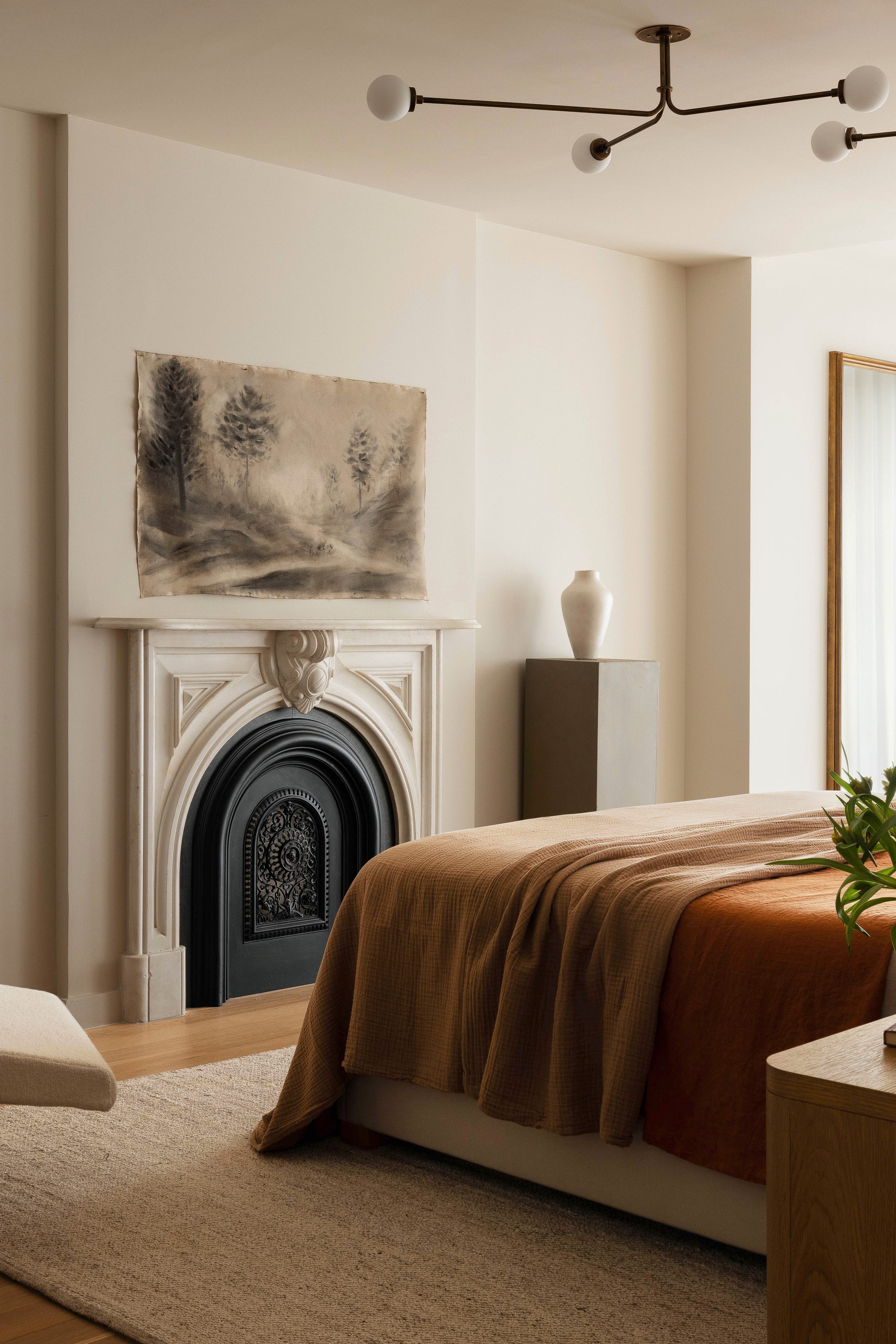
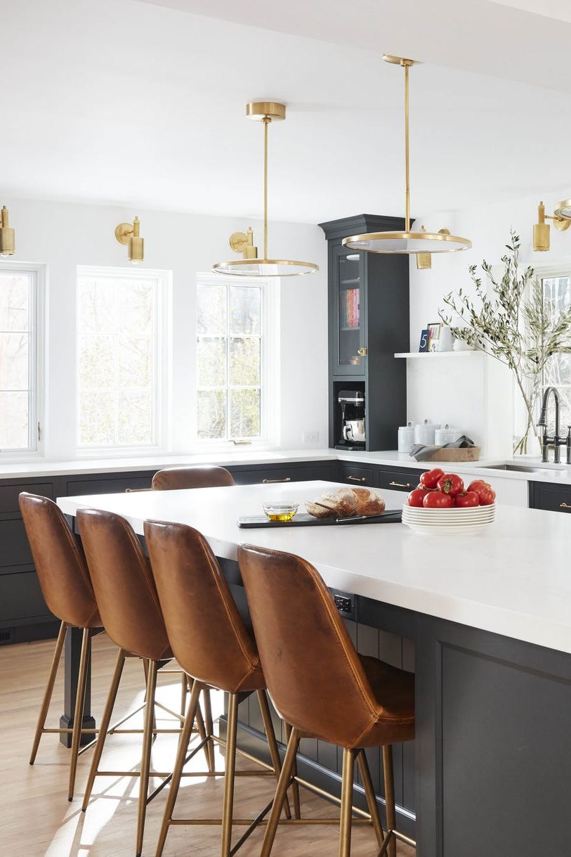
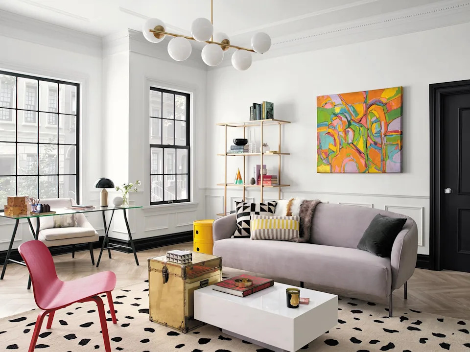
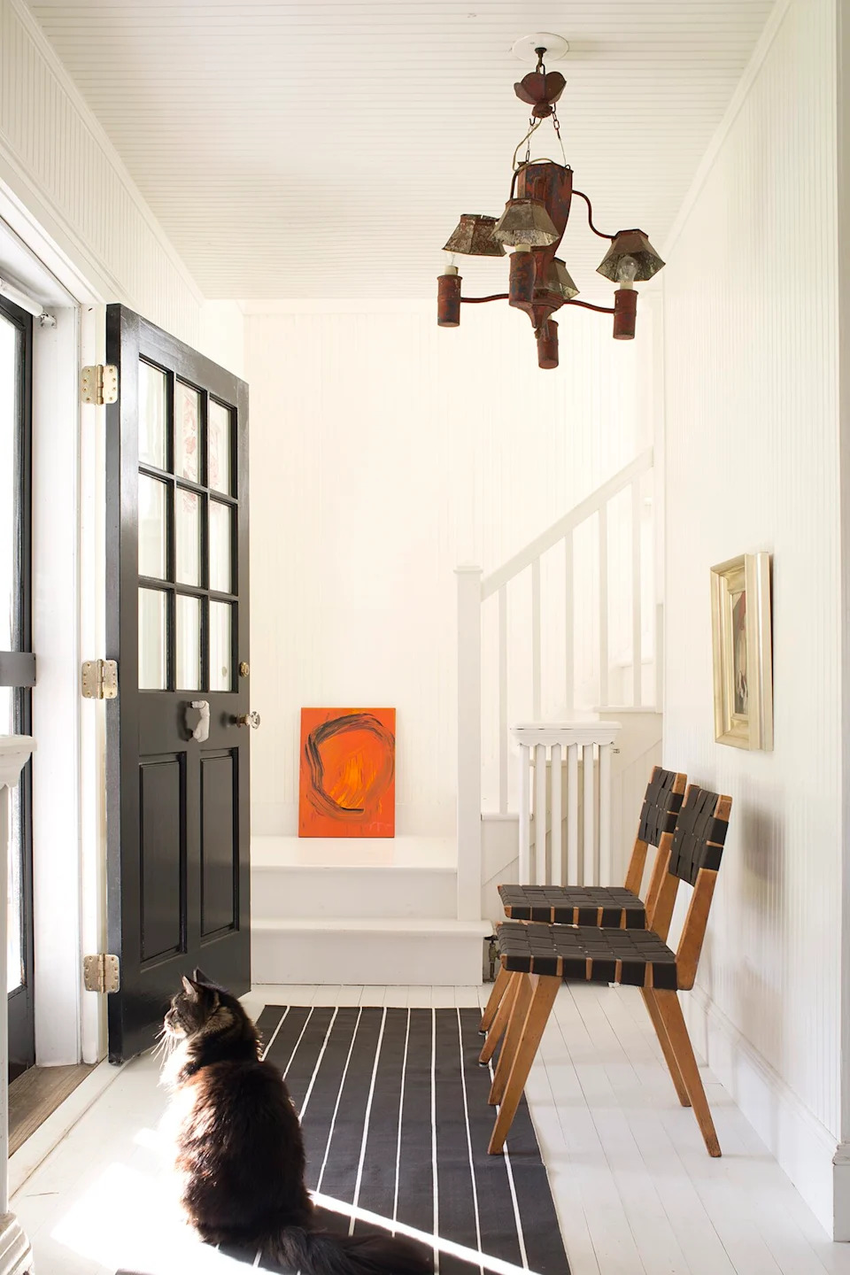
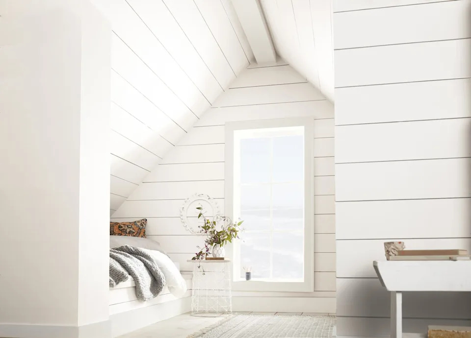
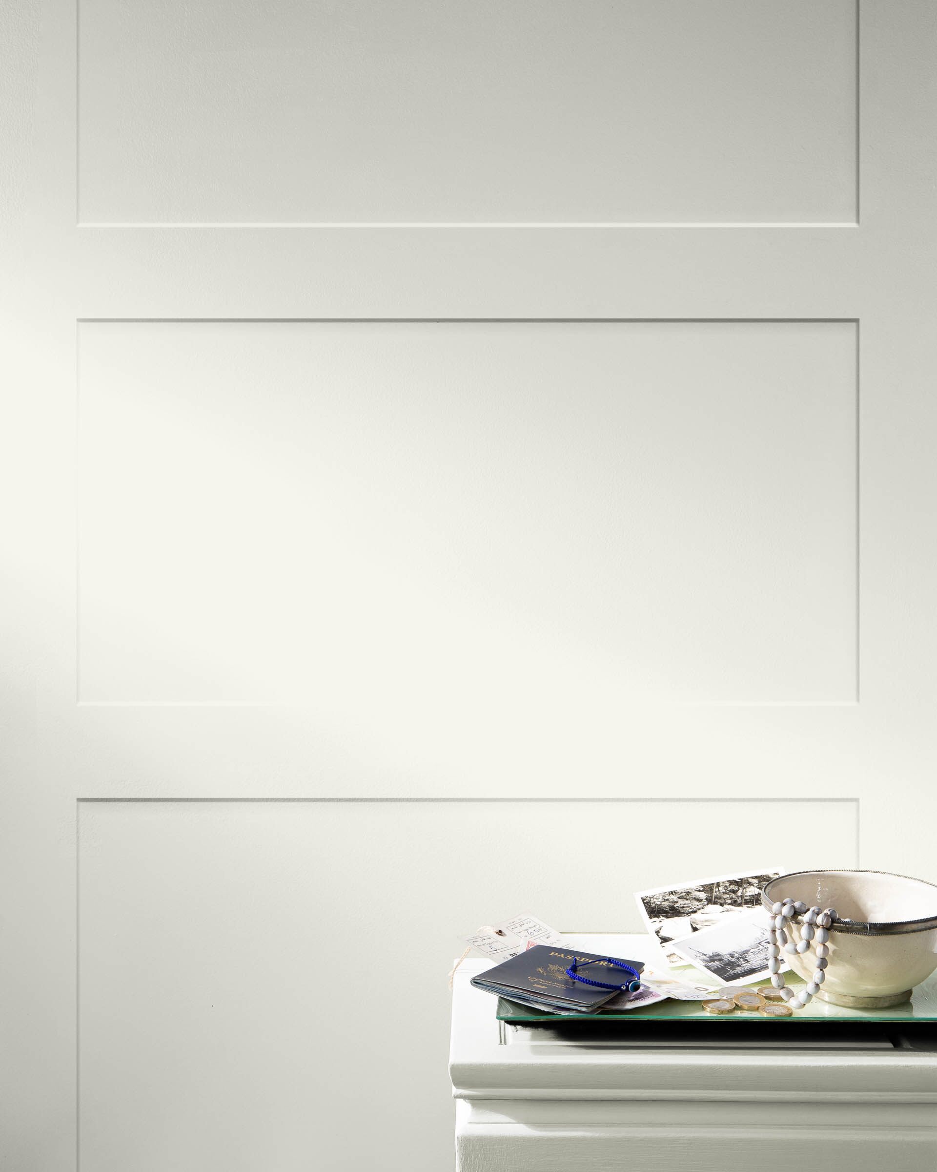
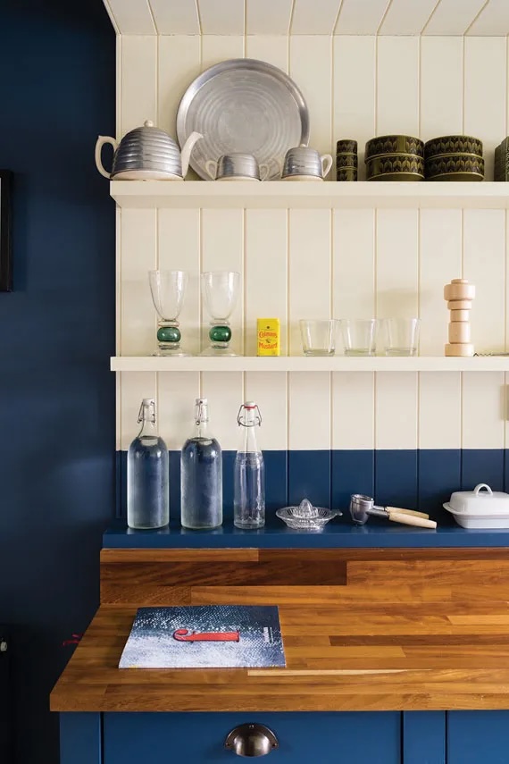
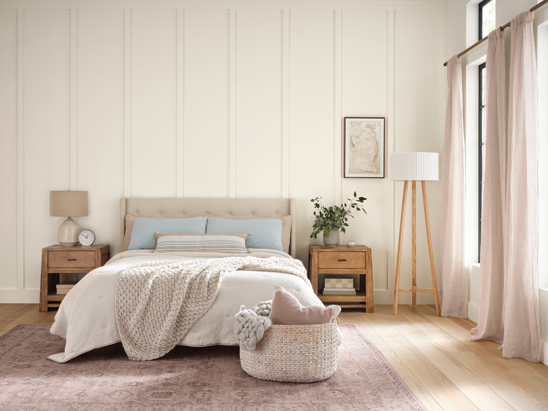
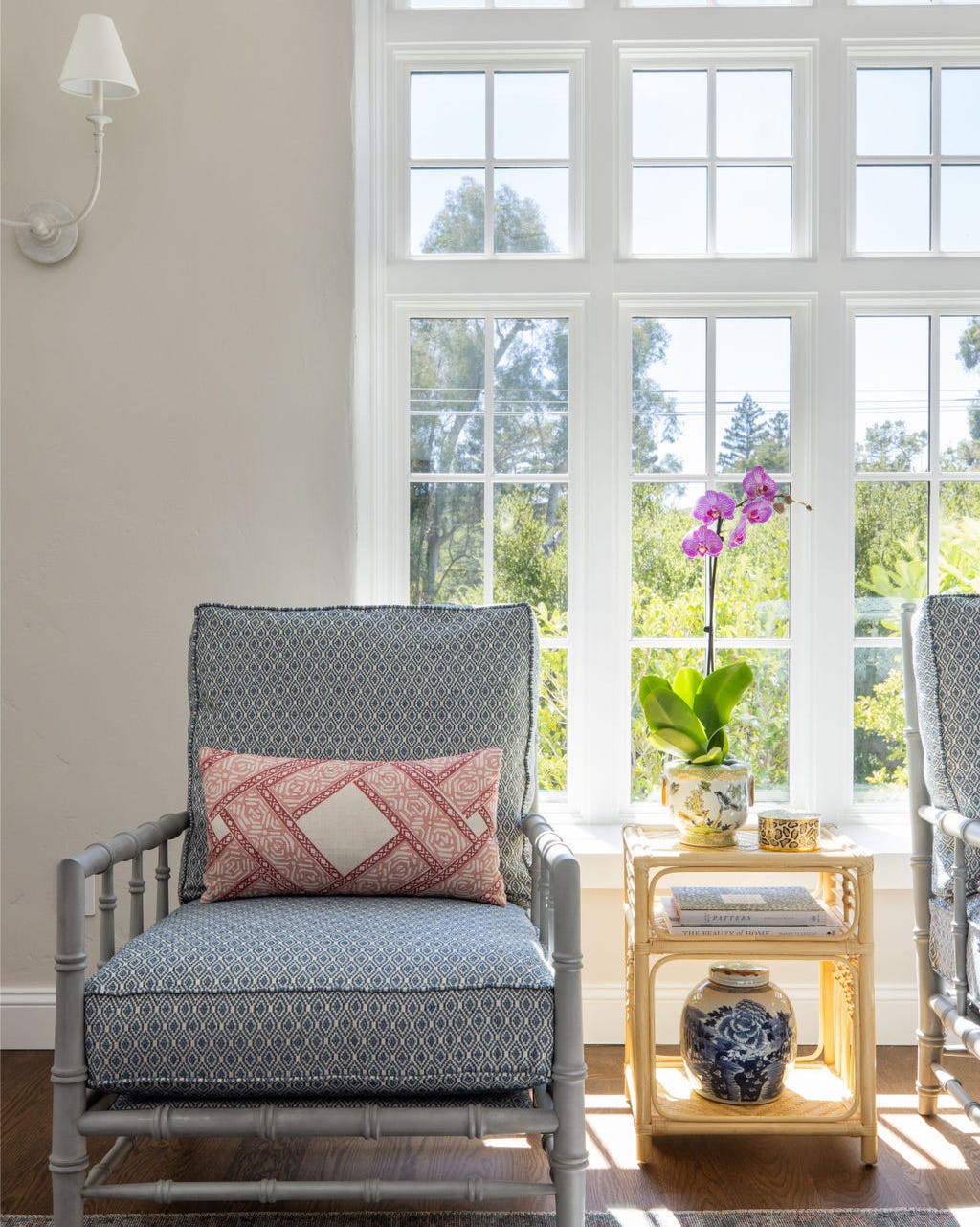
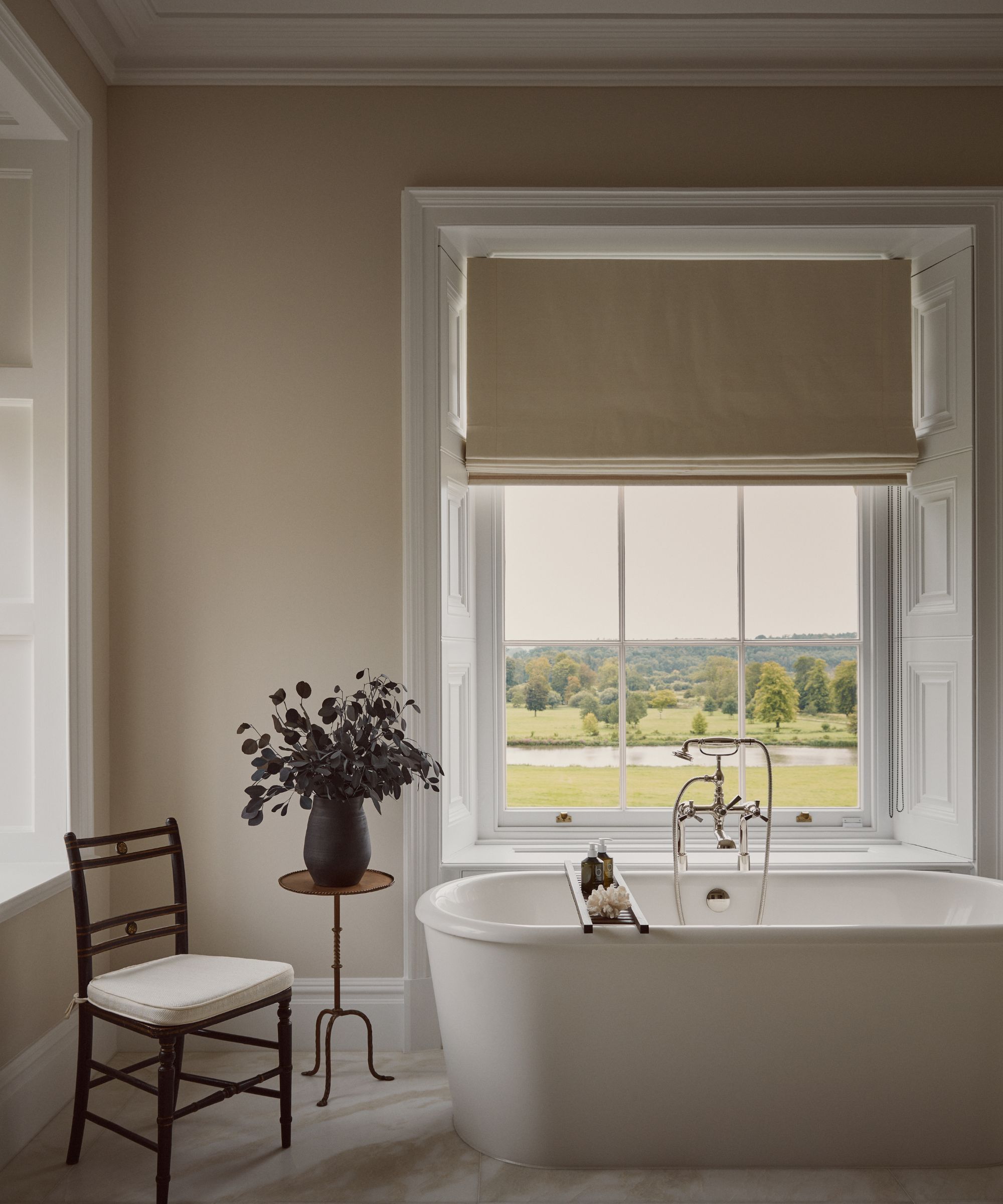
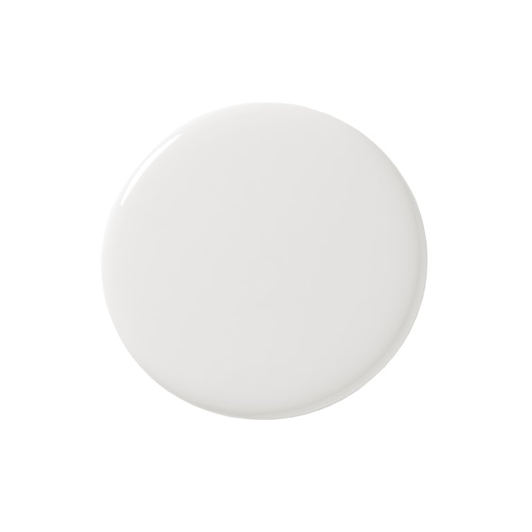
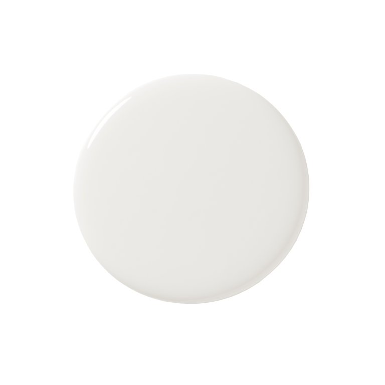
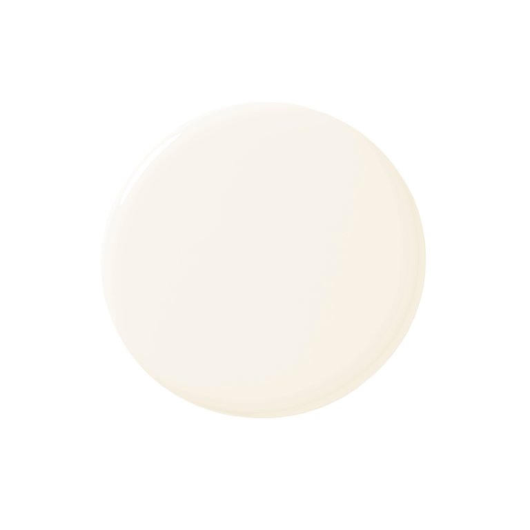
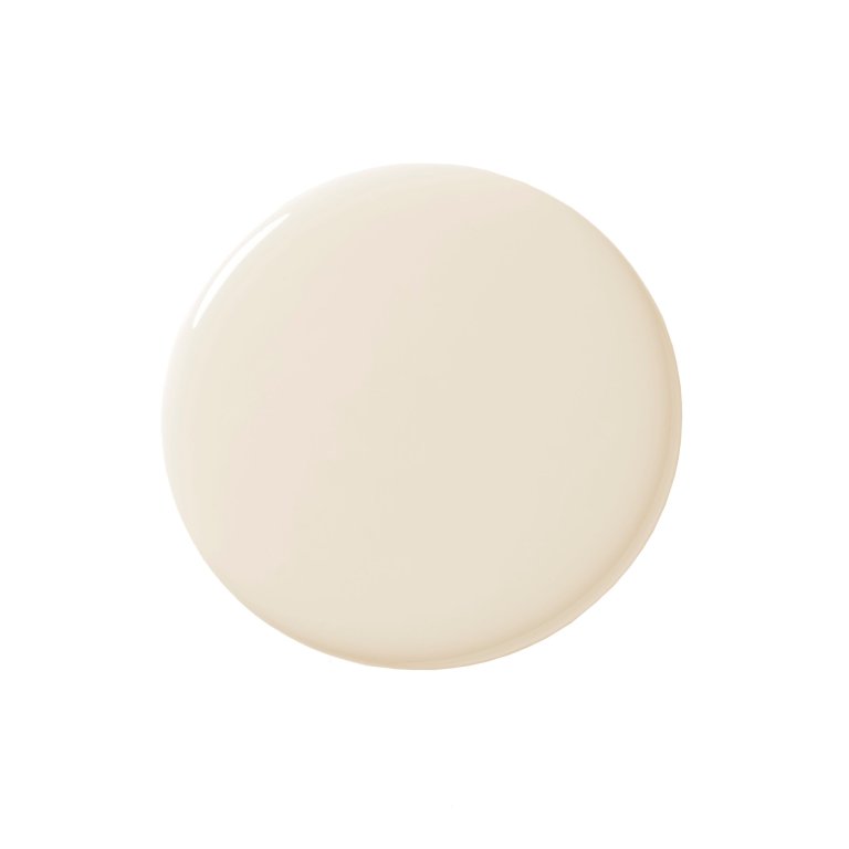
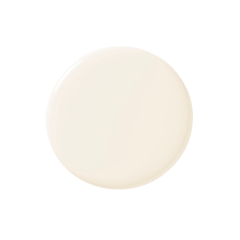
Selecting the appropriate white paint color can be a complex task, but insights from professional designers and architects can simplify the process. Bogdan Tomalevski of Colega Architects emphasizes the importance of choosing warm or cool white tones to align with specific project requirements, noting that while the color appears white, its underlying hue significantly influences the aesthetic. This guide compiles recommendations from various architects to assist in making an informed decision.
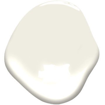
Alexander Jermyn of Alexander Jermyn Architecture LTD suggests Benjamin Moore's Swiss Coffee for exteriors, highlighting its ability to appear brightly white in sunny conditions and provide a richer, more nuanced white in overcast light or shadow. For interiors, Jermyn favors Benjamin Moore's White Dove, which he describes as a balanced neutral that is neither too cool nor too warm, making it an ideal backdrop for art. Josh Manes of Josh Manes Architecture selected Sherwin Williams' High Reflective White for a contemporary residence, opting for a true white without yellow undertones. He points out that despite its stark appearance, it introduces warmth and comfort to modern spaces.
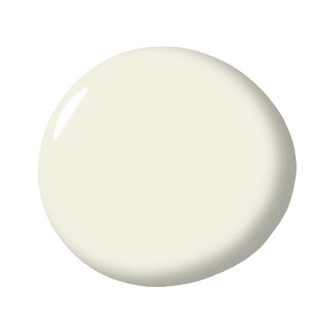

Eric Haesloop of Turnbull Griffin Haesloop Architects recommends Benjamin Moore's Mountain Peak White, valued for its ability to highlight simple architectural forms and reveal changing light throughout the day in both exterior and interior applications. Tomalevski also advocates for Dunn Edwards' White Picket Fence, chosen for a library/living room with extensive views. This shade's warm tones complement natural walnut cabinetry, and he details its subtle variations through different finishes like velvet for walls, flat for ceilings, and eggshell for bathrooms. Architect Amy Alper, principal of Amy A. Alper, uses Benjamin Moore's Chantilly Lace for exteriors, appreciating its neutrality devoid of red, blue, green, or yellow undertones, which allows it to contrast effectively with darker accents. For interiors, Alper utilized Benjamin Moore's Cotton Balls for its creamy warm undertone, harmonizing with bleached oak floors and rift white oak cabinets, while using Mountain Peak White on ceilings to enhance light reflection.
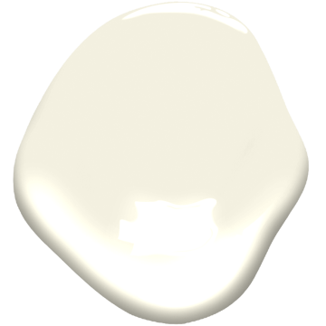
Jeff Guggenheim of Guggenheim Architecture and Design Studio frequently uses Benjamin Moore's Simply White for its subtle warmth, which complements the native wood species often featured in his Pacific Northwest projects. Greg Howe and Pam Lamaster of Searl Lamaster Howe recommend Benjamin Moore's White Wisp for contemporary facades in varied climates, noting its balanced hue that performs well in both cloudy and sunny conditions. For interiors, they chose Benjamin Moore's Cloud White for its versatility in blending with both warm and cool tones, maintaining a true white appearance across different spaces. Dallas-based architect Michael Gooden of M Gooden Design suggests Sherwin Williams' Snowbound, a soft, natural white that adapts to its surroundings' warmth while maintaining a crisp finish on level-5 walls. Risa Boyer of Risa Boyer Architecture also favors Benjamin Moore's Simply White for its consistency across various lighting conditions, describing it as crisp, clean, and subtly warm. Finally, Justine Dumas of Appareil Architecture selected Benjamin Moore's Oxford White for the Grand Pic Chalet, valuing its compatibility with wood and its ability to provide a warm, bright light that harmonizes with the surrounding forest landscape.
#WhitePaintColors #ArchitectRecommendations #InteriorDesign #ExteriorDesign #PaintSelection #HomeRenovation #ColorTheory #BenjaminMoore #SherwinWilliams #DunnEdwards #WhitePaintColors #ArchitectRecommendations #InteriorDesign #ExteriorDesign #PaintSelection #HomeRenovation #ColorTheory #BenjaminMoore #SherwinWilliams #DunnEdwards
Toplam 0 yorum
 Henüz yorum yok
Bu da beğenebilirsiniz
Best white paint colors: Expert share the top options

The 11 Best Warm White Paint Colors, According to Designers

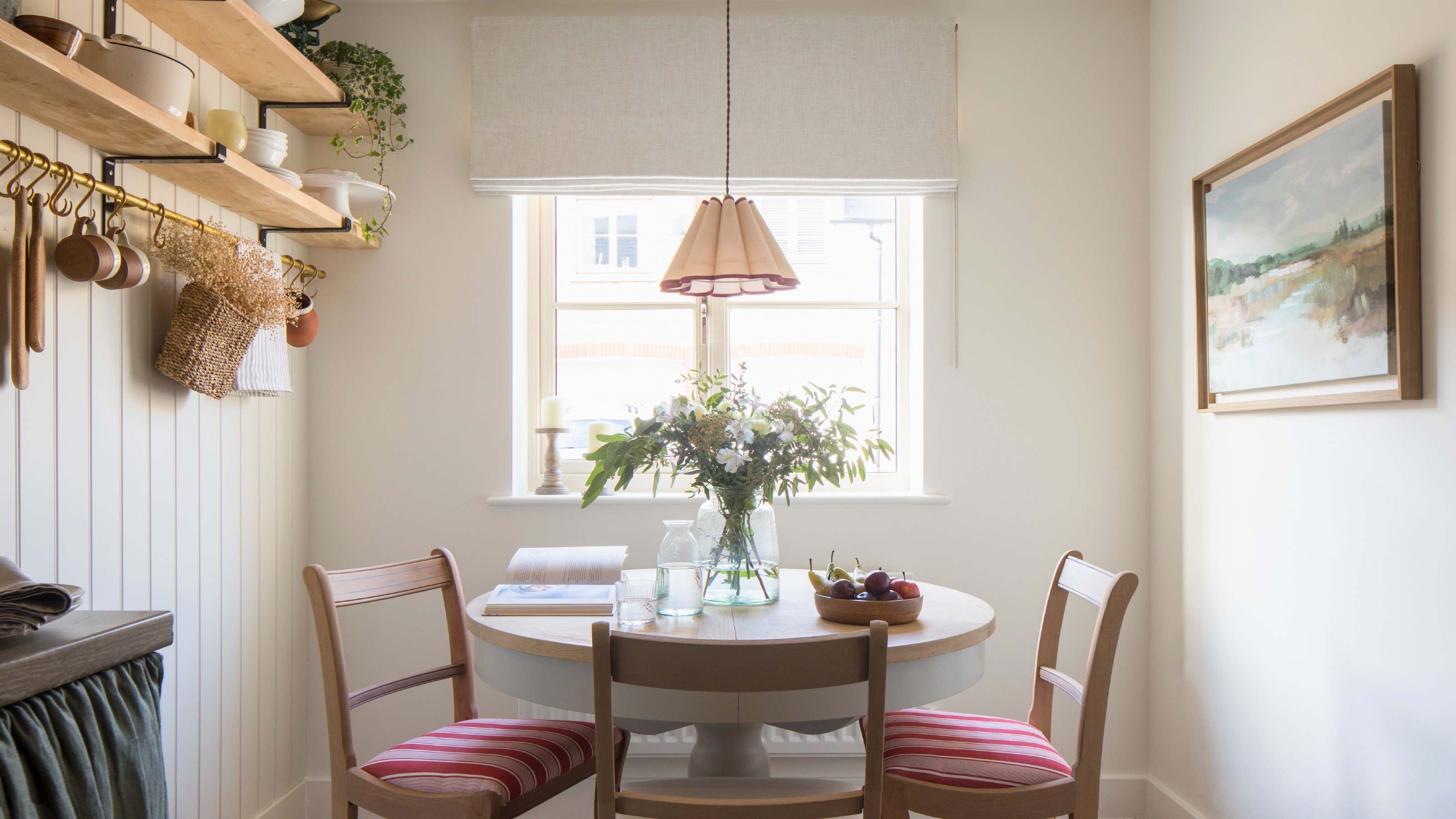
Which white paint is the best? Experts reveal the perfect shade of white for every room and feature
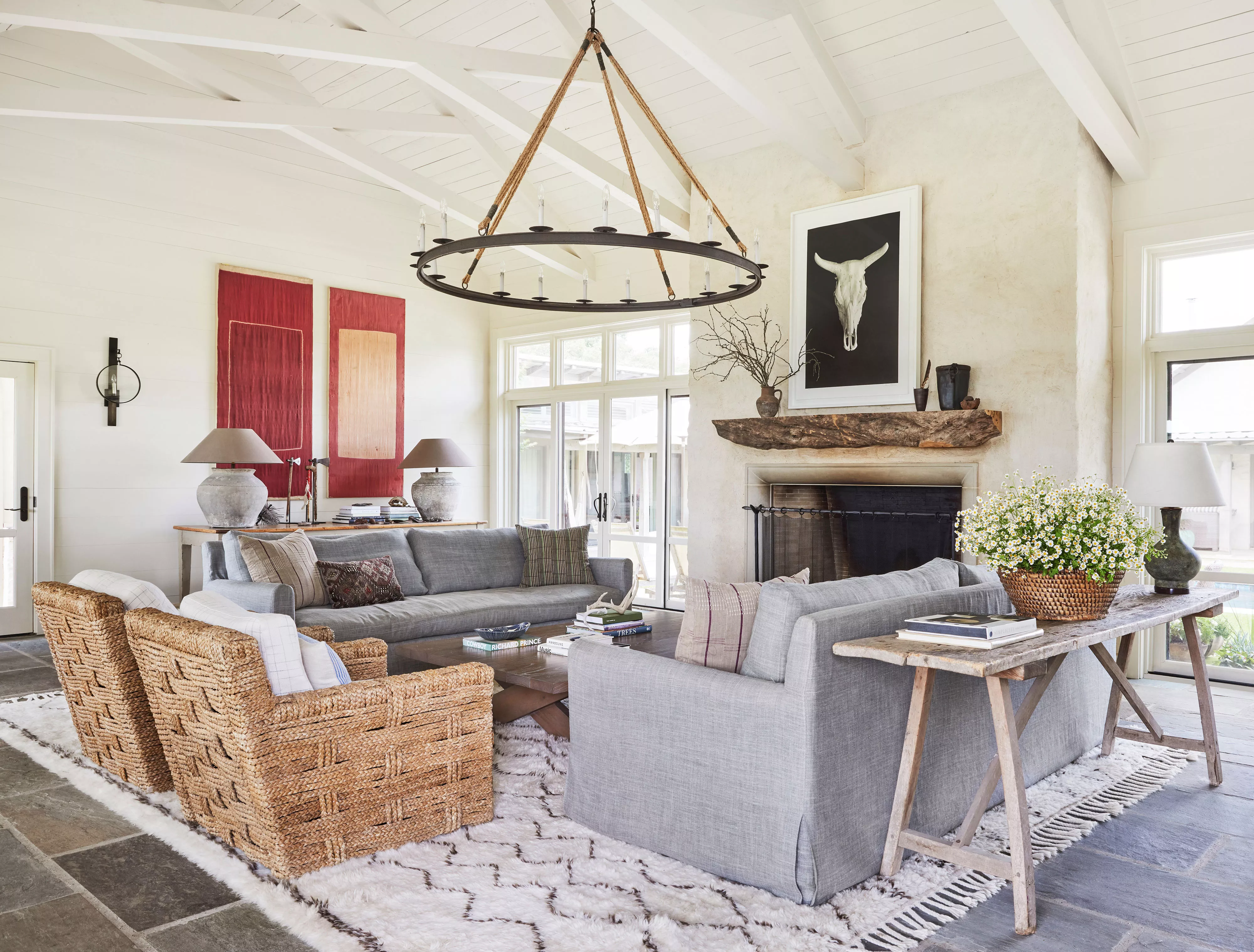
13 Off-White Paint Colors That Experts Always Recommend to Make Rooms Feel Bigger and Brighter

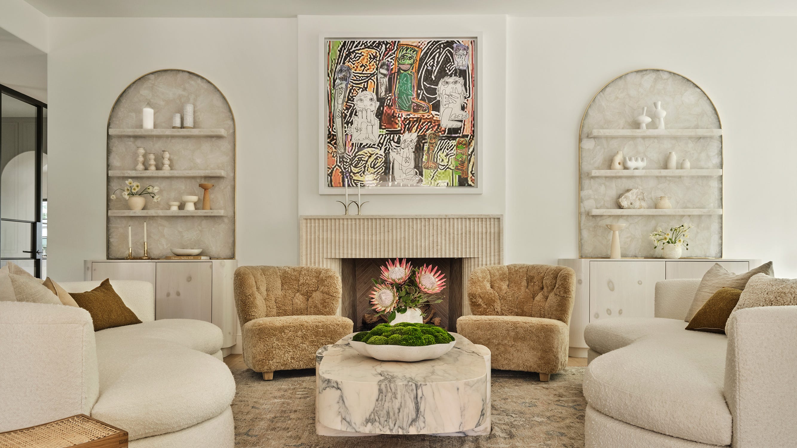
The 13 Best White Paint Colors That Interior Designers Swear By

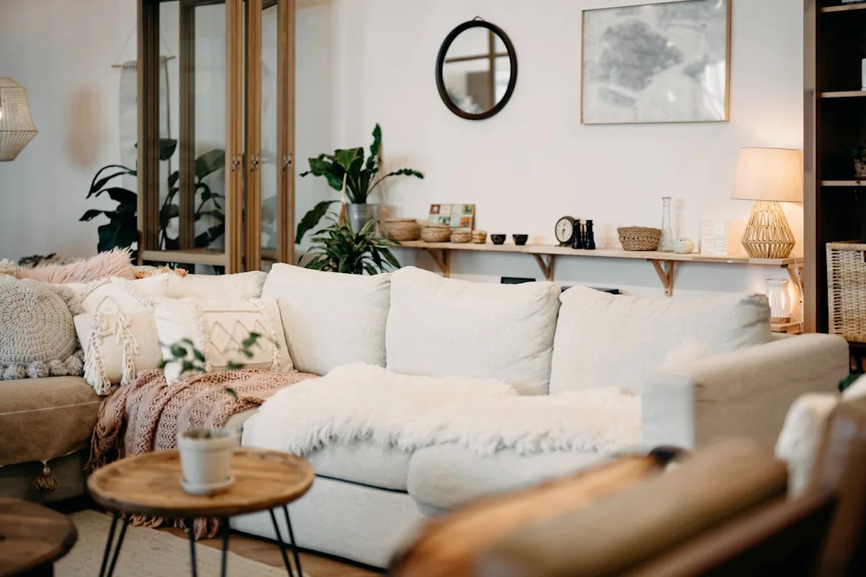
The 11 Best Warm White Paint Colors, According to Designers
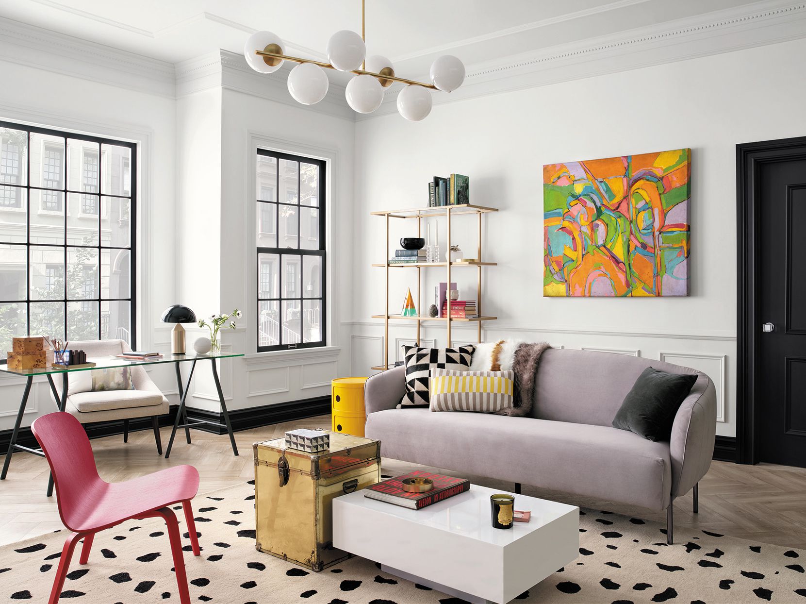
The Best White Paint for Walls That Experts Swear By
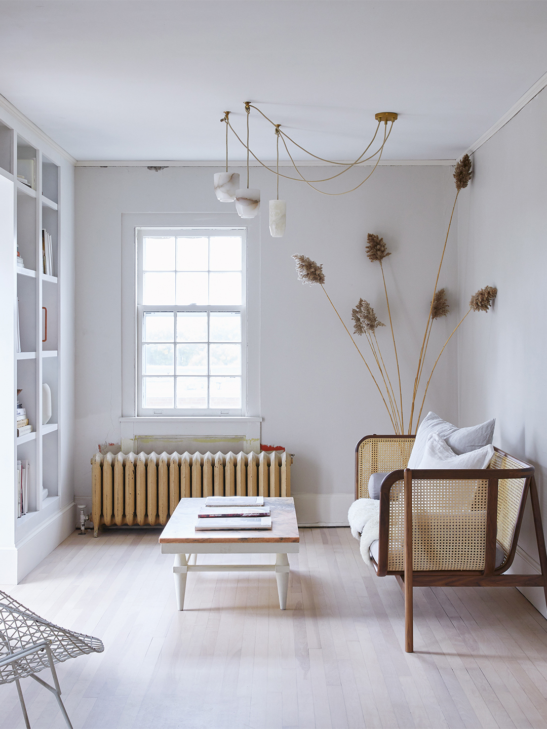
Designers’ Favorite White Paints Are Always Changing—We Asked 3 for Their Latest Pick


The Best White Paint Colors Experts Turn to Again and Again
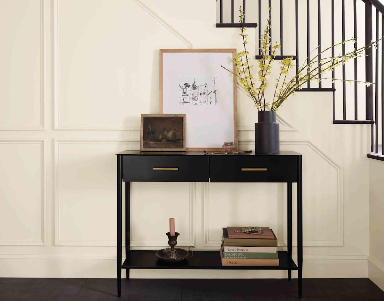
13 Off-White Paint Colors the Experts Recommend for Any Space

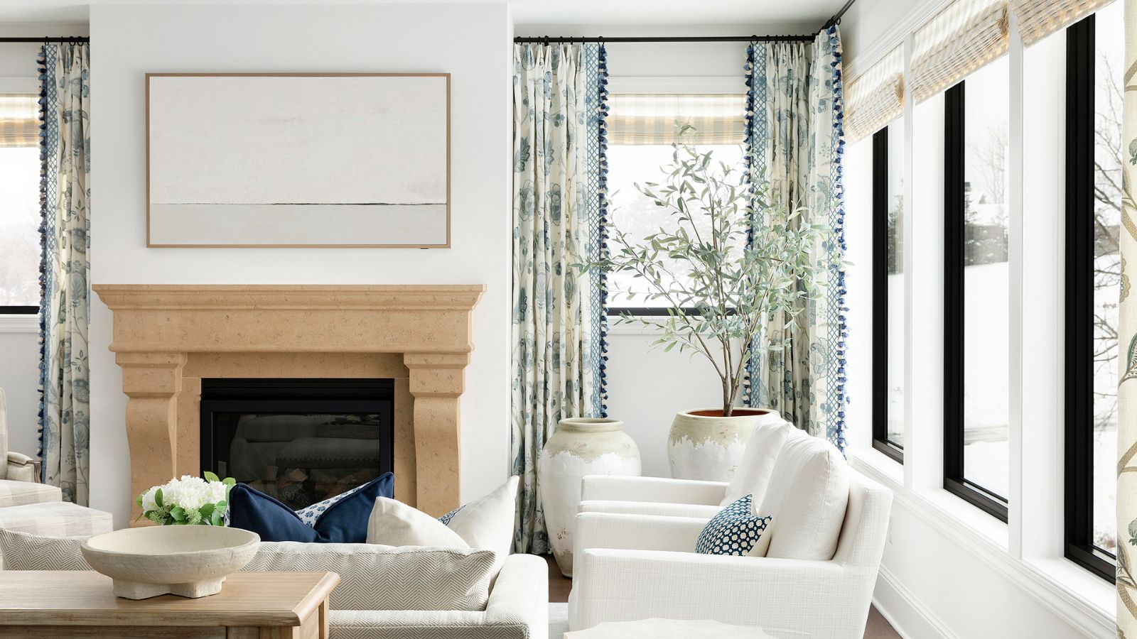
5 best warm white paints, as chosen by interior designers

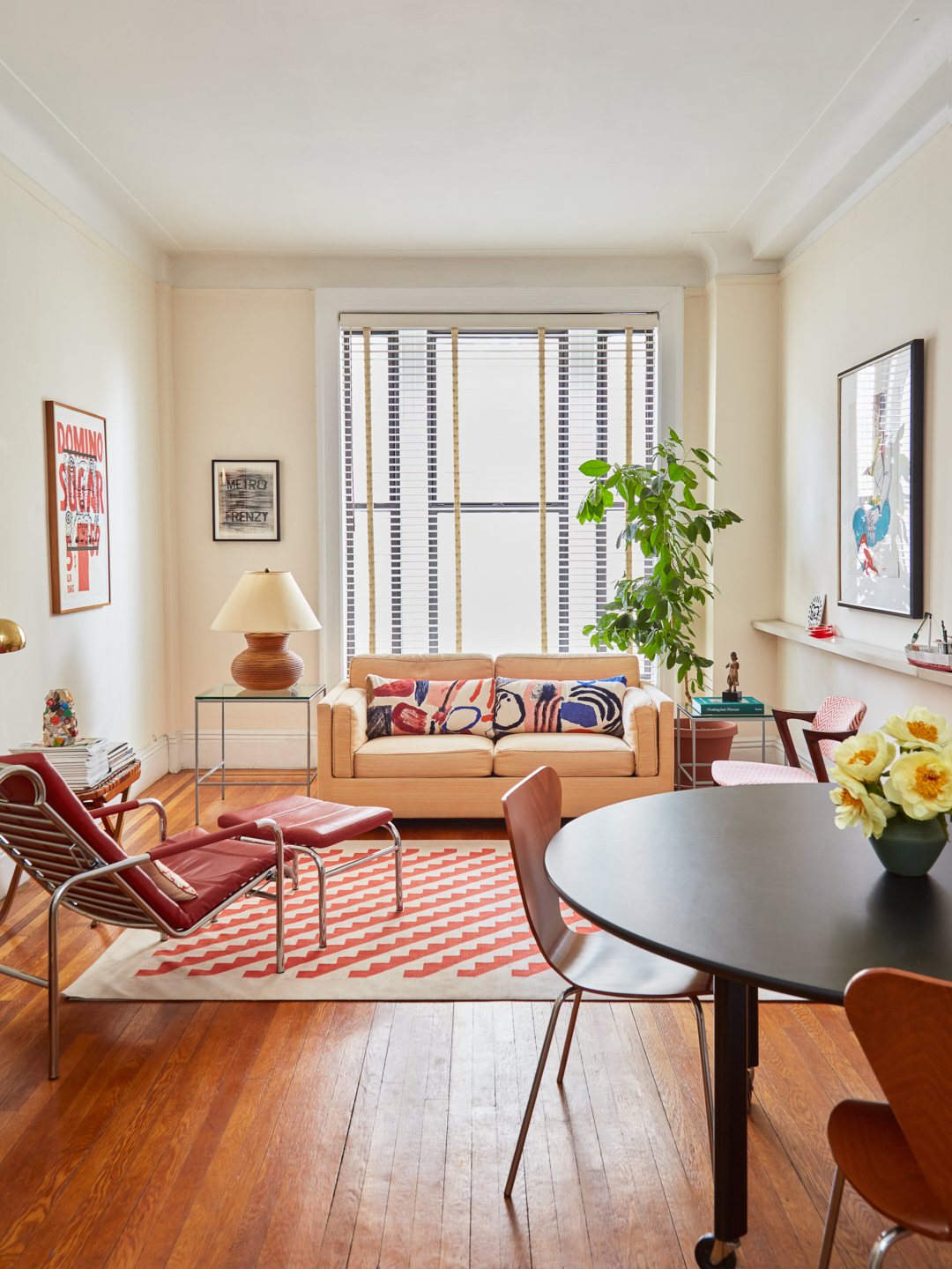
I Asked 3 Pros for White Paint Recs, and They All Agreed on This Undertone

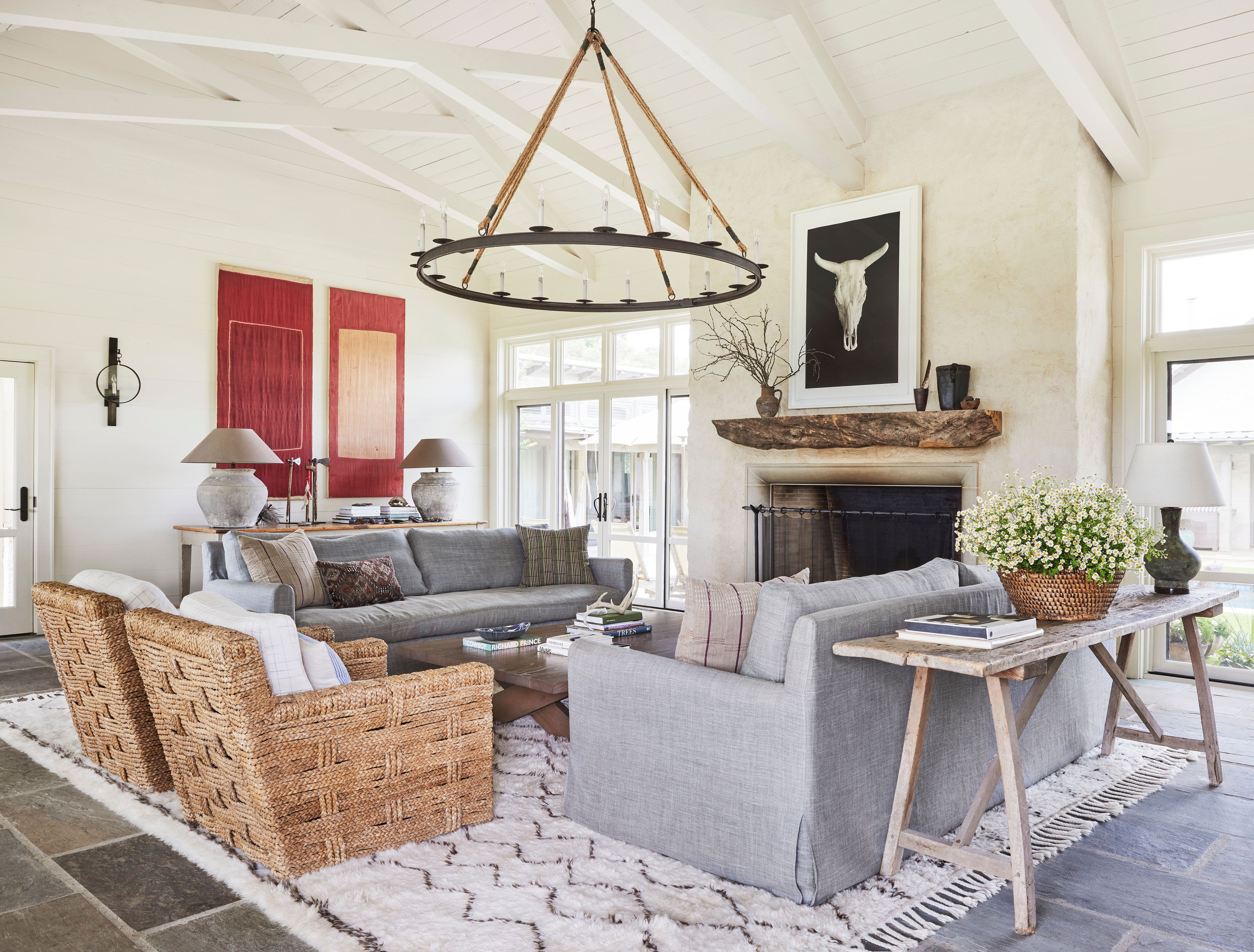
13 Off-White Paint Colors the Experts Recommend for Any Space
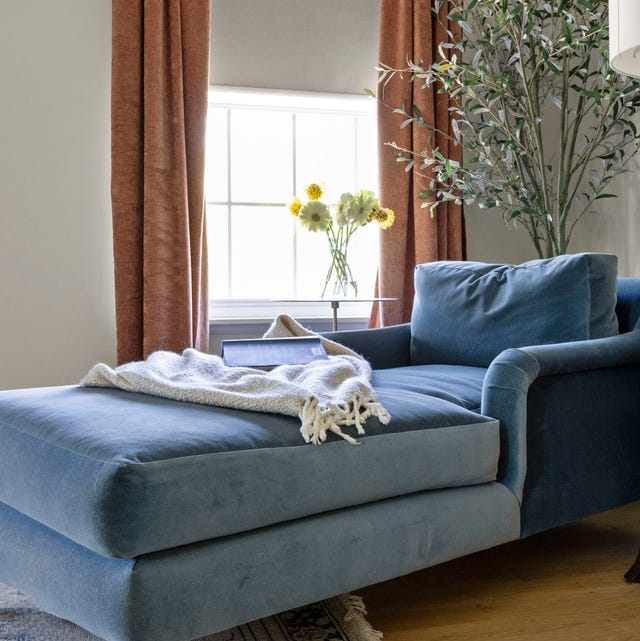
13 Best Off-White Paint Colors, According to Interior Designers

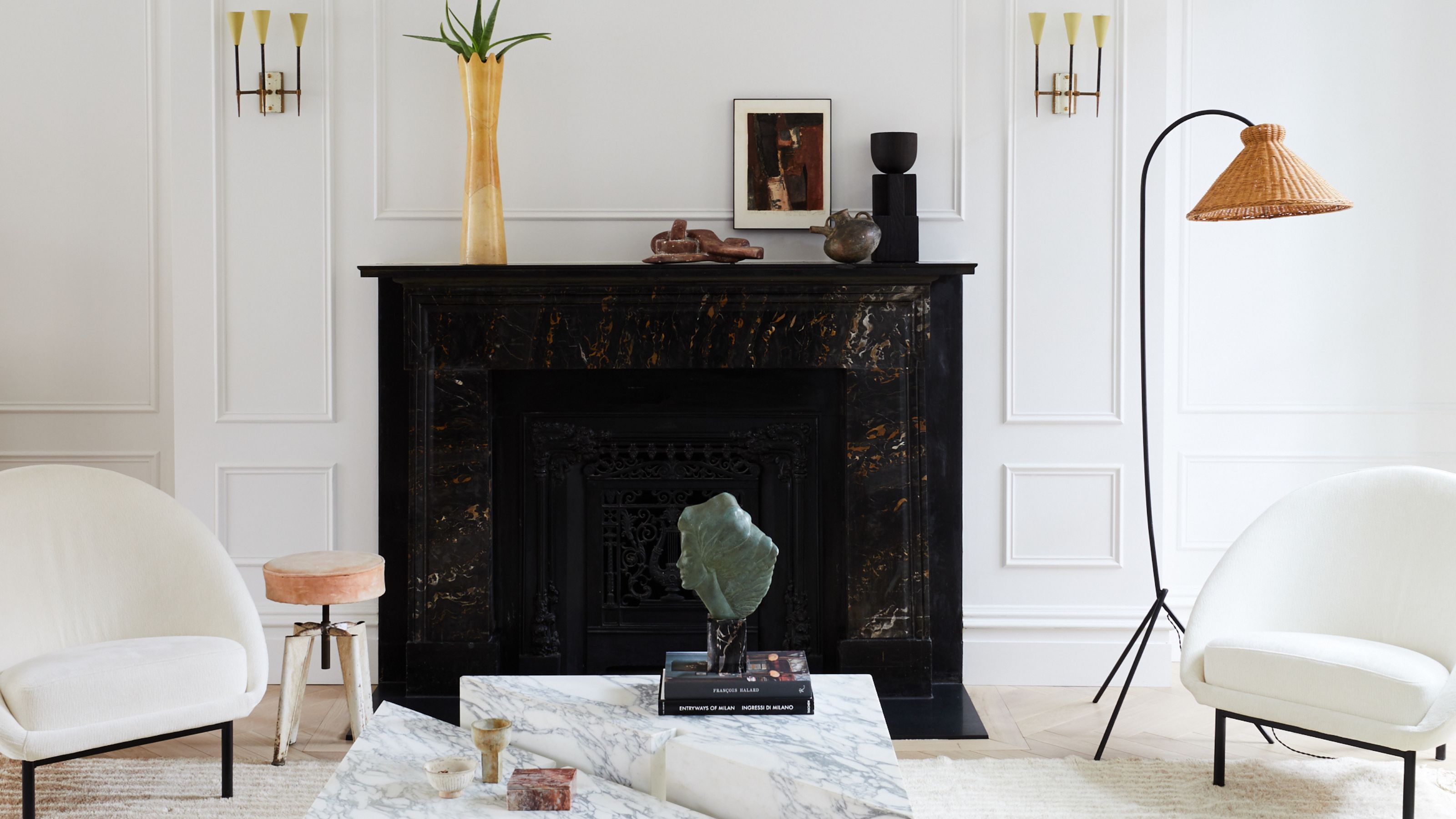
The ultimate guide to choosing the right shade of white for your walls

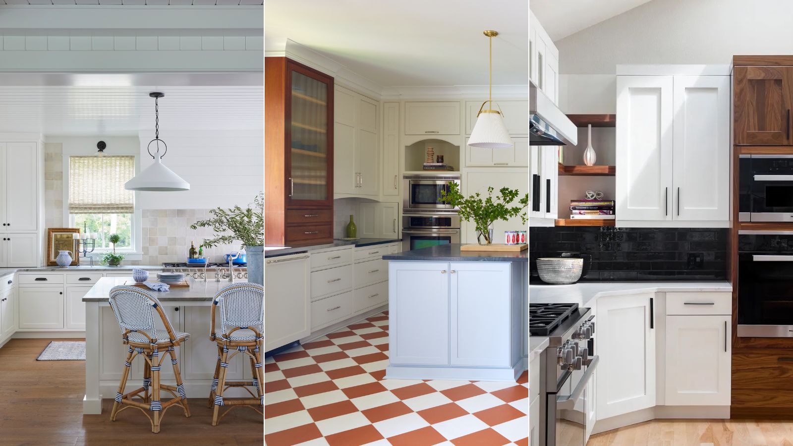
What are the best white paints for kitchens? 6 light and airy picks from interior designers
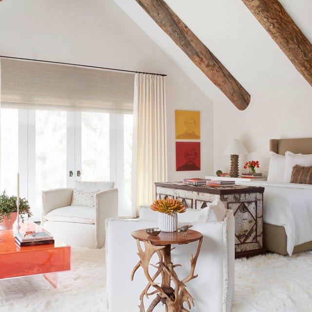
The 40 Best White Paint Colors, According to Designers
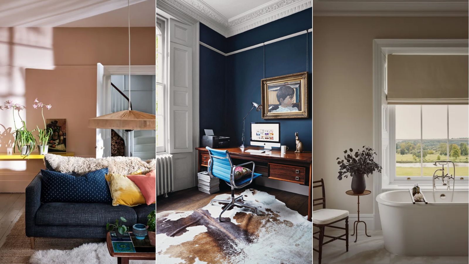
What colors go with white? 5 expert-approved color combinations to try
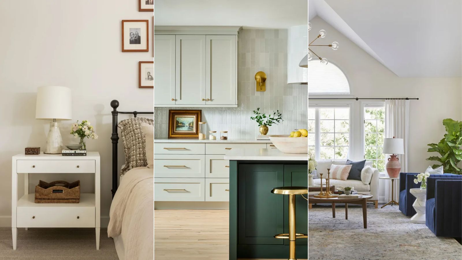
Best off-white paints according to designers
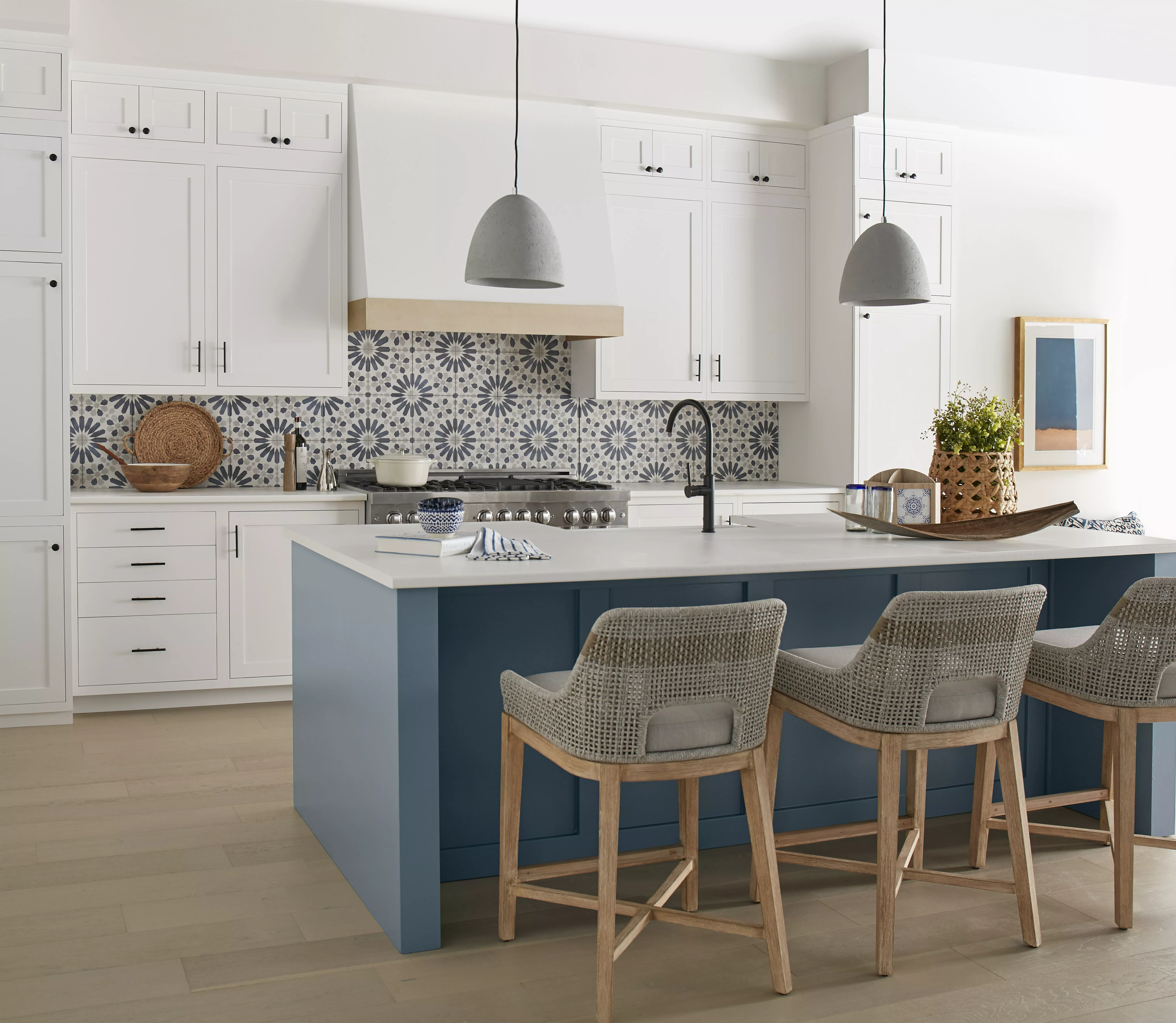
The 10 Best Paint Colors for White Kitchen Cabinets, According to Paint Pros