The Best Gray Paint Colors Interior Designers Swear By

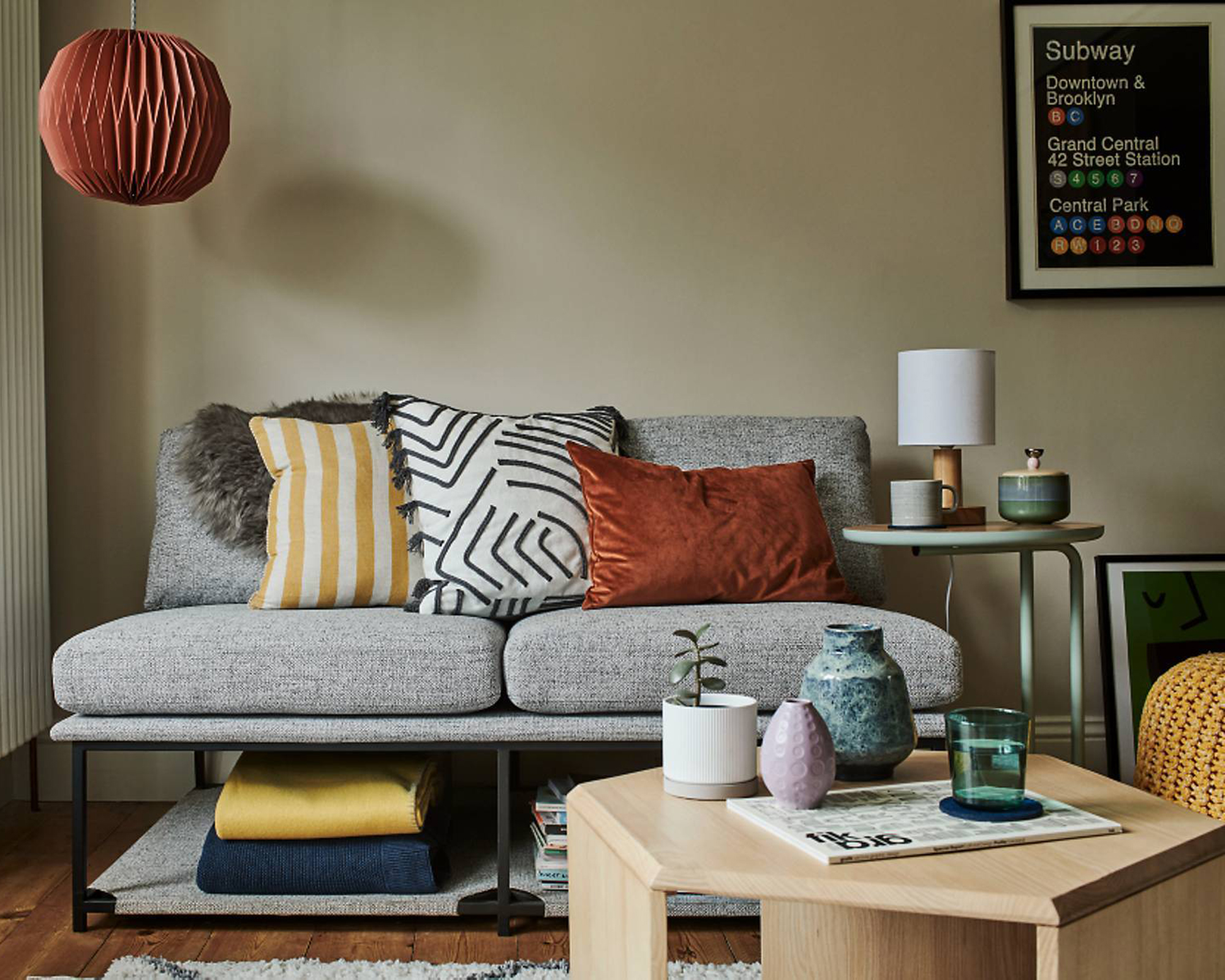
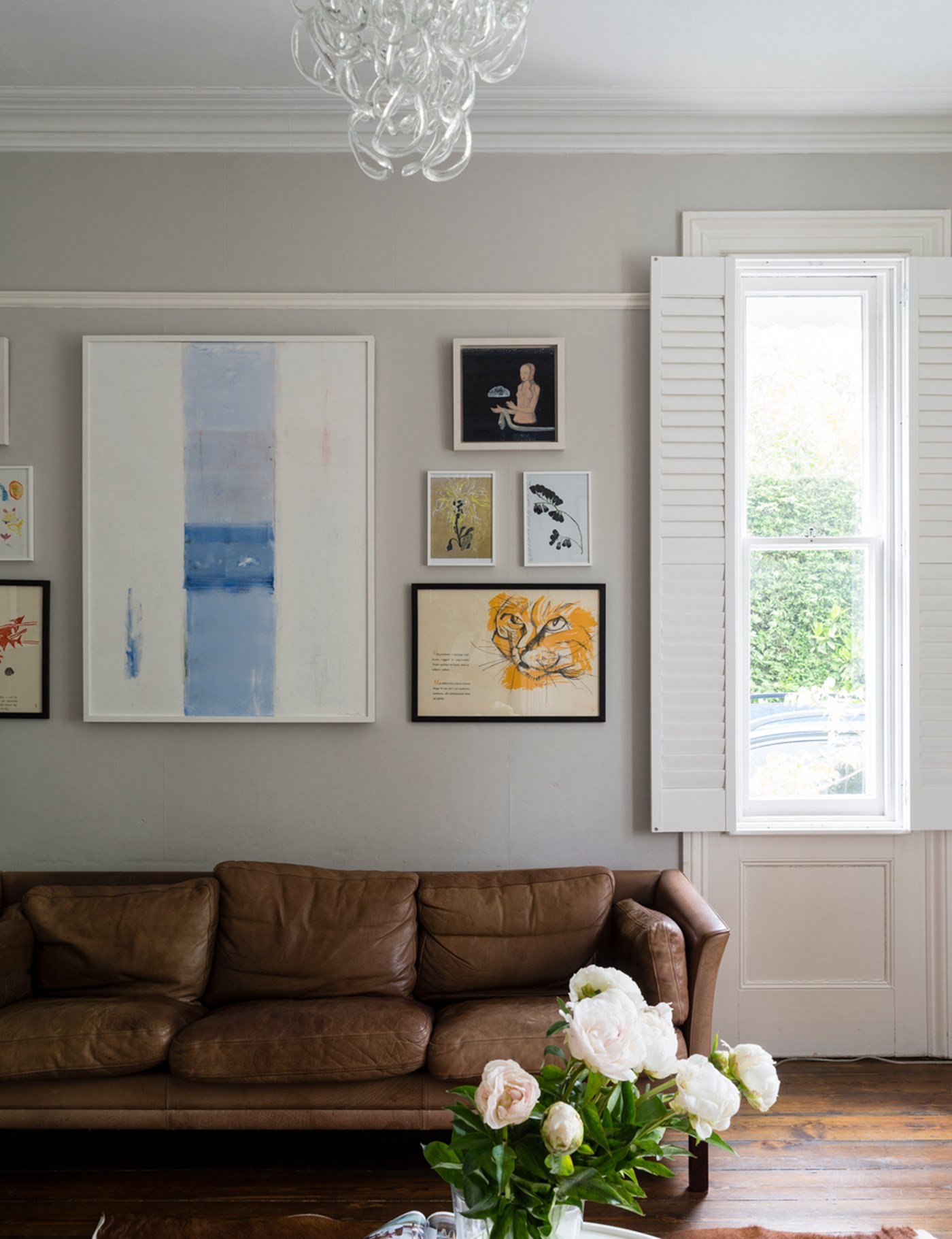
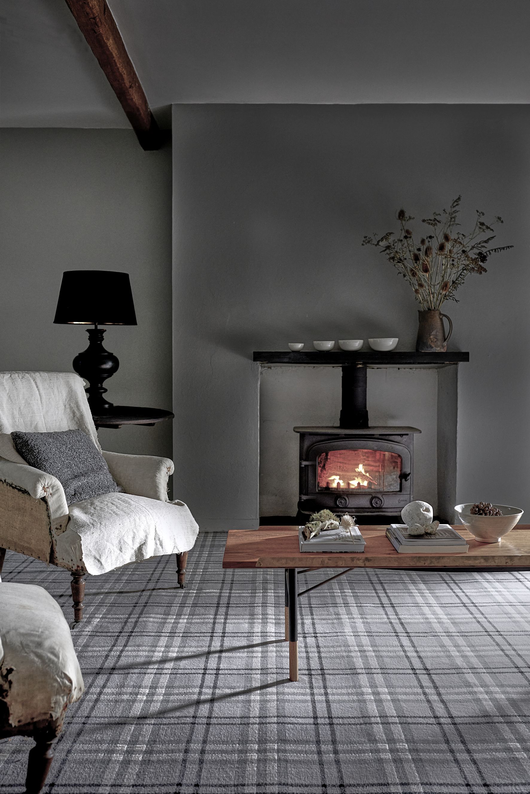
The article explores the use of gray paint in interior design, offering insights from professional designers on how to select the right shade. Gray is presented as a versatile alternative to white, capable of transforming a space. However, choosing the correct gray is complex due to its chameleon-like quality, which can make it appear too dark, too light, or influenced by various undertones. The article emphasizes that the decision involves more than just picking a color from a sample book, highlighting the importance of considering paint finish and undertones.
Two critical factors are discussed: paint finish and undertones. Nicole Gibbons, CEO of Clare, suggests that eggshell finish is the safest and most popular choice for walls among designers, as it offers a balance of durability and aesthetic appeal without excessive sheen. Semi-gloss or satin finishes are typically reserved for trim. Eggshell provides enough water resistance for cleaning while avoiding the reflection of light and imperfections associated with high-gloss finishes. Understanding undertones is presented as crucial, as they significantly impact how gray appears under different lighting conditions and alongside other elements in a room. Gray paints are often a mixture of pigments, and their underlying subsidiary colors, such as blue or red, can create cooler, relaxed vibes or lively, inviting atmospheres.
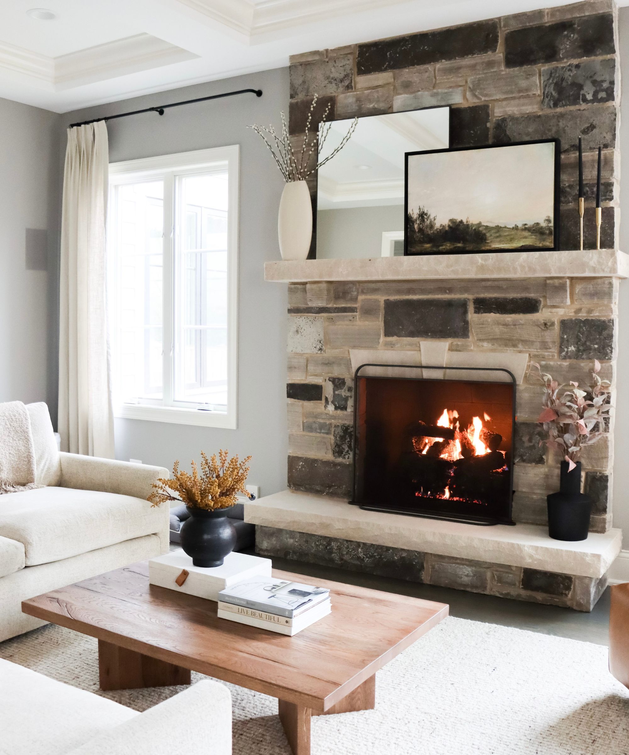
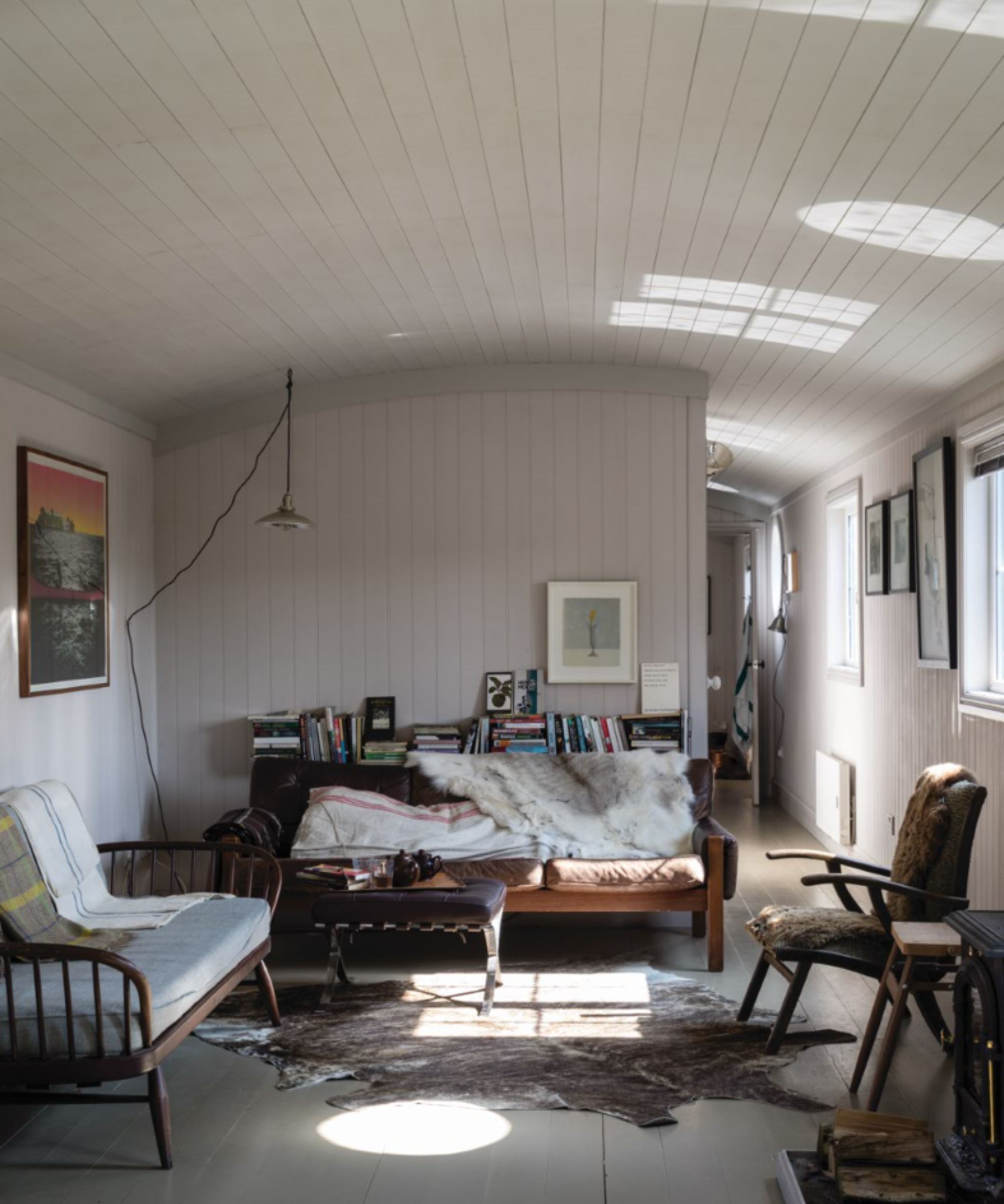
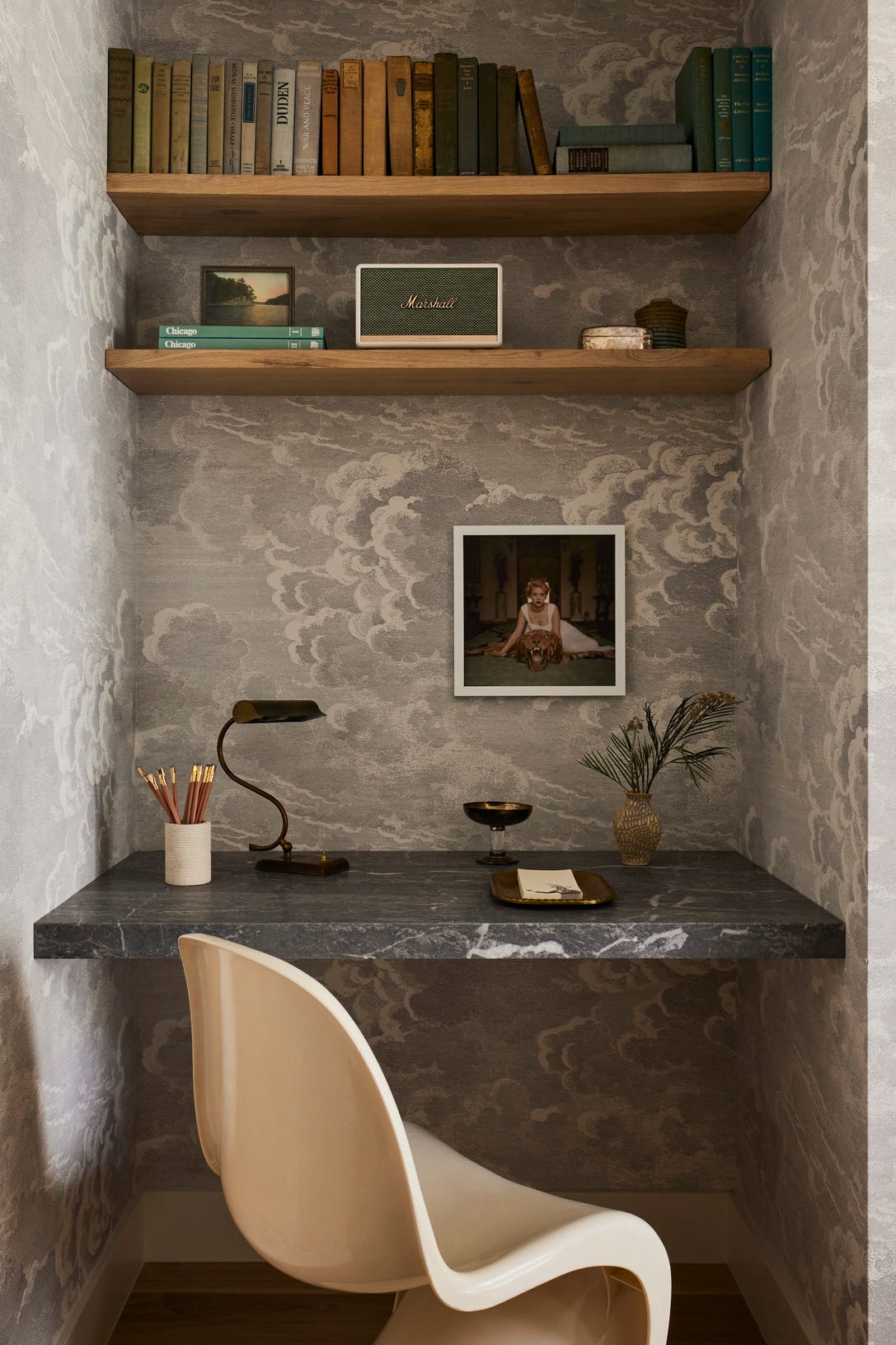
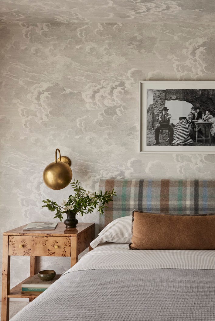
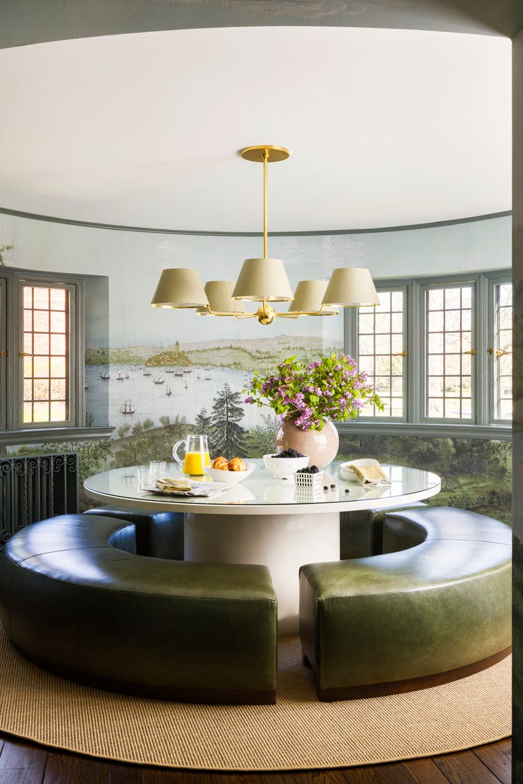
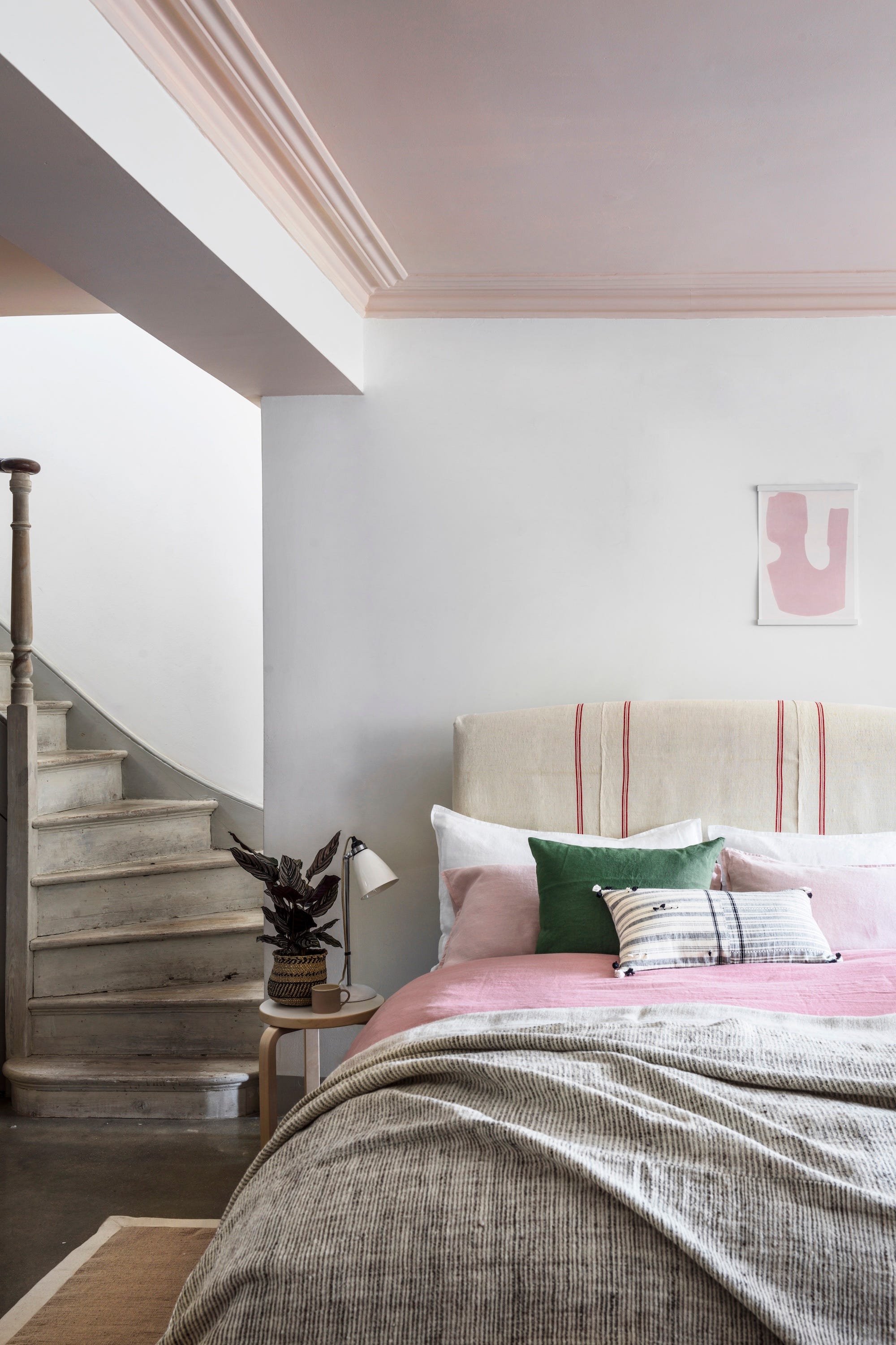
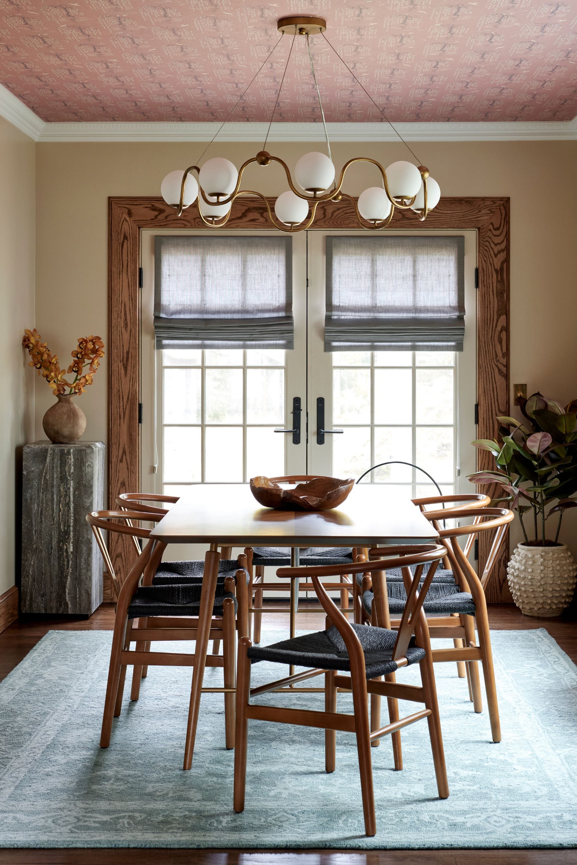
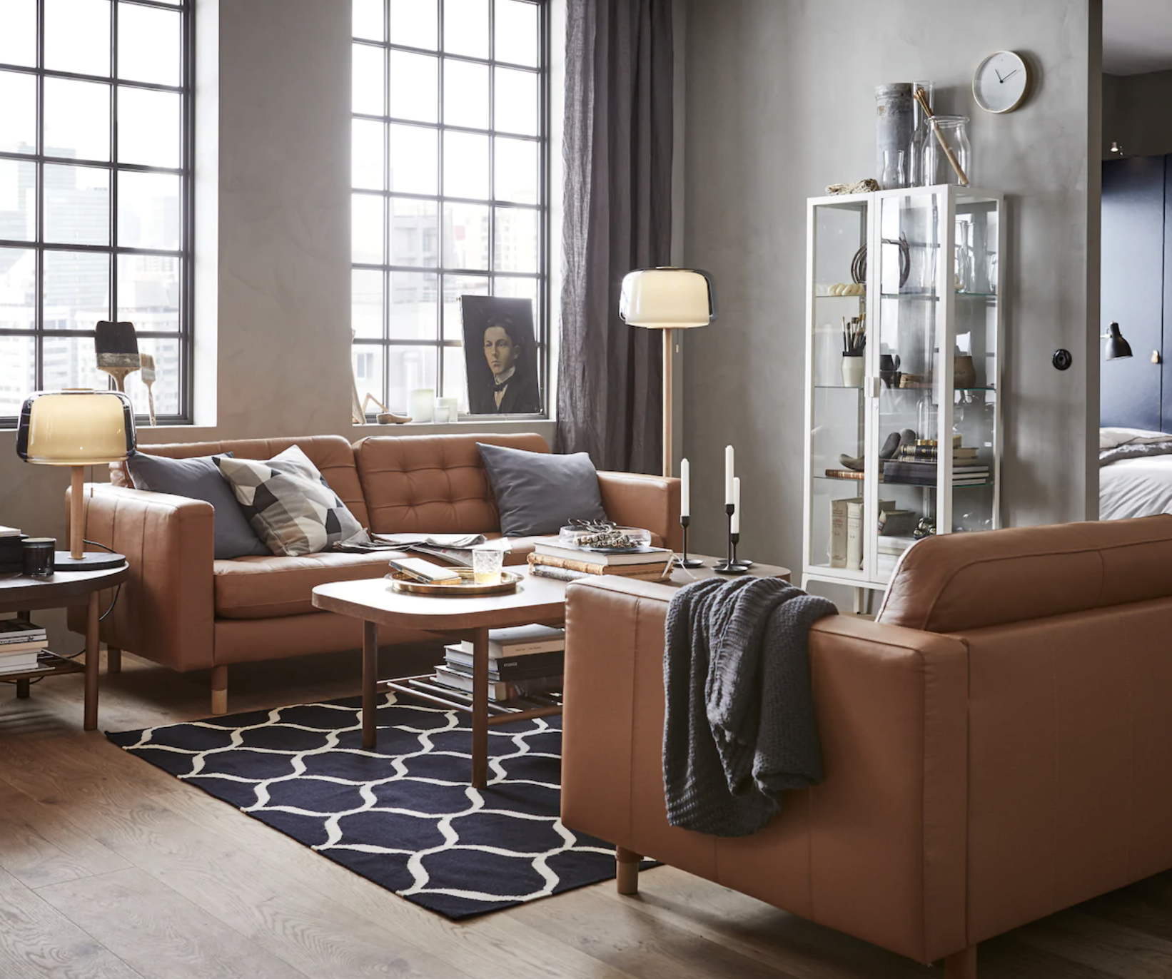
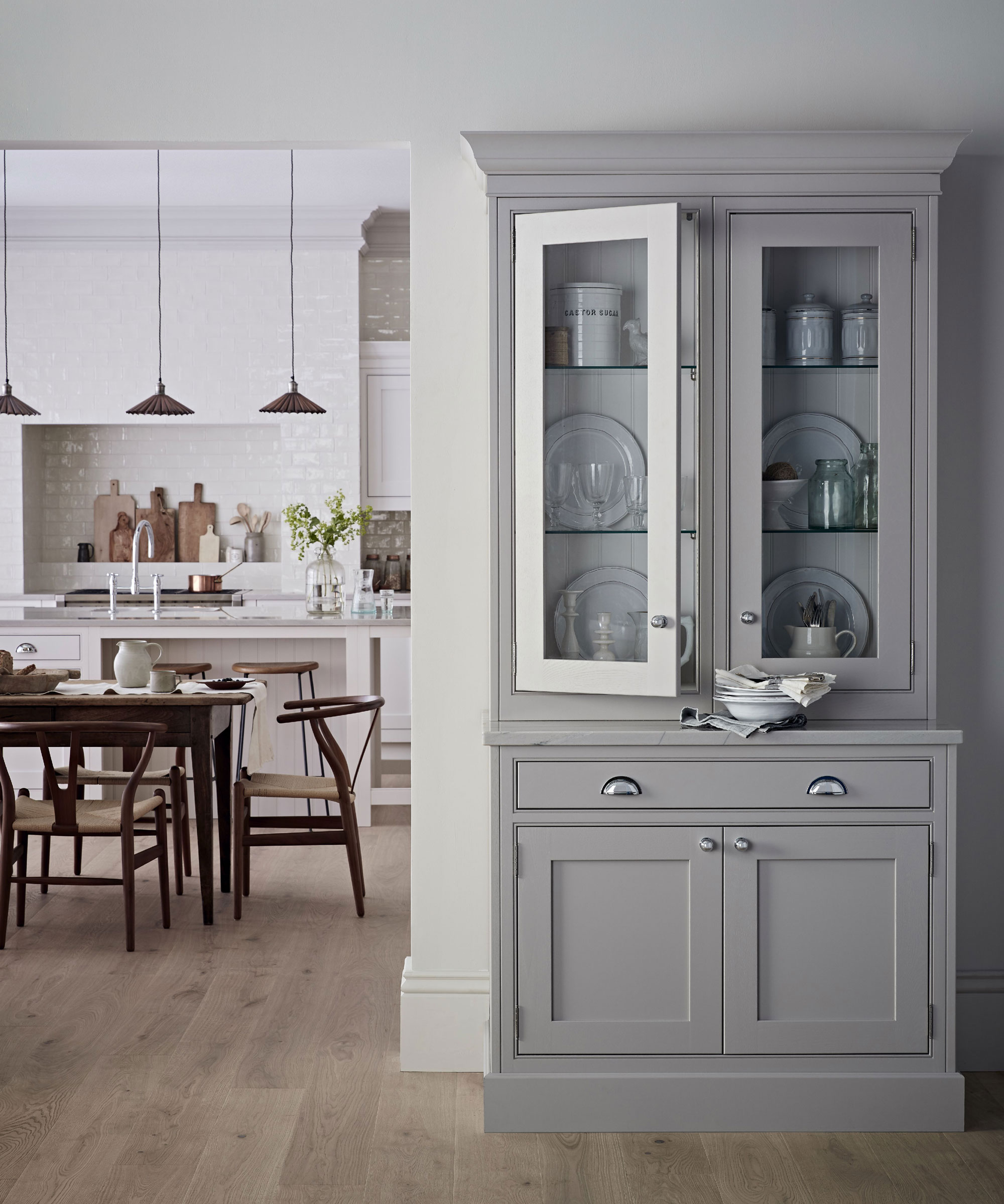
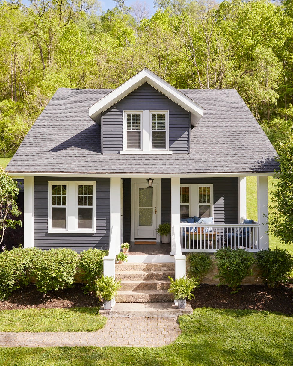
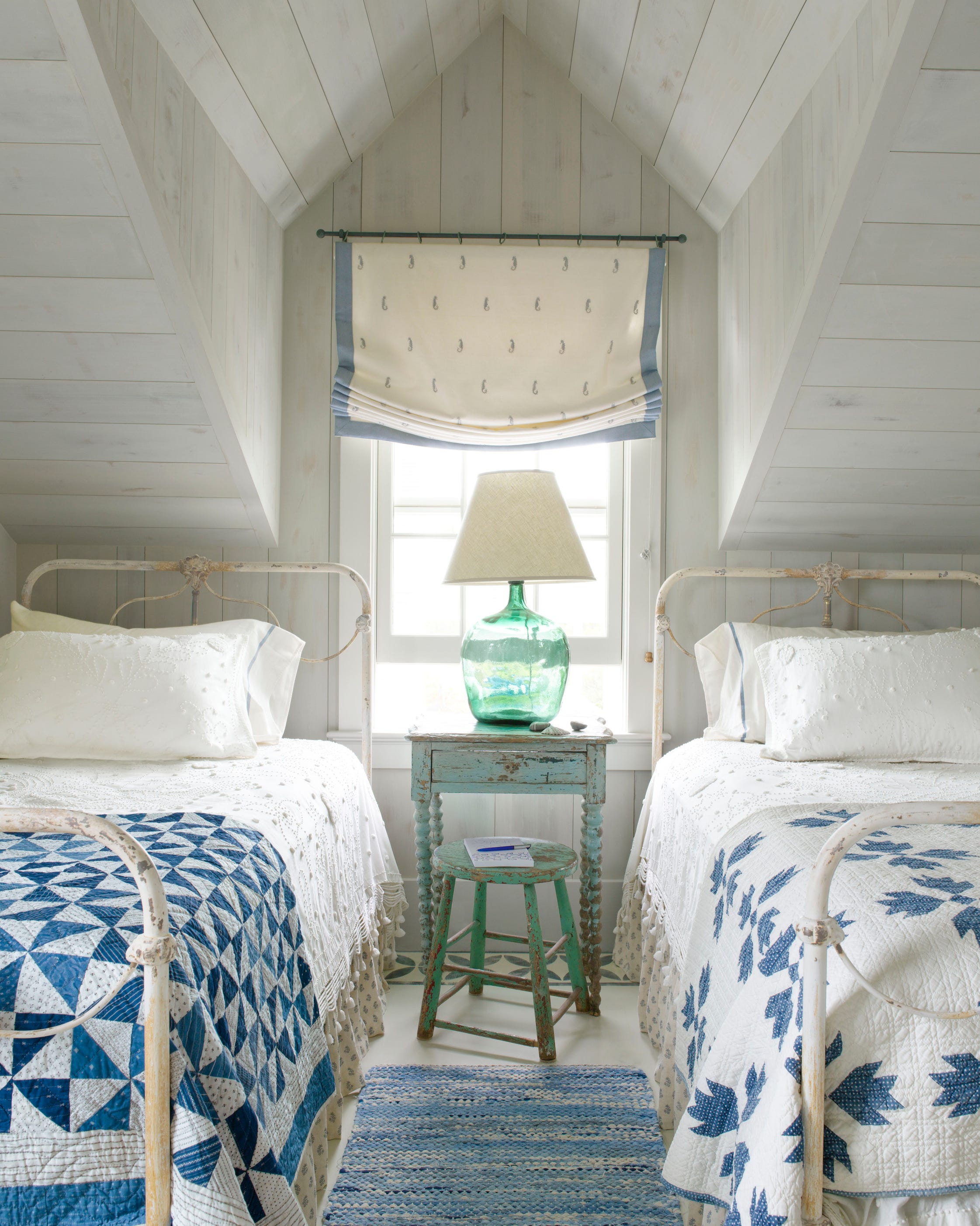
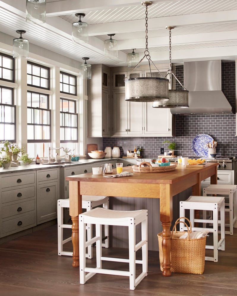
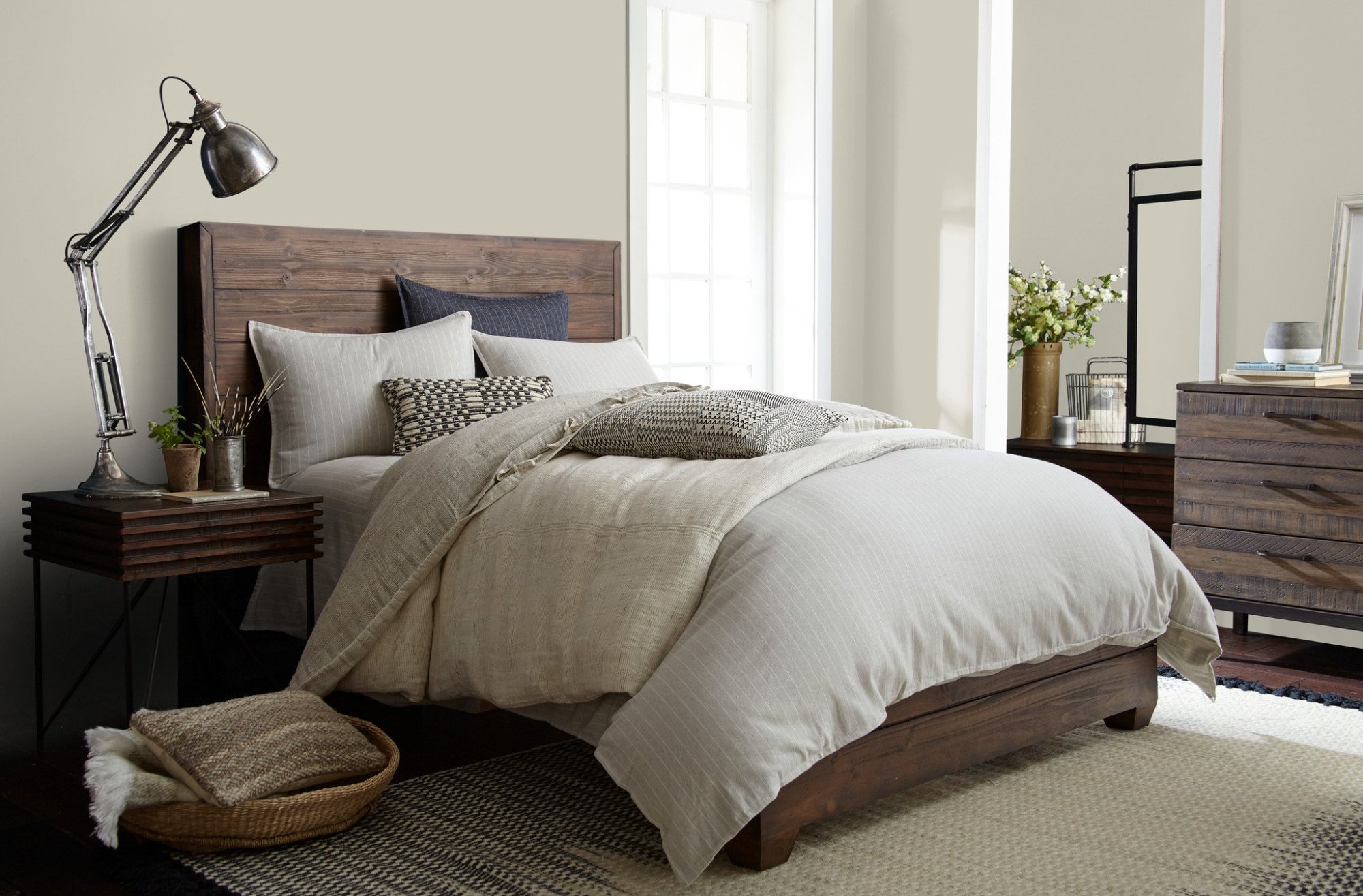
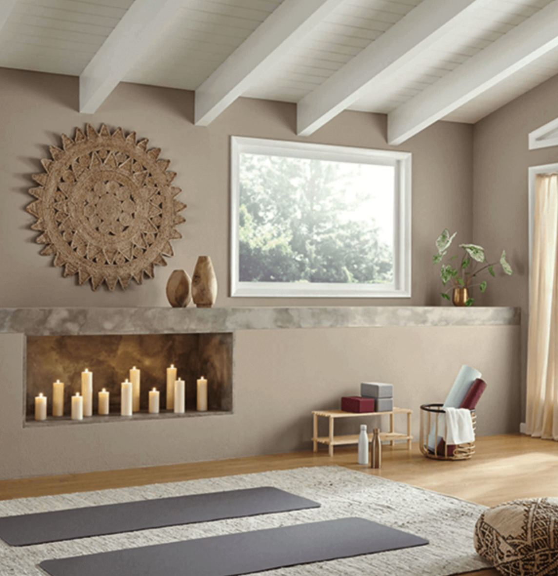
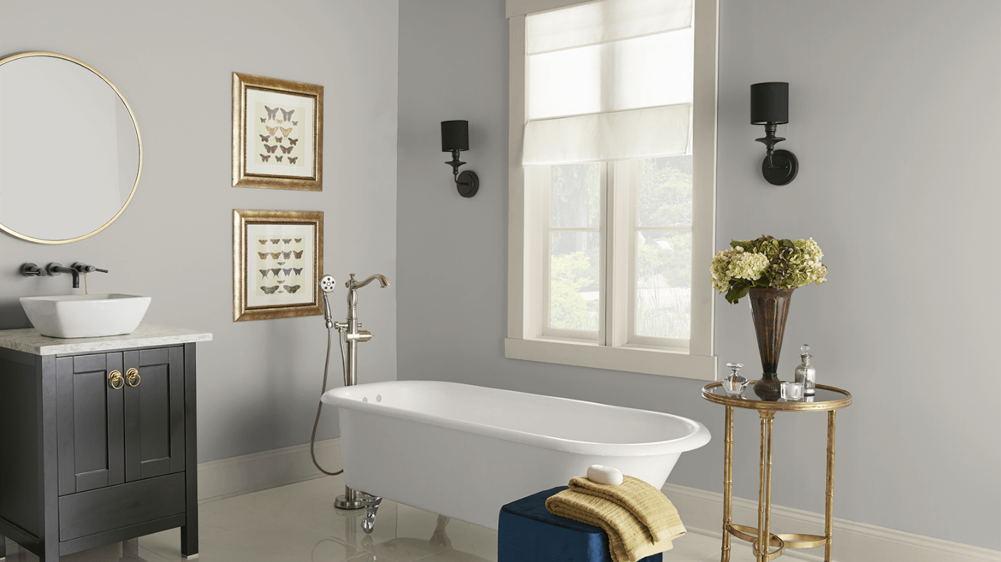
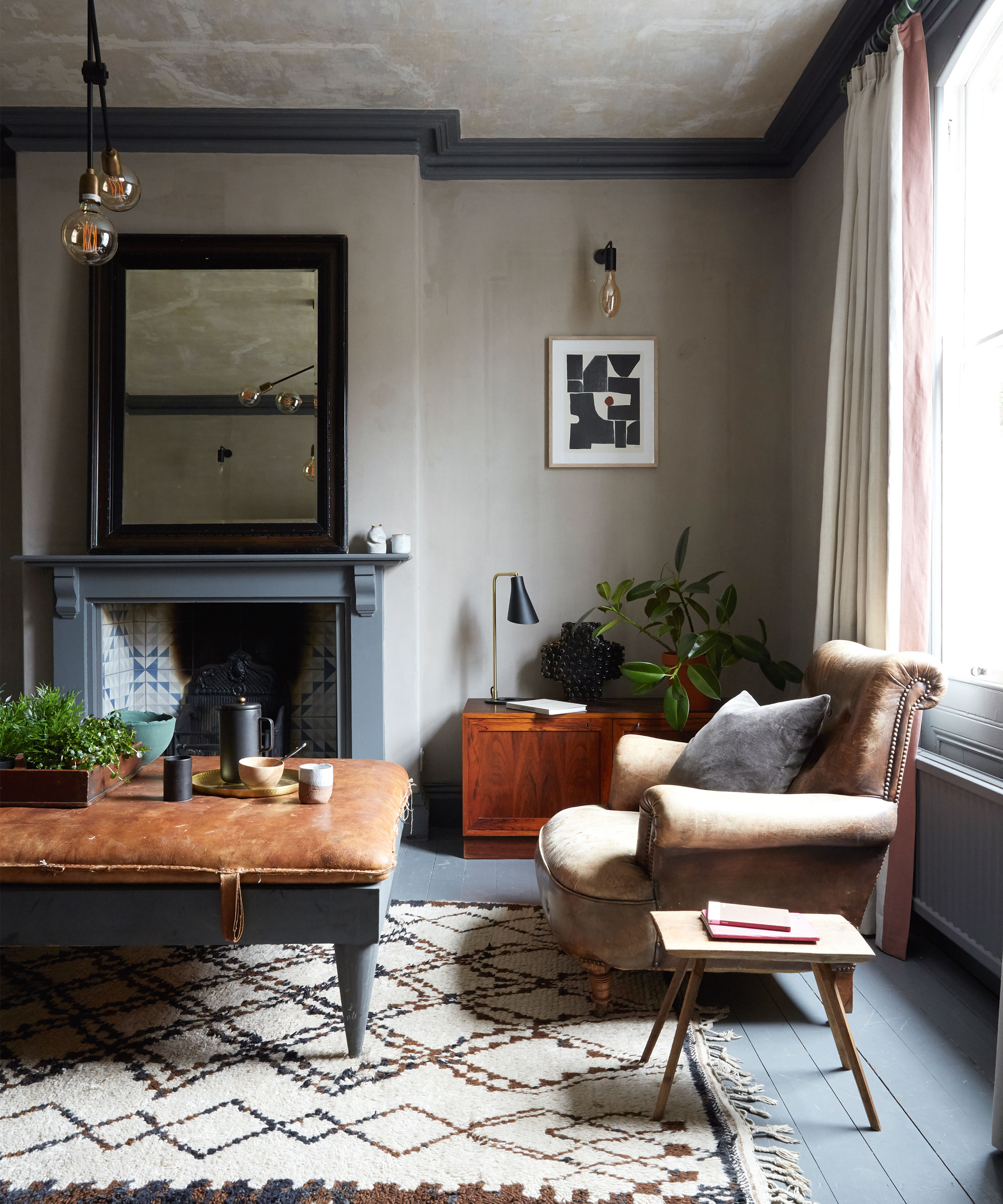
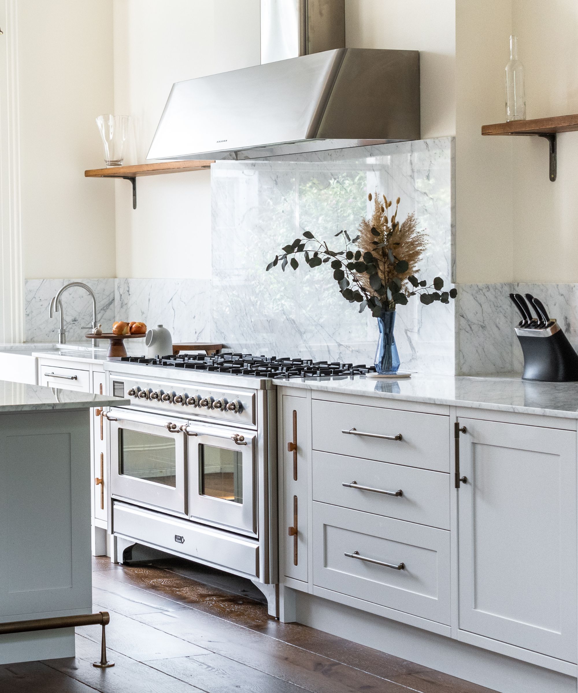
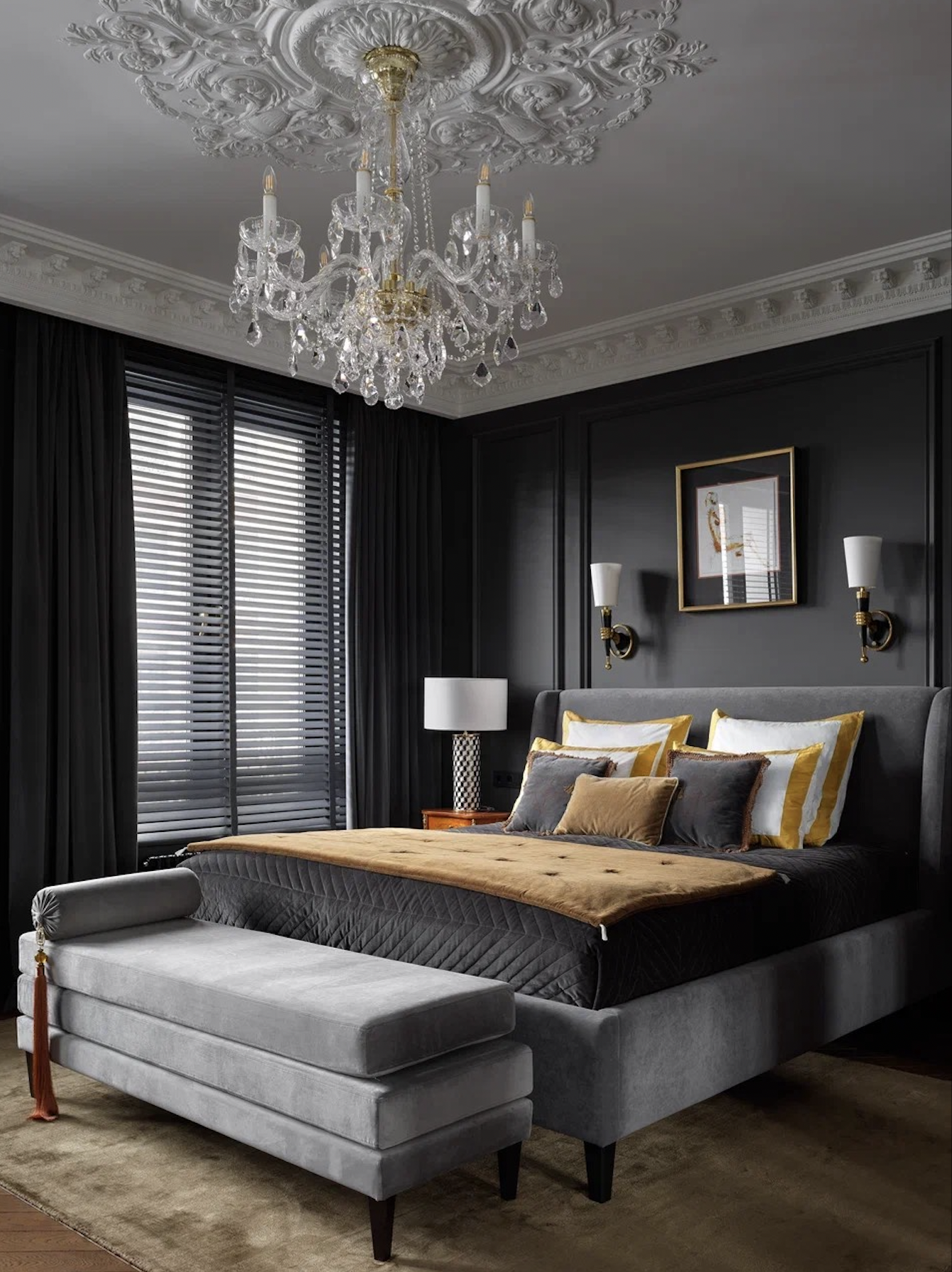
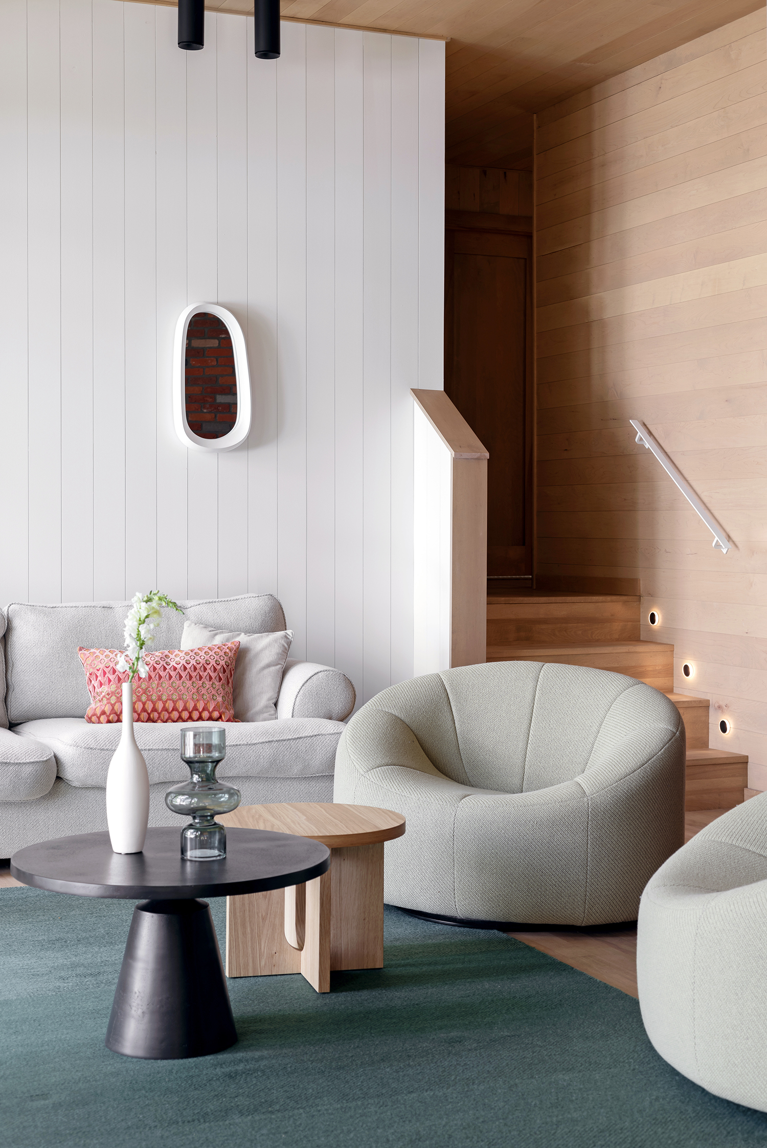
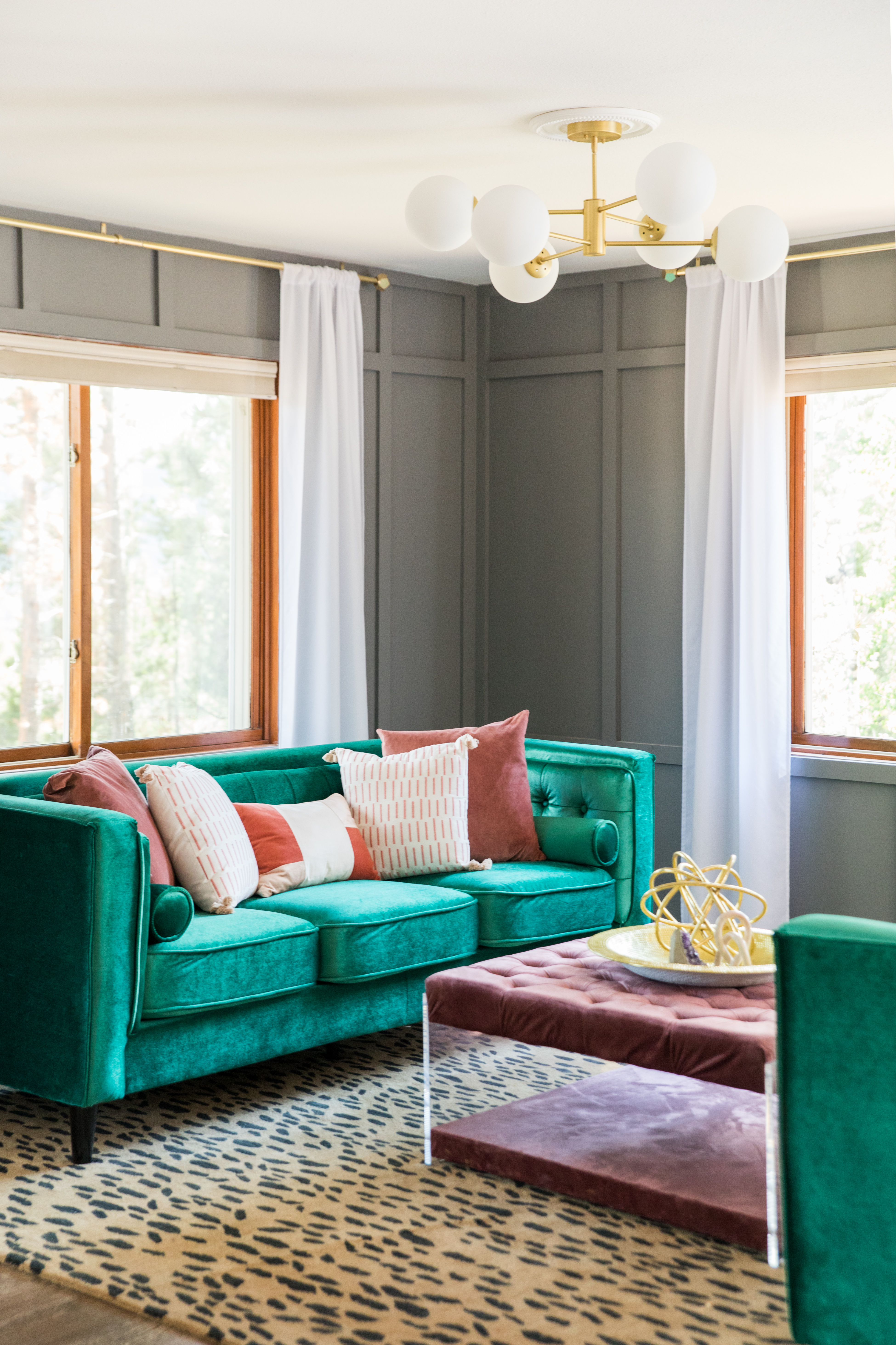
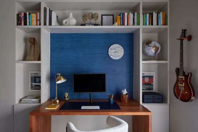
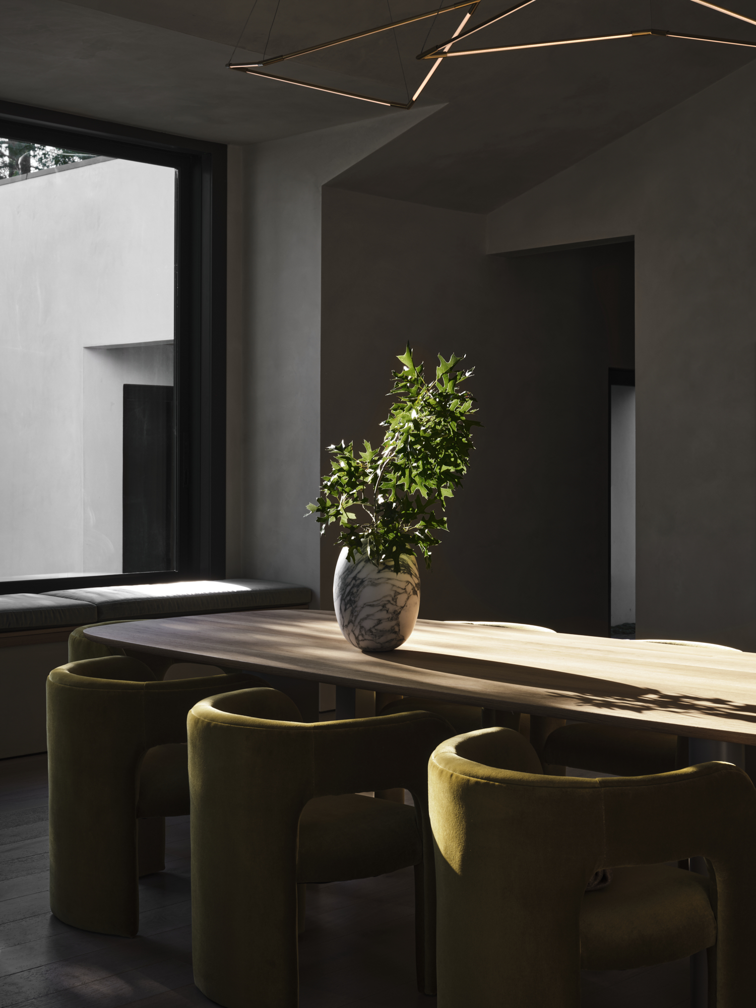
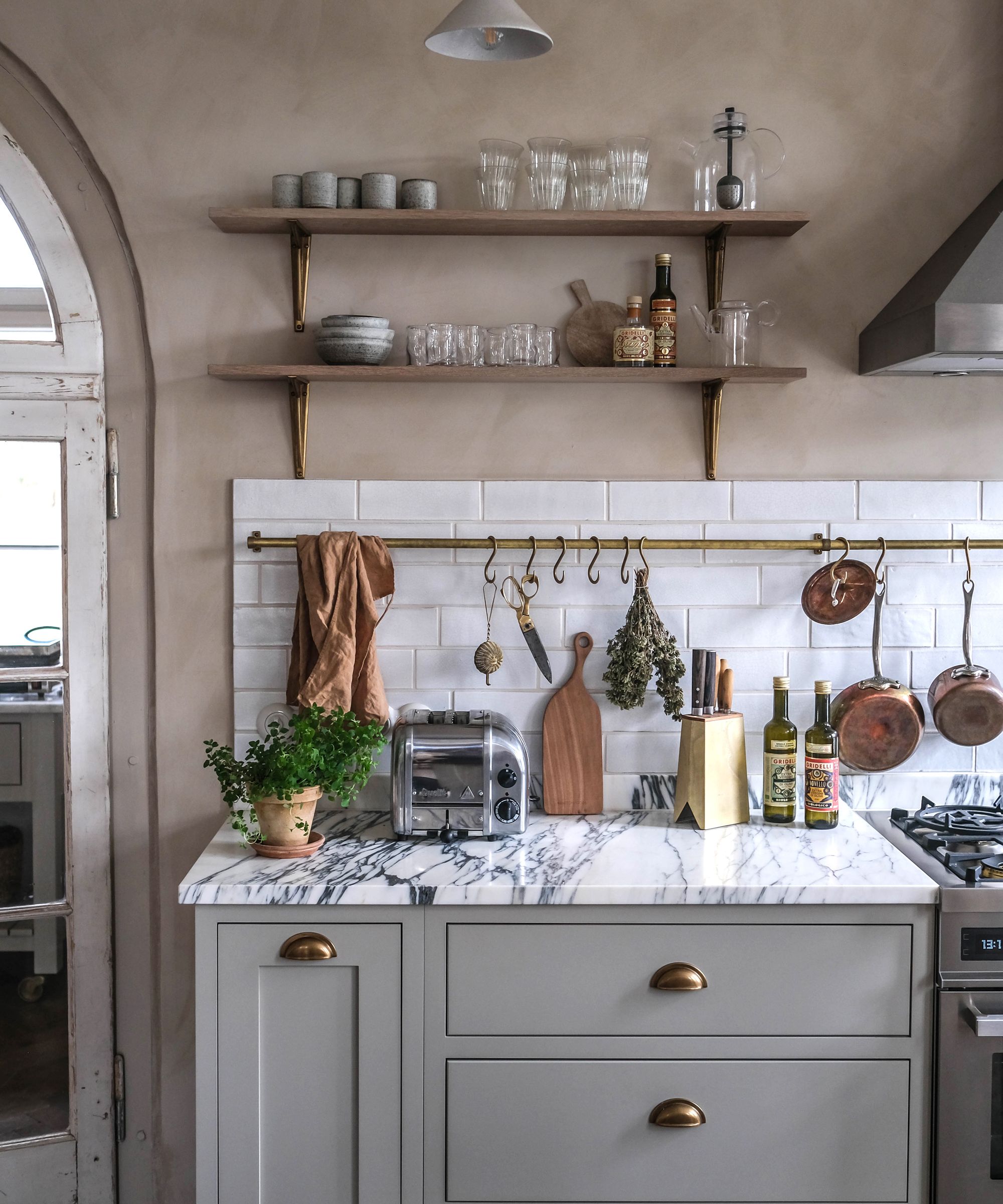
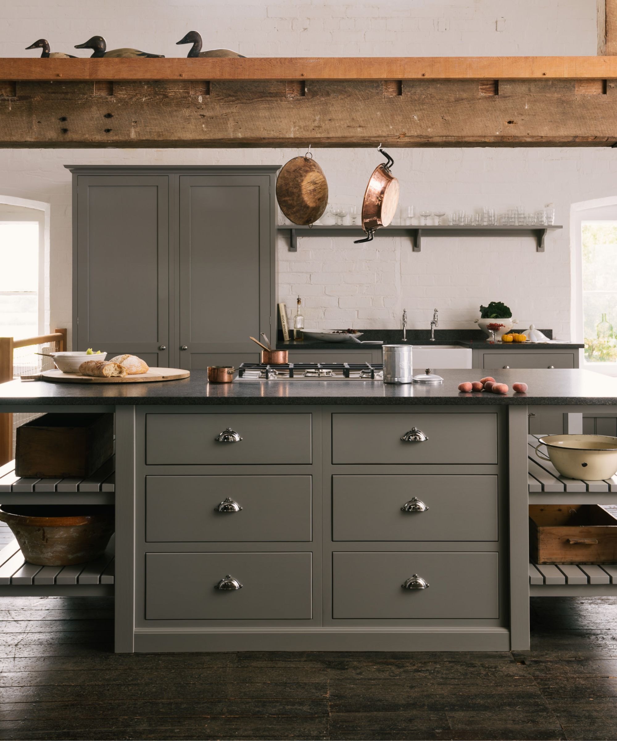
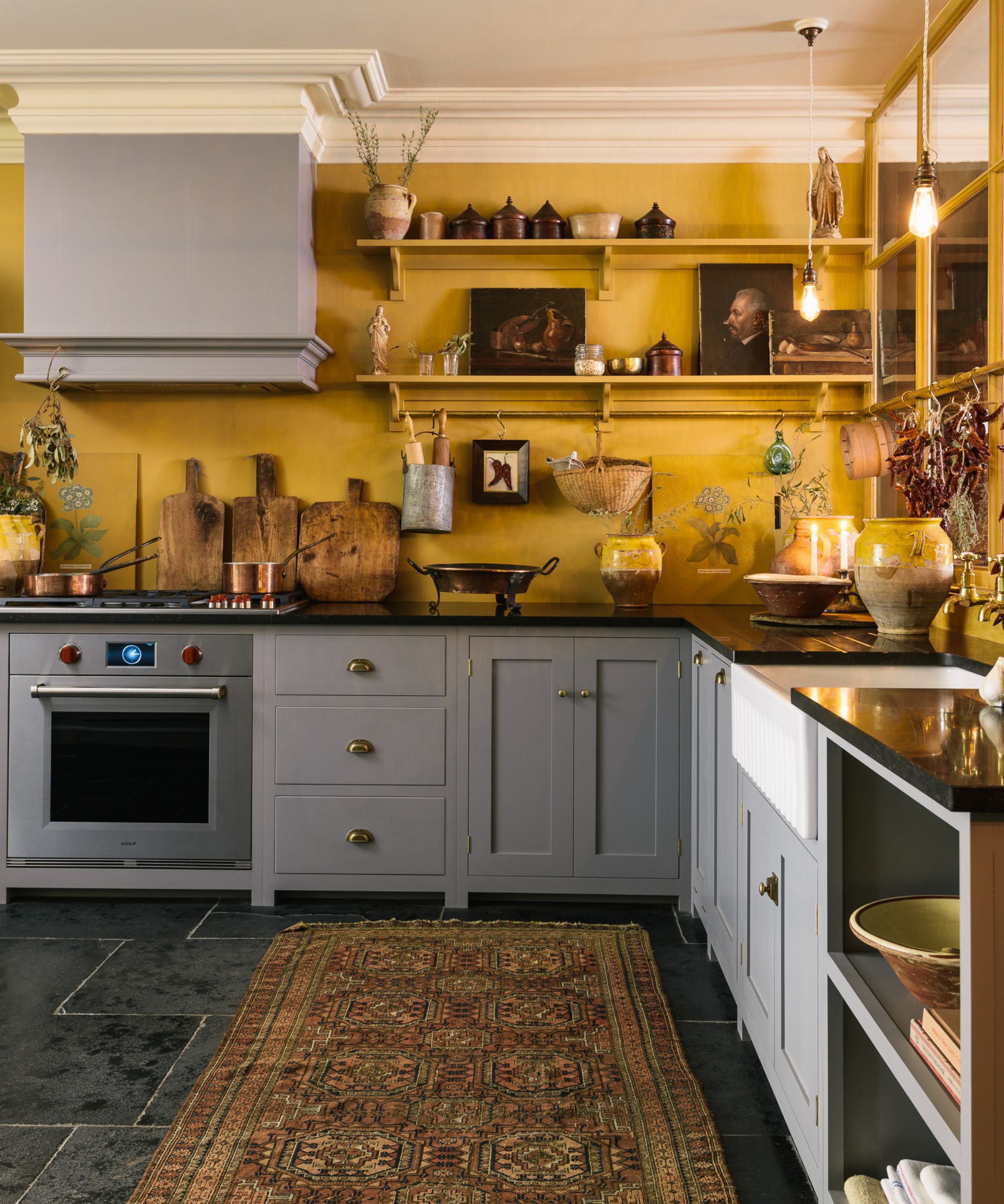
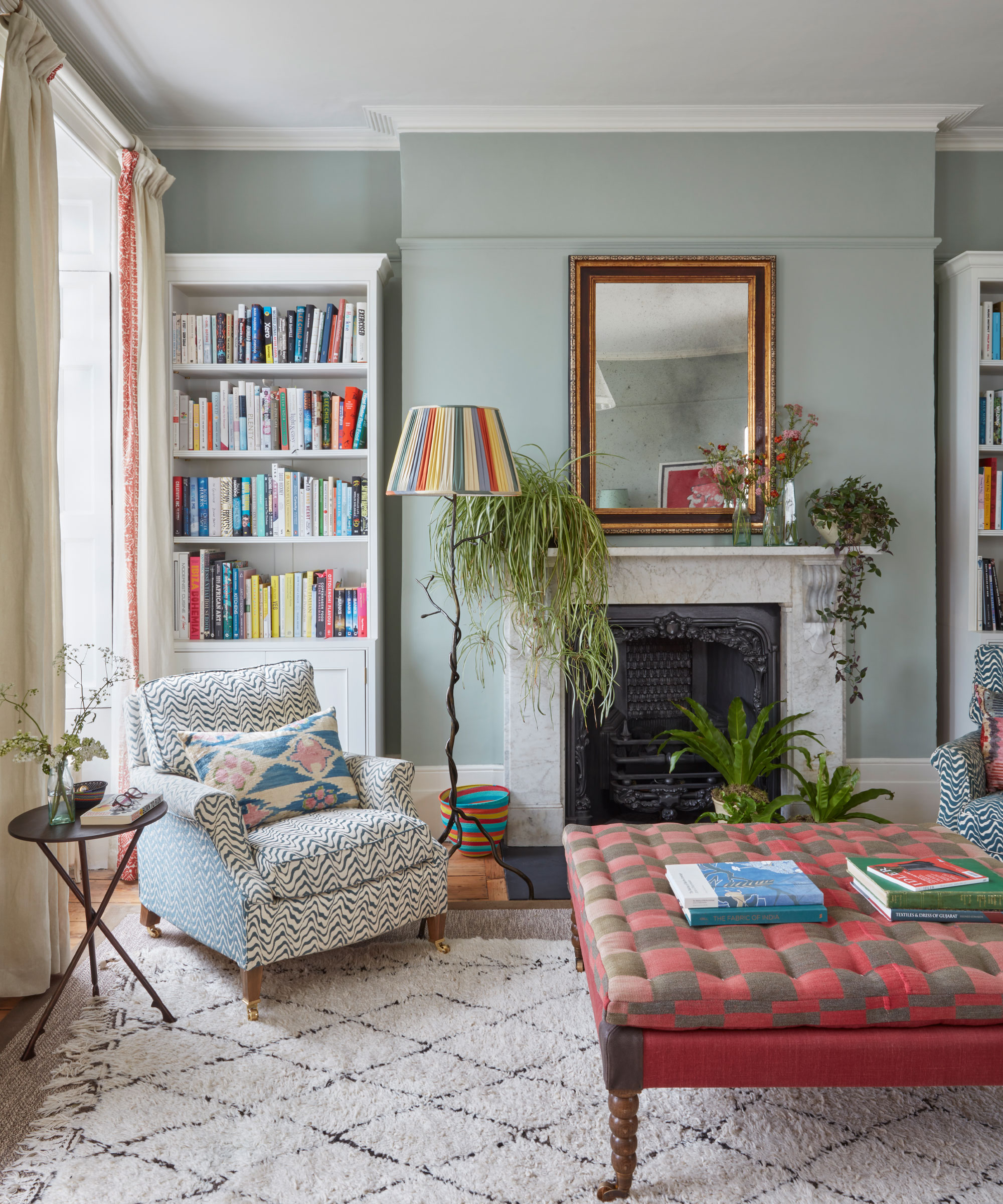
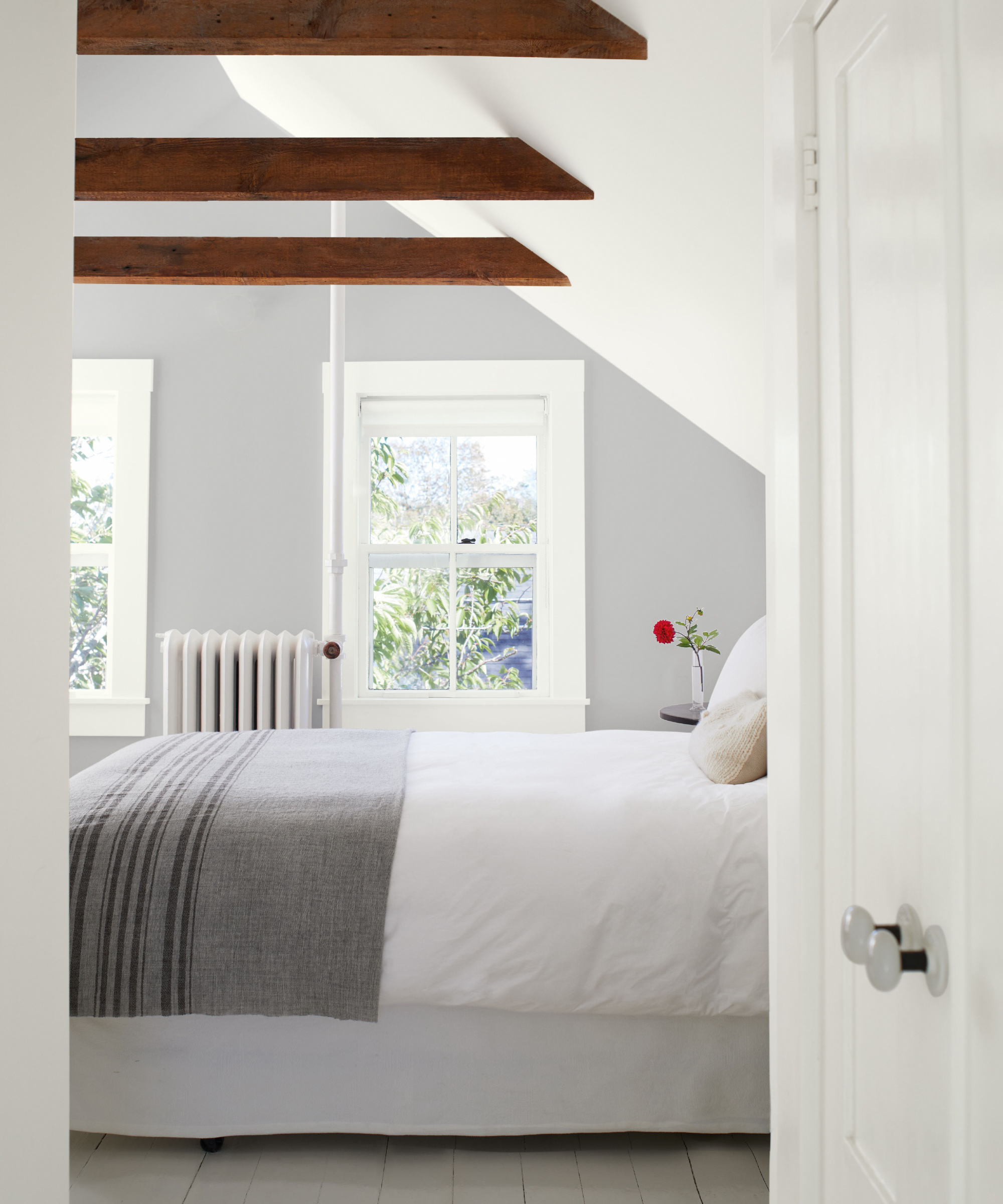
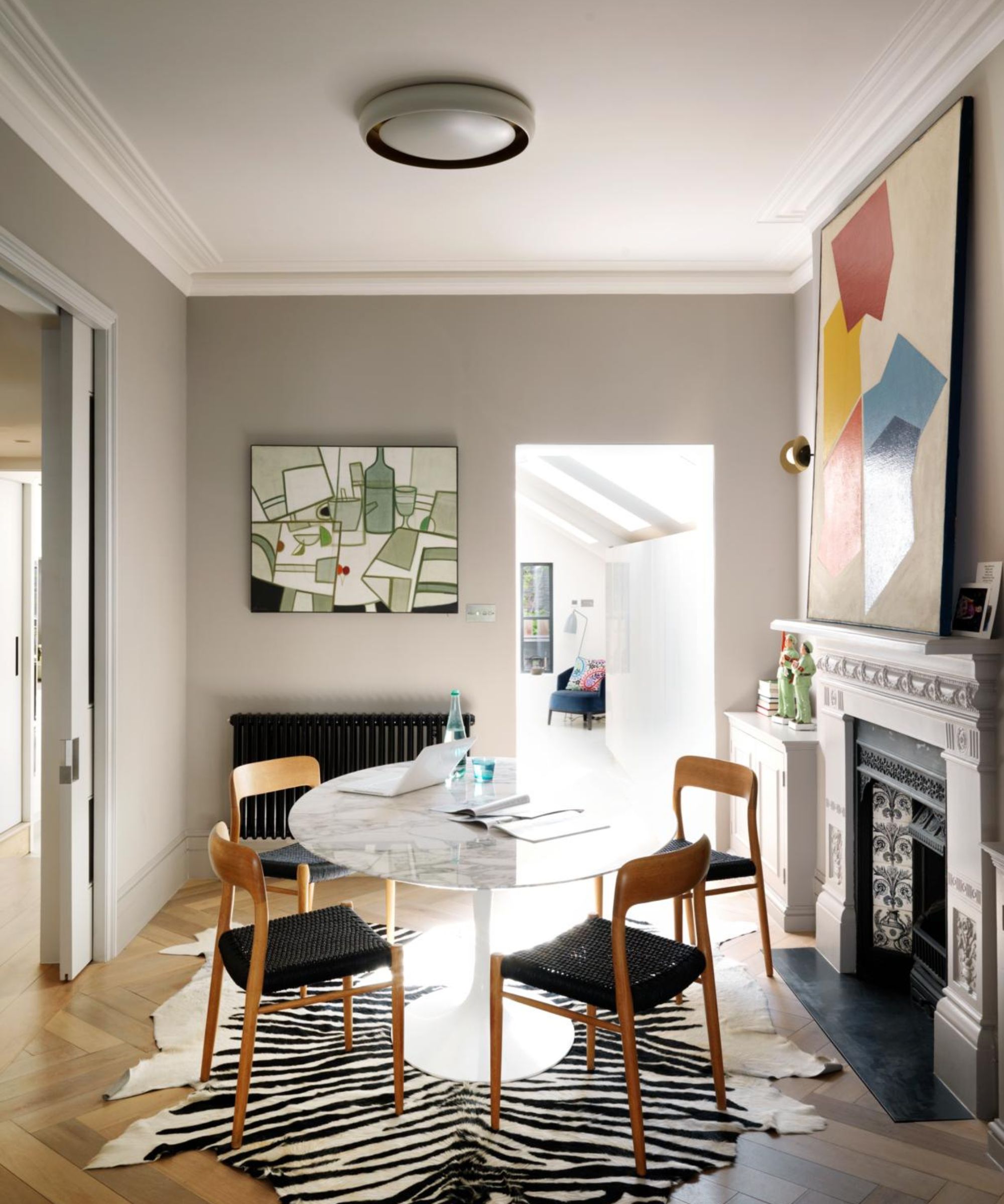
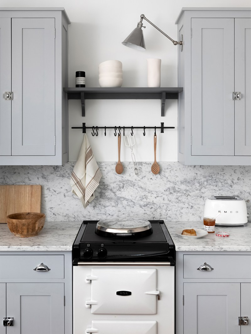
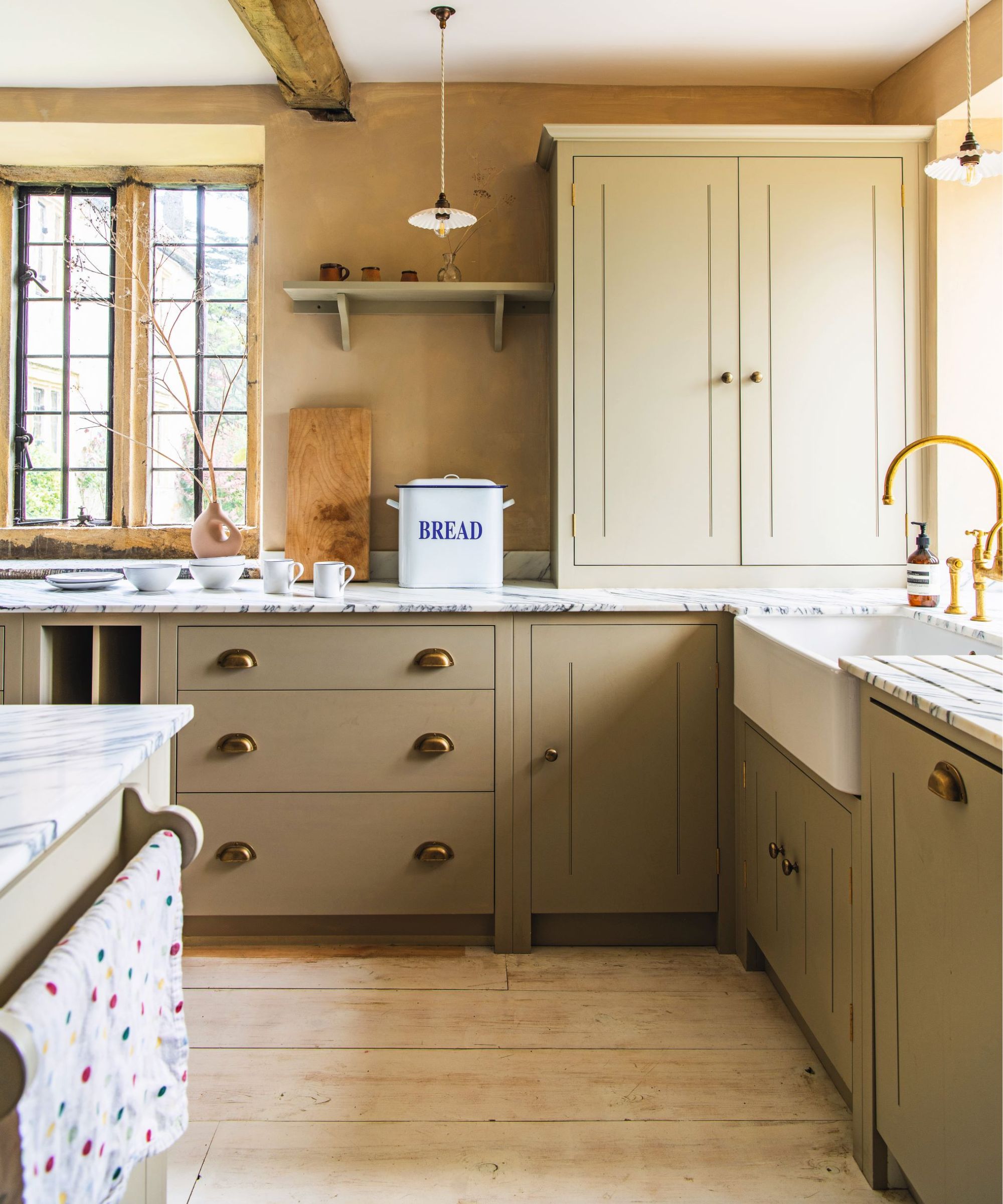
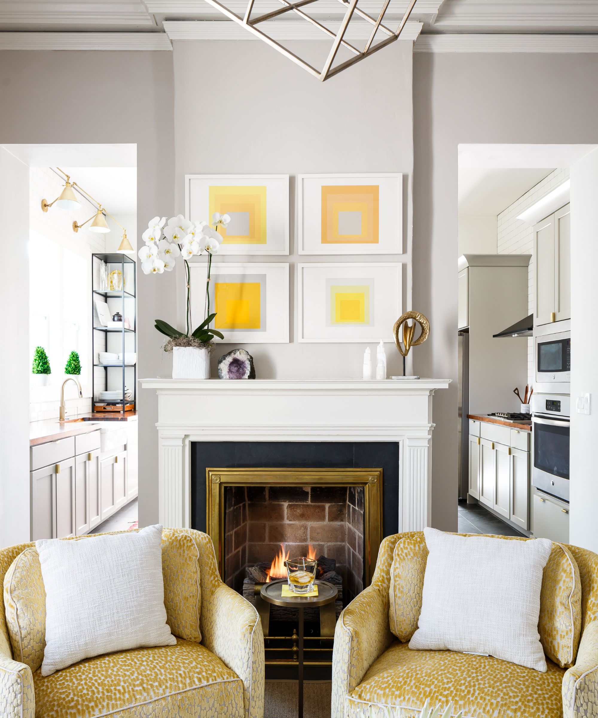
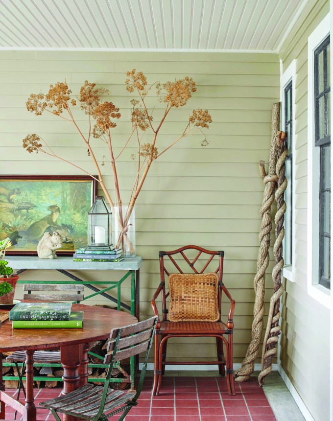
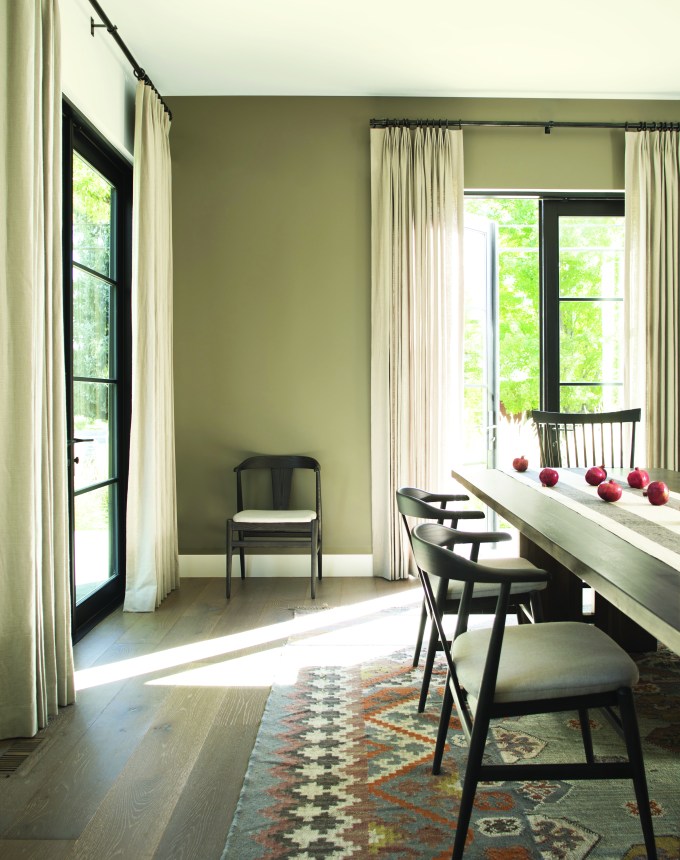
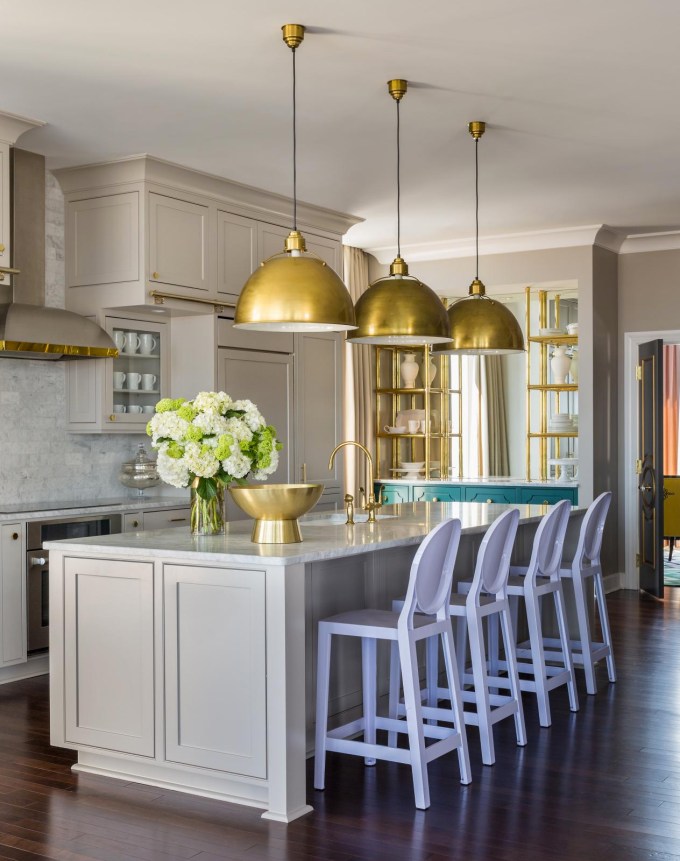
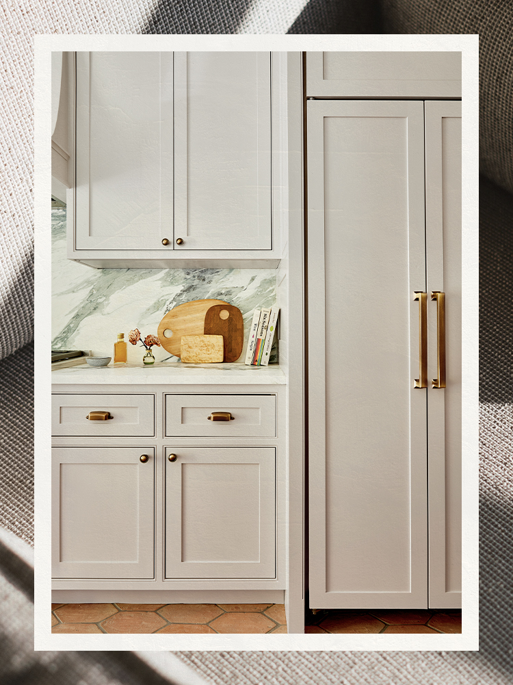
The article then provides a curated list of seven gray paint colors recommended by interior designers, each suited for specific applications and desired effects. Benjamin Moore's Stonington Gray is praised by Maggie Burns for adding character to white walls, making it ideal for classic charm. Farrow & Ball's Cornforth White, a favorite of Hannah Crowell, is noted for its neutrality, avoiding common blue or green undertones. For adding depth to small spaces, Katie Gebhardt of Solstice Interiors recommends Dunn-Edwards' Cloud, advising testing swatches to observe color shifts throughout the day. Whitney Durham suggests Benjamin Moore's Wolf Gray for a sophisticated, moody feel, particularly in high-gloss for libraries or on kitchen cabinets, attributing its coziness to blue undertones. Tania Cassill of Huit Laguna utilized Farrow & Ball's Ammonite for bathroom vanities, highlighting its zen quality and popularity within their Easy Neutrals collection. Layne Kula favors Pantone's Cool Gray for its matte option and cool undertones, which she believes perfectly catch the light. Lastly, Berkeley Minkhorst of House of Nomad recommends Benjamin Moore's Classic Gray for rooms with lower ceilings, noting its brightening effect, and Keri Peterson praises Restoration Hardware's Cashmere Gray for its luxurious, warm, and soft qualities, suitable for various rooms from dining rooms to nurseries, especially when accented with brass and chrome.
Each recommendation is accompanied by a designer's rationale, demonstrating how specific gray shades can achieve distinct interior design goals. The overarching message is that while gray might seem like a simple choice, its subtle variations and interactions with light and other design elements require careful consideration to achieve the desired aesthetic. The article implicitly encourages readers to experiment and observe how these recommended colors behave in their own spaces before making a final decision.
#GrayPaintColors #InteriorDesign #PaintFinishes #Undertones #HomeDecor #DesignTips #BenjaminMoore #FarrowAndBall #DunnEdwards #GrayPaintColors #InteriorDesign #PaintFinishes #Undertones #HomeDecor #DesignTips #BenjaminMoore #FarrowAndBall #DunnEdwards
0 ความคิดเห็นรวม
 ยังไม่มีความคิดเห็น
คุณอาจจะชอบอีกด้วย
5 of the best gray paints that interior designers love using

REVEALED: Is grey paint going out of style?

What Colors Go With Gray? 19 Arresting Combinations With This Time-Tested Neutral

The 11 Best Gray Paint Colors for a Stylish Bedroom

Committed to Your Millennial Gray Walls? Designers Share the Best Colors to Pair With It

23 Colors, Patterns, & Textures To Pair With Gray
15 Best Greige Paint Colors for Every Decorating Taste
The Best Gray Paint Colors for Kitchen Cabinets Are Anything But Boring
23 colours that go with grey, as revealed by interior stylists
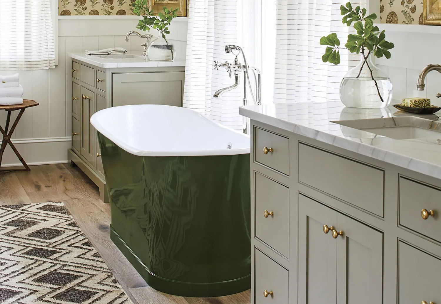
10 Greige Paint Colors Designers Recommend Again And Again
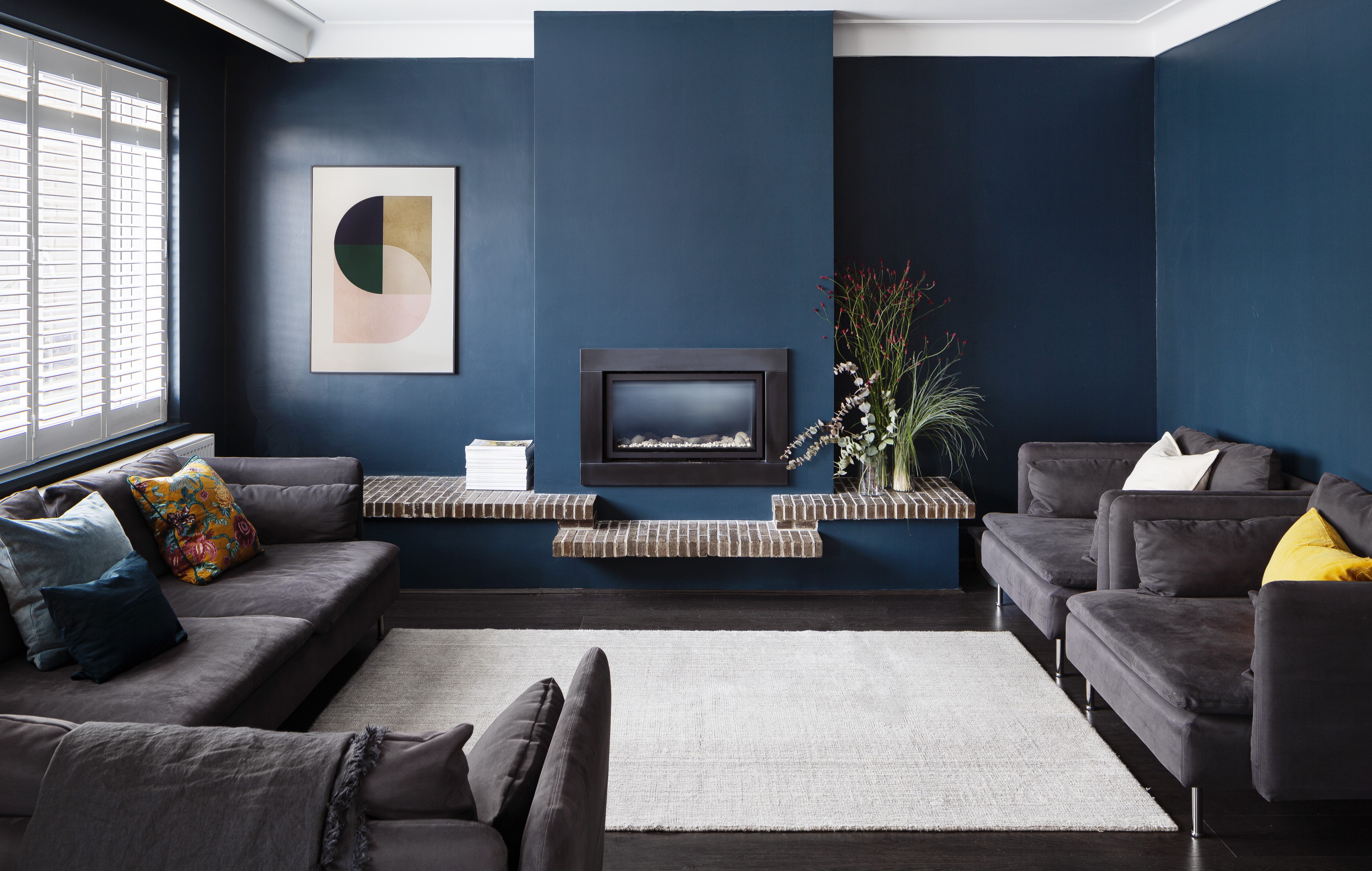
What Colors Go With Dark Gray? 13 Designer-Approved Pairings That Are Versatile and Timeless
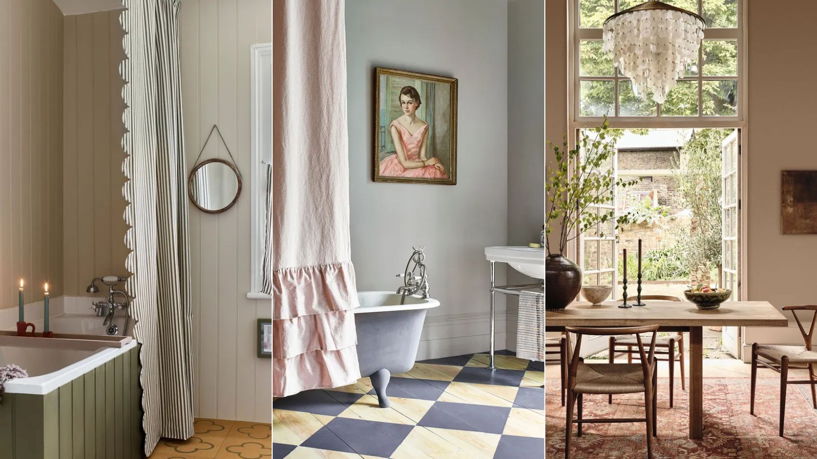
Is gray or beige more on trend for 2025? Designers share all on these popular neutrals
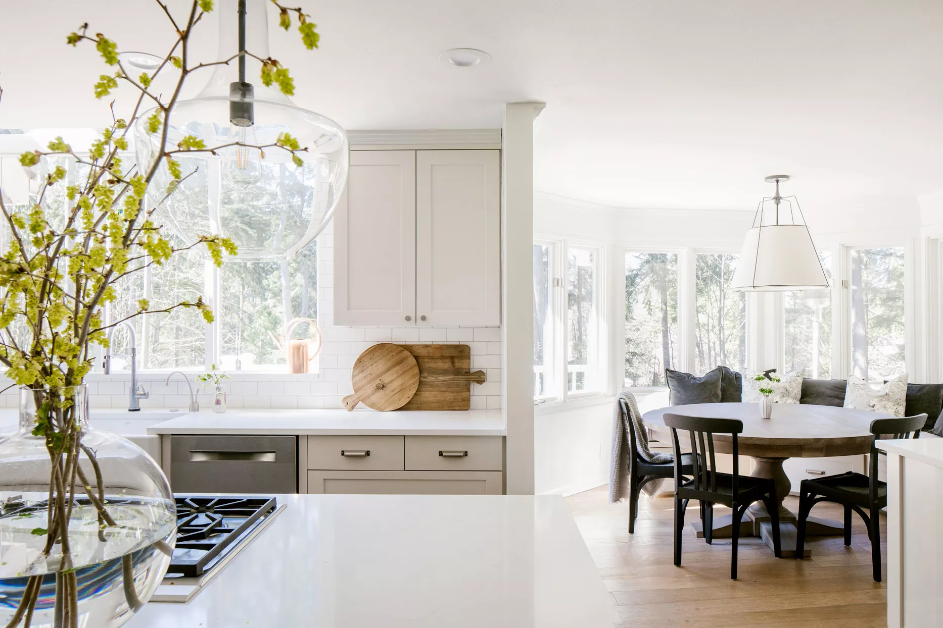
Top 32 Expert-Recommended Gray Paint Colors, Plus How to Pick the Best Shade

The Best Greige Paint Colors for a Warm, Welcoming Home

What colors go best with gray kitchen cabinets? Interior designers explain how to decorate with this cool neutral
The 13 Best Greige Paint Colors to Buy Right Now
What colors go with grey? 13 palette pairings according to interior designers
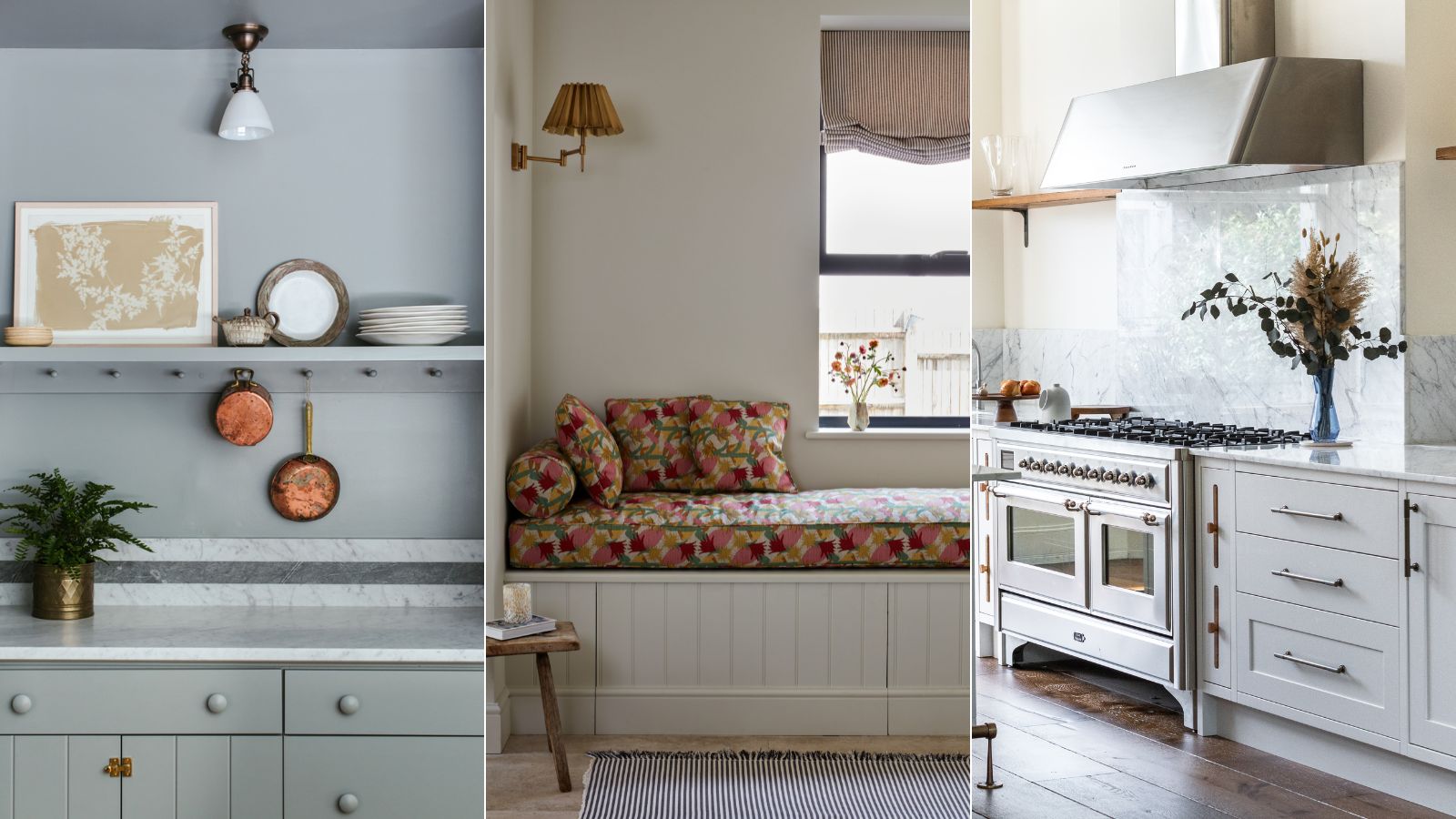
Are gray interiors really out of style? Interior designers weigh in on how to use this cool shade
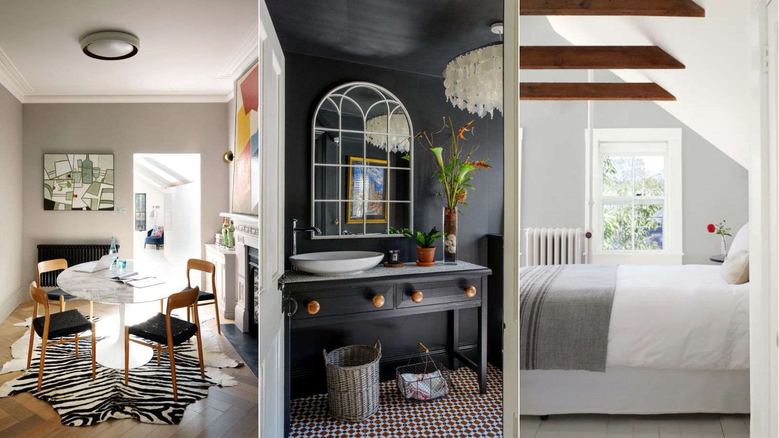
Is gray still on trend? Designers explain how to use this cool-toned hue in a world of warm color schemes
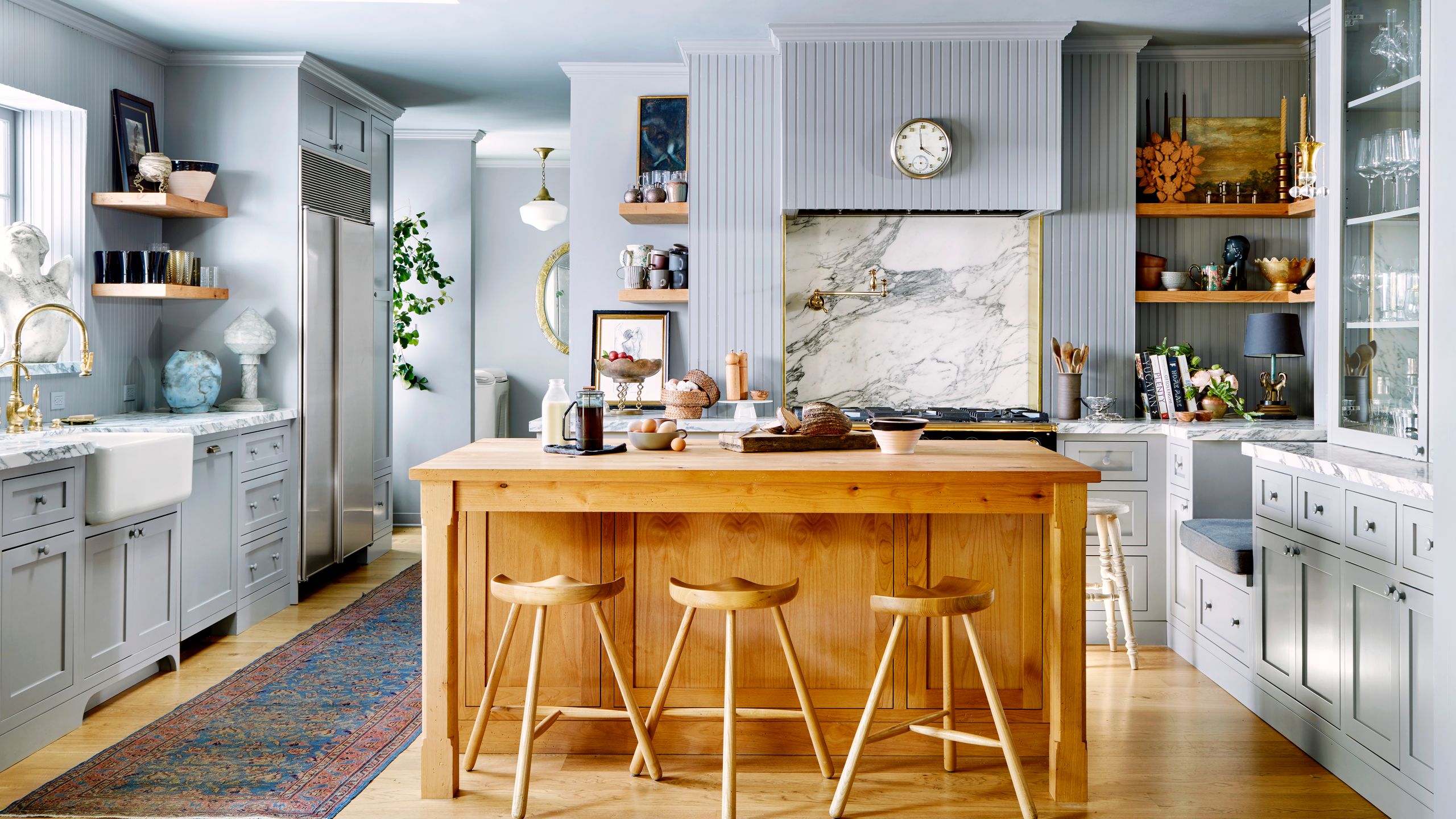
Is the Color Gray Taking Over the World?