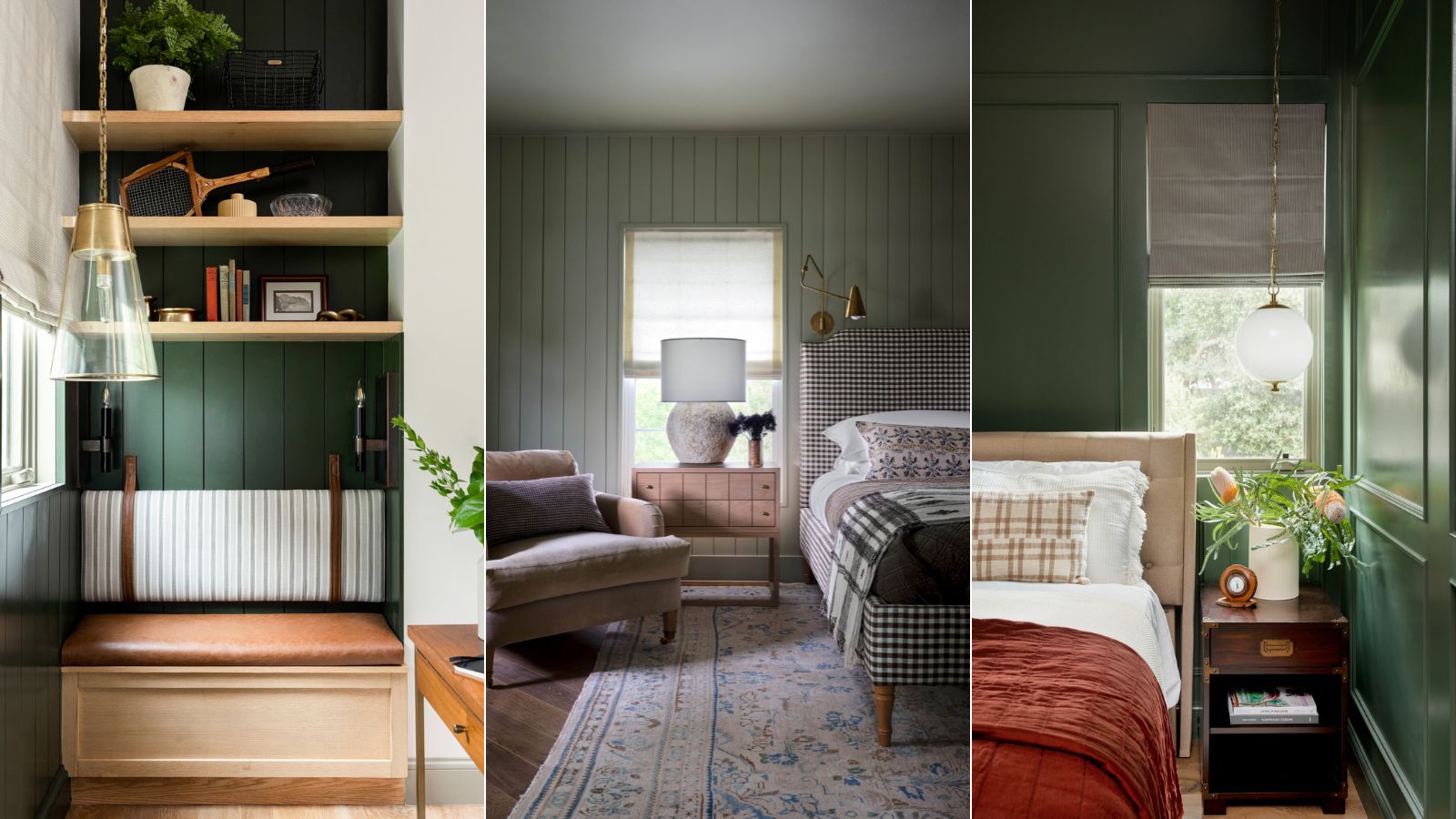
1/9
8 best dark green paints designers promise will bring calm and a touch of drama to any room
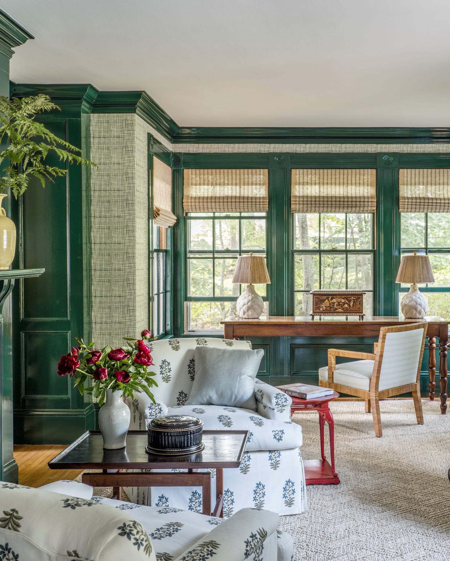
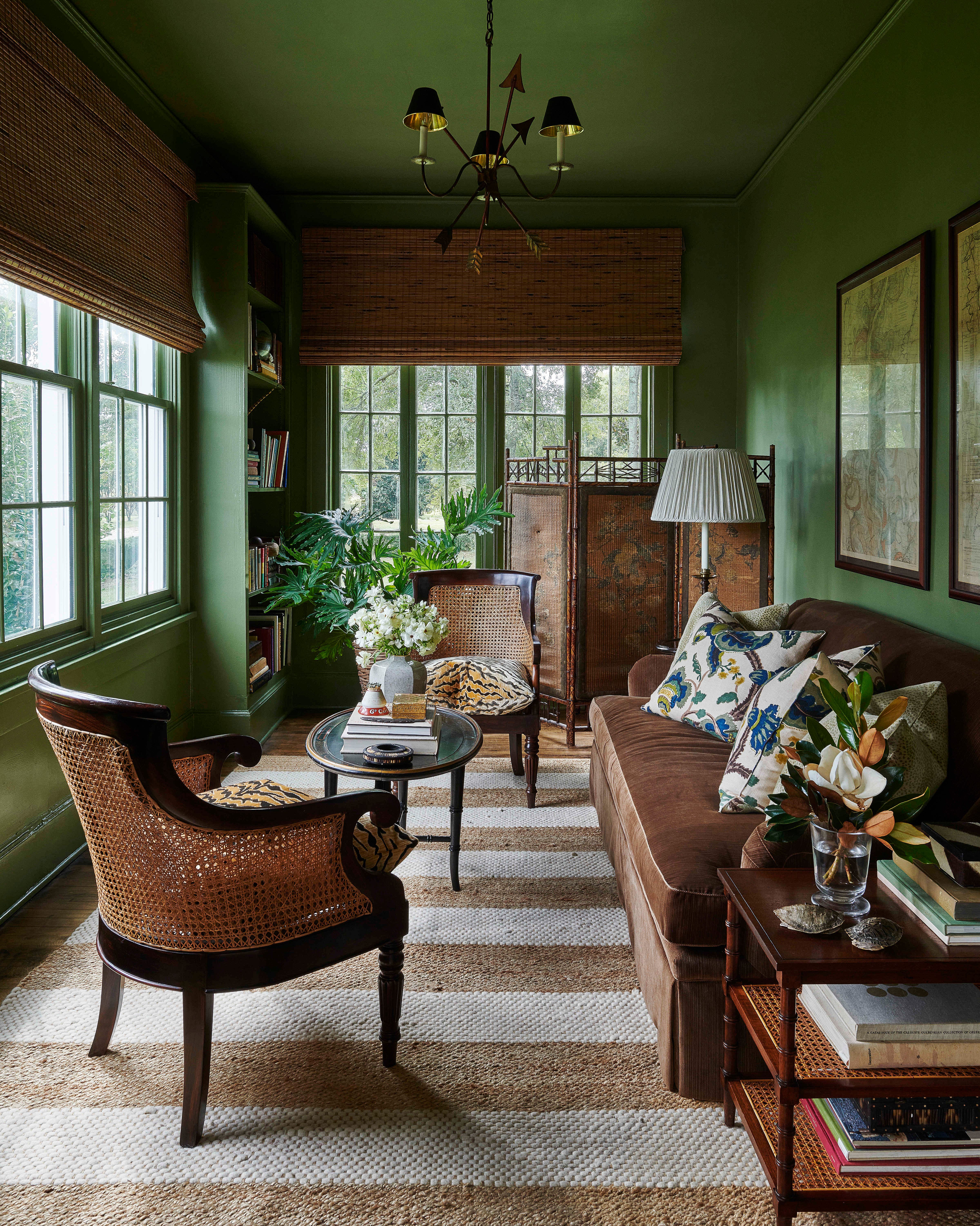
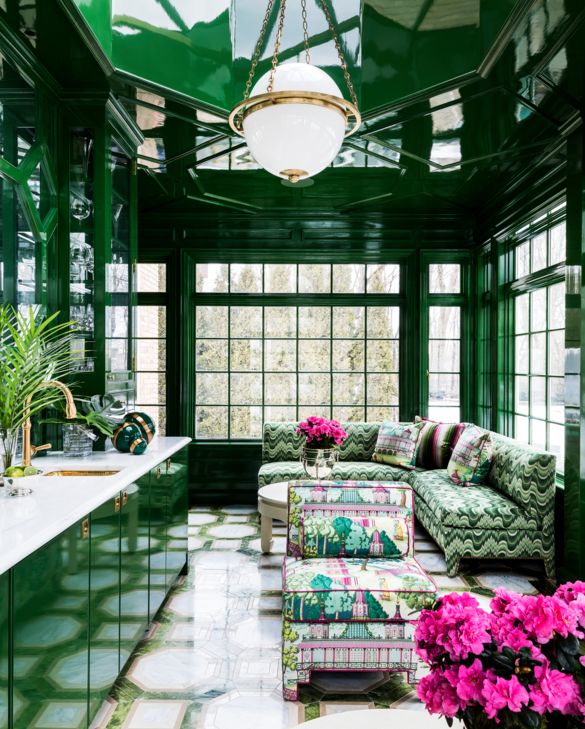
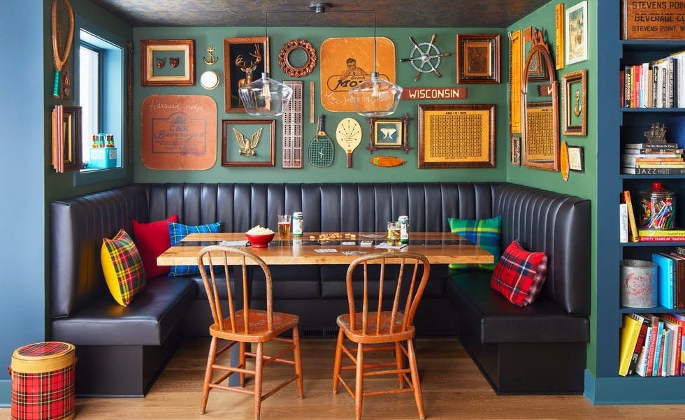
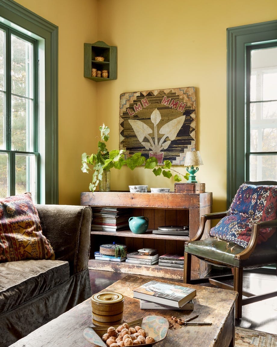
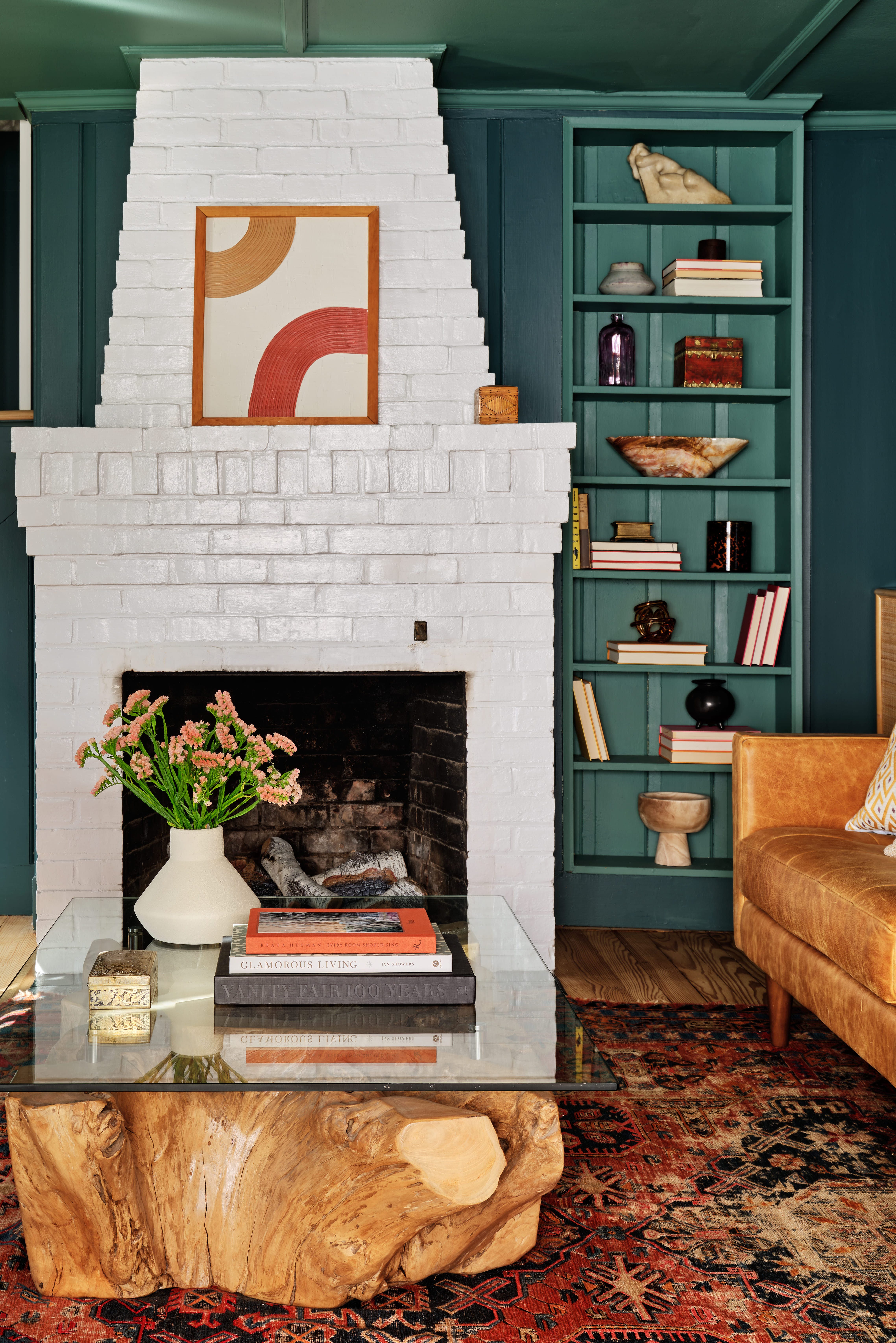
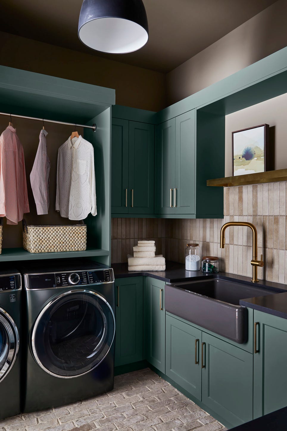
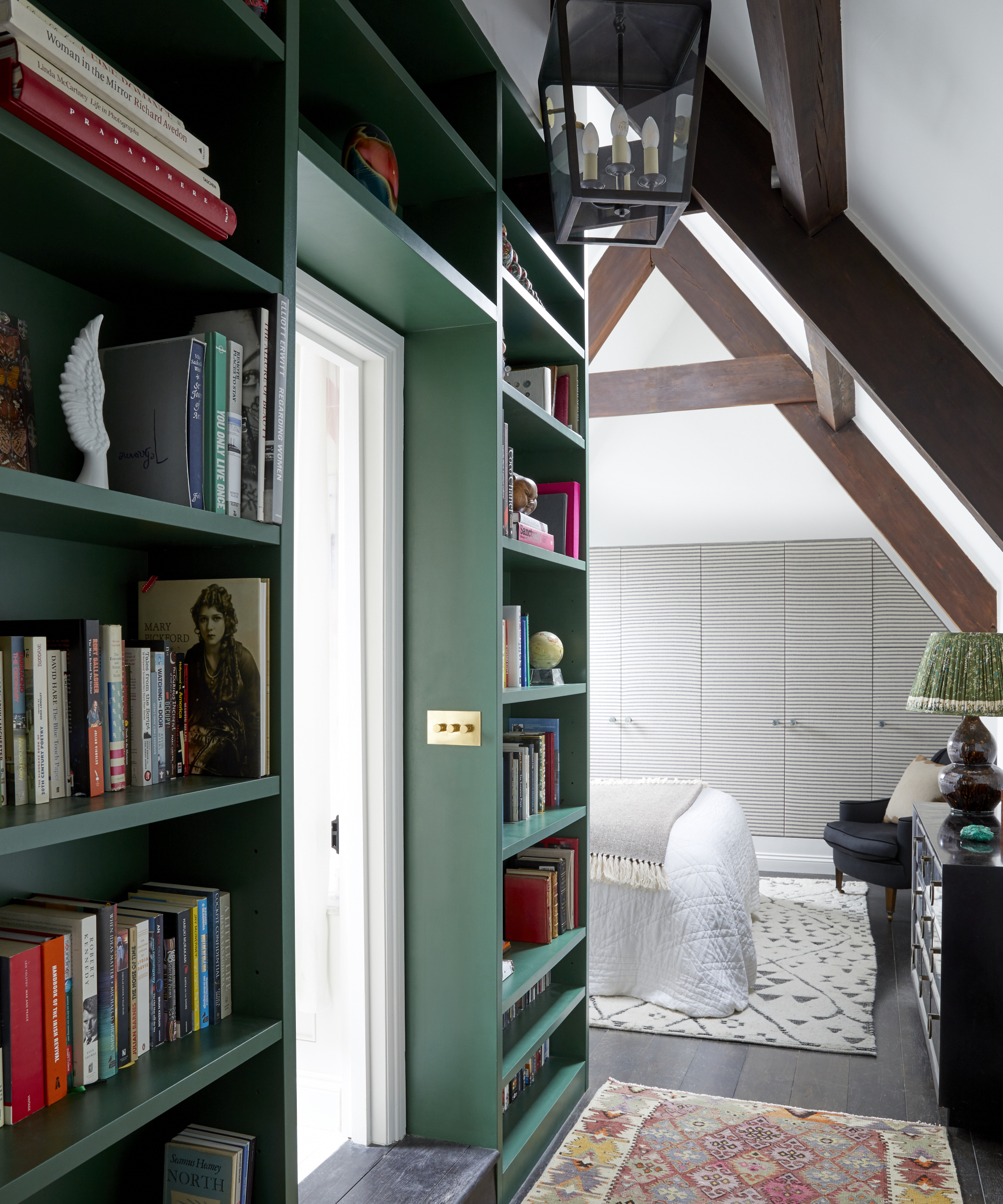
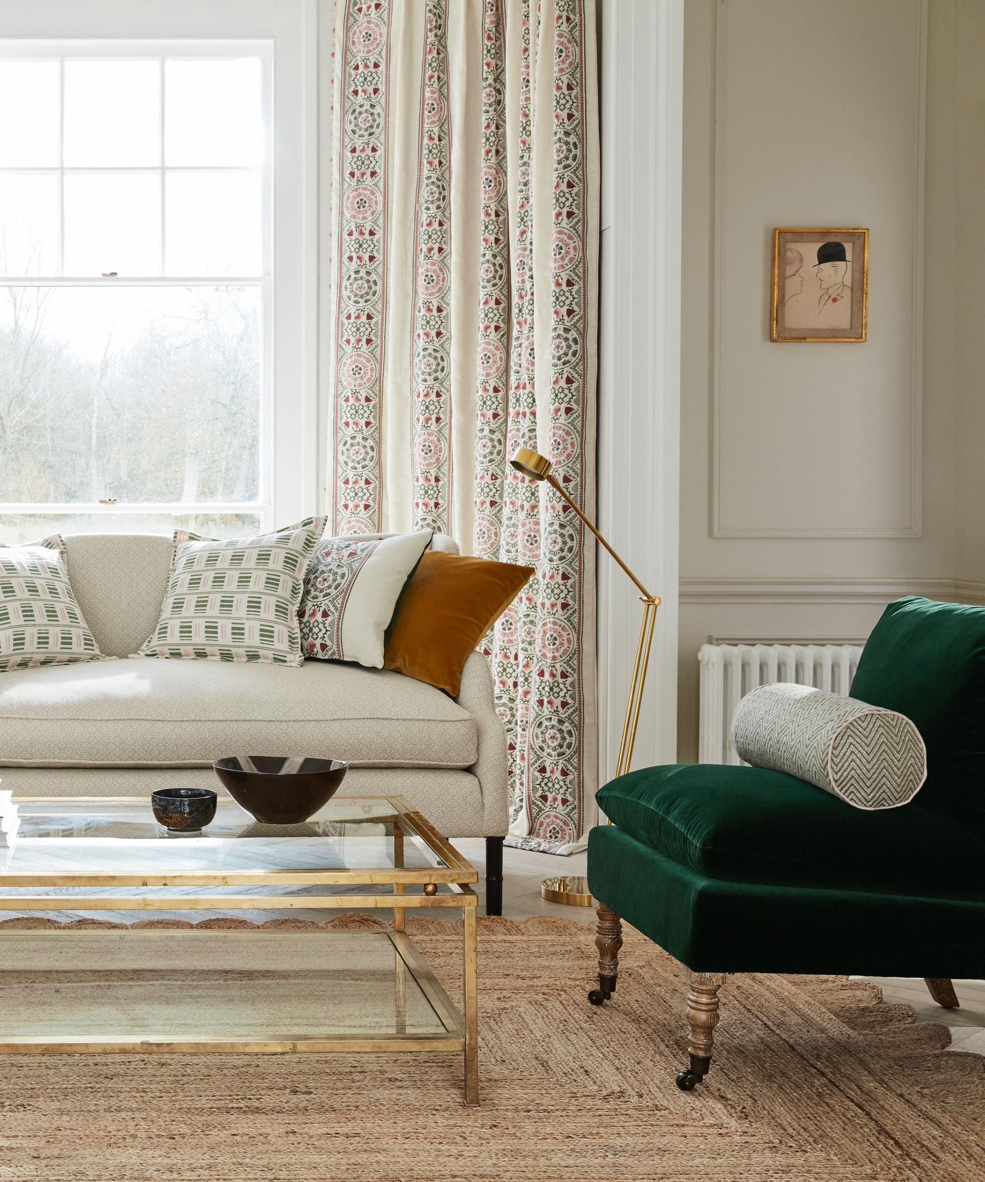
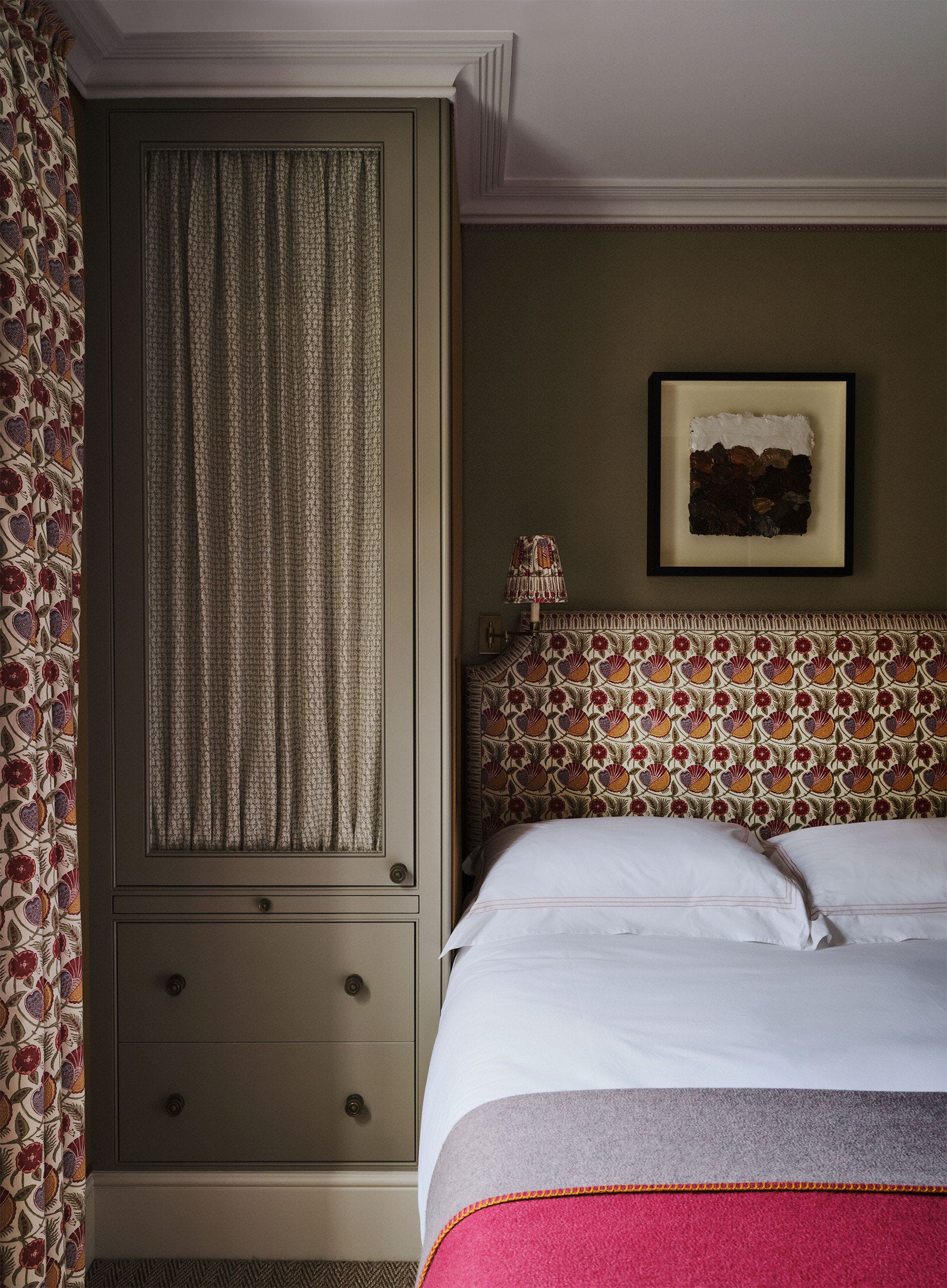
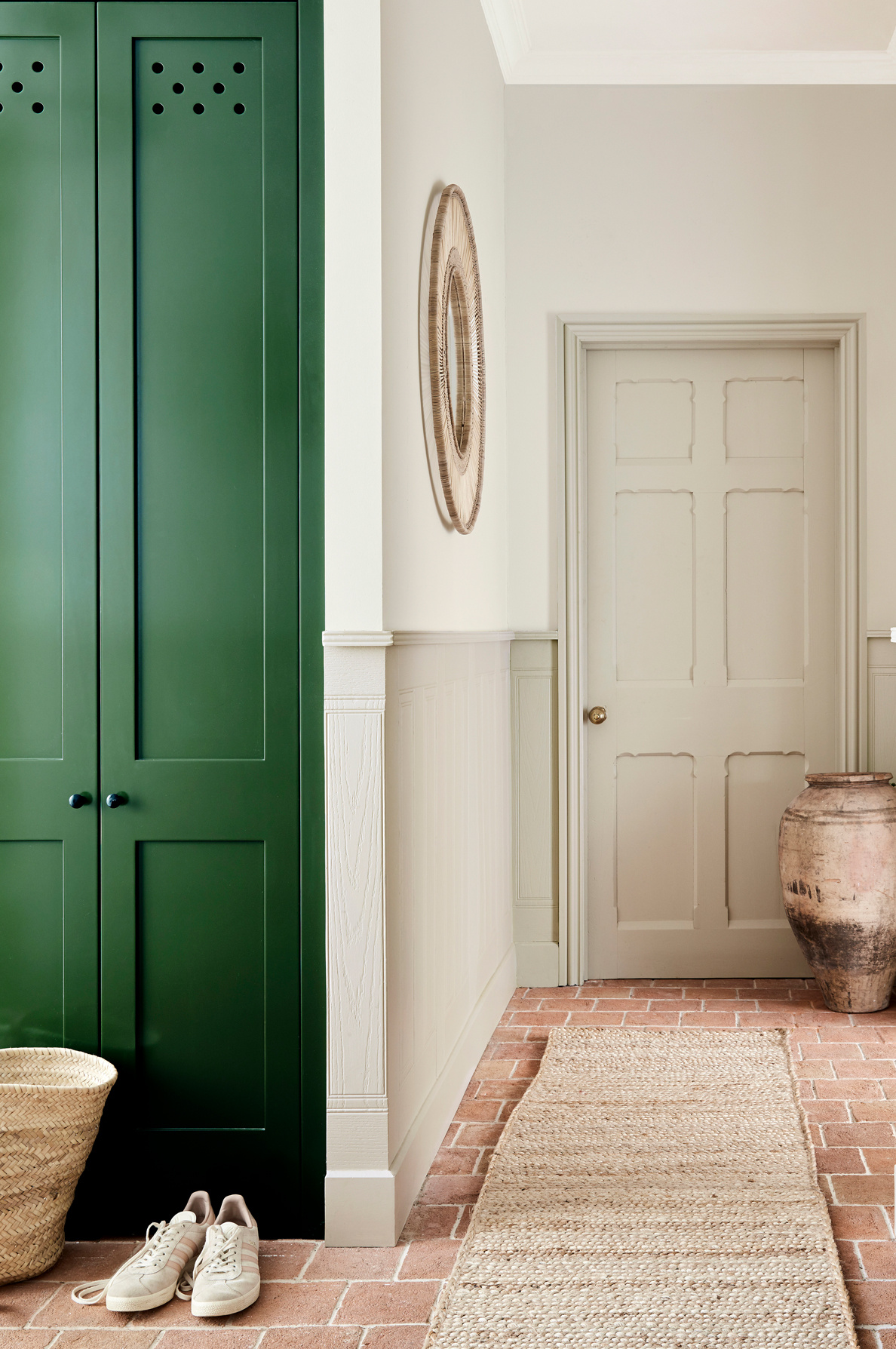
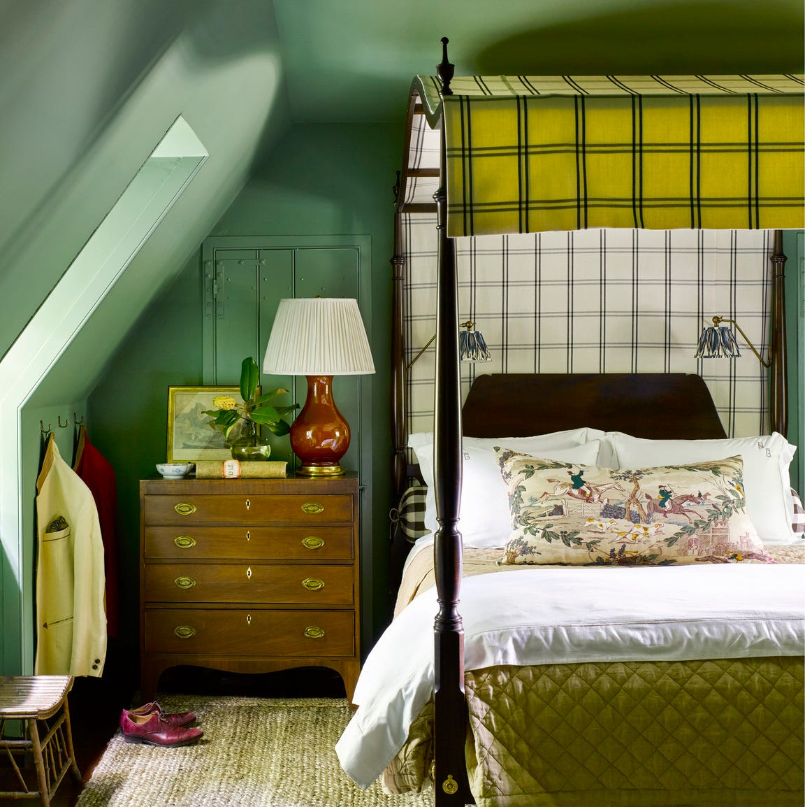
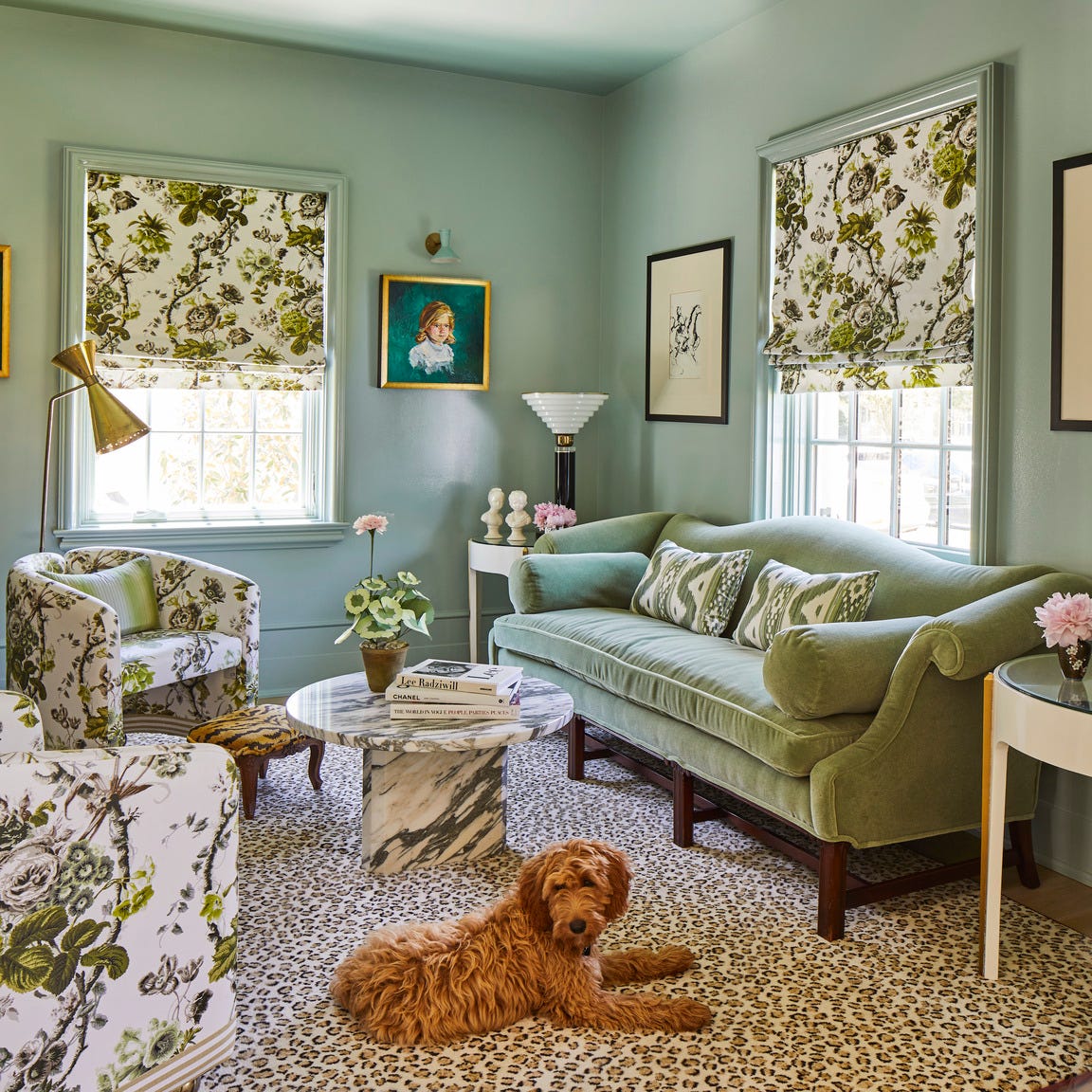
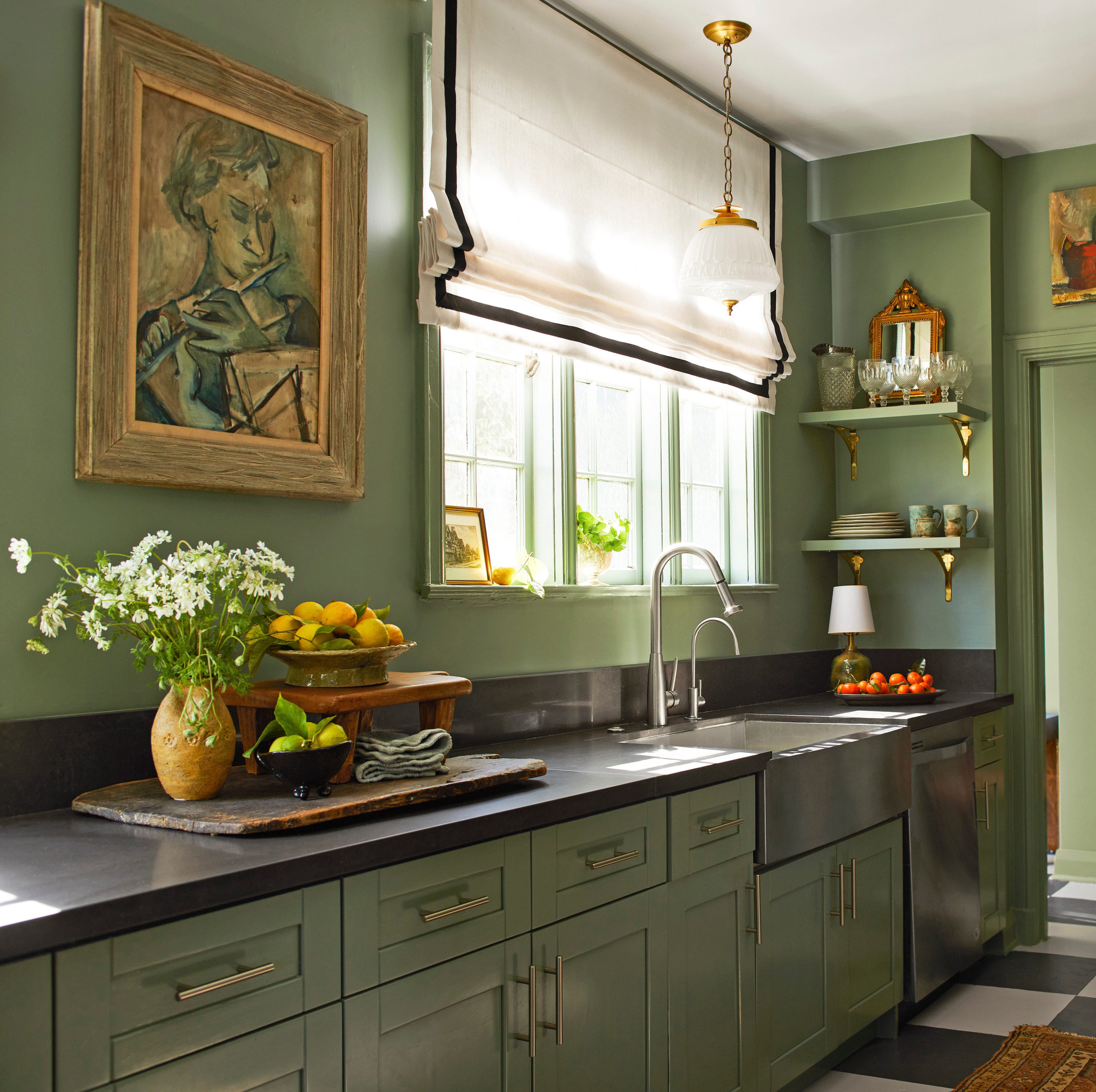
The article discusses the enduring appeal of dark green paint in interior design, noting its versatility in creating both calming and dramatic effects. Interior designers highlight how dark green has moved beyond traditional uses like kitchen cabinets into softer rooms, offering a balance between soothing and striking aesthetics. The piece emphasizes that the 'in' tone of green remains consistent, unlike other colors, making it a timeless choice for various interior design styles, from modern to rustic.
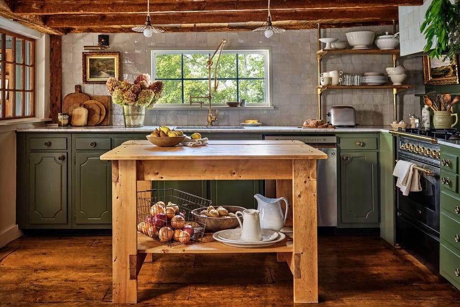
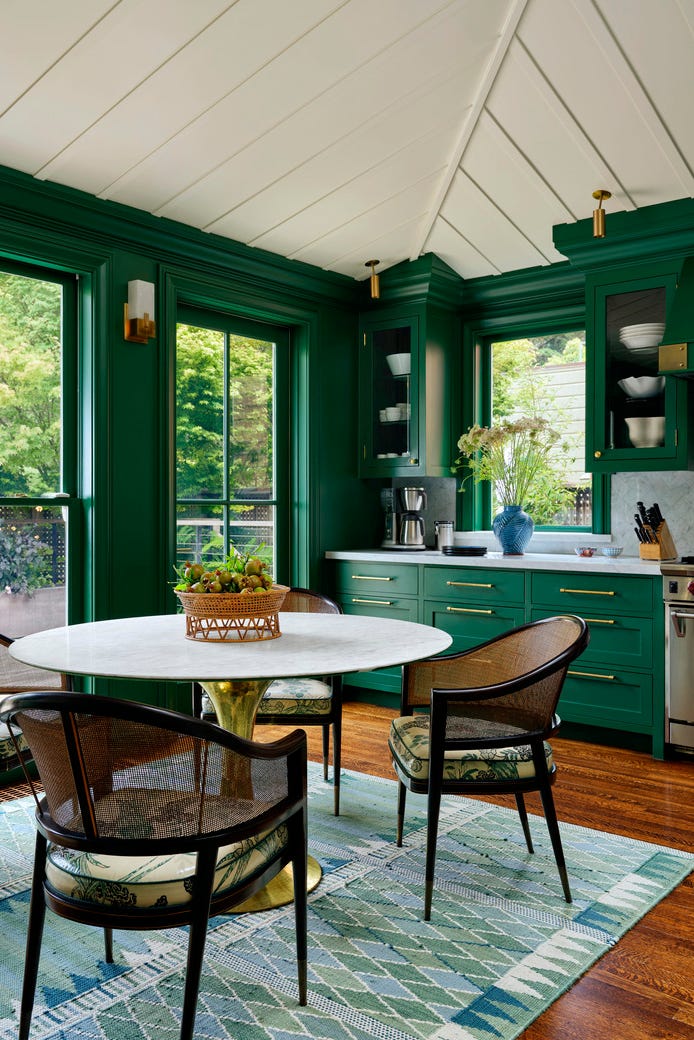
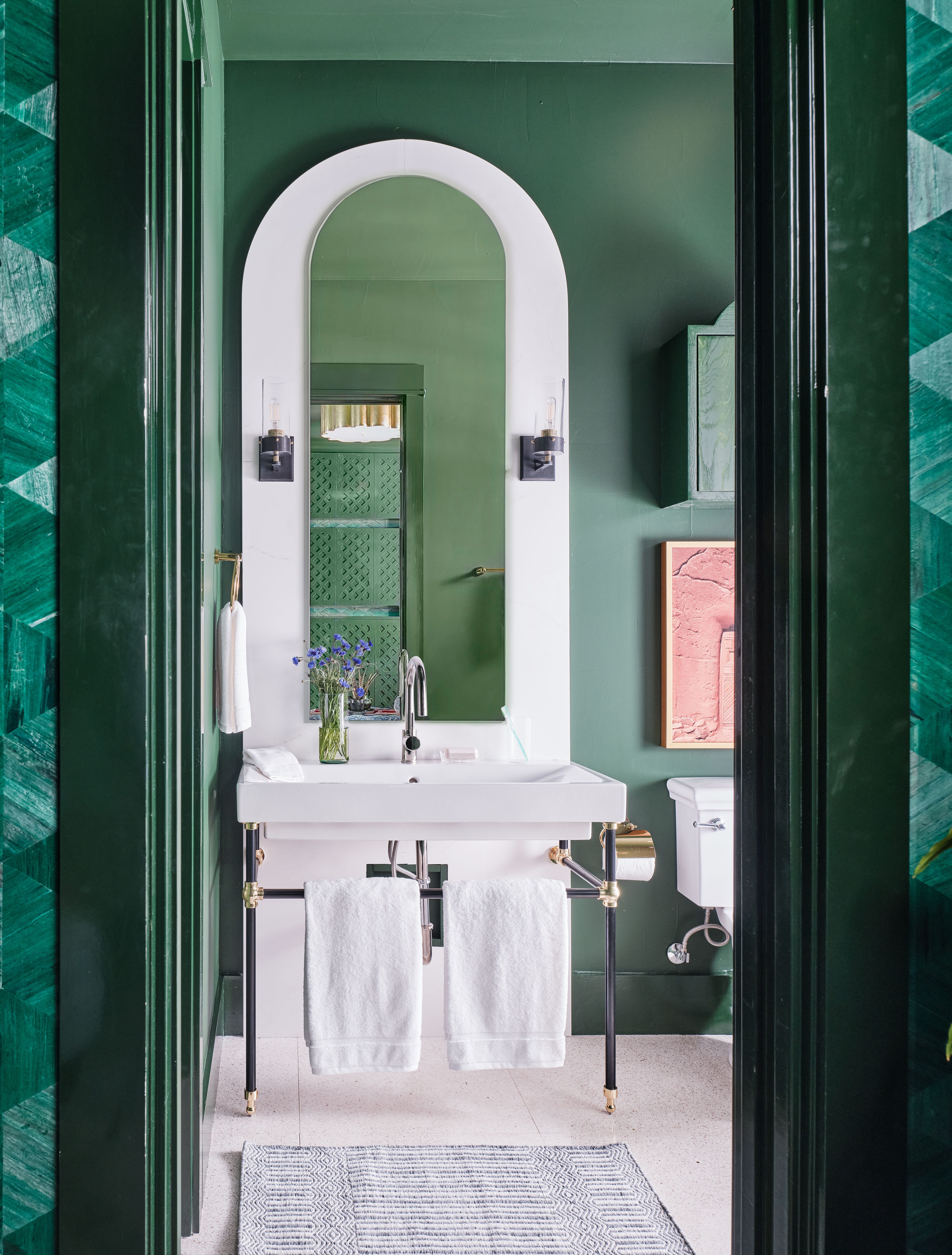
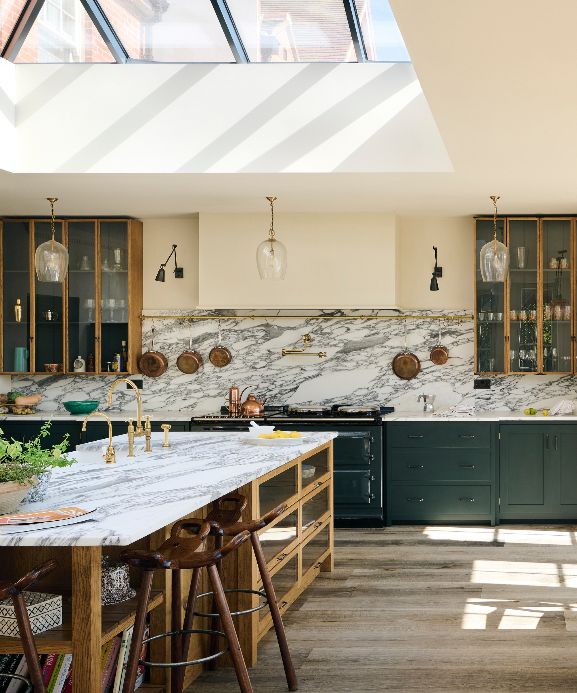
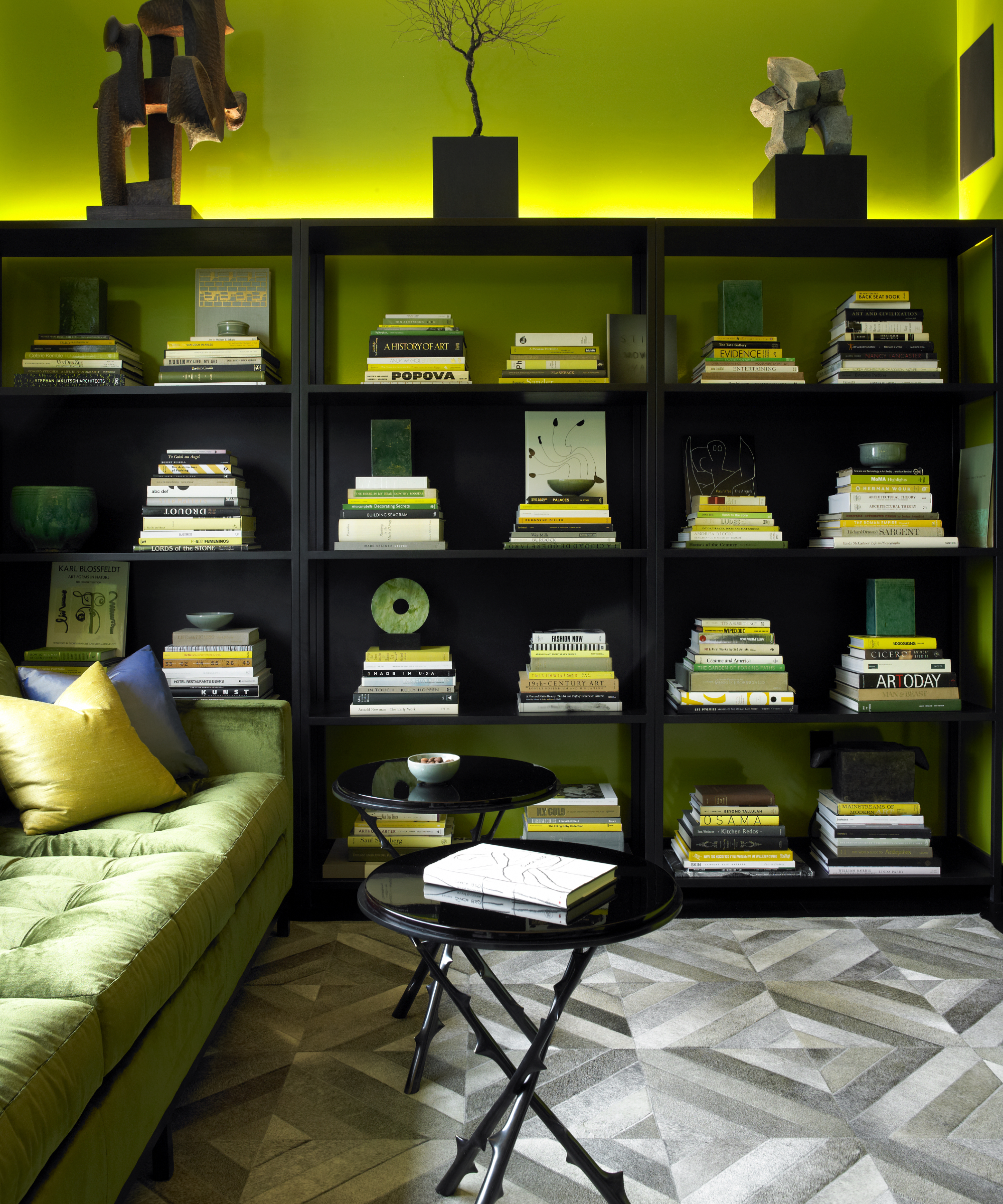
Several specific dark green paint recommendations are provided, starting with Benjamin Moore's 'Gondola Ride.' This rich green is suggested for making a statement in kitchens, drawing parallels to old-world studies and combining nature's beauty with luxurious sophistication. Kati Curtis, an interior designer, also points to Benjamin Moore's 'Garden Cucumber' as a perfect choice for an office space, noting its ability to command attention and energize a room without overwhelming it, providing a moody backdrop for design presentations.
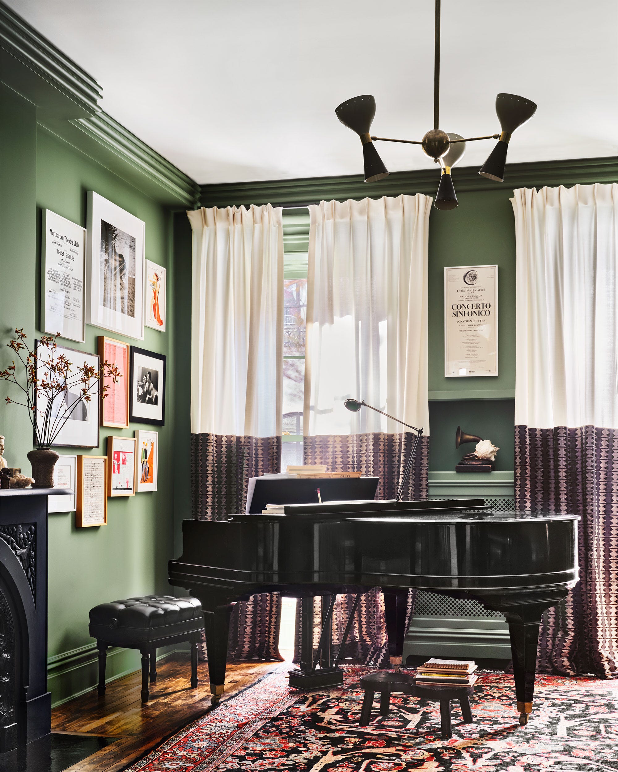
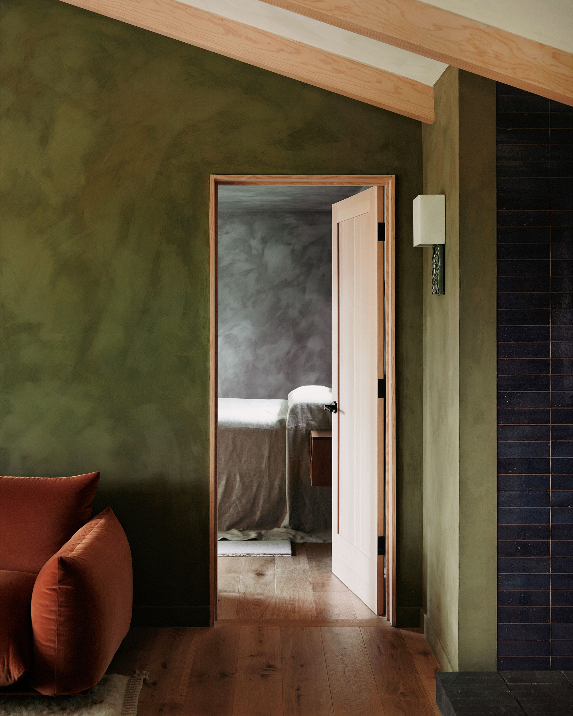
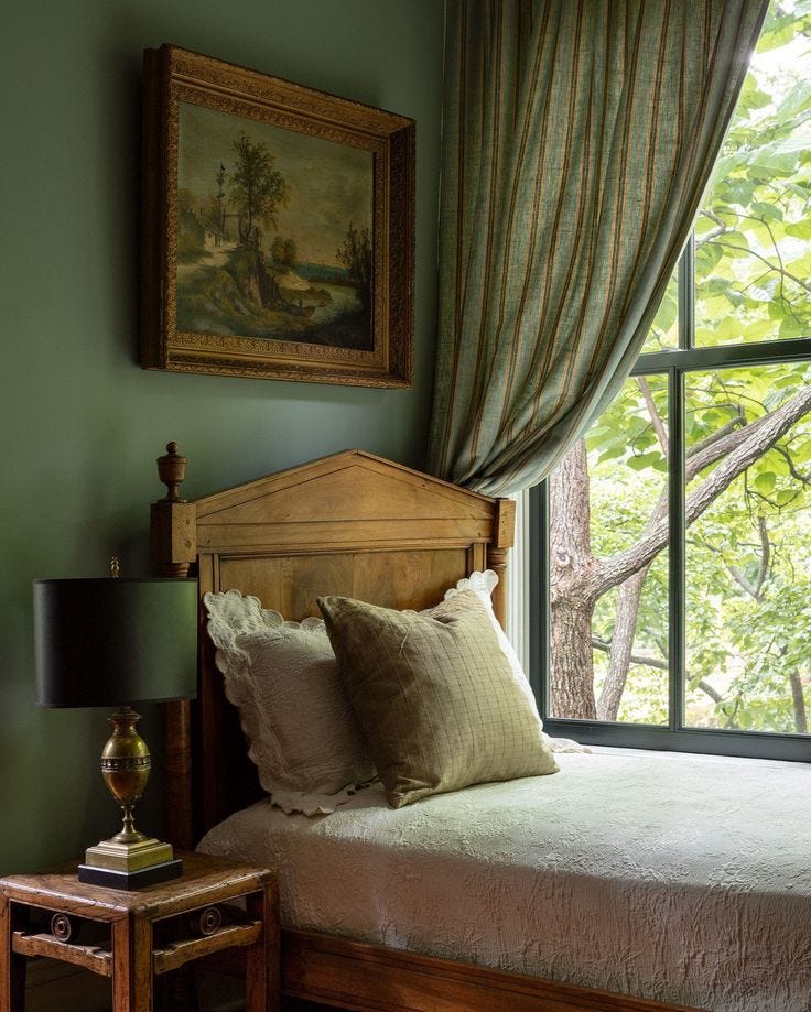
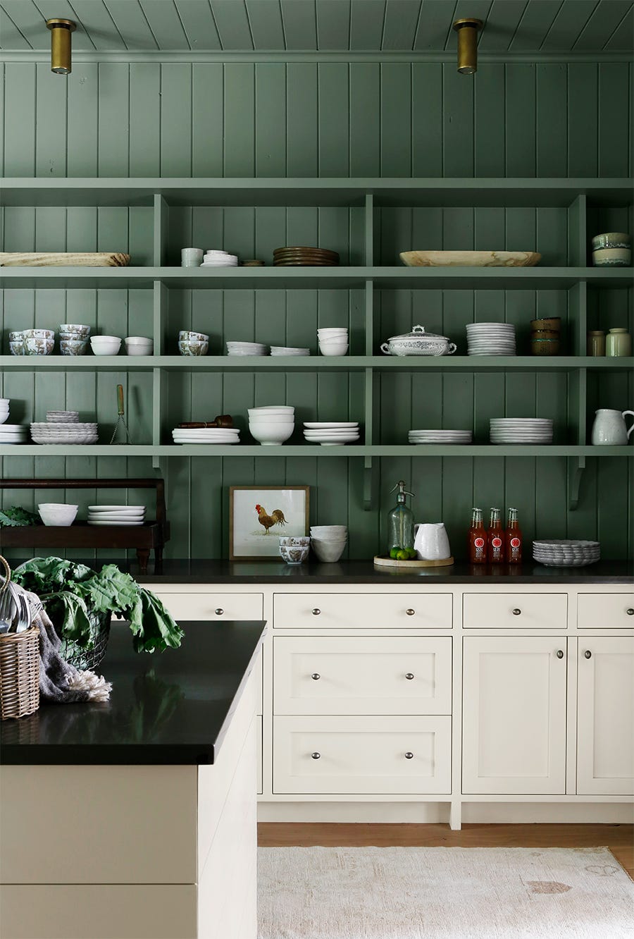
Sherwin-Williams' 'Rosemary' is presented as a soft dark green with olive or brown undertones, described as a 'deep, organic green.' Mollie Ranize of Dmar Interiors highlights its effectiveness in a semi-gloss finish, which creates a magical, forest-like ambiance and works well in smaller rooms by providing a cozy, cocooning effect without gloom. The semi-gloss also helps to reflect light, brightening the space.
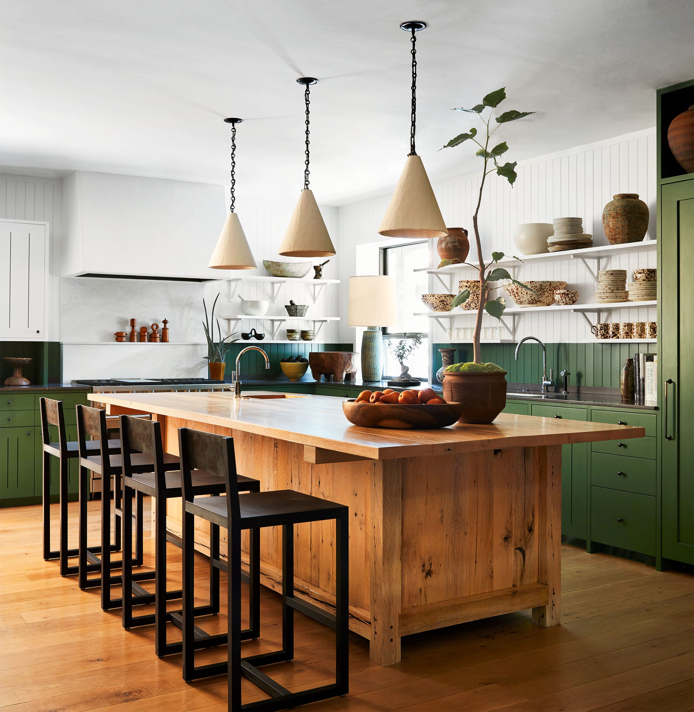
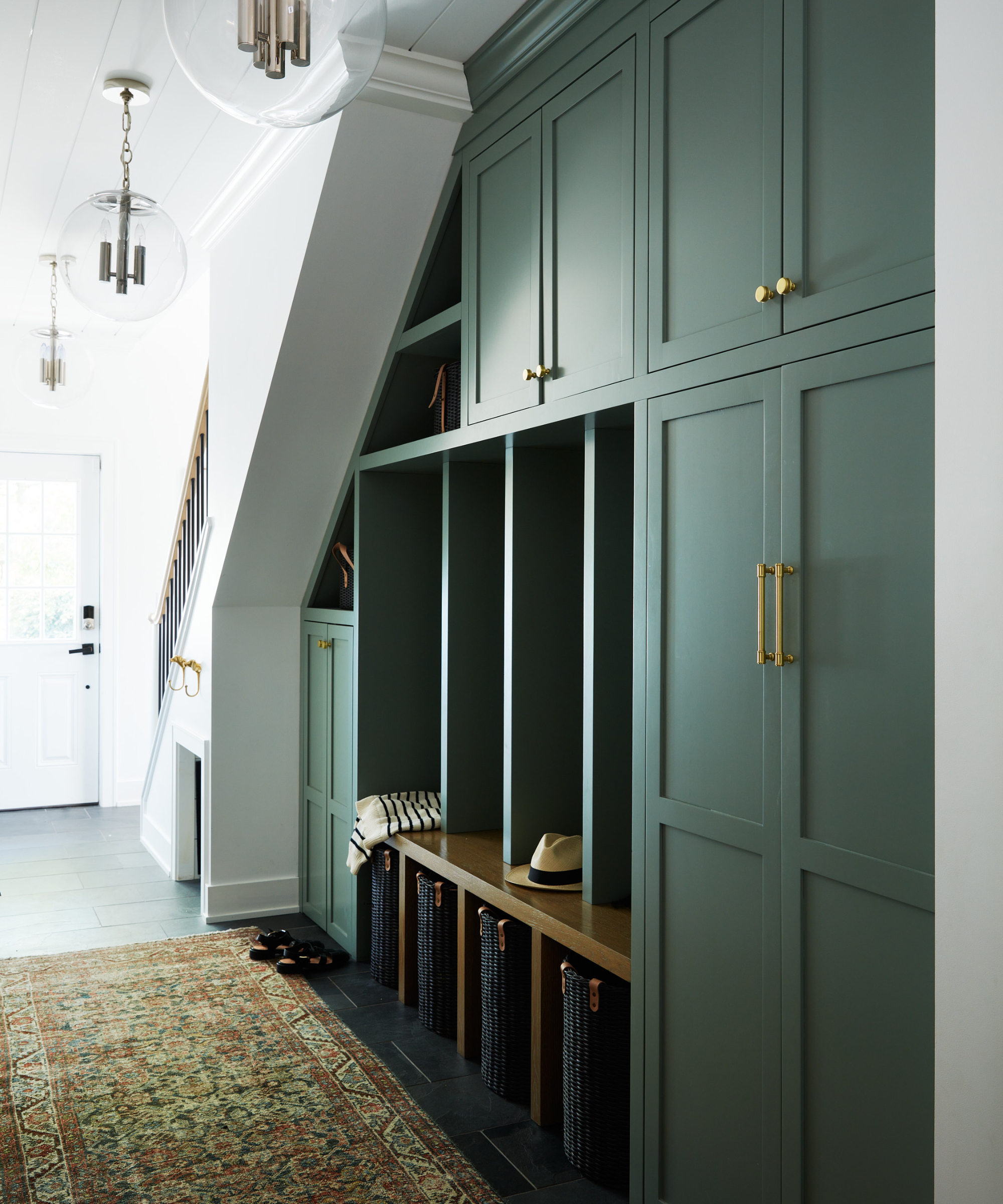
Another Sherwin-Williams shade, 'Pewter Green,' is described by Kara Childress as a color that unites warm elements like copper, stone, and reclaimed wood. Although typically considered a cool shade, 'Pewter Green' demonstrates its ability to complement warm color schemes, becoming a warm tone itself when paired thoughtfully with natural materials. This showcases the paint's adaptability and its ability to enhance diverse palettes.
Farrow & Ball's 'Green Smoke' is featured for its sophisticated atmosphere and gentle blue undertone, making it suitable for various spaces, from kitchens to outdoor areas. Patrick O’Donnell, a brand ambassador for Farrow & Ball, explains that this shade looks magical in both sunlight and candlelight, creating an immersive and calming feel. Its versatility extends to pairings, complementing bold primary colors and soft neutrals.
Benjamin Moore's 'Tate Olive' is recommended by Anastasia Casey of The Interior Collective for kitchen cabinets and butler's pantries. This shade balances yellow and blue undertones, allowing it to reflect light while maintaining a strong color presence. Casey notes that 'Tate Olive' acts as a neutral, ensuring its relevance across trends and making it a timeless option, especially when layered with warm grays, creams, beiges, and whites.
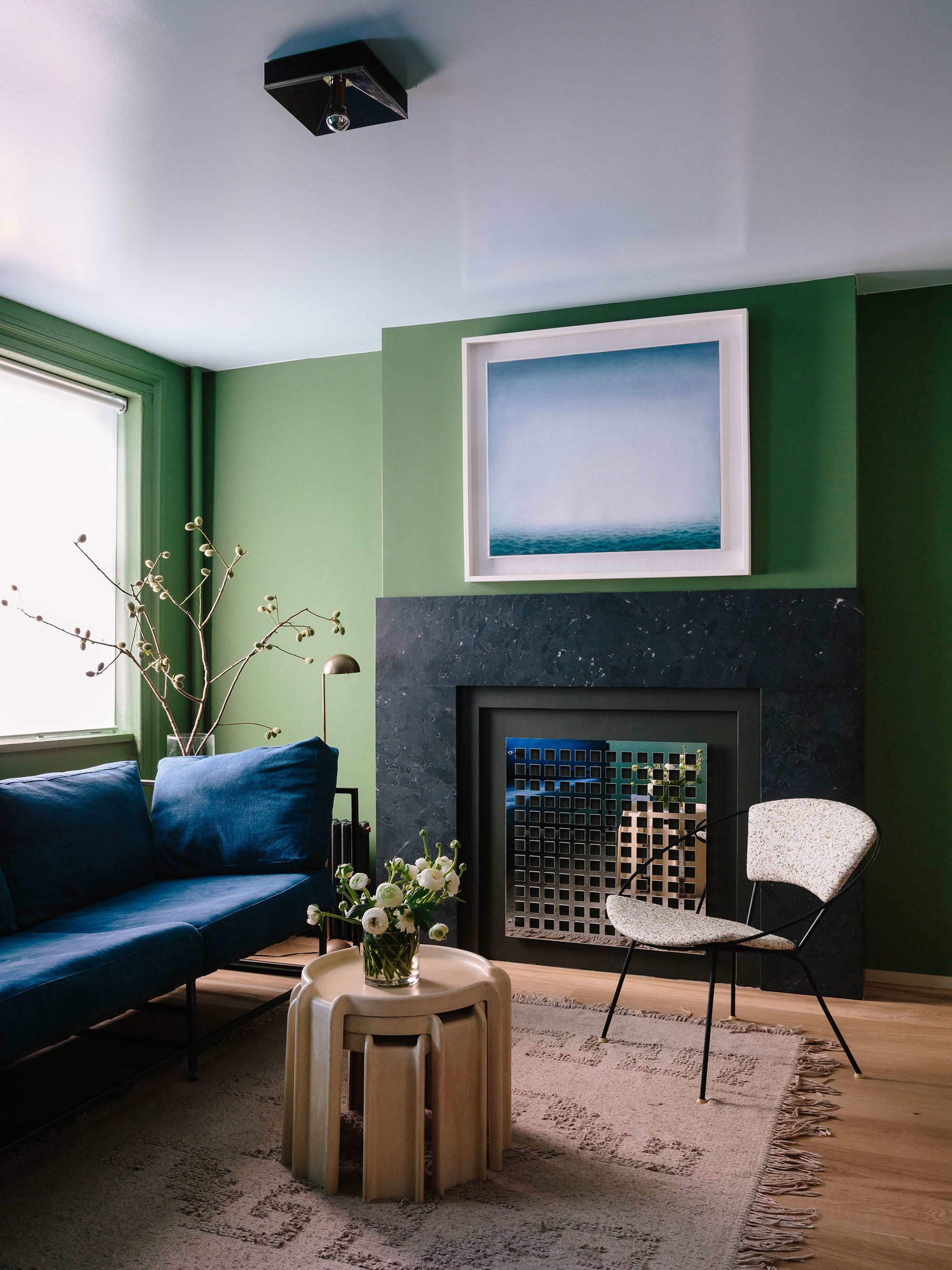
Sherwin-Williams' 'Ripe Olive,' another olive-toned dark green, is darker than 'Tate Olive' but still liveable and versatile. Sherwin-Williams describes it as a 'neutral green' with blue-gray undertones, capable of offering a sophisticated mood in well-lit spaces. Mollie Ranize suggests it for custom wall treatments, as its depth can appear dark and moody or brighter and welcoming, depending on the lighting conditions.
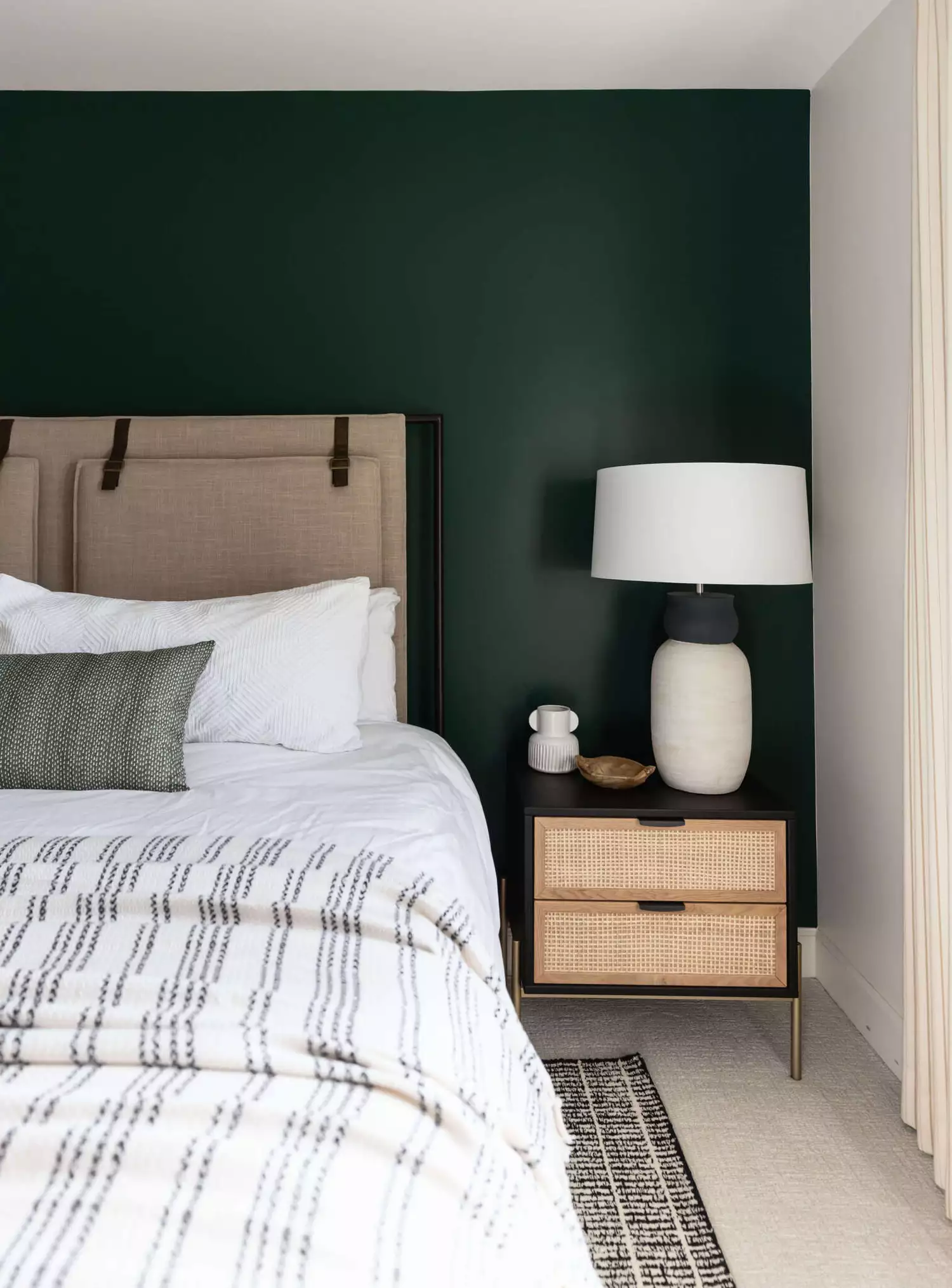
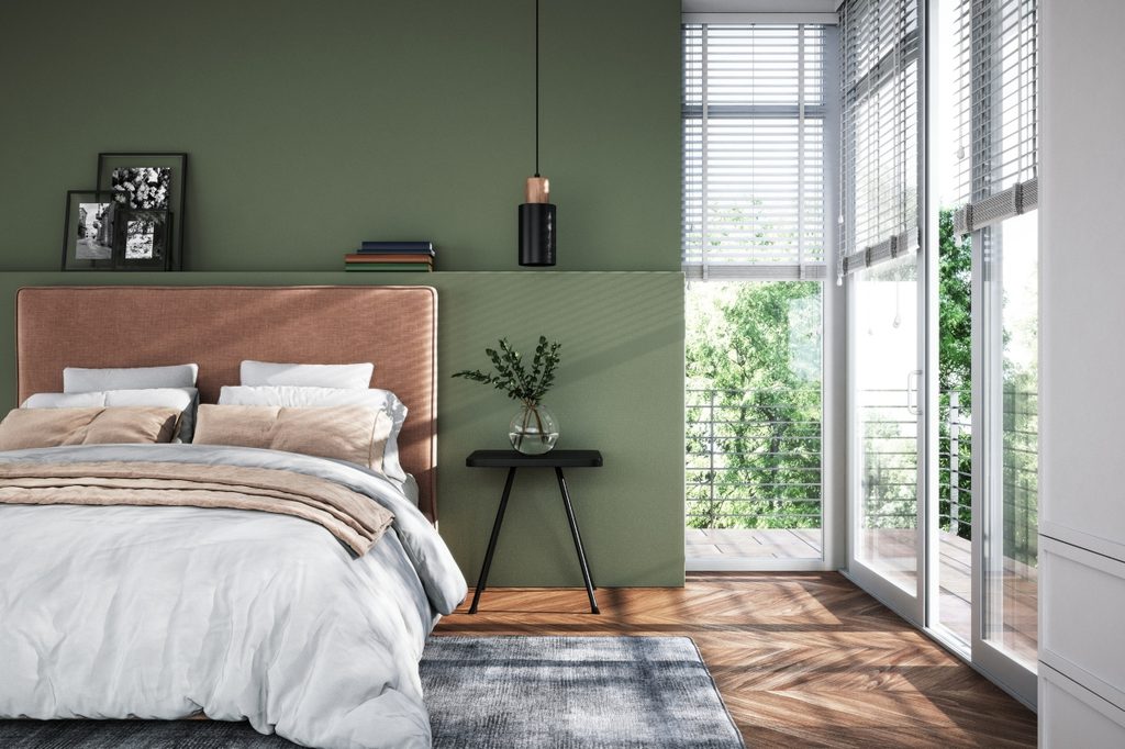
Benjamin Moore's 'Hunter Green' is favored by Kathy Kuo for its elegance and timeless sophistication, reminiscent of stately English manors and Ivy League studies. It is recommended for upscale aesthetics like Dark Academia and Quiet Luxury. Finally, Benjamin Moore’s 'Nantucket Gray' is highlighted by Anastasia Casey for its immense depth despite appearing pale in swatches. It effectively creates a calming, deep green hue, particularly when color-drenched in a bedroom. The article concludes by advising readers to always sample paints, considering how light, existing colors, and personal tastes influence the final look, to choose the best dark green paint for their space.
#InteriorDesign #PaintColors #DarkGreen #HomeDecor #ColorTrends #DesignTips #BenjaminMoore #SherwinWilliams #InteriorDesign #PaintColors #DarkGreen #HomeDecor #ColorTrends #DesignTips #BenjaminMoore #SherwinWilliams
0 комментариев всего
 Комментариев пока нет
Вам также может понравиться
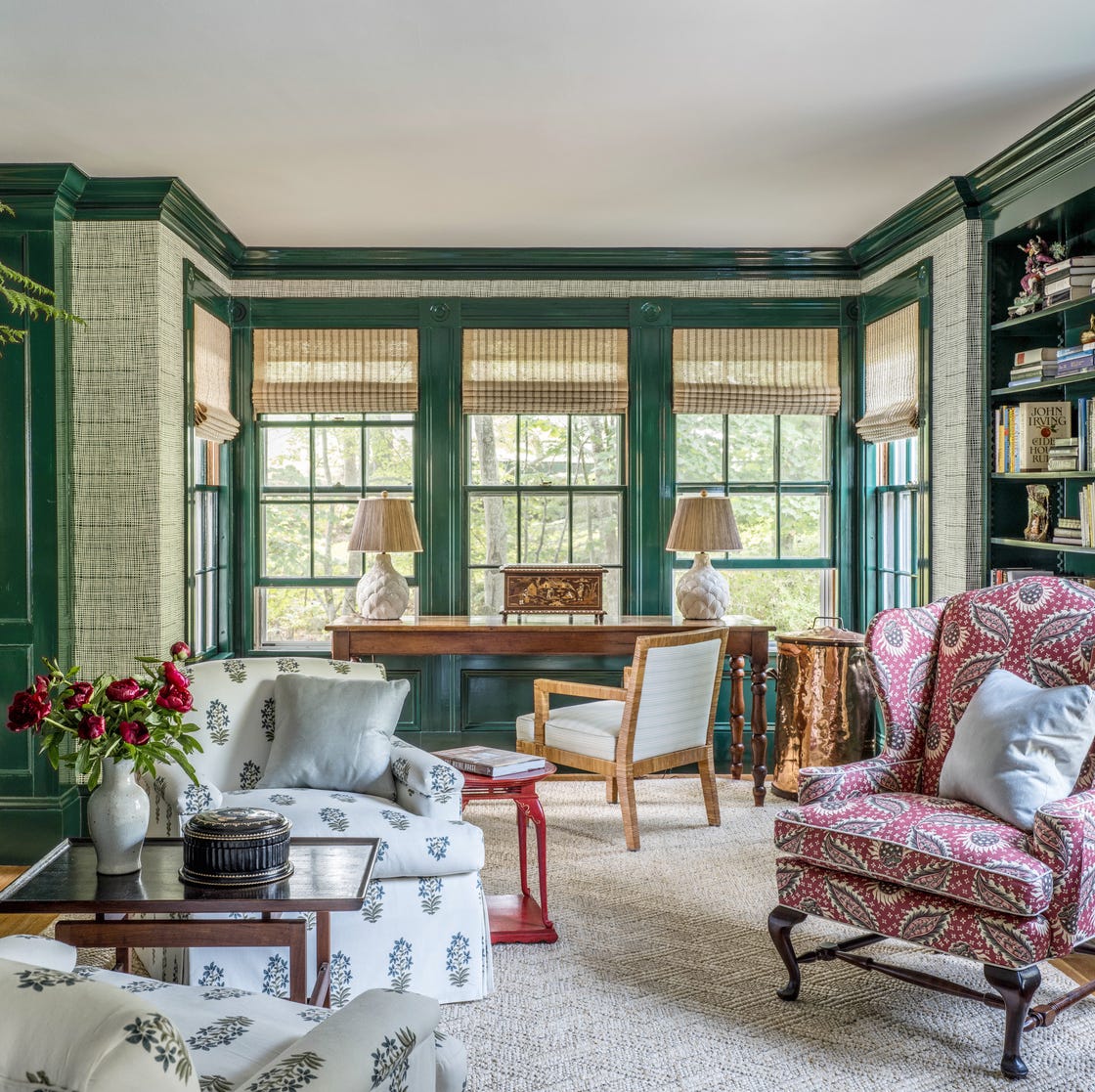
12 Designer-Approved Dark Green Paint Colors to Help You Nail the Moody Look

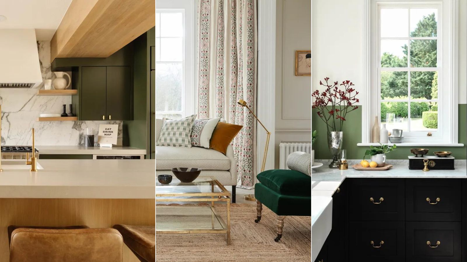
What colors go with dark green? 9 failsafe combinations for this nature-inspired hue
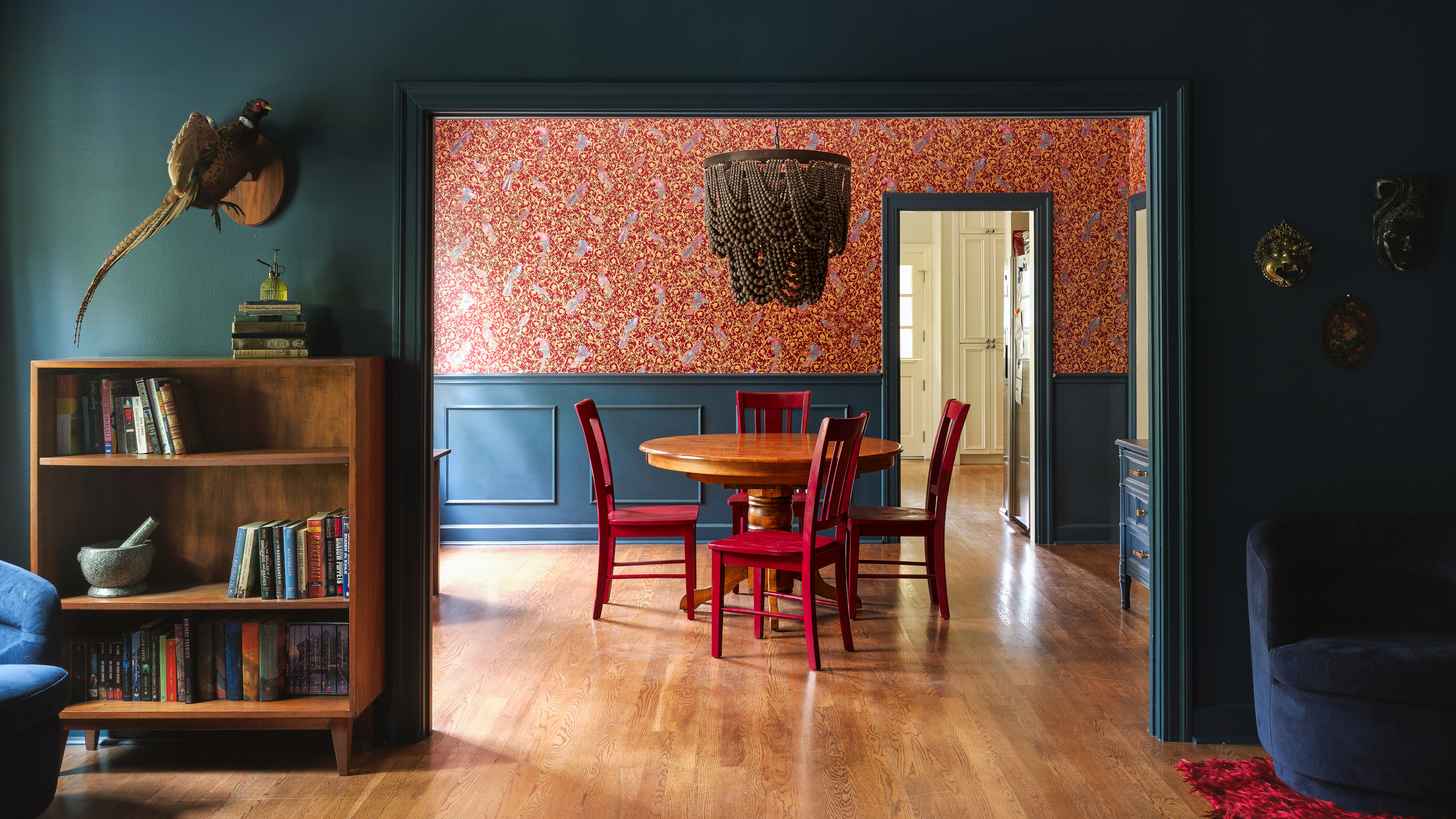
8 dark trim paint color schemes from interior designers that nail the look - 'they're cozy, cocooning and dramatic'

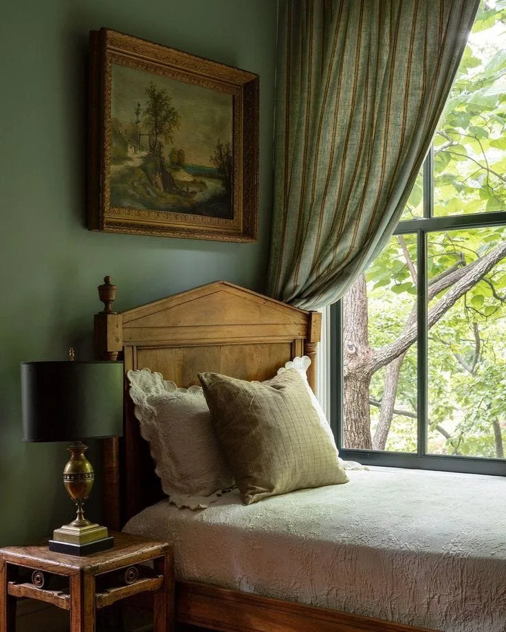
20 Dark Green Bedroom Ideas for the Most Soothing Sleeping Space
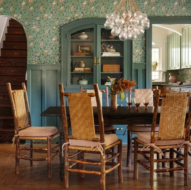
14 Best Dark Green Paint Colors to Cozy Up Your Home
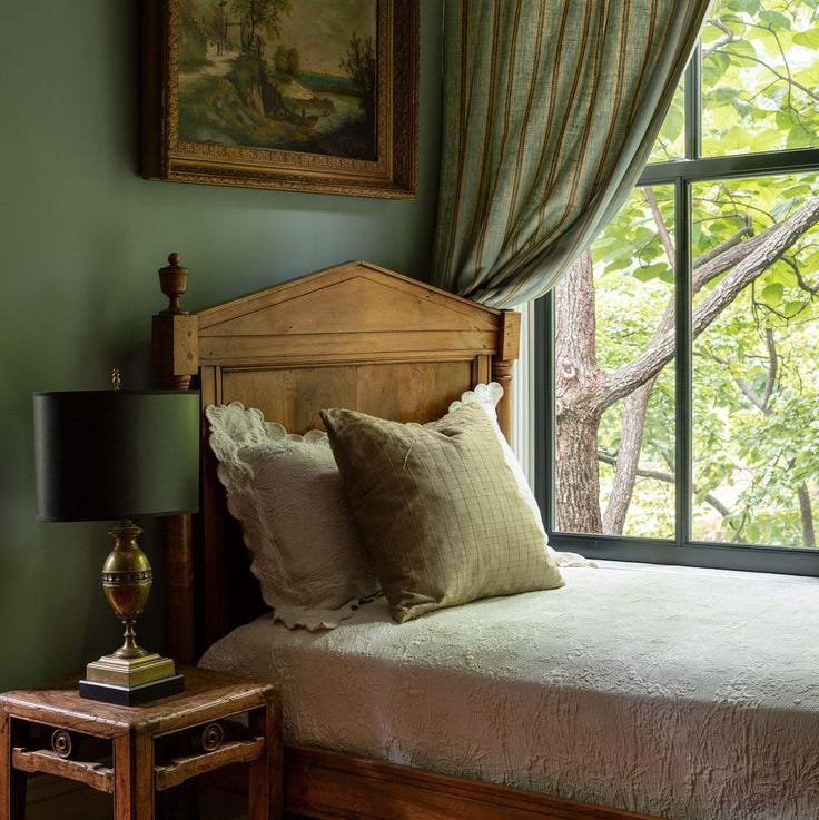
20 Dark Green Bedroom Ideas for the Most Soothing Sleeping Space

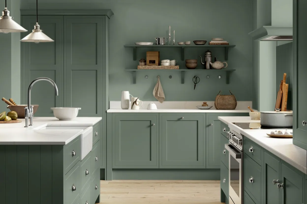
8 Green Paint Colors Interior Designers Swear By for a Bold and Fresh Home

15 Lush Green Paint Colors to Invigorate Any Space

Designers Declare This Color the Ultimate "Chill-Pill" for Your Home

These 18 Colors All Look Stunning With Dark Green

Dark green paints are the 'it' color right now – here are 4 shades from Benjamin Moore to use in small rooms
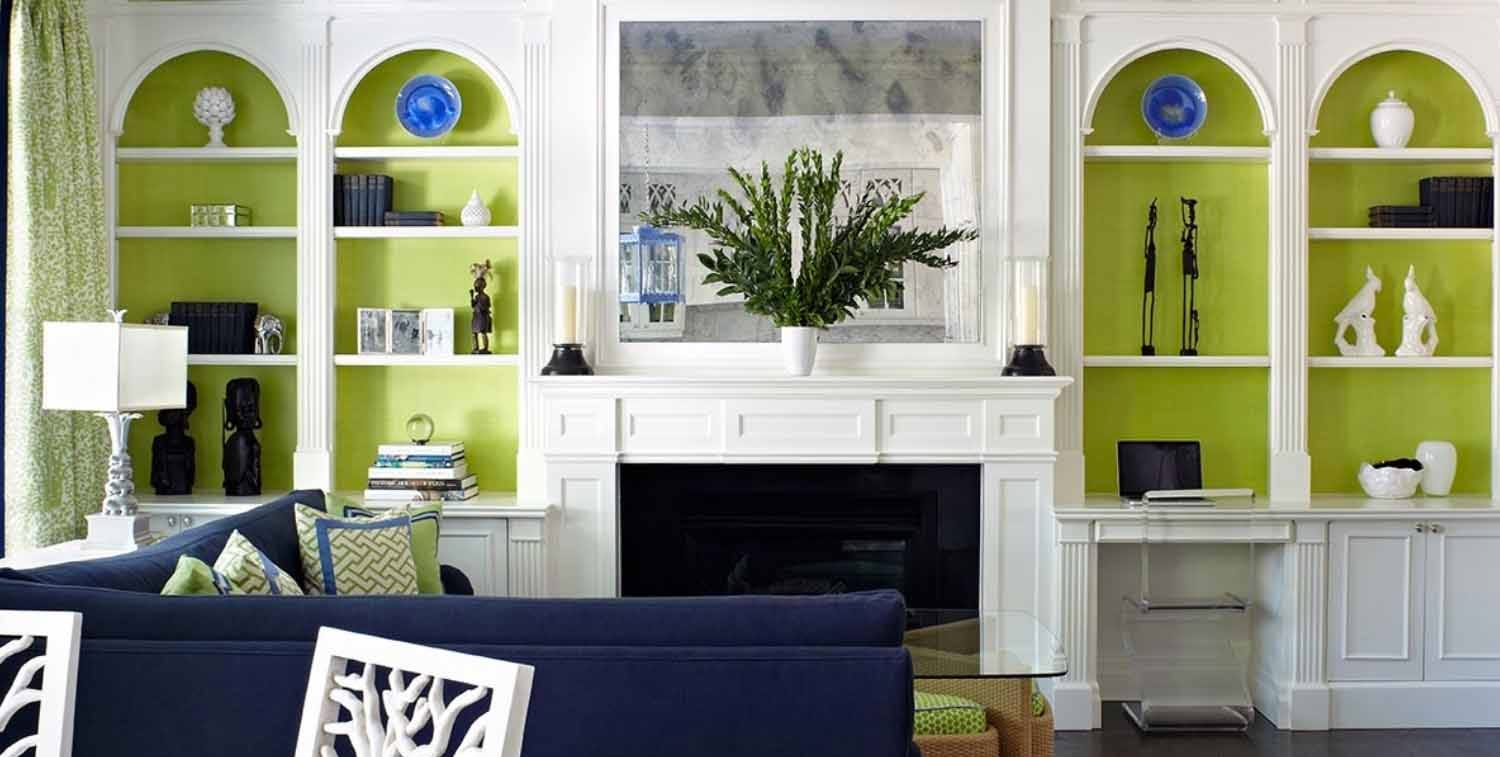
Designers Reveal the Best Lime Green Paint Colors for a Lively Home
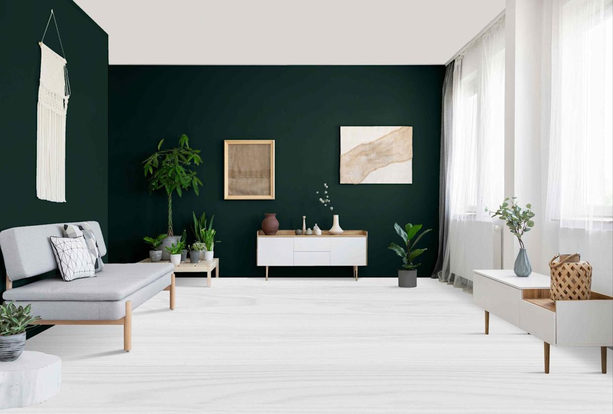
12 Dark Green Paint Colors That Instantly Make Any Room Feel Elegant
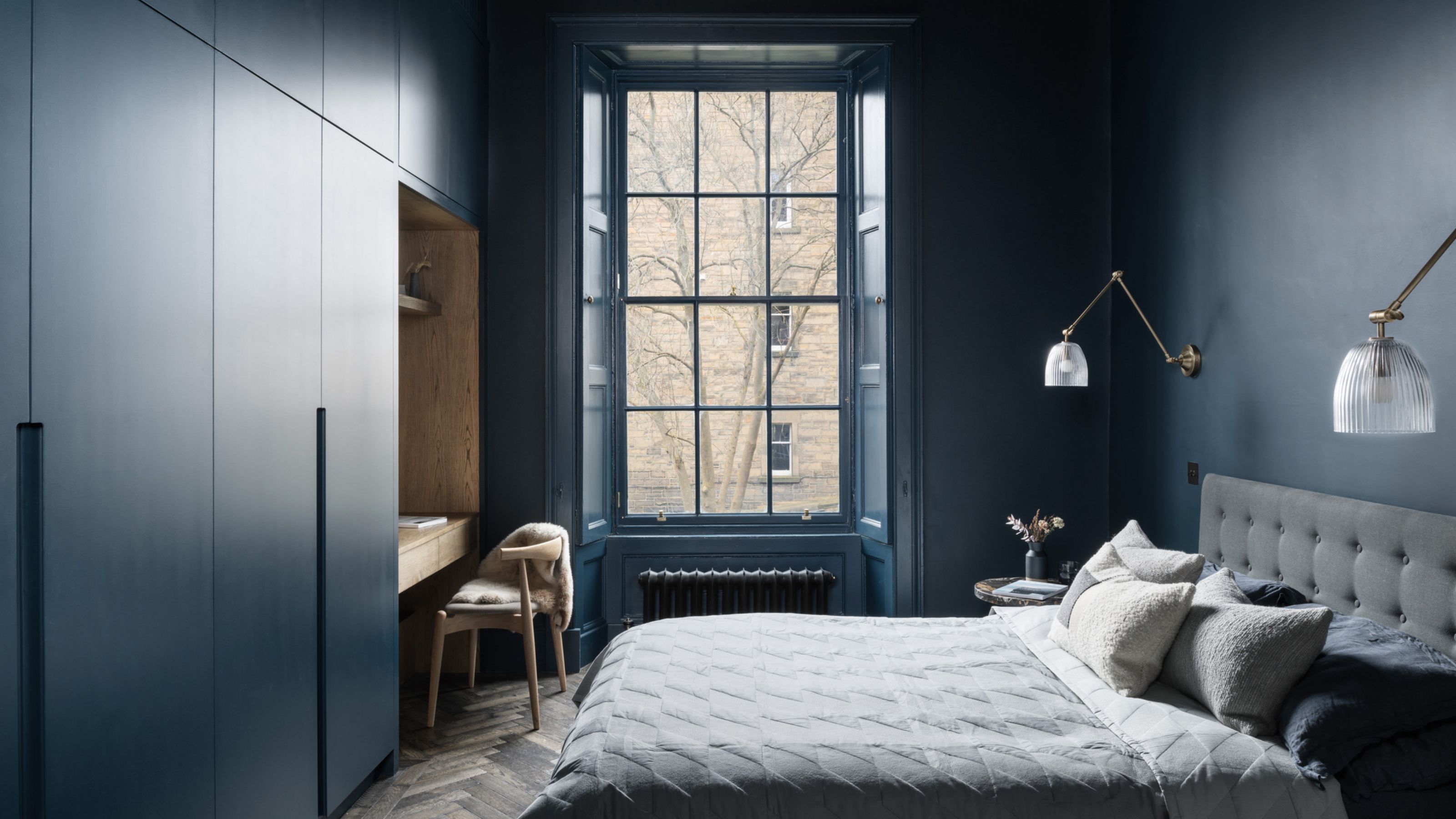
6 Dark Paint Colors That Designers Use to Bring Glamour
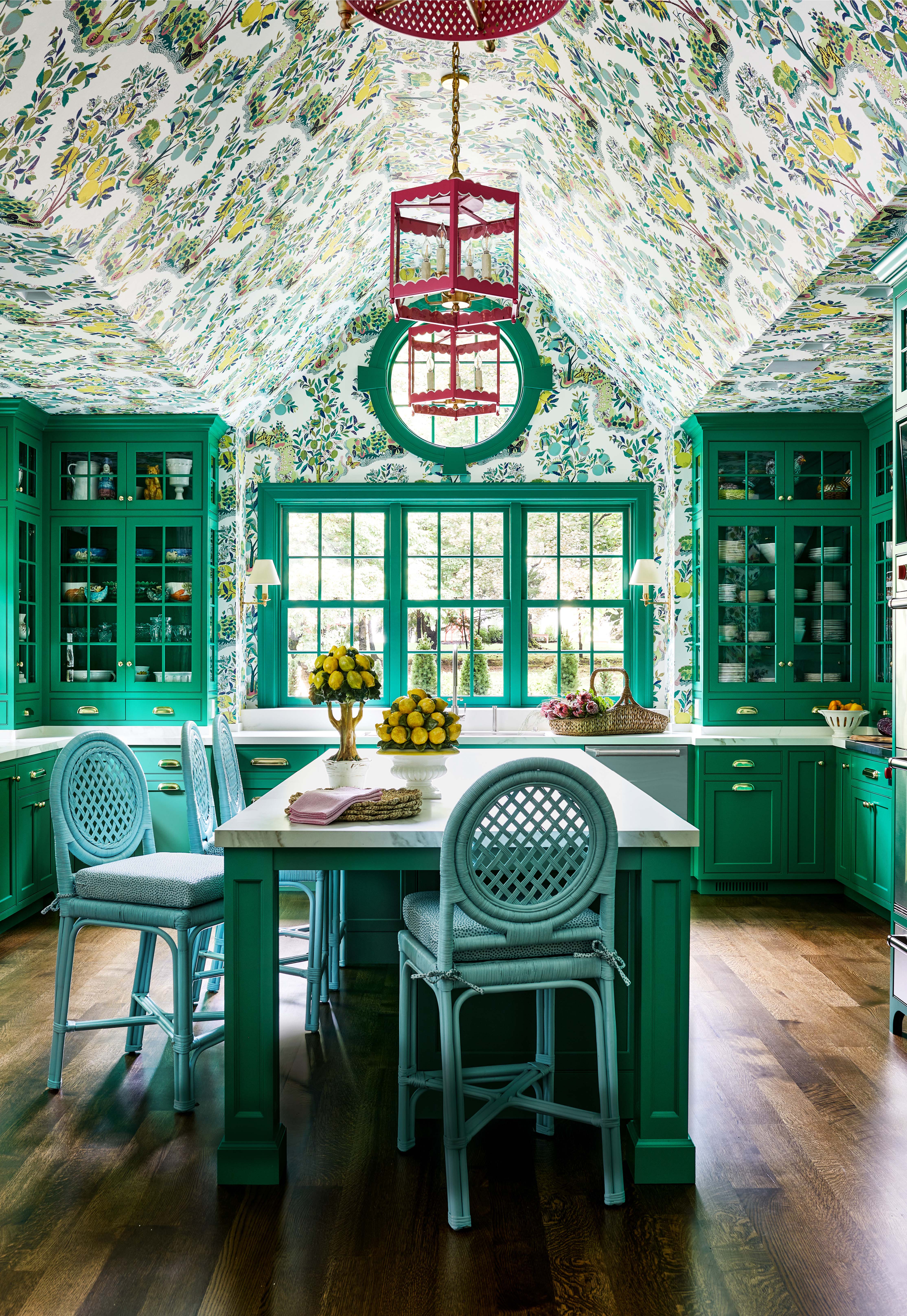
There Are Only Certain Green Paint Colors That Can Bring a Room to Life
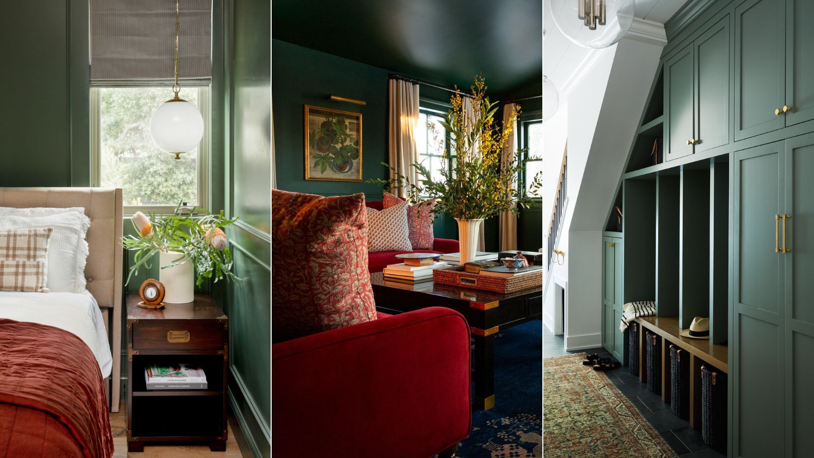
5 best green paints that will always be classics, according to interior designers
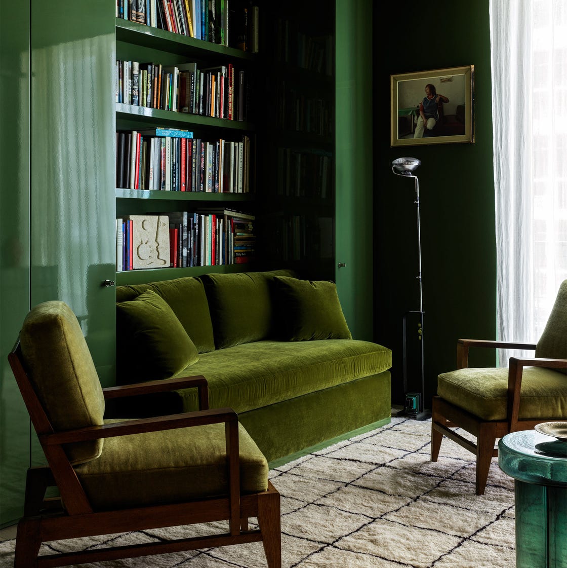
These Dark Green Paint Colors Will Make You Feel Like You’re Living in a LITERAL Forest
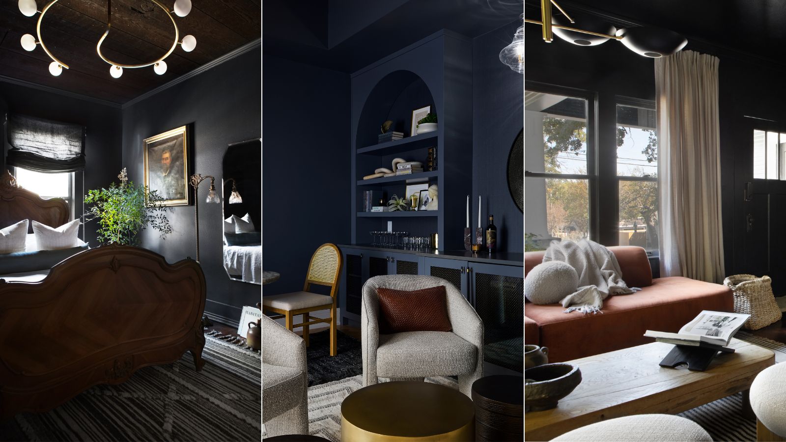
7 best dark paints loved by interior designers
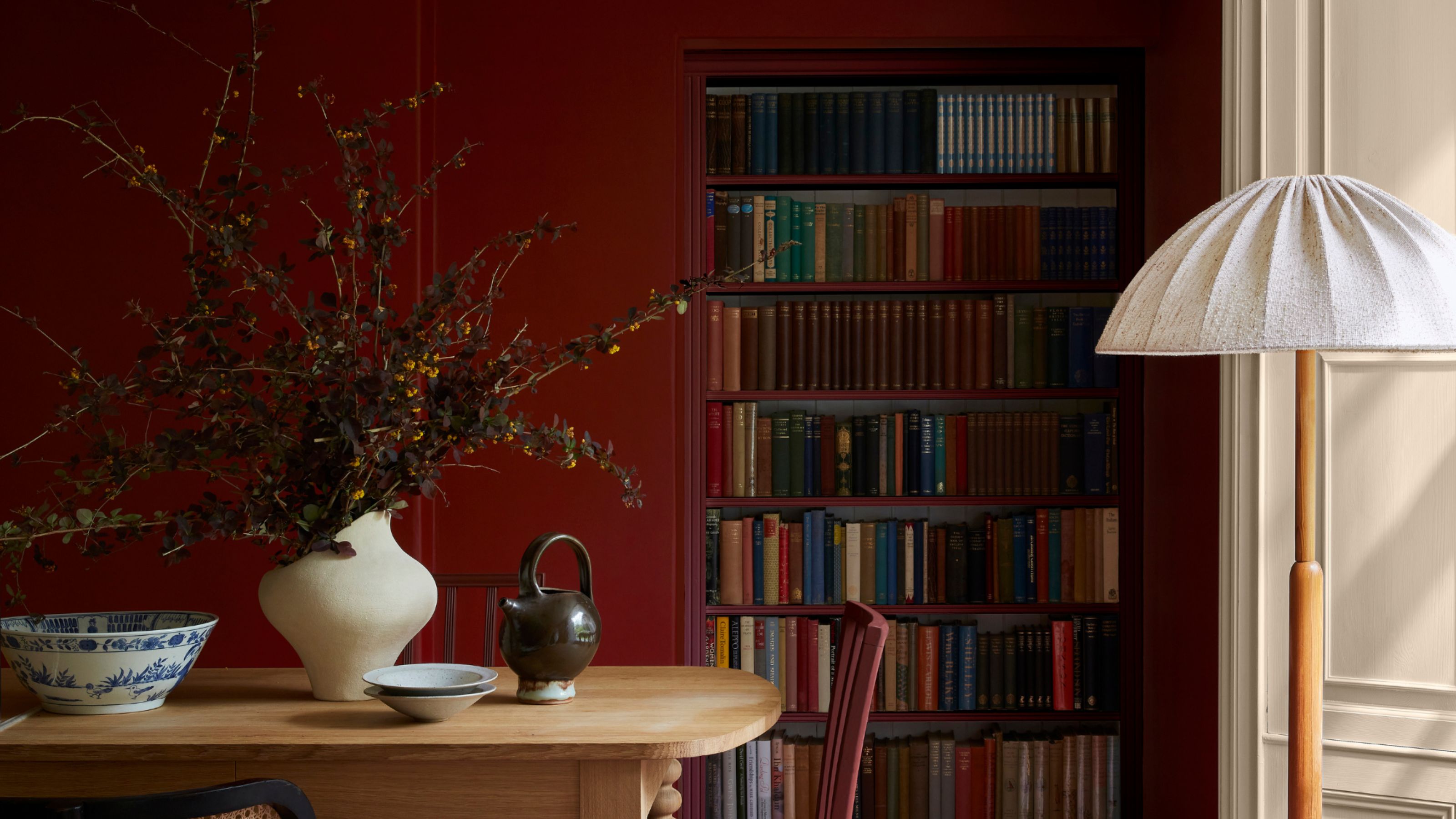
The 10 Best Little Greene Paint Colors For Your Home, as Chosen by Interior Designers
The best green paint colors for a soothing, sophisticated home