1/10
4 Grout Color Ideas That Take Ordinary Tile to the Next Level
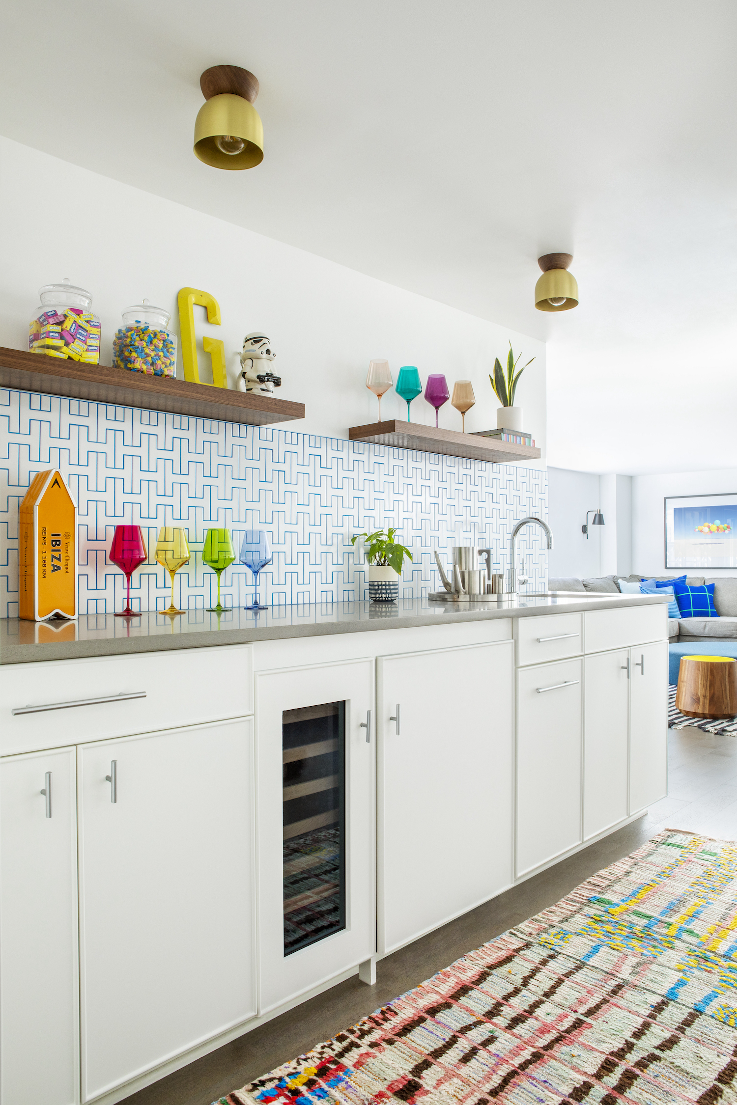
The article emphasizes the often-overlooked importance of grout color in home tiling projects, asserting that it is as crucial as the tile choice itself. Carrie Waller, founder of Dream Green DIY, highlights how grout can dramatically enhance or detract from the aesthetic appeal of a tile installation. Many individuals spend considerable time selecting tiles but neglect the grout, a mistake that can undermine the entire design.
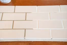
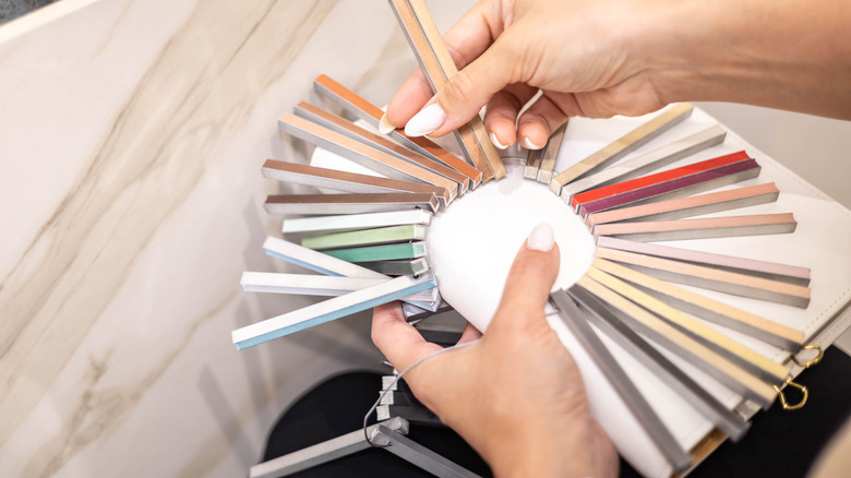
Waller advises against making a last-minute grout decision. Instead, she recommends choosing grout color concurrently with tile selection. To facilitate this, she suggests picking up free grout color sheets from home improvement stores. These sheets provide true-to-life printed blocks of color from manufacturers. It is crucial to examine these color sheets at home in the specific room where the tiles will be installed, allowing for an accurate assessment under the room's unique lighting conditions. Homeowners should also have their chosen tiles on hand to place next to the grout printouts for a realistic preview of the final look.
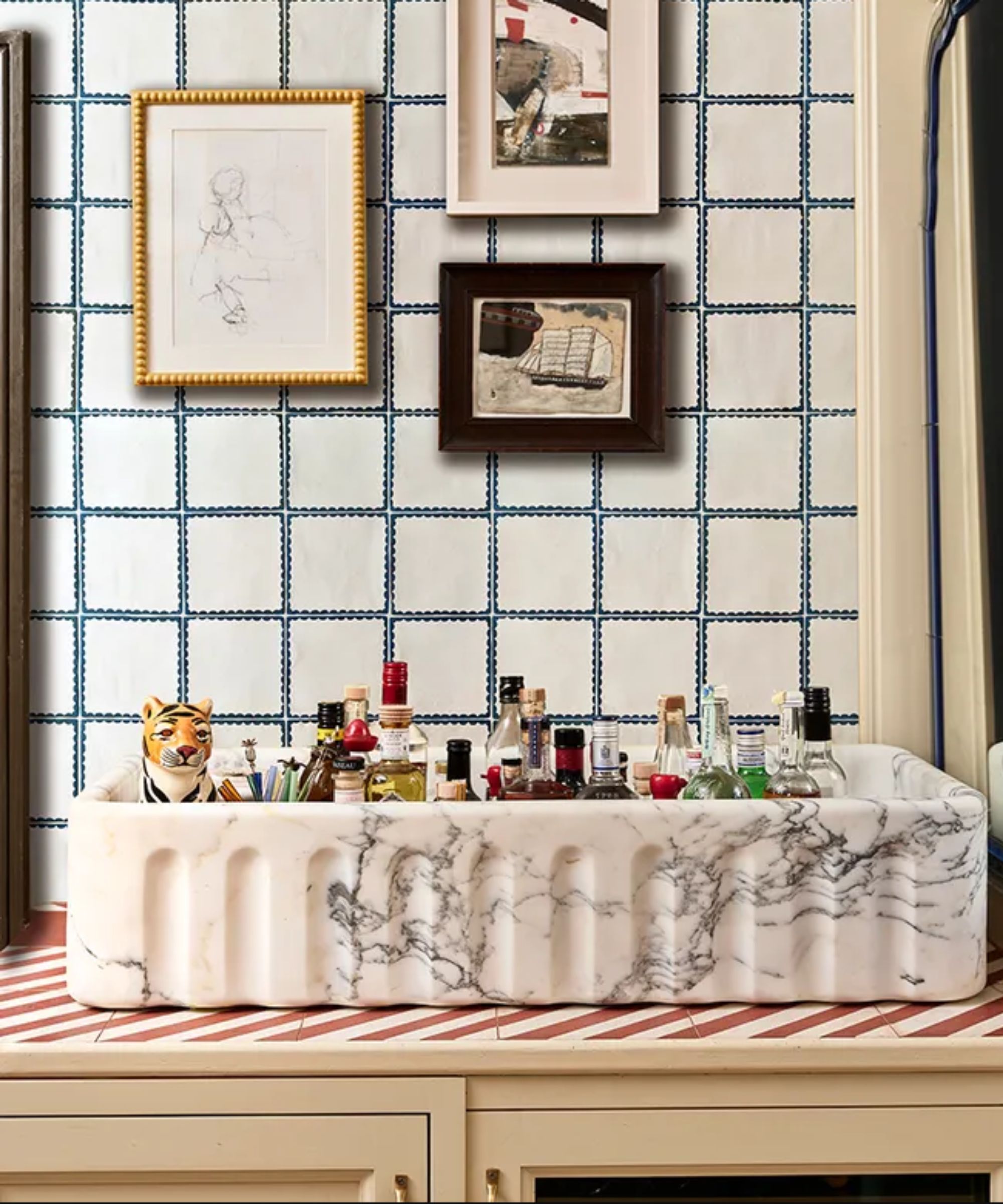
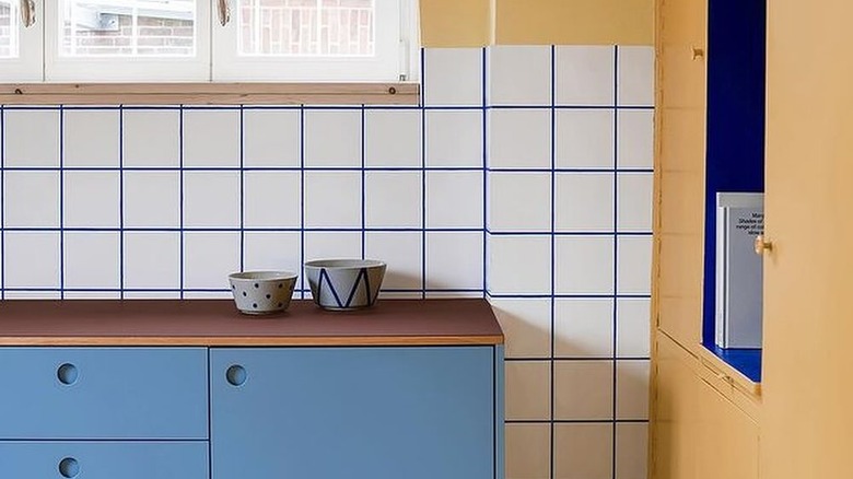
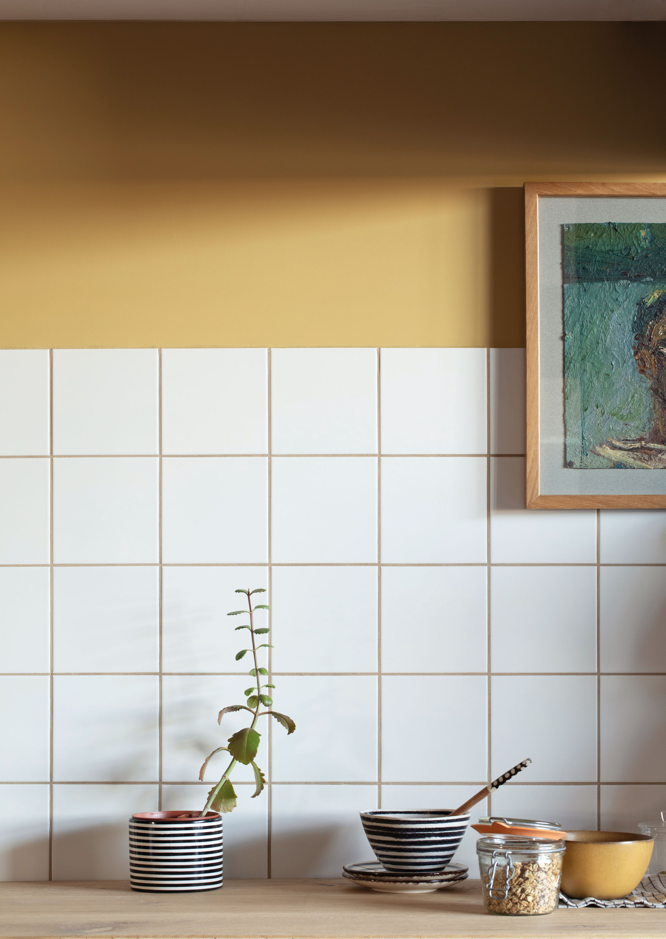
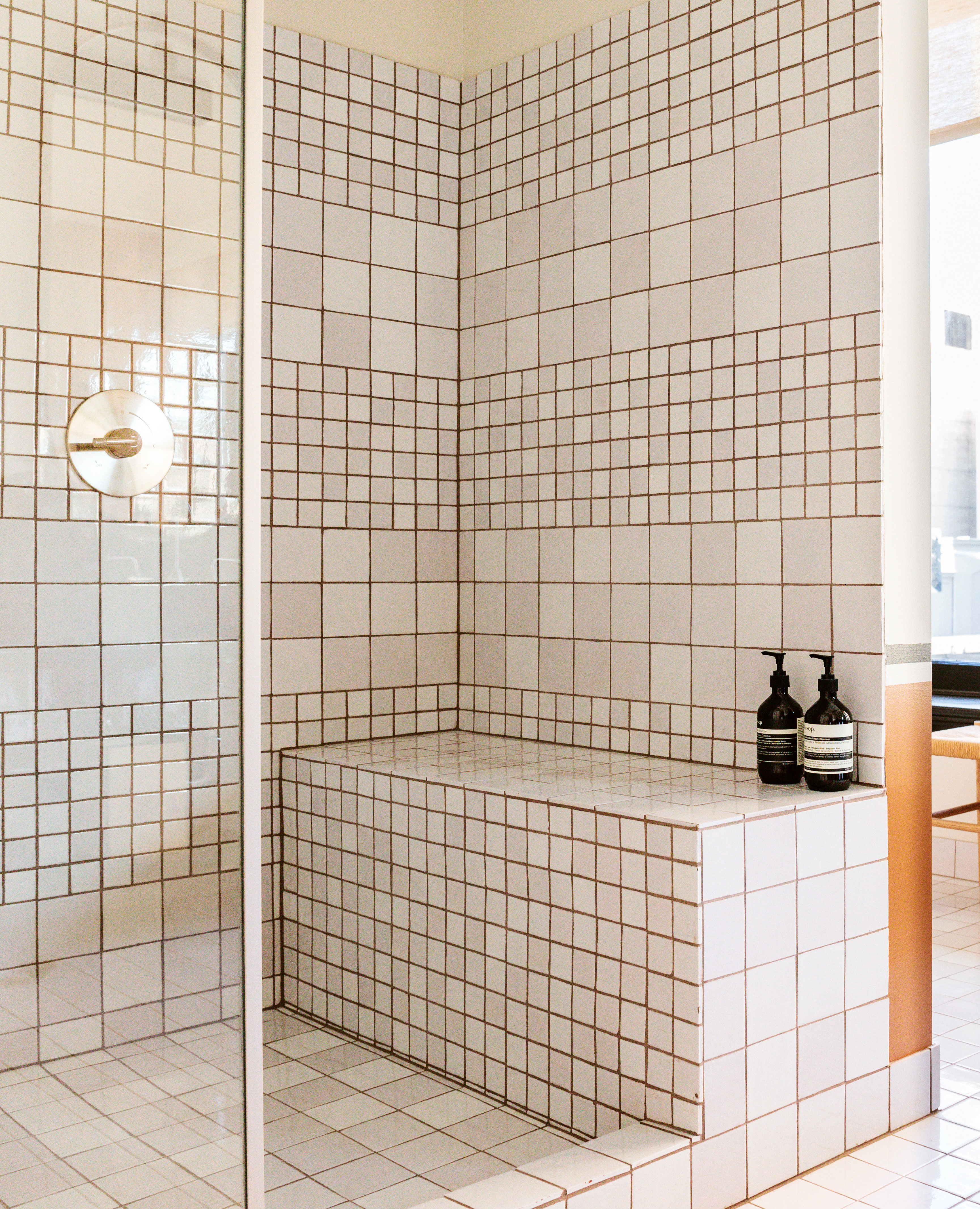
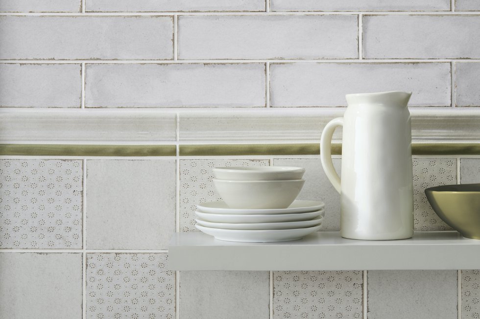
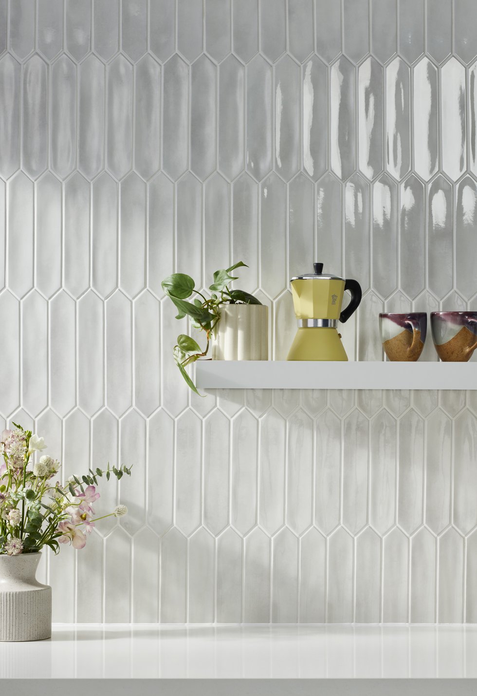
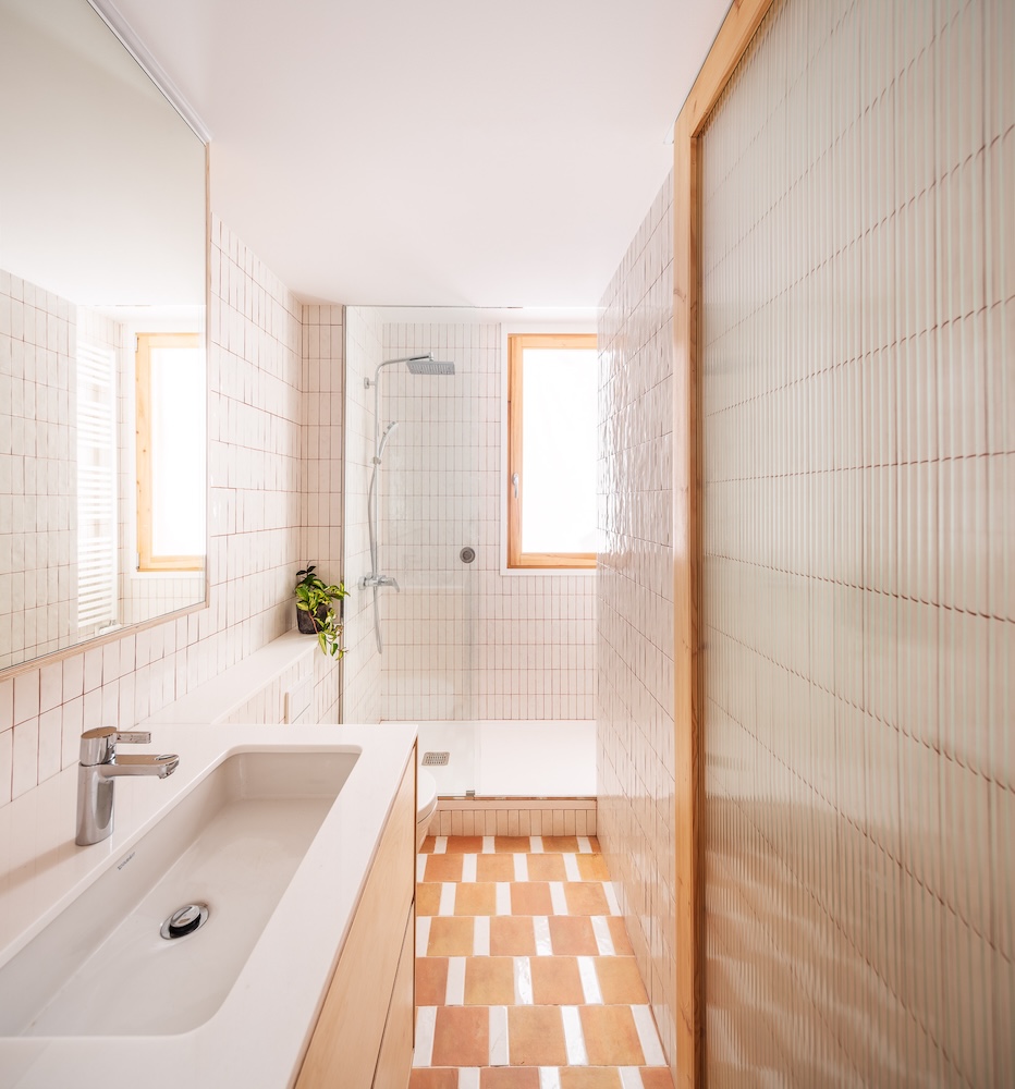
Another key consideration is the size of the grout lines, which can be manipulated to achieve different design effects. Grout color can either complement a minimalist aesthetic or contribute to a maximalist design. For those seeking a balanced approach, Waller suggests selecting a grout color that is one or two shades lighter or darker than the tile. When a bold grout color is chosen, its visual impact can be toned down by opting for slimmer grout lines. This can be achieved by using 1/16-inch spacers during tiling instead of 1/8-inch spacers, resulting in a more refined yet still visible grout line.
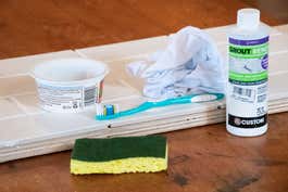
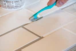
The application process also demands attention, particularly regarding the removal of excess grout. Waller advises considering the thickness or thinness of the tiles, as this should guide the amount of grout left behind. She cautions against leaving thick, uneven grout lines, which can indicate an amateur application. To ensure a professional finish, a heavy hand should be used when wiping away wet grout from between the tiles. The sponge should be passed back and forth gently but firmly until the edges of the tiles become visible. This technique helps to hide any DIY work and ensures a clean, polished appearance.
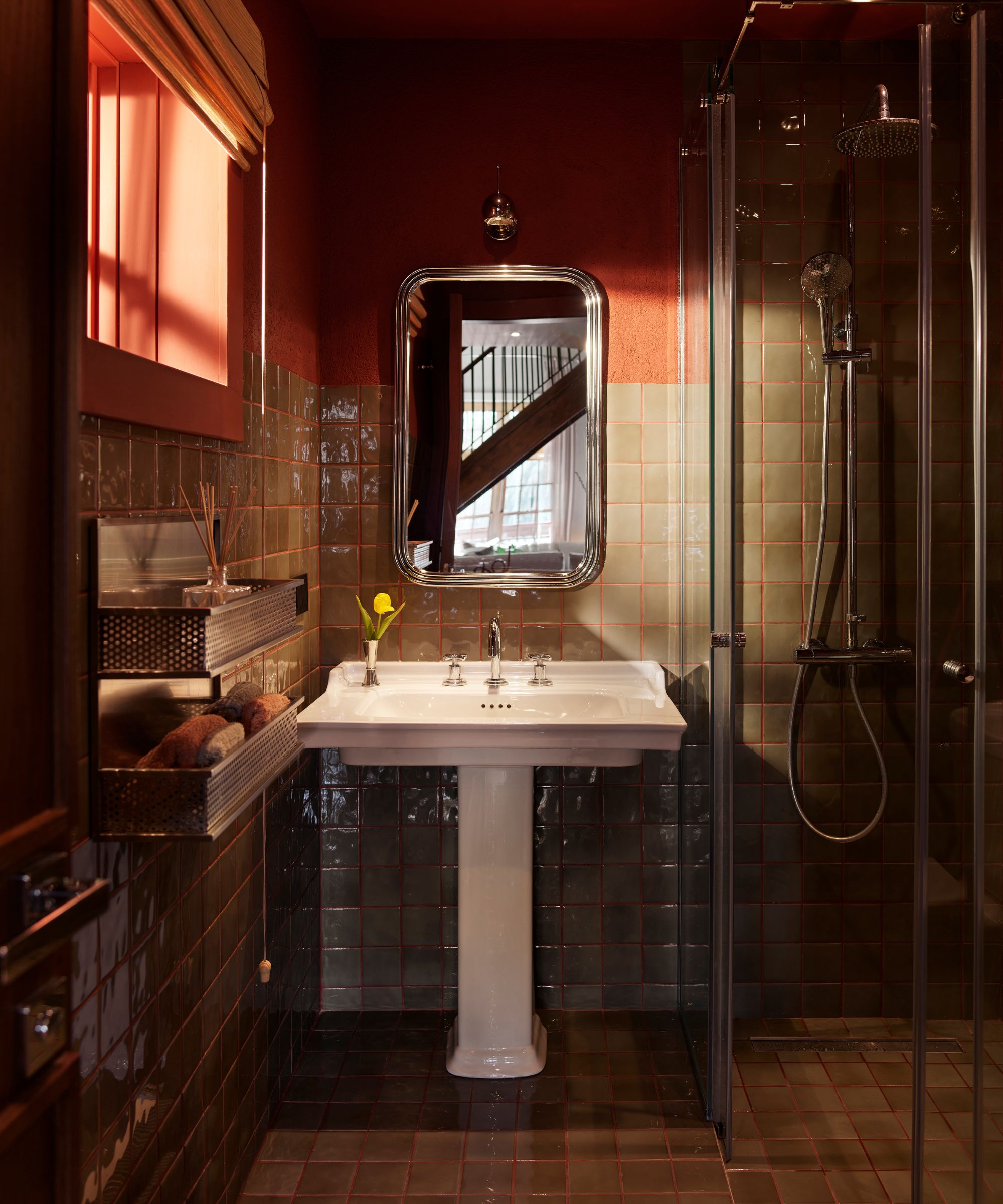
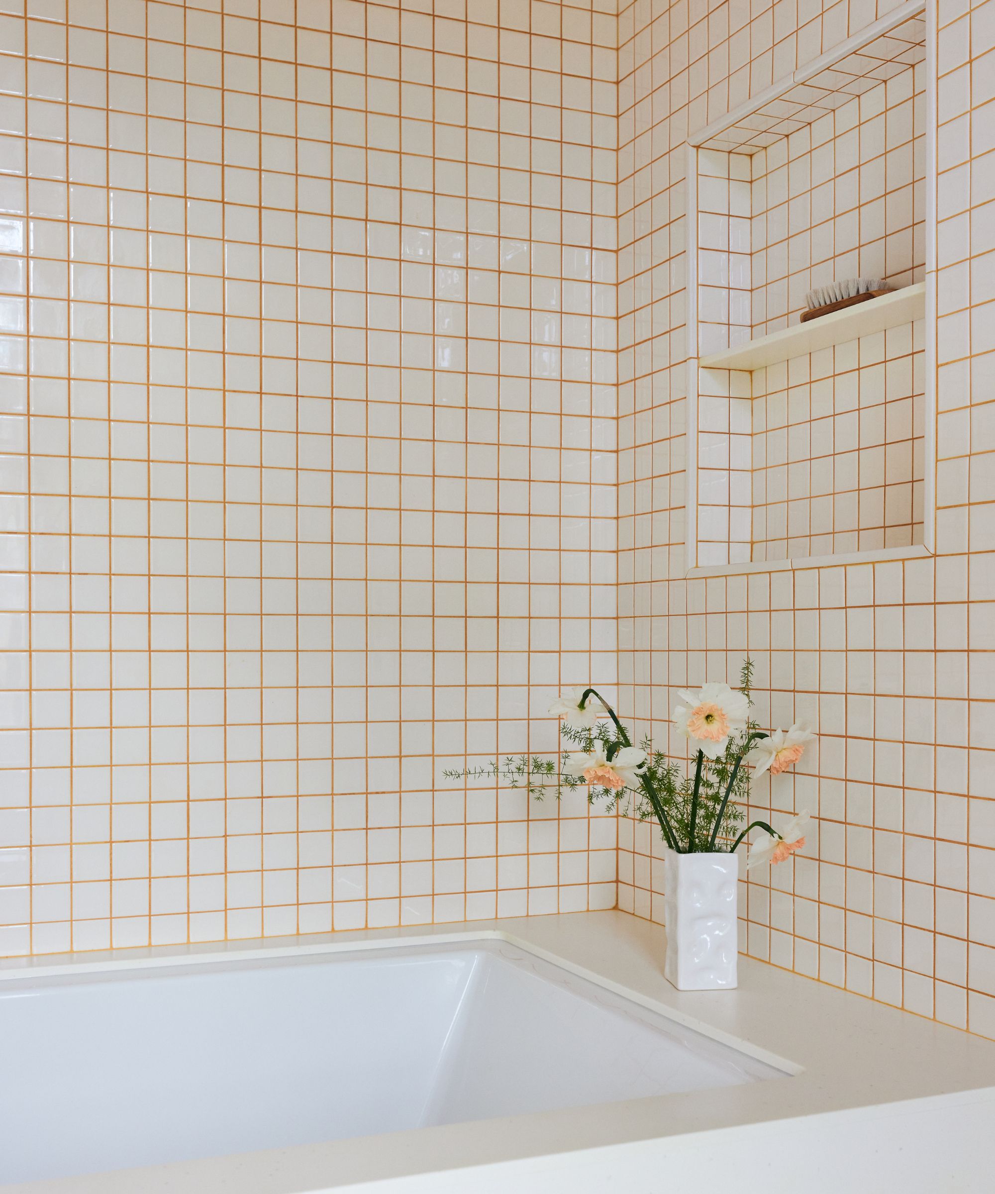
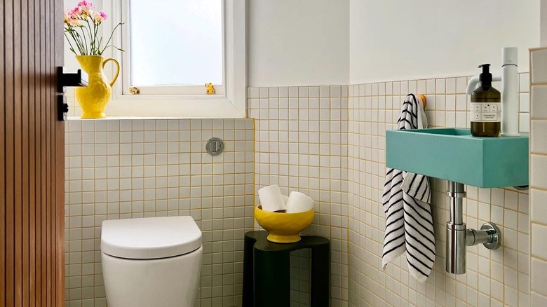
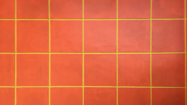
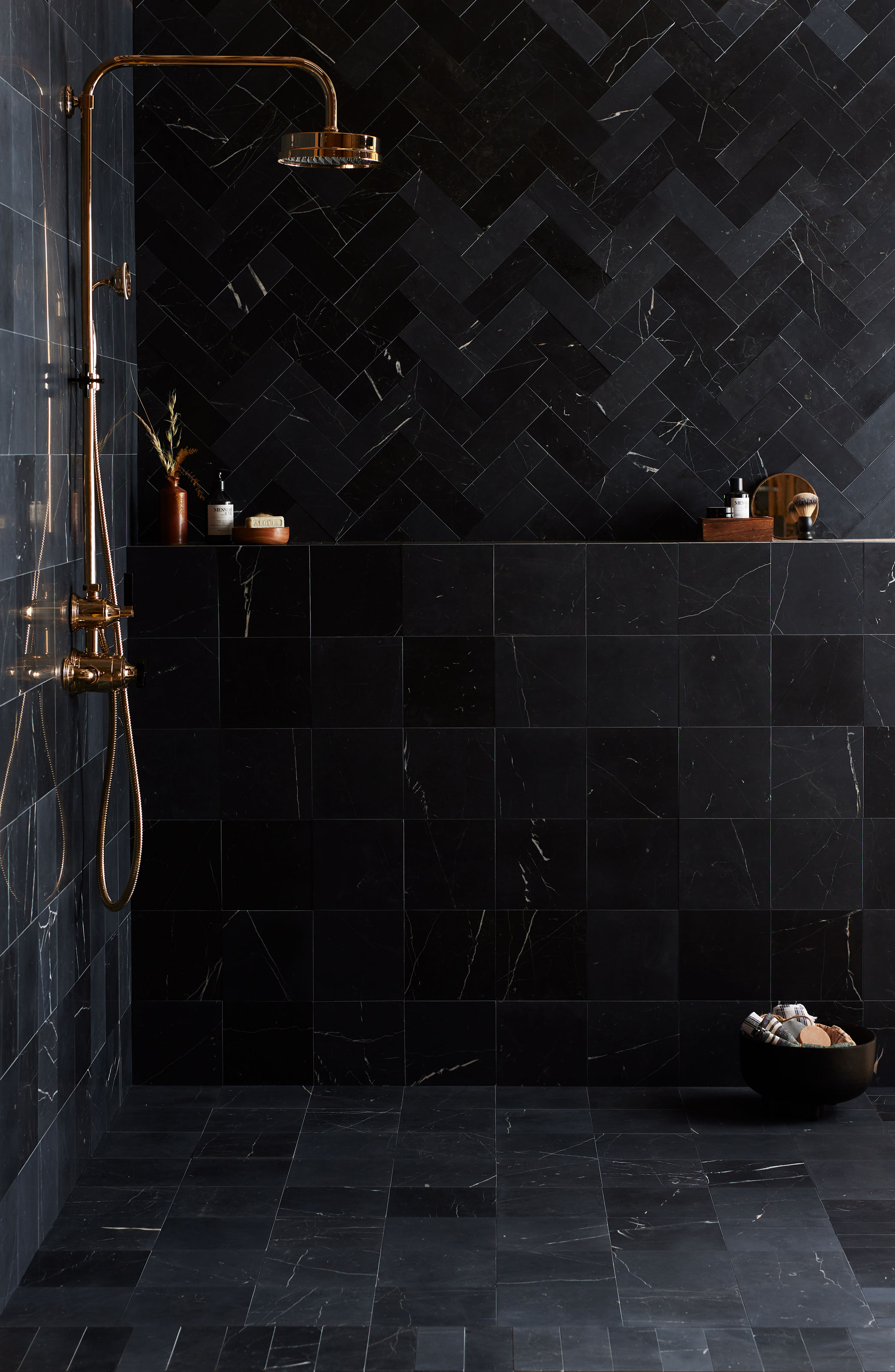
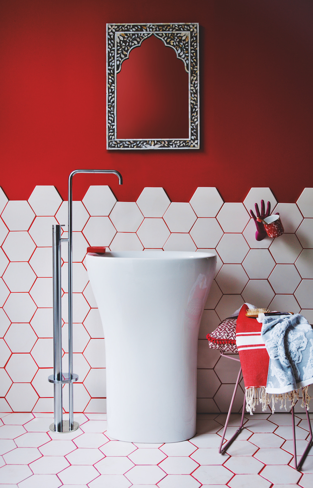
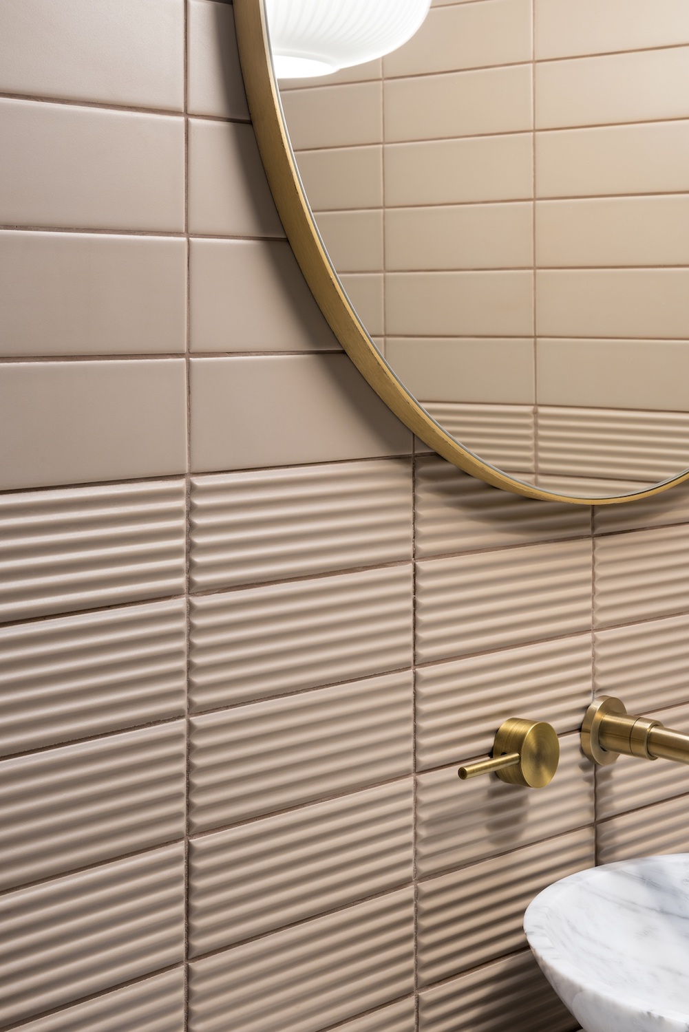
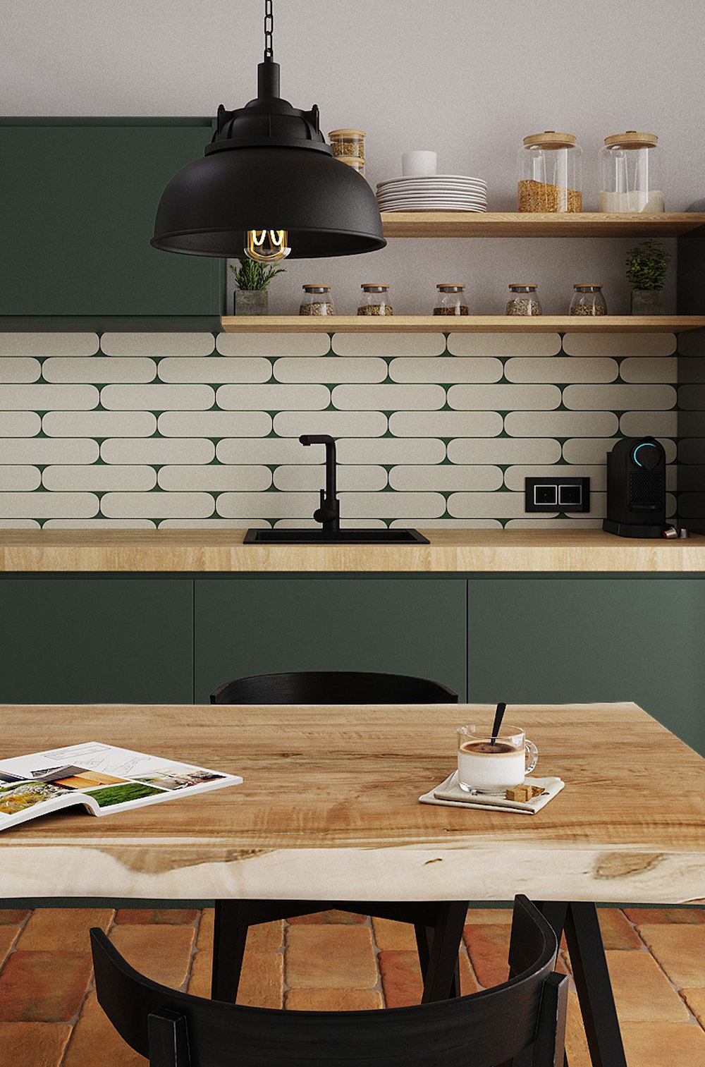
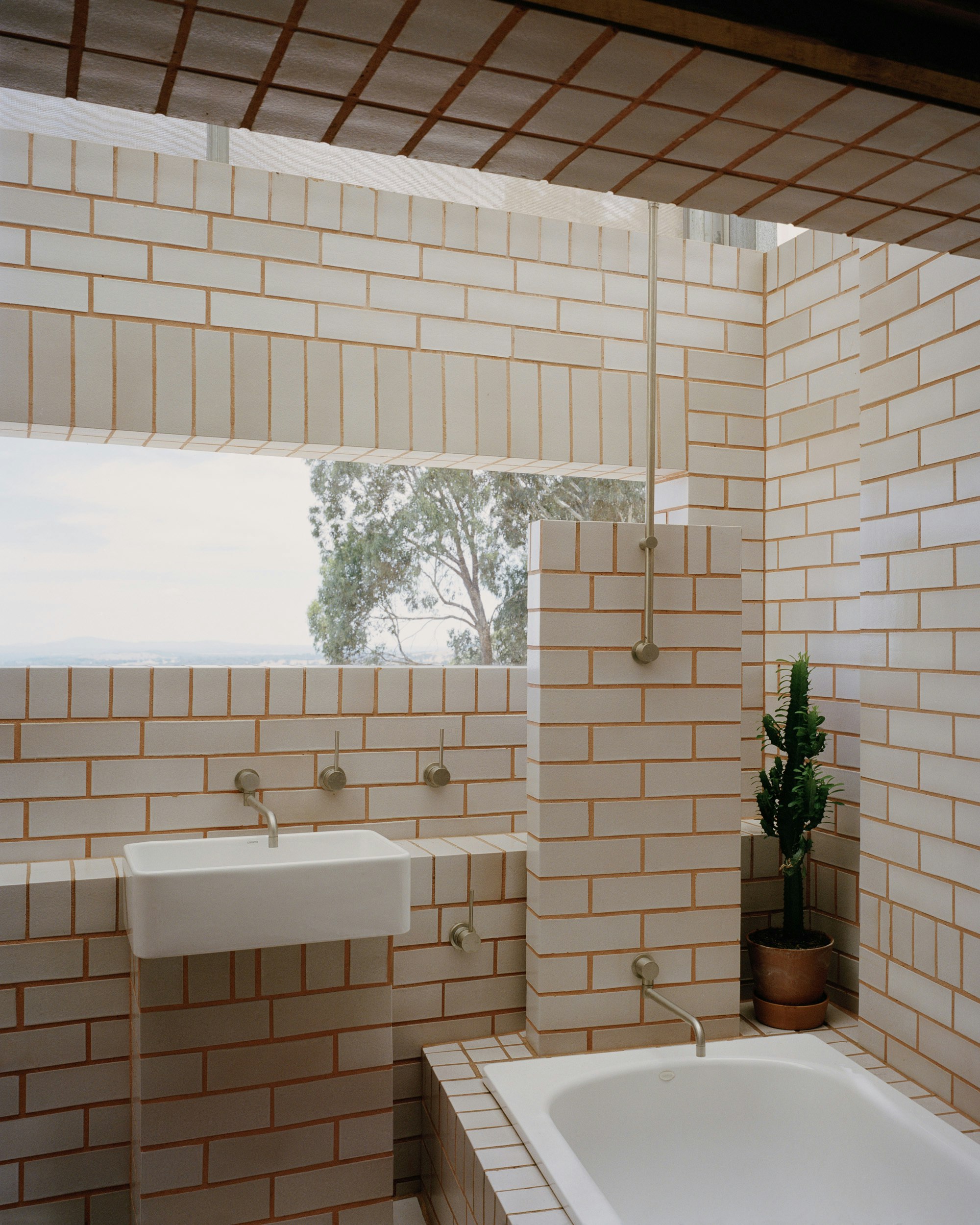
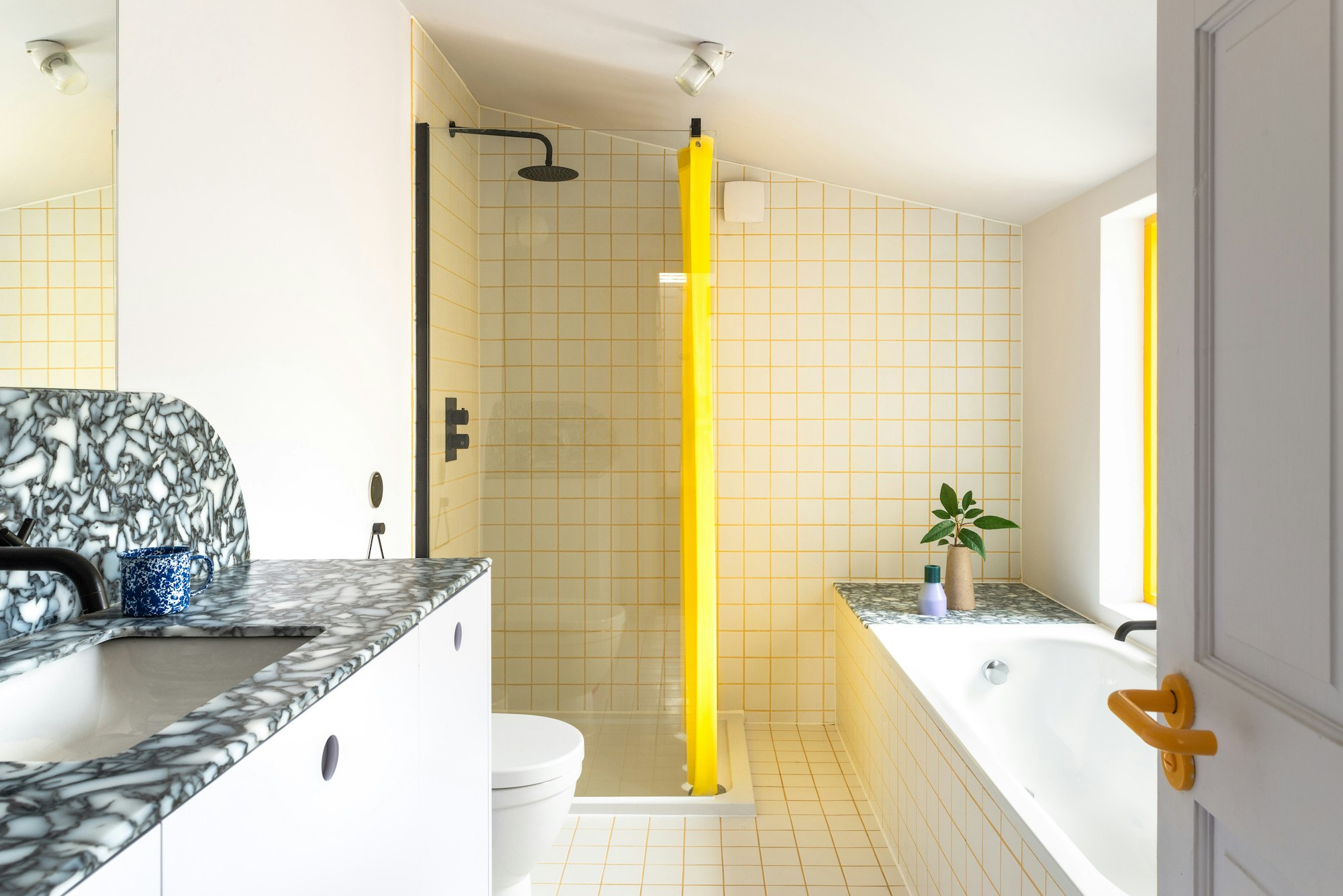
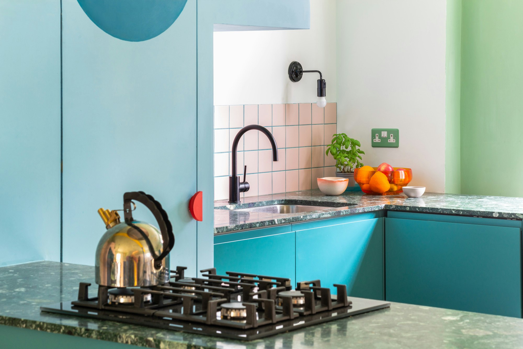
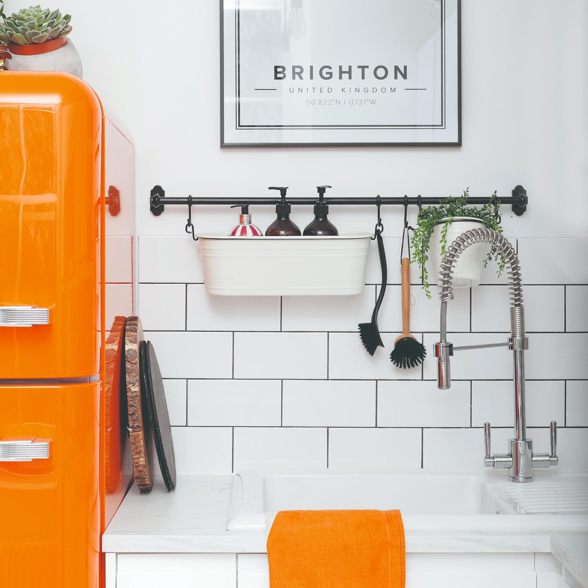
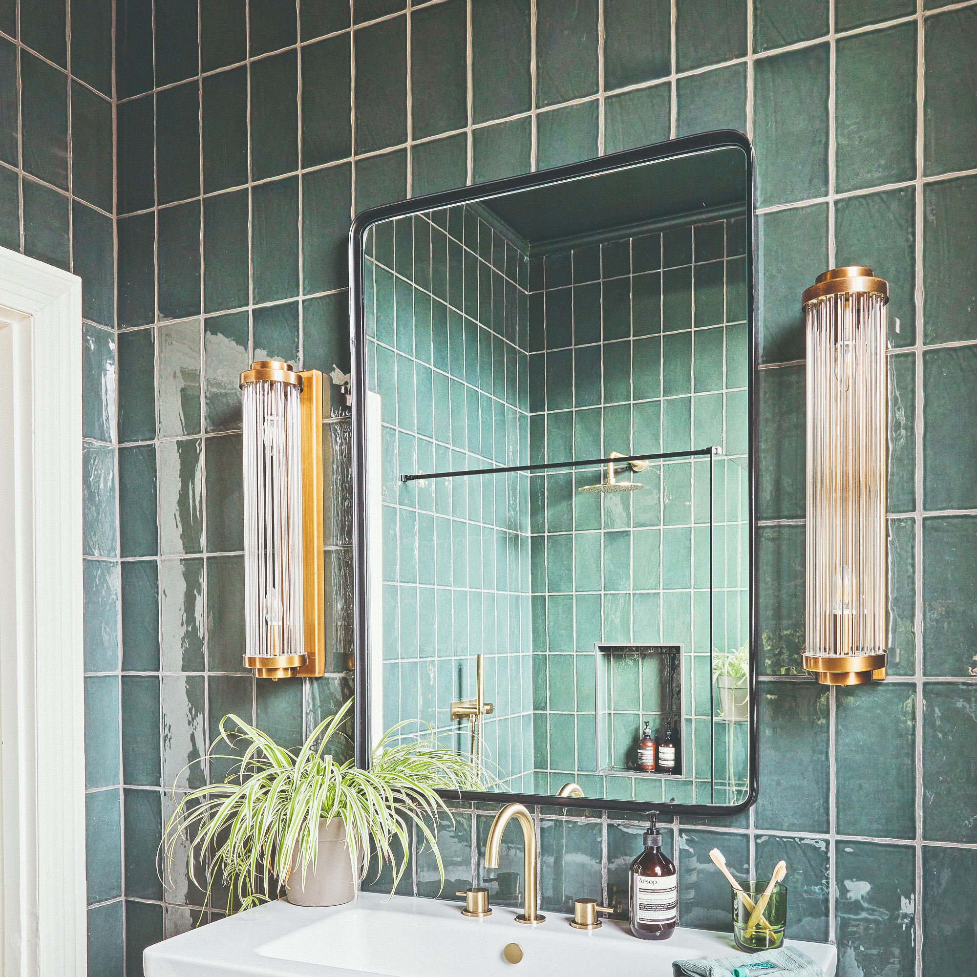
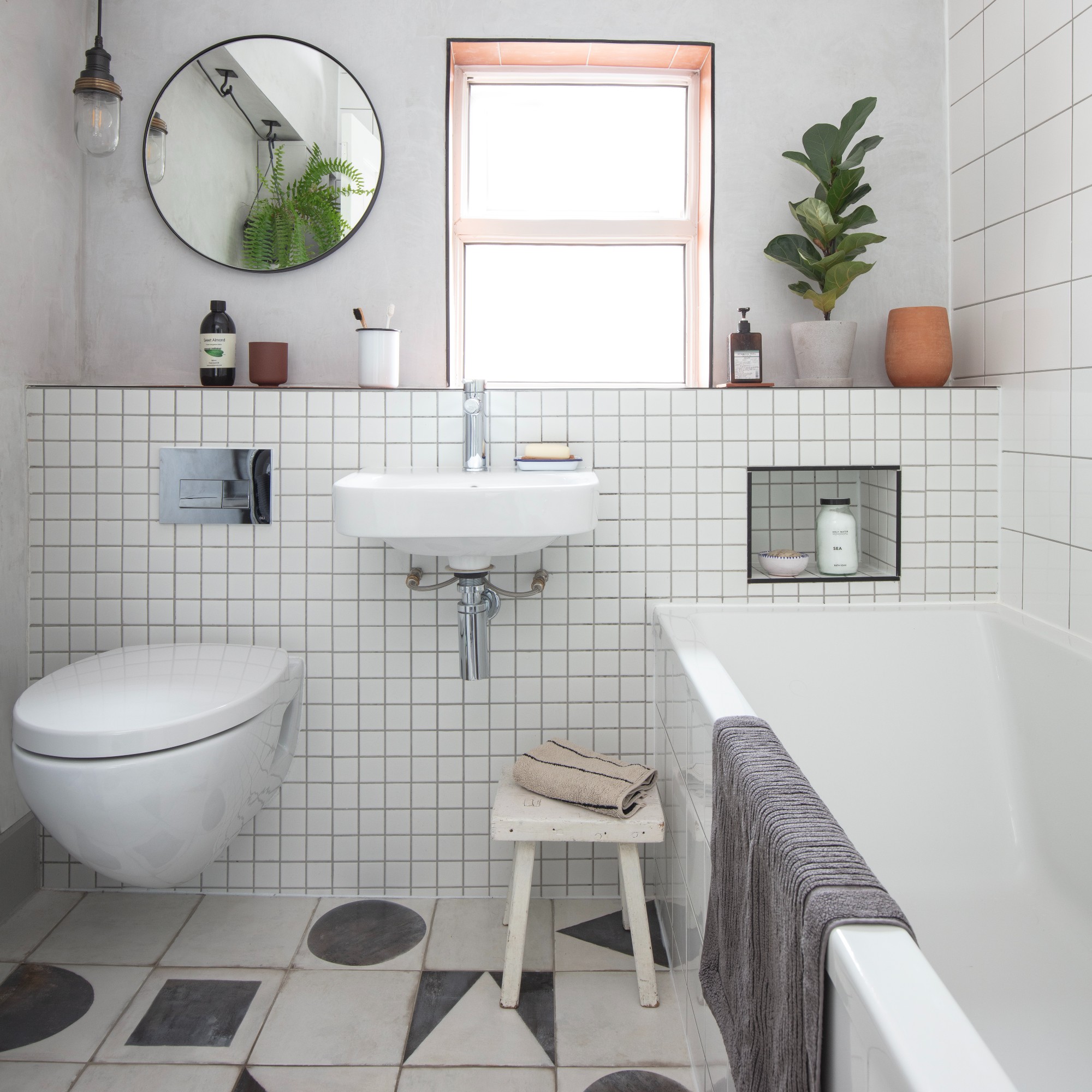
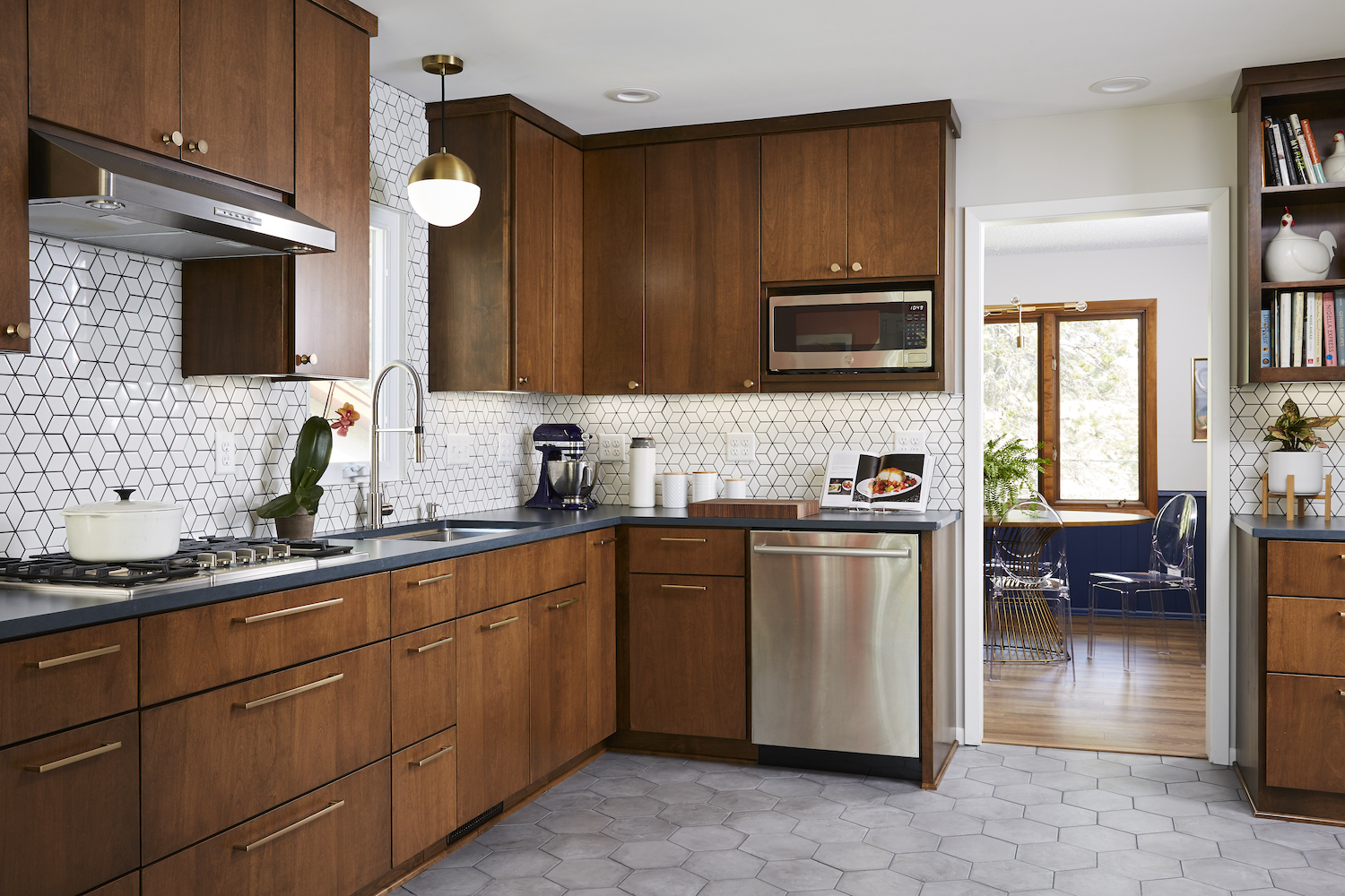
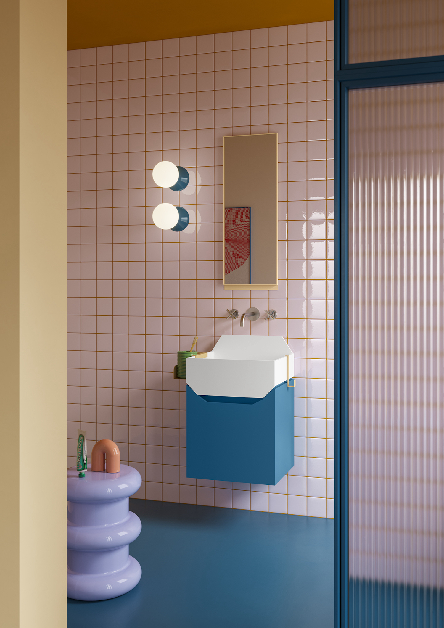
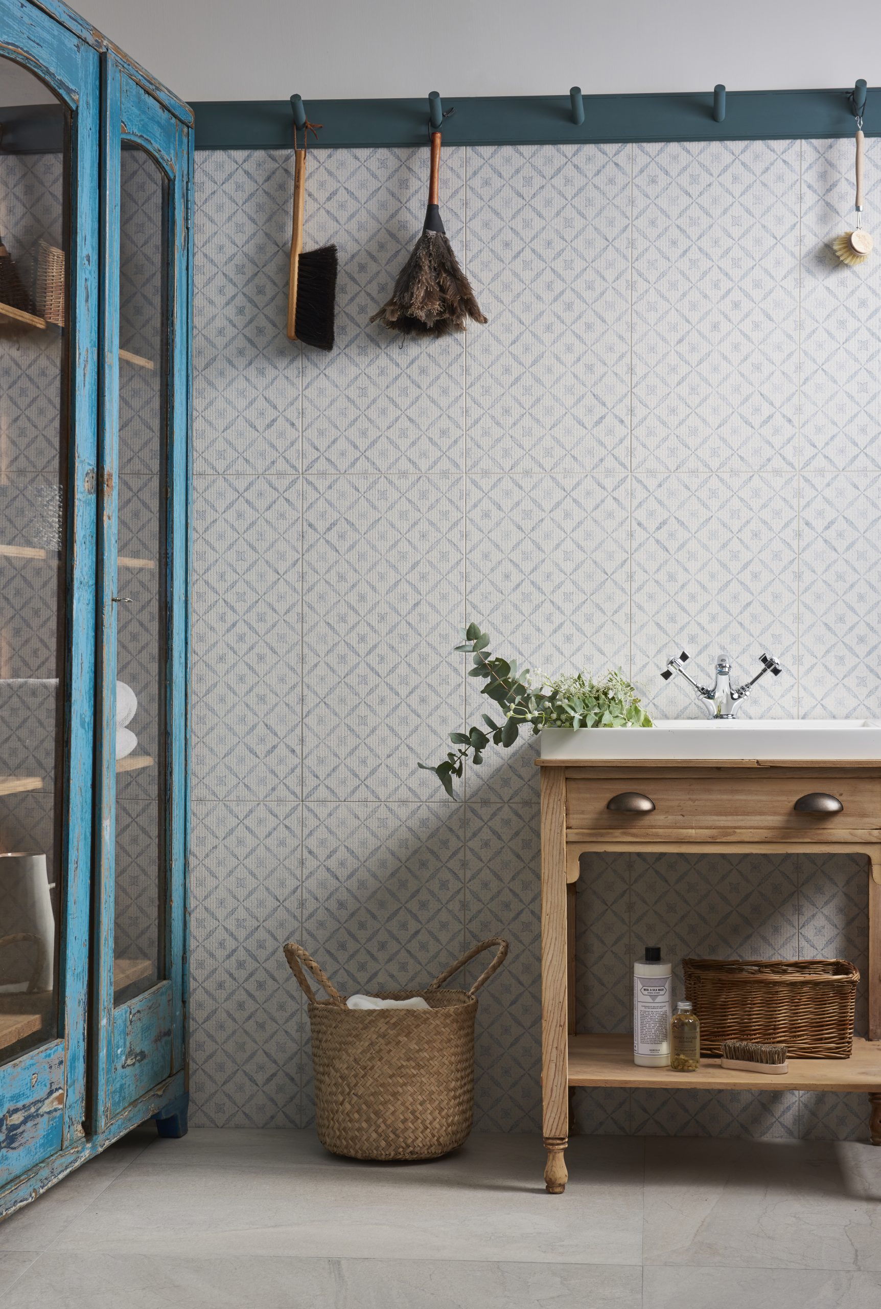
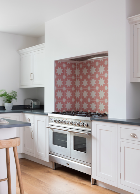
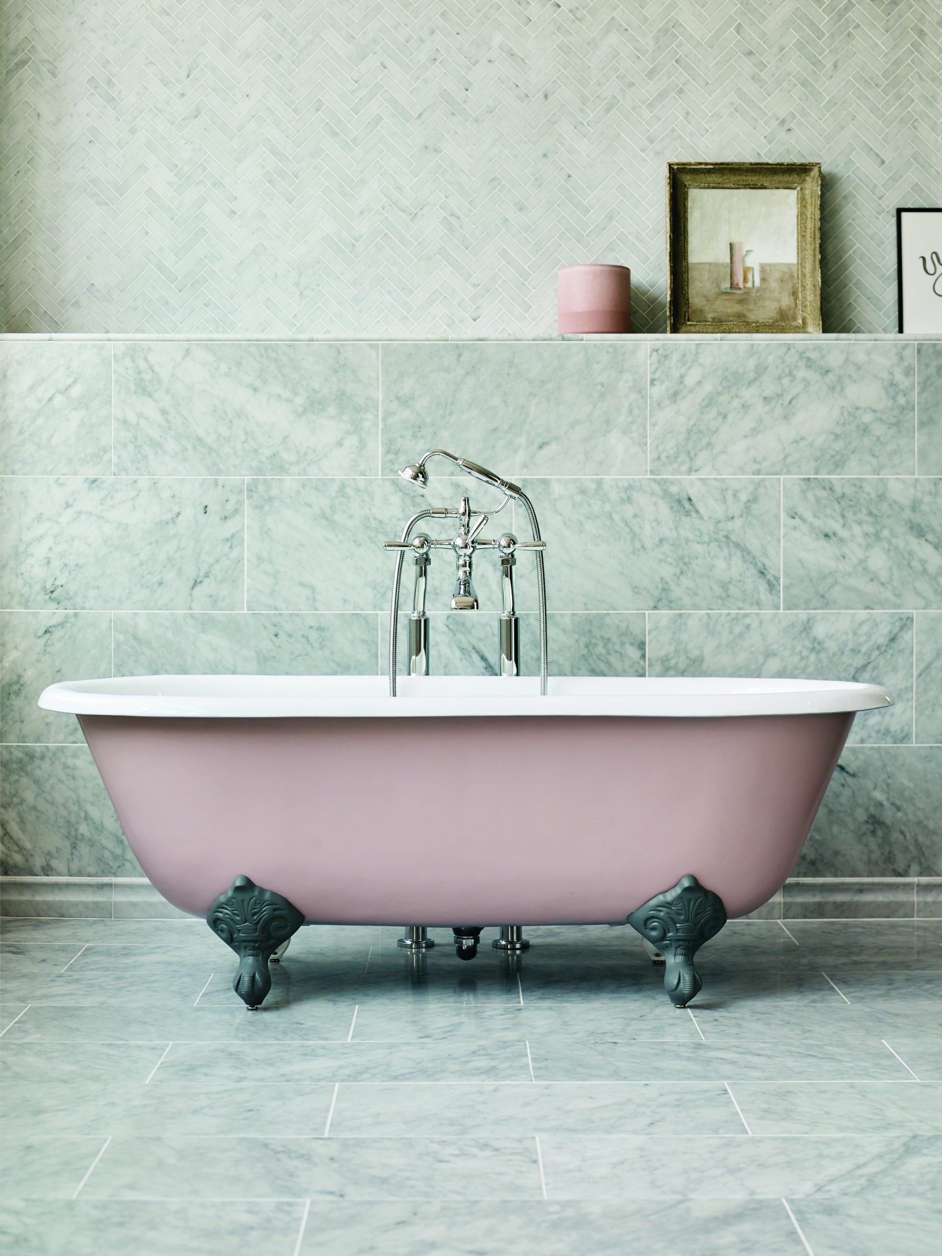
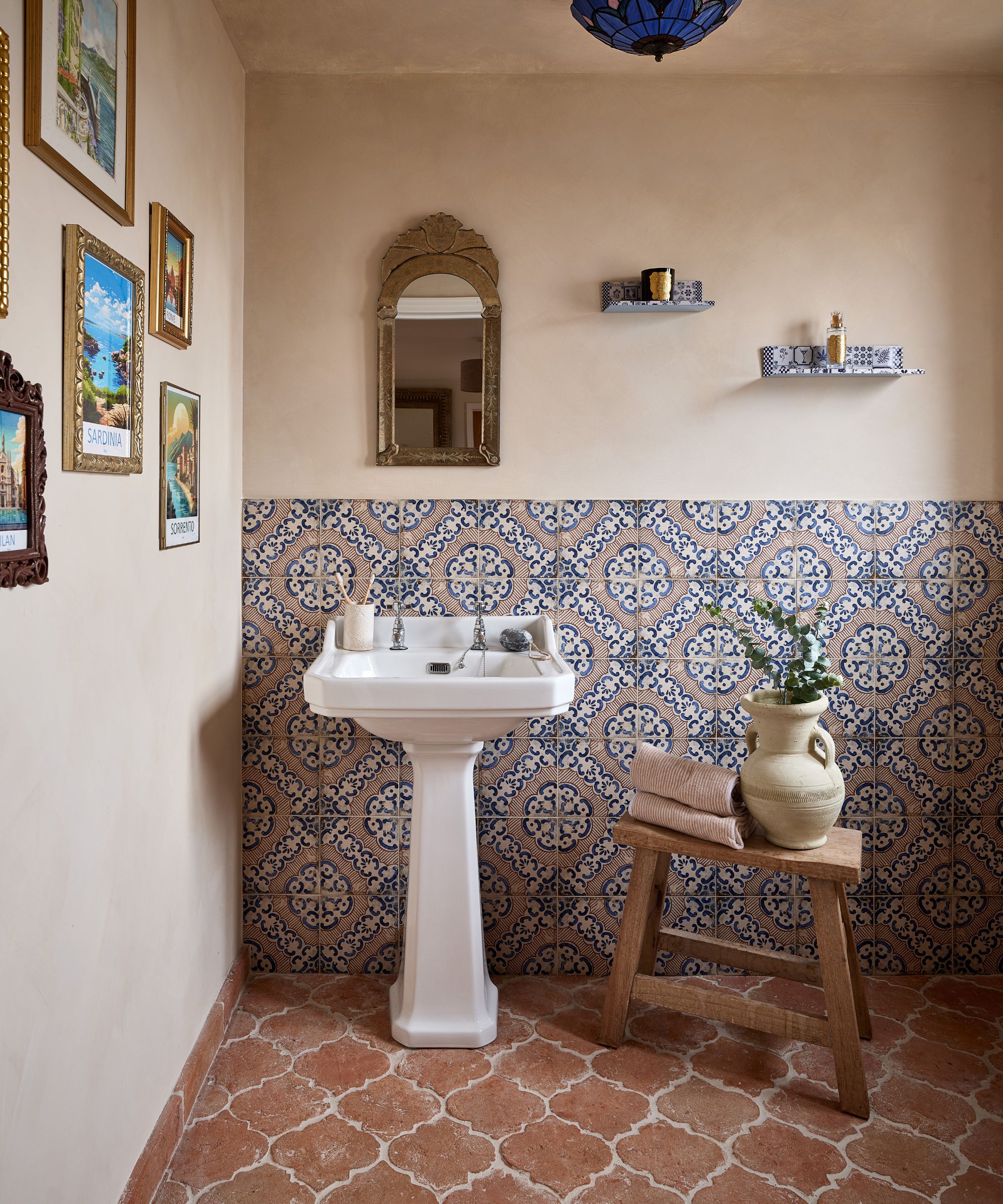
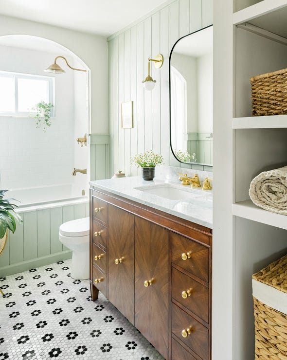
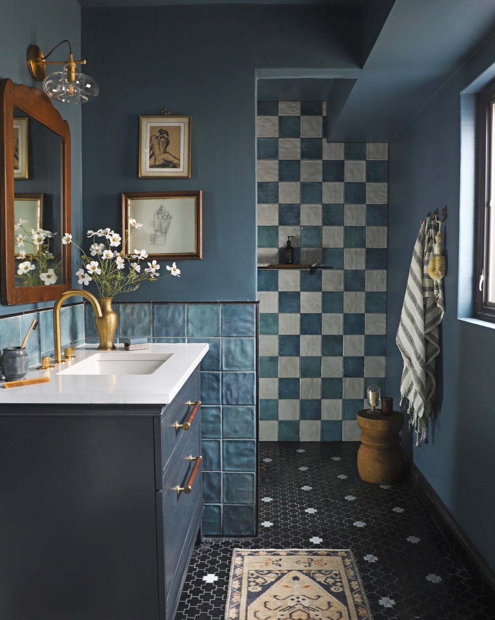
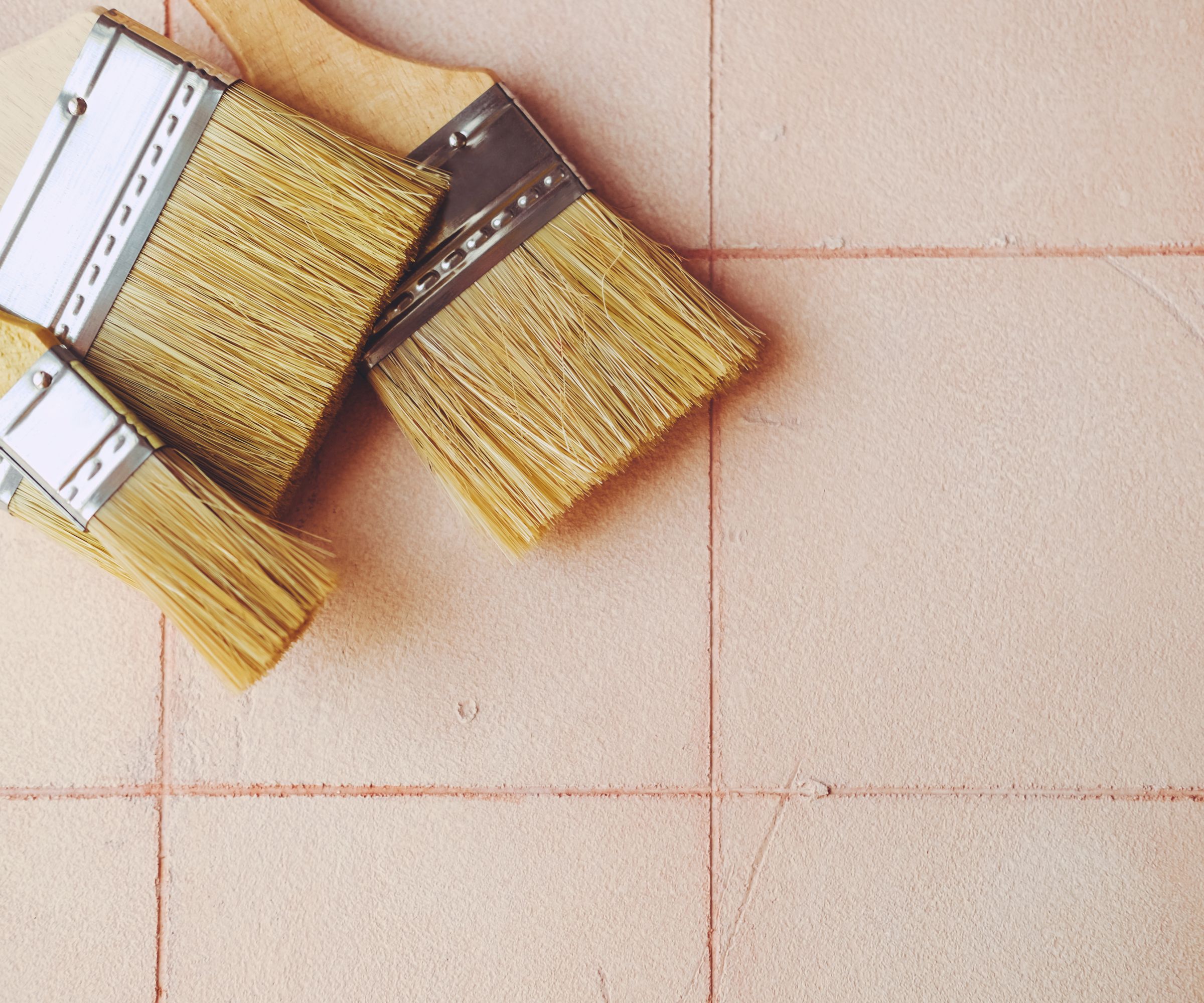
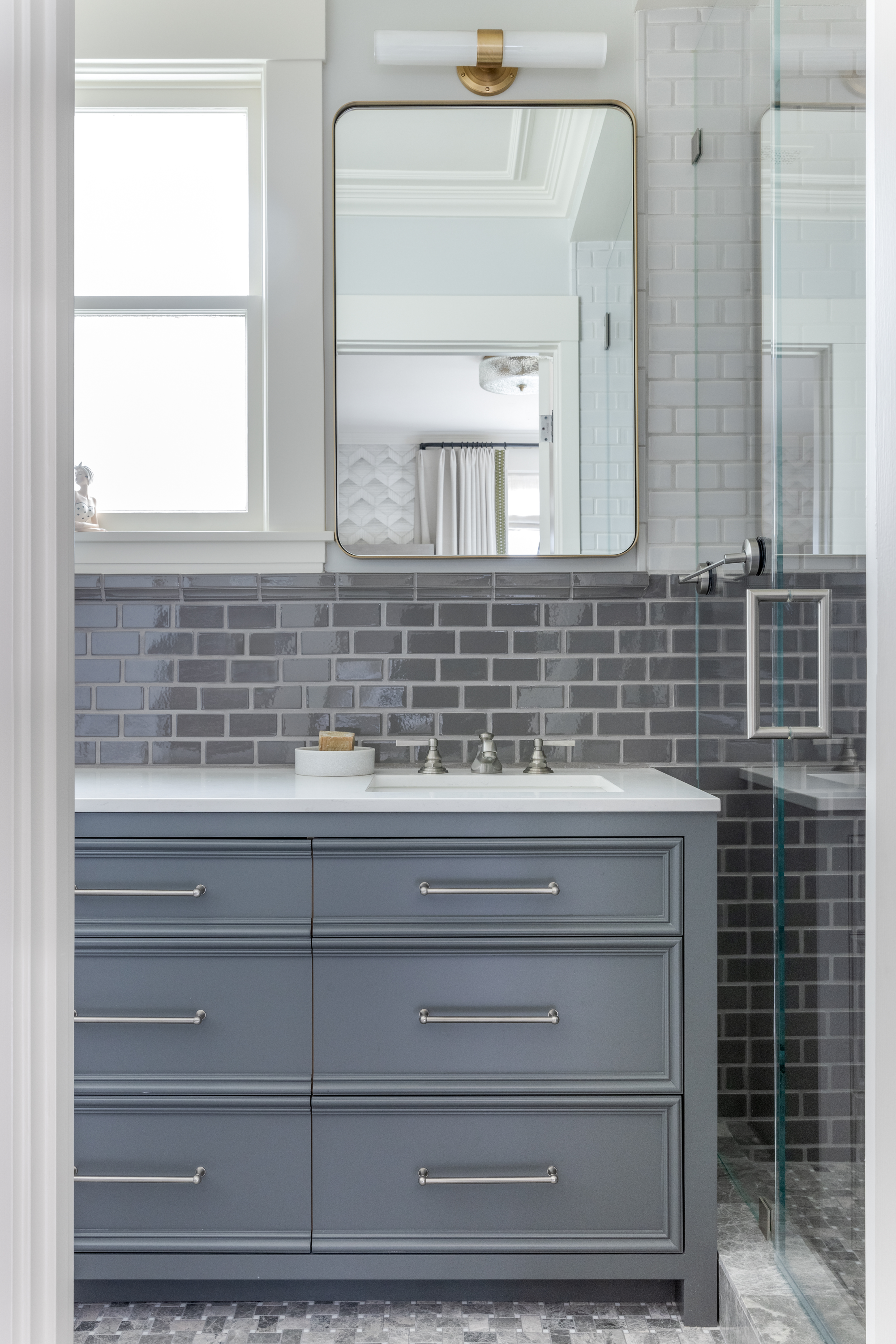
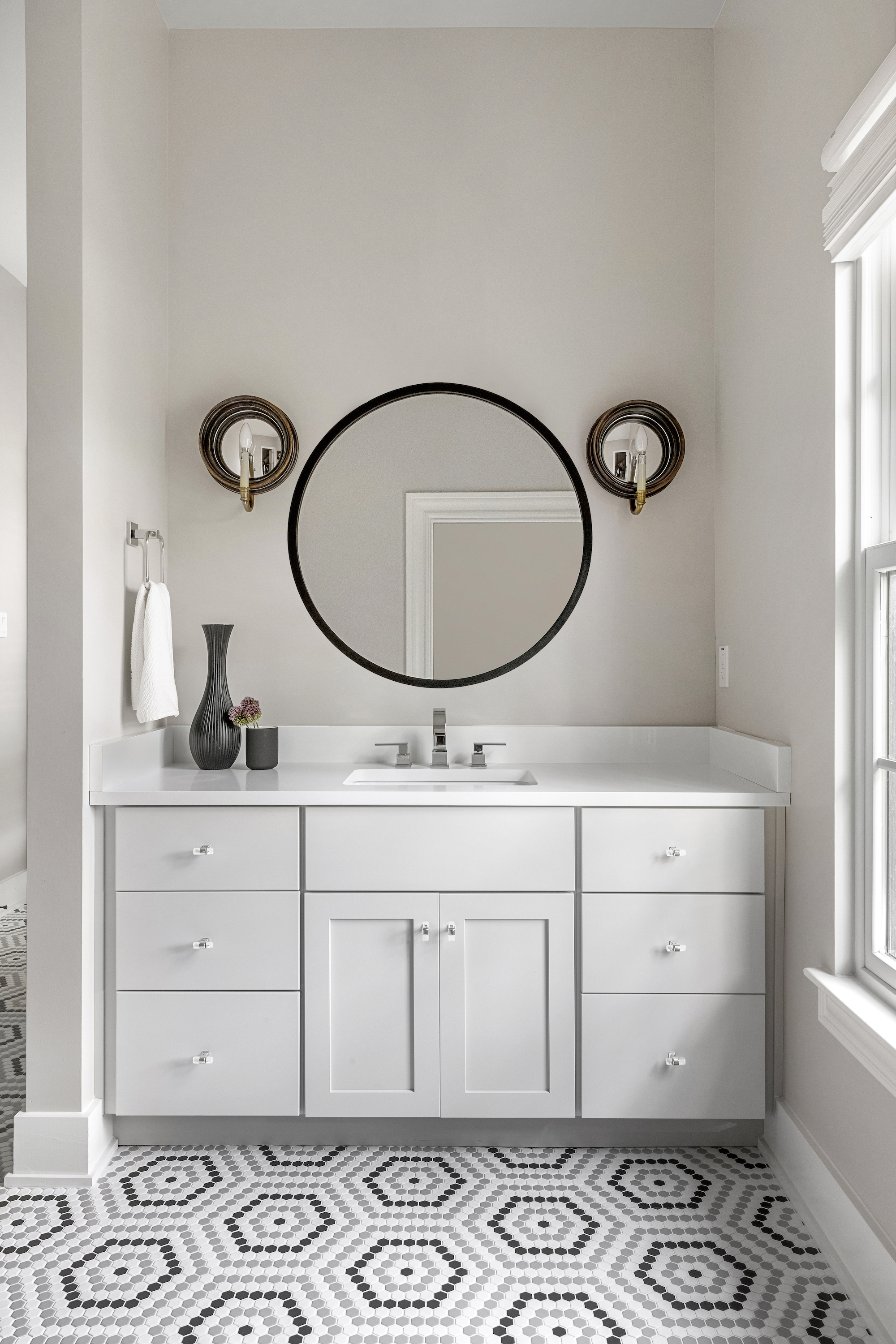
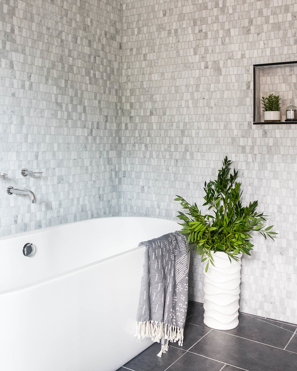
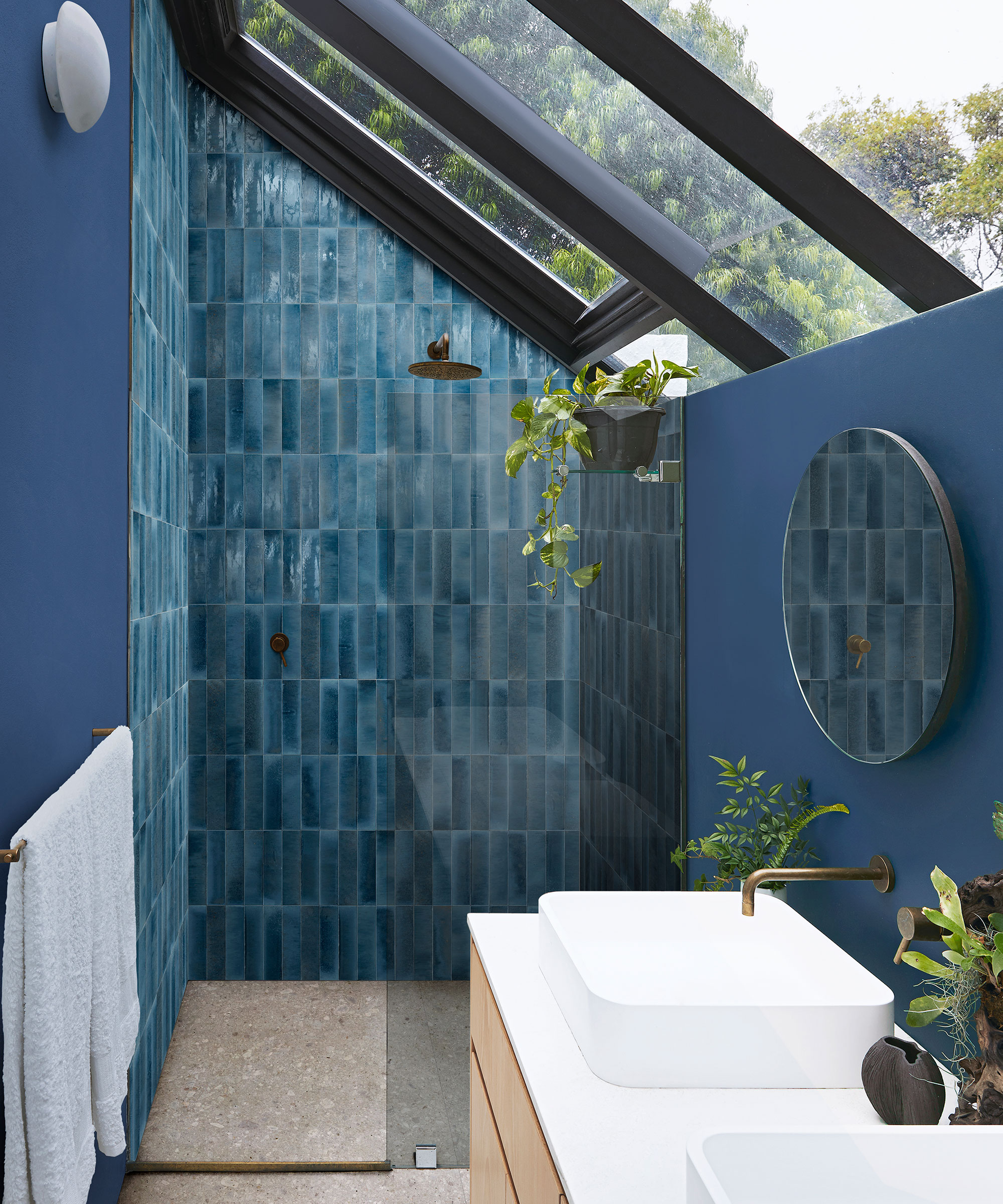
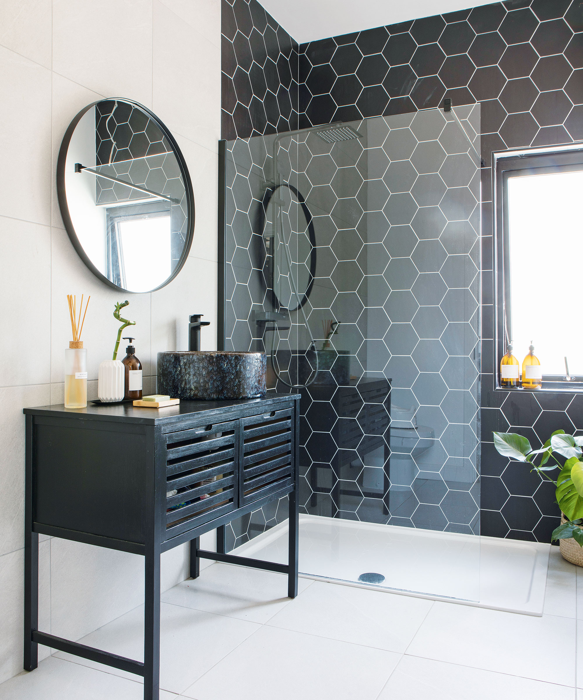
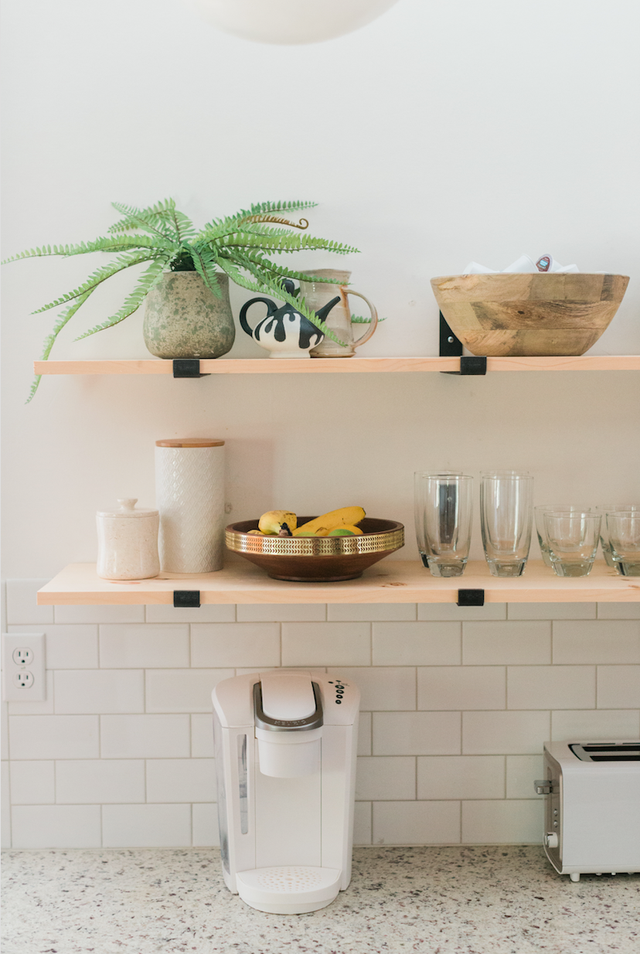
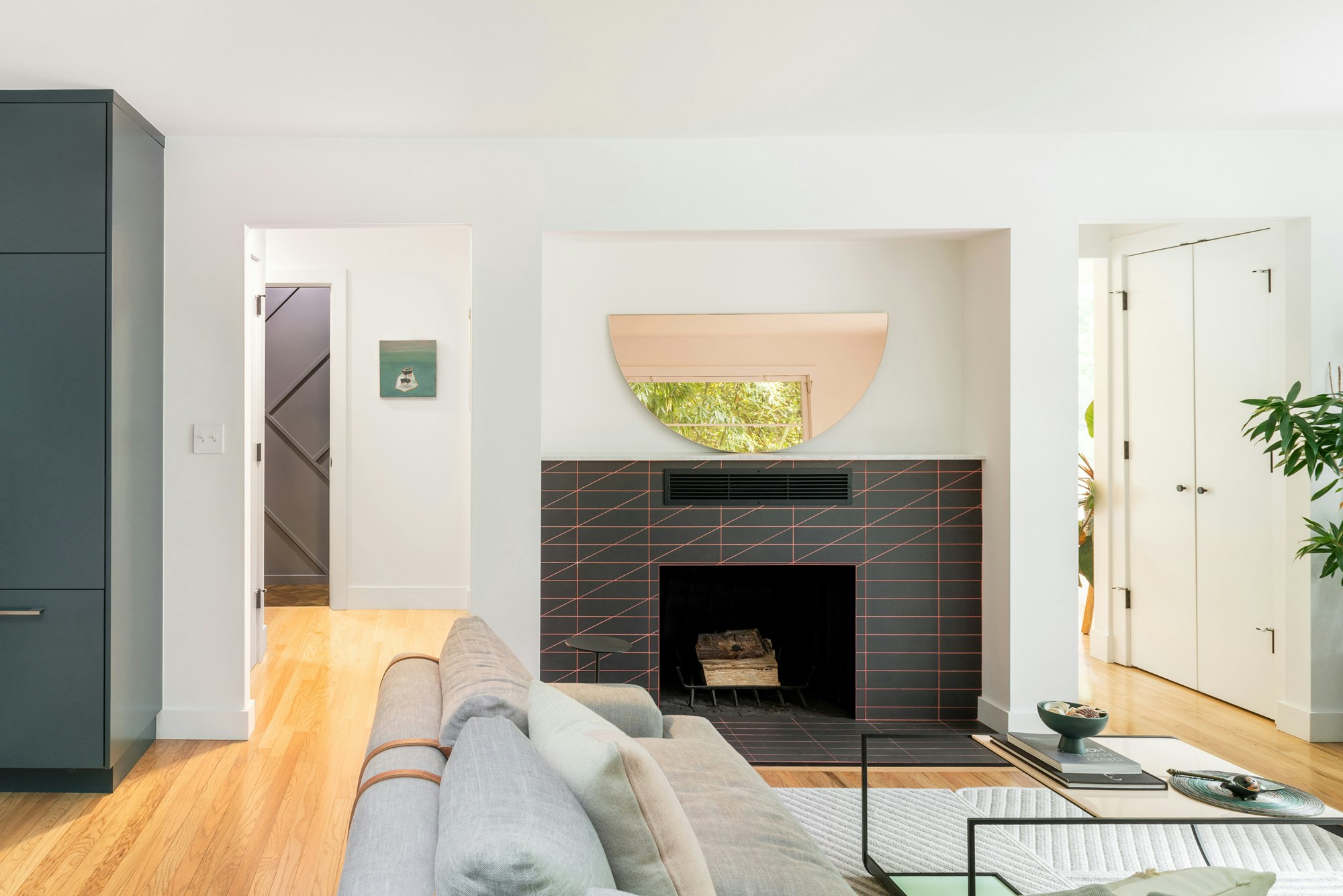
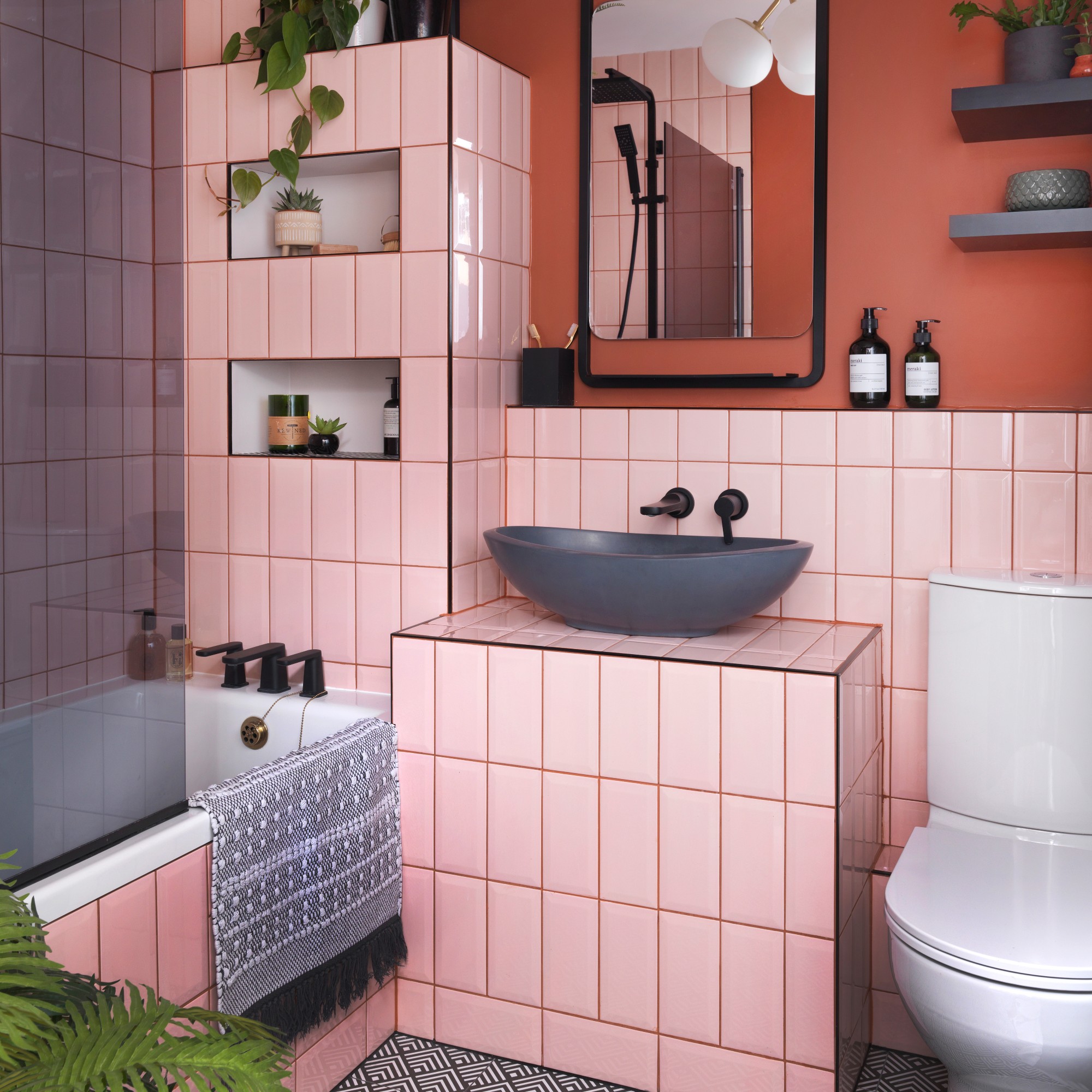
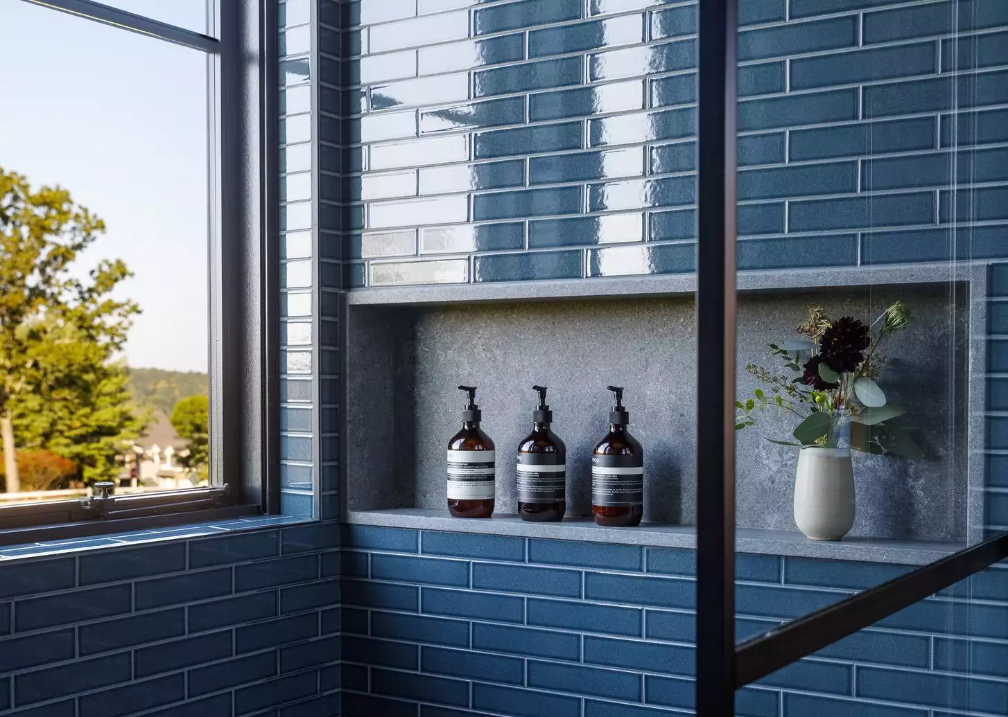
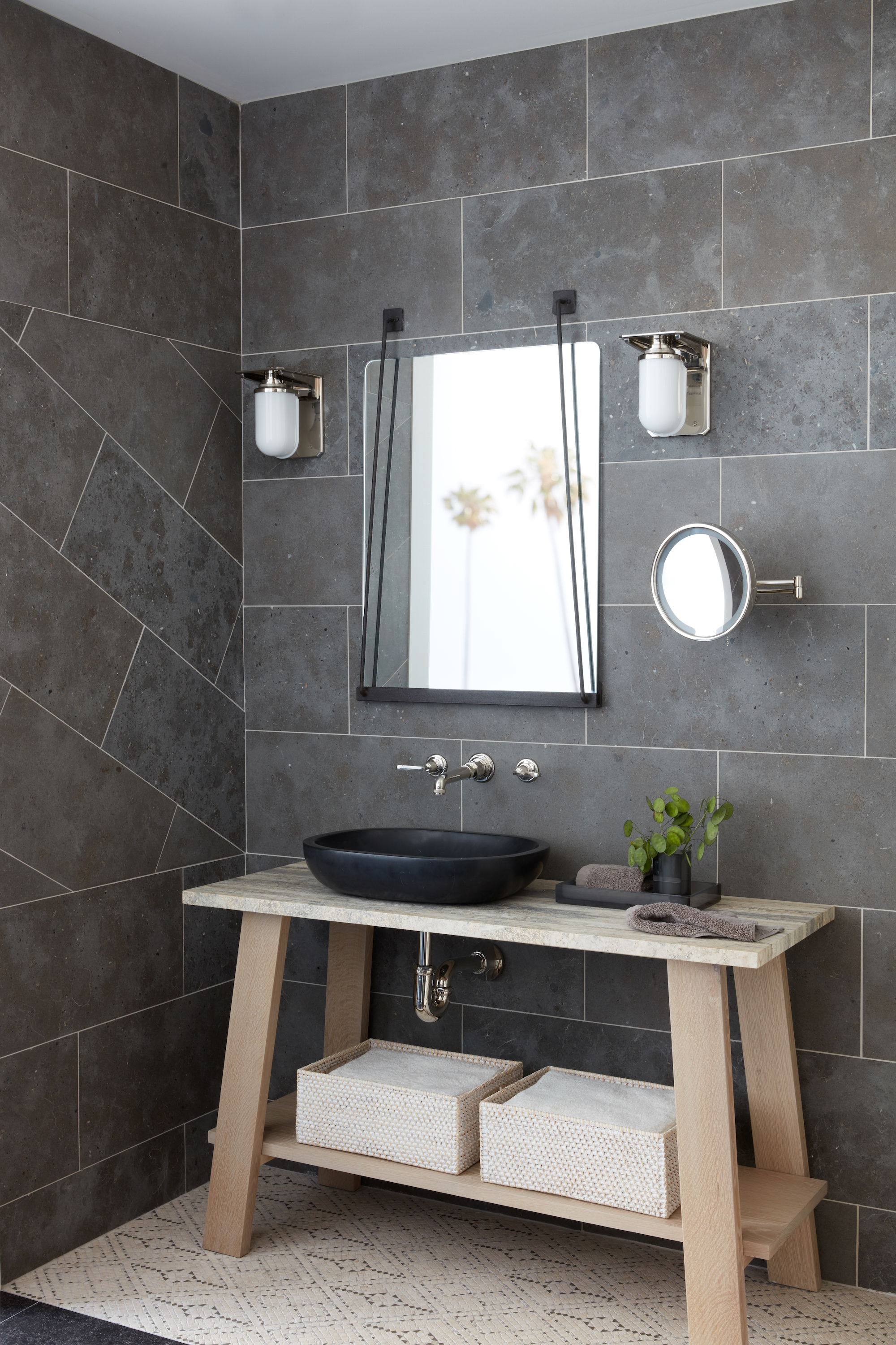
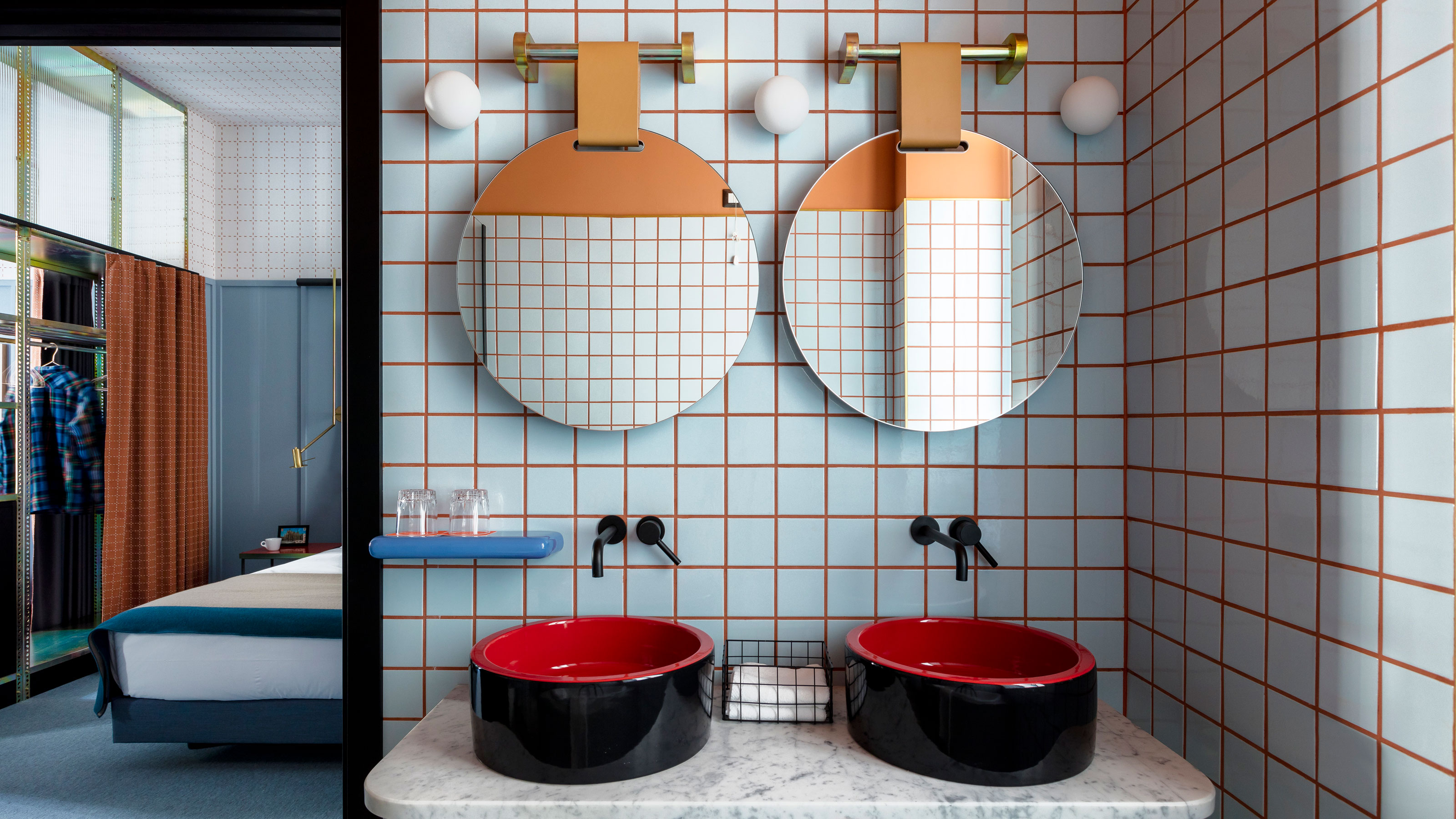
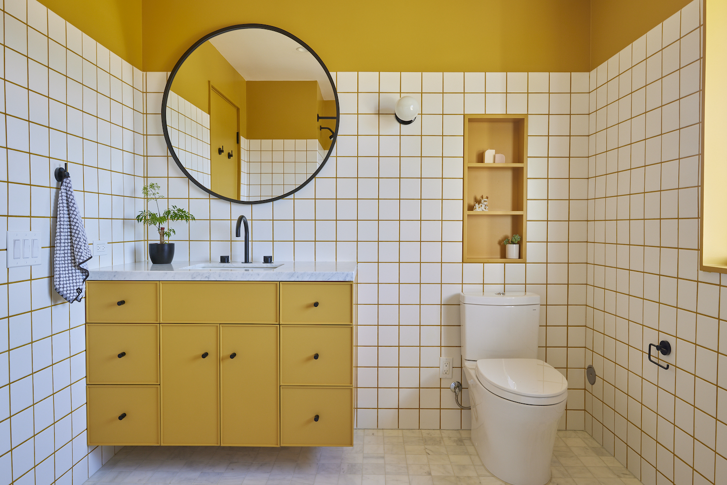
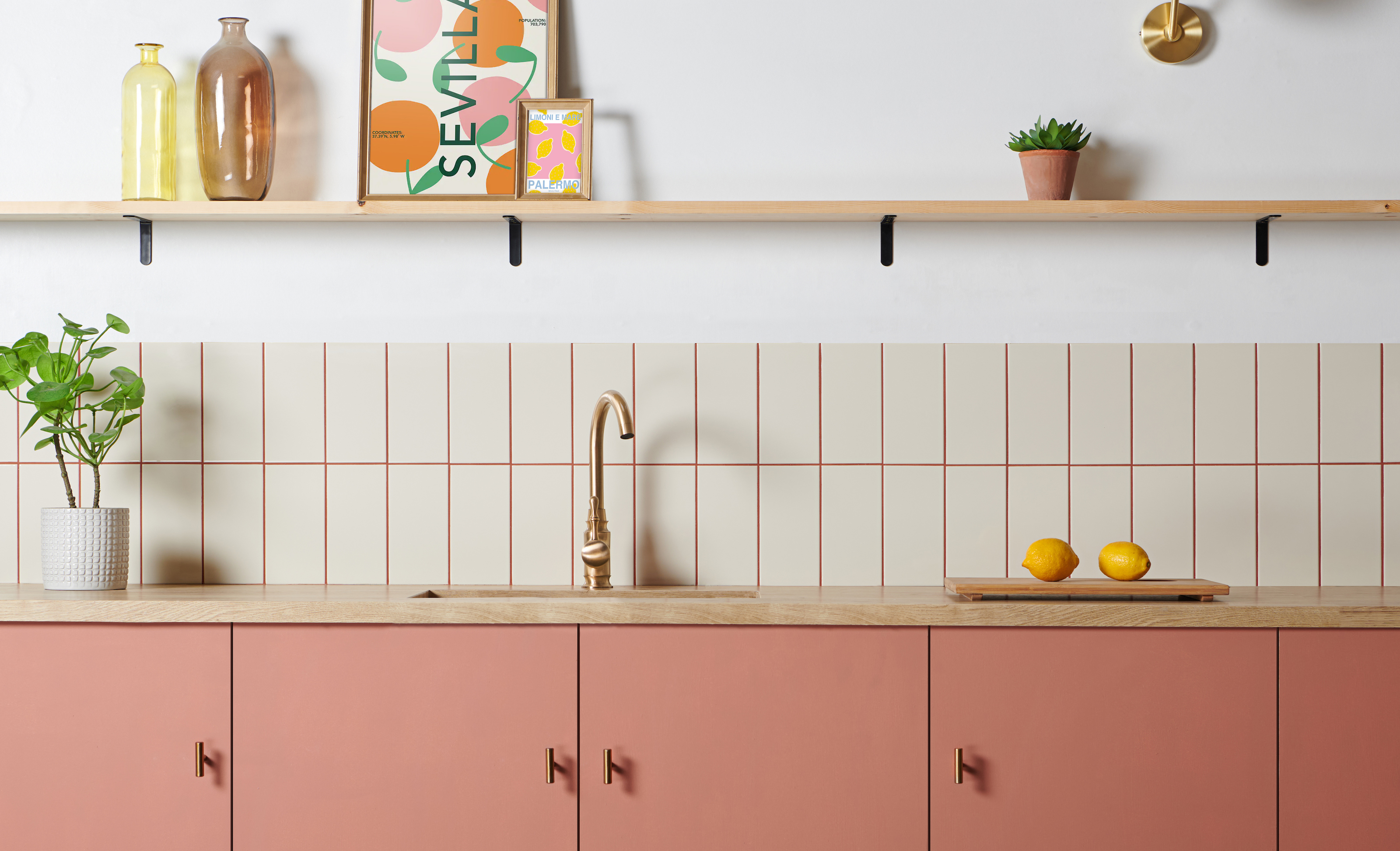
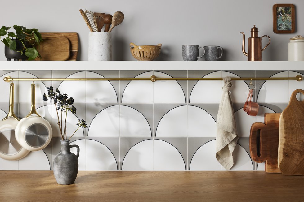
The article concludes by offering four favorite grout color ideas, along with examples of when to use them. Alabaster grout is recommended for marble tiles to accentuate dark veining. Charcoal grout is suggested to add a bold contrast to classic white subway tiles. Coral grout, inspired by Kelly Mindell of Studio DIY, is presented as a subtle blush option for white or gray penny tiles, particularly when paired with gold plumbing fixtures. Finally, bright white grout is recommended for black hexagon tiles to highlight their unique shape and make the tile work stand out. These examples illustrate how strategic grout color choices can elevate various tile styles and overall room designs.
#GroutColor #TileDesign #HomeRenovation #InteriorDesignTips #DIYHomeImprovement #BathroomDesign #KitchenDesign #ColorCoordination #GroutColor #TileDesign #HomeRenovation #InteriorDesignTips #DIYHomeImprovement #BathroomDesign #KitchenDesign #ColorCoordination
0 комментариев всего
 Комментариев пока нет
Вам также может понравиться
3 unexpected grout colors that prove you don’t have to decorate with just white

Grout Expectations: Ways to Play With Tinted Paste

Wall tile trends – from daring colour choices to creative combinations for walls
Can you paint grout lines? Professional painters say it could be easier than deep cleaning
27 Colorful Grout And Tile Combinations That Will Inspire You To Join The Bold Decor Trend
This is how you can easily replicate the colourful grouting trend - and for less than £4!

This Unexpected Grout Color Is Better Than White for Subway Tile, Designers Say

12 grey tile ideas for bathrooms – inspiring looks from a color classic

The best tile and grout color combinations – designer-approved pairings for more creative tiling

How to Choose Bathroom Tile That You'll Love Forever, According to a Designer
What’s making your bathroom tiles look cheap? 7 things to look out for, according to experts
5 Trendy Ways to Add More Color to the Bathroom
How to Choose the Perfect Grout Color for Your Next Project, According to a Designer
5 Times Interior Designers Used Colorful Tile Grout That Make Me Never Want to Choose White Again
Bathroom in Need of an Upgrade? Try One of These Paint Colors
24 bathroom tile ideas to add impact and transform your space
How to change grout color - the easiest little touch to make your home feel fresh again

I Transformed My Kitchen for Less Than $25 With This Grout Colorant | Reviews by Wirecutter
Tile Style: Four Ways to Dress Up Your Home
71 Bathroom Tile Ideas to Upgrade Your Space