
1/4
Color Psychology Meets Interior Design🎨
Let's dive into color psychology today!
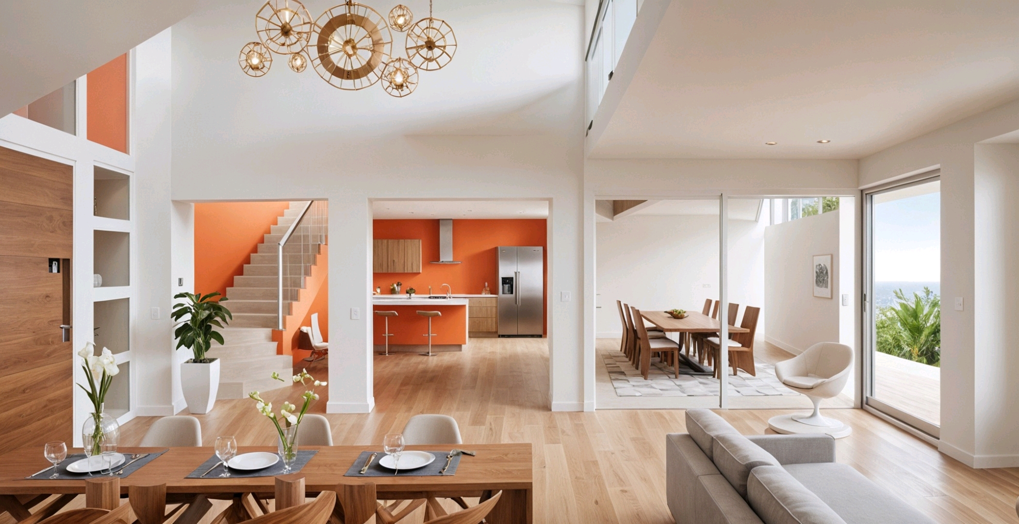
Blue and orange have opposing yet complementary properties. Blue exudes calm, perfect for bedrooms or meditation spaces. Orange, on the other hand, energizes and stimulates appetite – ideal for kitchens or dining areas!
The peacock color palette, blending vibrant blues with hints of orange, creates a dynamic yet harmonious atmosphere. It's bold, luxurious, and can transform any room! And let's not forget the subtle elegance of off-white paired with white. This combination adds depth and sophistication without overwhelming the senses. Perfect for creating a clean, airy space.
Experiment with these color pairings to elevate your interior design game! 🌟
#InteriorDesignColorSchemes #ColorPsychology #BlueOrangeContrast #PeacockInspiration #OffWhiteMagic #DesignTrends #HomeDecorGoal
14 de mai. de 2025
Há 0 comentários no total
Ainda não há comentáriosVocê também pode gostar
Color Theory 2.0: Dynamic Hues That Respond to Your Environment 🌈
Tired of static wall colors? Let's talk about the future: dynamic hues that respond to your environment and mood! 🌈 Imagine walls that subtly shift color based on ambient light, time of day, or even your chosen playlist. We're looking at smart pigments and responsive materials that can create truly immersive atmospheres. This isn't just about aesthetics; it's about actively enhancing your living experience through adaptive color. Picture a living room that glows with calming blues in the morning and vibrant corals in the evening. What color shift would enhance your space? Save this for a spectrum of design possibilities! ✨ #dynamiccolor #responsematerials #colorpsychology #interiorcolor #futureofdesign #innovativedesign #adaptiveinteriors #designtechnology #homeambiance #cuttingedgeinteriors
Color Psychology in Decor: Using Hues to Boost Your Mood! 🌈😊
Did you know colors can actually affect your mood? 🌈 It's true! For a mood boost, I love incorporating sunny yellows, cheerful oranges, and vibrant pinks into my spaces. These colors are known for their energizing and uplifting properties! ☀️ Think accent pillows, vibrant artwork, or even a colorful vase. You can achieve a joyful atmosphere without a complete overhaul. What color makes you feel happiest at home? Save this for a mood-boosting decor update! 💖 #ColorPsychologyIdeas #MoodBoostingDecorIdeas #VibrantHomeIdeas #HappyHomeIdeas #InteriorColorIdeas #DecorTips #HomeVibes #PositiveDecor #ColorInspiration #ChromaAndCharm
💡 The Impact of Light on Color Perception in Interior Design
Did you know the same paint color can look dramatically different depending on the light it’s in? Understanding light’s effect on color is crucial for perfect interiors. 🎨
Here’s how light plays a role:
* **Natural Light:** True colors are best revealed under bright, natural daylight.
* **Warm Artificial Light:** Tends to enhance reds, yellows, and oranges, making colors feel richer and cozier.
* **Cool Artificial Light:** Can make colors appear bluer or more subdued, often enhancing grays and whites.
* **Dim Lighting:** Colors can lose vibrancy and appear muted.
Always test paint colors in the actual lighting of your room! Save this for your color-choosing wisdom. ✨
#LightAndColorIdeas #ColorPerception #InteriorDesignColor #PaintColors #LightingInDesign #ColorTheory #HomeDecorTips #DesignSecrets #AccurateColor #LightingImpact

Exploring the Power of Color in Interior Design
I recently came across this beautiful living space that perfectly showcases how color can transform a room. The vibrant blue sofa and matching rug add a lively touch, while the yellow chair introduces a cheerful pop of color, creating a balanced and inviting atmosphere. The mix of bold and neutral tones enhances the overall aesthetic, demonstrating how thoughtful use of color can elevate interior design.
What are your favorite color combinations in home decor? Share your ideas or show us your colorful spaces!
#ColorInInteriorDesign #HomeDecor #InteriorDesign #ColorfulLiving #DesignInspiration #LivingRoomDecor #HomeStyling #Color

3
The Psychology of Color in Your Home Office 💡
Your home office colors can profoundly impact your productivity and mood! As a color psychologist, I love creating spaces that support focus and creativity. Here’s how:
💙 **Blues:** Known for calmness and focus. Think soft blues or muted teals to promote concentration and reduce stress. Ideal for long work sessions.
💚 **Greens:** Also calming and associated with balance and growth. Sage or mint greens can foster a sense of well-being and renewal.
💛 **Yellows (Muted):** Small touches of soft, sunny yellow can stimulate creativity and positivity without being overwhelming.
☁️ **Neutrals:** Off-whites, light greys, and warm beiges create a clean, uncluttered environment that supports clarity.
Which color inspires your workday? Save for your home office refresh! 🌈 #homeofficeideas #colorpsychology #workfromhome #productivitytips #colorpalette #interiordesign #officedecor #designinspiration #colortherapy #homedecorideas
Unlocking the Psychology of Sage Green 🌿: A Color Trend Deep Dive
Sage green isn't just a trend, it's a feeling! 💚 This nuanced hue has a rich history, often associated with healing, wisdom, and nature's calming embrace. Historically, it symbolized renewal and fertility. Today, it's the ultimate choice for creating serene and grounded living spaces. Think natural wood tones and creamy whites to amplify its tranquil effect. Ready to bring this historically significant color into your home?
✨ Saves for your next mindful decor project! ✨ #colortrends #sagegreen #interiordesignideas #colorpsychology #historicaldesign #decorinspo #greendecor #calmspaces #designhistory #colorhistorian
Unlocking Serenity: A Guide to Mindful Color Palettes 🎨
Ever feel overwhelmed by too much visual 'noise' at home? The secret to a truly tranquil space lies in intentional color. ✨ I'm obsessed with how specific hues can shift our mood and perception. Think soft, muted tones for relaxation and grounding earth colors for connection. 🌿 Let's explore creating calming environments that invite peace. Start by choosing one or two dominant colors that resonate with you, then layer in neutrals to allow them to truly sing. Save this for your next design refresh! 💖 #ColorPaletteIdeas #HomeDecorIdeas #InteriorDesignInspo #MindfulLiving #CalmSpaces #ColorTherapy #InteriorStyling #DesignTips #HomeInspiration #DecorInspo
Beyond Beige: Algorithmic Palettes for Your Chic Home 🎨
Tired of predictable color schemes? Algorithmic design offers a new way to think about palettes – generating harmonious and unexpected color combinations inspired by nature, data, and artistic sequences. This approach brings a unique, sophisticated dimension to any interior, moving beyond the expected.
✅ Explore unique color pairings.
✅ Infuse your space with unexpected harmony.
✅ See how math can inspire beauty.
It’s about creating a visual rhythm that feels both natural and thoughtfully curated.
Save this for your next color refresh! #colorpalette #interiordesign #homedecor #design #colorinspiration #algorithmicart #designinspiration #colortherapy #creativeinteriors #paletteideas
Color as Architecture: Bold Hues as Structural Elements 🧱
In avant-garde design, color isn't just an addition; it can be a defining architectural element. I love using bold, saturated hues to define zones, accentuate structural features, or create a sense of enclosure. Imagine a vibrant color block acting as a bold partition, or a deeply saturated accent wall that acts as a 'canvas' for the entire room. 💡 This approach is about harnessing the power of color to shape perception and emotion, transforming spaces with daring impact. Ready to paint with purpose? Save this for architectural color inspiration! ✨ #AvantGardeInteriors #ColorAsArchitecture #BoldColor #ArchitecturalColor #ColorBlocking #AvantGardeSpaces #VibrantInteriors #DesignImpact #HueDrivenDesign #ColorBlockIdeas
Crimson Red: The Color of Passion, Power, and Historical Grandeur ❤️
Let's dive into the power of crimson! 🔥 This rich, deep red has historically signified passion, courage, and noble status. From ancient Roman robes to royal banners, crimson was a color of prestige and impact. Today, it brings a sense of energy, warmth, and drama to any space. Use it as a bold accent or for a full enveloping experience. It pairs magnificently with deep wood tones and antique gold.
✨ Save this for a touch of bold, historical drama in your home! ✨ #crimsonred #historicalcolors #colorpsychology #interiorcolor #designinspiration #reddecor #boldinteriors #powerfulhues #vintageinspired #designhistory
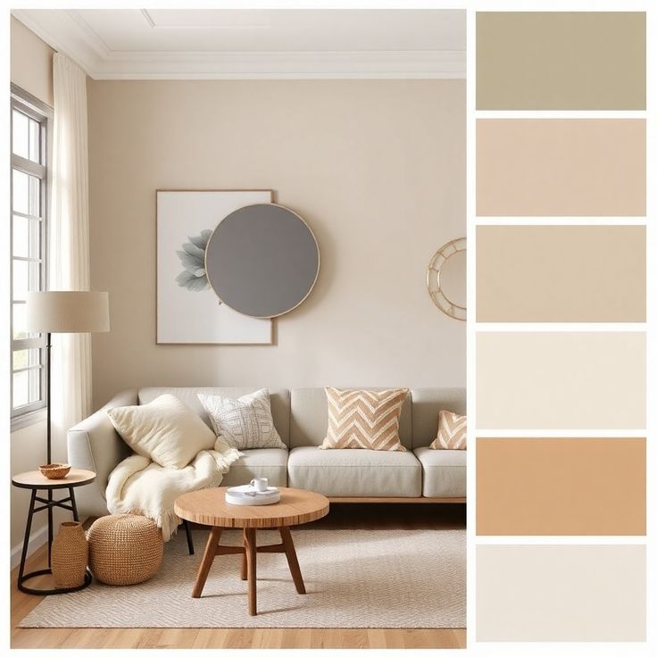
The Power of Undertones: Mastering Complex Neutrals 🎨
Understanding undertones is crucial for a truly cohesive monochromatic design. Even 'neutrals' have subtle undertones – a grey might lean blue, green, or even purple; a beige can have pink or yellow notes. 🎨 By choosing variations within the same undertone family, you create a layered and sophisticated look that feels intentional and harmonious. It’s the nuance that elevates a palette from flat to fabulous. Pay attention to the subtle shifts! Save this for your color theory journey! ✨ #ColorTheoryTips #NeutralUndertones #MonochromaticDesign #SophisticatedPalettes #InteriorDesignStrategy #ColorInspiration #DesignSecrets #HomeStylingIdeas #ComplexNeutrals #PaletteMastery
Curated Color Palettes for a Playful Home 🌈🎨
Tired of beige? Let's inject some fun into your home's color story! 🌟 Think beyond the ordinary. Embrace palettes that reflect your personality. Pair unexpected hues like coral and teal, or mustard yellow and deep plum. Want to go whimsical? Consider soft pastels with metallic accents. For a bold statement, experiment with vibrant jewel tones. The key is balance and intentionality. Don't be afraid to let color tell your unique story and create spaces that spark joy and wonder! ✨
Save this for your next paint project! #ColorPaletteIdeas #PlayfulColorIdeas #WhimsicalColorPalette #HomeColorTrends #InteriorColorInspo #DecorPalette #CreativeColor #ColorInDesign #RoomMakeoverIdeas #DesignInspiration
Unlock Bold Design: 5 Ways to Embrace Color Psychology in Your Home! 🎨
Tired of beige? Let's talk COLOR! 🌈 Your home should reflect your vibrant personality. Understanding color psychology is your secret weapon for creating spaces that evoke specific moods and feelings.
💡 Did you know warm colors like reds and oranges can boost energy, perfect for a home office? While cool blues and greens promote tranquility, ideal for bedrooms and relaxation areas.
Here's how to start:
* **Focus on Feelings:** What emotion do you want to cultivate?
* **Strategic Placement:** Use bolder hues as accents.
* **Monochromatic Magic:** Explore varying shades of one color.
Don't shy away from what makes your heart sing! Save this for your next room refresh! ✨ #ColorPsychologyIdeas #BoldColorHomeIdeas #InteriorDesignTips #VibrantDecorIdeas #HomeColorPalette #DecorInspo #LivingRoomMakeover #BedroomDecor #CreativeSpaces #TheColorConnoisseur
Color Psychology in Design: Using Neutrals to Create Calm 🤍
Neutrals aren't boring; they're the foundation for tranquility! ☁️ Understanding neutral colors allows you to create serene, sophisticated spaces that promote peace and balance.
Embrace these calming hues:
* **Soft Whites:** For an airy, bright feel.
* **Warm Beiges:** To add a touch of cozy comfort.
* **Greige (Gray + Beige):** A versatile, modern classic.
* **Muted Greys:** For a grounding, sophisticated backdrop.
Combine them with natural textures for maximum impact. They create a timeless backdrop for any style. Save this for your calm and collected home! ✨🏡 #NeutralDecorIdeas #ColorPsychologyIdeas #DecorIdeas #CalmingHome #InteriorDesignTips #SereneSpaces #MinimalistDecor #HomeColor #TranquilHome #DesignInspiration
1
Unlock Serenity: 5 Ways to Infuse Calm with Colour 🧘♀️
Colour is more than just aesthetics; it's an emotion! Today, let's dive into how intentional colour choices can transform your space into a sanctuary of calm. 💜 Speaking from experience, even small pops of soothing blues or greens can dramatically shift the mood. Think about using these colours in areas where you unwind, like your bedroom or a reading nook.
* **Embrace Pastels:** Soft lavenders, muted aquas, and pale pinks evoke peace.
* **Consider Earth Tones:** Deep forest greens and warm terracotta grounds you.
* **Strategic Accents:** A deep indigo cushion on a neutral sofa can be incredibly grounding.
How do you use colour to find your calm? Share your thoughts below! Save this for your next colour therapy session. ✨ #ColourIdeas #InteriorDesignIdeas #HomeDecorIdeas #ColourPsychology #EmotionalDesign #CalmingColours #DesignInspiration #HomeStyling #DecorInspo #PaletteIdeas
The Deep Dive into Deep Purple: Royalty, Mystery, and Modern Luxury 💜
Let's explore the enigmatic allure of deep purple! 👑 Historically, purple was a color of immense luxury and royalty due to the rarity and expense of its original dye. It evokes mystery, creativity, and spiritual depth. In modern interiors, deep purple brings a sophisticated, almost regal, feel. It pairs beautifully with contrasting golds, or with soft greys for a more subdued elegance.
✨ Bookmark this for a touch of mysterious, opulent inspiration! ✨ #deeppurple #colorhistory #interiorcolor #designinspiration #royalcolors #mysterioushues #luxurydesign #purpleinteriors #creativeinteriors #colorevolution
The Power of Blues: Creating Calm Spaces with Color 💙
Did you know blue is the most calming color? It's scientifically proven to lower heart rate and blood pressure, making it perfect for spaces where you want to relax and de-stress. Let's explore how to use it effectively!
🌊 **Ocean Blues:** Shades of deep ocean, turquoise, and aqua create a sense of depth and tranquility, like a peaceful coastline.
☁️ **Sky Blues:** Light, airy blues reminiscent of a clear day promote a sense of openness and freedom.
🕊️ **Muted Blues:** Soft, dusty blues offer a sophisticated and calming presence without being overpowering.
🔵 **Accent Blues:** Even a few strategically placed blue accents can bring a calming influence to a room.
Save this for your next calming corner design! 🤍 #blueinteriors #calmspaces #colorpsychology #colorpalette #interiordesignideas #homedecor #livingroominspiration #bedroomdesign #designcolors #relaxation
Introducing 'New Neutrals': Beyond Beige!
Move over, beige! The new neutrals are all about nuanced, sophisticated shades that bring warmth and depth without sacrificing serenity. Think muted sage greens, soft dusty roses, calming dove greys, and warm earthy terracottas. 🌿 These tones create a foundation that feels both modern and incredibly comforting. They act as a perfect backdrop for showcasing material textures and subtle color accents. I love how these 'new neutrals' can make a space feel grounded yet airy simultaneously. What's your favorite of the new neutral palette? #NewNeutralIdeas #MutedColorsIdeas #InteriorPalette #HomeDesignTrends #ColorInspiration #SereneSpaces #ModernInteriors #DesignTrends #ColorTherapy #CalmDecor


