1/4
Color as Architecture: Bold Hues as Structural Elements 🧱
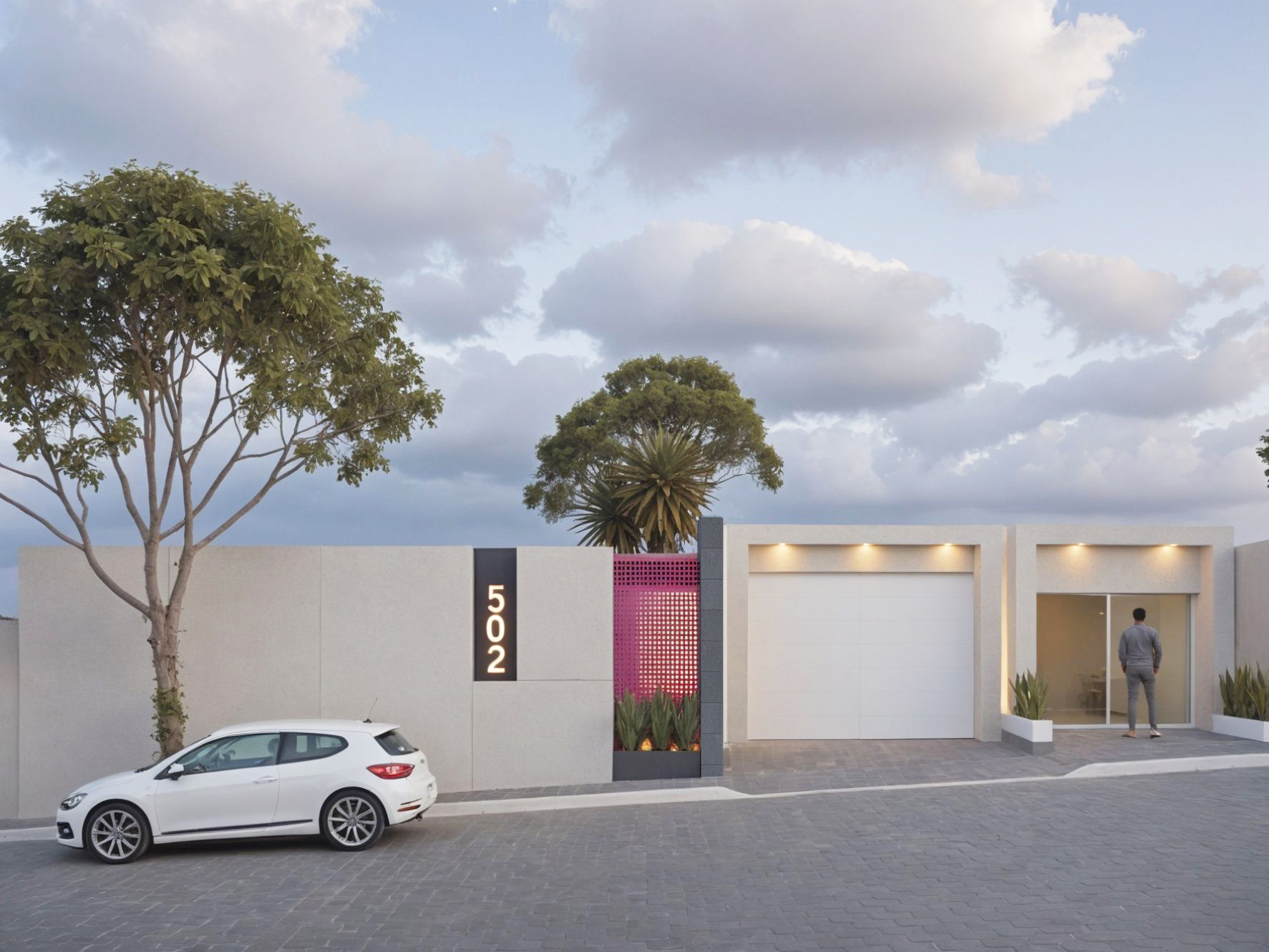
In avant-garde design, color isn't just an addition; it can be a defining architectural element. I love using bold, saturated hues to define zones, accentuate structural features, or create a sense of enclosure. Imagine a vibrant color block acting as a bold partition, or a deeply saturated accent wall that acts as a 'canvas' for the entire room. 💡 This approach is about harnessing the power of color to shape perception and emotion, transforming spaces with daring impact. Ready to paint with purpose? Save this for architectural color inspiration! ✨ #AvantGardeInteriors #ColorAsArchitecture #BoldColor #ArchitecturalColor #ColorBlocking #AvantGardeSpaces #VibrantInteriors #DesignImpact #HueDrivenDesign #ColorBlockIdeas
Oct 24, 2025
Copy Style
0 comment in total
No comments yetYou may also like


+5
The Dance of Color & Architecture
When architecture meets color, even cold concrete can tell a warm story. We explore the perfect fusion of color and structure—through bold palettes, subtle gradients, and creative designs—to give spaces unique visual impact and emotional depth.
Whether it’s the striking geometry of modern minimalism or the soft transitions of classical elegance, color breathes life into architecture, turning every line and surface into an extension of art. From facades to interiors, from light play to material textures, we let color converse with structure, crafting unforgettable living and commercial spaces.
Let architecture speak—through the poetry of color!
#Color #Art #Architecture

5
Bauhaus Color Palettes: Bold Hues and Balanced Neutrals 🎨
The Bauhaus school wasn't afraid of color, but it used it with intention and balance. Bauhaus color palettes often combine bold primary colors (red, yellow, blue) with strong neutrals like black, white, and grey. 🏗️ This approach creates dynamic yet harmonious compositions, emphasizing functionality and visual clarity. These palettes add energy and a modern feel without being overwhelming.
Consider how these classic combinations can elevate your space.
Experiment with these iconic hues to bring a touch of modernist art into your decor. Save for color inspo! #BauhausColors #ColorPaletteIdeas #InteriorColor #BauhausIdeas #PrimaryColors #NeutralDecor #ModernColor #DesignInspiration #ColorTheory #BoldHues
Beyond the Gray: Unexpected Color Palettes for Brutalist Interiors 🎨
Brutalism is often associated with monochrome, but this architectural style can brilliantly showcase pops of unexpected color! Here's how to experiment:
* **Jewel Tones:** Deep emerald greens, sapphire blues, or ruby reds can add a luxurious and dramatic contrast to stark concrete surfaces.
* **Earthy Ochres & Terracottas:** Warm, natural tones create a grounded and organic feel, softening the edges of concrete.
* **Vibrant Art:** Let artwork be the star. Bold, colorful abstract pieces or photography can transform a minimalist concrete space into a dynamic gallery.
* **Bold Furniture:** A single statement piece in a daring color – a bright yellow armchair or a teal sofa – can elevate the entire room.
* **Subtle Accents:** Even small touches like colorful cushions, rugs, or decorative objects can bring life and personality.
Which color would you pair with concrete? Tell me! 👇 #brutalistcolor #colorinspiration #boldinteriors #architecturalcolor #interiordesignideas #concreteandcolor #statementpiece #brutalistcolorideas #vibrantdecor #decorinspo

Exploring the Power of Color in Interior Design
I recently came across this beautiful living space that perfectly showcases how color can transform a room. The vibrant blue sofa and matching rug add a lively touch, while the yellow chair introduces a cheerful pop of color, creating a balanced and inviting atmosphere. The mix of bold and neutral tones enhances the overall aesthetic, demonstrating how thoughtful use of color can elevate interior design.
What are your favorite color combinations in home decor? Share your ideas or show us your colorful spaces!
#ColorInInteriorDesign #HomeDecor #InteriorDesign #ColorfulLiving #DesignInspiration #LivingRoomDecor #HomeStyling #Color

3
The Power of Primary Colors: Bauhaus Inspired Accents! 🟥🟦🟨
Don't shy away from bold color! The Bauhaus movement famously embraced primary colors – red, yellow, and blue – to express energy and clarity. Integrate these hues as focal points in your home: a vibrant armchair, a striking geometric rug, or even just decorative accents like cushions or art. It’s about adding personality and a pop of playful sophistication without overwhelming the space. Remember, the key is intentional placement. How would you add a pop of primary color to your space? ✨🎨 #BauhausColors #ColorInspiration #HomeAccents #InteriorDesignTips #ModernDecor #BoldDesign #PrimaryColorsHome #BauhausDecorIdeas #DesignAccentIdeas #AccentColorIdeas
The Art of the Accent Wall: Bold Color Choices 🎨
Accent walls are a fantastic way to introduce a bold splash of color and personality into your space without overwhelming the room! Let's explore some impactful choices.
💙 **Deep Teal:** Sophisticated and moody, deep teal creates a dramatic focal point and pairs beautifully with neutrals.
❤️ **Burnt Orange:** Warm and inviting, a burnt orange accent wall adds energy and a cozy, earthy vibe.
💜 **Muted Lavender:** A soft yet striking choice, muted lavender adds a touch of romance and tranquility.
💚 **Emerald Green:** For a touch of opulence and natural beauty, an emerald green wall is both bold and elegant.
Save these accent wall ideas for a room refresh! ✨ #accentwall #colorinspiration #boldcolors #interiordesign #homedecorideas #livingroomideas #bedroomdecor #designstatement #colorpalette #walls
Color Your World: Mastering Bold Hues in Eclectic Home Design 🎨
Bored of bland? Let's talk about bringing bold colors into your eclectic design! It’s not about overwhelming, but about strategic pops that ignite personality. Think a vibrant emerald accent wall against a more neutral backdrop, or jewel-toned furniture pieces. 💎 Mix and match contrasting colors for an energizing vibe. Your home should be a reflection of your spirit! ✨ What's your favorite bold color to use? Save this for your colorful design journey! 🌈 #BoldColorDecorIdeas #EclecticColorIdeas #MaximalistColorIdeas #VibrantHomeIdeas #AccentWallIdeas #InteriorDesign #HomeDecor #ColorInspiration #DecoratingWithColor #BohemianPalette
Crimson Red: The Color of Passion, Power, and Historical Grandeur ❤️
Let's dive into the power of crimson! 🔥 This rich, deep red has historically signified passion, courage, and noble status. From ancient Roman robes to royal banners, crimson was a color of prestige and impact. Today, it brings a sense of energy, warmth, and drama to any space. Use it as a bold accent or for a full enveloping experience. It pairs magnificently with deep wood tones and antique gold.
✨ Save this for a touch of bold, historical drama in your home! ✨ #crimsonred #historicalcolors #colorpsychology #interiorcolor #designinspiration #reddecor #boldinteriors #powerfulhues #vintageinspired #designhistory
Jewel Tone Dreams: Opulent Color Palettes for Your Walls! 💎💜
Dreaming of interiors that feel rich, dramatic, and utterly luxurious? Jewel tones are your answer! Think sapphire blue, ruby red, amethyst purple, and deep emerald. 👑
These intense hues add instant depth and sophistication to any room. They work beautifully on walls, accent pieces, or even as the star of your upholstery.
Pair jewel tones with metallics like gold or brass for an extra touch of glamour, or contrast them with creamy neutrals for a balanced, elegant feel.
#jeweltone #colorinspiration #luxurioushomes #interiordesign #homedecor #colorideas #jeweltoneinteriors #boldwalls #luxurydecor #opulenthome #sophisticatedstyle #designpalette #vividcolors
Architectural Details: Texture & Shadow Play 🖤
The subtle interplay of texture and shadow can transform a space. Let's explore architectural details that create depth. 🤍
Think beyond flat surfaces. Incorporating elements with inherent texture – like fluted wood panels, exposed brick, or rough plaster – adds visual interest and a tactile dimension.
Consider how light interacts with these textures. Strategic lighting can highlight the contours and create dramatic shadows, adding a sense of depth and sophistication. This approach adds character without the need for excessive ornamentation.
These details can be found in moldings, built-in shelving, or even decorative screens. Save this for your textural inspiration! ✨ #architecturaldetails #textureideas #homedesignideas #interiordesignideas #shadowplay #designelements #interiorarchitecture #detailedesign #depthanddimension #decorativefinishes
💡 The Impact of Light on Color Perception in Interior Design
Did you know the same paint color can look dramatically different depending on the light it’s in? Understanding light’s effect on color is crucial for perfect interiors. 🎨
Here’s how light plays a role:
* **Natural Light:** True colors are best revealed under bright, natural daylight.
* **Warm Artificial Light:** Tends to enhance reds, yellows, and oranges, making colors feel richer and cozier.
* **Cool Artificial Light:** Can make colors appear bluer or more subdued, often enhancing grays and whites.
* **Dim Lighting:** Colors can lose vibrancy and appear muted.
Always test paint colors in the actual lighting of your room! Save this for your color-choosing wisdom. ✨
#LightAndColorIdeas #ColorPerception #InteriorDesignColor #PaintColors #LightingInDesign #ColorTheory #HomeDecorTips #DesignSecrets #AccurateColor #LightingImpact
The Art of Faded Color: Softness in Design 🌸☁️
There's a unique beauty in faded, muted colors. They bring a sense of calm, history, and a gentle, aged aesthetic to any space.
Think of soft indigos, dusty roses, and faded olives – colors that whisper rather than shout. They create a backdrop for treasured objects and add a touch of soulful tranquility.
This palette is perfect for creating a serene retreat. Save this inspiration for a space that feels both elegant and deeply restful. ✨ #fadedcolors #mutedtones #softinteriors #PatinaAndPigment #FadedColorIdeas #MutedColorPalette #SoftInteriors #EtherealDesign #CalmingColor #DustyRoseDecor #VintageColor #SubtleElegance #SereneColorIdeas
Color Stories: Timeless Palettes for Heritage Homes 🎨🗝️
The right color palette can profoundly influence the atmosphere of a heritage home. 🌟 We draw inspiration from historical paint charts and the home's natural surroundings. Think muted earth tones, deep jewel tones, or classic neutrals that highlight architectural details. 🌱 The goal is to create a sense of depth and warmth that respects the home's history while feeling current. Accent colors are used strategically to draw attention to original features like millwork or fireplaces. It’s about timeless choices that enhance the home's narrative. Save this for your color inspiration! ✨ #HeritageColorIdeas #TimelessColorIdeas #HistoricalPaletteIdeas #InteriorColorIdeas #HomeColorIdeas #ColorPalette #InteriorDesign #HomeDecor #PaintColors #HeritageHomes
The Power of Undertones: Mastering Complex Neutrals 🎨
Understanding undertones is crucial for a truly cohesive monochromatic design. Even 'neutrals' have subtle undertones – a grey might lean blue, green, or even purple; a beige can have pink or yellow notes. 🎨 By choosing variations within the same undertone family, you create a layered and sophisticated look that feels intentional and harmonious. It’s the nuance that elevates a palette from flat to fabulous. Pay attention to the subtle shifts! Save this for your color theory journey! ✨ #ColorTheoryTips #NeutralUndertones #MonochromaticDesign #SophisticatedPalettes #InteriorDesignStrategy #ColorInspiration #DesignSecrets #HomeStylingIdeas #ComplexNeutrals #PaletteMastery
Color Theory 2.0: Dynamic Hues That Respond to Your Environment 🌈
Tired of static wall colors? Let's talk about the future: dynamic hues that respond to your environment and mood! 🌈 Imagine walls that subtly shift color based on ambient light, time of day, or even your chosen playlist. We're looking at smart pigments and responsive materials that can create truly immersive atmospheres. This isn't just about aesthetics; it's about actively enhancing your living experience through adaptive color. Picture a living room that glows with calming blues in the morning and vibrant corals in the evening. What color shift would enhance your space? Save this for a spectrum of design possibilities! ✨ #dynamiccolor #responsematerials #colorpsychology #interiorcolor #futureofdesign #innovativedesign #adaptiveinteriors #designtechnology #homeambiance #cuttingedgeinteriors
Color Pop! Bold Abstract Art for a Vibrant Space 🌈
Ready to inject some serious energy into your home? Don't shy away from vibrant, bold abstract art! A single, powerful piece with contrasting colors can instantly energize a room, turning it into a lively and inspiring environment. Perfect for spaces that need a dose of personality. Think a dynamic composition against a clean, neutral backdrop for maximum visual impact. 💥 #BoldDecor #BoldAbstractIdeas #ColorPopArt #VibrantInteriors #StatementArt #InteriorDesignTips #AccentWall #ModernDecor #ArtisticHome #ExpressiveArt #HomeColor


