color
color
Jul 23, 2025
1 comment in total
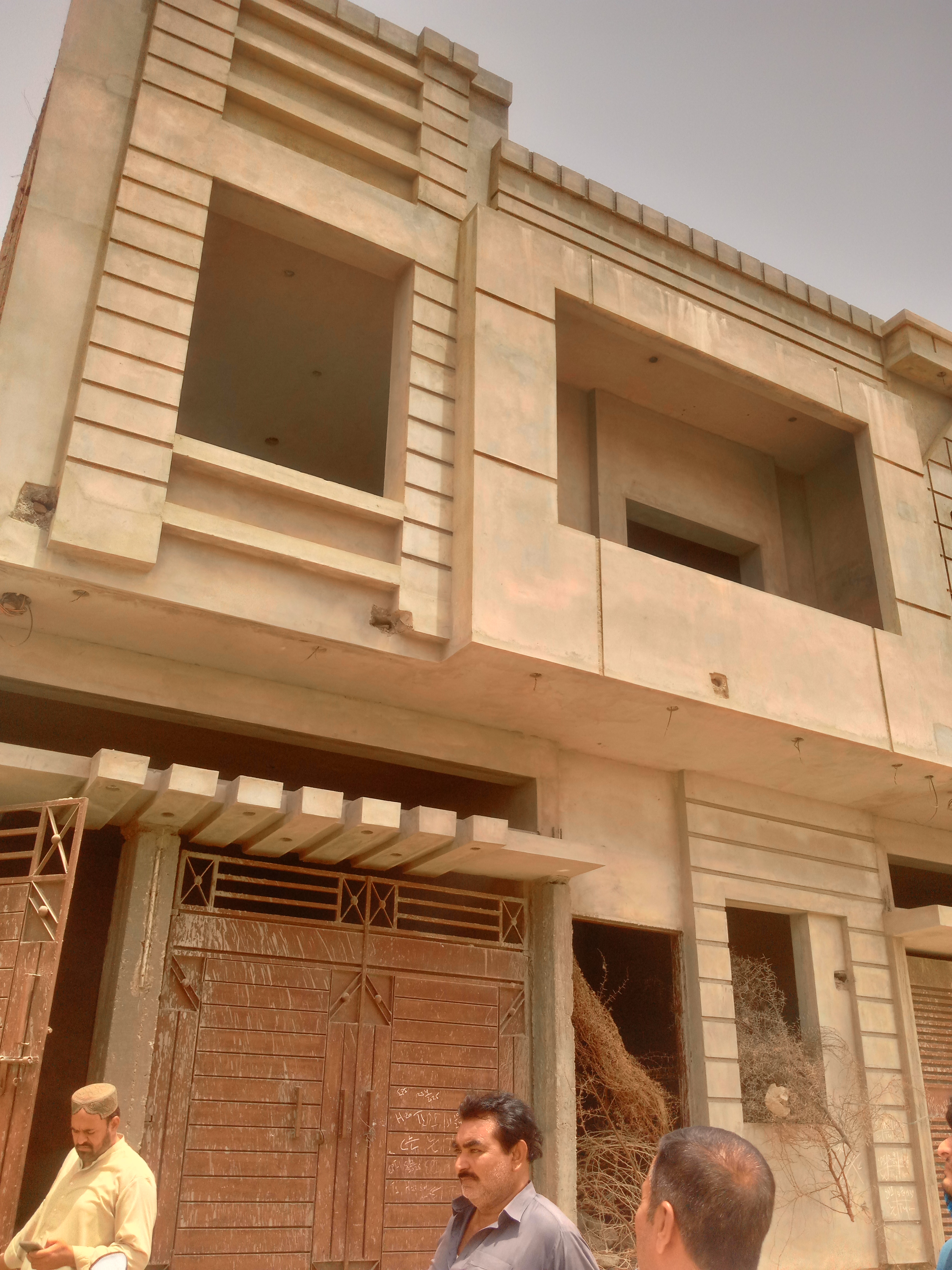
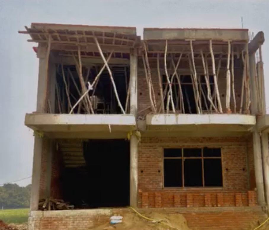
Ci-Tech S
rebuild it
Jul 26, 2025
0
0
You may also like

Purple Interior💜

Monochromatic Power: Unleash the Impact of One Hue 💜

Curated Color Palettes for a Playful Home 🌈🎨

The Art of the Accent Wall: Bold Color Choices 🎨

🎨Where Nature Dresses in Prismatic Excess

Color Palette Inspiration: Earth Tones & Global Hues 🌍🍂

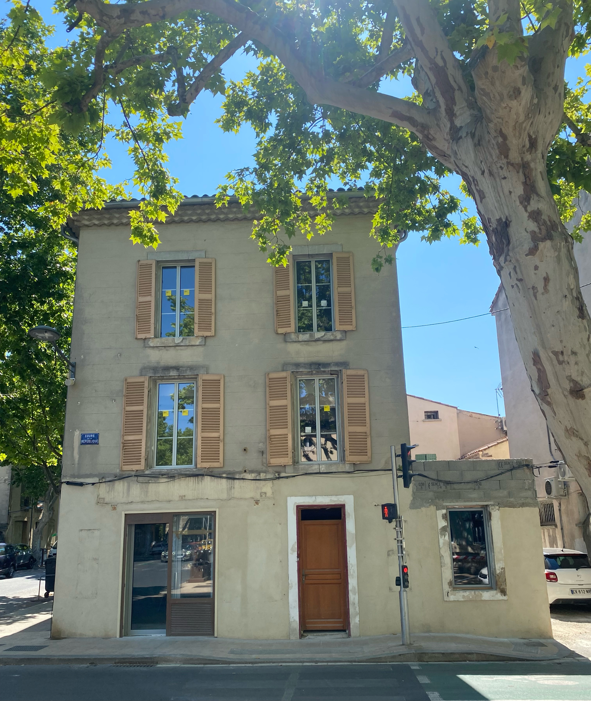
Facade magasin

The Joy of Unexpected Pops of Color in a Neutral Palette 🎨

Textural Twists in Monochromatic Design 🖤⚪

The Dance of Color & Architecture

Monochromatic Moods: Sculpting with Tone 🗿⚪

Colors house

रेड ब्लु यलो कलर

Brown colour

Crimson Red: The Color of Passion, Power, and Historical Grandeur ❤️

The

Color Palette: Grounding Your Industrial Space 🖤🤍

Monochromatic Moods: Bold Statements in Single Hues 🖤🤍

Color Theory 2.0: Dynamic Hues That Respond to Your Environment 🌈

Color Psychology Meets Interior Design🎨


+3
Purple Interior💜
▫️ Tonal Choreography
Pair lavender walls with plum velvet accents for depth. Add metallic finishes (gold handles/mirrors) to elevate warmth, as seen in the 60-30-10 color formula .
▫️ Material Poetry
Balance regal velvet drapes with raw textures like concrete floors or woven pendants—a clash of elegance and edge .
▫️ Artful Disruption
Anchor spaces with abstract purple art or amethyst geodes. Pro tip: Use soft blush tones to neutralize intensity, inspired by millennial pink trends .
▫️ Light Alchemy
2700K warm bulbs transform eggplant cabinets into cozy vignettes. For drama, try LED strip lighting under floating shelves .
▫️ Rule-Breaking Accents
Ditch neutrals—emerald greens or citrine yellows create bold contrasts. Warning: Keep accent ratios below 20% to avoid chaos .
#purple #interior #colorbalance

4


Textural Twists in Monochromatic Design 🖤⚪
Monochromatic design is anything but one-dimensional when you play with texture! ⚫⚪ Explore how different materials can add depth, warmth, and visual interest to your black and white spaces. Think a smooth, high-gloss lacquered surface next to a soft, matte boucle fabric, or the rough, organic texture of concrete against the refined elegance of polished metal. This approach prevents your space from feeling flat and instead creates a rich, layered experience. Don't shy away from materials like linen, wool, wood grain, and even strategically placed concrete or stone. Elevate your monochrome! Save for your textural design journey! 🤍🖤 #MonochromeTextures #TextureInDesign #InteriorDesignTips #MonochromeIdeas #TexturalDecor #HomeDecor #BlackAndWhiteLiving #SophisticatedInteriors #DesignInspiration #MaterialPlay


Color Palette: Grounding Your Industrial Space 🖤🤍
Industrial design thrives on a muted, grounded color palette that lets materials shine. Think neutral bases with metallic or earthy accents.
* **Neutrals:** Greys, blacks, whites, and beiges form the foundation.
* **Metallics:** Steel, iron, copper, and brass add industrial flair.
* **Earthy Tones:** Terracotta, rust, and deep greens can provide warmth.
What's your industrial color combo? #IndustrialPalette #ColorInspiration #industrialdesign #colorpalette #industrialcolors #neutrals #monochromaticdesign #industrialdecorideas #materialcolors #earthytone #designharmony #colorinspirationideas


+5
The Dance of Color & Architecture
When architecture meets color, even cold concrete can tell a warm story. We explore the perfect fusion of color and structure—through bold palettes, subtle gradients, and creative designs—to give spaces unique visual impact and emotional depth.
Whether it’s the striking geometry of modern minimalism or the soft transitions of classical elegance, color breathes life into architecture, turning every line and surface into an extension of art. From facades to interiors, from light play to material textures, we let color converse with structure, crafting unforgettable living and commercial spaces.
Let architecture speak—through the poetry of color!
#Color #Art #Architecture

5


Monochromatic Moods: Bold Statements in Single Hues 🖤🤍
Embrace the power of a singular color palette to create a truly dramatic and sophisticated avant-garde statement. By sticking to variations of one color – be it intense black, pure white, or a striking accent hue – you can achieve a mesmerizing effect. This monochromatic approach simplifies visual clutter, allowing form, texture, and light to take center stage. It's about creating an immersive atmosphere where every element contributes to a cohesive, impactful vision. Dare to be bold with a single, powerful hue. ✨
Would you try a monochromatic space? Tell me your color choice! #MonochromaticDesignIdeas #AvantGardeColorIdeas #BoldHueIdeas #SingleColorDecorIdeas #DramaticInteriorsIdeas #InteriorDesign #HomeDecor #MinimalistStyle #ColorPalette #LuxuryInteriors


Monochromatic Power: Unleash the Impact of One Hue 💜
Who says you need a rainbow for impact? Mastering a monochromatic palette is an advanced avant-garde move that creates stunning visual cohesion and depth. Choose a bold hue – like this deep amethyst – and explore its variations in texture, sheen, and form. From velvet sofas to subtle wall finishes, this is about commitment to a singular vision. It’s daring, sophisticated, and creates an immersive environment. Let one color tell your whole story. 💜 Save this for your bold color journey! #MonochromaticMagic #monochromaticdecor #boldcolorpalette #avantgardestyle #deepcolorlove #singlehuehome #interiorcolorideas #designchallenges #velvetdecor #luxuryinteriors #homeinspirationdaily


Color Palette Inspiration: Earth Tones & Global Hues 🌍🍂
My color palette is inspired by the earth and the diverse hues I encounter on my travels. It’s all about creating a grounding yet inspiring atmosphere.
🤎 Rich Browns & Terracottas: Evoke warmth, stability, and a connection to ancient cultures.
💚 Muted Greens & Olives: Bring in the calming essence of nature and the tranquility of lush landscapes.
🧡 Warm Neutrals: Soft beiges, creams, and subtle grays provide a serene backdrop for richer accents.
These colors create a harmonious and inviting space that reflects a well-traveled soul. Save this for your next color palette! #ColorPaletteIdeas #EarthToneDecor #ColorPaletteIdeas #EarthToneDecor #GlobalHuesIdeas #InteriorColorInspo #WarmColorPalette #NaturalColorScheme #EarthyInteriors #NomadColor #ColorInspiration #HomeColor


Color Theory 2.0: Dynamic Hues That Respond to Your Environment 🌈
Tired of static wall colors? Let's talk about the future: dynamic hues that respond to your environment and mood! 🌈 Imagine walls that subtly shift color based on ambient light, time of day, or even your chosen playlist. We're looking at smart pigments and responsive materials that can create truly immersive atmospheres. This isn't just about aesthetics; it's about actively enhancing your living experience through adaptive color. Picture a living room that glows with calming blues in the morning and vibrant corals in the evening. What color shift would enhance your space? Save this for a spectrum of design possibilities! ✨ #dynamiccolor #responsematerials #colorpsychology #interiorcolor #futureofdesign #innovativedesign #adaptiveinteriors #designtechnology #homeambiance #cuttingedgeinteriors


Monochromatic Moods: Sculpting with Tone 🗿⚪
For 'Sculptural Spaces,' working with a monochromatic palette amplifies the impact of form. Focusing on a single color family, like shades of white, grey, or even deep charcoals, allows the silhouettes and textures of your furniture and decor to take center stage. It creates a serene, sophisticated, and undeniably artistic atmosphere. Think varying textures within the palette – matte finishes, high gloss, rough weaves, smooth silks. This creates depth and dimension without introducing competing colors. It’s the ultimate celebration of shape. ✨ Save this for tonal design inspiration! #MonochromaticInteriors #MonochromaticInteriors #SculpturalSpaces #TonalDesign #InteriorColorPalette #MinimalistDecor #TexturalDesign #HomeInspiration #SophisticatedSpaces #SculpturalForms #ShadesOfGrey


Crimson Red: The Color of Passion, Power, and Historical Grandeur ❤️
Let's dive into the power of crimson! 🔥 This rich, deep red has historically signified passion, courage, and noble status. From ancient Roman robes to royal banners, crimson was a color of prestige and impact. Today, it brings a sense of energy, warmth, and drama to any space. Use it as a bold accent or for a full enveloping experience. It pairs magnificently with deep wood tones and antique gold.
✨ Save this for a touch of bold, historical drama in your home! ✨ #crimsonred #historicalcolors #colorpsychology #interiorcolor #designinspiration #reddecor #boldinteriors #powerfulhues #vintageinspired #designhistory


Curated Color Palettes for a Playful Home 🌈🎨
Tired of beige? Let's inject some fun into your home's color story! 🌟 Think beyond the ordinary. Embrace palettes that reflect your personality. Pair unexpected hues like coral and teal, or mustard yellow and deep plum. Want to go whimsical? Consider soft pastels with metallic accents. For a bold statement, experiment with vibrant jewel tones. The key is balance and intentionality. Don't be afraid to let color tell your unique story and create spaces that spark joy and wonder! ✨
Save this for your next paint project! #ColorPaletteIdeas #PlayfulColorIdeas #WhimsicalColorPalette #HomeColorTrends #InteriorColorInspo #DecorPalette #CreativeColor #ColorInDesign #RoomMakeoverIdeas #DesignInspiration


Color Psychology Meets Interior Design🎨
Let's dive into color psychology today!
Blue and orange have opposing yet complementary properties. Blue exudes calm, perfect for bedrooms or meditation spaces. Orange, on the other hand, energizes and stimulates appetite – ideal for kitchens or dining areas!
The peacock color palette, blending vibrant blues with hints of orange, creates a dynamic yet harmonious atmosphere. It's bold, luxurious, and can transform any room! And let's not forget the subtle elegance of off-white paired with white. This combination adds depth and sophistication without overwhelming the senses. Perfect for creating a clean, airy space.
Experiment with these color pairings to elevate your interior design game! 🌟
#InteriorDesignColorSchemes #ColorPsychology #BlueOrangeContrast #PeacockInspiration #OffWhiteMagic #DesignTrends #HomeDecorGoal


The Joy of Unexpected Pops of Color in a Neutral Palette 🎨
Neutral doesn't have to mean boring! Inject life and personality into a serene space with strategic pops of bold color. It's my favorite way to create a dynamic and expressive environment that feels truly joyful. 🌈 #SpectrumStyleIdeas #NeutralWithColorIdeas #ColorPopNeutralIdeas #AccentColorIdeas #SereneWithBoldIdeas #InteriorStyling #ColorInspo #ModernNeutral #ExpressiveDesign #HomeAccents


The Art of the Accent Wall: Bold Color Choices 🎨
Accent walls are a fantastic way to introduce a bold splash of color and personality into your space without overwhelming the room! Let's explore some impactful choices.
💙 **Deep Teal:** Sophisticated and moody, deep teal creates a dramatic focal point and pairs beautifully with neutrals.
❤️ **Burnt Orange:** Warm and inviting, a burnt orange accent wall adds energy and a cozy, earthy vibe.
💜 **Muted Lavender:** A soft yet striking choice, muted lavender adds a touch of romance and tranquility.
💚 **Emerald Green:** For a touch of opulence and natural beauty, an emerald green wall is both bold and elegant.
Save these accent wall ideas for a room refresh! ✨ #accentwall #colorinspiration #boldcolors #interiordesign #homedecorideas #livingroomideas #bedroomdecor #designstatement #colorpalette #walls