1/9
8 Perfect Paint Colors That Prove the West Coast Is the Best Coast
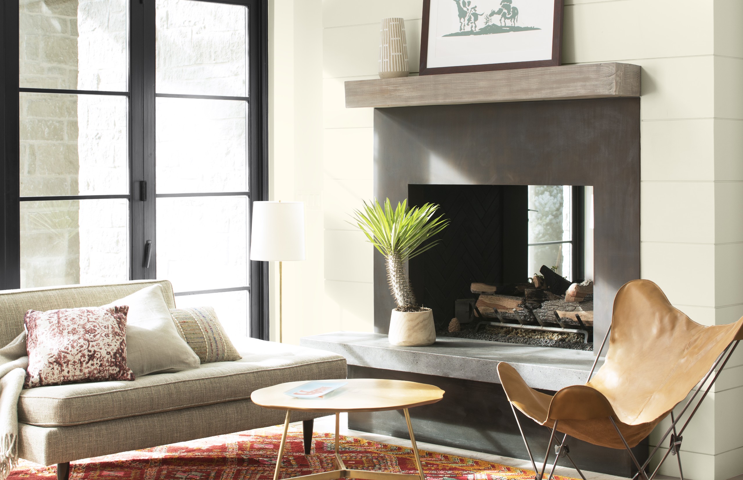
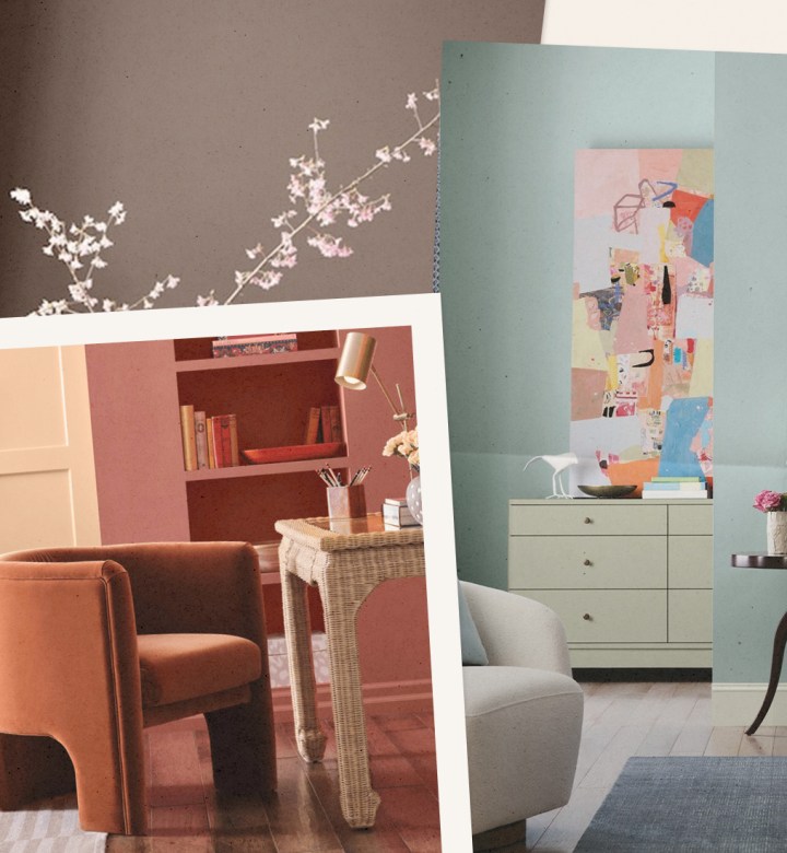
The Western states' diverse landscapes have long served as a rich source of inspiration for artists, and this influence extends to the world of paint colors. Paint companies are increasingly drawing on the unique palette of the West to create their trending colors. Behr’s Color of the Year, Canyon Dusk, is a dusty beige with a hint of pink, reflecting the desert landscapes. Even the venerable English paint brand Farrow & Ball has introduced a California Collection, a collaboration with Los Angeles interiors legend Kelly Wearstler, marking their first-ever designer partnership inspired by a specific region. These trends indicate a growing appreciation for the natural hues and light conditions characteristic of the West Coast.
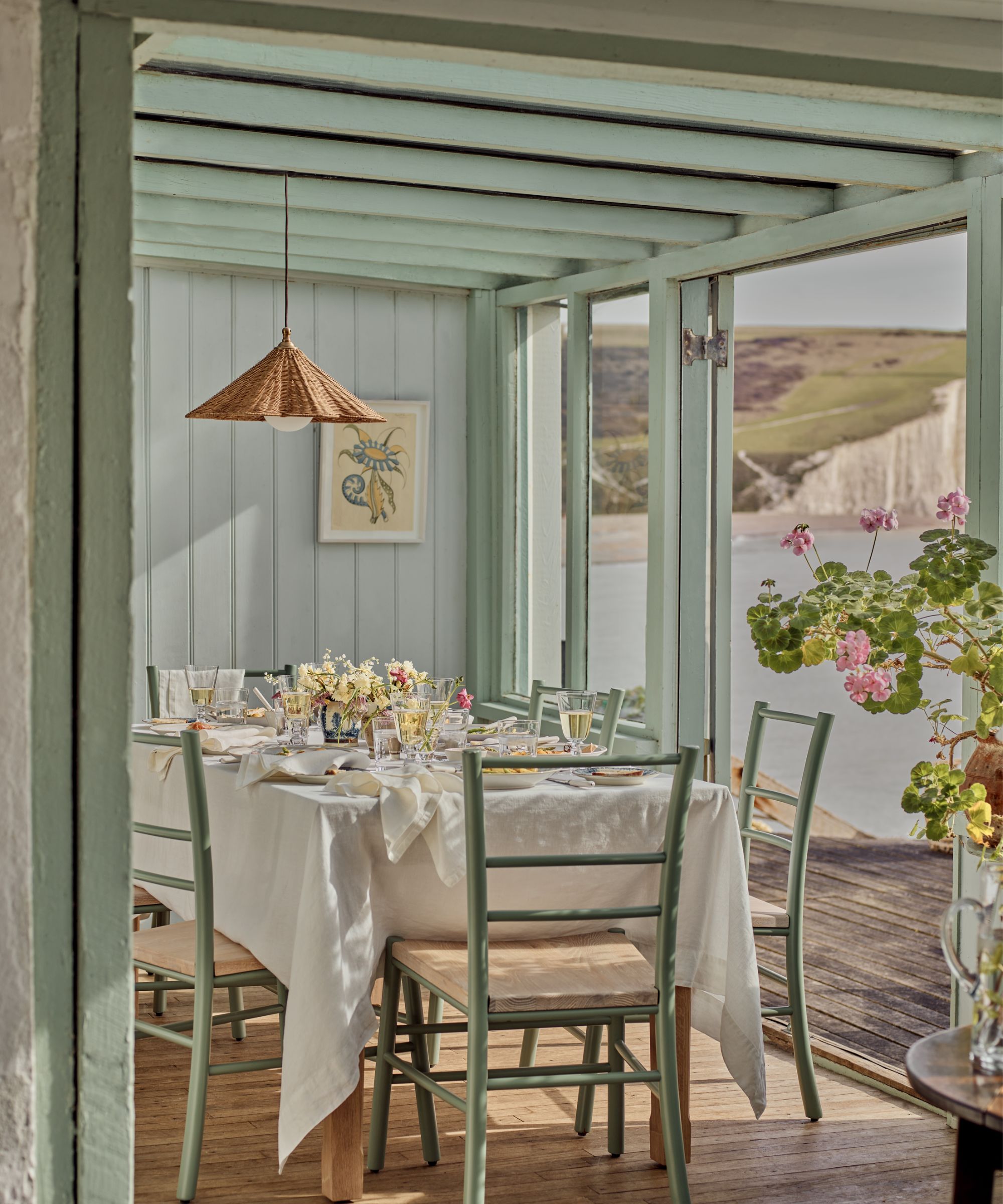
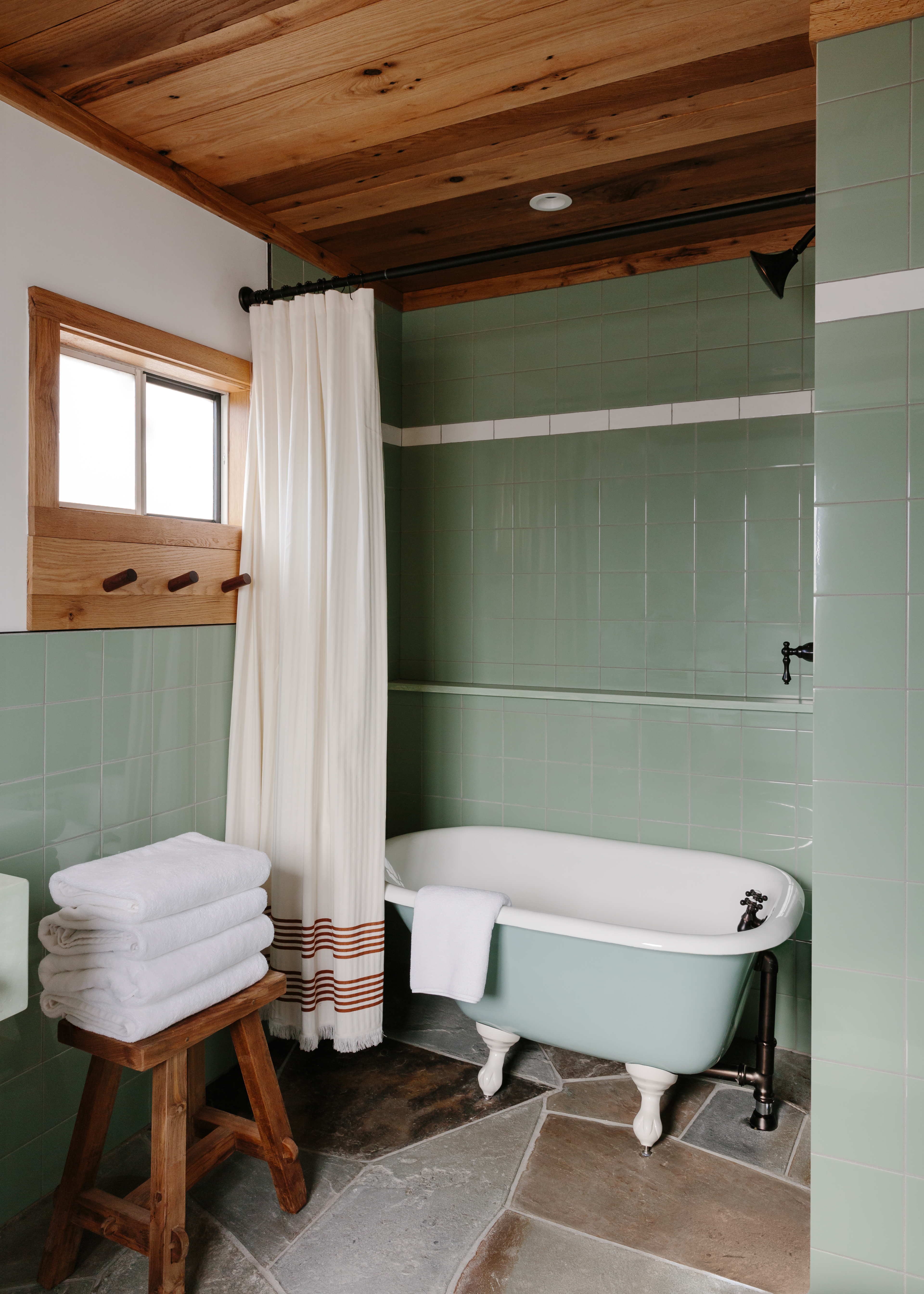
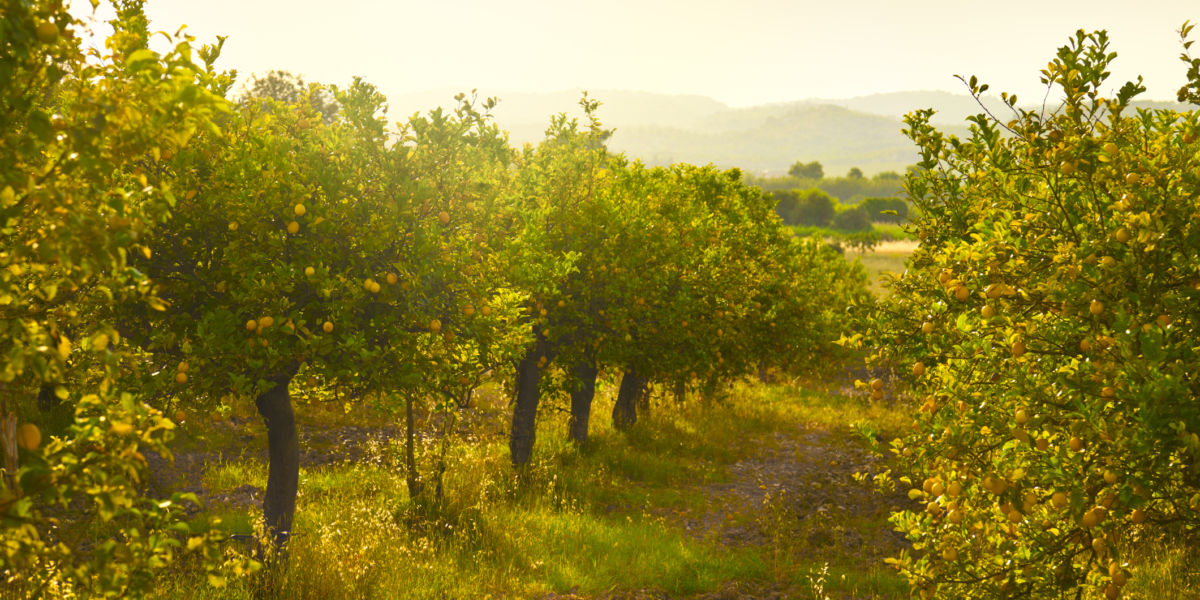
The article highlights eight specific paint colors that embody the essence of the West. Farrow & Ball’s 'Palm' from the California Collection is a desaturated green, a 'love letter to the iconic trees' of Los Angeles, capturing the unique bright, clear light of Southern California. 'Citrona,' also by Farrow & Ball, is a muted yellow inspired by the soft, reflected light of lemon trees, rather than the bright fruit itself. Interior design expert Teresa Grow suggests using such yellows sparingly for maximum impact, perhaps on a front door or painted shutters. 'Mustard Seed' by Dunn Edwards draws its inspiration from the wild mustard fields that bloom in Sonoma County every spring, another color Grow recommends for surprising accents.
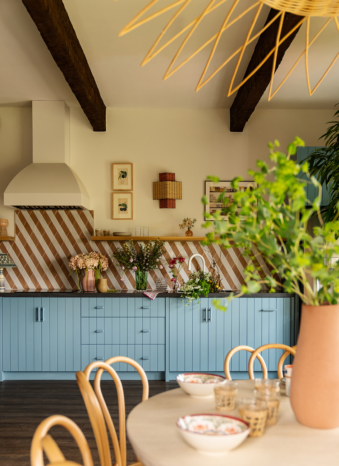
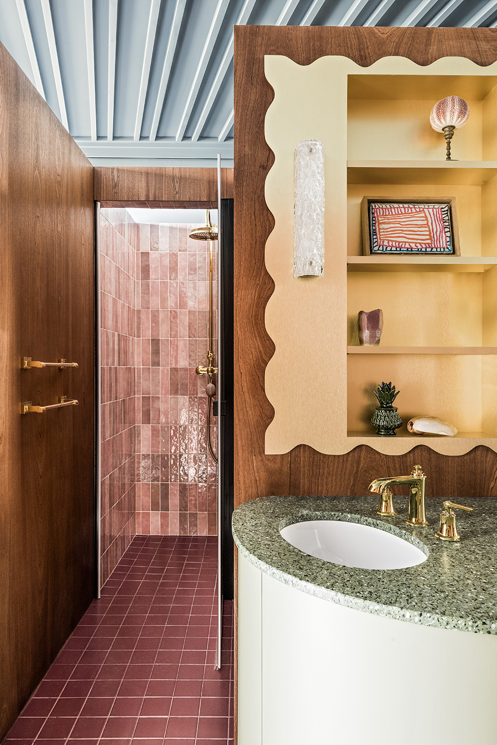
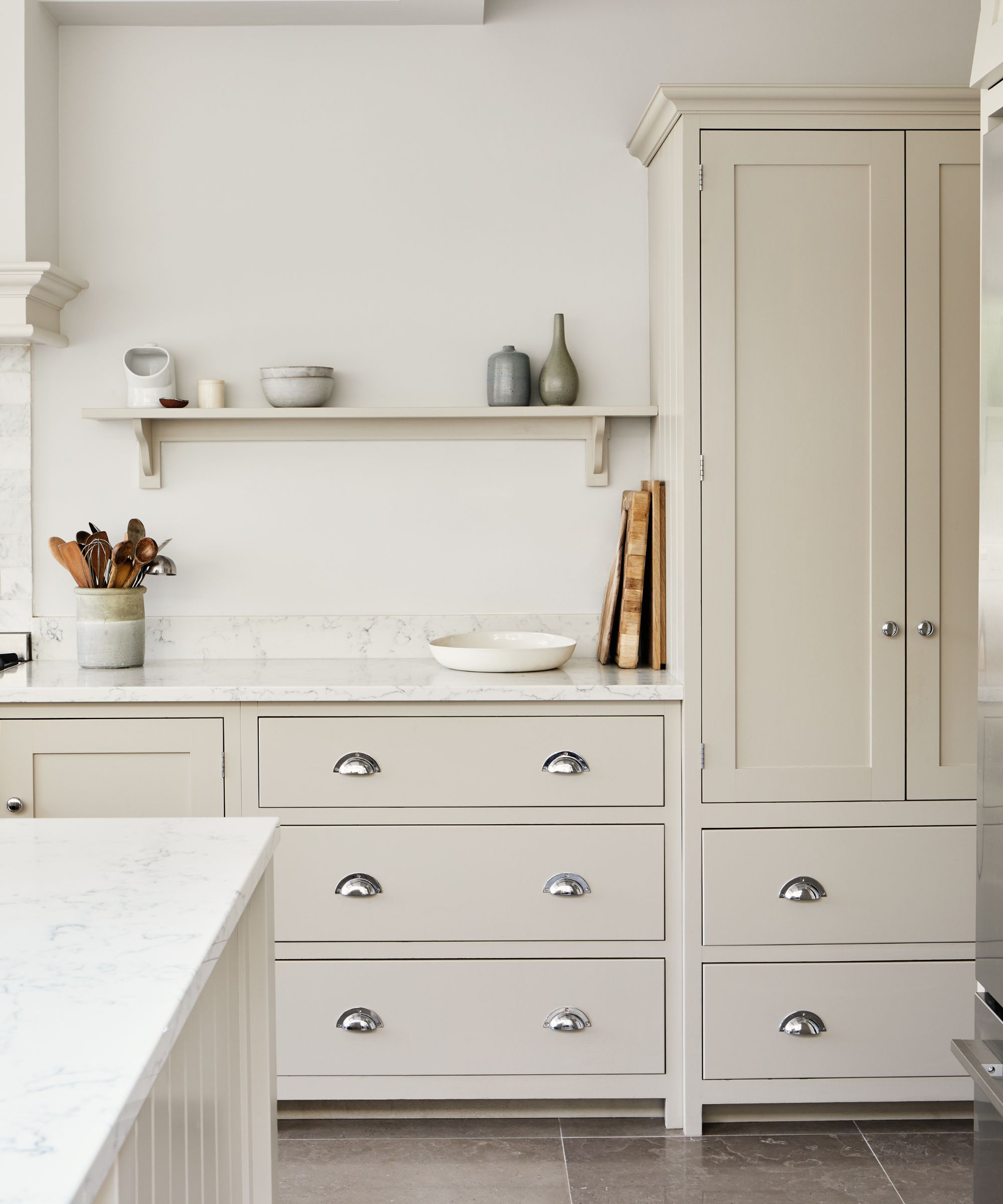
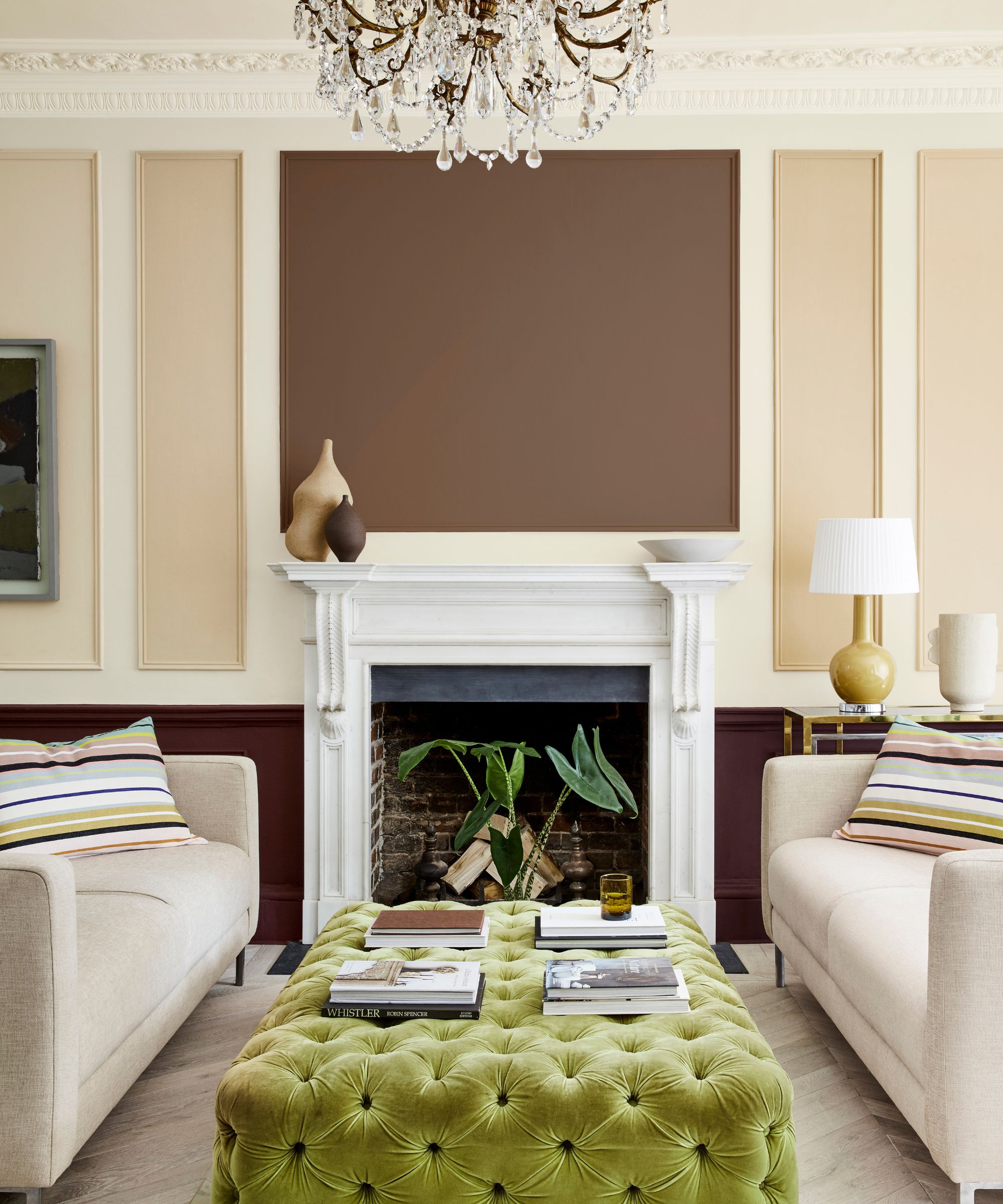
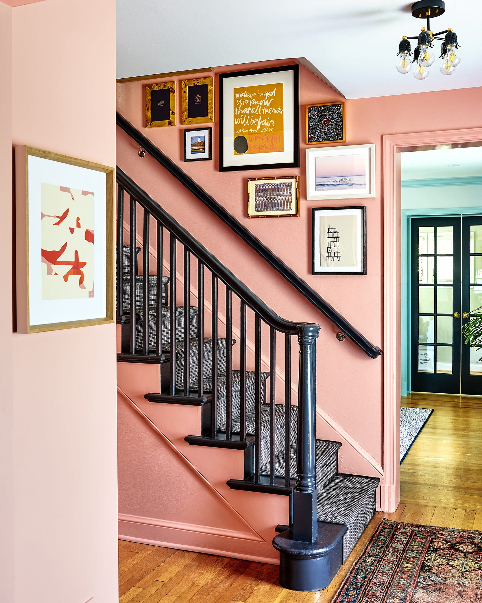
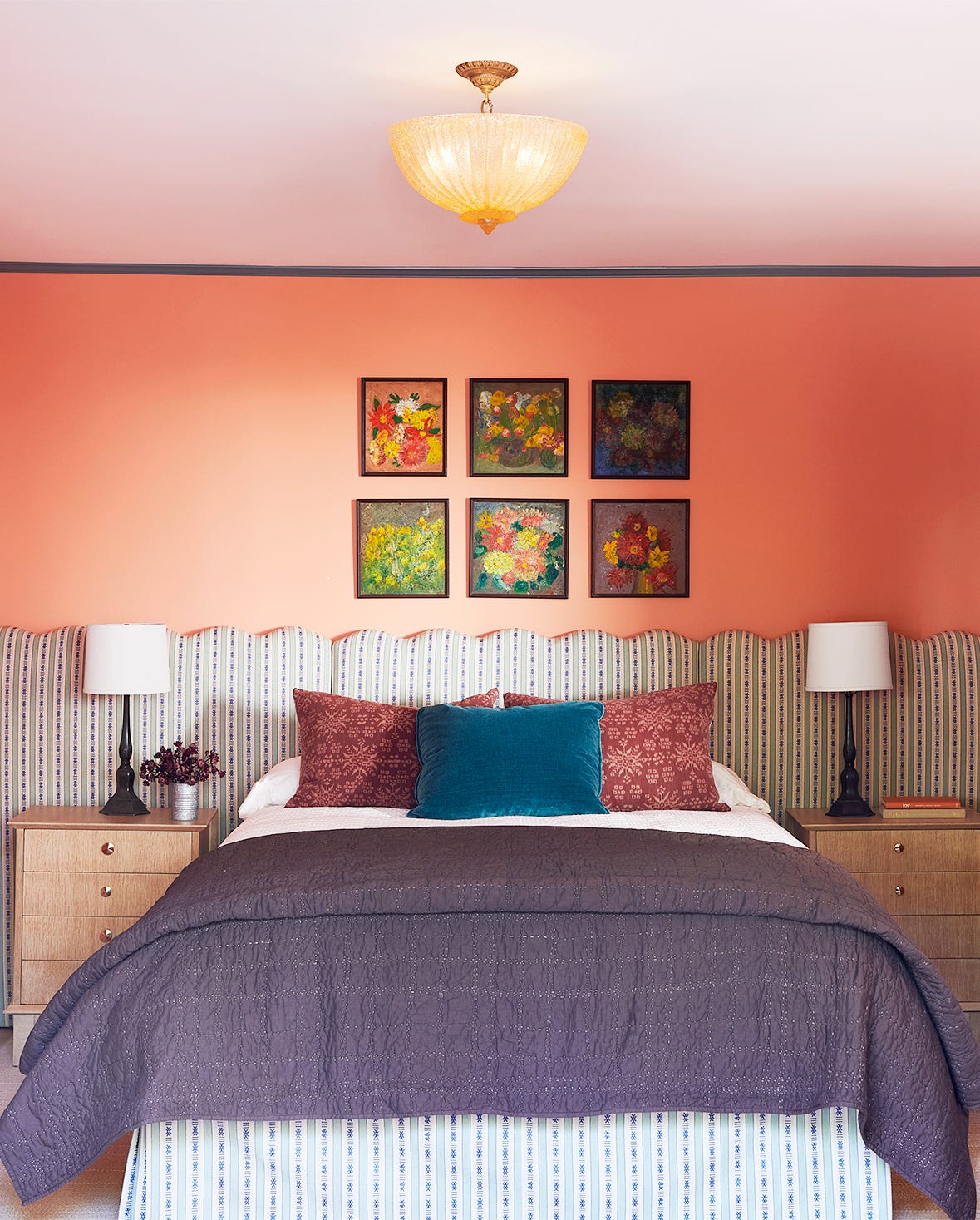
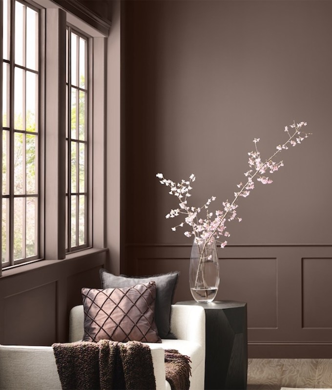
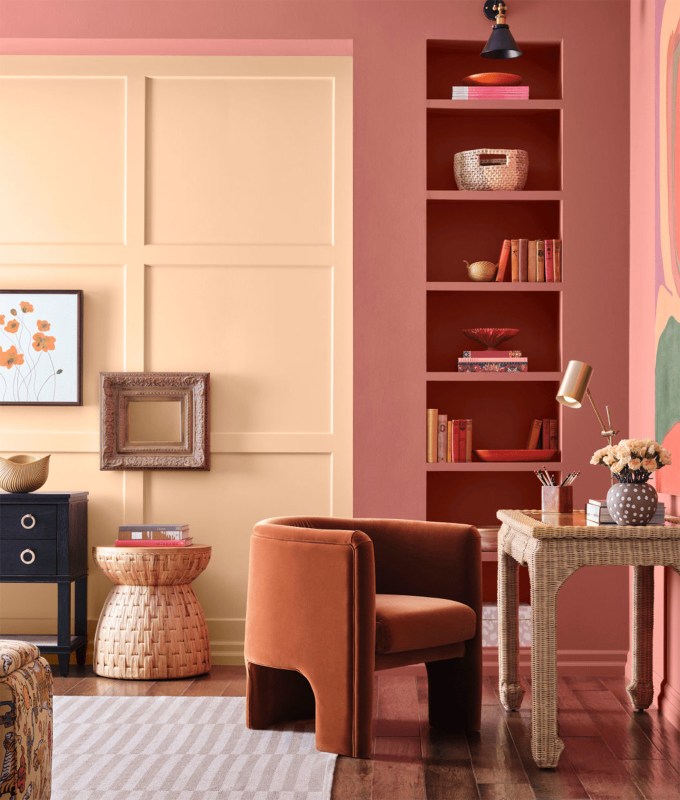
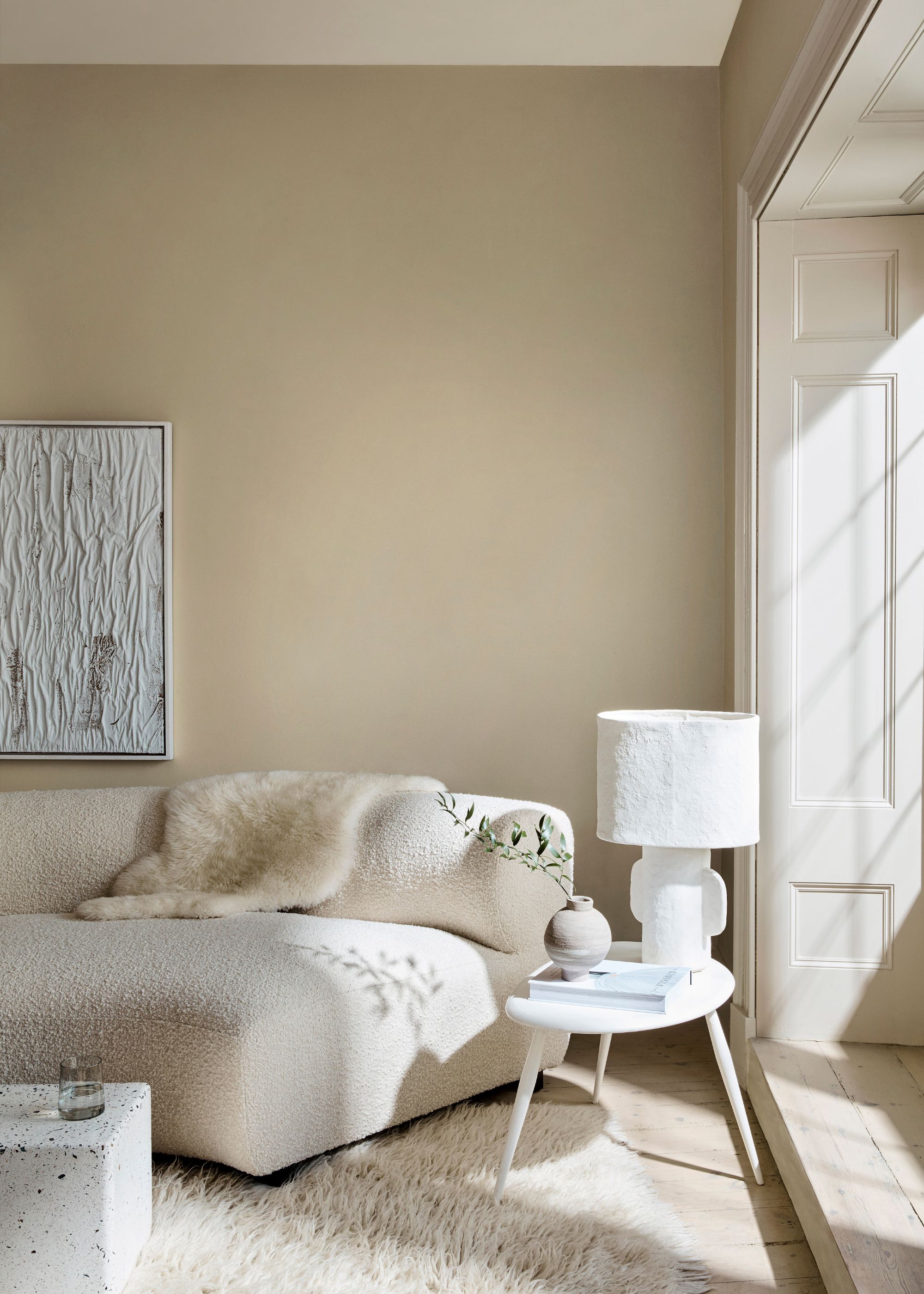
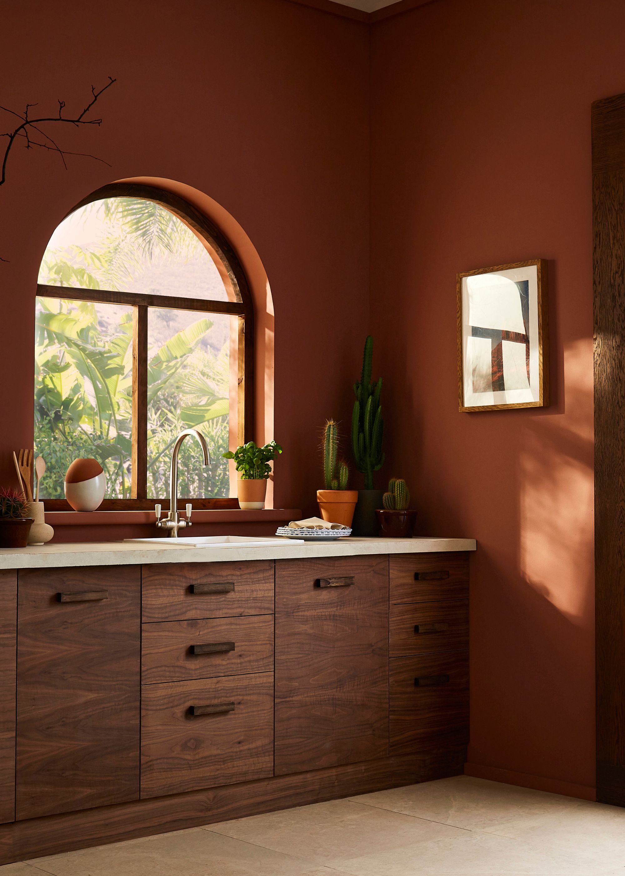
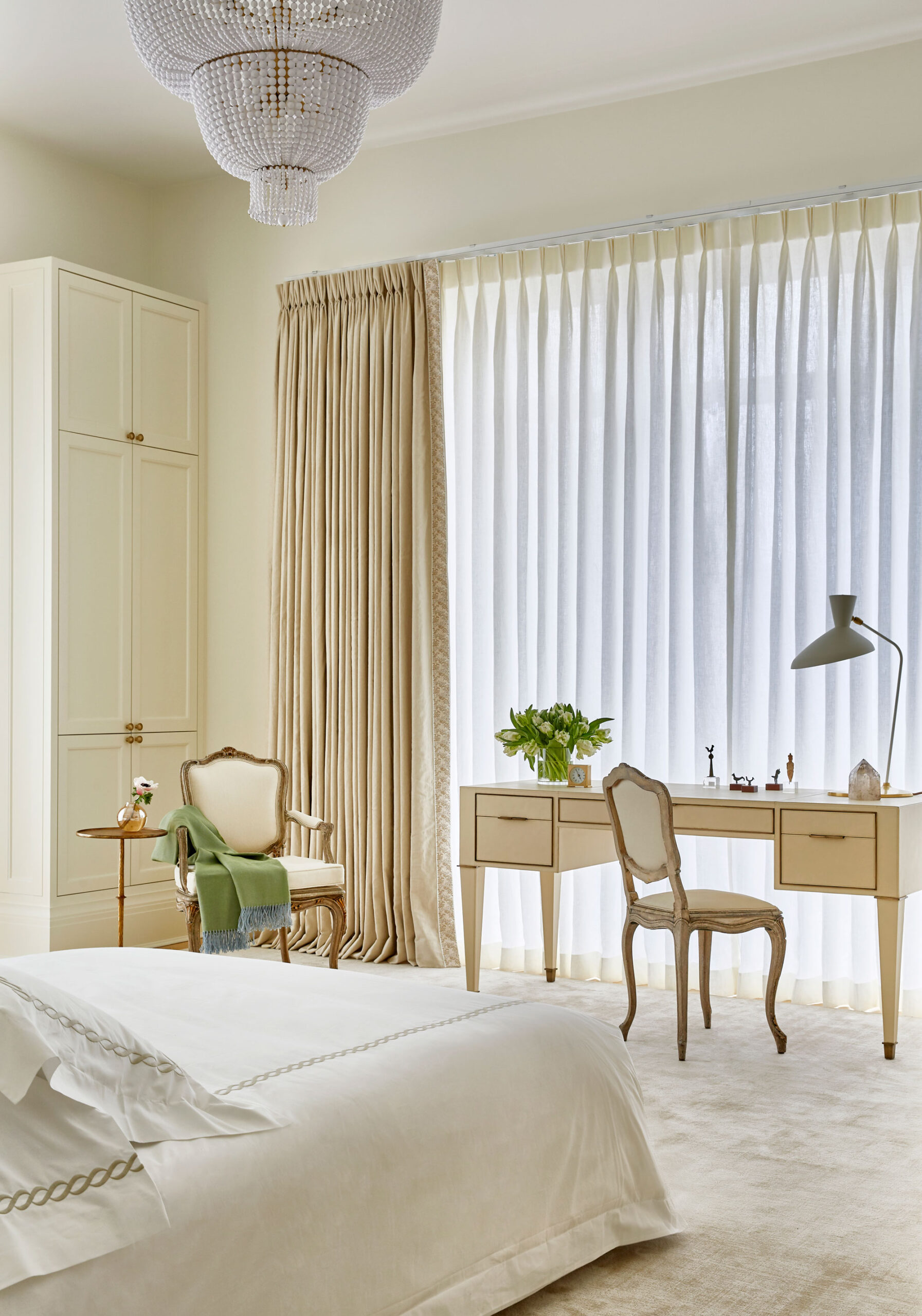
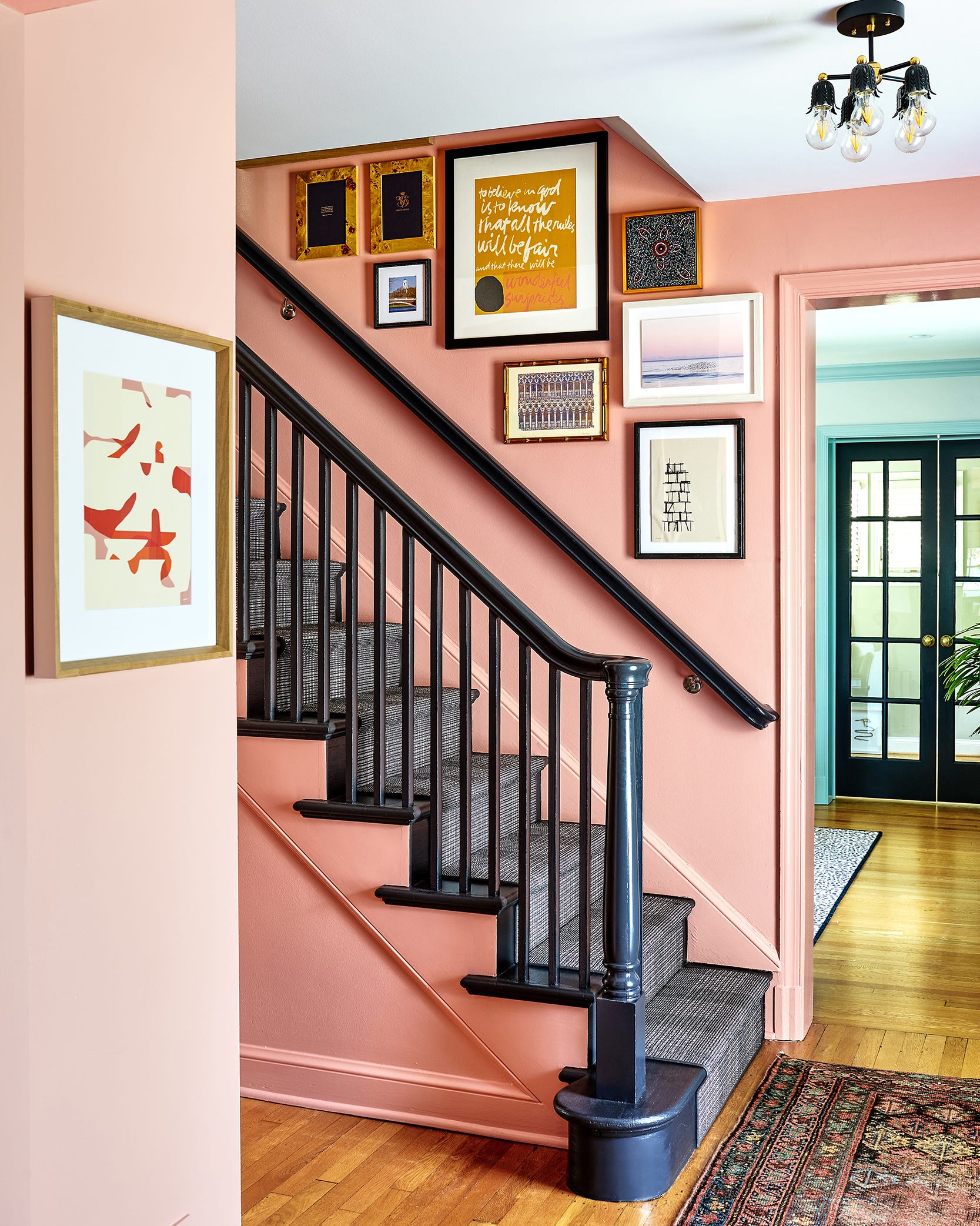
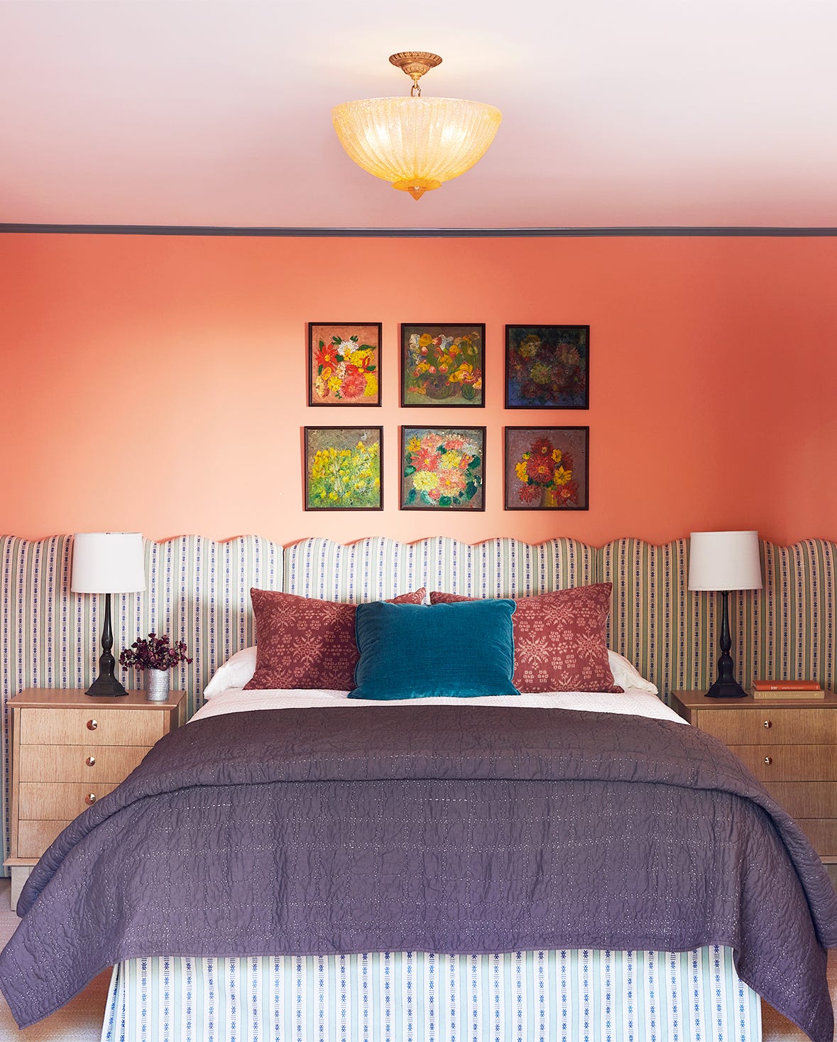
'Terracotta' by Farrow & Ball, one of eight shades in Kelly Wearstler’s collection, is inspired by sun-faded tiles and pots that acquire a pale coral hue over time in the California sun. Grow suggests terracotta as an accent color for cabinets and shelving. Behr’s 'Canyon Dusk,' described as grounding, calm, earthy, and warm, is presented as a soothing color for 2021, suitable for interior walls, floors, furniture, cabinets, or shelving due to its pale yet deep quality.
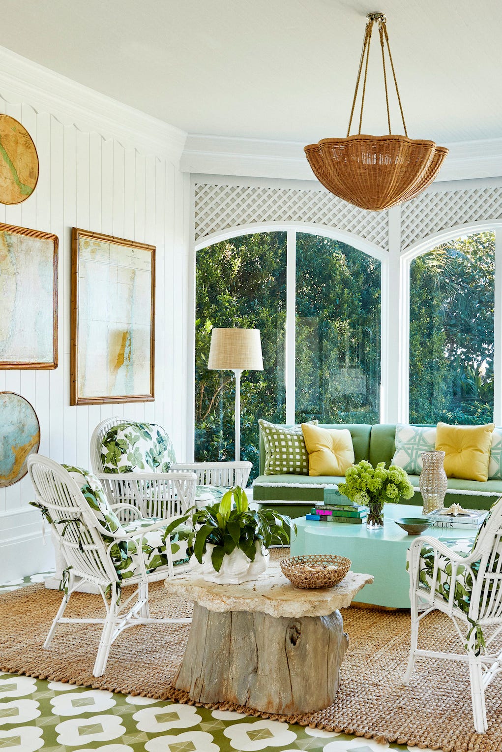
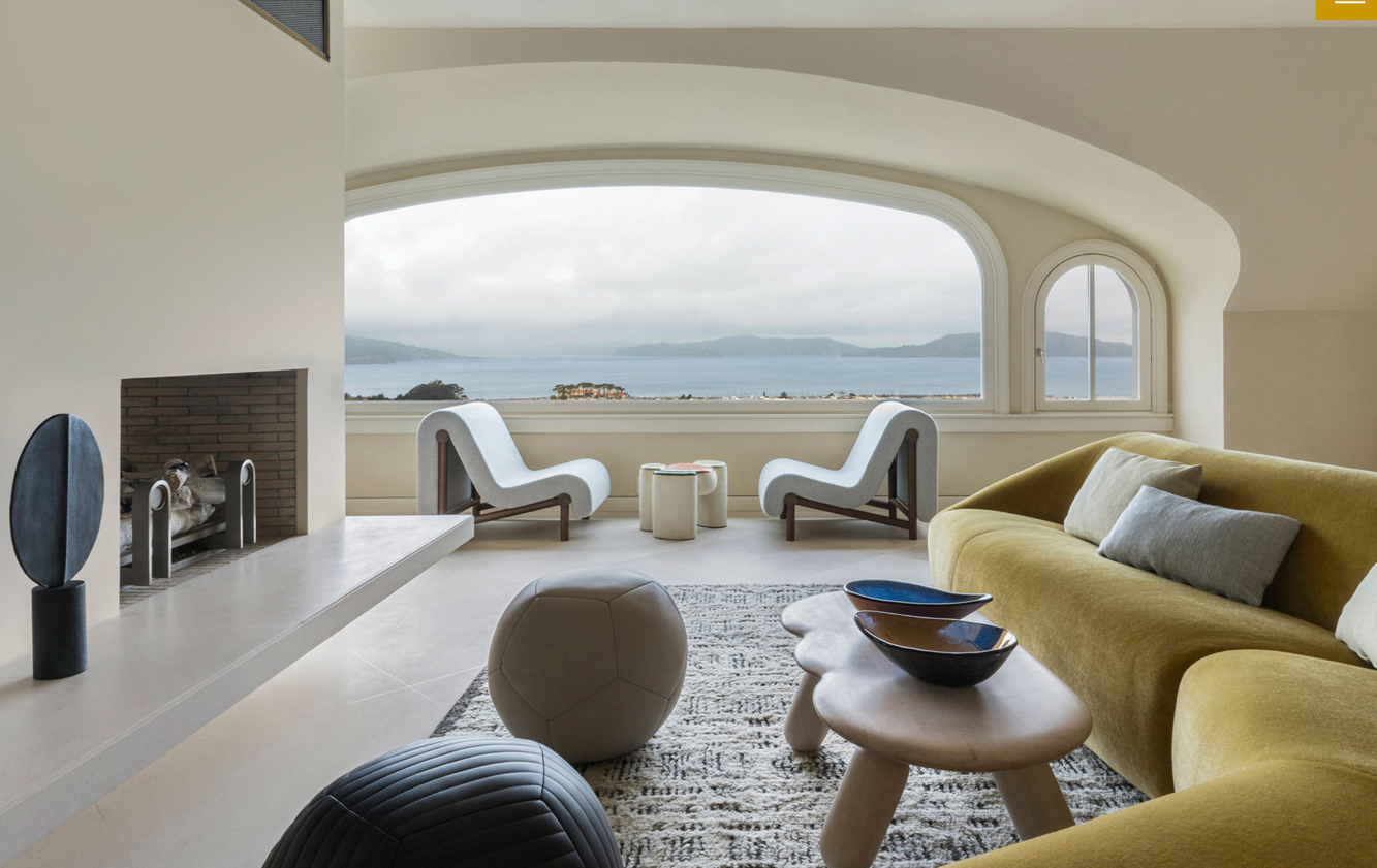
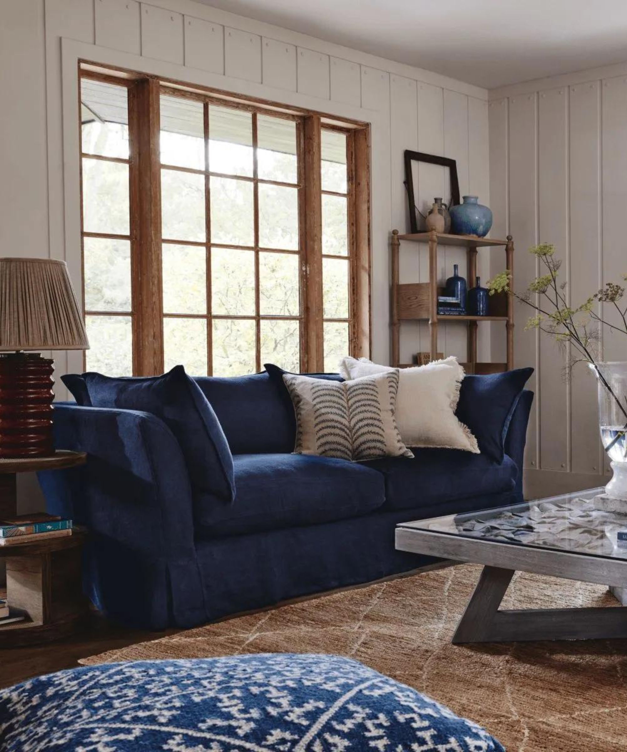
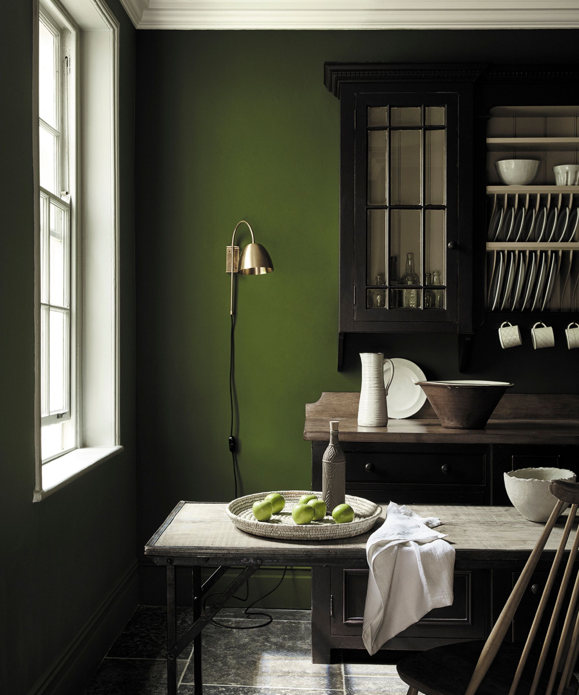
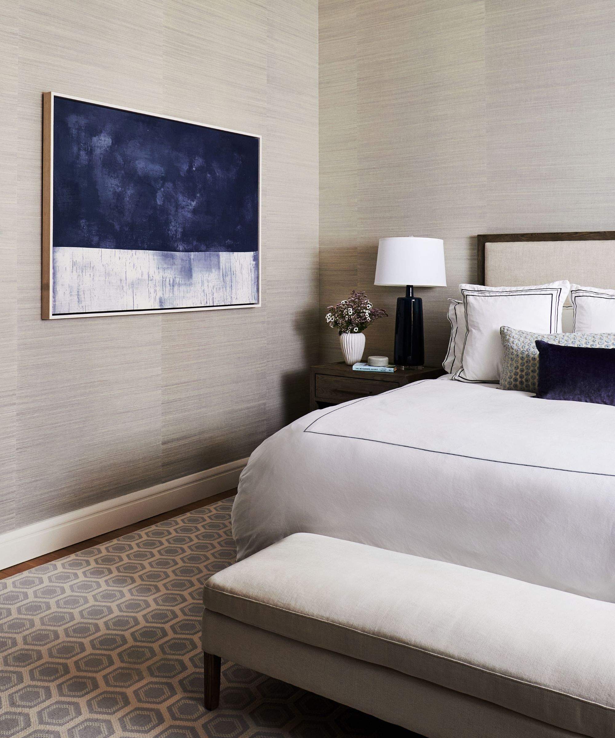
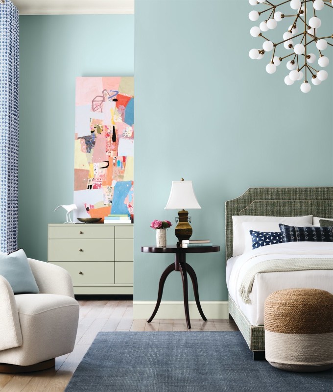
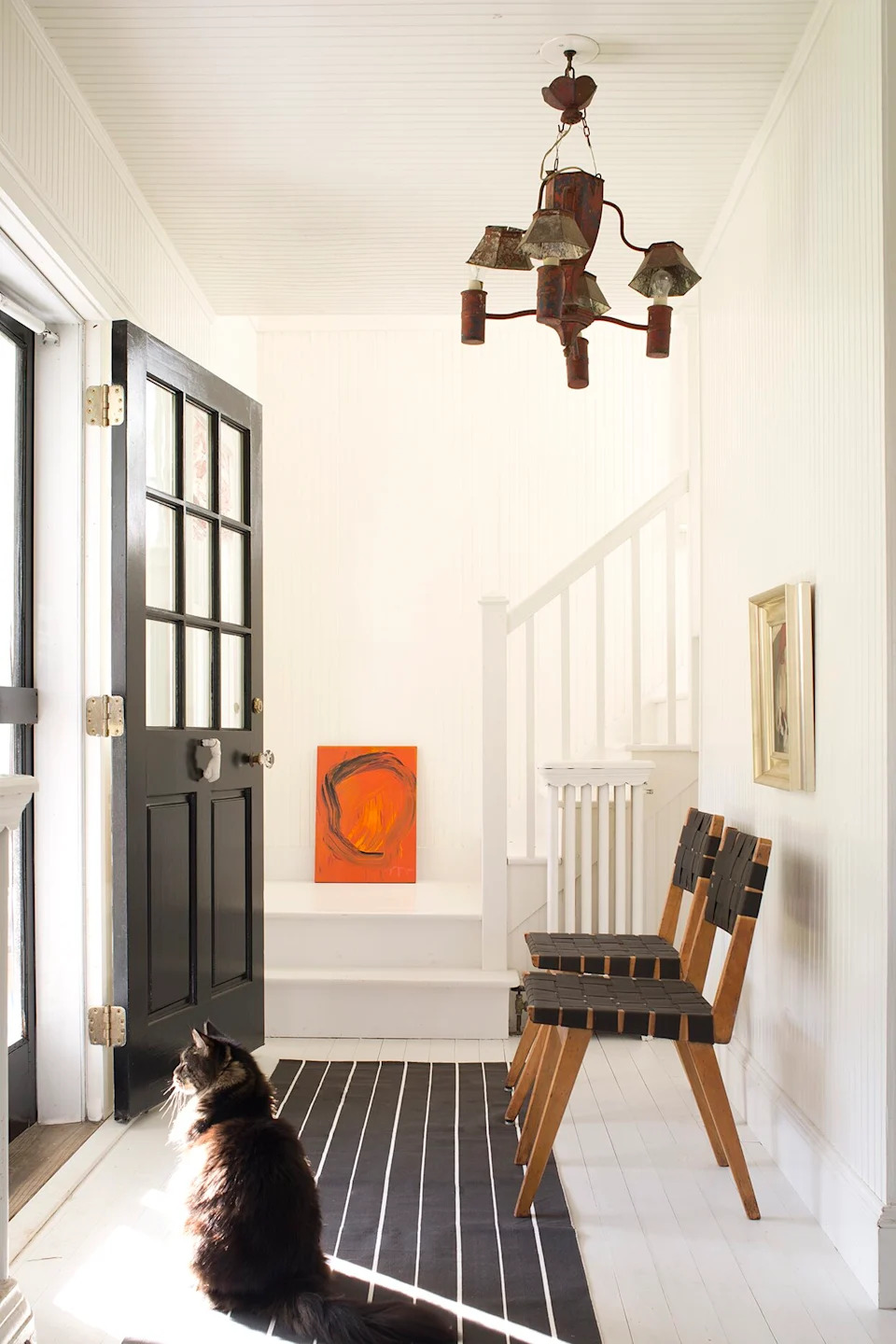
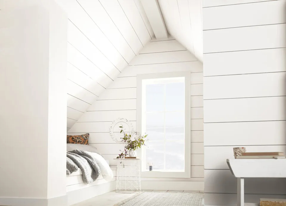
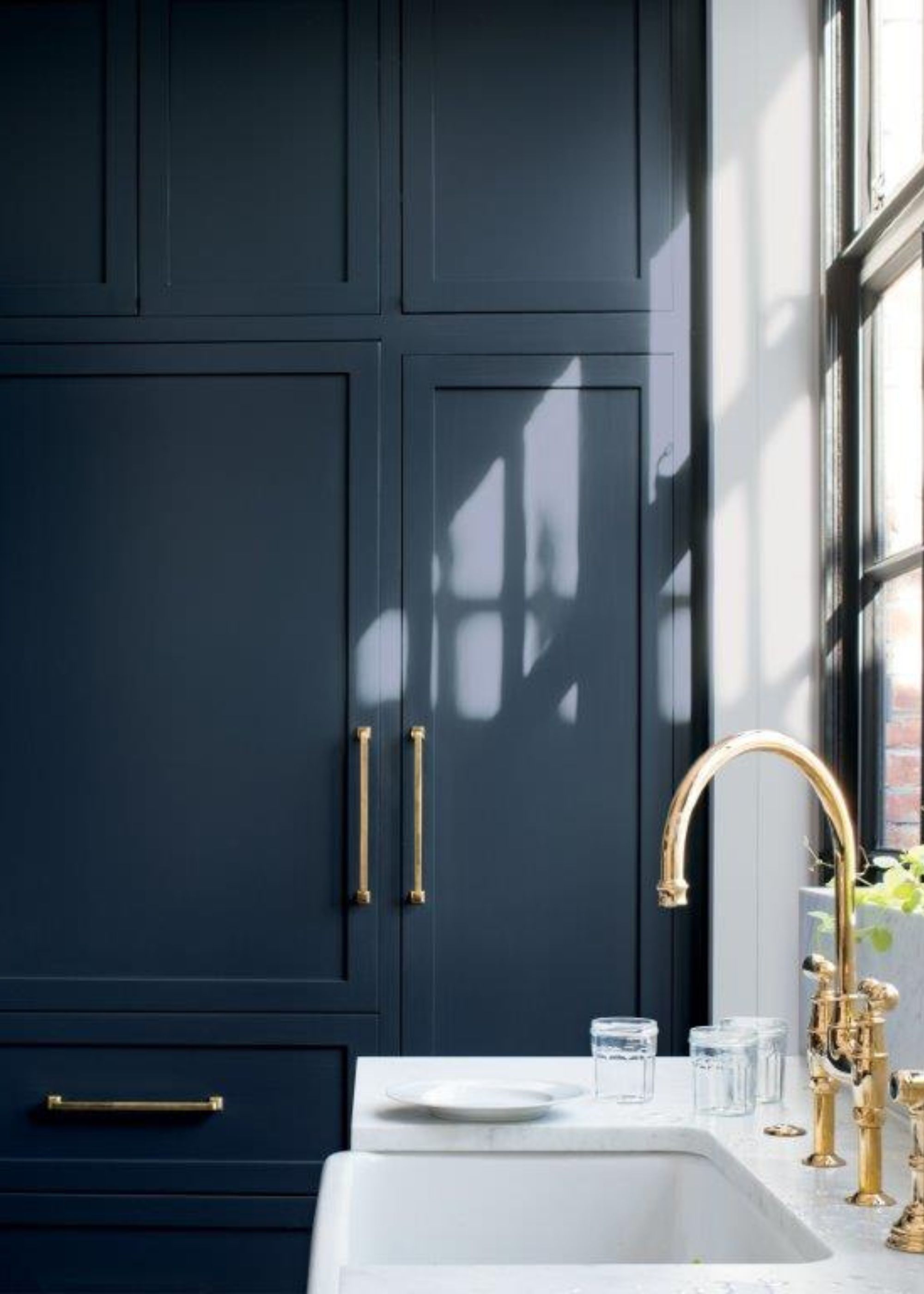
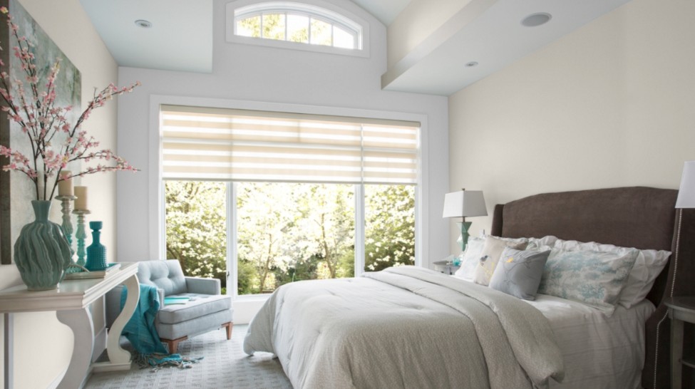
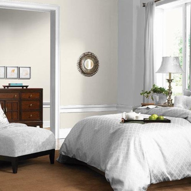
'Ashland' by Portola Paint, an eco-friendly, Los Angeles-based company, is a deep forest green reminiscent of Oregon’s old-growth forests. This rich neutral is suggested to balance more ethereal pastels and is recommended by Grow for exterior applications like doors, window trim, pergolas, and fences. 'Seattle Gray' by Benjamin Moore is a pale neutral that evokes the overcast, gray days of the Pacific Northwest, offering a calming alternative to stark white walls and serving as an ideal backdrop for bold art or a peaceful canvas for colorful rooms. Finally, Behr’s 'Tahoe Blue' captures the distinctive, hard-to-pin-down turquoise shade of Lake Tahoe, attributed to its unique algae concentration. This intense blue-green is recommended for small accent doses to bring a summery feel to any space. These selections collectively showcase the diverse and inspiring color palette found across the Western United States, offering a range of options for home decorators seeking to bring a touch of the West into their living spaces.
#WestCoastColors #PaintTrends #HomeDecor #InteriorDesign #FarrowAndBall #BehrPaint #DunnEdwards #PortolaPaint #BenjaminMoore #AccentColors #WestCoastColors #PaintTrends #HomeDecor #InteriorDesign #FarrowAndBall #BehrPaint #DunnEdwards #PortolaPaint #BenjaminMoore #AccentColors
Há 0 comentários no total
 Ainda não há comentários
Você também pode gostar
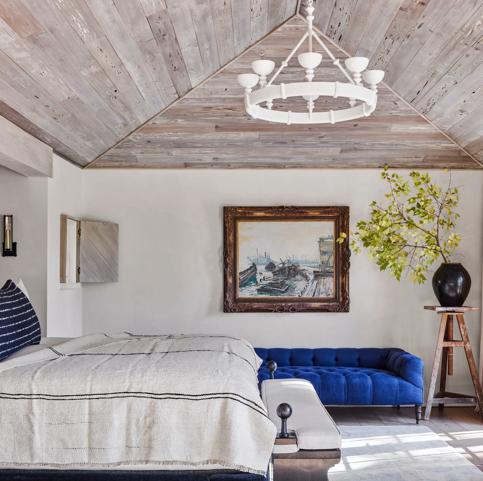
Bring the Beach Home with These 25 Dreamy Color Palettes

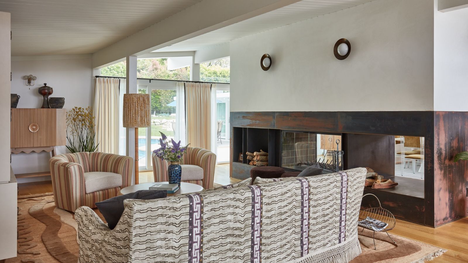
Does where you live affect the colors you decorate with? According to designers, yes – massively
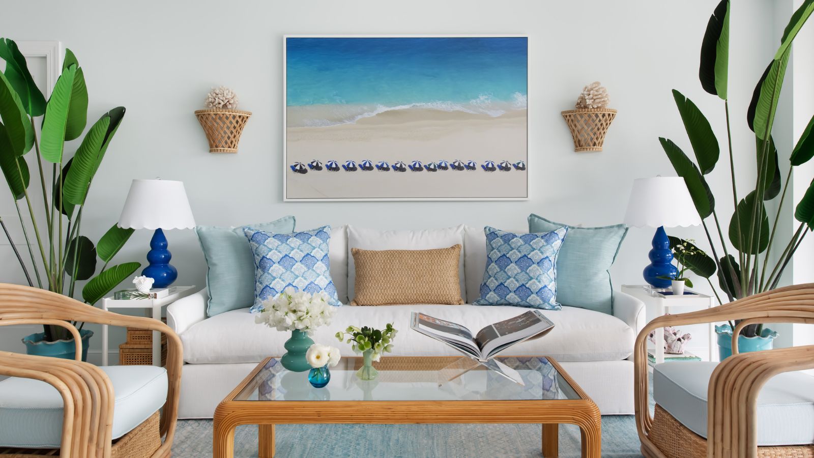
15 coastal decor ideas that are chic not clichéd

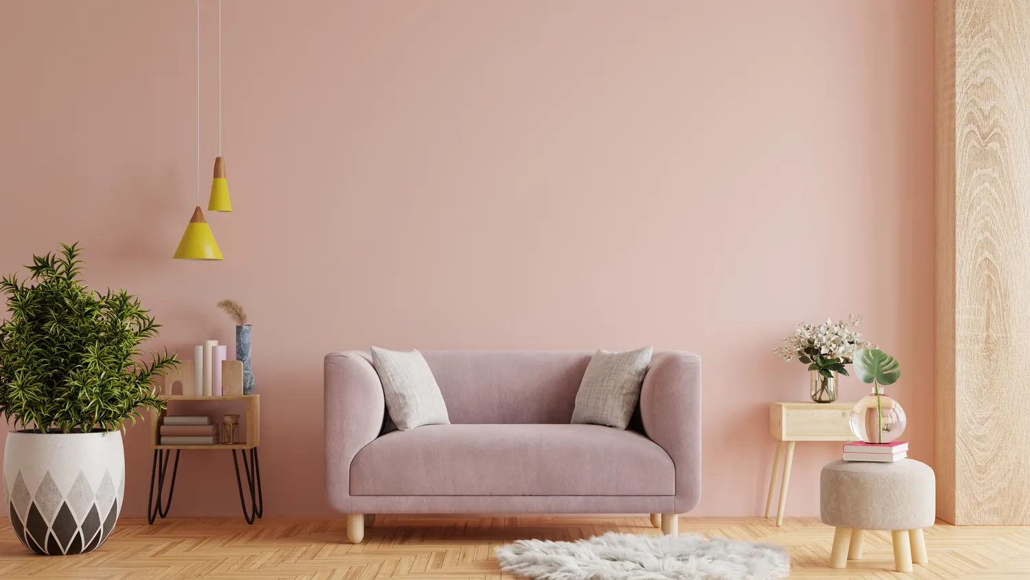
8 Timeless Paint Colors That Always Look Fresh, No Matter the Season

9 Contemporary Coastal Color Palettes Designers Love Which Make Rooms Feel as Relaxing as a Vacation

The subtle color tricks in ‘The Summer I Turned Pretty’ that can transform any room into a soothing coastal retreat
The 8 Best Color Palettes for a Beach Wedding
Best white paint colors: Expert share the top options

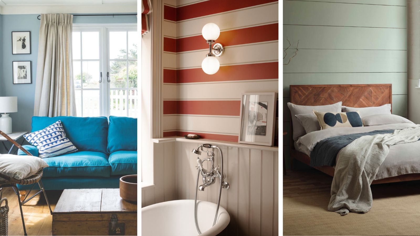
6 coastal color schemes for a calm and tranquil home, no matter how far from the ocean you are
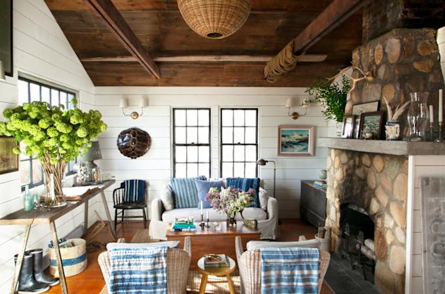
How to Bring the Coastal Grandmother Vibe to Your Living Room


The Best White Paint Colors Experts Turn to Again and Again
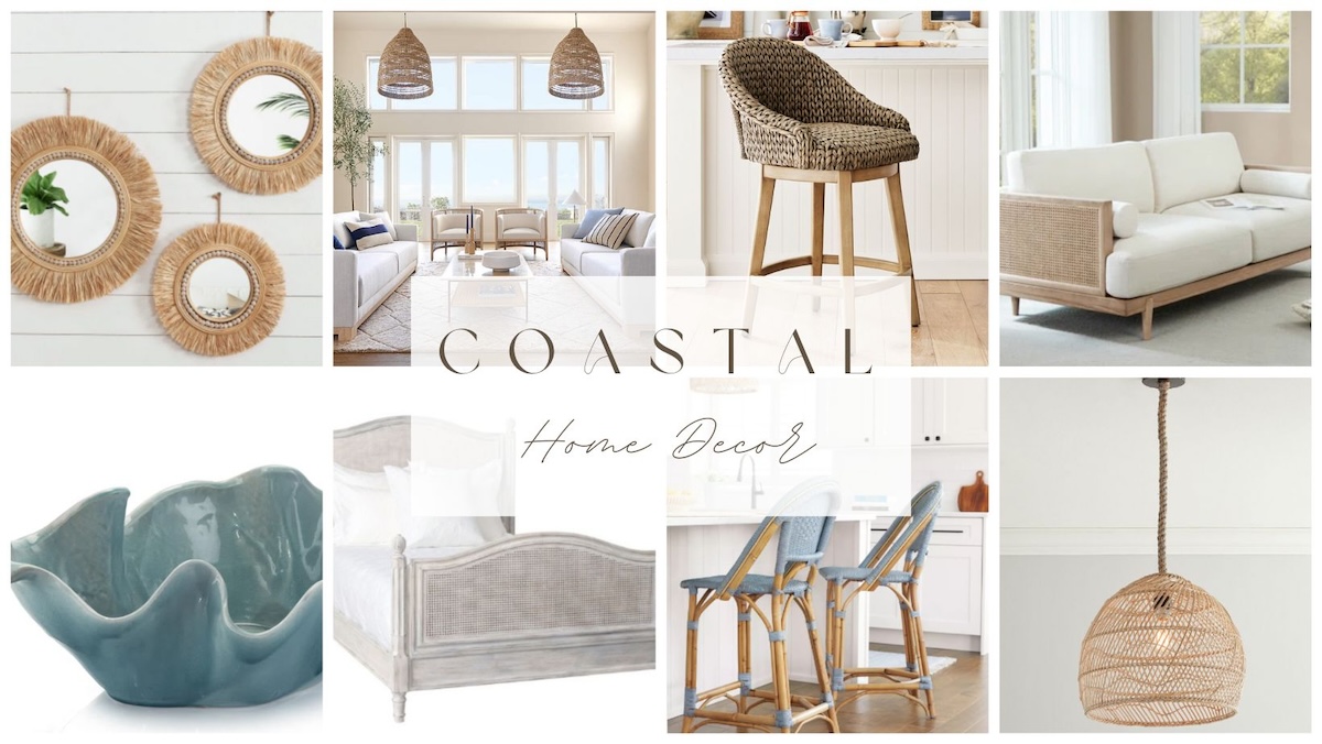
Coastal Decor: Pro Decorating Tips | How to Do Coastal Design Right


15 Top Coastal Paint Colors for Your Home’s Interior and Exterior

The Top Coral Paint Colors to Brighten Your Space
The Best Colors for West-Facing Rooms That Will Help You Make the Most of That Warm Evening Light
13 Coral Paint Colors to Brighten Your Walls

5 Rooms with Beach Color Schemes That Each Take a Different Approach to This Laidback Look
Bye-Bye True Blue: These Are the New Coastal Colors for 2026
The Best Warm White Paint Colors, as Seen in 8 Designers’ Favorite Spaces
Designers Swear By These 8 Off-White Paint Colors For Every Project