1/6
5 colors to avoid painting a landing – and the secret to choosing the right shades
The landing, often viewed as a transitional and easily overlooked area in a home, plays a crucial role in maintaining visual flow and cohesion between different living spaces. While its primary function is passage, the color choices for a landing can significantly impact the overall aesthetic and atmosphere of a home, connecting various rooms, staircases, and entryways. Selecting the right paint color for this area is essential to avoid clashes and create a harmonious environment, making it important to understand which hues to embrace and which to steer clear of.
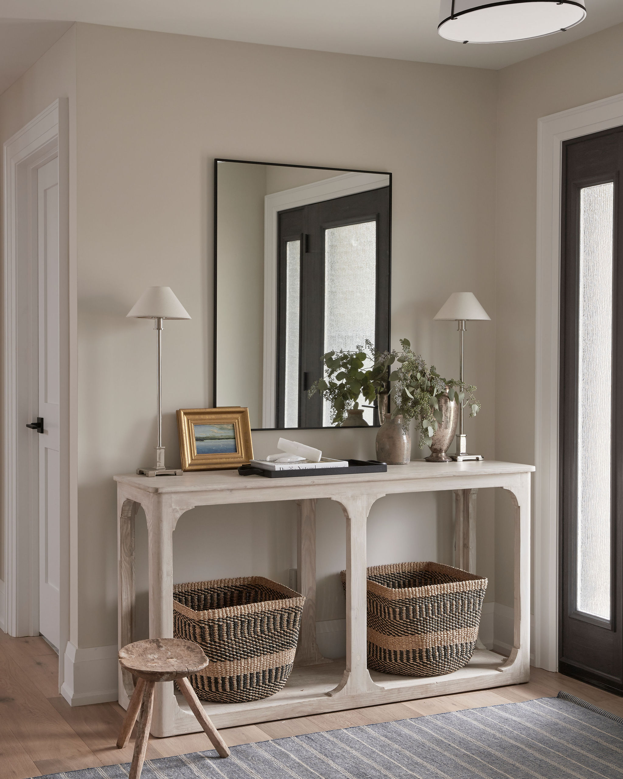
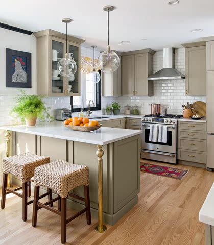
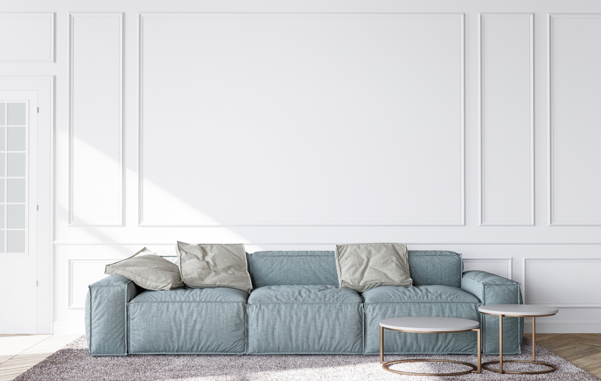
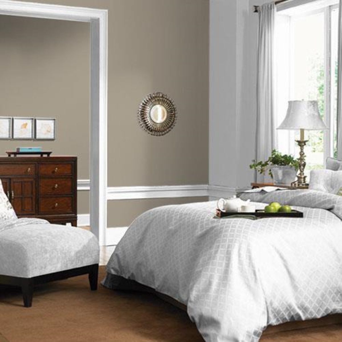
Beige, despite its popularity in other areas like living rooms, is identified as a tricky color for landings due to its varied undertones (pink, gold, yellow) and their potential to clash with adjoining rooms under different lighting conditions. Instead of beige, interior designers recommend opting for warmer or muted whites, such as Farrow and Ball's 'Cabbage White,' to achieve a soft, risk-free tone that complements diverse color palettes.
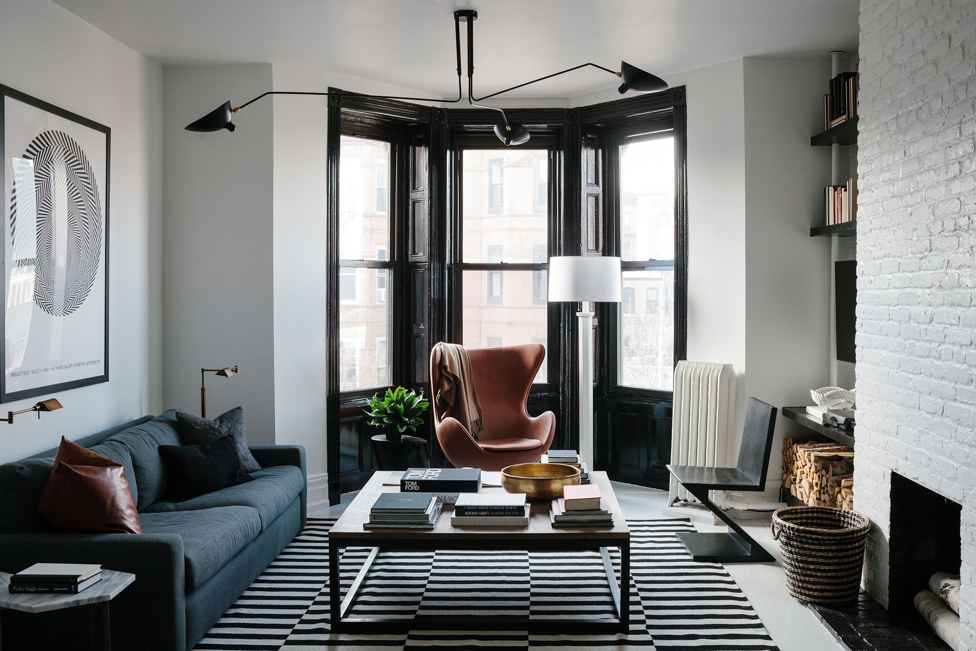
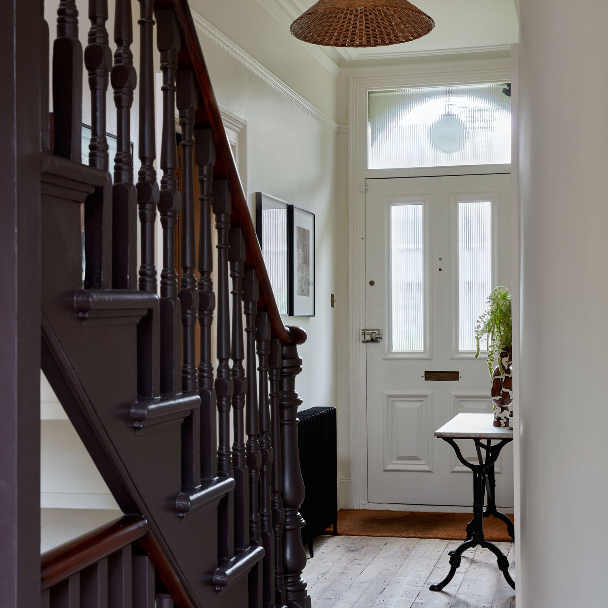
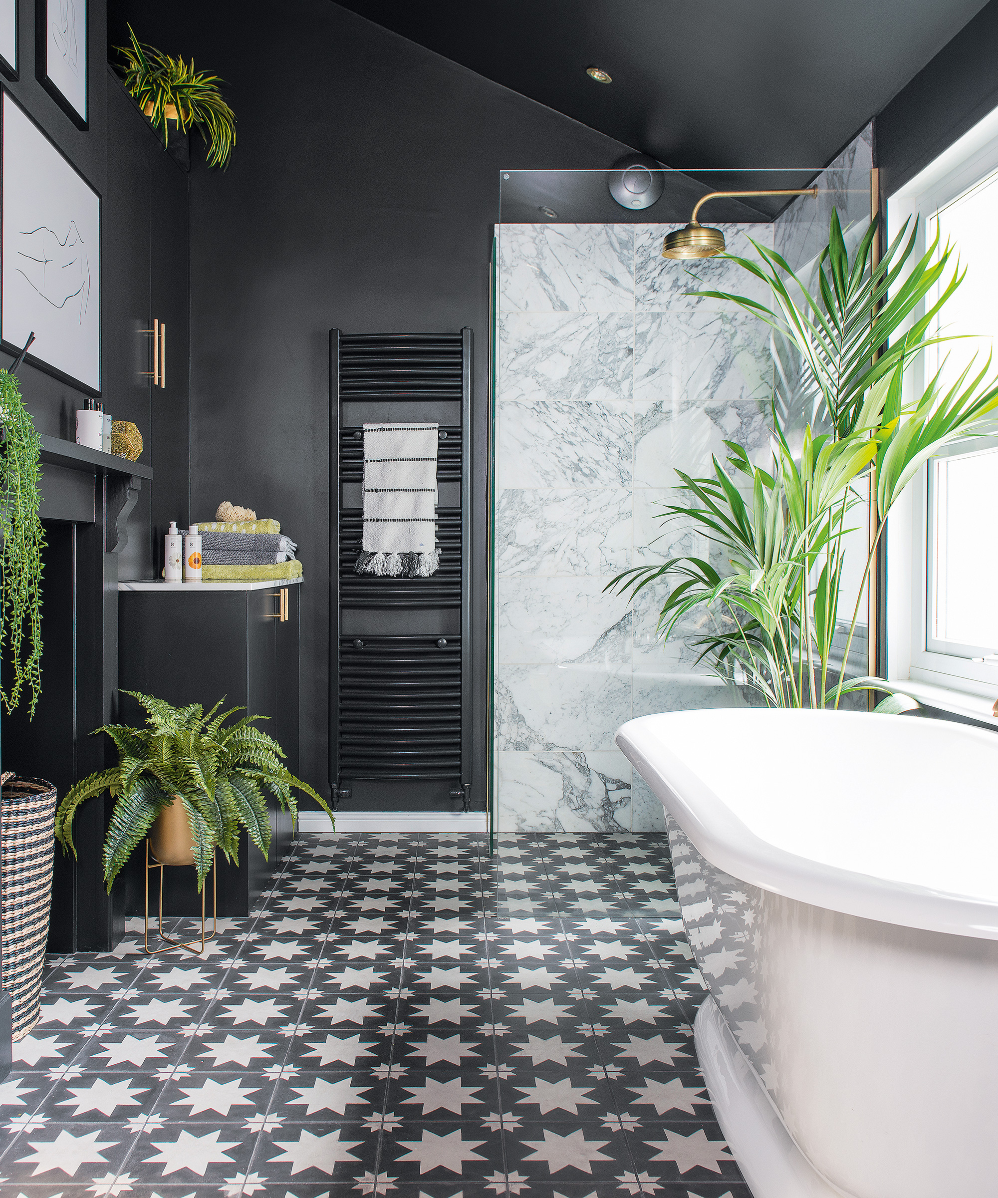
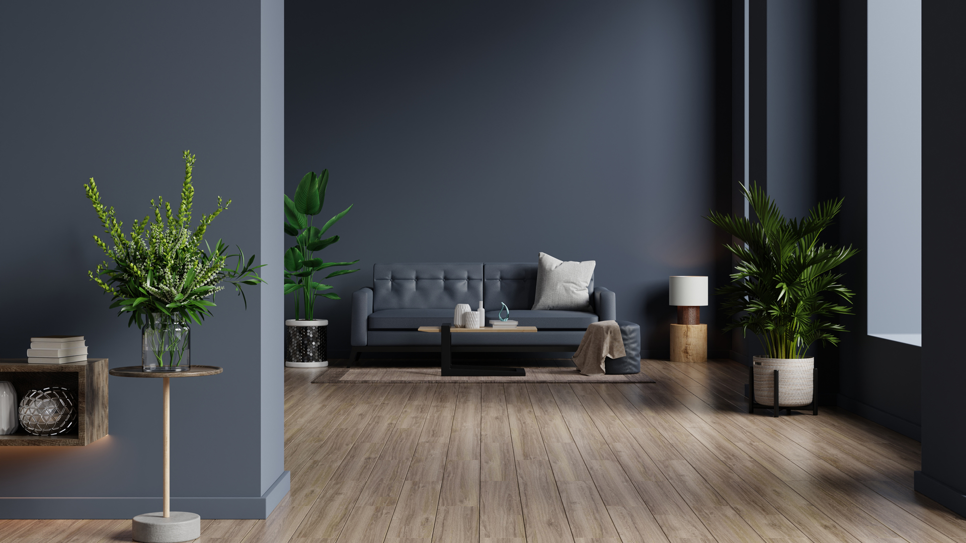
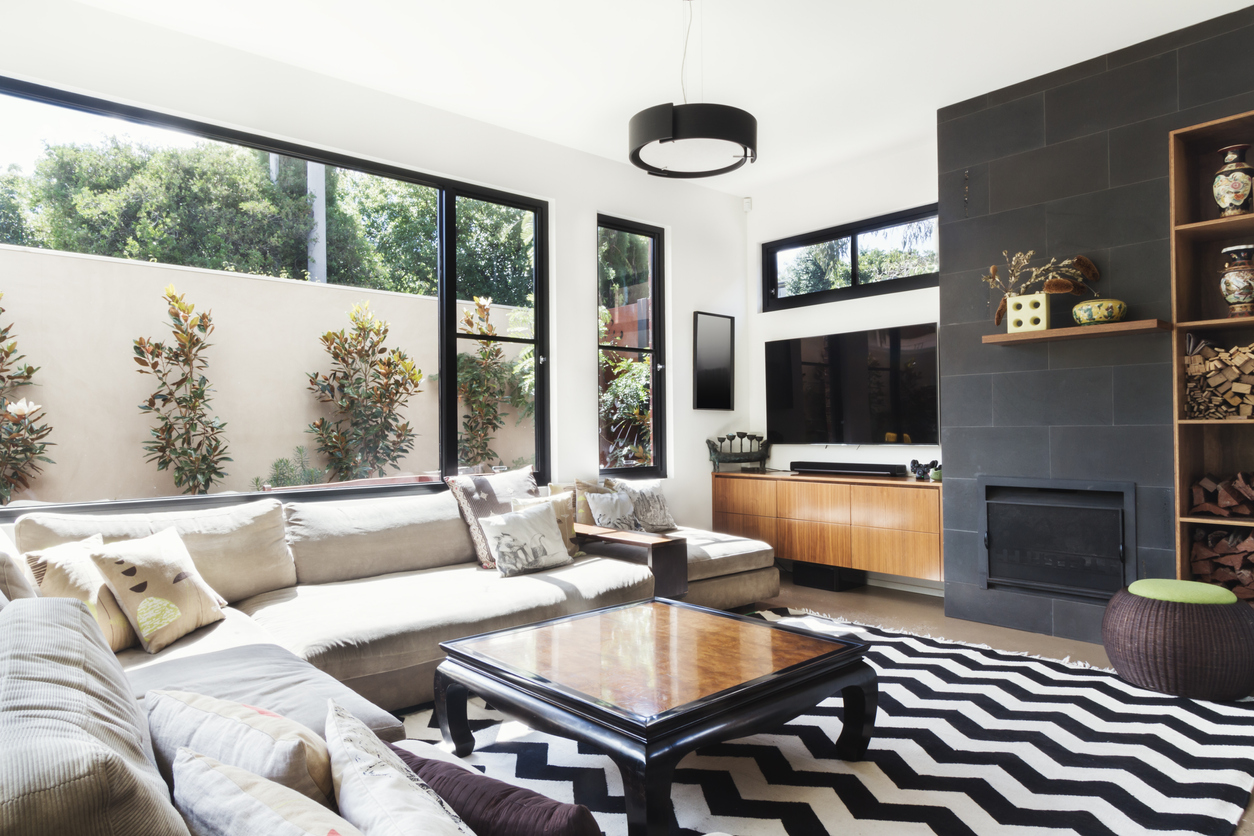
Charcoal gray is another color to avoid, as it is considered a fading trend that can instantly date a home. A more timeless alternative suggested is Farrow and Ball's 'Pigeon,' which offers a dusty gray-blue aesthetic, proving to be more enduring. Black, while possessing stylish qualities, is deemed unsuitable for landings primarily for practical reasons related to safety. In dimly lit conditions, black or off-black can increase the risk of falls due to poor visibility. A warm white is advised instead to ensure continuity, enlarge the space visually, and enhance safety, especially in areas with limited natural light.
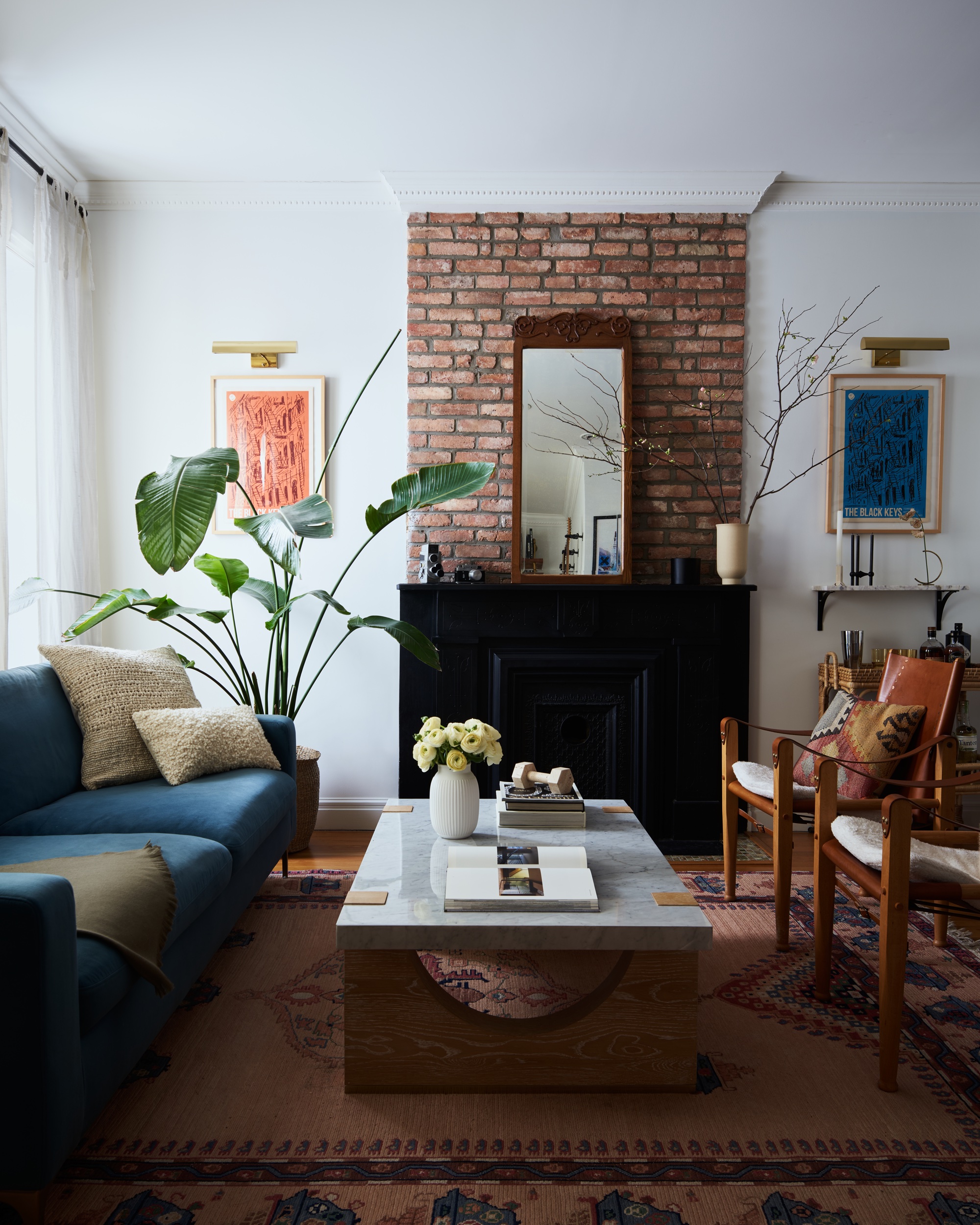
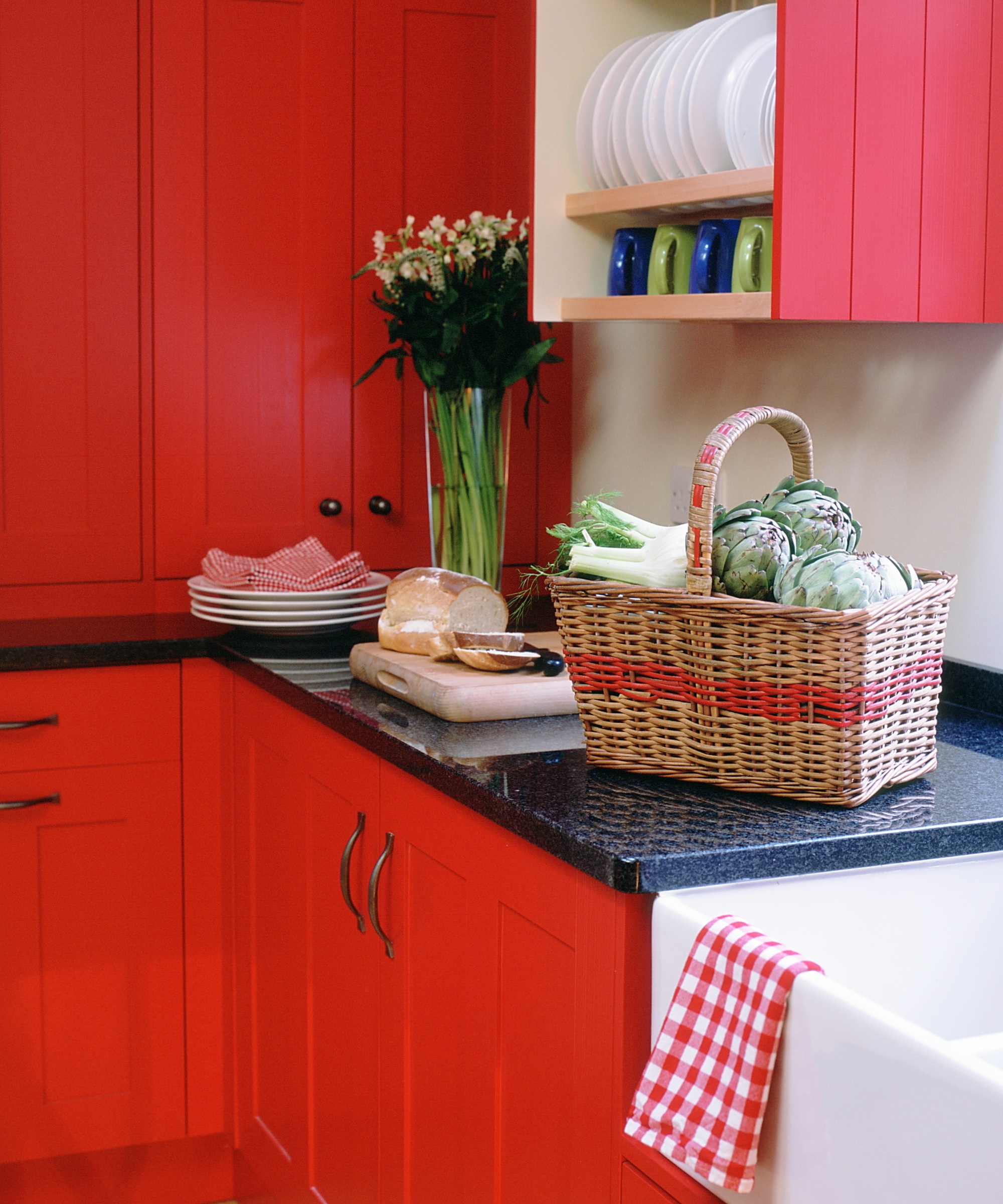
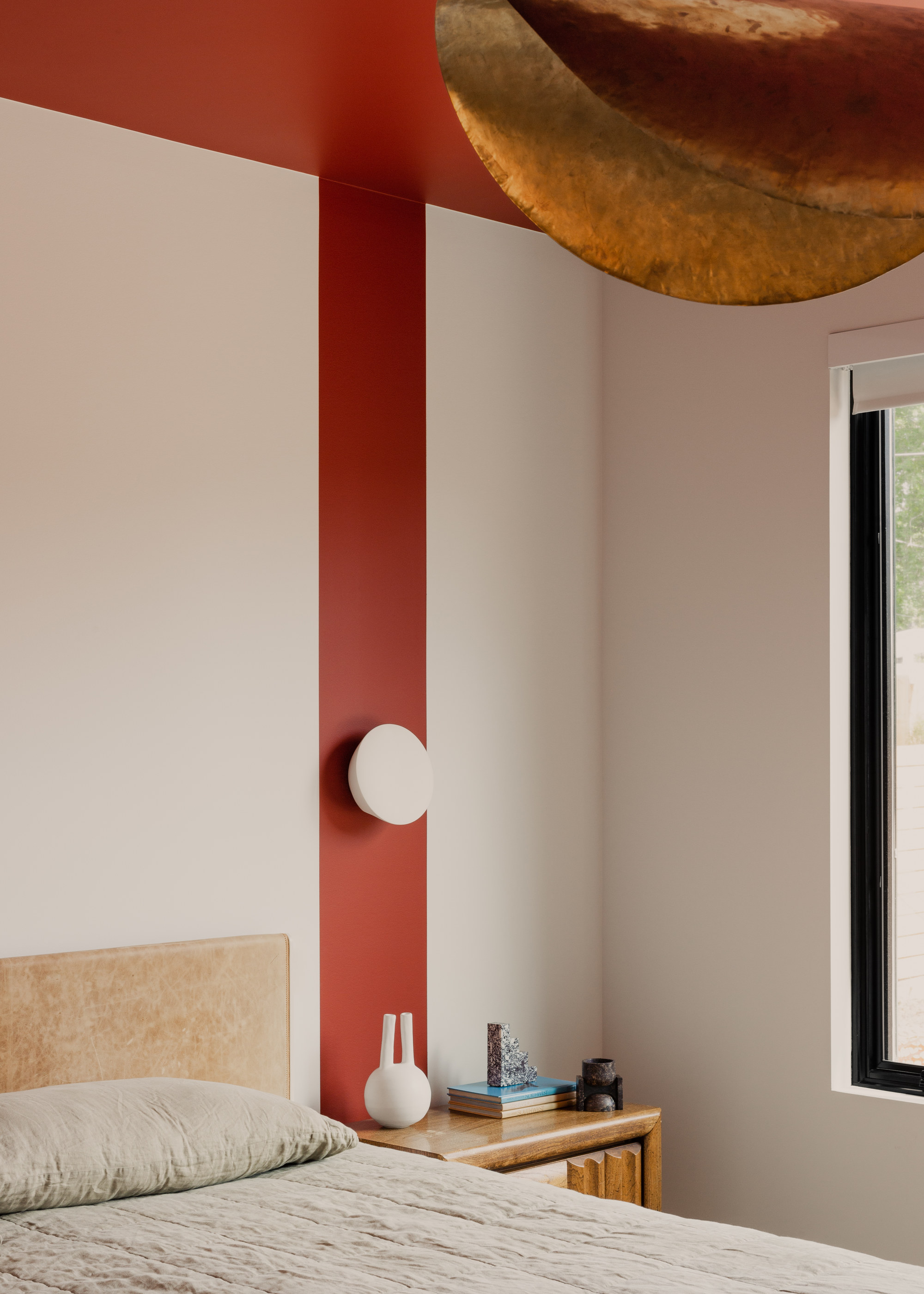
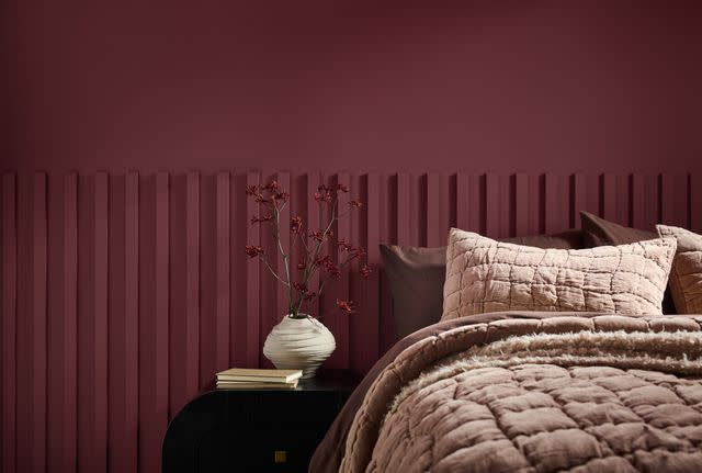
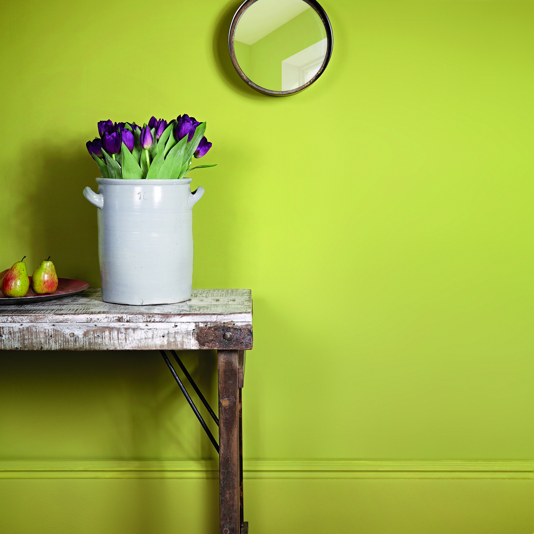
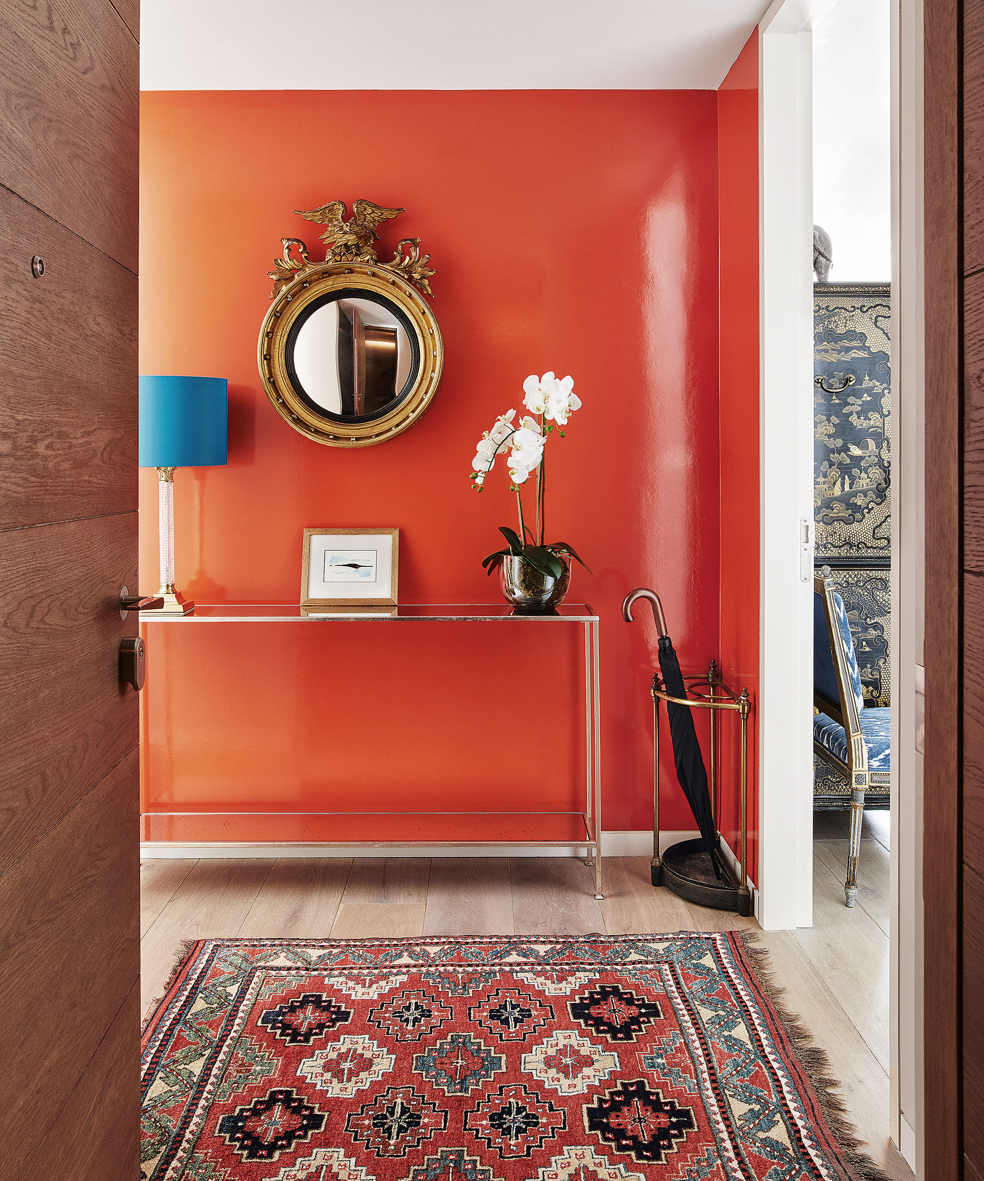
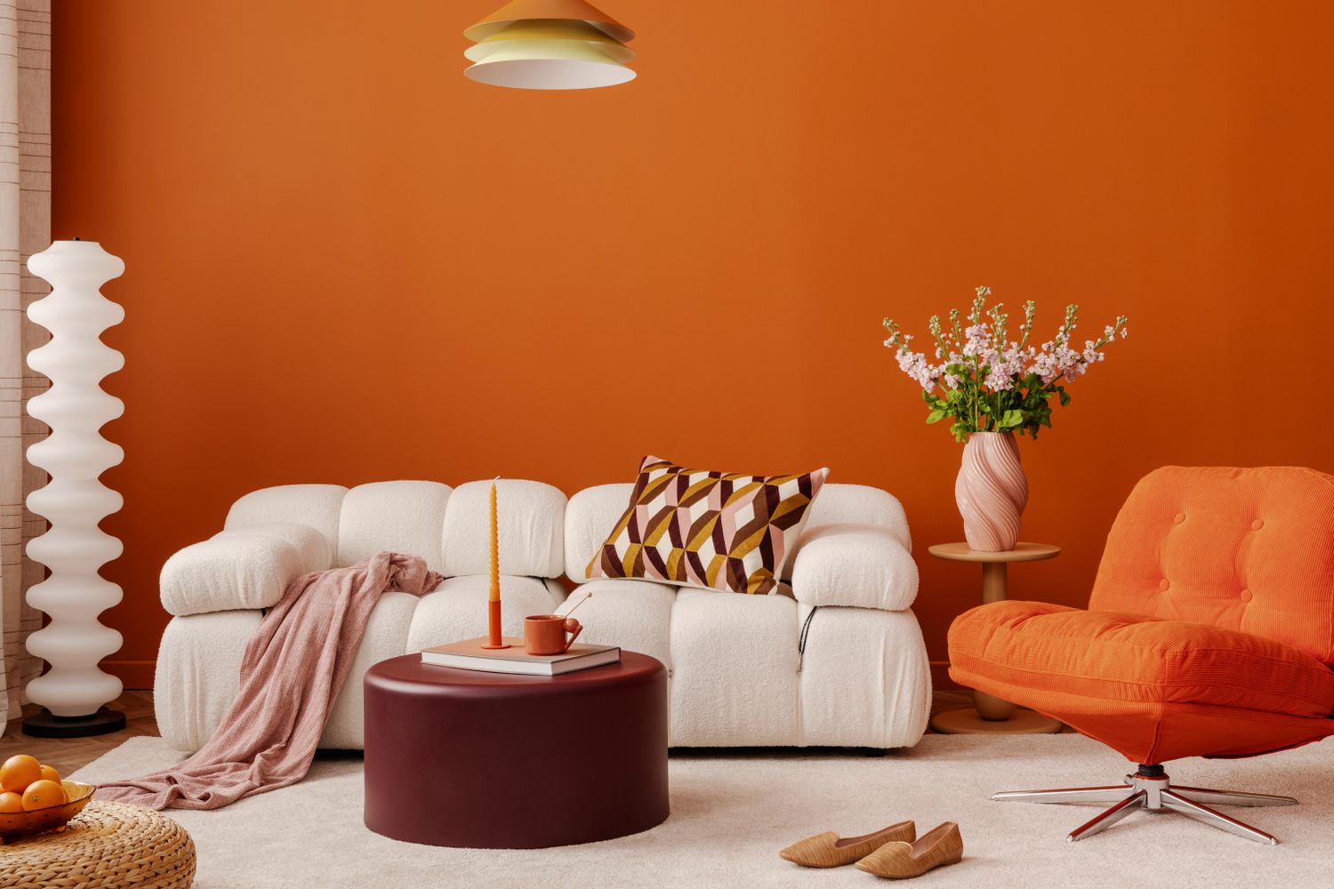
Bright, bold colors like red or orange are discouraged for landings because they can create a stressful or overwhelming atmosphere for individuals passing through. These vibrant hues are best reserved for social spaces intended to make a strong impression. Landings, by contrast, should remain airy, open, and uncomplicated, serving as a neutral transition zone rather than a space for lingering. Consequently, keeping the landing's color palette neutral and simple is recommended.
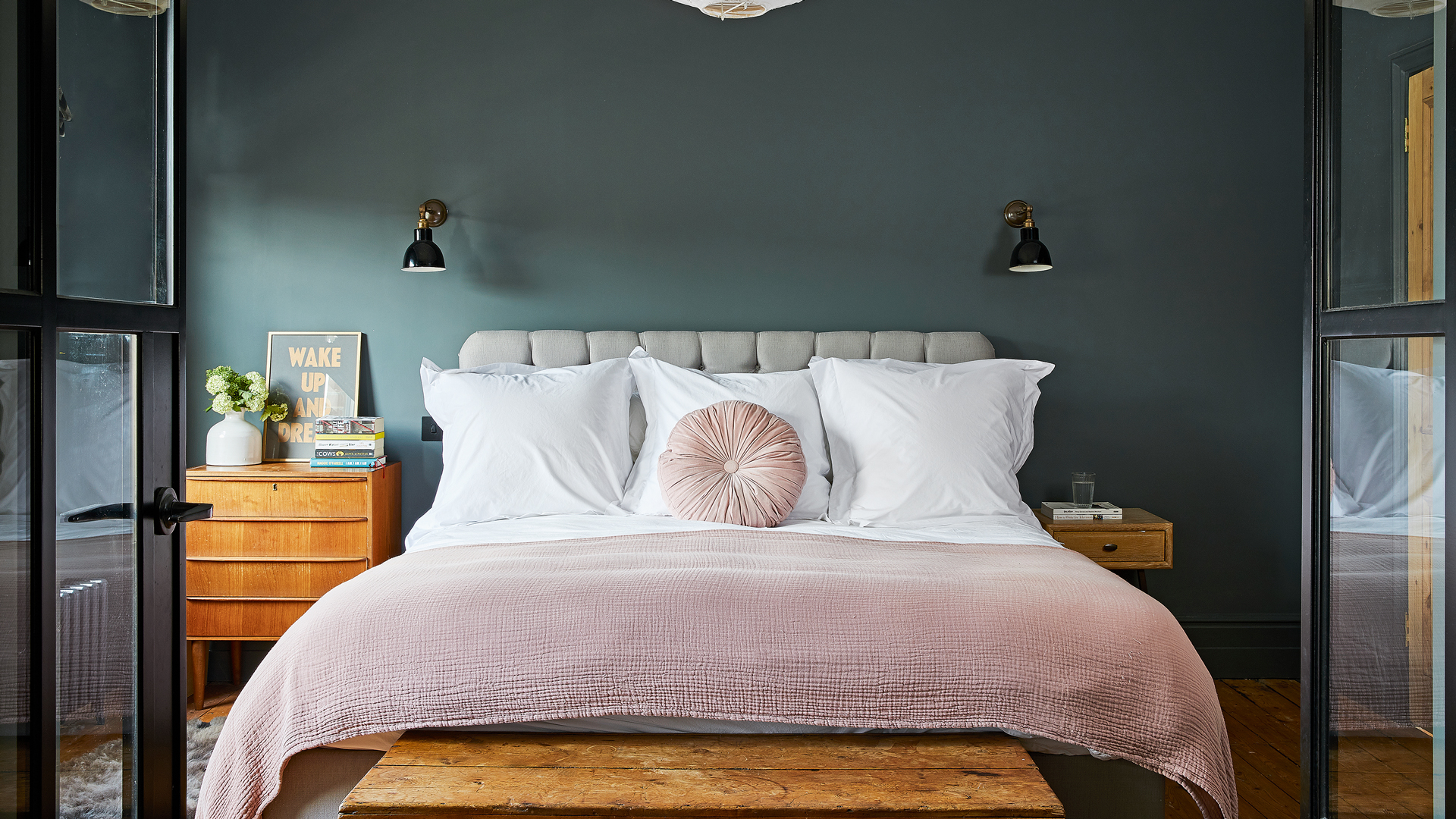
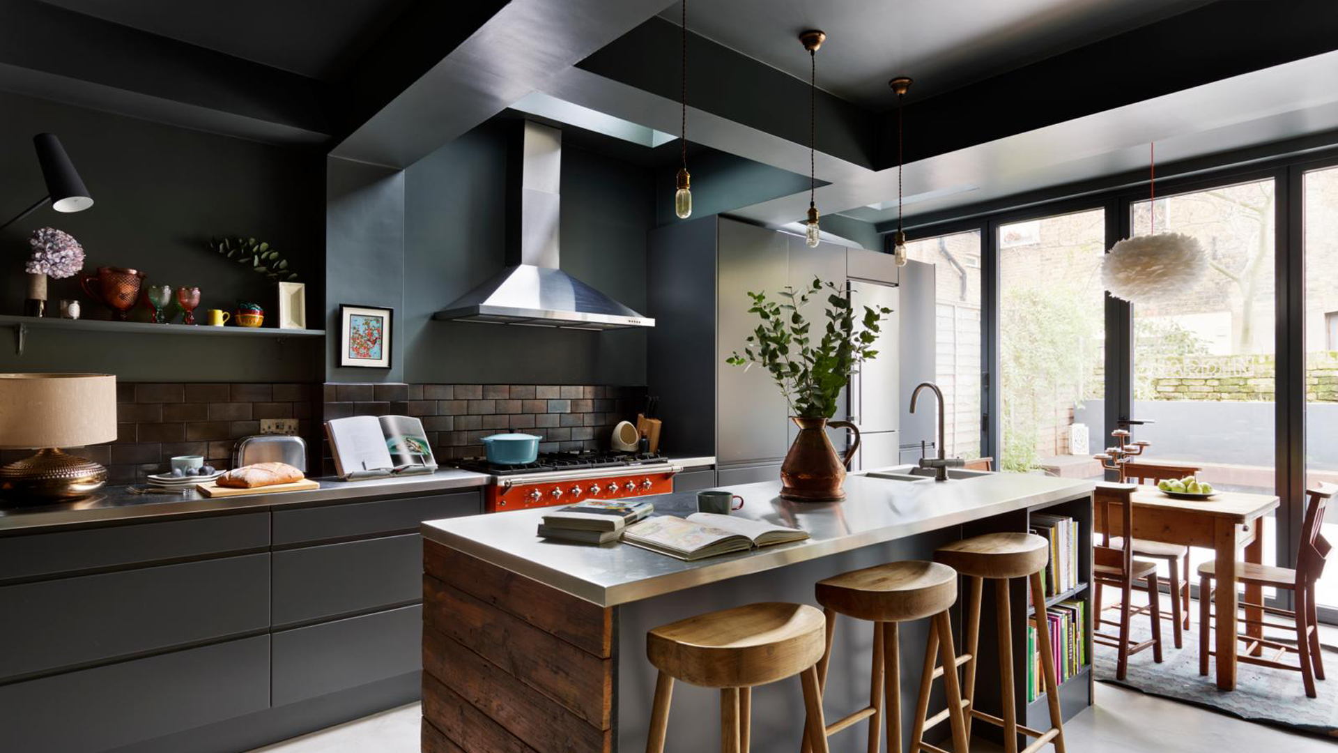
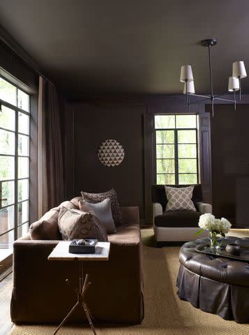
Dark greens and other heavy colors are also generally ill-suited for landings, particularly small ones, unless the entire staircase is painted in a high-gloss finish. These dark shades can make a space feel smaller and enclosed, hindering the desired open and flowing ambiance. Designers caution against their use due to the difficulty in achieving the right balance and their tendency to overpower the space.
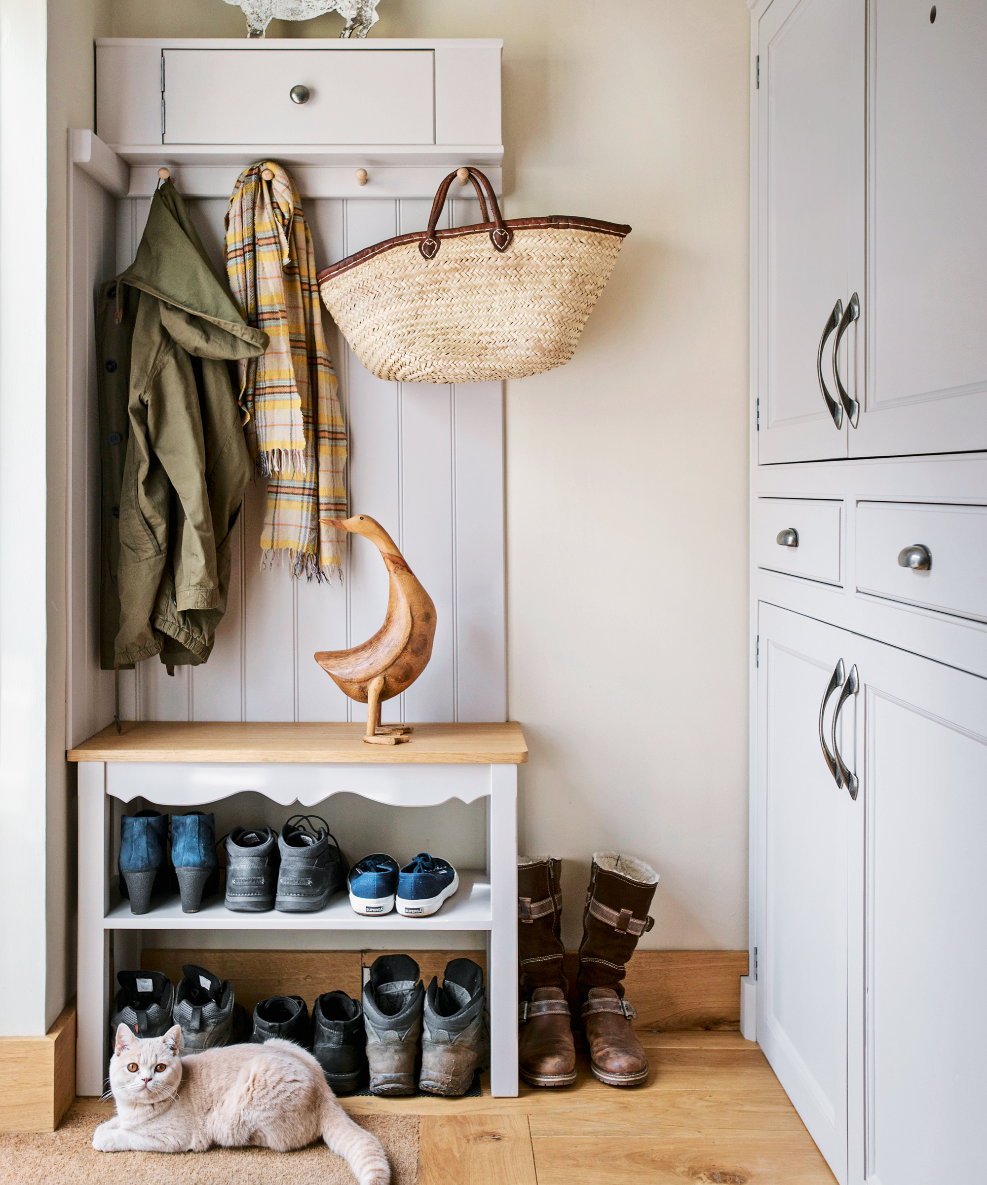
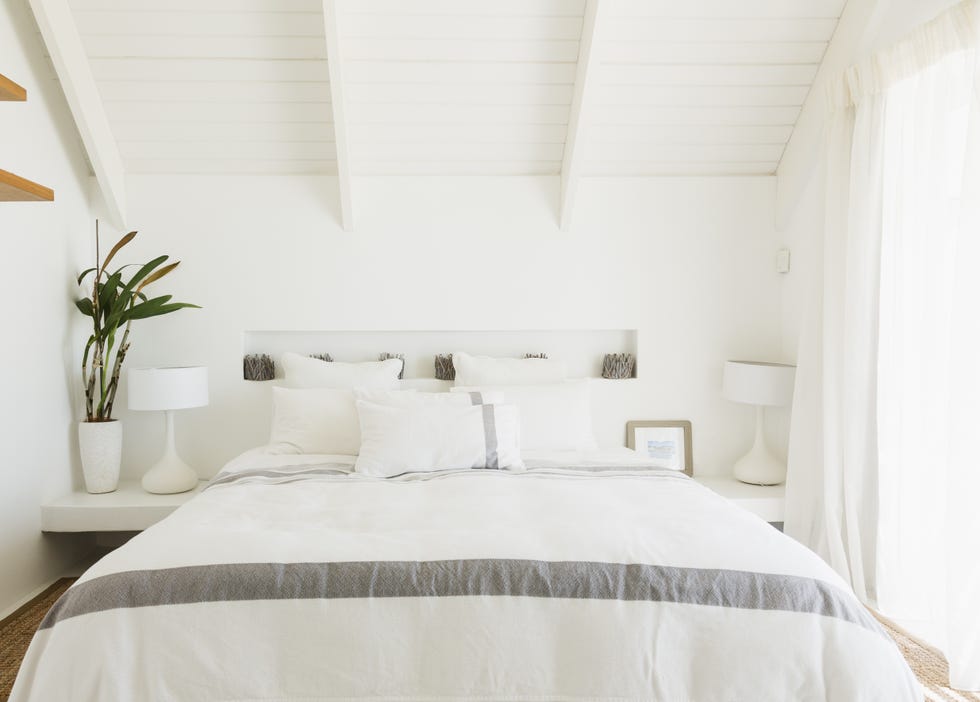
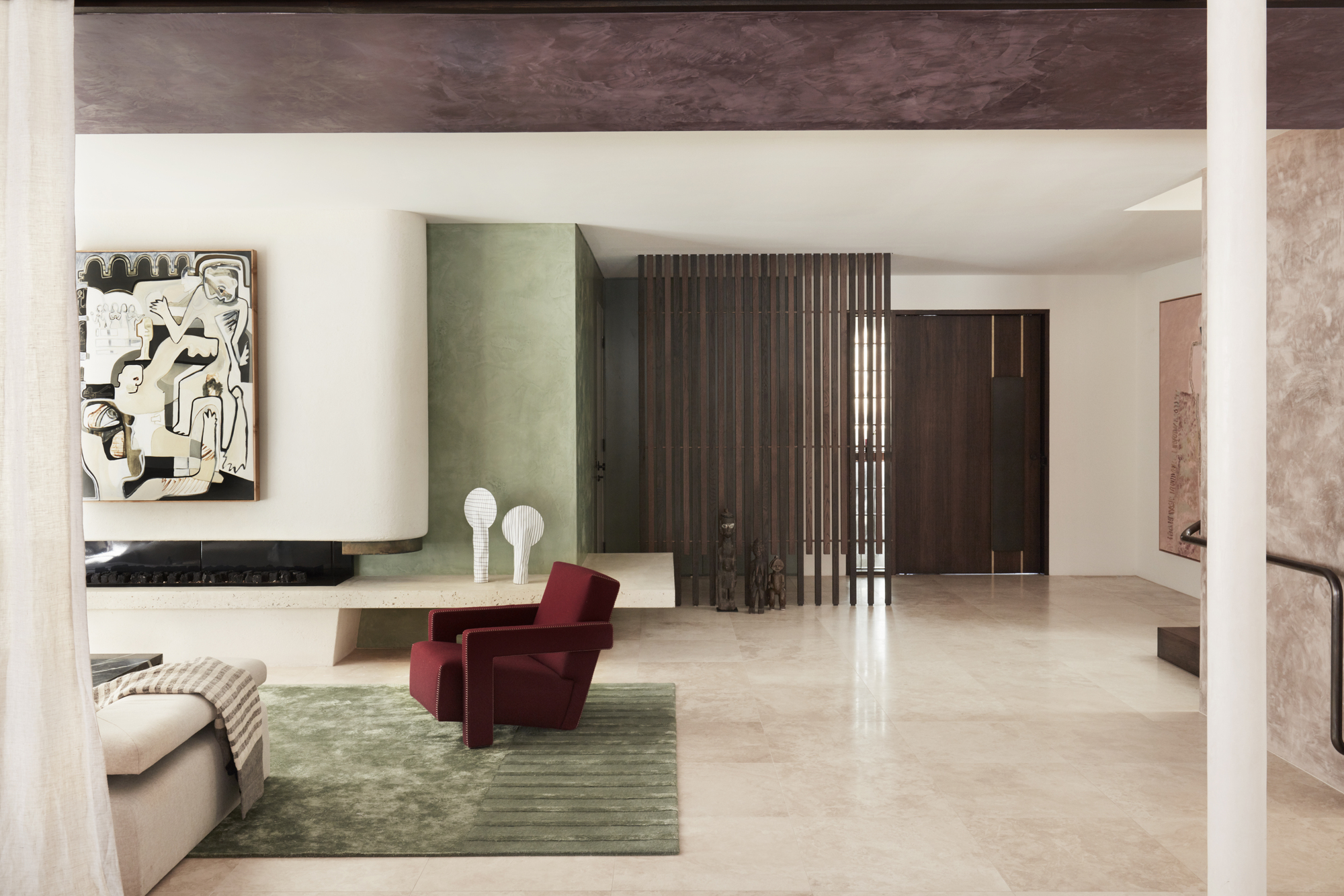
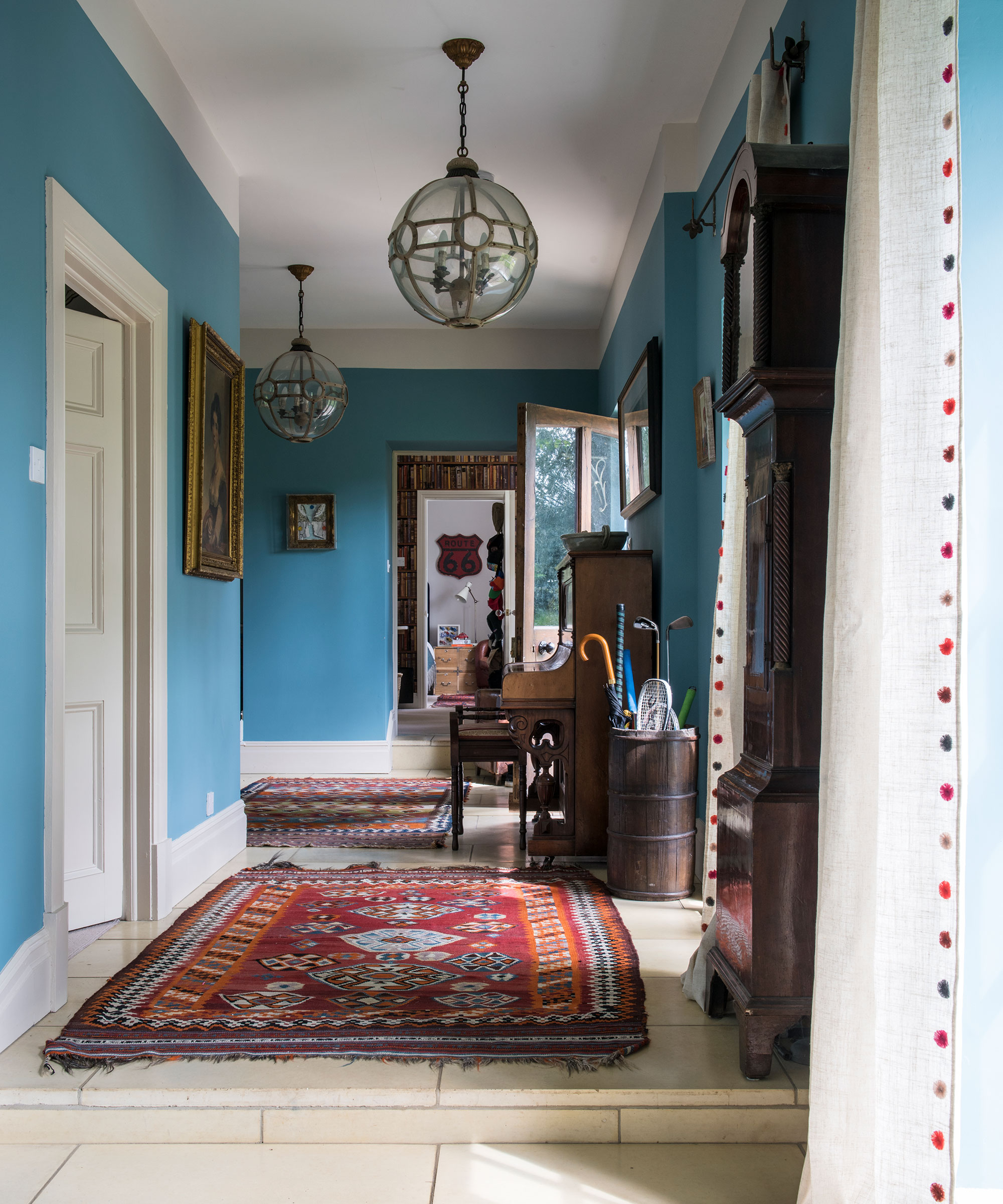
Ultimately, the most successful landing colors are light and neutral. These shades create a seamless visual link to adjacent rooms, complementing their colors rather than competing with them. For instance, if surrounding rooms feature deep earthy tones, a lighter earth-tone on the landing would be ideal. Similarly, for a coastal theme with blues and whites in bedrooms and bathrooms, the palest blues or bright whites on the landing would ensure harmony. The objective is to select colors that support a whole-story palette, ensuring that the landing color responds to and enhances the overall design scheme without demanding excessive attention or causing visual discord.
#LandingPaintColors #InteriorDesign #HallwayDecor #ColorSelection #HomeDecor #PaintTrends #TransitionalSpaces #NeutralPalette #DesignerTips #LandingPaintColors #InteriorDesign #HallwayDecor #ColorSelection #HomeDecor #PaintTrends #TransitionalSpaces #NeutralPalette #DesignerTips
Há 0 comentários no total
 Ainda não há comentários
Você também pode gostar
5 rug colors to avoid – the hues designers think you should veer away from on floors, plus how to make them work

These Master Tips Will Help You Avoid Choosing The Wrong Type Of Paint
5 colors to avoid in a bathroom – according to designers
5 Colors You Should Never Paint Your Hallway, According to Designers


5 colors you should never paint a small room – designers warn us to steer clear of these hues, and what to pick instead
Trust us, these are the colours to avoid when painting a small hallway
6 Paint Color Mistakes To Stop Making, According To Designers

The color group you should avoid in a basement – and the shades designers use to bring light to this tricky space

Colors not to paint a mudroom – 5 hues to avoid in this high-traffic space
6 Paint Color Mistakes To Stop Making, According To Designers
An interior designer reveals the 5 mistakes to avoid when painting with dark colours

The colors you should never paint your hallway – and what really works
The 5 Most Overused Paint Colors and What to Try Instead, According to Designers

'The World of Color is Rife With Danger' — 5 Color Combinations That Don't Go Together and What to Use Instead
5 Paint Colors That Experts Say You Shouldn't Use in 2025


What are the worst colors to paint a room? The shades experts say you should never use

5 colors you should never paint your entryway – according to interior experts

5 colors you should never paint a pantry – designers share the shades they swerve
5 Classic Wall and Trim Color Combinations—and 5 for Rule-Breakers Only

Never Regret a Paint Color Again—Avoid These 6 Common Mistakes