The Best Wall Colors to Make Your Kitchen’s Wood Cabinets Pop, According to Designers
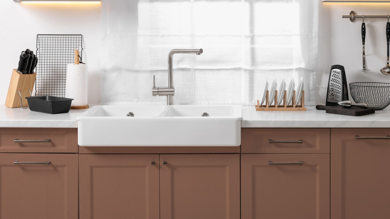
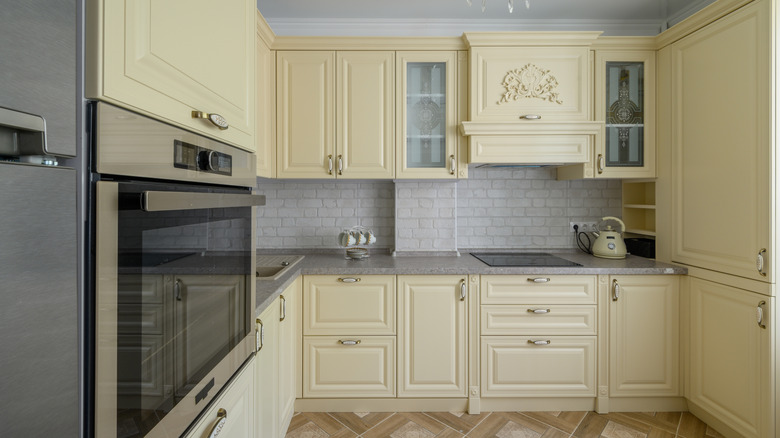
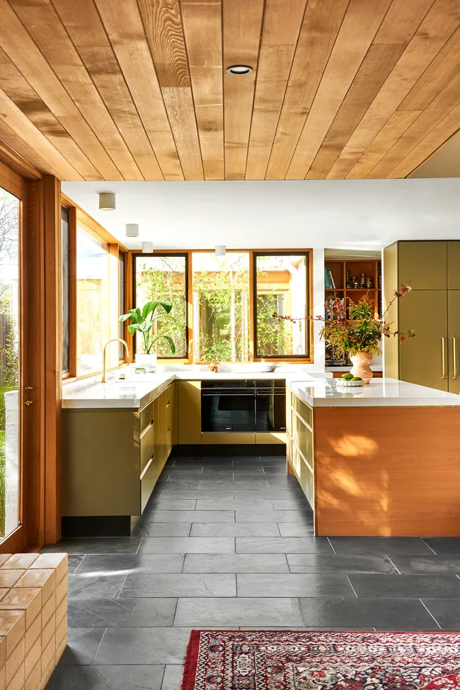
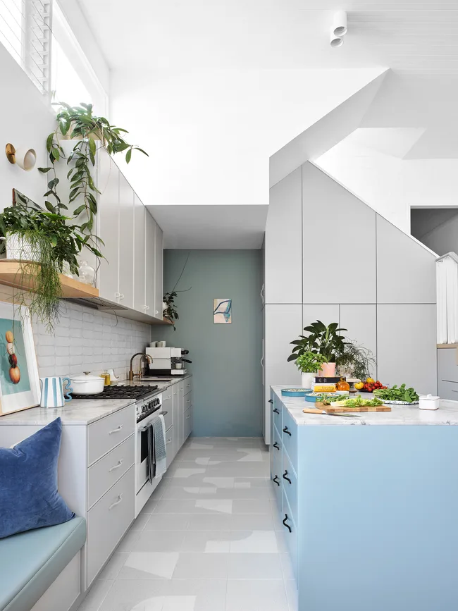
Updating a kitchen with wooden cabinets doesn't always require a full remodel; painting the walls offers a high-impact, affordable, and less labor-intensive solution. The key to choosing the right wall color lies in understanding the wood's undertone and deciding whether to create contrast or coordination. This approach allows homeowners to either highlight their cabinets, soften their presence, or blend them seamlessly with the surrounding walls.
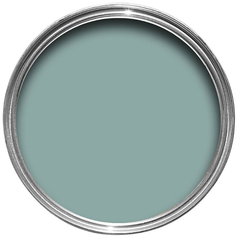
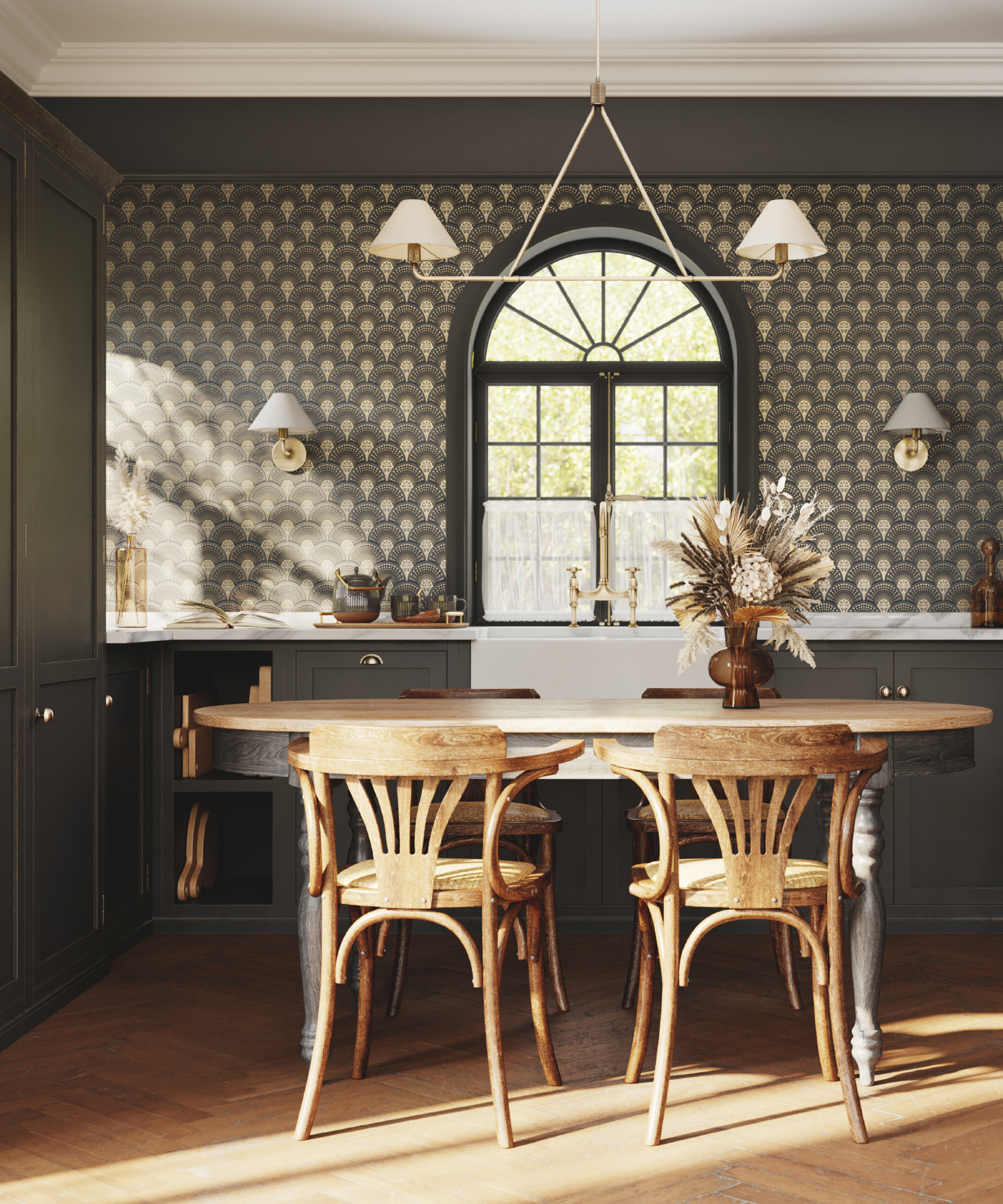
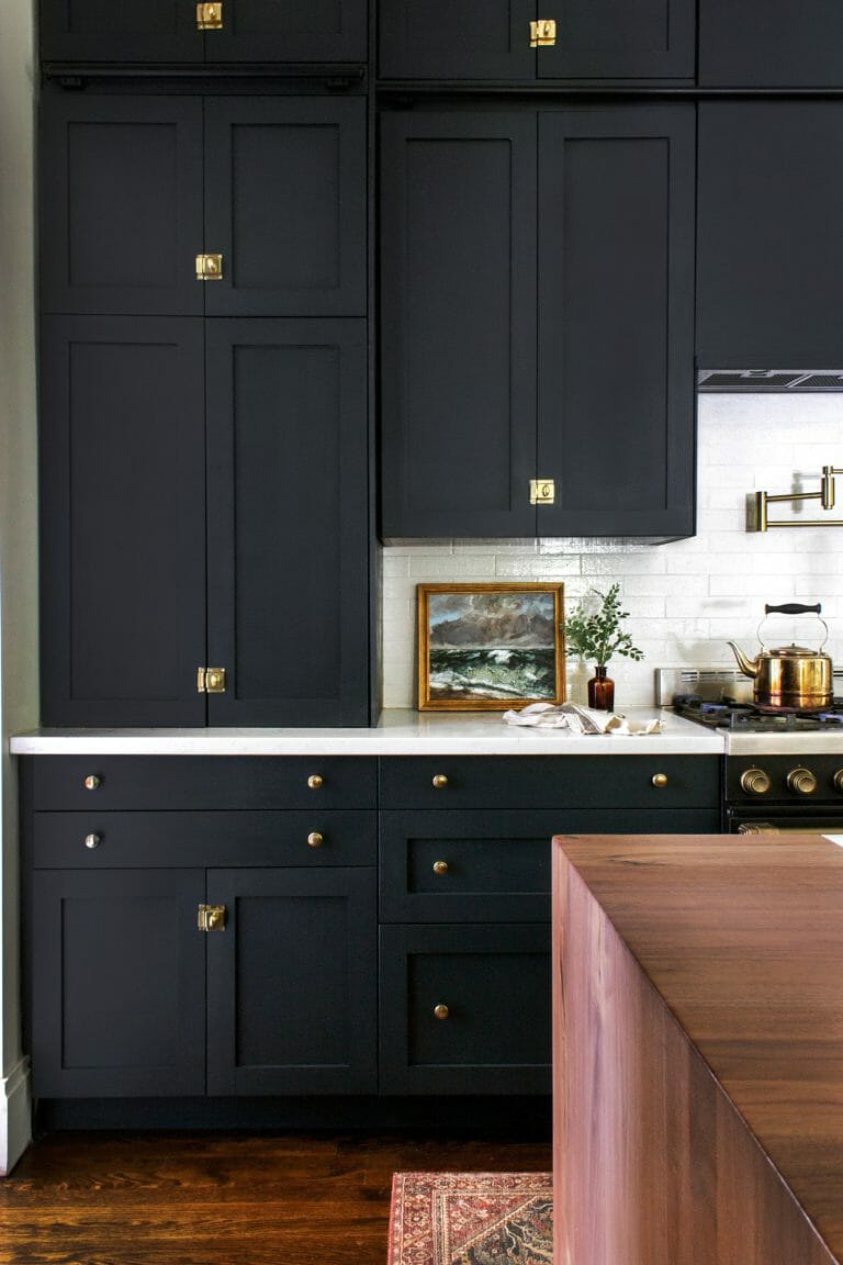
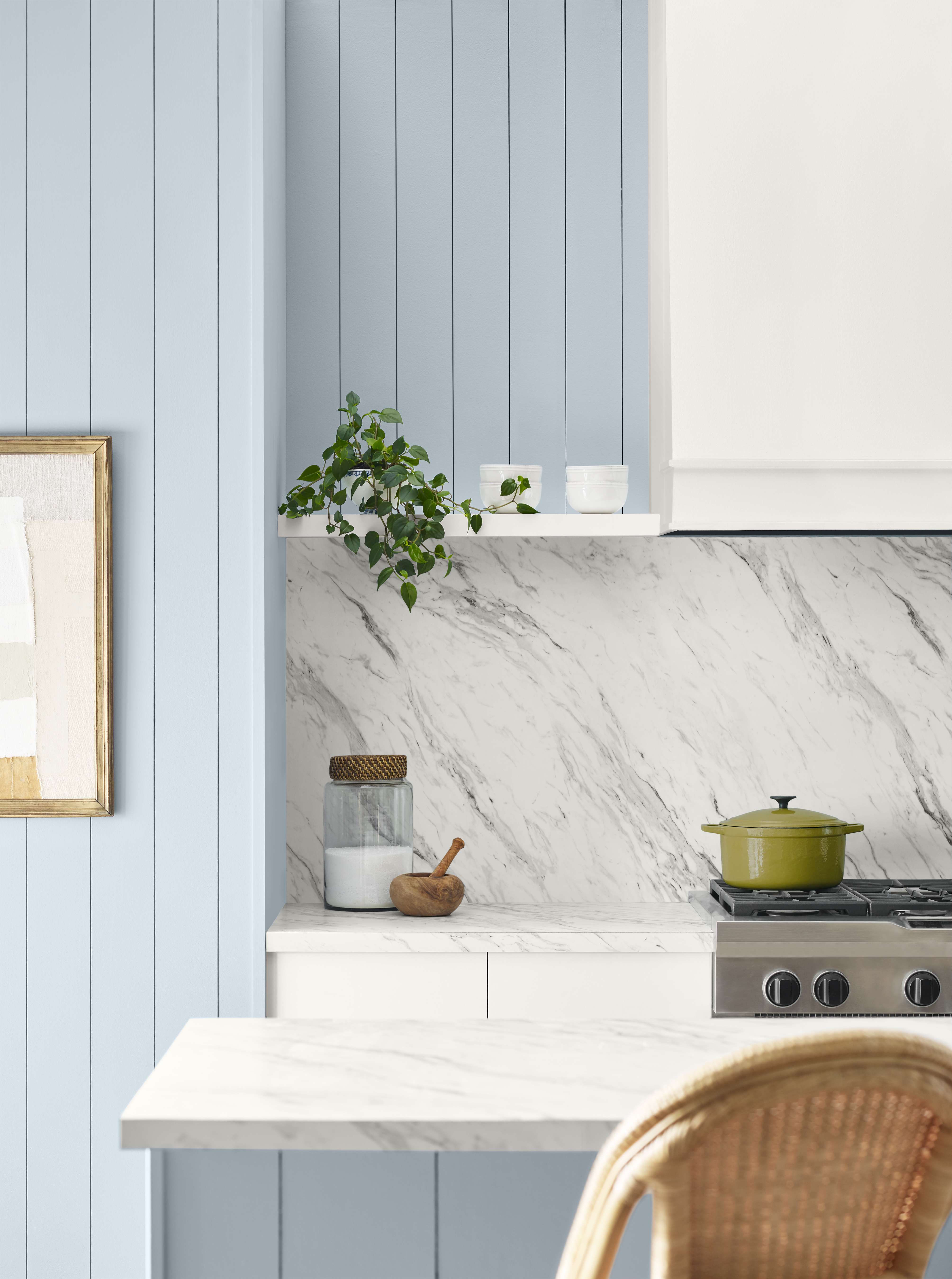
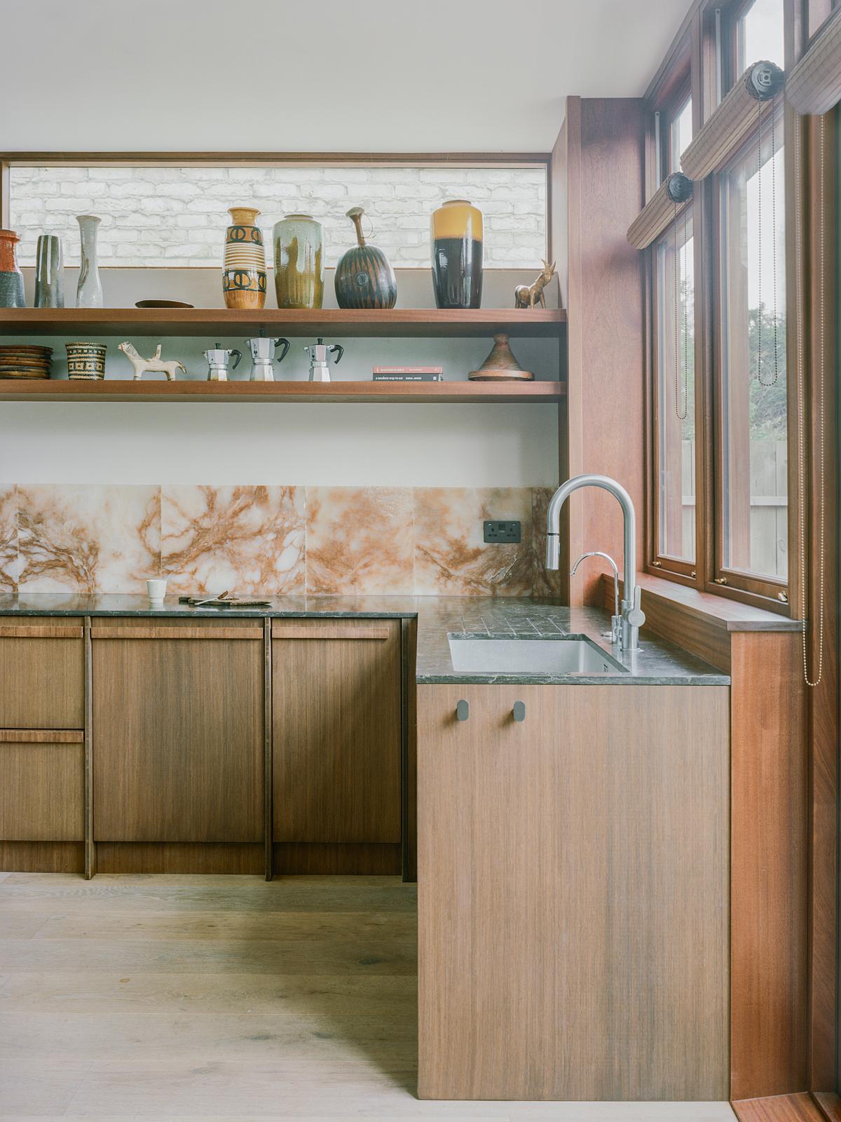
For wood cabinets with orange undertones, such as mahogany, honey oak, and alder, cool colors like blue are ideal for balance. Interior designer Miles Redd suggests using Farrow & Ball Ballroom Blue and extending this color to window trims to unify the room and avoid a busy look that white trim might create. Alternatively, black or white walls are timeless choices that pair well with orange-toned wood. An example provided is a Pennsylvania kitchen by Michele Plachter, featuring oak cabinetry against a black wall, demonstrating the striking effect of this contrast.
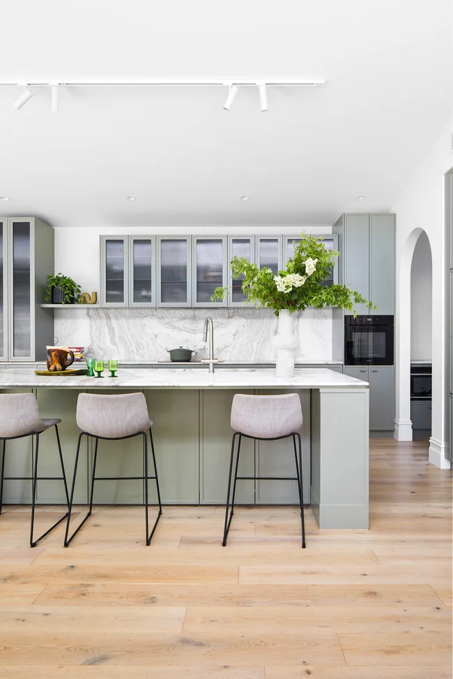
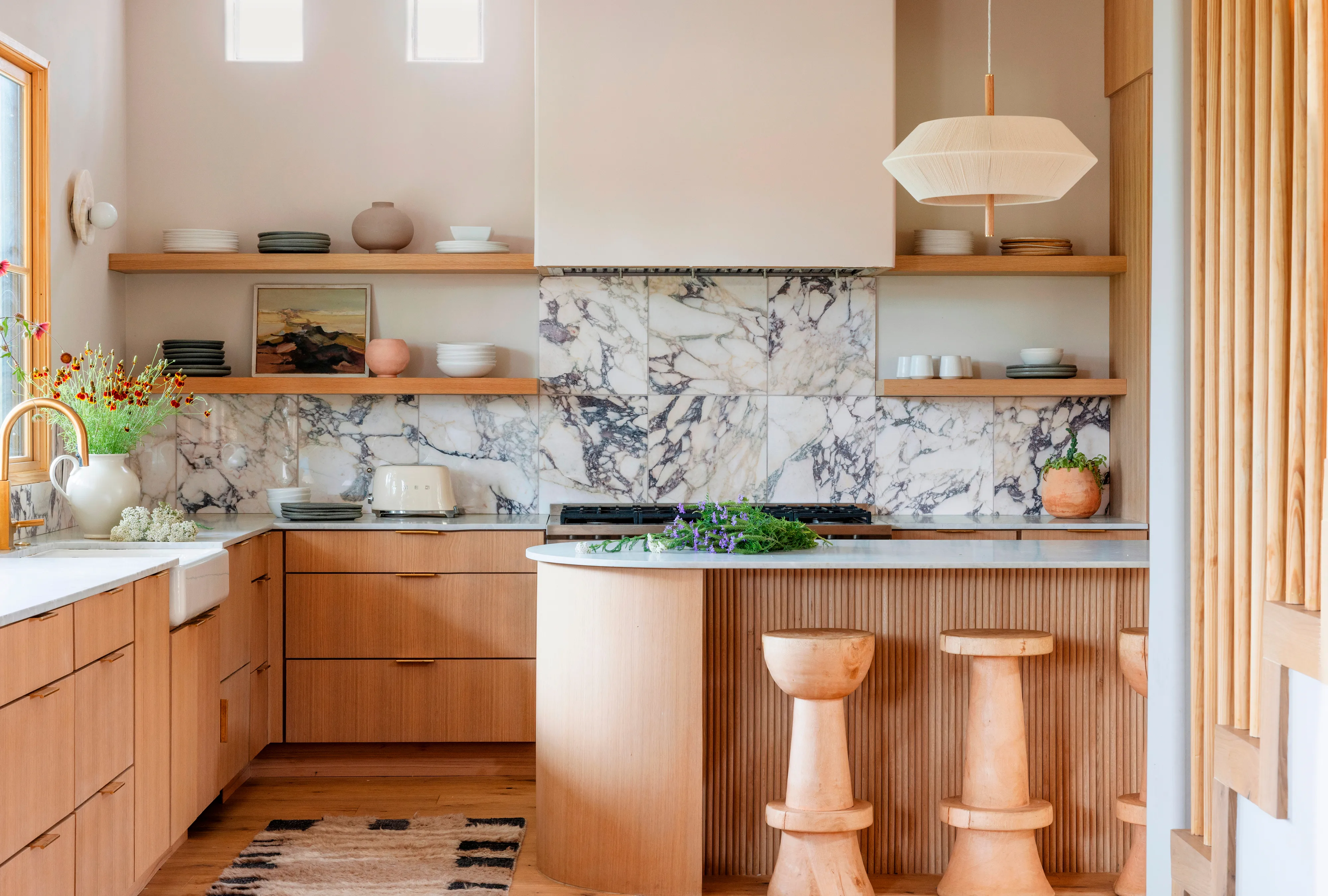
When dealing with wood cabinets that have yellow undertones, like maple, muted versions of yellow's complementary colors are recommended. Gina Sims advises using colors with warm undertones, even if they are cool, to prevent the space from feeling discordant. Benjamin Moore Woodlawn Blue is a suitable choice for this purpose. For those looking to amplify yellow hues, Sherwin-Williams Mysterious Mauve, a gray with violet undertones, offers a contrasting yet livable option. For a softer effect, Sims suggests a warm white like Benjamin Moore White Dove. A Texas kitchen by Amy Pigliacampo illustrates this, pairing pale cabinetry with creamy white walls and a Calacatta Viola marble backsplash that incorporates complementary lavender veining. Practical advice for kitchen walls includes using high-sheen paint for easy cleaning, although scrubbable flat paints are now available for a matte finish.
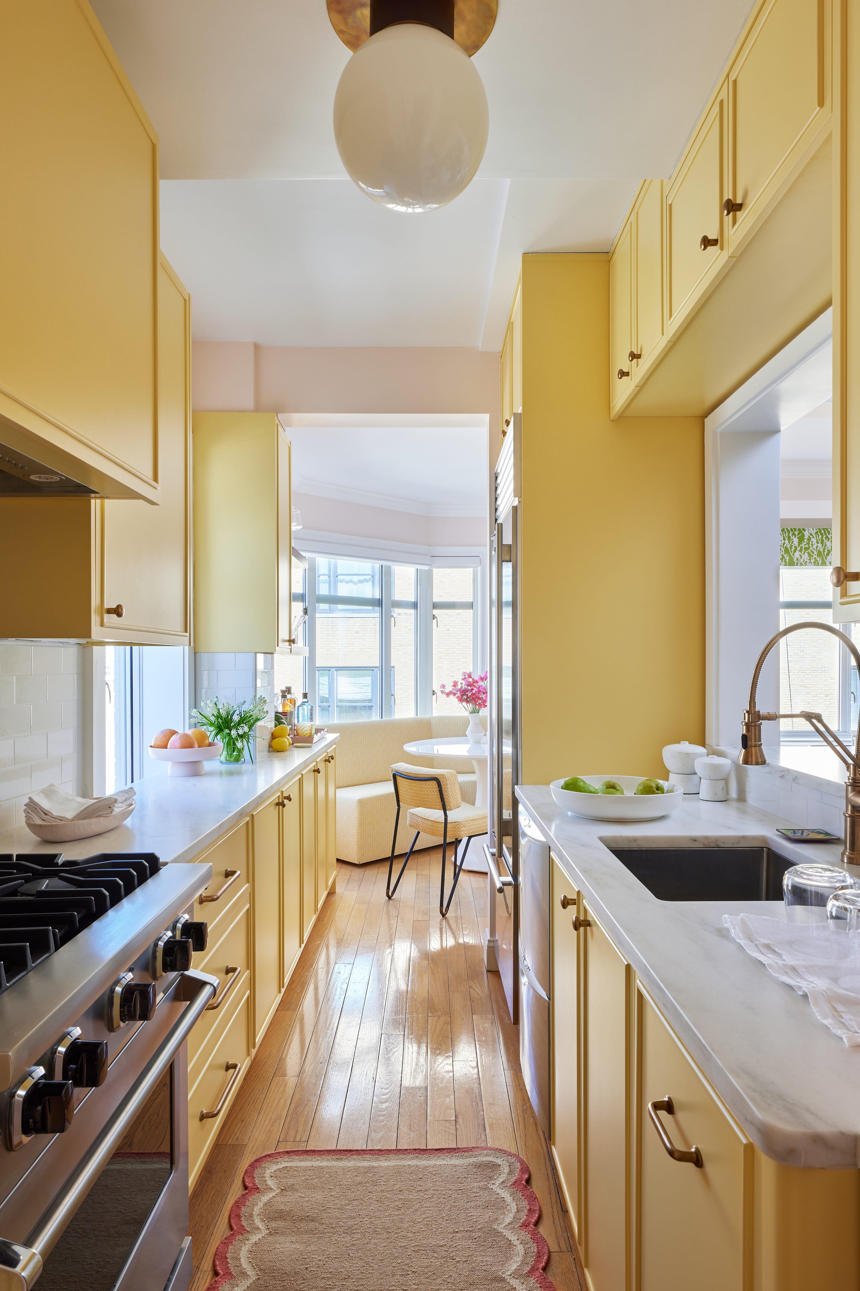
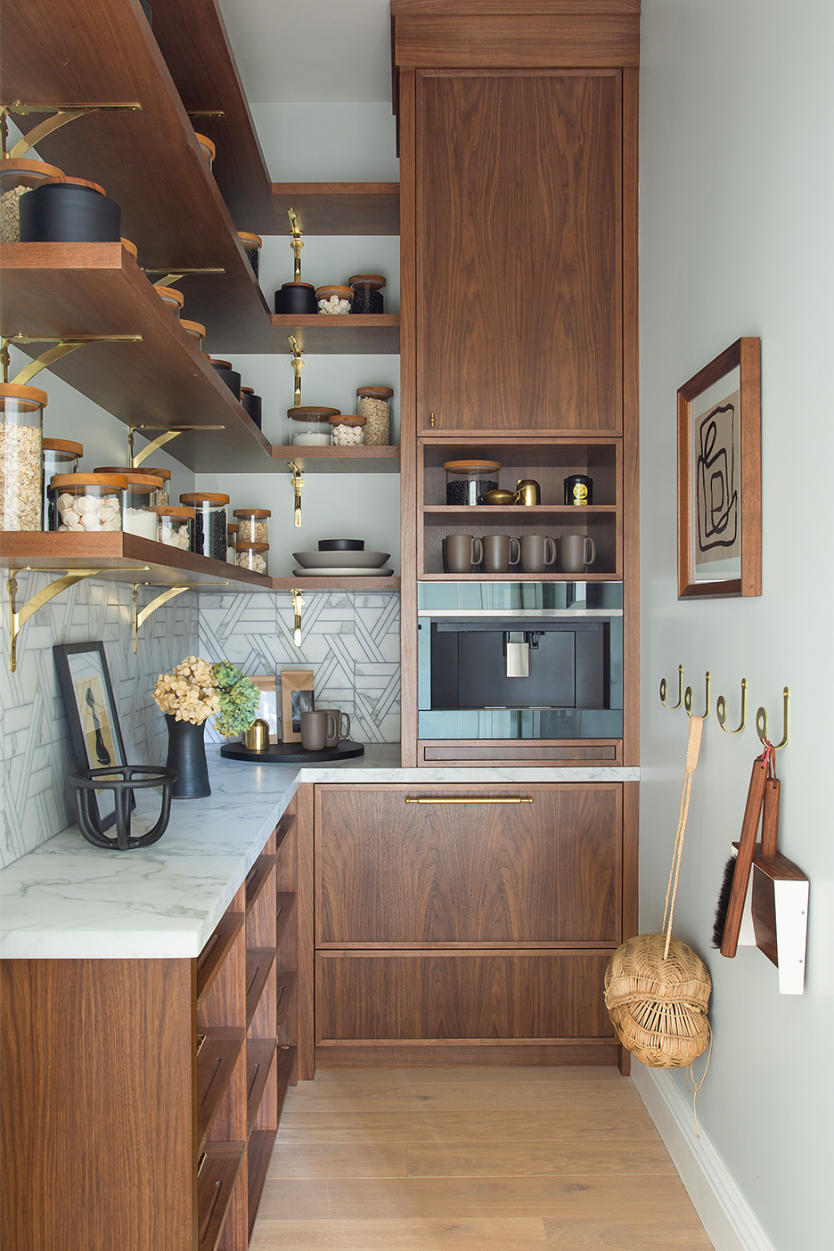
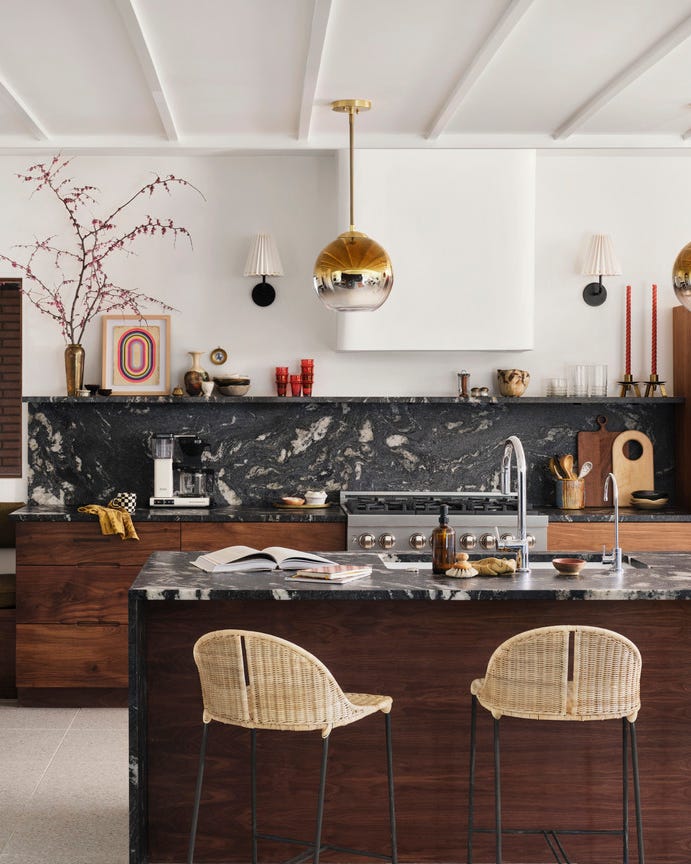
To complement red undertones found in cherry and red oak cabinetry, designer Sarah Kahn Turner recommends warm, saturated colors tempered with gray. Benjamin Moore Coachman's Cape, a deep taupe, can blend well with rich brown cabinets. Earthy orange tones like Benjamin Moore 14 Carrots can create a warm and inviting atmosphere. For high contrast, PPG Macaroon Cream, a beige with green undertones, serves as a direct color wheel opposite. A Georgia kitchen by The Misfit House showcases a dark walnut island against a soothing Sherwin-Williams Unusual Gray backdrop, with vibrant yellow counter stools adding a pop of color.
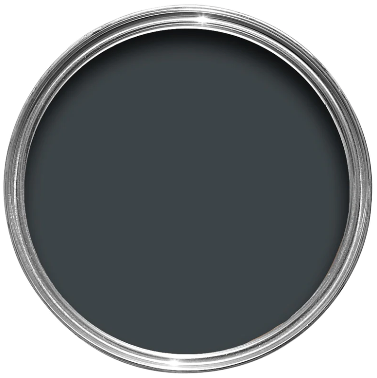
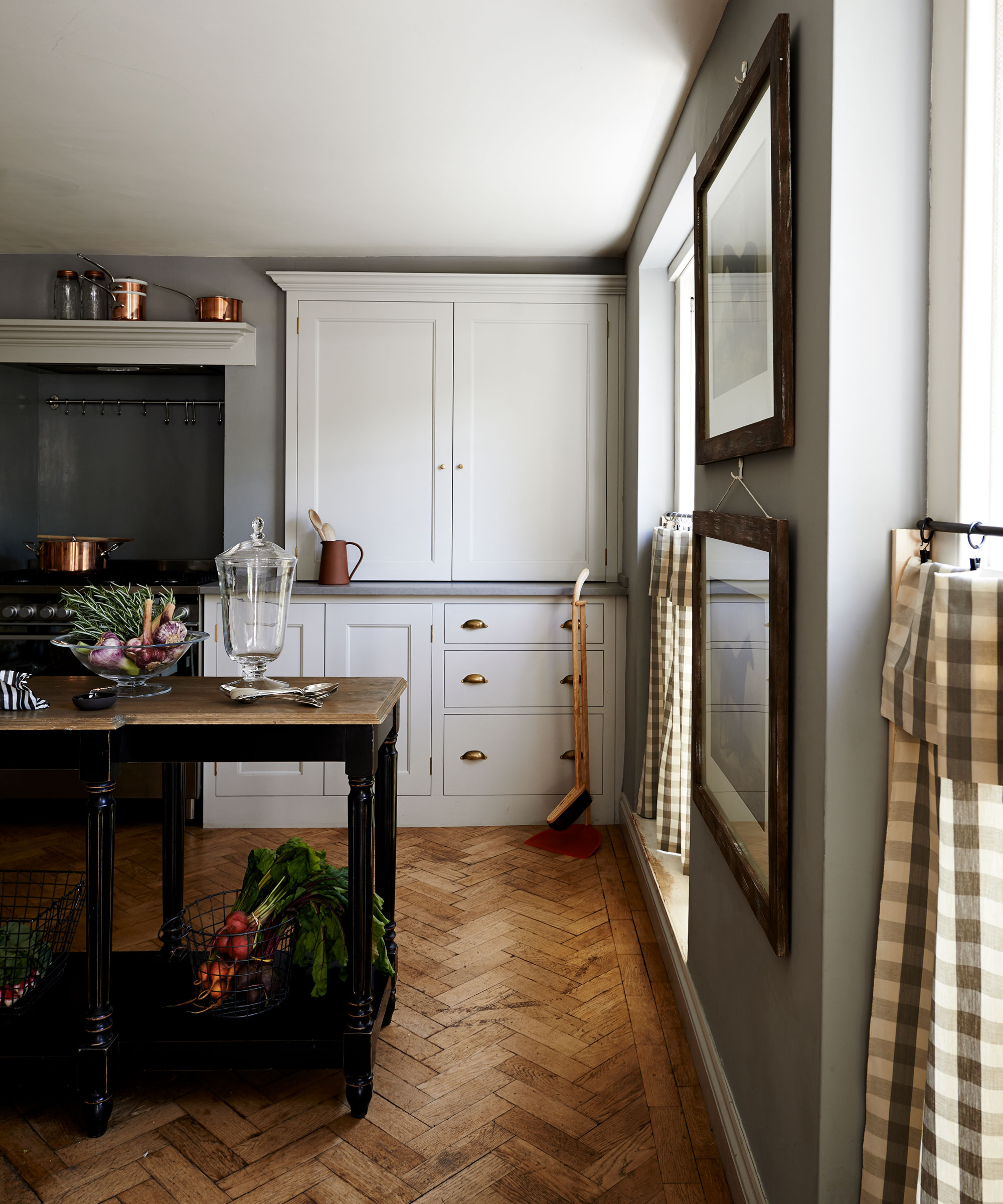
Finally, for cool wood tones such as ash or weathered finishes, designers Andréa Dixon and Jen Ziemer of Fiddlehead Design Group suggest strong neutrals like Sherwin-Williams Tricorn Black or dusty earth tones like Valspar Warm Putty. Their philosophy is to either create contrast to make the wood stand out or neutralize the tones for a subdued effect. Benjamin Moore Peale Green is a favored contrasting color. In a kitchen designed by Cecily Mendell, weathered wood in the island is paired with warm gray walls, specifically Benjamin Moore Classic Gray, and Calacatta marble, forming a cohesive neutral palette that accommodates mixed metal hardware and furnishings. Overall, careful consideration of wood undertones and desired aesthetic impact guides the selection of wall colors, enabling a significant refresh without extensive renovation.
#KitchenDesign #WallColors #WoodCabinets #InteriorDesign #ColorCoordination #KitchenRemodel #PaintChoices #HomeDecor #DesignTips #KitchenDesign #WallColors #WoodCabinets #InteriorDesign #ColorCoordination #KitchenRemodel #PaintChoices #HomeDecor #DesignTips
0 komentarzy łącznie
 Brak komentarzy jeszcze
Możesz również polubić
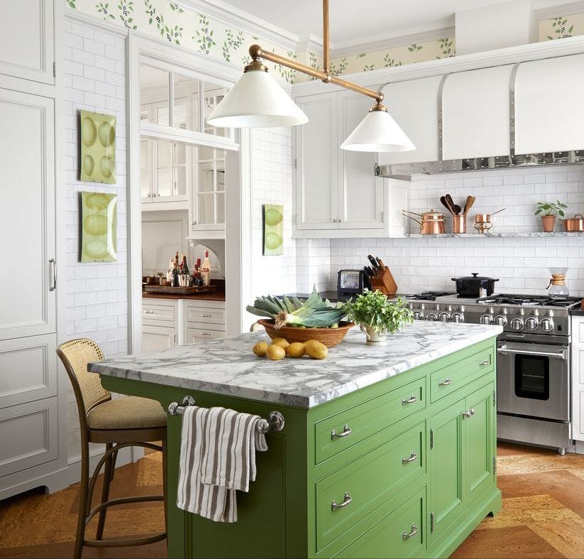
18 Gorgeous Kitchen Cabinet Paint Colors, According To Kitchen Designers

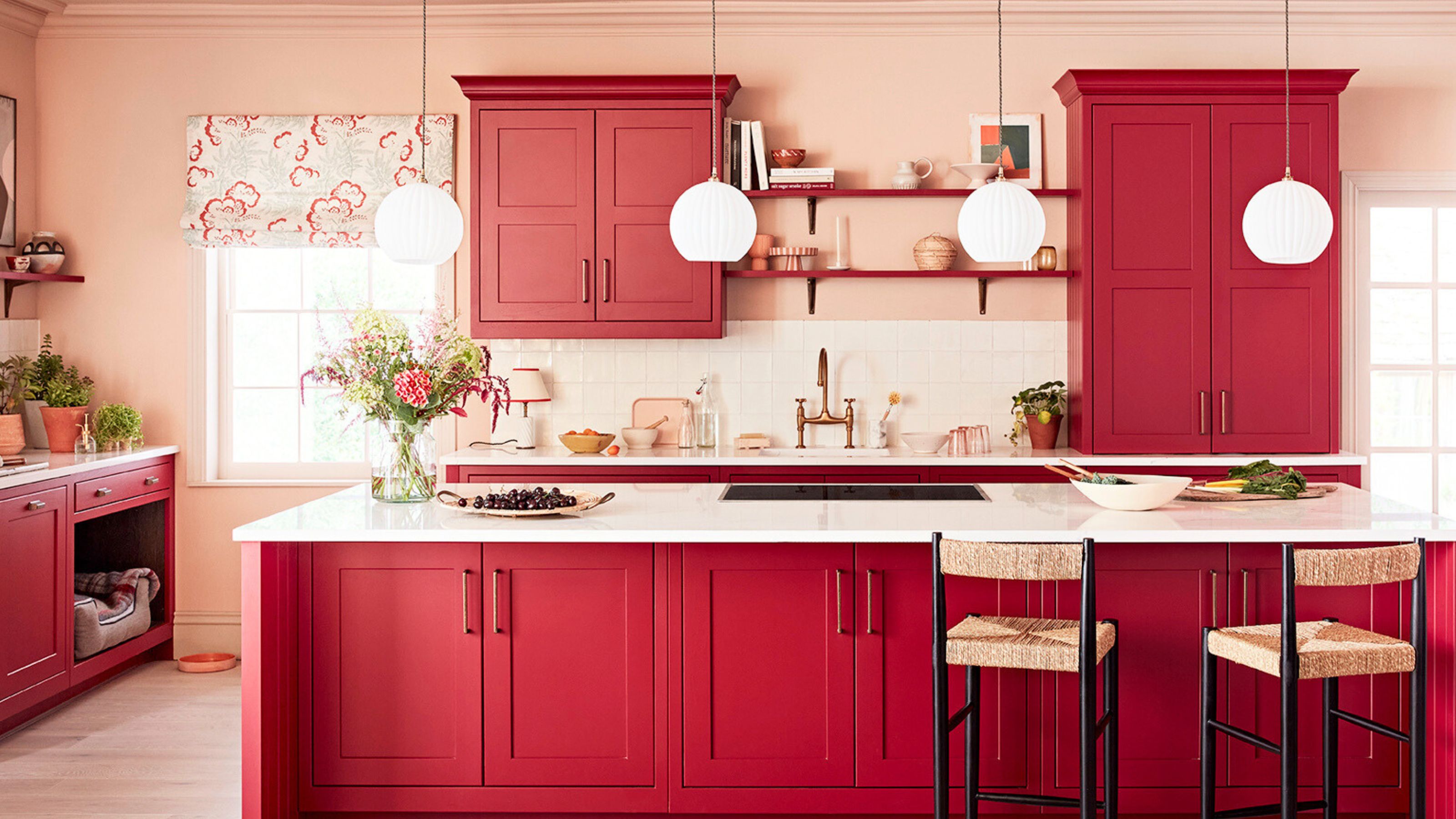
It’s Official: These are the Best Kitchen Paint Colors, According to Designers
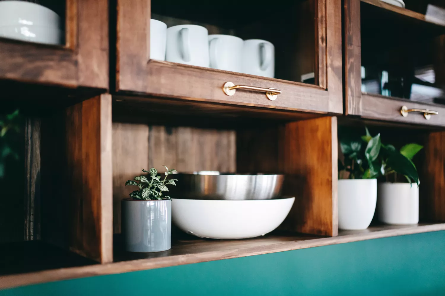
7 outdated kitchen cabinet colors designers say you should wave goodbye to, plus what to try instead

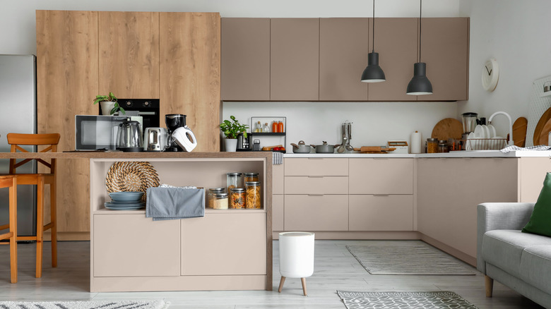
5 Trending Wood Stains for Kitchen Cabinets, According to Designers

10 Trendy Kitchen Cabinet Colors You Should Try In 2025
17 bright kitchen cabinet colour ideas to try in your home

7 Outdated Cabinet Colors Designers Are Leaving Behind In 2026
14 Kitchen Cabinet Colors You Can Easily Mix and Match

5 Designers Weigh In on the Best Brands of Paint for Kitchen Cabinets

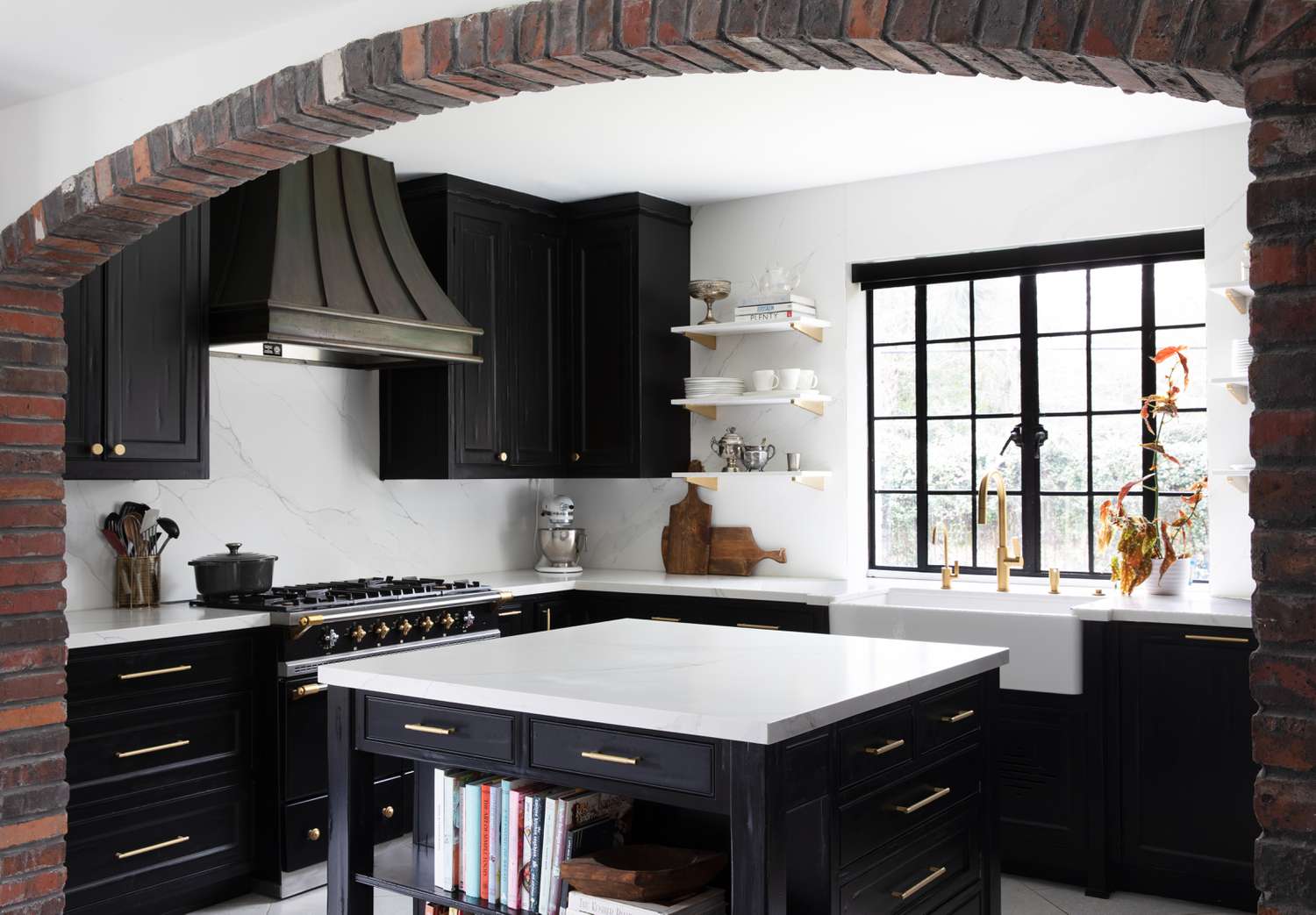
5 Timeless Kitchen Cabinet Paint Colors Designers Love
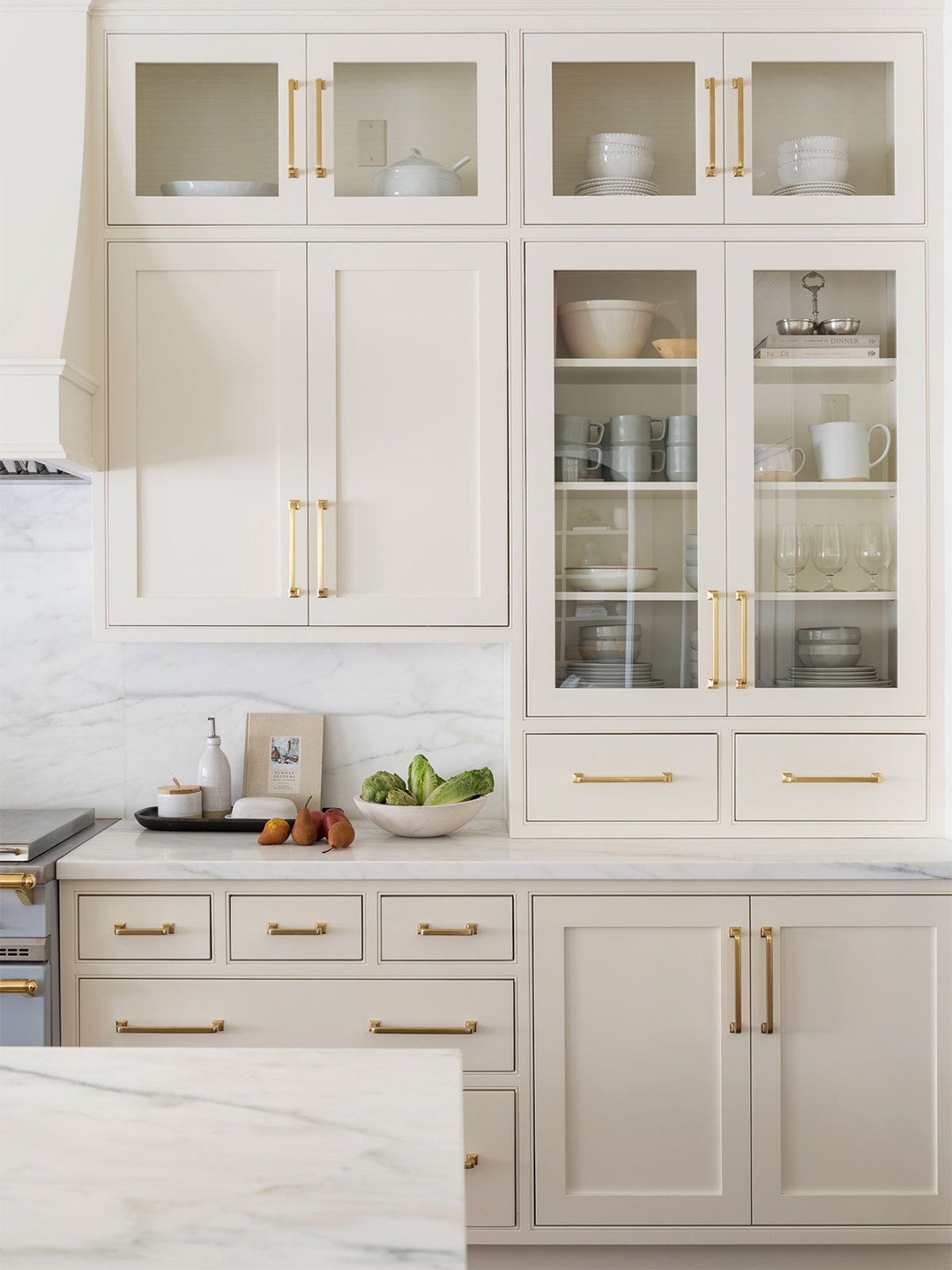
Our 87 Favorite Kitchen Cabinet Colors, All Gathered in One Place
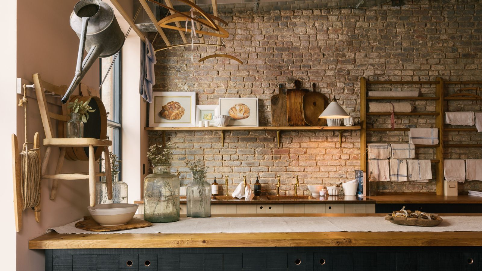
These are the 5 best colors to pair with a wooden kitchen countertop, according to interior designers
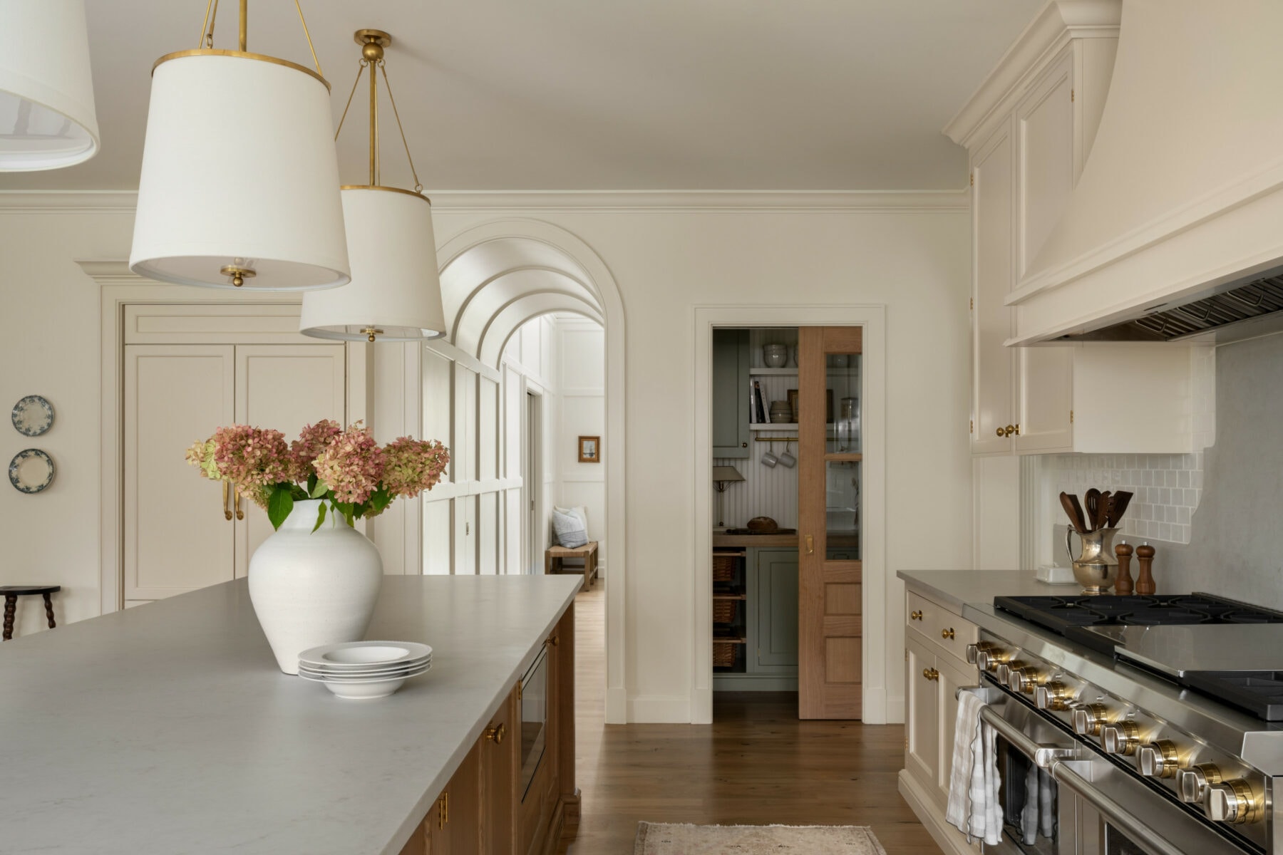
Our Favorite Kitchen Wall Paint Colors
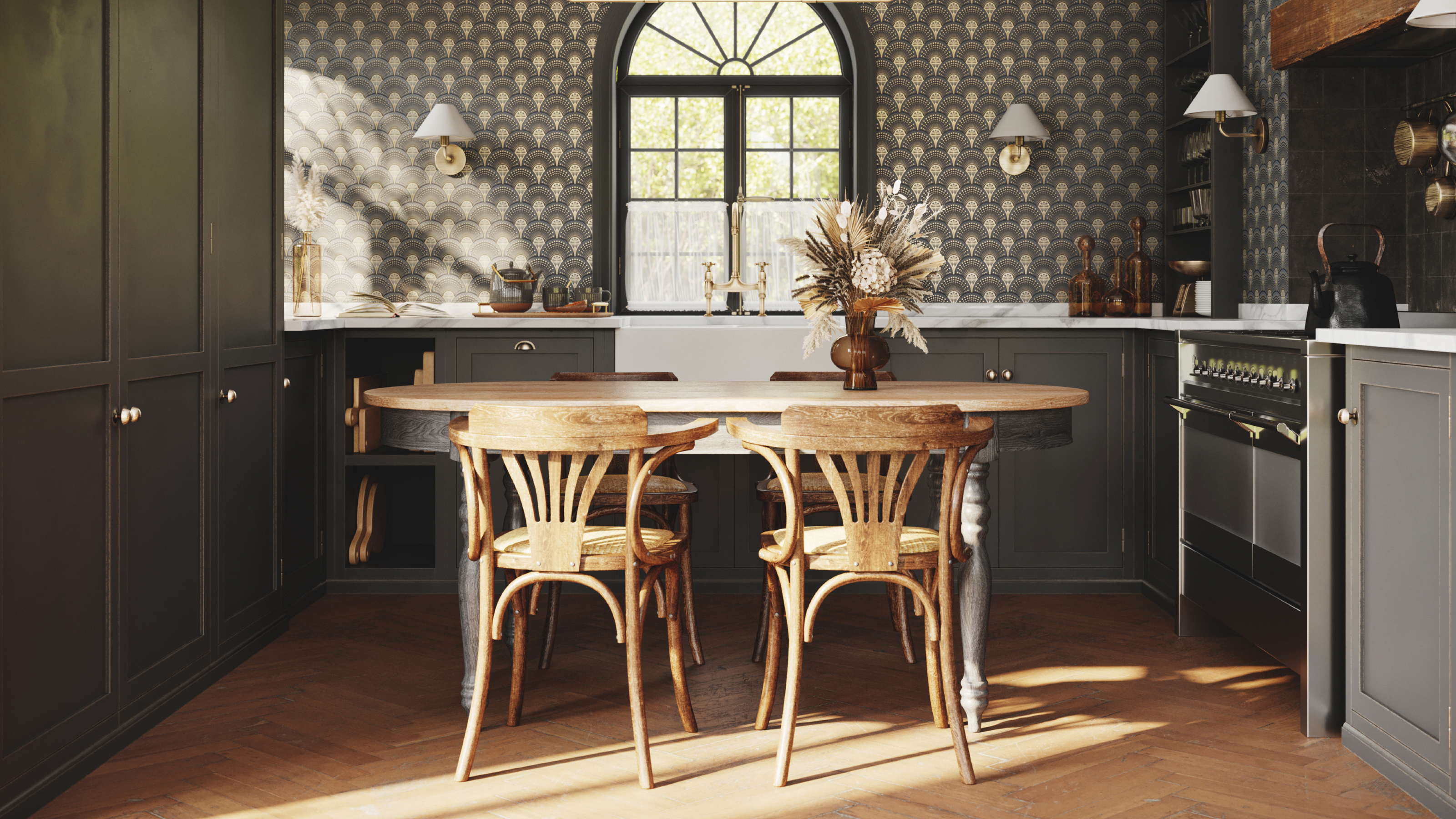
8 colors you should never paint kitchen cabinets according to the experts

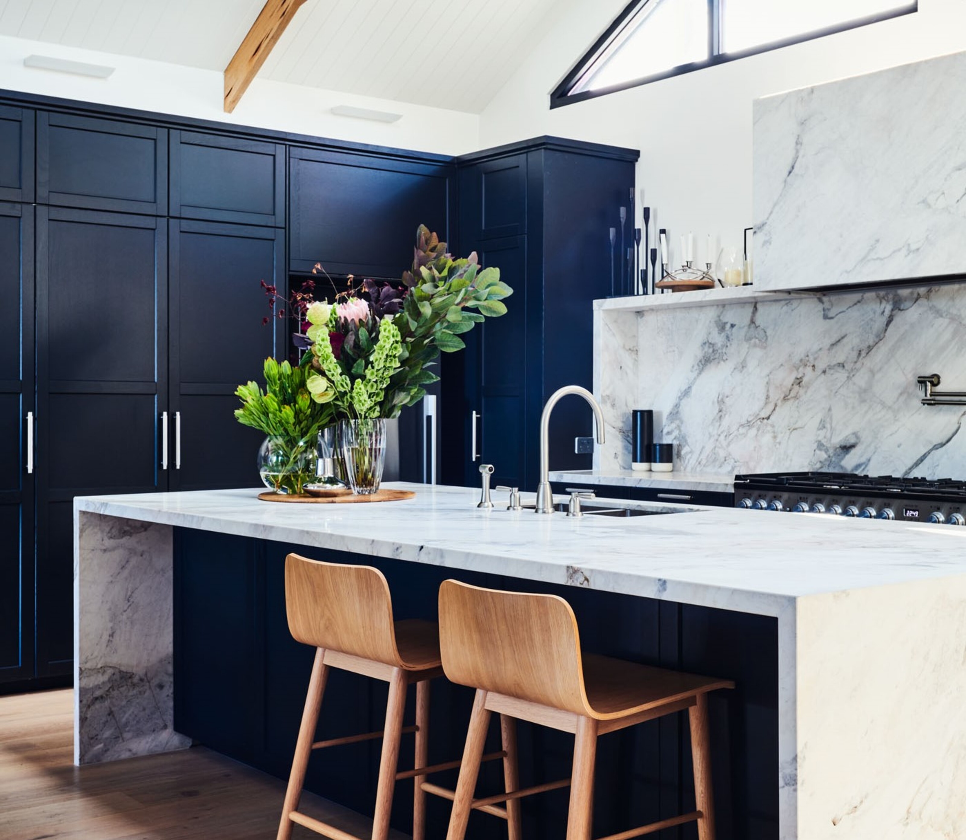
5 kitchen cabinet colors interior designers are avoiding for 2024 - and the shades they're picking instead

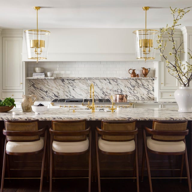
These Kitchen Paint Colors Will Be Everywhere in 2025
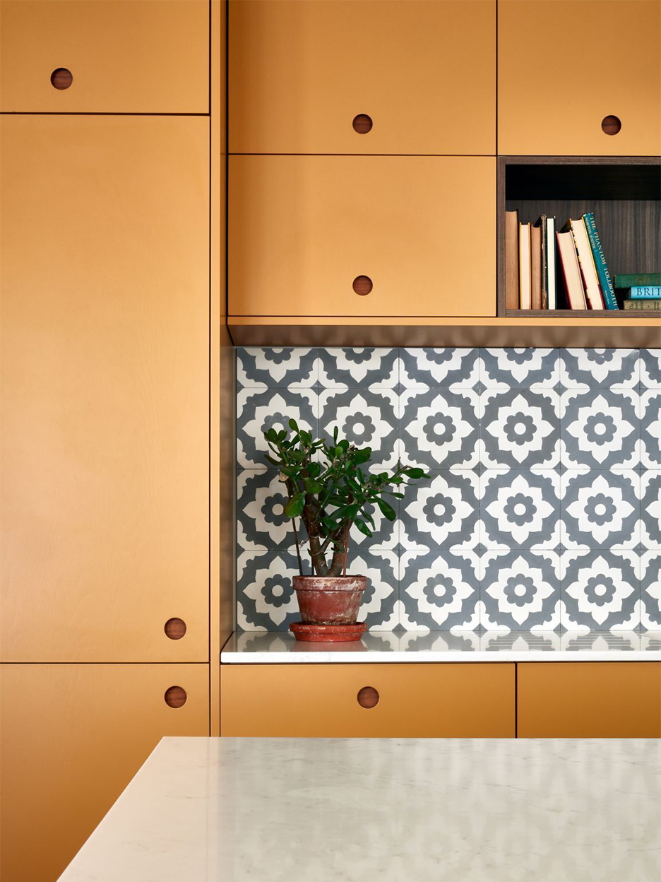
5 Designers Weigh In on the Best Brands of Paint for Kitchen Cabinets

15 Cabinet Paint Colors That Look STUNNING in Any Kitchen
5 outdated kitchen cabinet color trends to avoid if you don't want your kitchen to look unfashionable, say designers

We Asked Designers for Their Favorite Kitchen Cabinet Paint Colors—and Not One Picked White