1/6
The Best Colors for South-Facing Rooms, According to Experts

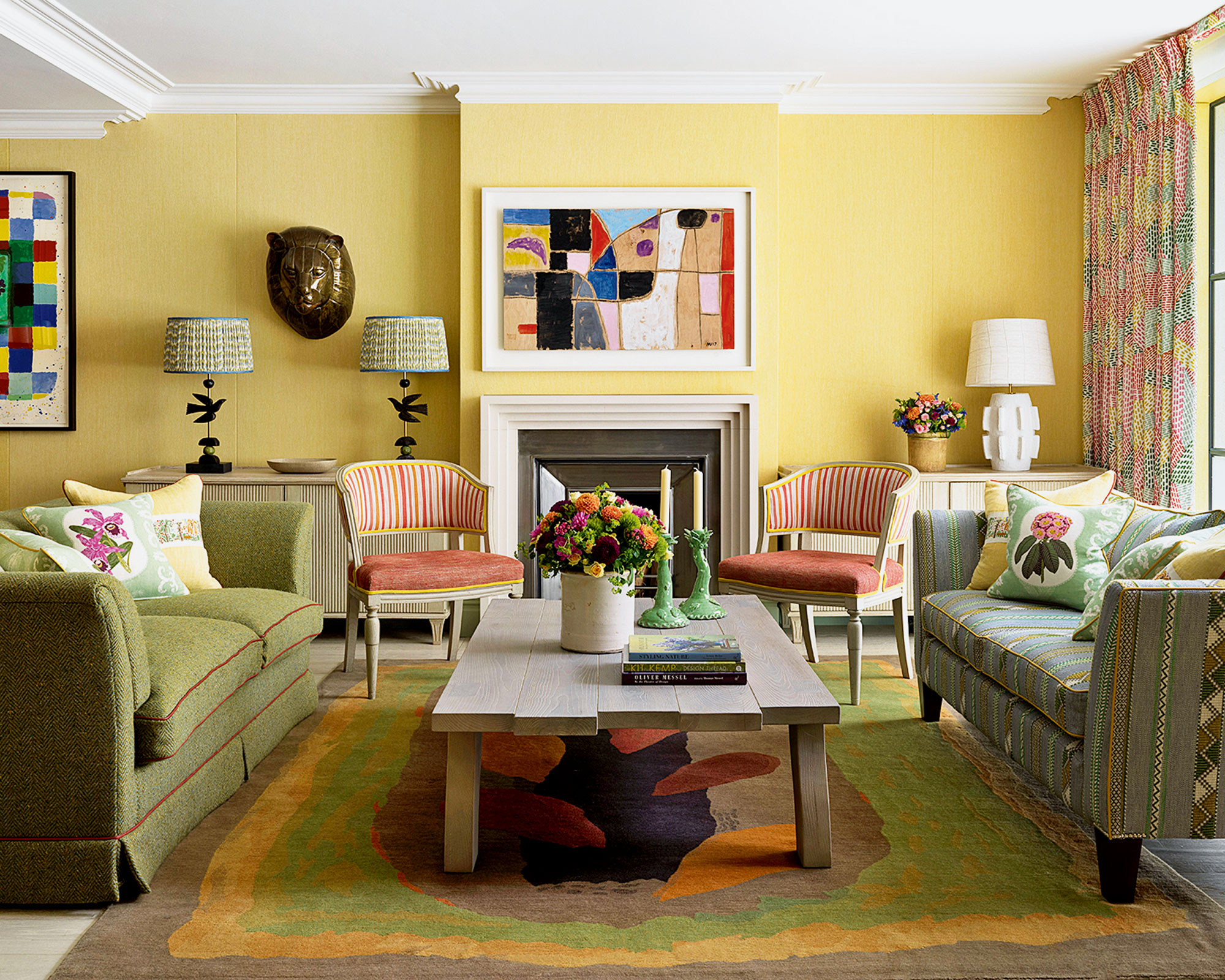
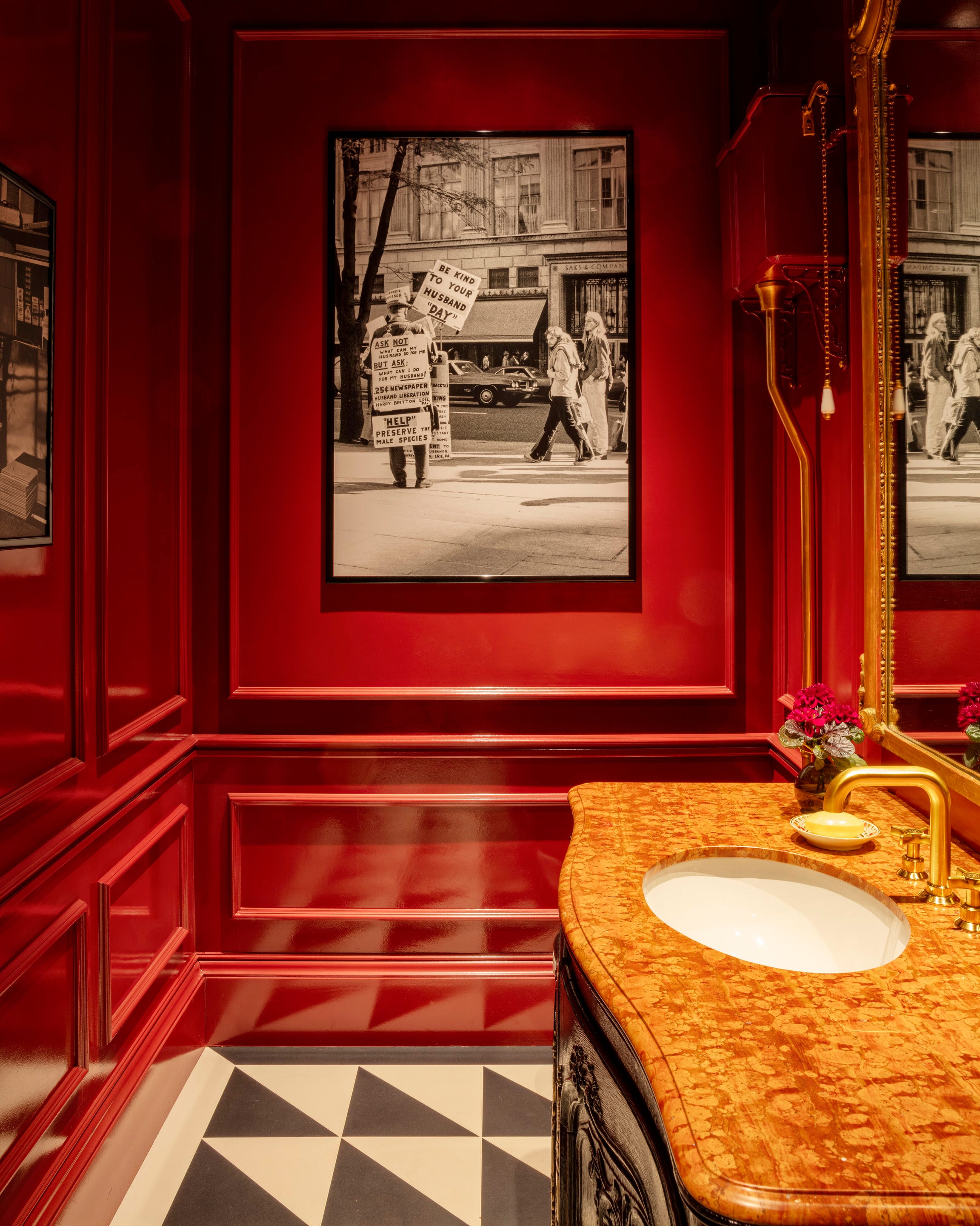
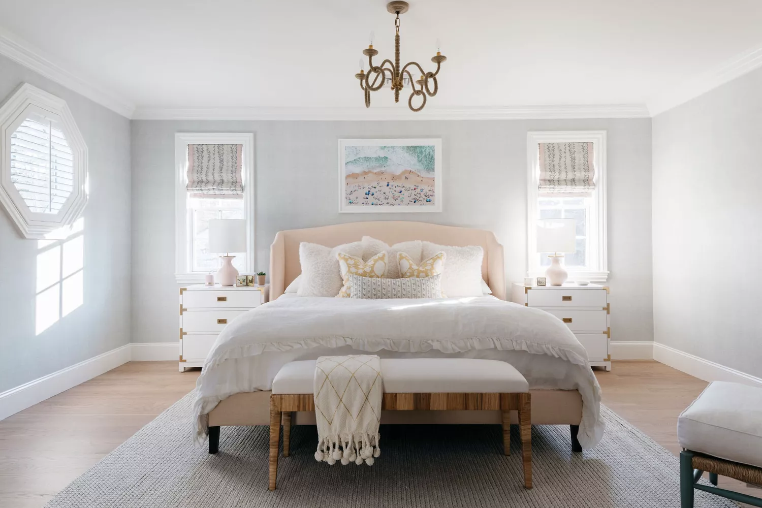
South-facing rooms are highly sought after due to their abundant natural sunlight throughout the day, providing a unique opportunity for creative interior design. The key to selecting paint colors for these spaces lies in deciding whether to embrace the inherent warmth or introduce cooler tones to balance the strong light. Interior design experts suggest a range of colors, from vibrant oranges to tranquil blues, earthy neutrals, fresh greens, and subtle dusky pinks, all chosen to complement or counteract the intense illumination.
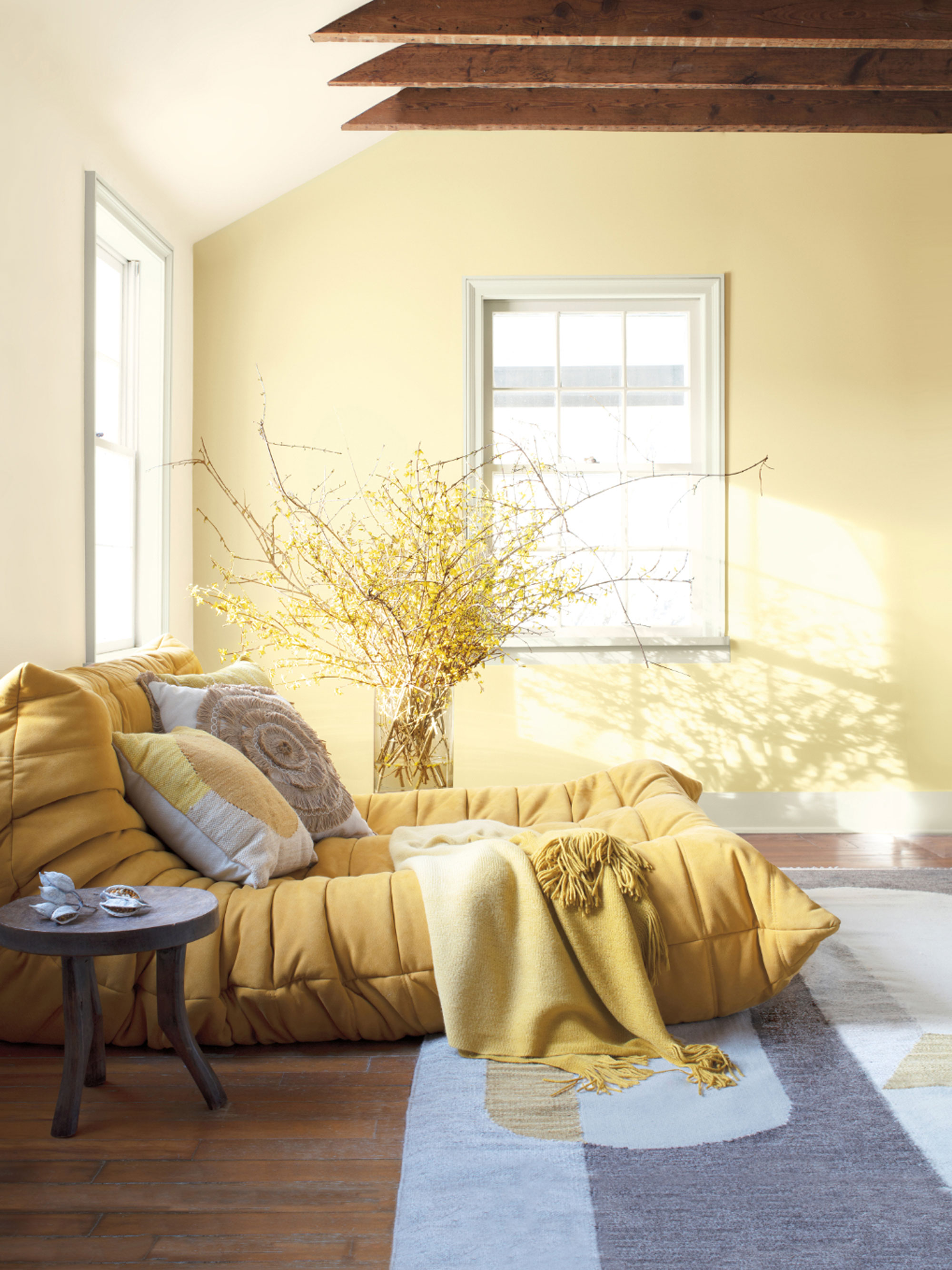
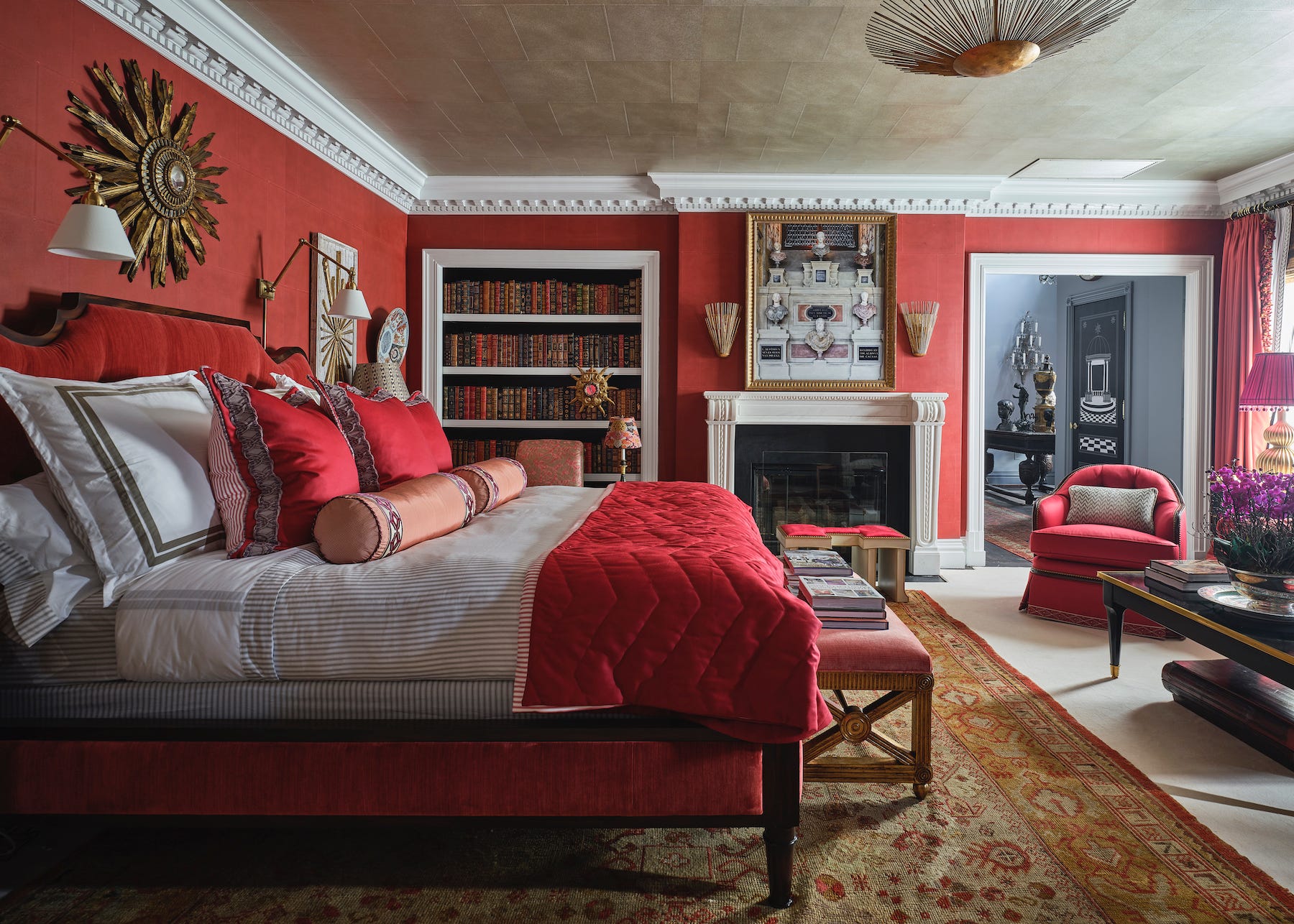
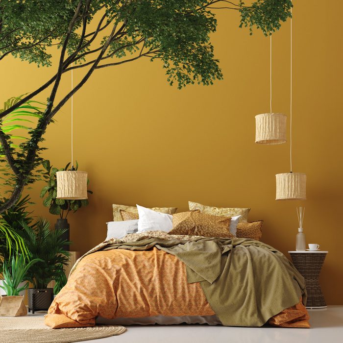
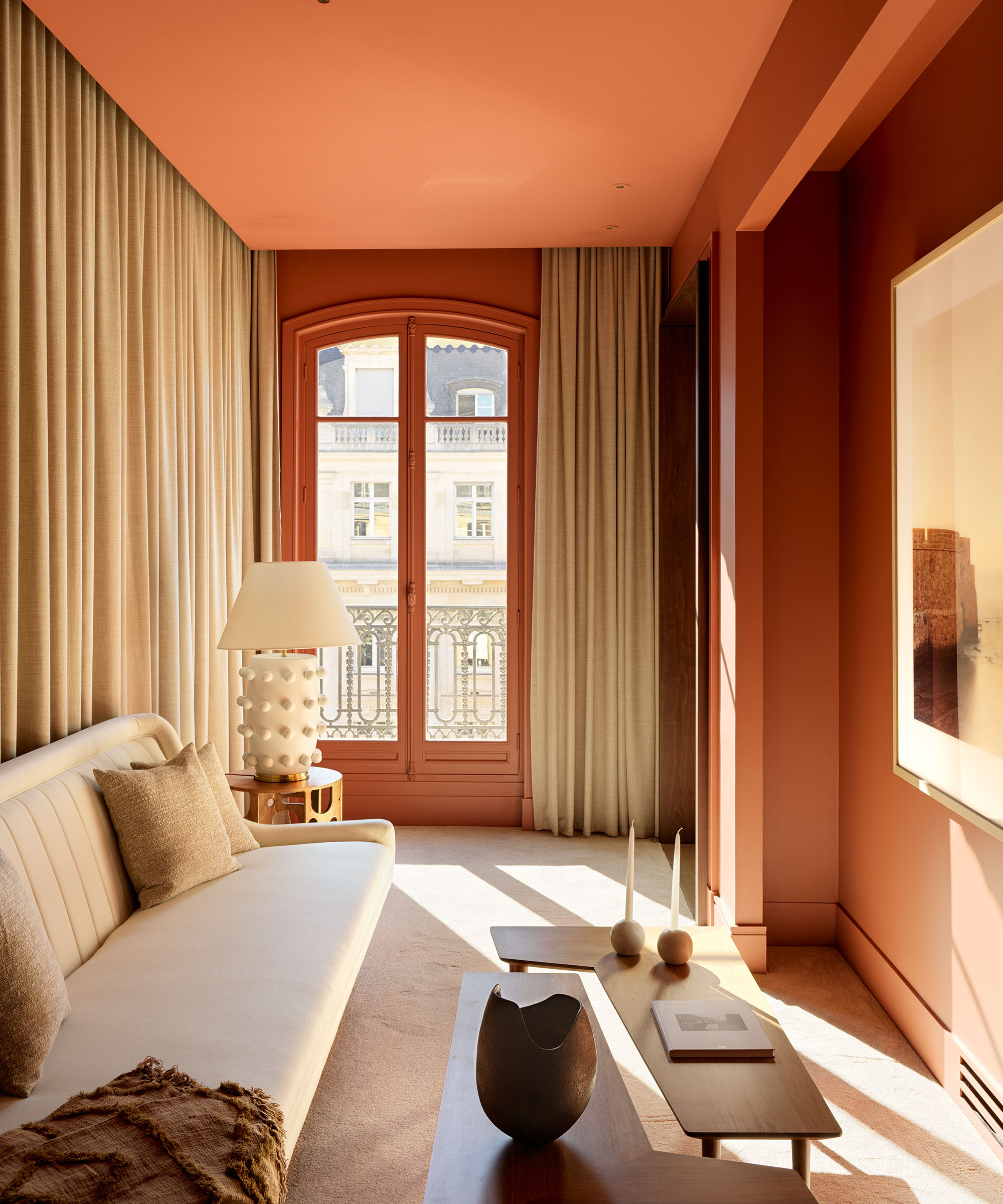
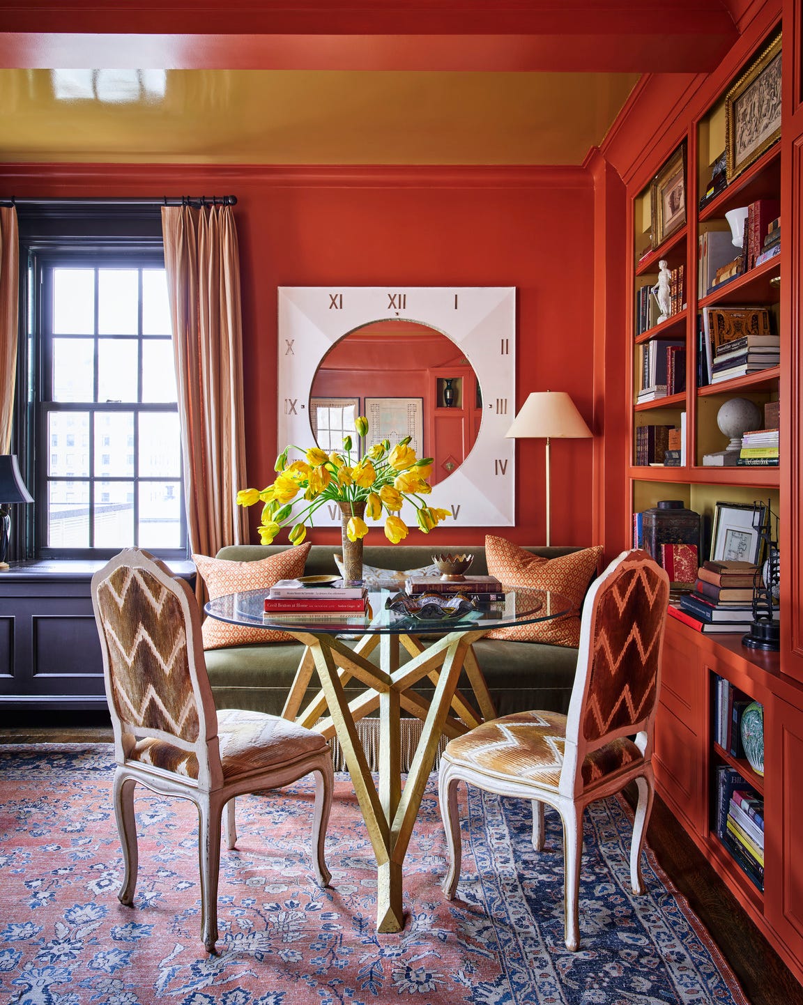
Bright oranges, such as Farrow & Ball's Dutch Orange, are recommended to amplify the existing warmth in south-facing rooms. This deep yellow-apricot shade is ideal for living rooms, enhancing the sunny disposition and creating an uplifting atmosphere when paired with complementary whites like Orange Coloured White. These bold colors thrive in constant direct sunlight, preventing them from appearing dull.
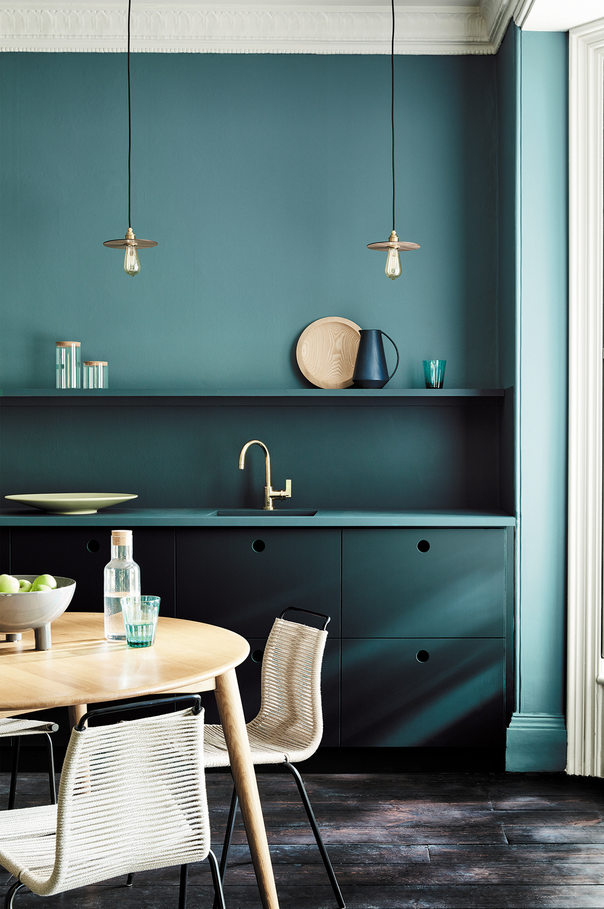
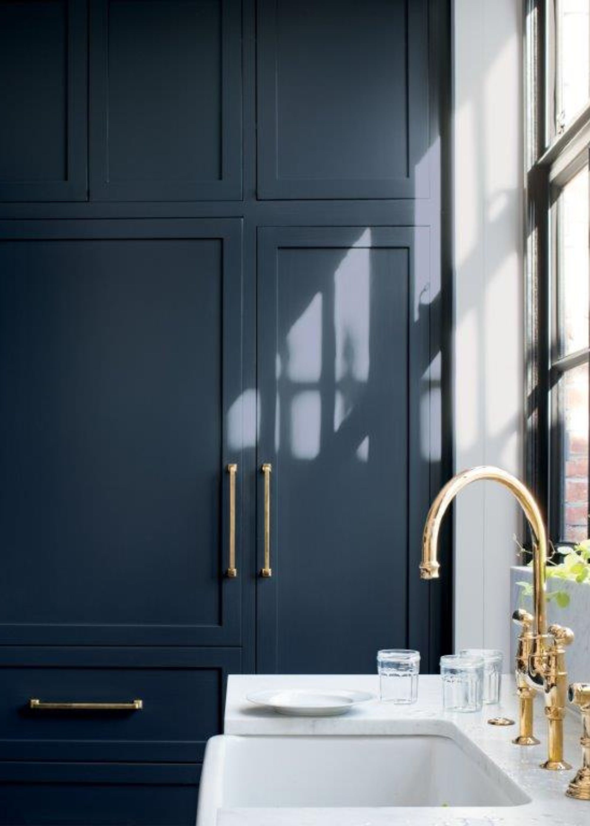
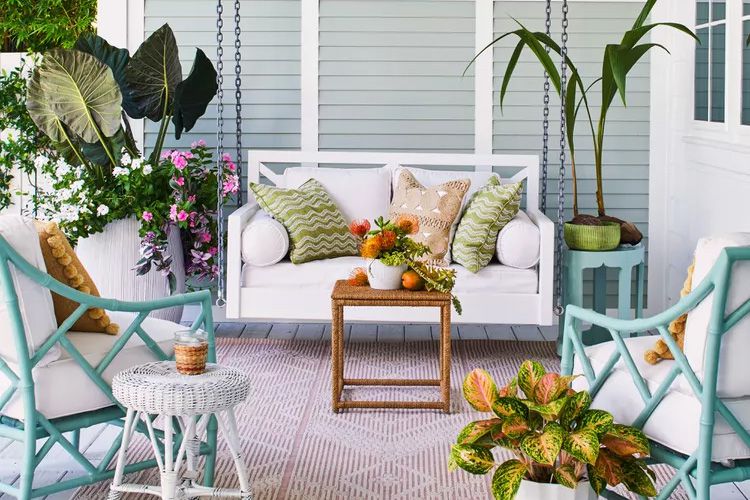
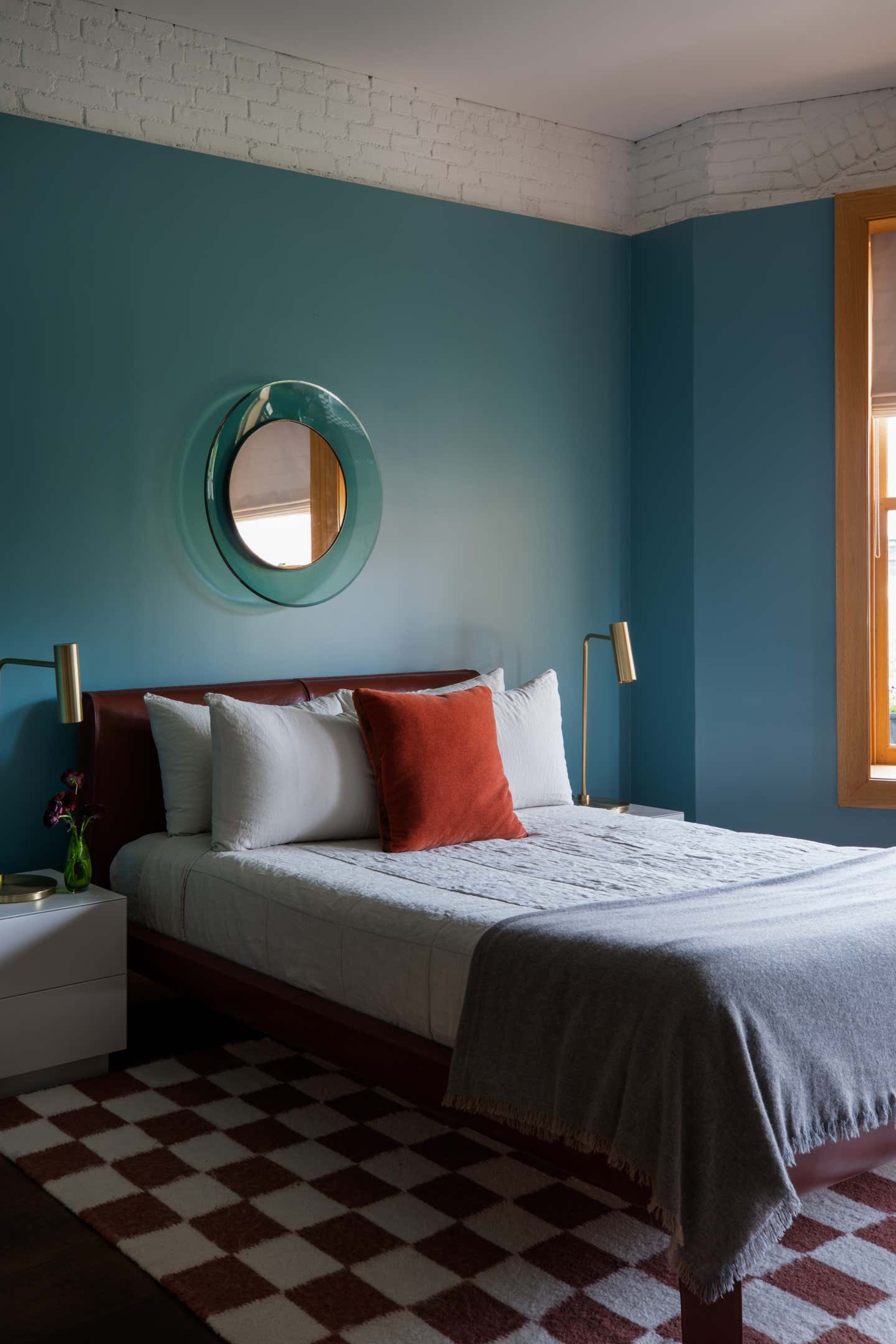
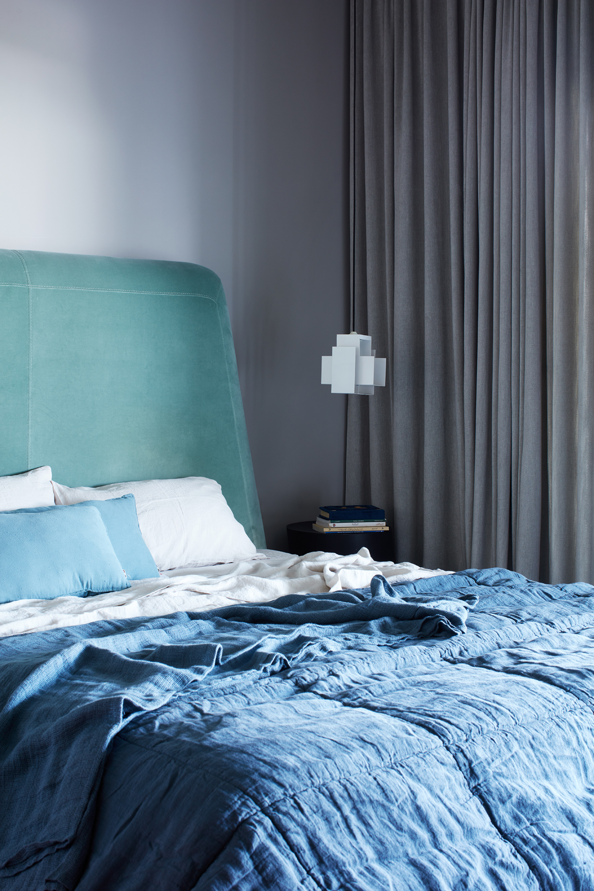
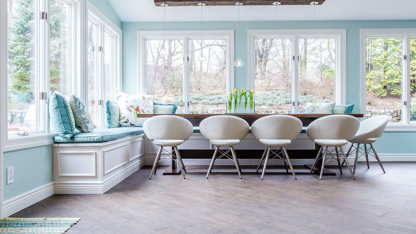
Conversely, cool blues can effectively temper the warmth in a south-facing room, fostering a restful environment. Tash Bradley, Director of Interior Design at Lick, suggests soft powder blues or moodier mid-toned blues like Lick’s Blue 03 or Blue 18 to add depth and calm. Ruth Mottershead of Little Greene recommends Hicks' Blue as a neutral alternative to grays and blacks, providing a scheme with greater depth while balancing the bright light, particularly suitable for kitchens and cabinets.
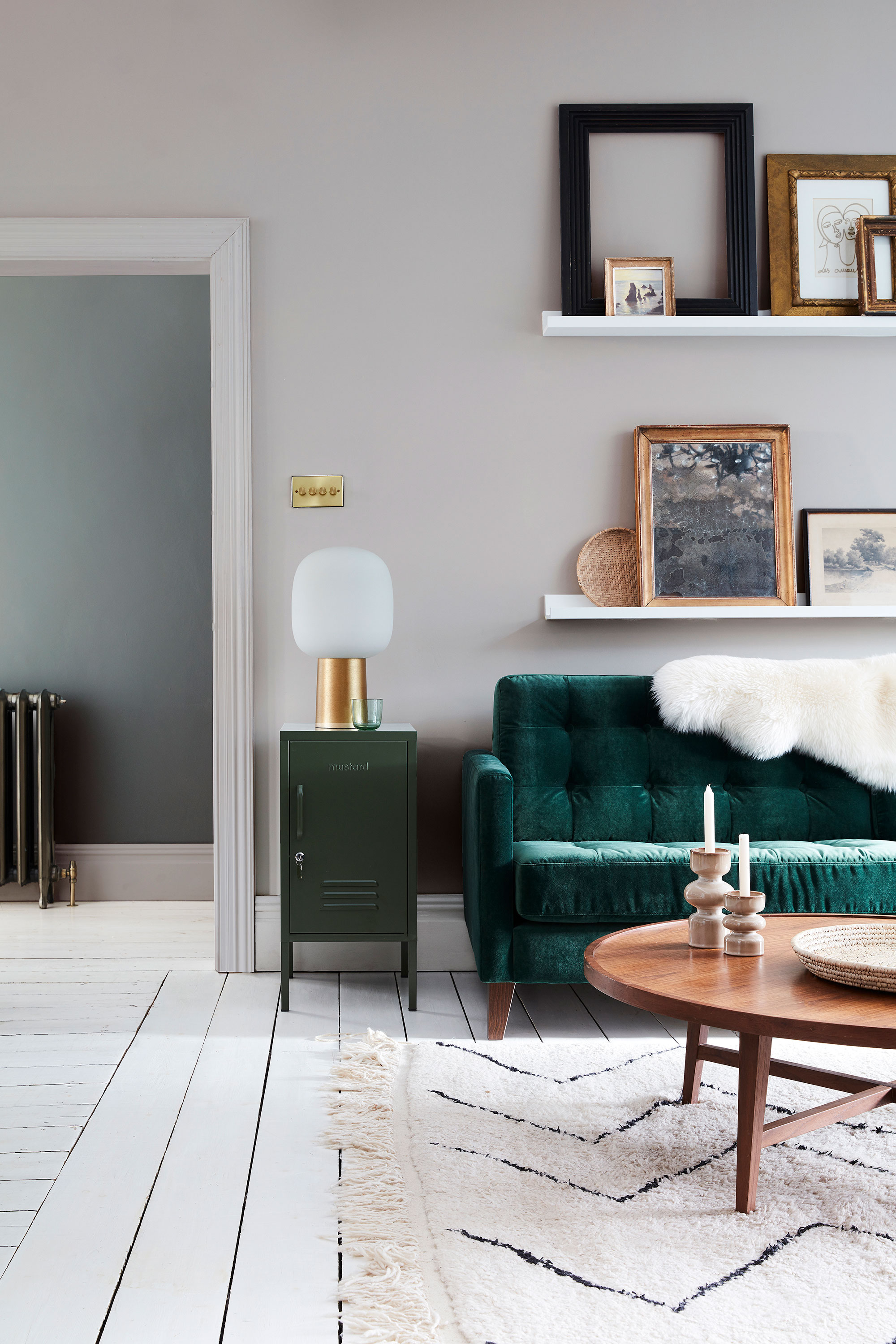
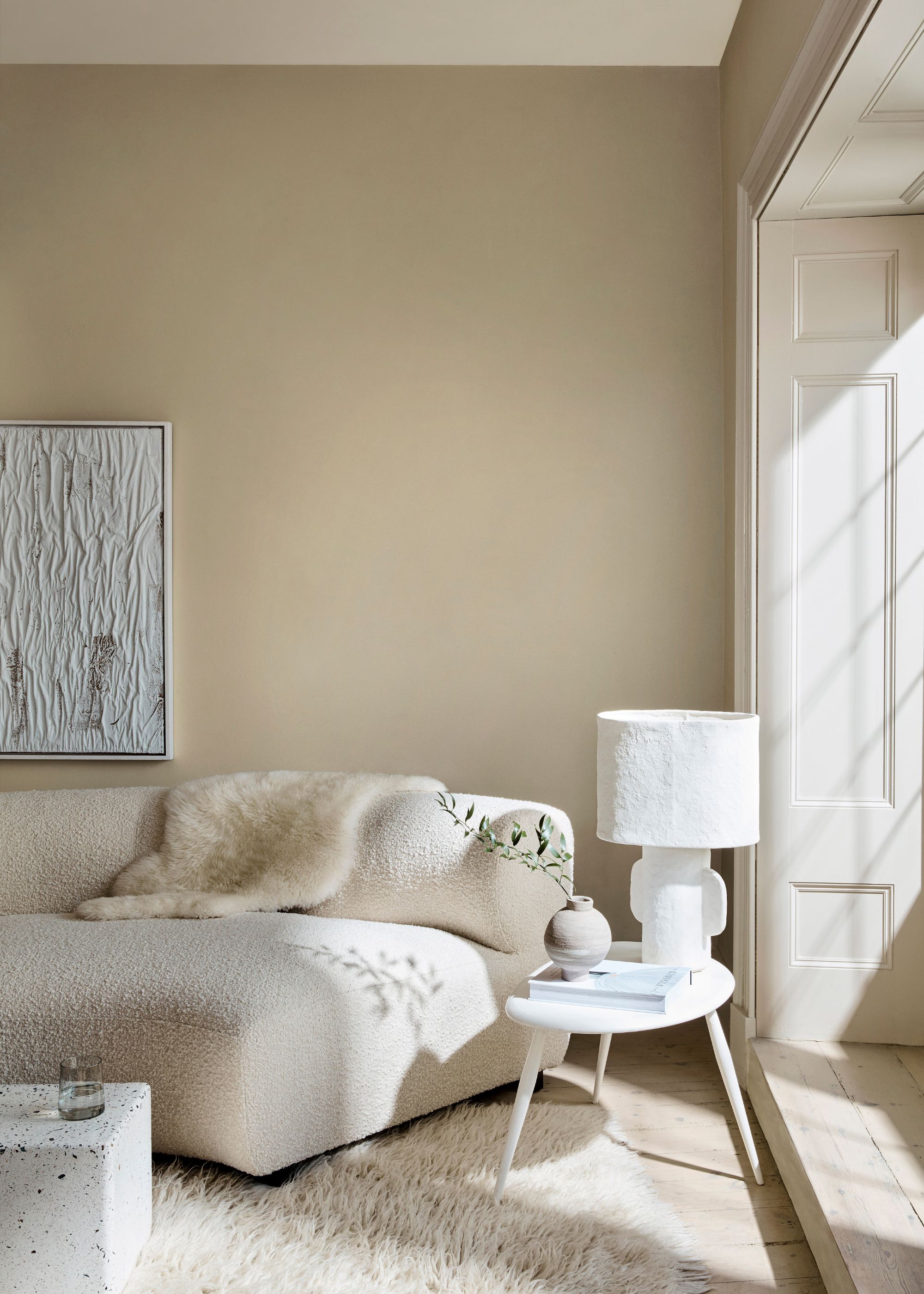
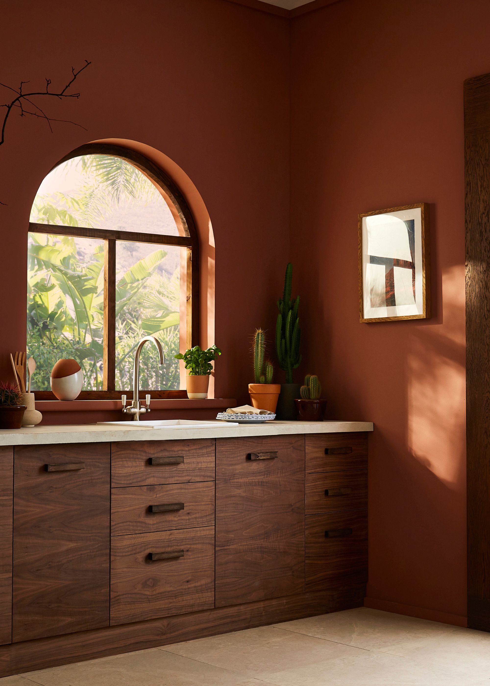
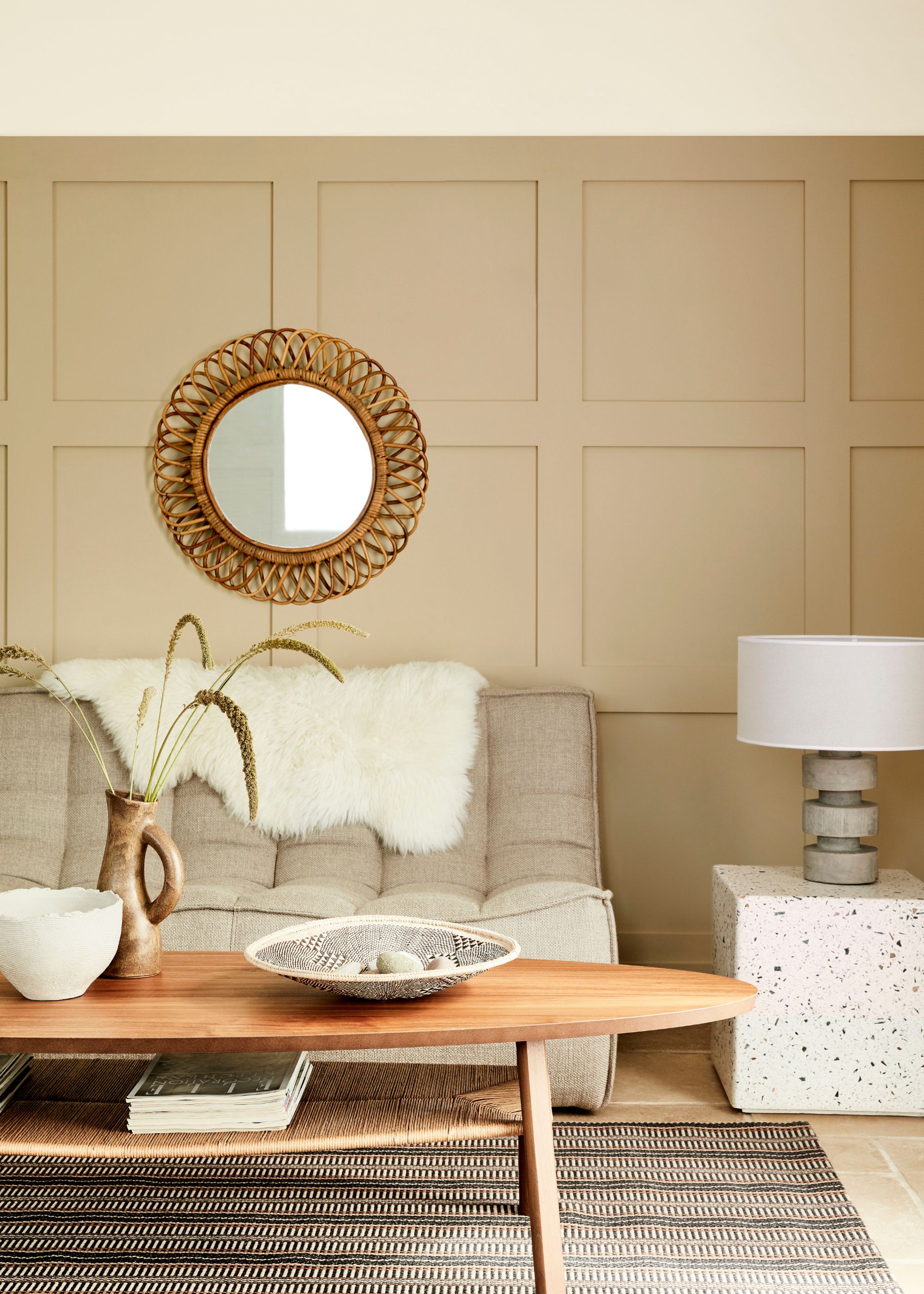
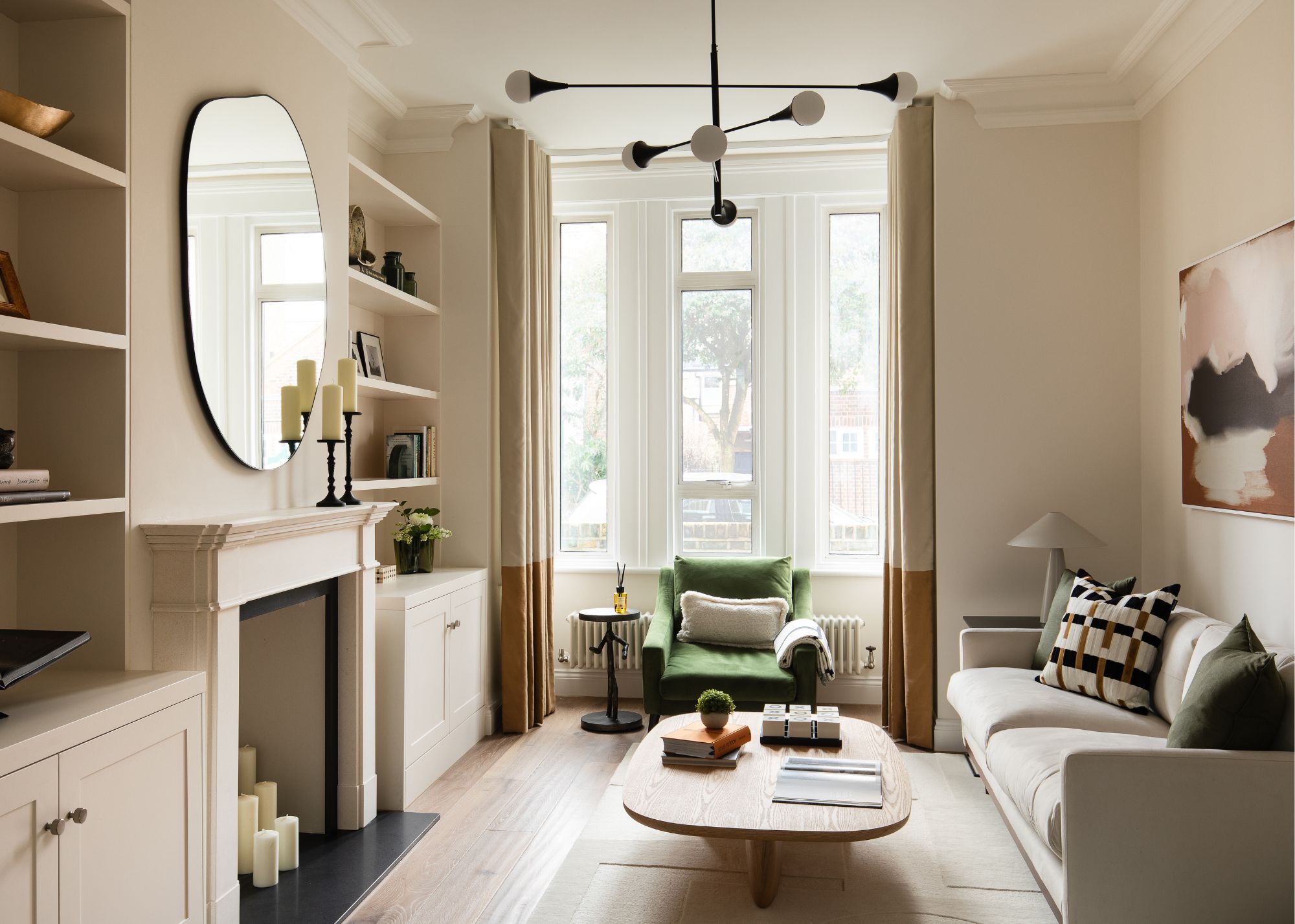
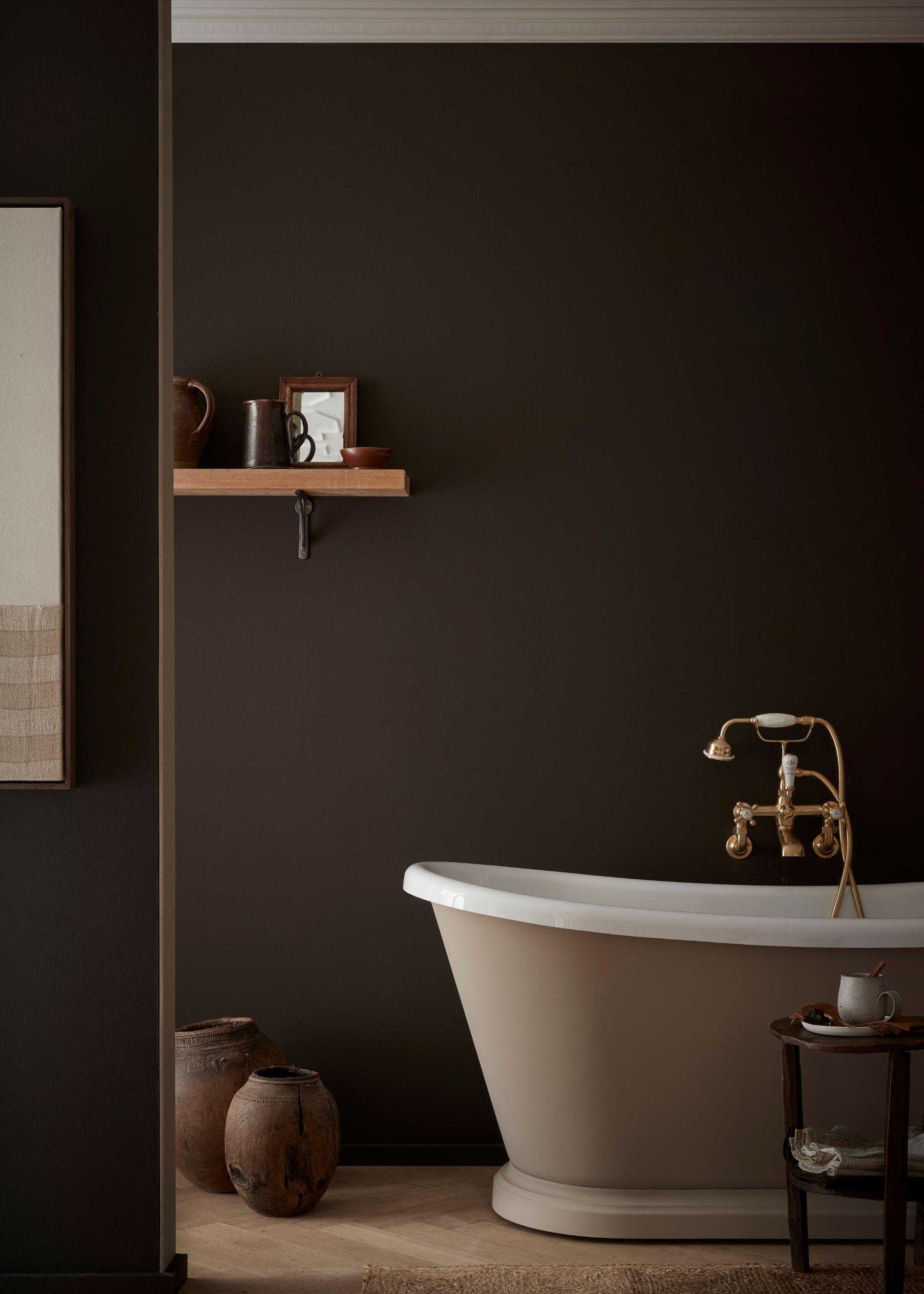
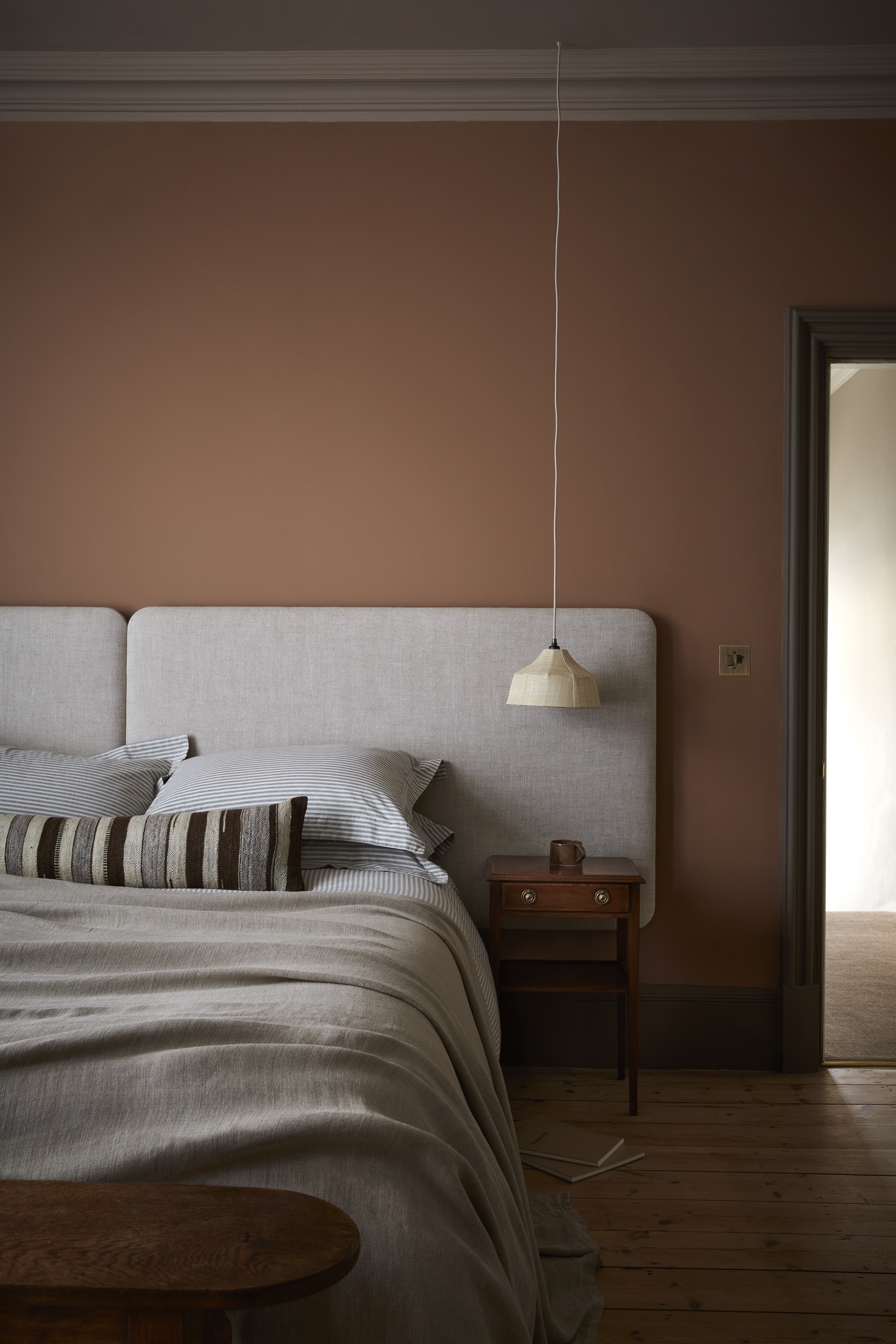
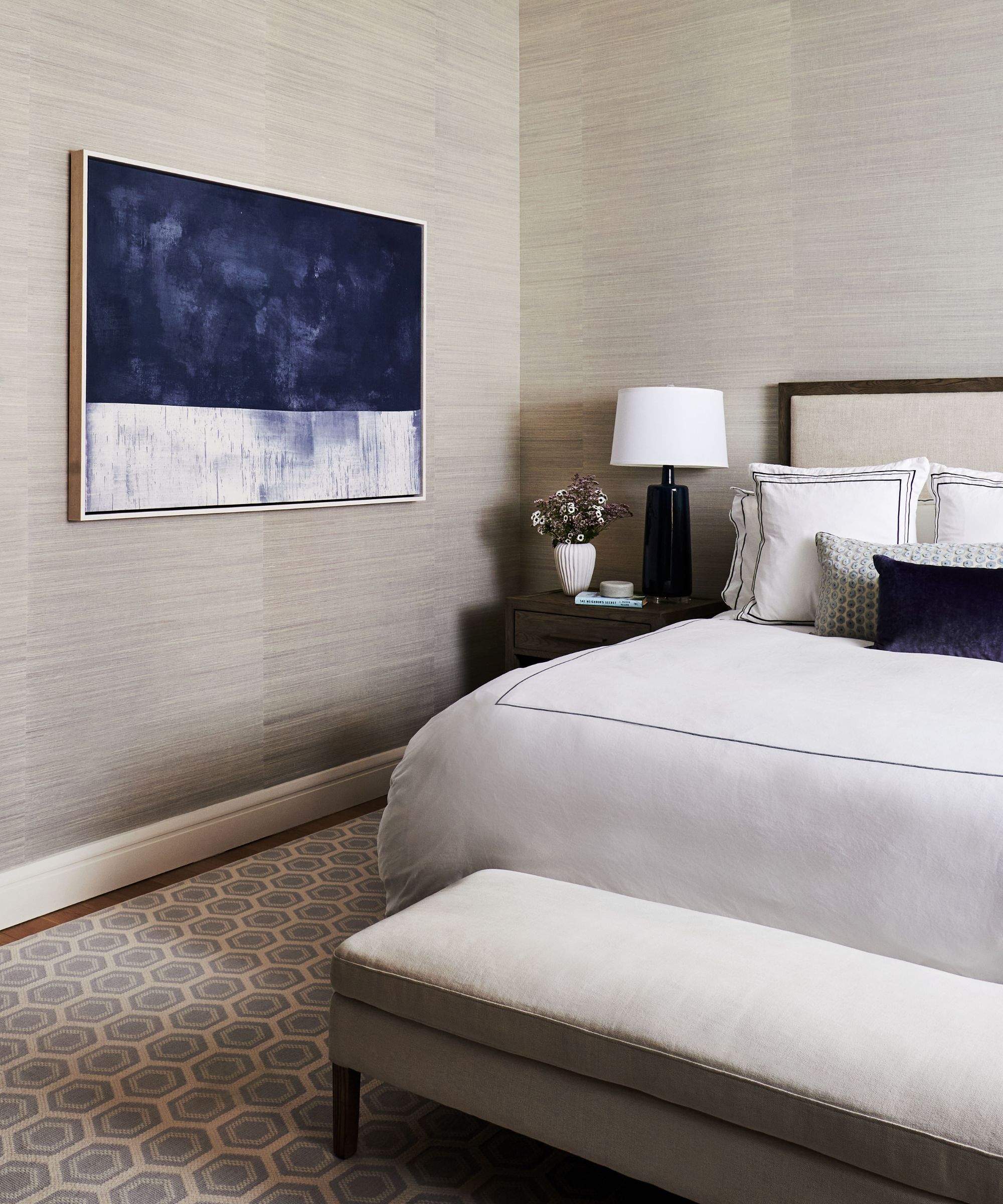
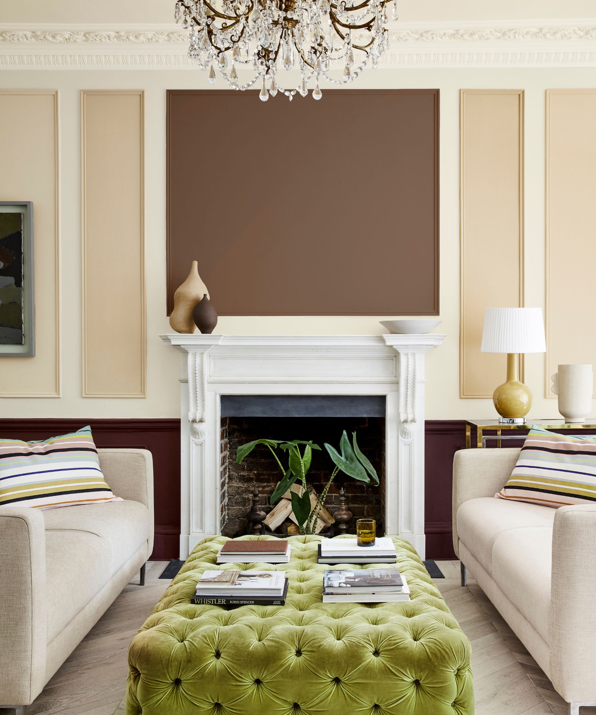
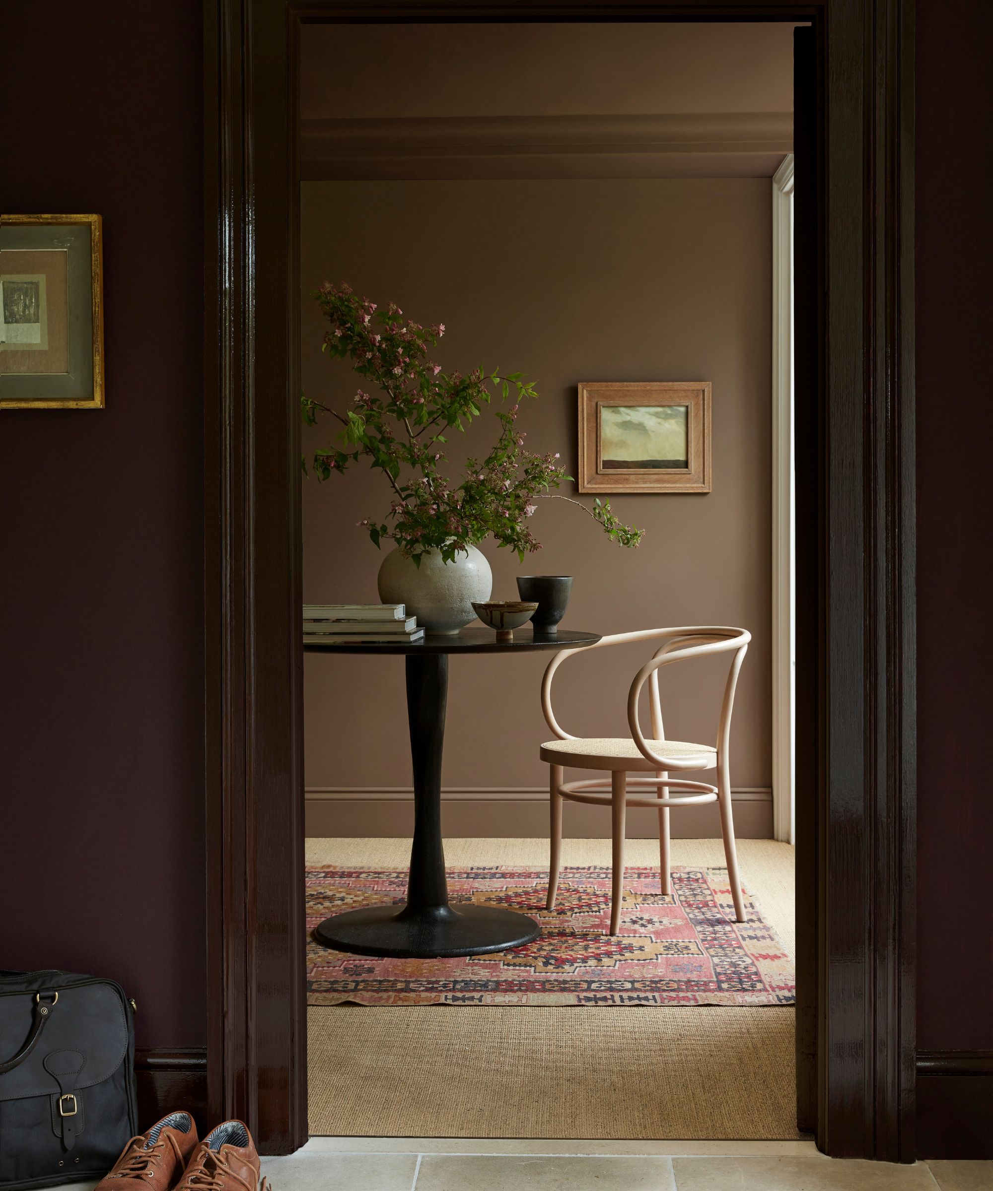
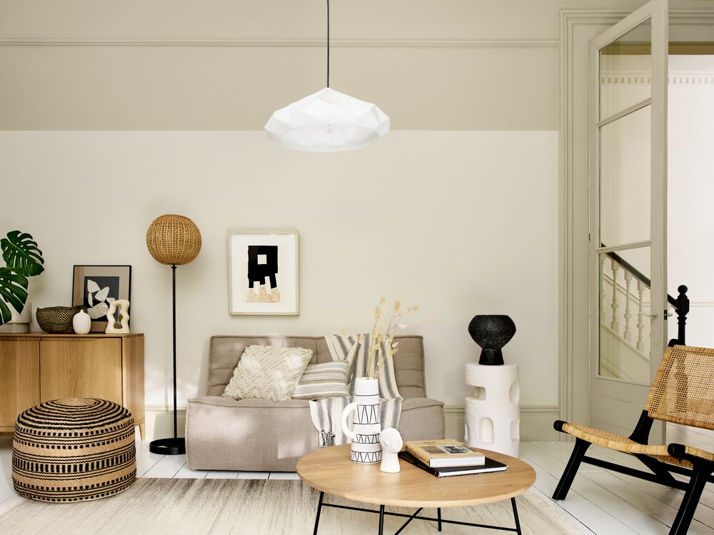
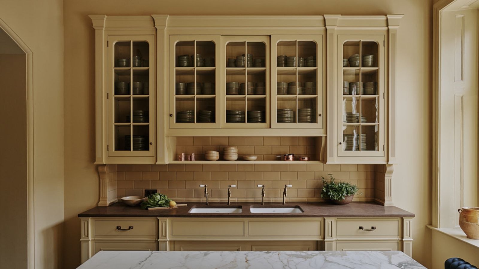
Earthy neutrals offer an understated elegance, complementing the golden light without making the space feel stark. Shades like soft taupes, warm beiges, or muted terracotta create a cocooning and calm ambiance. Lick’s Taupe 03 or Beige 03 are cited as examples that bring grounding warmth. When using white paints, selecting those with subtle cool undertones is crucial to avoid a creamy appearance in direct sunlight and maintain a balanced look, as exemplified by Benjamin Moore's Decorator’s White OC-149 with its light gray undertone.
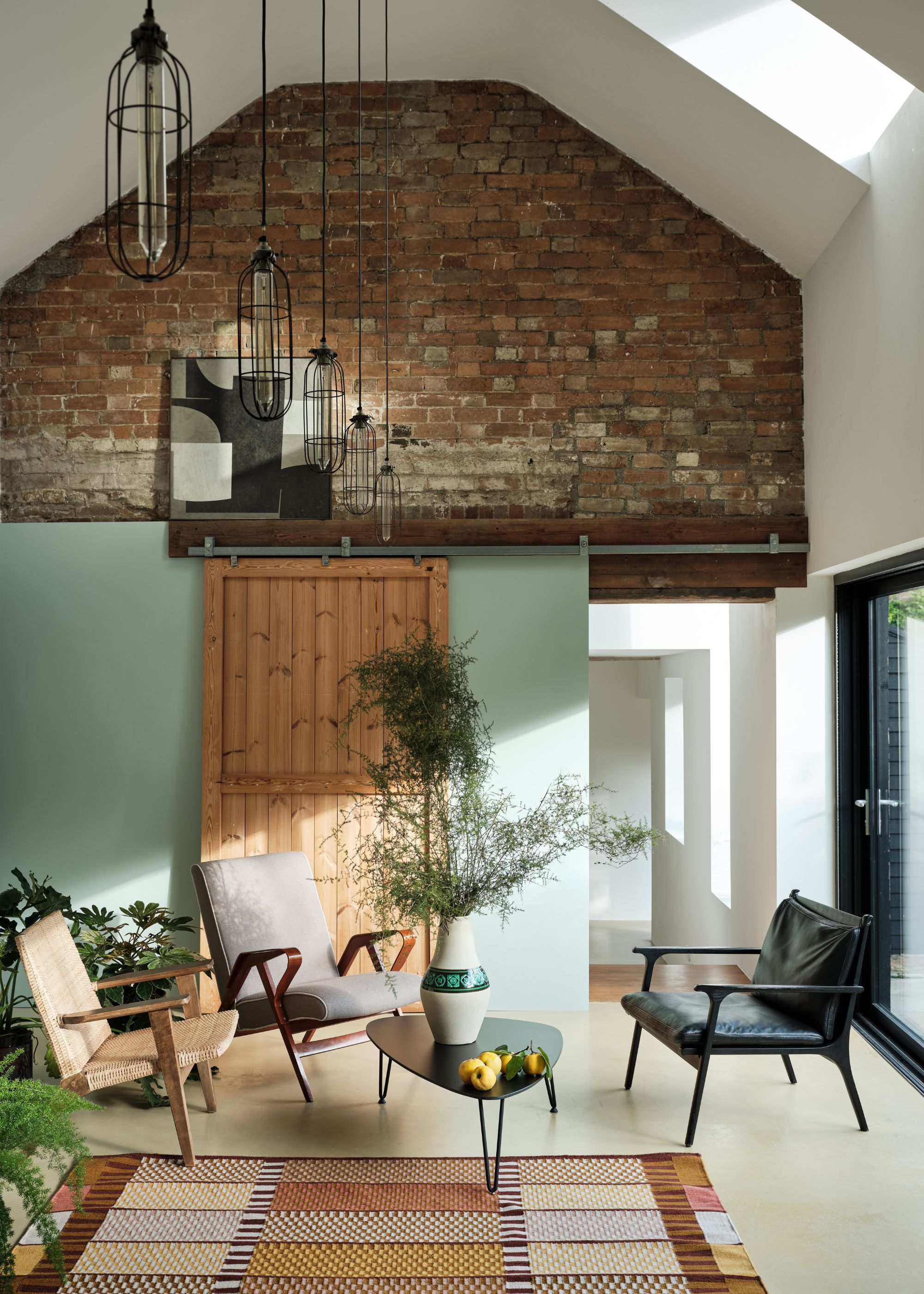
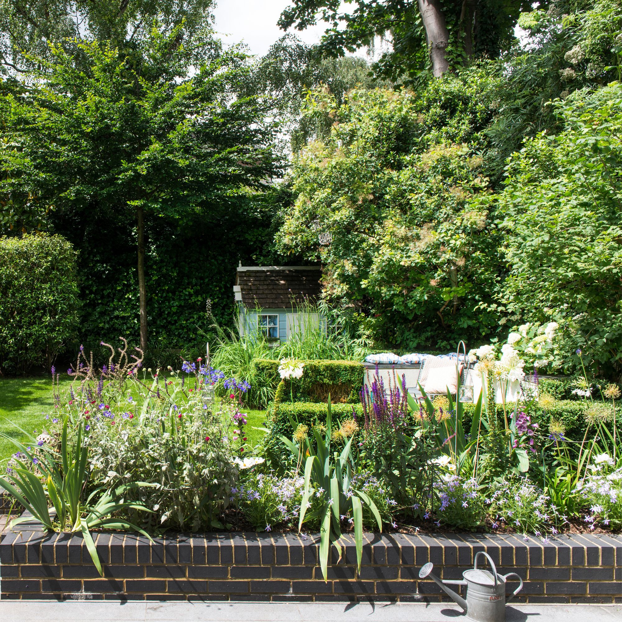
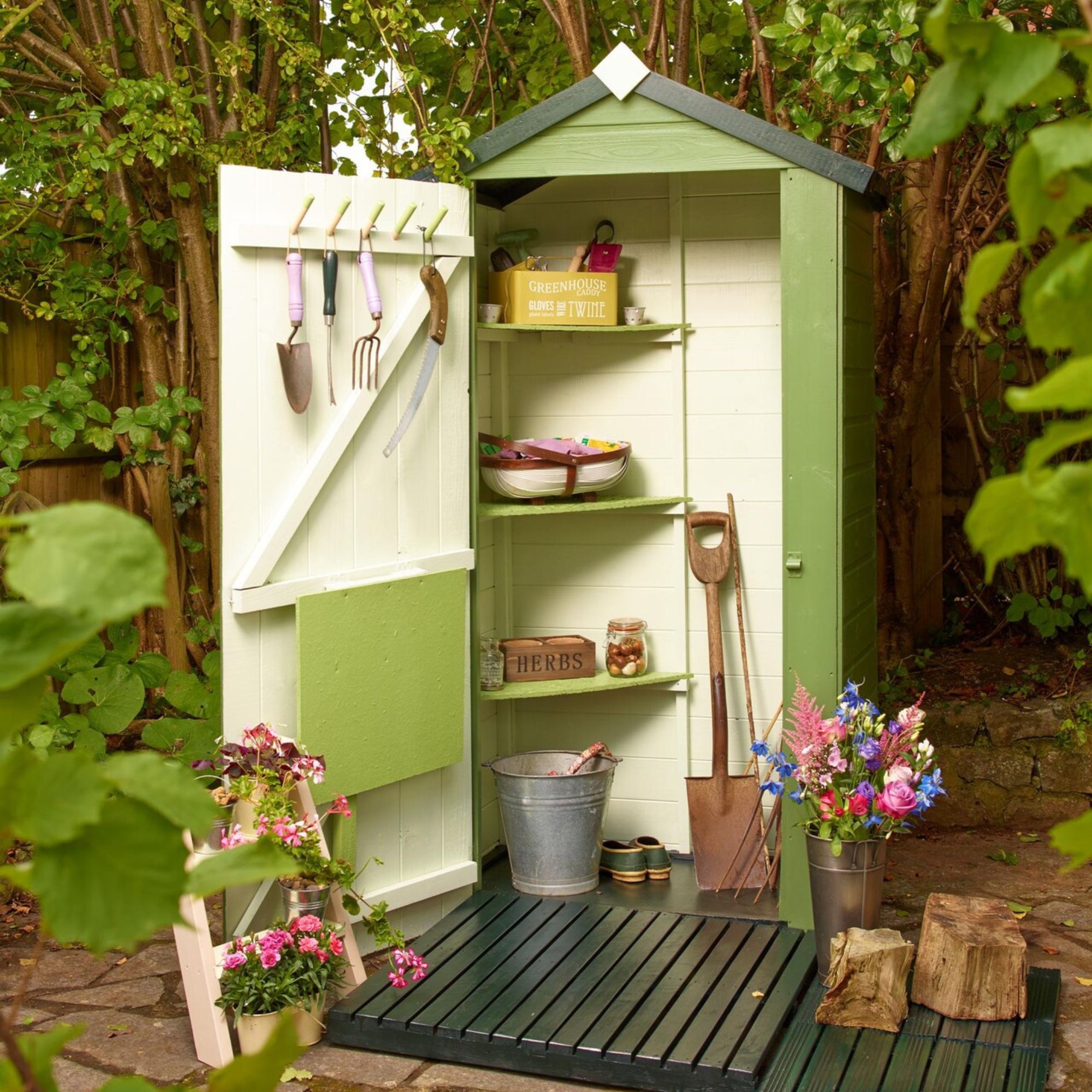
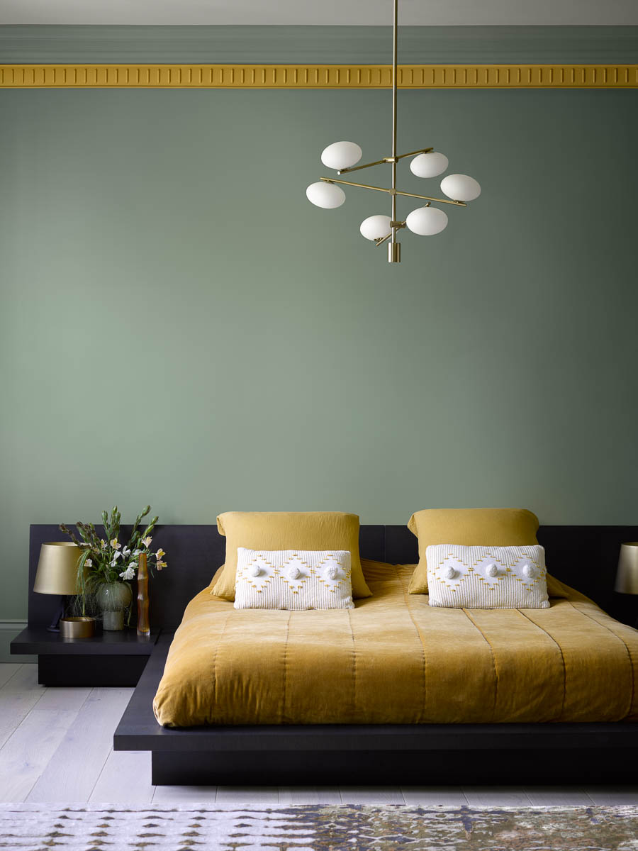
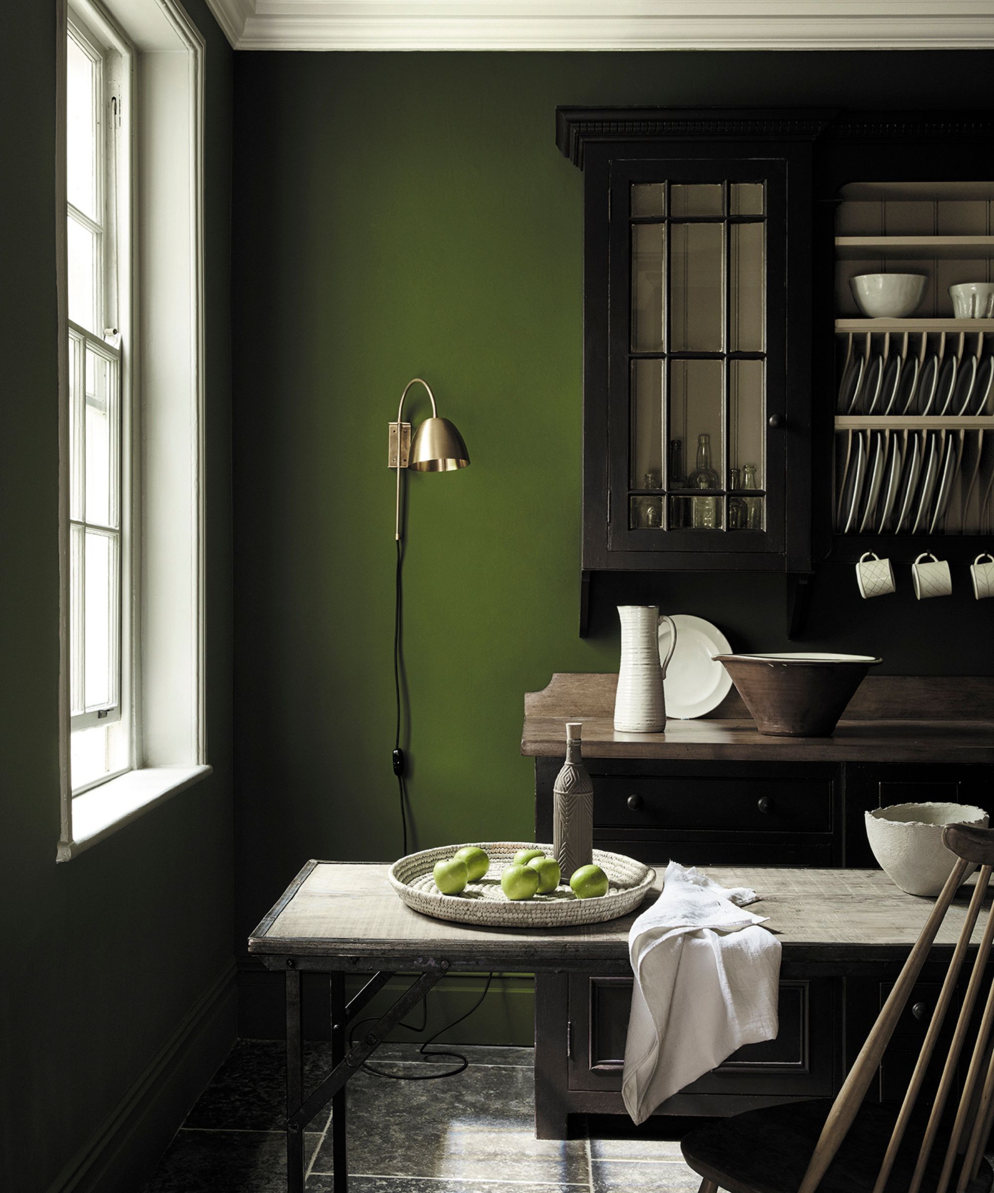
Green paints, from gentle sage to olive tones, also perform well in south-facing rooms, connecting the space to nature and providing a fresh, uplifting feel. Lick’s Green 09 or Green 18 are noted for their earthy quality, harmonizing with the warm light without competing with its brightness. The versatility of green allows for both bold and lighter applications in these well-lit spaces.
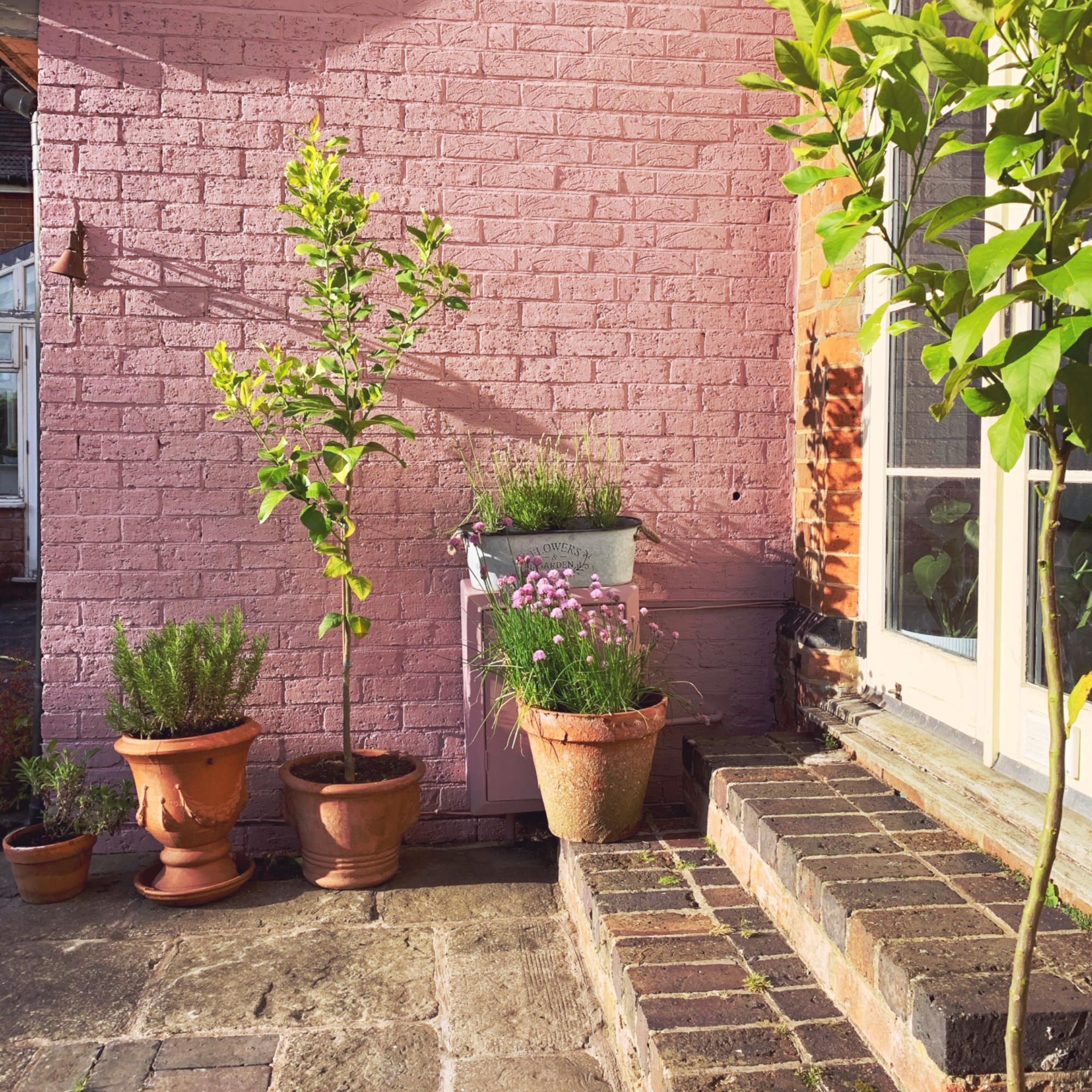
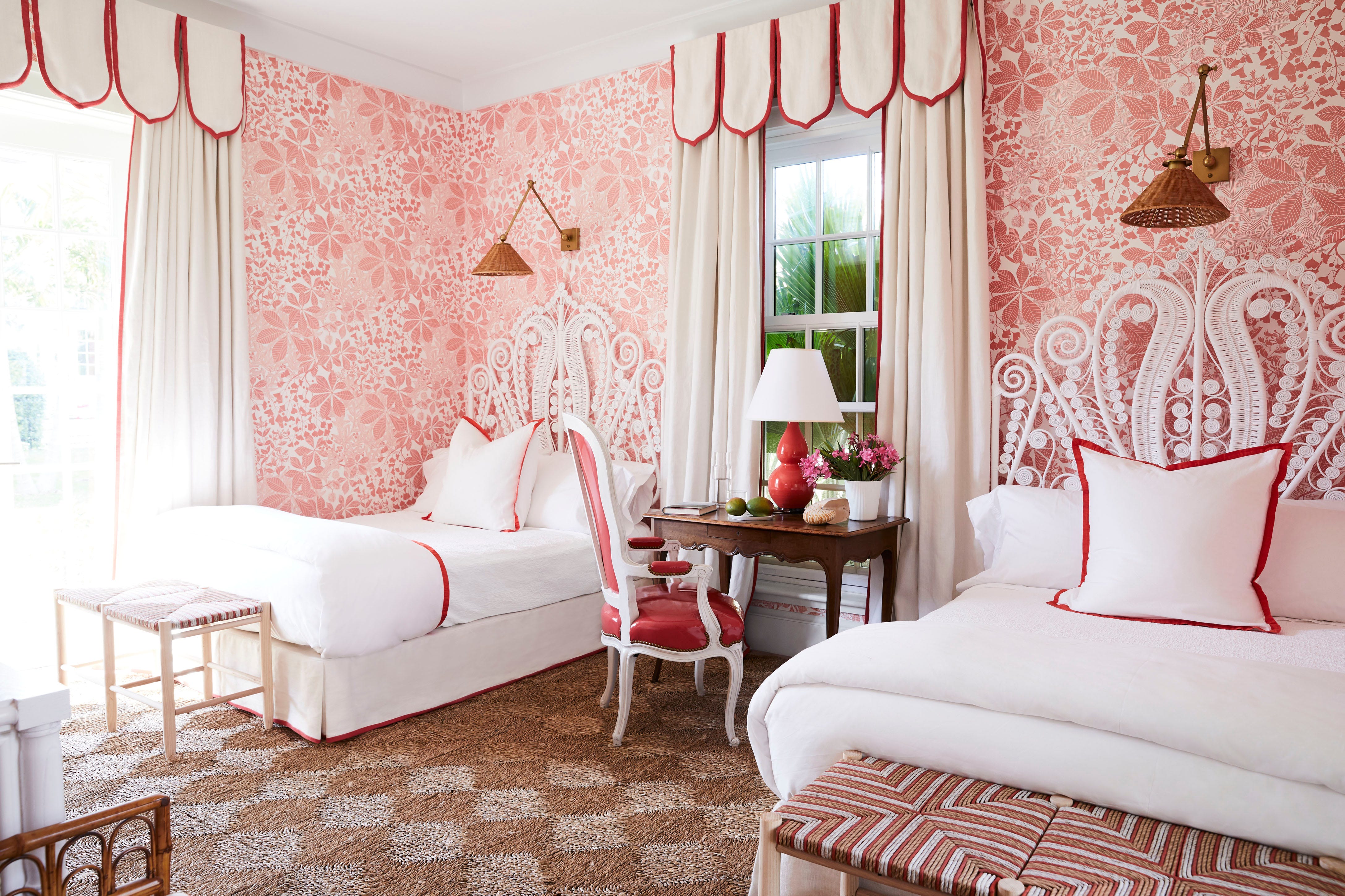
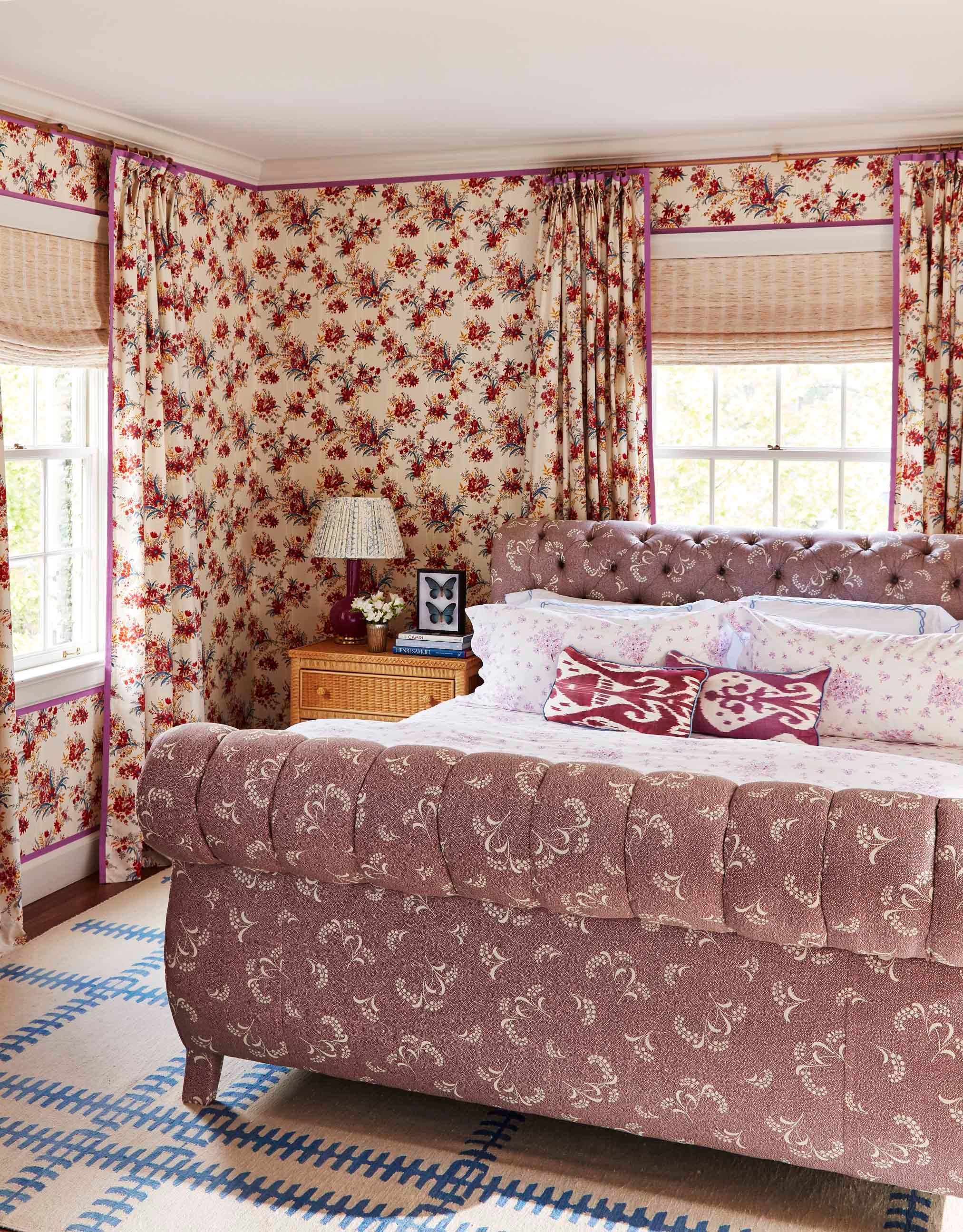
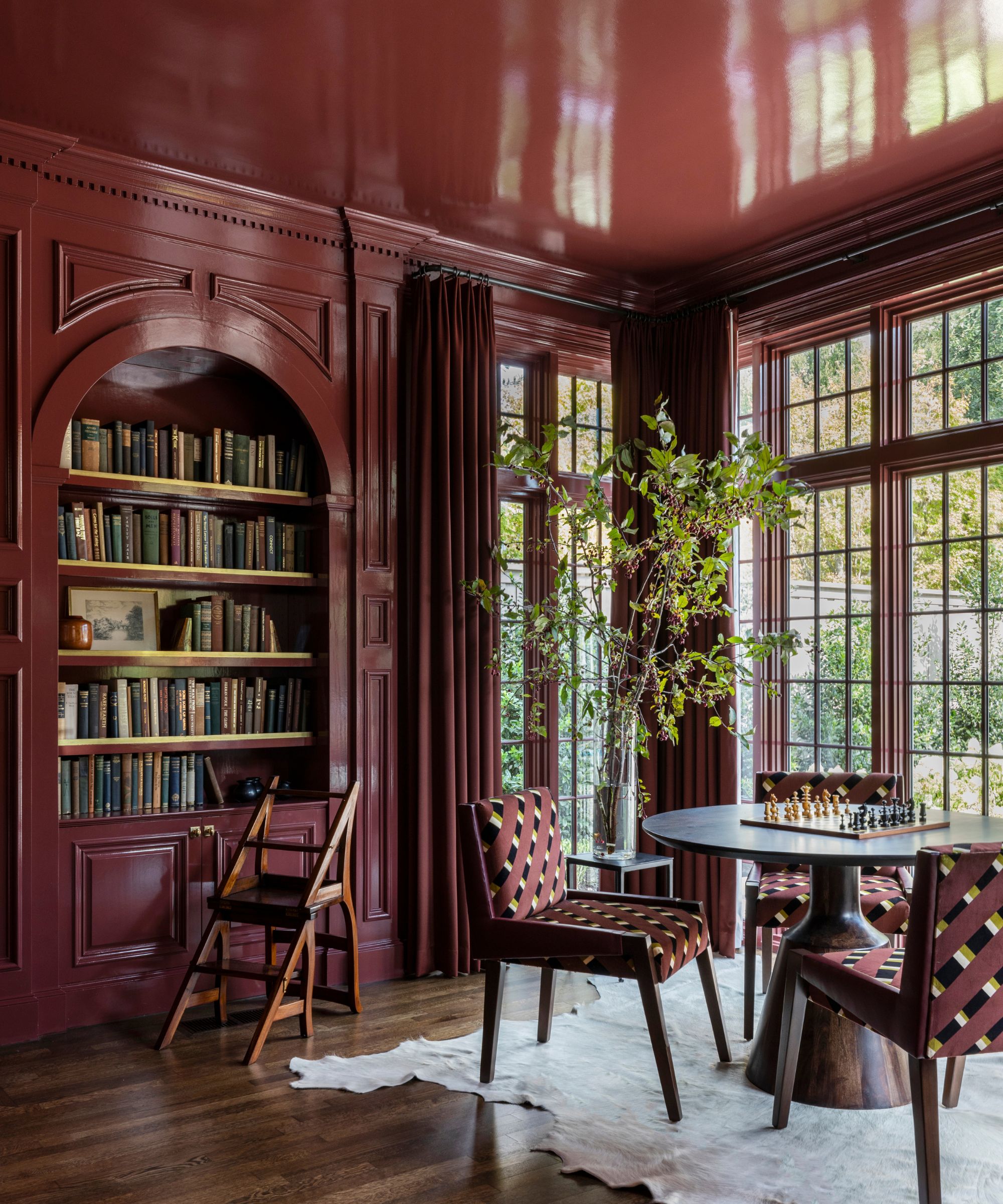
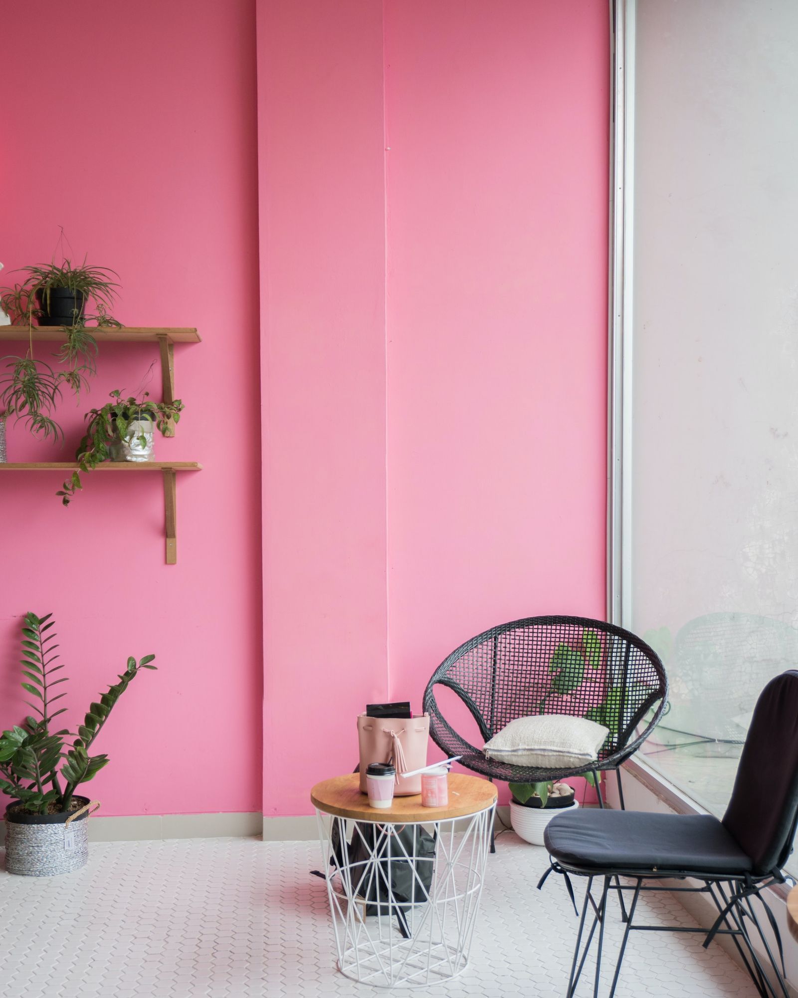
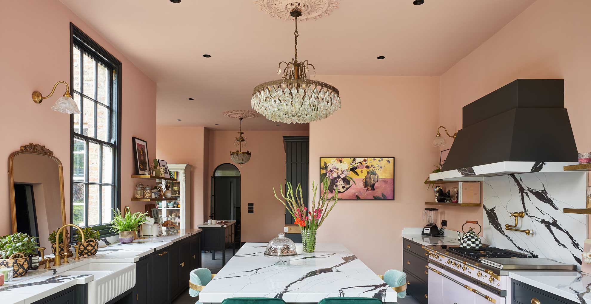
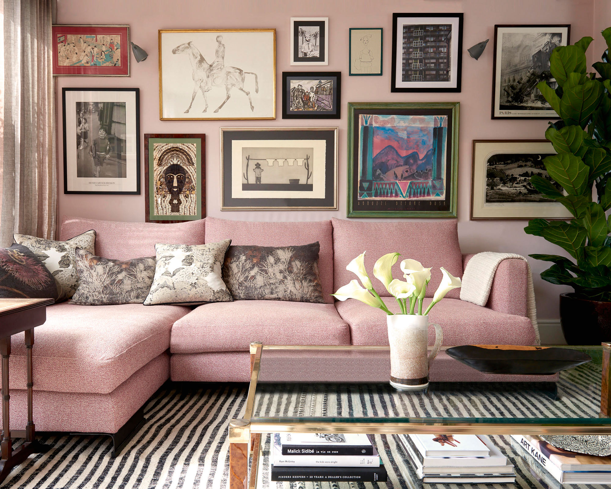
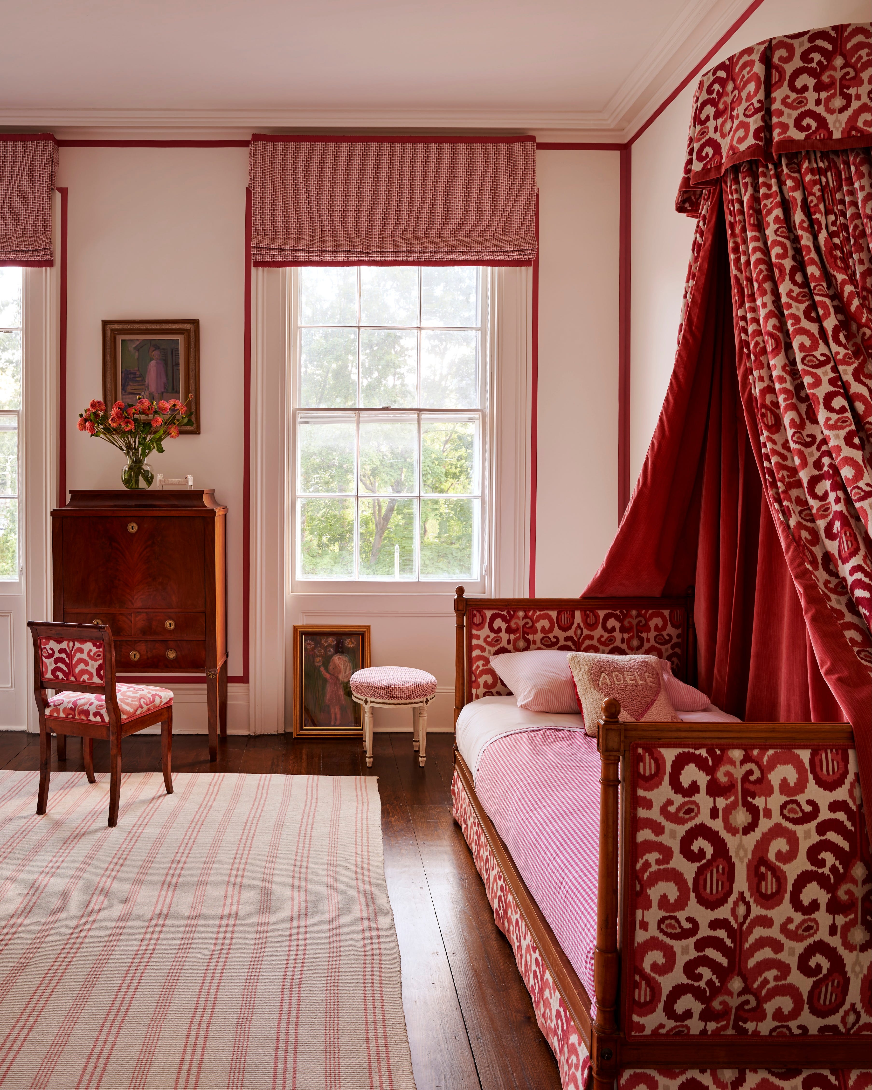
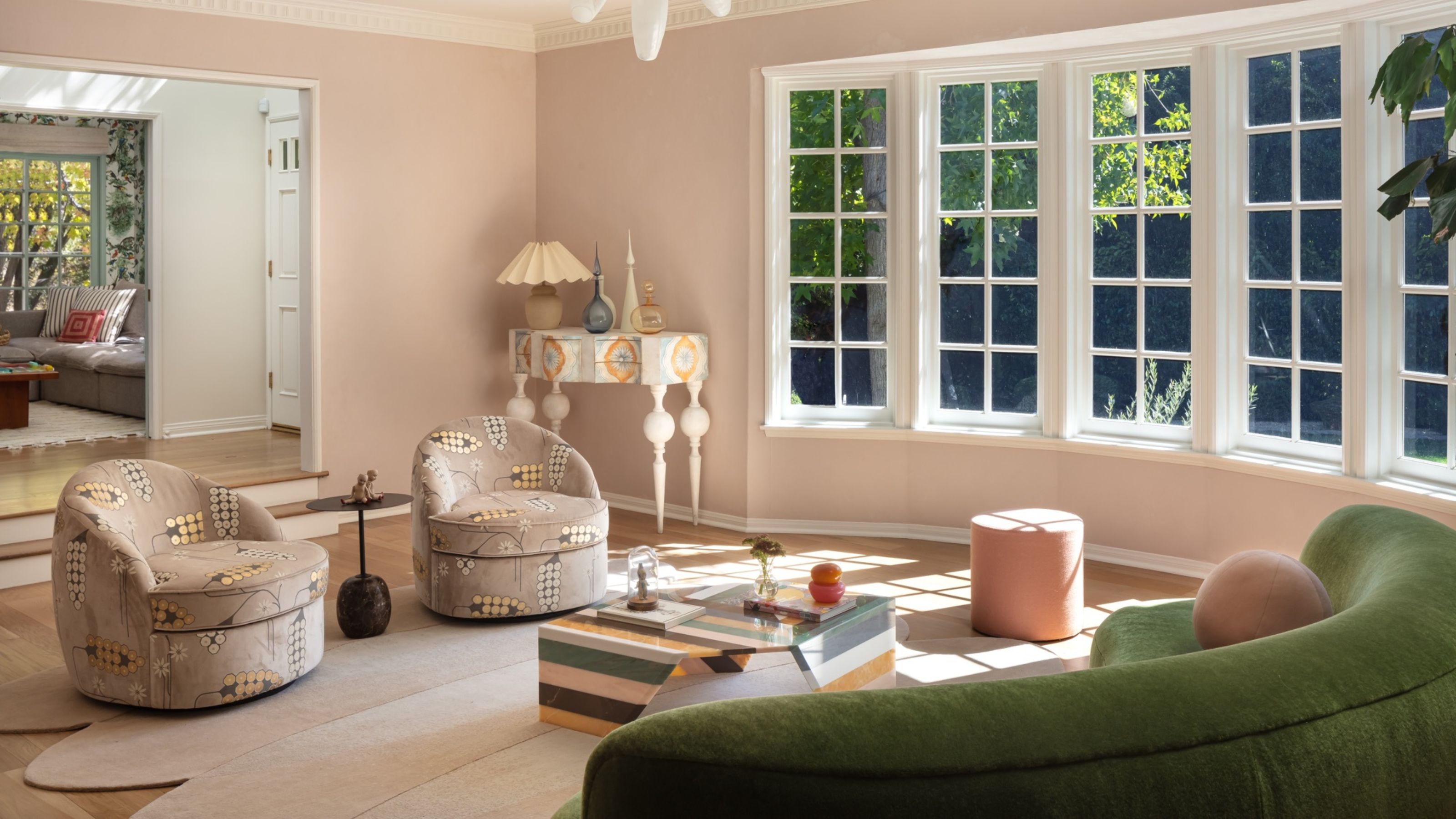
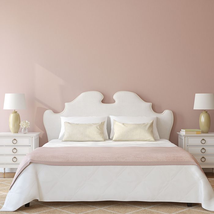
Lastly, dusky pinks are highlighted for their ability to add warmth and coziness without overwhelming the room. Lick’s Pink 07 and Pink 08 are suggested for their sophisticated and earthy feel, creating a grown-up glow. Darker pinks, such as Graham & Brown's Bittersweet and Bikini, can also enhance the sunlight without being overpowering, offering a playful yet romantic scheme.
When choosing a paint color, the purpose of the room is paramount. For social areas, vibrant, saturated colors can enhance natural light, while relaxing spaces benefit from soft, light neutrals or colors with cool undertones. Moreover, a matte or eggshell finish is advised to prevent glare from the intense sunlight, contrasting with glossy finishes that might reflect too much light. Testing paint samples throughout the day is crucial to observe tonal shifts and ensure the chosen shade harmonizes with the room's evolving light.
#SouthFacingRooms #PaintColors #InteriorDesign #HomeDecor #ColorPsychology #WarmColors #CoolColors #NeutralPalettes #PaintFinishes #SouthFacingRooms #PaintColors #InteriorDesign #HomeDecor #ColorPsychology #WarmColors #CoolColors #NeutralPalettes #PaintFinishes
0 opmerkingen in totaal
 Nog geen opmerkingen
Dit vindt u mogelijk ook leuk
The Best Colors for East-Facing Rooms, According to Experts
7 best paint colours to brighten up a gloomy north-facing garden, according to experts
These Are the Top Bedroom Colors of 2024

Expert Speak: What are the most soothing colours for the home?

Paint color ideas for every room – experts explain the best choices for different spaces
This Polarizing Color is Actually a Designer Favorite for Bedrooms—but ONLY When It's Done Right

We Asked Designers Which Paint Colors Are Best for Brightening a Dark Room—6 Top Picks

The best colour for ceilings as recommended by interior designers and colour specialists

The Best Colors for West-Facing Rooms That Will Help You Make the Most of That Warm Evening Light
20 Porch Paint Colors Southern Designers Are Loving
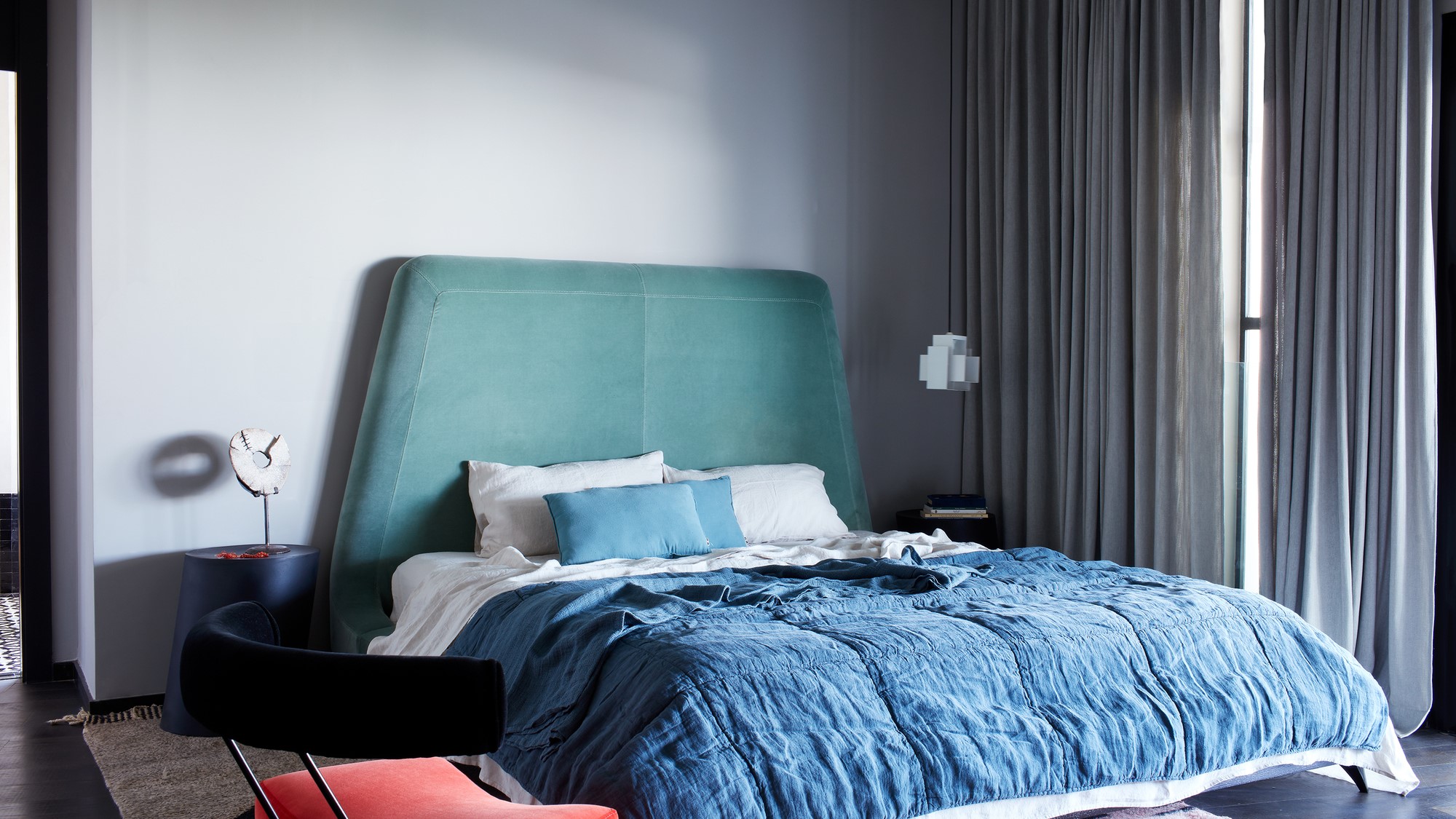
4 paint colors to make your bedroom feel cooler the paint experts swear by (and three to avoid)
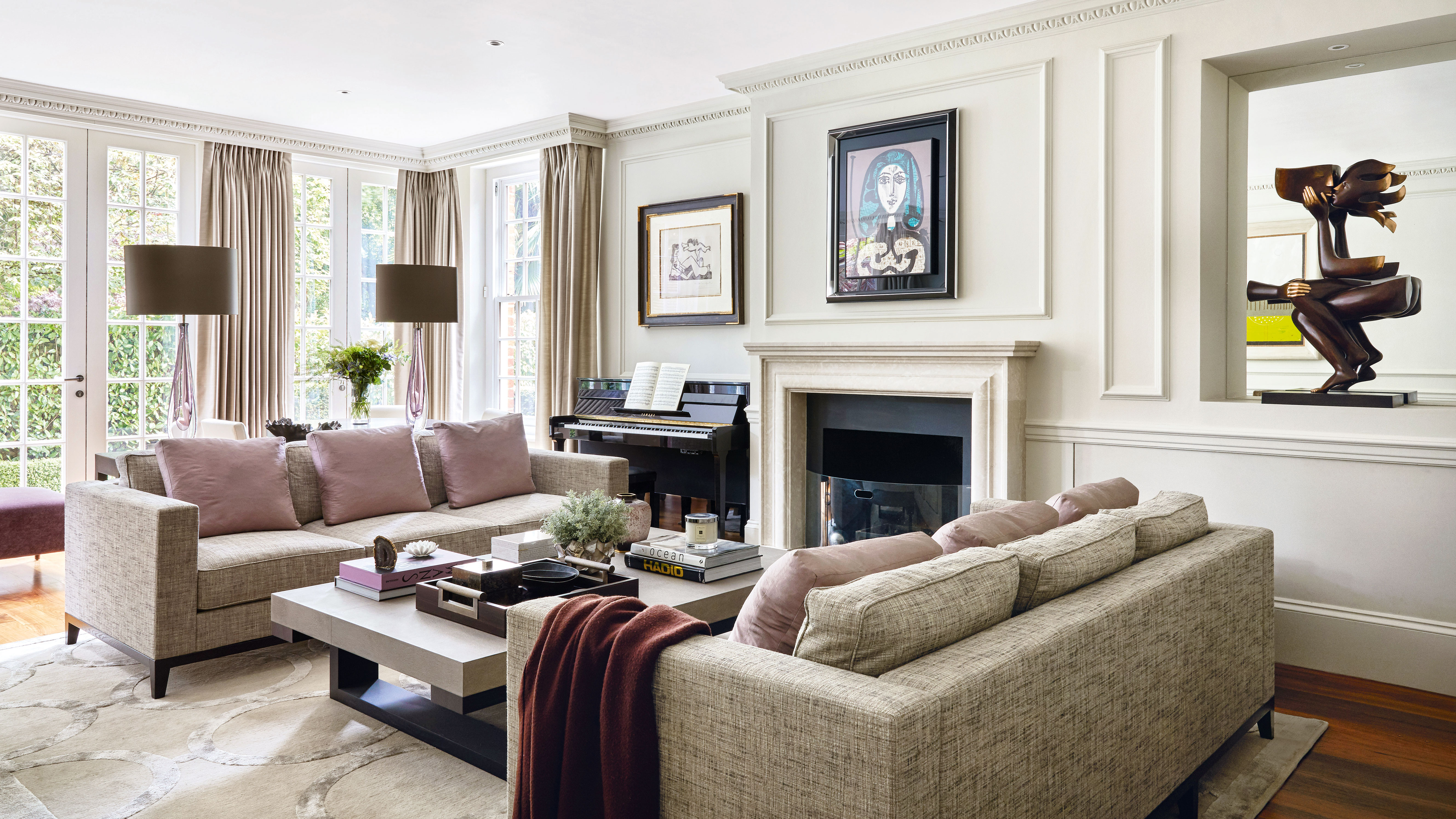
5 colors that will make your living room feel happier, according to interior designers
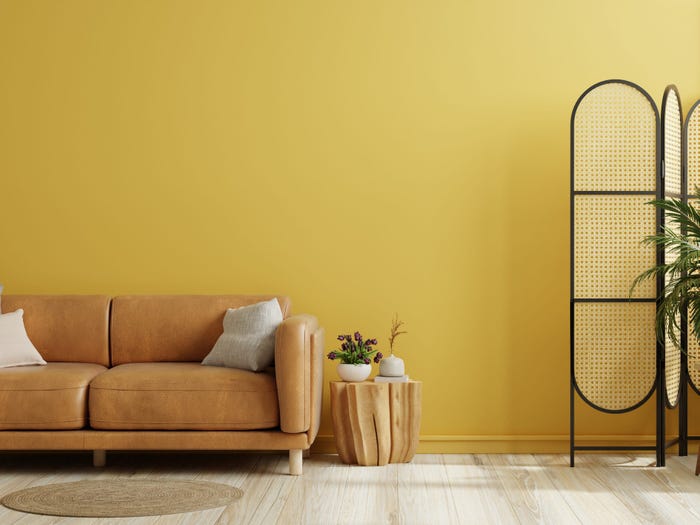
An expert in color psychology shares the 5 shades you should have in your living room
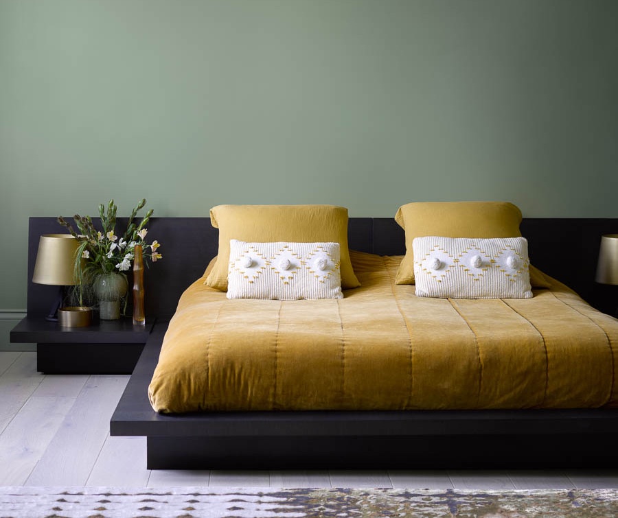
5 Paint Colors That Will Help You Sleep Better if You Use Them in Your Bedroom
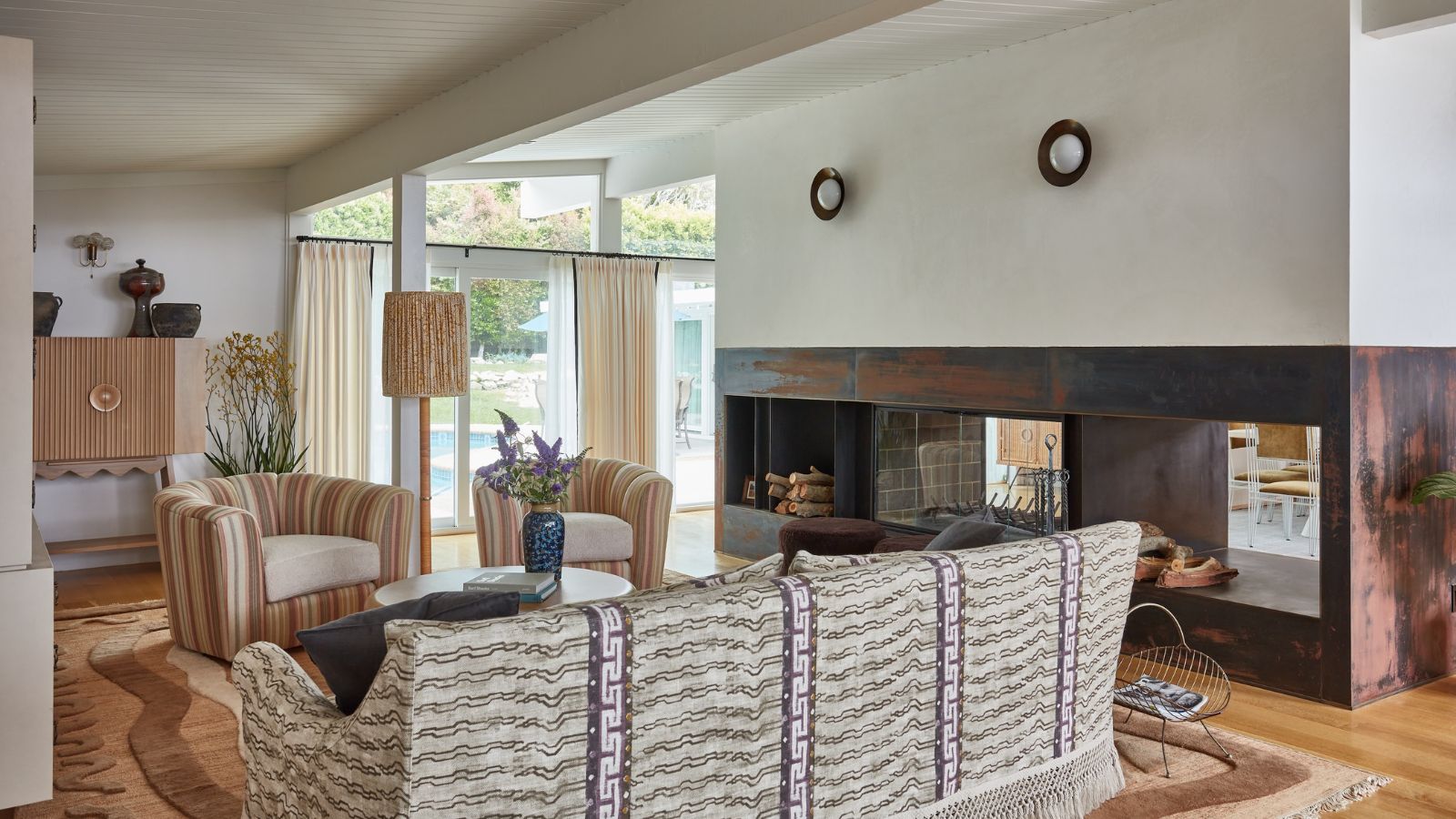
Does where you live affect the colors you decorate with? According to designers, yes – massively
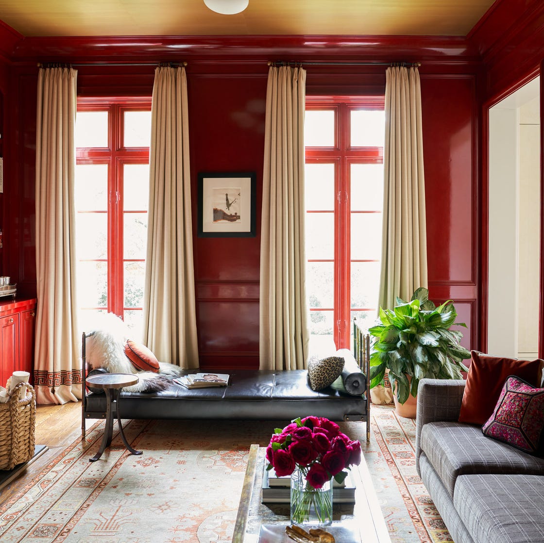
Why This Hue Is Suddenly Dominating Every Designer's Wishlist—Plus, How to Style It
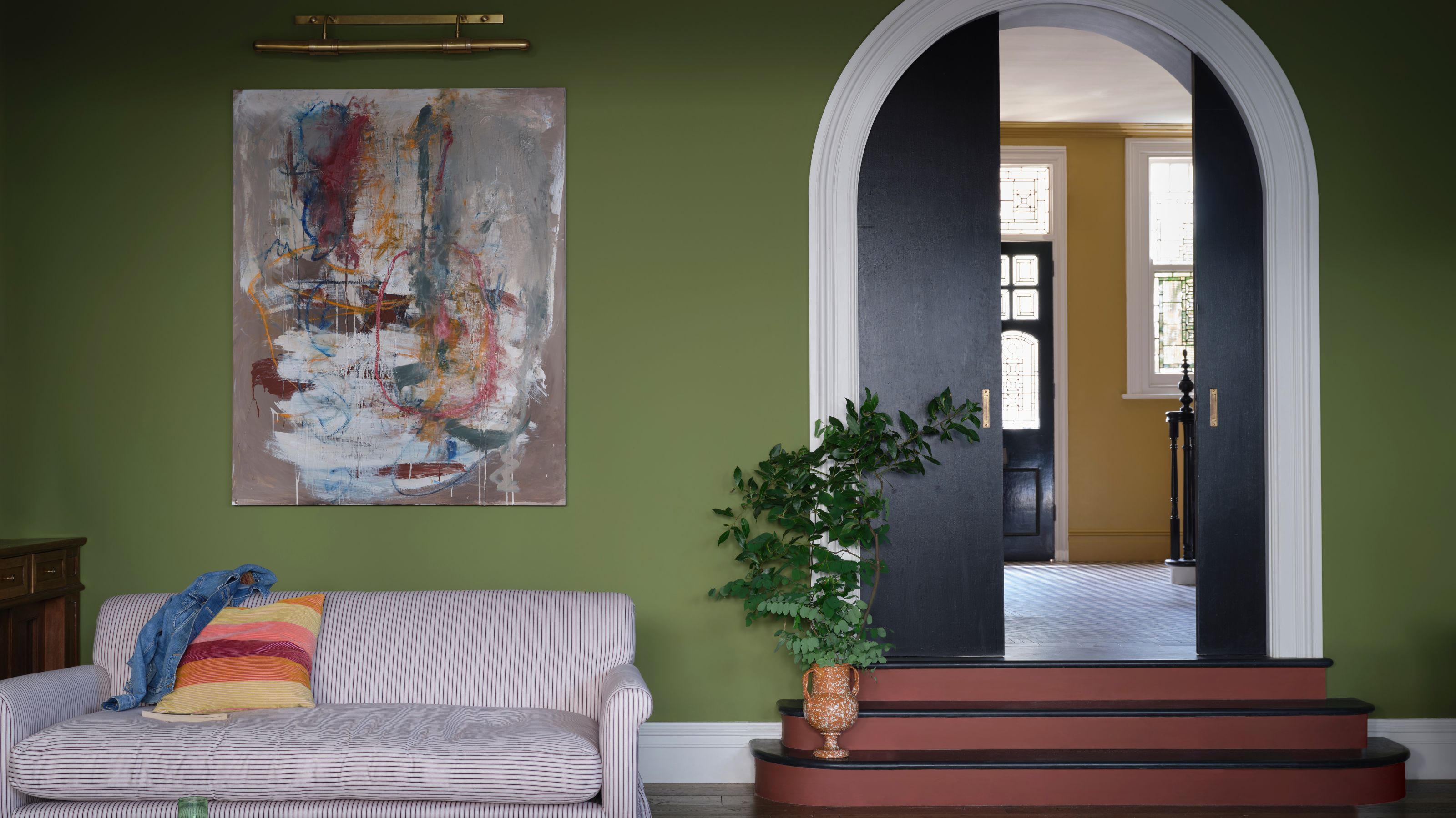
The Best Paint Colors for North-Facing Rooms To Create a Cozy Space That Embraces The Limited Natural Light
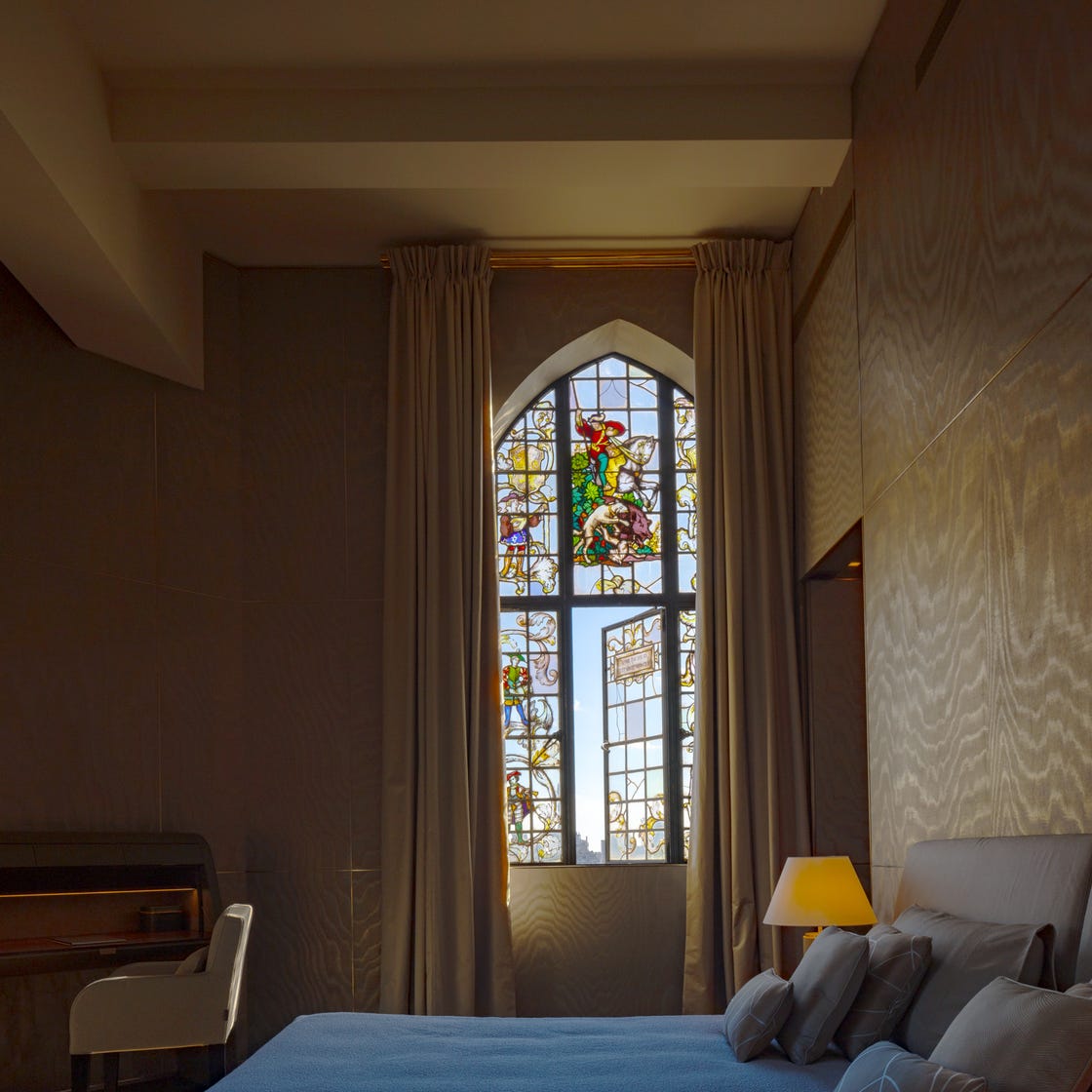
The Best Bedroom Colors to Help You Sleep (And Wake Up Happy)

The biggest color trends of 2025 – 10 colors designers say will lead the way next year


11 Soothing Bedroom Paint Colors Designers Say Can Help You Sleep