1/4
How designers decorate with Benjamin Moore's Bleeker Beige, the 'comforting neutral hue'
The article discusses the versatility and appeal of Benjamin Moore's Bleeker Beige paint color, describing it as a warm and welcoming neutral with gray undertones. Interior designers frequently recommend this shade for its ability to balance coziness and freshness, making it a popular choice for various interior styles. The article delves into three primary ways design experts incorporate Bleeker Beige into their projects.
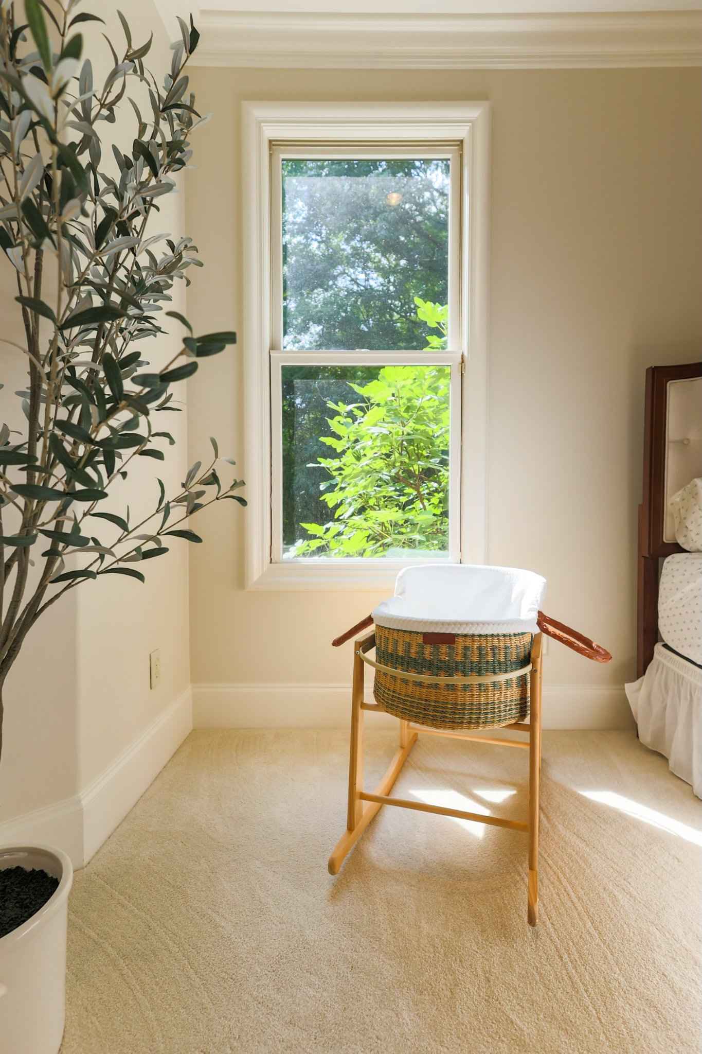
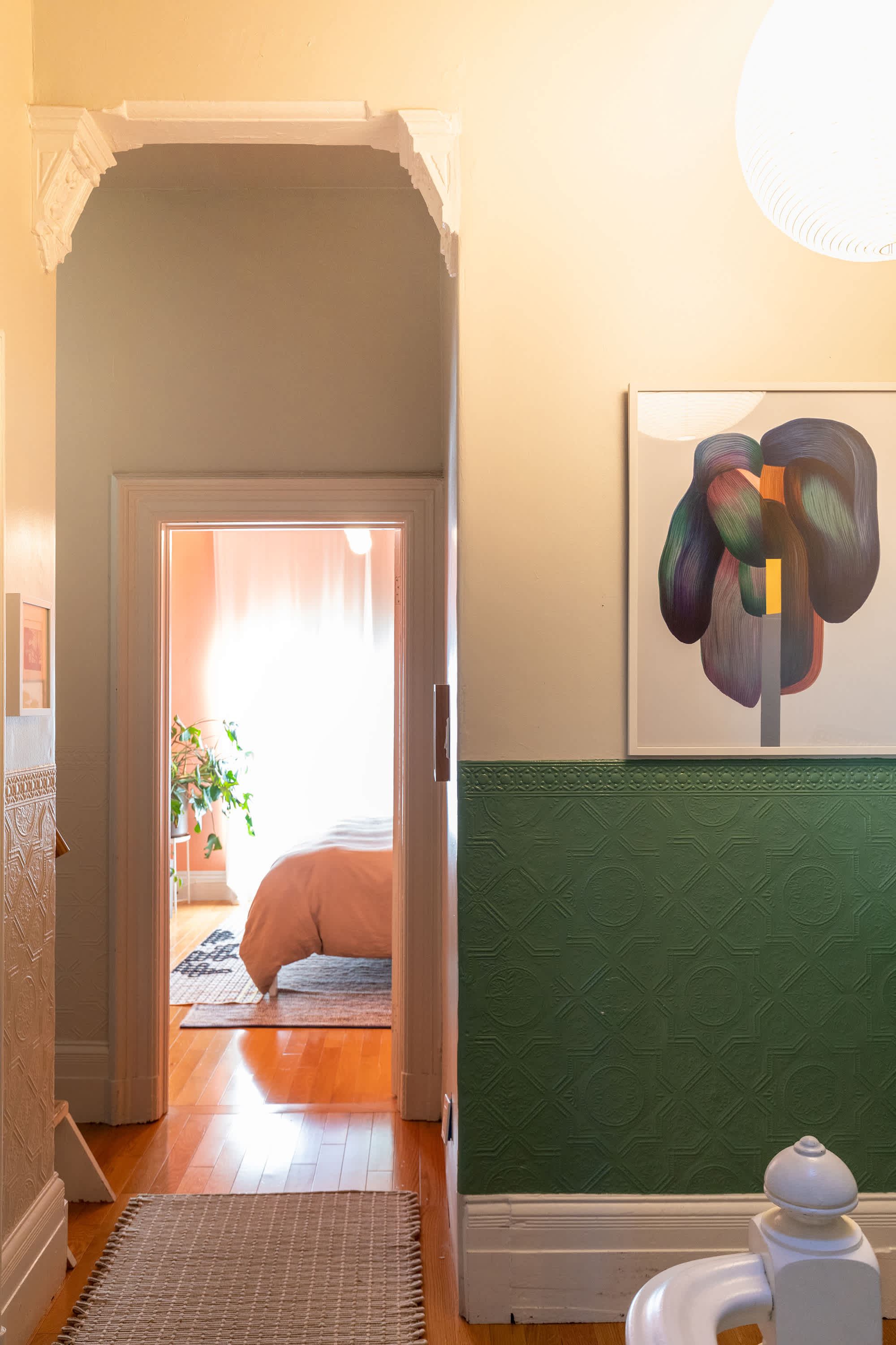
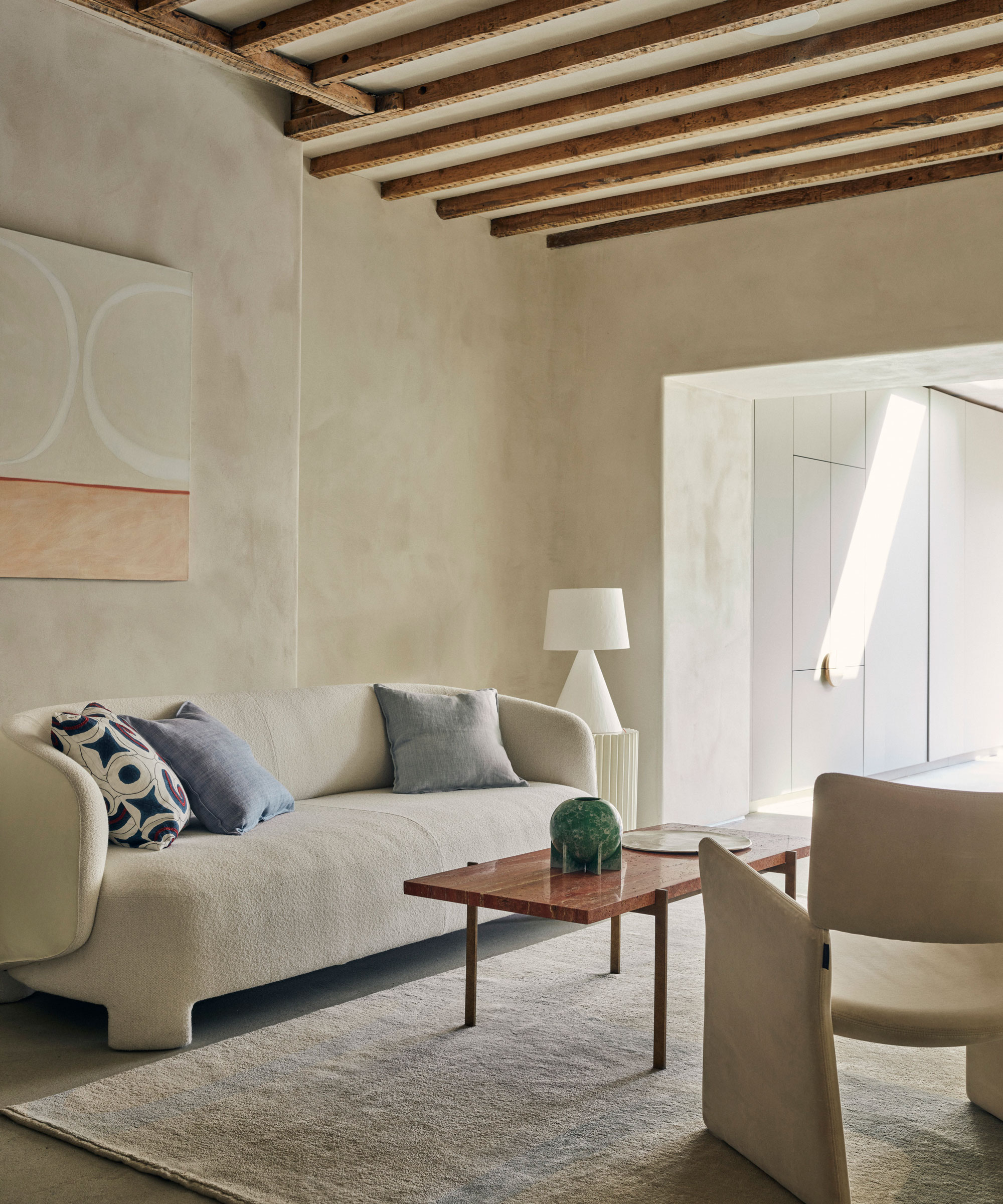
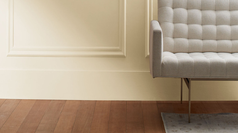
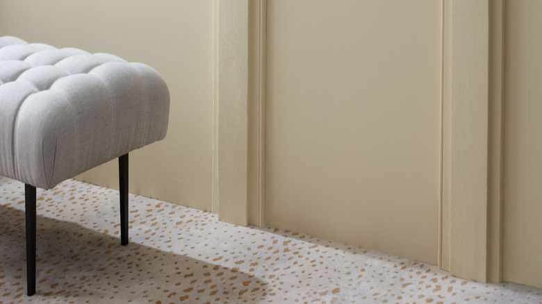
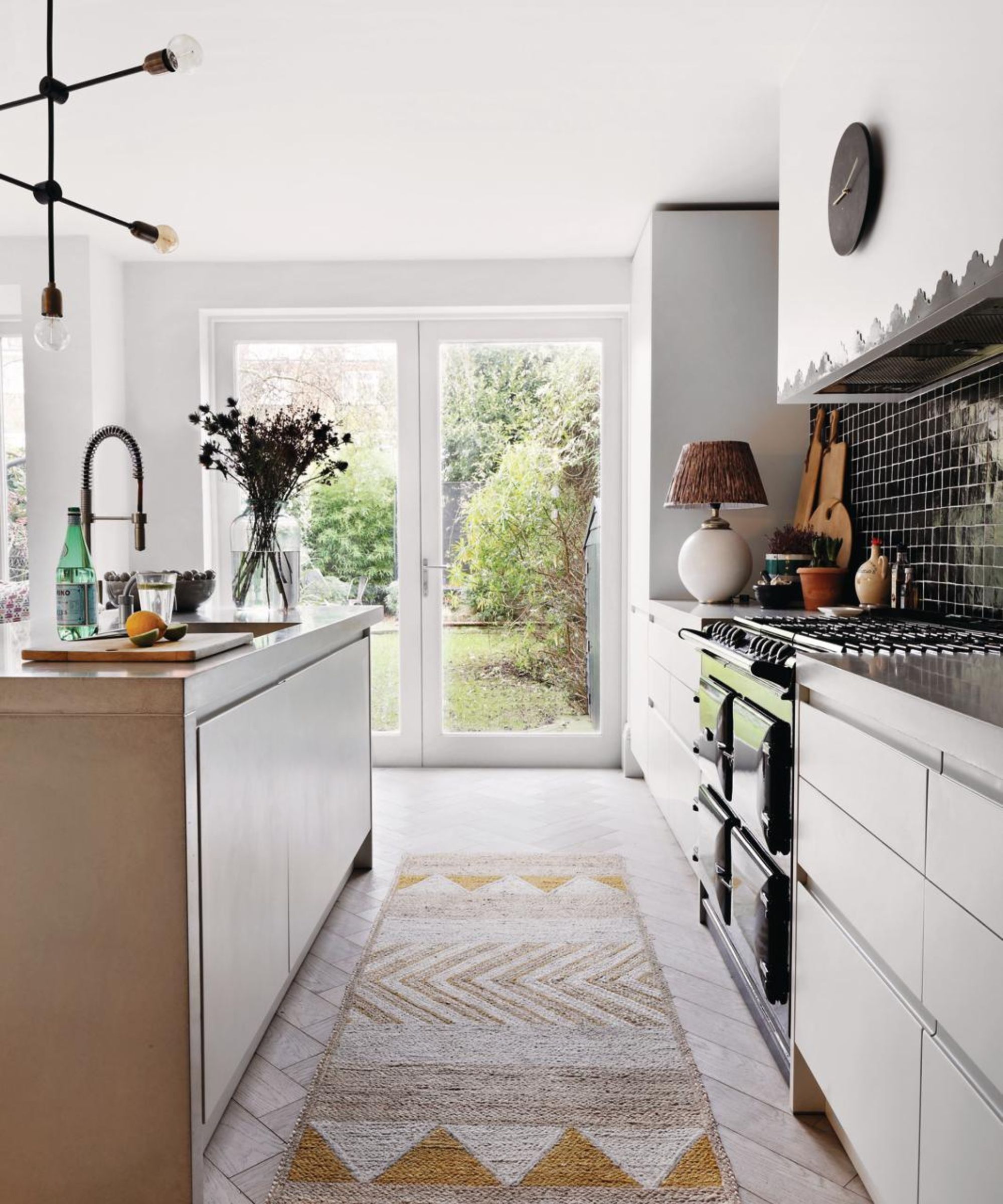
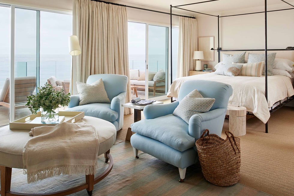
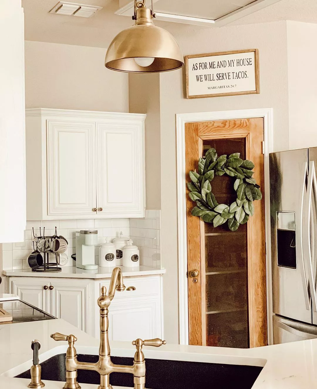
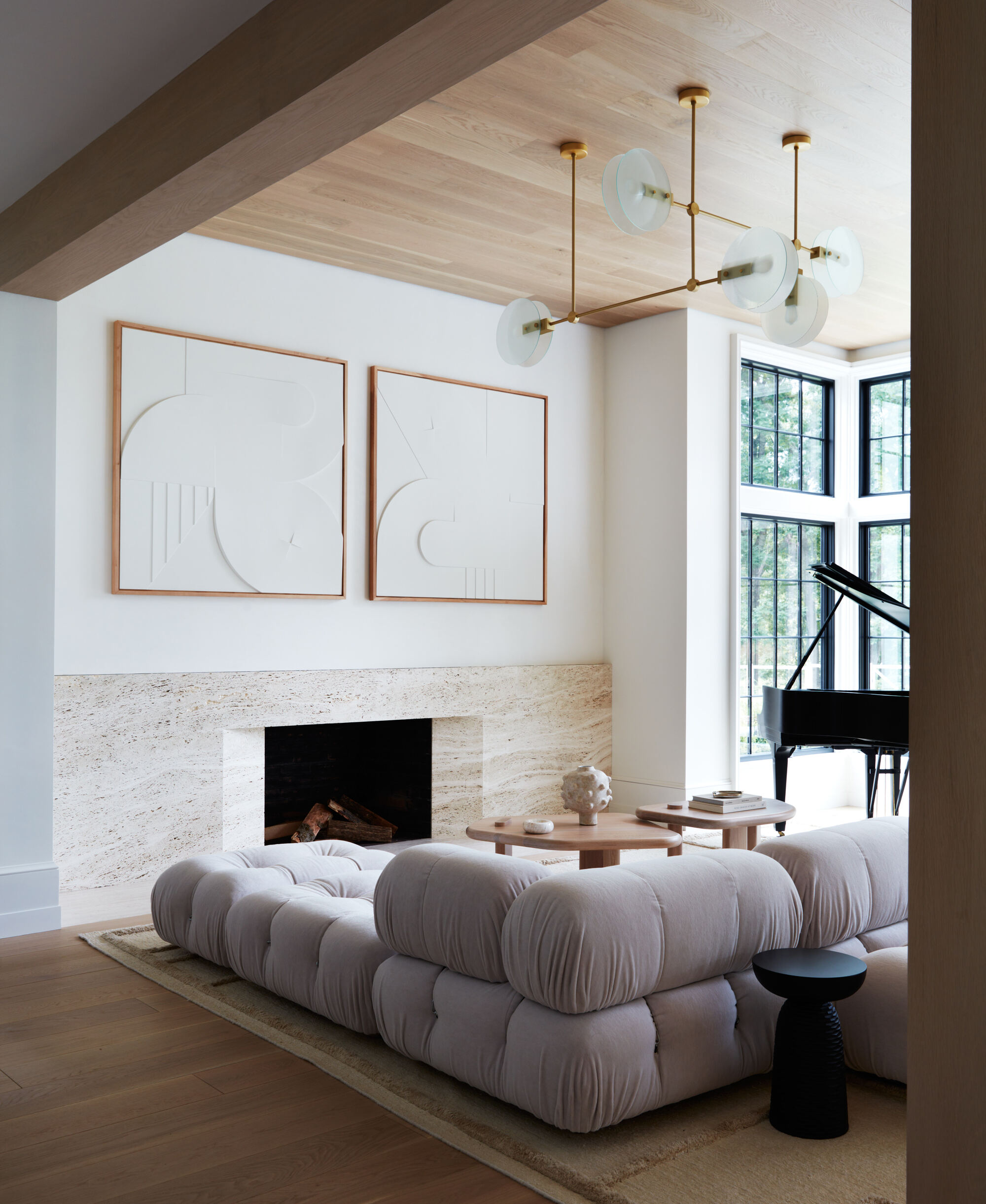
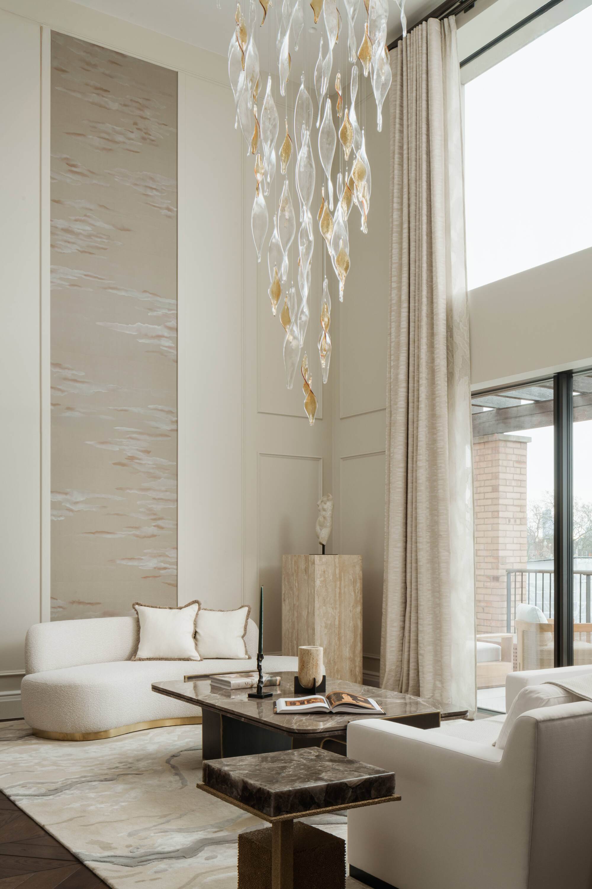
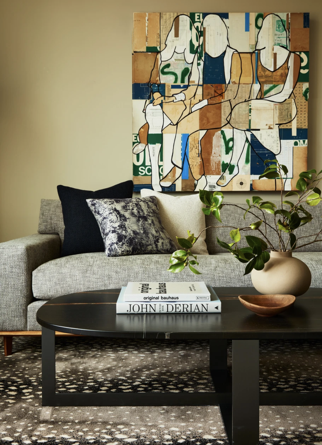
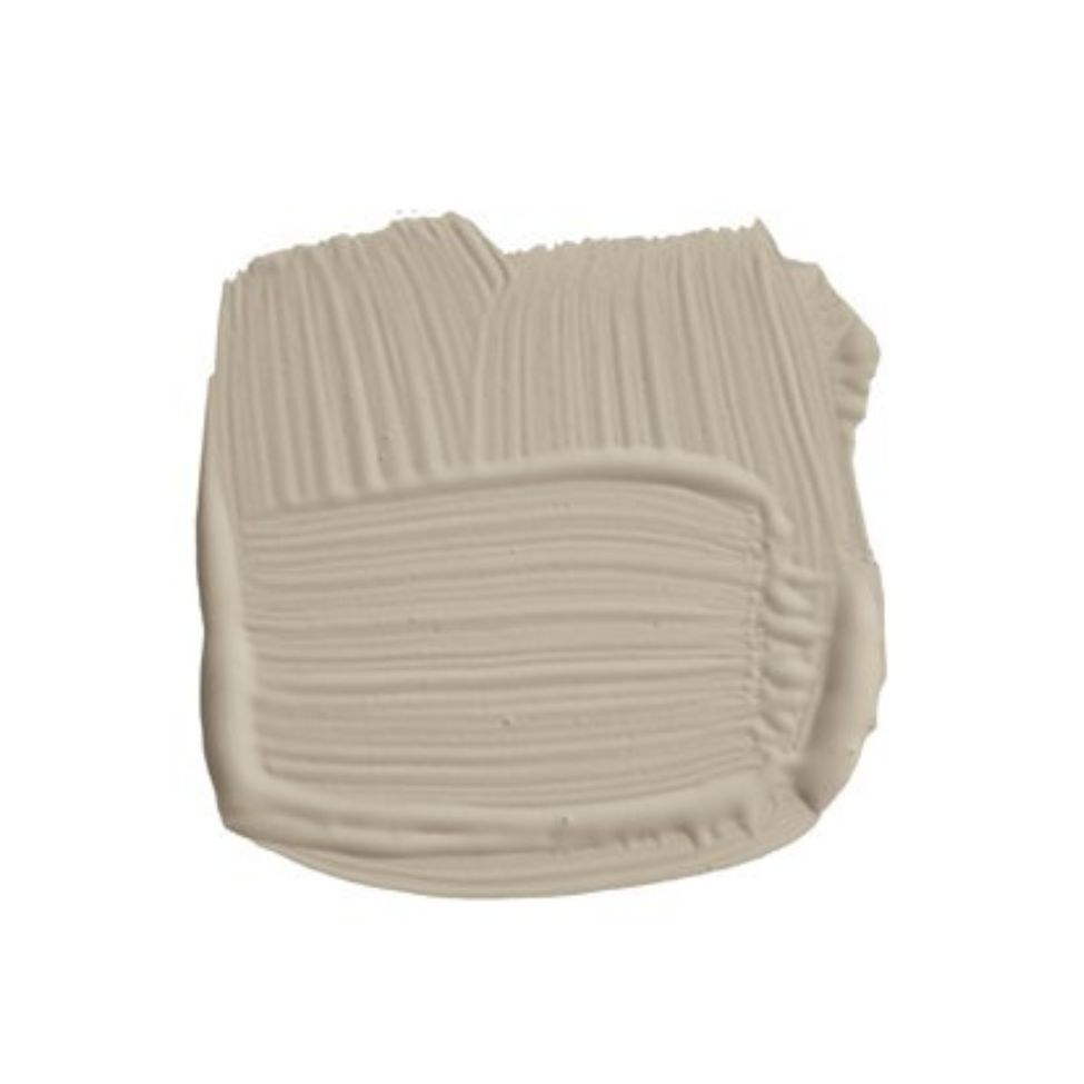
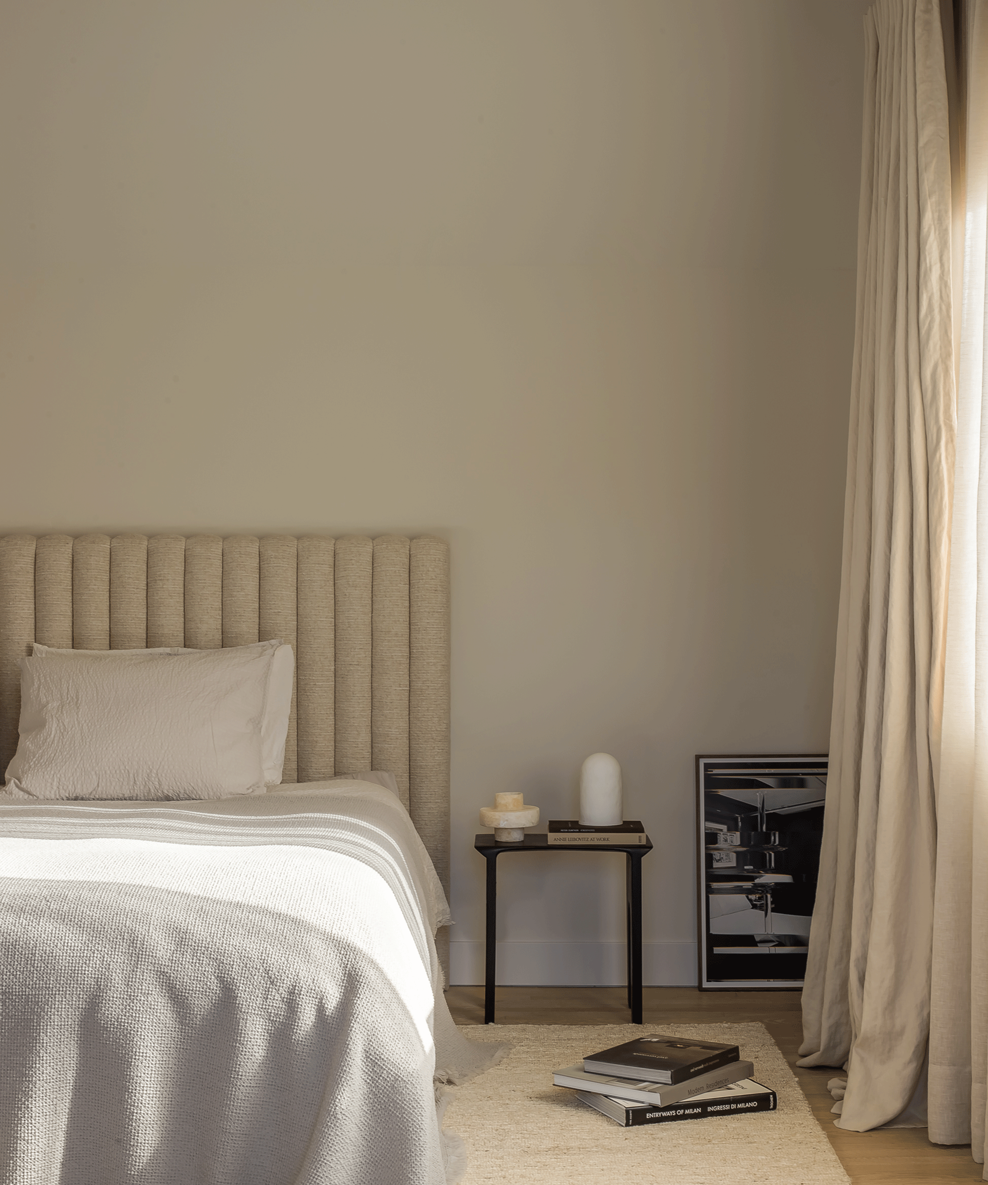
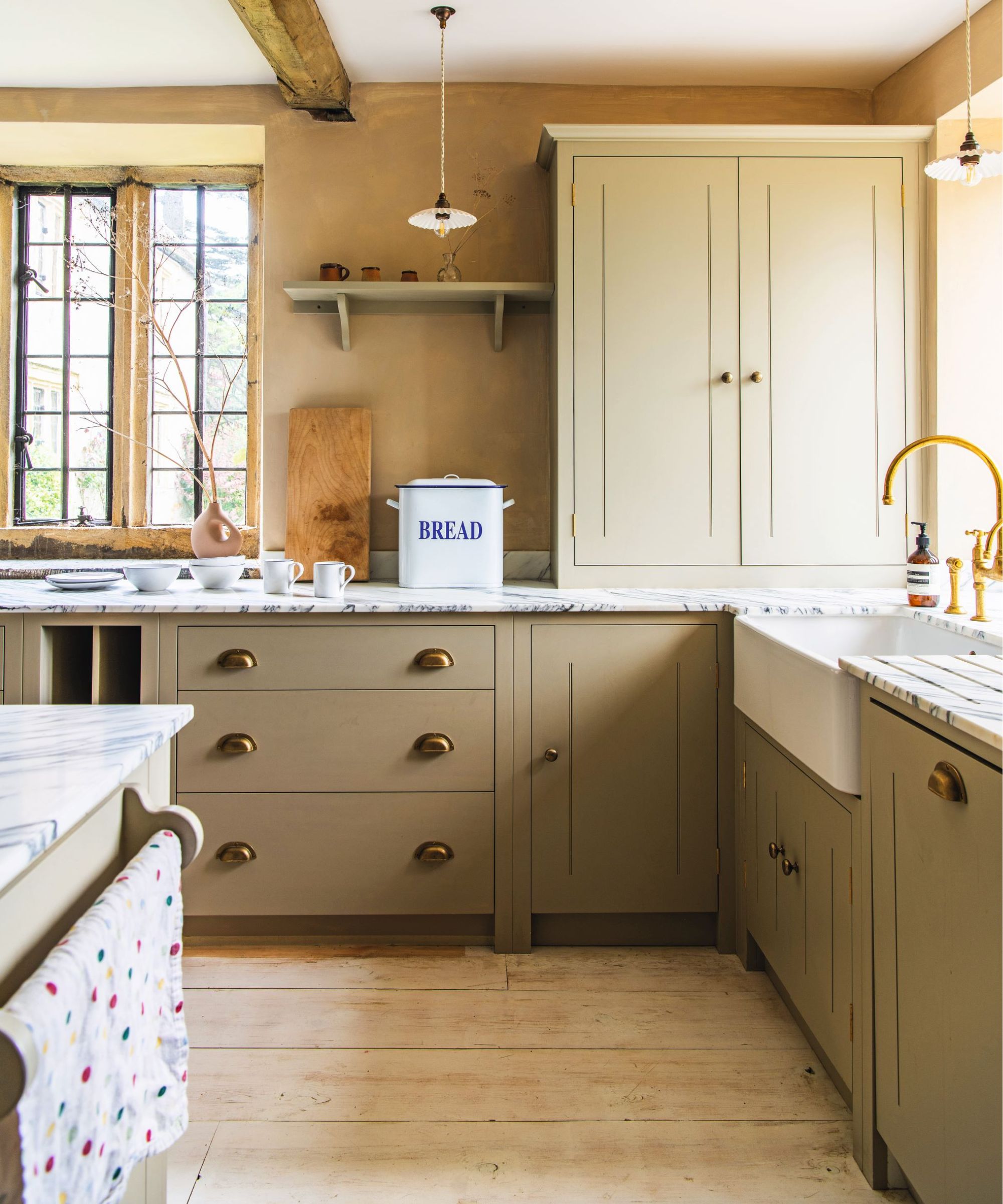
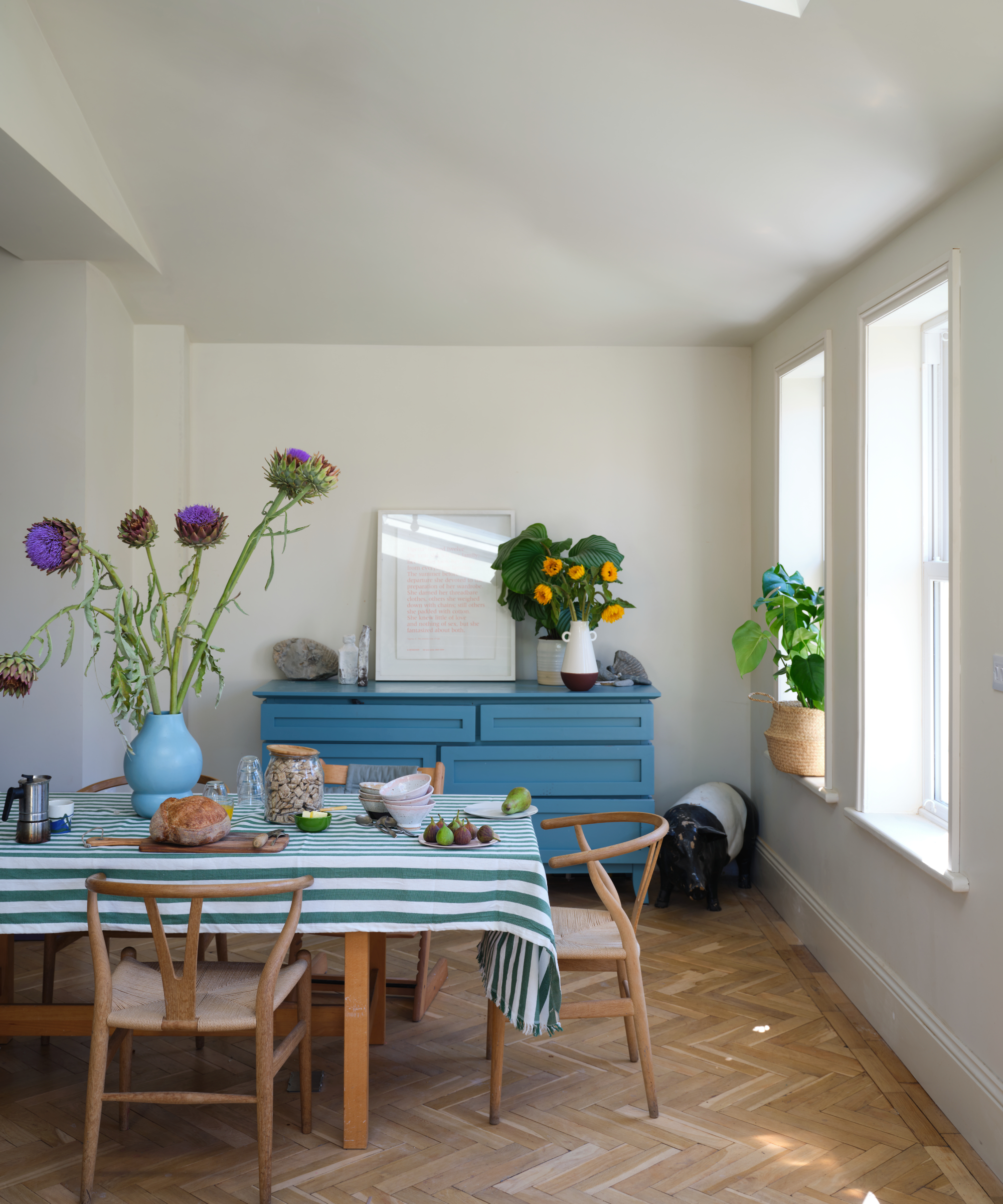
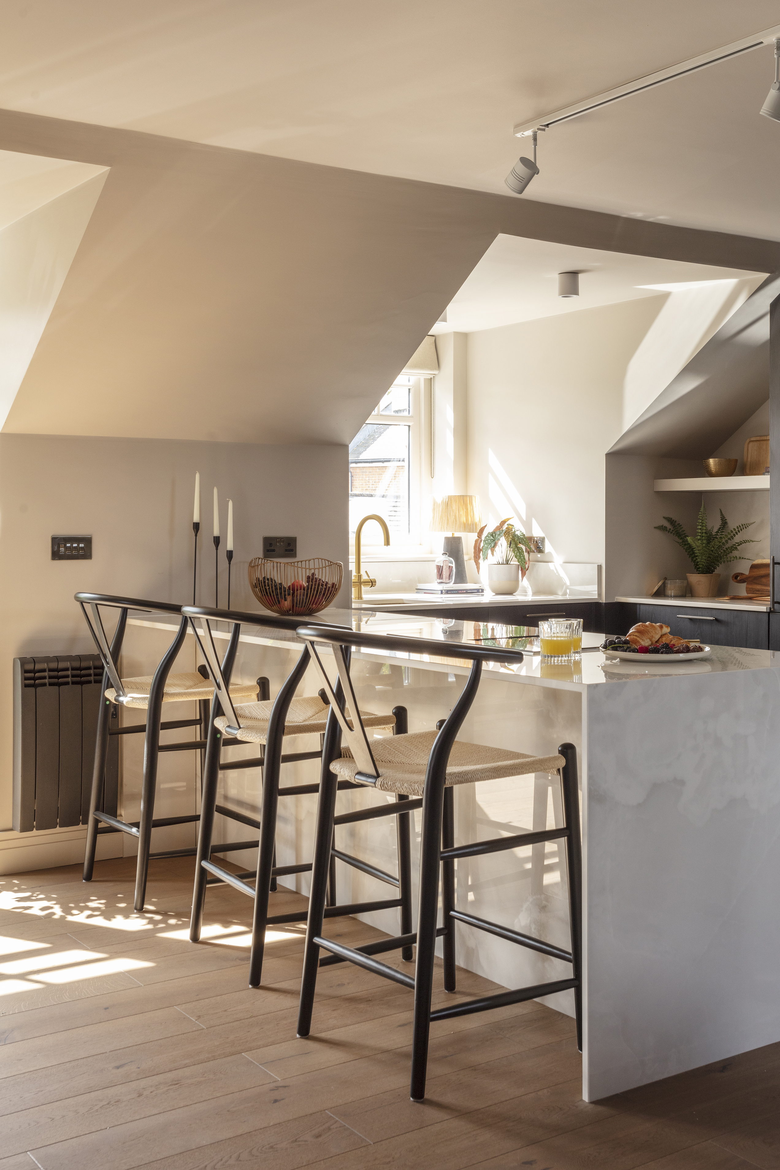
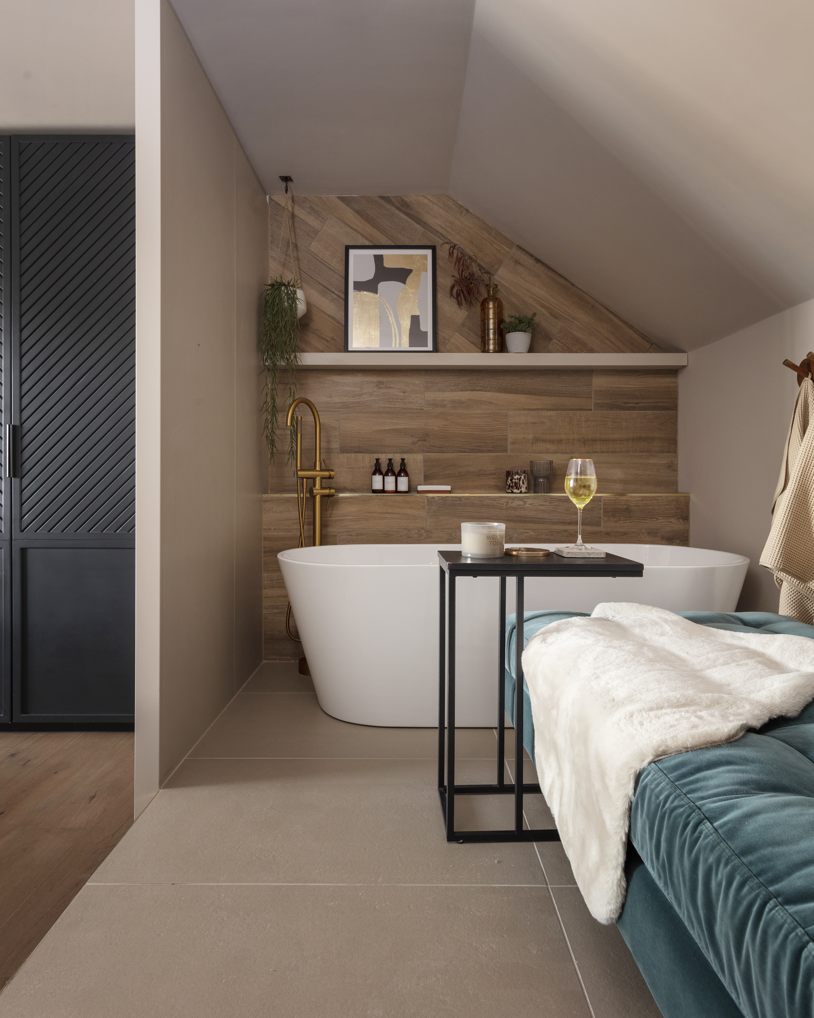
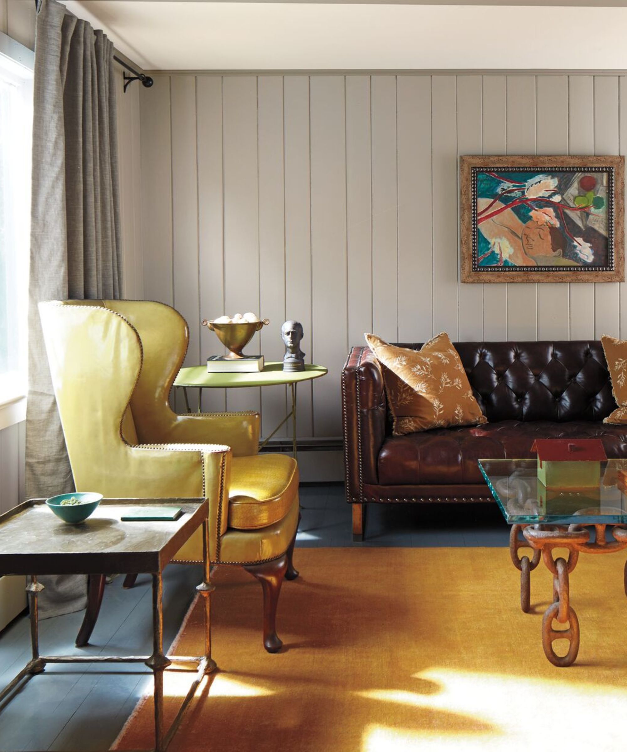
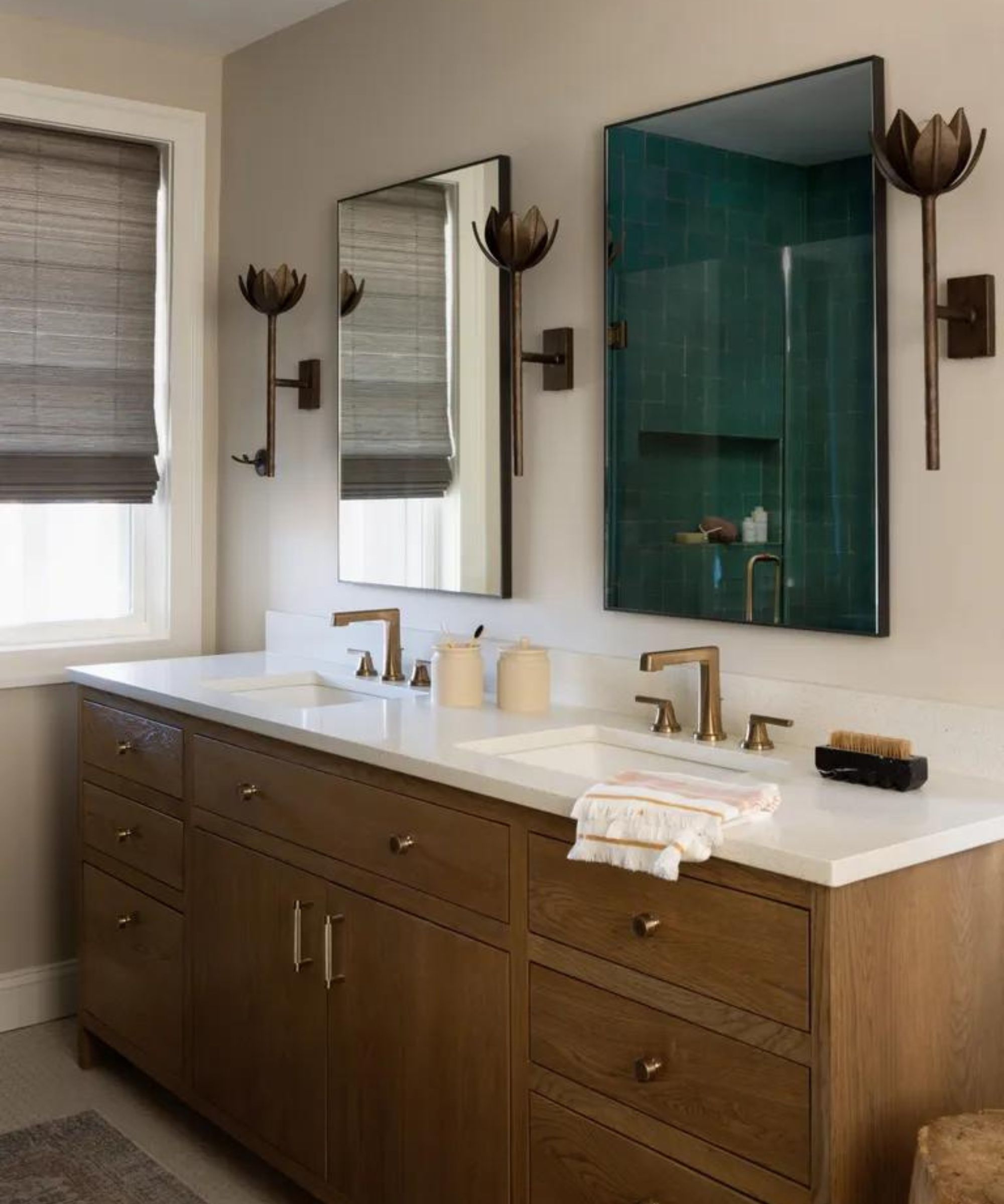
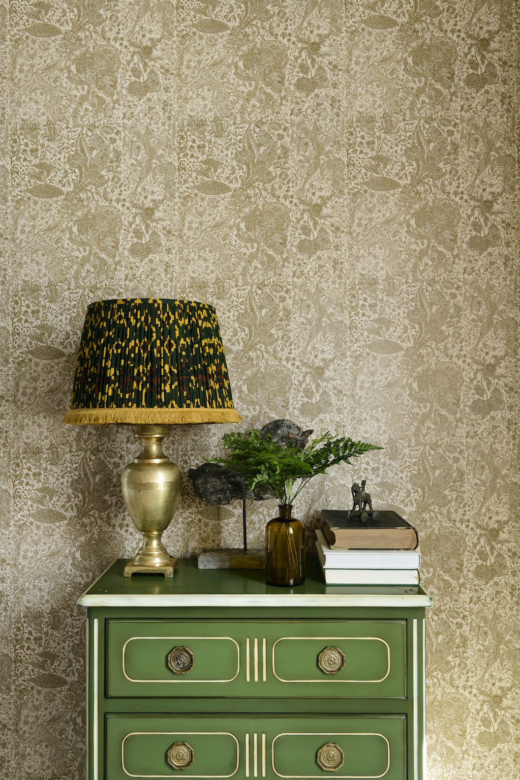
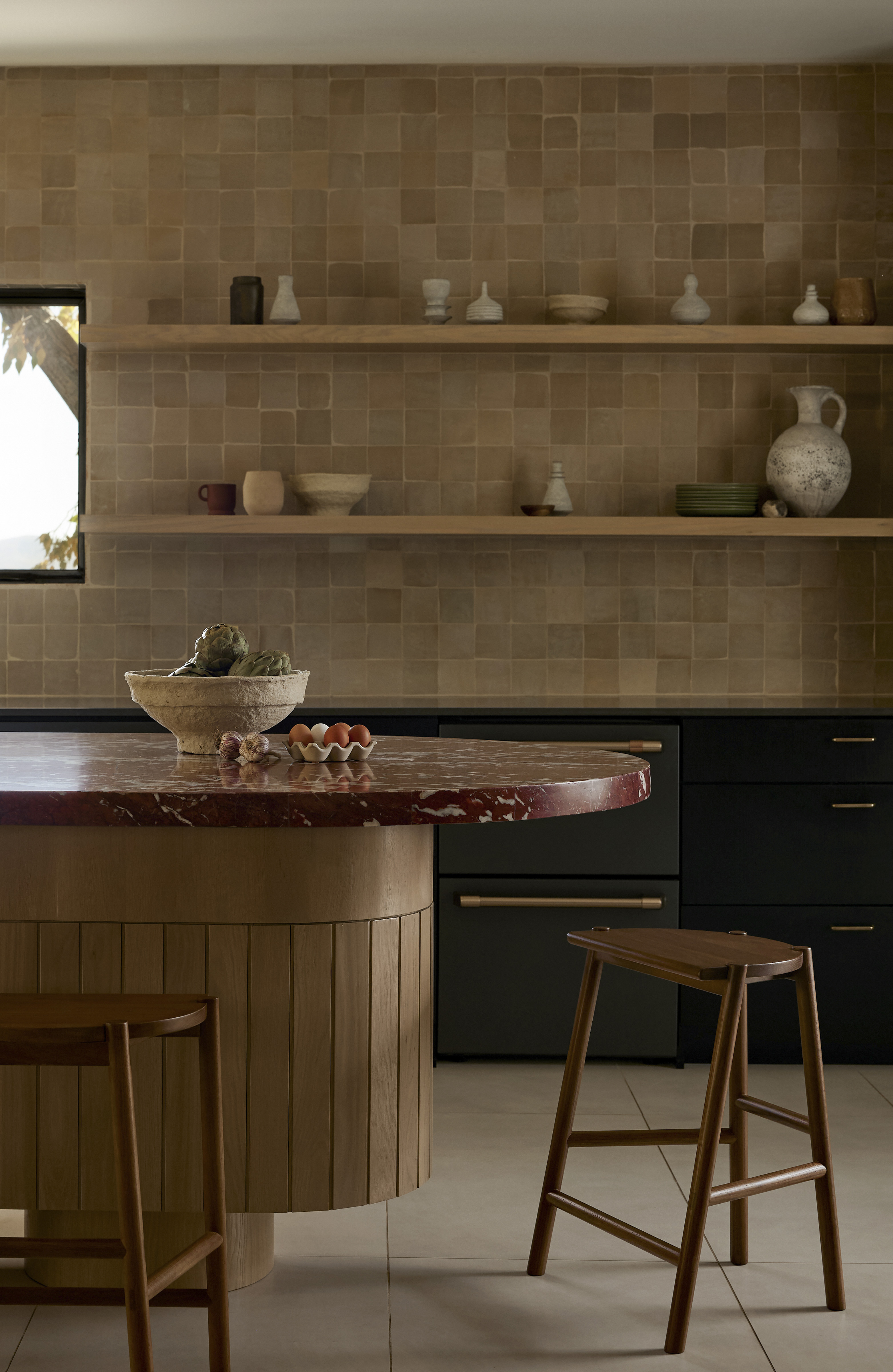
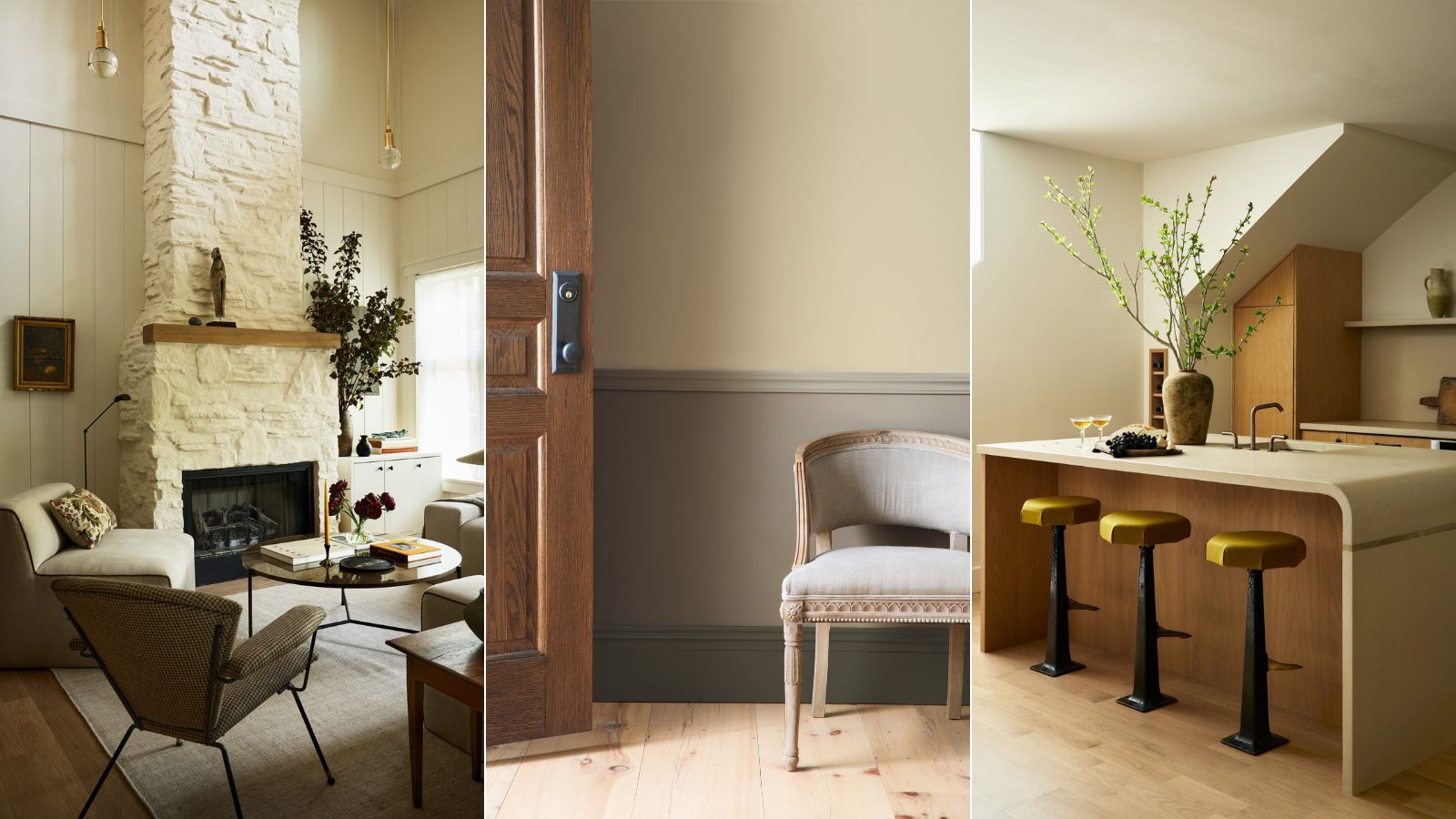
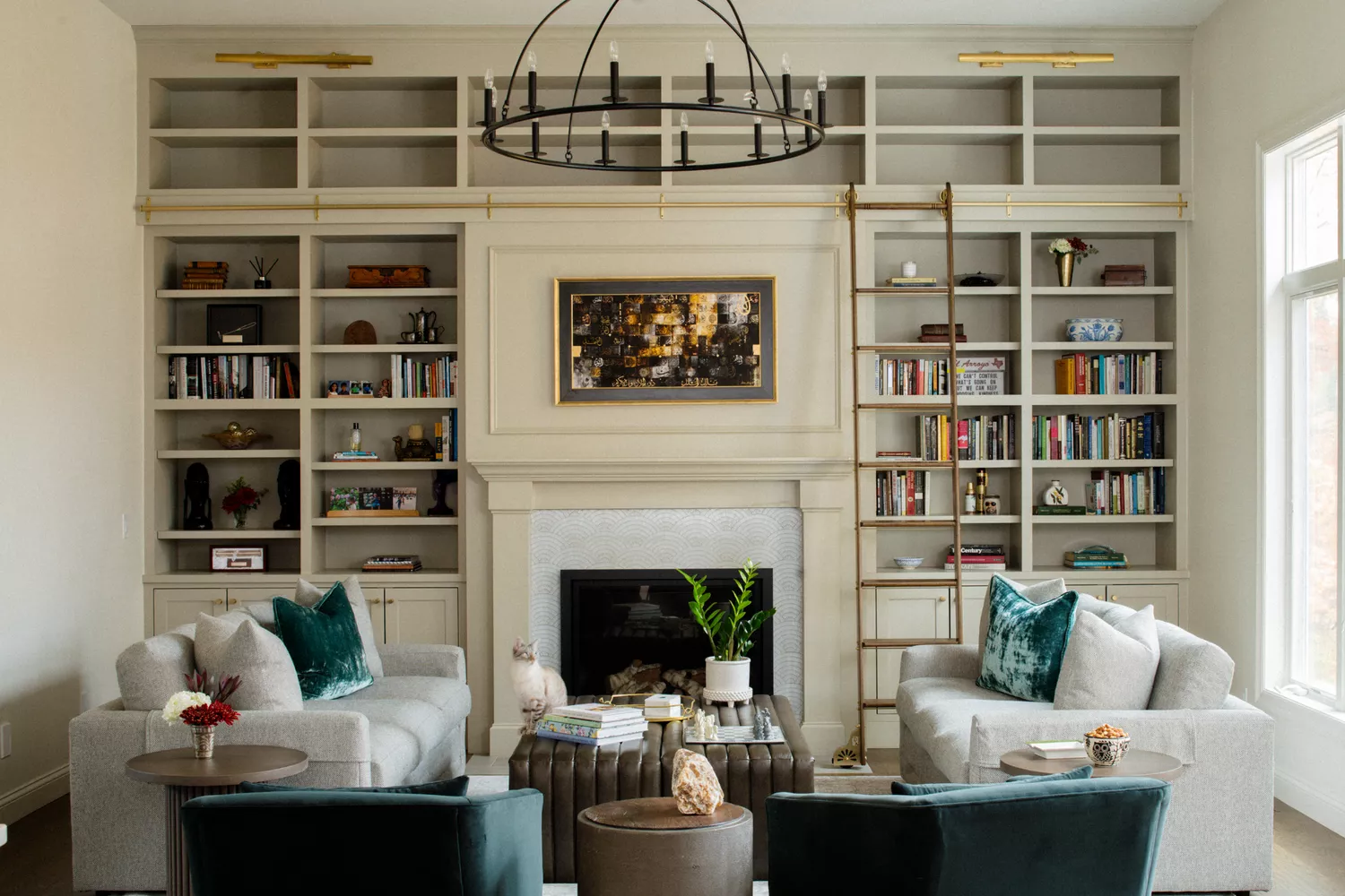
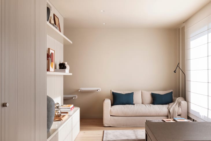
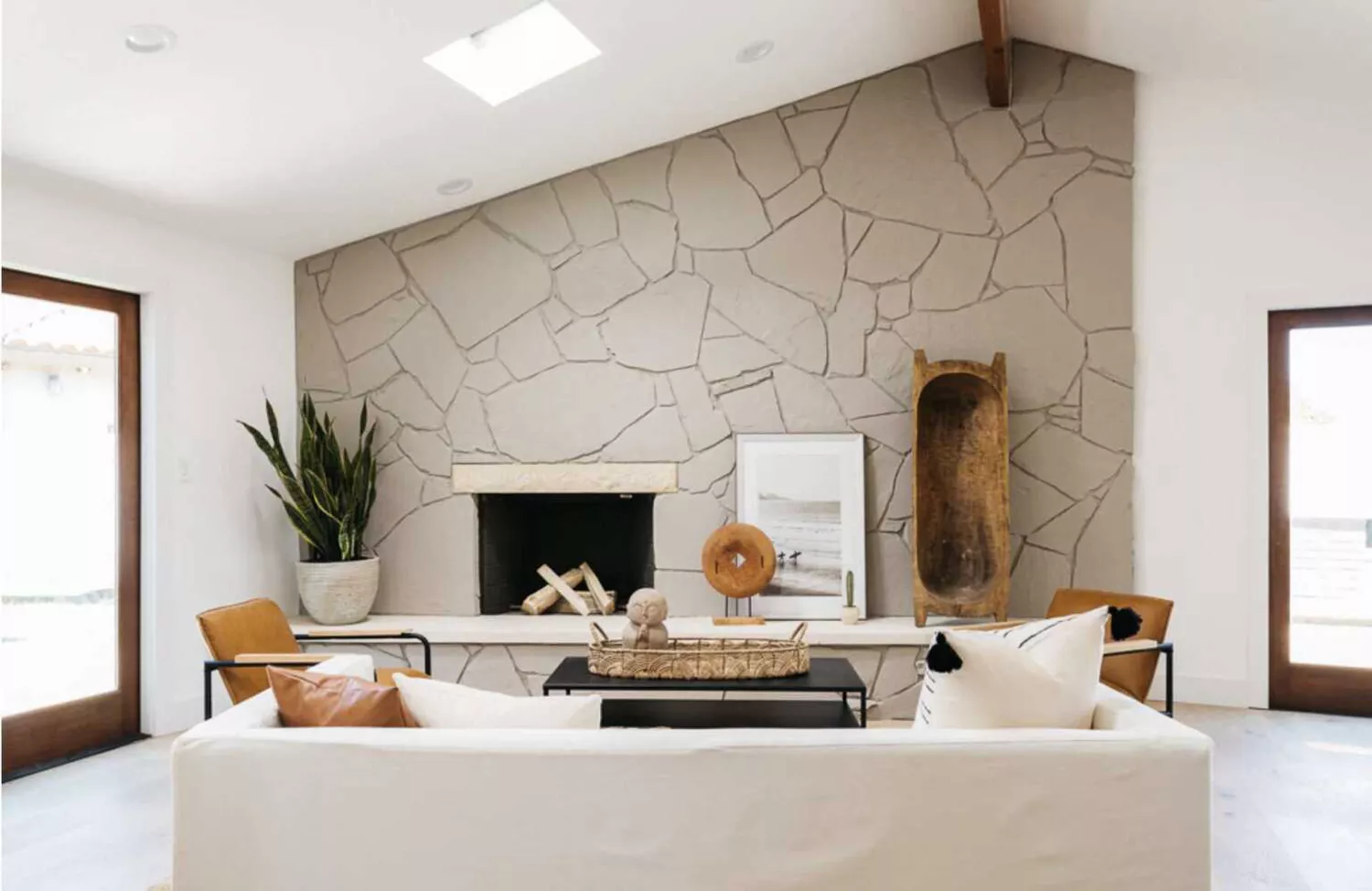
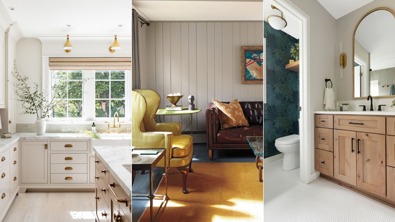
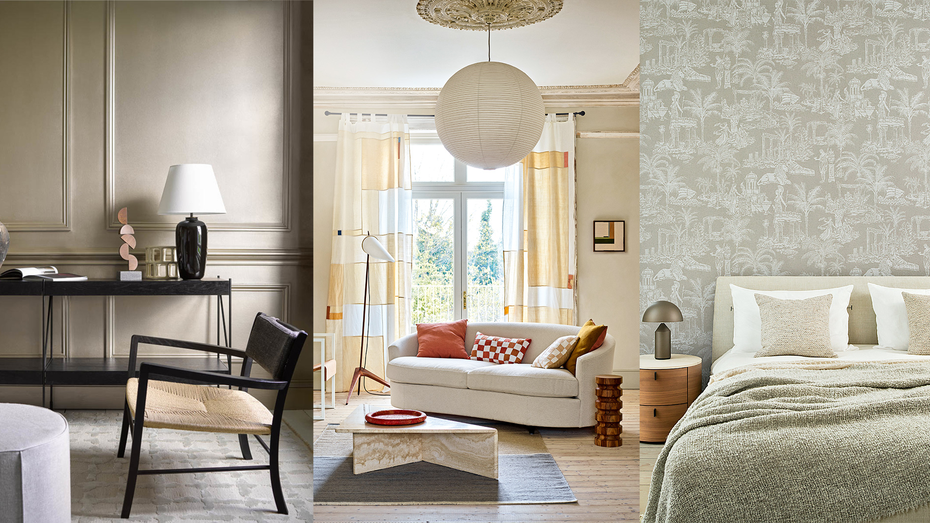
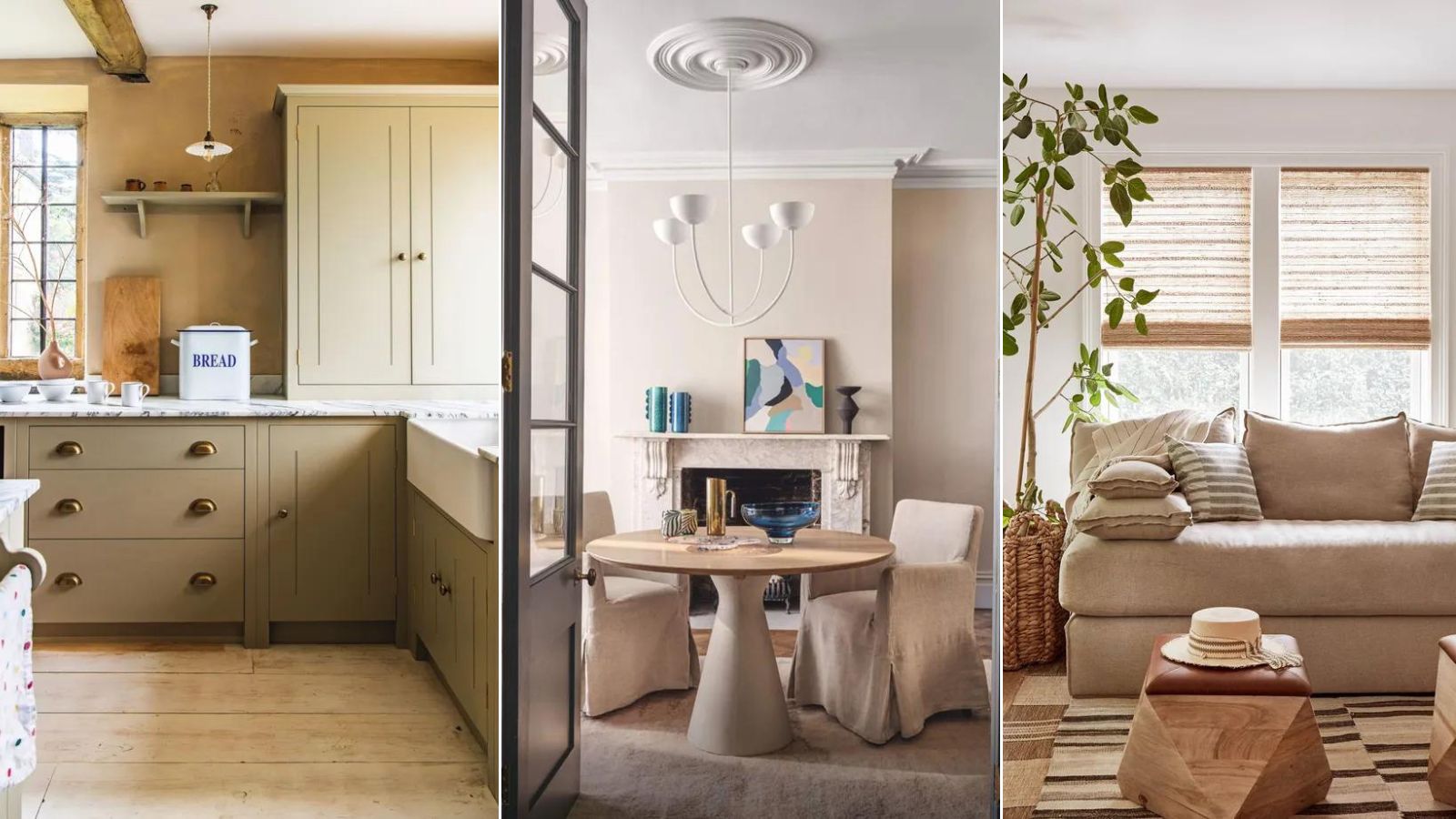
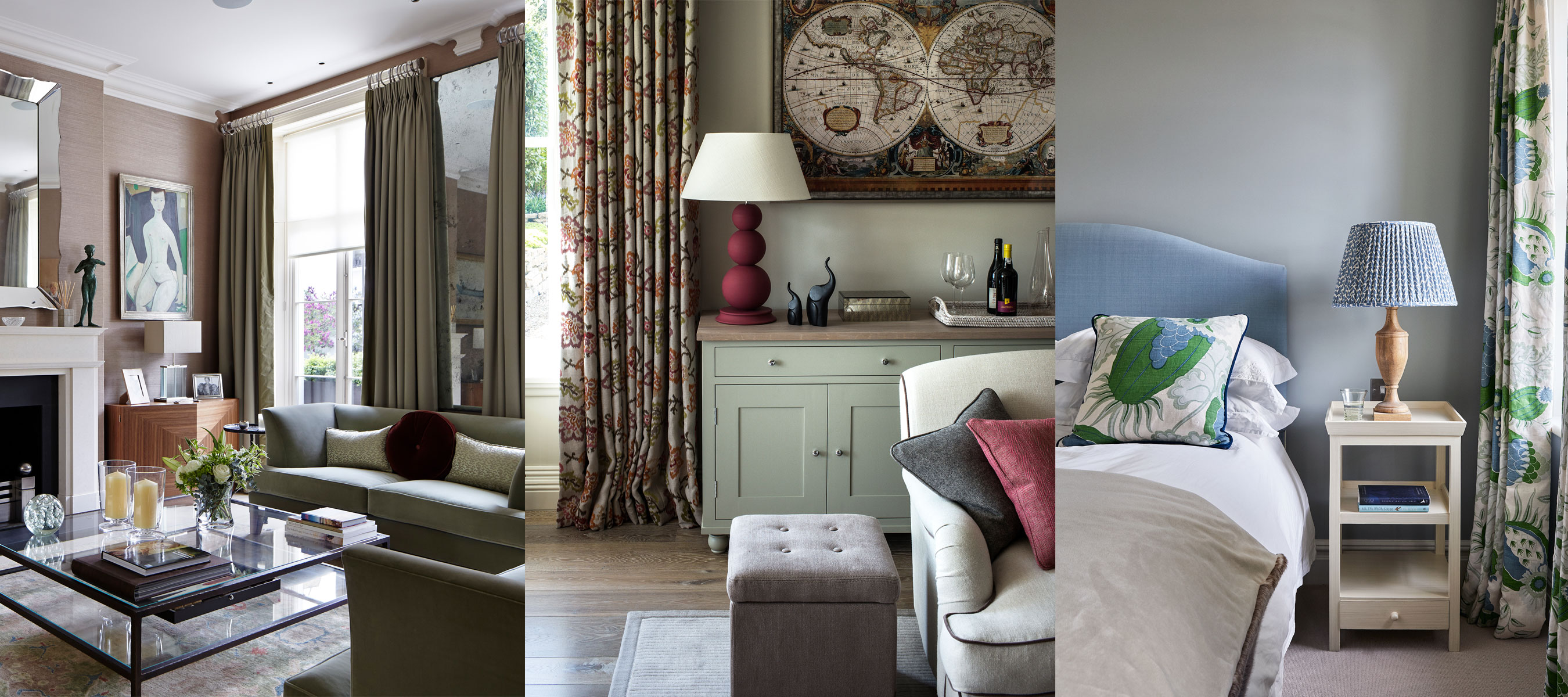
First, Bleeker Beige pairs effectively with earthy hues. Hannah Yeo, Senior Manager of Color Marketing at Benjamin Moore, notes its medium buff hue and pleasing gray undertones. With a Light Reflectance Value (LRV) of 51, it is considered a mid-tone color. This makes it an ideal complement to creamy off-whites, as well as organic and earthy shades like greens, ochre, and spice tones. The combination creates a cohesive and calming design scheme, further enhanced by incorporating lush textures and materials.
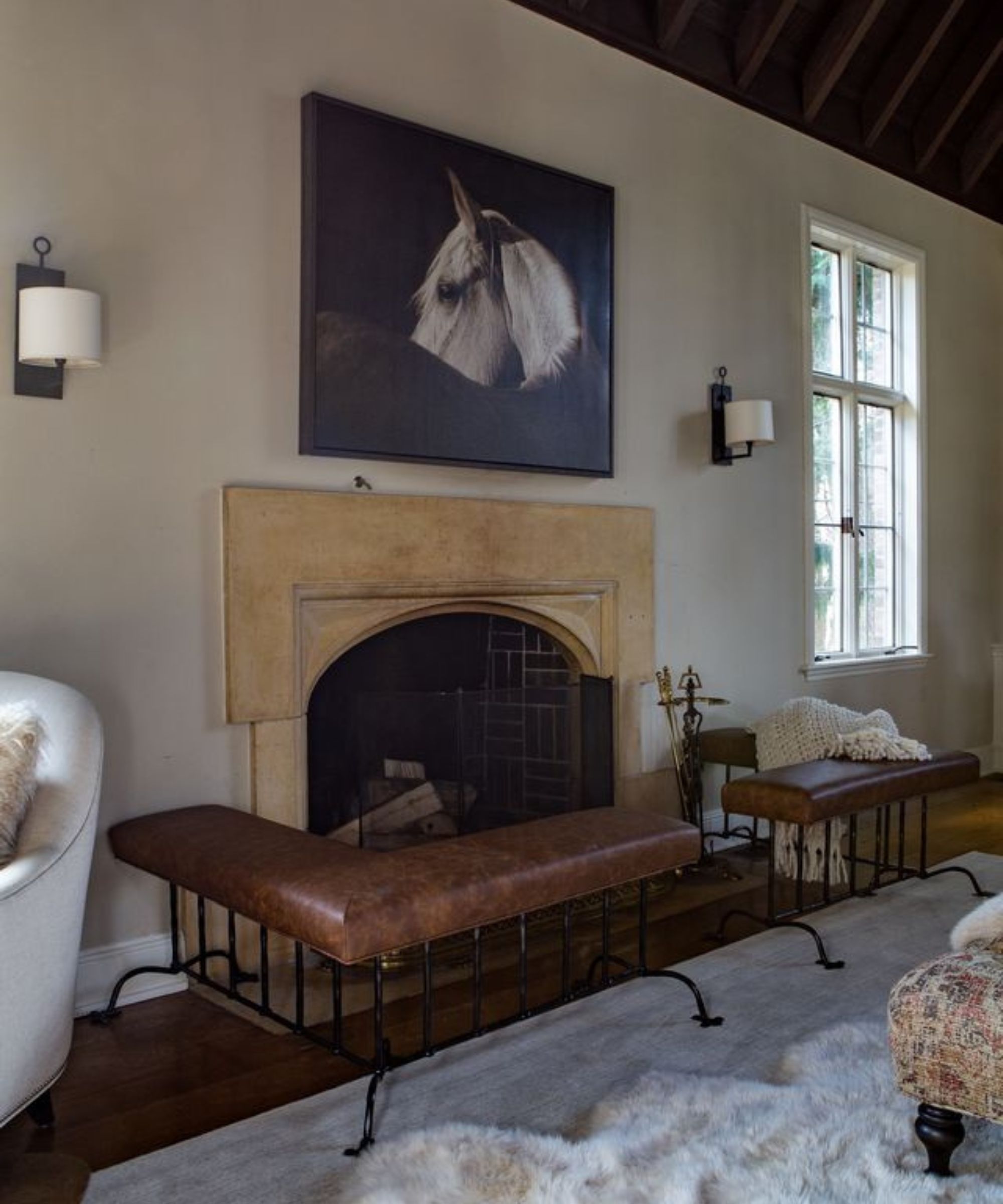
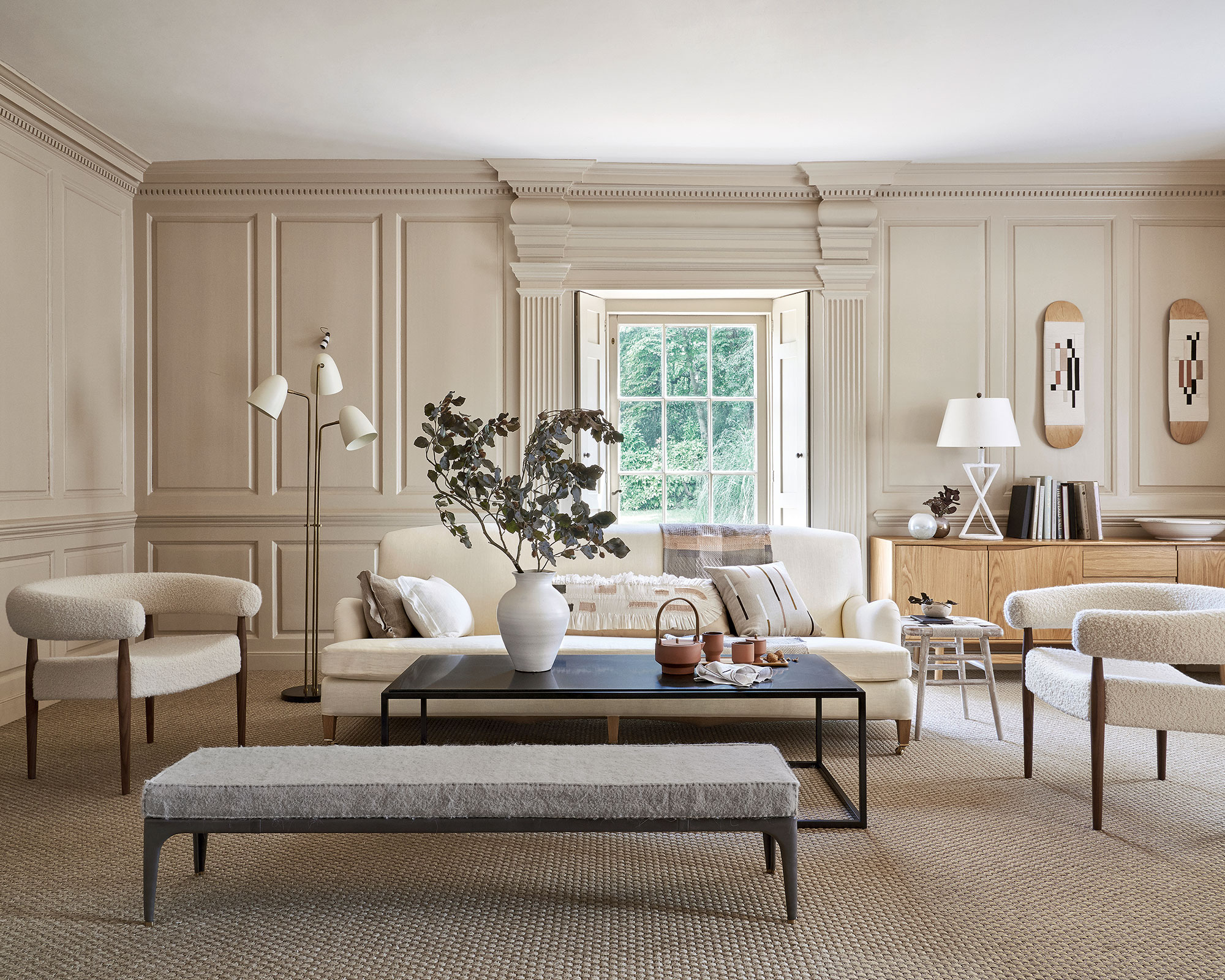
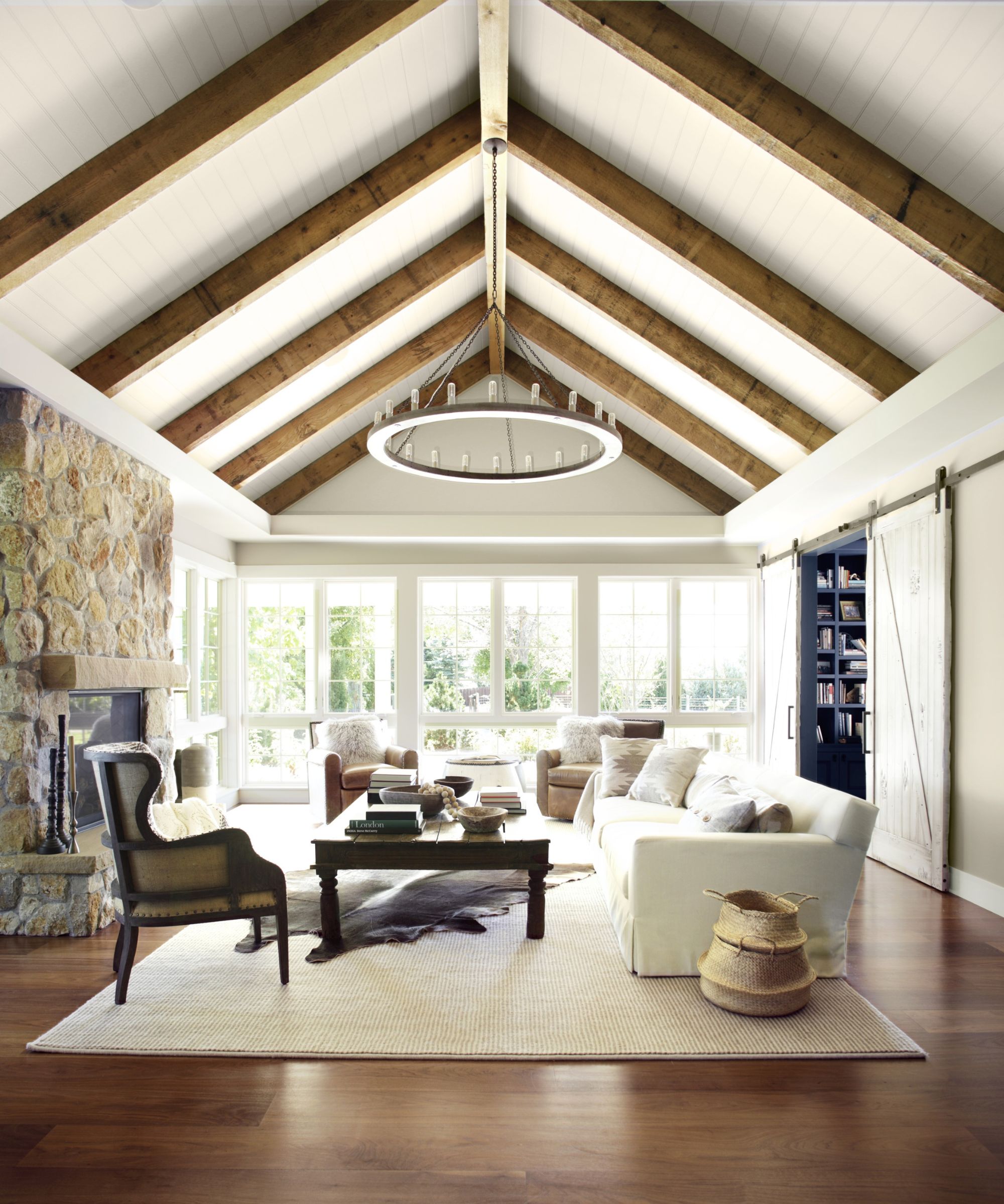
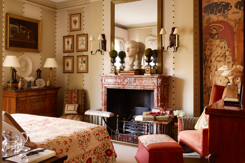
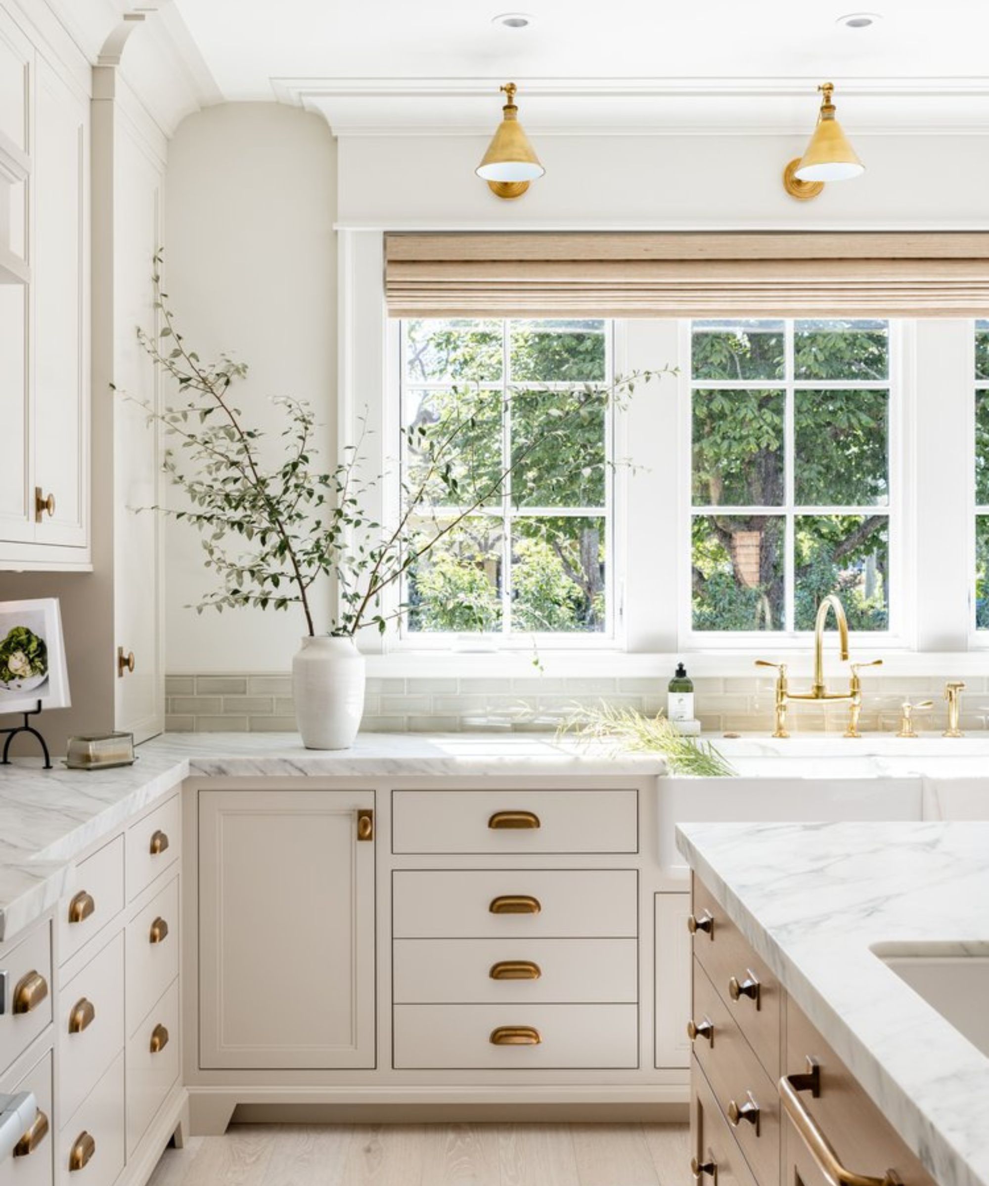
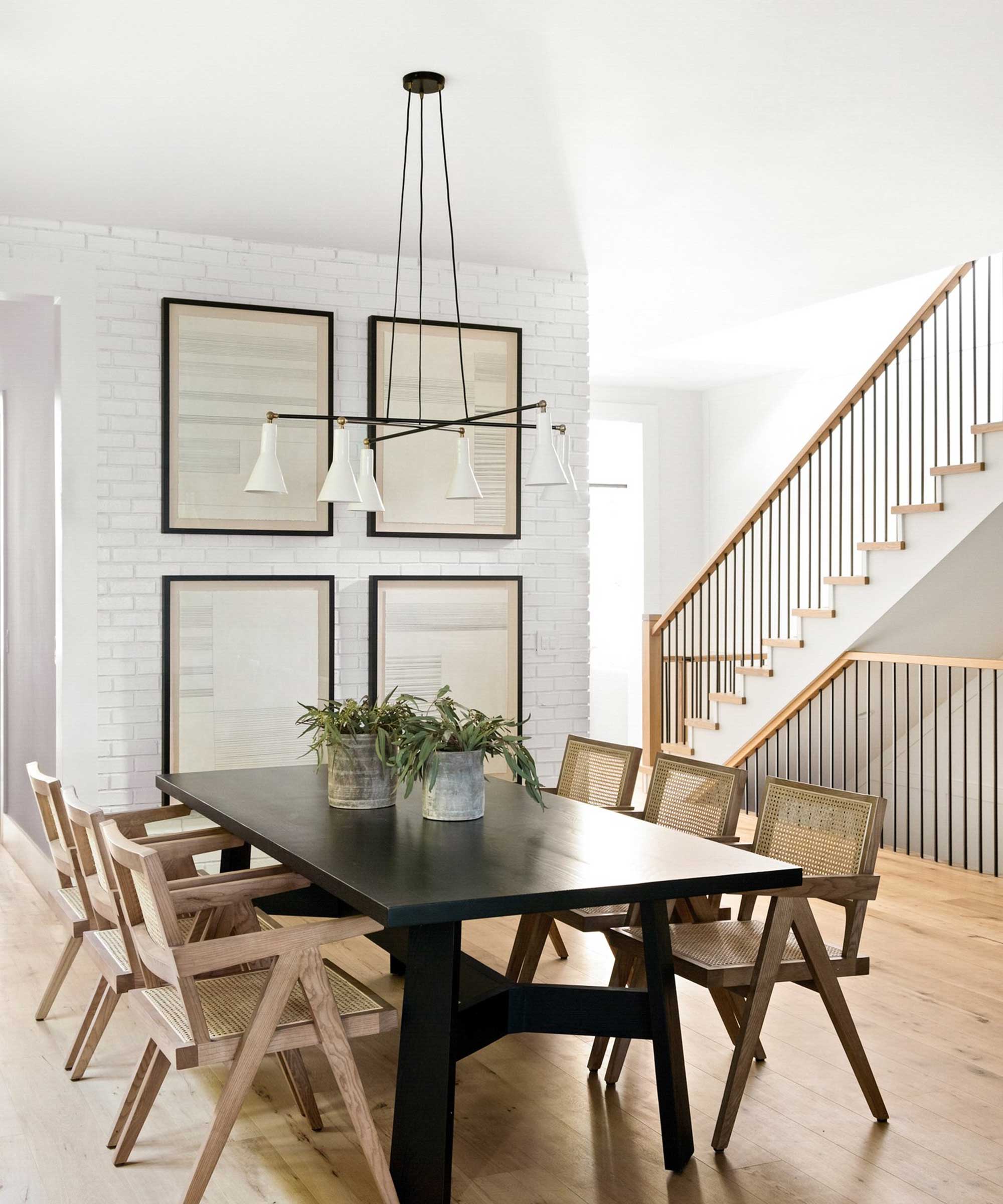
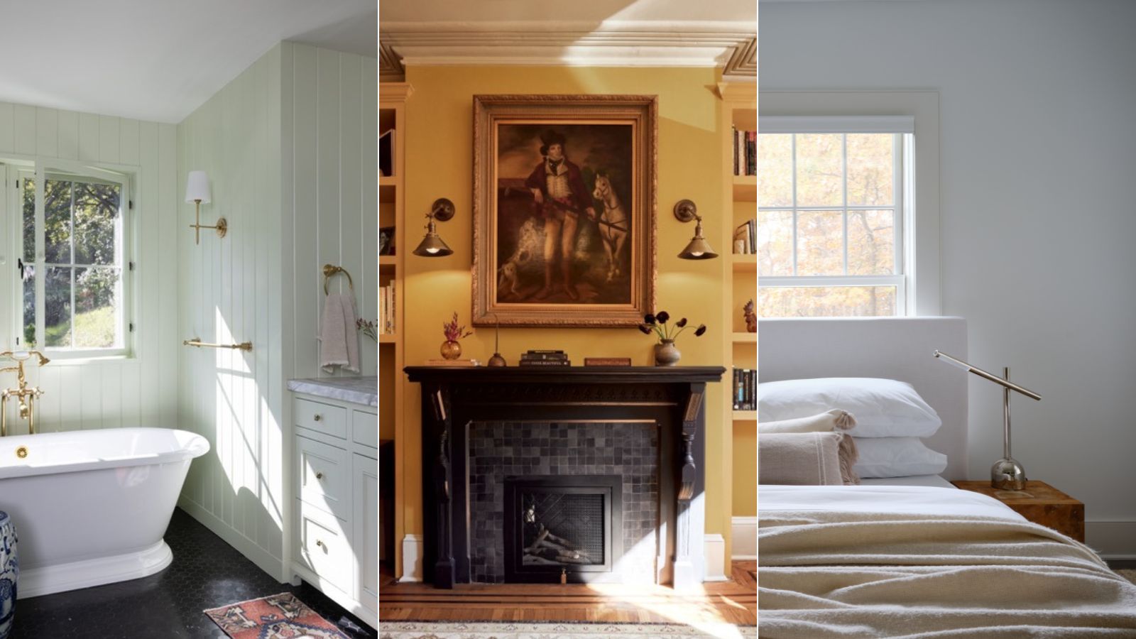
Second, the paint color is utilized to channel historical allure in homes. Blair Moore, Creative Director and Principal Designer of Moore House Design, highlights Bleeker Beige's role in her 'Minimalist Club' project, where it was combined with warm wood tones, greens, and creams. This blend helped update historic features, infusing spaces with warmth and charm. Blair Moore emphasizes that applying this warm undertone hue, especially over cooler blue tones, beautifully illuminates rooms in afternoon sunlight and adds a touch of historical elegance to colonial-style homes.
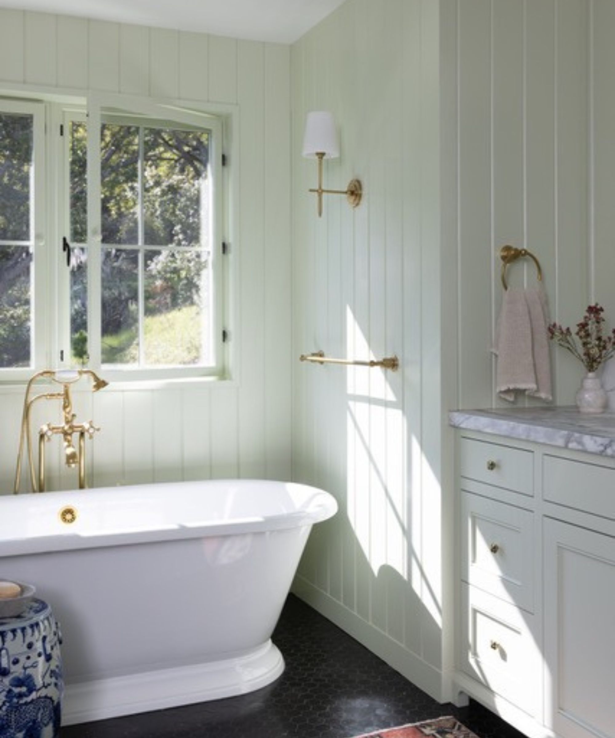
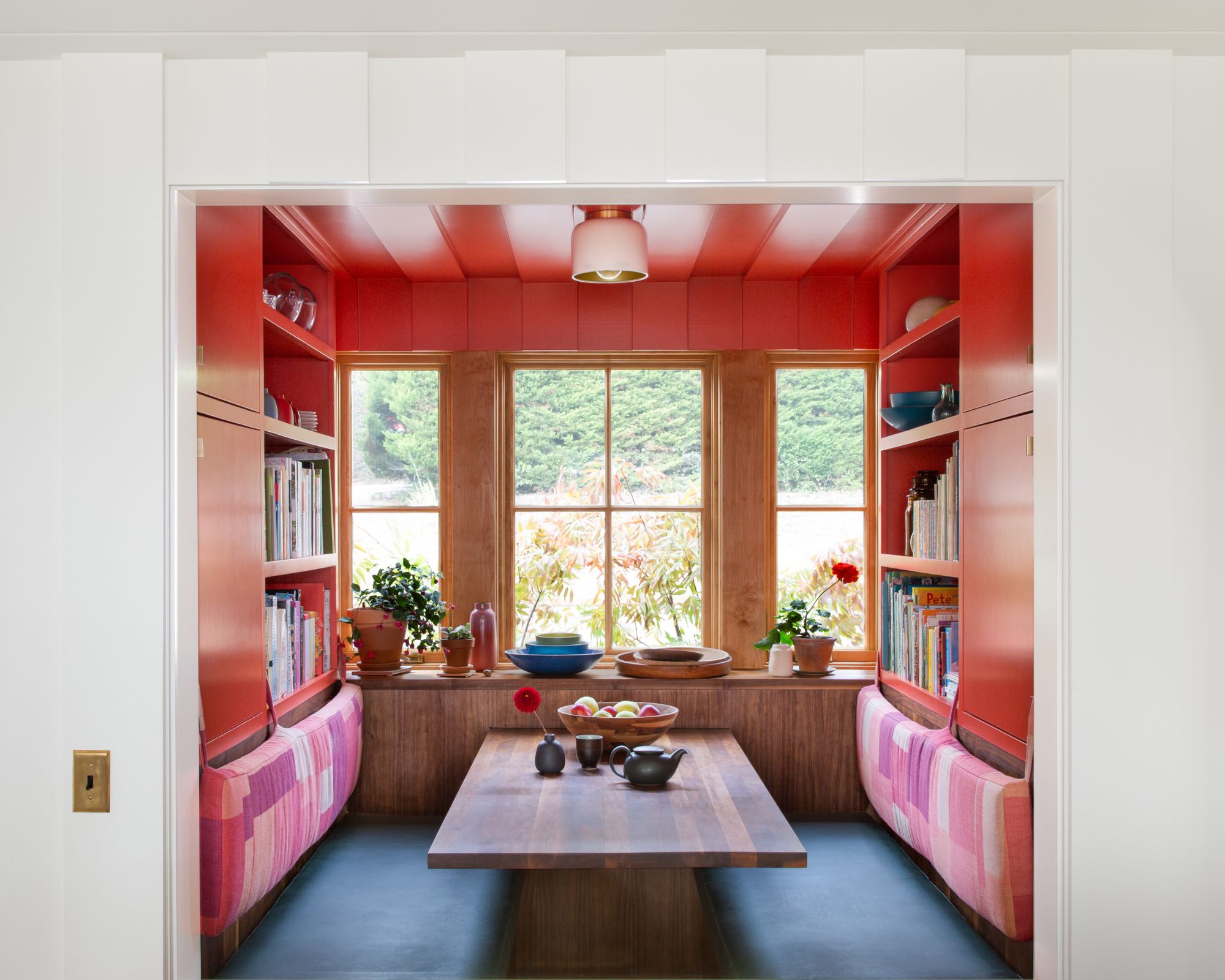
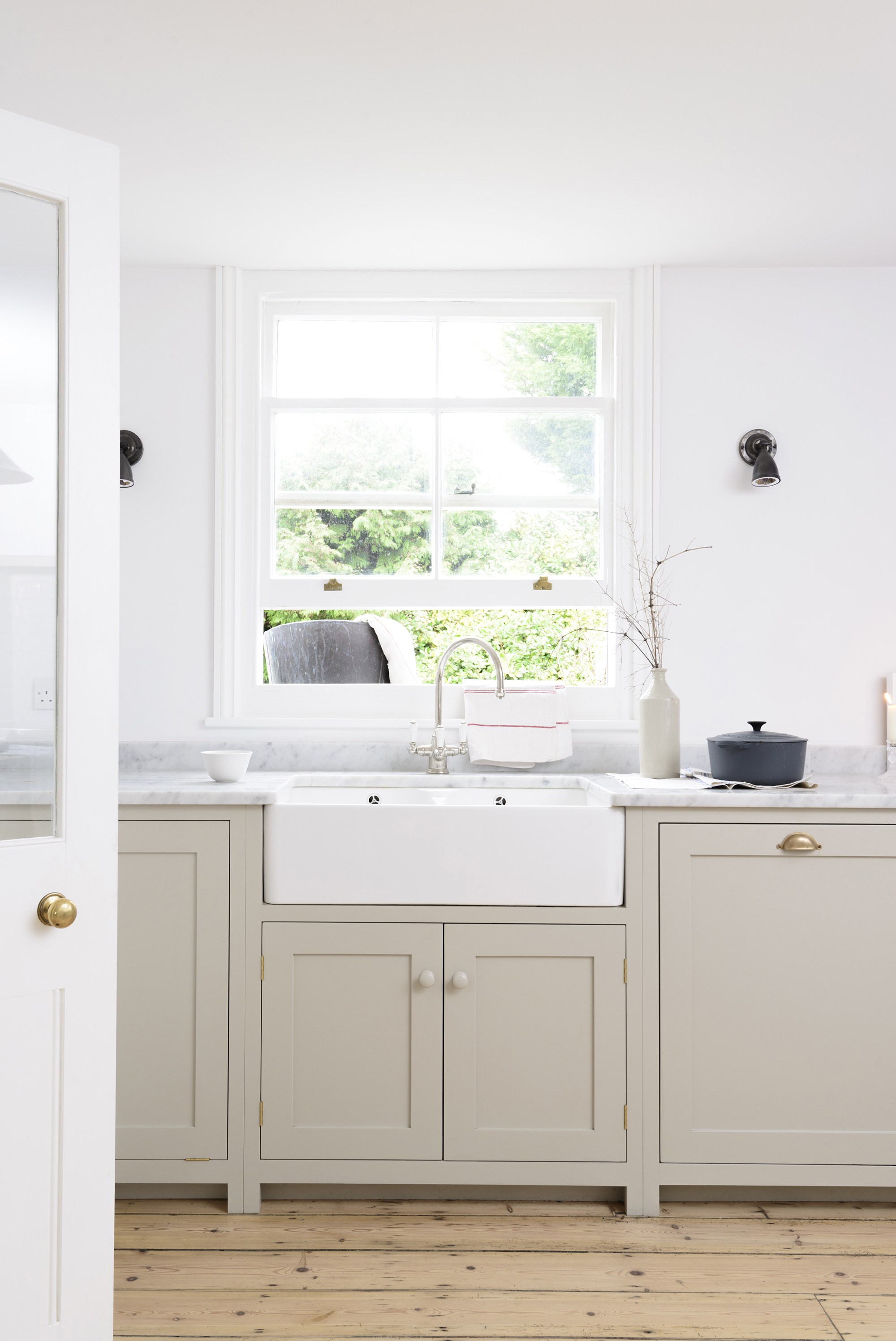
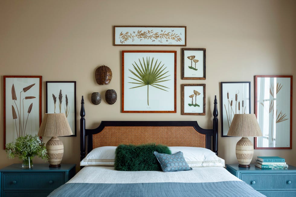
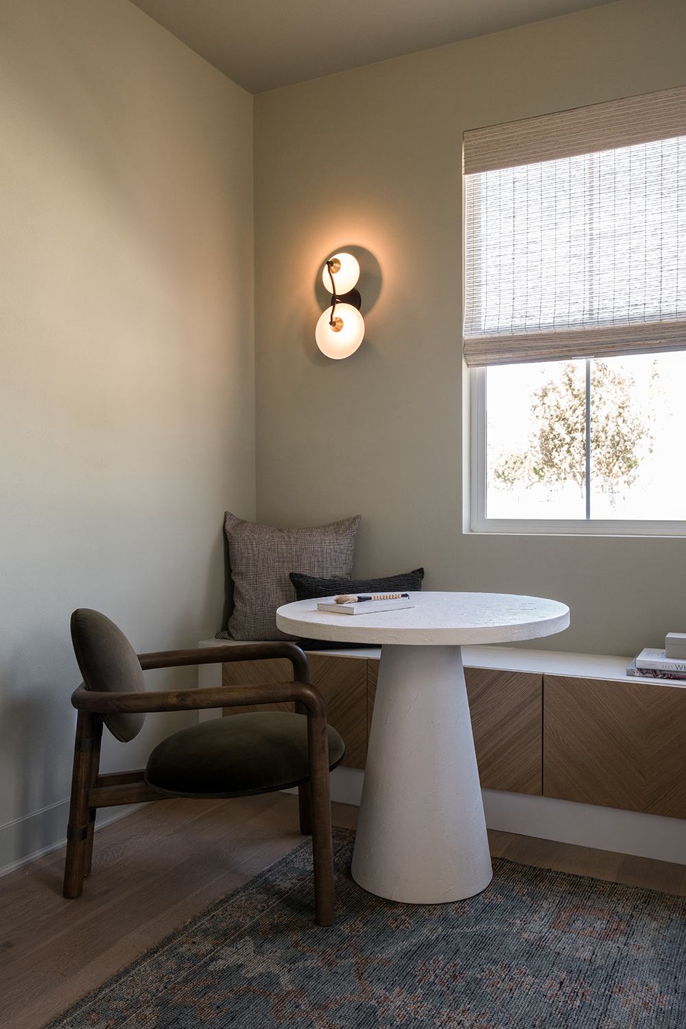
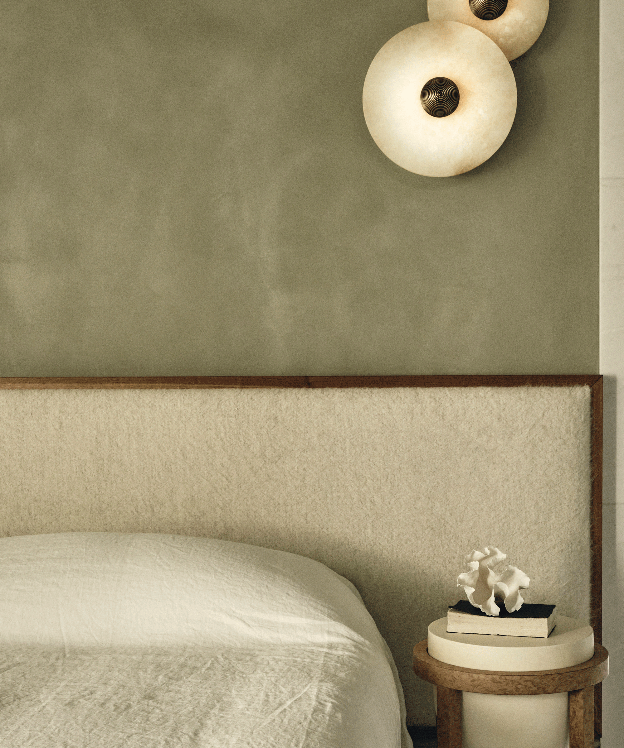
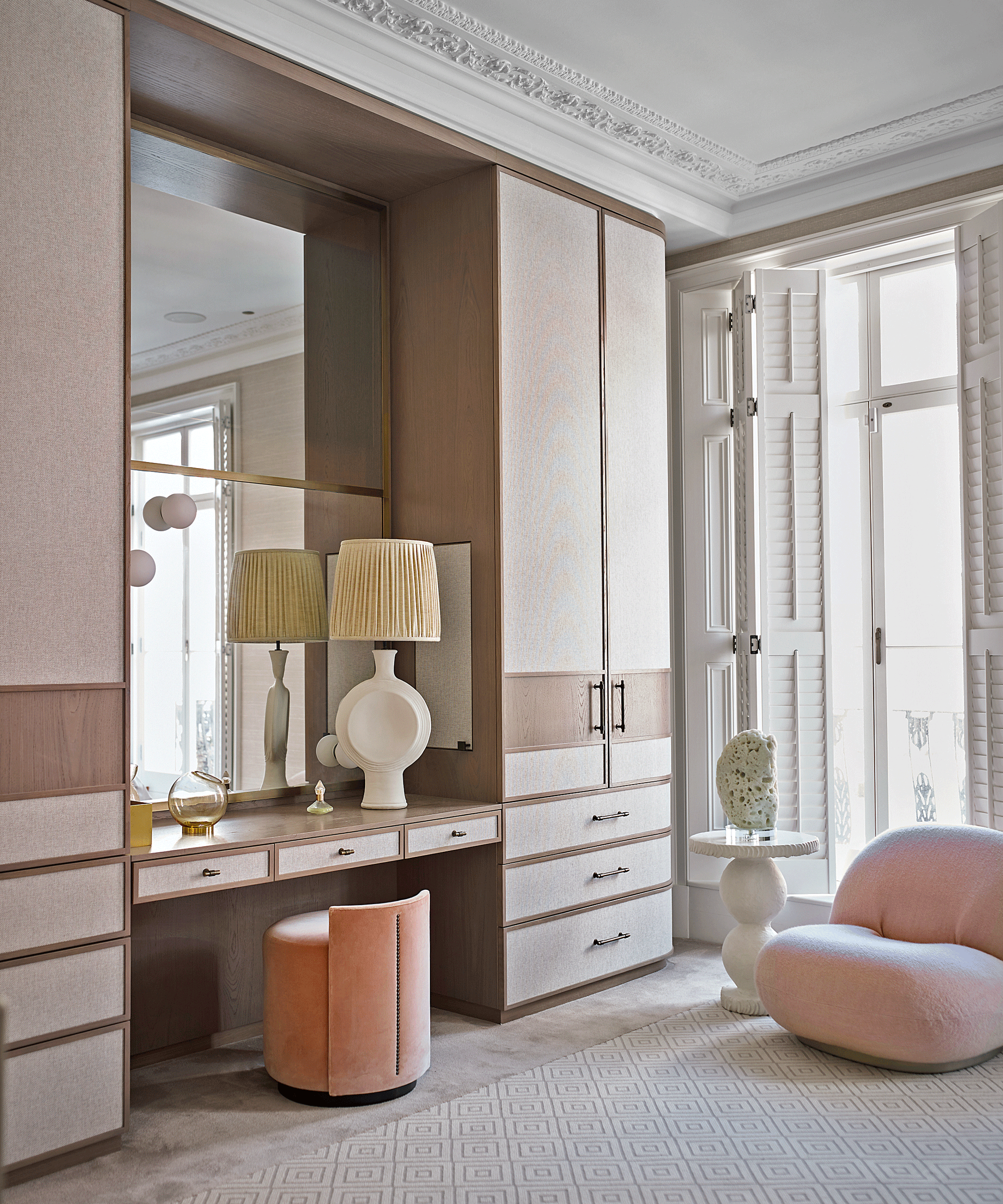
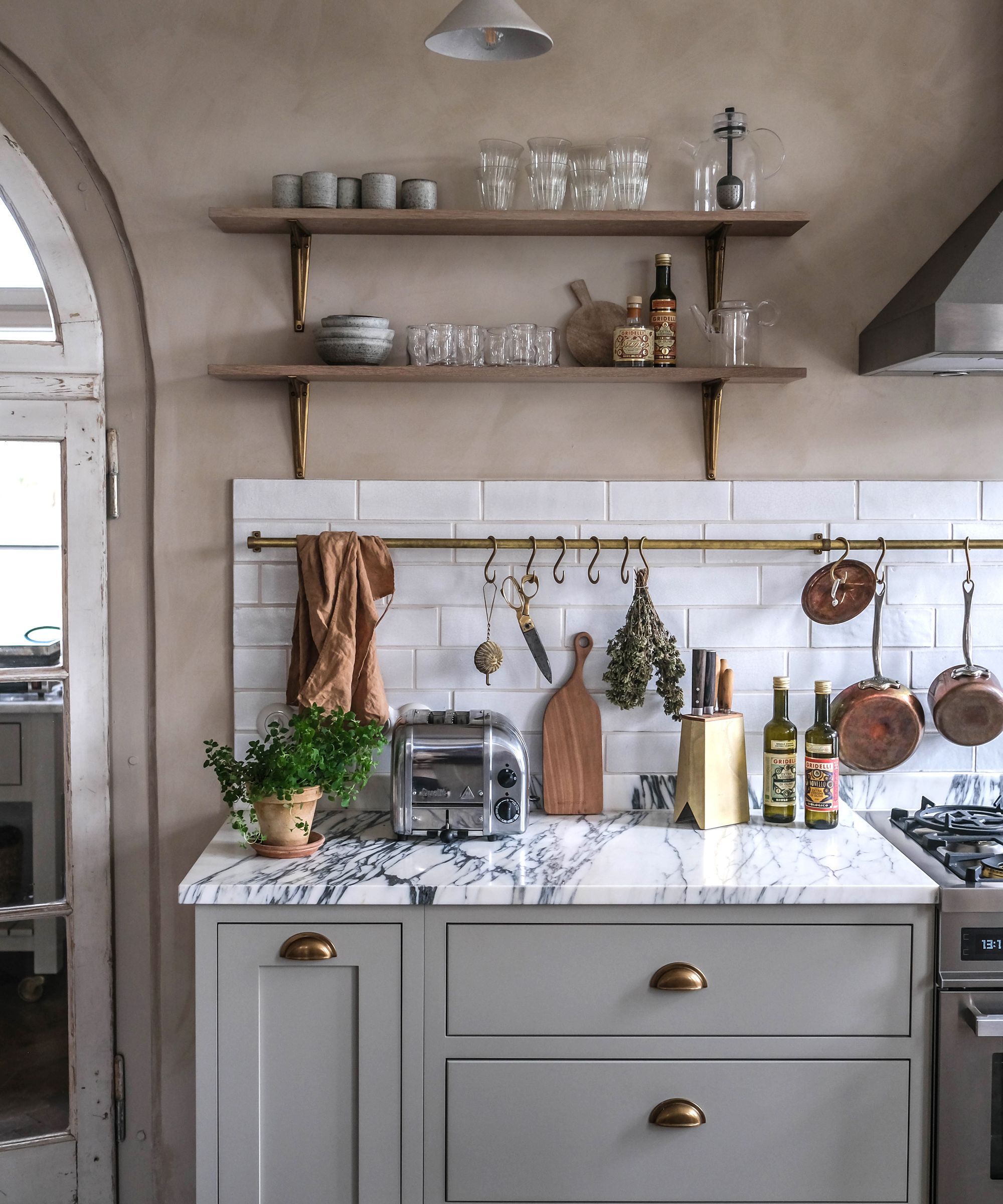
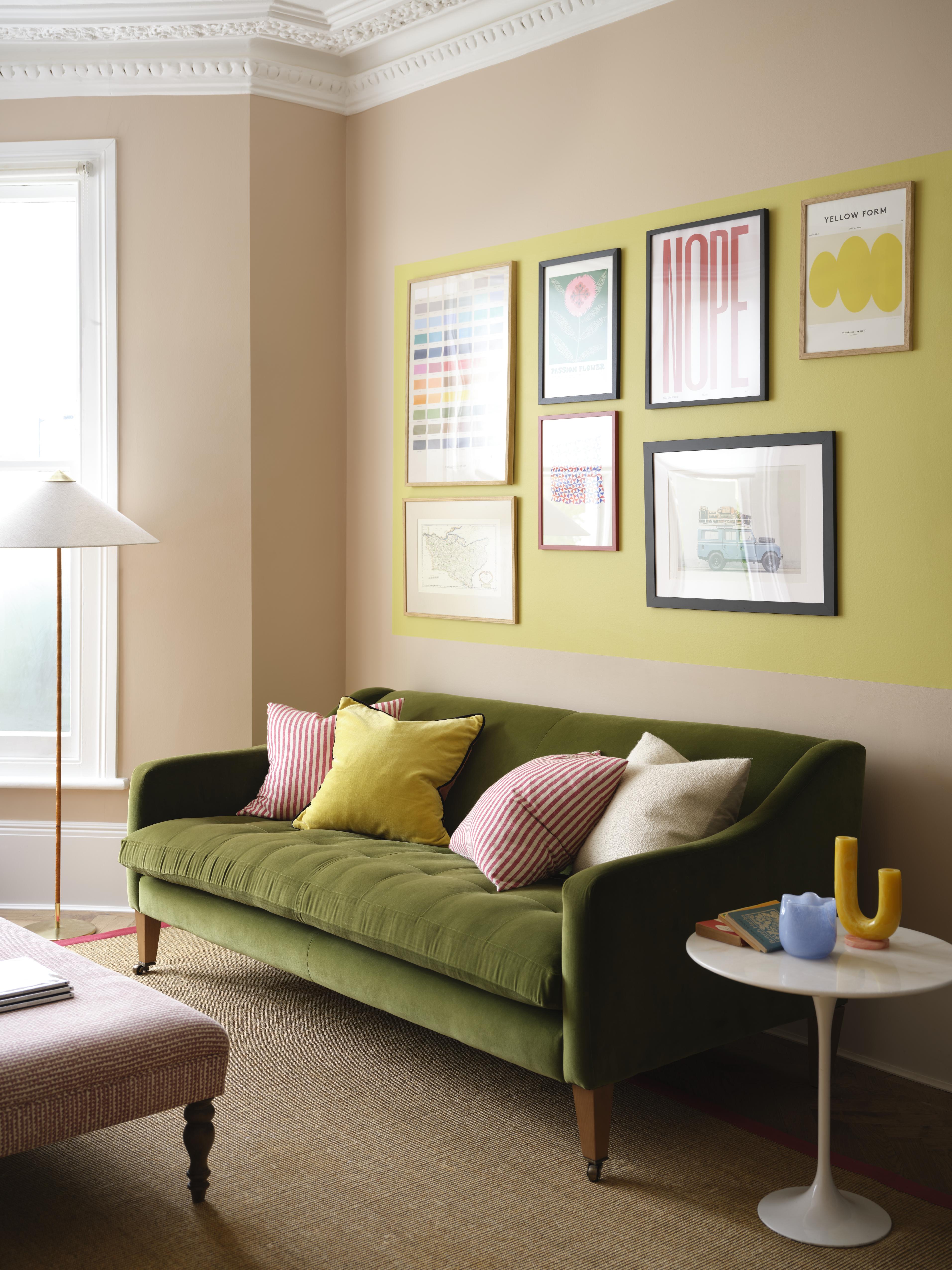
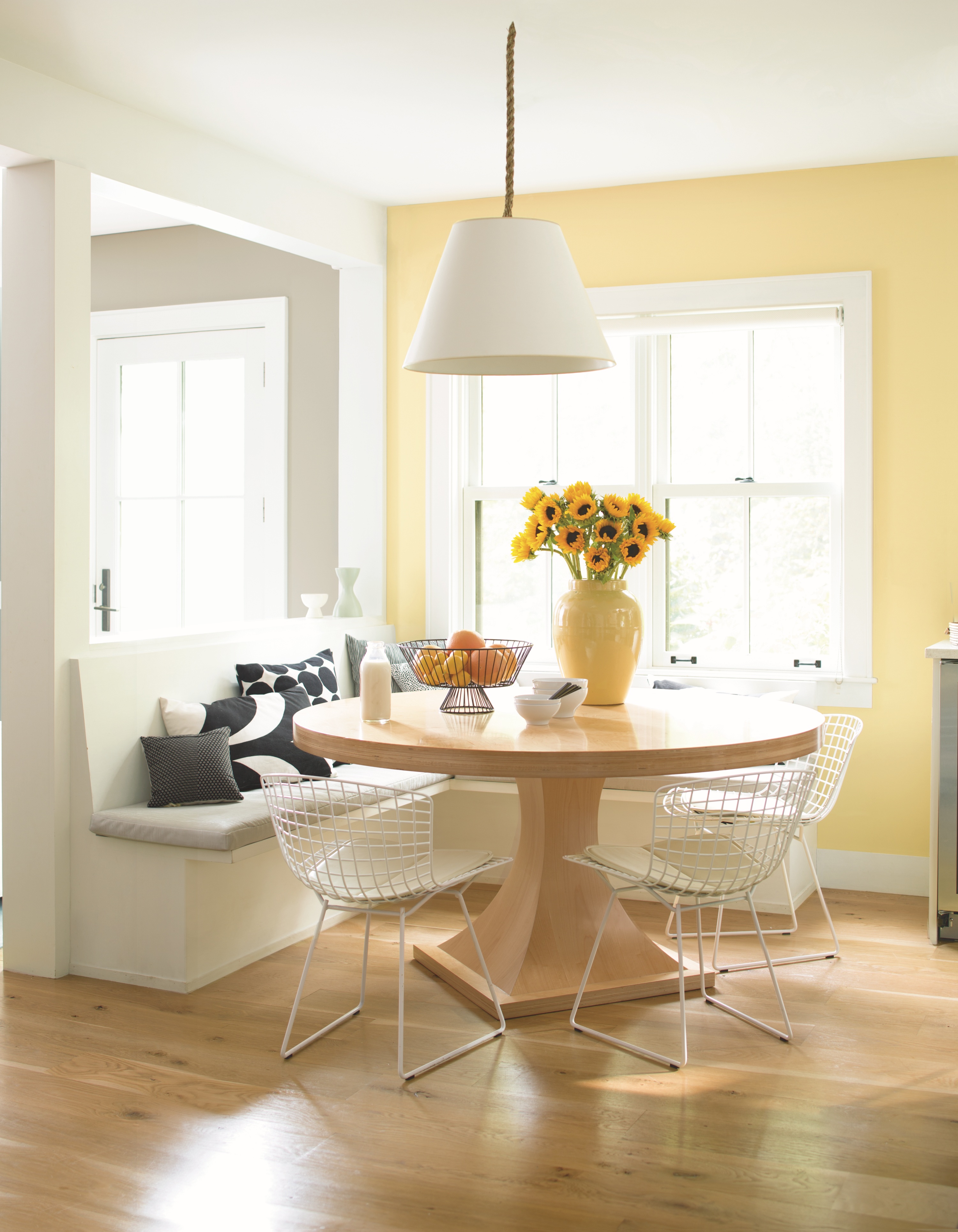
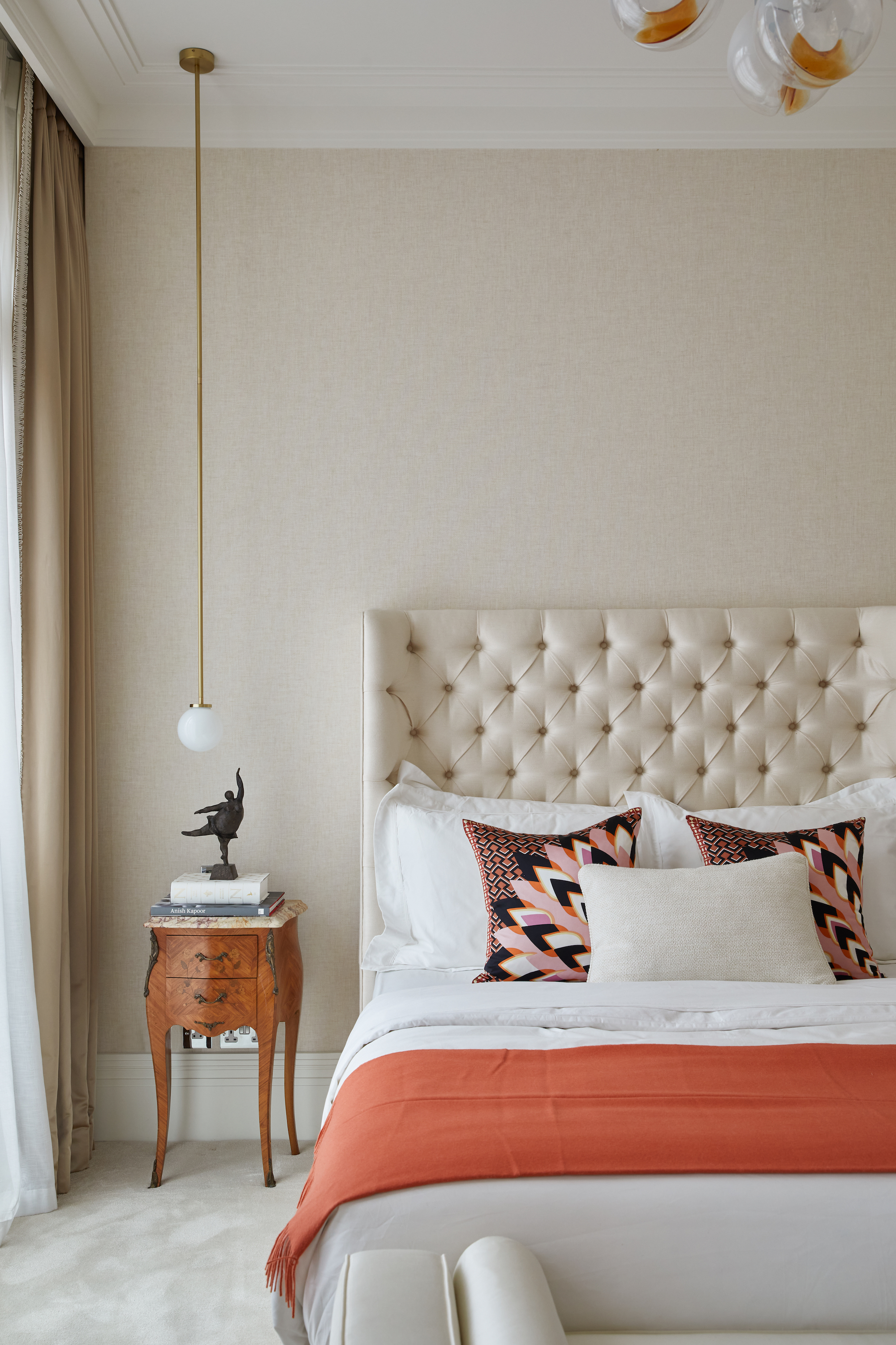
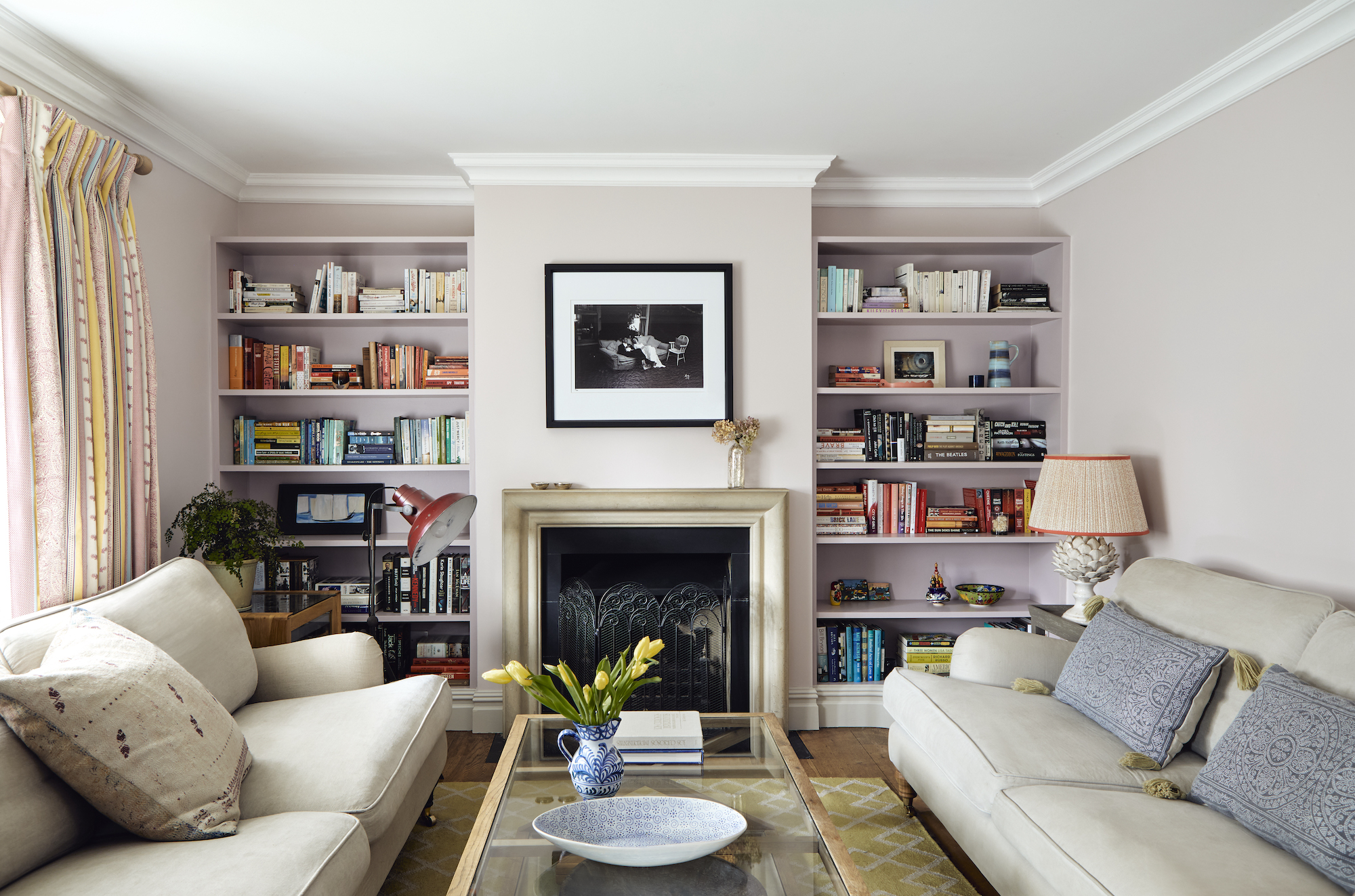
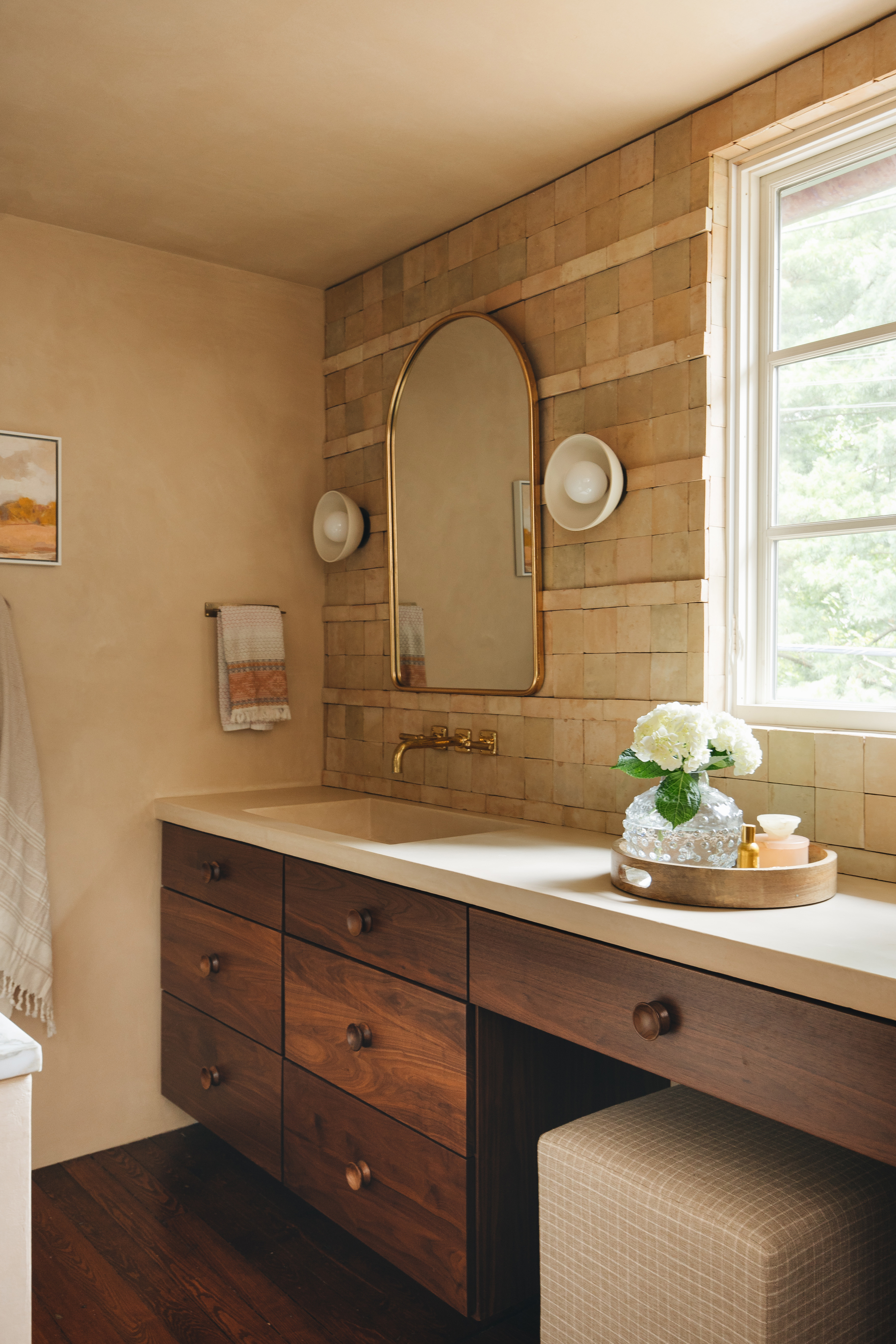
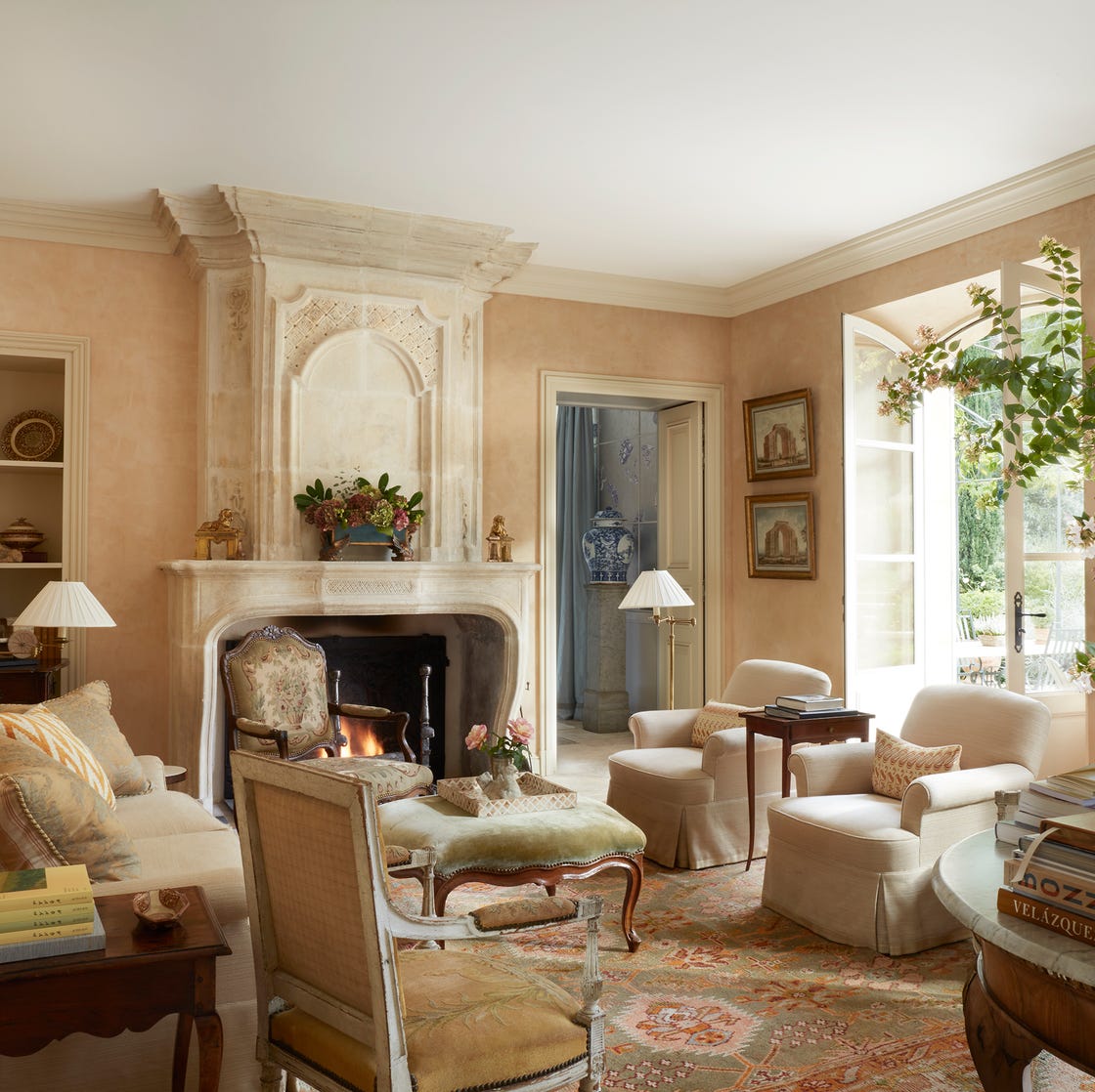
Third, Bleeker Beige layers well with muted greens and can also be complemented by pinks. Lauren Lothrop Caron, Interior Designer and Founder of Studio Laloc, states that Bleeker Beige is a versatile mid-tone neutral suitable for both modern and historic homes. She agrees that embracing a warm, organic aesthetic works seamlessly with this shade. Lauren suggests pairing it with various green shades and muted pinks, noting that it can also achieve a crisp and chic look when combined with warm white painted trim. Specific Benjamin Moore color recommendations for pairing include Odessa Pink, Peale Green, Narragansett Green, and Cloud White.
In conclusion, Benjamin Moore's Bleeker Beige is presented as a balanced and timeless color that interior designers appreciate for its adaptability. Whether used with vibrant greens and pinks or classic creamy whites, this hue consistently contributes to creating serene and inviting home environments throughout the year. The article underscores its enduring appeal in contemporary and traditional design.
#BenjaminMoore #BleekerBeige #InteriorDesign #NeutralColors #PaintColors #HomeDecor #EarthyTones #HistoricalAllure #ColorPairing #BenjaminMoore #BleekerBeige #InteriorDesign #NeutralColors #PaintColors #HomeDecor #EarthyTones #HistoricalAllure #ColorPairing
0 opmerkingen in totaal
 Nog geen opmerkingen
Dit vindt u mogelijk ook leuk
Benjamin Moore paint colors in real homes – 10 favorite shades amongst designers, from neutrals to brights

5 ways to decorate with Pale Oak, Benjamin Moore's best-selling versatile greige
Beige bedroom ideas – 12 fresh looks that prove beige is back

16 Beige Paint Colors That Never Go out of Style, According to Interior Designers
Forget Millennial Pink: When It Comes to Wall Paint, "Boring" Beige is Back
These Are the 10 Colors Interior Designers Would Pair with Beige

Are You Team Beige or Team Gray? We Asked Designers Which Neutral Reigns Supreme

5 ways to decorate with Edgecomb Gray, Benjamin Moore's softest gray paint
Decorating with beige – 10 ways to embrace this warm neutral shade
11 Beautiful Colors That Go Well With Beige
What color is replacing gray? This is the shade designers say is becoming the perennial favorite
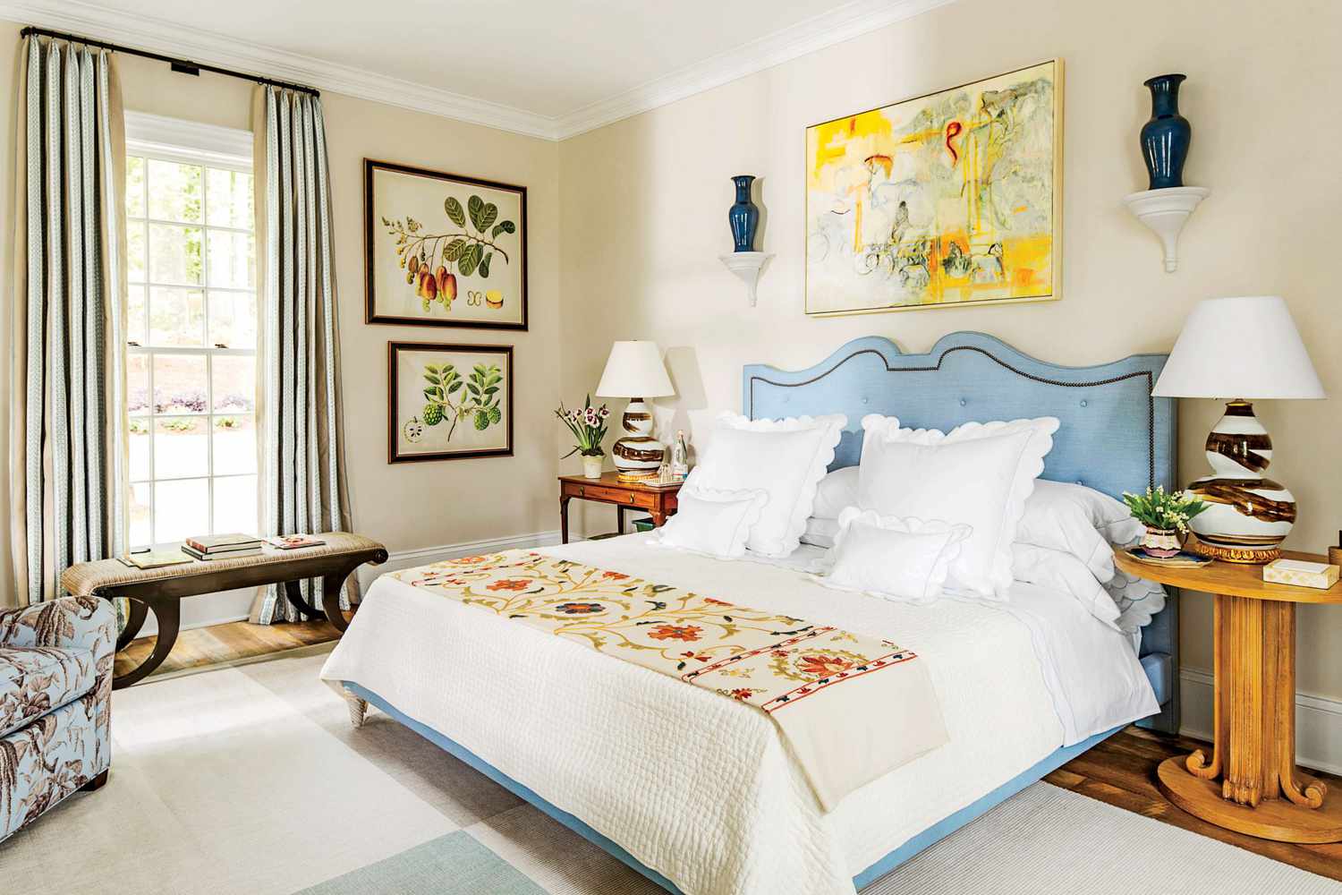
10 accent colors for beige – design experts' favorite color pairings
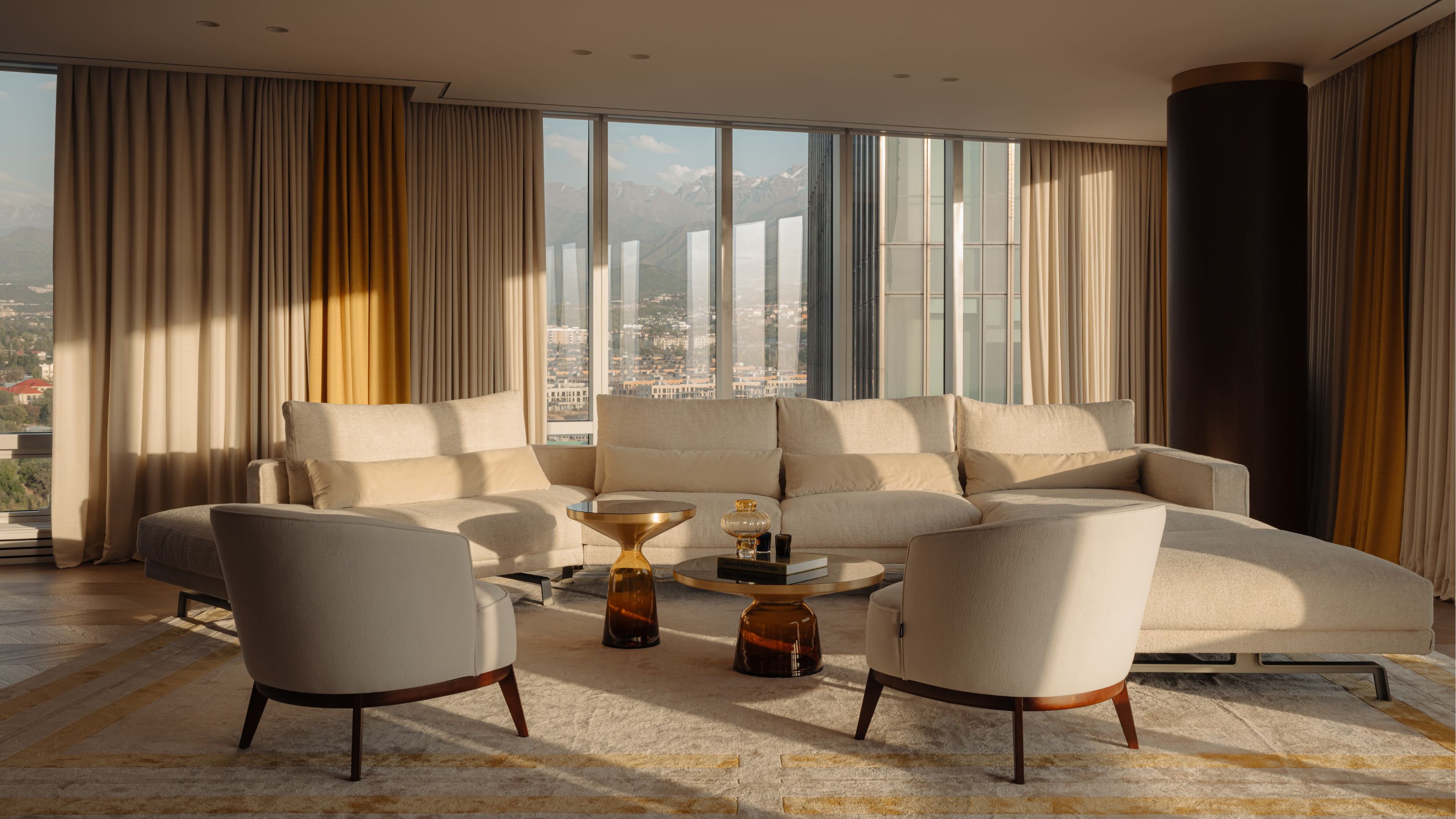
The Best Beige Paint Color of All Time
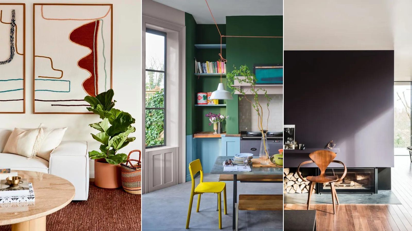
12 Beige Living Room Ideas That Make a Strong Case for the "Boring" Color Being Back in Fashion
Colors to avoid pairing with beige – 5 shades you’ll want to stay clear of
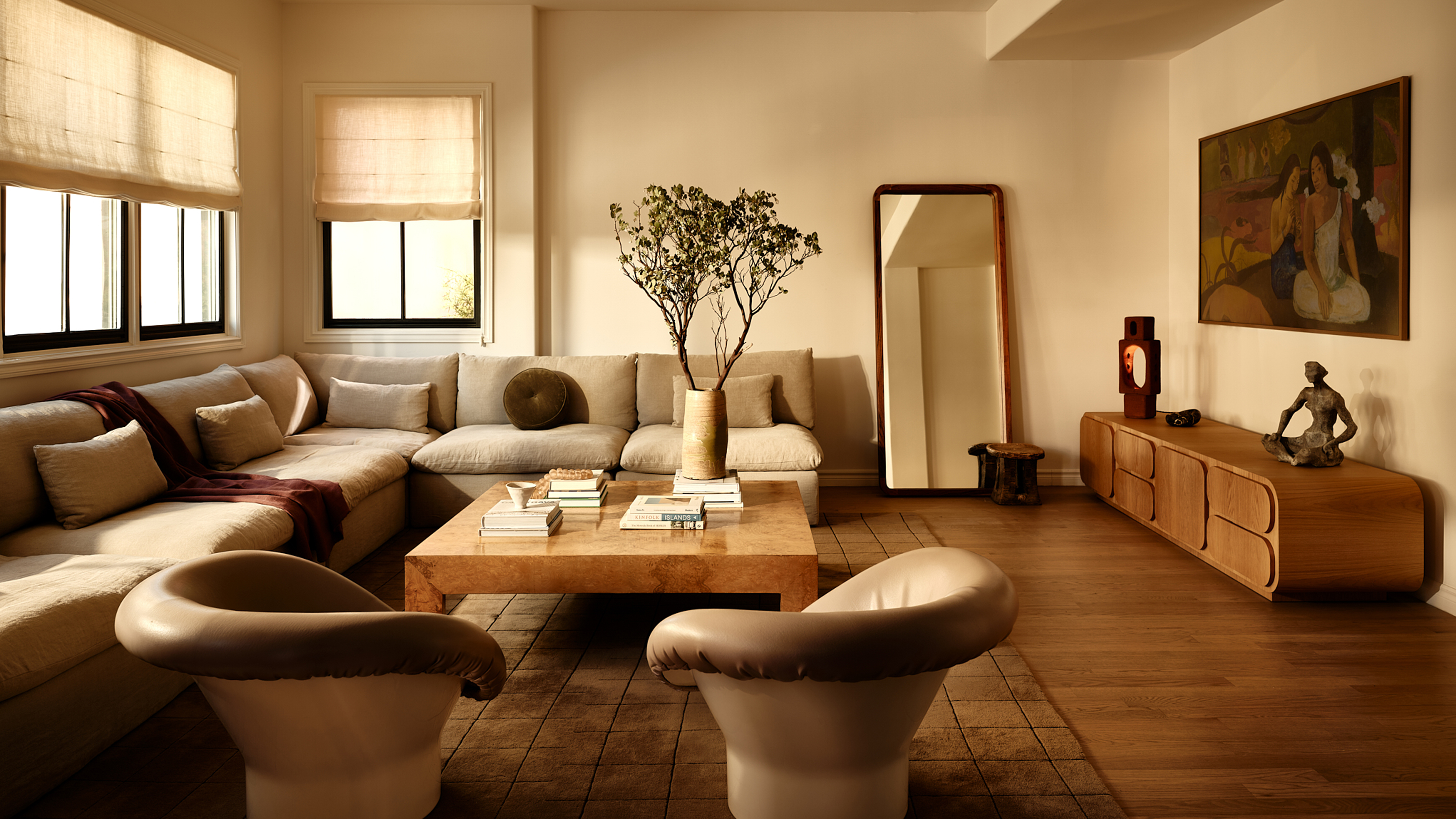
8 Beige Room Ideas That Break the 'Boring' Stereotype

Benjamin Moore's Trendiest Paint Colors (& Which Ones To Avoid)

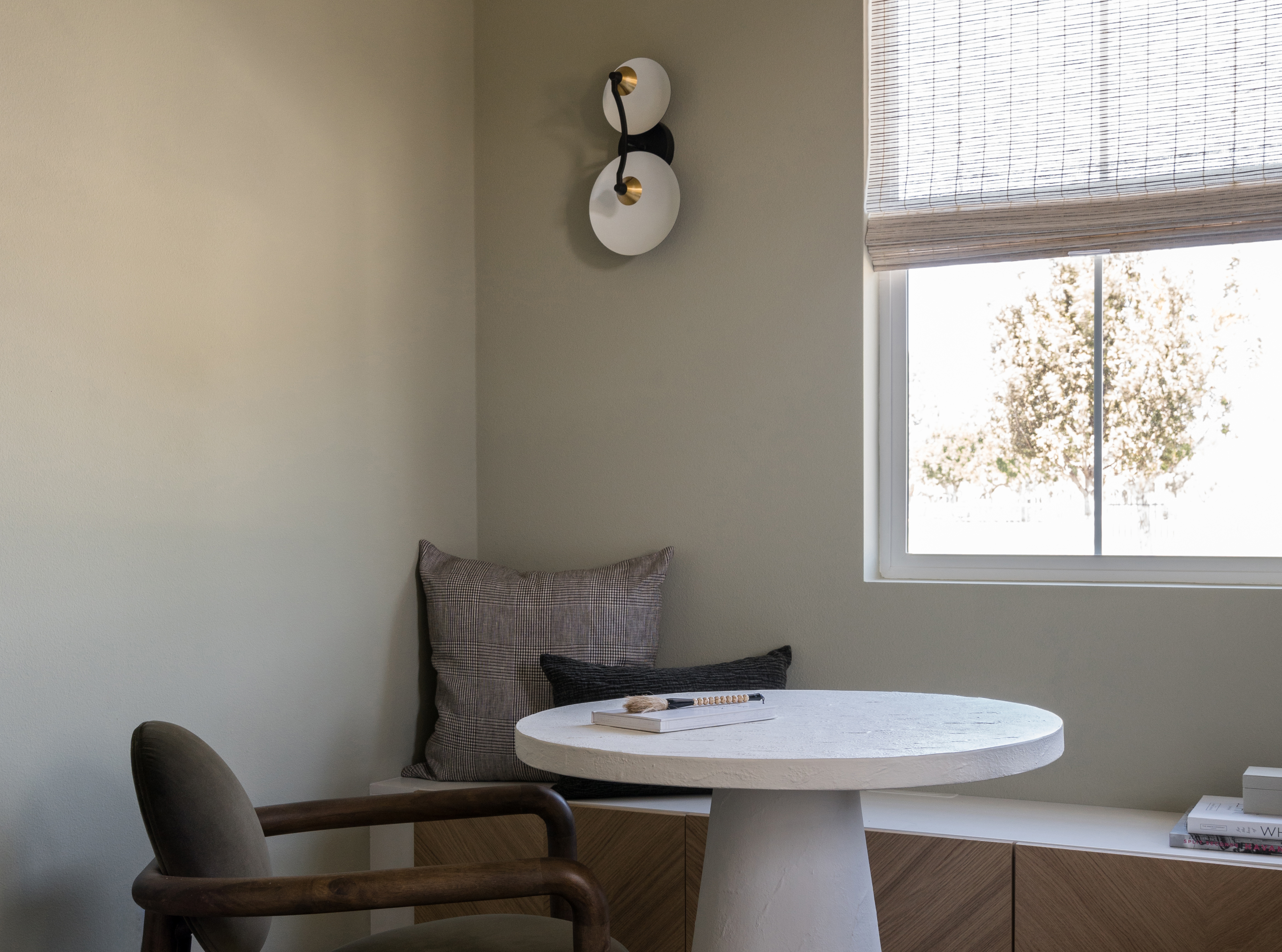
The 8 Best Beige Paints Designers Turn to for Warmly Luxe Schemes – "It Evokes a Sense of Calm"
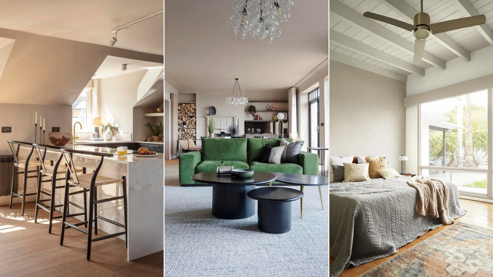
Is this the best beige paint? Why designers love Stone Hearth by Benjamin Moore
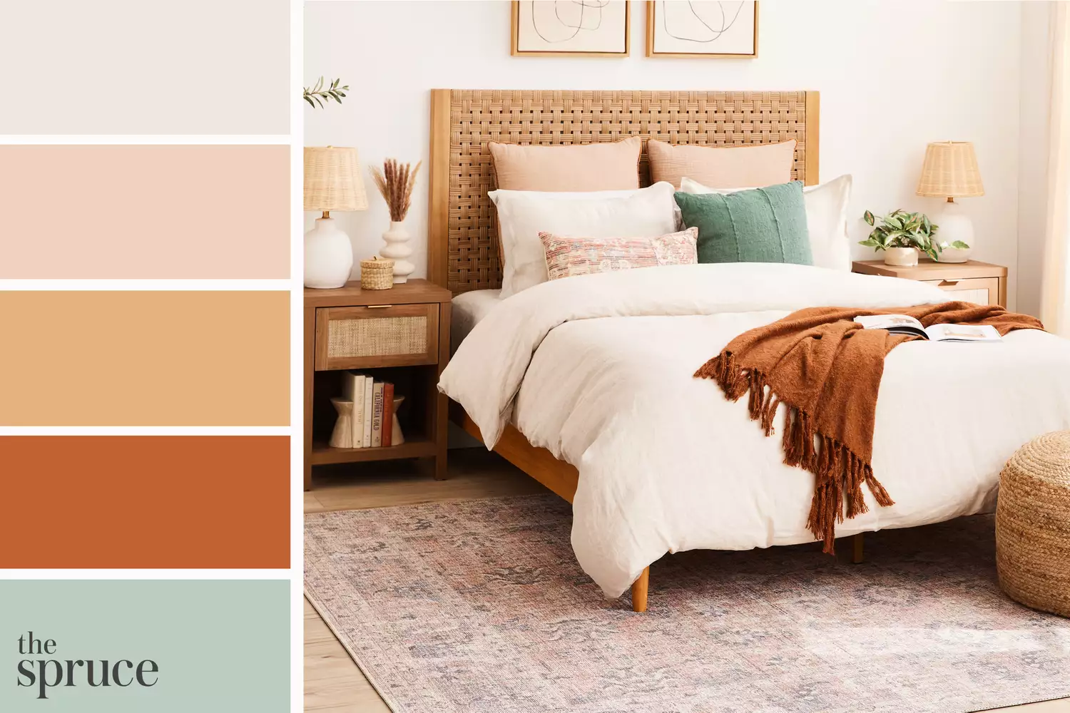
11 Beautiful Colors That Go With Beige