8 Spring Color Schemes the Paint Pros Are Raving About for 2025
As winter's gloom recedes, spring ushers in a period of renewal, making it an ideal time to refresh living spaces with vibrant new paint colors. Paint color experts have identified several key color schemes that are projected to be popular in 2025, ranging from classic pastels to unexpected earthy tones, offering diverse options for any home. These selections are designed to imbue spaces with the season's positive energy and playful spirit.
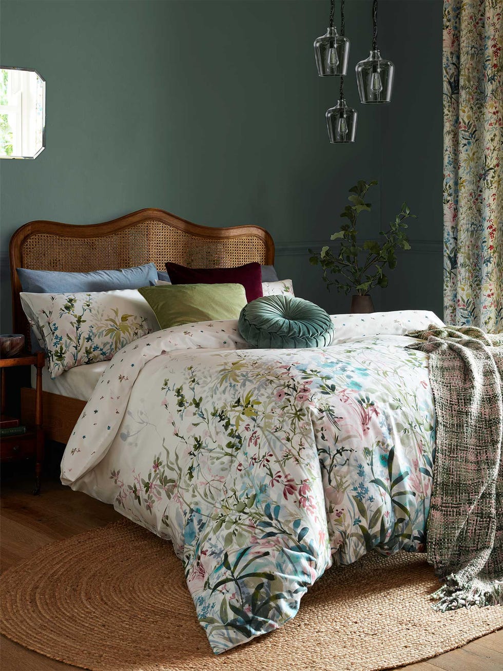
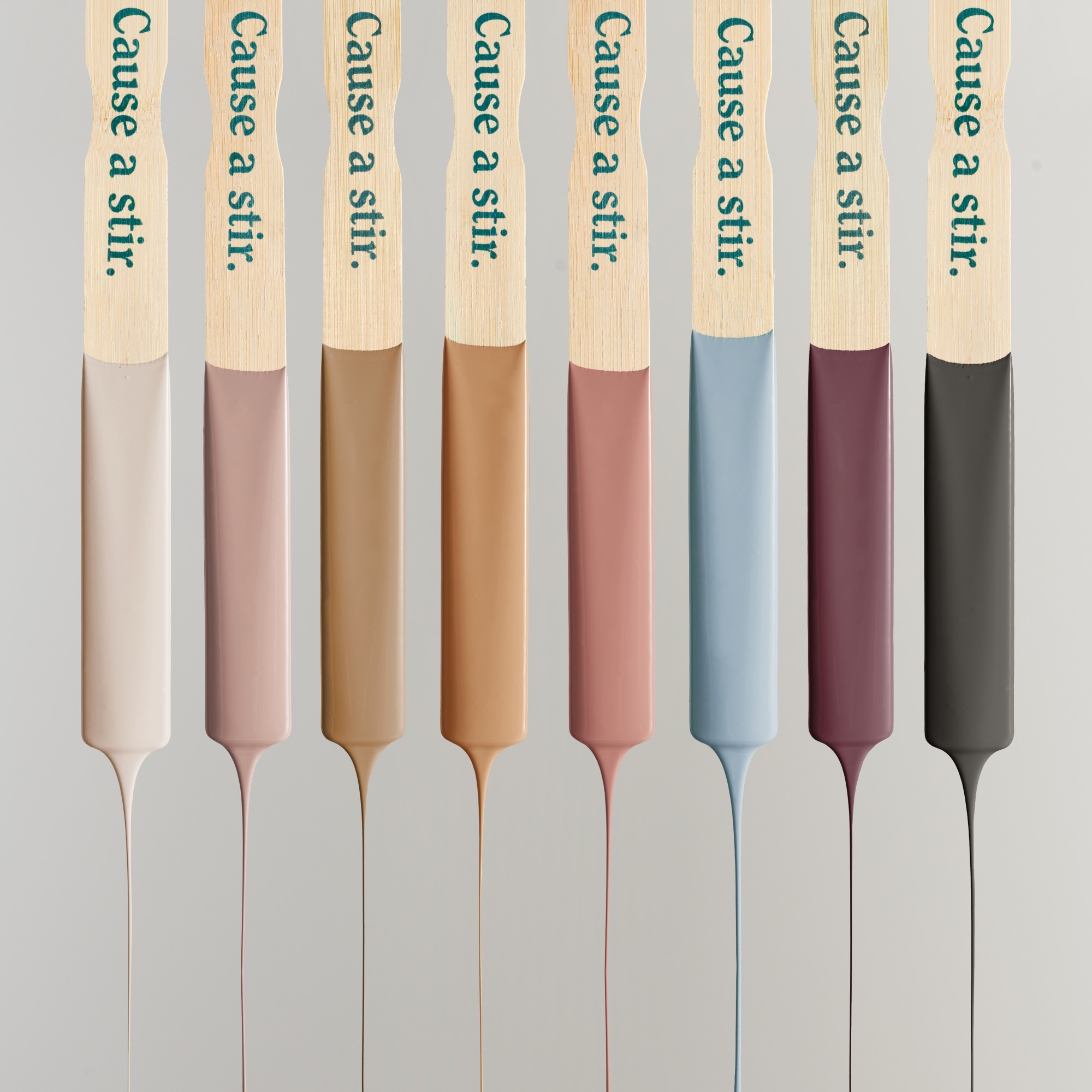
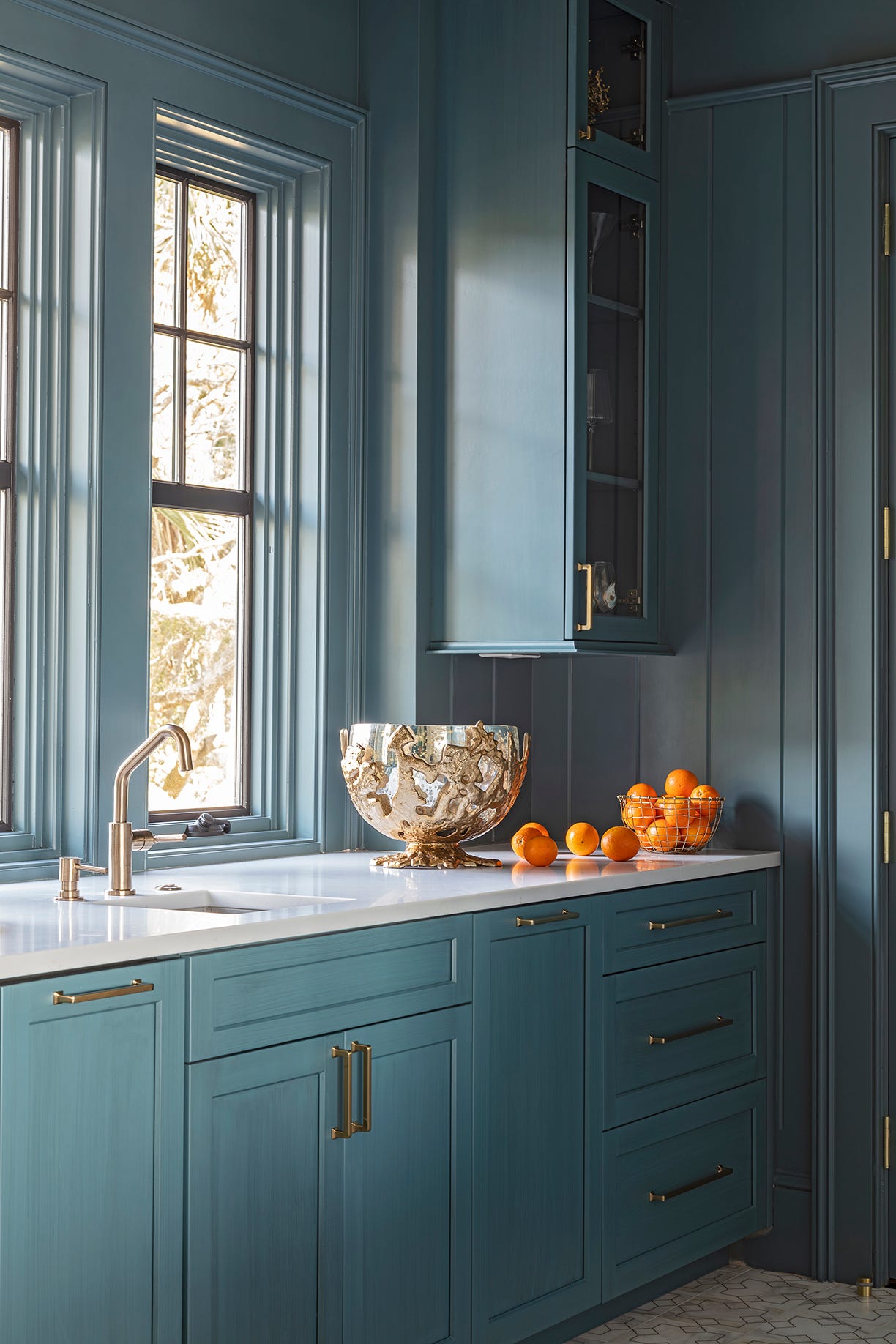
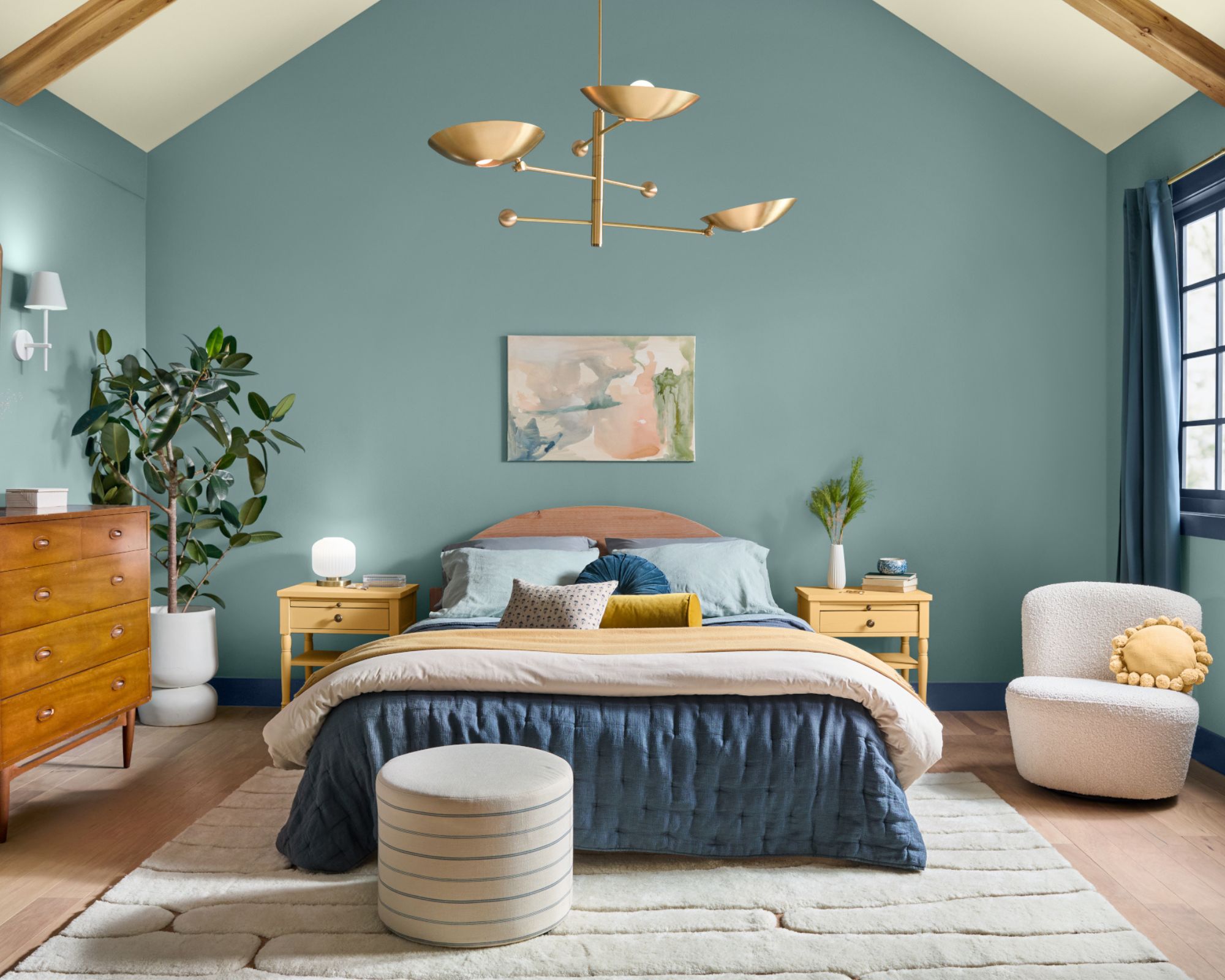
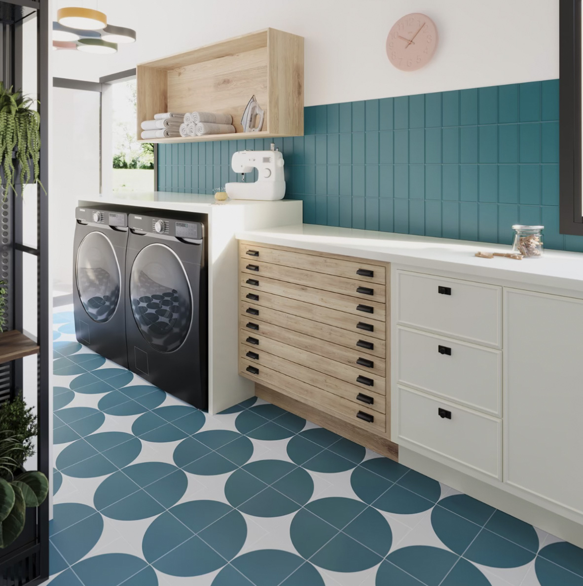
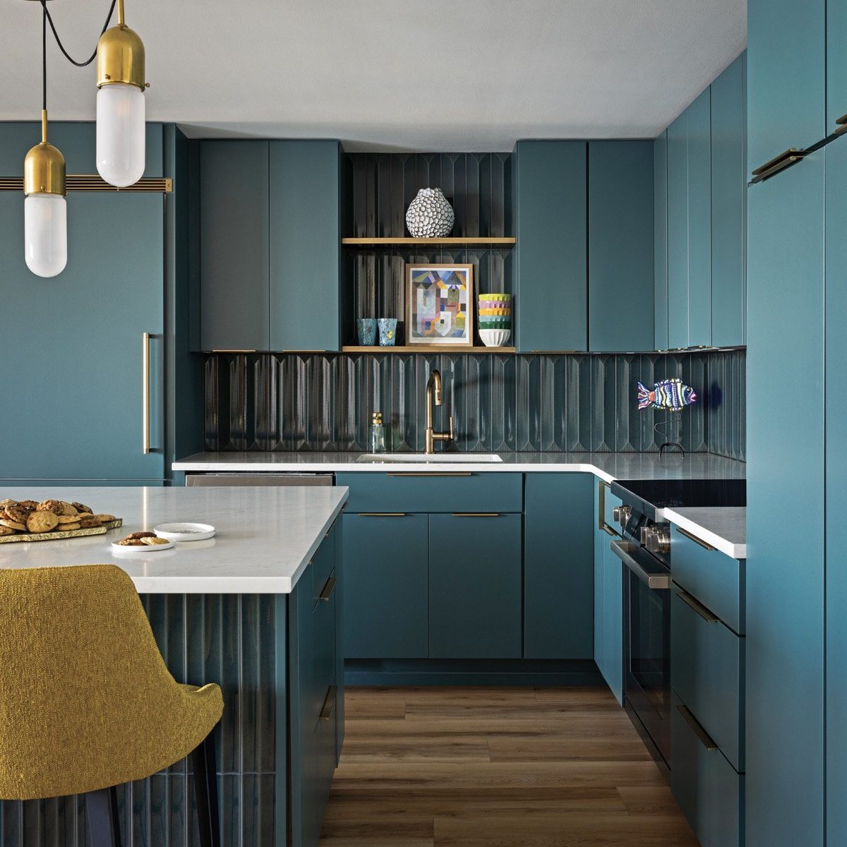
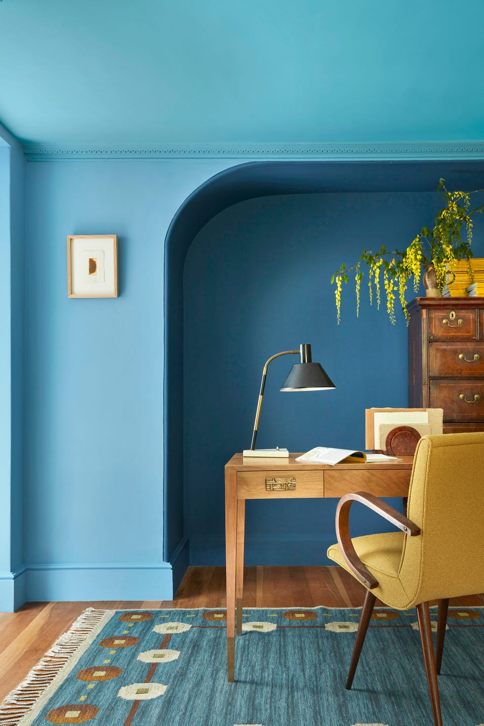
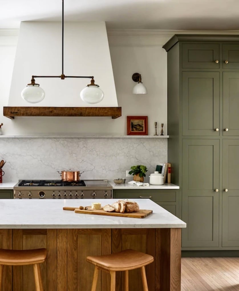
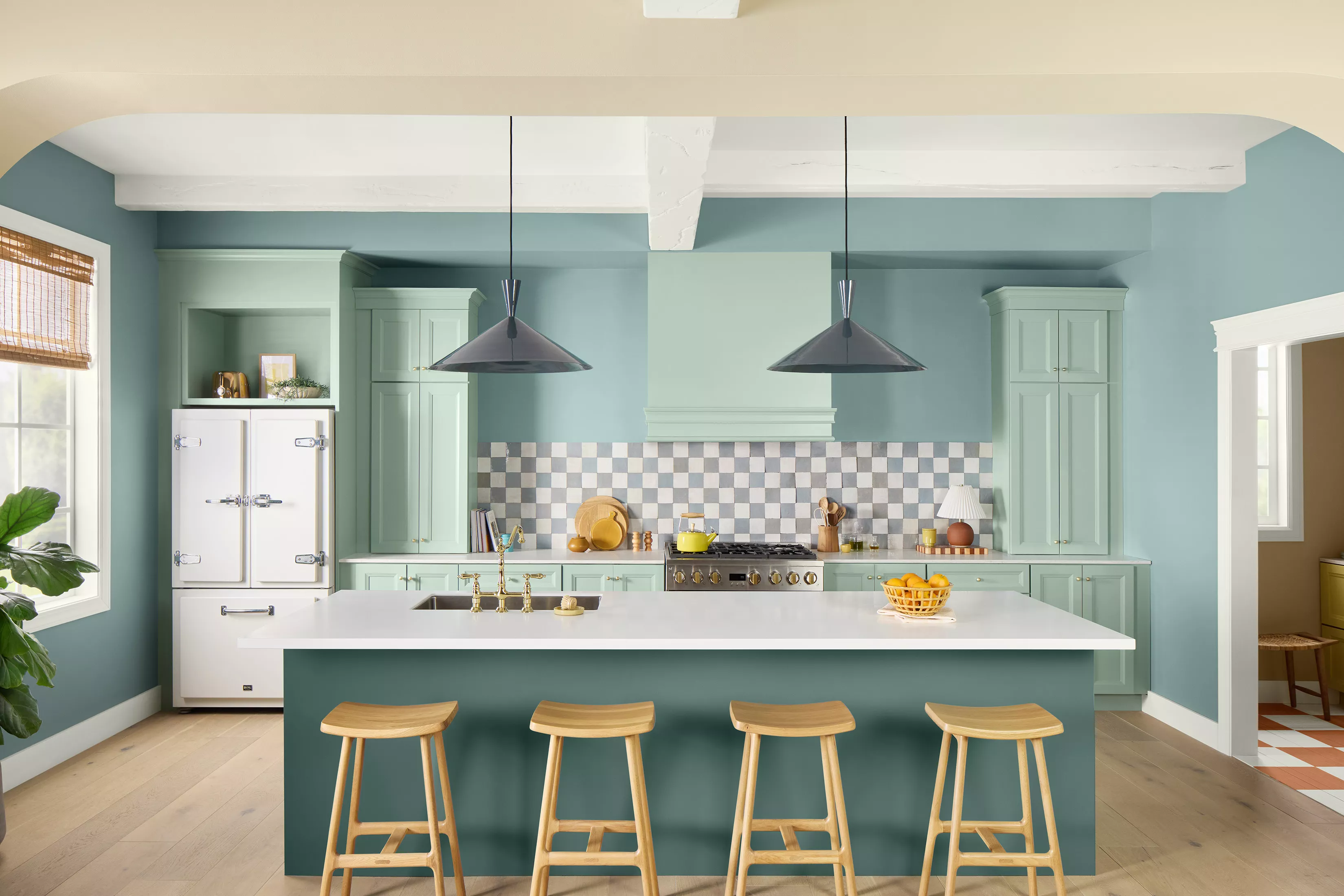
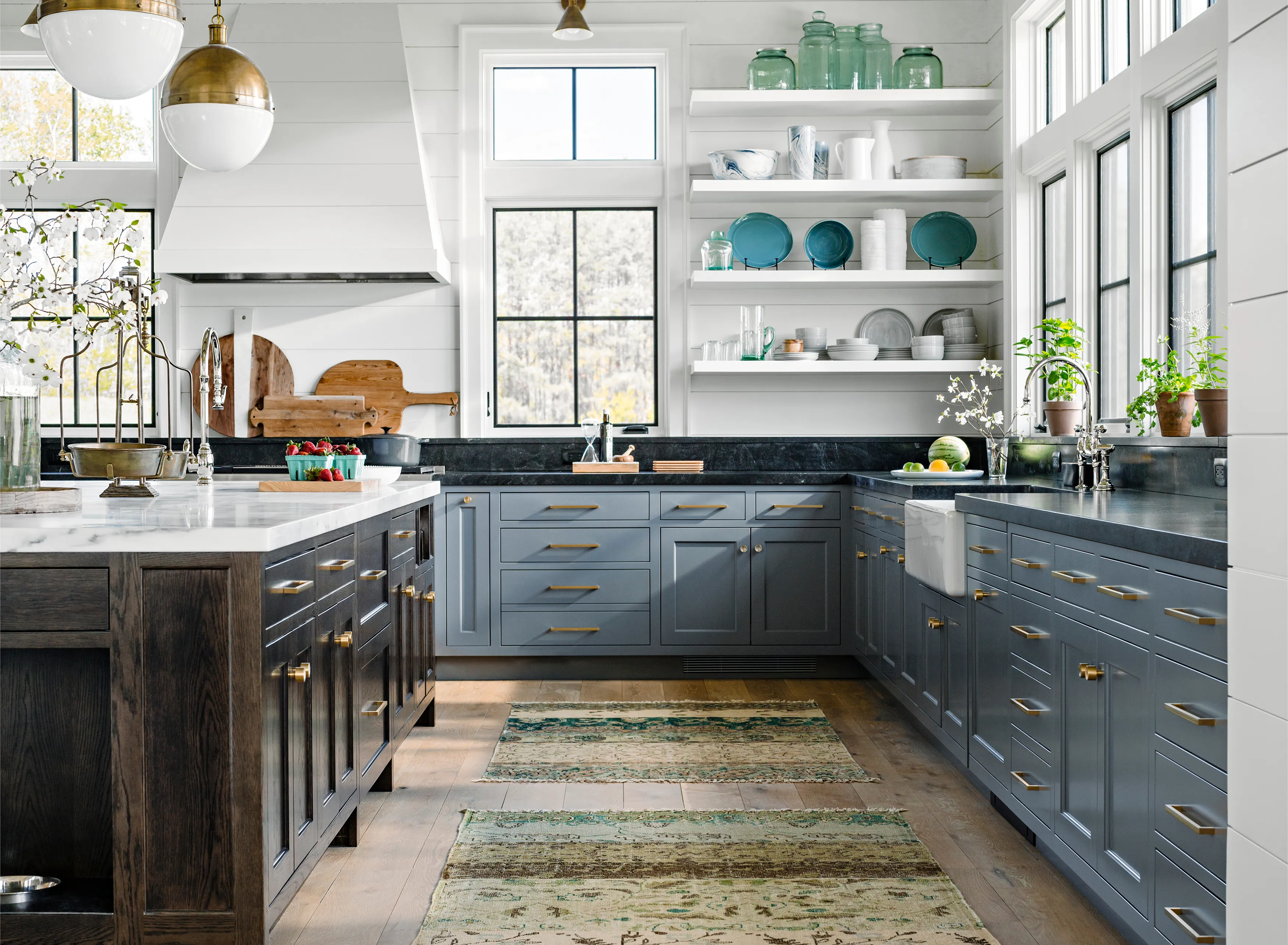
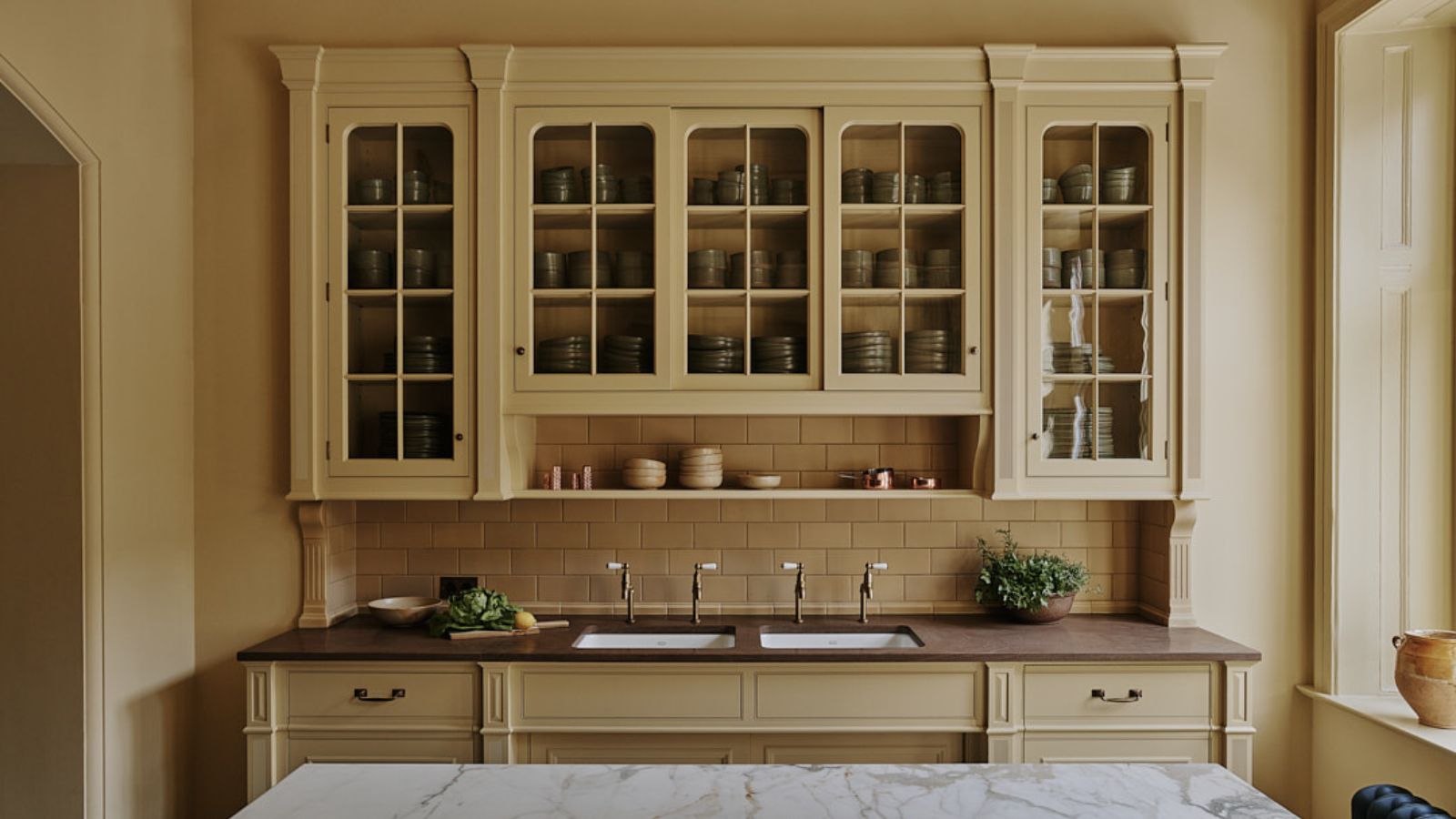
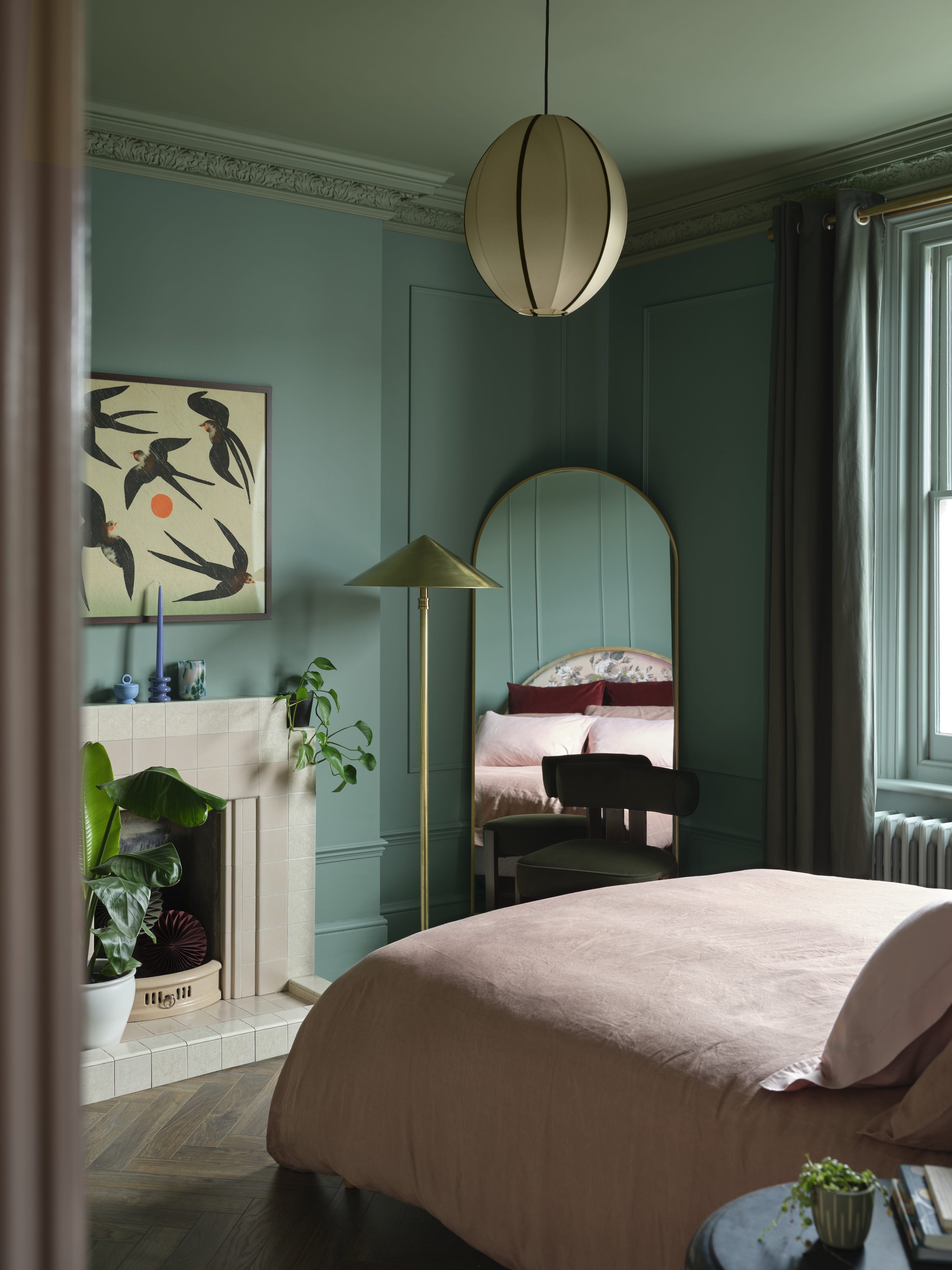
One highly recommended scheme is the combination of golden yellow and off-white. Benjamin Moore's 'Chestertown Buff,' a warm, earthy golden hue with beige undertones, creates a comforting and sunny backdrop. Paired with a soft off-white, this combination is particularly effective in mudrooms or entryways, providing a fresh and welcoming ambiance. Another timeless choice is calming blue and green. Ashley Banbury, color marketing manager at HGTV Home by Sherwin-Williams, highlights green as the quintessential spring color, symbolizing nature and growth. She suggests pairing a sage green, such as 'Quietude,' with a rich green featuring blue undertones, like 'Rocky River.' This refreshing and peaceful duo is ideal for both private spaces like bedrooms and communal areas such as kitchens.
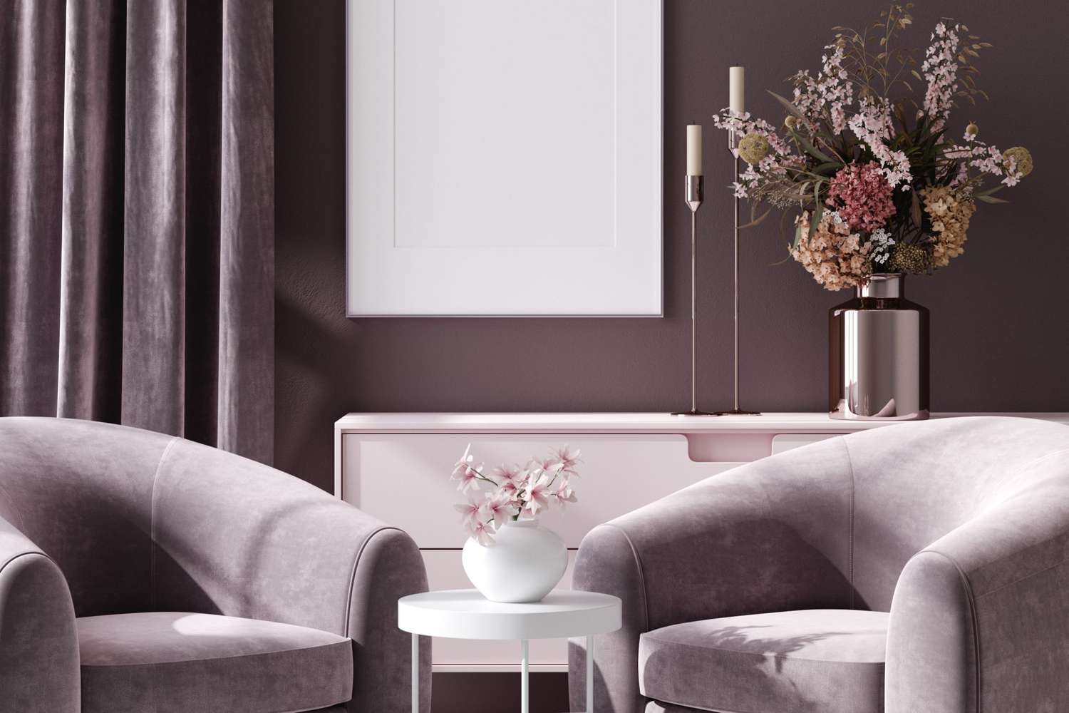
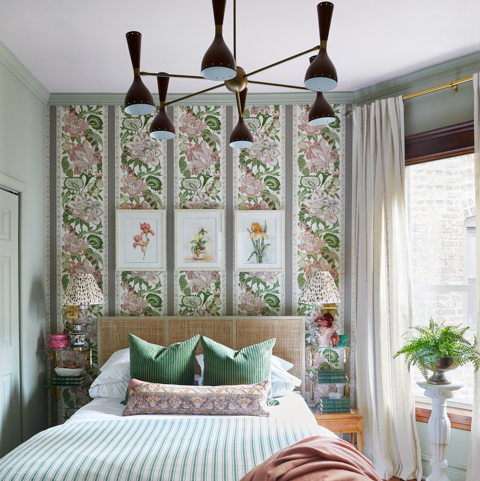
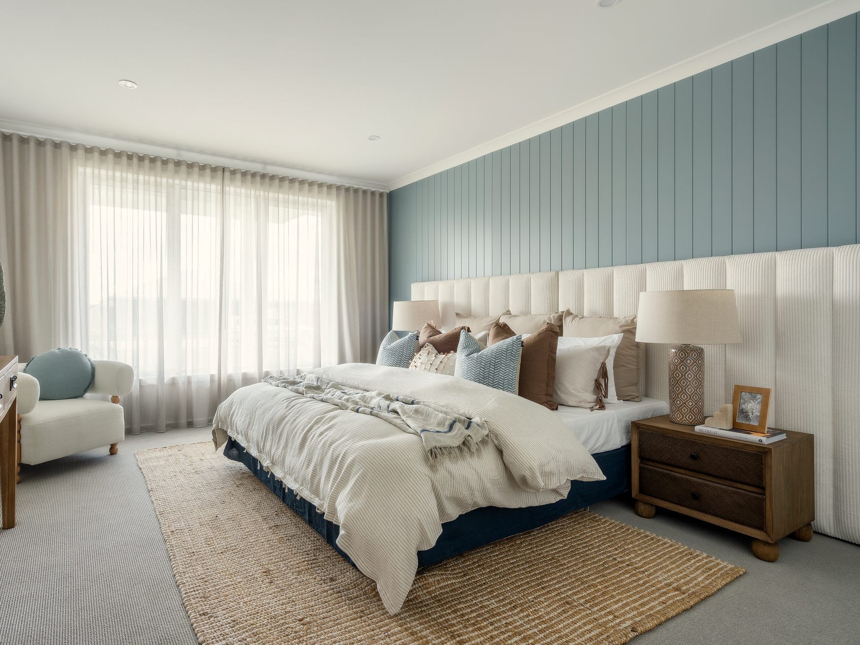
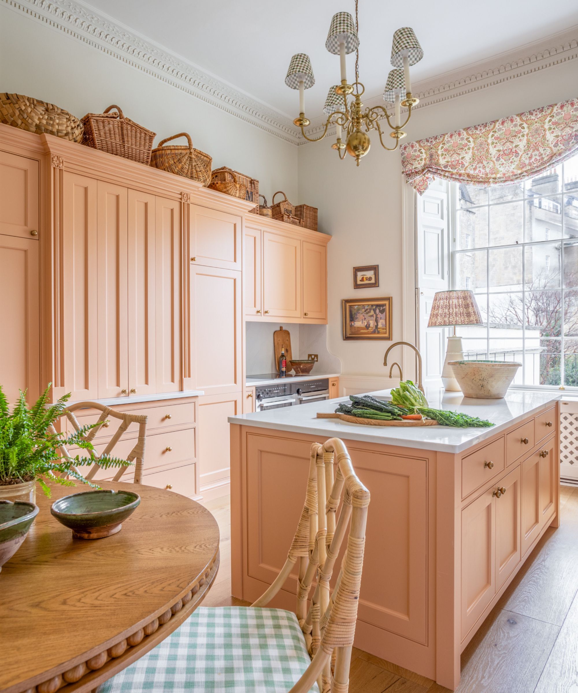
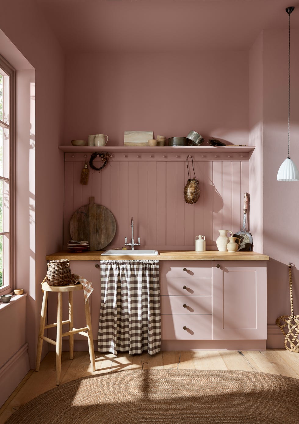
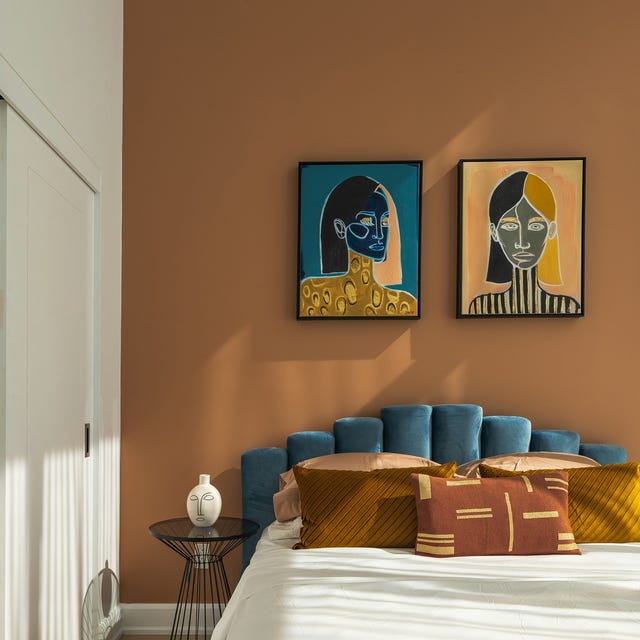
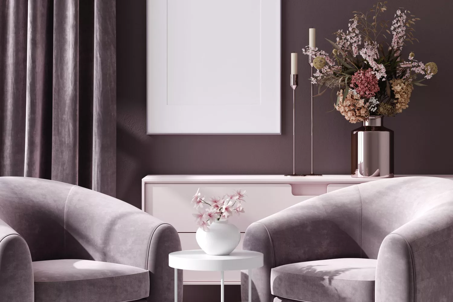
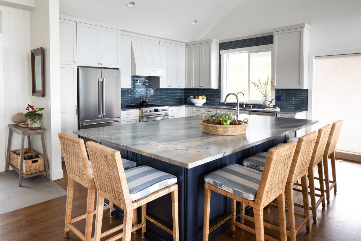
For those seeking a softer aesthetic, blush pink and soft green offer a gentle touch. Benjamin Moore's 'Tissue Pink' is described as a 'quietly colorful hue' that feels restorative and uplifting. When combined with 'Paris Rain,' a soft gray-green shade, it creates a tranquil, flower-inspired room. To complete this serene look, the addition of buttery tones and soft neutrals fosters a calming and optimistic atmosphere. An expansive palette incorporating soft beige, calming blush, and earthy brown is also gaining traction. Ashley McCollum, Glidden color expert, anticipates a shift towards colors that evoke lightness, nature, and rejuvenation for spring 2025. She suggests pairing 'Sablewood' blush with 'Long Weekend' (beige), 'Delicate White,' and 'Adobe White' to create a calm yet visually engaging bedroom. This scheme is enhanced with light natural woods, soft fabrics, and rattan accents, bringing in elements of the outdoors.
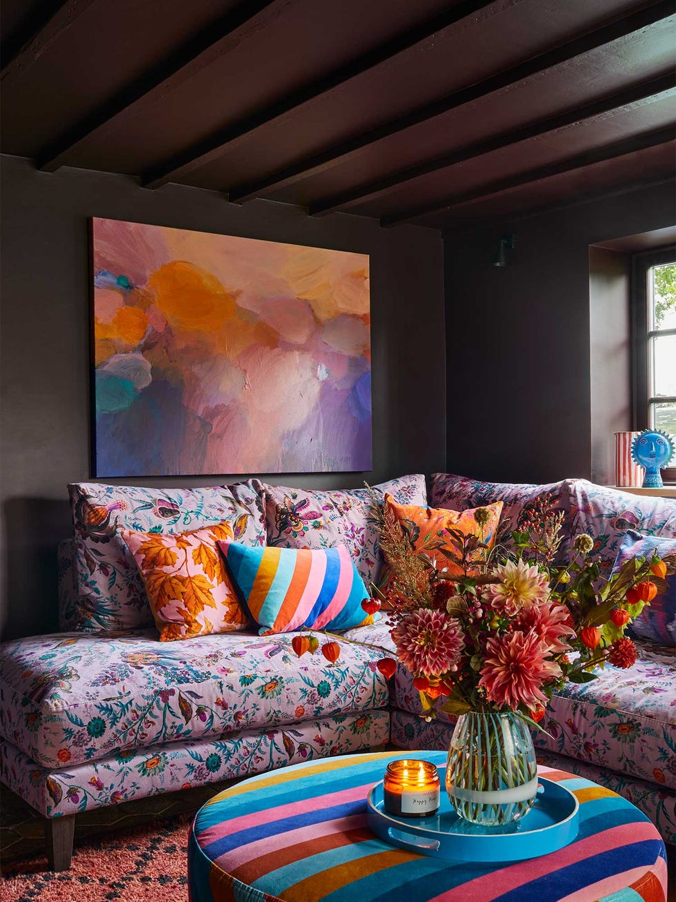
A more vibrant option includes pastel lilac, pink, and gold. Emily Kantz, color marketing manager at Sherwin-Williams, recommends pairing a soft 'Euphoric Lilac' with a saturated 'Dragon Fruit' pink and a sunny 'Quilt Gold.' To balance this colorful array, pops of bright white, such as 'Alabaster,' are suggested. The enduring popularity of pastel yellow combined with crisp white is also noted. This scheme, featuring 'Convivial Yellow' and 'Snowbound,' captures spring's warmth and optimism, making it suitable for entryways, kitchens, and social spaces. The cool, crisp white balances the golden yellow, creating an airy and stylish environment that reflects the longer days and renewal of the season.
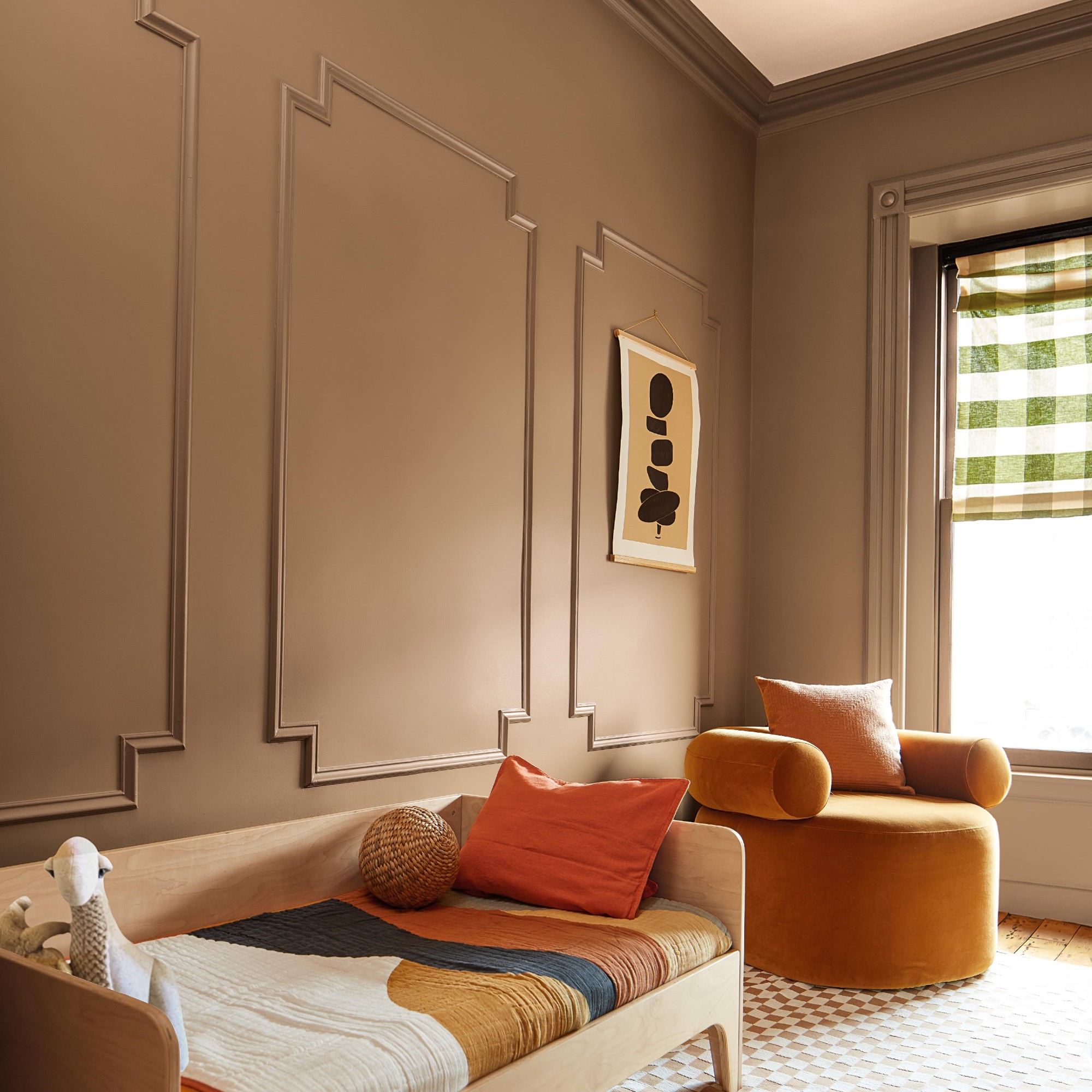
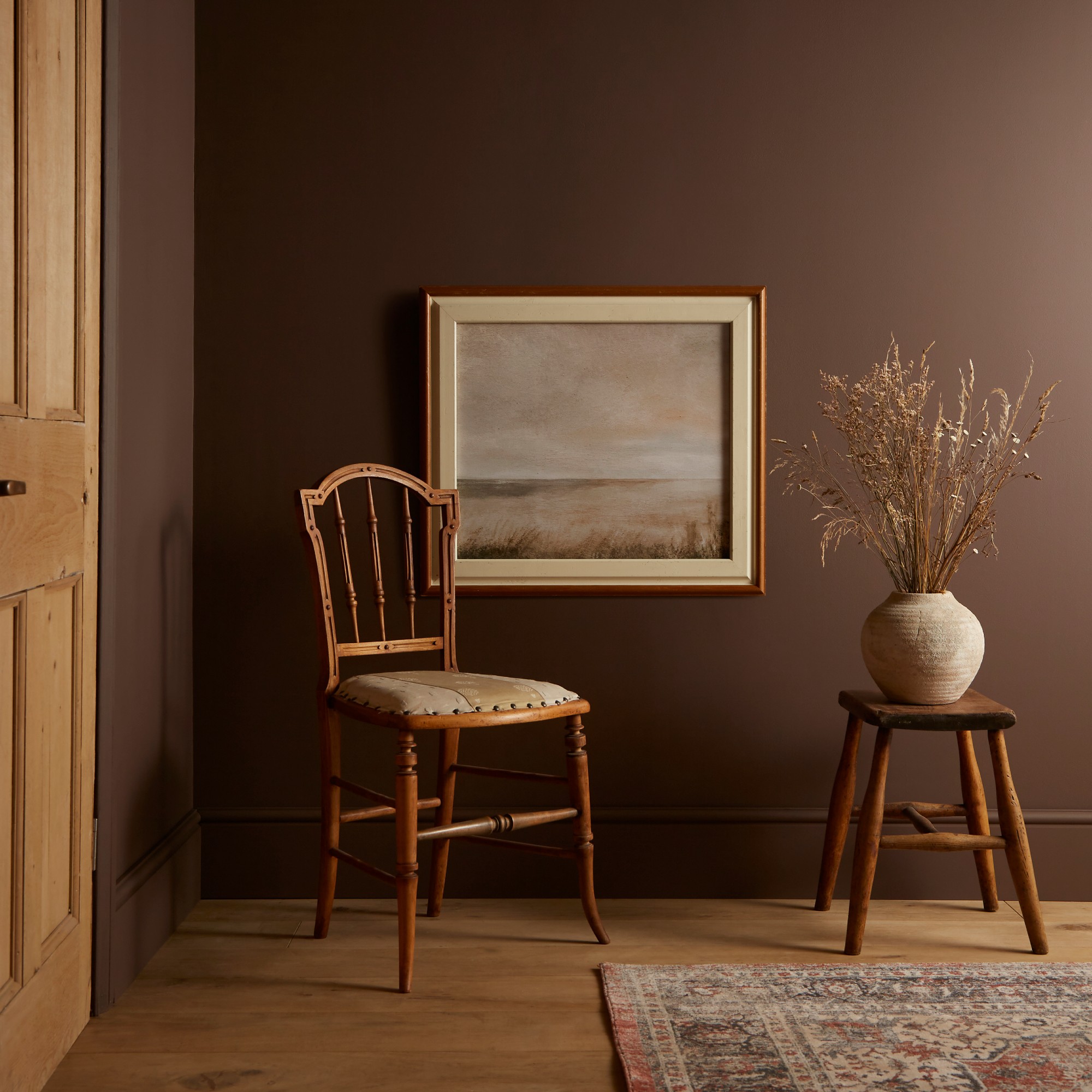
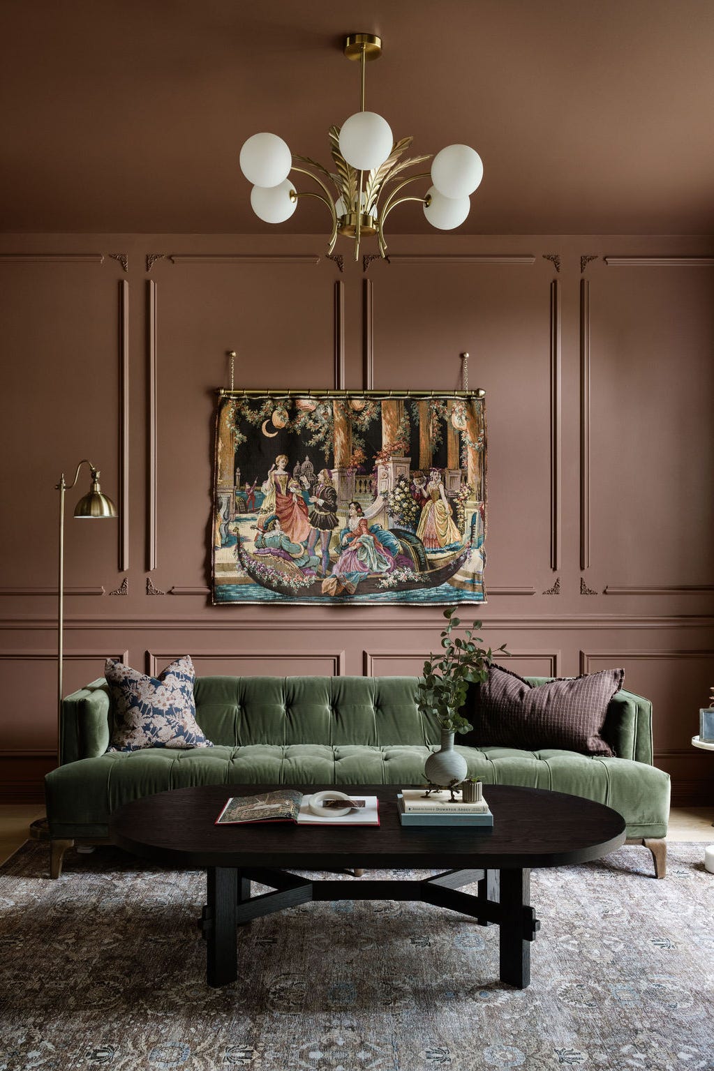
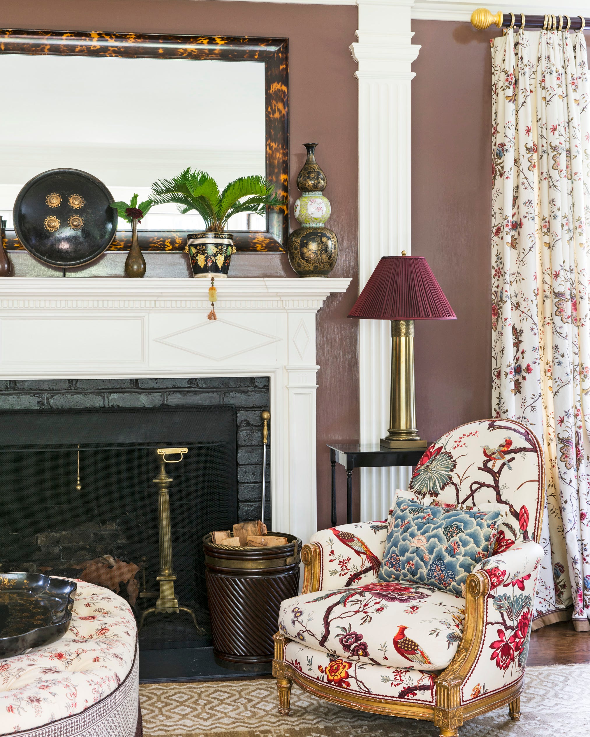
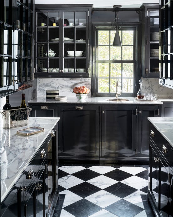
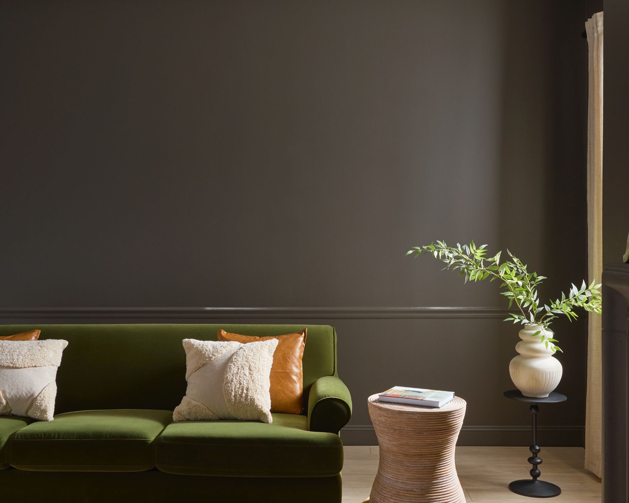
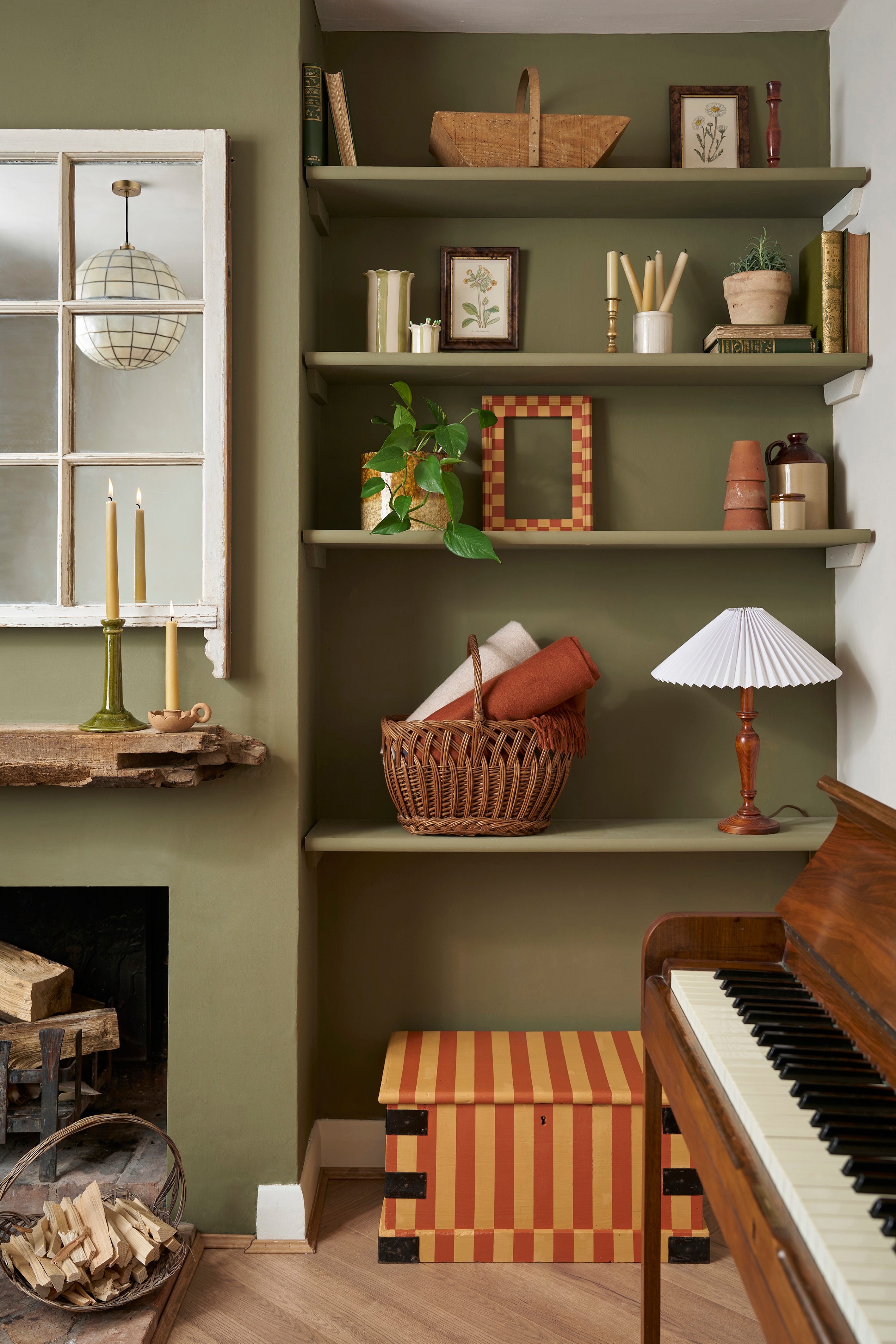
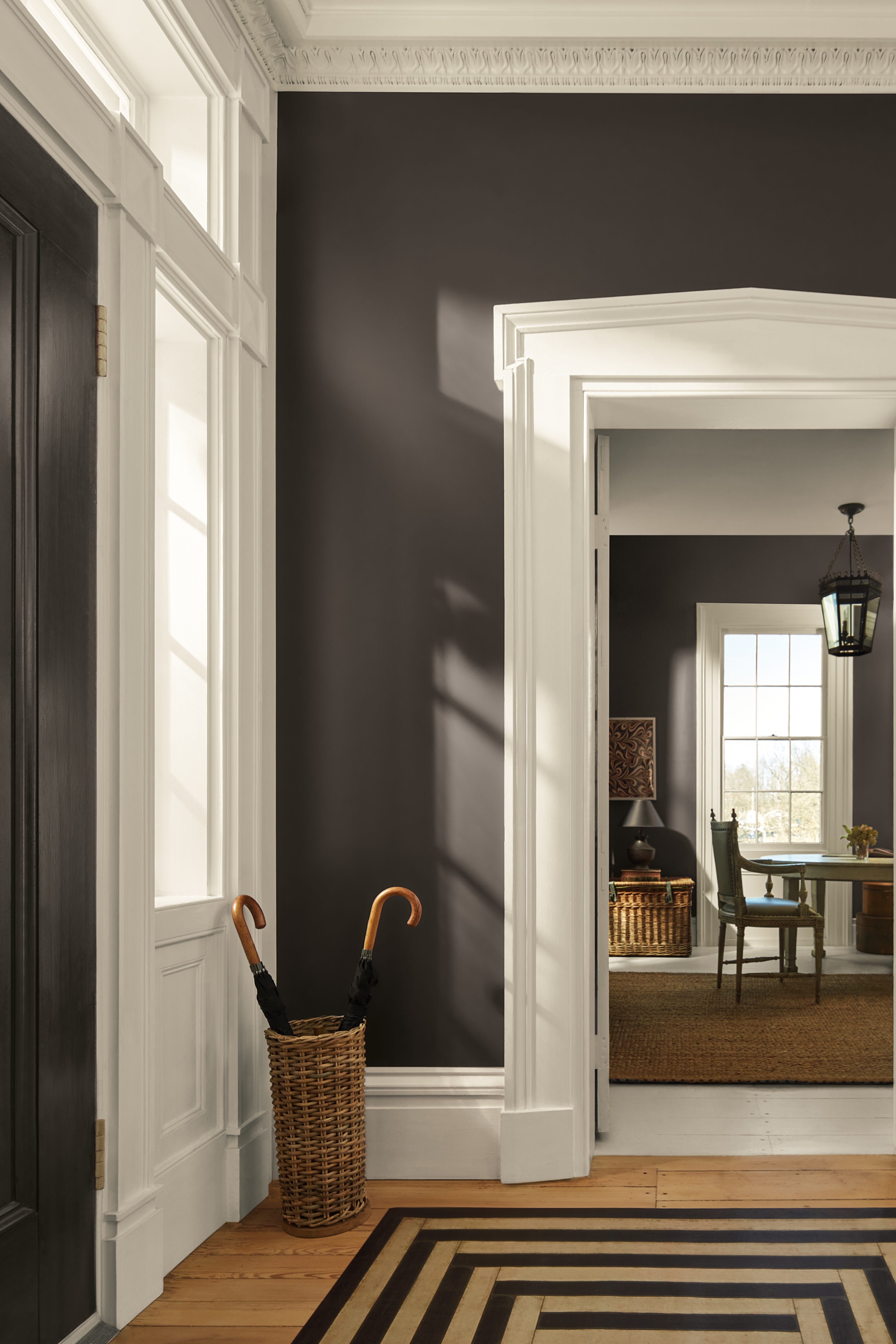
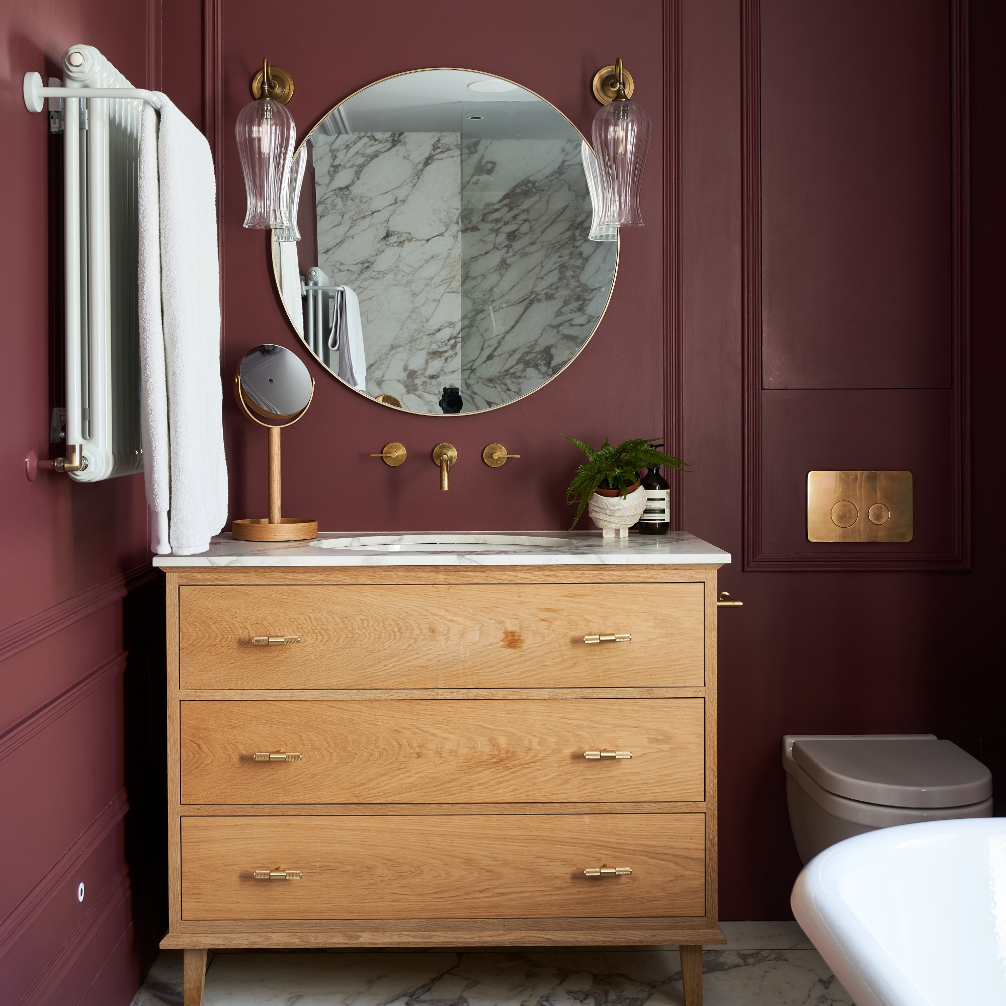
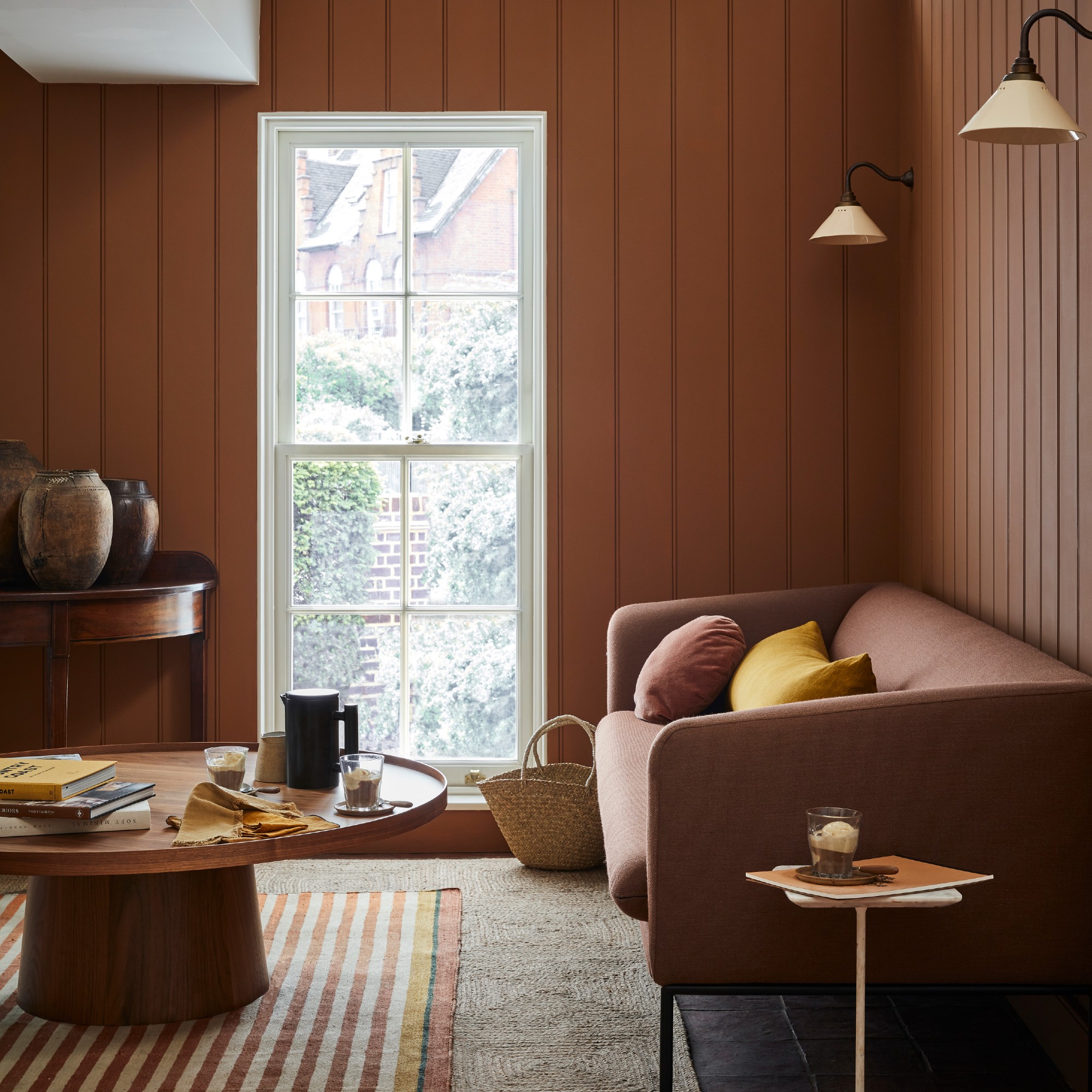
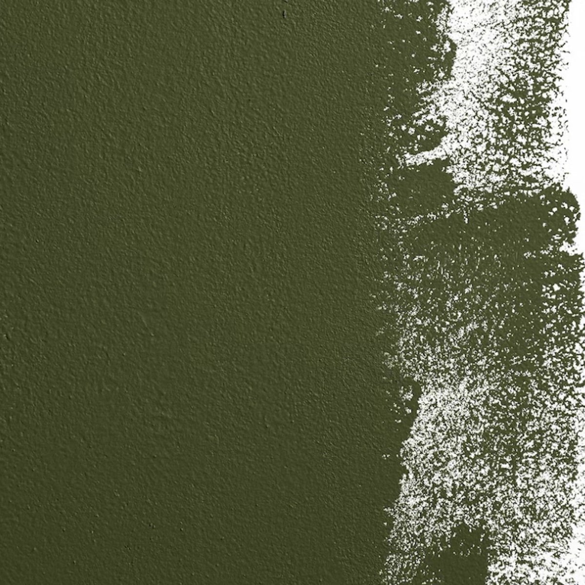
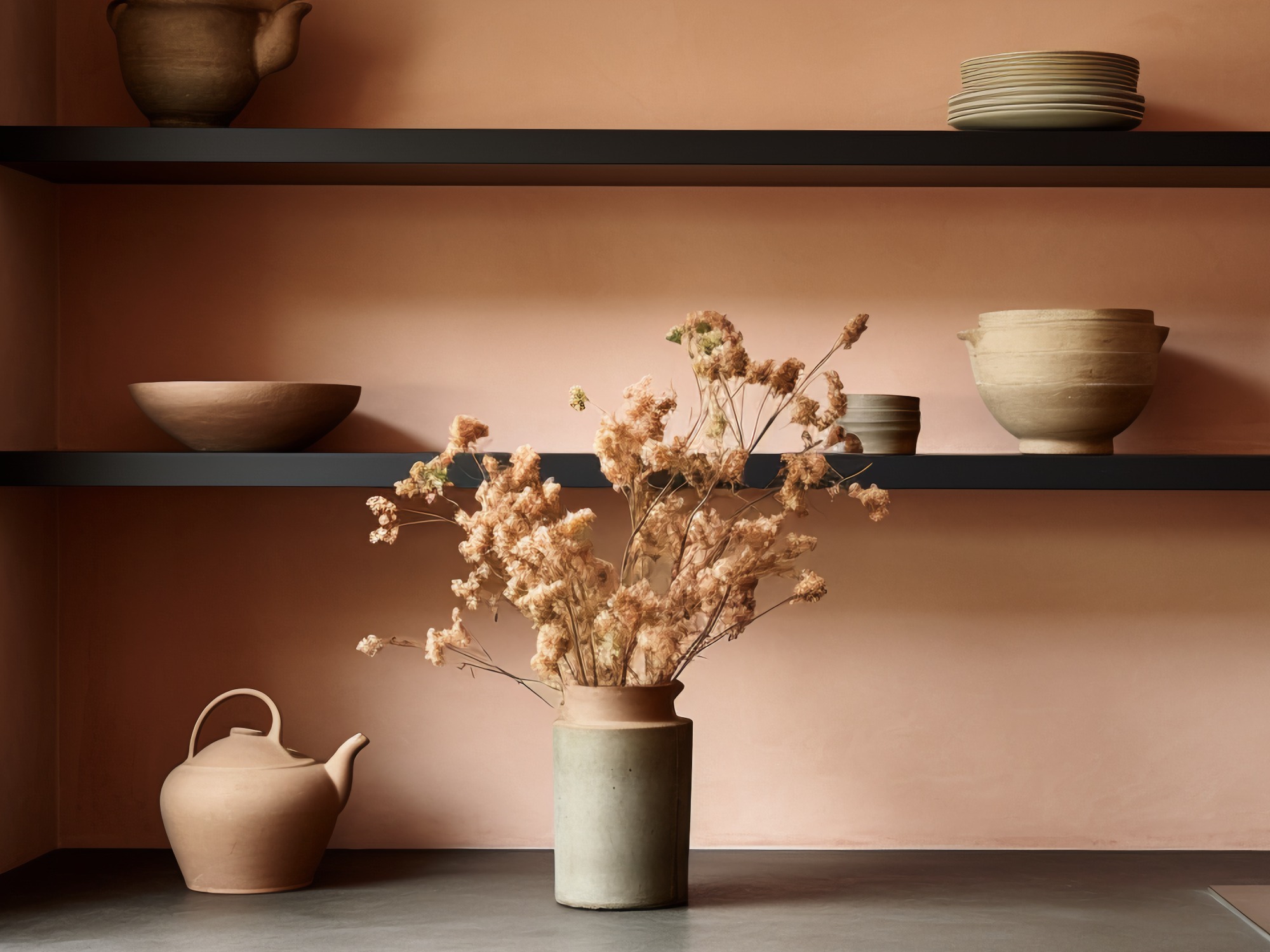
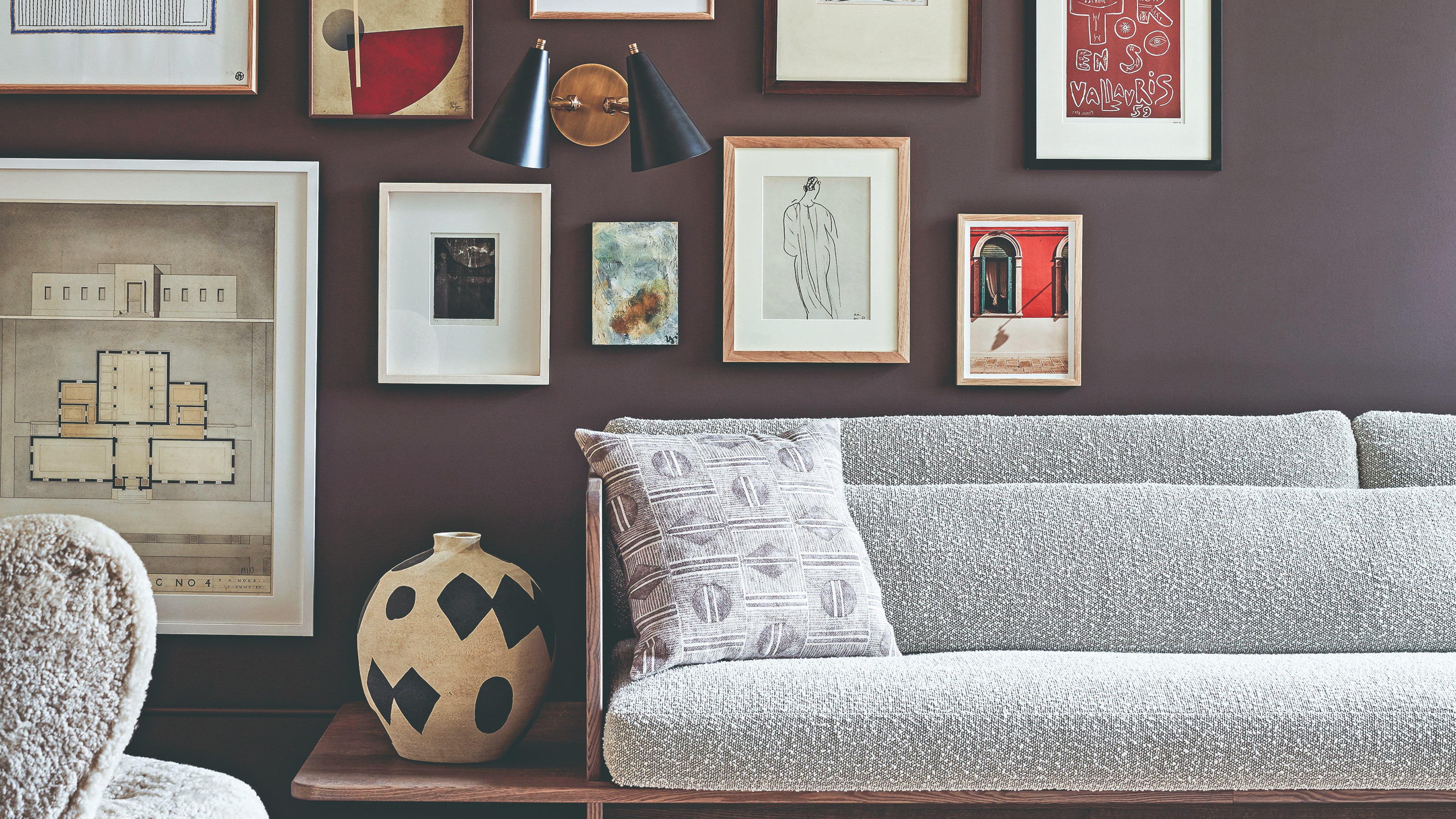
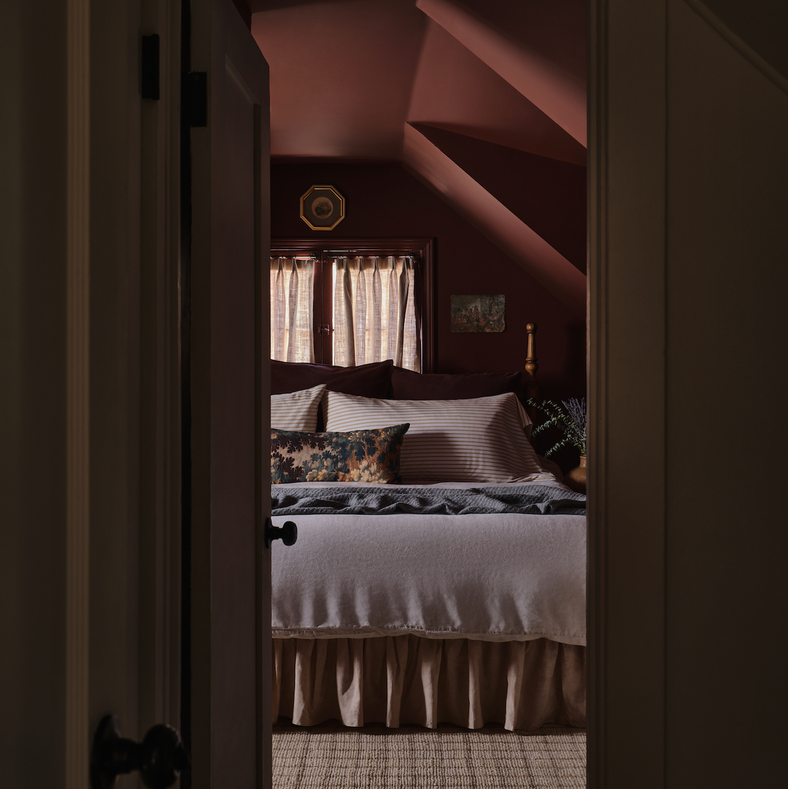
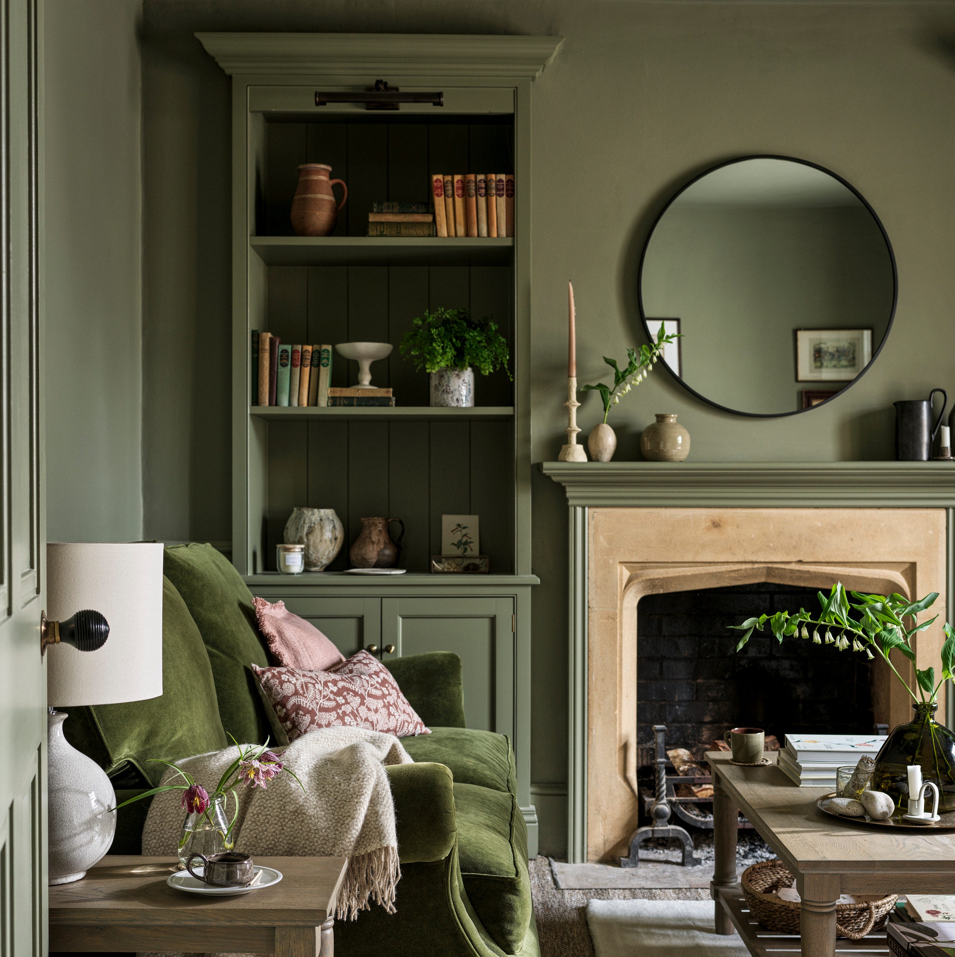
Finally, for a more sophisticated and understated approach, earthy brown and dark neutrals are making a significant comeback. Erika Woelfel, BEHR’s vice president of color and creative services, points to versatile, earthy tones like 'Wild Truffle' and 'Gardener’s Soil' to bring the outdoors in, replacing cooler grays with warm, inviting spaces. Complementing this, the 'quiet luxury' trend suggests refreshing spaces with creamy whites and earthy neutrals. Sherwin-Williams' 'Creamy' white serves as an ideal foundational shade, allowing for the layering of earthy neutral accents like 'Keystone Gray,' 'Minimalist,' and darker shades such as 'Sealskin' and 'Carnelian,' creating a serene and elegant space.
#SpringColorSchemes #HomeDecor #InteriorDesign #PaintTrends #ColorPalettes #DecoratingAdvice #ResidentialStyling #EarthyTones #SpringColorSchemes #HomeDecor #InteriorDesign #PaintTrends #ColorPalettes #DecoratingAdvice #ResidentialStyling #EarthyTones
0 opmerkingen in totaal
Dit vindt u mogelijk ook leuk
Colour experts share their top paint trends for 2024

These 5 Paint Color Trends Will Be Everywhere in 2024, According to Interior Designers
The Biggest Colour Trends Taking Off in 2025
5 Paint Color Trends Designers Are Begging You to Leave in 2025
The colour palette for 2025 – these are the shades paint experts say we’ll see everywhere next year
8 Paint Color Trends You'll ACTUALLY Want to Live With in 2026, According to Designers

9 Trending Paint Colors You'll See Everywhere in 2025, According to Designers
6 key colors to decorate with in May 2025, according to interior design and color experts in the know

The #1 Paint Color Trend of 2025, According to Designers


4 Paint Color Trends Designers Are Ready To Ditch In 2025
The biggest color trends of 2025 – 10 colors designers say will lead the way next year
Interiors experts predict this will be the biggest paint trend of 2026

5 Paint Colors That Are Out for 2025, According to Interior Designers

Colors of The Year – get to know every shade revealed by leading paint brands for 2025
Paint trends 2025 – the 9 shades, colour schemes and paint techniques you’ll be obsessed with this year
The Paint Color Trends of 2023 Are in—And They’re Gorgeous
These 8 Color Trends Will Rule in 2025, According to Color Pros

Experts Say These 5 Paint Colours Will Be Everywhere In 2026
Color Explosion: 2025 Color Trends

5 Paint Colors That Will Take Over in 2025, According to Interior Designers