1/14
Interior Paint Colour Trends 2024: 14 influential shades to inspire our homes
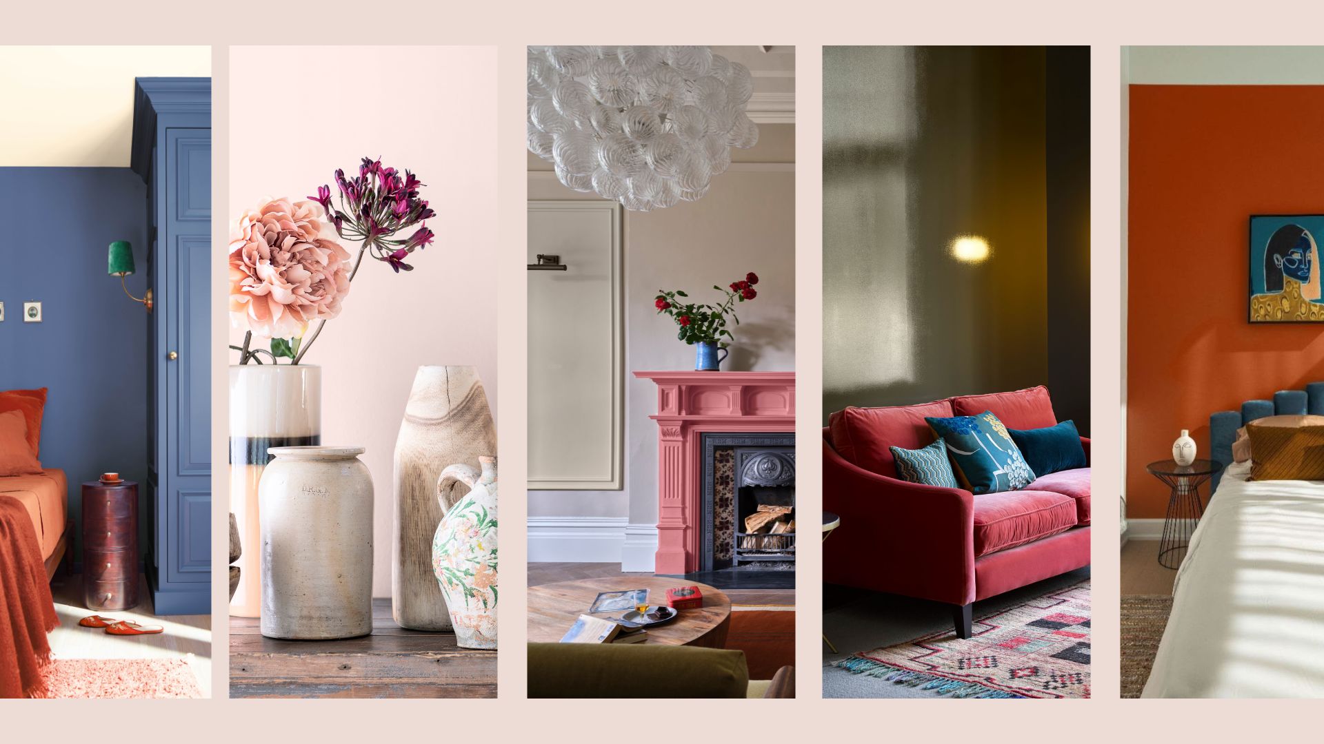
The article details the interior paint color trends for 2024, providing a comprehensive guide to shades predicted to be influential in home decoration. It emphasizes colors that offer both longevity and relevance, curated by color specialists and determined by leading experts who consider the psychology of color and its impact on creating harmonious living spaces.
The featured colors are influenced by broader interior design and fashion trends, ensuring they resonate with contemporary aesthetics. Each trend includes a specific paint shade from renowned brands like Dulux, Benjamin Moore, Graham & Brown, Farrow & Ball, YesColours, Valspar, Glidden, Earthborn, and Lick, along with insights into their characteristics and recommended applications.
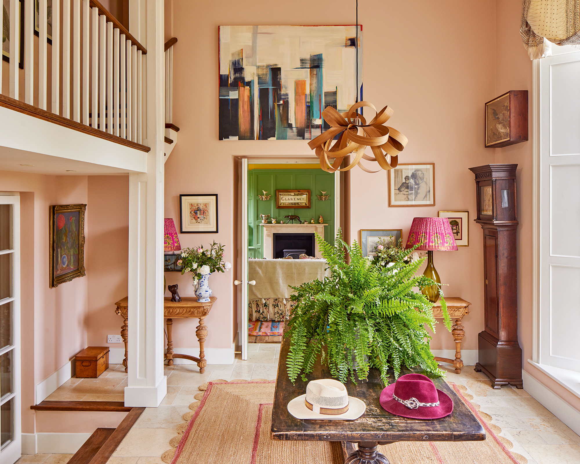
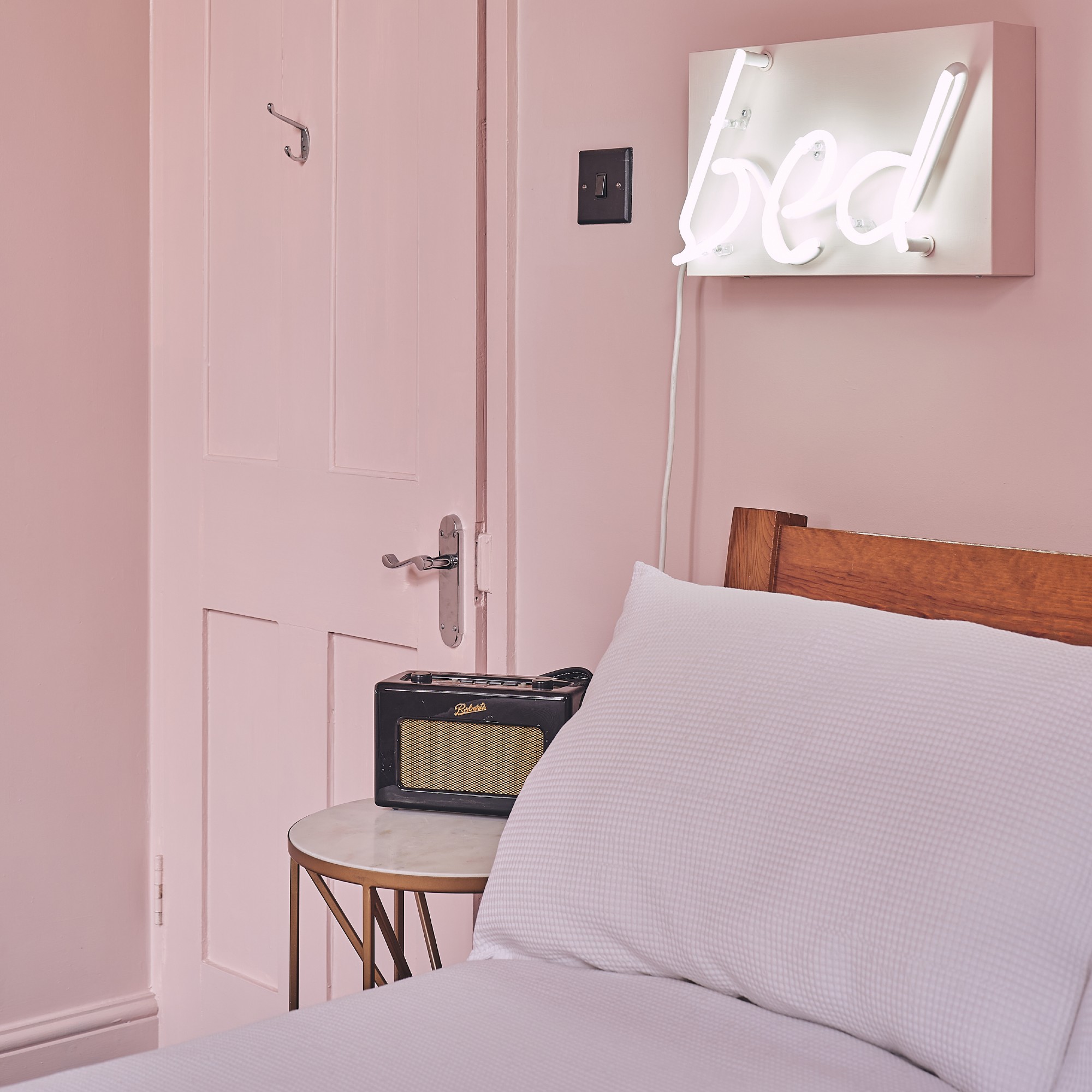
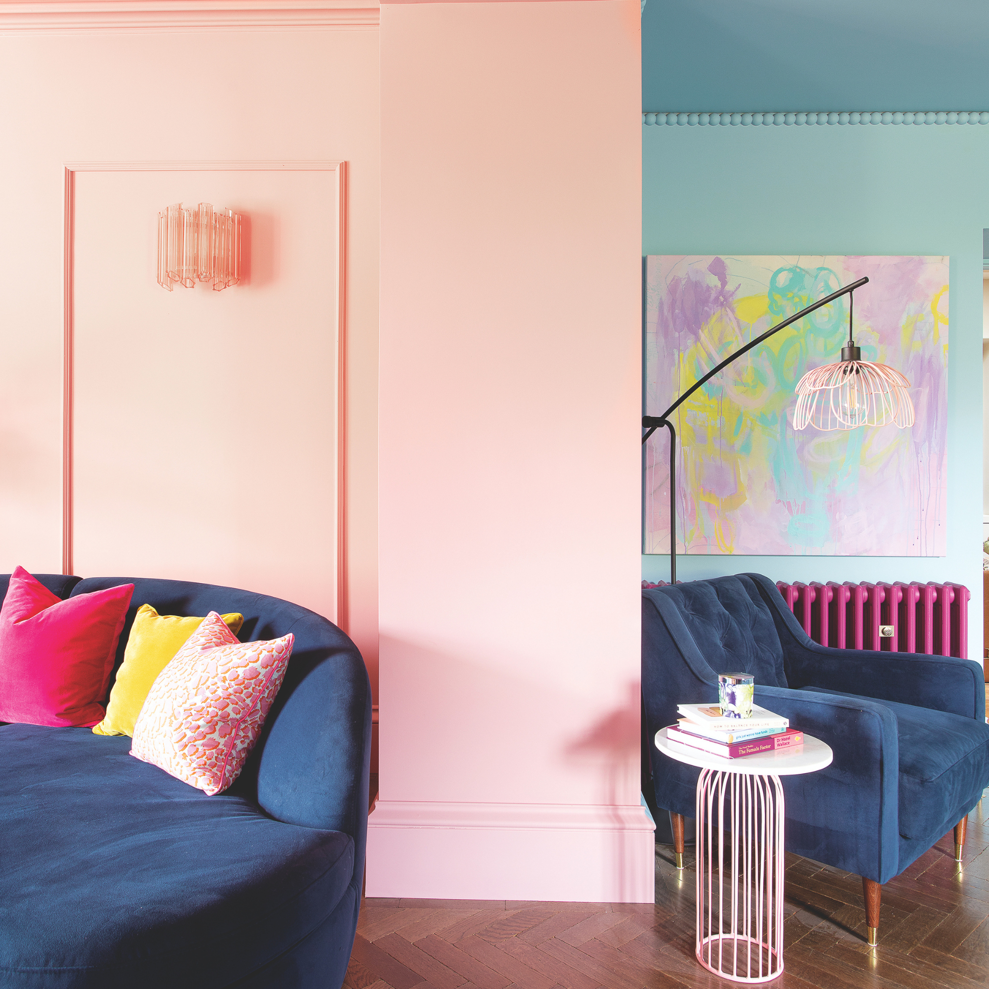
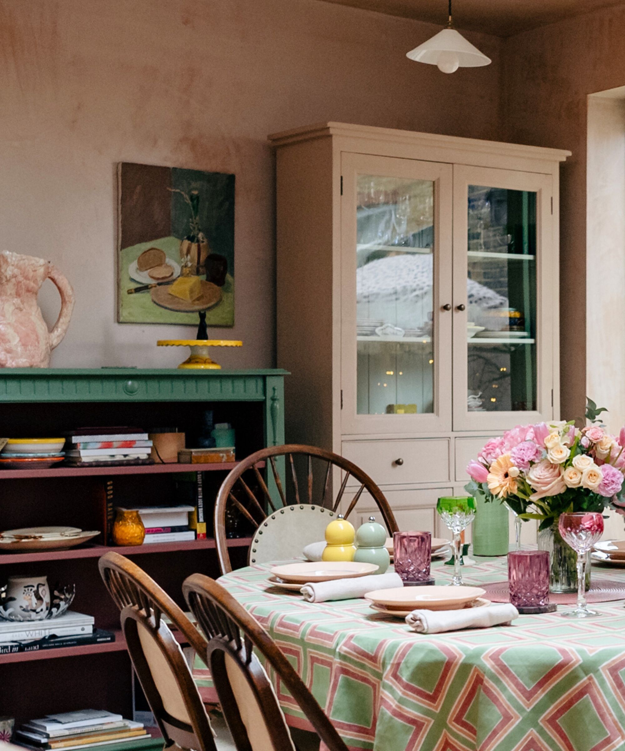
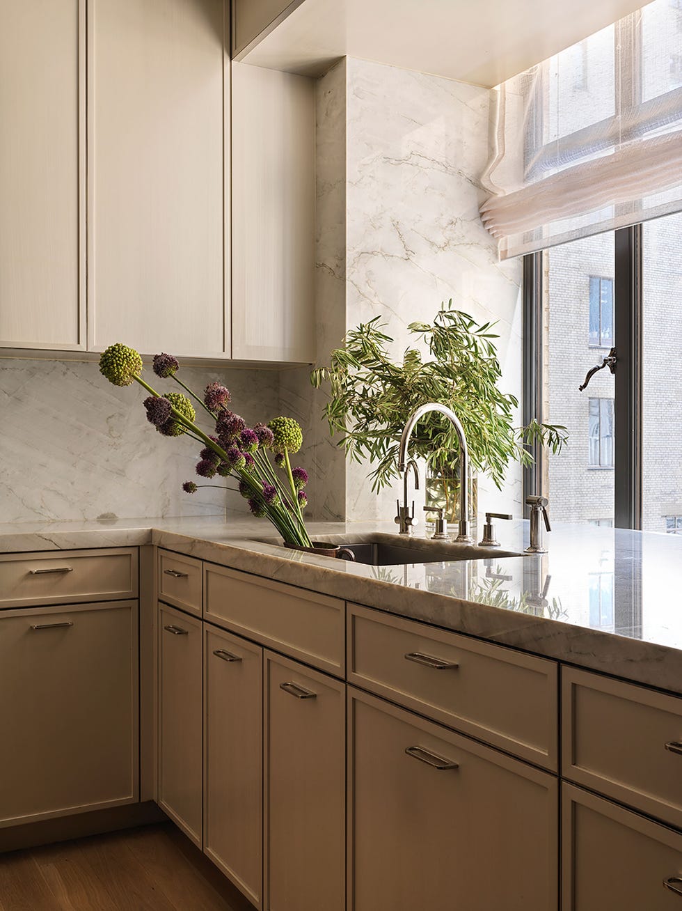
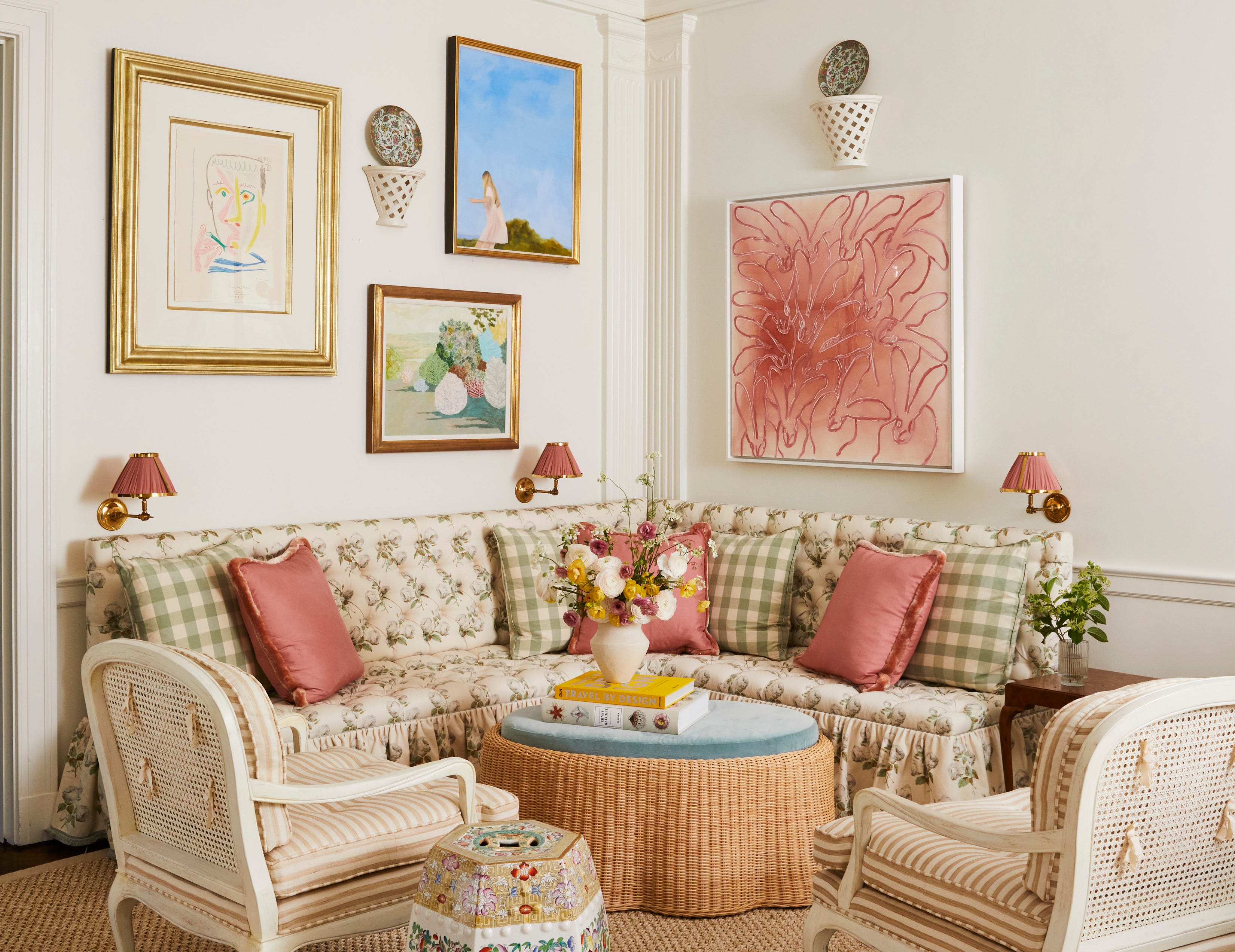
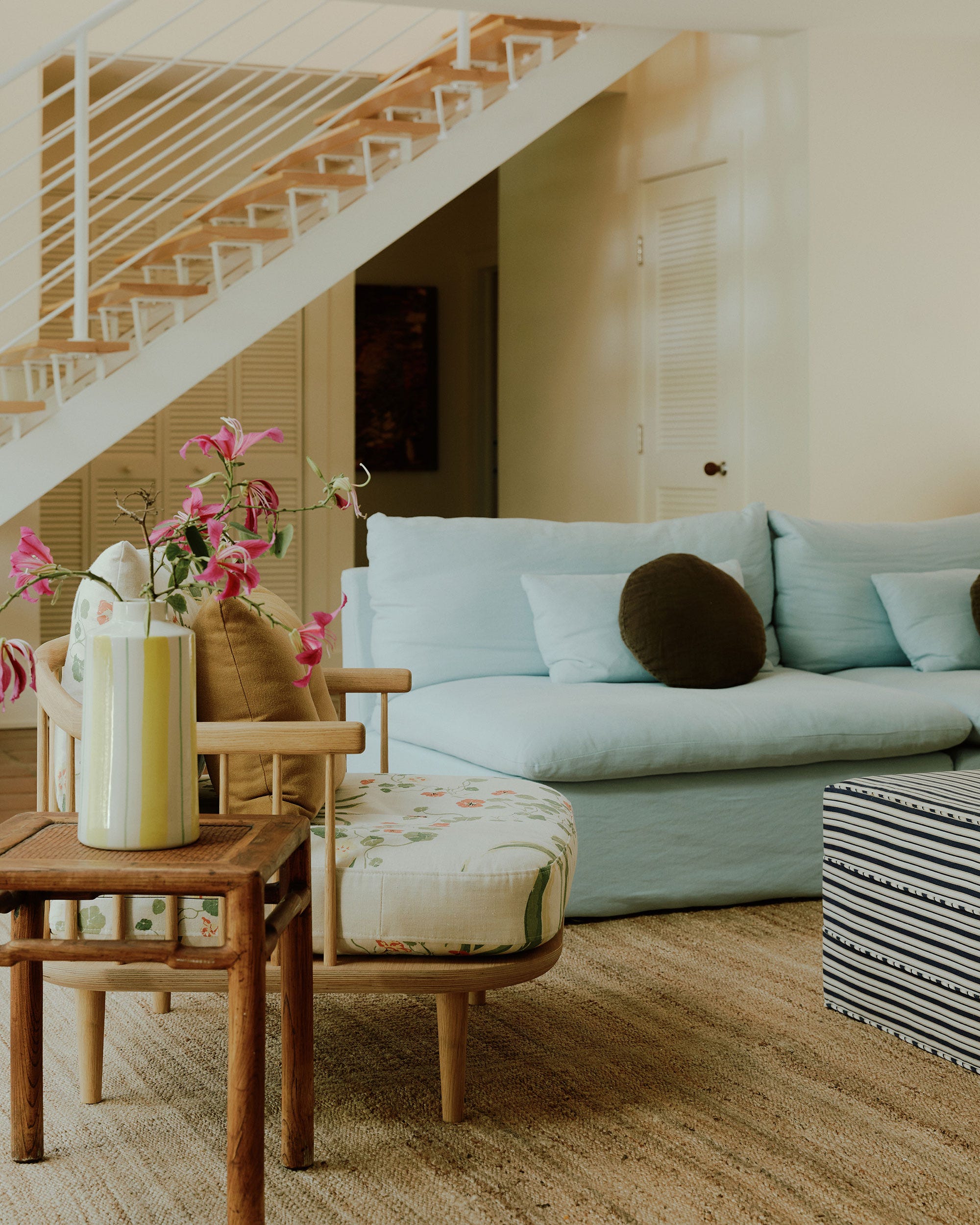
Dulux's 'Sweet Embrace' is highlighted as a soft neutral with pink undertones, ideal for adding warmth and vibrancy to smaller rooms or those with limited natural light. Its versatility allows it to blend seamlessly with various furnishings and artwork, fostering an uplifting atmosphere.
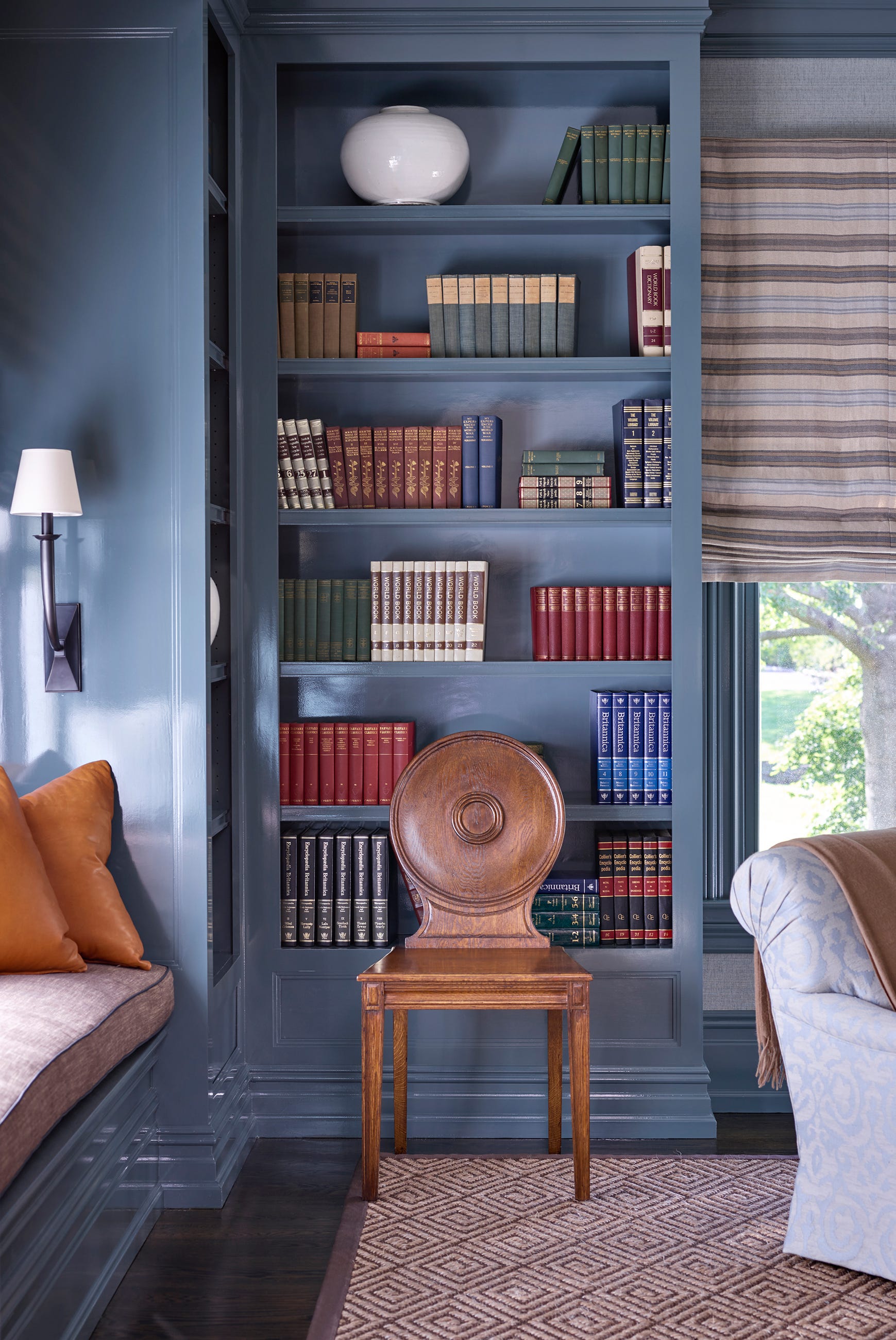
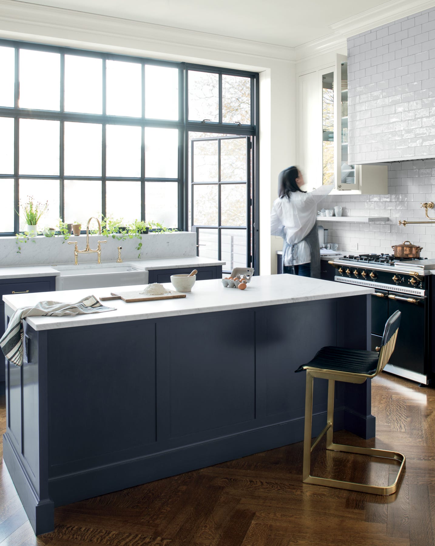
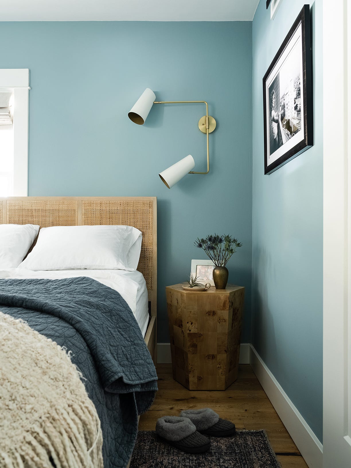
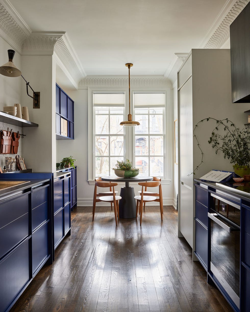
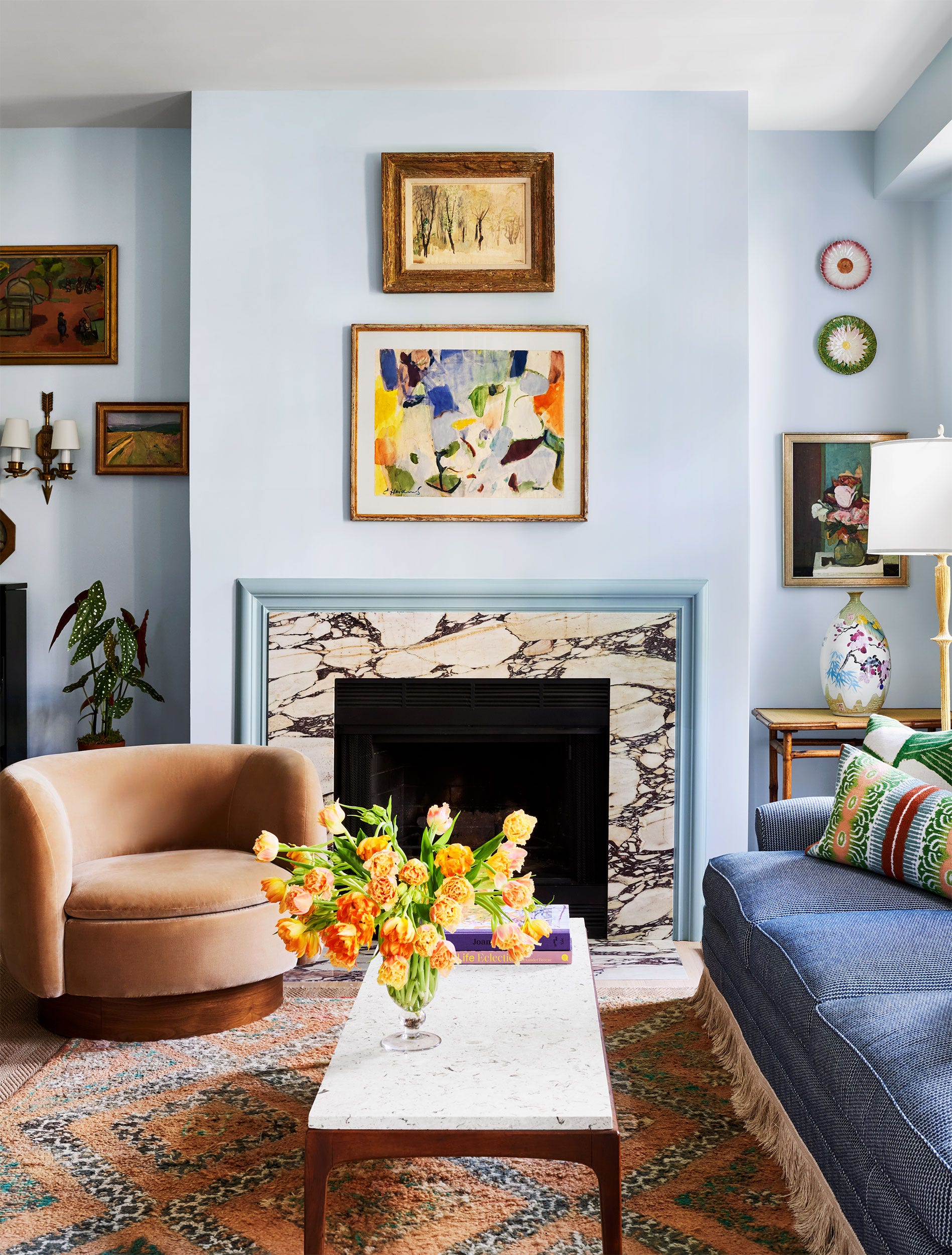
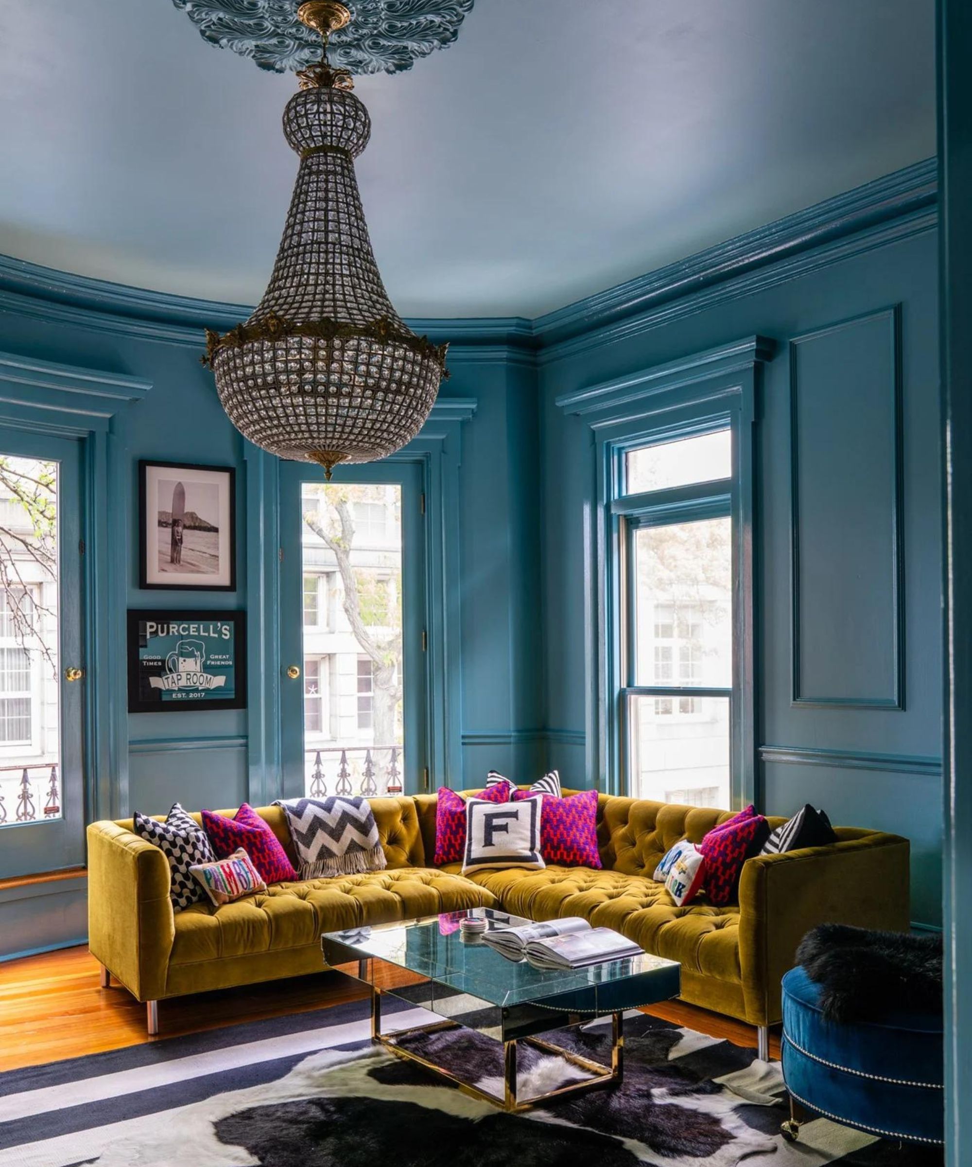
Benjamin Moore's 'Blue Nova 825' is presented as a deep, intriguing blue with violet notes, offering depth and boldness. This shade is described as calming and suitable for bedrooms and living rooms, pairing well with earthy tones like rust and terracotta to enhance its rustic appeal.
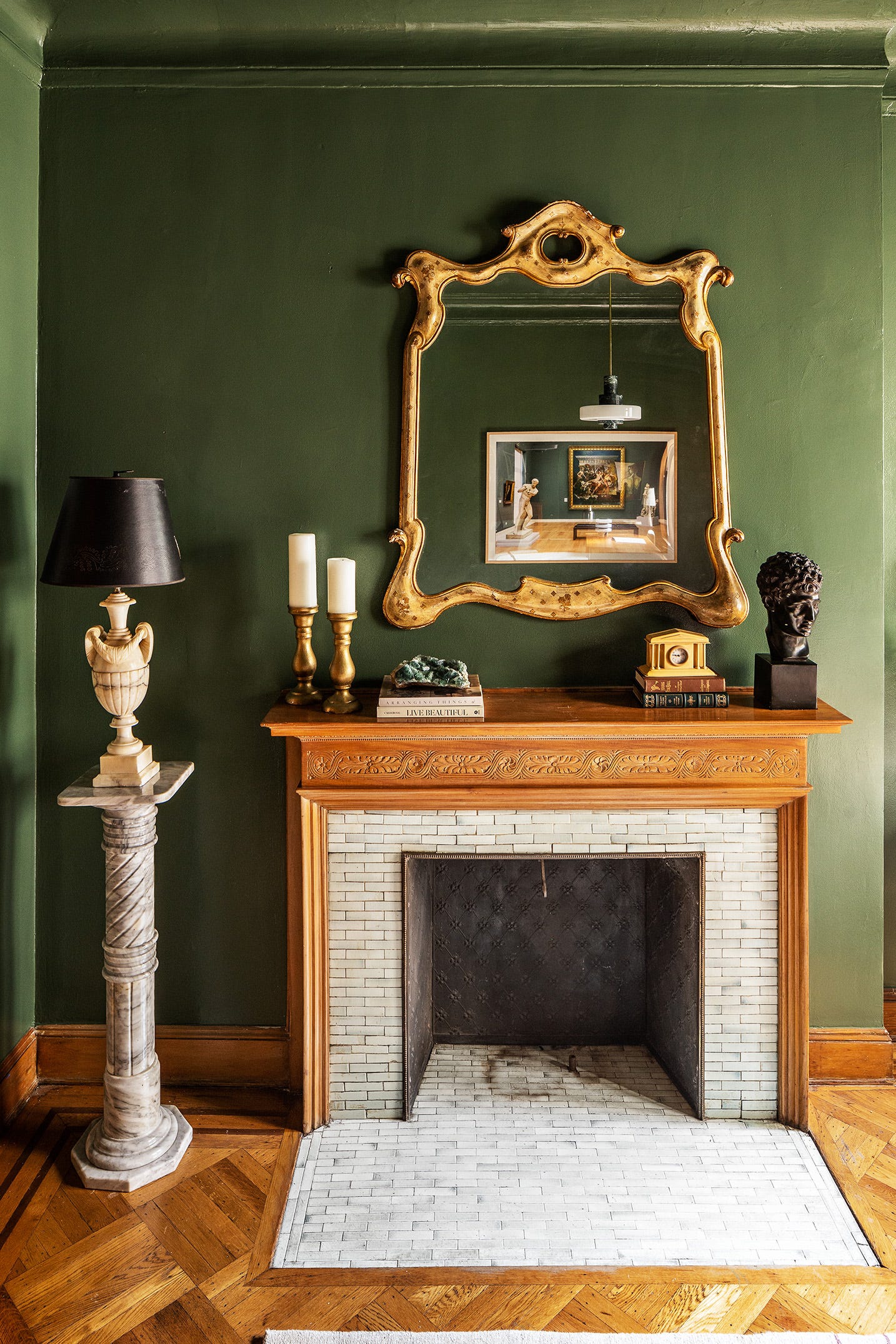
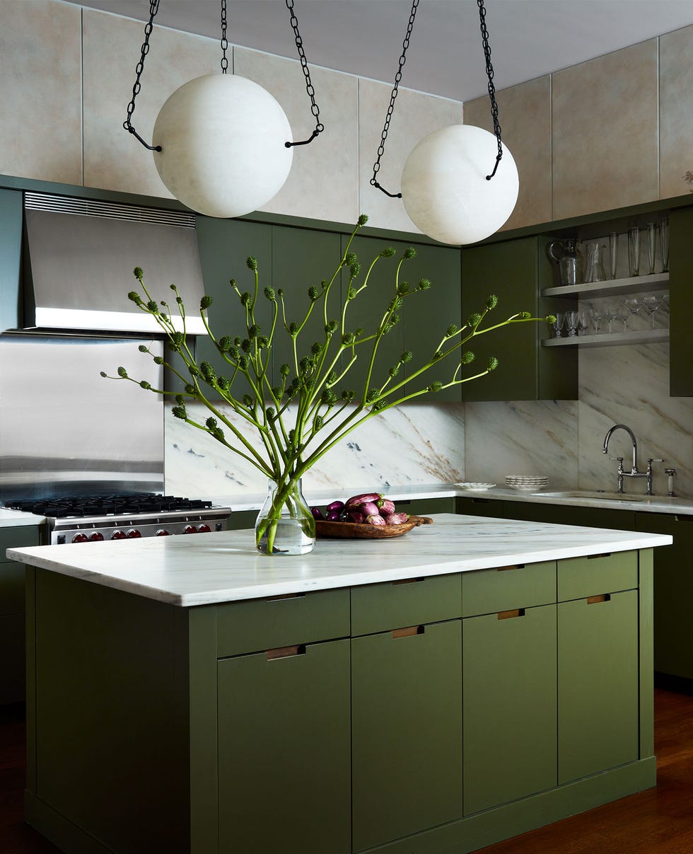
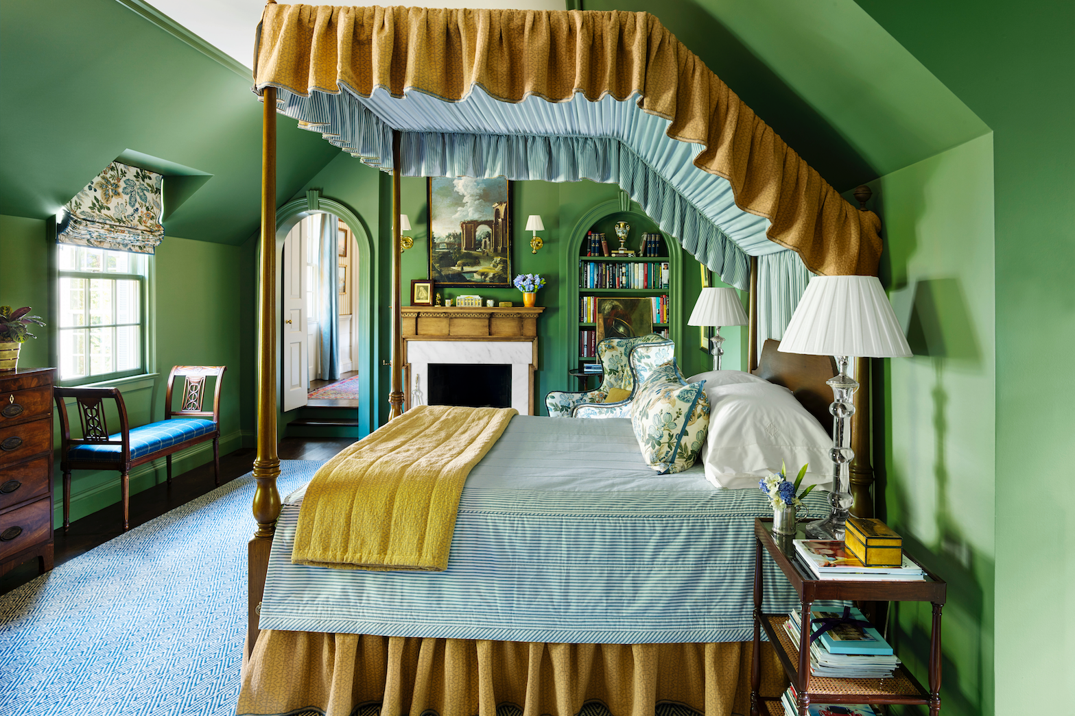
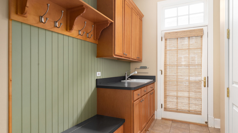
Graham & Brown's 'Viridis' is a muted, nature-inspired green, reminiscent of a saturated sage green. It is positioned as an alternative to greige schemes, promoting calm and peace by blurring the lines between indoor and outdoor environments, making it ideal for restful bedroom settings.
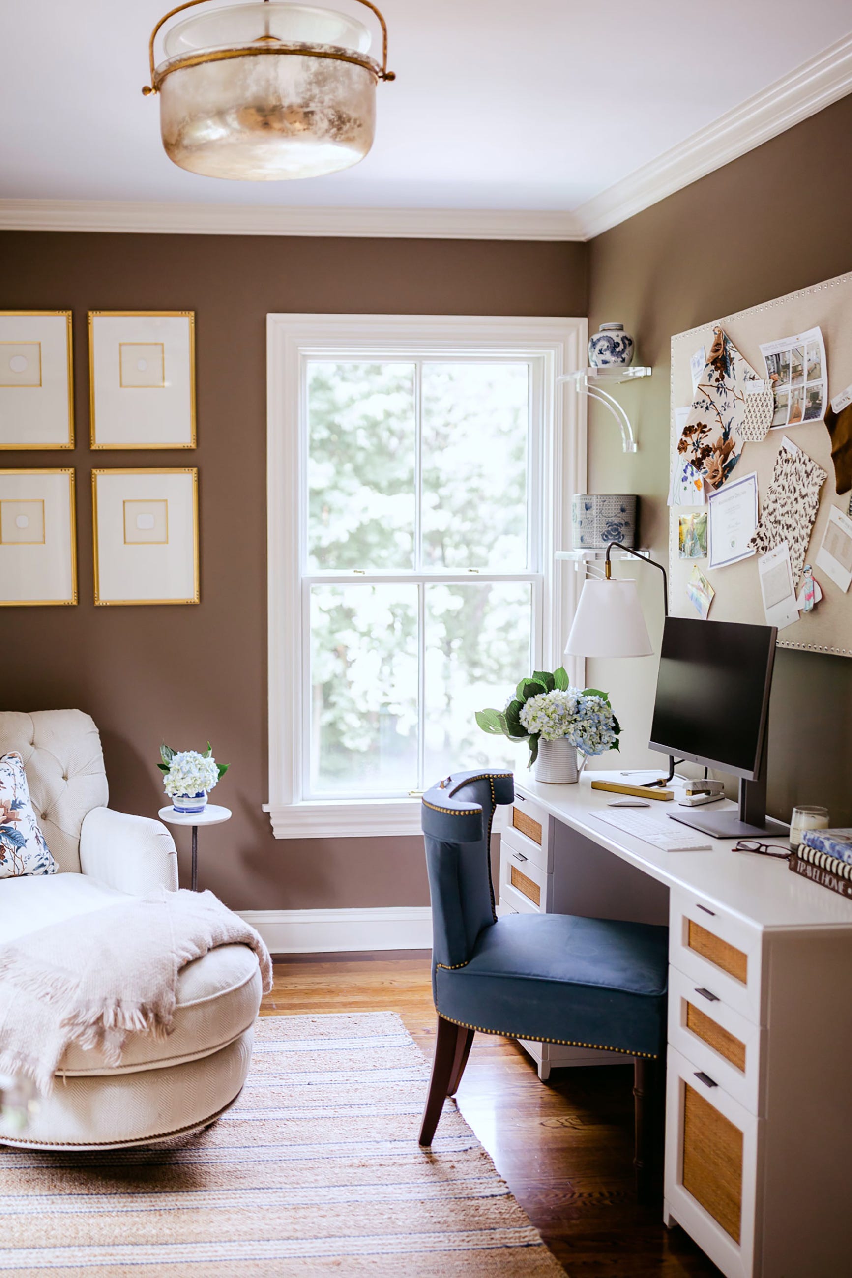
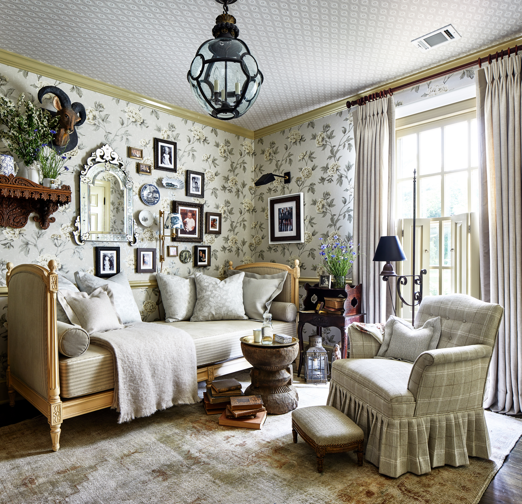
Farrow & Ball's 'Jitney', along with 'Stirabout' and 'Oxford Stone', are noted as timeless 'clay' shades that exude warmth. These neutrals create an earthy, reassuring ambiance, particularly effective when used in combination to make rooms feel brighter and more spacious, embodying chic Parisian decor.
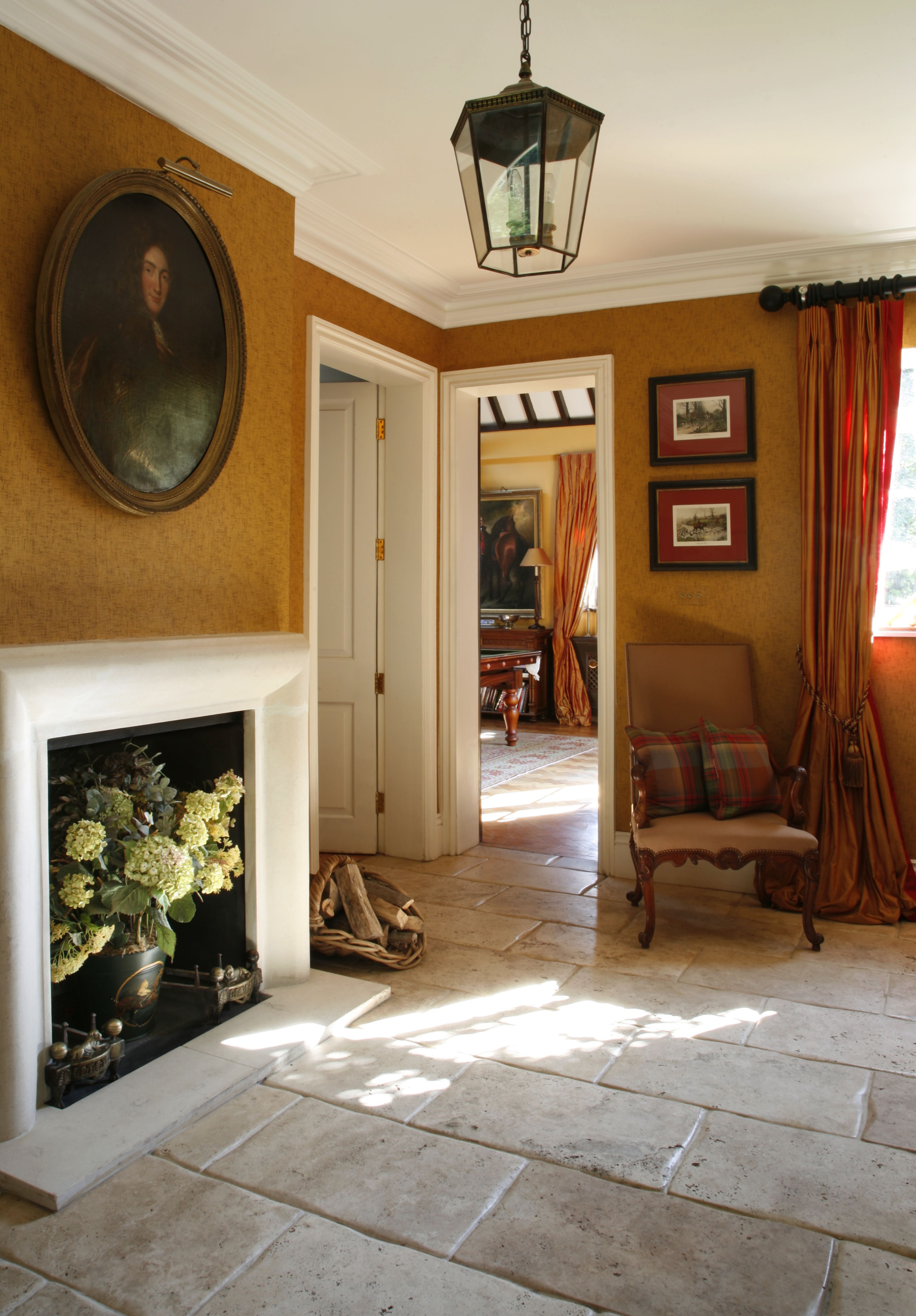
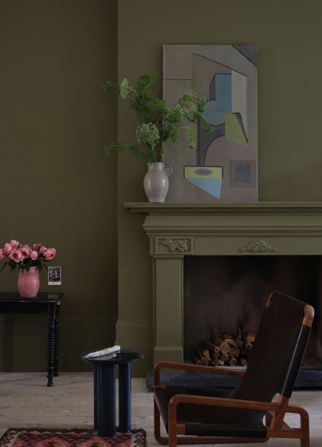
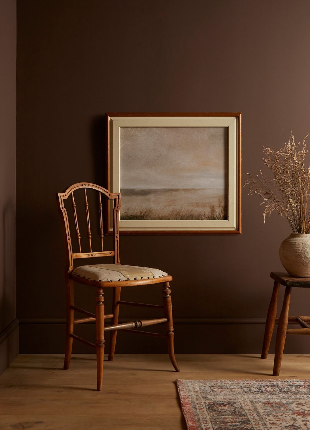

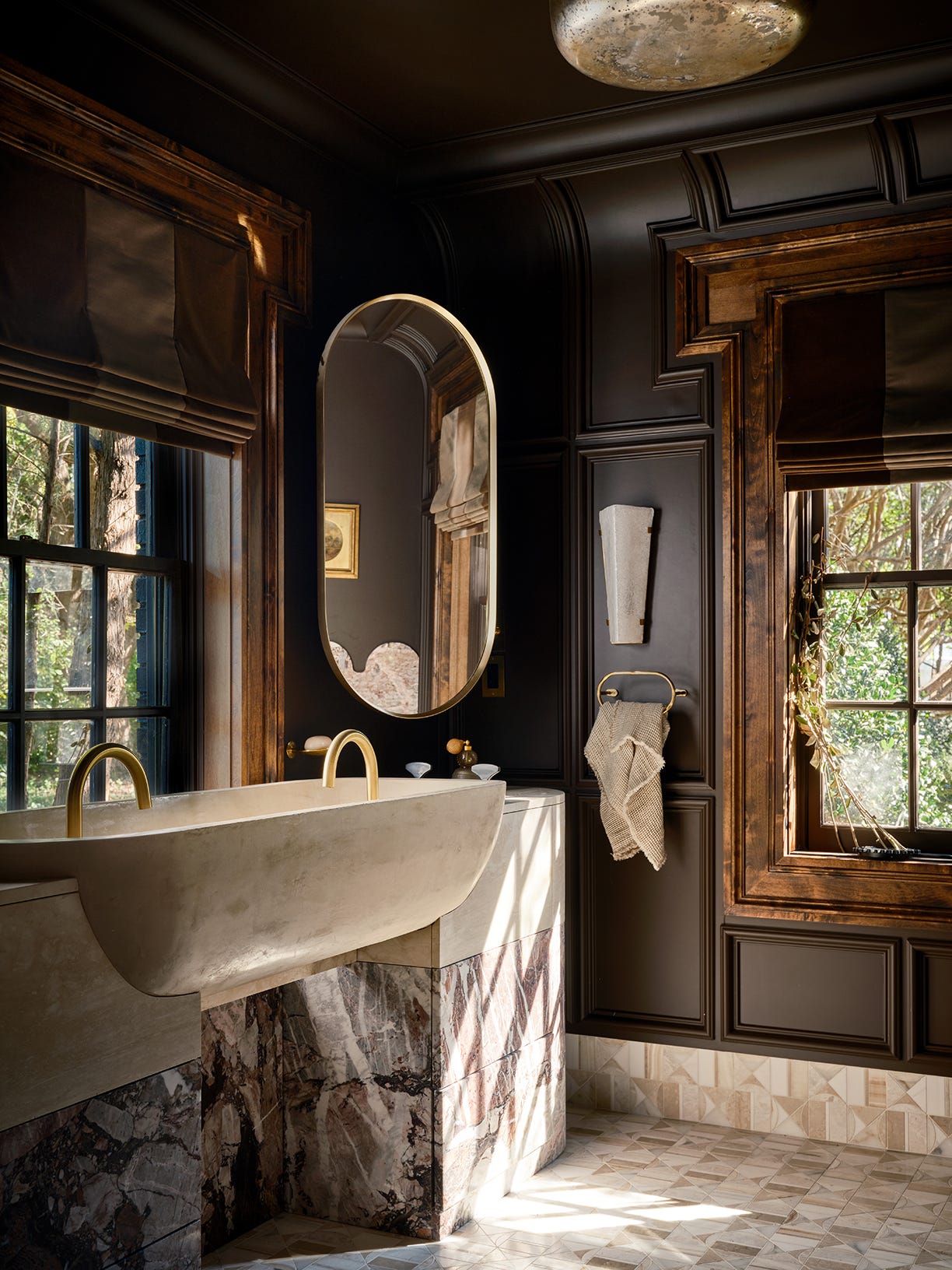
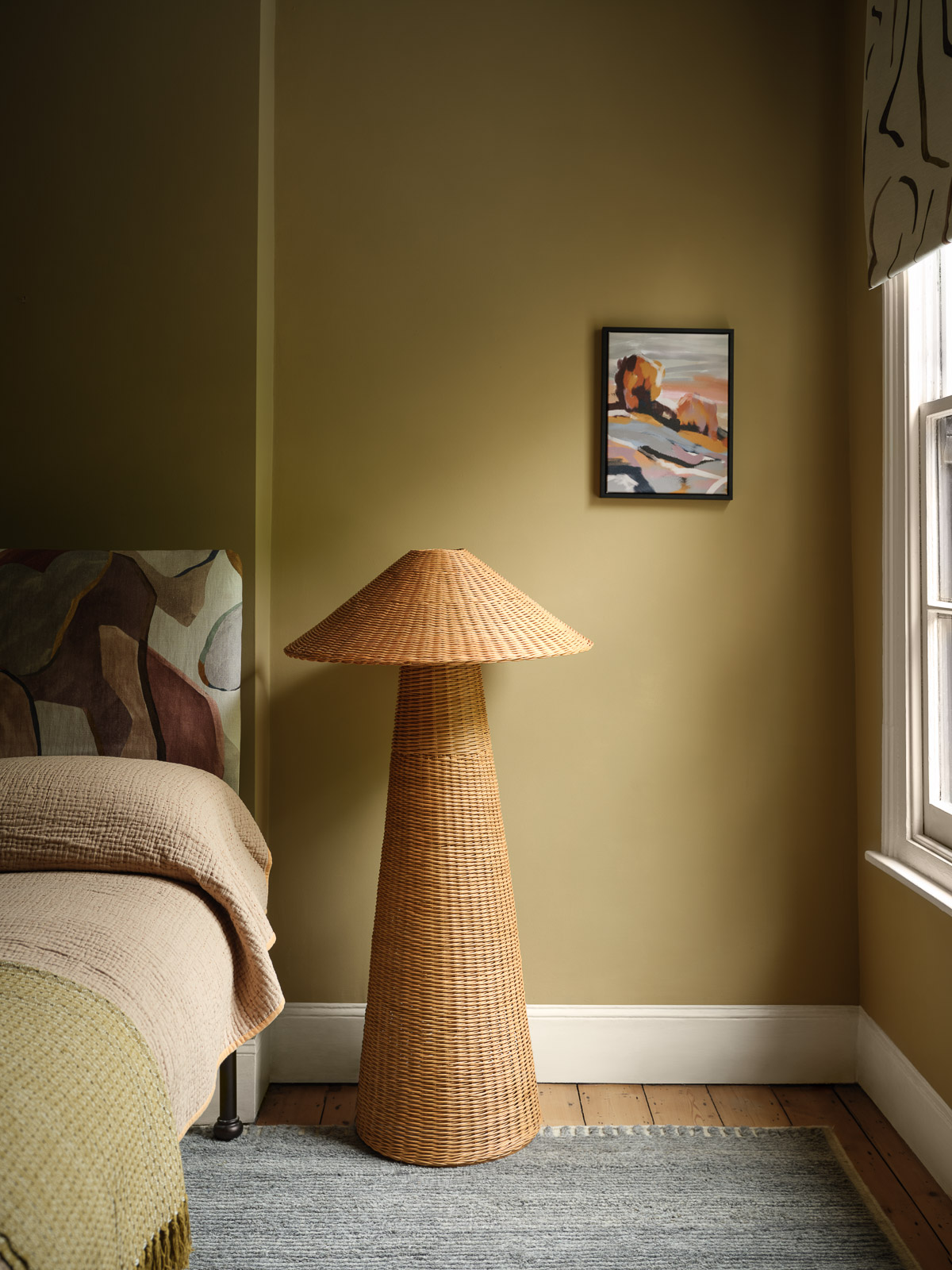
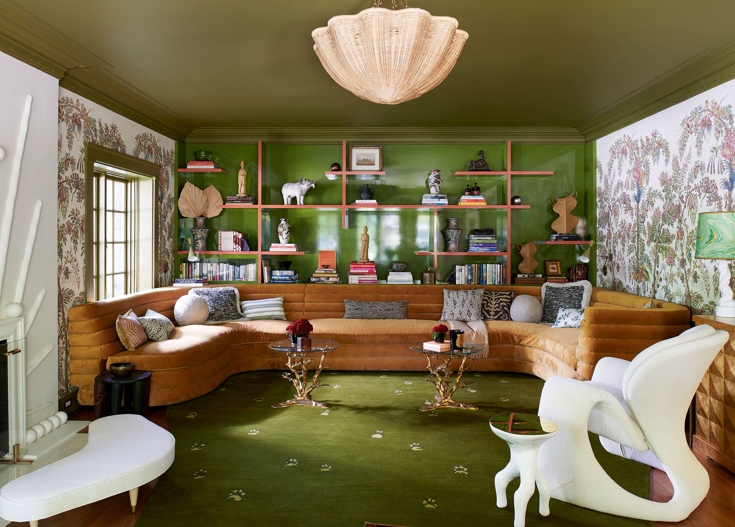
Benjamin Moore's 'Night Owl' is a deep brown with green undertones, representing the continued popularity of earthy tones and biophilic design. This shade offers richness and depth, especially when applied in a gloss finish to create cozy, luxurious retreats.
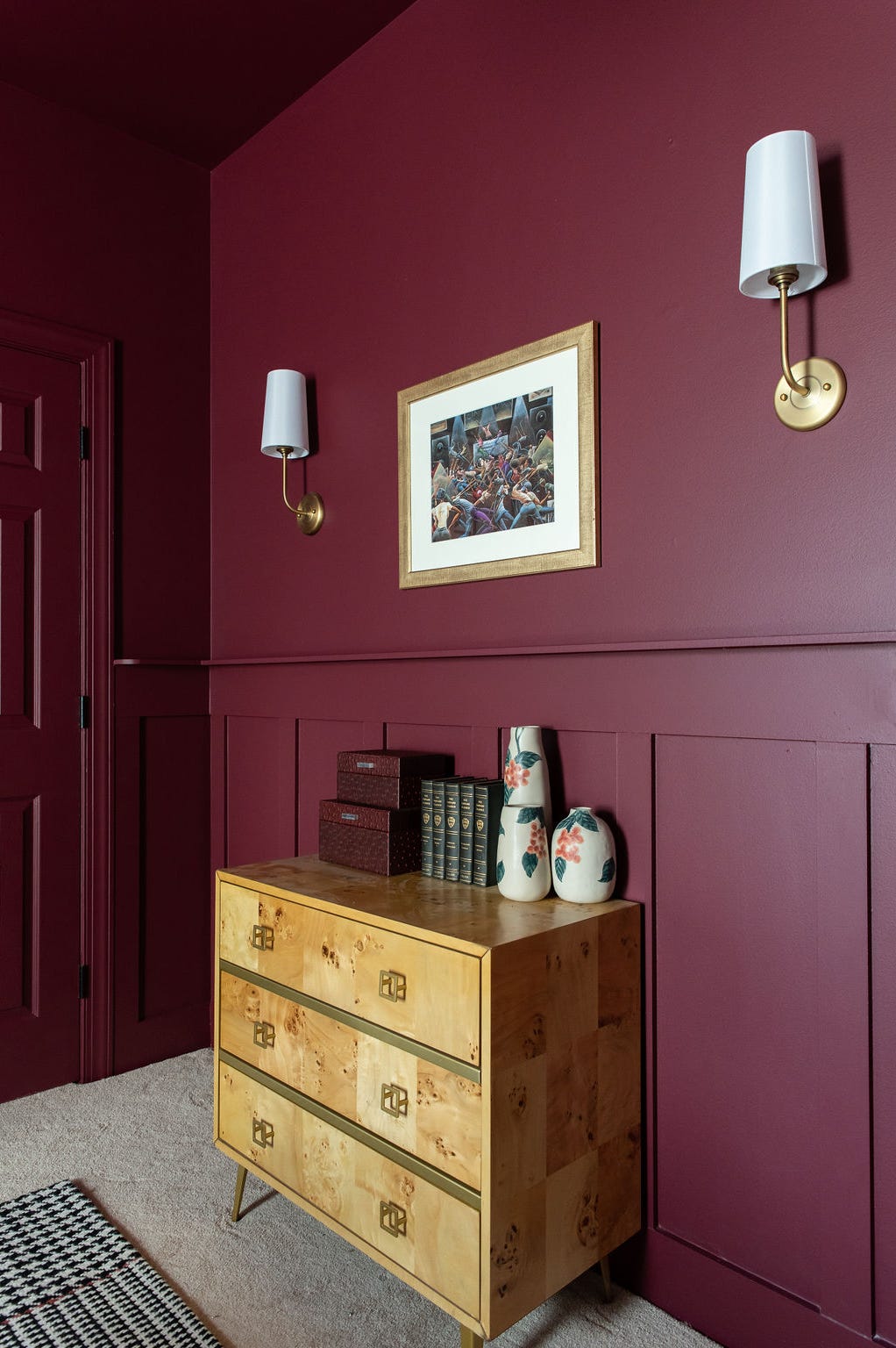
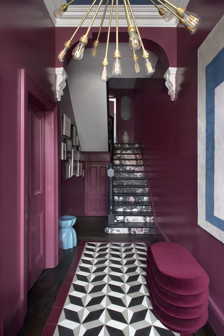
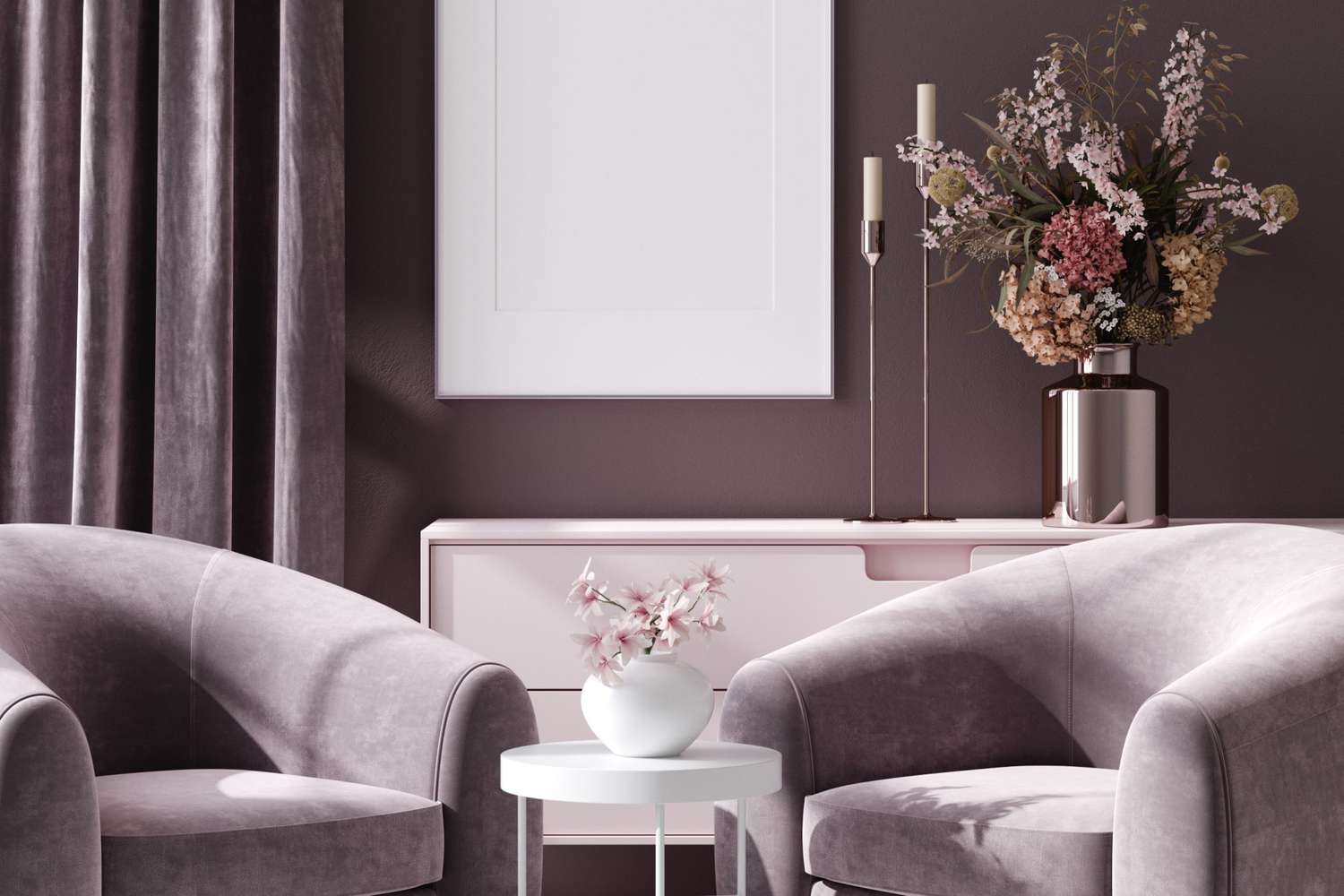
YesColours' 'Loving Pink' introduces a rich plum shade, offering elegance and comfort. This damson-like hue, lying between burgundy and purple, is predicted to add sophistication and mystery, bringing warmth and opulence to interiors.
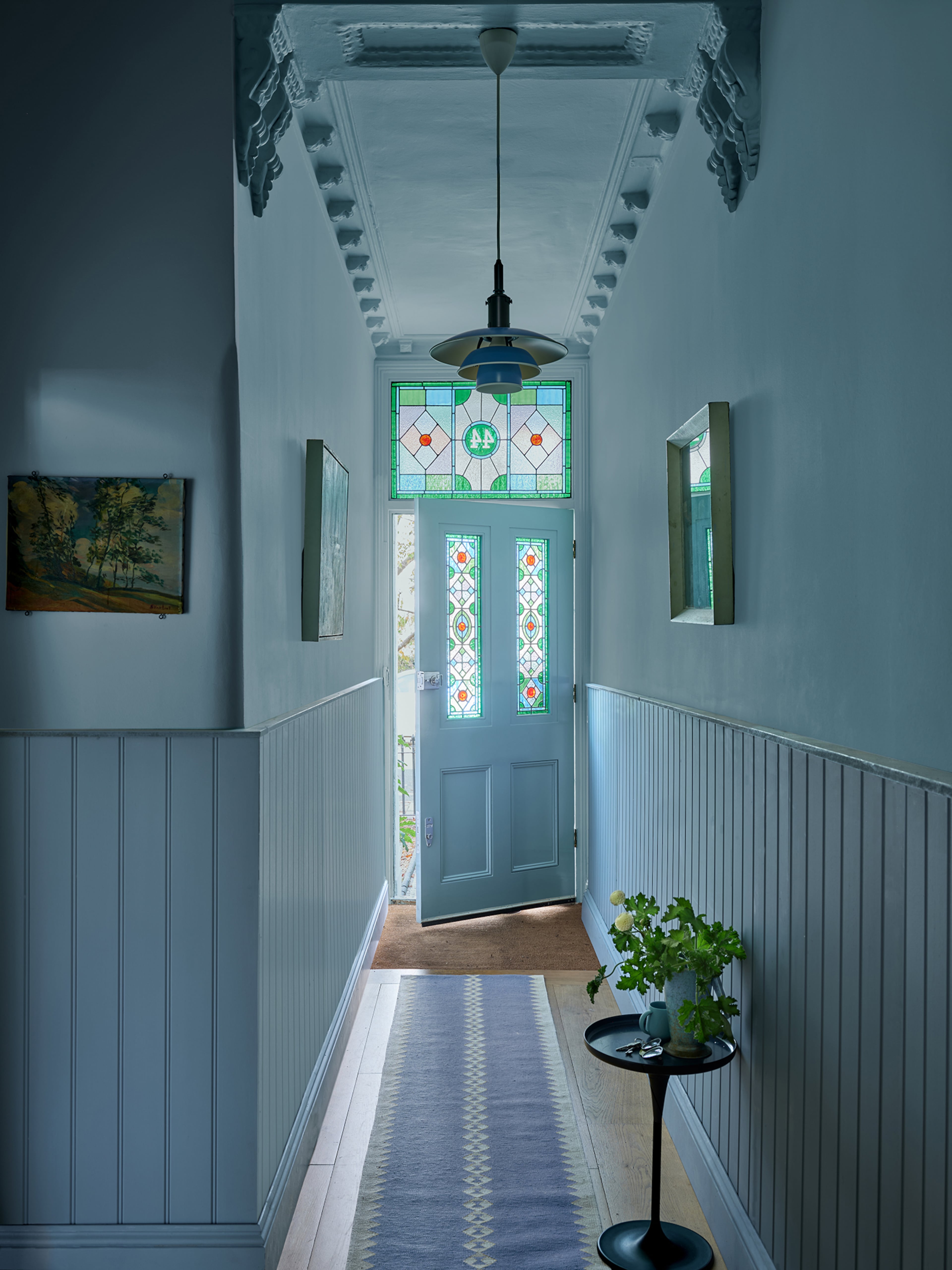
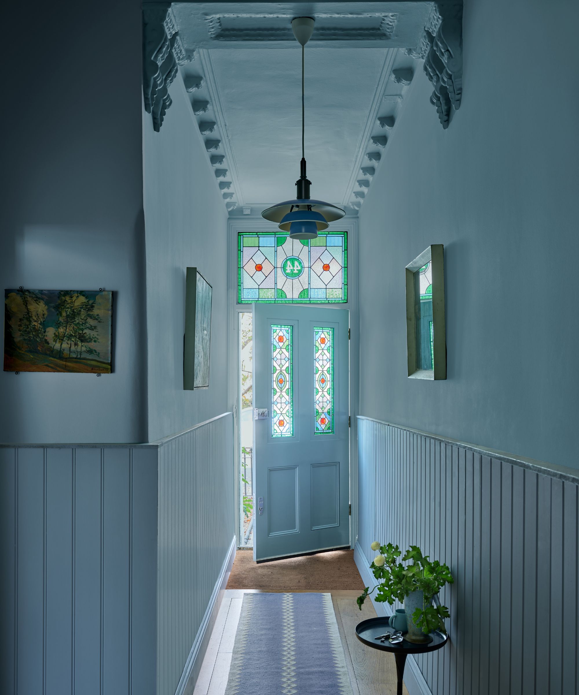
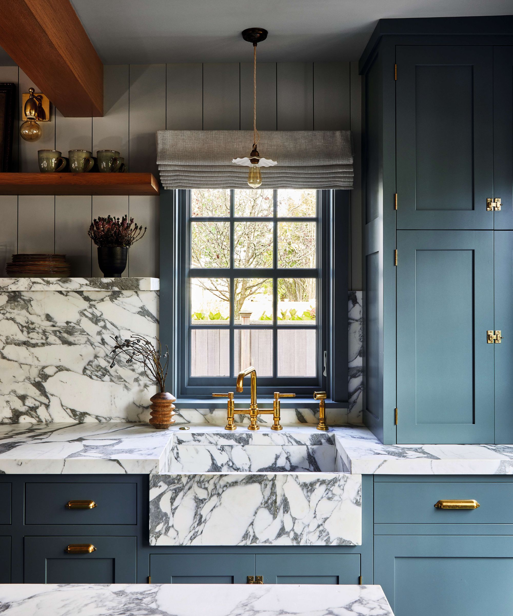
Valspar's 'Renew Blue' is a balanced blue, evoking coastal tranquility and stillness. Its versatility makes it suitable for various design styles, uplifting rooms, especially north-facing ones, and making spaces appear larger due to its receding quality.
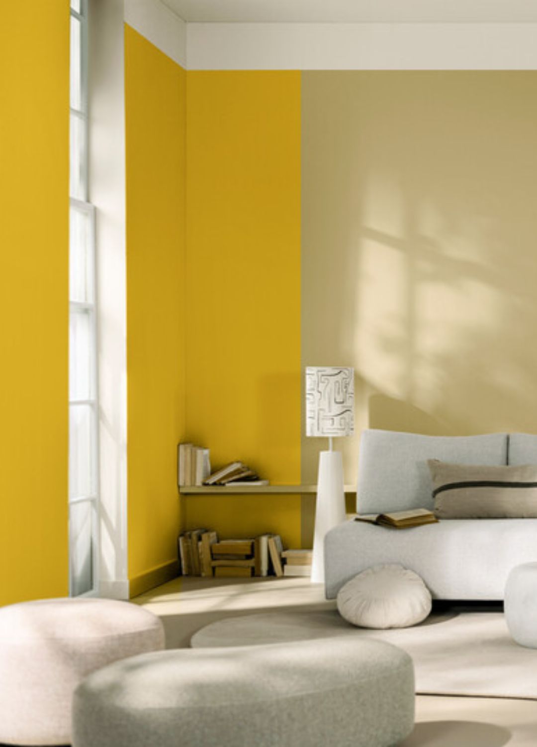
Glidden's 'Limitless' is a 'boujee beige' that serves as a fresh and energizing neutral. It is highly versatile, capable of acting as a main room color or an accent against both warm and cool tones, providing a forgiving canvas for layering accent colors.
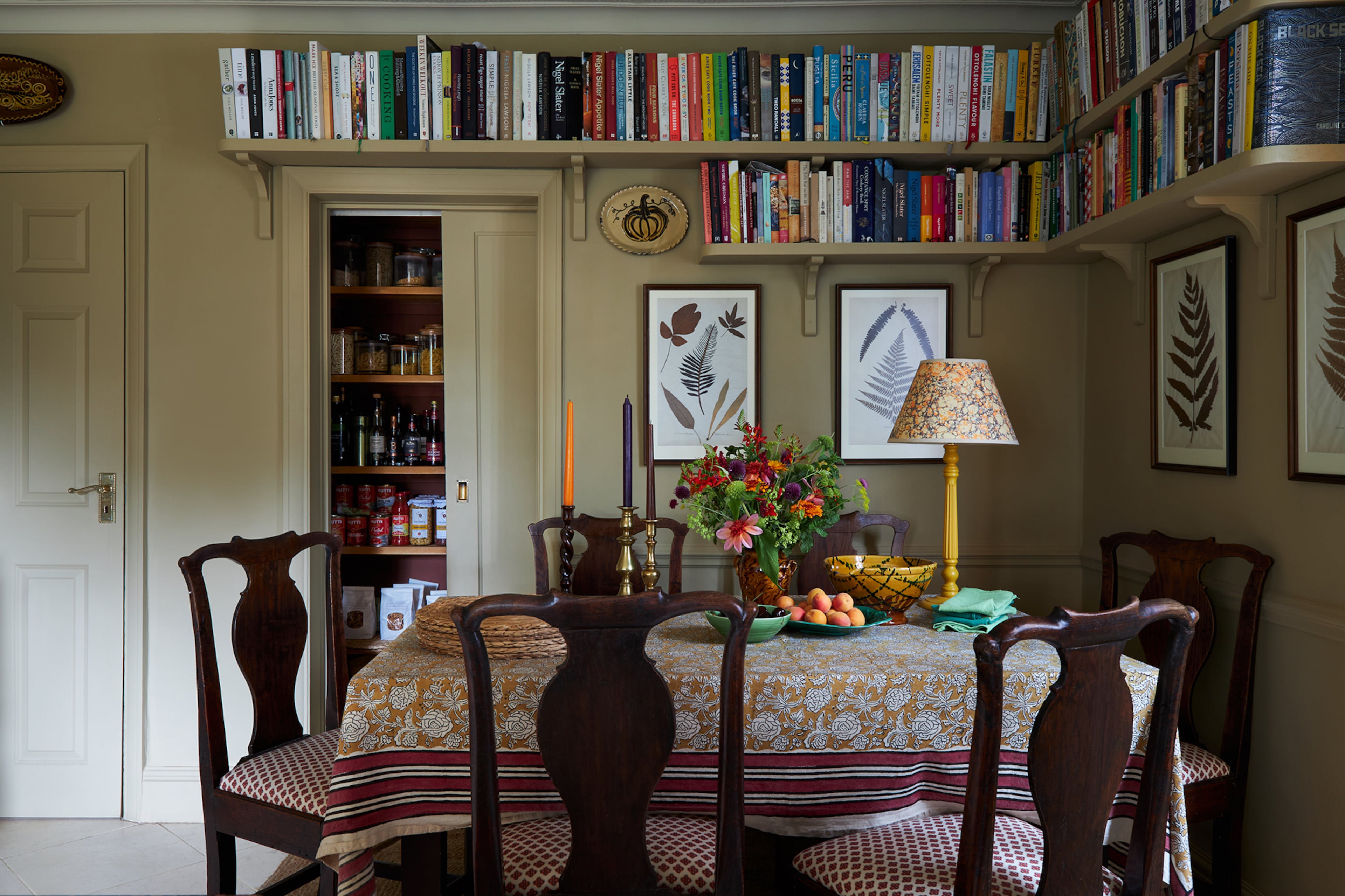
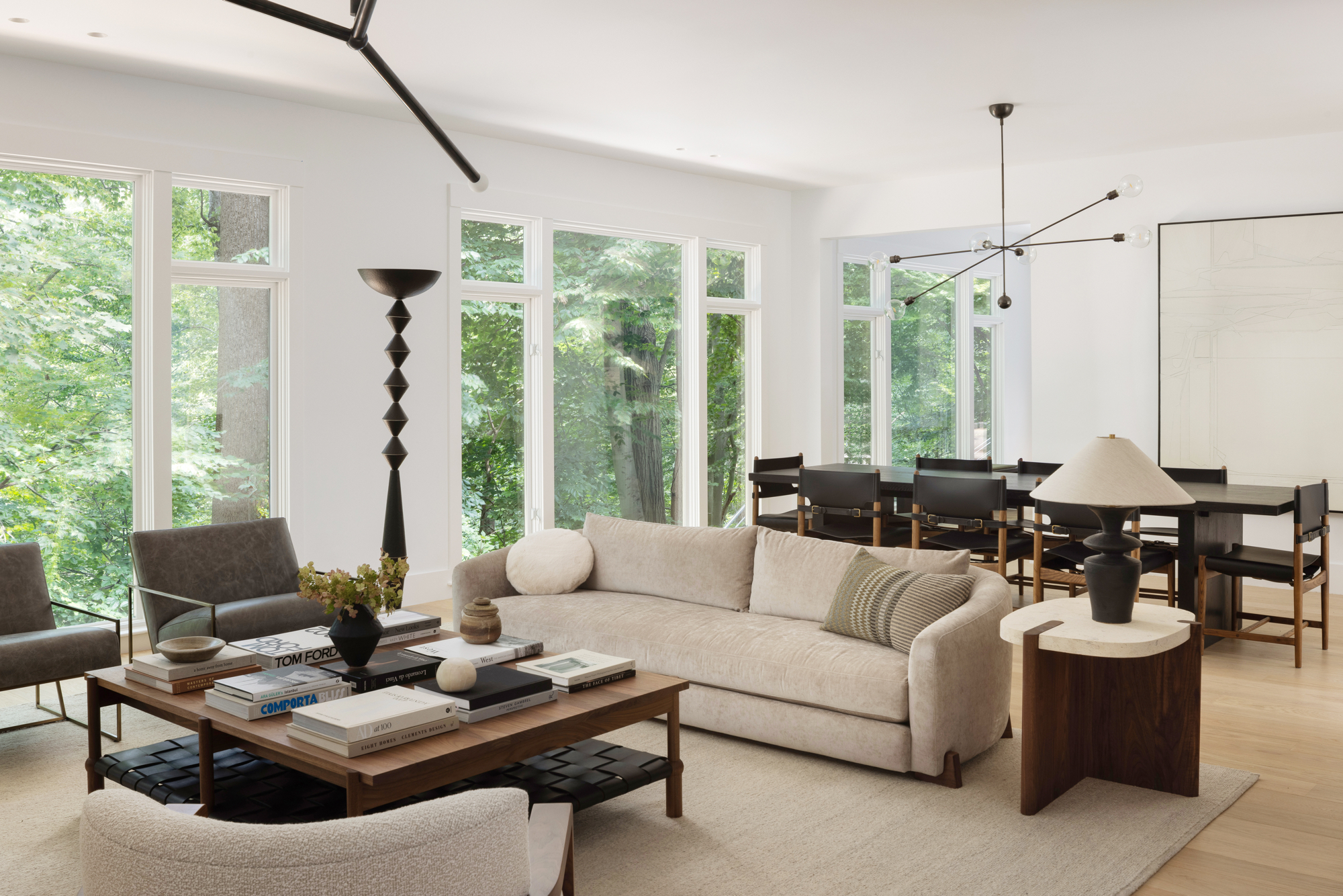
Fenwick & Tilbrook's 'Woodsmoke' is another earthy neutral, a pale grey-beige with green undertones, fostering peace and tranquility. It is recommended for living rooms to create a calm atmosphere in busy, multifunctional spaces.
YesColours' 'Loving Orange' signifies the growing trend of orange in home decor. From vibrant, playful primary oranges suitable for nurseries and offices to comforting terracotta shades for living rooms, bedrooms, or kitchens, orange is seen as a mood-boosting and grounding color.
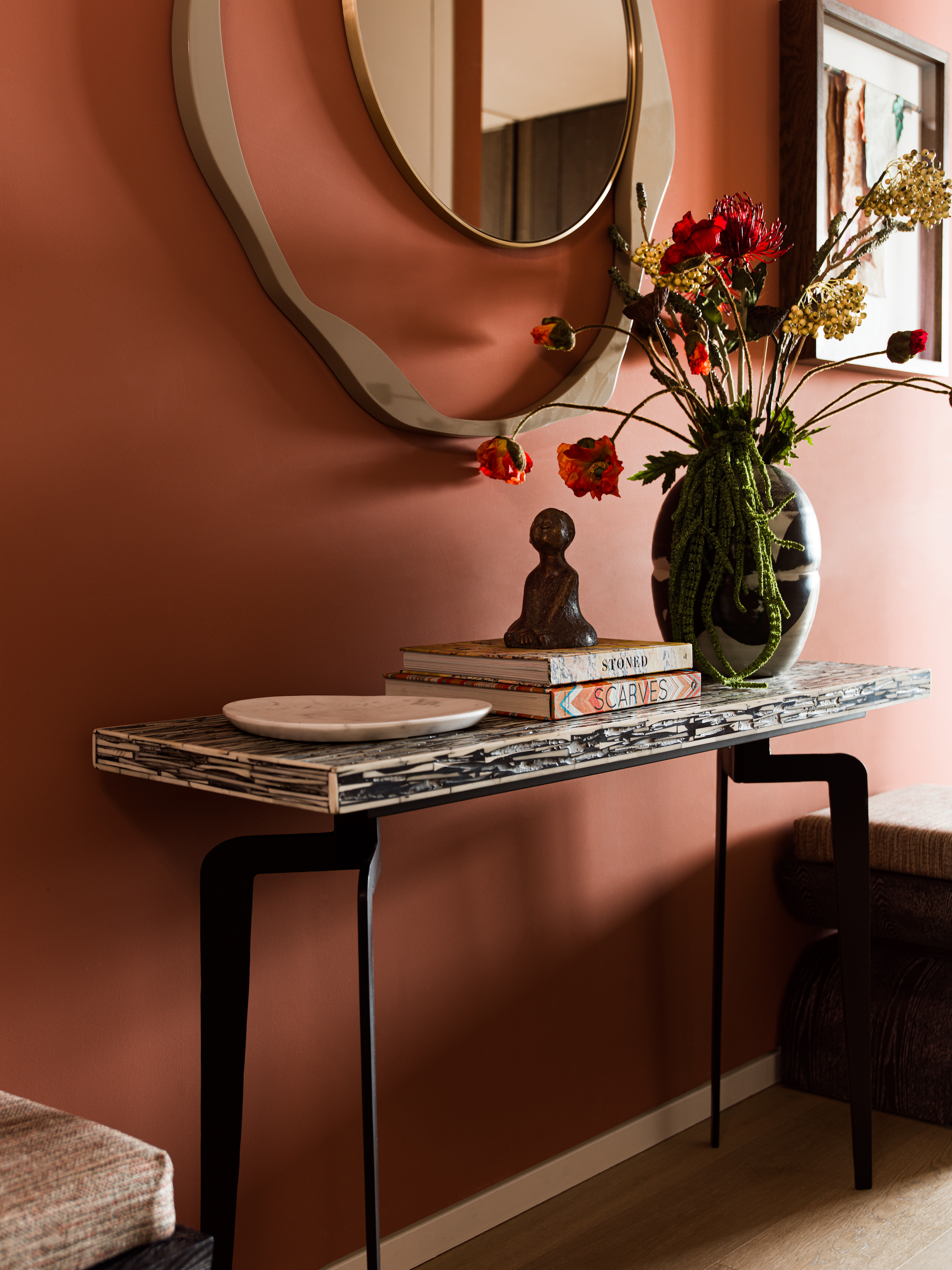
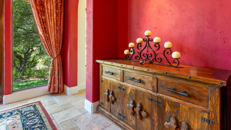
Lick's 'Red 03' is a warming red with brown earthy undertones, resembling clay and terracotta. This shade, less bright than traditional reds, is described as grounding and physically stimulating, making it ideal for creating focal points and energizing spaces.
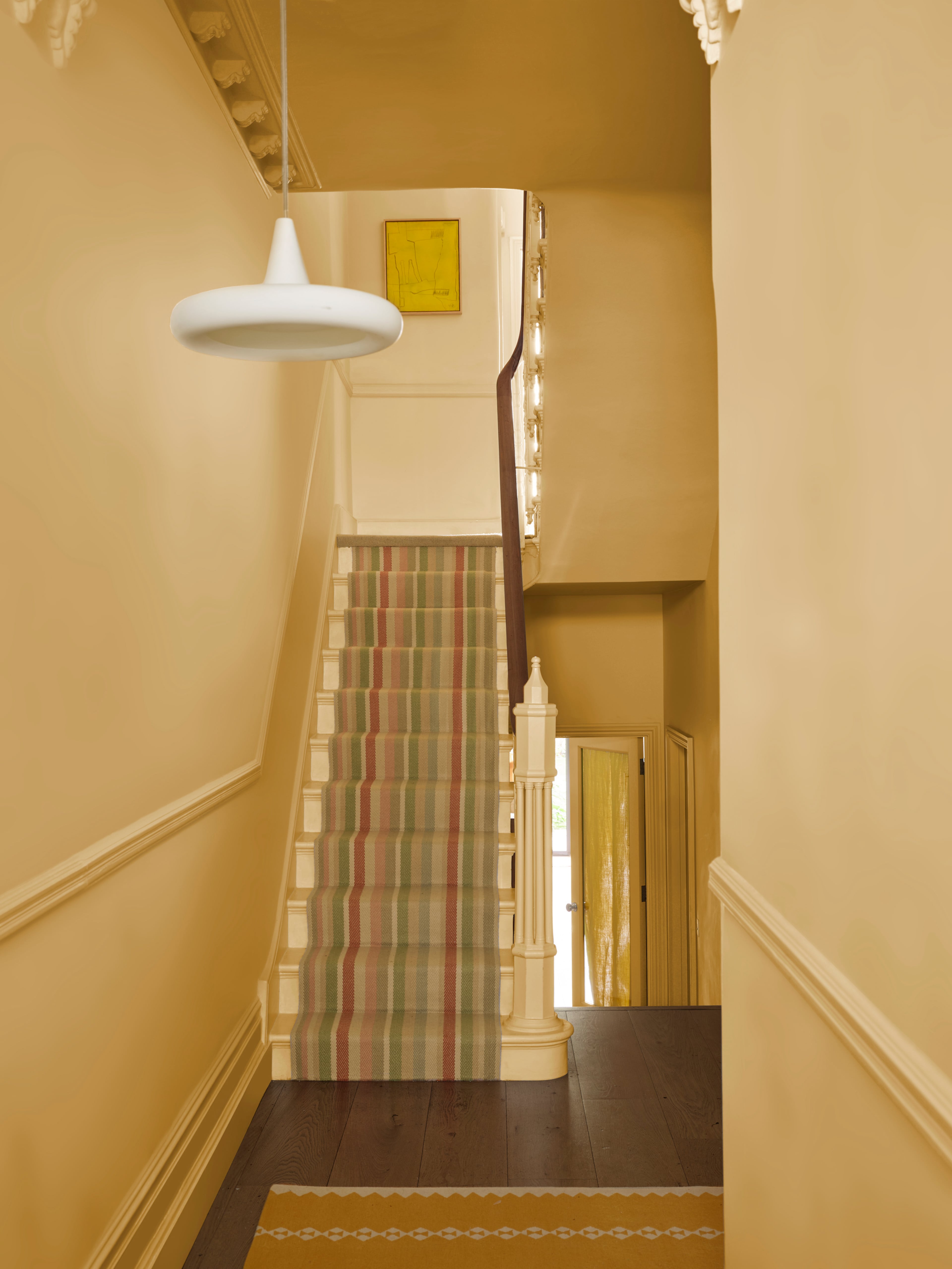
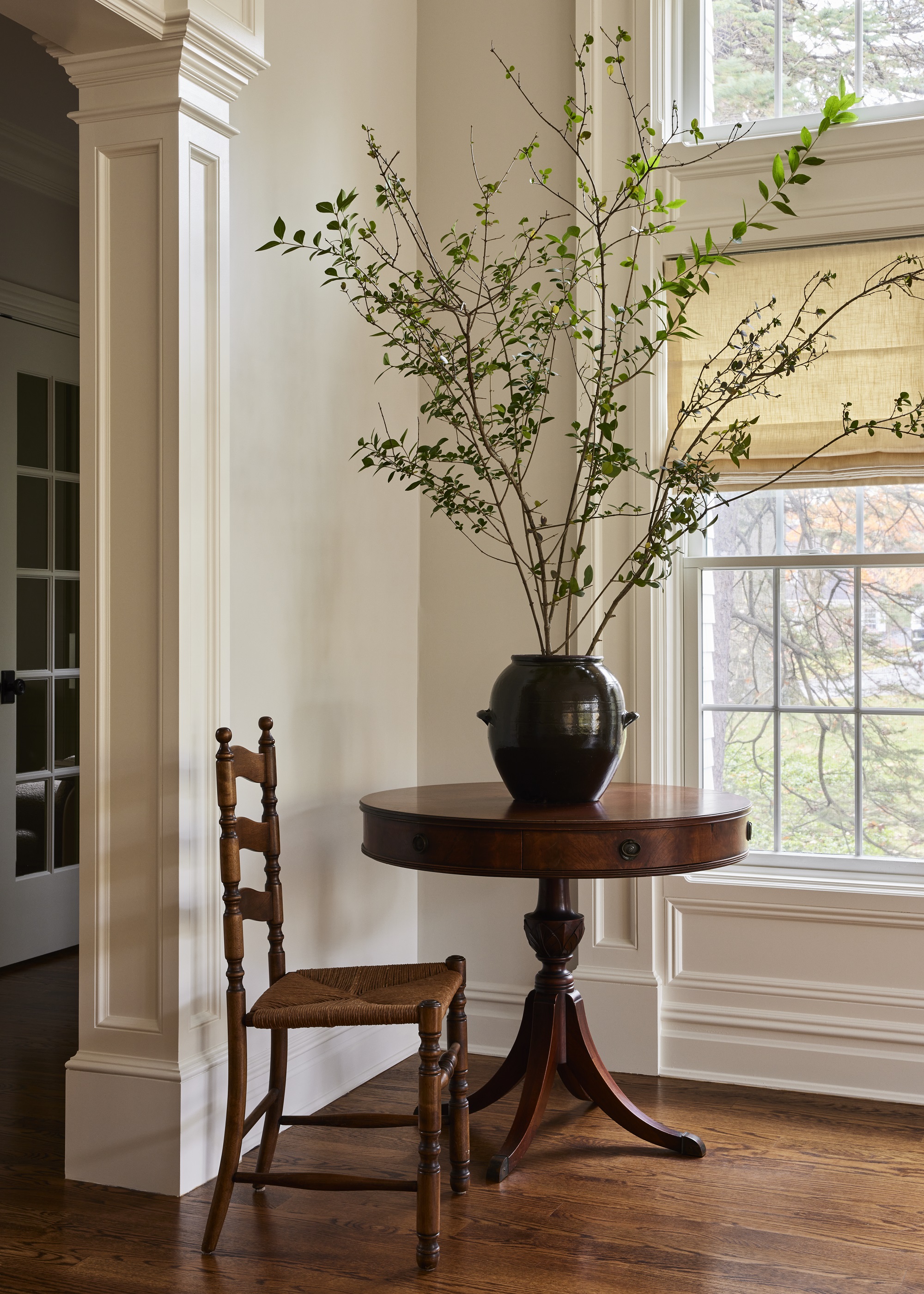
Earthborn's 'Hopscotch' is a sophisticated, warm, chalky off-white with subtle yellow and grey undertones. This adaptable neutral is a versatile backdrop for brighter colors or harmonious with other neutrals, bringing longevity and relaxation to any space.
Lick's 'White 05' is a creamy white with warm yellow undertones, moving away from grey-based neutrals. It creates a nurturing and relaxing space, pairing beautifully with fresher, more vibrant colors to achieve balance and harmony.
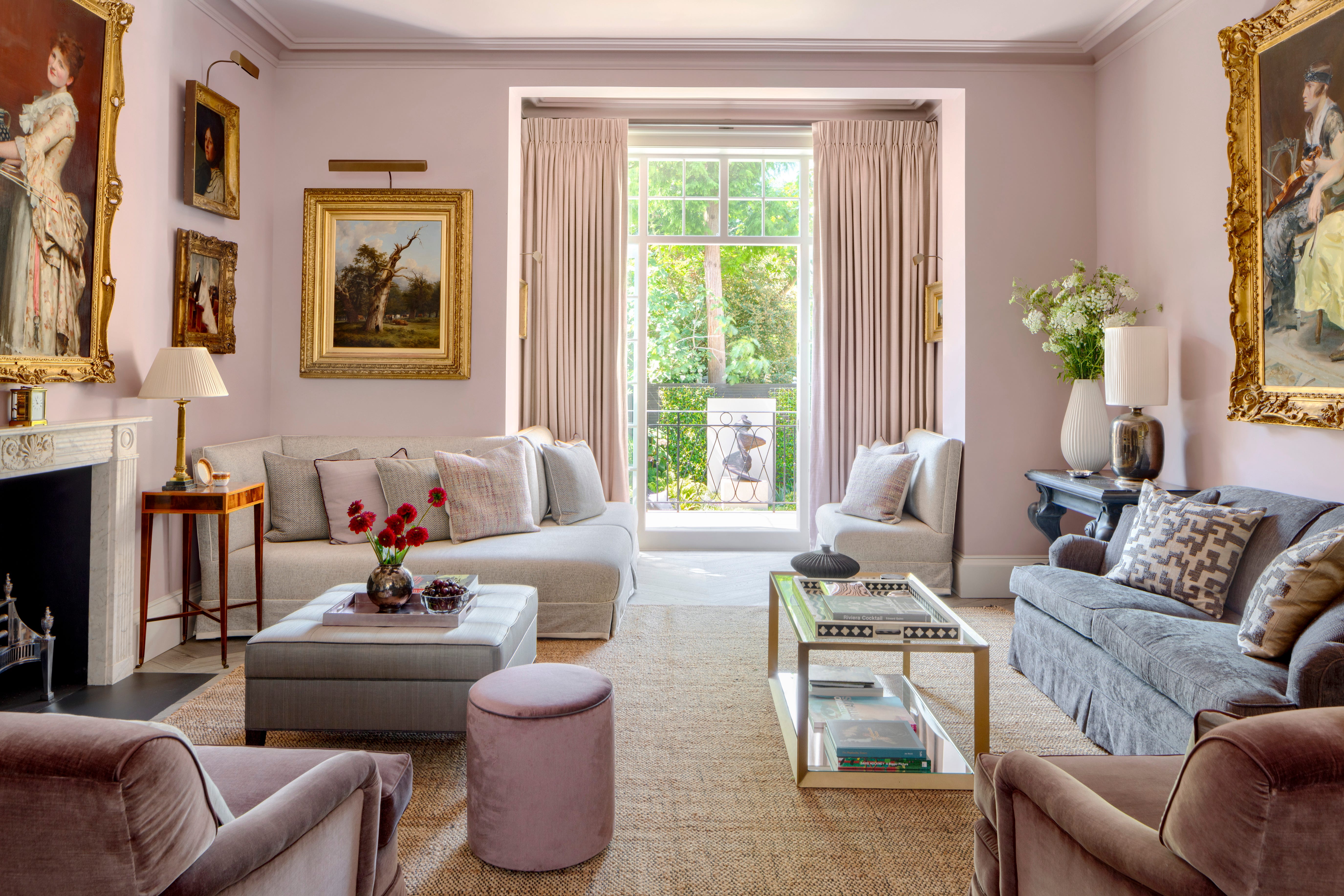
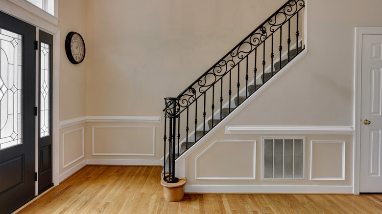
Fenwick & Tilbrook's 'Smudgewand' is a pink-undertoned neutral, highlighting the trend for soft and muted pastels. This shade is perfect for creating calming and serene atmospheres while introducing subtle color, aligning with the 'quiet luxury' decor trend.
#InteriorDesign #PaintTrends2024 #HomeDecor #ColorPsychology #NeutralColors #WarmTones #CoolTones #BiophilicDesign #HomeStyling #InteriorDesign #PaintTrends2024 #HomeDecor #ColorPsychology #NeutralColors #WarmTones #CoolTones #BiophilicDesign #HomeStyling
0개의 댓글이 총 표시됩니다.
 아직 댓글이 없습니다
추가로 마음에 드릴 만한 콘텐츠
6 entryway paint colors going out of style for 2024 – and the shades to use instead

Is colour drenching still on trend for 2025? Experts reveal how the popular paint trend is evolving in the new year
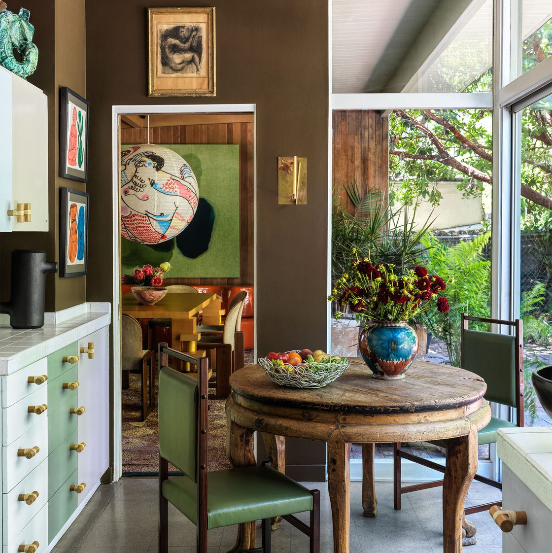
5 Kitchen Paint Color Trends to Watch in 2024

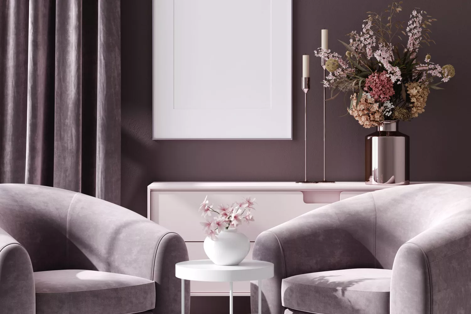
5 Paint Colors That Are Out for 2025, According to Interior Designers

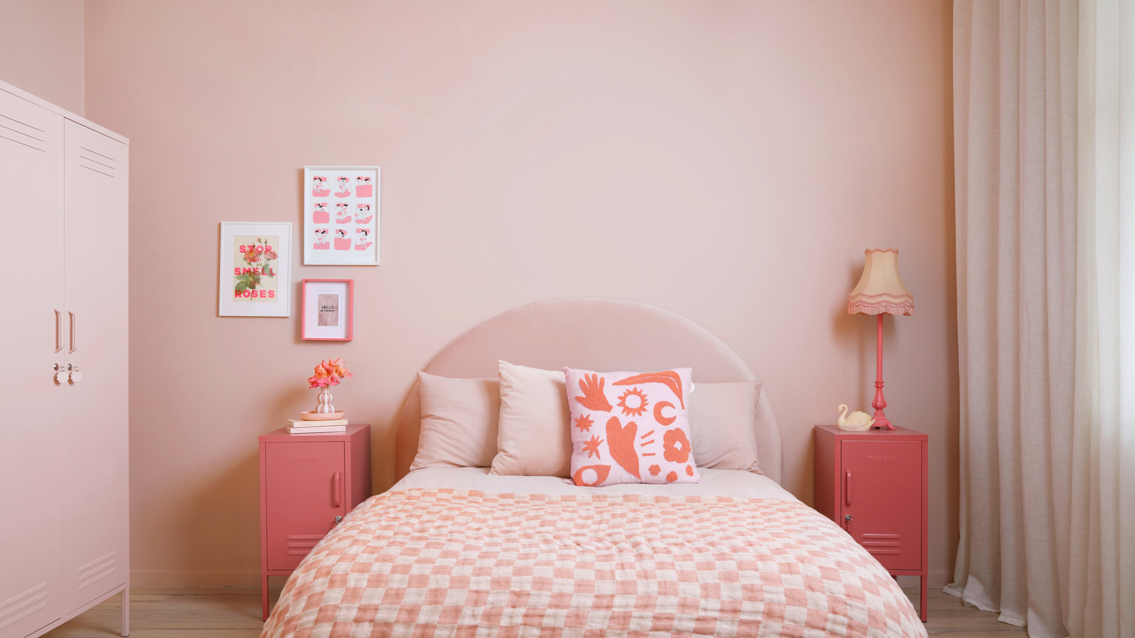
Bold, edgy color drenching is going to be big in 2024
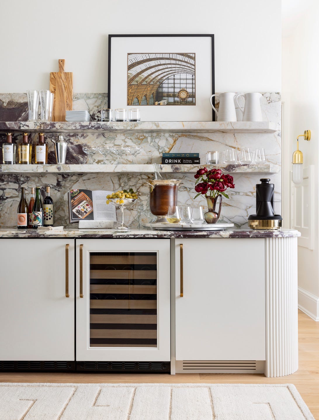
The Best Kitchen Paint Colors for 2024, According to Experts

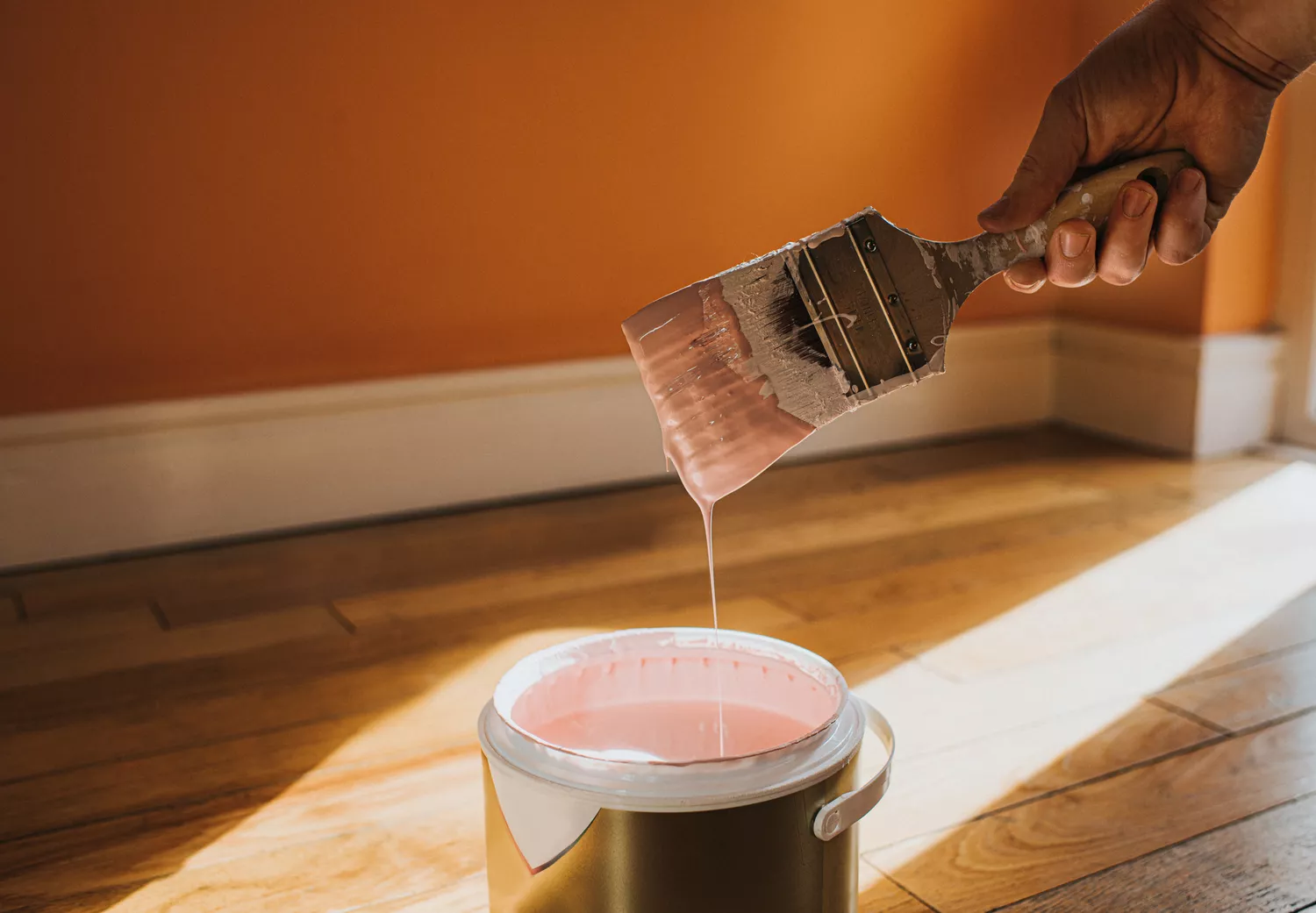
6 Outdated Paint Colors We're Saying Goodbye to in 2025, According to Designers

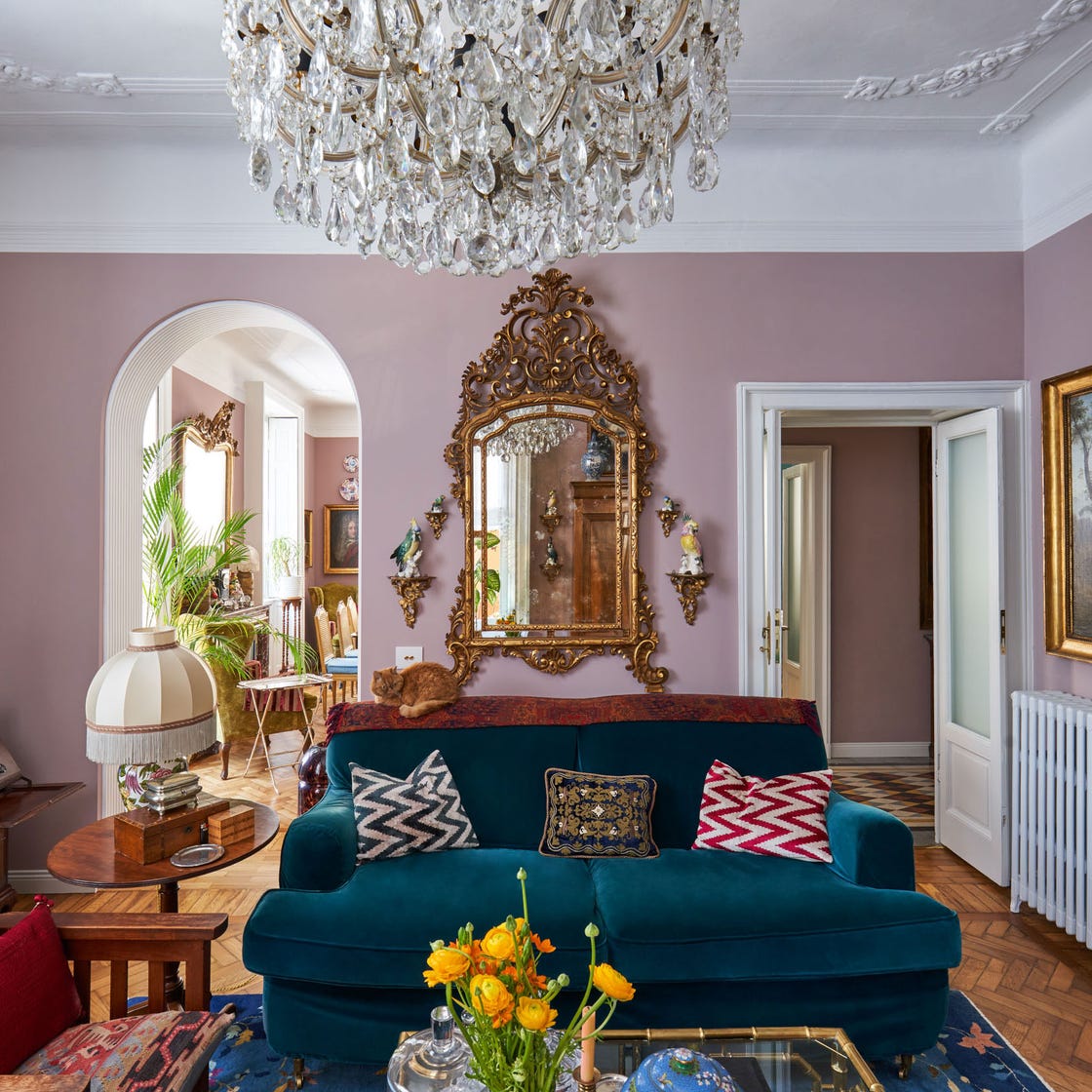
These Living Room Paint Colors Are a Total Mindset Shift
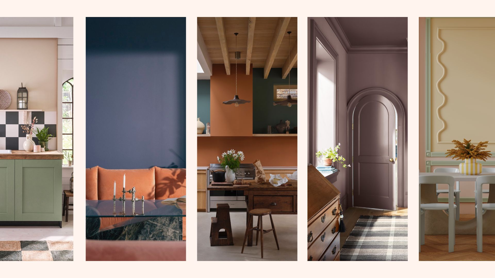
Interior paint colour trends 2025: 10 hues you'll be seeing everywhere this year

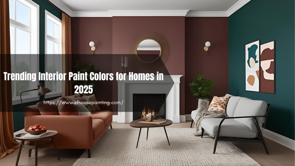
Trending Interior Paint Colors for Homes in 2025

5 Paint Colors Going Out of Style in 2025 — And What You Should Replace Them With Before Then

Blue has dominated Colors of the Year for 2024 – here's what it means and how you can decorate with it
The 15 Best Moody Paint Colors of 2024

The top kitchen color trends of 2024 that interior designers are seeing everywhere — 7 lush hues to try

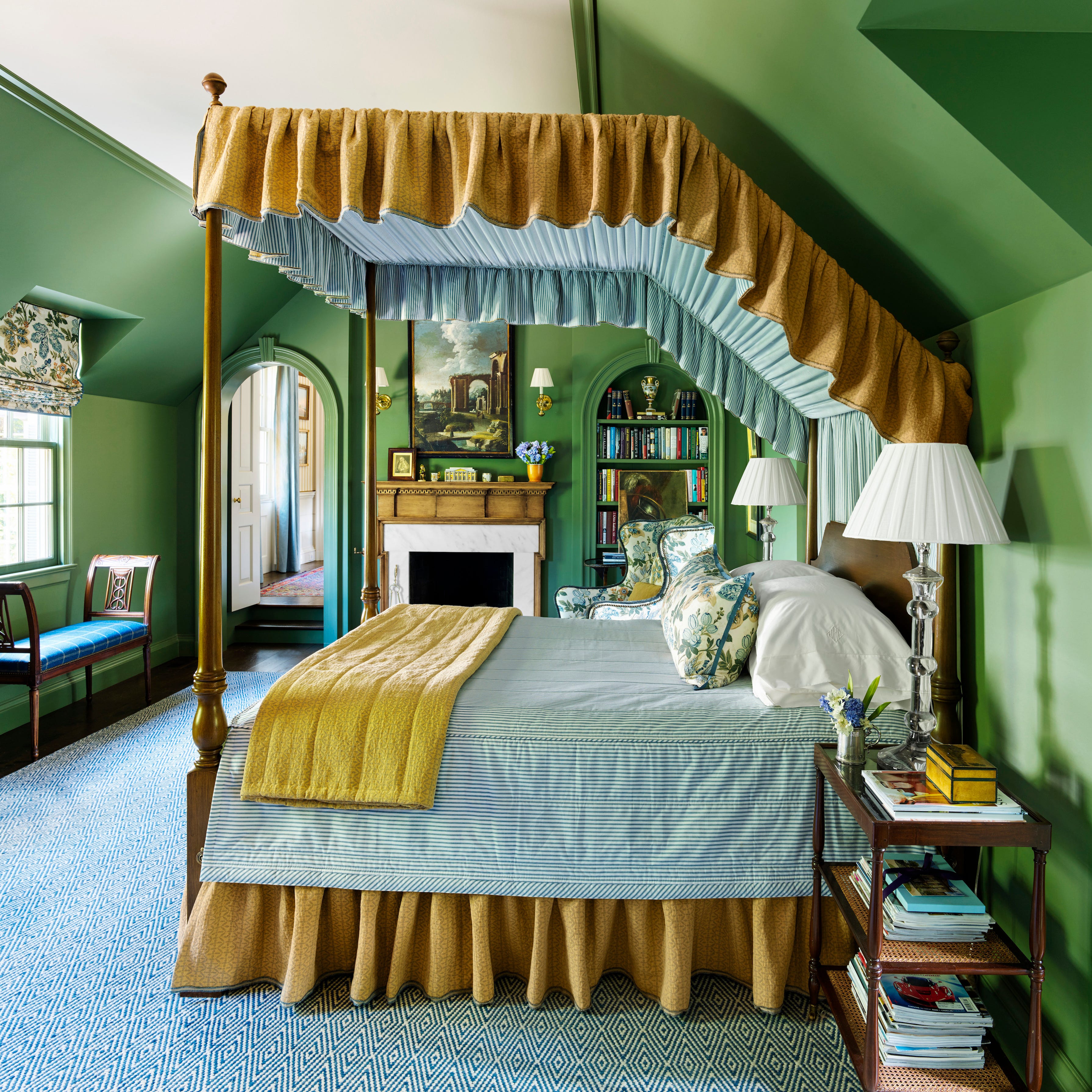
These 8 Colors Will Rule Interiors in 2026, According to Experts

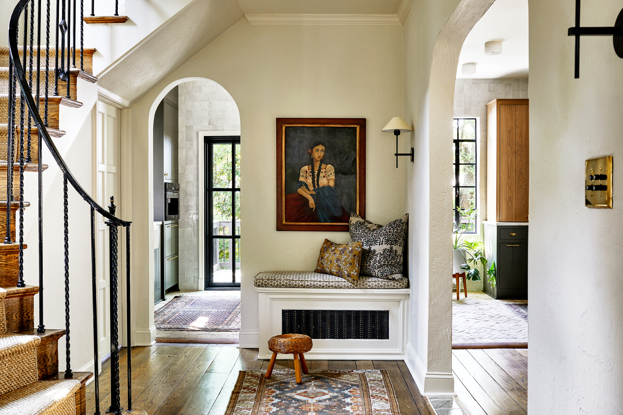
Home-Design Trends You’ll See Everywhere in 2024

The Interior Paint Colors You'll Be Seeing Everywhere in 2024

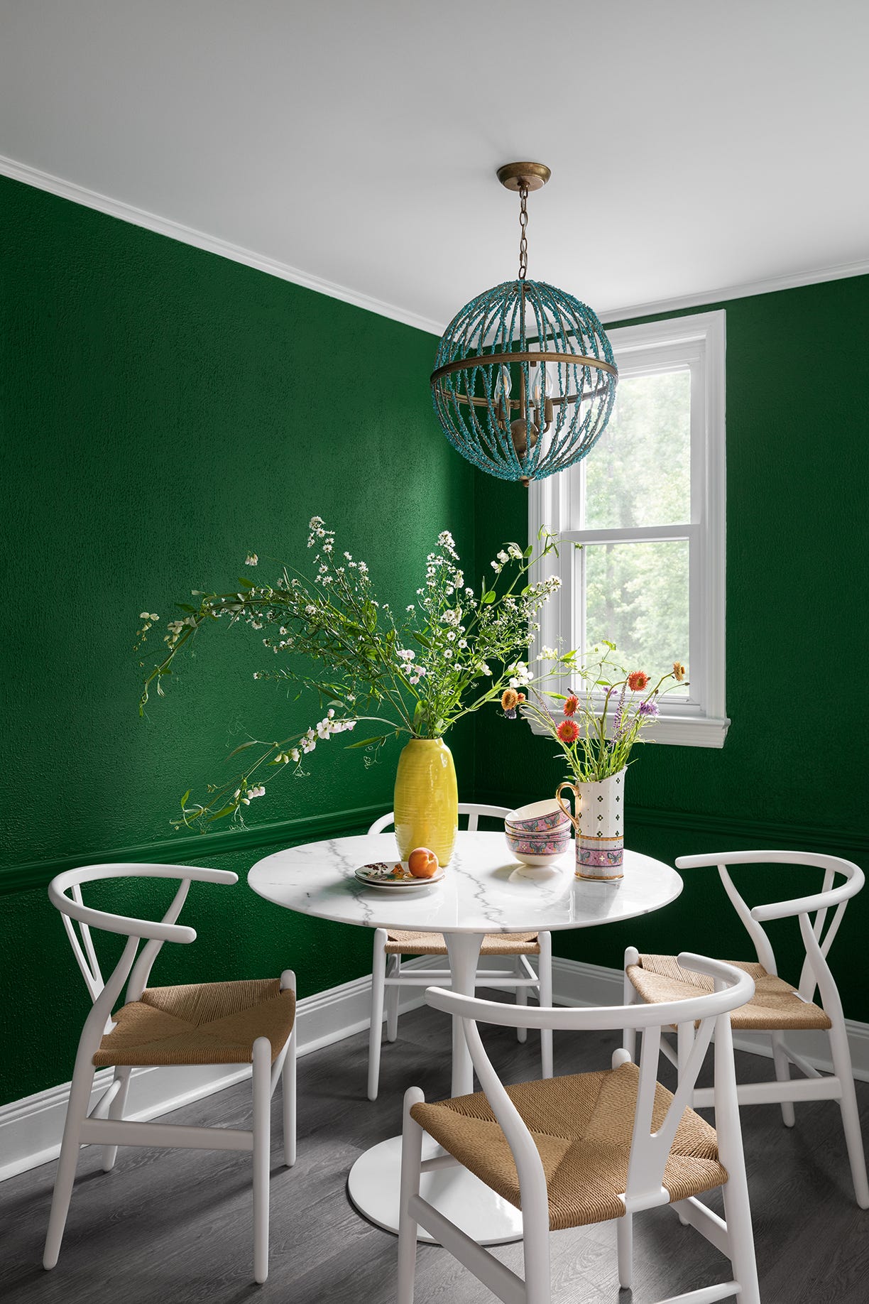
12 Trending Paint Colors for 2024, According to Design Experts
Outdated Entryway Paint Colors To Avoid In 2025 (And What To Try Instead)
9 Trending Paint Colors You'll See Everywhere in 2025, According to Designers