1/11
10 Colorful Scandinavian Schemes That Prove This Style Is So Much More Than Pared-Back White Rooms
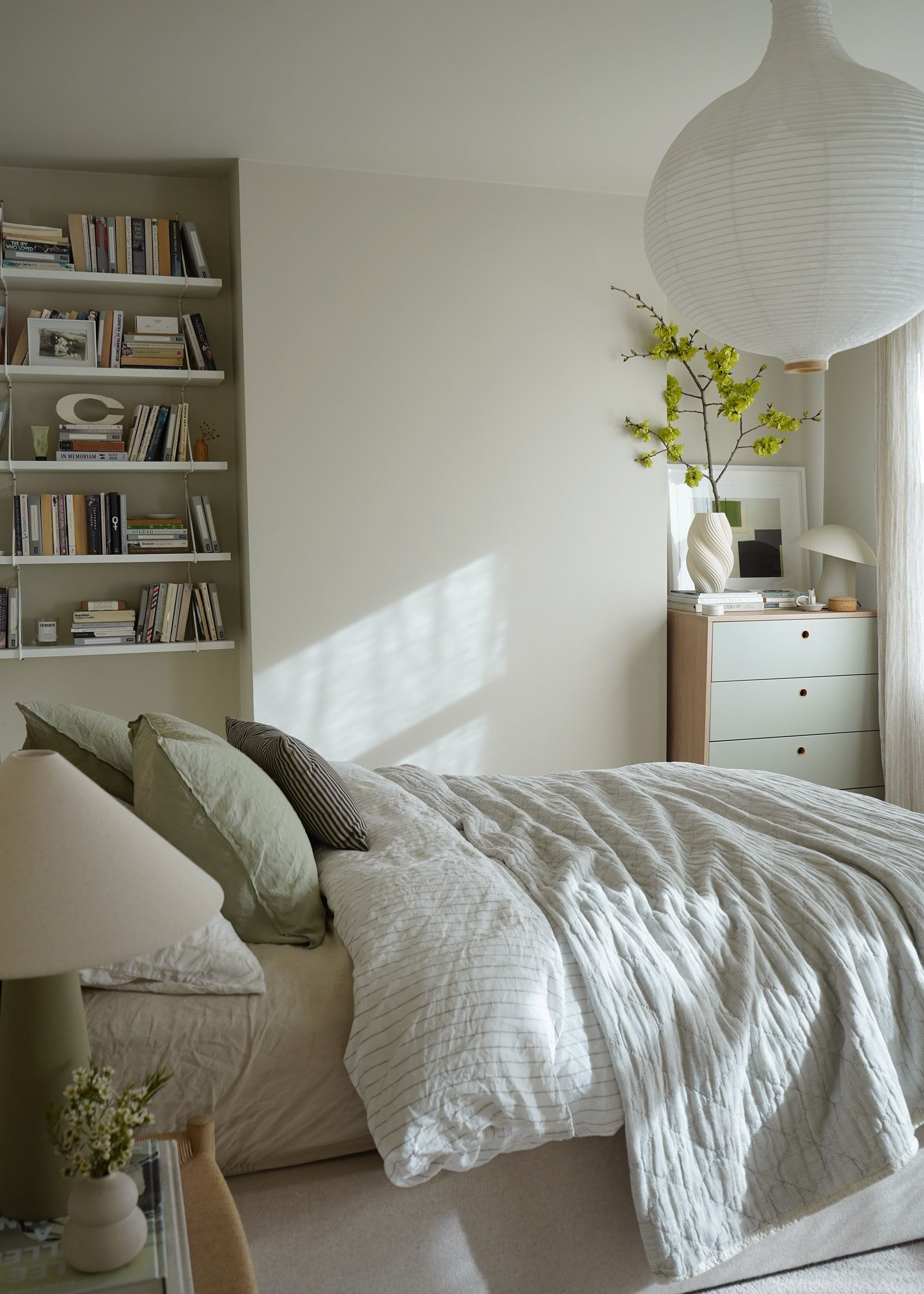
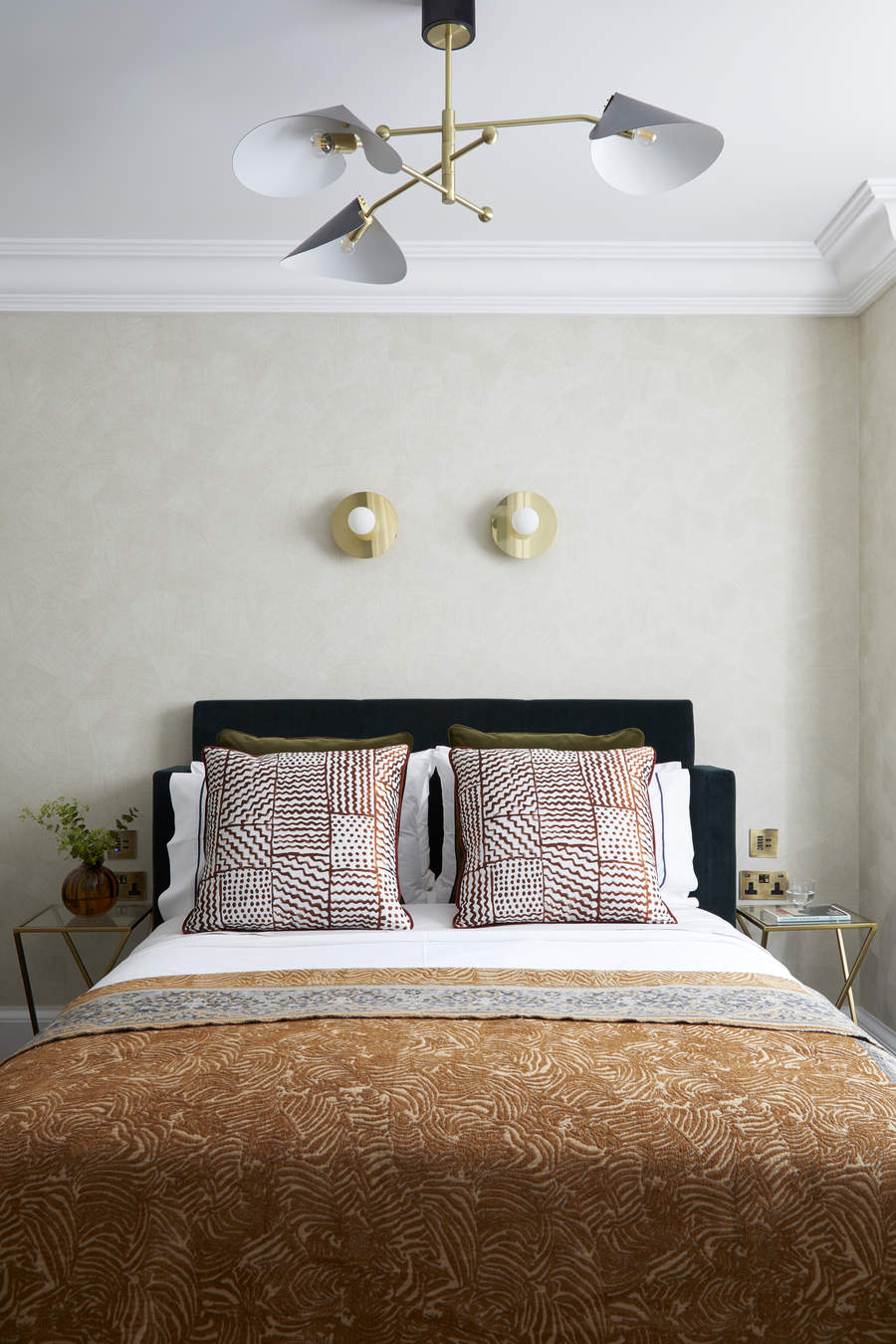
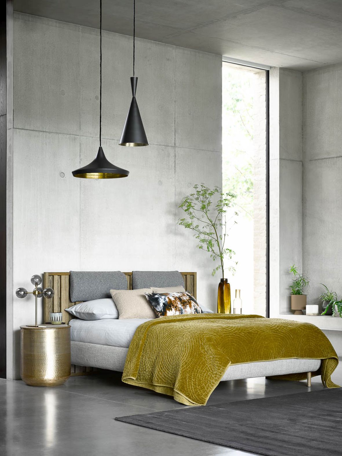
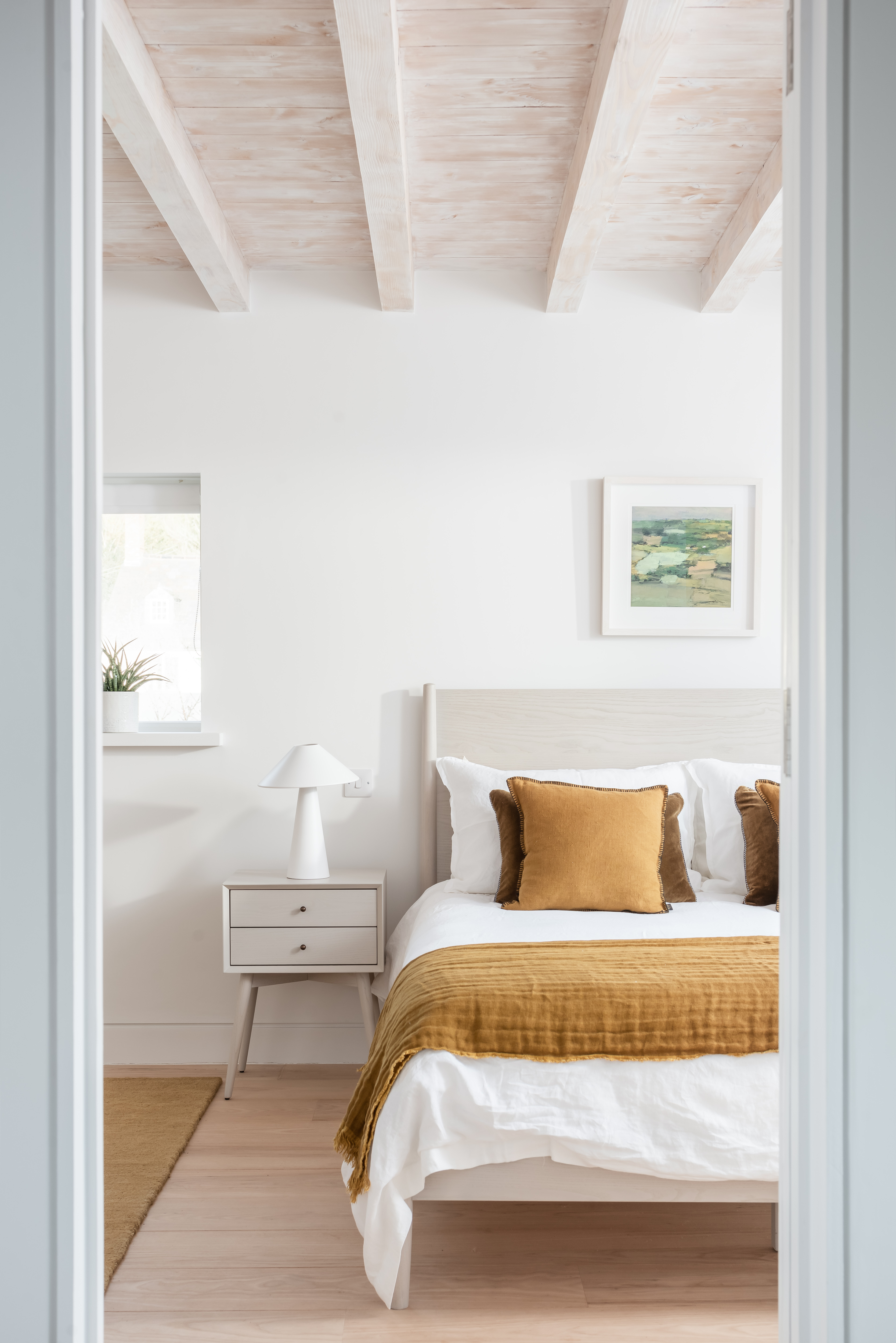
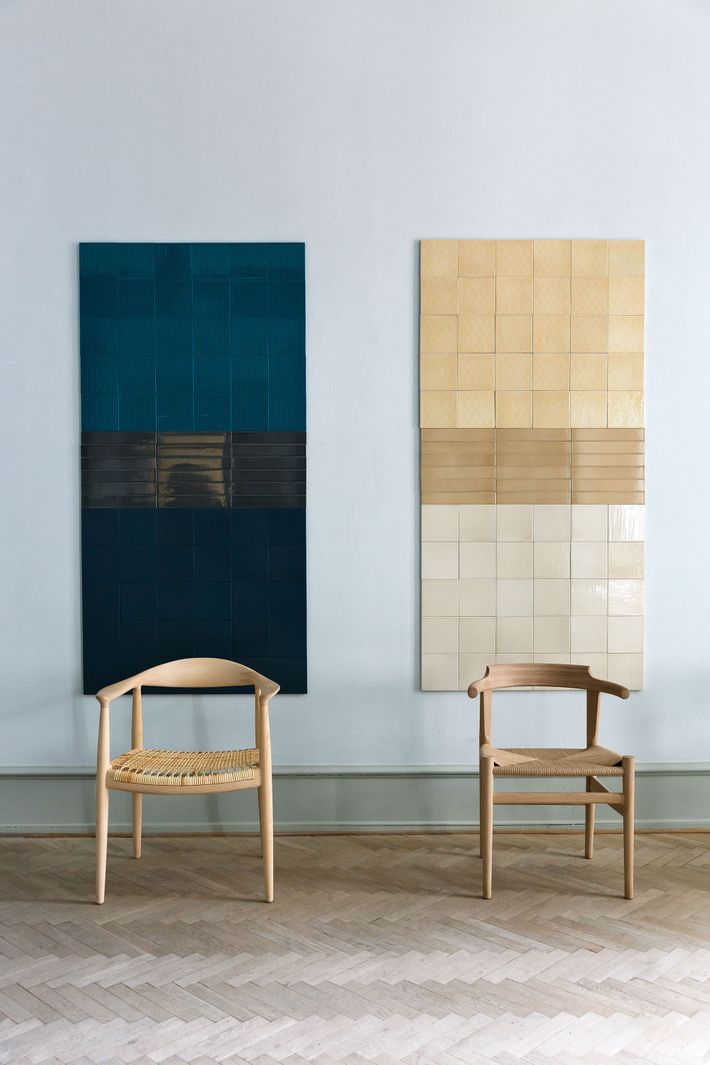
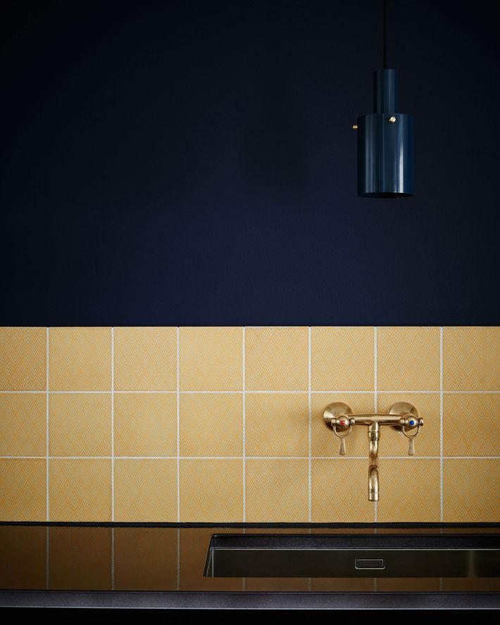
The Scandinavian aesthetic, often stereotyped by its minimalist and neutral color palettes, is evolving to embrace more vibrant and diverse hues. This shift demonstrates that Scandinavian interior design can be colorful and uplifting while retaining its core sensibilities of considered design and functionality. The article highlights how interior designers and color experts are integrating bolder shades into Scandinavian-inspired spaces, emphasizing balance and intention over chaos.
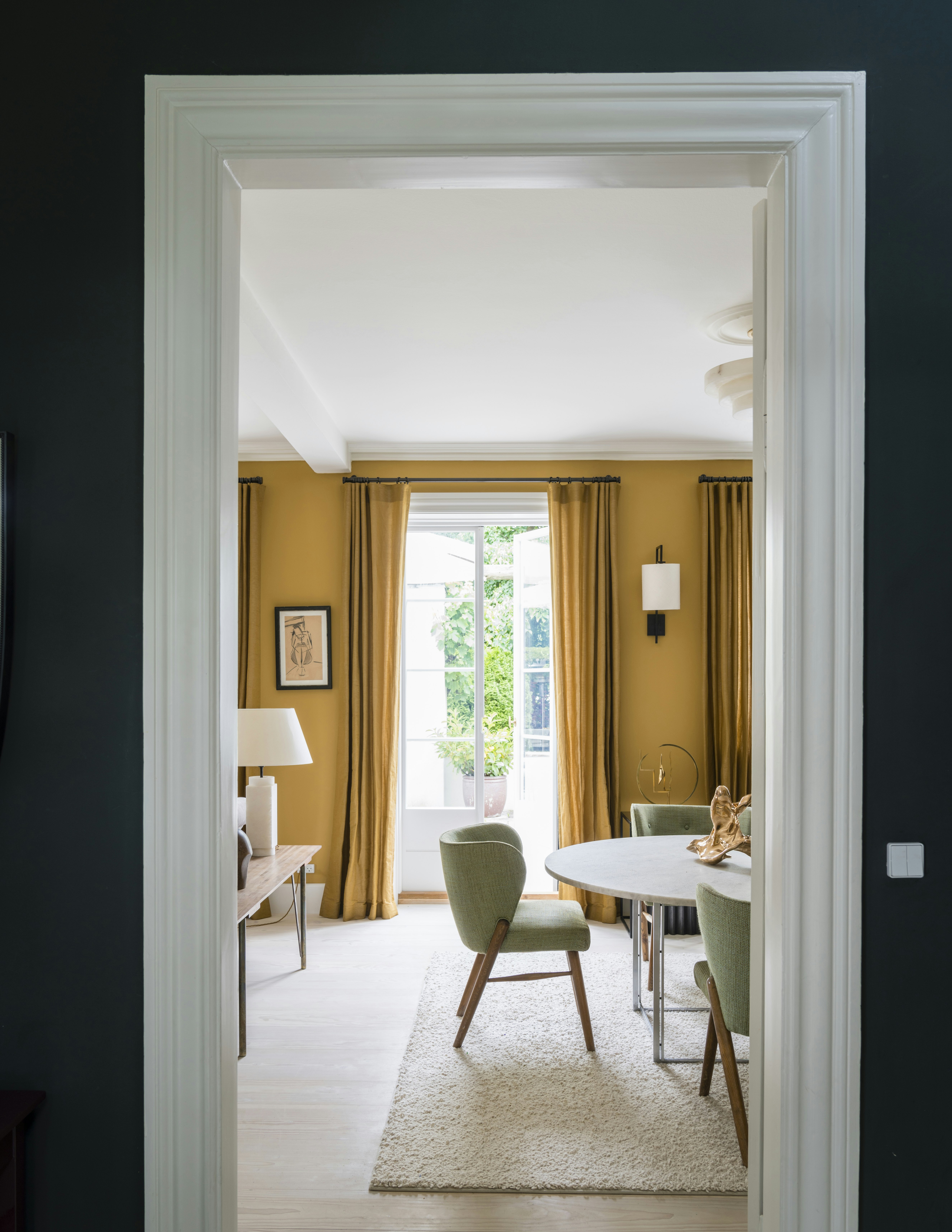
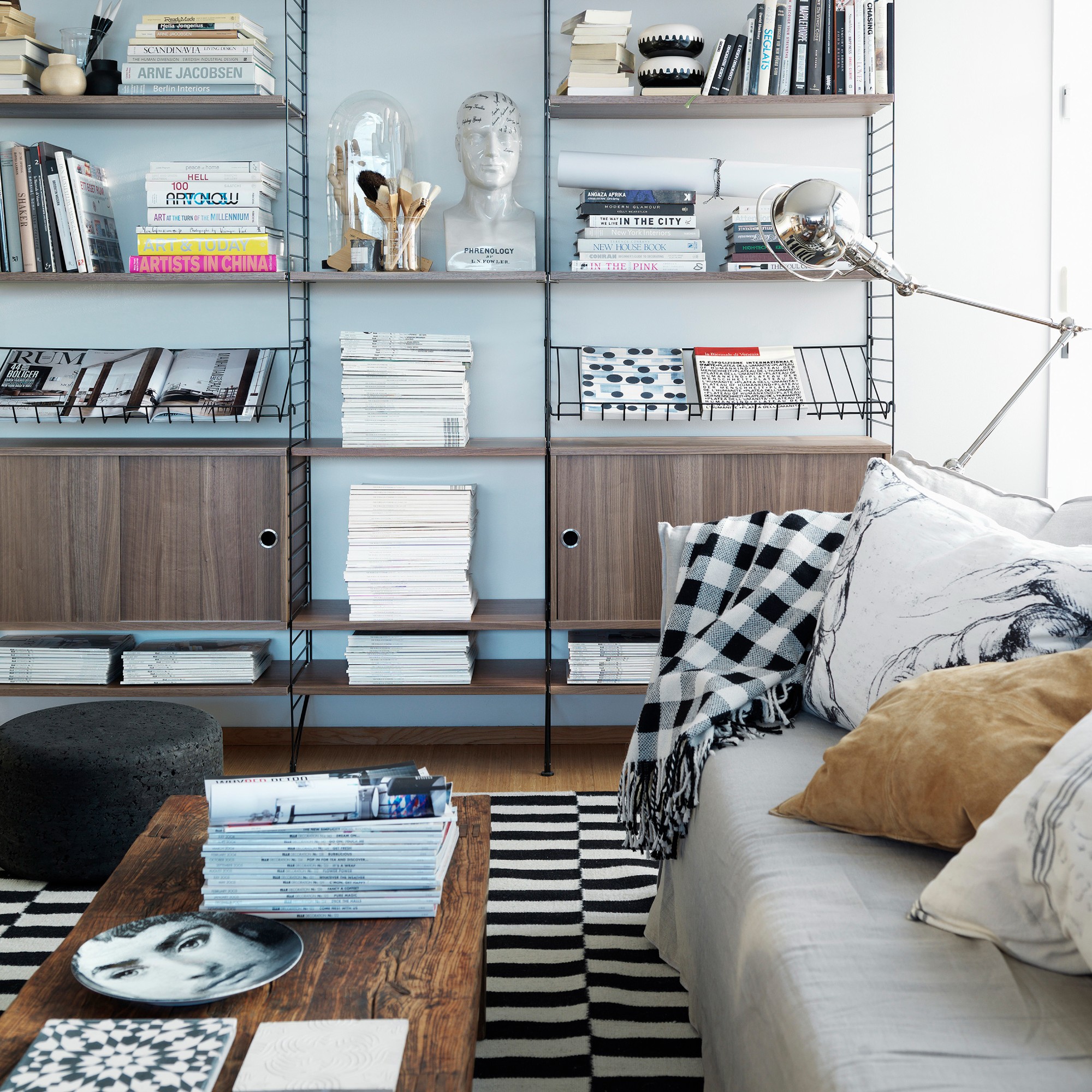
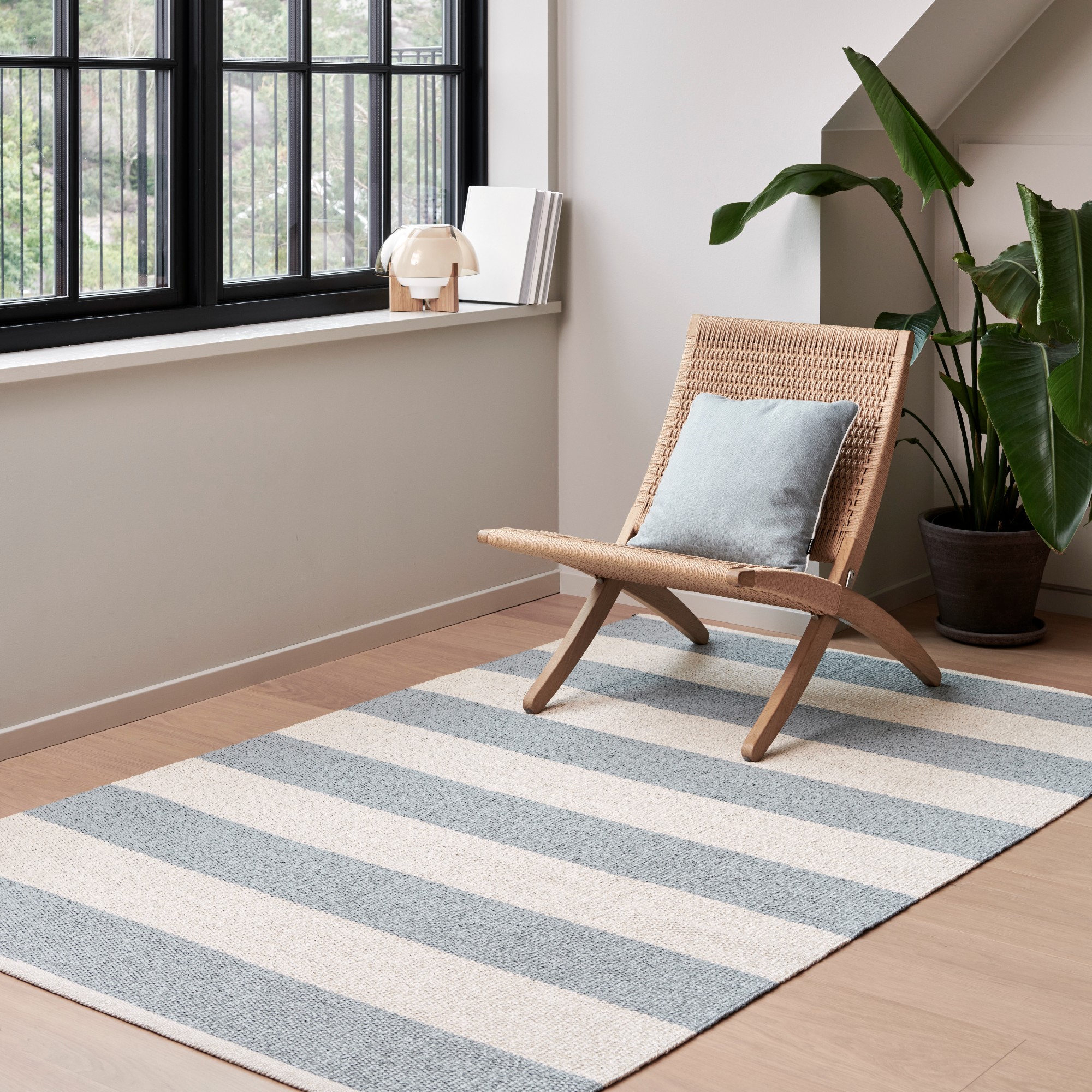
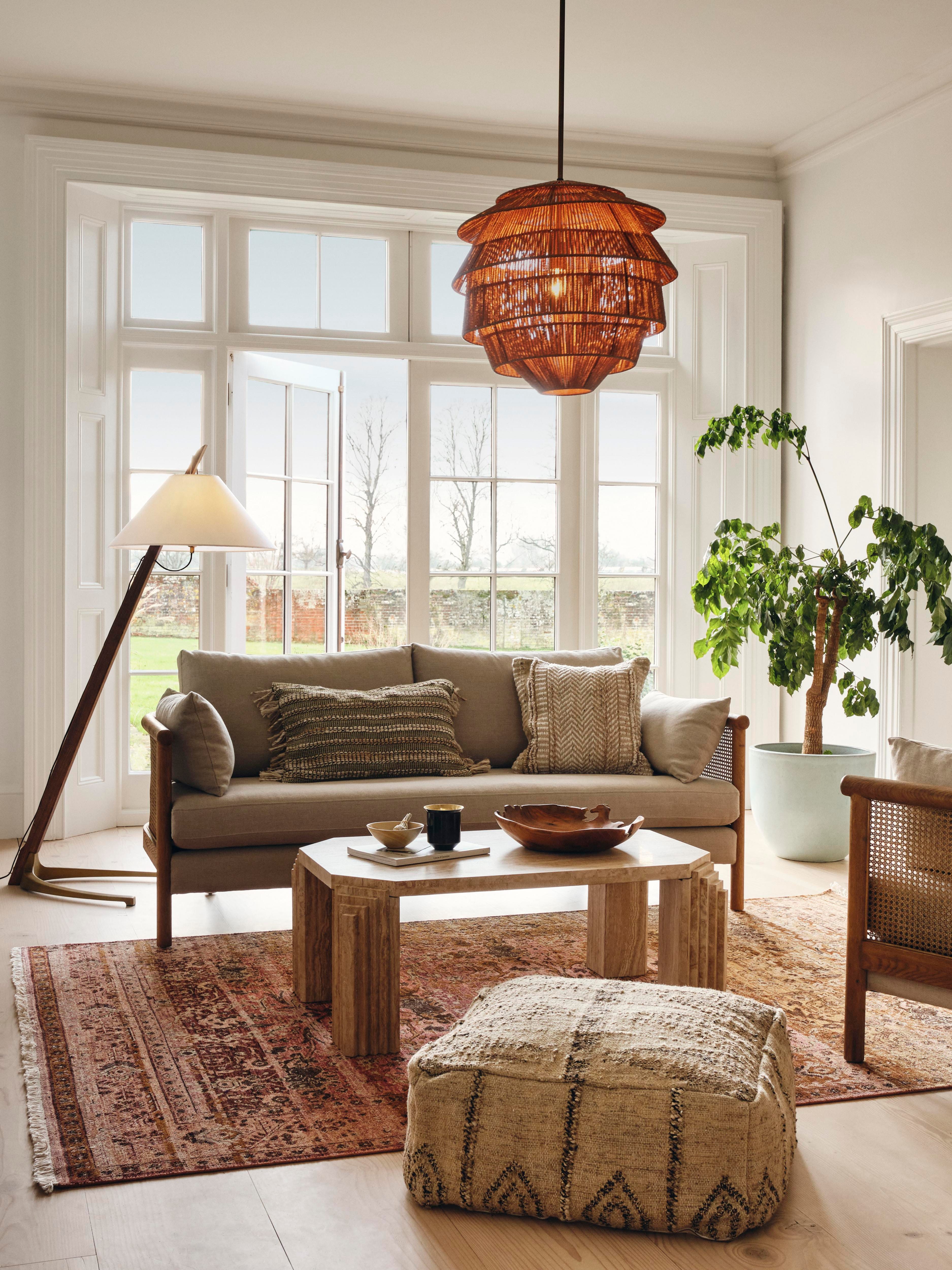
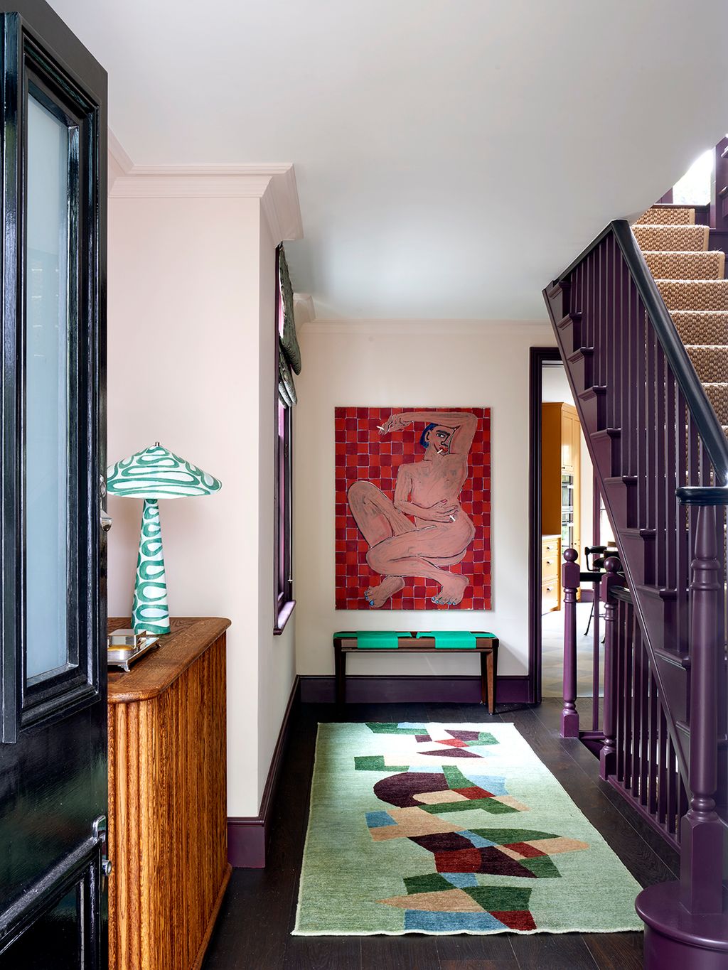
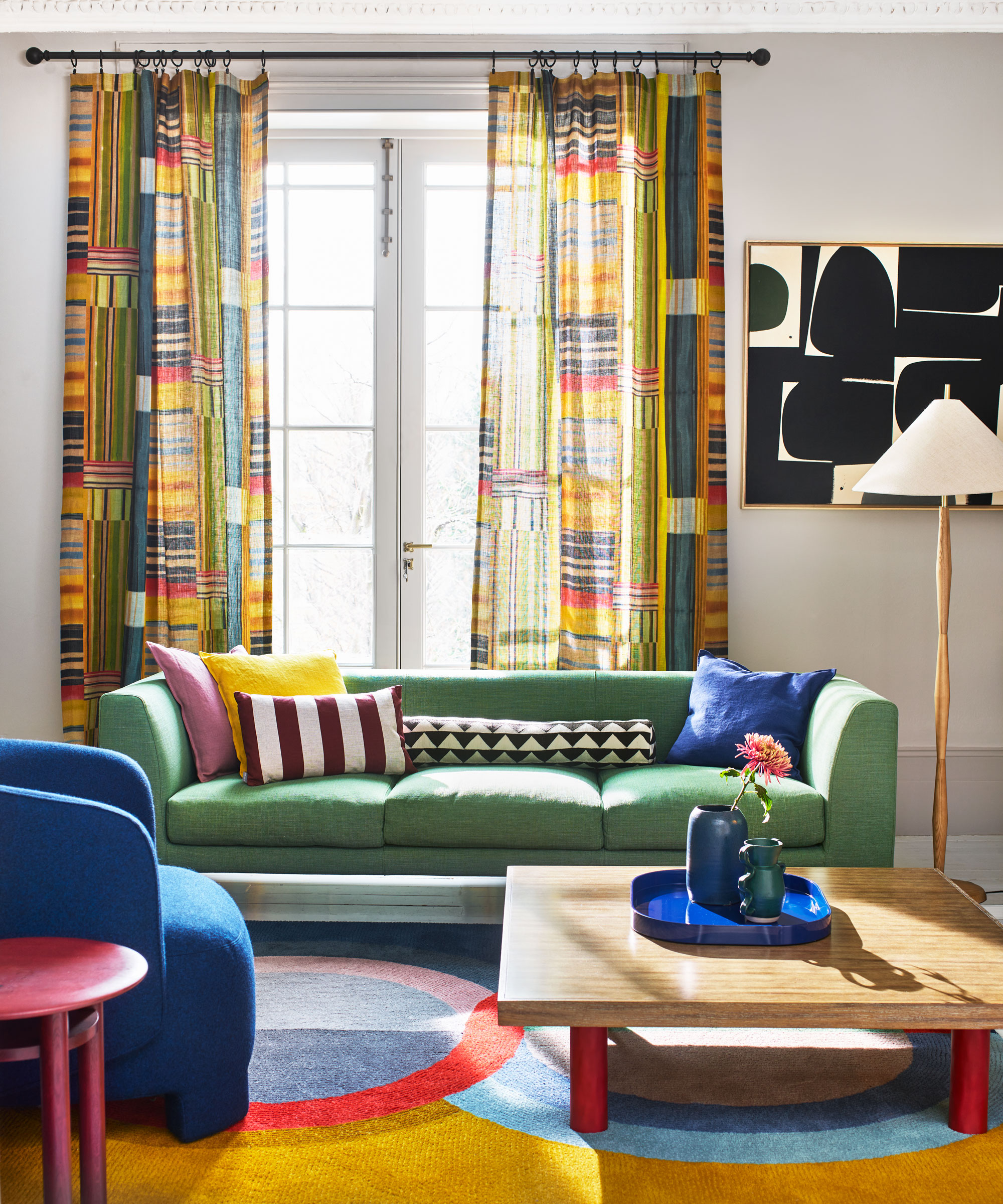
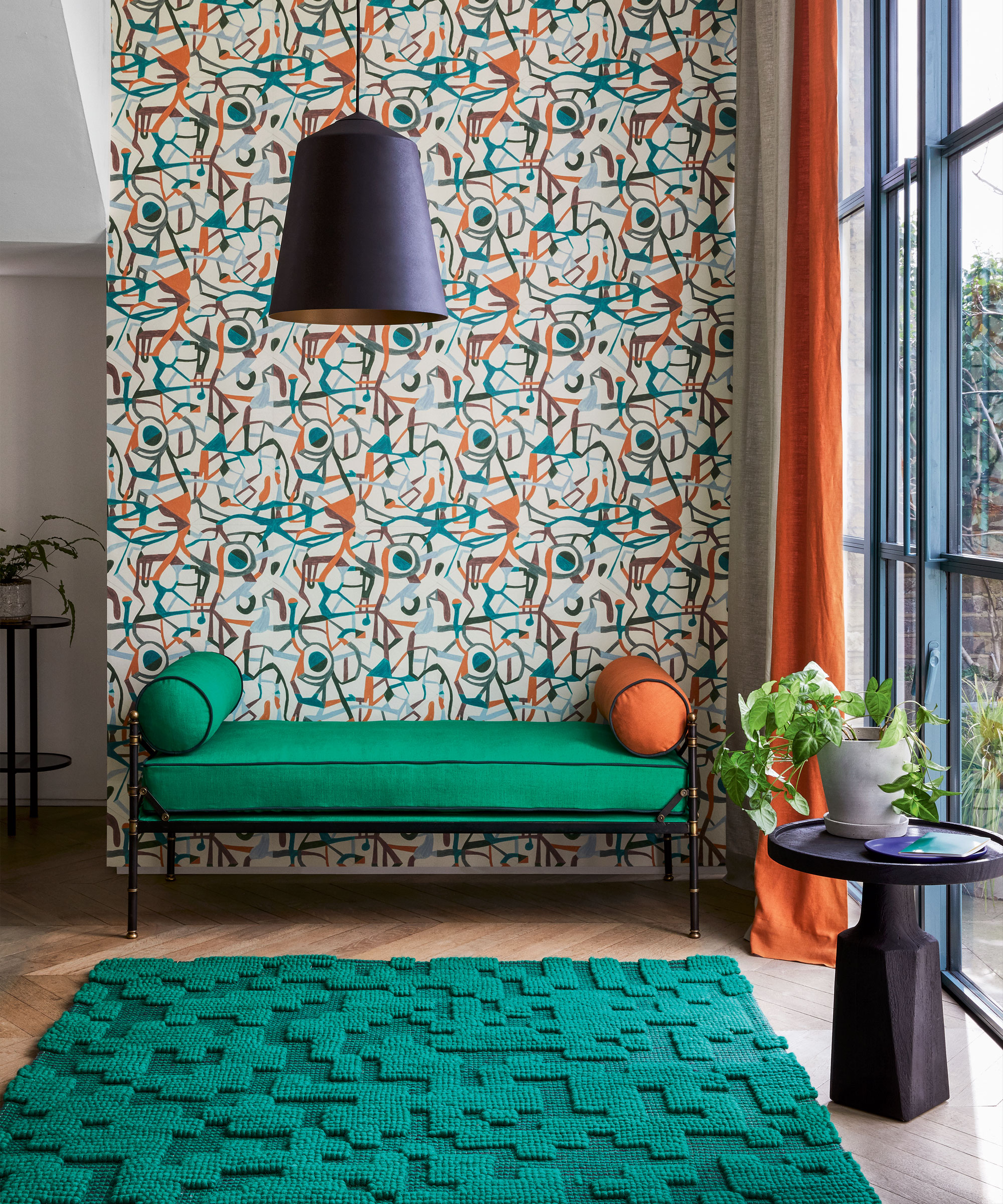
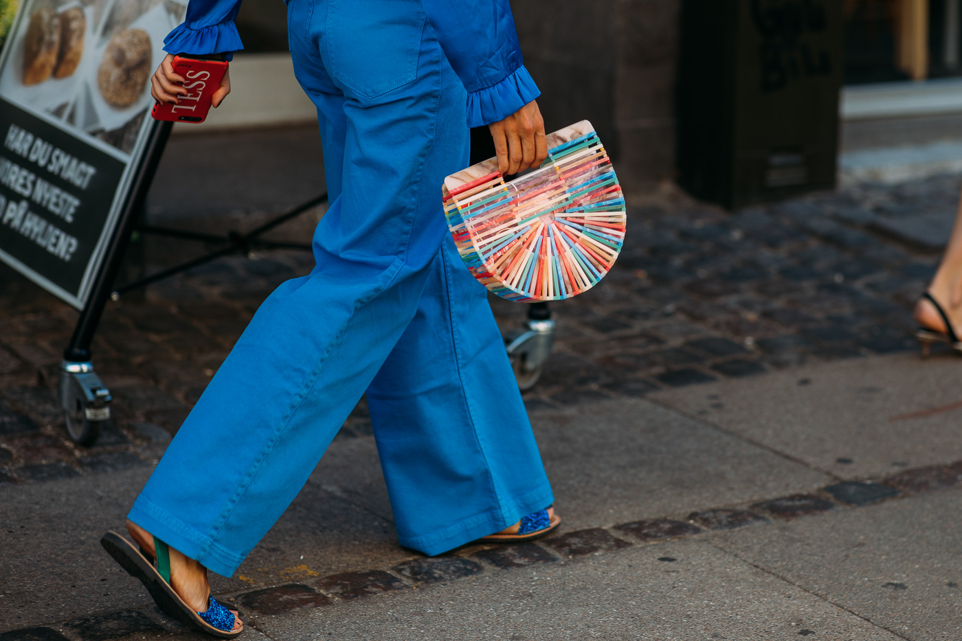
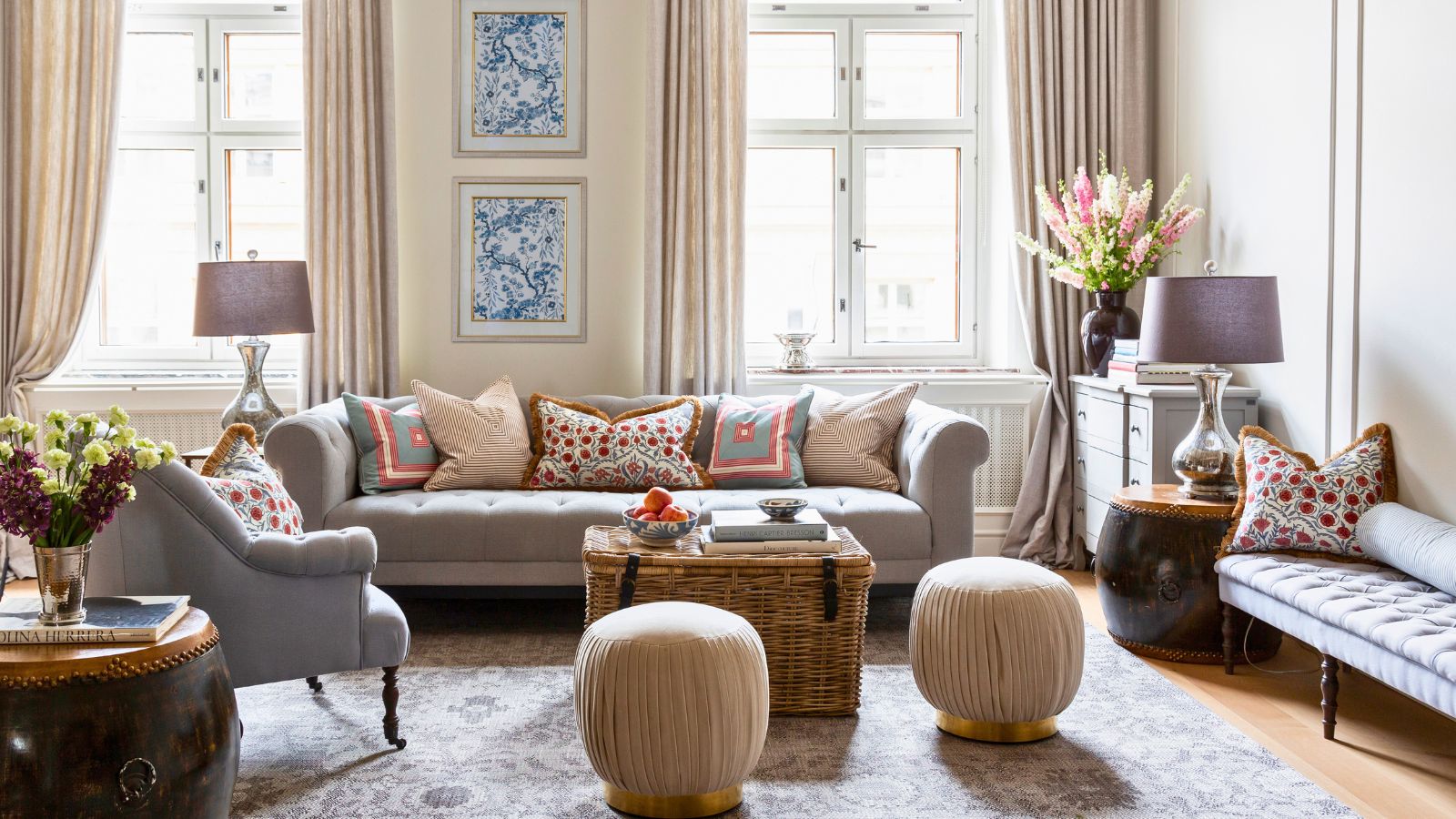
One approach to introducing color is starting with rugs. Colorful rugs can instantly transform a room, adding joy, warmth, and drama, and serving as a focal point. Experts note a growing demand for bolder expressions in home decor, making rugs an ideal medium for experimenting with color in an artistic manner. Another strategy involves balancing bolder hues with neutral backdrops. For example, a room with neutral white walls can incorporate vibrant textiles in cobalt blue, yellow, and green, creating a layered and intentional palette that avoids overwhelming the space. This method reflects a broader trend among designers who are moving beyond strict minimalism to include richer textures and tones, bringing personality and warmth to interiors without sacrificing calm and cleanliness. Strategic use of elements like deep-toned curtains or vibrant accent chairs can introduce drama effectively.
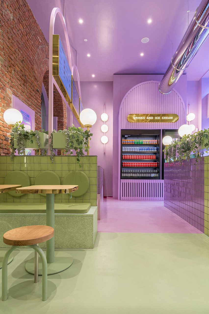
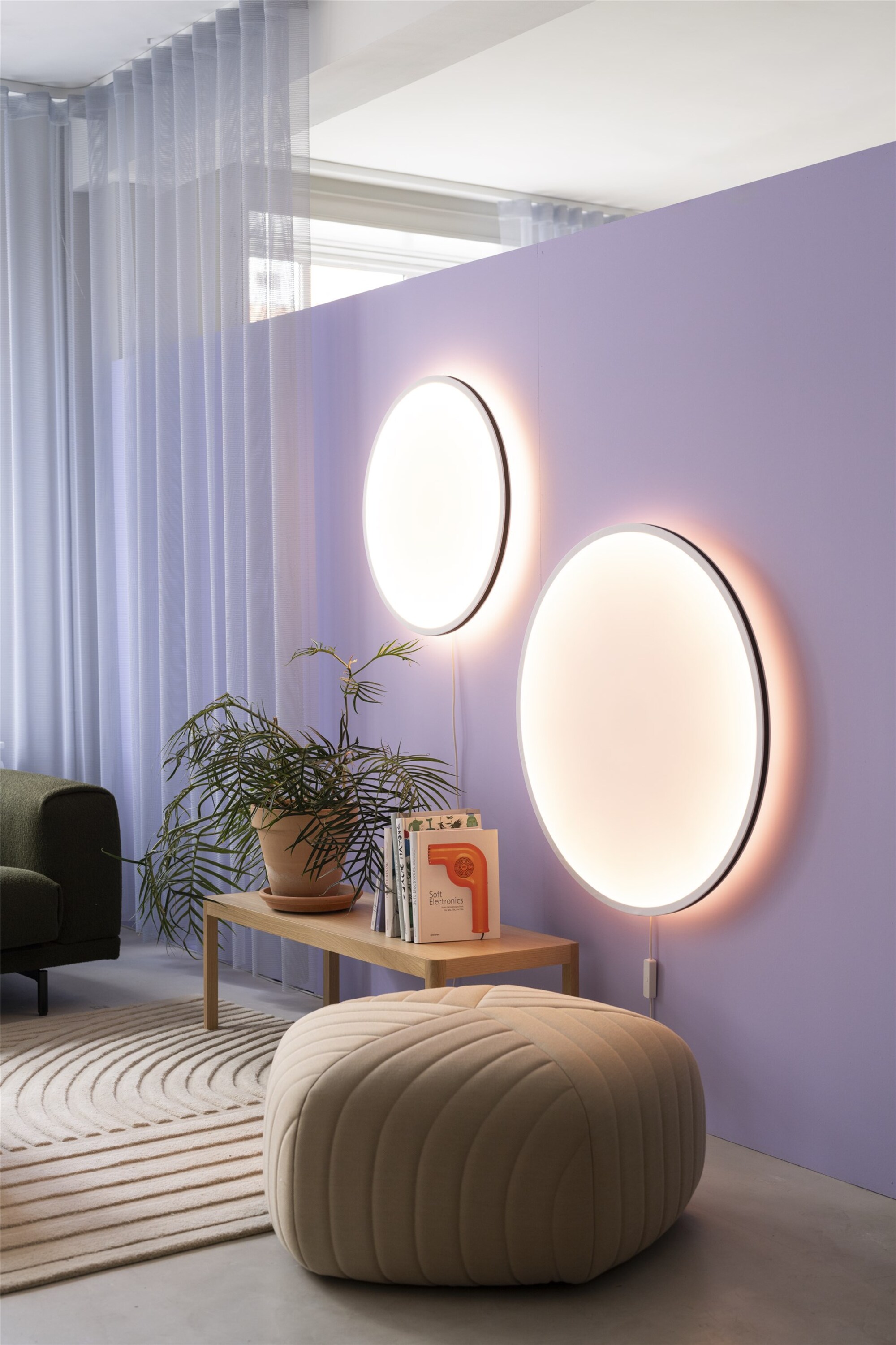
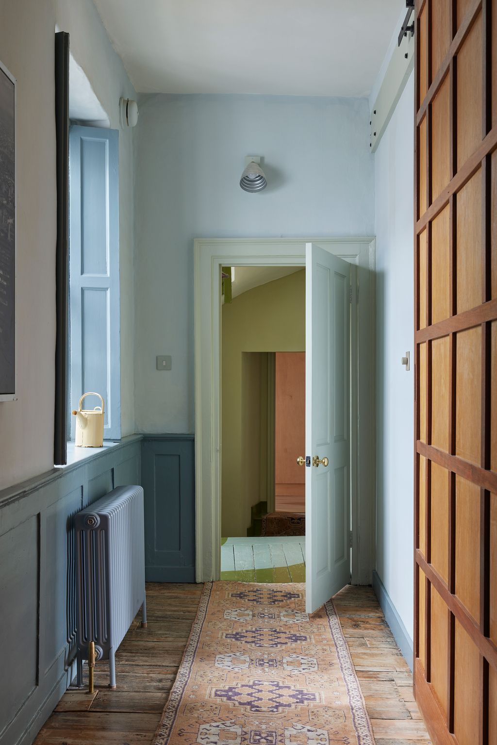
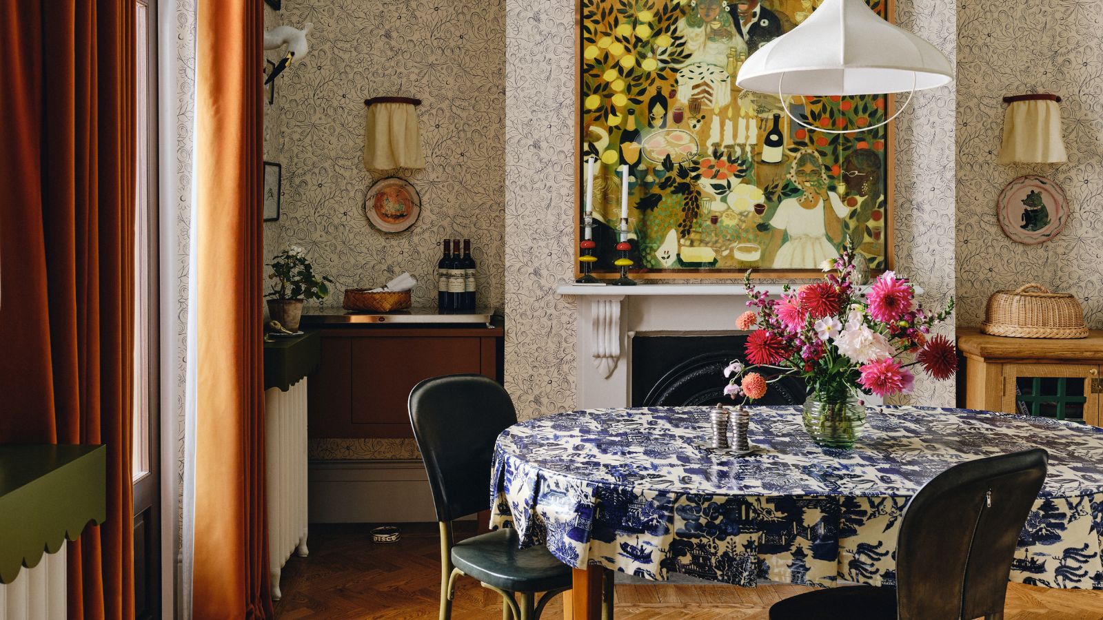
Integrating color can also involve using wallpaper, particularly designs that embody a vibrant fascination with the natural world, such as those by Josef Frank. These wallpapers can be balanced with geometric patterns from other elements, like hand-painted terracotta tiles, to create contrast and visual interest when mixing colors and patterns. Color can significantly impact the mood and energy of a space; in Scandinavian countries, lighter colors respond well to natural light, energizing rooms during darker periods. Playful and joyful colors are used to create fresh looks, often by repeating specific shades across various elements like lighting, furniture, and cabinet hardware, treating the project as a cohesive painting.
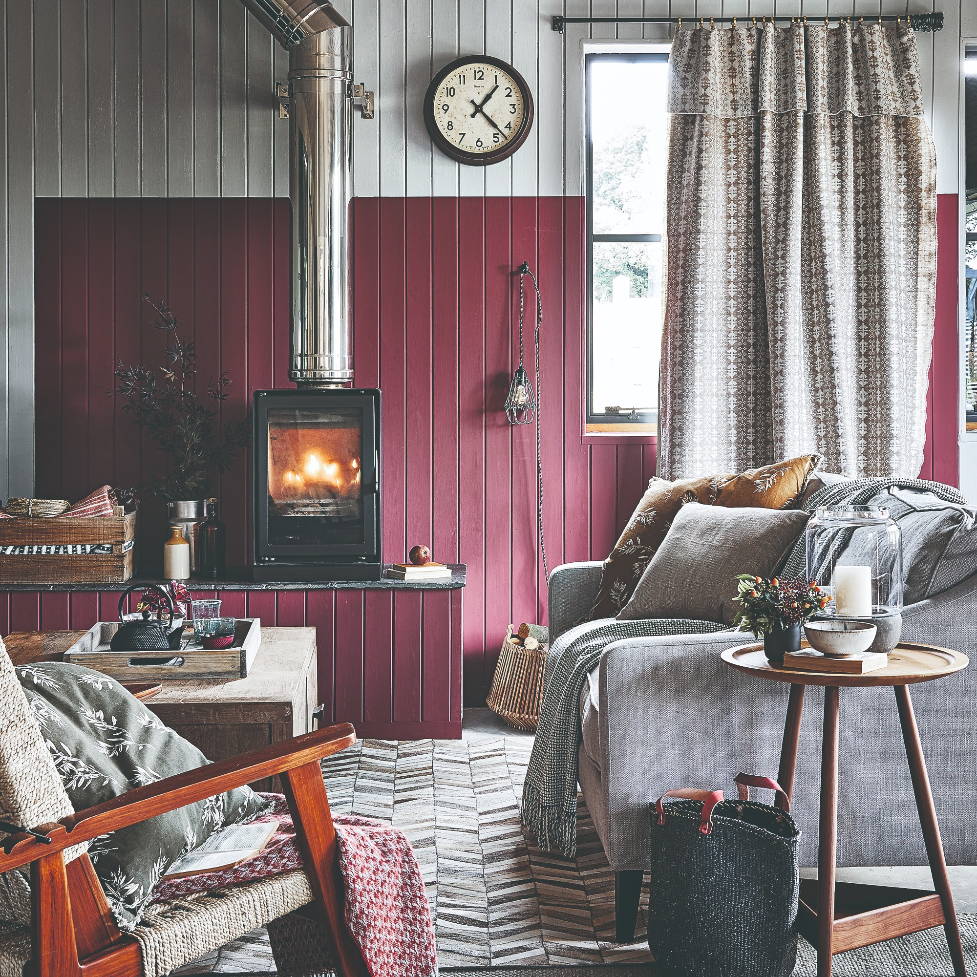
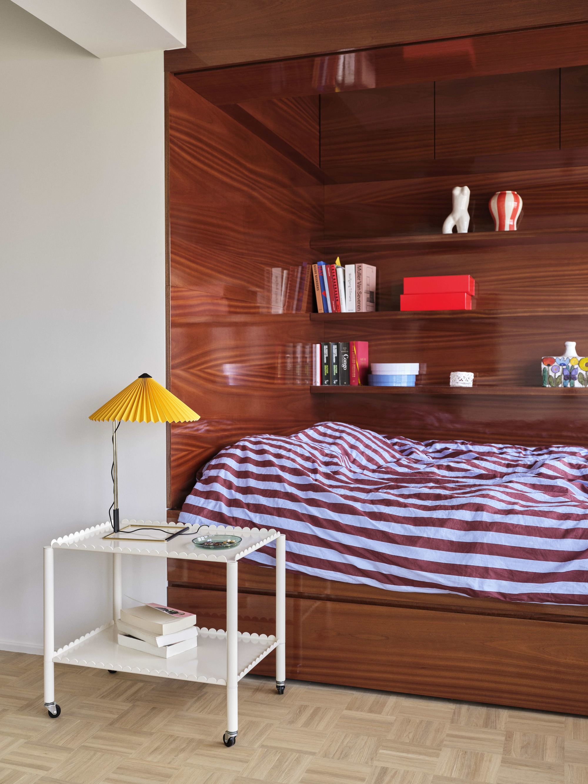
Contrast is another key element. Deep, rich shades in a bedroom, such as olive green walls and a high-gloss oxblood headboard, can create a grounding warmth, especially when contrasted with crisp white bedding and translucent paper pendants. This deliberate contrast energizes the palette, making the white an active element rather than a passive neutral, and contributes to a graphic and modern aesthetic. Texture also plays a role in how color is perceived, with glossy and matte surfaces reflecting light differently to add depth.
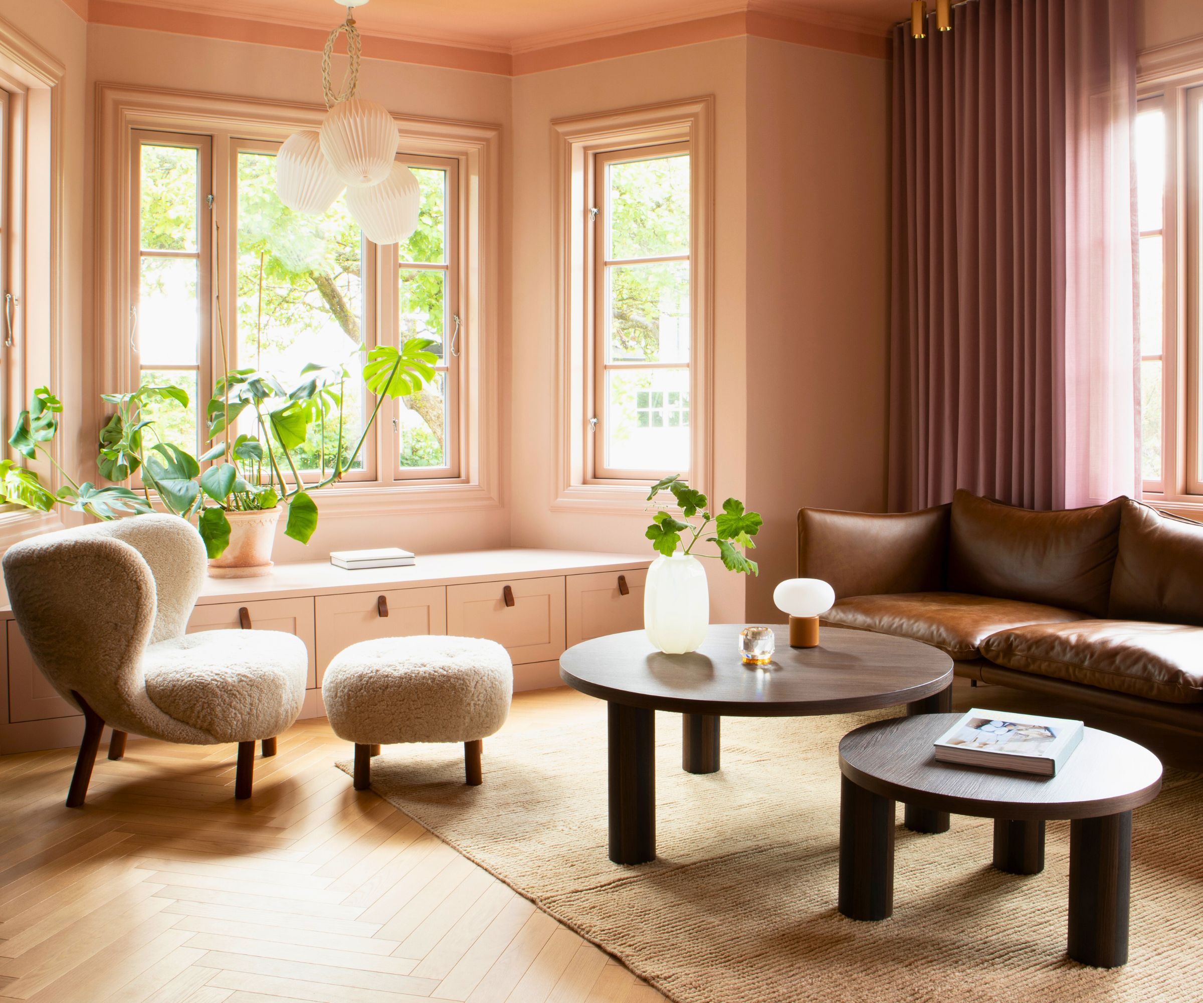
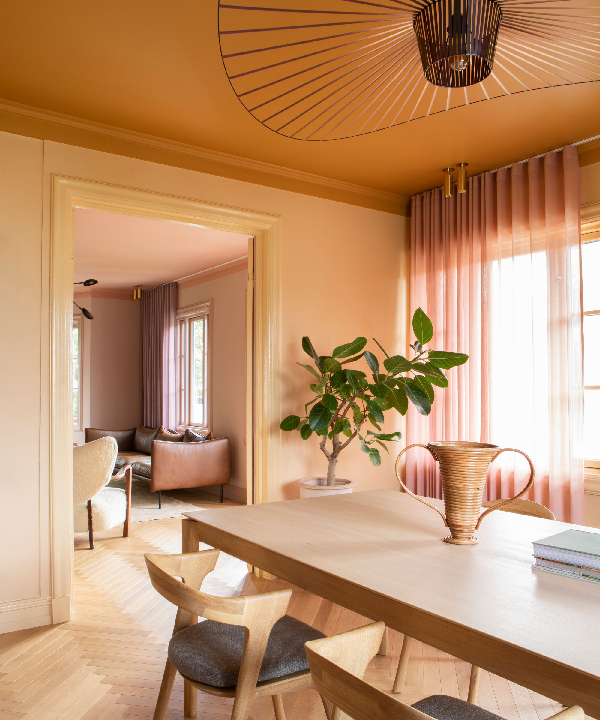
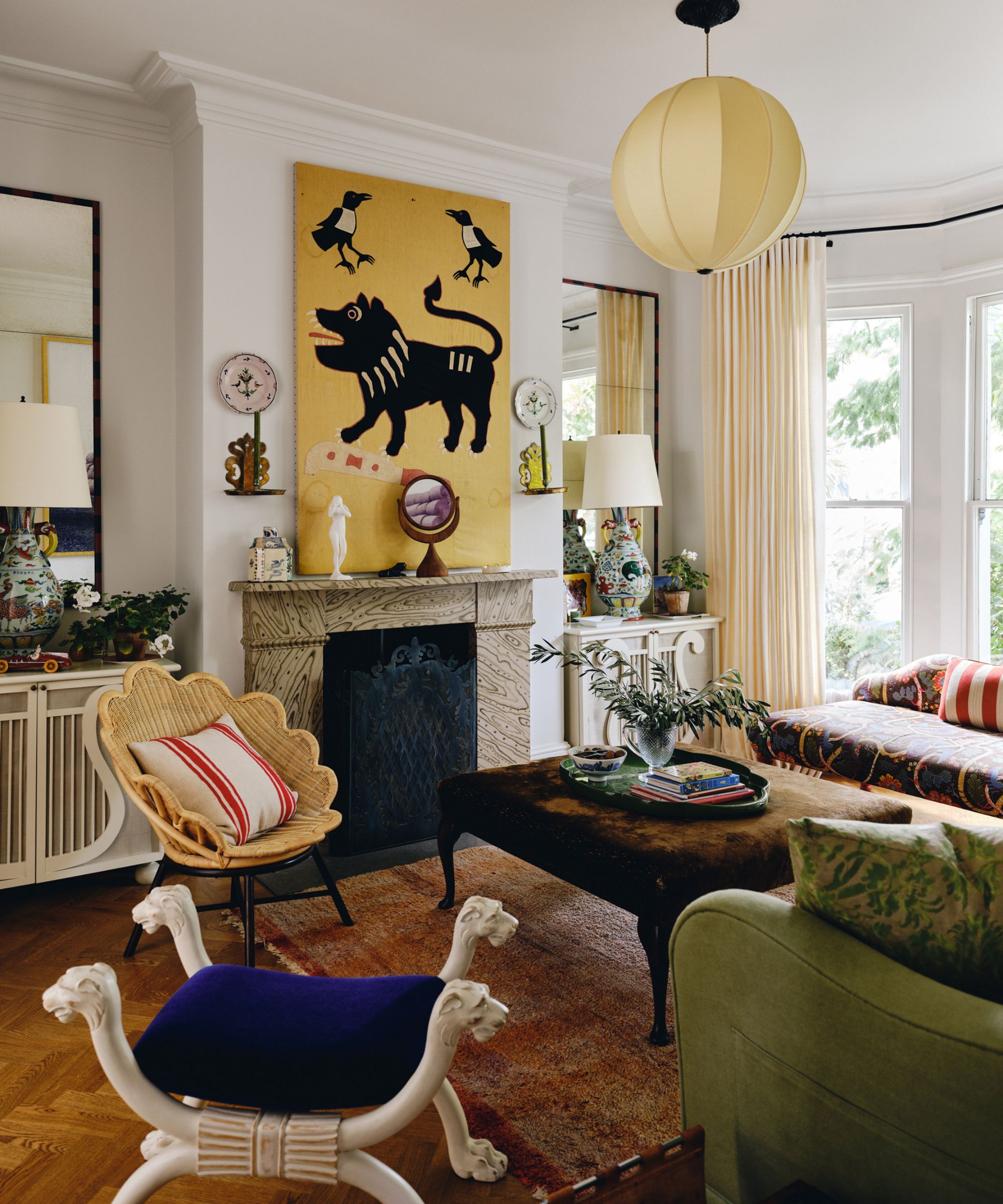
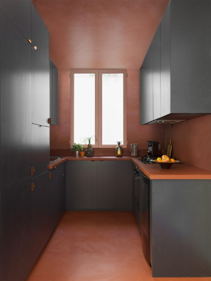
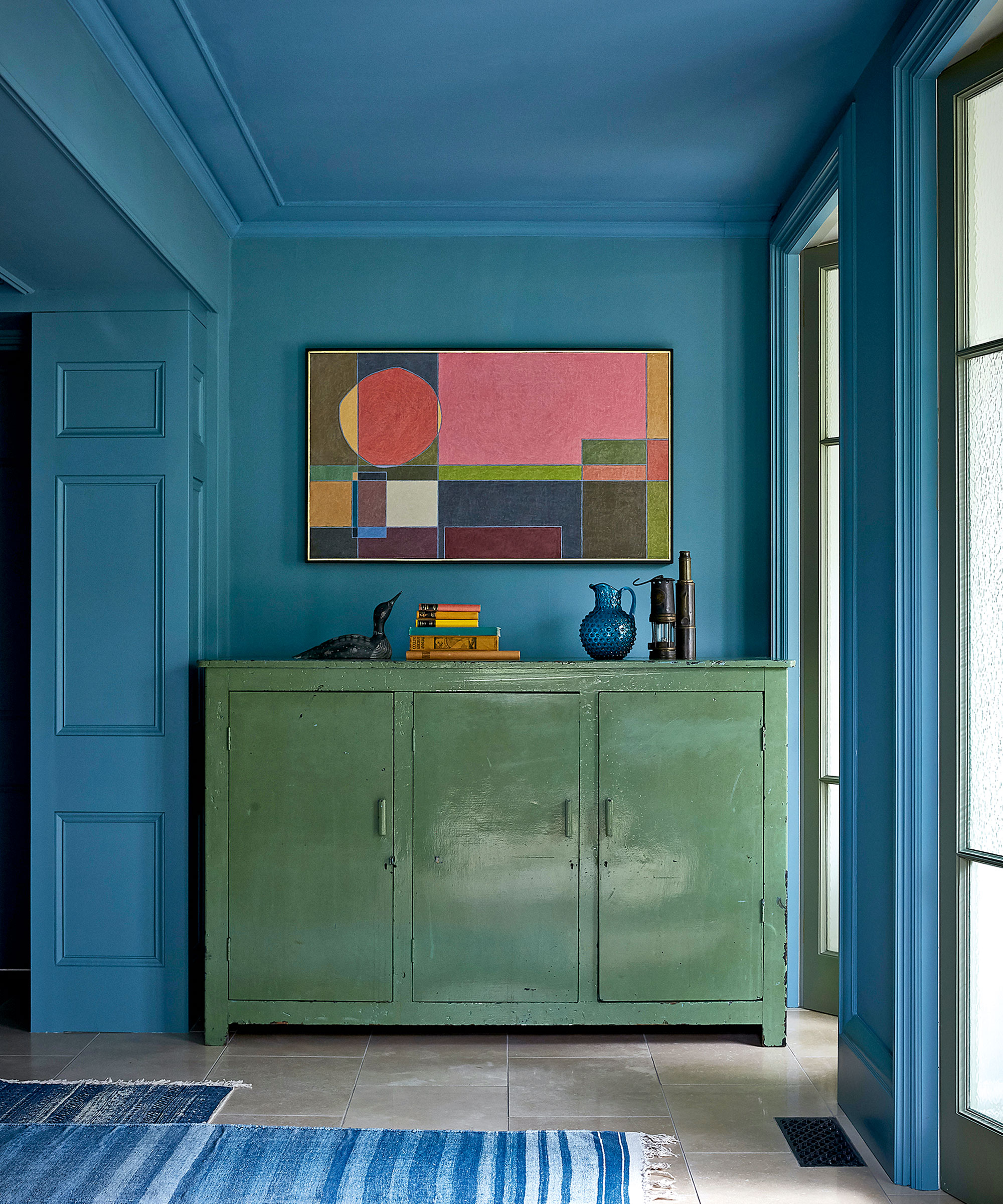
Ceilings, often referred to as the 'fifth wall,' offer an unexpected canvas for color. Painted ceilings can add atmosphere and surprise, drawing the eye upward and transforming a room's feel. Using a contrasting accent color on the ceiling, such as a soft sky blue against dark marble flooring and cloud-like marble walls, highlights the importance of balance in Scandinavian design. Furthermore, artwork can serve as inspiration for an entire room's color scheme. A central painting can dictate the palette, with colors echoed in furniture, textiles, and rugs to create harmony and a cohesive design narrative. A simple technique is to select a few colors from a piece of art or fabric and integrate them throughout the space to maintain balance.
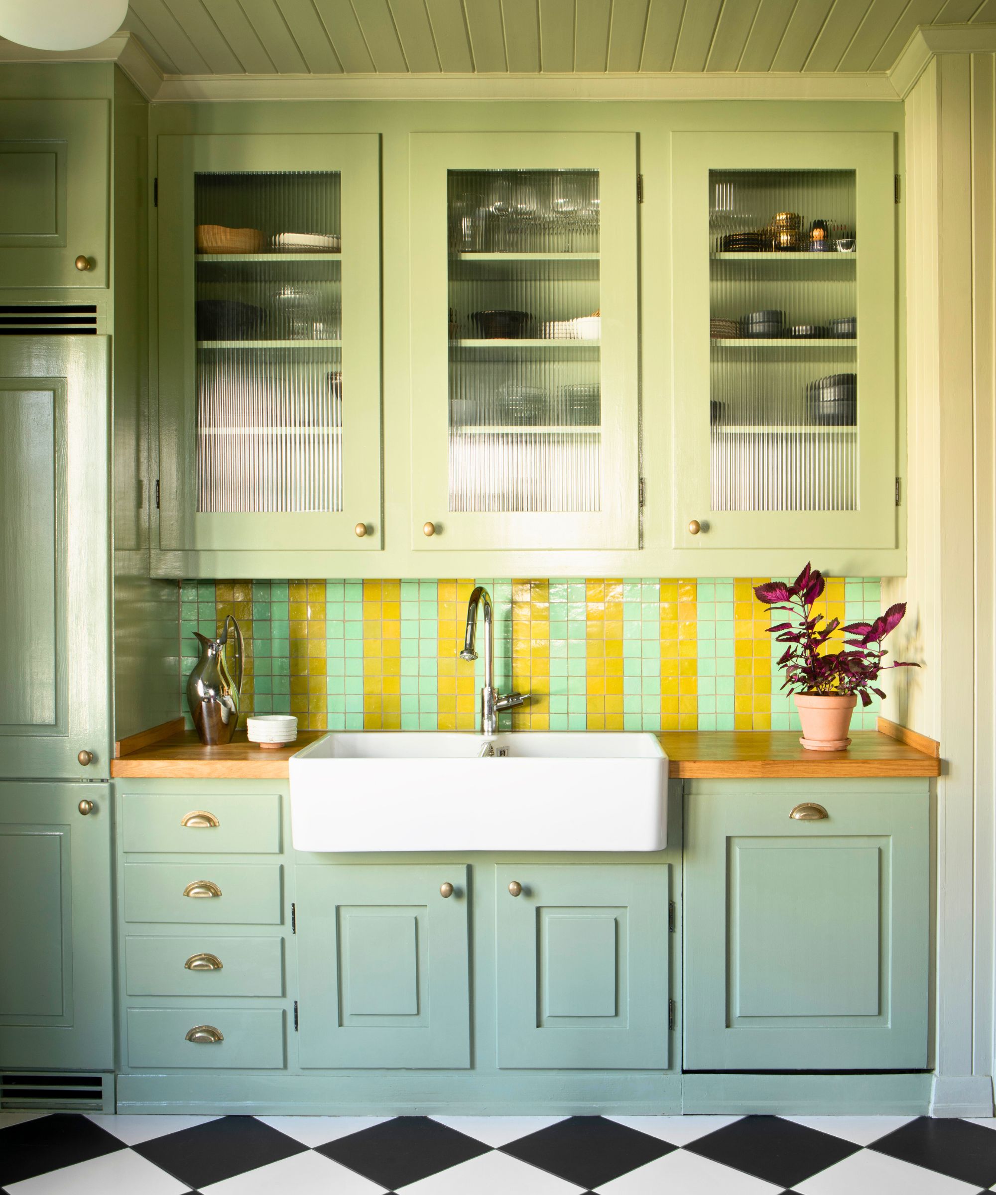
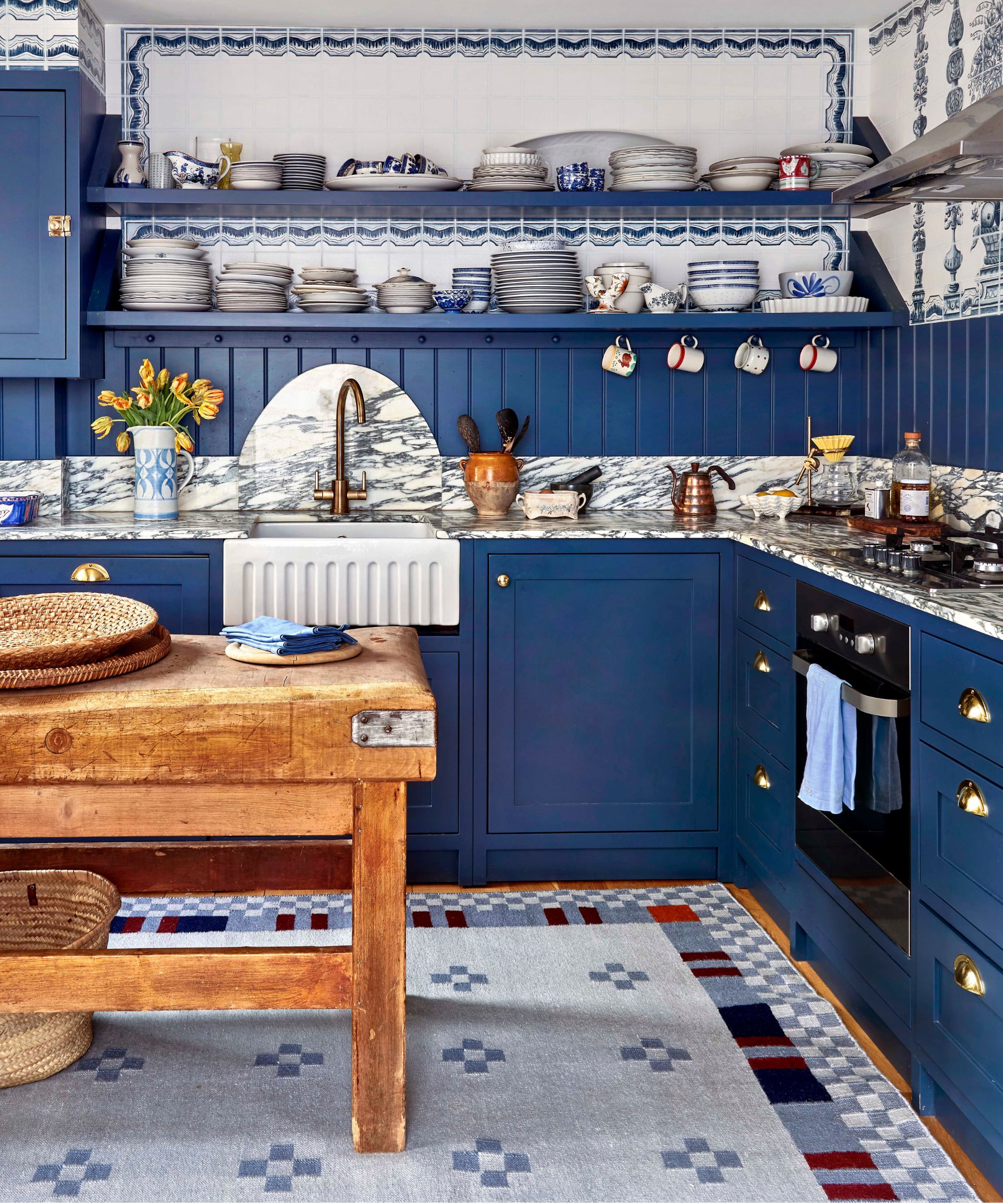
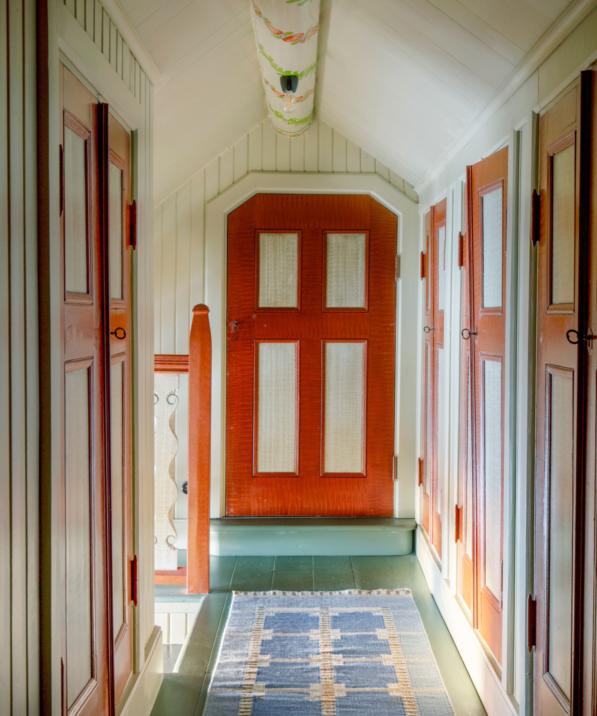
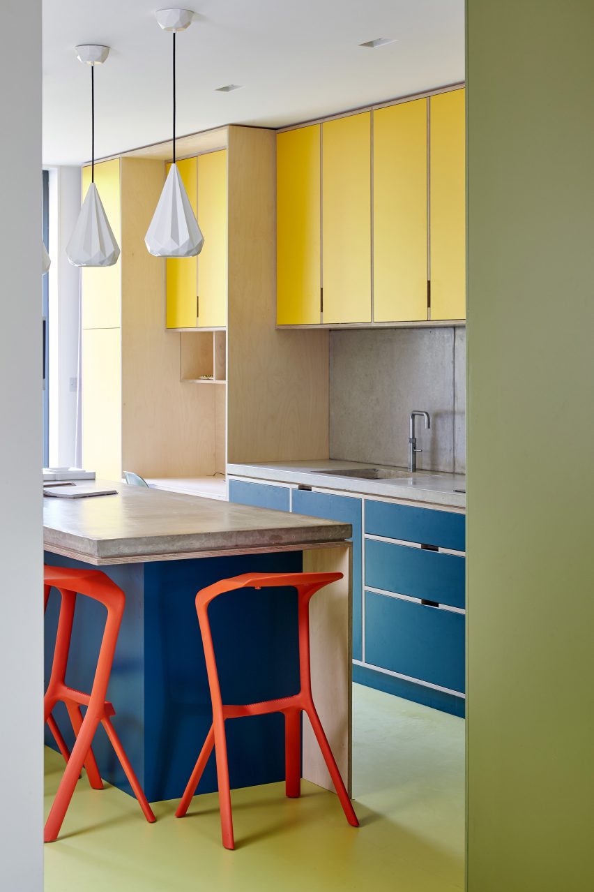
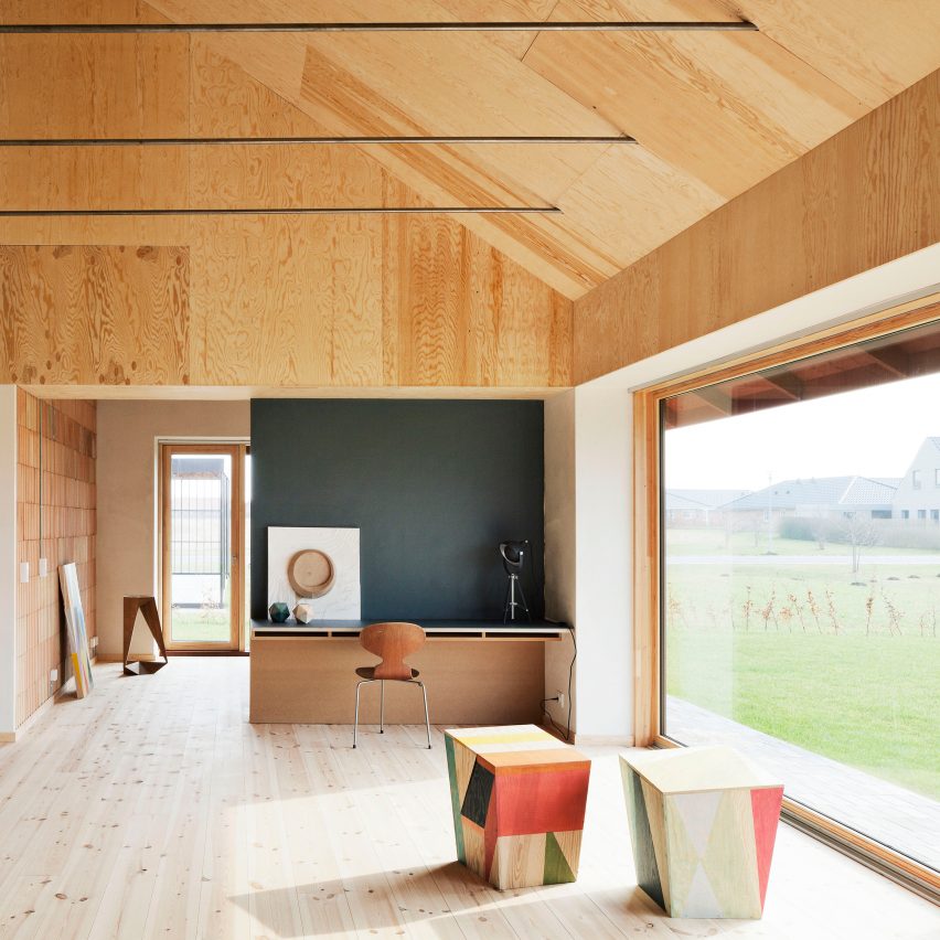
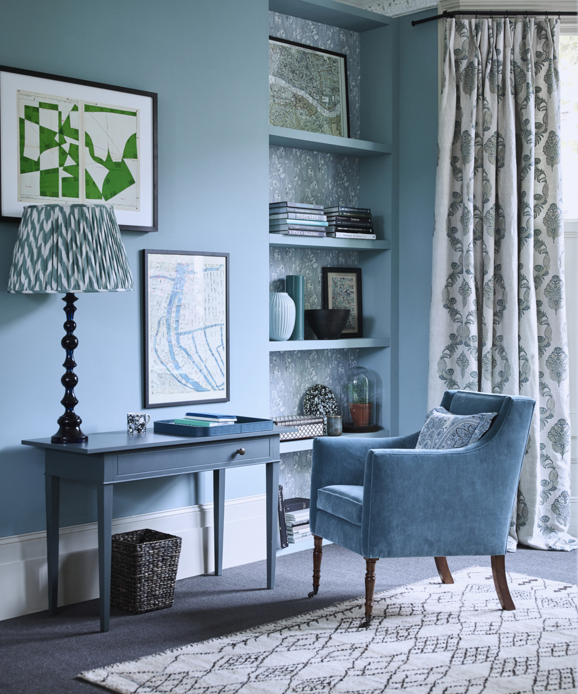
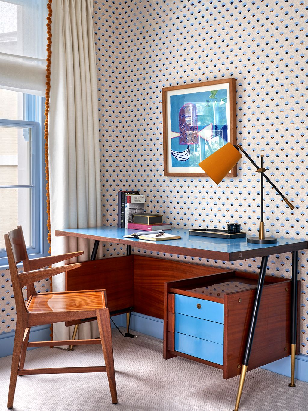
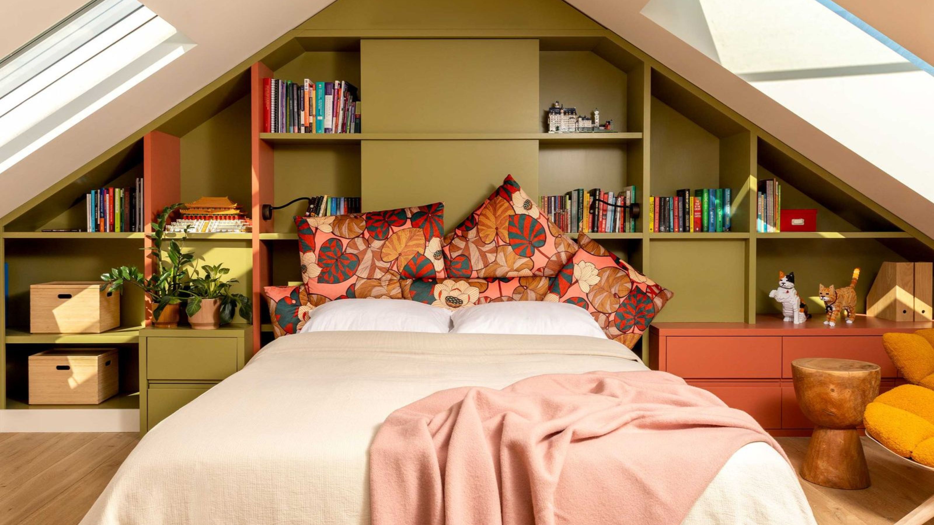
Careful selection of hues is crucial, particularly for spaces designated for productivity or study. Blue is recommended as an anchor color due to its ability to promote focus and its versatility with both natural and artificial light. A monochrome palette, using different shades of the same base color, can make a space feel intimate yet calming. Complementary colors can create dynamic contrast, but it is advised to use one dominant shade with others acting as accents. Finally, fitted furniture can be utilized as a colorful feature. Painting cabinetry in vibrant colors, rather than walls, draws attention to the craftsmanship and bespoke nature of built-in elements. Color combinations, such as orange and green, can introduce rhythm and visual balance, creating a dynamic effect beyond simple storage. The overarching principle is restraint and a sense of order, even in maximalist colorful Scandinavian designs, typically adhering to a palette of three or four colors to ensure a layered and harmonious result.
#ScandinavianDesign #ColorfulInteriors #HomeDecor #InteriorDesign #ColorPalette #DesignTrends #ModernLiving #HomeStyling #ScandinavianDesign #ColorfulInteriors #HomeDecor #InteriorDesign #ColorPalette #DesignTrends #ModernLiving #HomeStyling
0개의 댓글이 총 표시됩니다.
 아직 댓글이 없습니다
추가로 마음에 드릴 만한 콘텐츠
Scandinavian Color Palettes Aren't Always Muted and Monochrome — Here Are the Combinations Designers Choose
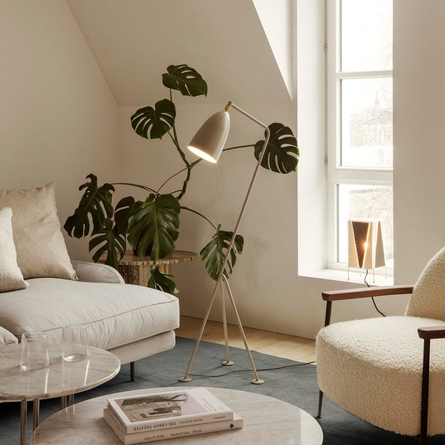
10 Scandi living room ideas to inspire your next interior project

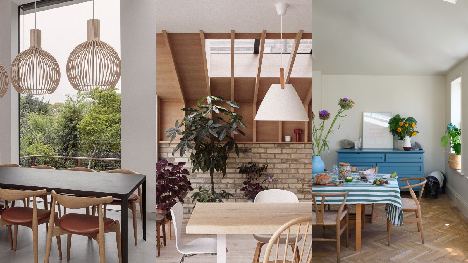
5 Scandinavian dining room ideas for a simplistic yet refined scheme

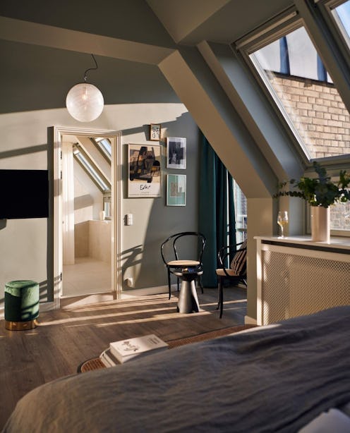
Try This Key Decor Item To Give Your Home That Signature Scandinavian Style
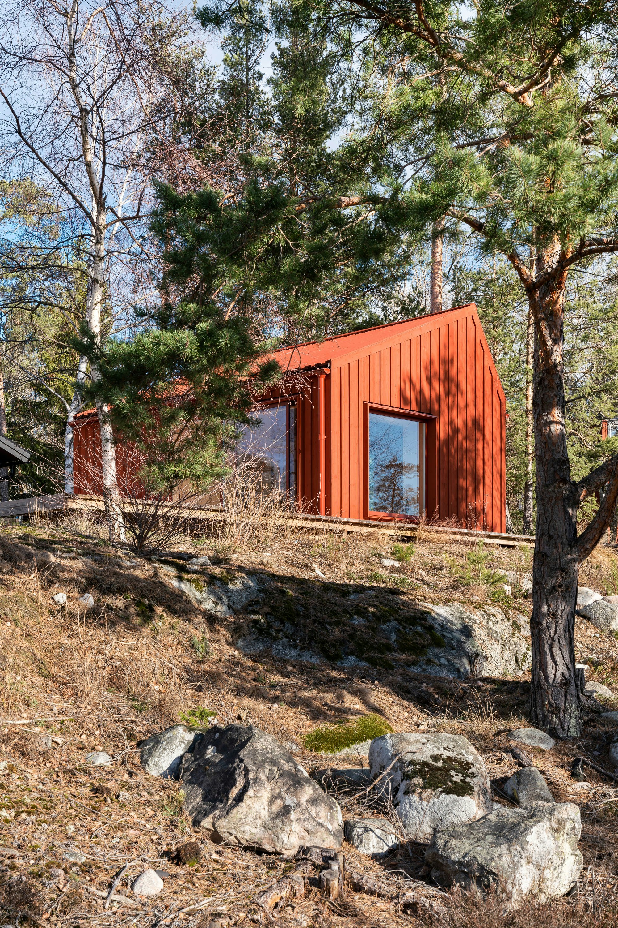
The Best Scandinavian-Inspired Paint Colors for Your Home, According to Experts

I've never been able to describe my interior design style until I came across the term Scandi Maximalism – here's everything you need to know about this folky, playful trend
Seriously Cool Color Combos We’re Stealing From the Danish

My whistle-stop tour of Copenhagen reaffirmed these 5 Danish design lessons in cool and cozy design
From uplifting pastel palettes to cool, crisp schemes, these 5 cozy homes showcase the best of Scandinavian style
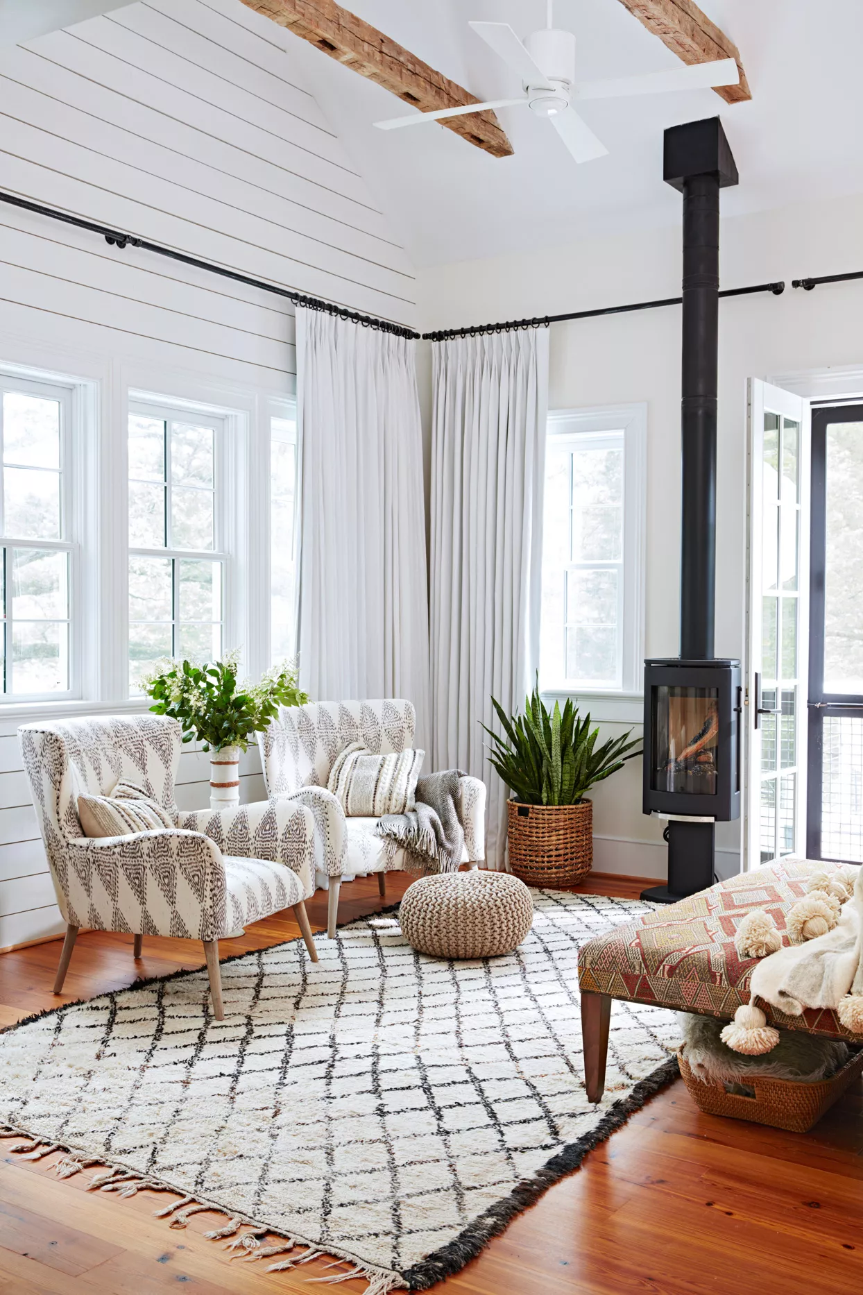
16 Gorgeous Scandinavian-Style Rooms Showcasing This Cozy, Minimalist Look

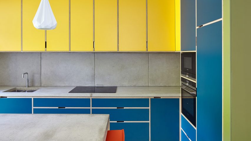
Ten bright and bold interiors that make use of colour theory
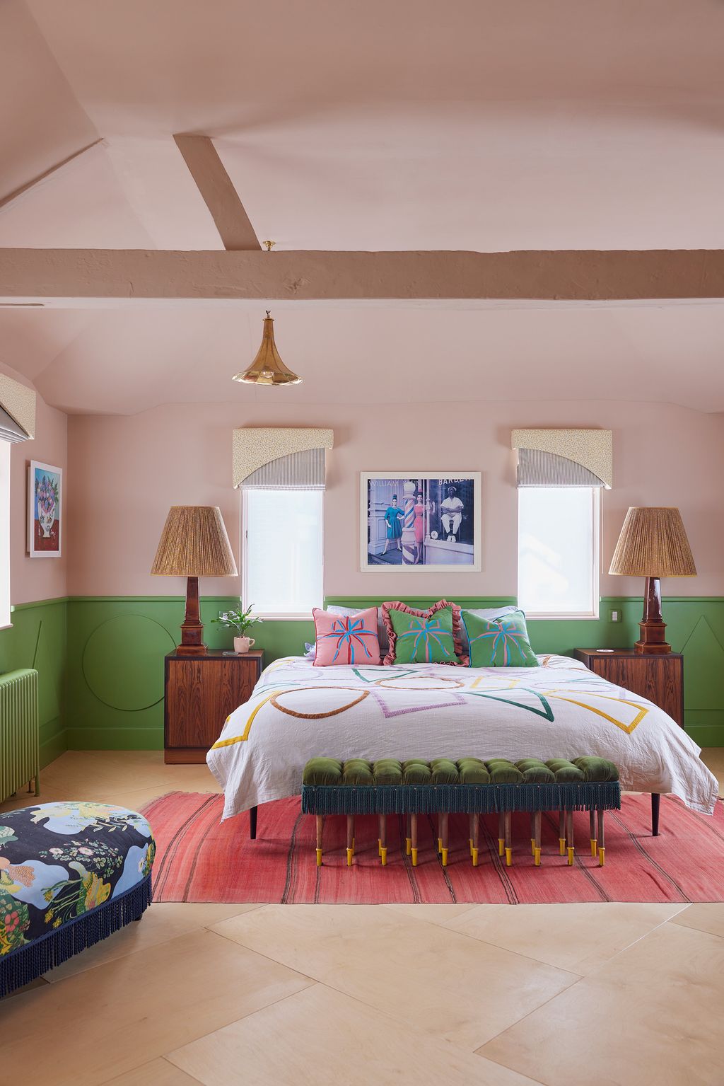
Time to rethink coloured ceilings and woodwork
15 Instagram accounts to follow if you love Scandinavian design

Scandinavian bedroom ideas – 10 looks to create a stylish cocooning space
10 Ways Scandinavian Lighting Ideas Can Make Illuminating a Space Feel Sculptural
Colorful room ideas – 15 vibrant spaces with daring decor
How to use pattern and colour in your home like the Scandis – it turns out they love them too, they just do it differently
3 Nordic Women Designers Defining Modern Hygge
10 popular Scandinavian home interiors on Dezeen's Pinterest boards
We Adore These 16 Scandinavian-Style Houses for Their Simplicity and Beauty