1/21
These 20 Trendy Paint Colors Will Be Taking Over Walls In 2026
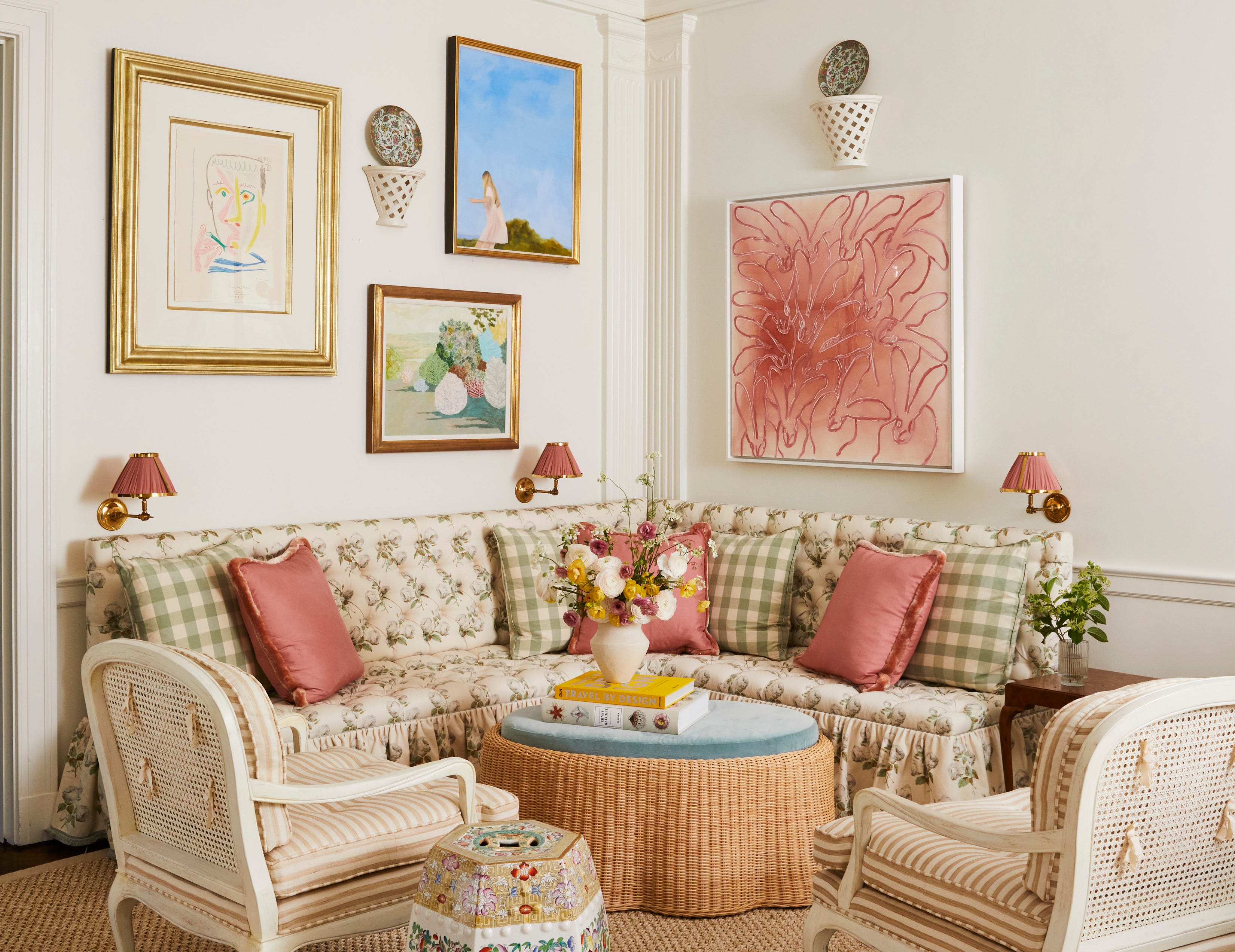
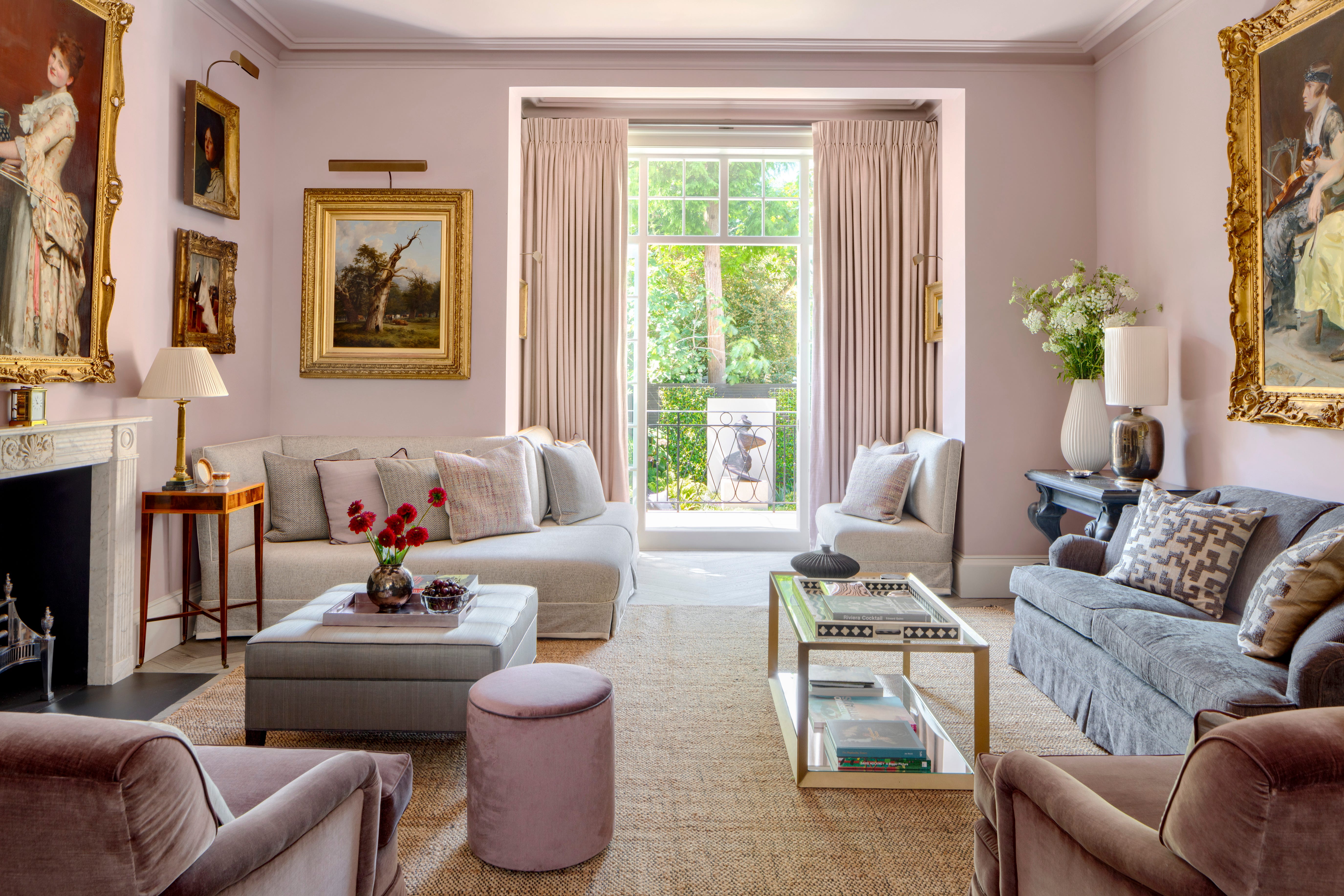
The article explores the anticipated paint color trends for 2026, highlighting a diverse range of palettes from leading paint companies like Sherwin-Williams, Behr, Valspar, and Glidden. These collections, designed for harmony and easy mixing, offer both bold and understated hues, catering to various design preferences. The trends are informed by color forecasting experts who analyze emerging styles and how individuals desire to feel in their homes.
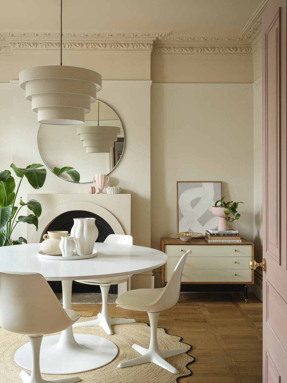
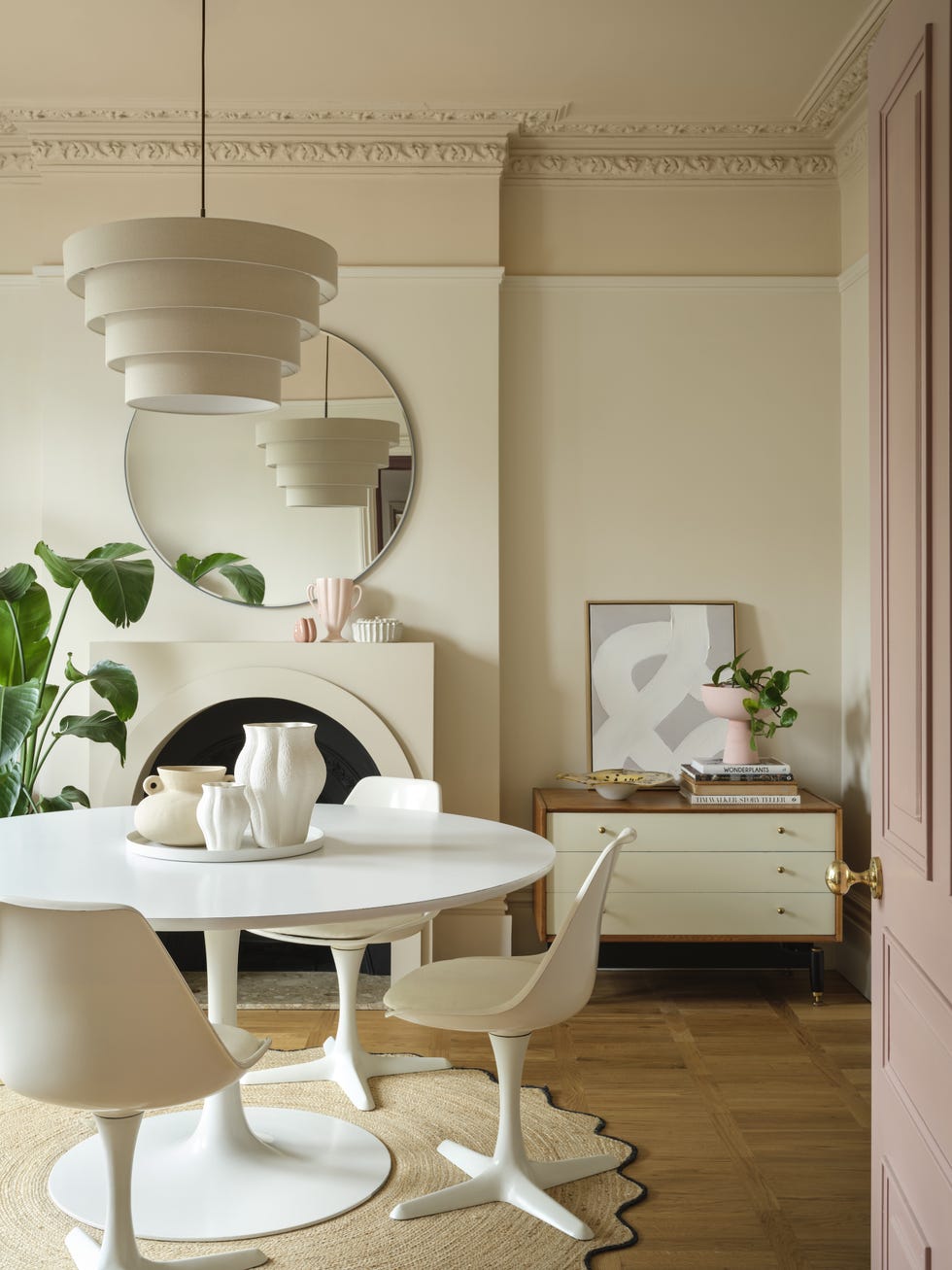
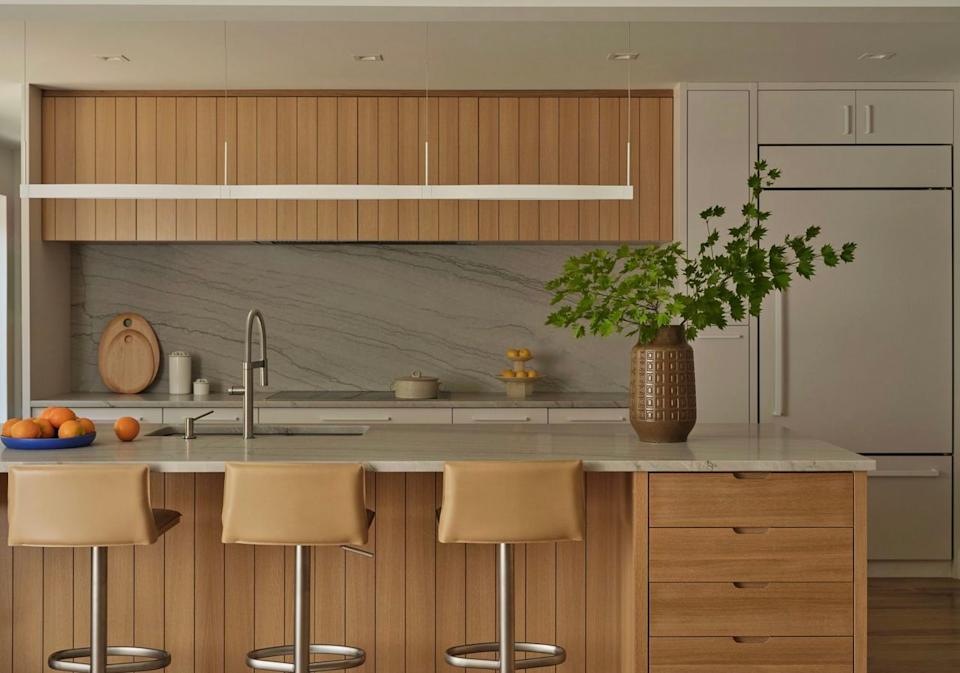
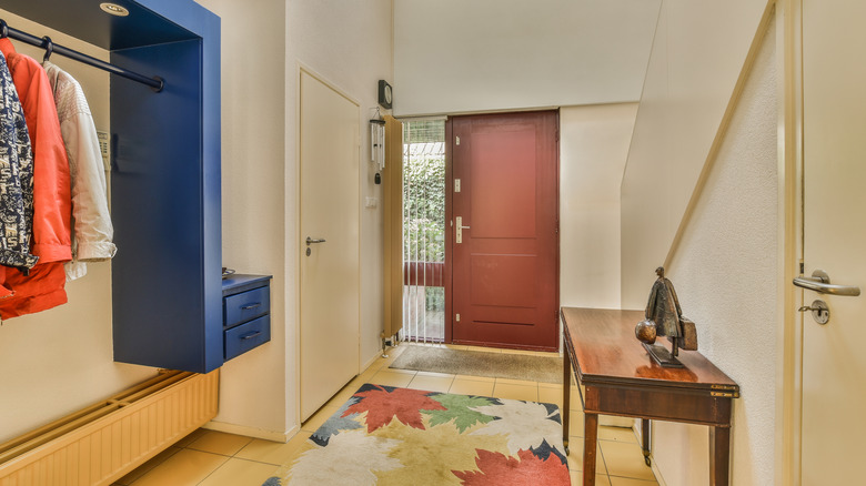
The discussion begins with foundational neutrals, which are described as evolving into more layered and nuanced tones. Sherwin-Williams' Pavestone, a rich stone gray with low light reflectivity, is presented as an example, offering a sophisticated alternative to traditional grays. Behr's White Moderne, a high-LRV white from their EVOLVEDNeutrals palette, is noted for its versatility and is suggested for color-drenching spaces by using different sheens. Sherwin-Williams' Universal Khaki, an earthy beige with a hint of green, aligns with the concept of "neutral maximalism," providing a subtle way to incorporate green trends.
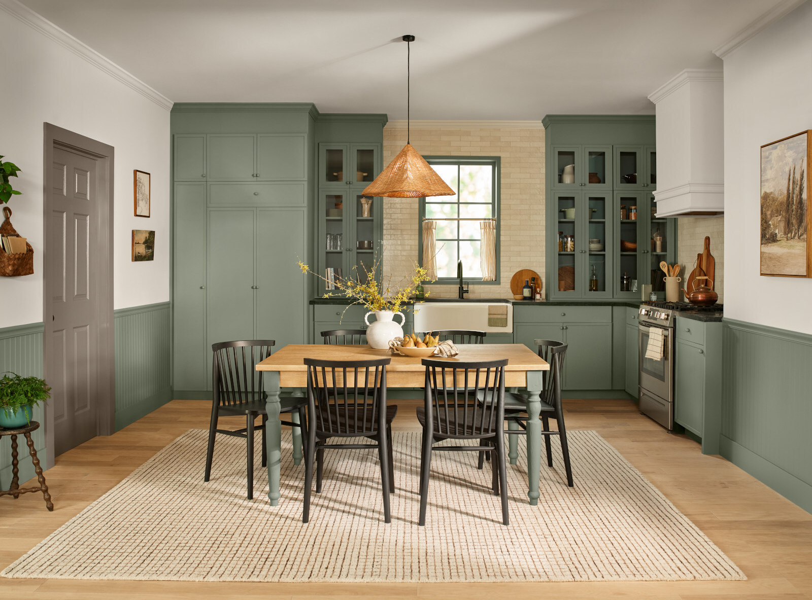
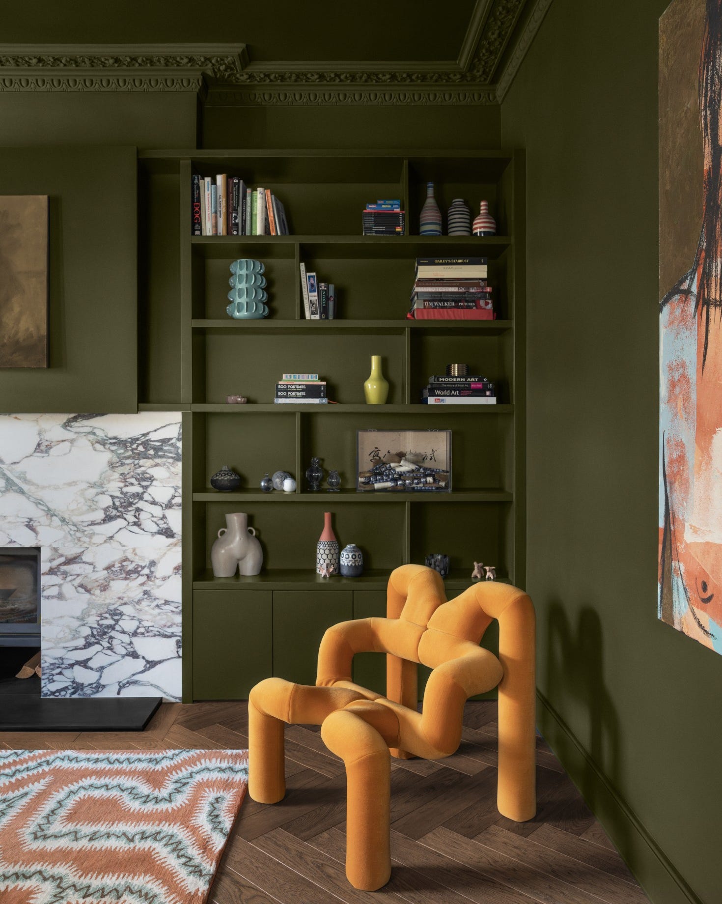
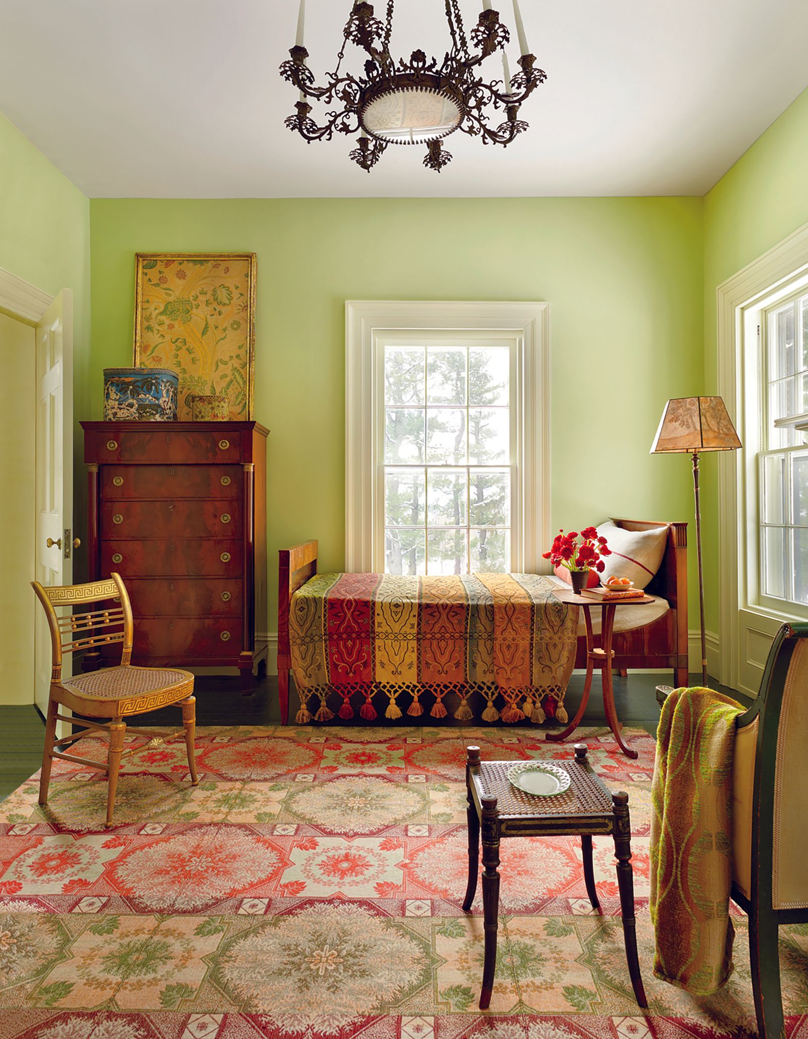
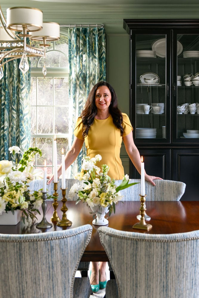
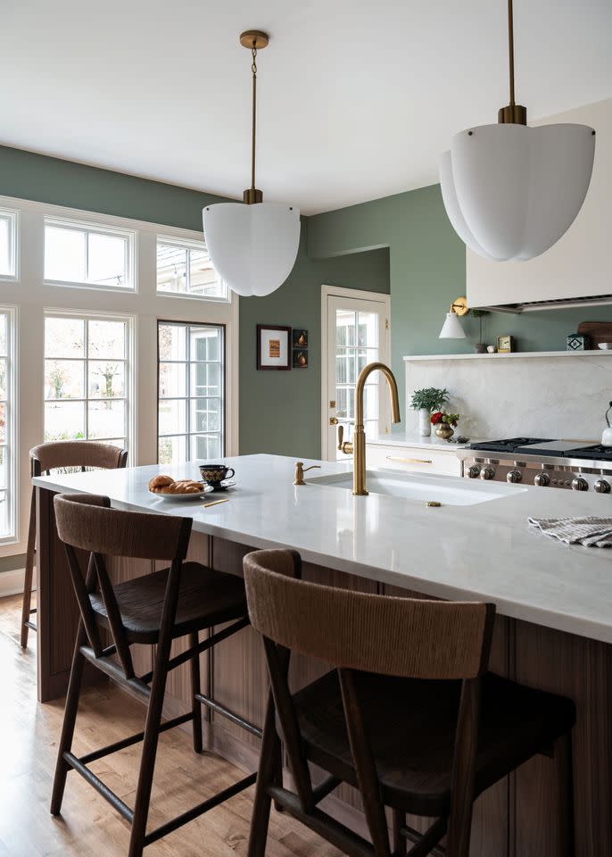
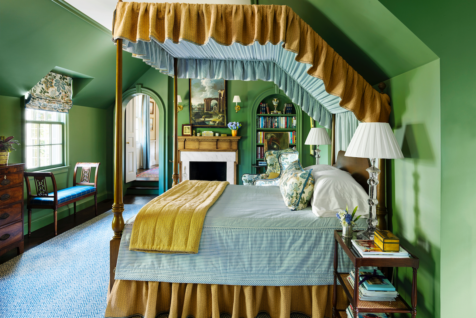
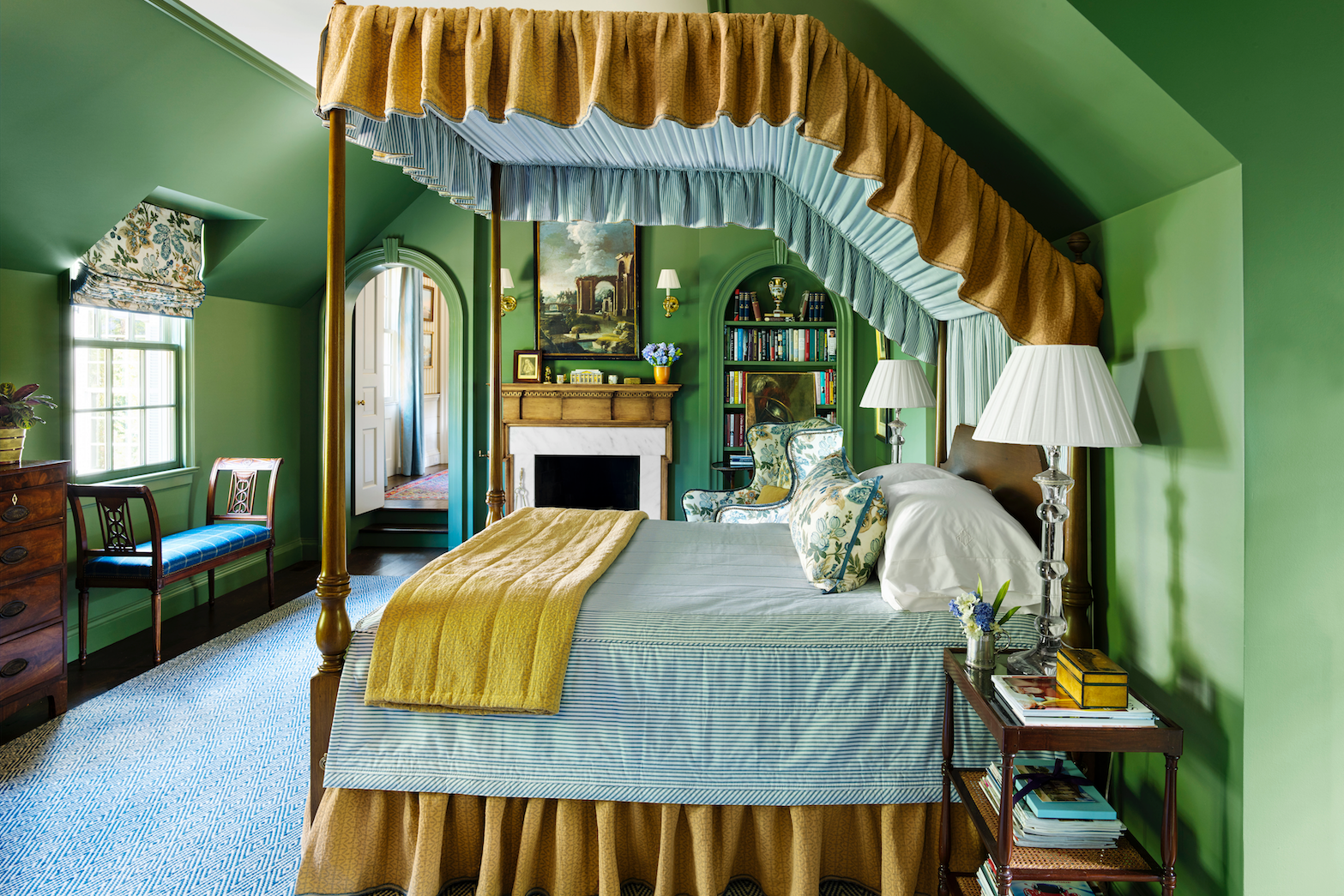
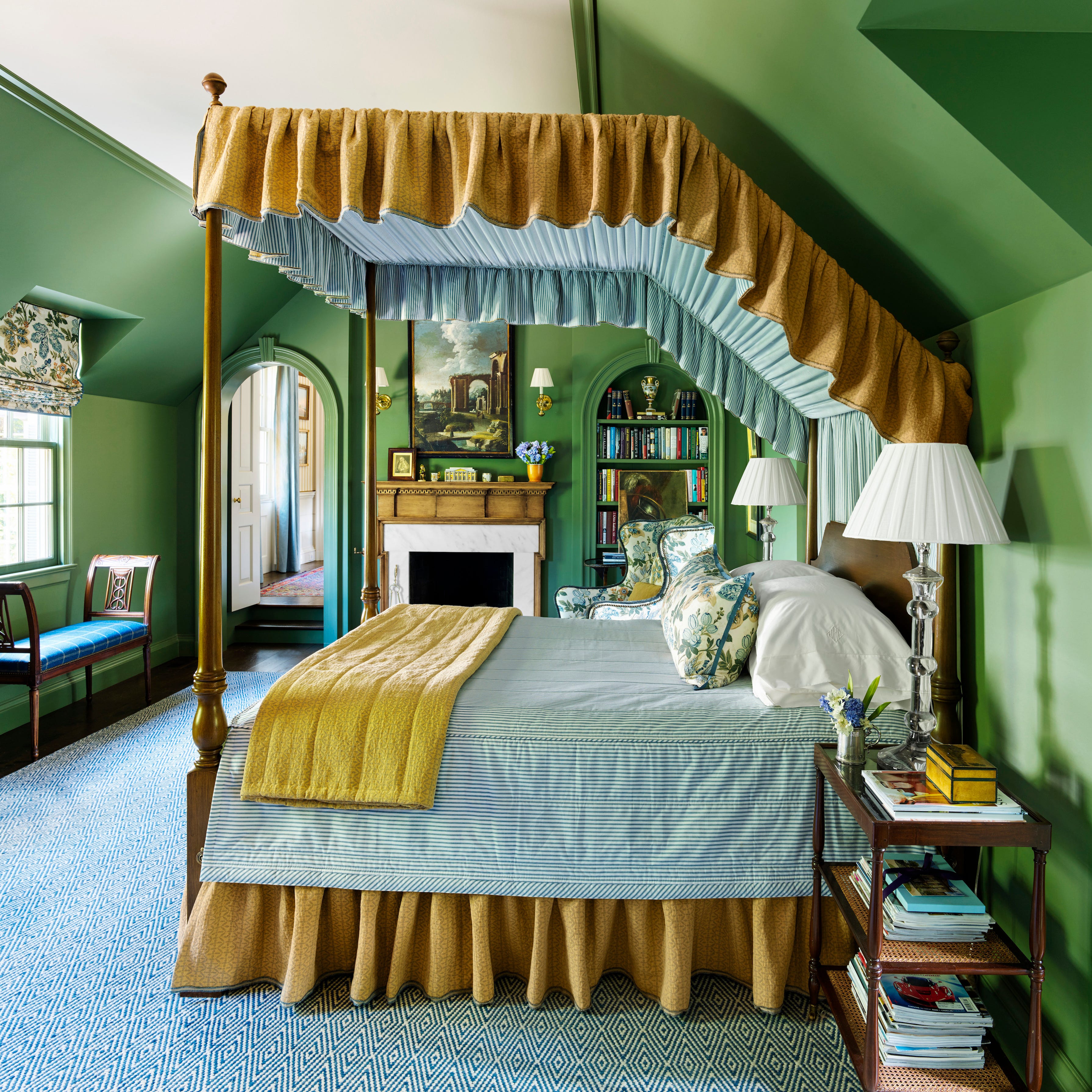
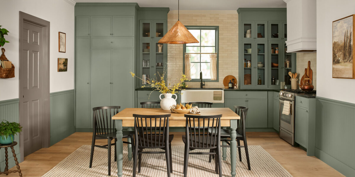
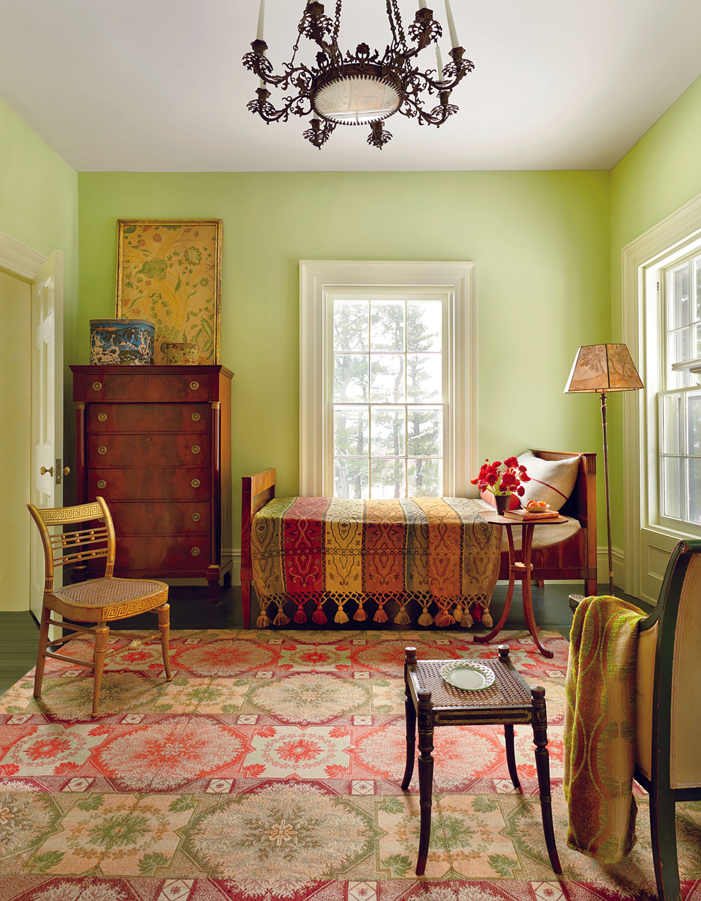
Green hues continue to be a prominent theme. Valspar's 2026 Color of the Year, Warm Eucalyptus, is highlighted as a comforting, slightly retro green ideal for biophilic design. Behr's Hidden Gem, a smokey jade hue, offers a bold and dynamic option that shifts appearance throughout the day, recommended for pairing with rich wood tones and eclectic accents. Sherwin-Williams' Celery, from their Frosted Tints collection, represents a softer, more restful green, suitable for nurseries and contemporary homes as a "grown-up spring pastel."
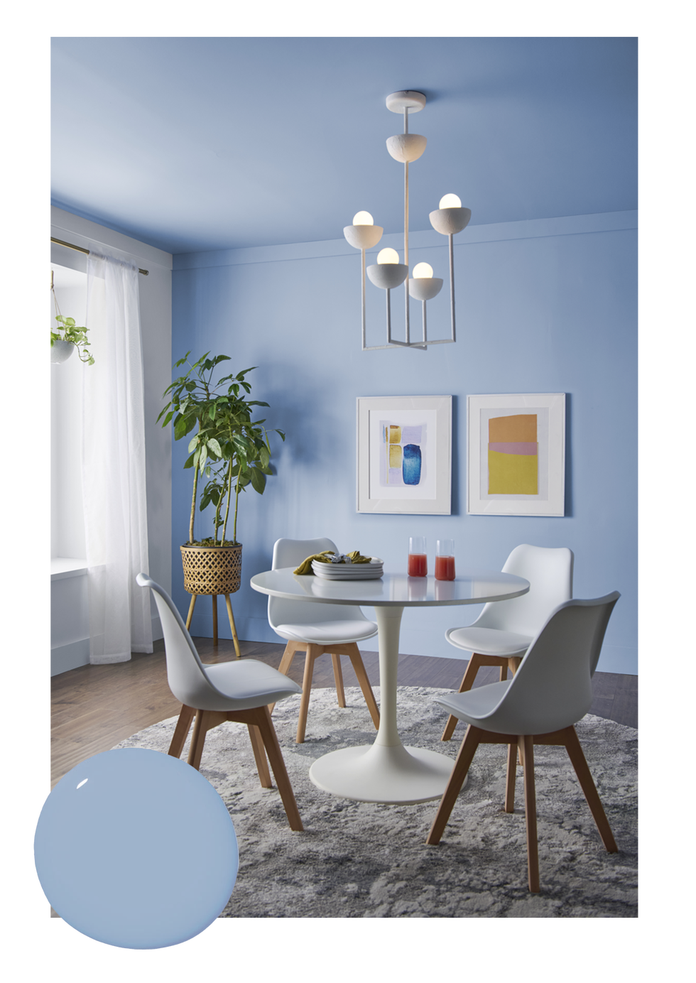
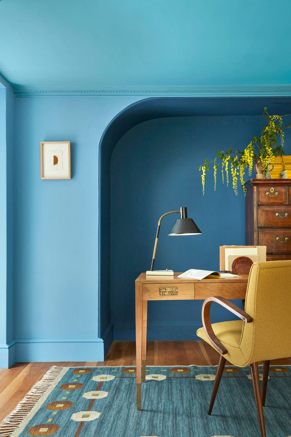
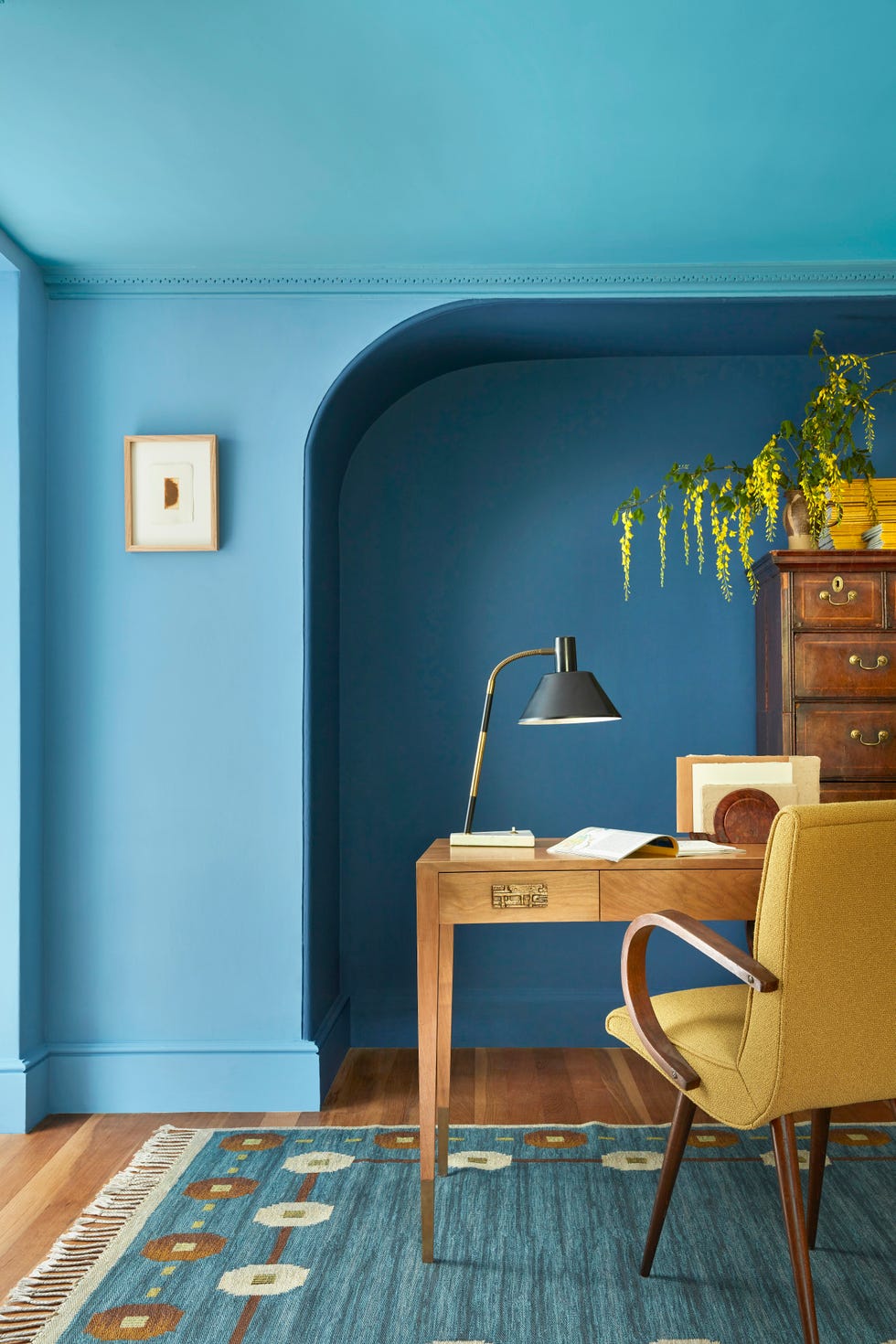
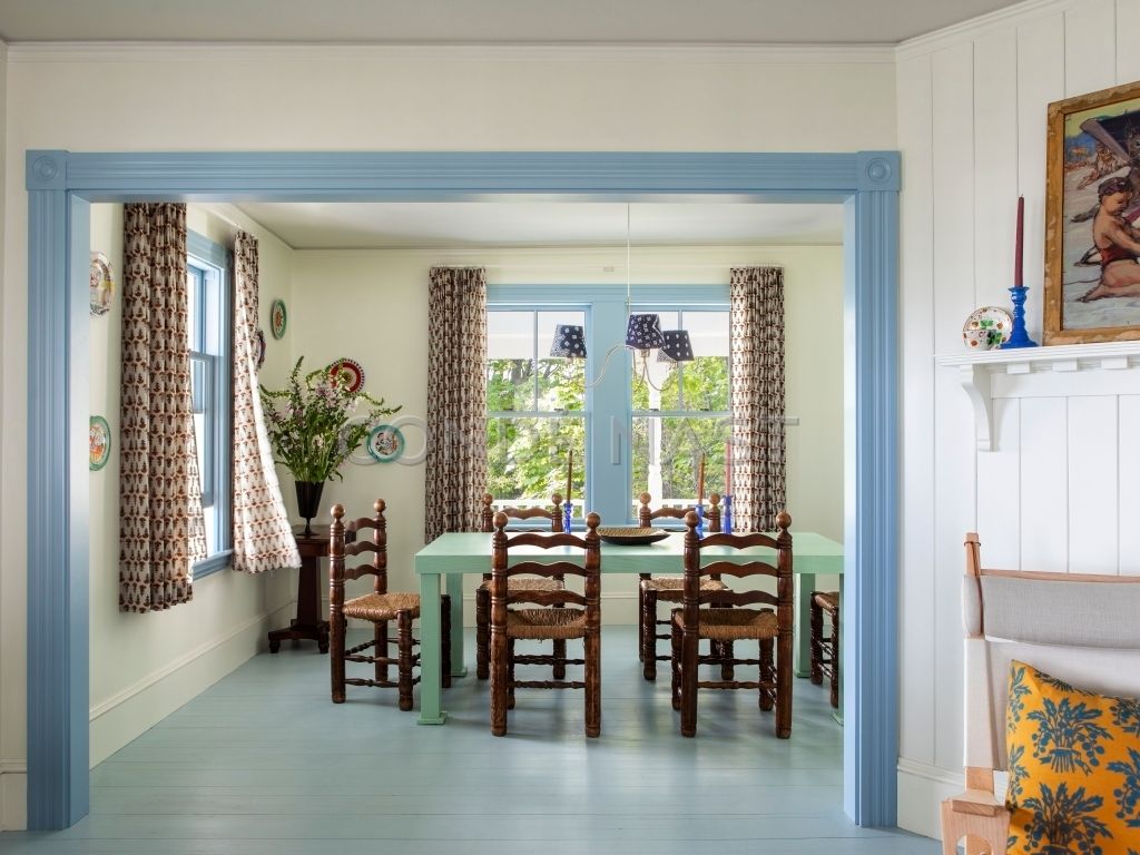
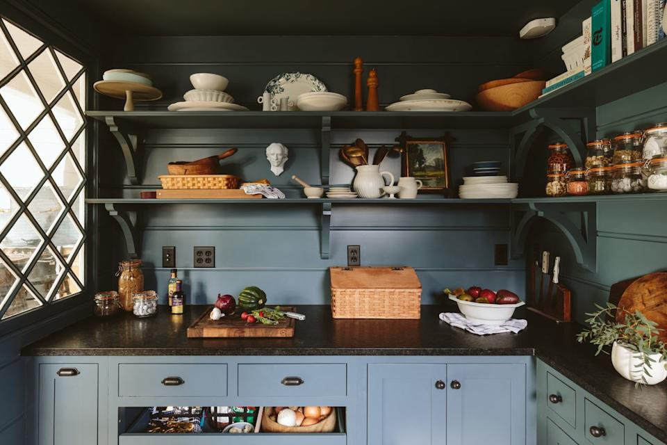
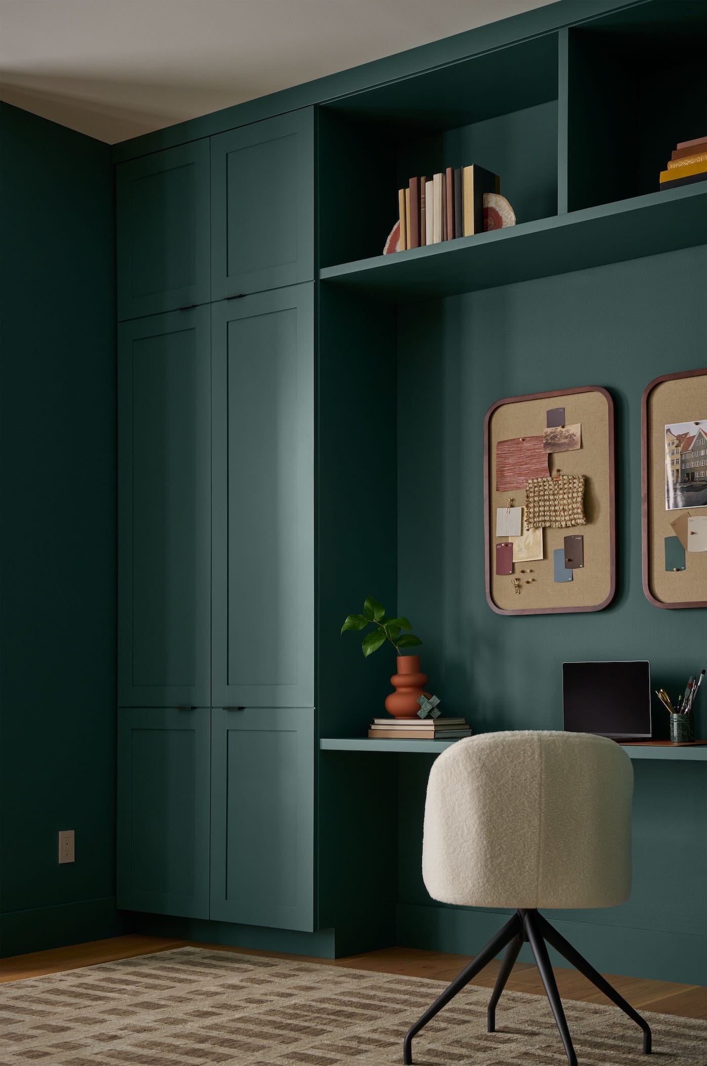
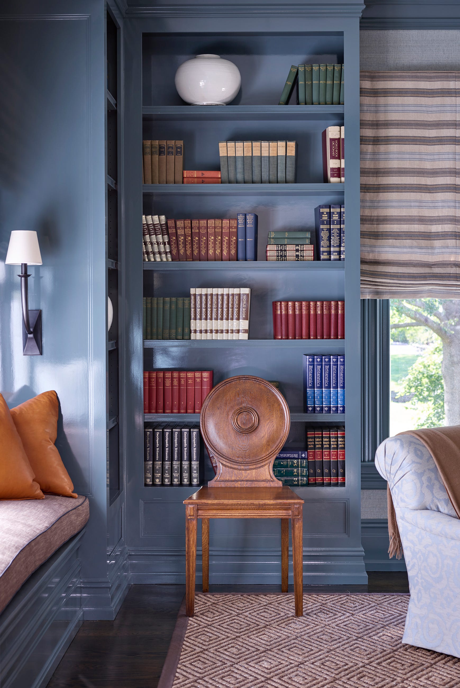
Blue tones, particularly those named "Watery," are also emphasized. Both Sherwin-Williams and Behr feature soft blues called Watery in their collections, with Behr's being chilled and serene, and Sherwin-Williams' being more lively and saturated. Glidden also offers a lighter, aqua-toned Watery Blue. Behr's Dragonfly, a versatile blue-green, is suggested for creating a moody yet charming apothecary aesthetic. Sherwin-Williams' Upward, a grayish denim blue, is presented as a comfortable and enduring frosted tint, ideal for clients moving away from purely cool whites. Behr's Adirondack Blue, a calm slate hue with gray undertones, is praised for its refined yet approachable quality, especially in light-filled spaces.
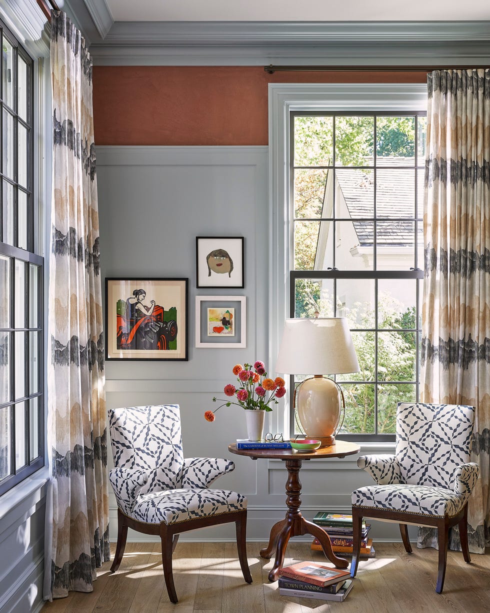
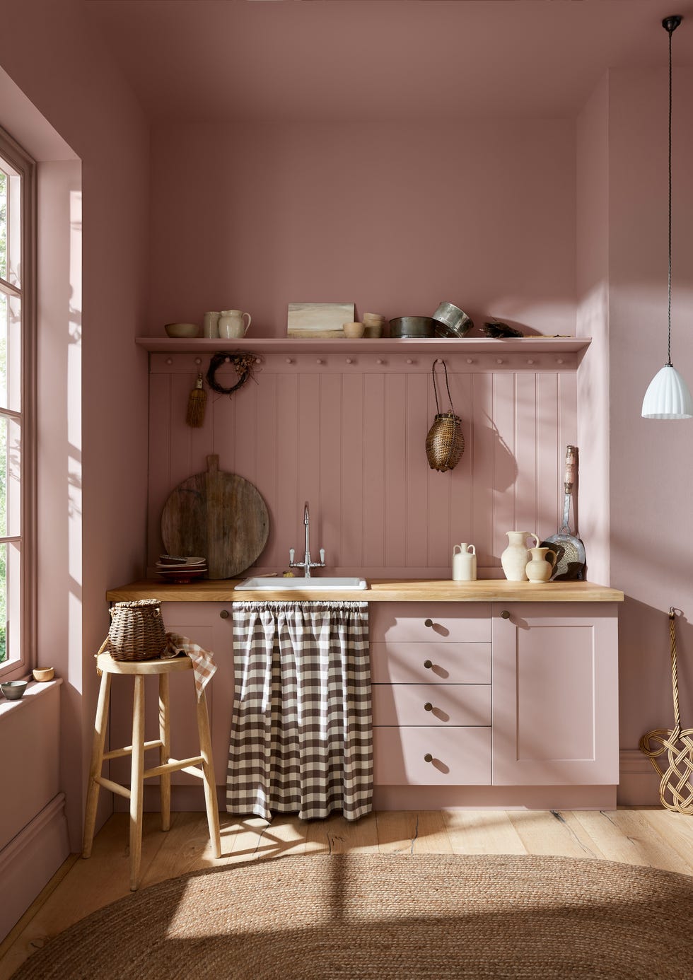
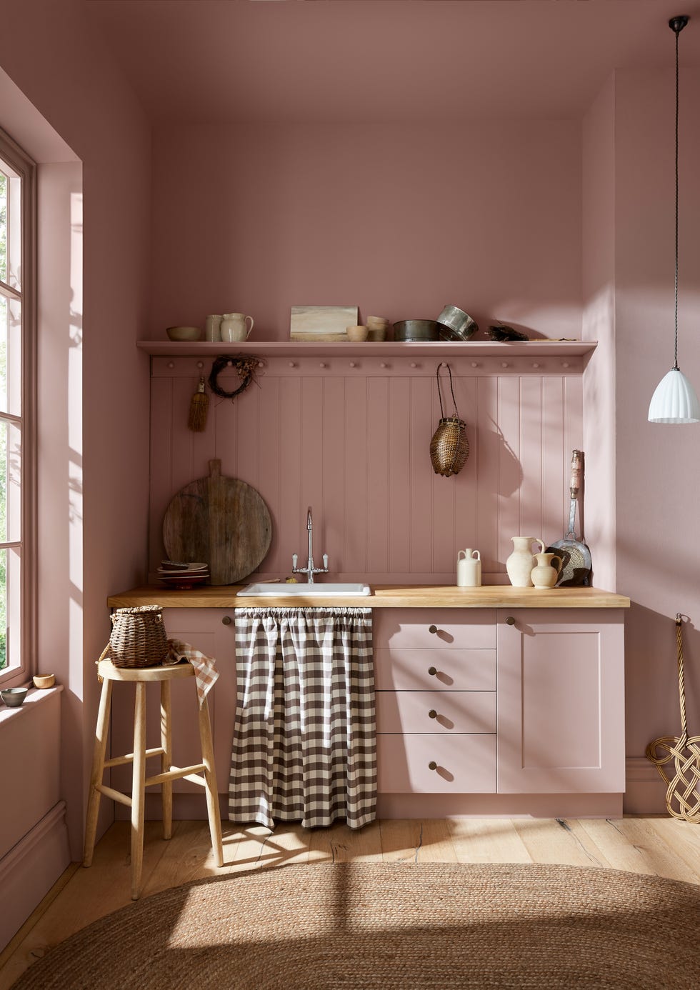
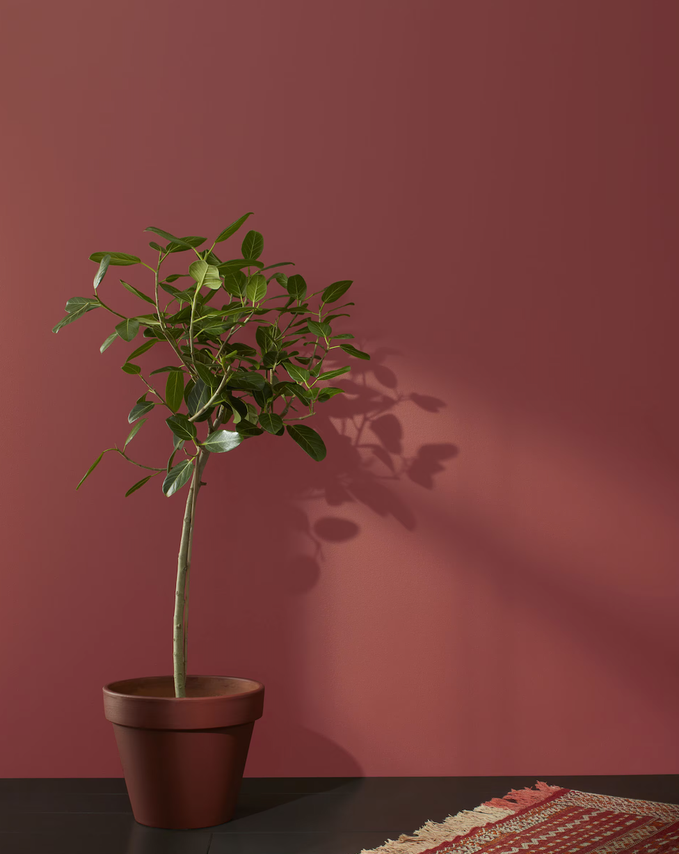
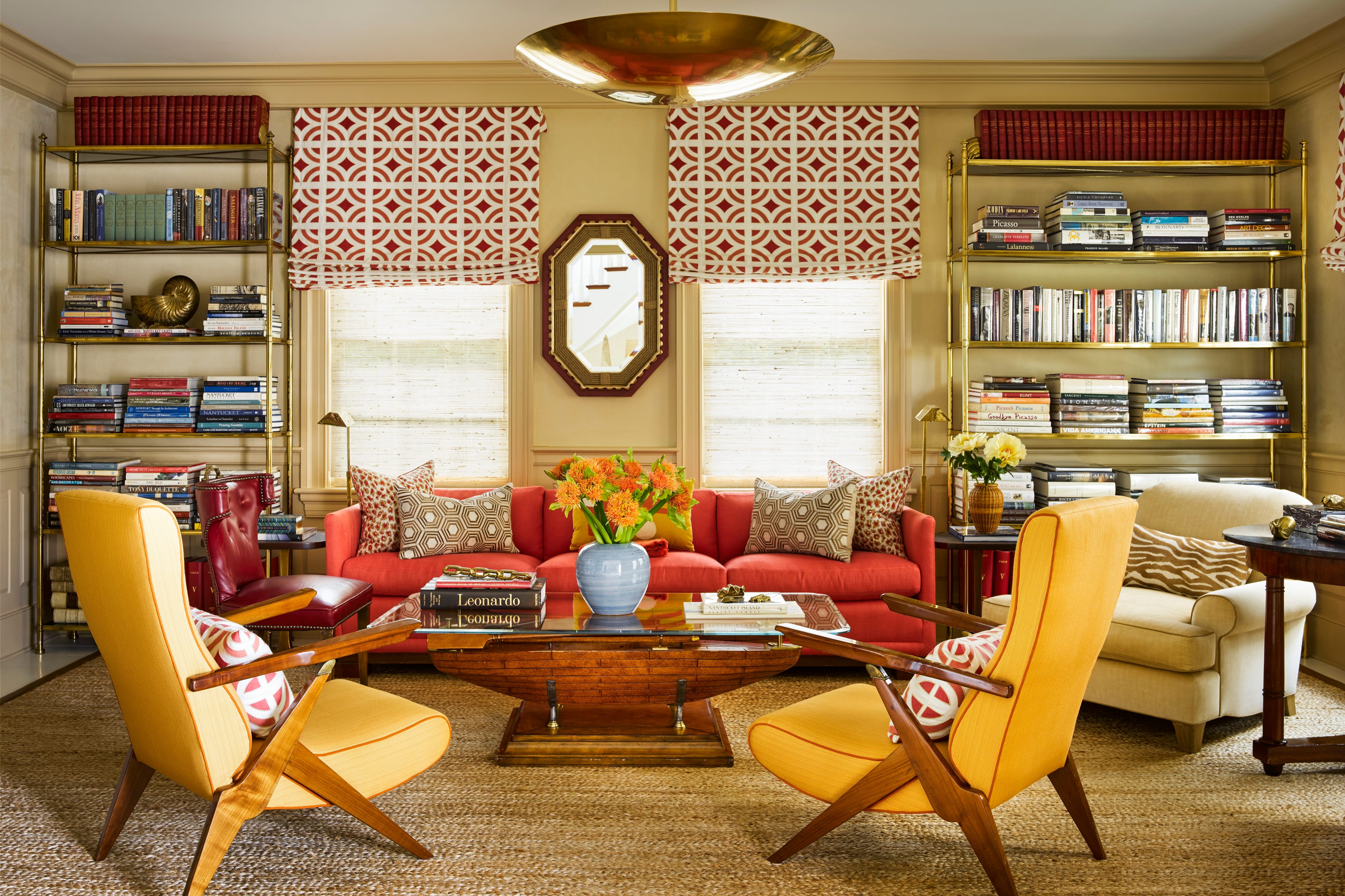
The article also touches on more distinctive colors. Sherwin-Williams' Modern Lavender, a hazy purple from the Frosted Tints collection, is recommended for elevated spaces and children's rooms. Behr's Curtain Call, a velvety plummy gray, introduces drama and eclecticism, with its color-changing properties depending on the light. Sherwin-Williams' Classical Yellow, a warm golden hue with historical roots, taps into the "sunbaked hues" trend and the popular "butter yellow" aesthetic. Glidden's Sandpaper, a muted terracotta with a rosy undertone, offers a fresh take on pinks, promoting an inviting and harmonized eclectic space. Sherwin-Williams' Pennywise, a deep ochre, is linked to the '70s design trend and "shambolism," providing a nostalgic backdrop.
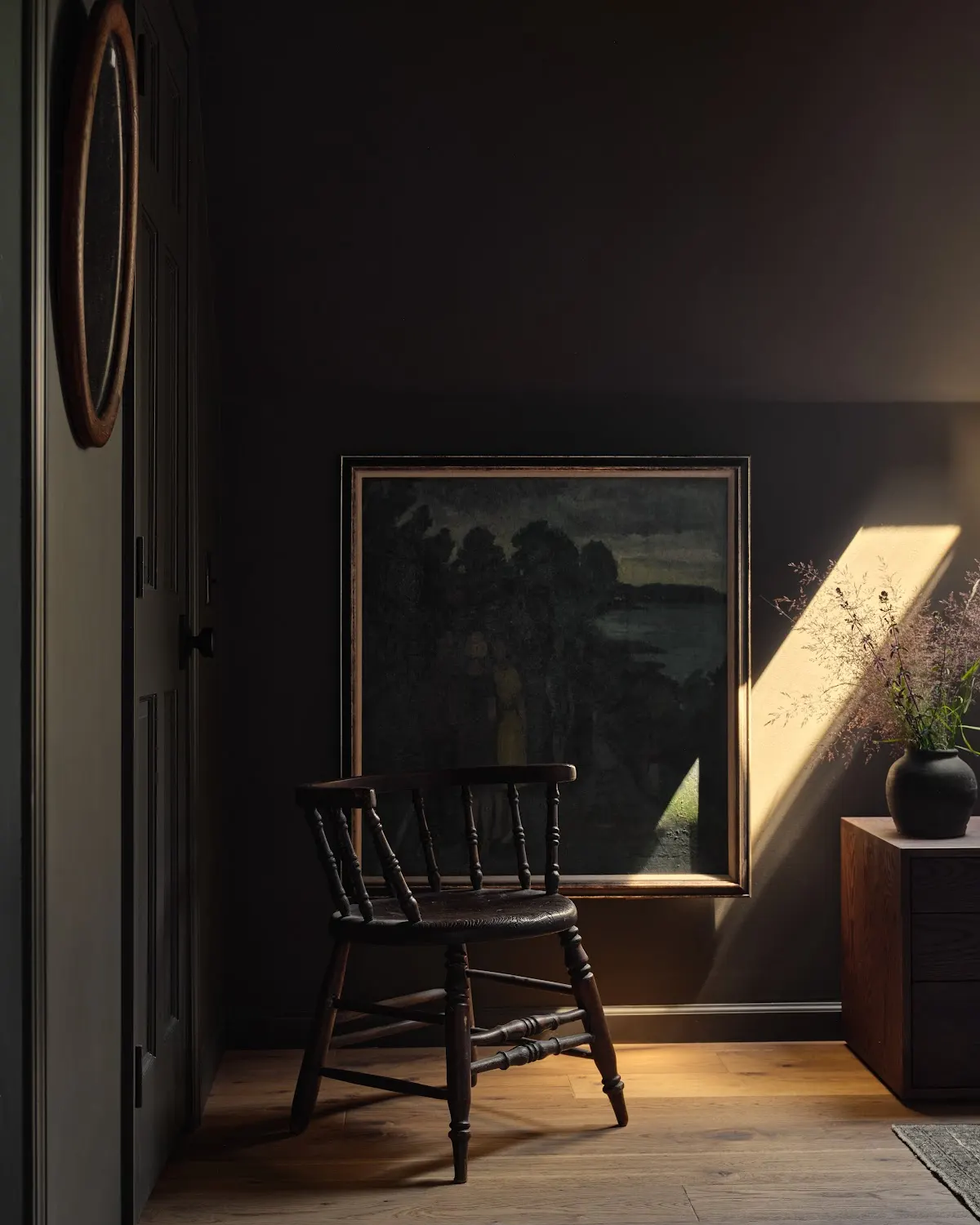
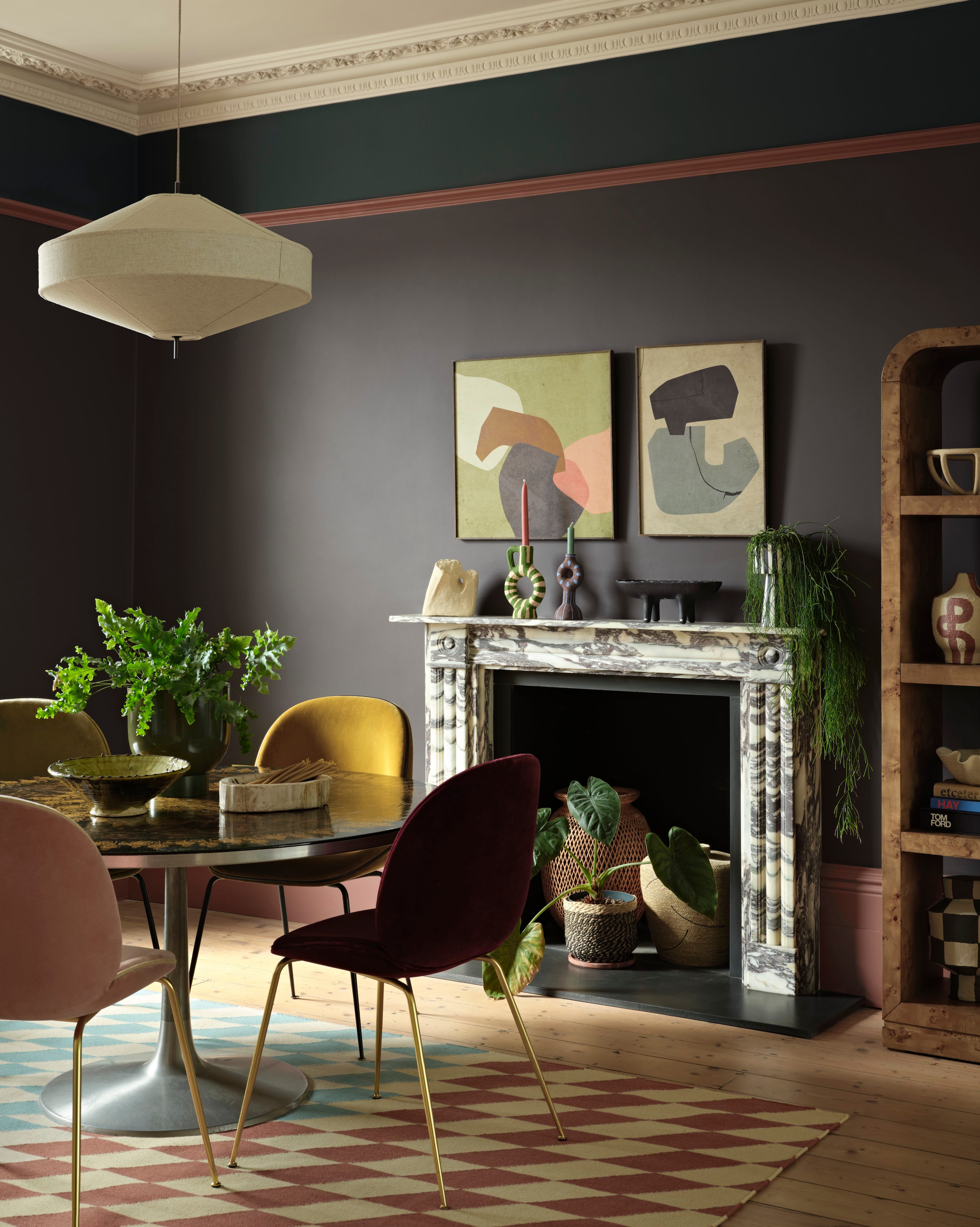
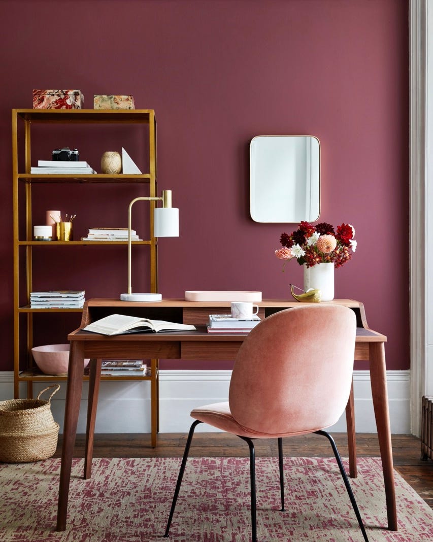
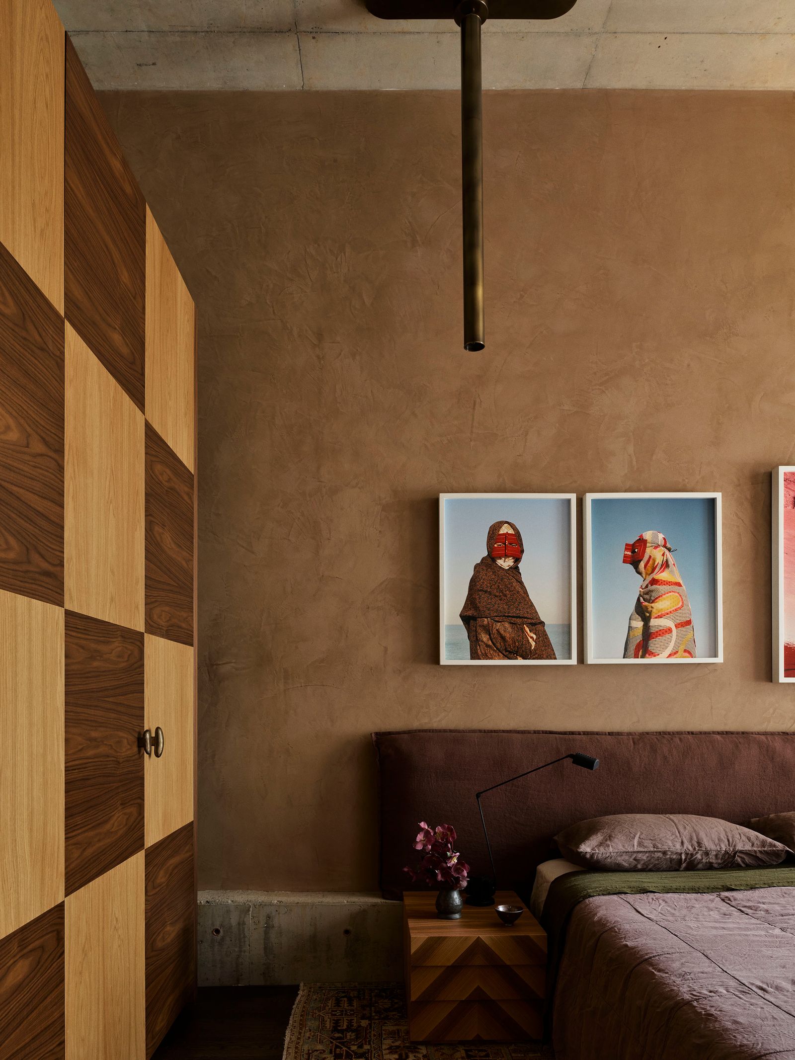
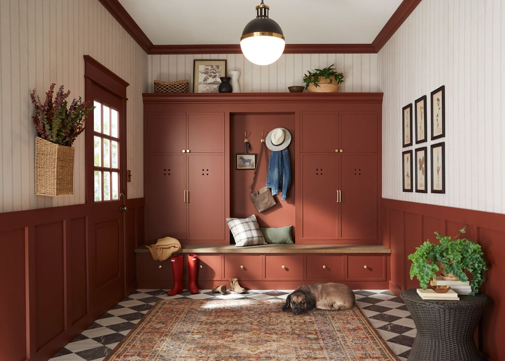
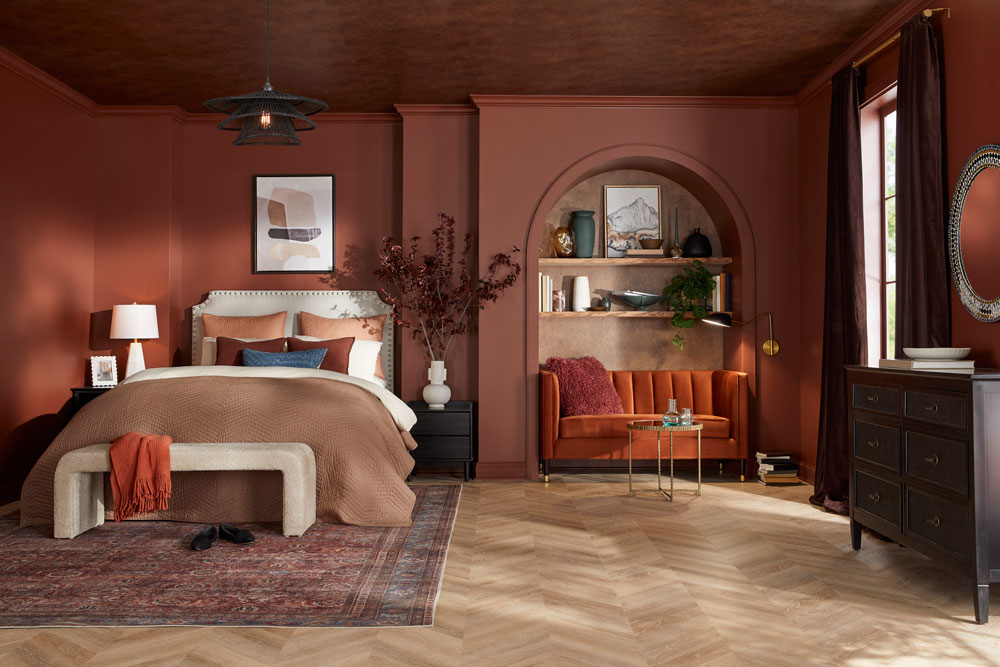
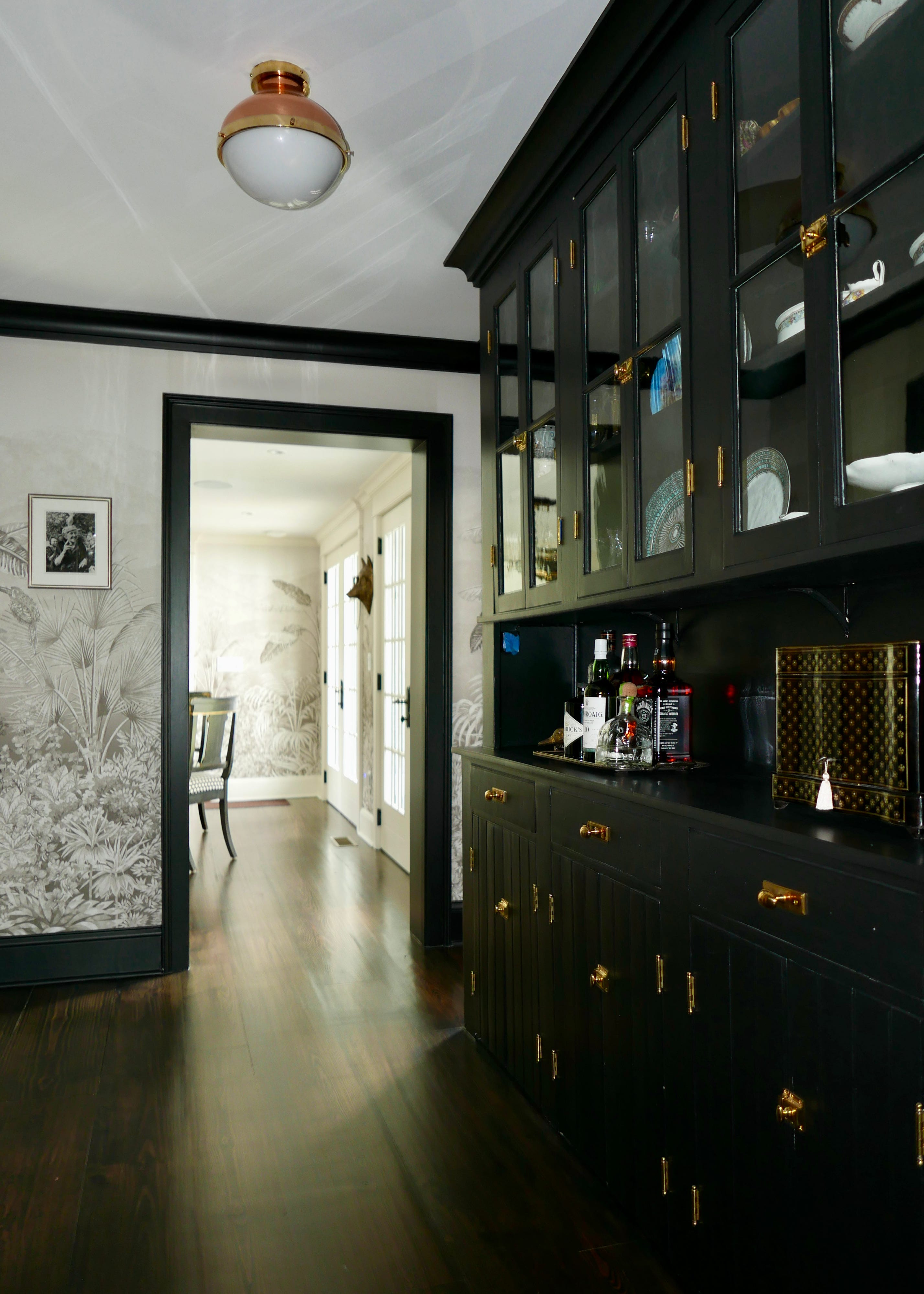
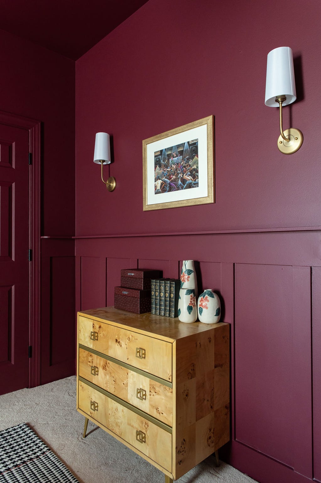
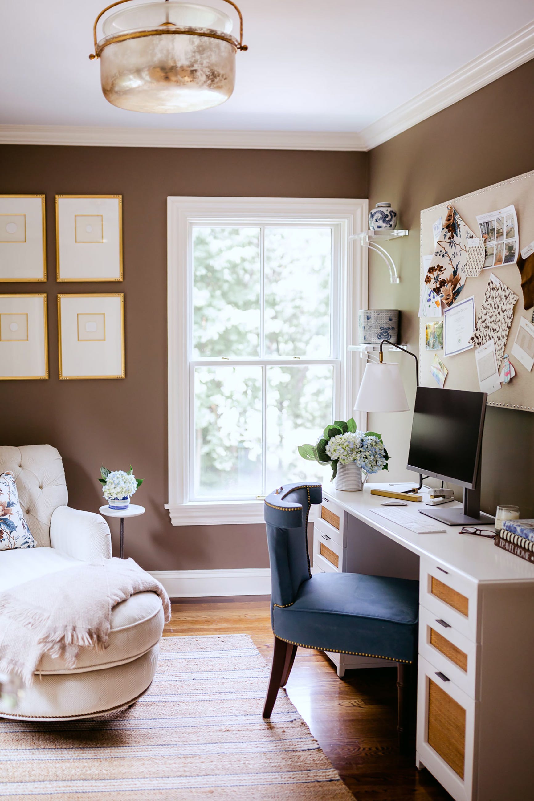
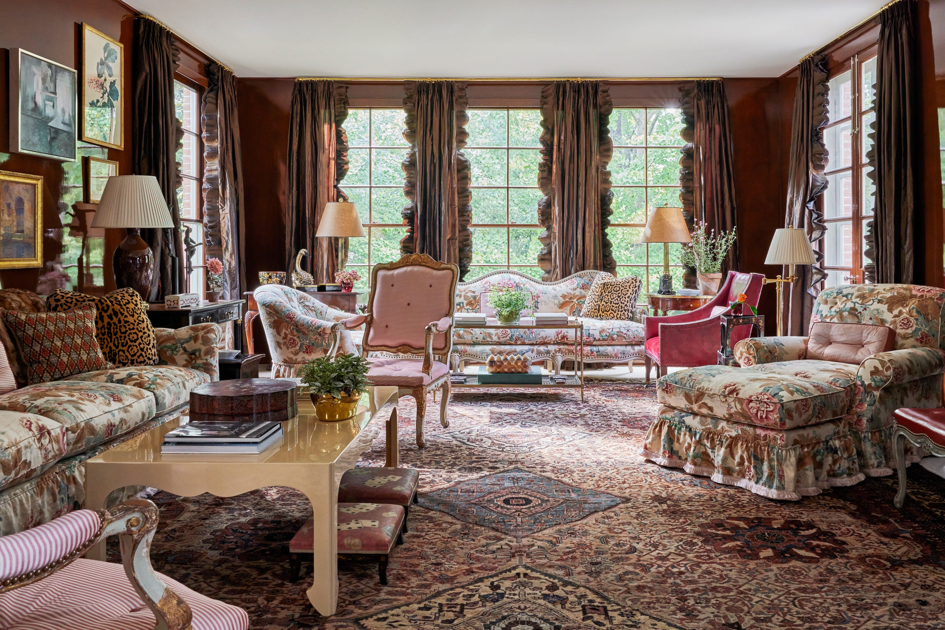
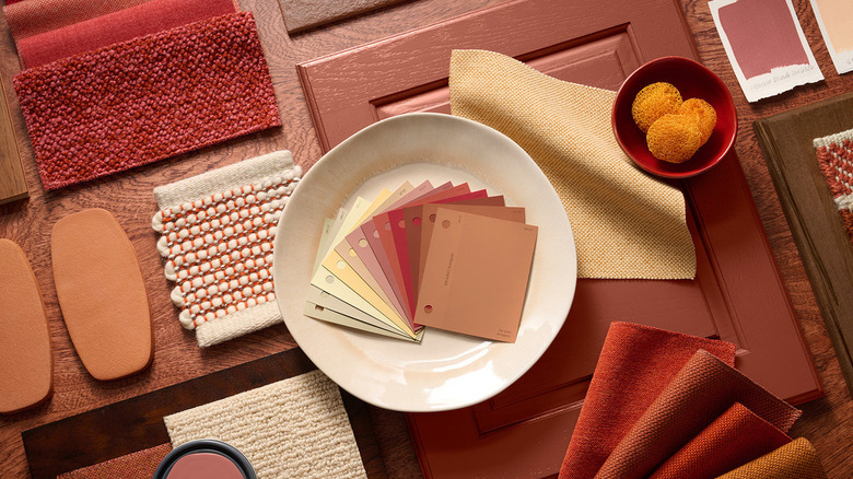
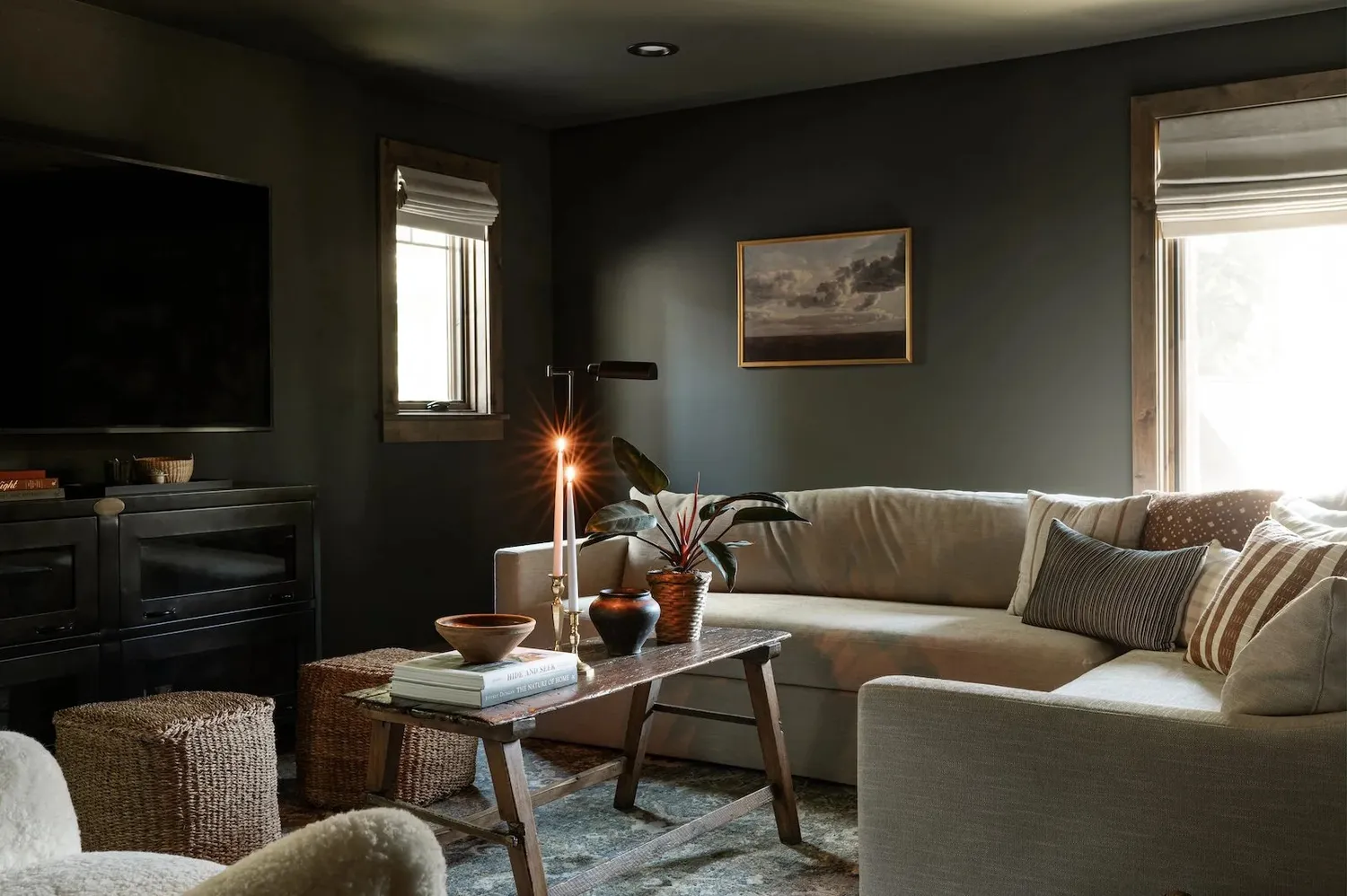
Finally, restorative darks are explored for creating intimate and luxurious environments. Behr's Rodeo Tan, a deep brown, is presented as a versatile shade that can be both rugged and refined, pairing well with natural textures. Sherwin-Williams' Sable, a super low-LRV hue, offers an opulent and cozy feel, particularly in color-drenched bedrooms. Behr's Baronial Brown, an "almost-black" shade, provides grounding sophistication, especially when combined with metallic accents and warm woods. Sherwin-Williams' Rojo Marrón, a rich red-brown, makes a strong case for impactful, color-drenched walls in spaces like libraries or offices, encouraging contrast with diverse furniture and decor. Behr's Cracked Pepper, a soft black, is highlighted as a surprisingly versatile neutral that adds depth without heaviness, suitable for dining rooms, reading nooks, or bedroom retreats, particularly when balanced with light elements and metallic accents.
#PaintColorTrends #InteriorDesign #HomeDecor #ColorForecasting #NeutralPalettes #GreenHues #BlueTones #RestorativeDarks #SherwinWilliams #Behr #Valspar #Glidden #PaintColorTrends #InteriorDesign #HomeDecor #ColorForecasting #NeutralPalettes #GreenHues #BlueTones #RestorativeDarks #SherwinWilliams #Behr #Valspar #Glidden
合計0件のコメント
 まだコメントはありません
あなたも好きかもしれません

Experts Say These 5 Paint Colours Will Be Everywhere In 2026
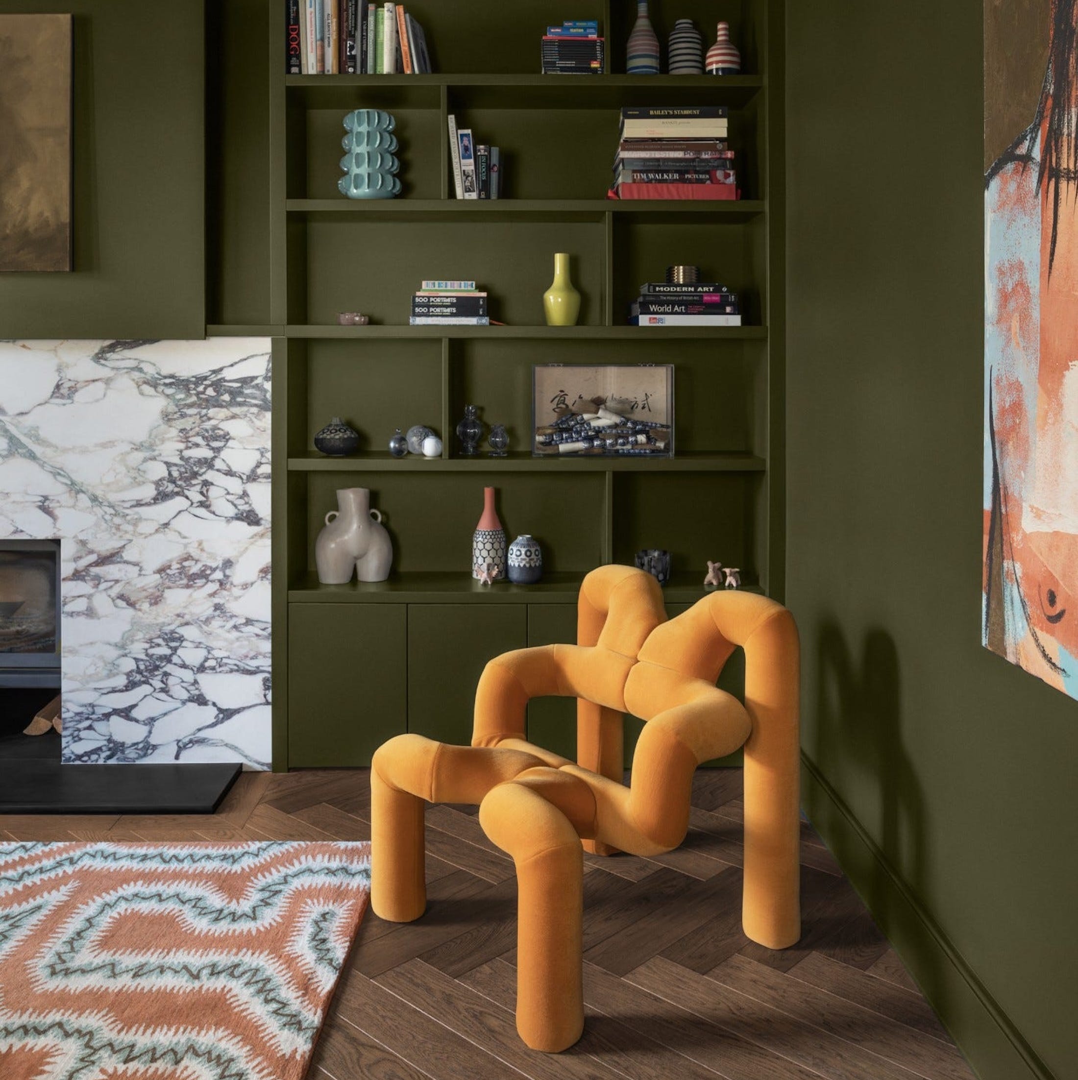
What Paint Colours will Rule 2026? The Experts Make Their Predictions

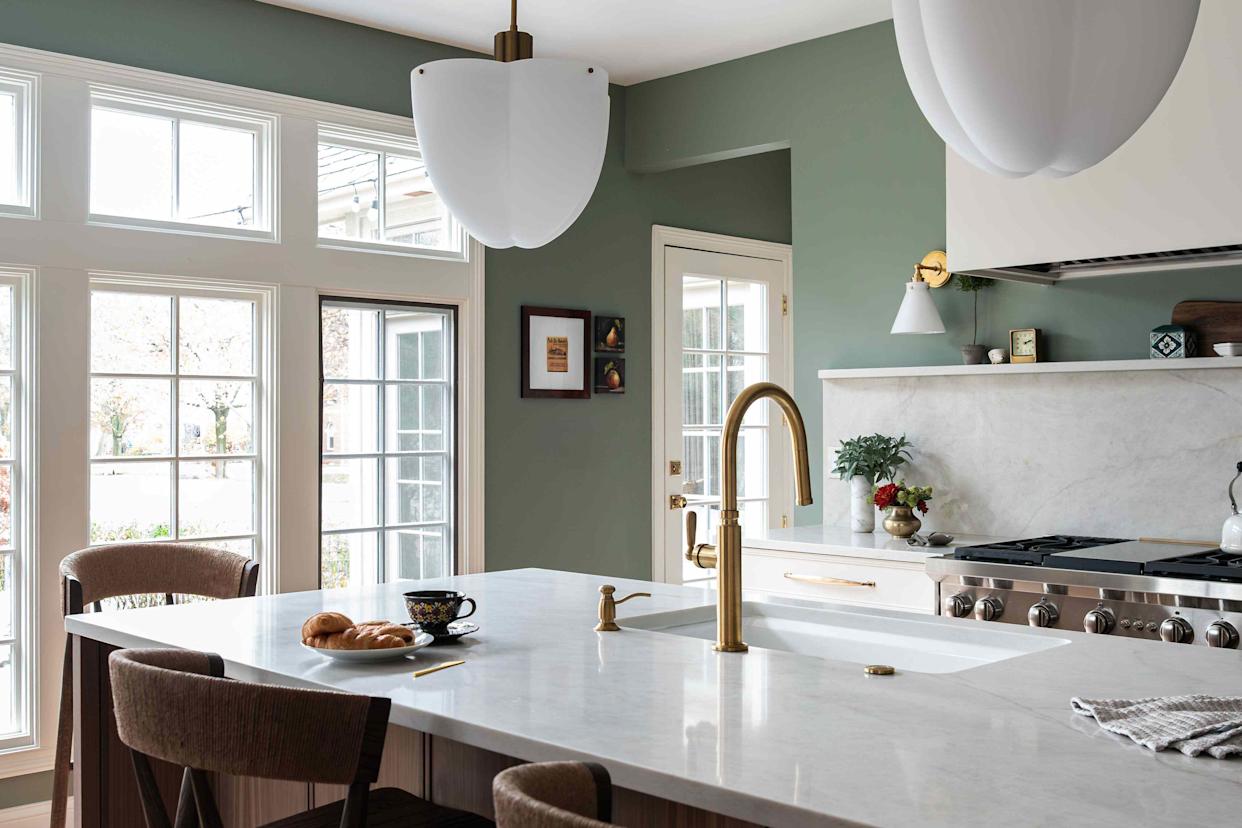
6 Kitchen Paint Color Trends That Are Already Taking Over Walls in 2026
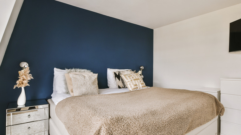
The Bold Color Trend That's Replacing Accent Walls In 2026
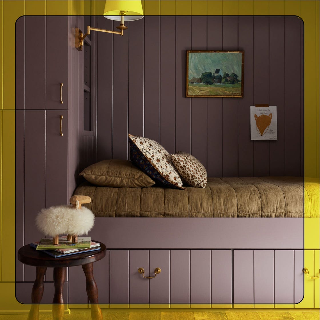
What Paint Colors Will Rule 2026? Designers Make Their Predictions

Designers Predict This Will Be The Biggest Paint Trend Of 2026
7 Trendy Paint Colors for Every Room in 2026, According to Designers

These 7 Colors Will Rule Interiors in 2026, According to Experts

Interiors experts predict this will be the biggest paint trend of 2026

6 Living Room Paint Color Trends That Are Going to Take Over Walls in 2026

These 6 Colors Will Rule Interiors in 2026, According to Experts

These 8 Colors Will Rule Interiors in 2026, According to Experts

These Will Be the Most Popular Paint Colors in 2026

These Colors Will Be Everywhere in Interior Design in 2026
Designers Say These 12 Paint Colors Will Be Everywhere in 2026


These Colors Will Be Everywhere in Interiors in 2025

8 Paint Color Trends You'll ACTUALLY Want to Live With in 2026, According to Designers
Will This Be the Color Everyone Paints Their Room in 2026?

The Interior Paint Colors You'll Be Seeing Everywhere in 2024
The Bold Color Trend That's Replacing Accent Walls In 2026