1/8
The best colors to pair with oak kitchen cabinets, according to interior designers
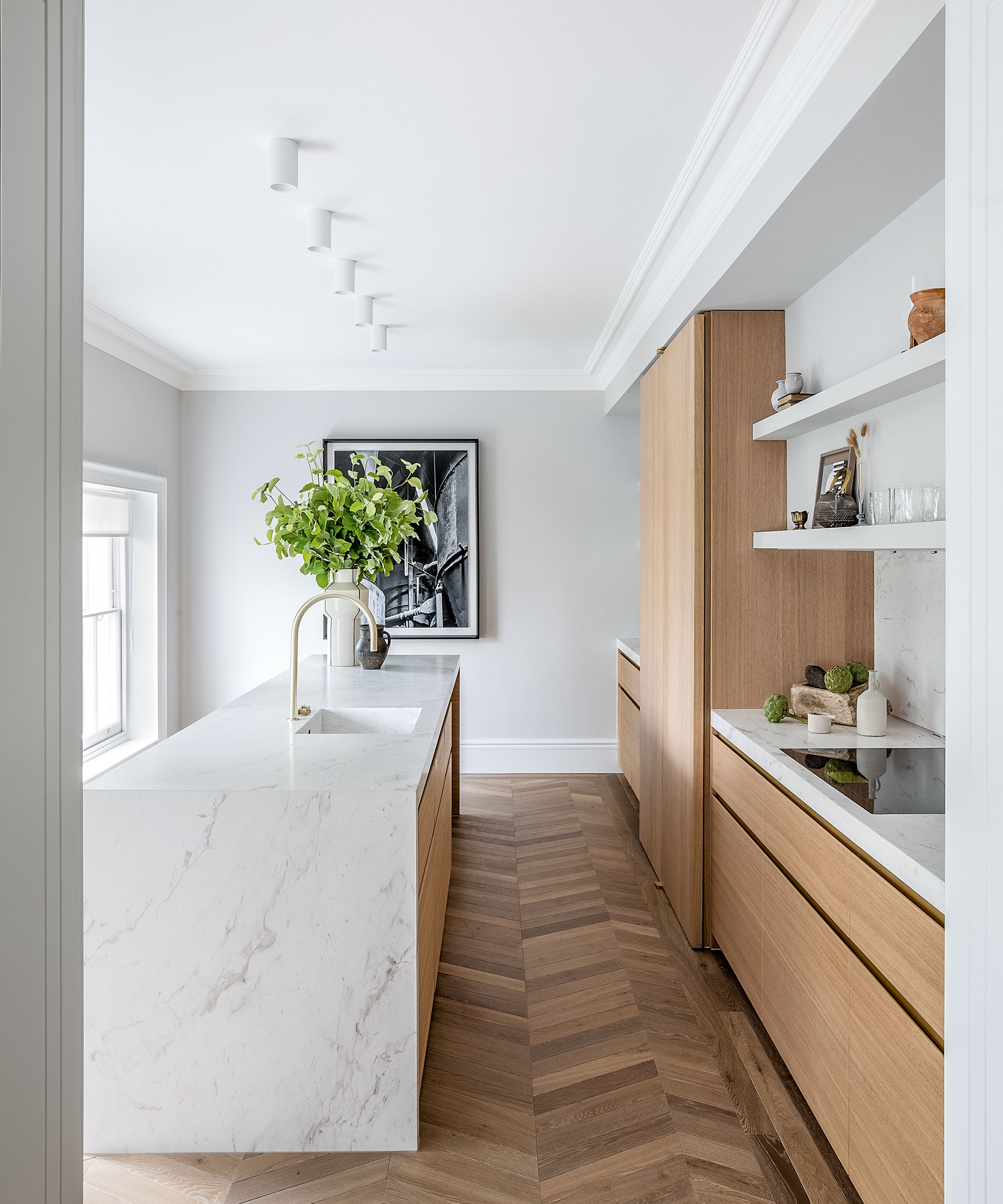
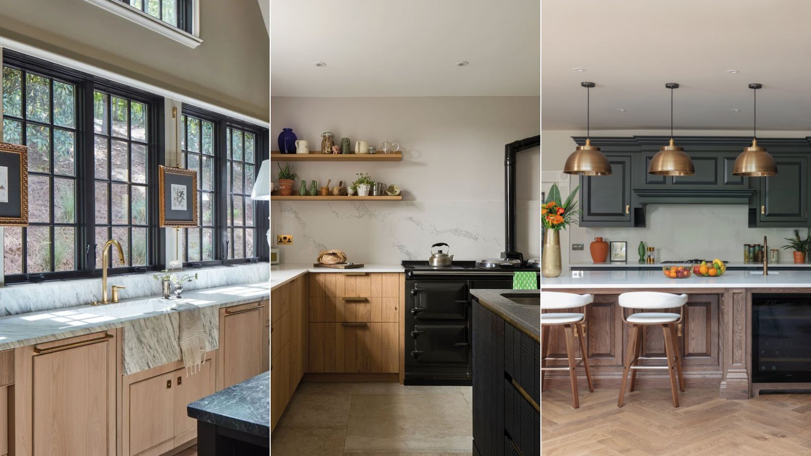
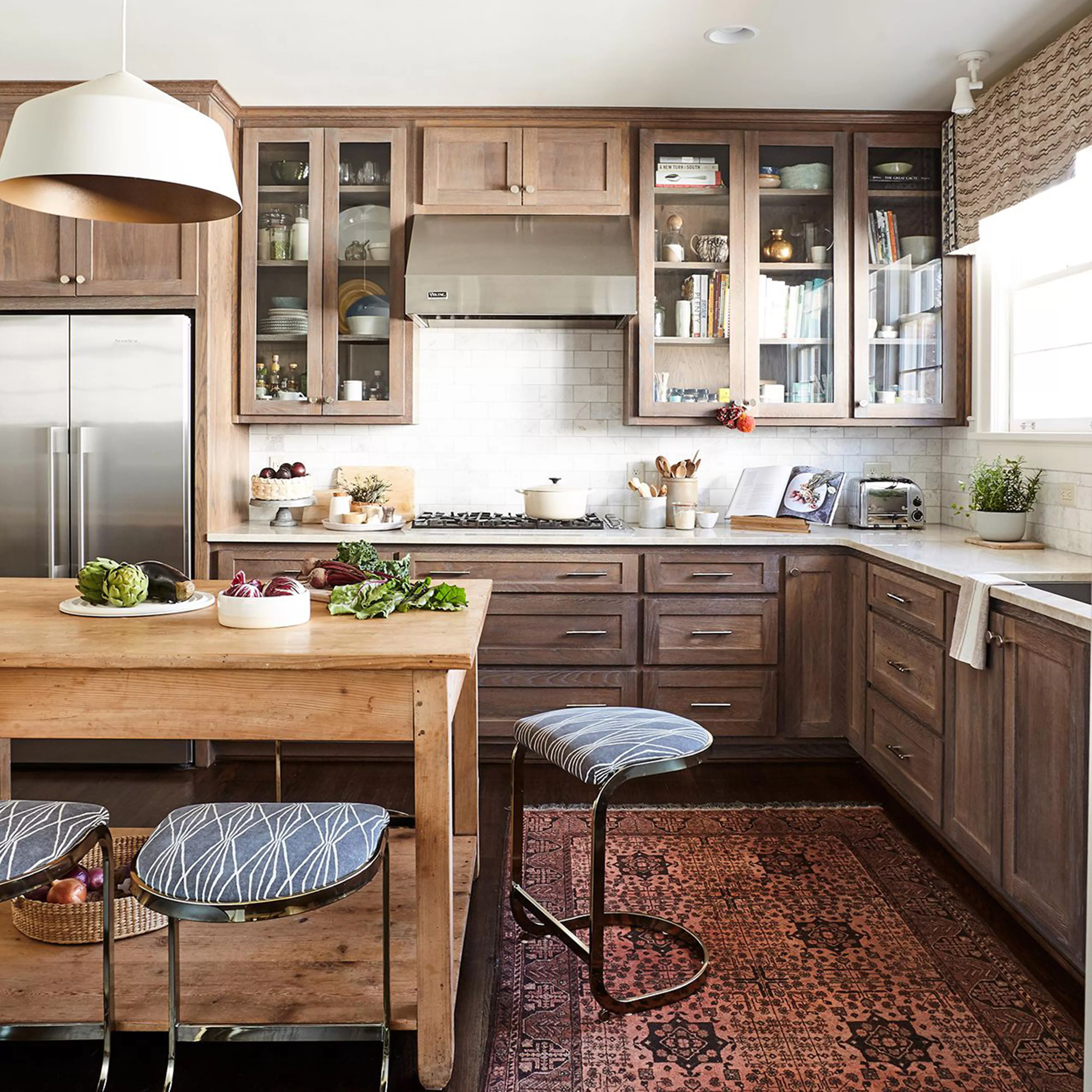
This article discusses the best color palettes to pair with oak kitchen cabinets, based on recommendations from interior designers and color experts. It emphasizes the importance of selecting hues that complement the natural warmth and undertones of oak wood. The main challenge with wooden cabinetry, particularly oak, is identifying whether its undertones lean warm or cool, as this dictates the most suitable complementary colors. The article presents three versatile palettes: earthy colors, warm neutrals, and moody hues, each catering to different design styles.
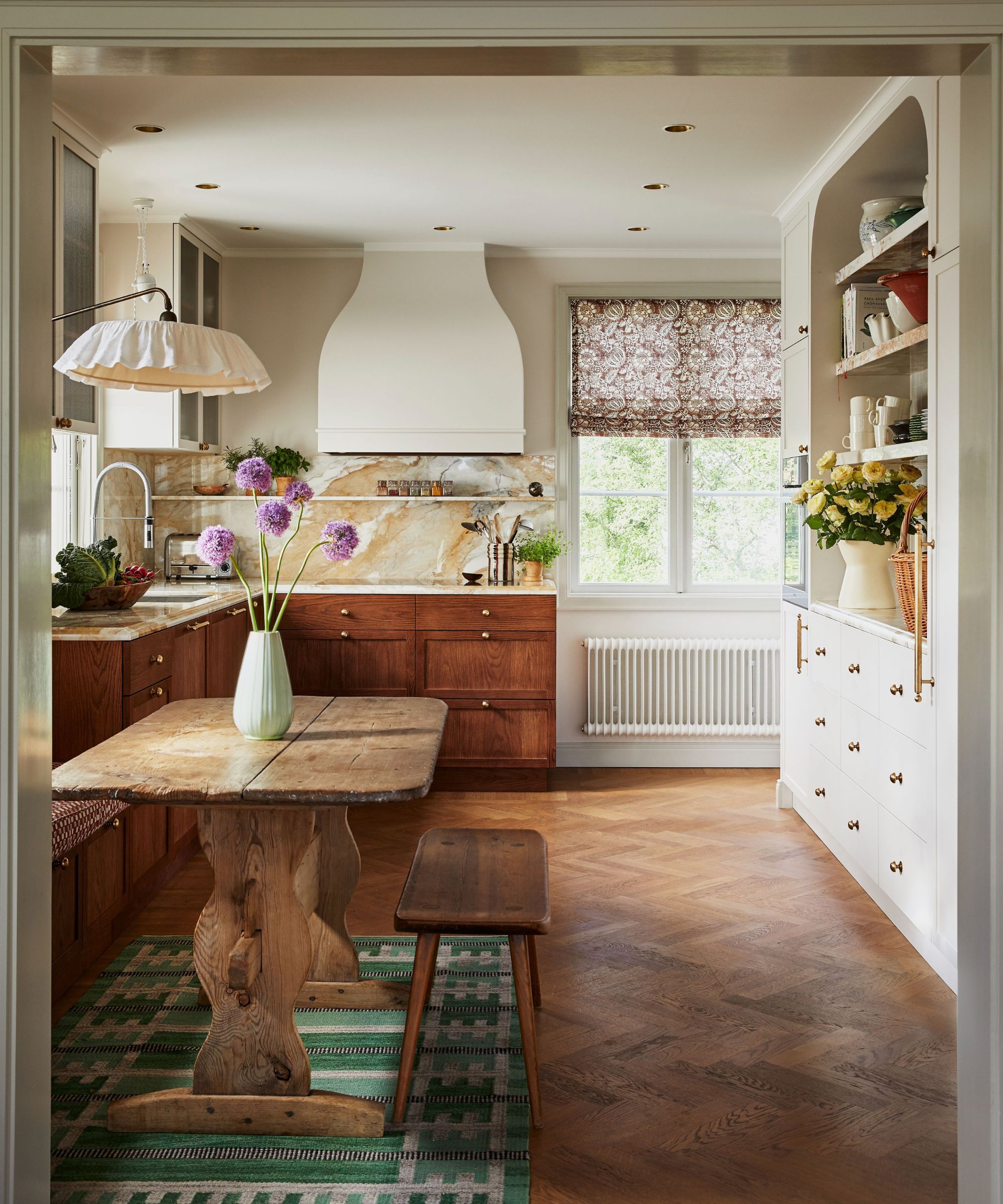
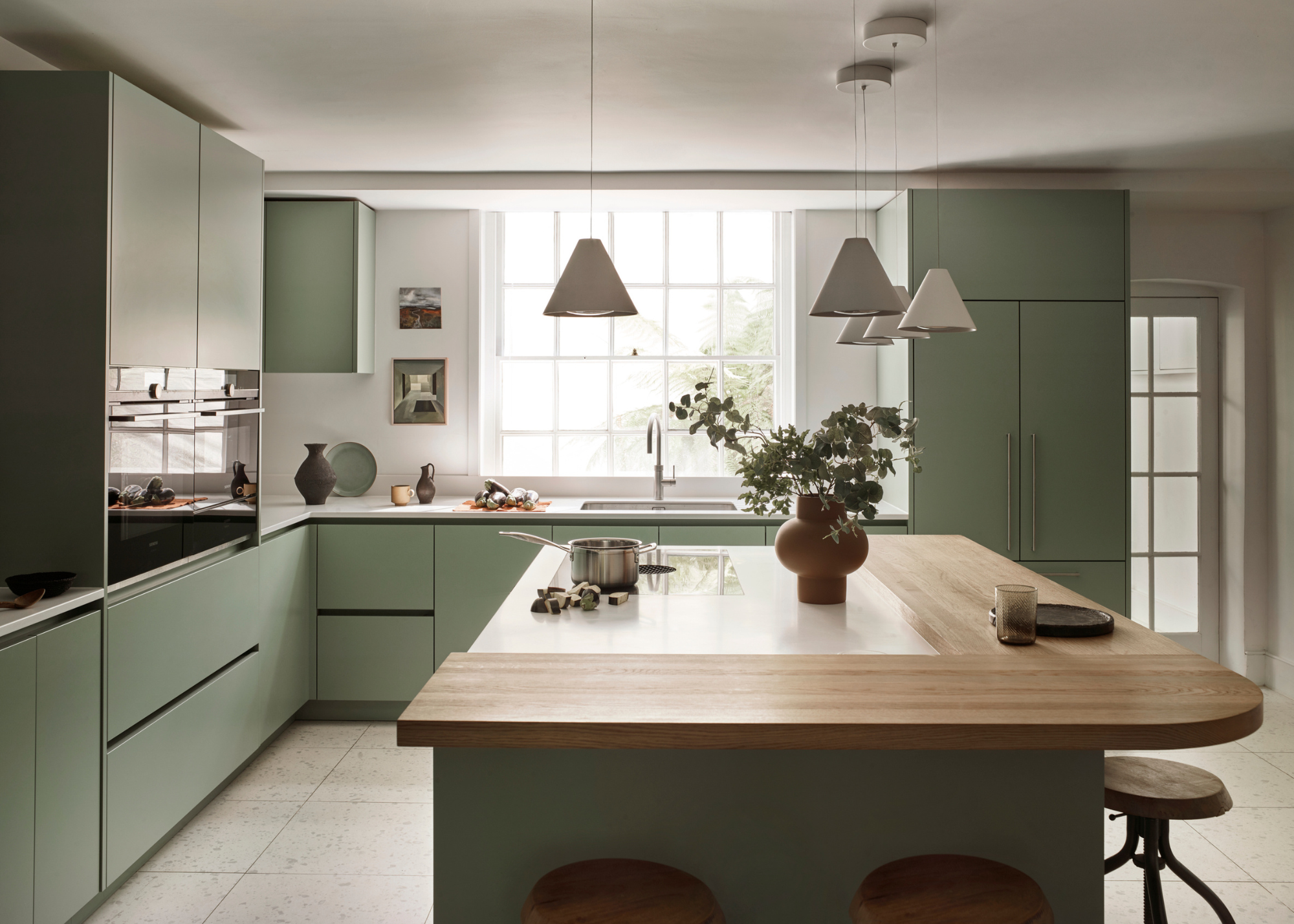
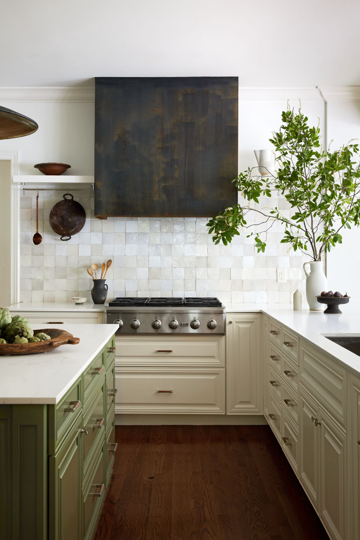
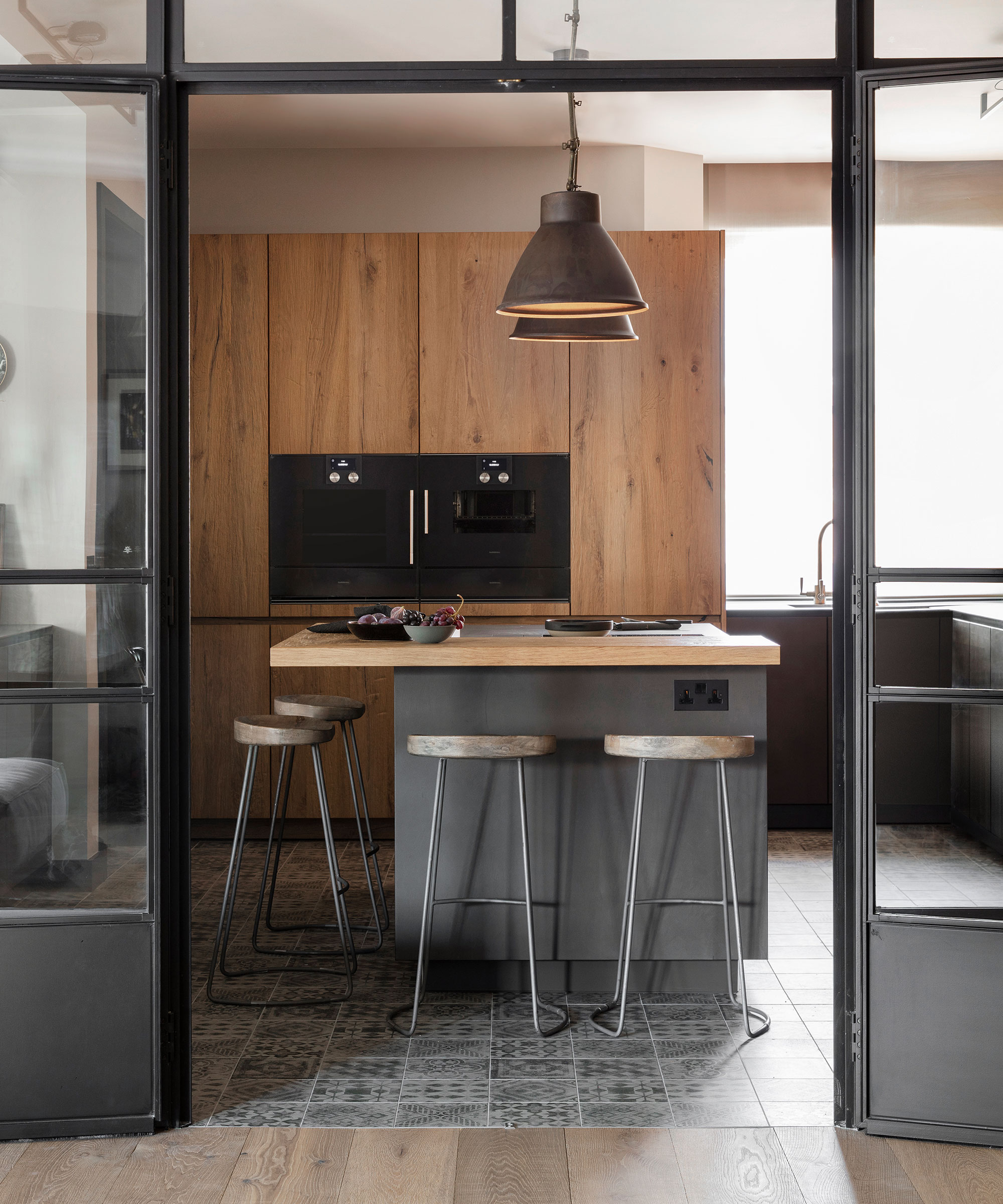
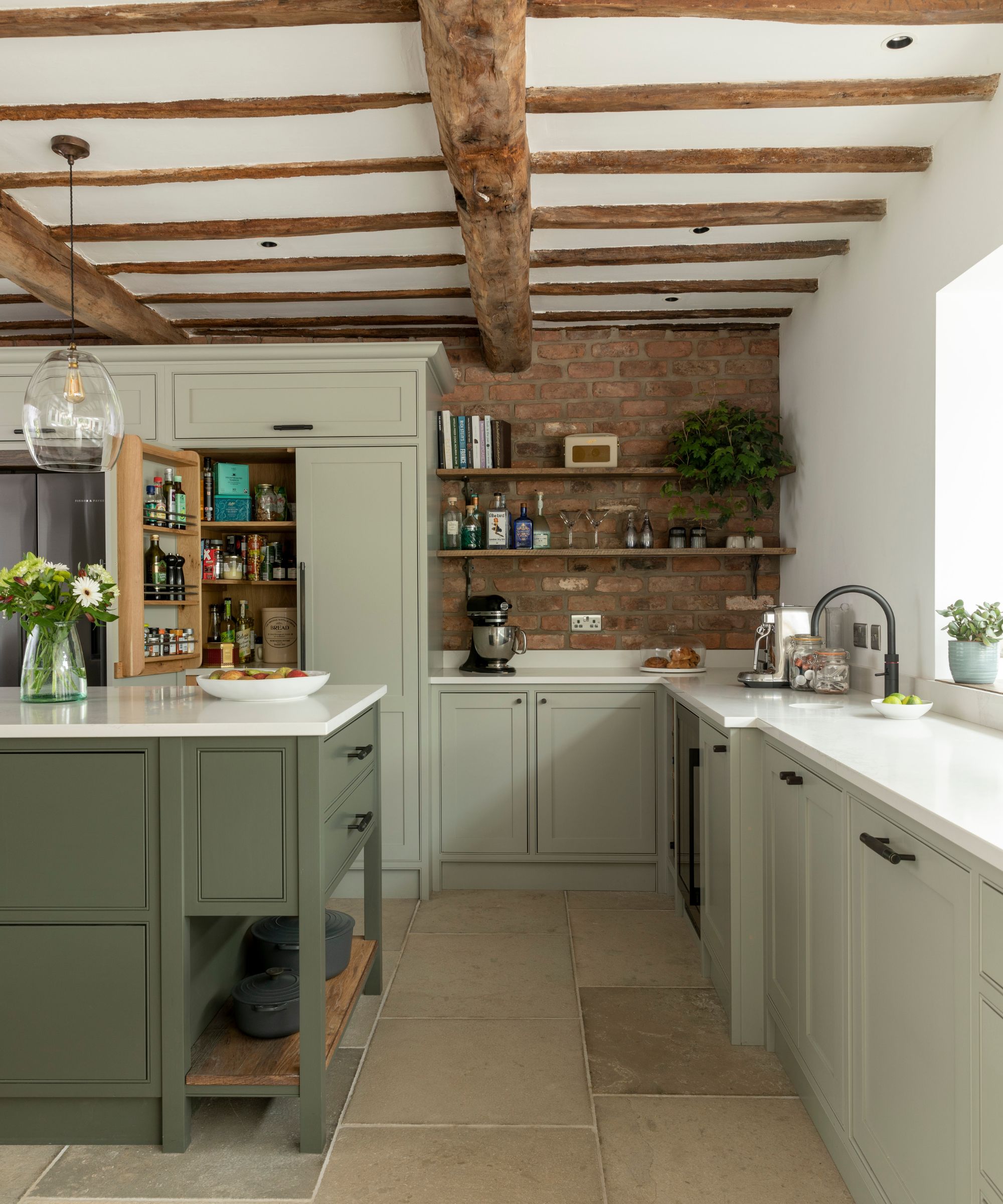
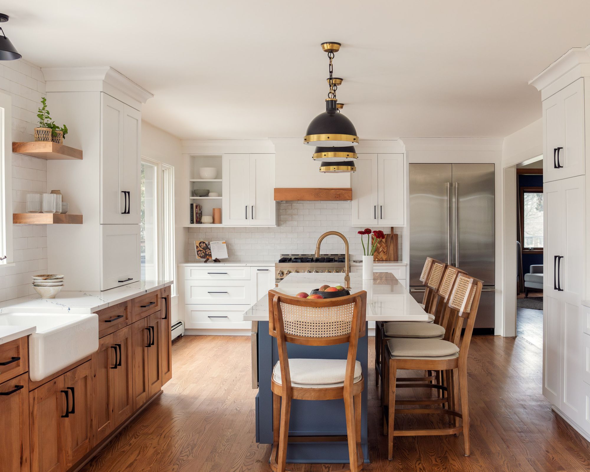
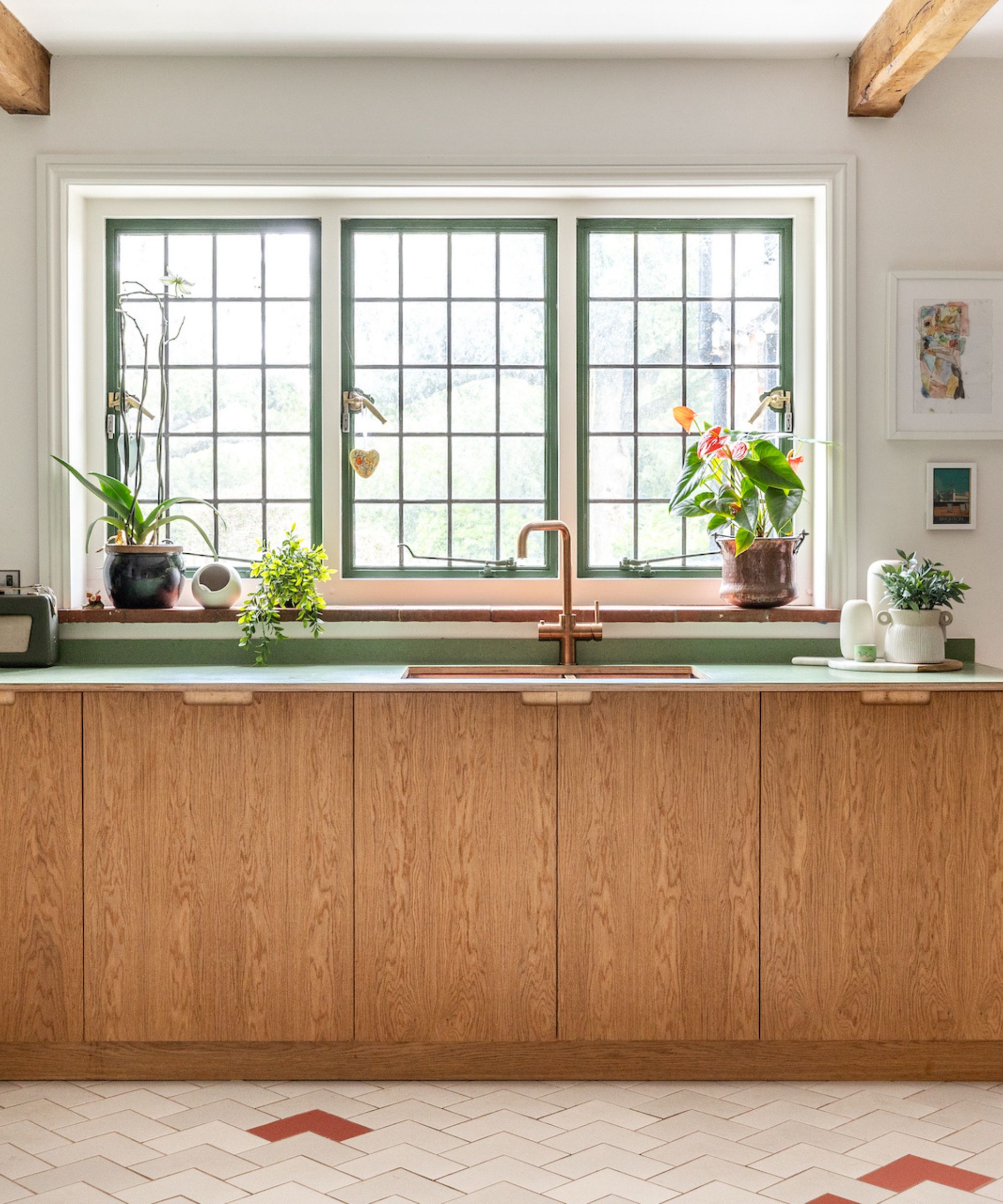
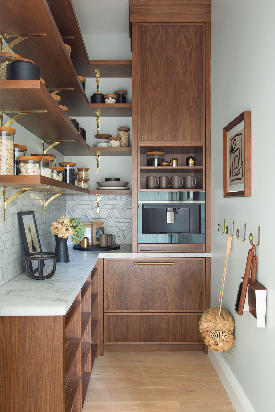
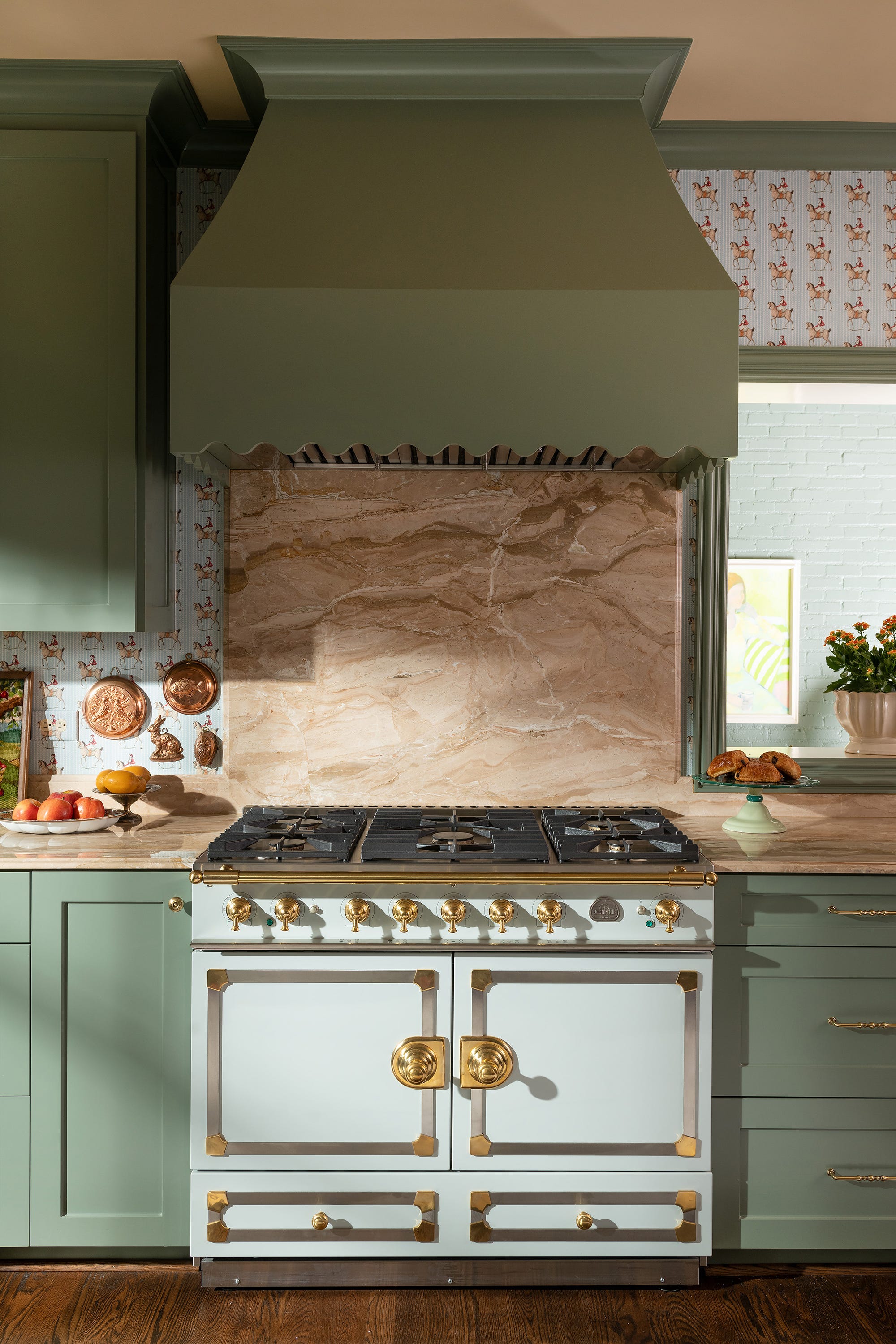
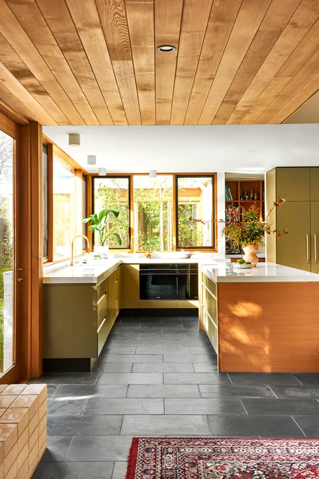
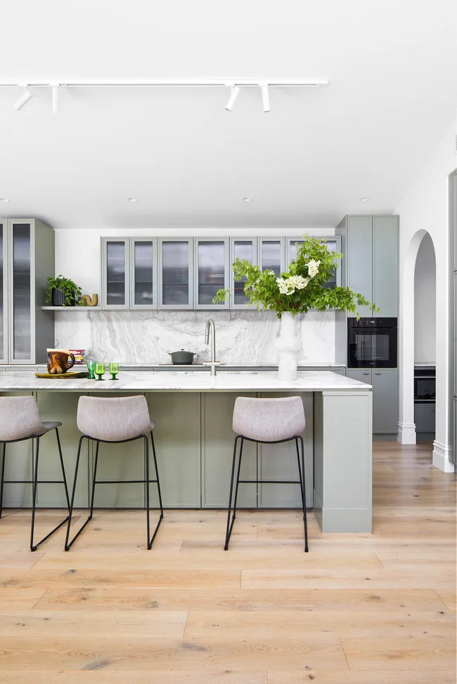
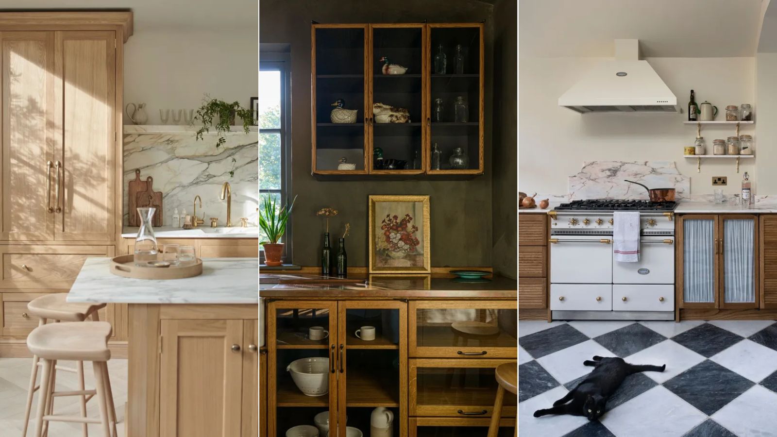
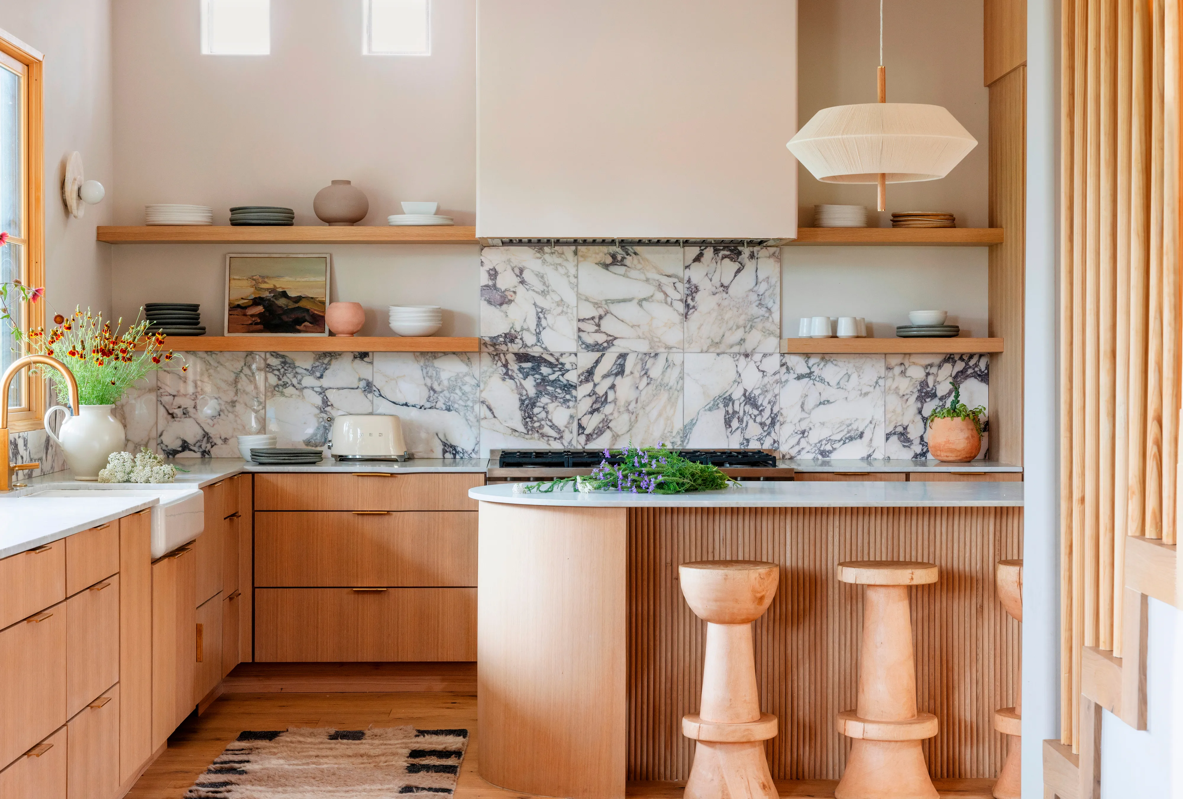
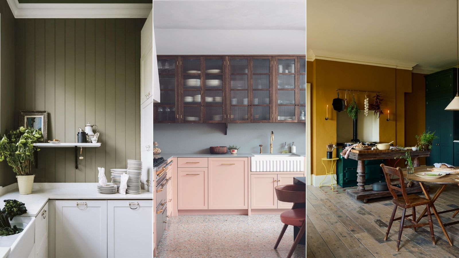
The first palette, earthy colors, is highlighted as a natural pairing for oak cabinets, as both evoke a sense of the outdoors and timeless style. Interior designer Lauren Gilberthorpe suggests soft, earthy greens like Treron by Farrow & Ball or Light Olive Green by Edward Bulmer for a calm and harmonious feel, while deep browns can add sophistication. For those preferring a more subdued aesthetic within the earthy spectrum, Patrick O'Donnell, a brand ambassador at Farrow & Ball, recommends shades like Jitney on walls and Pointing on woodwork, creating a look that layers well with natural materials and putty shades.
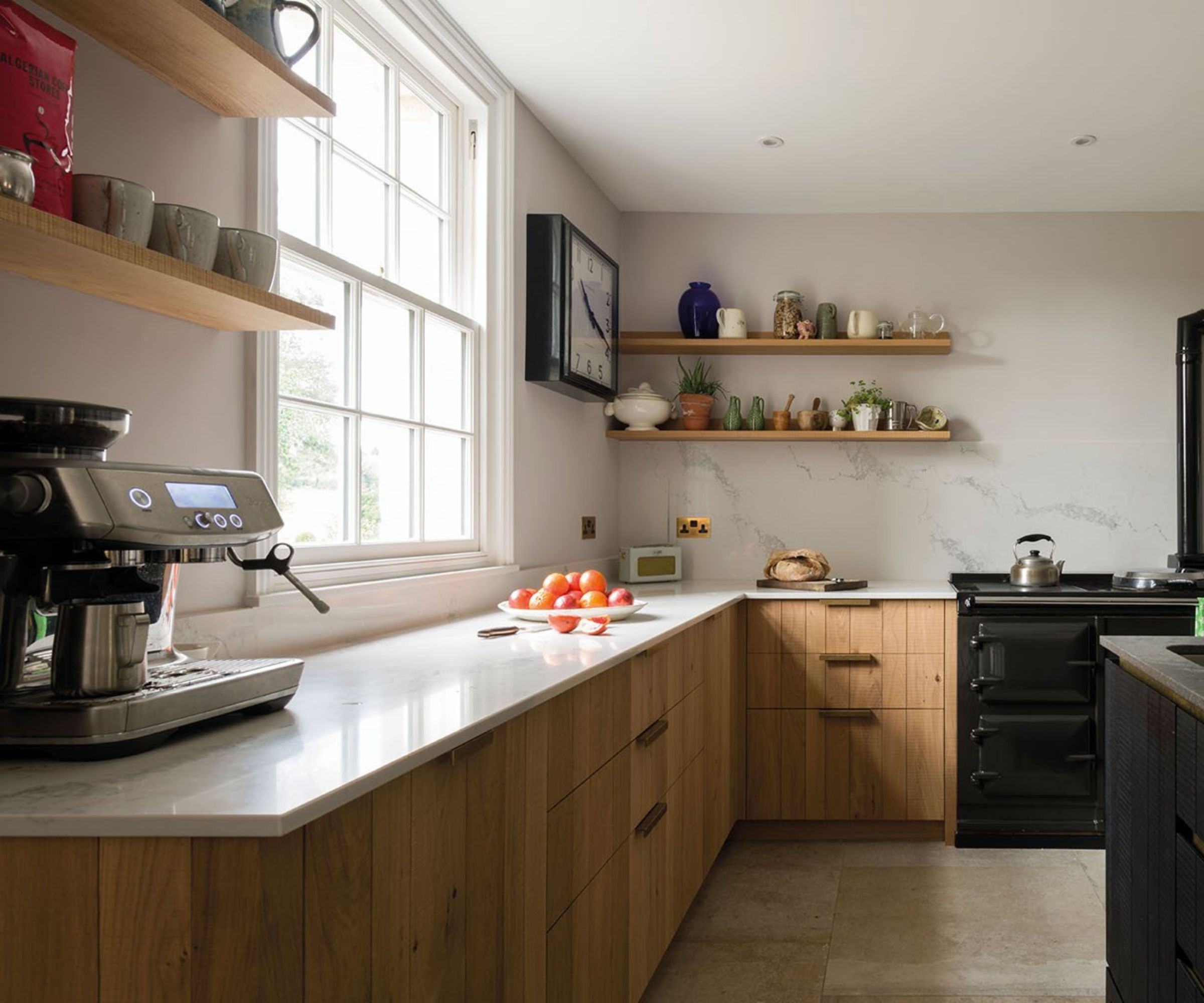
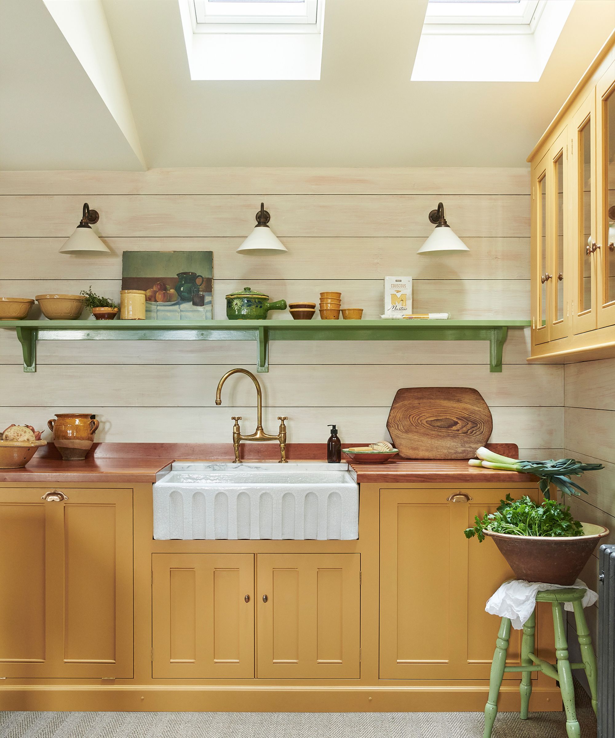
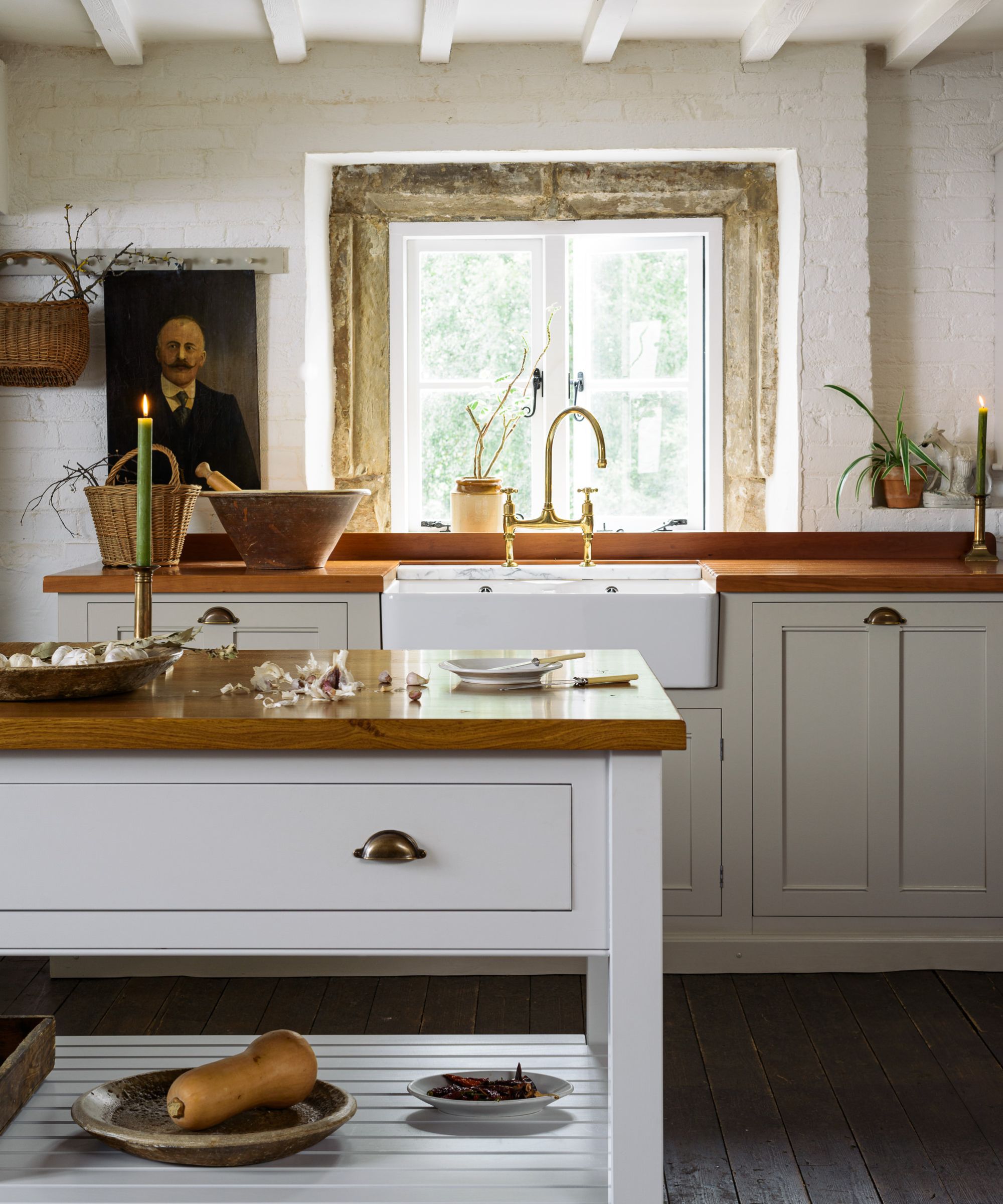
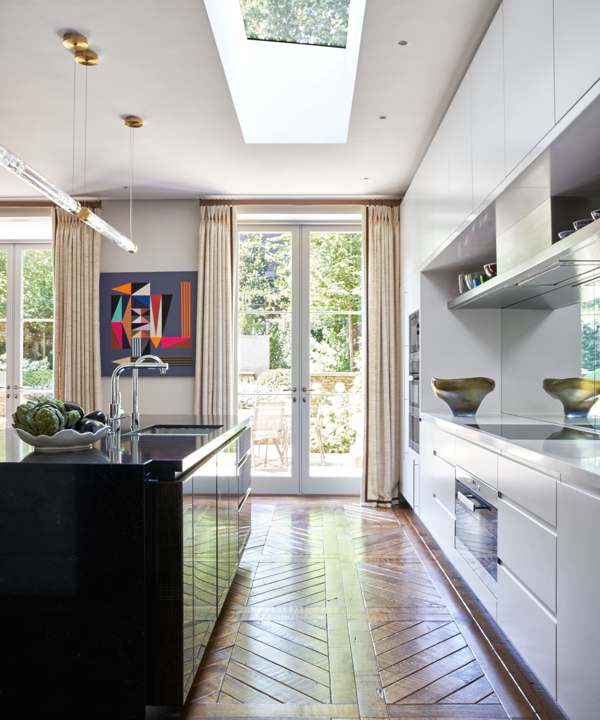
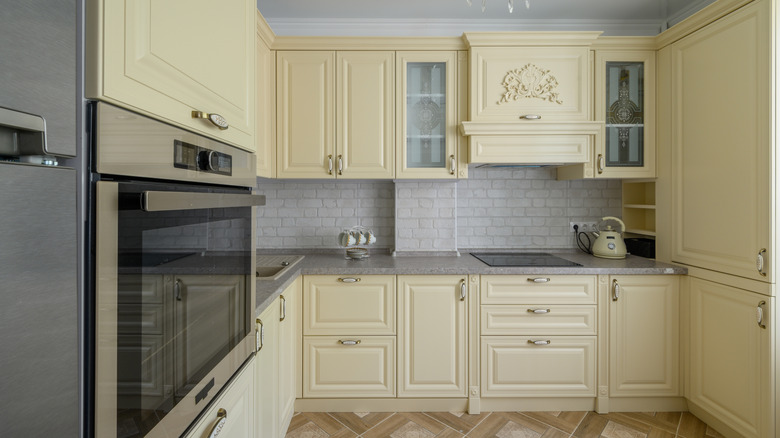
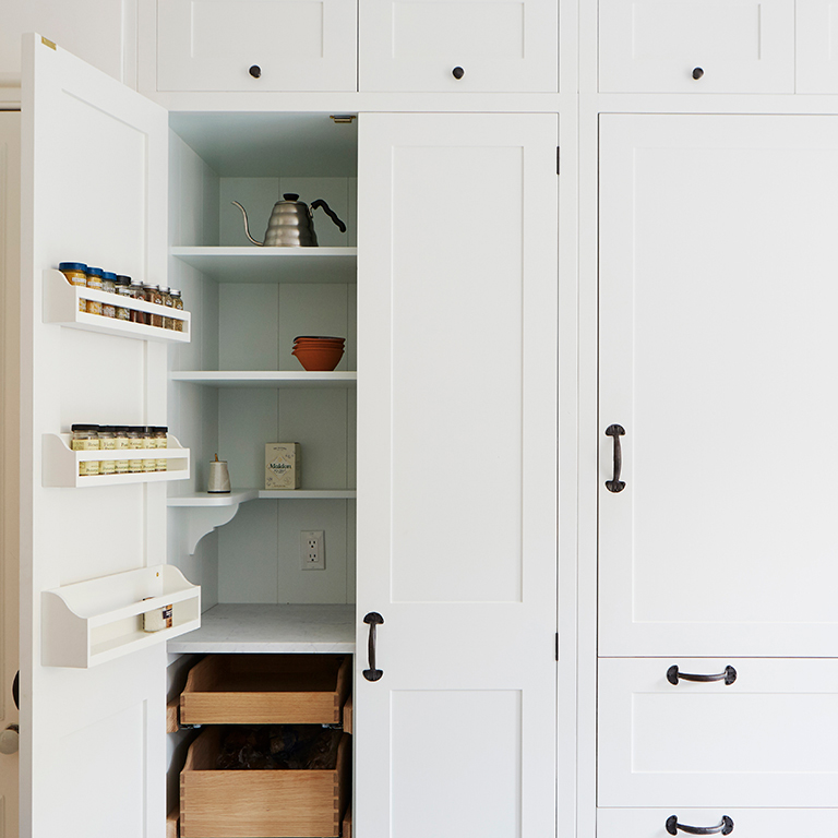
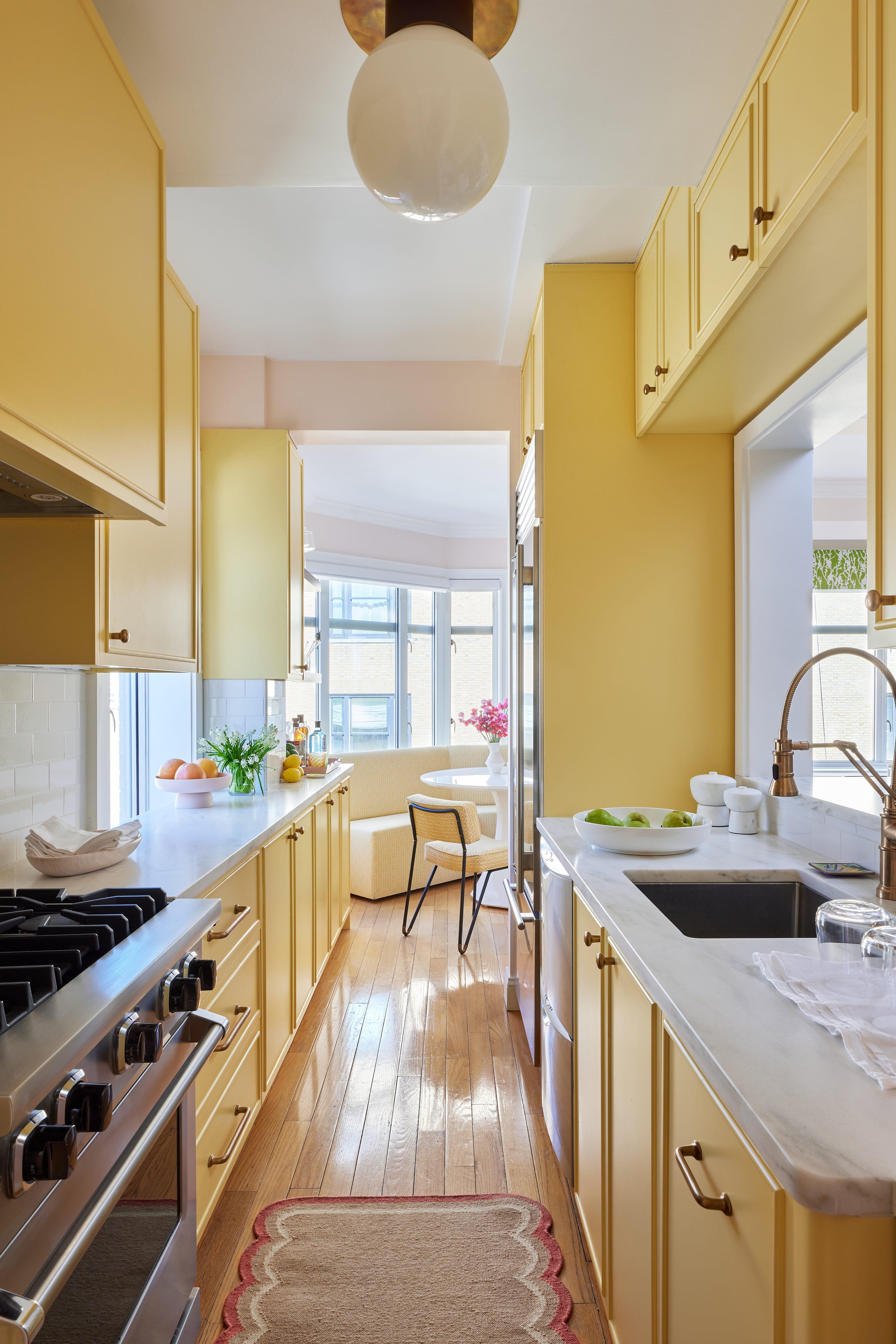
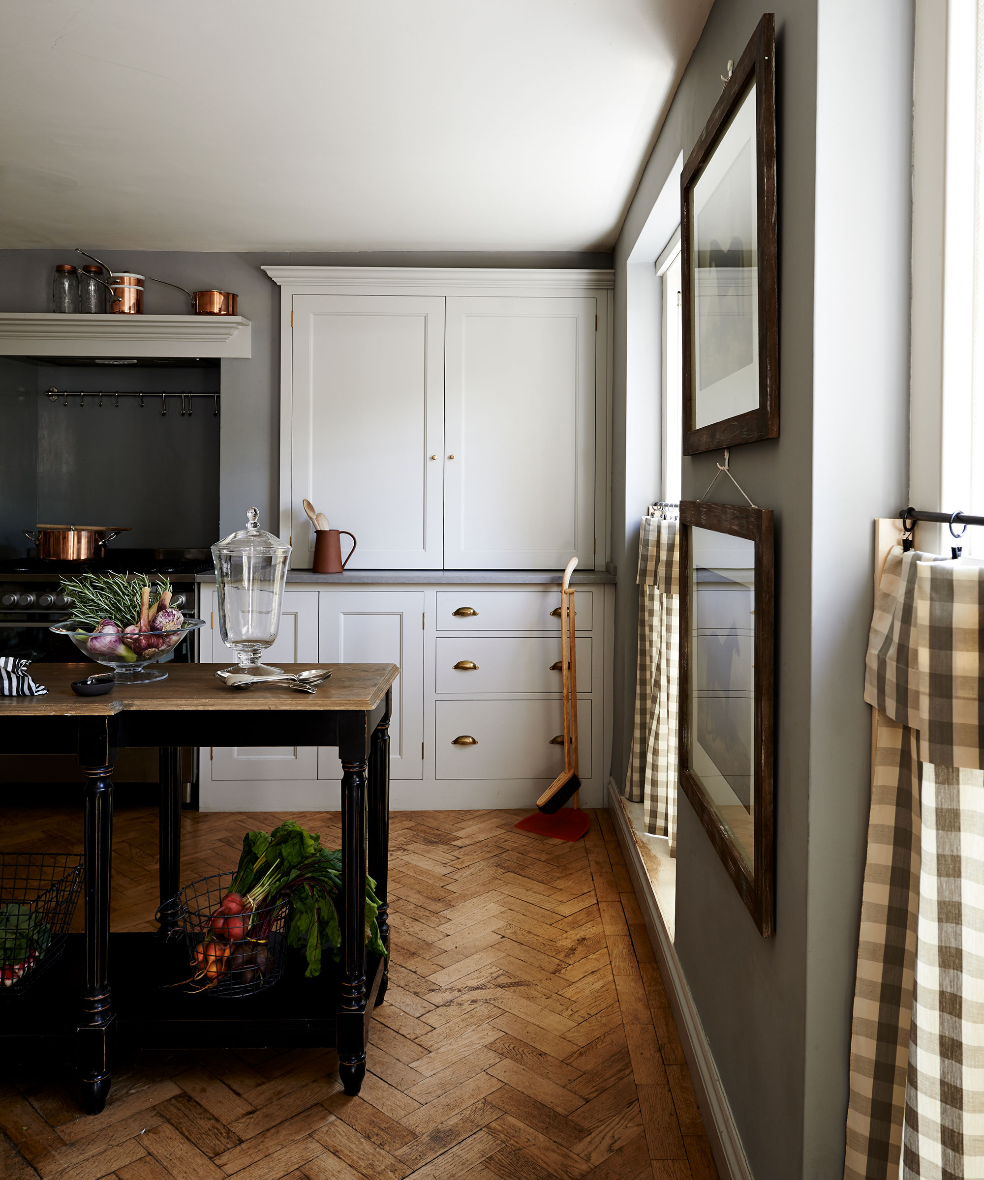
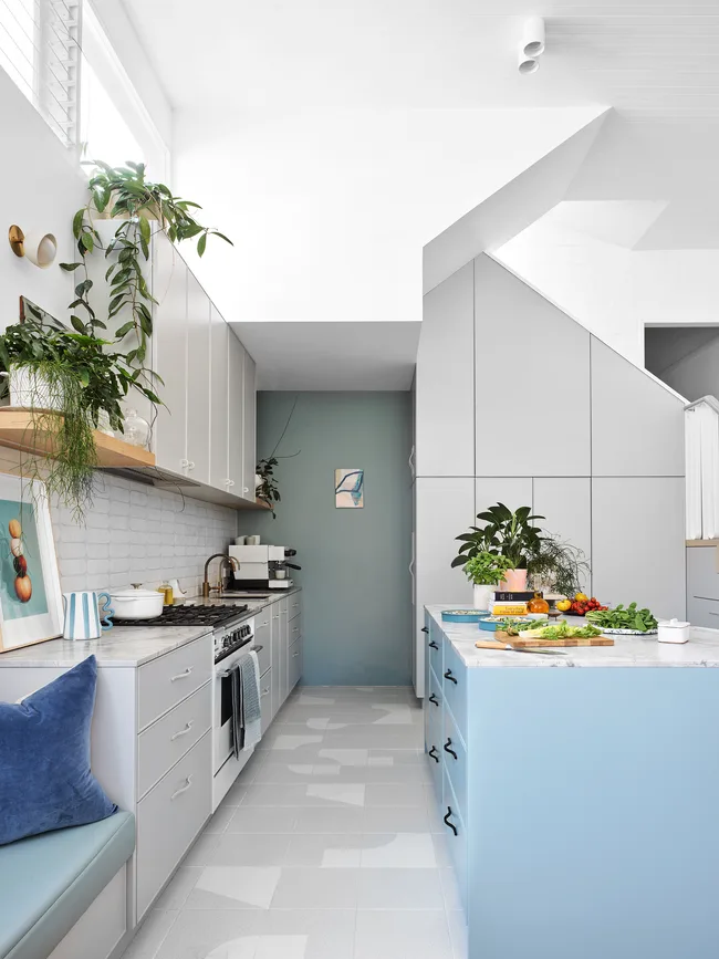
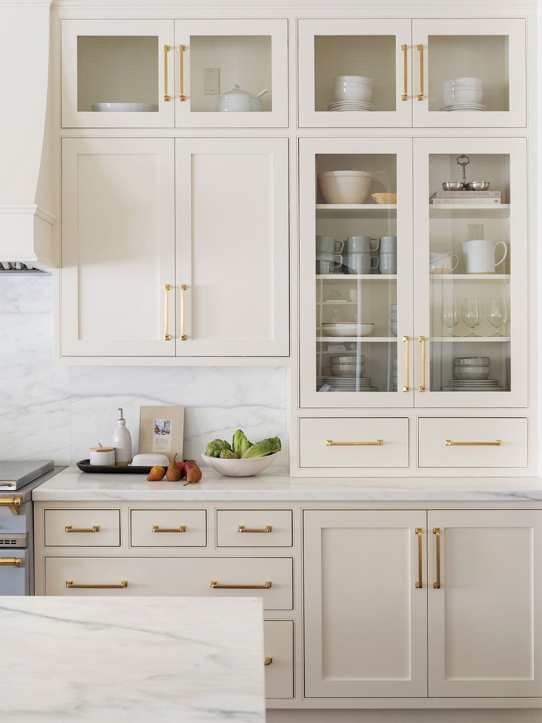
The second palette focuses on warm neutrals, considered a universal choice that pairs beautifully with almost any kitchen cabinet material. The key to success with neutrals is to select those with subtle warm undertones, avoiding cool tones that can make a kitchen feel stark or clinical. Emily Moorman, paint and color editor at Homes & Gardens, recommends Benjamin Moore’s Swiss Coffee for a bright and warming off-white, and Farrow & Ball’s Joa’s White, a gentle taupe suitable for farmhouse or rustic kitchens. Lauren Gilberthorpe also favors Little Greene's Slaked Lime for its versatility and slightly more saturated neutrals like Farrow & Ball's Setting Plaster or Edward Bulmer’s Ochre, which can be used as main or accent colors.
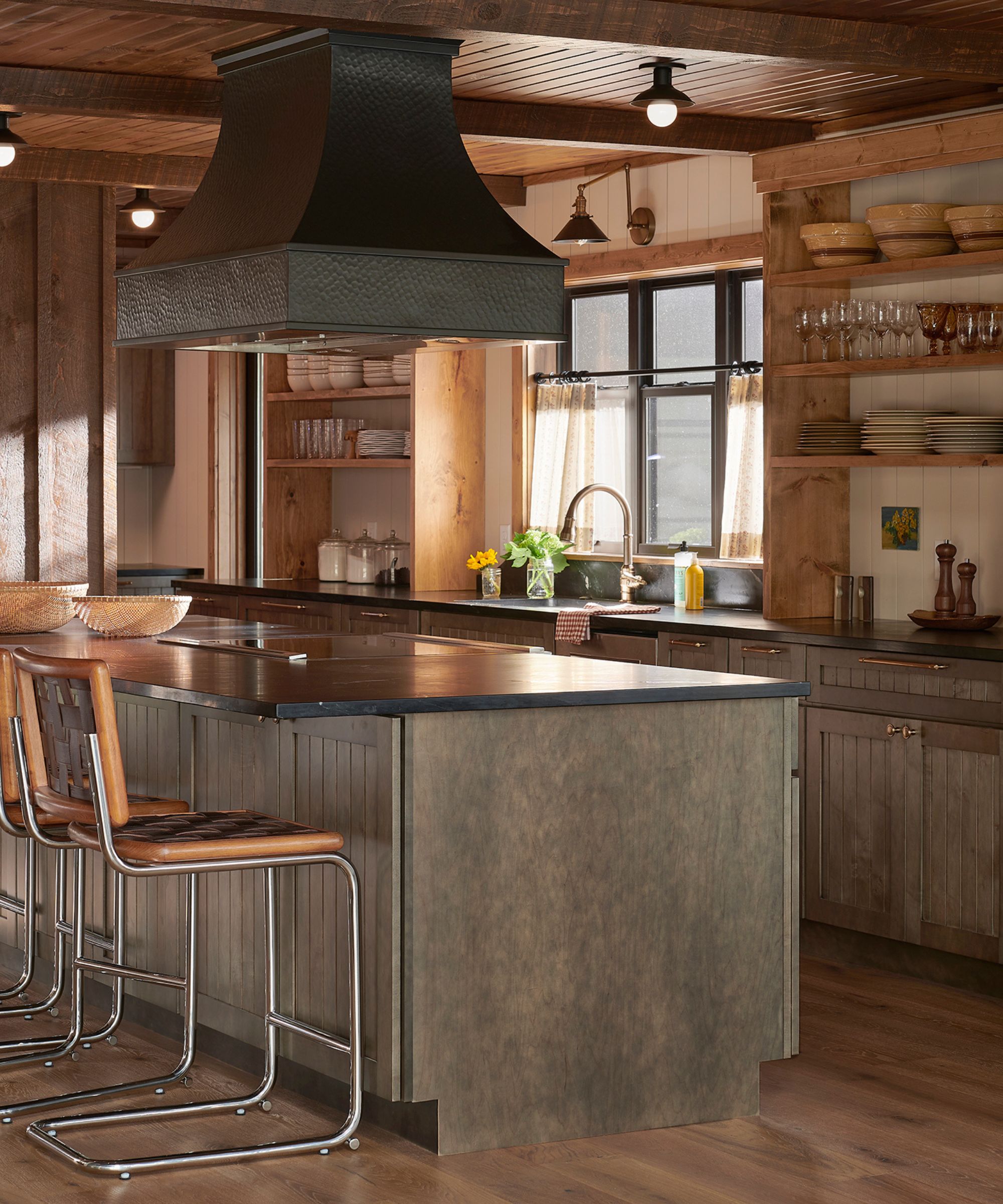
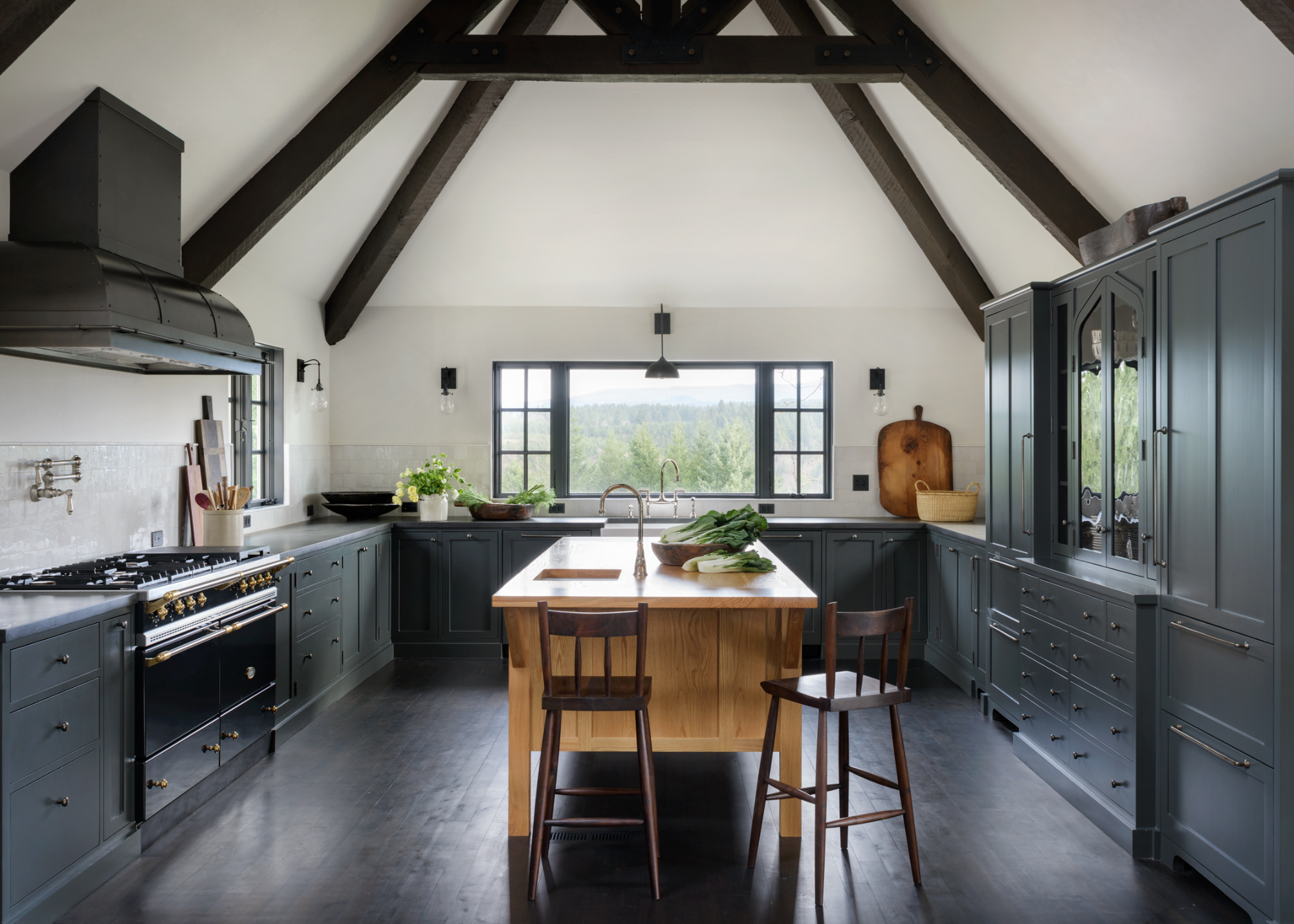
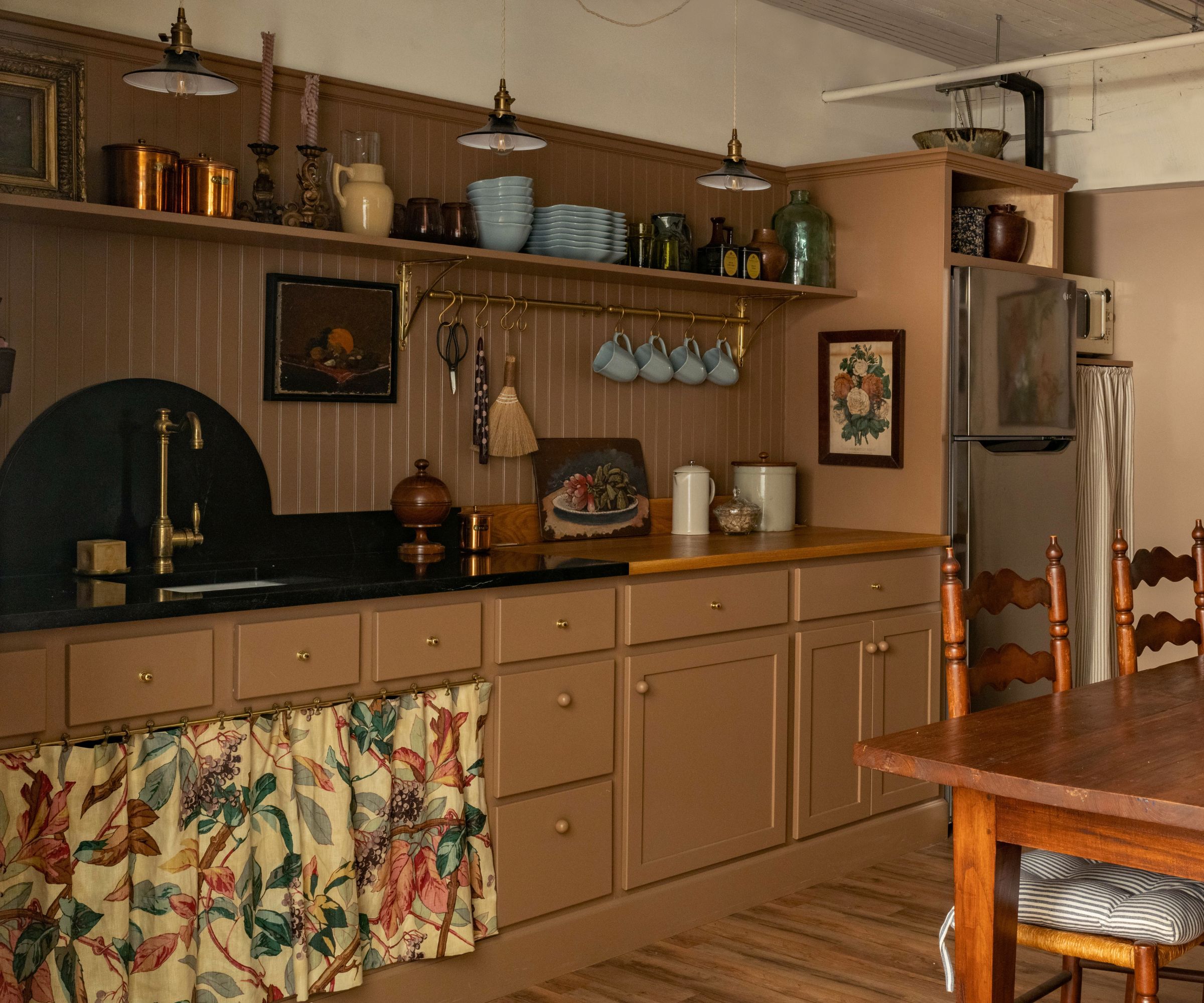
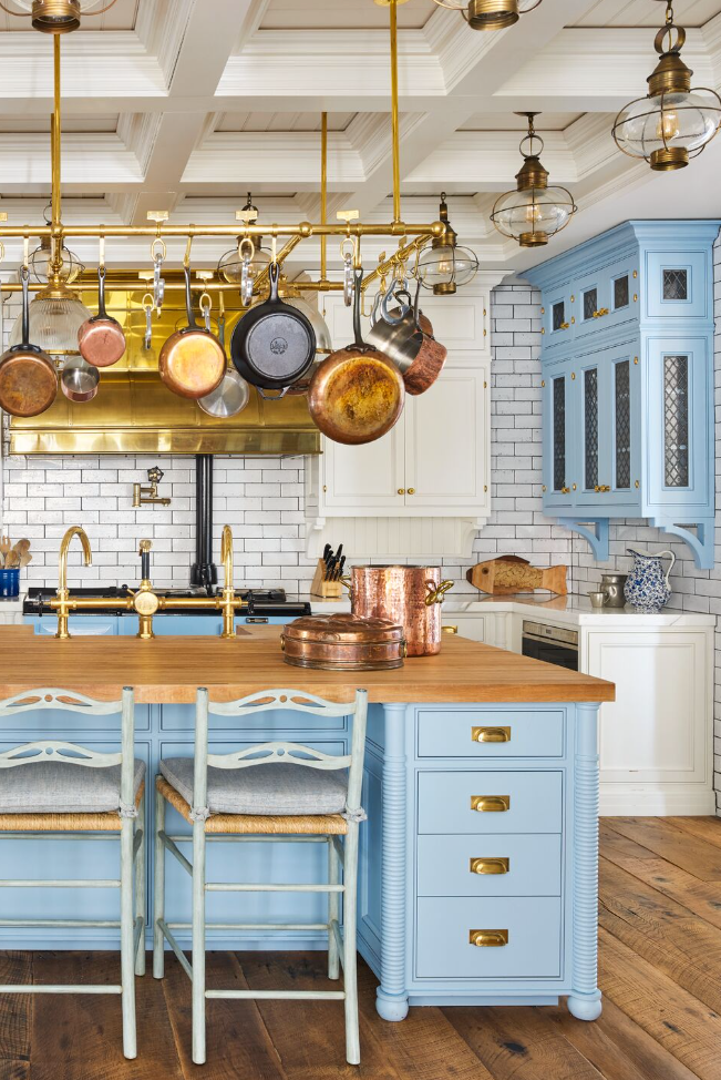
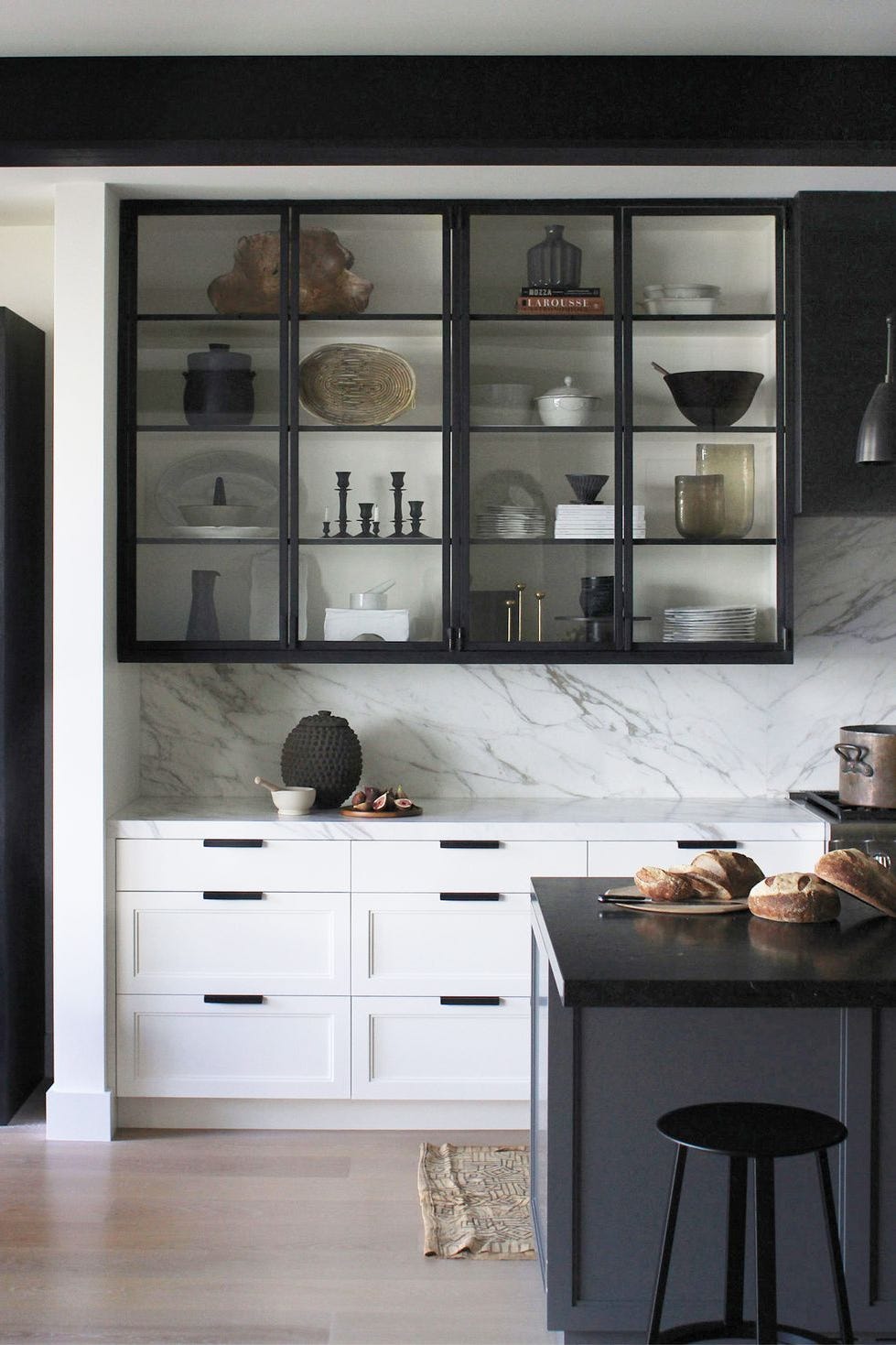
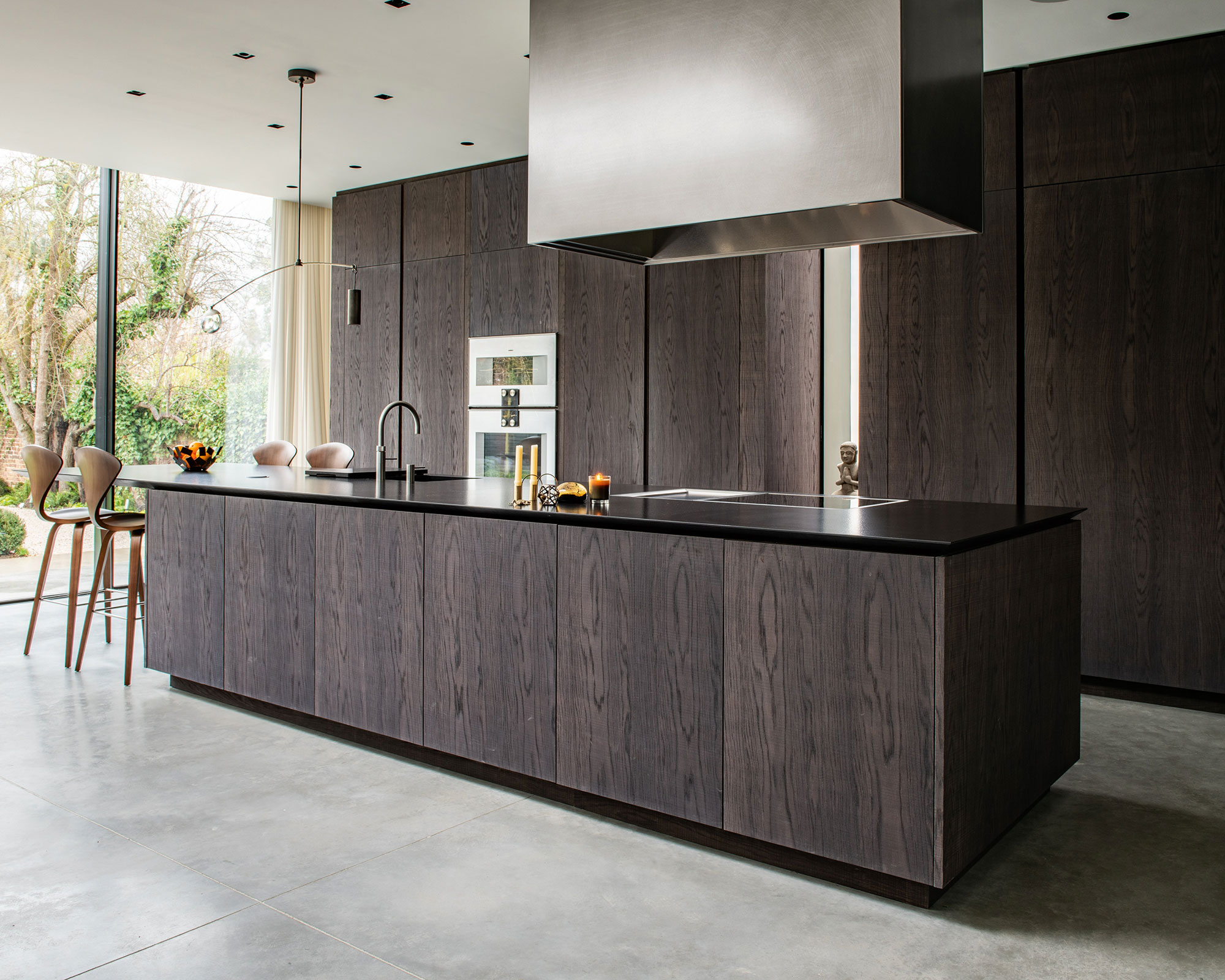
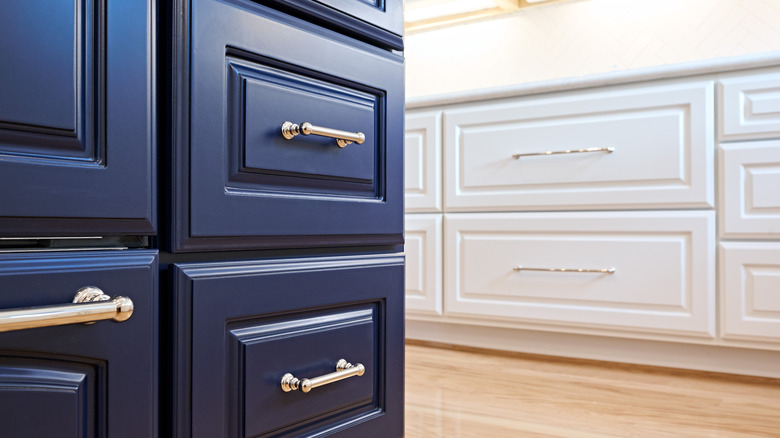
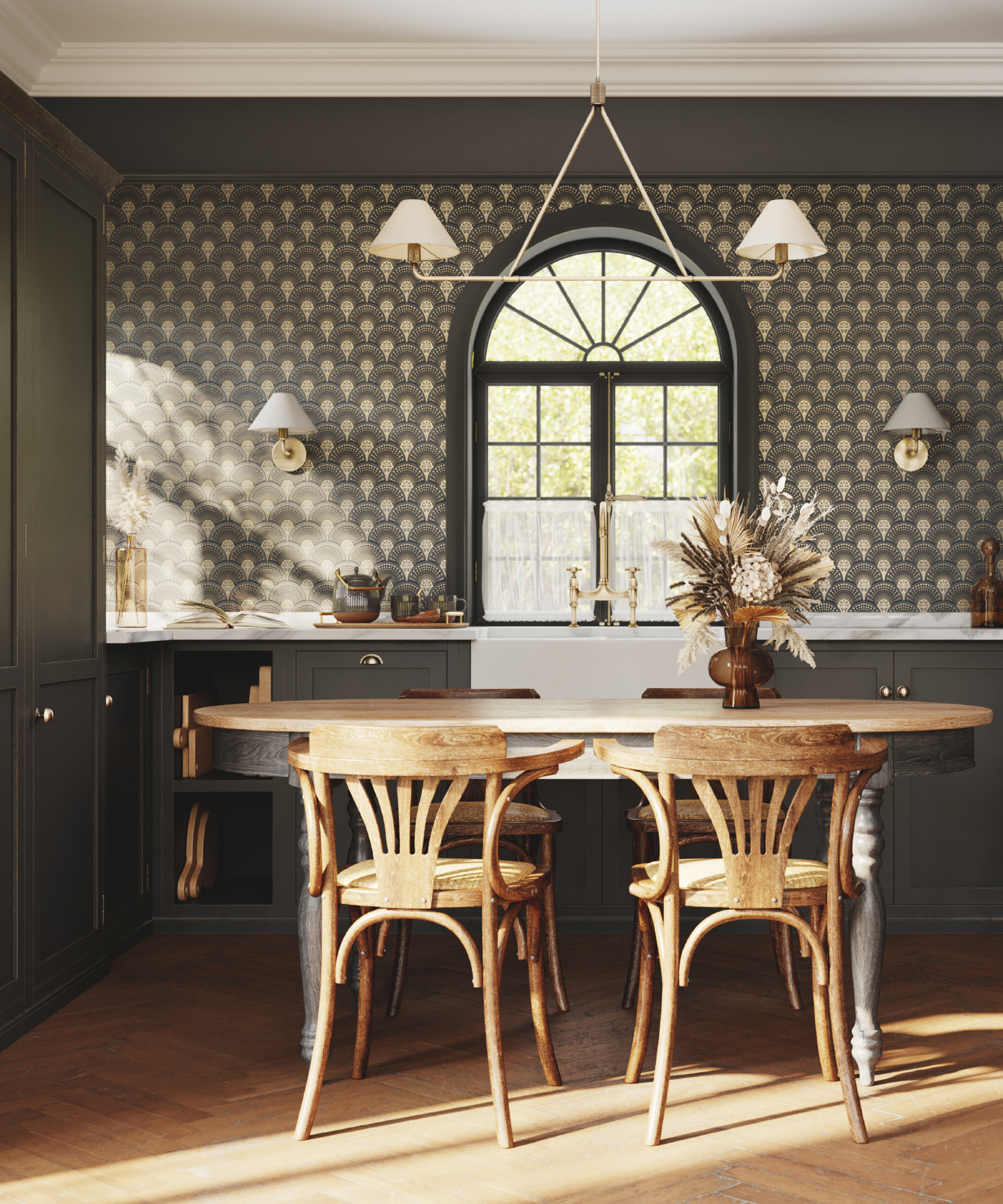
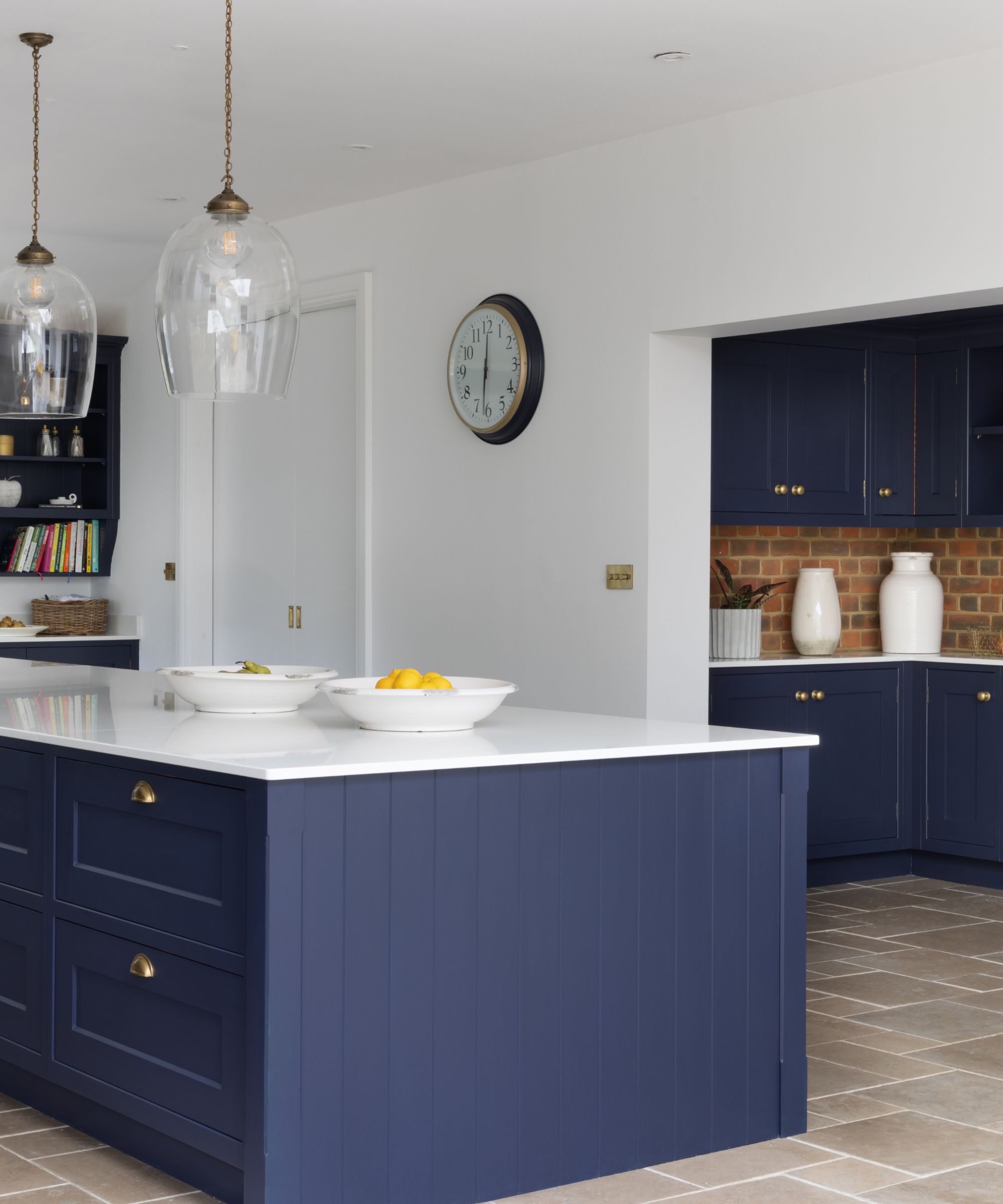
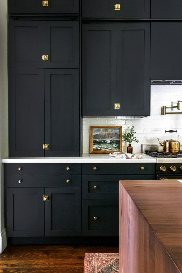
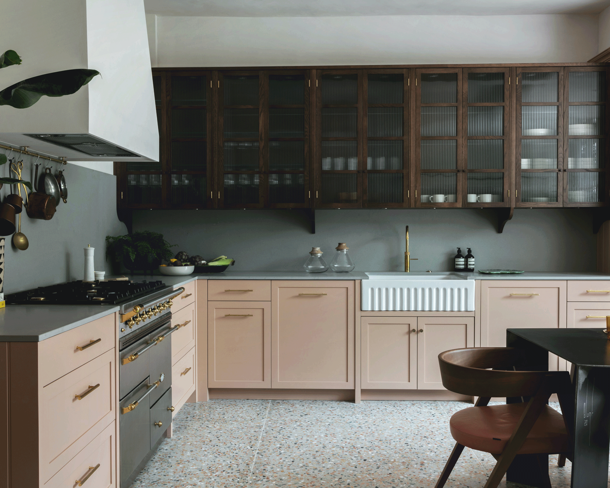
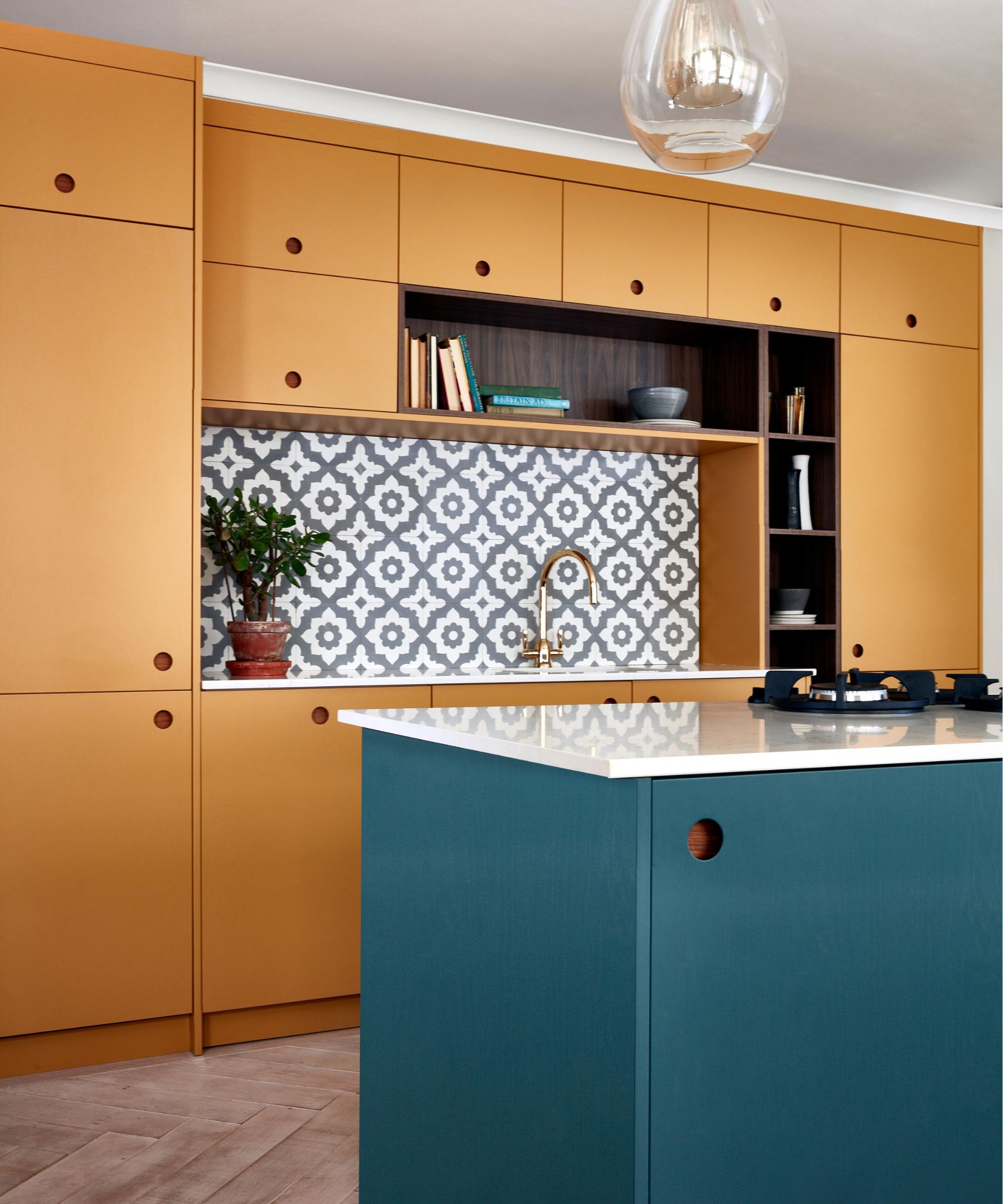
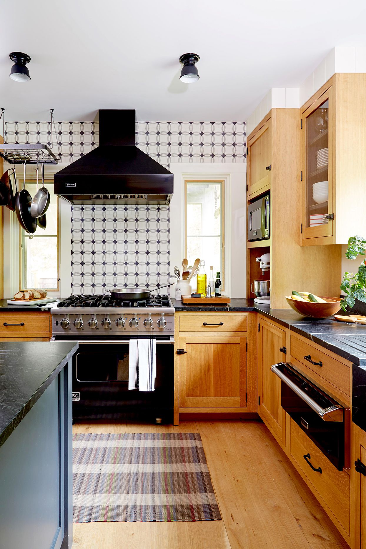
Finally, the article explores moody hues, which align with recent kitchen color trends that embrace depth and drama. Bo Hellberg, CMO at String Furniture, notes that rich, inviting colors such as warm grays, deep burgundies, and rich blues are becoming popular alongside warm wood accents like oak and walnut for a sense of comfort and sophistication. Emily Moorman advises using darker hues to create contrast with wood tones and achieve a design-led, cozy atmosphere, rather than a purely utilitarian one. She recommends timeless choices like Farrow & Ball’s Cardamom, a dark greenish-brown, and Lick’s Blue 07, a rich blue with green undertones, both of which make a striking statement with oak cabinets. The article concludes by emphasizing the versatility of oak kitchen cabinets and encourages homeowners to experiment with these palettes to achieve a modern and on-trend look.
#KitchenDesign #OakCabinets #ColorPalettes #InteriorDesign #HomeDecor #EarthyColors #NeutralTones #MoodyHues #KitchenDesign #OakCabinets #ColorPalettes #InteriorDesign #HomeDecor #EarthyColors #NeutralTones #MoodyHues
合計0件のコメント
 まだコメントはありません
あなたも好きかもしれません
How to make oak kitchen cabinets look modern, according to designers

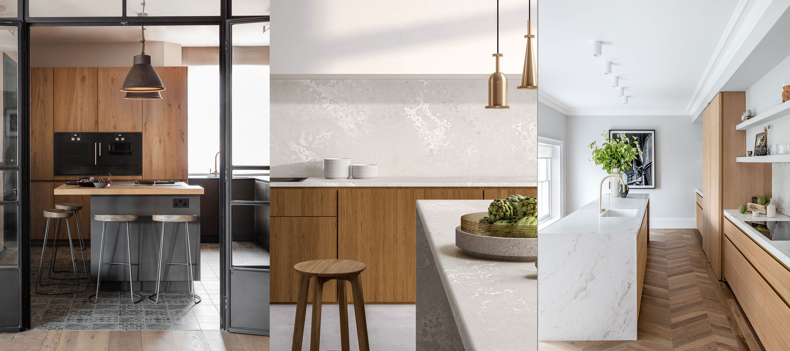
Oak cabinet kitchen ideas – the best new ways to use this traditional material
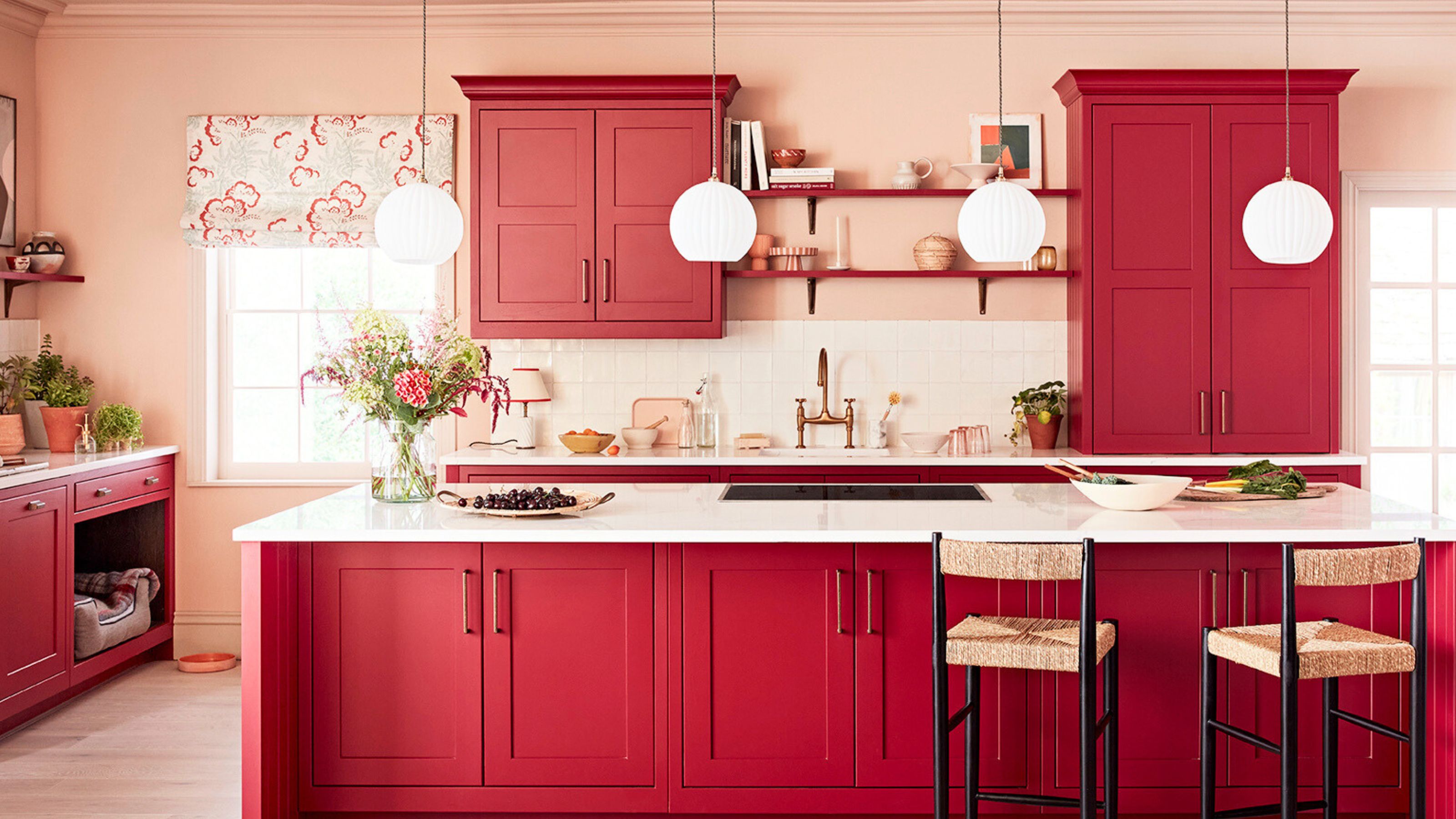
7 outdated kitchen cabinet colors designers say you should wave goodbye to, plus what to try instead

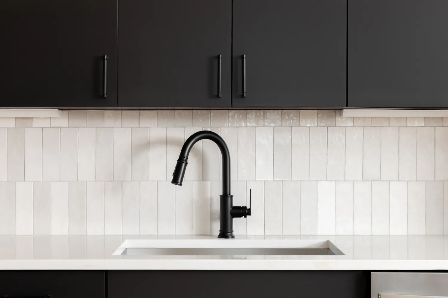
6 Kitchen Cabinet Colors Designers Advise Against—and the Alternatives They Recommend Instead

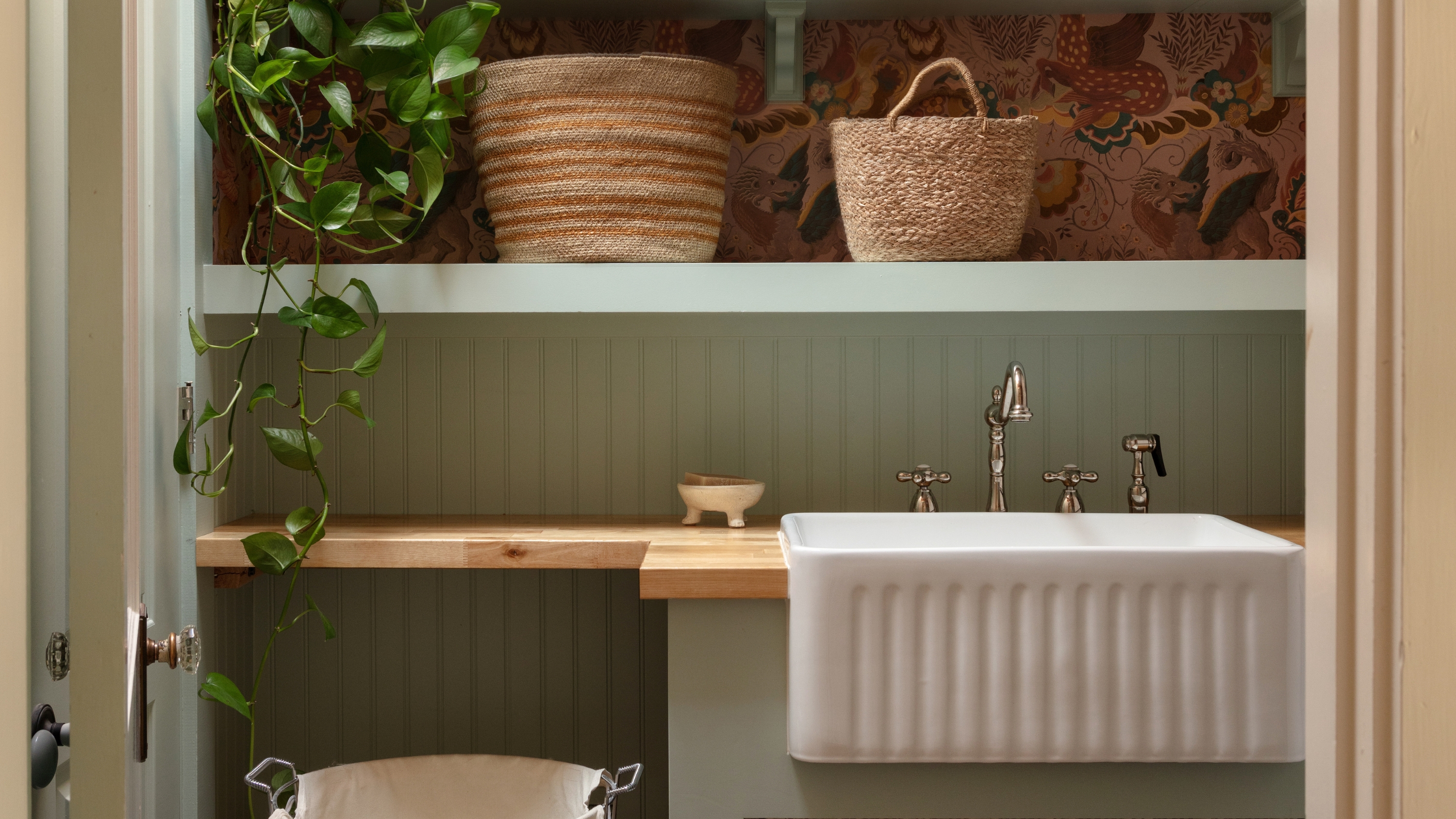
What Color Kitchen Cabinets Actually Go Well With Wooden Countertops? Designers Share Their Perfect Pairings

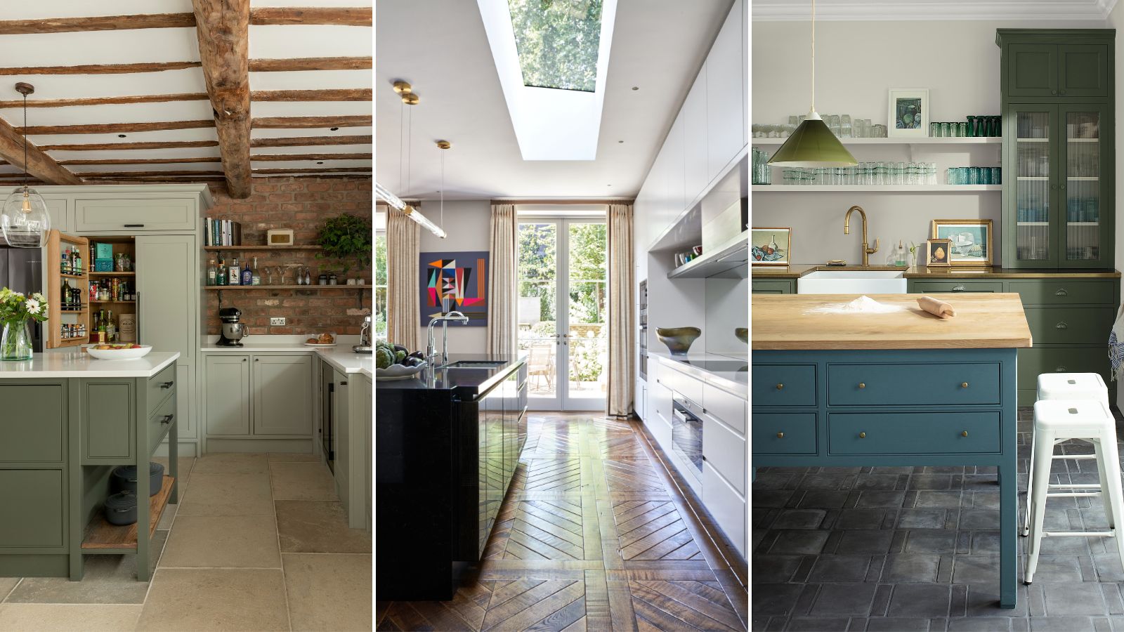
5 fail-safe kitchen cabinet color combinations that always work
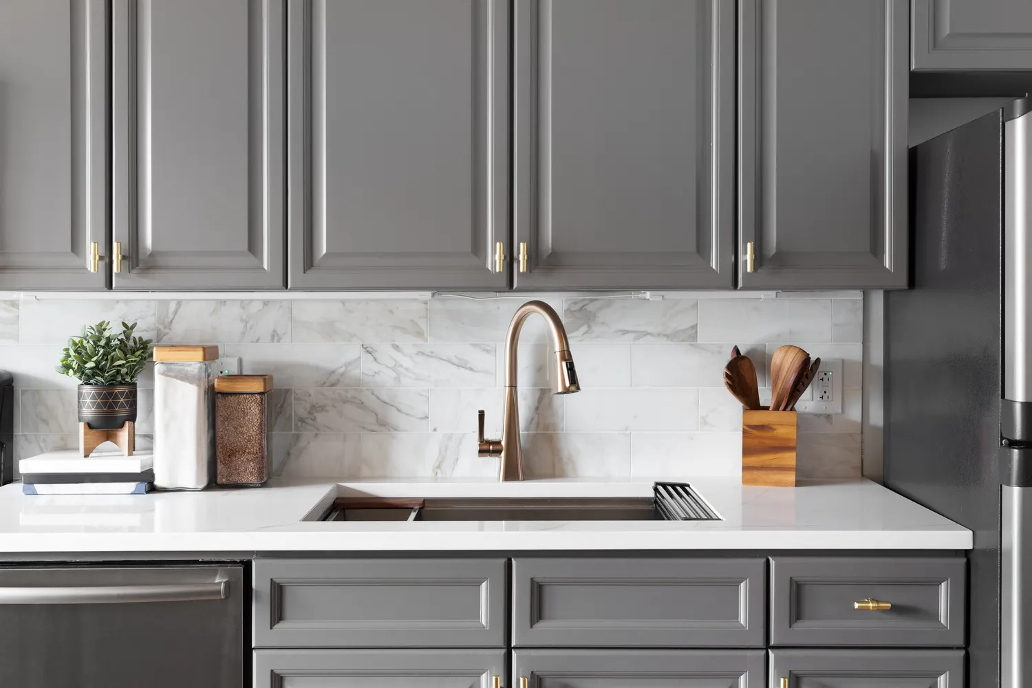
7 Outdated Cabinet Colors Designers Are Leaving Behind In 2026
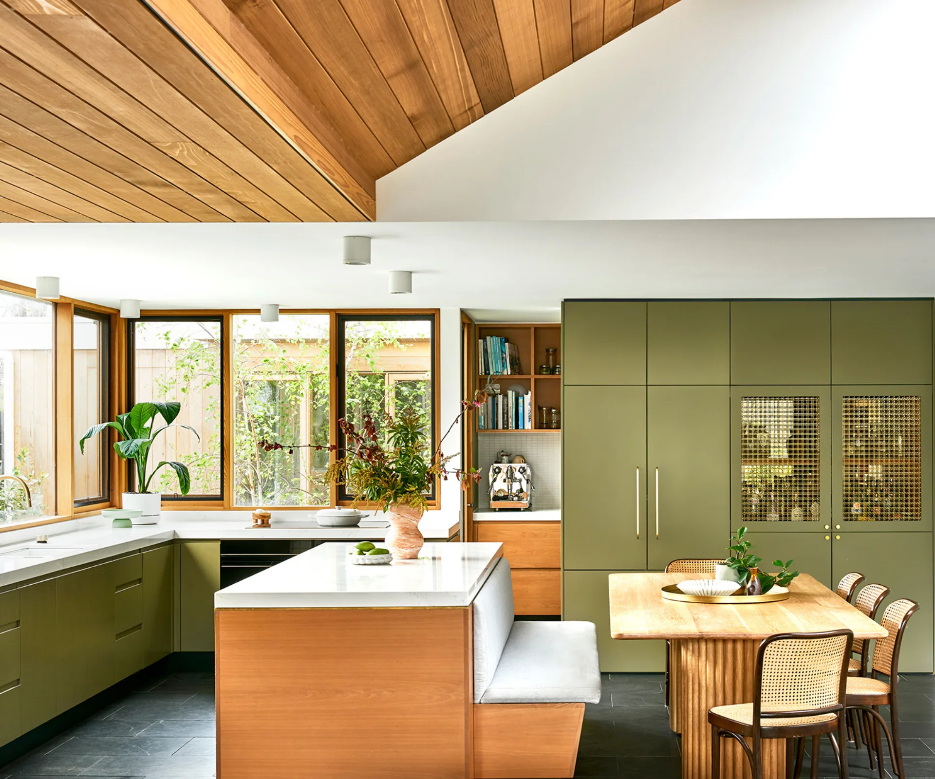
17 bright kitchen cabinet colour ideas to try in your home

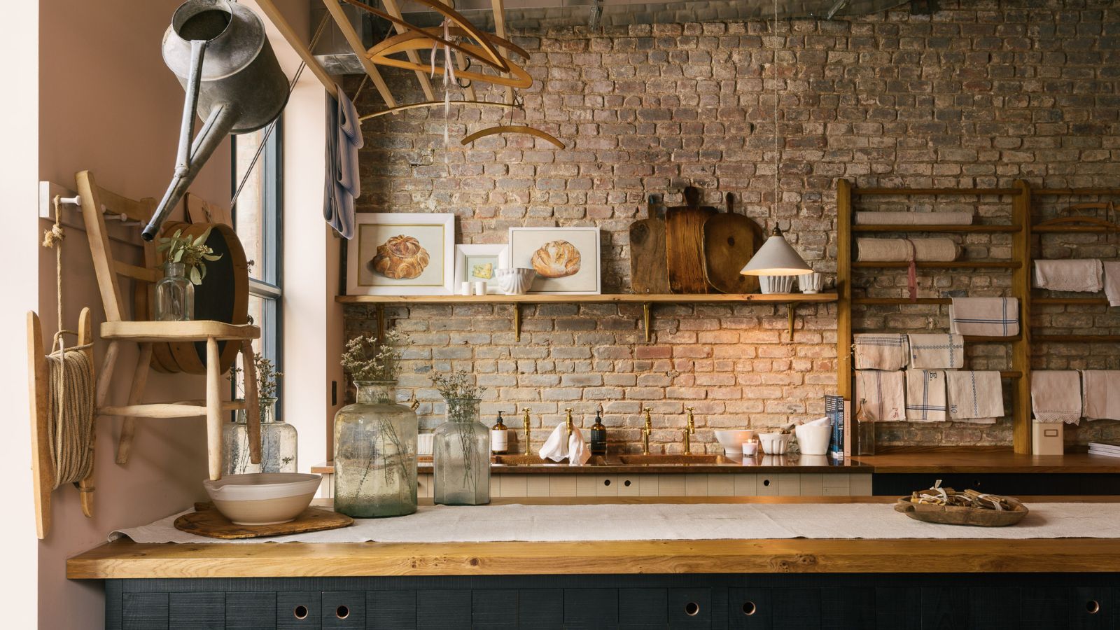
These are the 5 best colors to pair with a wooden kitchen countertop, according to interior designers
The Best Wall Colors to Make Your Kitchen’s Wood Cabinets Pop, According to Designers

Our 87 Favorite Kitchen Cabinet Colors, All Gathered in One Place

Want Multicolored Cabinets? Joy Cho Has a Strategy for Picking Complementary Hues

Do You Have a Kitchen with Oak Cabinets? Try These Design Tips
10 Trendy Kitchen Cabinet Colors You Should Try In 2025
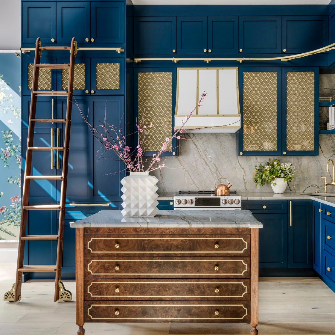
15 Cabinet Paint Colors That Look STUNNING in Any Kitchen

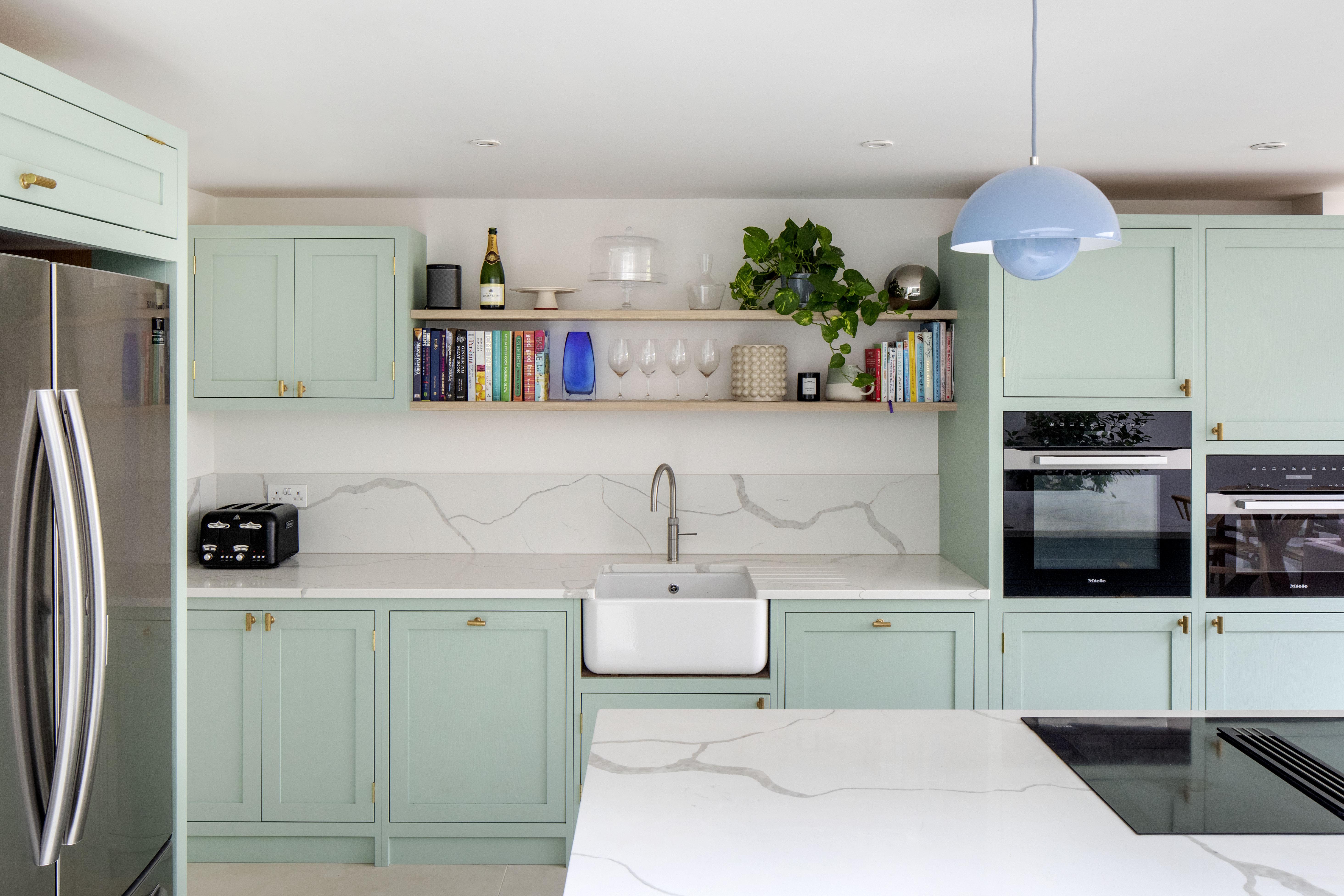
10 kitchen cabinet color mistakes to avoid for a cool and contemporary result

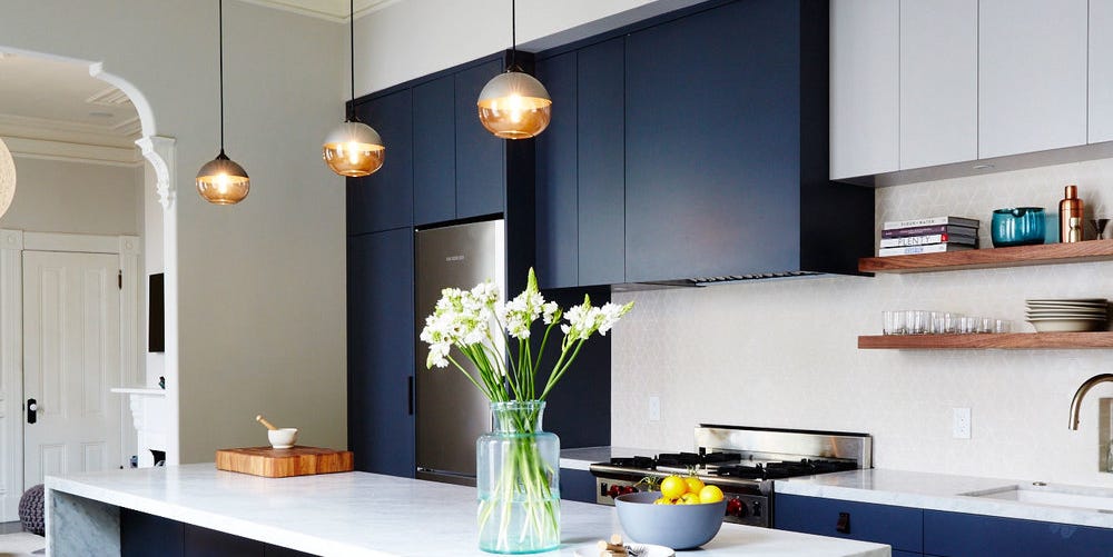
14 Kitchen Cabinet Colors You Can Easily Mix and Match
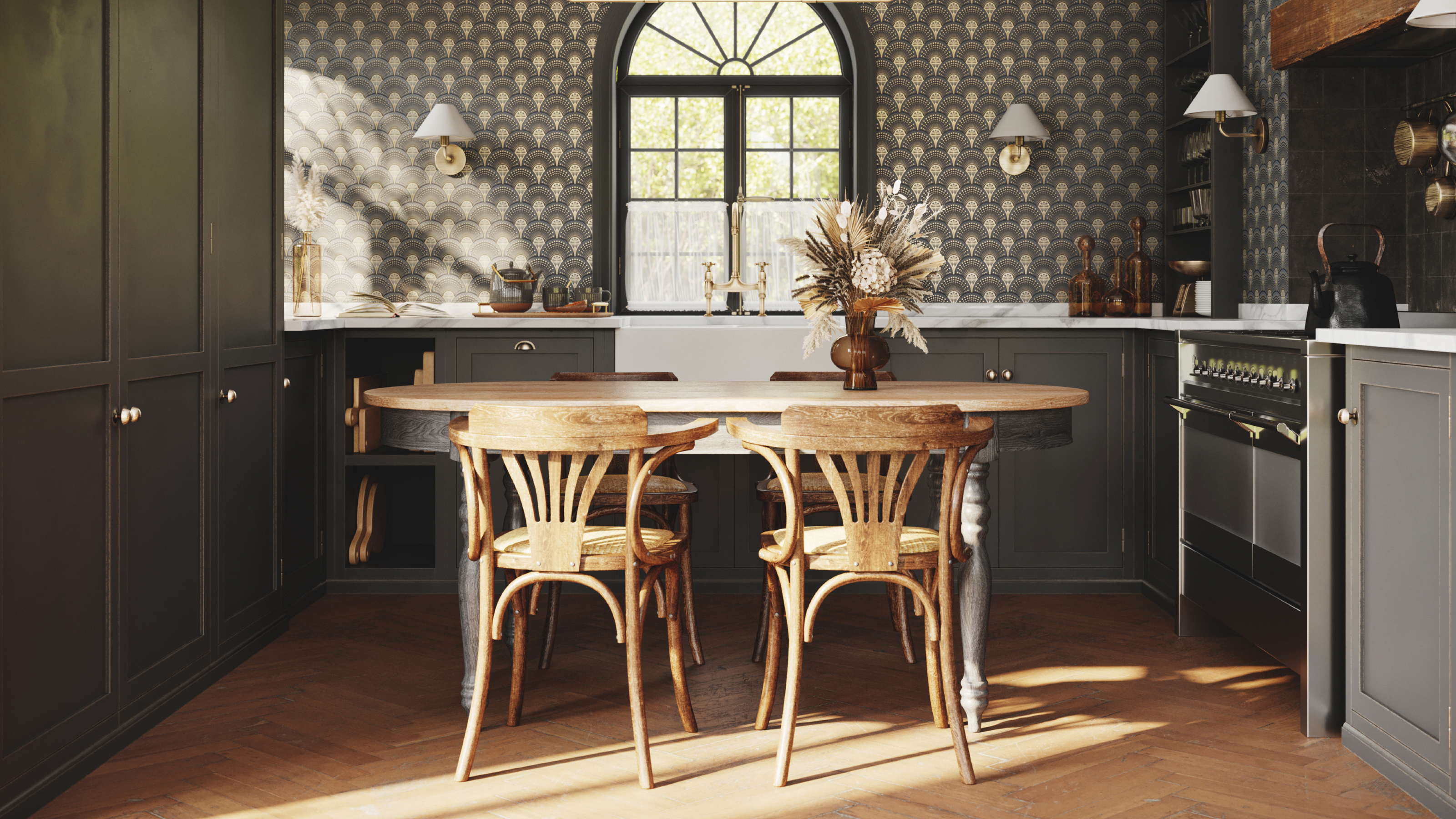
8 colors you should never paint kitchen cabinets according to the experts
5 outdated kitchen cabinet color trends to avoid if you don't want your kitchen to look unfashionable, say designers
Warm Oak Cabinets Are Back—and More Modern Than Ever