
1/3
Farrow & Ball Hague Blue: DUPES, coordinating colors, & Sarah’s full review


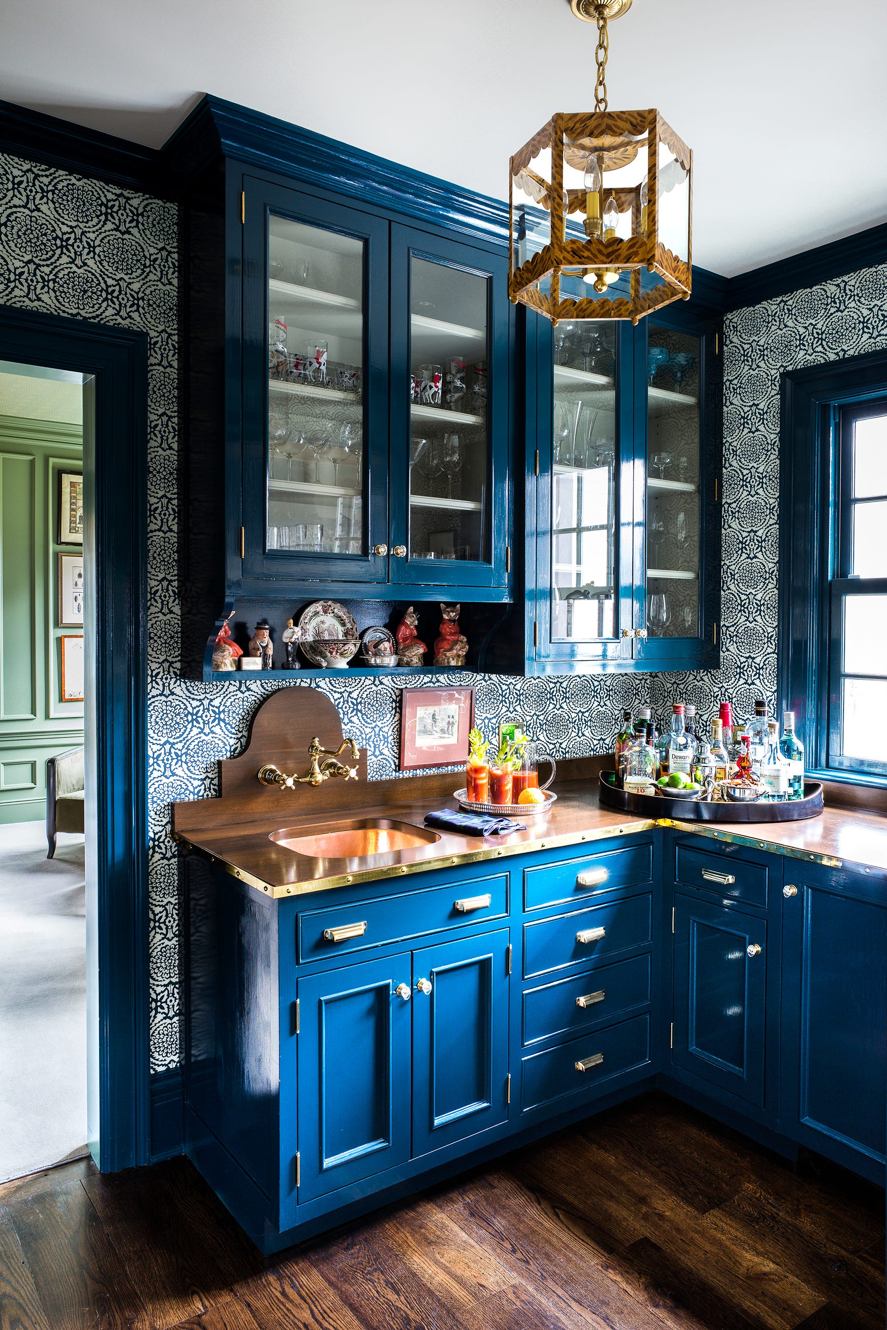
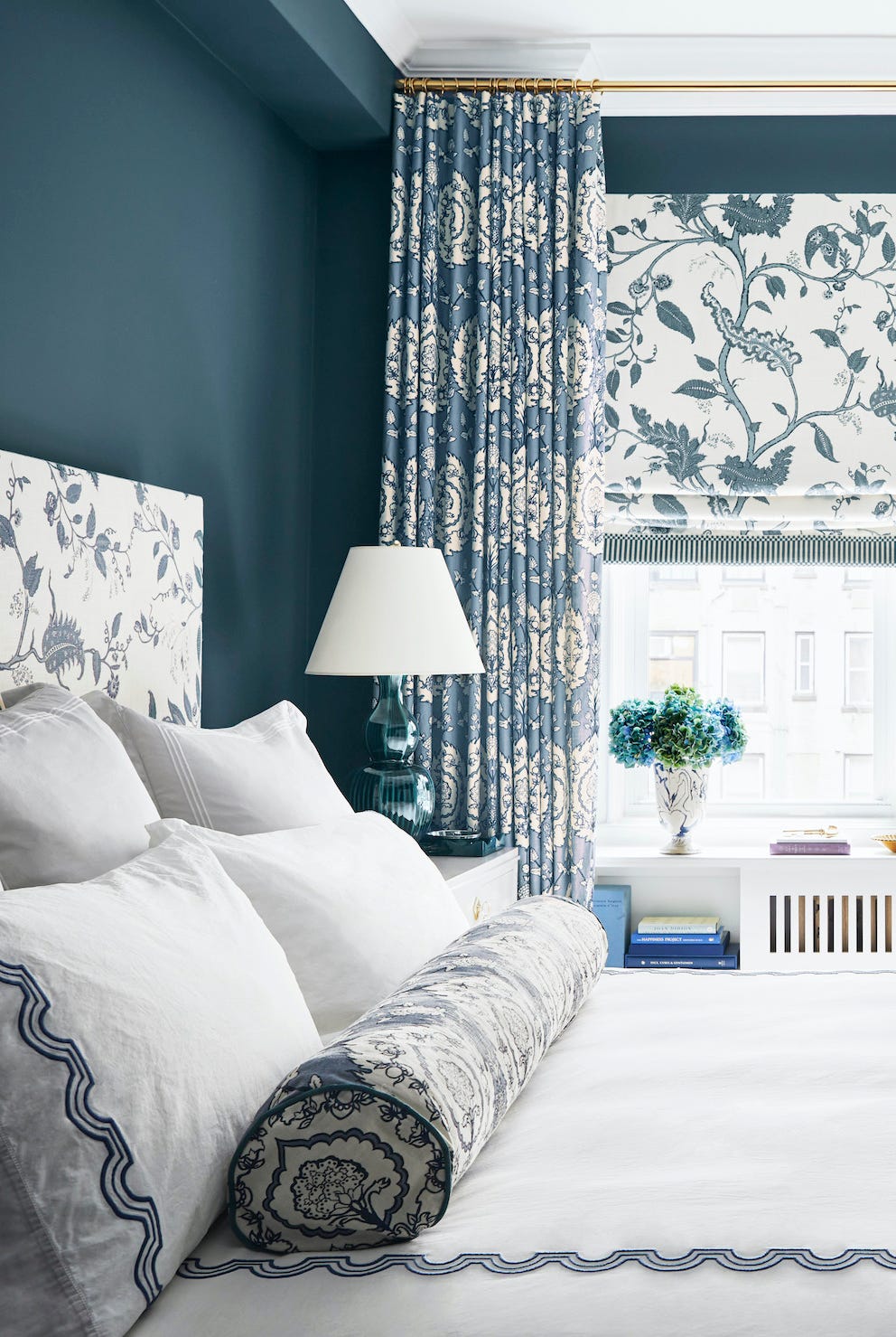
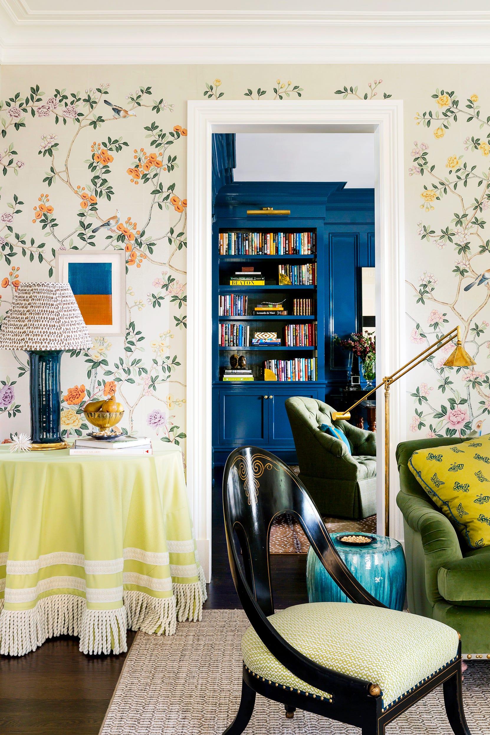
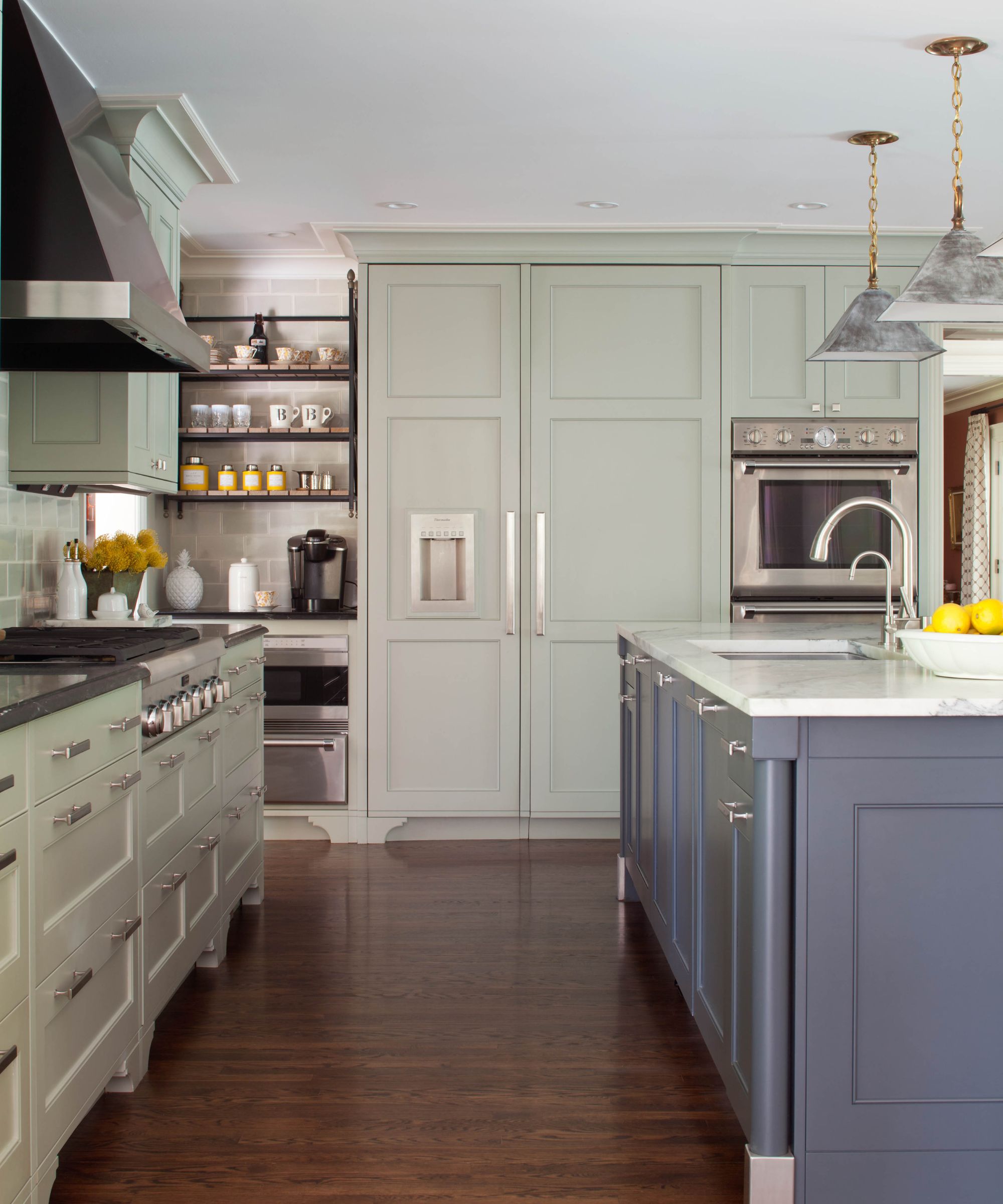
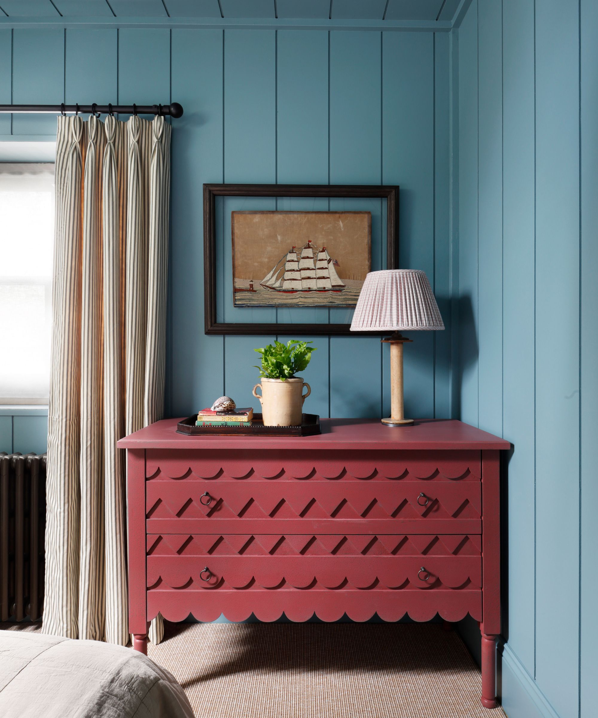
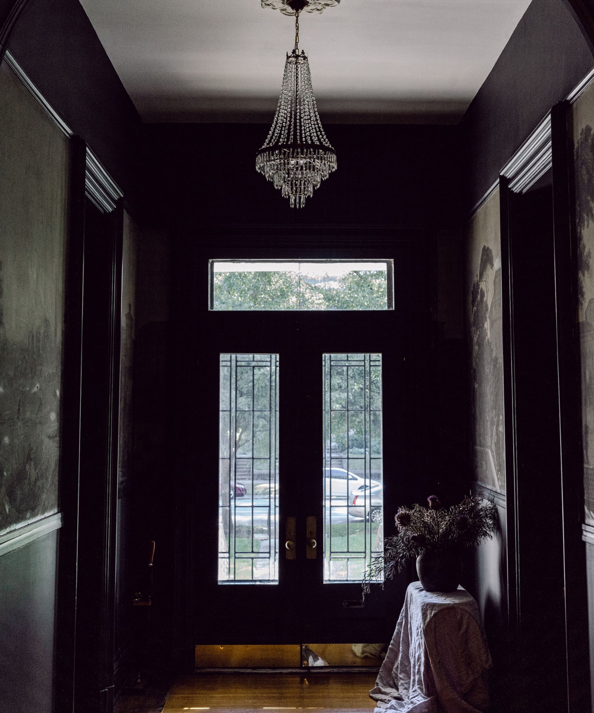
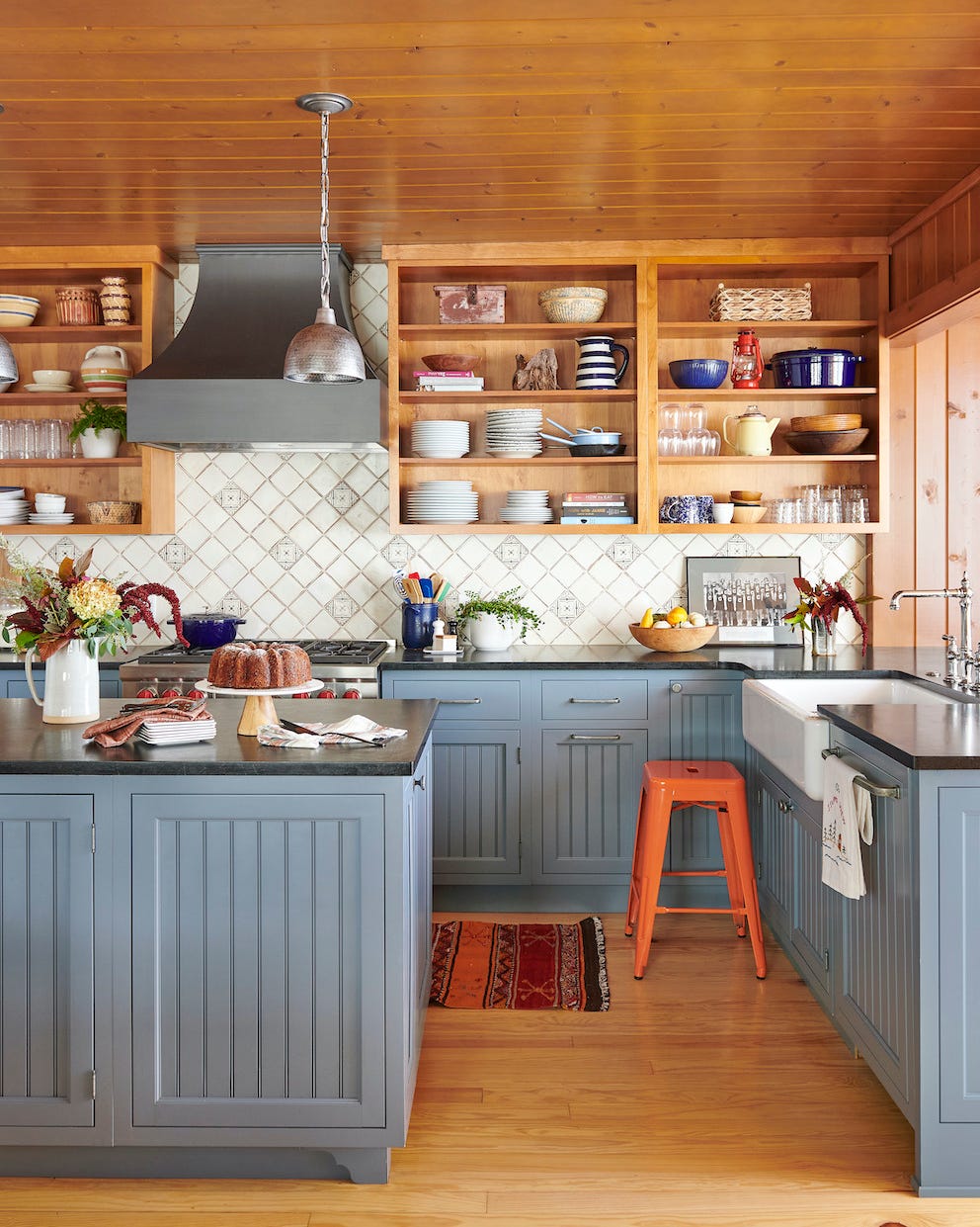
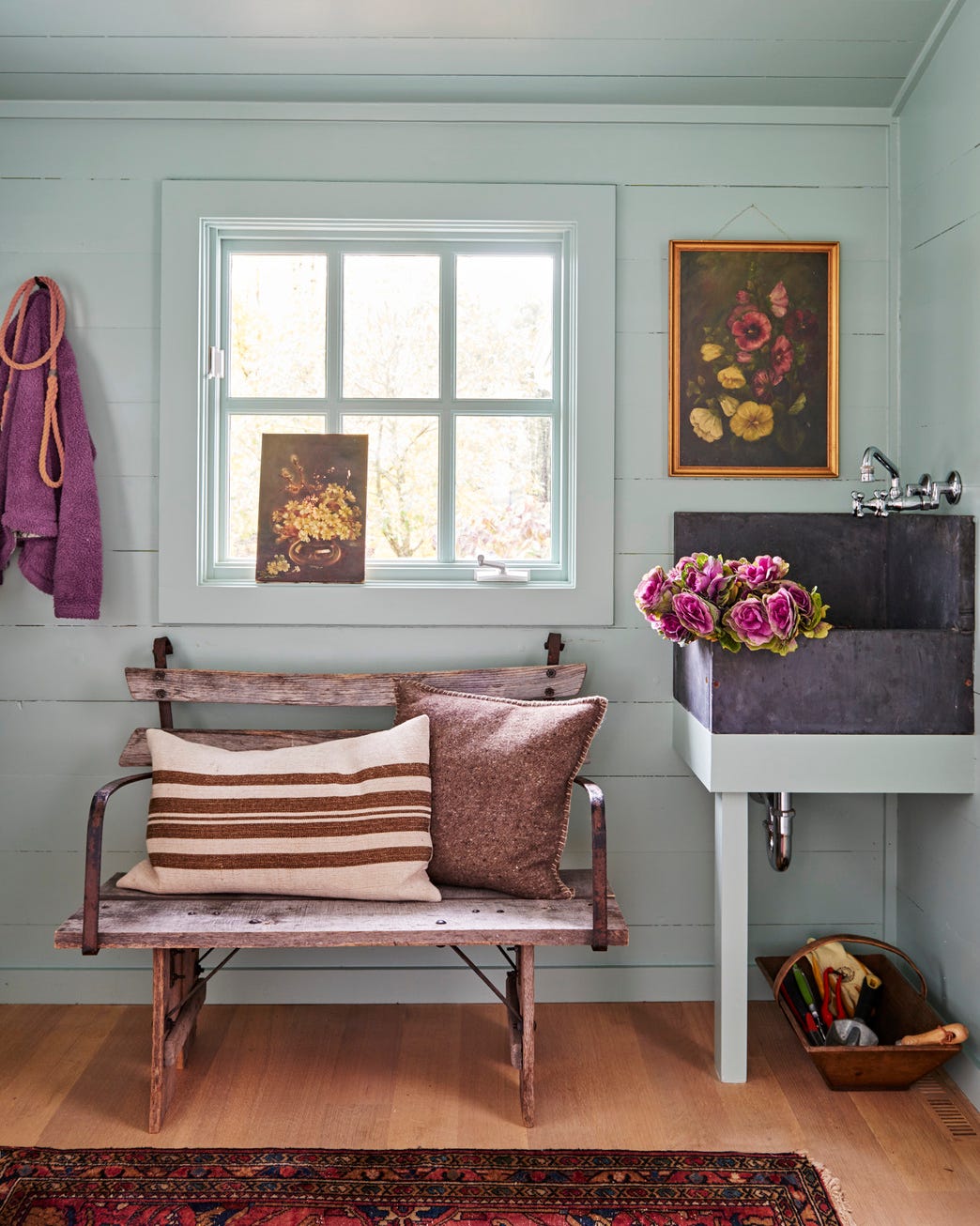
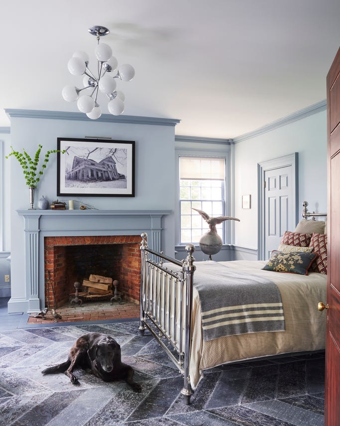
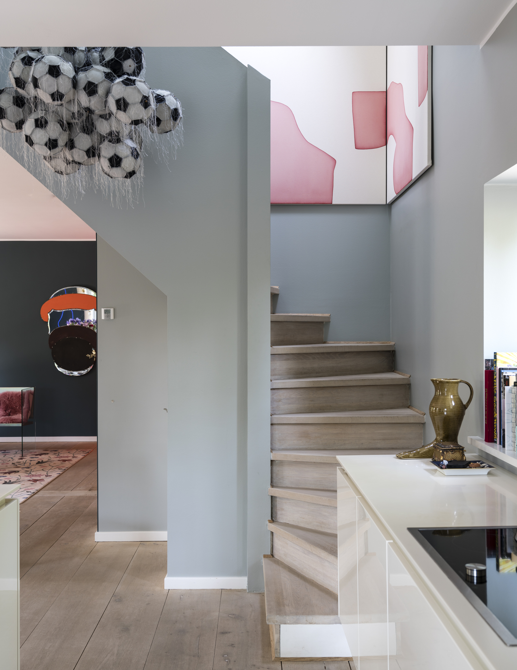
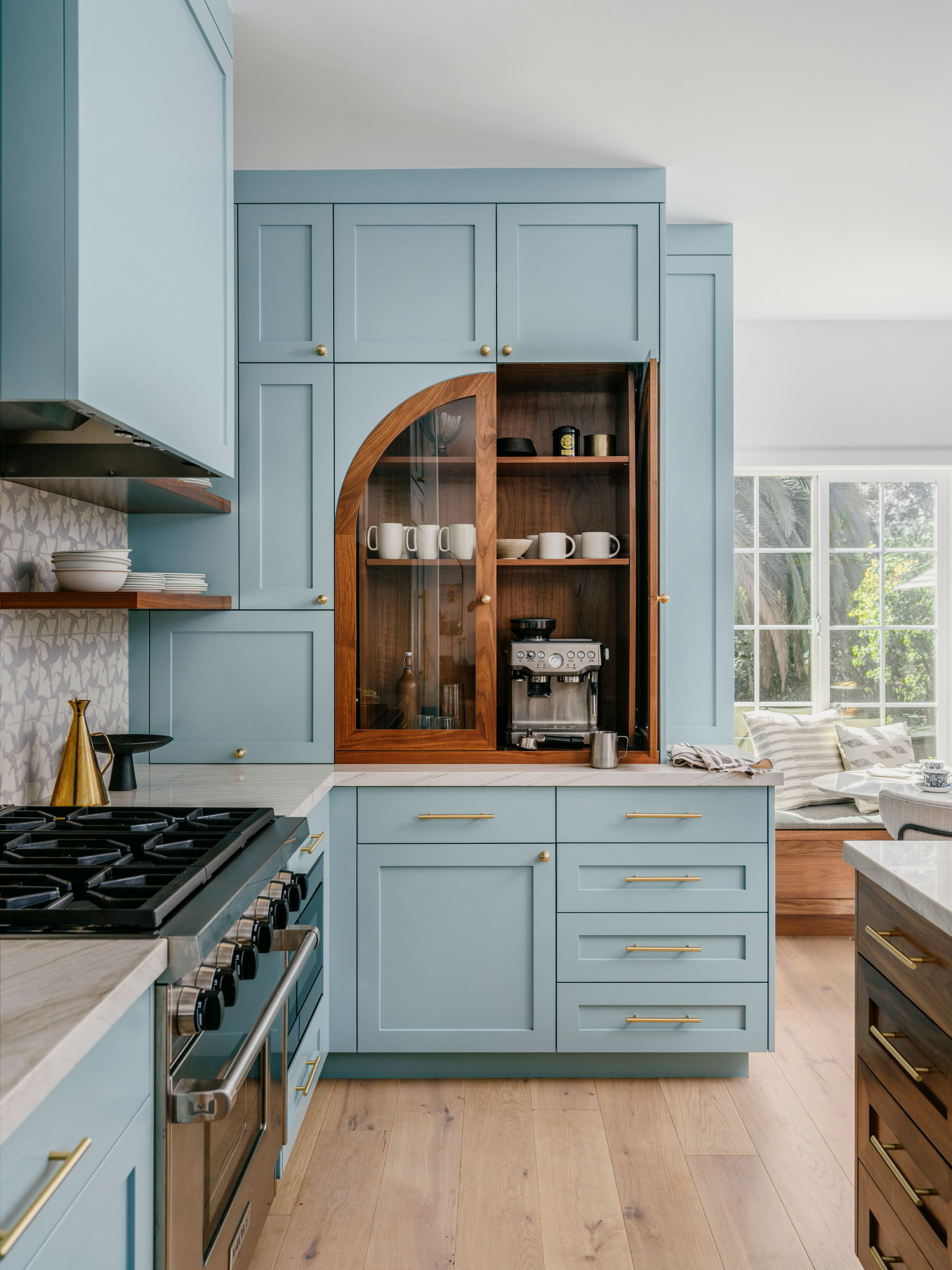
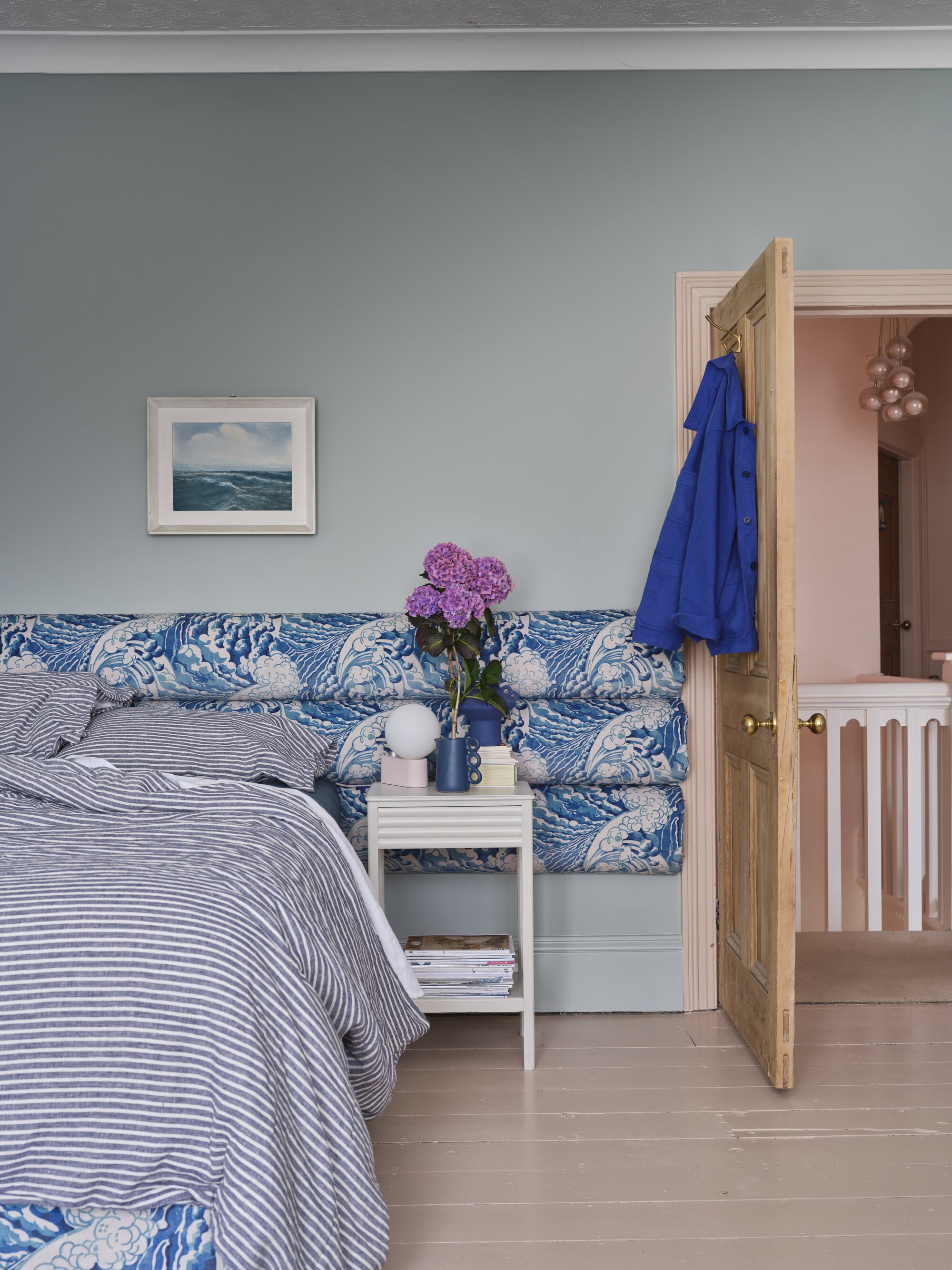
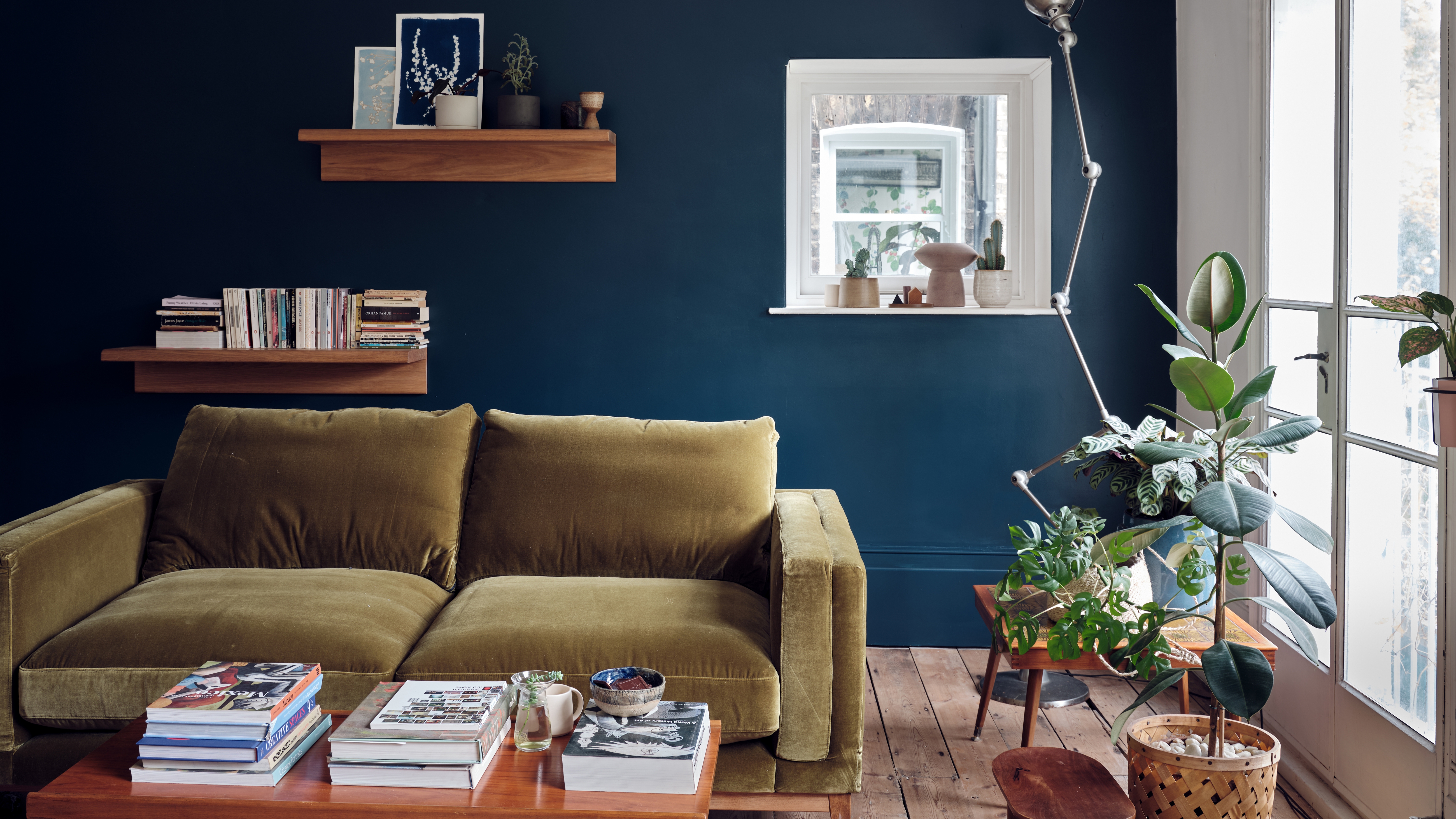
This comprehensive review delves into Farrow & Ball's 'Hague Blue' paint, a sophisticated, dark blackened blue-green, exploring its versatile application in various home settings. The color shifts in appearance, ranging from navy to ultramarine or deep teal, depending on lighting conditions. The article highlights its use in kitchens, mudrooms, living rooms, bathrooms, and offices, showcasing examples from renowned designers like Ben Pentreath, Jeannette Whitson, Miles Redd, Gil Schafer, Michael Maher, Robin Henry, Katie Lydon, Anna Booth, Sarah Ettleman, Jessica Davis, Anyeley Hallová, The Design Atelier, Elizabeth Reich, Bryan Young, Clary Bosbyshell, Christina Rottman, Nina Farmer, Honey Collins, Sarah Stacey, Michael Aiduss, Nicola Harding, Jaqui Seerman, Mariska Meijers, Ashley Whittaker, Patrick McGrath, and Studio Maddox. Notable projects include kitchen cabinets in an Arts & Crafts home, a library with a tented ceiling, a high-gloss butler's pantry in a Greek Revival manse, and modern kitchens in Eichler homes and Portland bungalows. The article also features mudrooms with custom cabinetry and William Morris wallpaper, living rooms with high ceilings and lacquered finishes, and powder rooms incorporating luxurious materials like burnished brass and quartzite. Offices and libraries are presented, demonstrating how Hague Blue creates a cocooning effect, as seen in Justin and Hailey Bieber's former Beverly Hills home and the Vital Voices headquarters.
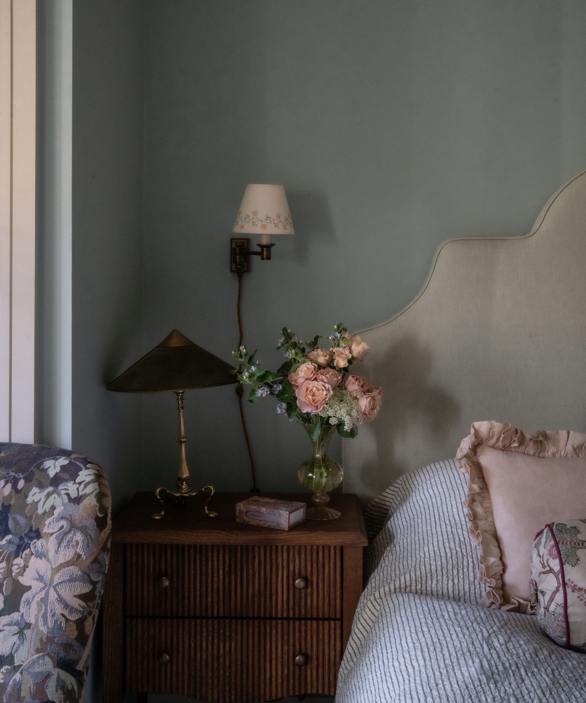
The discussion extends to the undertones of Hague Blue, emphasizing its chameleon-like quality that can appear cobalt, teal, deep navy, or bluish-black. It includes instances where the color takes on a bright Yves Klein blue or a blueberry hue, contrasting with examples where it leans distinctly teal. The importance of sampling paint colors with peel-and-stick samples is stressed due to the color's variability under different lighting and with surrounding finishes. The article provides extensive recommendations for coordinating colors, categorizing them into cooler and warmer palettes, and offering specific schemes for different rooms such as kitchens, bathrooms, entryways, bedrooms, dining rooms, offices, and laundry rooms. It also suggests alternative paint brands and colors that can complement Hague Blue.
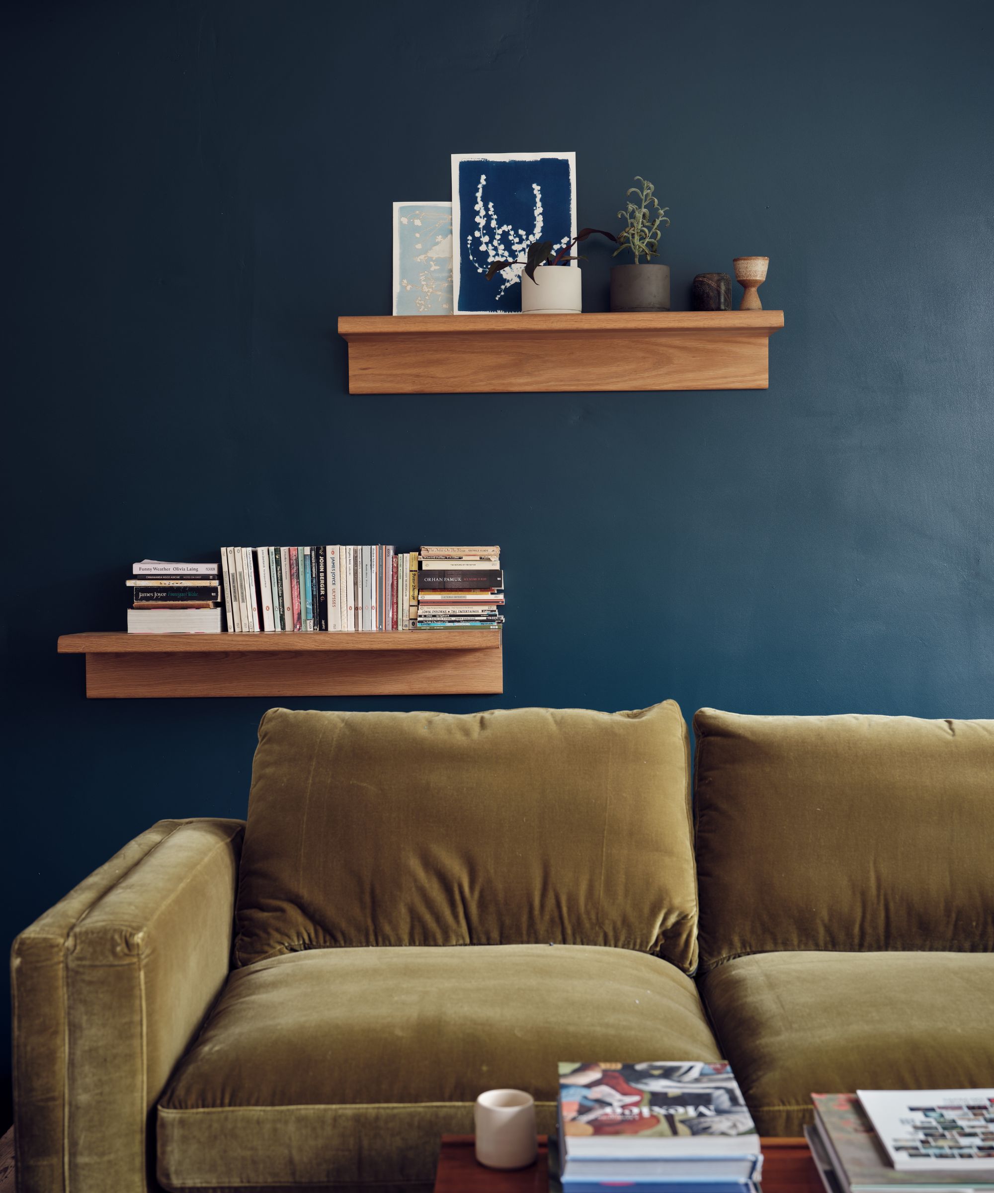
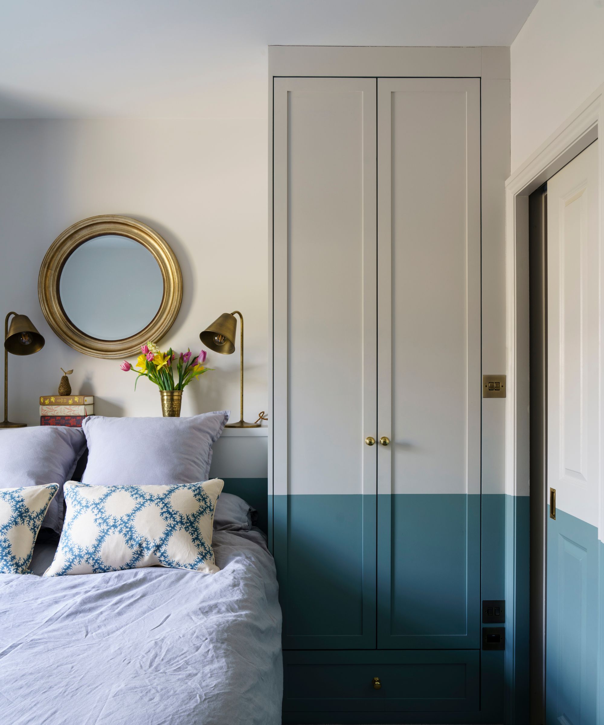
The review further examines how to integrate Hague Blue with other finishes. It recommends balancing its intensity with light finishes like white walls, creamy countertops, and pale flooring, exemplified by a bedroom with Soane drapery and an Ontario farmhouse kitchen with Lincoln Calacatta marble and unlacquered brass. The use of reflective surfaces, such as mirrors, to brighten rooms painted in Hague Blue is also mentioned. Conversely, the article explores pairing Hague Blue with dark finishes like soapstone countertops, oil-rubbed bronze hardware, and dark-stained wood floors to create a moody, dramatic atmosphere, as showcased in a butler’s pantry and a media room. The integration of Hague Blue with existing dark wood paneling in an English country home is also highlighted.
A technical aspect of paint, Light Reflectance Value (LRV), is explained, defining it as the percentage of light a paint color reflects. Hague Blue's LRV of 7 indicates it is a very dark color, absorbing over 90% of light. The impact of sheen on dark colors is discussed, noting that satin and gloss finishes enhance depth. Examples illustrate how Hague Blue appears saturated in natural light and almost black in dimly lit spaces. Comparisons are drawn between Hague Blue and other Farrow & Ball blues like Inchyra Blue, Stiffkey Blue, and Railings, advising on alternatives for those seeking lighter or darker options. Finally, the article addresses 'dupes' and color matching for Hague Blue, acknowledging the complexity of Farrow & Ball's 12-pigment formulation versus standard brands. It concludes by recommending selecting close alternatives from brands like Sherwin-Williams (Dark Night, Gale Force, Sea Serpent, Seaworthy), Benjamin Moore (Gentleman’s Gray, Washington Blue, Twilight), Behr (Undersea), and PPG (Soothing Sapphire), rather than attempting imperfect color matches, and reiterates the critical step of sampling colors before commitment.
#FarrowAndBall #HagueBlue #InteriorDesign #PaintColors #HomeDecoration #ColorSchemes #PaintDupes #LRV #KitchenDesign #FarrowAndBall #HagueBlue #InteriorDesign #PaintColors #HomeDecoration #ColorSchemes #PaintDupes #LRV #KitchenDesign
合計0件のコメント
 まだコメントはありません
あなたも好きかもしれません
Farrow & Ball's 'Hague Blue' is a Bold Navy That Acts Like a Neutral — Here's How Designers Use It

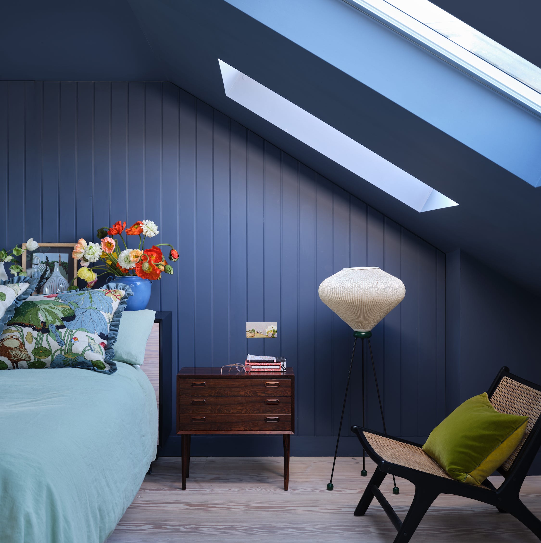
First look! Farrow & Ball has just released 11 new colours
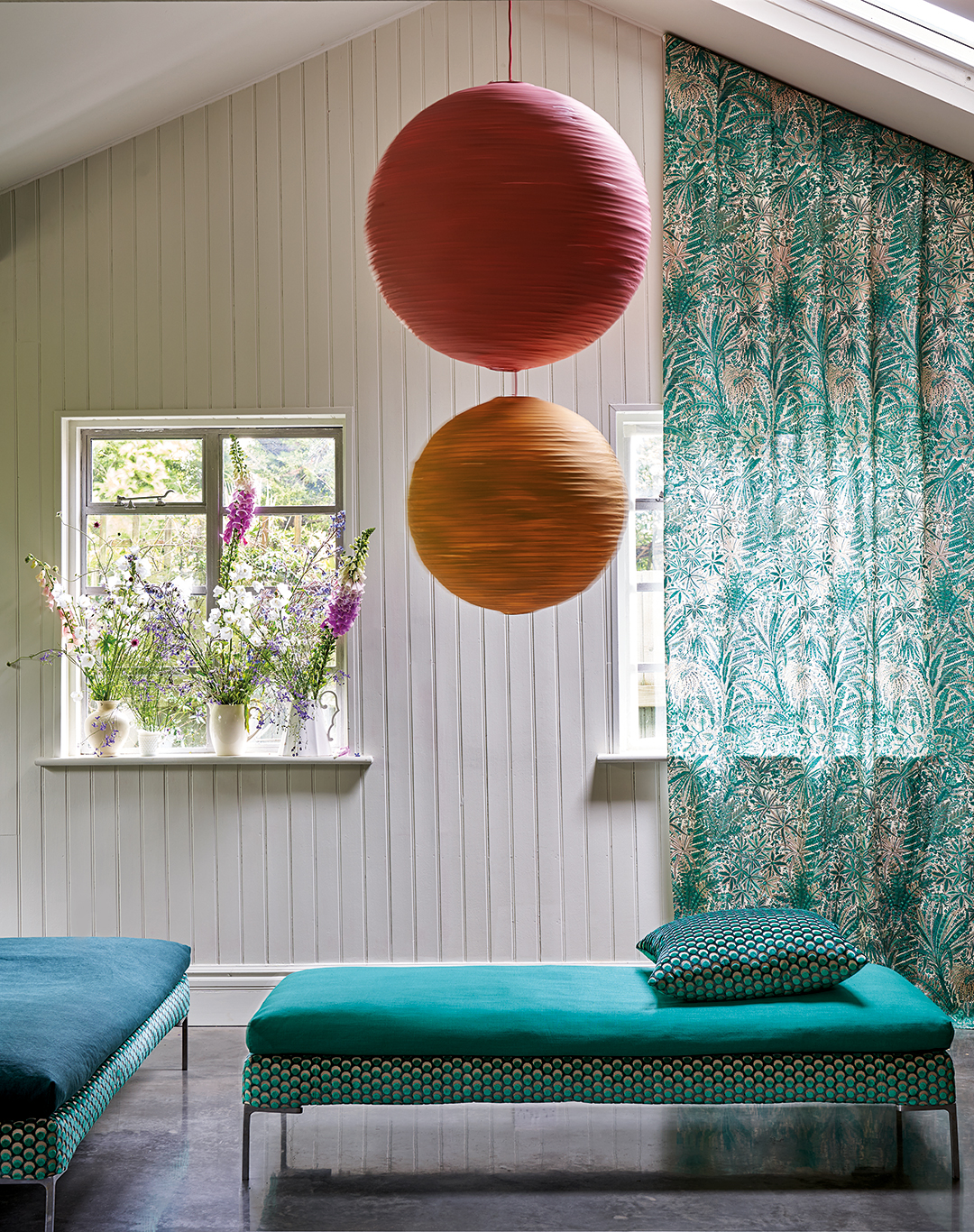
Farrow & Ball and Liberty Just Made Matching a Paint Color to Your Sofa Infinitely Easier


DUPES for Farrow & Ball Scallop, Kakelugn, Marmelo, Naperon, Duster, Sizing, and more
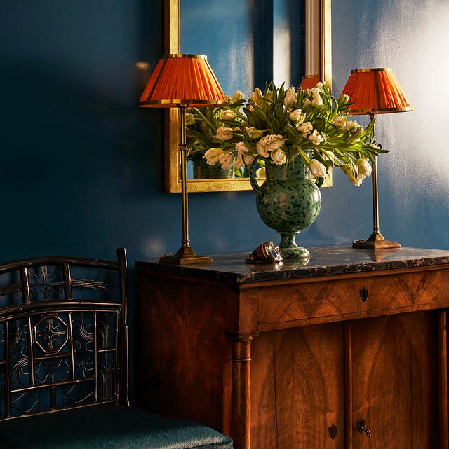
Why Designers Love This Shade of Blue Paint for Just About Any Room In the House

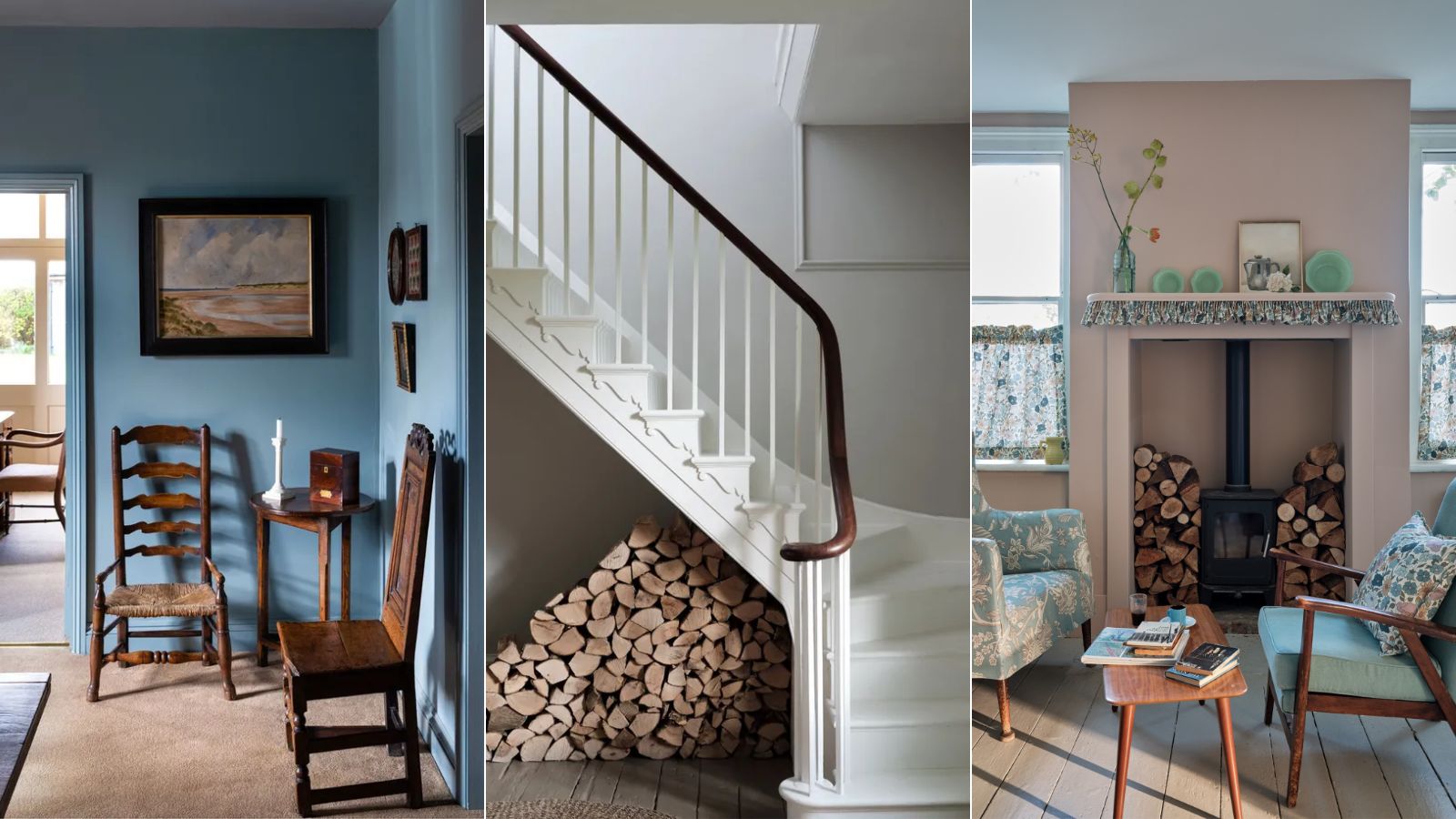
Interior designers' favorite Farrow & Ball paint colors

Shea On Farrow & Ball's New Paint Colors
15 Farrow & Ball paint colors in real homes – from calming blues to warm neutrals
Farrow & Ball's new colors have just launched – we ask designers how to use this calm, yet colorful palette

Farrow & Ball Green Smoke: Dupes, matches, coordinating colors, and Sarah’s full review
Kelly Wearstler Shares How to Create a Color Palette for Your Home

25 Dreamiest Blue-Gray Paint Colors for Any Room in the House
Farrow & Ball Purbeck Stone: DUPES, coordinating colors & Sarah’s full review
The Woman Behind Farrow & Ball’s Most Iconic Colors Has a New Favorite for 2025
I Covered My Apartment With 20 Dusty Blue Paint Swatches—Here’s Where I Landed

What a Paint Color Expert Would Pair With Light Blue Walls
These are Farrow & Ball's current 'most loved' paints – and how to decorate with them throughout the home
These 10 Farrow & Ball colors are their most popular paints – from earthy neutrals to deep and dark shades

What's Your Fancy: Farrow & Ball's Color Guru Takes on Entertaining
The 10 Best Farrow & Ball Paint Colors of All Time