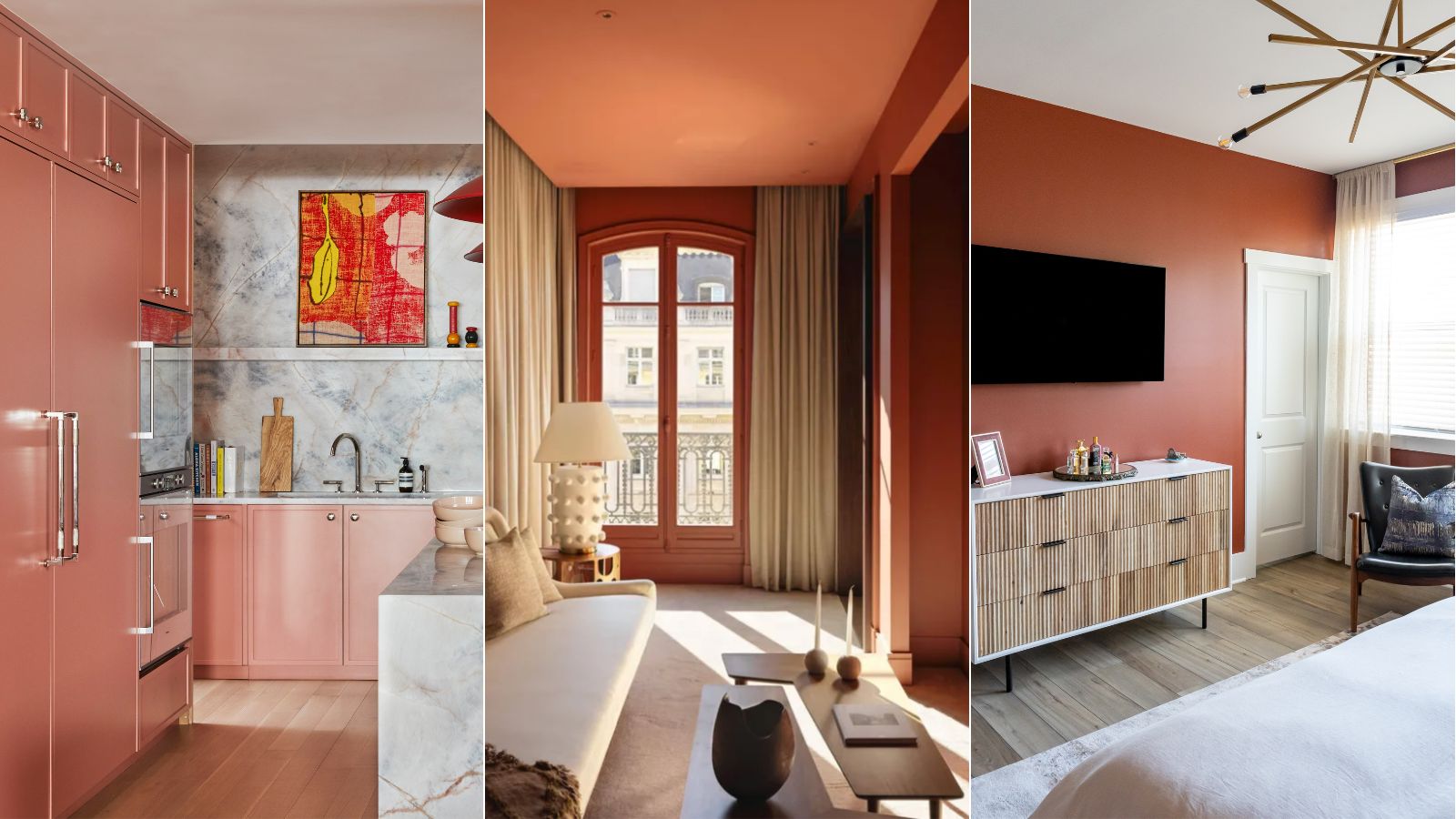
1/10
6 best terracotta paints that are interior designers' go-tos for creating an earthy and warm scheme
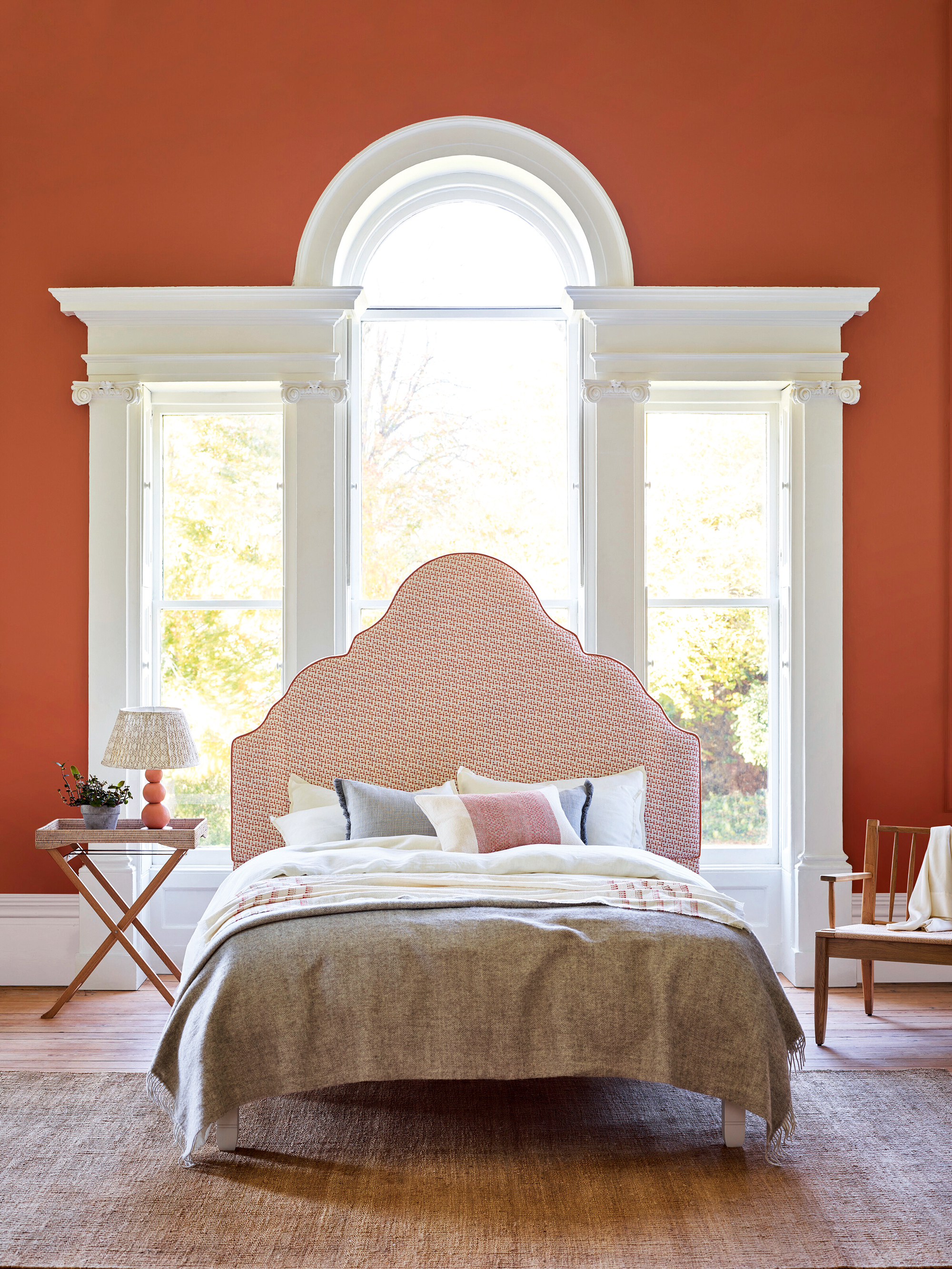
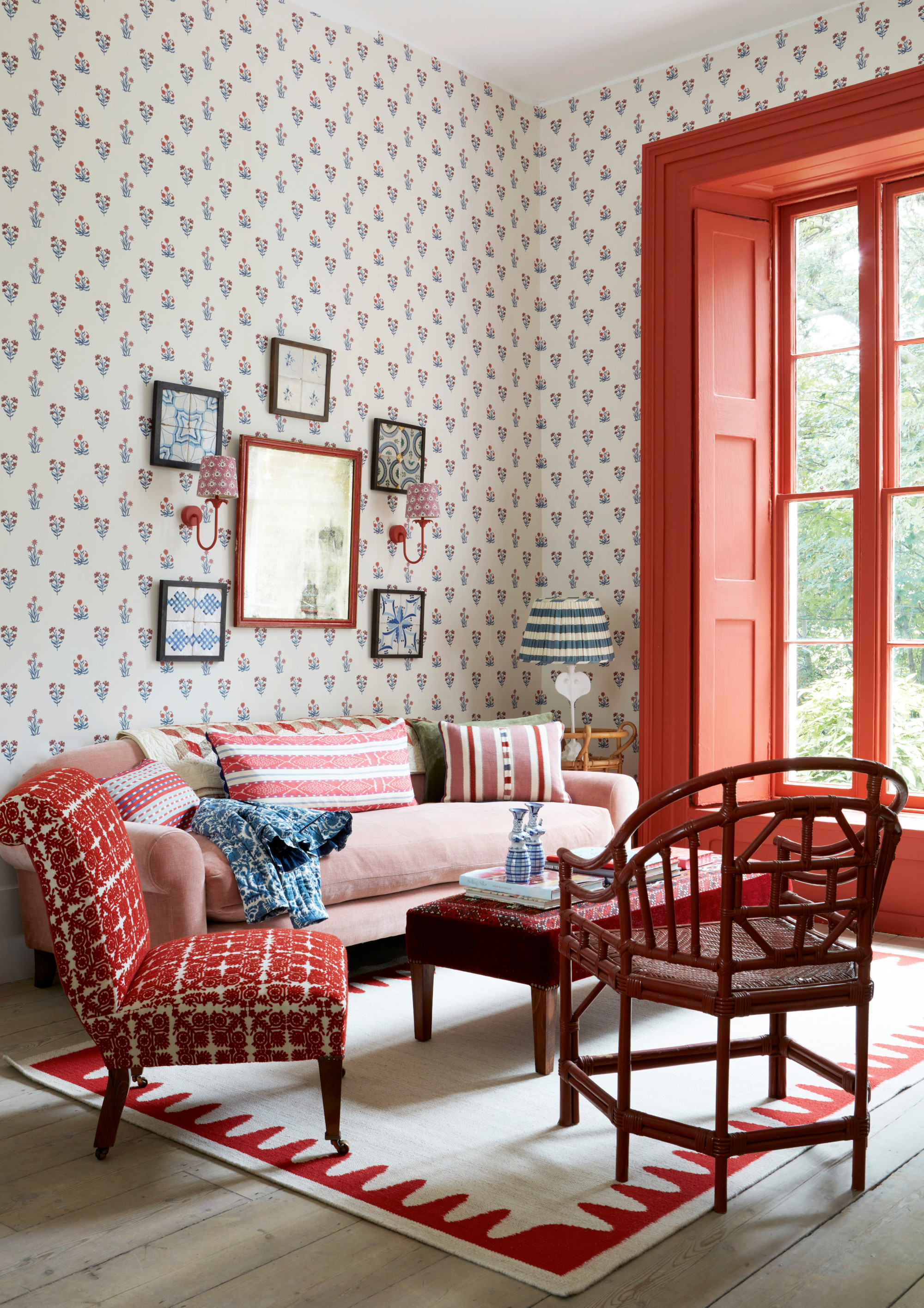
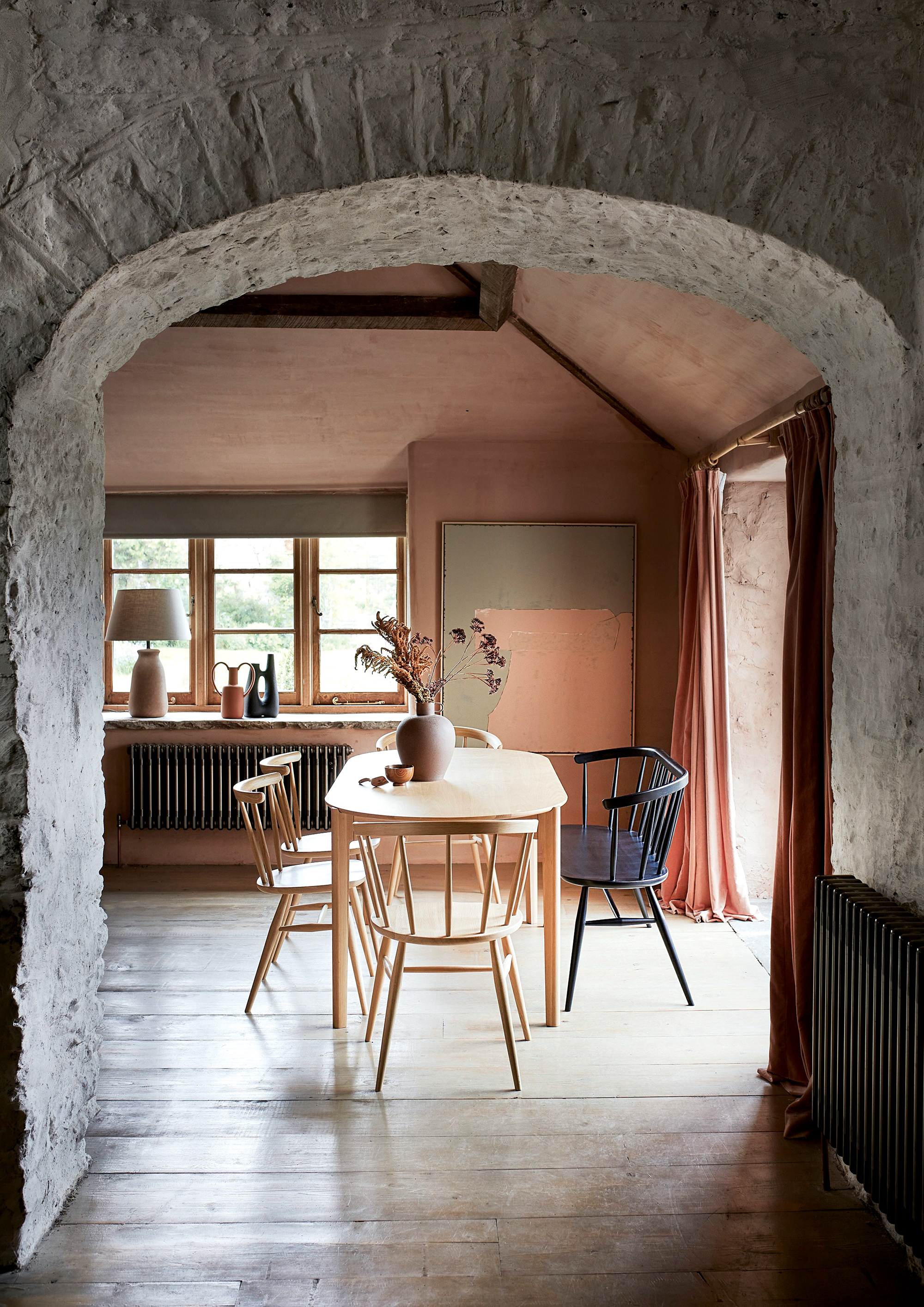
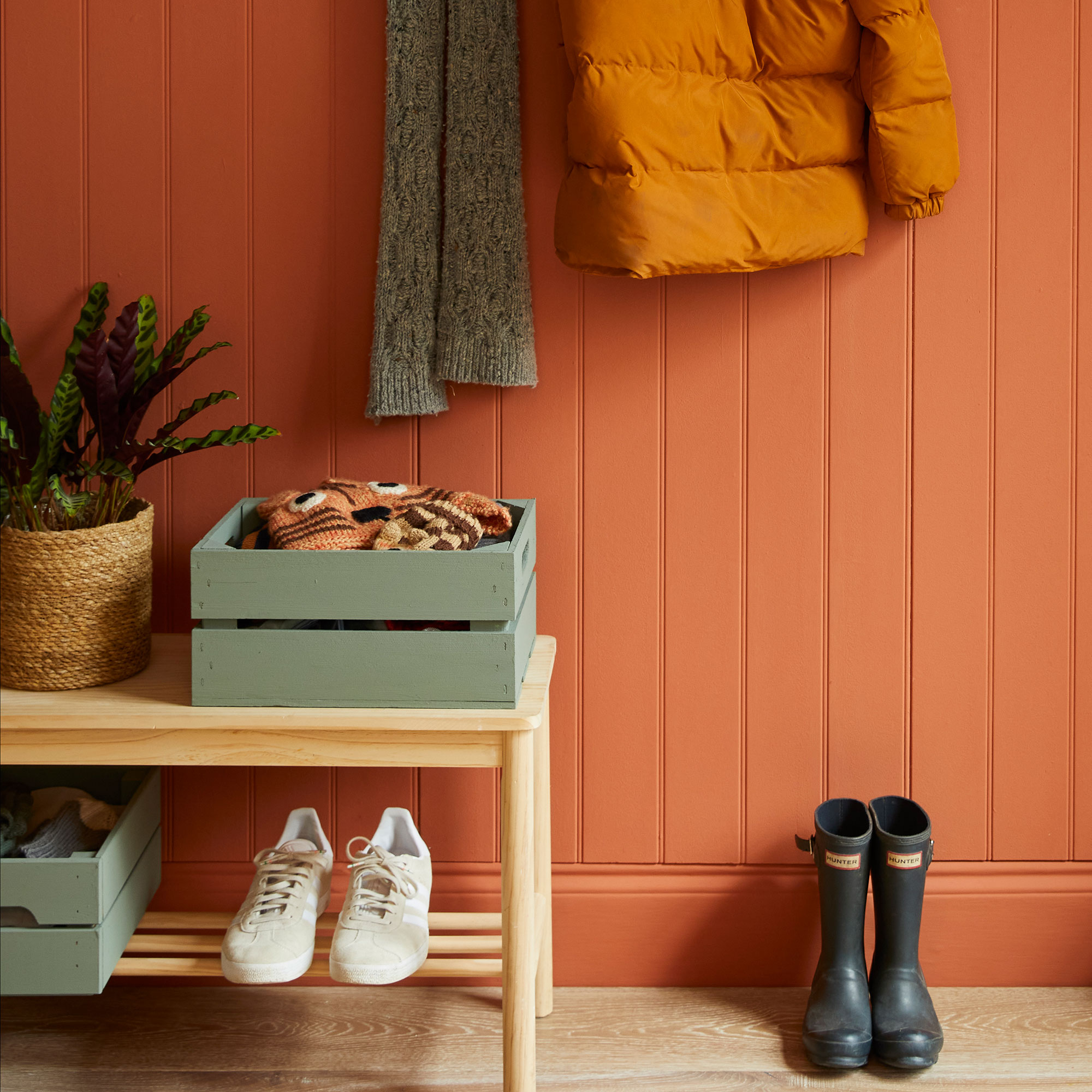
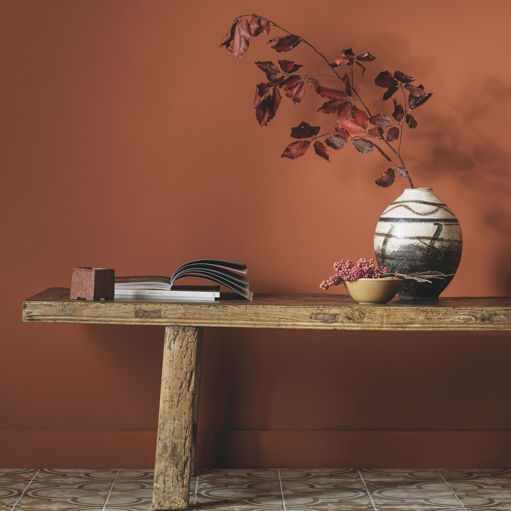
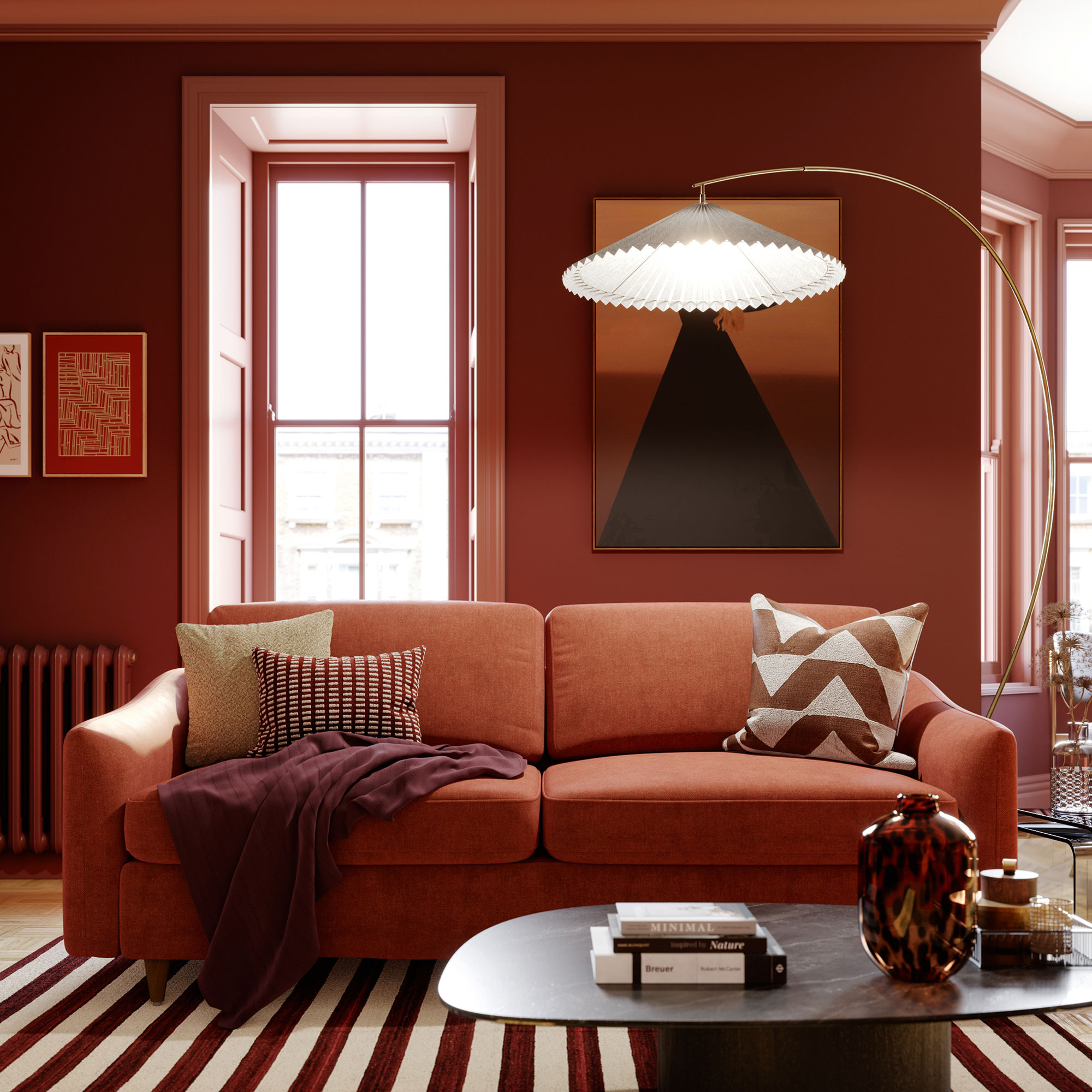
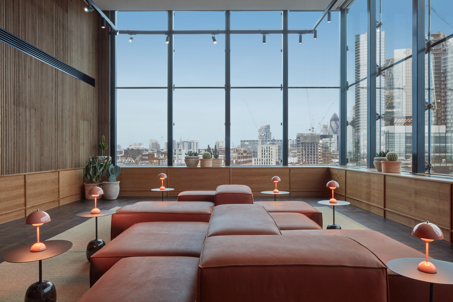
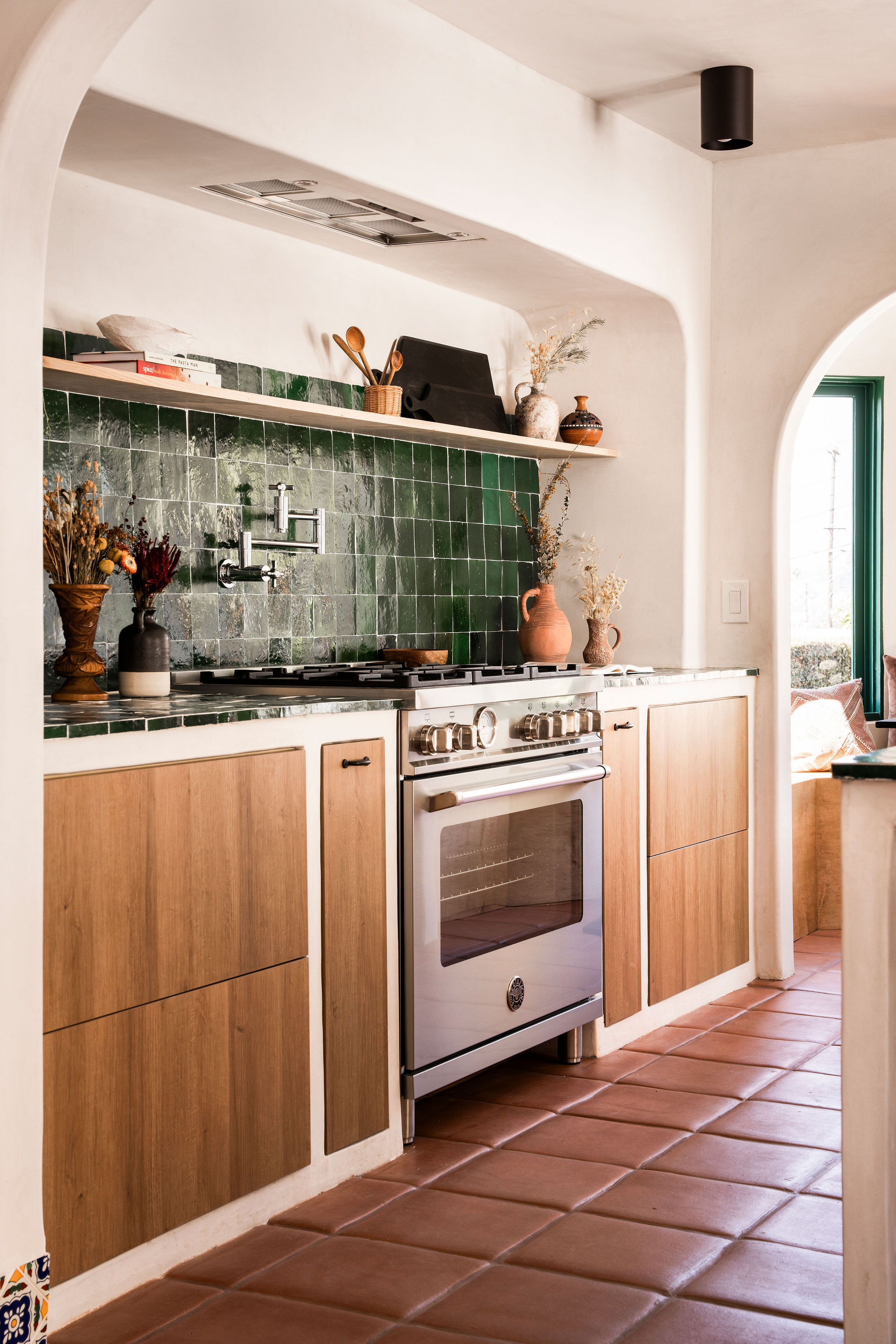
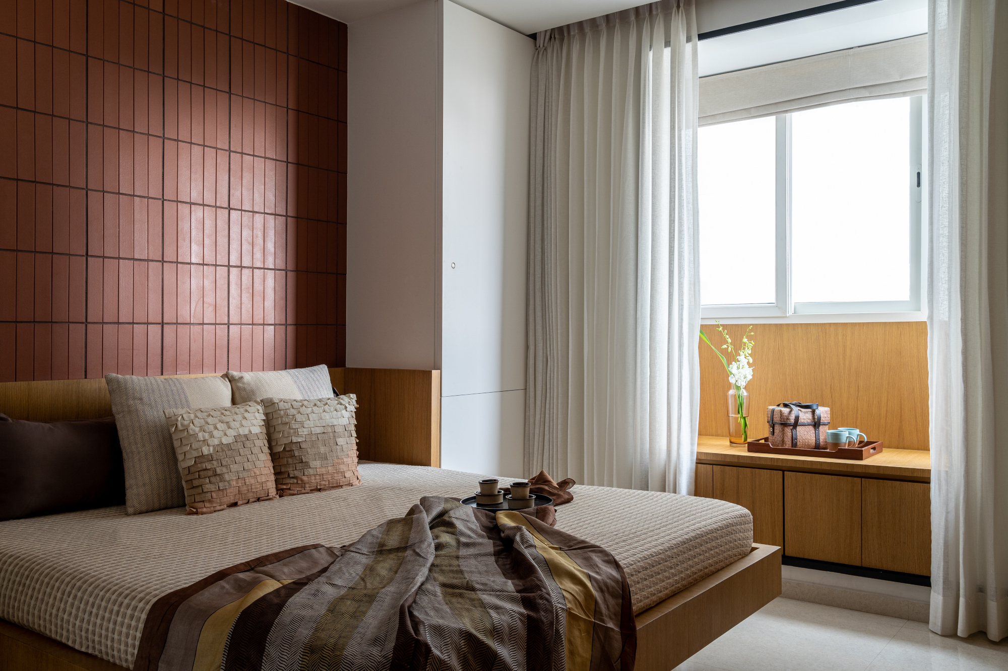
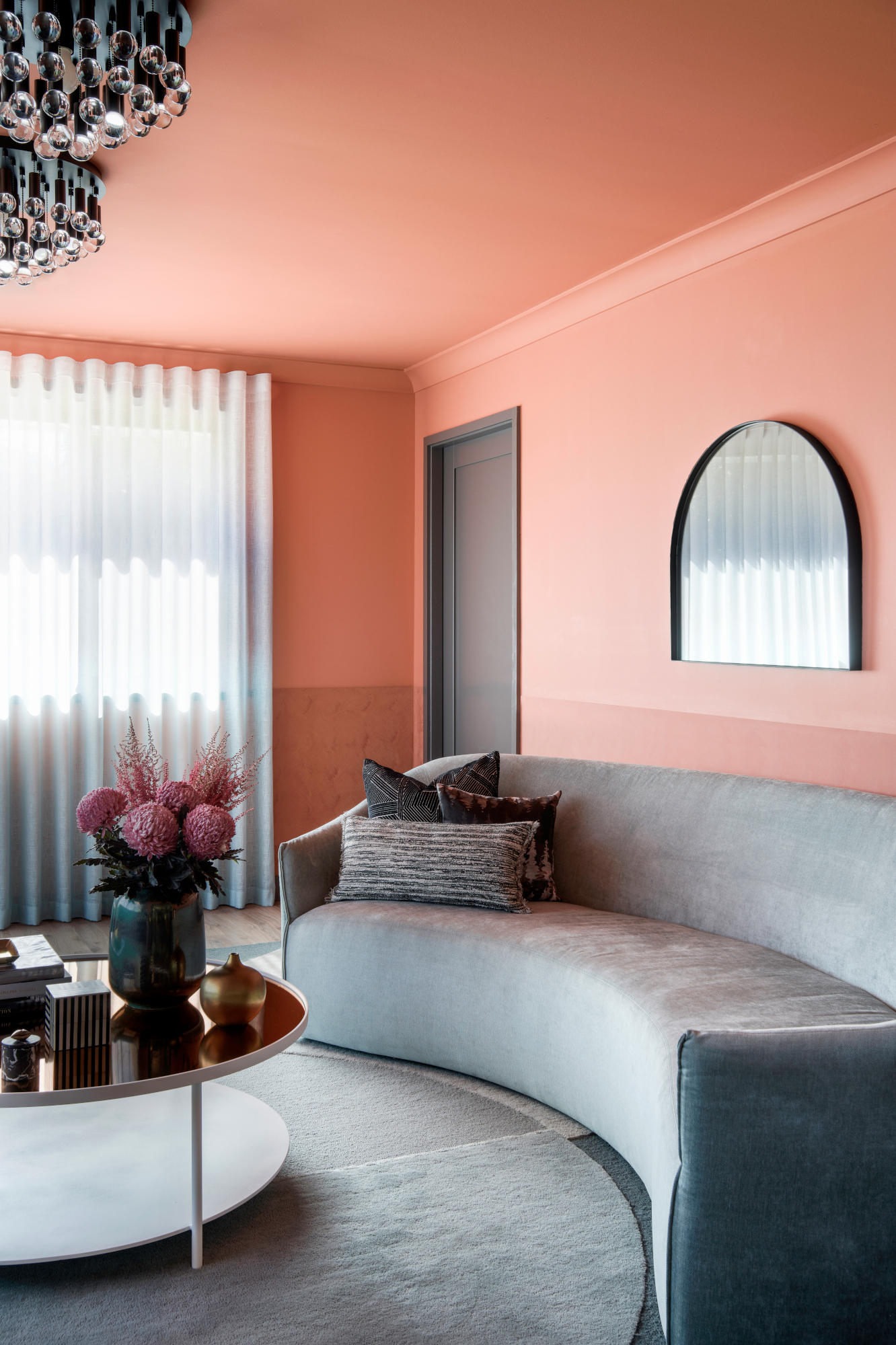
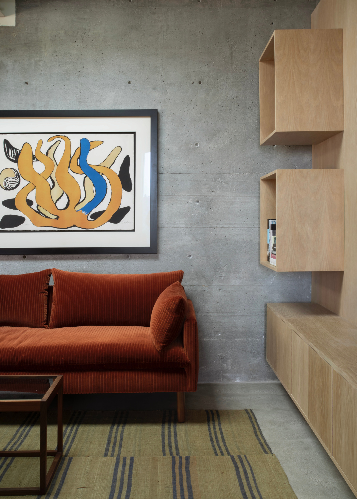
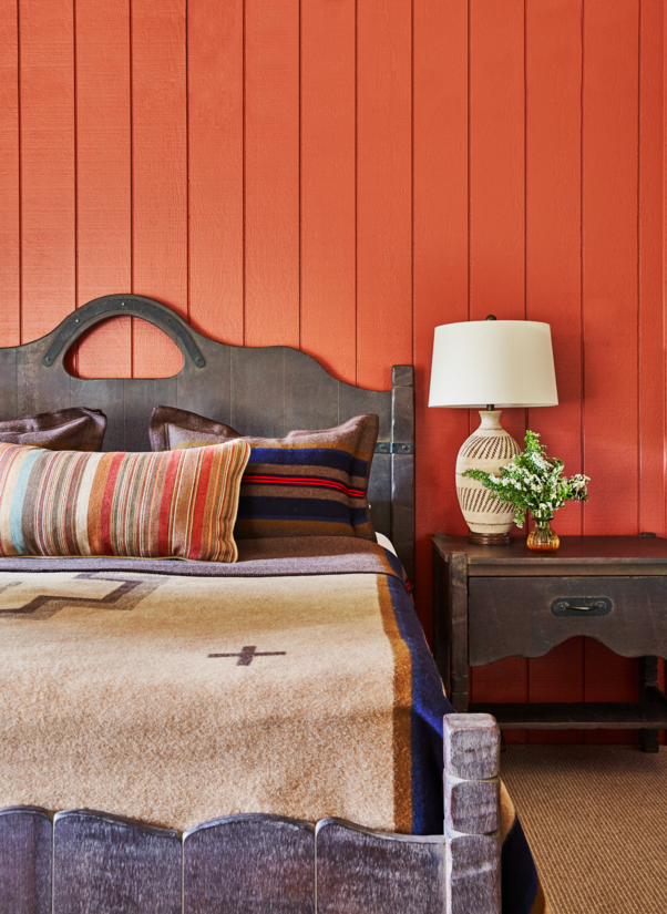
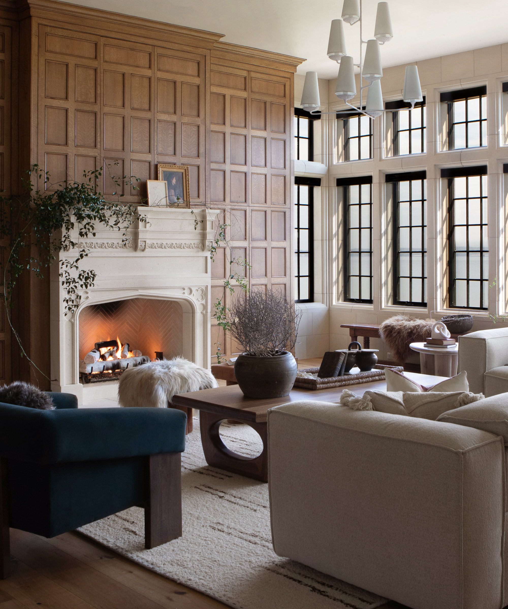
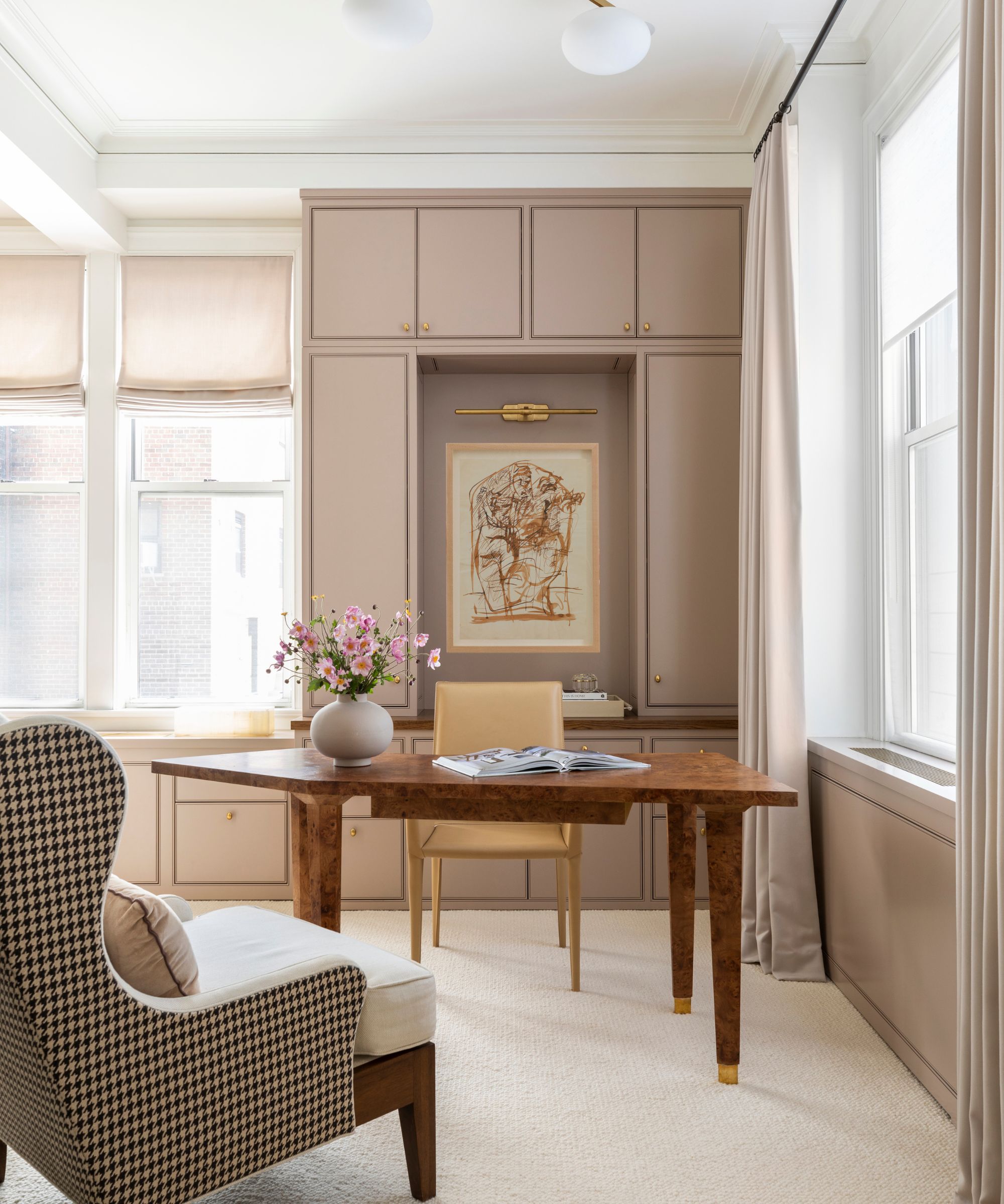
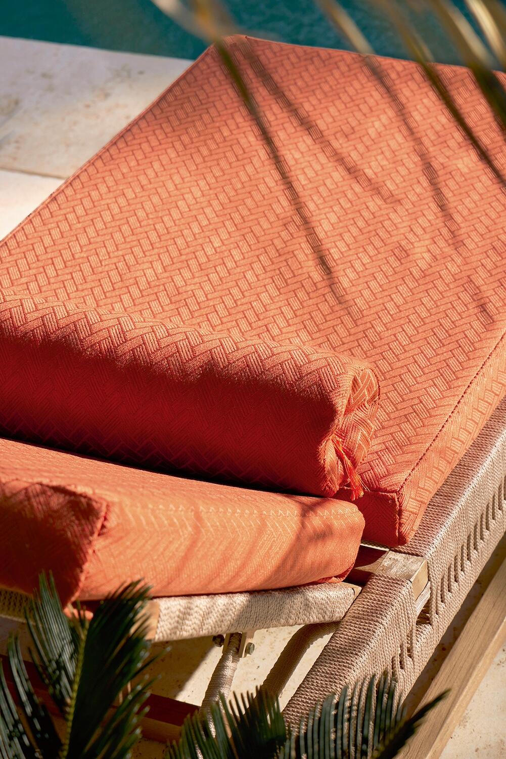
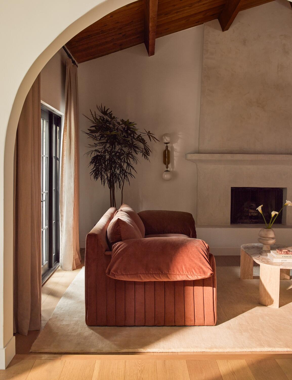
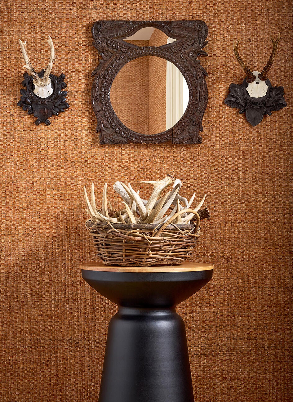
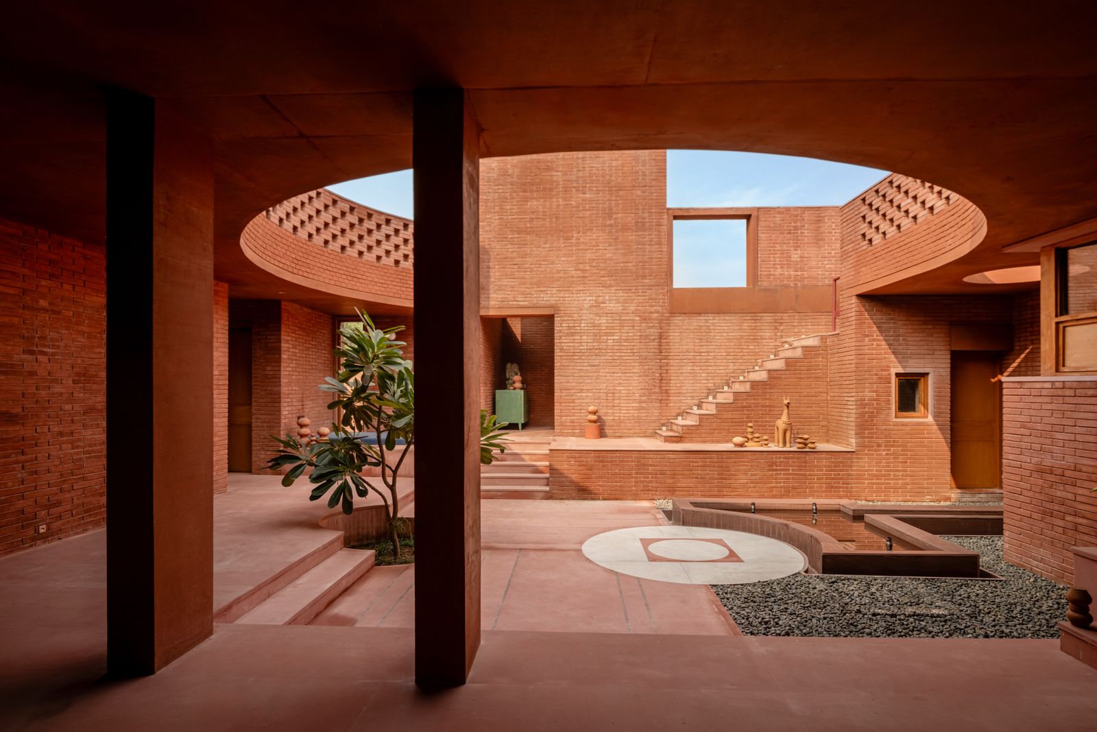
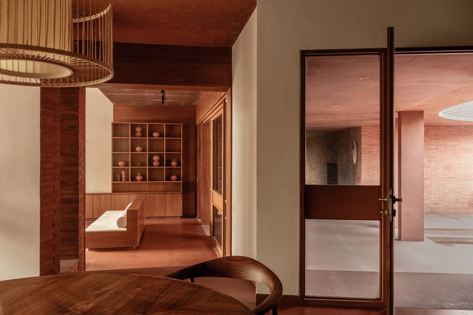
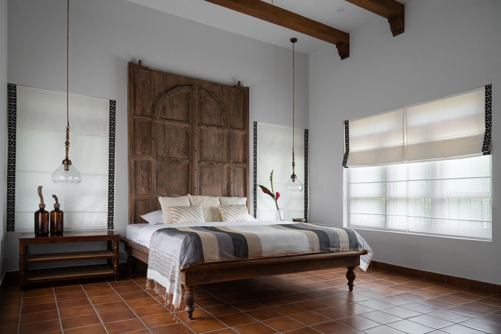
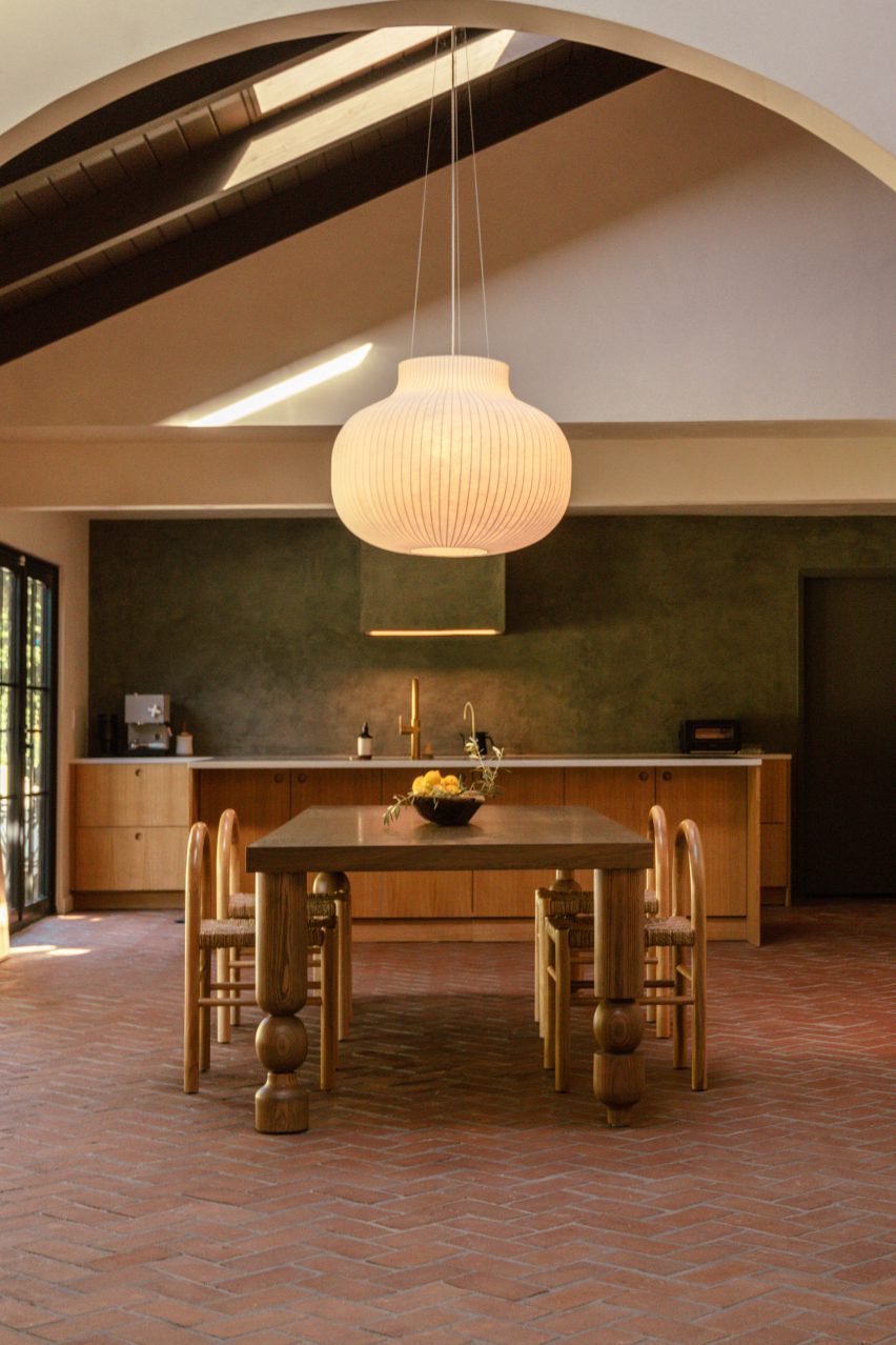
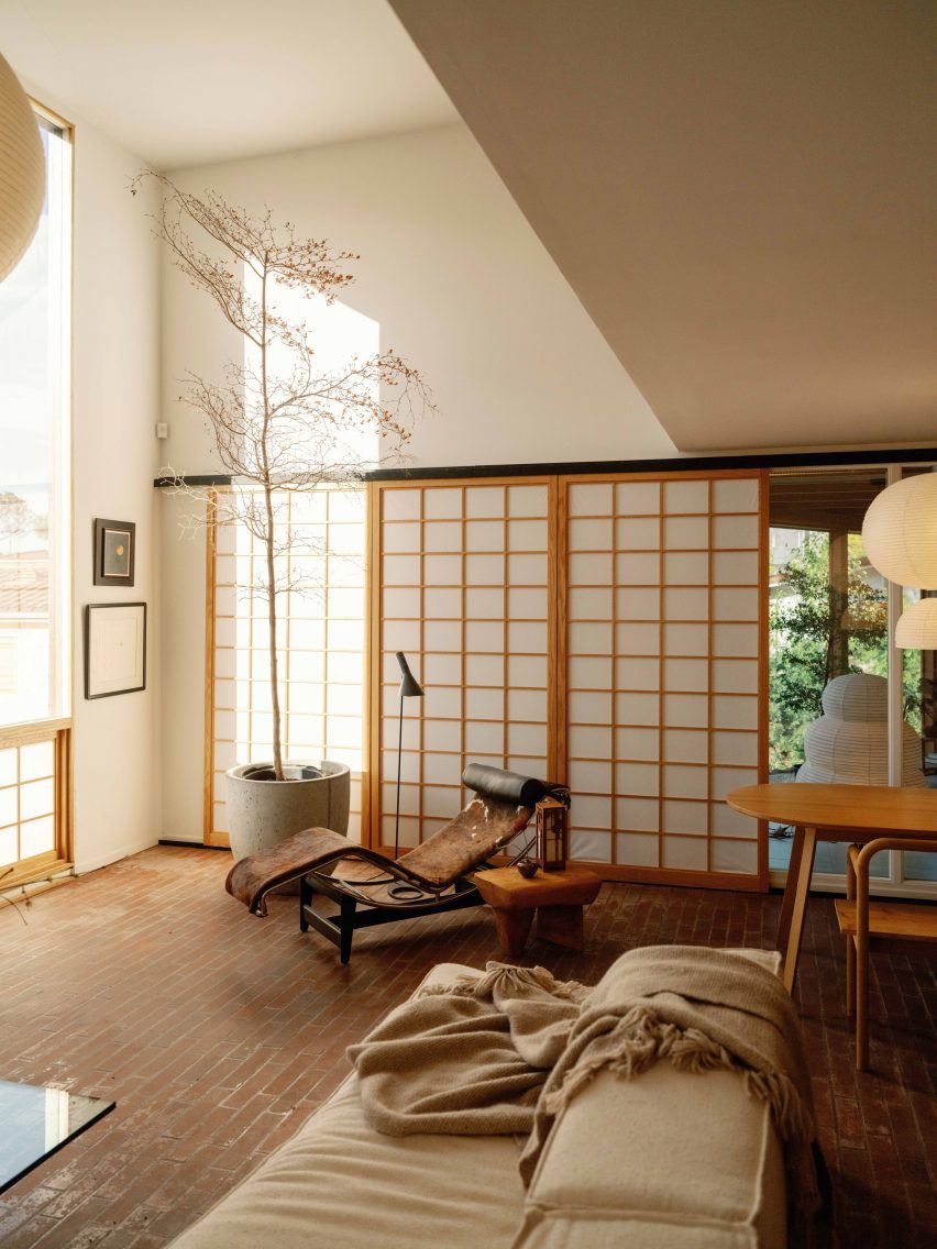
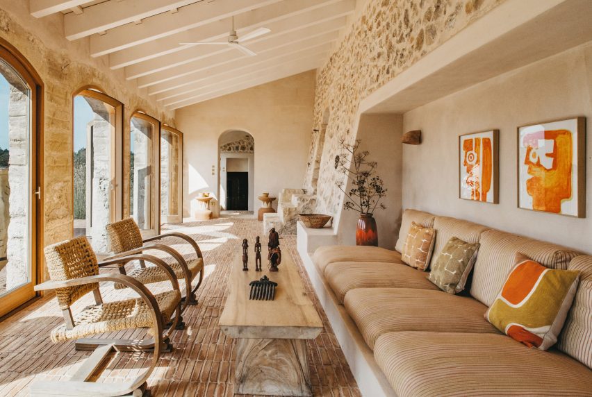
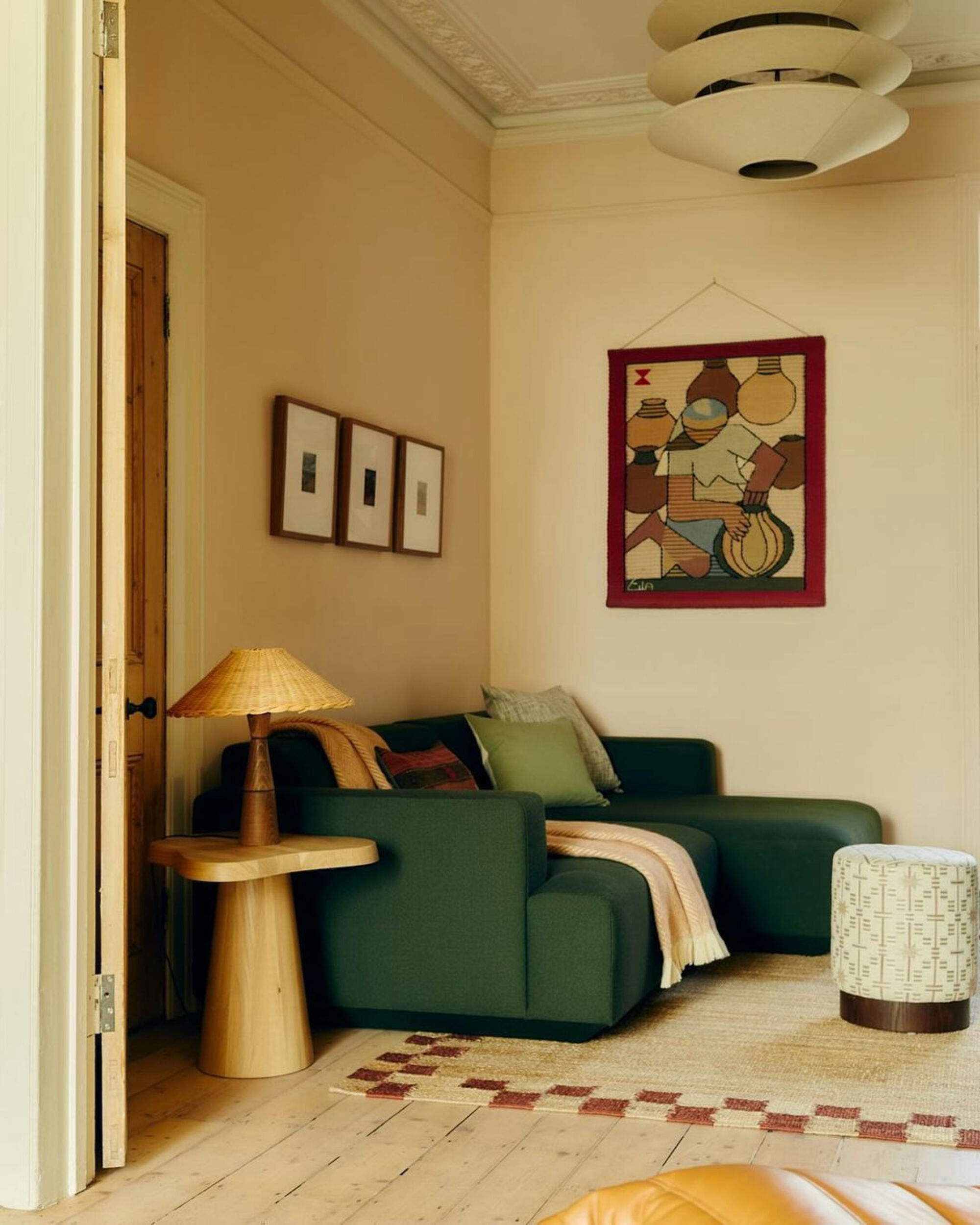
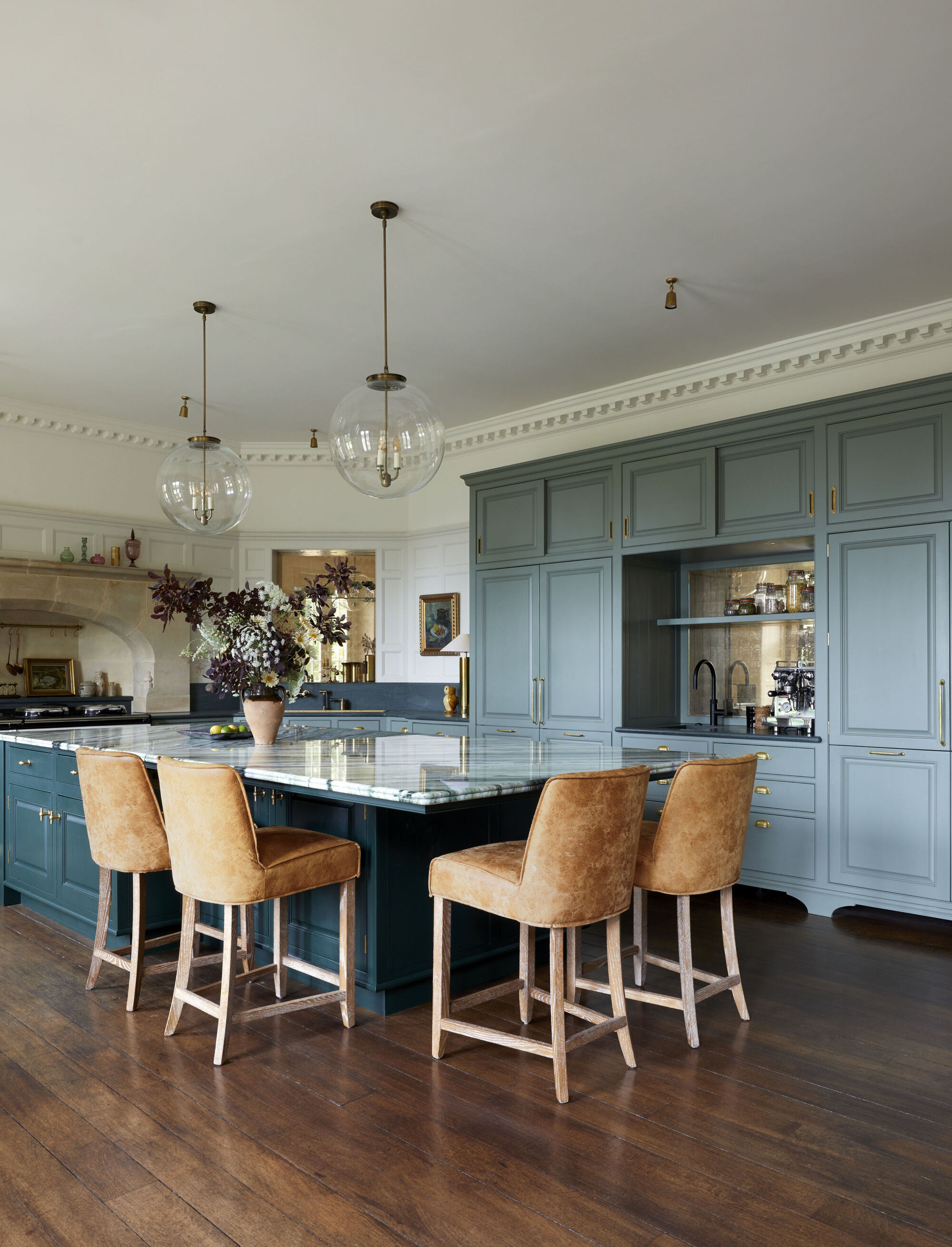
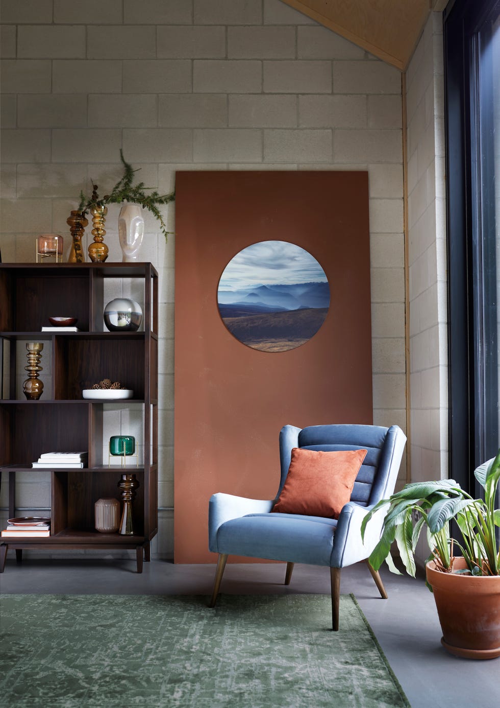
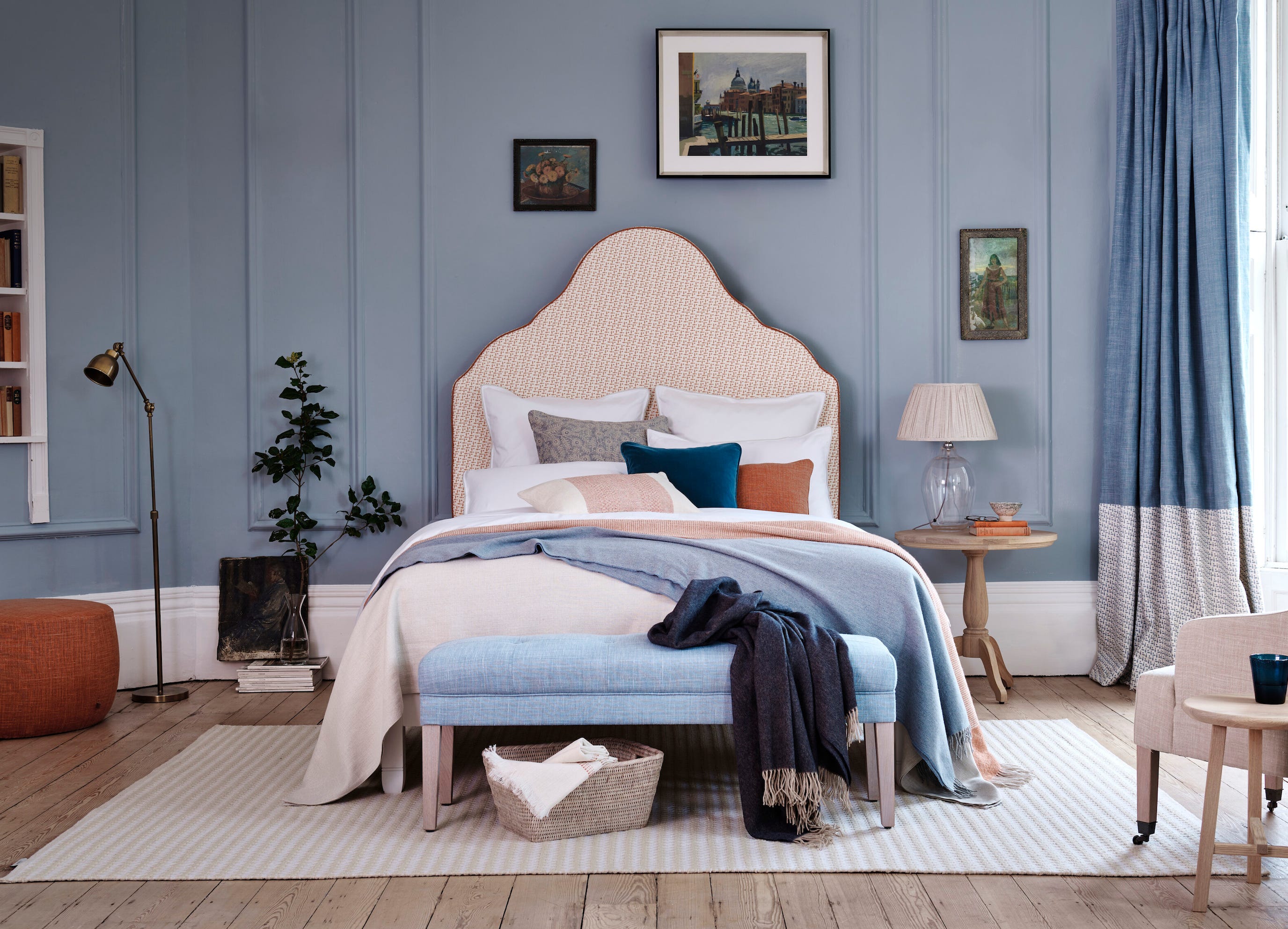
The article explores the rising popularity of terracotta paints in interior design, highlighting its versatility and ability to create warm, earthy aesthetics. Interior designers Nicole Cullum and Tyson Ness offer insights into what makes terracotta a standout color trend. Nicole Cullum, founder of Color Caravan, describes terracotta as a blend of red and orange that forms a deep, ruddy brown, emphasizing her preference for deeper shades that provide a more grounded feel in interiors. Tyson Ness, founder of Studio Ness, notes that terracotta tones introduce warmth and balance, complementing a wide range of color palettes and interior design styles.
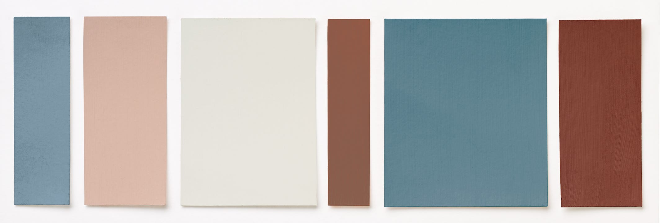
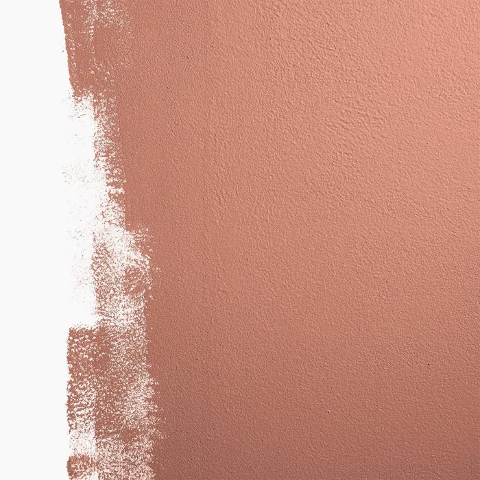
Key recommendations for incorporating terracotta include balancing strong terracotta shades with light, warm white paints that do not lean too heavily into yellow, pink, or gray tones. The article then presents six specific terracotta paint recommendations from interior designers and color experts. Benjamin Moore's 'Byzantine' is suggested for its traditional warm terracotta hue with rustic brown undertones, ideal for pairing with soft neutrals and organic modern styles. Another Benjamin Moore option, 'Persimmon,' is recommended for those seeking a feminine touch, as it features lovely rose-colored undertones and can be complemented with blush or taupe upholstery and rose gold accents.
Farrow & Ball's 'Red Earth' is highlighted as a classic terracotta shade that works well in smaller rooms and is suitable for individuals who prefer more muted colors. For a darker, rustic interpretation, Behr's 'Kalahari Sunset' is presented, with Erika Woelfel, VP of color and creative services at Behr, suggesting pairings with muted greens like 'Park Bench' or neutrals such as 'Even Better Beige.' Glidden's 'Georgian Leather' is a saturated, earthy hue recommended by color expert Ashley McCollum for gathering spaces like living rooms, which can be balanced with muted teals and neutral elements.
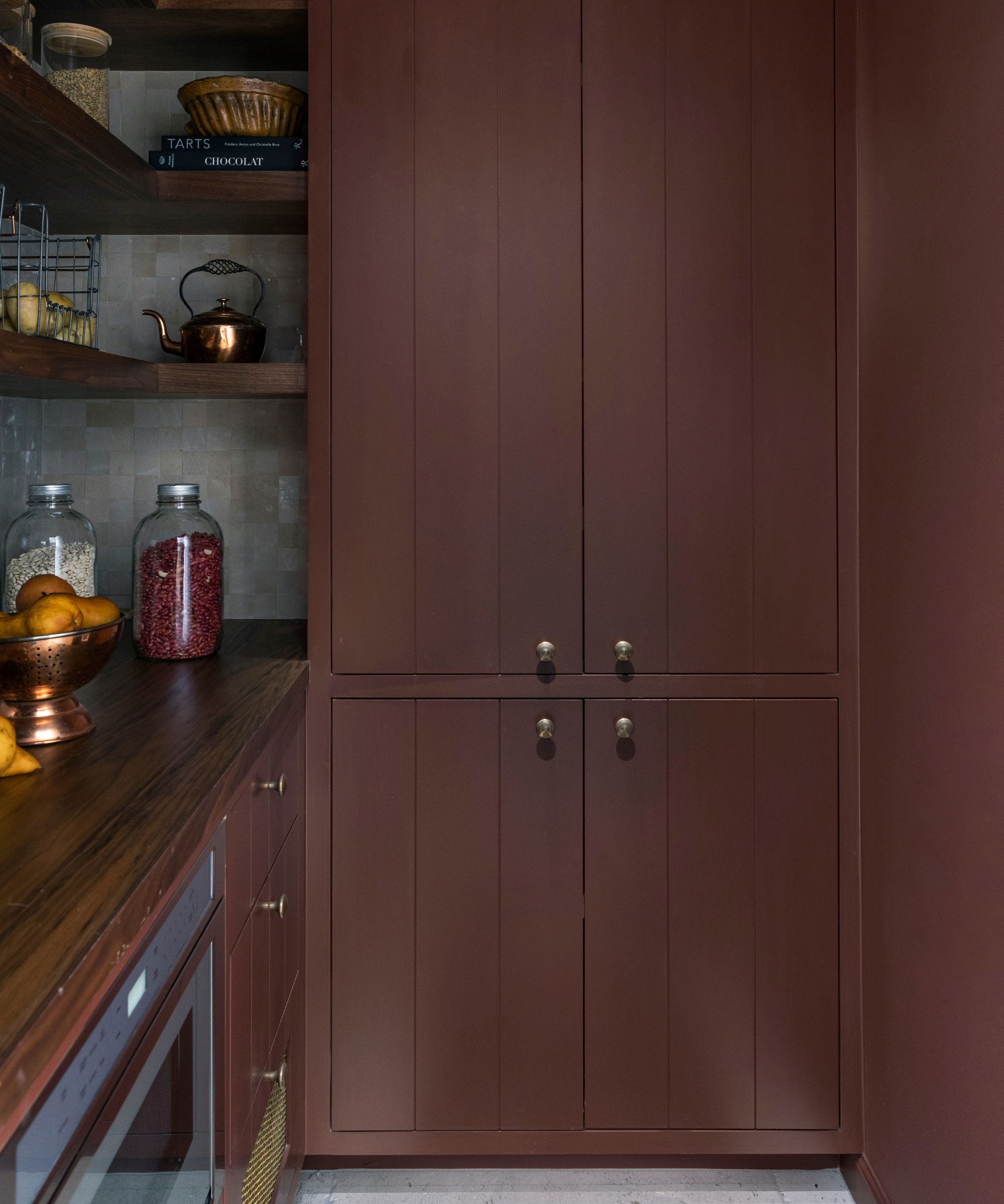
Finally, Sherwin-Williams' 'Fired Brick' is a favorite of Nicole Cullum, noted for its beautiful mix of brown and red with a hint of orange, creating a bold, earthy, and fiery feel. This shade is particularly suited for cabinetry when contrasted with linen white wall colors like Sherwin-Williams' 'Downy' or Benjamin Moore's 'Navajo White.' The article concludes by reiterating that terracotta's enduring appeal in 2024 stems from its ability to introduce warmth and its wide range of variations, allowing homeowners to adapt the trend to their individual decor styles.
#TerracottaPaint #InteriorDesign #ColorTrends #WarmColors #HomeDecor #PaintIdeas #ColorPalette #TerracottaPaint #InteriorDesign #ColorTrends #WarmColors #HomeDecor #PaintIdeas #ColorPalette
合計0件のコメント
 まだコメントはありません
あなたも好きかもしれません
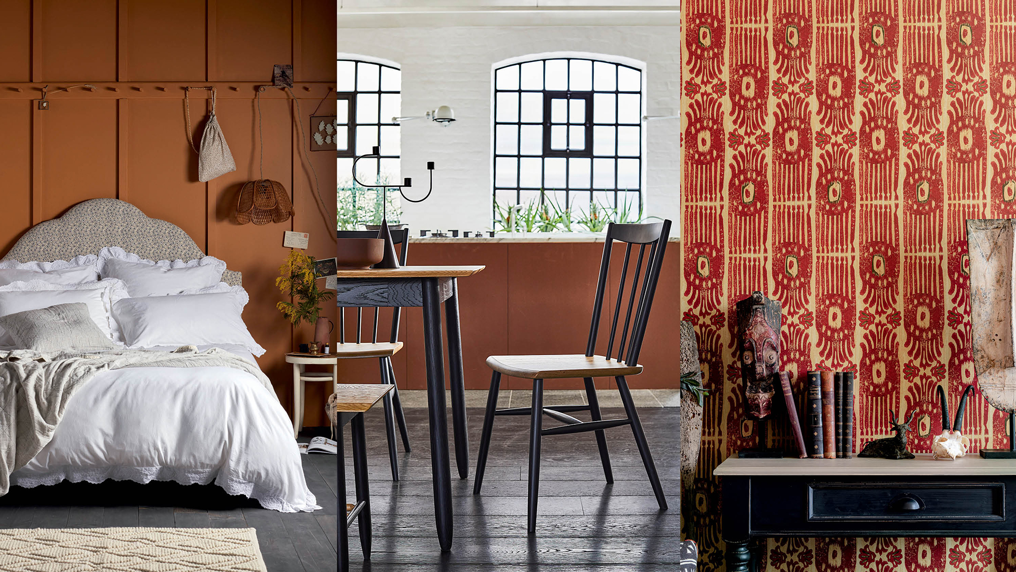
Terracotta decor – 10 ideas for using this warm, earthy shade
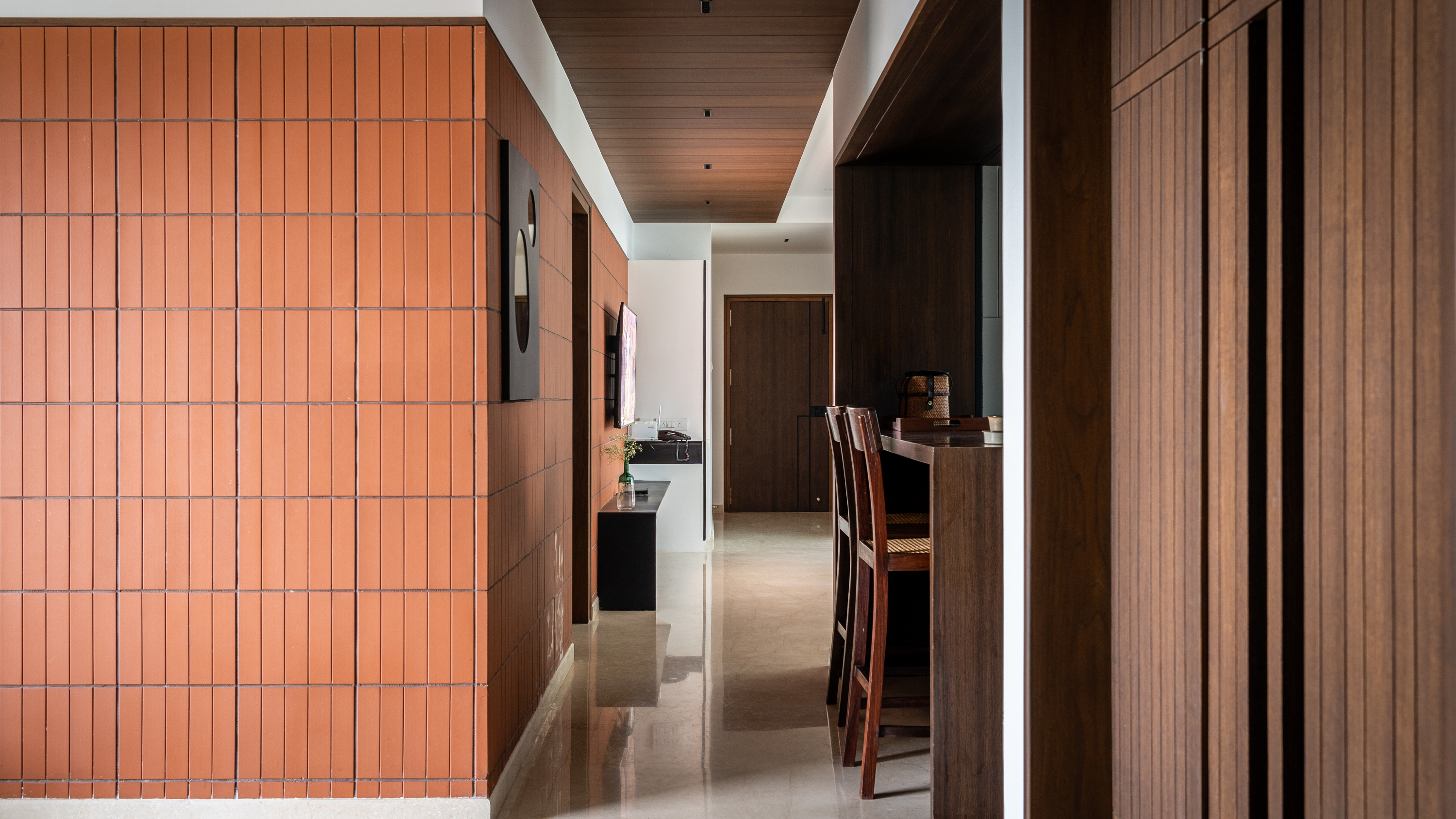
10 reasons you should be decorating with terracotta right now – and they're all incredible rooms that use this color

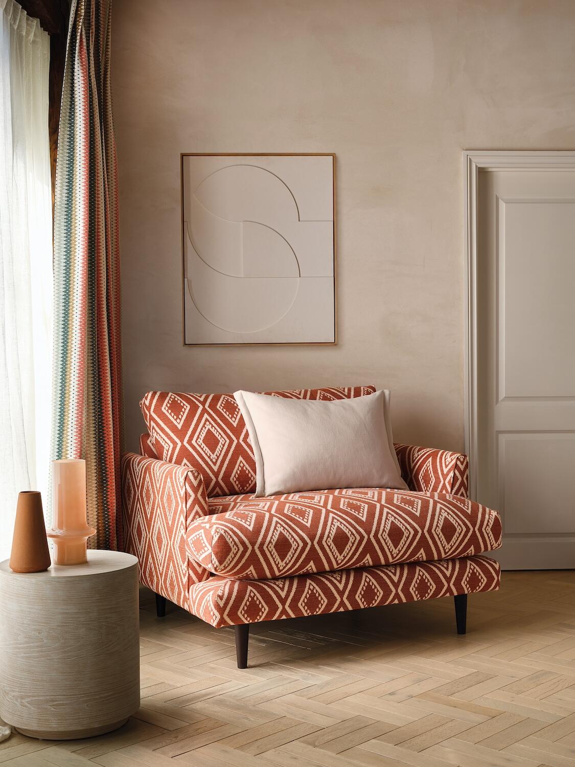
9 terra cotta colored finds for an earthy pop of color


Jeremiah Brent Reveals The Perfect Color Inspo For A Beautiful Accent Wall
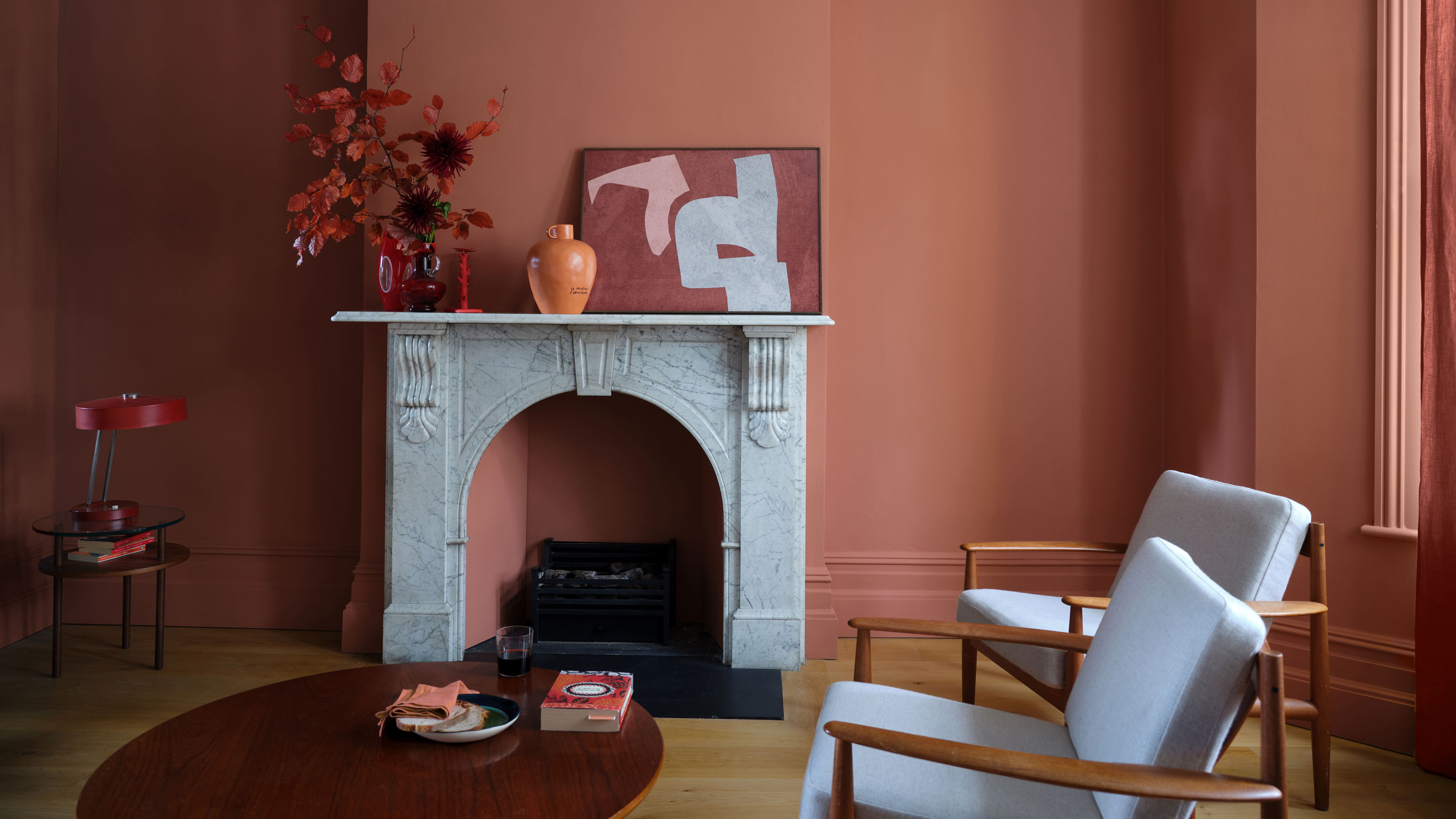
How to decorate with terracotta - 4 ways to use this earthy colour for a luxurious-looking room
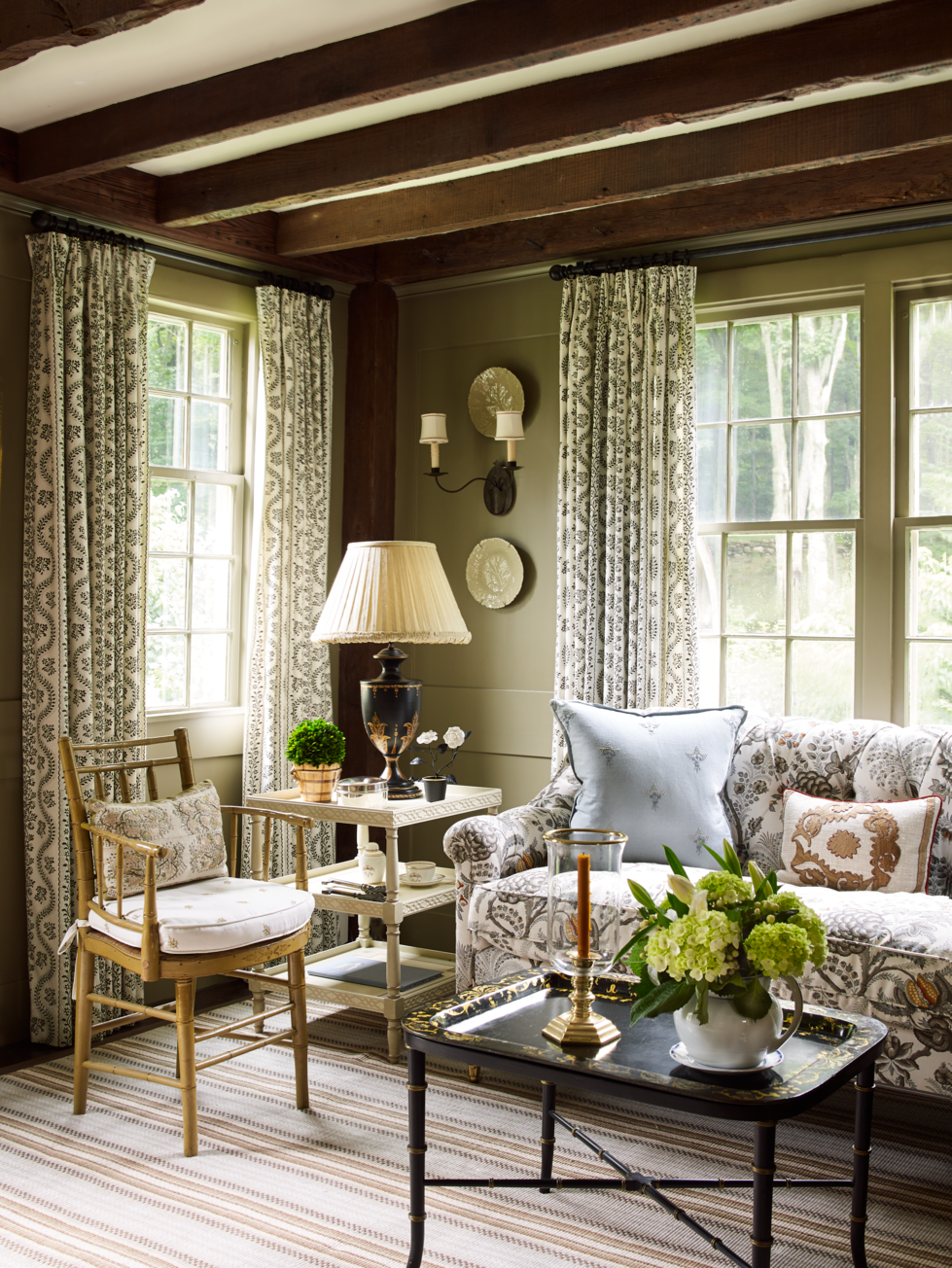
Warm Up Any Room with These 11 Best Earth Tone Paint Colors
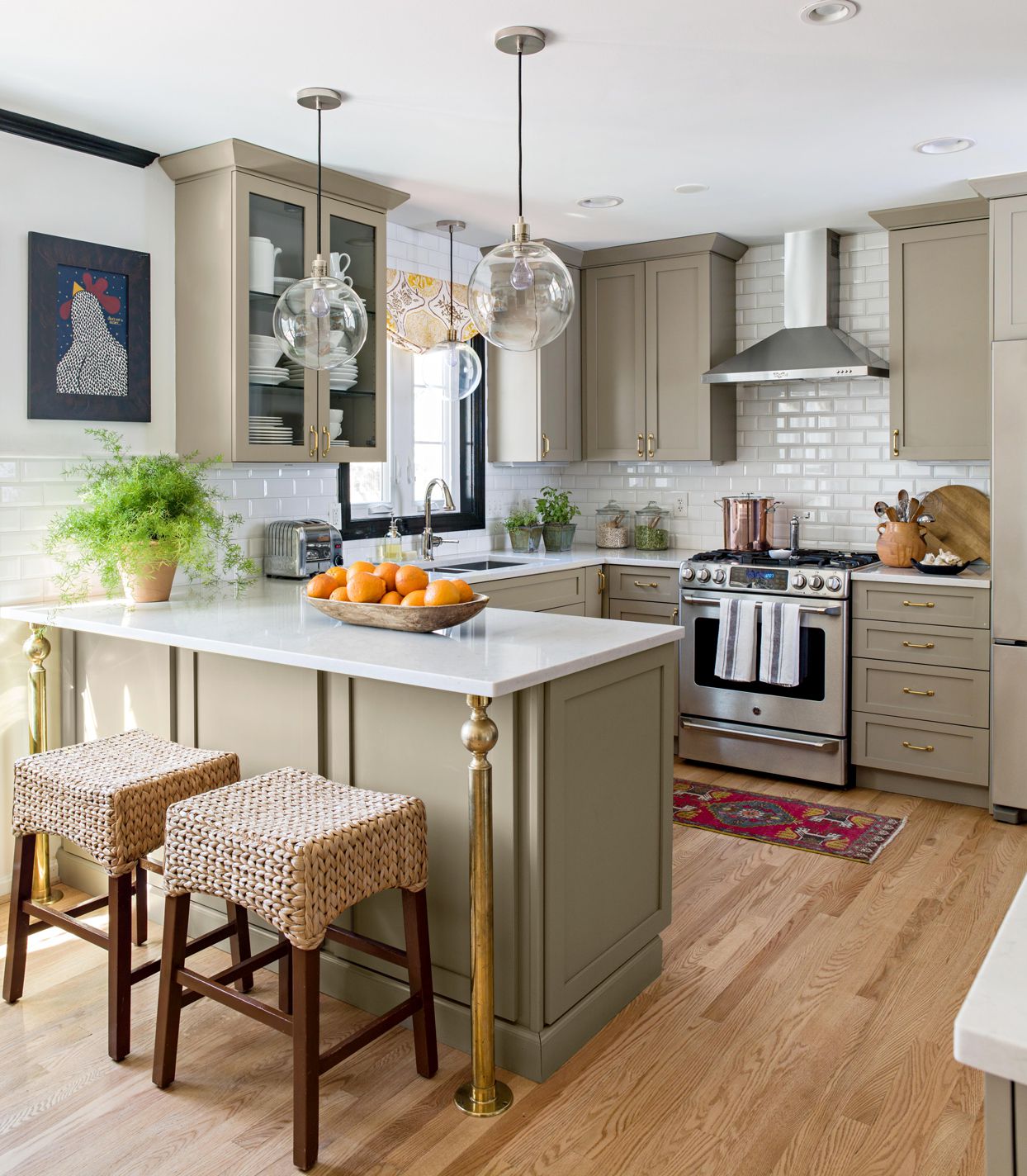
Earth Tone Paint Colors Designers Turn to Again and Again

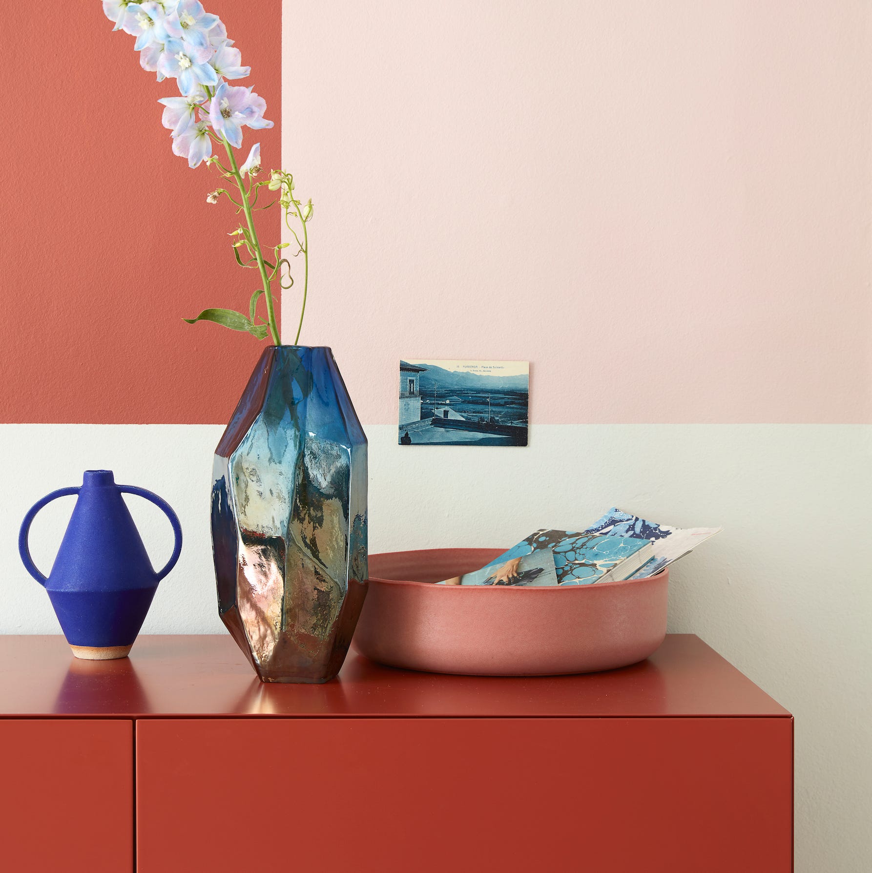
Pairing blues with terracotta shades is a big colour trend for 2021

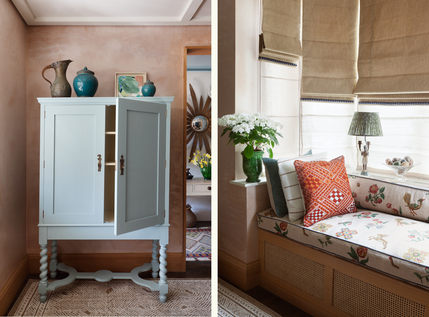
How to ground your space with terracotta tones
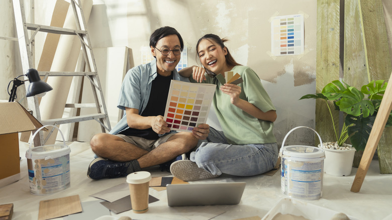
One Of Today's Hottest Interior Paint Trends Isn't Going Anywhere In 2025
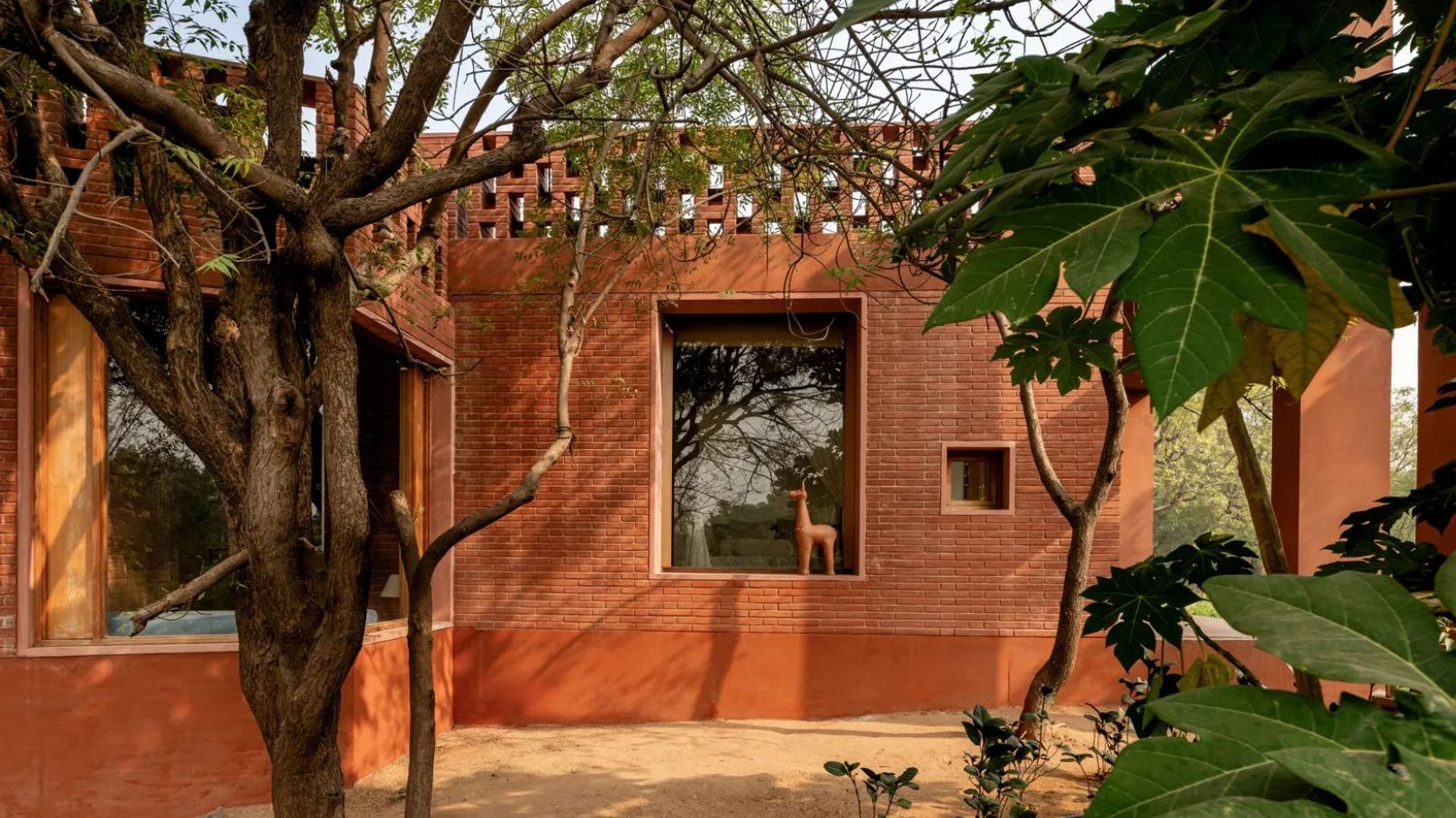
5 cool terracotta homes that champion vernacular design sensibilities

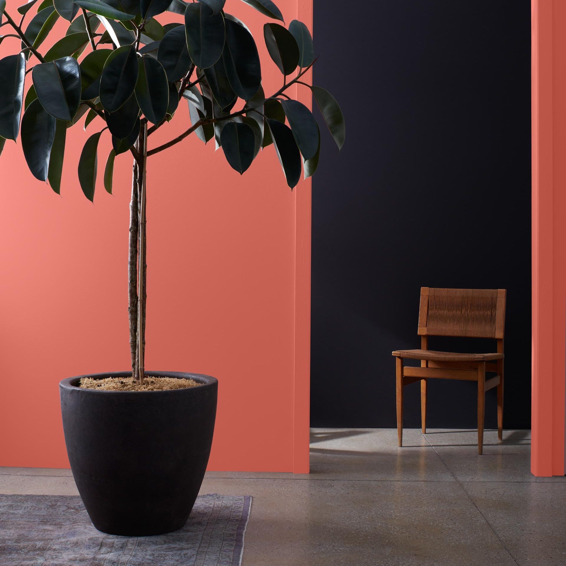
9 Best Interior Paint Colors

6 Earthy Paint Colors That'll Make Any Room Feel Cozy and Relaxed

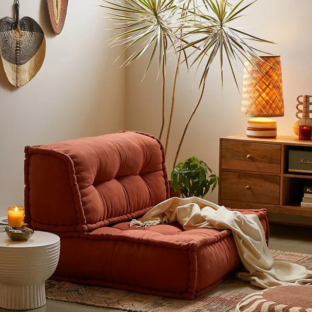
15 ways to bring terracotta into your home decor
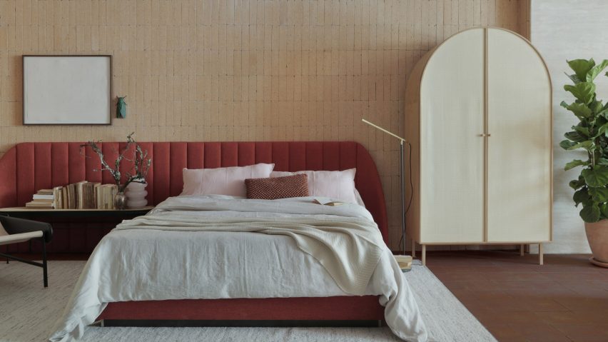
Eight homes with hardwearing and decorative terracotta floors
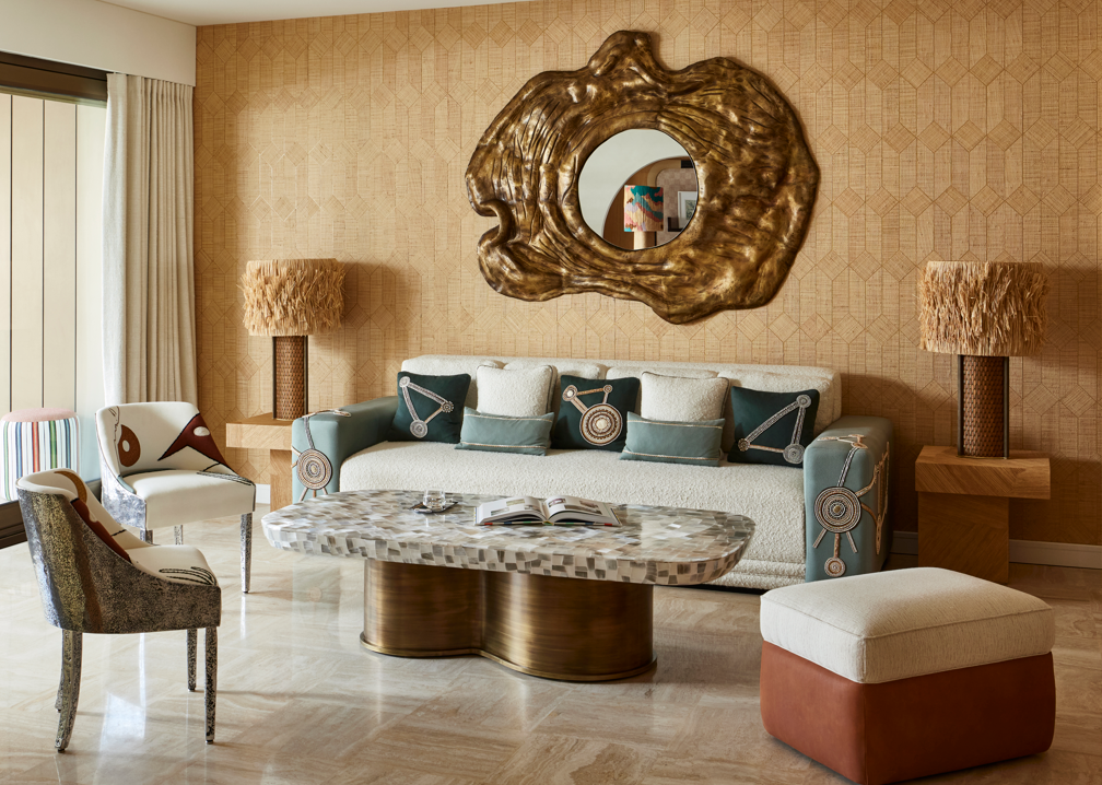
Earth Tone Living Rooms — 11 Palettes To Warm Up the Heart of Your Home
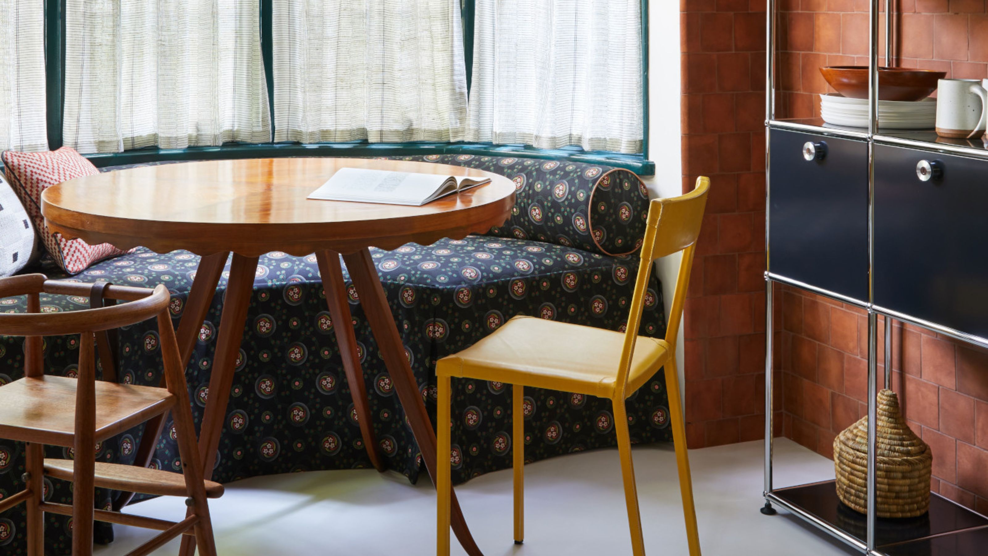
What Colors Go With Terracotta? How to Complement This Timeless and Grounding, Earthy Tone
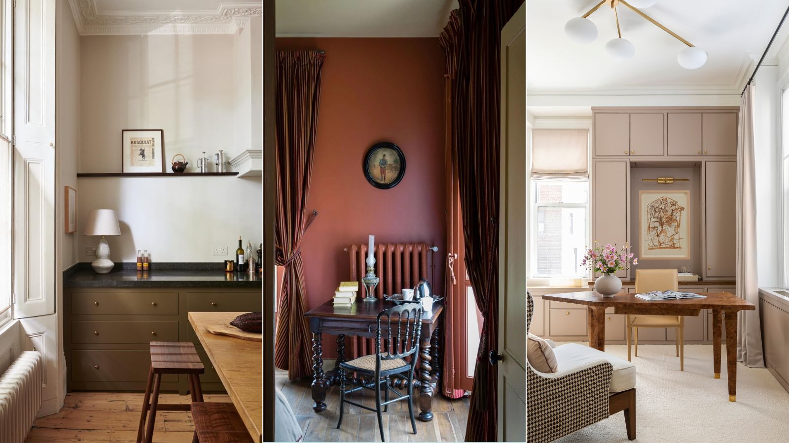
How to decorate with earthy colors – 6 ways to work with warmer shades
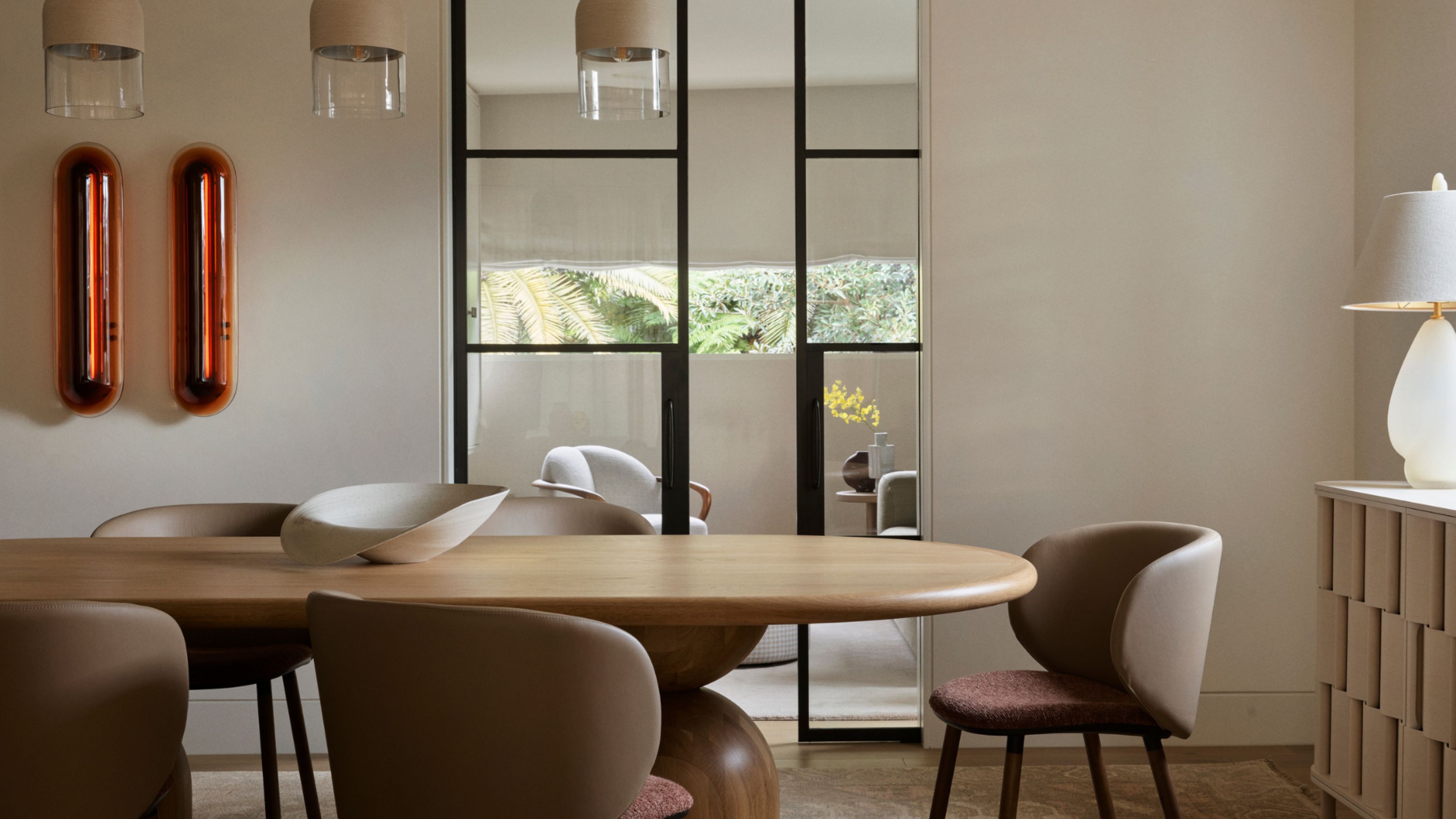
I'm a Color Expert, and Here's Why I Think Earthy Color Palettes Always Feel At Home
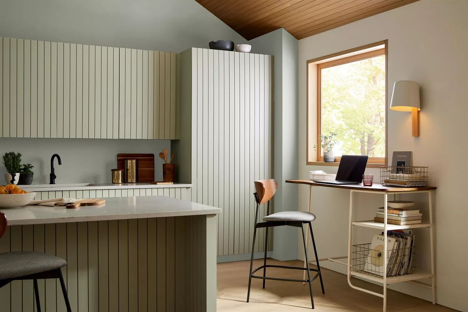
12 Earth-Tone Paint Colors Interior Designer Always Reach For