1/8
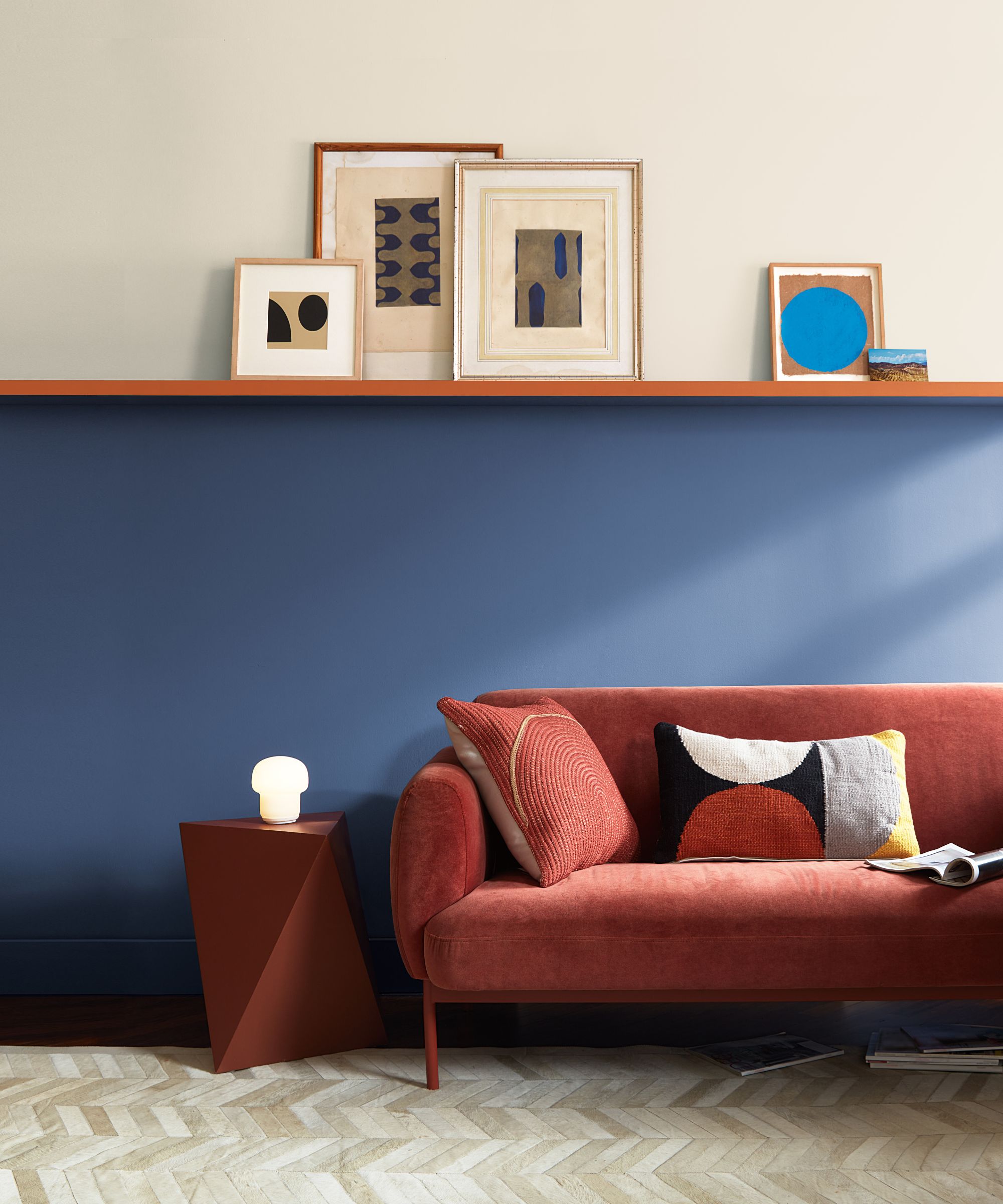
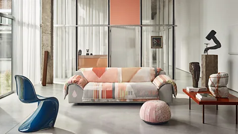
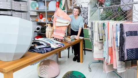
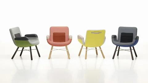
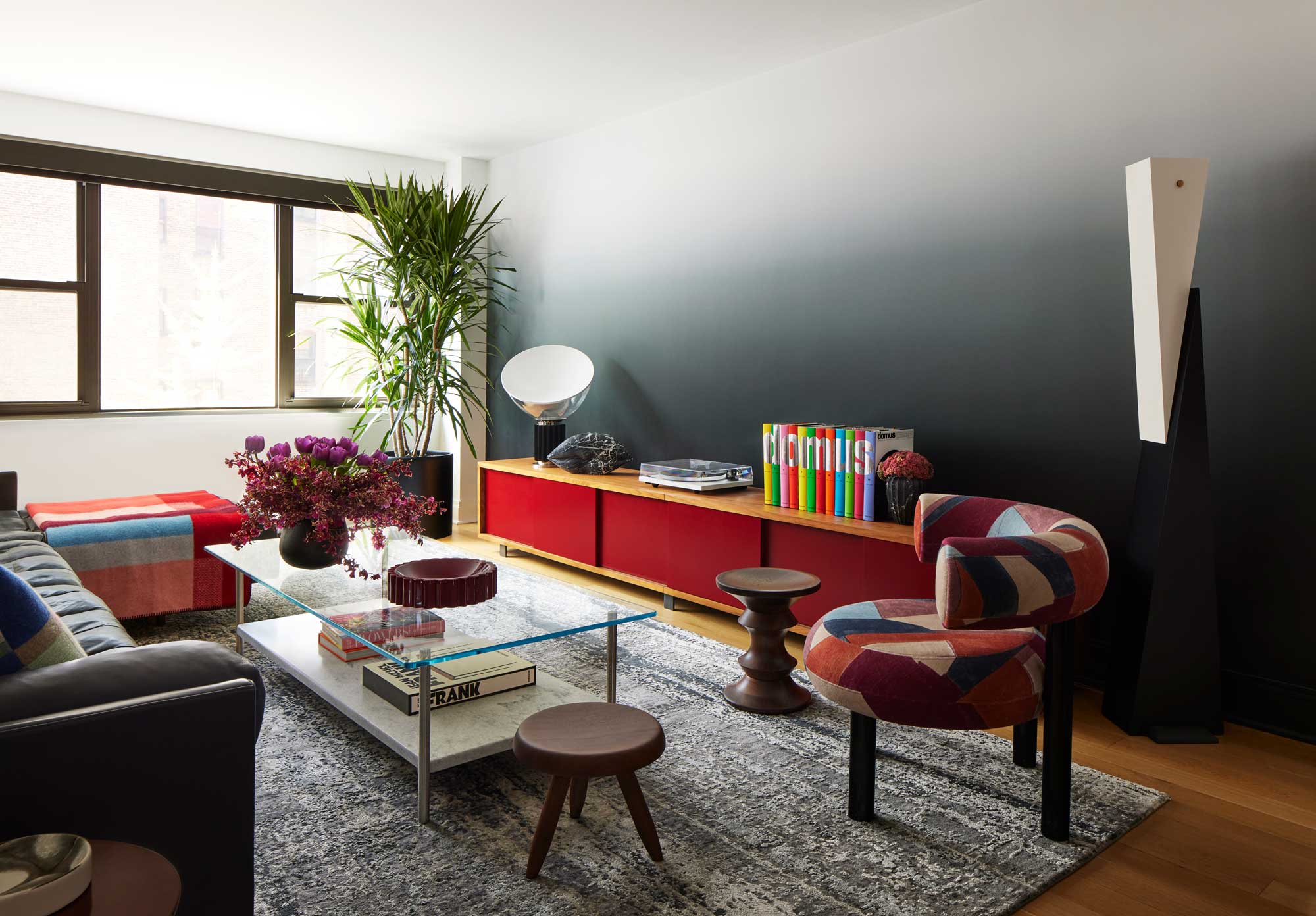
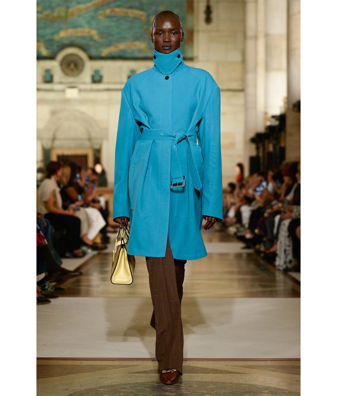
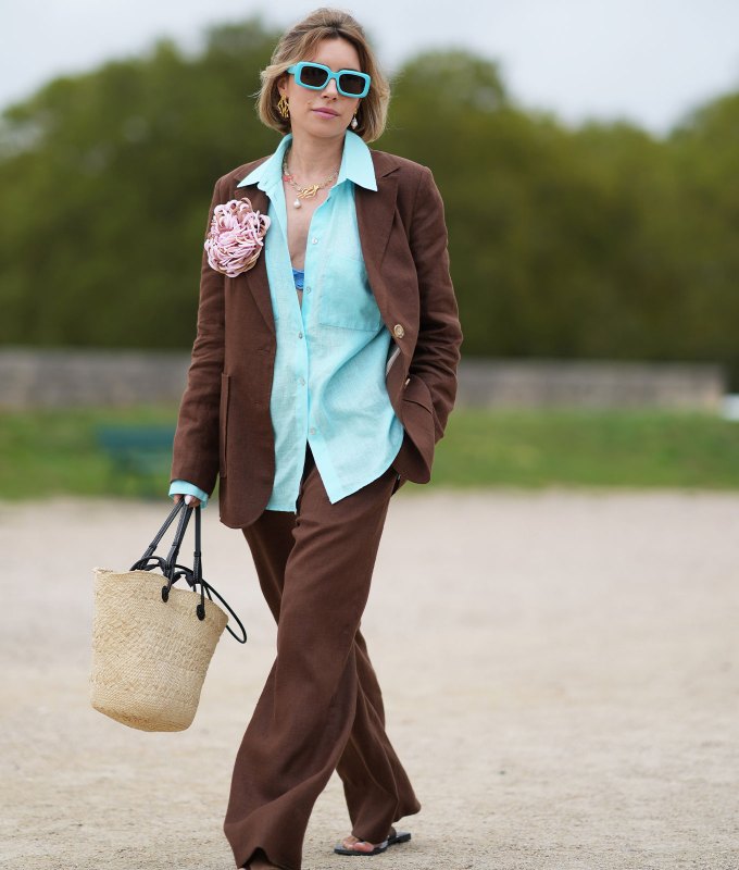
Pairing blues with terracotta shades is a big colour trend for 2021
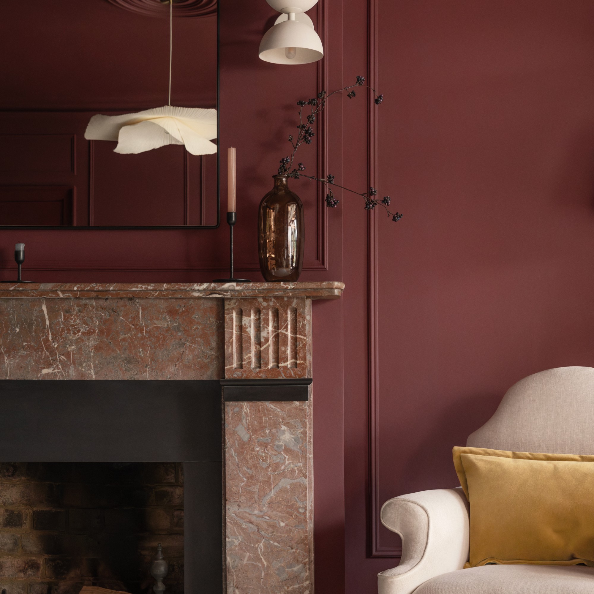
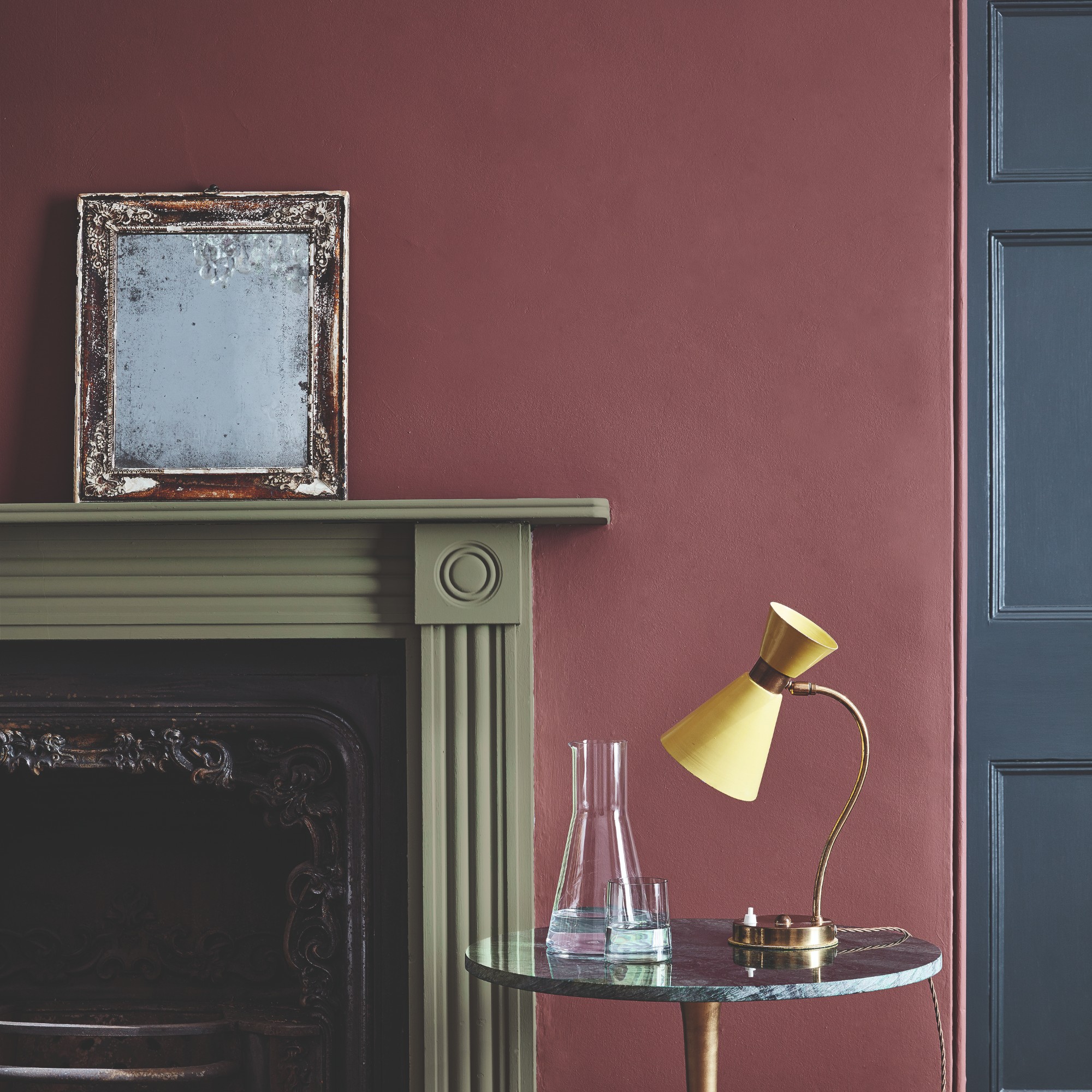
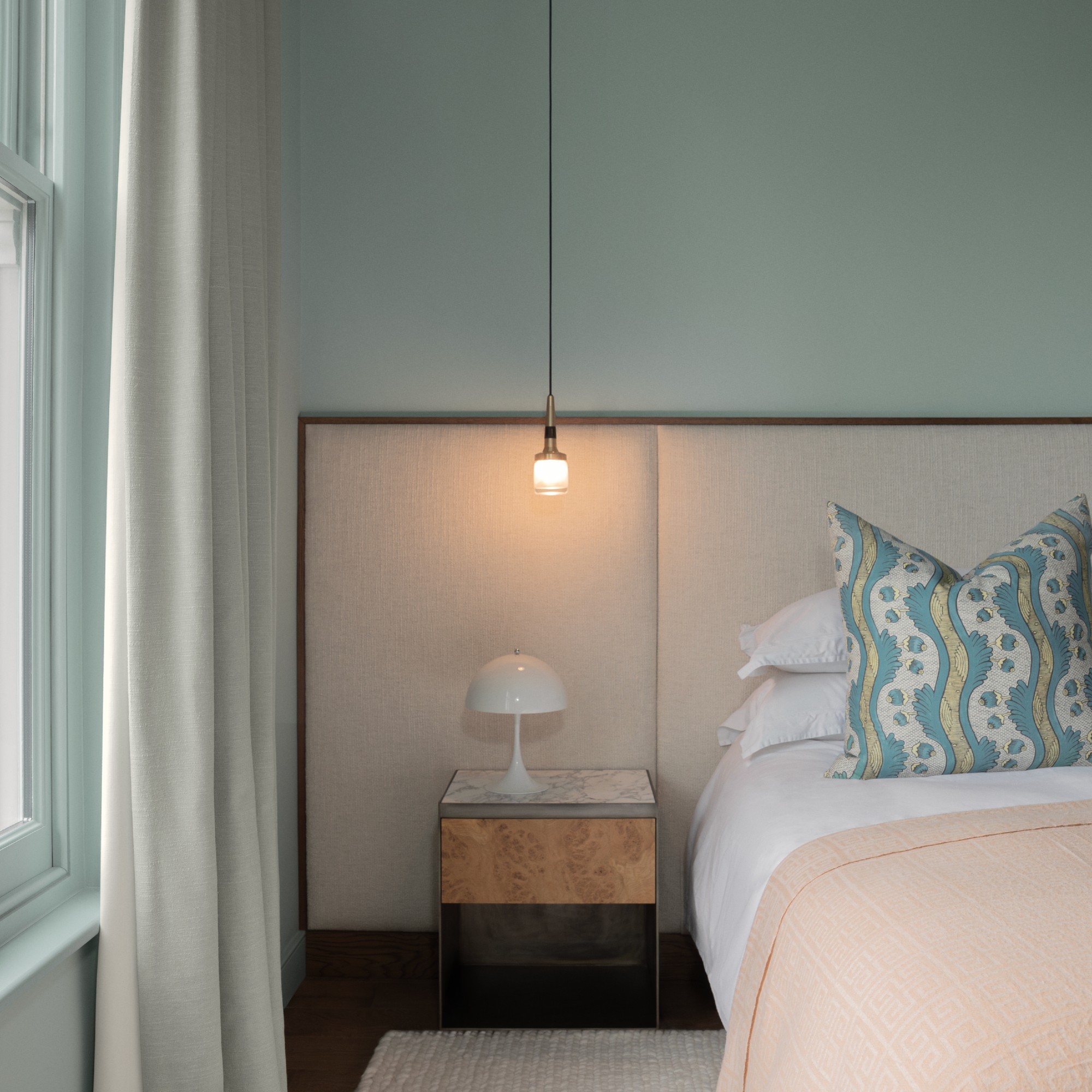
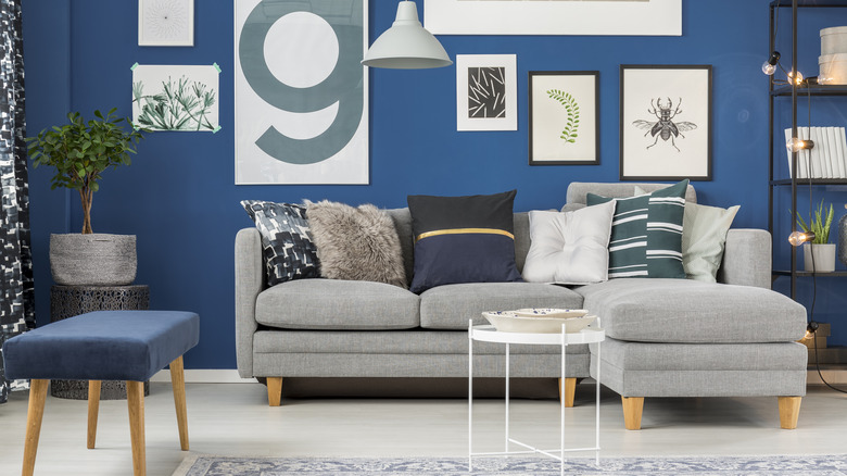
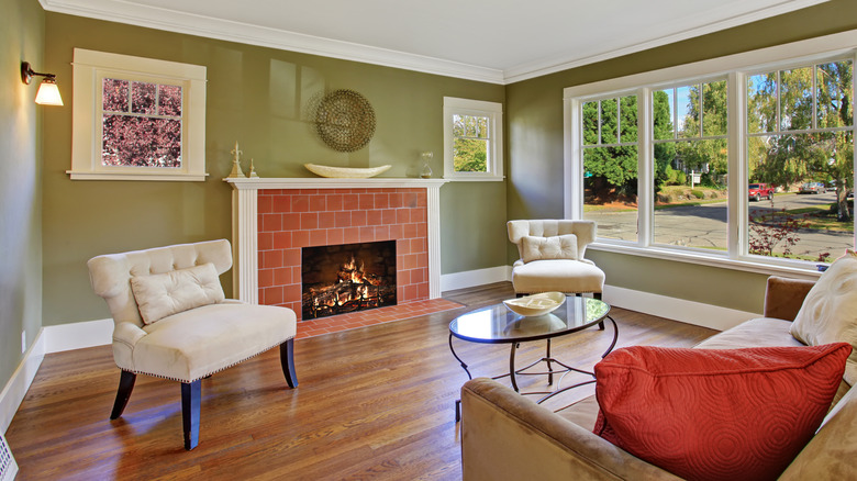
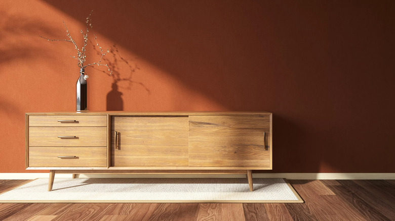
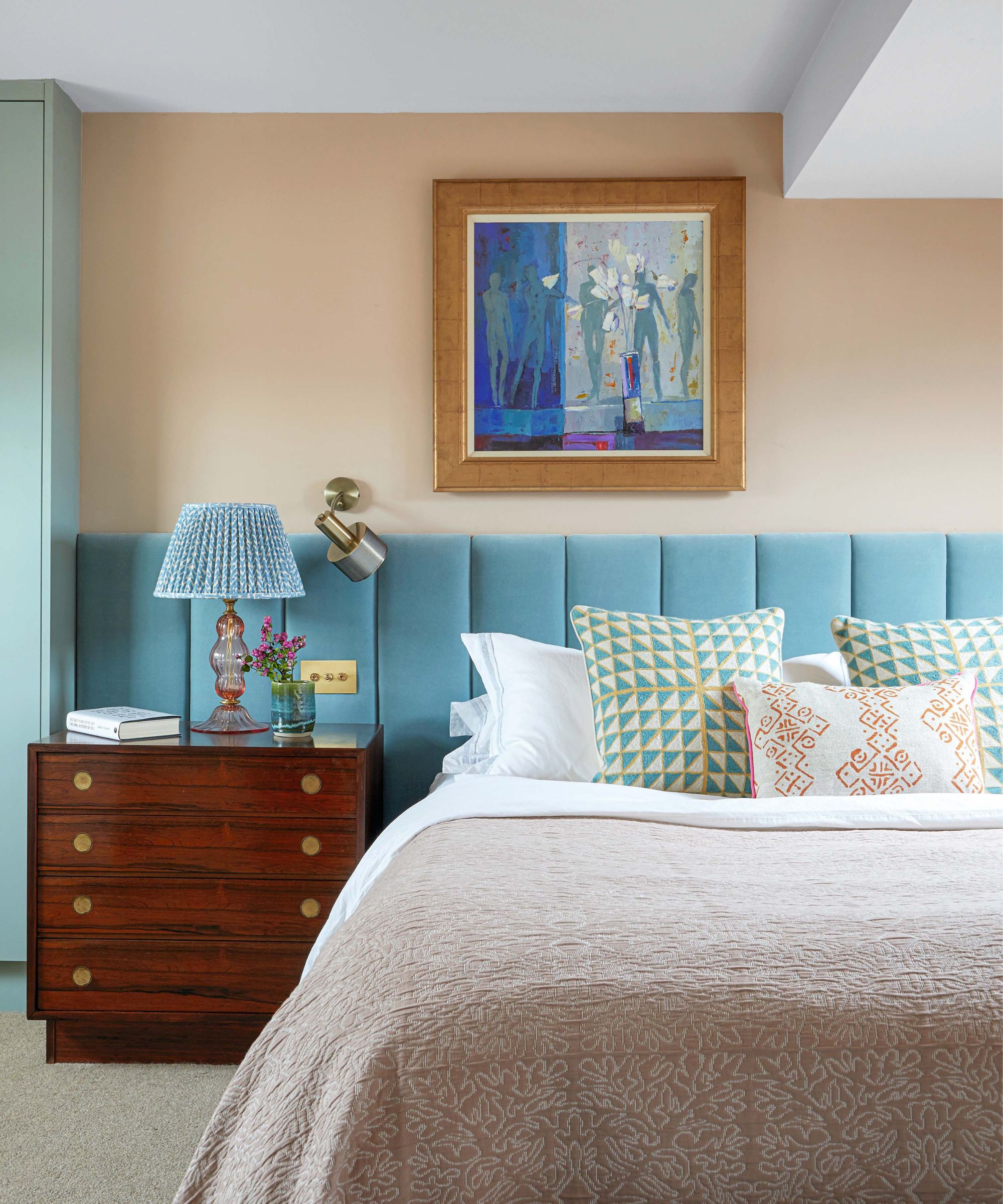
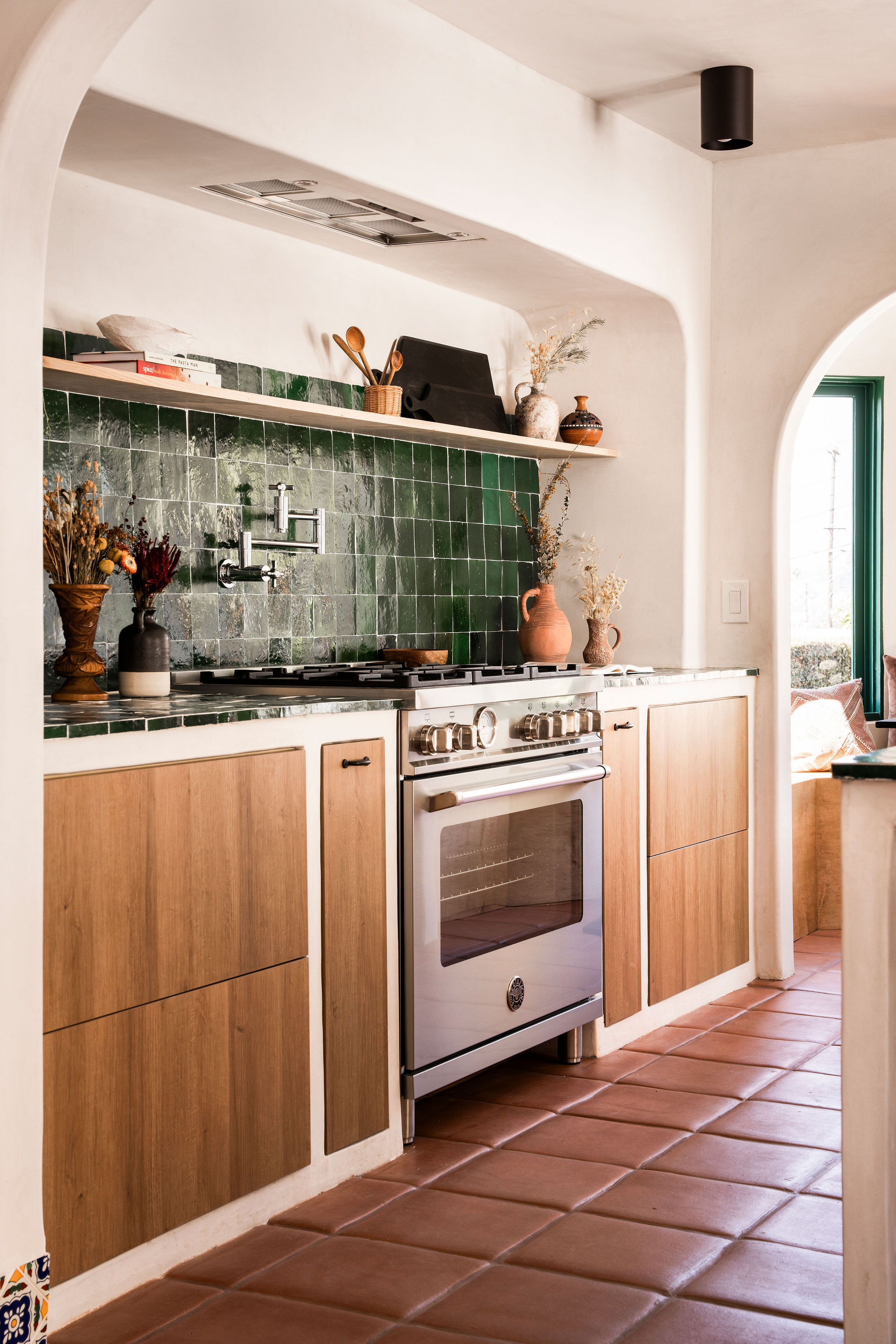
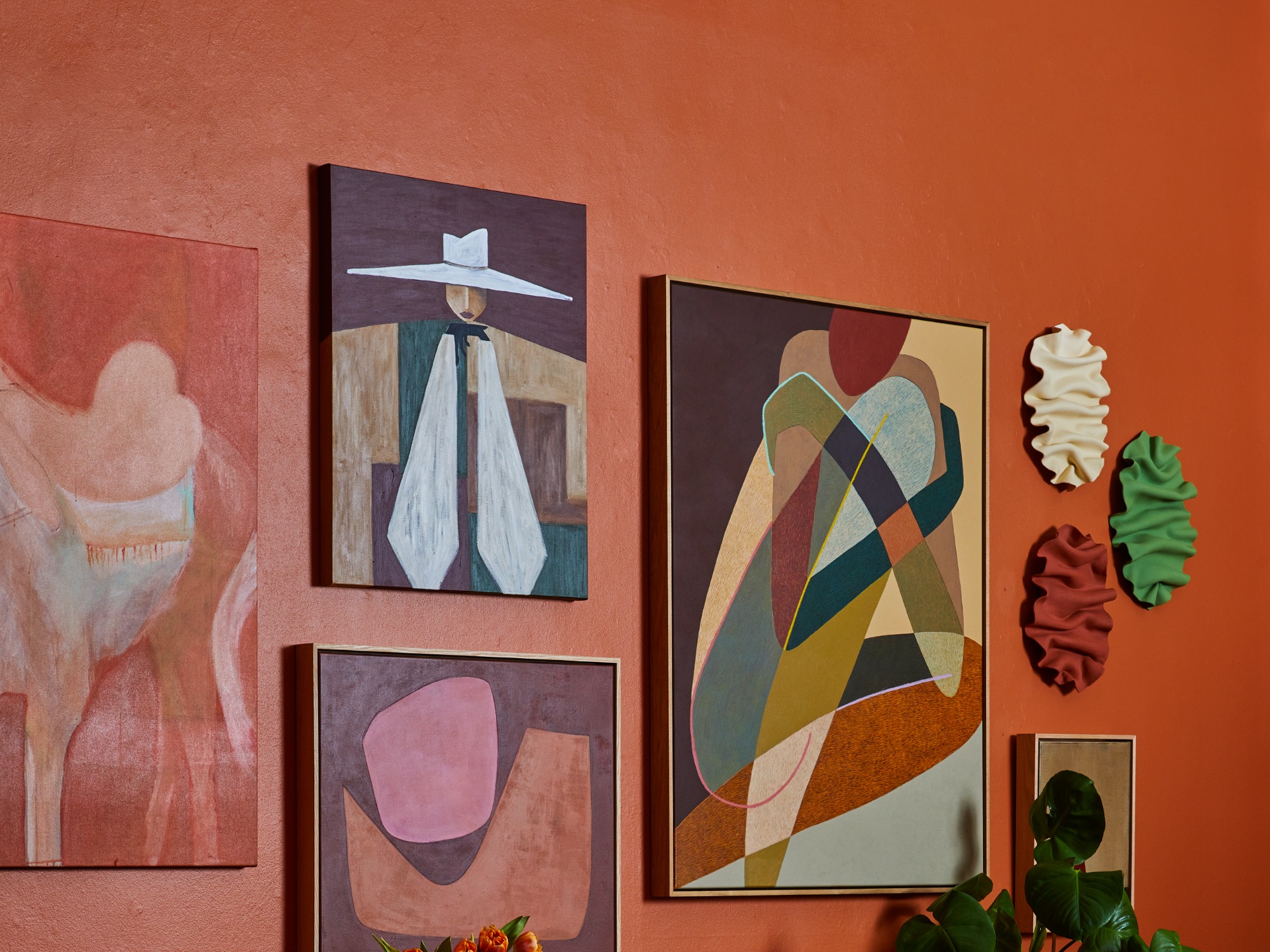
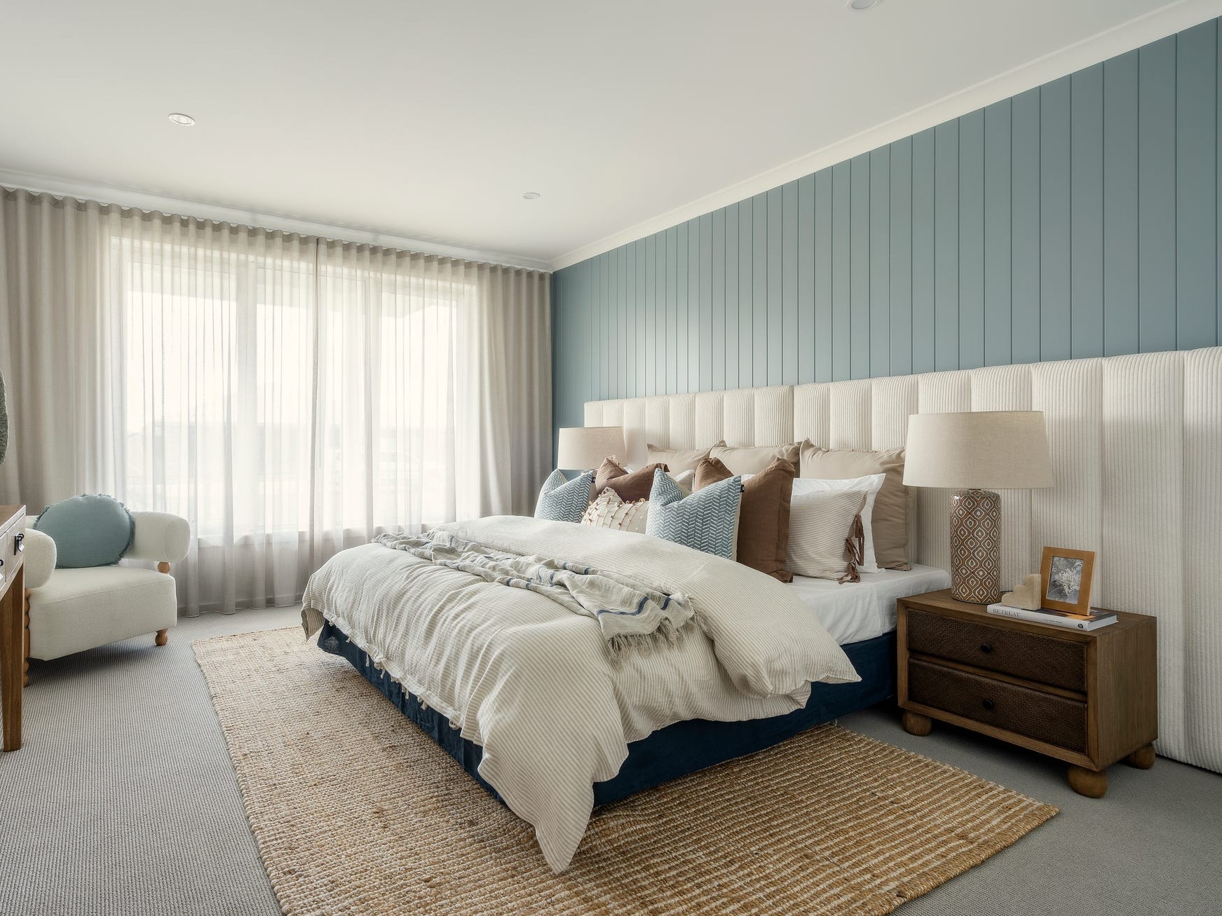
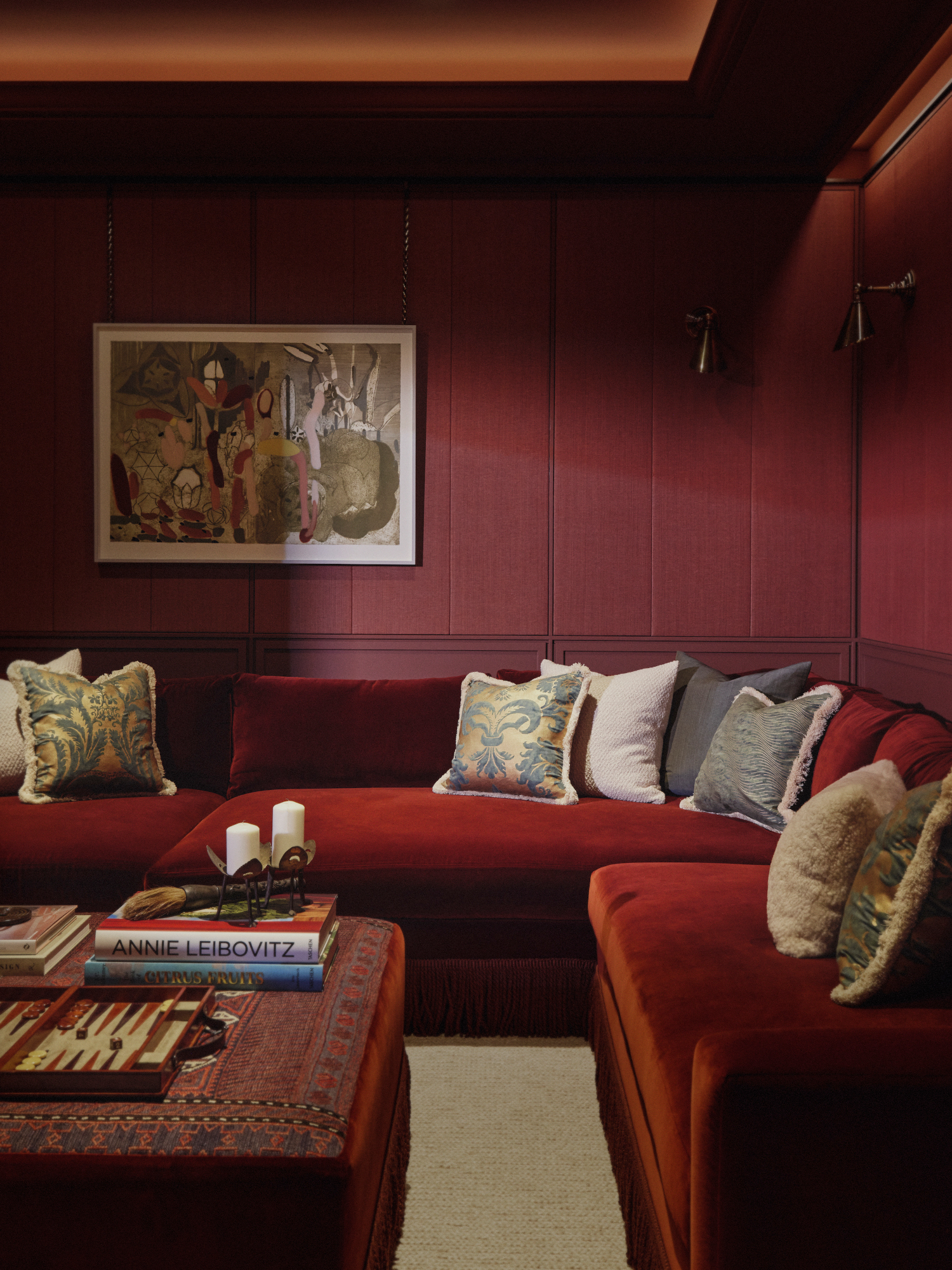
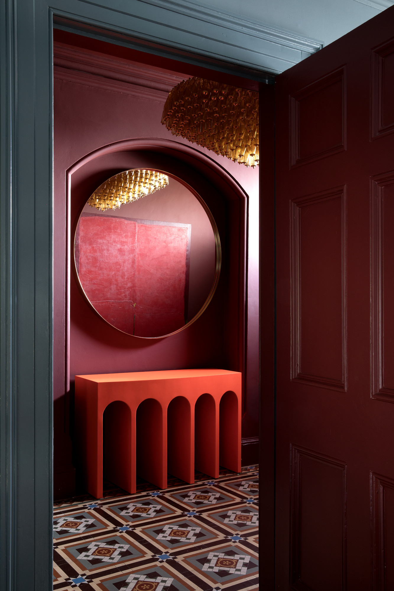
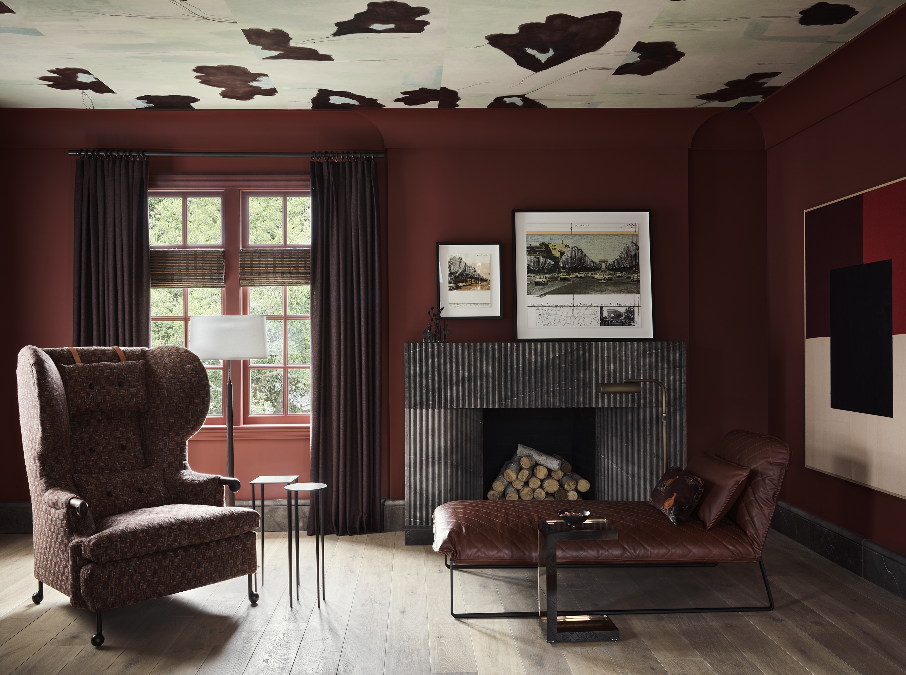
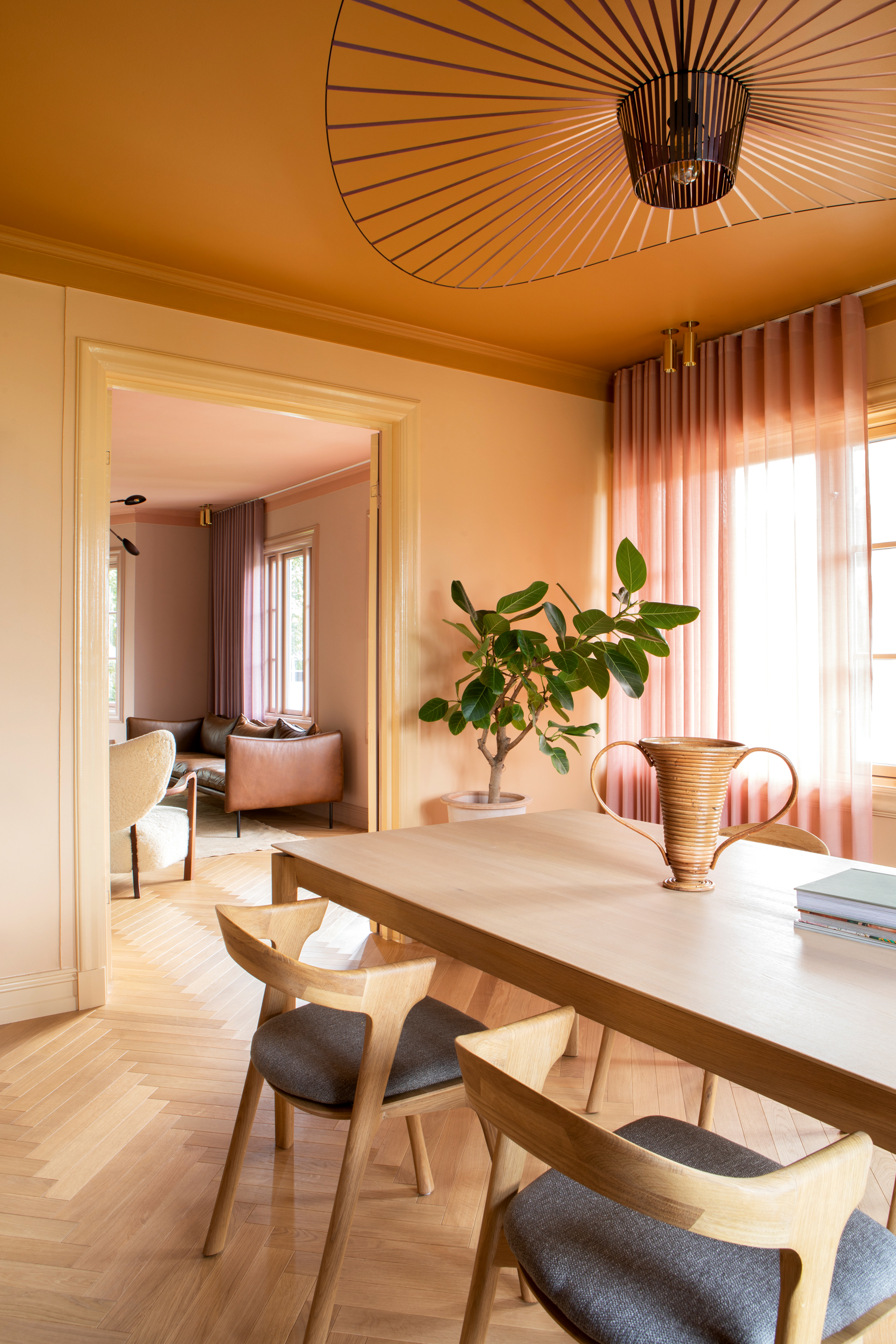
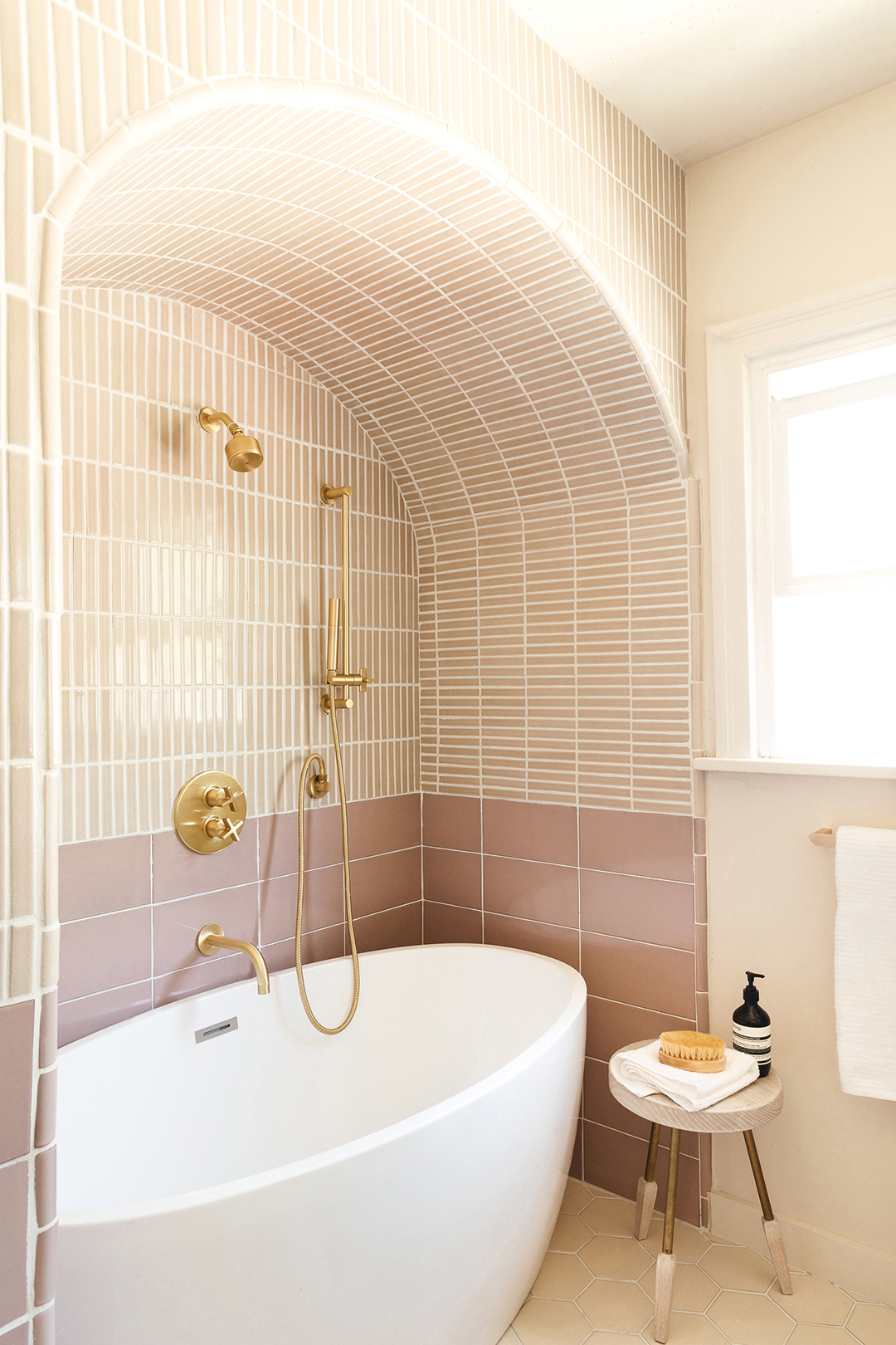
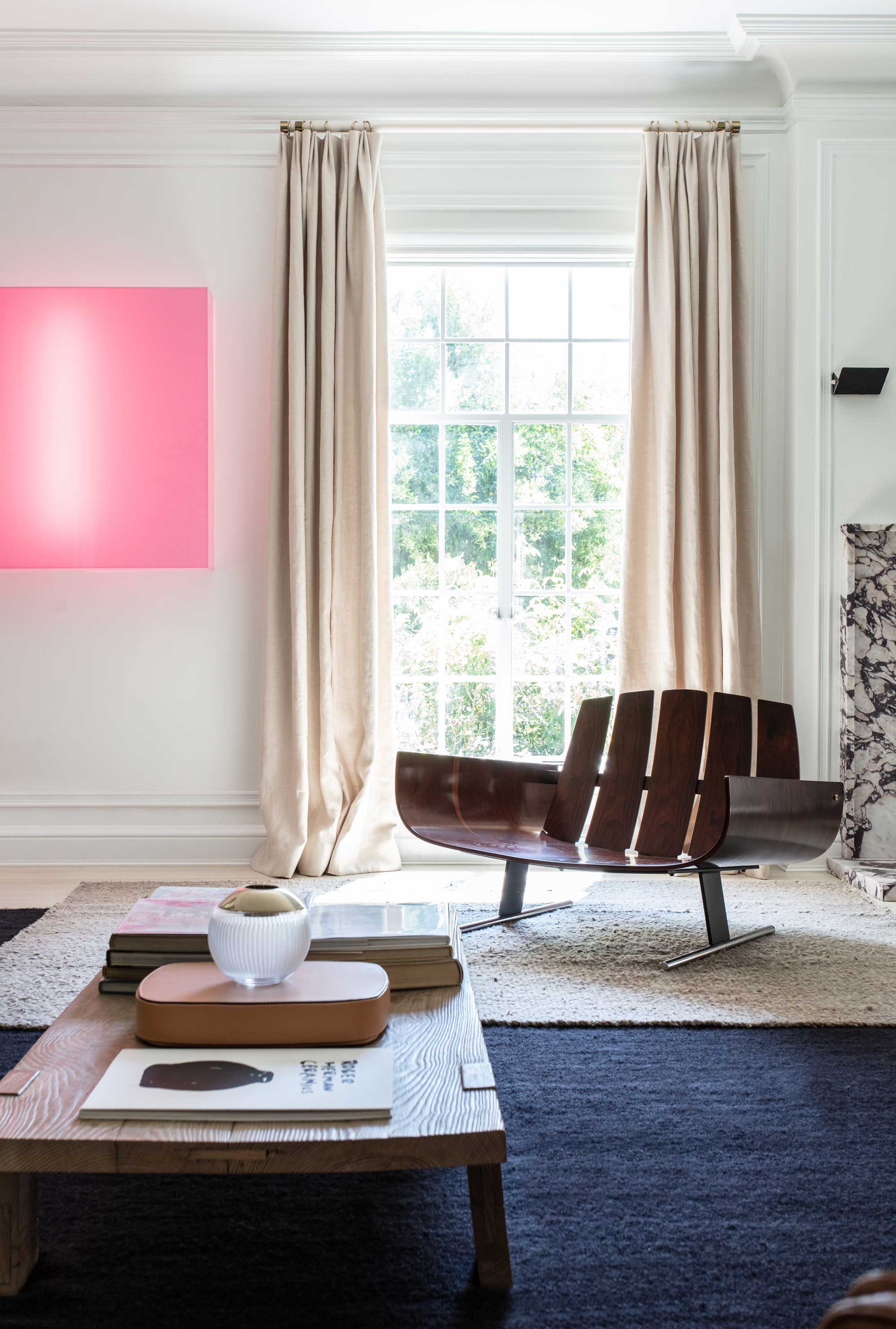
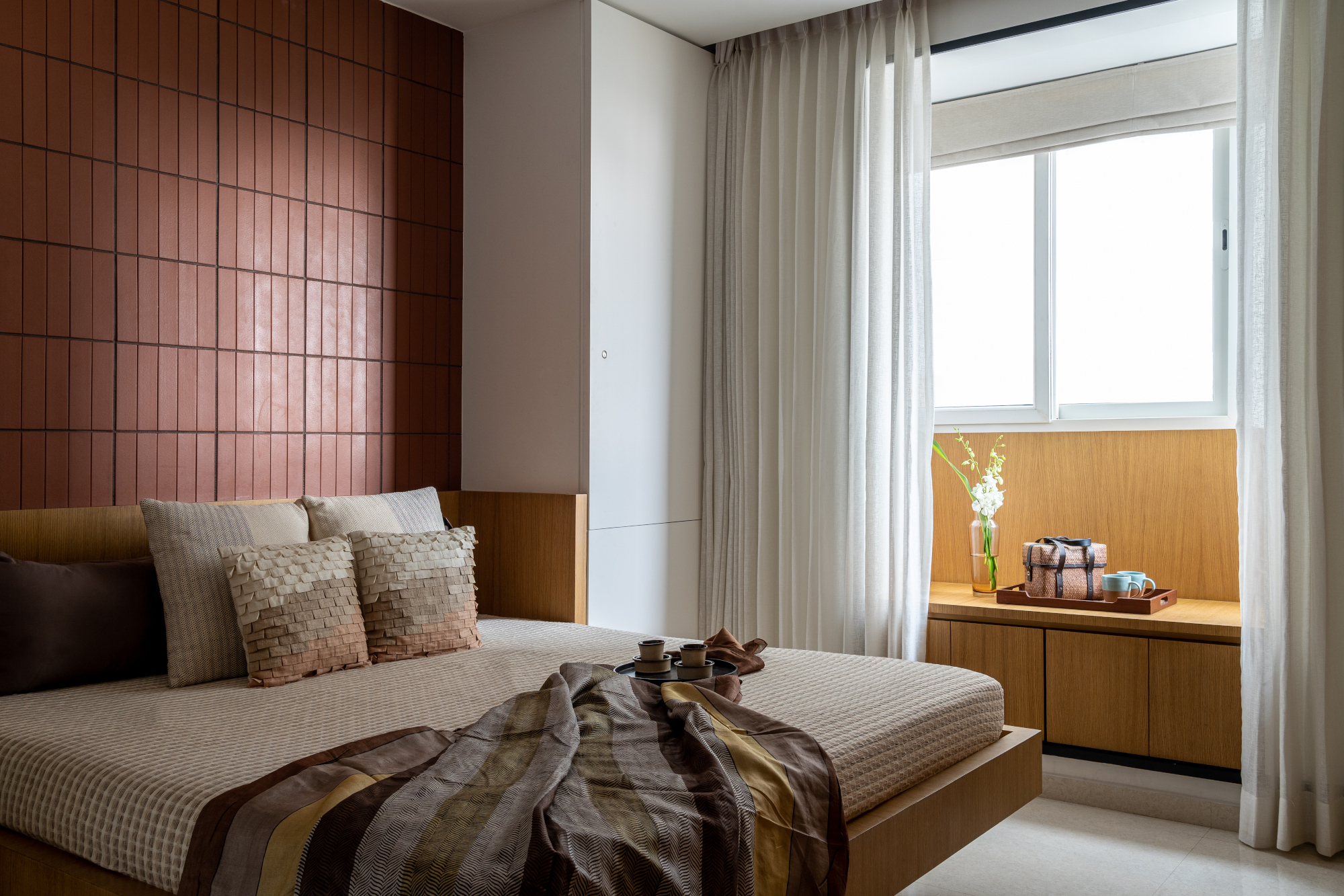
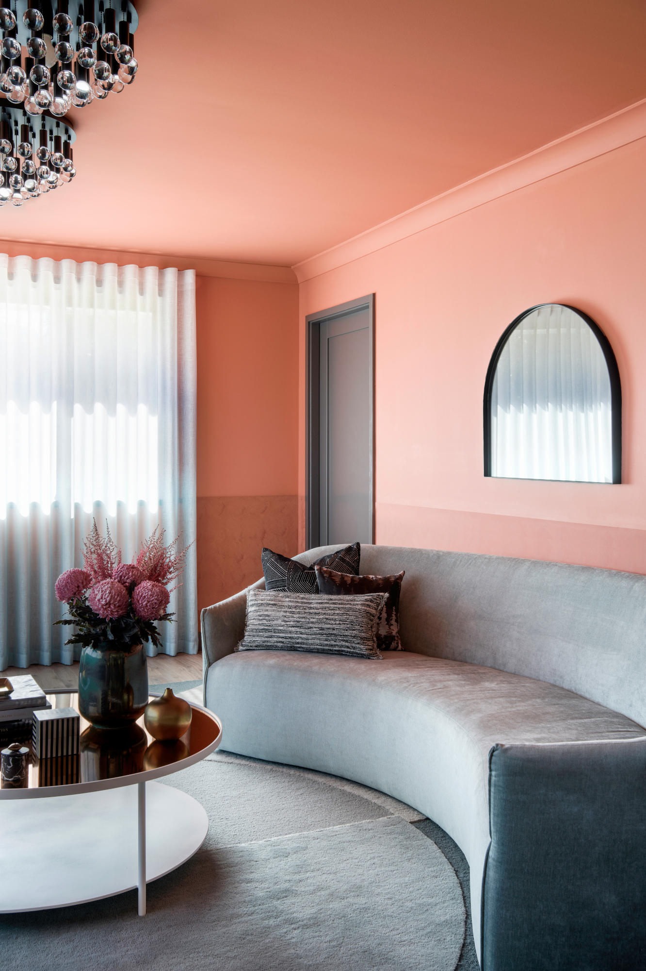
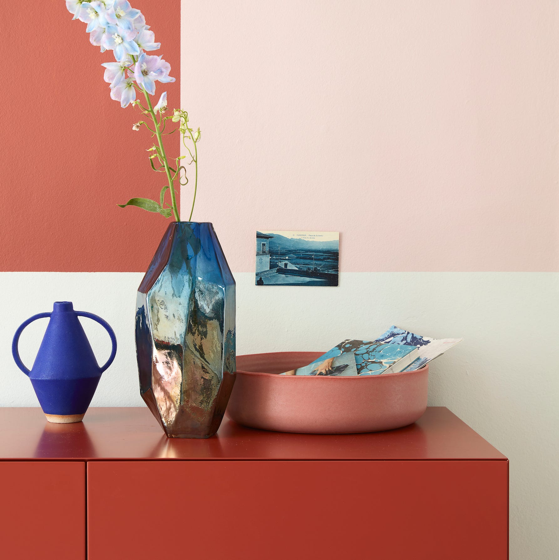
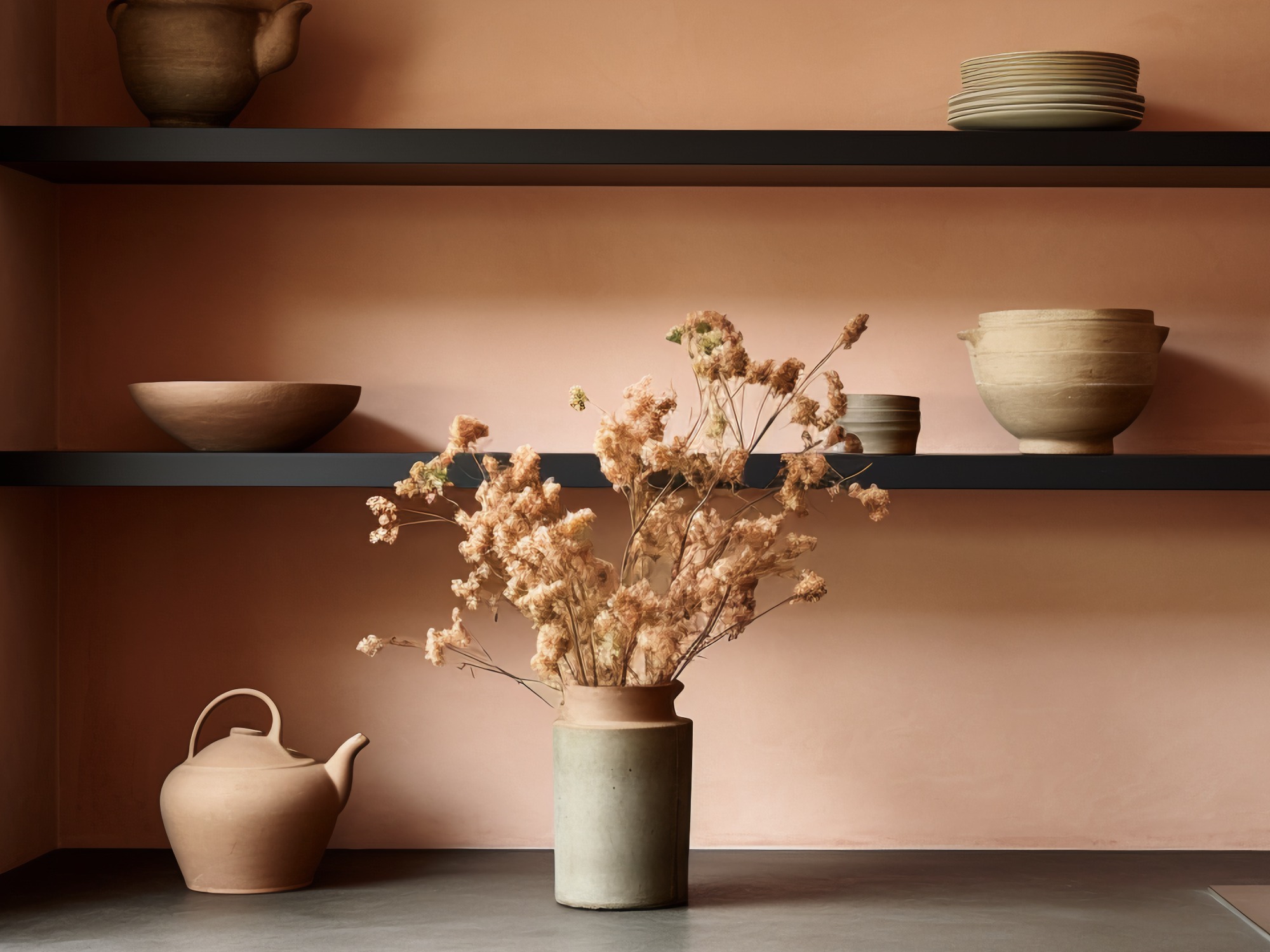
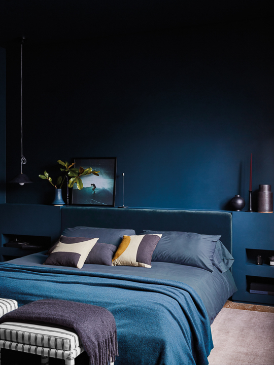
This article discusses the burgeoning interior design trend of combining blue and terracotta shades, highlighting its timeless appeal and ability to bring the outdoors inside. Robert Whitaker, creative and product director at Claybrook, identifies this pairing as a significant trend for 2021, noting its resurgence from the 1980s. The combination of warm, earthy terracotta tones with cool, serene blues creates a balanced and harmonious aesthetic, reminiscent of the land and sky. Terracotta pigments offer a grounding and stabilizing effect, connecting inhabitants with nature and providing a sense of stability. Blue hues, conversely, evoke feelings of calm, positivity, and serenity, making them ideal for spaces dedicated to relaxation, such as bedrooms and bathrooms. The article emphasizes the importance of incorporating varied textures to enhance the scheme, suggesting terracotta ceramics for their earthy contrast and ethereal blue glassware for its light-catching qualities. Materials like slubby linens and luxurious velvets are recommended for their ability to showcase the depth of these colors.
Expert advice is provided for implementing this color trend effectively. Starting a color scheme with one or two key rich sienna tones is suggested, followed by the introduction of a brighter, crisper counterpoint hue to maintain freshness. The article acknowledges that darker colors absorb light but encourages embracing this characteristic to create mood and depth in a room. For those desiring a more airy feel, a paler floor shade can enhance the sense of space and light. Sampling paint colors with swatches is crucial, allowing designers to observe how the colors interact with different light zones and spaces throughout the day, ensuring the chosen shades perform as intended. The article also encourages experimentation with unexpected color combinations, asserting that there are no strict rules in mixing and matching. It highlights how a strong color can pop against softer shades, with matching accessories tying the overall scheme together. Layering is another key technique, particularly with cushions in cinnamon, caramel, and pecan tones, to soften contrasts and achieve a more lived-in, relaxed feel.
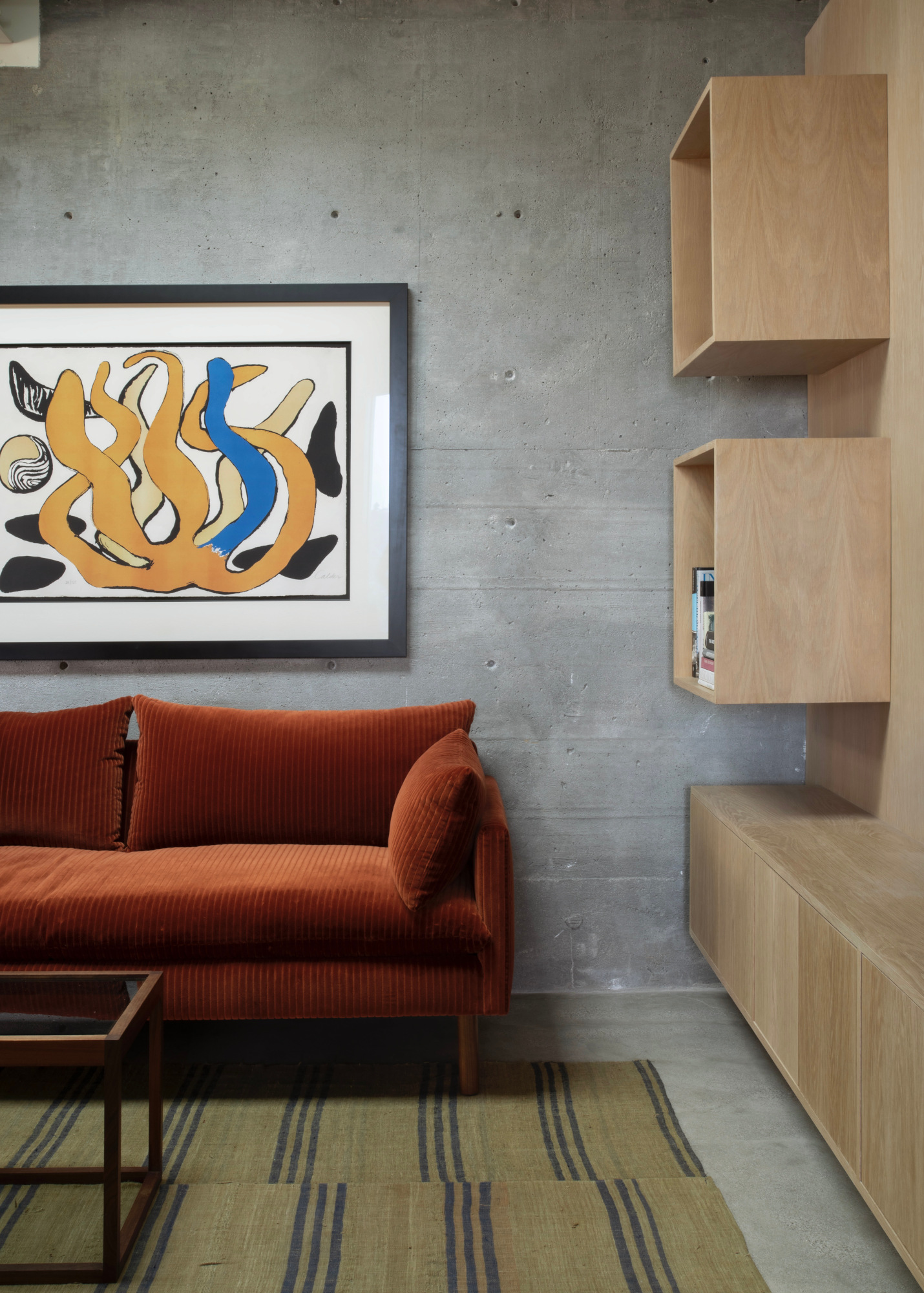
Specific examples of how to integrate these colors are provided, such as using cinnamon, with its red and brown undertones, to warm up industrial-style interiors and cold spaces. For bedrooms, relaxed linens in earthy shades are recommended for a cocooning effect, complemented by a spectrum of indigo shades in throws and cushions to add depth. A woollen bedspread is suggested to bring coherence to the overall design. The article also includes a shopping wish list featuring various home decor items in earth and sky shades, such as two-tone ceramic mugs, dark blue vista cushions, ceramic dessert plates, blue ceramic plant pots, linen duvet covers, washed linen tablecloths, organic vases, terracotta pitchers, wire box shelves, framed blue prints, velvet cushions, ridged glass vases, organic cotton bath towels, navy French linen duvet covers, storage baskets, drum shades, terracotta pitchers, elements blocks navy cushions, terracotta bowls, and terracotta flower pots. These examples demonstrate the versatility of the blue and terracotta palette across different home accessories and furnishings, reinforcing its potential to create a cohesive and stylish interior.
#InteriorDesign #ColorTrends #HomeDecor #Terracotta #BlueHues #ColorPairing #Homewares #TexturalElements #EarthTones #InteriorDesign #ColorTrends #HomeDecor #Terracotta #BlueHues #ColorPairing #Homewares #TexturalElements #EarthTones
0 comment in total
 No comments yet
You may also like
Deeper, moody colours and precious jewel tones are in style this year
What Colors Go With Terracotta? How to Complement This Timeless and Grounding, Earthy Tone

5 Living Room Color Trends for 2025 — New and Exciting Shades Designers Are Choosing for Walls
9 Trending Paint Colors You'll See Everywhere in 2025, According to Designers
The colour trends 2026 that will define our homes next year

The Biggest Colour Trends Taking Off in 2025
It’s Official: Designers Are Ditching This Once-Classic Color
2021’s Palette of Possibilities
Interior Paint Color Trends You Should Know About In 2021

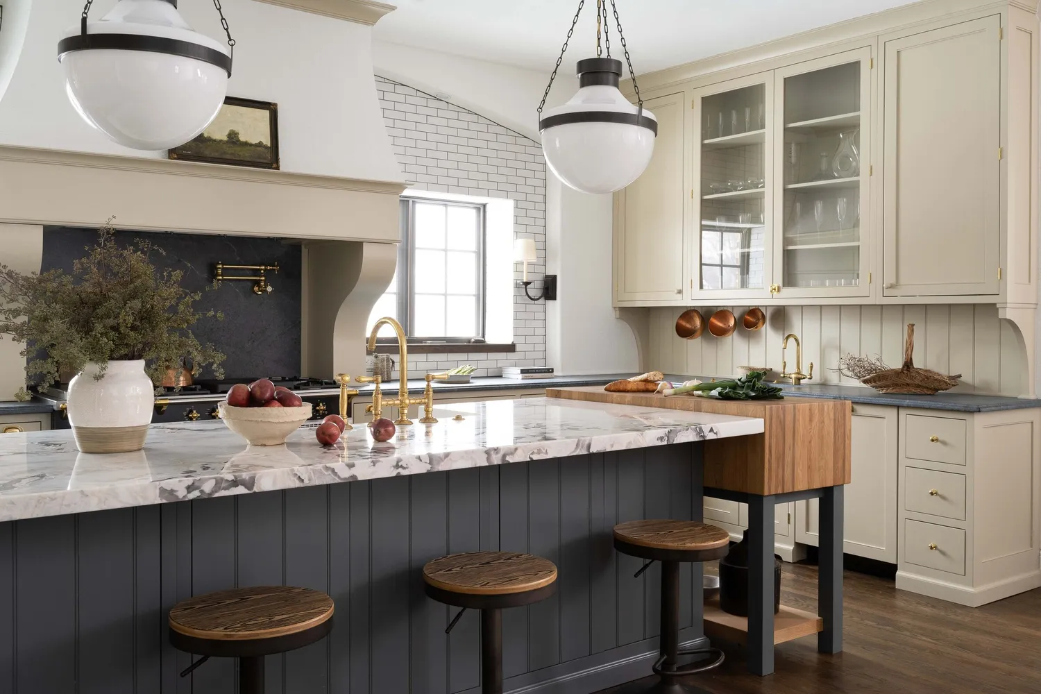
7 Trendy Paint Colors for Every Room in 2026, According to Designers

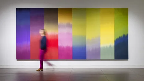
What you didn’t know about colour

This Controversial Y2K Trend Is Back—Here’s How to Wear It In 2025 (Plus 1 Look to Avoid)

Forget taupe, Jane Fonda’s wall color proves cool tones are making a sophisticated comeback for 2026

Designers are Calling Burgundy This Year's Big Color Trend
This surprising color trend is having a comeback
10 reasons you should be decorating with terracotta right now – and they're all incredible rooms that use this color

Experts Say These 5 Paint Colours Will Be Everywhere In 2026
What color is replacing teal? 5 trending alternatives for this versatile shade
Vibrant Green Is The Color Trend That Comes Celeb Approved

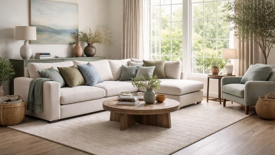
2026 colour trends: Soft blues, earthy greens, and timeless palettes for your home | Hindustan Times