1/5
I Think I May Have Just Discovered the Most Timeless Green Paint Color
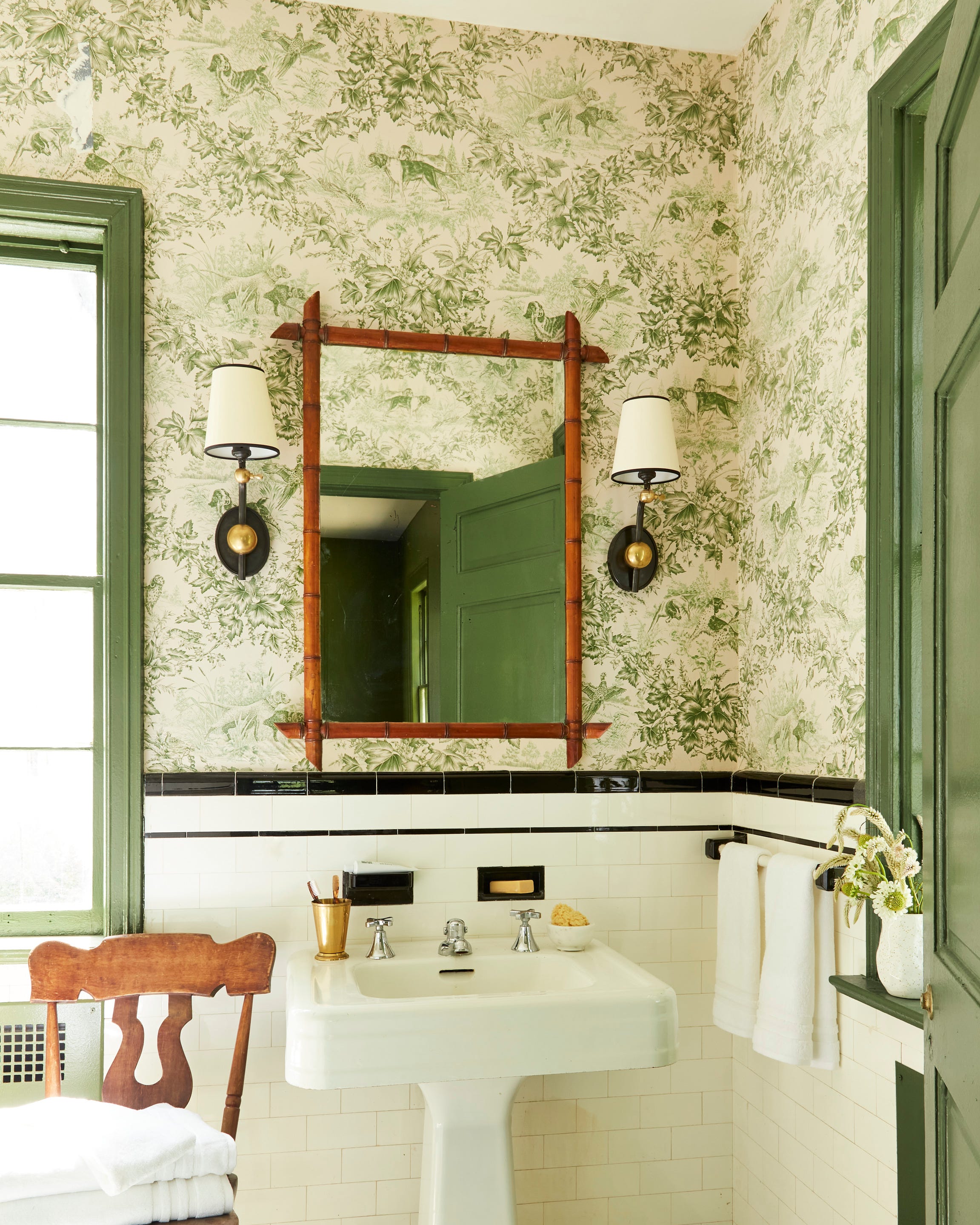
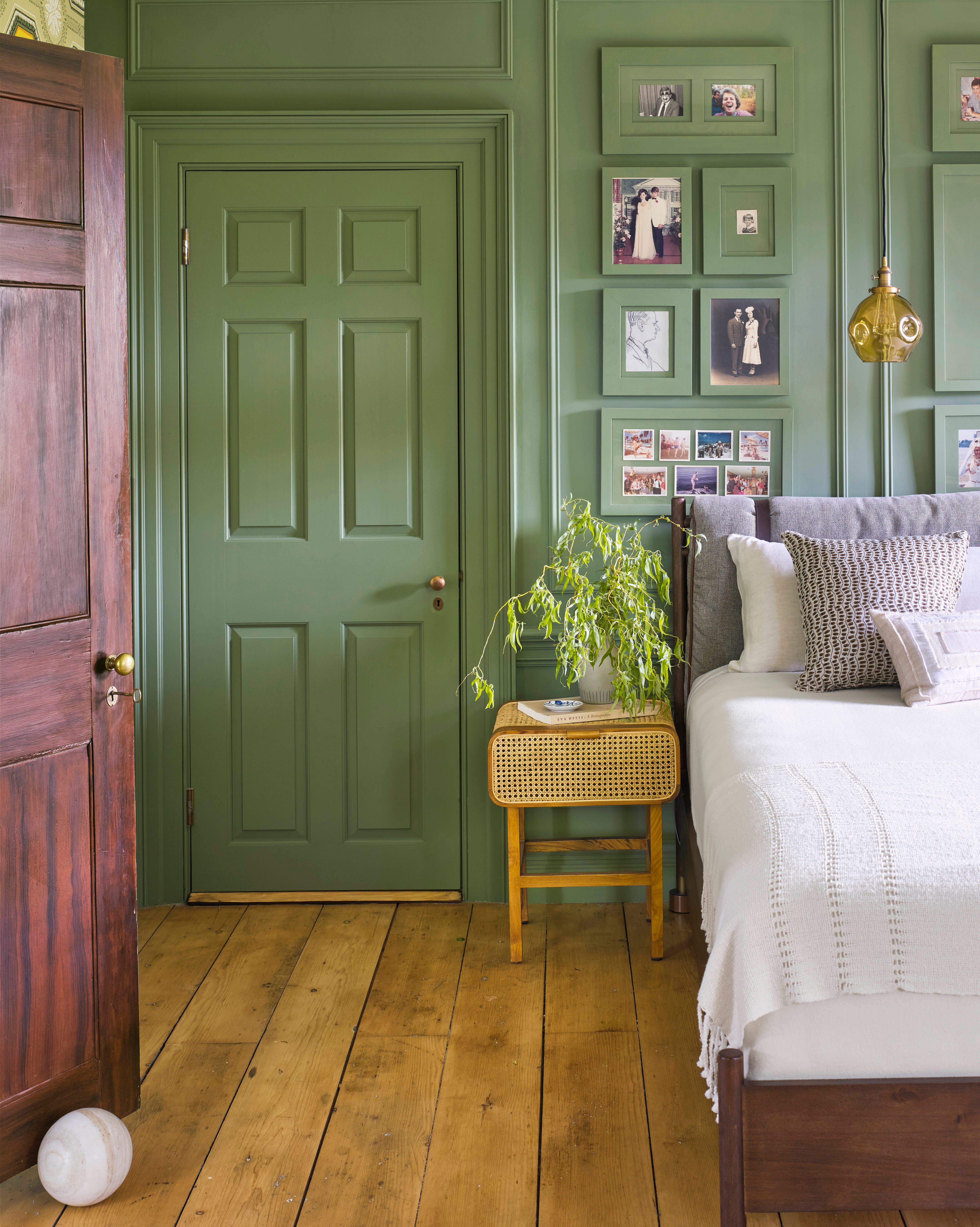
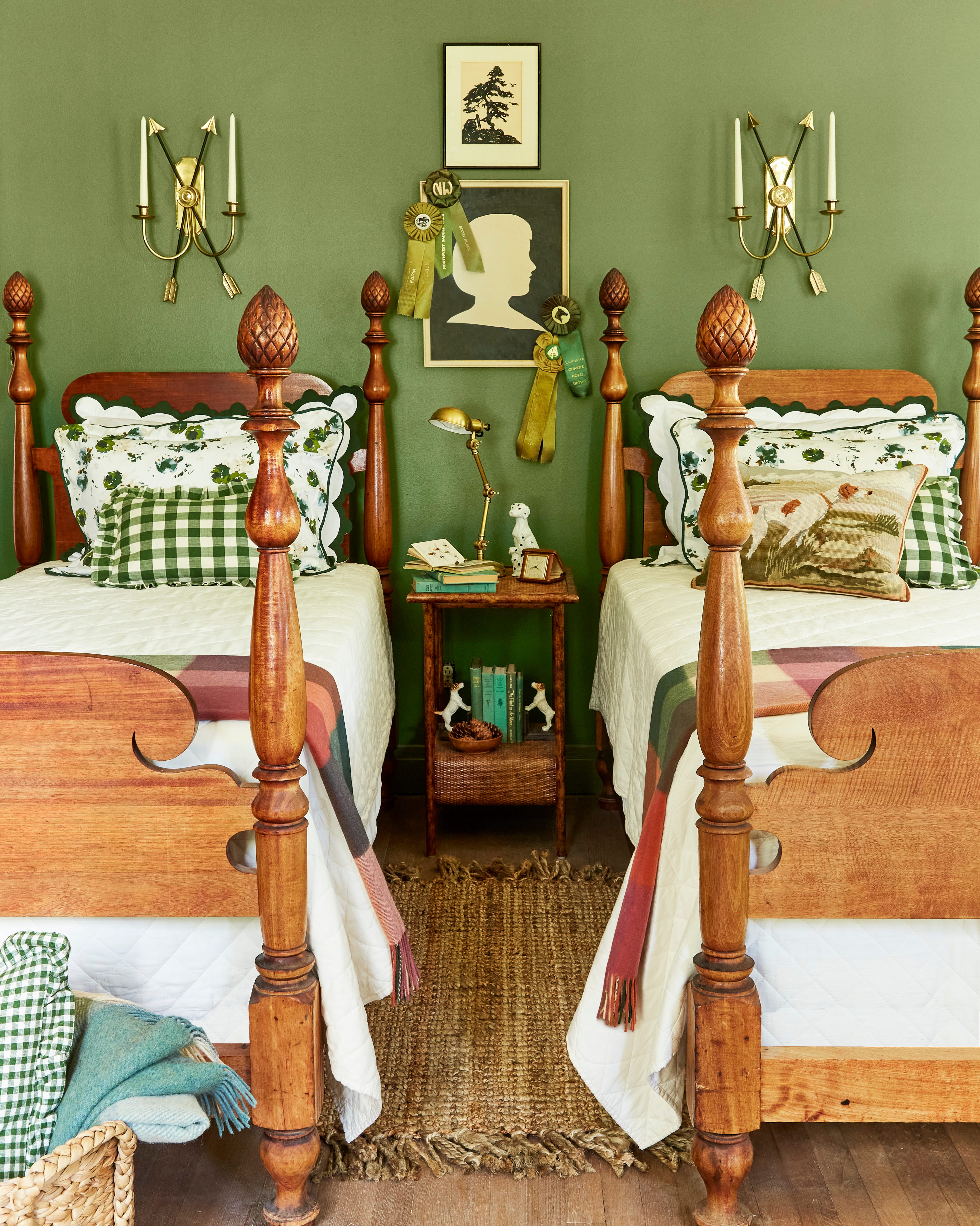
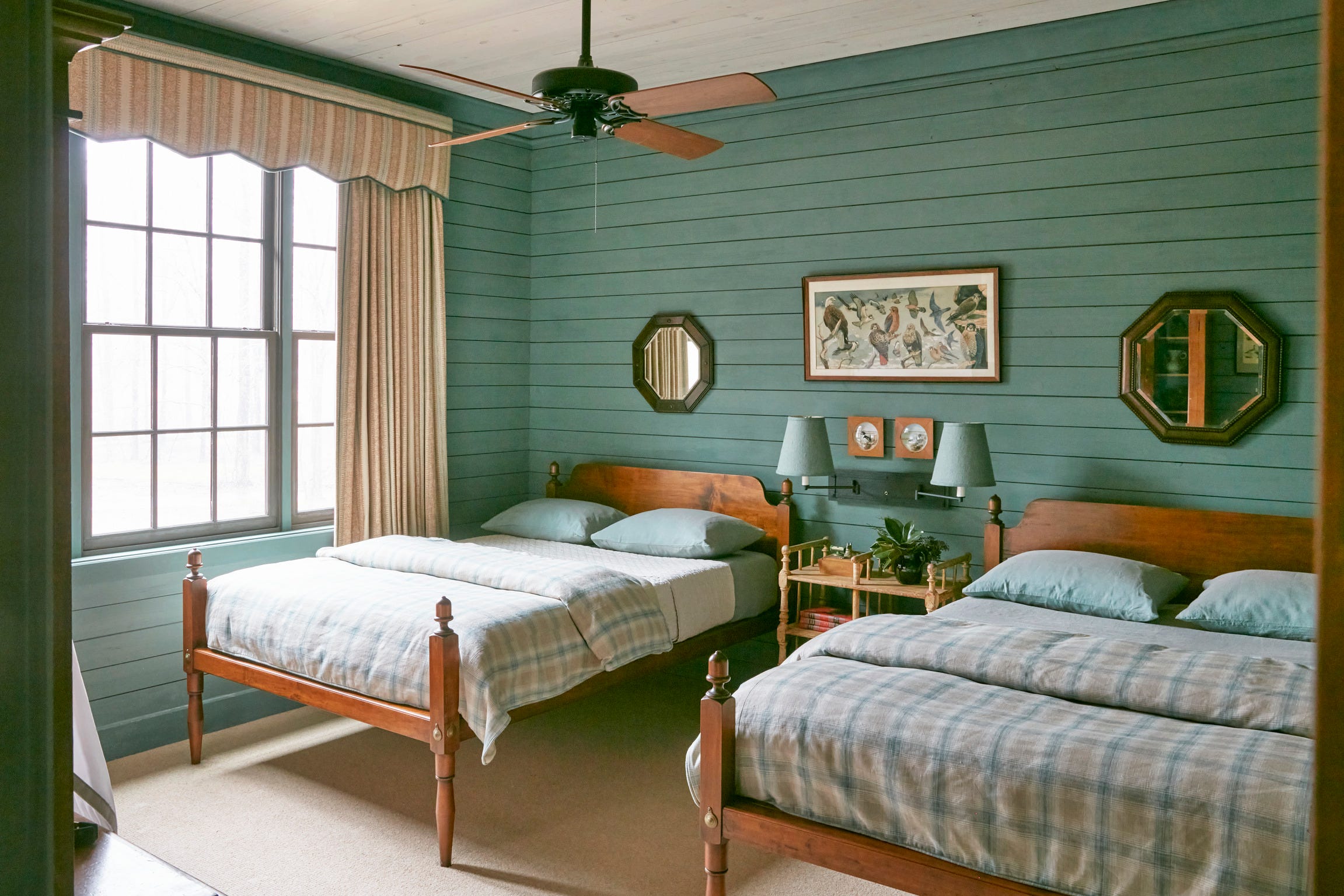
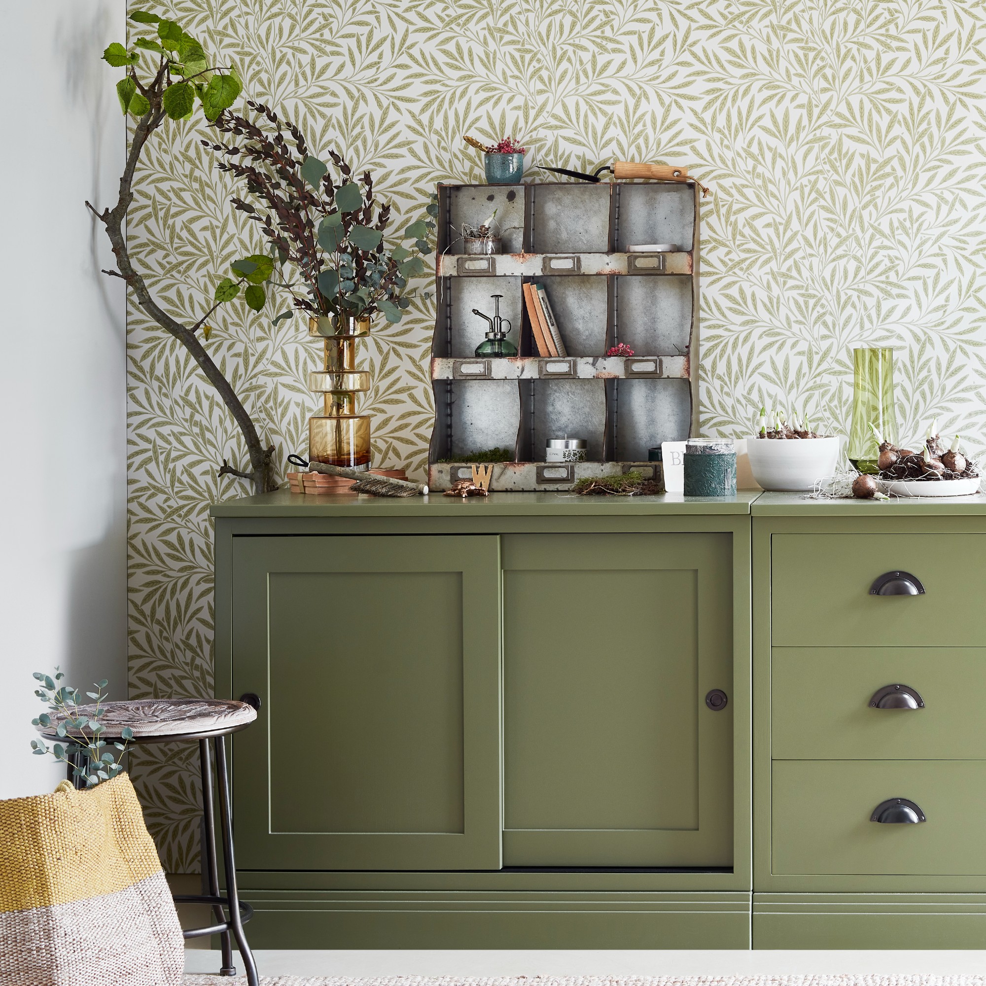
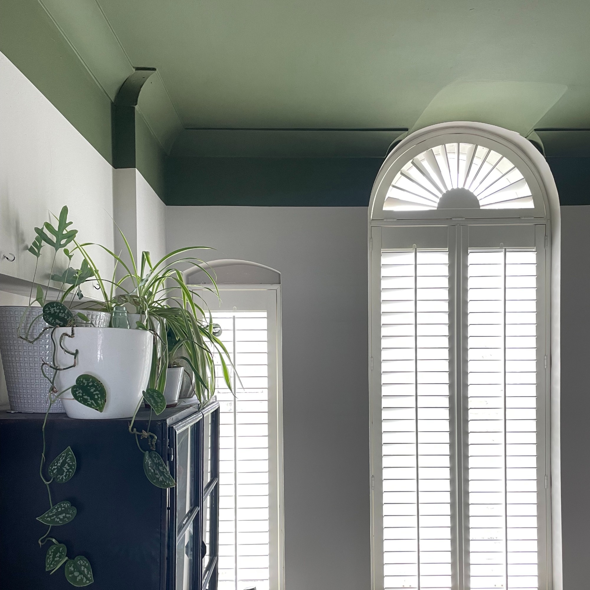
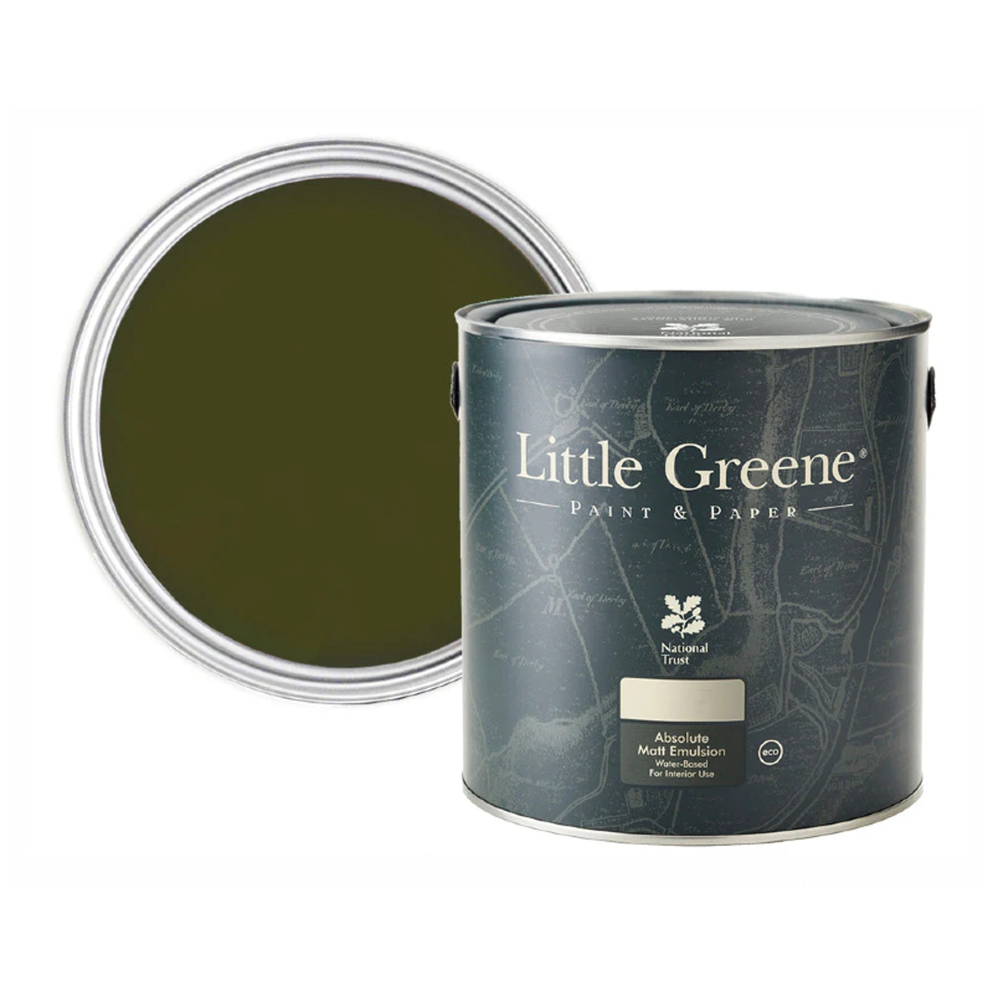
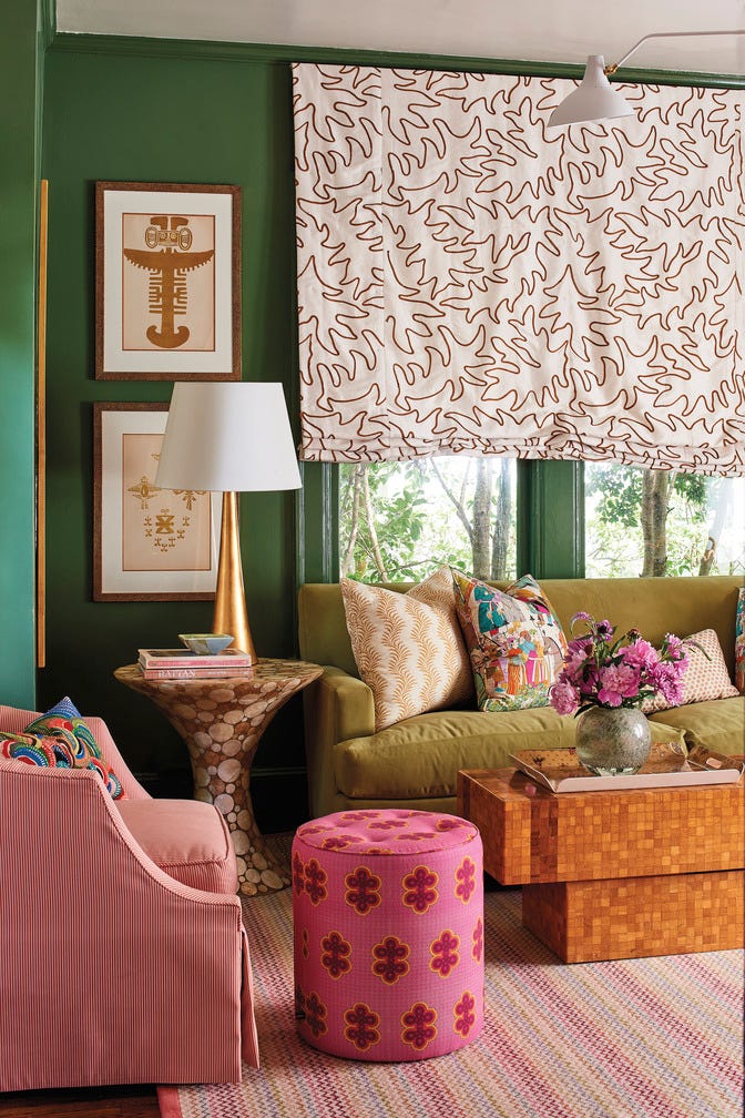
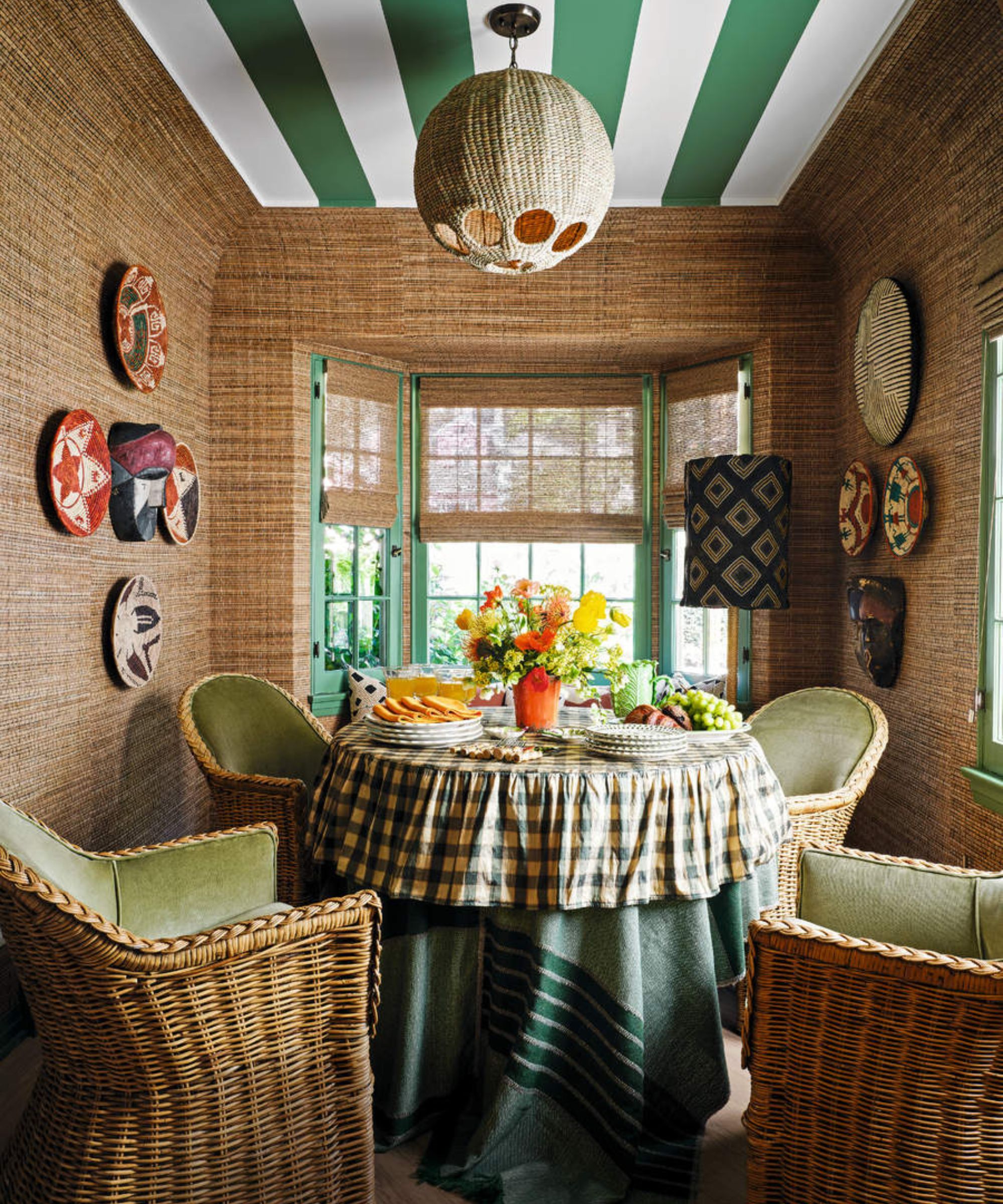
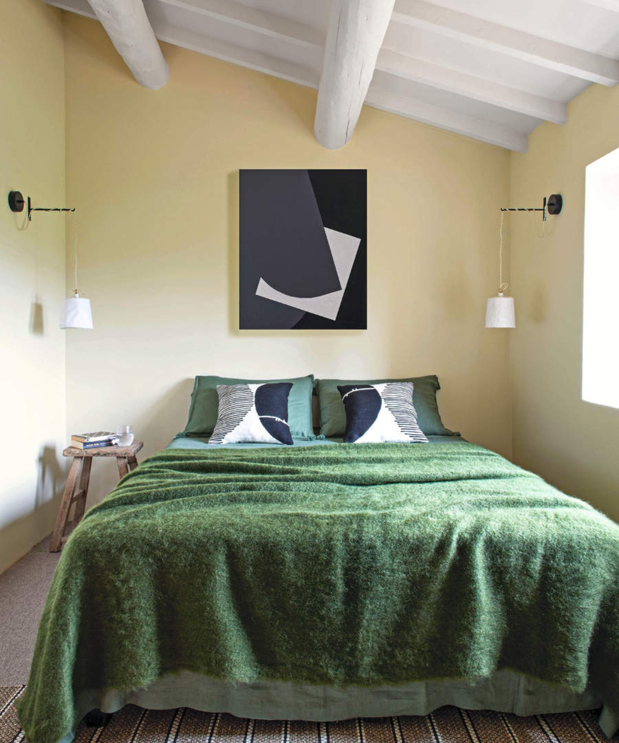
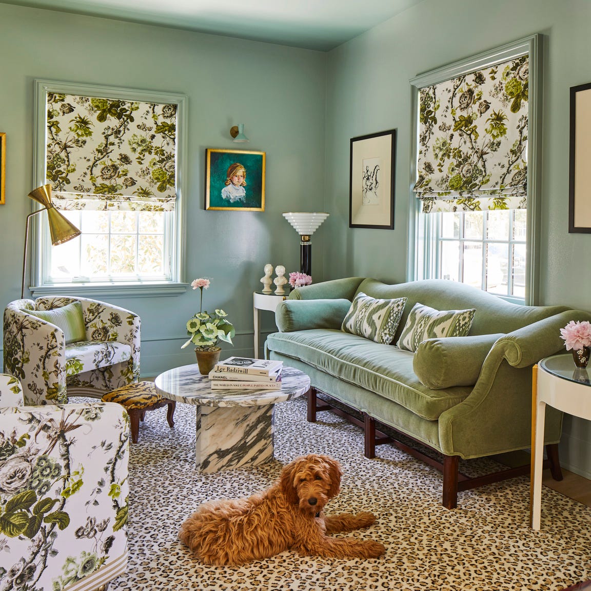
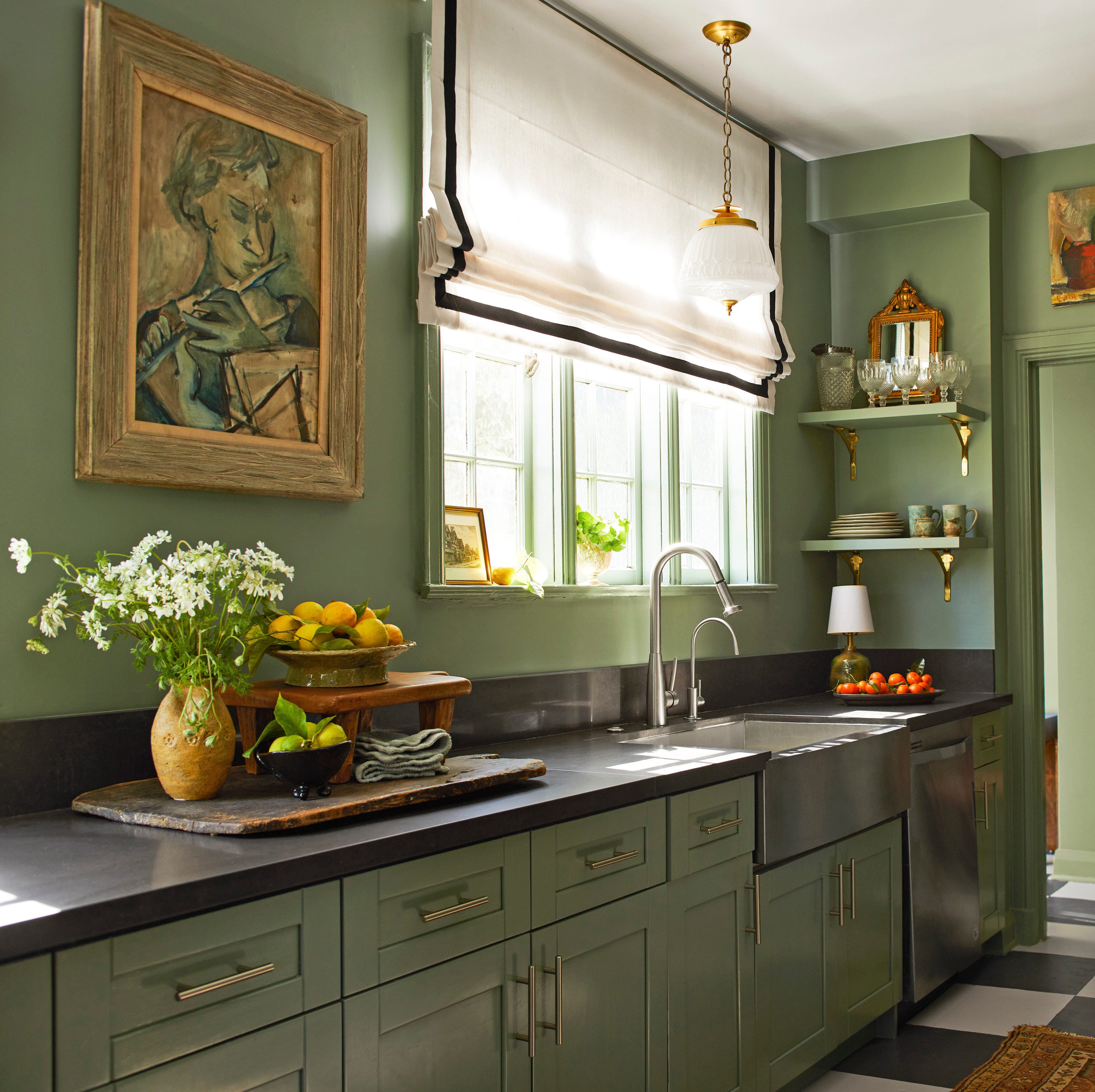
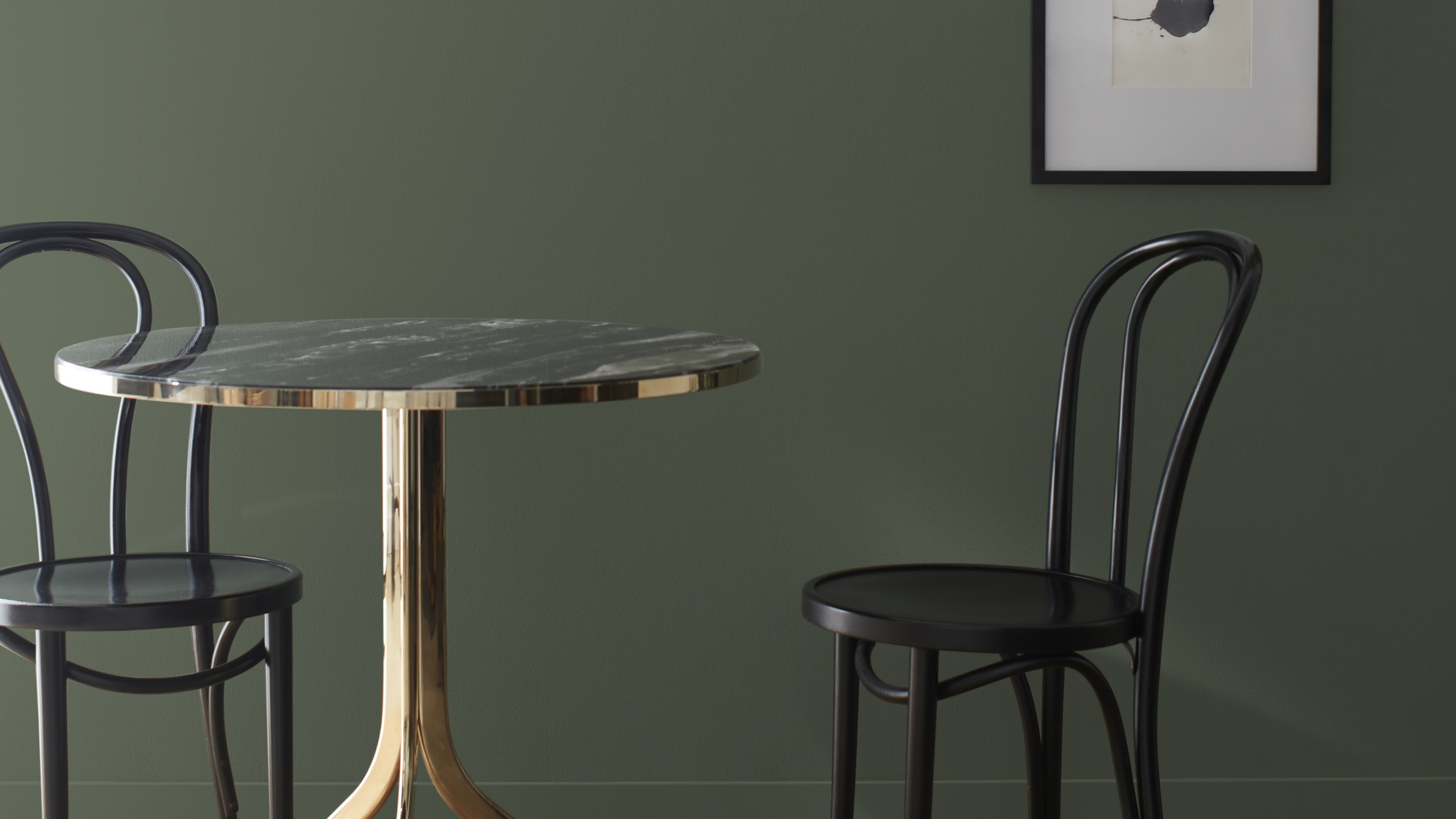
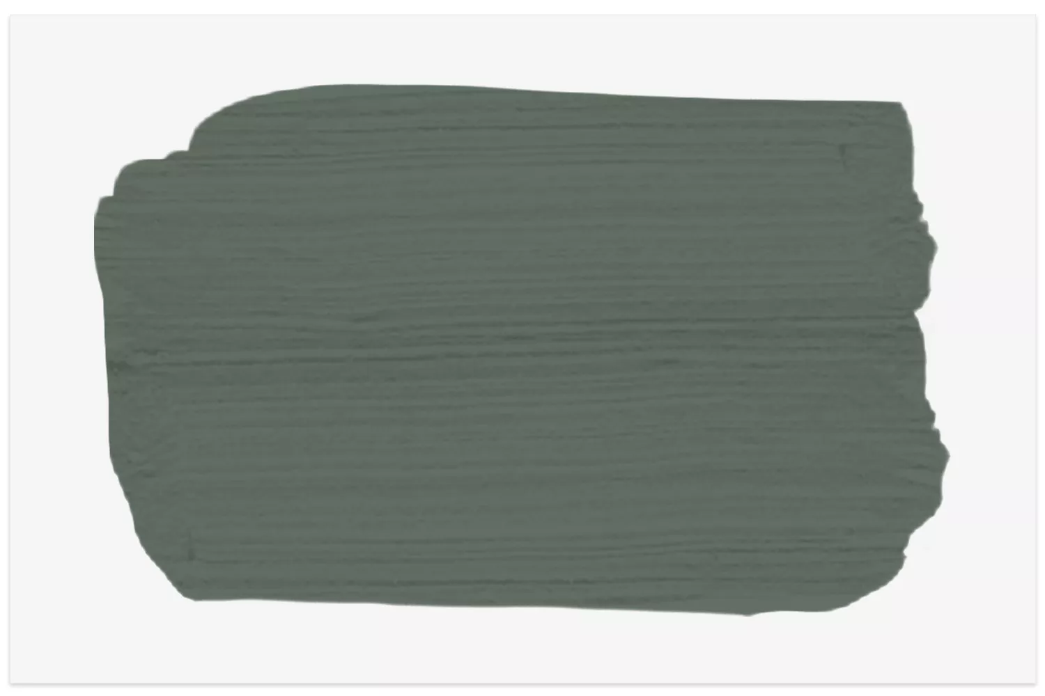
Benjamin Moore's Vintage Vogue is presented as a highly versatile and captivating green paint color, suitable for various interior design applications. Described as a deep, moody, and complex shade, it blends olive green with charcoal, exhibiting a dynamic quality that shifts with changing light conditions throughout the day. This characteristic contributes to its growing popularity among designers and homeowners alike, distinguishing it from conventional green hues.
Interior designer Rachael Gendrolis, founder of Penny & Pearl, highlights Vintage Vogue's ability to command attention without overwhelming a space, suggesting it as an ideal choice for rooms intended to be focal points. Hannah Yeo, a color expert at Benjamin Moore, further elaborates on its appeal, noting its capacity to infuse any space with a sense of timeless elegance. Yeo emphasizes its adaptability across different design styles, dependent on its pairing and styling, making it suitable for both traditional Parisian apartments and sleek, modern new builds.
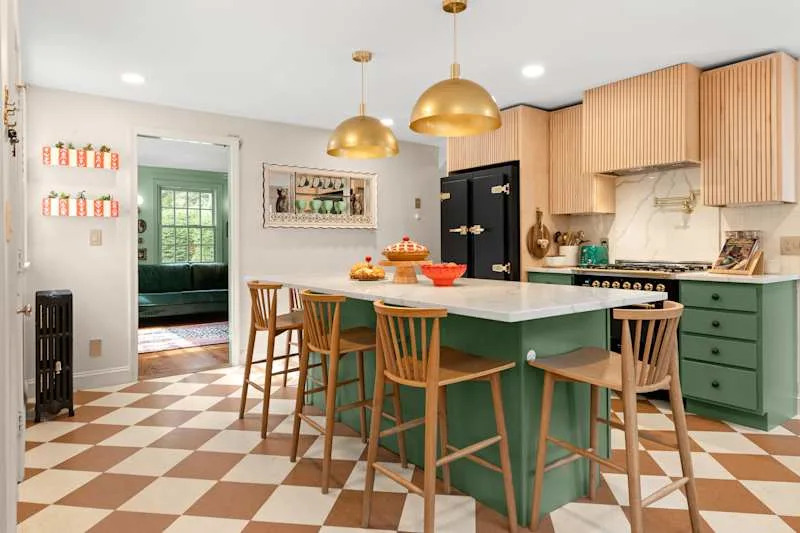
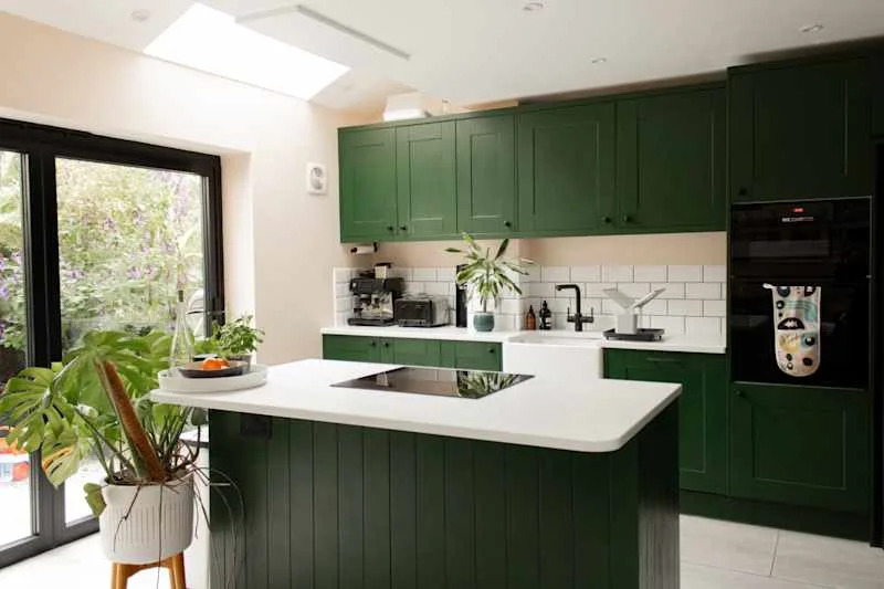
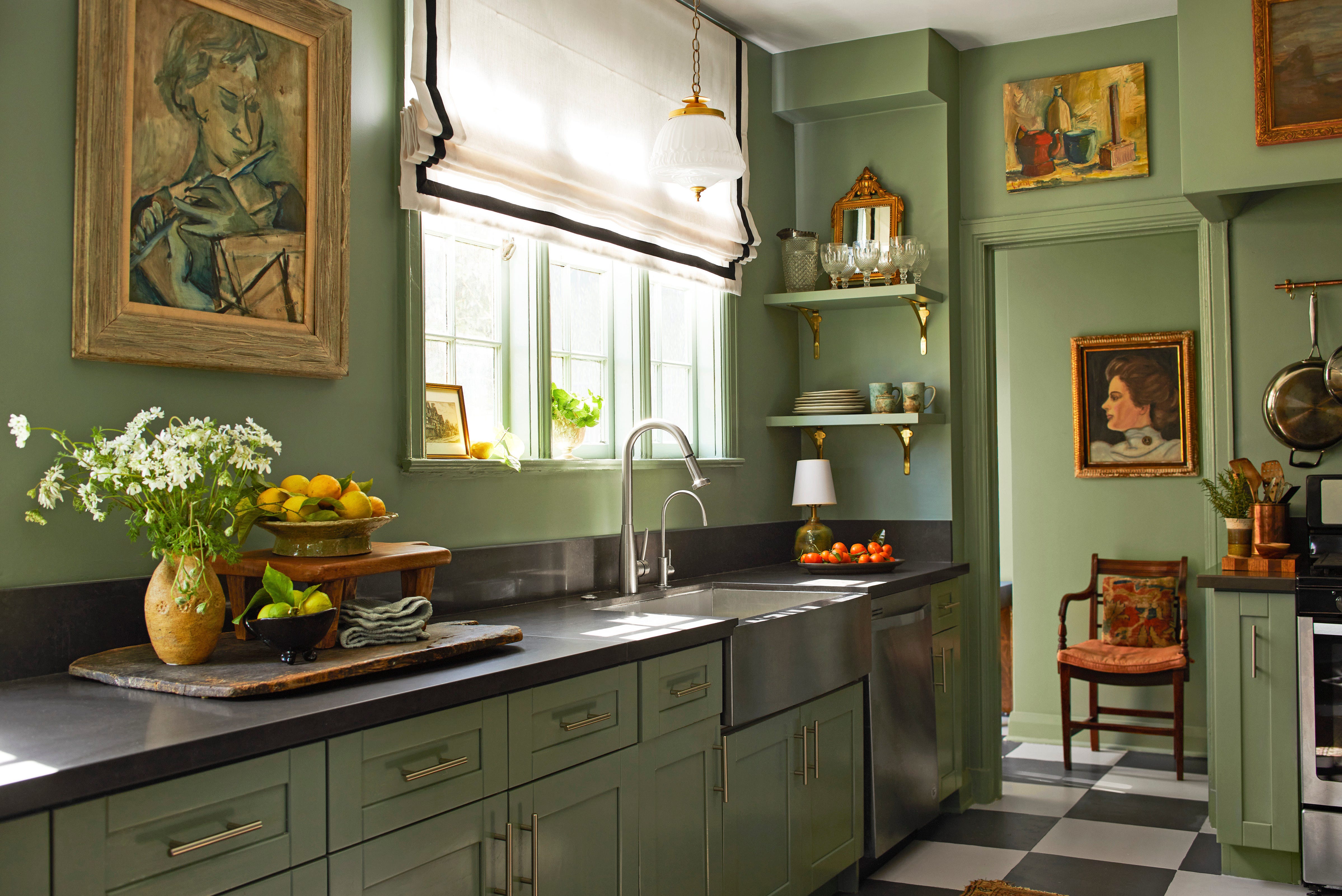
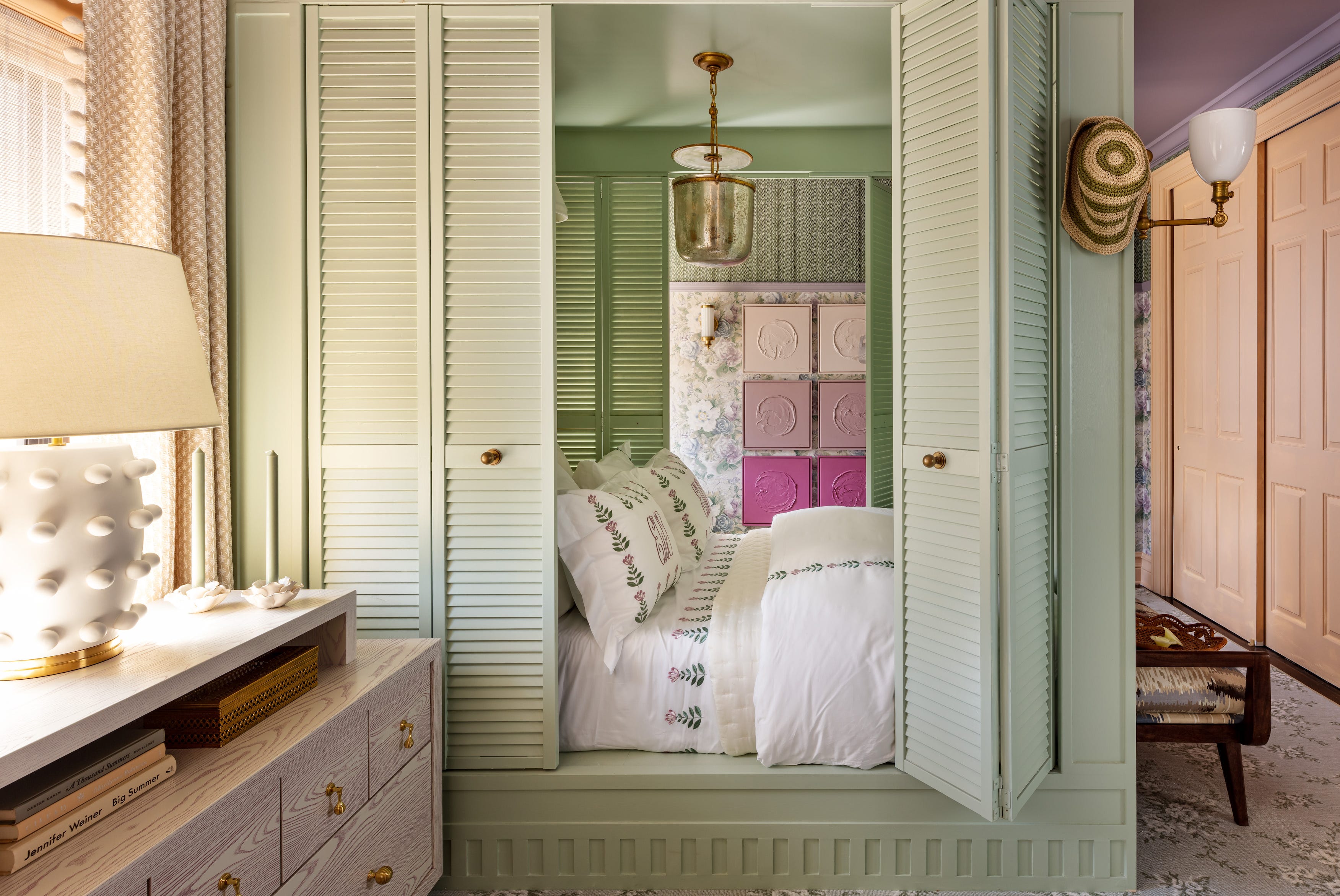
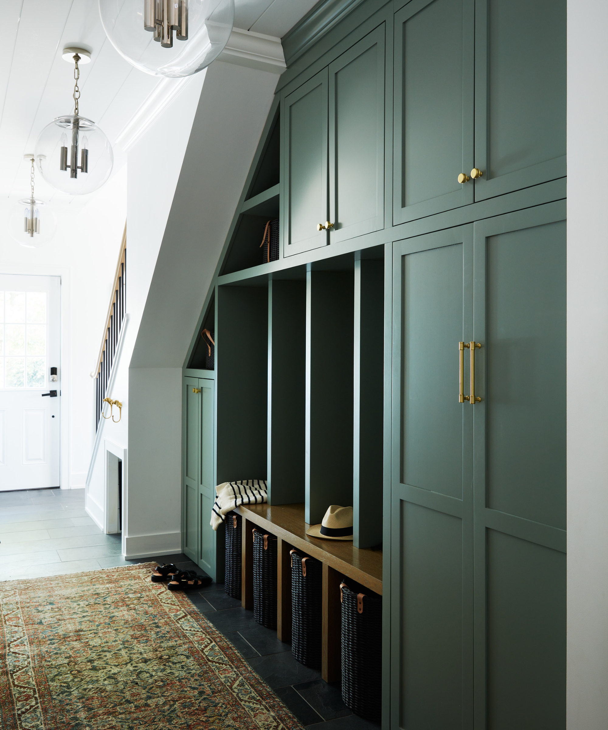
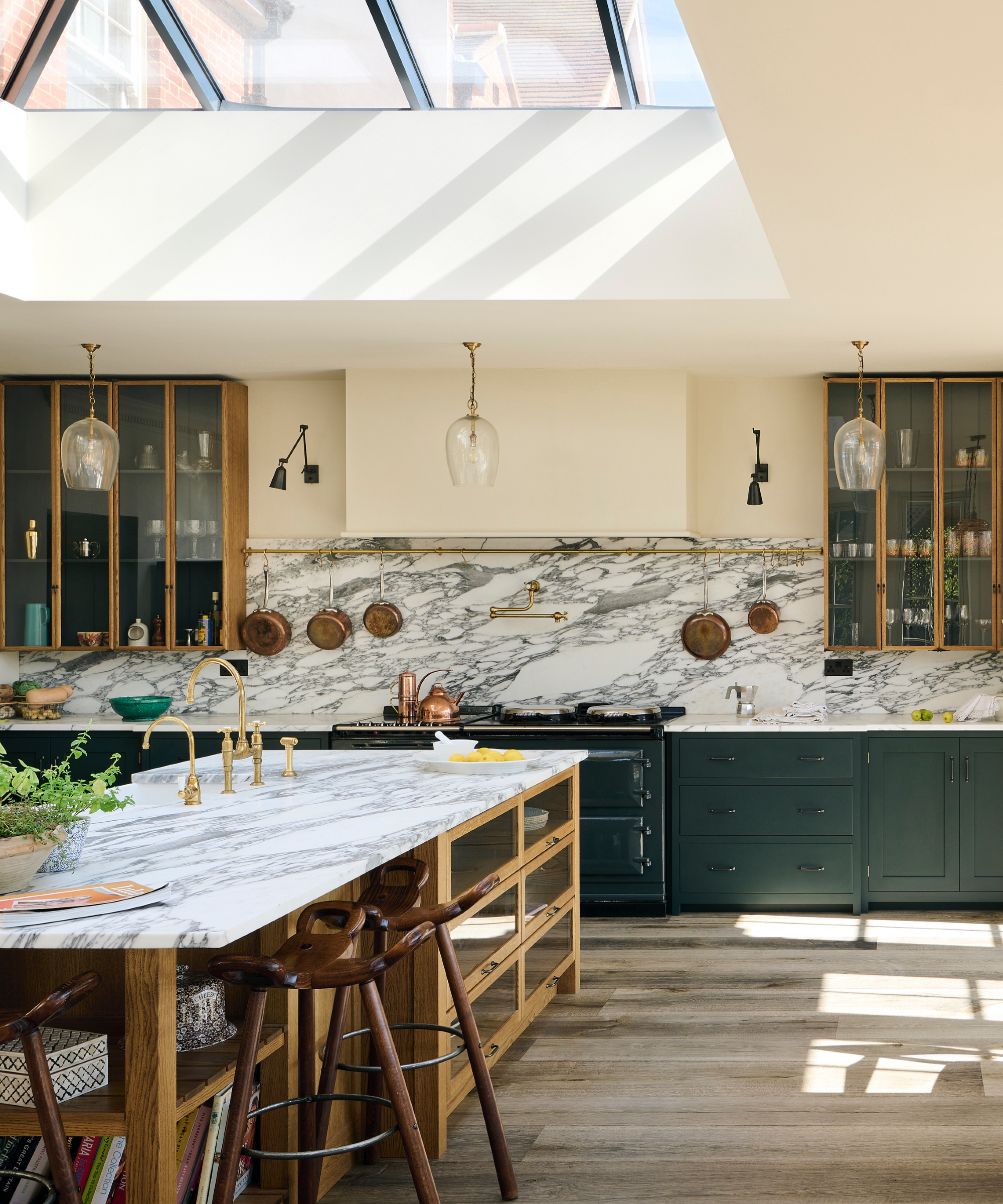
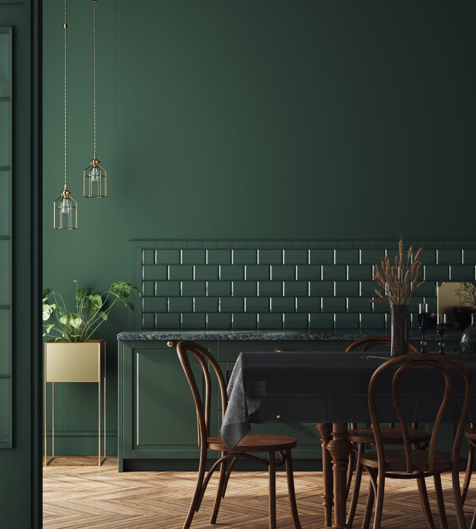
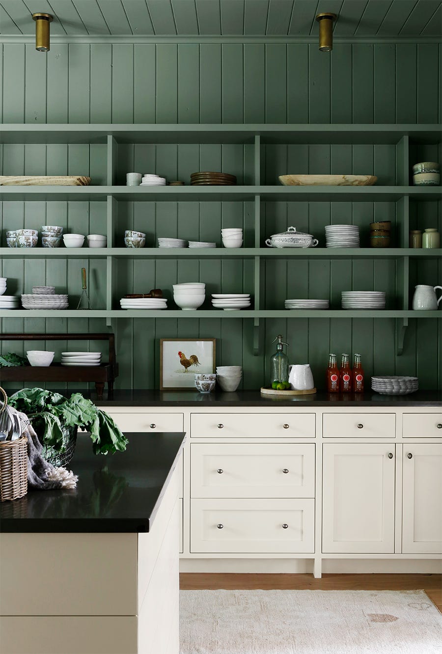
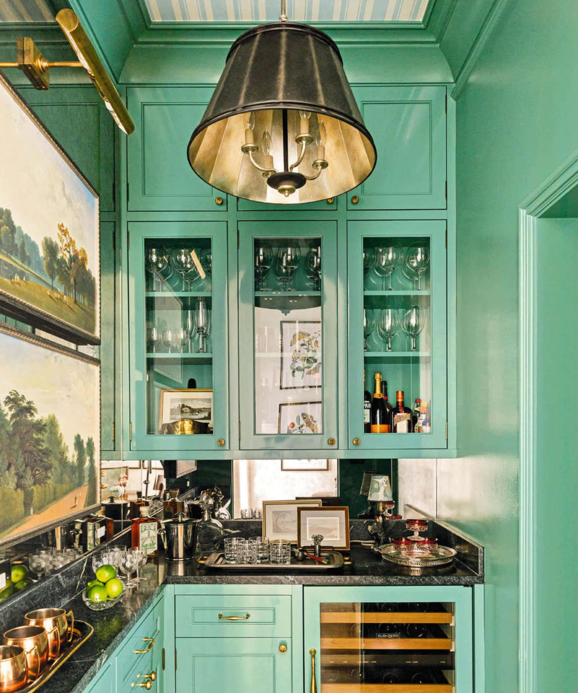
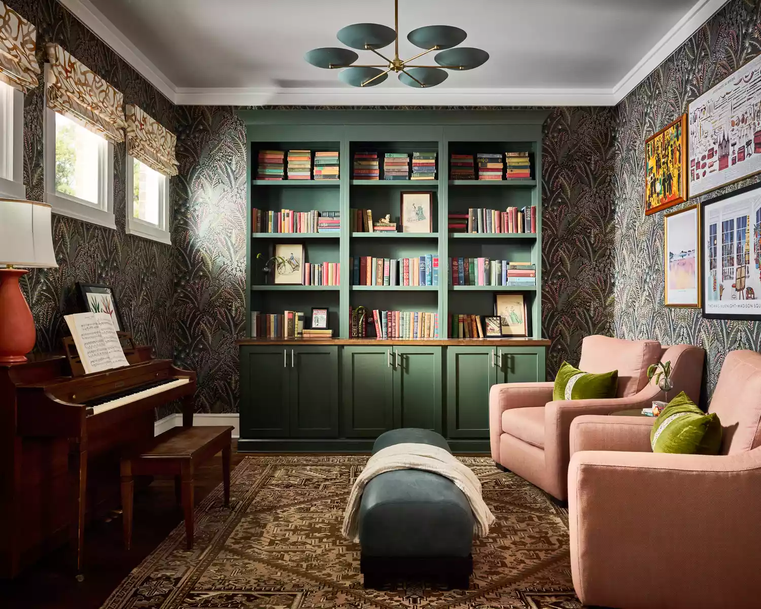
The article explores various applications for Vintage Vogue, from serving as a striking accent to becoming the primary color in a color-drenched interior. Gendrolis illustrates its use in a kitchen island, where its deep green hue creates a grounding contrast against a creamy white backdrop, contributing to an earthy yet modern aesthetic. Yeo points out its effectiveness in highlighting architectural details, such as built-ins and kitchen cabinet molding, adding a sophisticated touch to millwork.
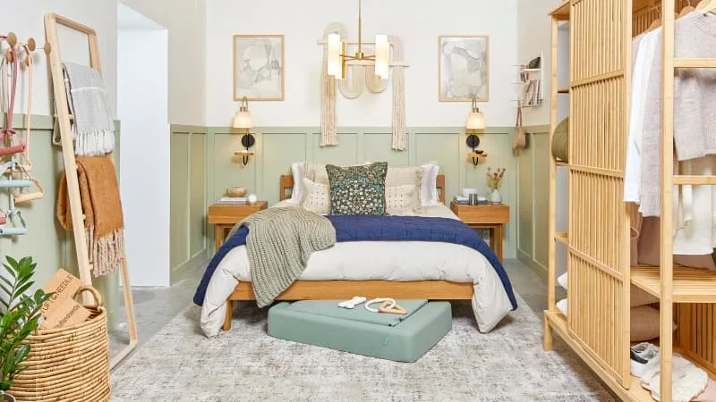
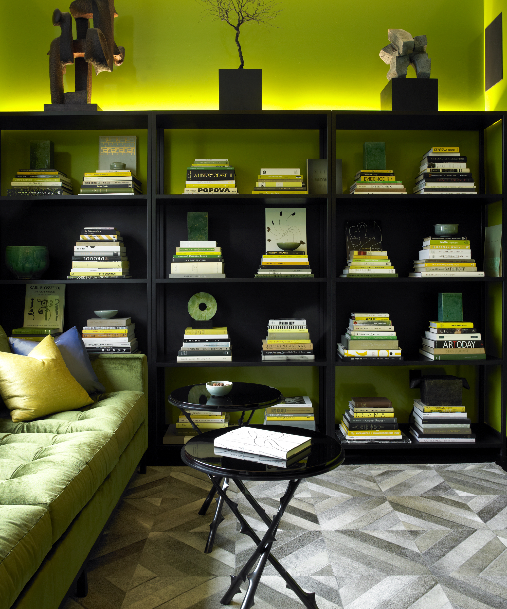
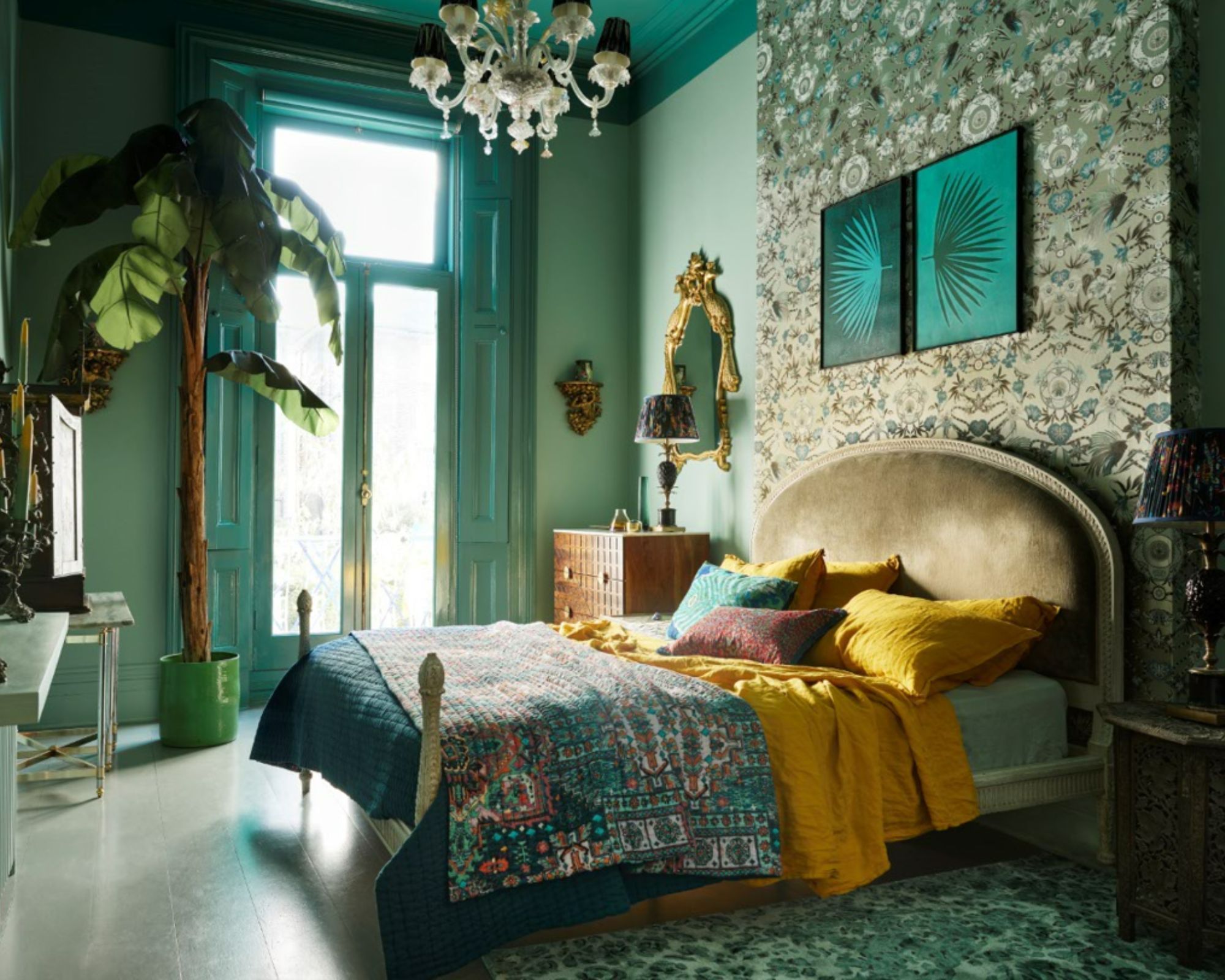
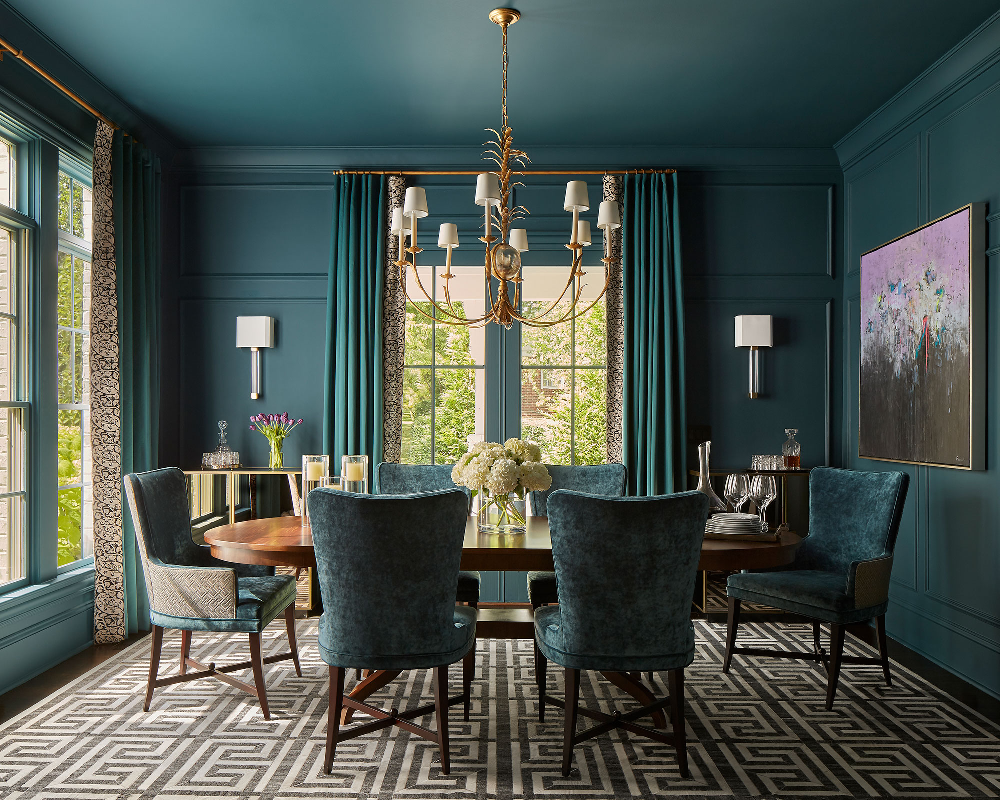
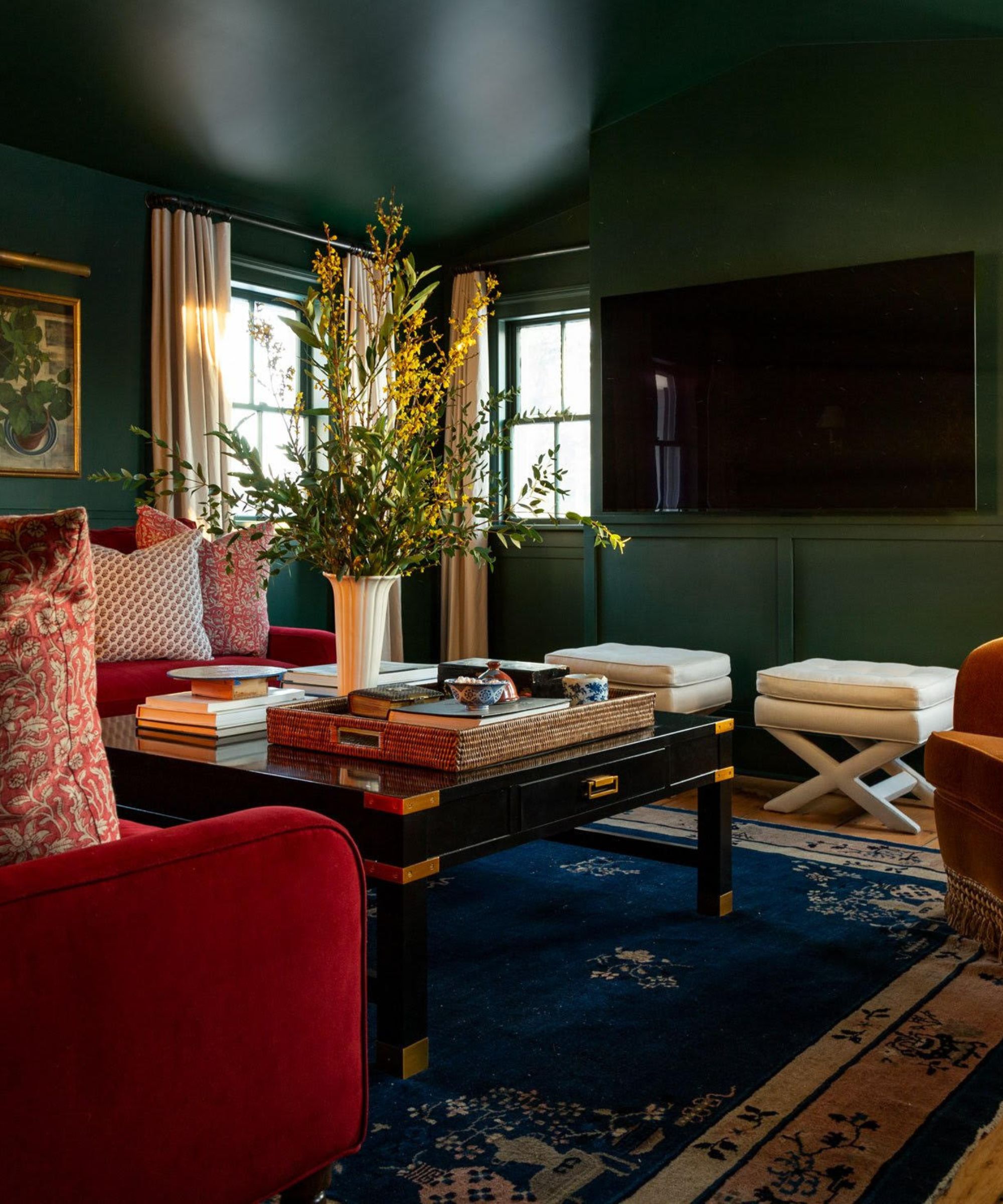
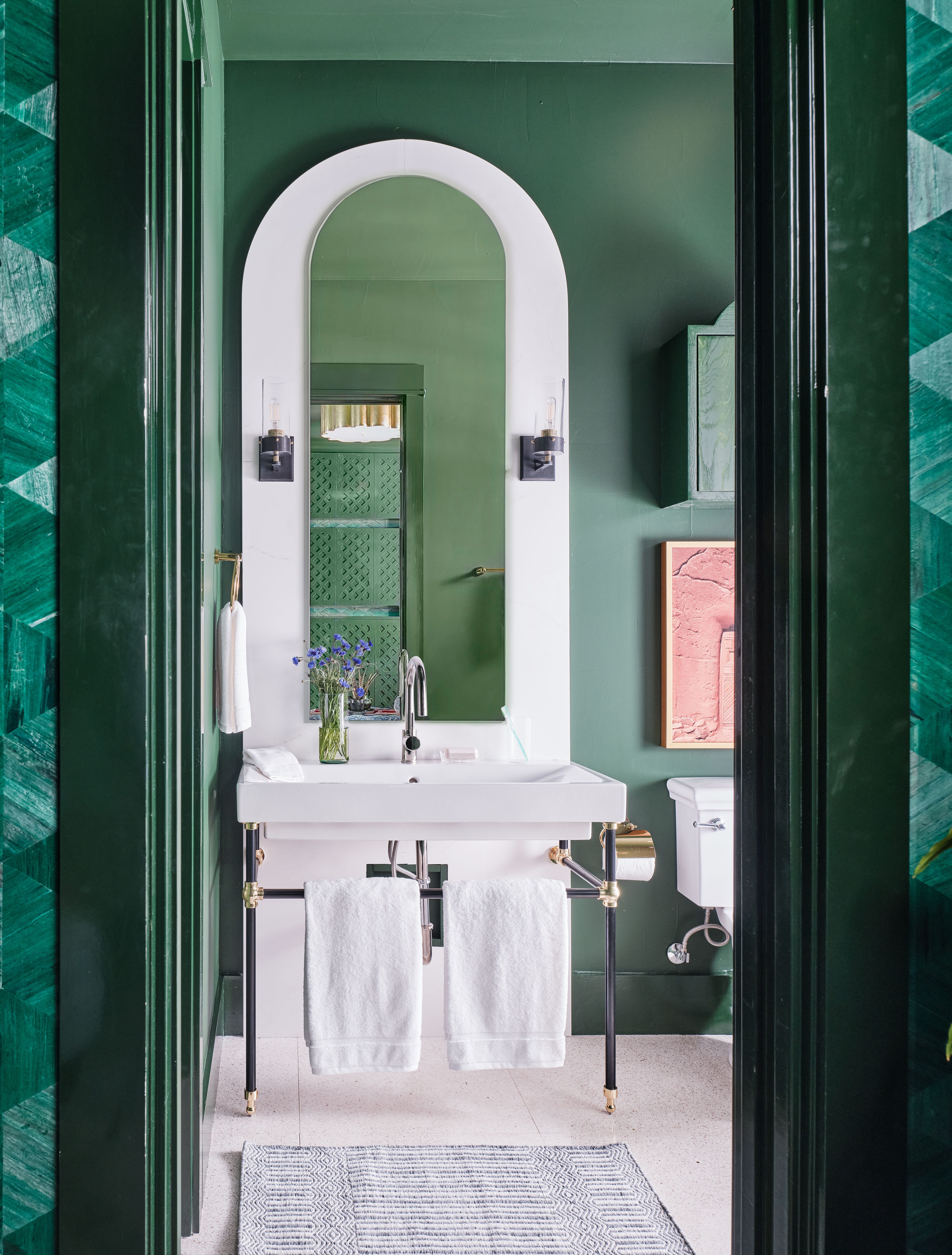
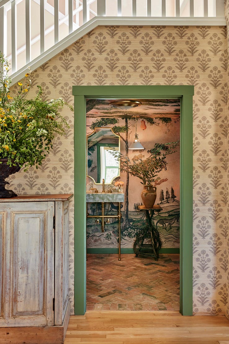
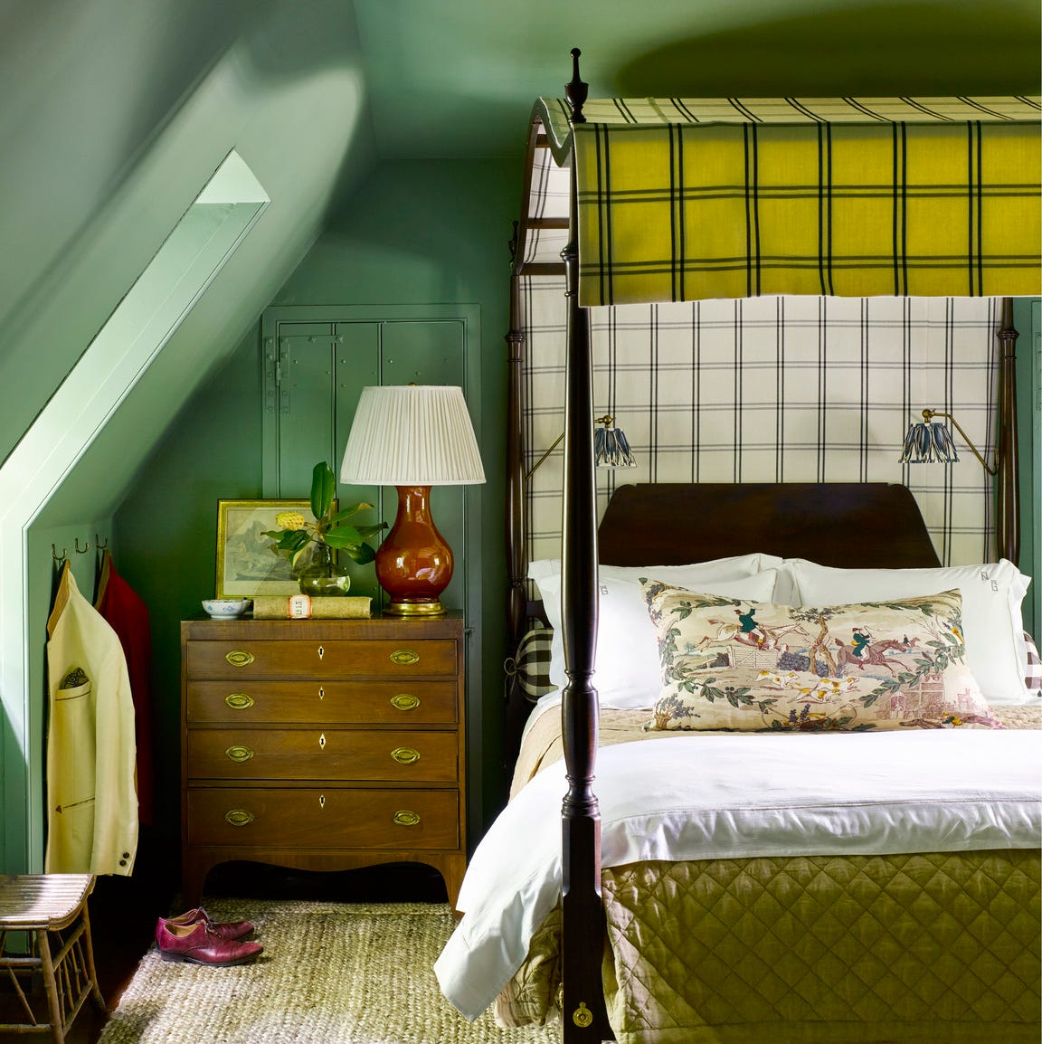
Vintage Vogue's inherent softness allows it to be used effectively in rooms with limited natural light, where it takes on a sultry, almost inky appearance, ideal for creating cozy bedrooms or living rooms when complemented with warm lighting. For a more dramatic effect, color drenching this shade is recommended, particularly in smaller, enclosed areas like powder rooms, to achieve a custom-designed, sophisticated feel. The color's soothing nature and soft, gray undertone also make it an excellent choice for home offices or libraries, promoting stability and focus as a sensory-conscious paint color.
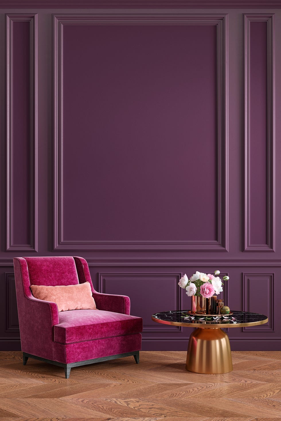
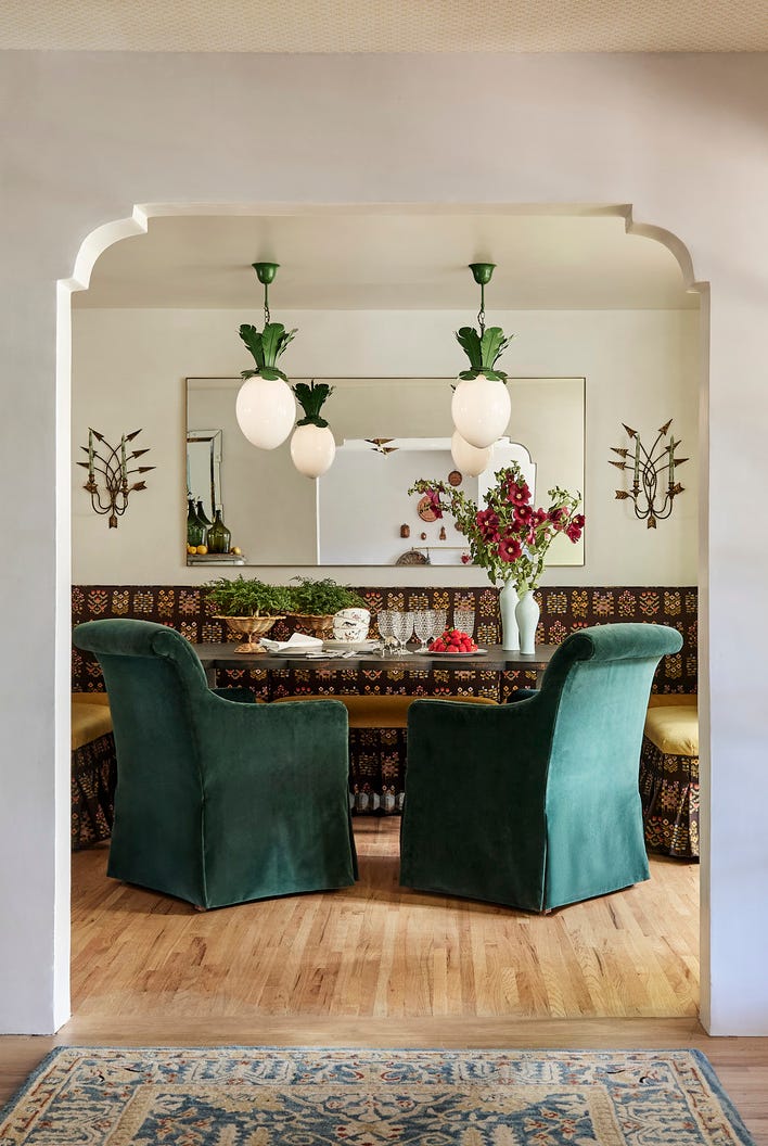
Regarding color pairings, Vintage Vogue harmonizes effortlessly with a calming, neutral palette. Warm, creamy whites like Benjamin Moore's Swiss Coffee or muddy taupes such as Stone Hearth are suggested for a balanced scheme. The article specifically mentions pairing Vintage Vogue with Benjamin Moore White Dove in a kitchen setting, where it stands out against an all-white backdrop. For those seeking more visual tension, muted yellows, soft blushes, or even dusty purples, like Benjamin Moore's Cinnamon Slate, can make Vintage Vogue come alive. Finishing touches with reflective accents such as brushed bronze sconces, metallic finishes, and elegant glassware can elevate the drama, while tactile elements like woven textiles, plush fabrics, warm hardwood floors, and light linens contribute to a sense of comfort and tranquility. The article concludes by reinforcing Vintage Vogue's capacity to offer drama without being overpowering, positioning it as a timeless olive paint color that soothes rather than shouts.
#BenjaminMoore #VintageVogue #PaintColor #InteriorDesign #GreenPaint #ColorTrends #HomeDecor #DesignTips #RachaelGendrolis #BenjaminMoore #VintageVogue #PaintColor #InteriorDesign #GreenPaint #ColorTrends #HomeDecor #DesignTips #RachaelGendrolis
0 commenti in totale
 Nessun commento ancora
Potresti anche gradire
These 13 Green Paint Colors Are the Best We’ve Ever Seen

5 best green paints that will always be classics, according to interior designers

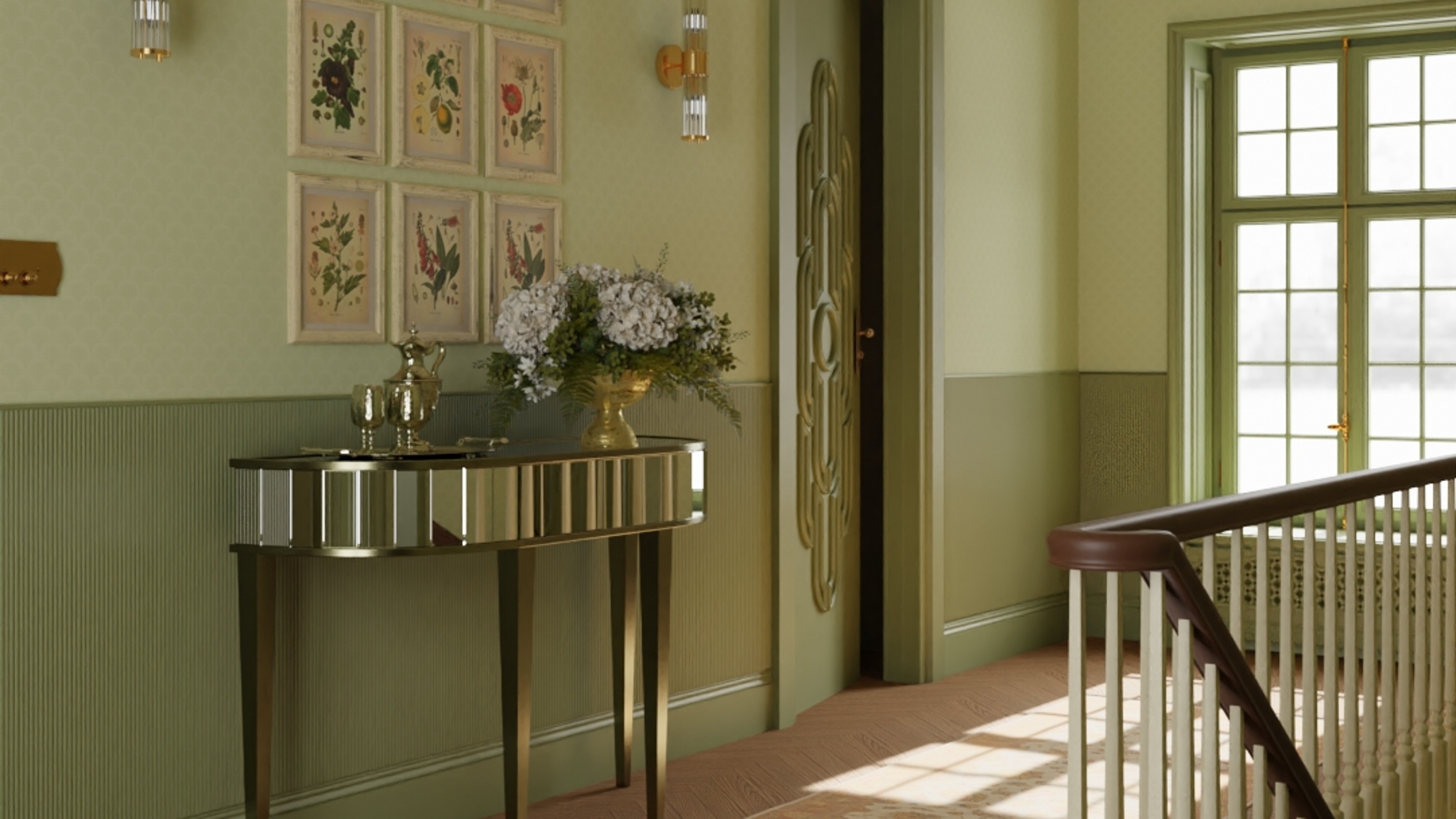
Olive green is the fresh new colour trend of this spring
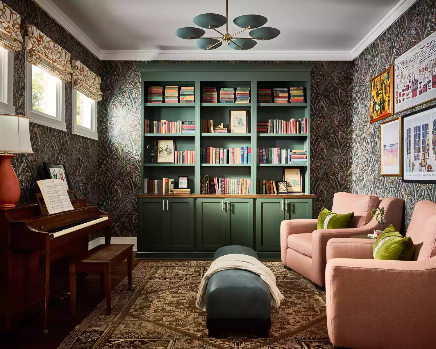
17 Green Paint Colors for Every Room, From Soothing Sage to Electric Emerald
Vibrant Green Is The Color Trend That Comes Celeb Approved

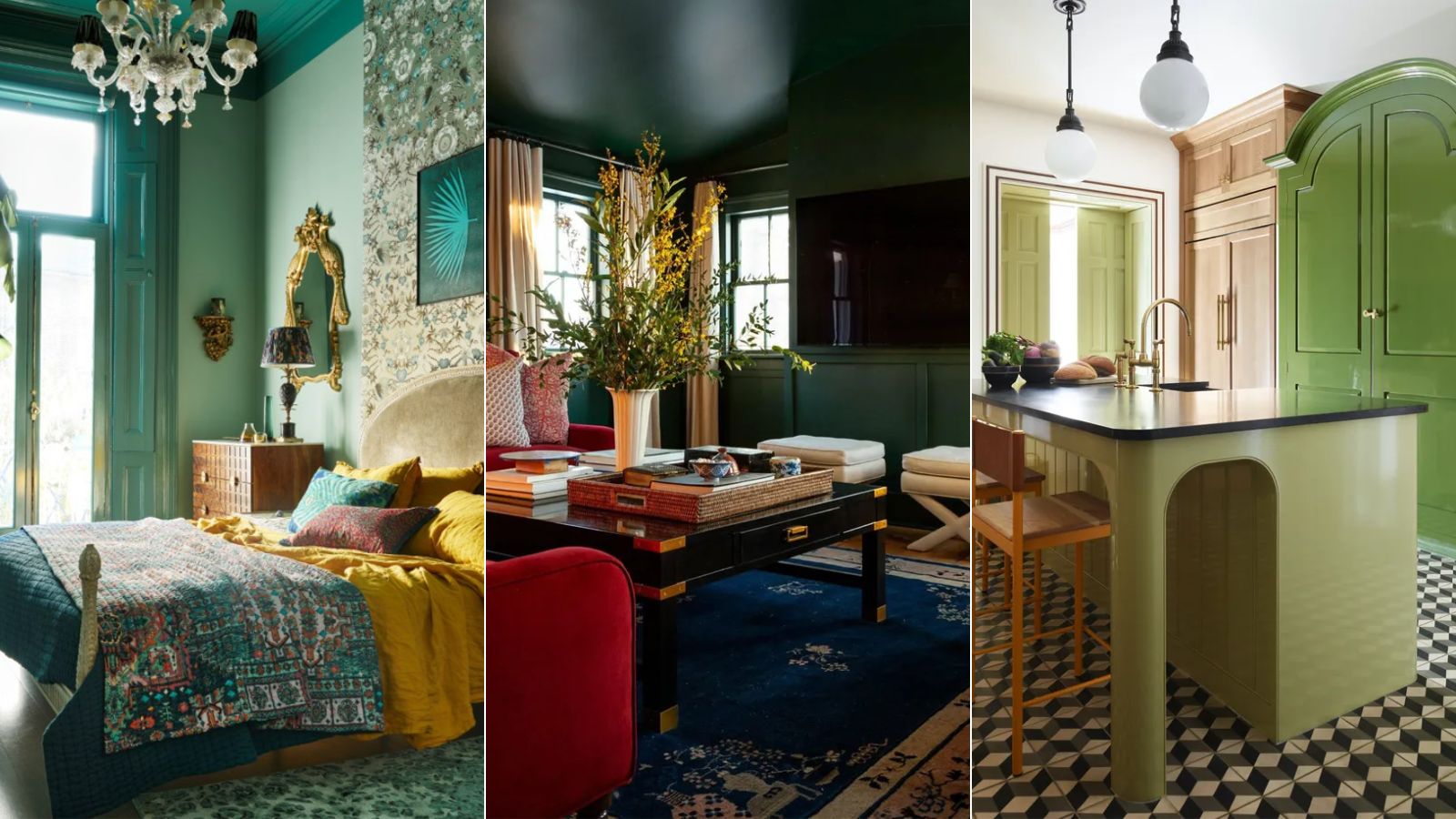
What's replacing sage green in 2024? 5 on-trend variations of this nature-derived hue
Going Green: Inside This Year’s Color Craze
Acid Green - The Color of the Year That No One Is Talking About
Gen Z Just Declared This “Boring“ Color the New Millennial Gray and I Am So Upset
14 Best Green Paint Colors

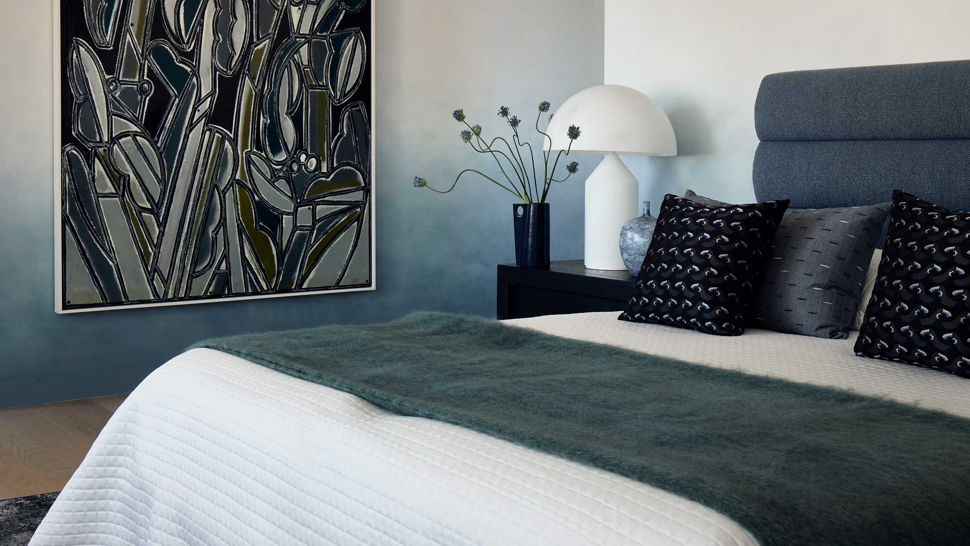
This surprising color trend is having a comeback
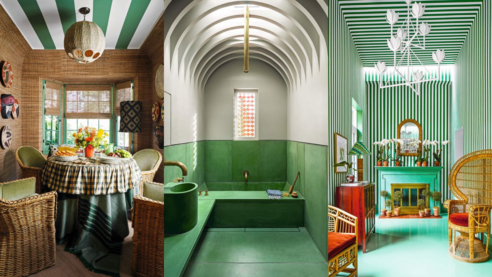
Green is the color of 2023 – these designer-approved ways to use it are bold and beautiful
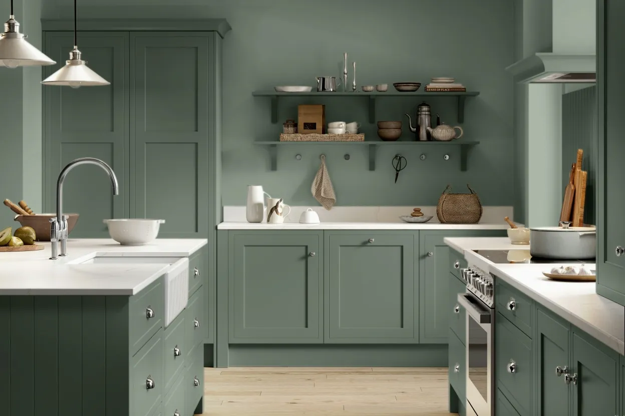
8 Green Paint Colors Interior Designers Swear By for a Bold and Fresh Home

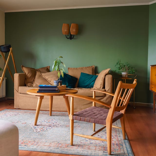
Designers Say These Vintage Paint Colors Are Back

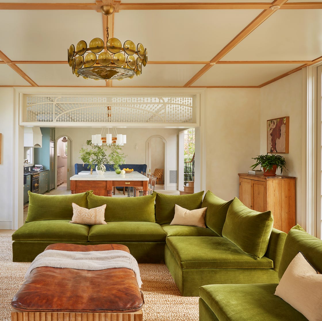
37 Unexpected Colors That Pair Perfectly With Green, According to Designers

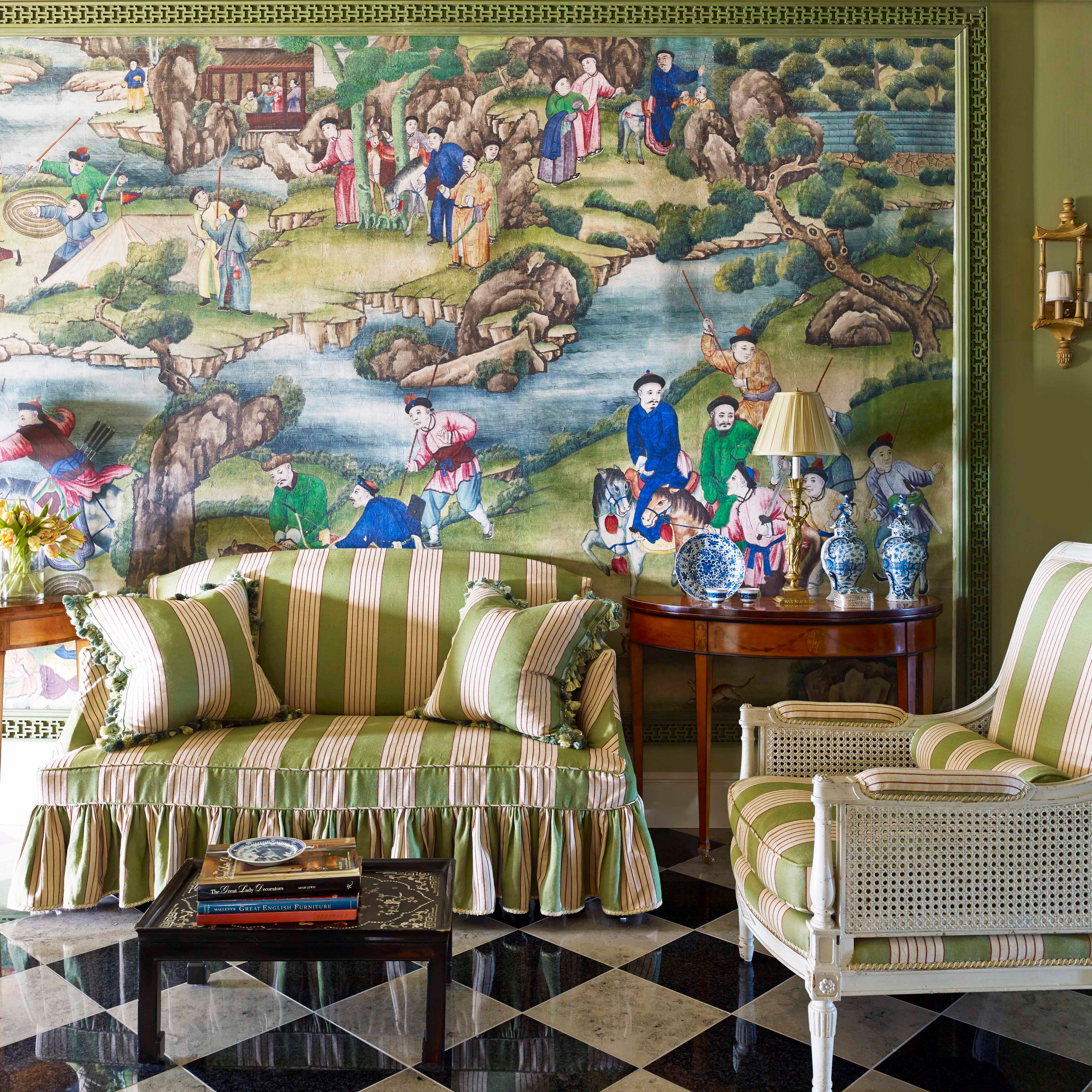
15 Lush Green Paint Colors to Invigorate Any Space

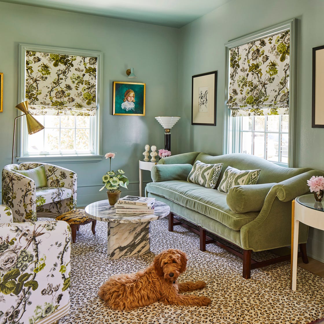
Designers Swear By These 11 Sage Green Paint Colors

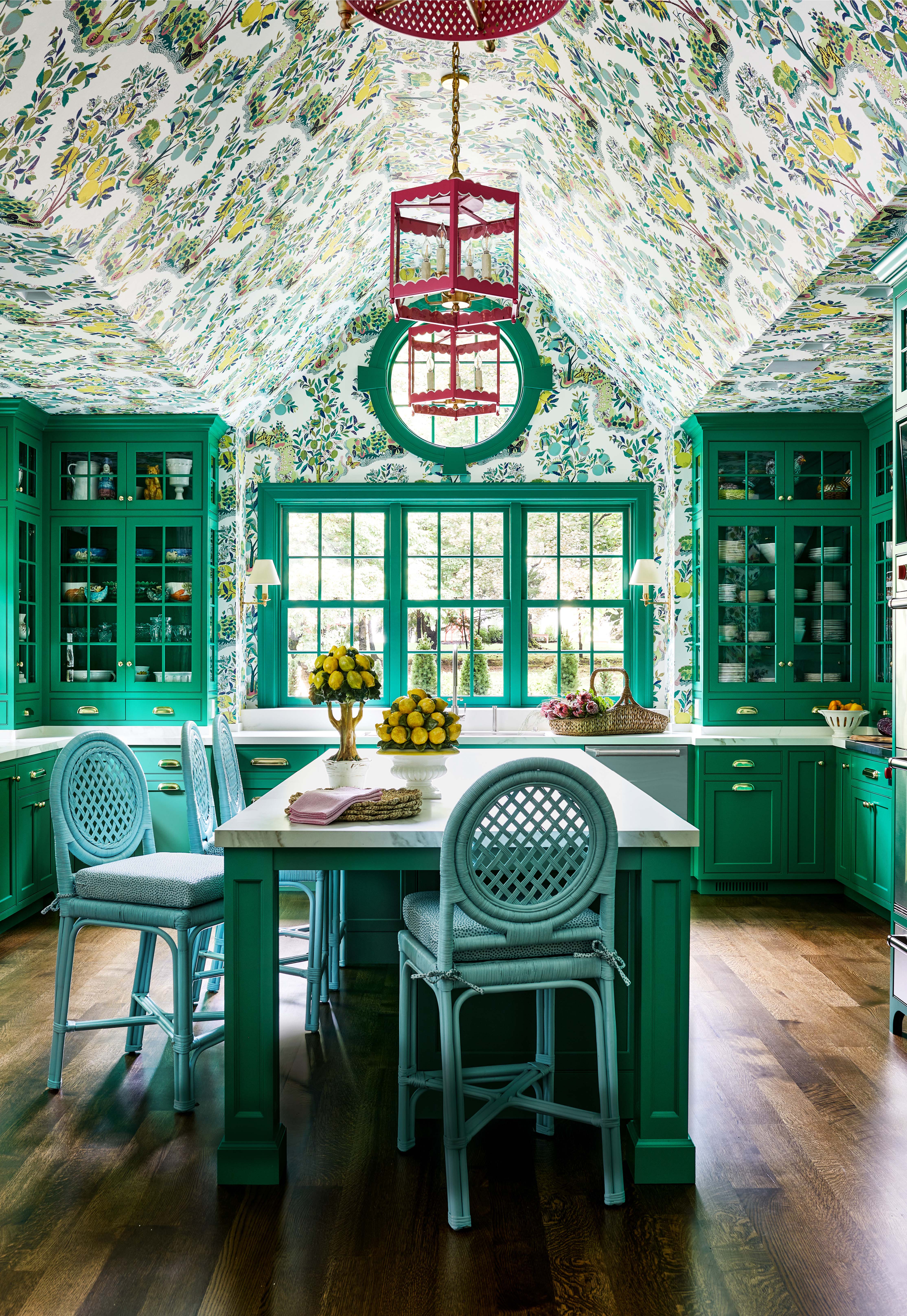
There Are Only Certain Green Paint Colors That Can Bring a Room to Life

Designers LOVE Pairing These Unexpected Colors With This One Timeless Hue

17 Green Paint Colors for Every Room in Your Home, From Soothing Sage to Electric Emerald