Designers Swear by This Coffee-Inspired Palette for Creating a Cozier Home
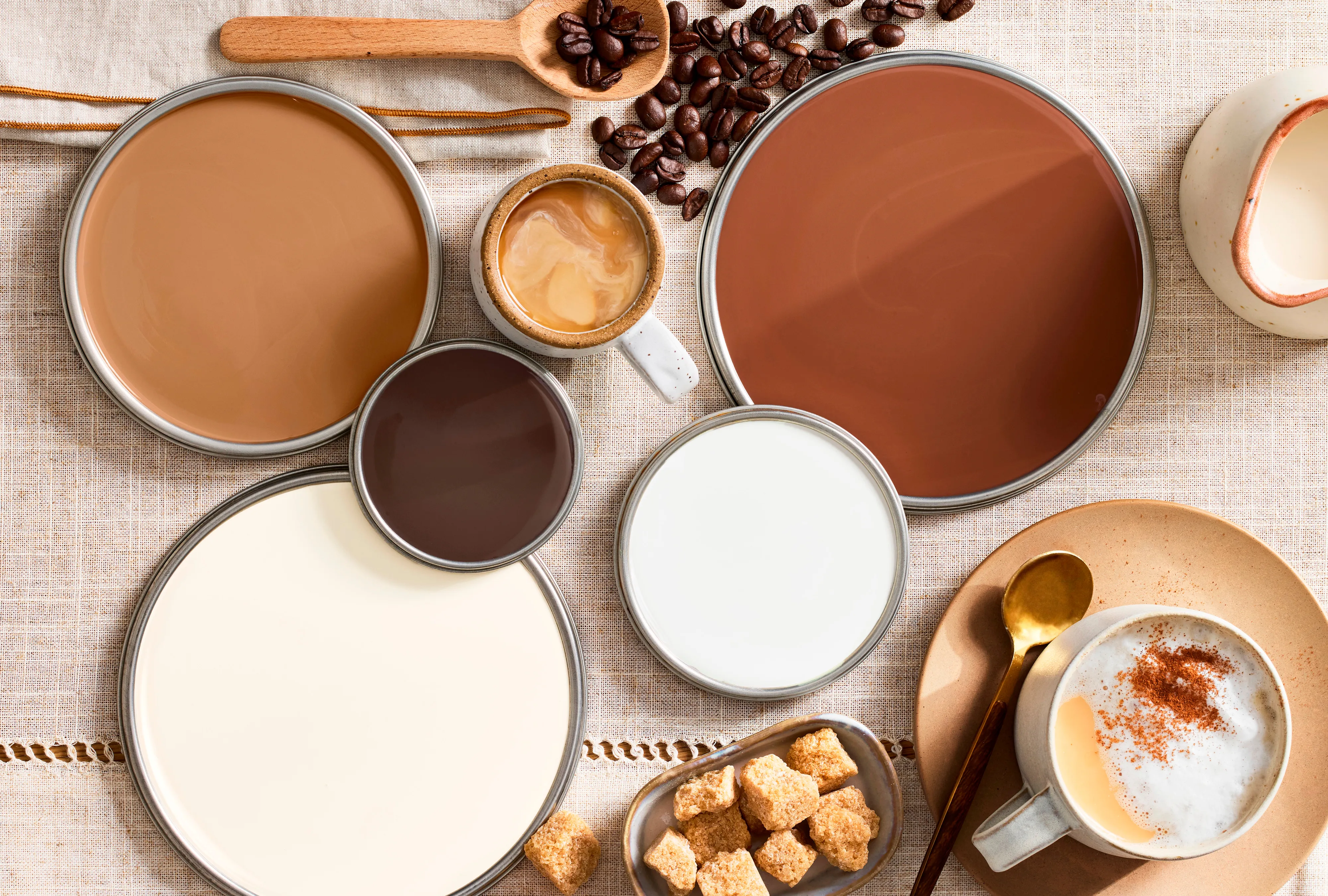
The article explores the growing popularity of coffee and cream color palettes in interior design, emphasizing their ability to create a sense of comfort and timeless elegance. This color scheme, reminiscent of an espresso with whipped foam, utilizes a blend of rich browns, such as cocoa, cinnamon, or raw sugar, paired with milky white and cream hues. The combination adds depth without making a space feel heavy, a key advantage highlighted by professional designers.
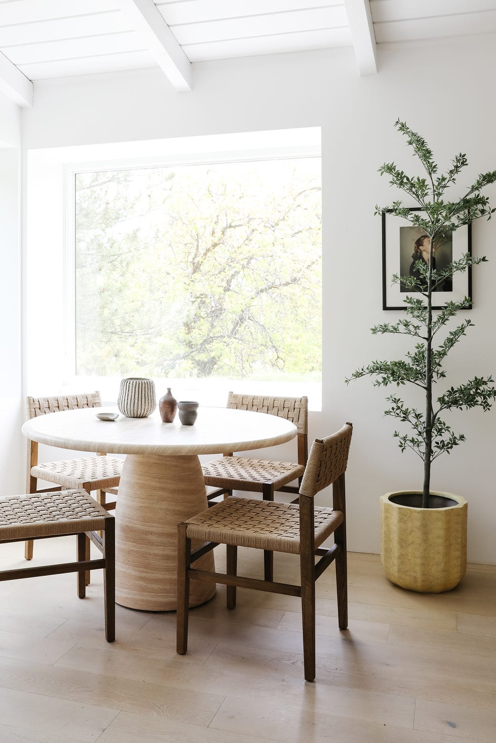
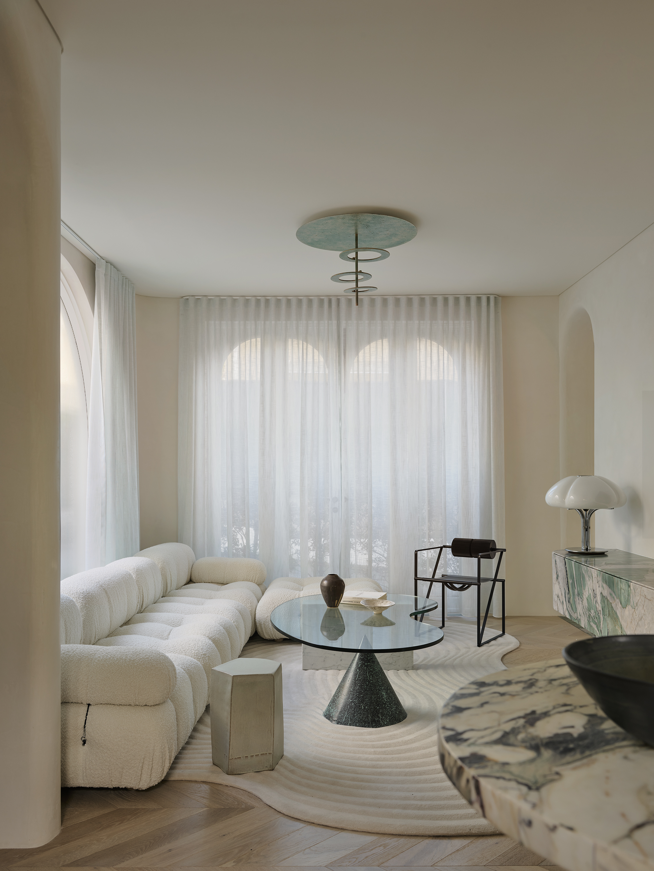
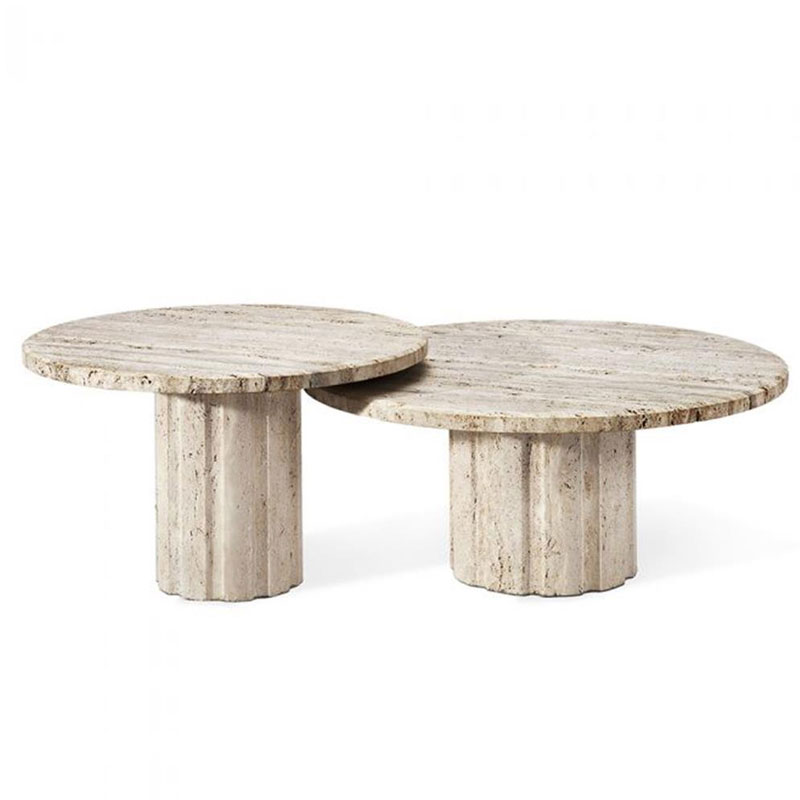
Interior designer Billy Cotton demonstrates the effectiveness of combining similar undertones in browns to achieve warmth. His loft dining room, featuring matte brown walls painted in Benjamin Moore's Weathered Oak, integrates large ecru and alabaster elements like a 44-inch Noguchi paper lantern and a 1970s travertine dining table. The deliberate choice of warm and rich surfaces ensures a harmonious blend, contributing to an immediately calming atmosphere.
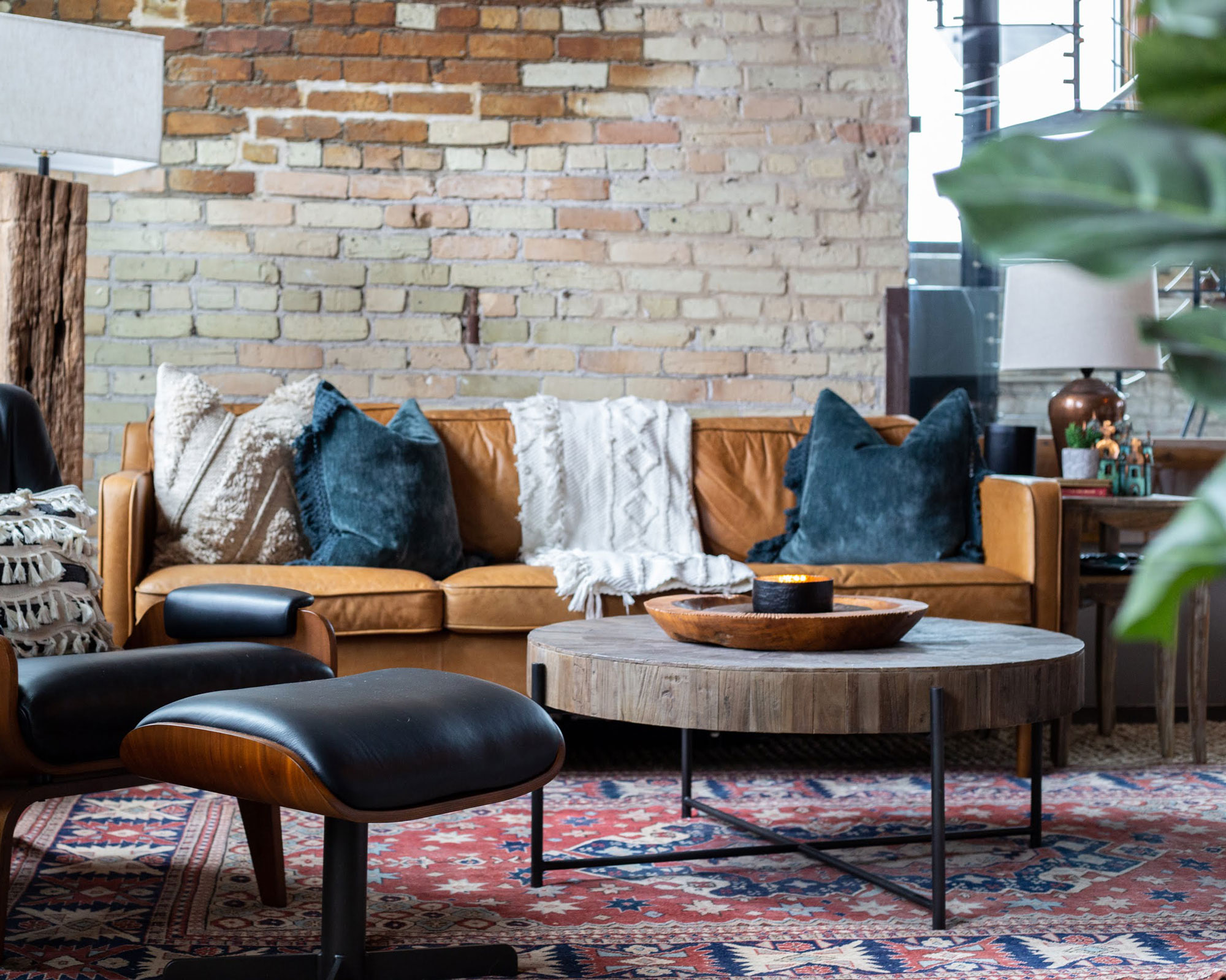
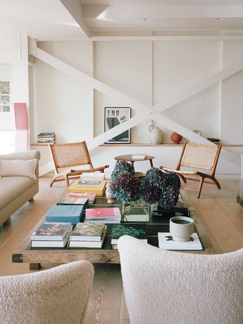
Maureen Ursino, another interior designer, focuses on texture within a cohesive palette of creams and mid-tone white oaks. In a living room, she incorporates whitewashed brick, an upholstered chair, and a wool rug, all contributing to warmth and depth through their tactile qualities. These soft textures are complemented by natural wood tones found in paneled shelving units, a live-edge coffee table, and a woven rope chair. Strategic injections of jet black in elements like the fireplace and wall lights provide anchors to the space, adding a finishing touch.
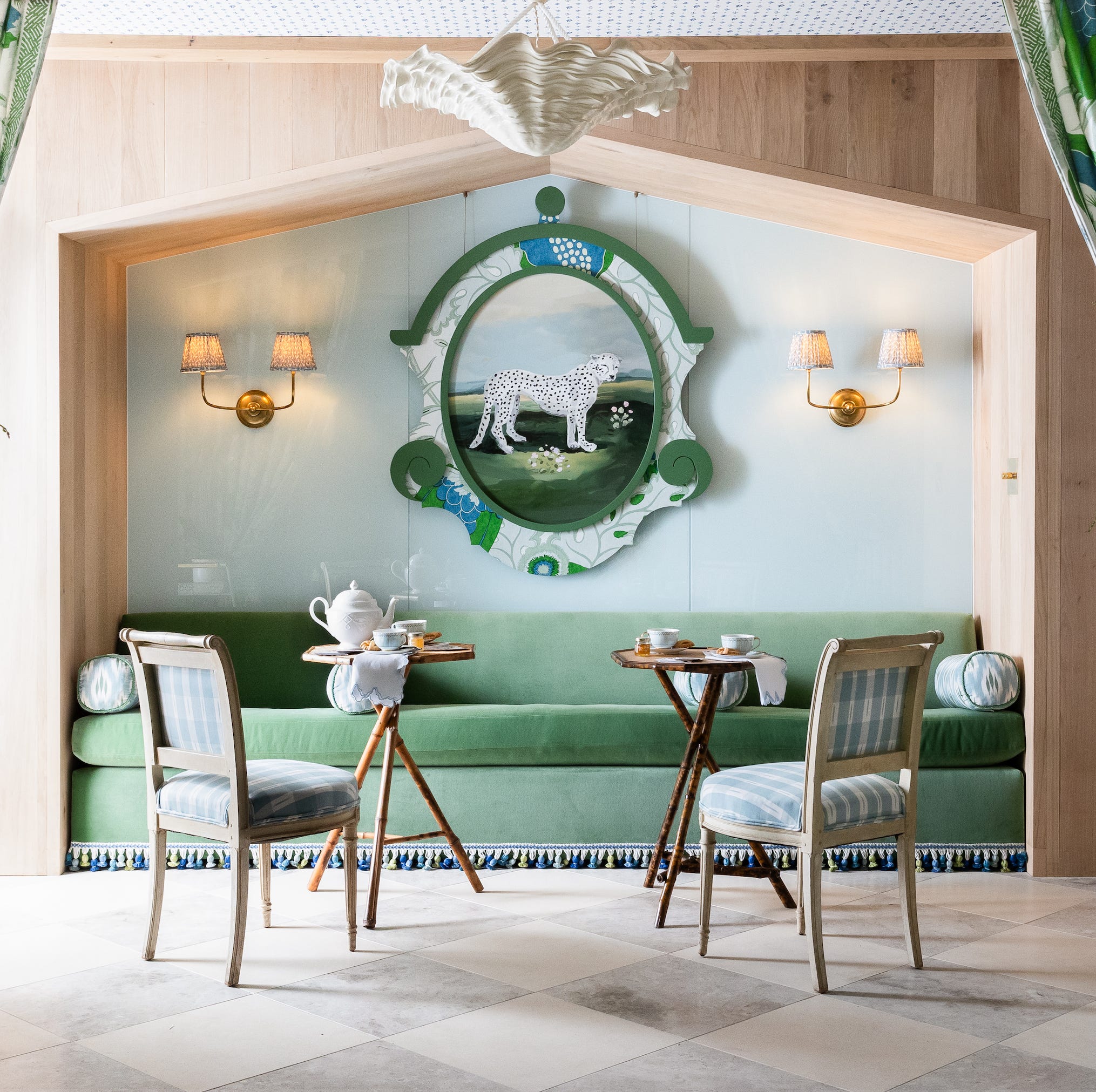
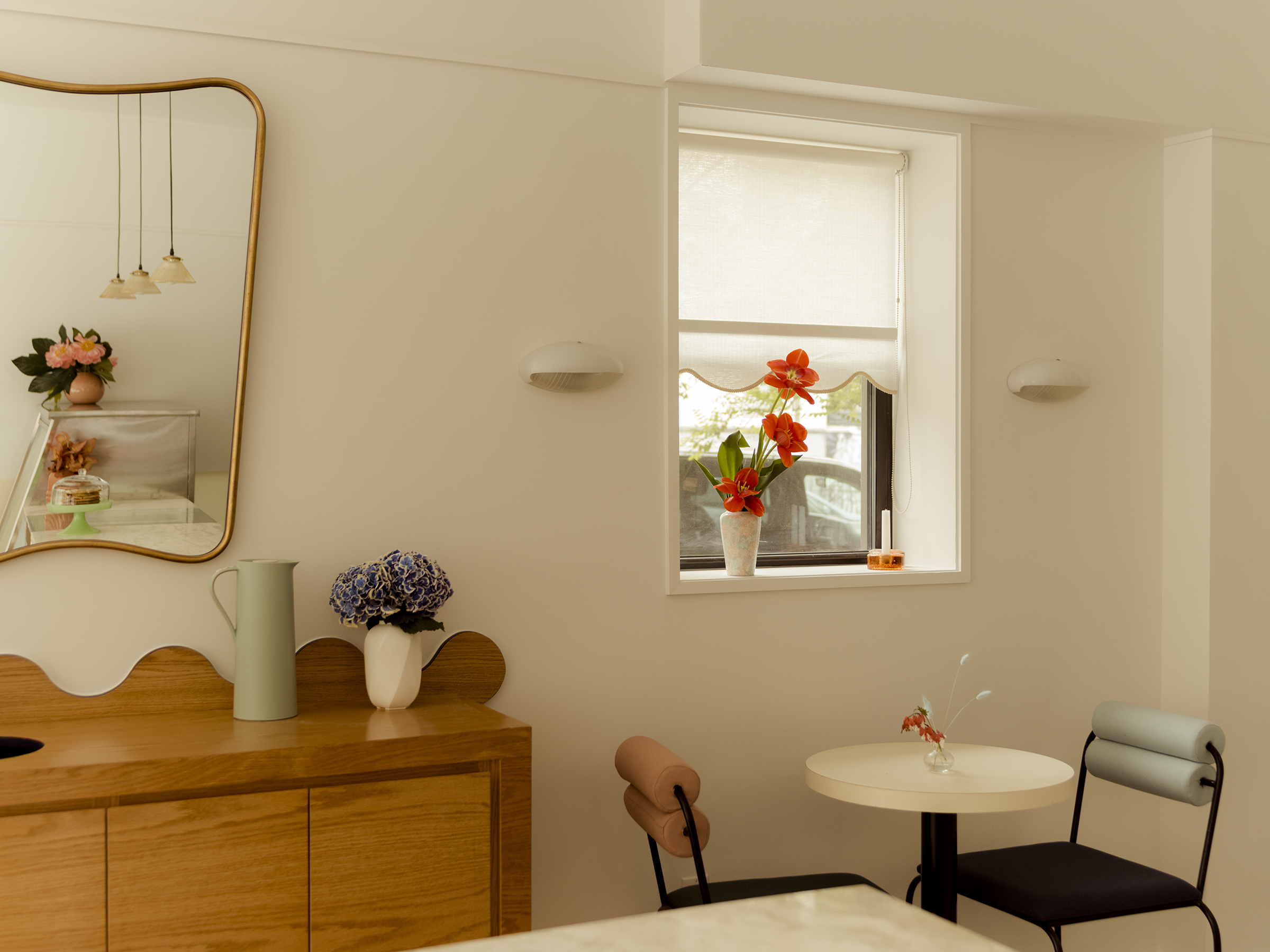
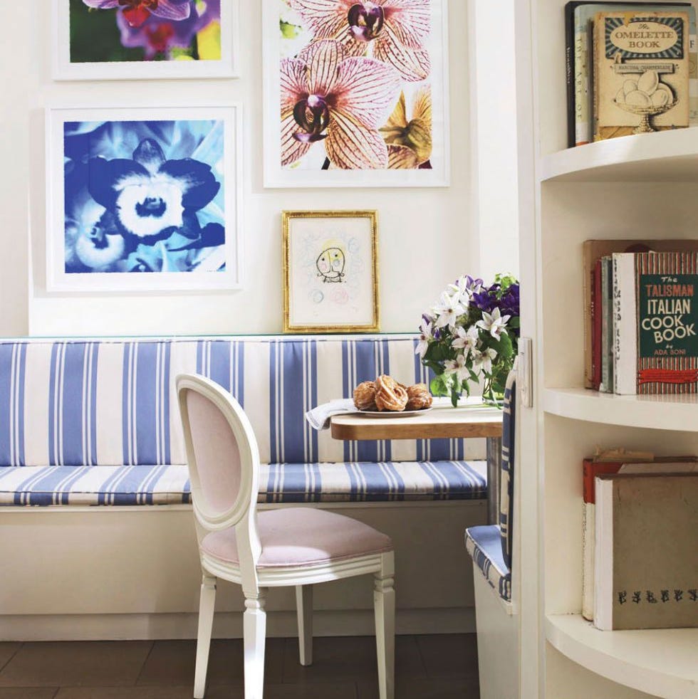
Nicole Salvesen, co-founder of Salvesen & Graham, discusses how this palette can soften more vibrant accents, particularly in open-plan spaces like a kitchen connected to a sitting room. She notes that the soft caramel and mellow whites, such as on a scalloped bench skirting, create a gentle contrast that adds sophistication without being too stark or graphic. This approach makes the living space more inviting and cohesive.
Alvin Wayne, an interior designer, advocates for embracing earthiness with this palette, drawing inspiration from natural materials. In a monochromatic bedroom, he uses a wallpaper mural designed to mimic travertine limestone, creating a "cocooning" effect that evokes the natural world. This is further enhanced by wood finishes and plush ivory accents, resulting in a cozy and peaceful environment. The article concludes by reinforcing the versatility and enduring appeal of coffee and cream colors, as demonstrated by these design professionals.
#InteriorDesign #ColorPalette #HomeDecor #CozyHome #NeutralColors #BrownAndCream #DesignTips #HomeStyling #ComfortableLiving #InteriorDesign #ColorPalette #HomeDecor #CozyHome #NeutralColors #BrownAndCream #DesignTips #HomeStyling #ComfortableLiving
0 commenti in totale
 Nessun commento ancora
Potresti anche gradire
Café Core Is the Next Big Design Trend—Here’s How to Get the Look


9 ombre designs for a soft splash of color

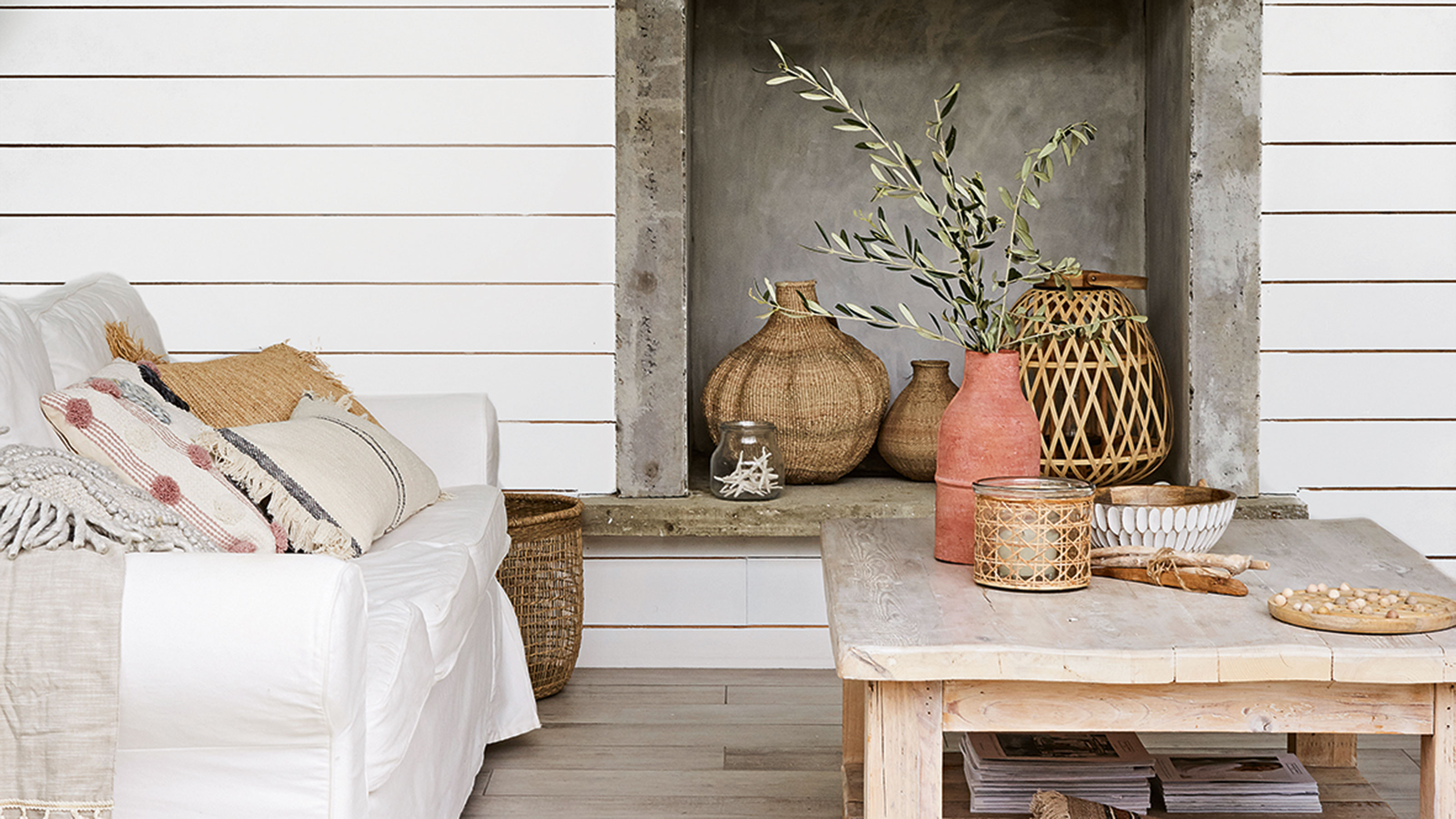
5 things stylists always do when styling a coffee table
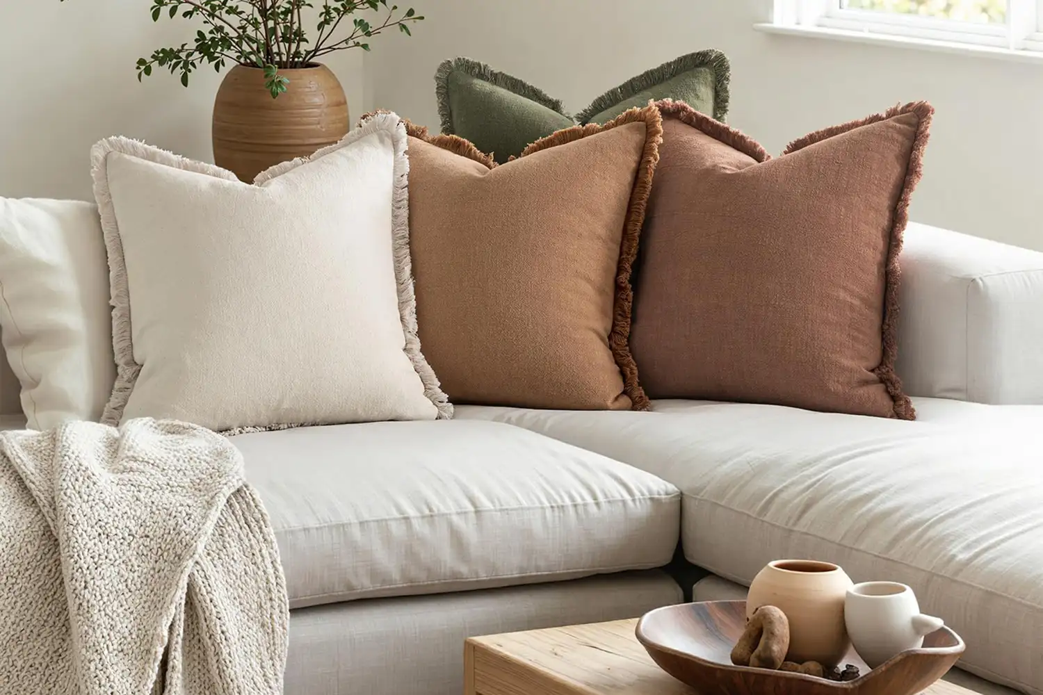
The 15 On-Trend Amazon Home Decor Finds You’ll See in 2026, According To An Interior Designer
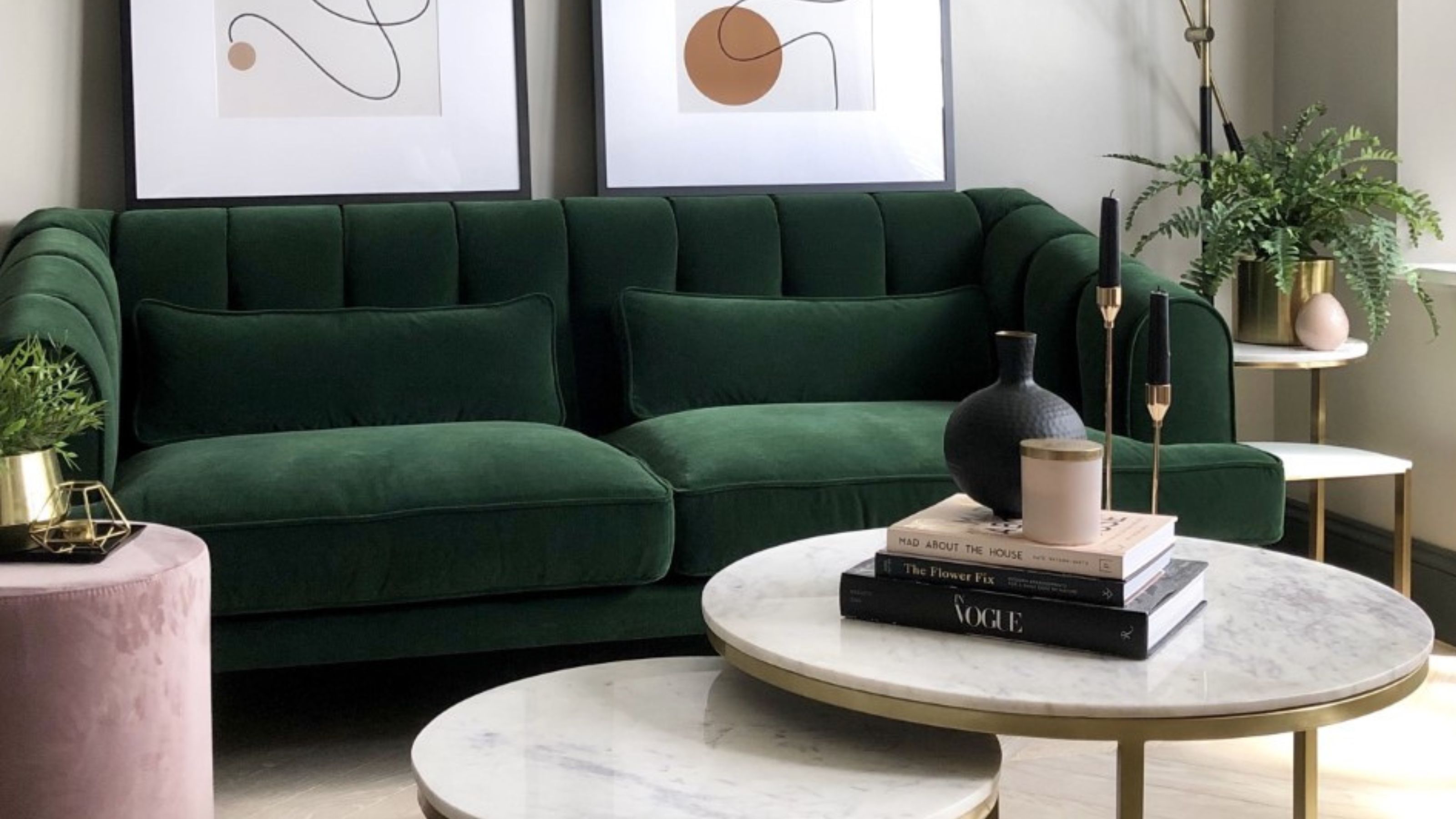
The 5 coffee table trends design experts are seeing everywhere in 2024

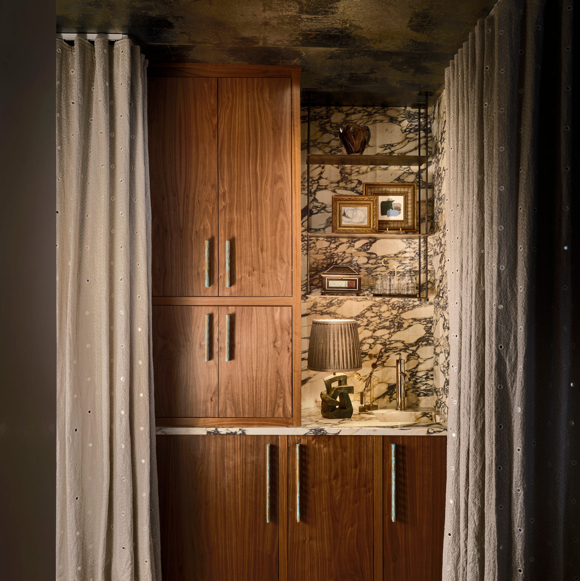
The 20 Best Coffee Bar Ideas for an Elevated Morning Routine

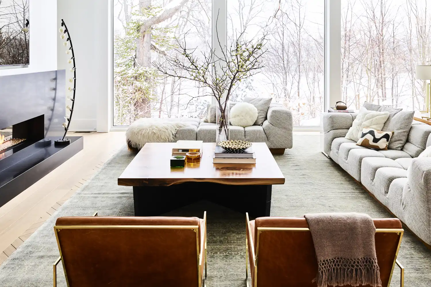
How to Style a Coffee Table So It Never Looks Cluttered, According to Interior Designers

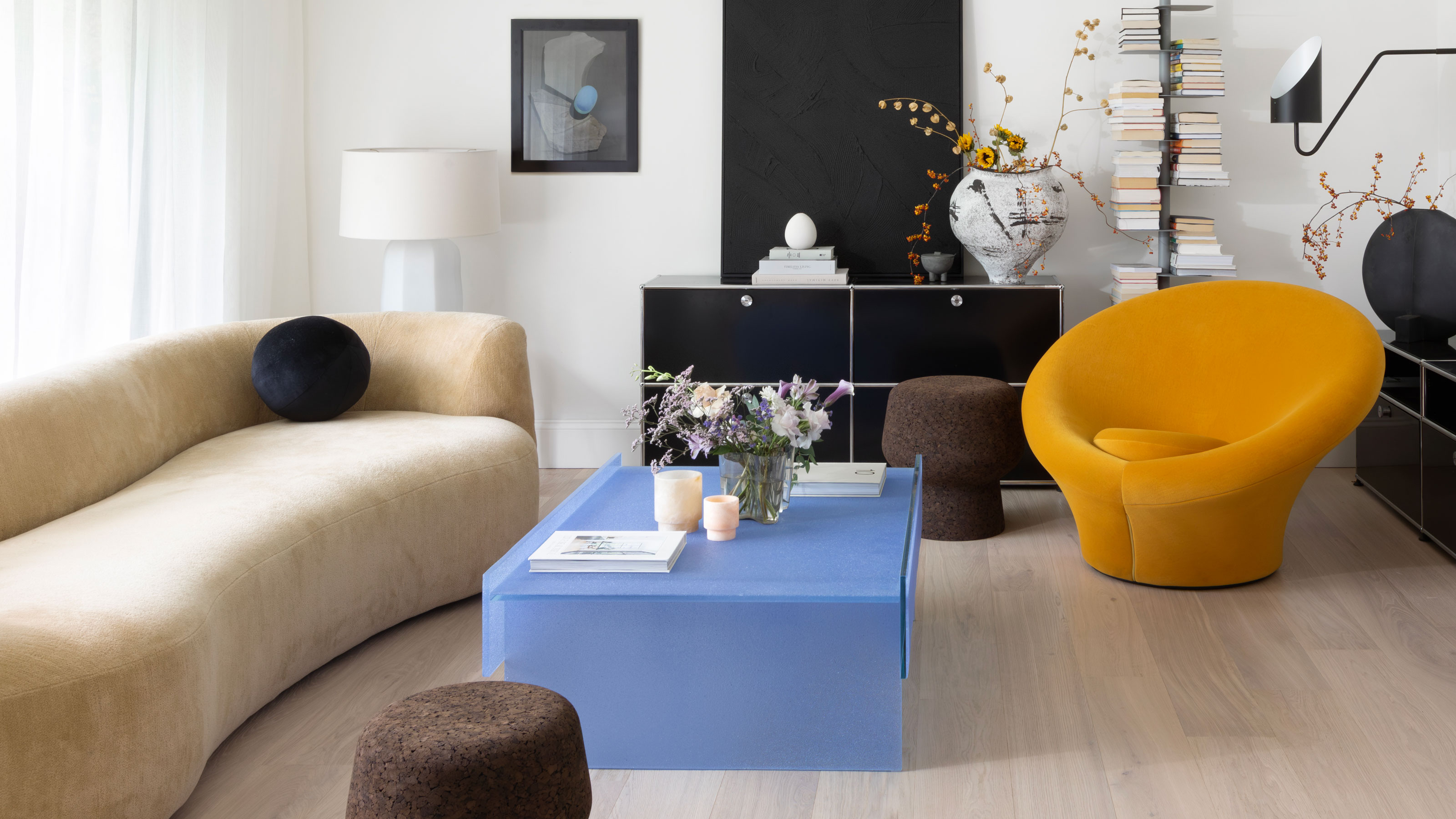
Coffee Table Trends — 9 Designer Styles That Resonate With the Mood of 2025, and How to Get the Look

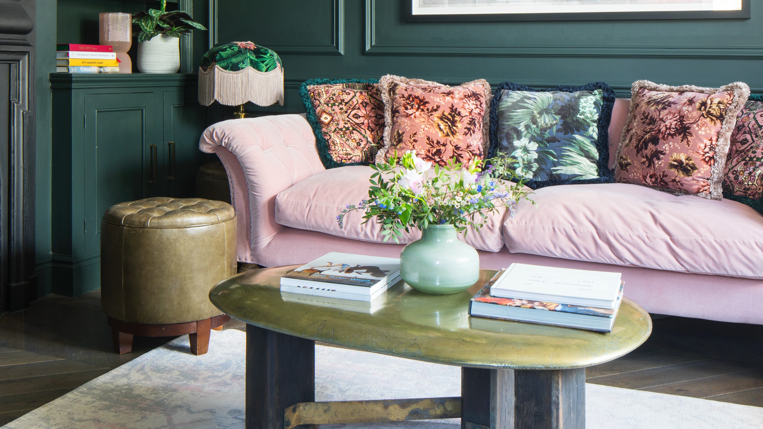
How to make a coffee table look expensive – 7 ways to elevate your coffee table just like interior stylists do
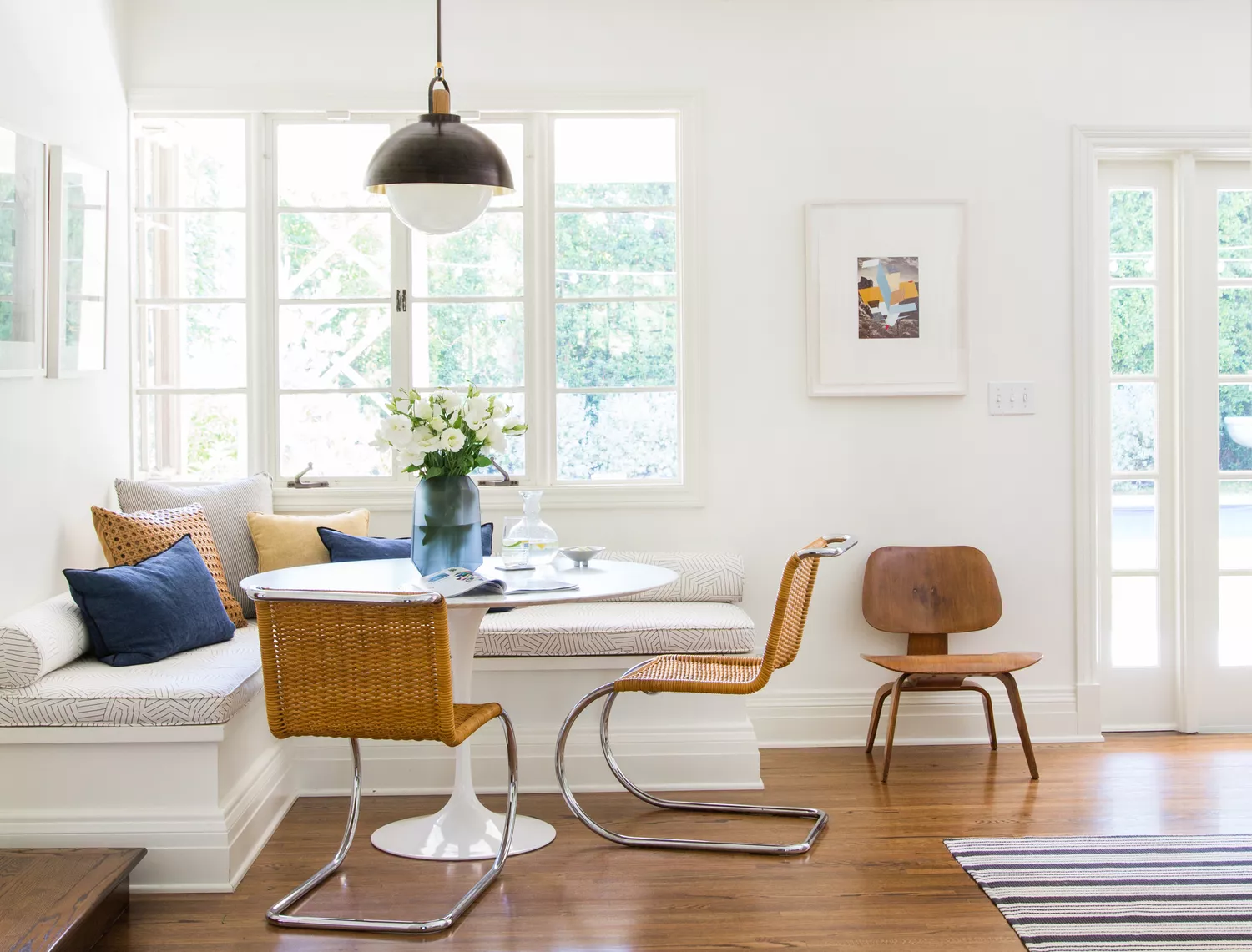
Café Core Is Taking Over Interior Design—Here's How to Bring the Cozy Look Home
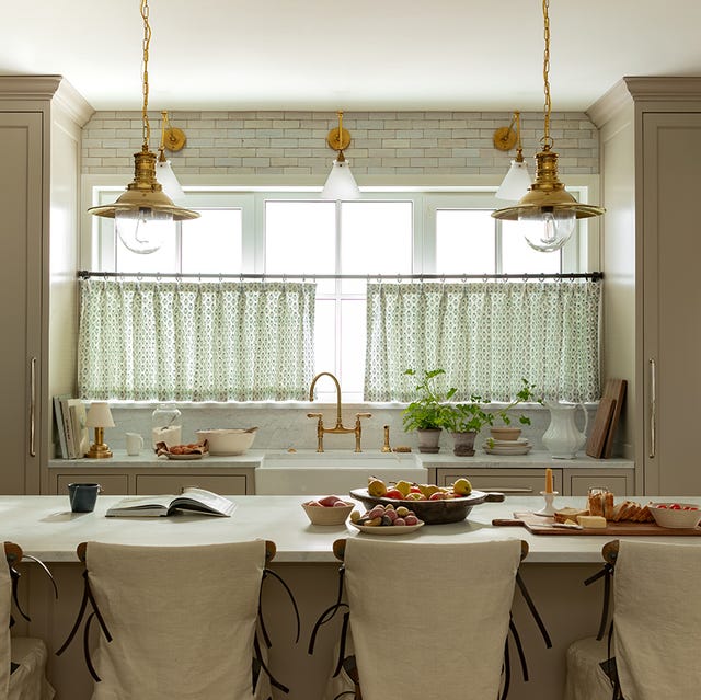
Café Core Is Taking Over Social Media — Here's What Designers Think of the Trend

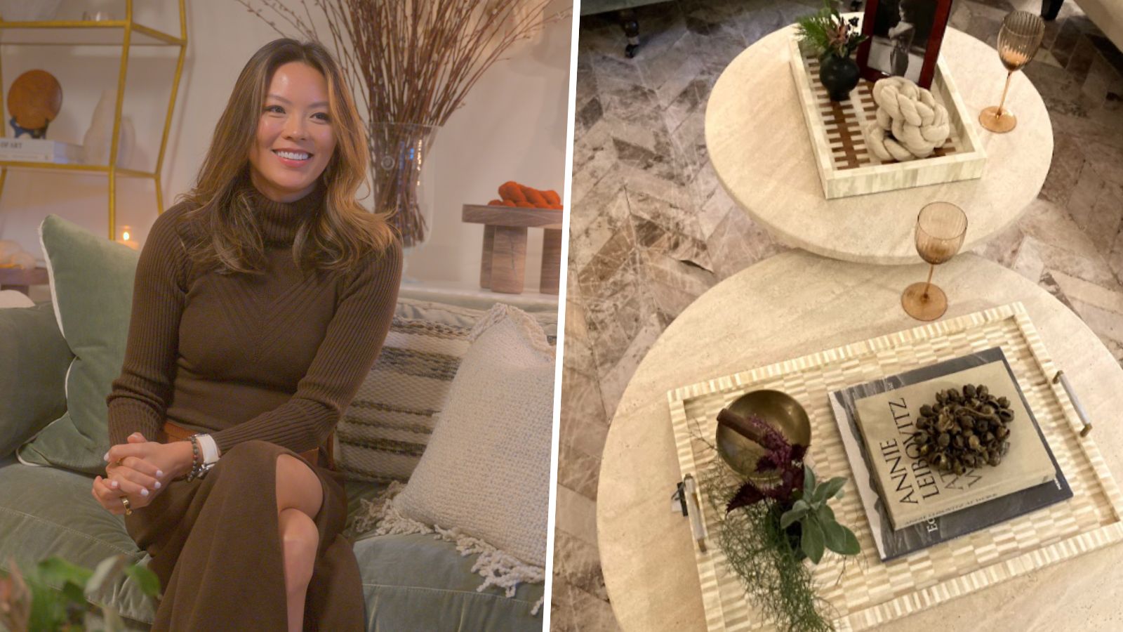
Kathy Kuo's 3 essential coffee table styling rules – for a truly chic display

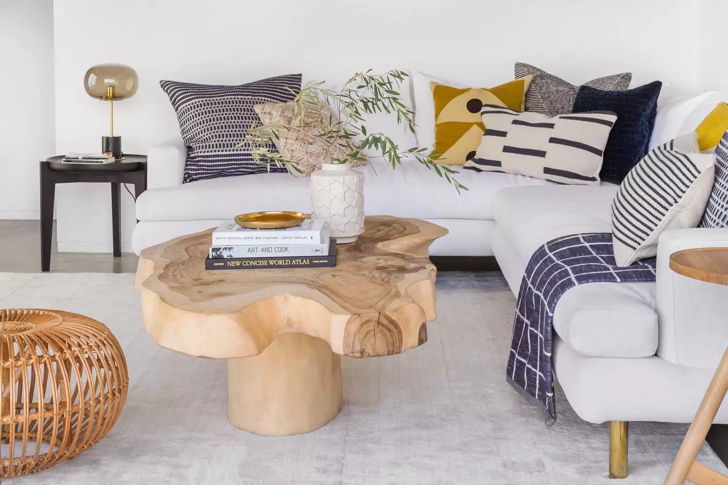
How Designers Style Coffee Tables to Feel Finished (Without Overdoing It)

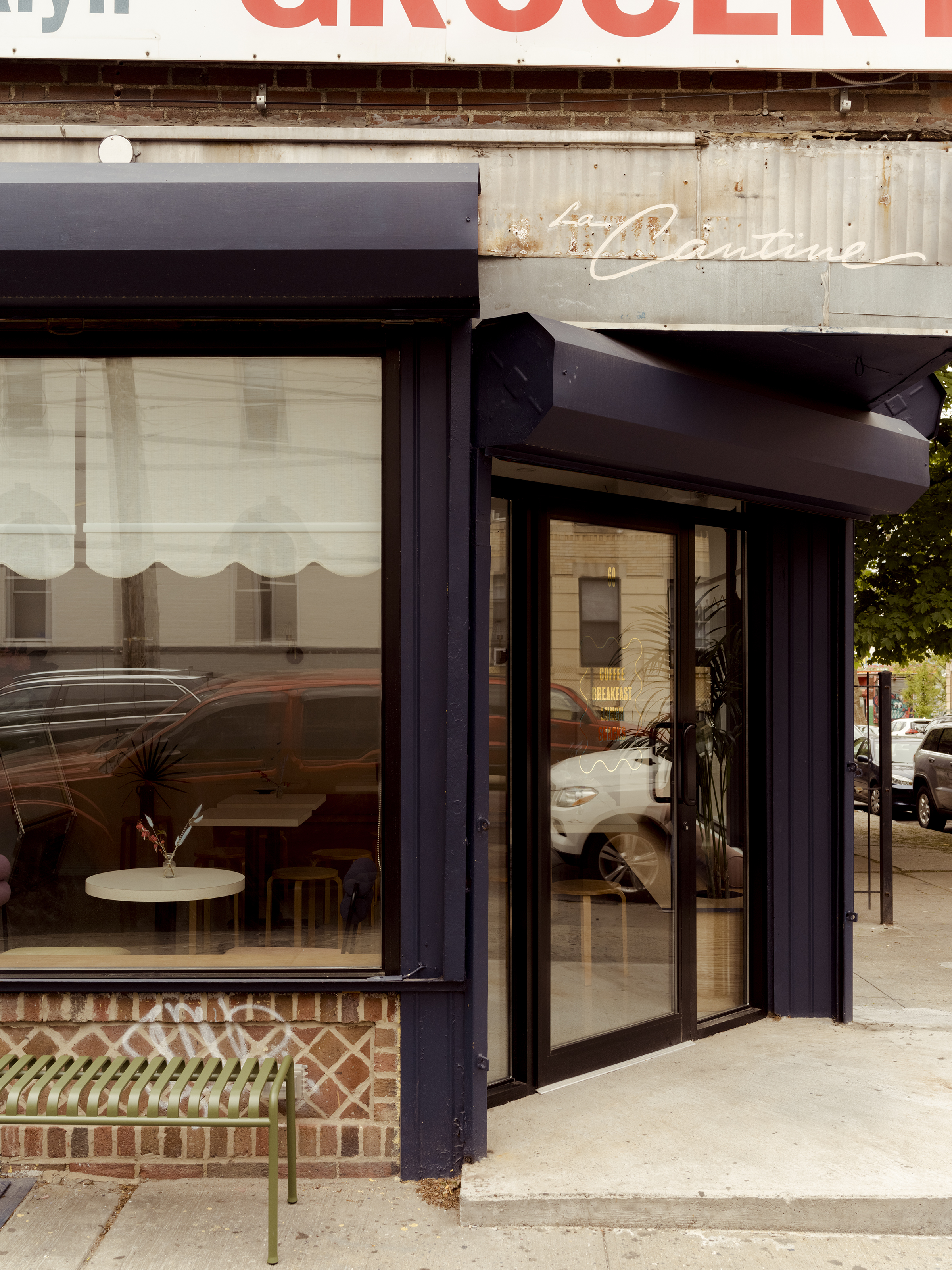
The Designer Behind Brooklyn’s Cutest New Café Spills Her Secrets

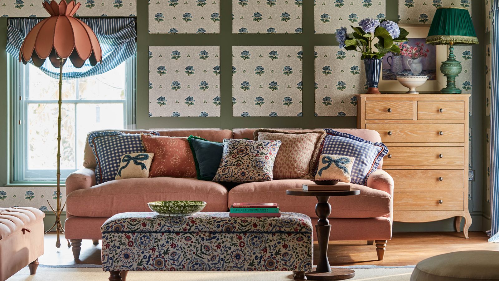
How to style around a couch – 6 ways to make this focal piece blend more seamlessly into your living room
Architects and Designers Pick Their Favorite New Textiles, Paints and Hardware (Published 2016)

Incorporate Color Drenching Into Your Home Design

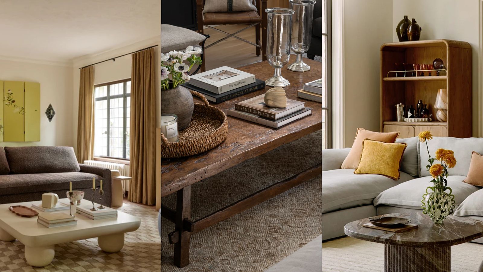
I swear by these affordable accessories to quickly make my coffee table look more expensive – and right now you can replicate the look for even less
12 modern coffee table decor ideas to make a focal point in your living space
3 Coffee Table Styling Tricks to Steal From a London It Girl