1/18
Creamy neutral paint colours are back — just don’t call it magnolia
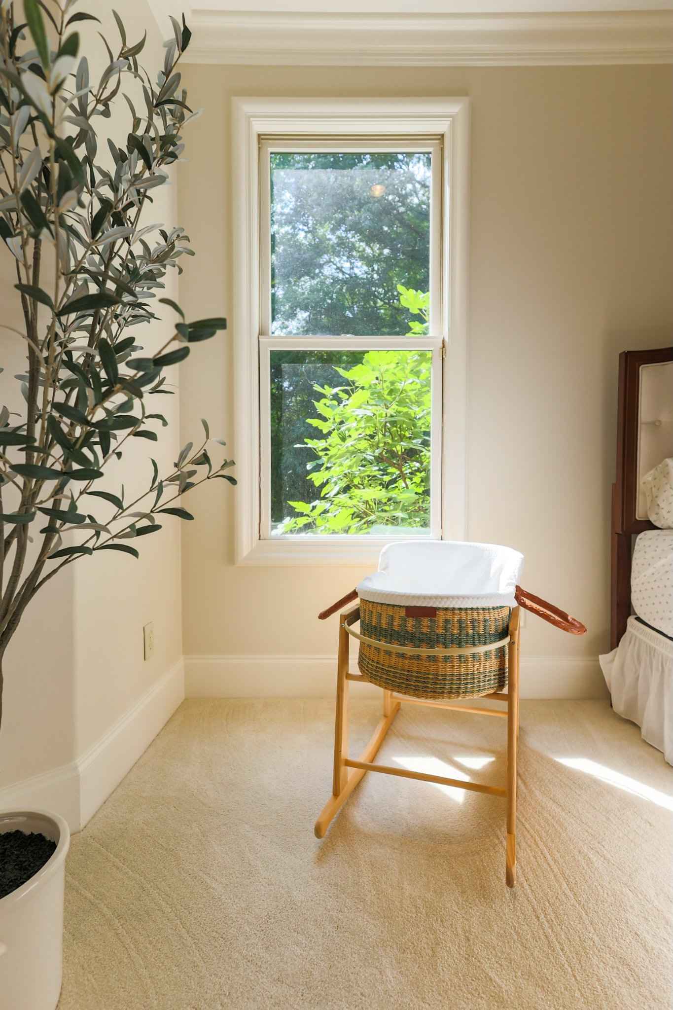
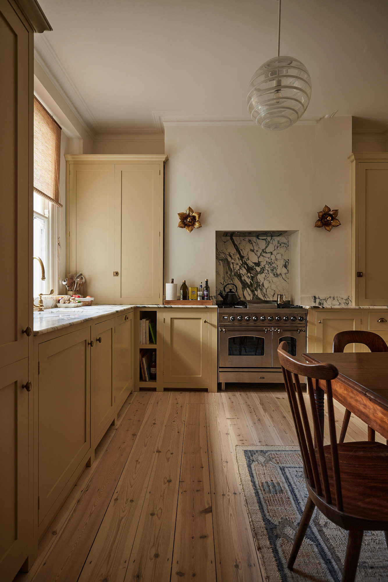
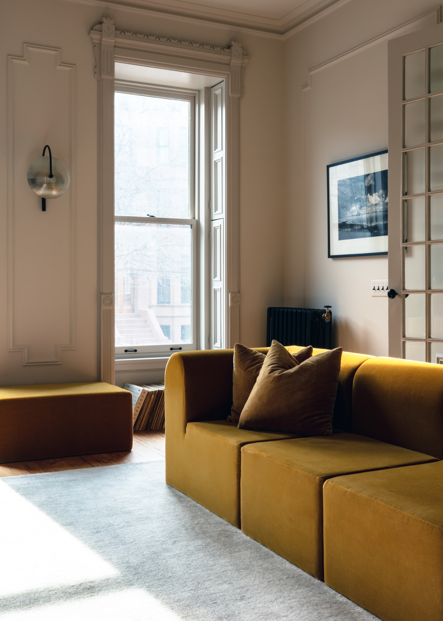
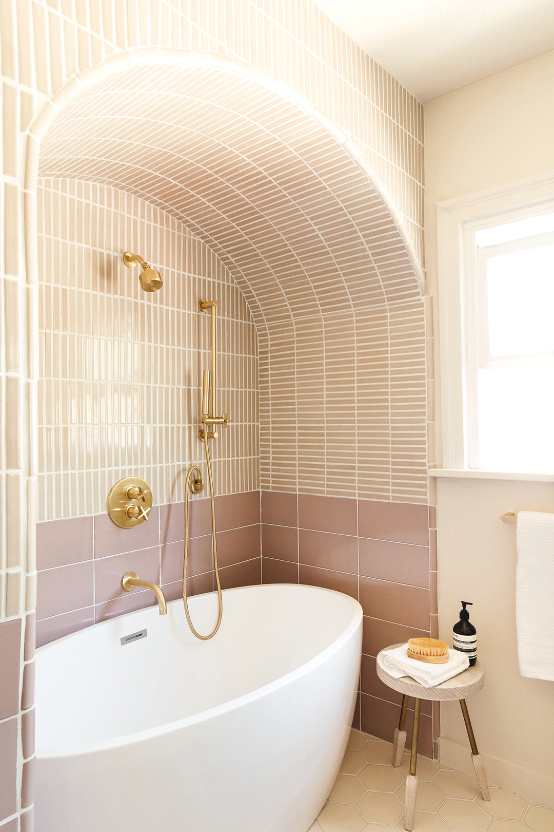
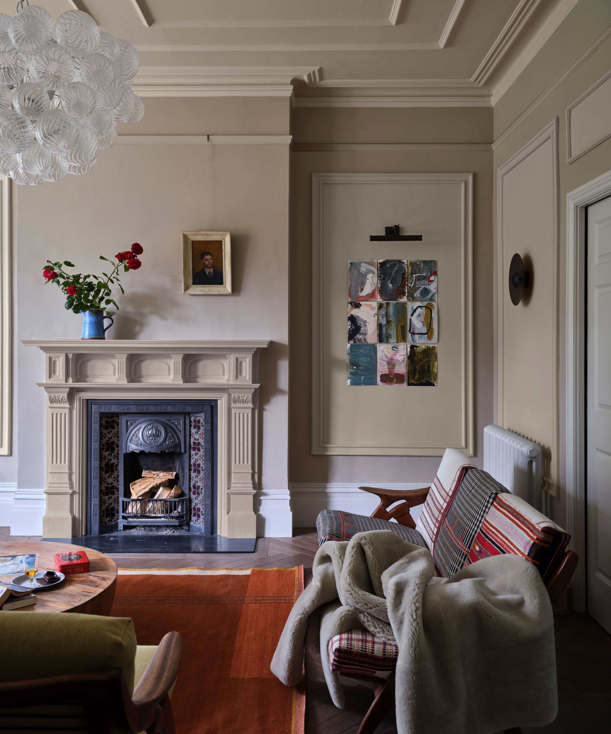
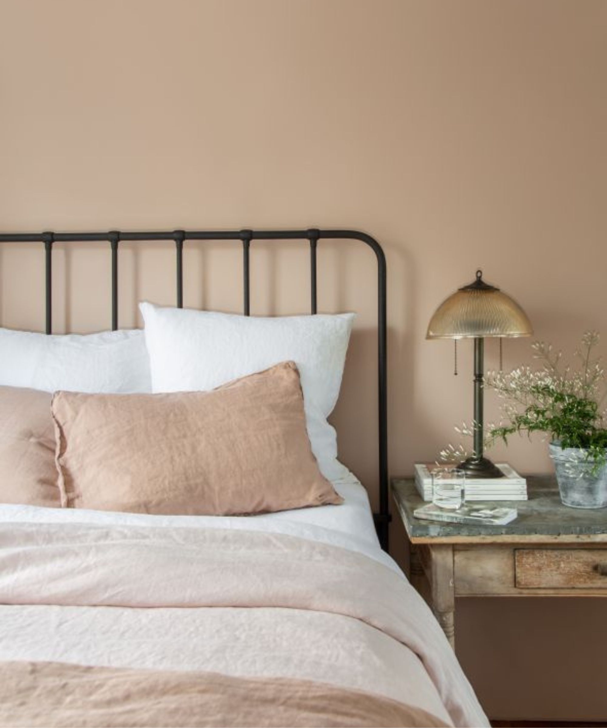
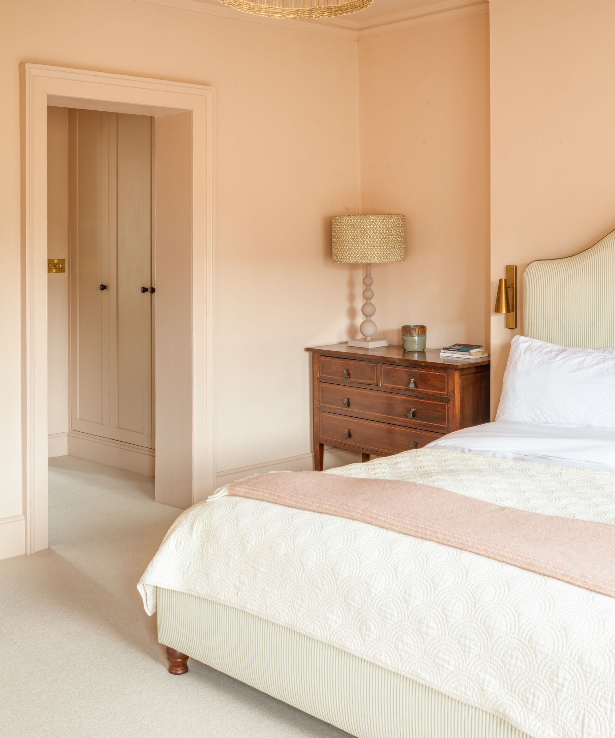
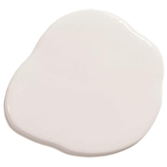
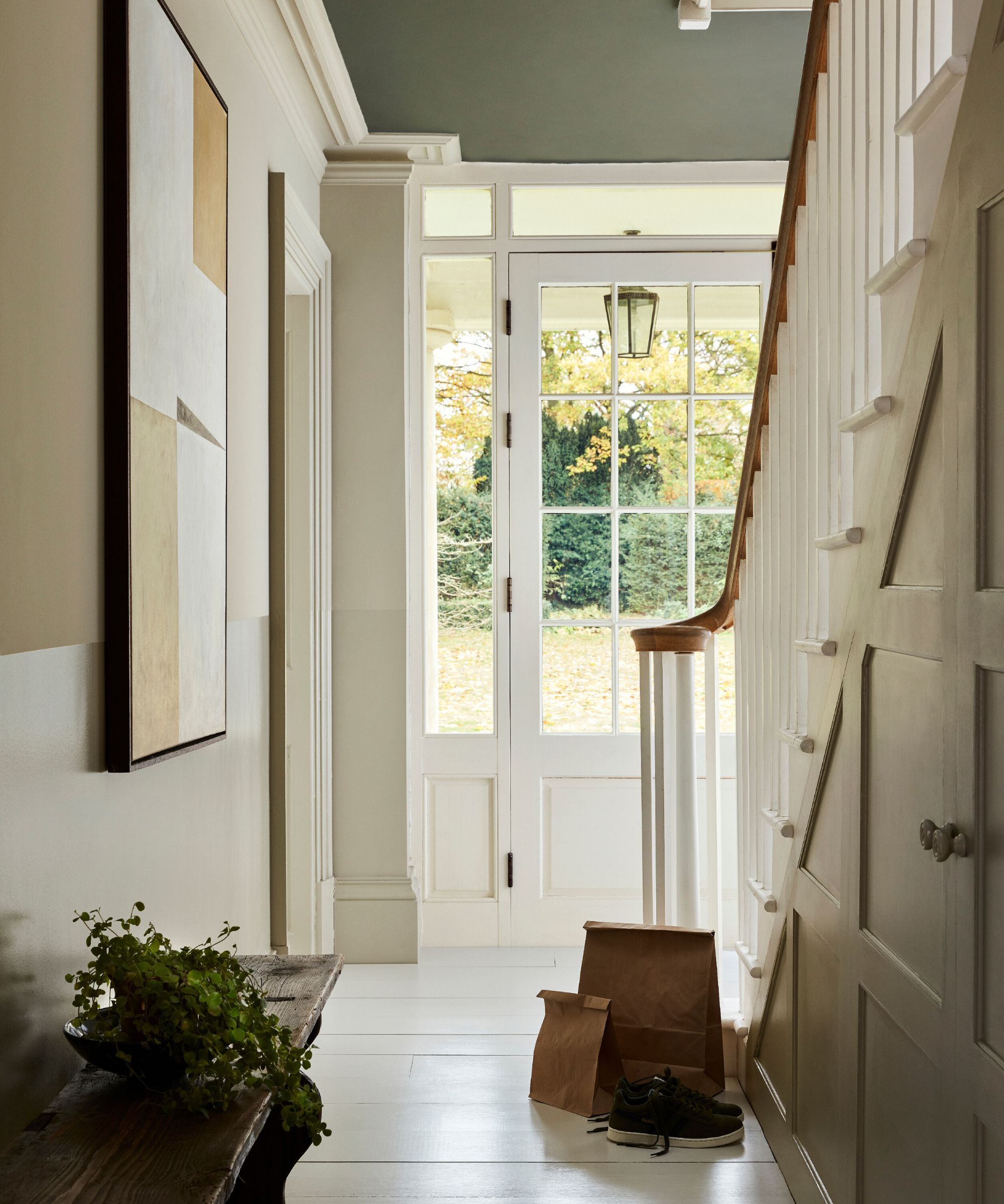
The article explores the resurgence of warm, creamy neutral paint colors in home interiors, despite the lingering negative connotation associated with the term "magnolia." The author recounts a personal experience of choosing a pale straw color for a Suffolk cottage, aiming for a warm and light-maximizing effect, only to have a decorator identify it as magnolia, a color often dismissed as outdated and indicative of cheap renovations from the 1980s and 1990s. This anecdote highlights the cultural baggage attached to the specific shade, even as its qualities are appreciated.
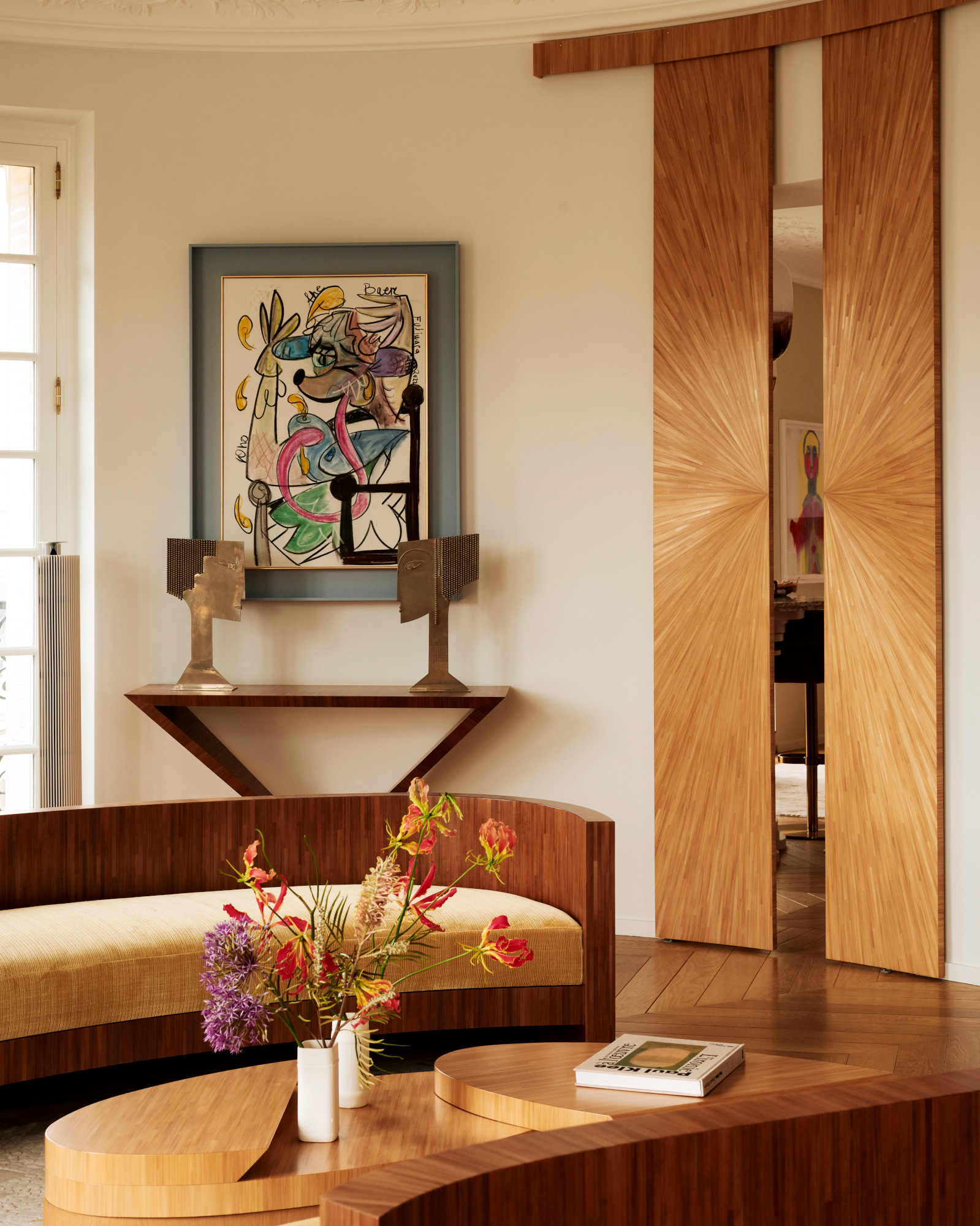
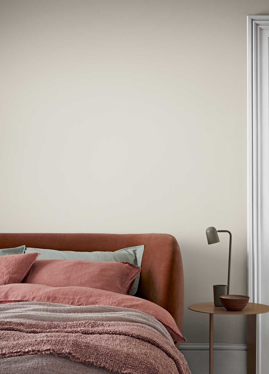
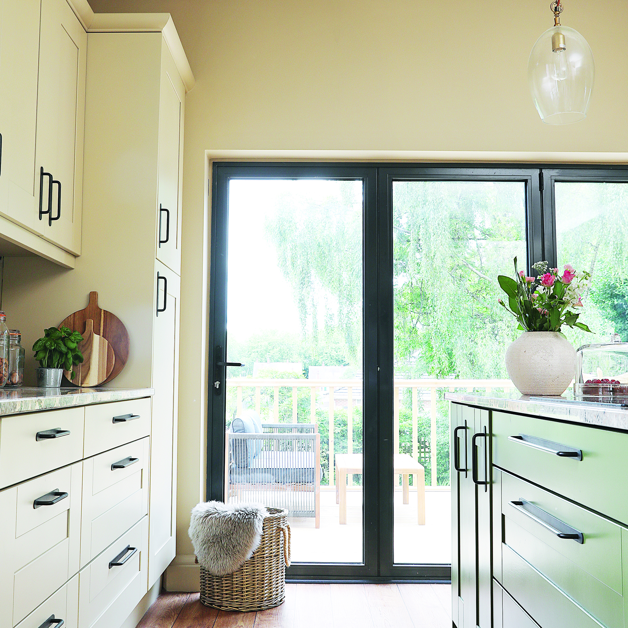
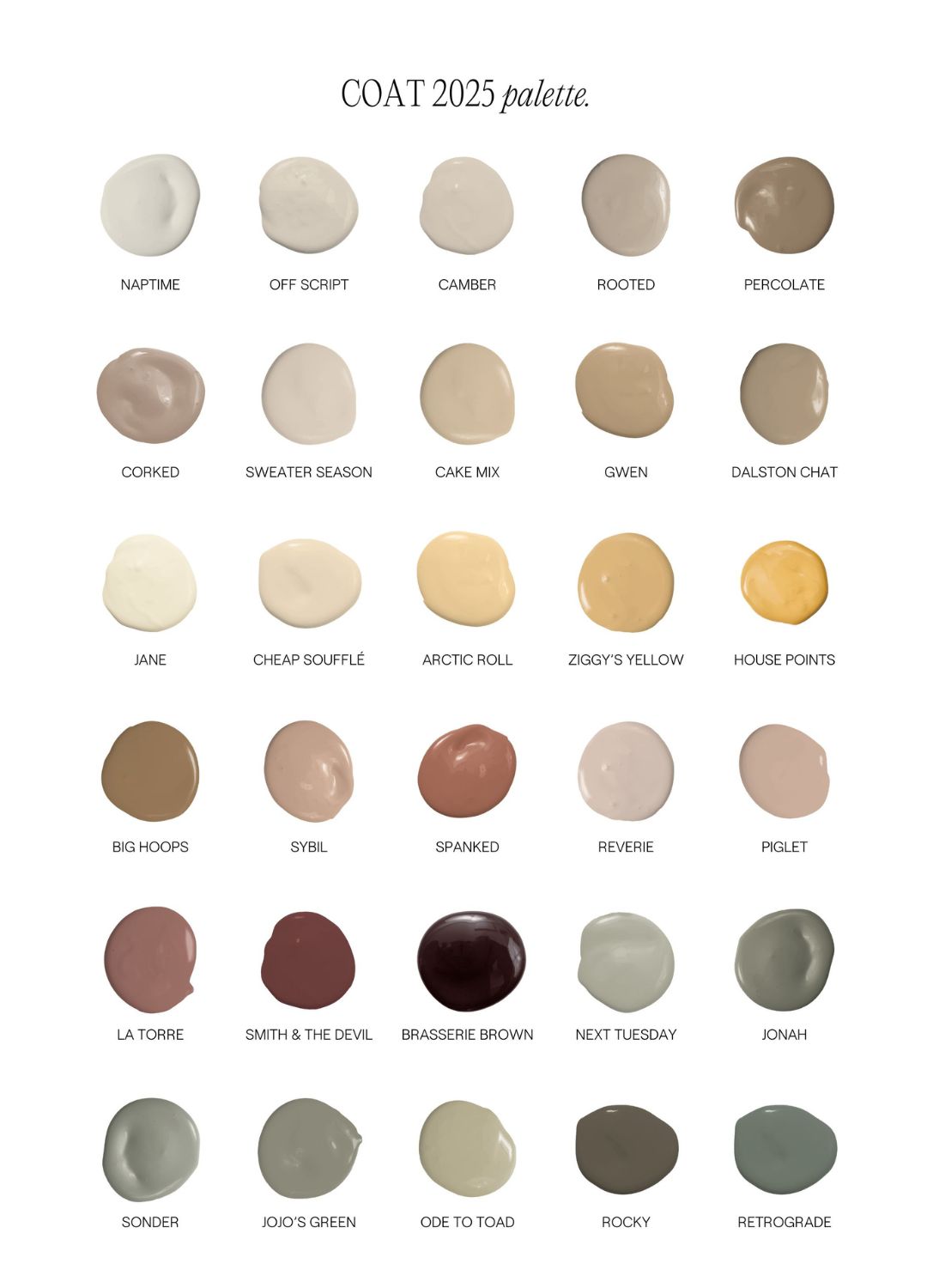
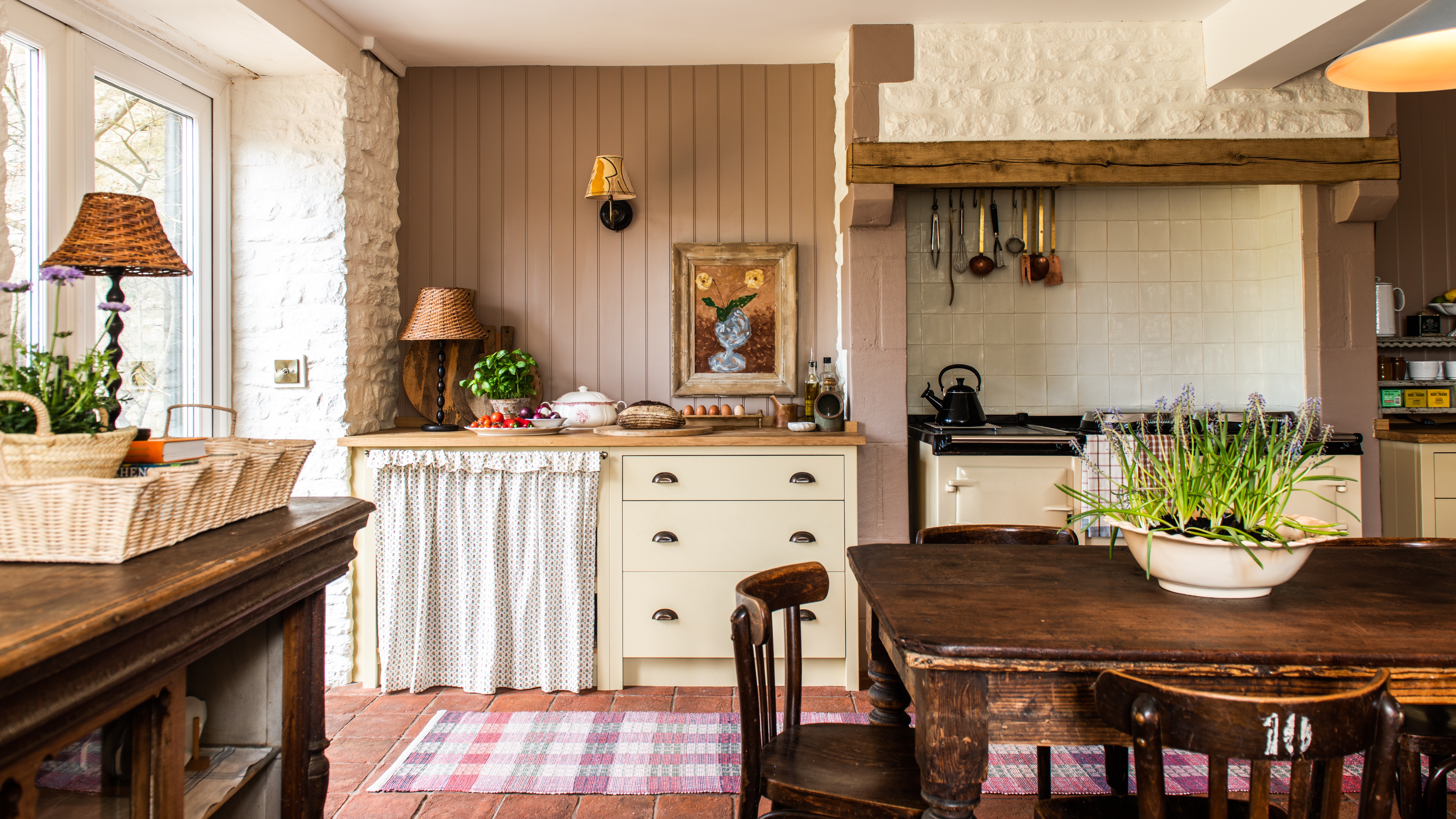
The piece notes a shift away from brilliant whites and greys towards warmer neutrals, driven by homeowners' desire for comfort, reassurance, and a mood-boosting backdrop. Despite the paint industry's public reluctance to embrace the term "magnolia," many paint companies are offering similar shades under new, more appealing names. For instance, Coat paints, despite its co-founder Rob Abrahams' strong disavowal of magnolia, has a bestselling creamy shade named "Jane." Similarly, Pickleson Paint Co, a self-described luxury, design-led company, launched "Open Sesame," a yellow-based neutral that they admit is "not a million miles away from being magnolia," and it sold out rapidly.
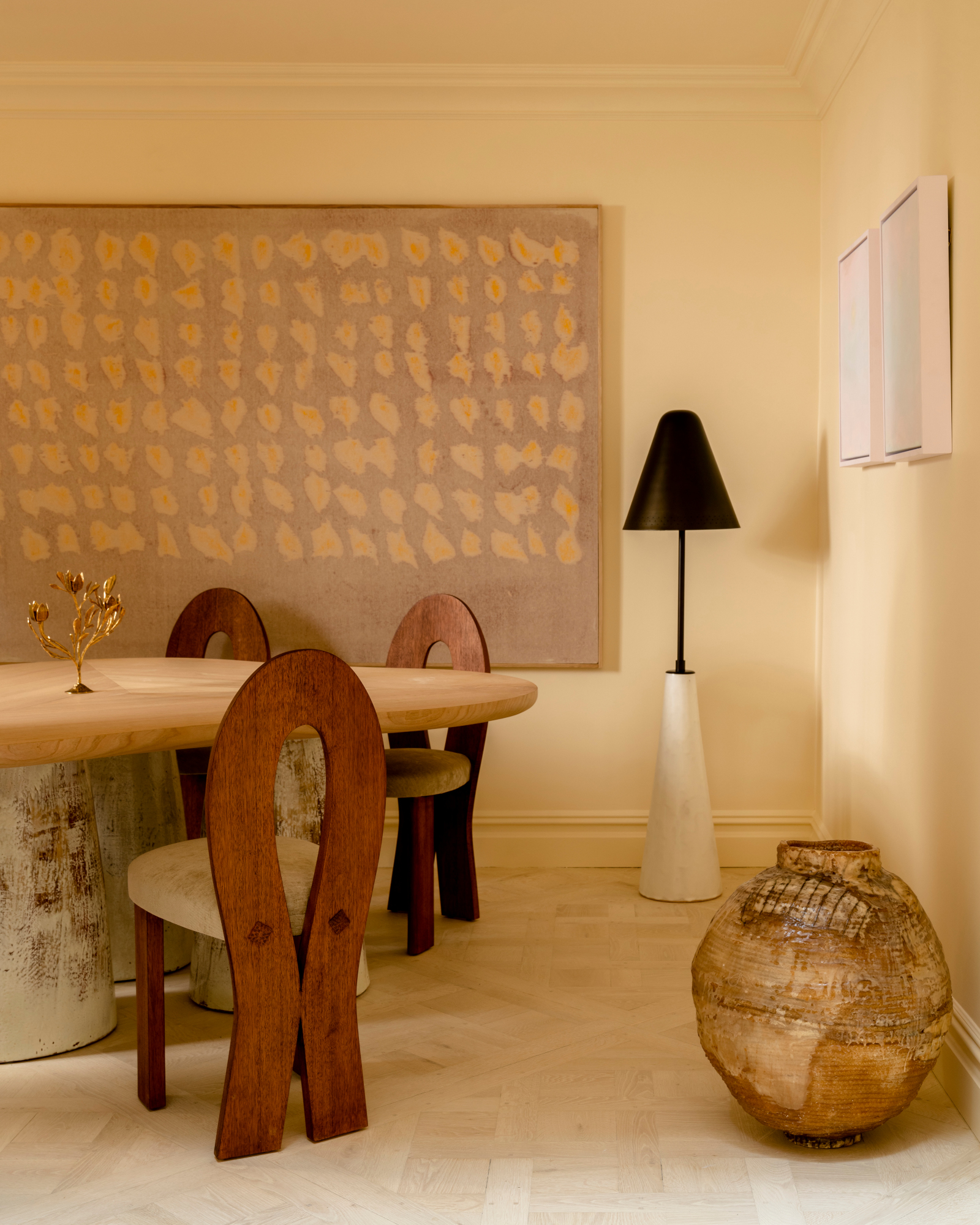
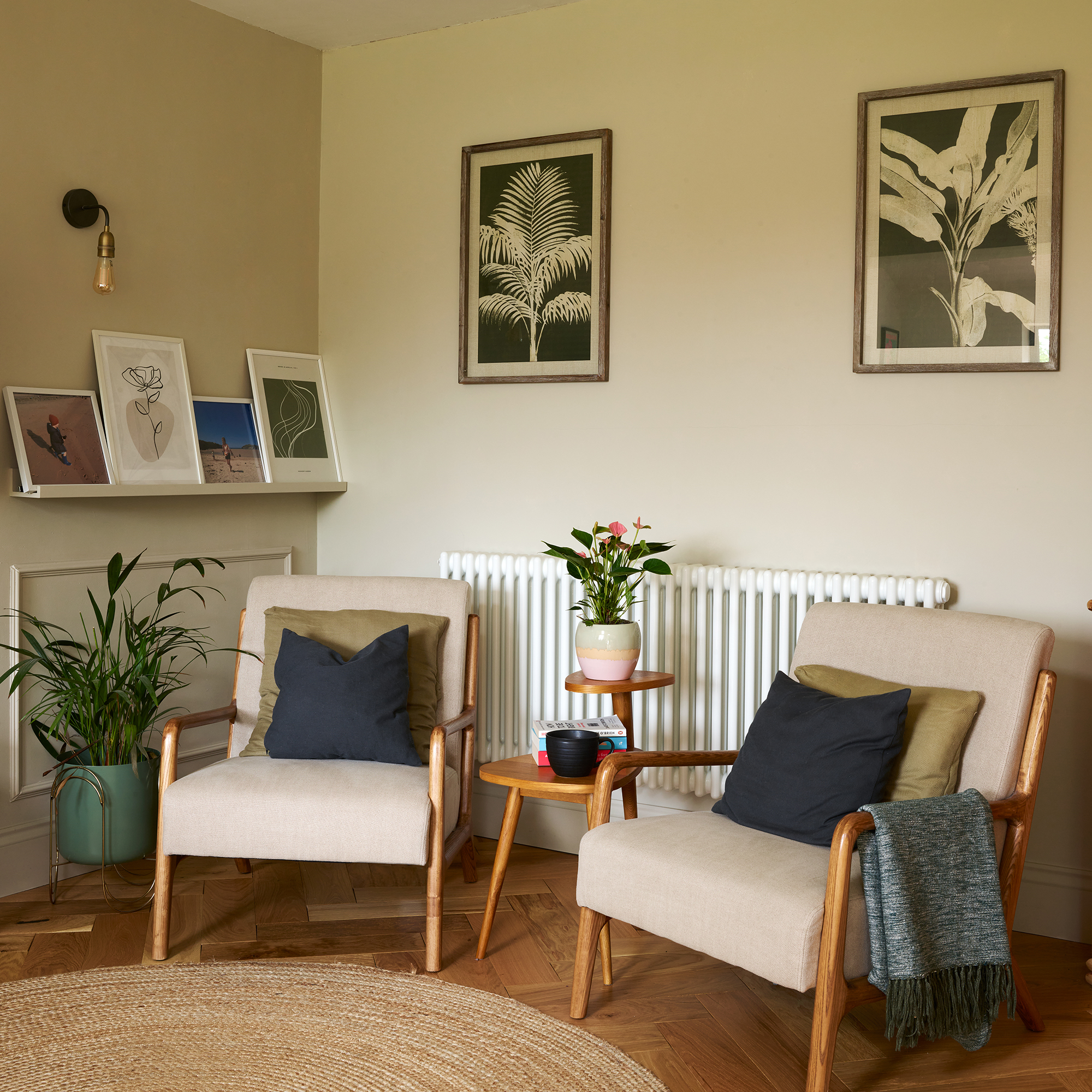
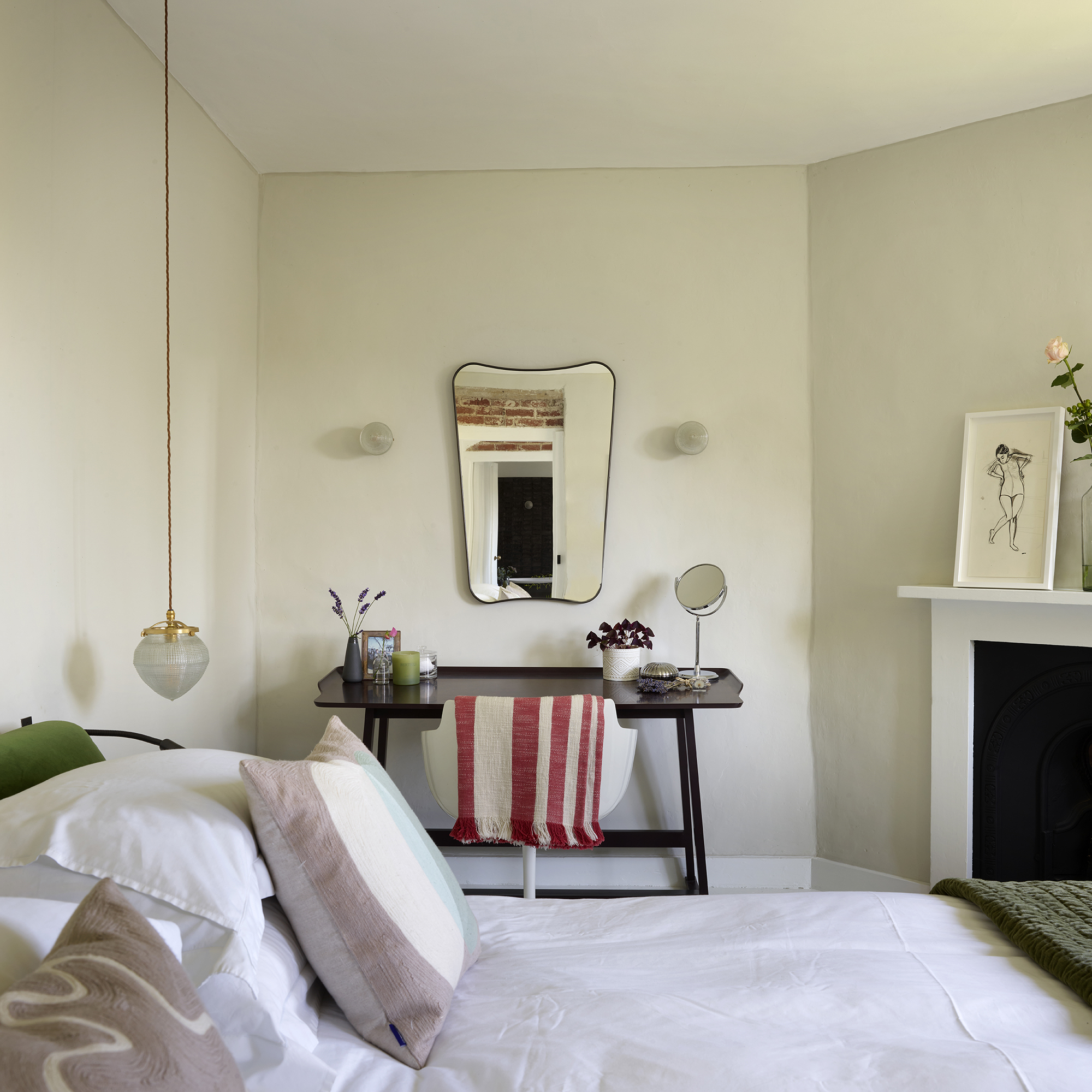
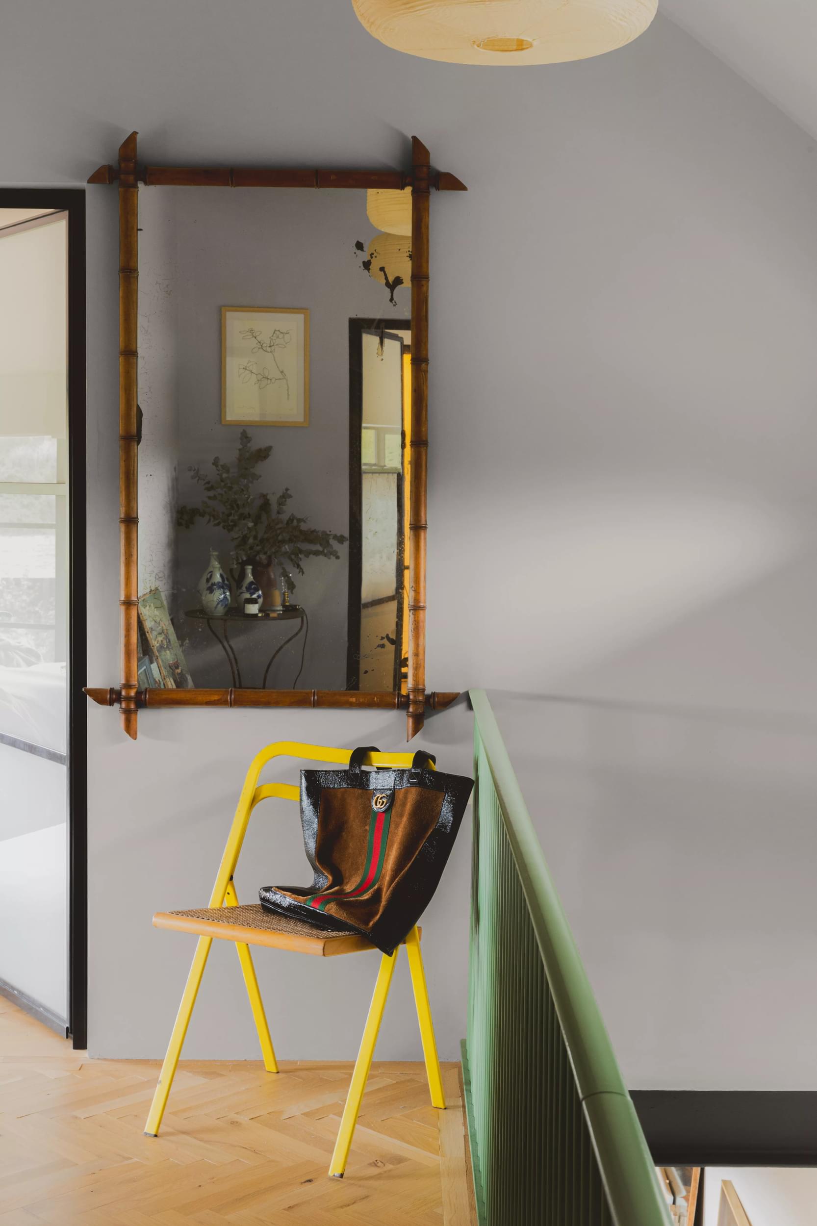
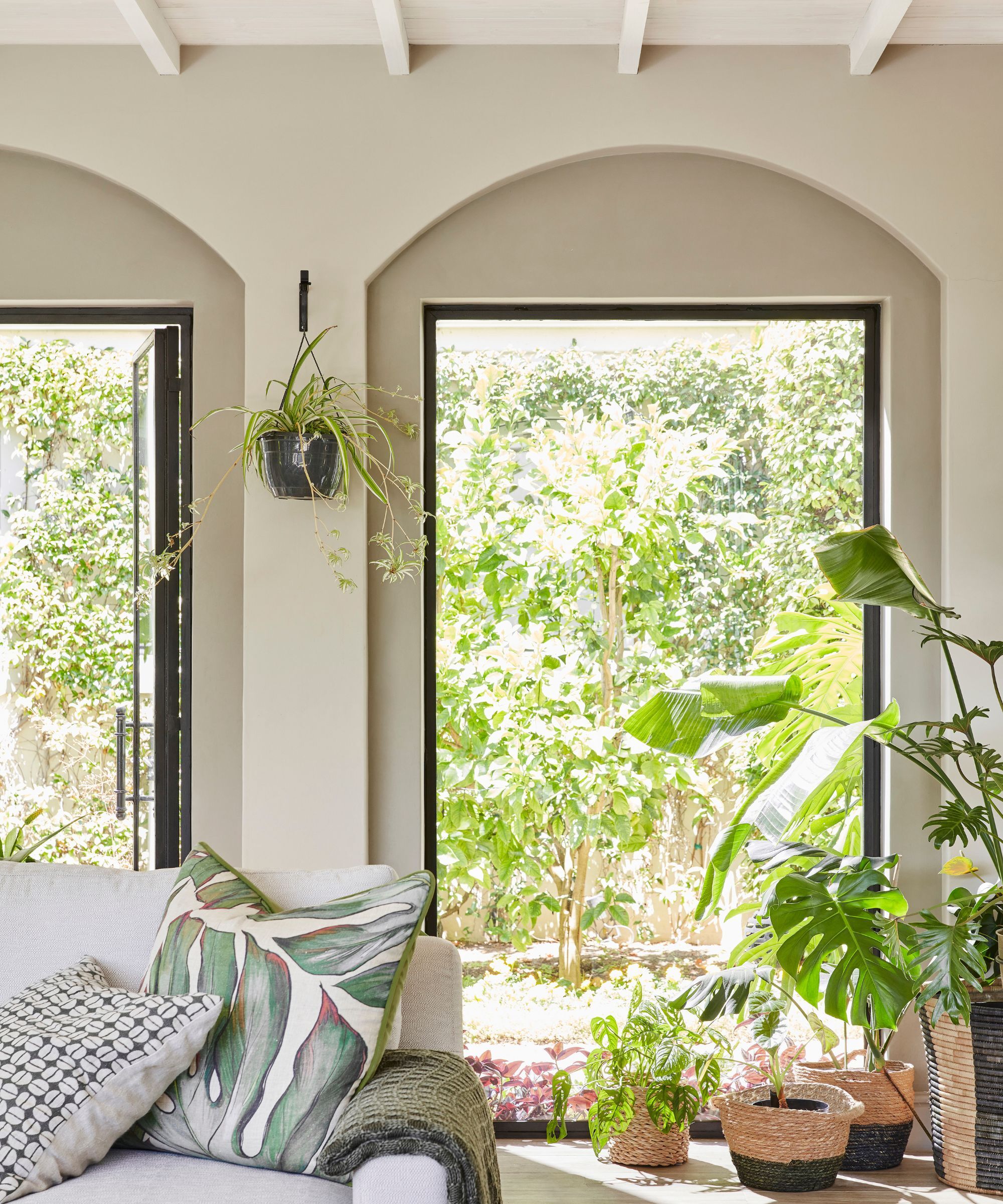
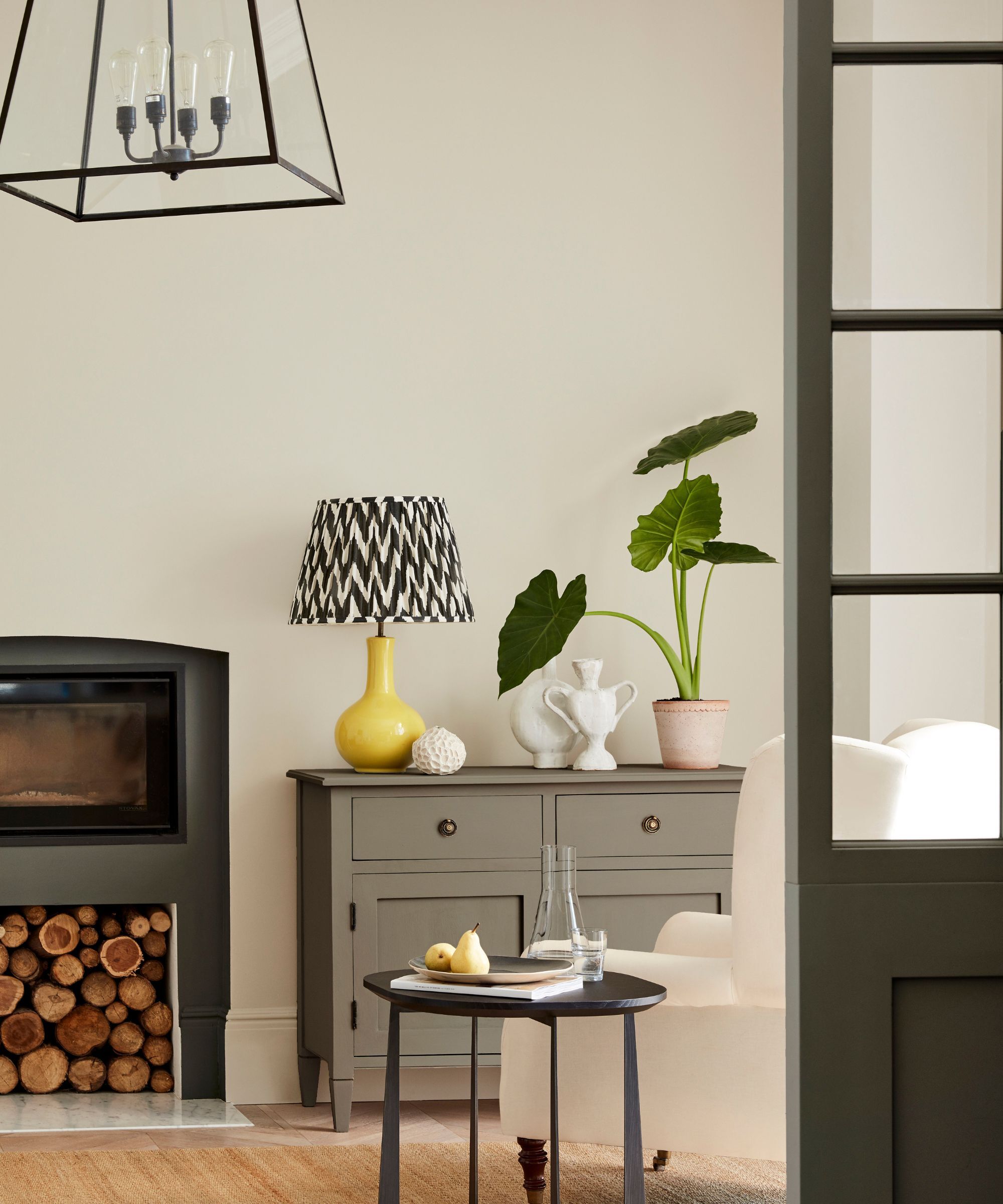
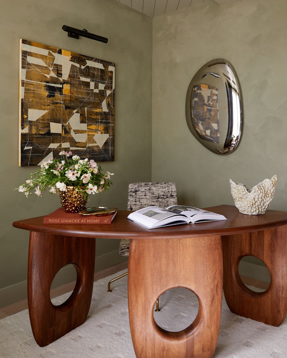
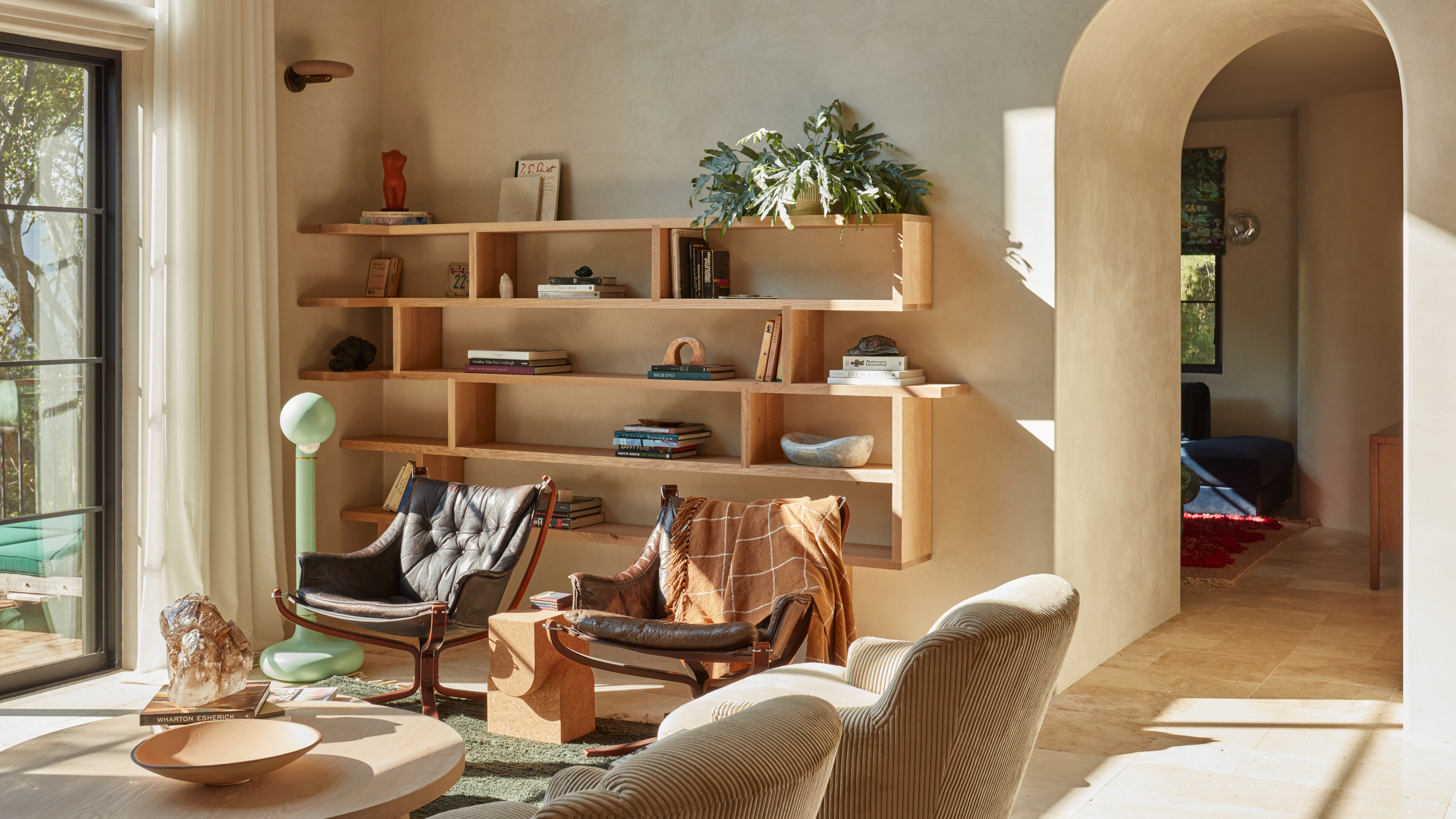
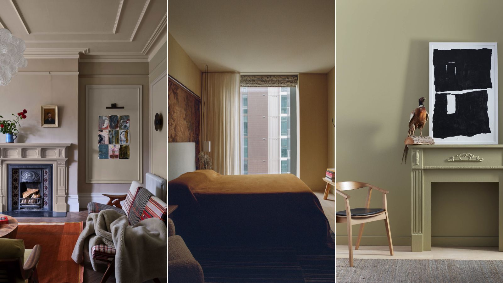
Designer Tim Gosling defends the hue itself, explaining that while the term "magnolia" gained negative associations due to its overuse in uninspired DIY schemes, the color itself evokes warmth. He points out that celebrated designers like Rose Uniacke use similar shades, albeit with names such as "Feather," "Cream Soda," and "Wild Sage," jokingly suggesting a "secret designers’ magnolia society." The article then lists several contemporary paint options that embody this creamy neutral trend, including Dulux’s "Wild Wonder" (their 2023 Colour of the Year), Craig & Rose’s "Pale Mortlake Cream," Annie Sloan’s "Canvas," Paint & Paper Library’s "Capuchin," and YesColours’ "Mellow Neutral."
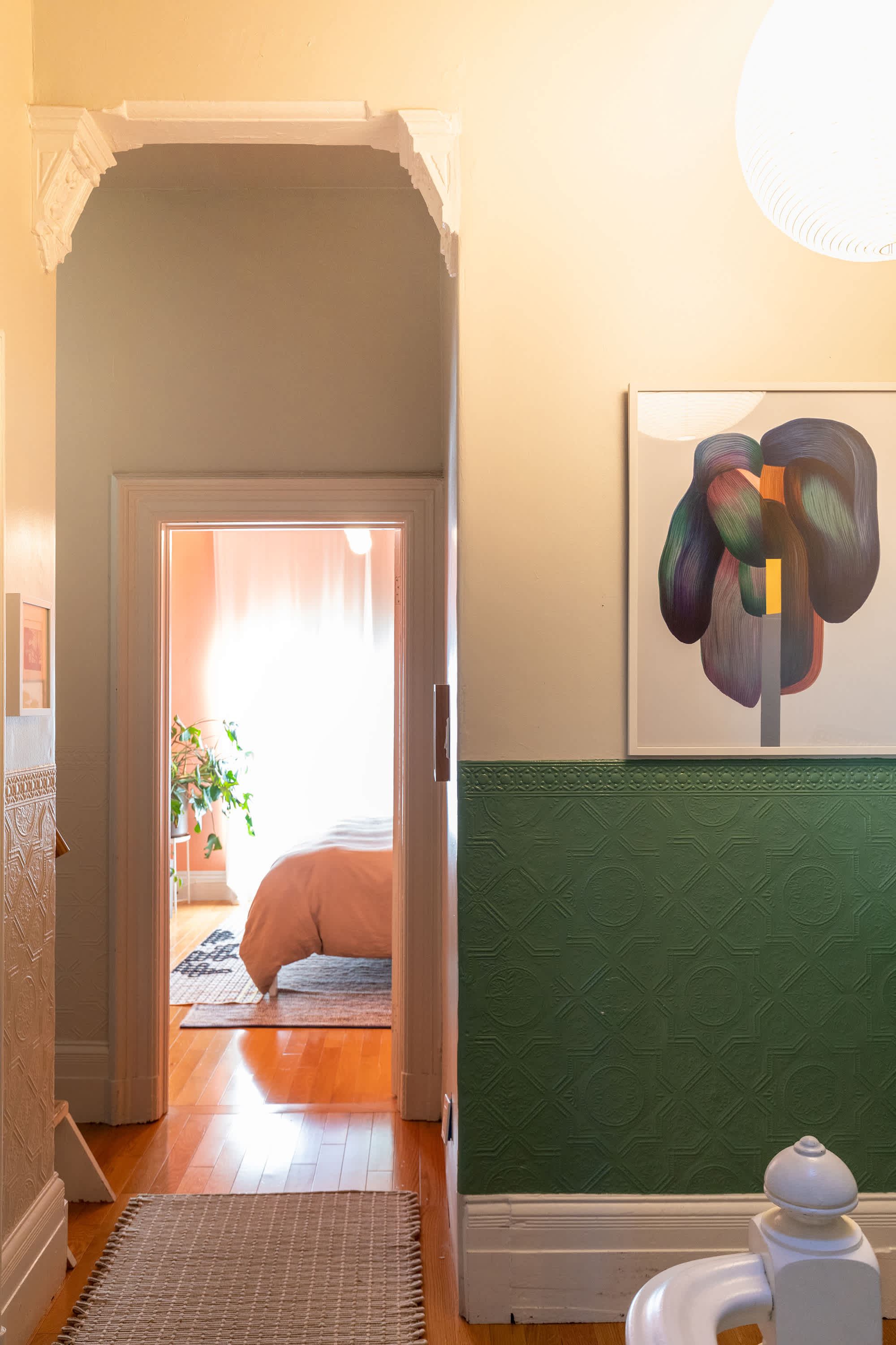
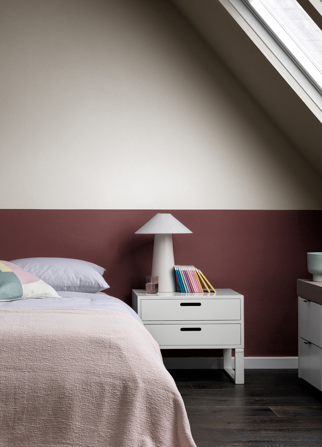
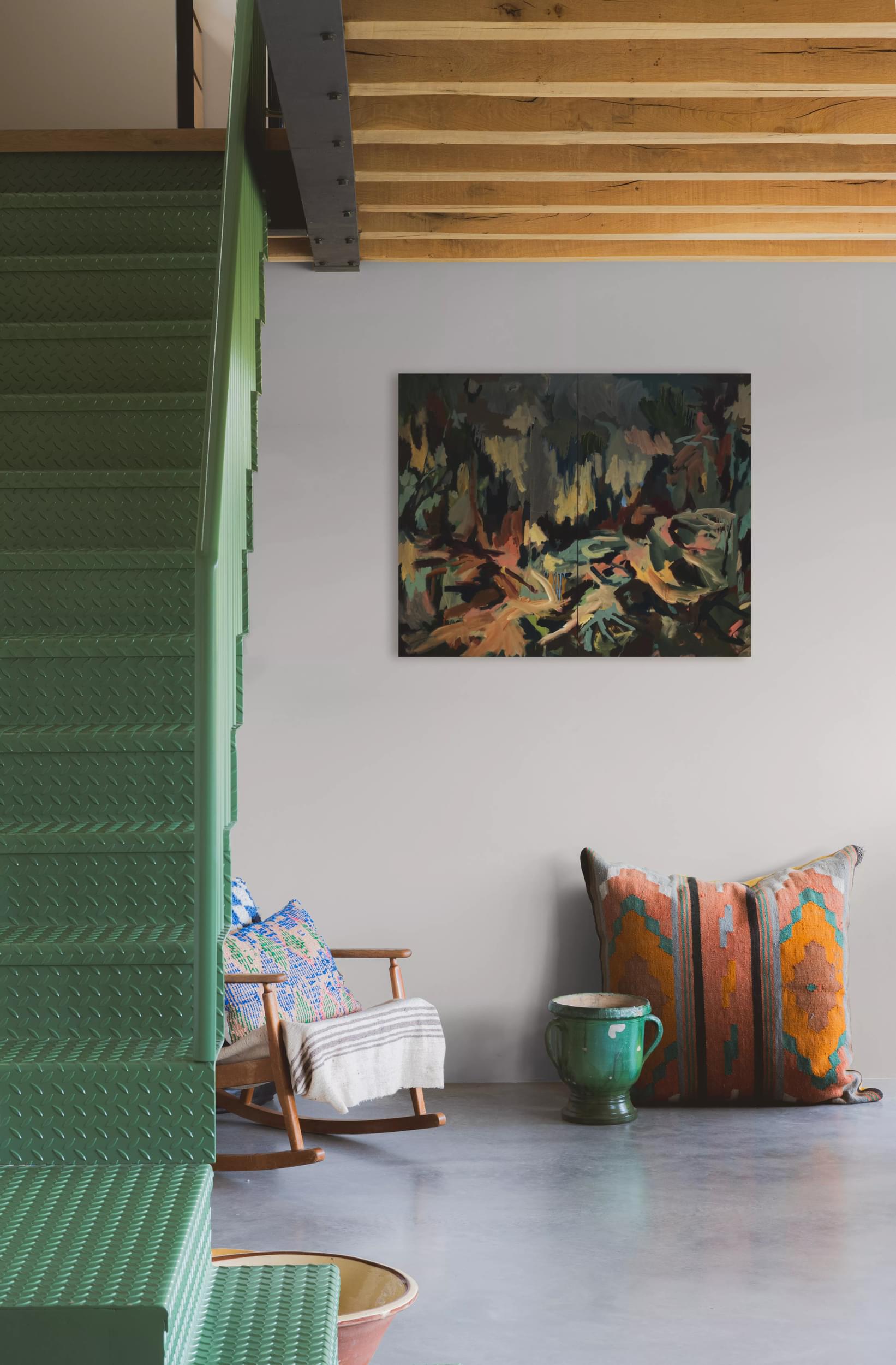
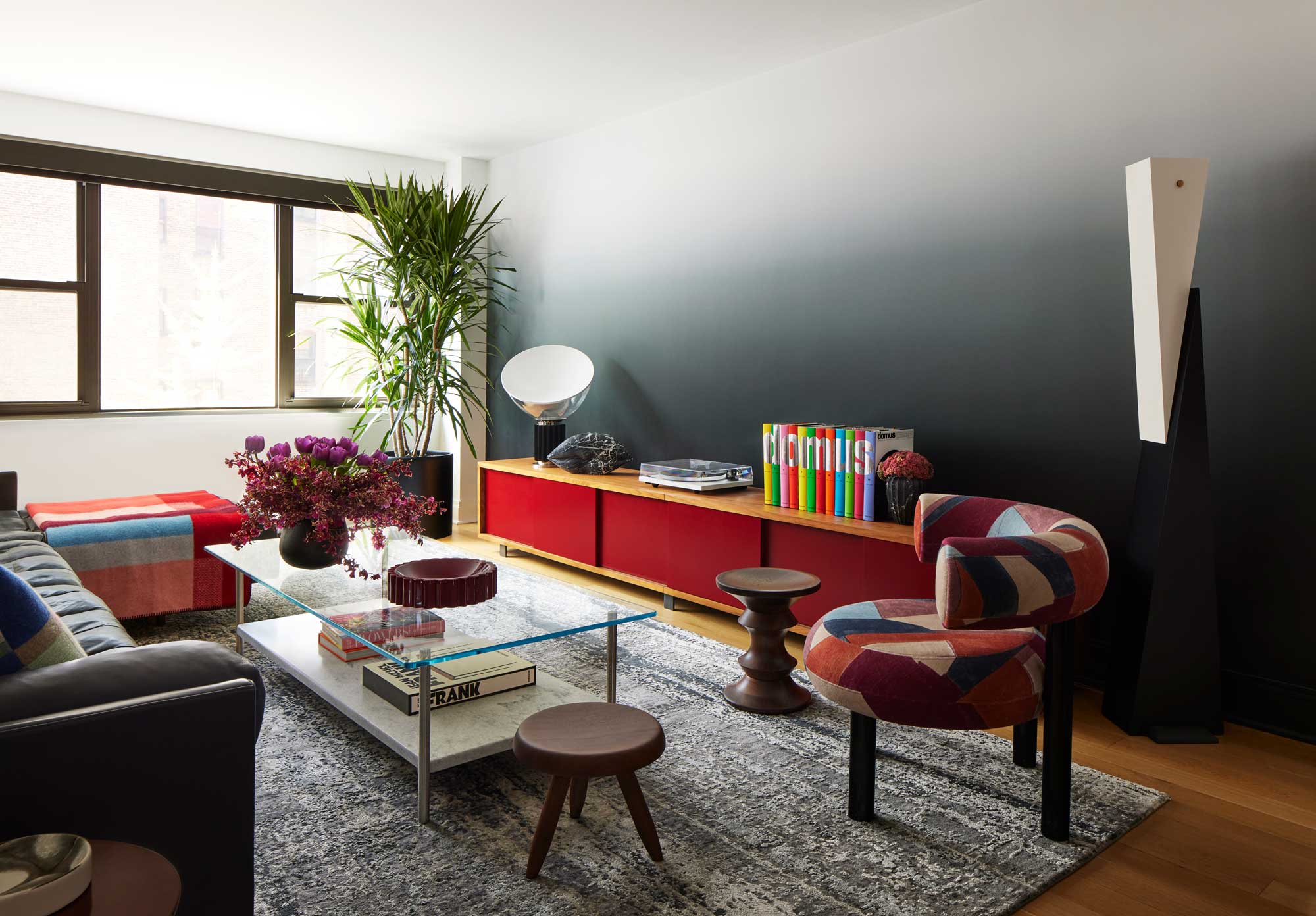
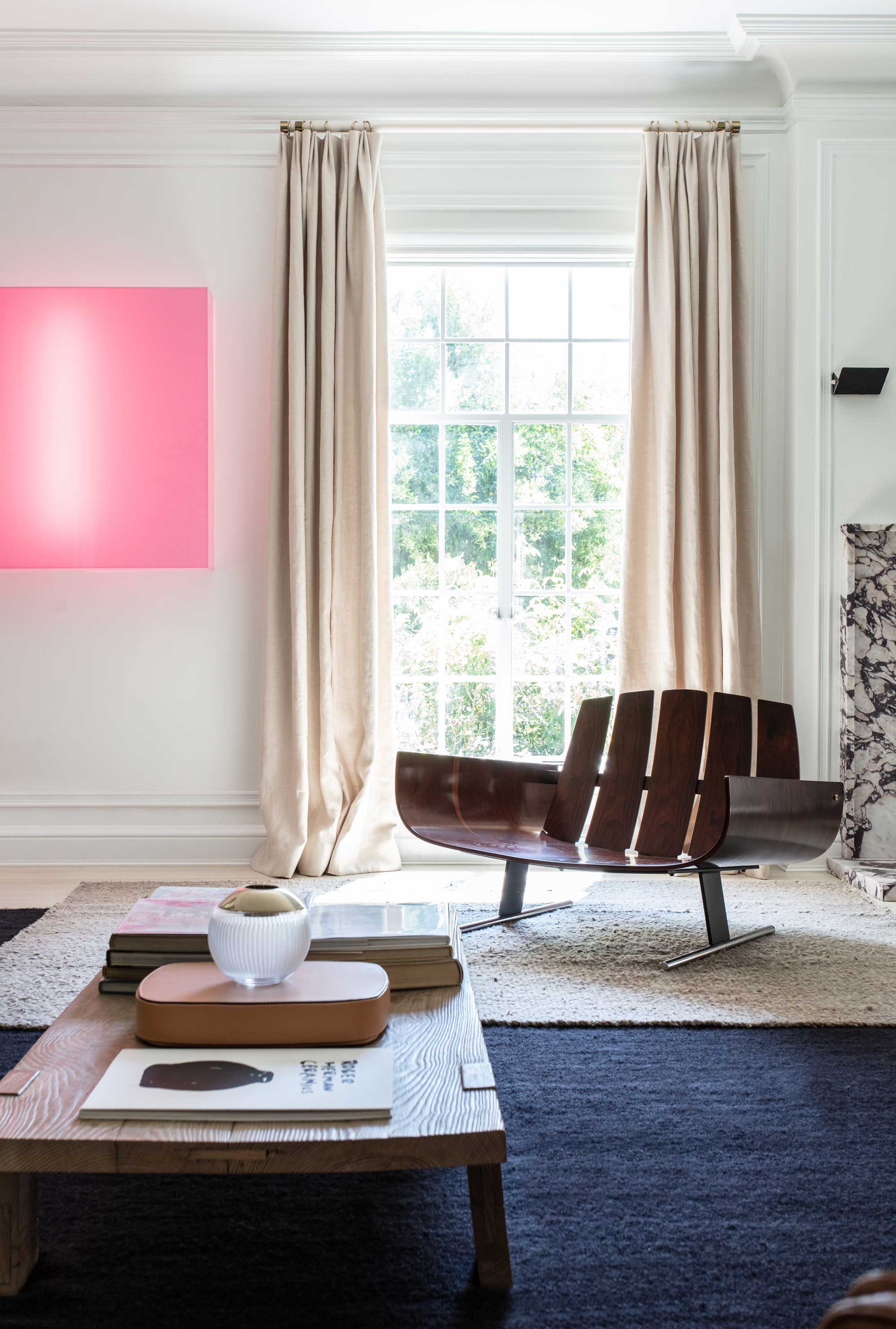
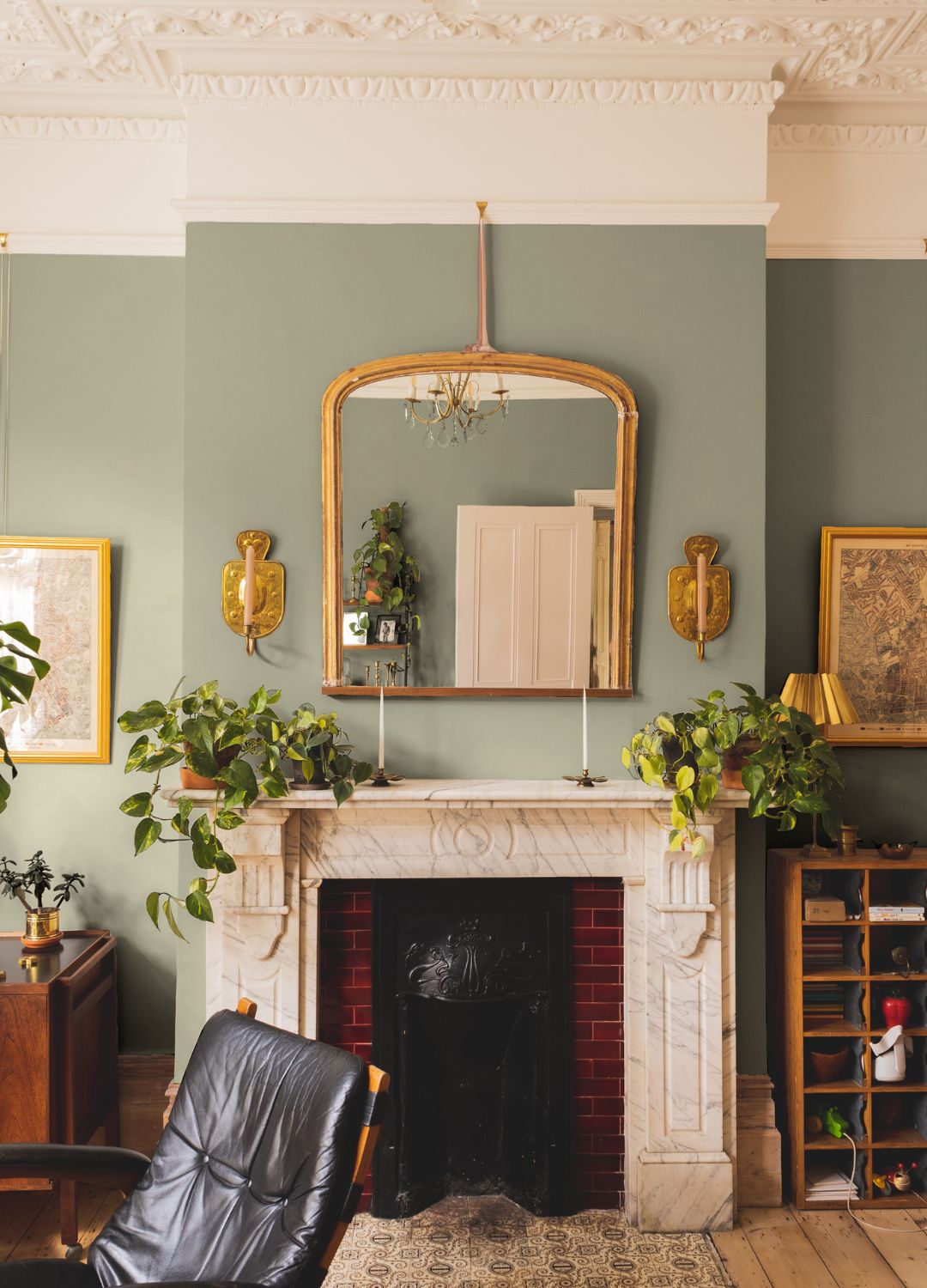
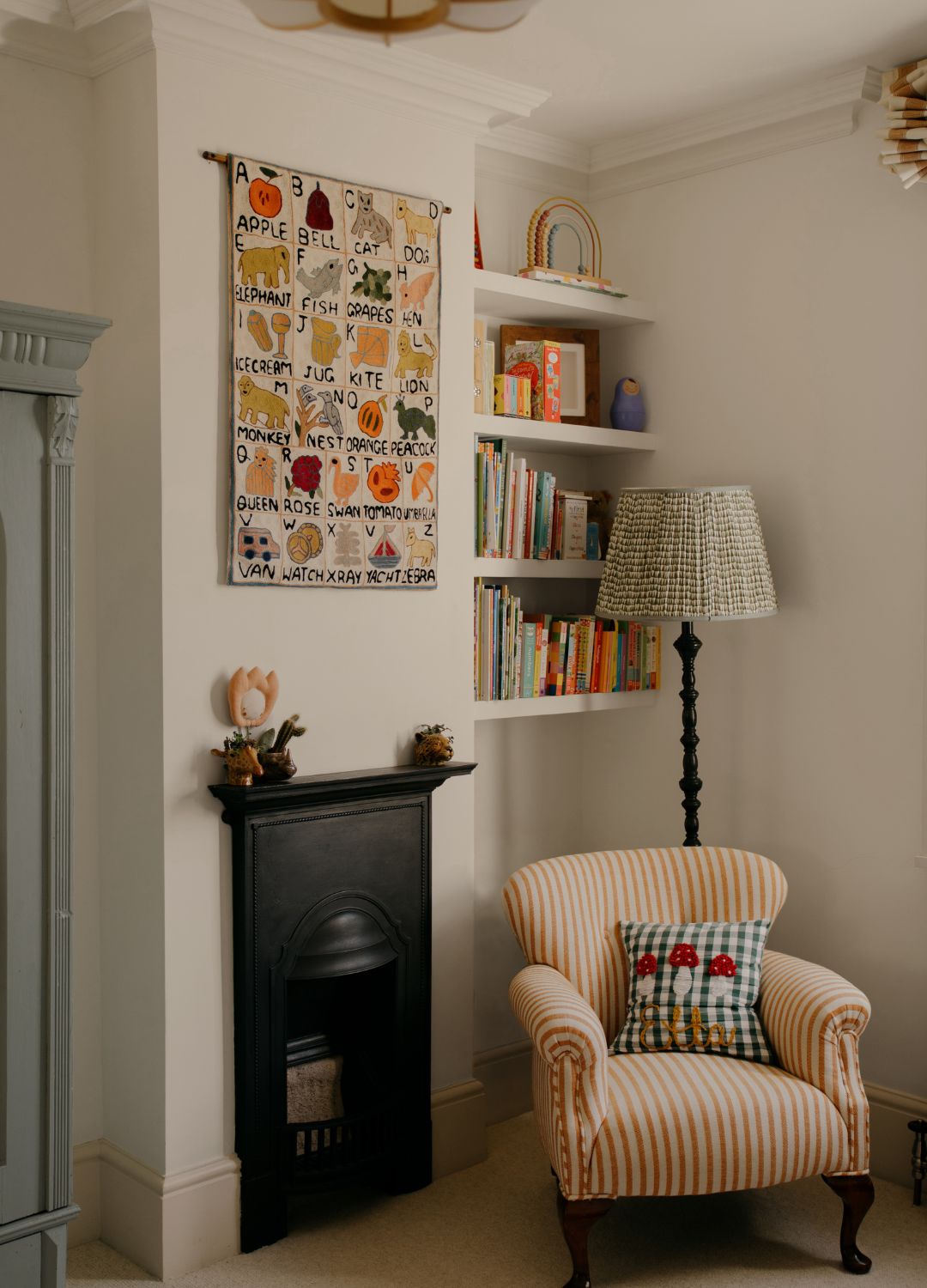
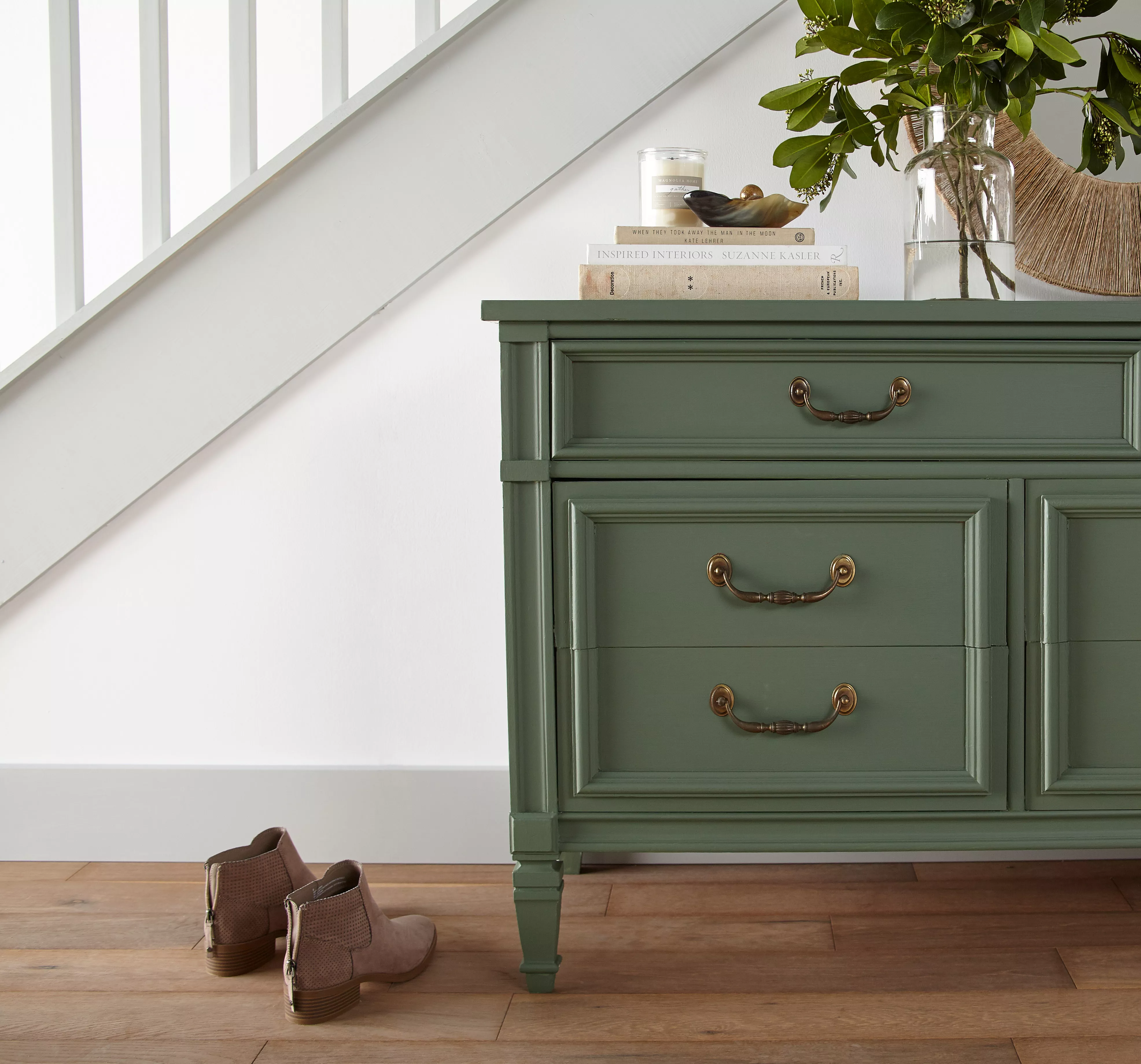
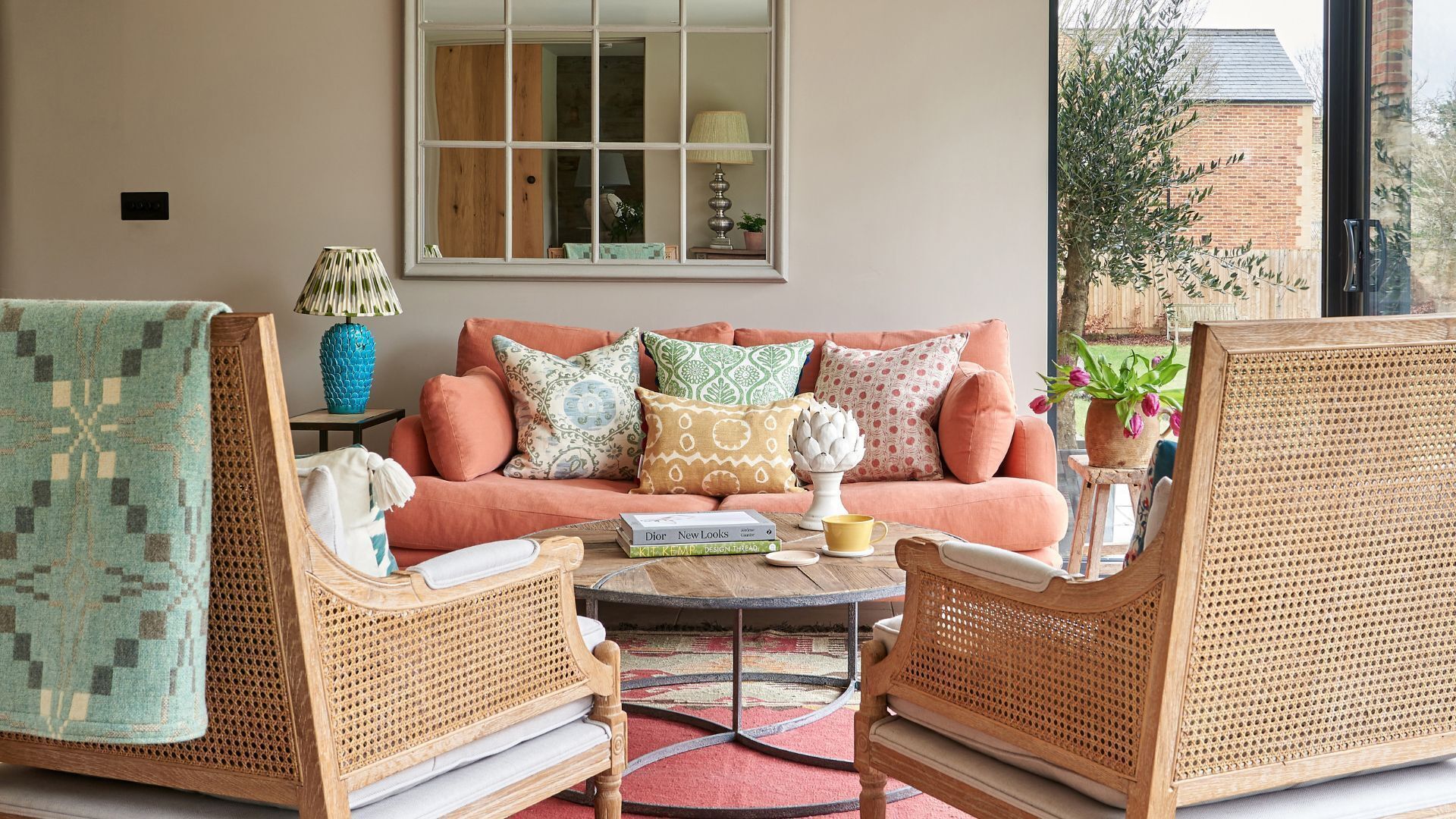
To successfully incorporate these warm neutrals, the article advises using a low-sheen finish and pairing them with earthy, natural shades like terracottas, ochres, and greens. It cautions against using black, as too much contrast can create an undesirable "Tudorbethan vibe." Adding texture through natural materials such as linen, cotton, and rattan is also recommended to enhance the homely feel. Flora Hogg, an interior design consultant and color specialist, emphasizes that the calming and cheering quality of these warm, creamy neutrals is precisely why they are experiencing a resurgence, fulfilling a contemporary need for comfort and reassurance in home environments. Ultimately, the article suggests that regardless of what it's called, this warm neutral provides the restful, mood-boosting backdrop sought after in current home decoration trends.
#InteriorDesign #PaintColors #HomeDecor #NeutralPalette #CreamyNeutrals #DesignTrends #HomeComfort #PaintChoices #InteriorDesign #PaintColors #HomeDecor #NeutralPalette #CreamyNeutrals #DesignTrends #HomeComfort #PaintChoices
0 commenti in totale
 Nessun commento ancora
Potresti anche gradire
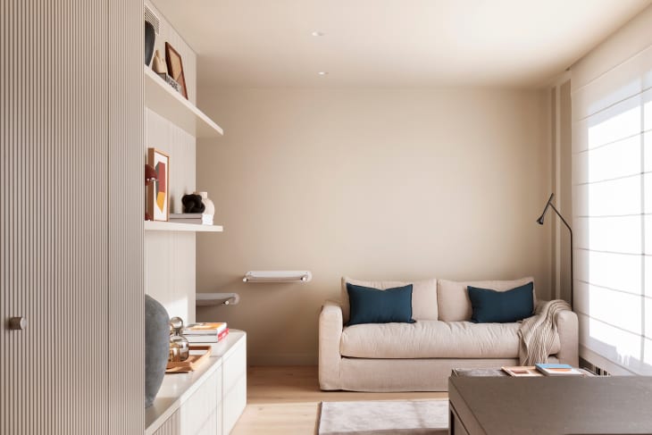
Forget Millennial Pink: When It Comes to Wall Paint, "Boring" Beige is Back
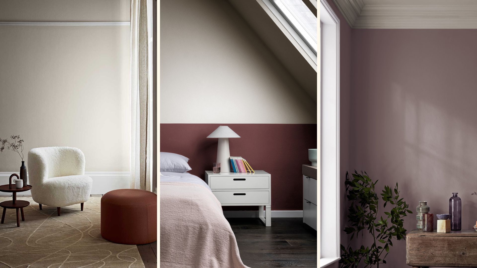
7 creative ways to use on-trend magnolia paint colours in your home

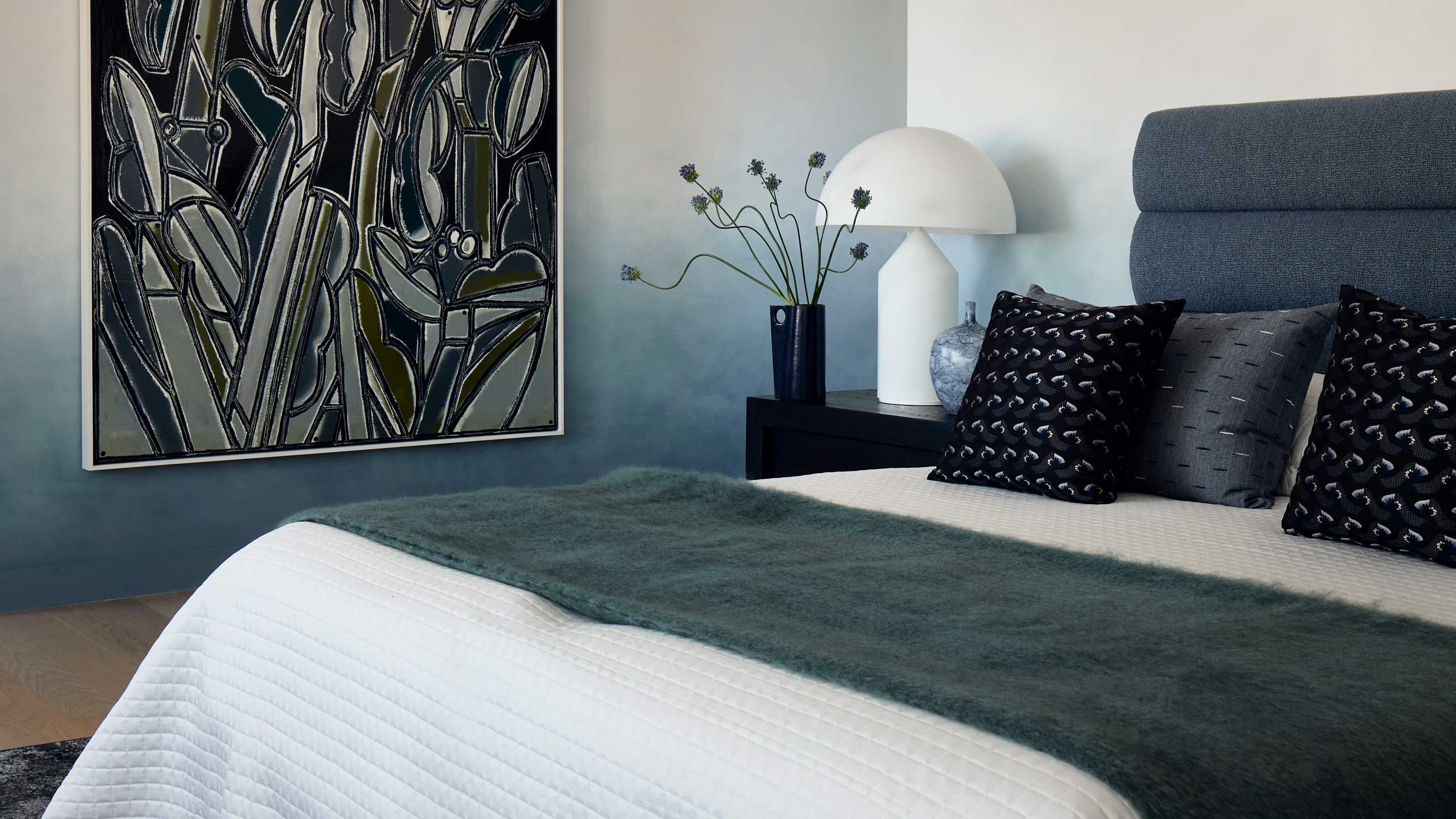
This surprising color trend is having a comeback

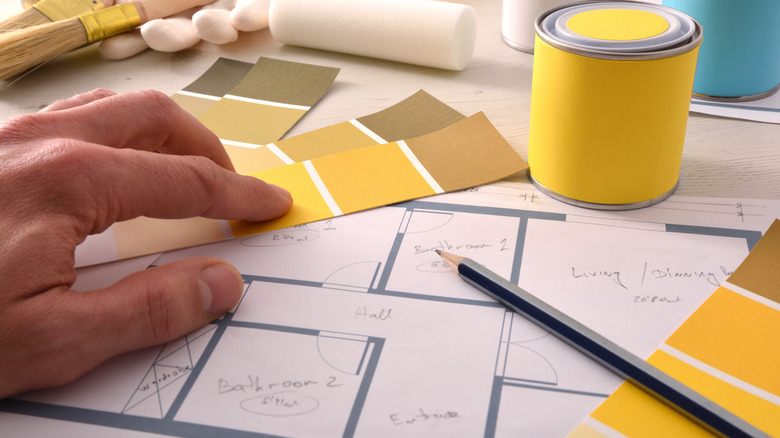
Goodbye To Butter Yellow: The Moodier Hue That's On Trend

"Magnolia 2.0" is the New Color Trend That's Re-Imagining This Controversial Shade for 2024
Decorating with this year’s neutral
The 10 Best Magnolia Paint Colors of All Time

Is Little Greene's Portland Stone the perfect neutral paint?

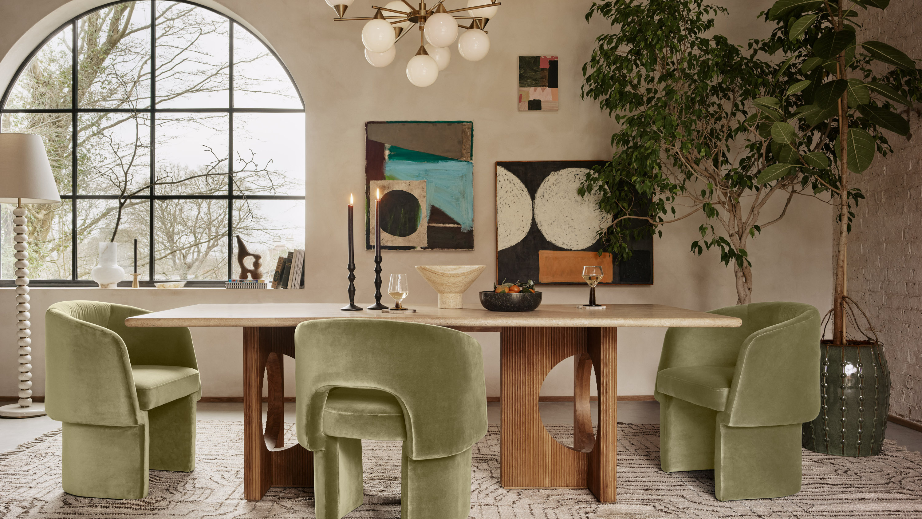
The Most Controversial Decor Trend of 2024? How to Create a Color Scheme Around the "New Magnolia"
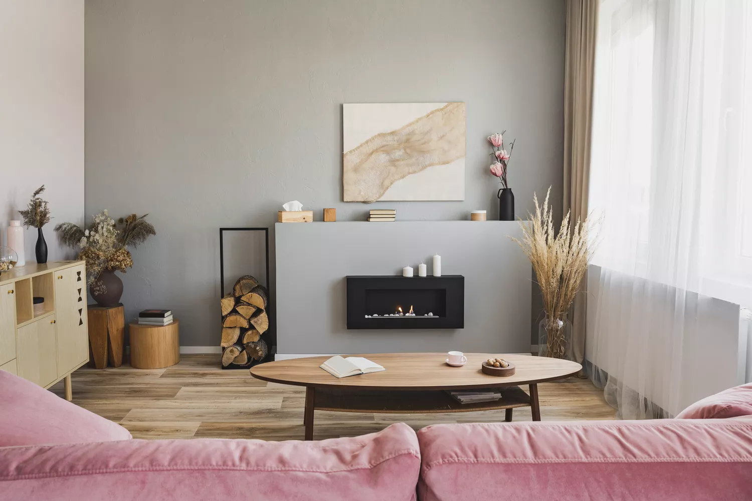
Bored With White Walls? Try One of These Designer-Recommended Neutral Paints Instead

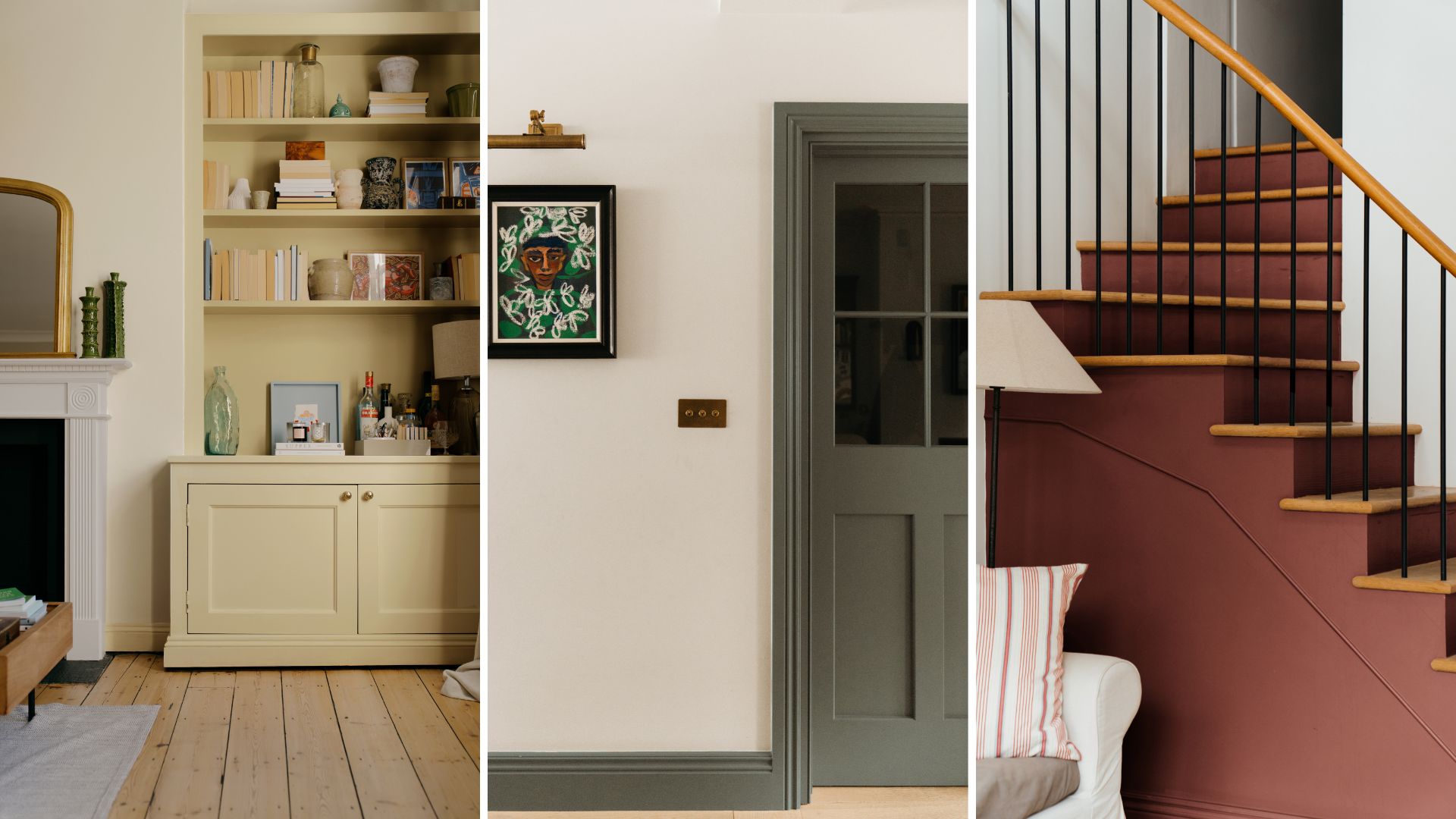
Make choosing paint easy with new 'natural light' colours

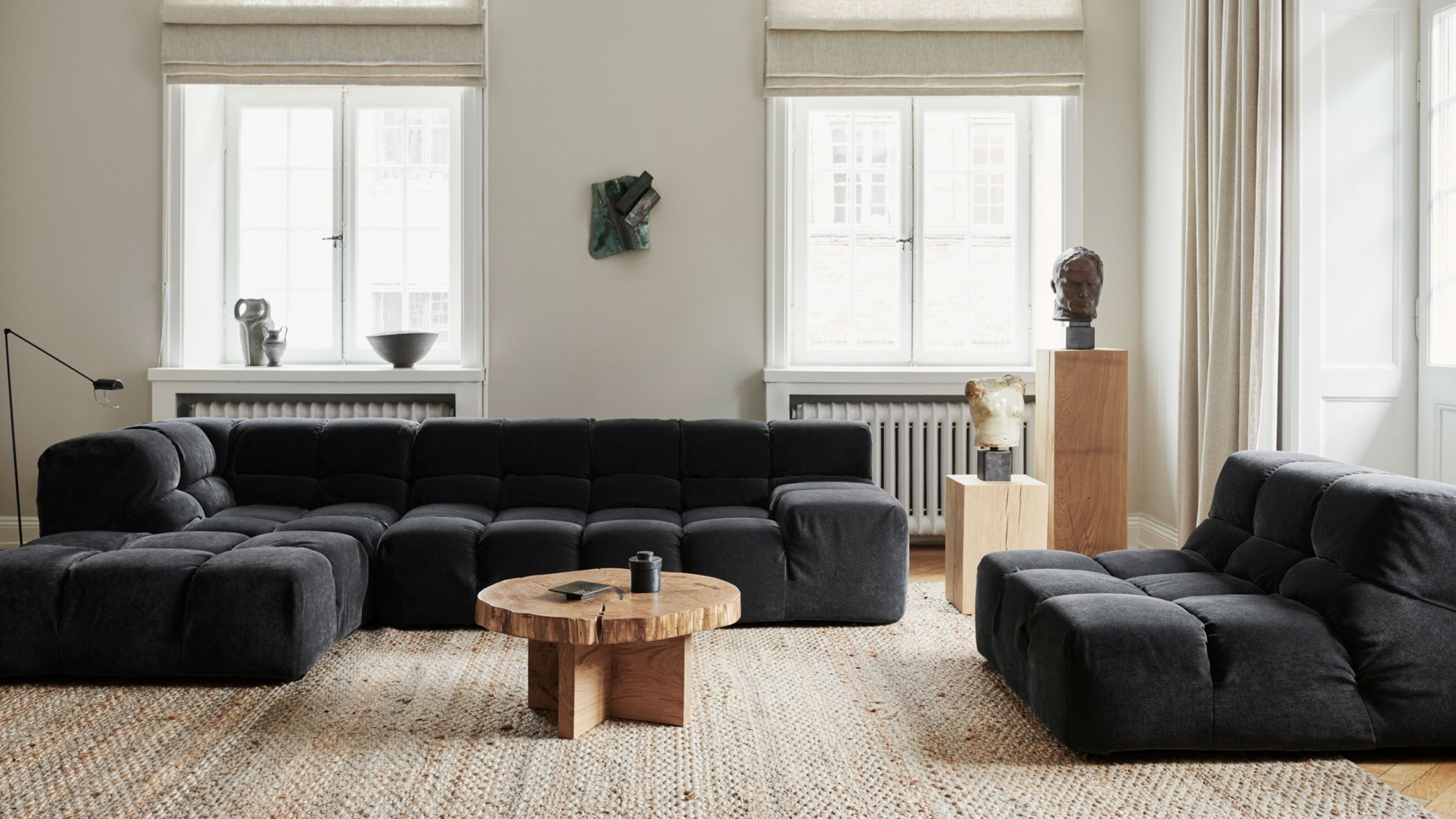
Which Neutral Is Replacing White in 2025? Experts Reveal
It’s Official: Designers Are Ditching This Once-Classic Color
Is magnolia paint back in style? How to make the once dated shade look brand new
This Very "Controversial" Color Is About To Be Everywhere Again

Designers Say These Vintage Paint Colors Are Back

6 earthy neutral paints that designers say are replacing bland white walls
Find your perfect neutral with COAT Paints' new Polite Palette
Unexpected Neutrals: Beige + Dark Grey + Camel

Are Neutral Paint Colors Finally Out of Style? We Asked Designers and They All Agreed