1/7
Towel colors to avoid in bathrooms – and what to buy instead, according to designers
The article discusses specific towel colors that interior designers recommend avoiding in bathrooms due to their potential to negatively impact the room's atmosphere or appearance, and it offers suggestions for alternative colors that promote a more desirable aesthetic. It emphasizes that towel choices, though seemingly minor, can significantly influence the overall mood and style of a bathroom.
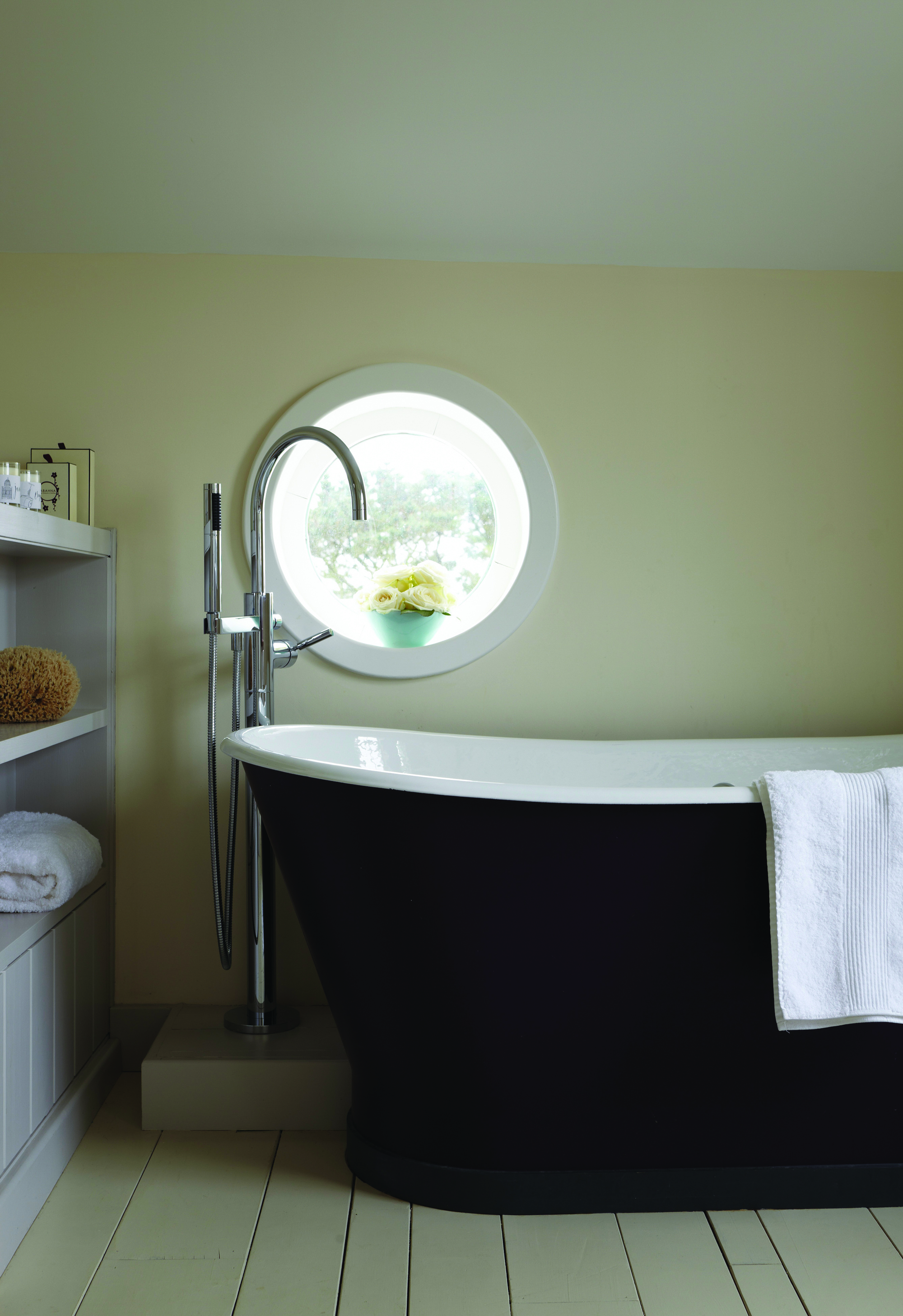
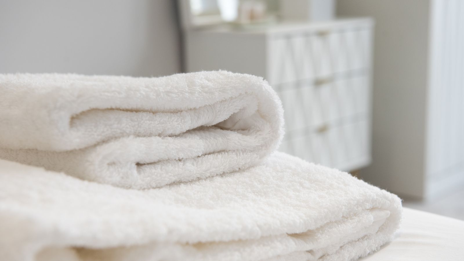
One of the colors to avoid is bright white. While white towels are often considered timeless, designers find them problematic because they are difficult to keep pristine white; they tend to gray over time, making a bathroom appear dated. Furthermore, an excessive use of bright white can create a sterile and impersonal environment, which is contrary to the calming and relaxed mood many people seek in a bathroom setting.
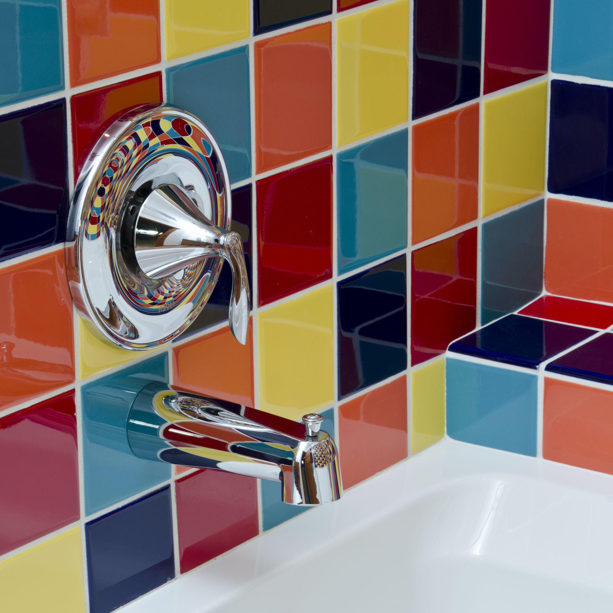
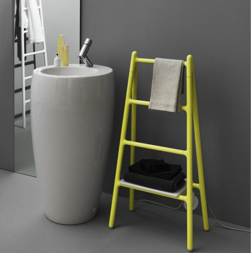
Vibrant yellows and oranges are also on the list of colors to avoid. These highly energetic colors are generally not conducive to a soothing bathroom. Designers suggest that such lively hues are more suitable for eccentric powder rooms or spaces where an invigorating effect is desired, rather than the primary bathroom where tranquility is paramount. Orange is noted for its eye-catching nature, and yellow for its energizing qualities, even in softer tones, making them disruptive to a calm ambiance.
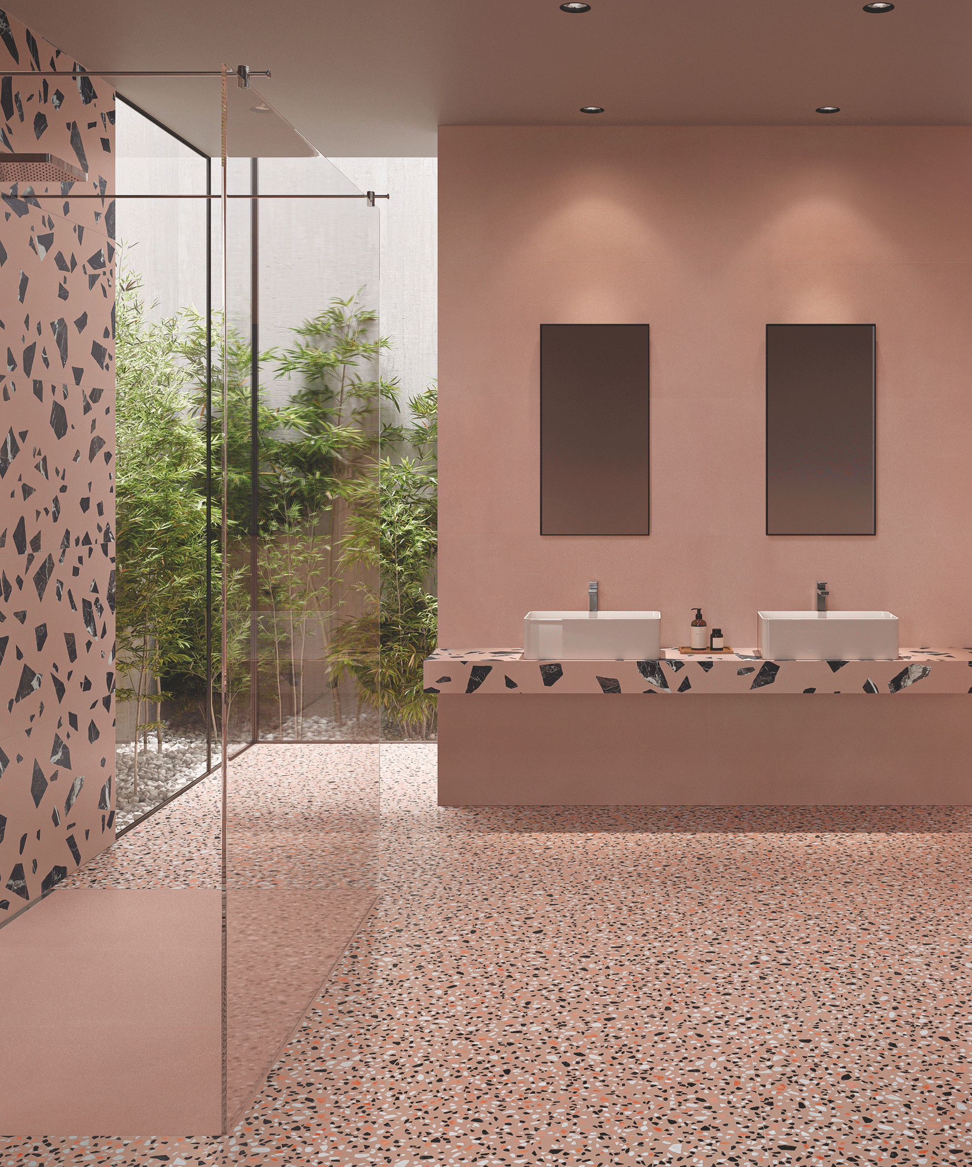
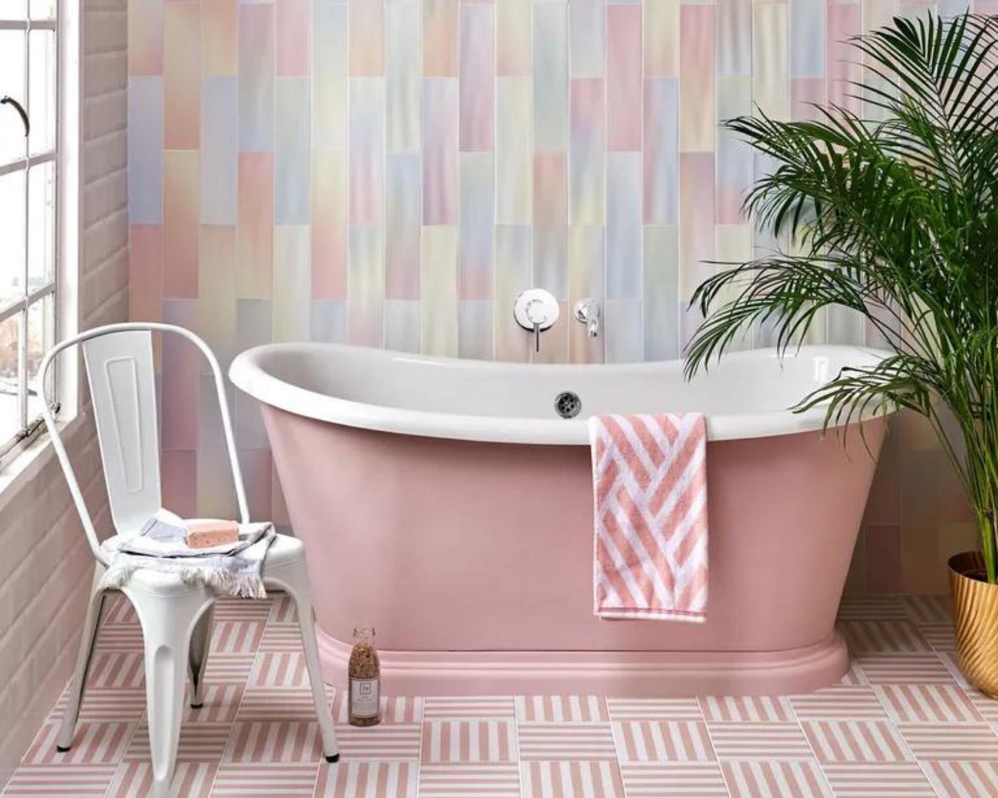
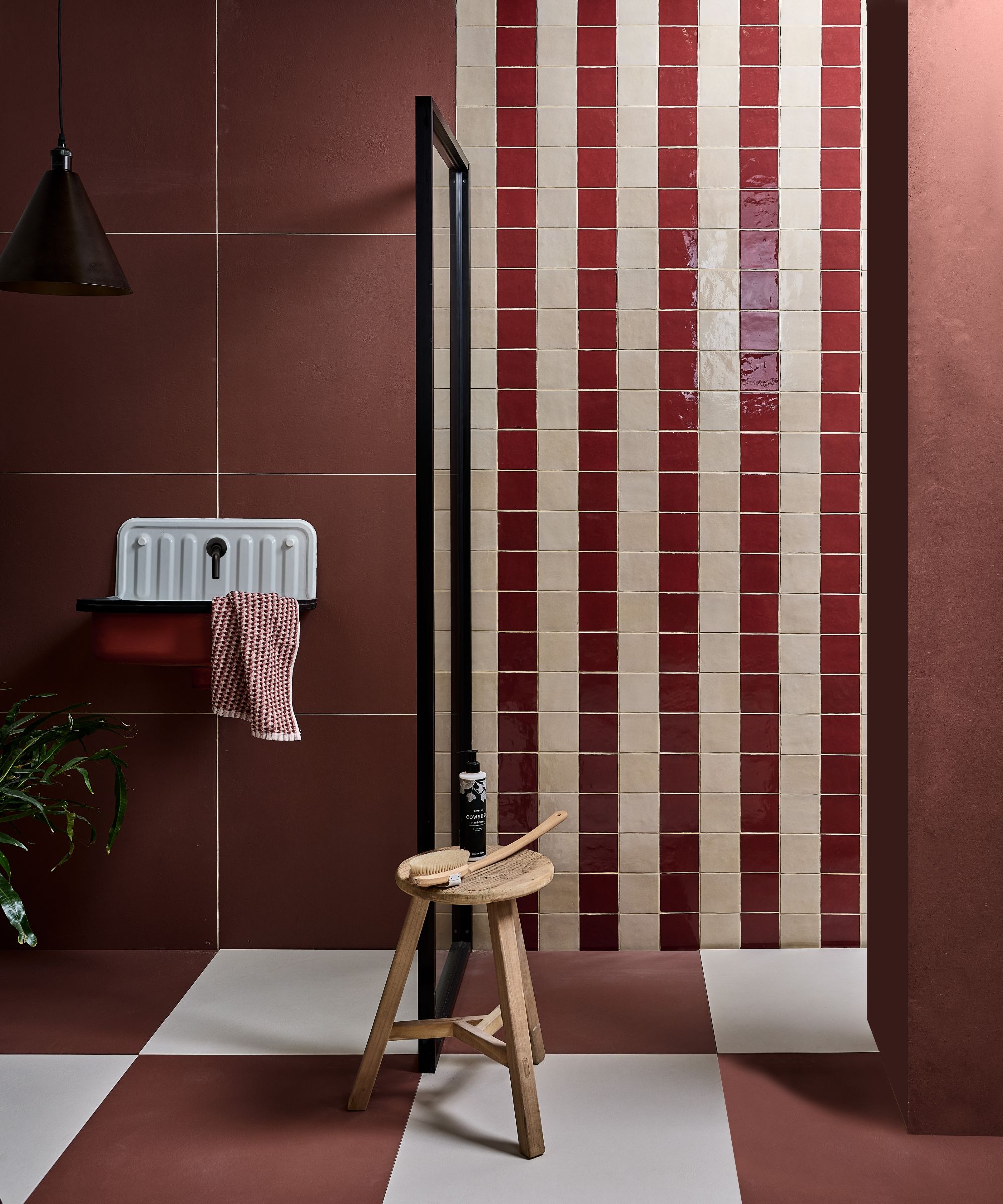
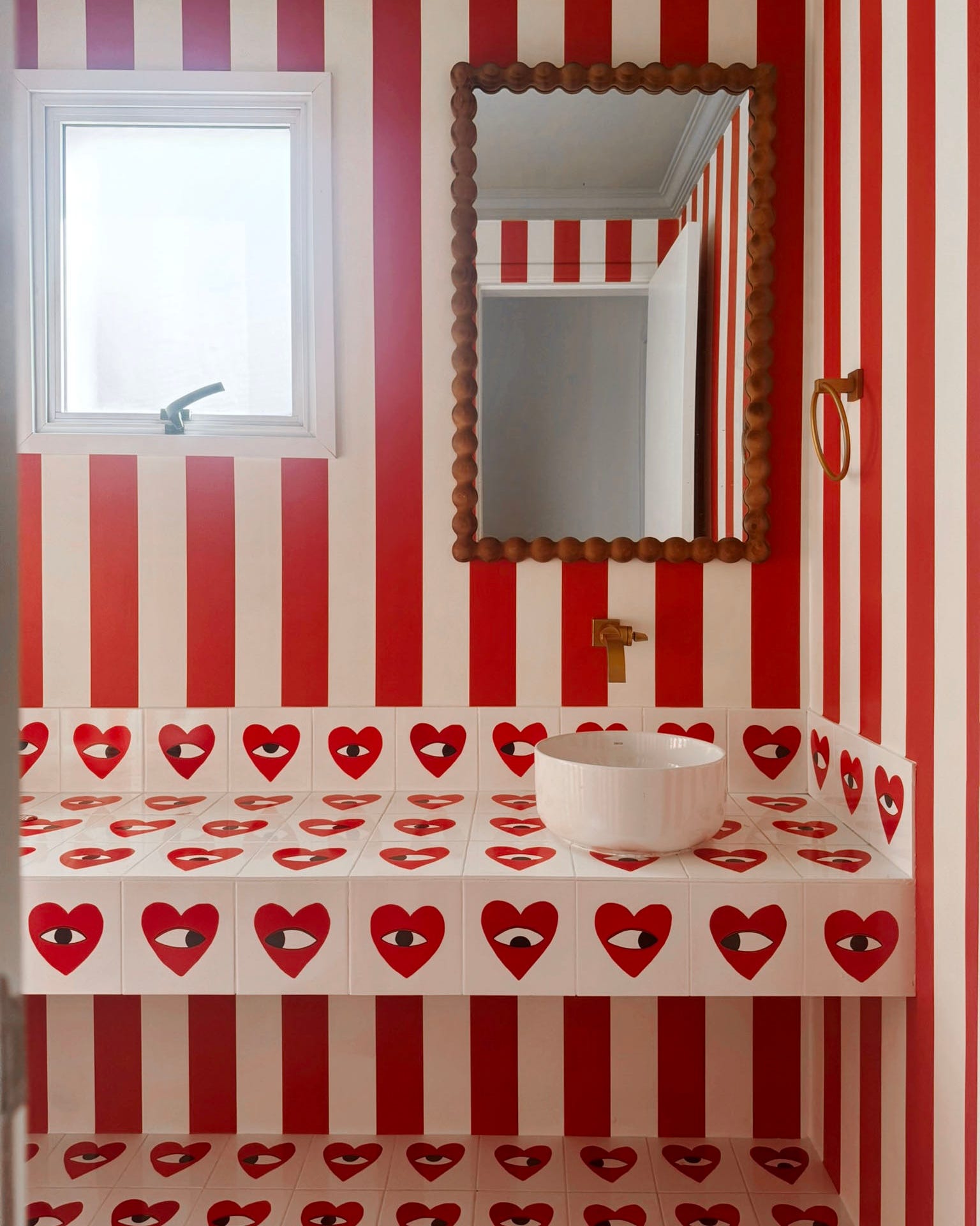

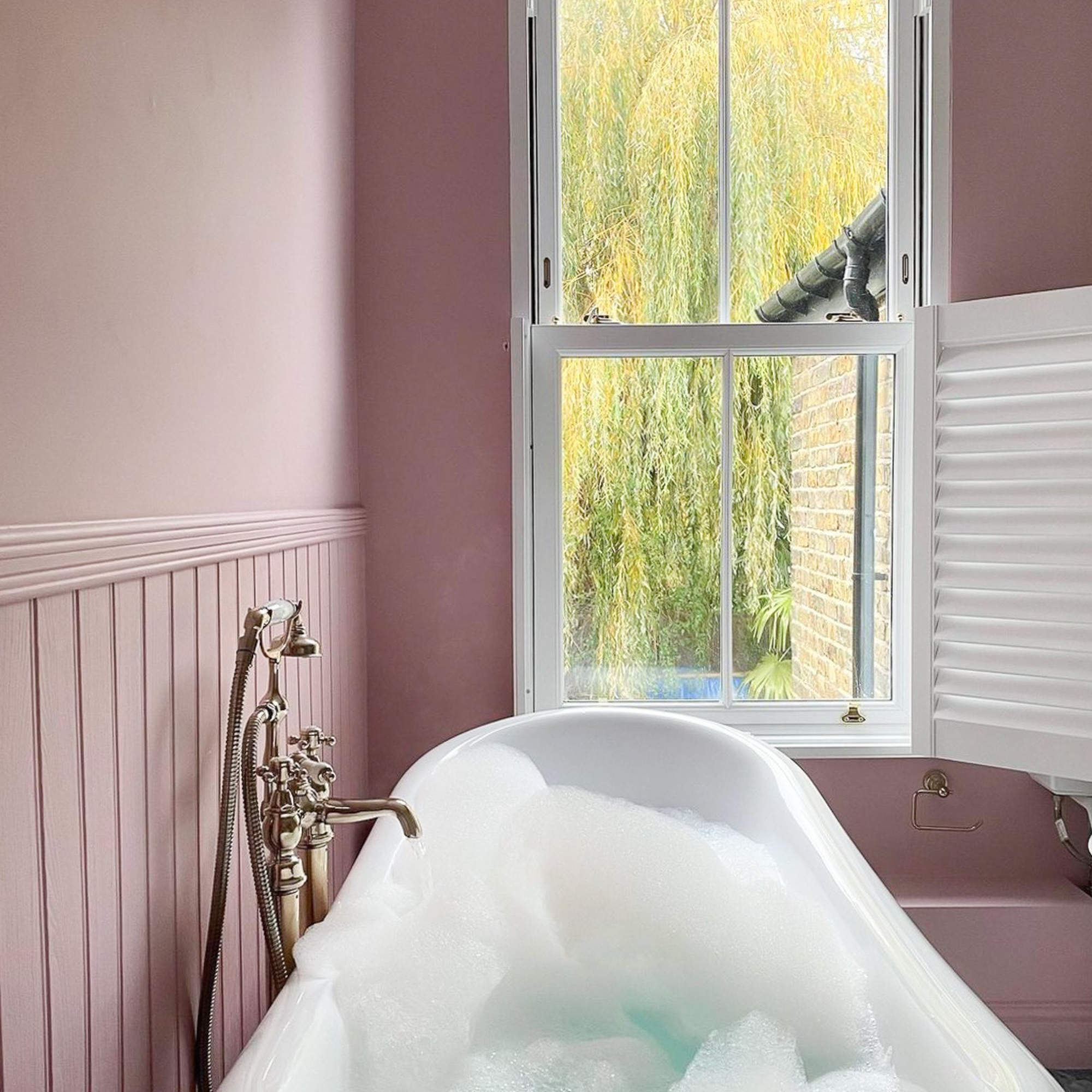
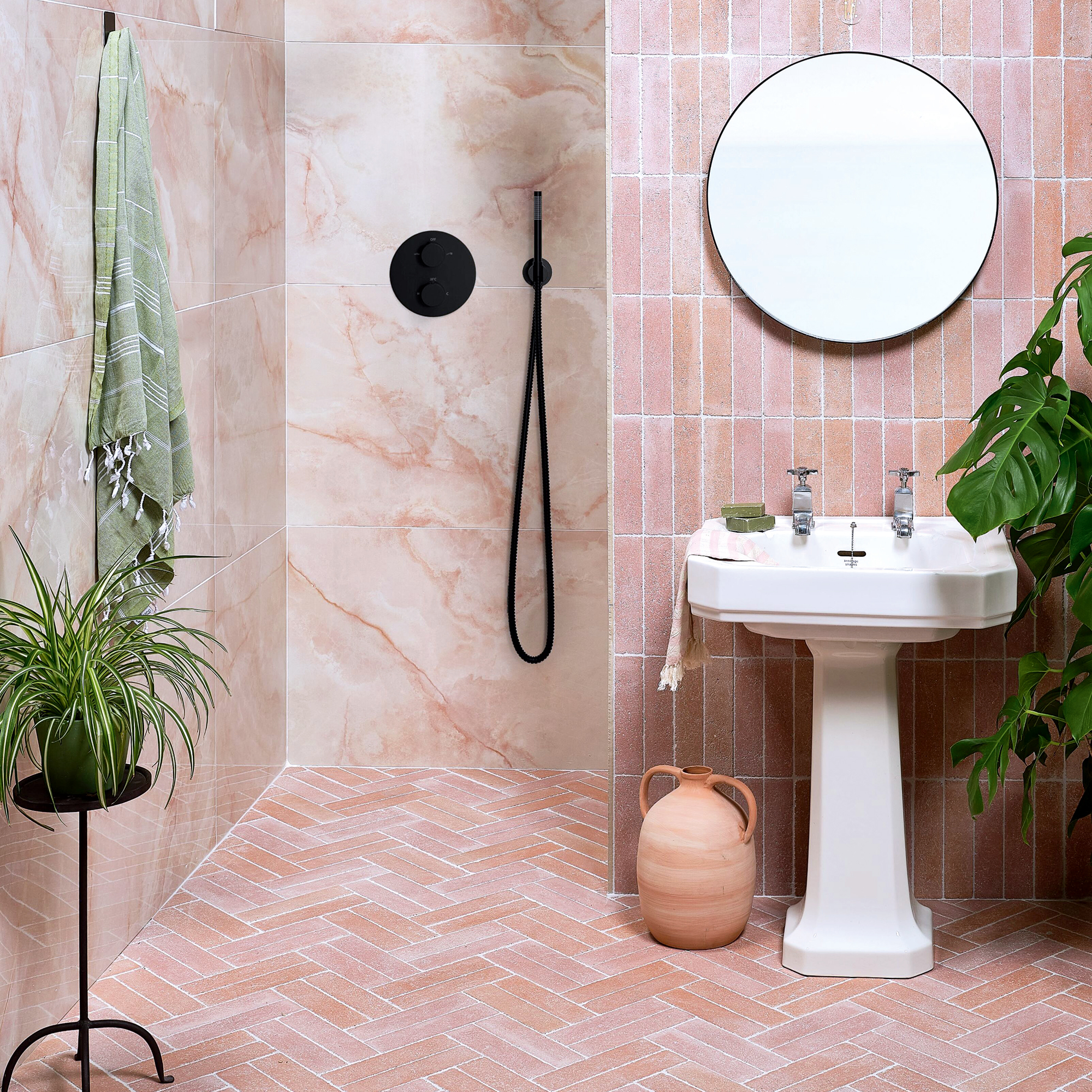
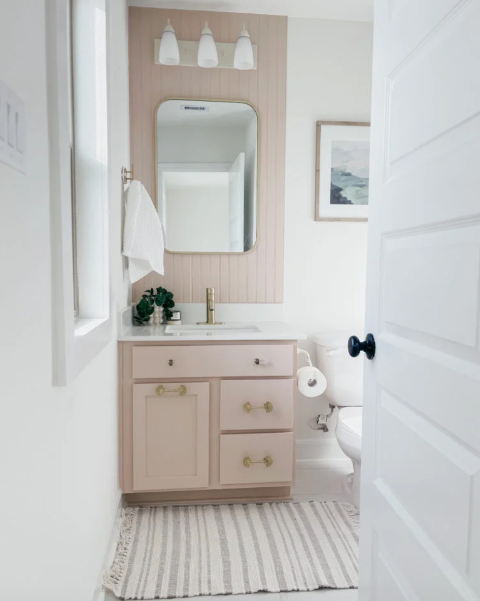
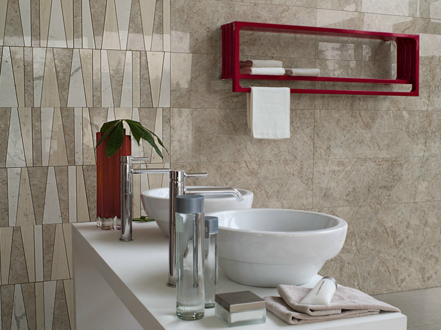
Intense primary reds are another color identified as difficult to integrate into a bathroom, particularly for towels. From a color psychology perspective, red is often associated with stress and can overpower a space. Even in a neutral bathroom, red towels can draw too much attention, distracting from other design elements and features that are meant to contribute to a relaxing environment. Muted or dusty pinks are suggested as a calming alternative if a touch of warmth is desired.
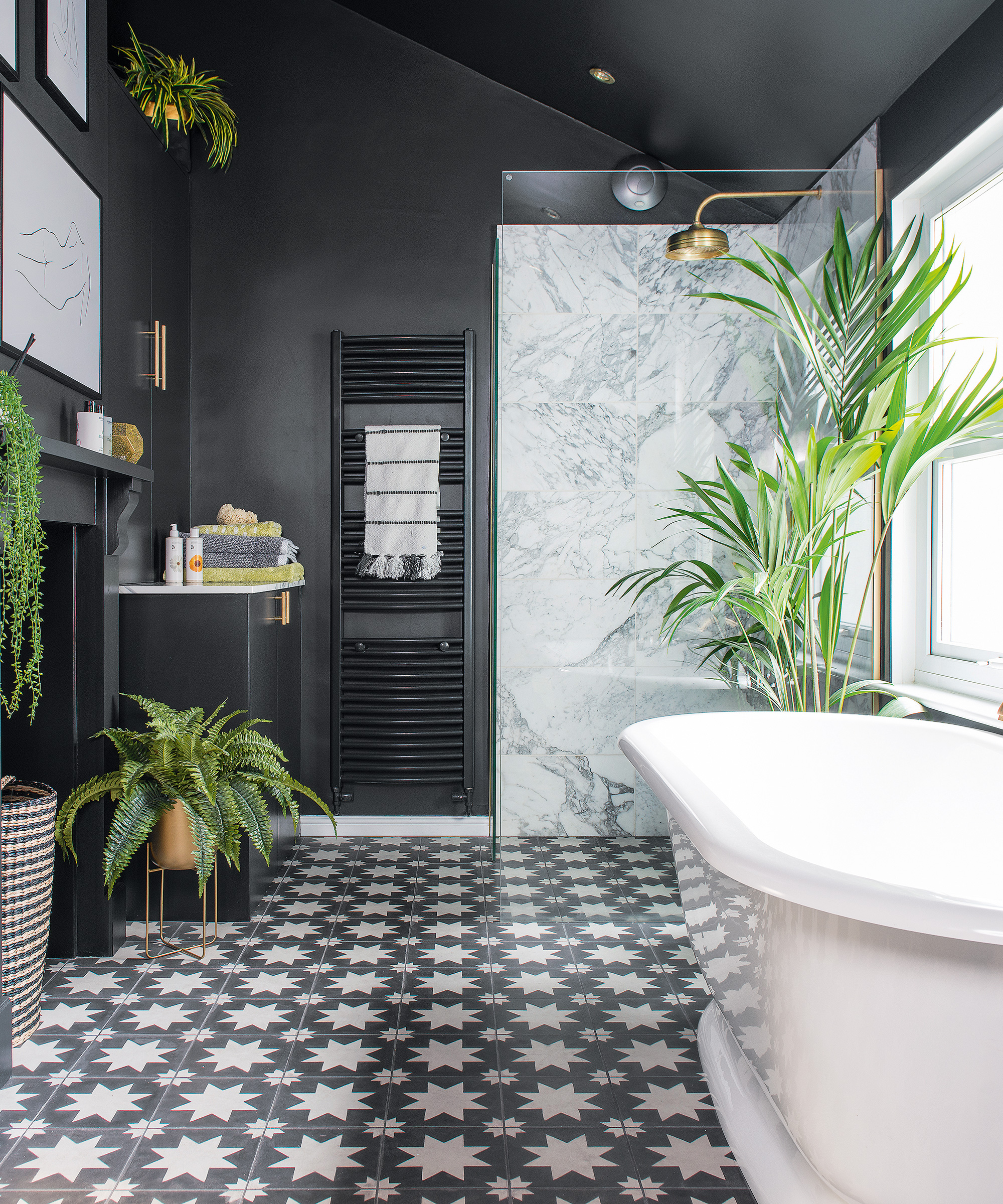
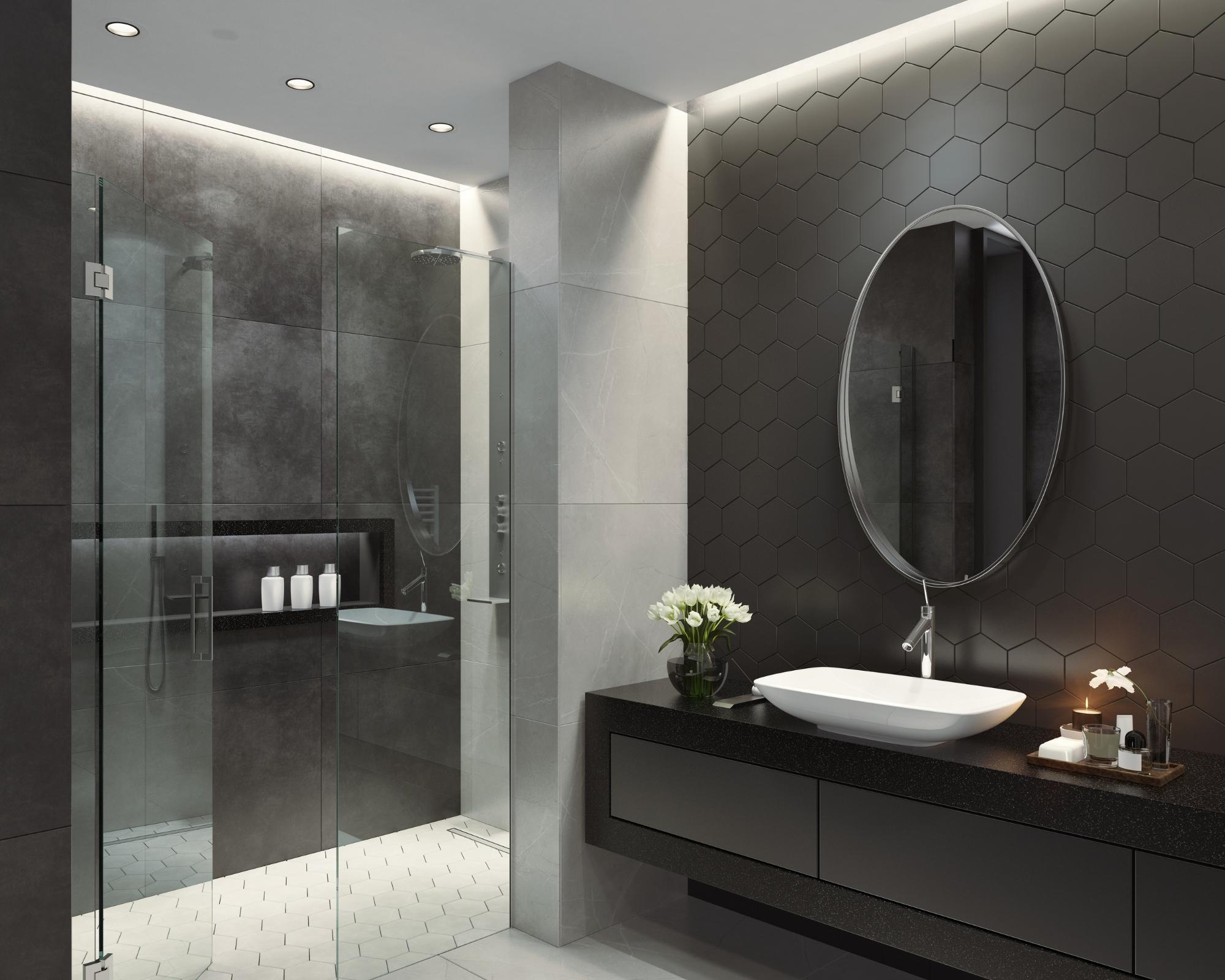
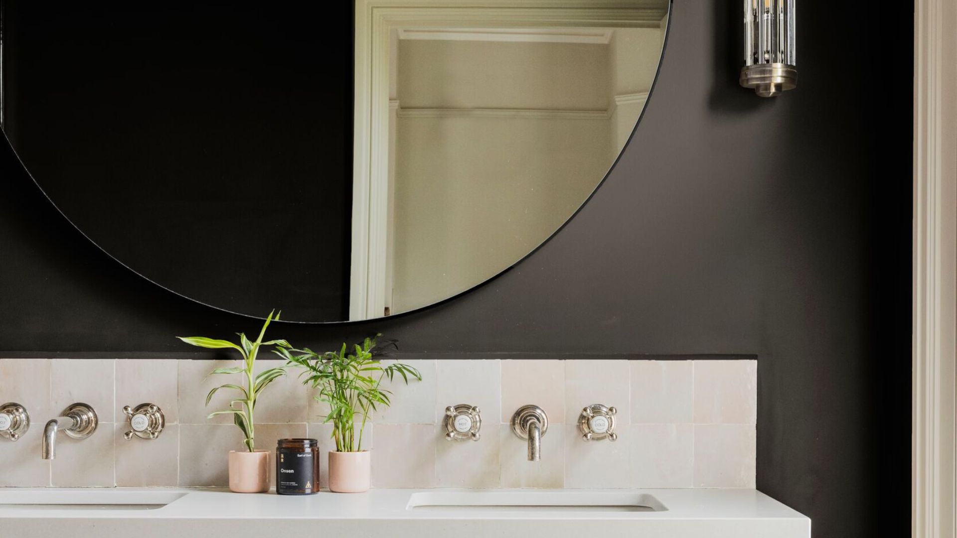
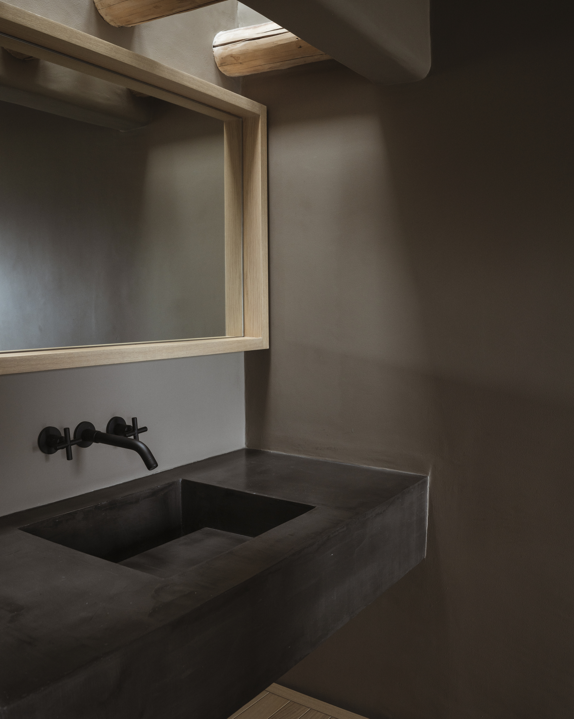
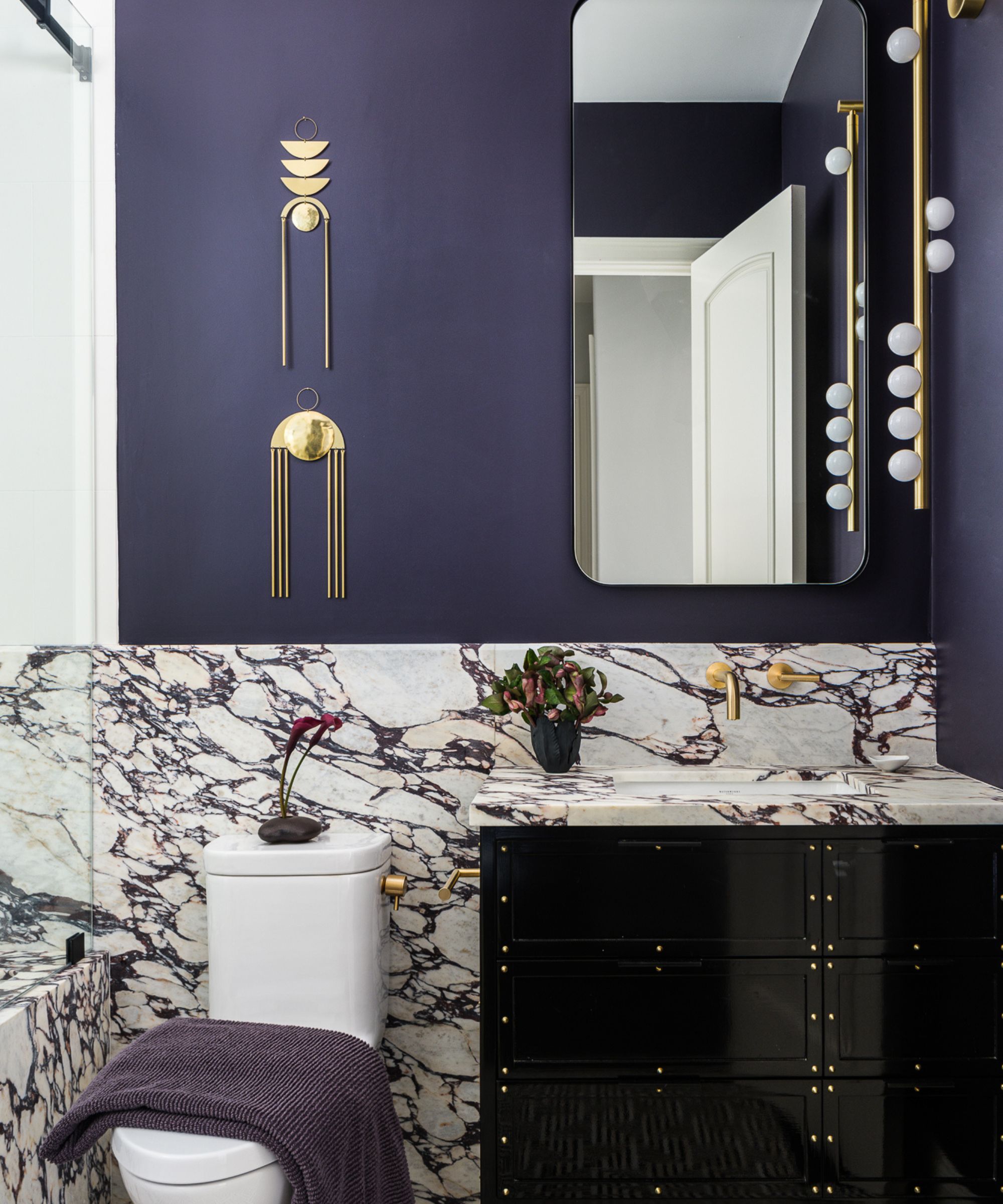
Black and near-black towels are generally discouraged unless the goal is to evoke the look of a hair salon. While black accents can add a sophisticated touch in matte finishes, black towels can make a bathroom feel enclosed and somber. This effect is particularly pronounced in smaller bathrooms or powder rooms, where dark colors can lead to a sense of claustrophobia, undermining the peaceful atmosphere that designers aim to create.
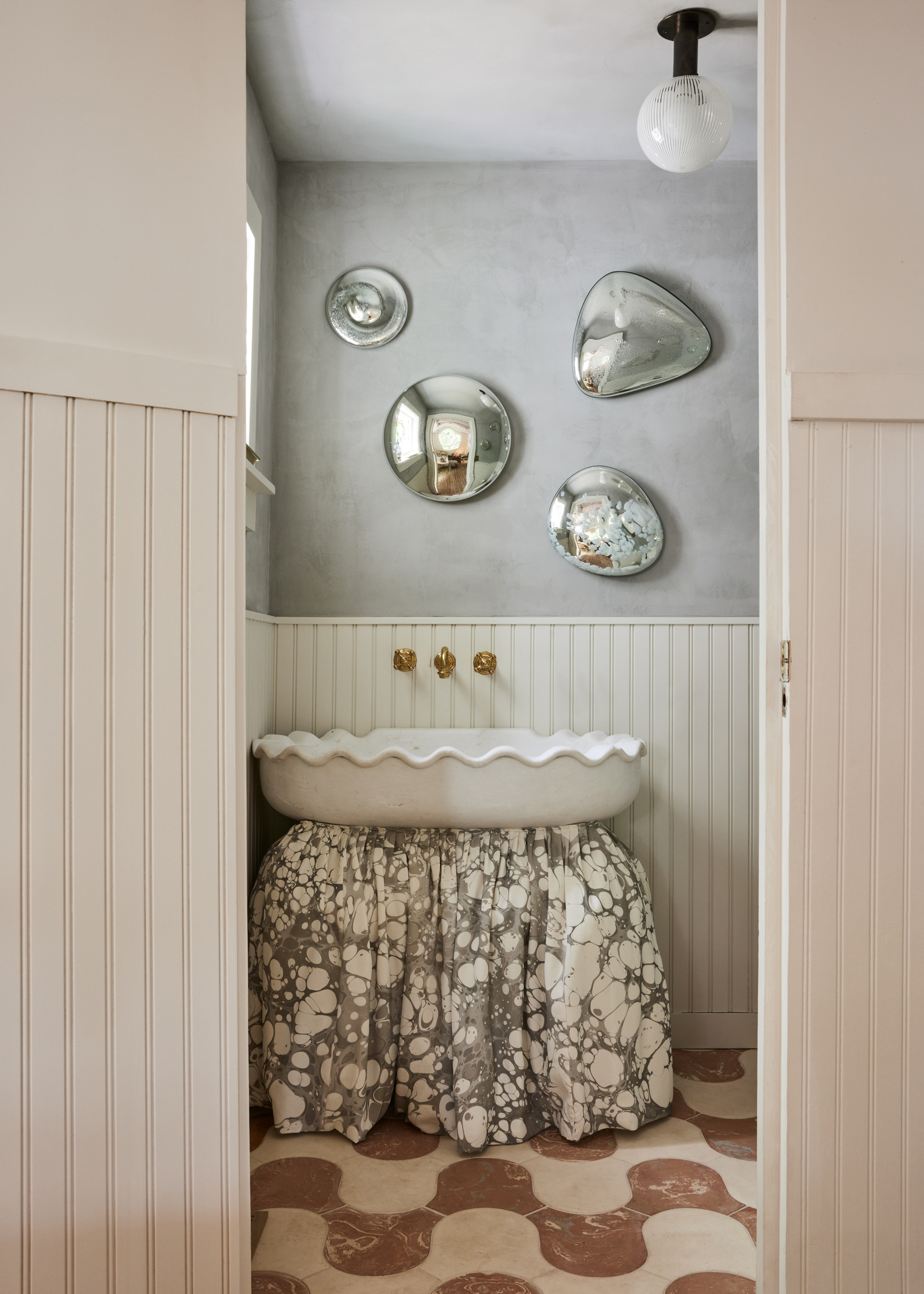
Multi-colored or brightly patterned towels are also on the list of items to avoid. The article highlights that these designs can be distracting and disrupt the serene and clean aesthetic typically desired in a bathroom. Plain towels are recommended as a timeless and versatile option that can integrate seamlessly with various bathroom decor schemes without clashing or appearing dated. The role of patterns and textures is also considered, emphasizing that simple, single-color options are often more effective for maintaining a calming environment.
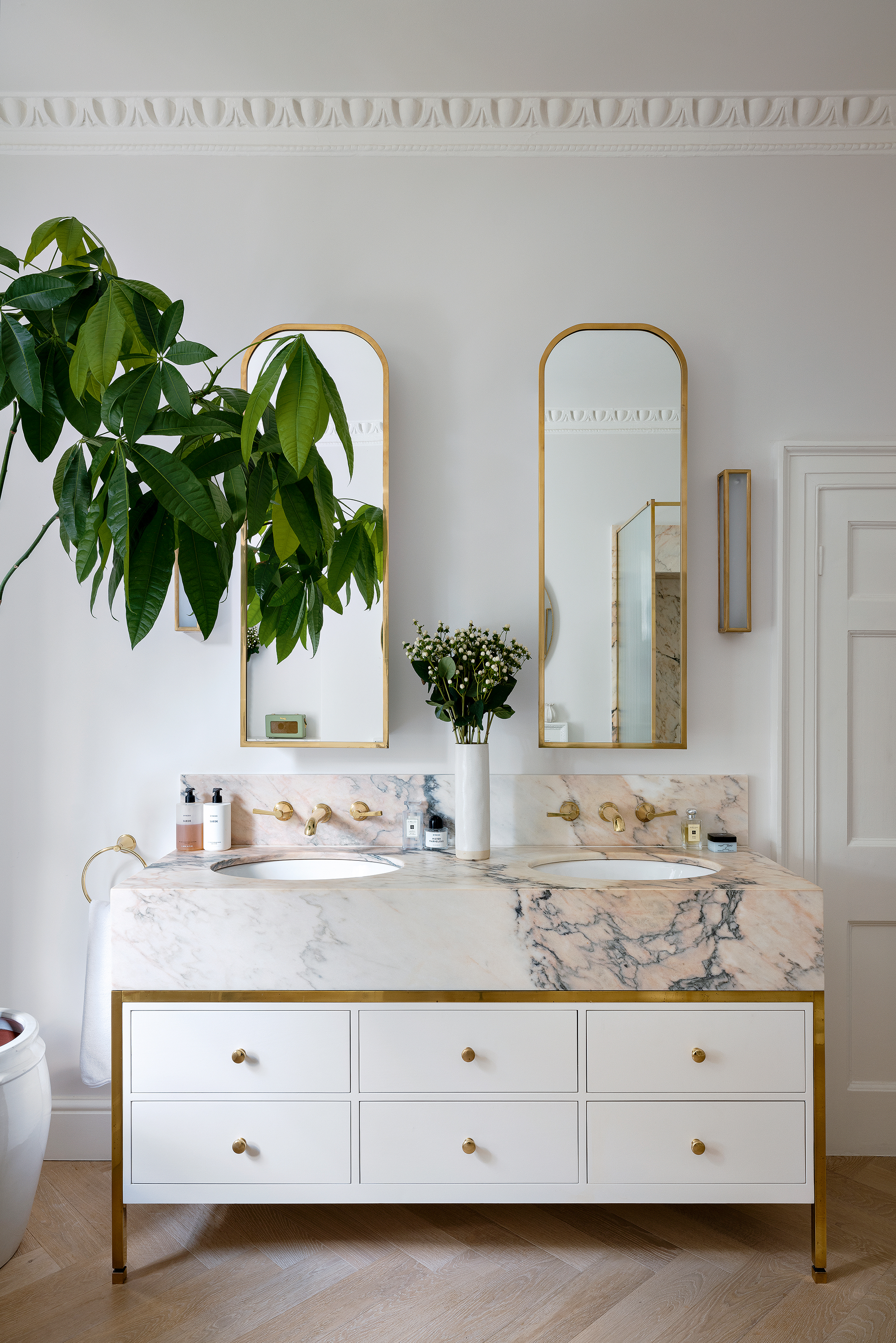
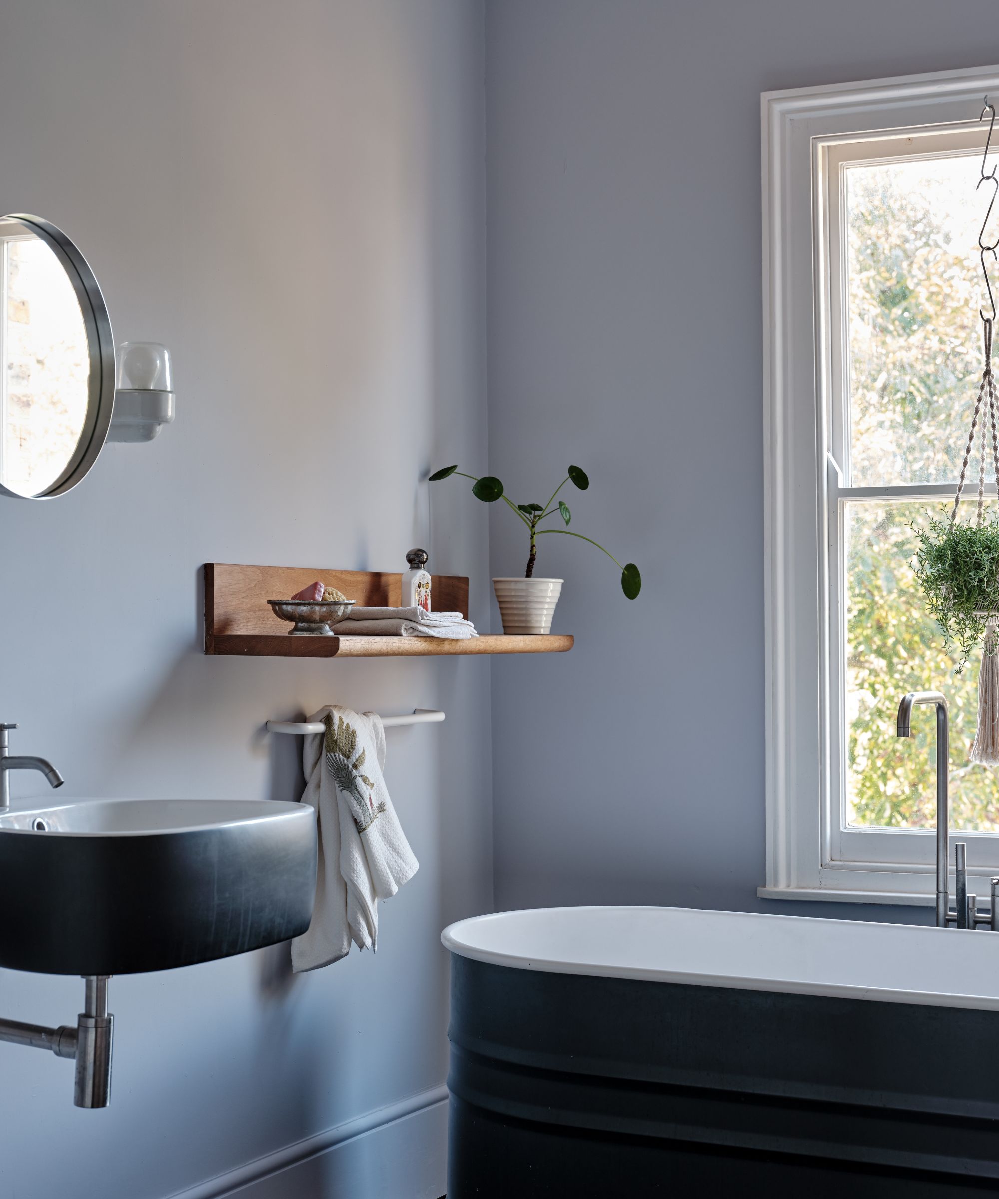
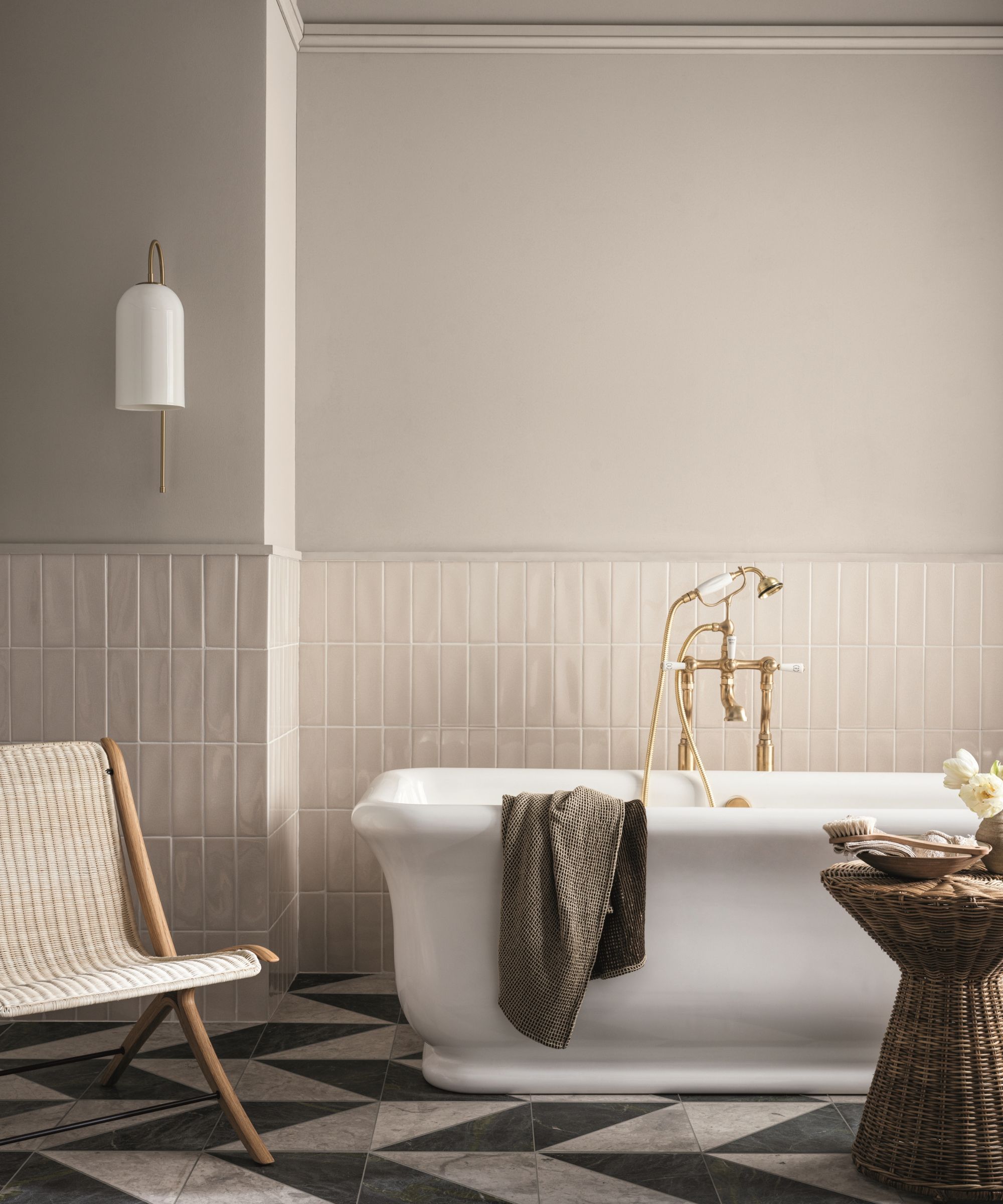
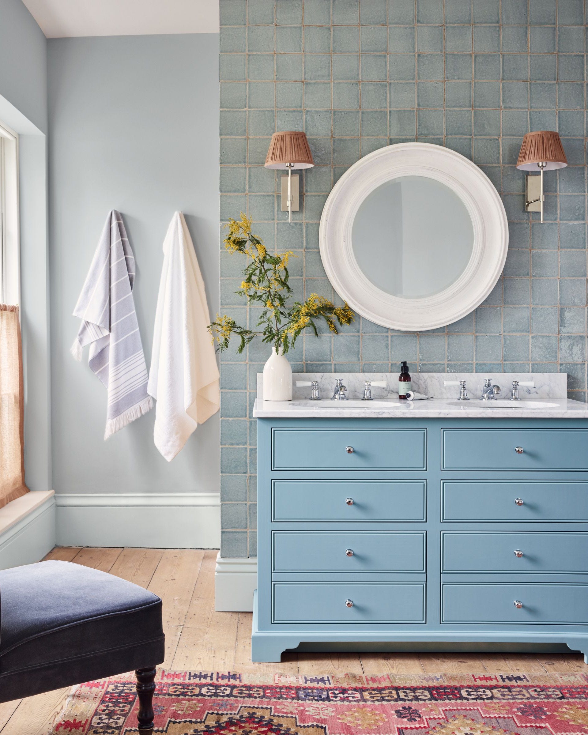
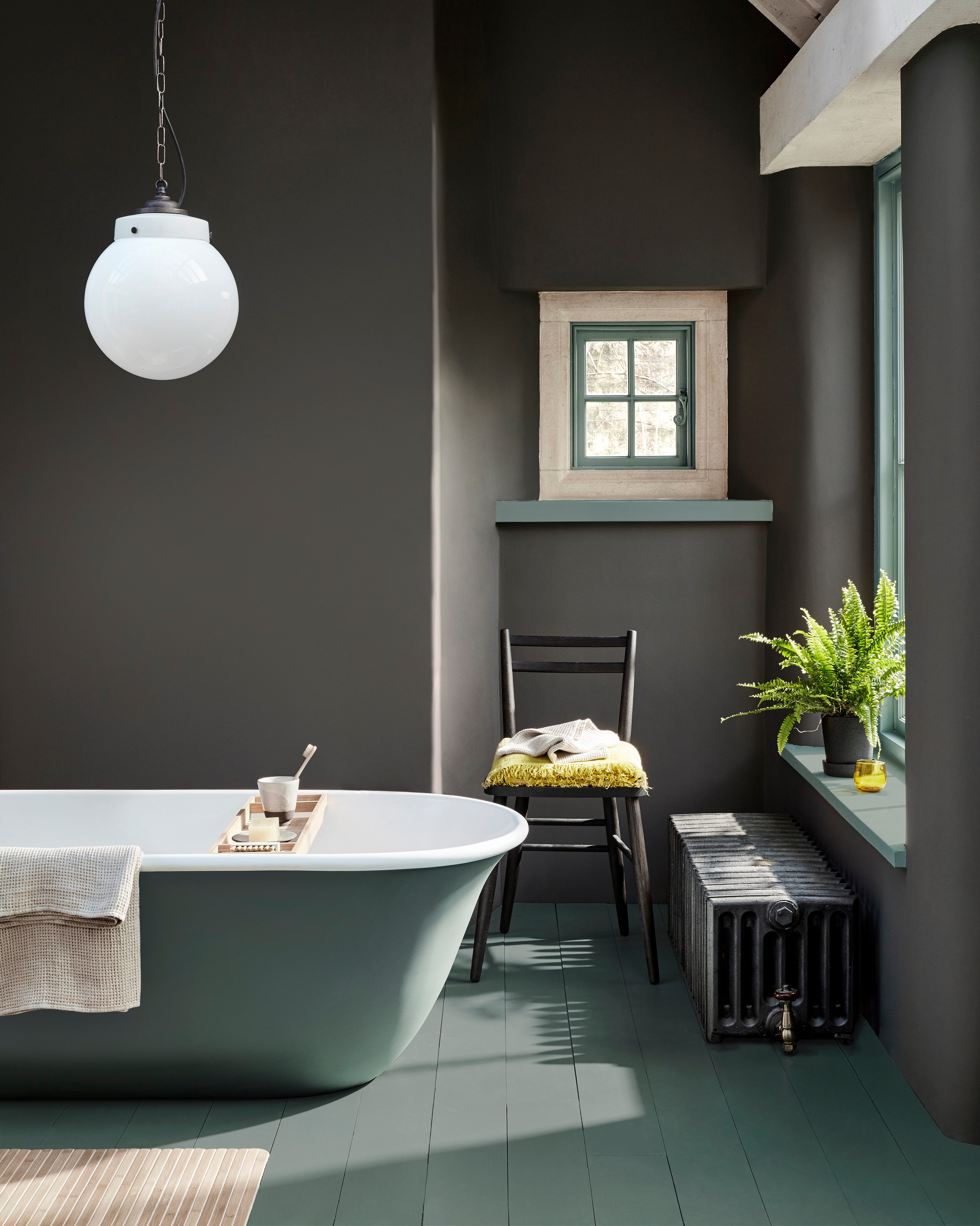
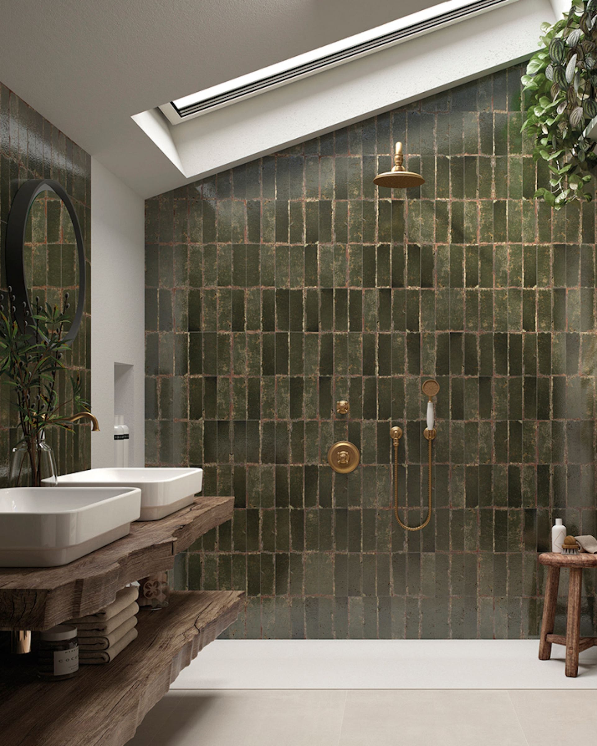
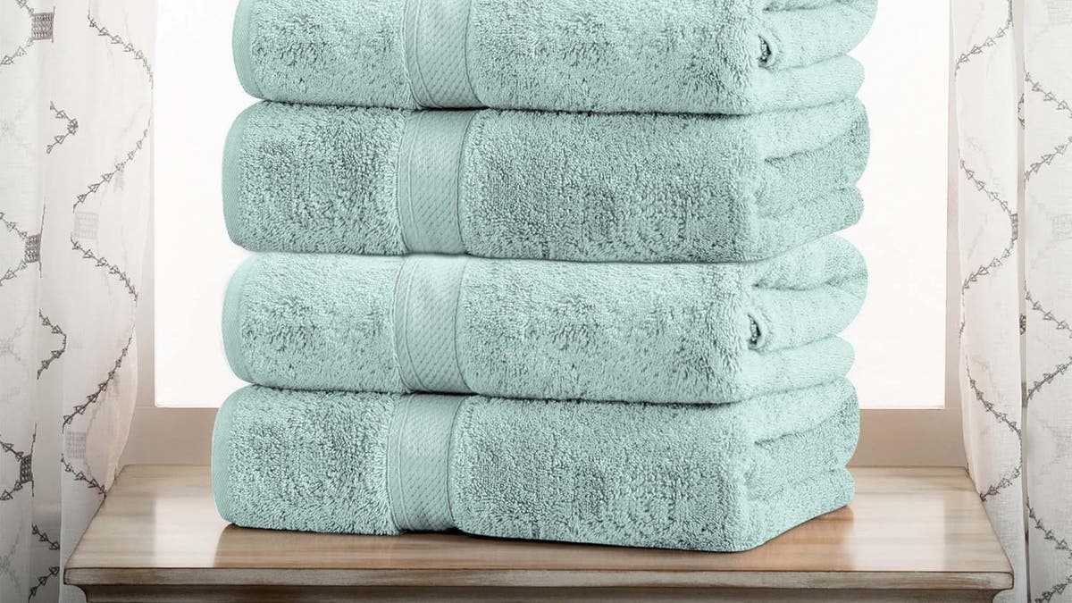
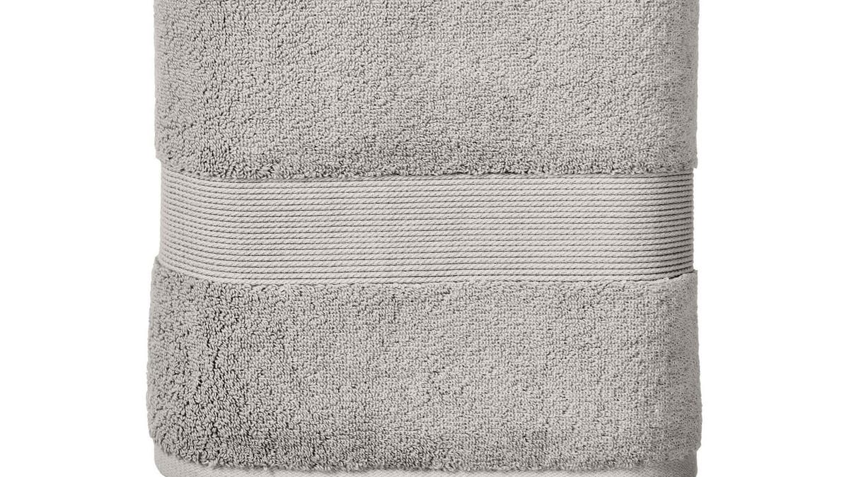
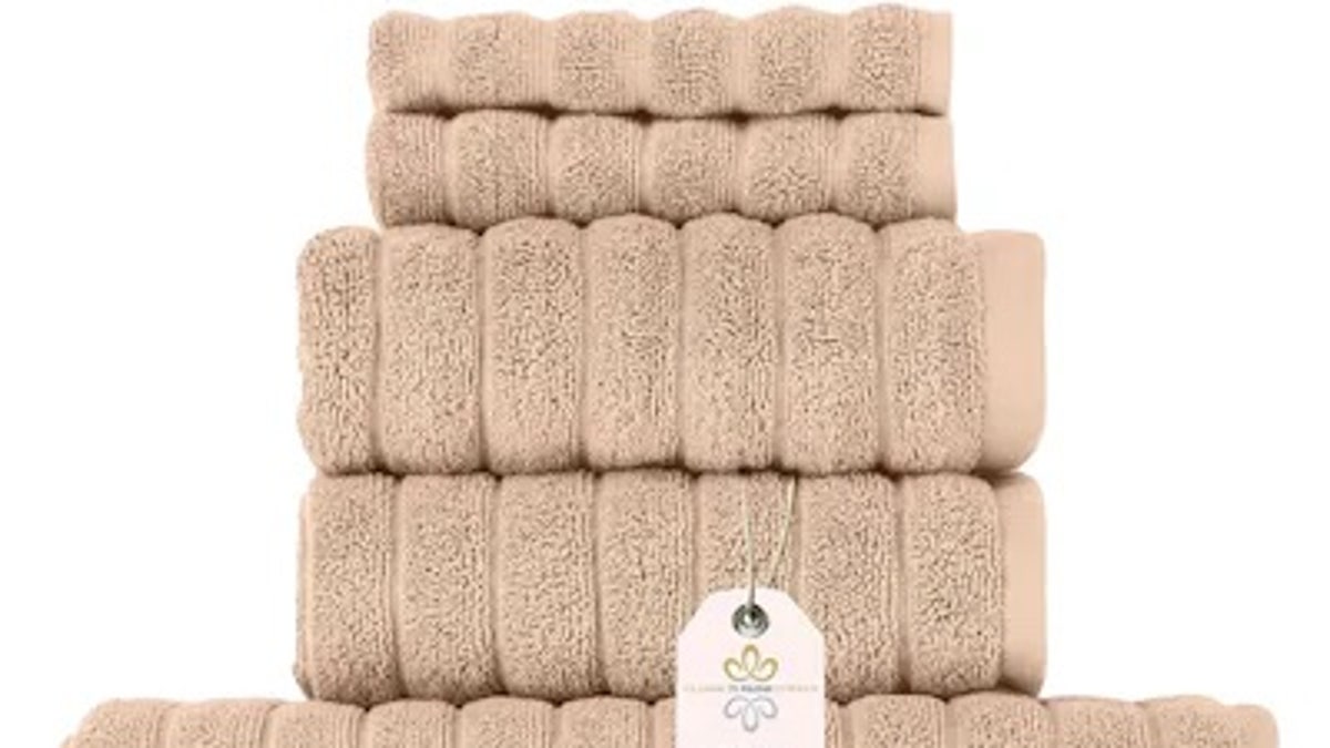
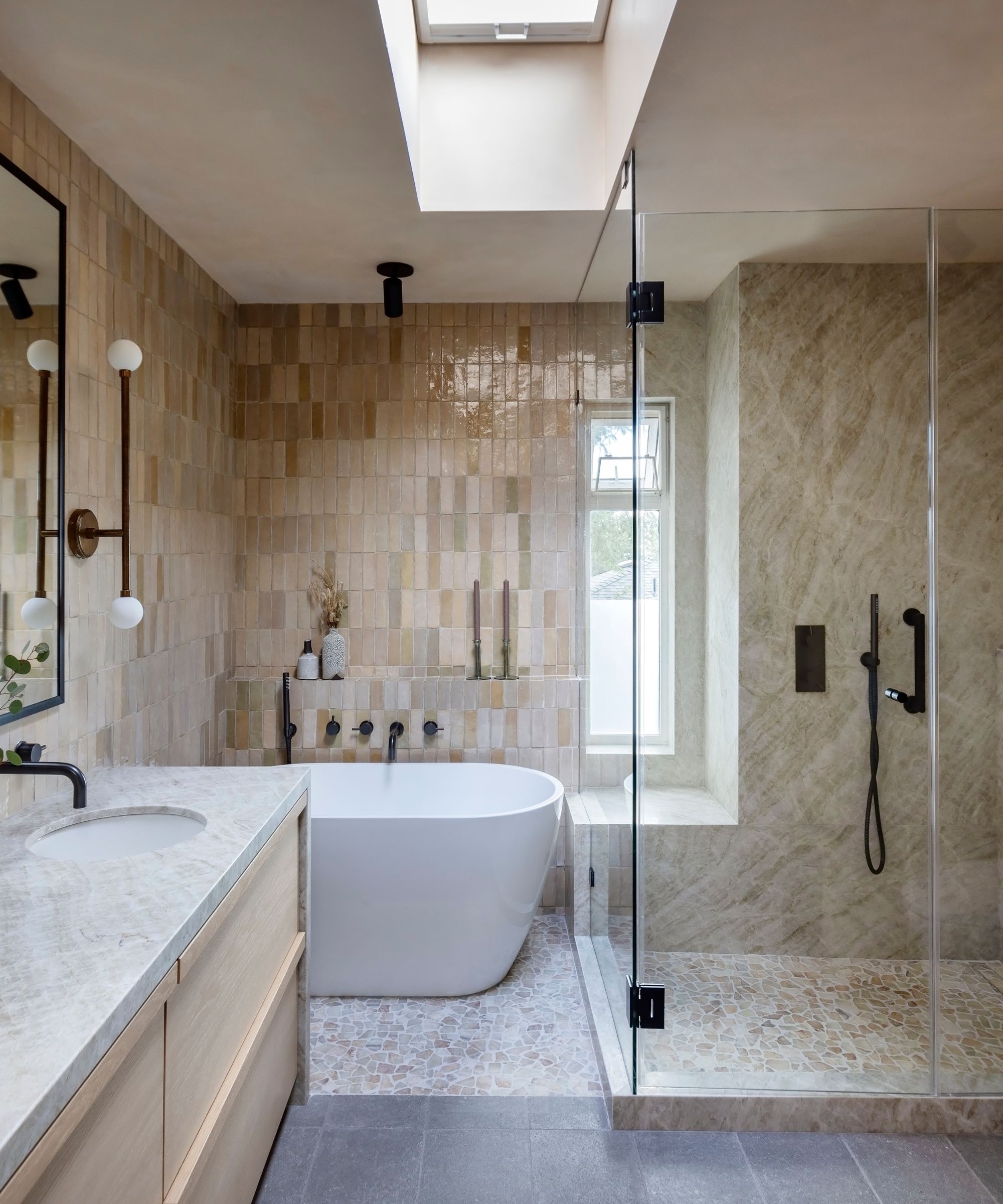
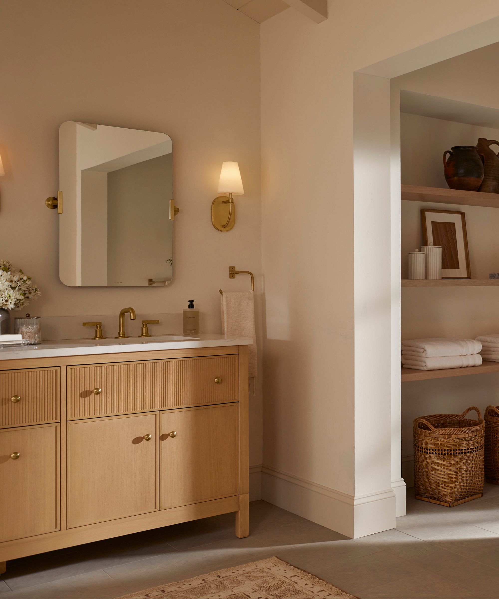
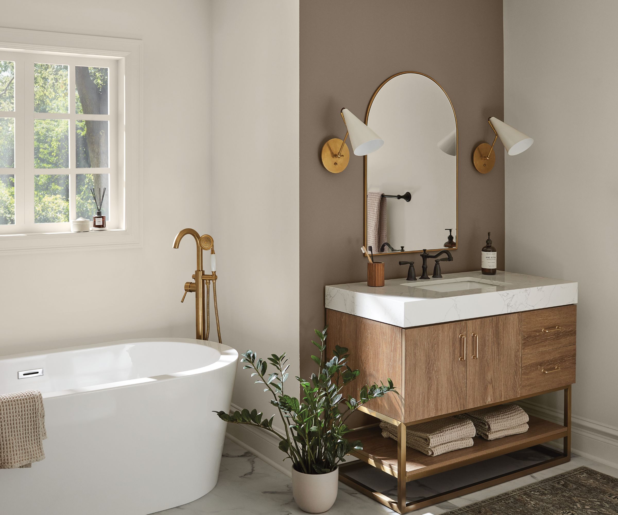
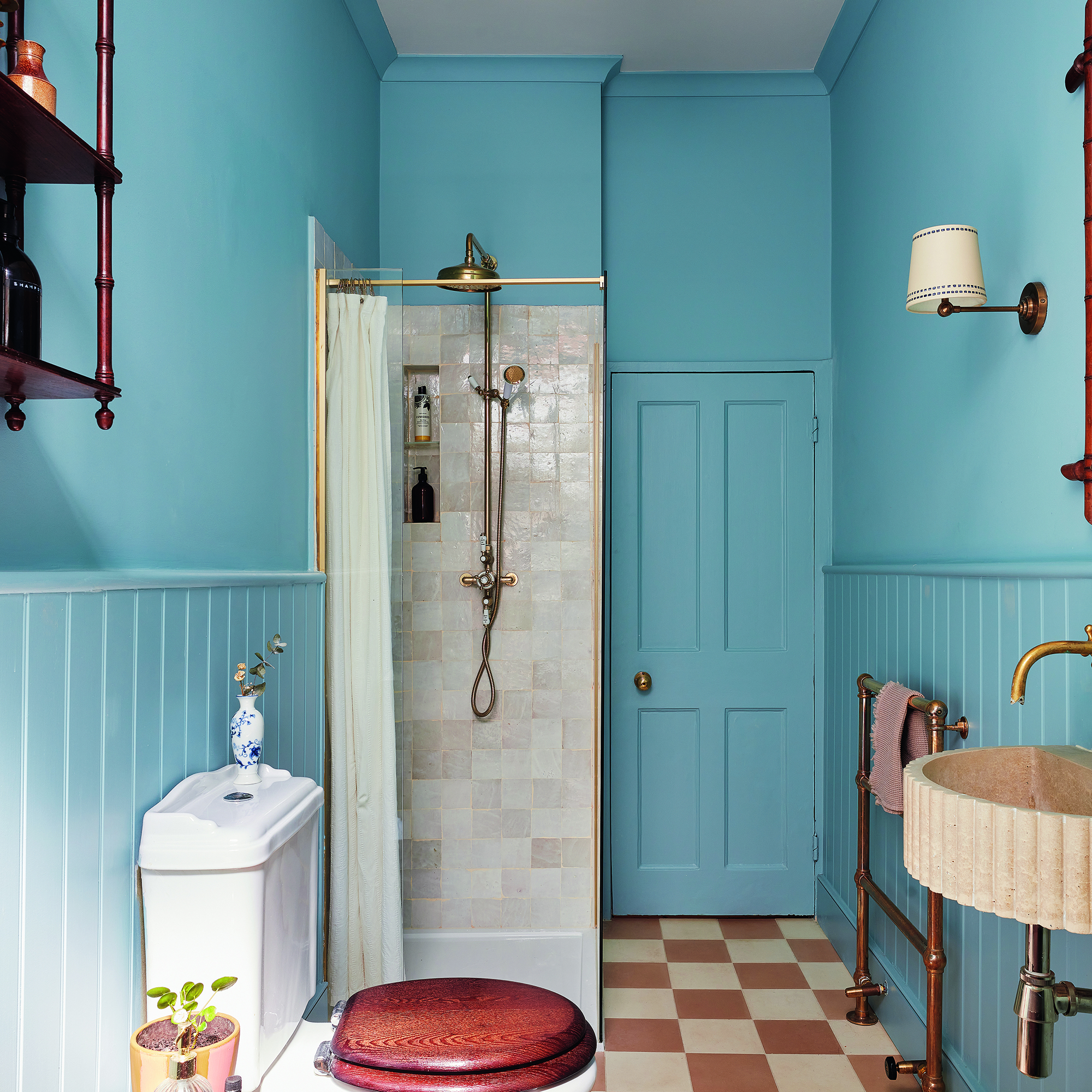
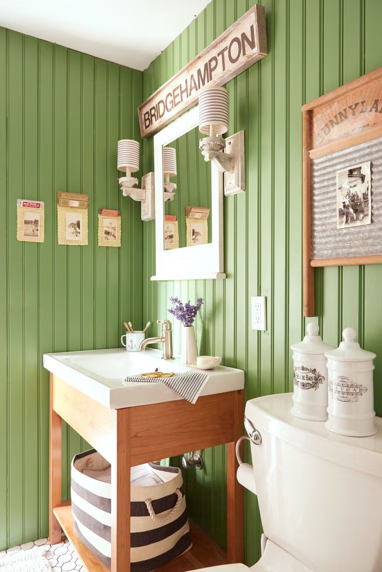
Instead of these problematic colors, designers advocate for warm, calming neutral shades. These colors can blend effortlessly with any bathroom design, contributing to a cohesive and tranquil space. If color is desired, shades that evoke nature, such as light greens and pale sky blues, are recommended. These colors are known for their relaxing qualities and can introduce a serene vibe without making the space feel sterile. The article concludes by emphasizing that a neutral color scheme does not imply a cold environment; thoughtful selection of sophisticated neutrals like apricot, taupe, or ivory can add warmth and luxury, echoing the ambiance of high-end spas and hotels.
#BathroomDecor #TowelColors #InteriorDesign #HomeStyling #ColorPsychology #HomeImprovement #RelaxingSpaces #BathroomDecor #TowelColors #InteriorDesign #HomeStyling #ColorPsychology #HomeImprovement #RelaxingSpaces
0 commentaire au total
 Aucun commentaire pour le moment
Vous aimerez aussi
5 colors to avoid in a bathroom – according to designers

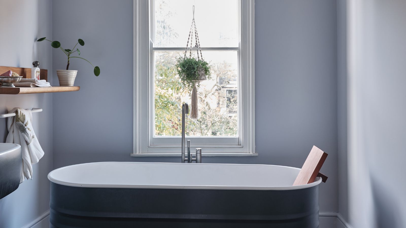
Bathroom colors going out of style in 2025 – and the designer-approved shades to decorate with instead
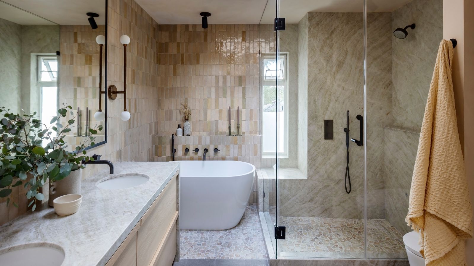
These are the 4 color schemes designers say will always make a bathroom look more expensive
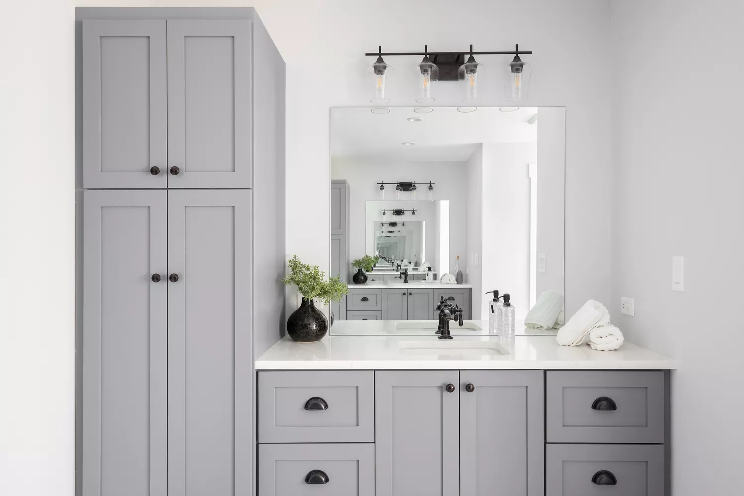
7 Outdated Bathroom Vanity Colors Designers Never Want to See Again

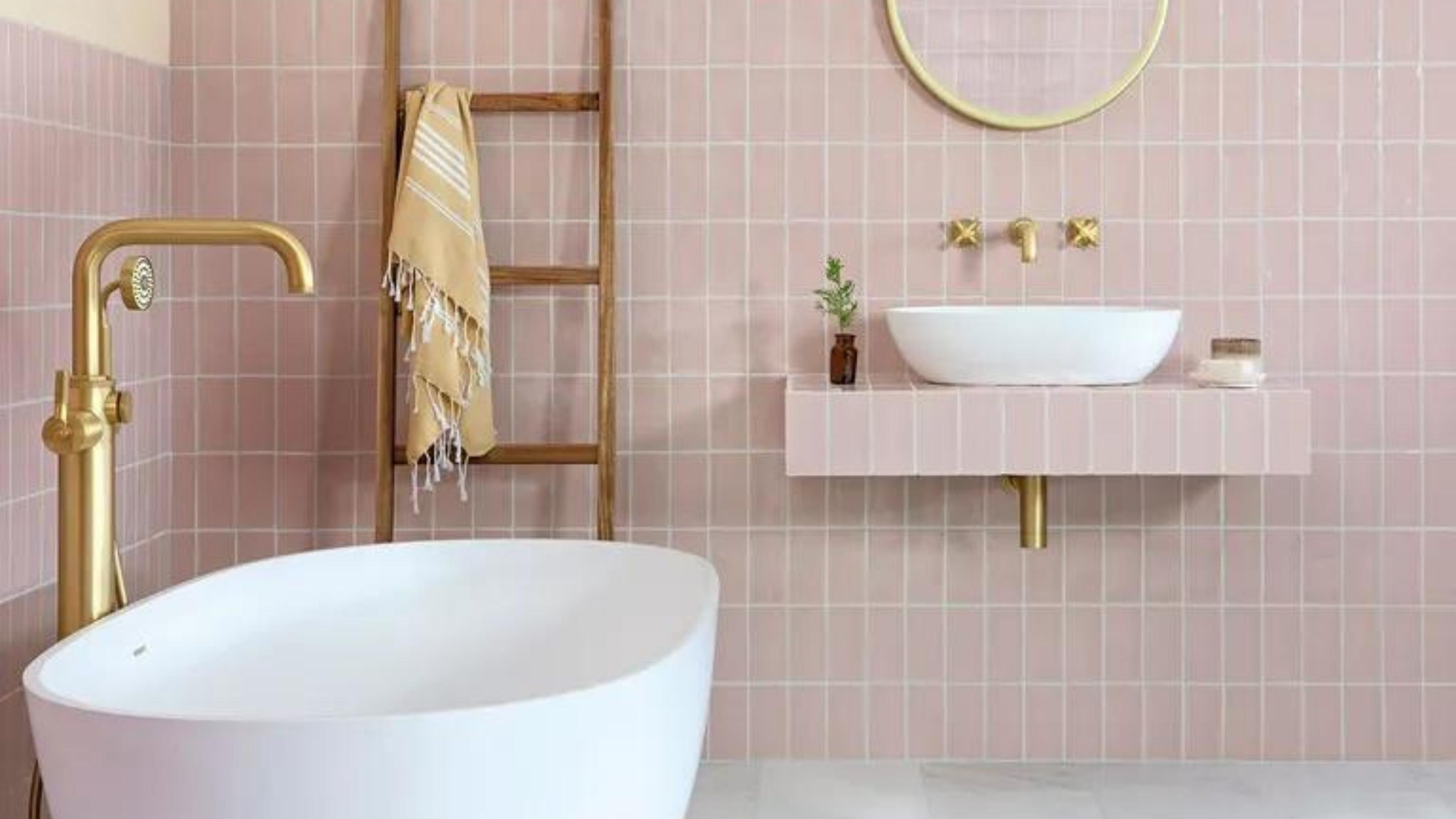
Yikes! The worst colors for a small bathroom that should definitely be avoided

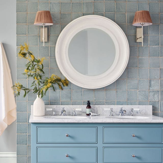
7 bathroom colour ideas to refresh, revive and soothe you every day
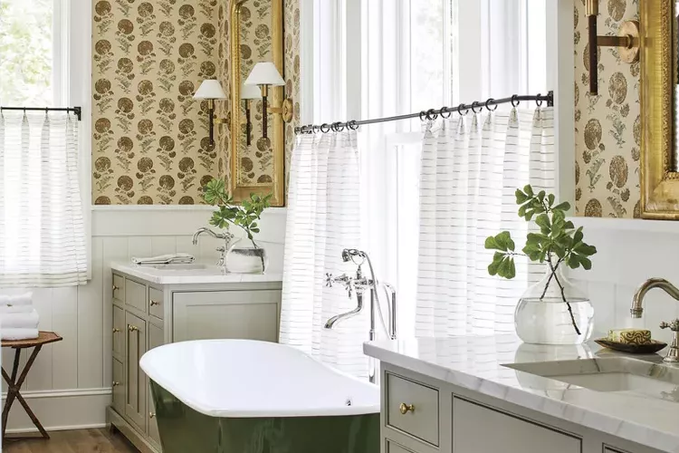
6 Paint Colors To Avoid In Your Bathroom—And 6 Shades You Should Use Instead
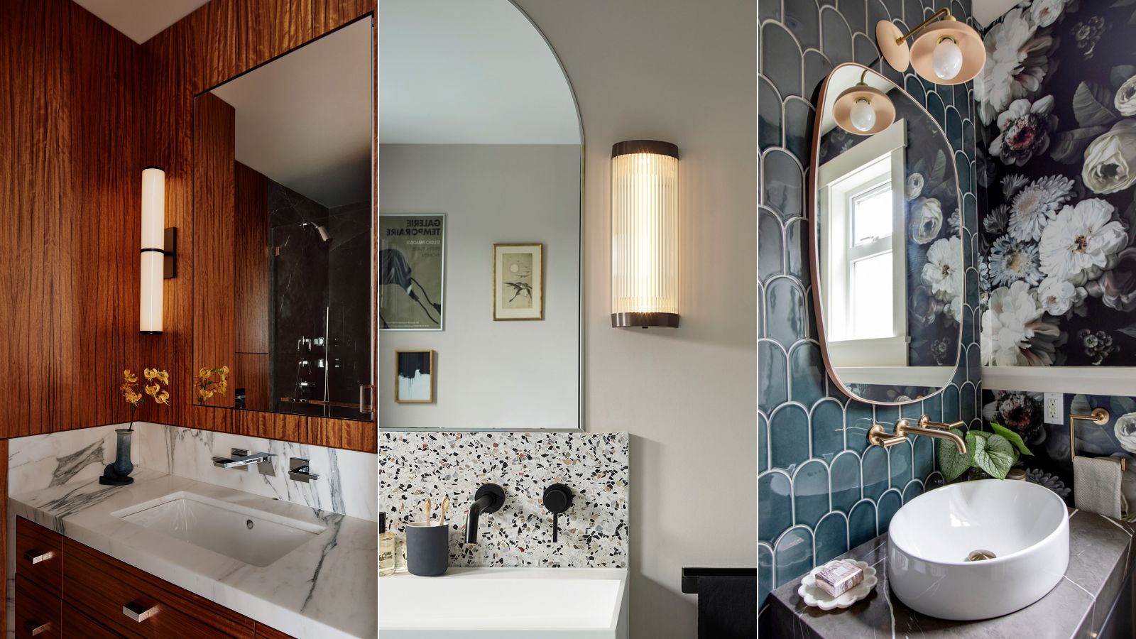
What are the most popular bathroom colors right now? Designers weigh in
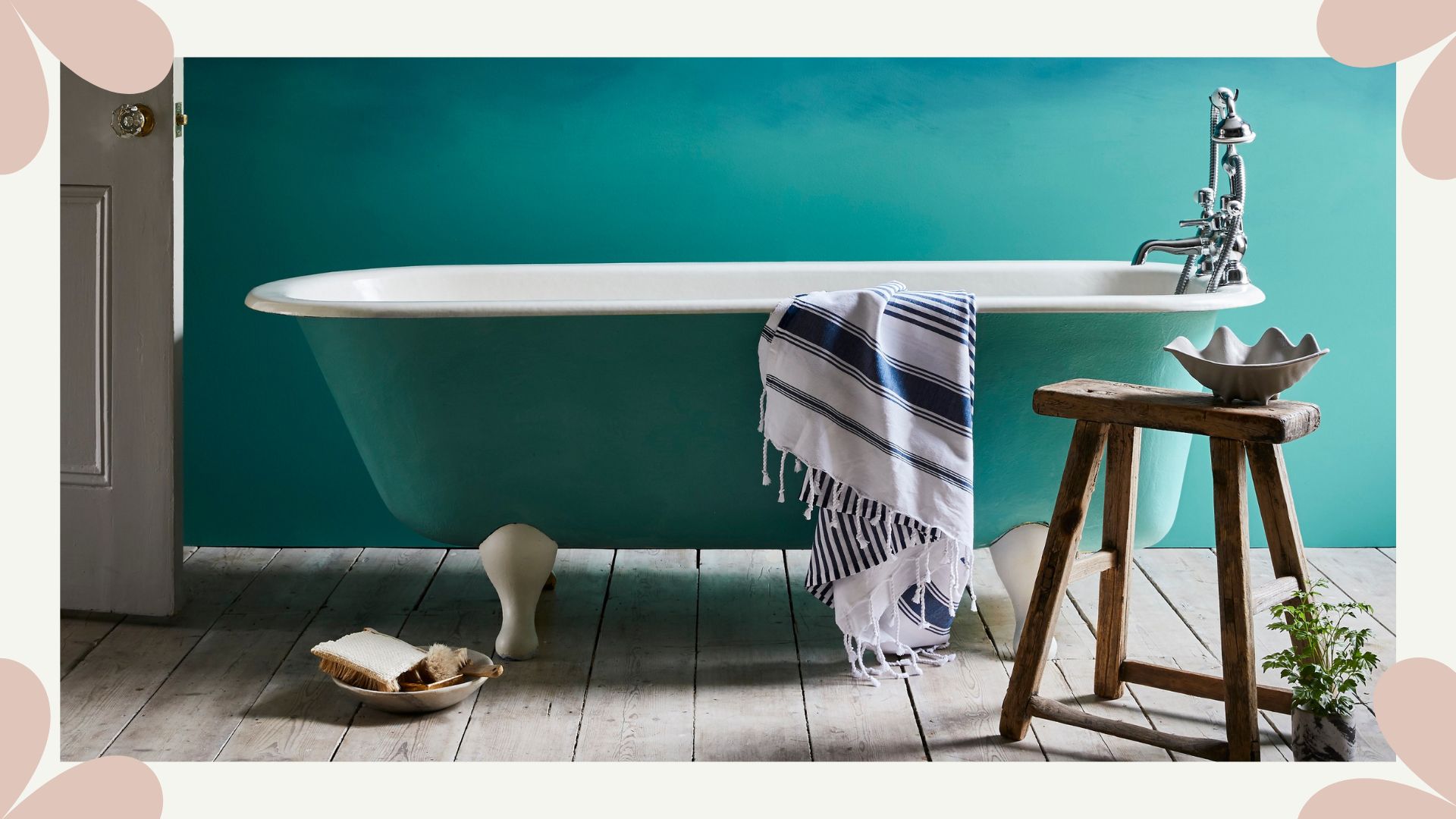
Paint color ideas for bathrooms: expert advice for choosing the best shades

6 Outdated Bathroom Paint Colors Designers Say You Should Never Use
Interior designers believe these are the bathroom tiling trends to follow (and avoid)

The Bathroom Paint Colors Interior Designers Swear By

5 Paint Colors You Should Never Use in a Bathroom, Designers Warn
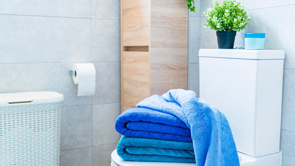
Enhance your bathroom decor with these bath towels

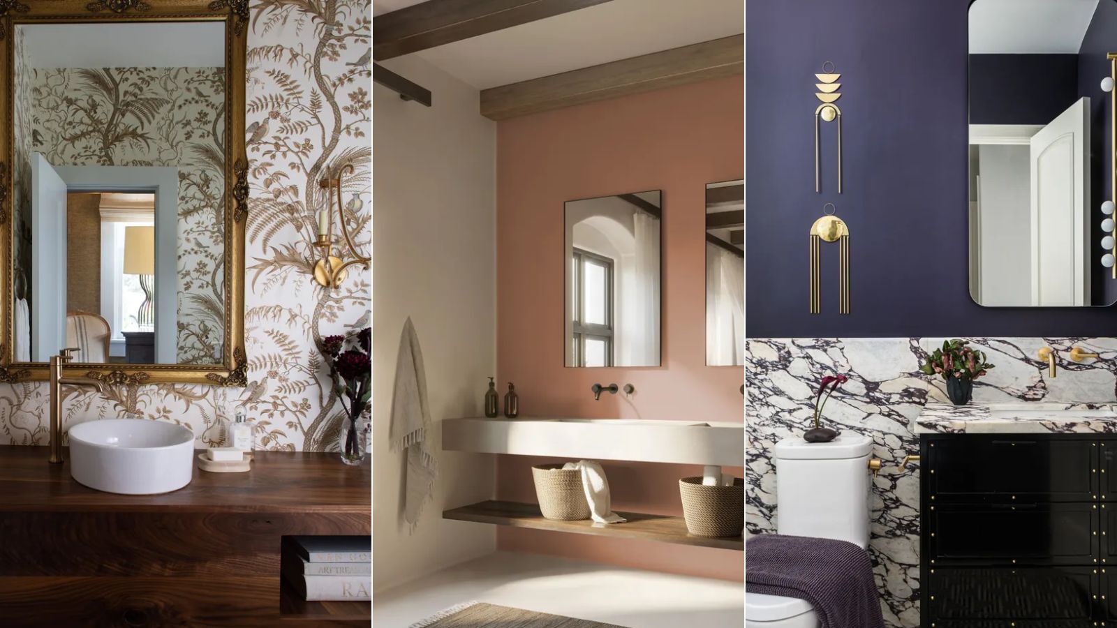
Bathroom color trends – the most stylish shades for this functional room in 2025
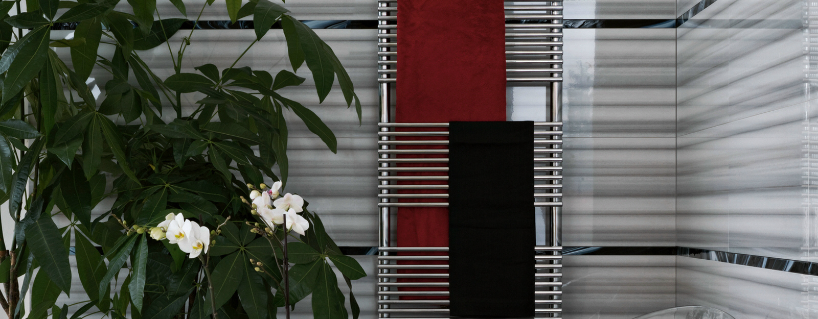
Organizing the Bathroom: 13 Designs for Taming the Towels

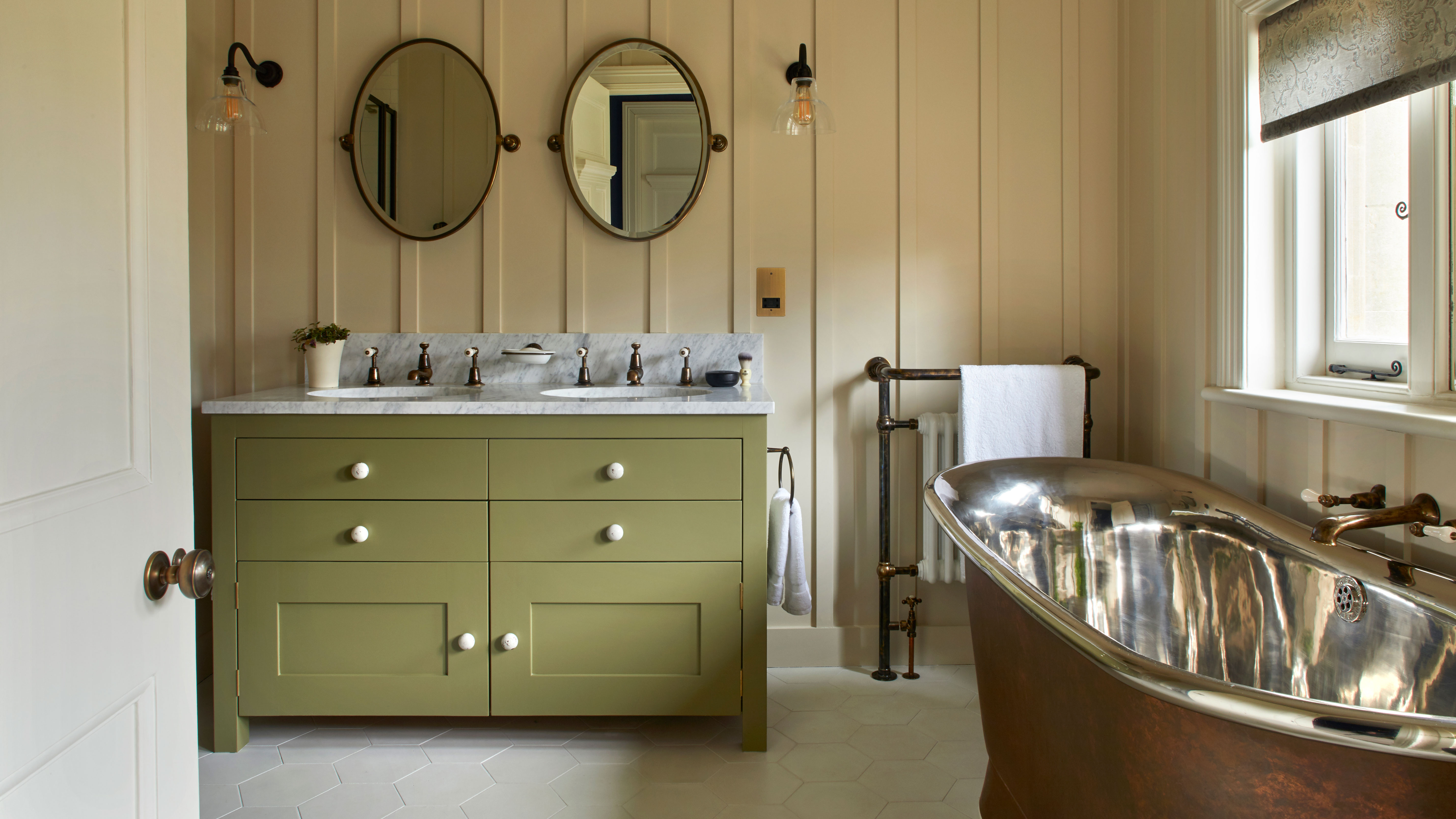
Bathroom color ideas – 17 shades to try to bring calm and character into your space
5 colors designers say are outdated for bathrooms - and what they're choosing instead for 2024

Colour drenching is the biggest trend in bathrooms - here are 6 ways to make it work in your home
8 Underrated Bathroom Paint Colors Designers Wish You Would Use This Year