1/22
Designer-Approved Bedroom Paint Colors That'll Help You Wake Up Happier
The selection of a bedroom paint color is a crucial yet frequently underestimated aspect of home design, as it significantly influences the room's atmosphere. The chosen hue should harmonize with the overall color scheme of the home while simultaneously fostering relaxation and serenity, avoiding colors that might induce restlessness before sleep. This article delves into a comprehensive archive to present 85 bedroom paint color ideas, aiming to inspire forthcoming home projects and seasonal refreshes.
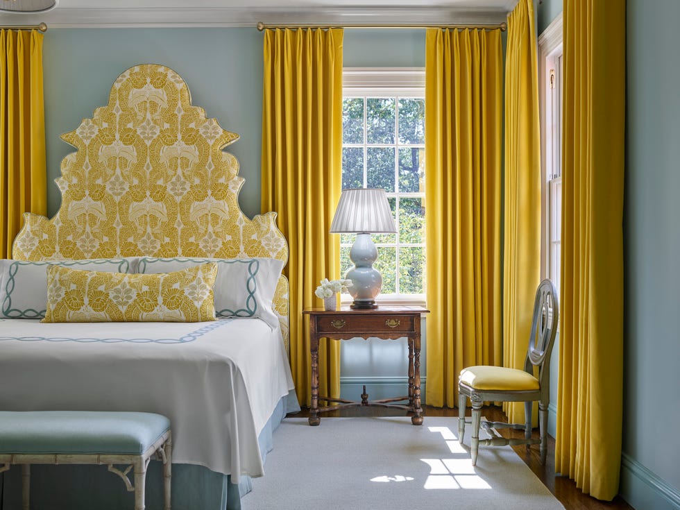
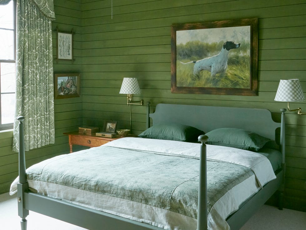
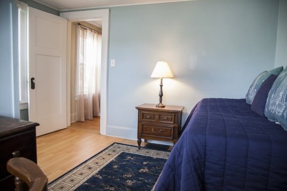
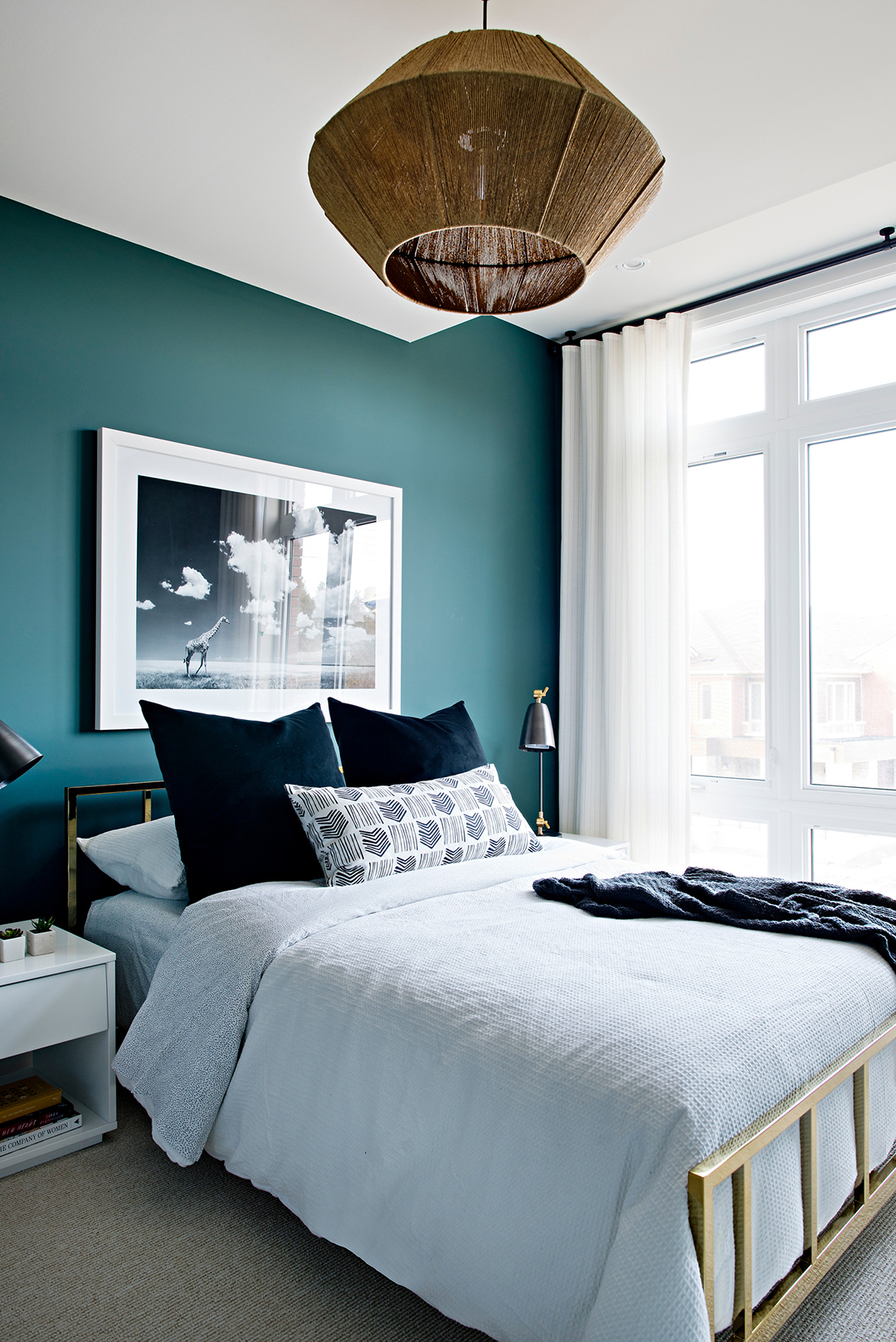
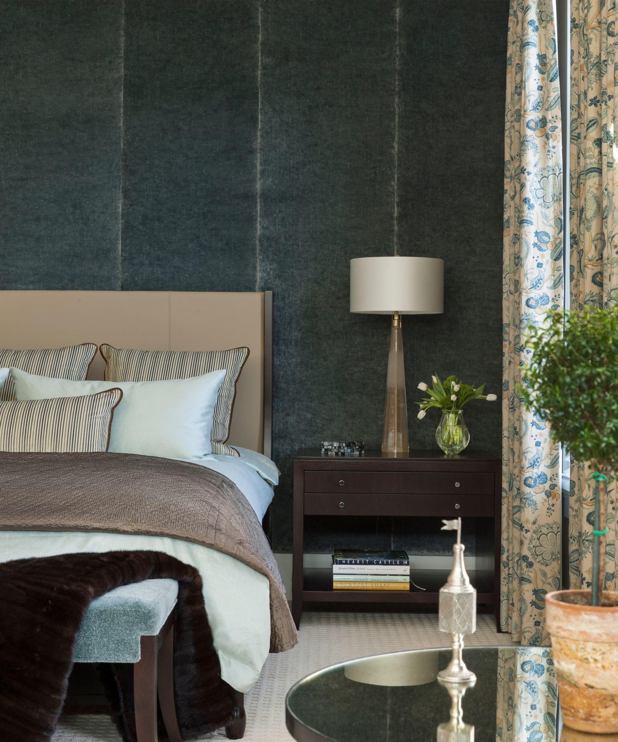
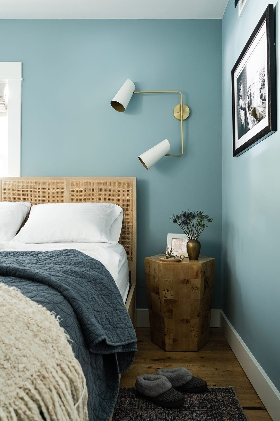
The article categorizes a wide array of color options, highlighting cool tones such as baby blue, navy, and hunter green as popular choices among experts due to their inherently calming effects. Conversely, vibrant shades like yellow or crisp white are suggested for their uplifting qualities, making them suitable for bedrooms that also serve as work-from-home spaces. The objective is to demonstrate how a simple paint update can transform a bedroom into a more inviting sanctuary, regardless of external weather conditions.
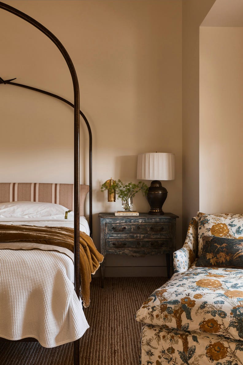
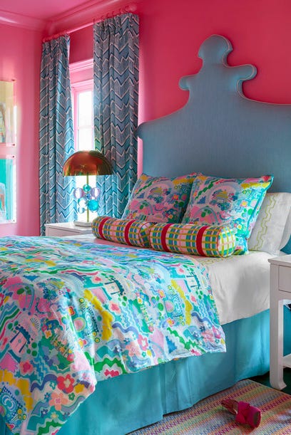
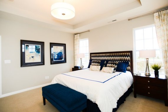
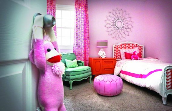
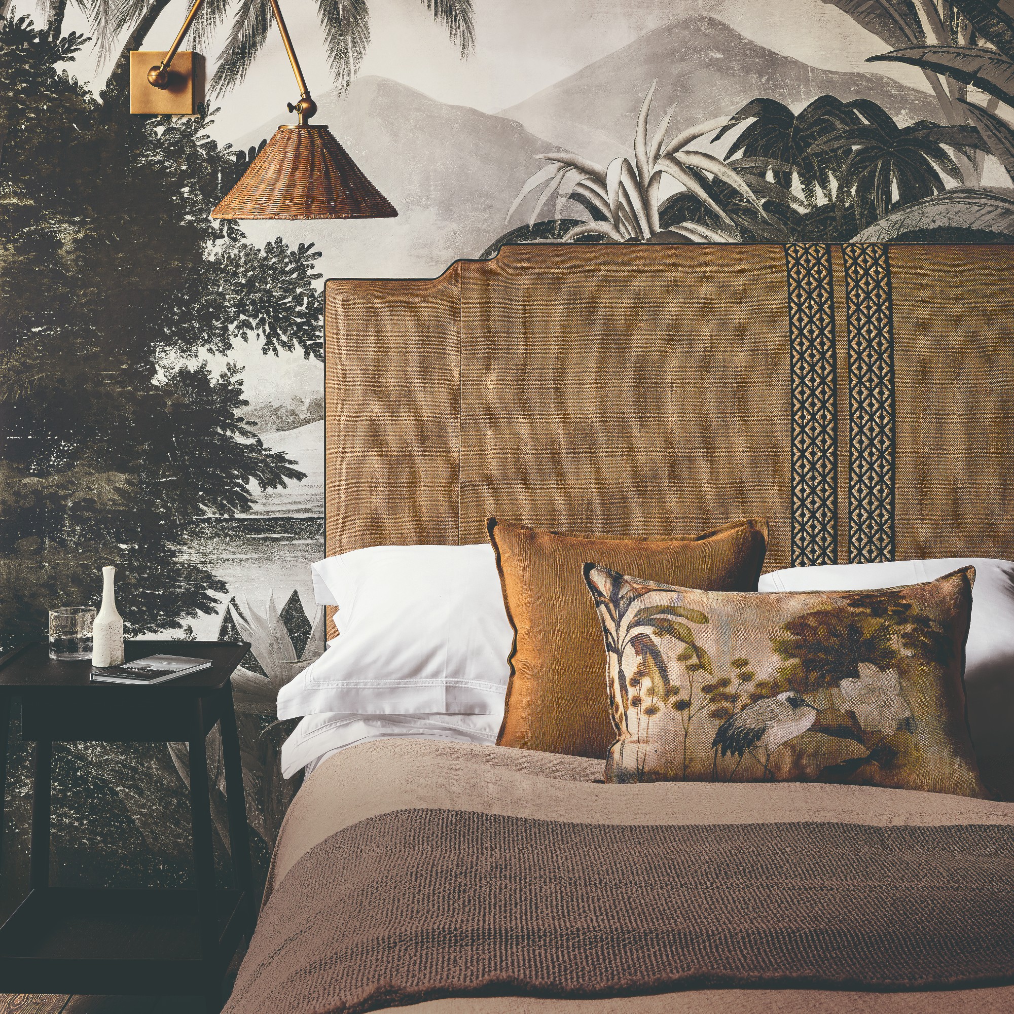
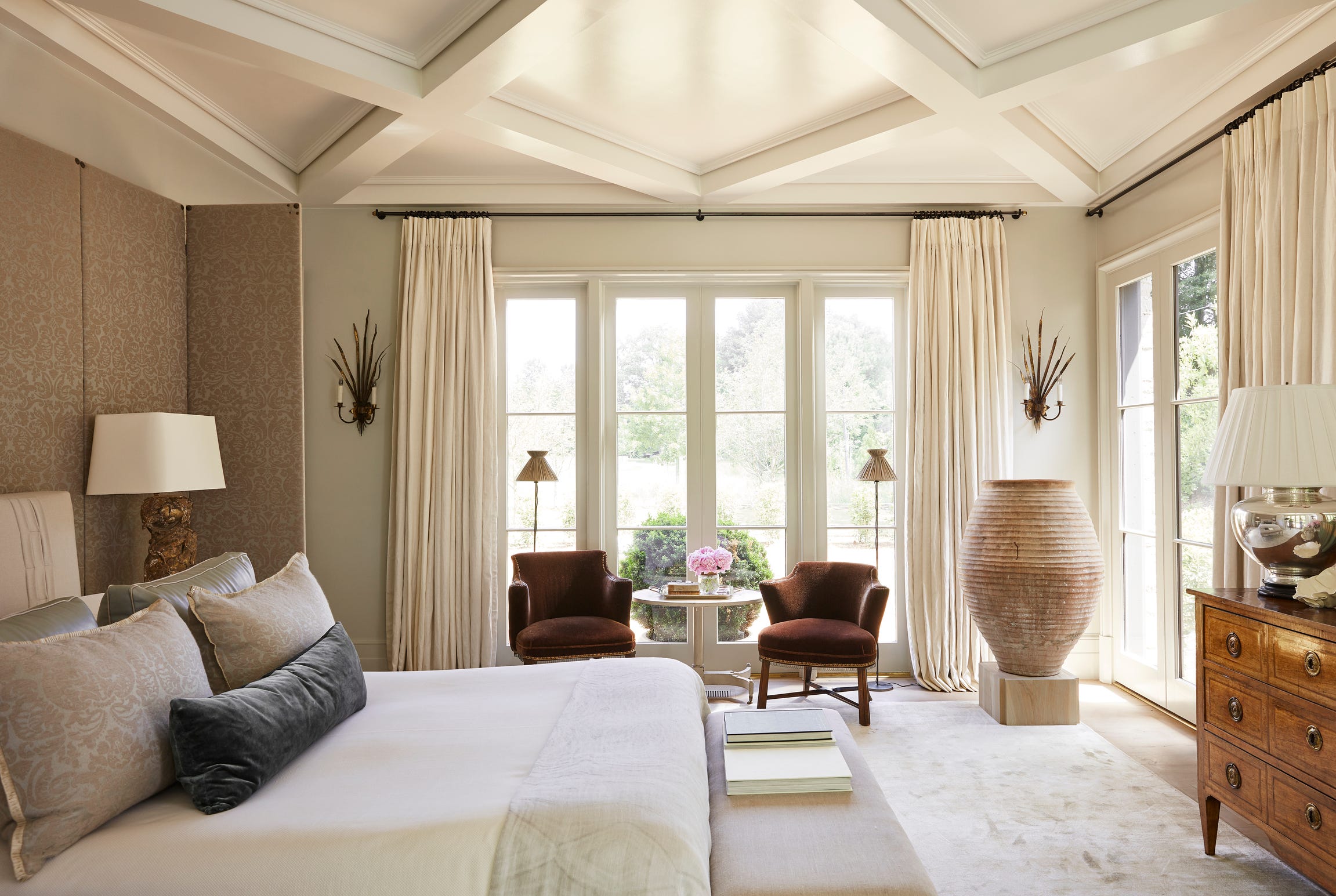
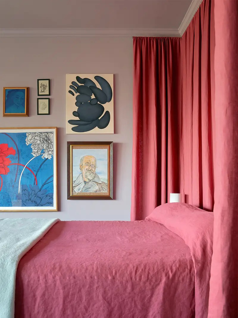
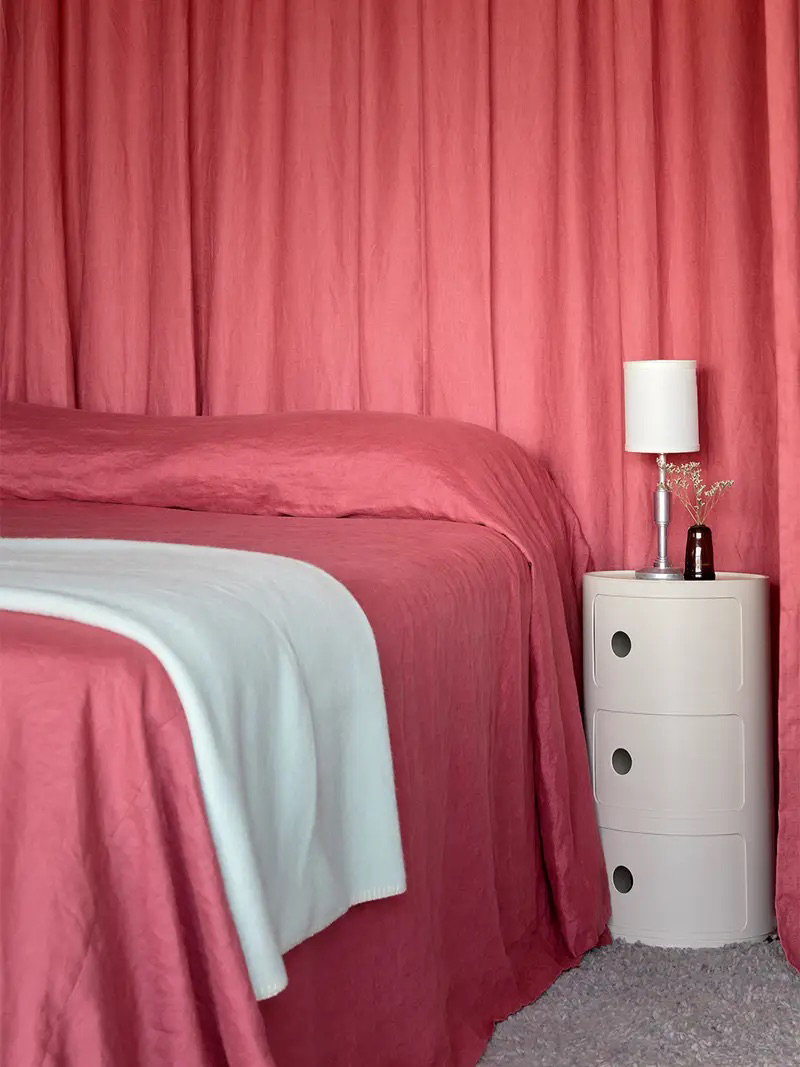
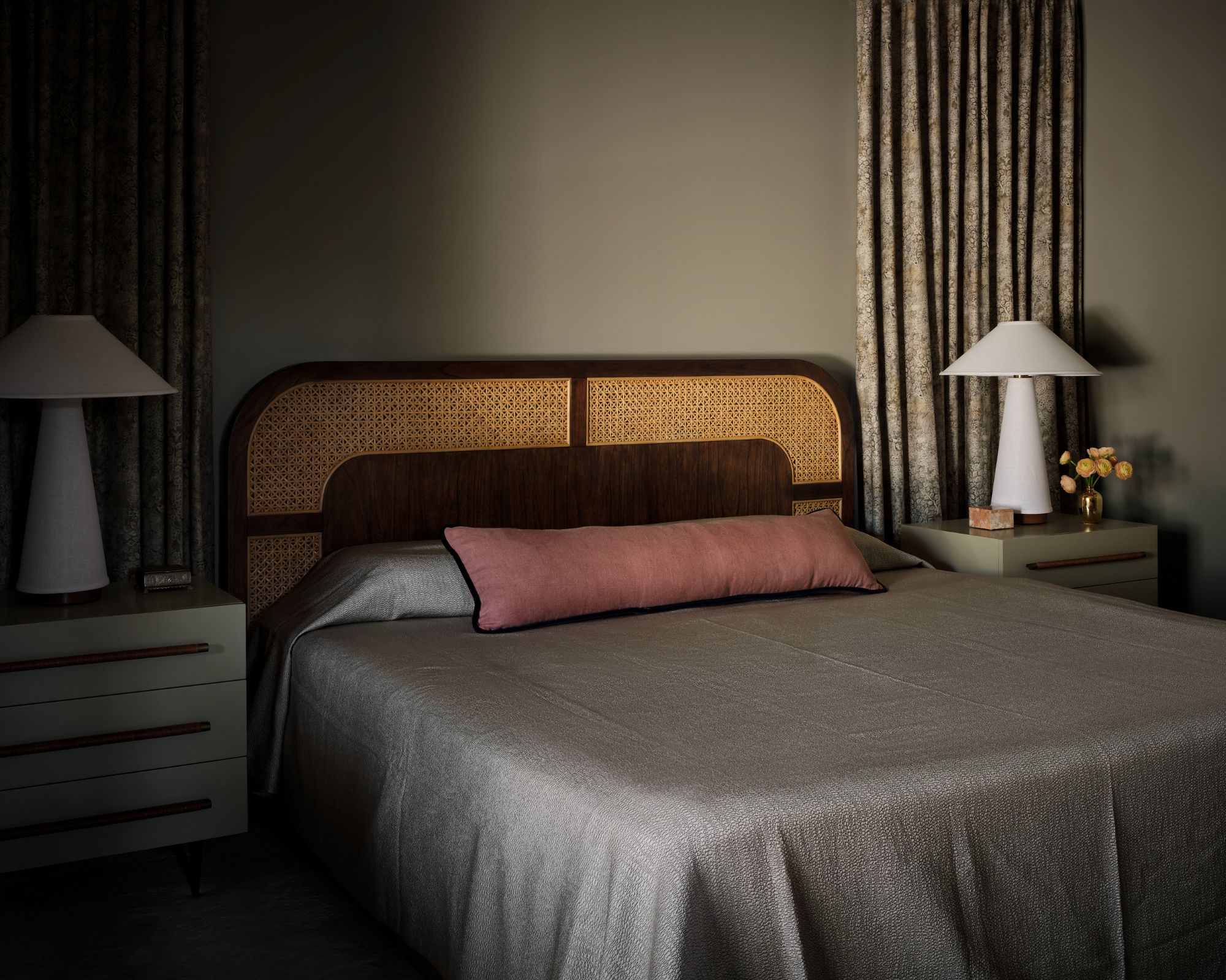
Various color examples are provided, starting with warm taupe, utilized by designer Alison Giese to create a serene, luxurious hotel-like ambiance in a primary bedroom. This choice involved a soothing palette, balancing masculine and feminine patterns. For a bolder statement, hot pink, specifically Benjamin Moore's Pink Starburst, was employed by Jenna Gross of Colordrunk Designs in a guest bedroom to achieve a vibrant interior.
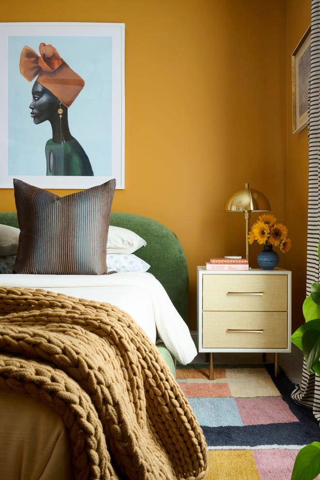
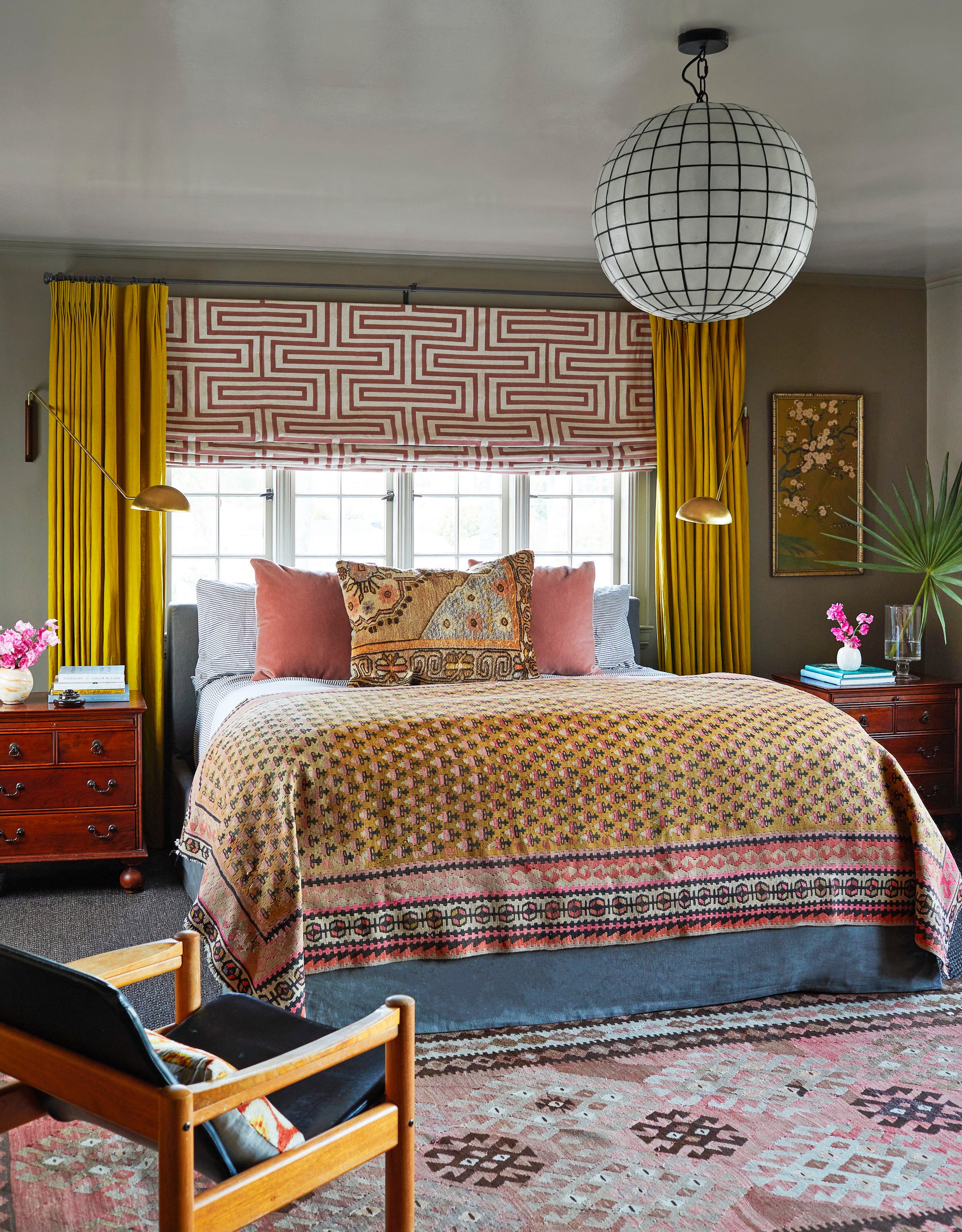
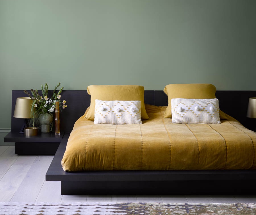
Mustard yellow, described as exuding joy by Amber Guyton of Blessed Little Bungalow, is presented as a warm gold tone that pairs well with a diverse range of colors. Steely gray, using Benjamin Moore's Piedmont Gray, was applied by Allison Willson in a bunk room to create a cohesive, color-drenched space that accommodates multiple occupants without feeling busy.
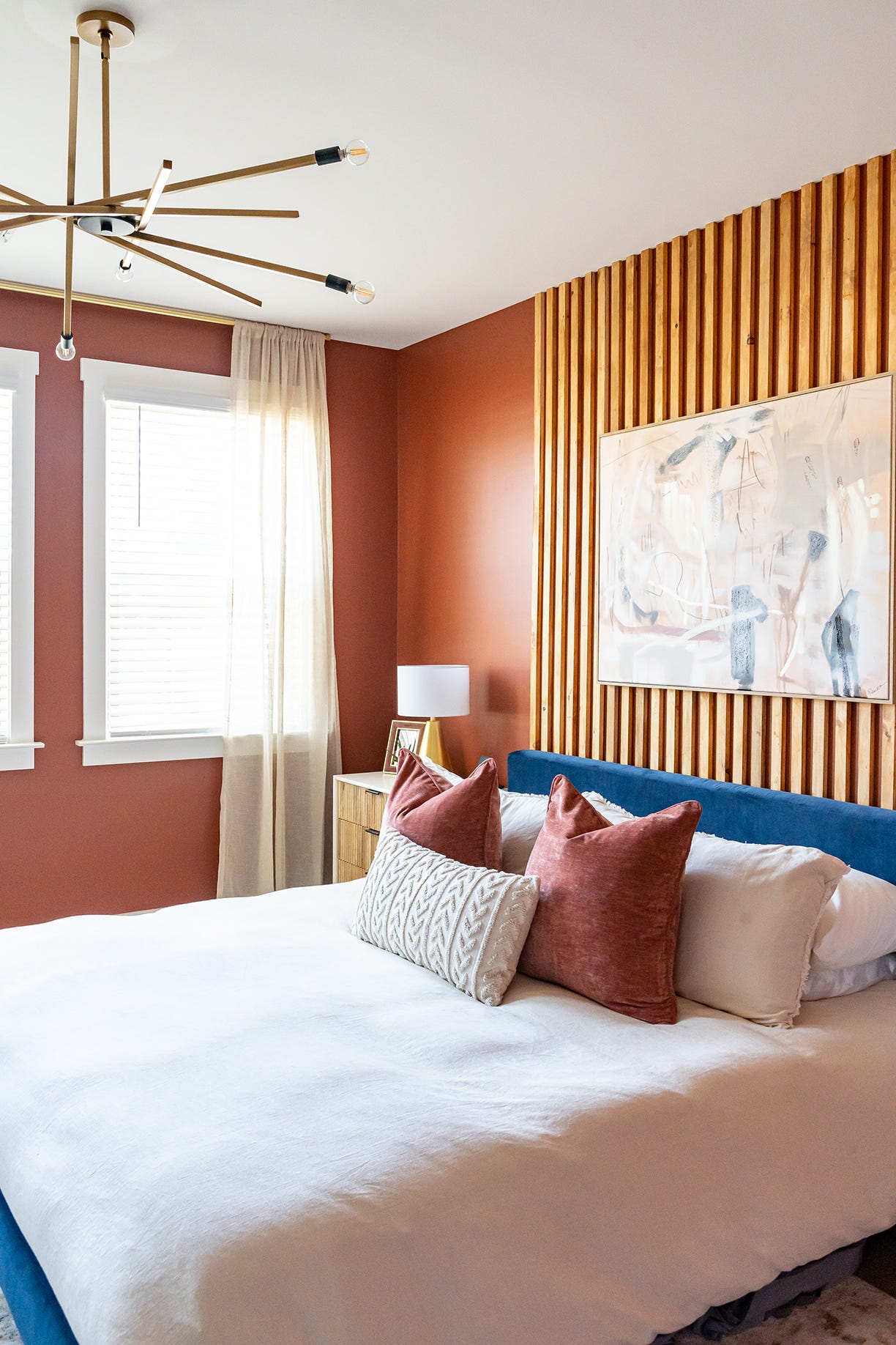
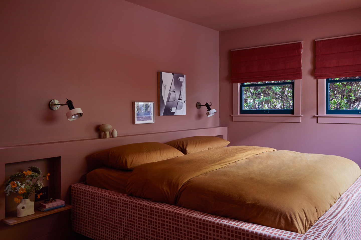
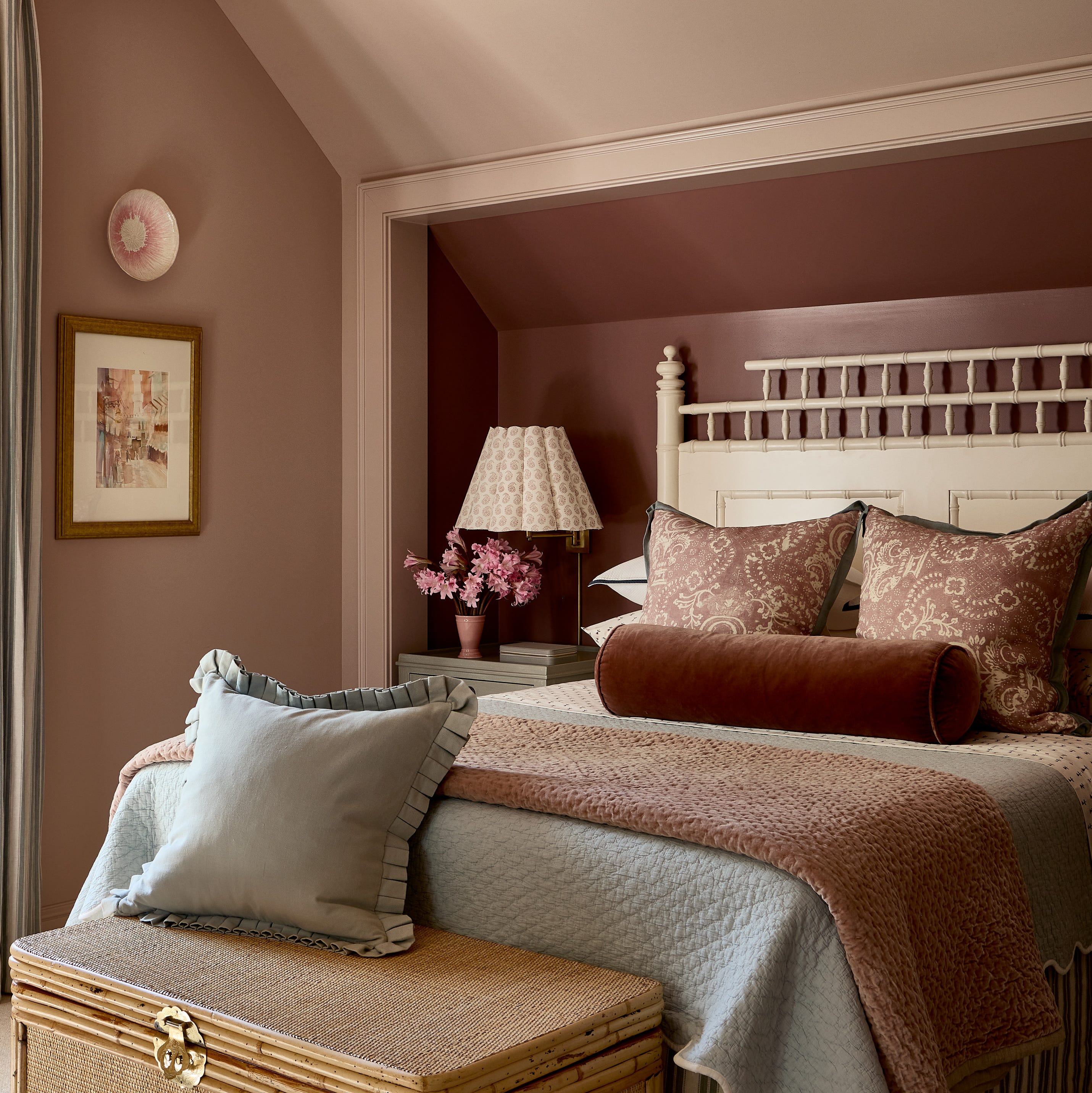
Krysta Gibbons of Kipling House opted for a foggy red, Benjamin Moore’s Cedar Ridge, in her daughter's room, with a deeper shade, Hickory Stick, in the bed niche for added softness. In her primary bedroom, Gibbons used a mid-tone blue-gray, Benjamin Moore's Adagio, complemented by rust accents and layered textures for warmth. Lindsay Rhodes introduced a brownish-red Mahogany by Farrow & Ball in a sleeping nook, enlivened with green and yellow cabana stripes.
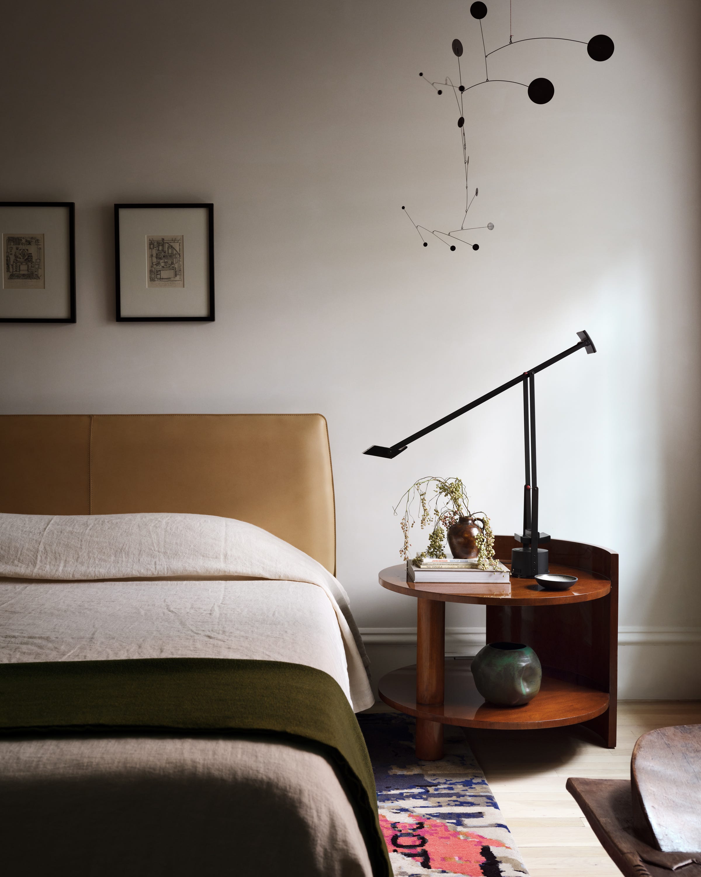
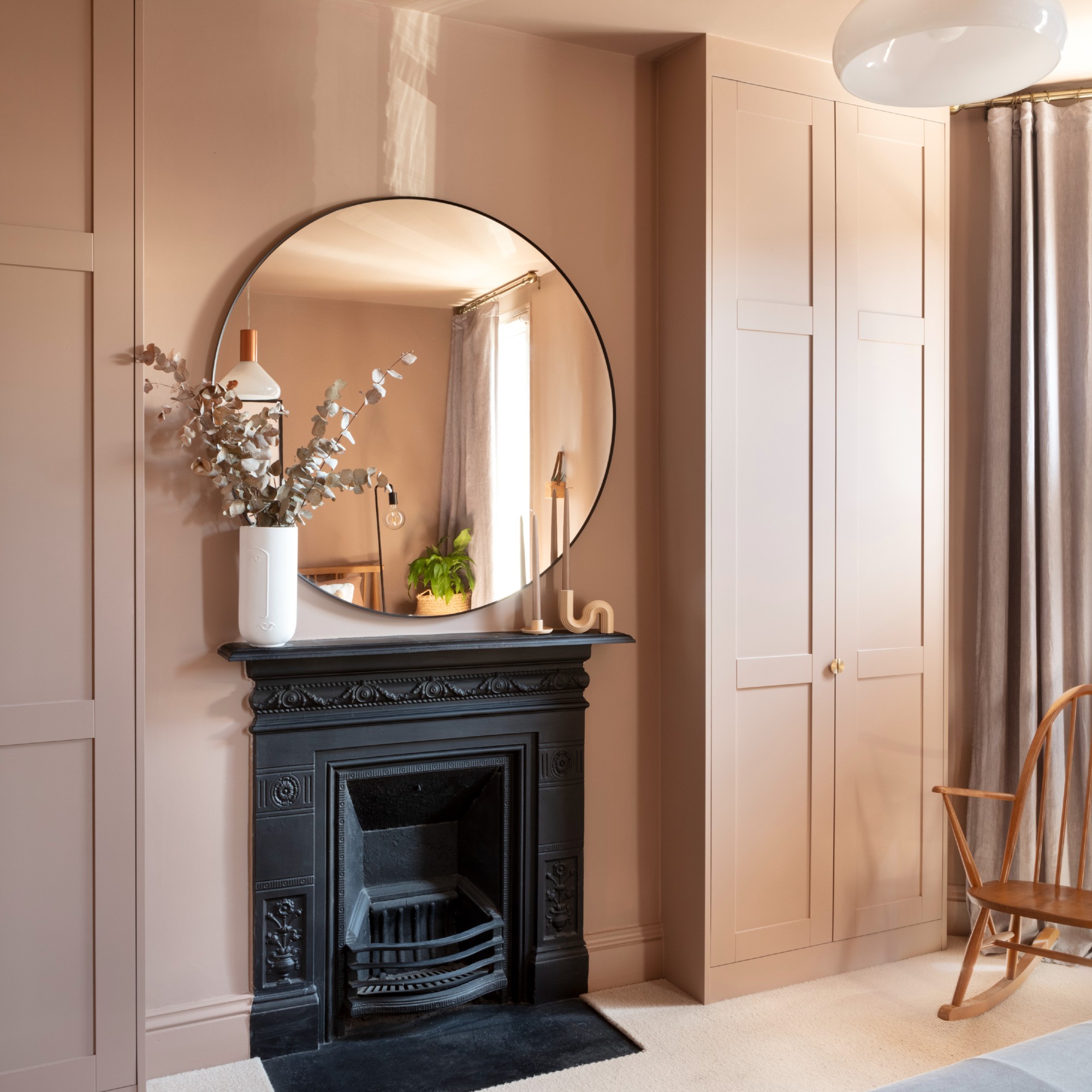
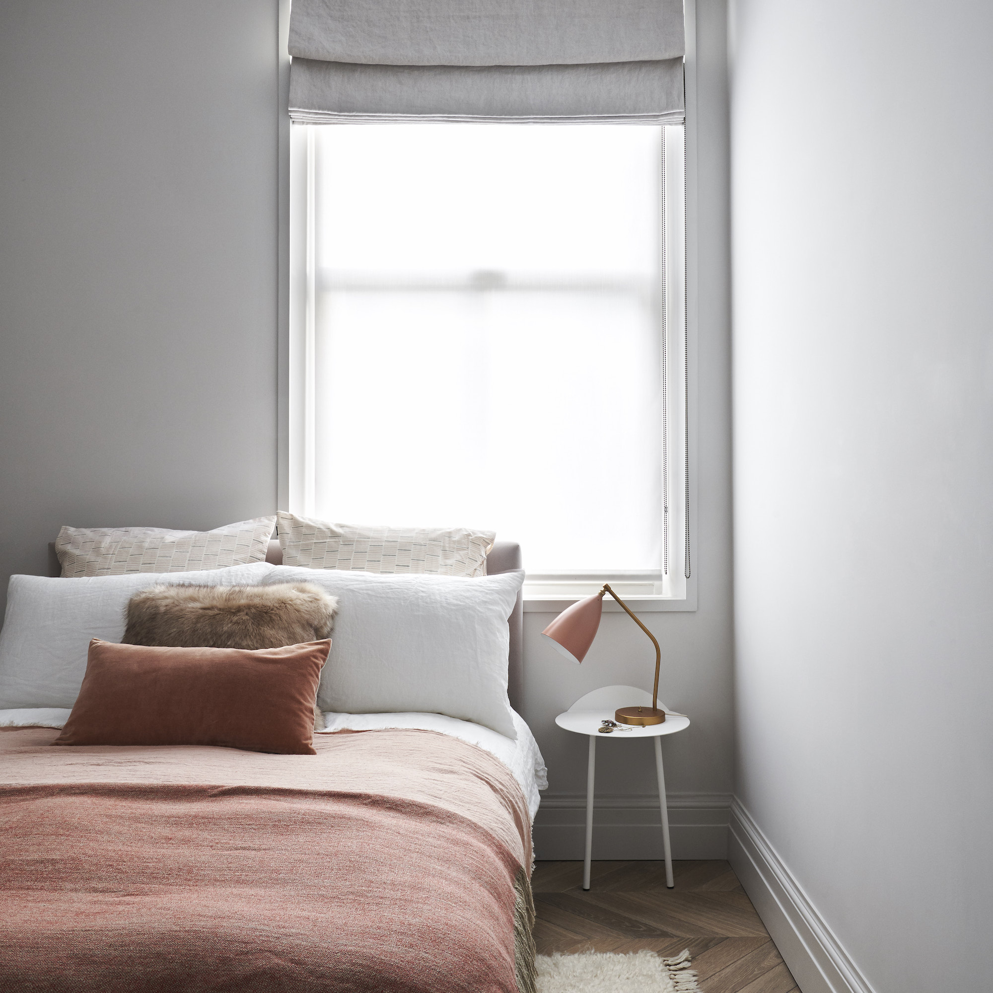
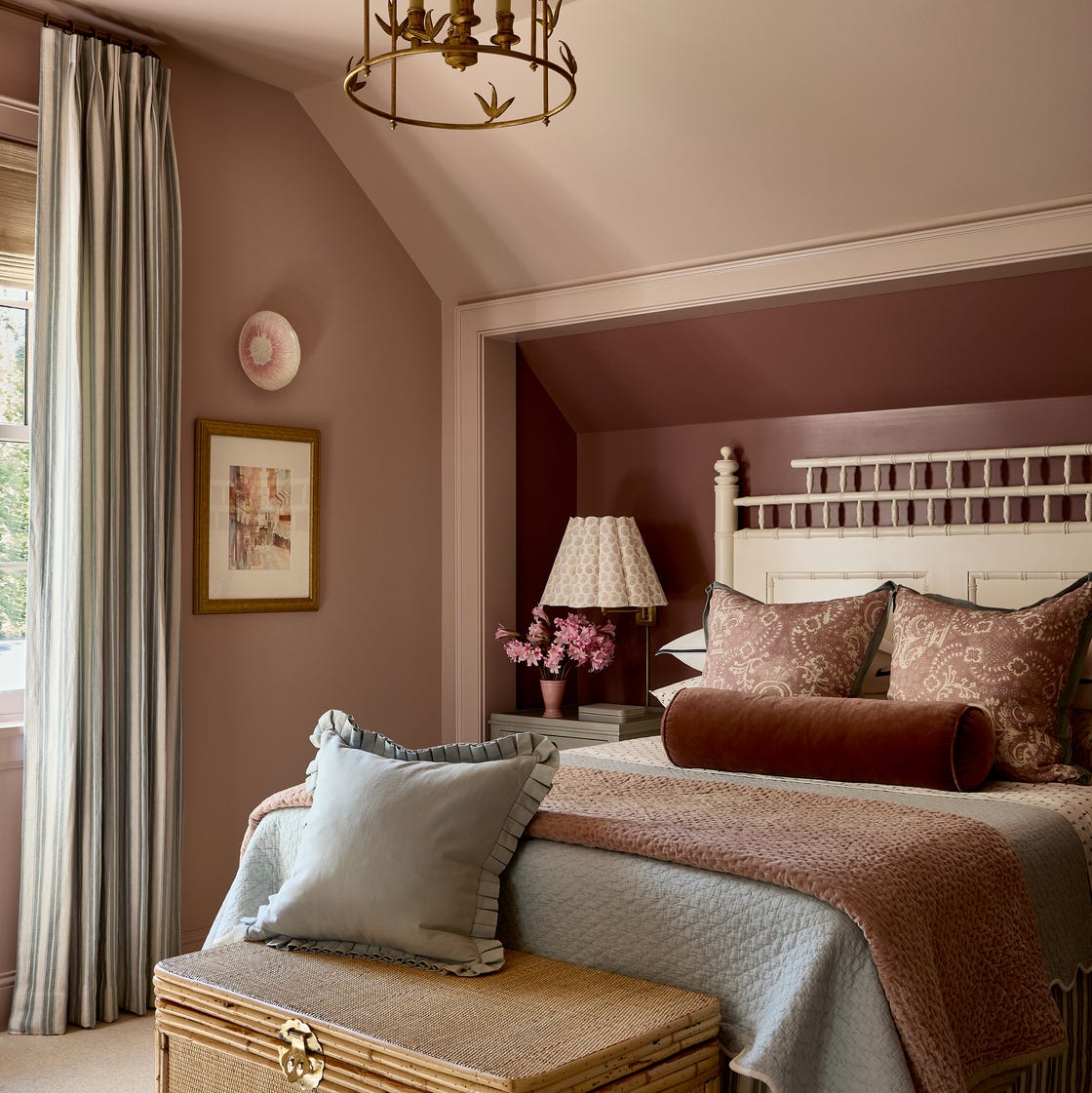
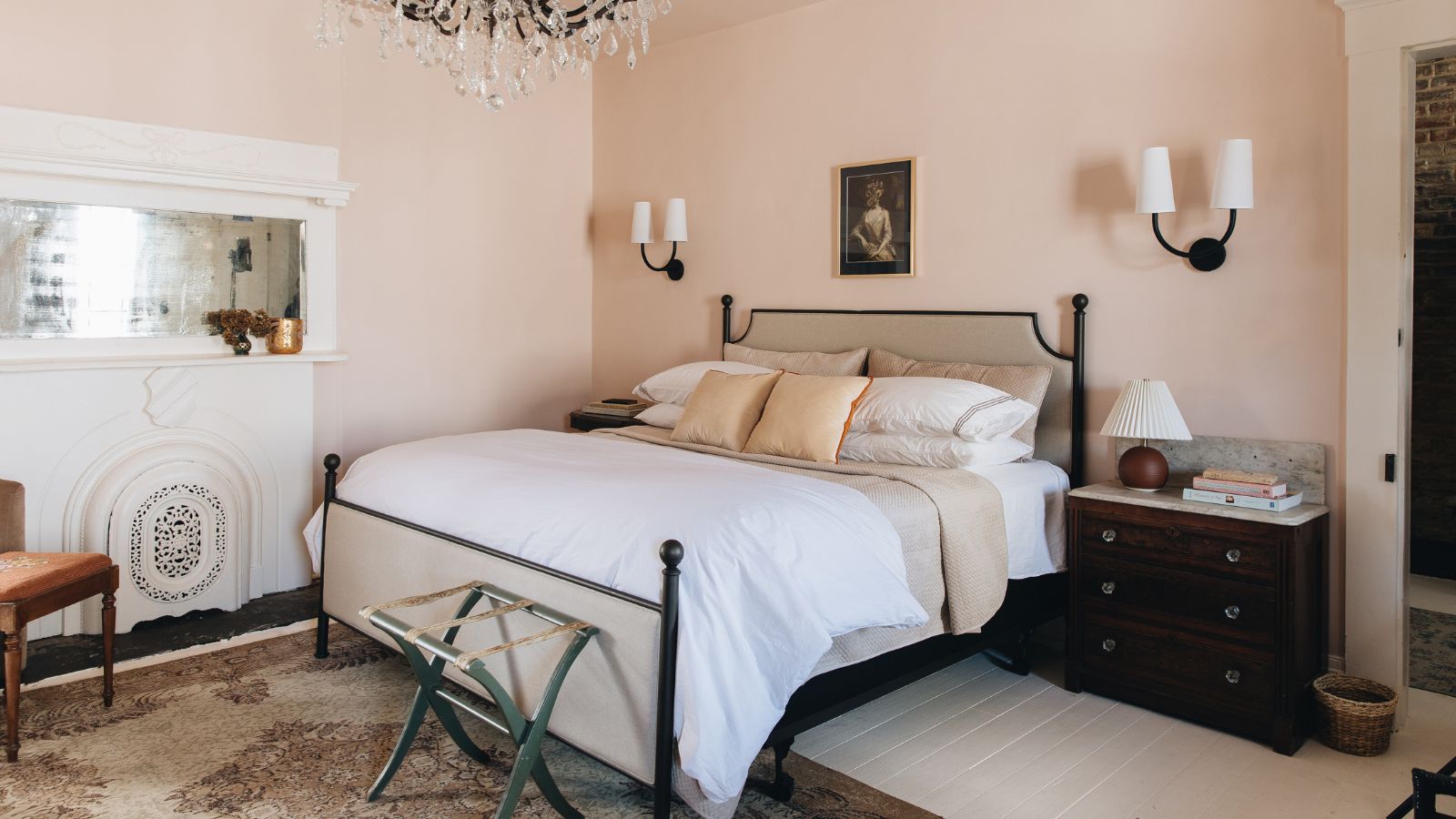
Kristen Peña selected a mauvey beige for a calming and versatile backdrop that appears subtly pink in sunlight. Adam Ben Wagner utilized a custom buttery-yellow plaster in a California home to enhance natural light, keeping the rest of the room in neutral cream and brown tones. Kim-Joy Hewlett designed a guest room with pink and chocolate brown contrasting stripes instead of a traditional headboard, softened by neutral drapery.
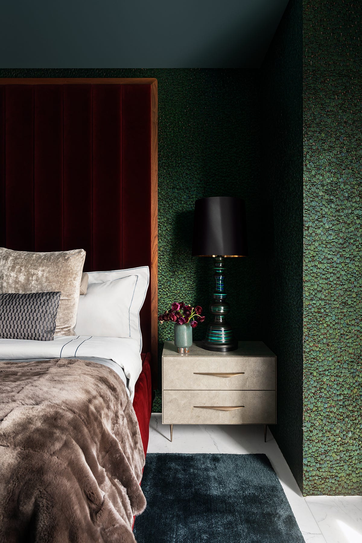
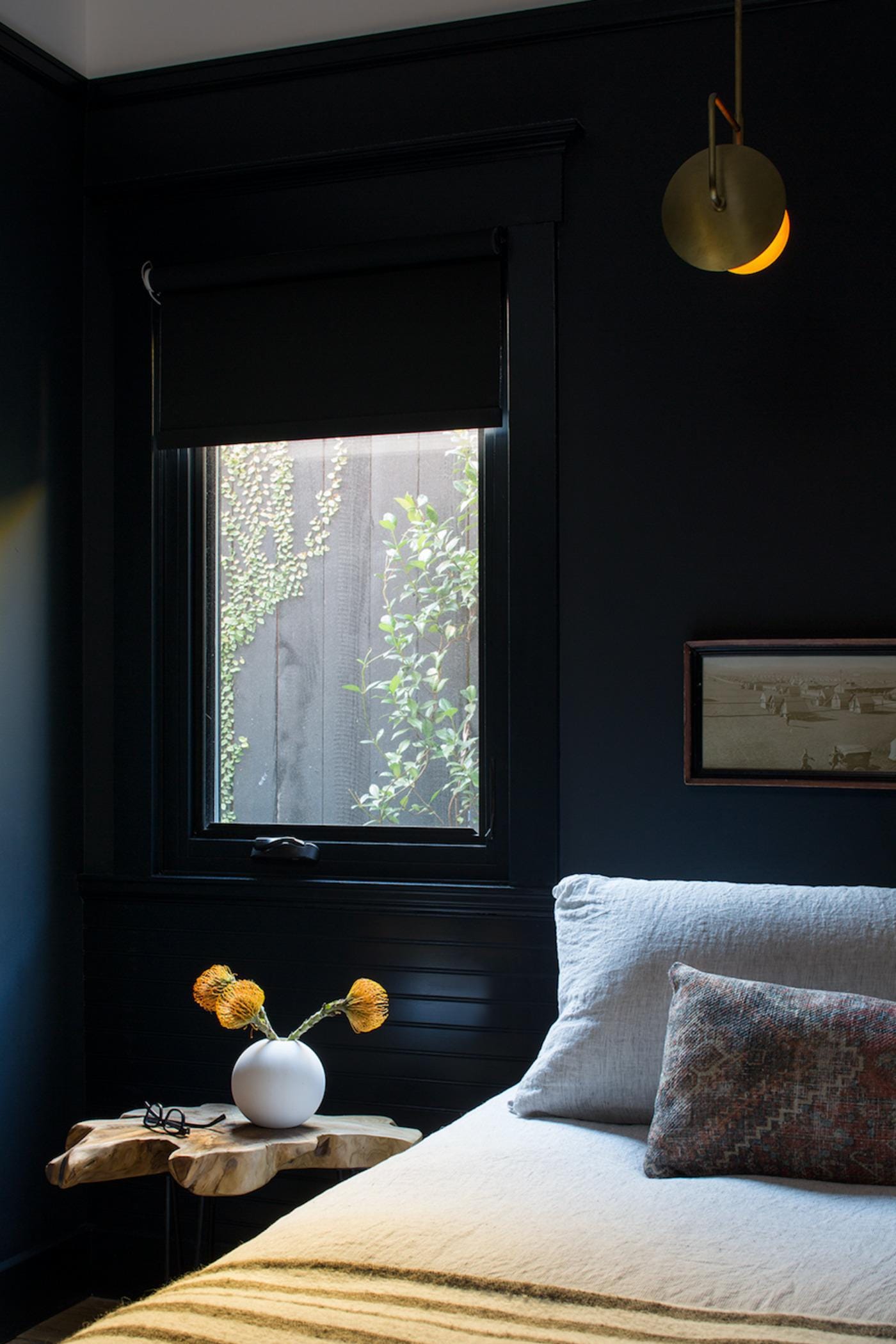
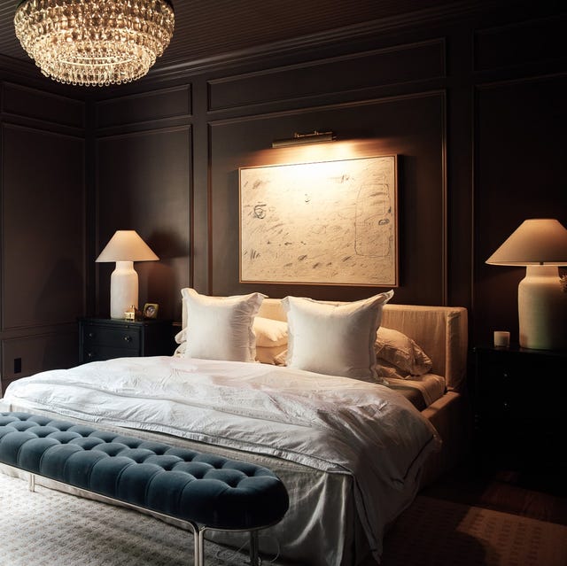
Darker options include blue-black, chosen by Breegan Jane for her son’s bedroom and brightened with graffiti-style art. Lively green, specifically Benjamin Moore's Herb Garden, was used by Kelly Hurliman in a guest bedroom's picture frame molding to transition between white walls and yellow wallpaper. Chartreuse, a yellow-green blend, is suggested for a lively yet balanced bedroom, softened by blue and white wallpaper by French & French.
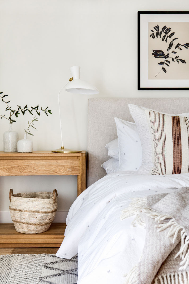
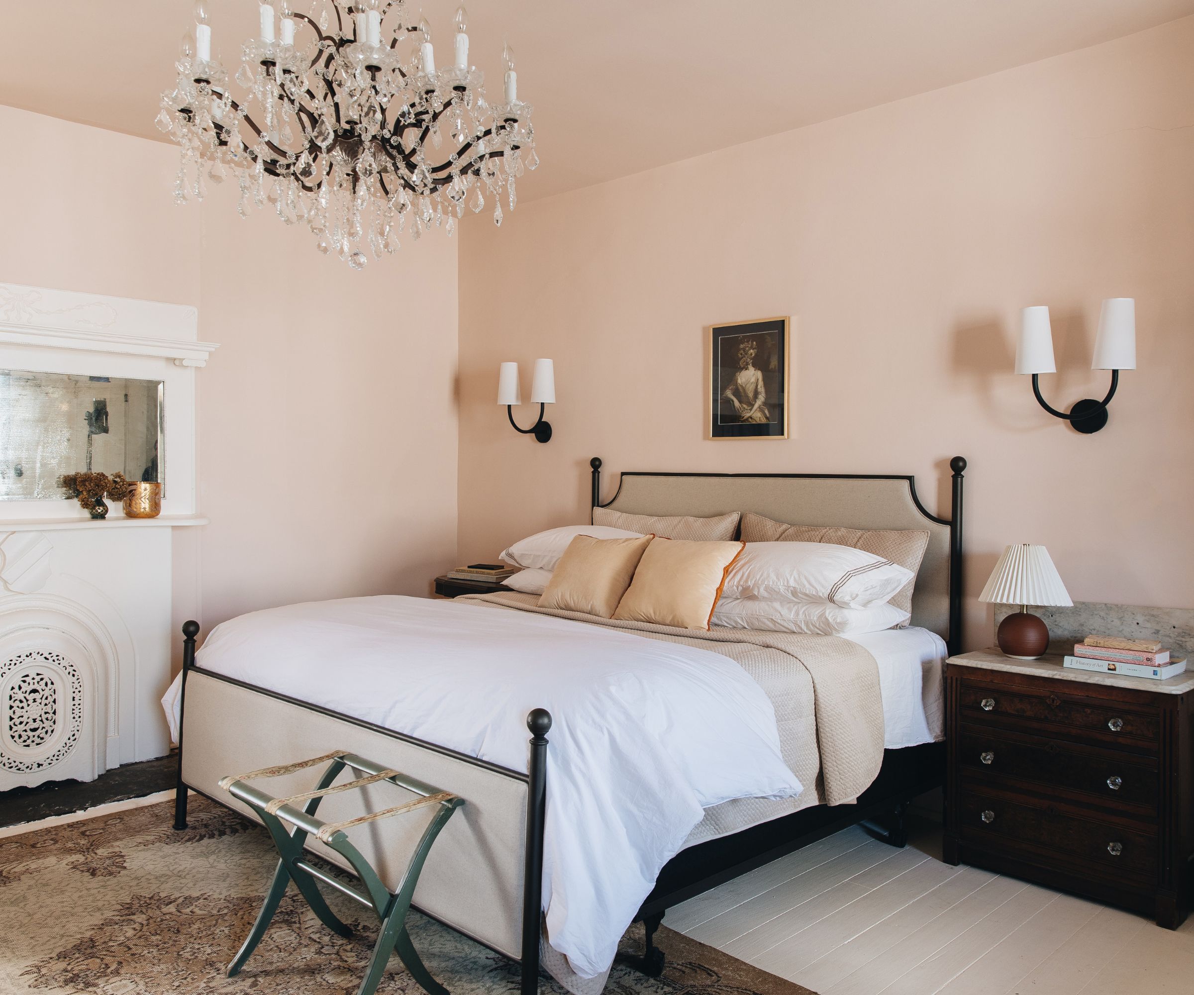
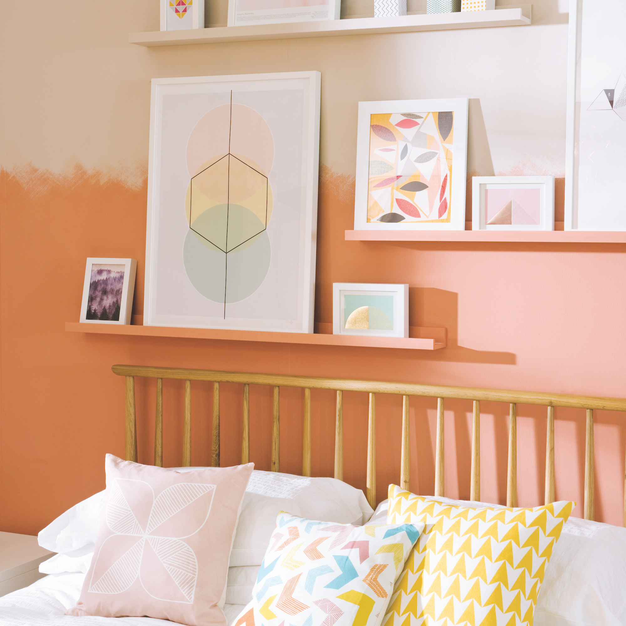
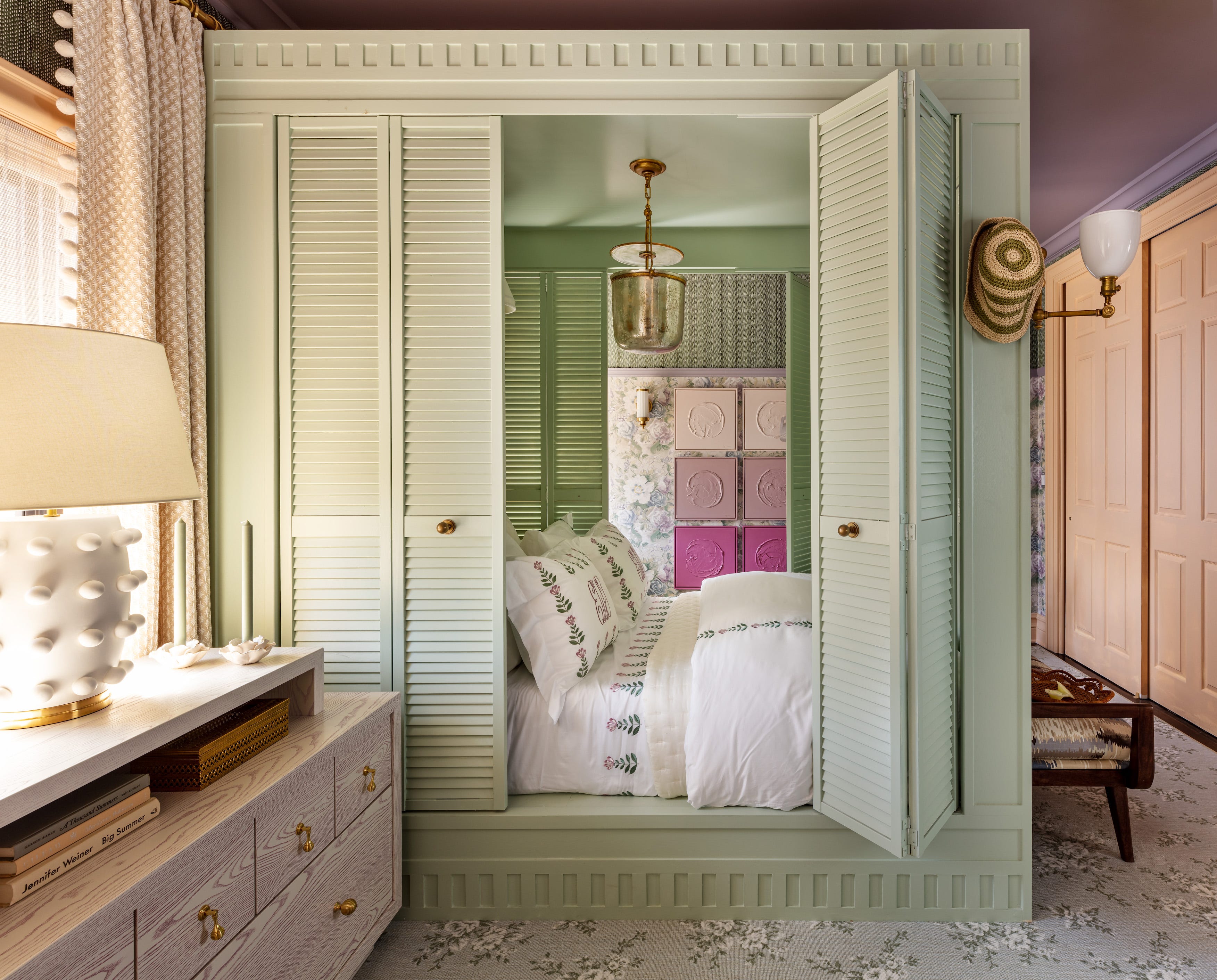
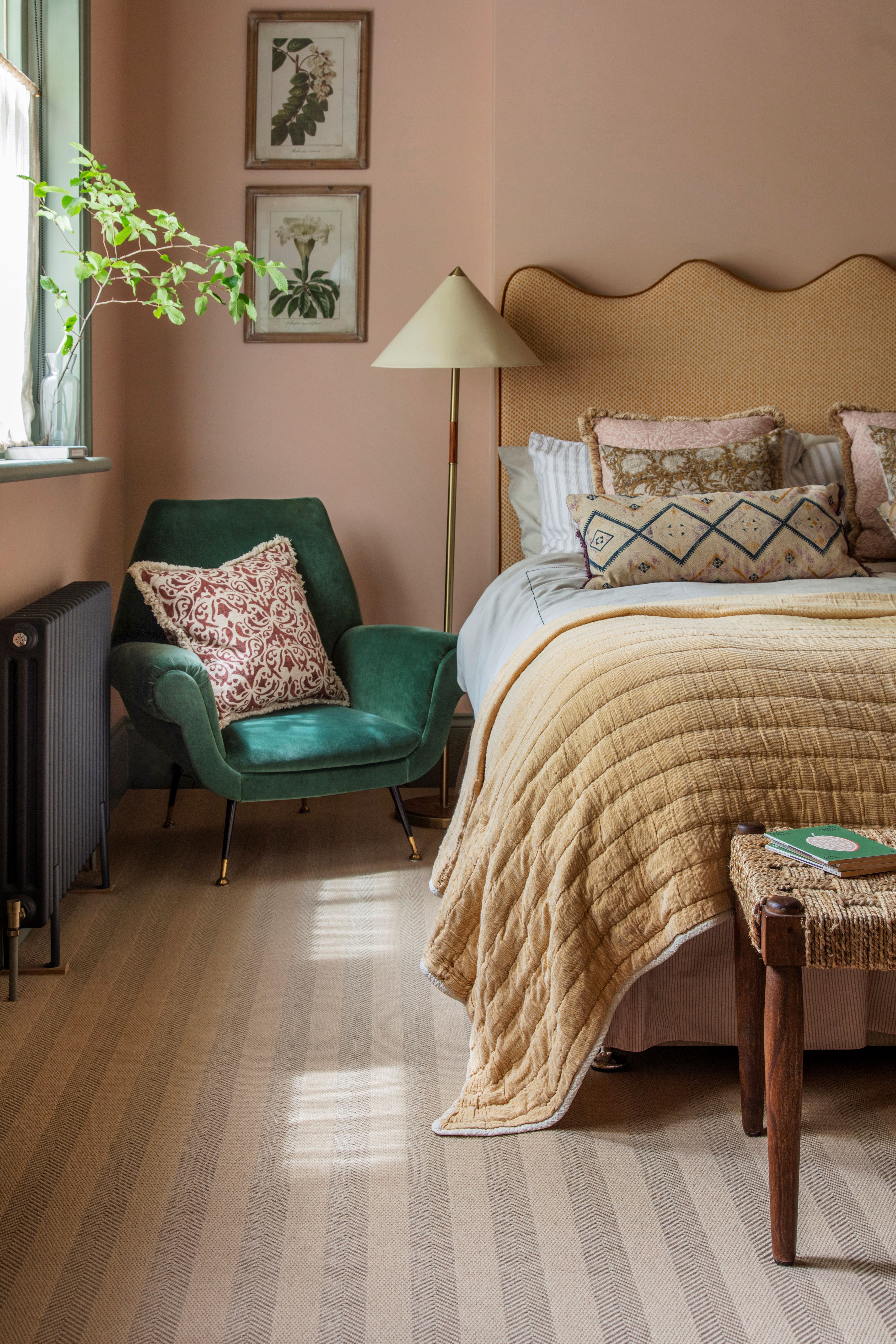
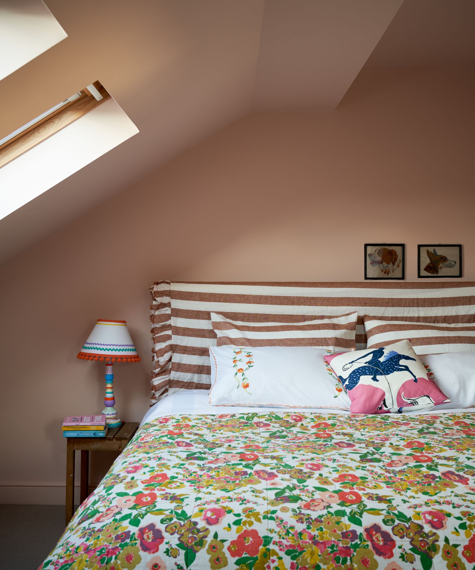
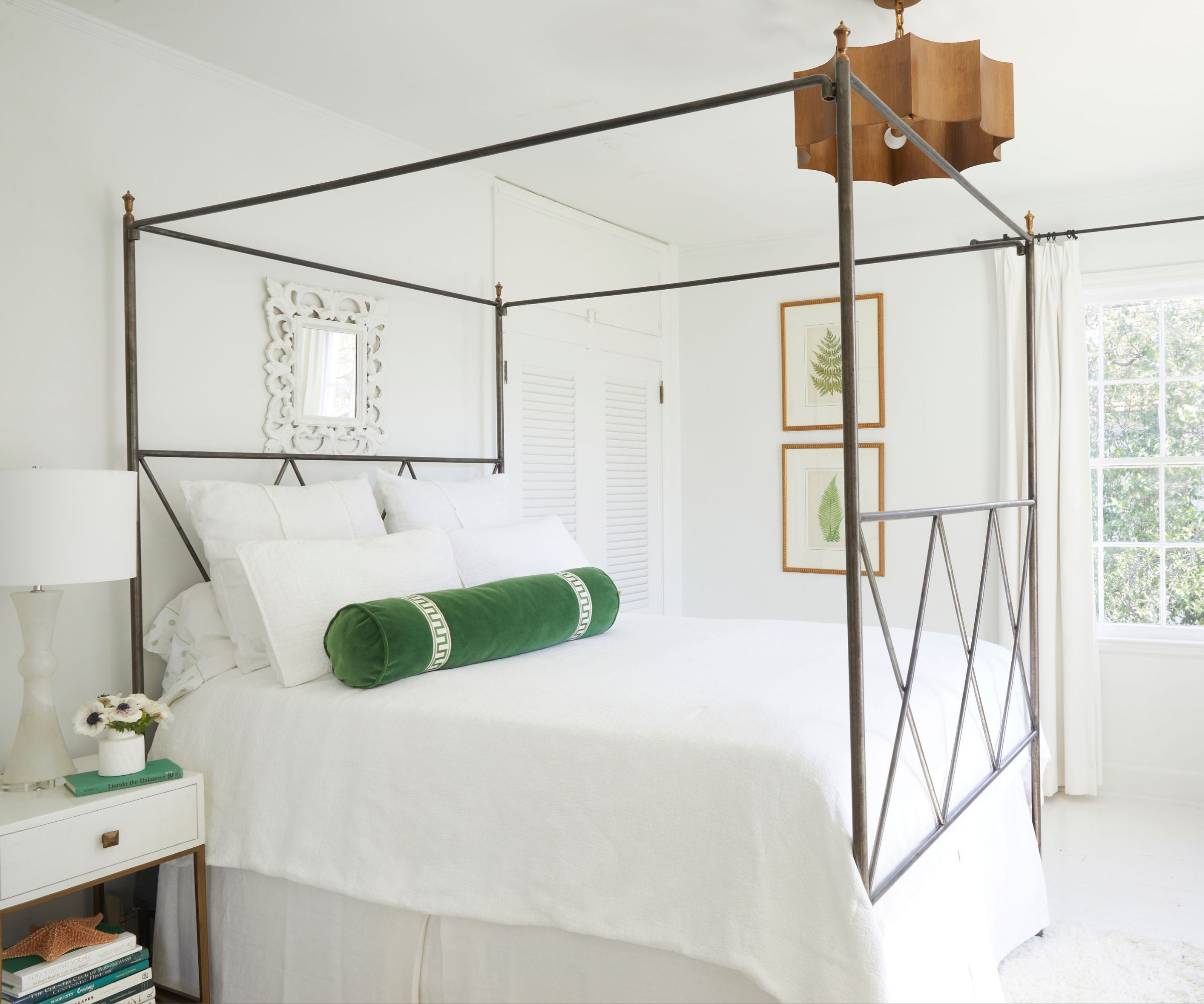
Peachy pink, a universally flattering and calming orangey-pink, is recommended for its sophisticated air when paired with darker hues. Muted green, like Sherwin-Williams' Sea Salt, with heavy blue undertones, was chosen by Minnette Jackson for a serene primary bedroom resembling a treehouse. Warm white, such as Farrow & Ball's Pointing, is presented as a versatile neutral for well-lit guest rooms.
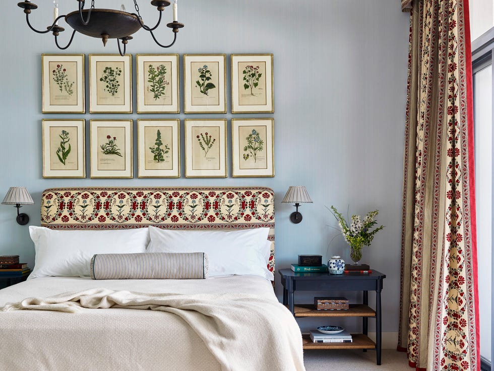
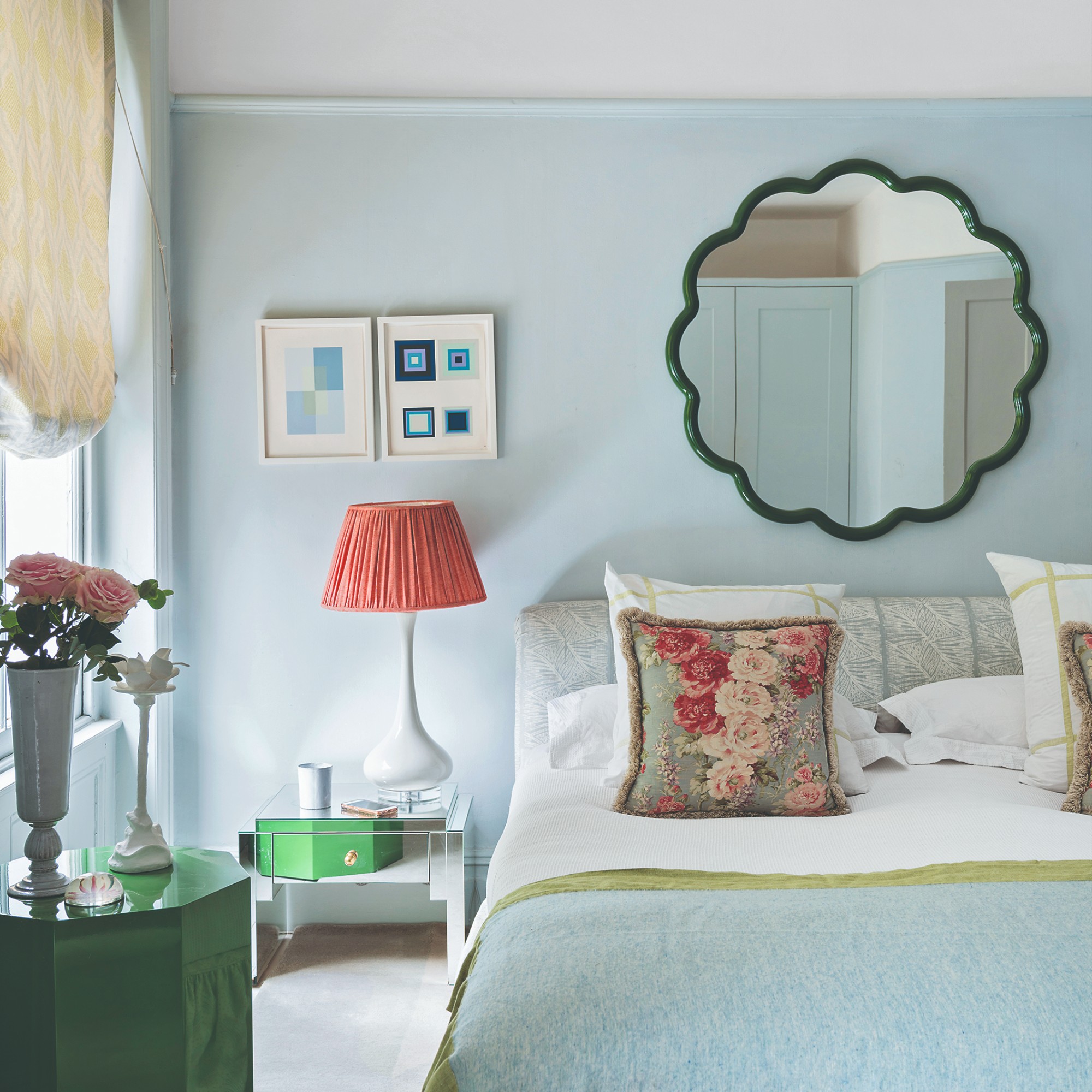
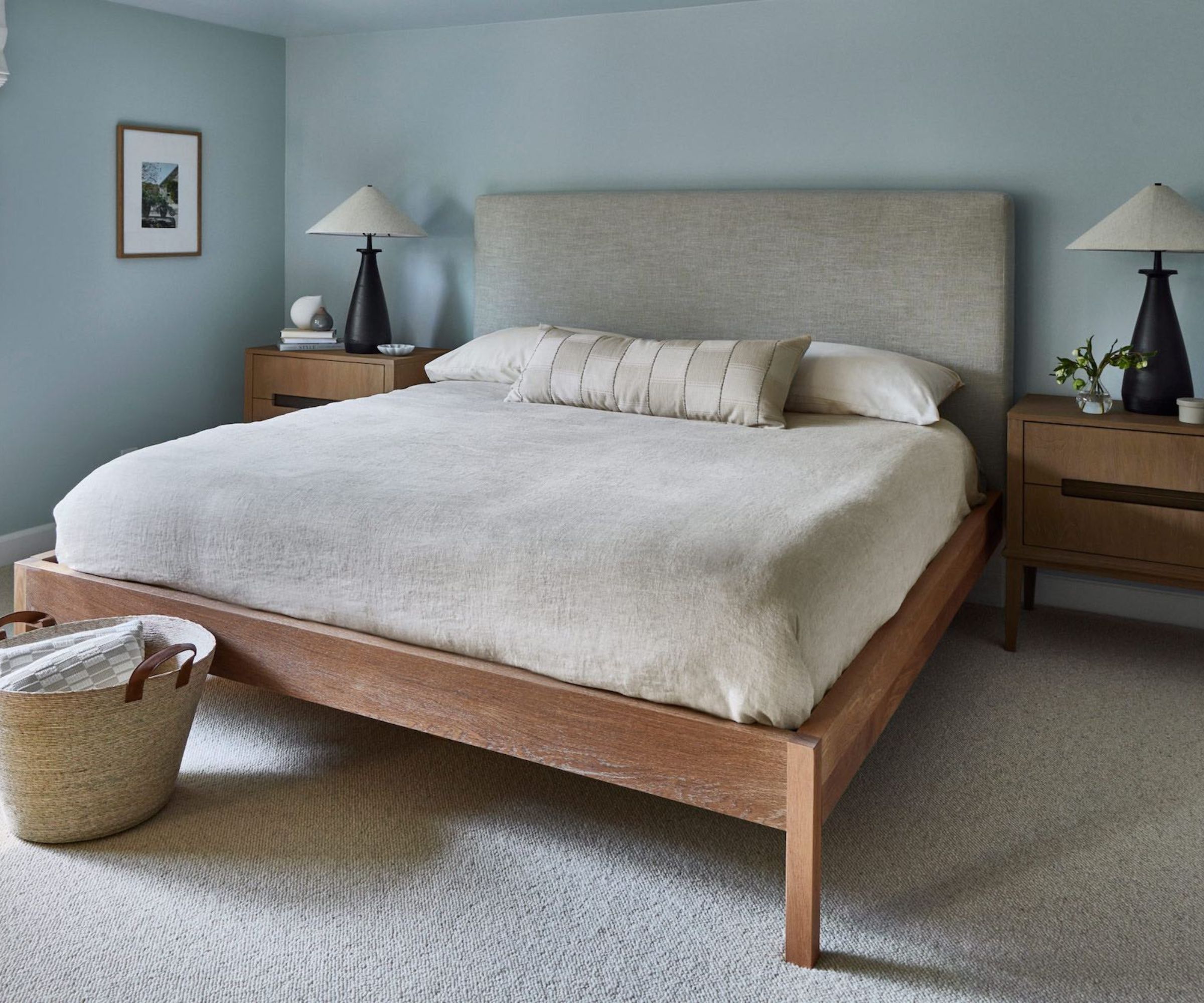
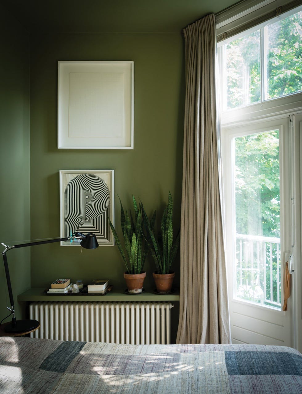
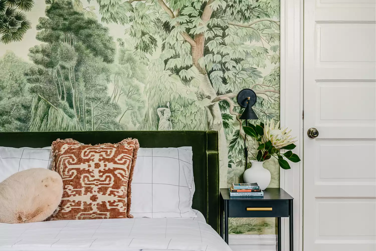
Soft blue, exemplified by Benjamin Moore's Summer Shower, creates a calming atmosphere in a bunkroom, suitable for evolving tastes. Mossy green, Benjamin Moore's Great Barrington Green, transforms a bunkroom into a forest-like retreat when paired with deep browns. Yellow-green, like Farrow & Ball's Churlish Green, is highlighted as a trending hue for invigorating sleep spaces, especially in guest or kids' rooms when combined with bold jewel tones. Finally, mauve purple, specifically Benjamin Moore's Muskoka Dusk, is suggested for creating a soothing and sophisticated countryside escape through wood paneling.
#BedroomPaintColors #HomeDecor #InteriorDesign #ColorPsychology #DesignInspiration #SereneSpaces #PaintTrends #RoomIdeas #BedroomPaintColors #HomeDecor #InteriorDesign #ColorPsychology #DesignInspiration #SereneSpaces #PaintTrends #RoomIdeas
0 commentaire au total
 Aucun commentaire pour le moment
Vous aimerez aussi
You Can Wake Up HAPPIER Just by Painting Your Bedroom—Here Are the Colors Designers Love

5 Paint Colors That Will Help You Sleep Better if You Use Them in Your Bedroom

We've Rounded Up the Best Bedroom Paint Colors — No Matter Your Style

20 Bedroom Color Schemes for a Cozy and Calm Sleep Sanctuary, All Picked by Designers

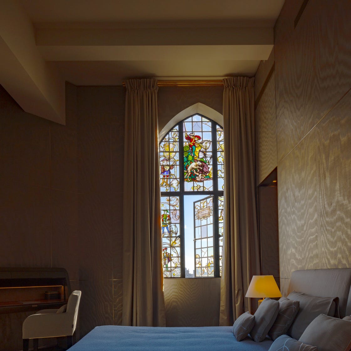
The Best Bedroom Colors to Help You Sleep (And Wake Up Happy)

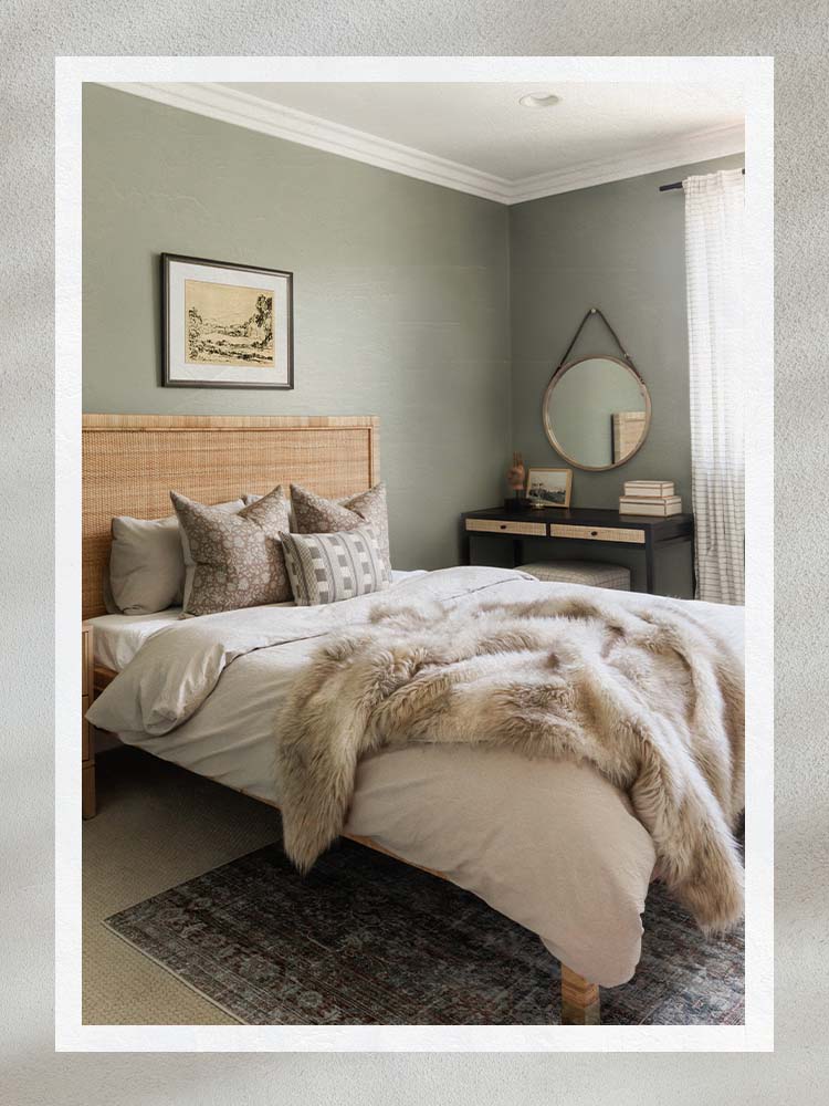
The Best Bedroom Paint Colors for Unwinding at Night

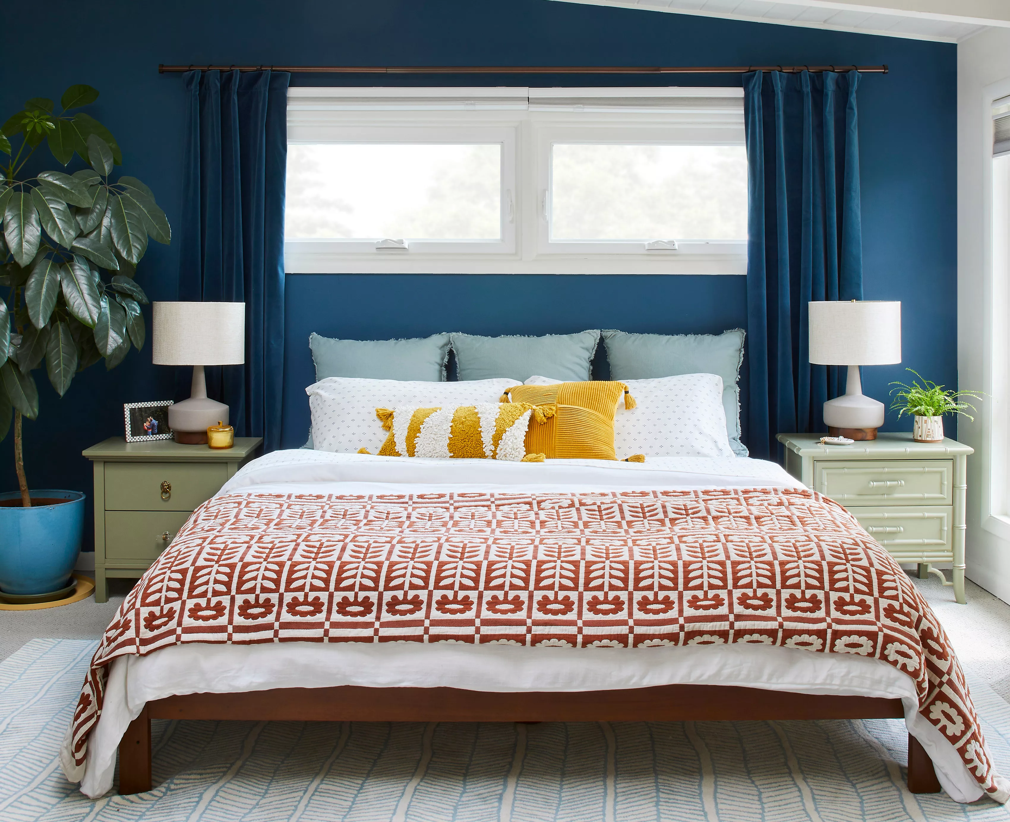
5 Bedroom Paint Colors That Could Be Ruining Your Sleep

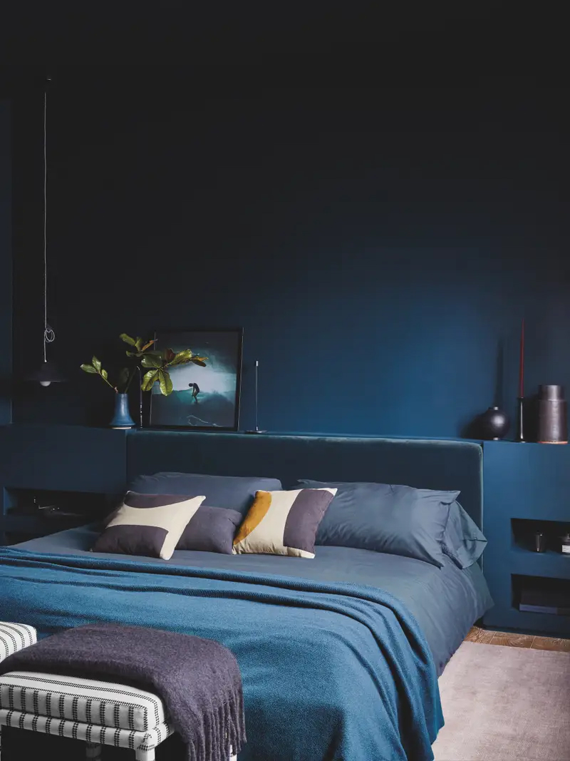
The Paint Trend That’s Arguably Helping Us Sleep Better

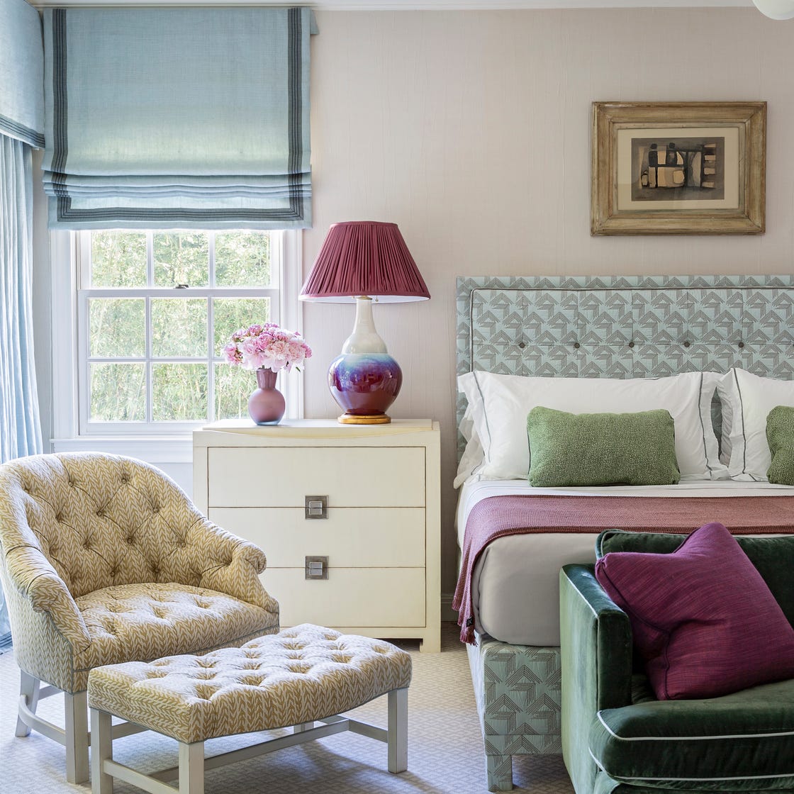
These Designer-Approved Bedroom Paint Colors Are the Key to the Best Sleep of Your Life

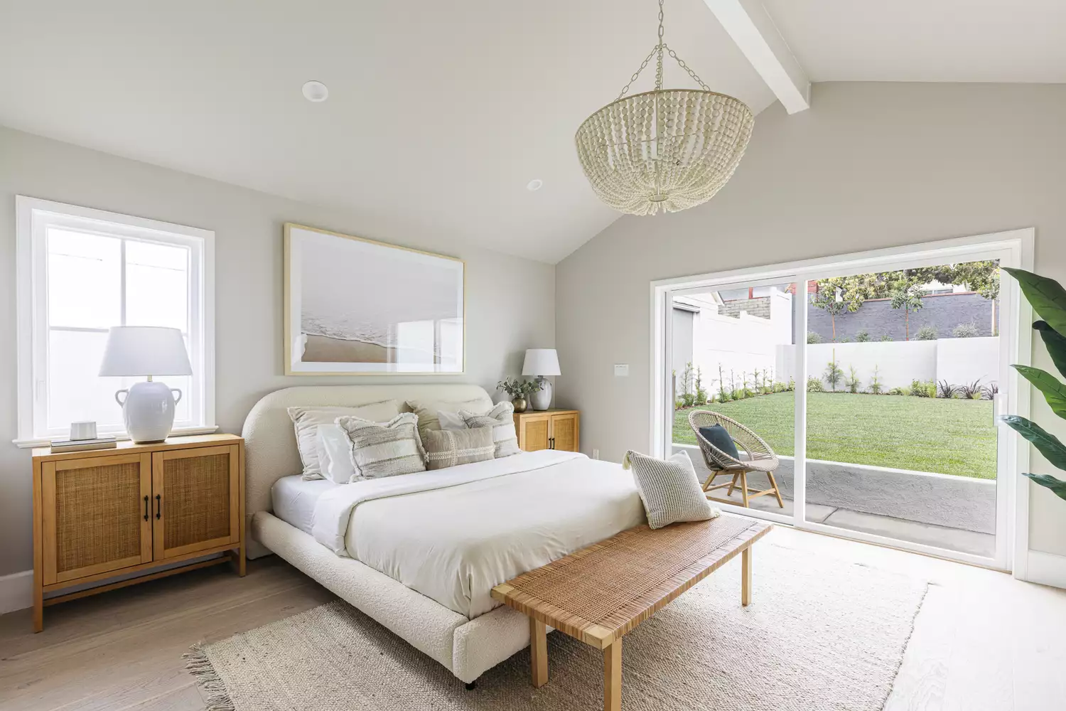
14 Best Bedroom Paint Colors for a Relaxing Space
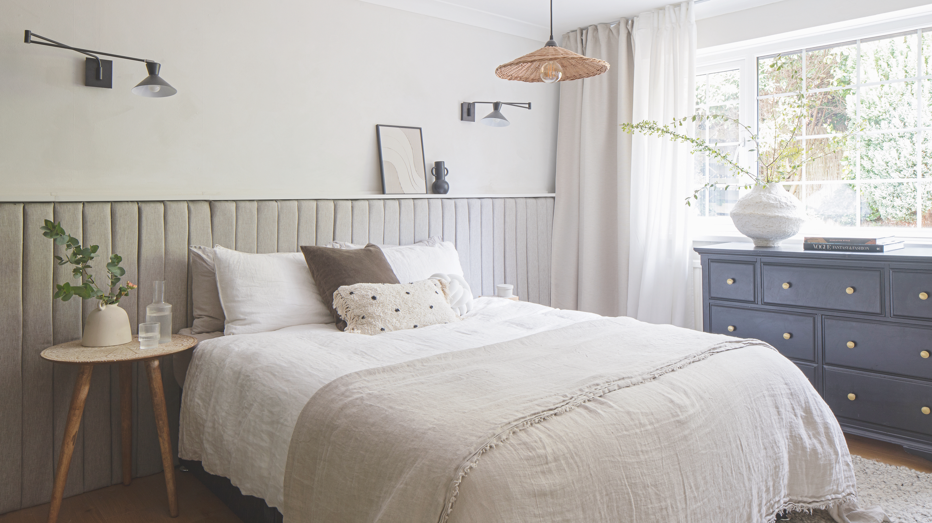
5 bedroom design tricks to help you become a morning person
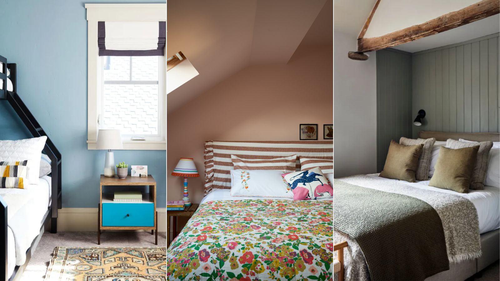
5 colors that will make your bedroom feel calmer, according to designers

11 Soothing Bedroom Paint Colors Designers Say Can Help You Sleep

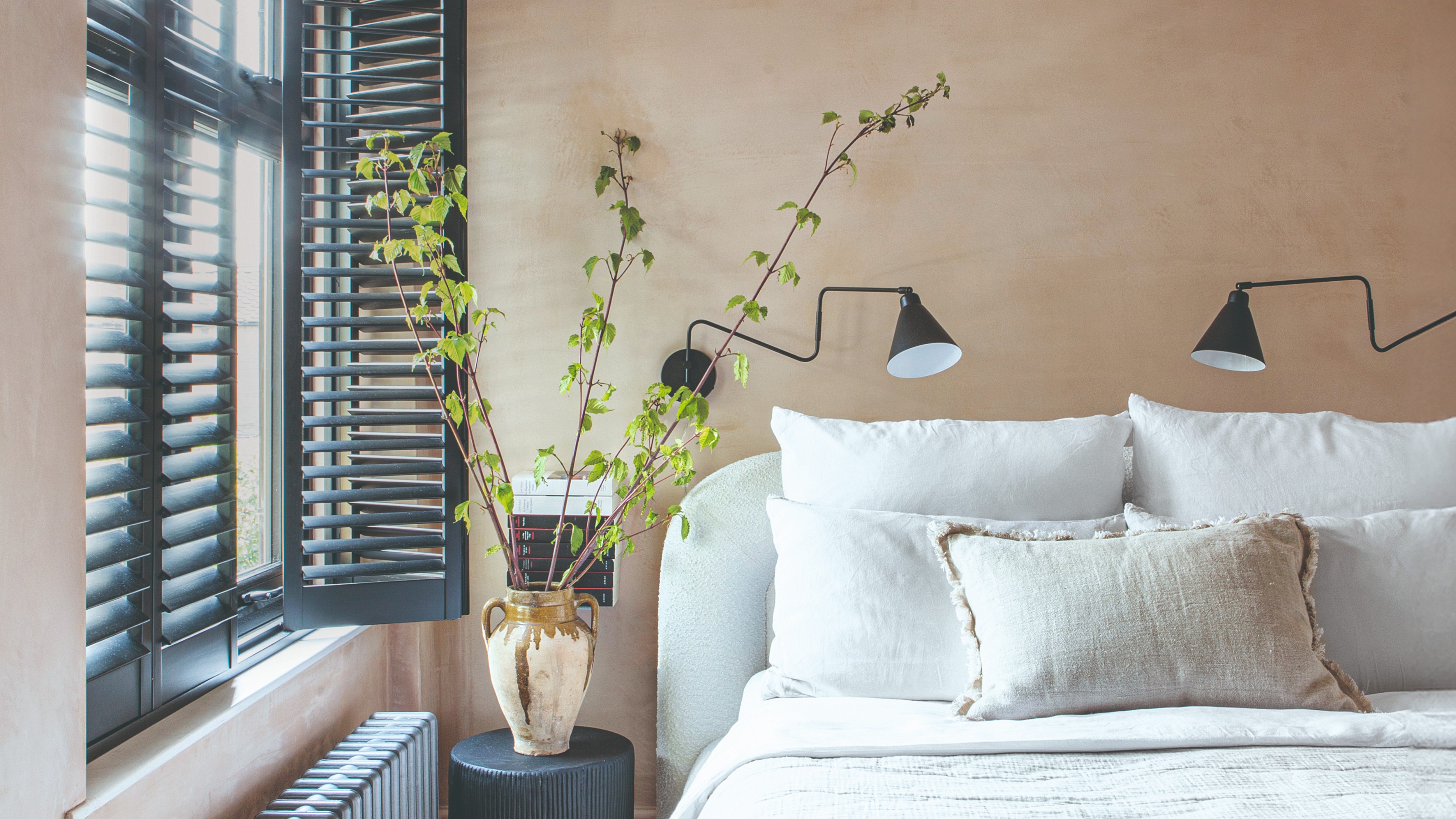
18 dreamy bedroom colour ideas to create a rest-promoting, stylish space

These Beautiful Paint Colors Will Make You Want to Switch Up Your Bedroom Right Now
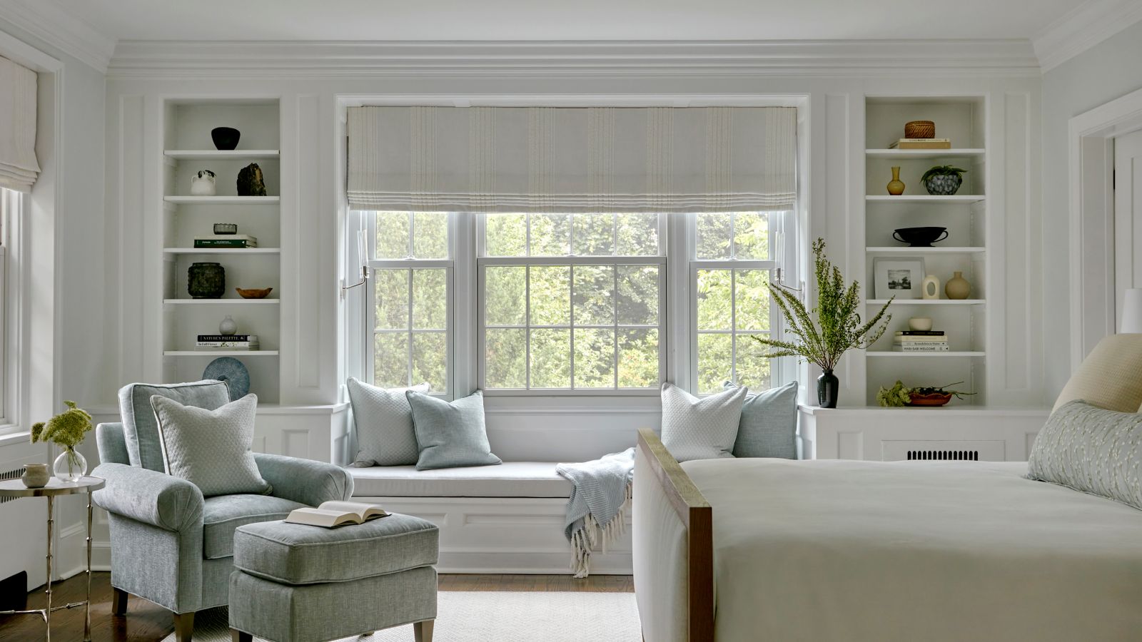
The best Benjamin Moore paint colors to use in bedrooms – 14 stylish shades recommended by interior designers

Best Bedroom Colors for Sleep

10 designers on the bedroom colors they always recommend
16 beautiful bedroom colour ideas and how to use them
25 Bedroom Wall Paint Ideas For A Good Night’s Sleep