1/29
7 Best Colors Designers Say You Should Use to Make Your Home Feel Fresh, Light and Spring-Ready
The article explores seven color palettes recommended by interior designers to refresh and revitalize homes for the new year, moving away from heavy holiday tones towards a lighter, more serene aesthetic. The focus is on incorporating these colors through both significant changes, such as painting, and smaller decor swaps.
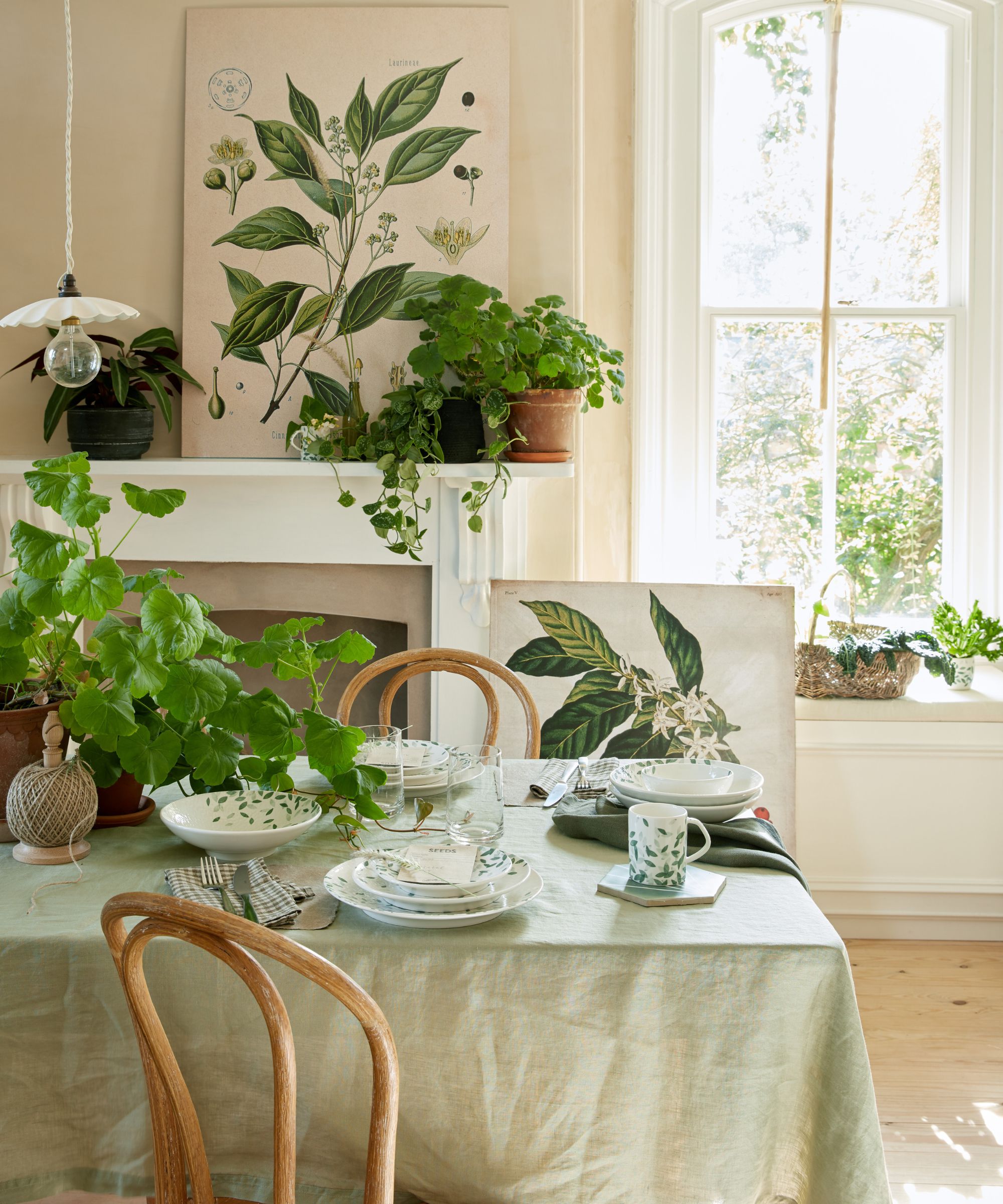
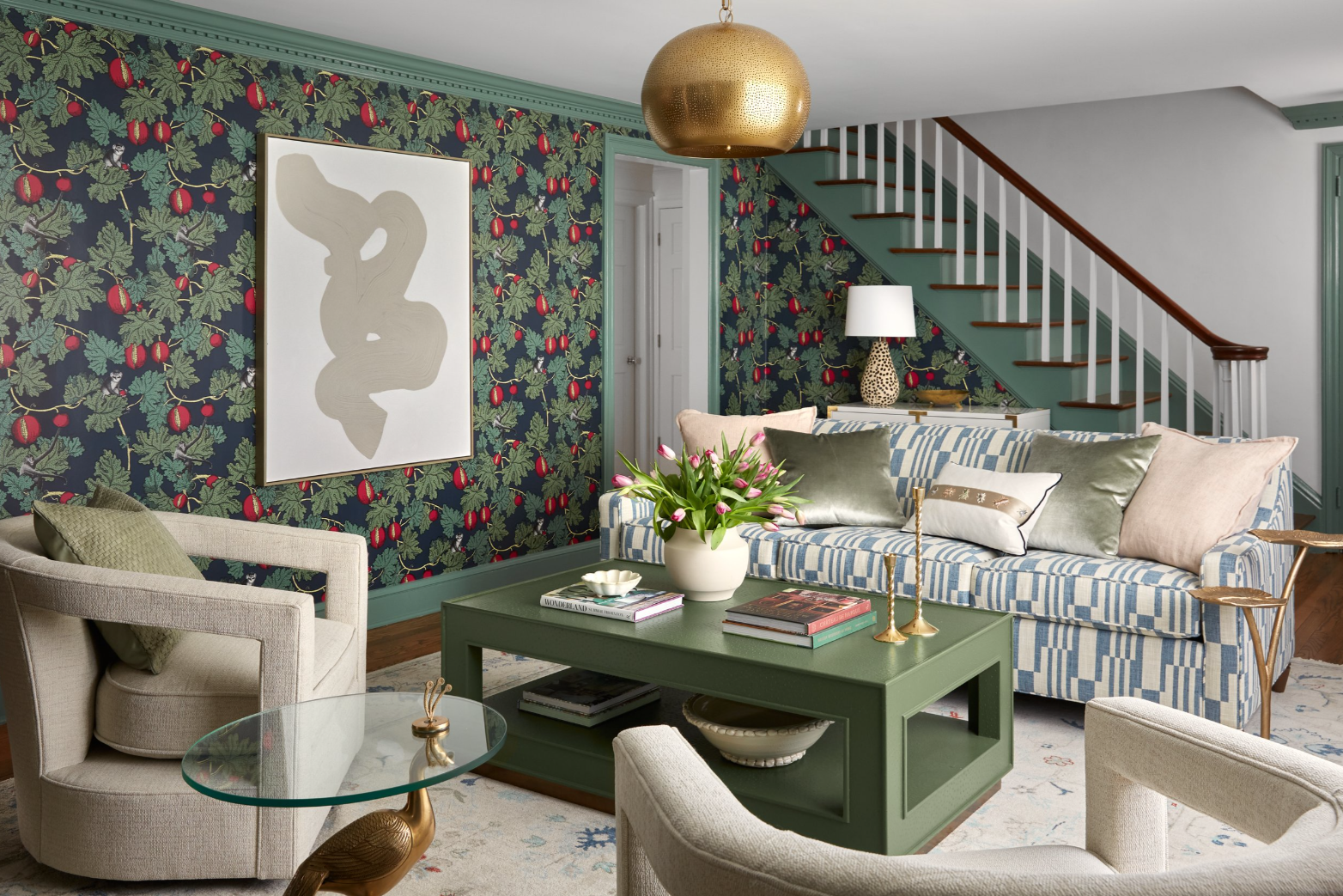
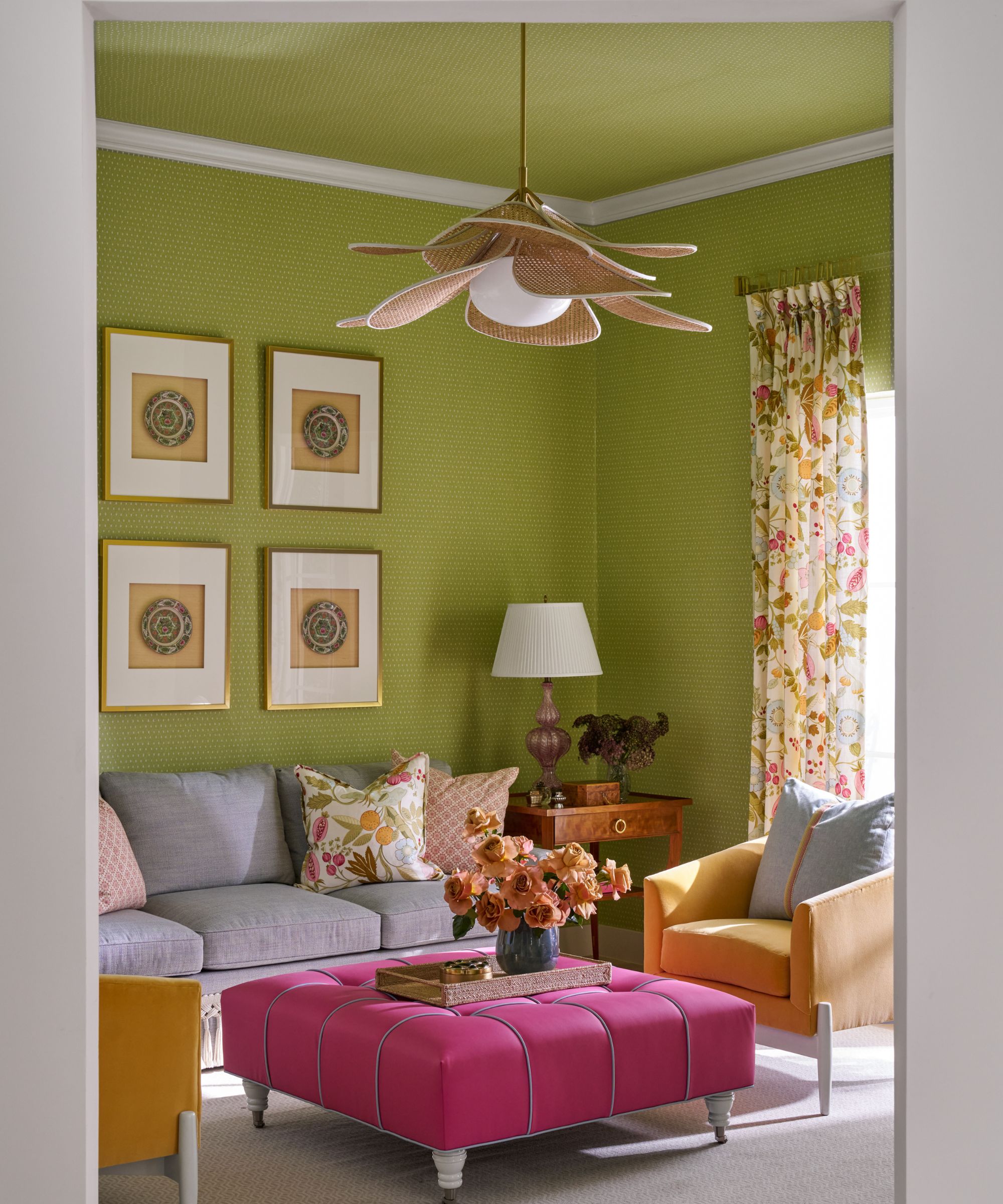
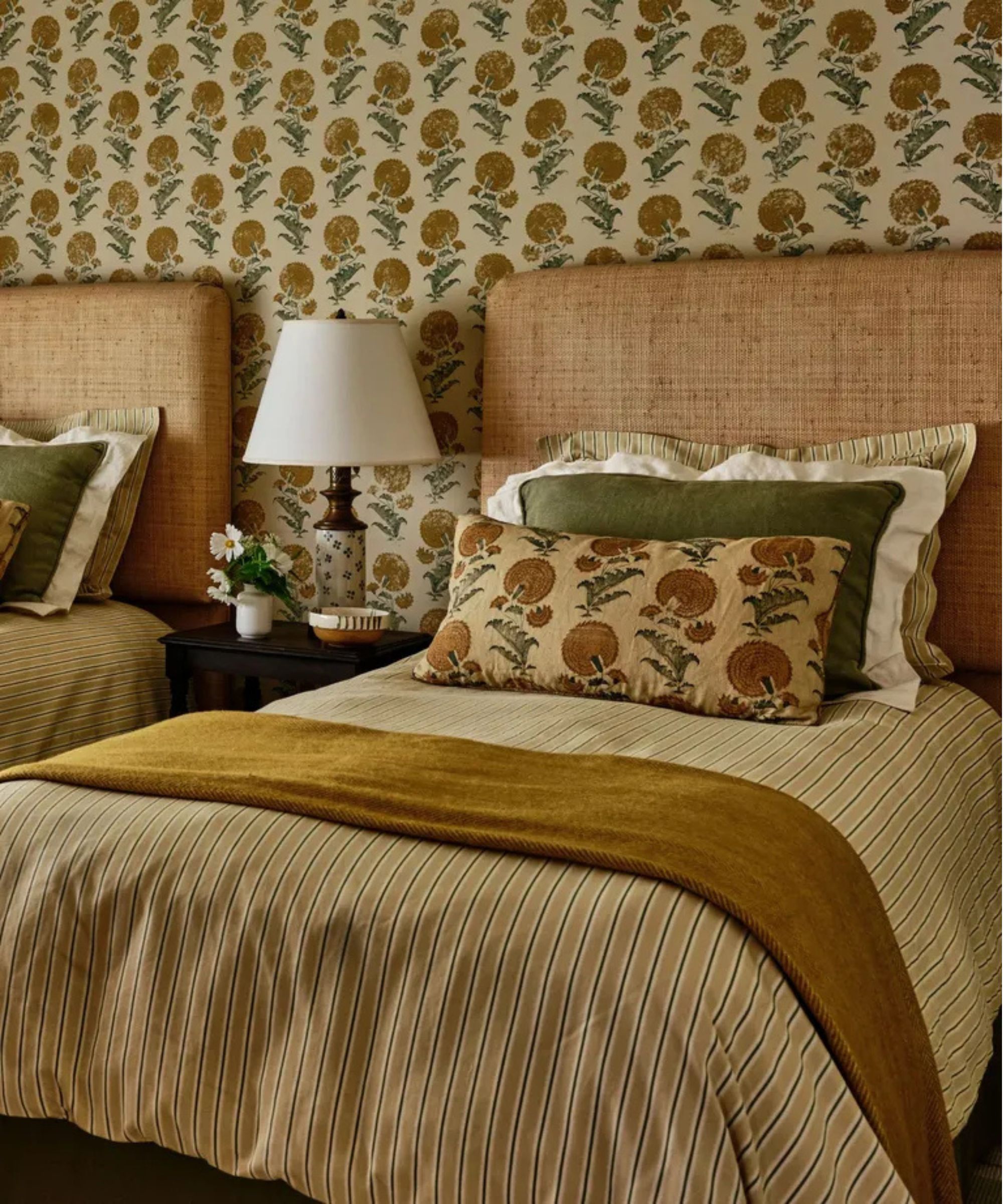
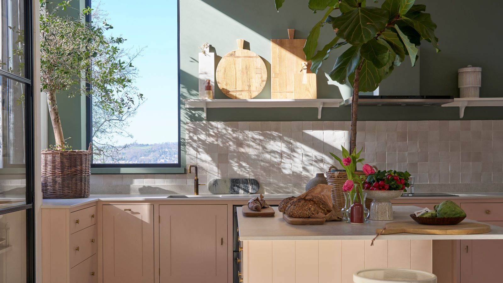
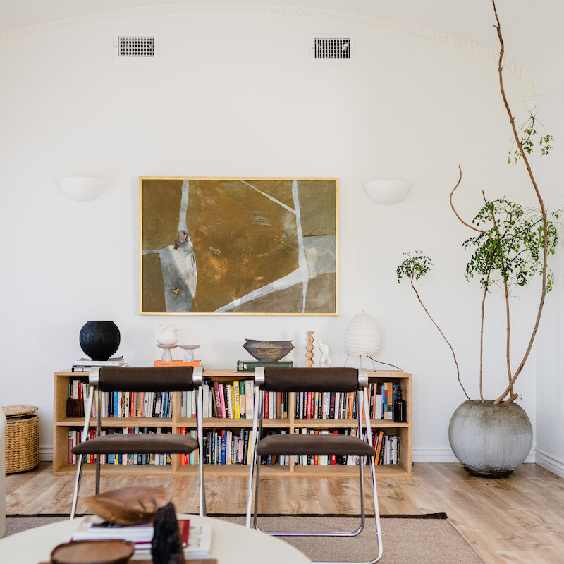
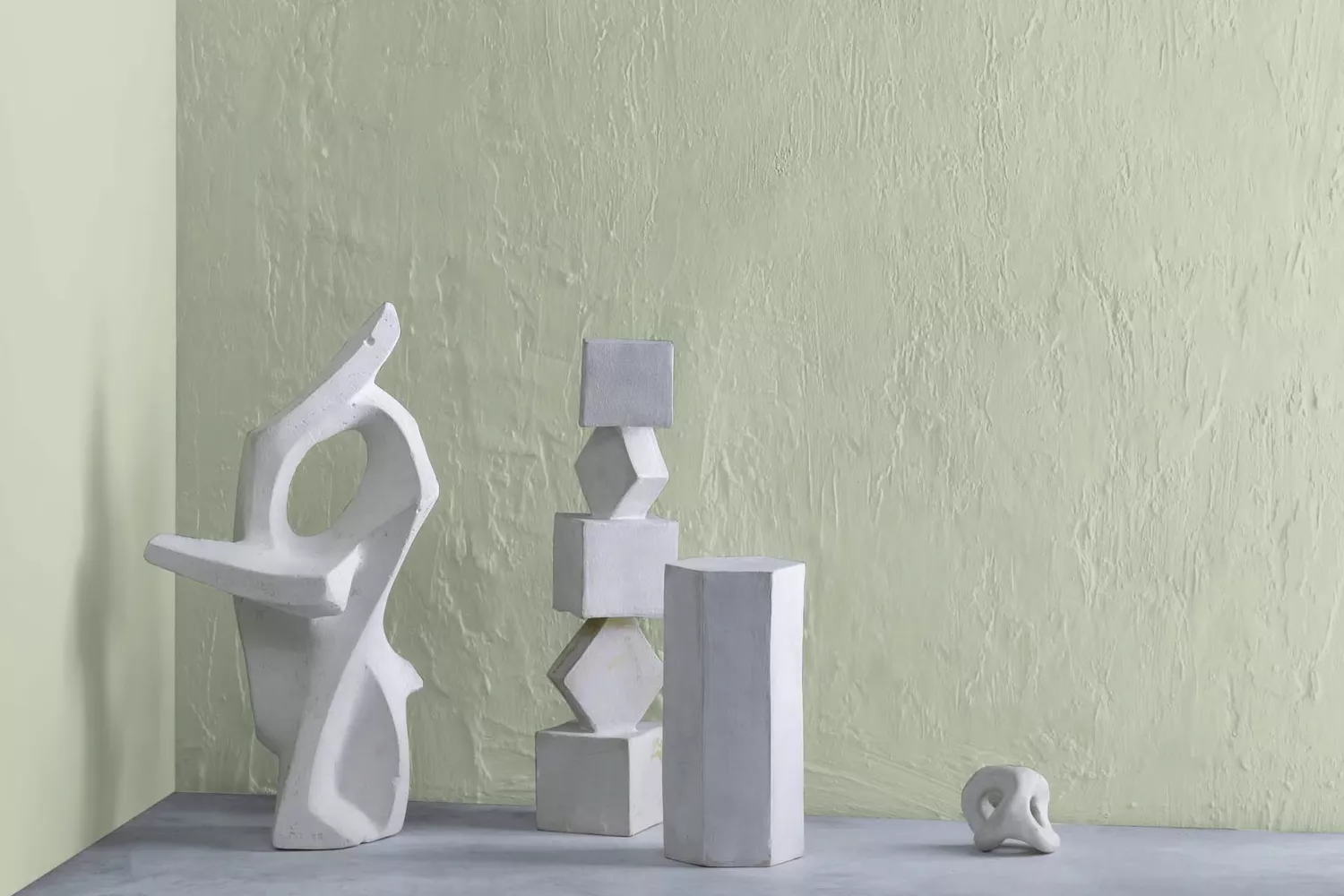
First, soothing greens are highlighted, particularly soft mineral greens with gray undertones. These shades are praised for their ability to reflect natural light and create a consistent, calming energy without appearing cold. Designers suggest using paints like Farrow & Ball's French Gray and Vert de Terre, or Backdrop's Road to Todos Santos. When accessorizing, light colors and natural materials such as warm white, light wood, limestone, and unlacquered metal are recommended to complement the green.
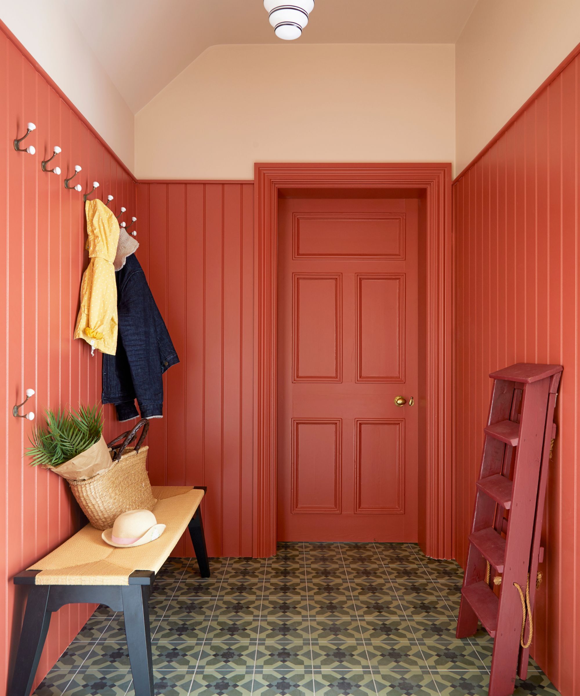
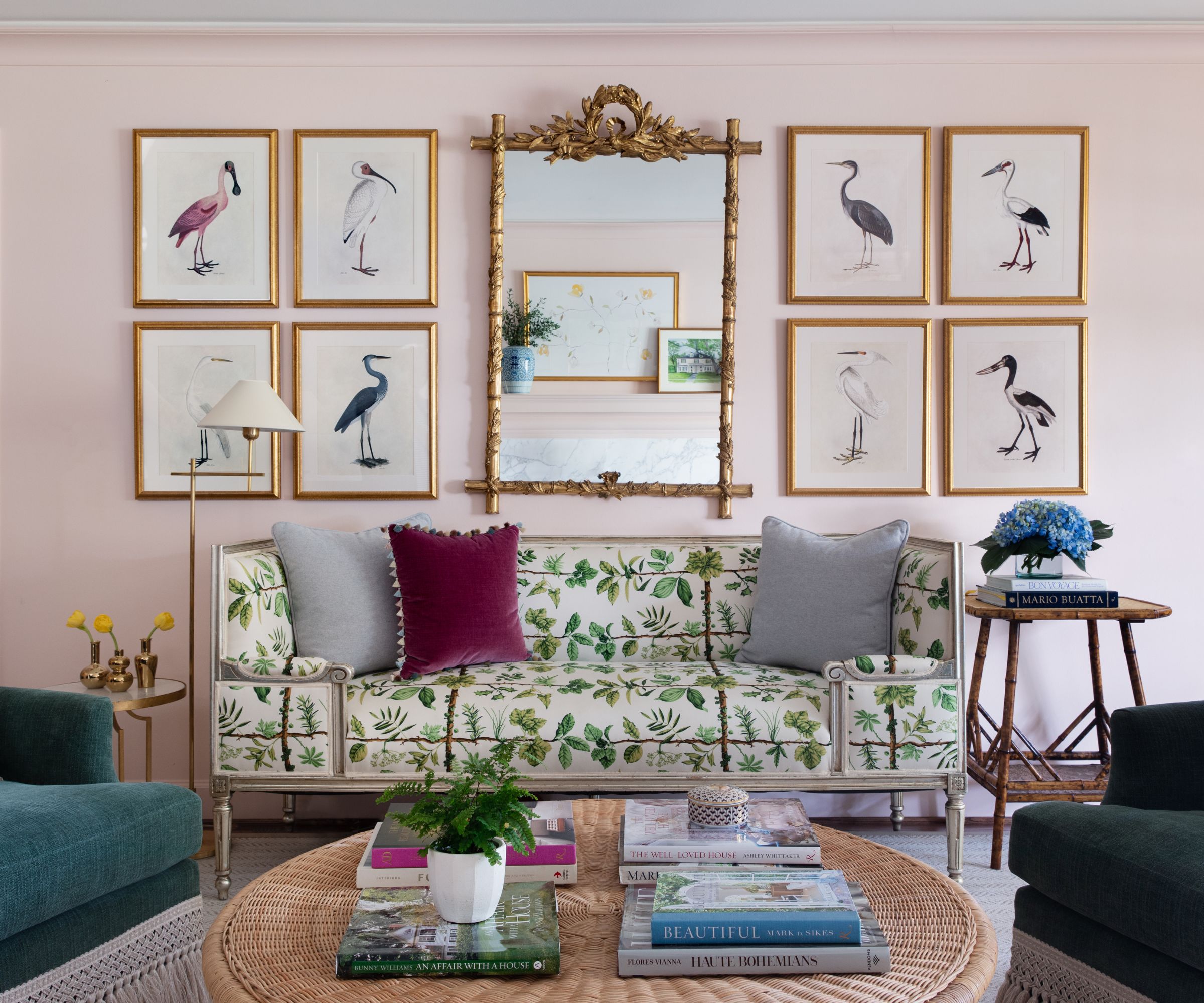
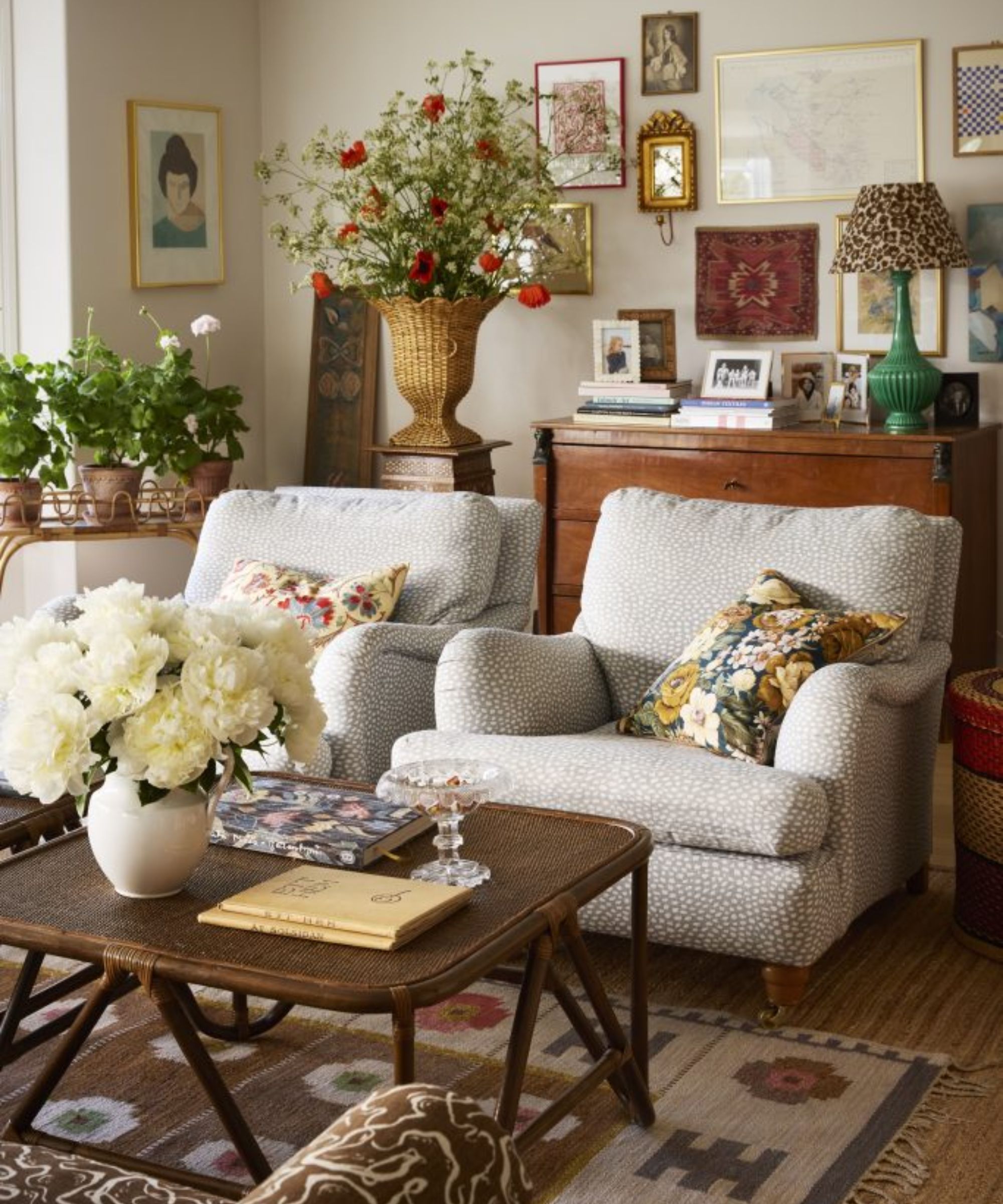
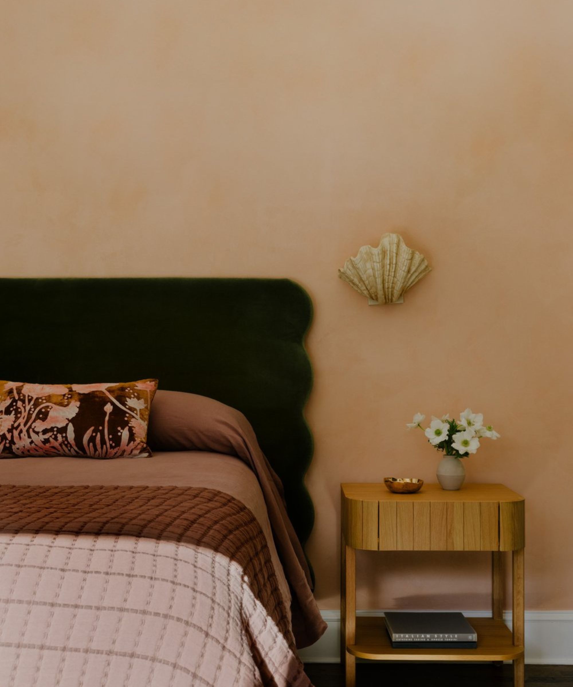
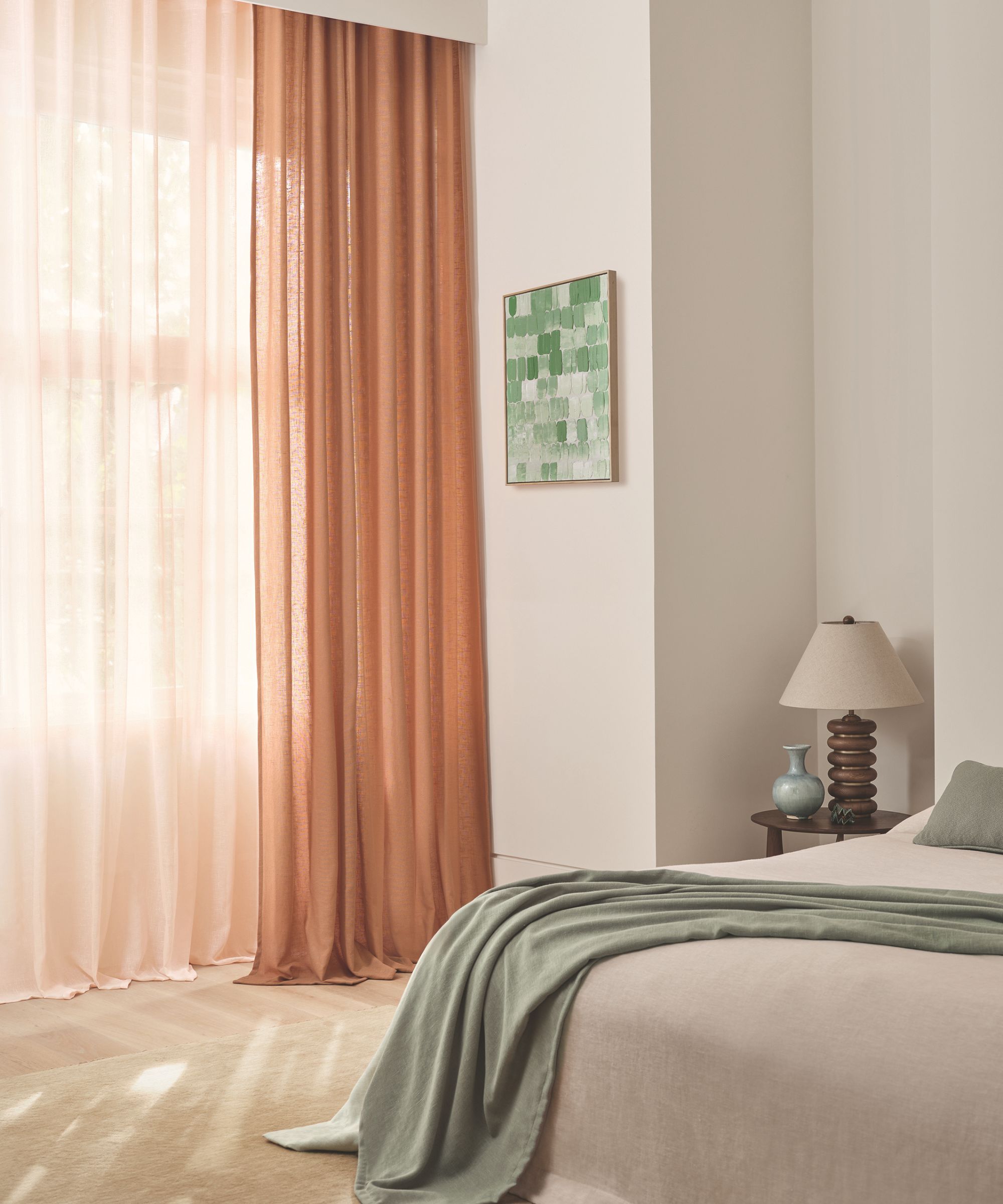
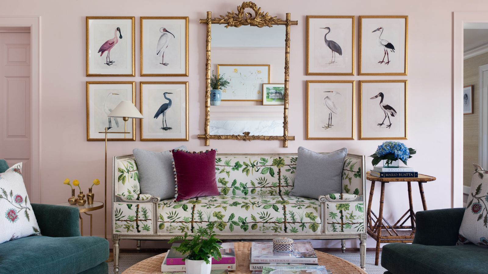
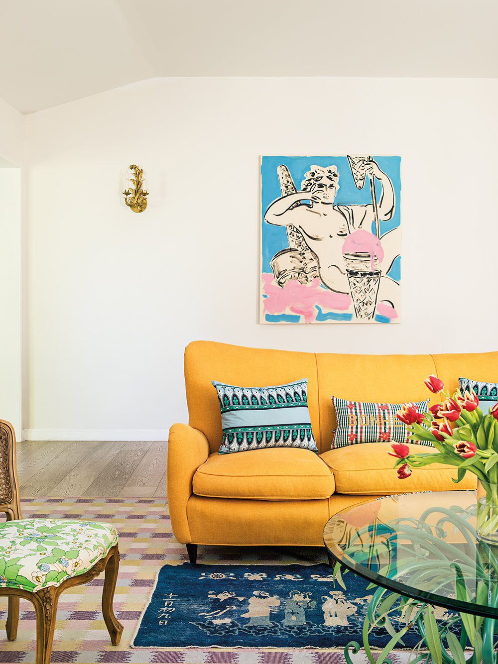
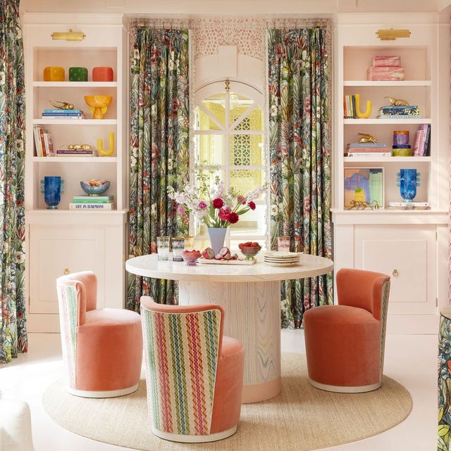
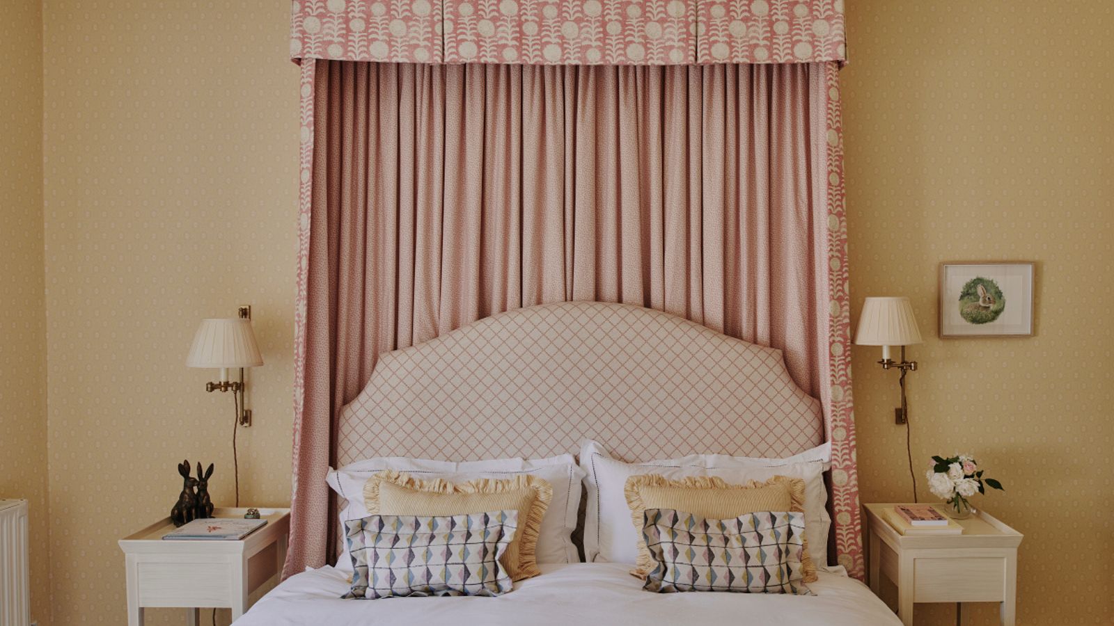
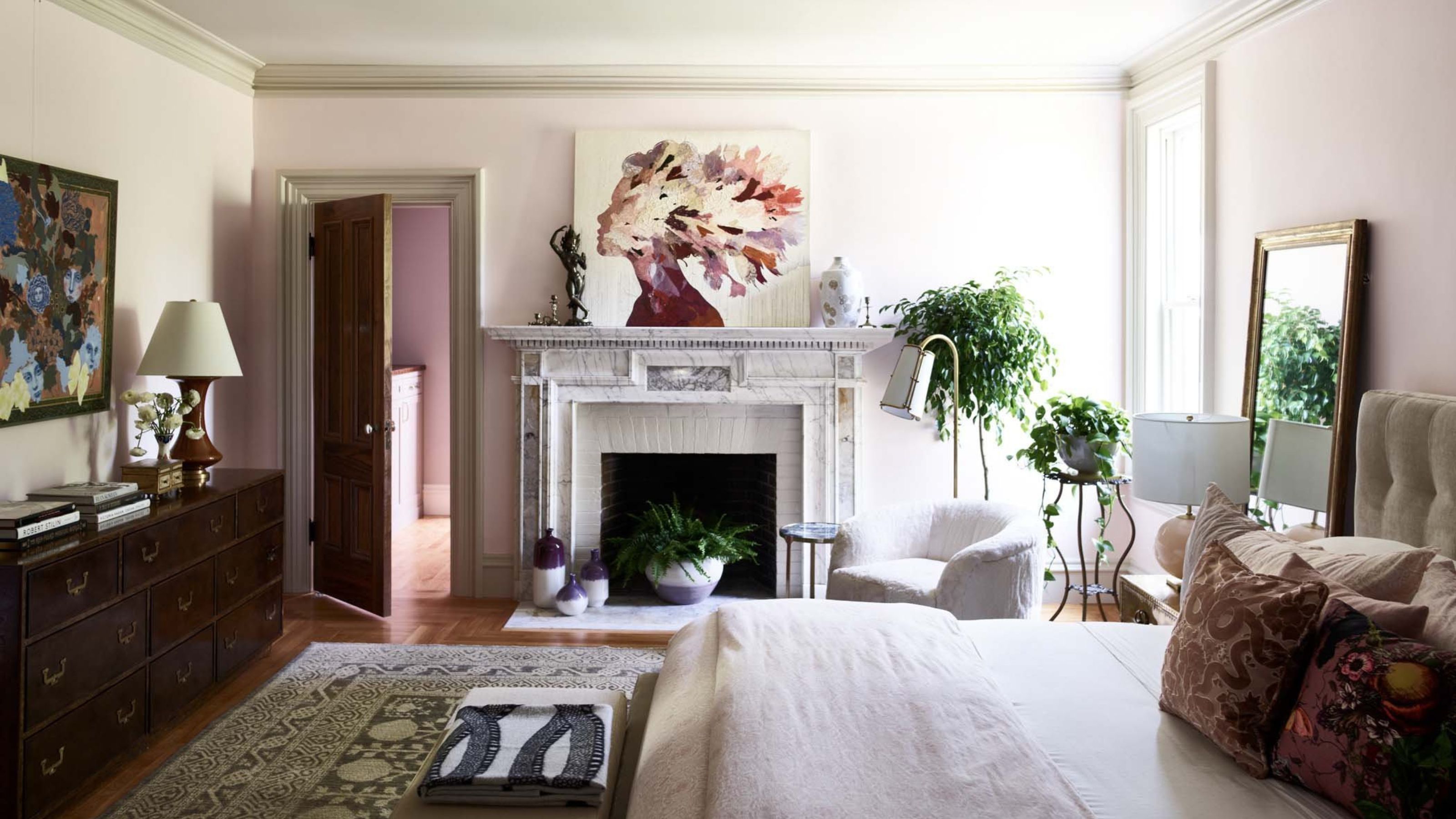
Next, dusty pinks are presented as a sophisticated alternative to brighter, more youthful pinks. This hue offers a timeless appeal, reminiscent of British country houses. Benjamin Moore's Morristown Cream is cited as an example, providing a soft, neutral pink. The article also suggests layering muted pinks with warm brown tones through textiles to achieve a luxurious and cozy feel.
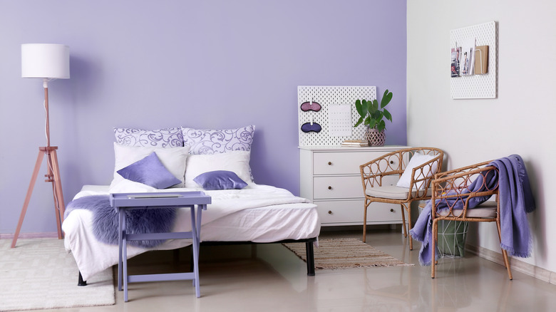
Soft lilacs are introduced as a fresh take on purple, offering sophistication and calmness. Benjamin Moore's Peace and Happiness or Touch of Gray, and Farrow & Ball's Calluna, are mentioned for their ability to create a soothing atmosphere. To enhance the organic quality of lilac, the article advises pairing it with creamy whites, warm linens, natural woods, rattan, and ceramics, avoiding harsh contrasts.
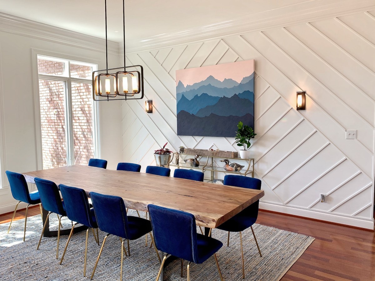
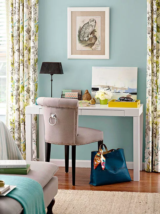
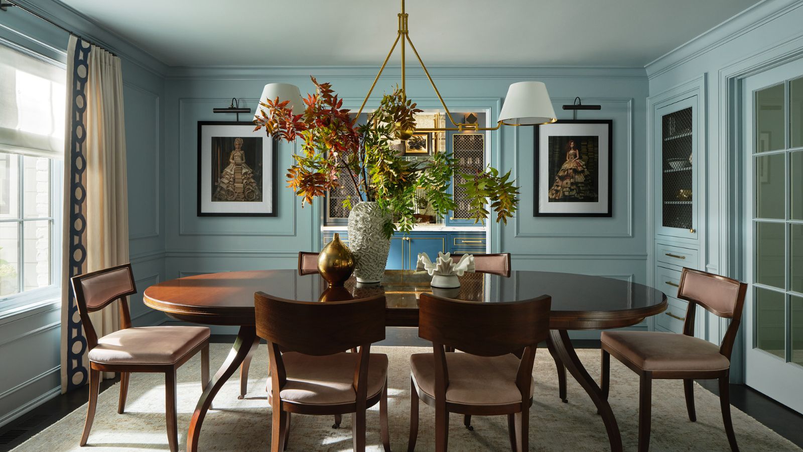
Light sky blues are recommended for their serene and crisp qualities, evoking nature with clear skies and coastal waters. Designers suggest using shades like sky blue to instantly reset a home, making it feel cleaner and more breathable. These blues pair well with warm materials like white oak, natural stone, linen, soft ivories, and touches of unlacquered brass to create an elevated feel. Wallpapers featuring light blue hues can also enhance natural light and grounding.
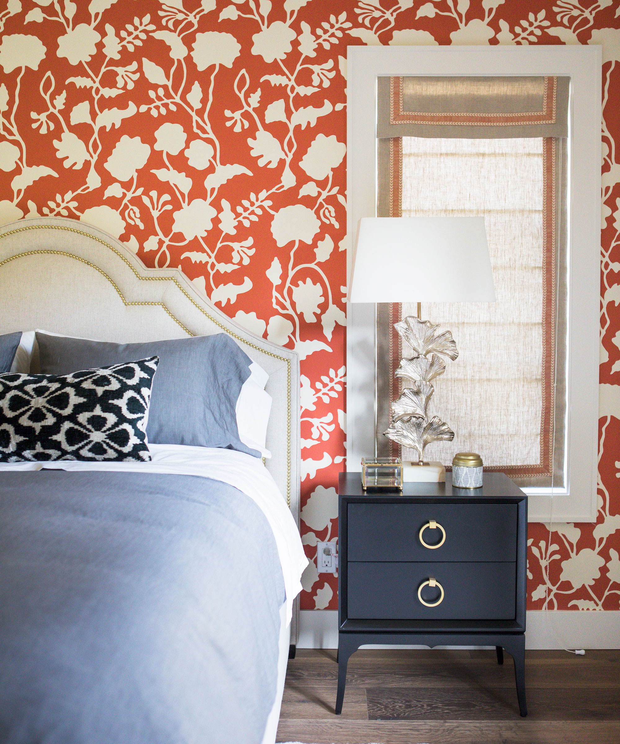
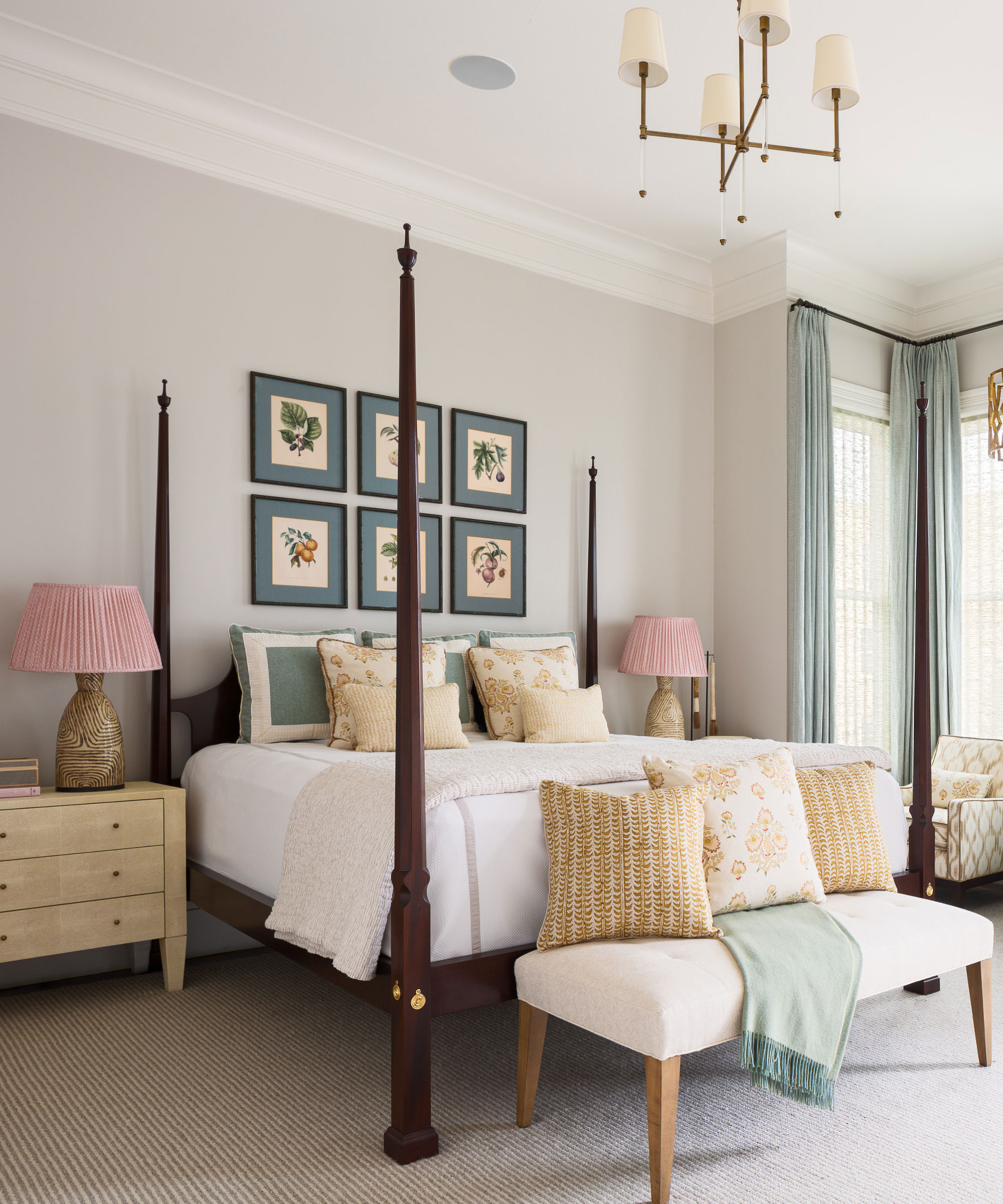
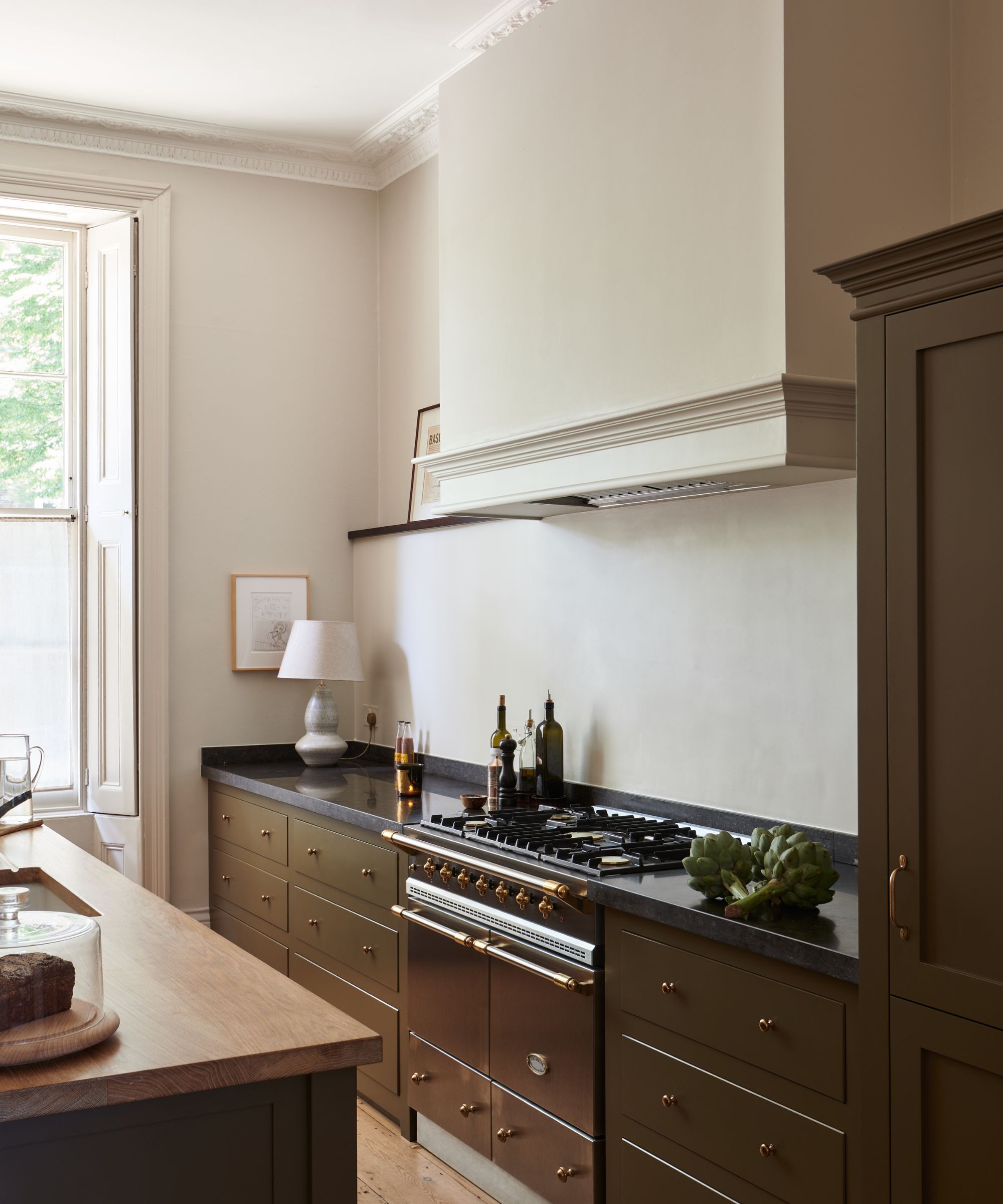
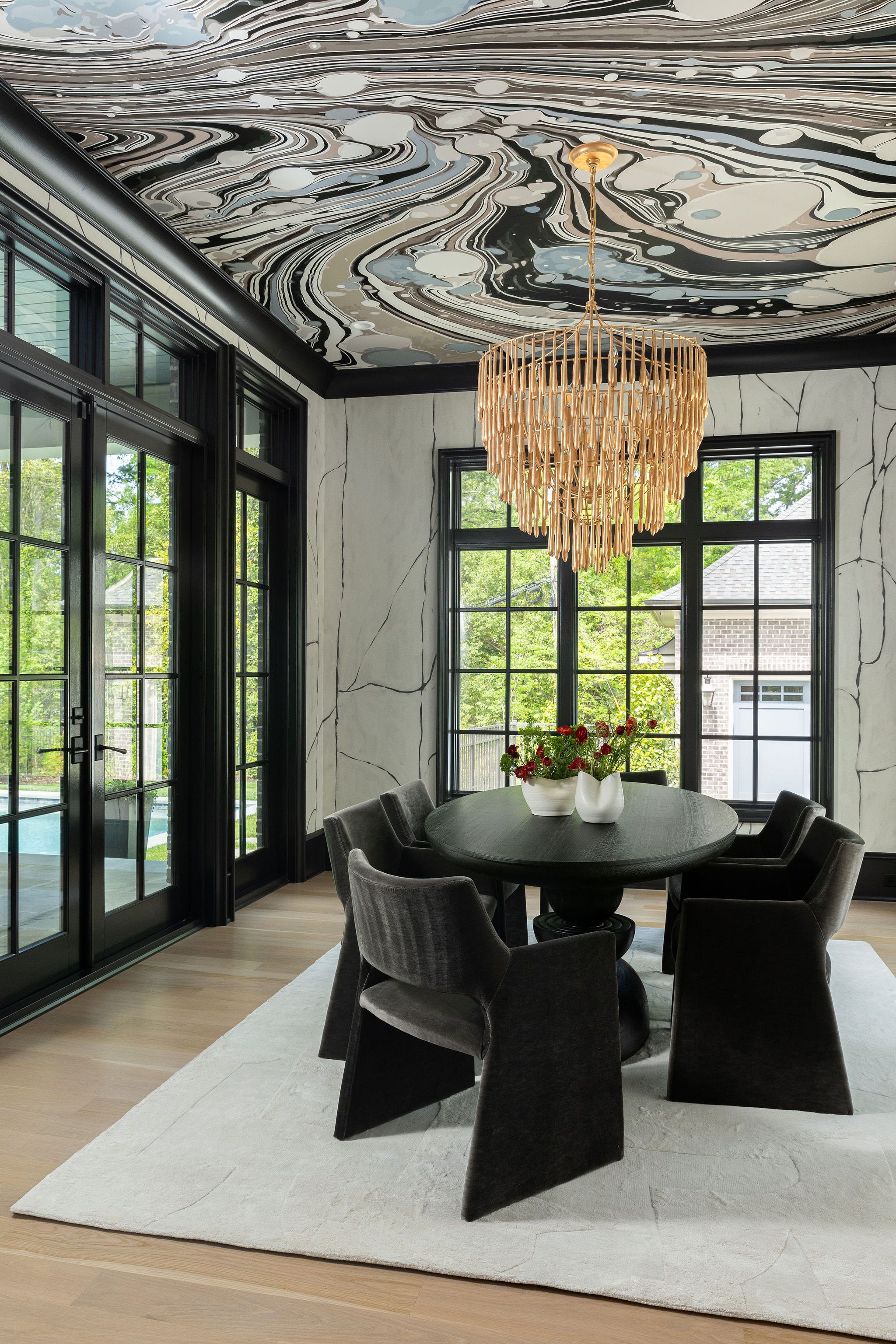
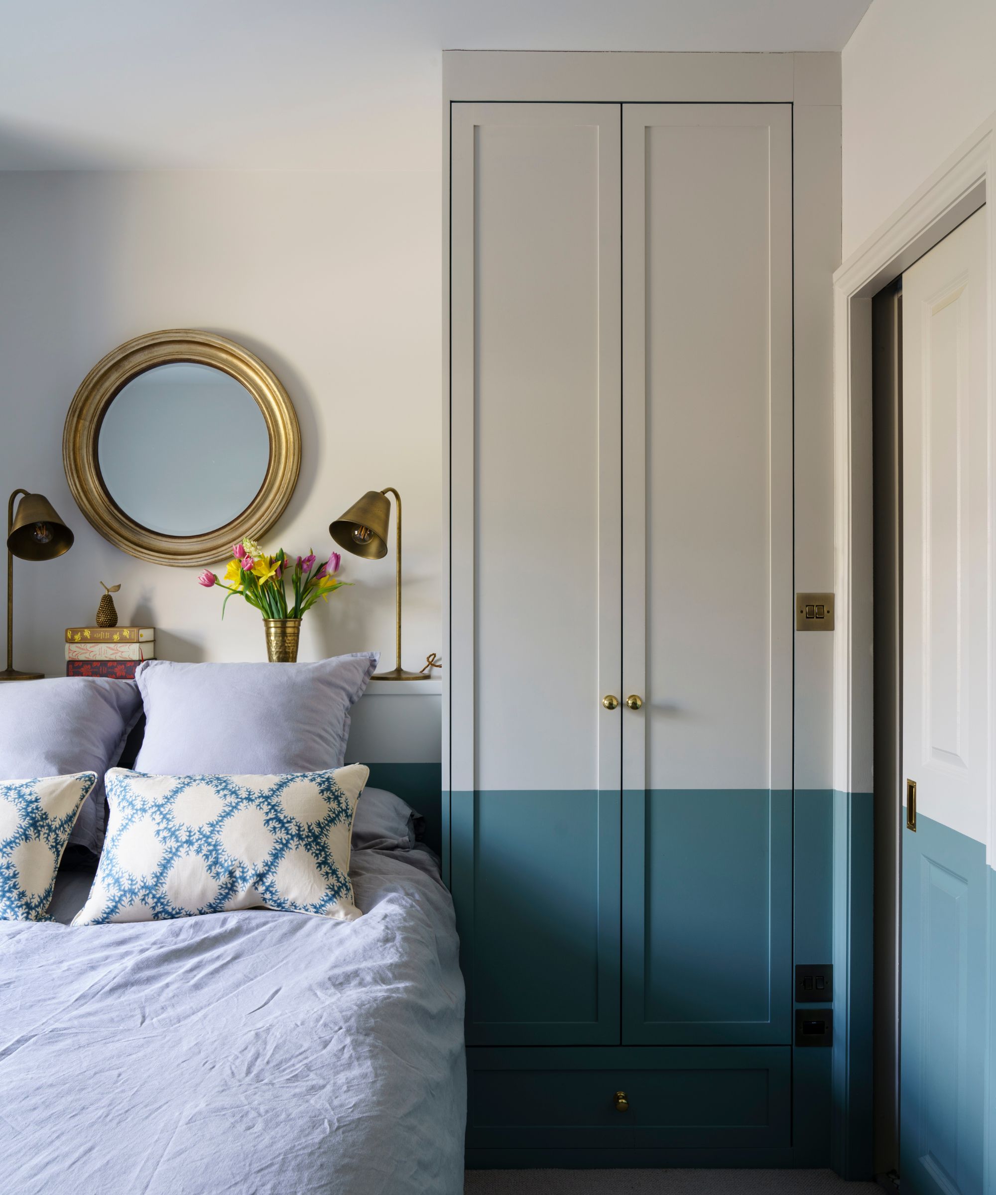
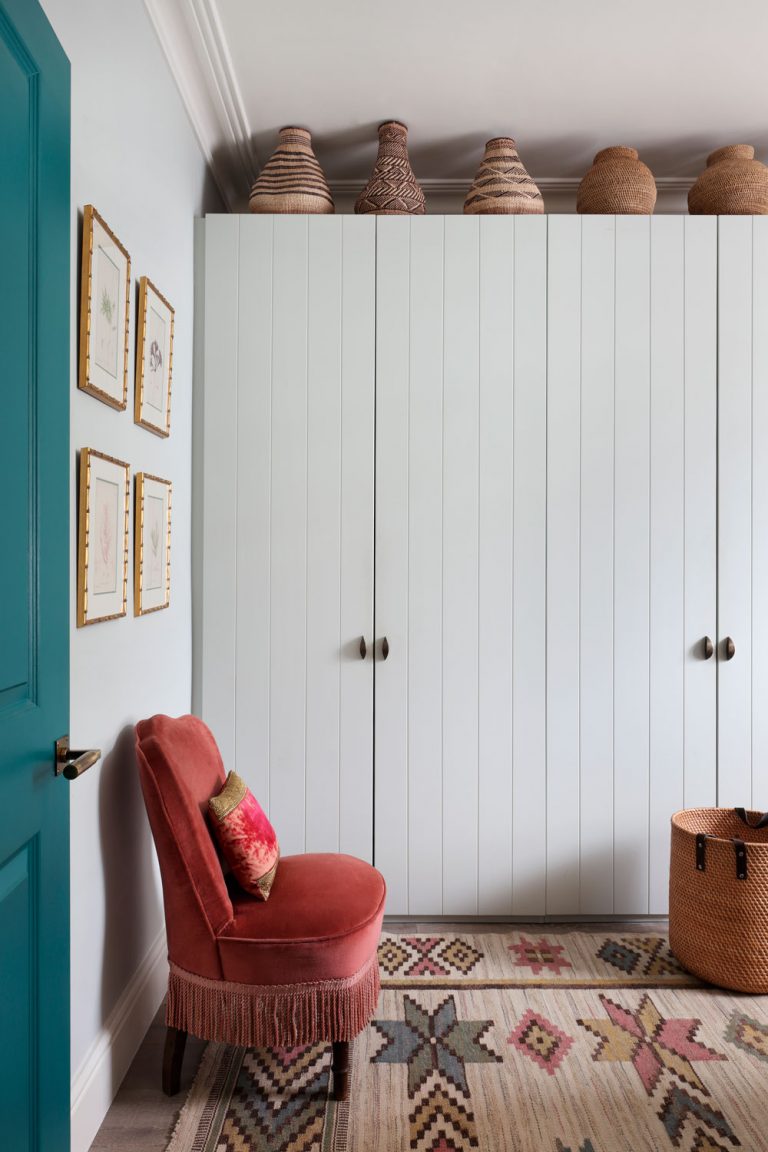
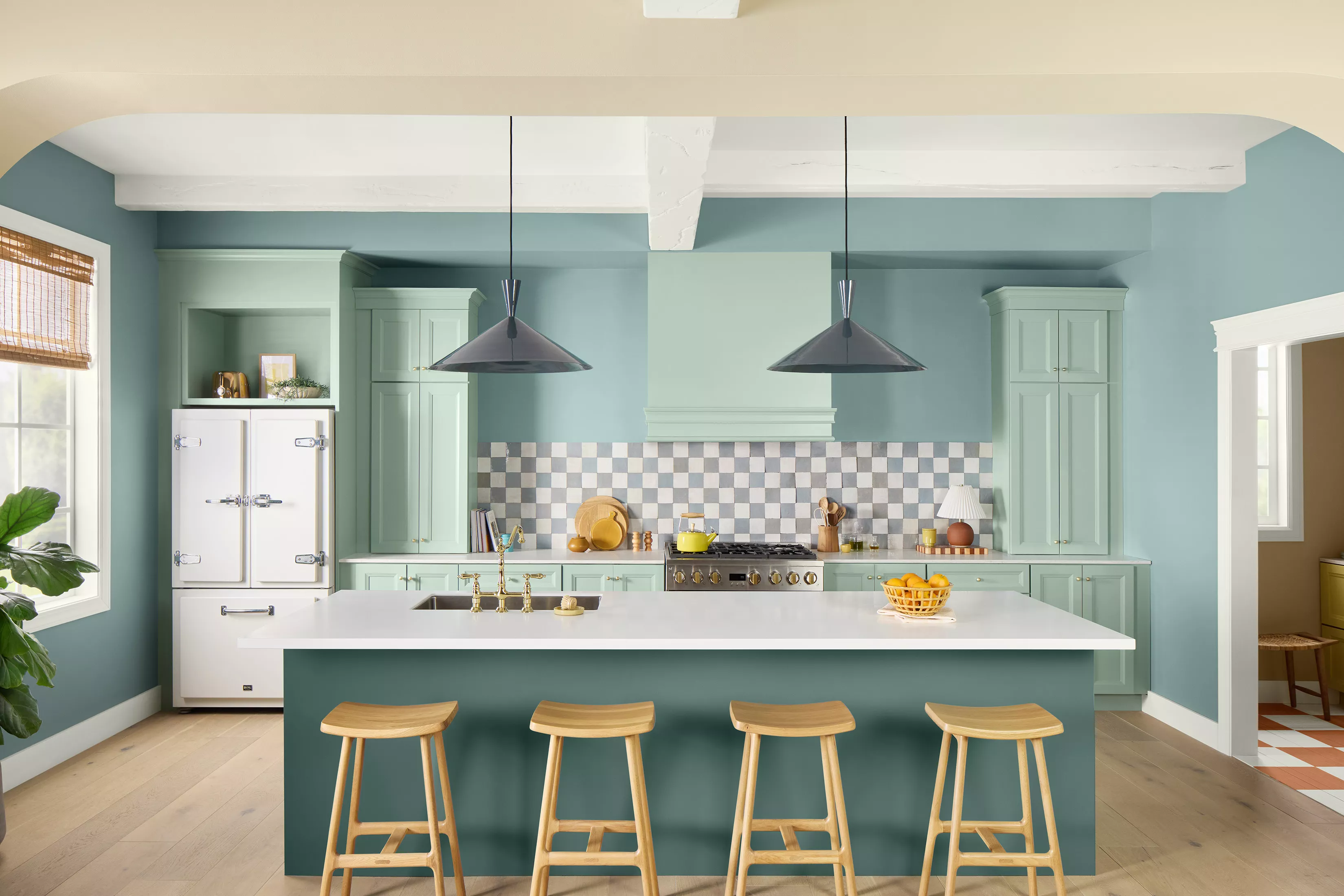
Teal, specifically softer, muted tones, is highlighted as a refreshing color that combines the calming aspects of blue and green. Benjamin Moore's Knoxville Gray is mentioned as an ideal paint color for rooms where a cocooning and restorative atmosphere is desired, such as dining rooms or bedrooms. The article also suggests incorporating smaller teal additions, like patterned cushions or whimsical wallpaper, to introduce color and freshness into neutral spaces.
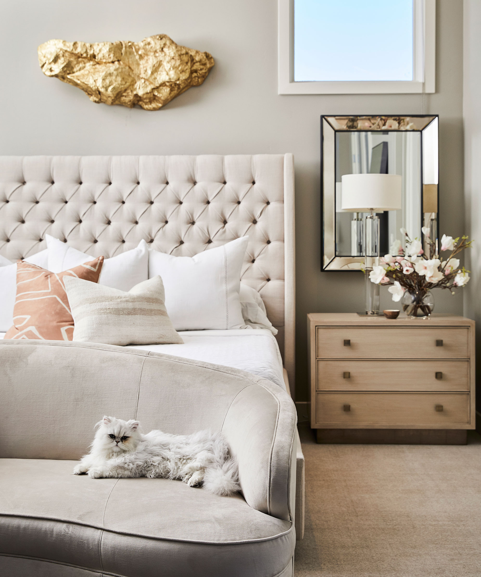
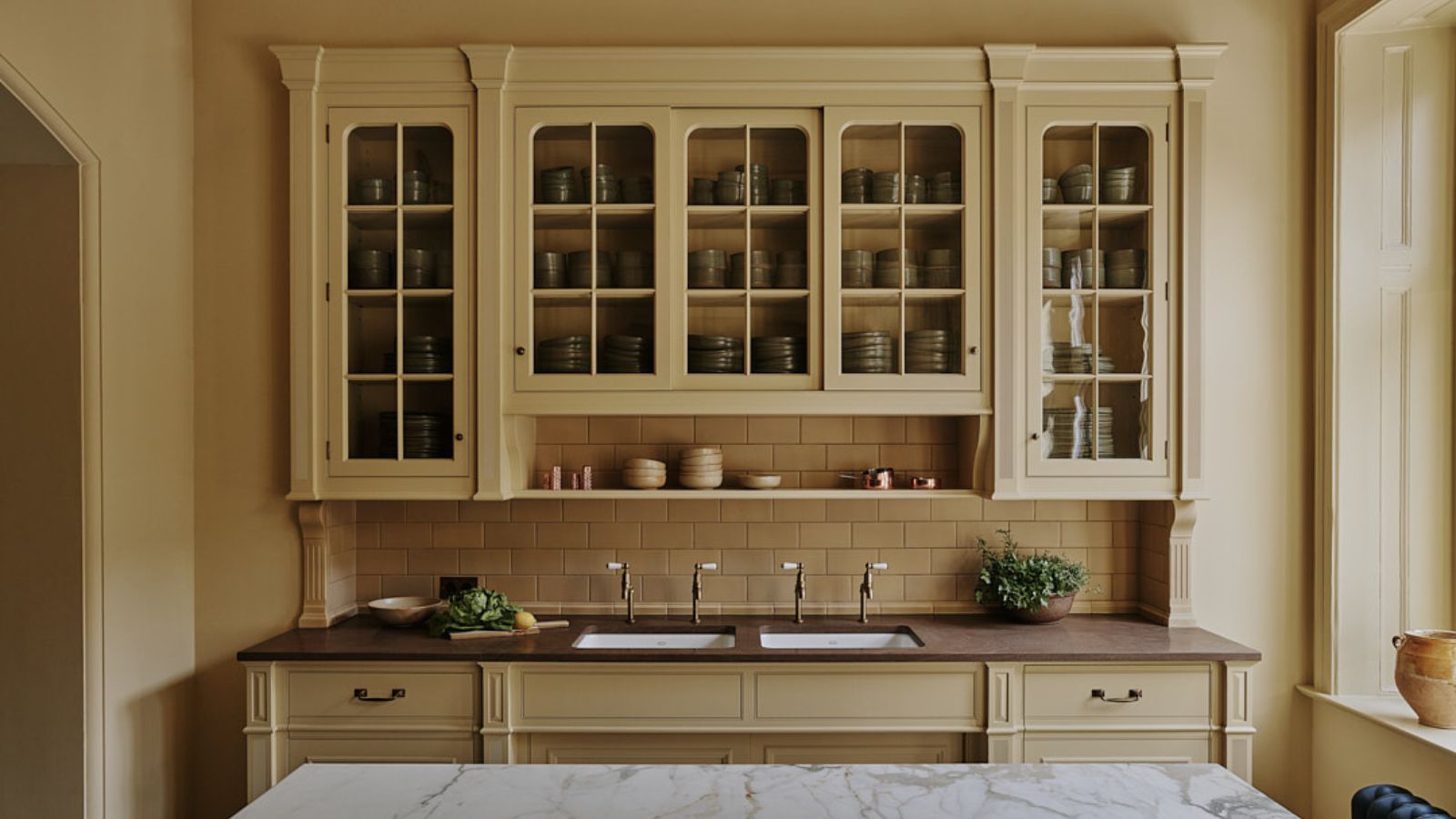
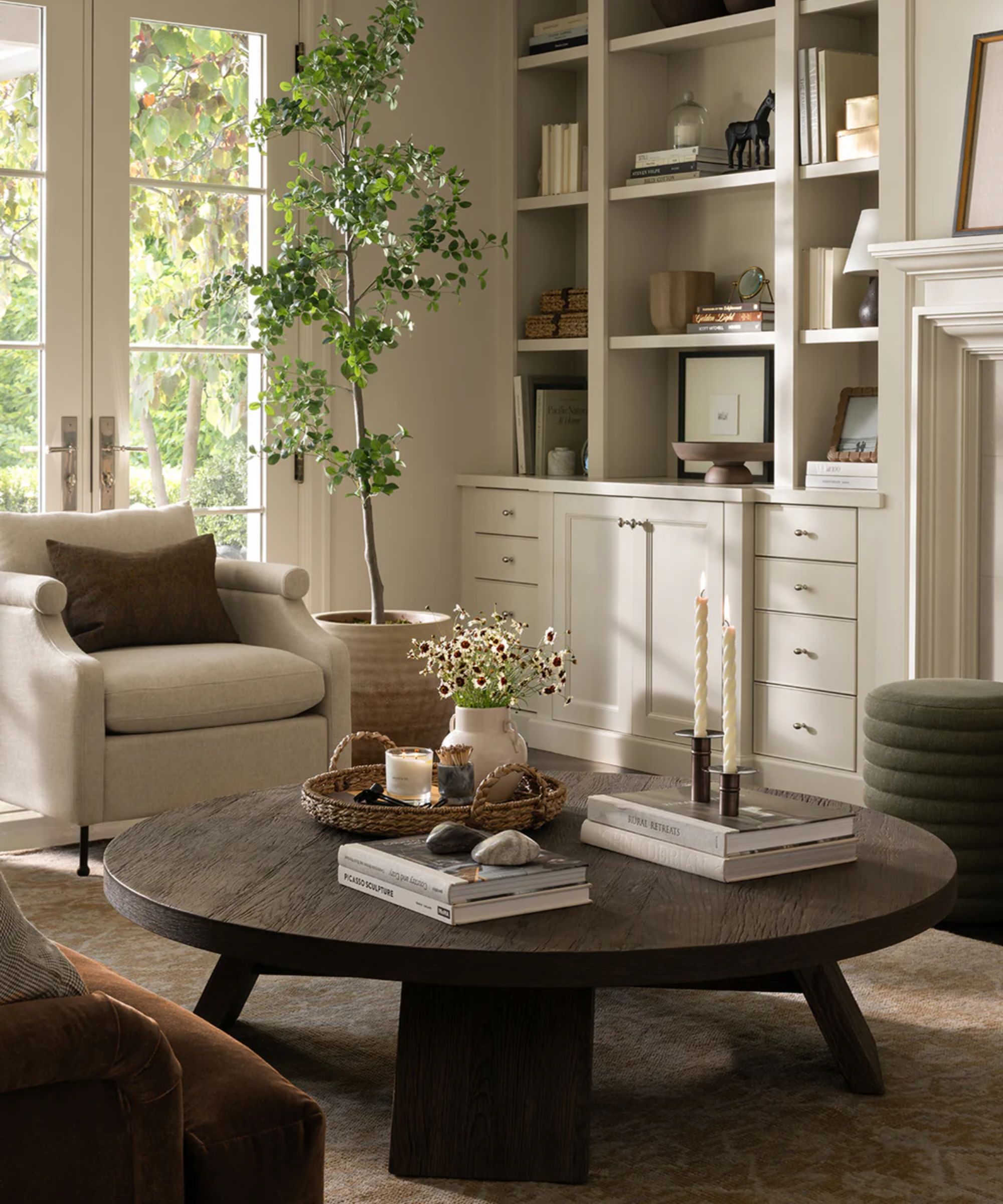
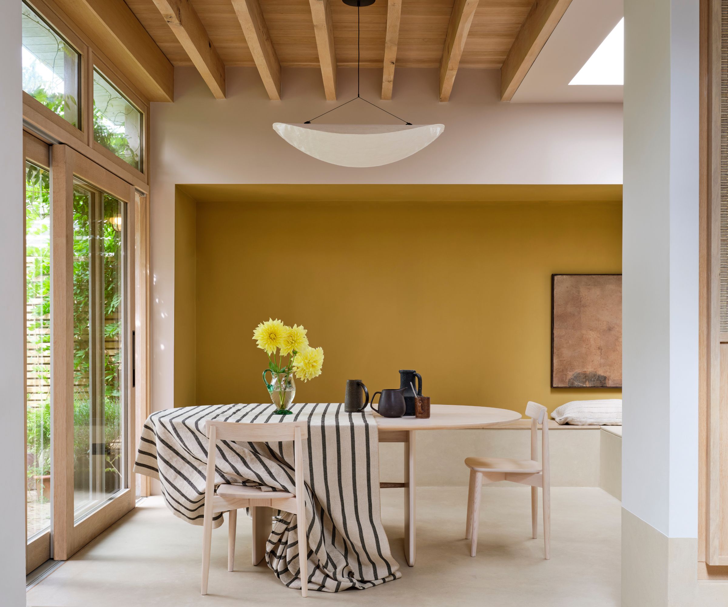
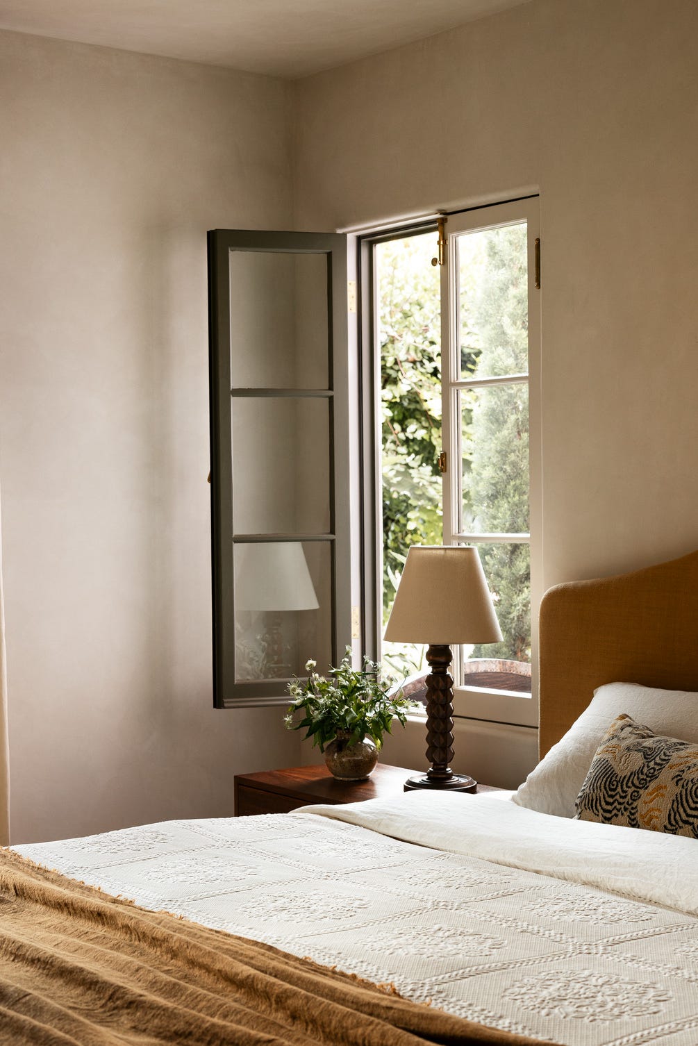
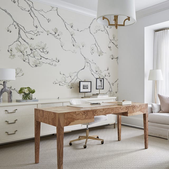
Warm beige is presented as a neutral option that brings freshness to a home. This palette creates a zen-like atmosphere, promoting clarity and calm. Luxurious textiles such as velvet and textured mohair are recommended for pillows or drapery to add warmth and a layered feel. Subtle blush accents can also be introduced to complement the neutrals without overpowering the space.
Finally, gray with a hint of blue is discussed as a nuanced way to maintain a neutral scheme while avoiding a drab appearance. Benjamin Moore's Brewster Gray is praised for its soft, uplifting, and fresh qualities, acting as a timeless shift from pure neutral. Combining Brewster Gray with Benjamin Moore's Swiss Coffee on walls and ceilings can create a crisp, clean, yet warm and inviting atmosphere, providing a balanced blend of charm and modernity for the new year.
#ColorTrends #InteriorDesign #HomeDecor #SpringRefresh #PaintColors #NeutralPalette #GreenHues #BlueShades #PinkTones #LilacDecor #ColorTrends #InteriorDesign #HomeDecor #SpringRefresh #PaintColors #NeutralPalette #GreenHues #BlueShades #PinkTones #LilacDecor
0 commentaire au total
Vous aimerez aussi
The Color Palettes Currently Inspiring Domino Editors

Say goodbye to winter blues with these 8 spring living room ideas that will feel like a breath of fresh air for your space
7 New Interior Design Books to Inspire Your Spring Home Refresh

21 Designers Share Their Color-Trend Predictions for Spring
11 spring color ideas for bedrooms – to make your home look lighter, brighter, and bigger
7 spring home decor ideas to refresh your home for the season

20 Spring Color Combos That will Brighten Your Home No Matter the Season

These Are the New Floral Prints Designers Are Loving

2023 spring trends: decorate your home with this season's colours

The Spring Color Trend That'll Make Your Home Feel Refreshed

15 Unexpected Spring Home Trends That Will Define the Season

Spring bedroom ideas – 10 ways to refresh and reinvent your sleep space
7 Spring Paint Colors to Freshen Up Your Space, According to Designers

15 ways to add color to your home, according to interior designers
Sorry pastels, there's a new color palette on trend for spring – and it's all about playful and more saturated hues
9 Easy Switch-Ups to Make Your Bedroom Feel Like Spring — For Light, Bright, and Optimistic Spaces

These are the 6 must-have colors to decorate with in April 2025
How To Decorate the Home for Spring: 19 Full-Colour, Floral-Inspired Ideas
How To Style Your Home With Spring Styling Trends
8 Spring Color Schemes the Paint Pros Are Raving About for 2025