




1/3
Now More Than Ever, I Need (Not Want) Plaster Walls
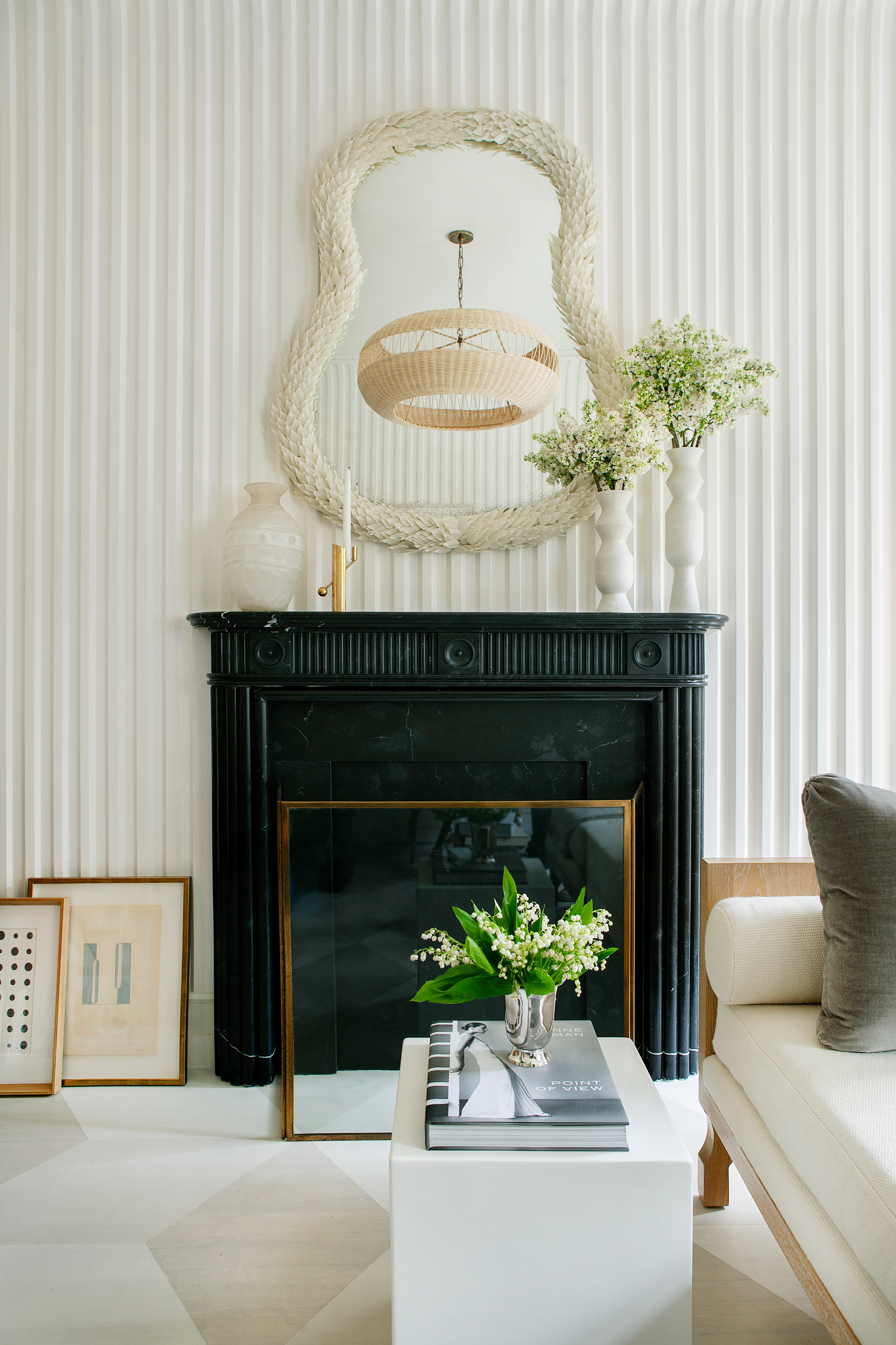
The author shares a long-standing appreciation for plaster walls, tracing it back to a specific wall color, "London Fog" by Benjamin Moore, at a furniture store in Sag Harbor, New York, in August 2016. The walls, finished in a matte Venetian plaster, struck a perfect balance of color and texture, initiating a desire for such a finish in their own home. This desire was reignited by a visit to the Kips Bay Decorator Show House, where multiple rooms showcased plaster walls in contemporary applications, ranging from moody matte green in bathrooms to bright ivory spaces with three-dimensional stripes.
The article emphasizes that these were not traditional Venetian plaster applications but modern interpretations, utilizing current colors and unexpected techniques to make the material feel fresh and relevant. To achieve this look, the author consulted with several designers, who provided tips on incorporating plaster into a home, suggesting that the finish can evoke the feeling of a breezy Italian farmhouse.
Nashville-based designer Sarah Bartholomew contributed insights into creating a three-dimensional texture using plaster. For a living room in the show house, she utilized plaster panels with a one-inch fluted pattern, finished with a limewash paint matched to Benjamin Moore’s White Dove. Bartholomew cautioned against over-polishing plaster, highlighting that its beauty lies in its raw, matte finish. She also noted that white is not the only option for plaster, expressing an interest in using a pale blue Venetian plaster in a future project.
Pappas Miron, a design firm, adopted a different approach to plaster in an Italian-inspired powder room for the show house. Designers Alexandra Pappas and Tatyana Miron opted for Roman plaster from Ressource House of Paints in Etourneau, creating a matte, moody wall covering. They described the process as involving a rough primer, a mineral undercoat, and a final troweled plaster layer. Their preference is for minimal movement in the final coat to achieve a subtle texture that is super-chic and old-world, favoring earthy undertones and clean white looks while advising against primary colors due to the risk of making the plaster appear unsophisticated. Miron cited Belgian designer Axel Vervoordt as an inspiration for his use of matte and rough plaster elements, emphasizing its role in setting the mood of a room.
Tara Mangini and Percy Bright of Jersey Ice Cream Co., known for their plaster work in private homes and hotels, discussed their technique of mixing custom colors using pigments from Guerra Paint and Pigment. They draw inspiration from historical periods and global architectural styles, observing that traditional plaster is more common in some countries than modern wall systems. Bright advised that mastering plaster work requires significant practice, as the material offers limited working time and many potential pitfalls. Despite the learning curve, the article concludes that plaster remains a time-trusted and enduring finish for walls.
#PlasterWalls #HomeDecor #InteriorDesign #WallFinishes #DesignTips #TexturedWalls #MatteFinish #Renovation #KipsBayShowHouse #PlasterWalls #HomeDecor #InteriorDesign #WallFinishes #DesignTips #TexturedWalls #MatteFinish #Renovation #KipsBayShowHouse
 Aún no hay comentarios