




1/10
A Look Back at the Last Decade of Sherwin-Williams’ Color of the Year
This article explores the evolution of color trends over a decade by reviewing Sherwin-Williams' Color of the Year selections from 2011 to 2020. The retrospective aims to provide insight into how design inspiration and consumer preferences for interior and exterior paint colors have shifted. Each year's chosen color is presented with a brief description of its characteristics, potential applications in home design, and coordinating elements.
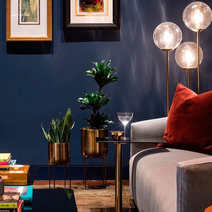
In 2020, Sherwin-Williams introduced 'Naval' (SW 6244), a deep, sophisticated blue designed to act as a new neutral. This color is noted for its ability to complement marble tiles and enhance brass fixtures, reflecting a blend of polished elegance and a connection to nature. The previous year, 2019, featured 'Cavern Clay' (SW 7701), a terracotta shade with pink undertones. Described as an earthy millennial pink, it was highlighted for its versatility in both Southwestern and Bohemian-style decors, particularly effective as an accent wall color.
'Oceanside' (SW 6496) was the choice for 2018, a bold marine blue that injects energy into neutral spaces and cools hotter accent colors. Its chameleon-like quality makes it adaptable to various design schemes. In 2017, 'Poised Taupe' (SW 6038) was selected, a complex neutral combining soft brown and gray. This color was celebrated for its depth and versatility, embodying a weathered, woodsy aesthetic that remains timeless. The 2016 pick was 'Alabaster' (SW 7006), a warm, creamy white that offers a peaceful backdrop, flattering to light and suitable for both all-encompassing applications and graphic pairings with bold blacks.
'Coral Reef' (SW 6606) brightened 2015 with its vivacious orange-red pink hue, reflecting optimism and pairing well with mid-century modern walnut furnishings or bold black-and-white elements for a vibrant, Miami-inspired look. While it was later superseded by dustier blush tones, its pairing with more recent colors like Naval is still considered beautiful. For 2014, 'Exclusive Plum' (SW 6263) was chosen, a rich blend of blue, red, and gray. This adaptable purple can create romantic, ethereal, or dramatic atmospheres depending on its accompanying furnishings and accent colors.
'Aloe' (SW 6464), a minty green, was the 2013 selection, offering a vintage callback. It was suggested to be revitalized when paired with driftwood browns or dirty neutrals, moving away from its potential 1950s diner aesthetic when combined with black-and-white floor tiles. In 2012, 'Argyle' (SW 6747), a bold green, was chosen. While originally a preppy choice, the article notes that contemporary trends lean towards deeper, jewel-toned emeralds, suggesting that integrating gray or black can modernize this shade. Finally, 2011's 'Indigo Batik' (SW 7602), a deep, gray-blue, was described as a cozy and elegant color. Its flexibility allows it to warm cold spaces, add sophistication to libraries or dens, and complement bright colors or Bohemian patterns, making it a timeless choice.
#SherwinWilliams #ColorOfTheYear #InteriorDesign #PaintColors #HomeDecorTrends #ColorTrends #HomeImprovement #DesignInspiration #DIYProjects #SherwinWilliams #ColorOfTheYear #InteriorDesign #PaintColors #HomeDecorTrends #ColorTrends #HomeImprovement #DesignInspiration #DIYProjects
 Aún no hay comentarios