1/5
How to Successfully Mix Bold Colors in Your Home Like an Interior Designer

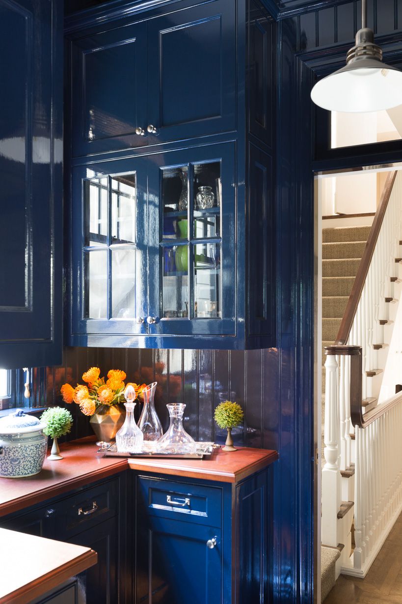
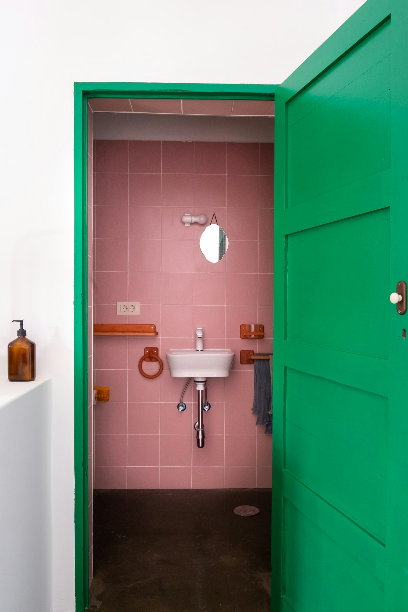
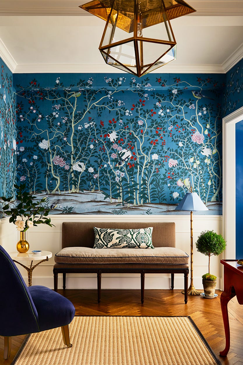
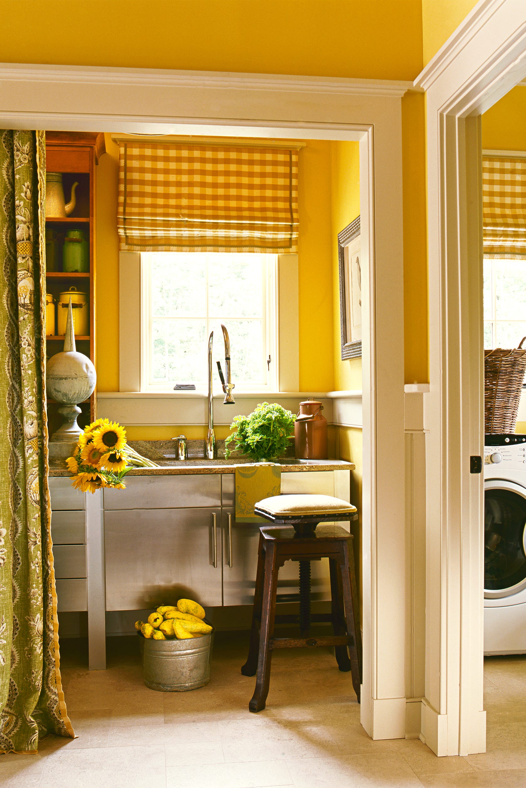
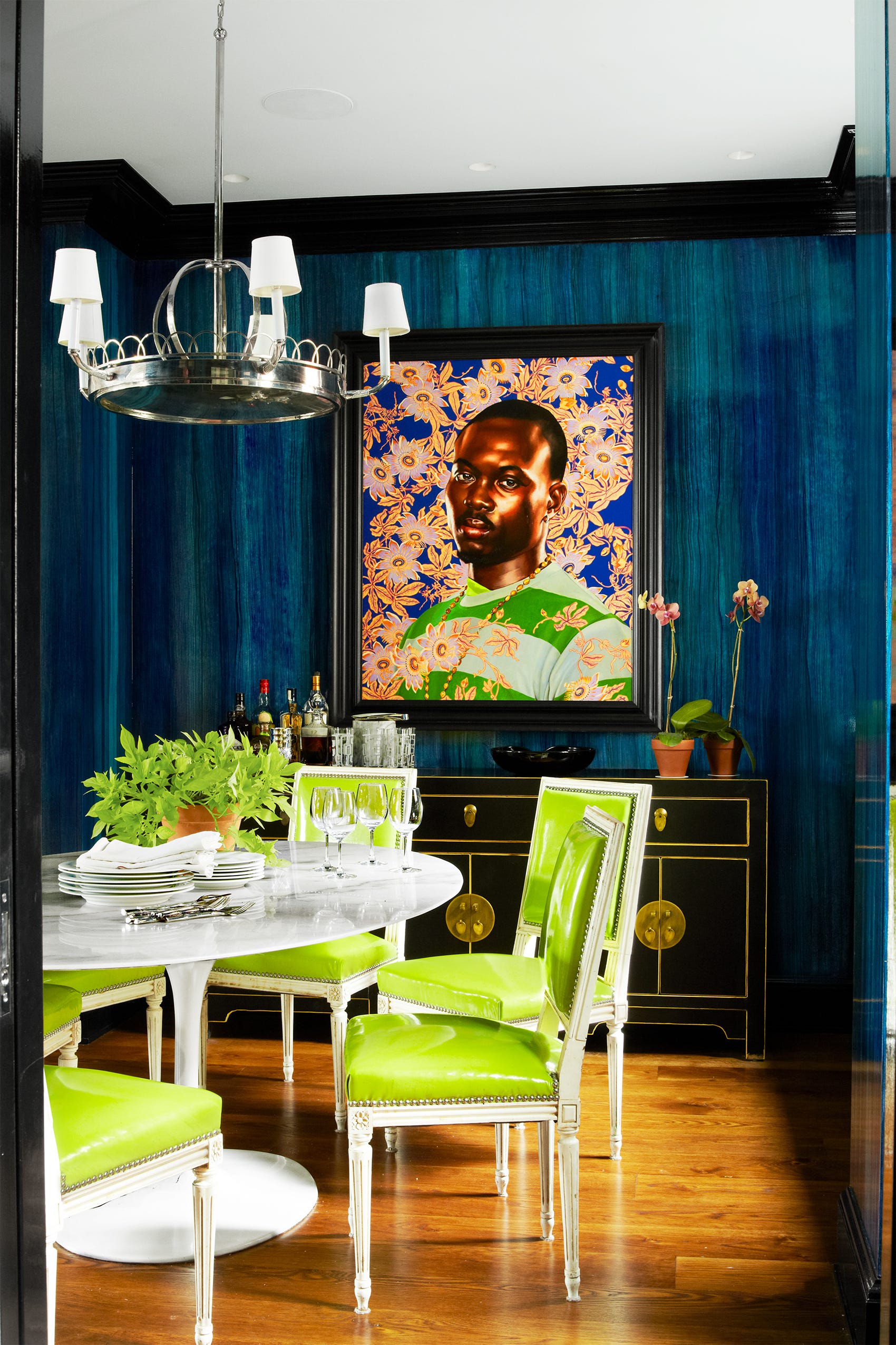
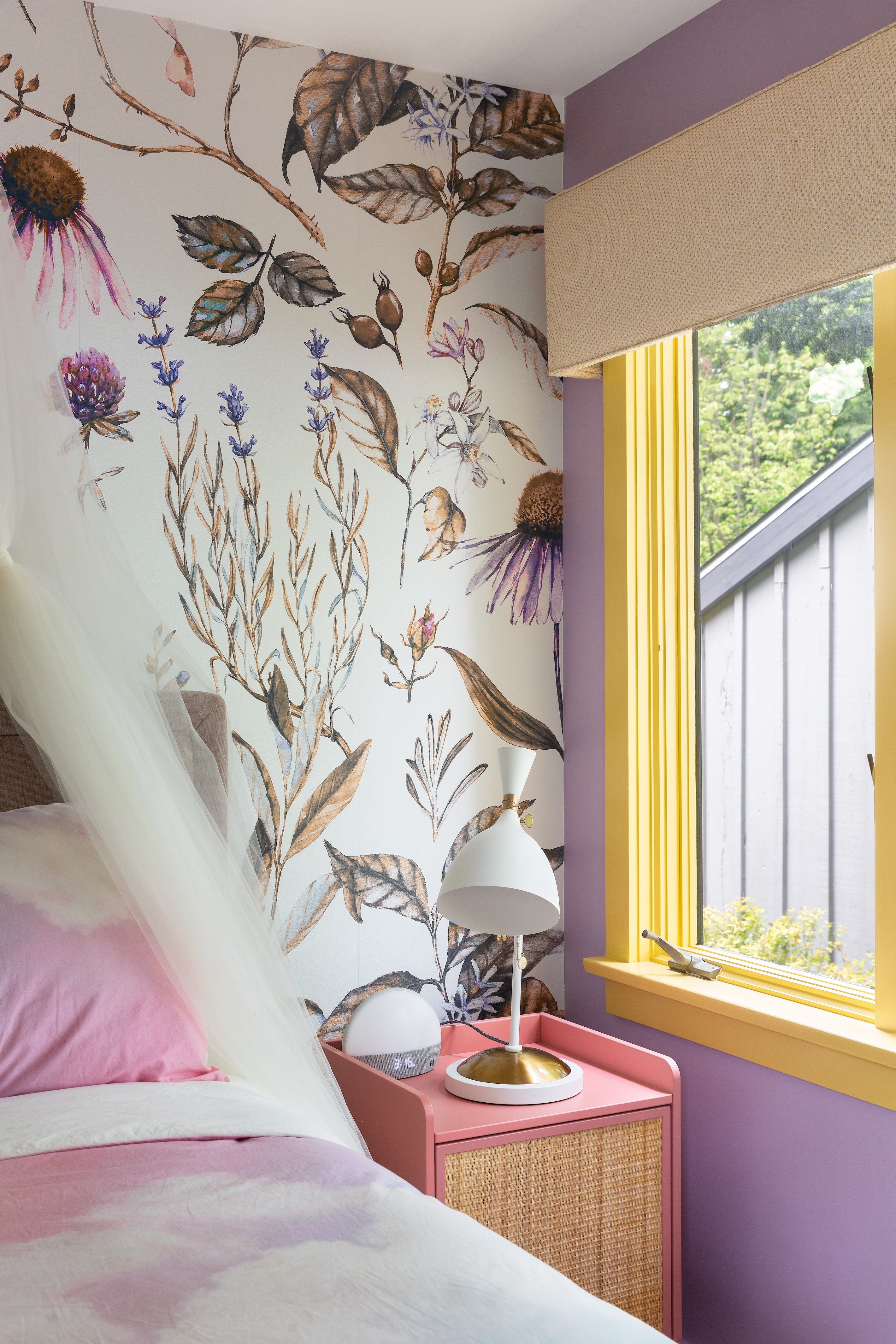
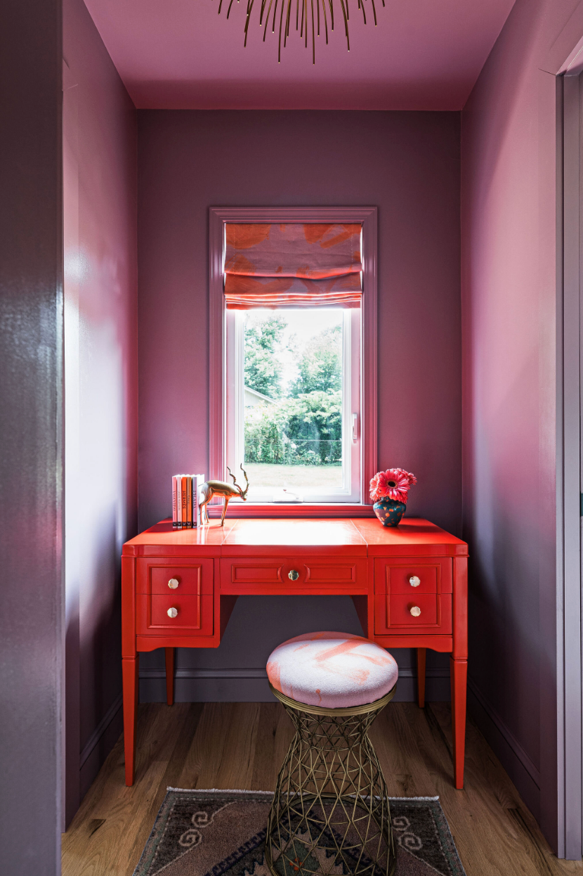
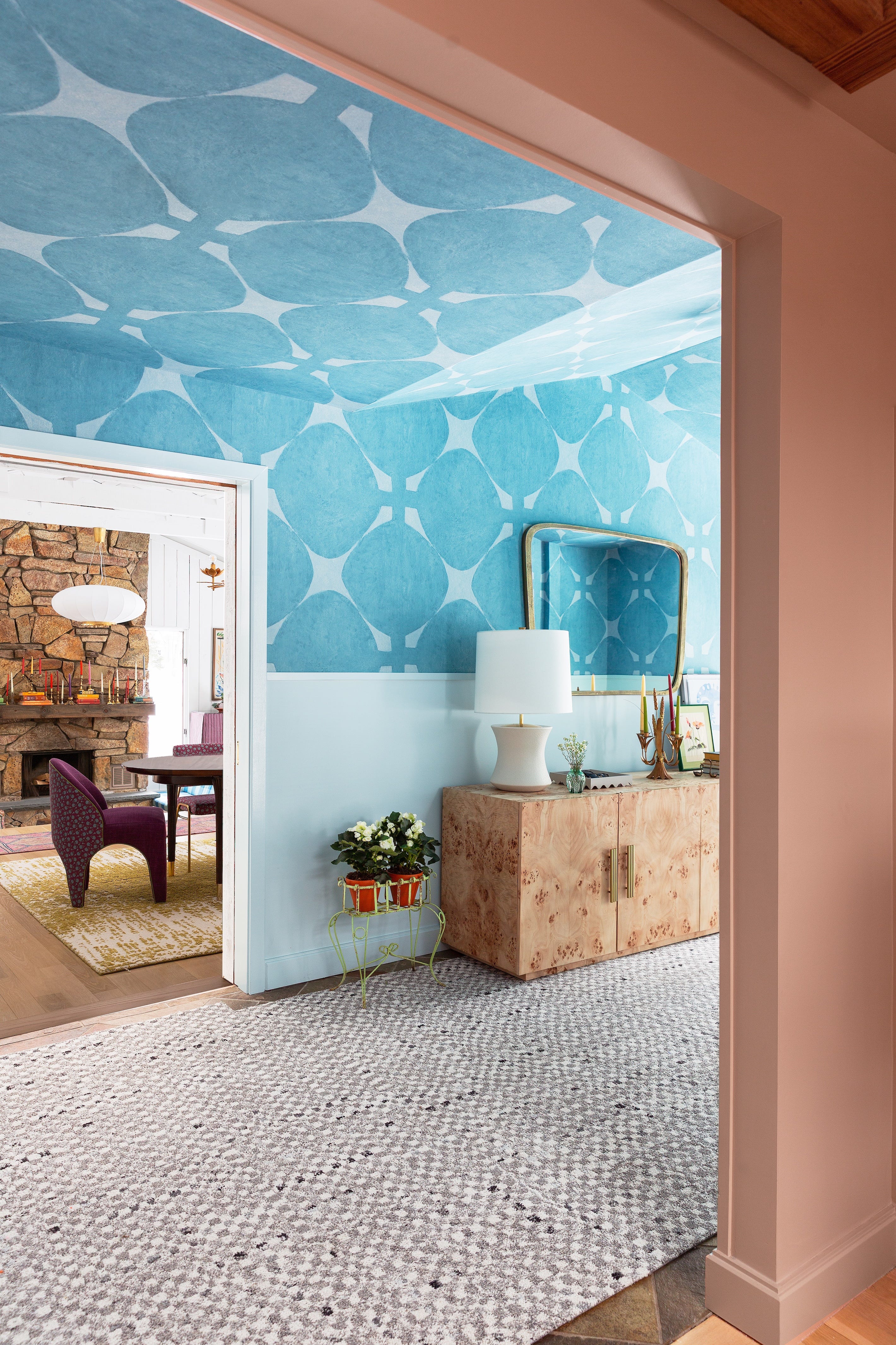
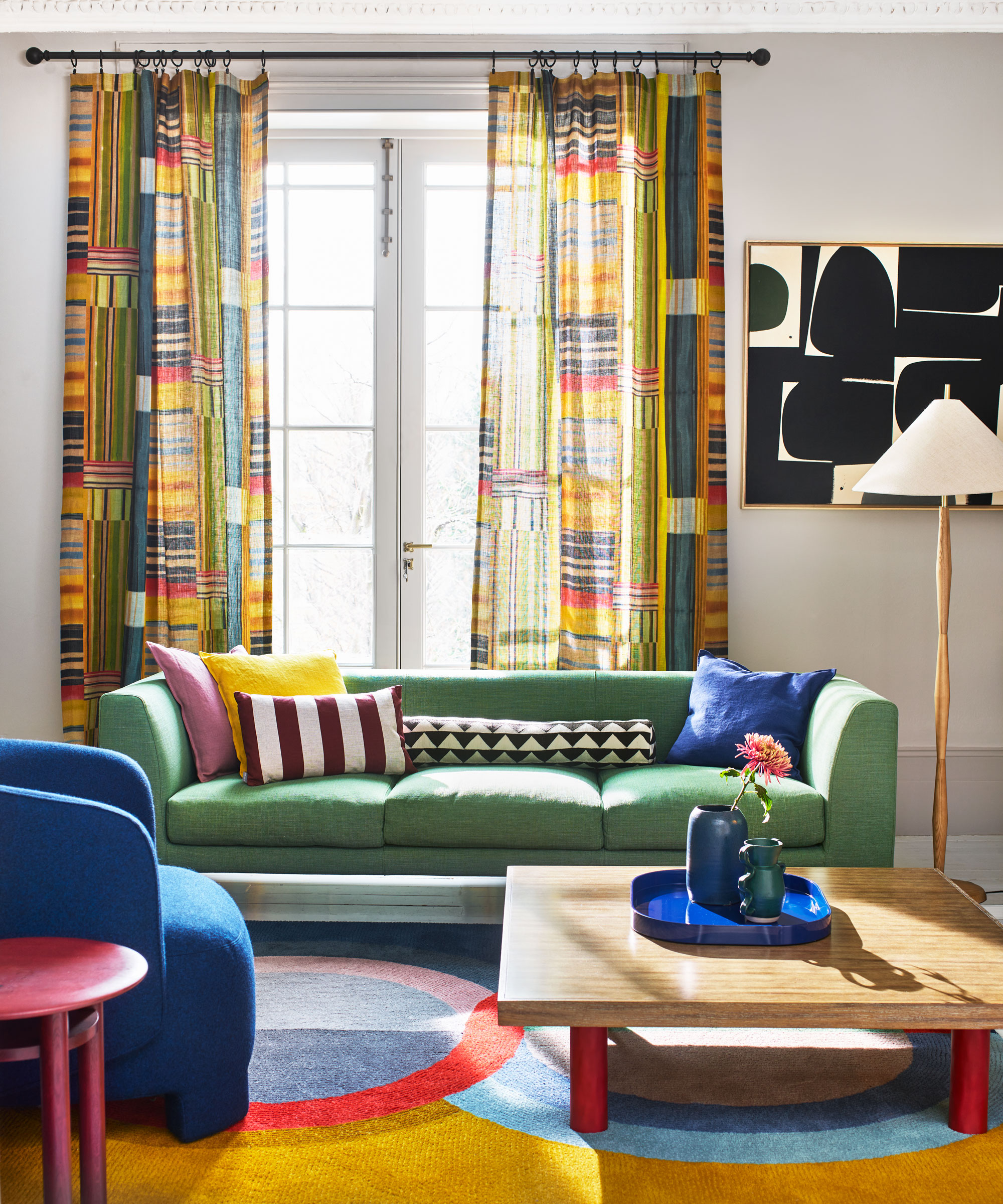
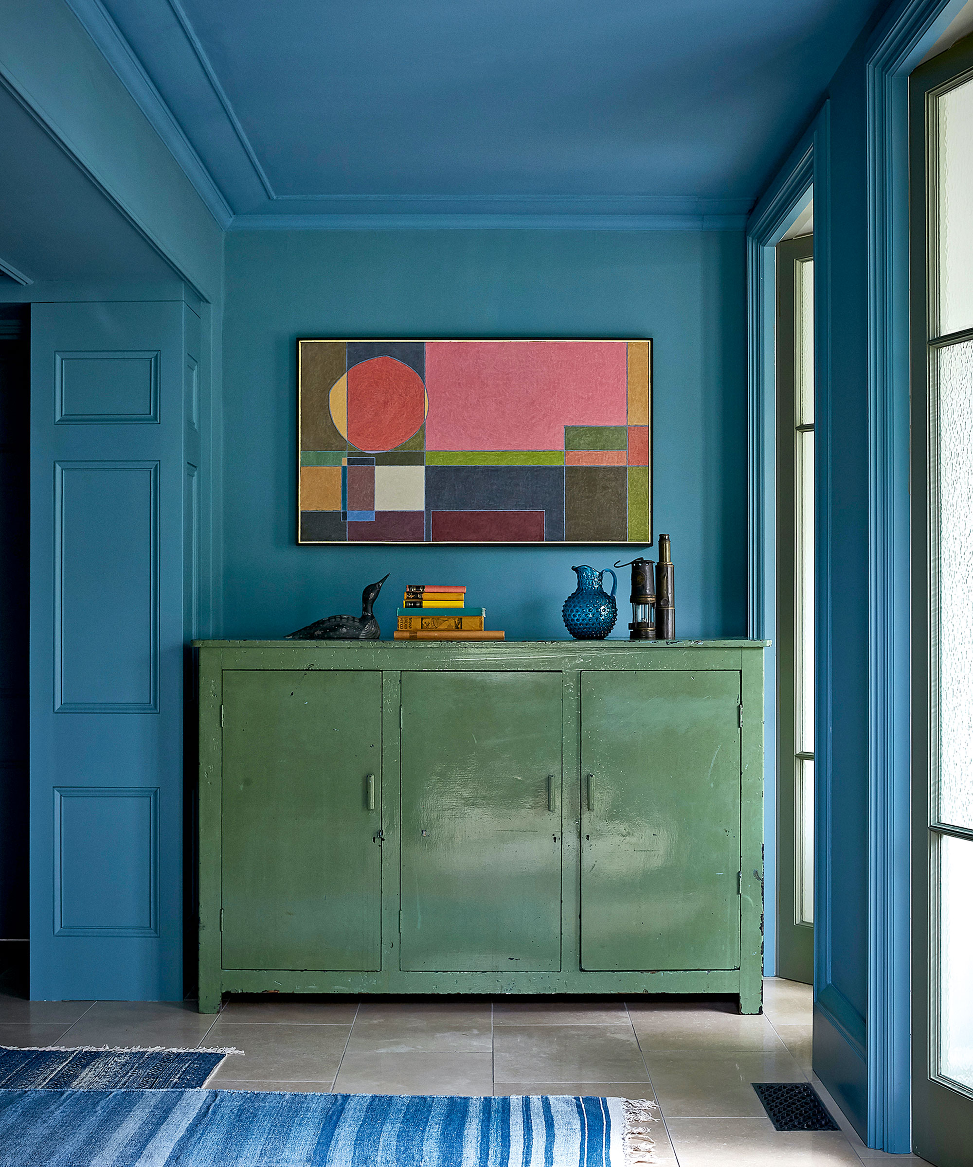
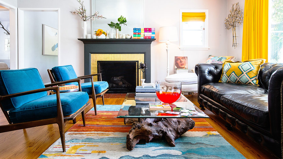
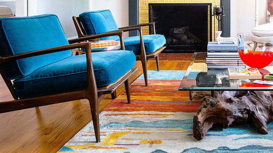
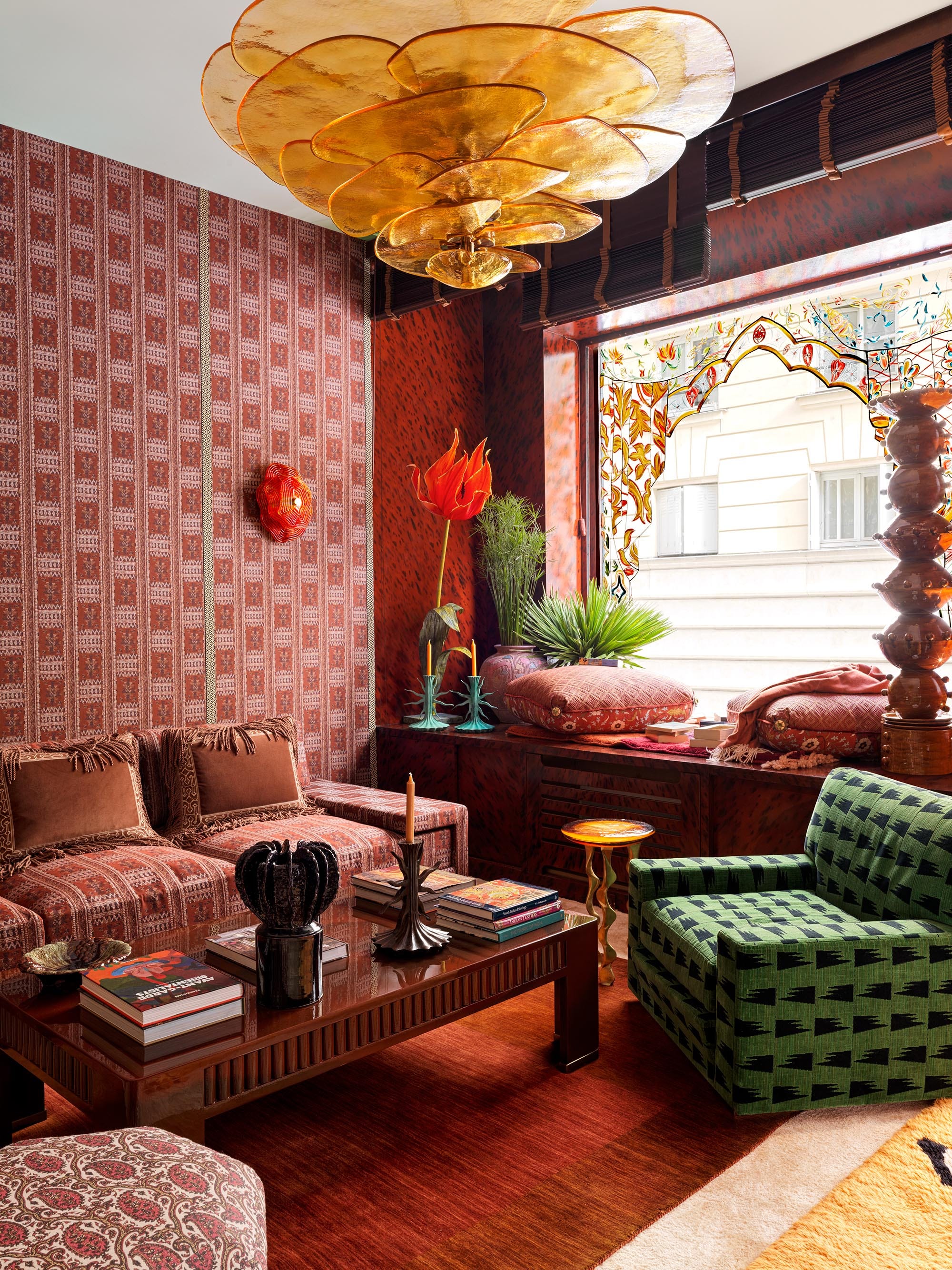
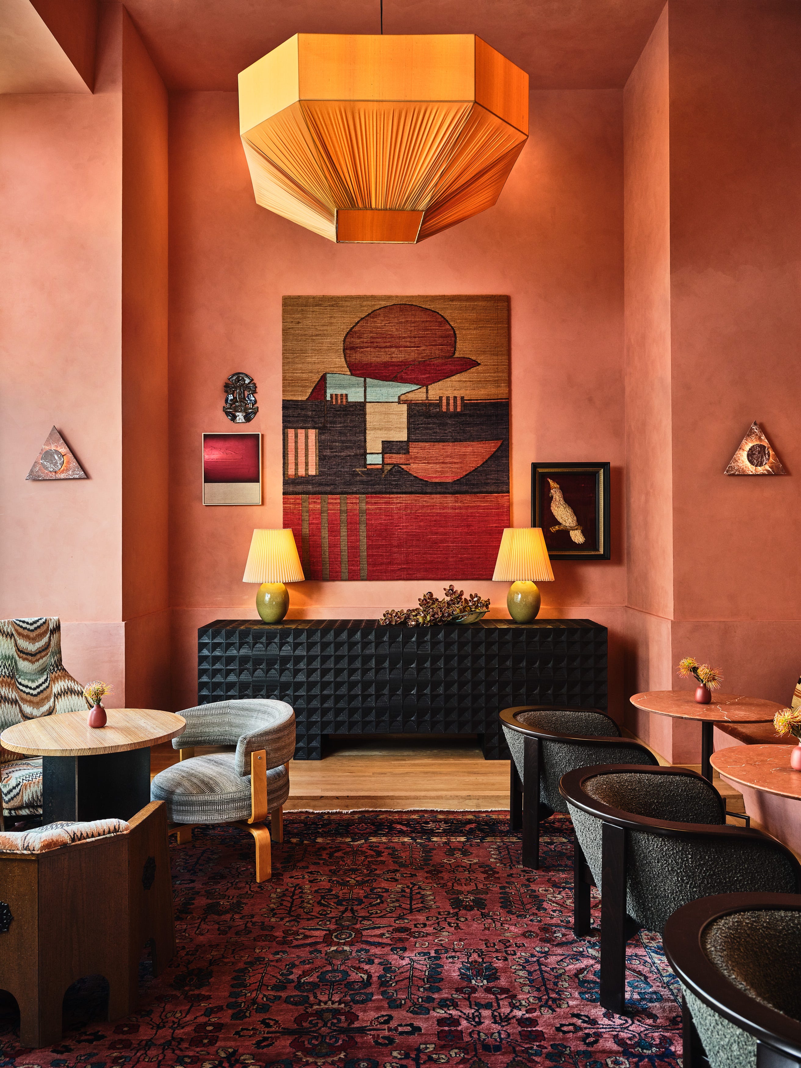
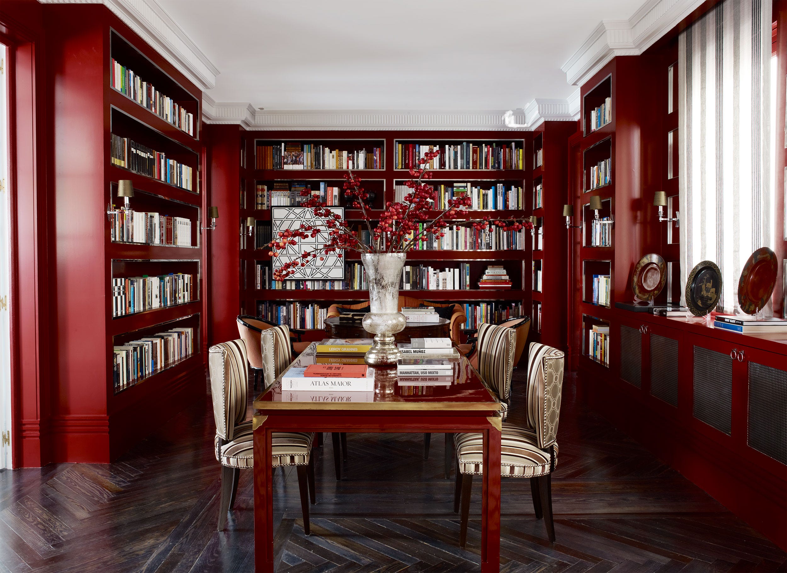
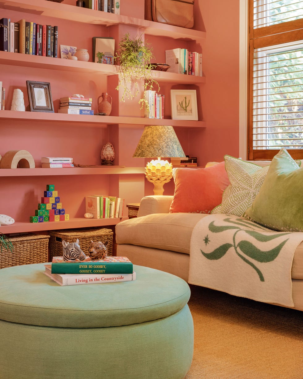
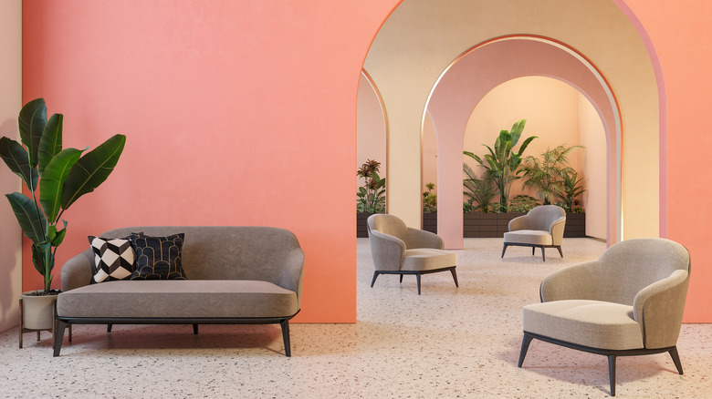
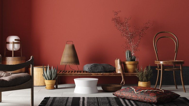
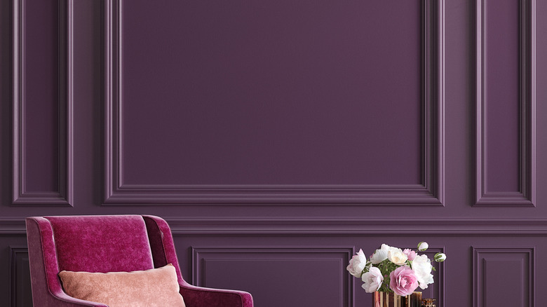
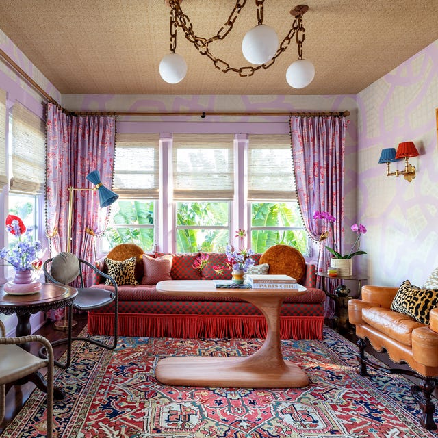
The article explores how to effectively integrate bold colors into home interiors, drawing insights from designer Noz Nozawa’s work at the Kips Bay Decorator Show House in Palm Beach. Many individuals are often reluctant to use vibrant shades in their homes due to concerns about overwhelming the space. However, the Show House demonstrated that vivid colors can significantly enhance a room’s atmosphere and encourage more daring design choices. Nozawa emphasizes that color holds substantial power in transforming a room’s mood or purpose.
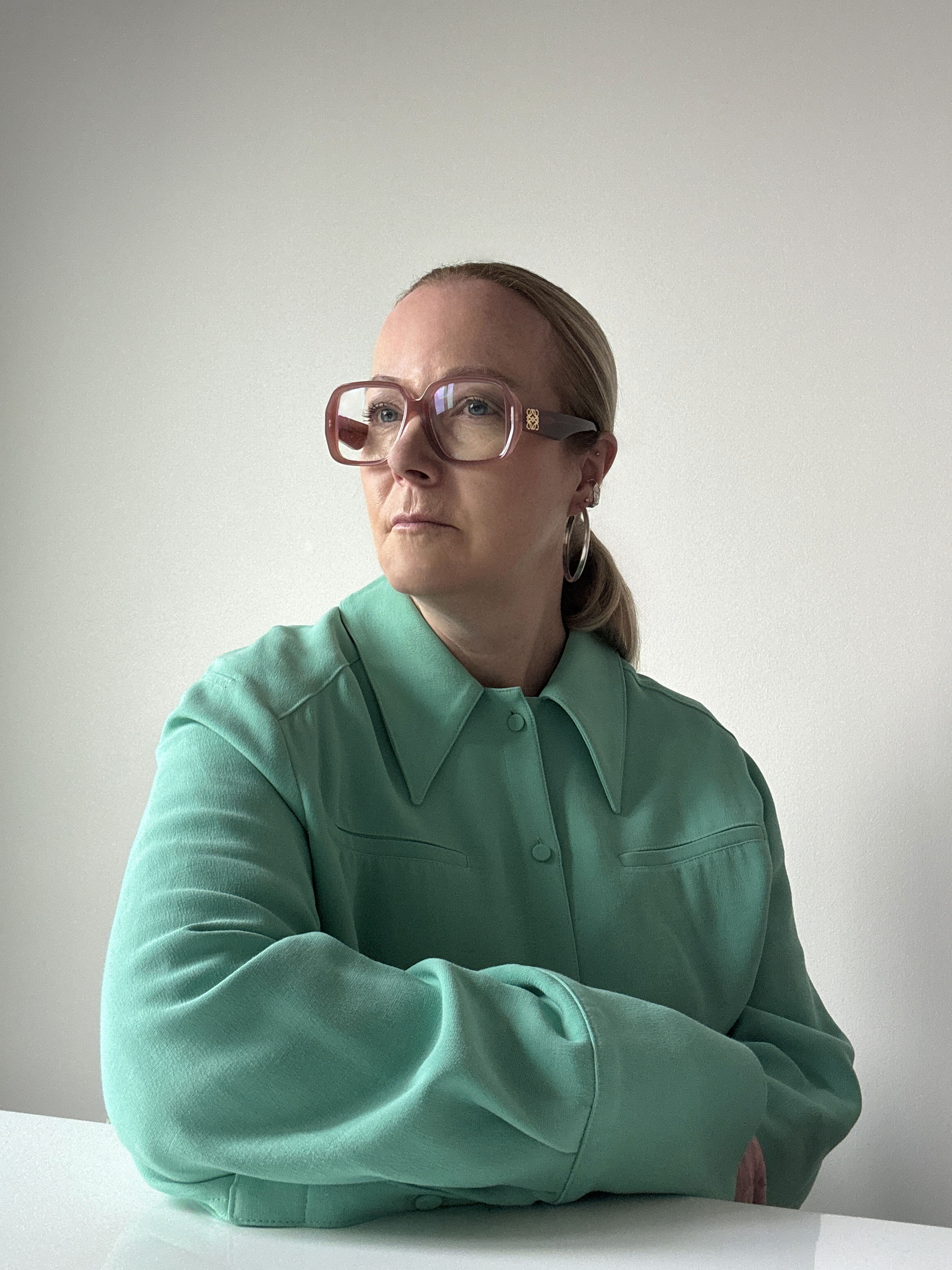
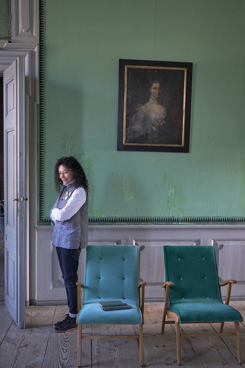
Nozawa, a San Francisco-based designer, provides practical advice for incorporating bold colors. She suggests that before selecting a color palette, individuals should observe colors that naturally attract them in their surroundings. This involves paying attention to hues noticed outside the home and reflecting on how they evoke certain feelings. Understanding personal preferences for colors, or lack thereof, serves as a crucial starting point for interior designers. Nozawa also notes that seeking a decorator’s advice, even for a color consultation, can help translate external color inspirations into suitable interior schemes. Once a primary color is chosen, consideration can then be given to the extent of its application and the complementary shades it will be paired with.
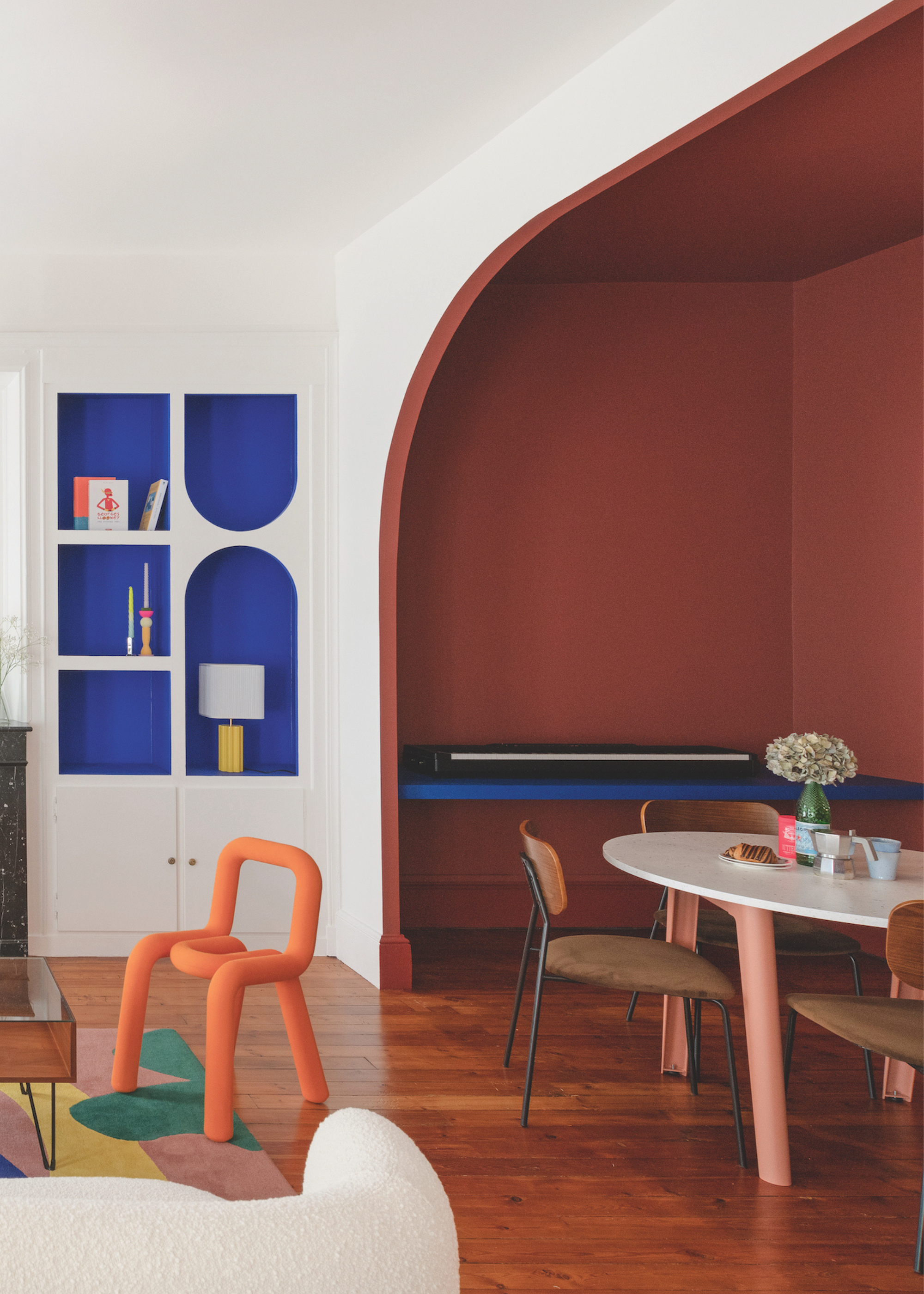
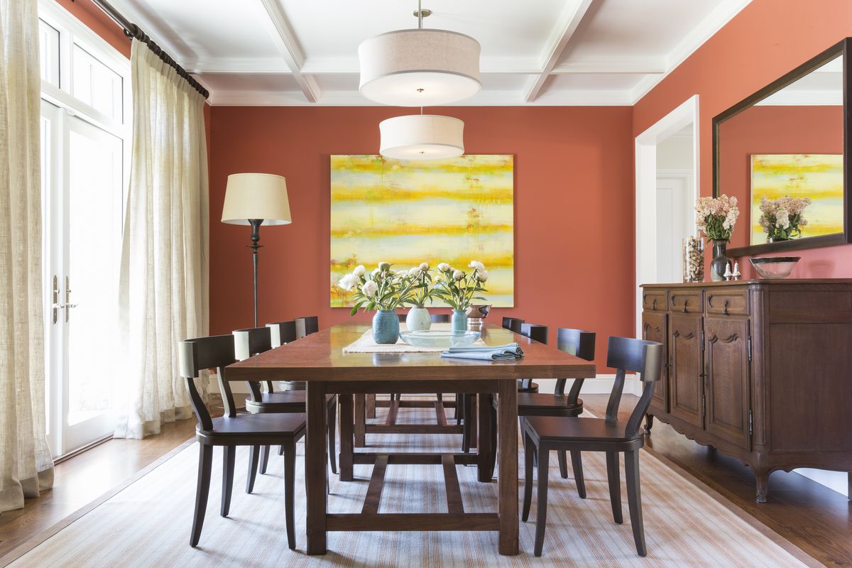
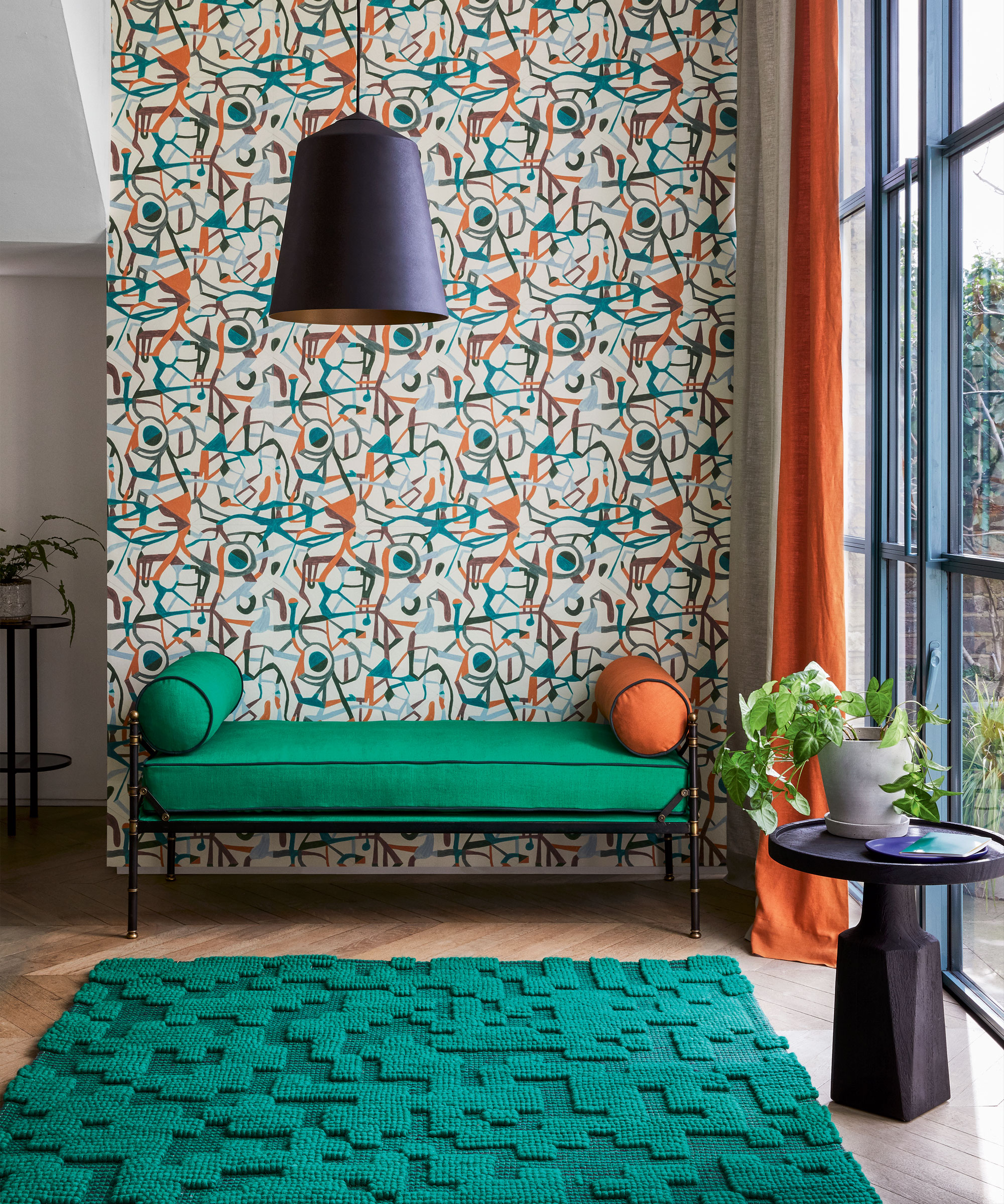
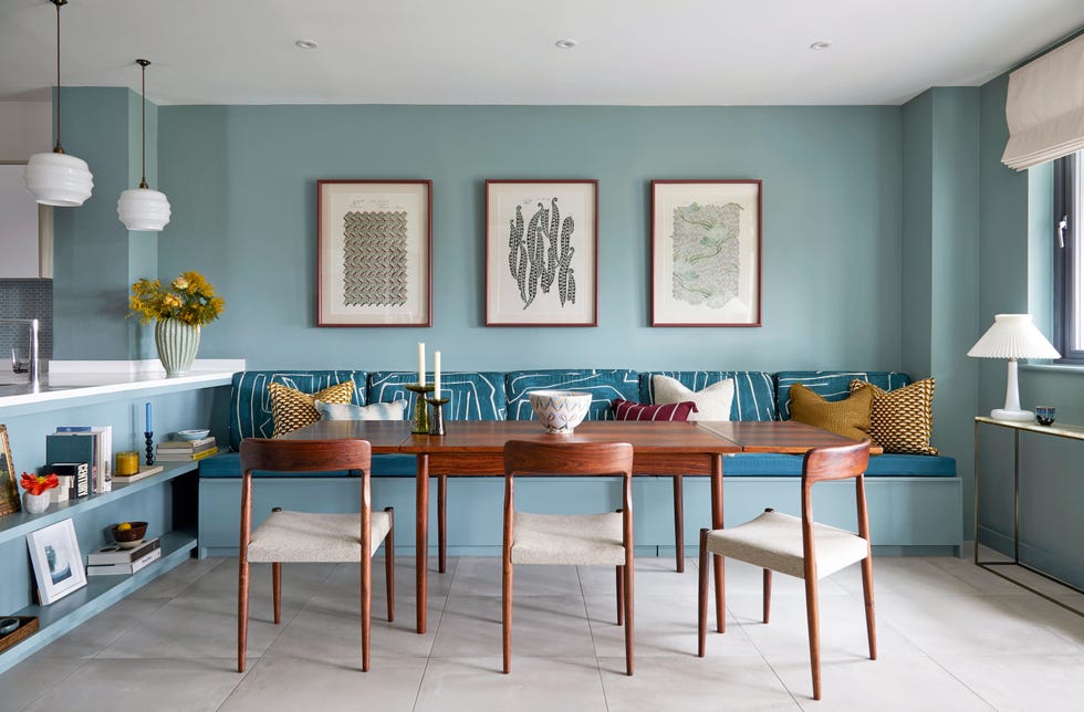
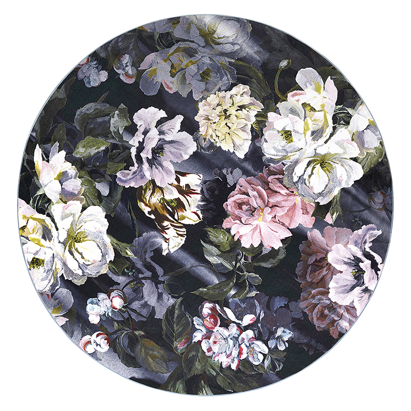
Furthermore, Nozawa advocates for the use of color theory, specifically referring to the color wheel, to identify suitable complementary shades. For instance, when working with a warm, vibrant color, she often selects a bold cool shade from the opposite side of the color wheel to achieve balance within the room. While the color wheel is a useful guide, Nozawa also highlights the value of experimentation and intuition in creating compelling color schemes. She recounts how an unexpected combination of lavender with olive greens and tomato reds emerged from discovering a particular textile. This highlights her belief that some of the most exciting color palettes originate from physically experimenting with fabric swatches and paint chips to assess their aesthetic appeal.
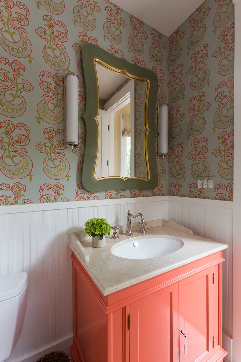
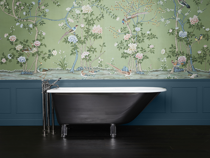
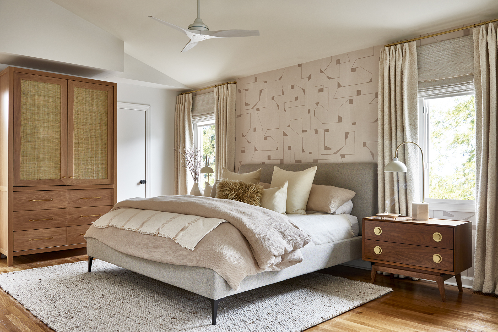
For those venturing into bright colors, Nozawa recommends minimizing the use of multiple patterns, suggesting that solid colors are easier for the brain to process without causing a sense of being overwhelmed. The objective is to achieve a harmonious balance that prevents guests from feeling overly stimulated by a colorful environment. Conversely, if patterns are preferred, she advises choosing designs with a limited color story to guide the overall room palette. Nozawa also encourages a bold approach, rather than starting with small accents like pillows or rugs. She asserts that a strong desire for vibrant change often indicates a readiness to fully embrace bold shades. She points out that even if an initial bold choice is not entirely satisfactory, colors can always be re-influenced or altered by introducing other layers of color or patterns, implying that color is dynamic and can be adjusted through further experimentation.
#InteriorDesign #ColorTheory #HomeDecor #BoldColors #NozNozawa #KipsBayShowHouse #DecoratingTips #InteriorStyling #InteriorDesign #ColorTheory #HomeDecor #BoldColors #NozNozawa #KipsBayShowHouse #DecoratingTips #InteriorStyling
0 Kommentare insgesamt
 Noch keine Kommentare
Das könnte Ihnen auch gefallen
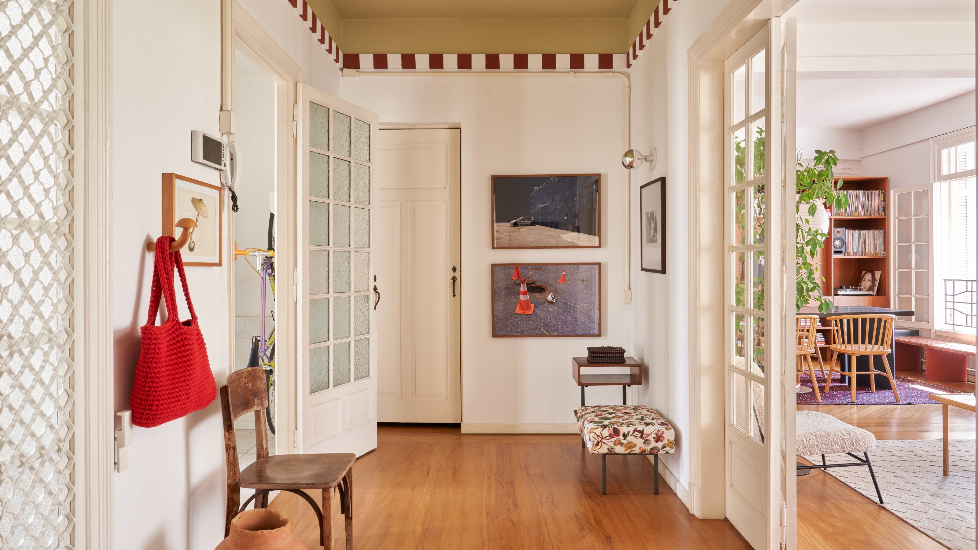
Here's How to Coordinate Paint Colors Throughout Your Home, so That It Looks Cohesive, Curated, but Still Creative

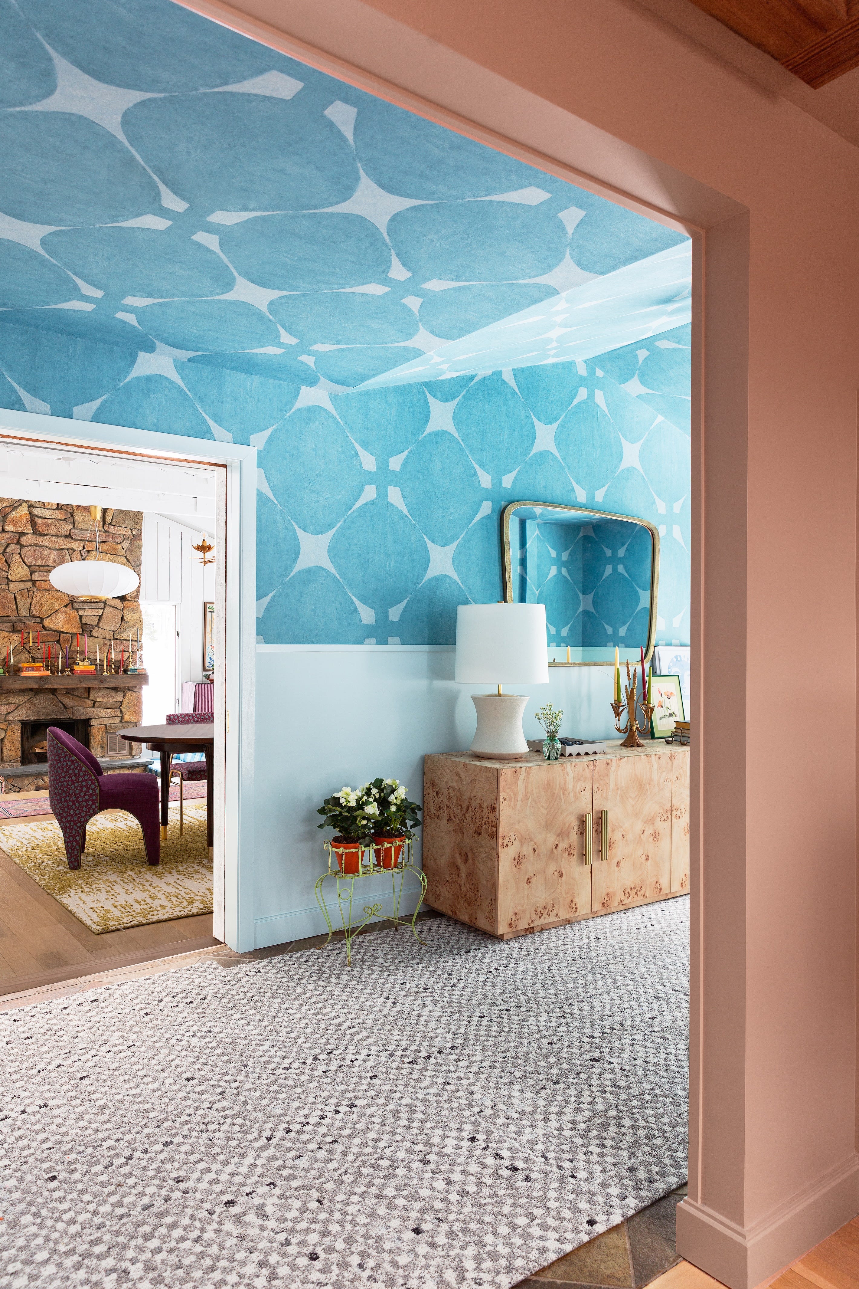
Designers Say These Unusual Paint Color Combos Will Transform Your Home

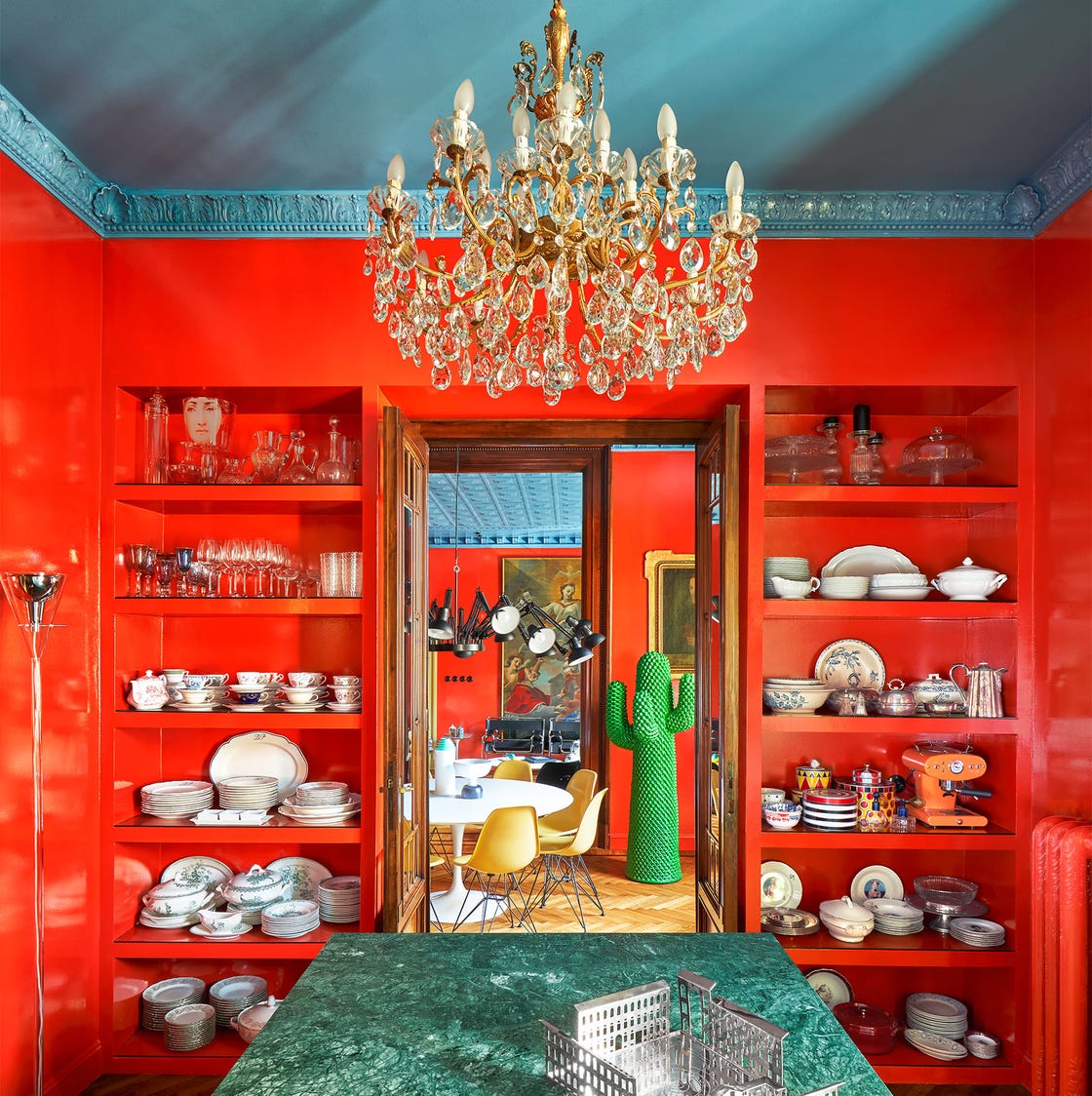
These 20 Rooms Use a Red Color Palette in All the Right Ways

Choose contrasting color schemes for a more powerful effect
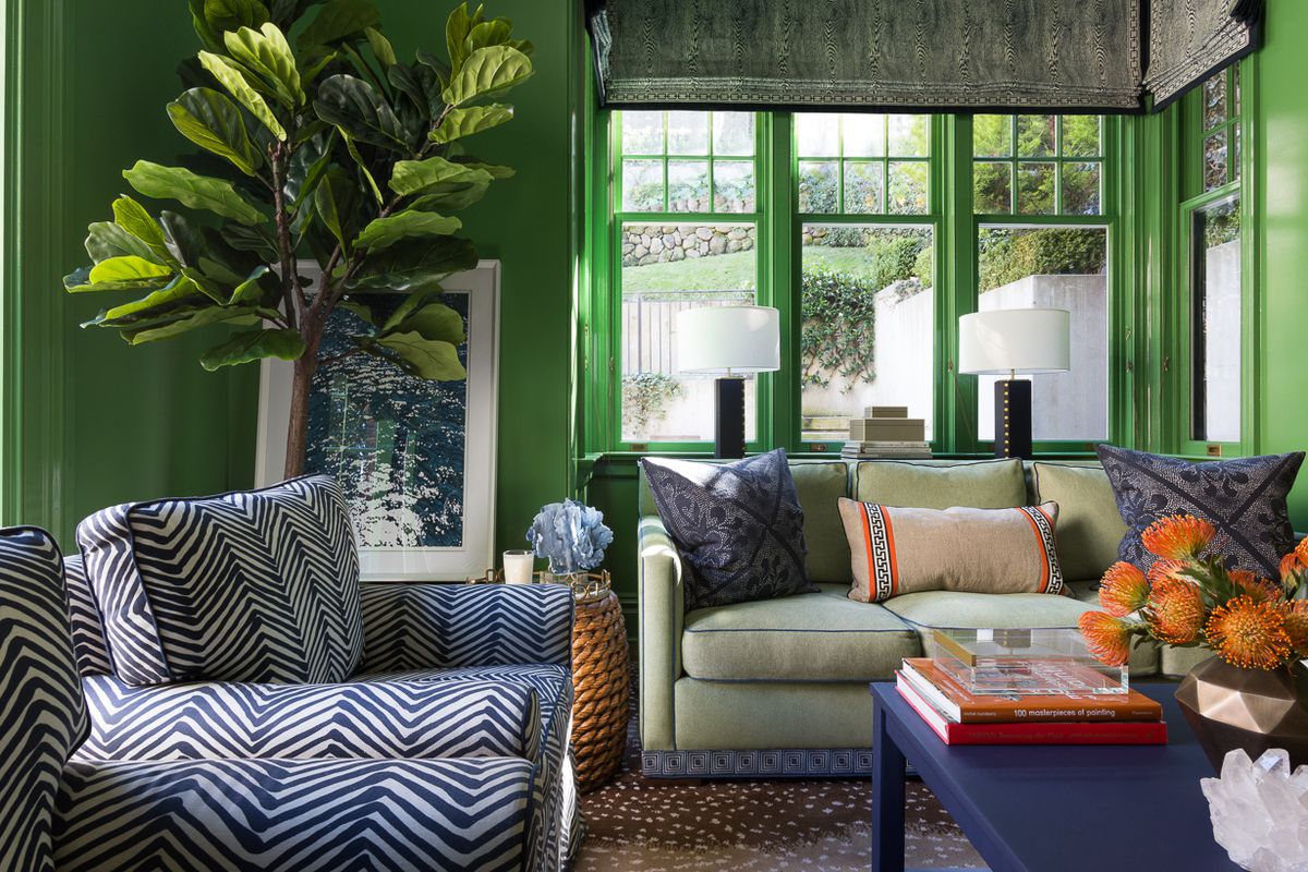
15 high-risk high-reward paint hues
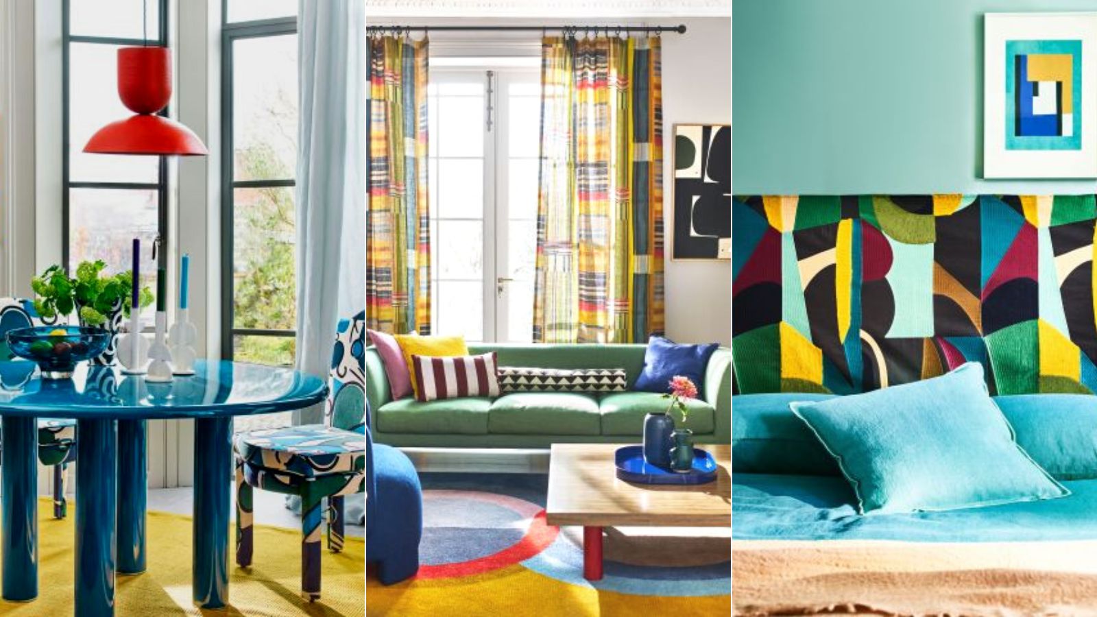
Colorful room ideas – 15 vibrant spaces with daring decor

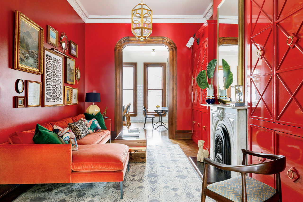
Home Design: How to Go All In on a Bold Hue
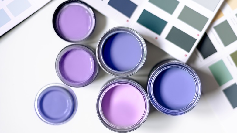
3 Things To Consider When Painting With Bold Colors
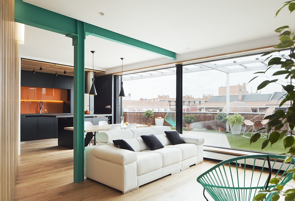
Dress Up Your Space With Contrasting Colors

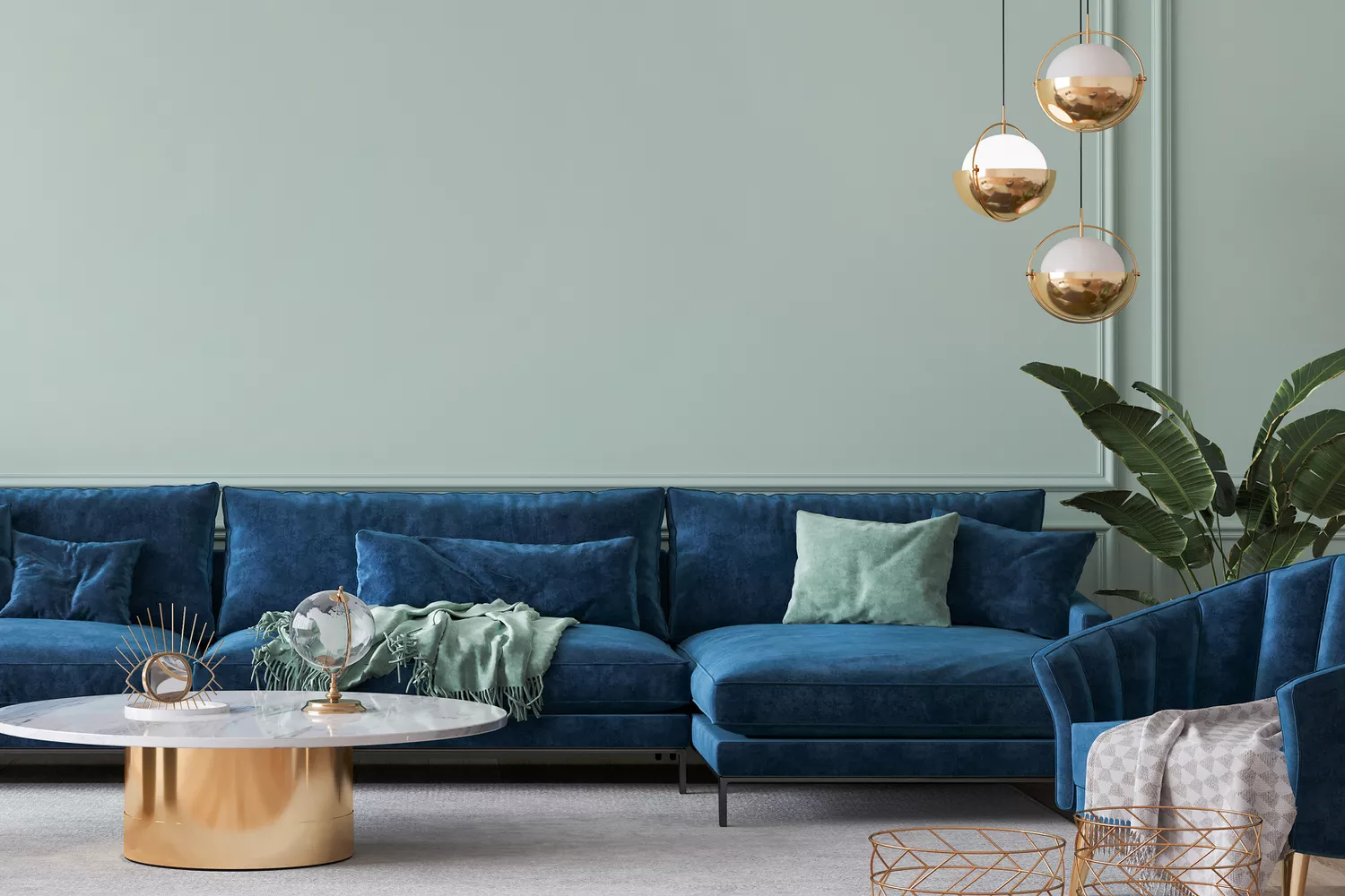
7 Color Combos That ALWAYS Look Good Together, According to Designers

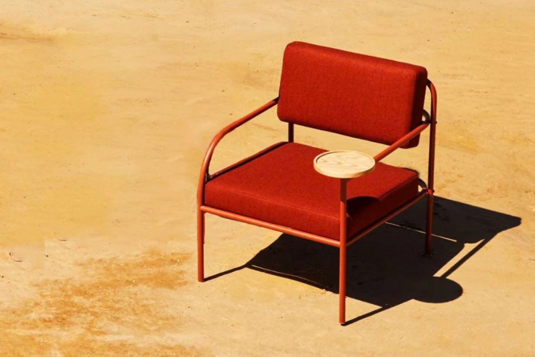
Incorporate Color Drenching Into Your Home Design

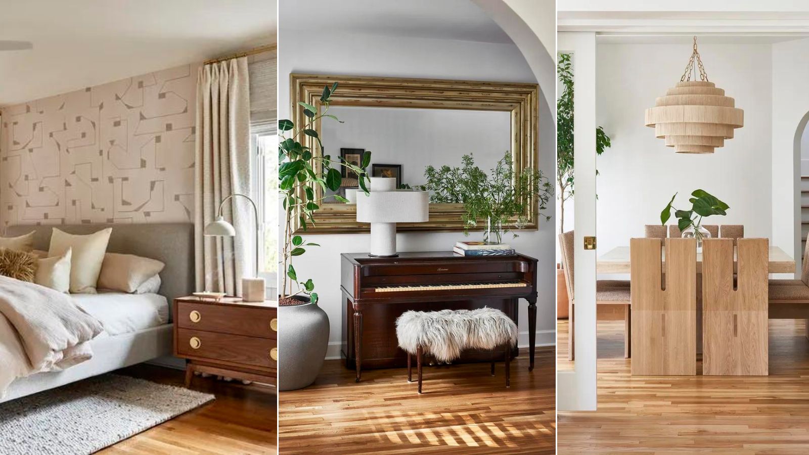
How to mix different wooden tones like an interior designer – 'It makes spaces feel more collected'
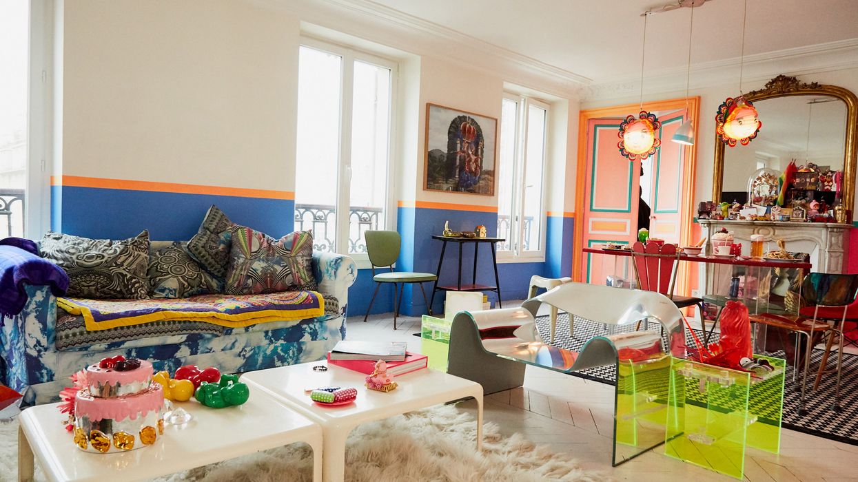
Tips for Bringing More Color Into Your Home, Straight from Interior Designers


15 Ways to Add Bold Color to Your Home
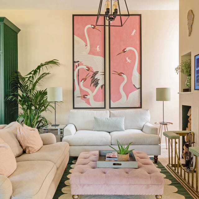
How to make your home look instantly more stylish with clever use of colour

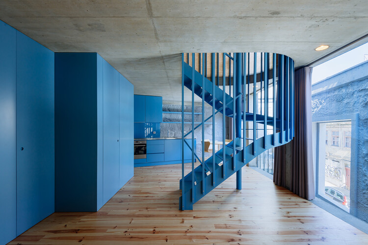
How to Combine Colors and Textures in Interior Decor

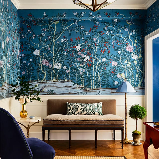
35 Unexpected Color Combos We Can't Get Enough Of

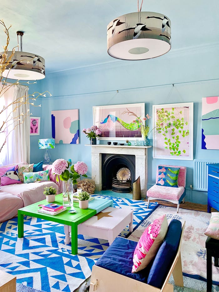
15 ways to add color to your home, according to interior designers
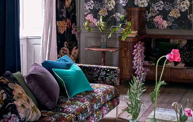
How to combine colour, pattern and texture without making a complete mess of things
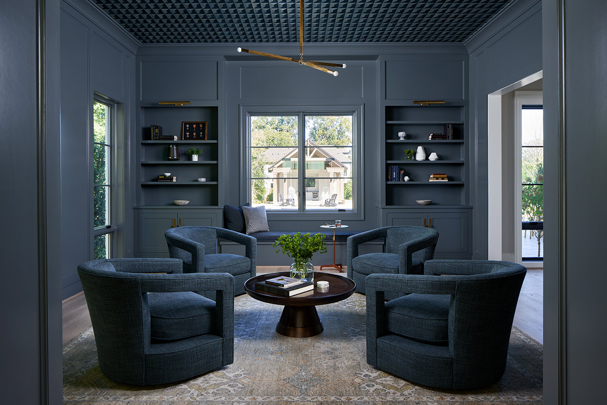
How to Incorporate Color Drenching in Your Home Design