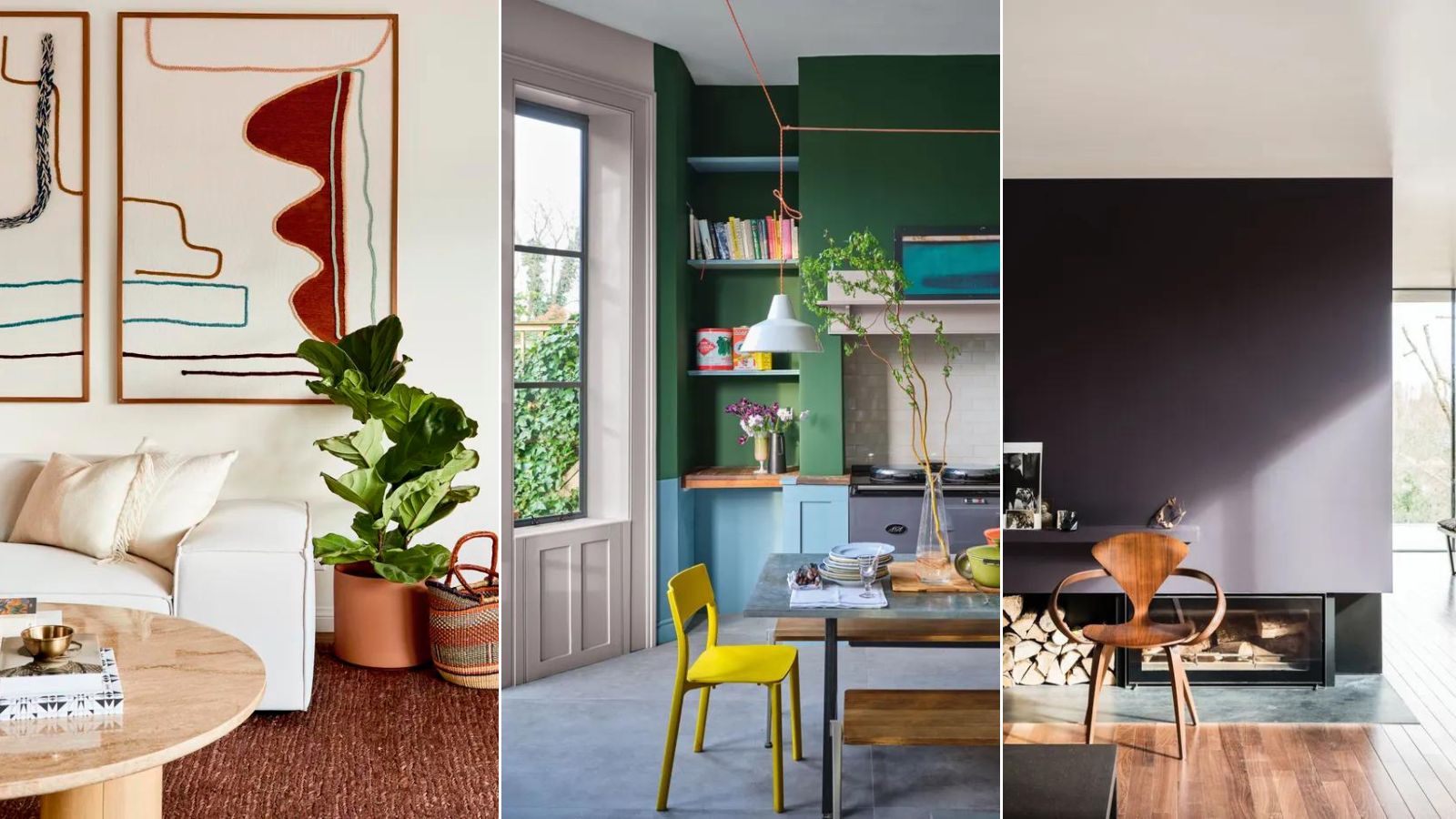
1/5
Colors to avoid pairing with beige – 5 shades you’ll want to stay clear of
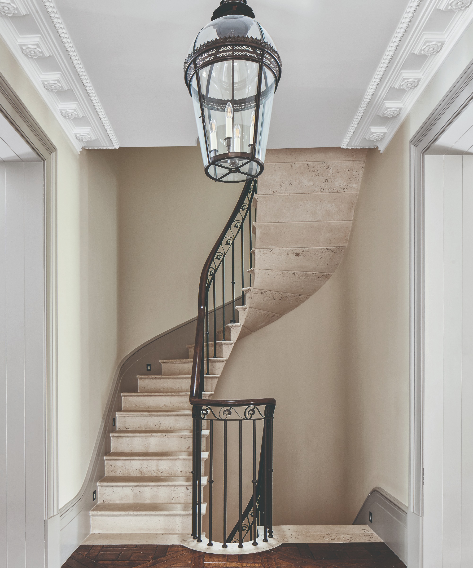
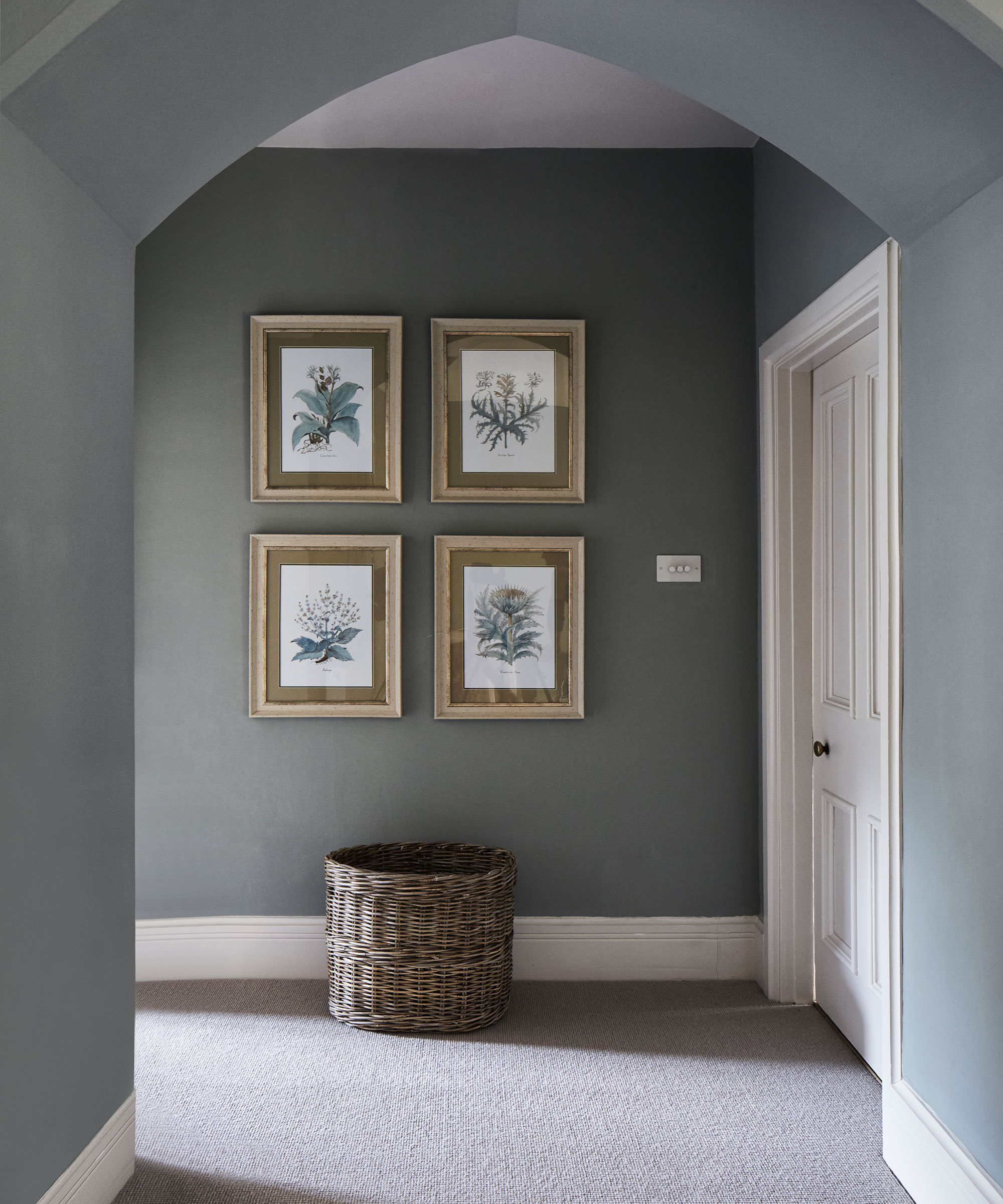
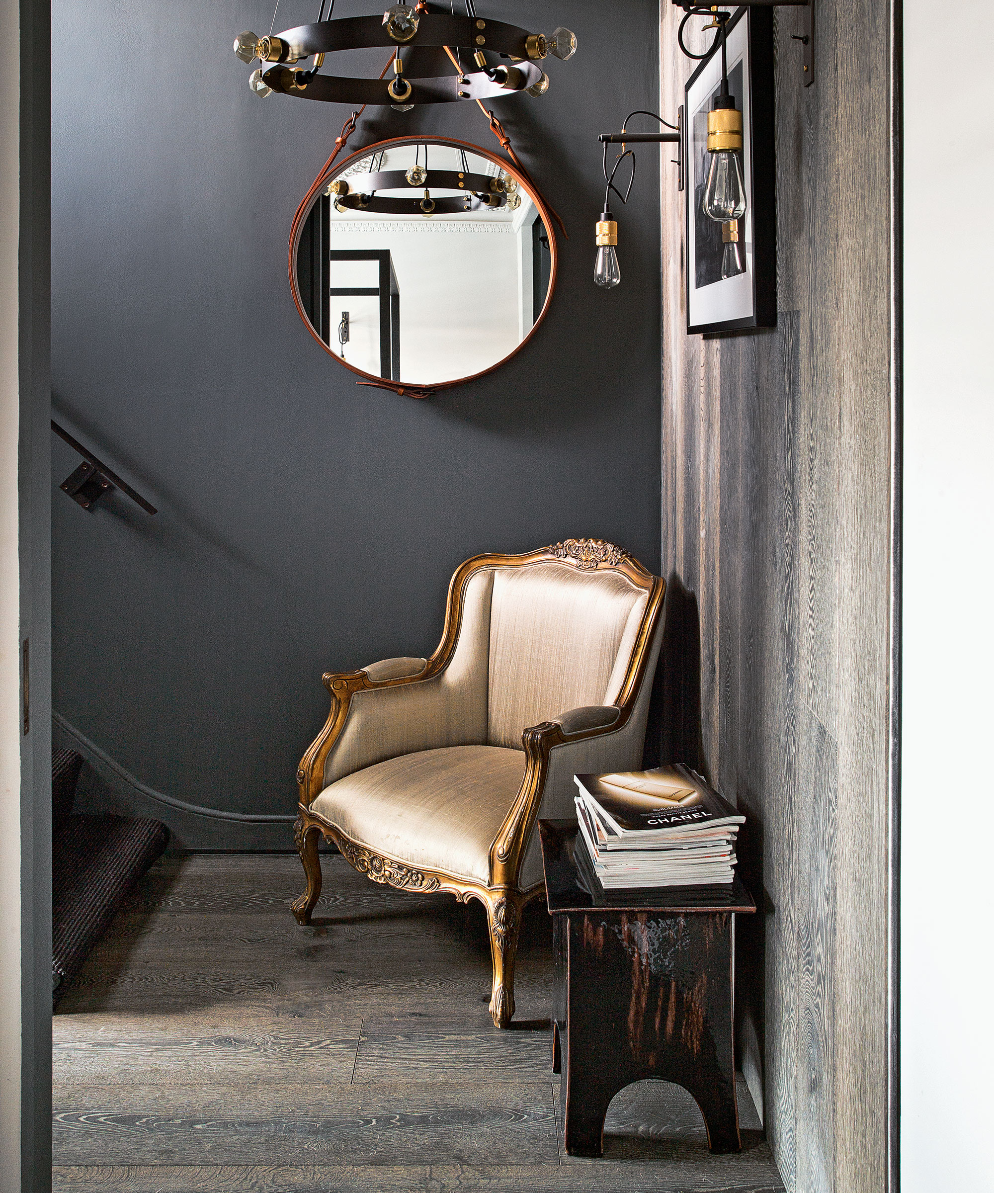
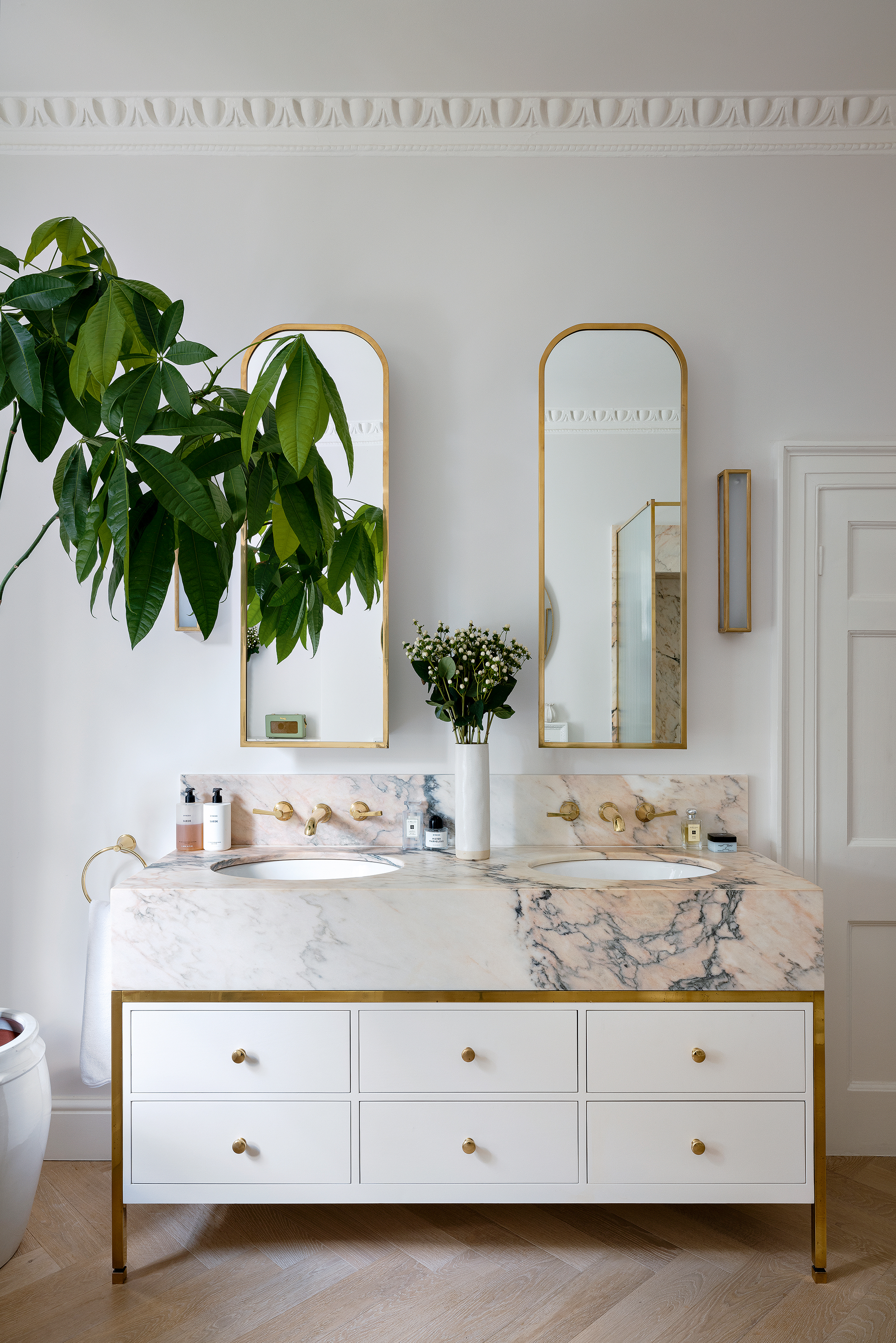
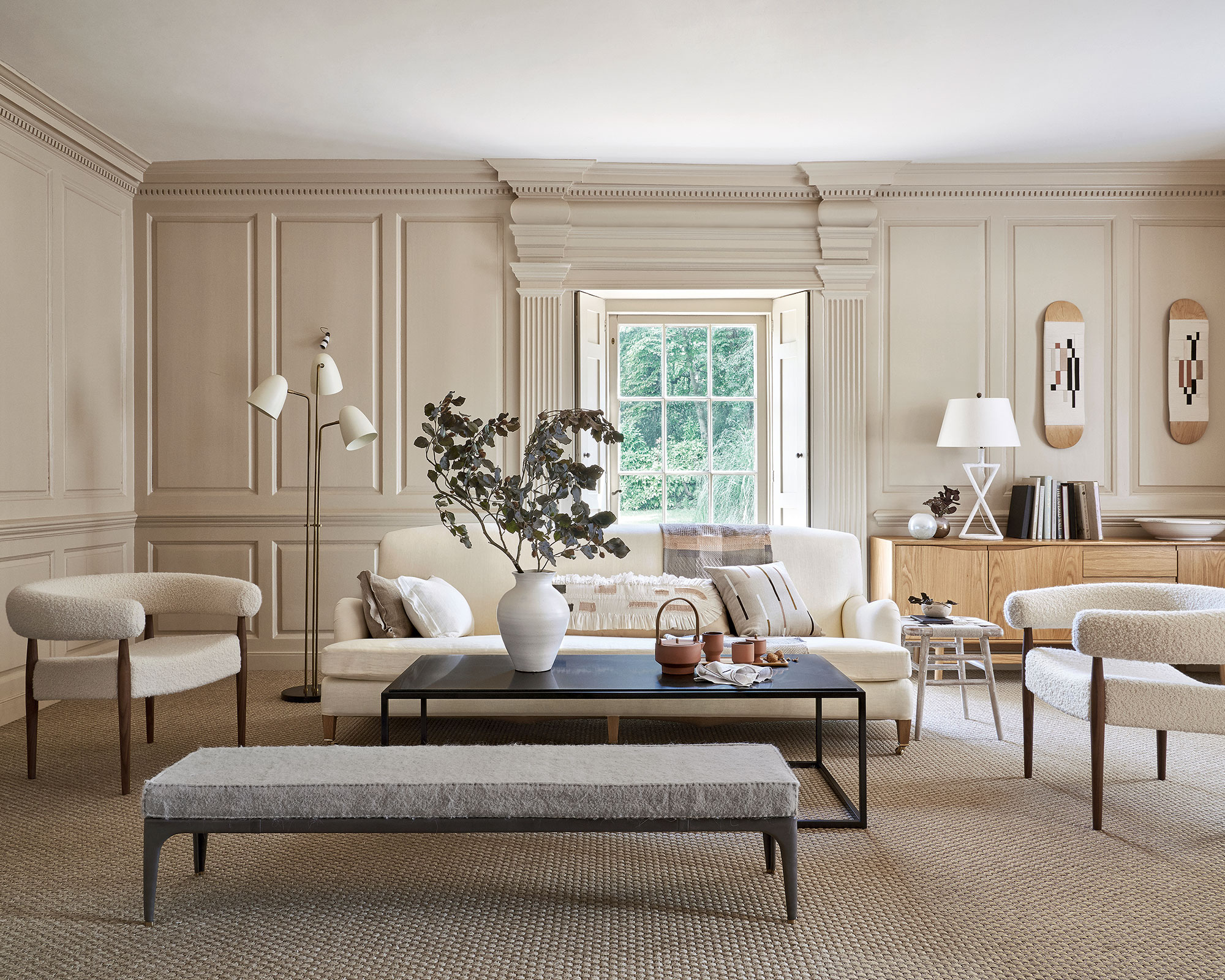
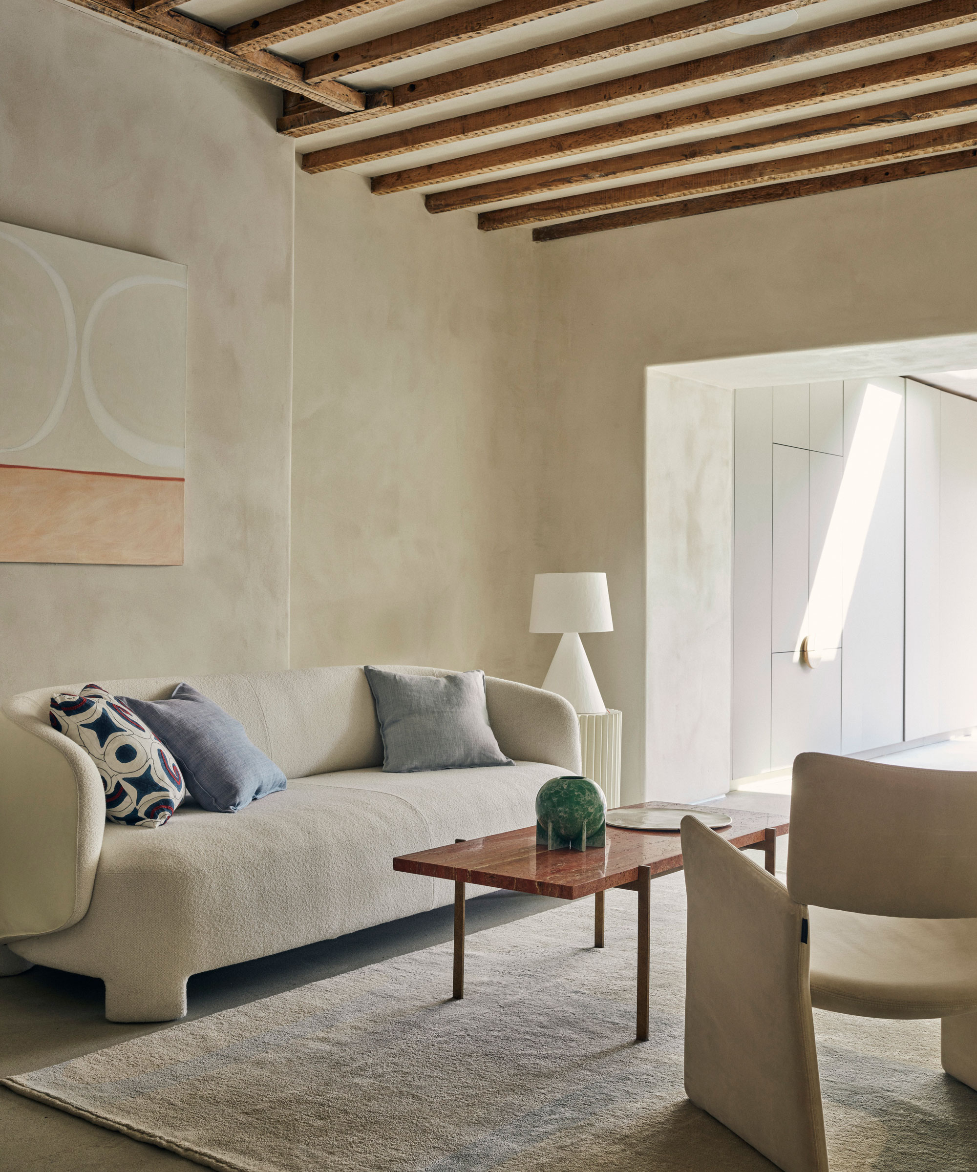
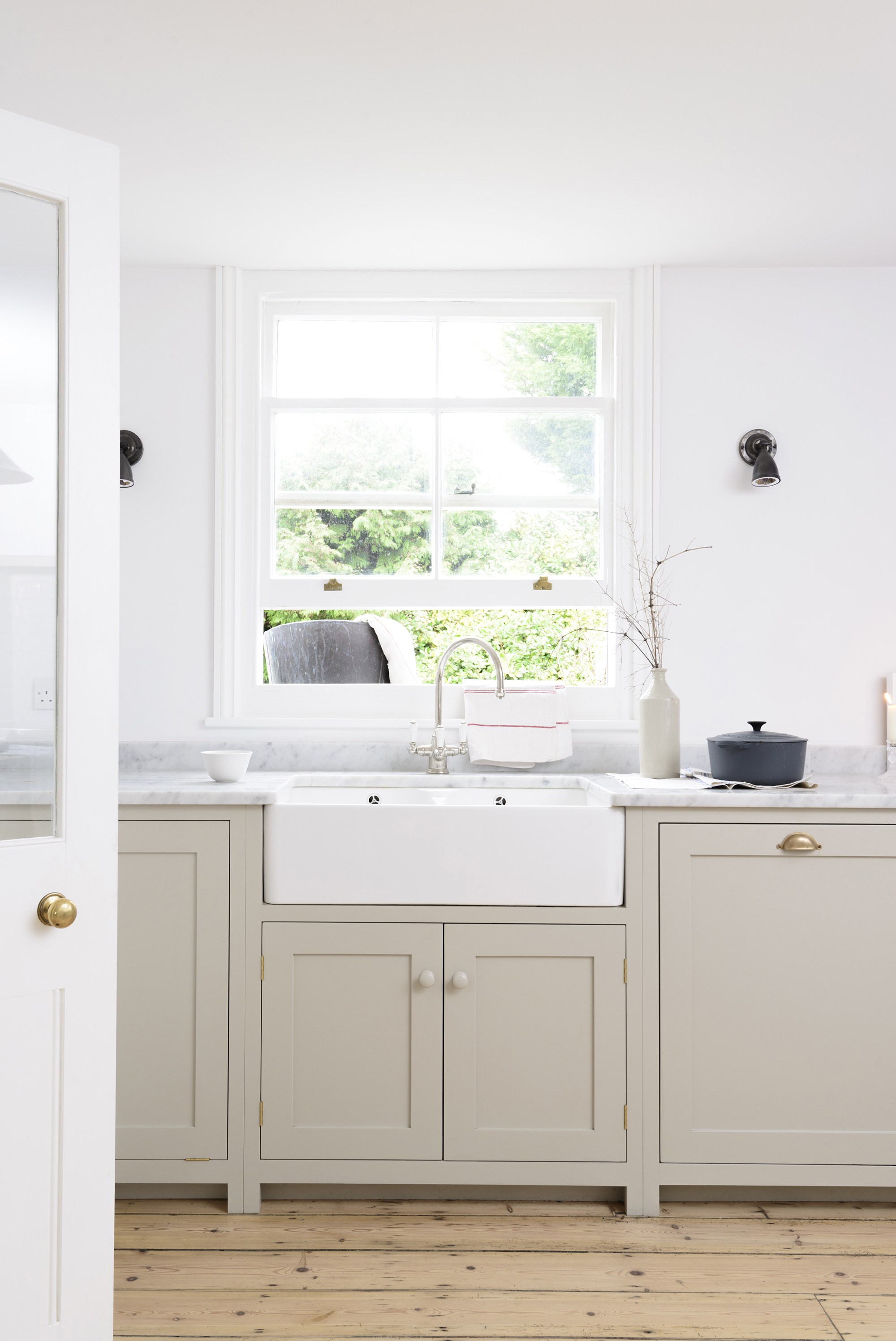
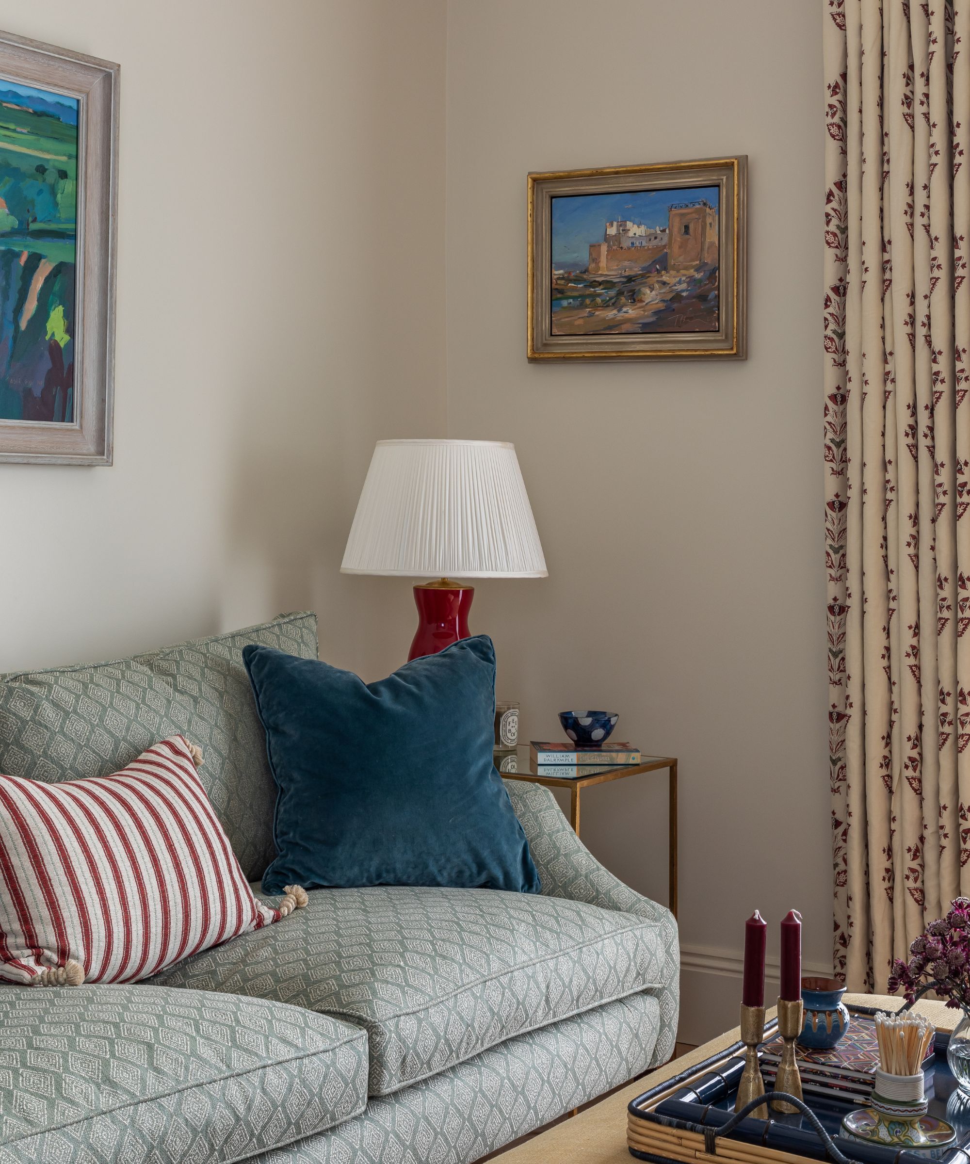
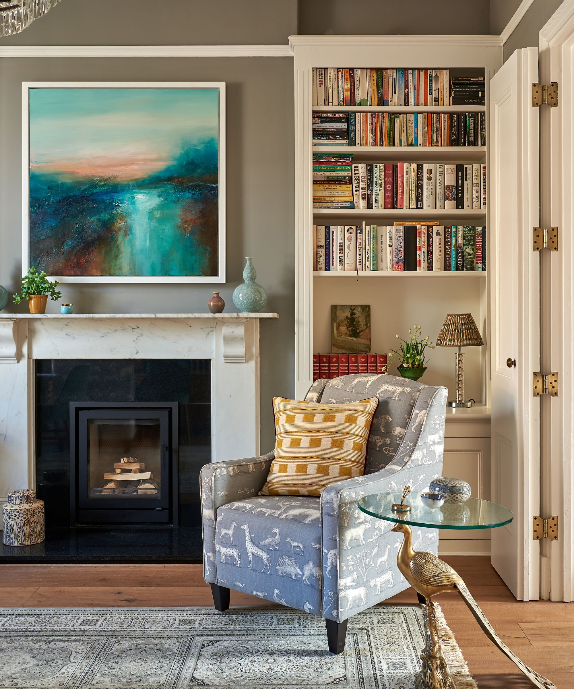
The article discusses color combinations to avoid when decorating with beige, a popular neutral shade in interior design. Despite beige's versatility, certain colors can clash with its calming qualities, disrupting the aesthetic harmony of a room. Interior designers and color experts emphasize the importance of thoughtful color pairing to maintain a polished and harmonious look when incorporating beige into a scheme.
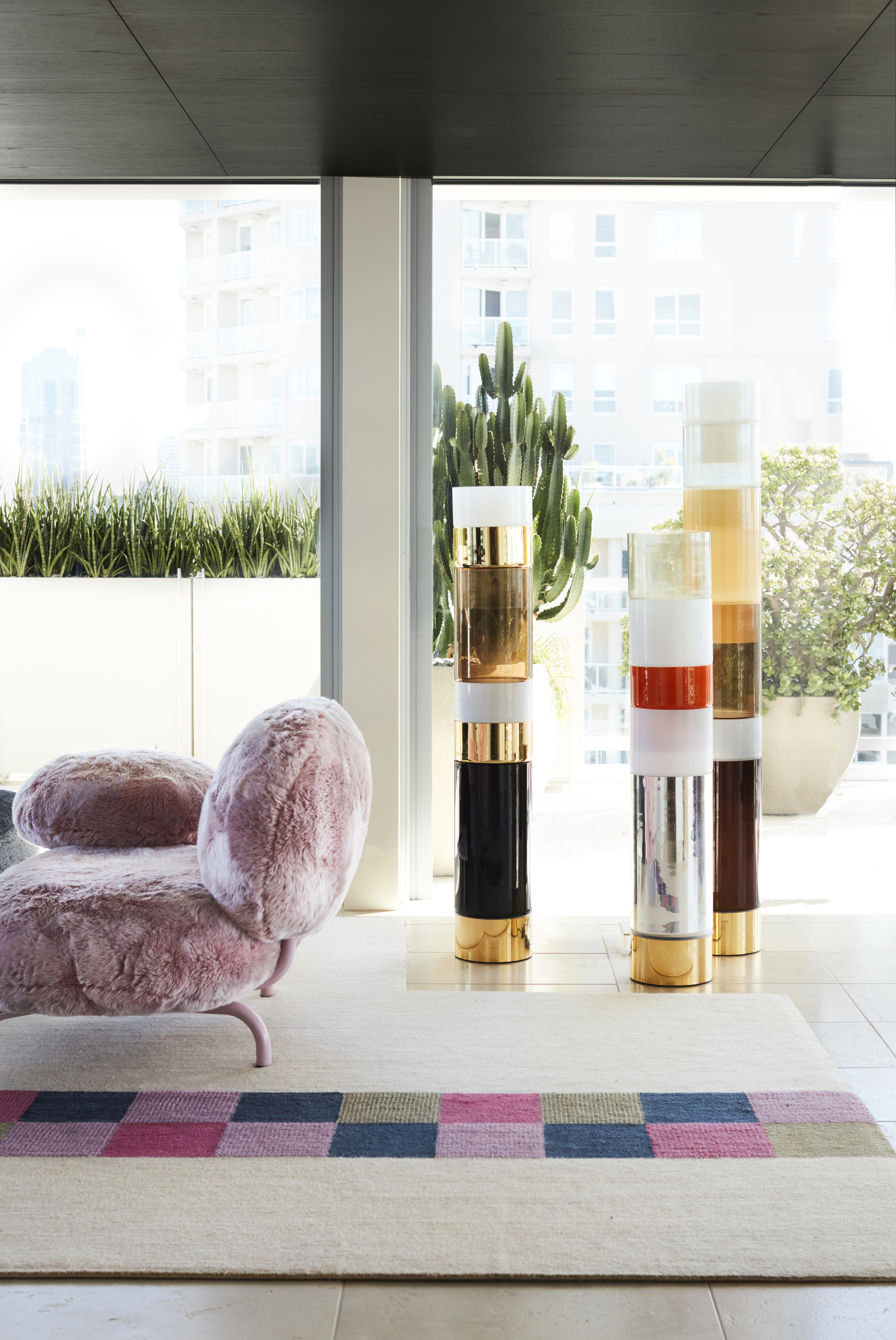
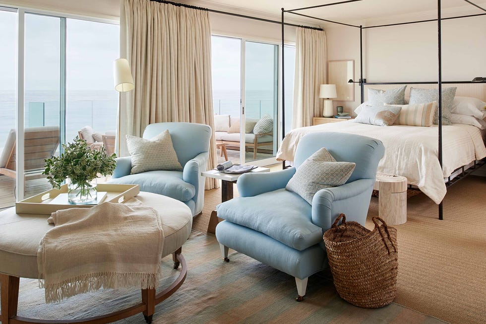
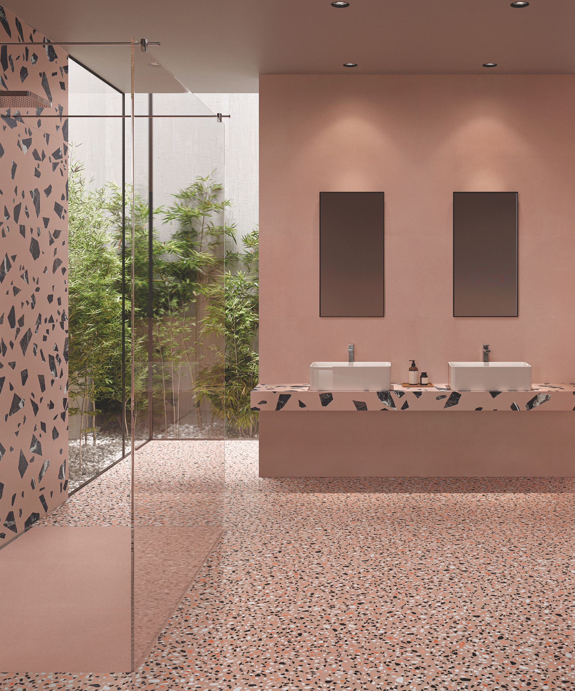
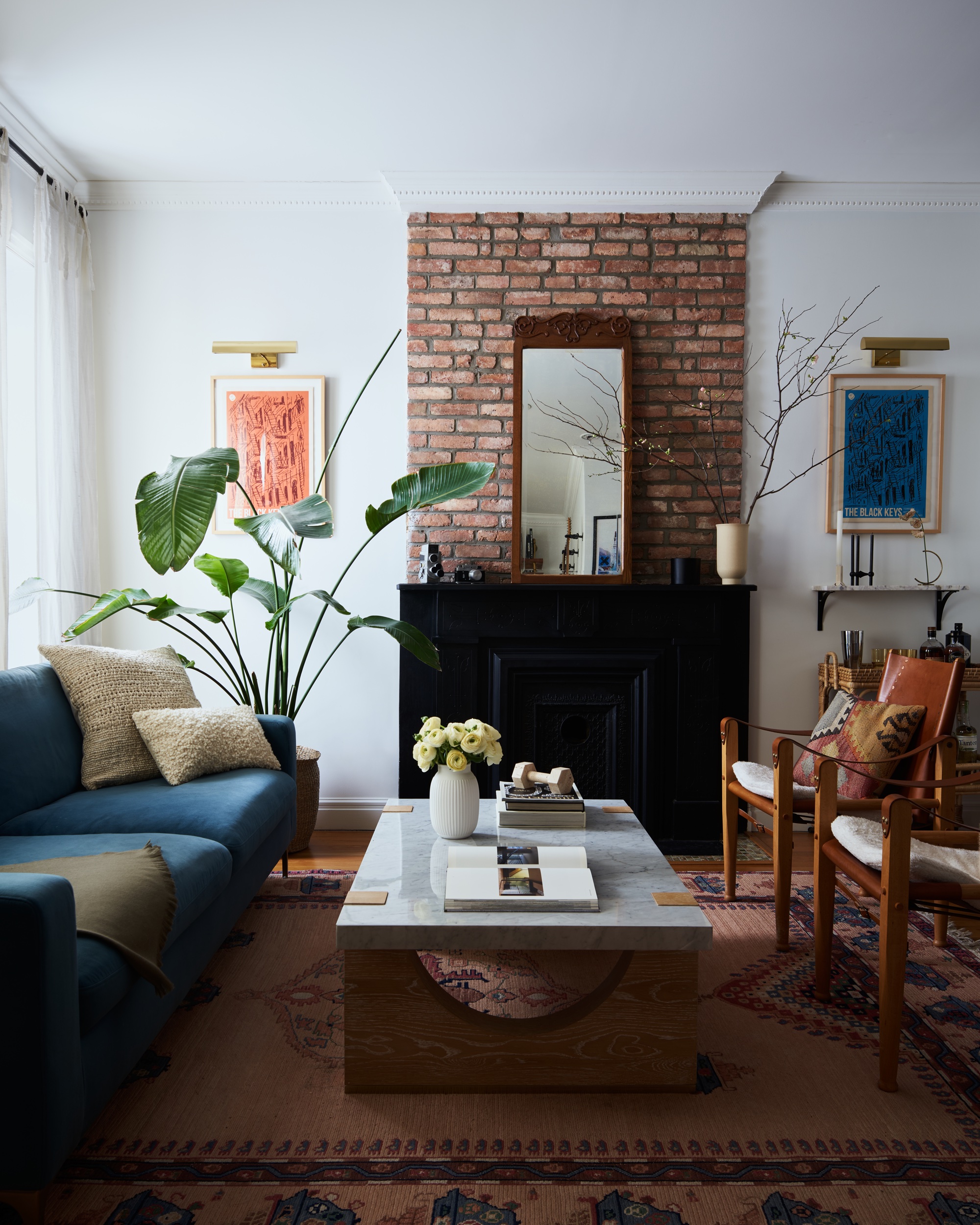
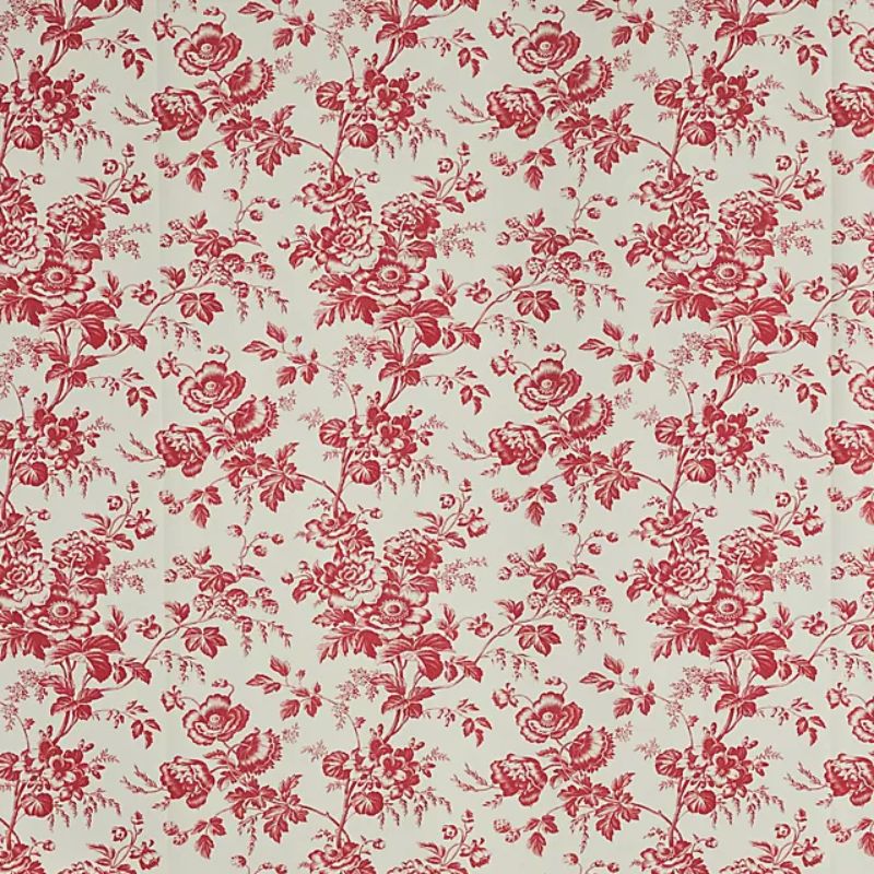
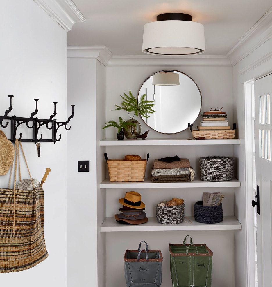
One color highlighted as problematic is fuchsia. While beige can accommodate brighter shades, highly saturated and intense colors like fuchsia tend to conflict with beige's subdued nature. Instead, experts suggest opting for pale, muted colors with brown or earthy undertones for a more refined appearance.
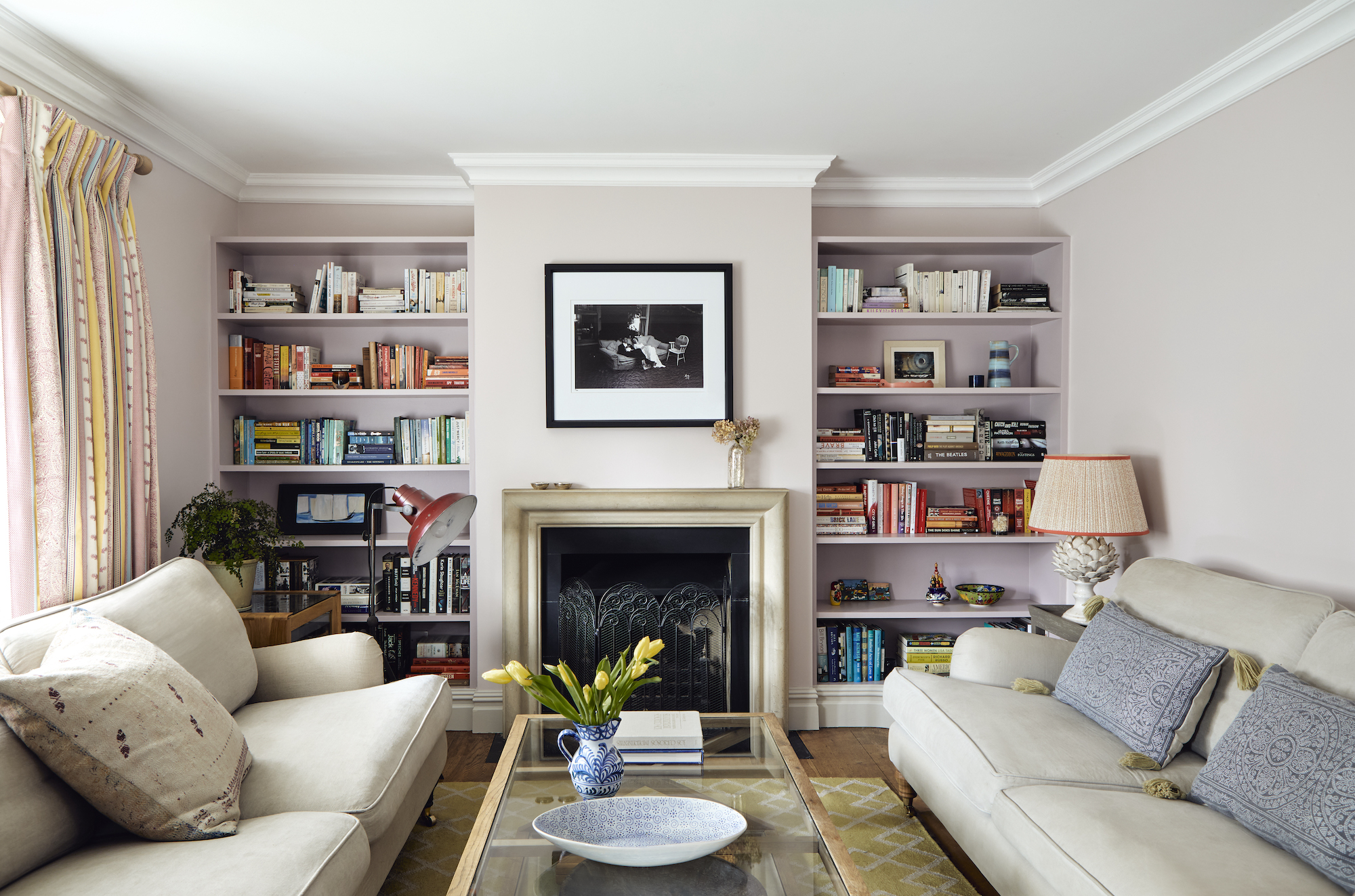
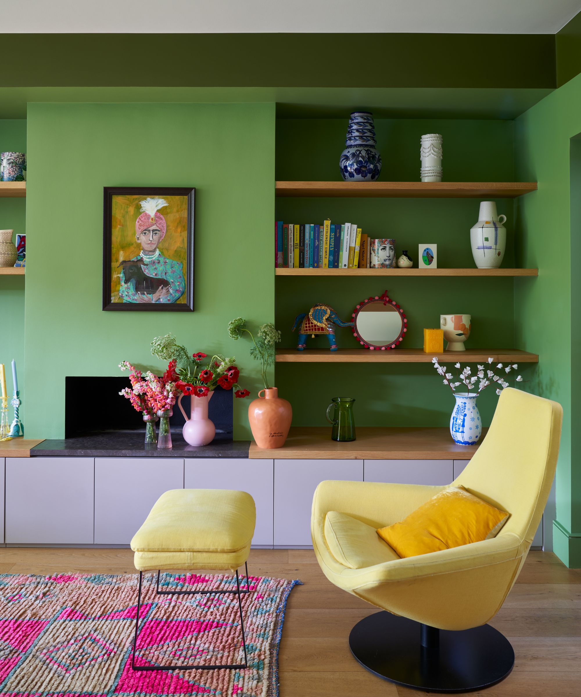
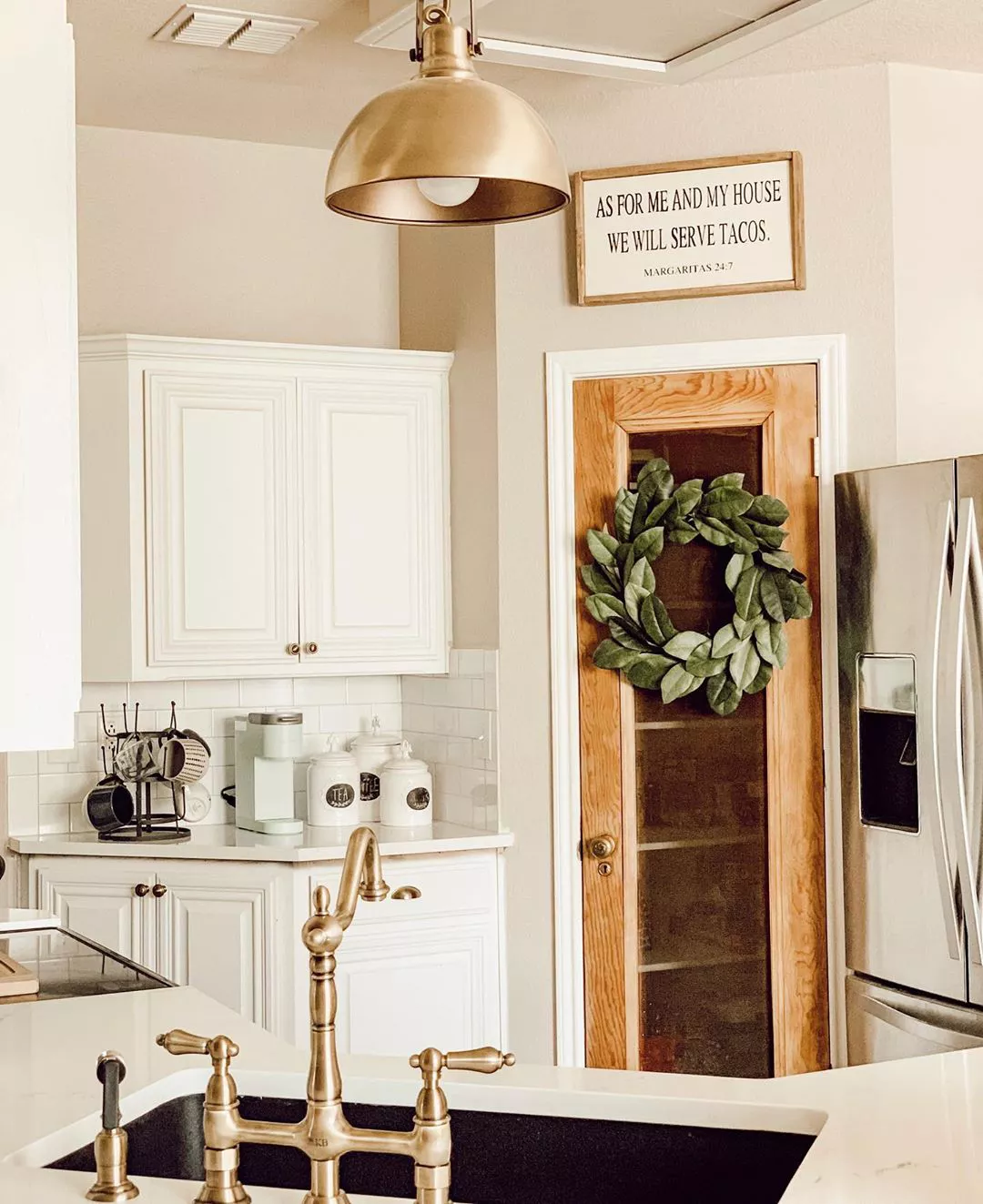
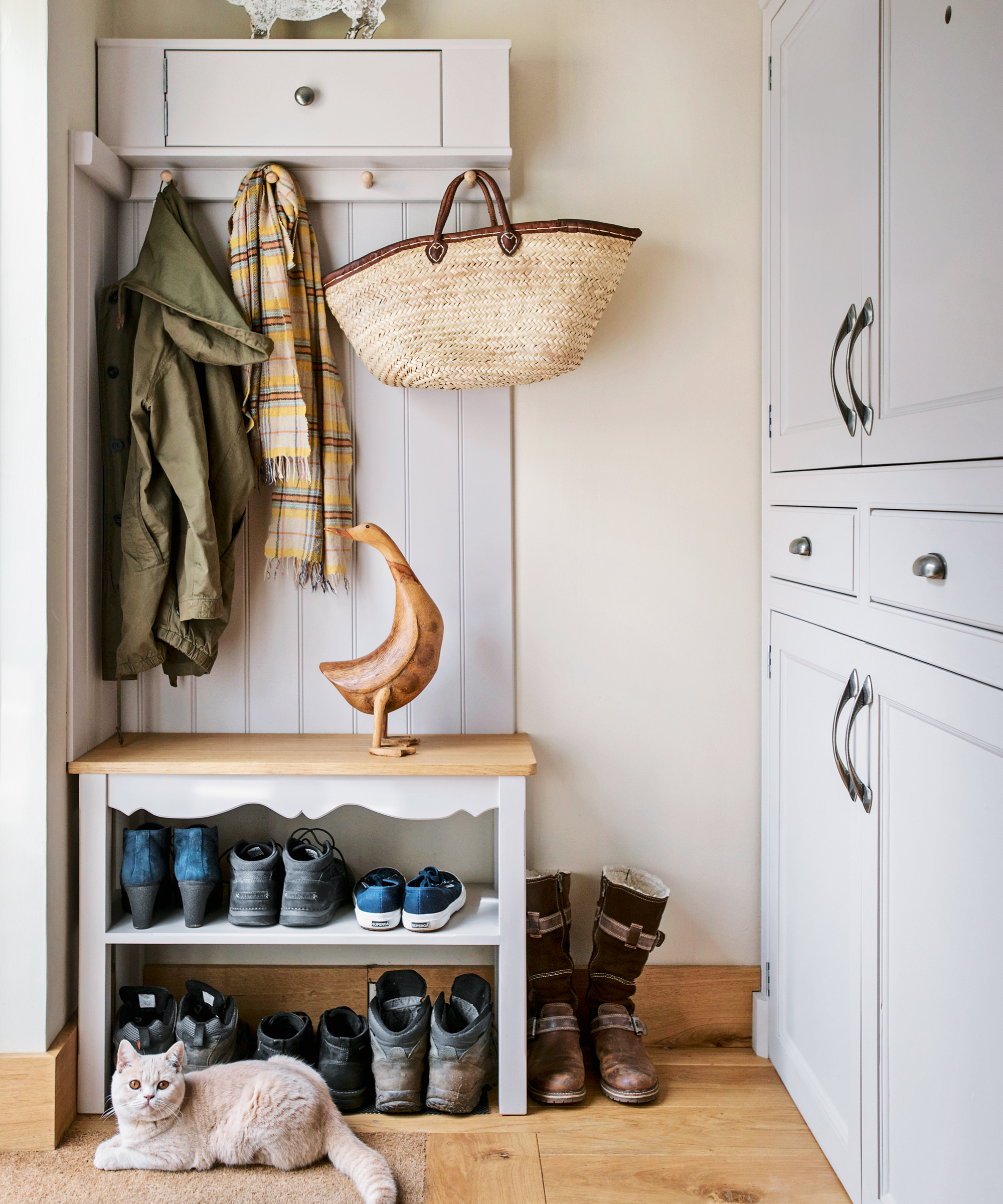
Bright yellow is another color that interior designers advise against pairing with beige. The article explains that yellow can easily wash out a beige scheme, making the room appear dull or uninspired. If yellow is desired, it should be used alongside white to introduce contrast and brighten the overall palette.
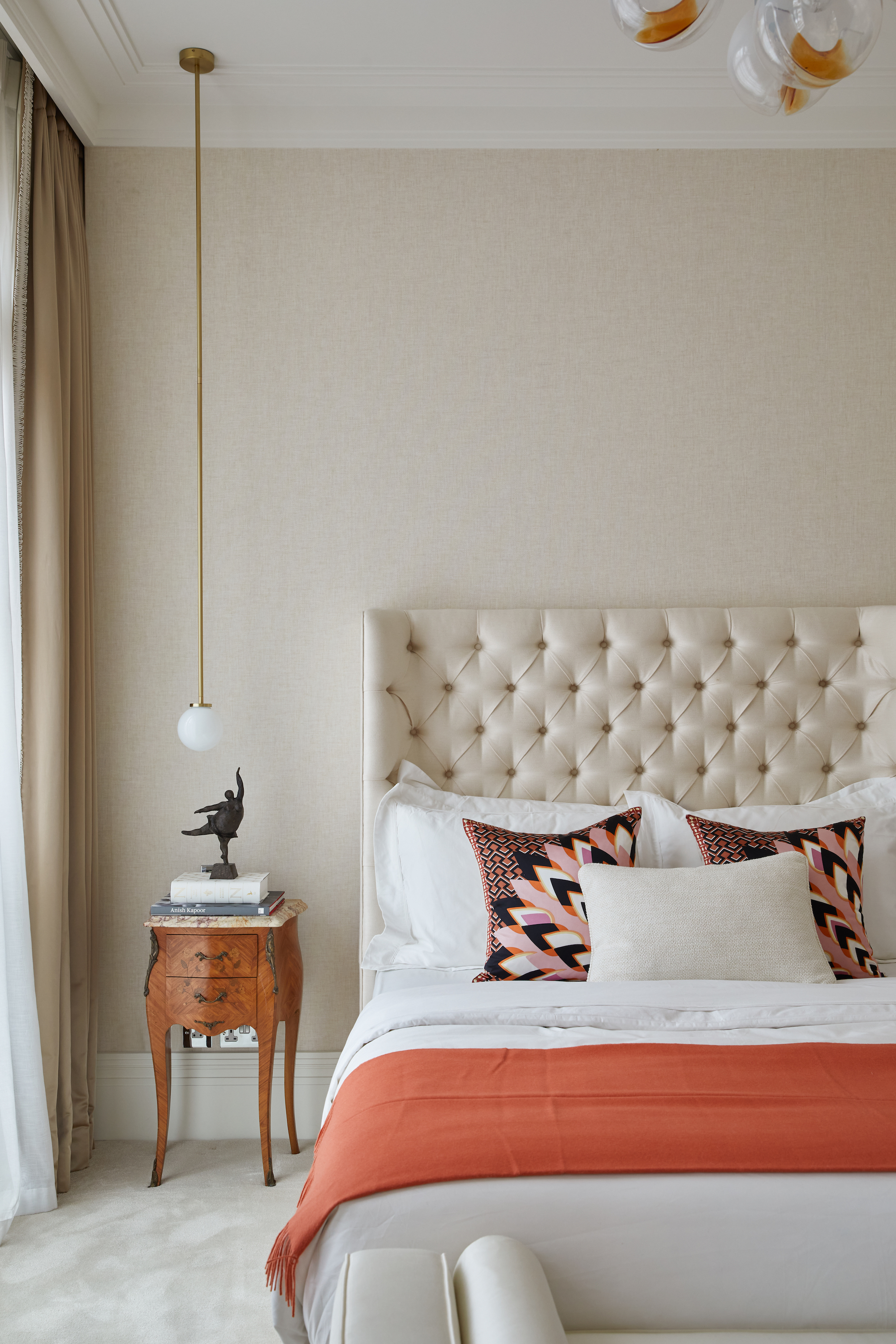
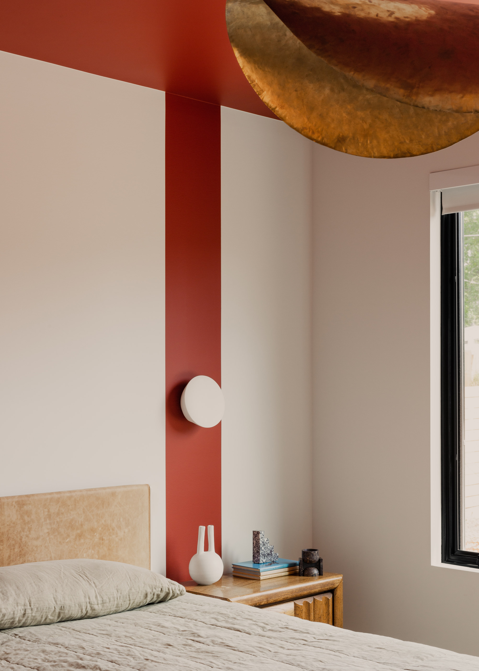
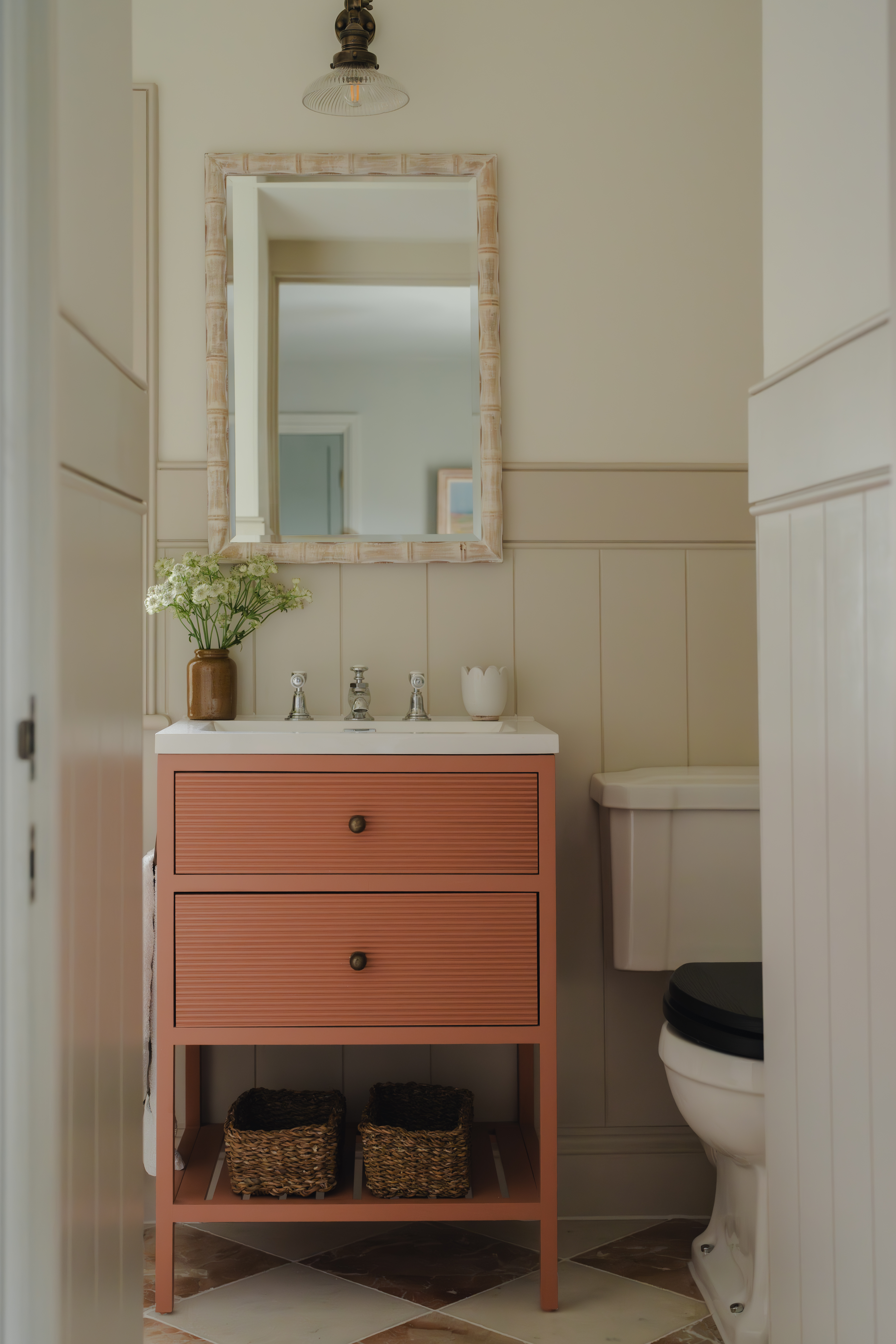
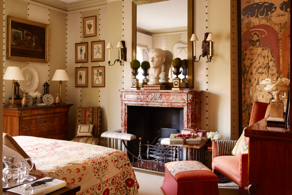
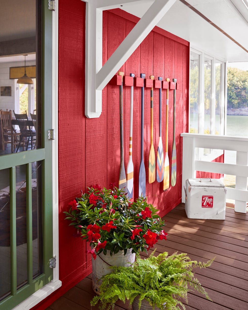
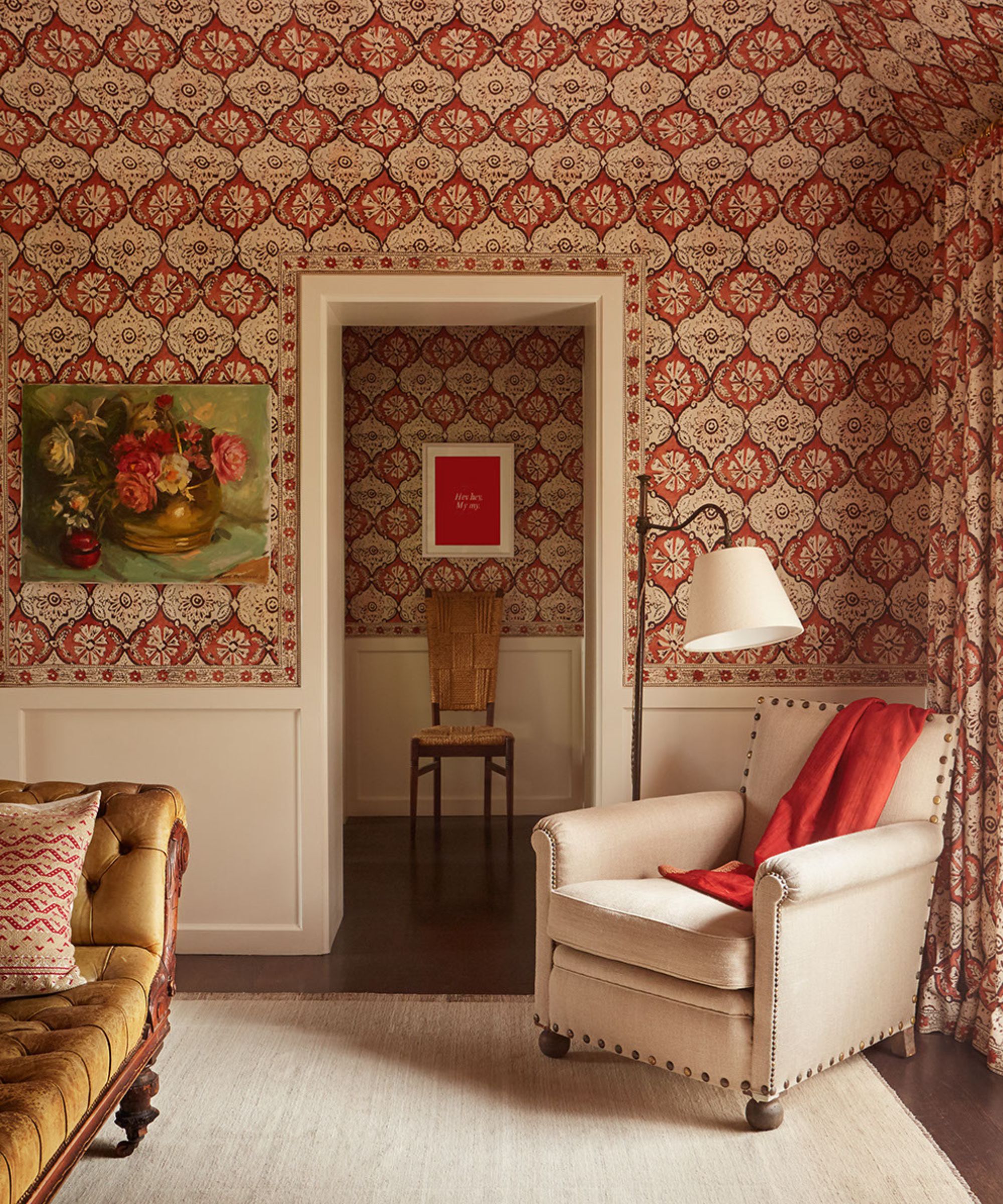
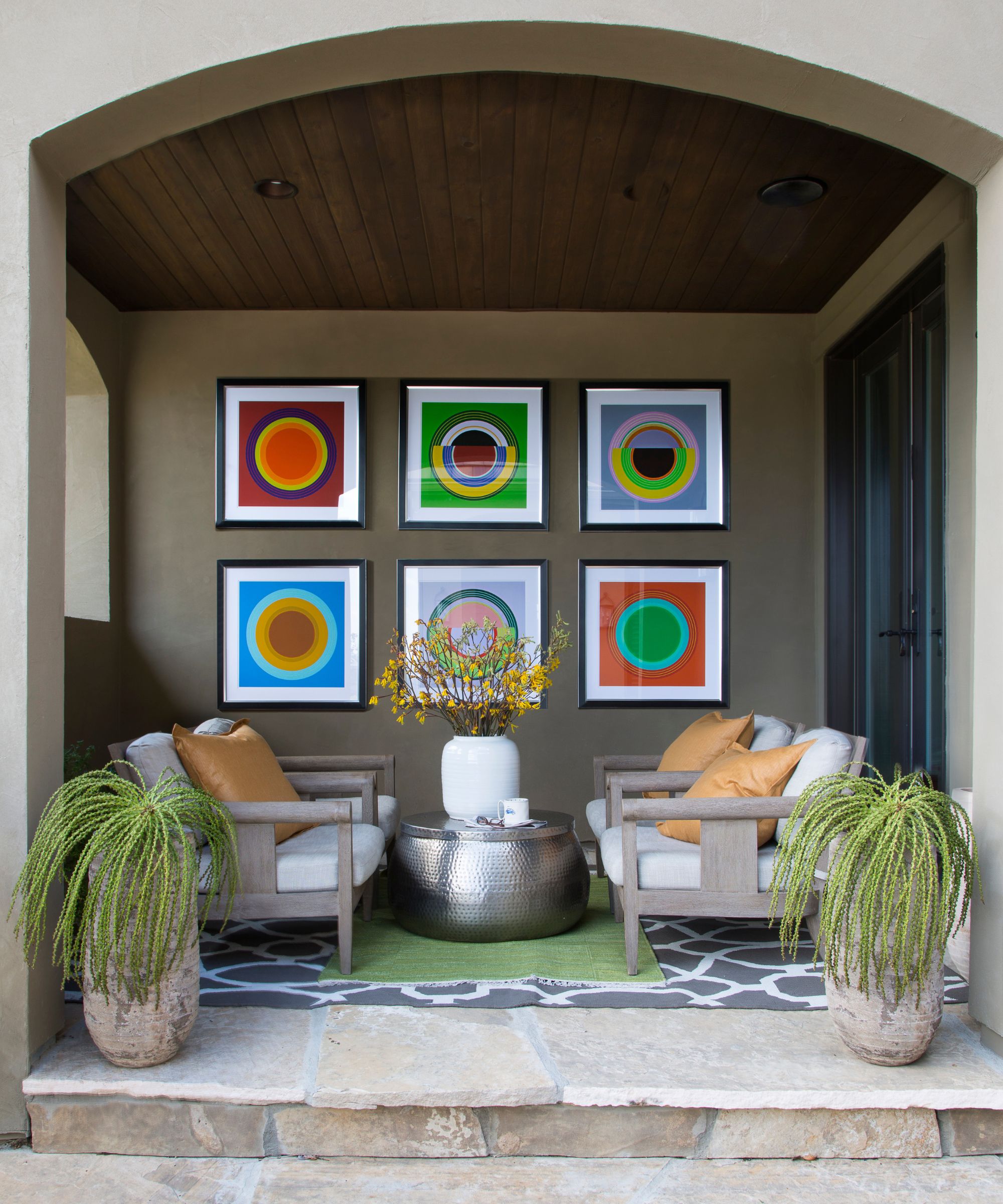
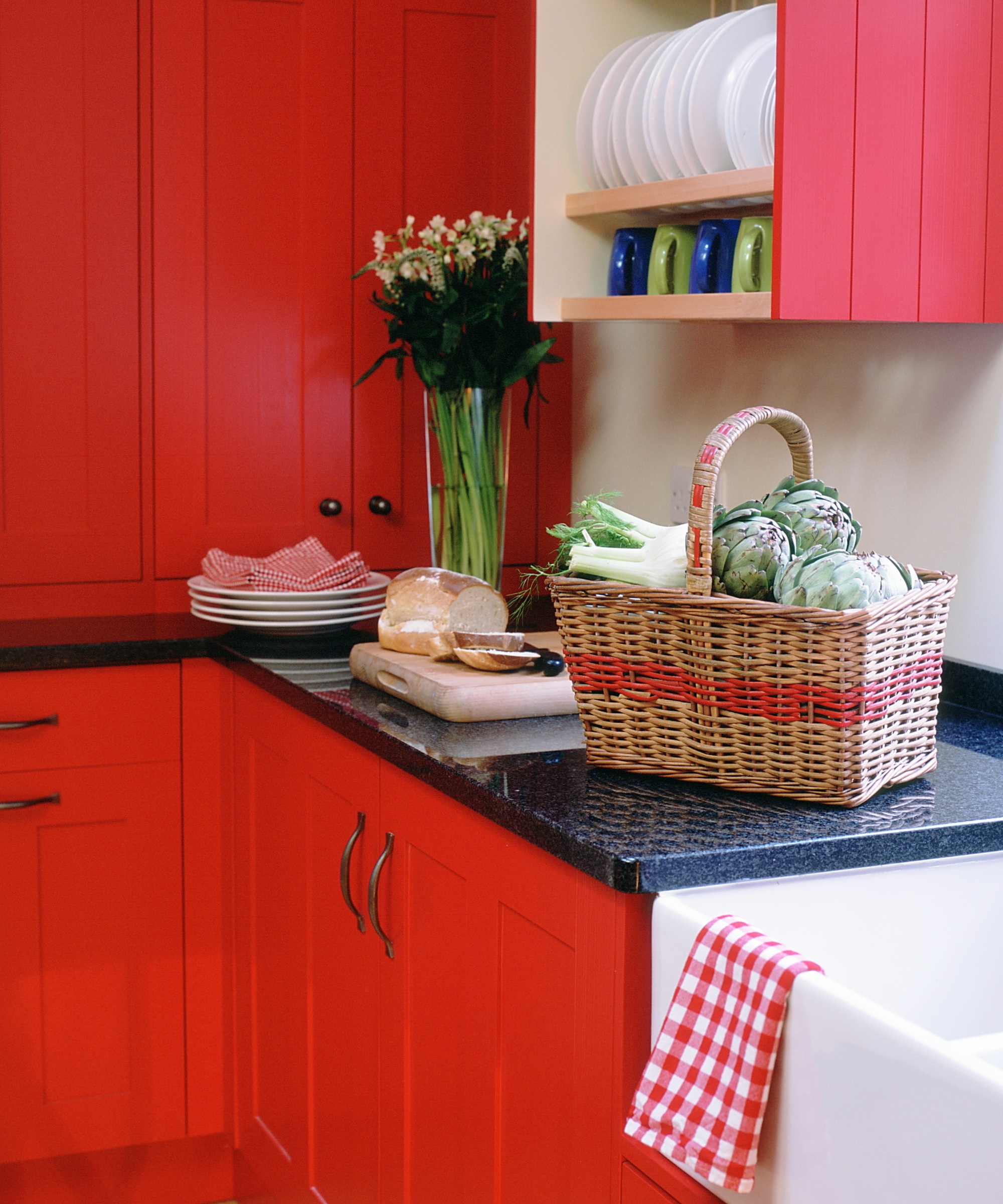
Fiery reds and oranges are also on the list of colors to avoid. When beige is used as a backdrop, the intention is often to create a calm and serene space. Vibrant reds and oranges can overpower beige's softness, leading to a visually chaotic imbalance. For those who appreciate these warm hues, the recommendation is to choose their muted versions, such as rusty red or terracotta, which complement beige more effectively.
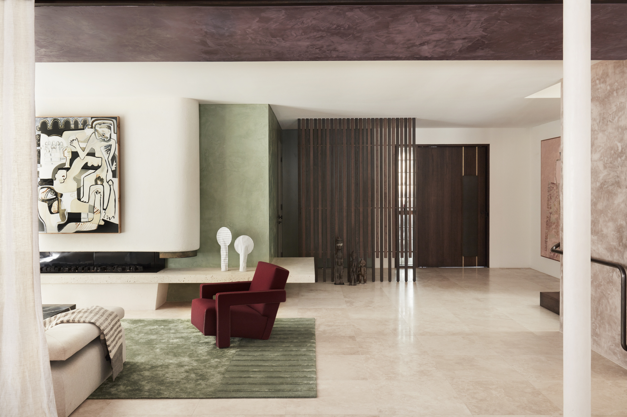
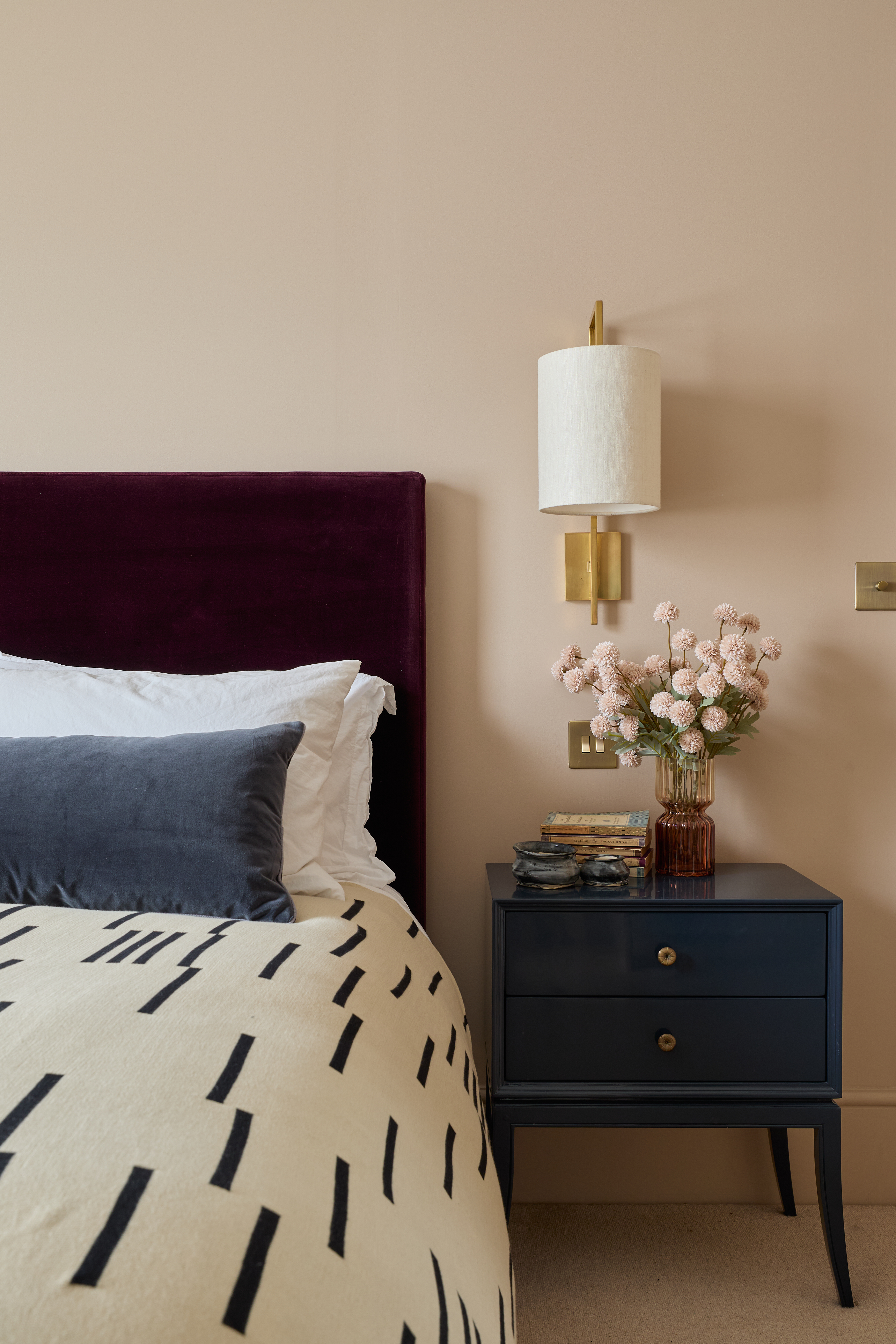
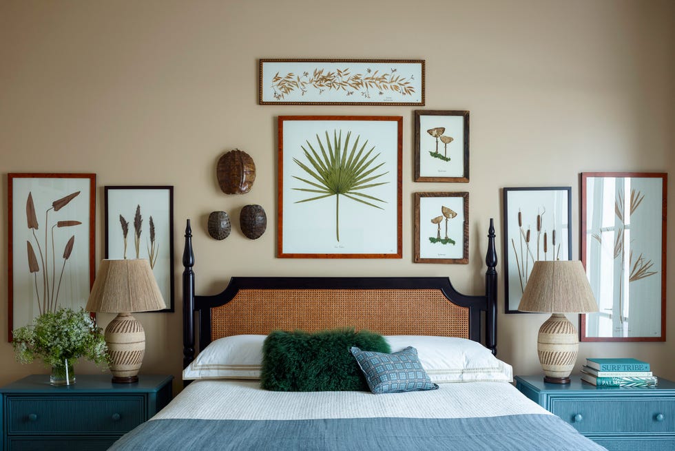
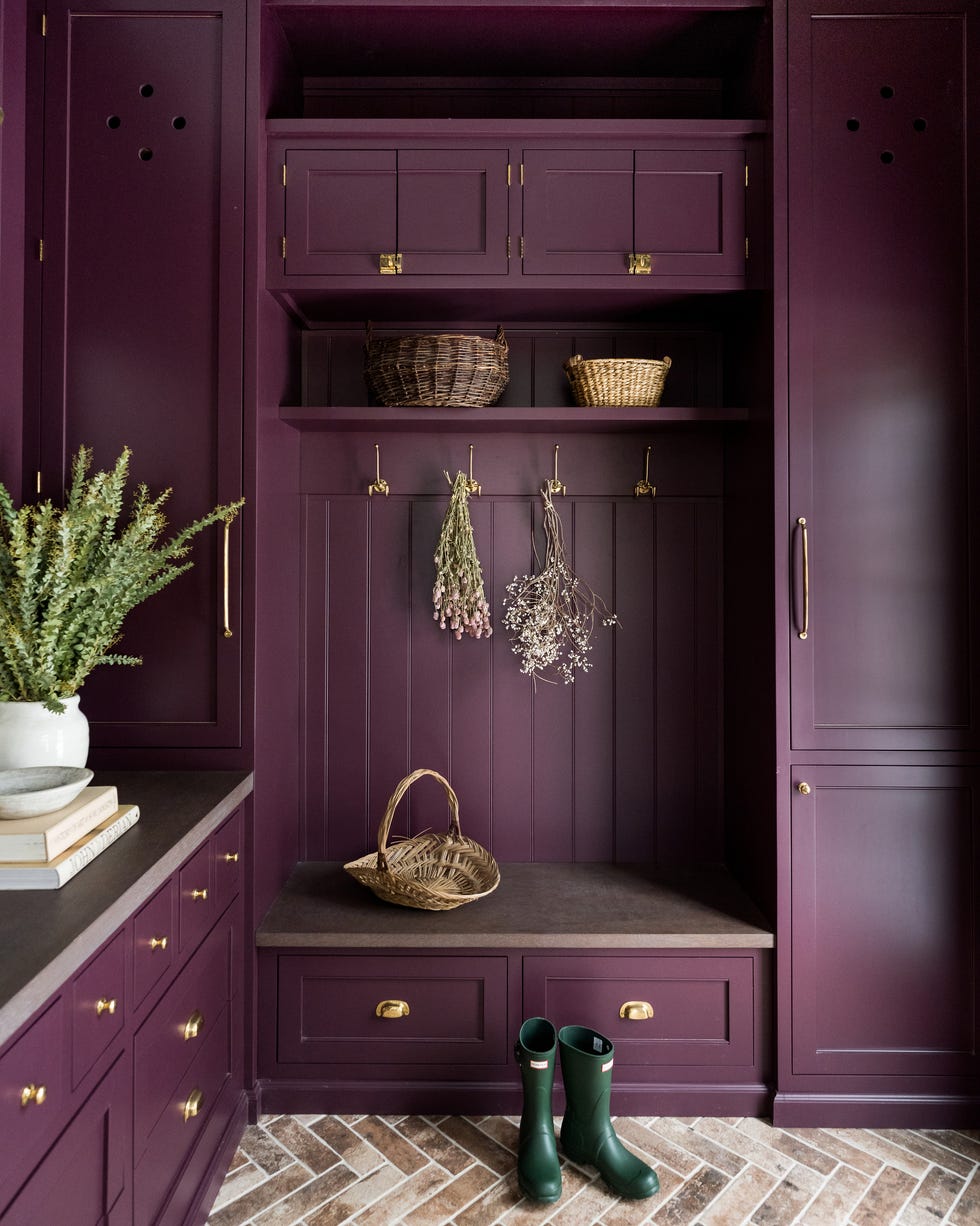
Deep purple, particularly its darkest forms, is identified as a color that creates a discordant contrast with beige. Purple, often perceived as a cooling color, can be dulled by the presence of beige, which might not be the desired effect. A better alternative would be to pair beige with a neutral like taupe that has a subtle lilac undertone, ensuring a more cohesive blend.
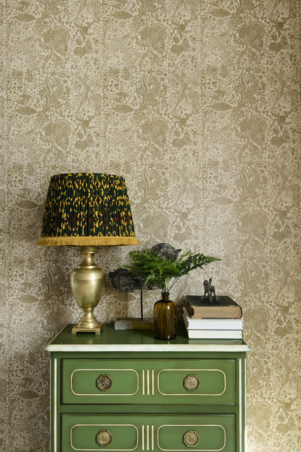
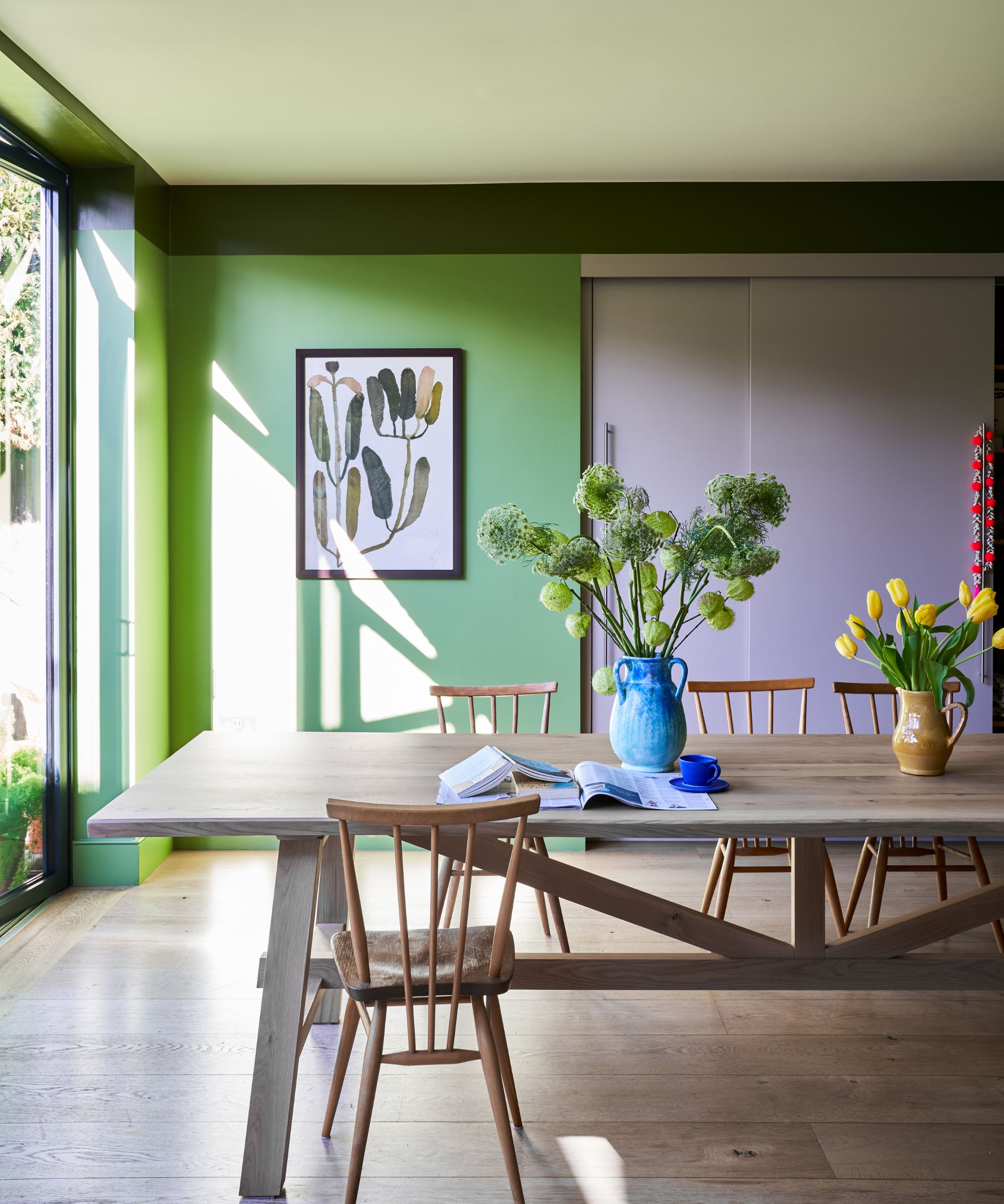
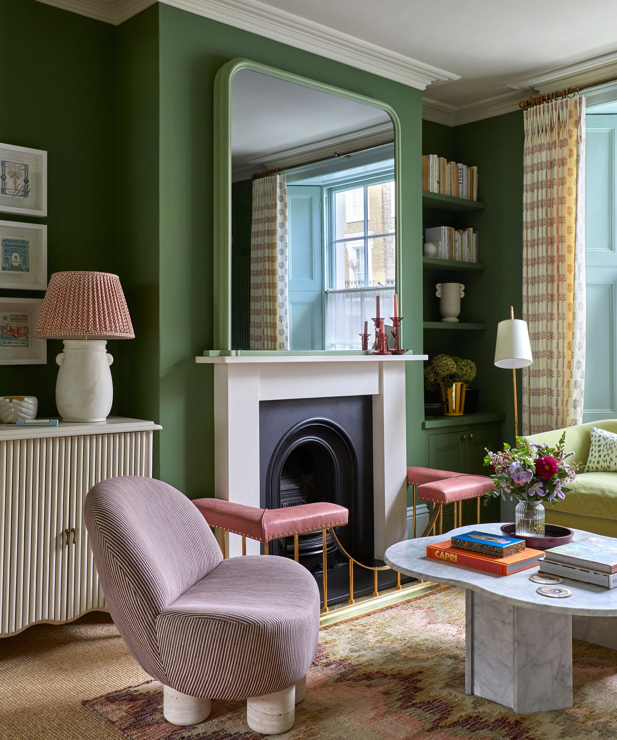

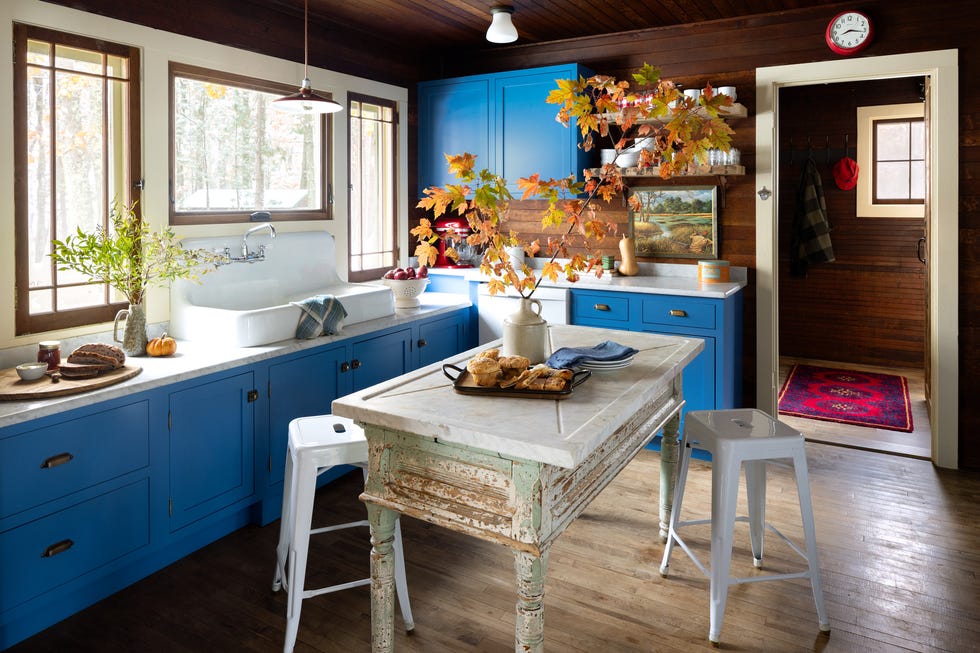
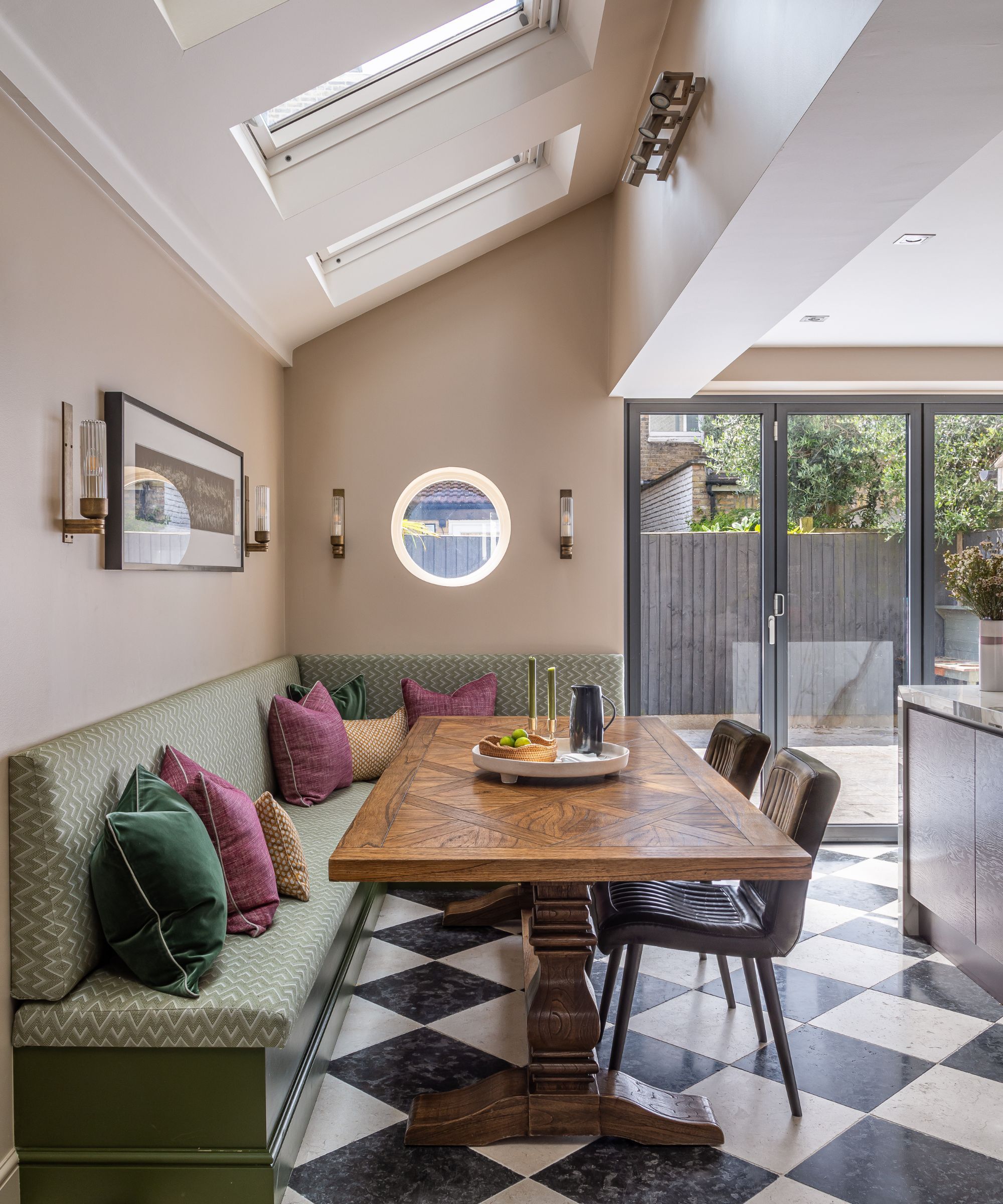
Finally, vibrant green is cautioned against due to its energetic tones clashing with the calmness of beige. While green is generally popular for its calming and versatile qualities, a vibrant shade next to beige can create a jarring effect in a living space or bedroom. Muted alternatives like olive or sage green are recommended as they are part of the neutral color palette and harmonize well with beige.
The article concludes by reiterating that while there are no strict rules in interior design, certain color pairings can undermine the intended aesthetic of a beige-based scheme. It advises steering clear of vibrant, chaotic colors and instead choosing shades with muted undertones to maintain a harmonious and well-thought-out room design.
#InteriorDesign #ColorTheory #BeigeDecor #ColorCombinations #HomeDecor #MutedTones #NeutralPalette #ColorClashes #InteriorDesign #ColorTheory #BeigeDecor #ColorCombinations #HomeDecor #MutedTones #NeutralPalette #ColorClashes
0 Kommentare insgesamt
 Noch keine Kommentare
Das könnte Ihnen auch gefallen
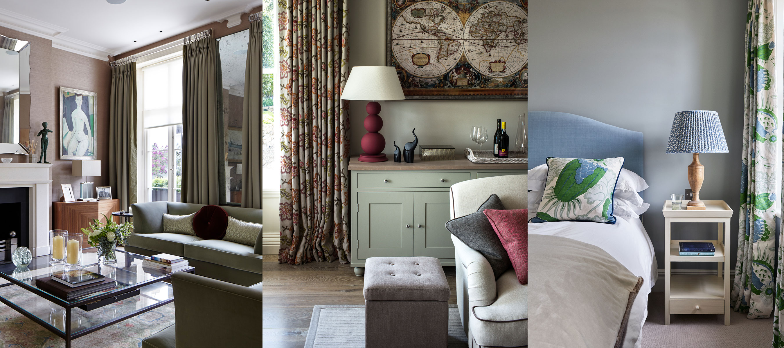
10 accent colors for beige – design experts' favorite color pairings

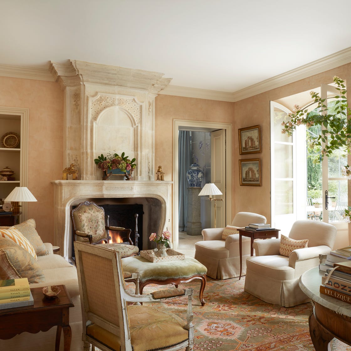
These Are the 10 Colors Interior Designers Would Pair with Beige

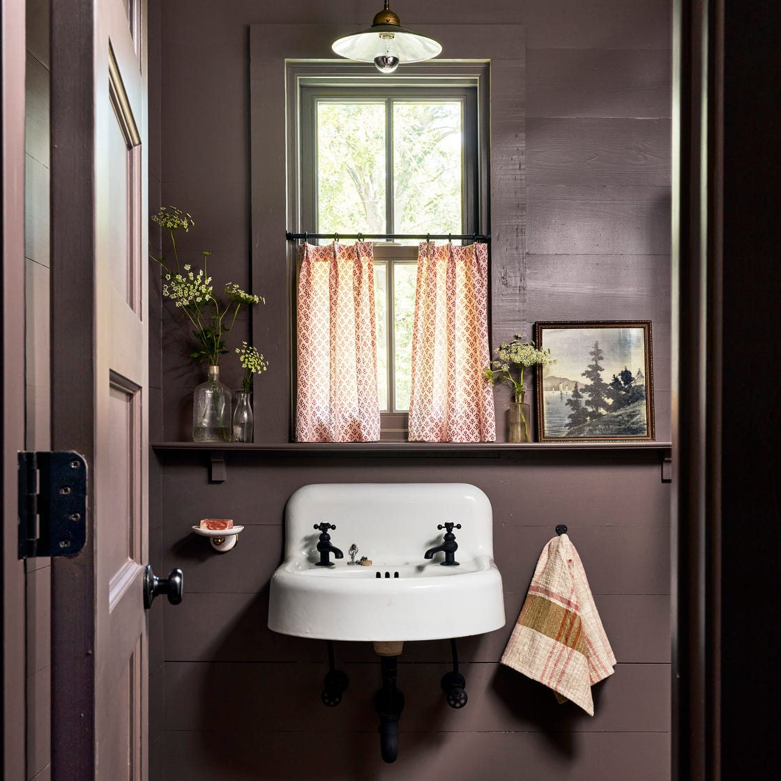
5 Paint Colors You'll See Everywhere in 2025—None of Them Are Beige
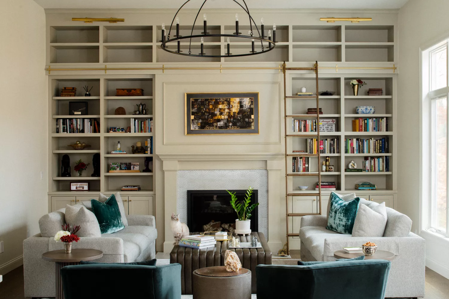
16 Beige Paint Colors That Never Go out of Style, According to Interior Designers
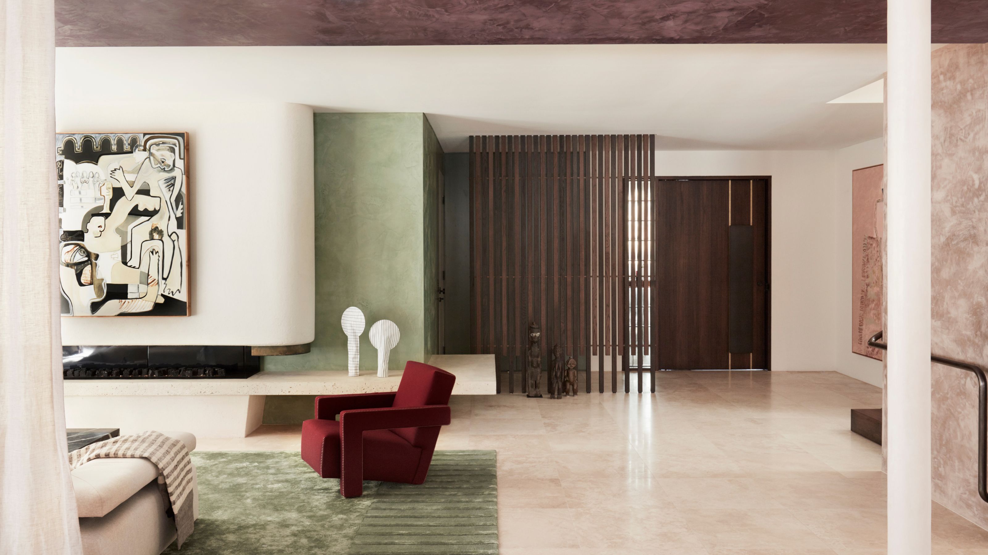
'The World of Color is Rife With Danger' — 5 Color Combinations That Don't Go Together and What to Use Instead

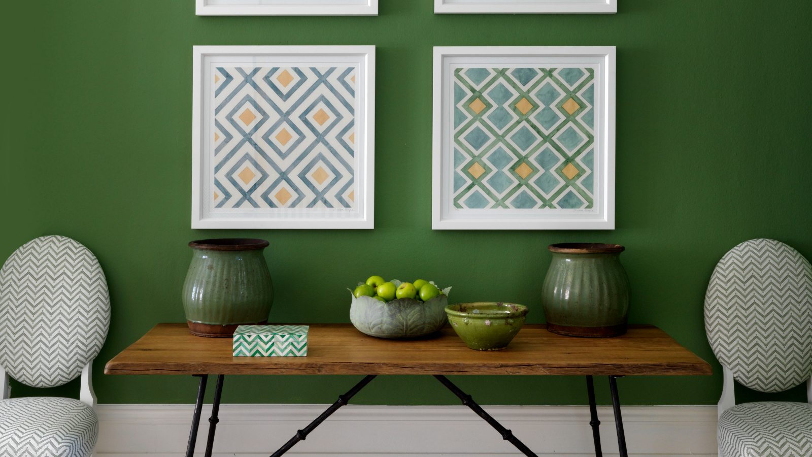
5 colors to avoid painting a landing – and the secret to choosing the right shades
11 Best Beige Paint Colors for Interiors

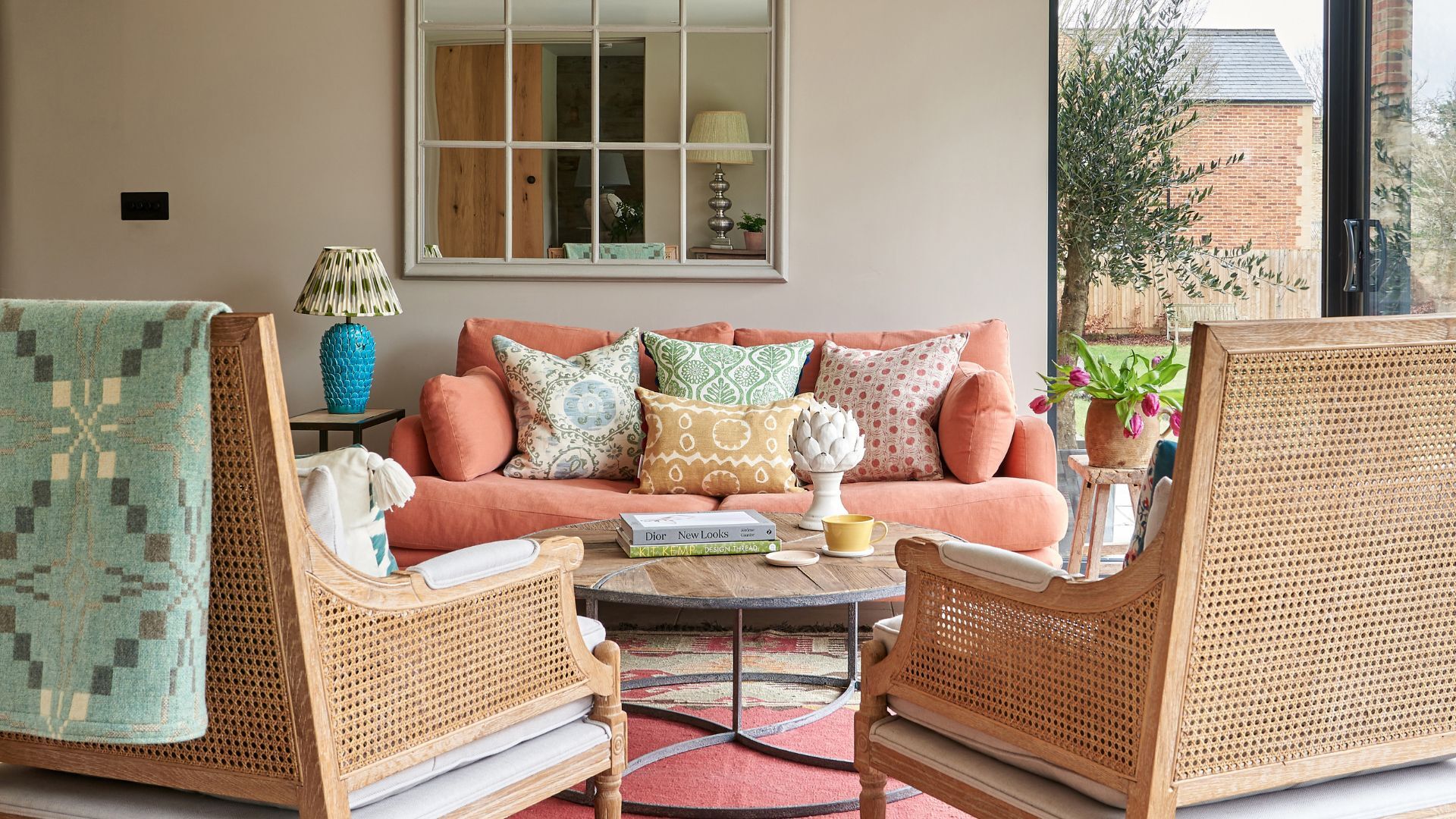
14 best beige paints, as chosen by interior designers
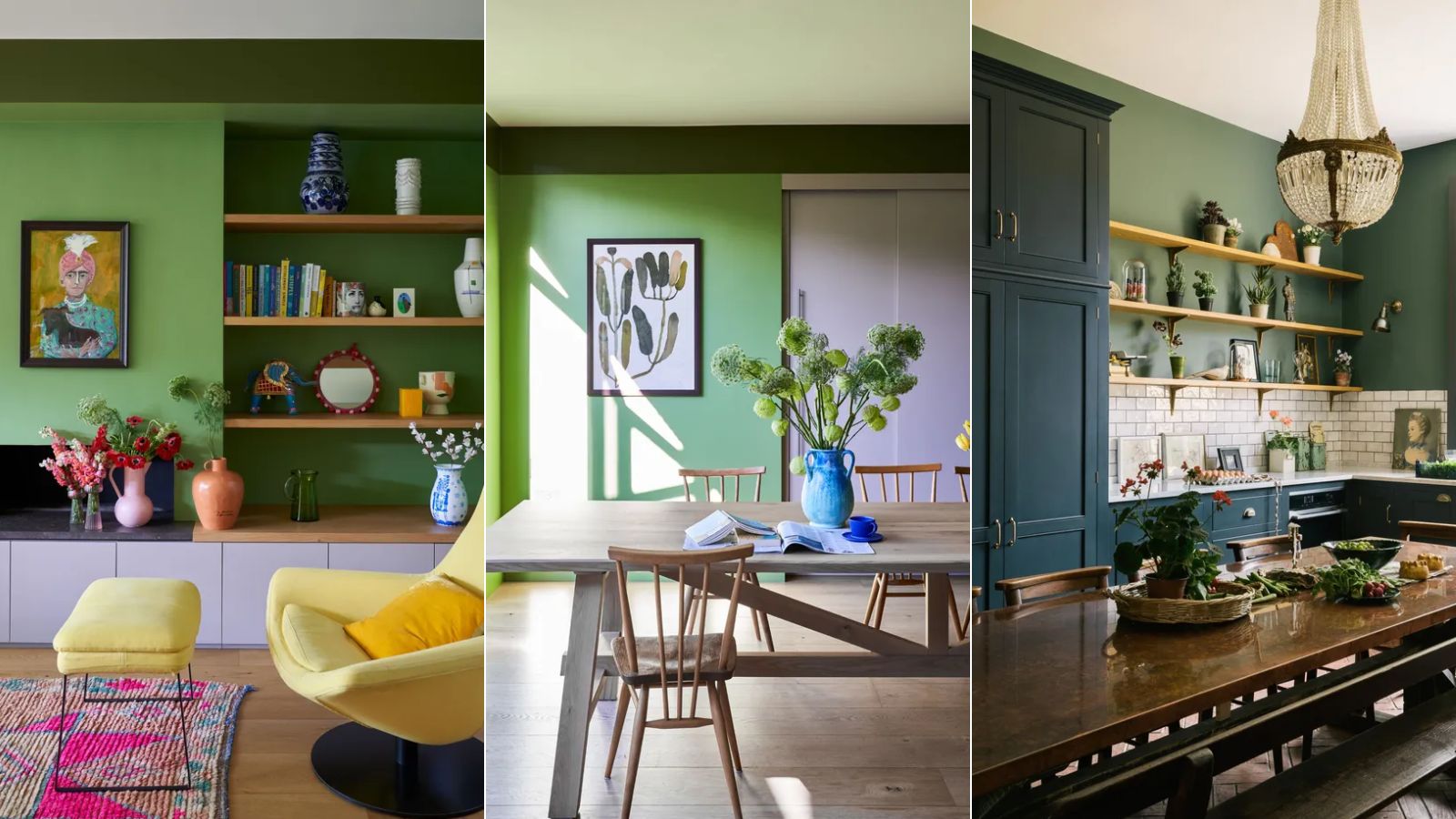
5 colors to never pair with green according to designers – and what to use instead
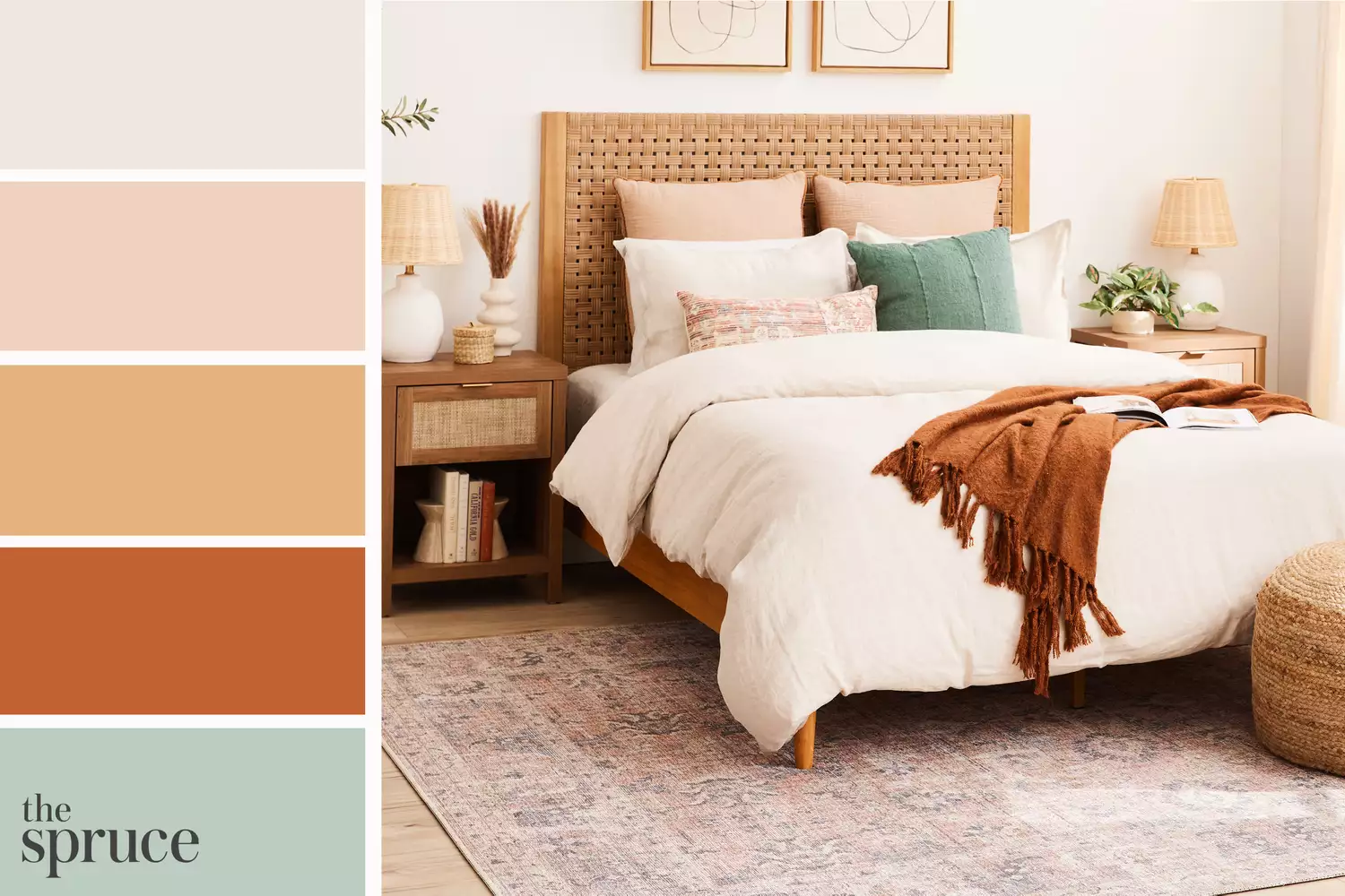
11 Beautiful Colors That Go With Beige
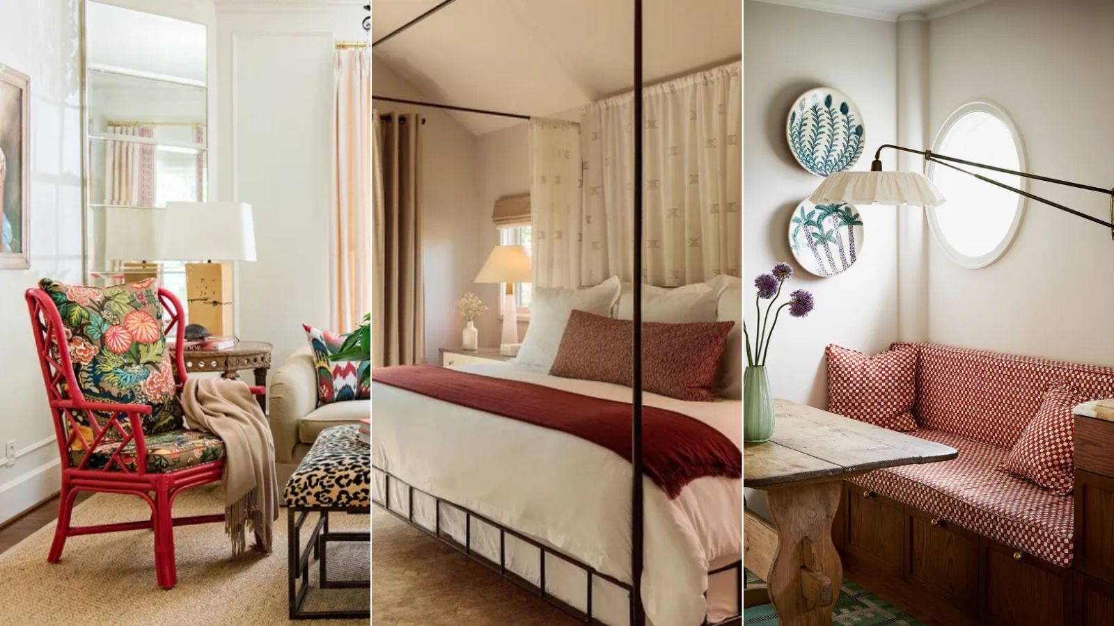
How to pair red and beige – 5 expert ideas for this on trend color combination
Colors not to paint a mudroom – 5 hues to avoid in this high-traffic space
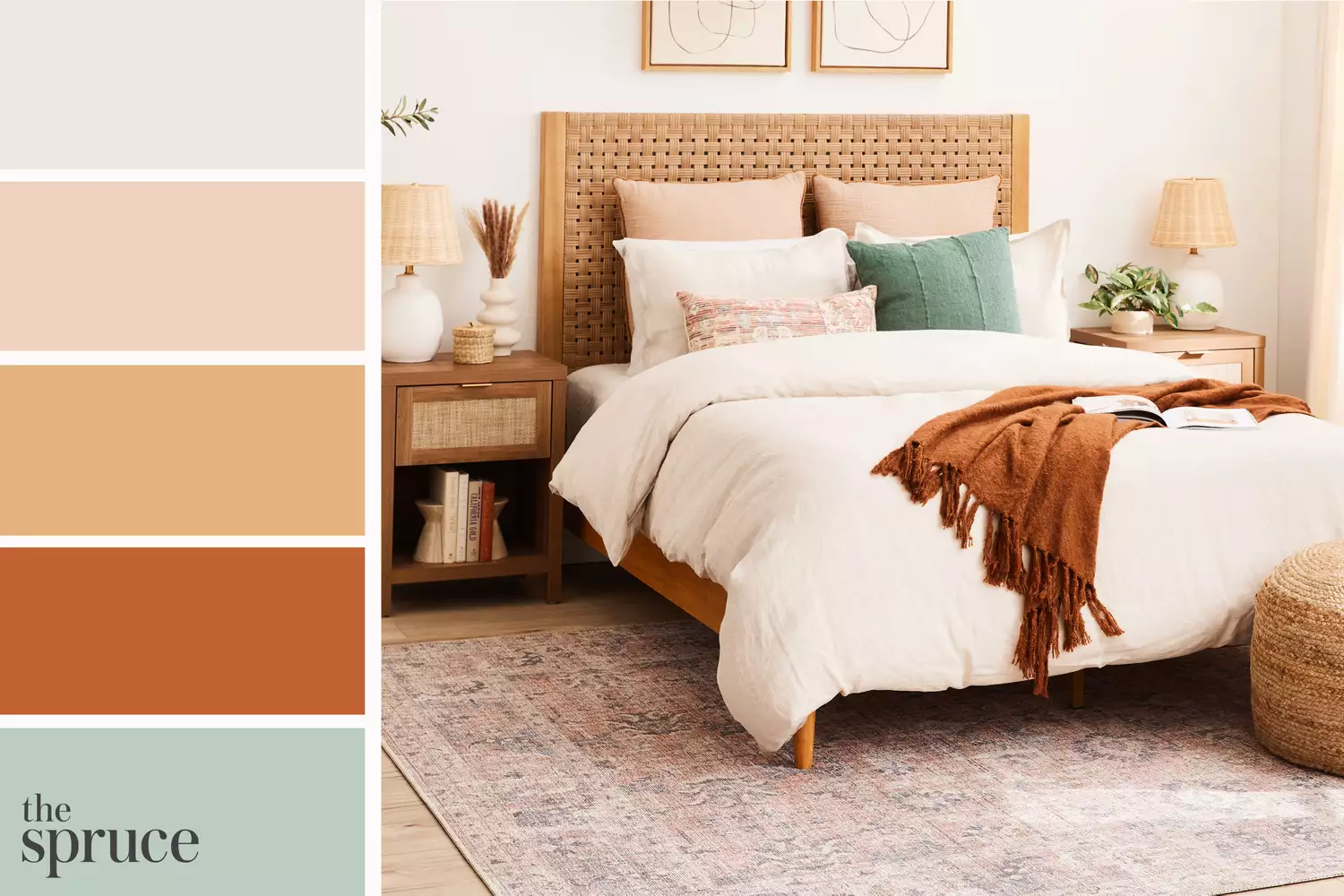
11 Beautiful Colors That Go Well With Beige
5 colors to avoid in a bathroom – according to designers
Beige Is My Favourite Colour—20 Pieces That Prove It's in No Way Boring


5 colors you should never paint a small room – designers warn us to steer clear of these hues, and what to pick instead
14 Colors You Should Pair With Beige to Make This Neutral Pop in Your 2025 Decorating Schemes
5 rug colors to avoid – the hues designers think you should veer away from on floors, plus how to make them work
Decorating with beige – 10 ways to embrace this warm neutral shade
The Best Beige Paint Color of All Time