1/5
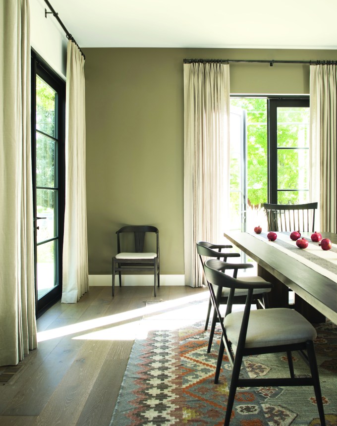
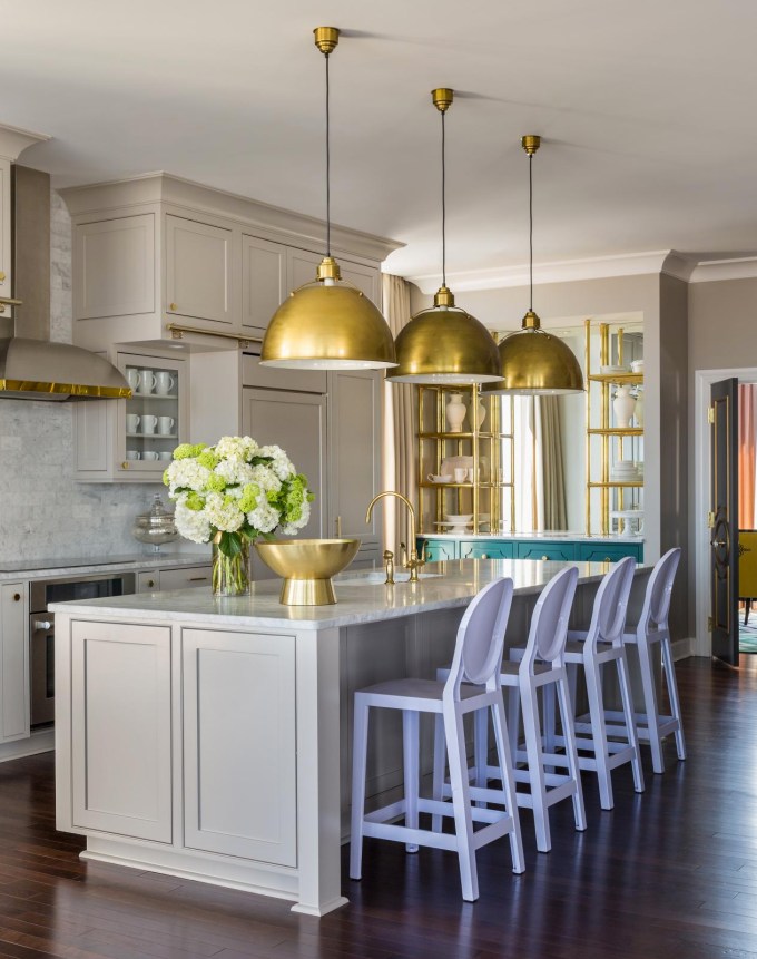
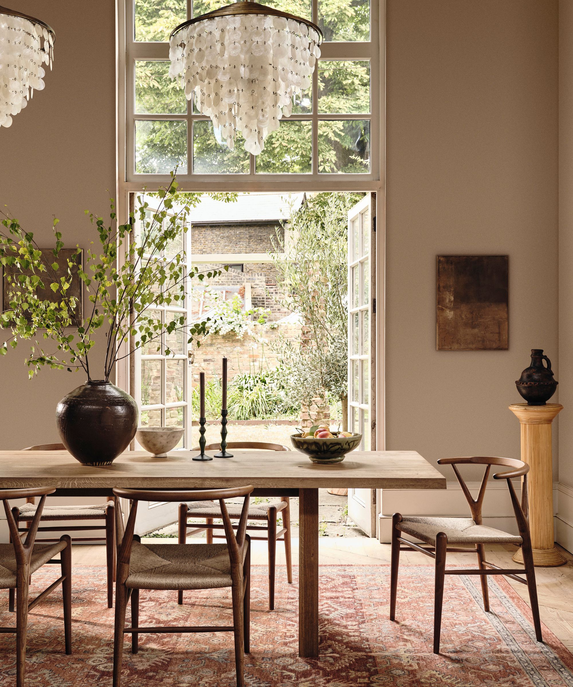
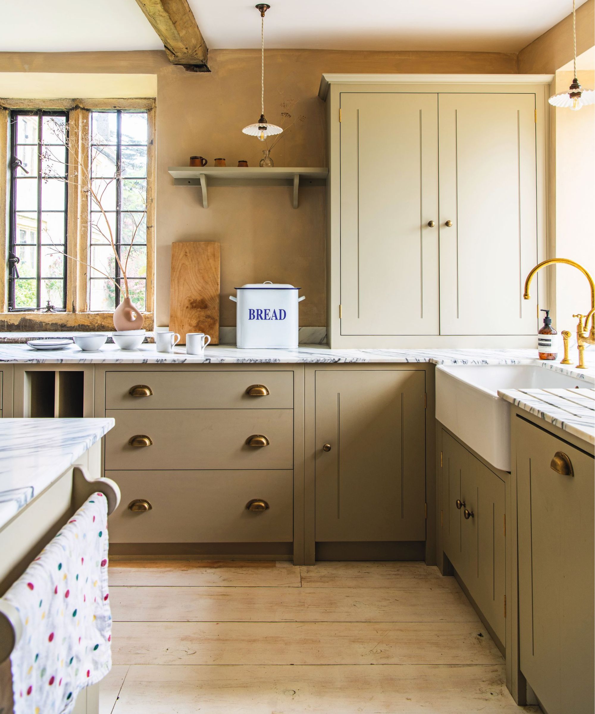
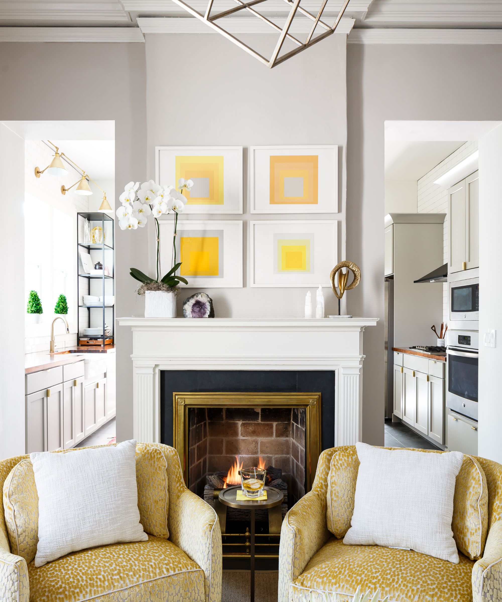
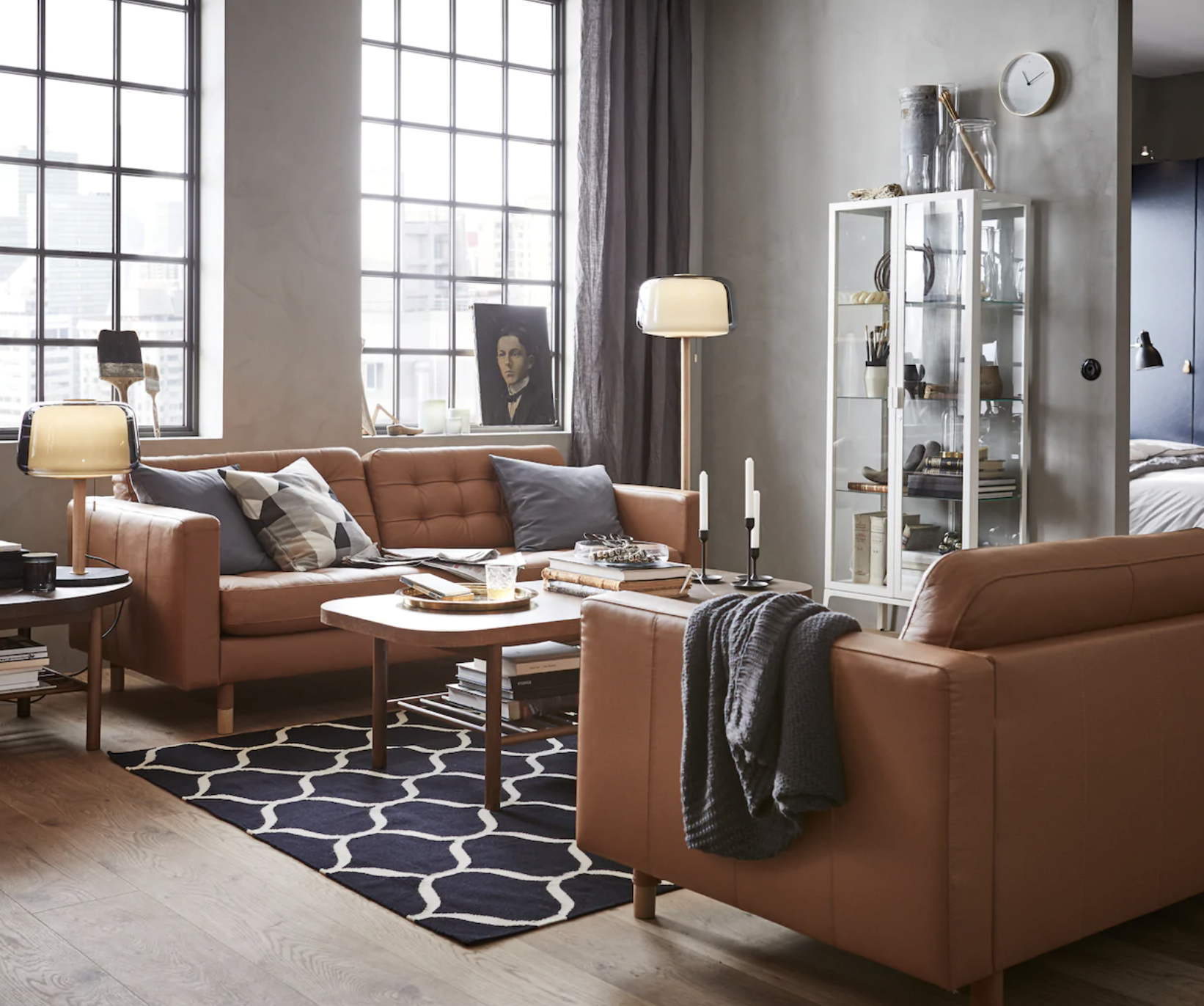

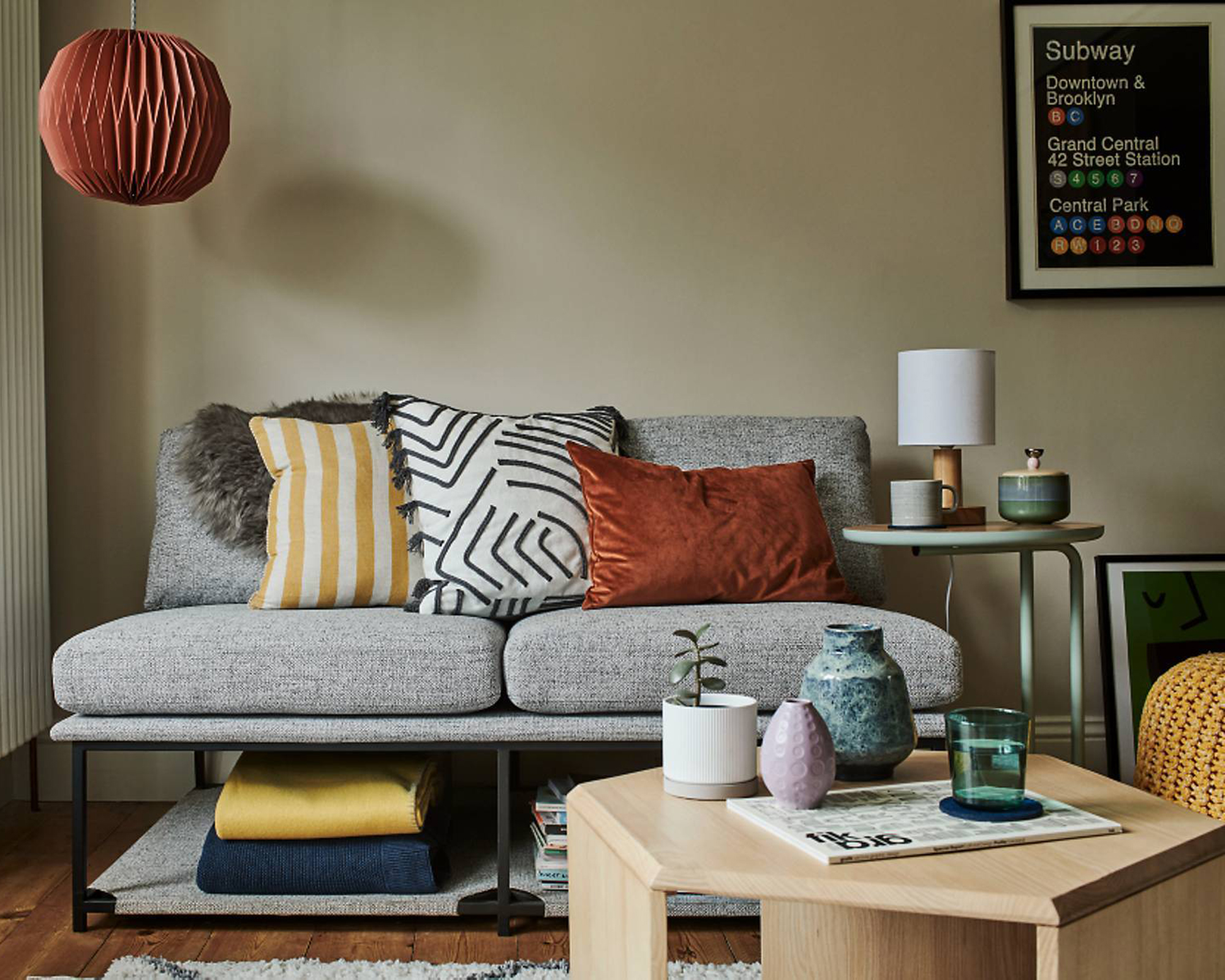
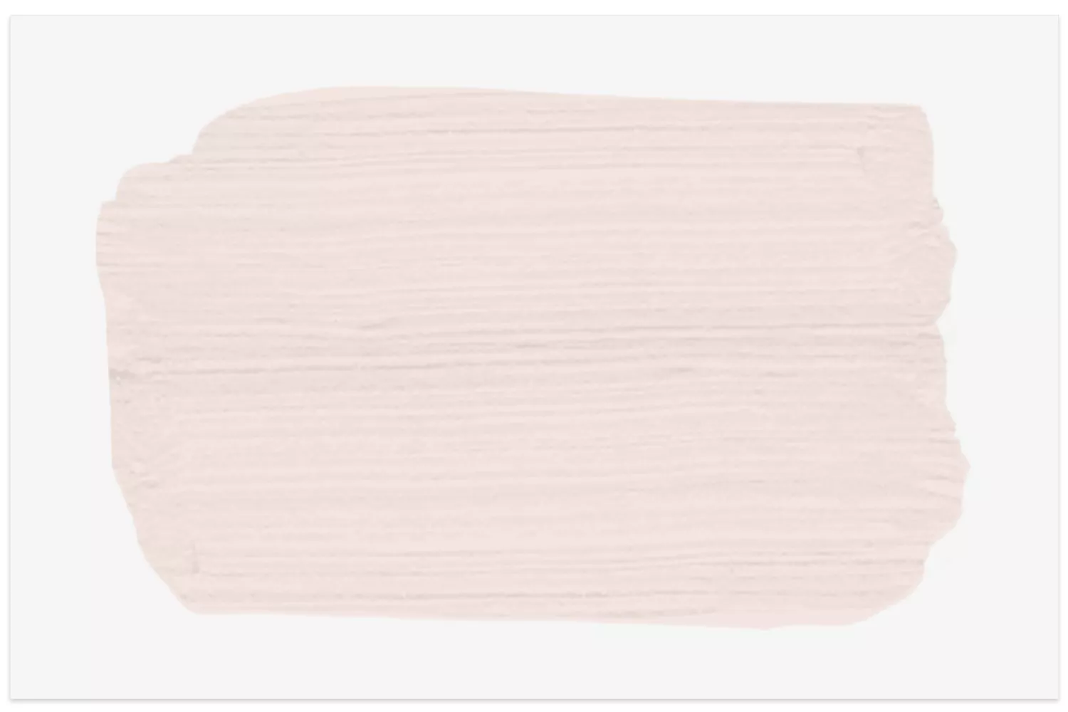
Beige-grey – the timeless paint color perfect for a barely-there backdrop
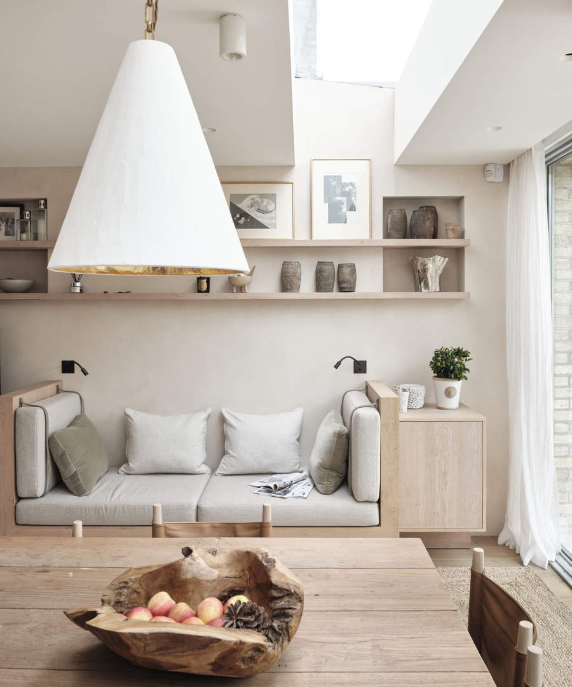
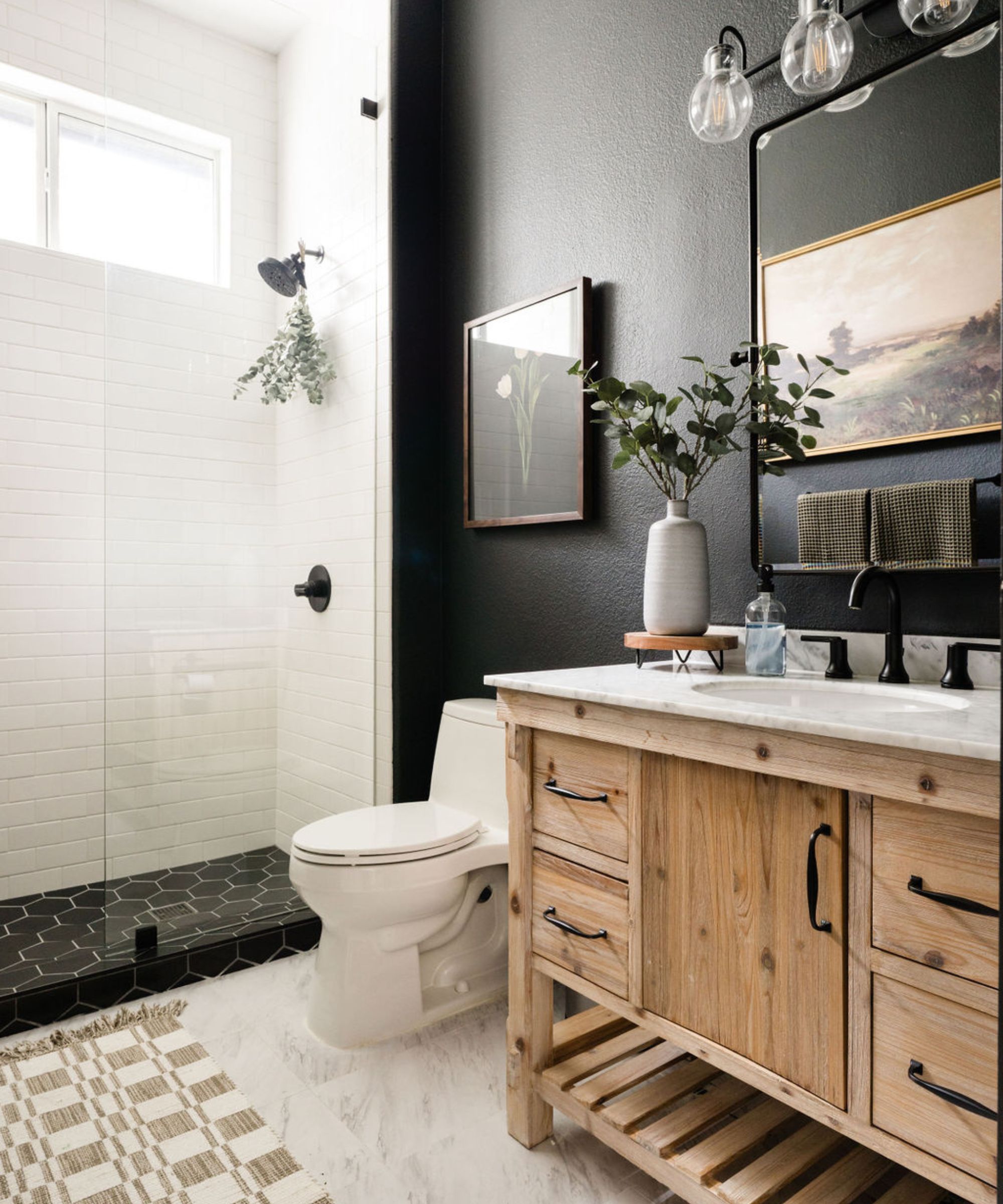
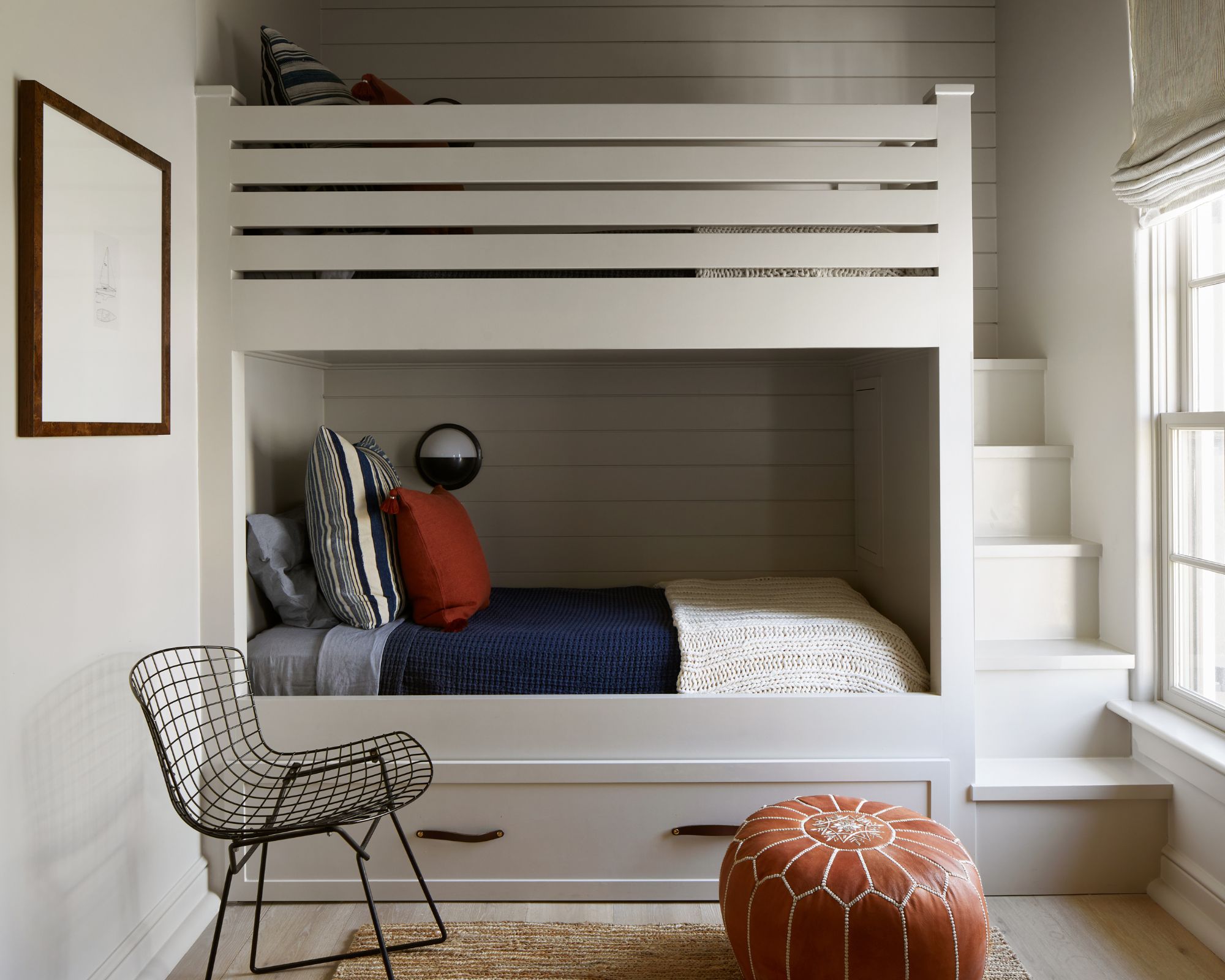
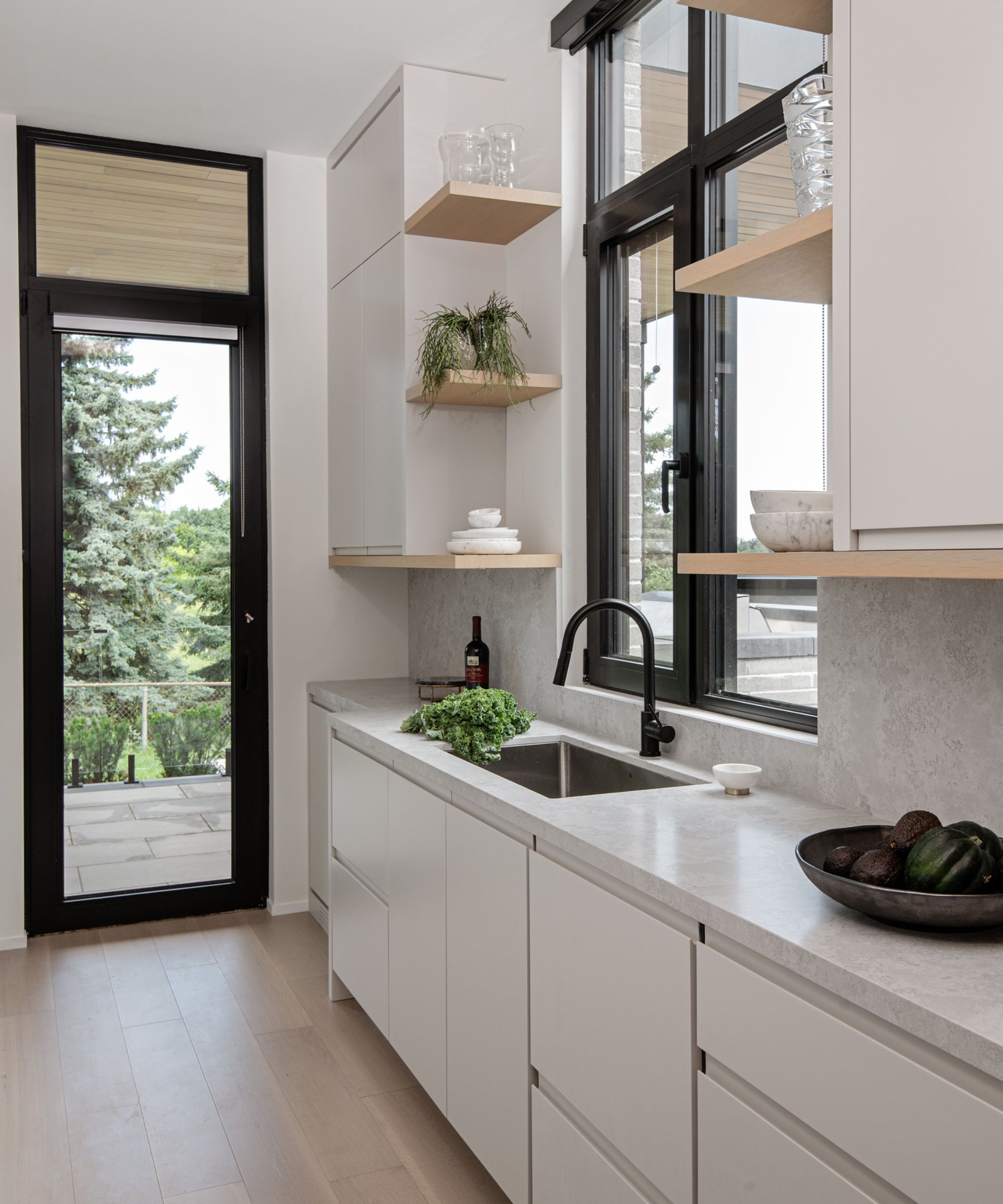
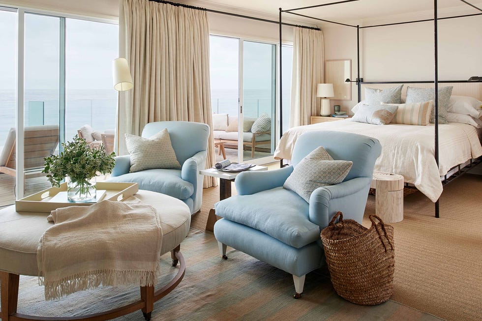
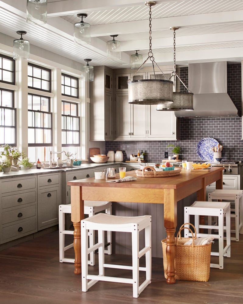
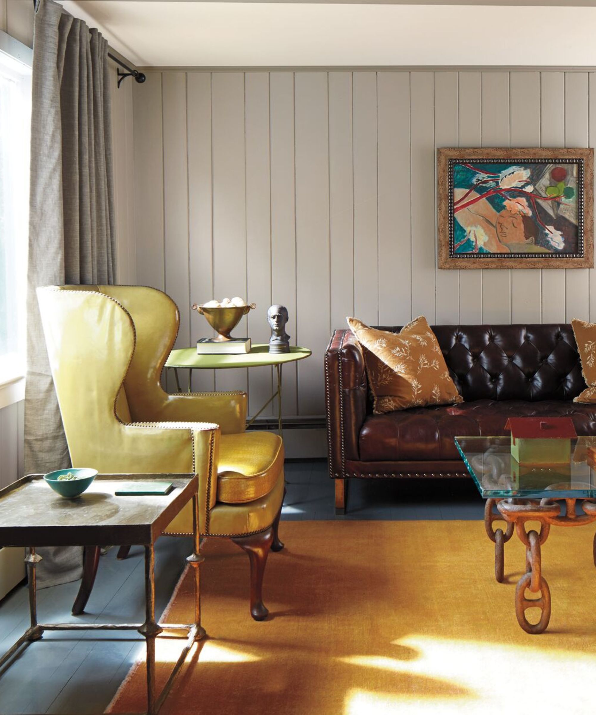
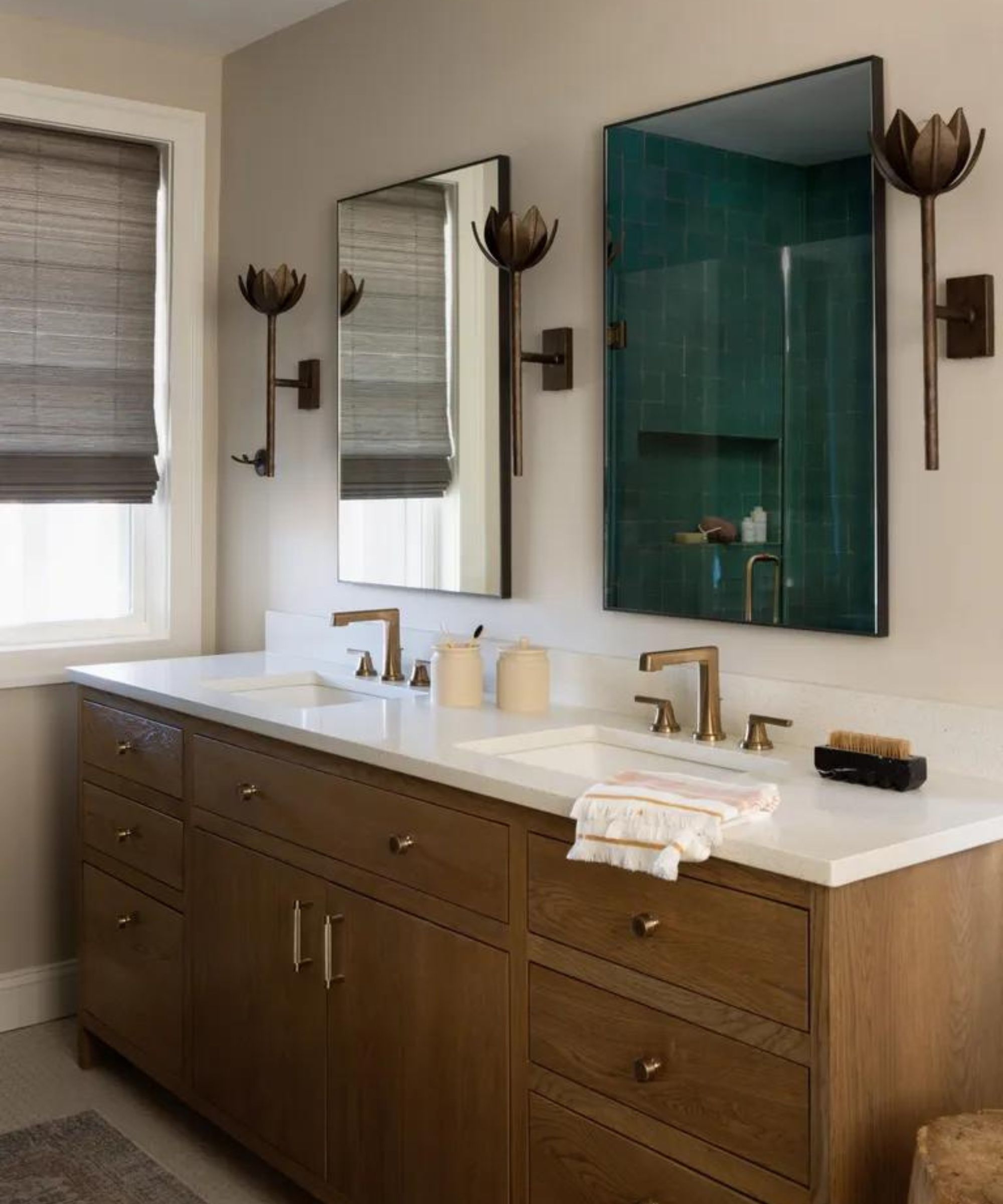
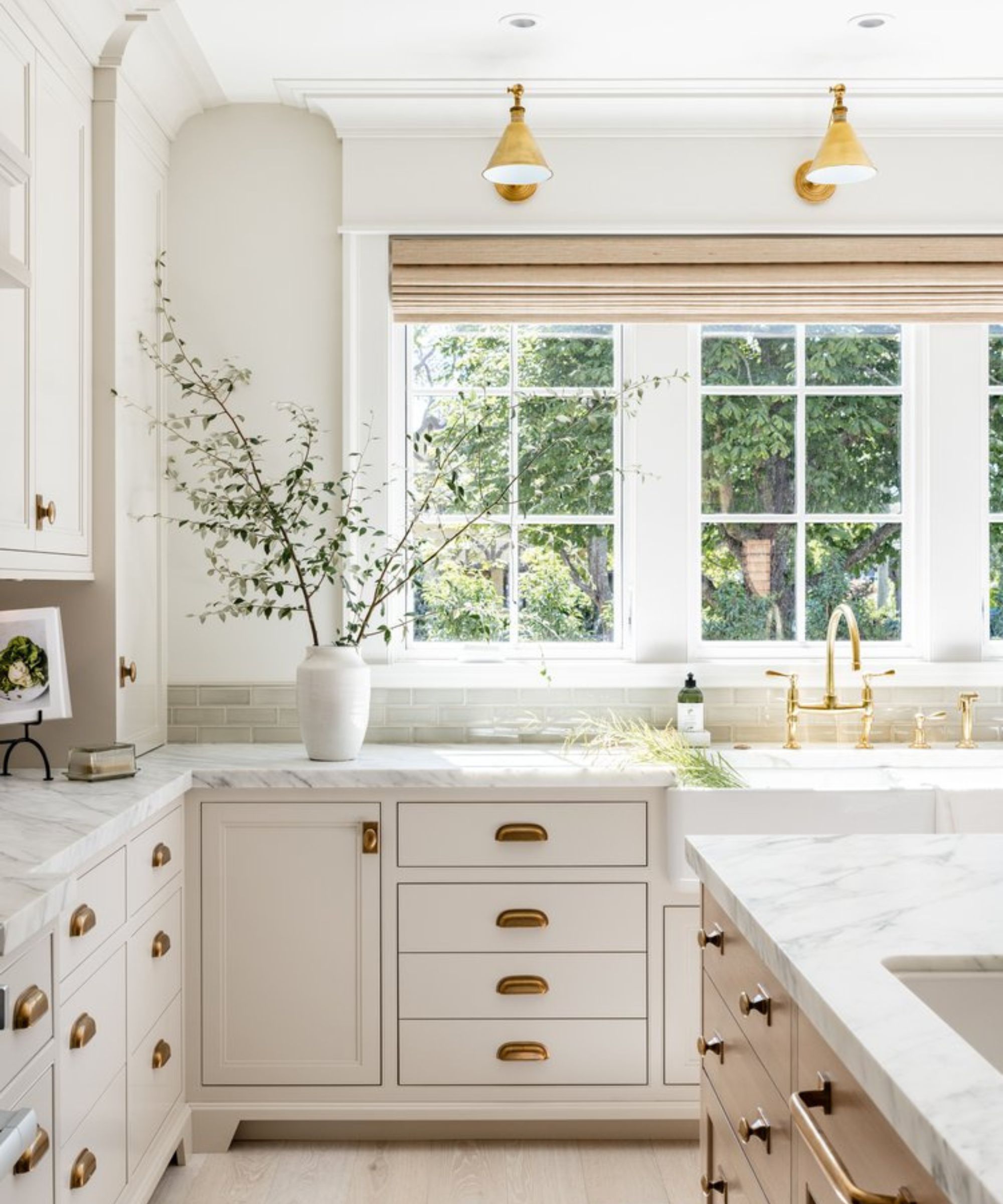
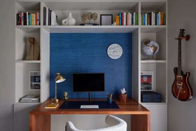
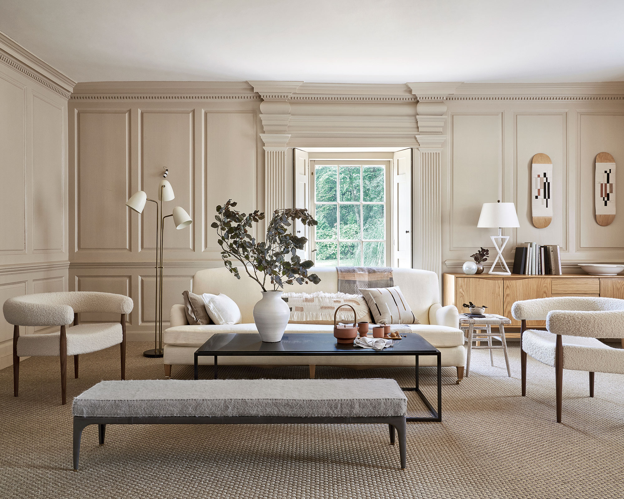
This article discusses the emerging interior design trend of using beige-grey as a sophisticated and versatile neutral paint color. It highlights how this soft hue can serve as an ideal backdrop for various design elements, from architectural features to decorative furniture and bespoke artworks. The piece emphasizes that while bold and vivid interior schemes have been popular, a well-chosen neutral like beige-grey offers a timeless and livable foundation for home decor.
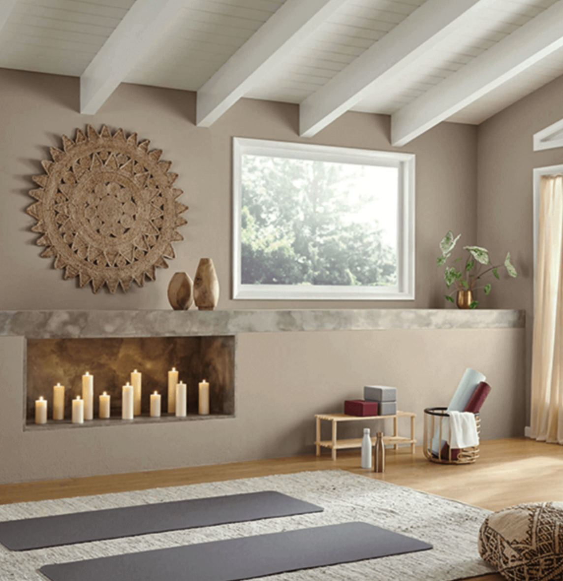
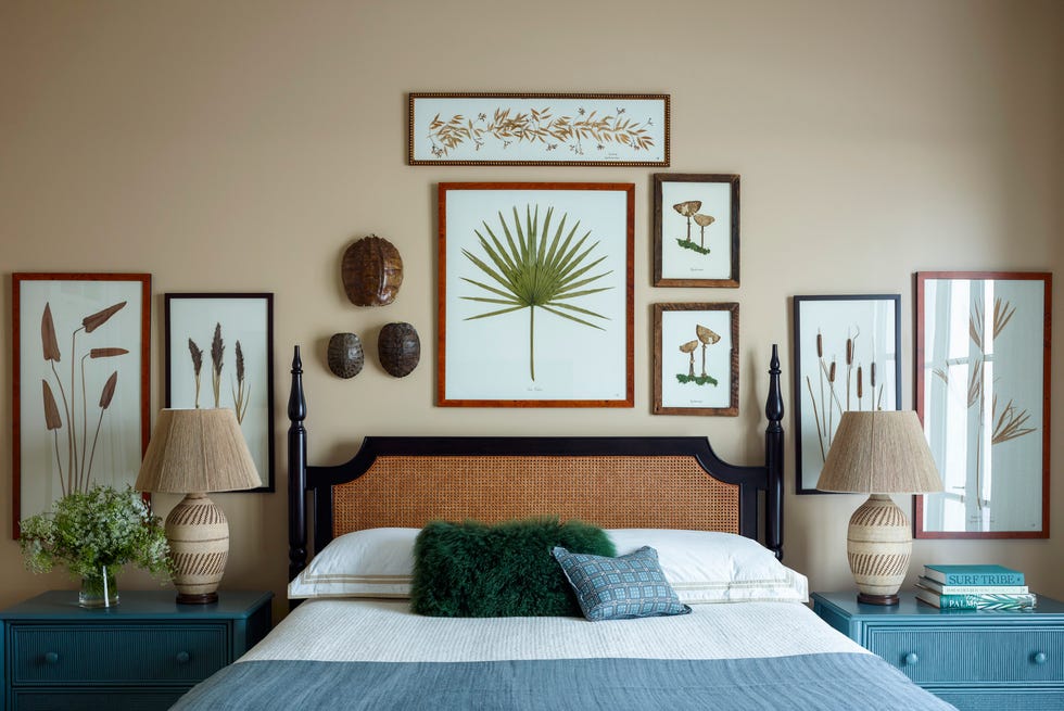
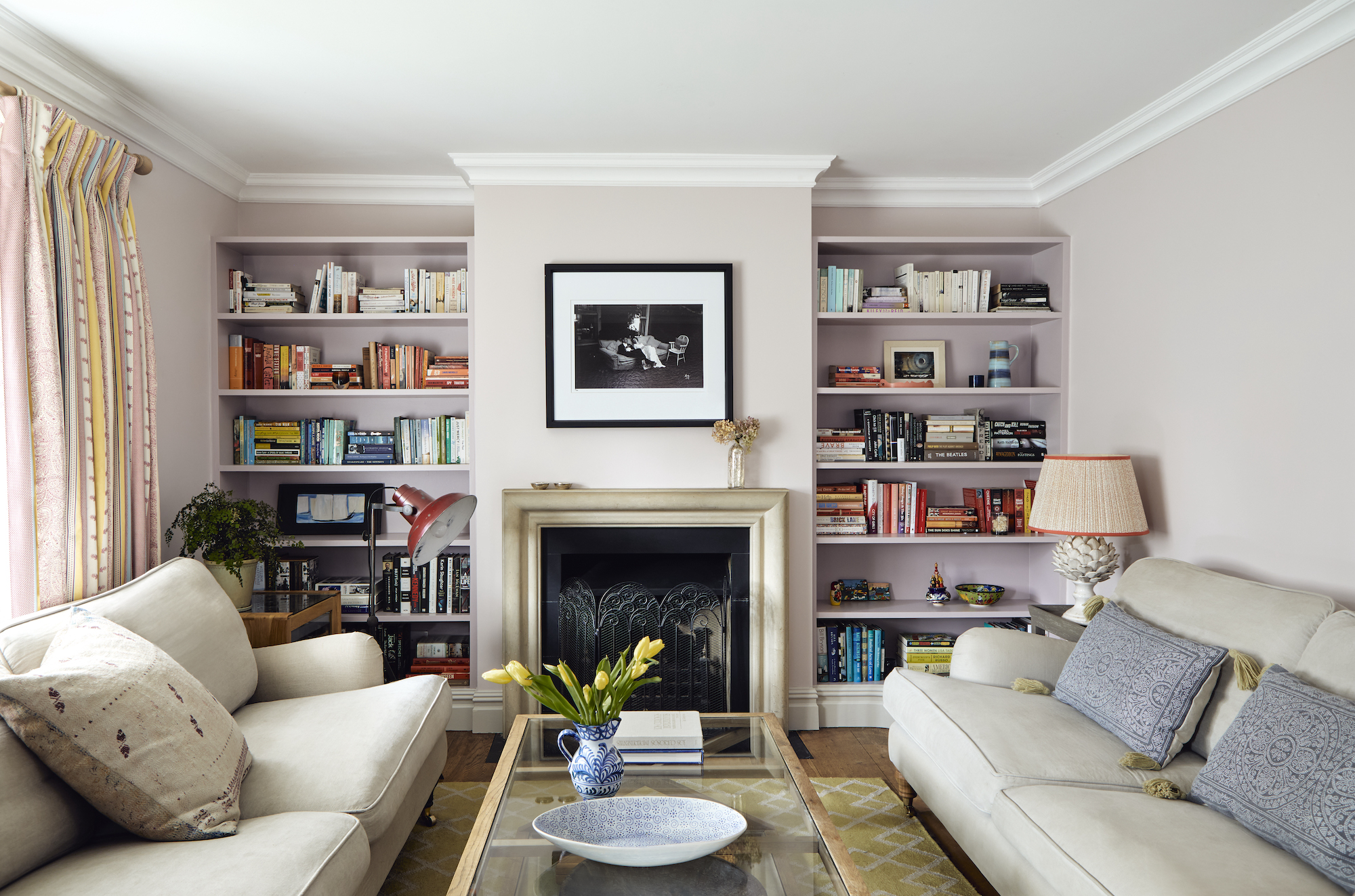
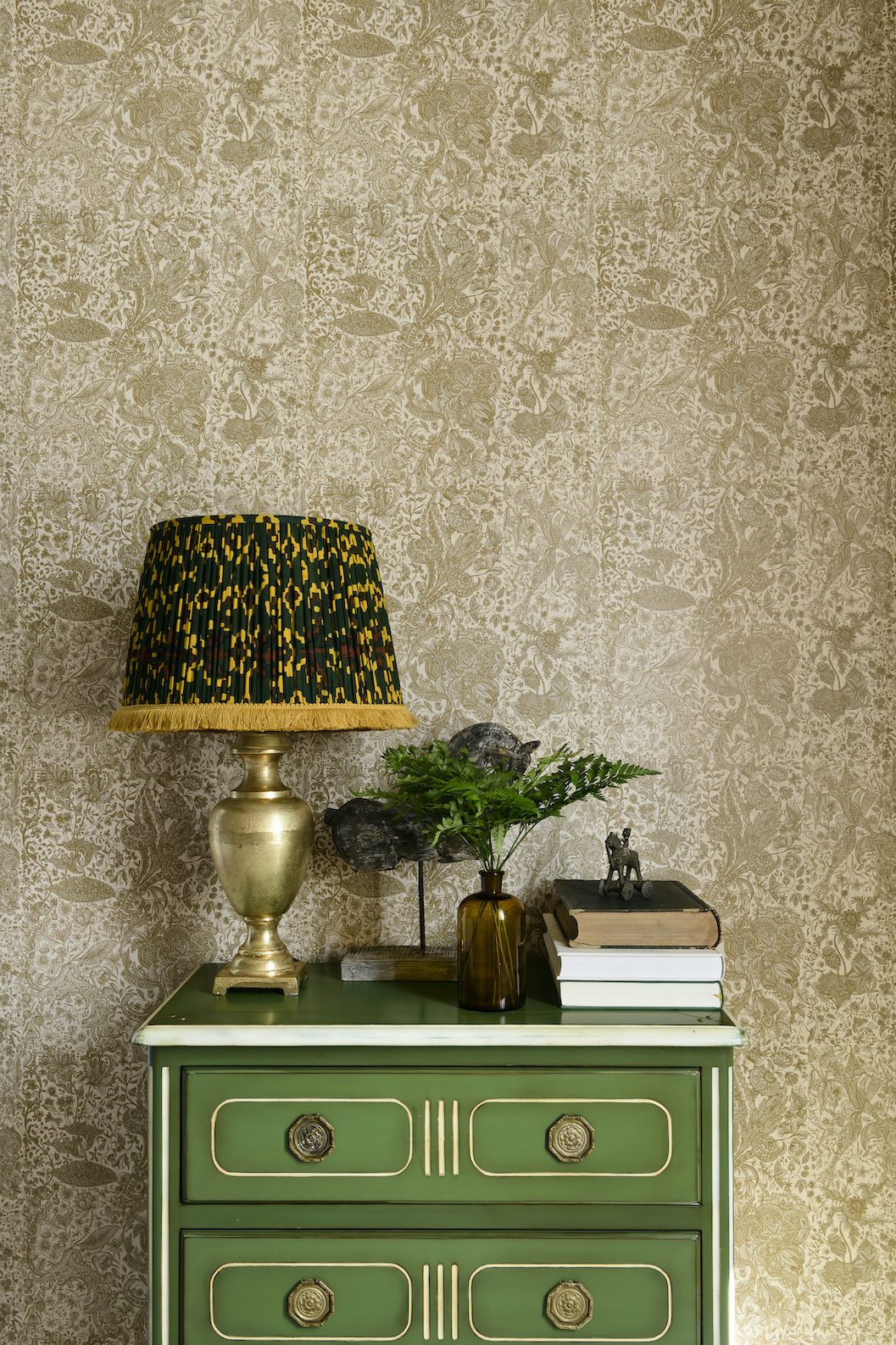
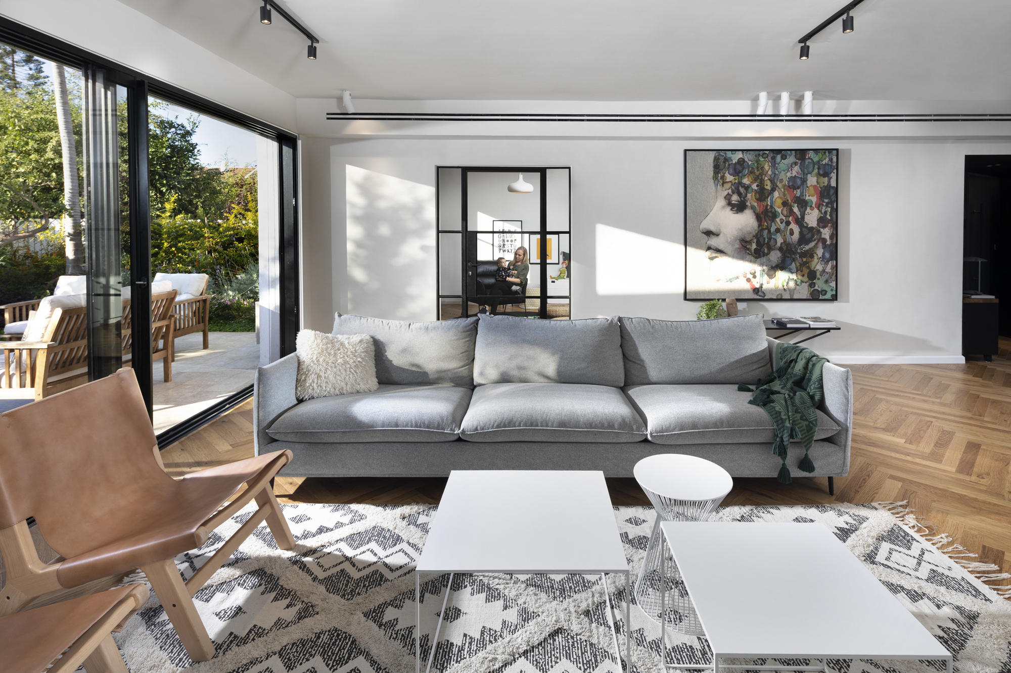
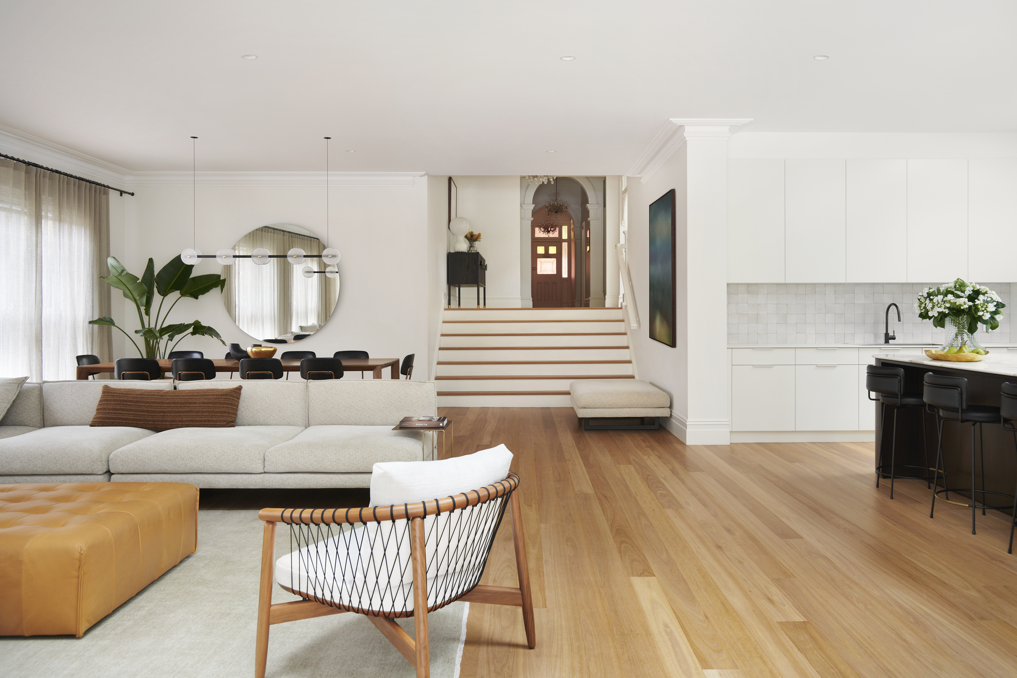
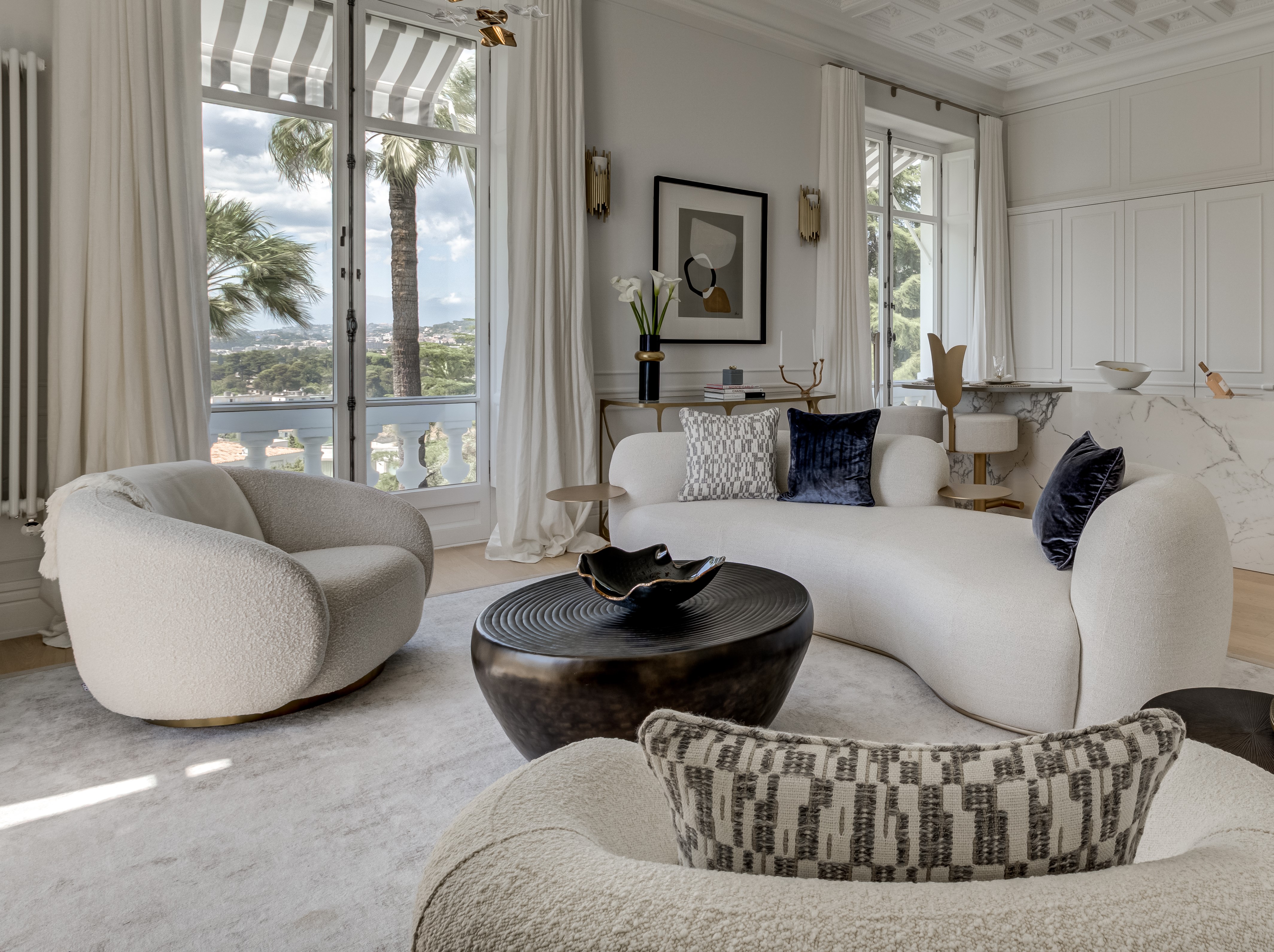
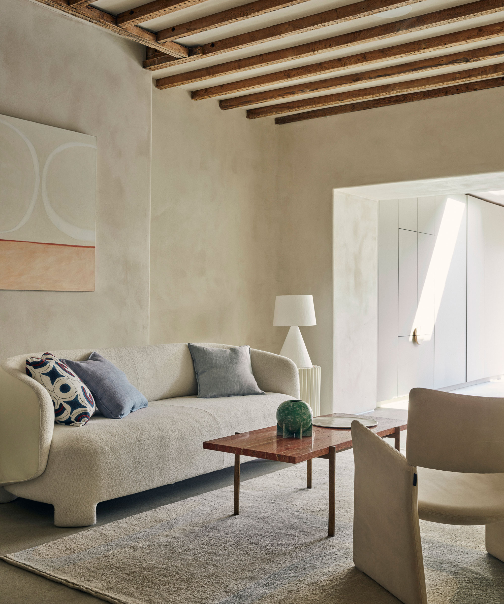
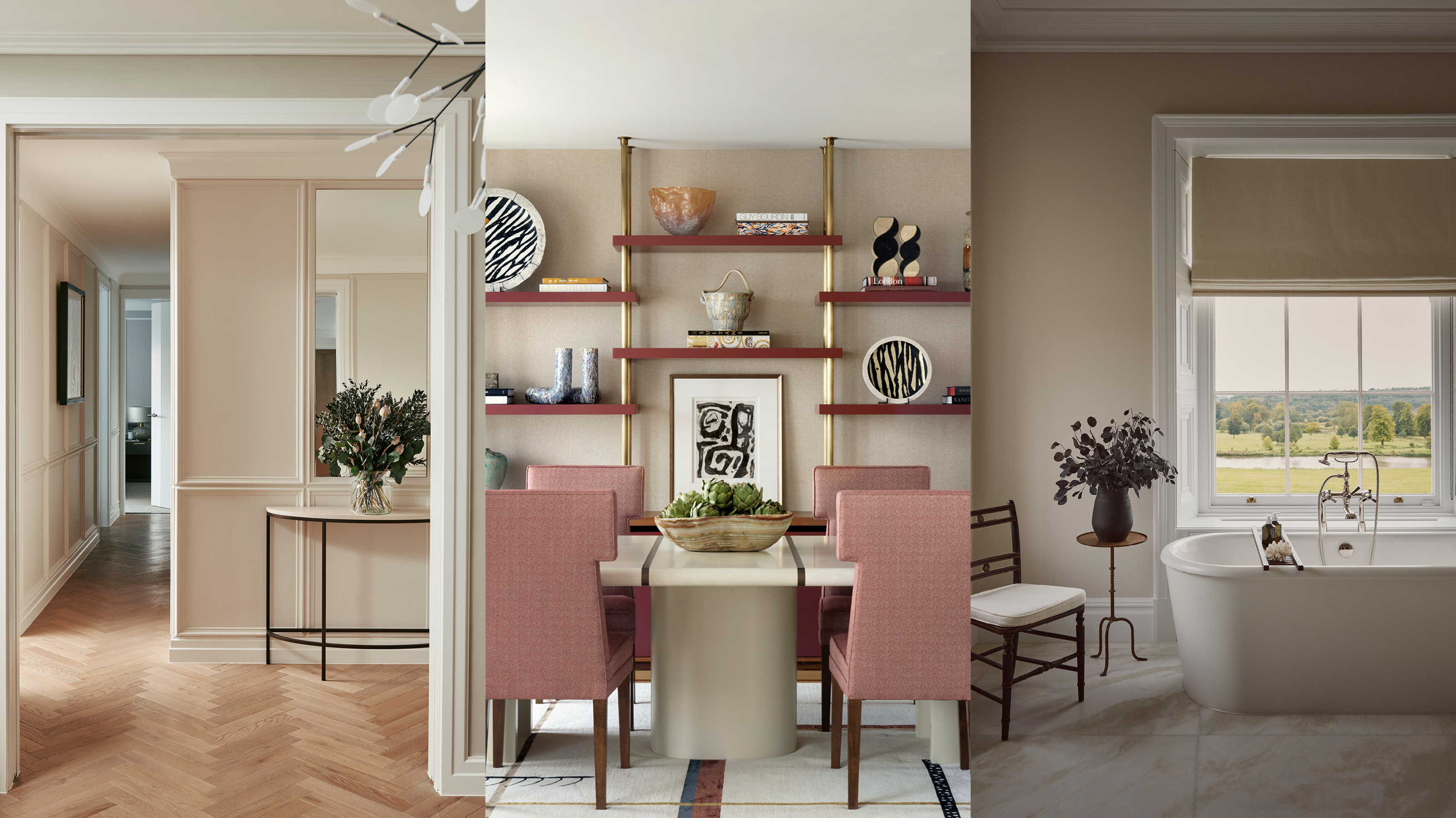
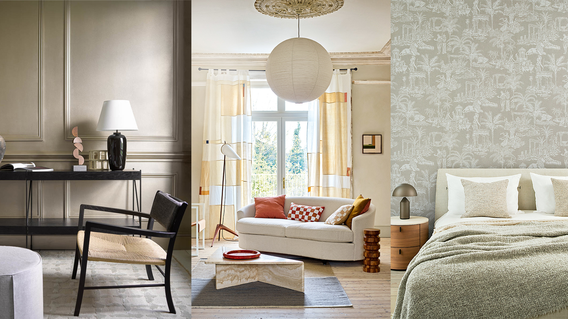
Experts in interior design advocate for the strategic use of neutral backdrops, particularly beige-grey, to allow other elements within a room to stand out. Rob Whitaker, creative director at Claybrook, describes this color as a 'smart neutral' that provides an excellent framework for introducing stronger pops of color elsewhere. Charu Gandhi, founder and director of Elicyon, suggests pairing beige-grey with materials such as leathered finished marble, suede, carved woollen rugs, ceramic, clay, and colored glass to enhance tactility and prevent the space from feeling sombre. The article underscores the importance of thoughtful material selection to complement the neutral palette.
To effectively implement a neutral scheme, the article advises planning the overall palette early in the design process. This initial decision influences subsequent choices for furniture, lighting, and textiles. When selecting the right tone of beige-grey for a space, it is crucial to consider factors like natural light, artificial lighting, and the existing textures. Sampling the paint color on-site, under various lighting conditions and at different times of the day, is highly recommended to ensure the desired effect. The article reassures readers that, unlike more vibrant colors, neutrals offer a safer choice, making them suitable for those uncertain about their design direction.
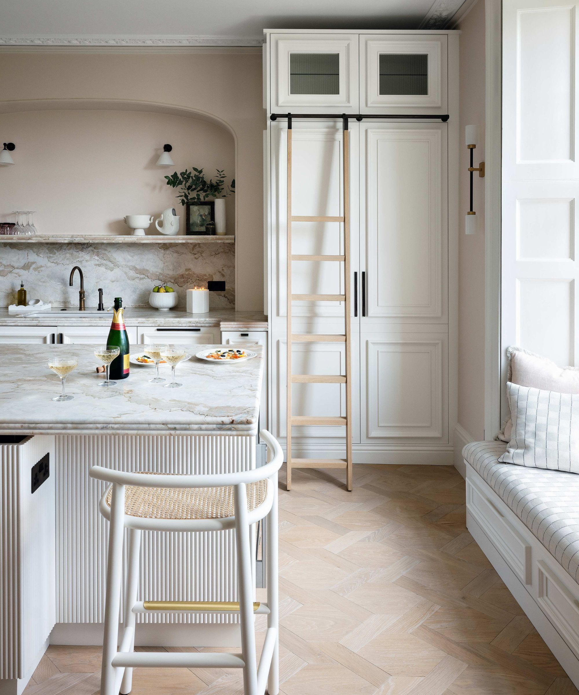
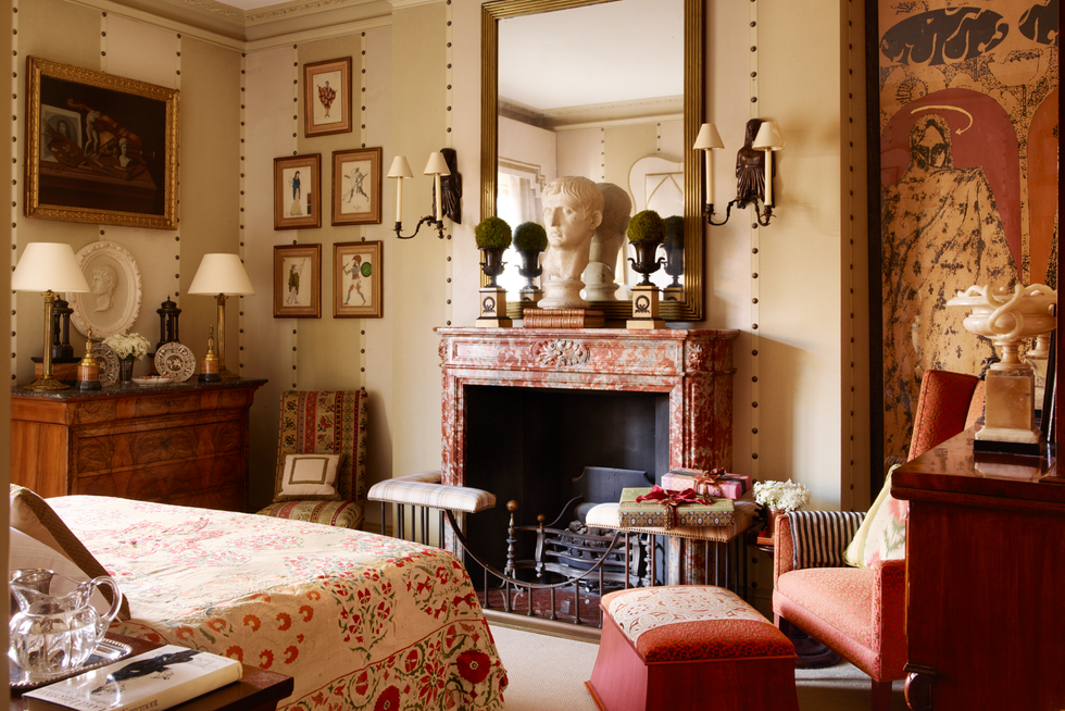
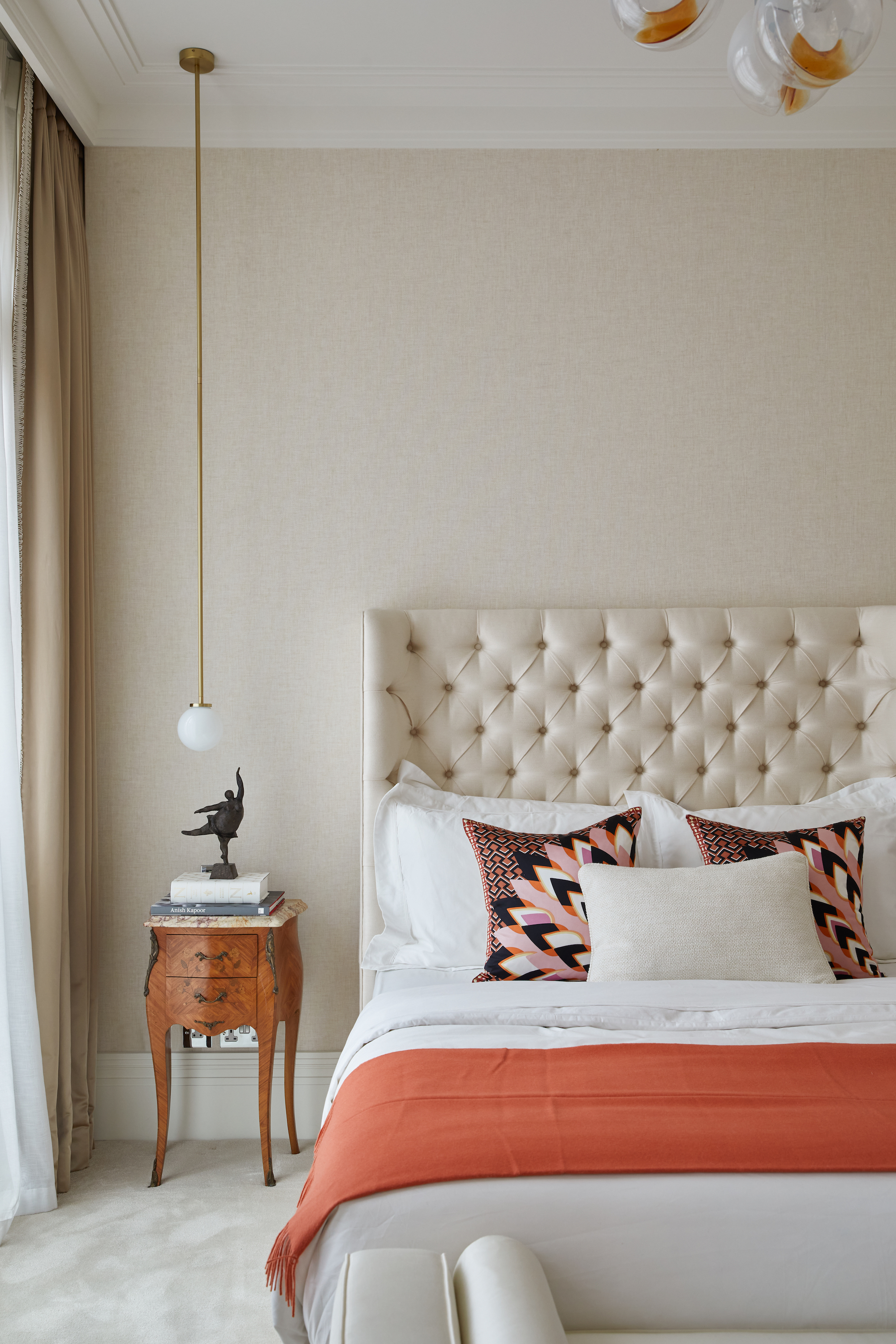
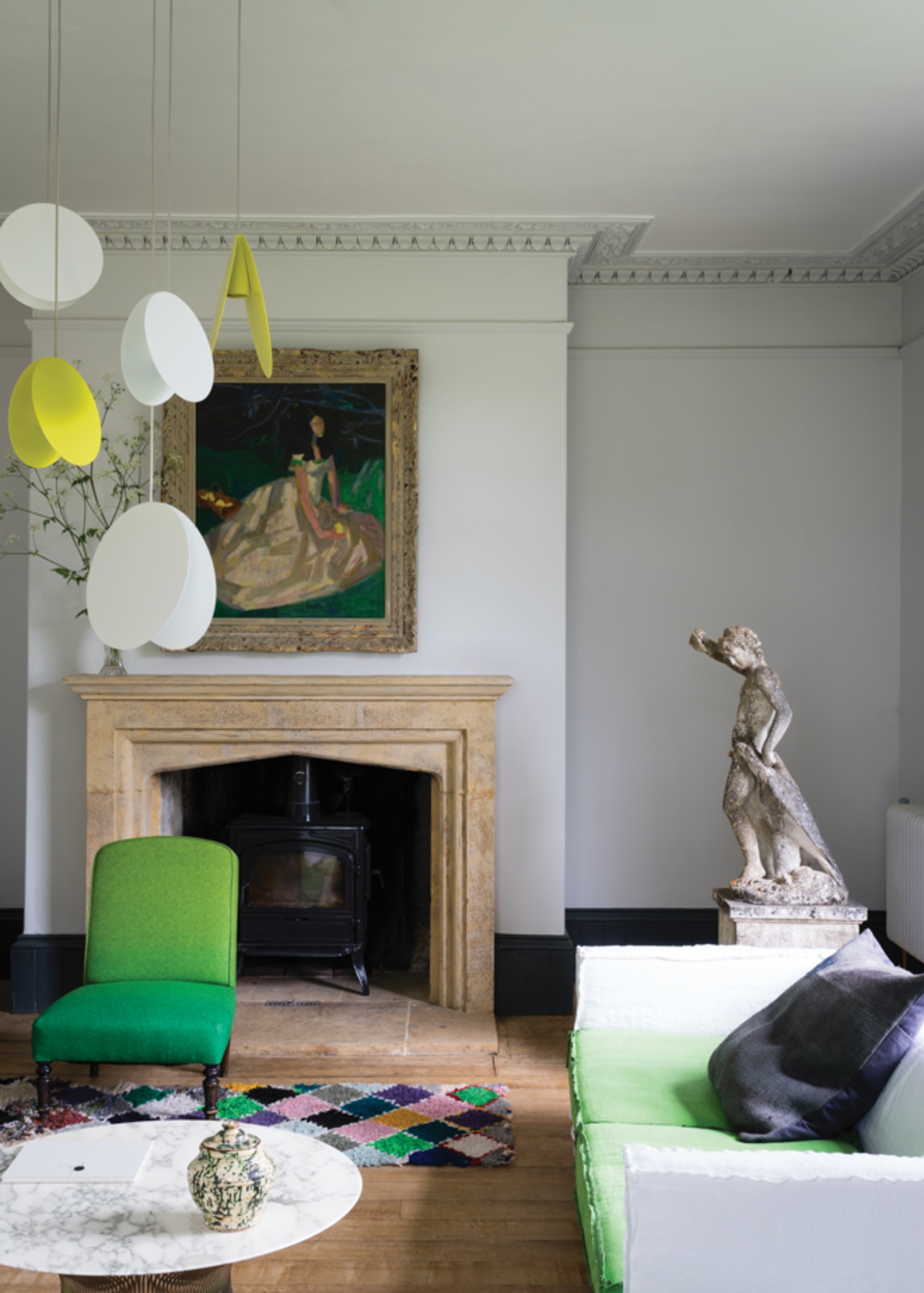
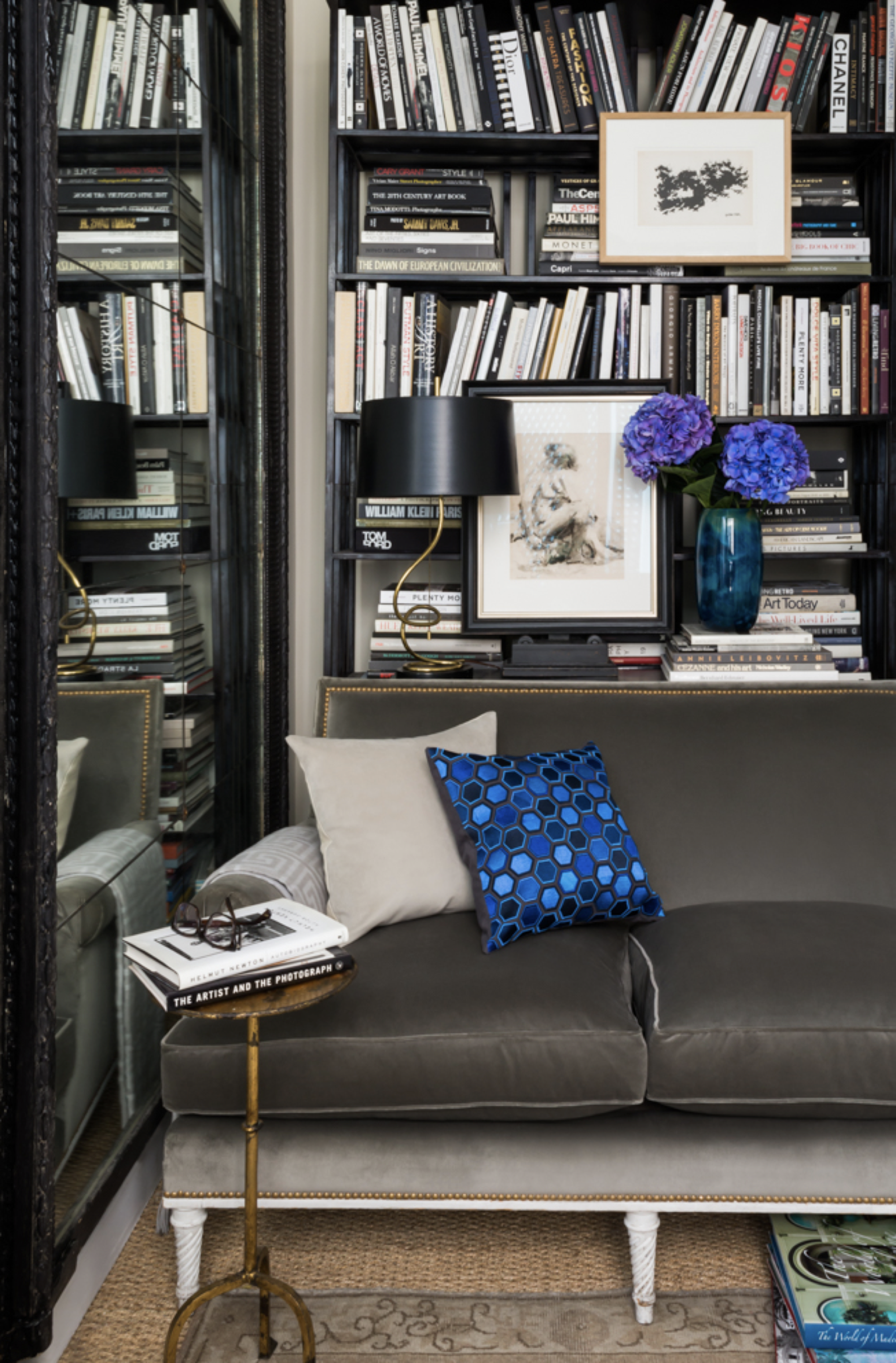
The benefits of incorporating beige-grey into home interiors are further explored through insights from industry insiders. Deborah Base, director of Base Interior, highlights the delicate balance required to use a neutral tone without creating a minimal or stark atmosphere. She stresses the significance of considering both natural and artificial light when choosing a shade. An example is given of a London pied-à-terre where Dulux Trade's 30YY 78/035 provides a perfect backdrop for architectural details and grand mirrors.
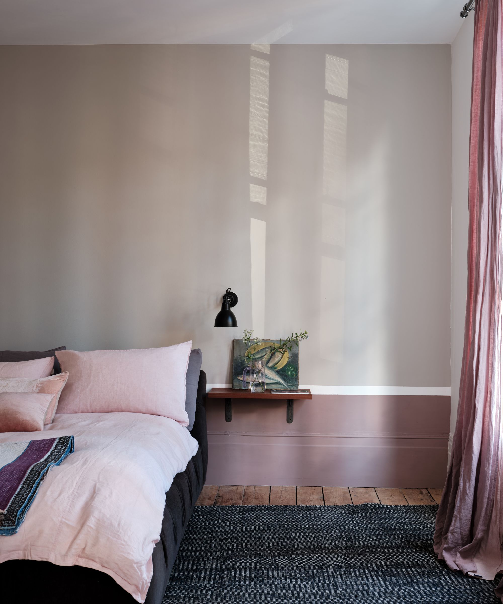
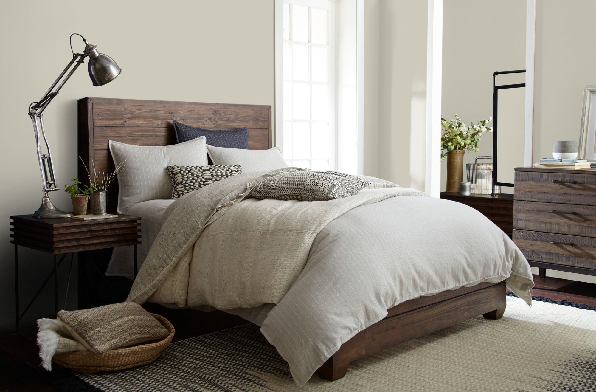
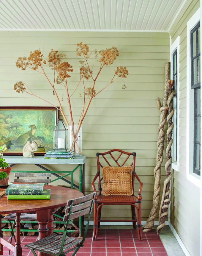
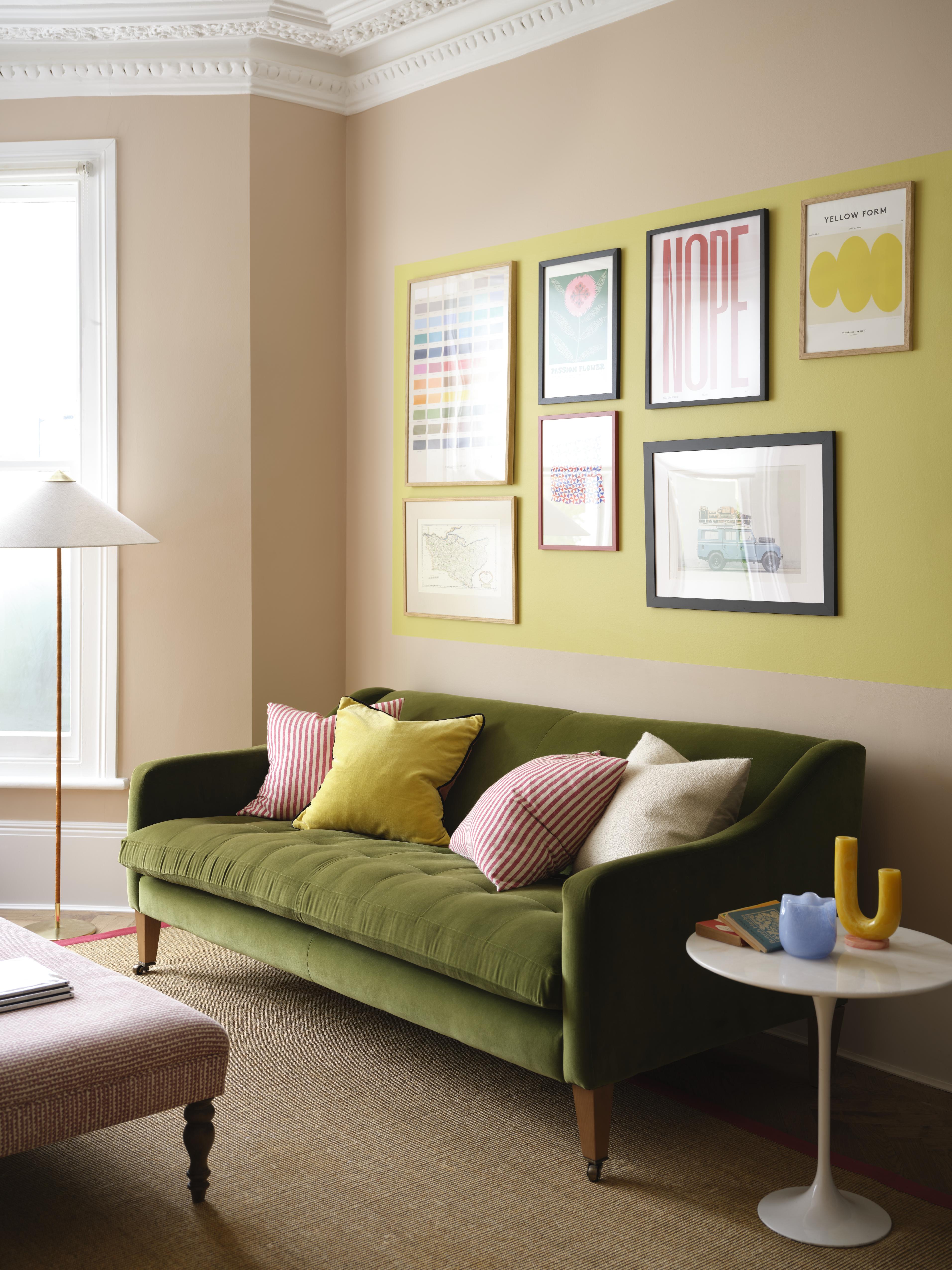
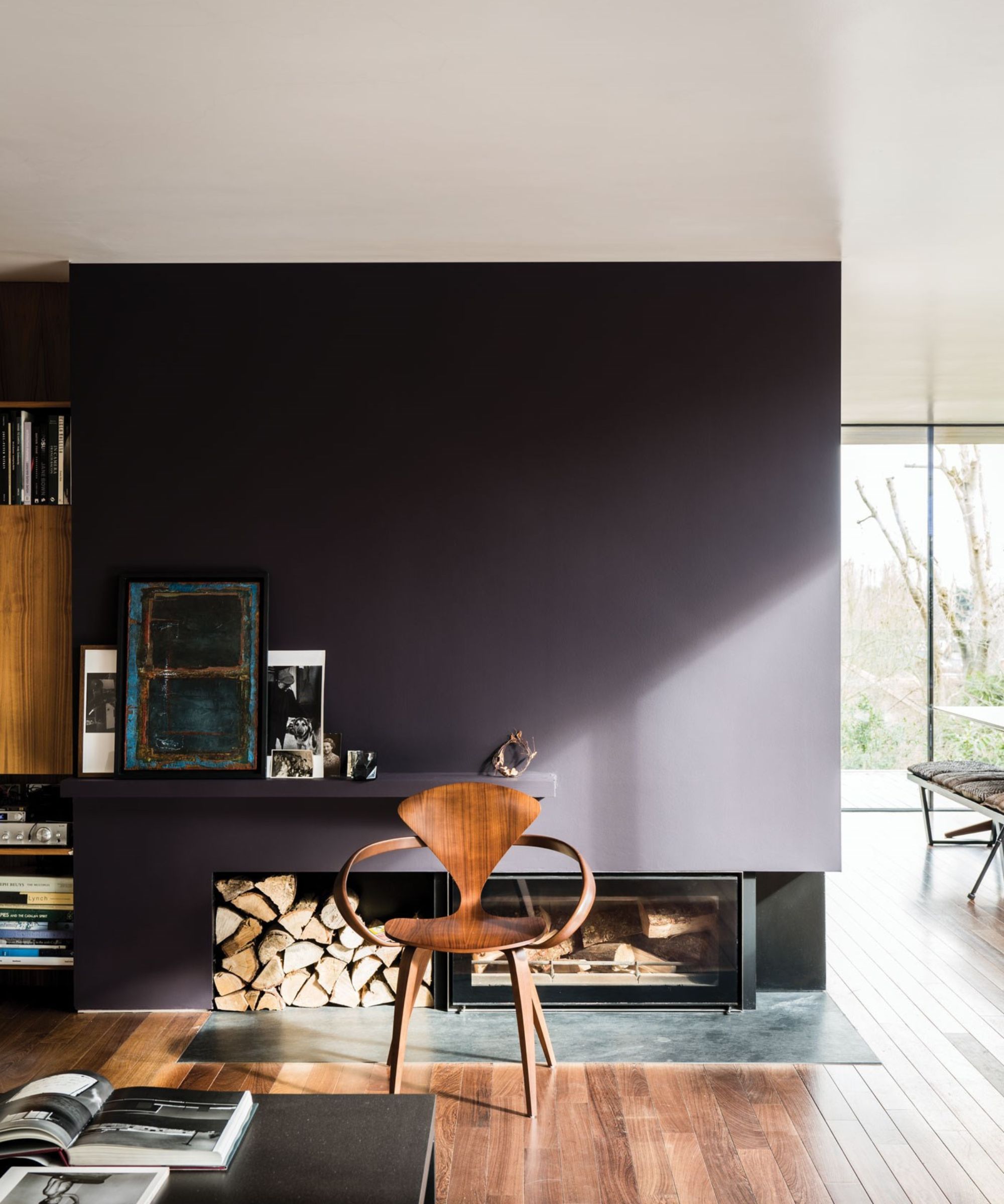
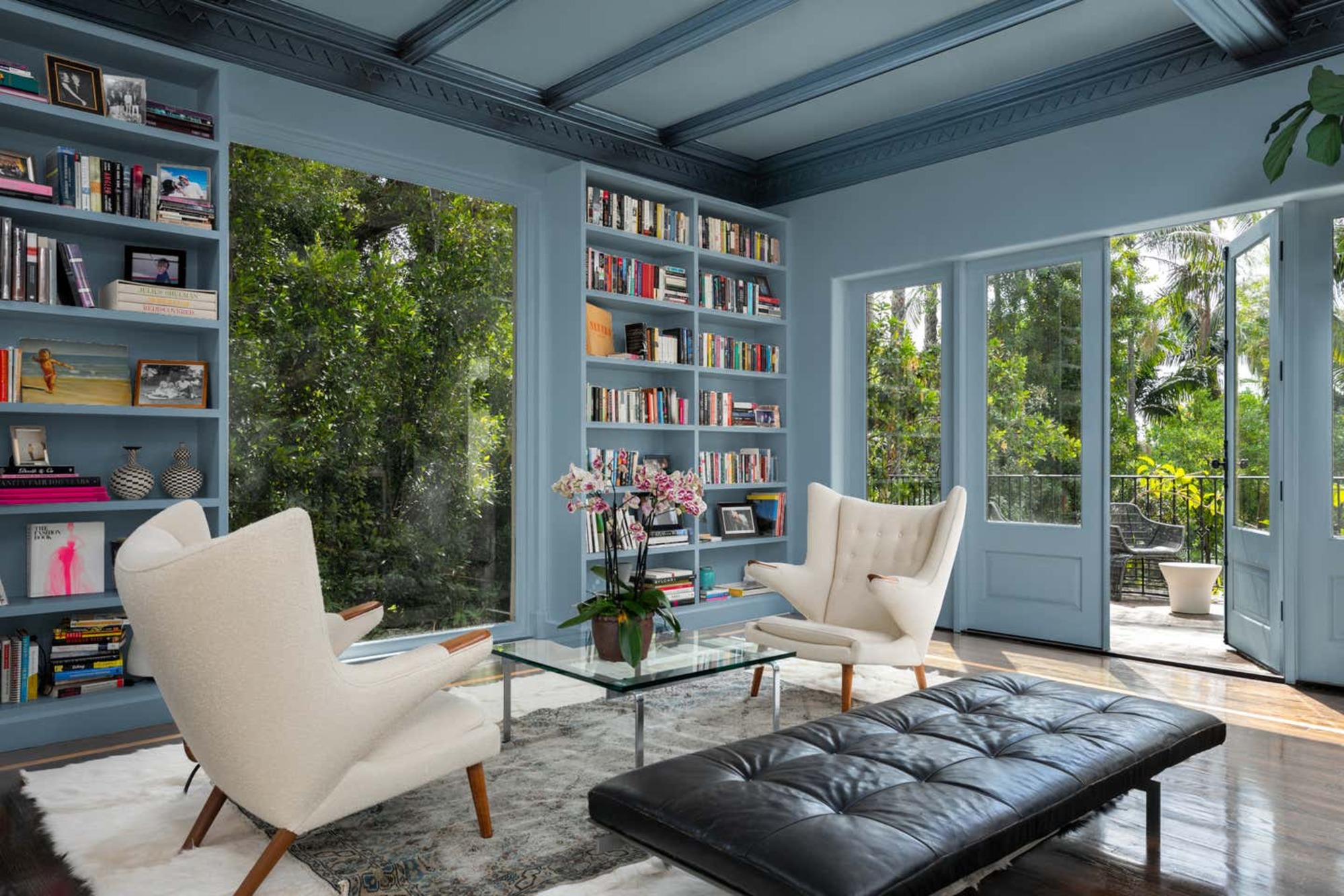
The article also delves into accentuating neutral backgrounds with warming colors. Natalia Miyar, director of Natalia Miyar Atelier, suggests pairing a taupe base with rosy shades, noting that pink can make a surprisingly sophisticated statement. She shares her personal preference for pink palettes, finding them comforting and cozy. Judy Smith, color consultant at Crown, recommends bolder accents like burnt orange and mustard, or deeper tones such as darkest olive, bitter chocolate, or black for more dramatic focal points. For a sophisticated industrial look, she suggests combining beige-grey with other washed tones of cream, grey, and brown.
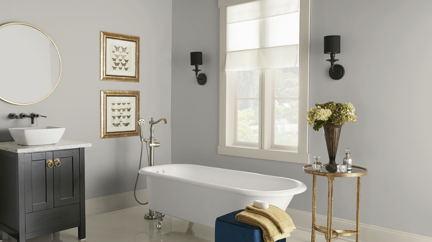
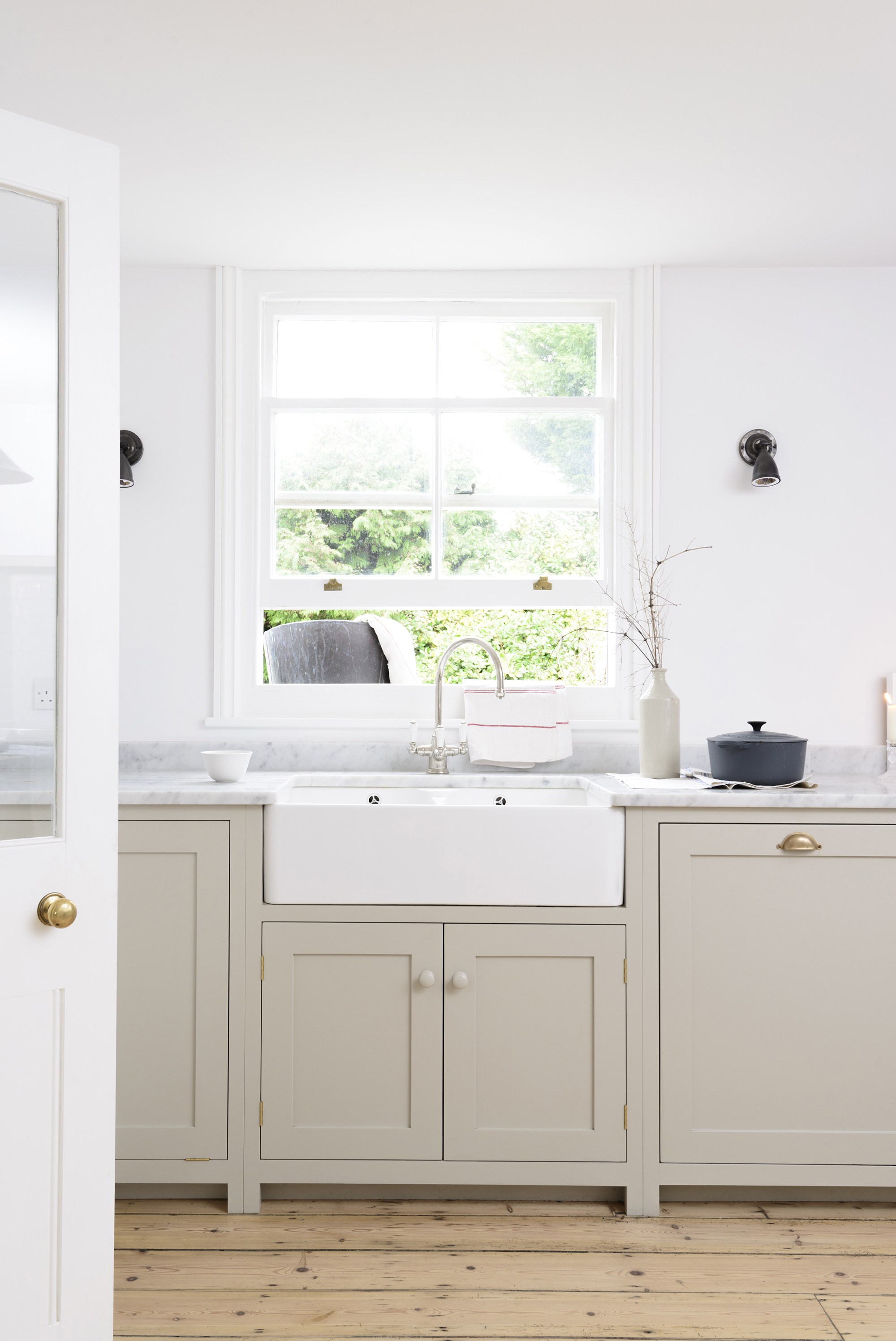
Finally, the piece emphasizes the importance of maintaining clean and crisp schemes, even with neutrals. Albion Nord's main bathroom in a Grade II listed mansion illustrates this point, where subtle colors enhance rural views. Ottalie Stride, creative director at Albion Nord, praises beige-grey's versatility, noting its warm, light, and inviting qualities, which contrast beautifully with crisp white ceilings and woodwork. The article concludes by presenting beige-grey as a timeless and adaptable choice for interior design, capable of creating elegant and serene environments in both historic and contemporary settings.
#InteriorDesign #PaintColors #NeutralPalette #HomeDecor #DesignTrends #ColorSchemes #ArchitecturalFeatures #InteriorDesign #PaintColors #NeutralPalette #HomeDecor #DesignTrends #ColorSchemes #ArchitecturalFeatures
0 Kommentare insgesamt
 Noch keine Kommentare
Das könnte Ihnen auch gefallen
This is the most versatile shade you can bring into your home – designers share the 5 best greige paints
Is gray or beige more on trend for 2025? Designers share all on these popular neutrals
Colors to avoid pairing with beige – 5 shades you’ll want to stay clear of
15 Best Greige Paint Colors for Every Decorating Taste


5 Timeless Paint Colors That Will NEVER Go Out of Style, According to Designers

What colors go with grey? 13 palette pairings according to interior designers

A versatile neutral, gray goes with anything
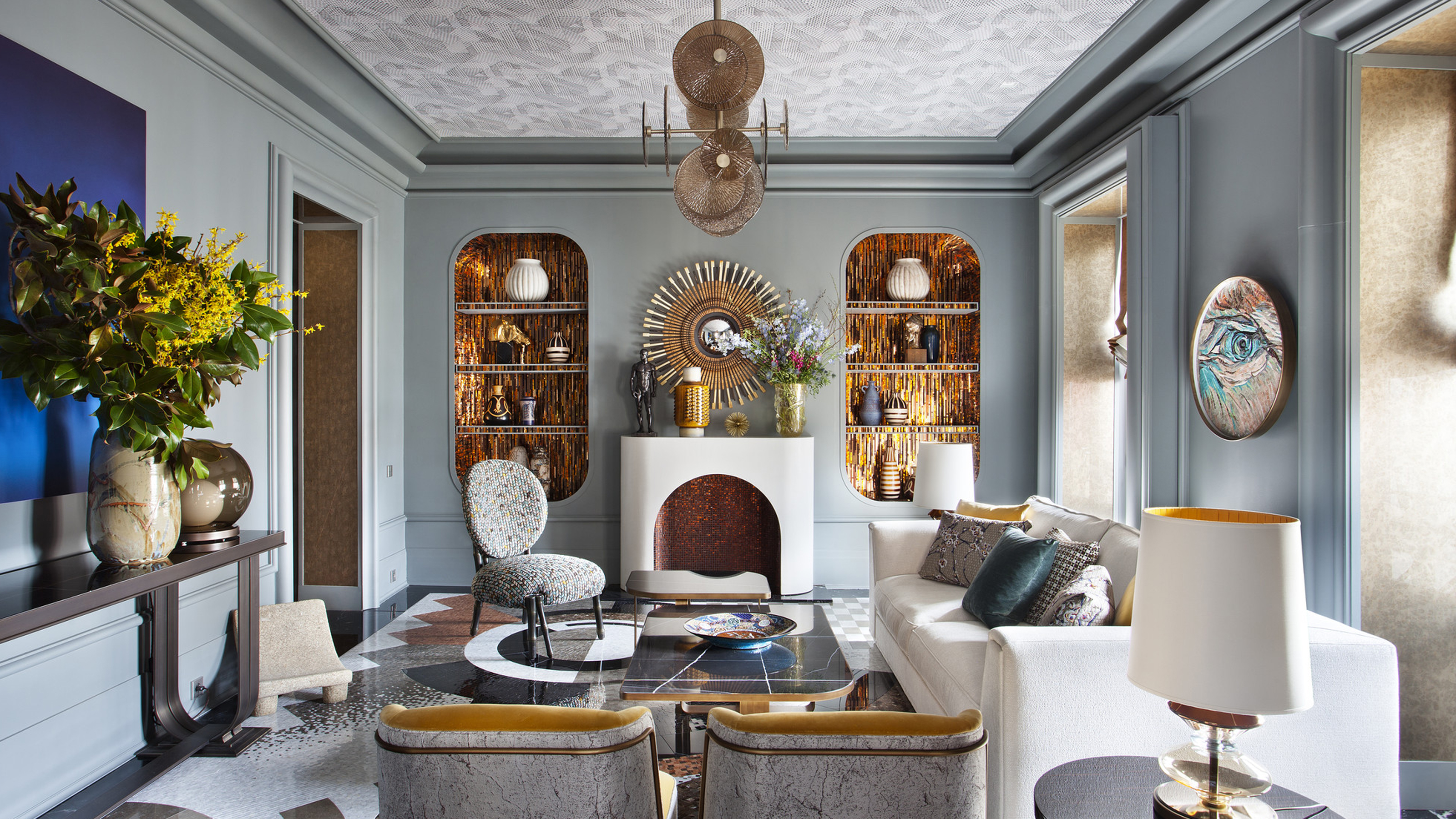
Grey living room ideas – 30+ ways to use this popular shade in a stylish way

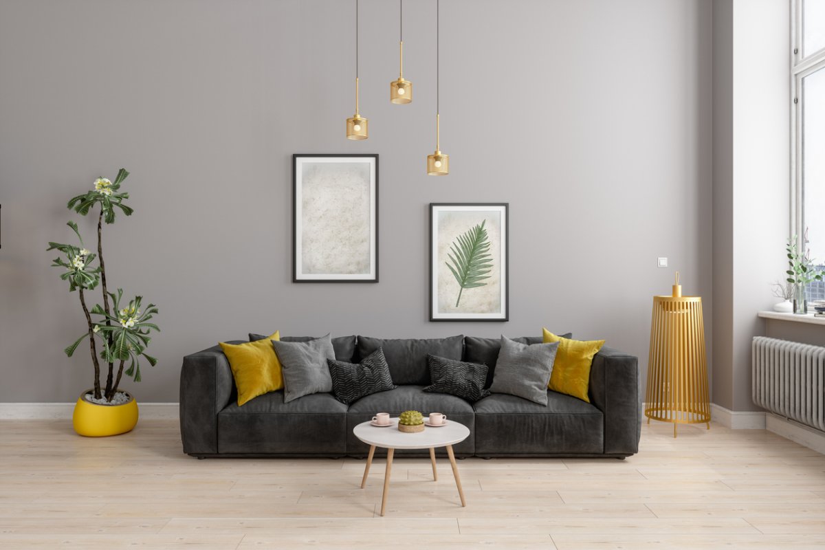
The Best Greige Paint Colors for a Warm, Welcoming Home

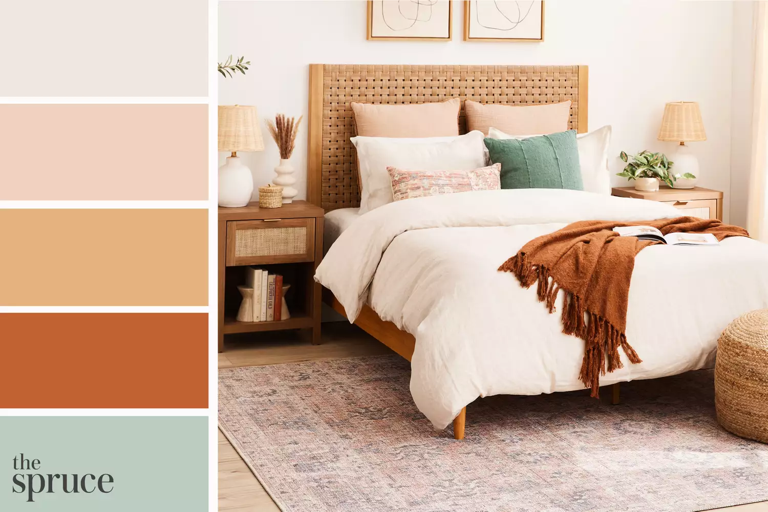
11 Beautiful Colors That Go With Beige
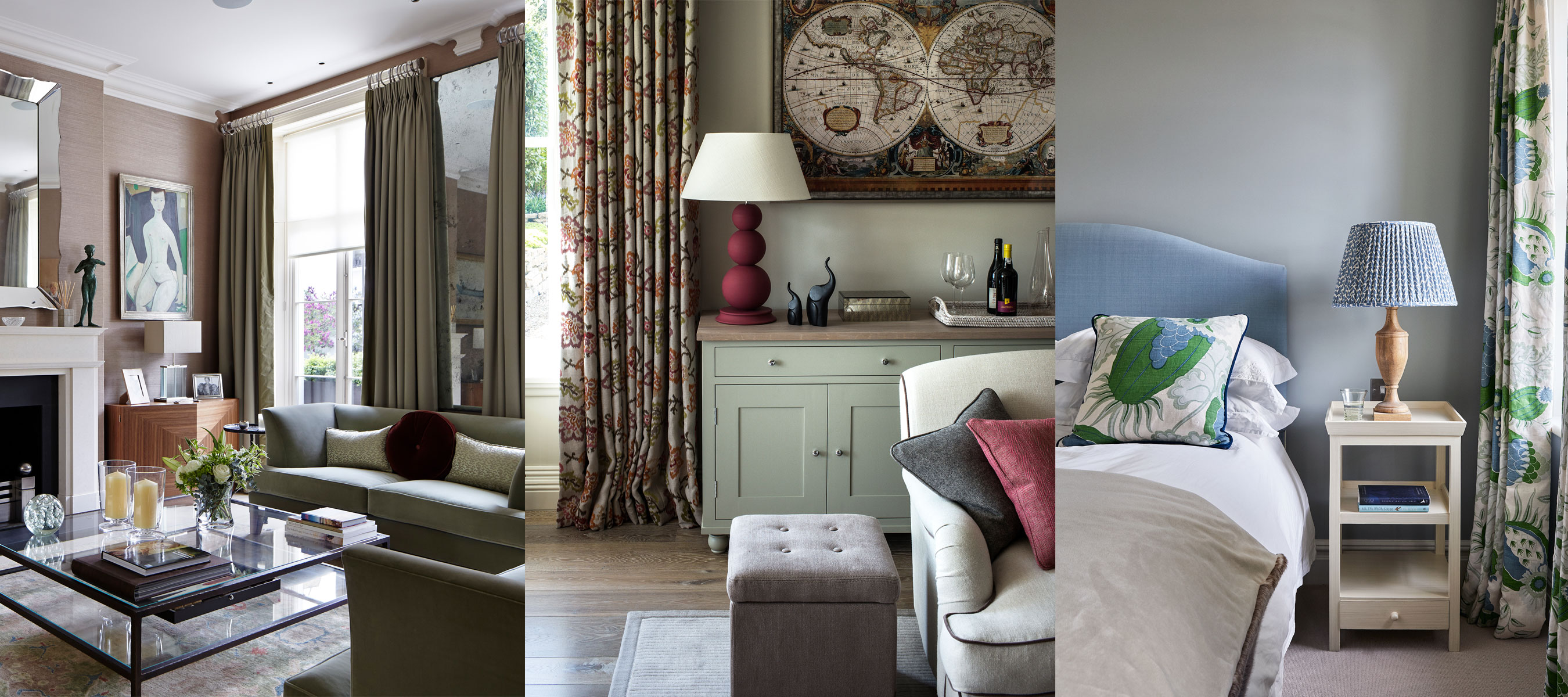
10 accent colors for beige – design experts' favorite color pairings
What colors will go best with my grey rug? Here's how to decorate around this timeless floor covering
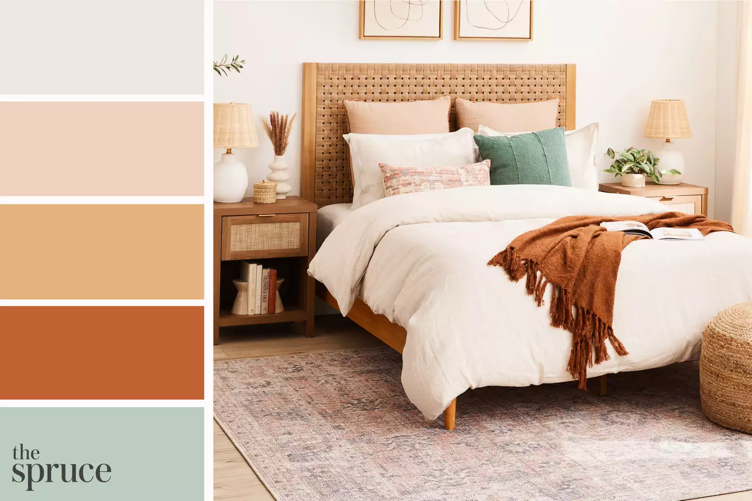
11 Beautiful Colors That Go Well With Beige
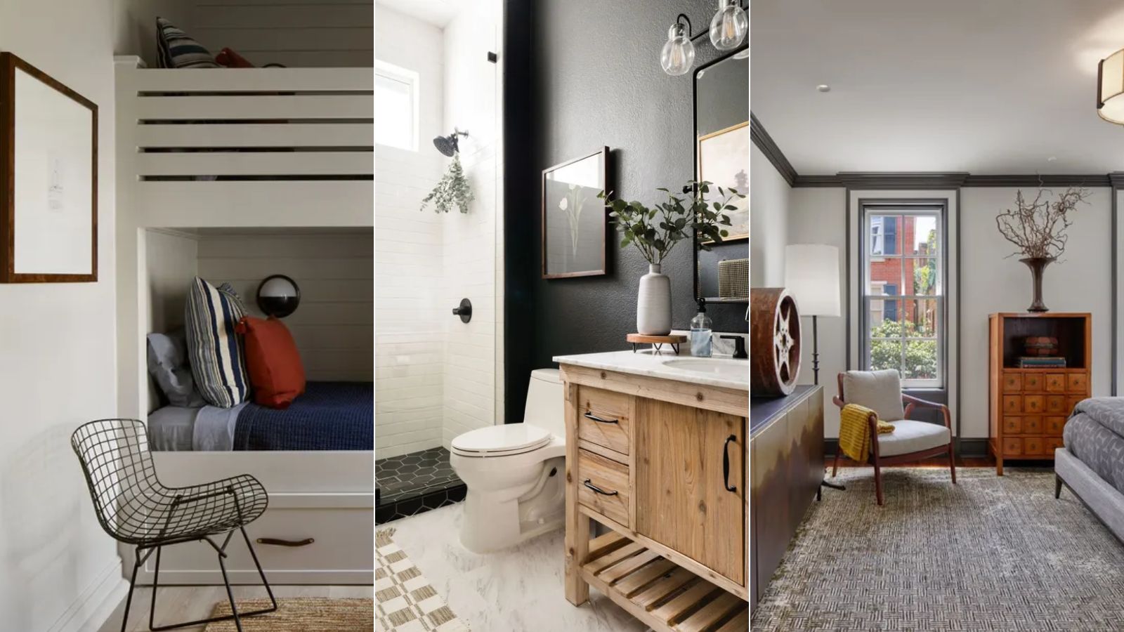
What are the best Benjamin Moore gray paints? 7 go-to shades recommended by designers
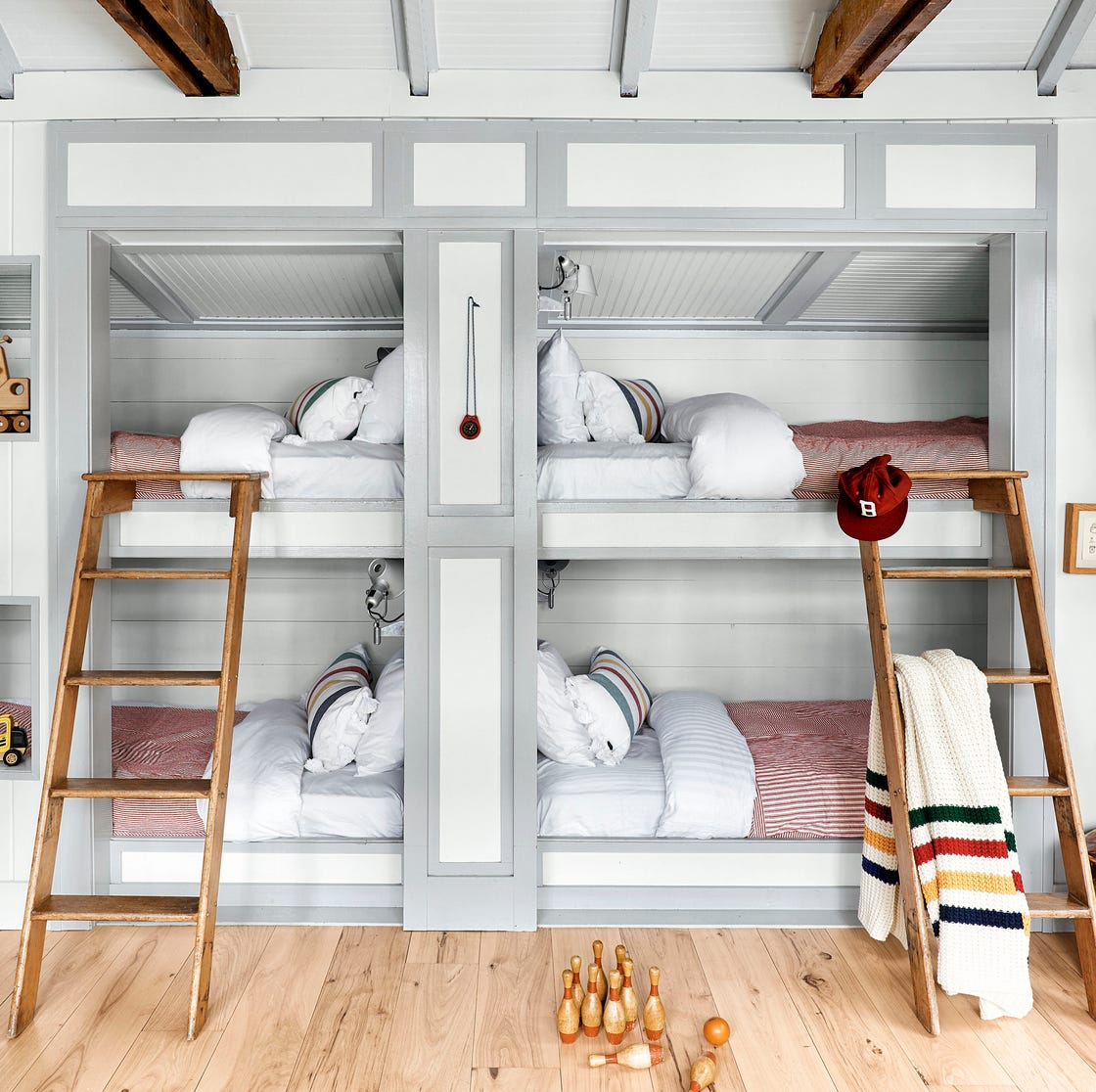
23 Colors, Patterns, & Textures To Pair With Gray
Decorating with beige – 10 ways to embrace this warm neutral shade
The 13 Best Greige Paint Colors to Buy Right Now
These Are the 10 Colors Interior Designers Would Pair with Beige

5 ways to decorate with Edgecomb Gray, Benjamin Moore's softest gray paint
11 Best Beige Paint Colors for Interiors