1/8
A Guide to Every Color of the Year for 2025 (So Far)
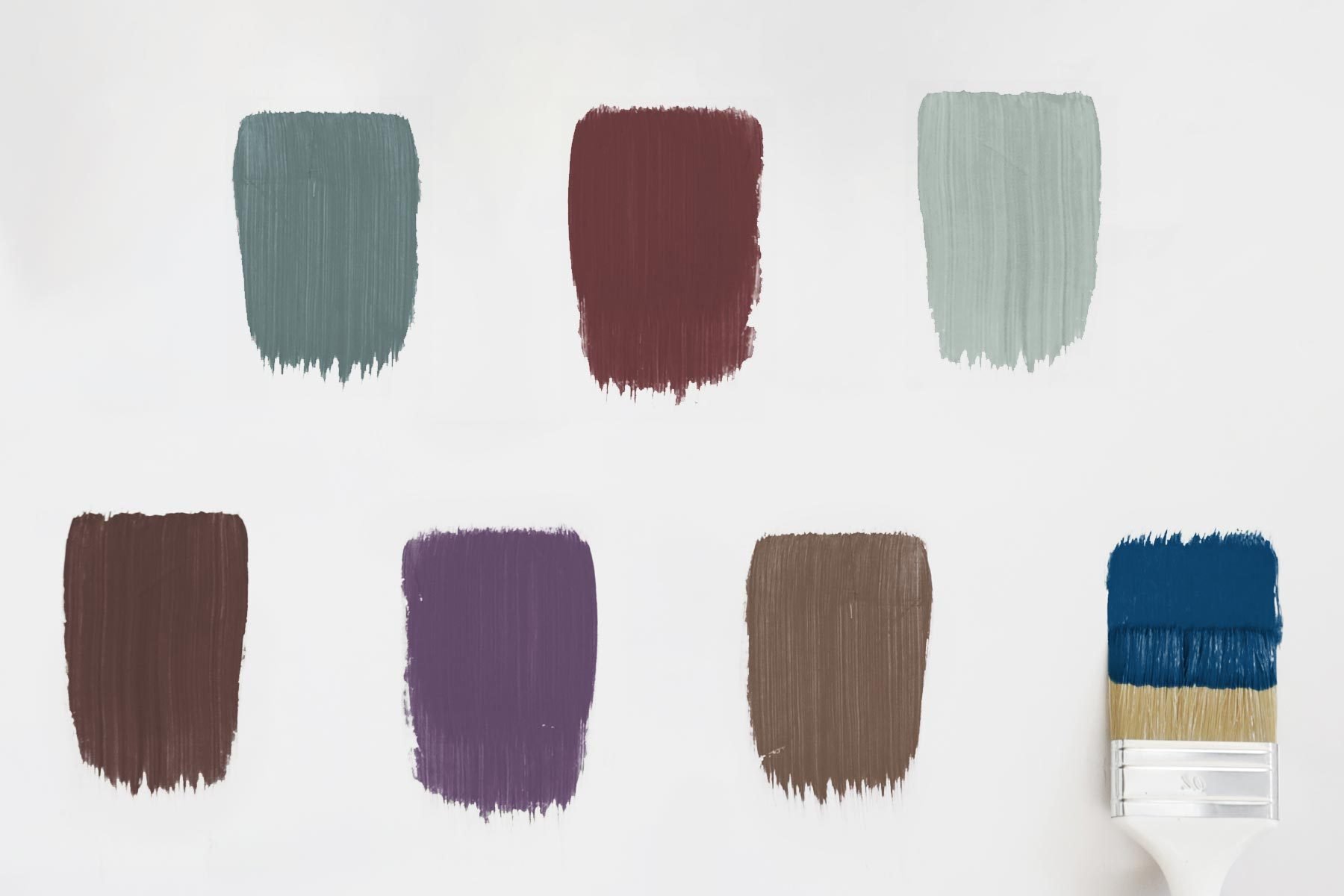
The annual "Color of the Year" (COTY) season is underway, with paint companies and color experts announcing their predictions for dominant interior shades in 2025. While 2024 saw a mix of preppy pinks and dark moody colors, the 2025 outlook is currently embracing moody browns and rich jewel tones. This article details the announced Colors of the Year from several prominent brands, highlighting their unique characteristics and potential applications in home design.
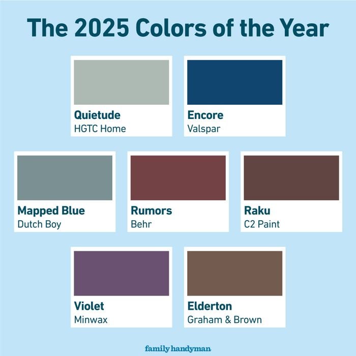
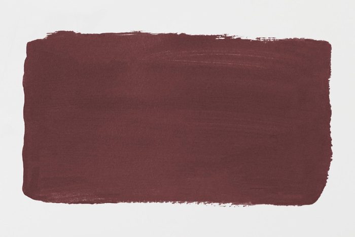
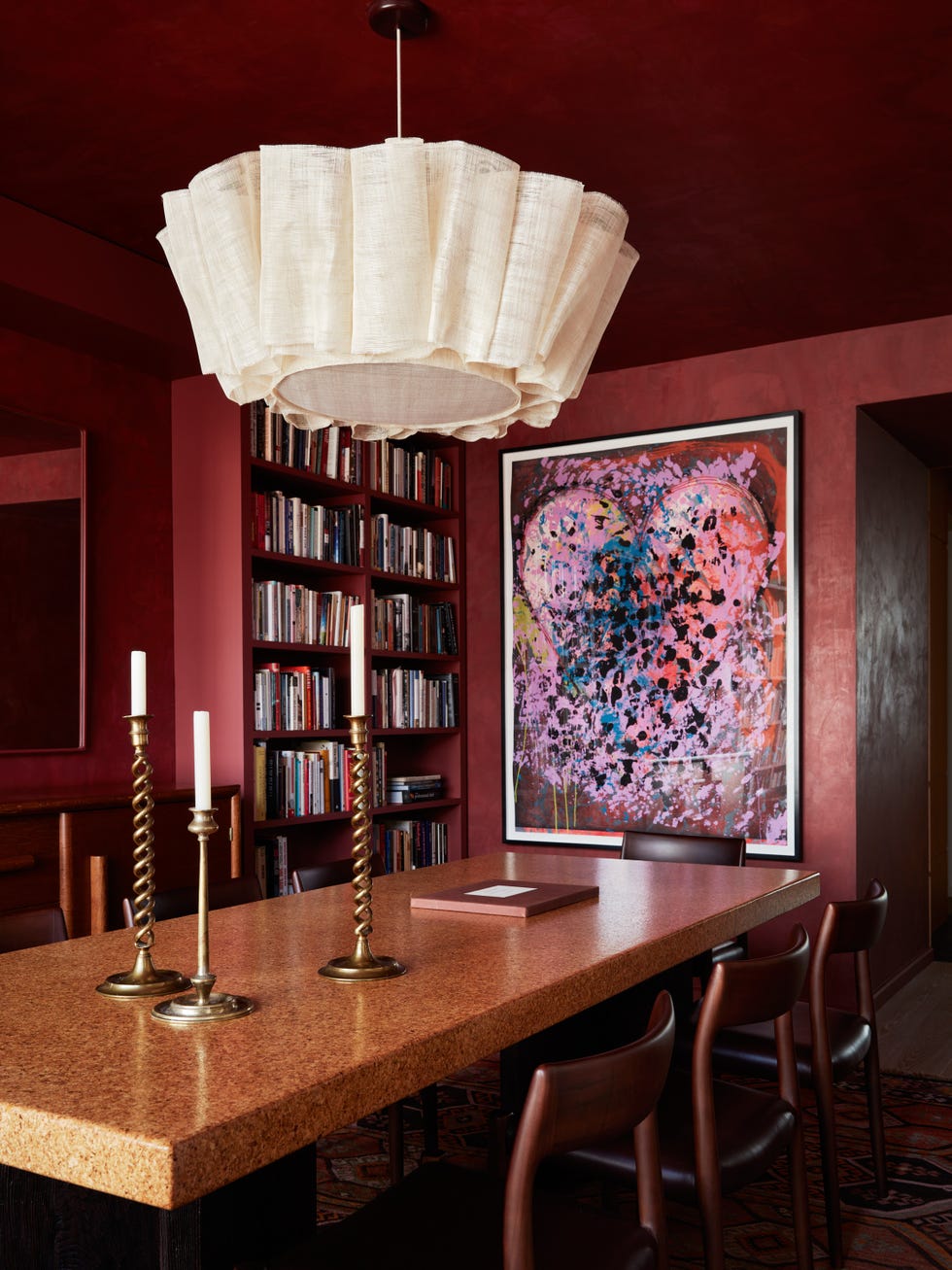
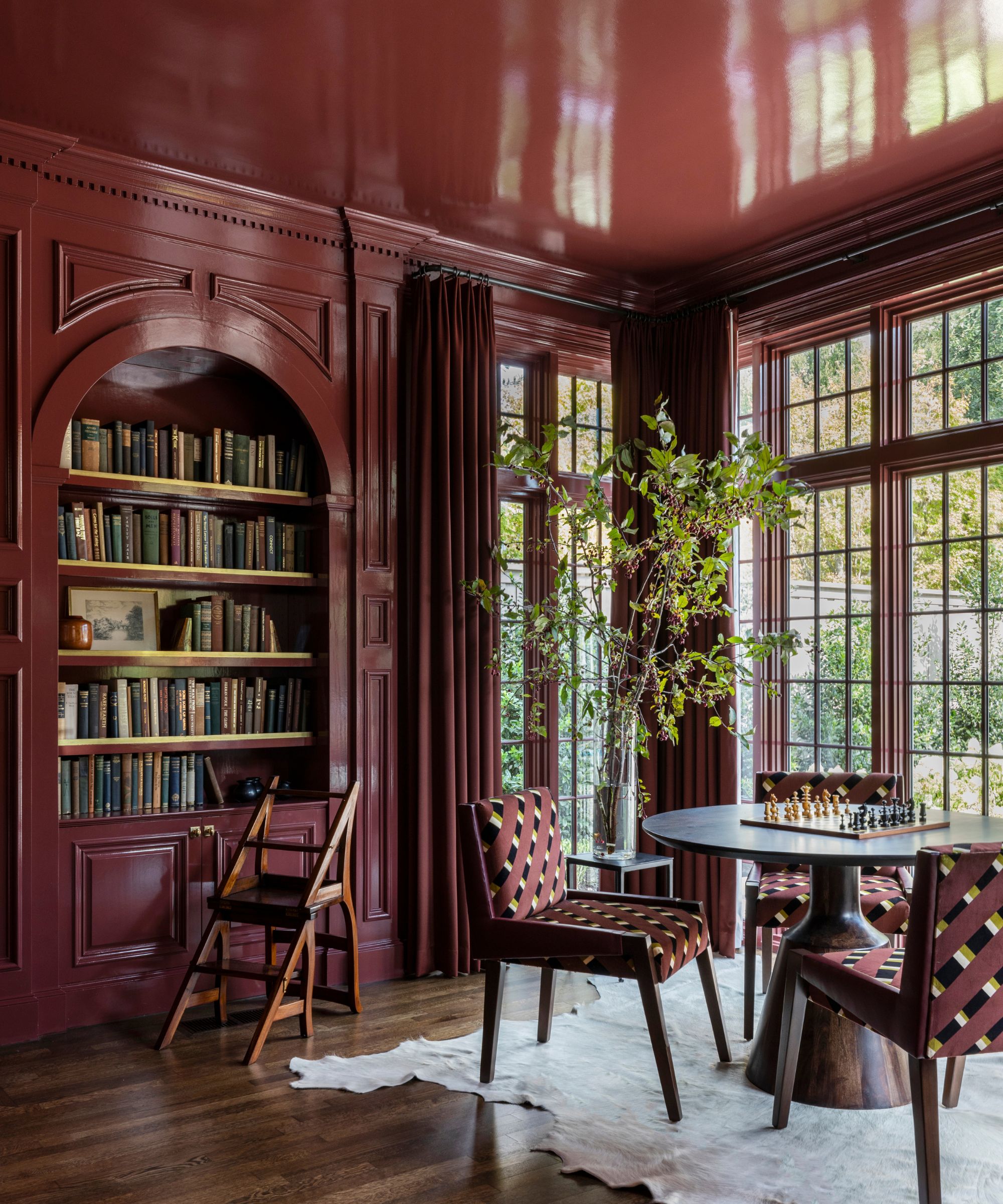
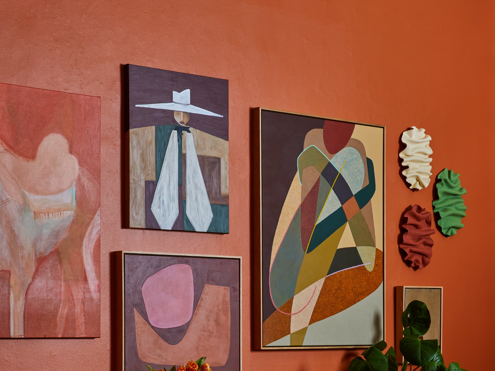
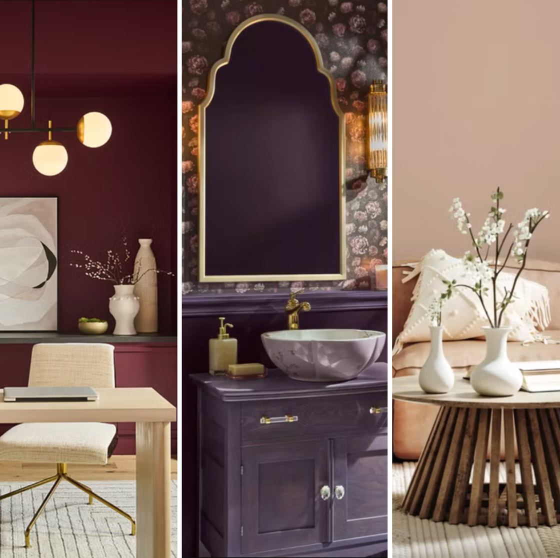
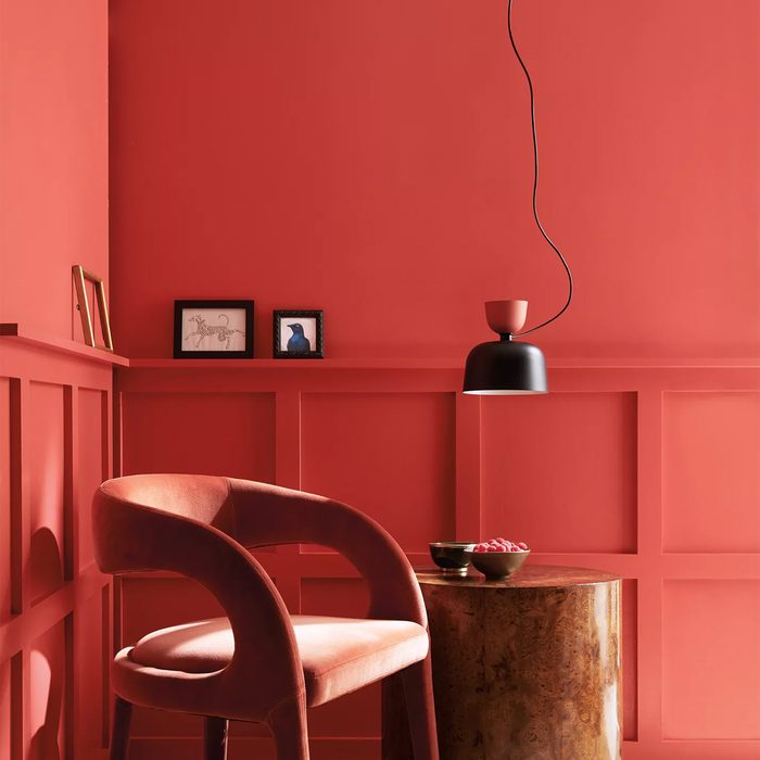
Behr, a Home Depot brand, named "Rumors" as its 2025 Color of the Year. This sultry red is a sophisticated take on the recent unexpected red trend and marks a departure from their 2024 charcoal shade, "Cracked Pepper." Sarah Fishburne, Home Depot's director of trend and design, notes that "Rumors" reflects a consumer desire for self-expression and confidence in their personal style. It can be used for entire walls or specific architectural details like a fireplace mantel or accent wall.
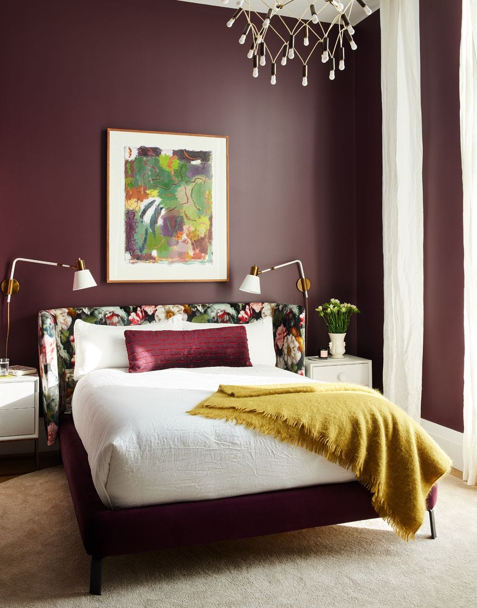
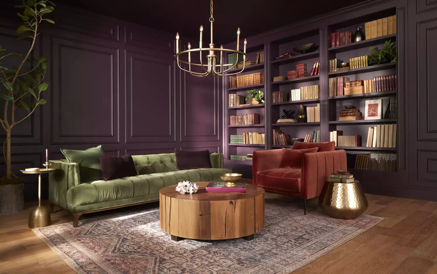
GLIDDEN Paint by PPG selected "Purple Basil," indicating a growing trend for purple hues. PPG color expert Ashley McCollum explains that "Purple Basil" encourages bold color choices that bring joy, aligning with the rise of maximalism in interior design. This versatile deep purple can be used for color-drenched rooms or subtle accents on mantels or bookshelves.
Minwax also embraced the purple trend with "Violet," a deep eggplant purple with blue and red undertones. Lisbeth Parada, Minwax's color and design lead, states that "Violet" promotes maximalism and empowers DIYers to experiment with wood staining. The color revitalizes thrifted or handcrafted pieces, bringing a sense of fun and happiness to homes.
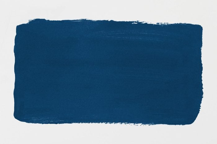
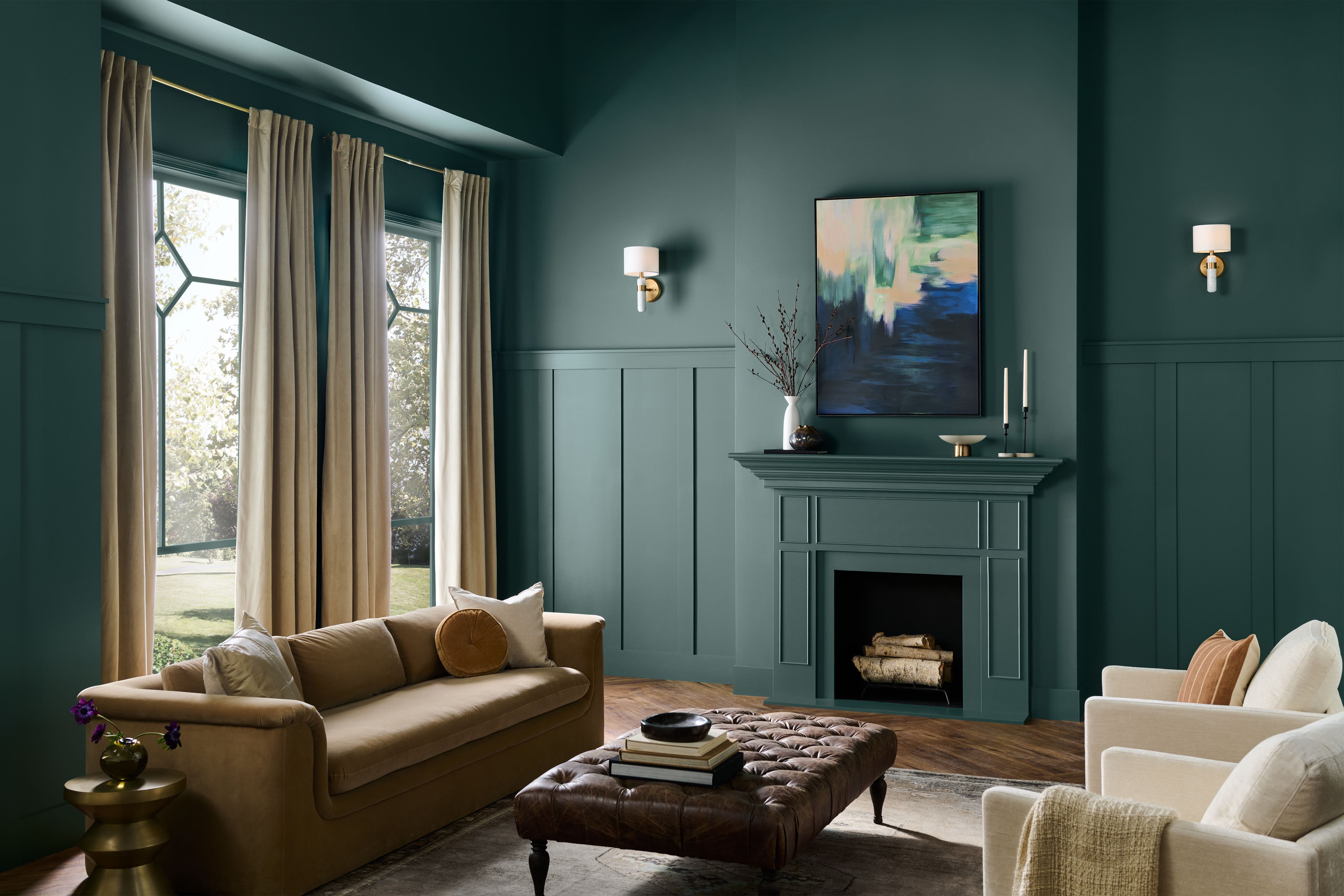
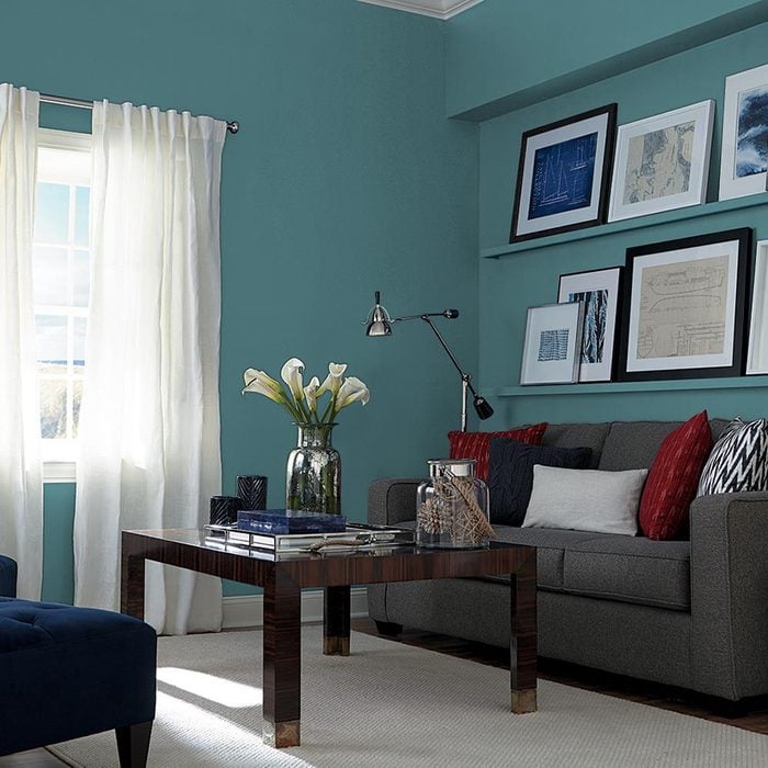
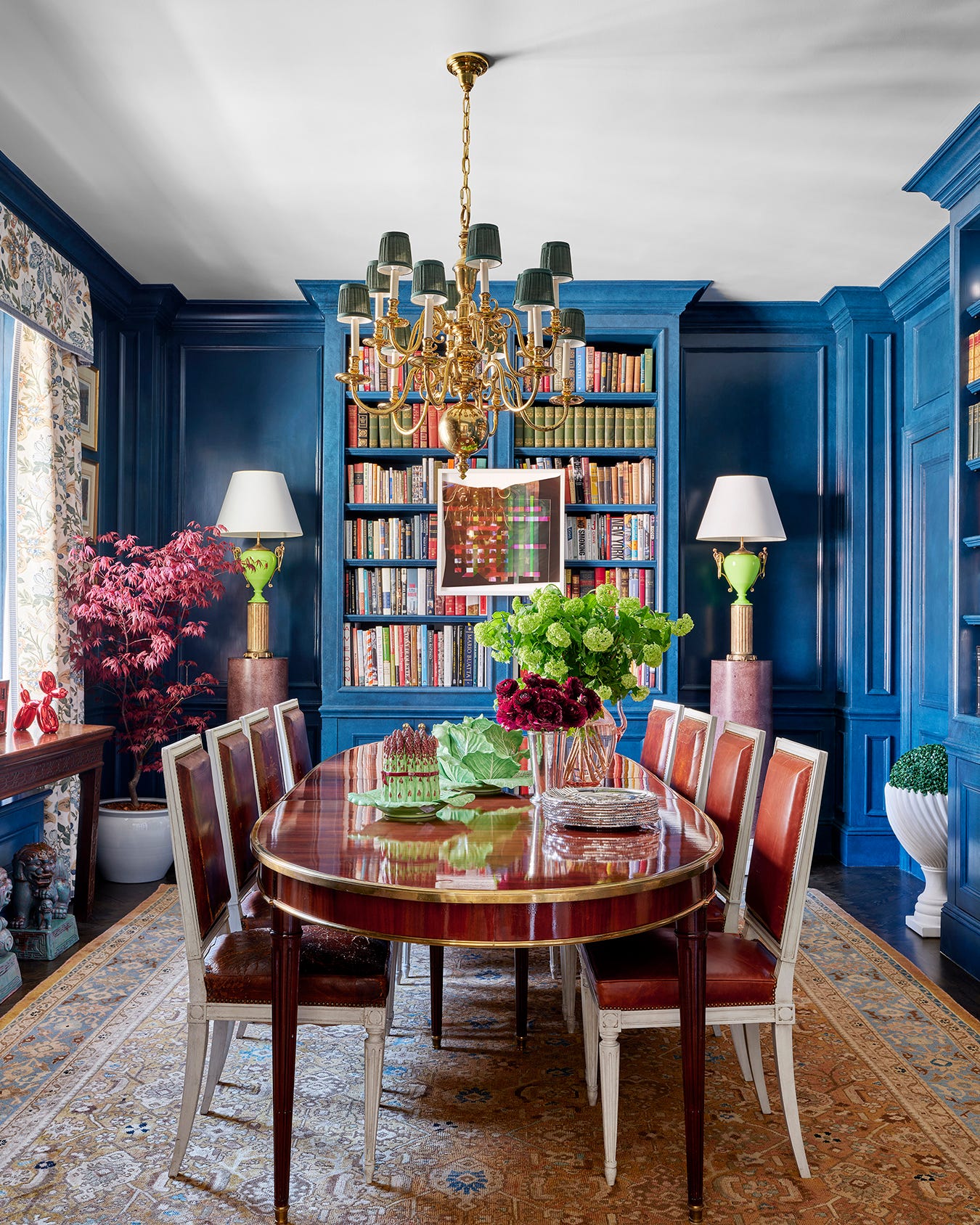
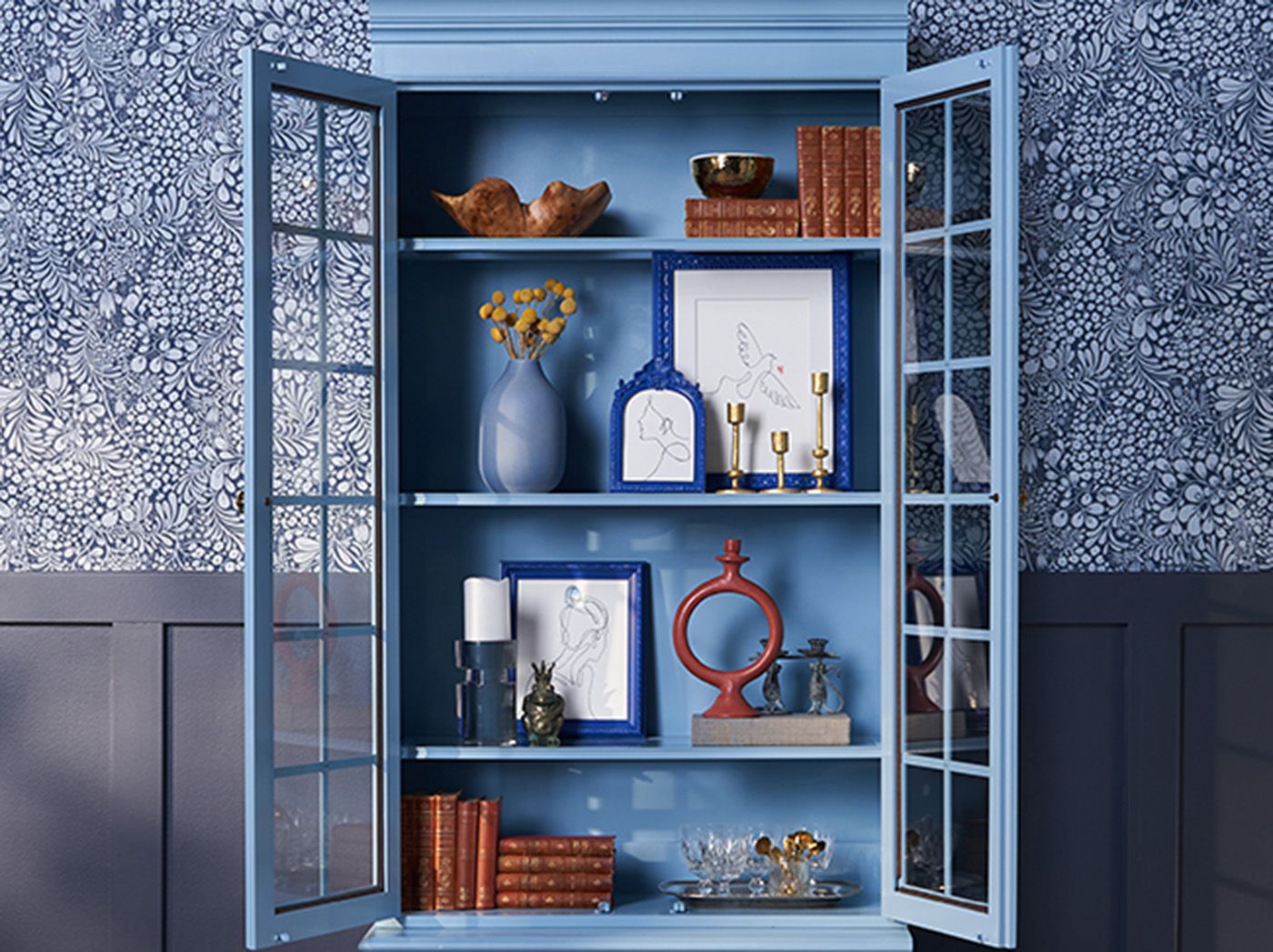
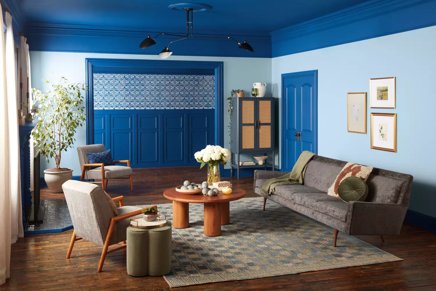
Valspar's 2025 Color of the Year is "Encore," a rich, saturated ultramarine jewel tone. Sue Kim, Valspar's director of color marketing, describes it as a "livable ultramarine" that offers a more luxurious feel than their previous minty blue. The shade's versatility makes it suitable for modern and old-world interiors, ideal for accent walls or small, impactful spaces like a jewel-box bathroom.
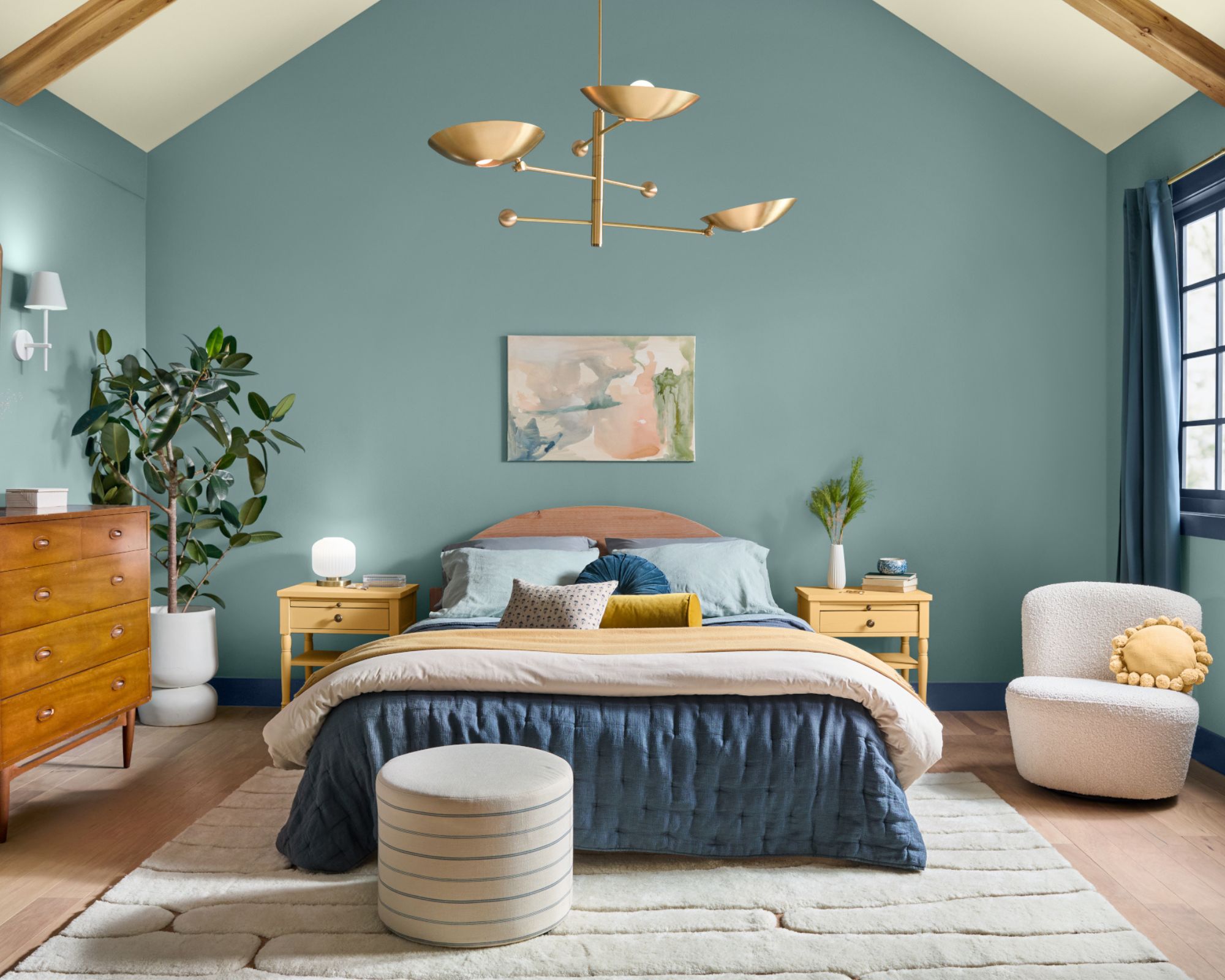
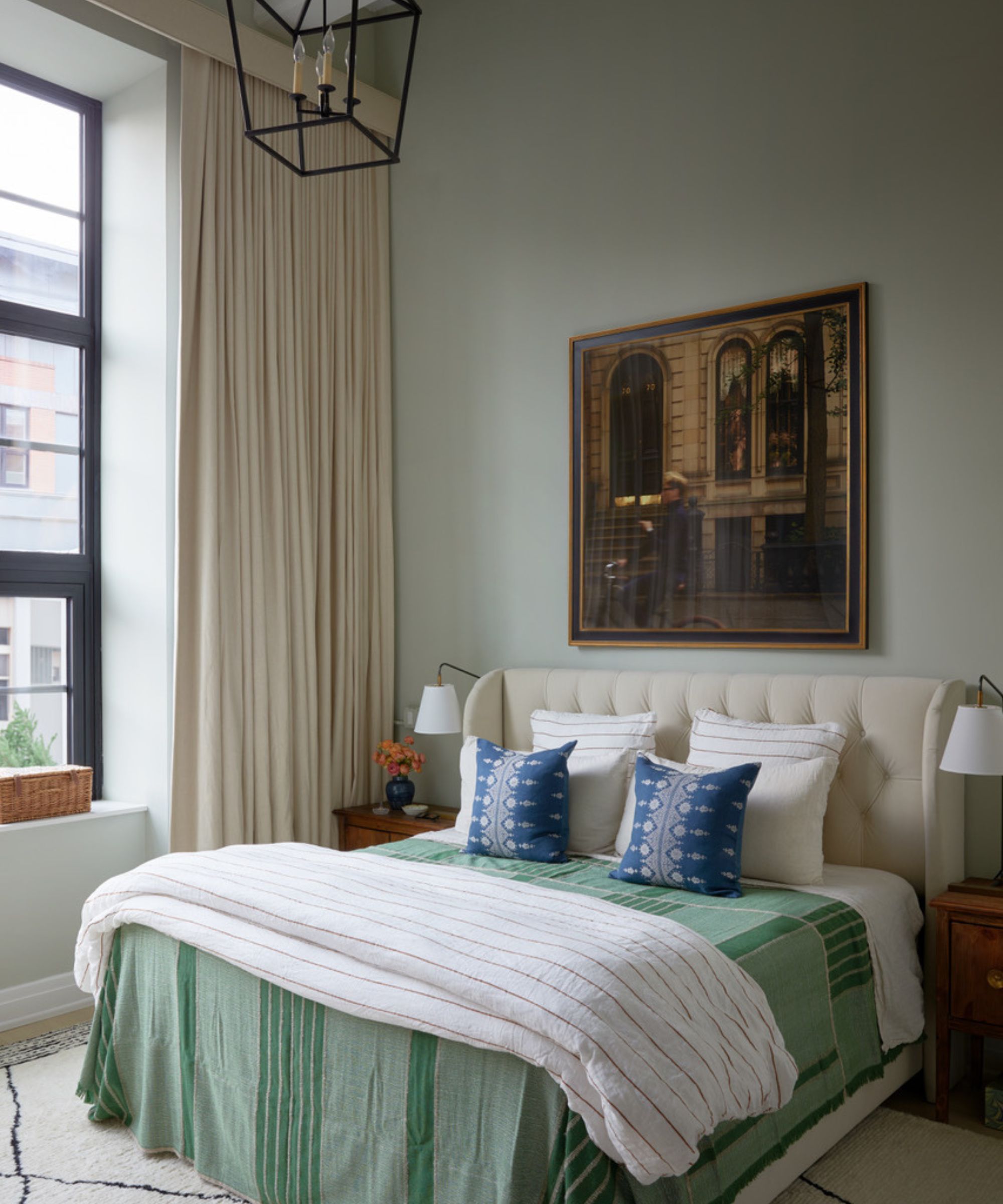
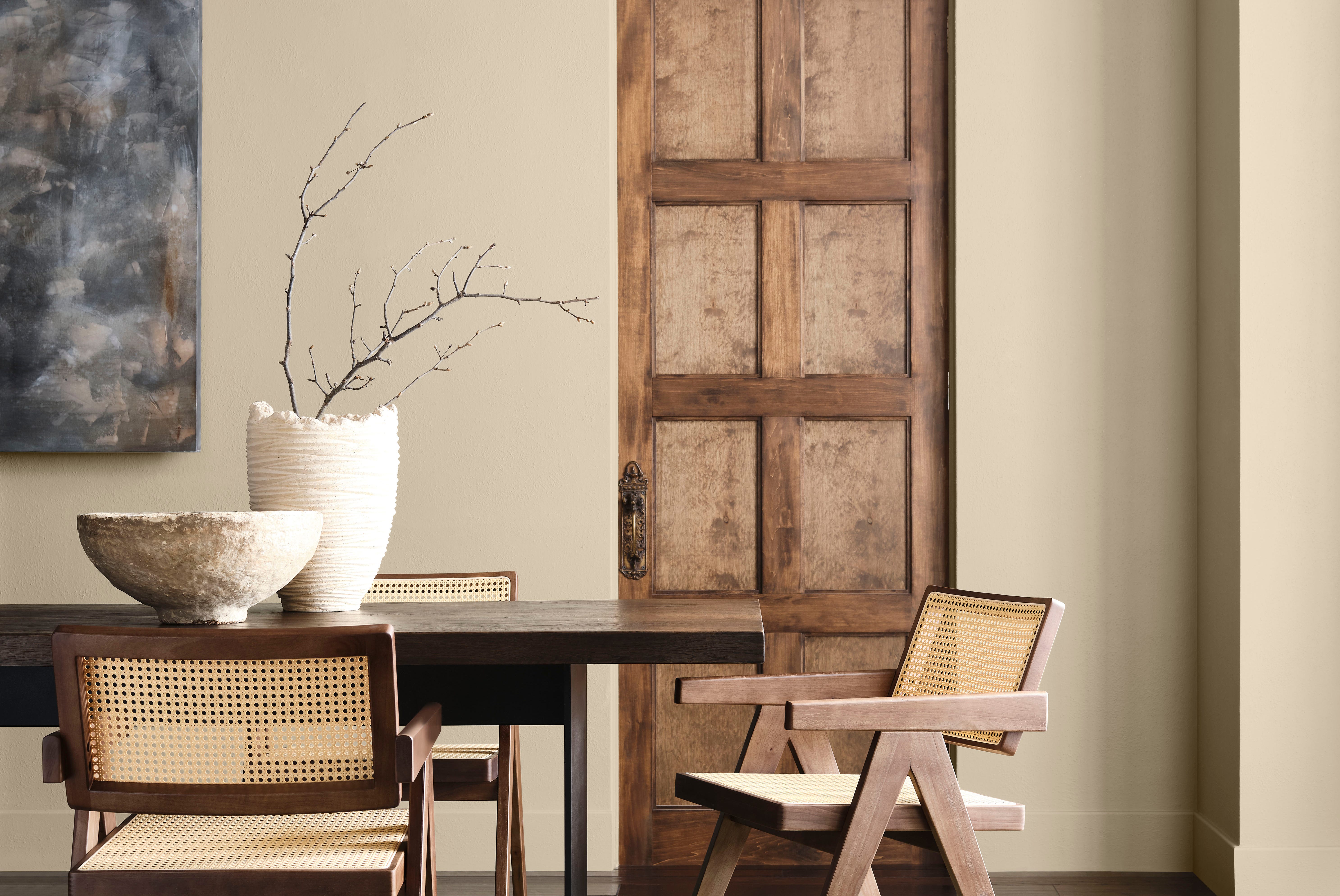
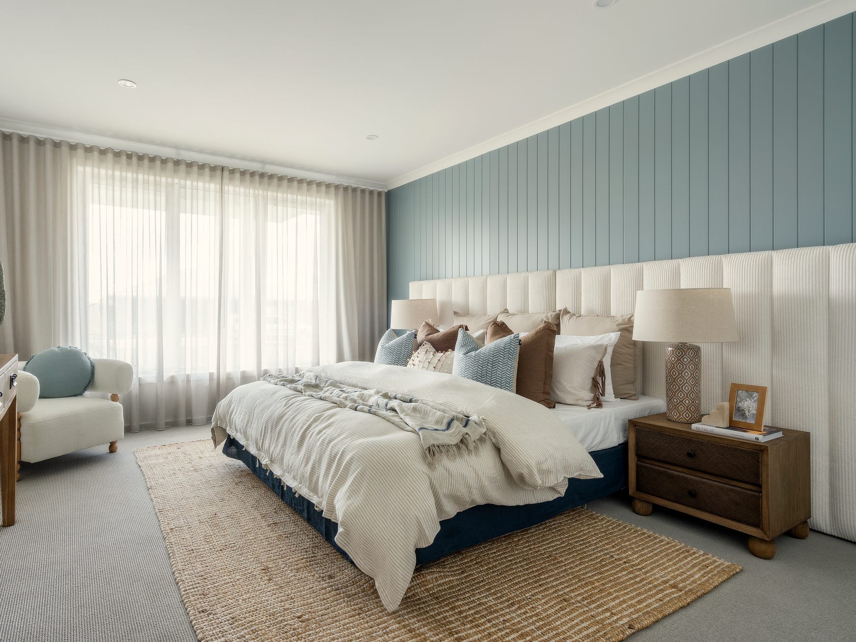
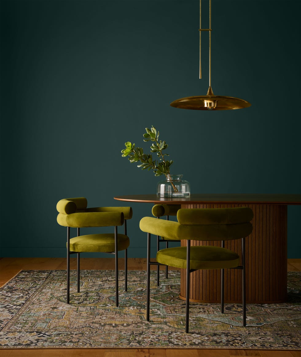
HGTV Home by Sherwin-Williams introduced "Quietude," a cool sage green that promotes a calming atmosphere. "Quietude" is part of their "Naturally Refined" Color Collection, which features a palette of muted yellows, creamy neutrals, and warm browns, reflecting a desire for simplicity and slower living. Ashley Banbury, color marketing manager, suggests it encourages understated elegance.
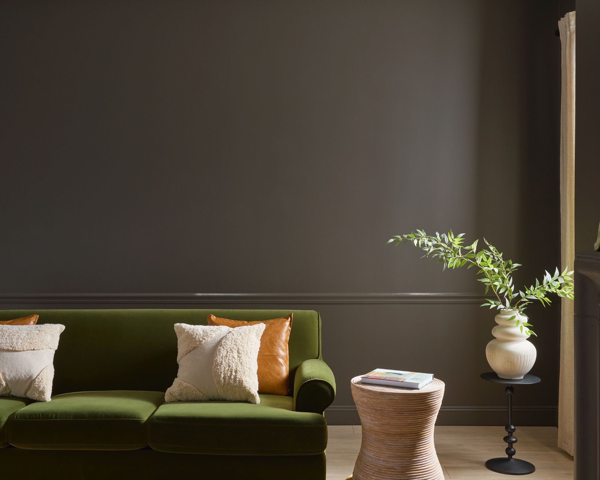
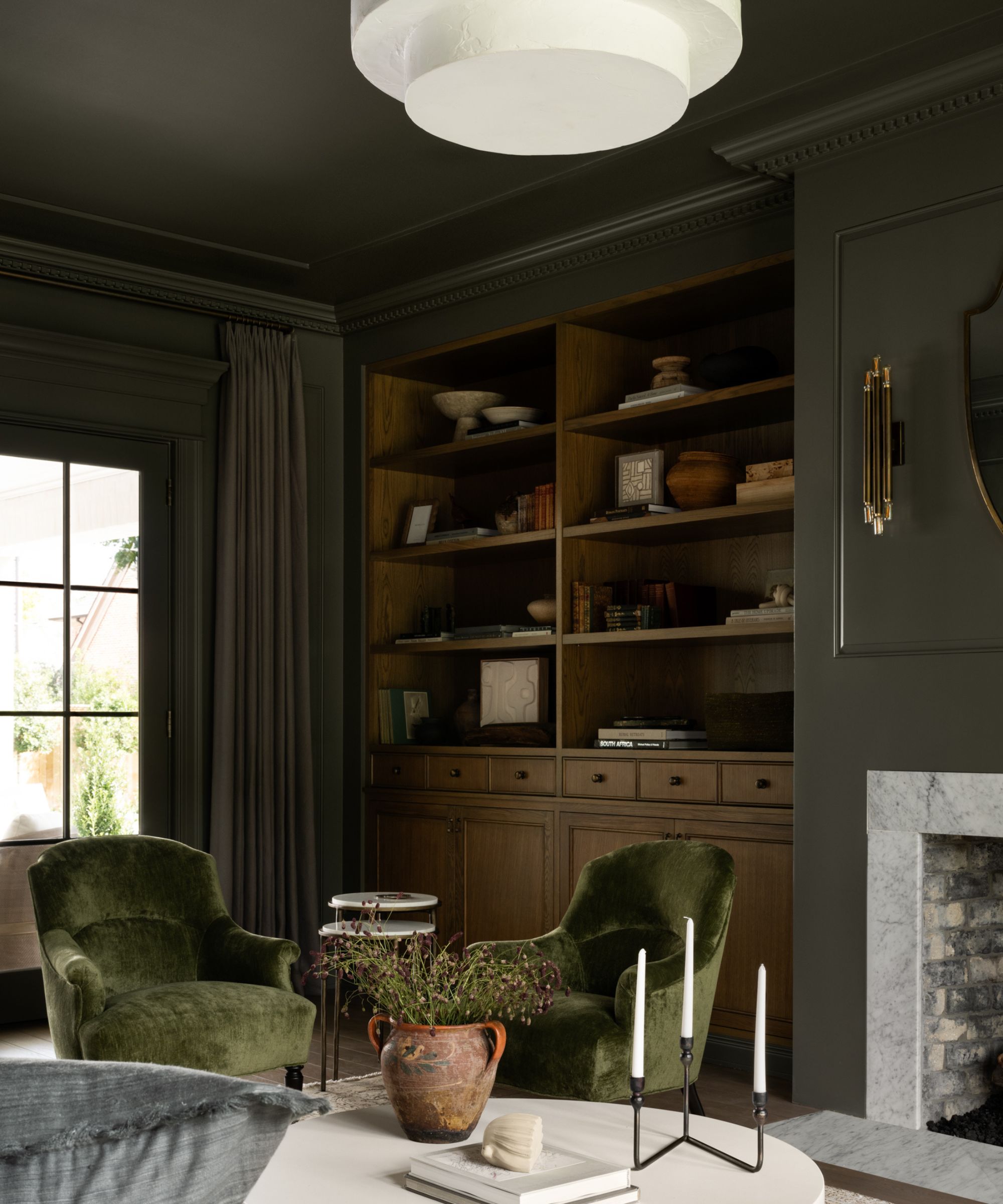
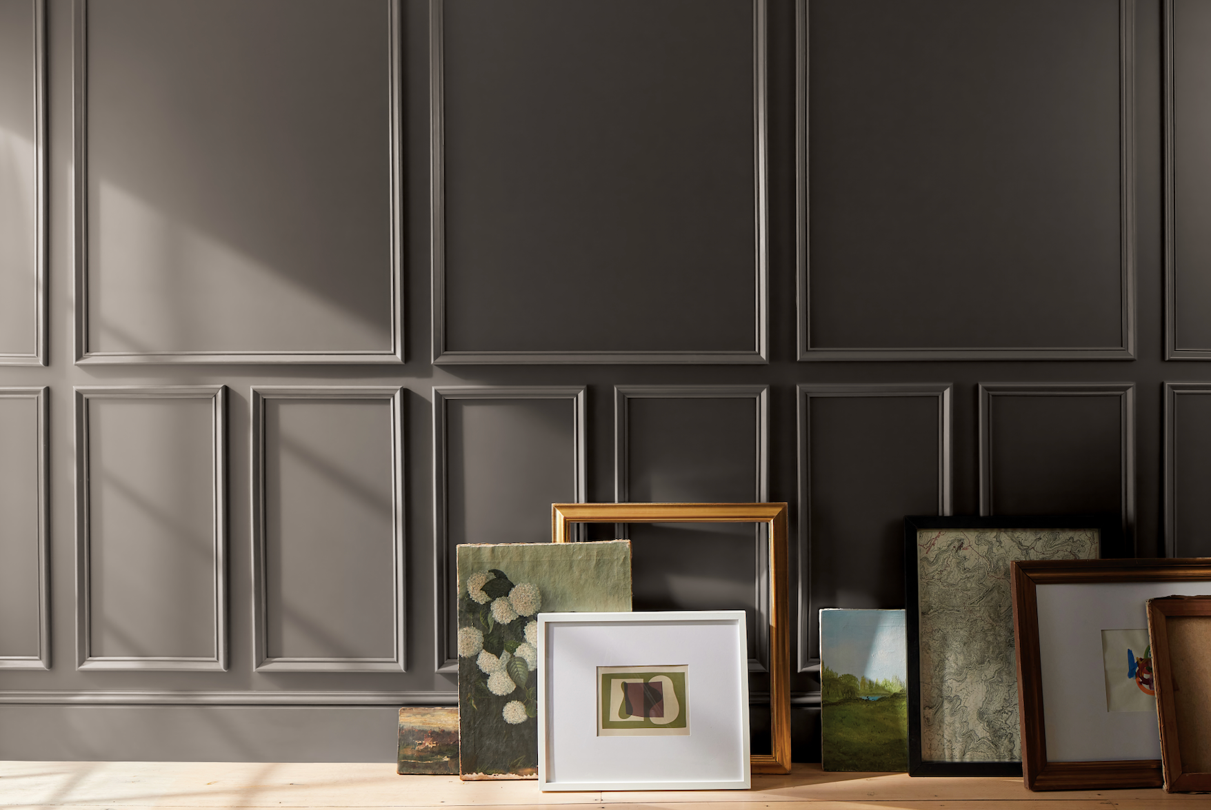
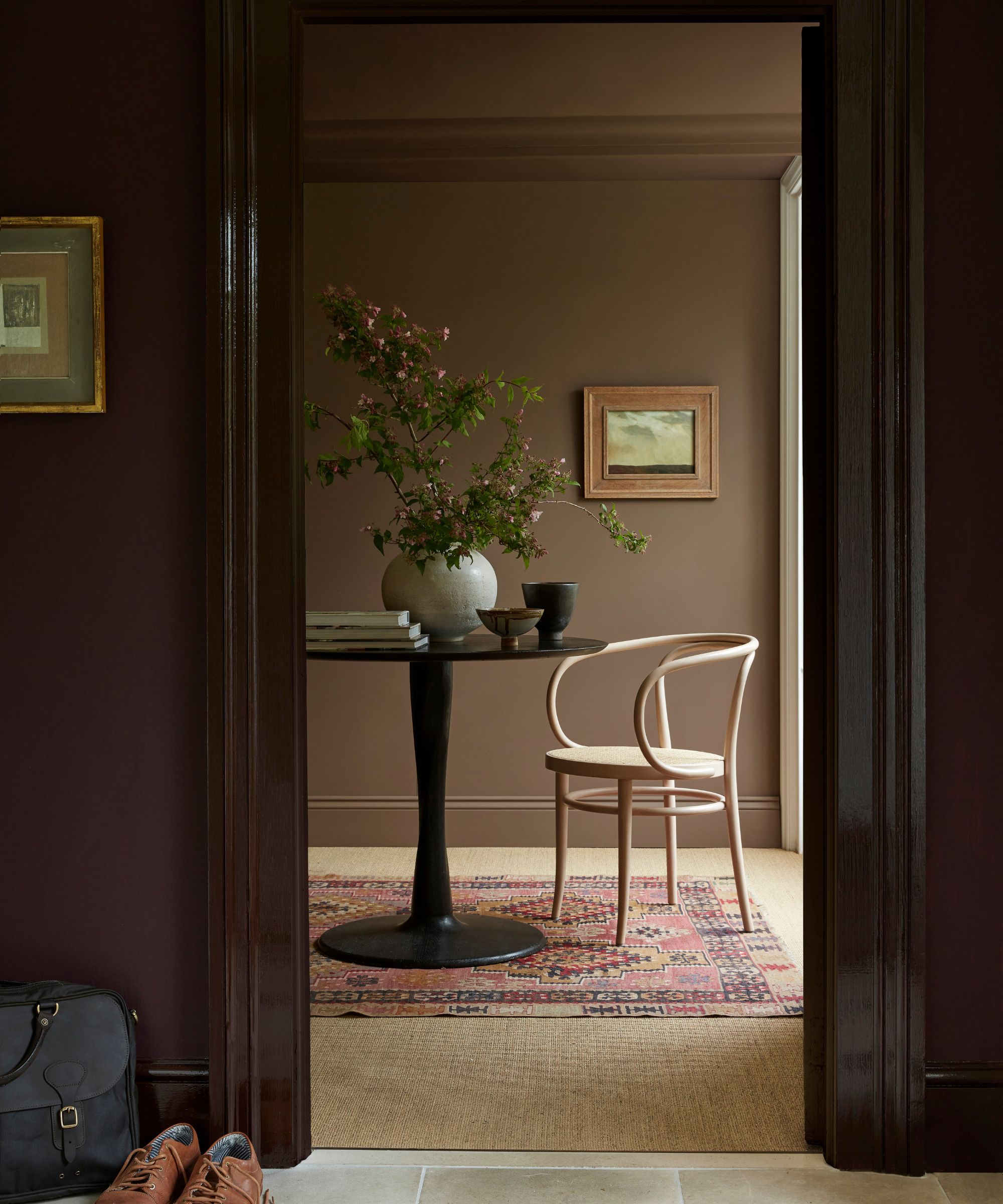
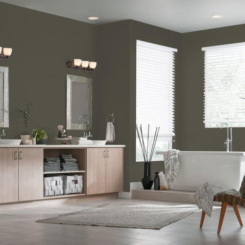
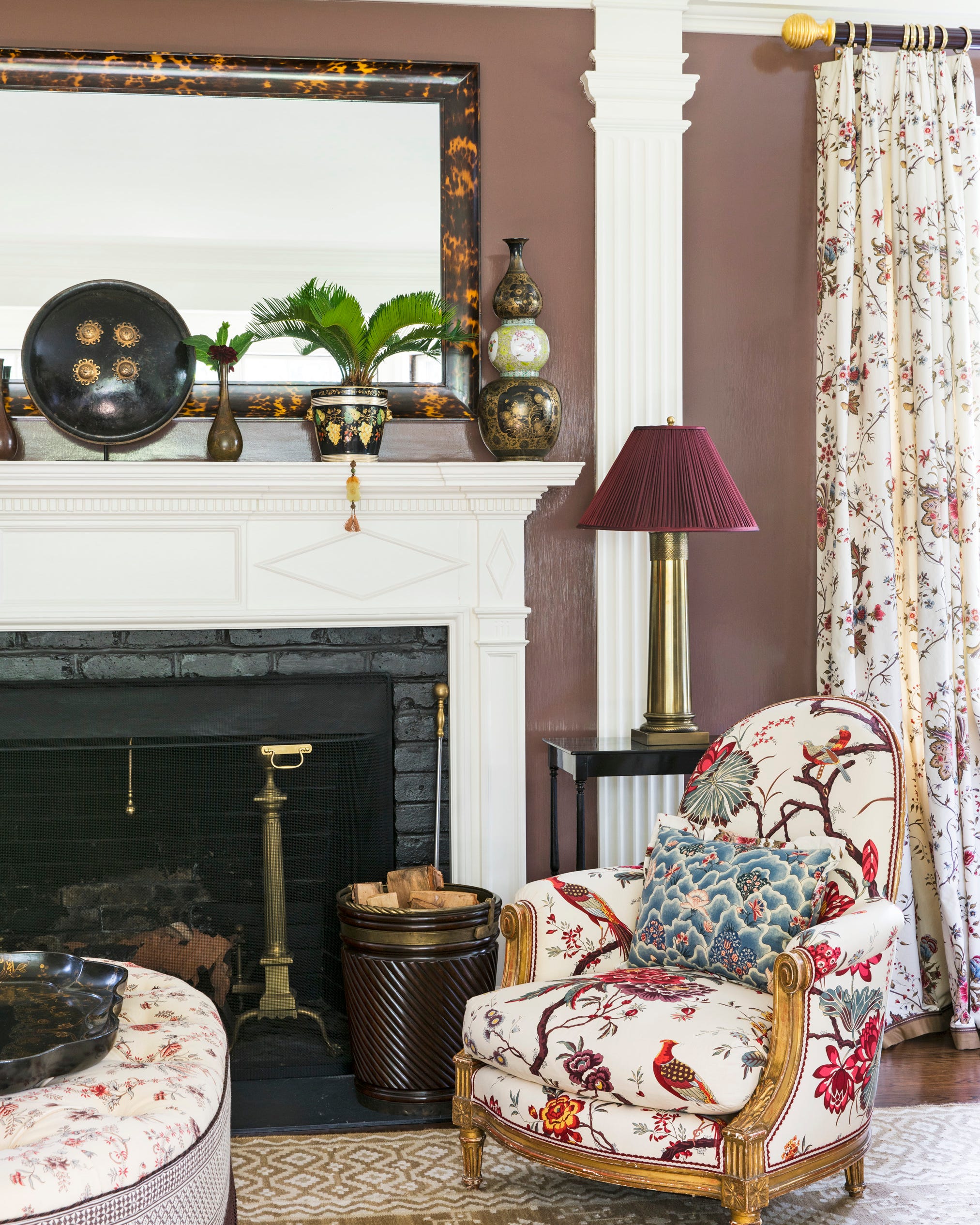
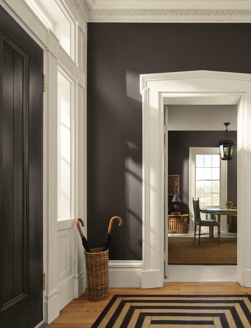
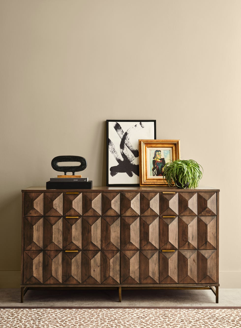
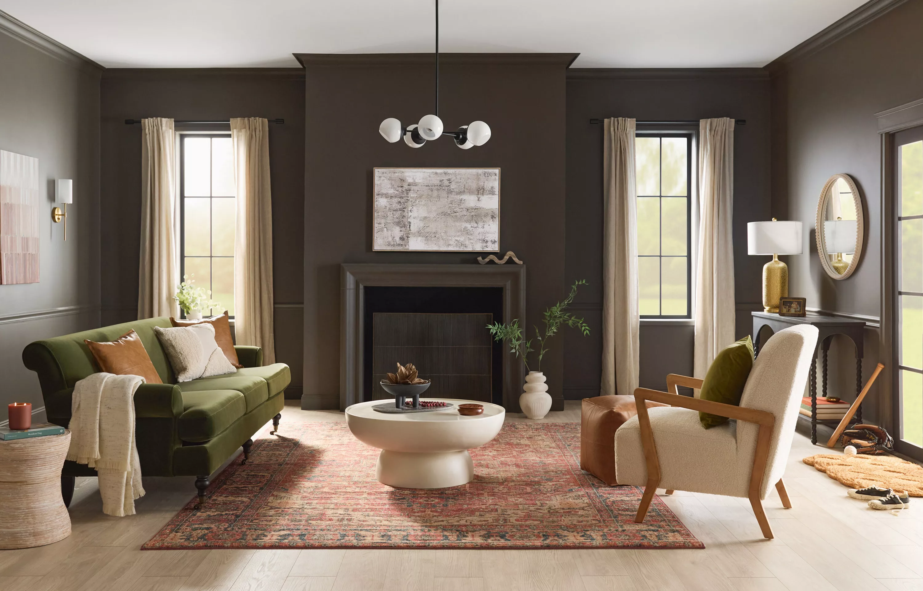
STAINMASTER, a Lowe's brand, chose "Truffle" as their Color of the Year. This rich chocolate-meets-taupe shade signifies that brown is emerging as a popular alternative to black in interiors. Monica Reese, Lowe's director of trend and style, highlights "Truffle's" ability to complement various styles, from modern minimalist to rustic chic, and enhance luxury interiors with dark designs. It can be used for a complete color drench or to introduce quiet luxury into neutral rooms.
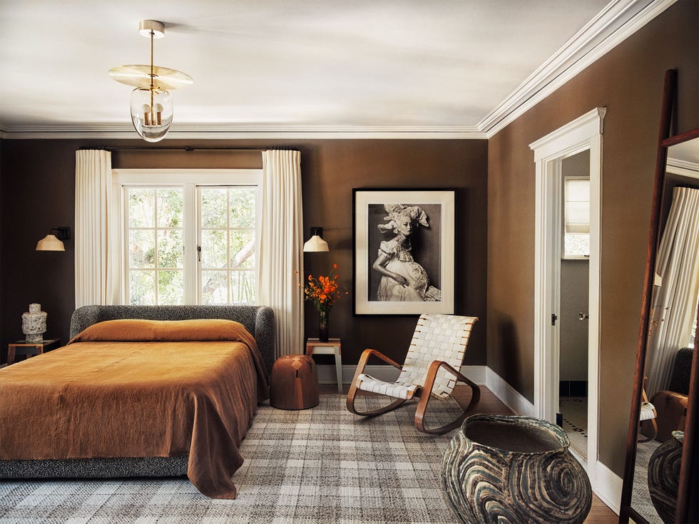
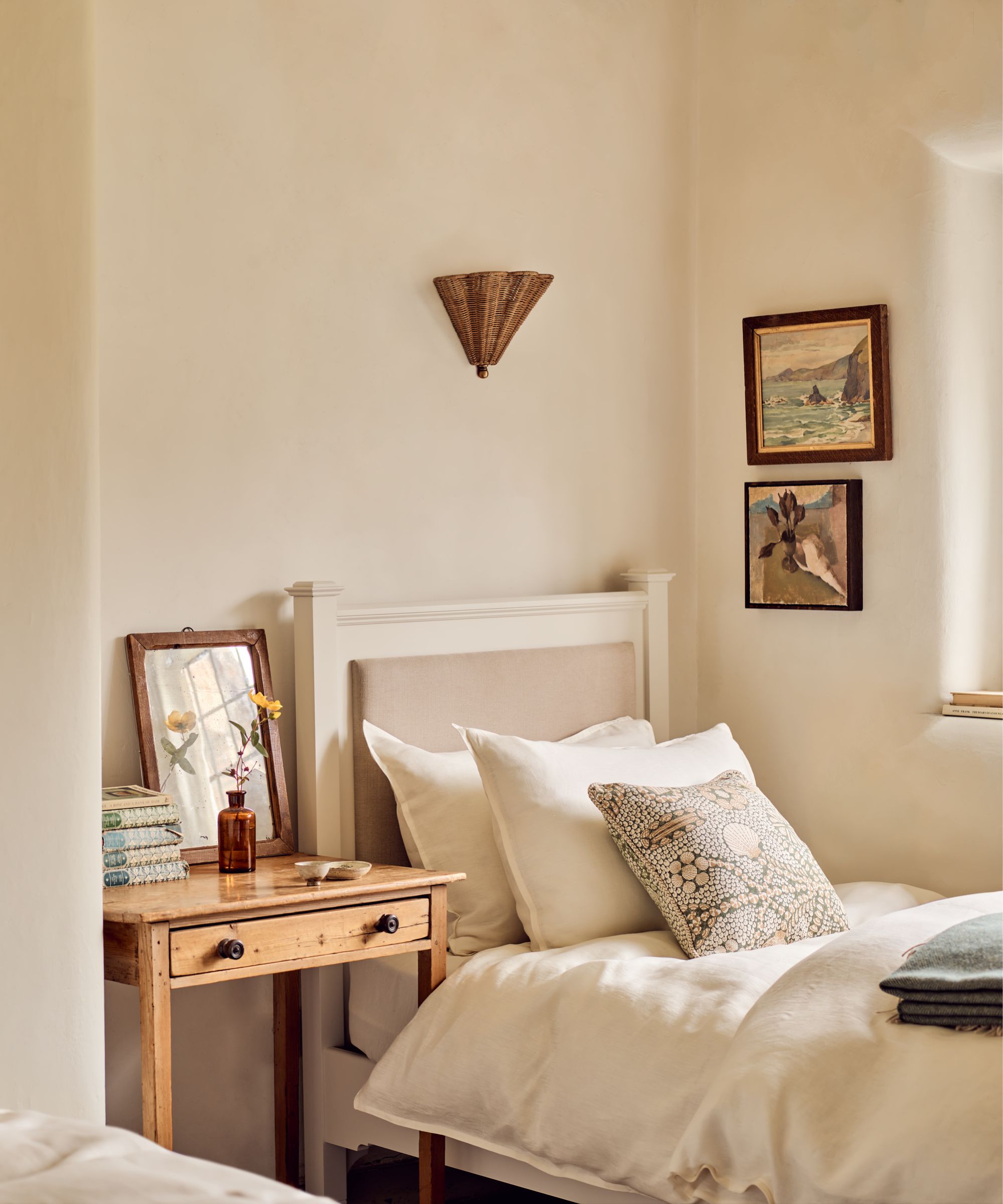
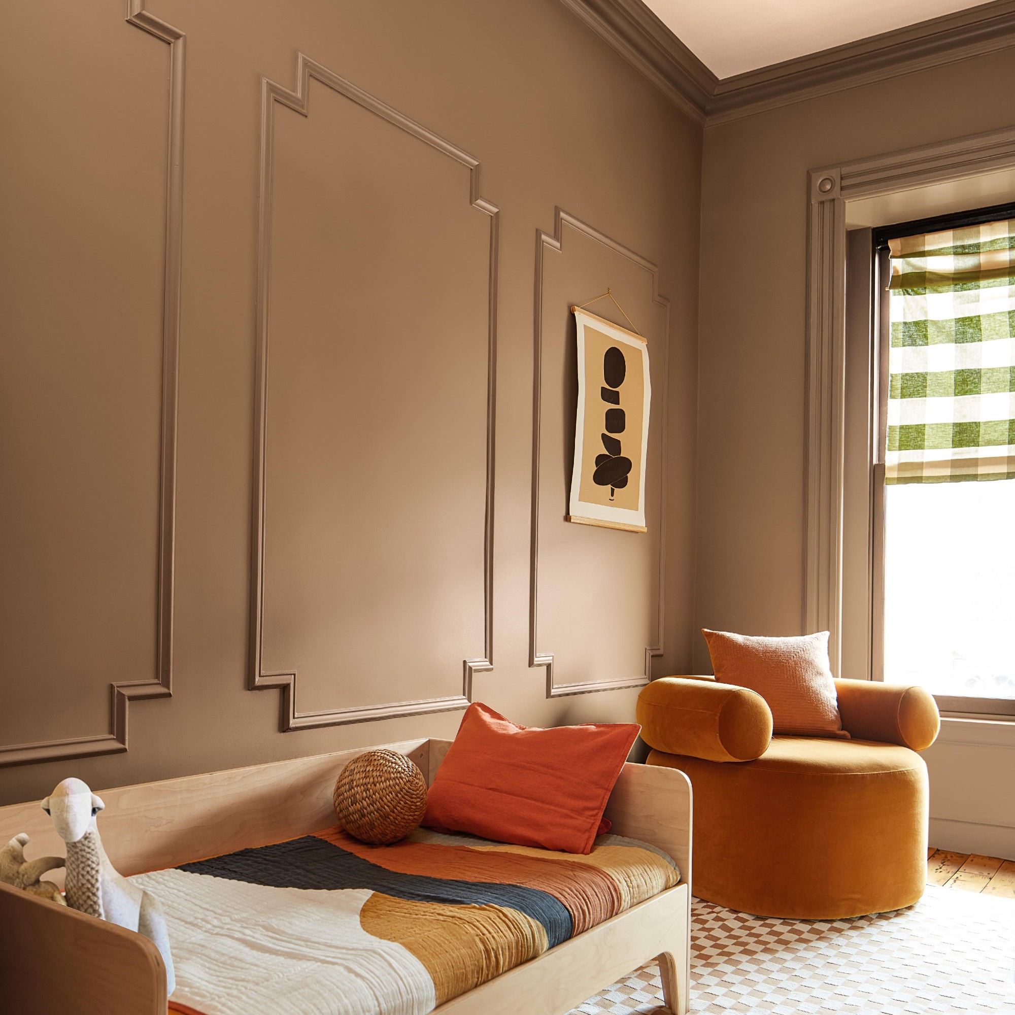
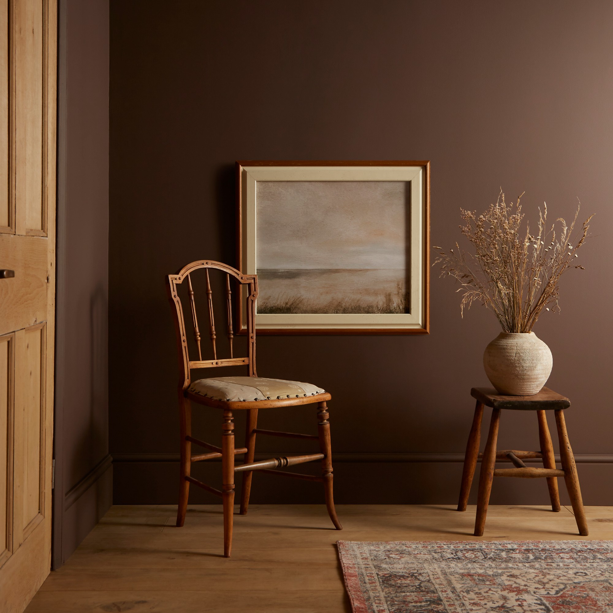
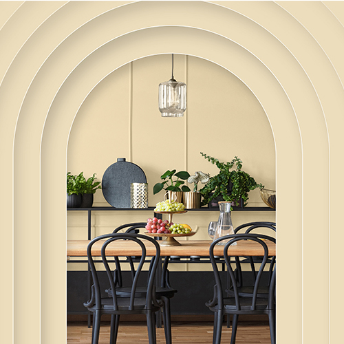
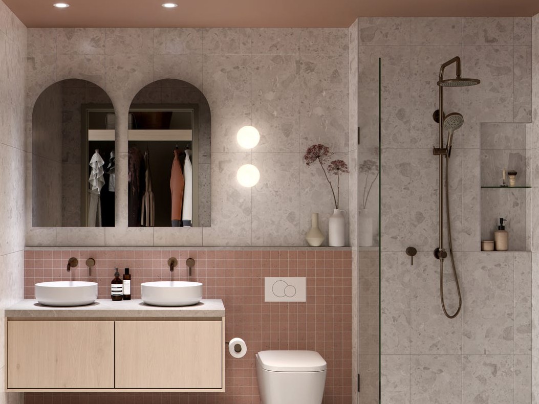
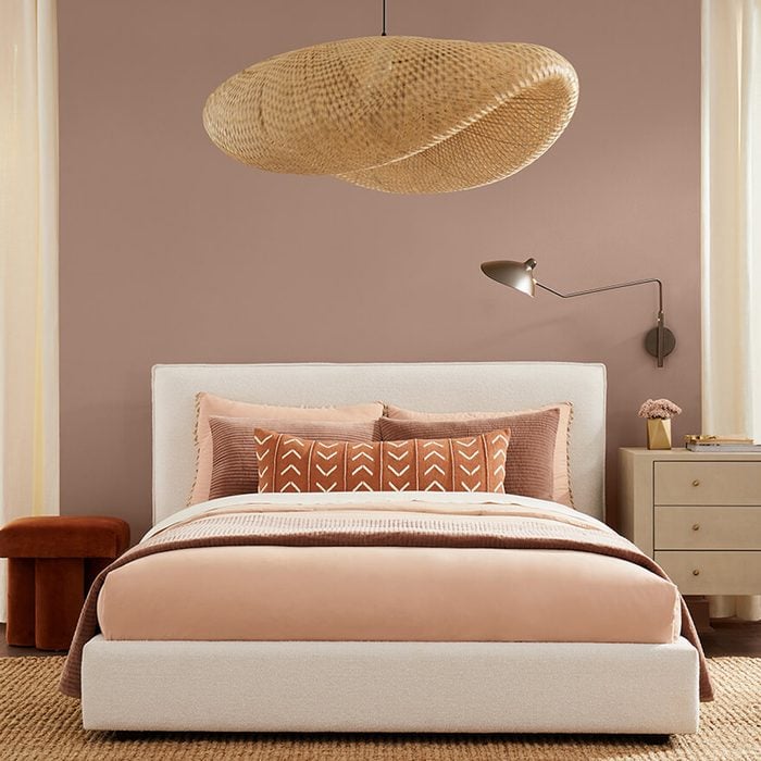
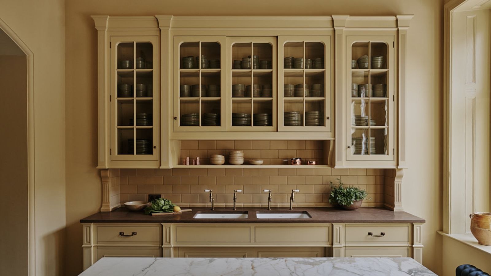
Finally, Little Greene presented "Mochi," a warm light brown with peachy pink undertones. Ruth Mottershead, creative director at Little Greene, suggests "Mochi" provides comfort and works well in both traditional and ultramodern settings. She recommends pairing it with greens and grays for an earthy feel or with dark browns for a contemporary look, creating inviting and sumptuous spaces.
#ColorOfTheYear #InteriorDesign #HomeDecor #PaintTrends #Behr #GLIDDEN #Minwax #Valspar #SherwinWilliams #STAINMASTER #LittleGreene #ColorOfTheYear #InteriorDesign #HomeDecor #PaintTrends #Behr #GLIDDEN #Minwax #Valspar #SherwinWilliams #STAINMASTER #LittleGreene
0 Kommentare insgesamt
 Noch keine Kommentare
Das könnte Ihnen auch gefallen
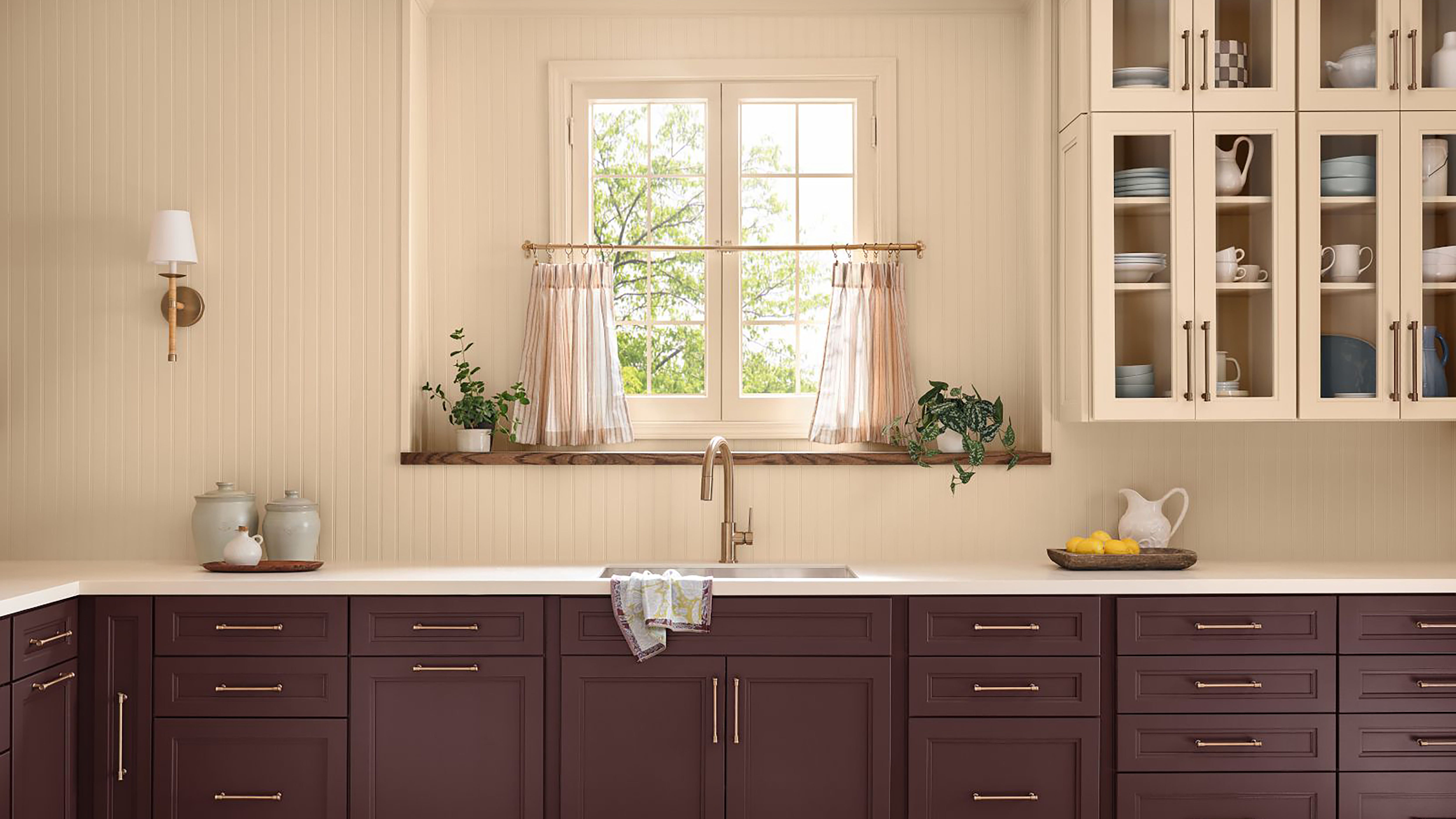
2025 Colors of the Year, and How to Use Them

Every 2026 Color of the Year That Has Been Announced So Far

The biggest color trends of 2025 – 10 colors designers say will lead the way next year

Here's Every 2024 Color of the Year We Know So Far

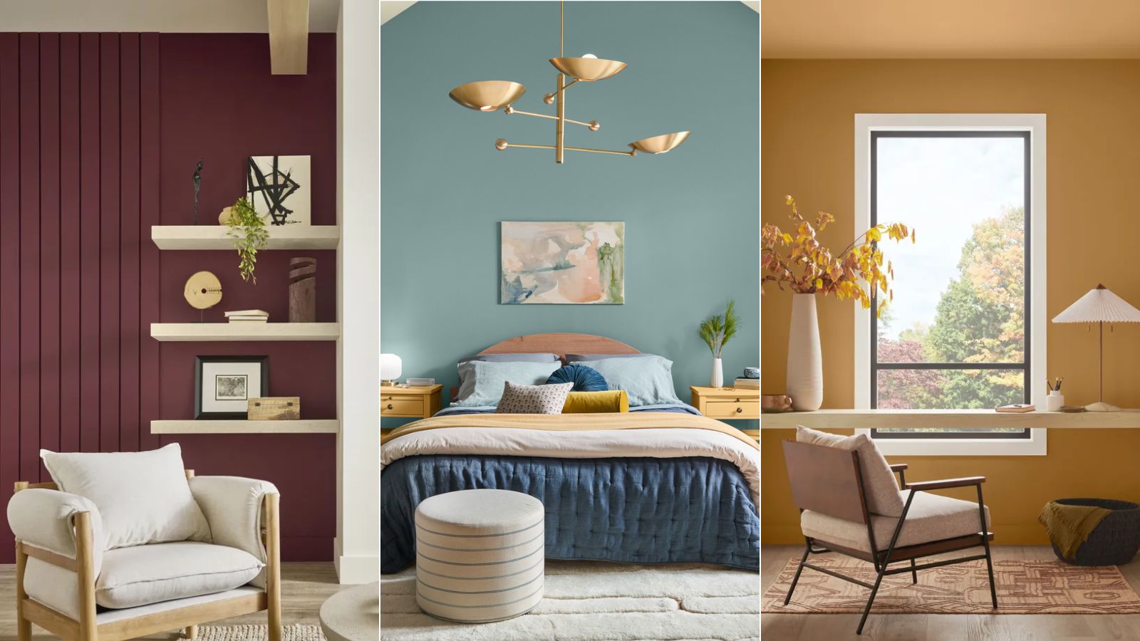
Colors of The Year – get to know every shade revealed by leading paint brands for 2025
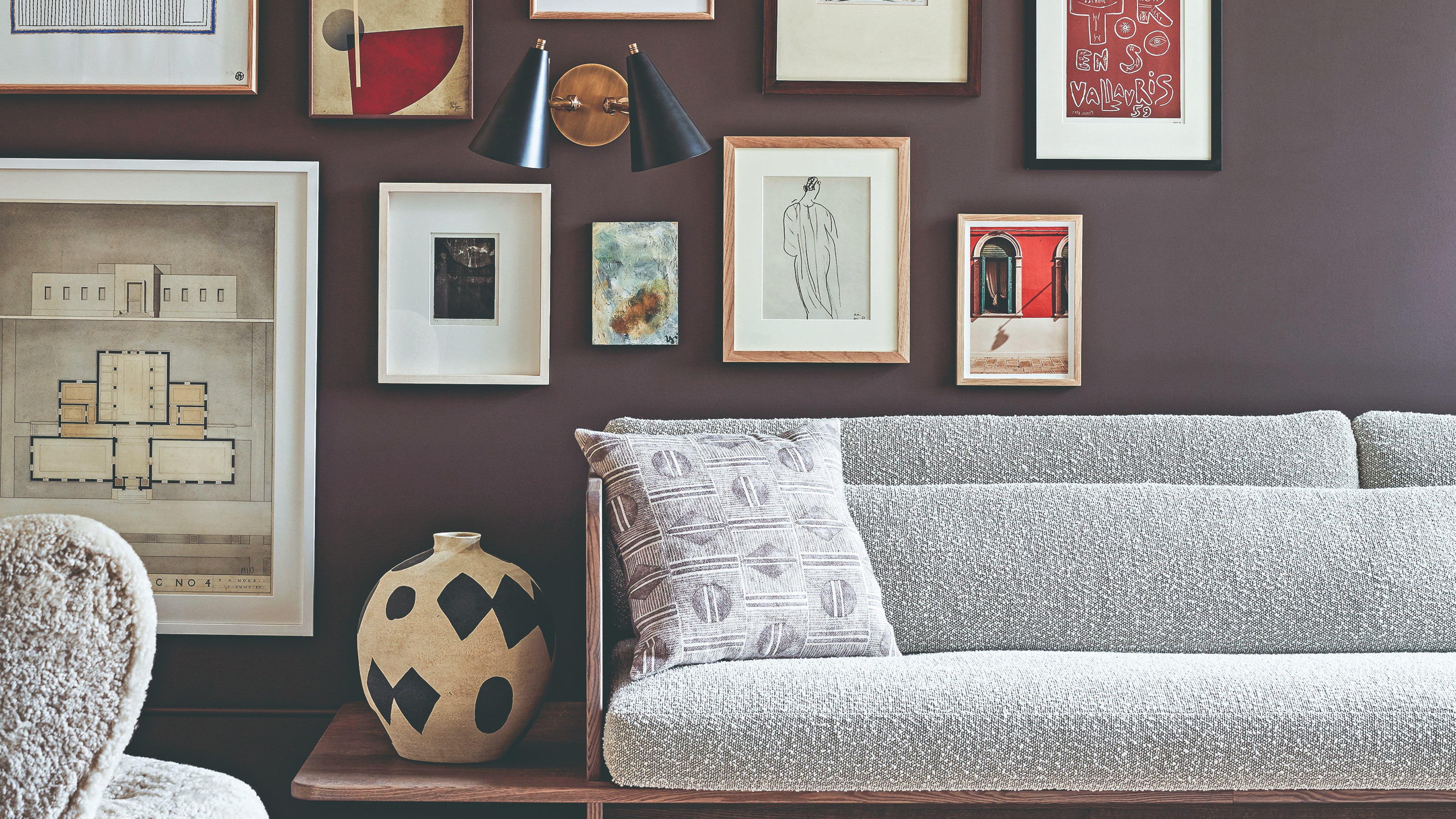
The colour palette for 2025 – these are the shades paint experts say we’ll see everywhere next year
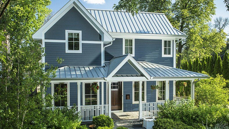
Update! From Evening Blue to Cinnamon Slate: See All the 2025 Colors of the Year We Know So Far
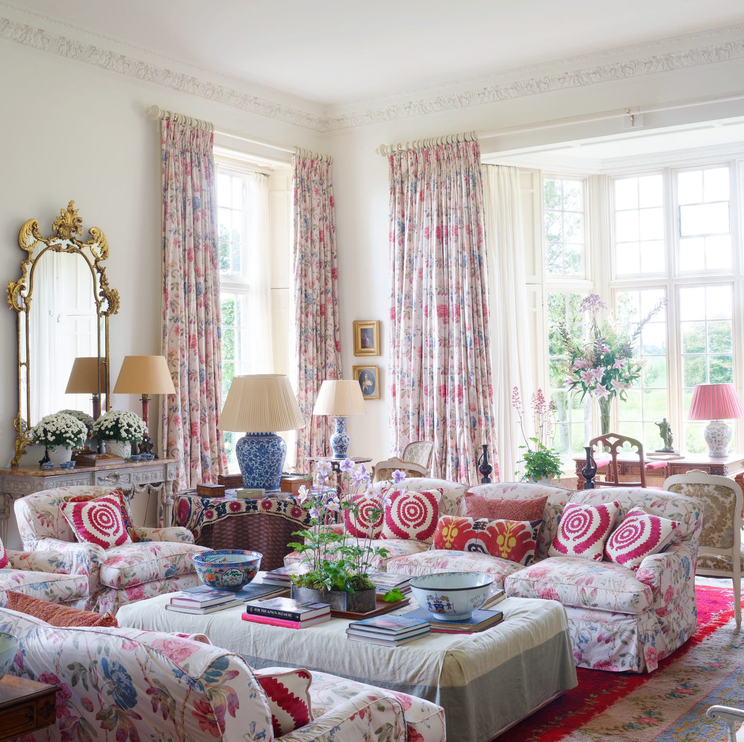
These 8 Color Trends Will Rule in 2025, According to Color Pros

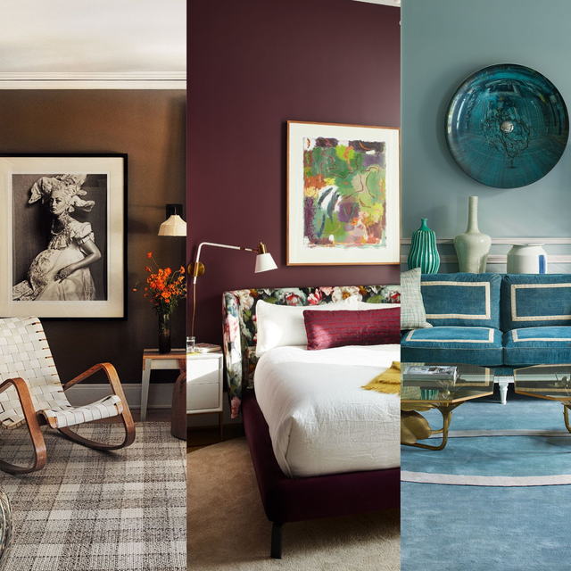
We’re Calling It: These Are the Official Color Trends of 2025
The 2025 Colors of the Year Are Here—and They All Have One Thing in Common

Pick Your Favorite 2024 Color of the Year


Experts Say These 5 Paint Colours Will Be Everywhere In 2026
Every 2025 Color of the Year We Know So Far
Every Single Pantone Colour Of The Year From 2000 – 2026
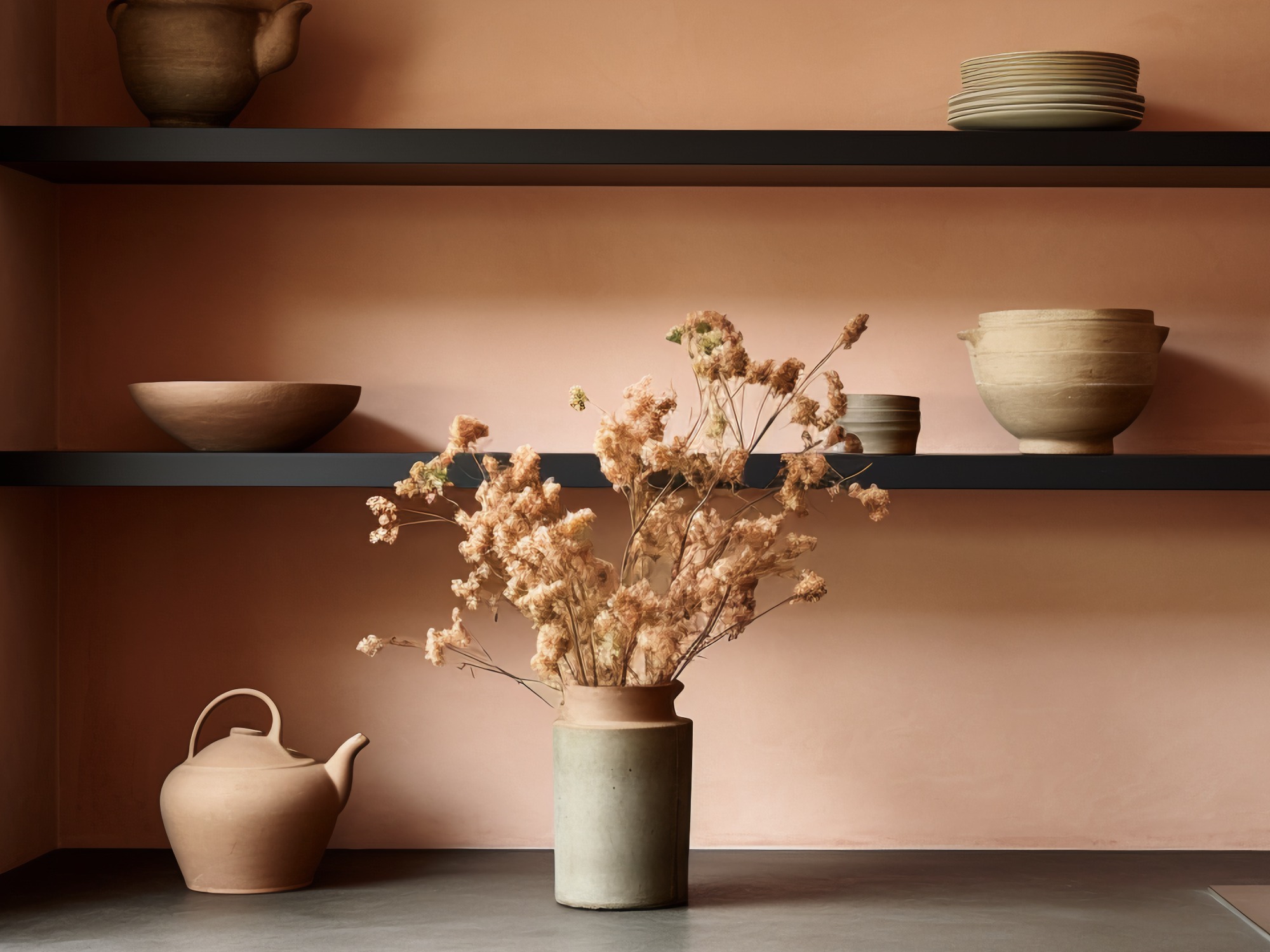
The Biggest Colour Trends Taking Off in 2025
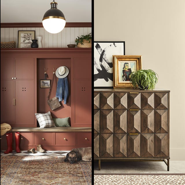
What 2026's Colors of the Year Say About You—And All Of Us
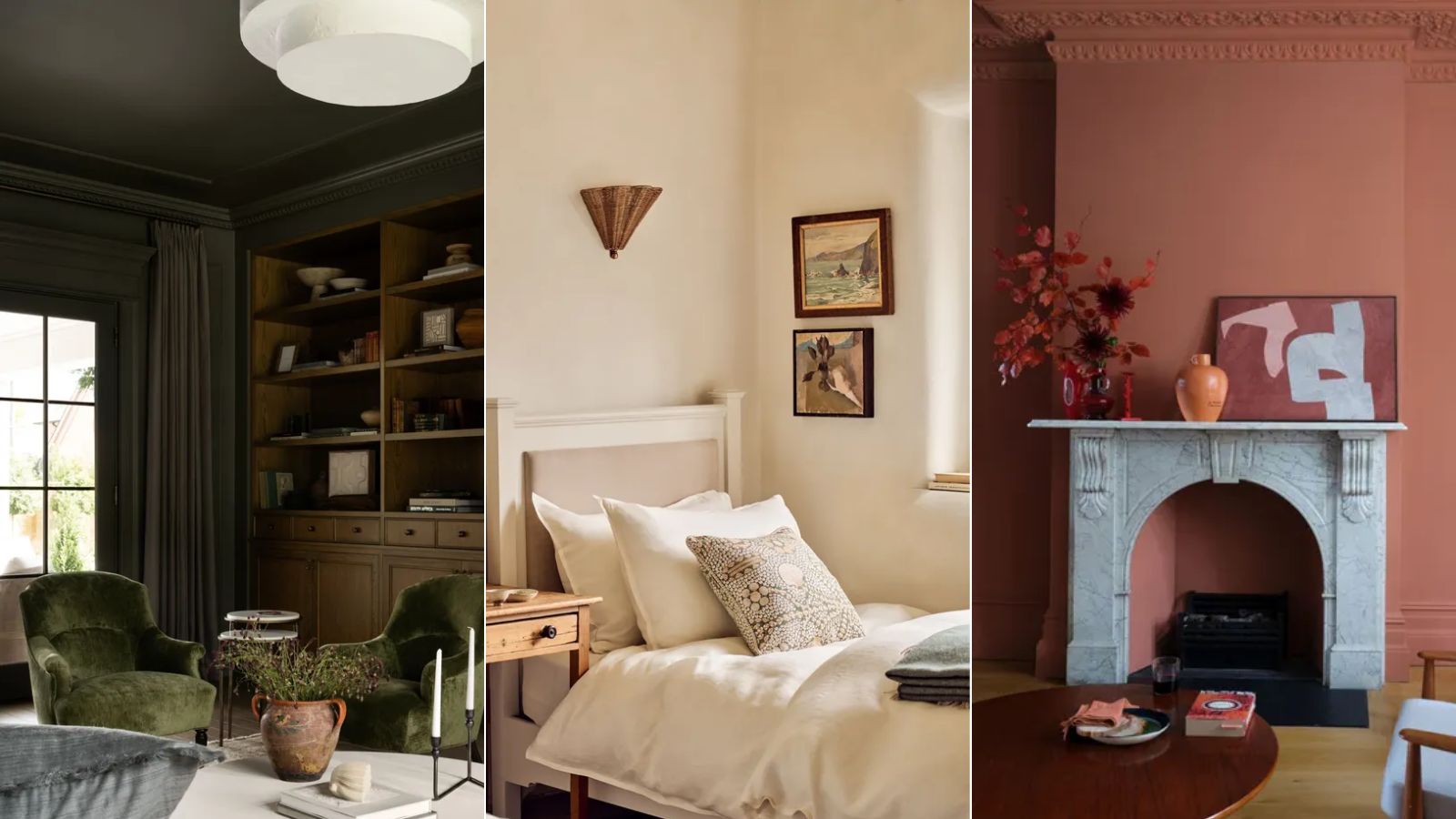
As a color editor, I've seen hundreds of color trends come and go this year – these are the ones I think will stick for 2025
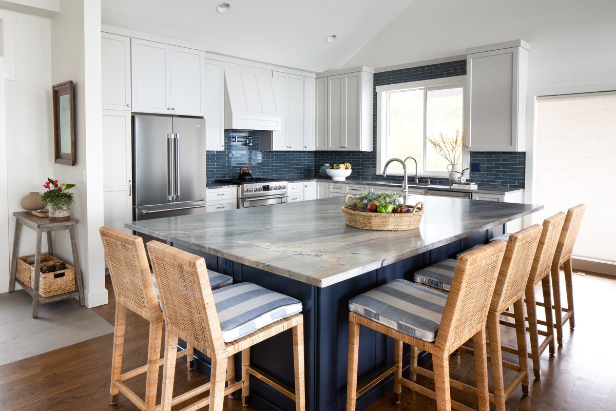
Color Explosion: 2025 Color Trends

Compare All the Paint Colors of the Year for 2023
Every 2025 Color of the Year We Know So Far—and Inspiration for How to Use Each in Your Home