9 Retro Colors That Are Back in Style for Home Interiors
This article explores nine retro color trends that are making a comeback in home interiors, offering modern interpretations and pairing suggestions for each hue. The featured colors include Mauve, Beige, Denim Blue, Earthy Green, Yellow, Warm White, Mint Green, Pastel Pink, and Red, each with historical context and advice on how to integrate them into contemporary design schemes.

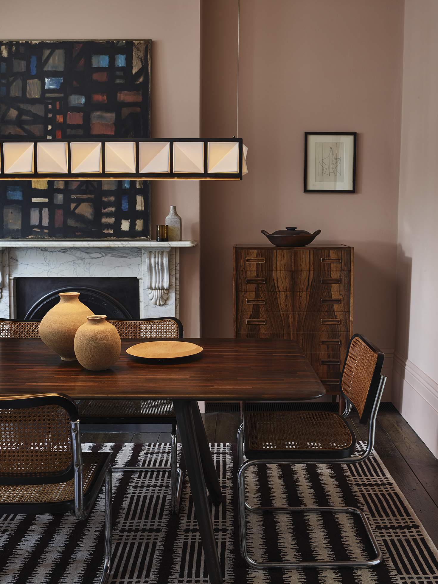
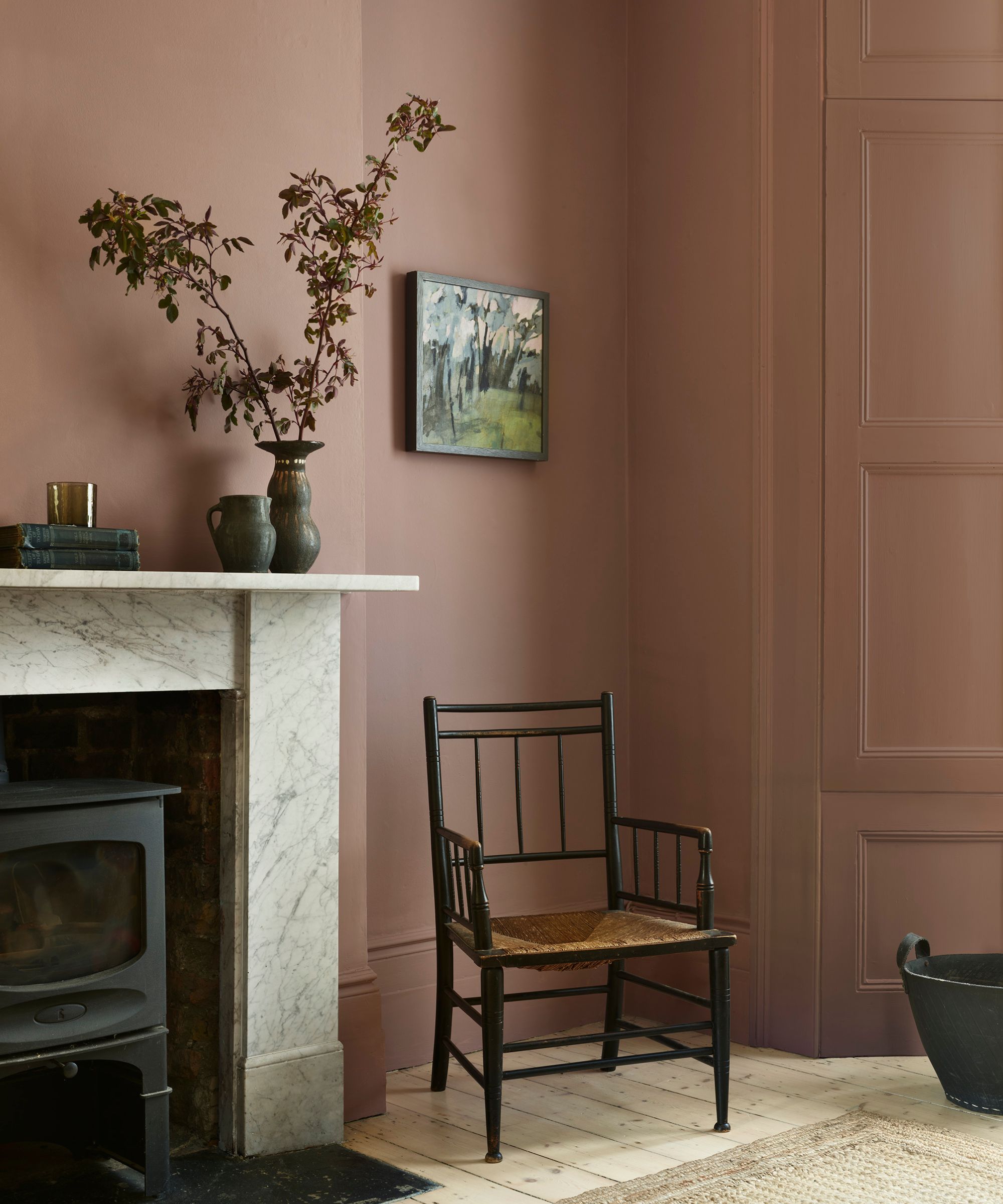
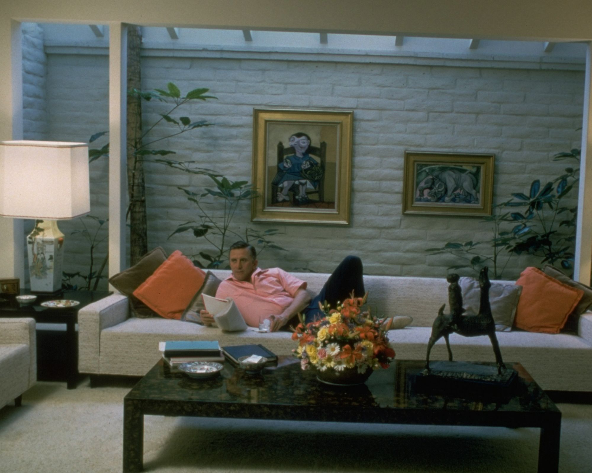
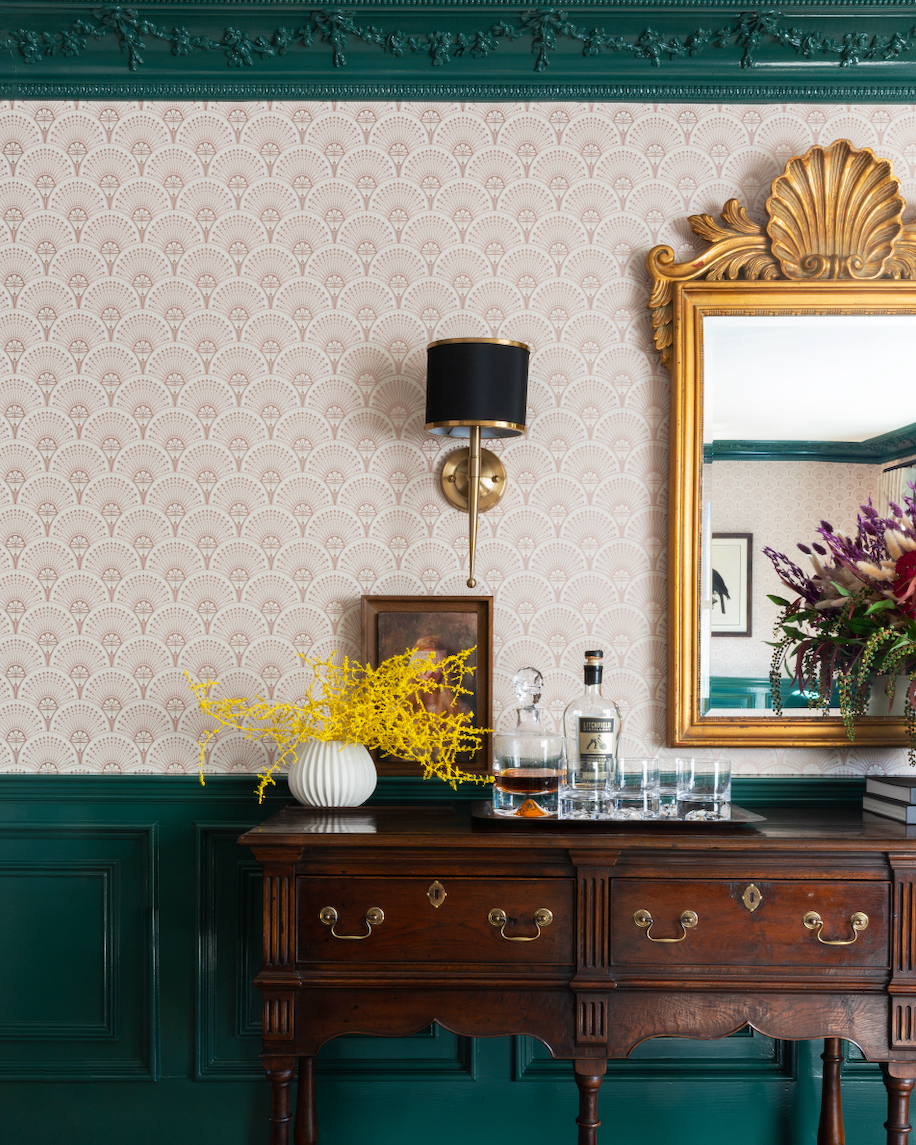
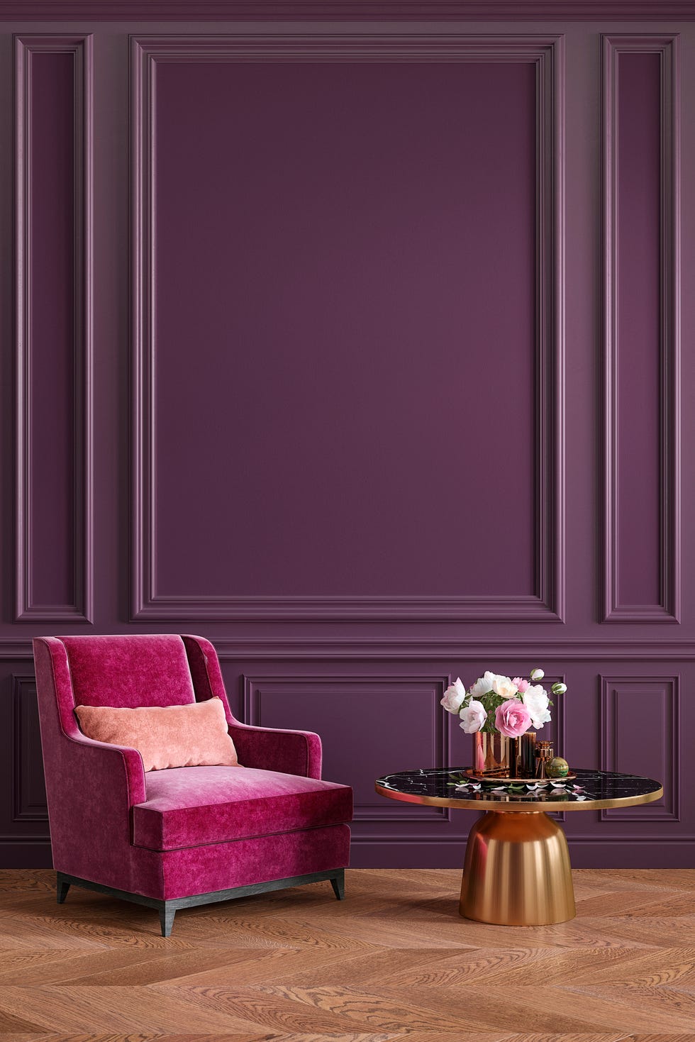
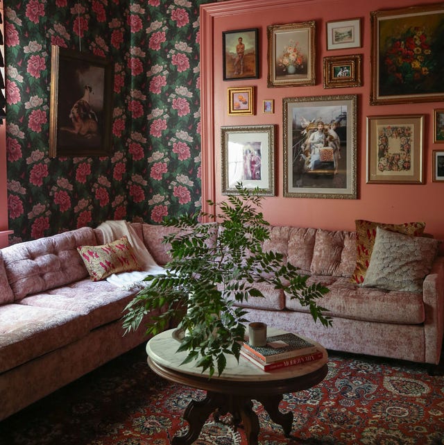
Mauve, a dusty pink-purple reminiscent of the '80s, is re-emerging with a sophisticated appeal. Contemporary applications favor saturated, dusky shades over pastel versions, making it suitable for living areas and dining rooms. Interior stylists suggest pairing mauve with cooler hues like blues and grays to create a soothing ambiance. Its ability to add depth without being overpowering makes it a versatile choice for various rooms.
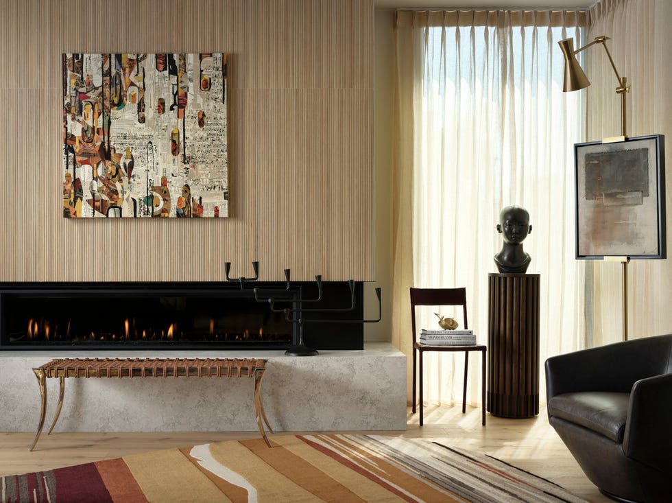
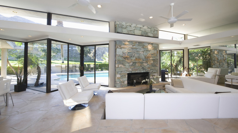
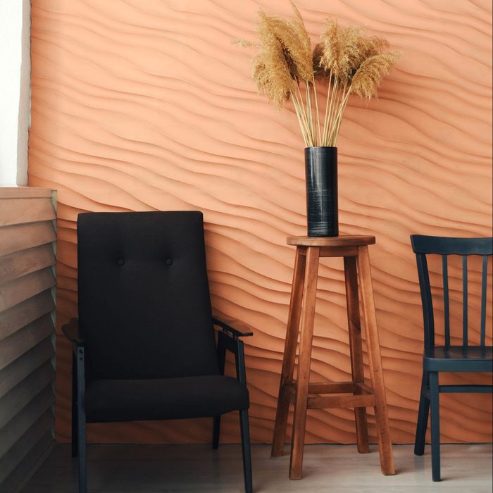
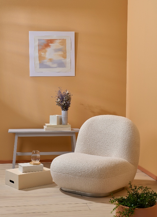
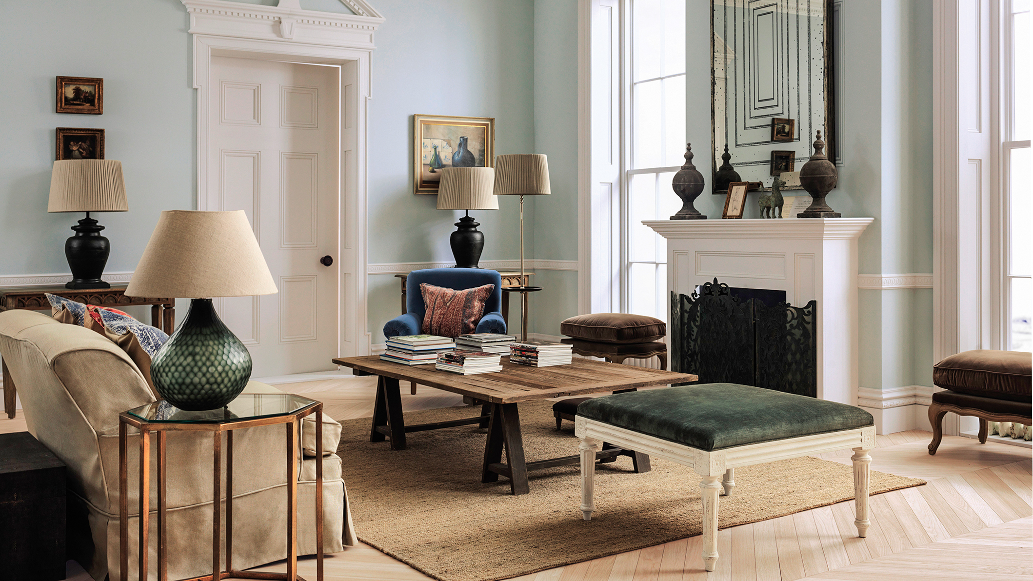
Beige, a warm, sandy neutral popular in the '90s and early 2000s, is returning to offer nostalgic comfort. Unlike the crisp, cool neutrals that dominated recent years, today's beige brings a soft, inviting quality to spaces. It pairs well with dusty blues or rich clay tones, contributing to an easygoing, nature-inspired color palette that can ground a room and provide a sense of warmth.
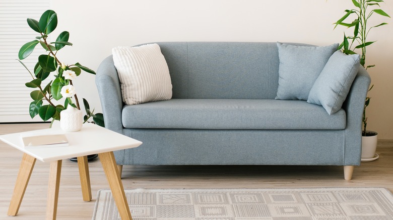
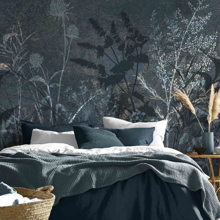
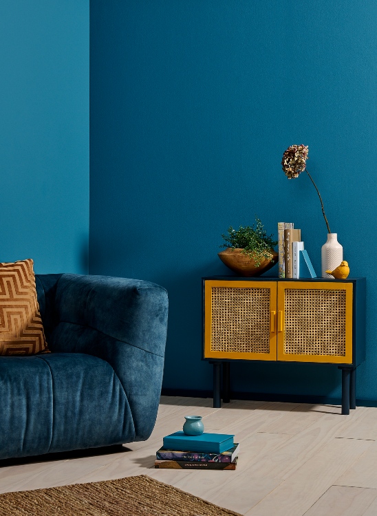
Denim Blue, a shade that evokes the familiarity of well-worn jeans, is celebrated for its classic appeal. This color, deeply rooted in traditional interiors, is now used to create timeless and livable spaces. Painting walls in denim blue can foster a calming and understated atmosphere, particularly suitable for bedrooms and bathrooms where relaxation is key. Its enduring quality makes it a reliable choice for long-term decor.
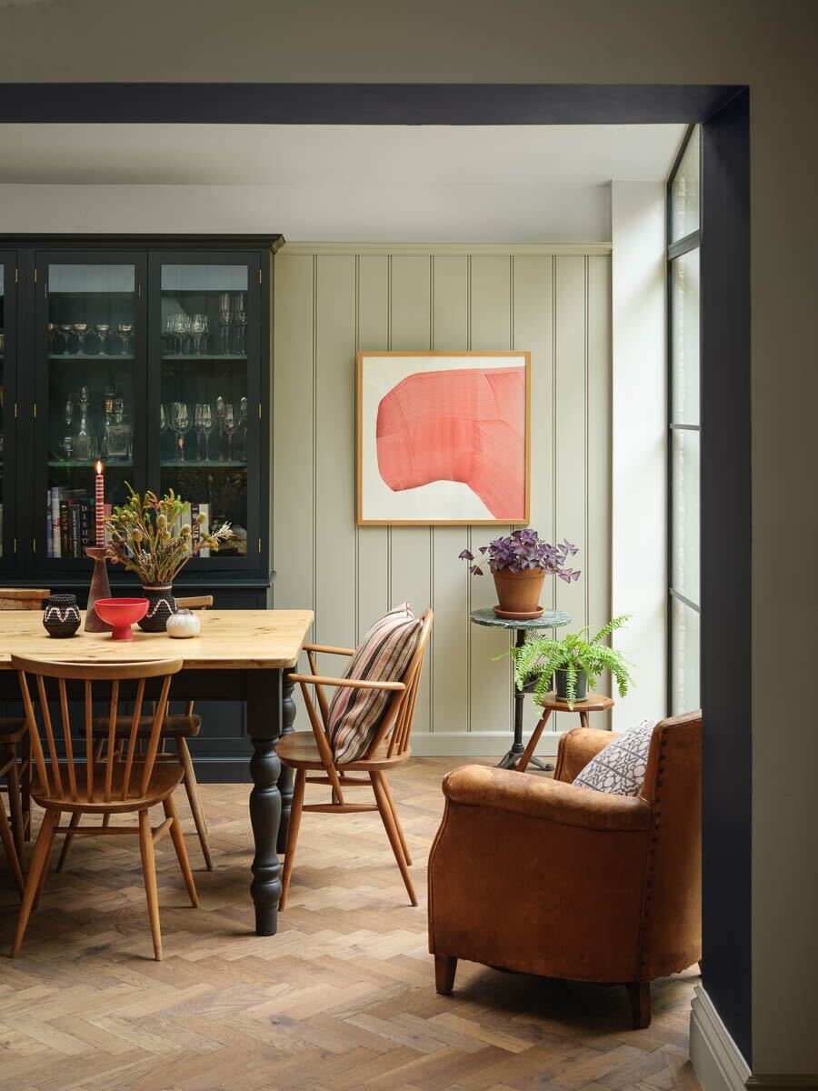
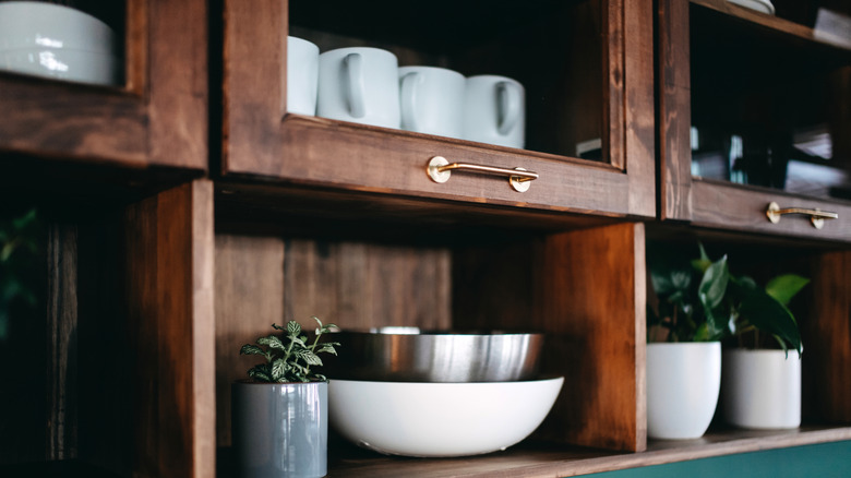
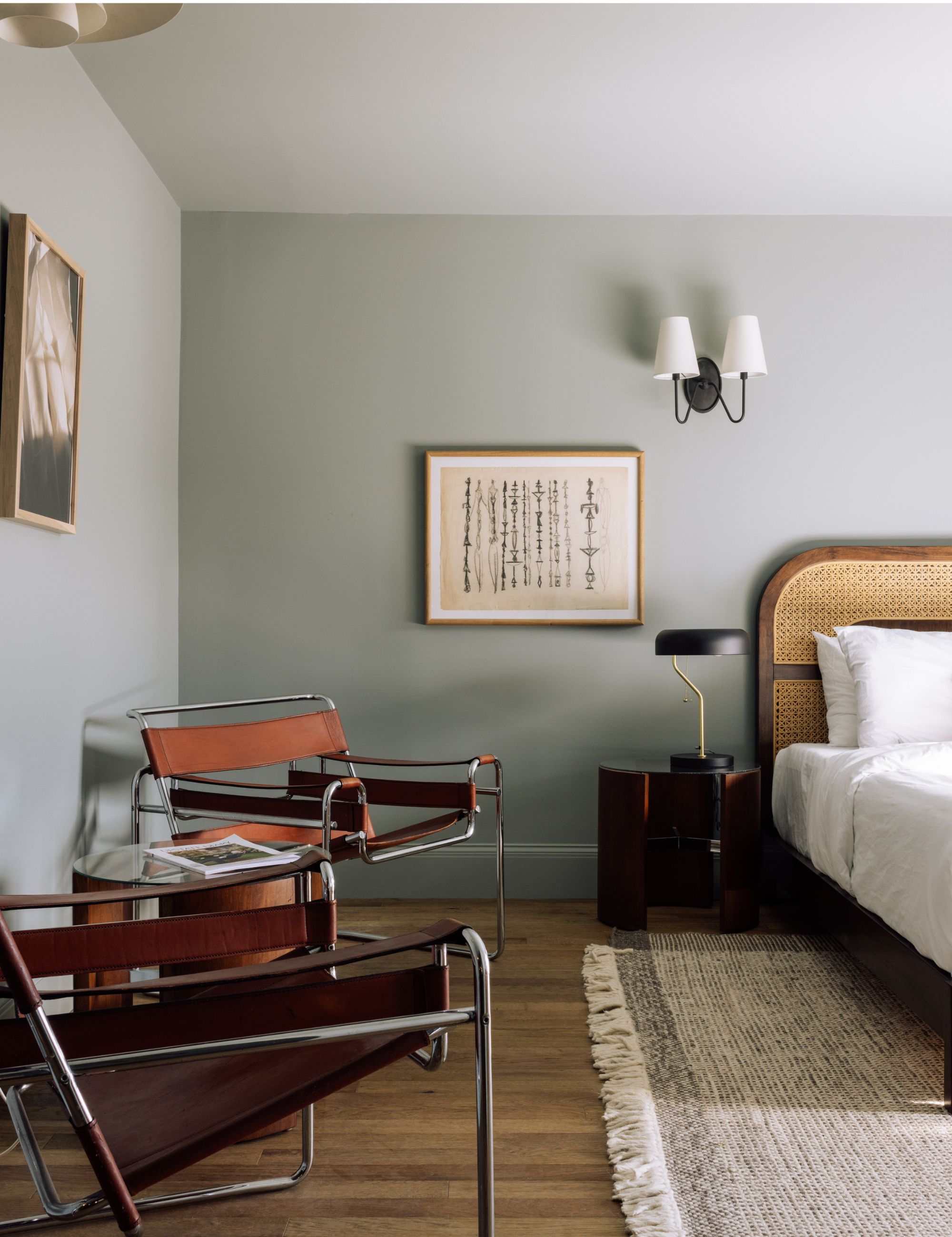
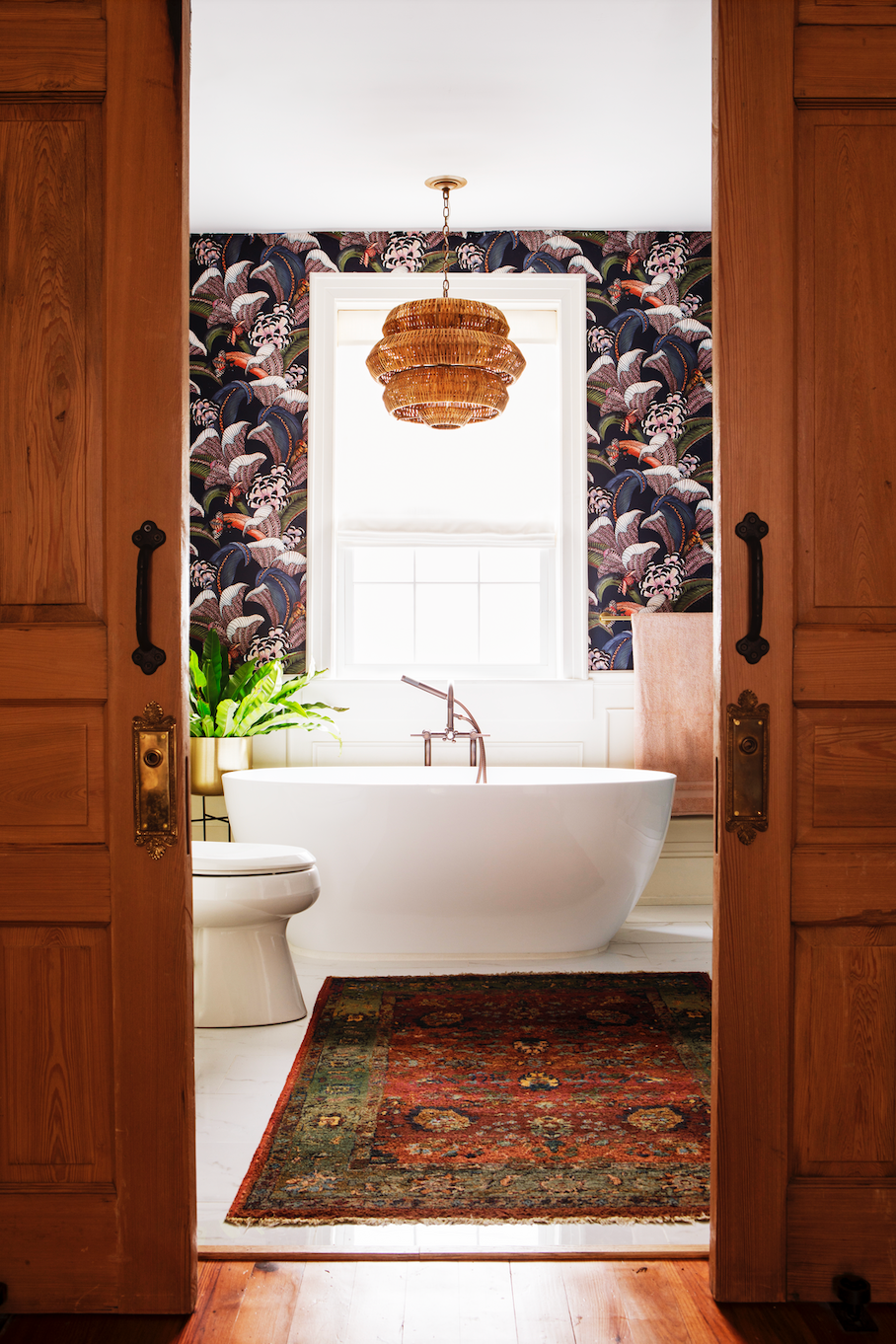
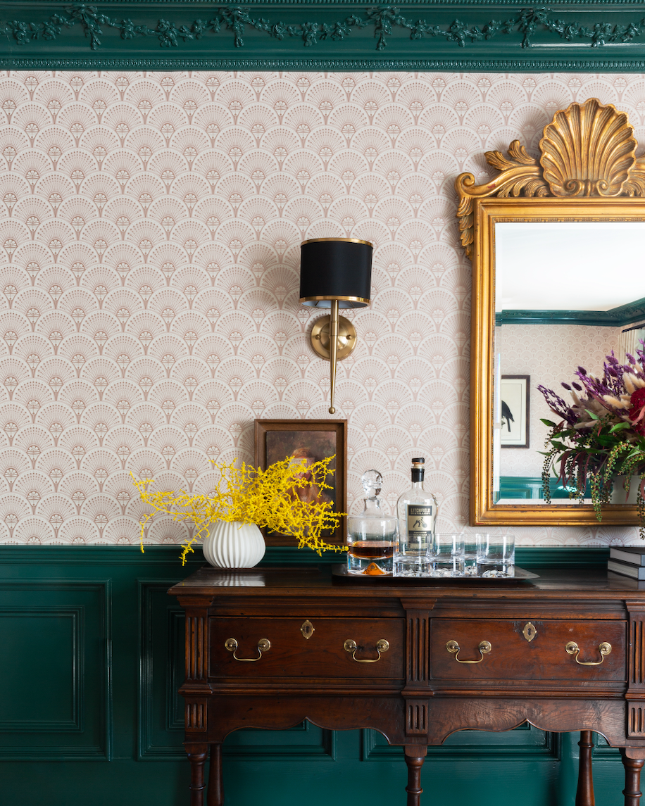
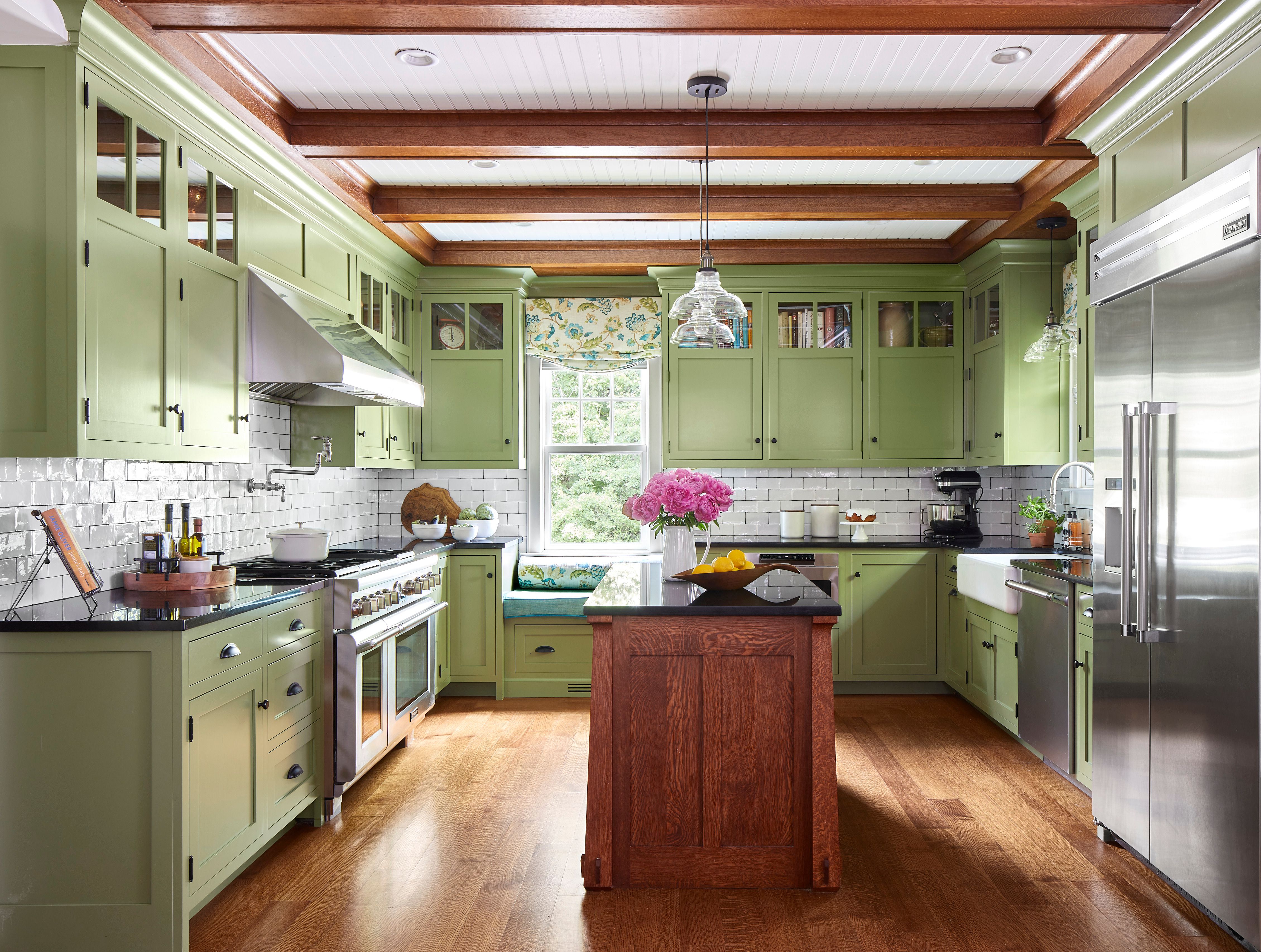
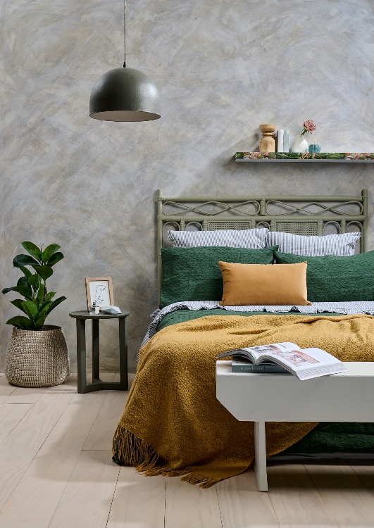
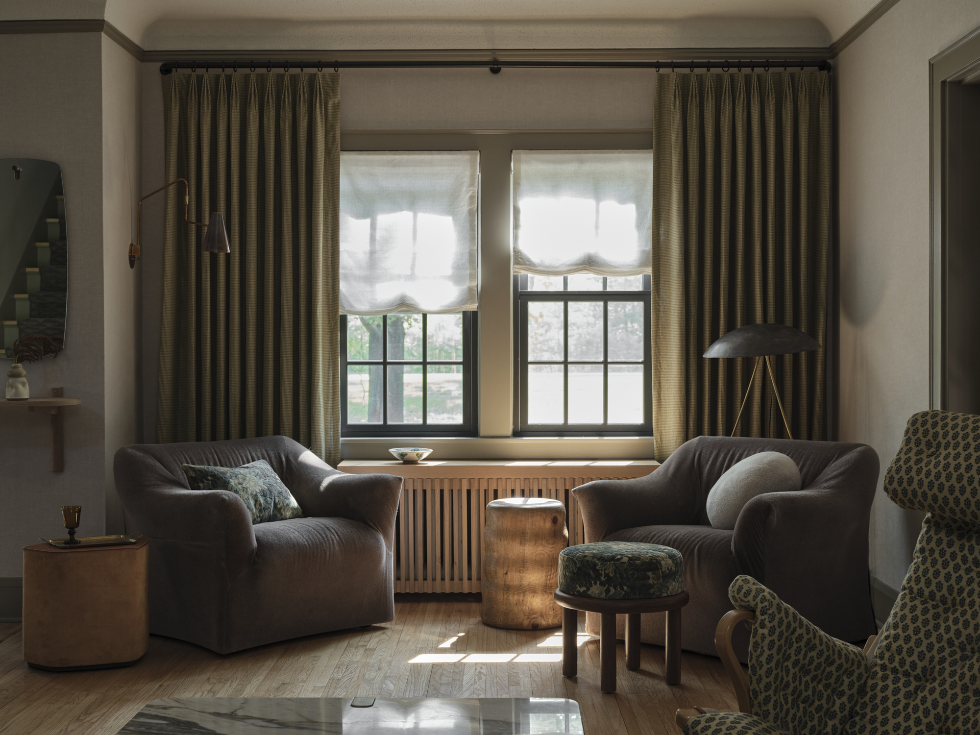
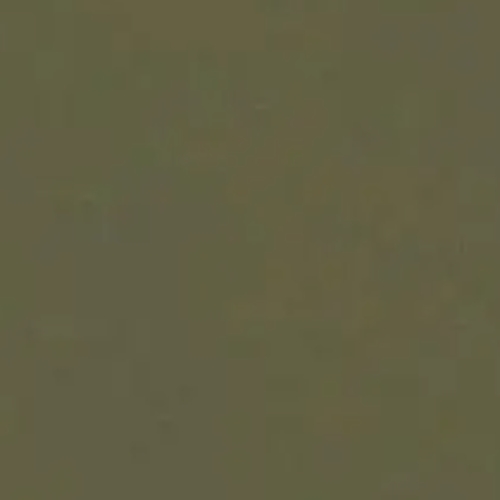
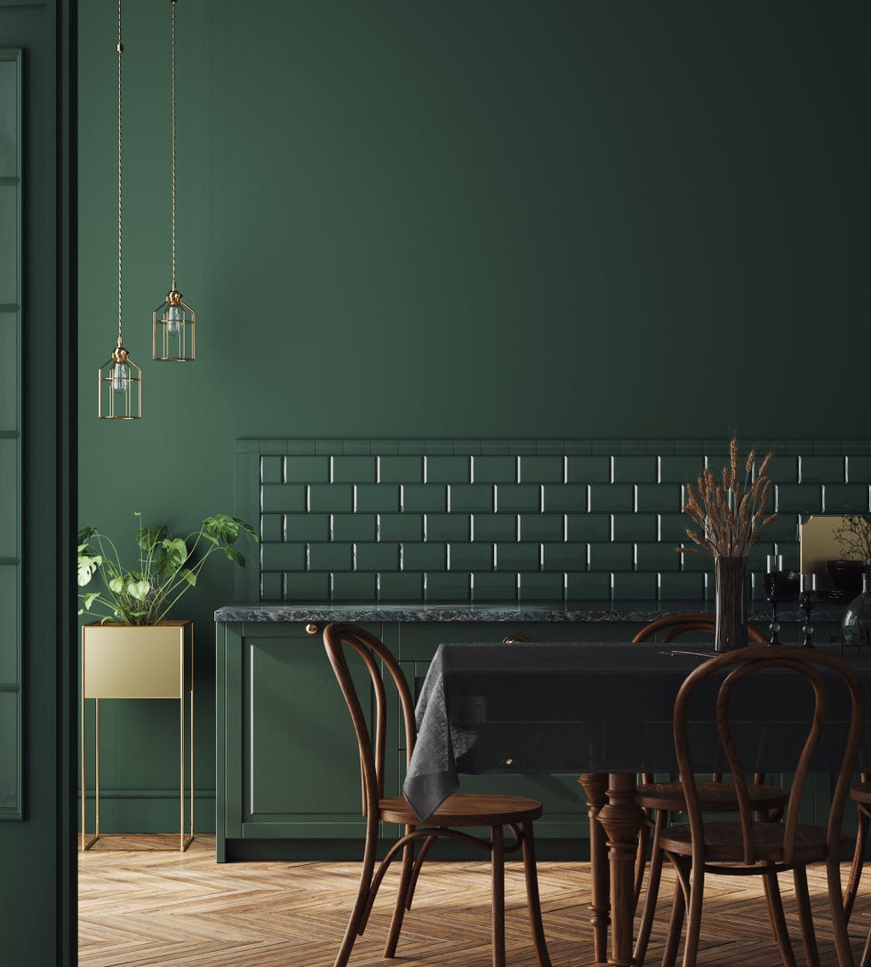
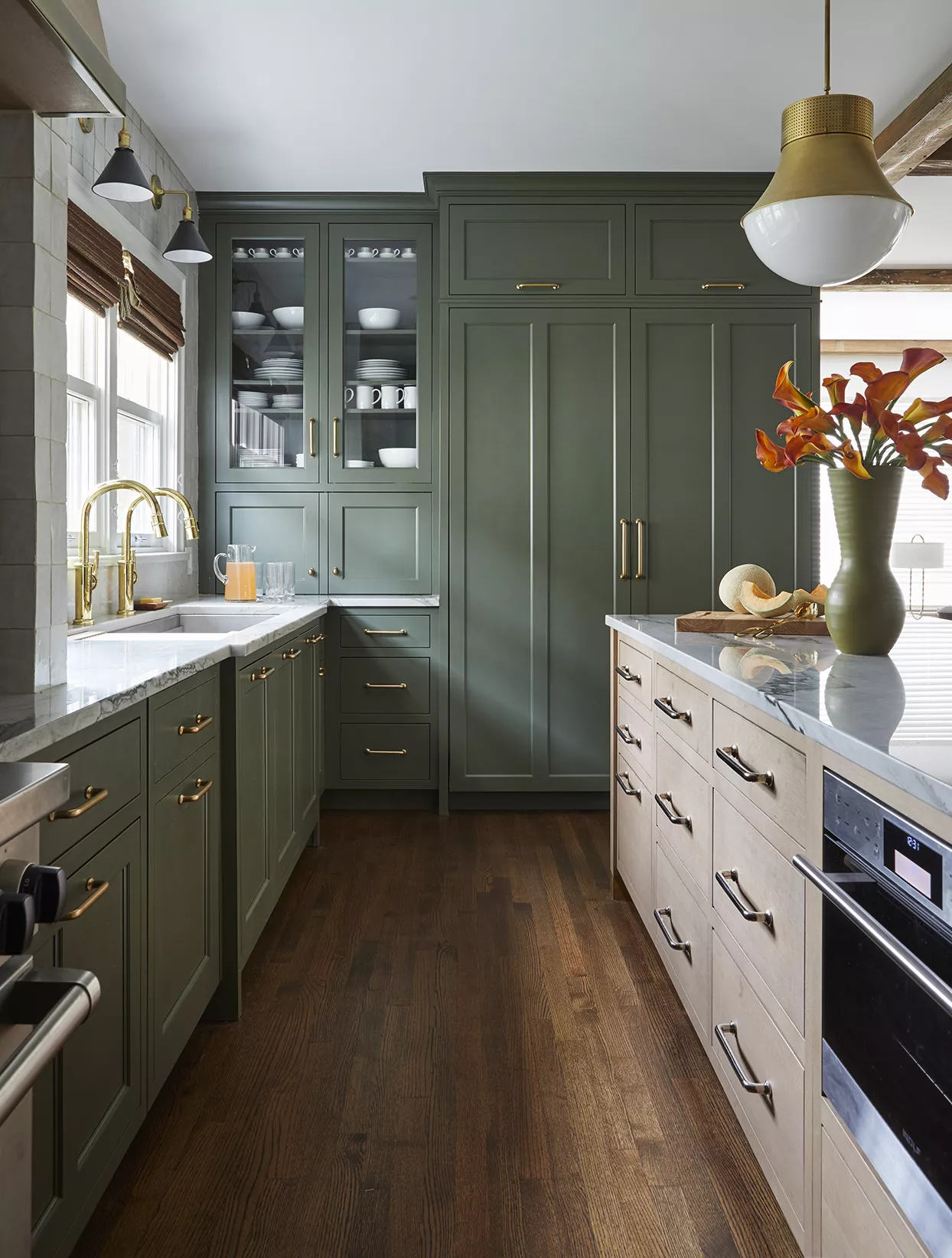
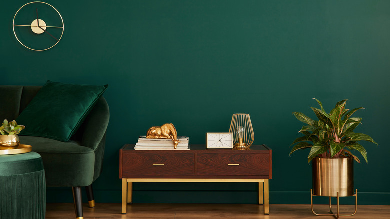
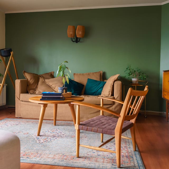
Earthy Green is presented as a modern response to the avocado green of the 1960s and '70s. Deep, grounded shades of green are currently trending, especially in kitchens for dramatic cabinet colors and in bathrooms through towels and accessories. The recommendation is to select hues with a significant gray undertone to ensure the color reads as a versatile neutral, blending seamlessly with other elements in a room.
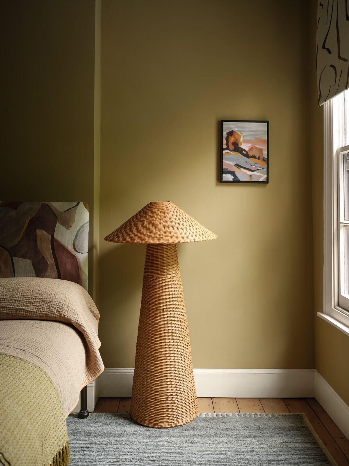
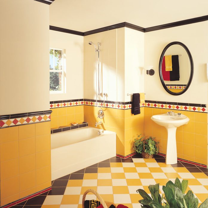
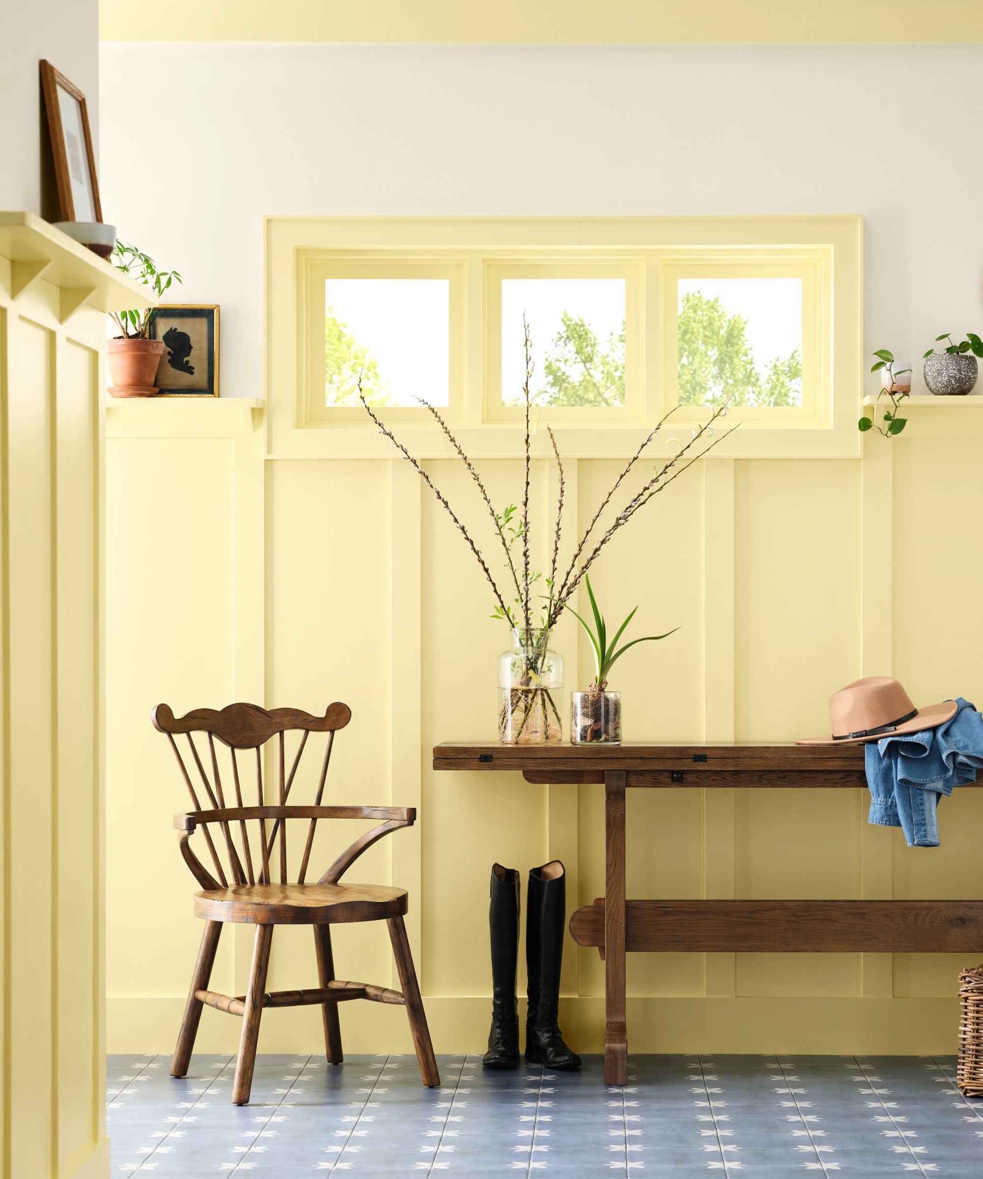
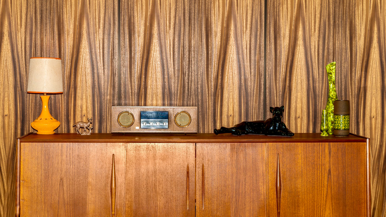
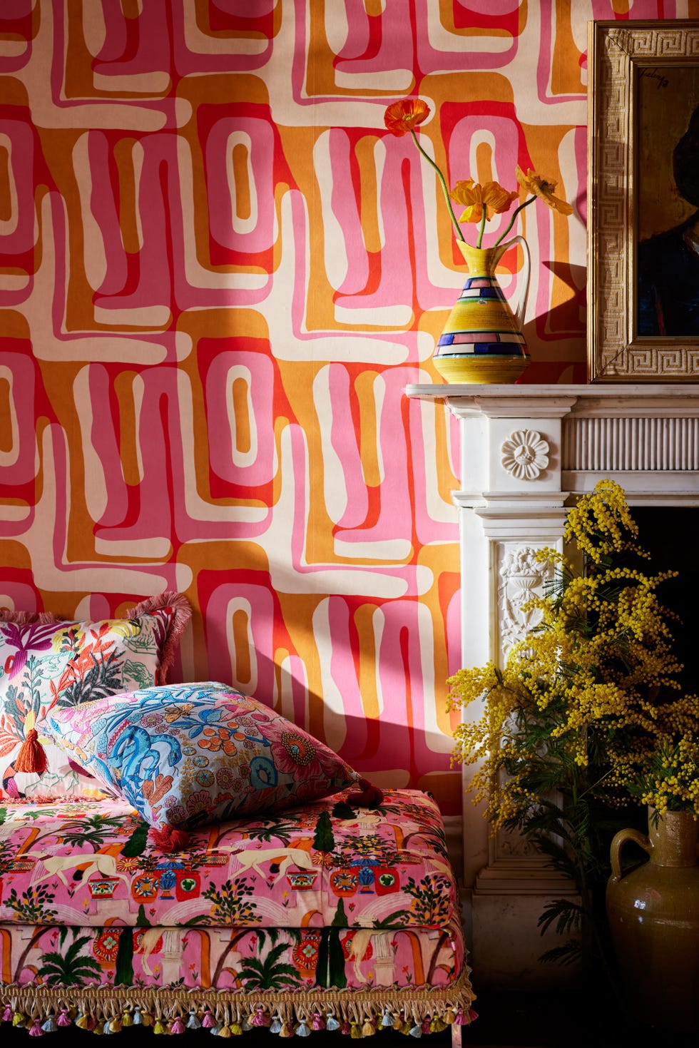
Yellow, a vibrant color often associated with the groovy style of the '70s, is back in various forms. For a fresh and impactful look, the article suggests opting for intense shades like lemon or citrine. Interior designers note that the umber undertones in warmer yellows are particularly complementary to antique furnishings, adding a friendly and welcoming feel to a space while embracing a retro sensibility.
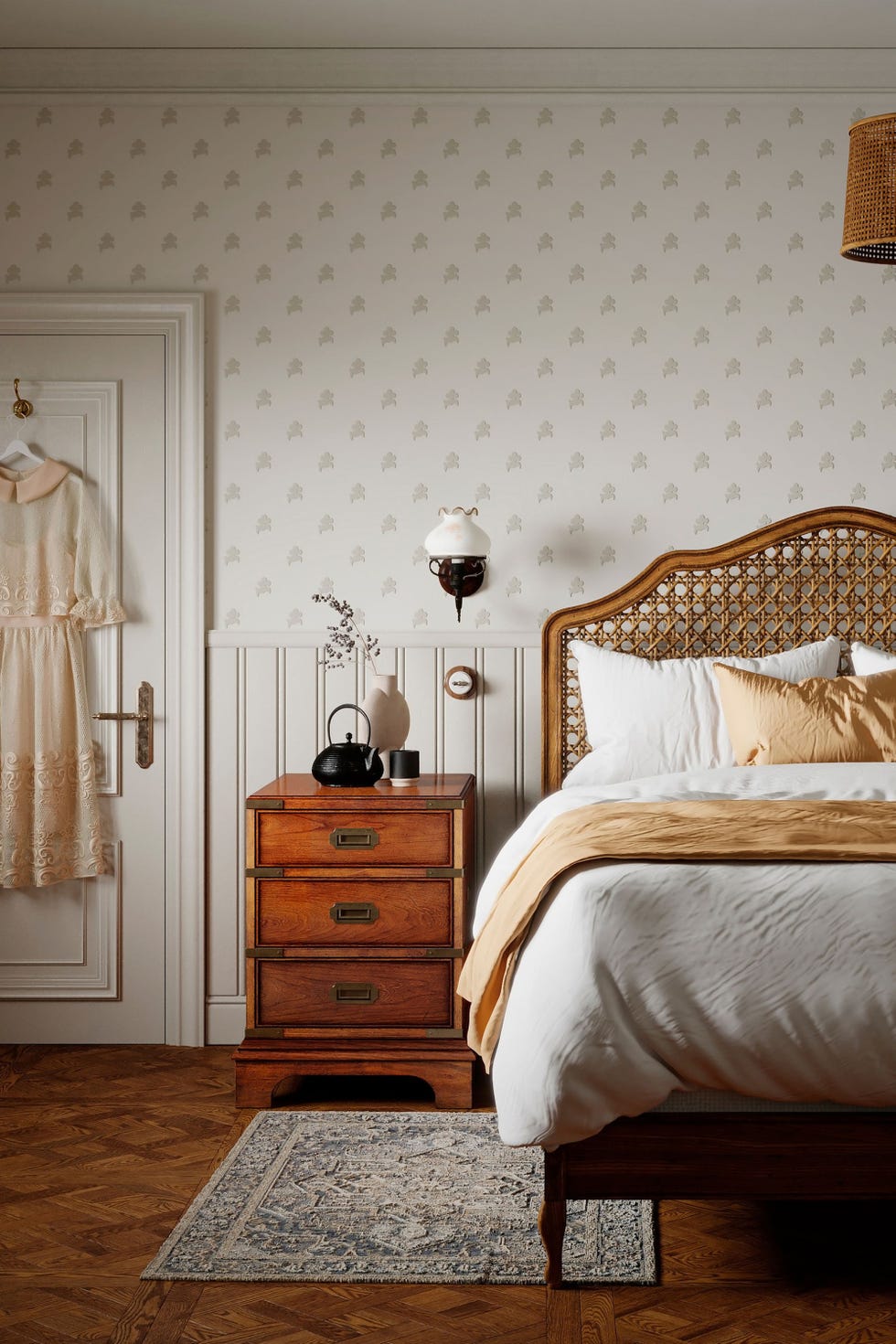
Warm White, characterized by subtle undertones of red or yellow, brings to mind old farmhouses and cozy country cottages. These softer, antique shades are gaining popularity over the stark, pure whites previously in vogue. Incorporating warm white into rooms can create an inviting and comfortable atmosphere, providing a gentle backdrop that enhances other decorative elements without being overwhelming.
Mint Green, a prominent retro color from the first half of the 20th century, particularly in kitchens and bathrooms, is also experiencing a revival. Historically paired with jet-black and bright white for sharp contrast, its modern interpretation involves combining it with soft whites and natural wood tones. This approach results in a fresh, natural aesthetic that updates the nostalgic hue for contemporary tastes.
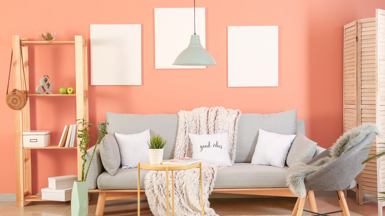
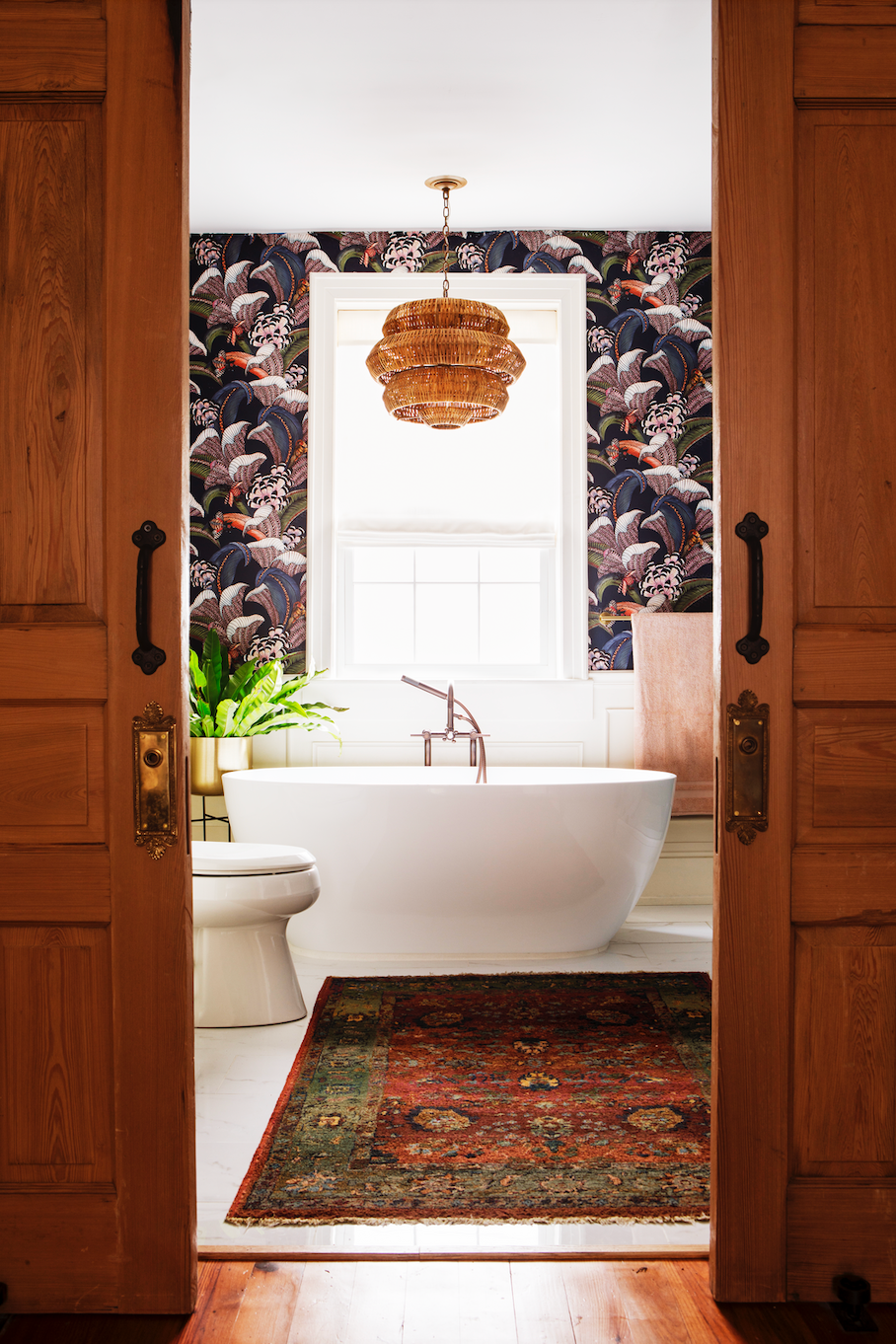
Pastel Pink, a widespread color in the 1950s, is now making a comeback, albeit in a more controlled manner. While less pervasive than its historical application on bathroom fixtures, powdery pink is currently a popular choice for bathrooms. To temper its inherent sweetness, the article suggests pairing pastel pink with modern black accents, creating a balanced and chic look. Designer Emily Henderson notes that pastels, including pink, bring softness to a room without sacrificing color.
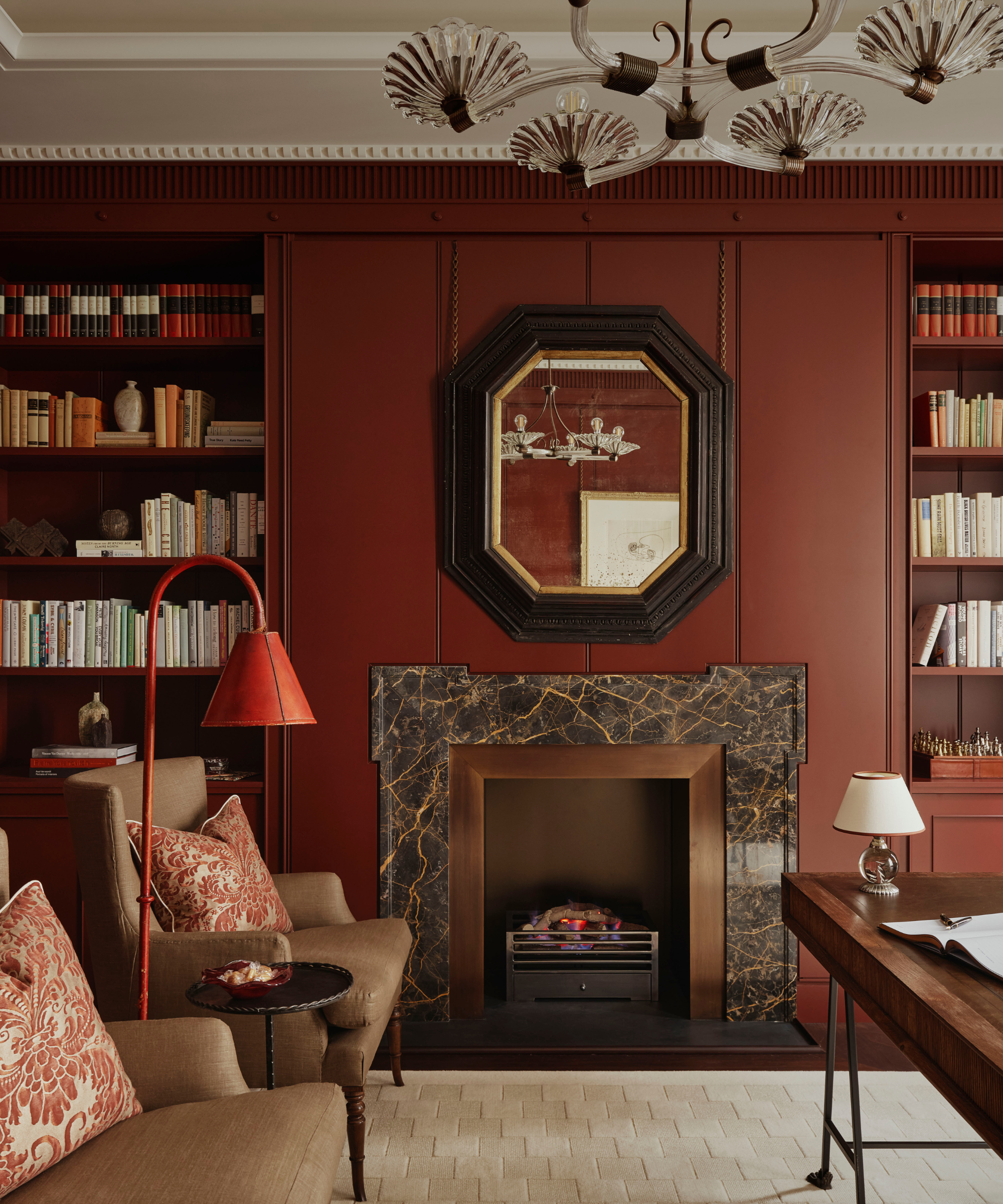
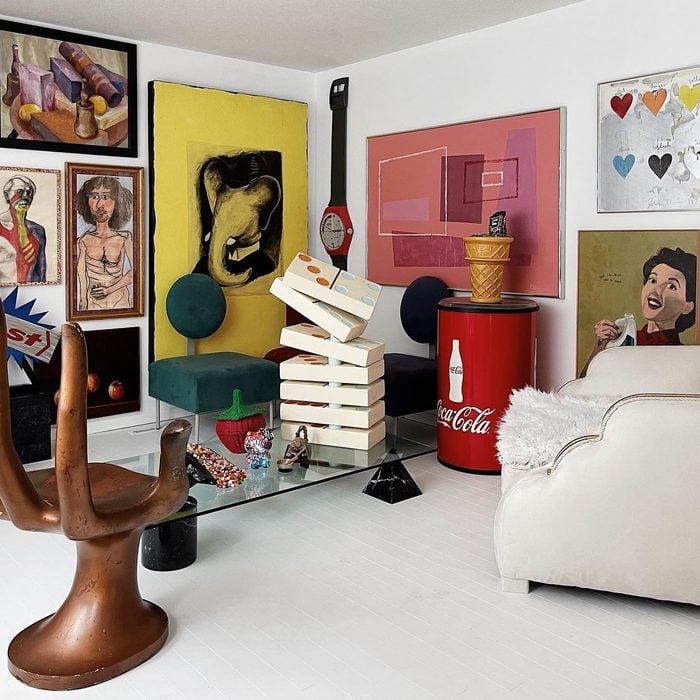
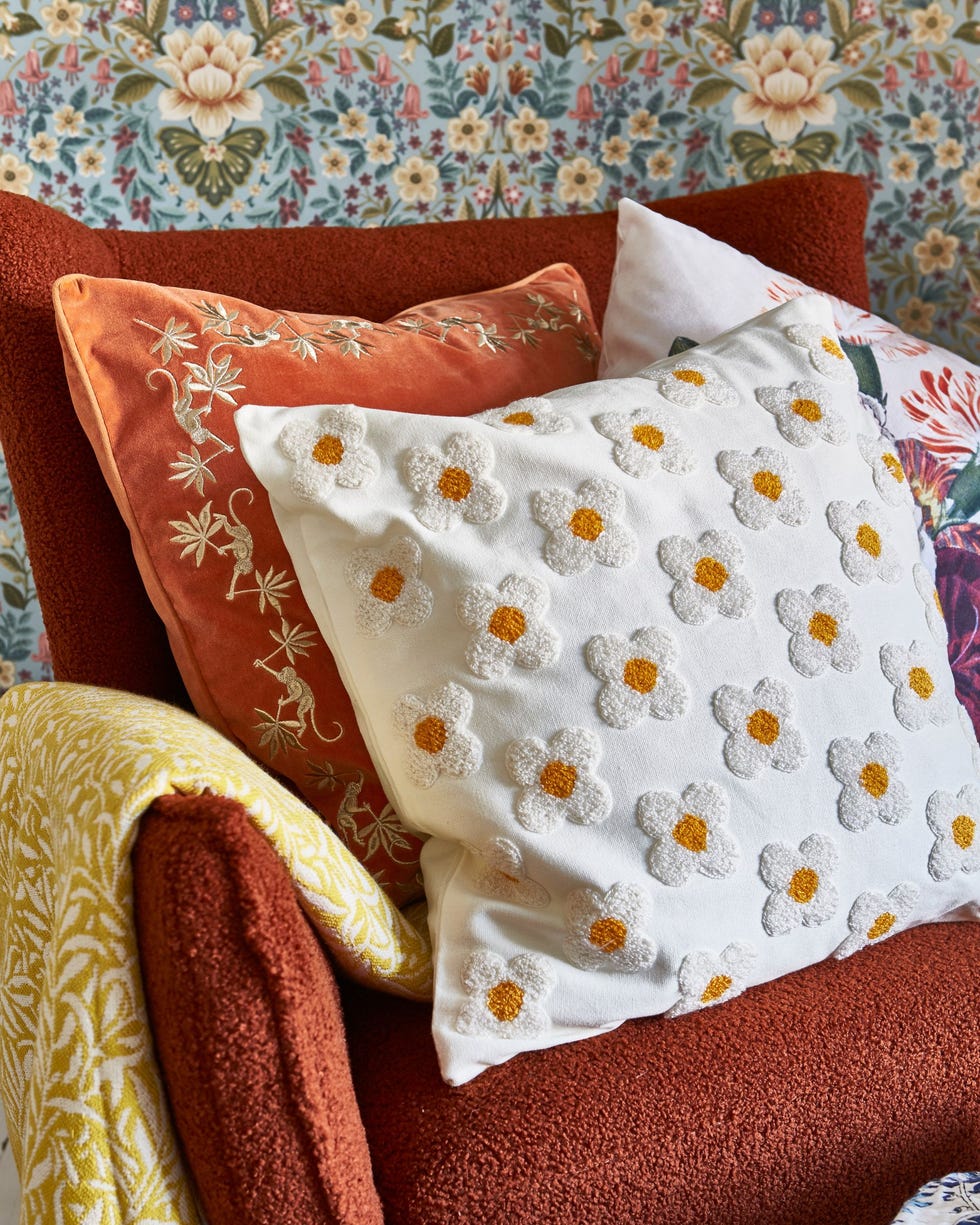
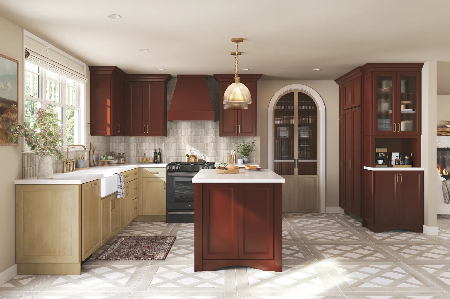
Red, a go-to post-war paint color symbolizing brightness and cheer, continues to offer dramatic appeal in contemporary spaces while maintaining a classic feel. For a bold accent, true red is recommended, while deeper shades like burgundy can provide a luxurious touch. The versatility of red allows for diverse applications, from vibrant statements to rich, opulent finishes.
#RetroColors #HomeInteriors #ColorTrends #InteriorDesign #DecoratingAdvice #PaintColors #NostalgicHues #HomeDecor #DesignTrends #RetroColors #HomeInteriors #ColorTrends #InteriorDesign #DecoratingAdvice #PaintColors #NostalgicHues #HomeDecor #DesignTrends
0 Kommentare insgesamt
 Noch keine Kommentare
Das könnte Ihnen auch gefallen
The Best Vintage-Inspired Paint Colors — 6 Expert-Approved Shades for a Touch of Chic Nostalgia

30 Home Trends Kids of the ’90s Remember

Vintage Home Design Trends That Are Making Huge Comebacks

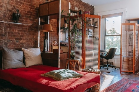
Interior design tips on vintage vibes incorporating retro charm into modern home | Hindustan Times

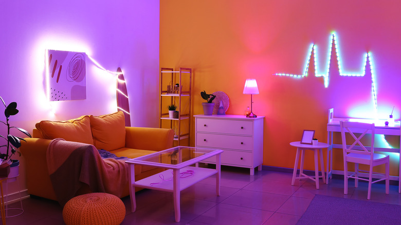
15 Colors To Decorate With For A '90s Aesthetic
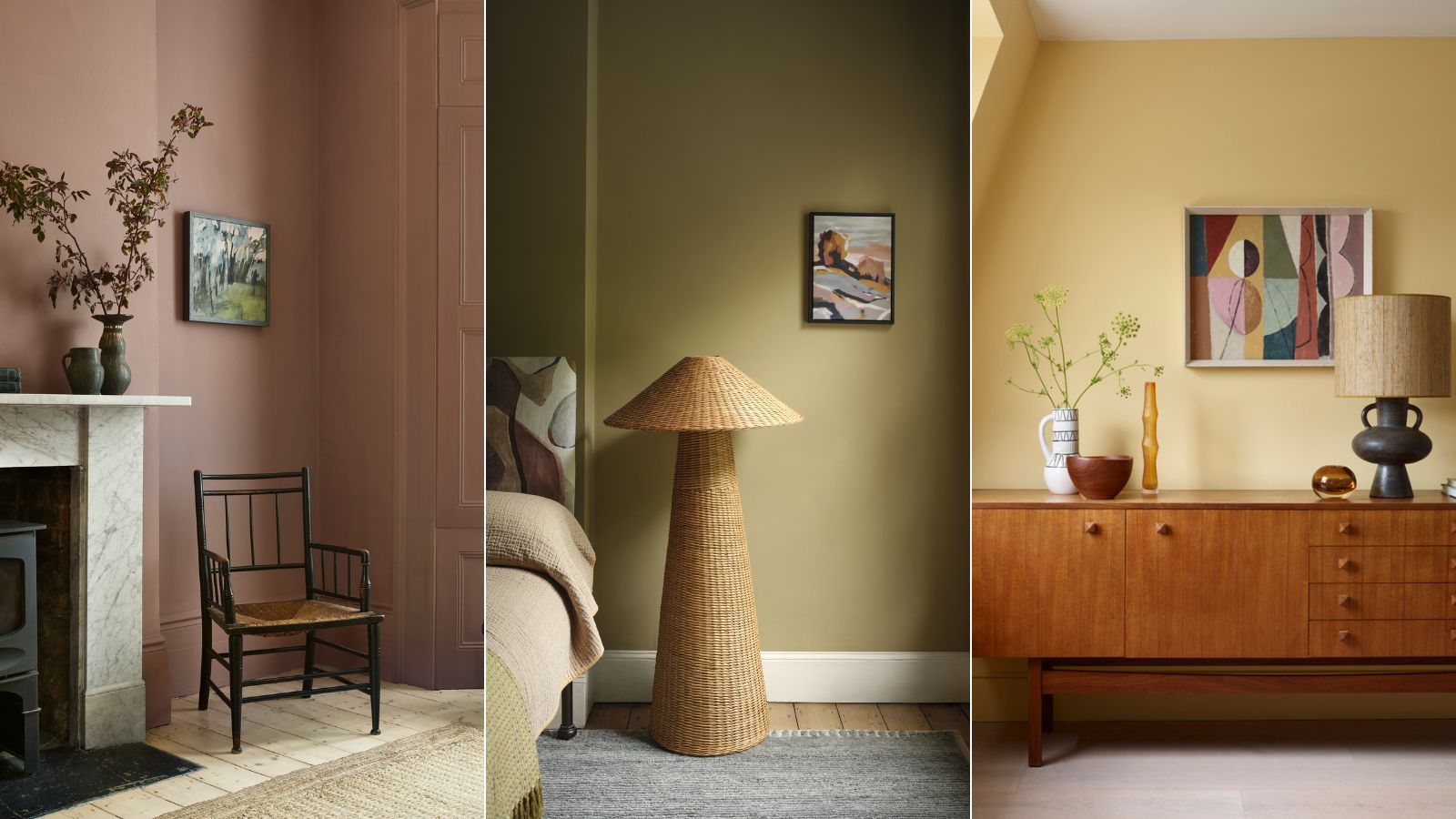
Vintage paint colors making a comeback this year – experts reveal their top shades for adding a touch of nostalgia

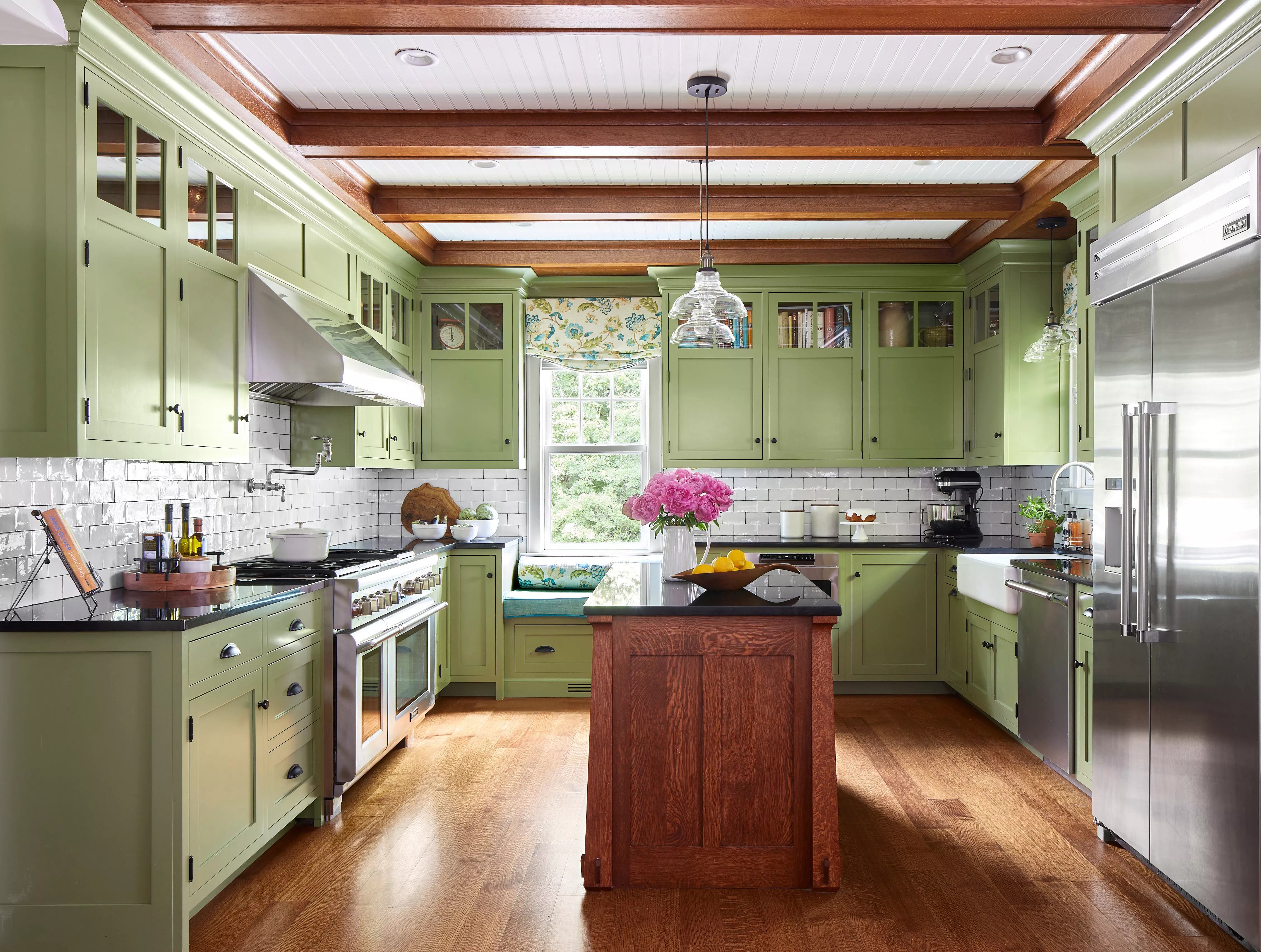
Retro Kitchens Are Back—Designers Share Their Best Tips to Get the Nostalgic Look

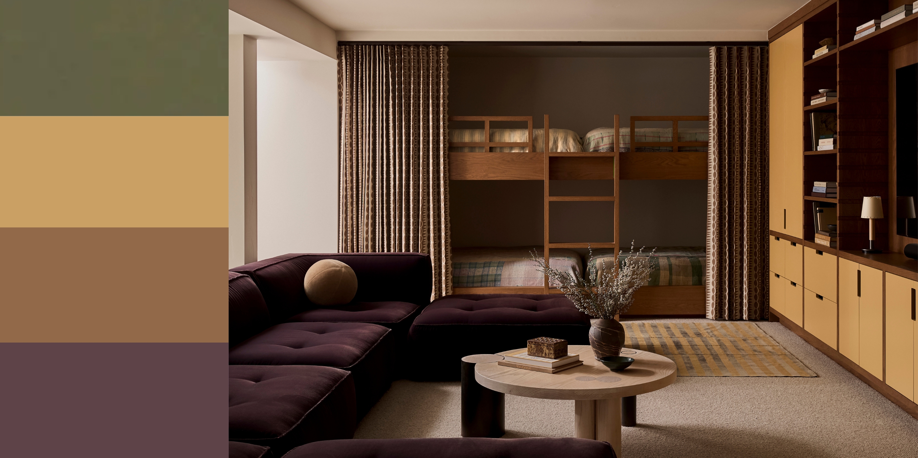
70s Color Palettes — 4 Formulas That Work for Homes Today
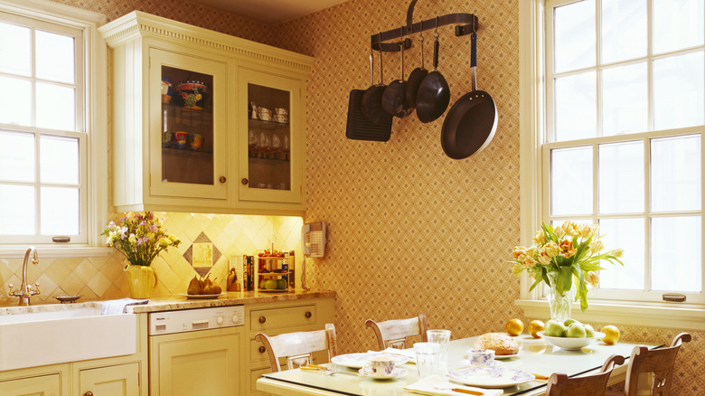
Charming '90s Kitchen Color Schemes That Deserve A Comeback

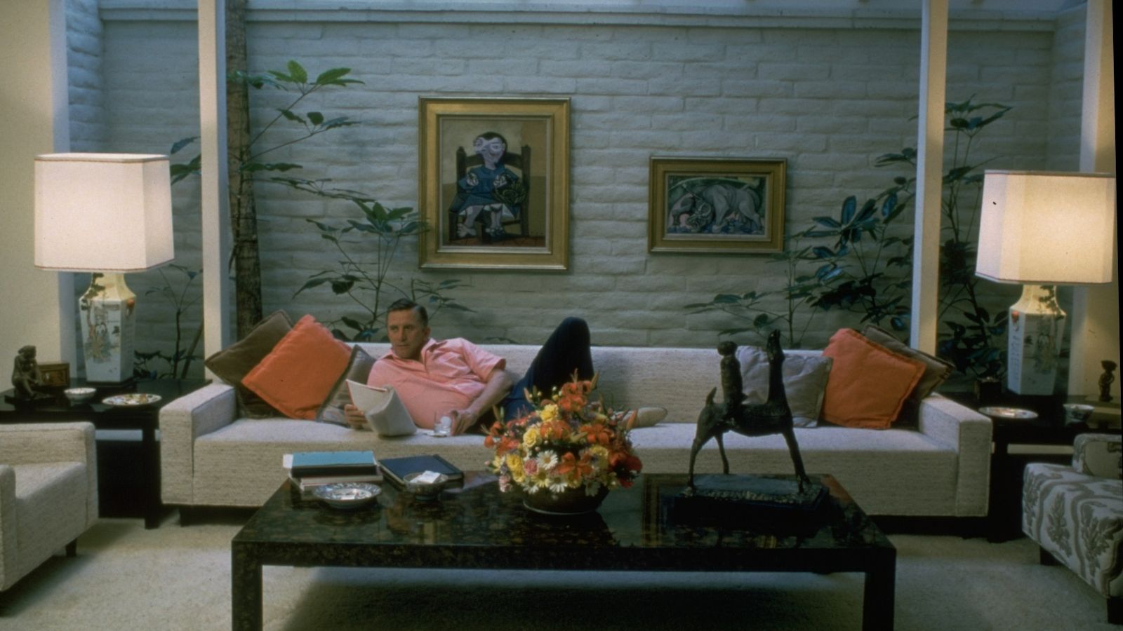
Kirk Douglas's '80s Living Room Predicted 2026's Most Popular Color Palette
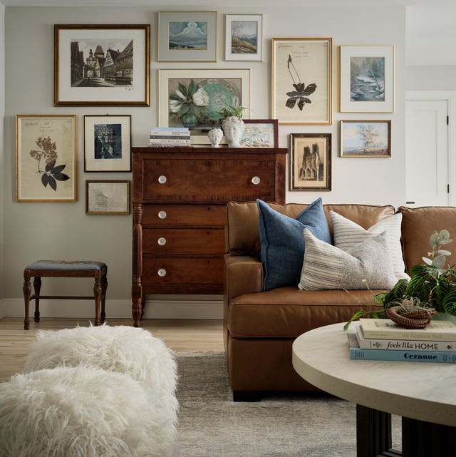
The #1 Retro Design Trend Designers Say is Making a Comeback

The enduring comfort of nostalgiacore – and why it's loved by designers
20 Photos of 1990s Home Décor to Overwhelm You With Nostalgia
7 Retro Design Trends Making a Comeback, According to Interior Designers

11 Vintage Home Trends That Are Making a Comeback
Designers Say These Vintage Paint Colors Are Back
8 retro home decor ideas to bring back this funky trend in a classic way
Retro Decor: 10 Things From Your Grandparents' House That Are Back in Style

Interior Design Trendwatch: Colour is coming home
'90s Kitchen Cabinet Colors Are Back—and Better Than Ever