
1/3
Adding a Pop of Color with Low Maintenance
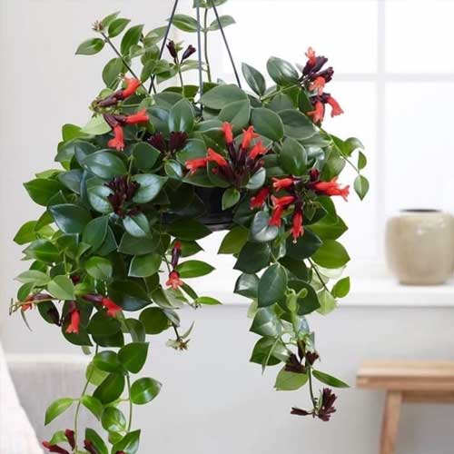
The lipstick plant is a colorful and low - maintenance addition to your indoor plant collection. With its bright orange or red tubular flowers that resemble lipsticks emerging from their cases, it brings a playful and vibrant element to any room.
The plant's glossy green leaves provide a nice contrast to the bold flowers, creating an eye - catching display. It's well - suited to bright indoor spaces and can thrive in hanging baskets or on shelves where its trailing stems can be showcased.
The lipstick plant is relatively easy to care for, requiring moderate watering and bright, indirect light. It's a great choice for adding a splash of color to your home without the need for excessive attention, making it perfect for busy plant lovers.
#LipstickPlant #TropicalVibes #HangingPlants #IndoorOasis #JungleChic
Jun 16, 2025
0 comment in total
No comments yetYou may also like
Neutral Palettes with a Twist: Adding Depth and Interest 🤍🖤
Master the art of the neutral palette by adding depth and interest through subtle variations and textures. Instead of a single shade, layer different tones of white, cream, grey, and beige. Combine materials like rough linen, smooth wood, matte ceramics, and touches of black for contrast. Varying finishes – from matte to subtle sheen – also adds dimension without overwhelming the senses. This approach creates a sophisticated and calming atmosphere that feels anything but boring. It’s about a sophisticated symphony of subtle differences. Save this for your artfully neutral home inspo! ⚫ #neutralpaletteideas #depthindecorideas #texturedhomeideas #minimalistpaletteideas #homedecorideas #monochromaticdecor #sophisticatedstyle #interiorstyling #calmliving #chicdecor
The Joy of Unexpected Pops of Color in a Neutral Palette 🎨
Neutral doesn't have to mean boring! Inject life and personality into a serene space with strategic pops of bold color. It's my favorite way to create a dynamic and expressive environment that feels truly joyful. 🌈 #SpectrumStyleIdeas #NeutralWithColorIdeas #ColorPopNeutralIdeas #AccentColorIdeas #SereneWithBoldIdeas #InteriorStyling #ColorInspo #ModernNeutral #ExpressiveDesign #HomeAccents
Monochromatic Magic: Elevating Your Space with One Hue 🖤
Looking for a chic and sophisticated design approach? Embrace the power of a monochromatic color scheme! ♠️ By sticking to variations of a single hue, you create a visually cohesive and impactful space. It's all about playing with different shades, tints, and textures within that one color family. Think elegant greys, bold blacks, or serene whites. 🤍 This method adds depth and drama without feeling chaotic. It's a masterful way to highlight architectural details and form. Save this for your next sleek redesign! 🌟 #MonochromaticIdeas #ChicHome #ElegantInteriors #ColorPaletteInspo #HomeDecor #InteriorDesignTrends #MinimalistDesign #SophisticatedStyle #DecorIdeas #ModernHome
The Power of Soft Neutrals: Creating a Tranquil Palette 🌲
Achieving a truly tranquil home often starts with a soft, neutral color palette. Inspired by the muted tones of Nordic landscapes, these colors create a calming backdrop for everyday life.
Embrace shades like:
* Warm Whites: Think off-white, cream, or ivory – softer than stark white.
* Soft Greys: From dove grey to charcoal, they offer sophistication without being harsh.
* Earthy Beiges & Tans: These ground the space and add natural warmth.
* Muted Greens & Blues: Subtle hints of nature's calming hues.
These colors layer beautifully and create a cohesive, serene atmosphere. Save this for your palette inspiration! ✨ #NeutralColorPaletteIdeas #ColorInspirationIdeas #CalmingColorIdeas #InteriorColorIdeas #NordicDecorIdeas #ScandinavianStyleIdeas #HomeColor #TranquilHome #DecorPalette #ForestAndFjordColors
1
Adding Warmth to Monochrome: Your Guide ⚫⚪🍂
Think monochromatic is cold? Think again! ⚫⚪ Adding warmth to black and white palettes is all about strategic use of materials and subtle accents. Incorporate natural wood elements – like a light oak console table or woven rattan baskets – to introduce organic texture and tone. Think about introducing soft, diffused lighting from layered sources, such as table lamps with linen shades or ambient floor lighting. Even a hint of metallic (think brushed brass or warm copper) can add a subtle glow. It's about balancing the sharp contrast with inviting textures and gentle illumination. Create your warm monochrome haven! Save this for design inspo! 🤍🖤 #WarmMonochrome #MonochromeDecor #AddingWarmth #MonochromeIdeas #CozyMonochrome #InteriorDesignTips #HomeStyling #ElegantInteriors #NaturalMaterials #SoothingSpaces
Monochromatic Moods: Sculpting with Tone 🗿⚪
For 'Sculptural Spaces,' working with a monochromatic palette amplifies the impact of form. Focusing on a single color family, like shades of white, grey, or even deep charcoals, allows the silhouettes and textures of your furniture and decor to take center stage. It creates a serene, sophisticated, and undeniably artistic atmosphere. Think varying textures within the palette – matte finishes, high gloss, rough weaves, smooth silks. This creates depth and dimension without introducing competing colors. It’s the ultimate celebration of shape. ✨ Save this for tonal design inspiration! #MonochromaticInteriors #MonochromaticInteriors #SculpturalSpaces #TonalDesign #InteriorColorPalette #MinimalistDecor #TexturalDesign #HomeInspiration #SophisticatedSpaces #SculpturalForms #ShadesOfGrey


Adding Playfulness and Warmth to Your Space 💖
Pink wallpaper is a delightful choice for those looking to add a touch of playfulness and warmth to their interior design. Whether you opt for soft pastel pinks or bold, vibrant shades, pink wallpaper can transform a room into a space that feels both inviting and full of personality.
In a bedroom, pink wallpaper can create a cozy and romantic atmosphere, while in a dining room, it can add a pop of color that stimulates conversation and appetite. When selecting pink wallpaper, consider the pattern and scale in relation to the room's size and furnishings. Smaller patterns can work well in compact spaces, while larger designs can make a statement in more spacious rooms.
Balance the boldness of pink wallpaper with neutral furniture and accents to prevent the space from feeling overwhelming. Pink wallpaper can also be a fun choice for children's rooms, where it can inspire creativity and imagination. Let pink wallpaper bring a sense of joy and personality to your home.
#MaximalistRevolution #PunkBaroque #NeonGothic #WallpaperAlchemy #DesignParadox #PinkWallpaper #Color

2
Textured Minimalism: Adding Depth to Neutral Palettes ☁️
Think minimalism is boring? Think again! The key to a rich, sophisticated neutral palette lies in texture. Layering different materials adds warmth, dimension, and tactile interest without overwhelming the space. Consider boucle fabrics for your sofa, a chunky knit throw, a distressed wood accent table, and a woven rug. Even a few well-placed ceramic pieces can make a significant difference. It’s about creating a serene, inviting environment that feels layered and deeply considered. 🤍 #MinimalistDecor #TextureInDesign #TextureIdeas #MinimalistIdeas #NeutralDecorIdeas #TexturedLivingRoom #HomeDecorInspo #SophisticatedInteriors #InteriorDesignTips #CalmAndCozy #DesignInspiration #MinimalistHome
Monochromatic Magic: Elevate Your Space with One Color 🤍✨
Monochromatic design is a sophisticated choice for urban living, offering a serene and impactful aesthetic. By using variations of a single color, you create a sense of depth and cohesion without overwhelming the senses. Think crisp whites, soothing blues, or rich earth tones. Layer different textures within the same color palette – a smooth satin sofa against a matte wall, or a ribbed rug on a polished floor. It’s about creating a calm, intentional, and visually harmonious environment that feels both modern and timeless. 🦢 #MonochromaticDecor #InteriorDesign #MonochromaticIdeas #AllWhiteDecorIdeas #NeutralDesignIdeas #ElegantInteriors #HomeDecorInspo #InteriorStylingTips #MinimalistDesign #SophisticatedSpaces #CalmInteriors #ModernHome
Monochromatic Power: Unleash the Impact of One Hue 💜
Who says you need a rainbow for impact? Mastering a monochromatic palette is an advanced avant-garde move that creates stunning visual cohesion and depth. Choose a bold hue – like this deep amethyst – and explore its variations in texture, sheen, and form. From velvet sofas to subtle wall finishes, this is about commitment to a singular vision. It’s daring, sophisticated, and creates an immersive environment. Let one color tell your whole story. 💜 Save this for your bold color journey! #MonochromaticMagic #monochromaticdecor #boldcolorpalette #avantgardestyle #deepcolorlove #singlehuehome #interiorcolorideas #designchallenges #velvetdecor #luxuryinteriors #homeinspirationdaily
✨ Low-VOC Paint: Healthy Walls, Beautiful Spaces
Did you know that conventional paints can off-gas harmful volatile organic compounds (VOCs)? 🏡 Opting for low-VOC or zero-VOC paints is a game-changer for creating a healthier home. These eco-friendly alternatives offer beautiful color palettes without compromising your indoor air quality. I love using them to achieve a clean, modern look that I can feel good about. Transforming your walls is an impactful step towards a more sustainable and healthy living environment. Are you ready for healthier walls? Save this for your next renovation or refresh! 🎨 #LowVOCPaintIdeas #HealthyHomeIdeas #EcoFriendlyPaintIdeas #SustainableRenovationIdeas #HomeColorIdeas #ZeroVOCPaint #NonToxicHome #InteriorPainting #GreenRenovation #HealthyLiving
Creating Calm: The Power of a Monochromatic Palette 🎨
Monochromatic palettes are a cornerstone of minimalist design, creating a sense of calm, spaciousness, and sophisticated cohesion.
⚪ **Tips for Success:**
* **Vary Tones & Shades:** Use different depths of your chosen color for visual interest.
* **Texture is Key:** Introduce various textures to prevent flatness.
* **Accent with Neutrals:** Incorporate black or white for definition and contrast.
* **Focus on Natural Light:** This will help showcase the subtle variations in your chosen hue.
* **Select Quality Pieces:** With fewer elements, each piece's form and material are crucial.
It’s about visual harmony and peace. What color palette brings you the most calm? #monochromatic #minimalism #interiordesign #homedecor #colorpalette #calmspaces #monochromaticideas #designinspiration #neutraldecor #sophisticatedhome
Monochromatic Magic: Elevate Your Living Space 🤍
Let's talk about the power of a single hue. Monochromatic design isn't just about white walls; it's about creating a sophisticated and serene atmosphere by layering varying shades and textures within one color family. ✨ Think subtle shifts in tone from creamy whites to soft ivories, or deep charcoals to lighter greys. This approach fosters a sense of calm and cohesion, making your space feel intentionally designed and endlessly elegant. It’s perfect for those seeking a refined, uncluttered aesthetic. How do you incorporate monochromatic schemes into your home? Let me know below! 👇 #MonochromaticDesign #NeutralPalette #ColorTheory #SophisticatedInteriors #MinimalistLiving #HomeDecorIdeas #InteriorDesignInspo #WhiteAndGreyDecor #ElegantHomes #DesignInspiration


A Burst of Color for Your Home and Garden🌹
Red geraniums are a vibrant and versatile addition to both outdoor gardens and indoor spaces. Their bright red flowers can instantly liven up any area, from window boxes and balcony planters to indoor shelves and tables.
Geraniums are known for their hardiness and ability to thrive in various conditions, making them a low - maintenance yet high - impact choice for adding color to your environment. They prefer sunny spots but can tolerate some shade, and with regular deadheading, they'll continue to bloom throughout the season.
Whether you're looking to brighten your outdoor patio or bring some natural color indoors, red geraniums are a fantastic choice that will reward you with their cheerful presence.
#RedGeranium #ContainerGardening #CottageCore #PollinatorGarden #BoldBlooms

1
Textural Twists in Monochromatic Design 🖤⚪
Monochromatic design is anything but one-dimensional when you play with texture! ⚫⚪ Explore how different materials can add depth, warmth, and visual interest to your black and white spaces. Think a smooth, high-gloss lacquered surface next to a soft, matte boucle fabric, or the rough, organic texture of concrete against the refined elegance of polished metal. This approach prevents your space from feeling flat and instead creates a rich, layered experience. Don't shy away from materials like linen, wool, wood grain, and even strategically placed concrete or stone. Elevate your monochrome! Save for your textural design journey! 🤍🖤 #MonochromeTextures #TextureInDesign #InteriorDesignTips #MonochromeIdeas #TexturalDecor #HomeDecor #BlackAndWhiteLiving #SophisticatedInteriors #DesignInspiration #MaterialPlay
The Serenity of Layered Neutrals with Subtle Shadows 🤍
Layering neutrals can create incredible depth, and shadows are the perfect way to accentuate it. 🤍 Think shades of cream, beige, taupe, and soft grey, combined with varying textures. When light plays across these subtle variations, it creates a gentle interplay of light and shadow that is profoundly calming. Avoid stark white; instead, opt for warm, muted tones that invite softness. This technique brings a sophisticated and serene ambiance to your home, creating a true sanctuary. Save this for your calm and collected interiors! #NeutralDecorIdeas #LayeredNeutrals #CalmInteriors #ShadowAndLightDesign #SereneLivingRoom #HomeDesignInspiration #TexturalNeutrals #MutedTonesDecor #SophisticatedHome #MinimalistAesthetic
Opal Hues: Subtle Sparkle for an Ethereal Touch ☁️💎
While I love bold jewel tones, there's a unique magic in soft, iridescent hues like opal! ☁️ They bring a subtle, ethereal sparkle that's incredibly sophisticated and intimate. ✨
Incorporate opal tones through:
* **Glassware & Vases:** Think iridescent vases or champagne flutes.
* **Accent Pillows:** In soft, pearlescent fabrics.
* **Decorative Objects:** Small sculptures or trinket dishes with an opal finish.
* **Subtle Paint Accents:** A hint of iridescent sheen on a ceiling or accent wall.
* **Lampshades:** Fabrics with a pearlescent quality. 🌟
These soft, shifting colors add a delicate luminosity that complements richer tones beautifully. Do you love opal accents? Save this for your ethereal sparkle inspo! 💖 #opaldecor #etherealhome #subtlesparkle #luxeinteriors #pearlescent #jewelboxinteriors #interiordesign #homedecor #colorinspiration #opalhues #elegantdesign #interiorstyling #softdecor


