IDEAL HOUSE
Explore
AI Tools
Post
Notifications
Log in
Get Free Lite Membership
Invite friends—LITE VIP for both, no limits.
Get App
Get the Ideal House App
More
Explore
AI Tools
Post
Notifications
Shadow & Light Interiors
+ Follow
Share
1/4
Shadow & Light Interiors
+ Follow
The Serenity of Layered Neutrals with Subtle Shadows 🤍
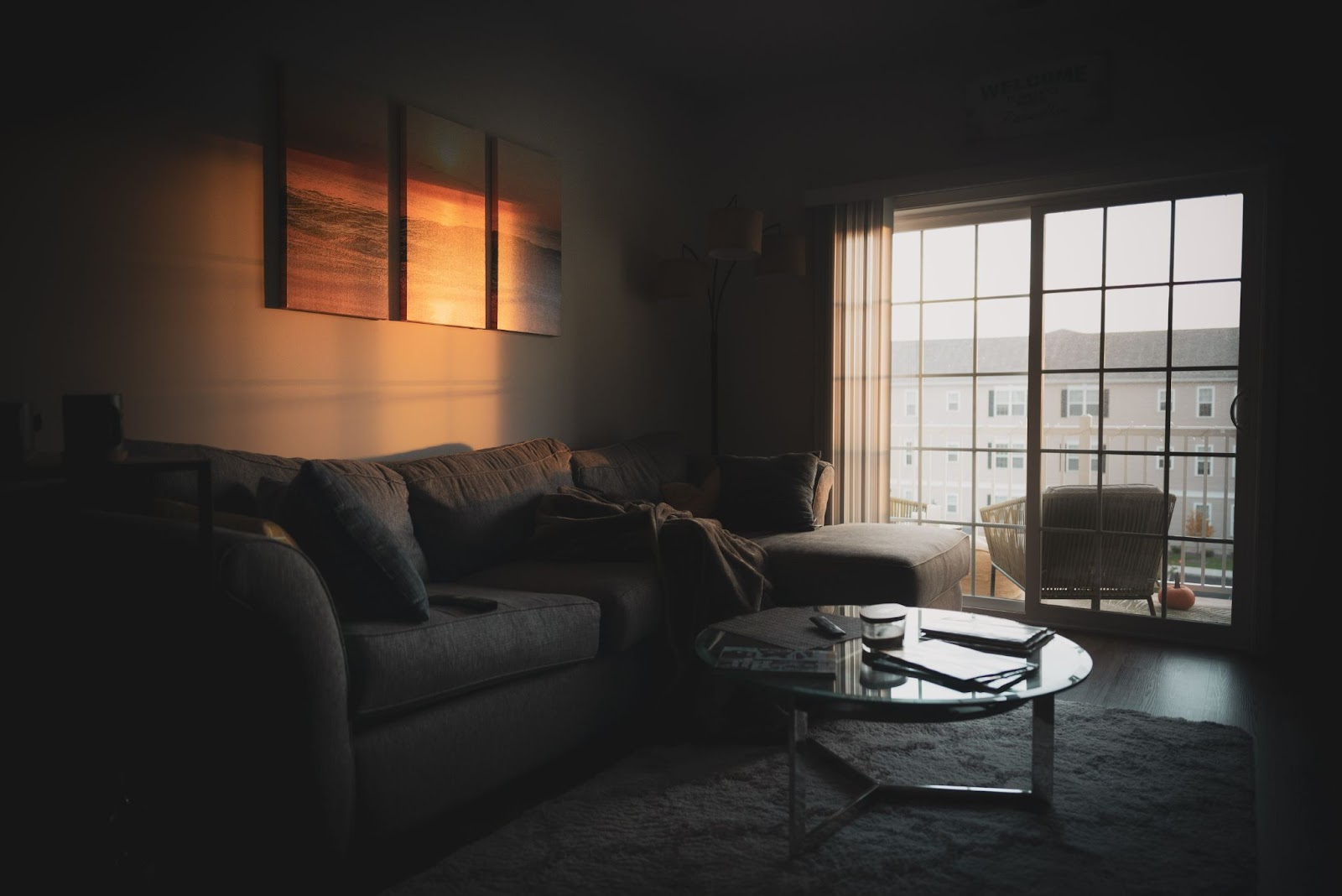
Layering neutrals can create incredible depth, and shadows are the perfect way to accentuate it. 🤍 Think shades of cream, beige, taupe, and soft grey, combined with varying textures. When light plays across these subtle variations, it creates a gentle interplay of light and shadow that is profoundly calming. Avoid stark white; instead, opt for warm, muted tones that invite softness. This technique brings a sophisticated and serene ambiance to your home, creating a true sanctuary. Save this for your calm and collected interiors!
#NeutralDecorIdeas
#LayeredNeutrals
#CalmInteriors
#ShadowAndLightDesign
#SereneLivingRoom
#HomeDesignInspiration
#TexturalNeutrals
#MutedTonesDecor
#SophisticatedHome
#MinimalistAesthetic
Oct 28
Copy Style
0 comment in total
No comments yet
You may also like
The Power of Soft Neutrals: Creating a Tranquil Palette 🌲
Forest & Fjord
The Power of Undertones: Mastering Complex Neutrals 🎨
The Palette Purist
The Neutral Palette: Creating a Serene & Timeless Home ✨
The Sustainable Stylist
1
Earthy Neutrals: Grounding Your Space 🤎🌾
Patina & Pigment
The Tranquility of Soft Edges: Diffused Light & Shadow ☁️
Shadow & Light Interiors
Cozy Neutrals: Creating a Serene & Sophisticated Space ☁️✨
Architectural Digest Finds
Warm Neutrals: Building a Cozy & Inviting Atmosphere ☕
The Chroma Collector
Sophisticated Neutrals: The Art of Layering Textures 🍦
The Palette Purist
Neutral Palettes with a Twist: Adding Depth and Interest 🤍🖤
Artful Assemblage
Subtle Sophistication: Embracing Soft Neutrals in Your Home Decor 🤍
Ethereal Elements
1
The Tactile Tale: Elevating Neutrals with Rough & Smooth Textures 🤍
The Texture Tinkerer
Sophisticated Neutrals: The Timeless Appeal of Greige 🤍🌫️
The Urban Muse
A Dark Room Redefined: Mood Lighting Masterclass
yuki_zzz
1
Textural Harmony: Layering Neutrals for Cozy Sophistication 🤍
Rustic Refinement
Creating Calm: The Power of Neutral Palettes in Small Spaces ☁️🤍
Urban Sanctuary Seeker
Crafting Calm: The Serenity of Neutral Ceramic Palettes 🤍
The Ceramic Sculptor
1
Sophisticated Neutrals: The Art of Elevated Earth Tones 🤎
The Palette Purist
Textured Minimalism: Adding Depth to Neutral Palettes ☁️
The Urban Muse
Beyond Beige: Adding Subtle Texture to Neutral Decor 🎨
The Texturalist
Subtle Shimmer: The Sophistication of Matte Finishes ✨
The Textured Terrain
The Power of Soft Neutrals: Creating a Tranquil Palette 🌲
Achieving a truly tranquil home often starts with a soft, neutral color palette. Inspired by the muted tones of Nordic landscapes, these colors create a calming backdrop for everyday life. Embrace shades like: * Warm Whites: Think off-white, cream, or ivory – softer than stark white. * Soft Greys: From dove grey to charcoal, they offer sophistication without being harsh. * Earthy Beiges & Tans: These ground the space and add natural warmth. * Muted Greens & Blues: Subtle hints of nature's calming hues. These colors layer beautifully and create a cohesive, serene atmosphere. Save this for your palette inspiration! ✨
#NeutralColorPaletteIdeas
#ColorInspirationIdeas
#CalmingColorIdeas
#InteriorColorIdeas
#NordicDecorIdeas
#ScandinavianStyleIdeas
#HomeColor
#TranquilHome
#DecorPalette
#ForestAndFjordColors
Forest & Fjord
The Tranquility of Soft Edges: Diffused Light & Shadow ☁️
Sharp edges can create harsh lines, but embracing softer edges, both in architecture and decor, invites a gentler light and shadow play. ☁️ Think rounded corners on furniture, archways, or even walls with a subtle curvature. These elements diffuse light more softly and create more graduated, serene shadows. This approach cultivates a sense of calm and fluidity, making spaces feel more peaceful and artistic. It's about embracing a softer, more forgiving aesthetic. Save this for your tranquil design inspo!
#SoftEdgeIdeas
#DiffusedLightDesign
#GentleShadows
#TranquilInteriors
#InteriorDesignAesthetic
#CalmSpaces
#RoundedFurniture
#SereneHomeDecor
#ArtisticAmbiance
#FluidDesign
Shadow & Light Interiors
Sophisticated Neutrals: The Art of Layering Textures 🍦
The secret to a truly inviting monochromatic space? Texture, texture, texture! ✨ When working within a single color family, layering different materials is key to adding visual interest and warmth. Think the soft pile of a velvet cushion against a smooth linen sofa, the rough weave of a jute rug grounding a polished concrete floor, or the grainy finish of a reclaimed wood side table next to a matte ceramic lamp. 🌿 These tactile elements prevent the space from feeling flat and create a rich, layered aesthetic. What's your favorite texture to incorporate? Share below! 👇
#TexturePlay
#MonochromaticDecor
#NeutralDecorIdeas
#InteriorStylingTips
#CozyHomeIdeas
#LayeredTextures
#SophisticatedLiving
#HomeDecorTips
#ElegantInteriors
#DesignSecrets
The Palette Purist
A Dark Room Redefined: Mood Lighting Masterclass
Embrace the shadows with: 💡 Tunable LED strips (2700K-4000K) 🖼️ Backlit black-and-white photography 🕯️ Flameless candles with irregular flicker Pro tip: Matte black outlets disappear!
#MoodLighting
#DarkInteriors
#AtmosphericDesign
#CocooningSpaces
#aDarkRoom
yuki_zzz
1
Sophisticated Neutrals: The Art of Elevated Earth Tones 🤎
Beyond greys and whites, let's explore the rich depth of elevated earth tones in a monochromatic scheme. Think warm caramels, deep chocolates, soft tans, and muted caramels. 🤎 These colors bring an inherent warmth and organic feel to a space, creating an atmosphere of grounded sophistication. Layering textures like leather, suede, wool, and matte wood is crucial to prevent the palette from feeling flat. It’s about creating a cozy yet refined sanctuary. Save this for your next warm-toned design project! ✨
#EarthTonesDecor
#MonochromaticBrown
#WarmNeutrals
#SophisticatedInteriors
#OrganicDesign
#CozyHomeIdeas
#InteriorInspo
#ColorPalette
#ElegantDecor
#HomeStyle
The Palette Purist
Textural Harmony: Layering Neutrals for Cozy Sophistication 🤍
Achieving a warm and inviting atmosphere is all about layering textures in a neutral palette. ✨ Think beyond color and focus on touch: combine soft linen throws with nubby wool rugs, smooth ceramic accents with matte wood finishes. 🪵 The interplay of these different surfaces creates depth and visual interest without relying on bold hues. It’s a sophisticated way to create a comfortable and grounded living space that feels both elegant and approachable. Embrace the subtle beauty of variations in tone and feel. Save this for your textured neutral haven!
#TexturedNeutralsIdeas
#CozySophistication
#NeutralDecor
#HomeDesign
#InteriorLayers
#WarmInteriors
#LinenDecor
#RusticRefinement
#GroundedLiving
#DecorInspo
Rustic Refinement
Neutral Palettes with a Twist: Adding Depth and Interest 🤍🖤
Master the art of the neutral palette by adding depth and interest through subtle variations and textures. Instead of a single shade, layer different tones of white, cream, grey, and beige. Combine materials like rough linen, smooth wood, matte ceramics, and touches of black for contrast. Varying finishes – from matte to subtle sheen – also adds dimension without overwhelming the senses. This approach creates a sophisticated and calming atmosphere that feels anything but boring. It’s about a sophisticated symphony of subtle differences. Save this for your artfully neutral home inspo! ⚫
#neutralpaletteideas
#depthindecorideas
#texturedhomeideas
#minimalistpaletteideas
#homedecorideas
#monochromaticdecor
#sophisticatedstyle
#interiorstyling
#calmliving
#chicdecor
Artful Assemblage
Textured Minimalism: Adding Depth to Neutral Palettes ☁️
Think minimalism is boring? Think again! The key to a rich, sophisticated neutral palette lies in texture. Layering different materials adds warmth, dimension, and tactile interest without overwhelming the space. Consider boucle fabrics for your sofa, a chunky knit throw, a distressed wood accent table, and a woven rug. Even a few well-placed ceramic pieces can make a significant difference. It’s about creating a serene, inviting environment that feels layered and deeply considered. 🤍
#MinimalistDecor
#TextureInDesign
#TextureIdeas
#MinimalistIdeas
#NeutralDecorIdeas
#TexturedLivingRoom
#HomeDecorInspo
#SophisticatedInteriors
#InteriorDesignTips
#CalmAndCozy
#DesignInspiration
#MinimalistHome
The Urban Muse
Cozy Neutrals: Creating a Serene & Sophisticated Space ☁️✨
Embrace the calming power of neutrals! 🤍 A palette of soft whites, warm beiges, greys, and earthy tones creates a serene and sophisticated atmosphere. ✨ Layer different textures within these shades to add depth and visual interest – think chunky knits, smooth linen, and soft velvets. 🛋️ It’s a timeless approach that promotes tranquility and a sense of spaciousness. Perfect for any room where you want to relax and recharge. 💫 Save this for your neutral dream home inspo! 💖
#NeutralDecor
#CozyNeutral
#SereneHome
#SophisticatedStyle
#HomeDecor
#InteriorDesign
#MinimalistHome
#EarthyTones
#CalmInteriors
#BedroomIdeas
Architectural Digest Finds
The Power of Undertones: Mastering Complex Neutrals 🎨
Understanding undertones is crucial for a truly cohesive monochromatic design. Even 'neutrals' have subtle undertones – a grey might lean blue, green, or even purple; a beige can have pink or yellow notes. 🎨 By choosing variations within the same undertone family, you create a layered and sophisticated look that feels intentional and harmonious. It’s the nuance that elevates a palette from flat to fabulous. Pay attention to the subtle shifts! Save this for your color theory journey! ✨
#ColorTheoryTips
#NeutralUndertones
#MonochromaticDesign
#SophisticatedPalettes
#InteriorDesignStrategy
#ColorInspiration
#DesignSecrets
#HomeStylingIdeas
#ComplexNeutrals
#PaletteMastery
The Palette Purist
Subtle Sophistication: Embracing Soft Neutrals in Your Home Decor 🤍
Let's dive into the serene world of soft neutrals! ✨ They're the foundation of an ethereal, light-filled aesthetic, creating spaces that feel delicate and profoundly calm. It’s all about effortless elegance. Here’s how to master the neutral palette: * **Layer Textures:** Mix linens, cottons, wools, and subtle silks. * **Warm Whites & Creams:** Embrace variations for depth. * **Pale Greys & Beiges:** Ground the space with natural tones. * **Minimalist Accents:** Avoid overpowering colors; focus on form. * **Natural Light:** This palette thrives in bright, airy rooms. Save these ideas for a timeless, sophisticated home. 🌿
#neutraldecorideas
#etherealstyle
#softneutrals
#lightandairyhome
#elegantdecor
#homestyle
#minimalisthome
#calmspace
#decorinspiration
#timelessdesign
Ethereal Elements
1
Creating Calm: The Power of Neutral Palettes in Small Spaces ☁️🤍
Feeling overwhelmed by city life? Your home's color palette can be a powerful tool for creating a tranquil sanctuary. 🕊️ Embrace neutral tones for maximum impact: * **Whites & Off-Whites:** Reflect light and create an airy, open feel. * **Soft Greys:** Add sophistication and depth without being heavy. * **Earthy Beiges & Creams:** Introduce warmth and a connection to nature. * **Monochromatic Schemes:** Use varying shades of one neutral for a cohesive look. * **Layering Textures:** Introduce warmth and visual interest through different materials like wood, linen, and wool. Neutral palettes create a sense of peace and allow your decor to shine. Save this for your serene home inspo!
#neutraldecor
#smallspaceliving
#calmspace
#interiordesign
#homedecor
#neutralpaletteideas
#minimalistdecor
#designinspiration
#urbanretreat
#peacefulhome
Urban Sanctuary Seeker
Beyond Beige: Adding Subtle Texture to Neutral Decor 🎨
Neutral palettes don't have to be boring! The secret to keeping them interesting lies in layering subtle, beautiful textures. 🤍 It's how you add depth and sophistication without introducing bold colors. Think: * **Textured wallpapers:** A grasscloth or linen-look finish adds subtle depth. * **Bouclé or boucle upholstery:** Its looped texture is visually dynamic and incredibly inviting. * **Stone or concrete accessories:** For a grounding, artisanal feel. * **Woven accents:** Baskets, trays, or even lampshades. It’s these nuanced details that make a neutral space feel luxurious and layered. Save for your chic neutral designs! ✨
#NeutralDecorIdeas
#SubtleTexture
#InteriorStyling
#HomeDecorInspo
#TexturalDesign
#ChicInteriors
#LuxuryNeutral
#DecorInspiration
#Boucle
#TheTexturalist
The Texturalist
The Neutral Palette: Creating a Serene & Timeless Home ✨
Embracing the power of neutrals for a truly serene and timeless home. 🤍 It’s about creating a calm canvas that allows textures and curated pieces to shine. My favorite neutral elements: * **Soft Whites & Creams:** For a light, airy feel. * **Warm Beiges & Greys:** To add depth and grounding. * **Natural Wood Tones:** From light oak to rich walnut, they add organic warmth. * **Layered Textures:** Think linen, cotton, wool, and subtle weaves to keep it interesting. Let your space breathe and evoke peace. Save this for your tranquil, neutral home inspo! 🕊️
#NeutralHomeIdeas
#SereneHomeIdeas
#TimelessDesignIdeas
#NeutralDecor
#CalmInteriors
#HomeDecorInspo
#MinimalistDecor
#ElegantHome
#InteriorStyling
#PeacefulHome
The Sustainable Stylist
1
Warm Neutrals: Building a Cozy & Inviting Atmosphere ☕
My absolute favorite for creating a welcoming sanctuary? Warm neutrals! Think creamy beiges, soft caramels, and earthy taupes. 🤎 These shades provide a beautiful, understated foundation that feels instantly comforting and timeless. They have a subtle warmth that makes any space feel more intimate and inviting. 🌟 I love layering different textures within this palette, from cozy knits to natural wood. It’s all about creating a sense of understated elegance and comfort. Save this for your next cozy retreat! ✨
#WarmNeutralIdeas
#CozyHomeIdeas
#InvitingSpaces
#HomeDecor
#InteriorDesignInspo
#NeutralPalette
#ComfortableLiving
#DesignTips
#HomeStyling
#TimelessDesign
The Chroma Collector
The Tactile Tale: Elevating Neutrals with Rough & Smooth Textures 🤍
Neutrals don't have to be boring! The key to creating a captivating neutral palette is in the texture. 🖐️ Play with the contrast of rough surfaces like textured plaster, nubby linen, or unpolished wood against smooth elements like polished concrete, silk, or finely honed stone. This interplay adds depth, visual interest, and an invitation to touch, making your neutral space feel far richer and more inviting. It's about subtlety and sensory experience. Save this for sophisticated neutral design! ✨
#NeutralDecorIdeas
#TexturePlay
#HomeDesignIdeas
#InteriorTexture
#MinimalistDecor
#TactileDesign
#SophisticatedSpaces
#ColorPalette
#ElegantHome
#DecorInspiration
The Texture Tinkerer
Crafting Calm: The Serenity of Neutral Ceramic Palettes 🤍
In a busy world, creating a sense of calm and tranquility at home is so important. Neutral palettes, achieved through the subtle beauty of unadorned ceramics, offer a powerful way to foster this serenity. My work often explores the nuanced shades of white, beige, and soft greys. Think about the soft glow of a matte white vase or the understated elegance of a textured grey stoneware bowl. These pieces don't compete for attention; they invite you to pause and appreciate their form and subtle beauty. They blend seamlessly into any decor, enhancing the peaceful atmosphere. Embrace: - Matte finishes in off-white and cream. - Textures that are subtle and refined. - Simple, clean silhouettes. Let your home be a haven of peace. Save this for your tranquil home inspiration! 🕊️
#CeramicSculptor
#NeutralDecor
#CalmInteriors
#SereneHome
#CeramicDesign
#HomeDecorInspo
#MinimalistDesign
#TranquilSpaces
#EarthyTones
#InteriorStyling
The Ceramic Sculptor
1
Subtle Shimmer: The Sophistication of Matte Finishes ✨
While gloss has its place, matte finishes offer a sophisticated, understated elegance. 🤍 They absorb light rather than reflect it, creating a soft, velvety depth that feels truly luxurious. Consider matte for: * **Cabinetry:** For a sleek, modern look. * **Countertops:** Especially in kitchens and bathrooms. * **Furniture:** Adding a refined touch. * **Paint:** On walls for a soft, enveloping atmosphere. Matte surfaces create a sense of calm and can make bold colors feel richer and more grounded. They invite touch and add a refined texture to any space. Save this for a touch of quiet luxury!
#MatteFinishIdeas
#InteriorDesign
#HomeDecor
#SophisticatedStyle
#LuxuryInteriors
#ModernDecor
#TexturedFinishes
#QuietLuxury
#SubtleElegance
#TheTexturedTerrain
#MatteFinishIdeas
#SubtleElegance
#InteriorStyling
#HomeAccents
#ModernFinishes
#TexturedDesign
#SophisticatedHome
#DecorInspiration
#RefinedLiving
#TheTexturedTerrain
The Textured Terrain
Sophisticated Neutrals: The Timeless Appeal of Greige 🤍🌫️
Greige – the perfect marriage of grey and beige – is the ultimate neutral for sophisticated urban living. It offers warmth without being too dominant, and a timeless elegance that transcends trends. This versatile hue works beautifully on walls, furniture, and textiles. Layer different shades of greige to create depth and dimension. Accessorize with subtle metallic accents or natural wood tones for a touch of refinement. It’s a calm, grounding color that provides the perfect backdrop for your curated decor. 🕊️
#NeutralDecor
#GreigeInteriors
#GreigeIdeas
#NeutralDecorIdeas
#TimelessInteriors
#SophisticatedHomeIdeas
#InteriorDesignTrends
#CalmInteriors
#WallColorIdeas
#DecorInspiration
#ModernNeutral
#ElegantSpaces
The Urban Muse
Earthy Neutrals: Grounding Your Space 🤎🌾
Earthy neutrals have a grounding, calming effect that I find incredibly beautiful and restorative. Think warm beiges, soft browns, terracotta, and muted greys. These colors create a serene backdrop that feels both sophisticated and deeply comforting. They are the perfect foundation for layering textures and adding pops of rich, natural color. Save this for your next design that aims for tranquil harmony. ✨
#earthytone
#neutraldecor
#calmspace
#PatinaAndPigment
#EarthyNeutralIdeas
#NeutralDecorStyle
#TerraCottaAccents
#MutedTonesDecor
#GroundingColors
#SereneHome
#NaturalColorPalette
#CalmInteriors
#RestorativeSpaces
Patina & Pigment