1/5
Elizabeth Goodspeed on why brown feels so beige
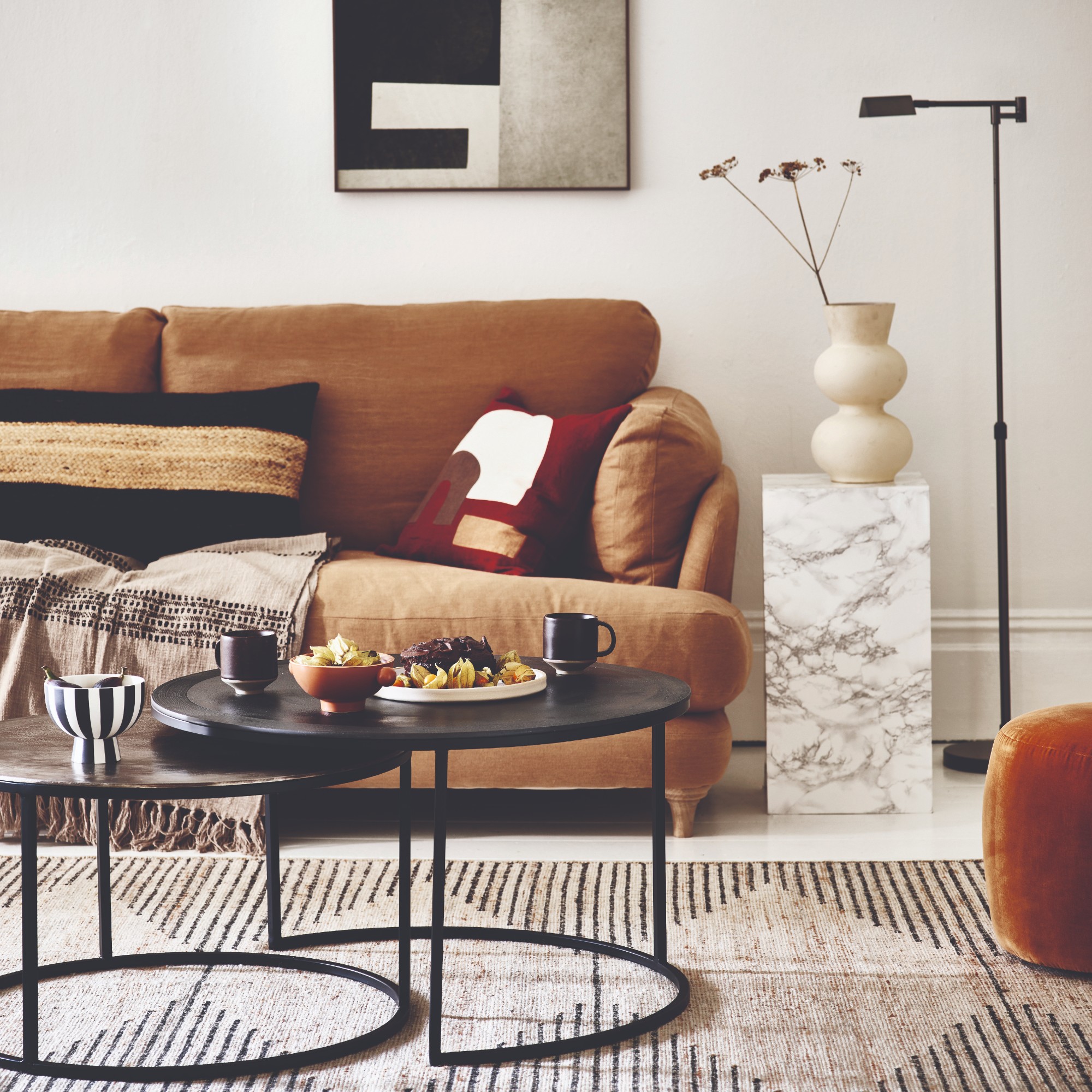
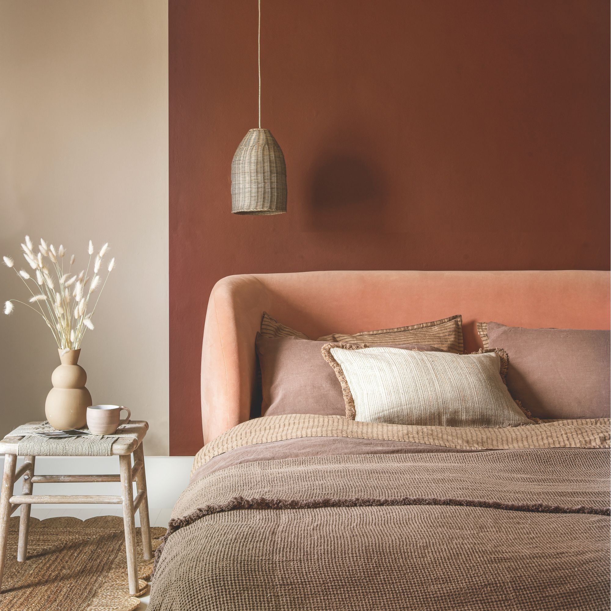
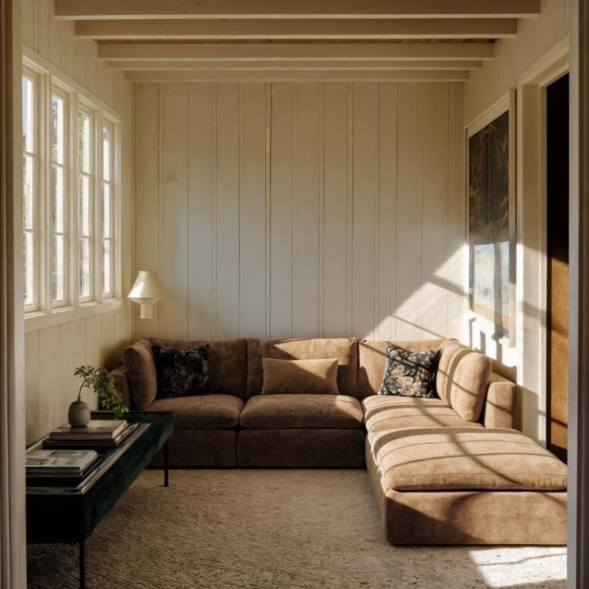
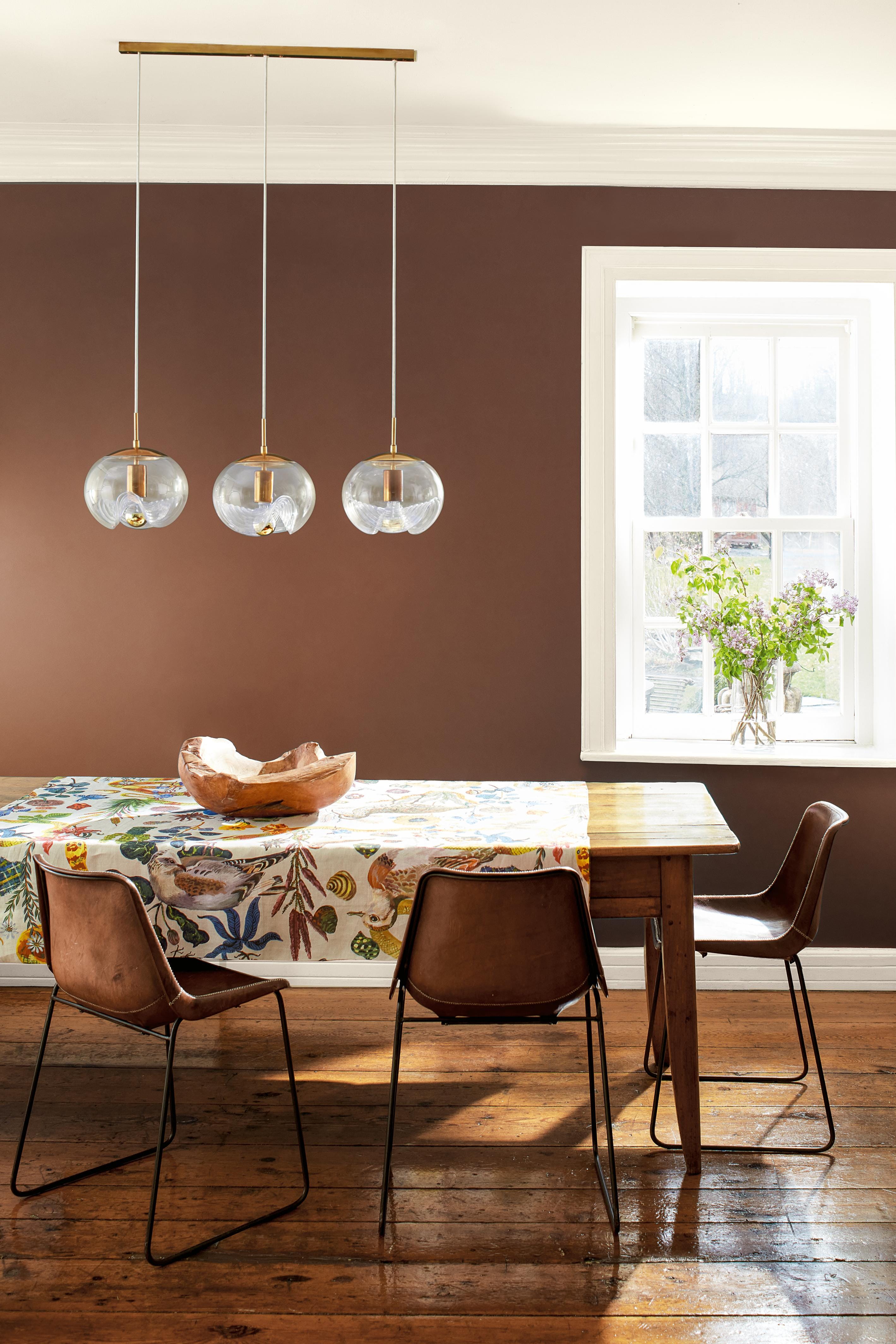
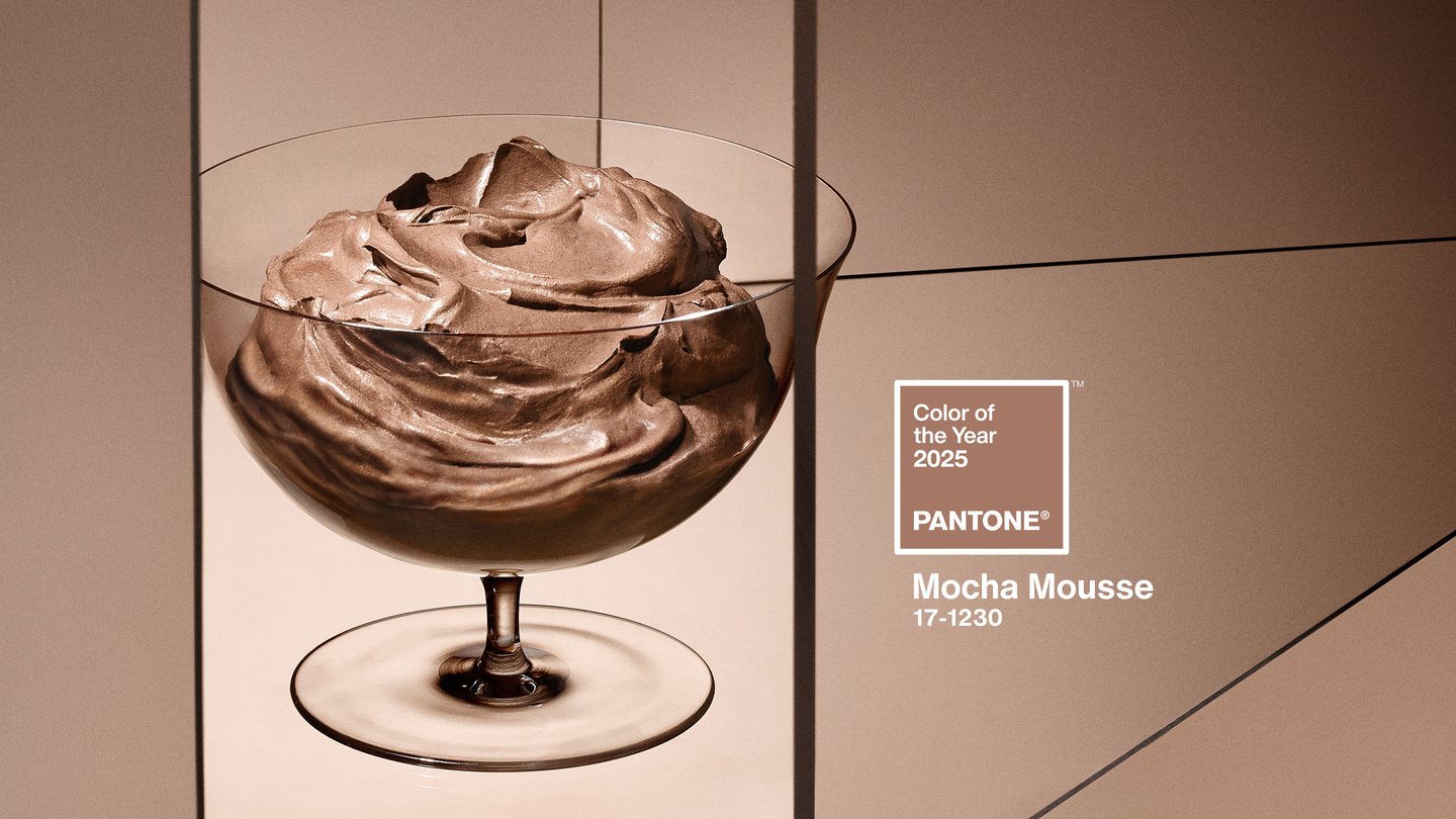
The article critically examines Pantone's 2025 Colour of the Year, Mocha Mousse, and its broader implications for the creative industry, marketing, and consumer culture. The author, Elizabeth Goodspeed, questions the purpose and genuine impact of Pantone's annual selection, particularly on designers. She begins by noting the historical context of color as a commodity, explaining that before synthetic dyes, vibrant colors were expensive and a symbol of high status. However, the industrial revolution democratized color, leading the wealthy to embrace muted tones like brown, beige, and black as new markers of sophistication. Mocha Mousse is presented as fitting into this lineage, marketed with terms like "indulgent" and "delectable" to evoke an aesthetic of understated wealth and minimalism, rather than embracing more progressive associations brown could have with nature or connection.
The discussion then shifts to how brands leverage color to convey meaning and create aspirational products. Examples include Tiffany Blue and Cadbury Purple, which instantly communicate luxury and heritage. The article highlights recent pop culture phenomena, such as Barbie Pink and the marketing around the musical Wicked, to illustrate how color has become a powerful shorthand for identity and value systems. Both Barbie and Wicked successfully used associated colors to drive partnerships and merchandise, turning color into a key component of their commercial strategy, often without deep narrative integration. This contrasts with more grassroots color trends, like Charli XCX's Brat Green, which gained popularity organically through fan engagement and social media, subsequently being adopted by businesses.
The author posits that color has become incredibly accessible and powerful in the digital age, allowing for superficial transformation without requiring in-depth design knowledge. Historically, Pantone served as a gatekeeper, maintaining color as the domain of professionals through its precise color matching systems. The author shares a personal anecdote about the aspirational nature of Pantone books for design students and the significant cost associated with maintaining them. However, she notes that many contemporary designers now work digitally and rely on non-proprietary hex codes, diminishing the practical necessity of Pantone's physical systems. This shift is further emphasized by Adobe's termination of its partnership with Pantone in 2022, indicating a reduced functional role for Pantone colors in professional print production software.
Despite its diminished practical utility for many designers, Pantone's cultural influence has paradoxically expanded, primarily through the "Colour of the Year" initiative. The article argues that this annual announcement is less for designers and more of a marketing spectacle aimed at fashion brands, influencers, and trend-conscious consumers. The selection of a color and its subsequent widespread adoption is portrayed as a self-fulfilling prophecy, driven by pre-planned partnerships and curated editorials that make the color's popularity seem inevitable. The piece concludes by discussing the rapid rise of micro-trends on social media platforms like TikTok, where single dominant colors often anchor aesthetics like "Tomato Girl" or "Vanilla Girl," simplifying identity into a palette and encouraging consumption. Pantone's use of AI-generated imagery for the Mocha Mousse launch further illustrates the performative nature of trend-spotting, highlighting how trends are often created and sold rather than discovered. The article challenges readers to question the power given to these trends and to look beyond commercially driven color dictates.
#Pantone #ColorOfTheYear #MochaMousse #CreativeIndustry #Marketing #ConsumerCulture #DesignTrends #SocialMediaInfluence #BrandIdentity #Pantone #ColorOfTheYear #MochaMousse #CreativeIndustry #Marketing #ConsumerCulture #DesignTrends #SocialMediaInfluence #BrandIdentity
0 comment in total
 No comments yet
You may also like
Billie Eilish's Light Brown Nail Polish Color is Surprisingly Wearable
Sorry, beige! This popular, grounding shade has taken over as the 'new neutral' for autumn/winter

The Moodboard: Why Is Beige The Colour Of Money?
Why Joanna Gaines says grout color deserves more attention

Brown is the colour of the moment — here's how to use it in your home
It’s A Brat Green Summer: What’s The Appeal Of The Hue?

What Colors Go With Brown? 12 Complementary Pairings for This Earthy Neutral

We're Finally Leaving The "Sad Beige Aesthetic" Behind

The Best Beige Paint Color of All Time
Will you wear the new power beige this season?

What are the best Benjamin Moore gray paints? 7 go-to shades recommended by designers
I tried Joanna Gaines’ 3 go-to colors – and this quiet luxe palette is all I want for fall and winter 2025
Move Over, Gray: “Boring”Beige is Back, and It’s Better Than Ever