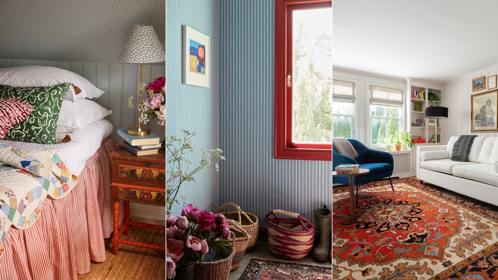
1/6
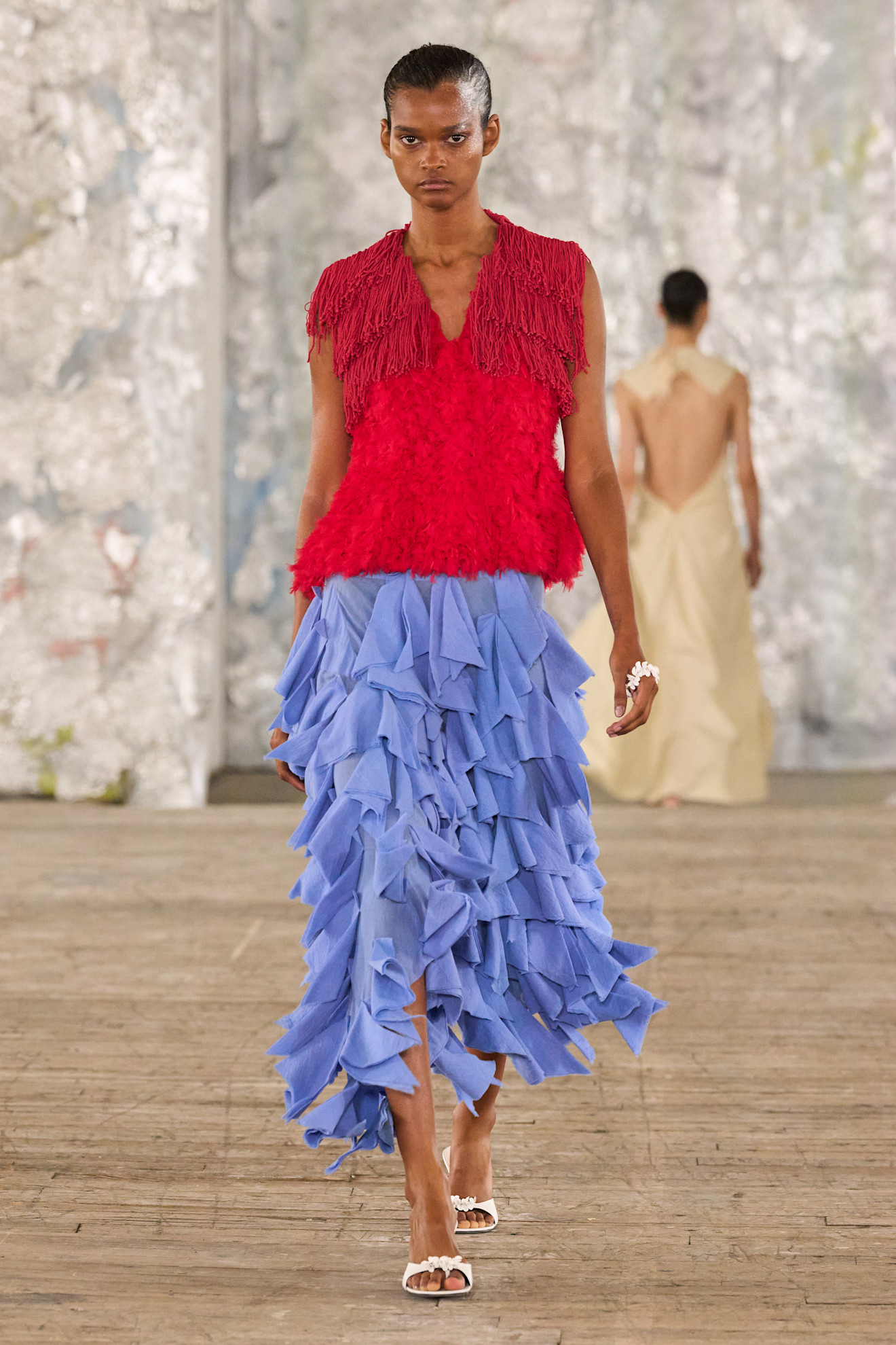
Blue and red is the unexpected color combination for fall 2024
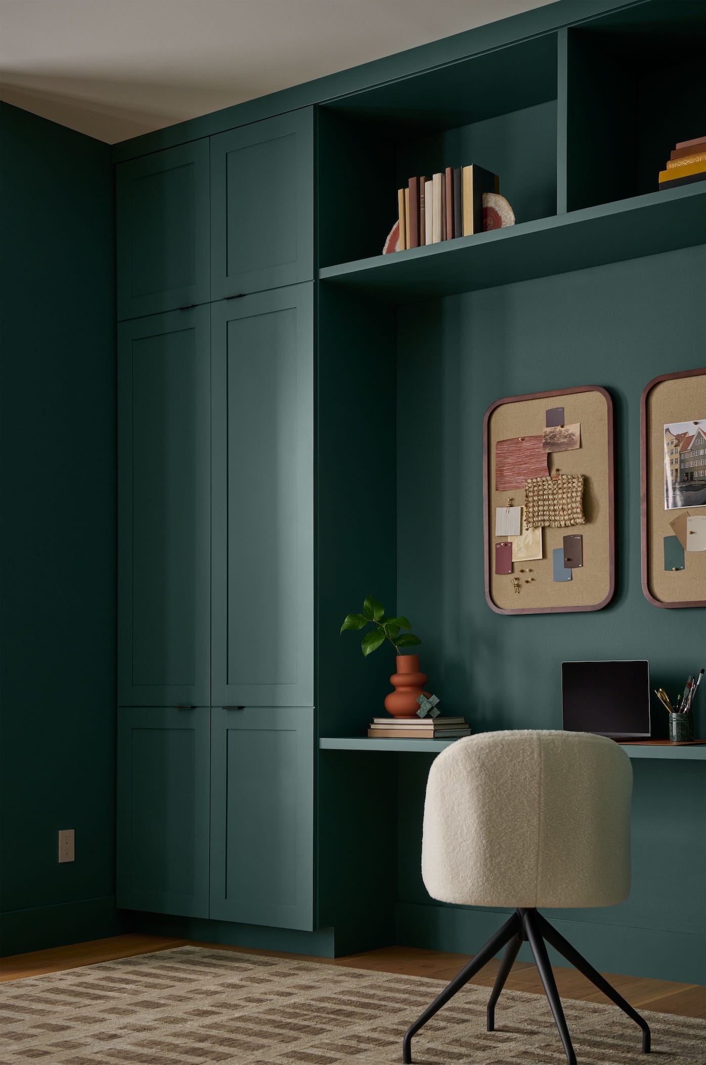
The article explores the resurgence of the blue and red color combination in interior design for fall 2024, highlighting its unexpected yet stylish appeal. Traditionally associated with saturated primary colors and Americana, this pairing is being reimagined with more subtle and on-trend variations to create sophisticated and inviting spaces. Interior designers explain how the contrasting nature of blue, a cool and calming color, and red, a warm and bold one, can be harmonized to create dynamic yet balanced interiors.
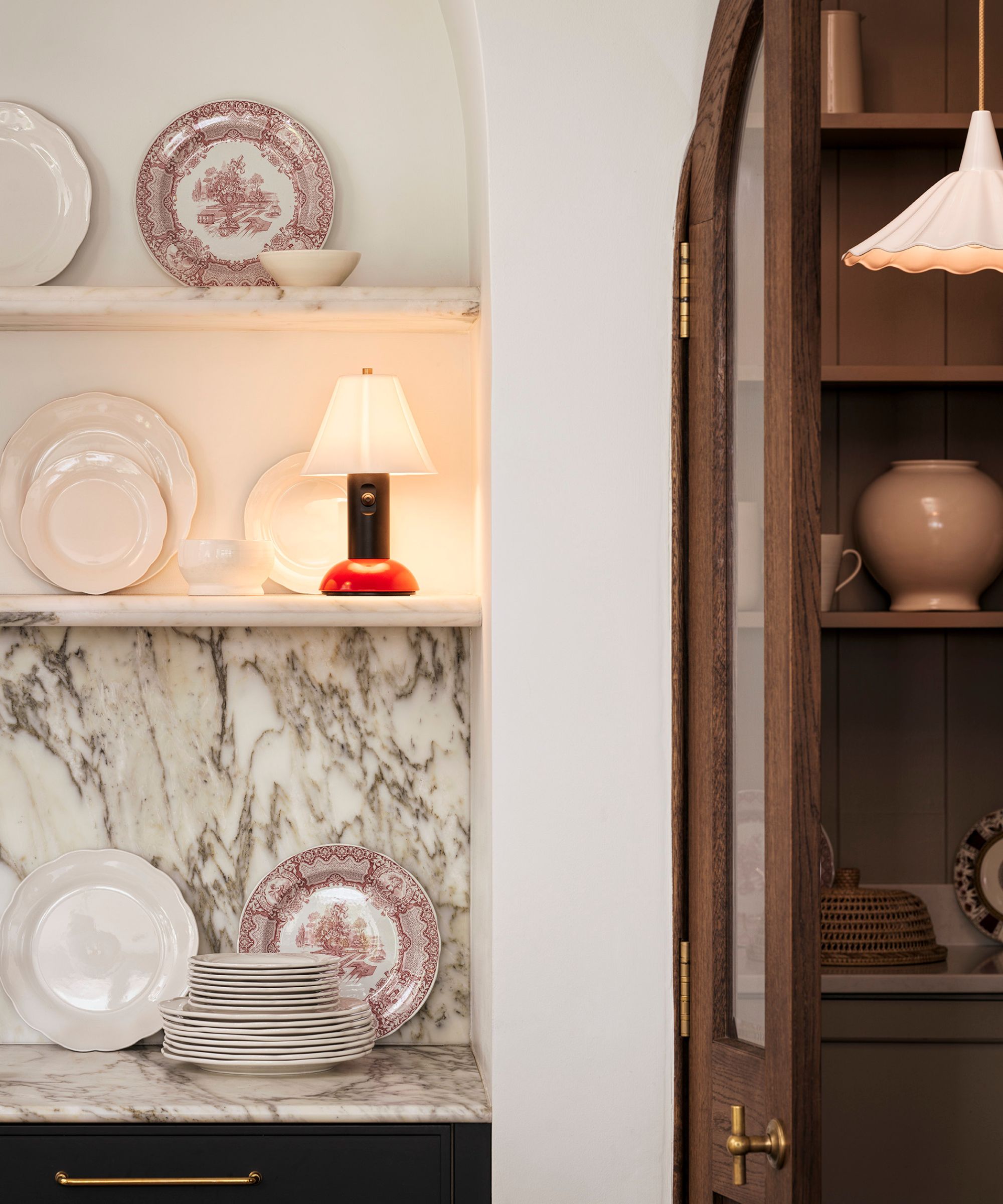
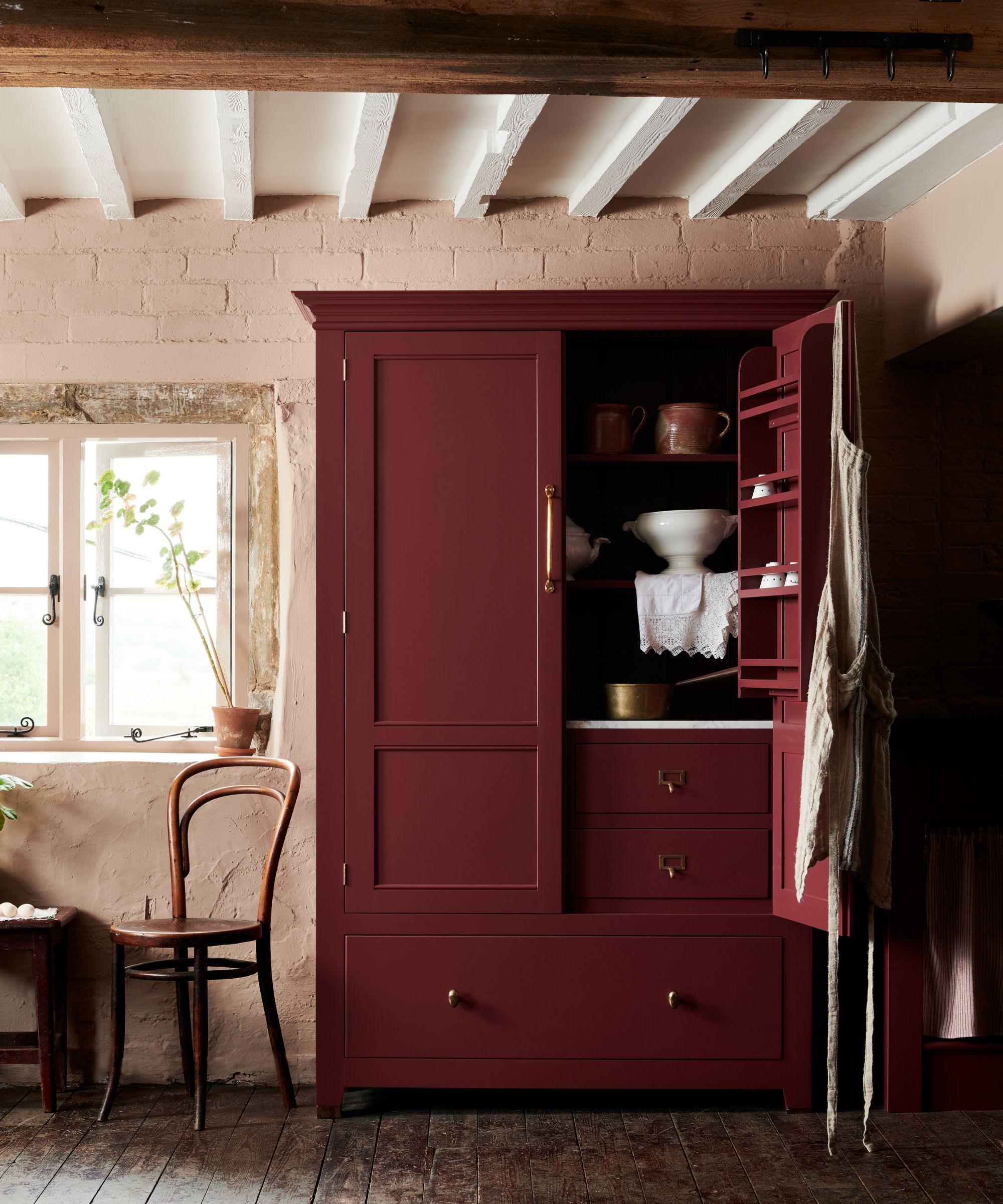
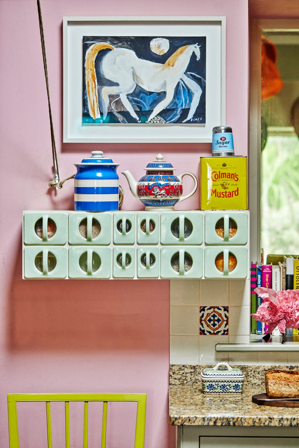
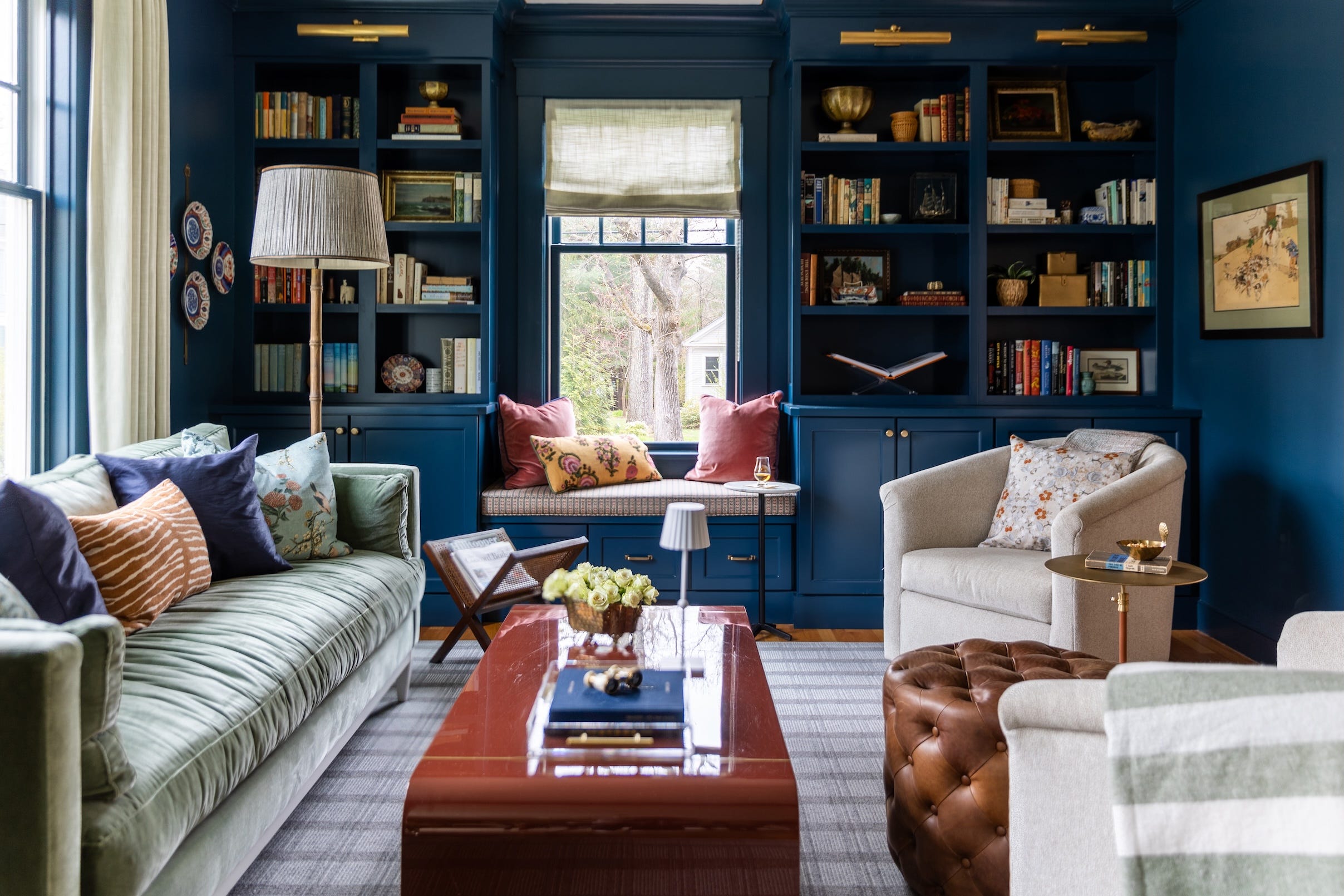
One key strategy discussed is the use of red in small doses. Drawing inspiration from the "unexpected red theory," designers suggest incorporating red sparingly through accents like throw pillows, trim, or light fixtures. This approach allows blue to remain the dominant, calming color while red adds a vibrant focal point without overwhelming the space. An example is provided of a great room that uses red in cord trim, lampshades, and accent pillows to create a playful, preppy spirit with classic sophistication.
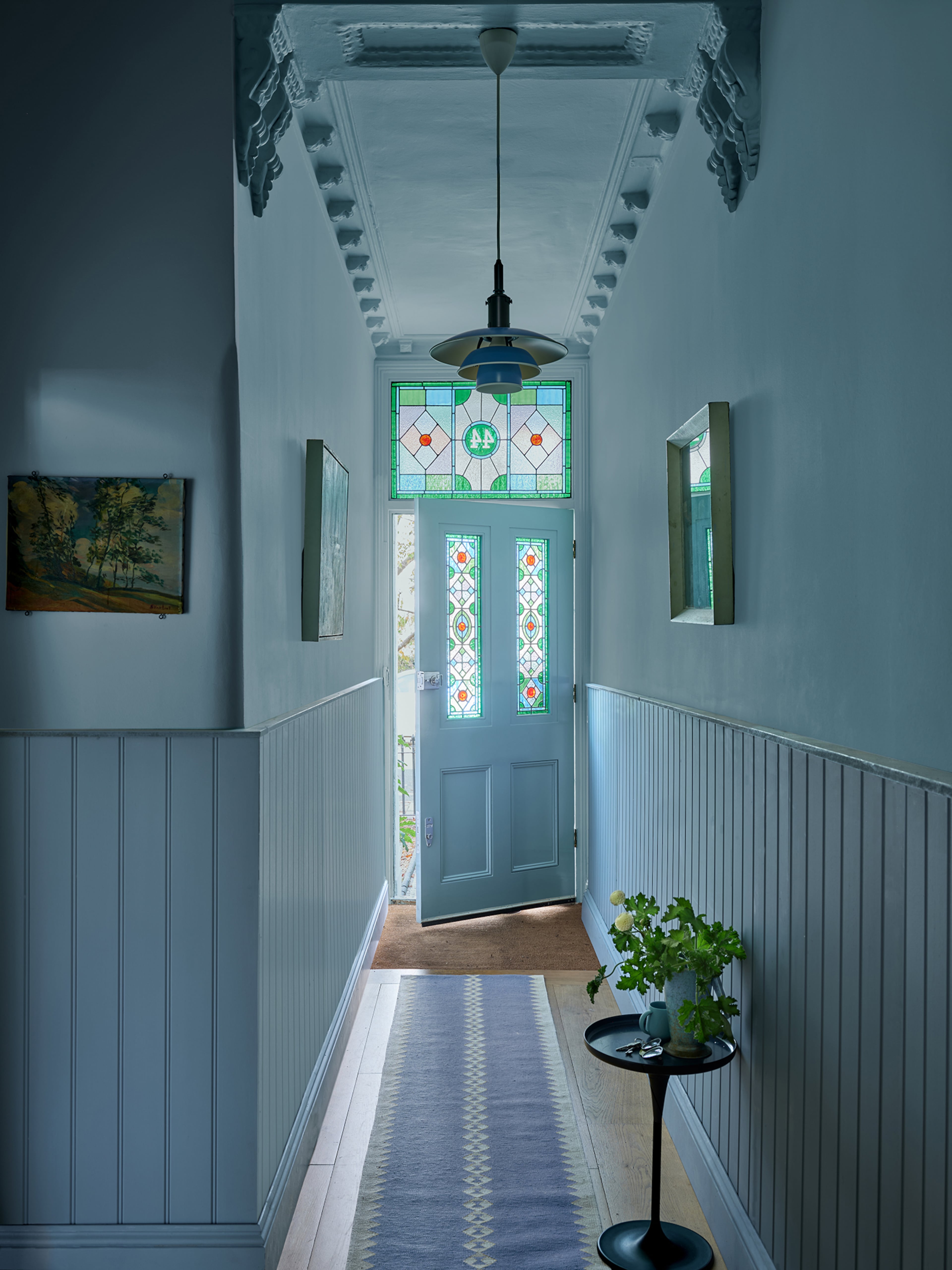
Another technique involves selecting very light shades of blue. To achieve a restful and timeless aesthetic, pale blue paints can be used as a neutral backdrop. This approach evokes coastal color schemes, drawing inspiration from nature, and allows for subtle pops of red without venturing into a nautical theme. The article suggests specific pale blue paint colors, like Farrow & Ball's Borrowed Light, which can be paired with raspberry red for a pared-back interpretation of the combination.
Incorporating classic white is also recommended to balance the boldness of blue and red. Using white for walls and major decor elements provides a visual break, preventing the room from feeling overstimulated by too many competing colors. A living room example showcases how a dark red rug and a dark teal accent chair can add interest to an otherwise neutral white scheme, demonstrating how to effectively integrate these strong colors.
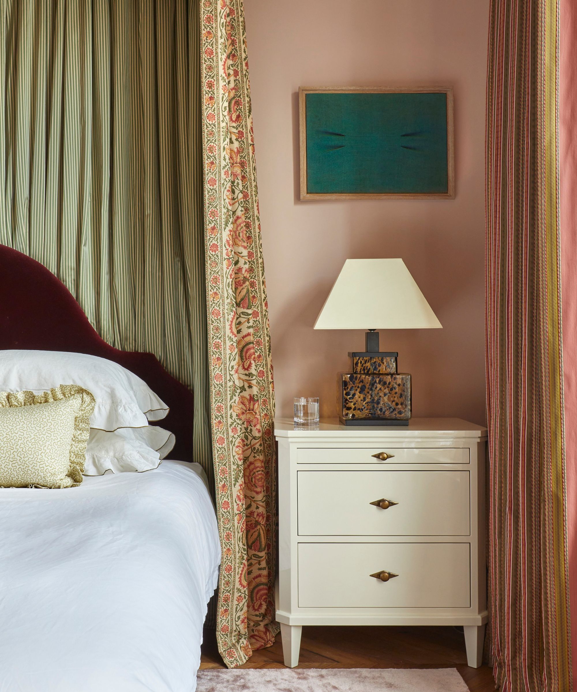
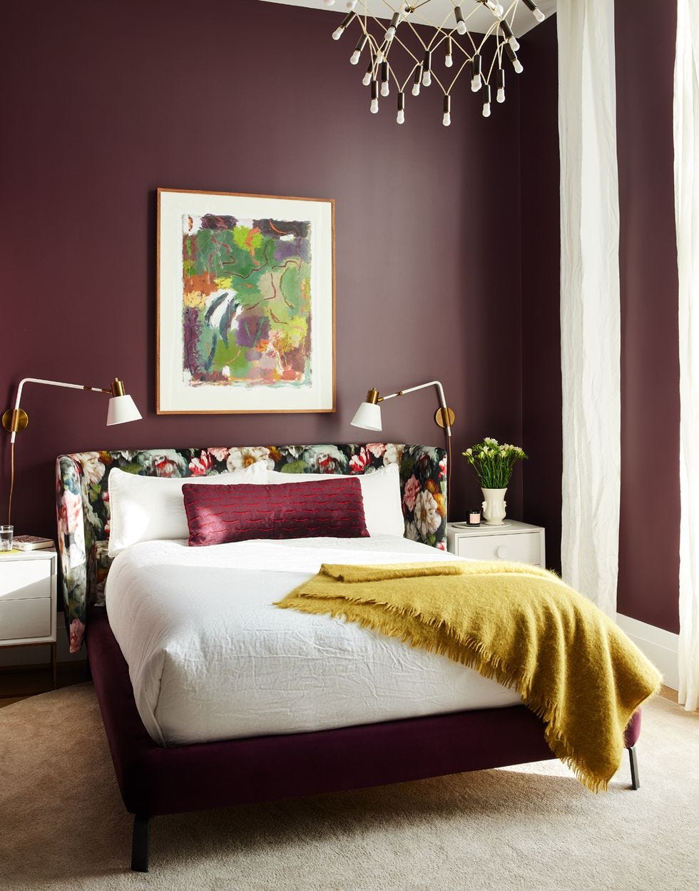
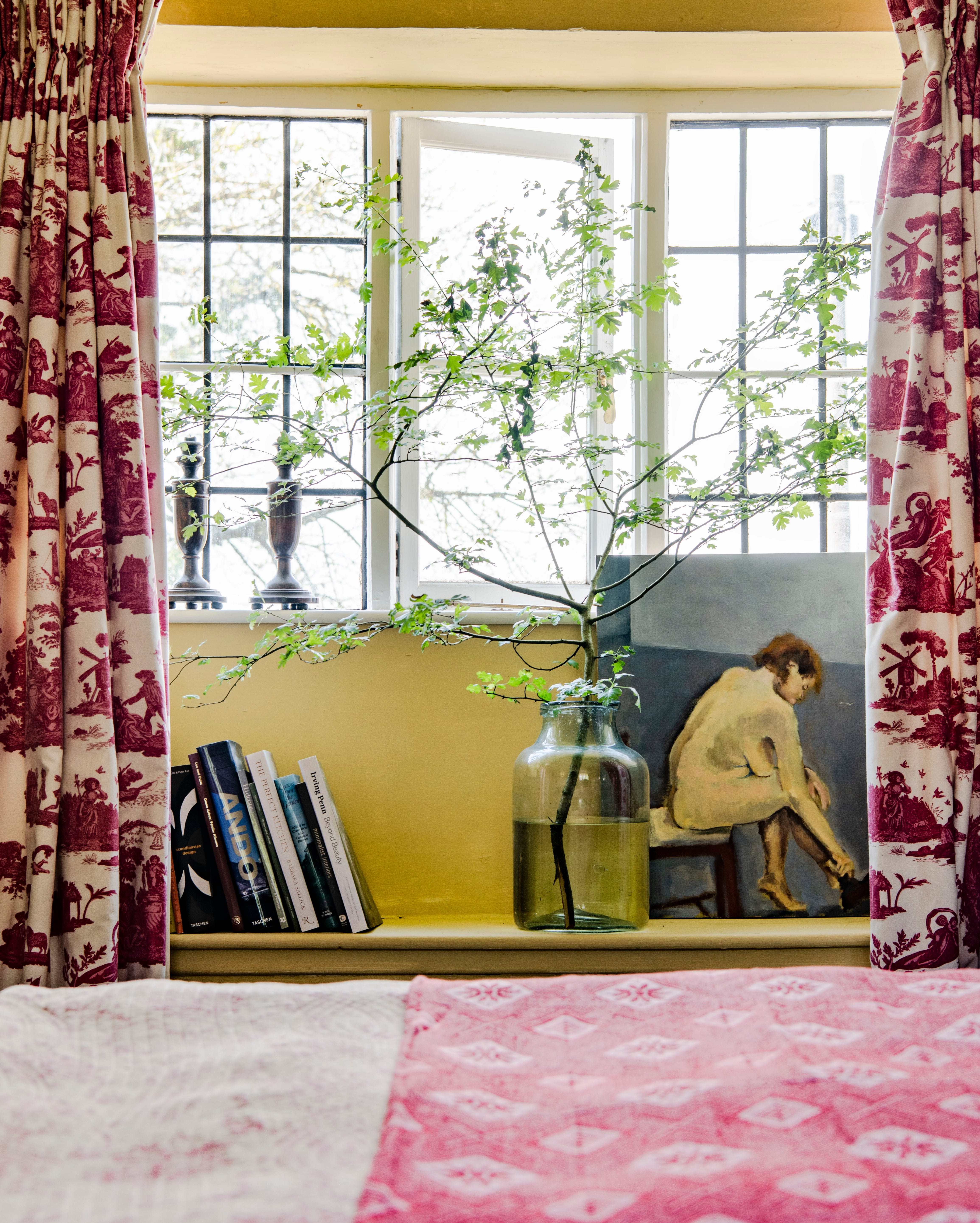
Finally, the article addresses the application of blue and red in bedrooms, traditionally a space for neutrals. The key to successfully using this combination in a restful environment is to opt for lighter variations of both hues. Patterned wallpaper featuring blue and red floral designs is presented as a starting point, with emphasis on balancing richer tones with airier shades, such as periwinkle blue with earthy persimmon. The article concludes by encouraging readers to embrace this color trend for its cozy and nostalgic feel, whether through subtle pairings or richer, more vibrant combinations.
#ColorCombinations #InteriorDesign #HomeDecor #FallTrends #BlueAndRed #AccentColors #ColorTheory #ColorCombinations #InteriorDesign #HomeDecor #FallTrends #BlueAndRed #AccentColors #ColorTheory
0 comment in total
 No comments yet
You may also like
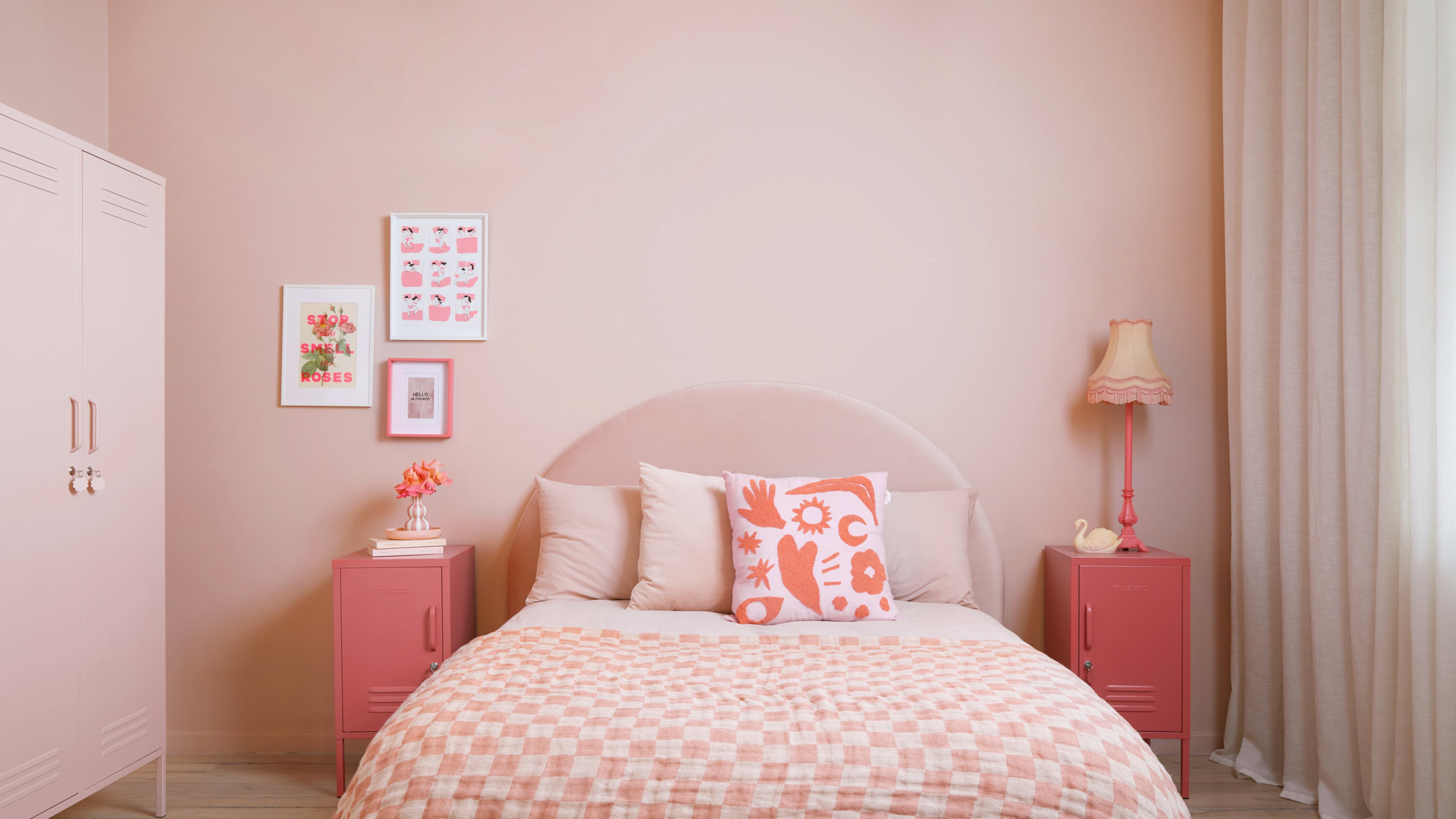
Bold, edgy color drenching is going to be big in 2024
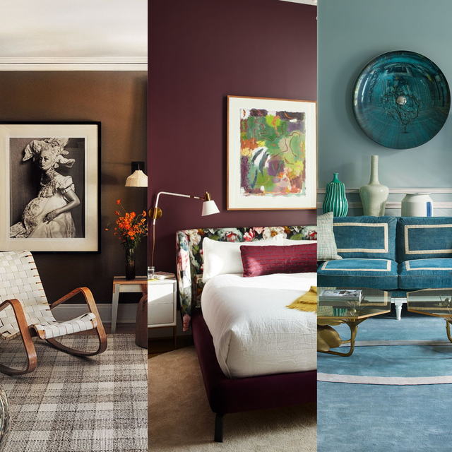
We’re Calling It: These Are the Official Color Trends of 2025


2024 Fashion Colour Trends To Brighten Up Your Wardrobe

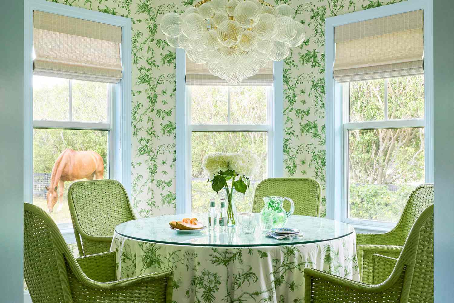
We're Calling It: Blues And Greens Are The New Neutrals For 2025
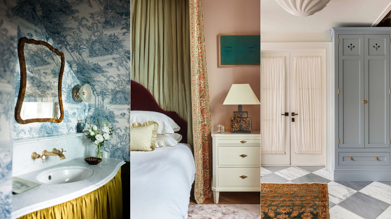
What's replacing the 'Unexpected Red Theory'? Here's what colors designers say will be popular in 2025
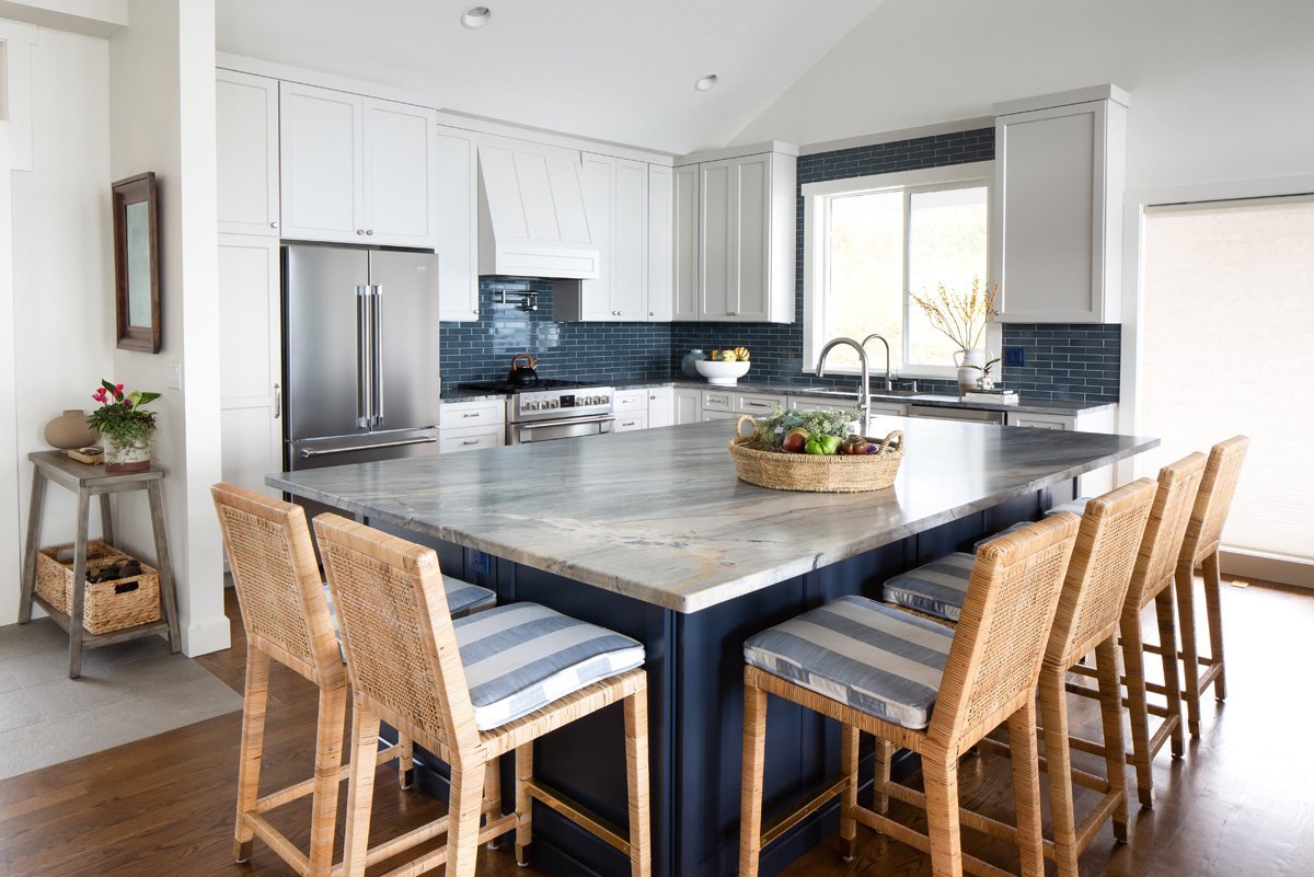
Color Explosion: 2025 Color Trends

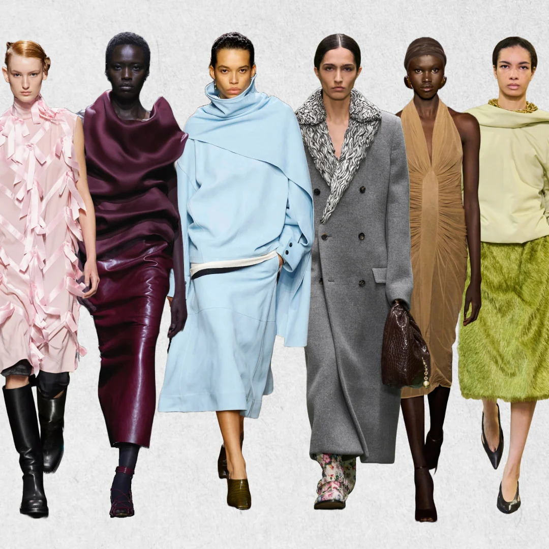
Fashion's Fall 2024 Color Trends Went Viral

Designers Say These 12 Paint Colors Will Be Everywhere in 2026

These are the 'fail-safe' paint color combinations to embrace in 2024, according to Lick's color psychologist
Fashion's Fall 2024 Color Trends Went Viral
Kitchen colour experts are calling this the 'it' colour of 2024 that will go down as a future classic
7 Color Trends That Will Be Huge in 2024, According to Color Experts

The Latest Color Trend You'll Be Seeing Everywhere In Fall 2025
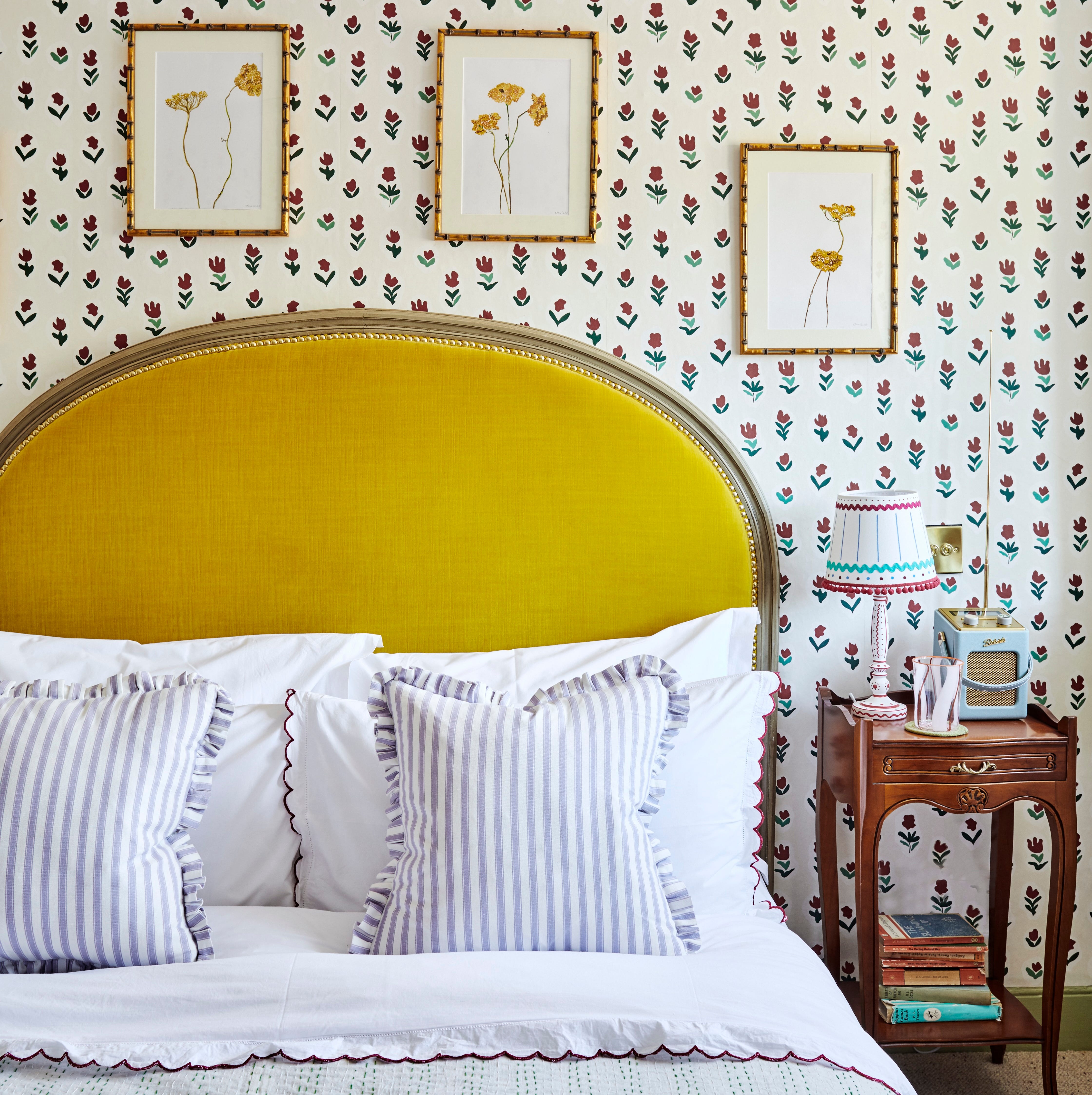
‘Unexpected Yellow Theory’: The Bold New Interior Trend Replacing Red in 2025
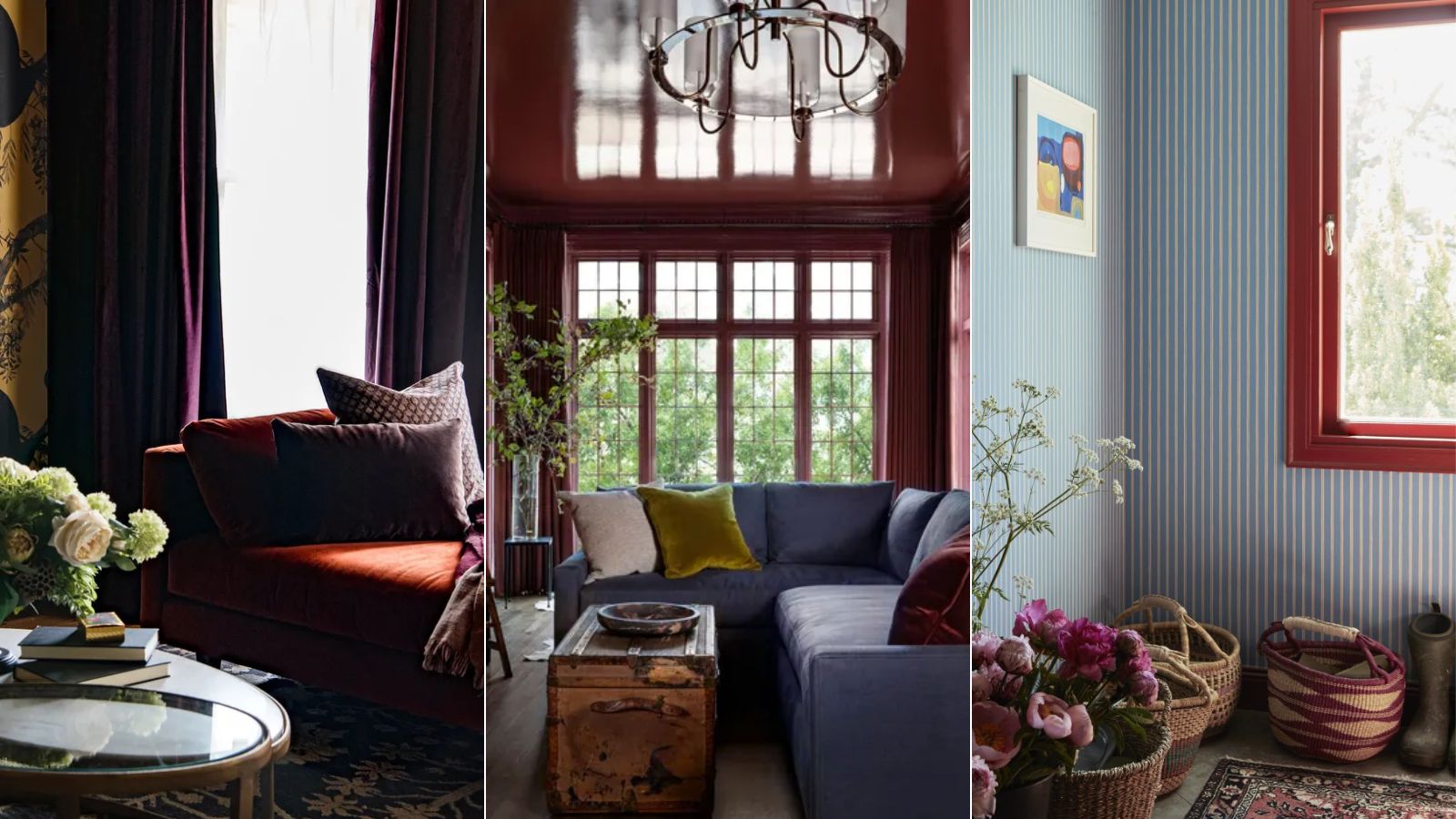
I predict wine red as the winning color of fall and winter 2024 – here's how designers are embracing this alluring shade
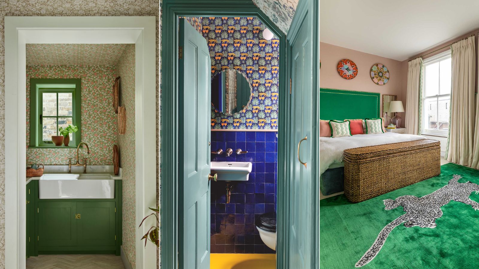
What color is replacing red? Discover the new trending accent colors designers are favoring for 2024 and beyond
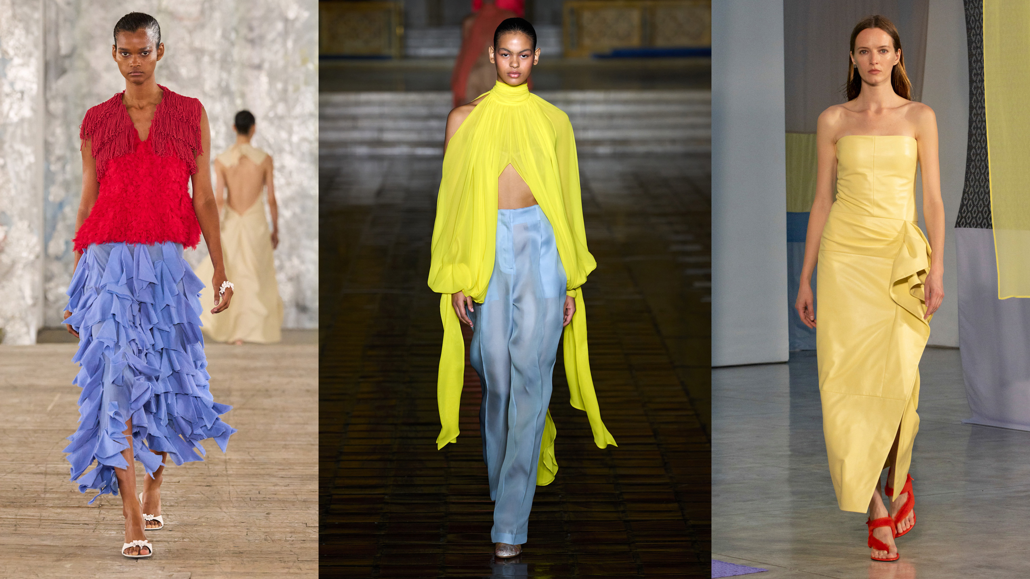
Unexpected Color Combinations Trend Spring/Summer 2026


The #1 Paint Color Trend of 2025, According to Designers
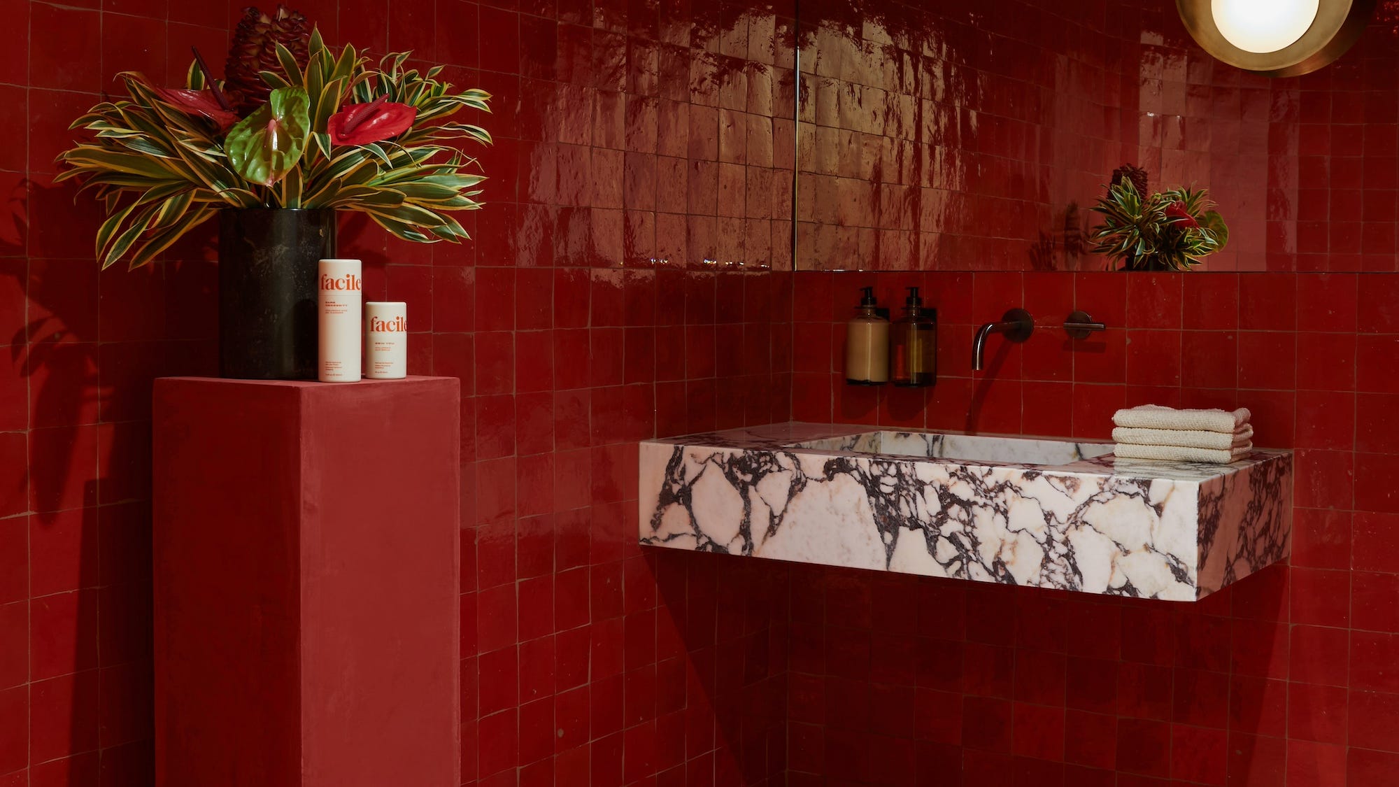
Red Is the Biggest Bathroom Color of 2024, According to Designers

The 2026 paint Colors of the Year Have Been Announced