1/7
A Colonial Revival Retreat in Maine Comes Alive with Emerald Lacquer and Graphic Patterns
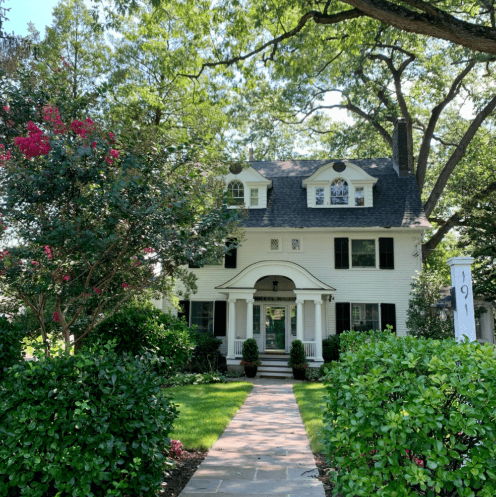
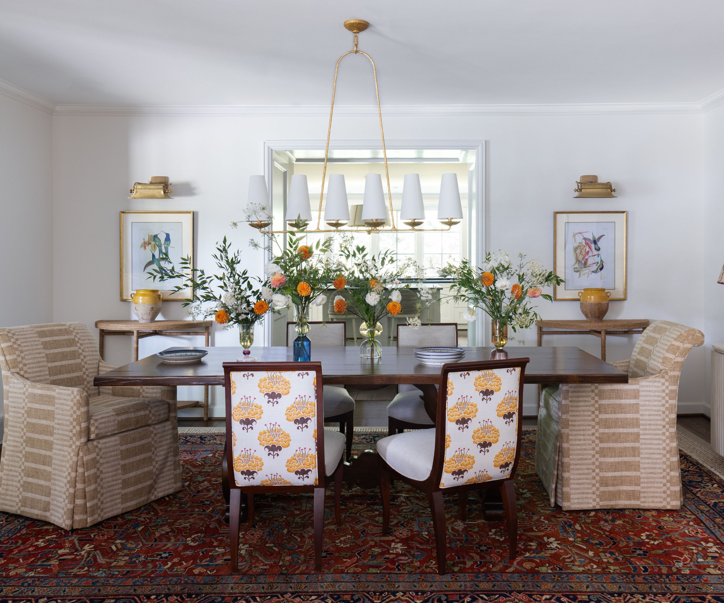
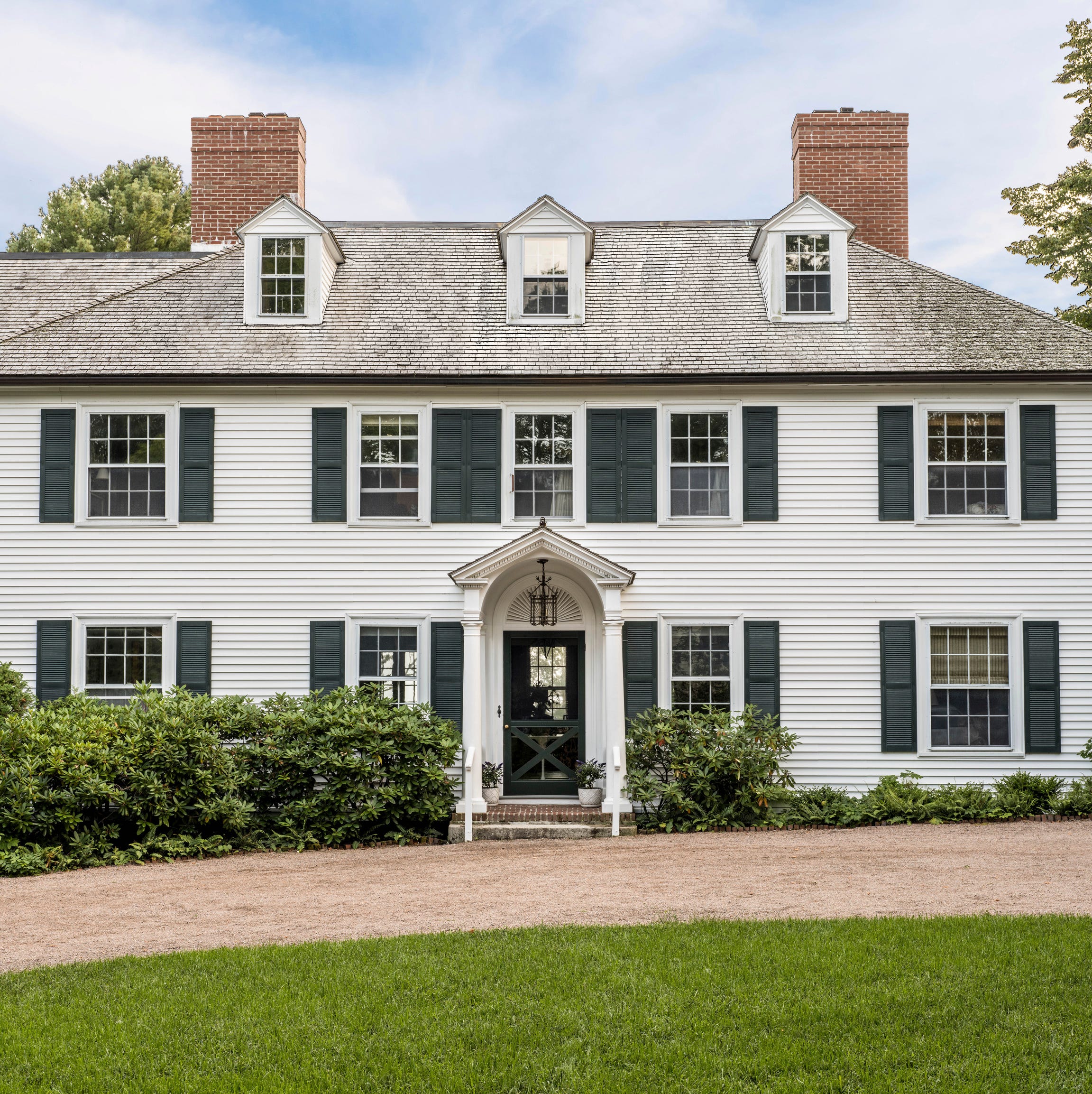
Matthew Carter, a Lexington, Kentucky-based decorator, undertook his first project in Maine, transforming a quintessential Colonial Revival summer house for clients from Kentucky. The clients, who possessed traditional taste but also a high tolerance for color and pattern, desired to elevate the home's aesthetic beyond its original "simple and lovely" state, which characterized many coastal Maine cottages. These homes often exude an undecorated feel, a blend of Yankee ingenuity and Puritanical vestiges, emphasizing functionality over ornamentation.
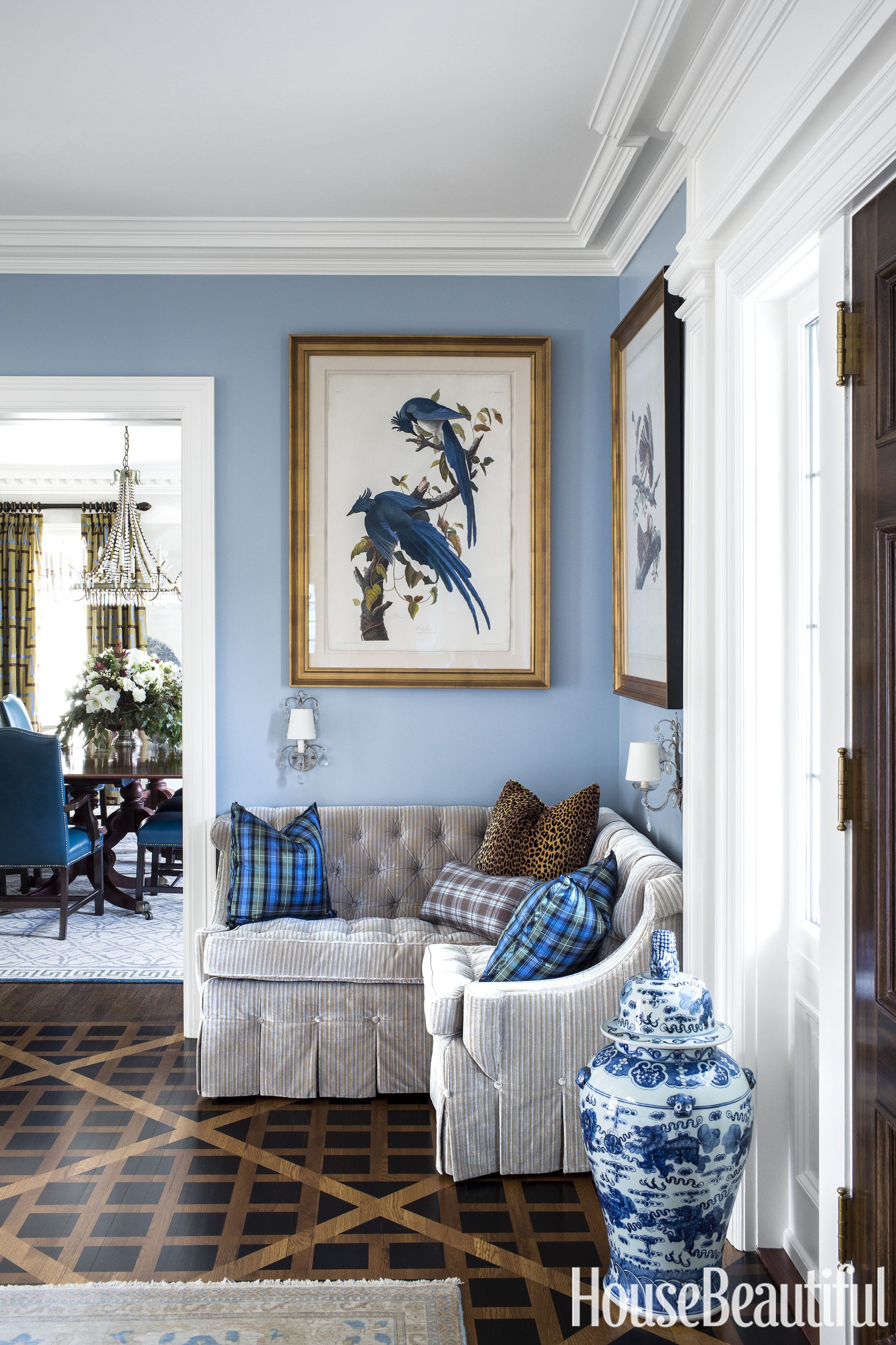
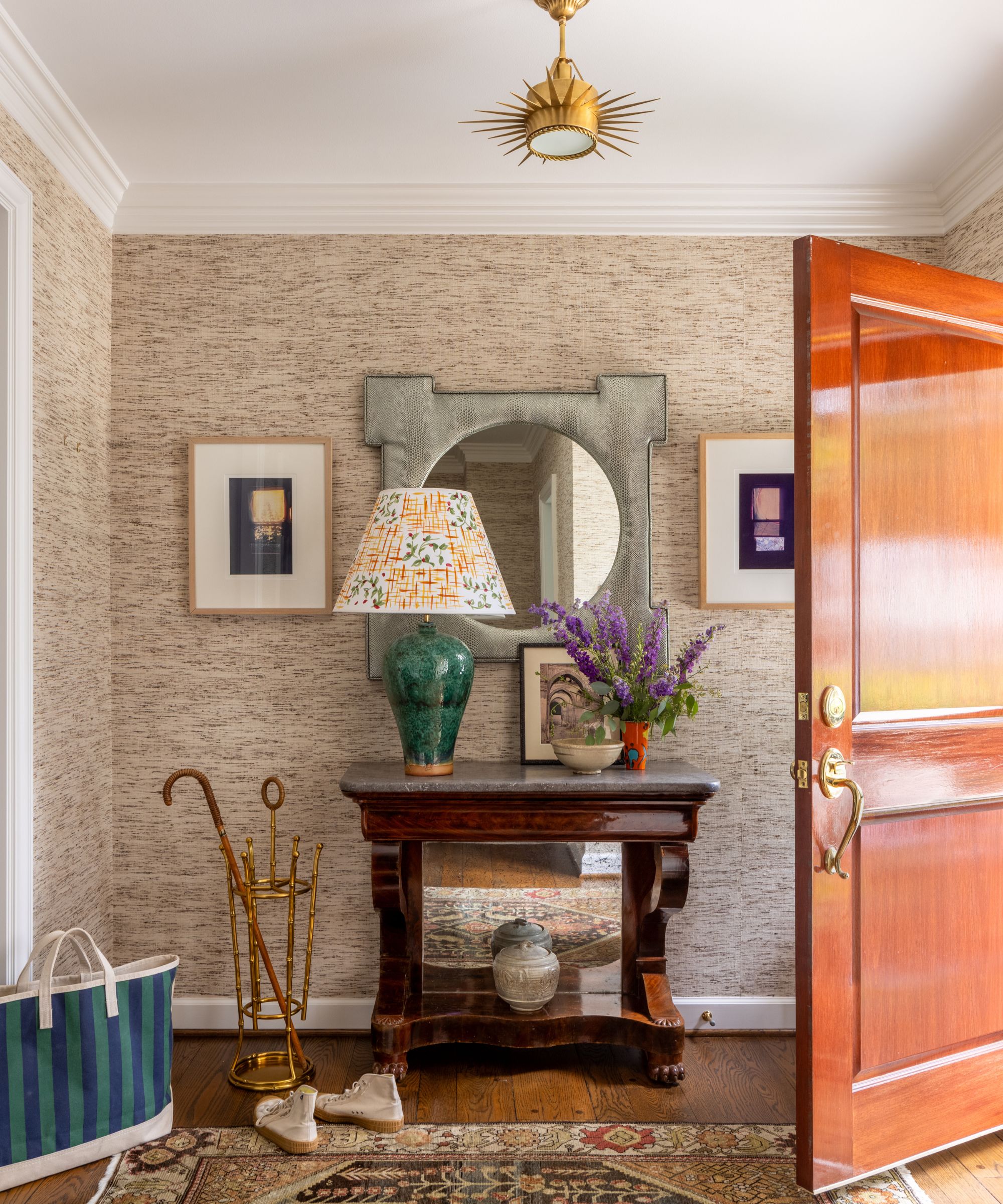
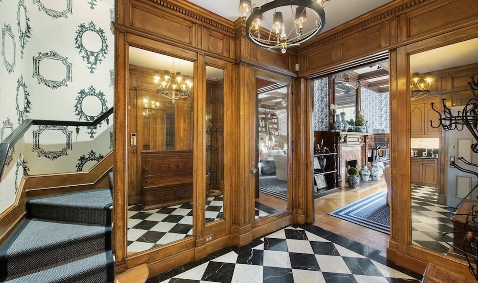
Carter's approach was to infuse the home with personality and vibrancy while respecting its heritage and location. He began in the entry hall, choosing a bold, all-over dark brown and ivory Miro wallpaper by Albert Hadley. This choice was not only striking but also meaningful, subtly acknowledging Sister Parish, co-founder of Parish Hadley and a long-time summer resident of Dark Harbor, a nearby locale. This bold decorative move set the tone for the rest of the house, demonstrating that daring design choices could be harmonious with the Maine setting.
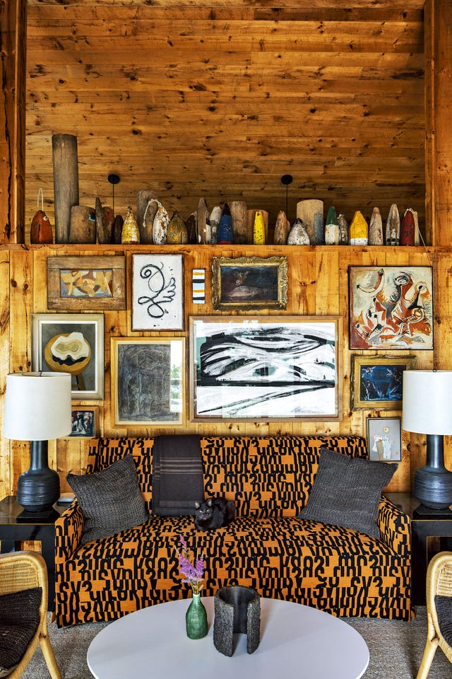
The decorator emphasized that each bold design decision was carefully considered and connected to the home's context, rather than being a generic design that could exist anywhere. The design elements paid homage to both Northeast Harbor, where the owner spent his youth, and Lexington, his current home. Carter's design philosophy aimed for a "studied looseness," arranging items in a way that felt natural and un-curated, akin to the historical decorative displays in New England sea captains' homes, which often featured an eclectic mix of global artifacts.
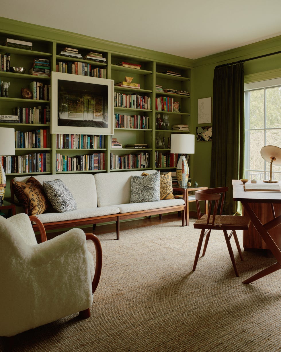
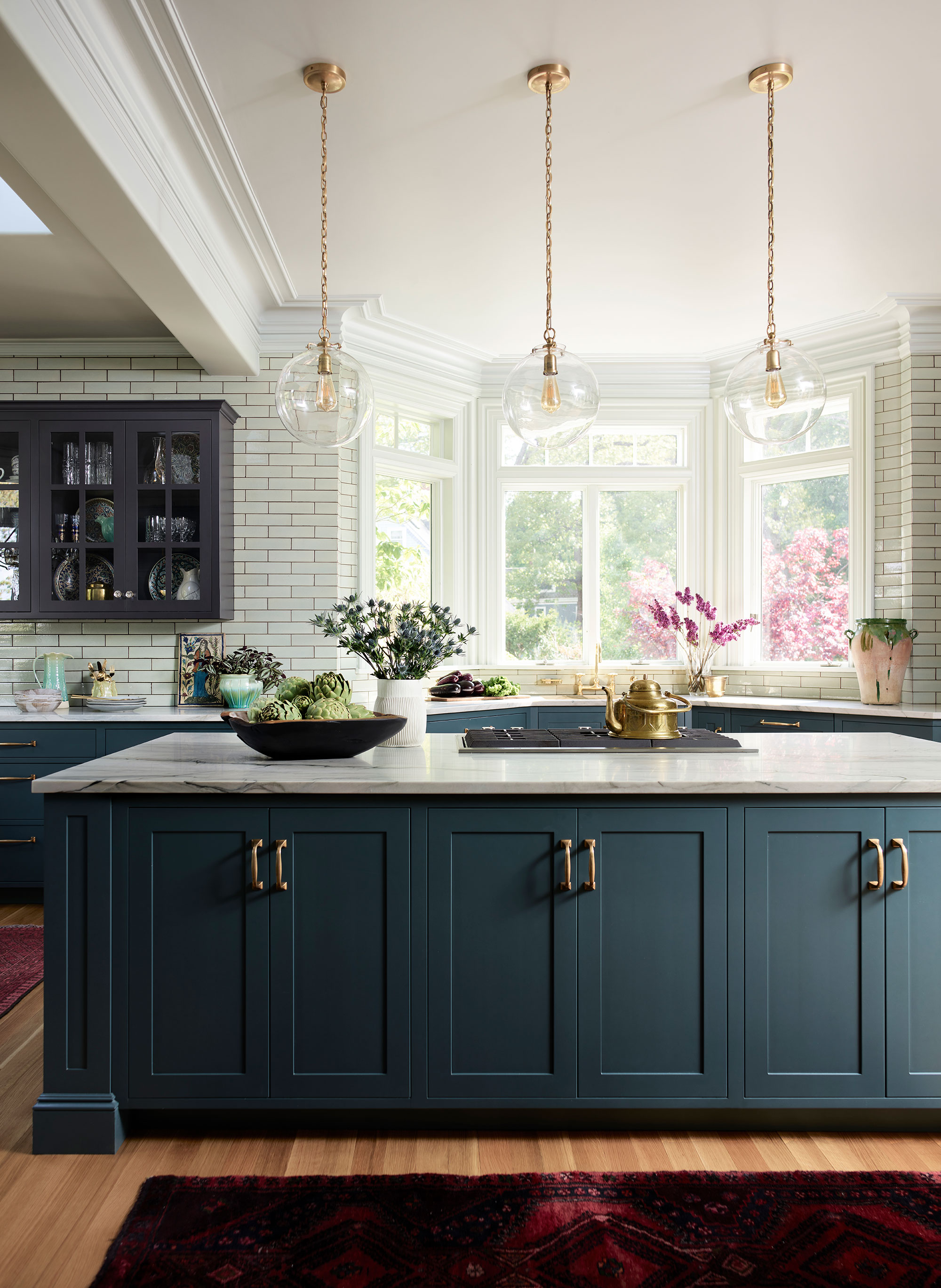
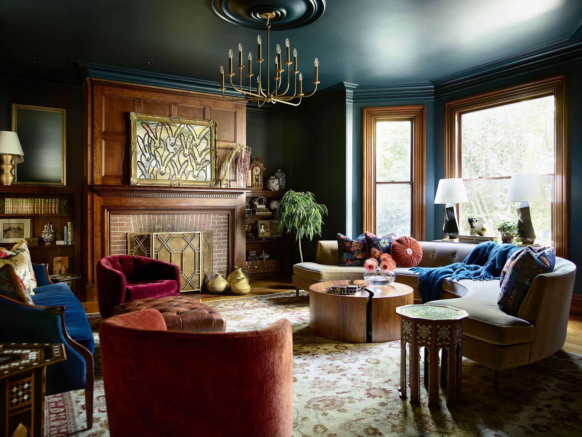
This deliberate lack of rigid order allowed Carter to introduce strong design elements without them appearing overly deliberate or "try-hard." An example of this is the study, where emerald lacquered paneling and bookcases, combined with custom deep green on ivory wallpaper, could have been overpowering but instead offered depth and definition. Carter explained that this provided a necessary punch and dimension, allowing furniture and art to stand out against a rich, jewel-toned backdrop.
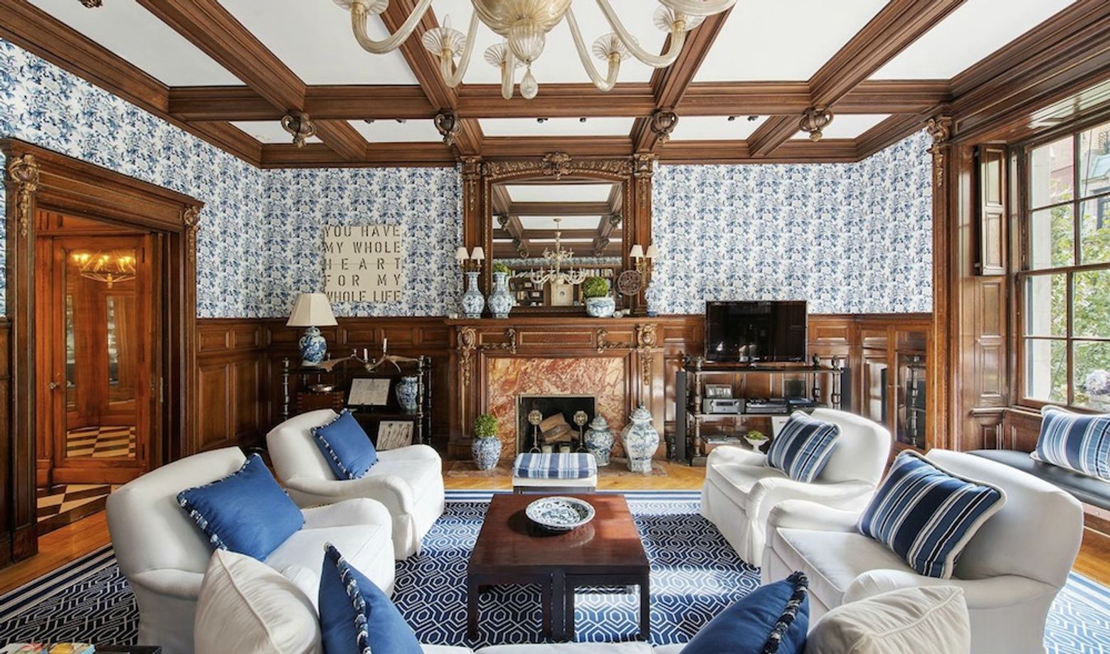
A similar effect was achieved in the central living room, which was painted a deep chocolate brown. Carter noted that dark colors cause walls to recede, drawing attention to the exterior views and creating a cool, grounding atmosphere in the core of the house, contrasting with the lighter perimeter rooms. This technique, also employed in his own home's dark brown library, is a classic summer house strategy effective in various climates.
Challenges arose, such as integrating a family heirloom—an antique pencil-post double bed—into a guest bedroom. To blend its "very Kentucky" aesthetic with the coastal summer house style, Carter draped the bed in fifty yards of ivory linen, transforming it into an airy, coastal-appropriate piece. This humorous and inventive solution highlighted the project's overarching theme: reinterpreting the classic summer house concept through playful and sophisticated design. The project, featured in Veranda magazine's July/August 2023 issue, showcased Matthew Carter's ability to blend traditional tastes with vibrant colors and graphic patterns, creating a distinctive and personal summer retreat.
#ColonialRevival #MatthewCarter #MaineSummerHouse #InteriorDesign #EmeraldLacquer #GraphicPatterns #Wallpaper #CoastalDecor #TraditionalInteriors #ColonialRevival #MatthewCarter #MaineSummerHouse #InteriorDesign #EmeraldLacquer #GraphicPatterns #Wallpaper #CoastalDecor #TraditionalInteriors
0 comment in total
 No comments yet
You may also like
Natural Elements and Glam Give New Life to a Victorian Colonial Revival

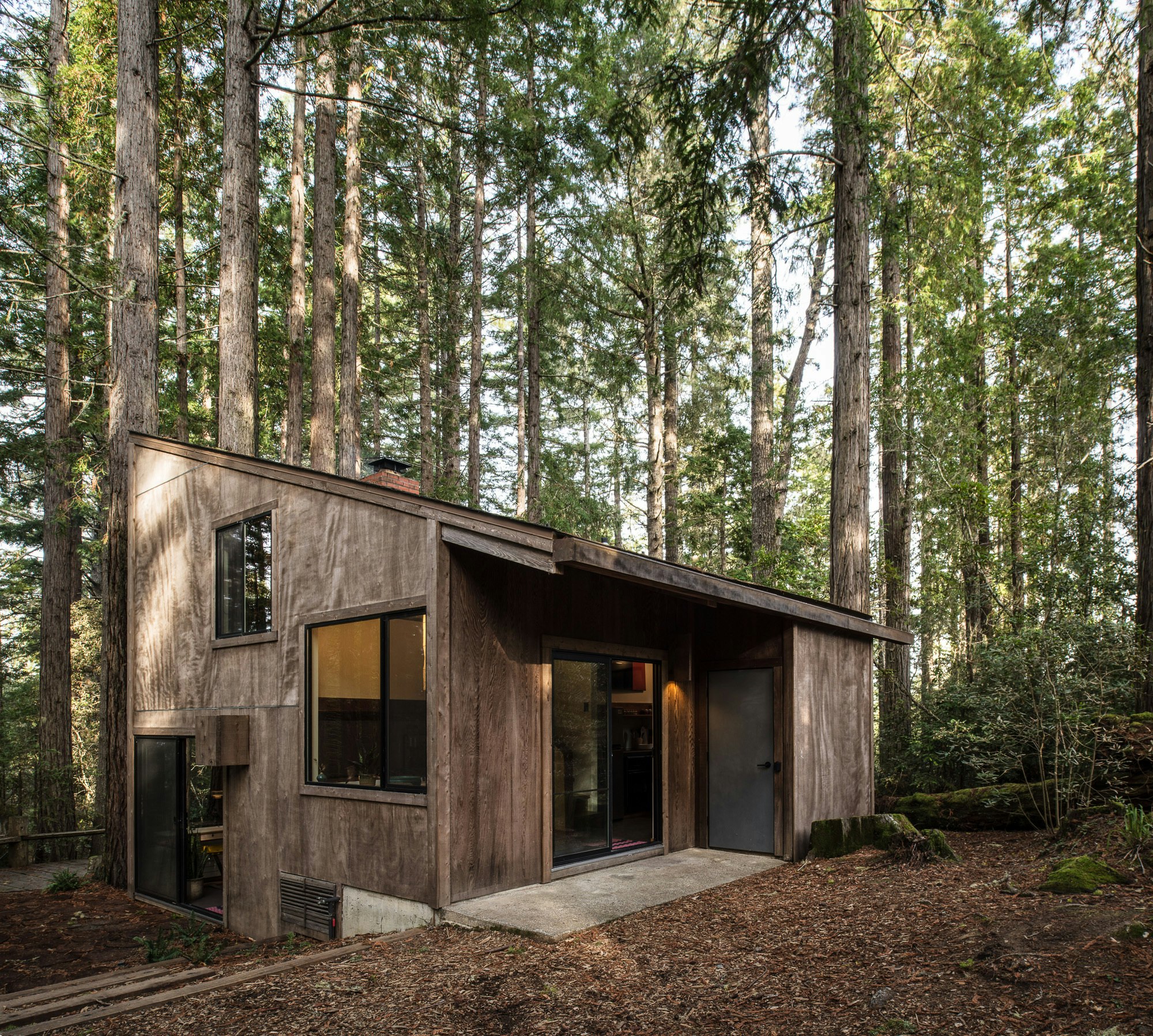
A Midcentury Cabin at California’s Sea Ranch Gets a Glowing Makeover

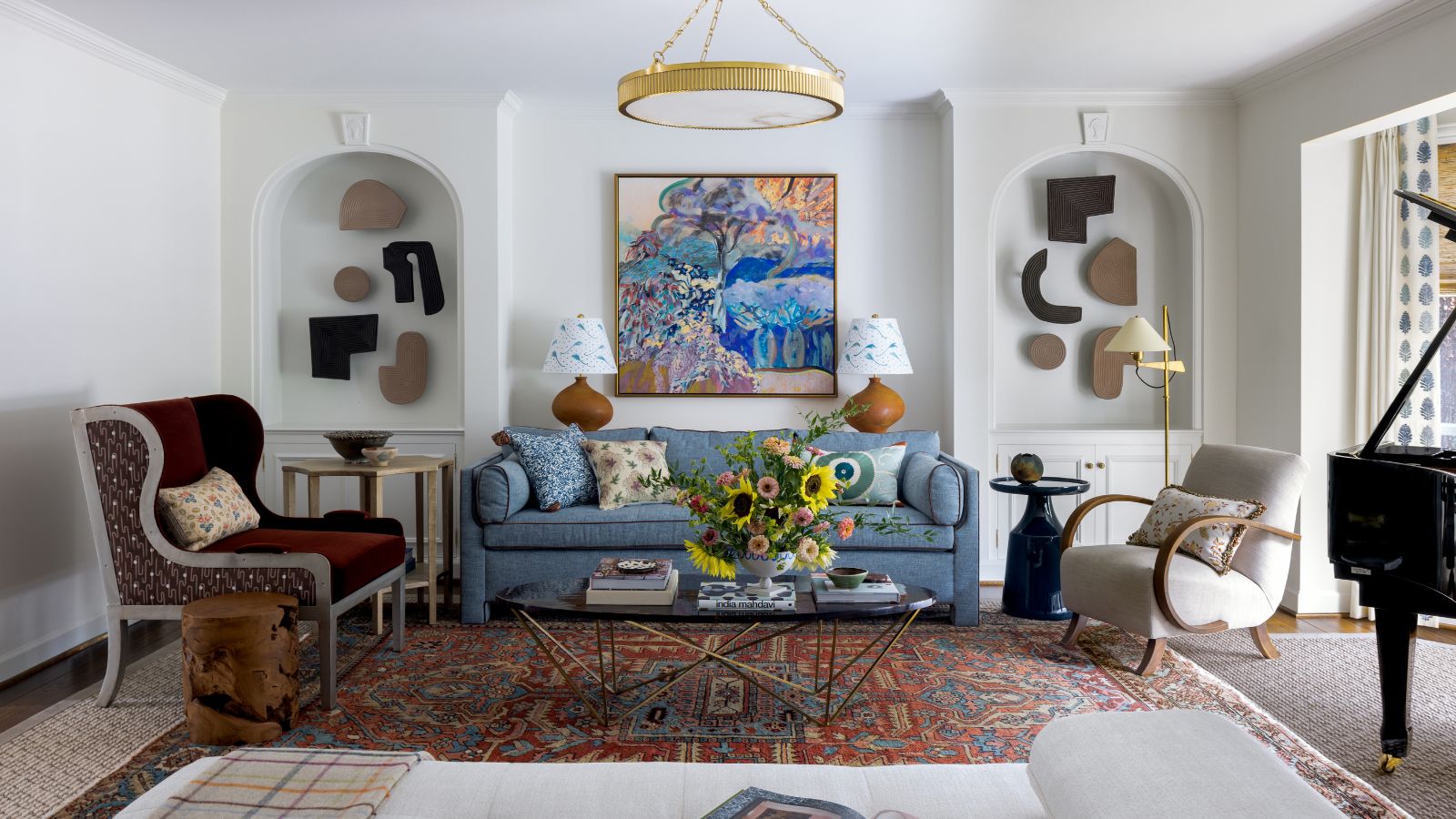
Color, art, and a handful of Mid-century icons gave this 1950s ranch a bright new identity

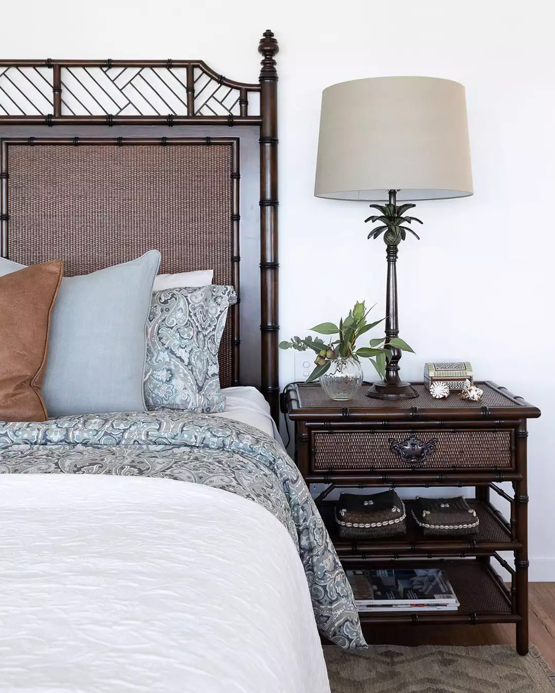
What Is British Colonial Style?

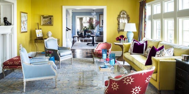
A Bright Color Palette Refreshes This 100-Year-Old New Jersey Colonial

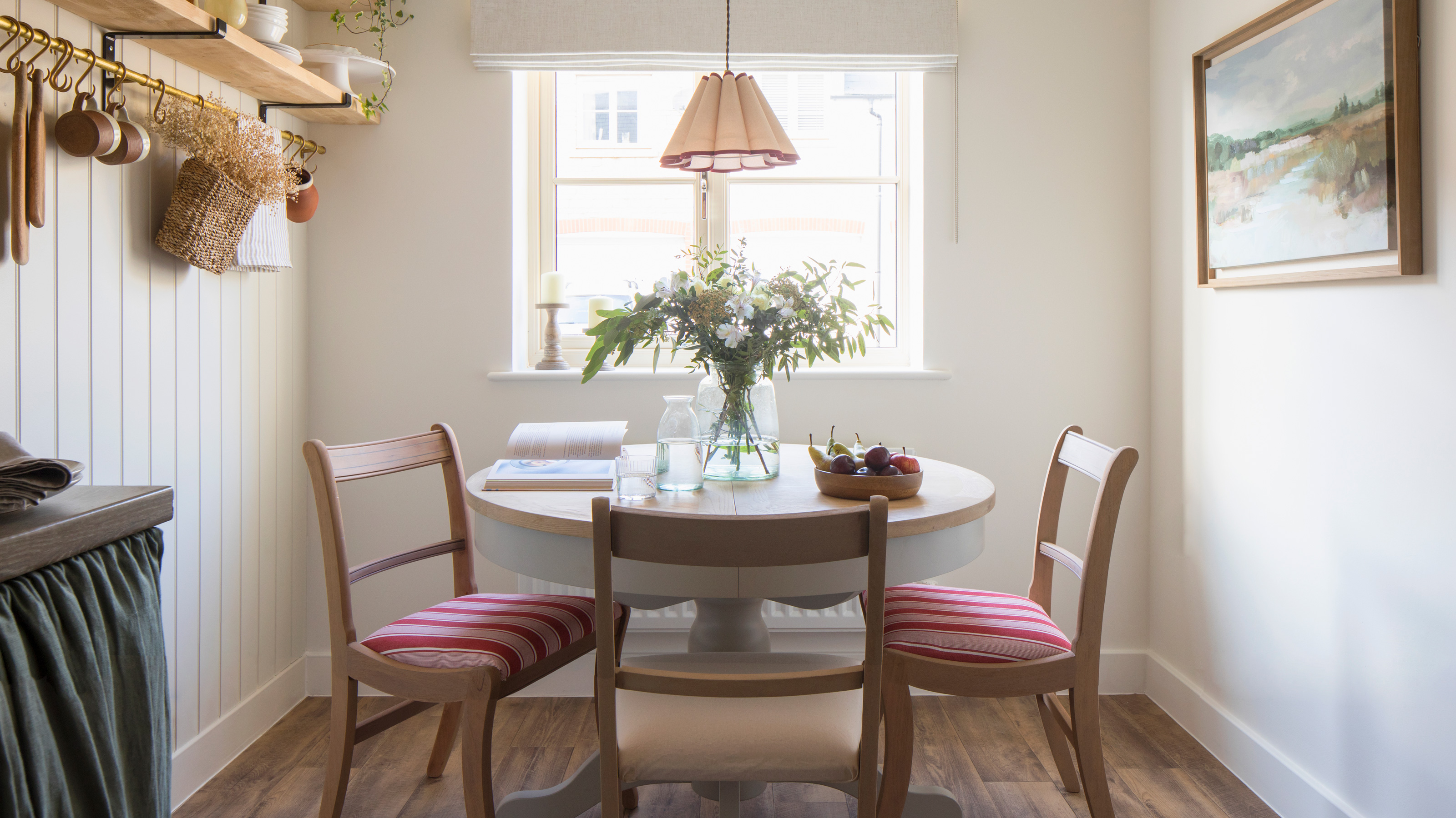
Packed with classic neutrals and pops of warming colour, this new build oozes country-style charm

A Renaissance of a Geist Estate

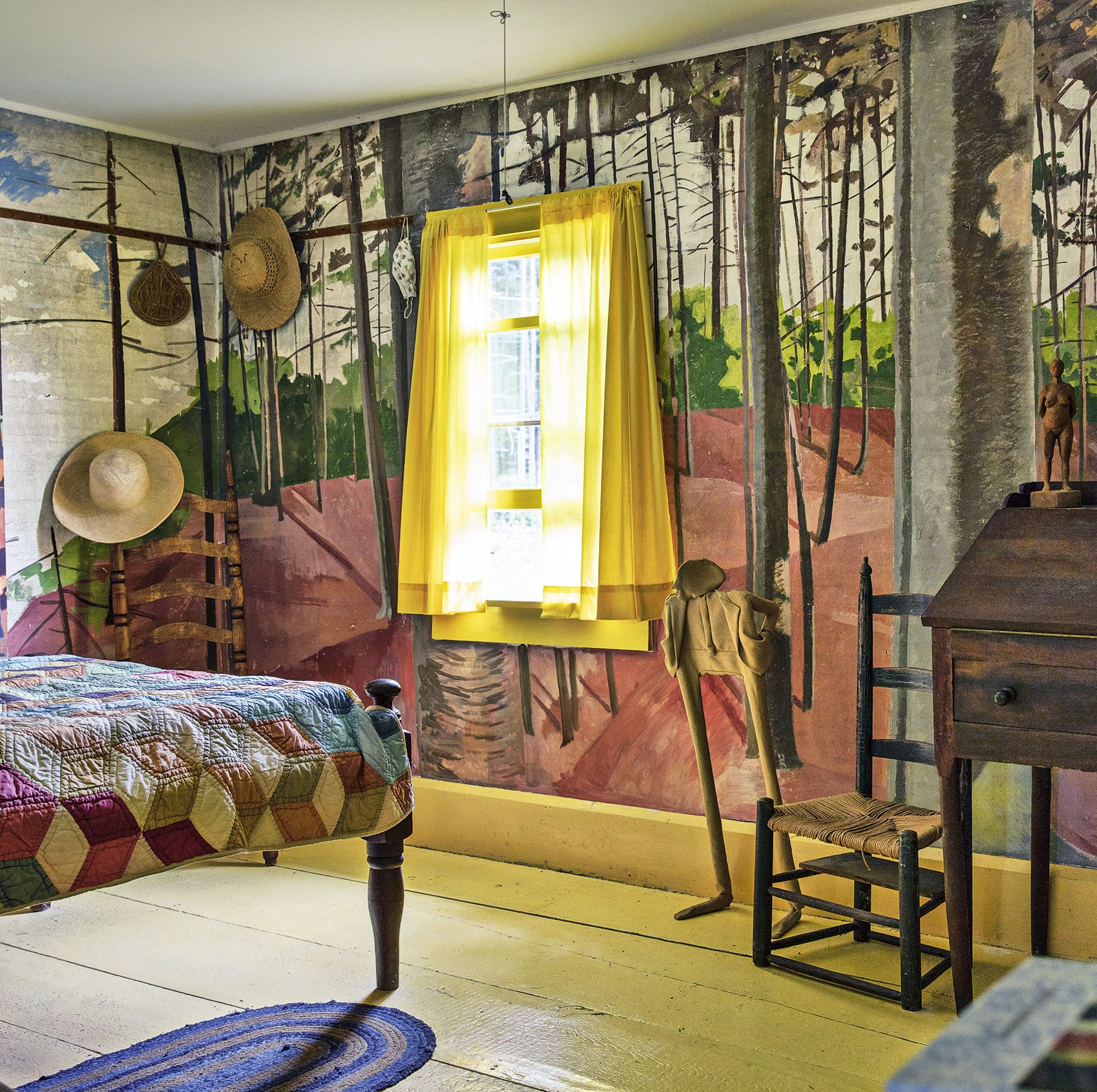
7 Ways to Bring Maine Cottage Style into Your Home
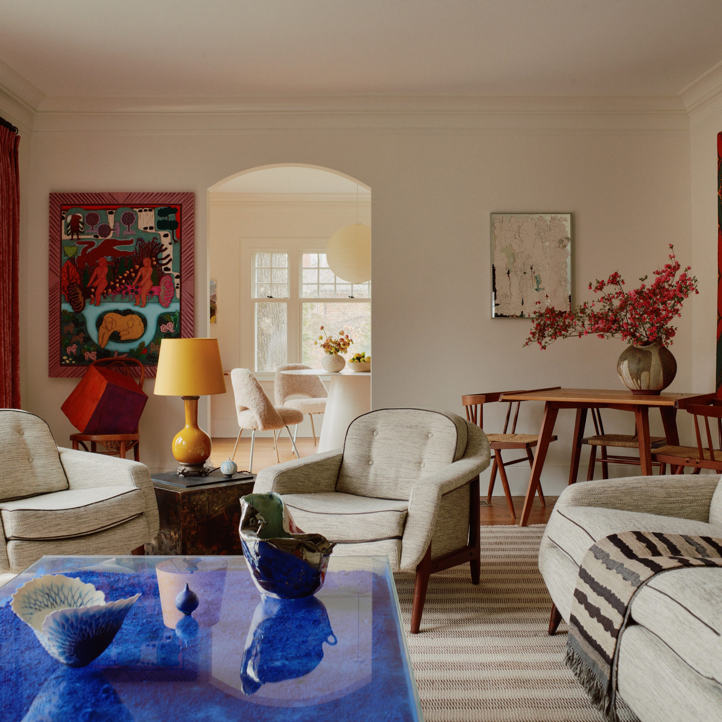
With Happy Pinks, Greens, and Blues, a Designer Totally Transformed a Quirky Colonial Revival
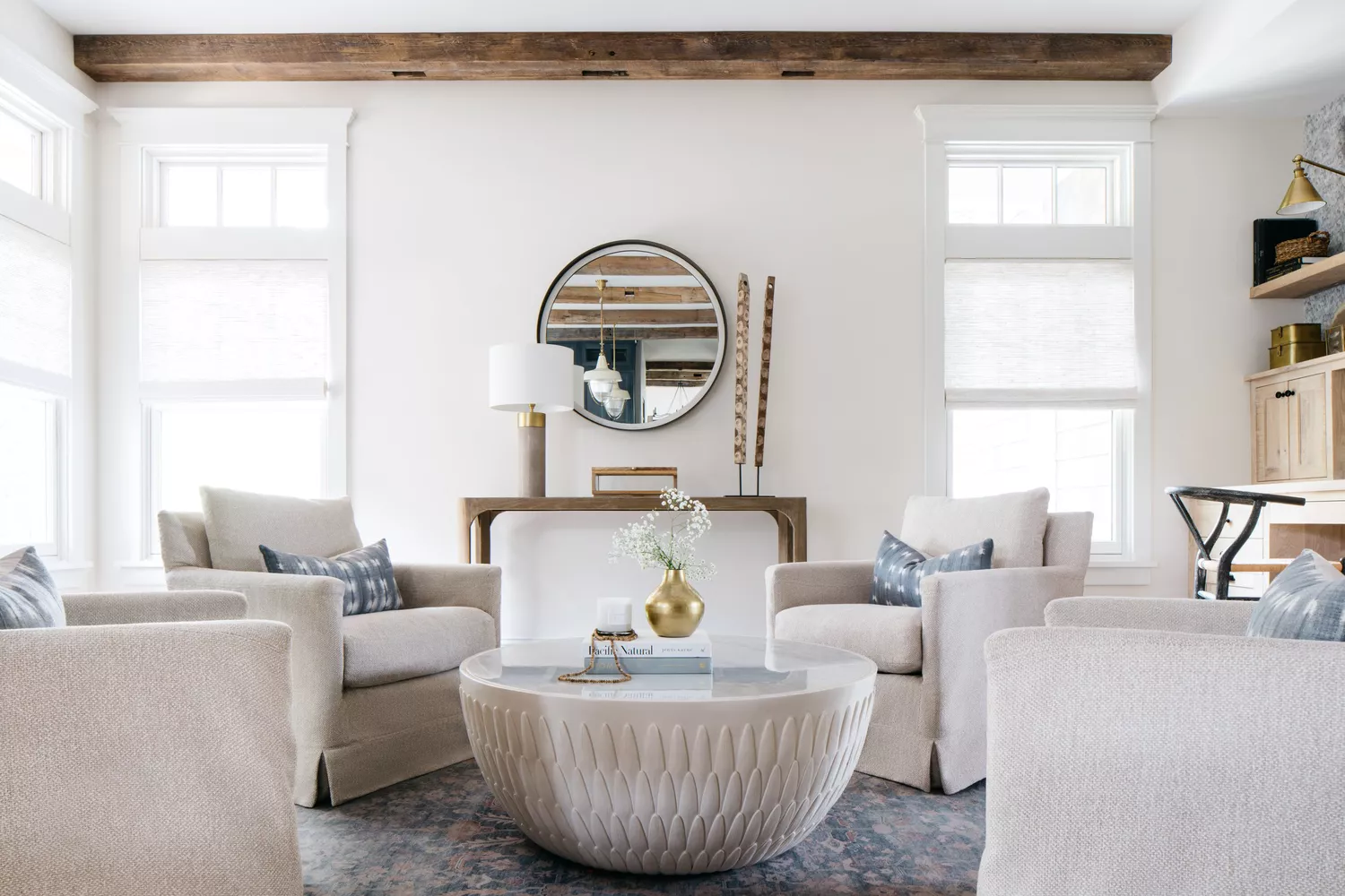
This Coastal New England Color Combo Is Trending This Summer—And It Just Got a Modern Upgrade
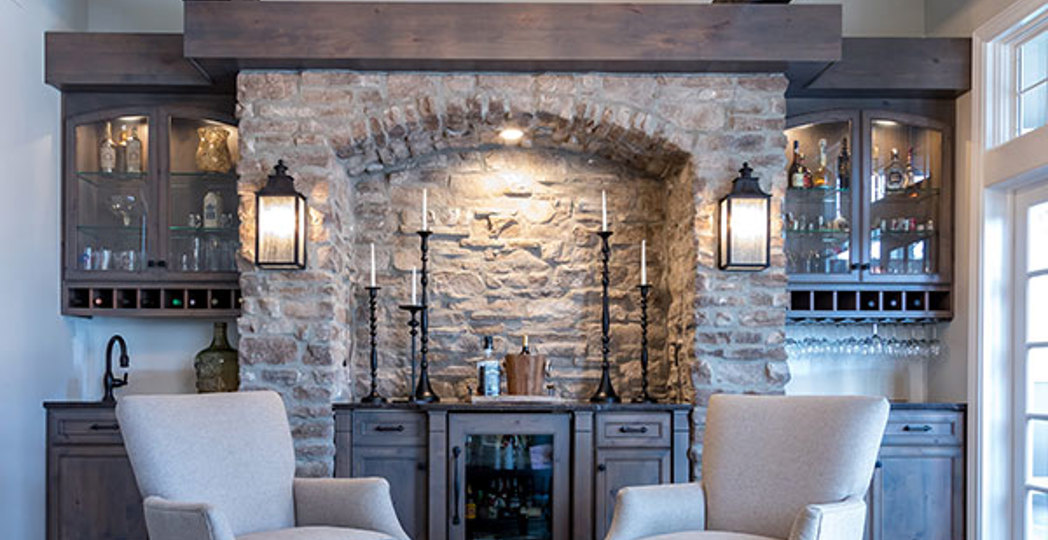
A Rustic, 5,300-Square-Foot Aurora Remodel Steals The Show

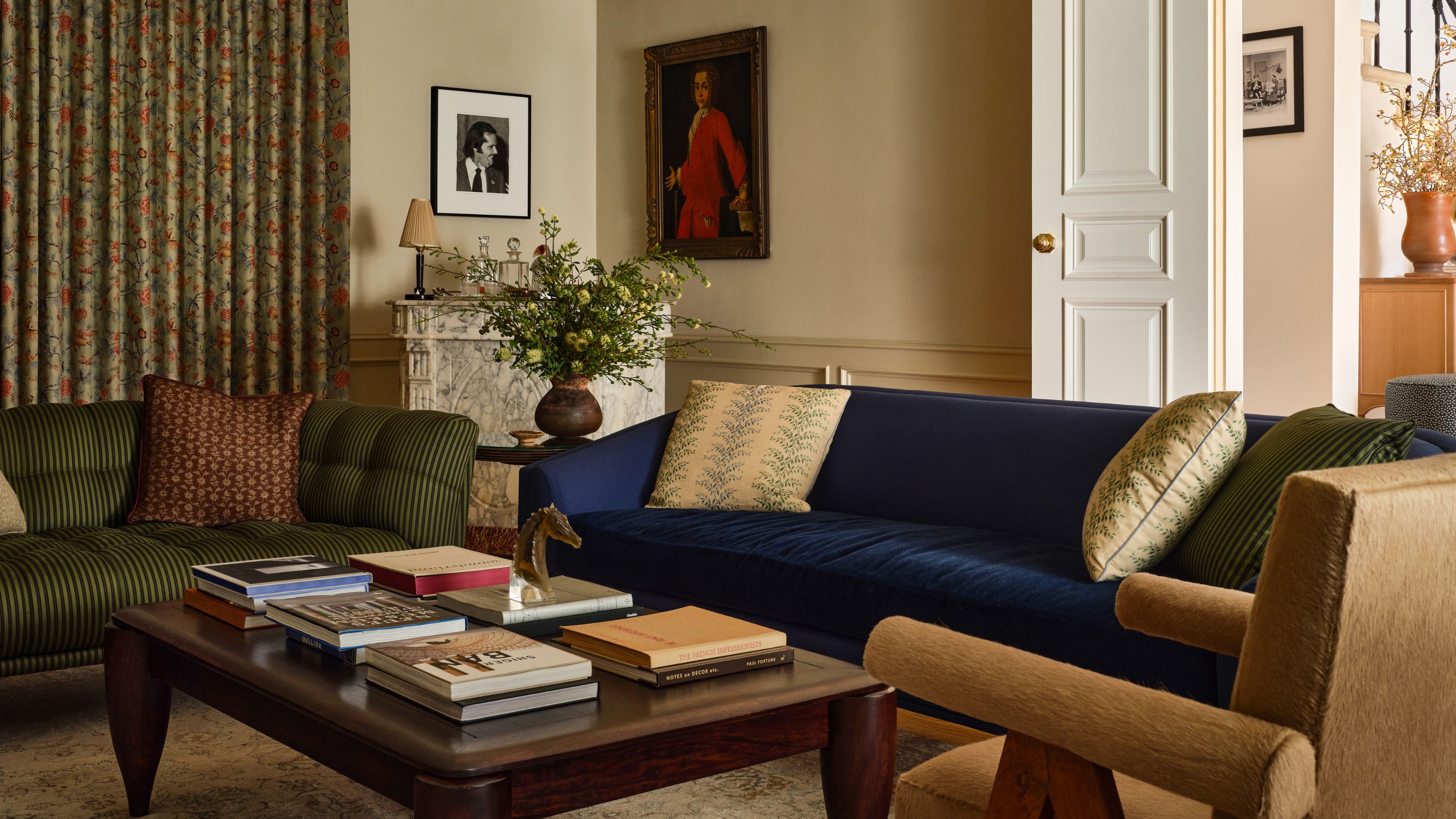
A 1940s Colonial Revival Where Color and Pattern Mix With Old and New to Create a Truly Transitional Family Home
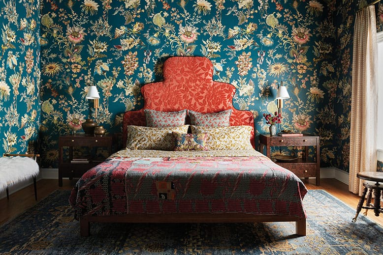
18th-Century Lumberton Farmhouse Gets an Eclectic Makeover
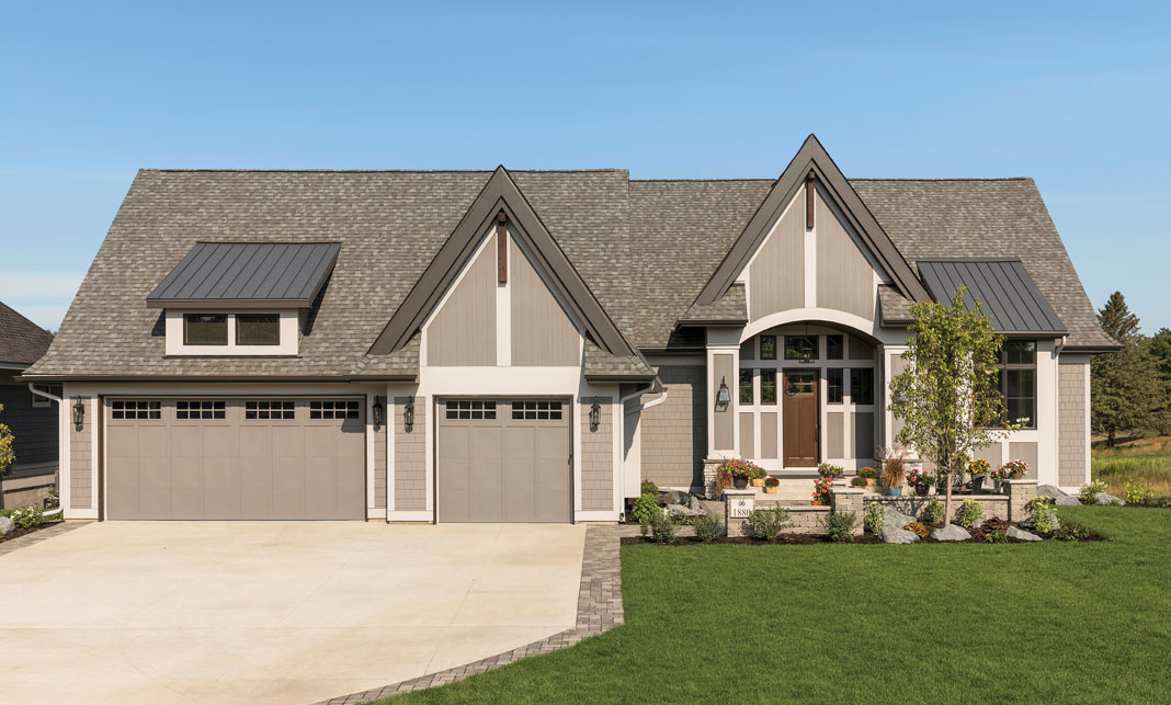
Rustic Charm

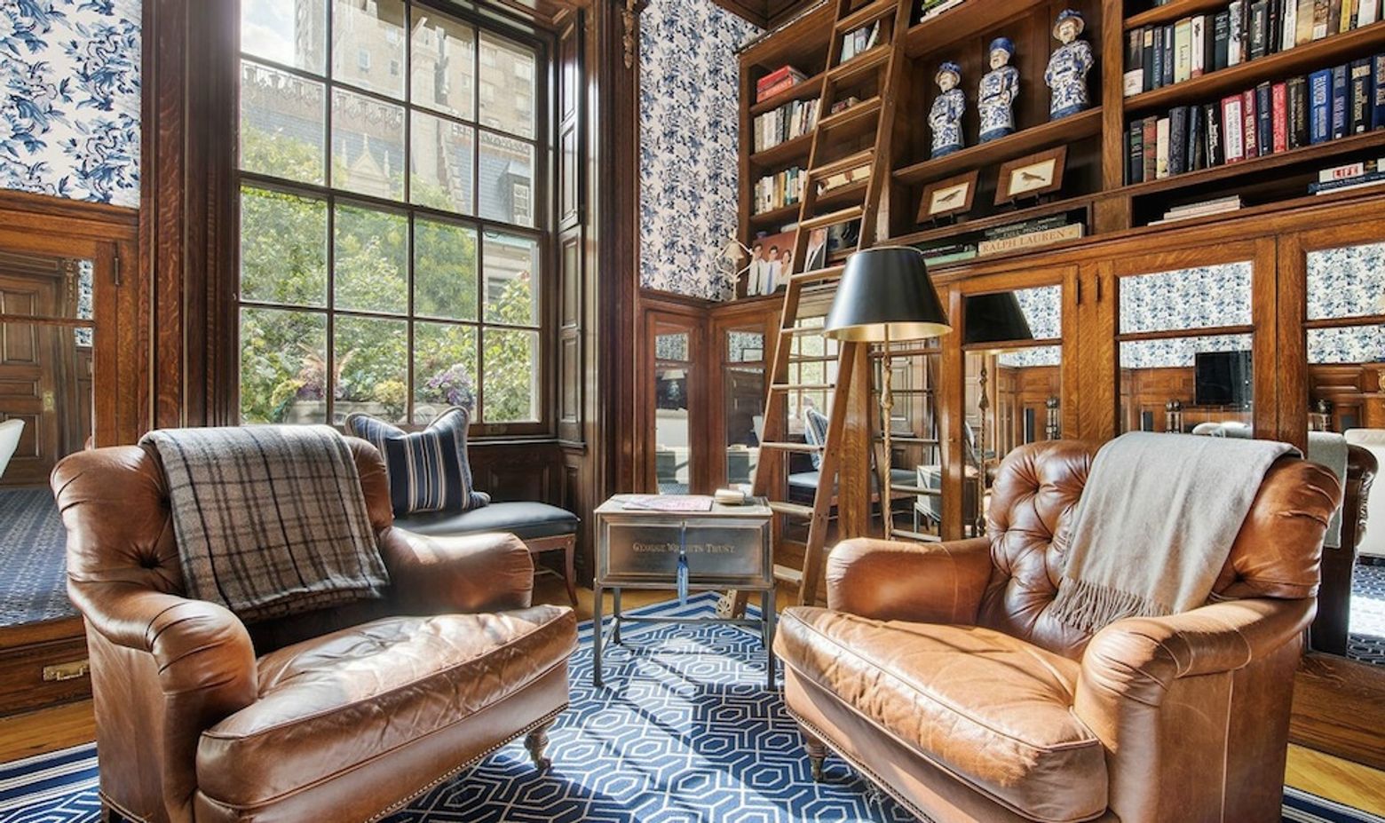
$4M Restored 19th Century Co-Op Boasts Exquisite Millwork

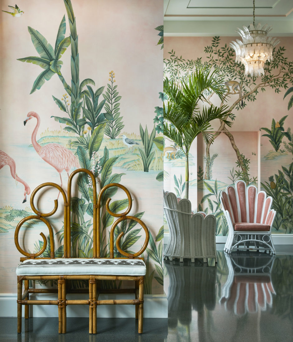
Step into a Hand-Painted Florida Wonderland

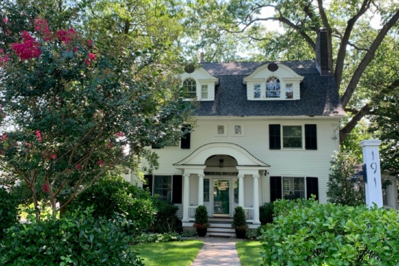
19th Century Montclair Home Undergoes Stunning Makeover


Historic Destination Reimagined
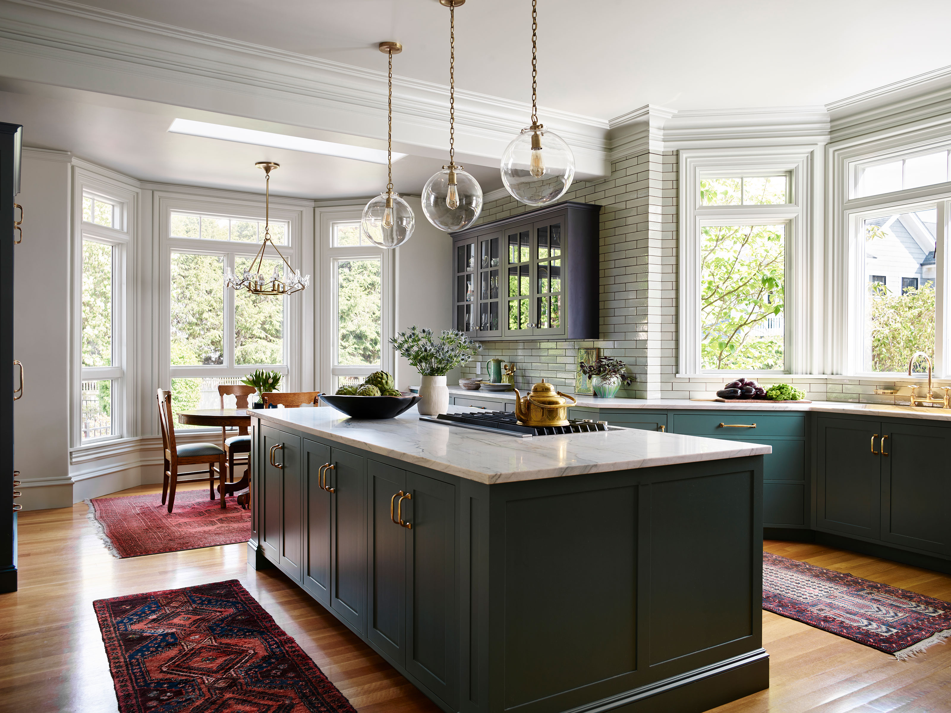
Bold color schemes bring original features to life in this historic home
A Historic Home Gets A Modern Update With The Color Drenching Trend: 'Gorgeous'