I thought cream was the worst living room color, but Sofía Vergara's space gives the neutral shade an unprecedented allure
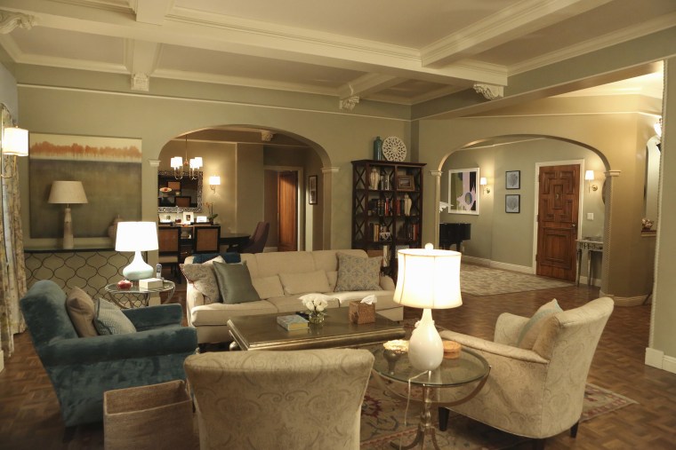
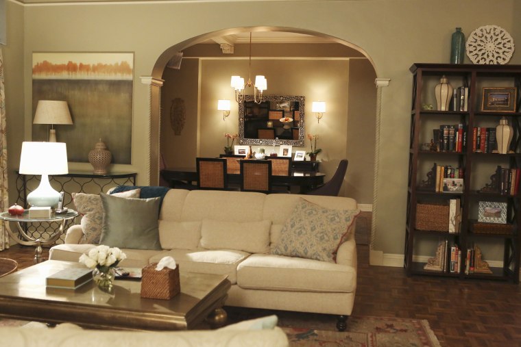
The article details a re-evaluation of cream as a living room color, prompted by the sophisticated use of the shade in Sofía Vergara's living space. Initially, the author considered cream to be a dull and uninspiring choice, often associated with a lack of personality in interior design. However, Vergara's approach demonstrates that cream, when styled thoughtfully, can exude warmth, elegance, and timeless appeal, challenging preconceived notions about this neutral hue. The article explores how Vergara's living room successfully elevates cream from a mere background color to a central element of a luxurious and inviting aesthetic. This transformation is attributed to several key styling choices observed in her home, which are highlighted as examples for readers to consider in their own decor.
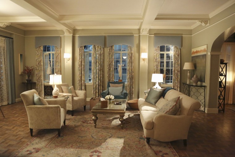
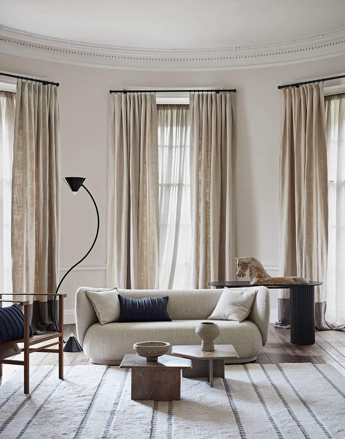
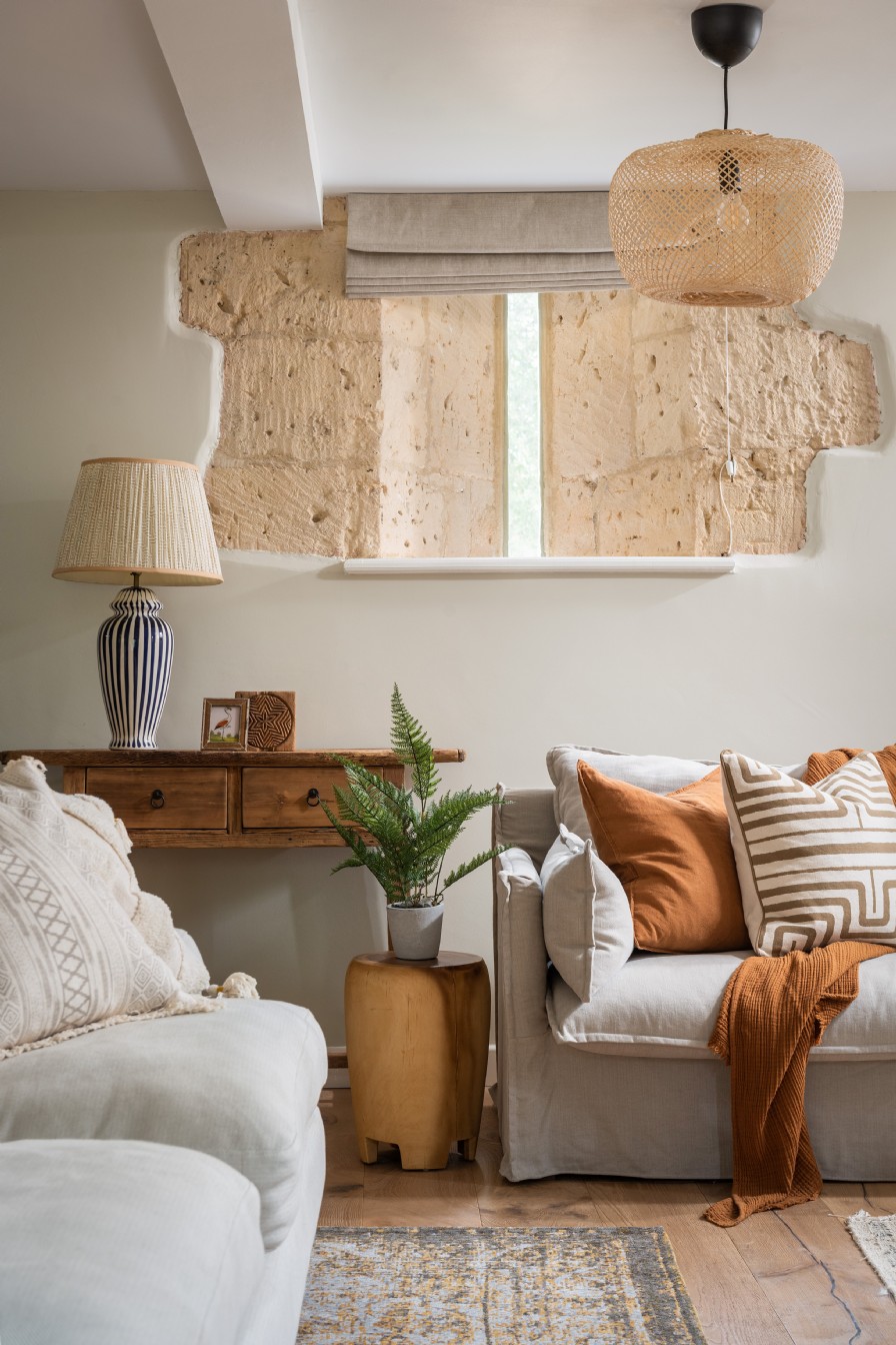
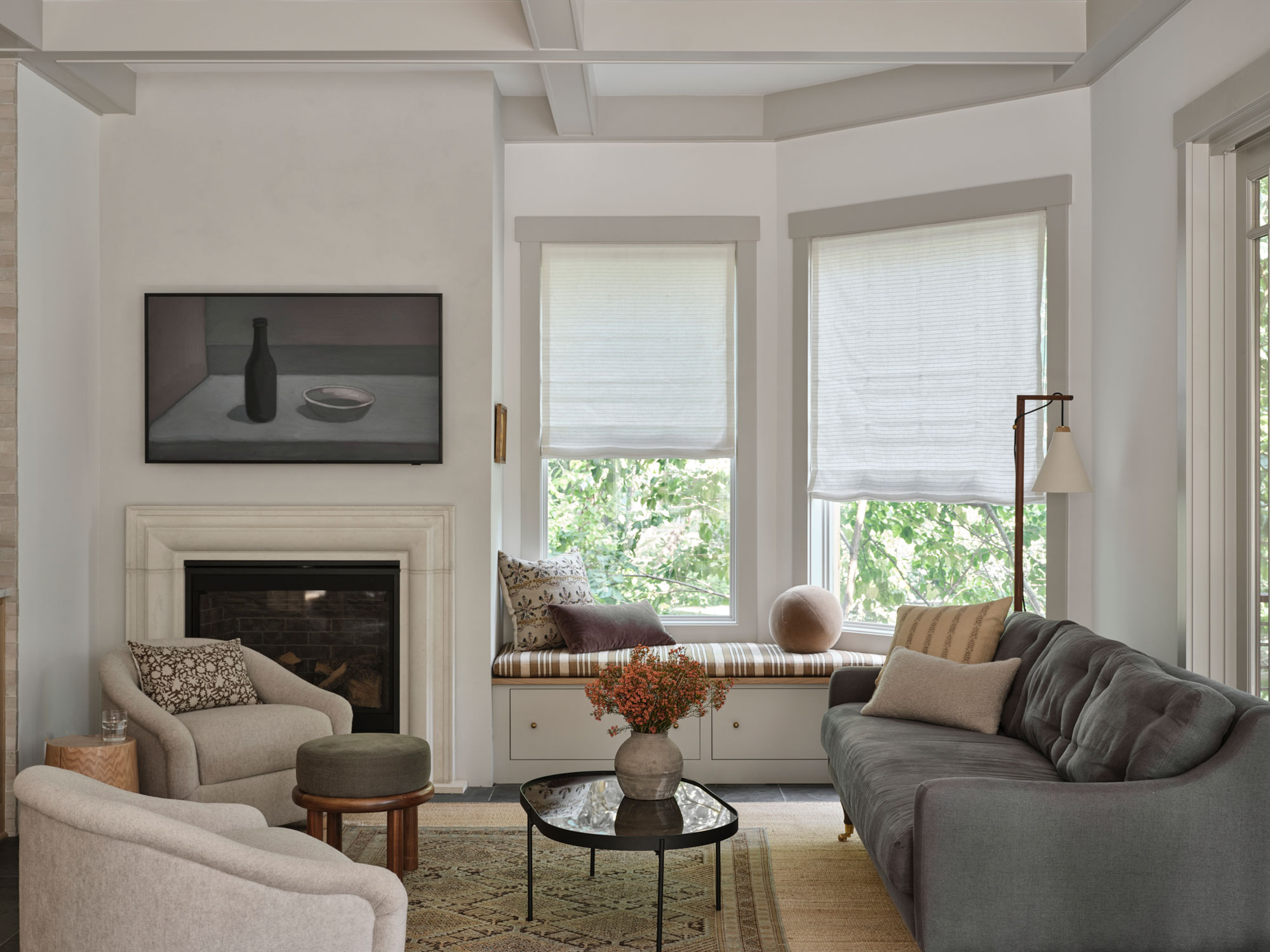
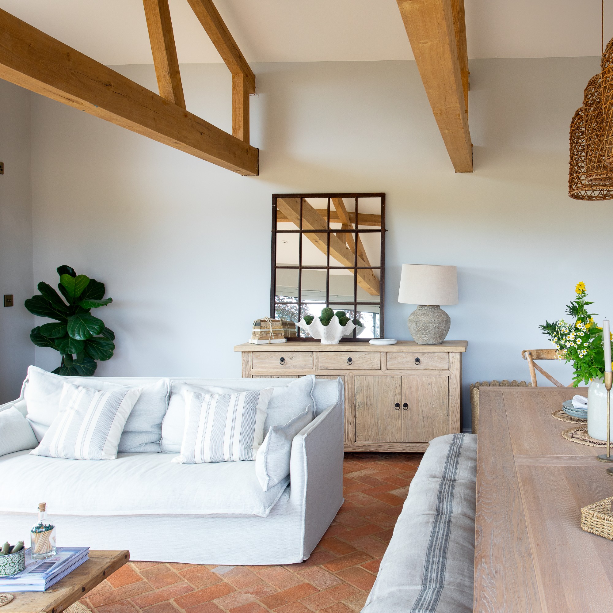
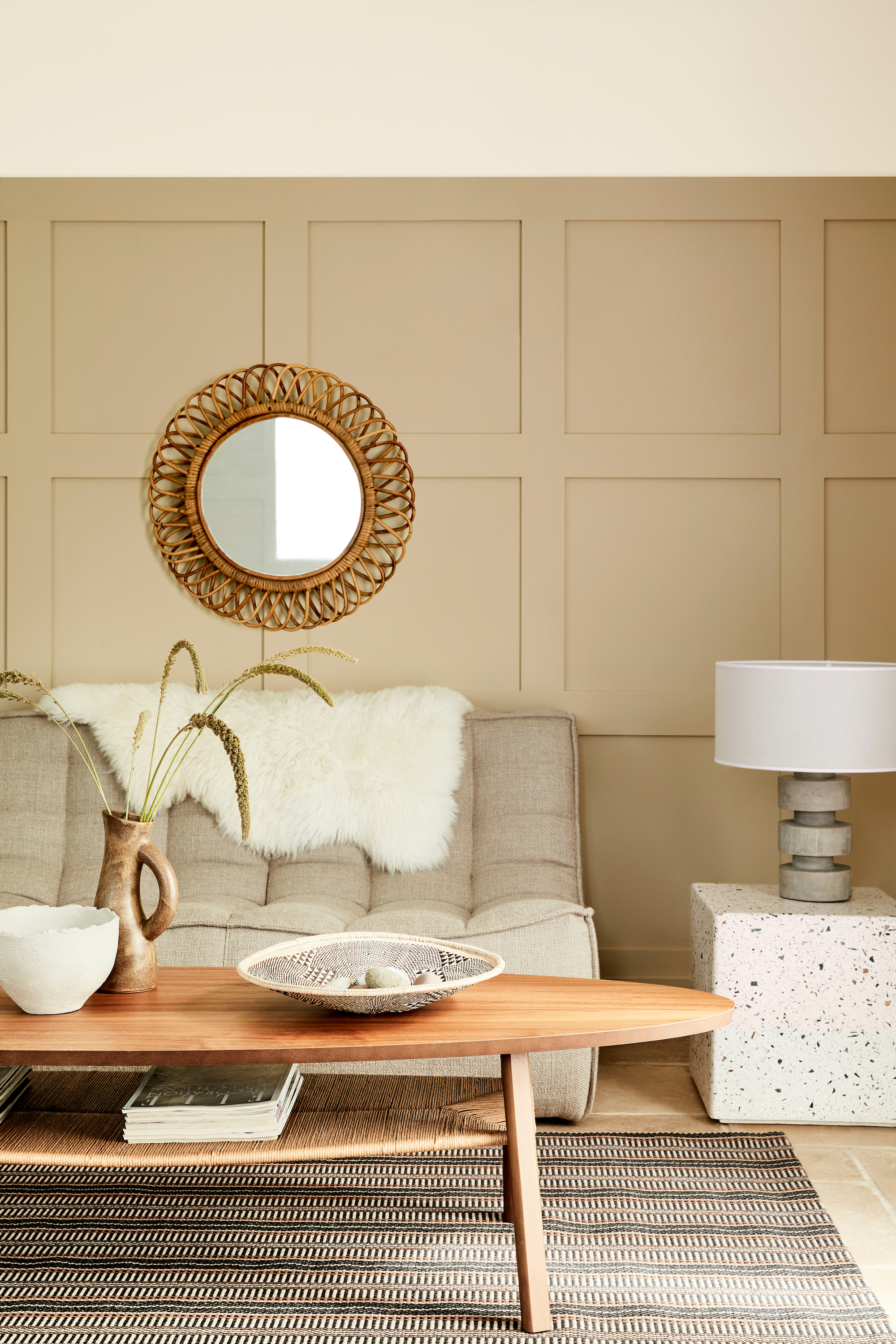
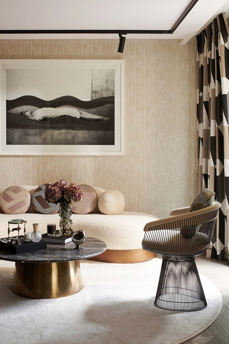
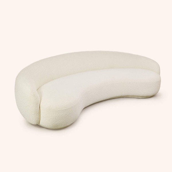
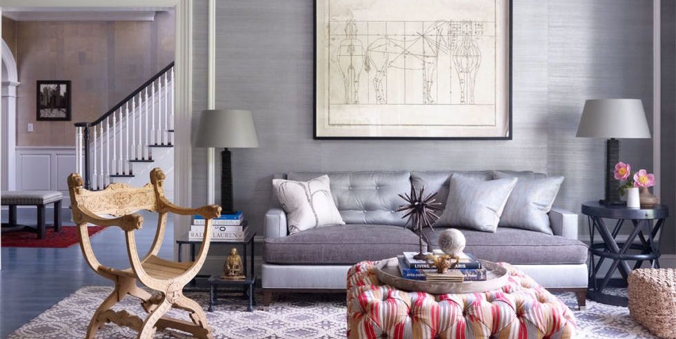
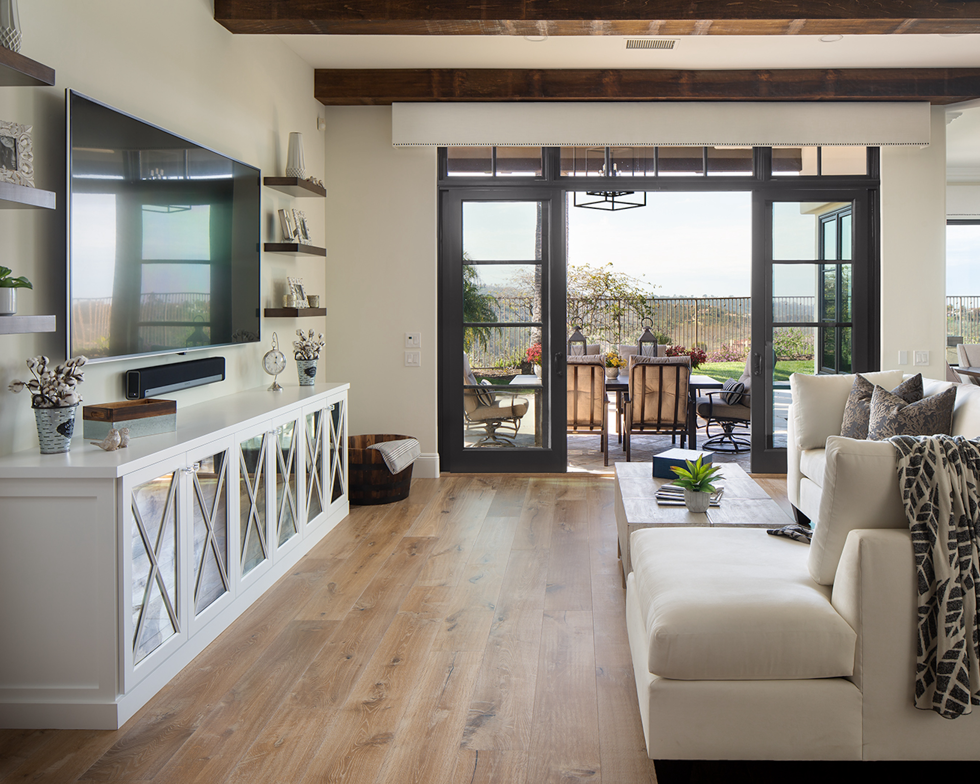
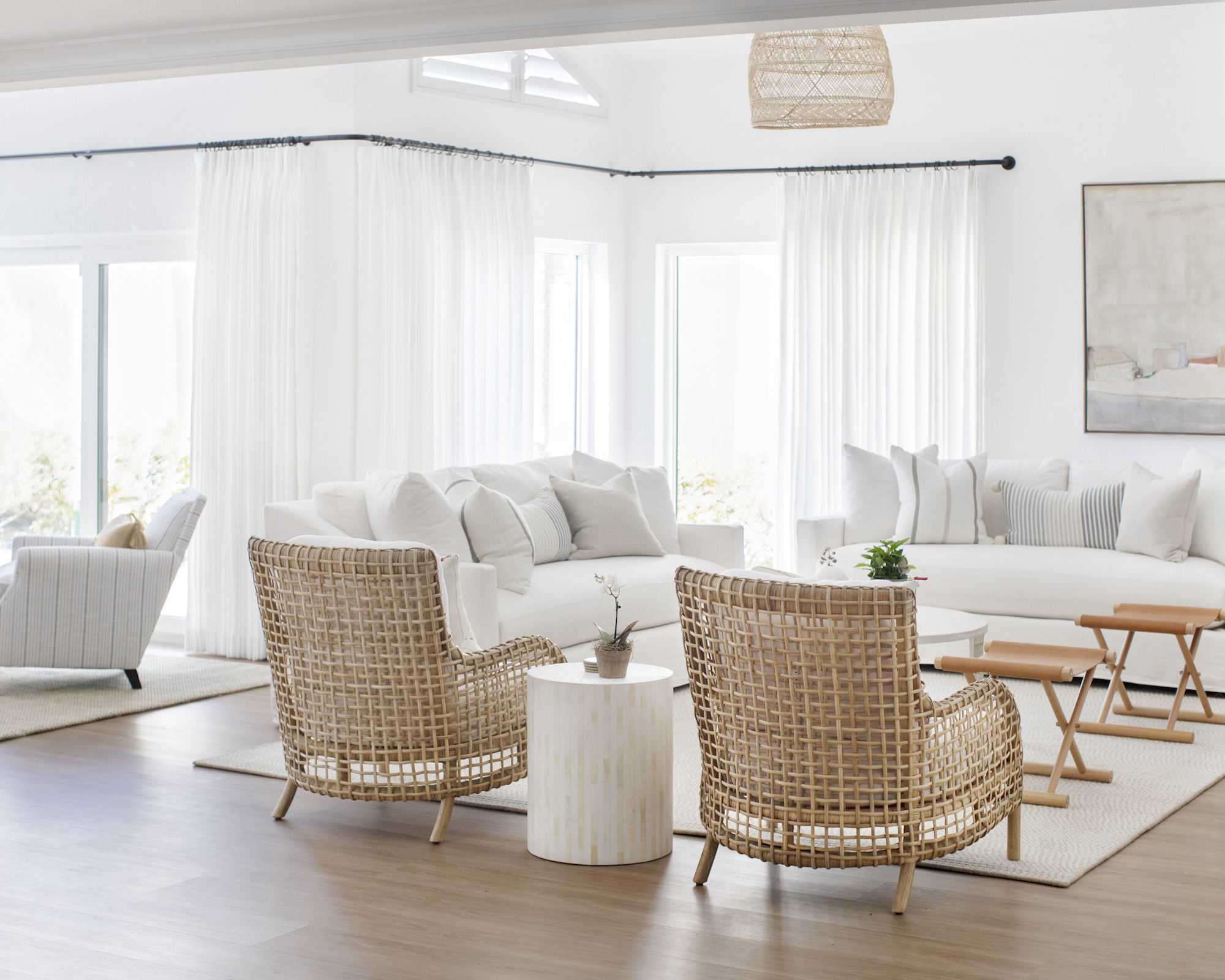
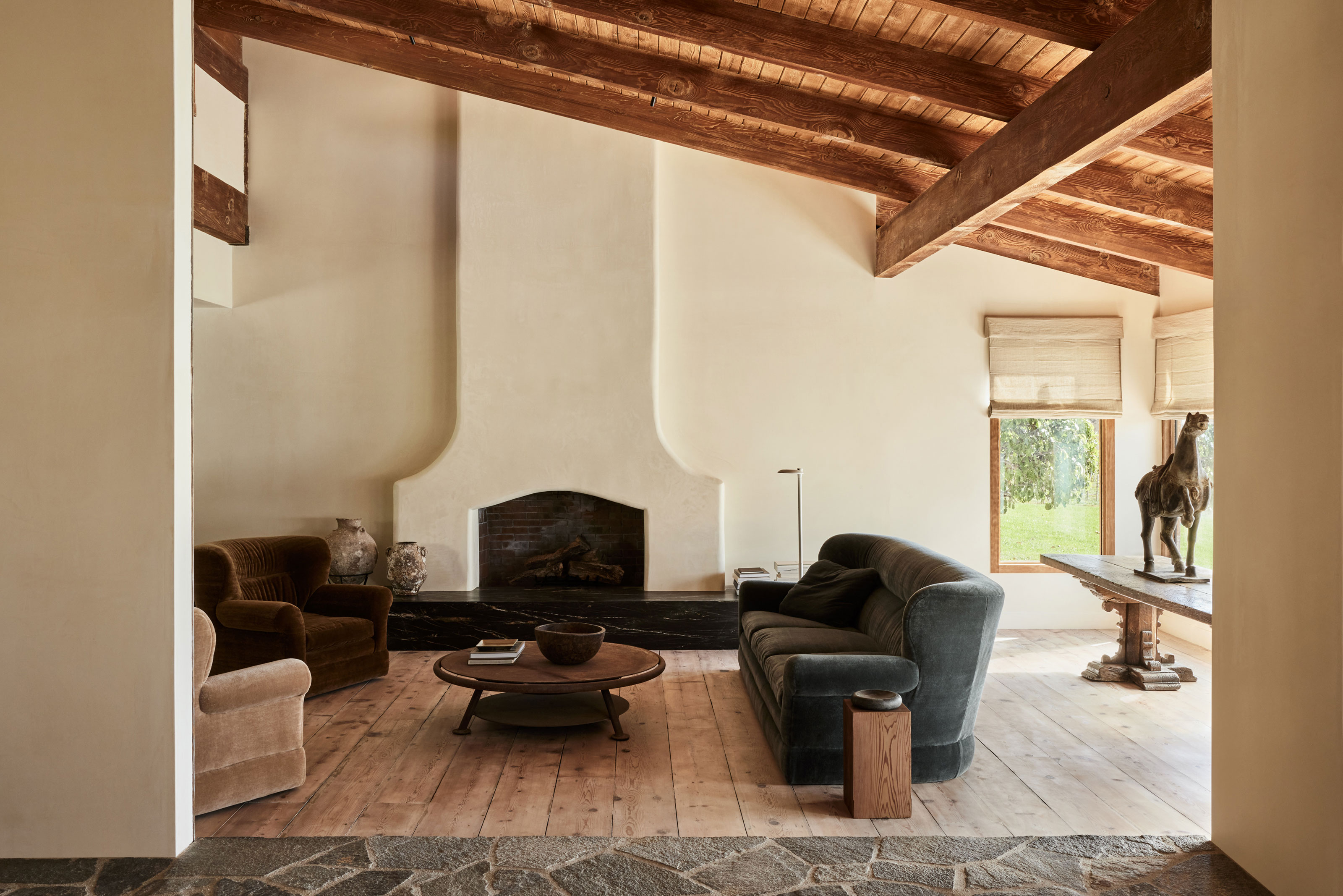
One significant aspect of Vergara's design is the strategic use of texture. The cream palette is enriched by incorporating various textures, such as plush sofas, woven rugs, and detailed architectural elements. These diverse textures prevent the room from appearing flat or monotonous, adding depth and visual interest. The interplay of soft fabrics with more structured surfaces creates a dynamic environment that is both comfortable and chic. This layered approach to texture is crucial in bringing character to a predominantly cream space, showcasing that the material quality can significantly enhance a neutral color scheme.
Another crucial element is the careful selection of complementary colors and accents. While cream dominates, it is not used in isolation. Vergara's living room features subtle infusions of other shades that complement the cream, such as warm wood tones, metallic finishes, and occasional touches of muted secondary colors. These accents are strategically placed to break up the cream expanse and draw the eye, preventing the room from feeling washed out. This demonstrates that a successful cream scheme often relies on intelligent integration of other elements rather than strict adherence to a single color.
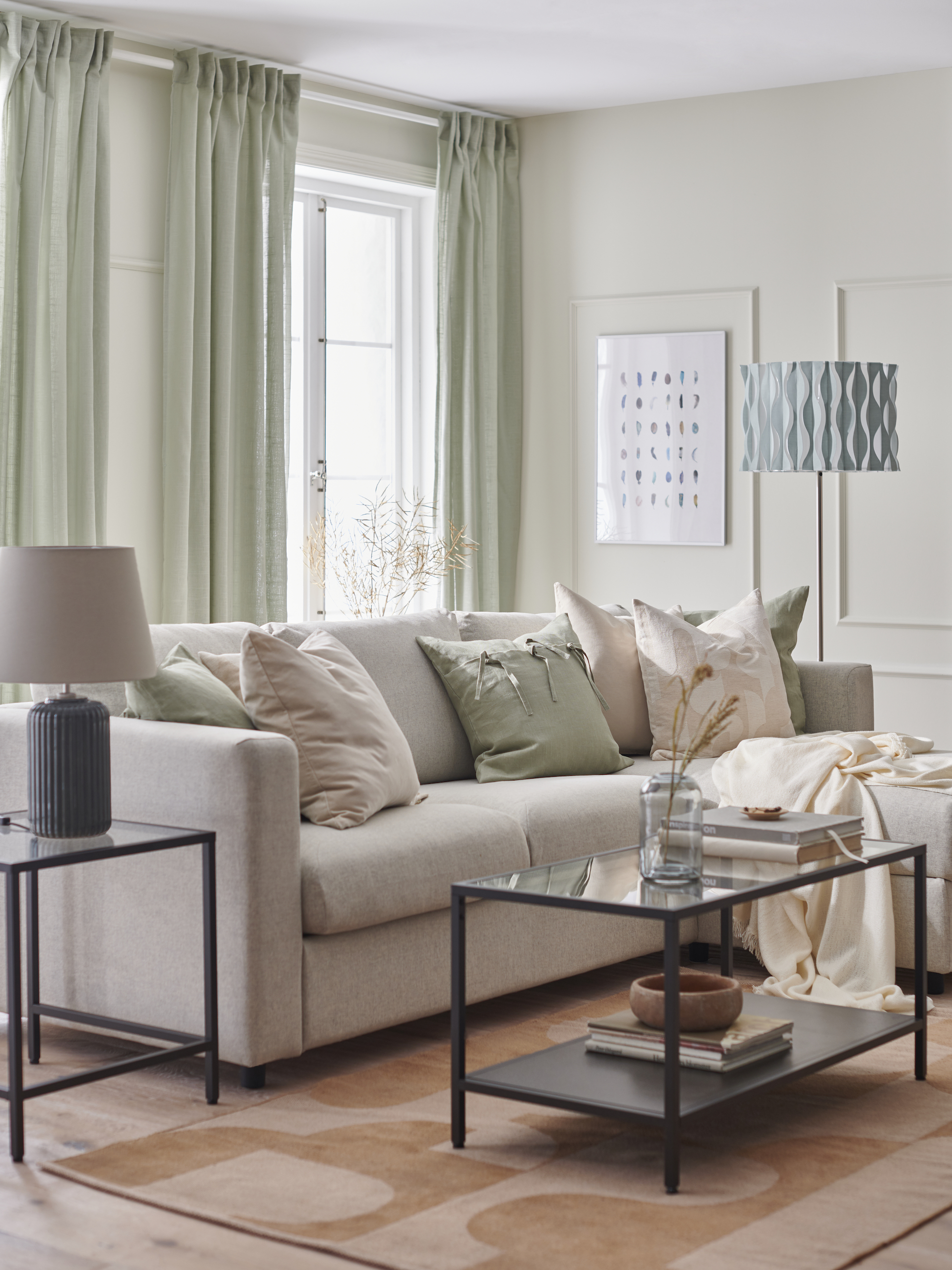
The article also emphasizes the importance of lighting in making a cream living room feel vibrant rather than bland. Natural light, as depicted in Vergara's space, plays a vital role in enhancing the luminosity and warmth of cream tones. Additionally, the strategic placement of artificial lighting, including lamps that cast a soft, inviting glow, contributes to the overall ambiance. Proper lighting can transform a cream room, highlighting its nuances and making it appear more expansive and welcoming, thereby dispelling the myth of cream being a 'cold' color.
Finally, the article touches upon the timelessness and versatility of cream as a foundational color. Unlike more trend-driven shades, cream offers a classic backdrop that can be easily updated with accessories and seasonal decor. Vergara's living room exemplifies how a cream base can serve as a sophisticated canvas, allowing for flexibility and enduring style without frequent major overhauls. This adaptability is presented as a key advantage, making cream a practical and elegant choice for those seeking longevity in their interior design. The author concludes that Sofía Vergara's home provides a compelling case for cream as a refined and captivating color for living spaces.
#SofiaVergara #LivingRoom #CreamDecor #InteriorDesign #HomeStyling #NeutralShades #TexturalElements #ColorScheme #SofiaVergara #LivingRoom #CreamDecor #InteriorDesign #HomeStyling #NeutralShades #TexturalElements #ColorScheme
0 comment in total
 No comments yet
You may also like

Katherine Heigl's timeless living room cured my trend fatigue – it's proof that classic styling prevails
After a Decade of Millennial Gray, This Living Room Looks Like New in Warm Neutrals

Experts say these are the 3 sofa colours to avoid

Soft Colors Transform a Reading Townhome from Beige to Beautiful
I Love the Neutral Color Palette in This Chicago Living Room Makeover
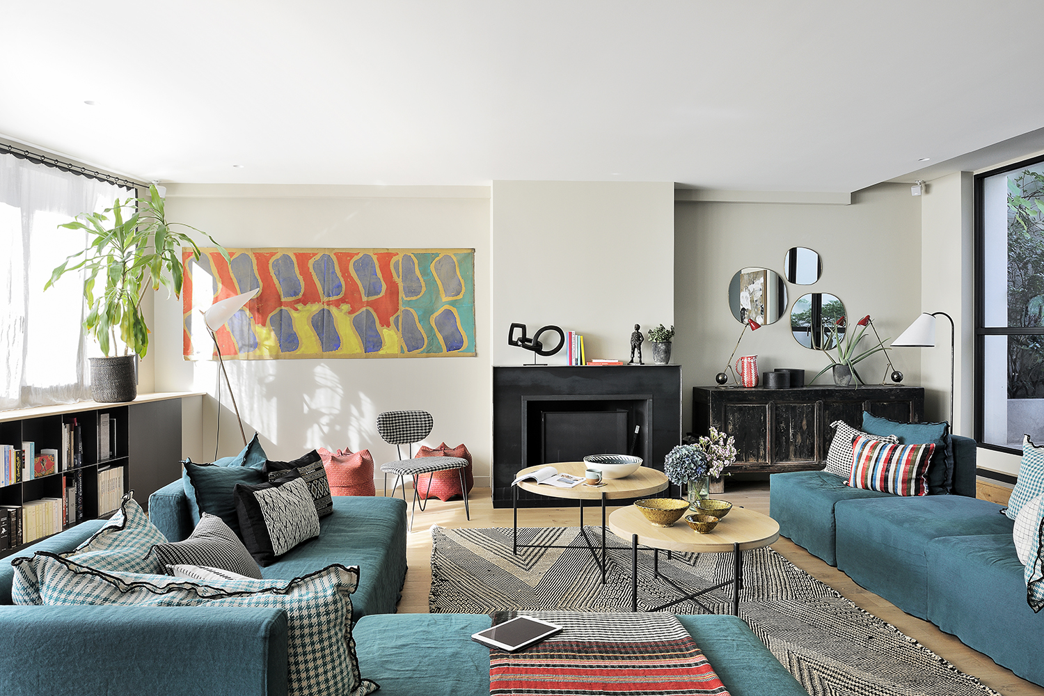
Cream living room ideas – 10 ways to play up this versatile neutral

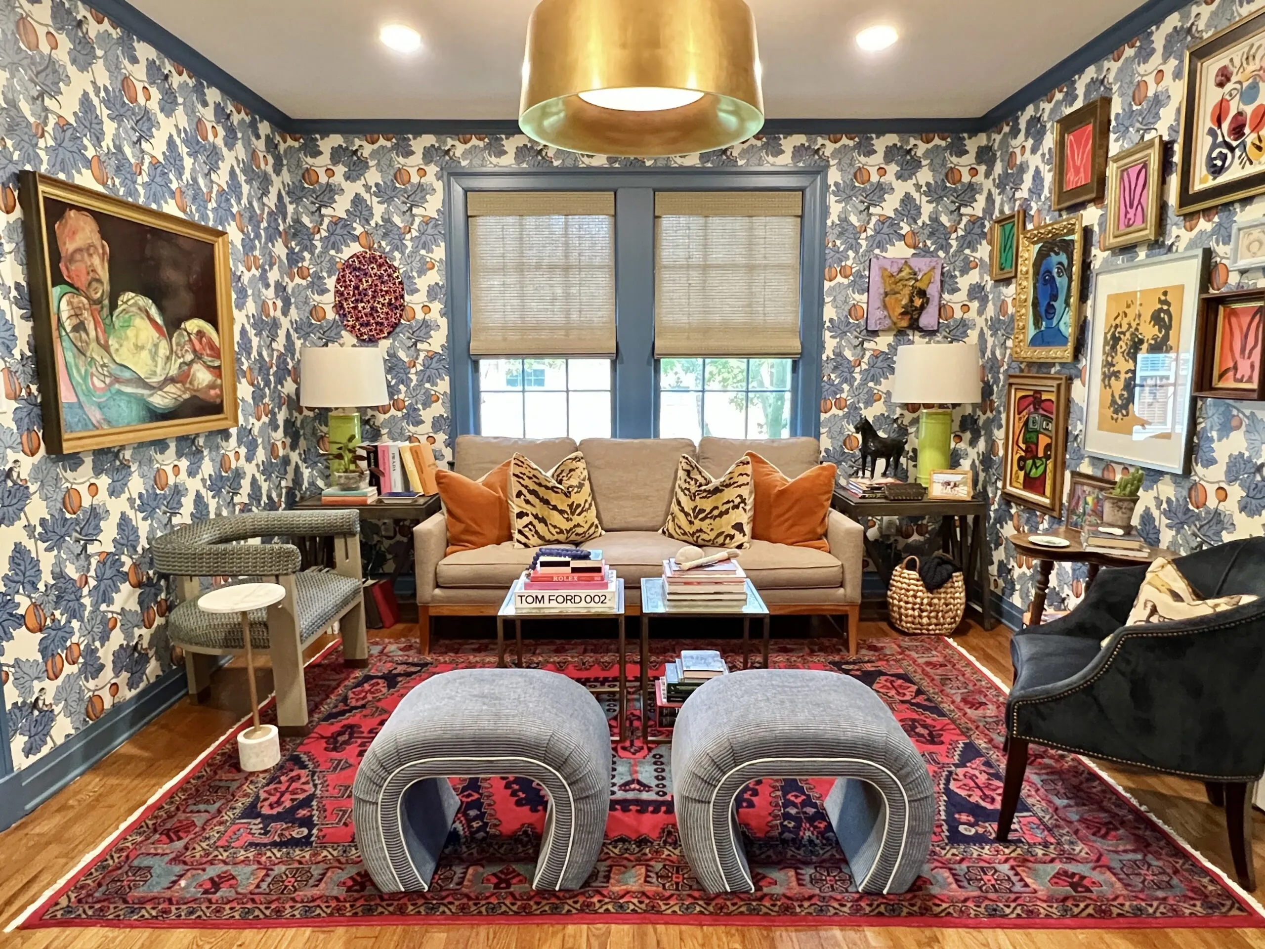
This colorful living room is making us love maximalism again

These Gray Living Rooms Are Full of Style

Get the look: Have a living room like Olivia Pope on 'Scandal'

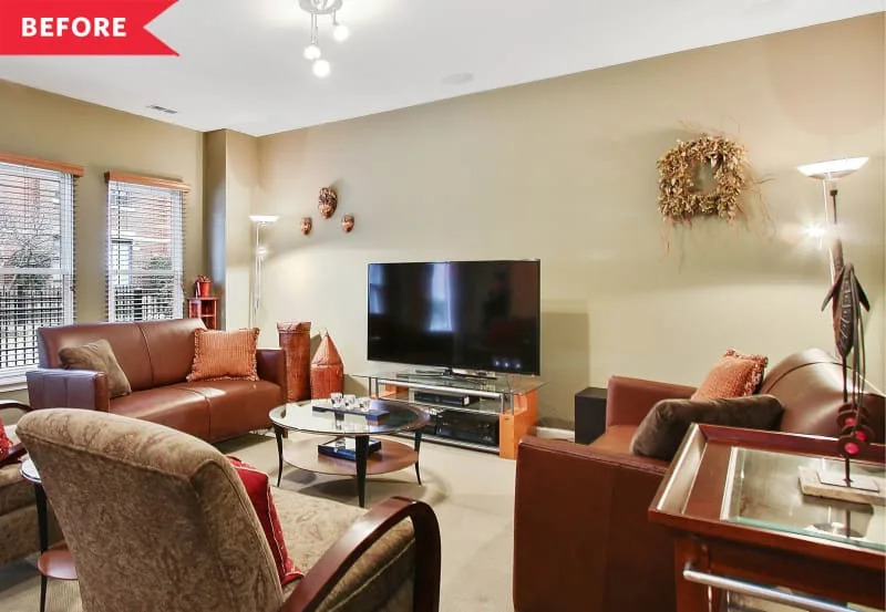
I Love the Neutral Color Palette in This Chicago Living Room Makeover

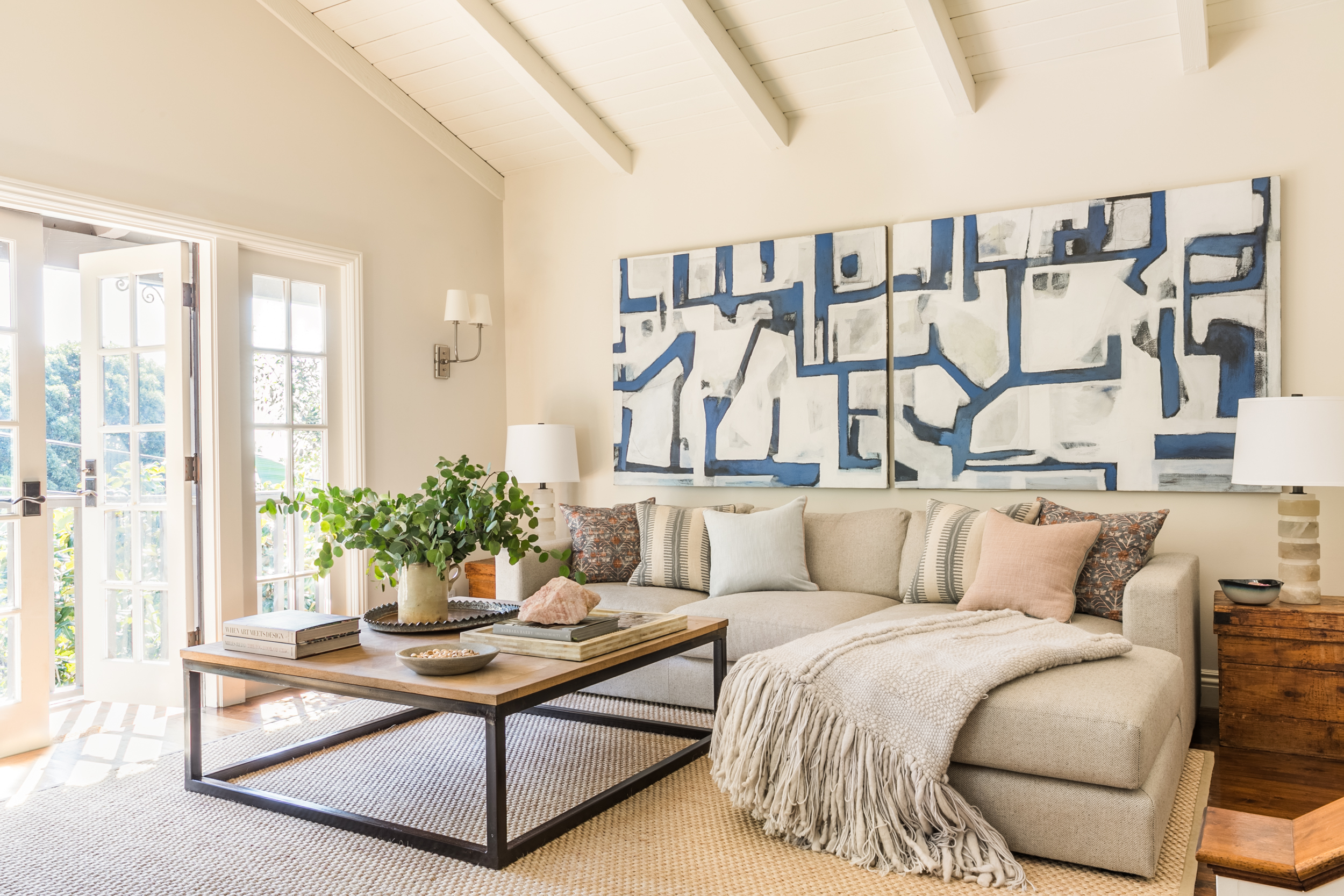
14 beige living room ideas that prove this grounding color scheme is anything but bland


'I’ve always hated grey crushed velvet,' says interior designer Gemma Samuels

I thought cream was the worst living room color, but Sofía Vergara's space gives the neutral shade an unprecedented allure

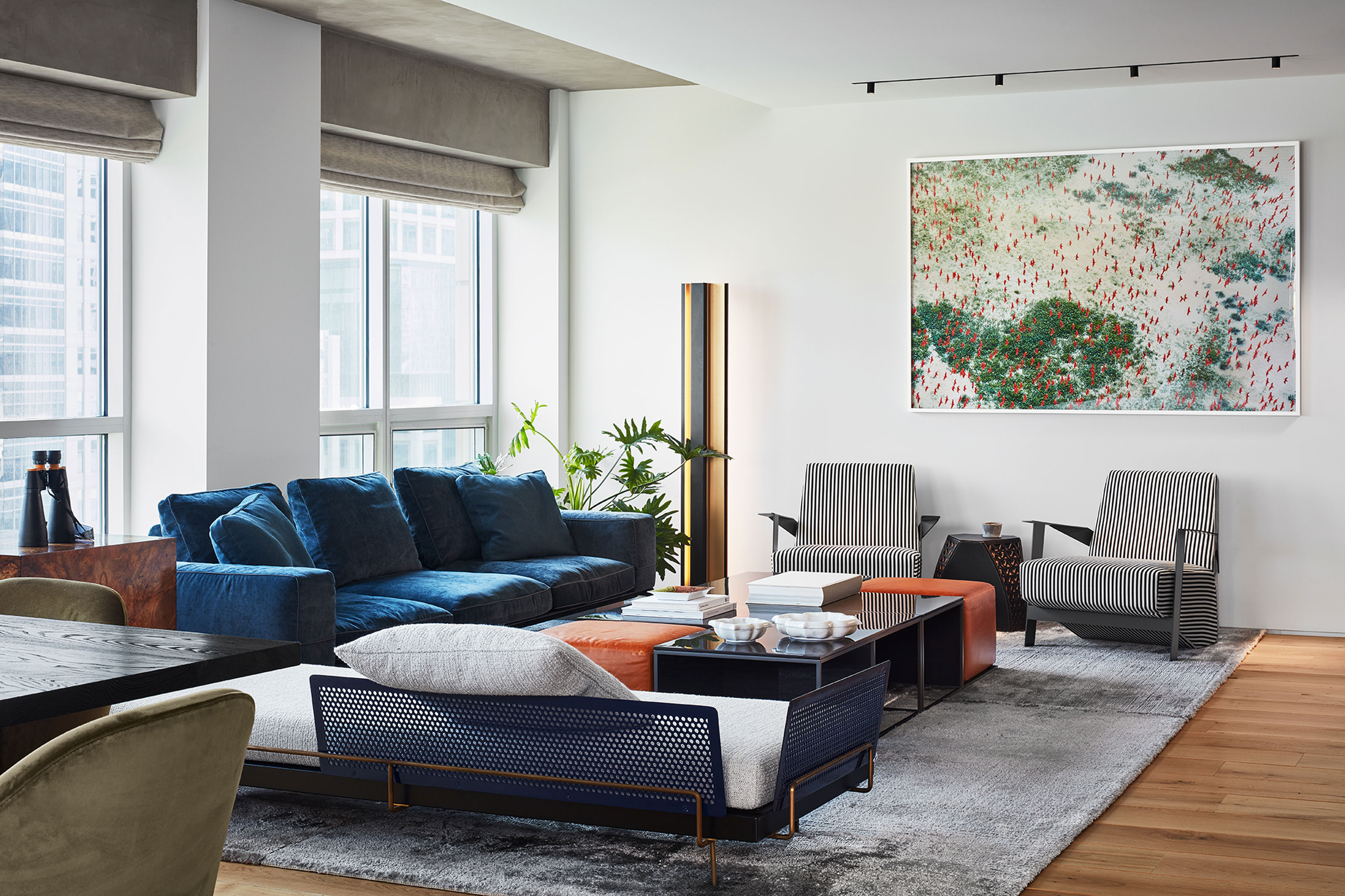
Decorating around a navy blue sofa – 9 interior scheme ideas you can use your existing couch for

In Jessica Alba’s ‘Quiet Luxury’ Living Room, Soft Neutrals Become a Canvas for Calm, Warmth, Refined Glamour, and Eternal Style

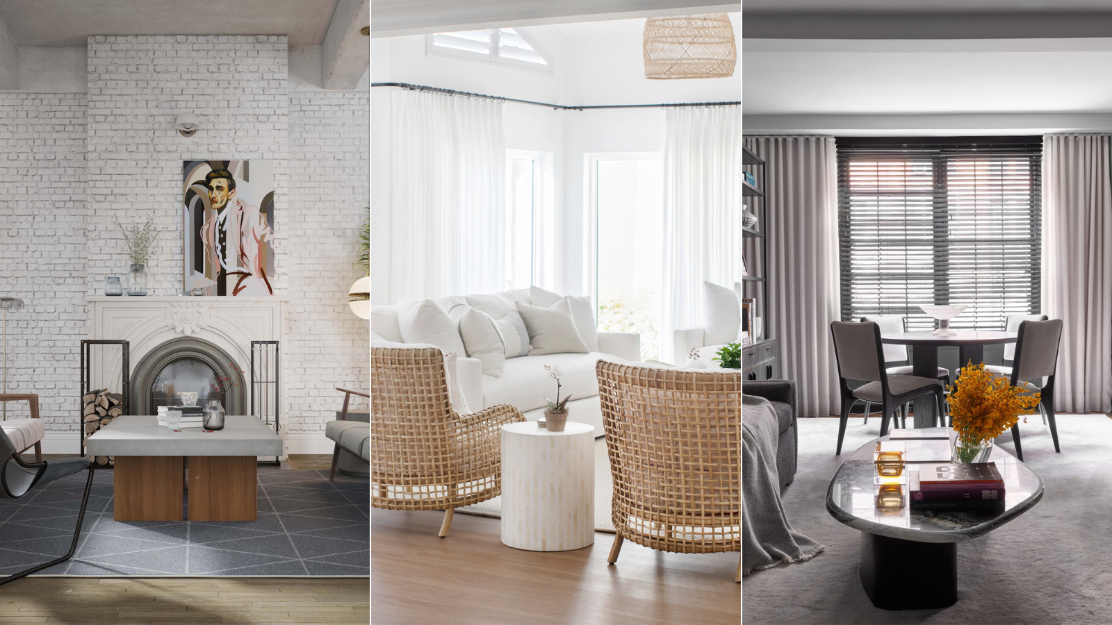
Should living room flooring be lighter or darker than the walls? Experts weigh in

I thought I had my living room figured out, but Cameron Diaz’s rust sofa has me rethinking everything – it's the chicest piece I’ve seen all year
10 Living Rooms With Dark Gray Sofas That Show This Couch Color Is a Real Style Chameleon
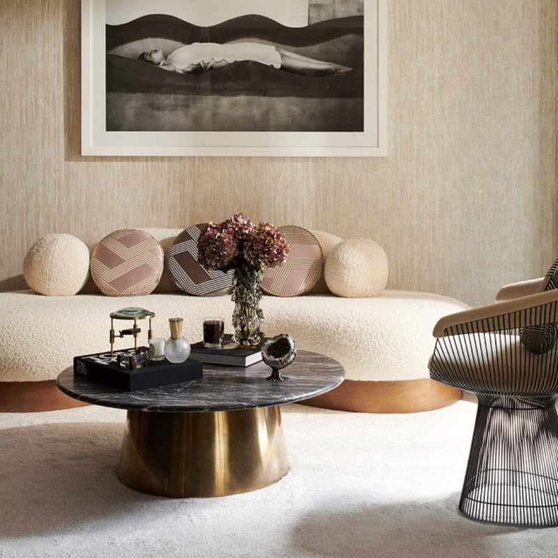
Get The Look: A Contemporary Living Room

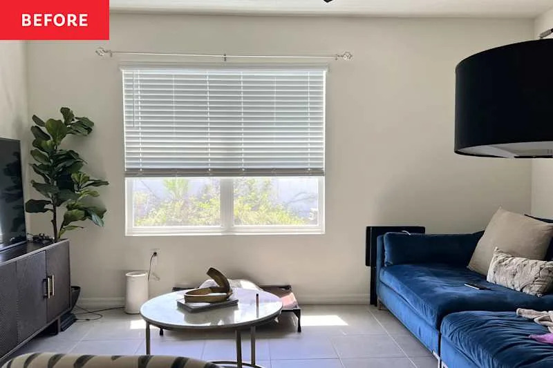
A “Builder Beige” Living Room Gets a Much More Interesting Color Story