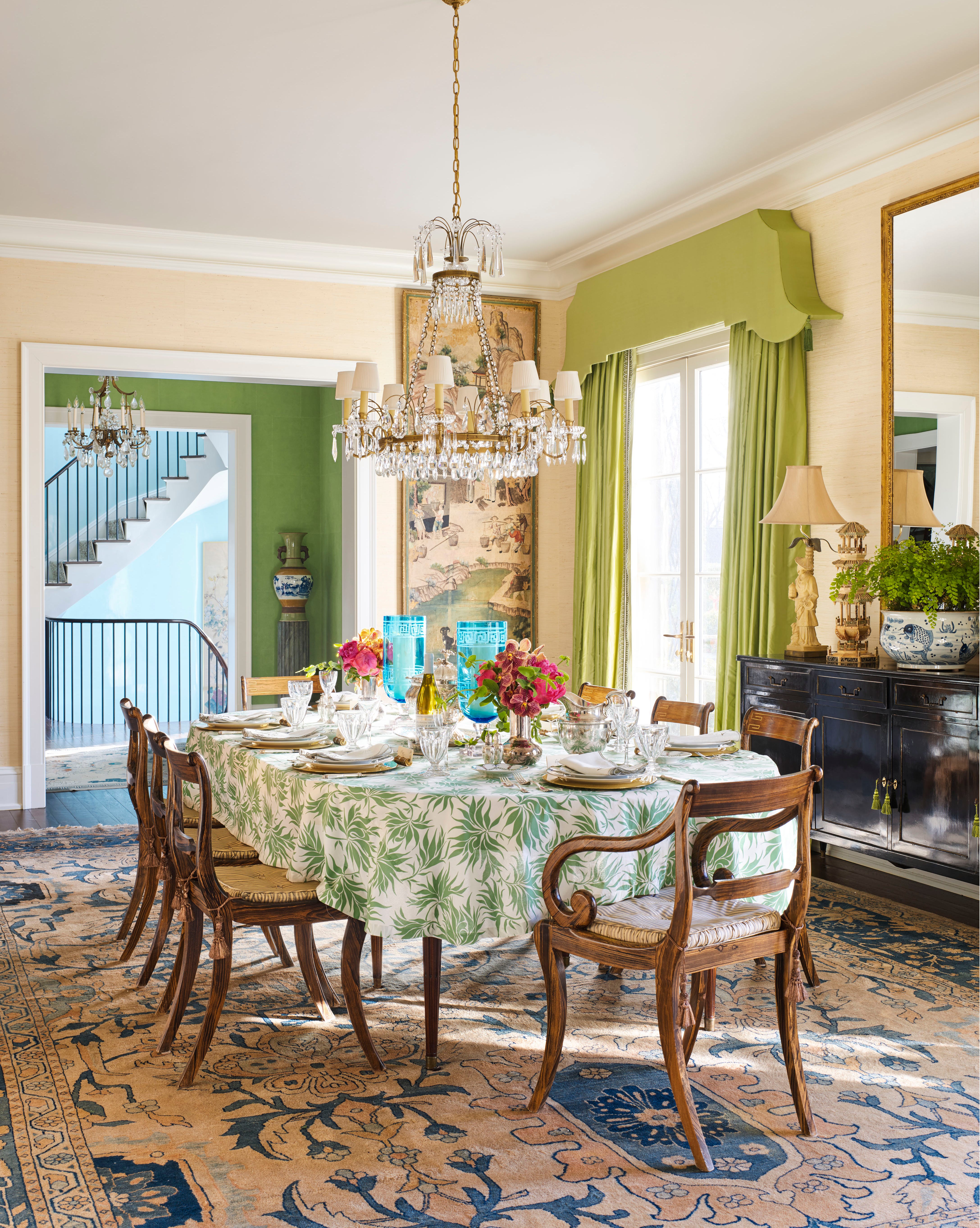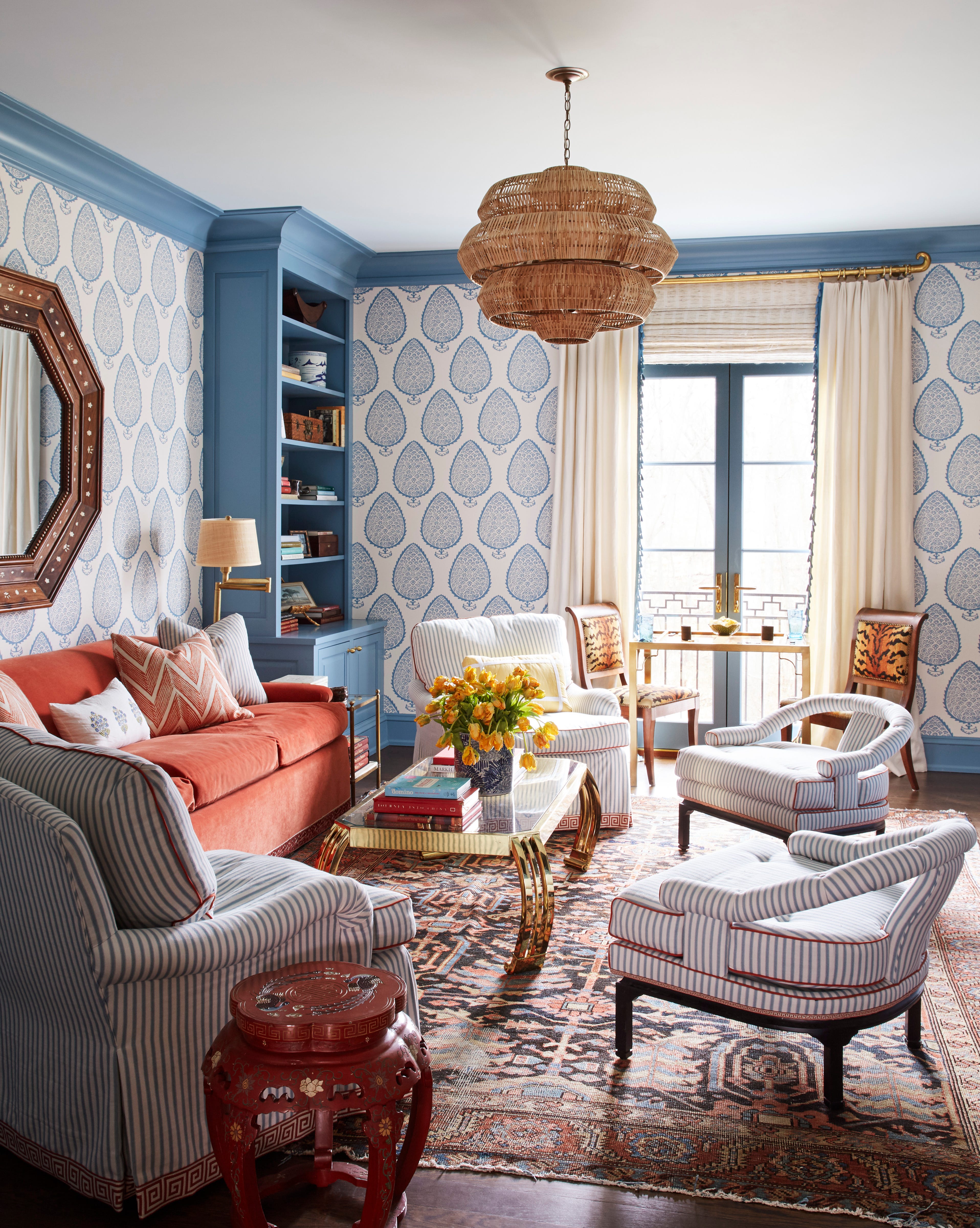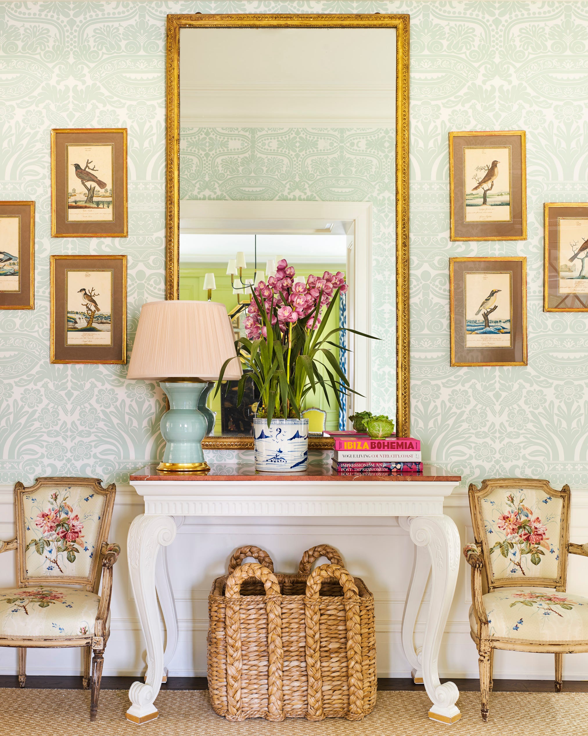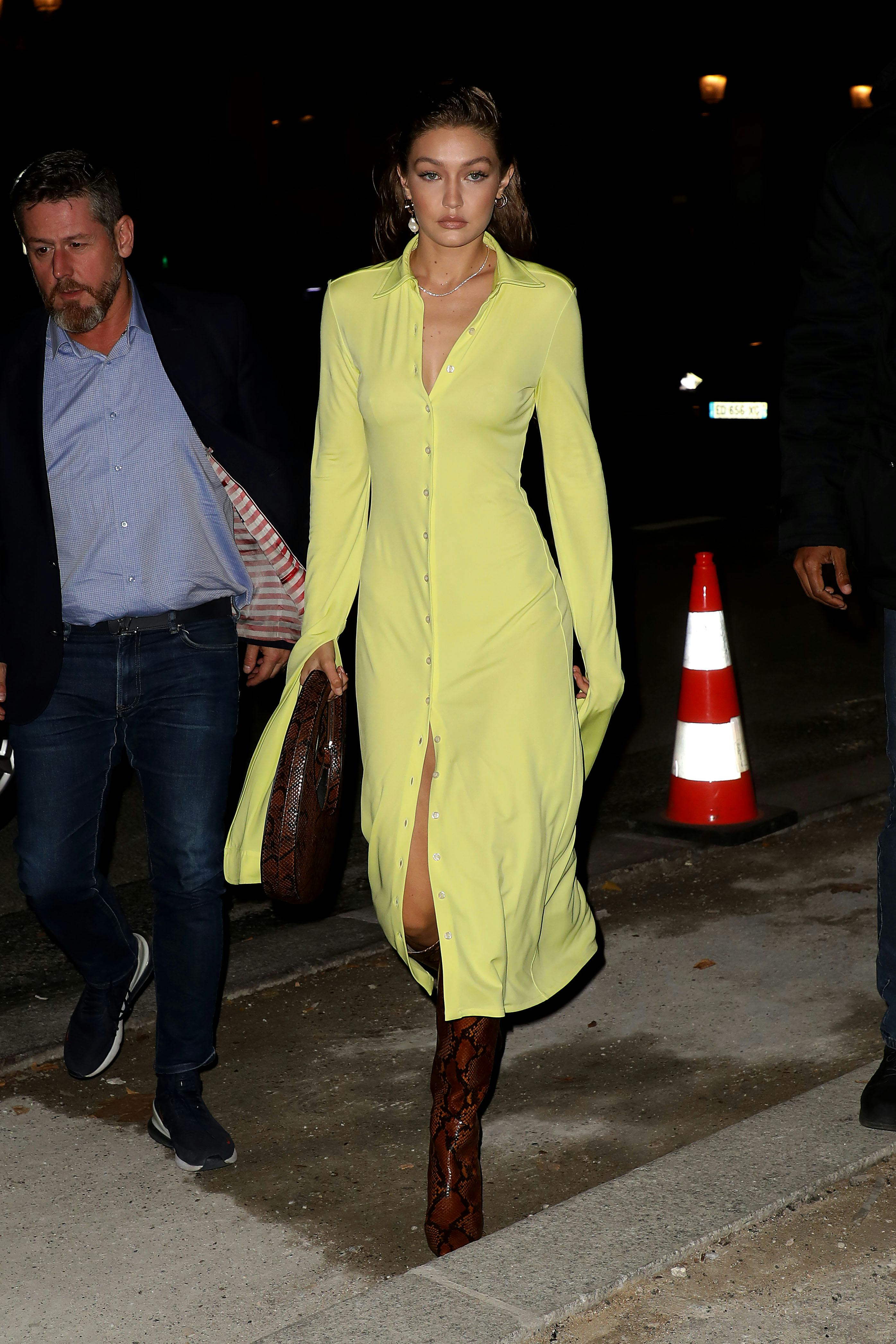
1/4
What color is chartreuse? How to use it in your decor
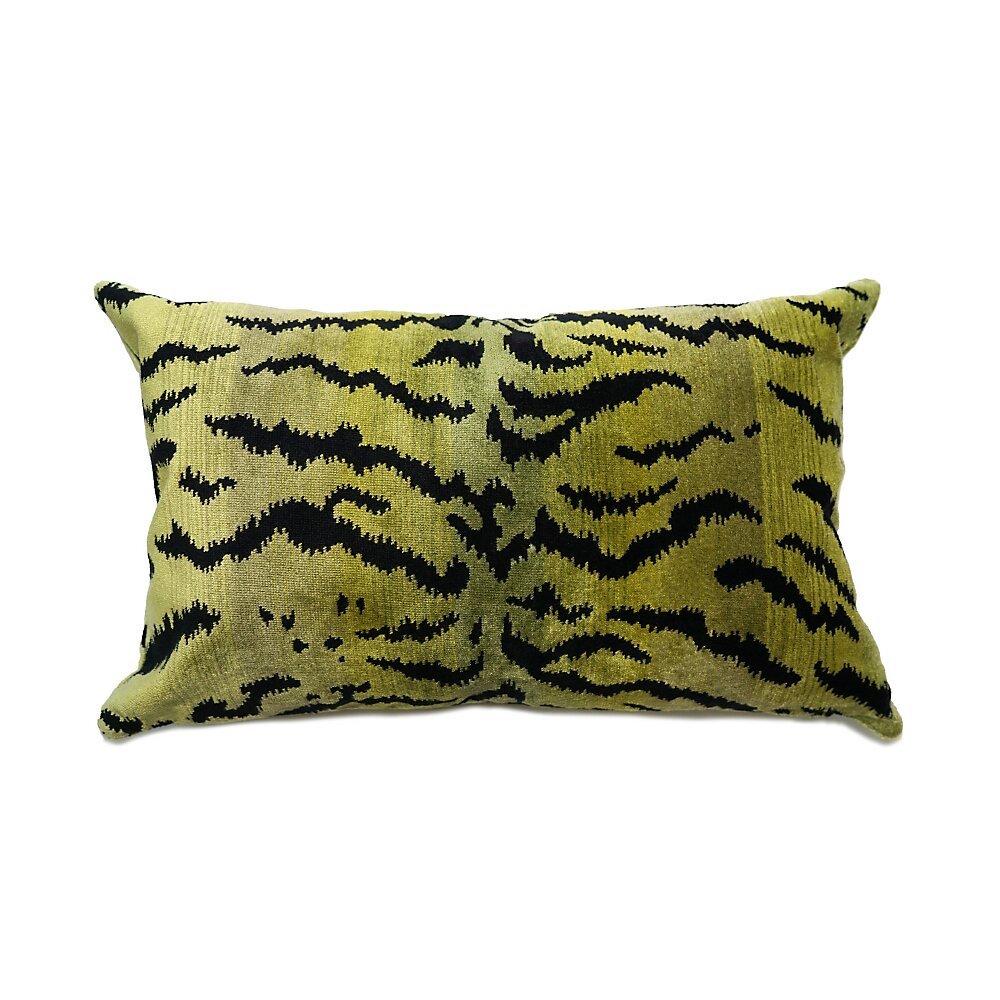
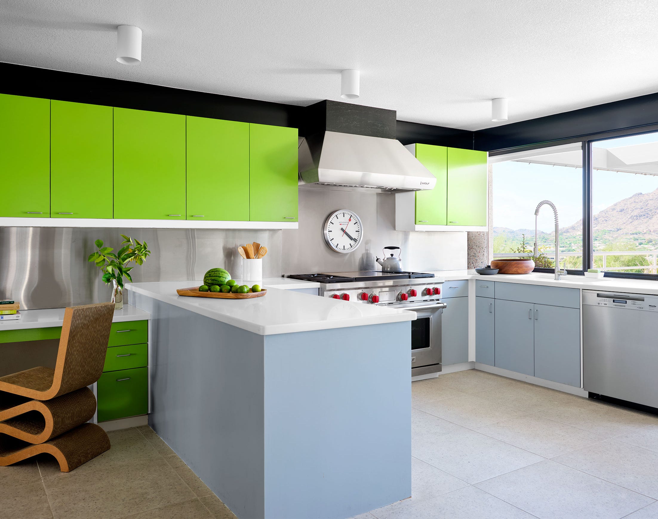
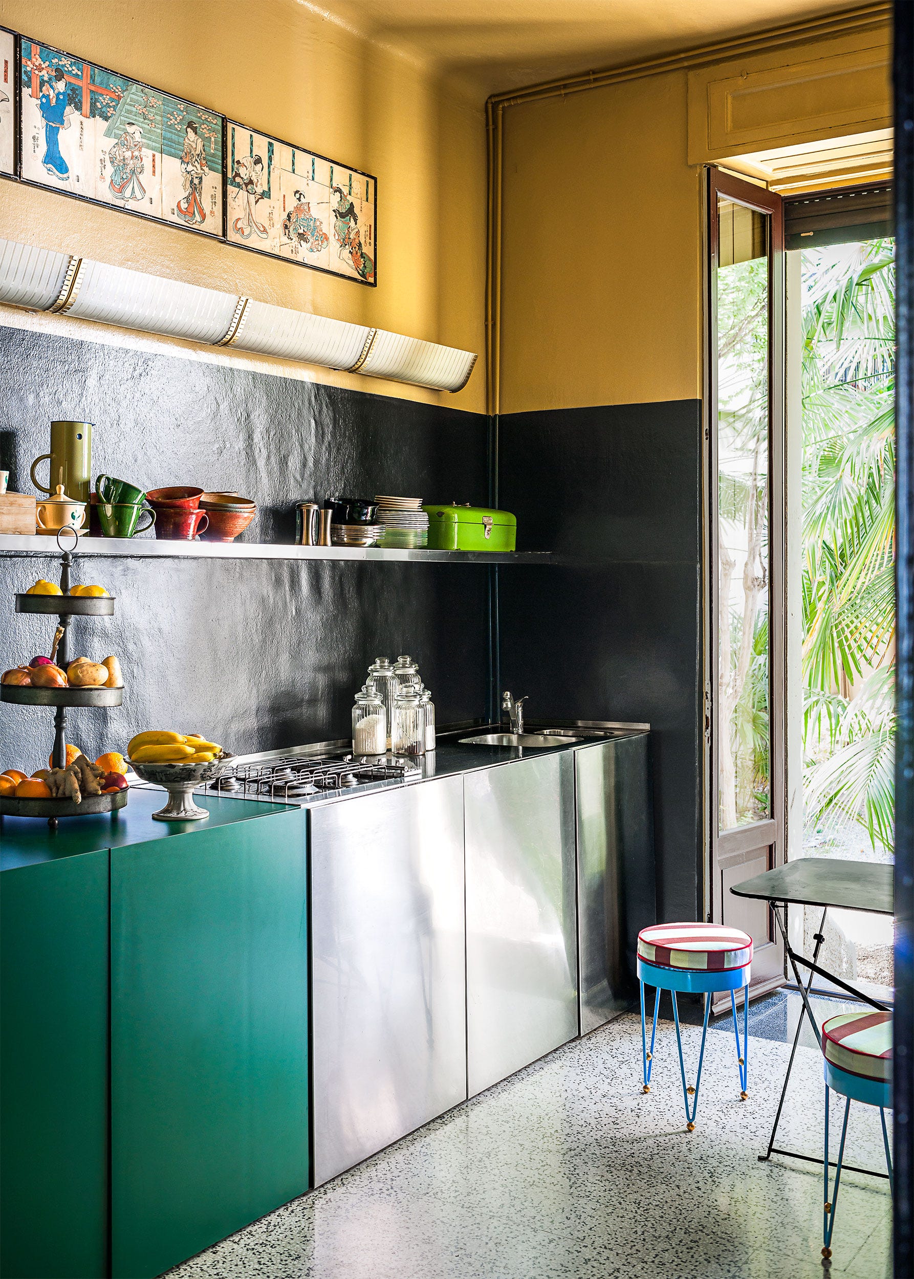
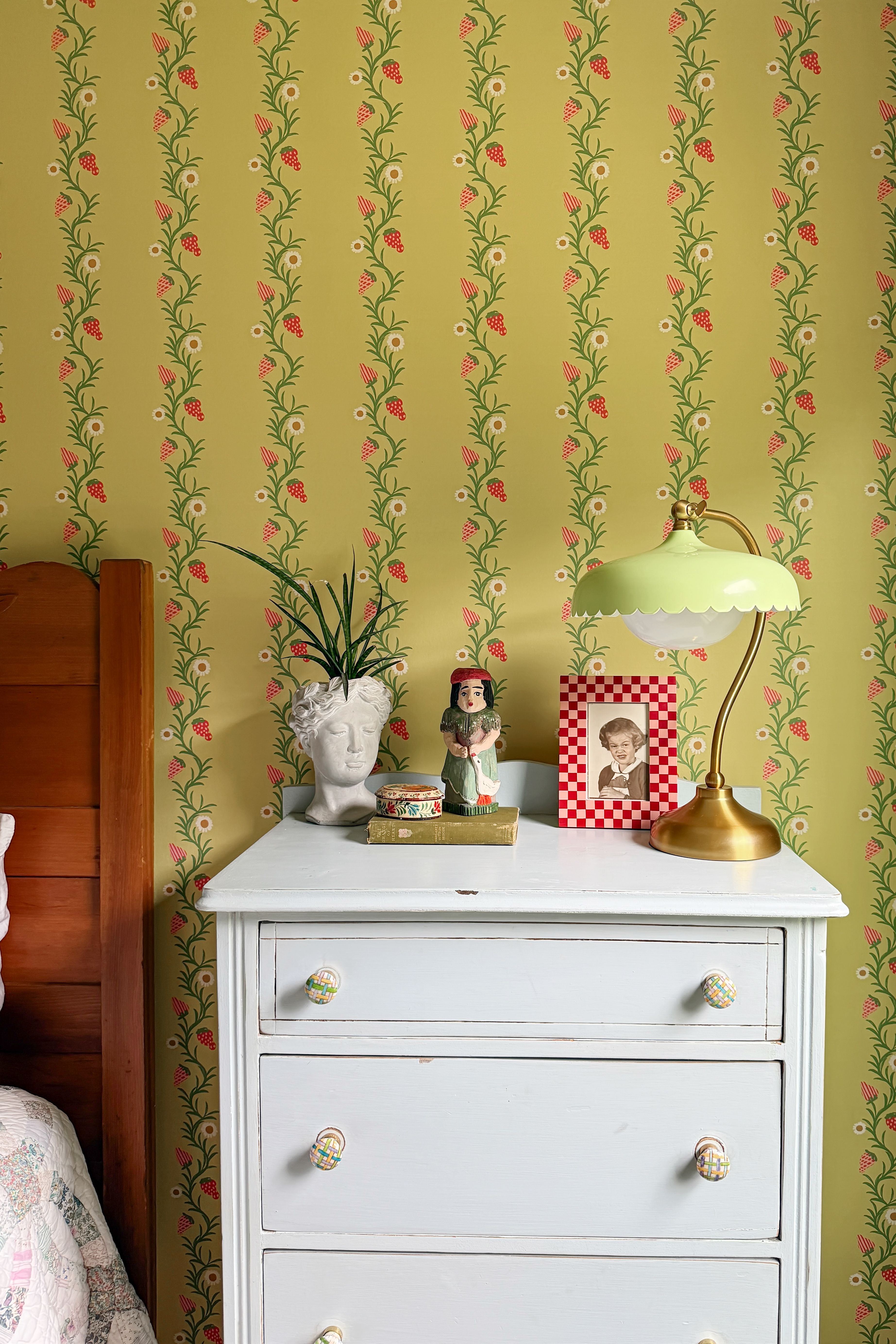
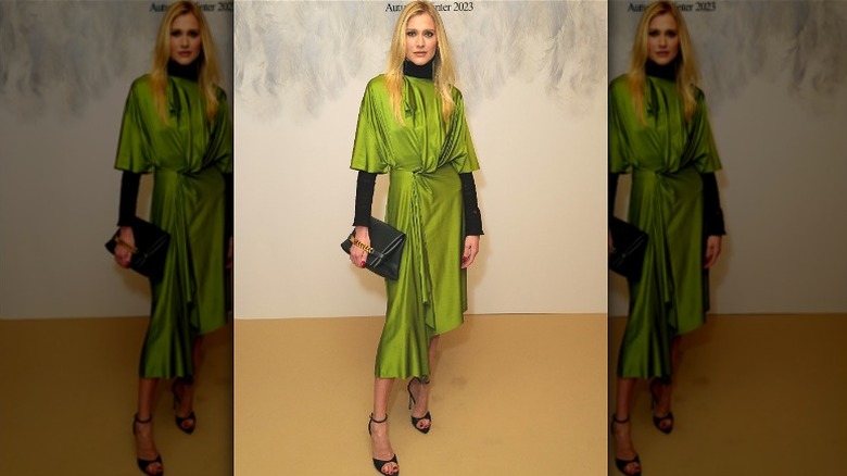
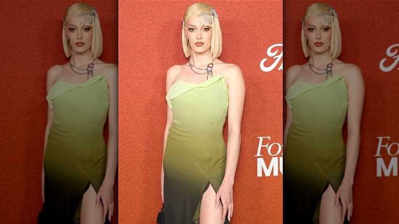
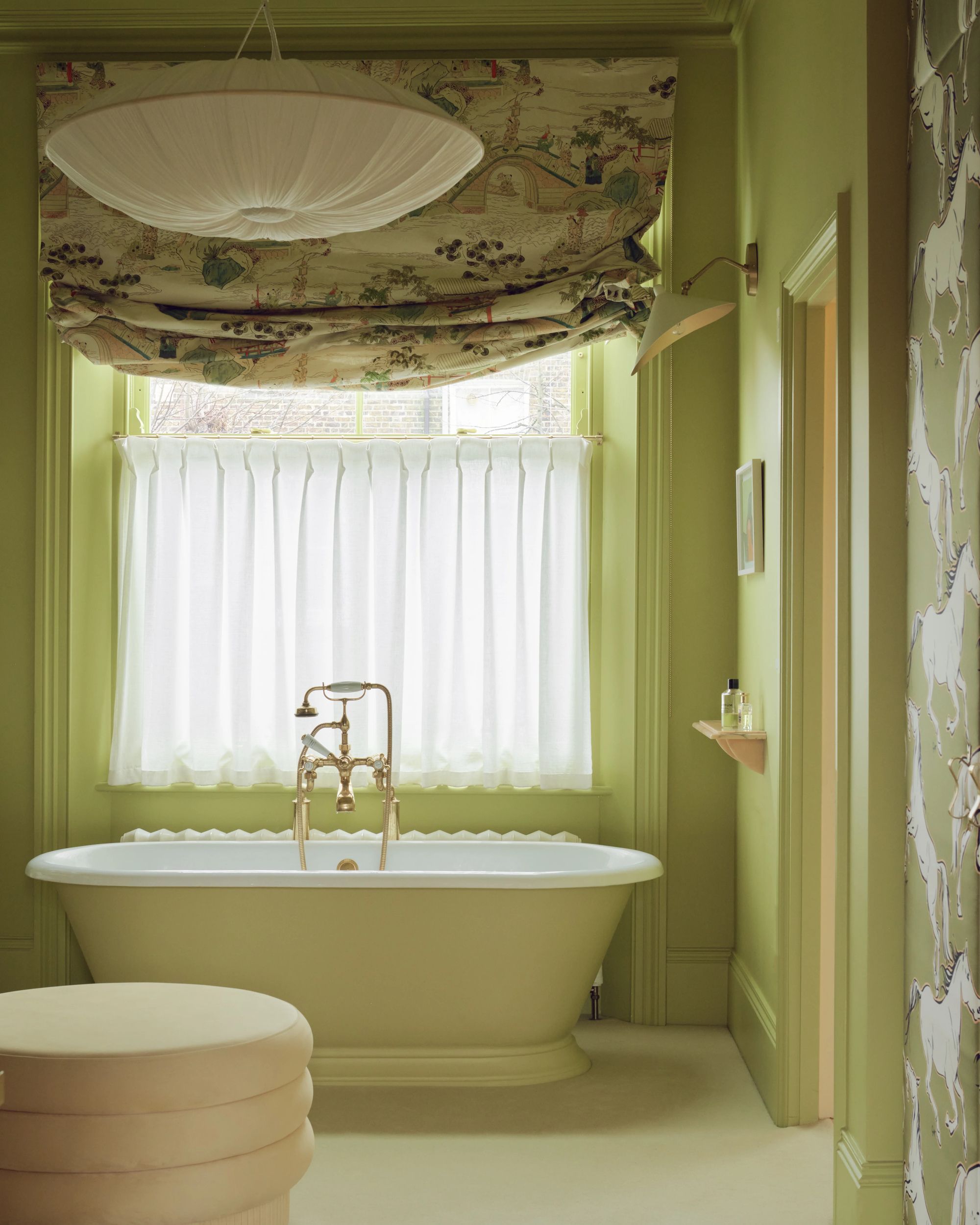
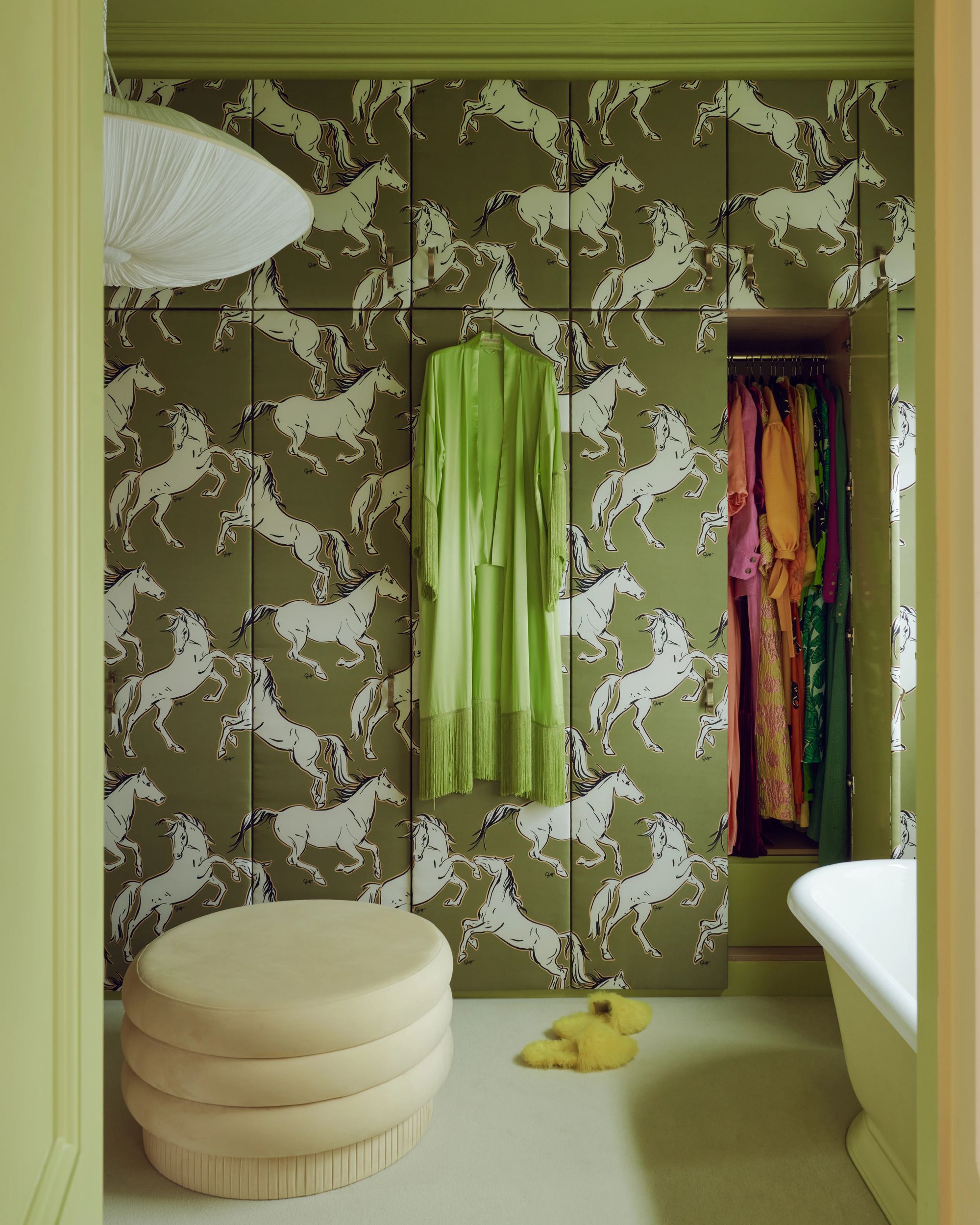
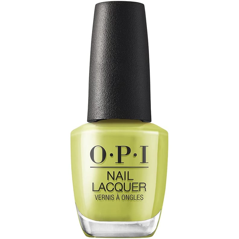
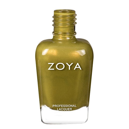
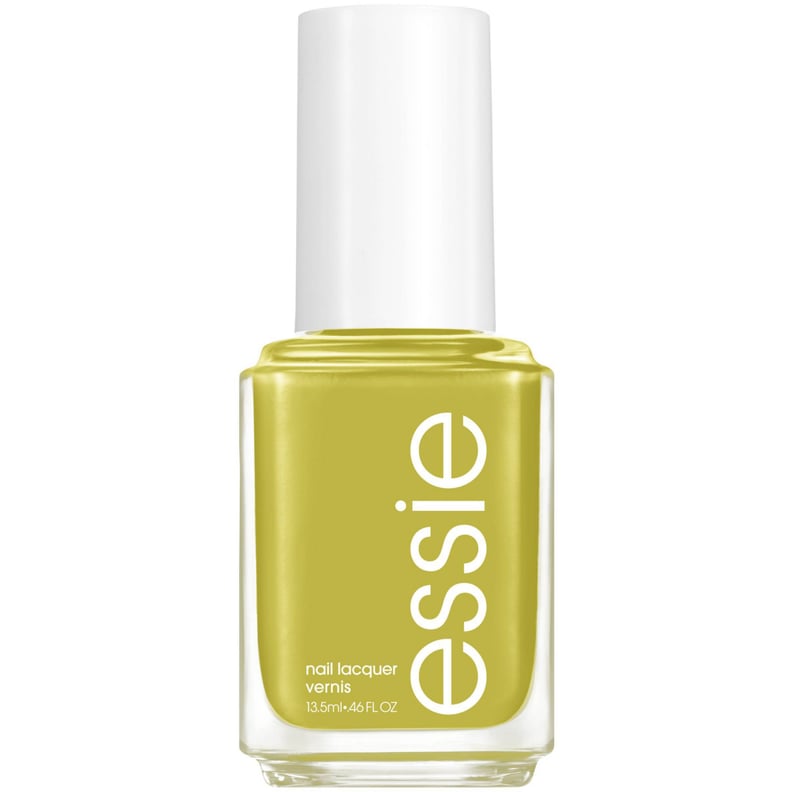
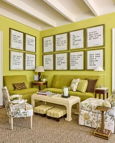
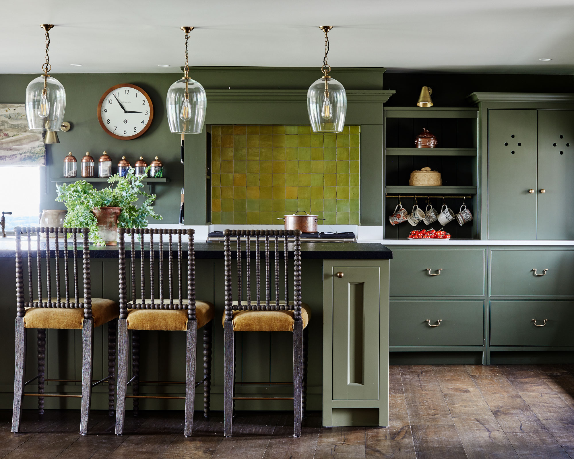
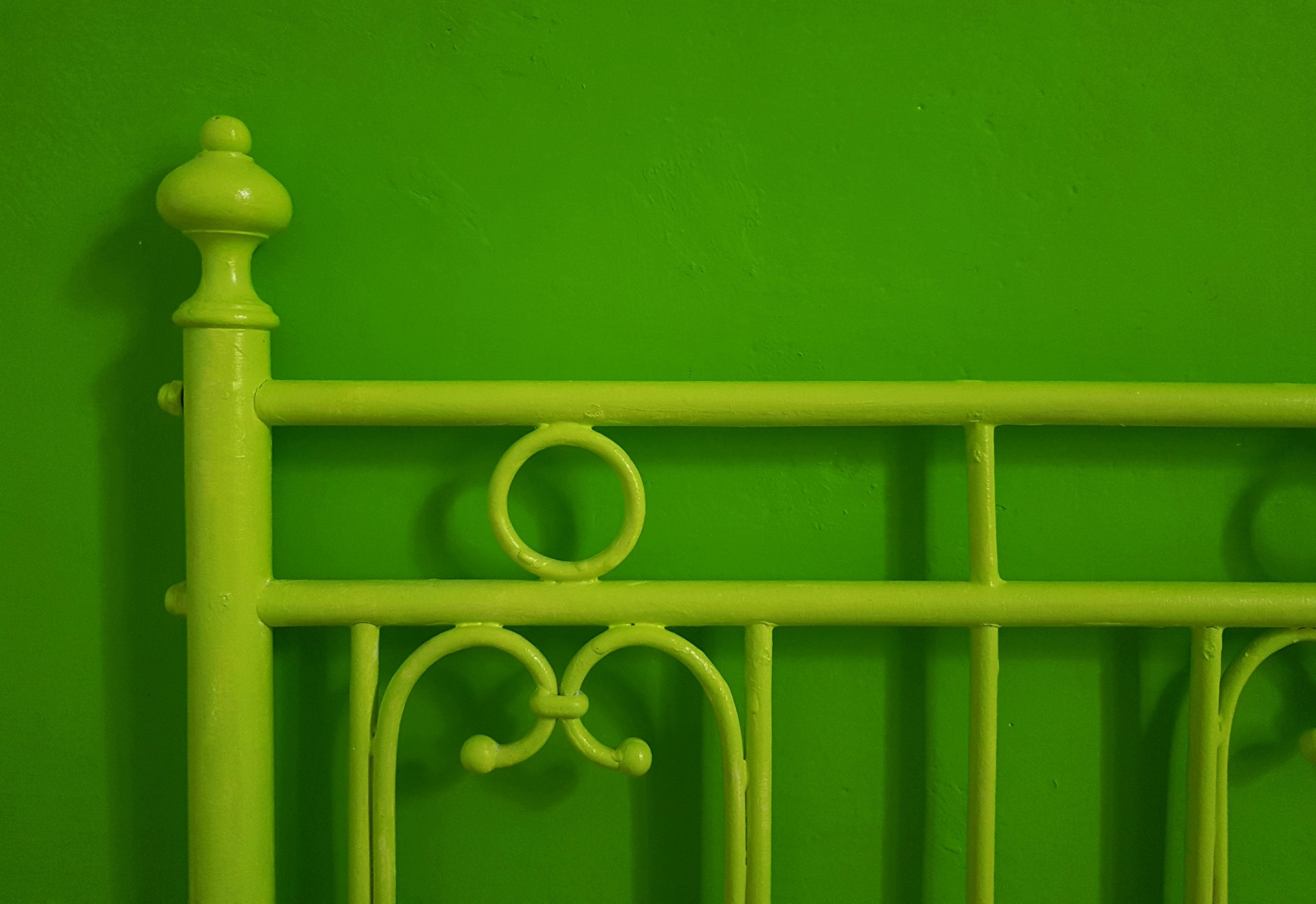
Chartreuse is a vivid, energetic yellow-green shade that draws attention and can brighten any room. The color, named after the French herbal liqueur, has a long history in design but is currently experiencing a resurgence due to recent trends favoring bold and bright colors. As a tertiary color, chartreuse sits between yellow and green on the color wheel, meaning it can lean more yellow or more green, offering a variety of shades for interior design. Yellow and green are both known to create an upbeat atmosphere, with yellow promoting positivity, especially in spaces lacking natural light.
There are two types of chartreuse liqueur, yellow and green, leading to some confusion about the exact shade of the color. However, technically, chartreuse is an equal mix of both yellow and green. The specific shade chosen can influence whether the color leans warm or cool. Shades closer to green tend to be cooler, while those closer to yellow are warmer. For example, a color psychologist notes that yellow affects emotions and is a good choice for kitchens, especially if natural light is limited, because it is bright and cheerful. Similarly, a senior brand manager from Valspar Paint suggests that fresher, cleaner tones like Vintage Chartreuse can enhance positive moods and boost serotonin, making them suitable for lively spaces.
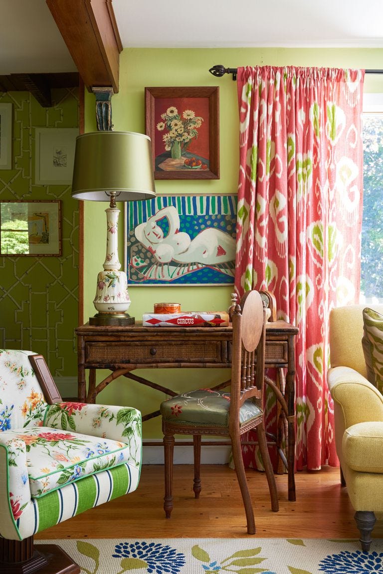
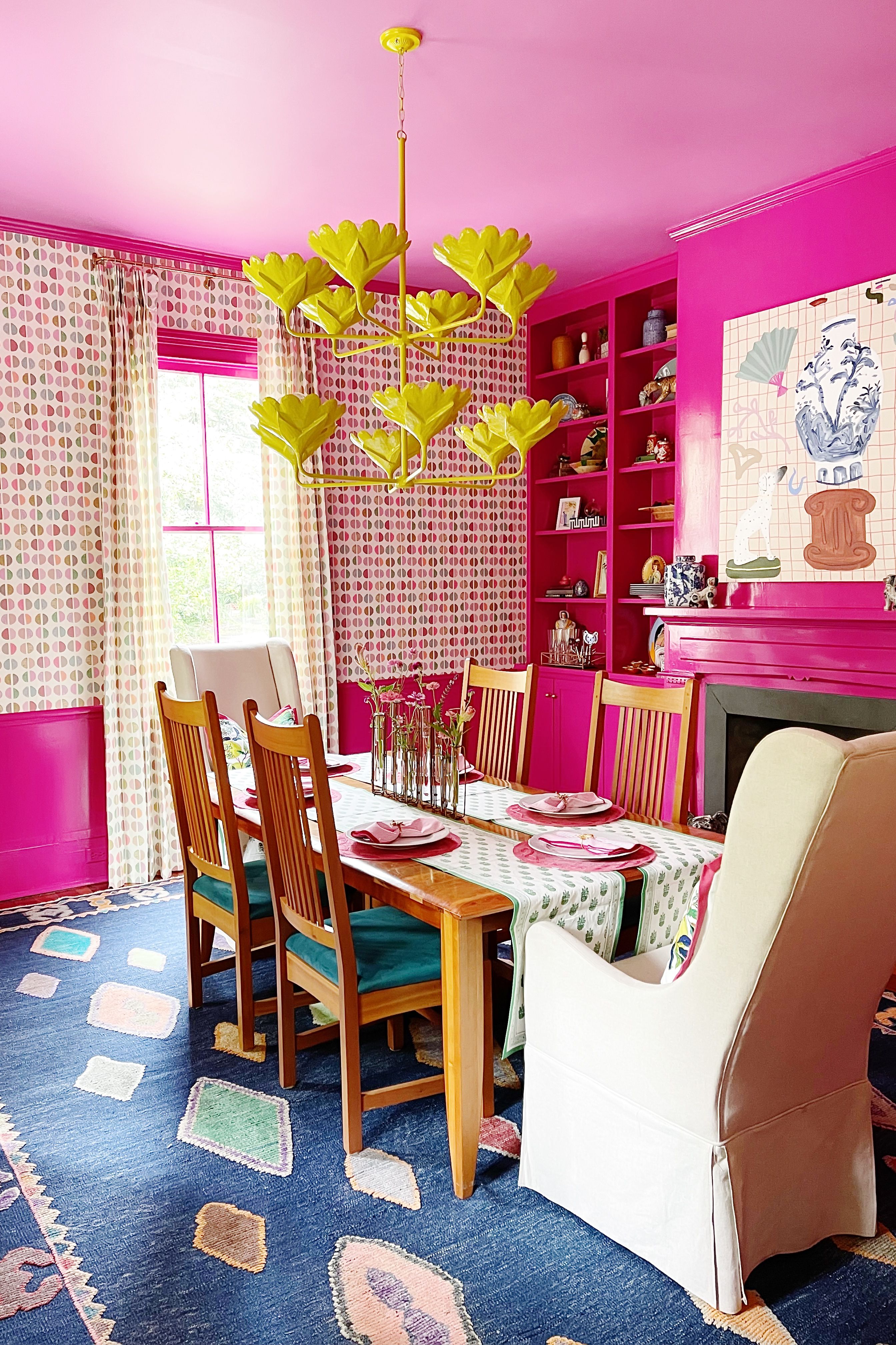
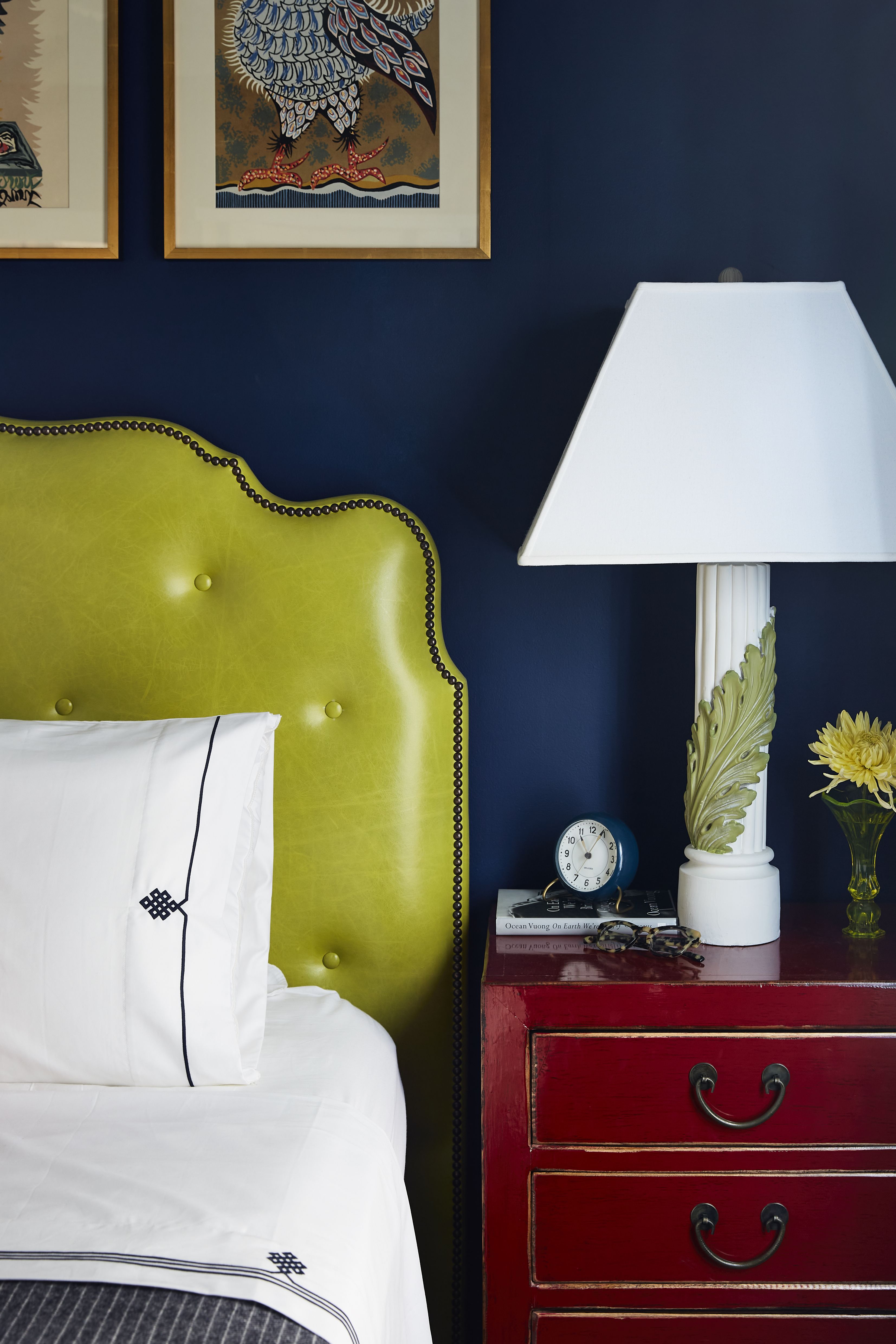
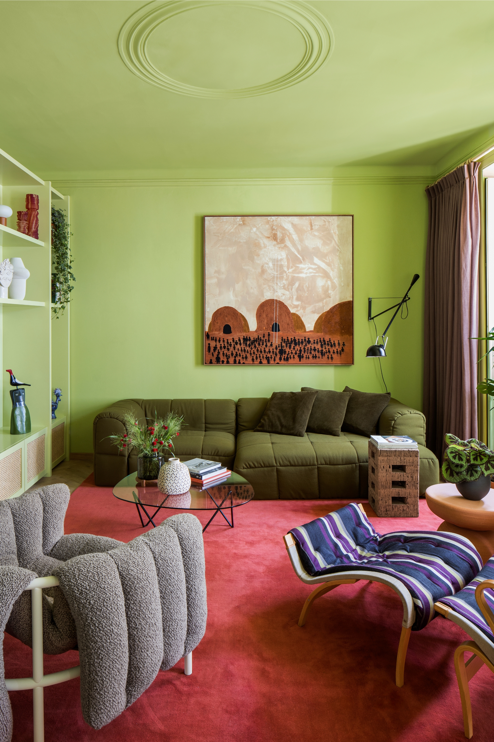
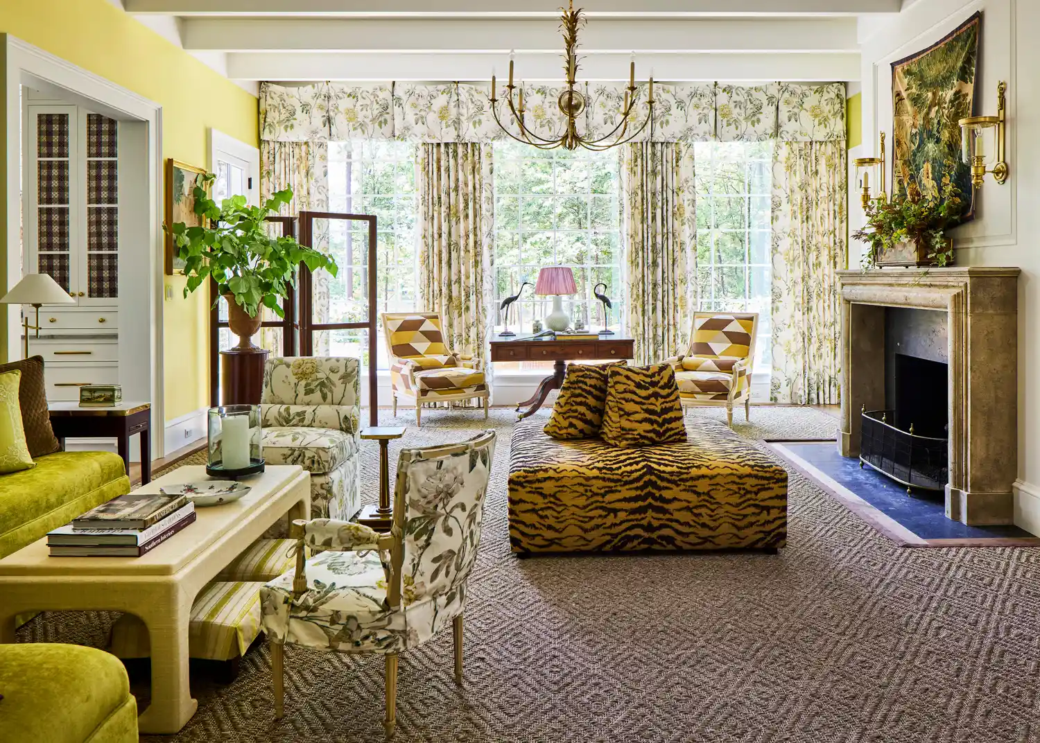
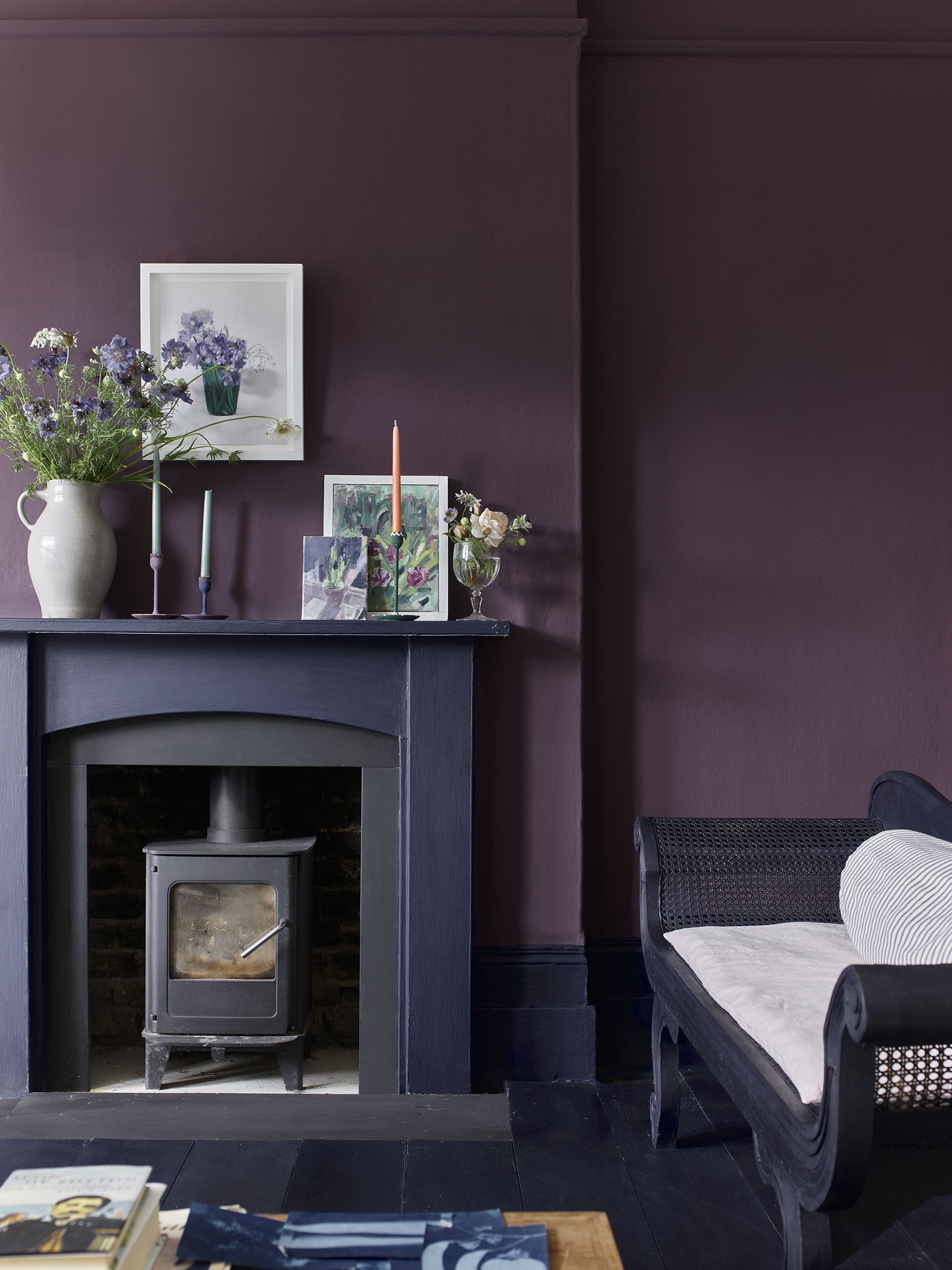
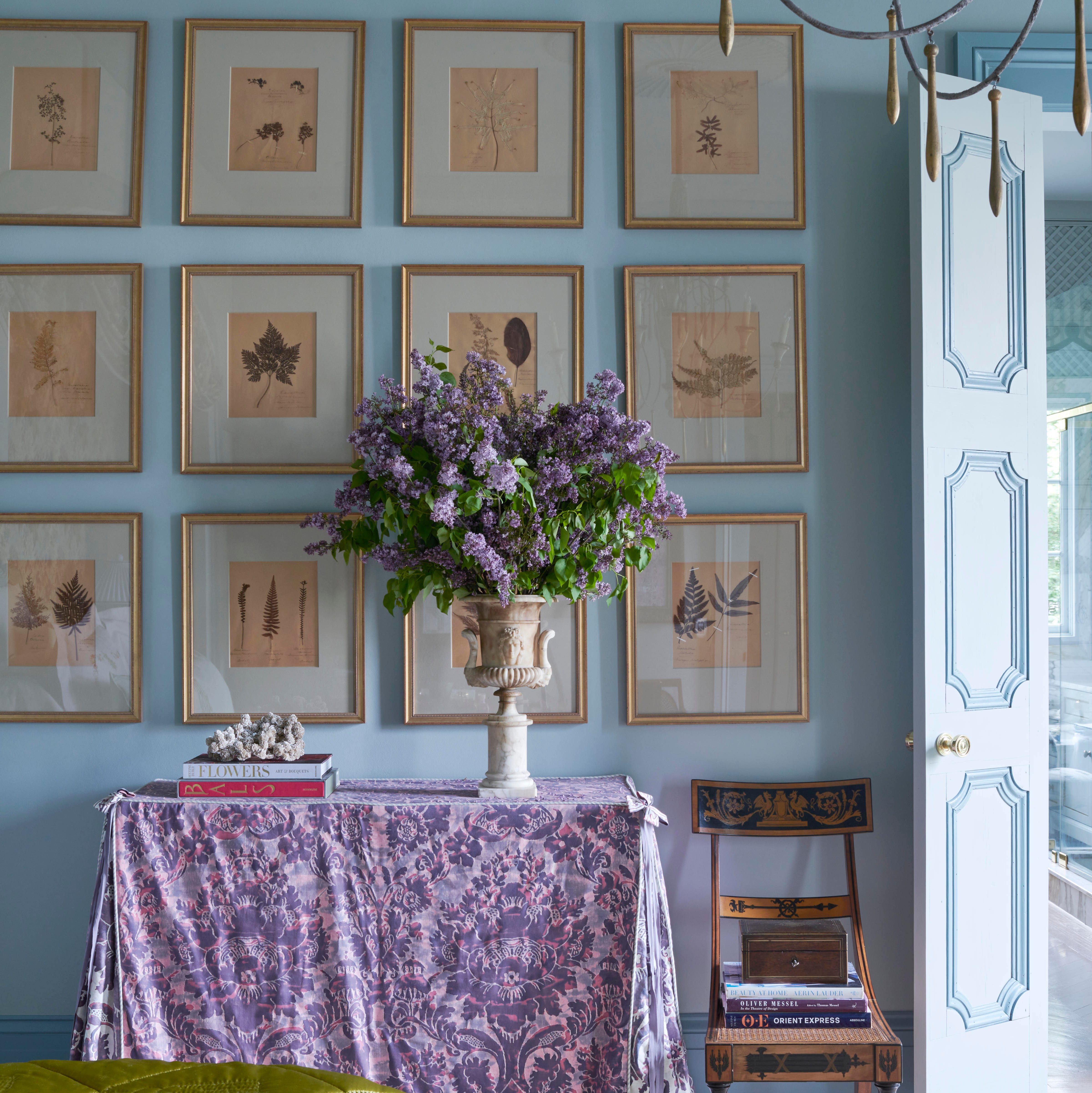
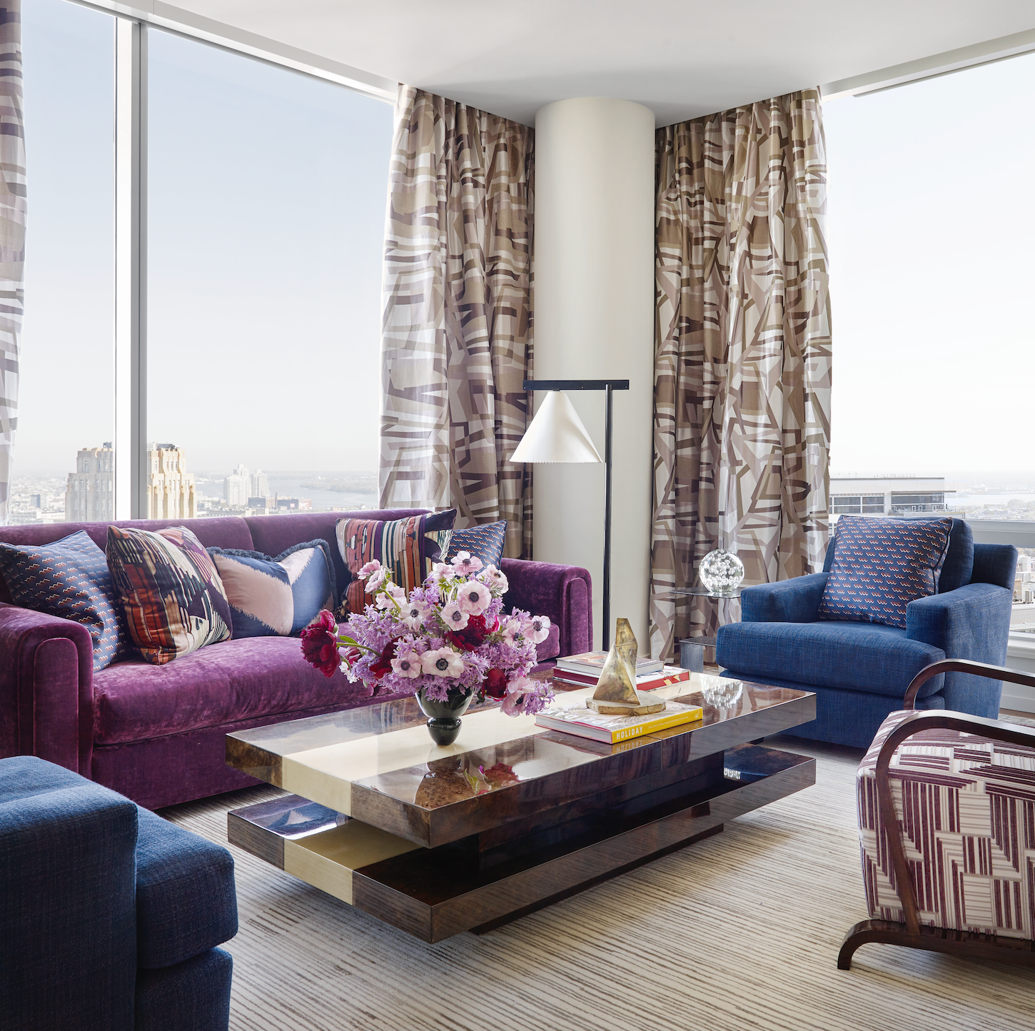
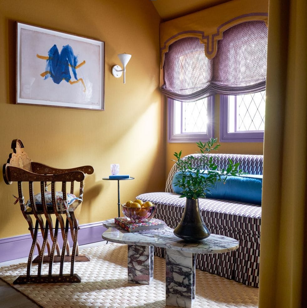
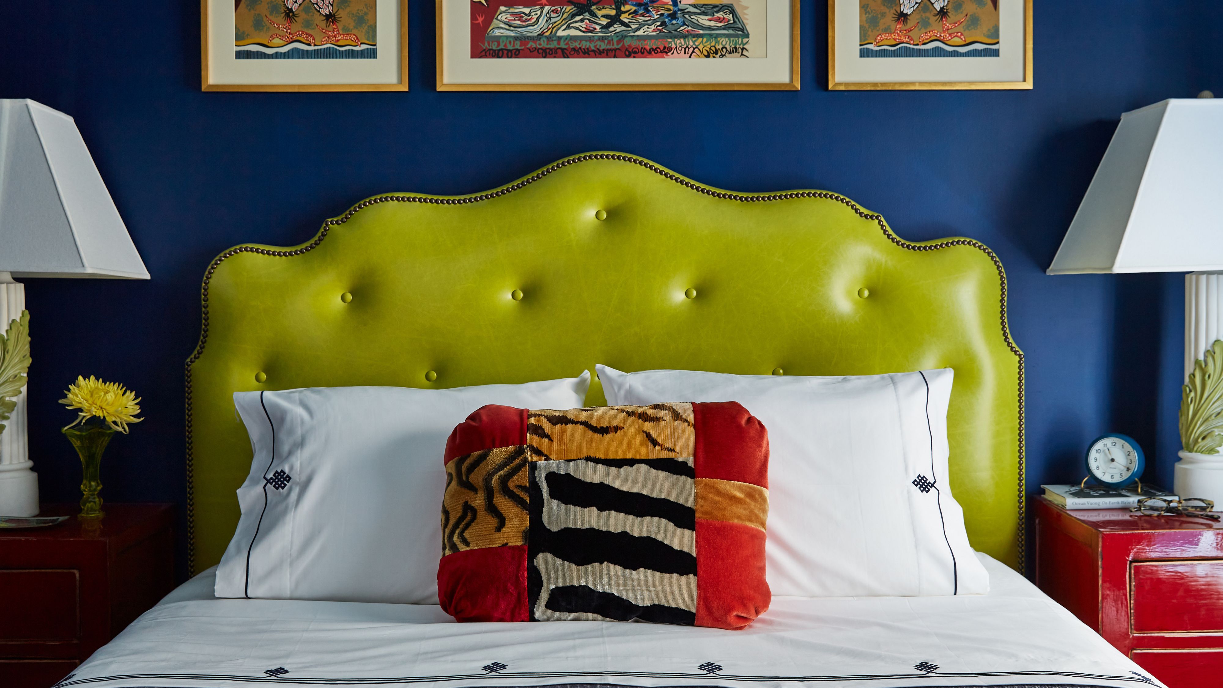
When decorating with chartreuse, it can be integrated into both traditional and modern interior styles. Its versatility allows it to be paired with other bold colors or with more neutral and calm tones. To identify complementary colors on the color wheel, one would look at the opposite side from the yellow-green section where chartreuse resides. This would mean red-violet for greener shades of chartreuse and blue-violet for yellower shades. The key to successfully decorating with chartreuse lies in selecting the right shade for the room. This decision should consider the amount and quality of natural light in the space.
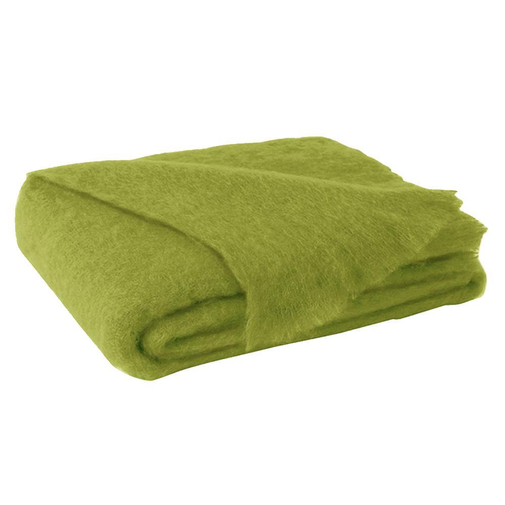
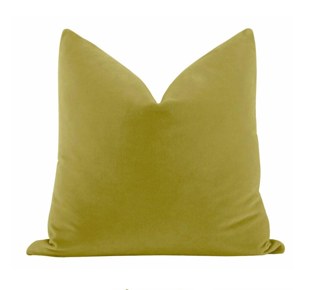
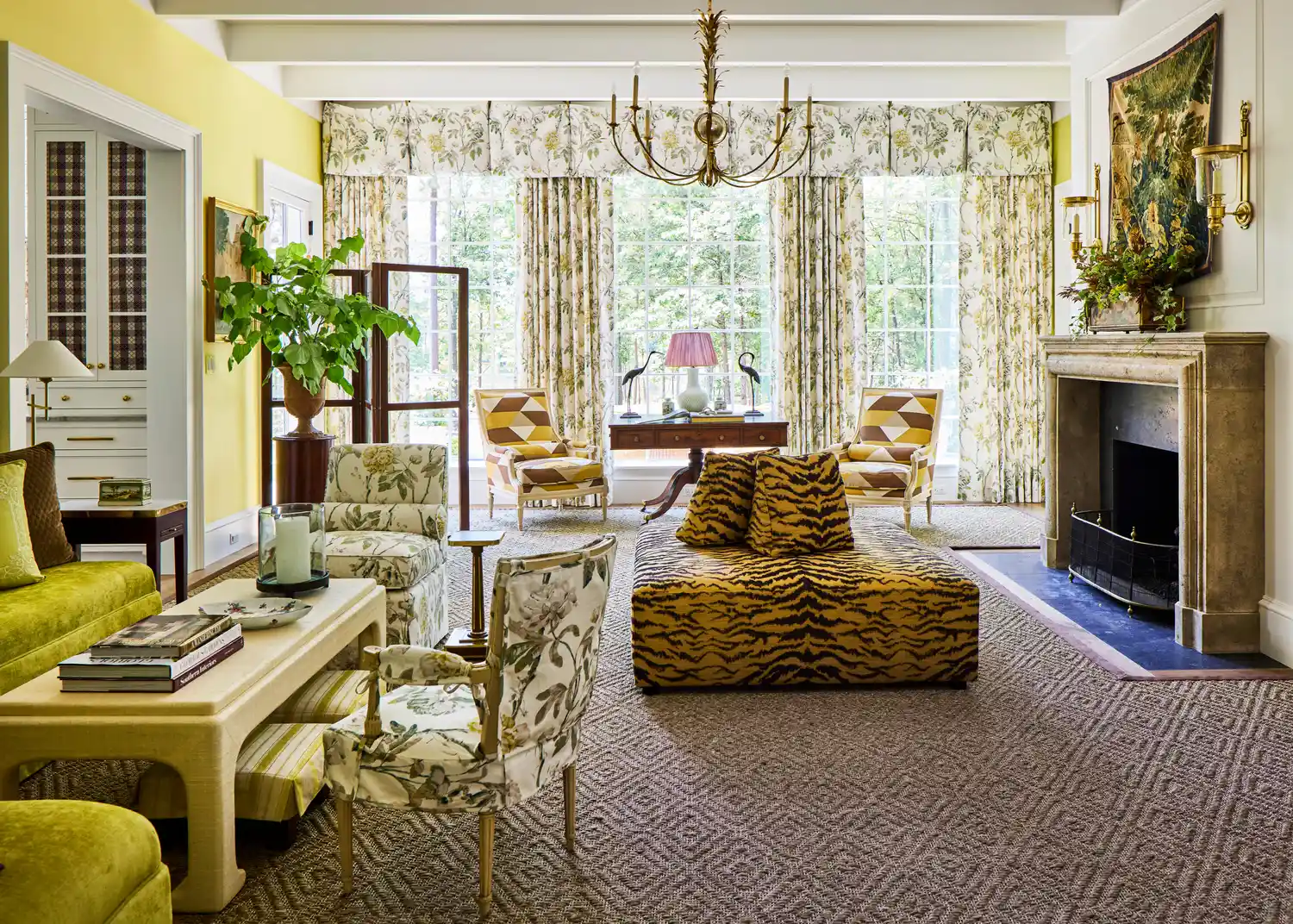
For rooms with small windows or those facing north or east, which typically receive less light, choosing a warm-toned, pale chartreuse can make the room feel larger and brighter. Alternatively, using warm-toned mustard yellows can create a more inviting appeal. This adaptability allows chartreuse to be used in various applications, from subtle accents like accessories and soft furnishings to more prominent statements such as painted walls or doors. Its unique citrus and neon-like qualities contribute to its distinctive character, making it a powerful tool for designers looking to create vibrant and engaging interiors.
#InteriorDesign #ColorTheory #Chartreuse #RoomDecor #ColorTrends #DecoratingWithColor #TertiaryColor #WarmAndCoolColors #HomeDecor #InteriorDesign #ColorTheory #Chartreuse #RoomDecor #ColorTrends #DecoratingWithColor #TertiaryColor #WarmAndCoolColors #HomeDecor
0 comment in total
 No comments yet
You may also like

9 chartreuse decor ideas to instantly brighten up a space
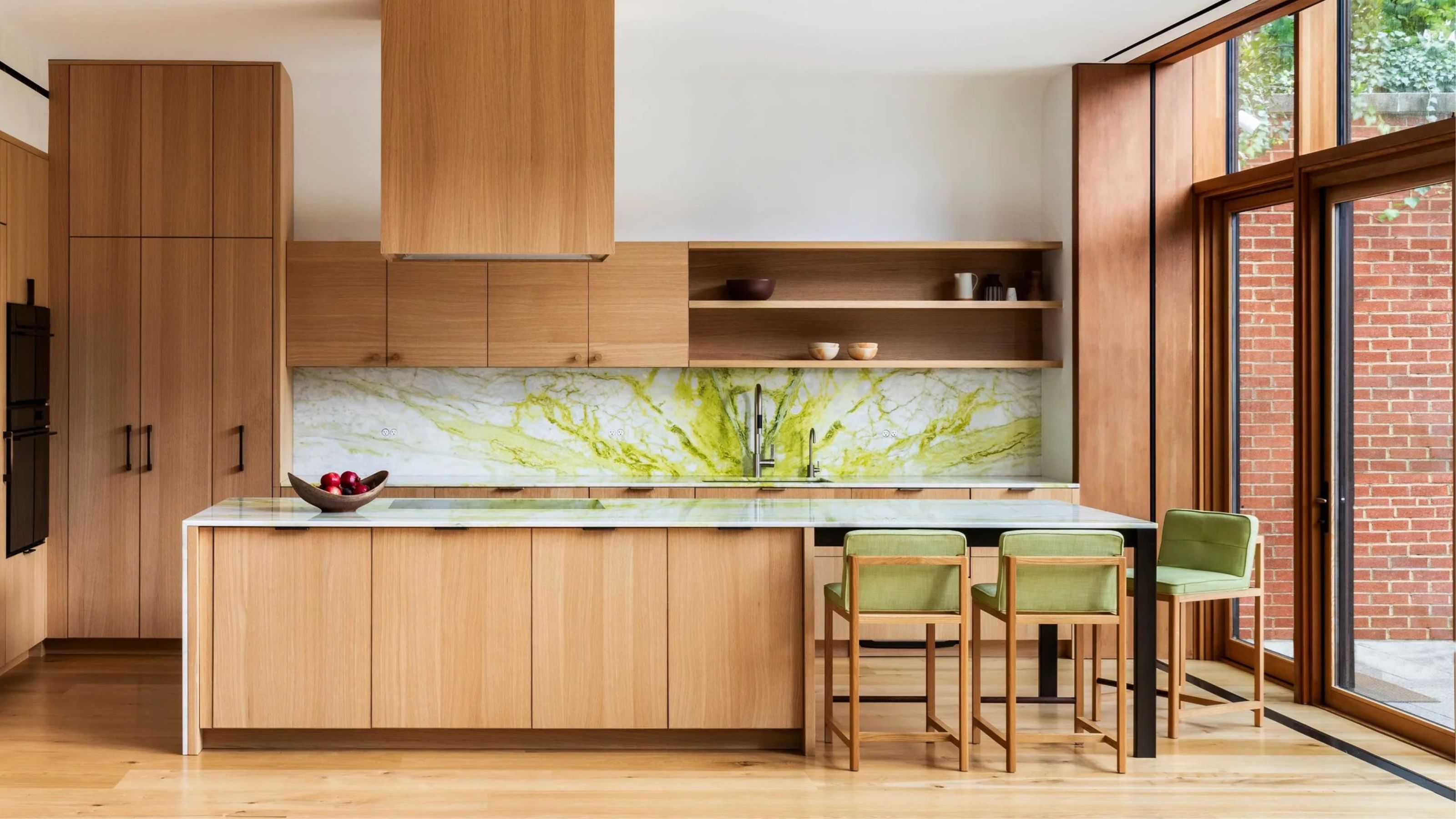
What This Sour Yellow-Green Says About Color for 2026


It's Official: Chartreuse Is the New Slime Green
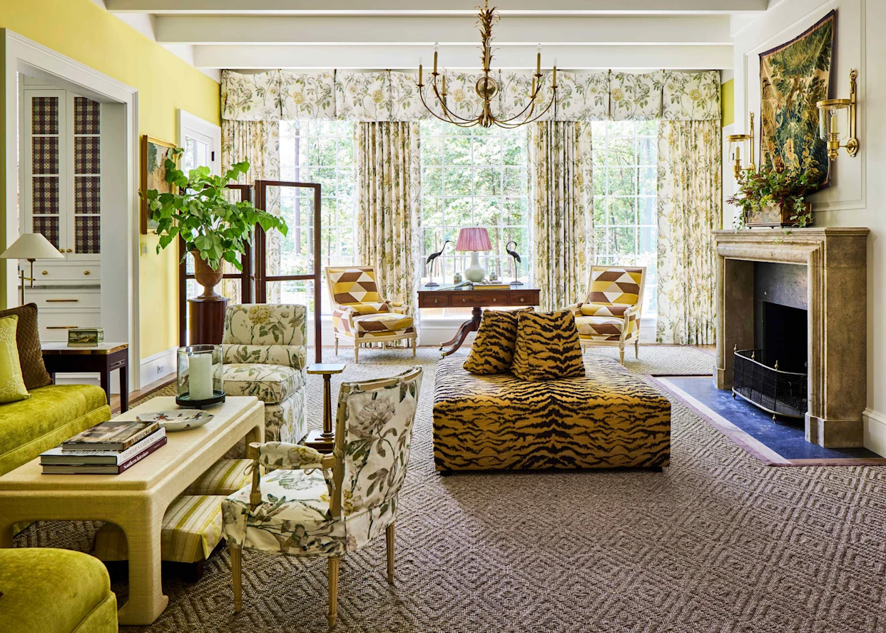
This Bold 1960s Color Is The Most Talked-About Hue In Our 2025 Idea House
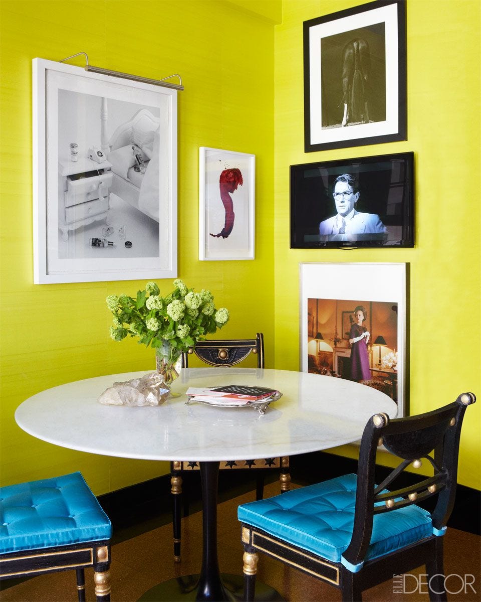
21 Chartreuse Color Ideas for a Summer-Ready Refresh

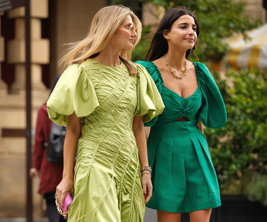
From The Runway To Street Style, Chartreuse Was The Colour Crush of Afterpay Australian Fashion Week

I’m an Interior Designer, and This Is the 1 Color I Wish More People Used in Their Homes

What Color Is Taupe? Plus 5 Ways To Decorate With This "Thoughtful" Shade in Your Home
This electric 1960s shade is making an unexpected return – and designers say it’s the key to lifting darker, moodier interiors this fall

This Bold 1960s Color Is The Most Talked-About Hue In Our 2025 Idea House

How to Get Portia's Chartreuse Nails From "The White Lotus"
The Top Coral Paint Colors to Brighten Your Space

This Bold 1960s Color Is Making A Comeback In Our Idea House
Fall’s Hottest Color is Kind Of Hard to Wear (Unless You Know These Style Rules)

Decorating with purple – 10 ways to use this versatile shade
The 19 Best Colors to Pair with Purple, According to Designers

Vibrant Green Is The Color Trend That Comes Celeb Approved

This Colorful and Modern Long Island Home Proves Chartreuse Paint Can Look Timeless

Purple room ideas – 10 ways to use this on-trend color
The Color of the Year Is Chartreuse Shame