1/4
Designers are ditching gray walls in kitchens for these 3 on-trend alternatives – here's why you should too
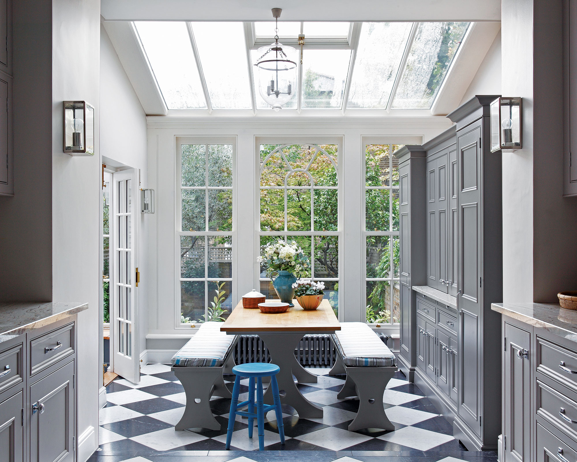
The article discusses the declining popularity of gray as a go-to color for kitchen walls and presents three on-trend alternatives that designers are favoring. While warm neutrals like taupe, beige, and off-white are common alternatives, the article emphasizes a shift towards bolder, more colorful options.
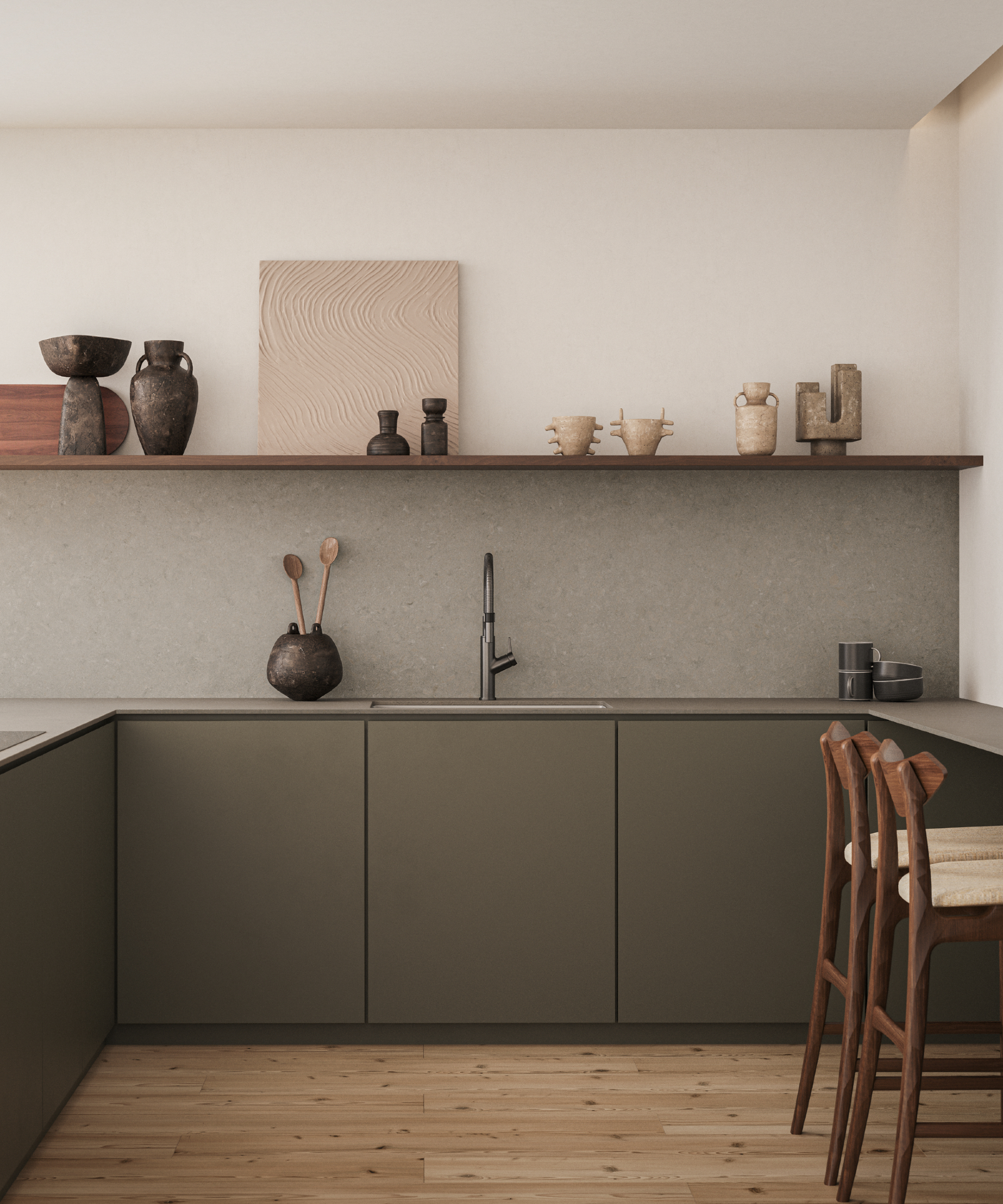
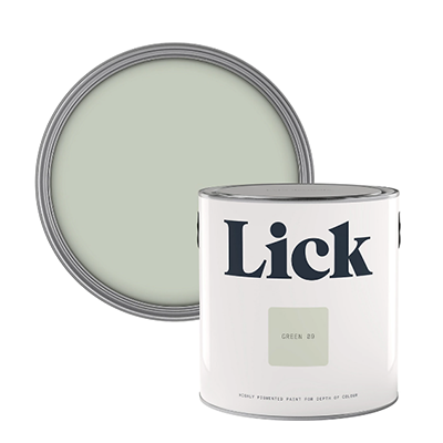
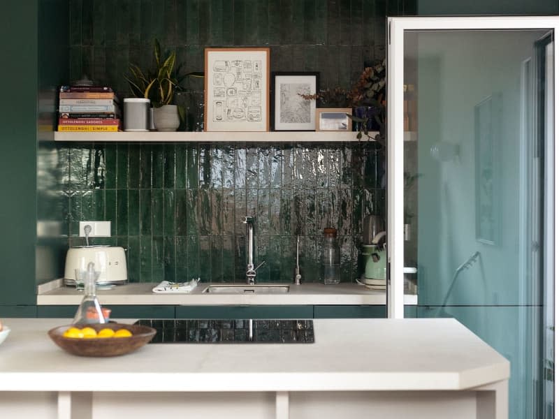
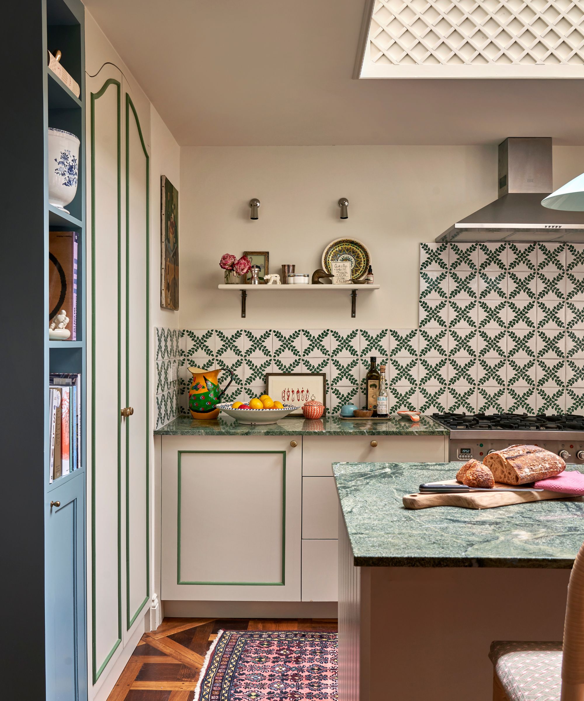
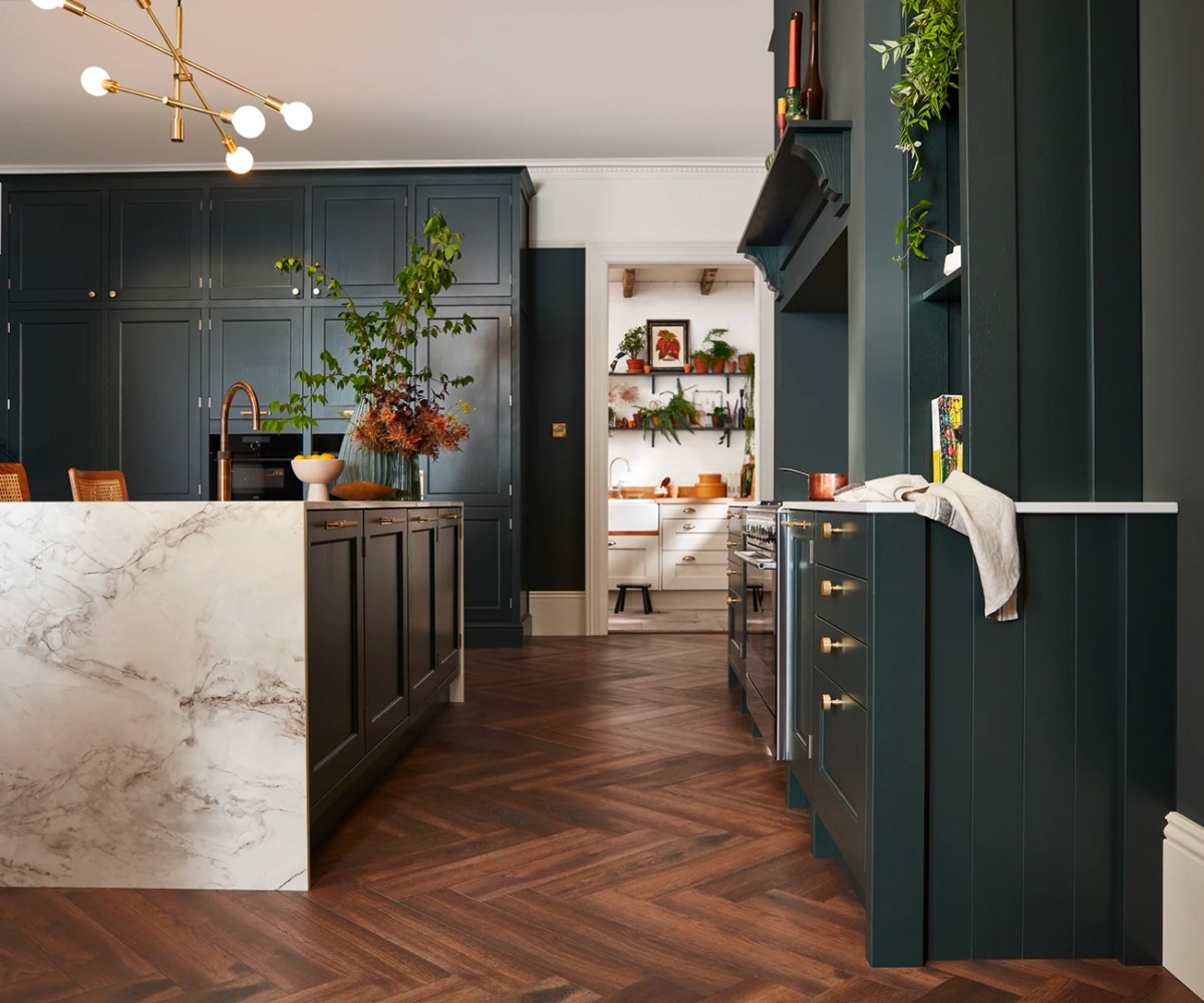
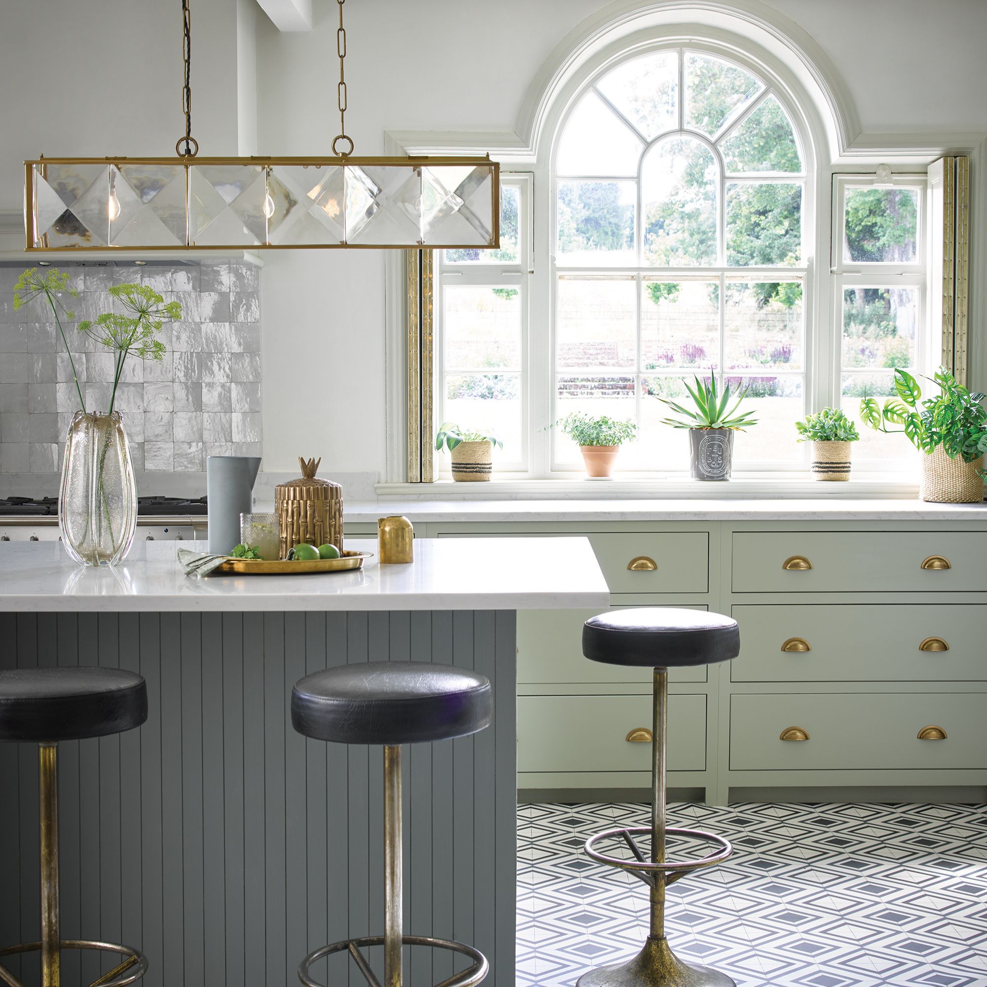
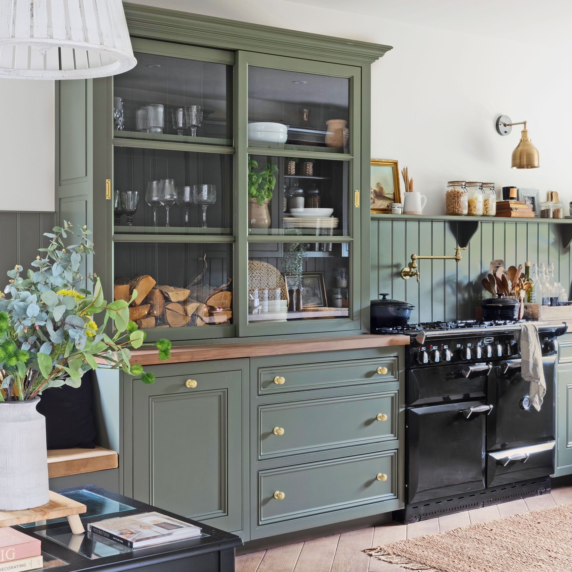
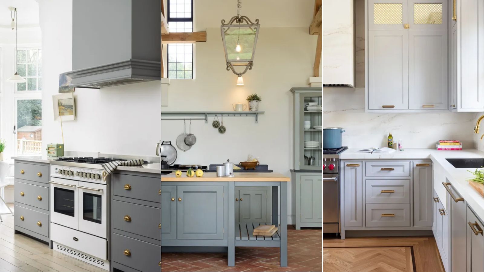
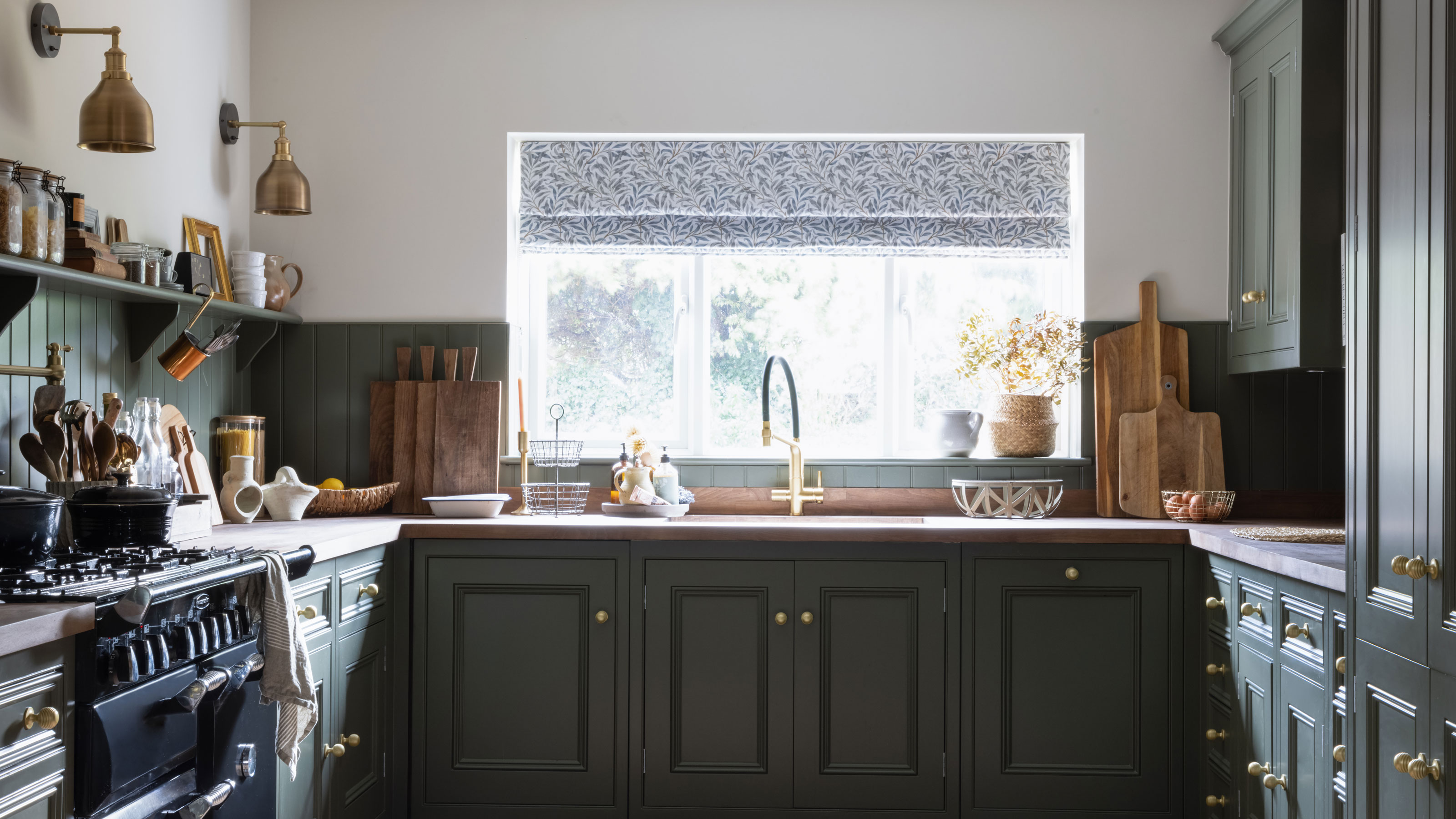
One of the primary recommendations is sage green. Interior designer Emma Beryl Kemper highlights its versatility, noting its beautiful pairing with both warm woods and sleek metals. She suggests layering textures with sage green, incorporating elements like linen textiles, stone countertops, and oak cabinetry with brass hardware to achieve a refined and timeless finish. For paint choices, a muted sage green is advised to avoid overwhelming the room. Caitlin Creer recommends Benjamin Moore's Mountain Air for its depth and subtle, grounding feel, while Jacqueline Goncalves of Moksa Design suggests Benjamin Moore's Heather Gray for those seeking a neutral yet colorful option with green undertones.
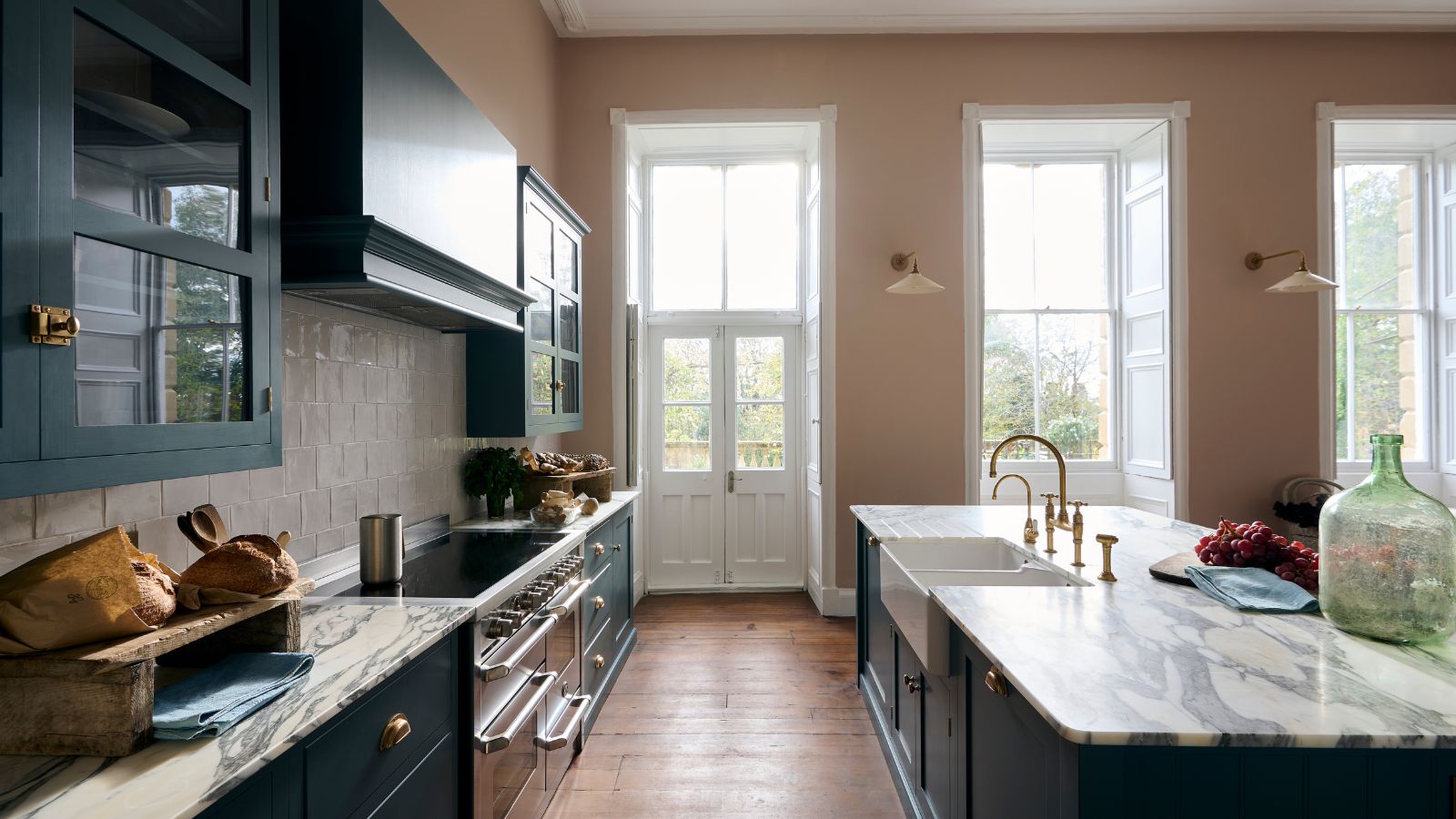
Another alternative is plaster pink. Michelle Murphy, founder of Demi Ryan, advocates for soft, earthy pinks to introduce warmth and softness, a quality often lacking in cool-toned grays. She emphasizes selecting muted pink paints to maintain a sophisticated and mature aesthetic, avoiding overly sweet connotations. Benjamin Moore's Pink Damask is cited as a favorite, described as a neutral blush that enhances white cabinetry and brass or aged bronze hardware, allowing other design elements to stand out. The article suggests treating these pinks as versatile neutrals.
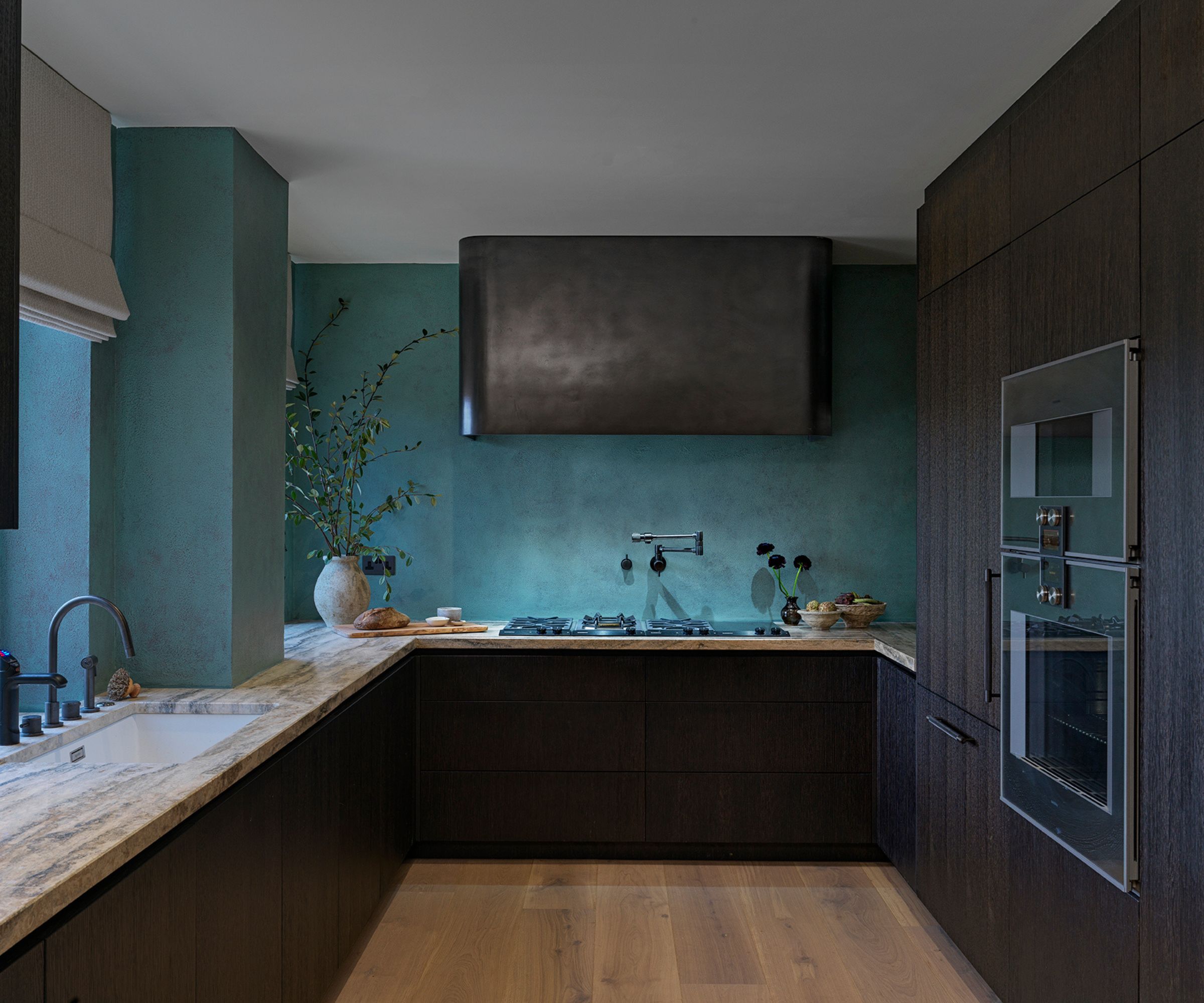
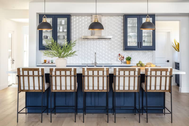
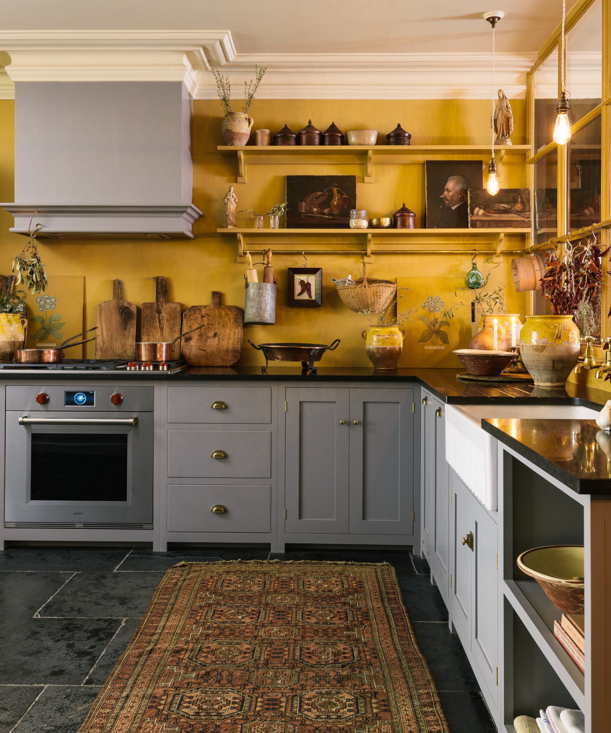
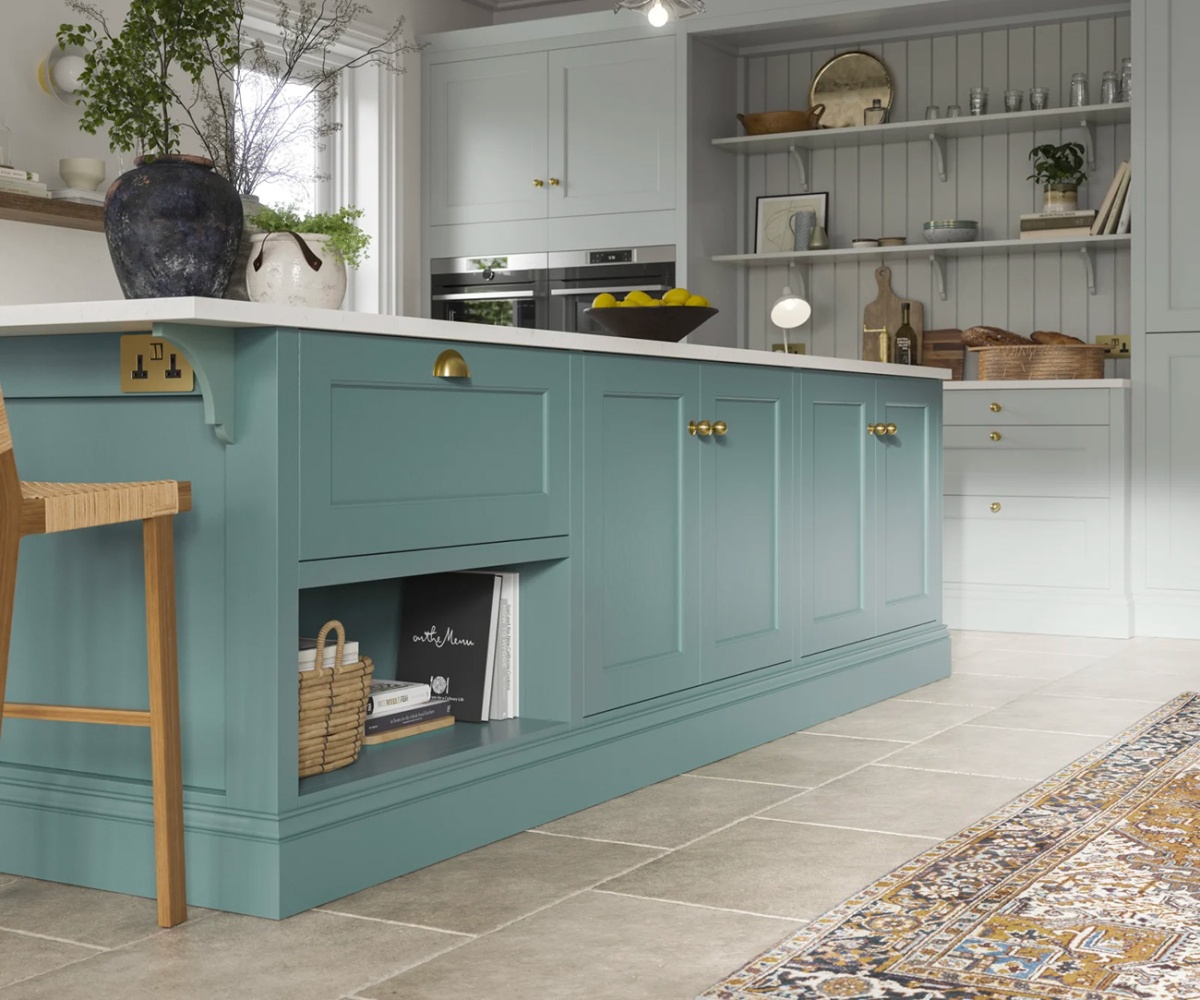
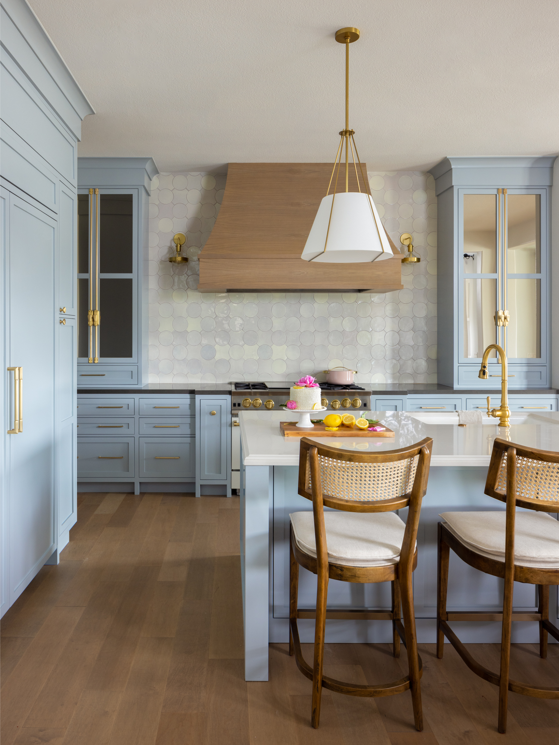
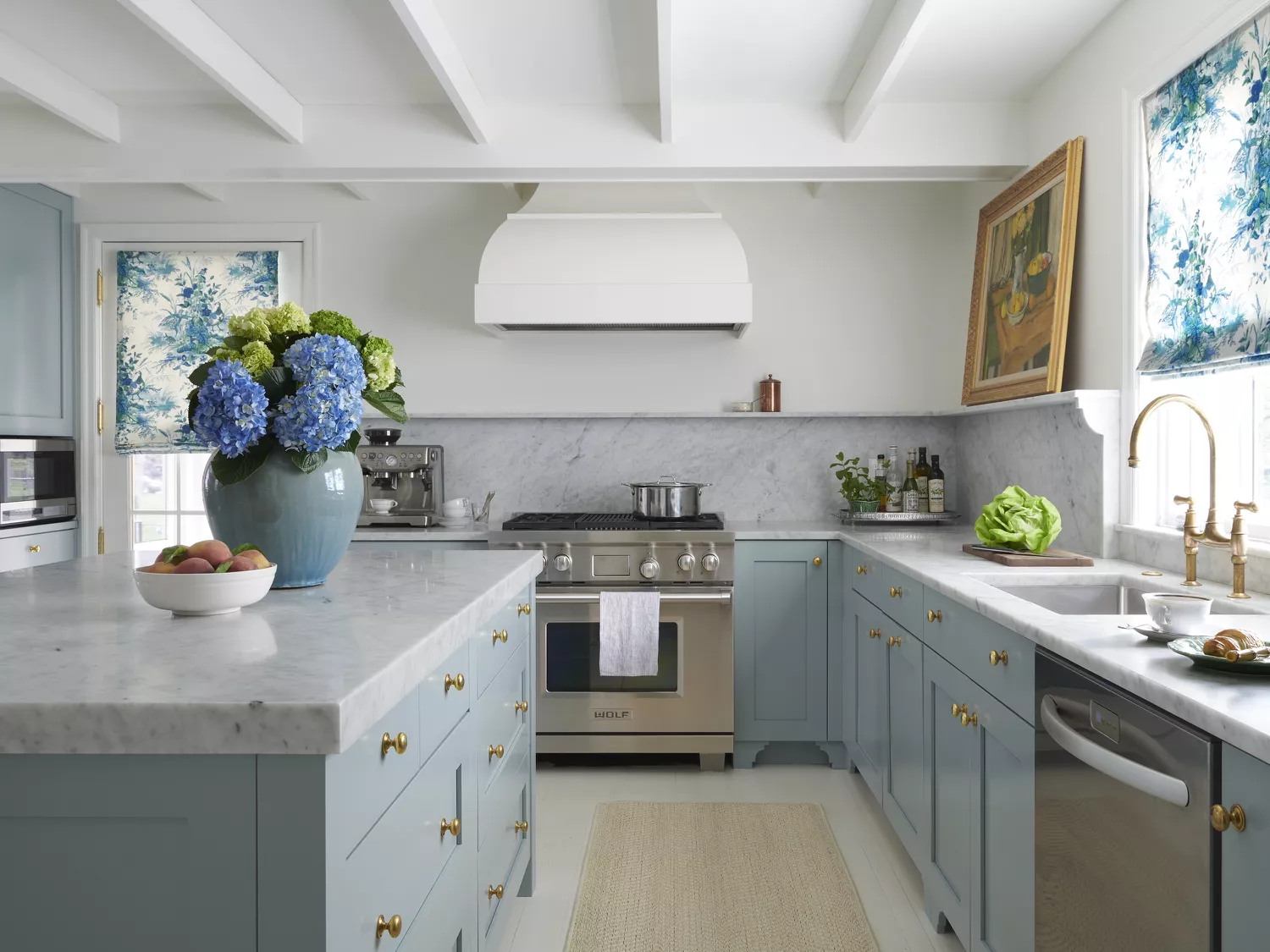
The third recommendation is light blue. Although a bolder step away from gray, pale blue paints can create a light and airy atmosphere while adding visual interest. Lauren Robbins, lead designer at Lauren Robbins Interiors, used Benjamin Moore's Yarmouth Blue for a color-drenched kitchen, noting its depth and compatibility with whites and rich woods. She also suggests varying sheens for added dimension. Lisa Gilmore of Lisa Gilmore Design recommends Sherwin-Williams' Rainwashed, a blue paint with green undertones, for its refreshing and non-overpowering quality. This shade pairs well with various whites and wood tones, and can be complemented by vibrant colors like yellow, pink, and green, or a minimalist cream and white palette.
The article concludes by advising readers to sample chosen shades before committing, as colors can appear differently under varying light conditions throughout the day. It also references broader kitchen color trends for further inspiration, underscoring the importance of informed decision-making in home design. #KitchenDesign #InteriorColorTrends #PaintAlternatives #SageGreenKitchens #PlasterPinkWalls #LightBlueInteriors #HomeDecorAdvice #DesignTips #ColorPsychology
0 comment in total
You may also like
Are gray kitchens out of date? We get the low-down from design experts

3 Kitchen Tile Trends On Their Way Out This Year (and What to Do Instead), According to Interior Designers

Beat the All-White Kitchen Blahs With More Colorful Options
Open Kitchen Shelves Are Losing Their Appeal—Here's What to Use Instead, According to Interior Designers
3 overlooked colors you never thought could work in your kitchen – but interior designers swear by them

This Popular Kitchen Color Can Actually Hurt a Home’s Sale Price

This ’90s Countertop Material Is Making a Surprising Comeback—Plus, 3 Other Kitchen Trends Designers Are Loving Right Now

Are gray kitchens still in style? Designers weigh in on this cool-toned and divisive color scheme
3 reasons you shouldn't paint your kitchen walls white – plus the new neutrals to try instead, according to kitchen pros
6 kitchen trends interior designers are excited about right now, and 3 that are out
Current Kitchen Interior Design Trends

These are the 3 wall colours to avoid if you have a green kitchen - and the expert-approved shades to try instead
Top 10 Kitchen and Bath Design Trends for 2013
What colors go best with gray kitchen cabinets? Interior designers explain how to decorate with this cool neutral
SEE IT: 3 creative interior design looks to help with your kitchen remodel
3 Ways to Revamp Your Kitchen, According to an Interior Designer

Grey kitchen ideas – 35 classic designs you will love forever
Designers say to ditch black kitchen countertops and try these 5 alternatives instead
4 Fresh Takes on Contemporary Kitchen Cabinets

Kitchen trends