1/9
'It was one of the most fun projects we've worked on' – 8 design lessons to learn from the most interesting gray kitchen I've seen in years
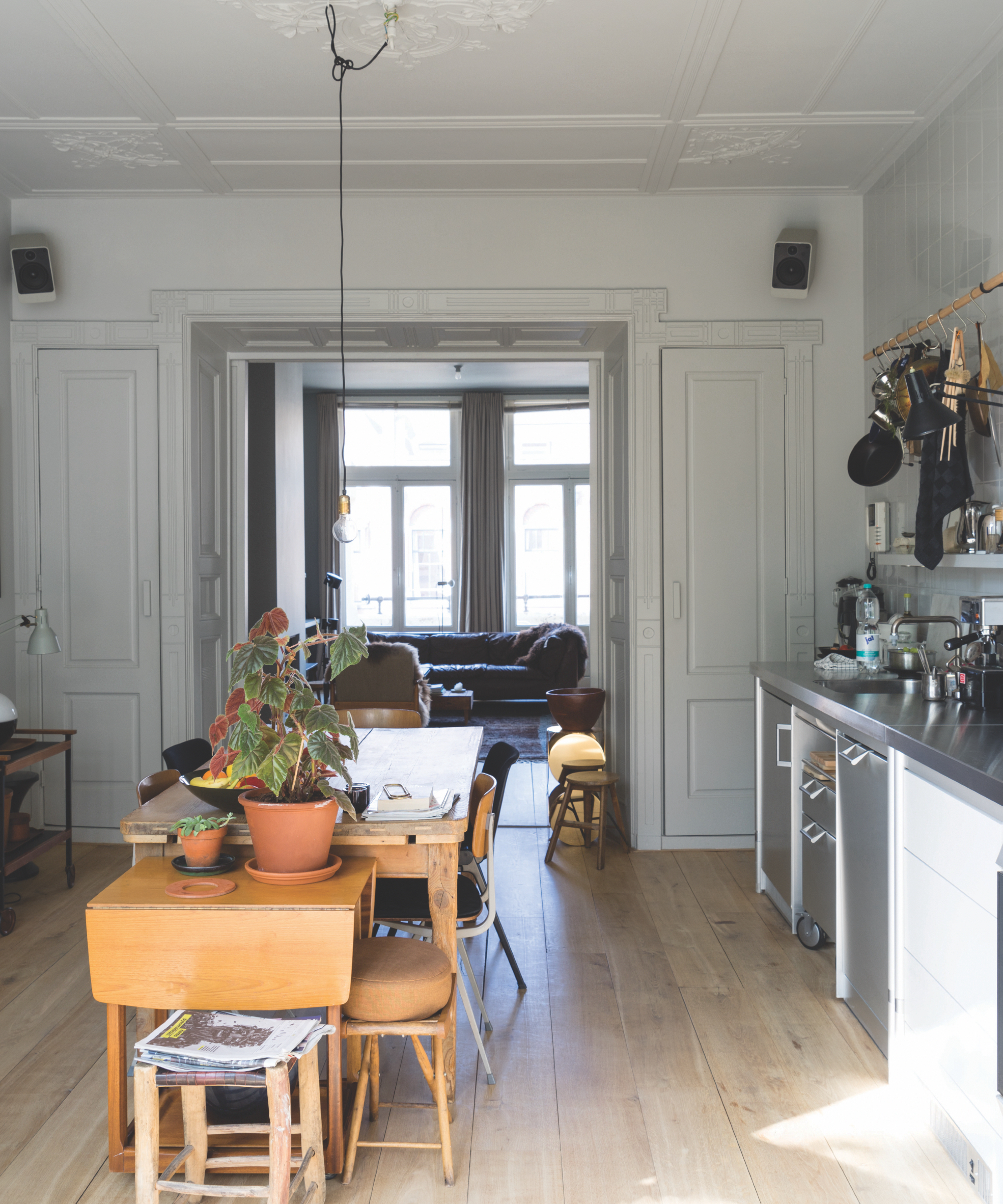
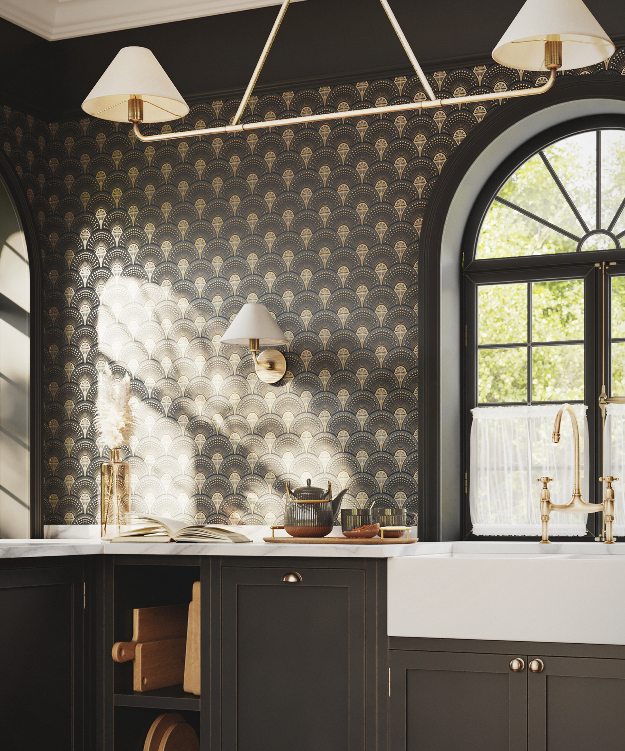
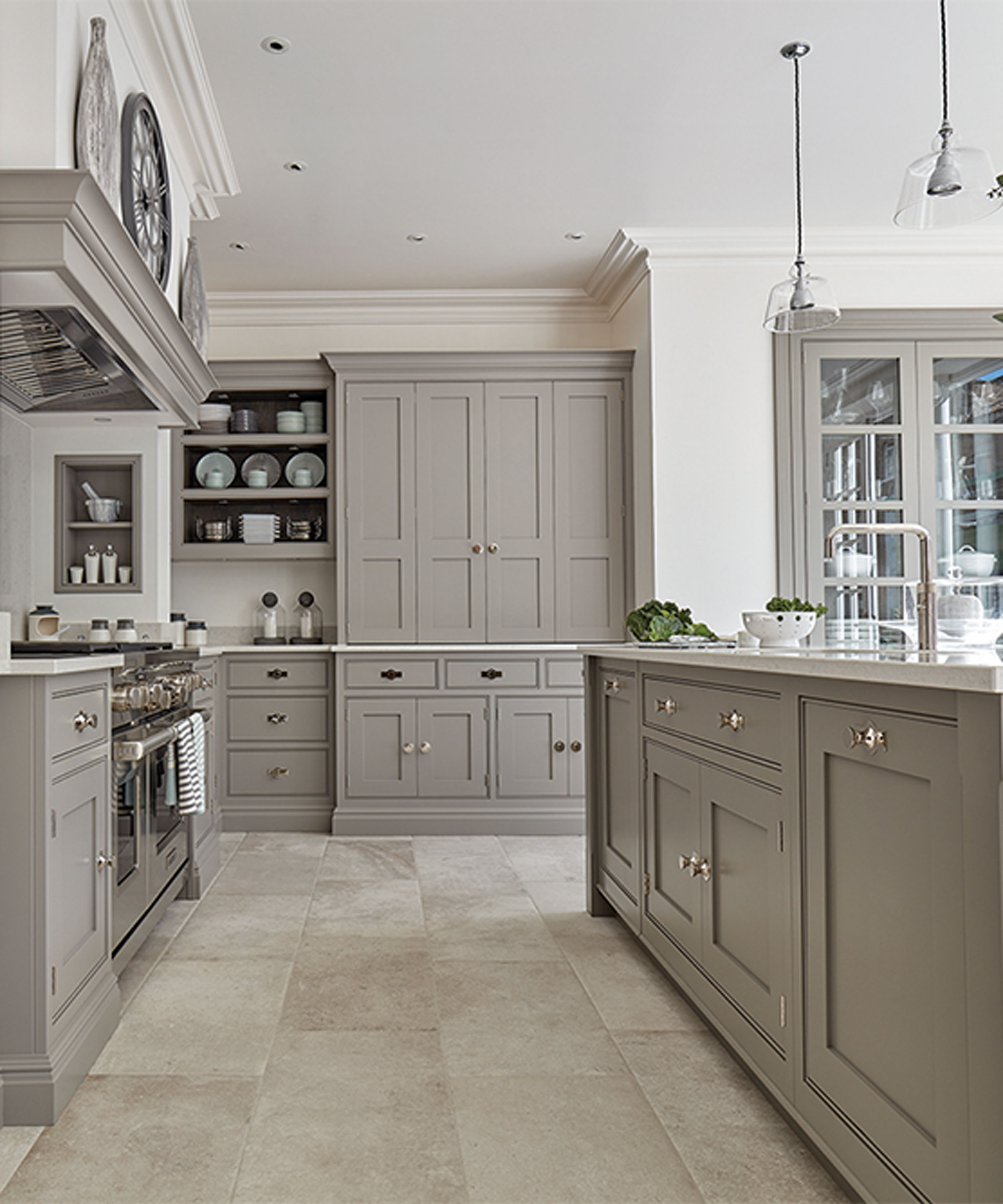
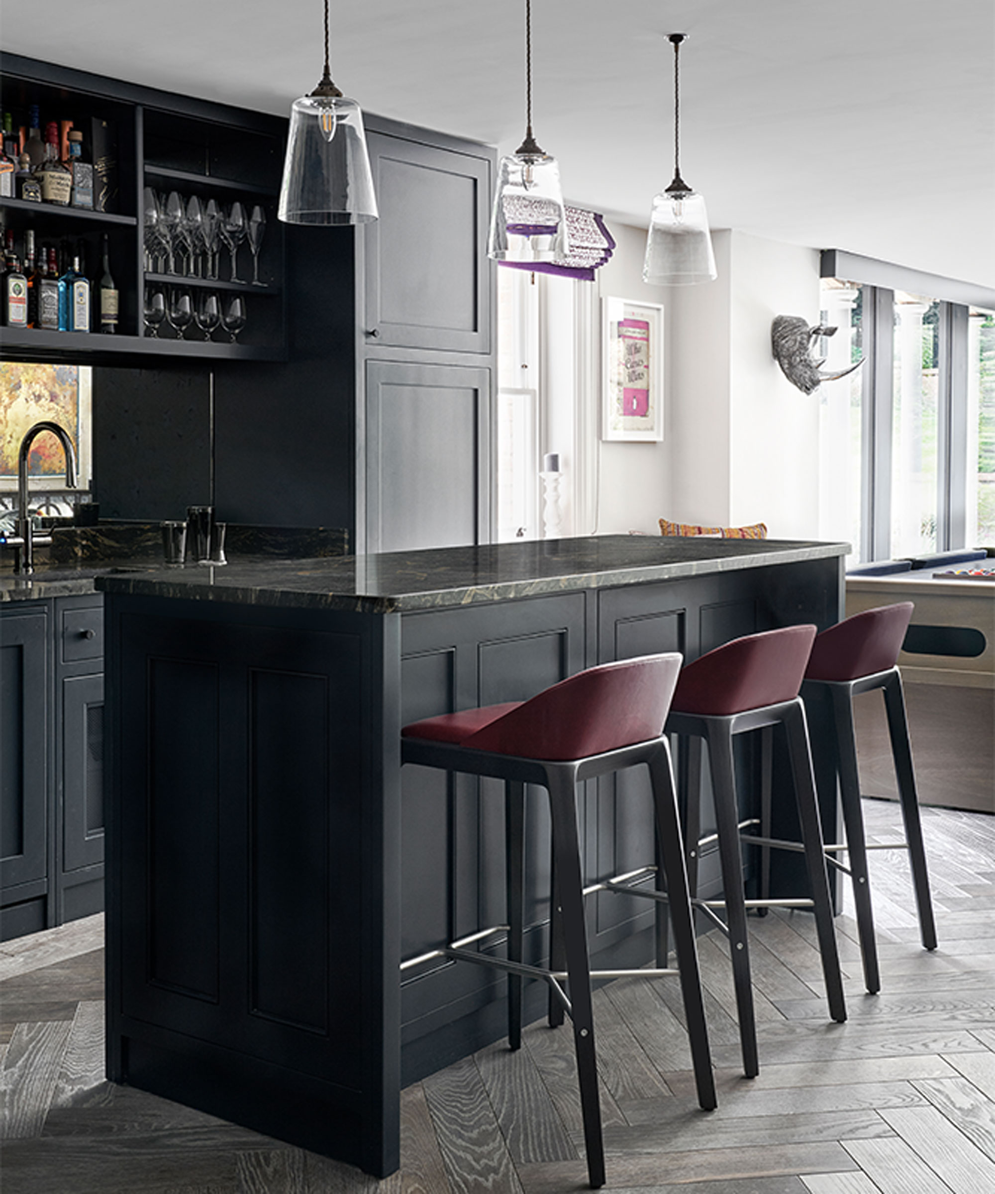
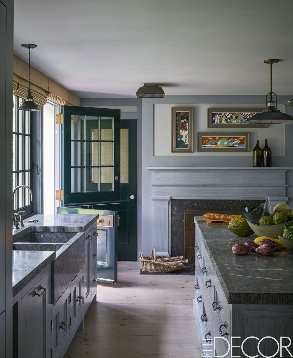
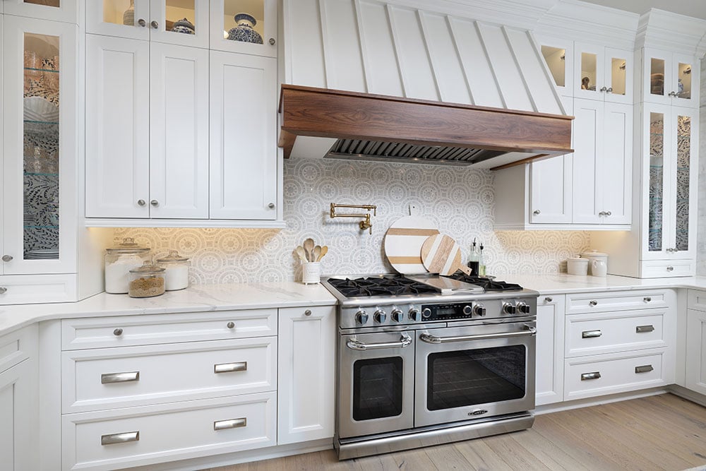
This article explores a remarkable gray kitchen remodel by Steven Cooper of Cooper Pacific, highlighting how a masterful blend of contrasting elements can create a cohesive and captivating space. The project, undertaken in a 100-year-old historic home in Los Angeles, focused on updating the kitchen while respecting the building's original framework and history. Steven Cooper emphasizes that the key to successfully integrating diverse design choices, such as different metals, wood tones, and light and dark colors, lies in careful planning and a confident approach.
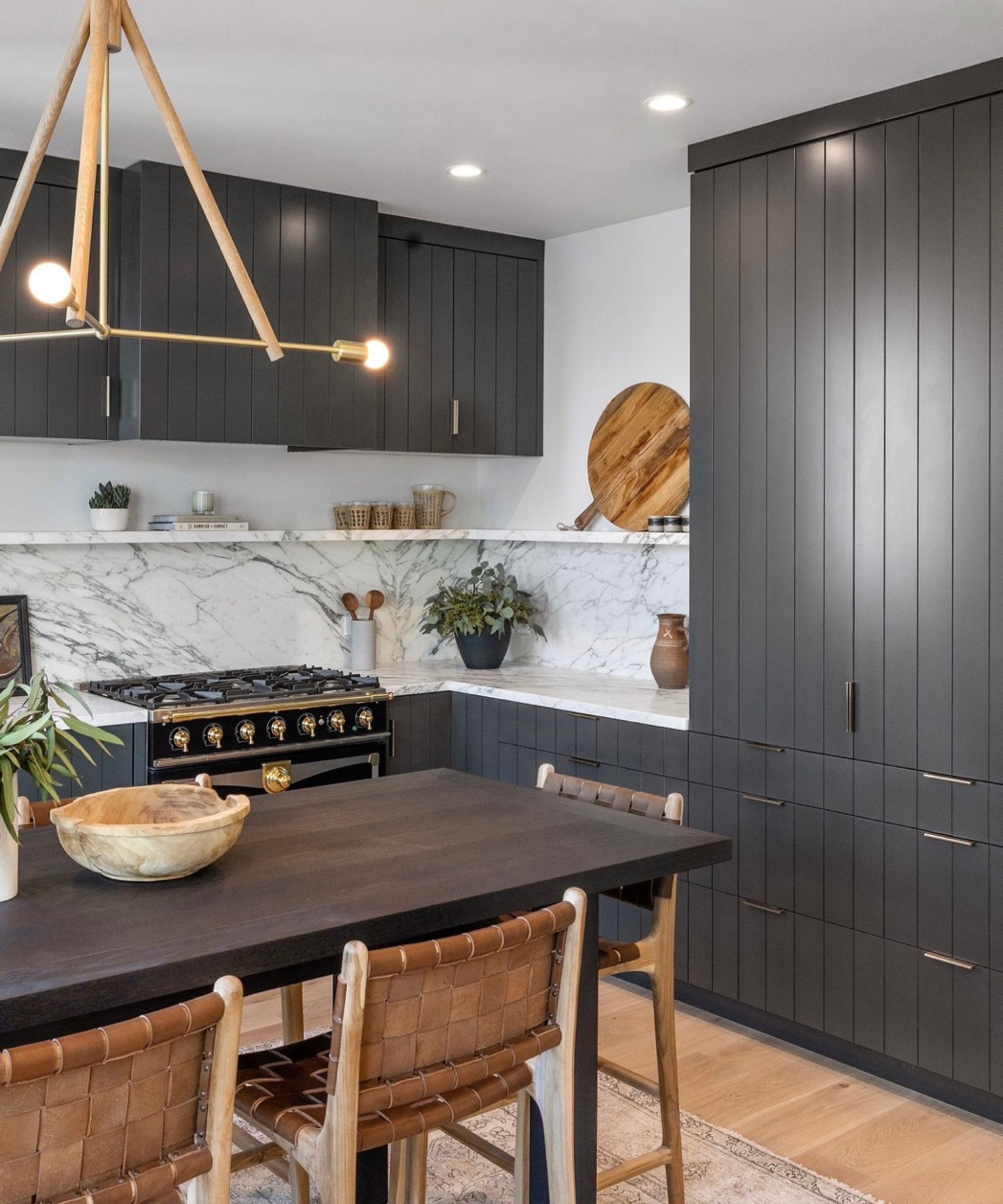
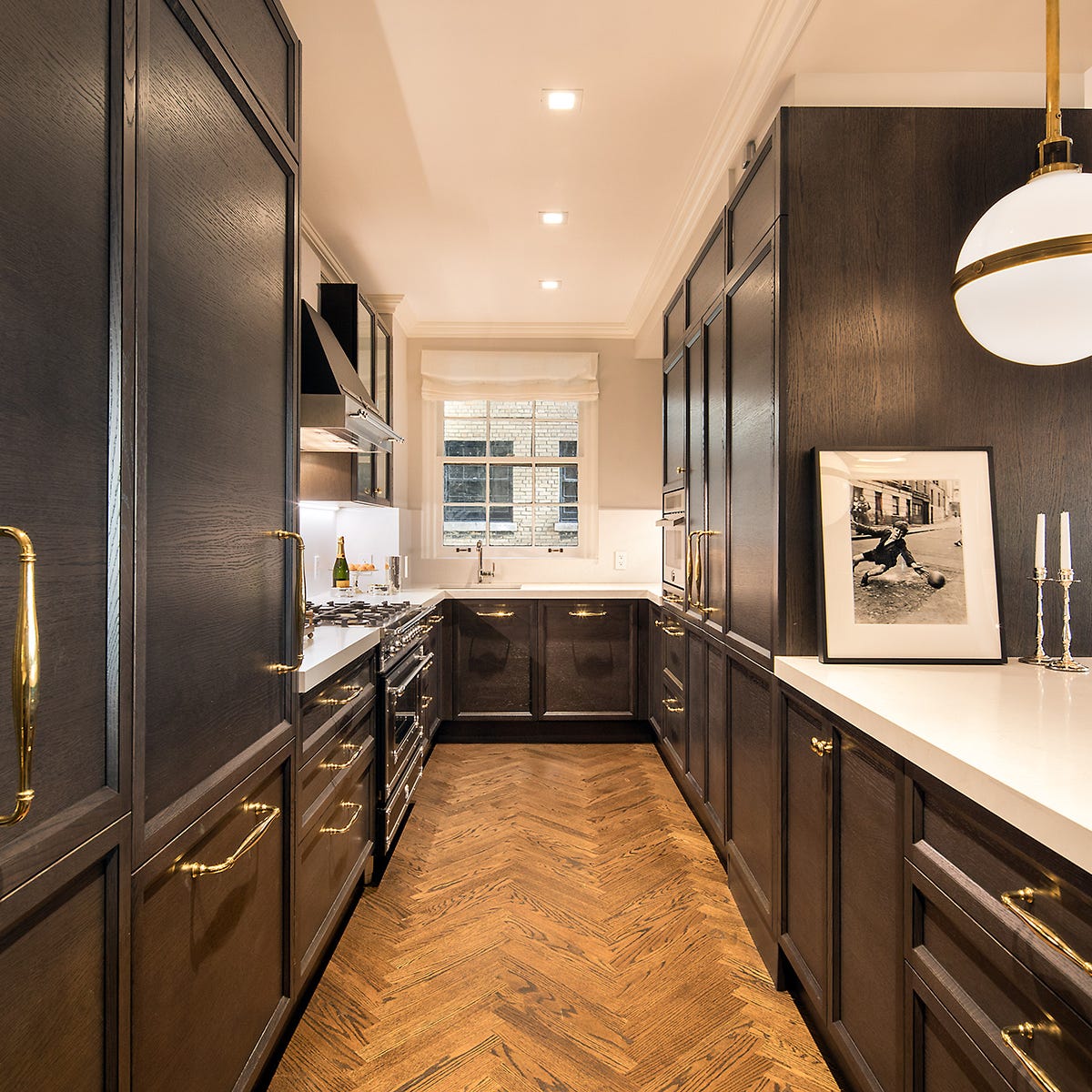
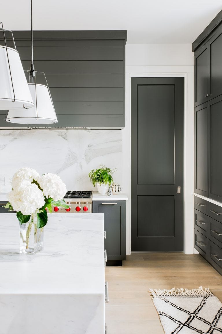
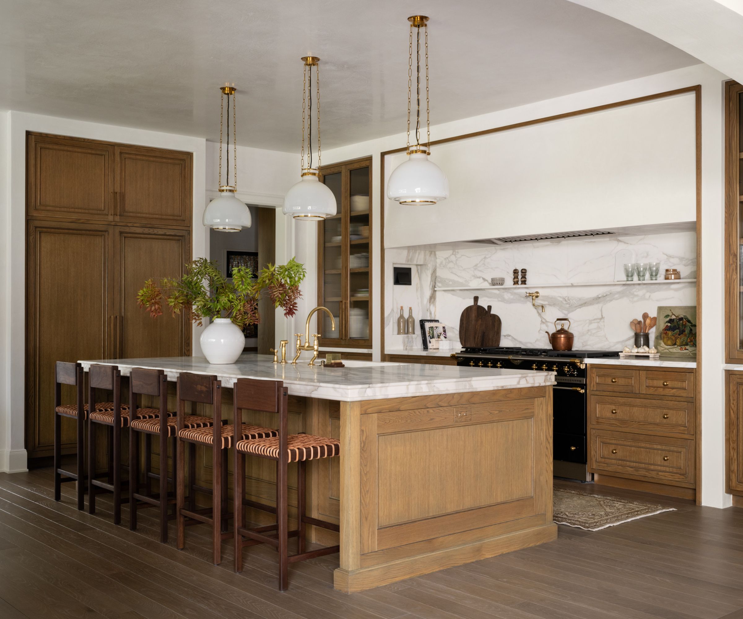
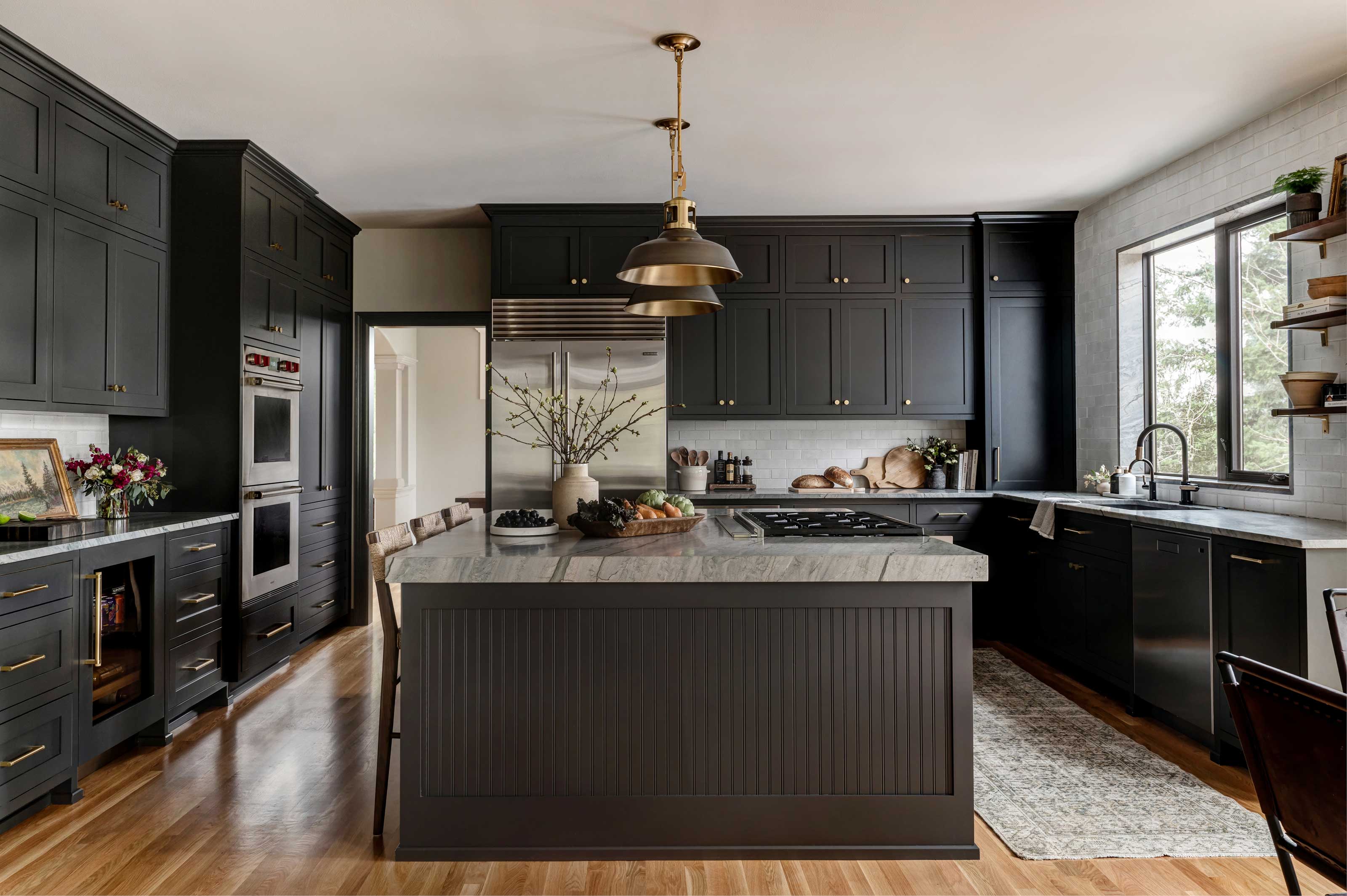
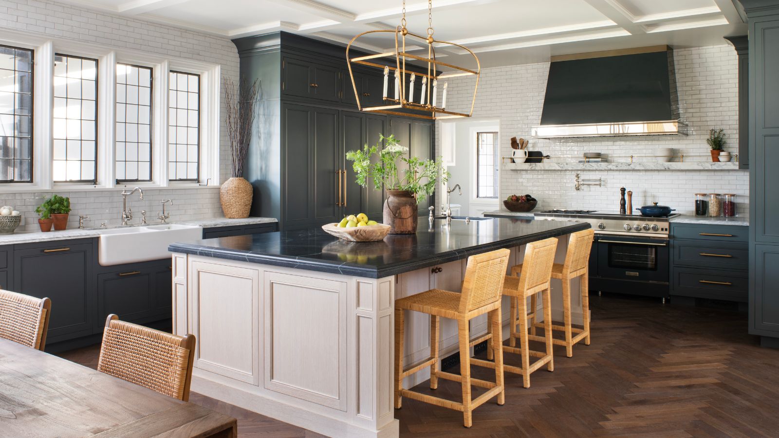
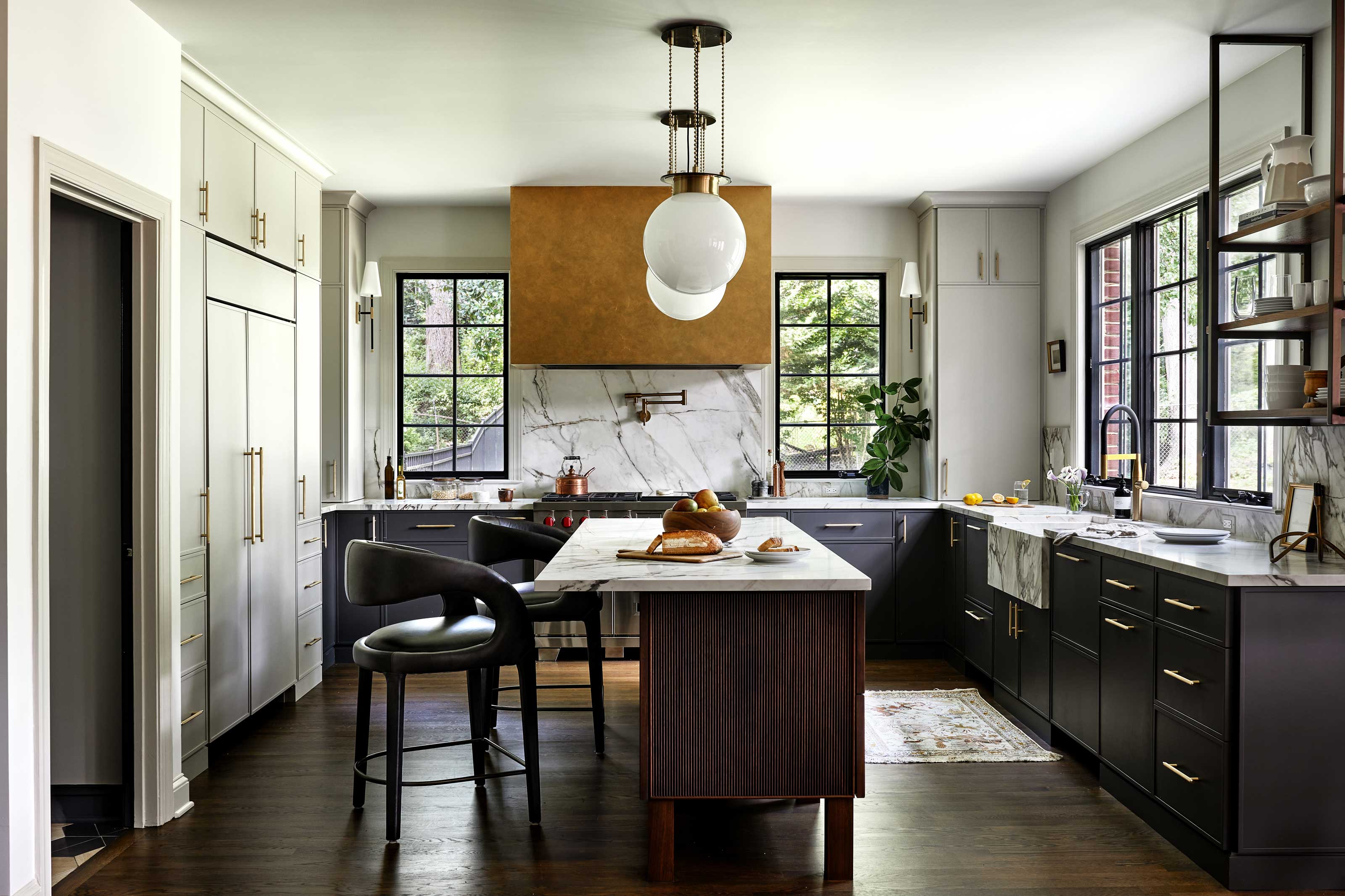
The design process began with the kitchen flooring, which needed replacement but had to align with the home's existing herringbone wood floors. Opting for a darker, richer wood tone established a strong anchor point, influencing subsequent design decisions. To prevent the space from becoming overly dark, a neutral kitchen island was introduced, along with white subway tiles and a large white ceiling, creating balance and warmth. This deliberate use of contrasting color areas is a central theme, with dark cabinets (Benjamin Moore's Dark Pewter) lining the perimeter and a creamy island (Benjamin Moore's Driftwood) occupying the center. This contrast is designed to draw the eye inward and then outward, emphasizing the room's expansiveness.
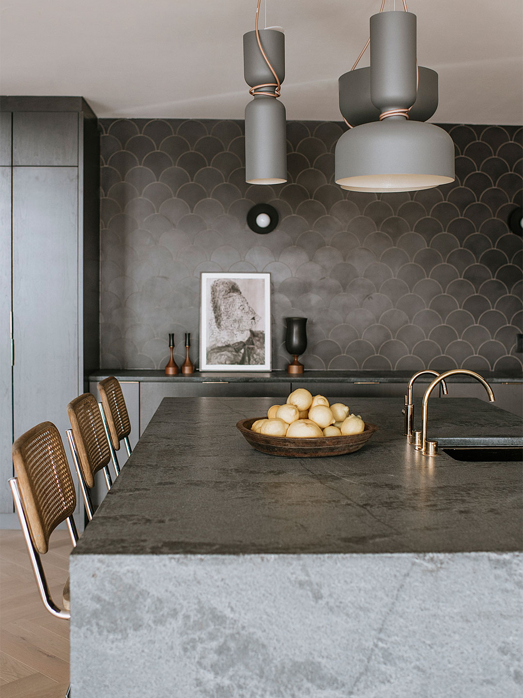
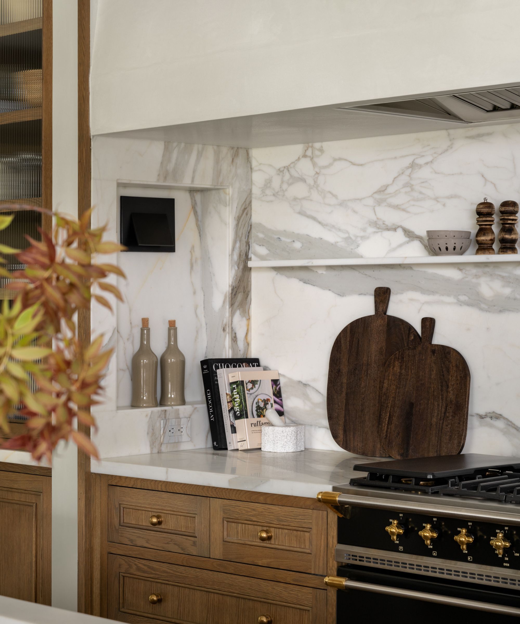
Cooper advocates for boldness when incorporating dark colors, particularly in well-lit spaces. He extended the dark cabinetry all the way to the ceiling, arguing that negative space can enhance the overall grandeur and prevent the design from feeling too safe. The choice of dark countertops also plays a crucial role, but with a twist. Instead of a solid, light-absorbing black, a black soapstone with subtle white veining was selected for the island. This textured material breaks up the darkness and reflects light, avoiding the monolithic effect of plain black surfaces.
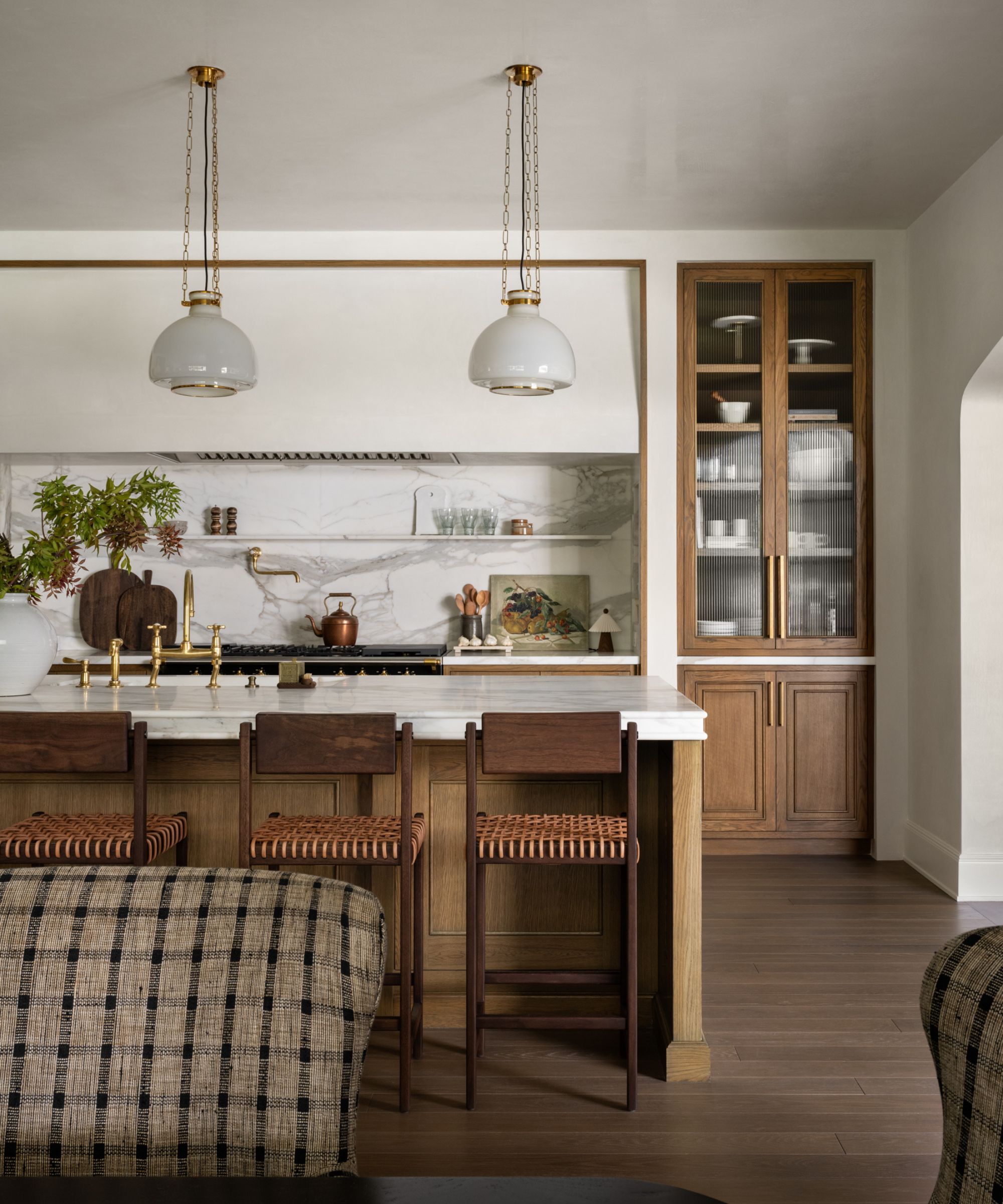
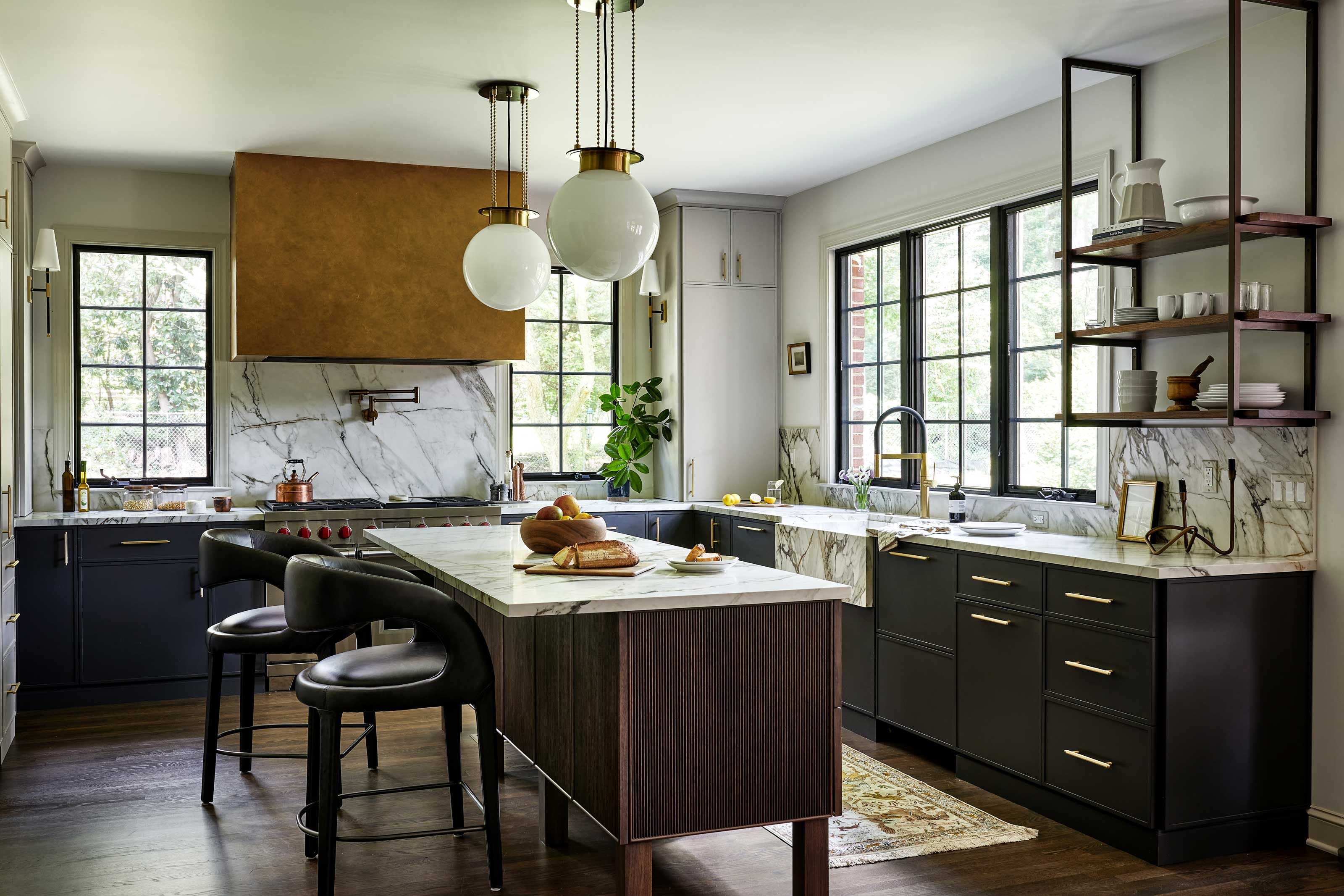
The kitchen also challenges conventional design rules regarding metallic and wood finishes. Instead of sticking to one metallic tone, Cooper mixed waxed brass handles, chosen to complement the home's architecture, with a chrome faucet. This approach adds visual interest, with the chrome faucet receding into the background due to its practical, non-patinating nature. Similarly, various wood tones are present, including the flooring, counter stools, and dining table. These different woods were chosen not for their color uniformity, but for their unique textures and character, contributing to the kitchen's layered personality.
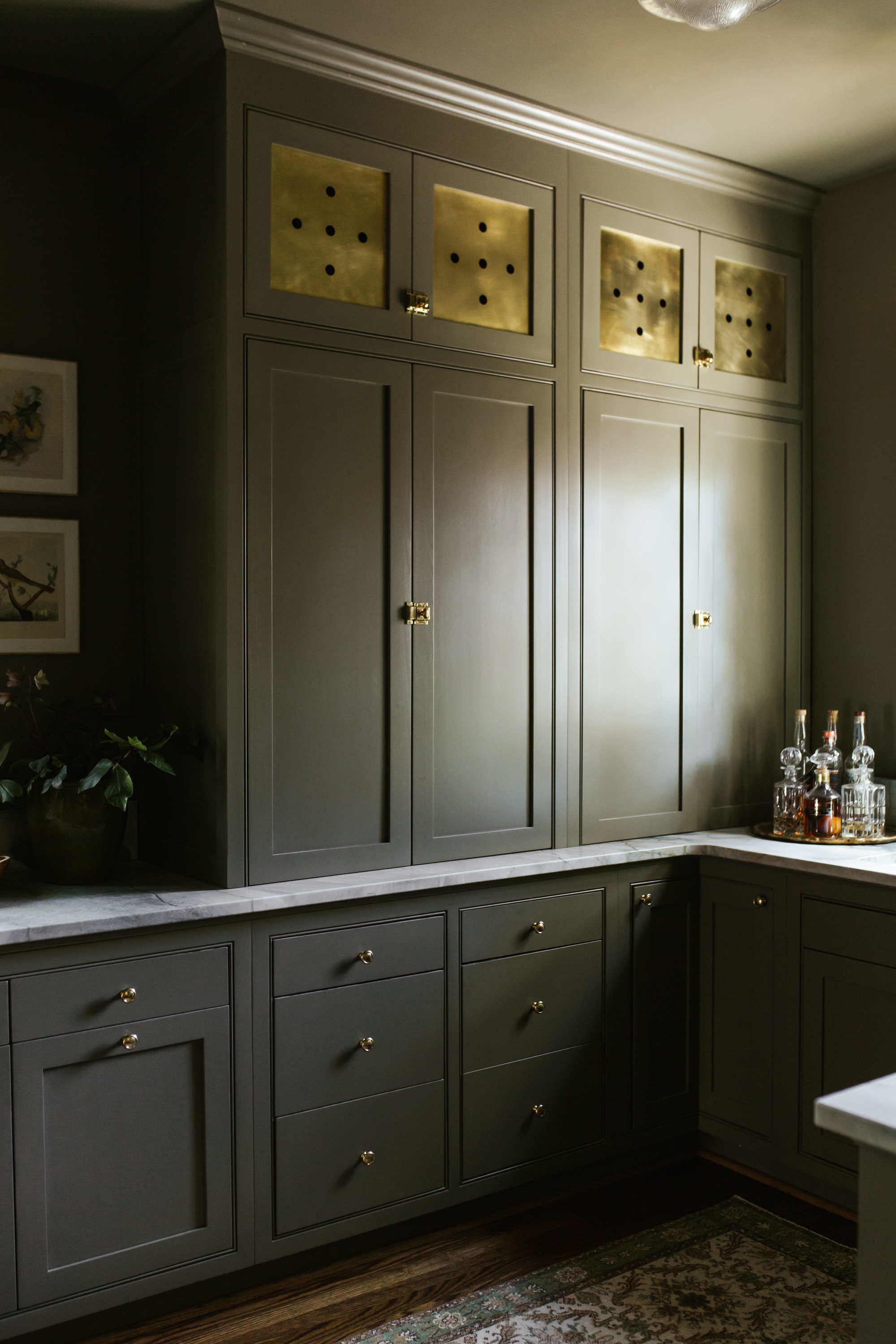
Despite the apparent eclecticism, a strong sense of cohesion underpins the design. This is achieved through elements like the brass-fronted cabinets near the dining table, which subtly tie together the dark cabinetry, the gridded ceiling details, and the floor's texture. This intentional through-line allows for playful design choices without sacrificing harmony. Finally, the lighting strategy is meticulously planned, with impactful feature lighting above the island complemented by hidden recessed lights in the ceiling and cabinets. This creates a soft, ambient glow, fostering a convivial atmosphere and demonstrating that practical light sources don't always need to be overtly displayed.
#GrayKitchen #KitchenRemodel #InteriorDesign #StevenCooper #HomeRenovation #ColorContrast #MixedMetals #WoodTones #KitchenLighting #GrayKitchen #KitchenRemodel #InteriorDesign #StevenCooper #HomeRenovation #ColorContrast #MixedMetals #WoodTones #KitchenLighting
0 comment in total
 No comments yet
You may also like
I thought I hated gray kitchens, until I saw this design

What colors go best with gray kitchen cabinets? Interior designers explain how to decorate with this cool neutral
Dark gray kitchen ideas – 10 sophisticated and timeless looks
Fun Tips for an Amazing Kitchen Remodel
Are gray kitchens out of date? We get the low-down from design experts

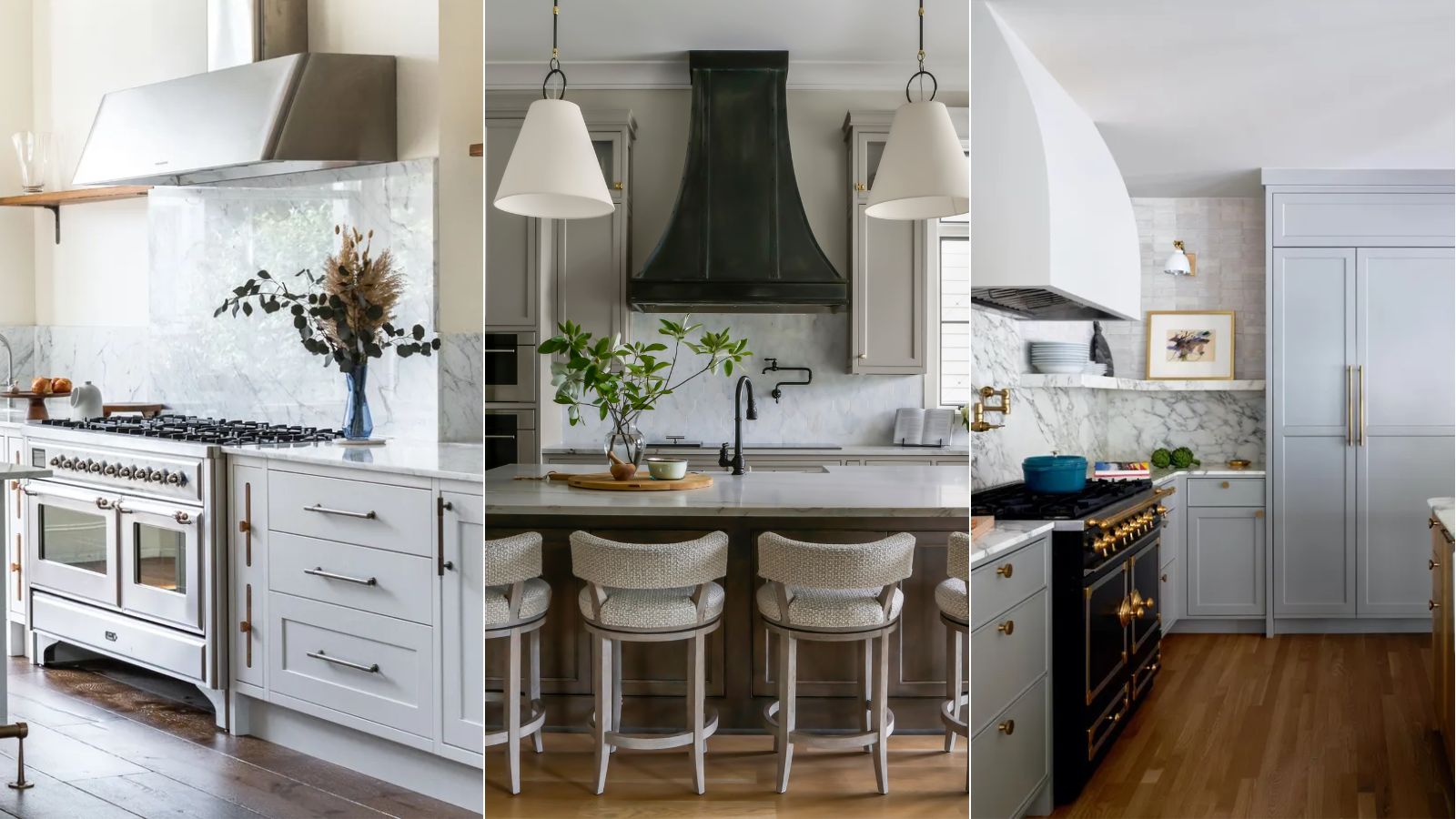
3 most common gray kitchen mistakes – and what designers advise to do instead

Martha Stewart Credits Cabinet Color For Making 20-Year-Old Kitchen Look Good As New
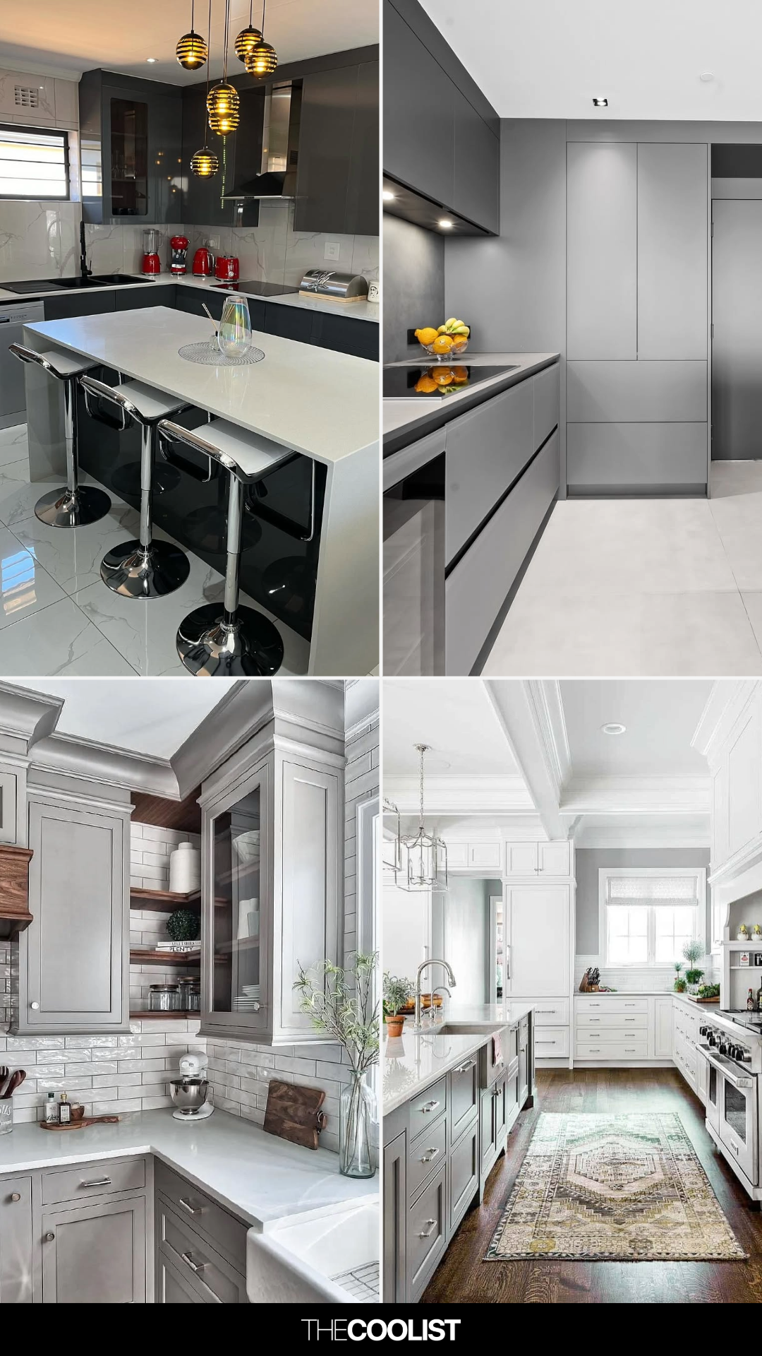
26 Pinterest-Shattering Gray Kitchen Ideas That Have Designers Drooling in 2025
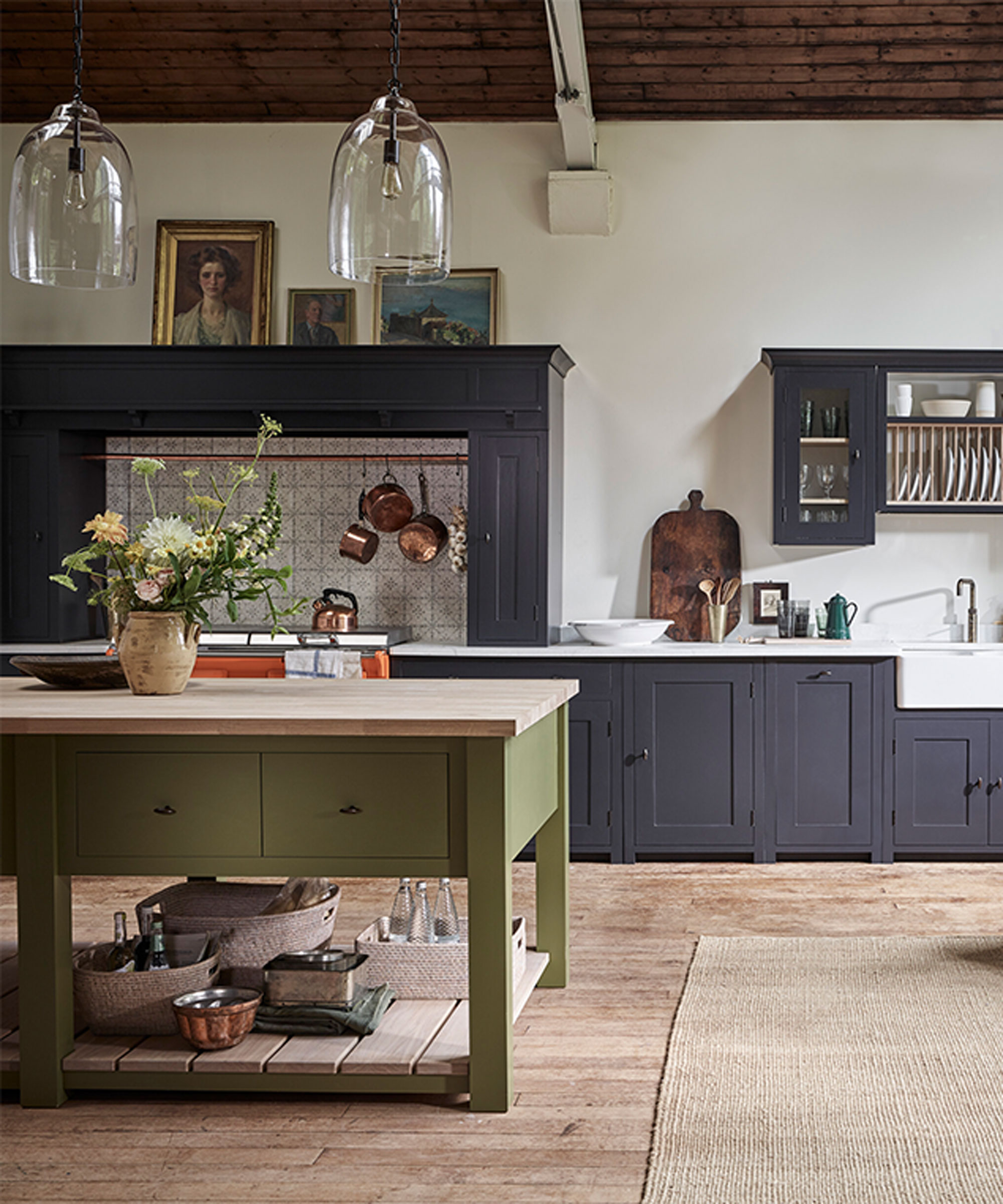
Grey kitchen ideas – 35 classic designs you will love forever
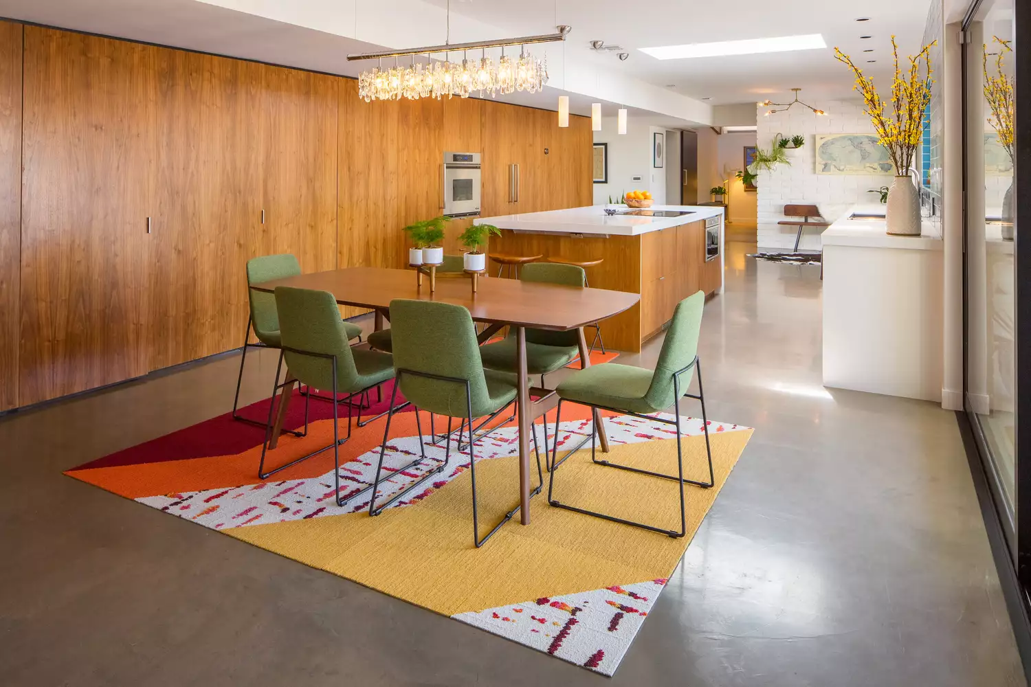
These Eye-Catching Kitchens With Gray Floors Are Perfect for Any Home

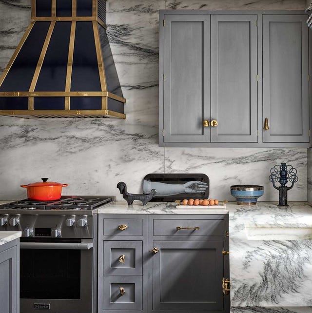
40 Gray Kitchens That Are Anything But Dull

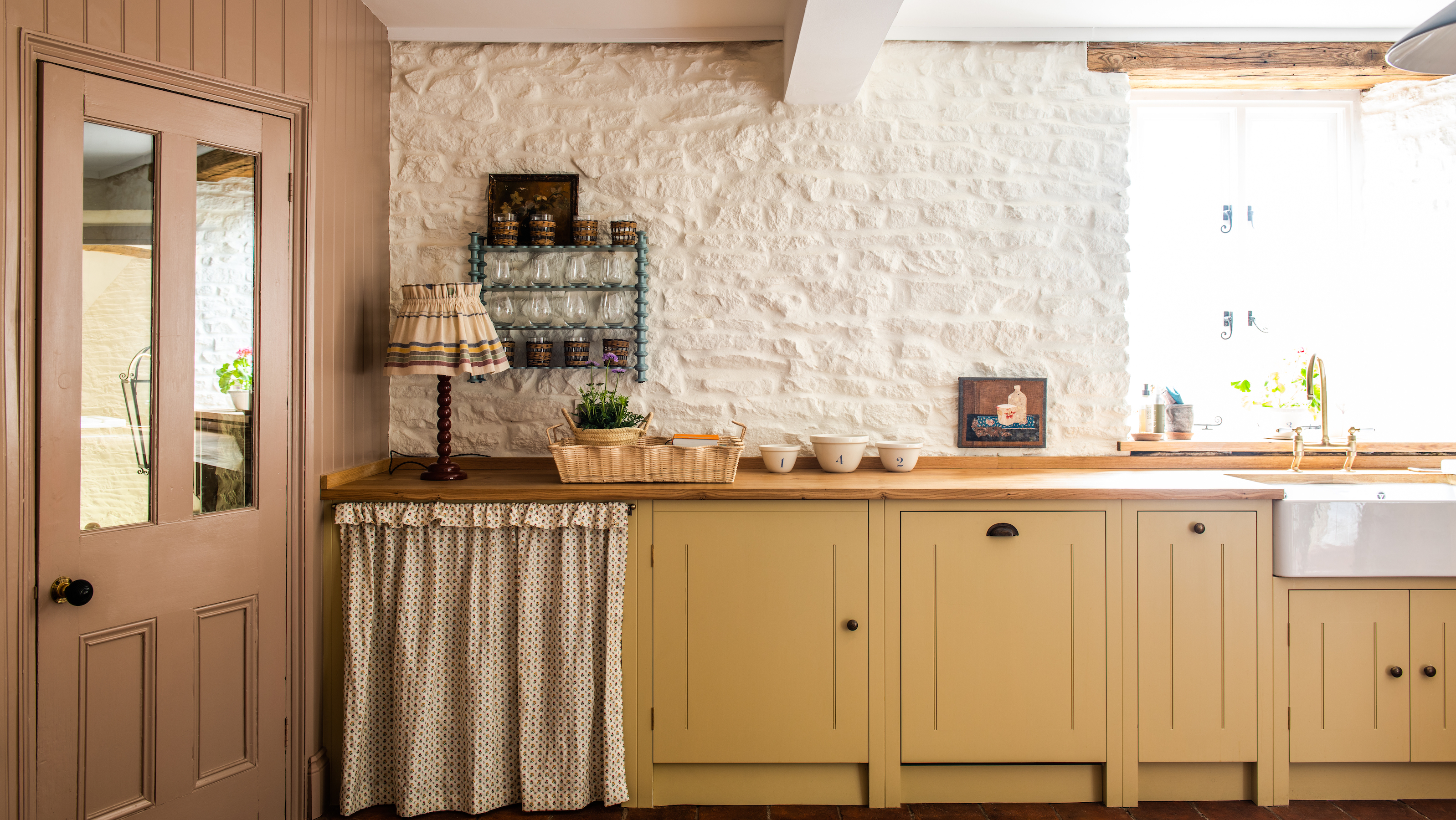
10 style secrets we learned from the kitchen design of edit58's founder – take inspiration for yours
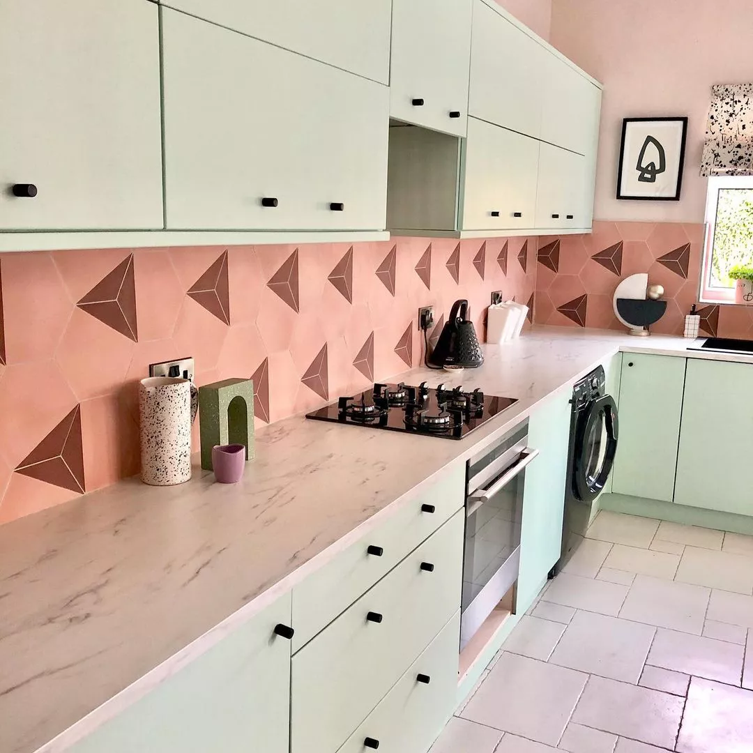
10 Genius Tips Designers Always Use to Add Pops of Color to a Dull Kitchen
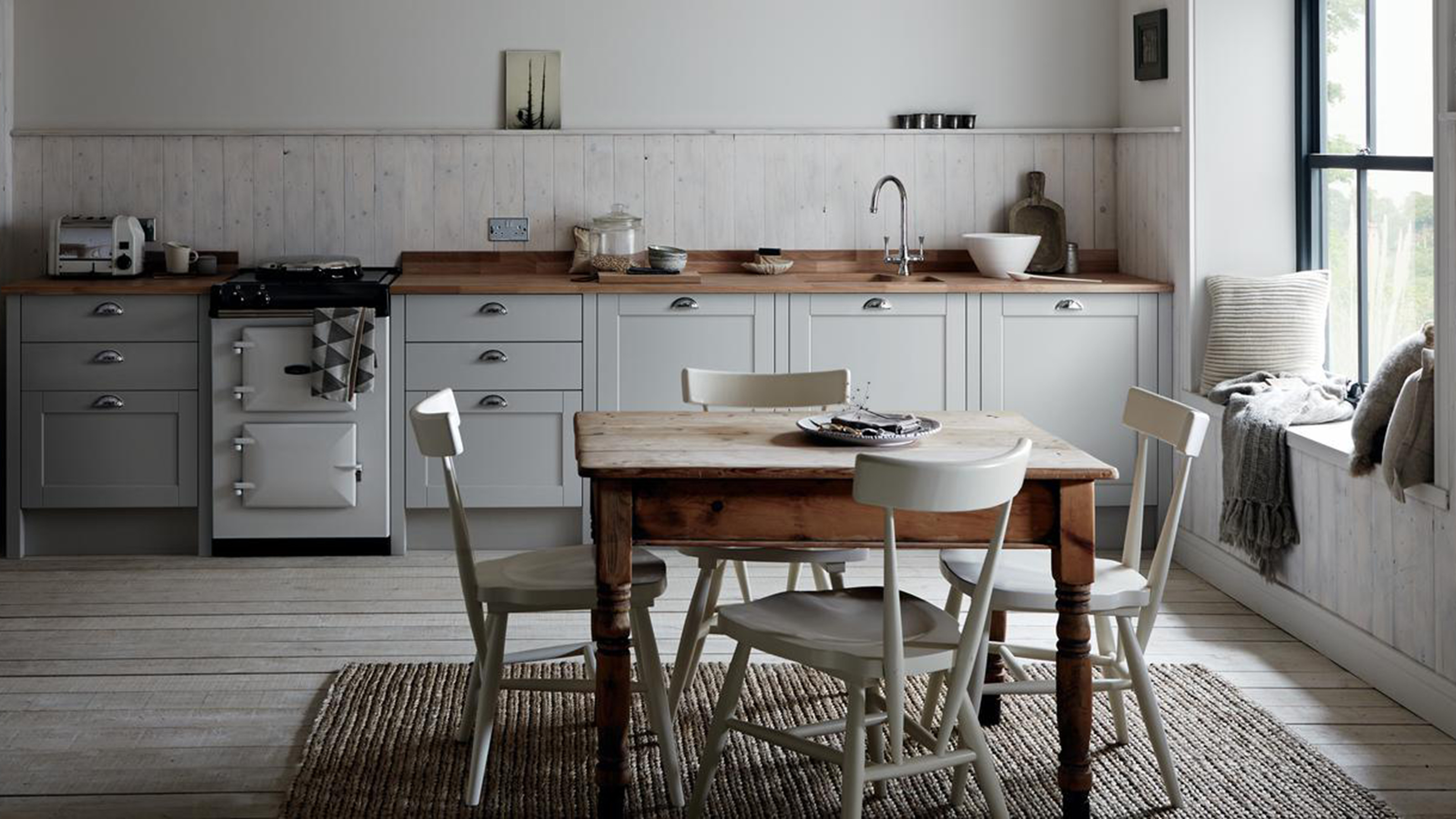
25 gorgeous grey kitchen ideas
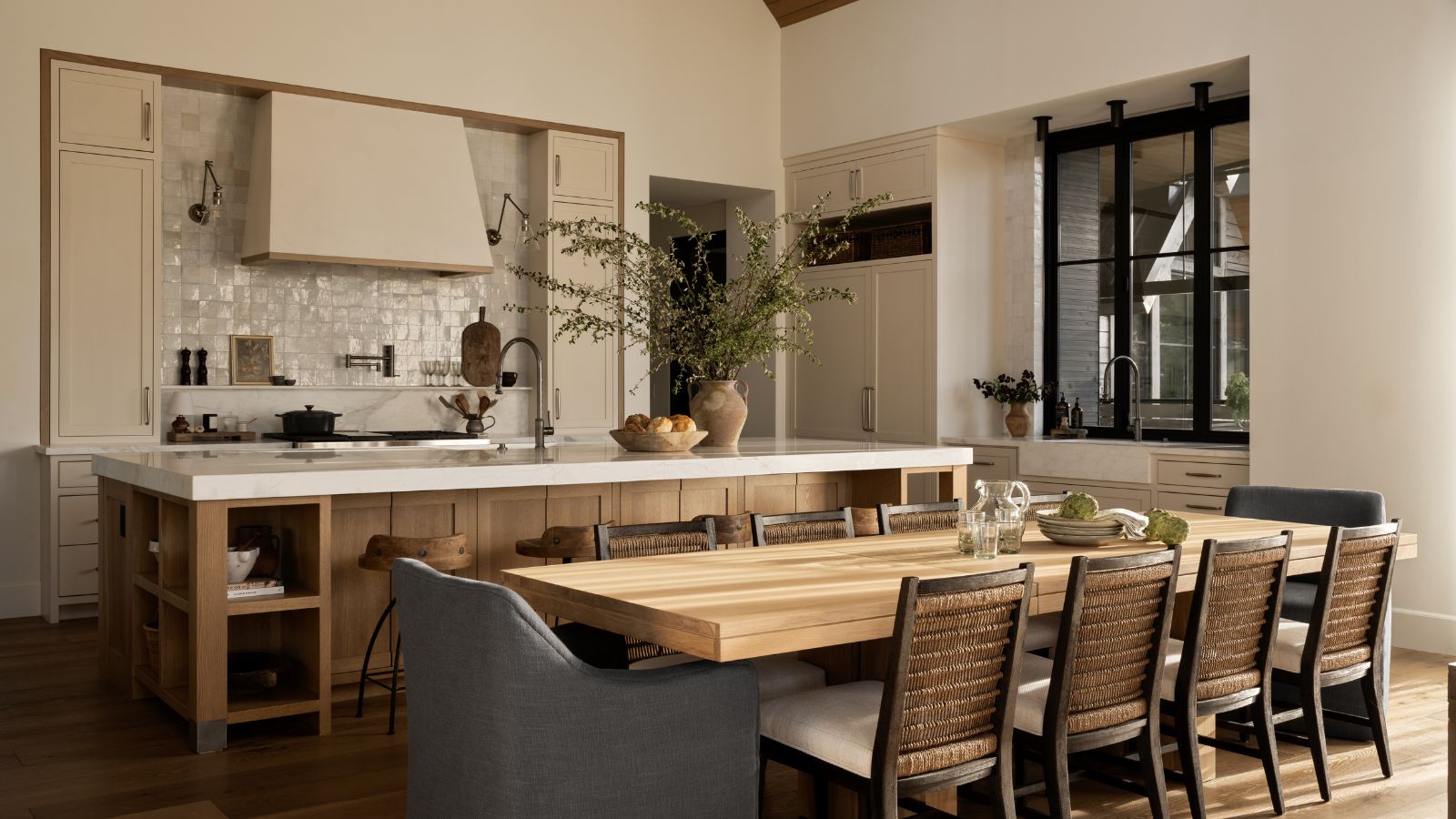
3 of the most beautiful Studio McGee kitchens – and the design lessons we’ve learned from them
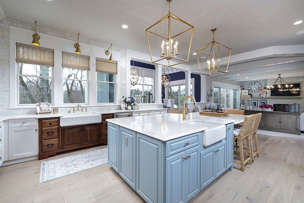
Best of Design: New Kitchen

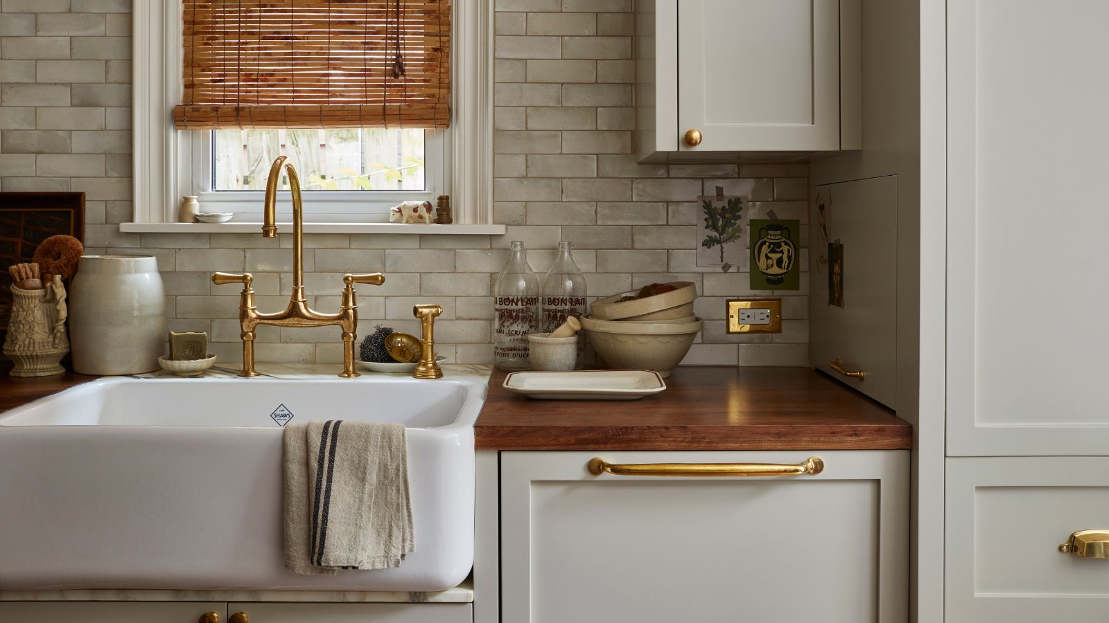
I thought I was totally over gray kitchens – but this surprisingly textured, vintage-style space has proved gray can be warm and welcoming if you know how to use it
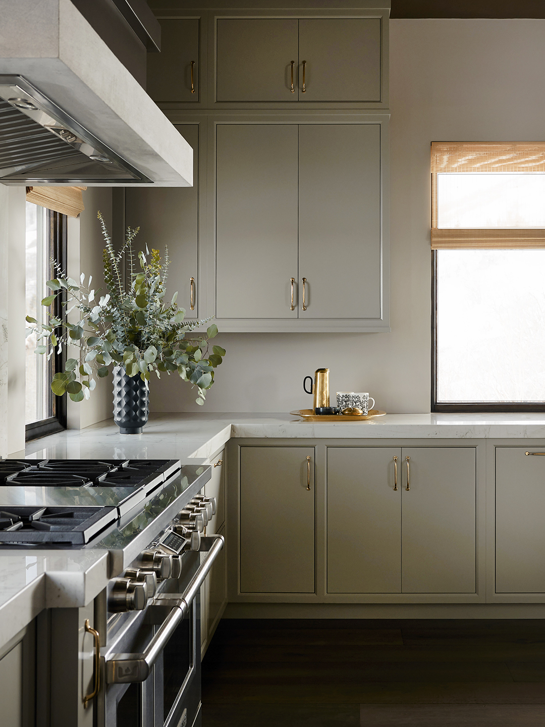
This Popular Kitchen Color Can Actually Hurt a Home’s Sale Price

This "trend-defying" kitchen color could make your home sell for thousands of dollars more, say experts

The Ultimate Kitchen-Design Hack