1/12
Getting Hitched This Spring? Try One of These Elegant Color Schemes
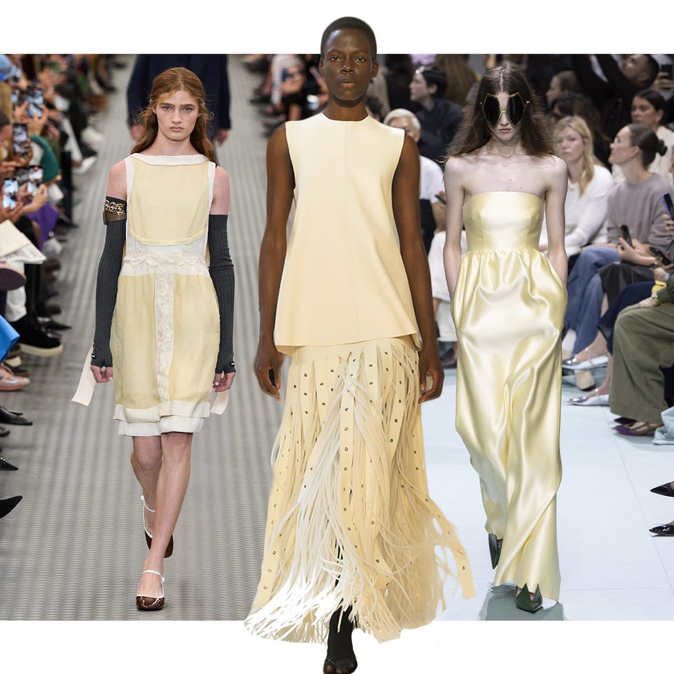
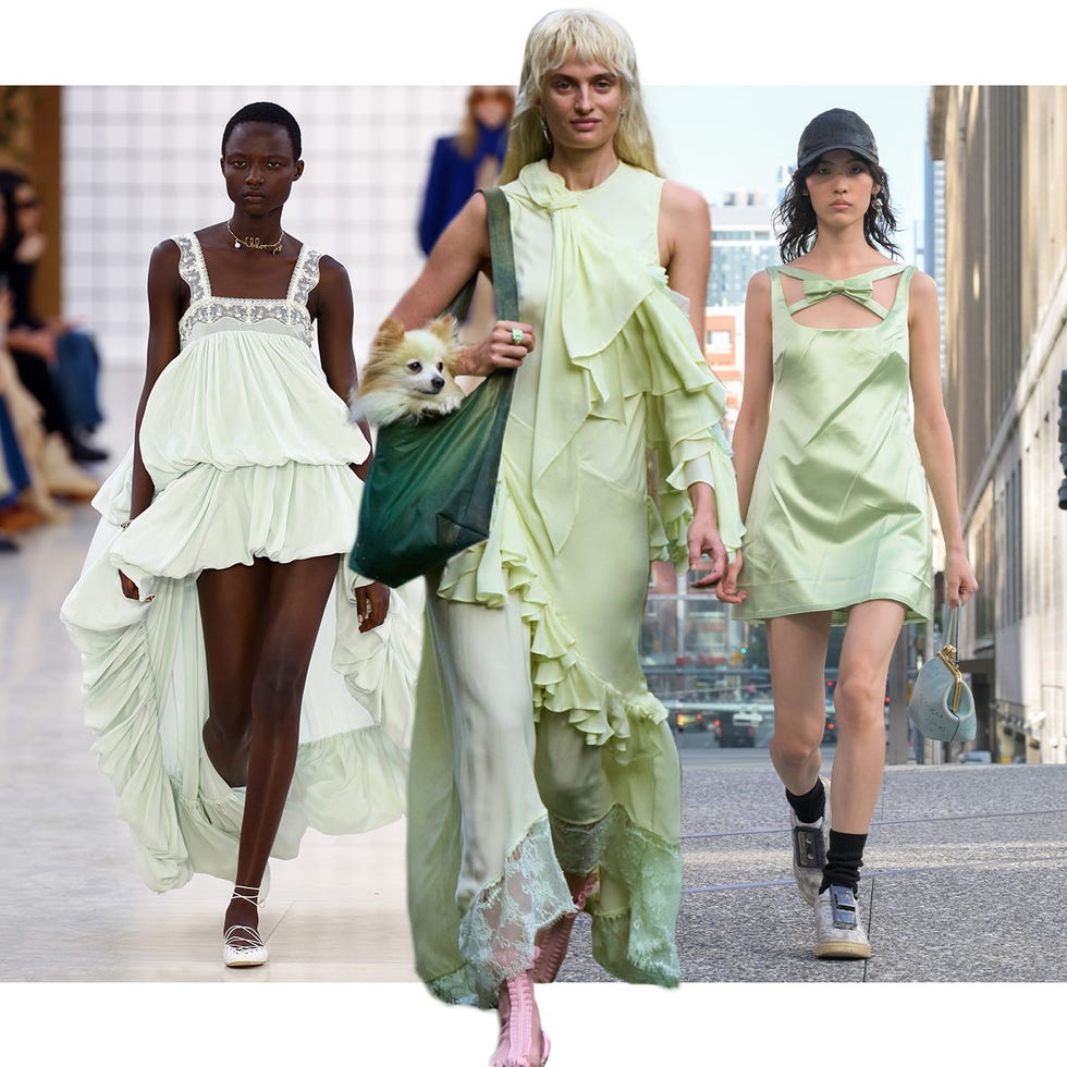
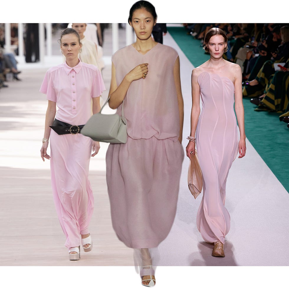
Planning a spring wedding involves numerous decisions, with the color scheme being one of the most pivotal, influencing everything from table settings to floral arrangements. The spring season, symbolizing new beginnings, offers a rich source of inspiration for wedding palettes. Experts like Darcy Miller, a veteran party planner, emphasize selecting colors that feel fresh and joyful, whether that translates to pastels, crisp black and white, or vibrant pink and green, all depending on the venue's decor. Matthew Robbins, another top wedding planner, advocates for romantic pastel palettes for spring, suggesting soft lilac, pale pink, white, butter yellow, and the palest green tones that harmonize beautifully.
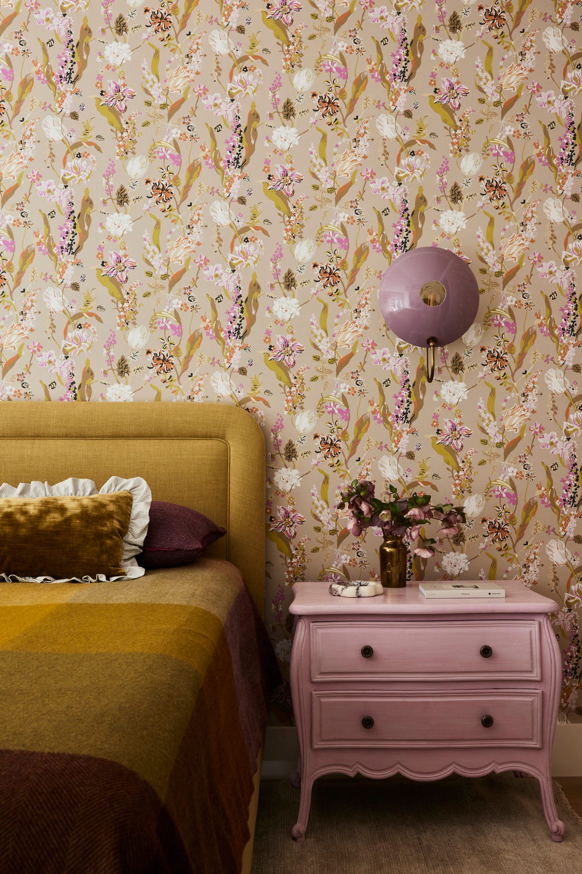
Several specific color combinations are highlighted as elegant choices for spring weddings. Mauve, a softer variation of vivid purples and berry hues, can create a chic, monochromatic tablescape when paired with greenery and complementary glassware. A classic combination of white, blue, and green, as recommended by Robbins, emphasizes delicate textures and shapes. Rather than solely using flowers, these colors can be incorporated through accessories like water glasses, napkins, linens, or menu details. For venues with distinct features, such as brick walls, incorporating those hues subtly into the tablescape, as Fallon Carter suggests, can create a cohesive look. However, Carter also advises against being too matchy-matchy, recommending complementary colors like greenery to enhance a monochrome setting.
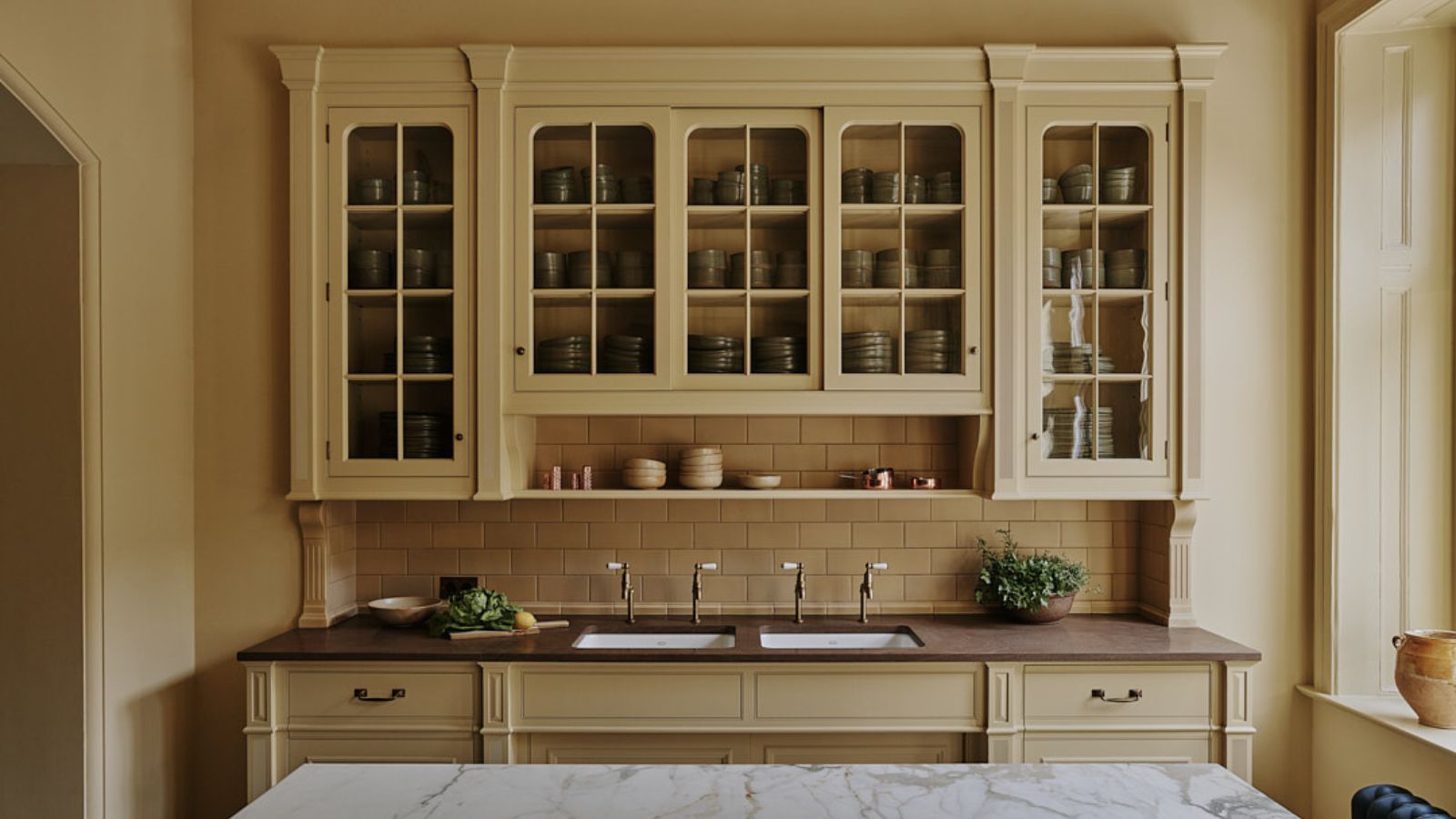
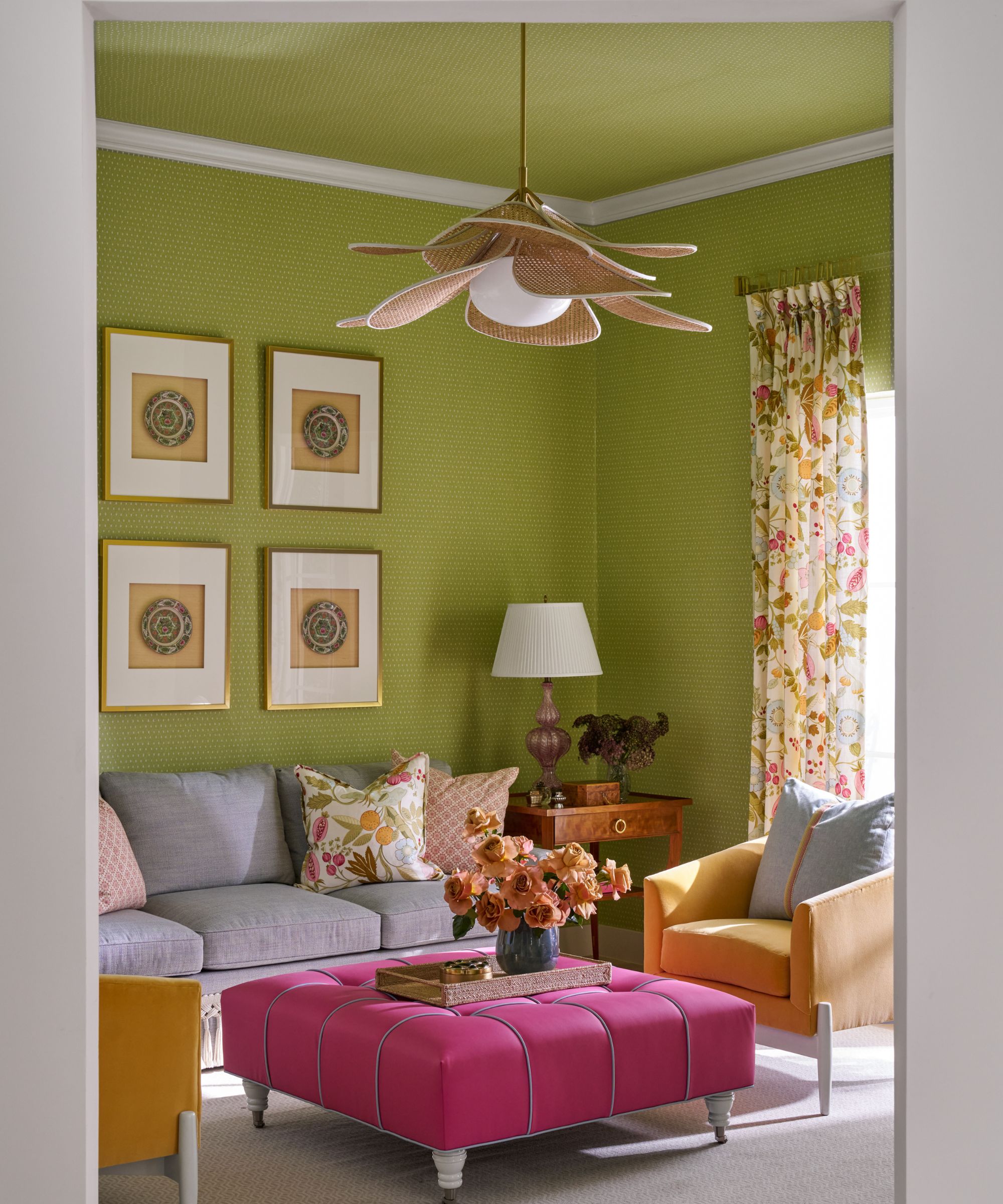
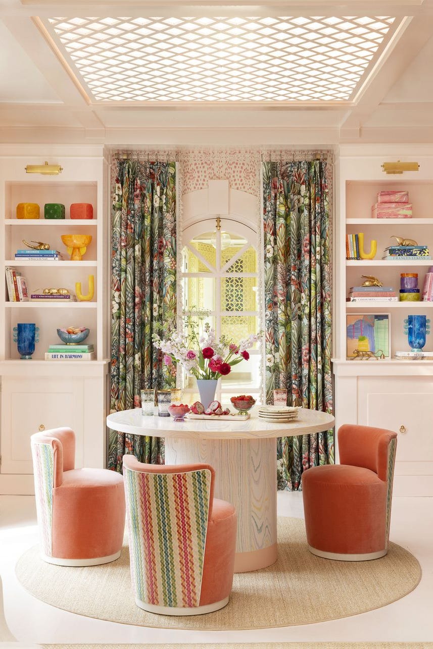
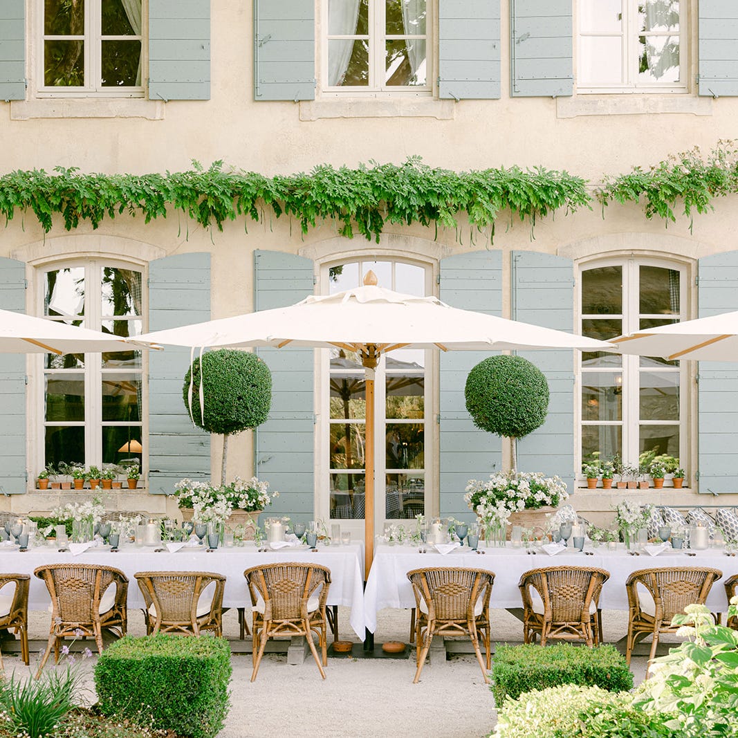
For those who prefer bolder statements, jewel tones offer an alternative to pastels. Bronson van Wyck describes this palette as more resilient, with rich emeralds, fuchsia, and oranges creating a thoughtful yet playful narrative through linens, flowers, and seasonal fruit. Conversely, vibrant pastels, dubbed "sherbet hues" by Rebecca Gardner, can also make a bold impact. These include shades of pink, mint, and creamsicle, often anchoring an explosion of floral abundance, such as variegated parrot tulips. Another classic approach features white and green, with subtle "something blue" elements found in architectural details like shutters, as seen in a Provence wedding designed by Matthew Robbins, enhanced by pale blue glassware.
Even in spring, romantic and moody atmospheres can be achieved. A combination of red, peach, white, and green, accentuated with candlelight from glass hurricanes, can create a glowing scheme, particularly when complementing existing architectural elements like brick walls. Personalized color palettes, such as Darcy Miller's Ladurée-inspired pastels, hold special meaning. Her soft palette, drawn from a shared memory of a Parisian bakery with her husband, demonstrates how personal experiences can inform wedding colors, creating a dessert buffet and cake reflecting those hues.
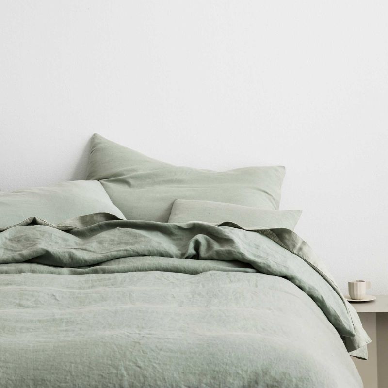
Further options include soft lilac, pink, and green, where colors are integrated beyond just flowers, extending to elements like napkins, timber tones, and chandelier lighting, complemented by hanging vines and blooms for added romance. For a vibrant twist on green, G. Blake Sams suggests amping up a green-centric scheme with confetti-bright touches of yellow, pink, and blue in floral arrangements, set against white tablecloths and weathered chairs. Finally, fresh pastels, embracing the abundance of spring flowers, are encouraged, with Robbins recommending large urns of delphinium and lilac to frame a ceremony or entrance, and emphasizing movement in floral arrangements to capture spring's energy.
#SpringWedding #WeddingColors #WeddingDecor #EventPlanning #ColorPalette #FloralDesign #TableSetting #LuxuryWeddings #SeasonalDecor #SpringWedding #WeddingColors #WeddingDecor #EventPlanning #ColorPalette #FloralDesign #TableSetting #LuxuryWeddings #SeasonalDecor
0 comment in total
 No comments yet
You may also like
The Color Palettes Currently Inspiring Domino Editors

Sorry pastels, there's a new color palette on trend for spring – and it's all about playful and more saturated hues


Designers LOVE Pairing These Unexpected Colors With This One Timeless Hue

8 Spring Color Schemes the Paint Pros Are Raving About for 2025

7 Best Colors Designers Say You Should Use to Make Your Home Feel Fresh, Light and Spring-Ready
Designers LOVE Pairing These Unexpected Colors With This Sophisticated Hue

20 Spring Color Combos That will Brighten Your Home No Matter the Season
These Are the New Floral Prints Designers Are Loving

Deeper, moody colours and precious jewel tones are in style this year
The 9 Best Color Palettes for a May Wedding
Chartreuse, Cobalt, & 9 More Of Spring’s Hottest Nail Polish Color Trends
15 Unexpected Spring Home Trends That Will Define the Season

24 Wedding Color Palettes That Are Just Right for Spring Nuptials
2023 spring trends: decorate your home with this season's colours
Colors That Go With Blue — 16 Pairings Designers Depend on for Bold, Breezy, and Perfectly Balanced Palettes

This Elegant Color Is to Spring What Black Is to Winter

These are the 6 must-have colors to decorate with in April 2025
Unexpected Color Combinations Trend Spring/Summer 2026

These Are the Top 6 Color Trends We’ll Be Sporting This Summer
21 Designers Share Their Color-Trend Predictions for Spring