3 Designer-Approved Ways to Nail a Red and Gray Color Scheme
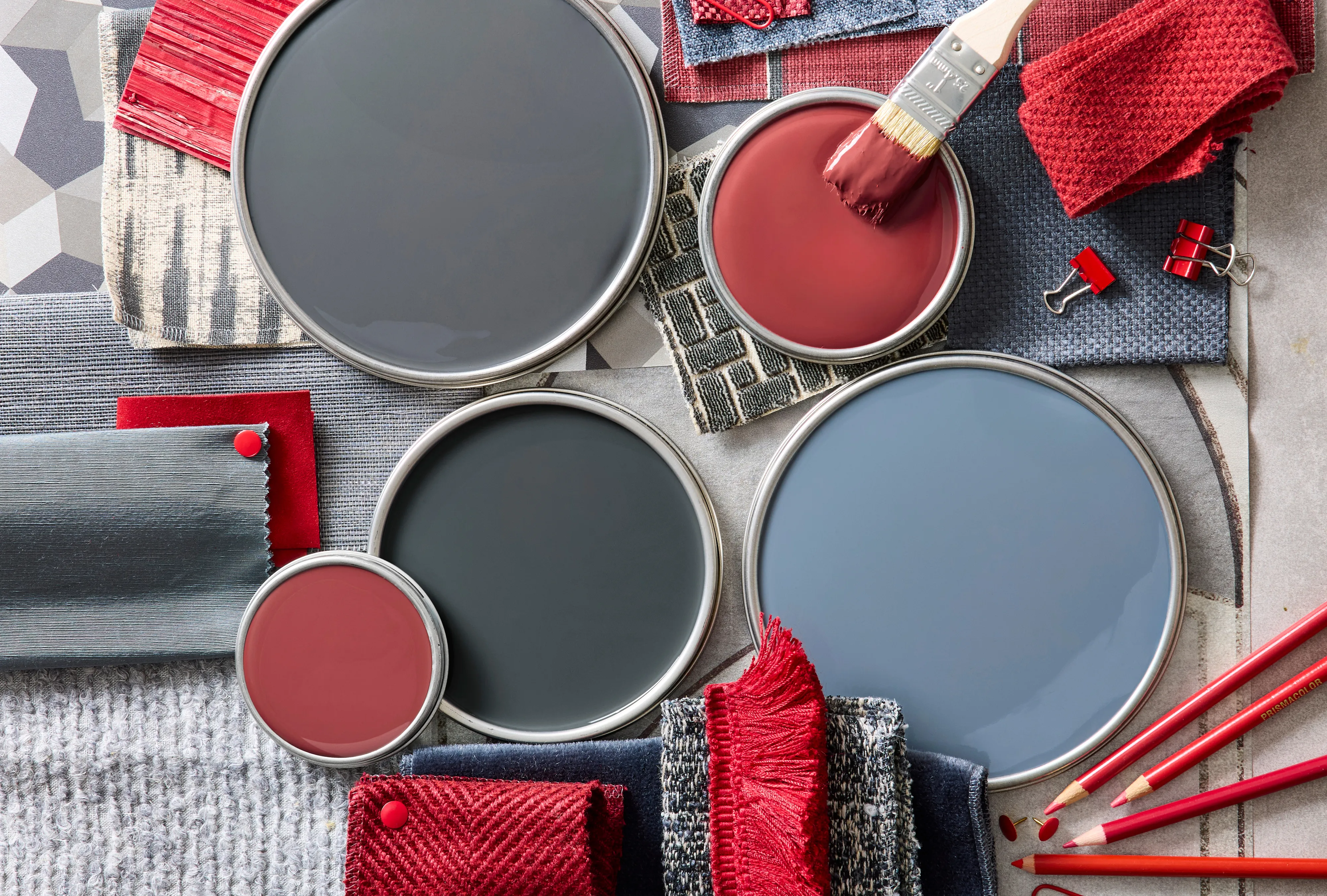
The combination of red and gray offers a versatile and impactful palette for interior design, moving beyond its traditional association with flannel to become a sophisticated choice. This color scheme gained prominence, notably featuring in film sets like 'Downton Abbey: The Grand Finale,' where lavish red rooms were complemented by glistening silver accessories. Red inherently brings energy and excitement into a space, while gray introduces a sense of coolness, calm, and soothing neutrality. When these two colors are combined, they create a strong synergy that can be manipulated to achieve various moods, from bold and sophisticated to relaxed and comforting.
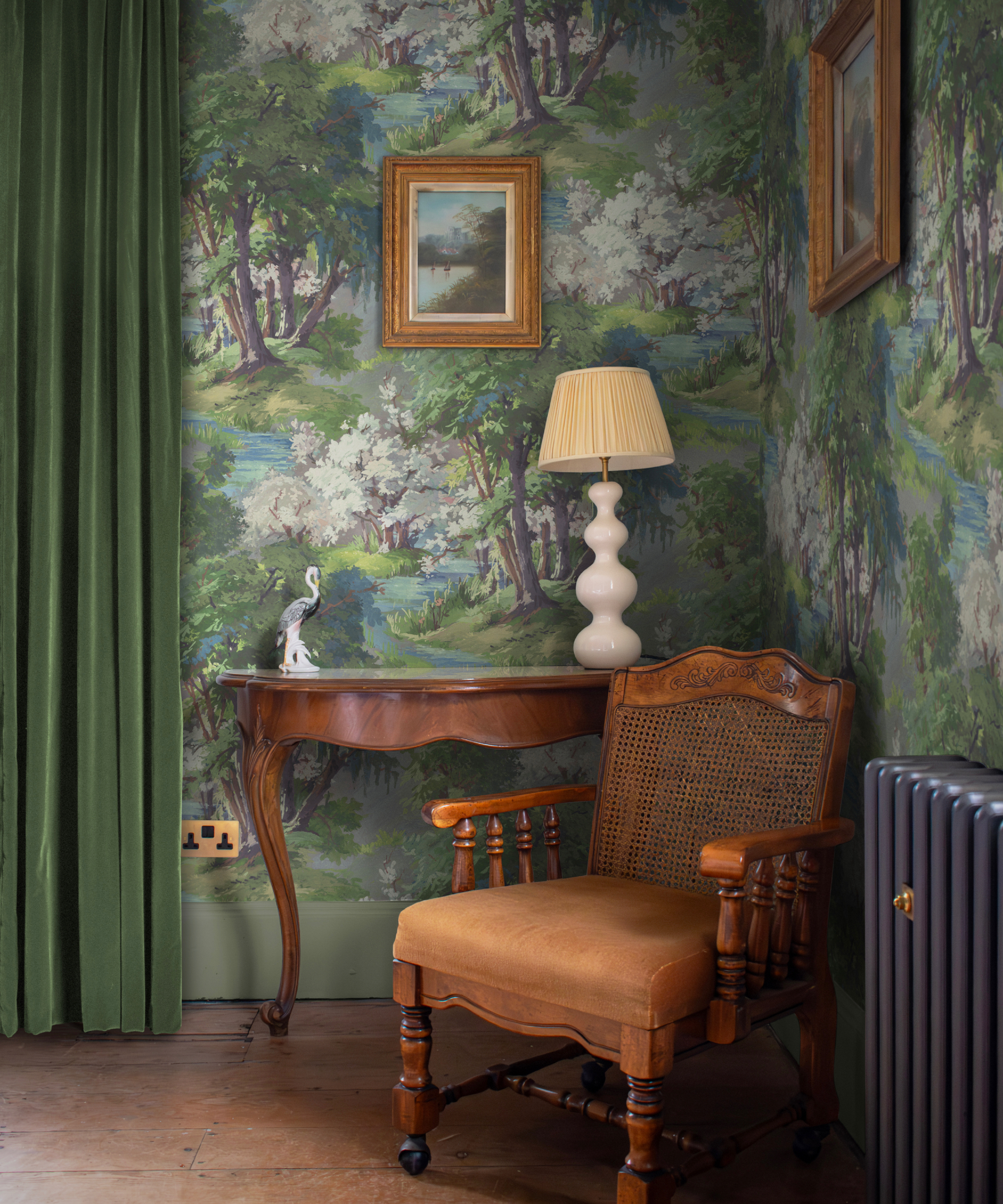
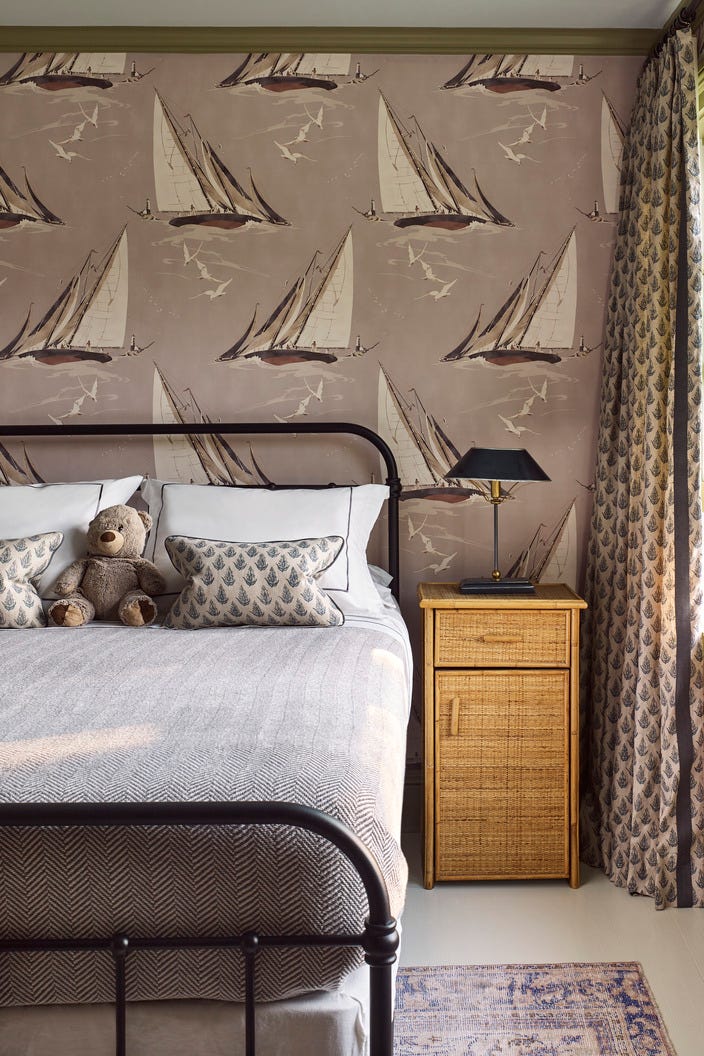
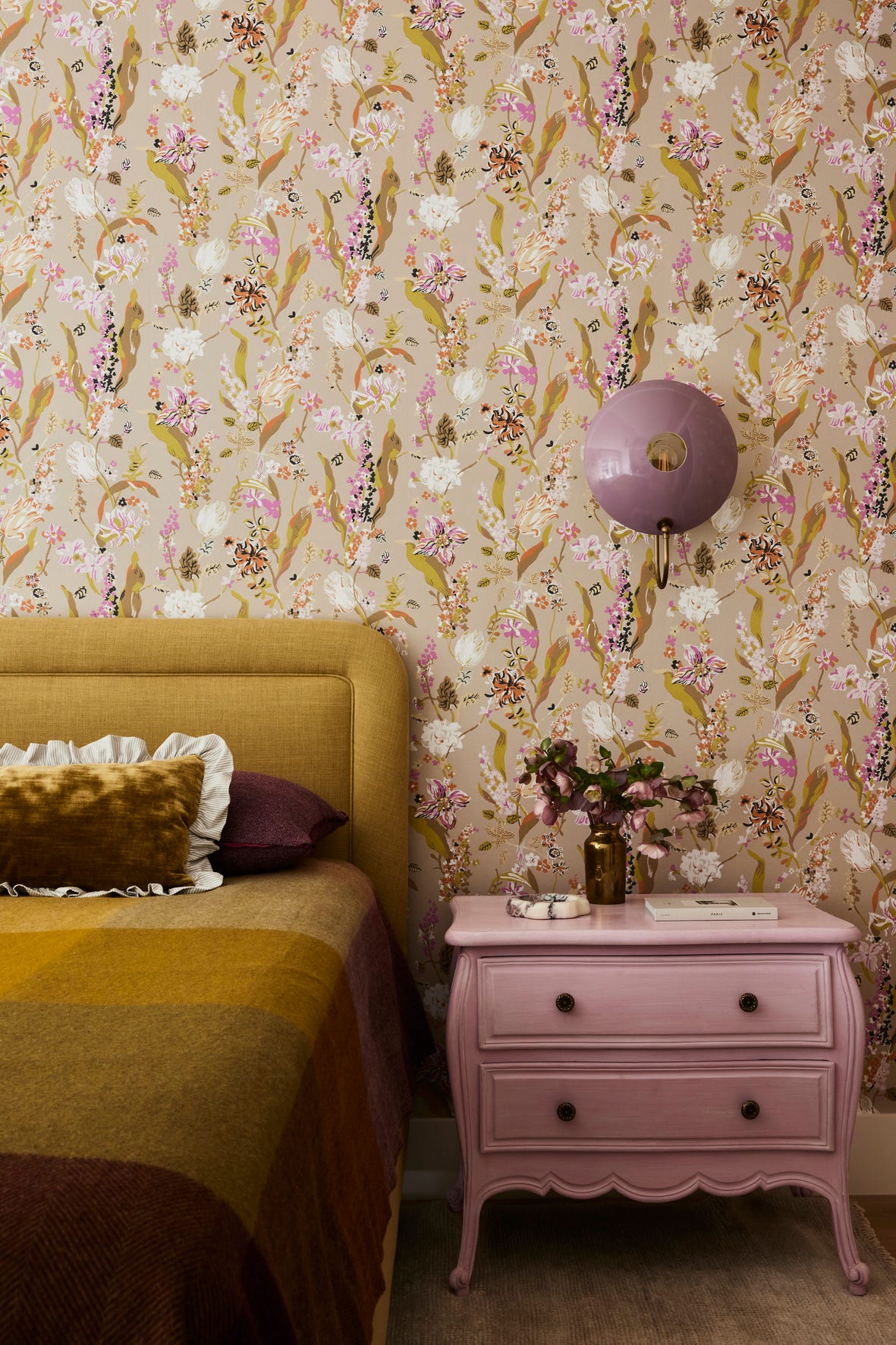
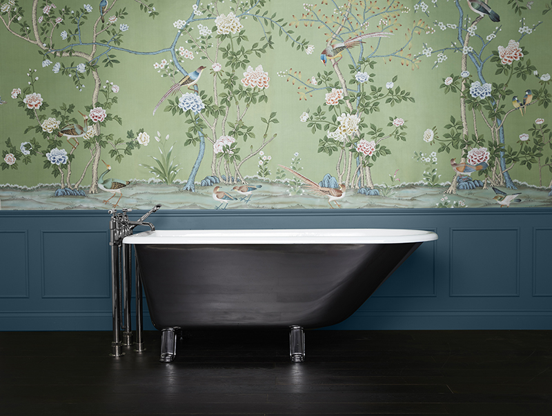
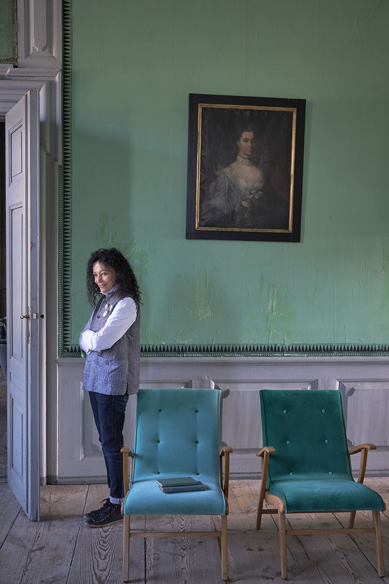
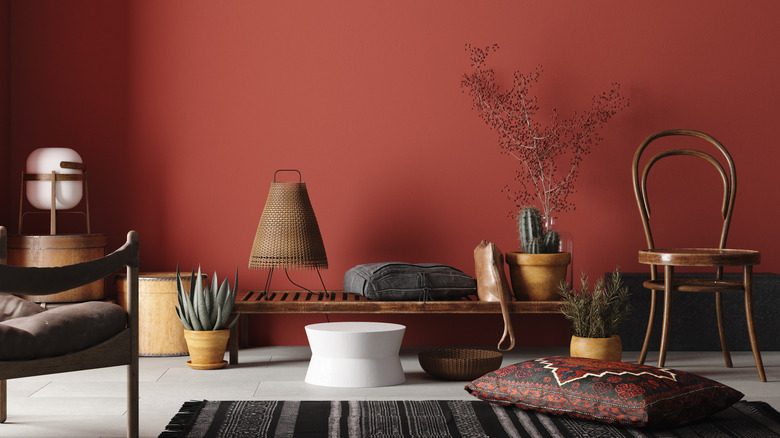
Designers emphasize the importance of balancing the tone and saturation of red and gray to achieve the desired aesthetic. One approach involves focusing on midtones, which creates a cozy, inviting atmosphere. For instance, using quiet blue-gray tones for walls and furnishings allows for subtle variations as light reflects differently off upholstery, wallpaper, and painted surfaces. Incorporating raspberry reds and warm pinks through elements like throws, pillows, lampshades, and rugs adds depth and layers of pattern to the scheme. This method is particularly effective in naturally darker rooms, such as north-facing ones, where the vibrant reds can effectively burst against a dark backdrop.
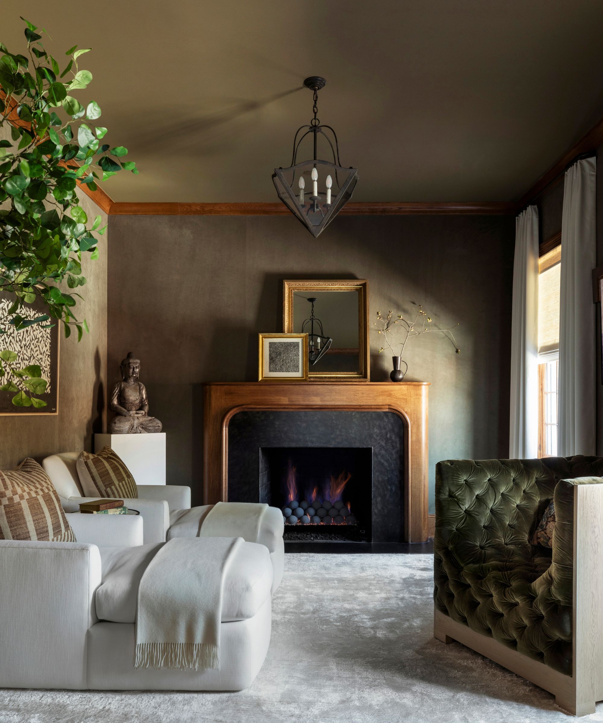
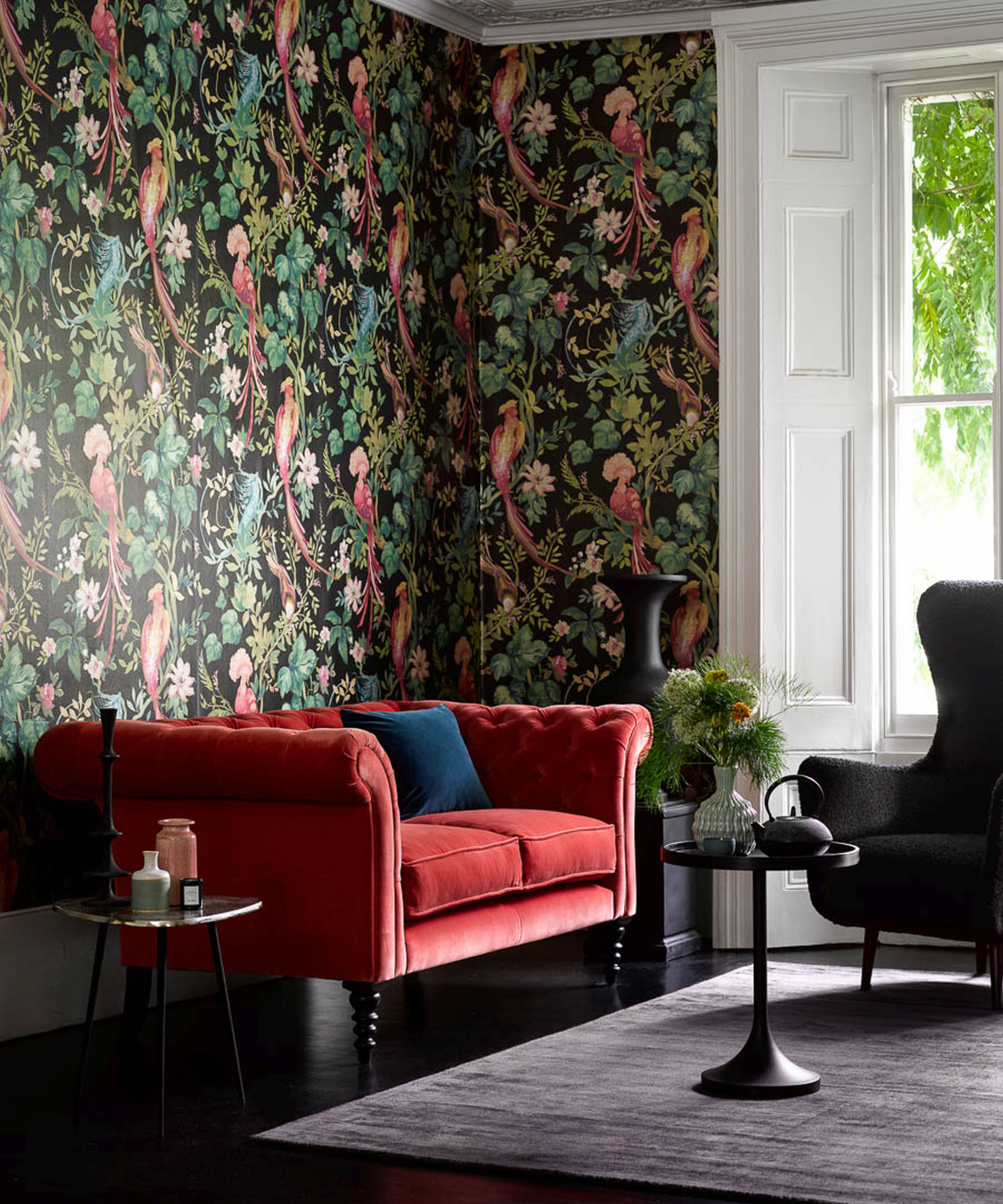
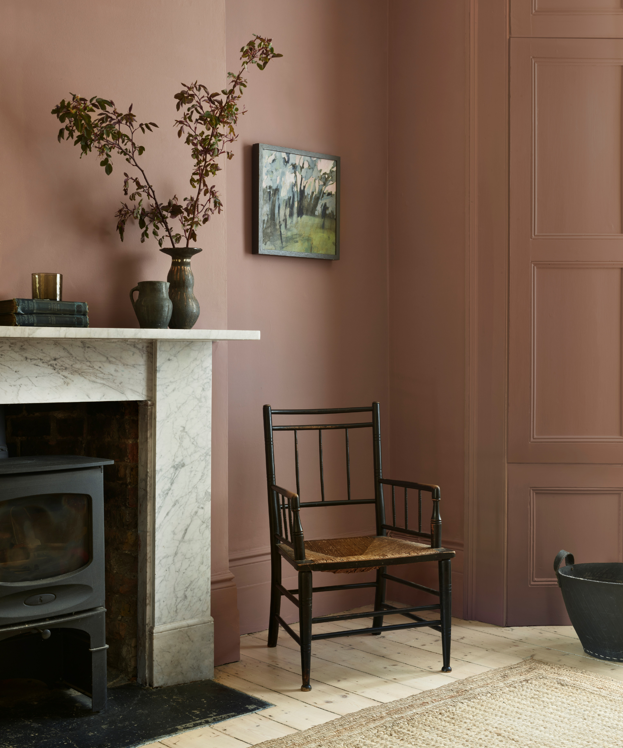
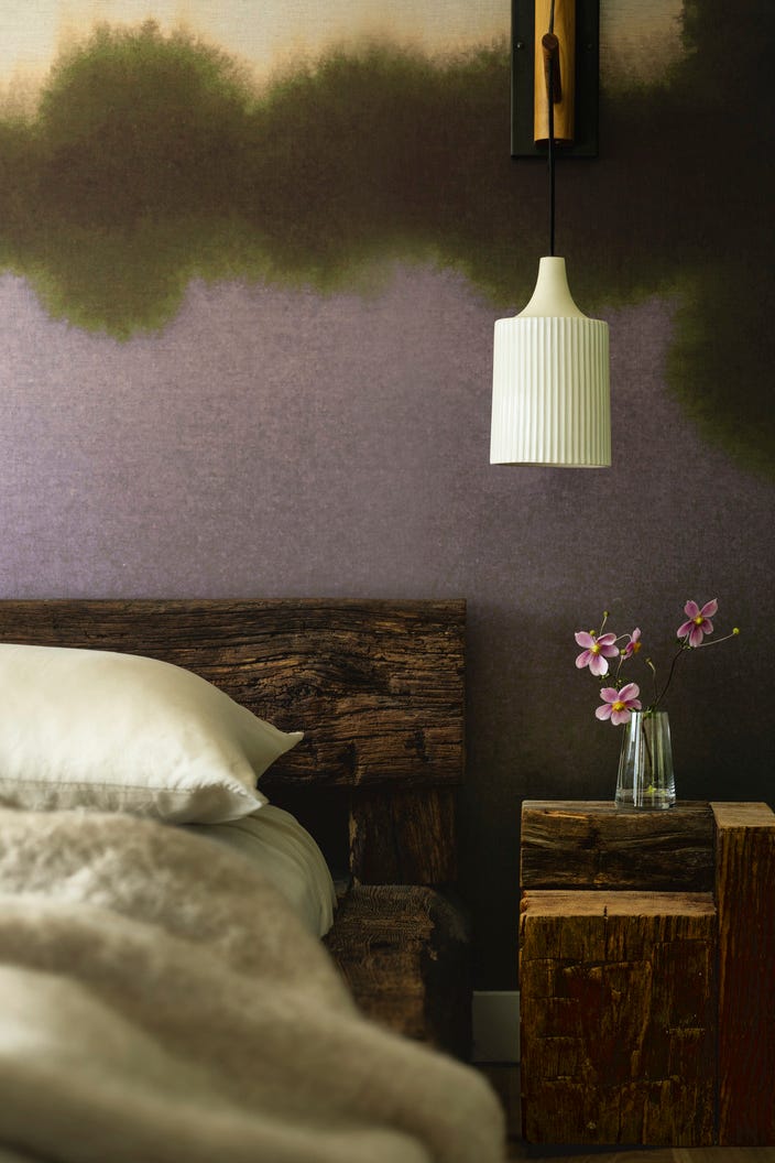
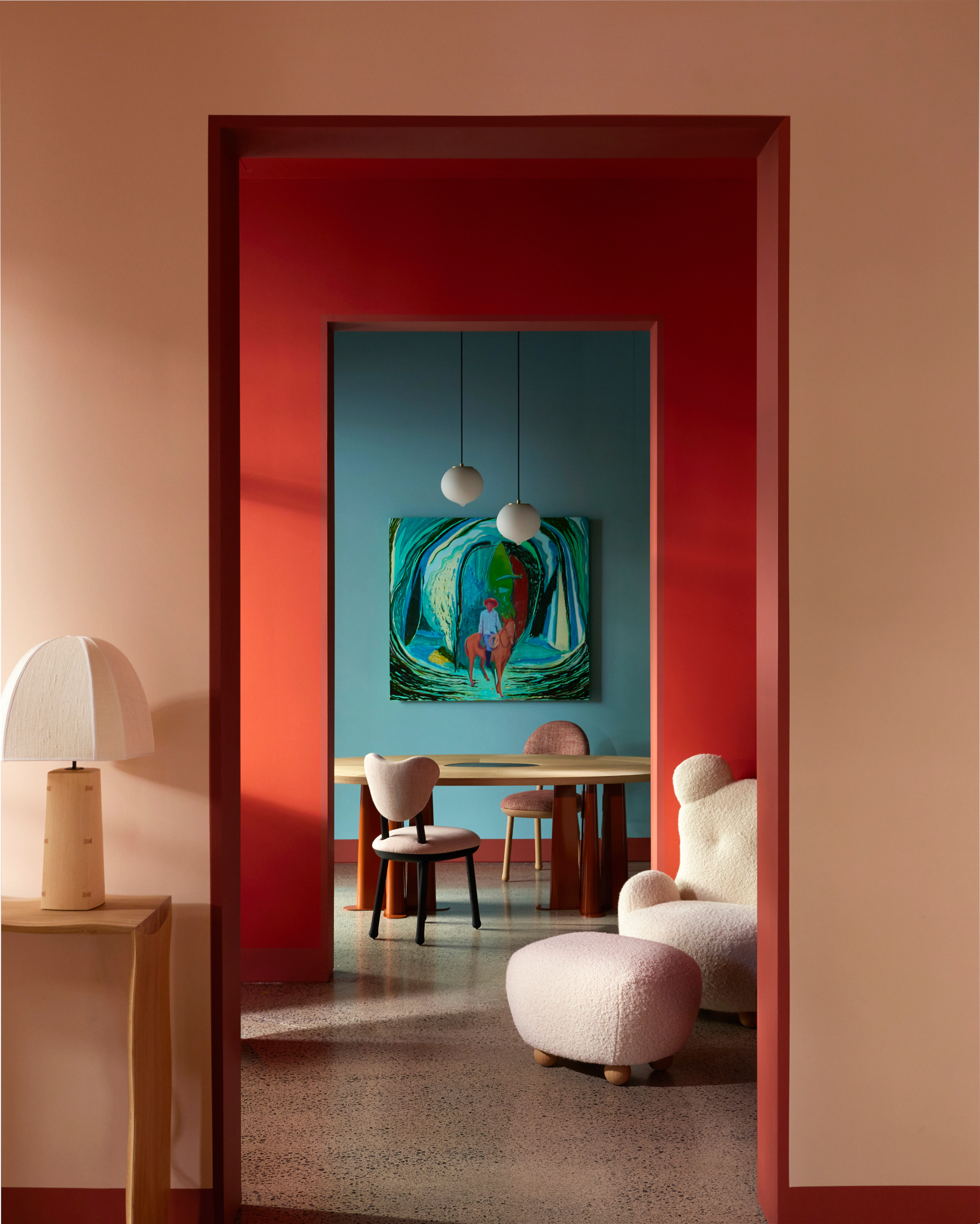
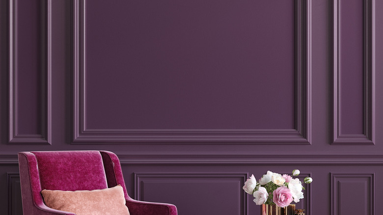
Another strategy is to embrace dark and moody hues, which works best when the chosen colors are similar in richness and tone. Gray, though often considered neutral, can lean cool (blue) or warm (brown), and reds can carry warmer (orange) or cooler (purple) undertones. Understanding these nuances is crucial for creating a cohesive palette. A deep red and gray pairing can be both dynamic and restorative, making it suitable for spaces intended for relaxation, like bedrooms. To ground such a space, designers might include brown elements or wood accents, while orange in artwork or rugs can activate the room and add warmth. When selecting a strong paint color or bold fabric, it's essential that other room elements also hold their own visually.
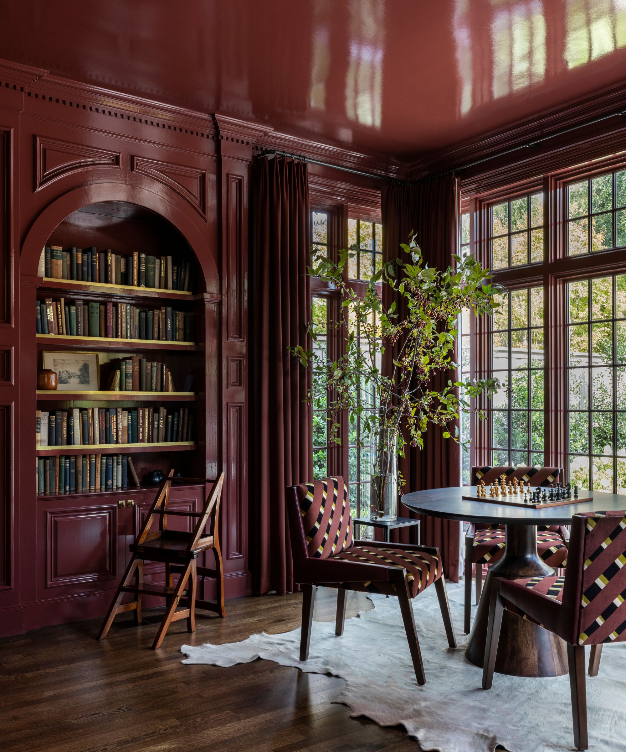
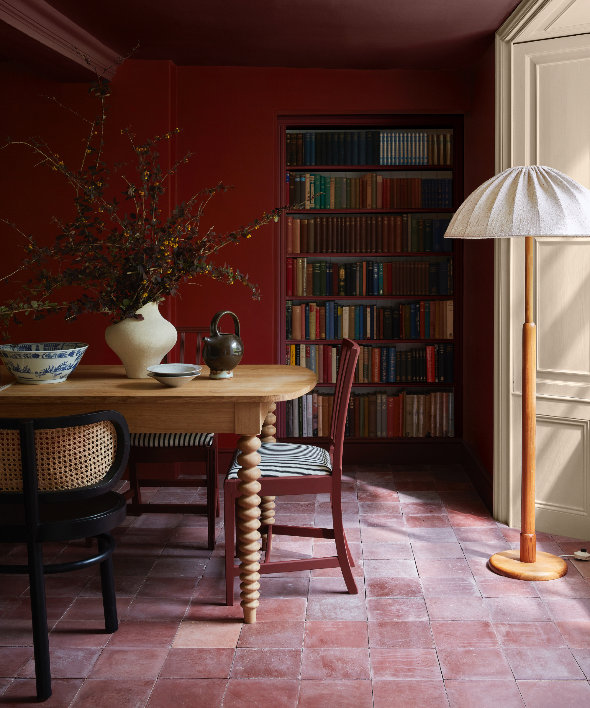
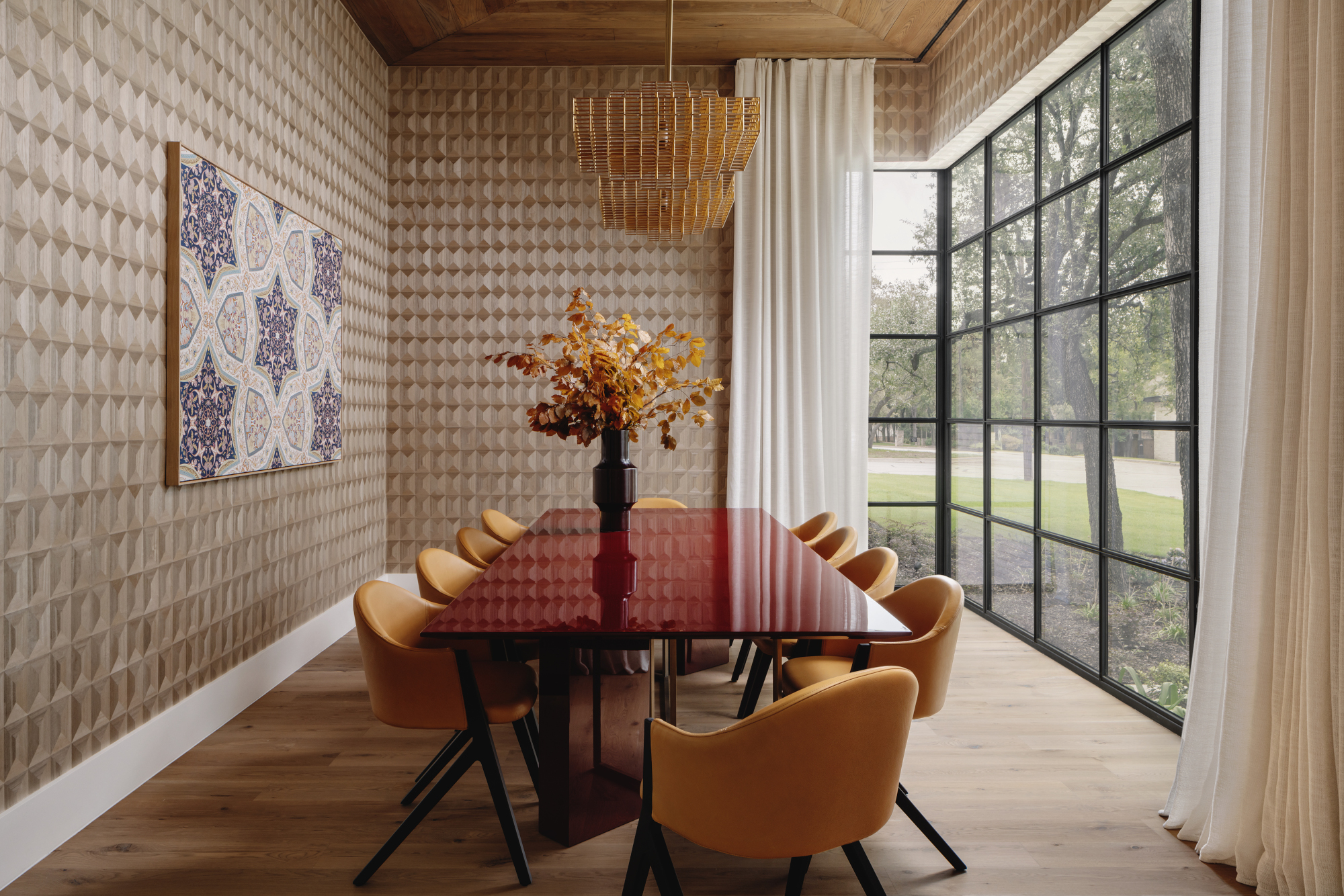
Achieving balance within a rich color scheme, like in a dining room, involves keeping all colors within the same tonal range. For example, matching the dining set and wall color in equally full-bodied shades ensures harmony. A brighter red or a truer black in such a scheme could create a jarring effect. The interplay of textures is also vital; sleek lacquer finishes on furniture can be offset by soft, matte paint finishes and textured rugs to add dimension and prevent the space from feeling flat. Additionally, a light and airy atmosphere can be created with red and gray, especially in spaces with ample natural light. This approach results in a spirited yet restful look, often imbued with a hygge-like comfort.
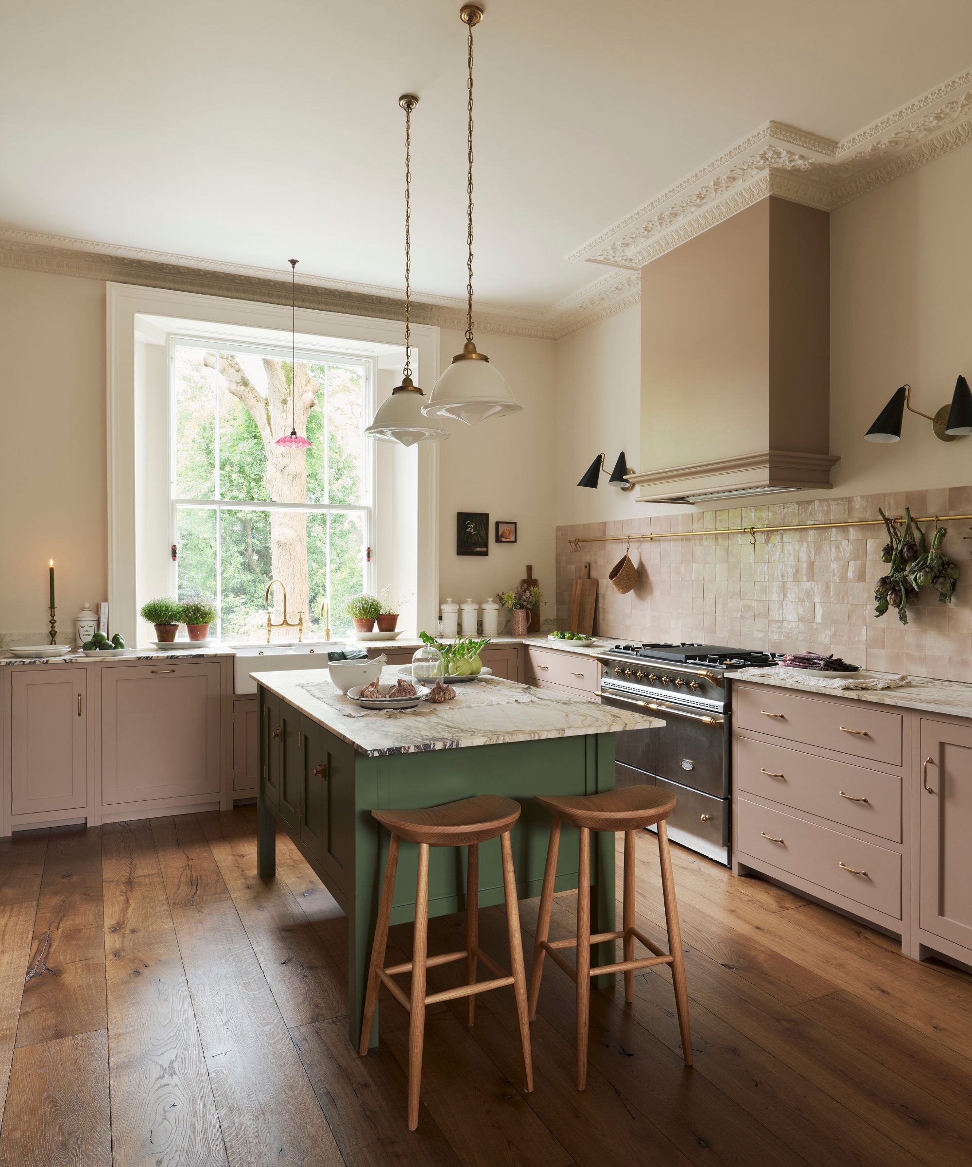
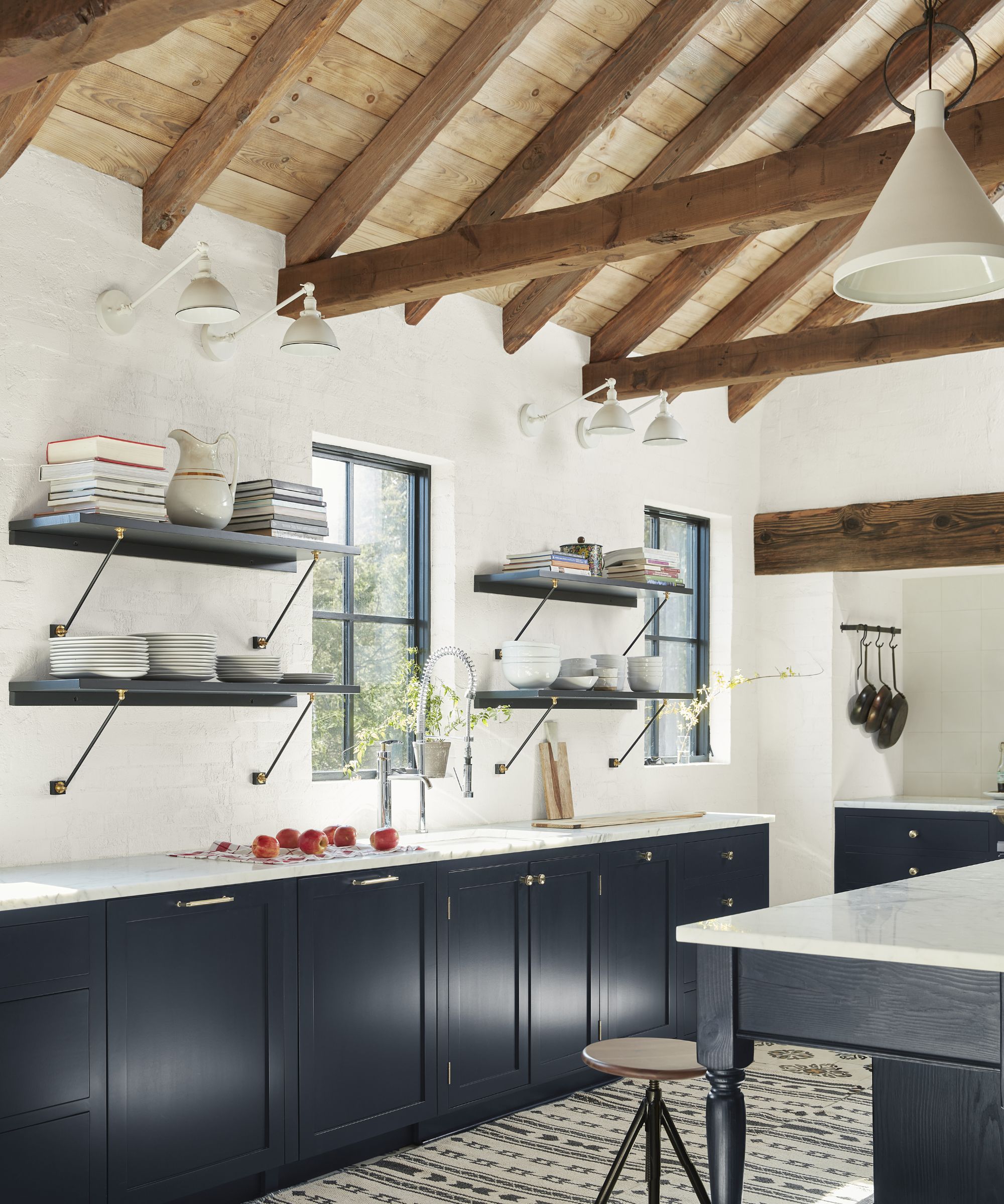
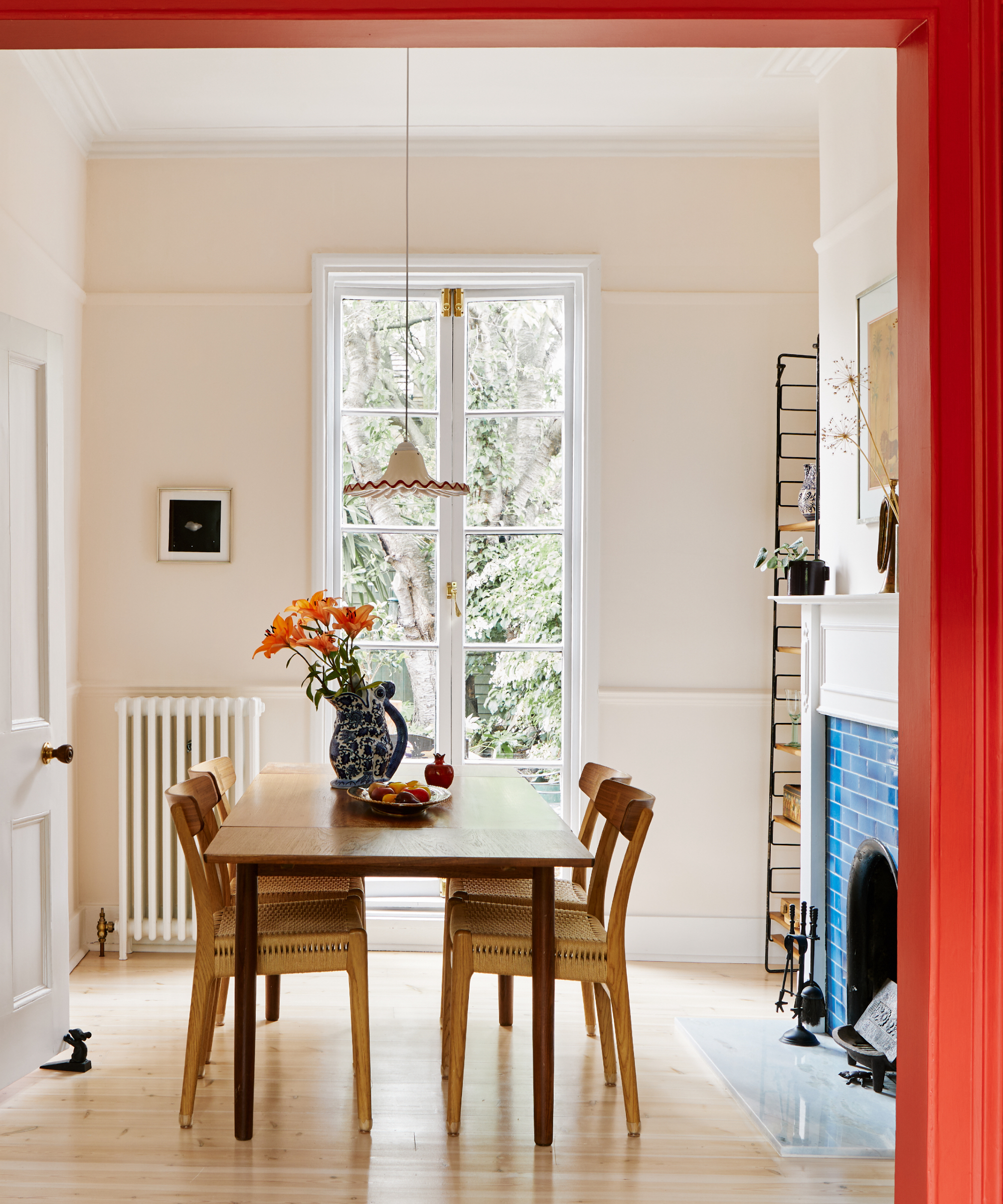
For a minimalist or Scandinavian vibe, the key is simplicity: keeping a tight palette with predominantly neutral grays and only a few pops of red. This can evoke a mountain retreat aesthetic, particularly effective in regions with snowy landscapes. In rustic settings, a client's preferred fiery red-orange can be a starting point, softened by natural finishes and textures such as rush seats, fluted wood dining tables, and off-white walls. Focusing on warmer earthy tones and incorporating weathered elements like sideboards and charcoal-toned rugs helps bridge the hues and adds an unpolished, authentic feel. The overarching principle is to embrace the inherent characteristics of the space and let the chosen color scheme enhance its natural light and mood.
#ColorScheme #RedAndGray #InteriorDesign #HomeDecor #DecoratingTips #DesignerApproved #MoodyHues #LightAndAiry #ColorBalance #ColorScheme #RedAndGray #InteriorDesign #HomeDecor #DecoratingTips #DesignerApproved #MoodyHues #LightAndAiry #ColorBalance
0 comment in total
 No comments yet
You may also like
This designer-approved color drenching hack will ensure the look never falls flat – the key is in the finish

9 colors that go with red – the best pairings for this bold shade
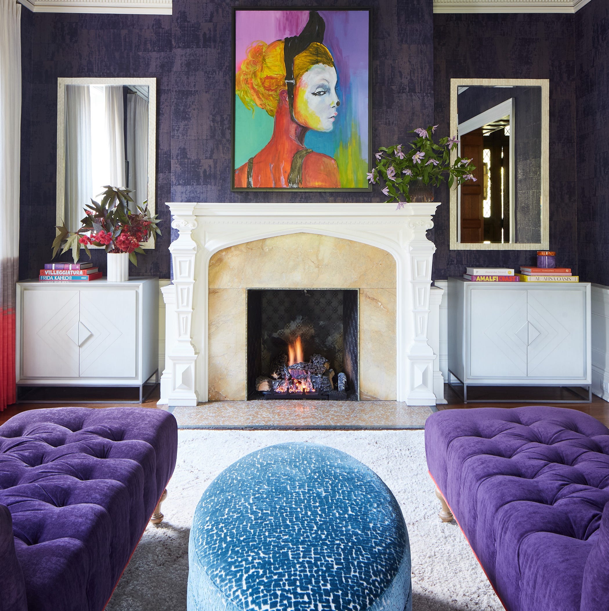
Designers LOVE Pairing These Unexpected Colors With This Sophisticated Hue

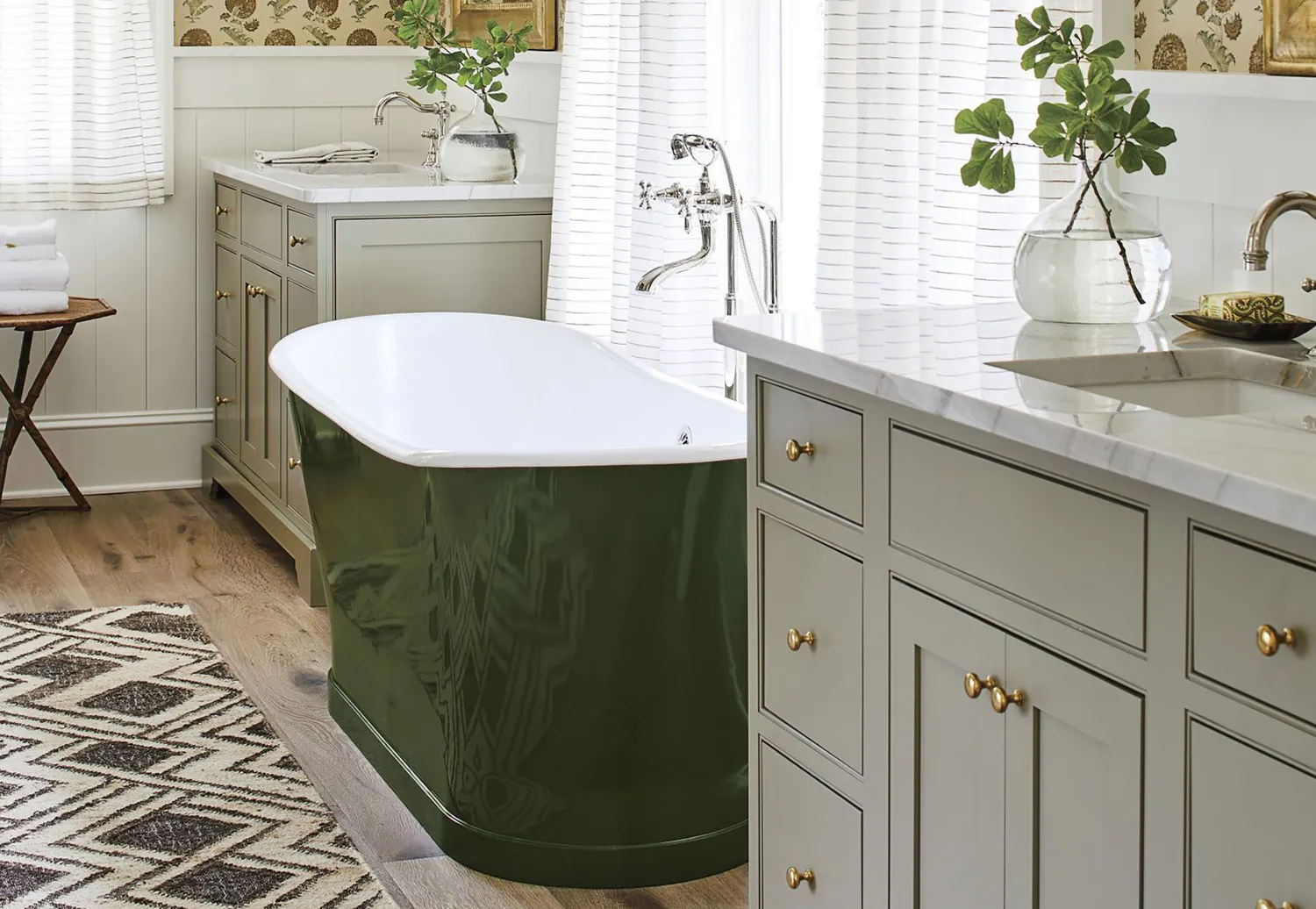
10 Greige Paint Colors Designers Recommend Again And Again
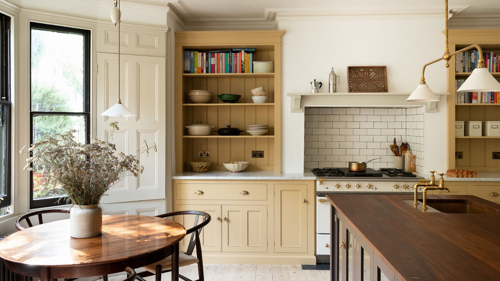
5 ways to nail the tri-color kitchen method, say designers
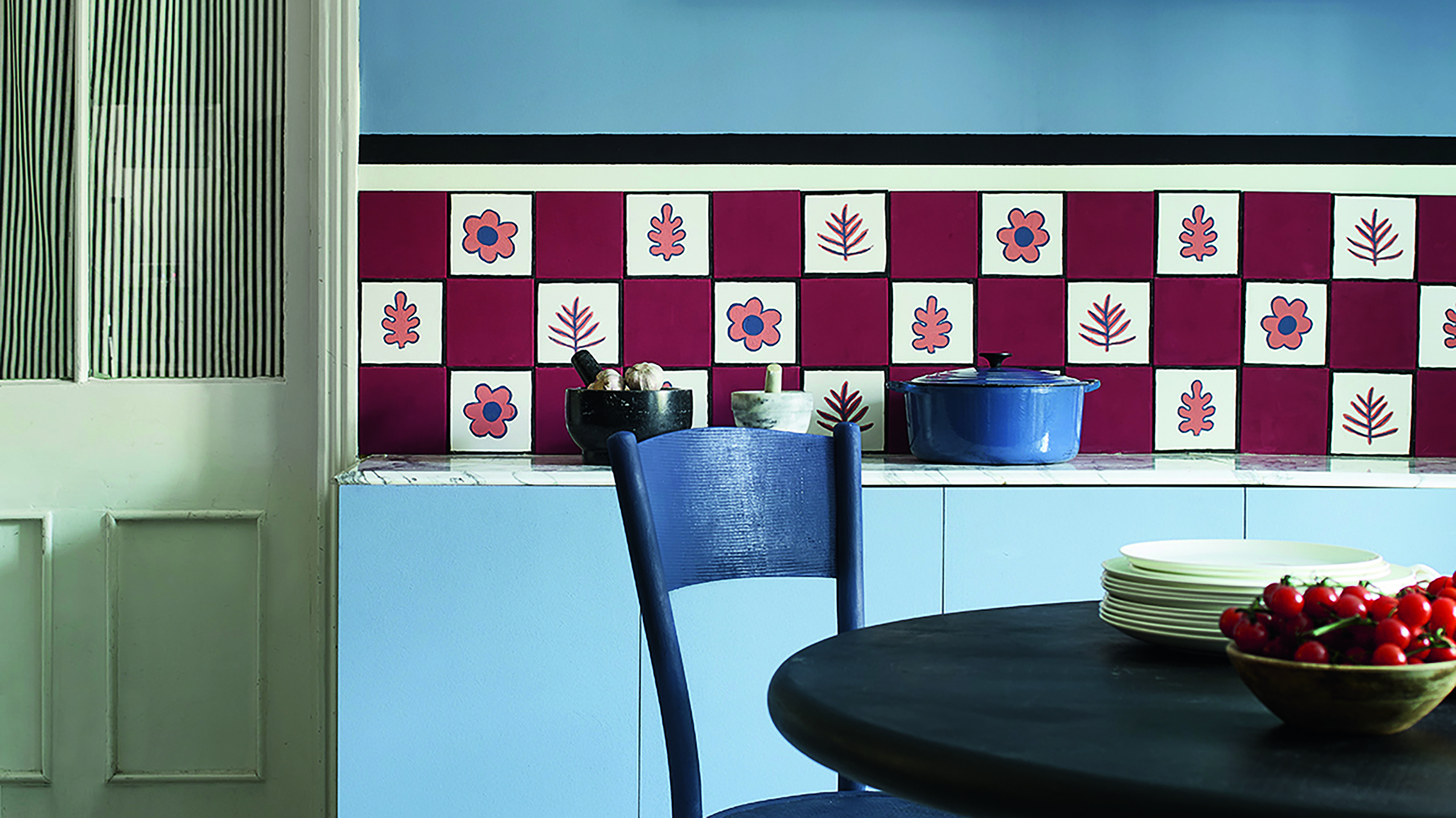
Primary colours are having a moment - but the secret to styling them is through 'unexpected' touches
3 Ways to Identify and Match Any Paint Color, According to Experts
How to Decorate with Yellow the Right Way, According to Designers


An A-List Designer’s Secrets To Picking Perfect Paint Colors
3 Ways to Identify and Match Any Paint Color, According to Experts

Red and Beige is the New Designer Favorite Combo — Here’s Why (and How to Make it Work)

3 Things To Consider When Painting With Bold Colors
3 color coordination tips any beginner can master
This Popular Fabric Designer Reveals the Right Way to Decorate with Color
How to combine colour, pattern and texture without making a complete mess of things
Color drenching has never been simpler with this color expert's one-paint-finish approach for the whole room
Decorating with red and pink: How to master this daring colour combination

How to decorate with rich colors – 9 ways to add character with an intriguing scheme

Designers LOVE Pairing These Unexpected Colors With This One Timeless Hue
Design Pros All Agree: The Color-Blocking Trend Is One to Try