1/9
What are the best color combinations for fall? 7 cozy-season-ready suggestions from designers
As autumn approaches, interior designers offer various color combinations to create cozy and inviting spaces. The shift from vibrant summer brights to richer, darker tones for fall decorating requires thoughtful consideration to ensure these hues complement individual decorating styles while maintaining versatility. Expert recommendations cover a spectrum from subtle accents to bold wall treatments.
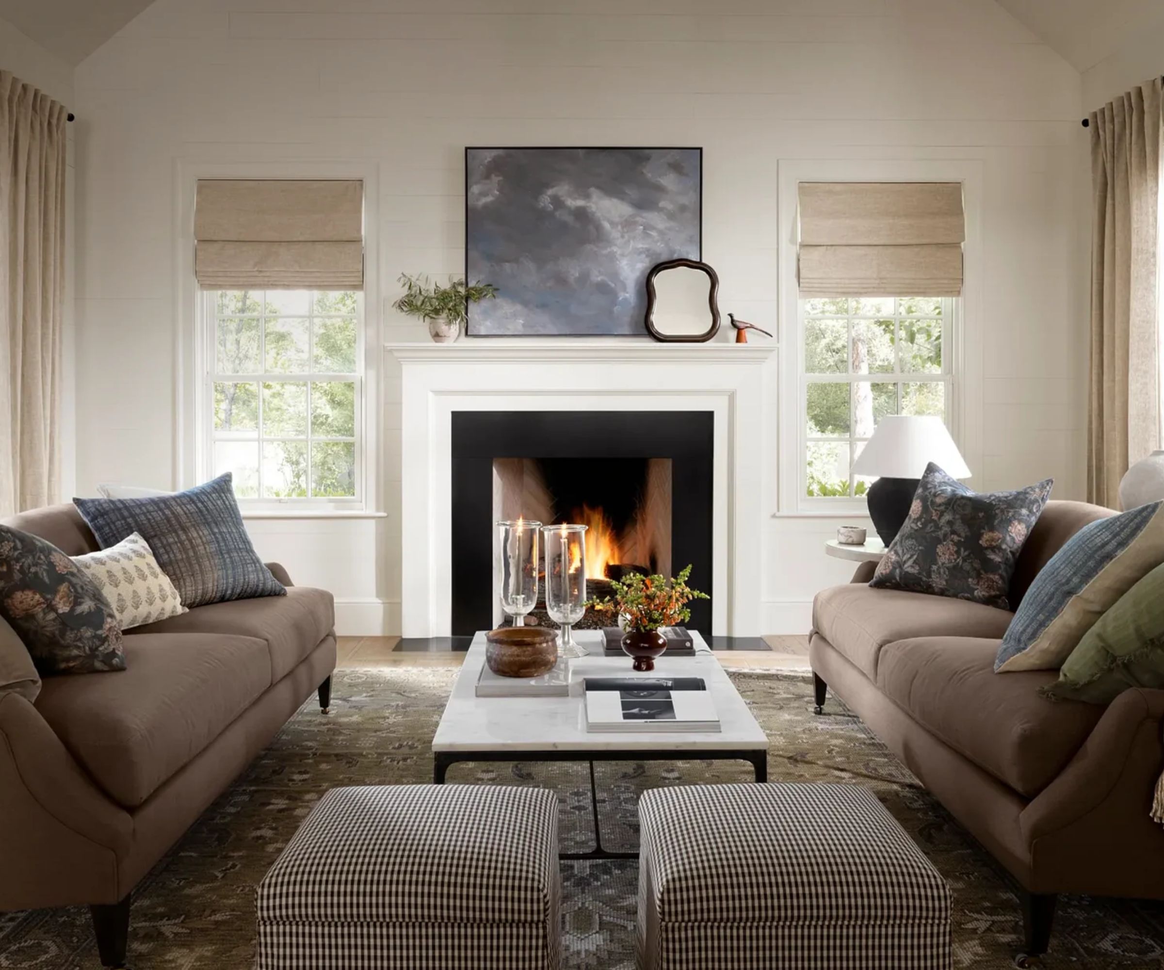
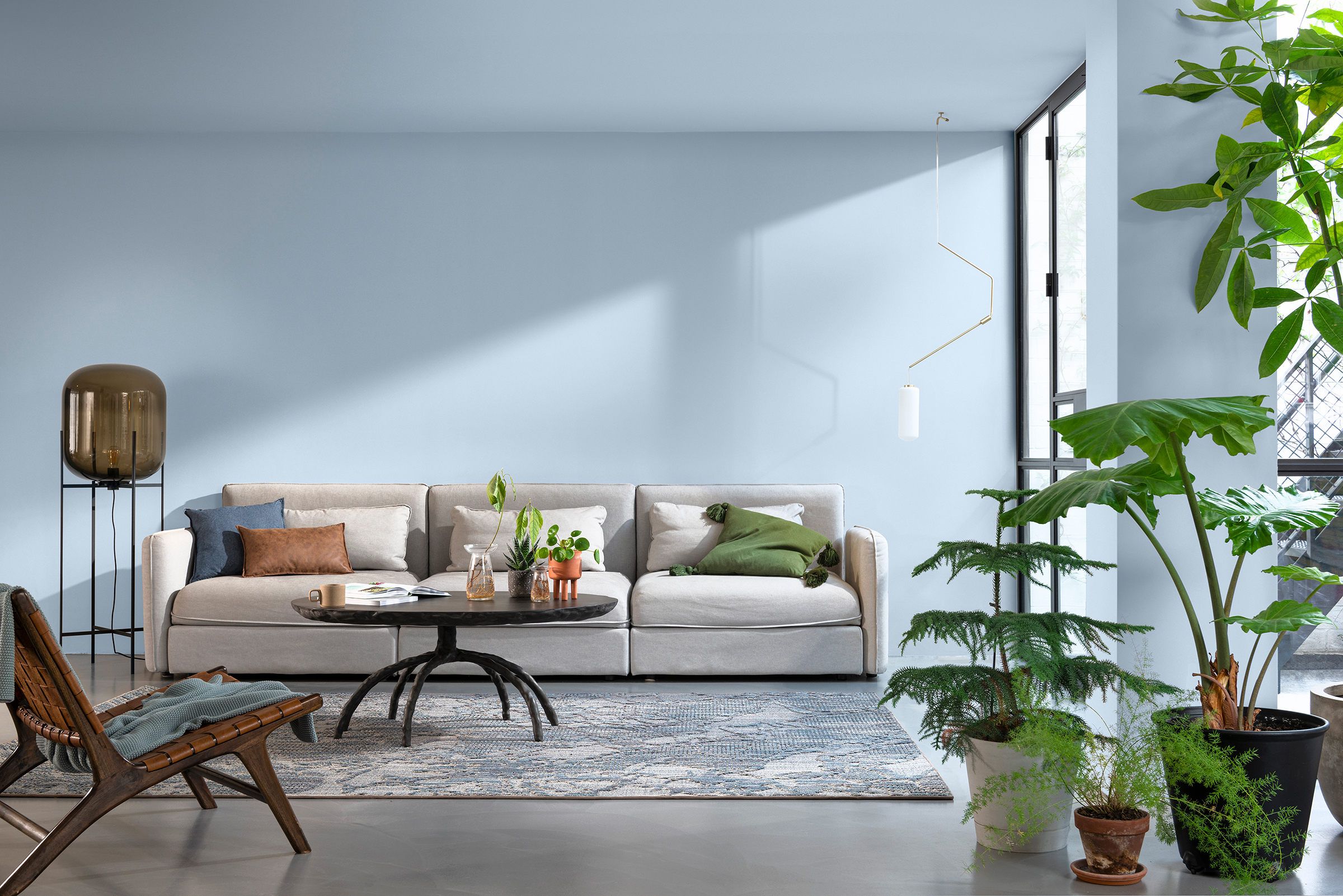
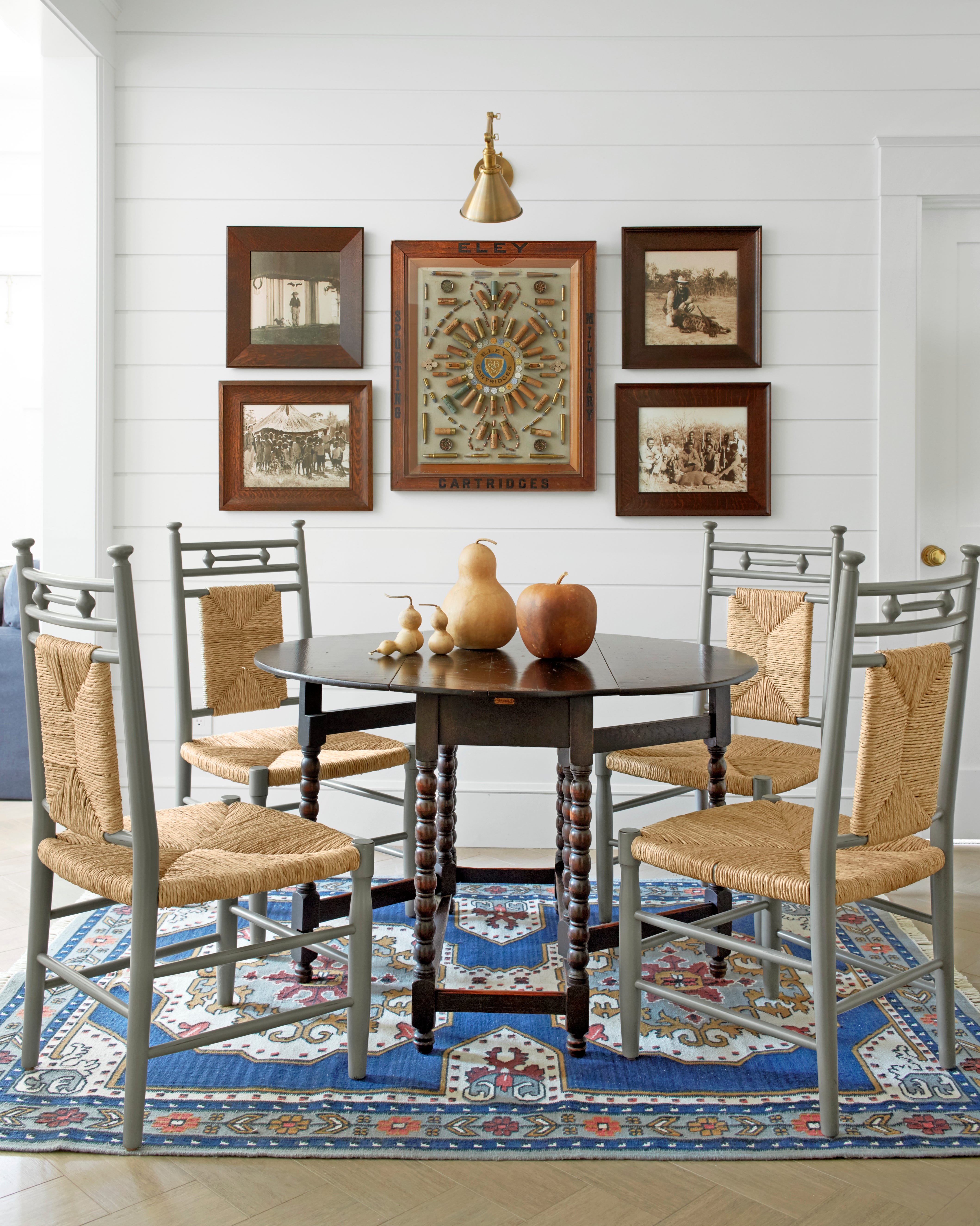
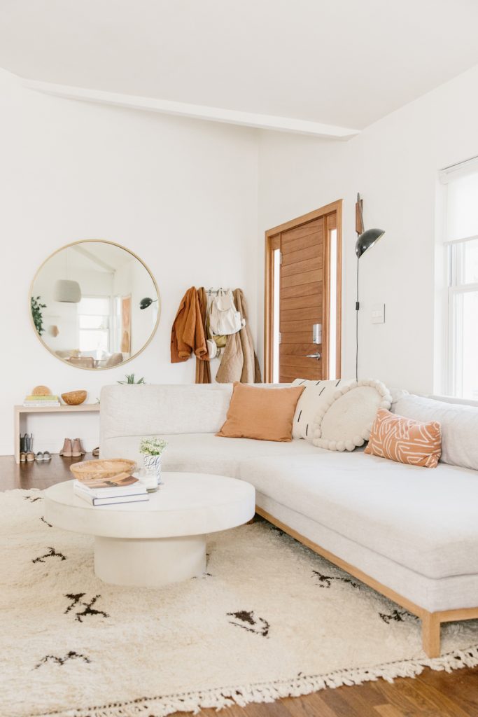
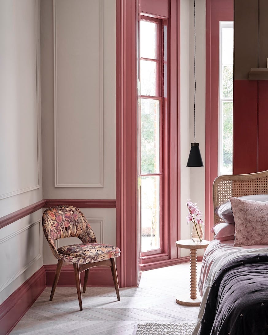
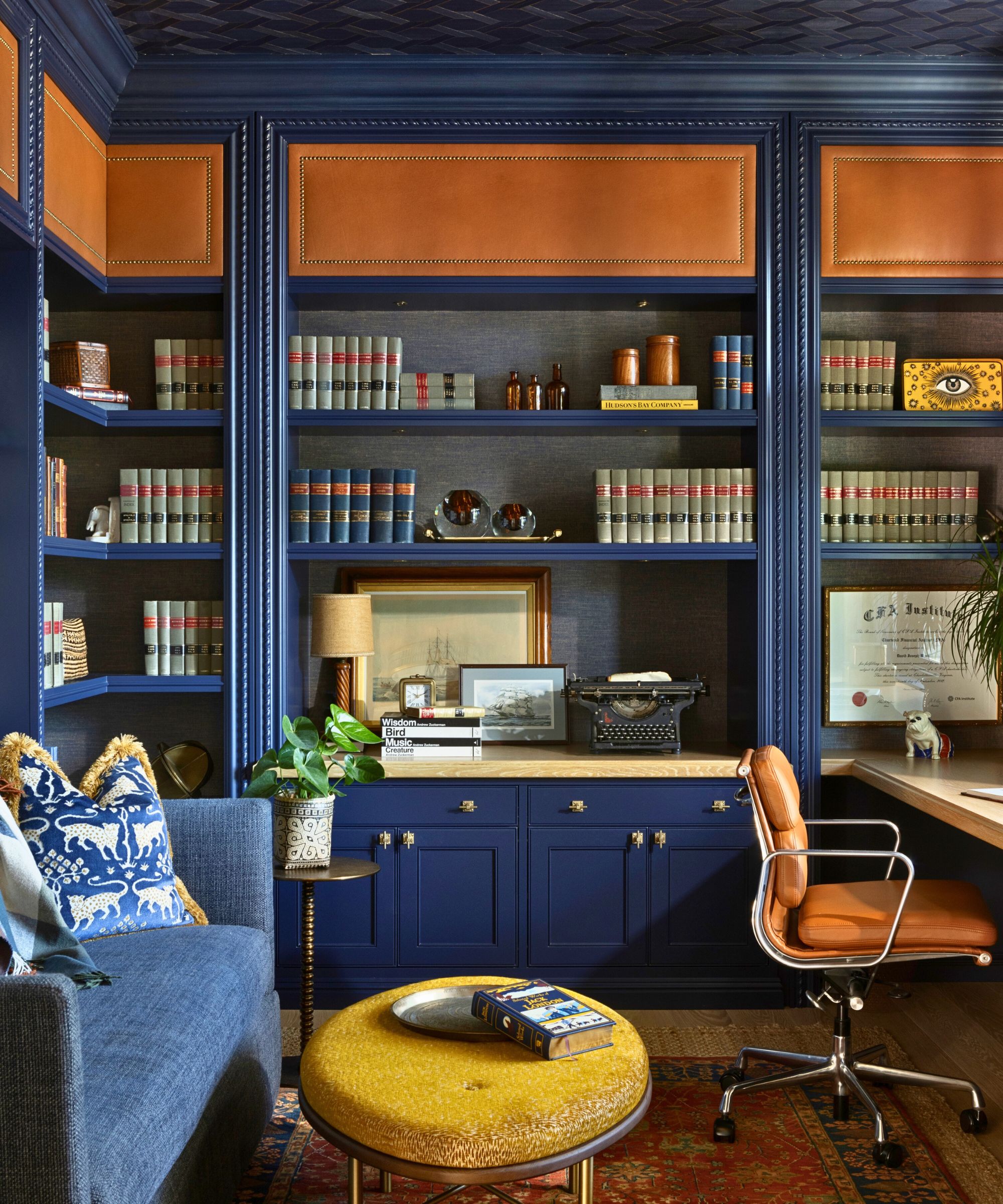
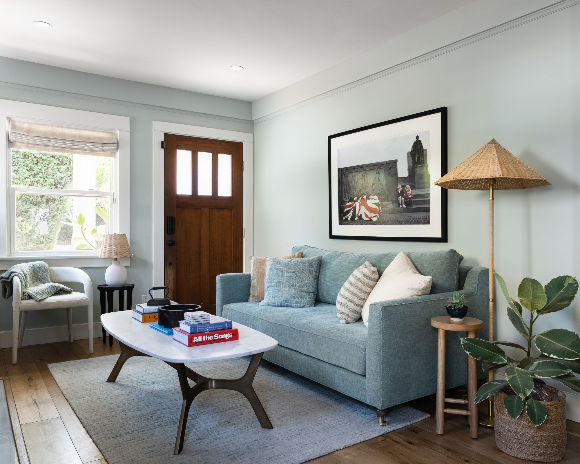
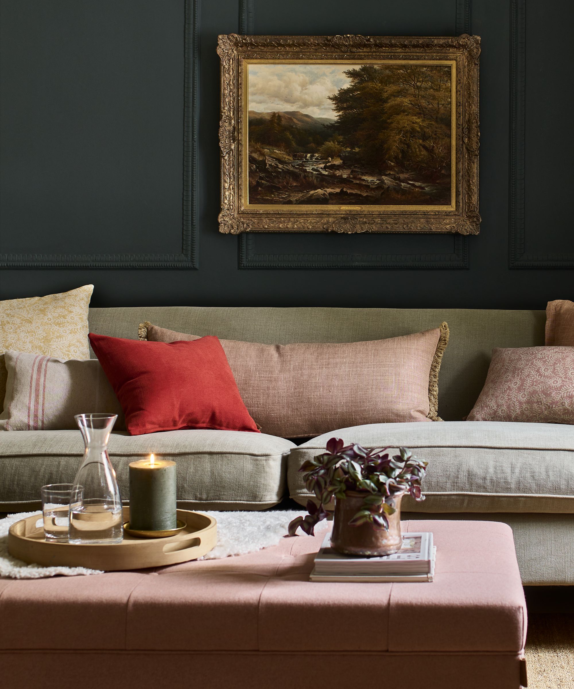
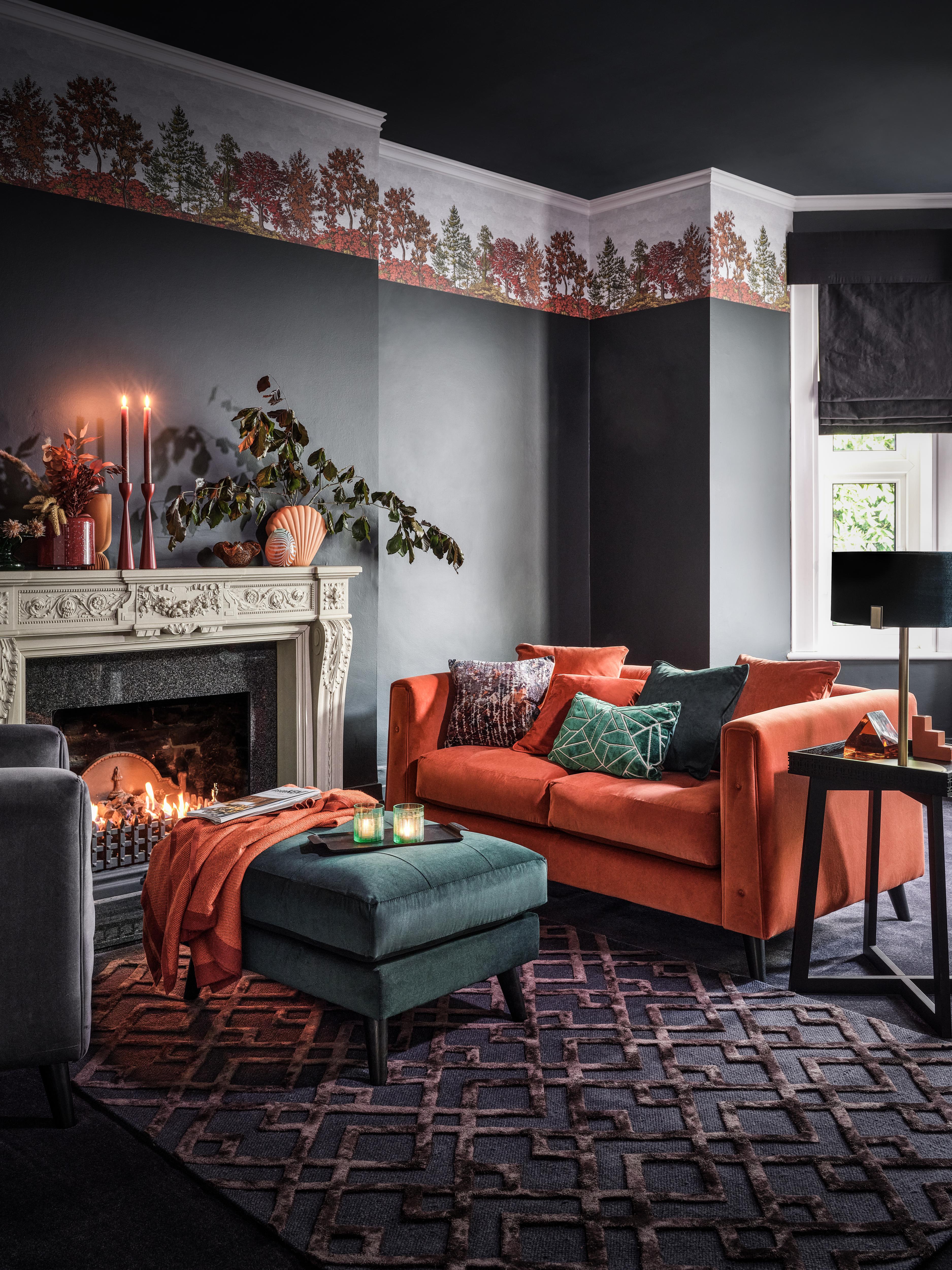
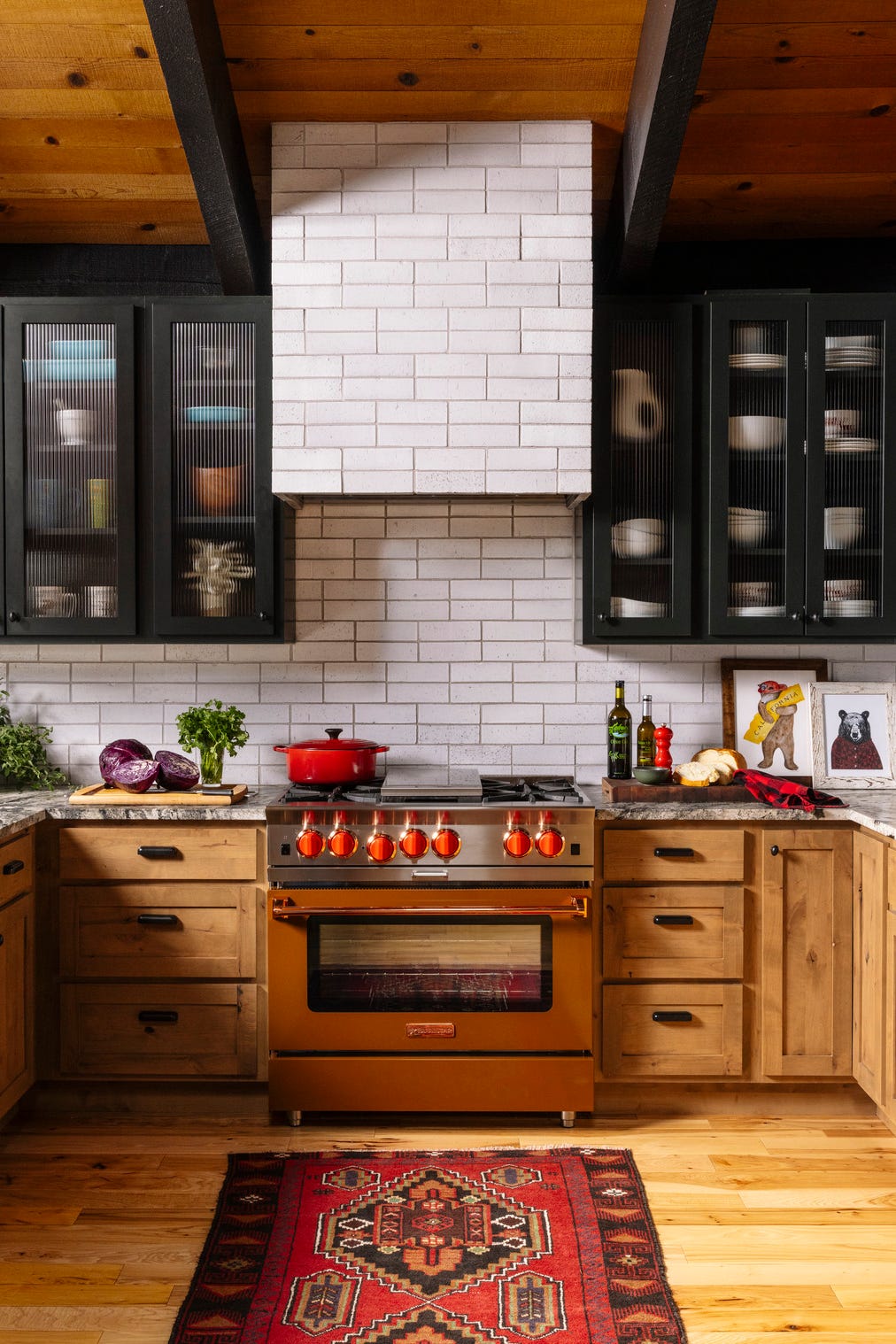
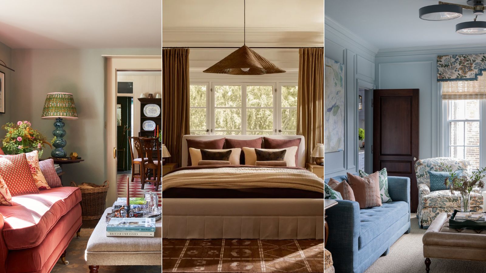
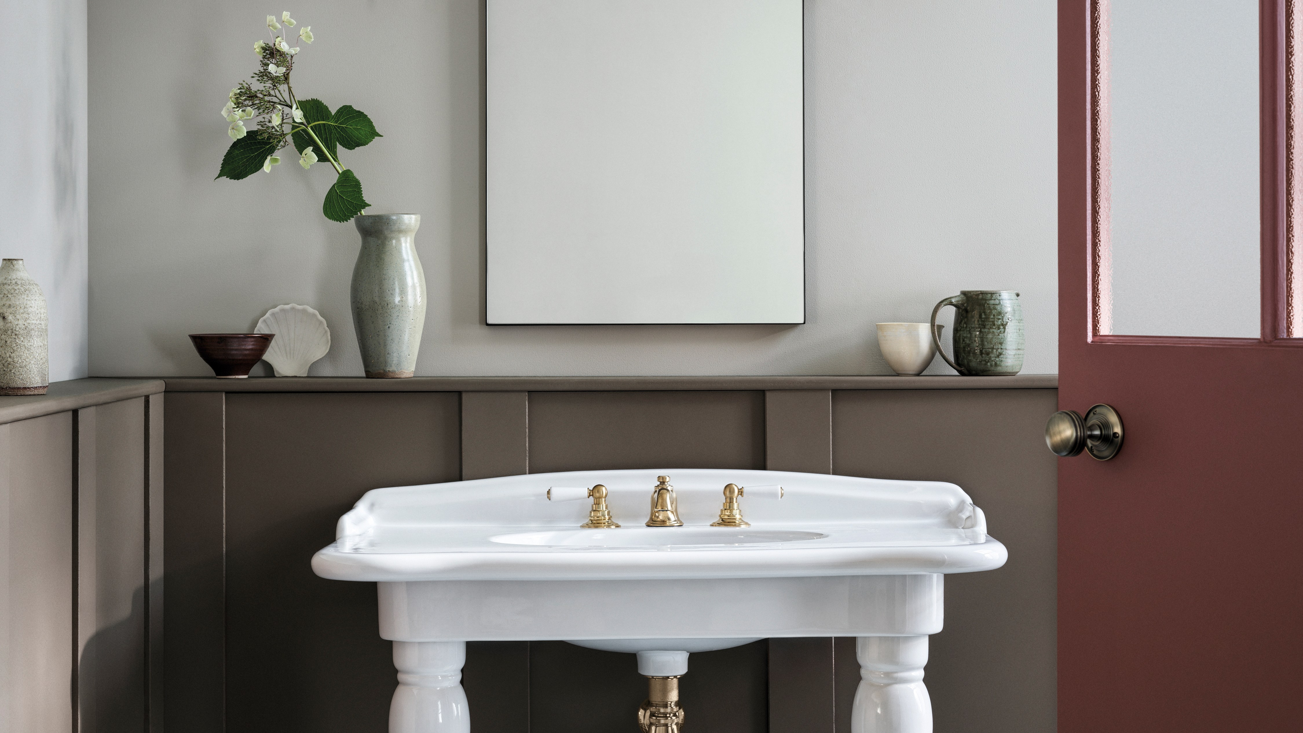
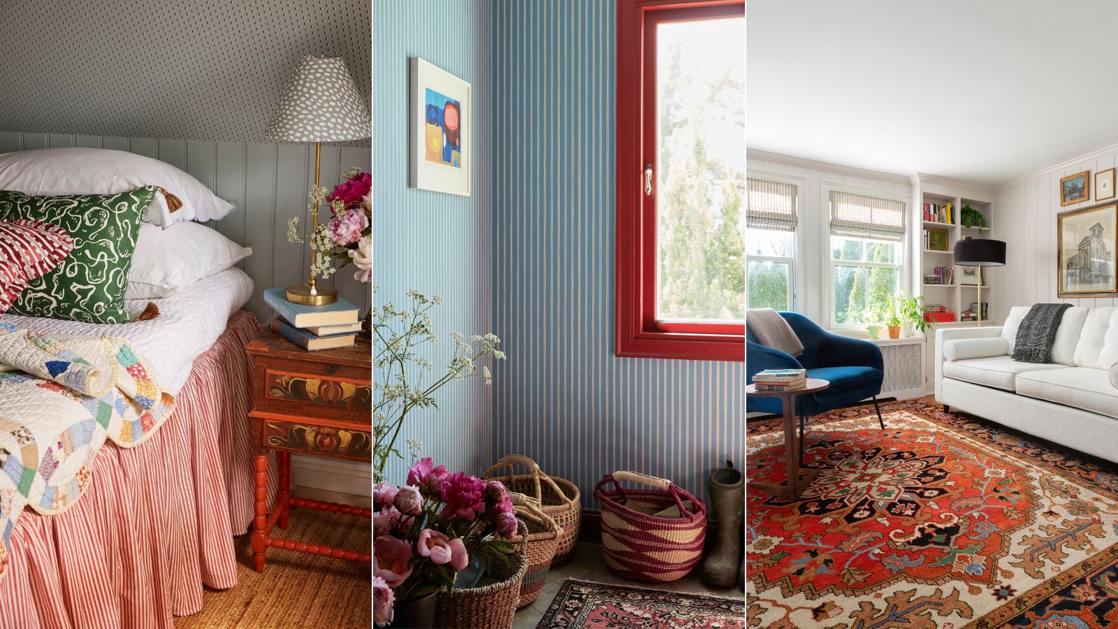
One popular combination is rust and teal, which provides an autumnal vibe without necessitating a complete decor overhaul. For instance, in a traditional living room with a neutral scheme, incorporating rust orange and muted teal sofa pillows can elevate the space. This approach allows for easy seasonal changes by swapping out accent colors, preserving the main decor elements. Another suggestion involves gray-green and earthy red. A gray-green shade, specifically Farrow & Ball's 'Blue Gray,' creates a warming and relaxing environment, complementing terracotta tones like 'Red Earth' or even steelier blues such as 'Inchyra Blue.' These pairings offer a harmonious blend for a cozy atmosphere.
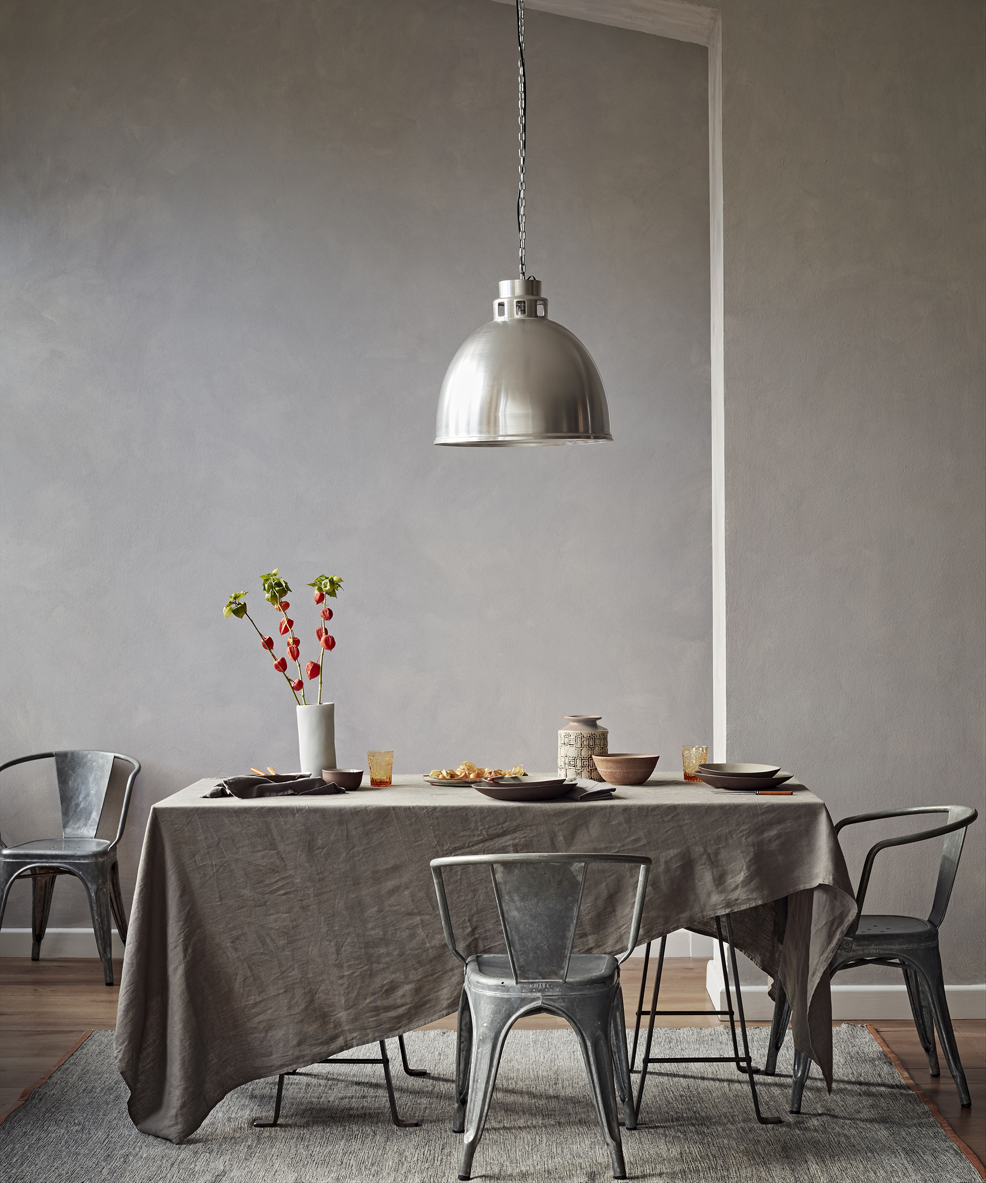
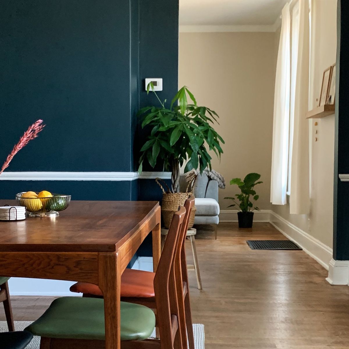
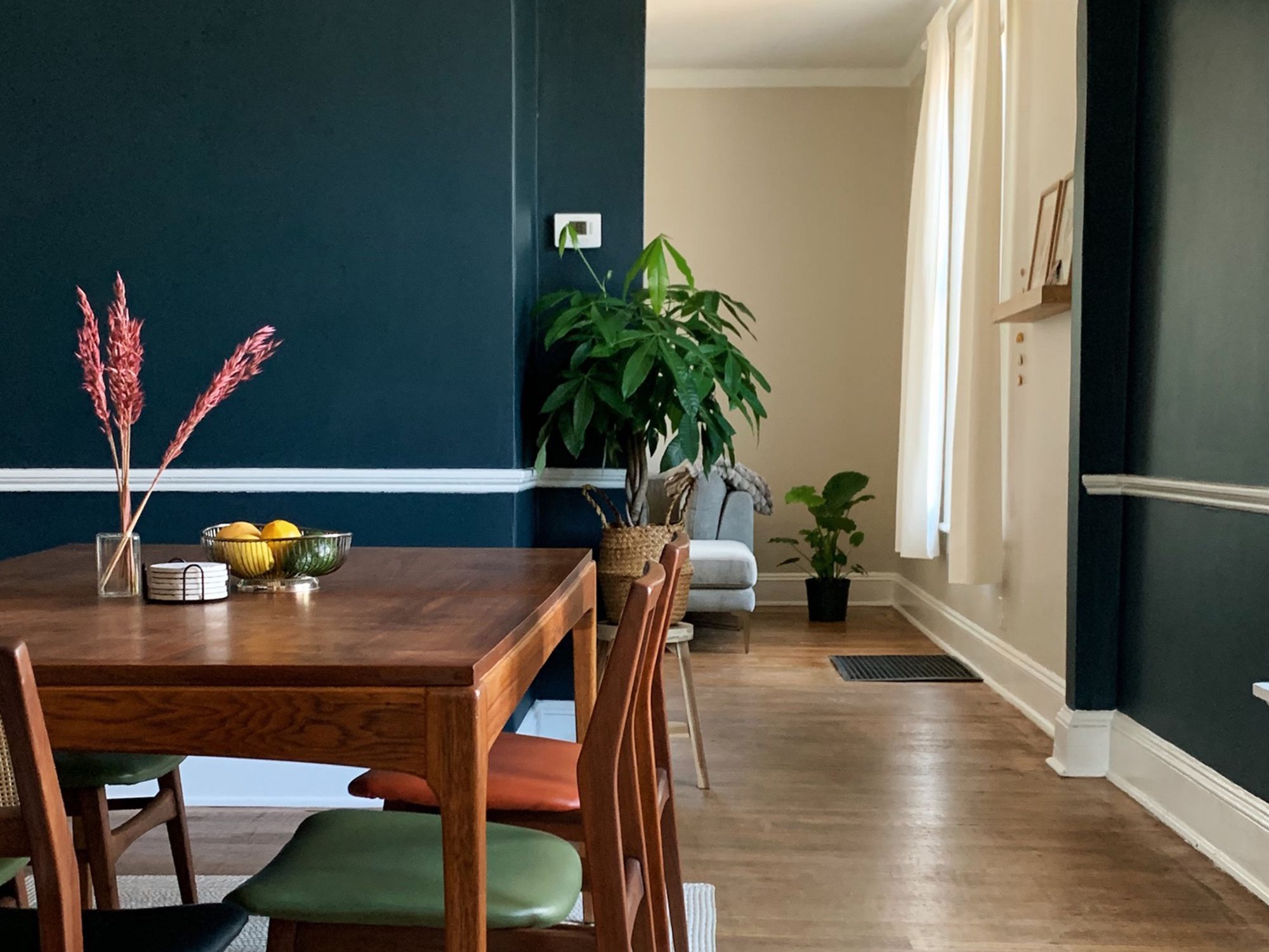
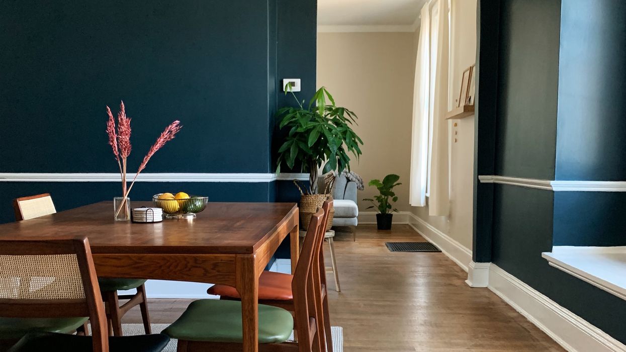
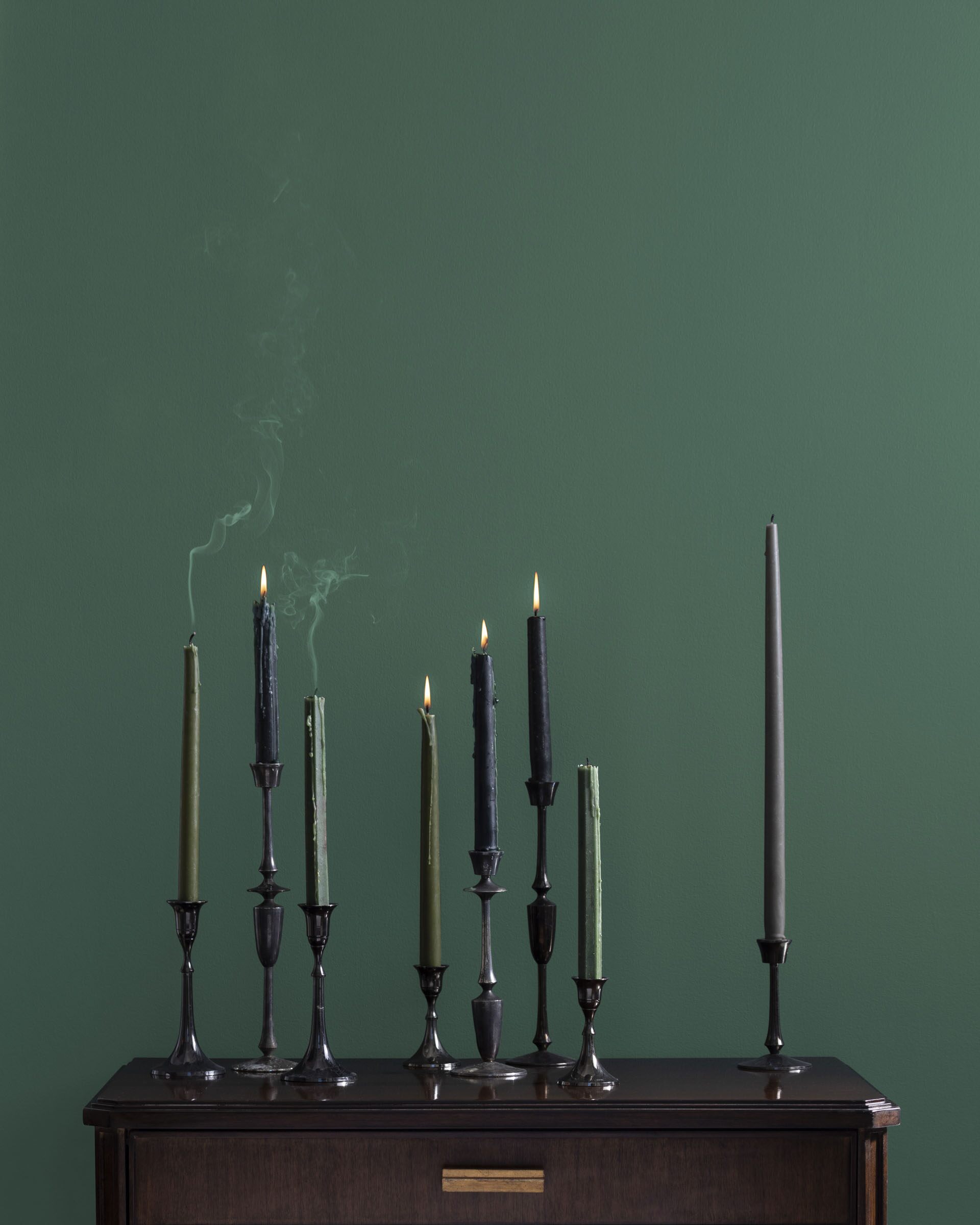
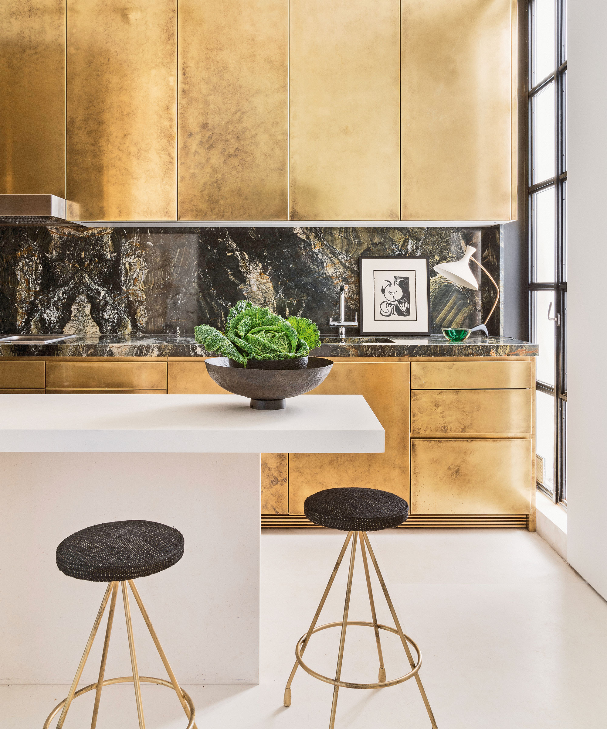
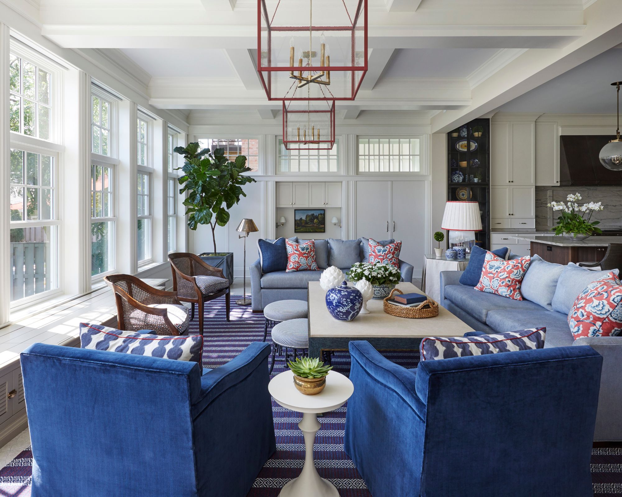
Warm blues and mustard are also highlighted as an unexpected yet effective fall combination. Rather than being exclusively a summer color, blue, particularly warm-toned variants like Benjamin Moore's 'Salzburg Blue,' can be paired with mustards, terracottas, and rusts. These warm undertones add instant coziness, especially when combined with tactile elements like velvet upholstery and throws. Metallic tile finishes can further enhance the effect by reflecting light. For those who prefer a neutral aesthetic, earthy neutrals and white are ideal for fall. The key is to transition from light, airy summer neutrals to richer, darker tones, such as various shades of brown, to add depth and warmth while maintaining a pared-back look. Layering different brown shades creates an organic, grounded feel suitable for the season.
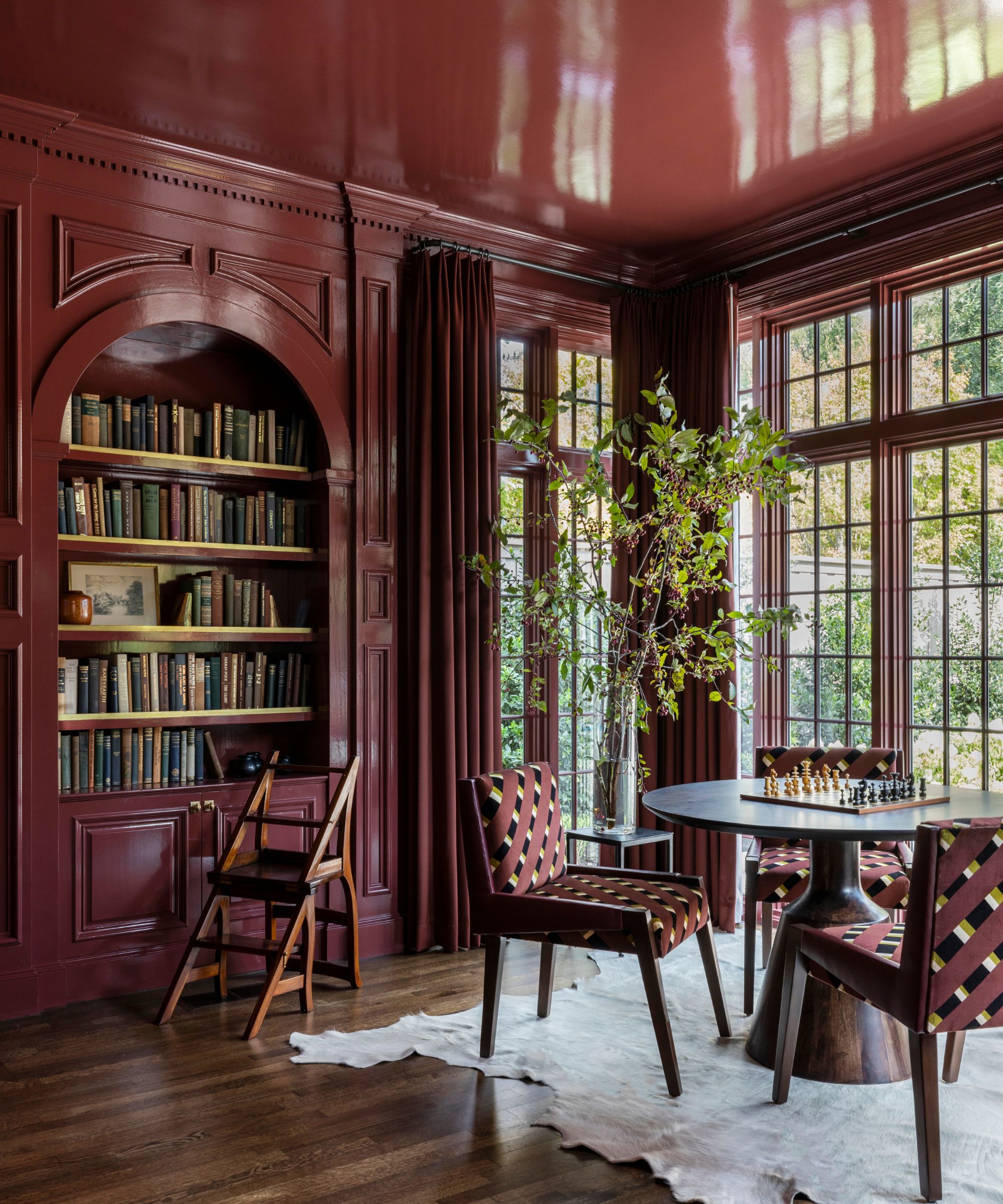
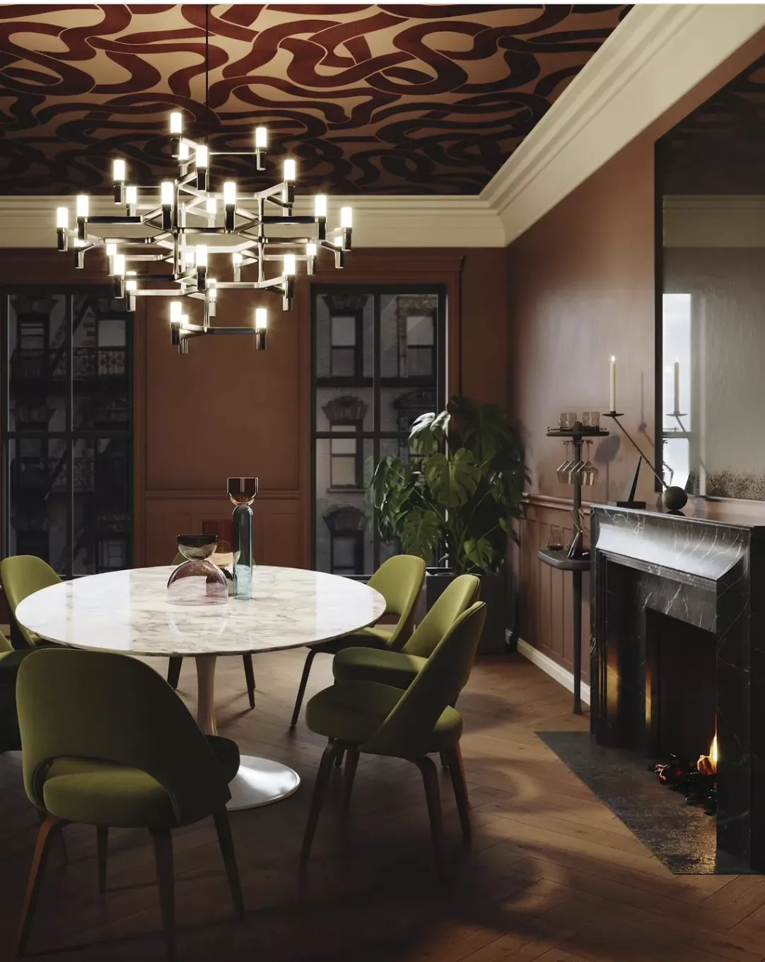
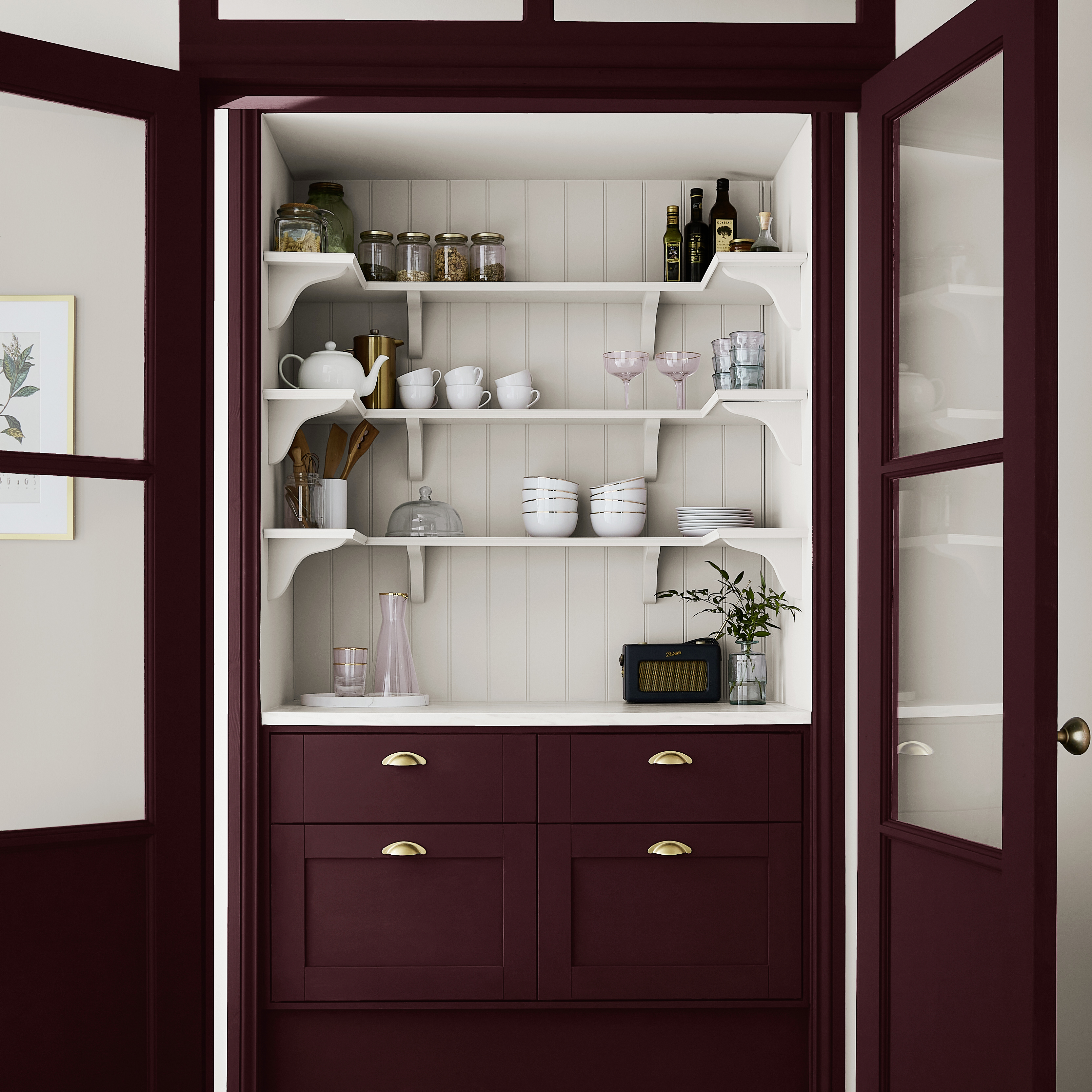
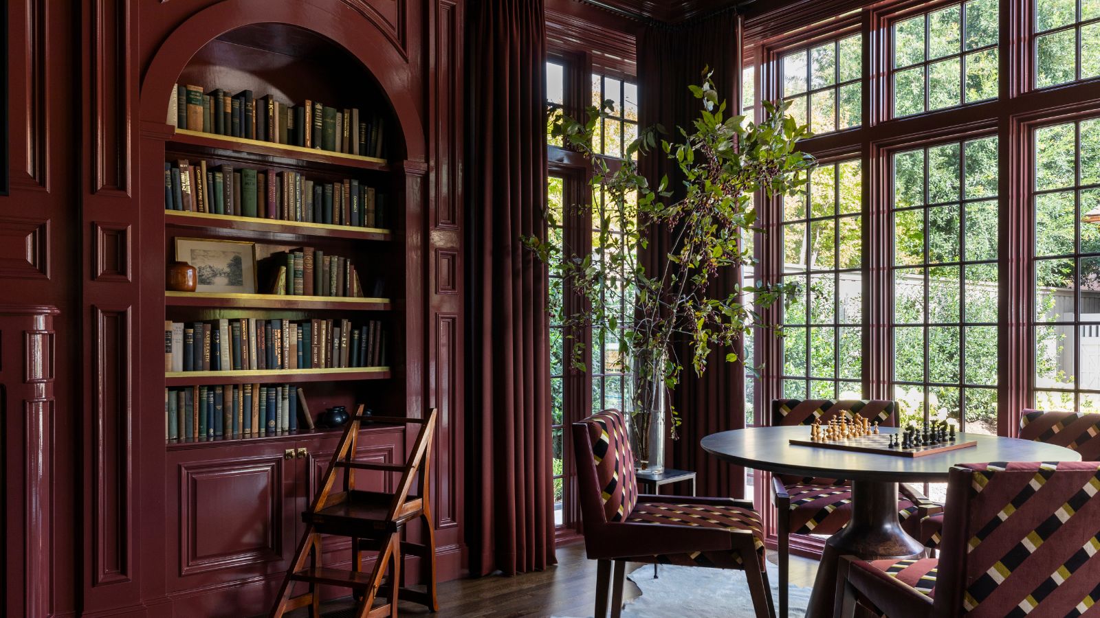
The article also presents aqua and orange, a complementary color pairing that works well for fall when muted variations are chosen. This combination brings cohesion and warmth, creating a cozy and balanced aura. Aqua softens the intensity of orange, offering a light yet seasonally warm feel that modernizes fall design beyond traditional earthy tones. For a more dramatic statement, chocolate brown and neutrals are recommended. Painting walls in a deep chocolate hue, possibly with a glossy lacquer finish, can transform a room into an autumnal sanctuary, especially when balanced with soft, neutral furniture and decor.
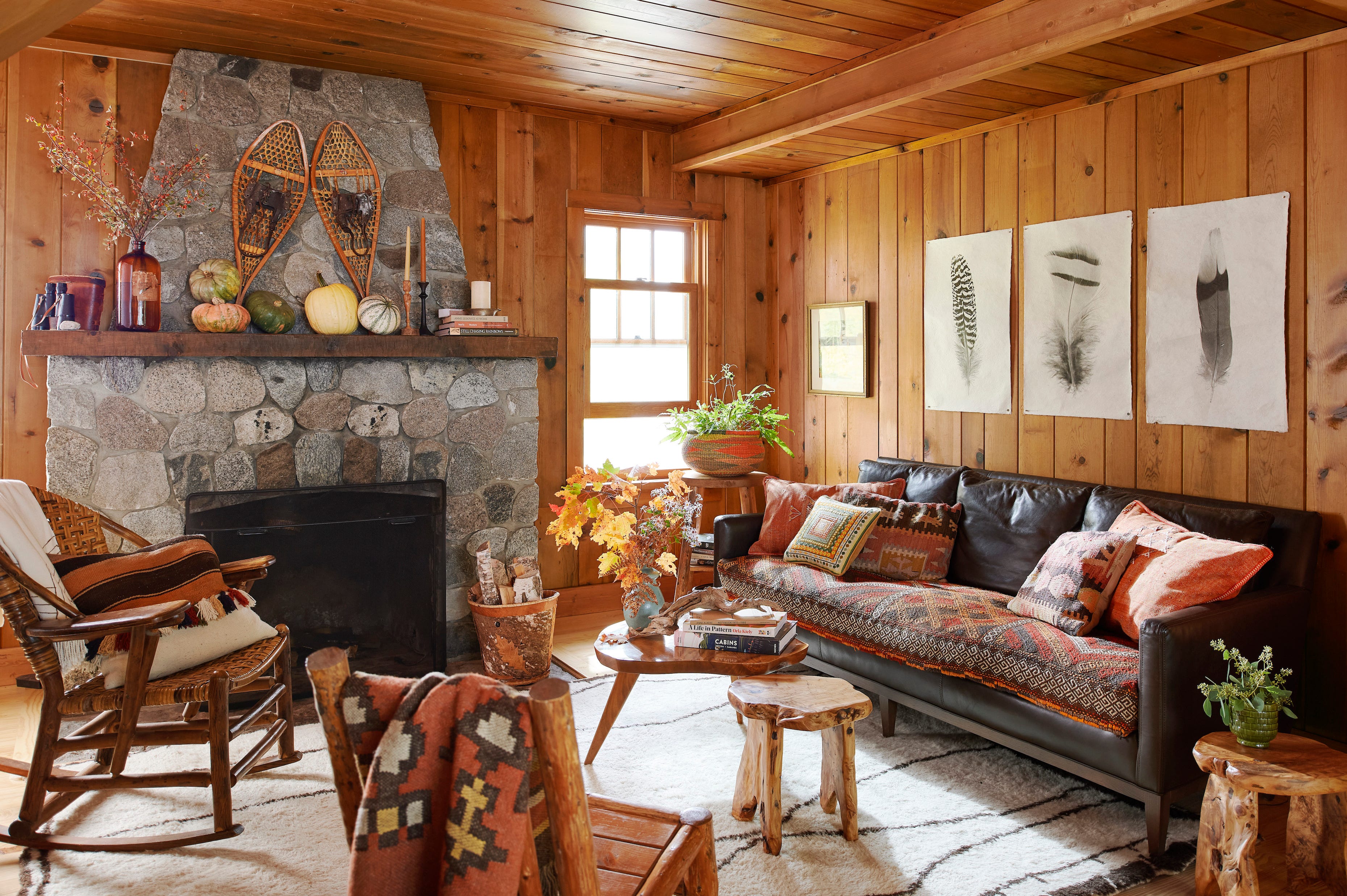
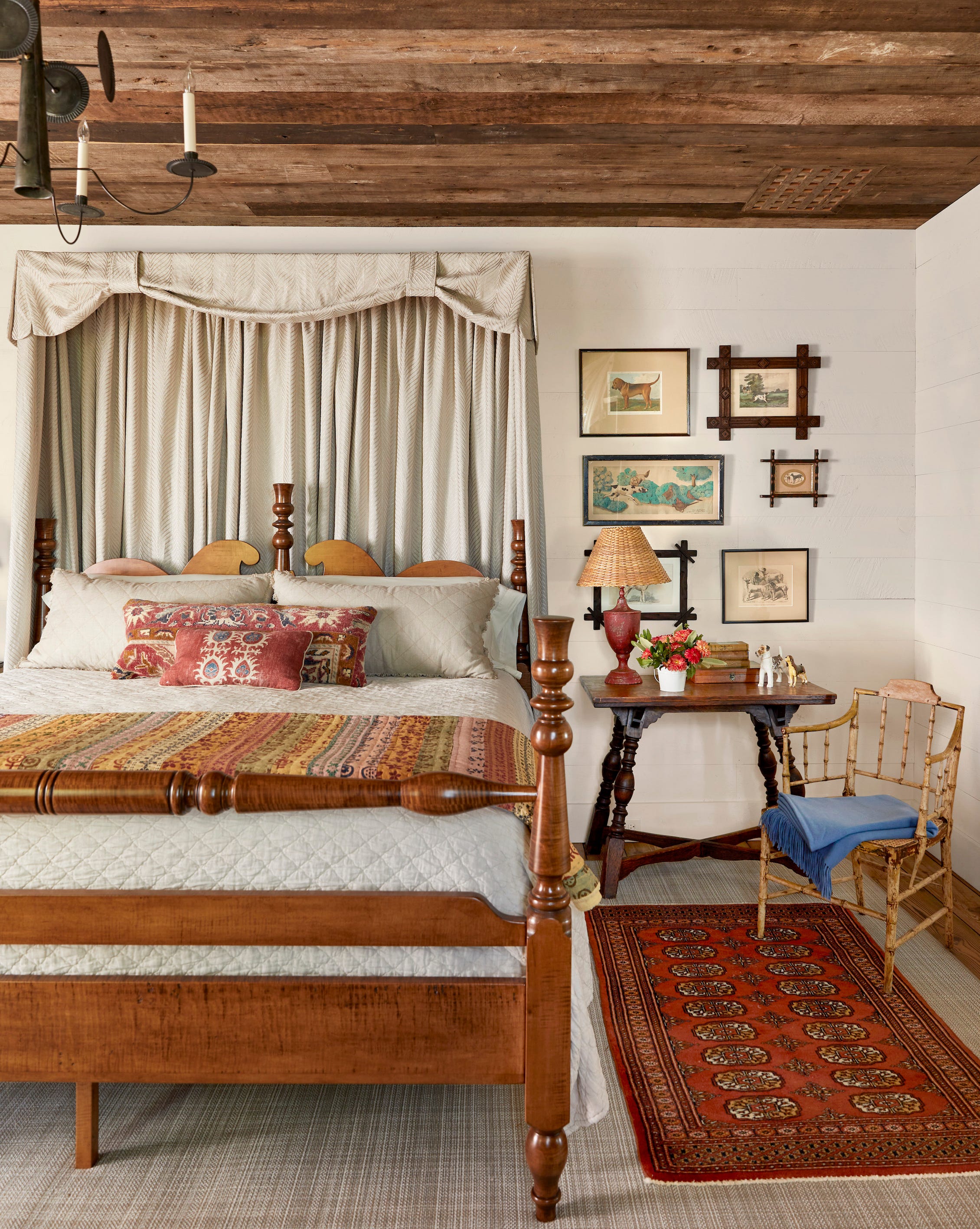
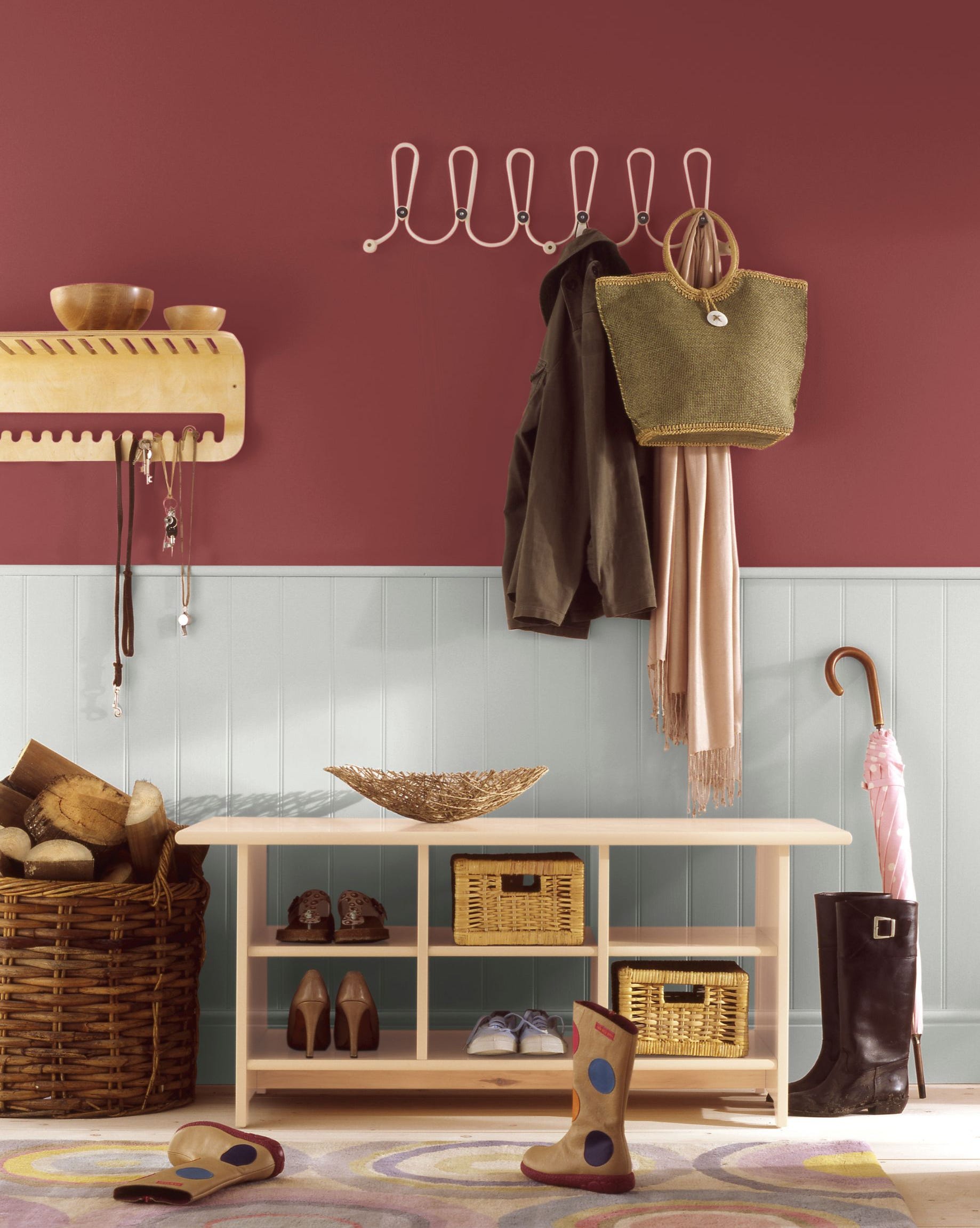
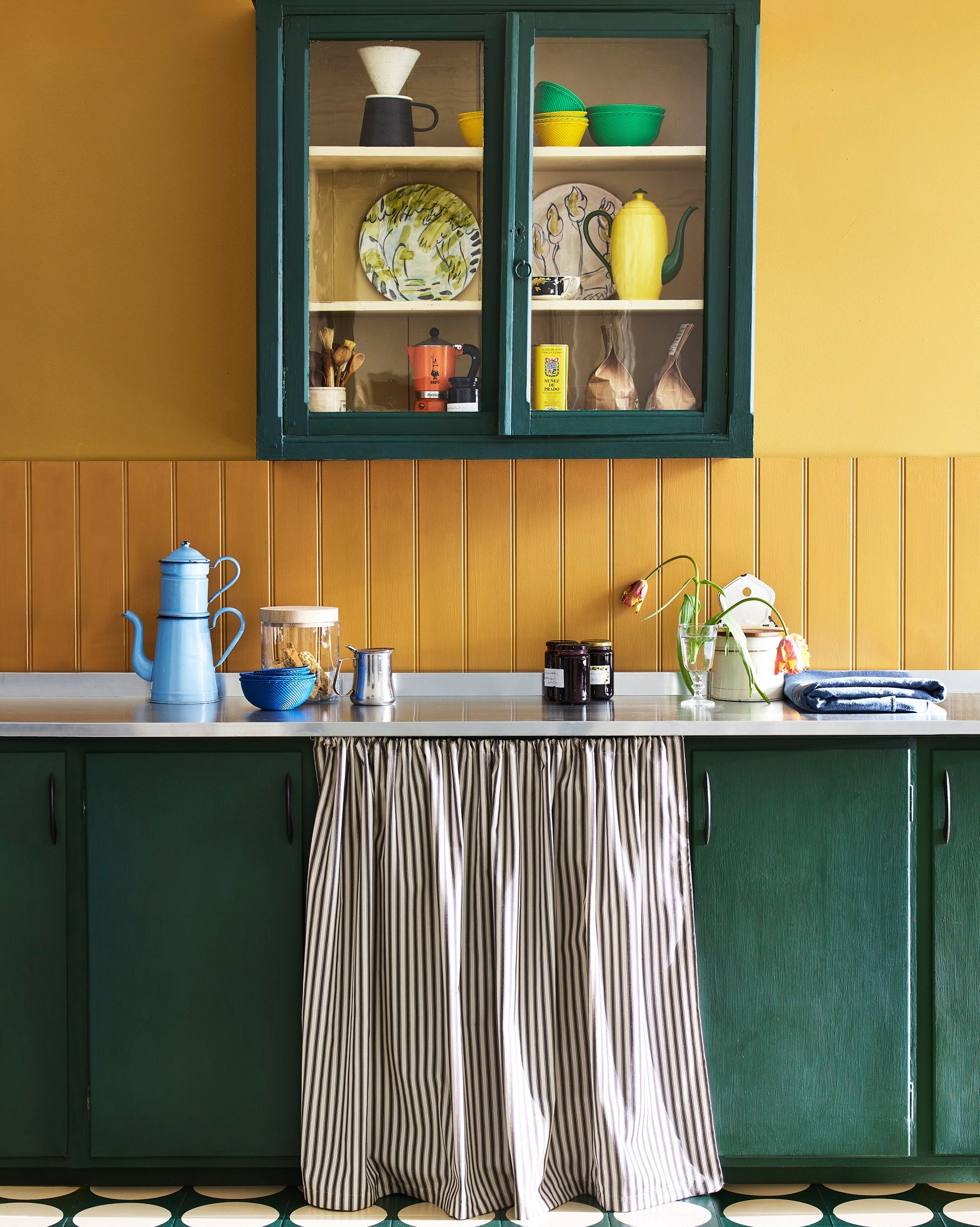
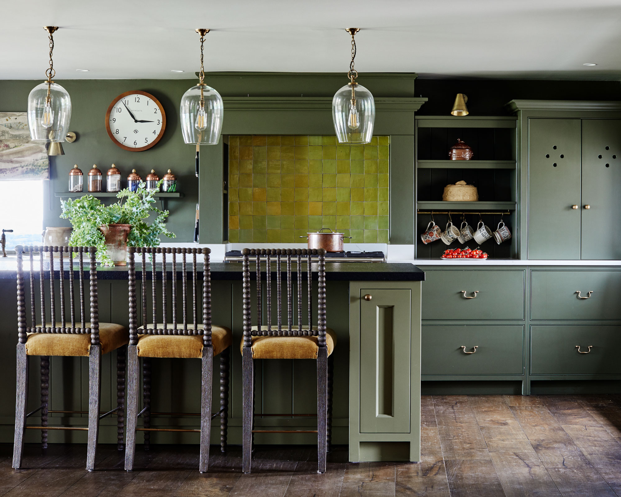
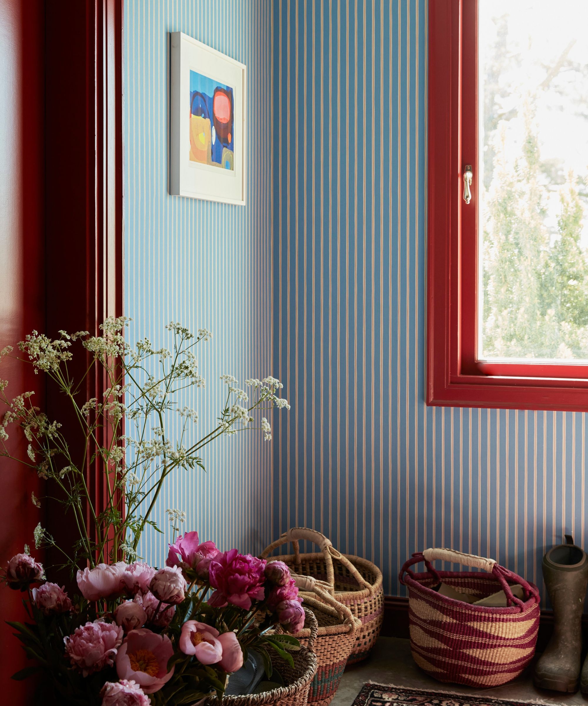
Finally, camel and jewel tones provide an opulent yet balanced option. Jewel tones, while luxurious, can be intense, so pairing them with neutrals like camel helps to tone them down and achieve a timeless look. A pop of rich purple with a camel-colored wallpaper, for example, maintains a fresh mood while delivering a cozy fall palette. Yellow and wood tones are also suggested as transitional colors, particularly for regions where temperatures drop later in the season. Warm yellows and oranges, combined with rich wood tones, can bridge the gap between summer brights and winter cools, adding whimsy and delight to a room through art, accessories, rugs, or furniture.
#FallColorCombinations #InteriorDesign #HomeDecor #AutumnalColors #ColorPsychology #AccentColors #SeasonalDecor #CozyInteriors #NeutralPalette #FallColorCombinations #InteriorDesign #HomeDecor #AutumnalColors #ColorPsychology #AccentColors #SeasonalDecor #CozyInteriors #NeutralPalette
0 comment in total
You may also like
It's time to look beyond pumpkin spice – 10 fall colors designers swear by for a cozy, seasonal, and timeless look
Designers Weigh In on the 7 Biggest Paint Color Trends of Fall 2022
12 Home Paint Colors We're Loving for Fall

Fall Home & Decor: Tips for embracing that warm seasonal vibe
10 fall color schemes that aren't all about orange

5 Autumn Paint Colours Designers Say Will Make Your Home Feel Instantly Cosier

16 Fall Paint Colors That Capture the Beauty of Autumn

How to style a coffee table for fall – 7 seasonal tips from interior designers
22 Beautiful Fall Color Schemes for Your Home
24 Fall Paint Colors to Make Your Space Cozy Just in Time for Autumn

The best paint colours for autumn — and how to style them at home

Turn Your Home Into a Cozy Fall Dream With These Designer Ideas

7 Fall Paint Color Trends Designers Want You to Use This Year

6 Paint Color Duos Designers Can't Get Enough of This Fall


It’s Cozy Season, and Nothing Says 'Snug and Restful' More Than Johnny Galecki's Cabin-Style Kitchen – the Autumnal Color Palette Is a Game-Changer
This Chic Color Pairing Is Cooler Than Beige and Black and Set to Dominate Fall Outfits

Fall’s Most Stylish Paint Color Trends Have Us Swooning
7 colors to decorate with in September 2024
Blue and red is the unexpected color combination for fall 2024
7 Color Combos That ALWAYS Look Good Together, According to Designers