6 Kitchen Countertop Colors That Make Your Home Look Outdated
Kitchen countertops have transitioned from mere functional components to significant expressive elements in contemporary kitchen design, with 87% of designers now considering them a focal point. The choice of color, material, and finish plays a crucial role in establishing the overall ambiance of a space. However, certain countertop colors and finishes are increasingly viewed as outdated, failing to align with current design preferences.
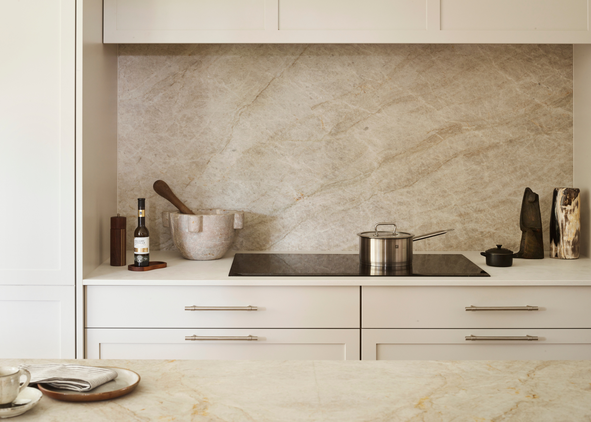
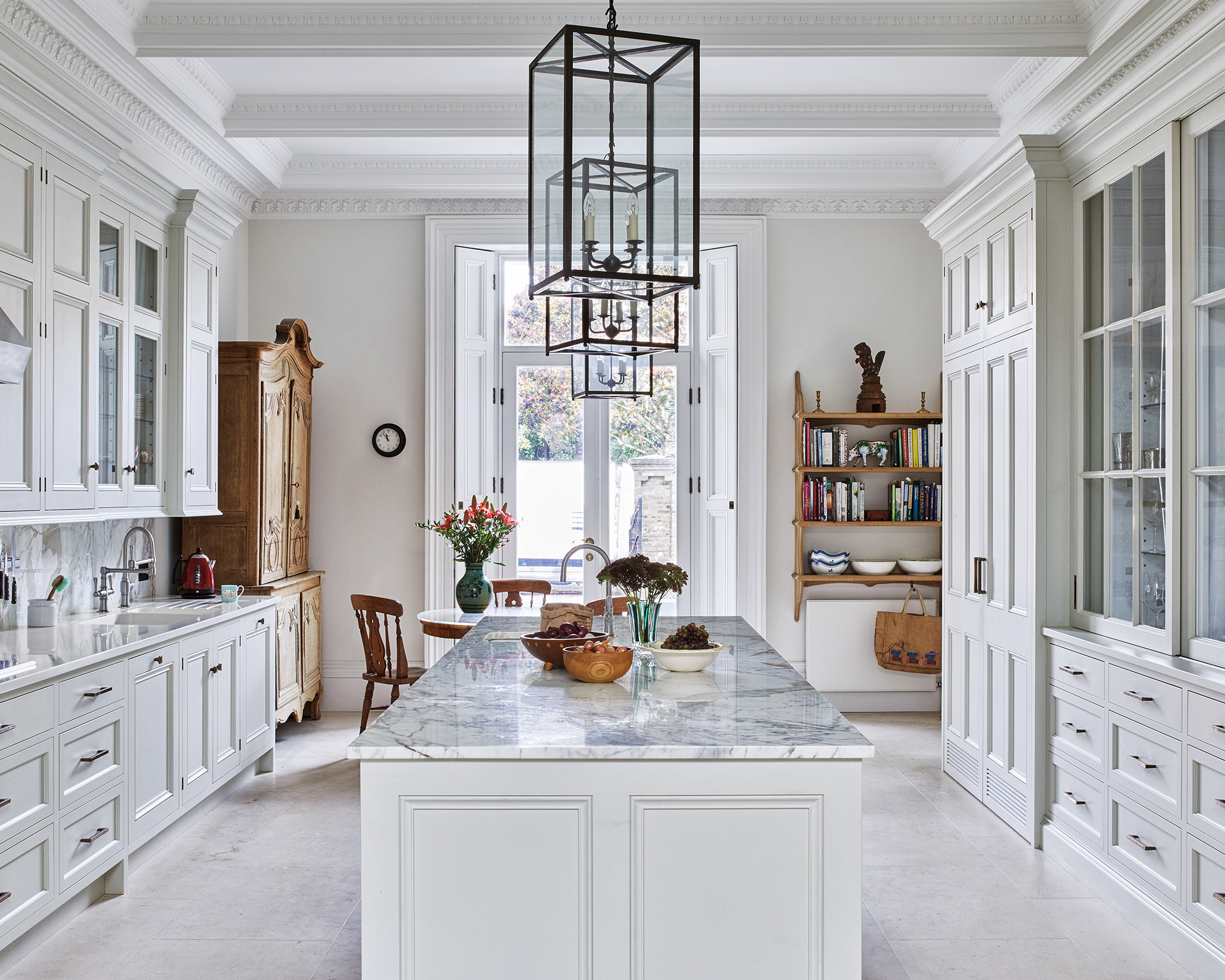
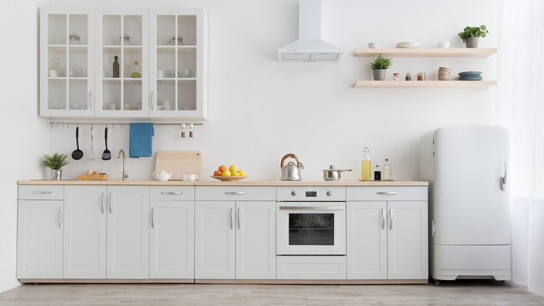
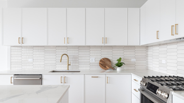
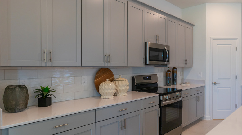
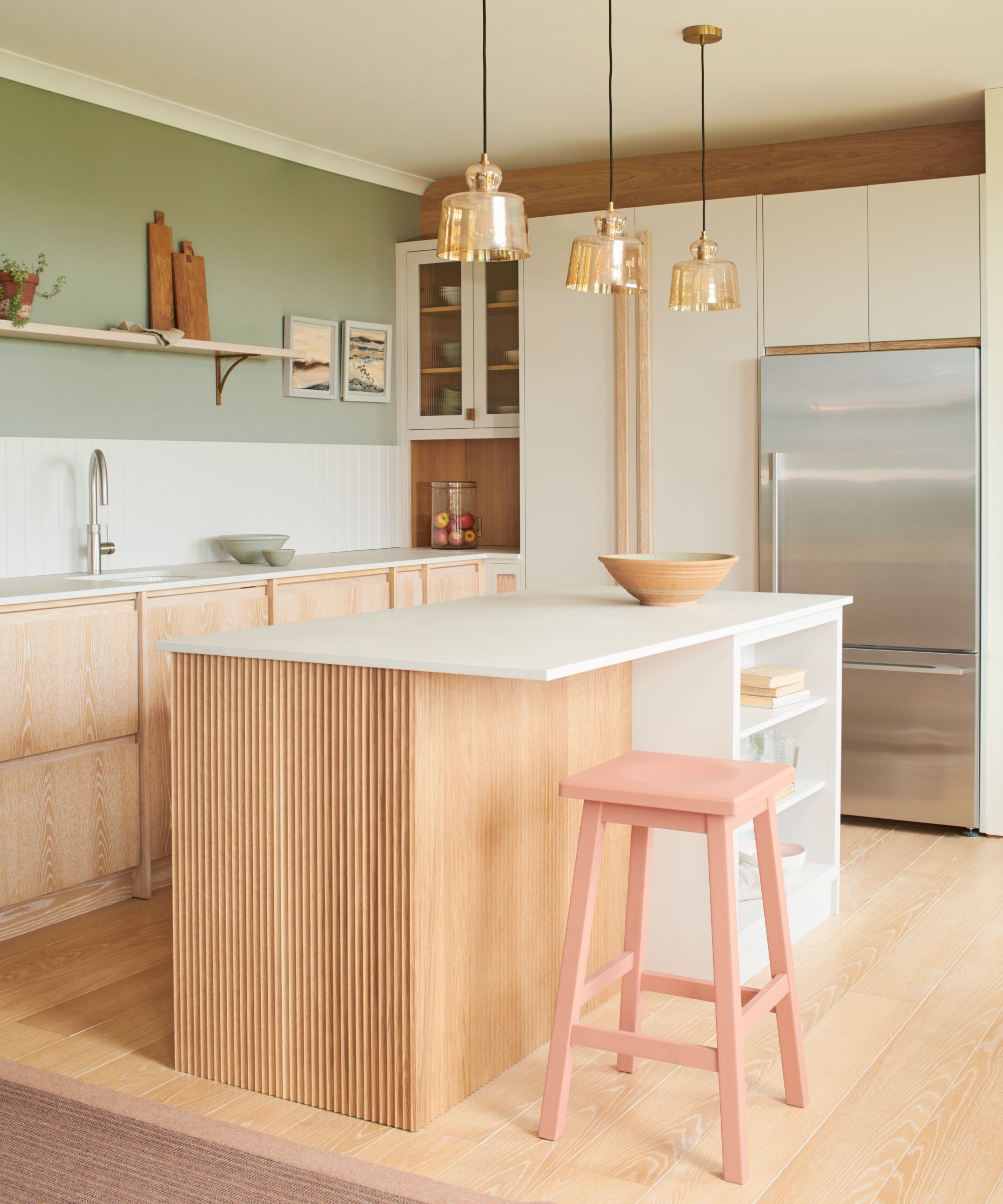
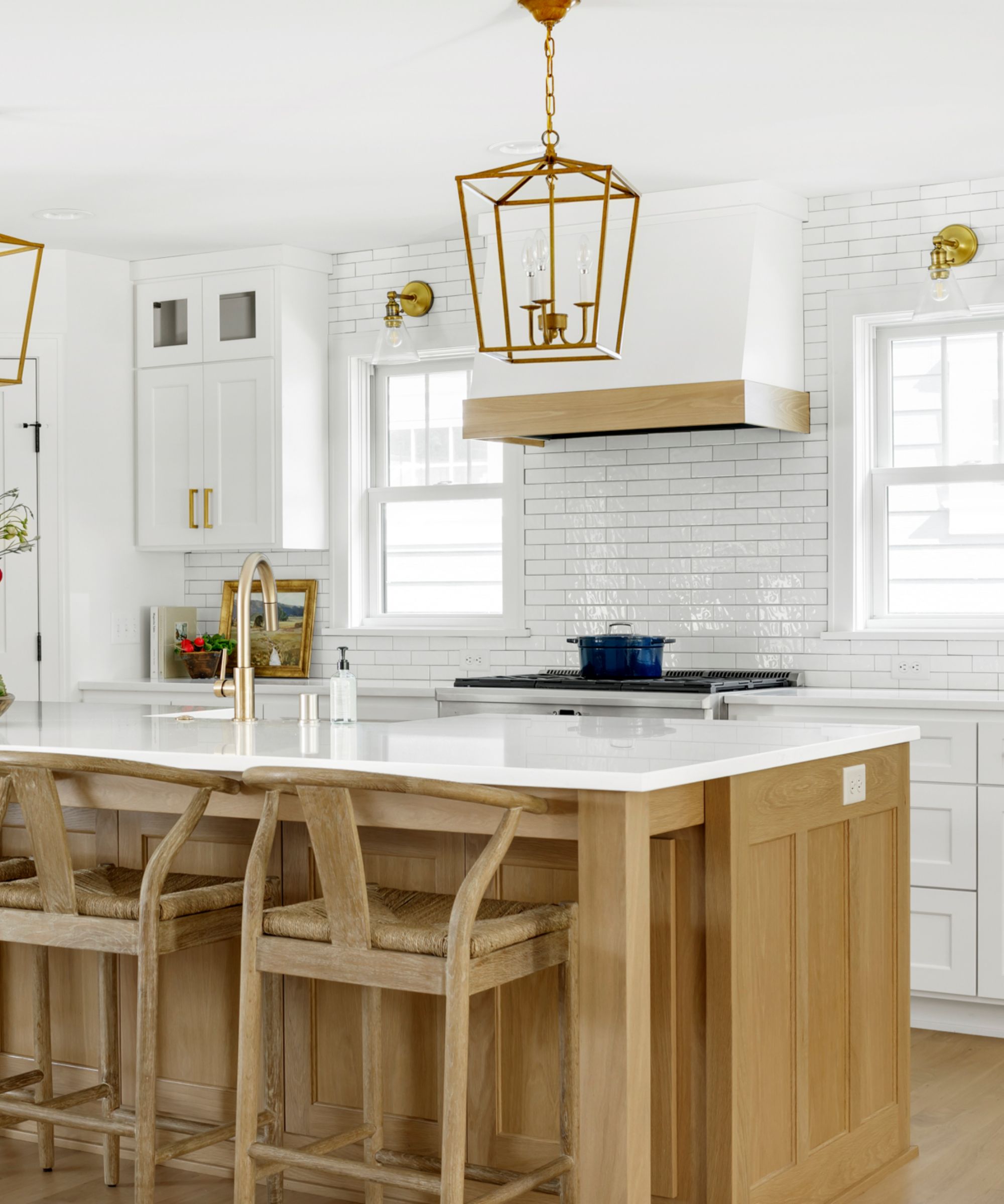
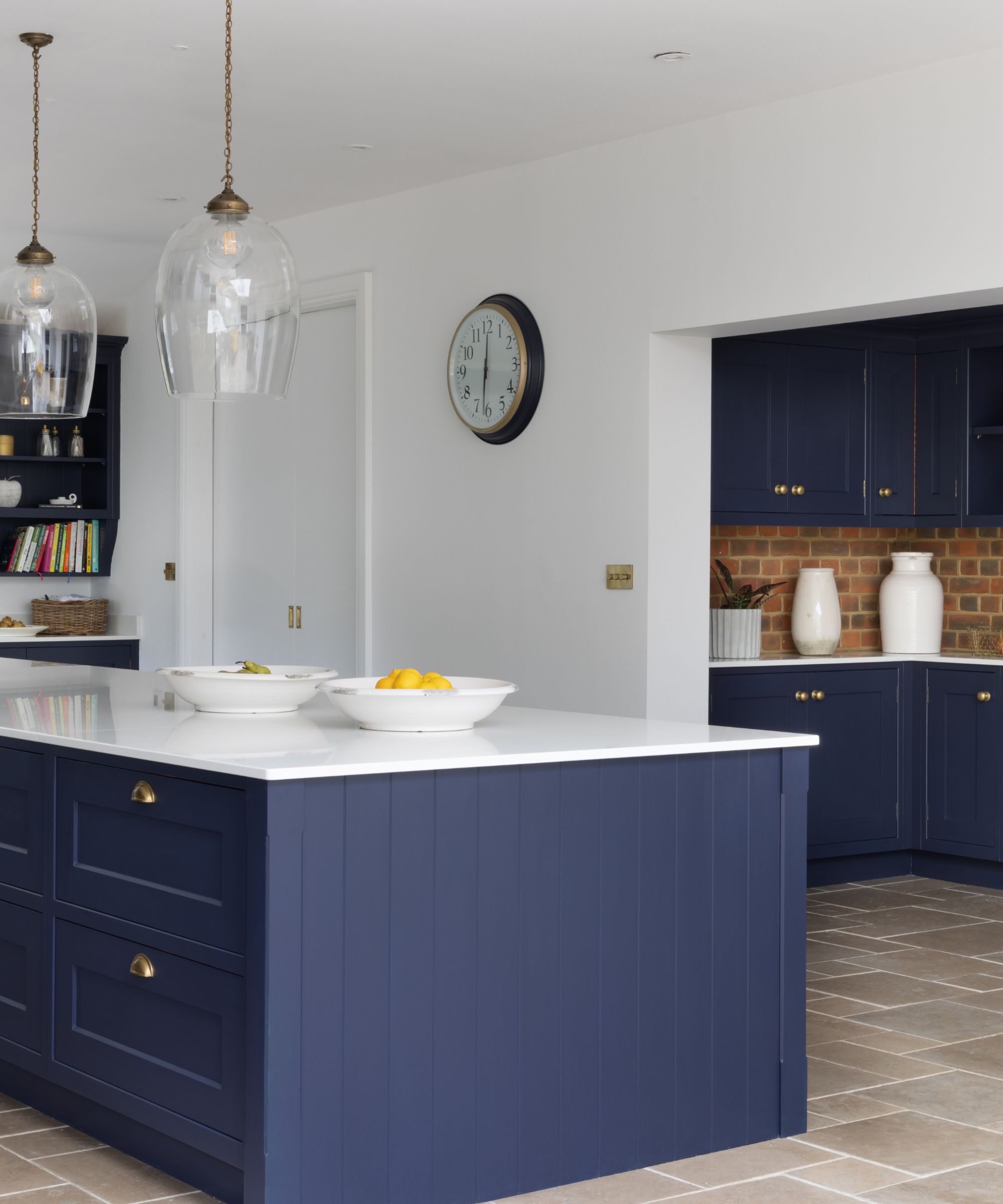
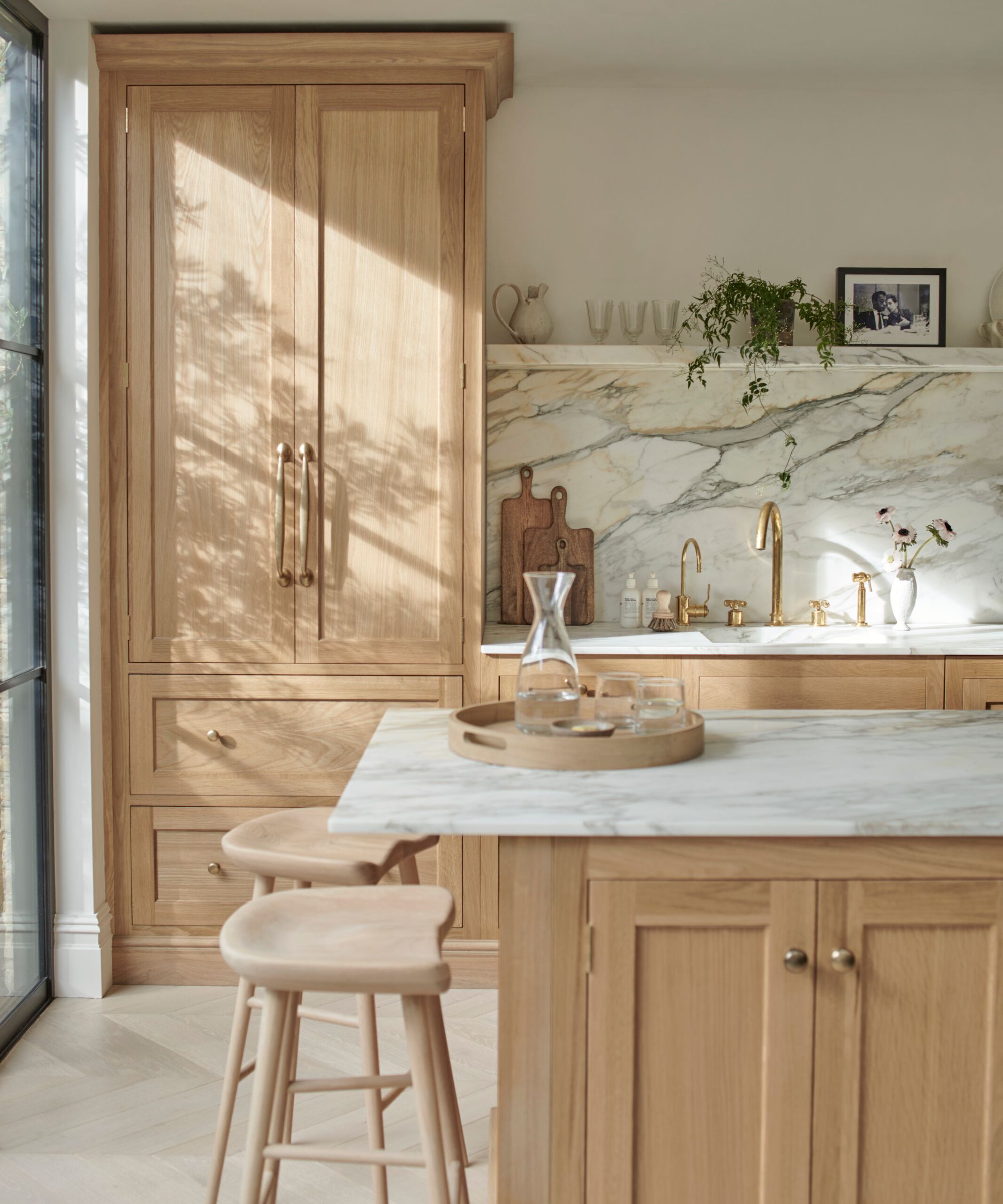
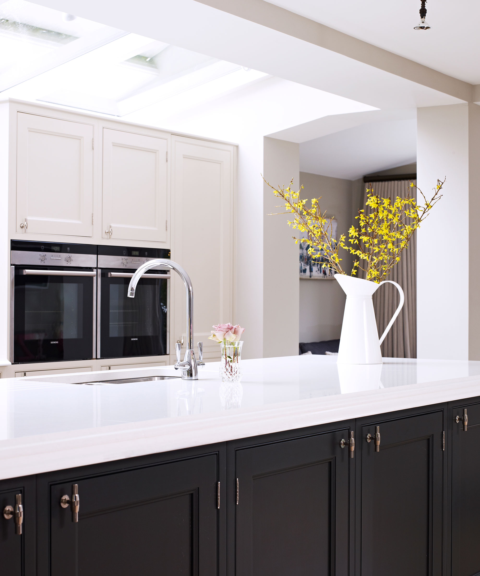
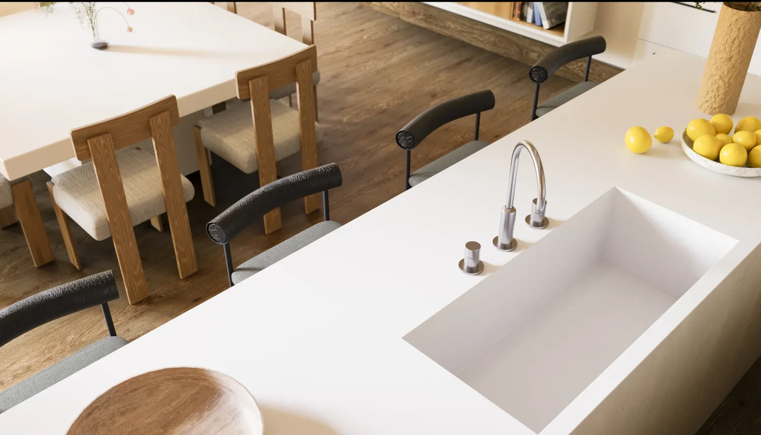
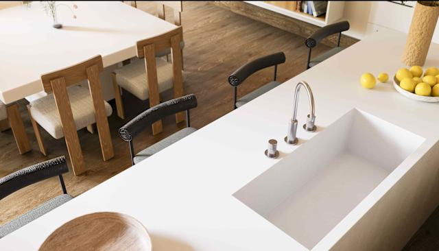
Stark, pure white countertops, once a hallmark of modern minimalism, are now perceived as cold and clinical. Homeowners are moving away from these in favor of warmer, more inviting tones. Instead, cream off-whites, soft beiges, and warm greige offer similar brightness while introducing more character and warmth. These alternative hues effectively reflect light without flattening the space and harmoniously blend with both light and dark cabinetry.
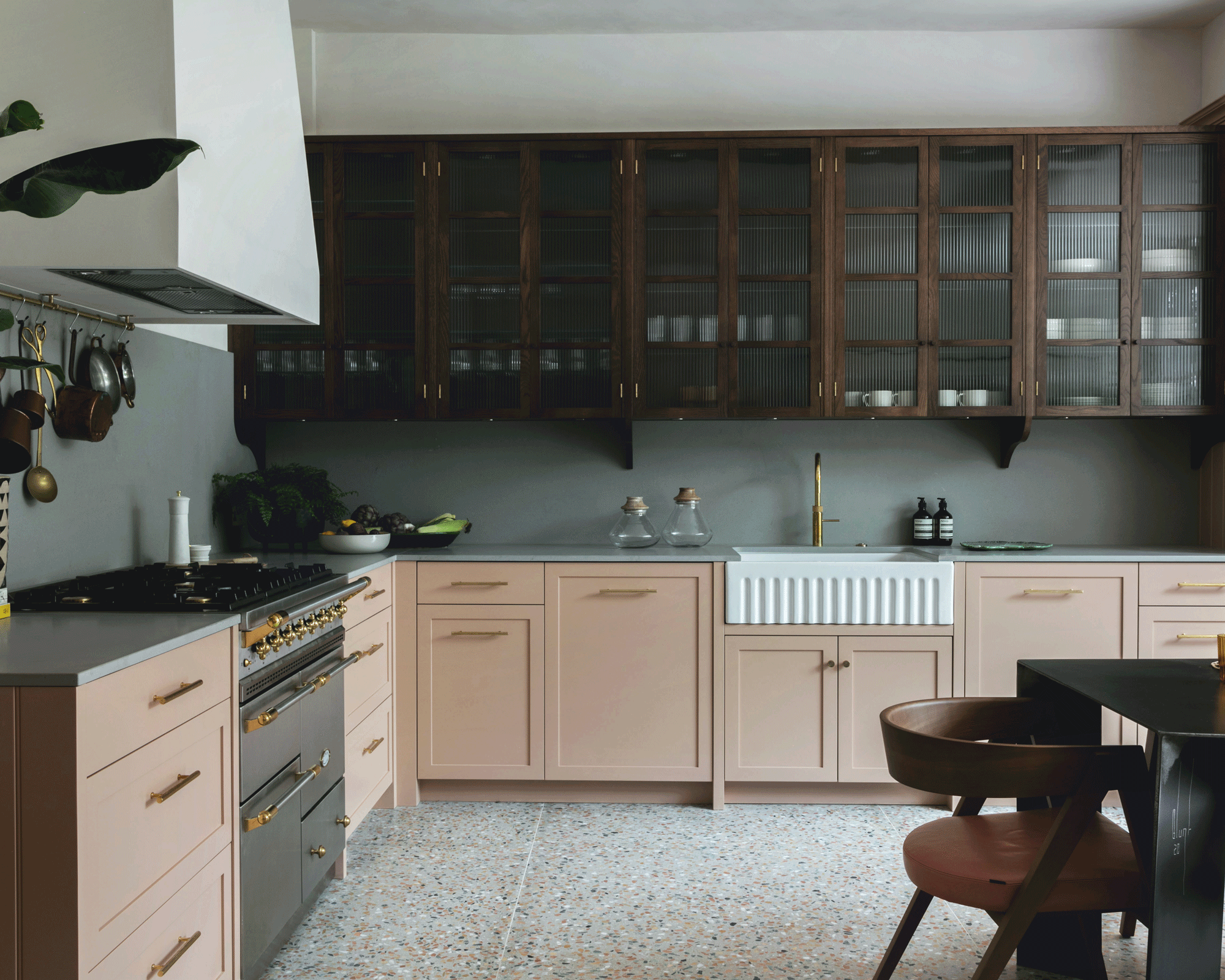
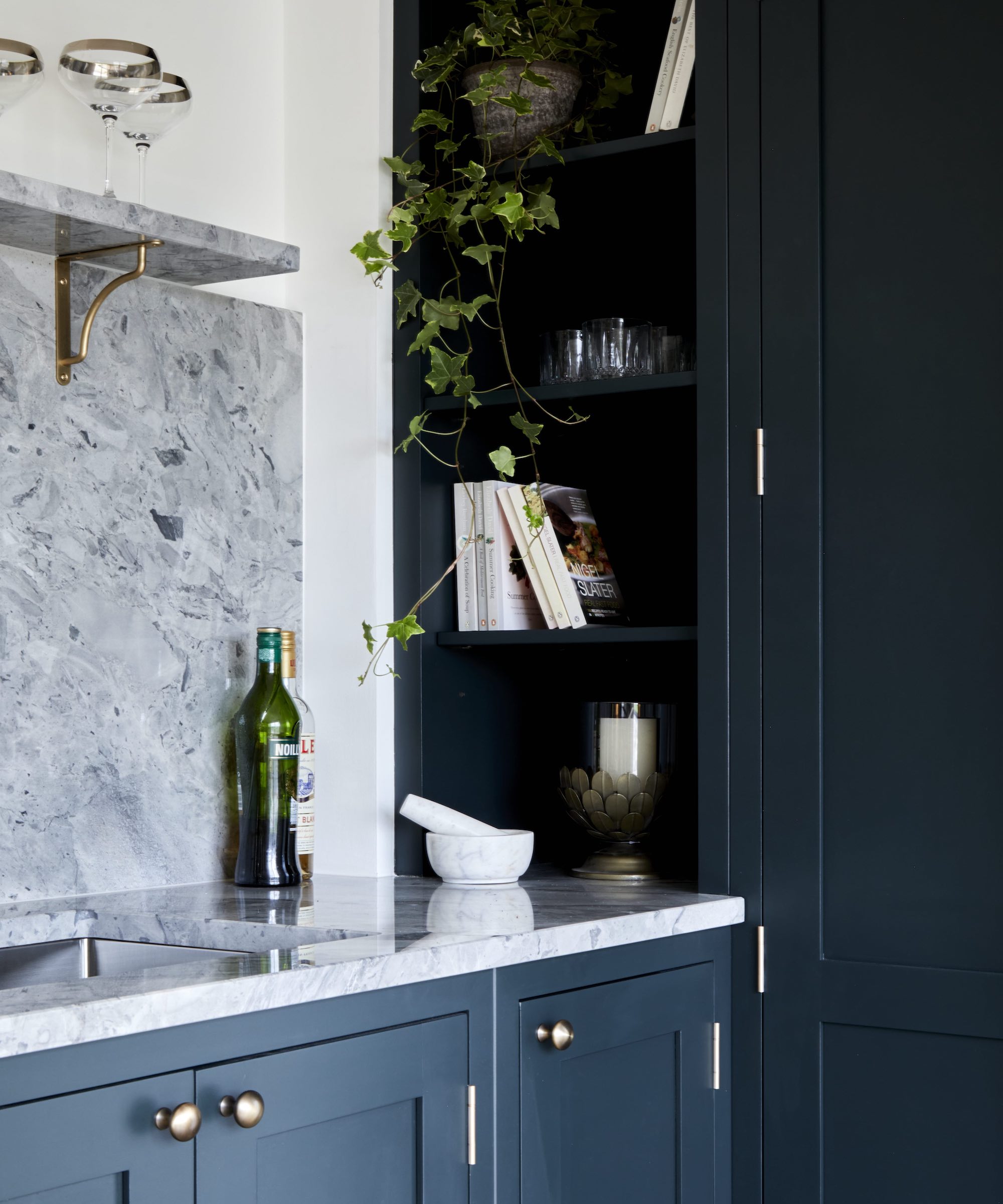
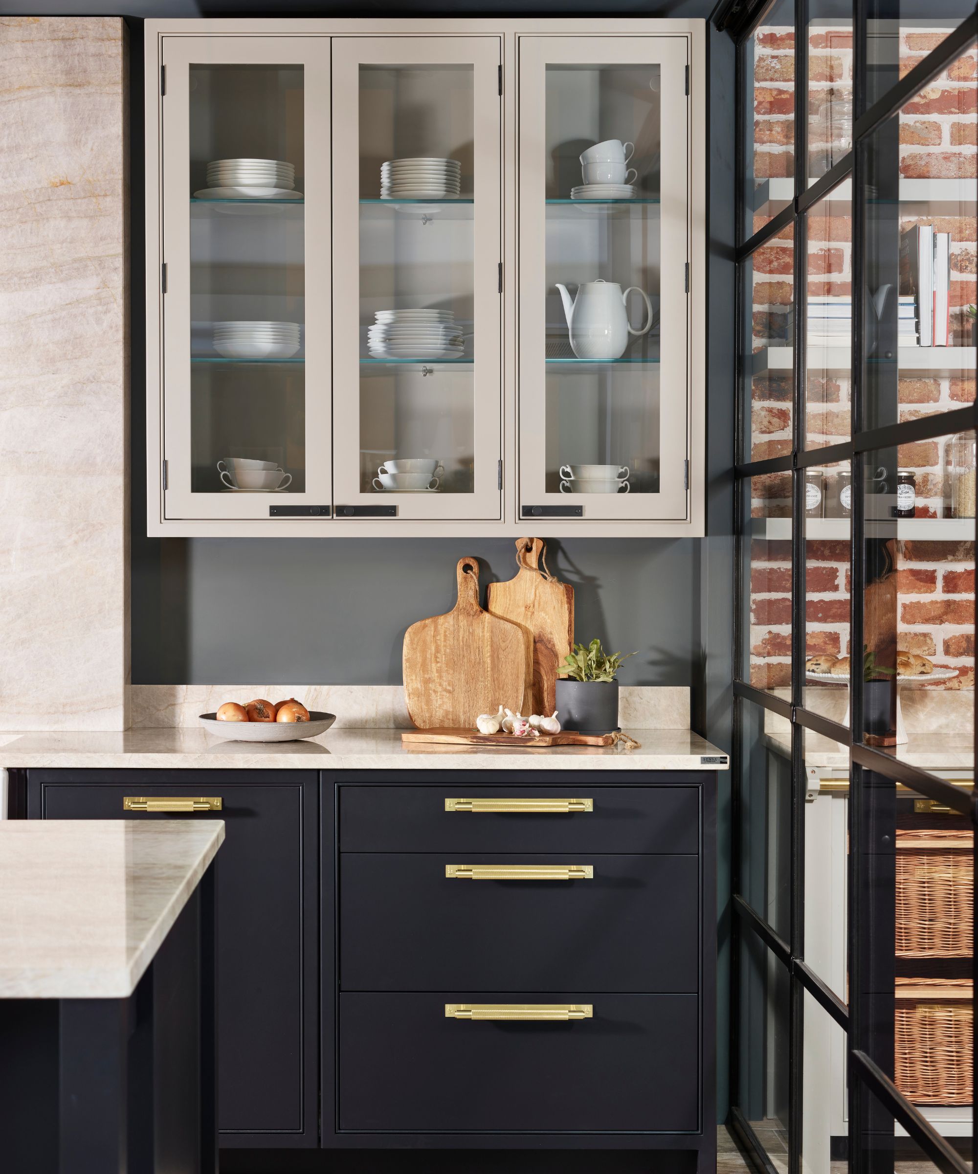
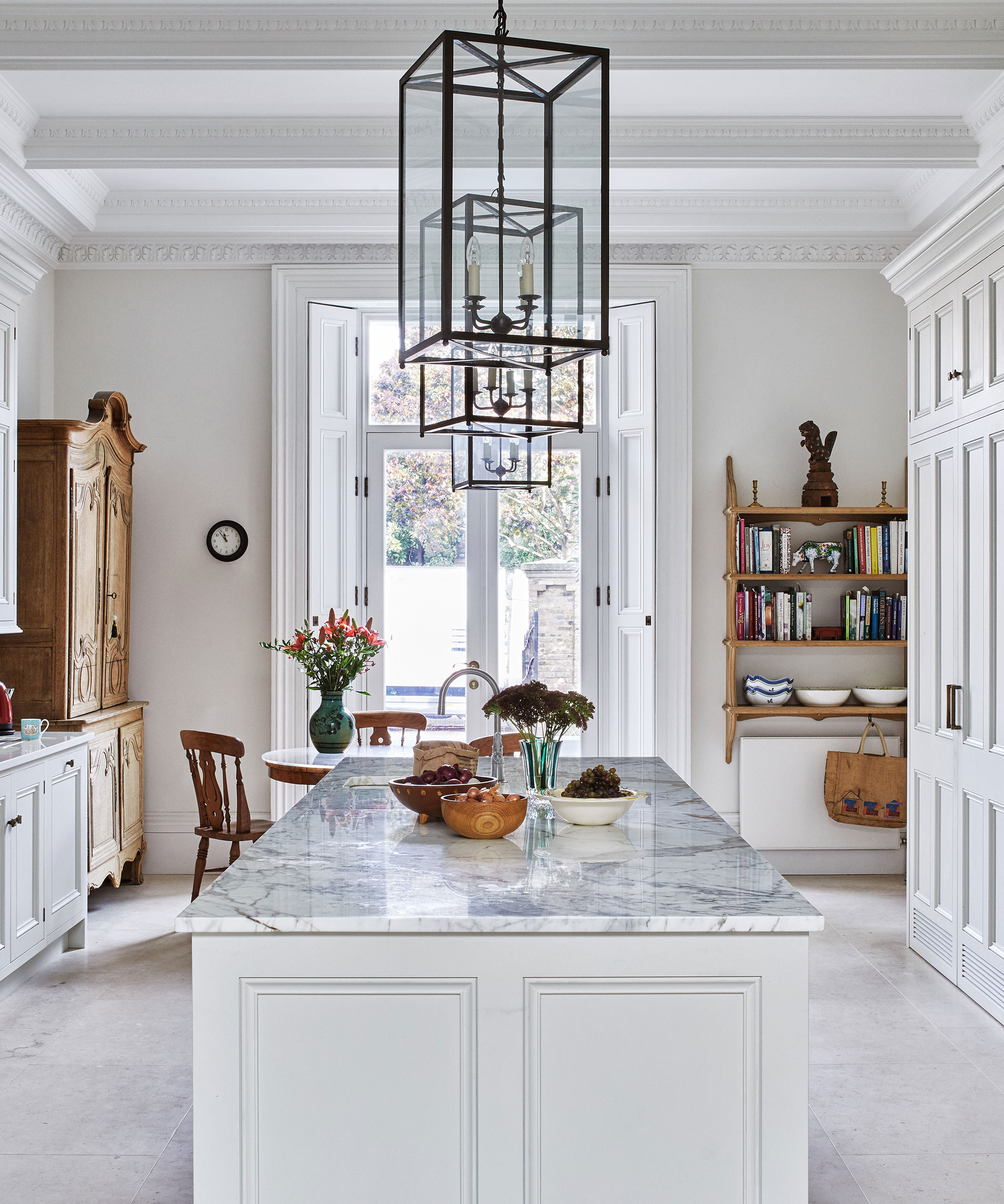
Cool-toned gray surfaces, which saw a surge in popularity, are also falling out of favor. These often prove challenging to integrate into a home's design, frequently resulting in a disappointing and unwelcoming feel due to their lack of warmth. Preferred alternatives include earth-inflected neutrals or natural stone with subtle patterns, which provide visual interest without restricting the kitchen to a narrow color palette.
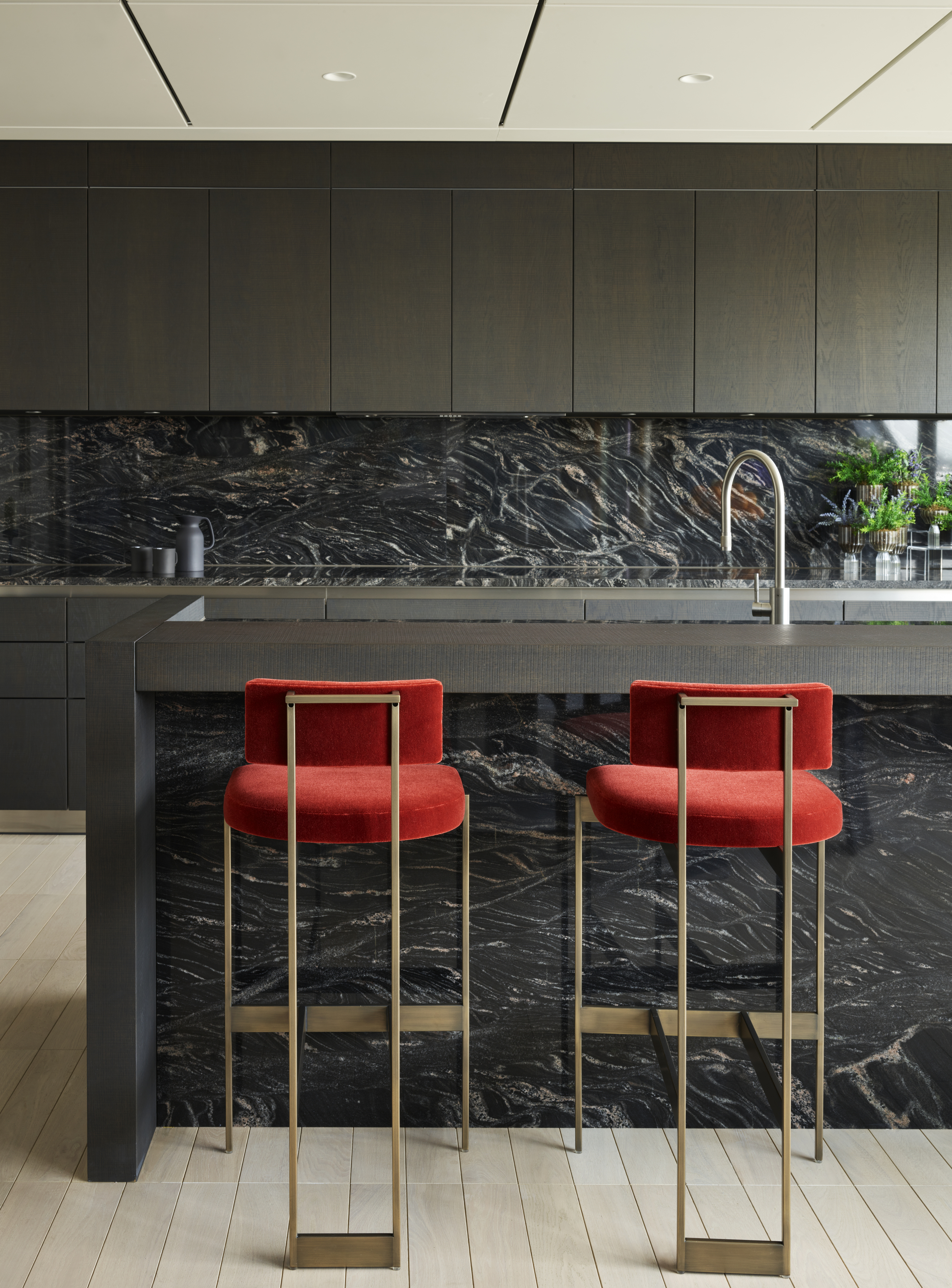
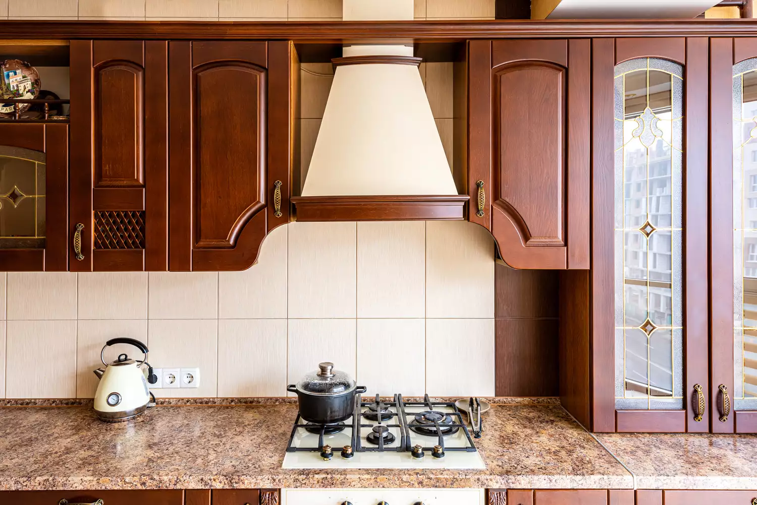
Heavily speckled or beige granite, prevalent about 15 years ago, is now a clear indicator of an outdated kitchen. This type of granite creates visual clutter and often necessitates darker cabinetry, potentially making a room feel smaller. Modern designs lean towards engineered quartz with lighter backgrounds or natural stone featuring restrained veining, which offer a cleaner, more durable, and contemporary aesthetic.
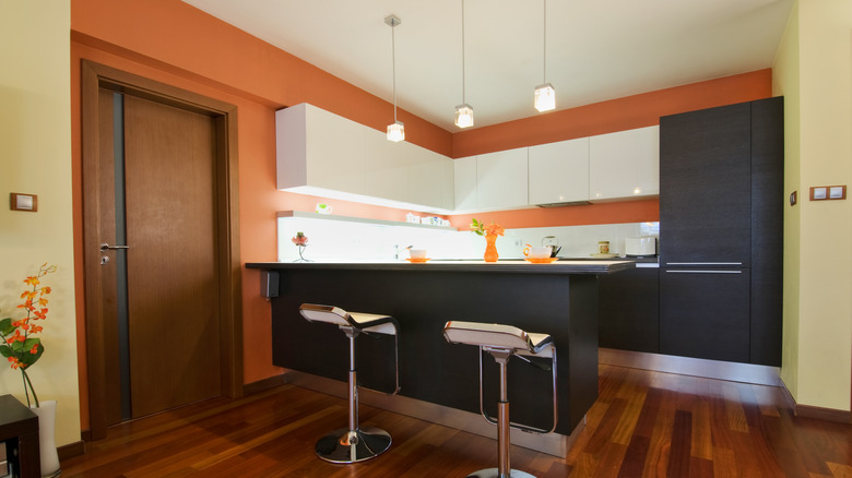
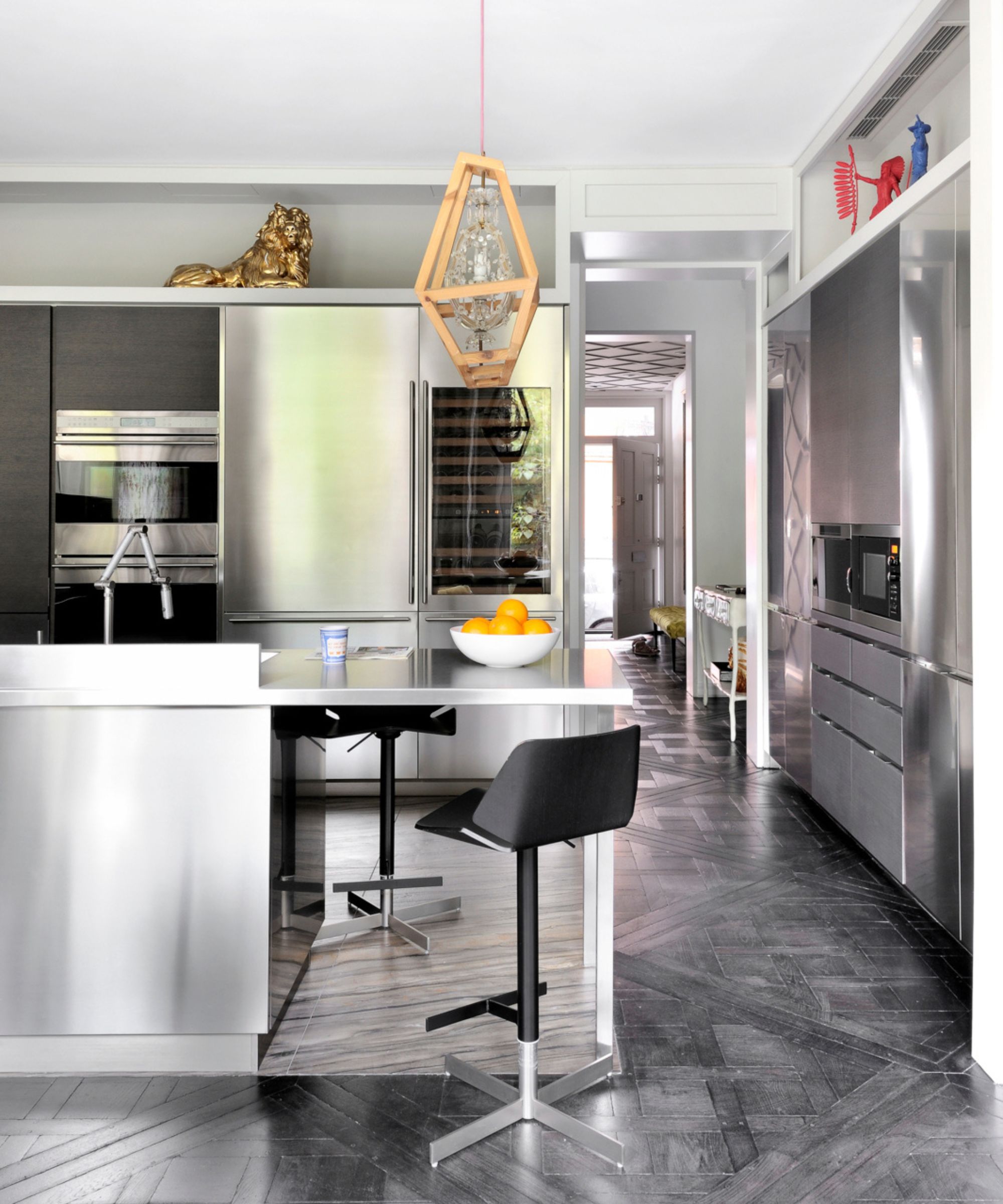
High-gloss finishes, particularly in dark colors, are being phased out due to both aesthetic and practical concerns. These surfaces readily show fingerprints, smudges, and general wear. Matte, honed, or leathered finishes are now preferred for their softer, more natural appearance. Matte black, in contrast to glossy black, is highly sought after for its contemporary appeal.
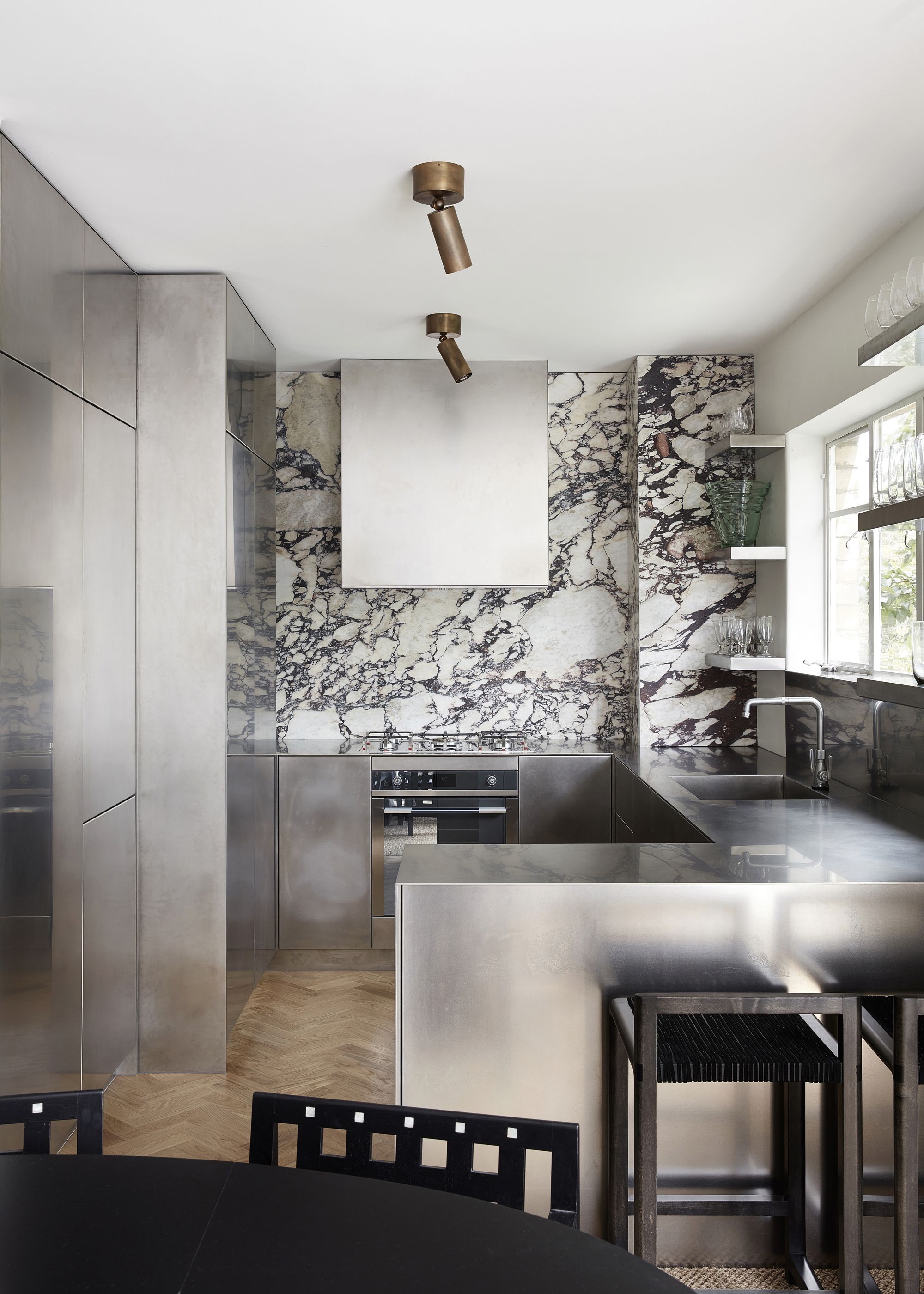
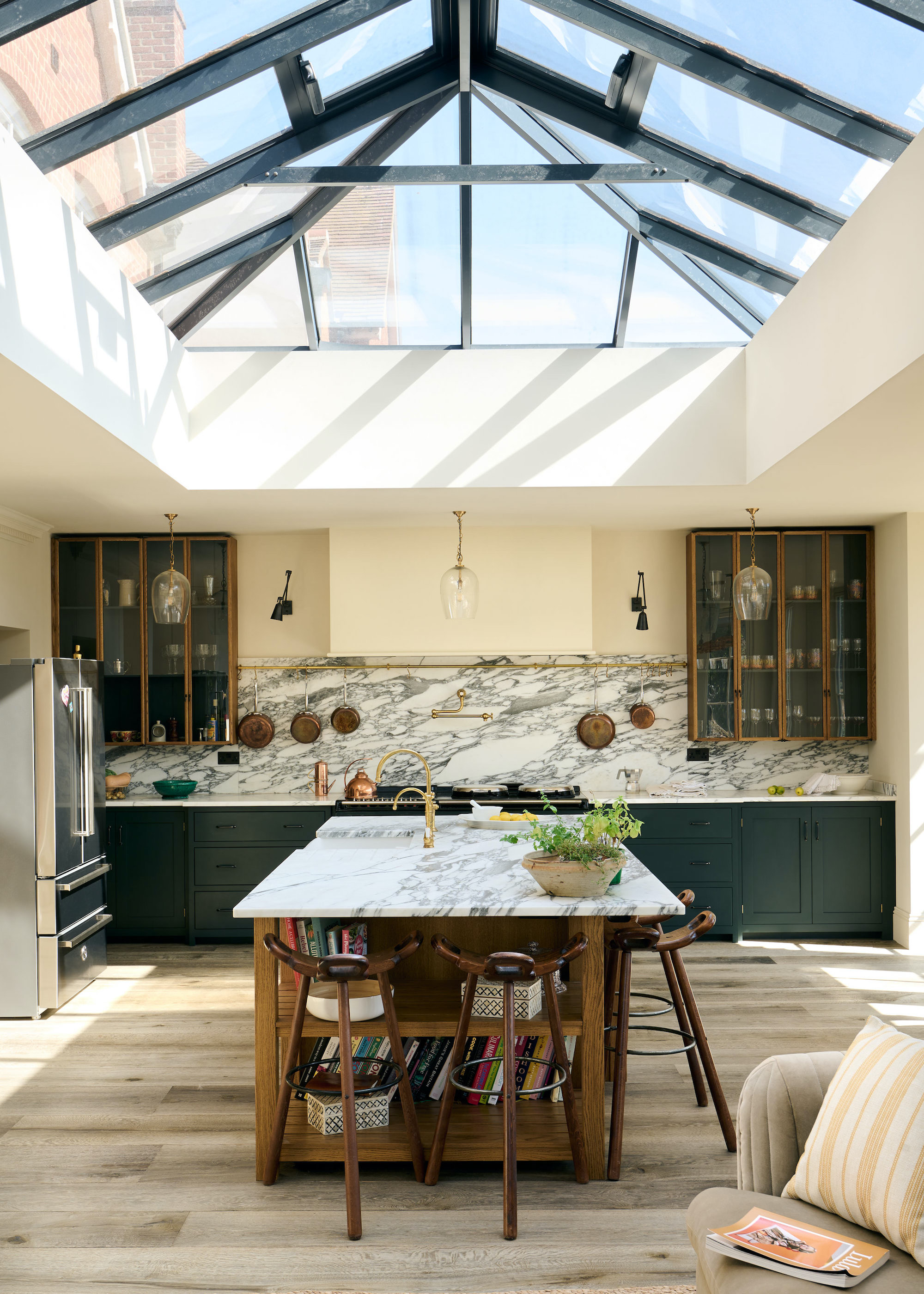
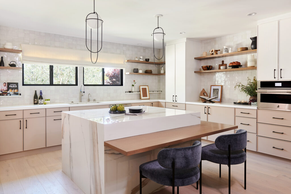
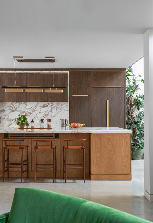
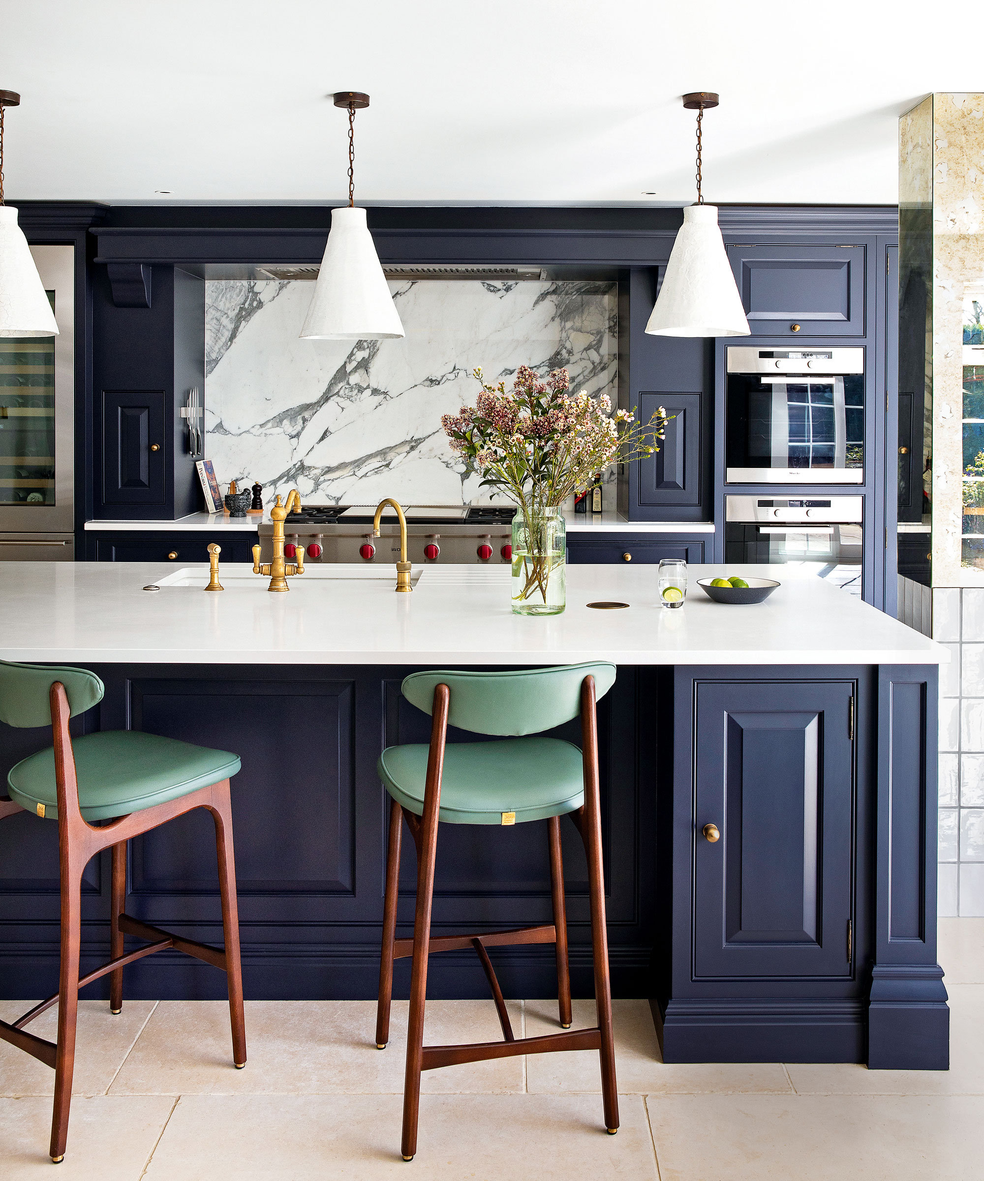
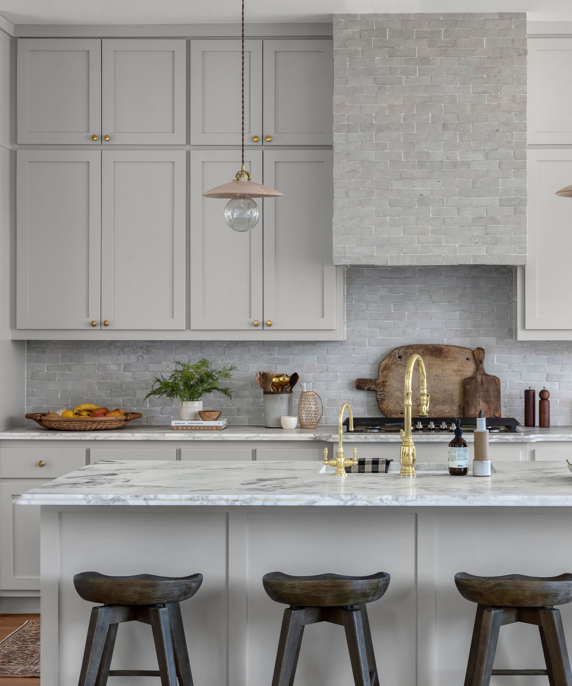
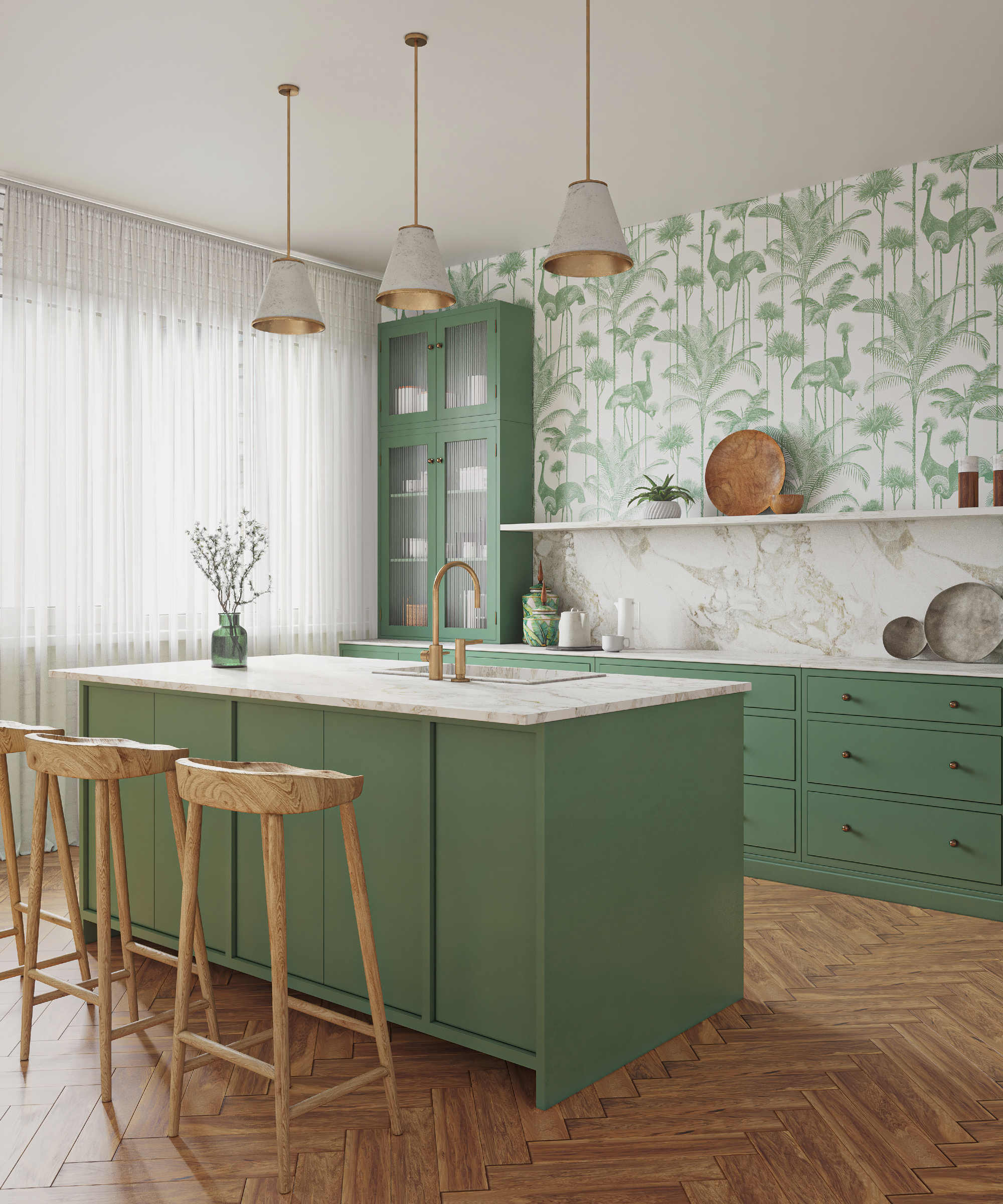
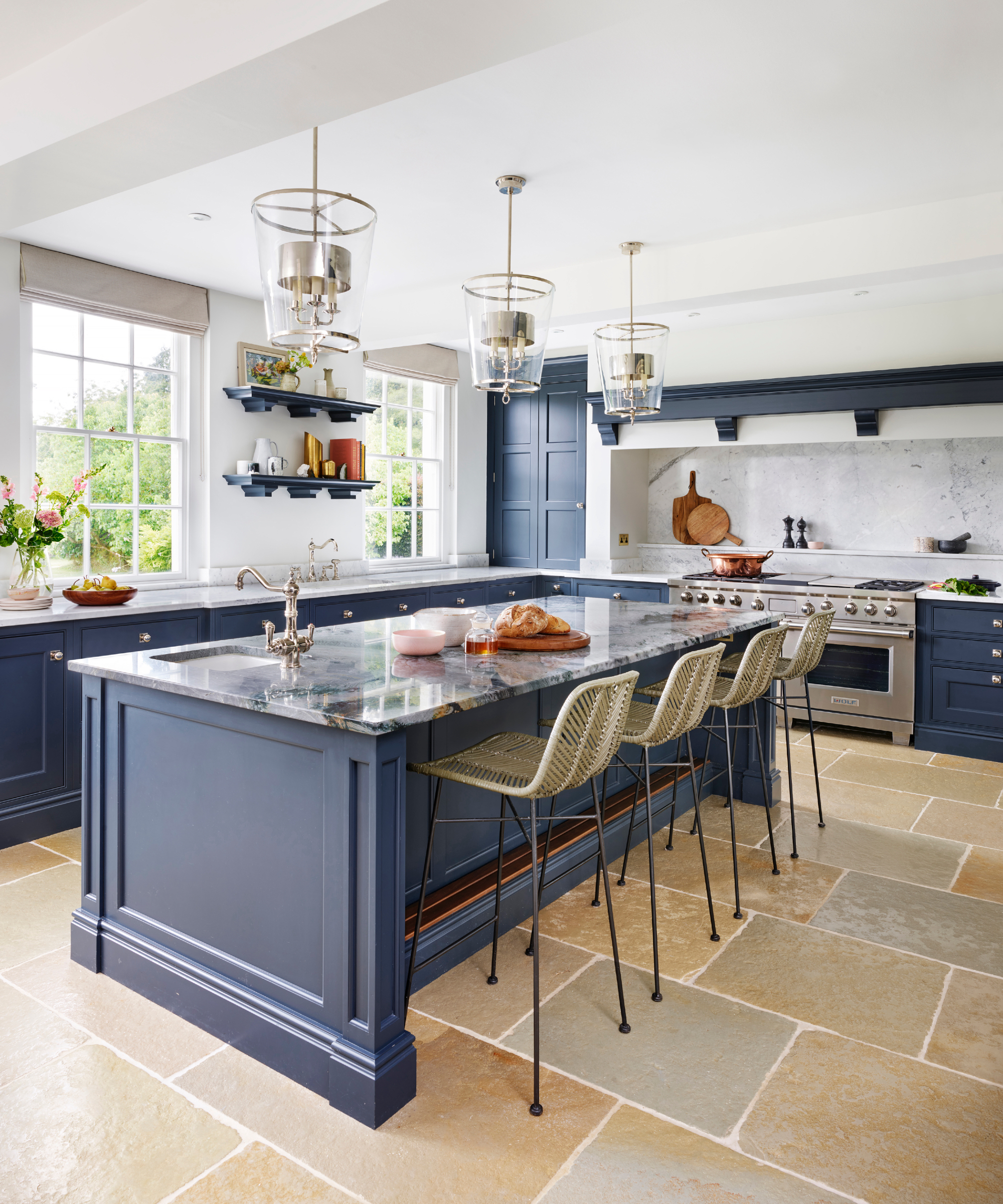
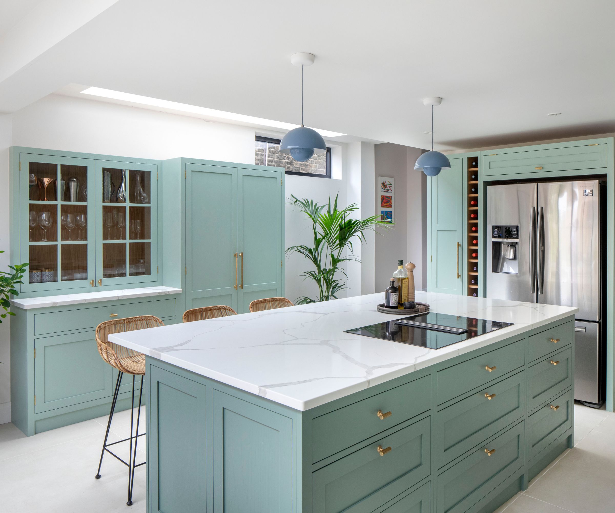
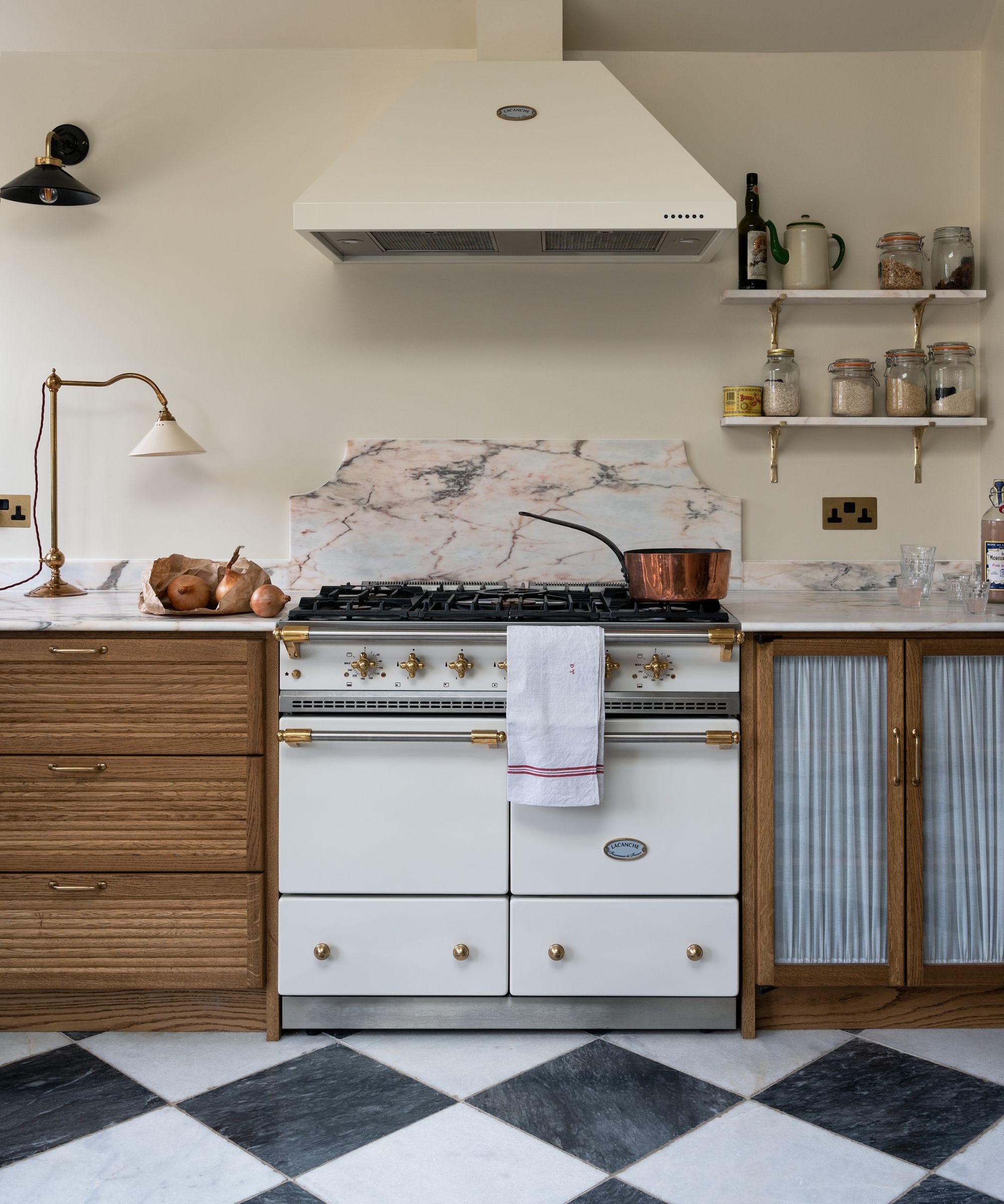
While bold veining still has a place, thick, high-contrast white quartz slabs are seeing reduced interest. Homeowners are increasingly opting for thinner, more refined veining that offers a quieter and more timeless look. Natural marble or quartzite with organic, flowing veining is favored, as it adds movement without dominating the space.

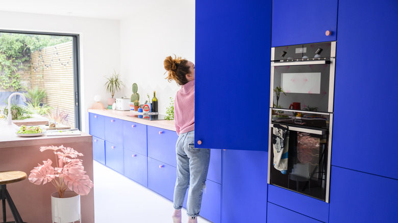
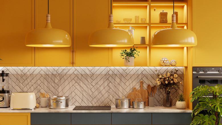
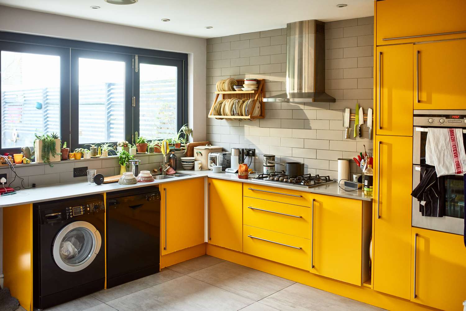
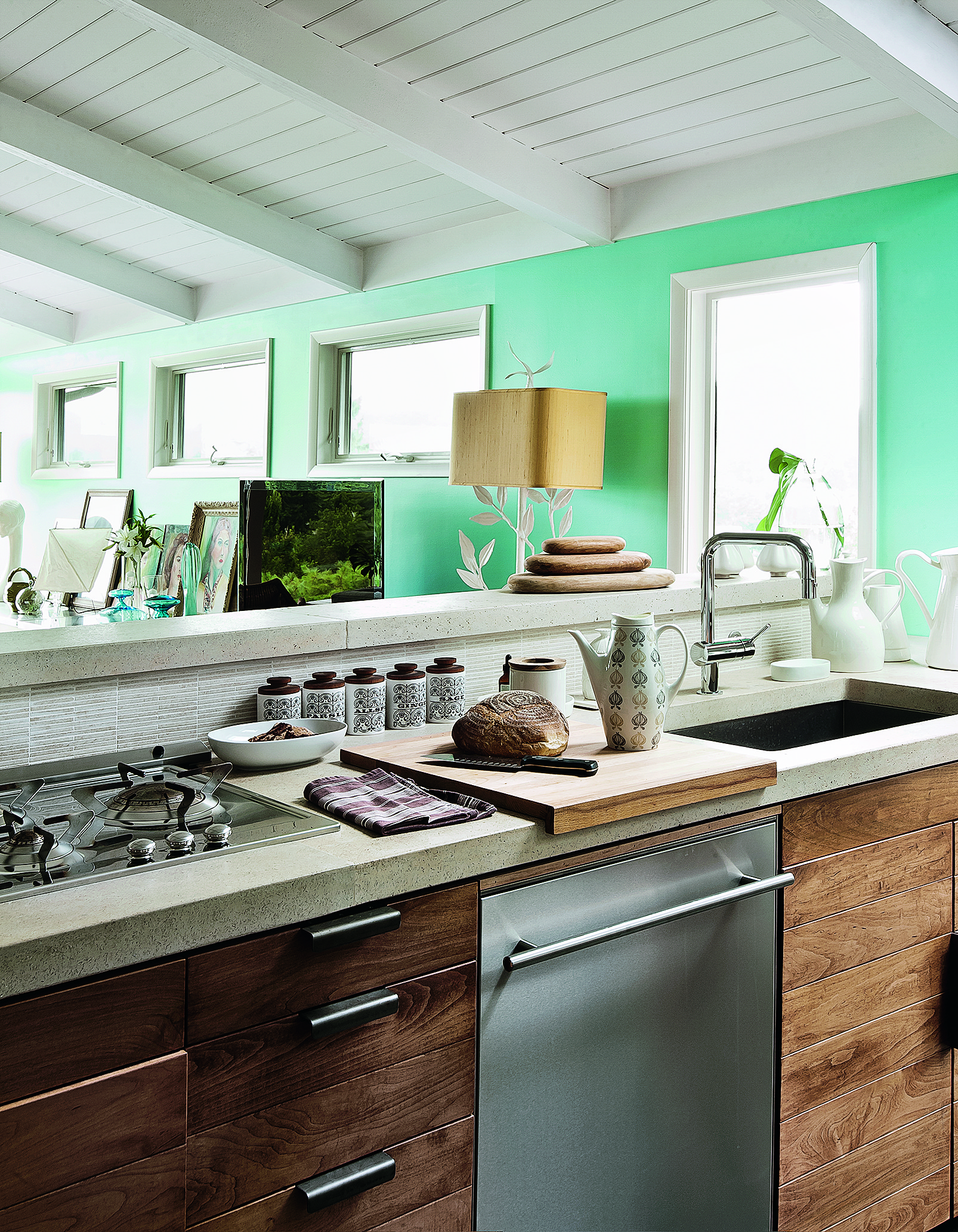
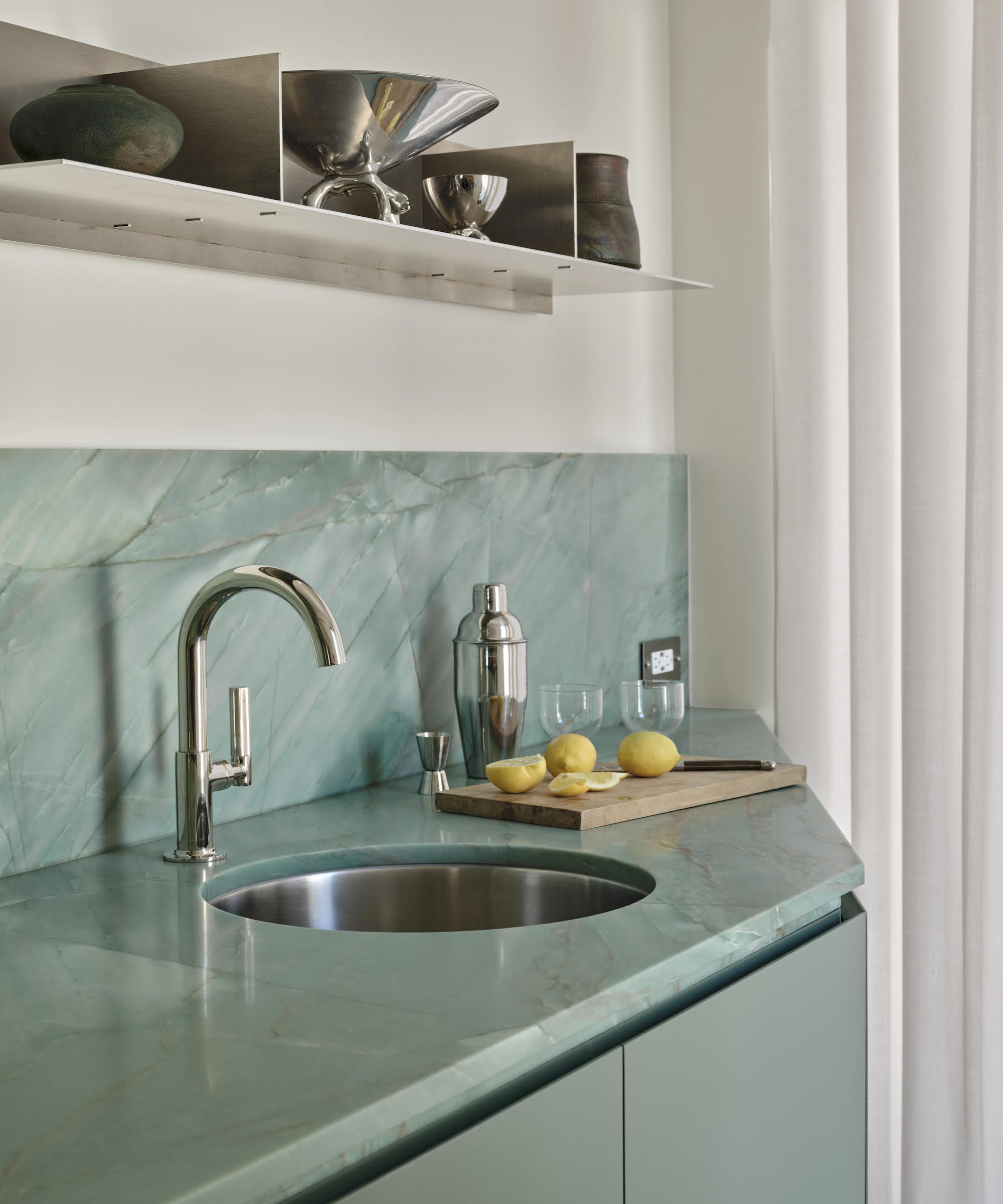
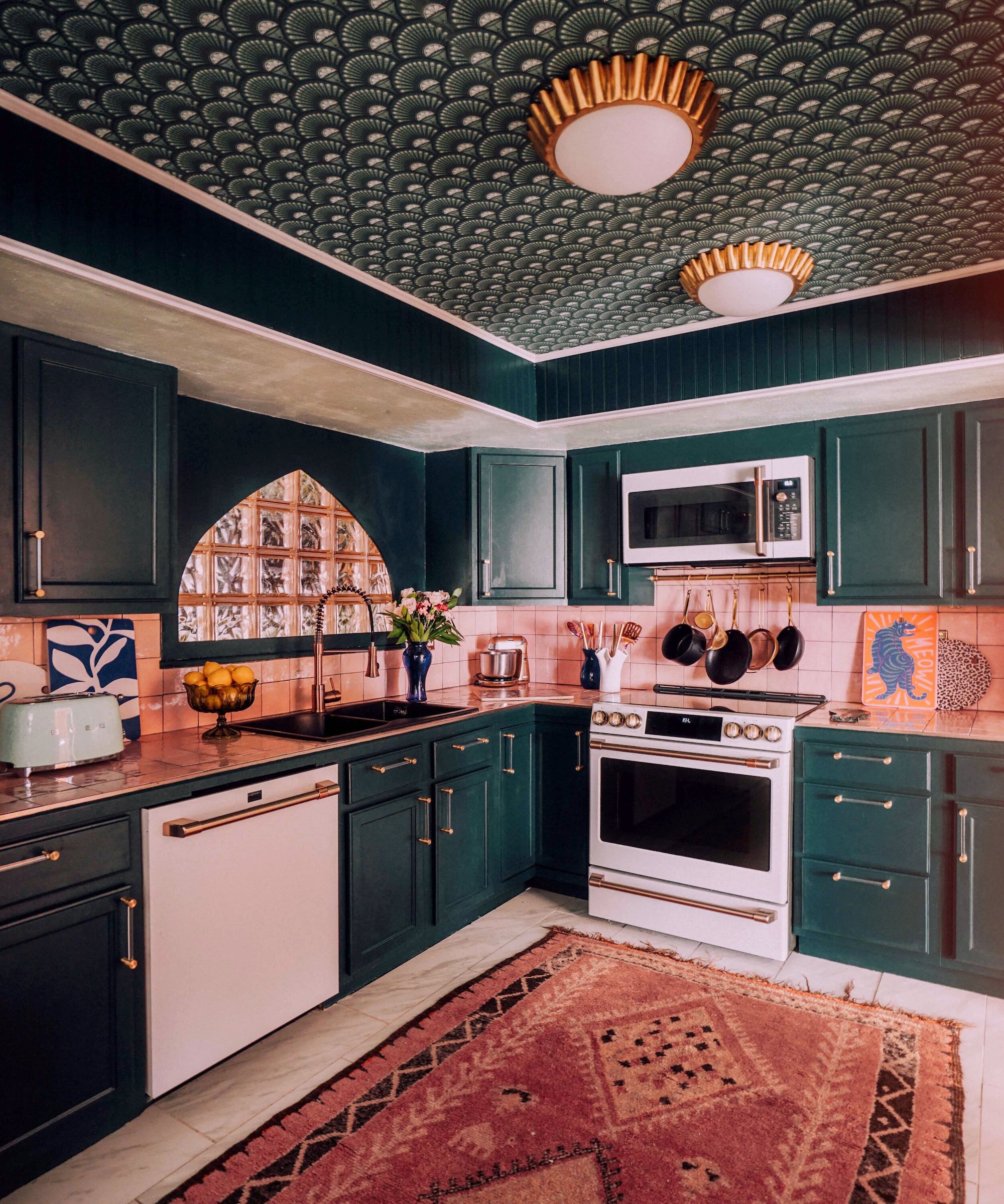
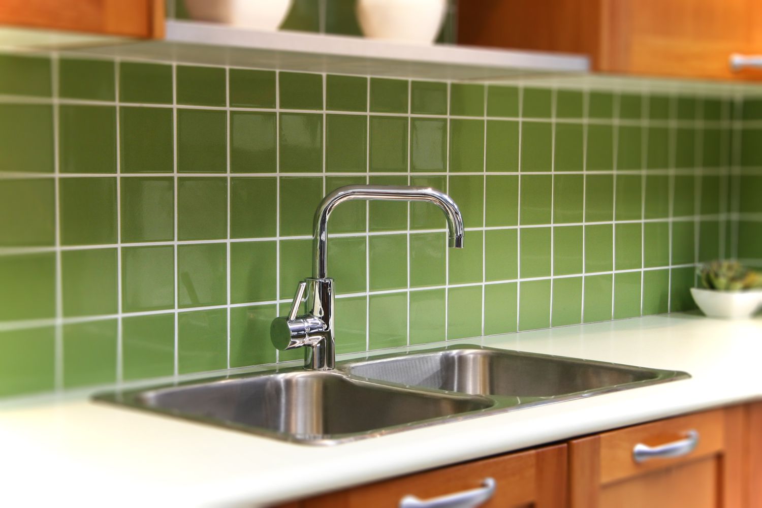
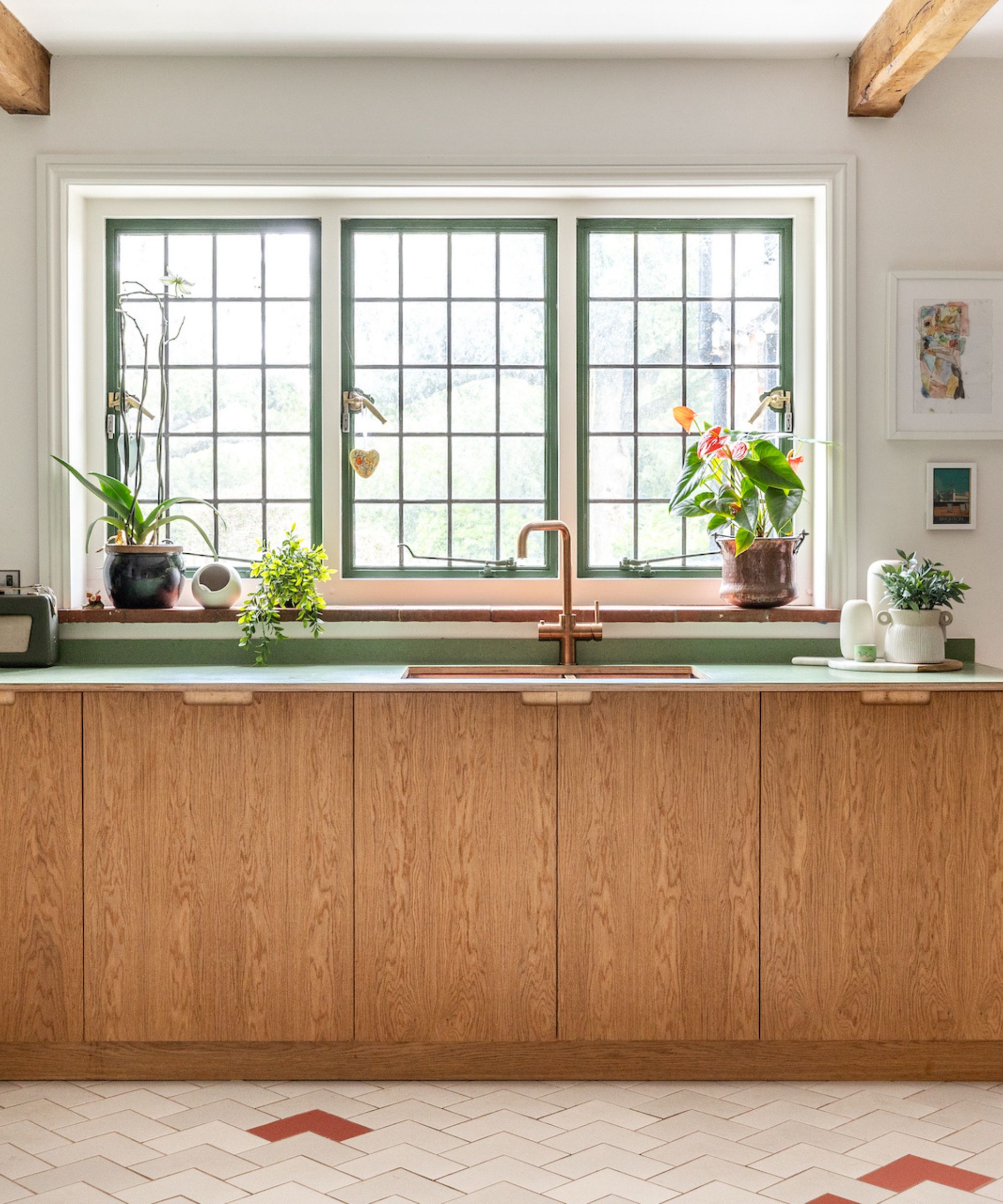
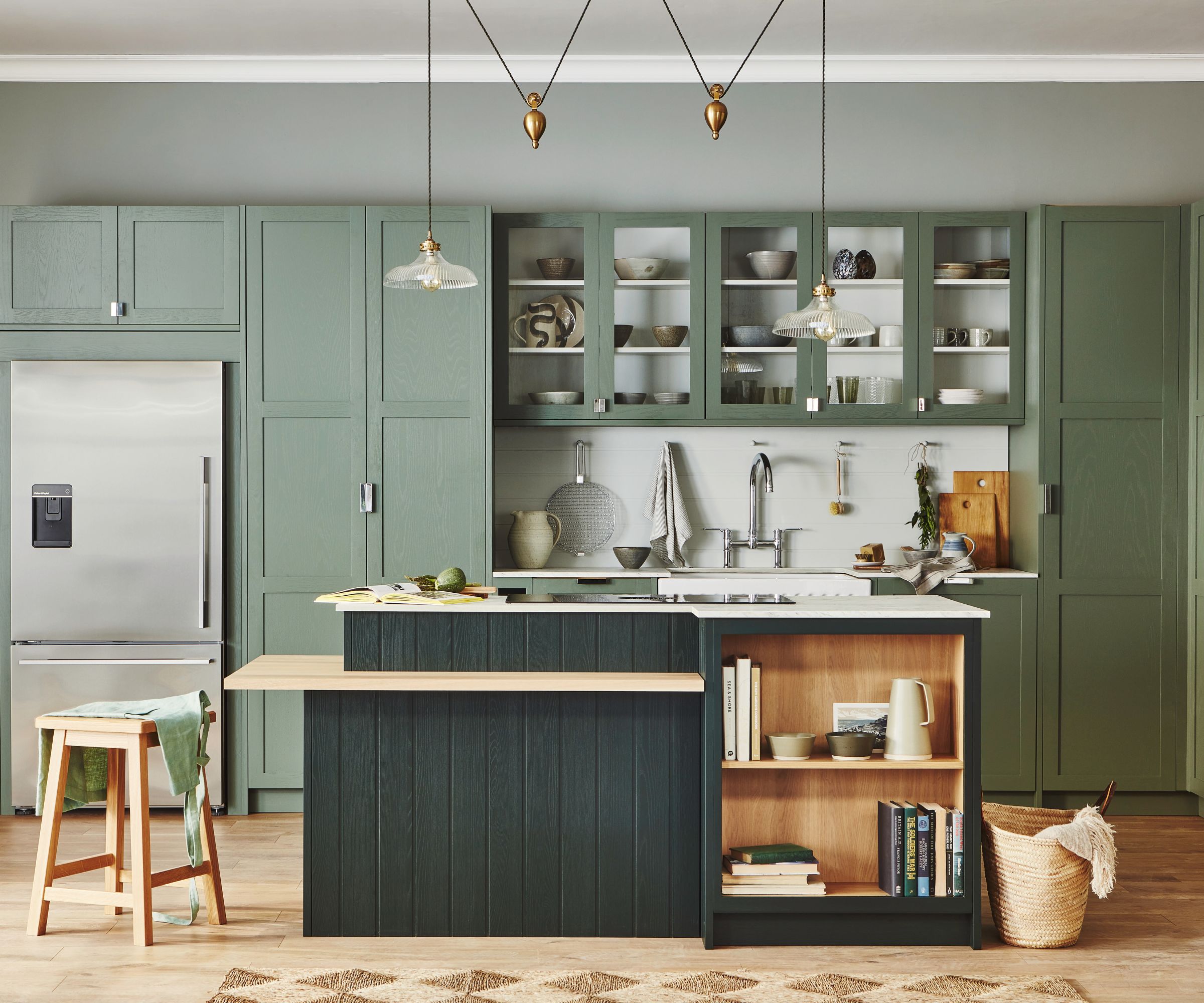
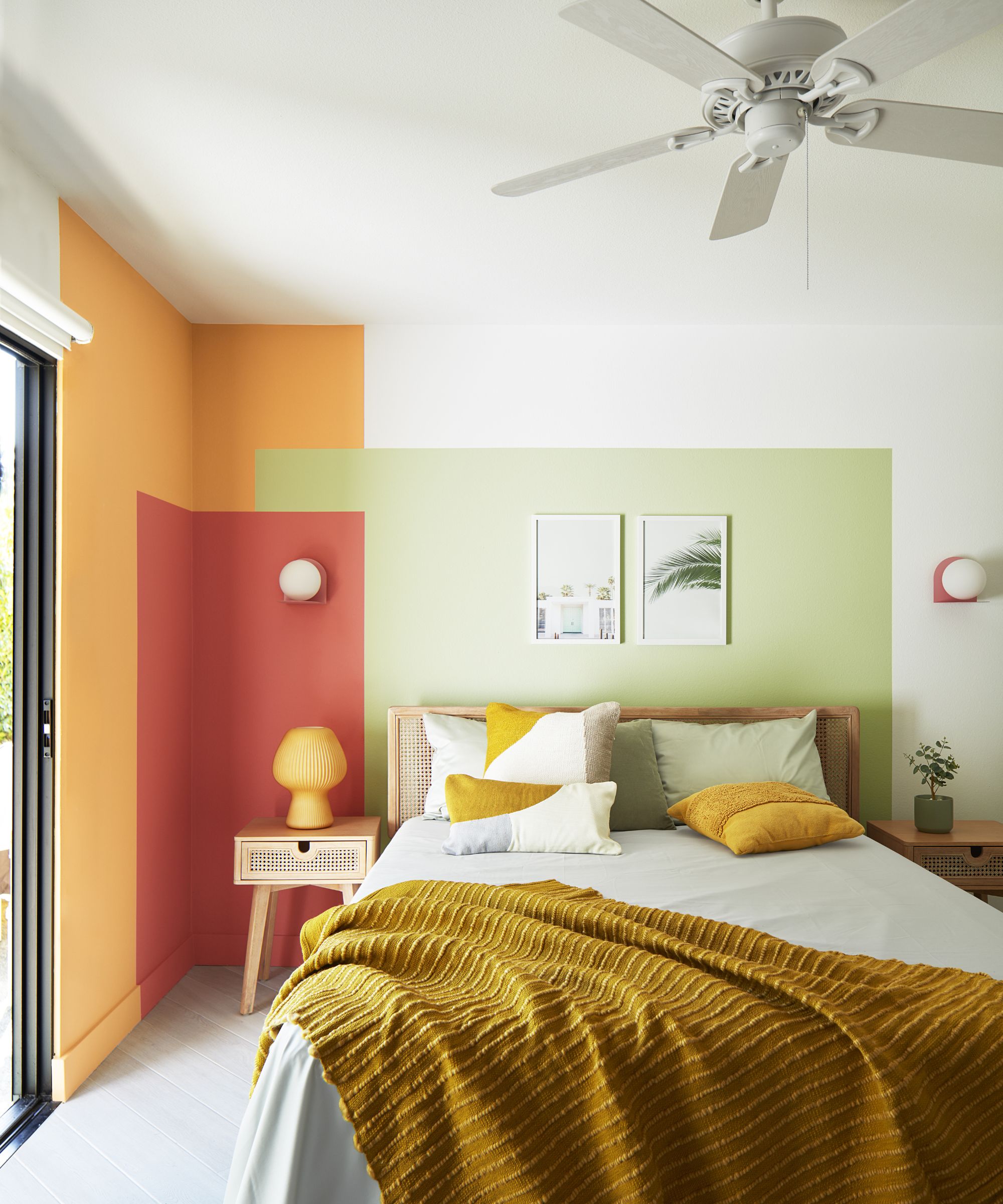
Bright, saturated countertop colors, such as vivid reds or electric blues, are cautioned against, especially when applied to large surfaces. These intense colors can overwhelm a space and quickly become dated. Instead, designers recommend earthy greens like sage or olive, deep ocean blues, or blue-grays, as these function as sophisticated neutrals and seamlessly complement wood, stone, and metal finishes.
#KitchenDesign #CountertopTrends #InteriorDesign #HomeRenovation #ModernKitchen #DesignTrends #ColorPalette #NaturalStone #QuartzCountertops #KitchenDesign #CountertopTrends #InteriorDesign #HomeRenovation #ModernKitchen #DesignTrends #ColorPalette #NaturalStone #QuartzCountertops
0 comment in total
 No comments yet
You may also like
5 Countertop Colors That Are Going Out of Style, and What You Should Choose Instead — According to Kitchen Designers

9 Outdated Kitchen Cabinet Colors We Hope To Never See In 2026

7 kitchen countertop color ideas designers say "will infuse your kitchen with tons of personality

These 7 Kitchen Cabinet Colors Are So Outdated, According to Interior Designers

5 outdated kitchen cabinet color trends to avoid if you don't want your kitchen to look unfashionable, say designers

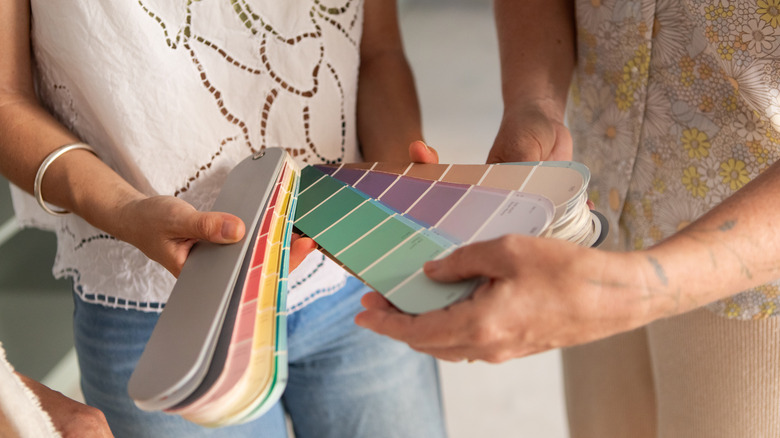
9 Outdated Kitchen Cabinet Colors We Hope To Never See In 2026
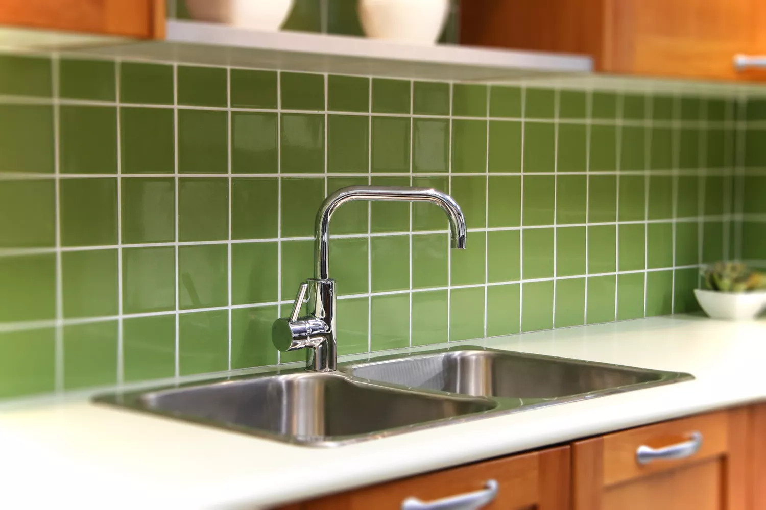
6 Kitchen Backsplash Colors That Are No Longer in Style, Designers Say
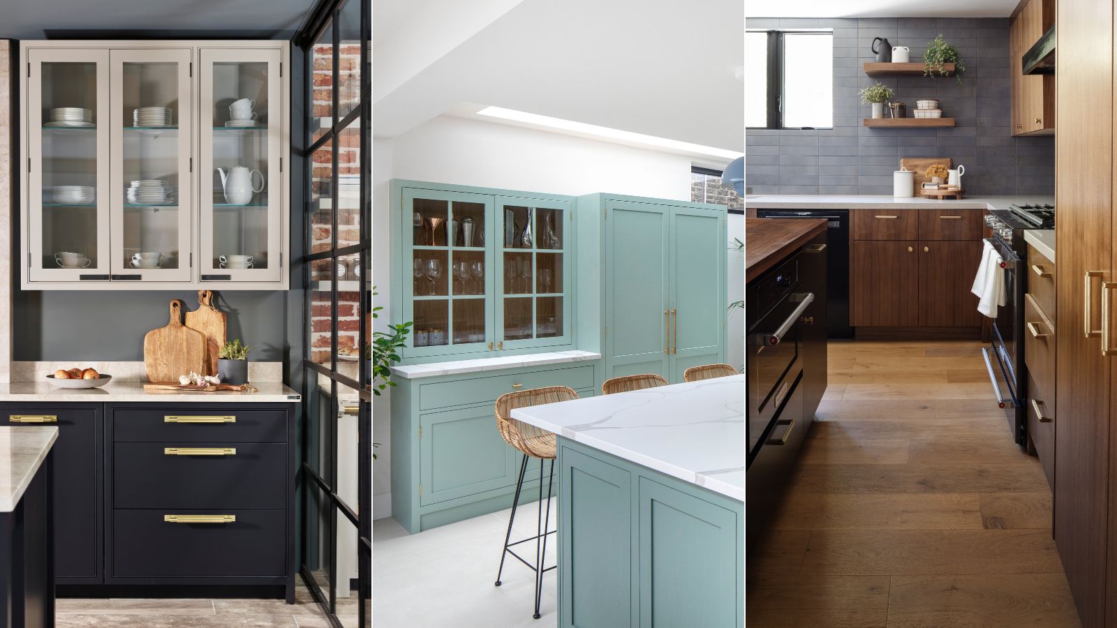
5 dated kitchen hardware trends that could be bringing down the look of your kitchen
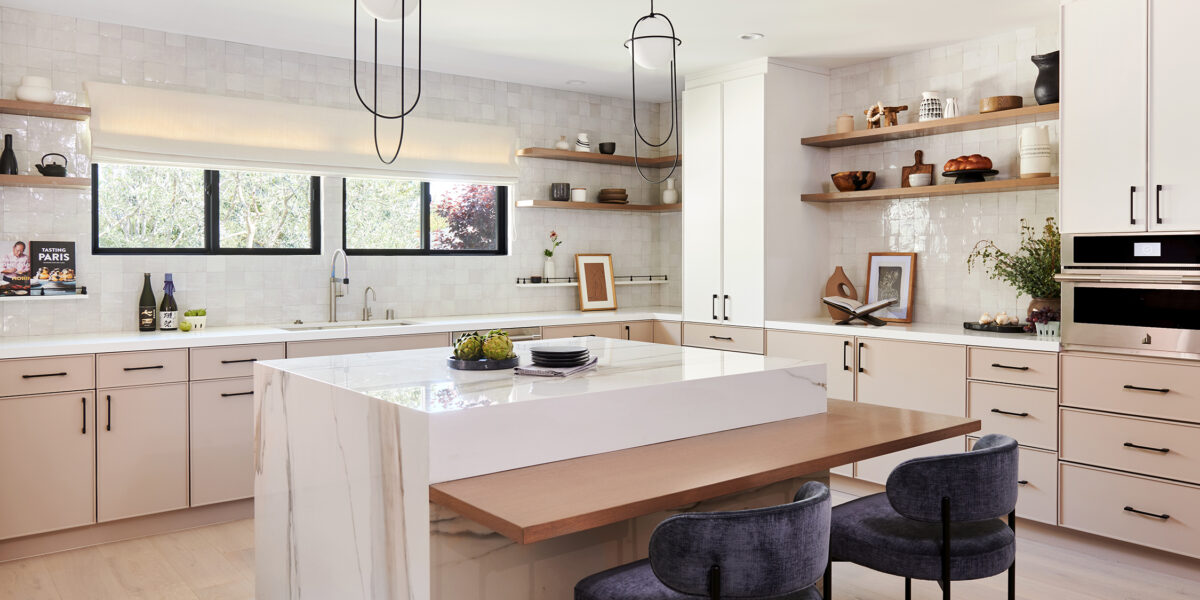
The 6 Paint Colors for Your Kitchen That Will Never Go out of Style
5 Outdated Kitchen Paint Colors That Interior Designers Are Tired of Seeing
6 outdated kitchen backsplash designs that can bring down a whole room
8 outdated '60s interior design trends making a comeback in 2024
6 Kitchen Countertop Colors That Make Your Home Look Outdated

Outdated Granite Colors to Avoid for Kitchen Countertops — and What to Pick Instead for a Fresh Look
7 outdated kitchen cabinet colors designers say you should wave goodbye to, plus what to try instead

6 outdated kitchen countertop trends to leave behind in 2025
6 Worst Colors To Paint Your Kitchen (And What To Choose Instead)
Outdated kitchen color trends – 5 colors to avoid in 2025, and what to use instead
Which kitchen color is timeless? Our experts give us their take
We Asked Designers Which Countertop Colors Instantly Make a Kitchen Look Tacky—And They Chose These 5