We Asked Designers Which Countertop Colors Instantly Make a Kitchen Look Tacky—And They Chose These 5
The kitchen countertop is a crucial element that significantly influences the overall aesthetic and feel of a kitchen space. Its color is one of the first things noticed and can guide or detract from the room's design. According to design experts, there are certain countertop colors that tend to make a kitchen appear tacky or outdated. This article highlights five such colors identified by interior designers Peter Spalding, Thomas Borcherding, and Damla Turgut, while also offering practical advice on how to mitigate their negative impact or avoid them altogether.
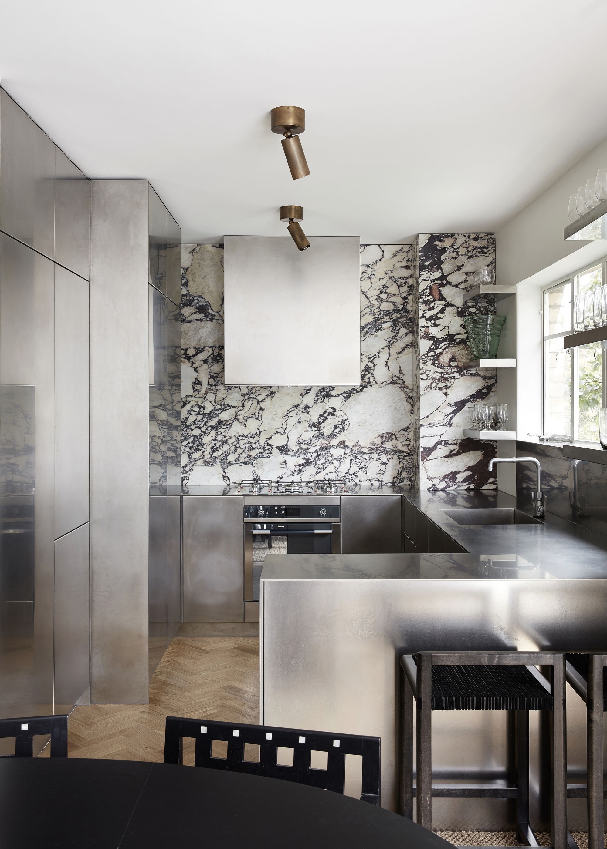
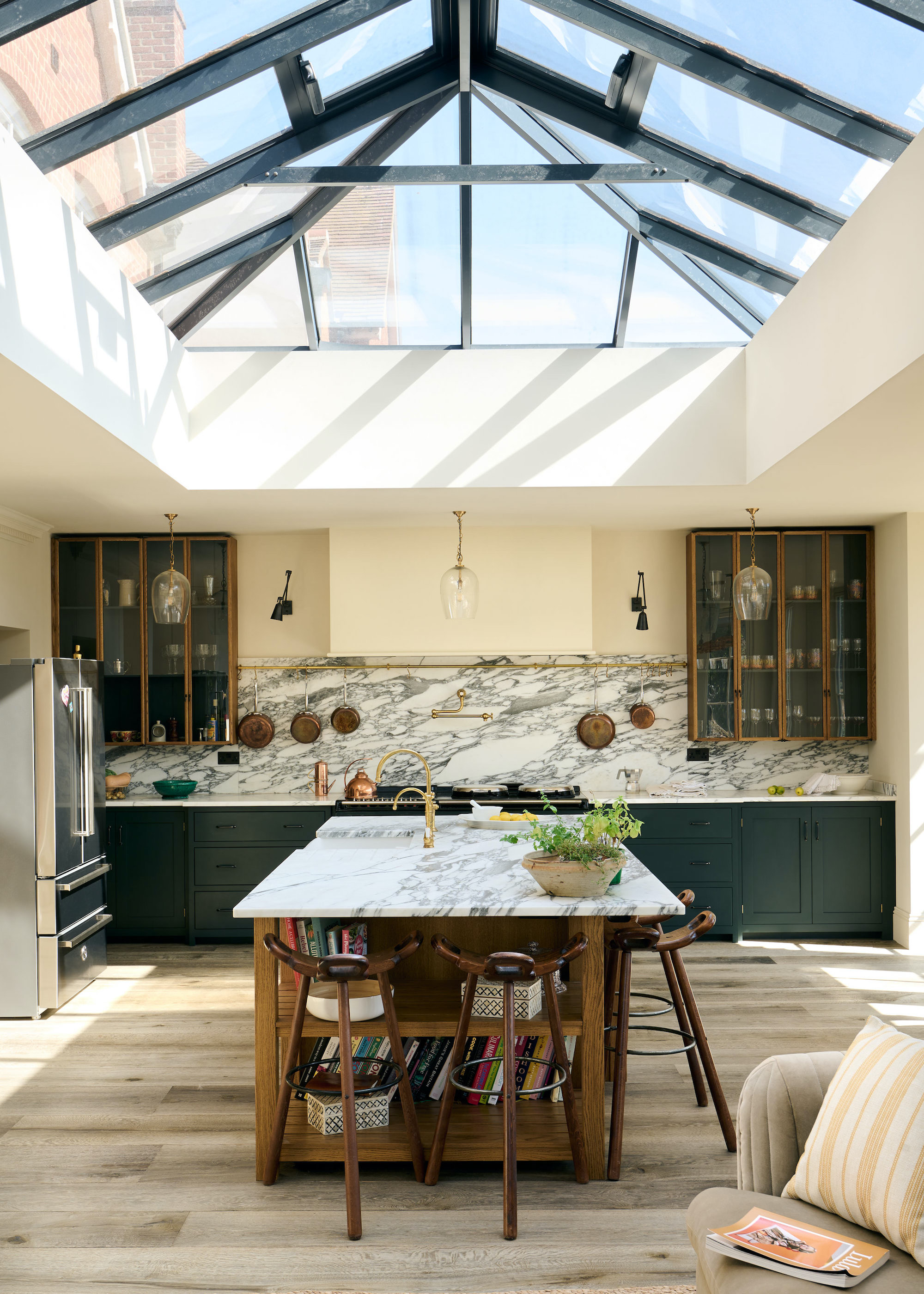
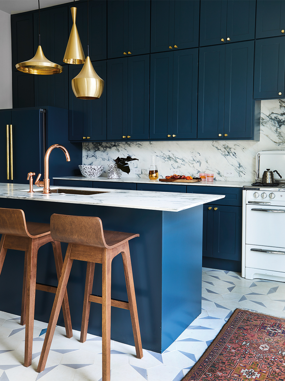
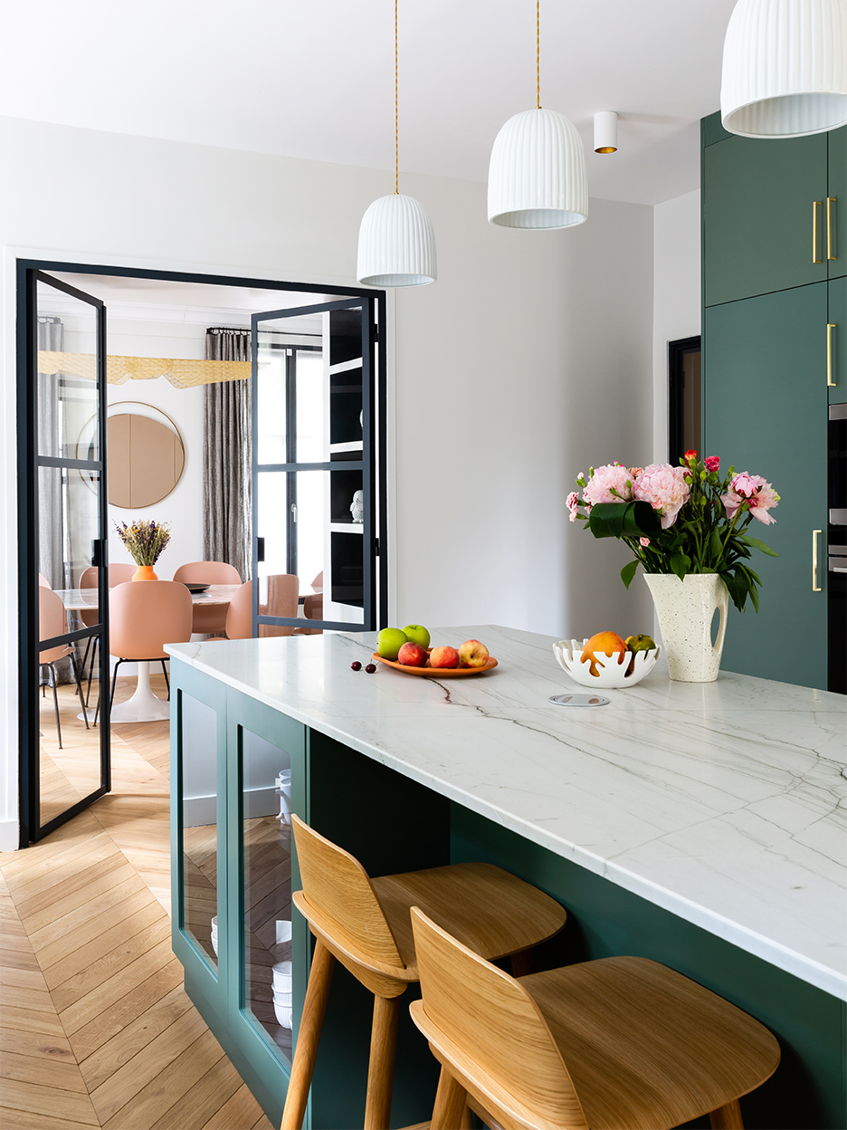
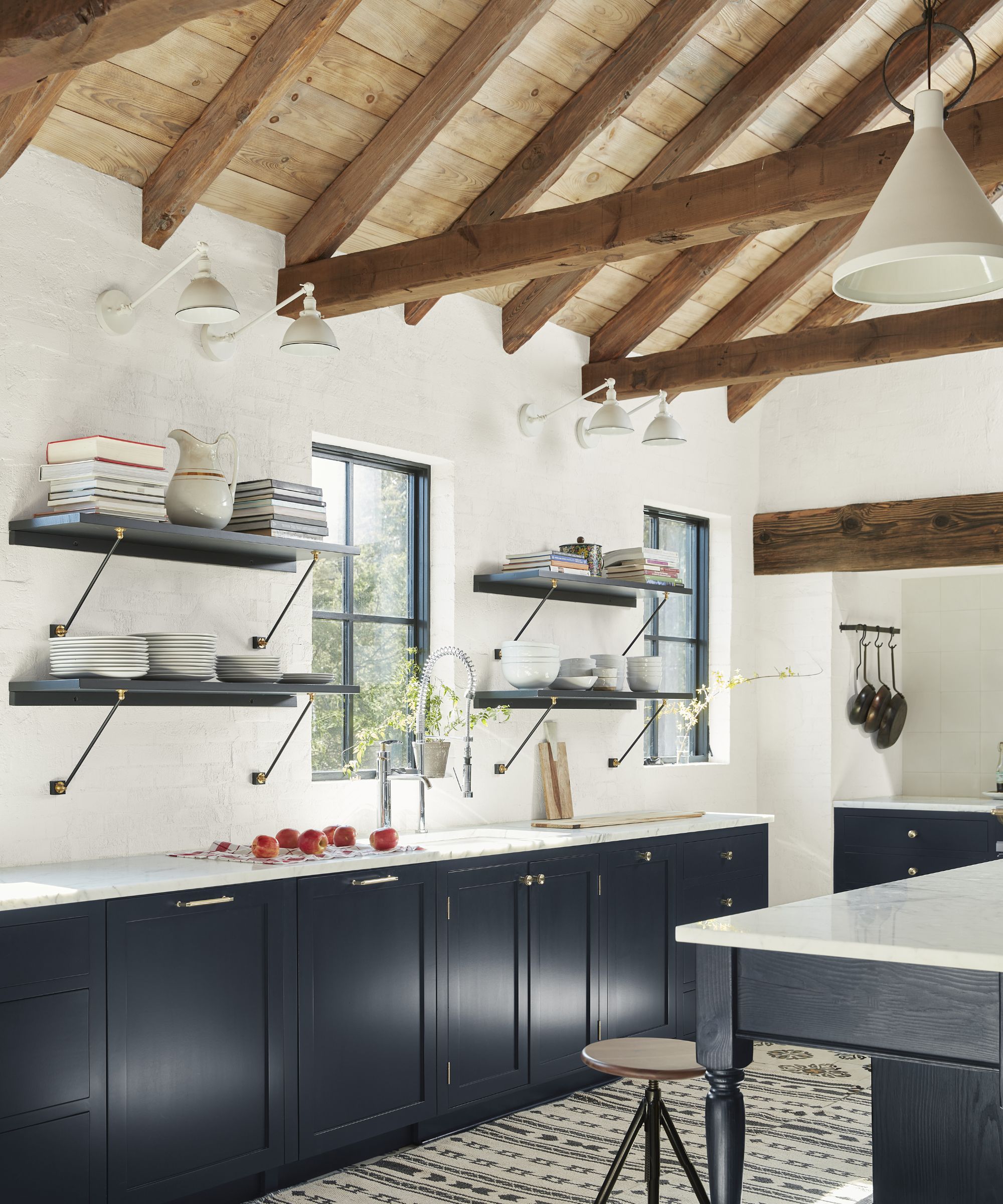
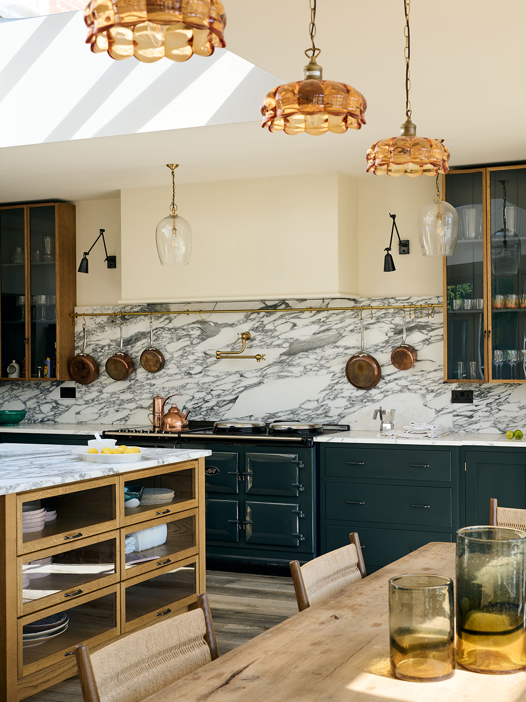
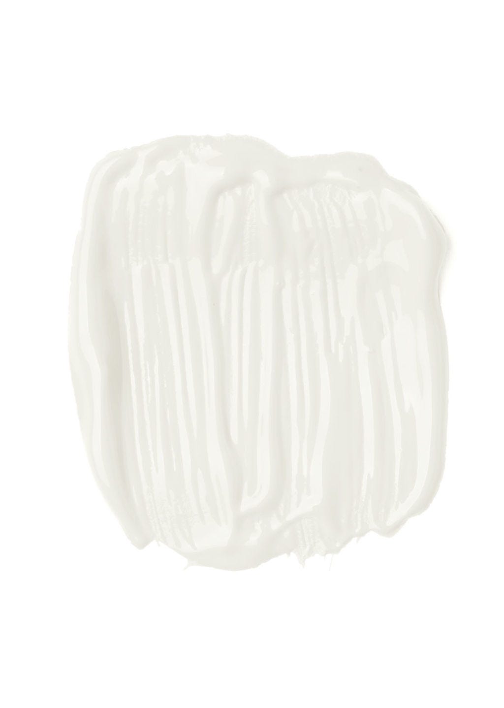
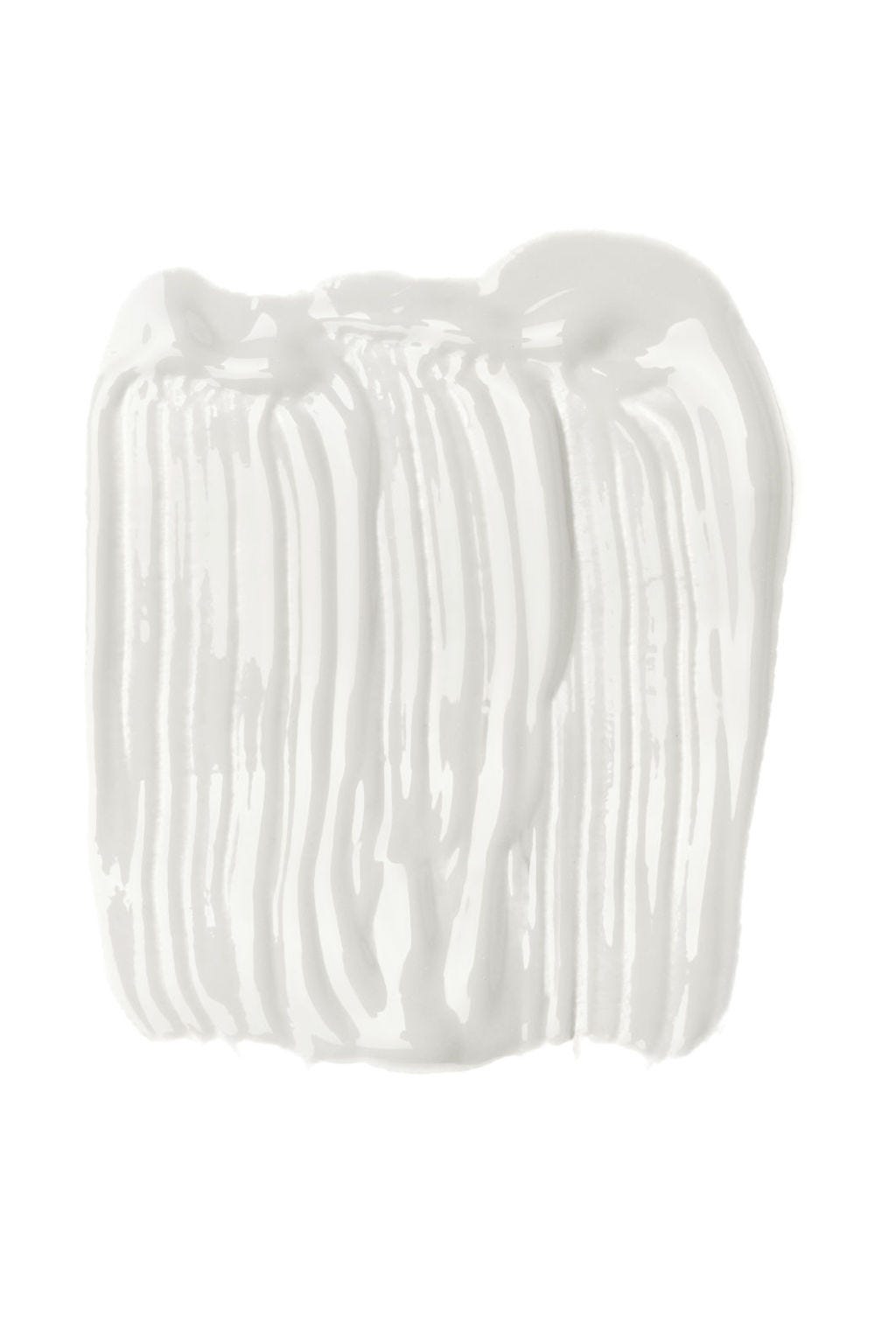
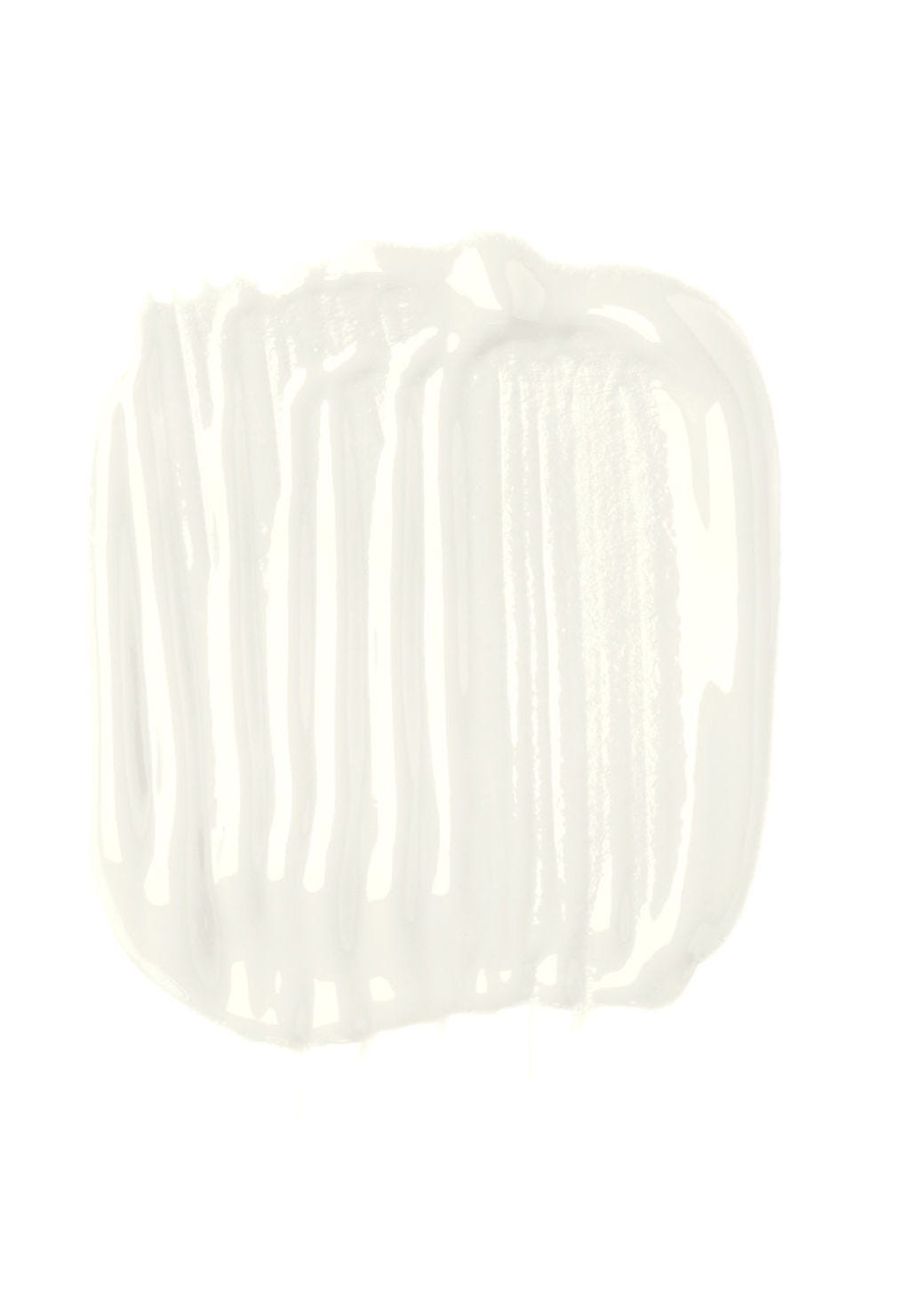
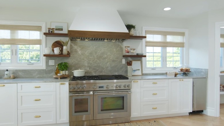
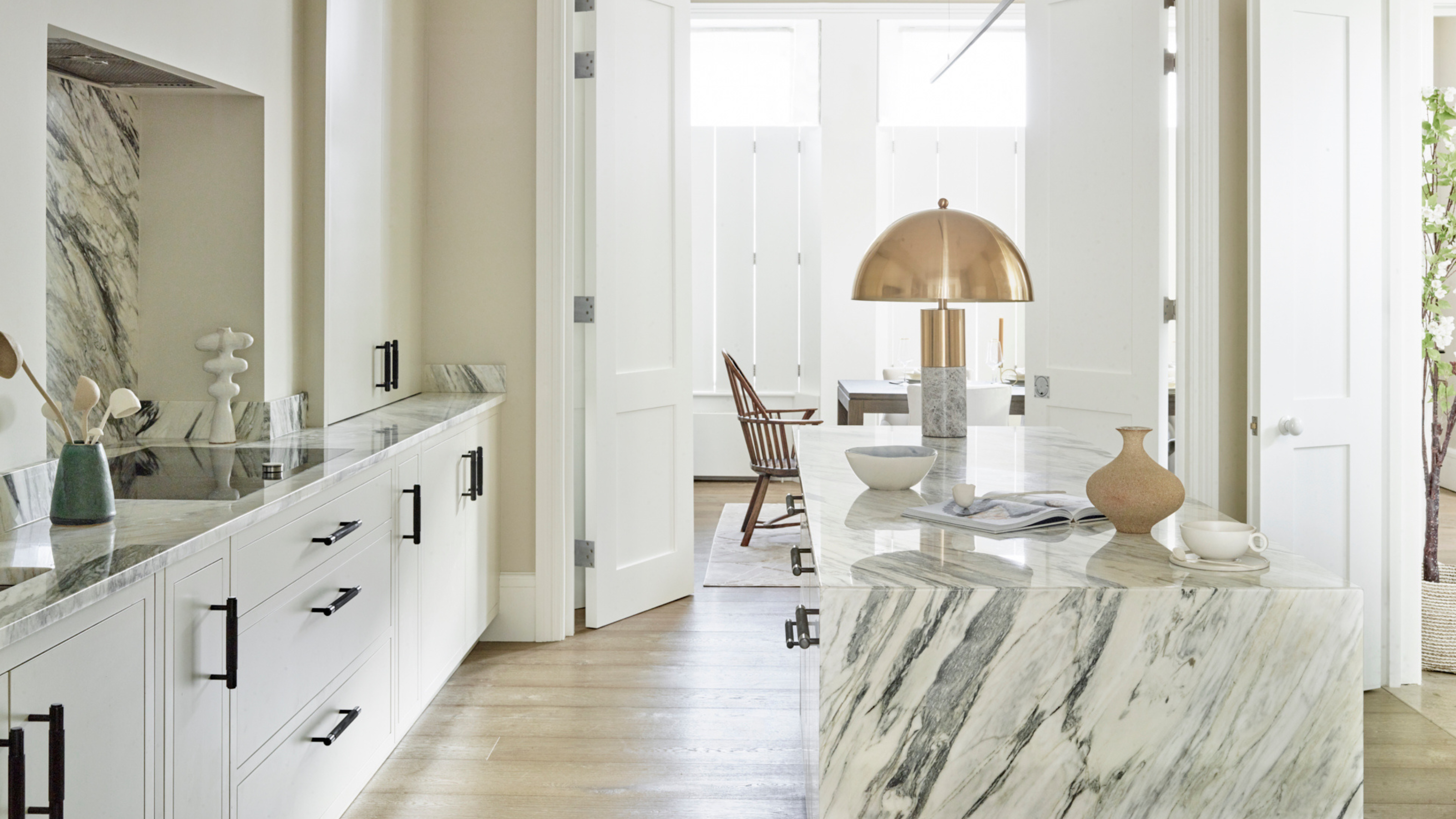
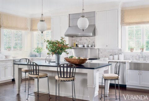
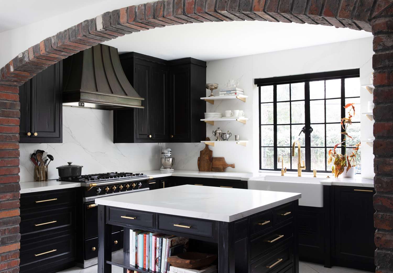
The first color discussed is stark white. Although often perceived as a safe, neutral, and modern choice, pure white counters can appear clinical, cold, and outdated, especially in newer constructions or rental properties. While white can enhance natural light and make a space feel larger, designers recommend opting for natural materials with variations and textures, such as marble with distinct veining or limewashed wood, to add warmth and character. For renters with stark white countertops, styling suggestions include using icy, silvery blues, light wood finishes, bold and abstract art, and colorful pots and pans to add vibrancy and distract from the clinical feel.
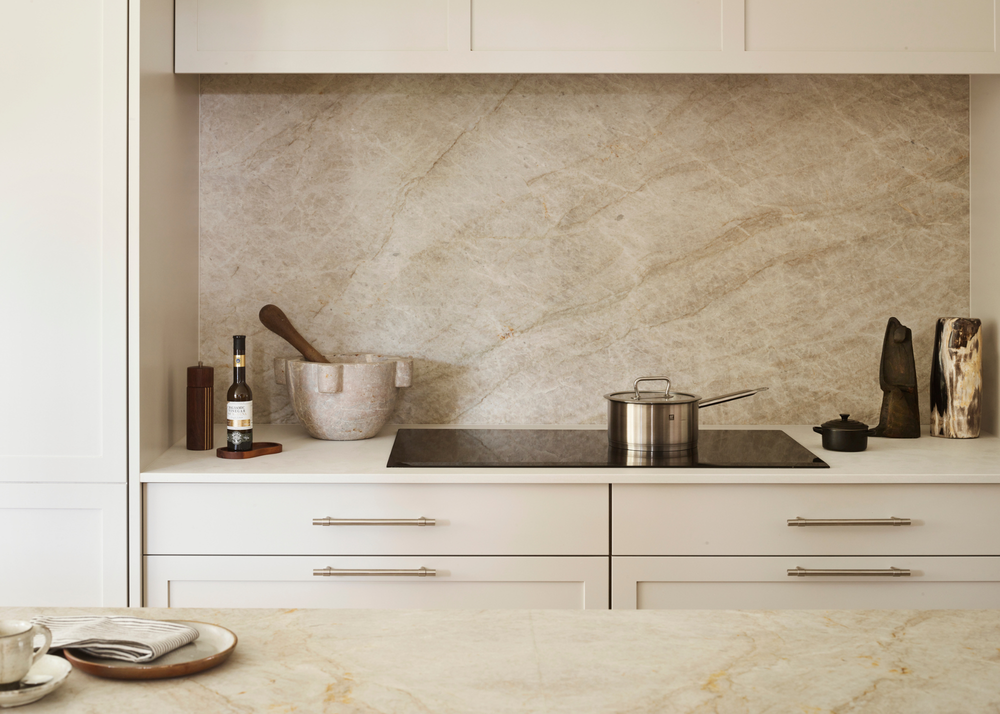
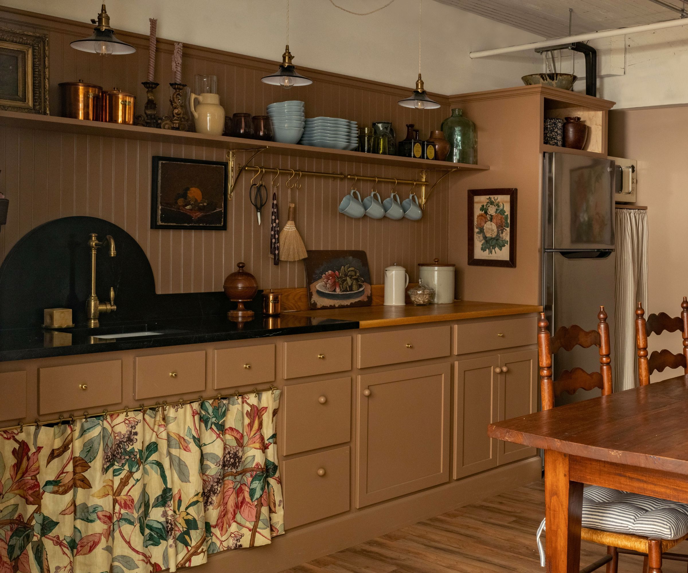
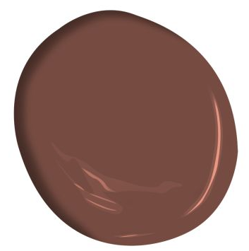
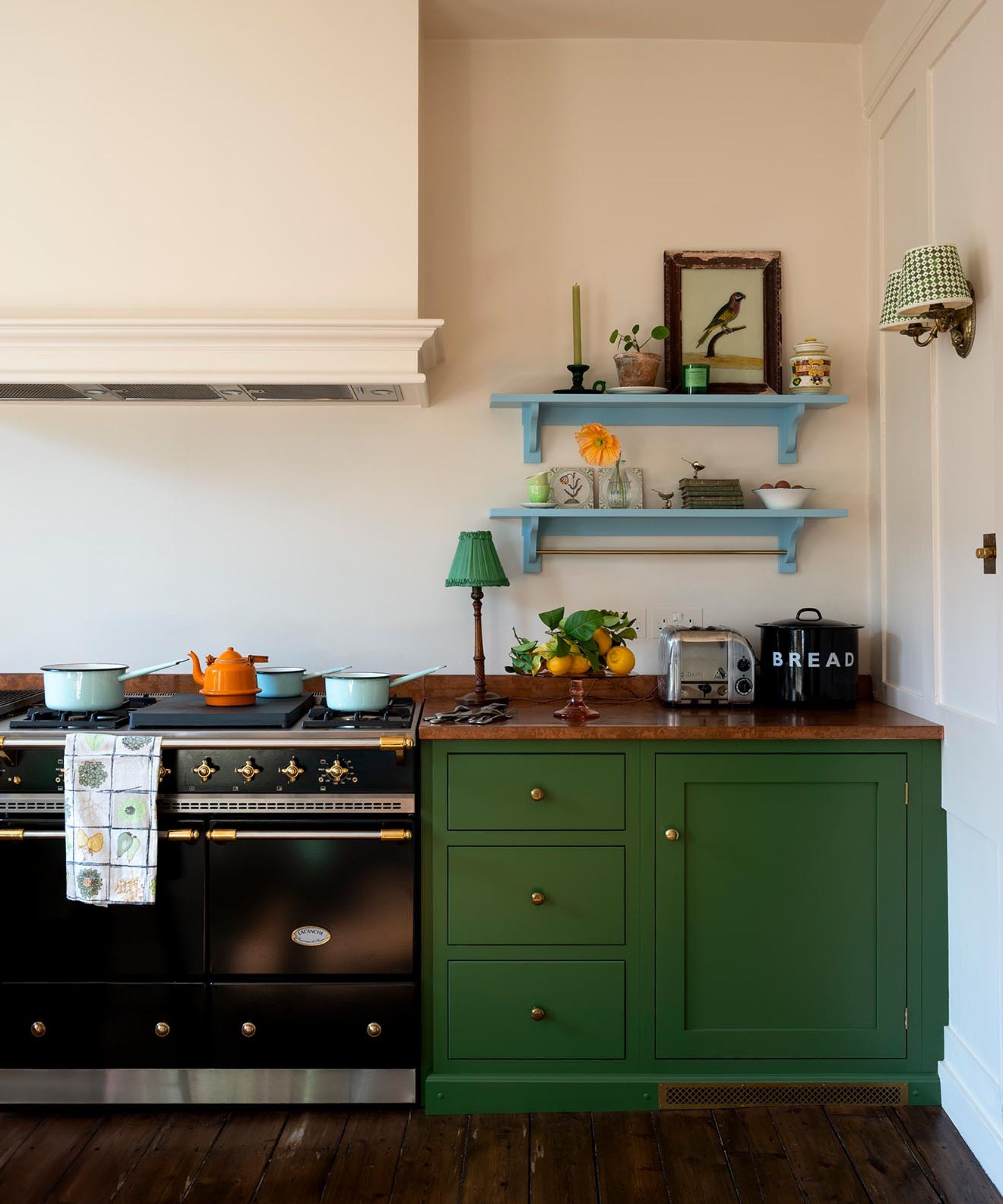
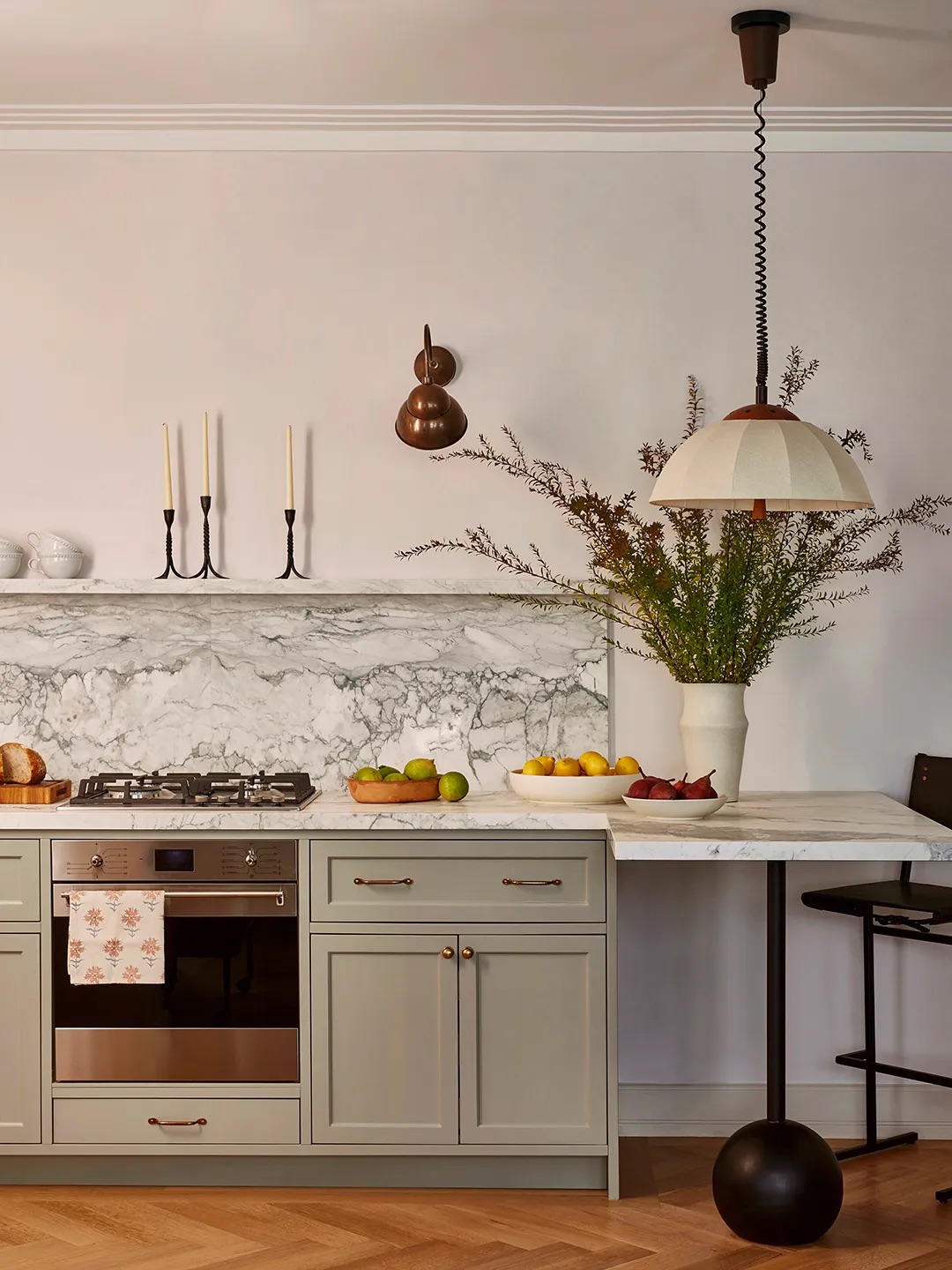
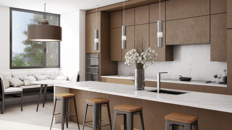
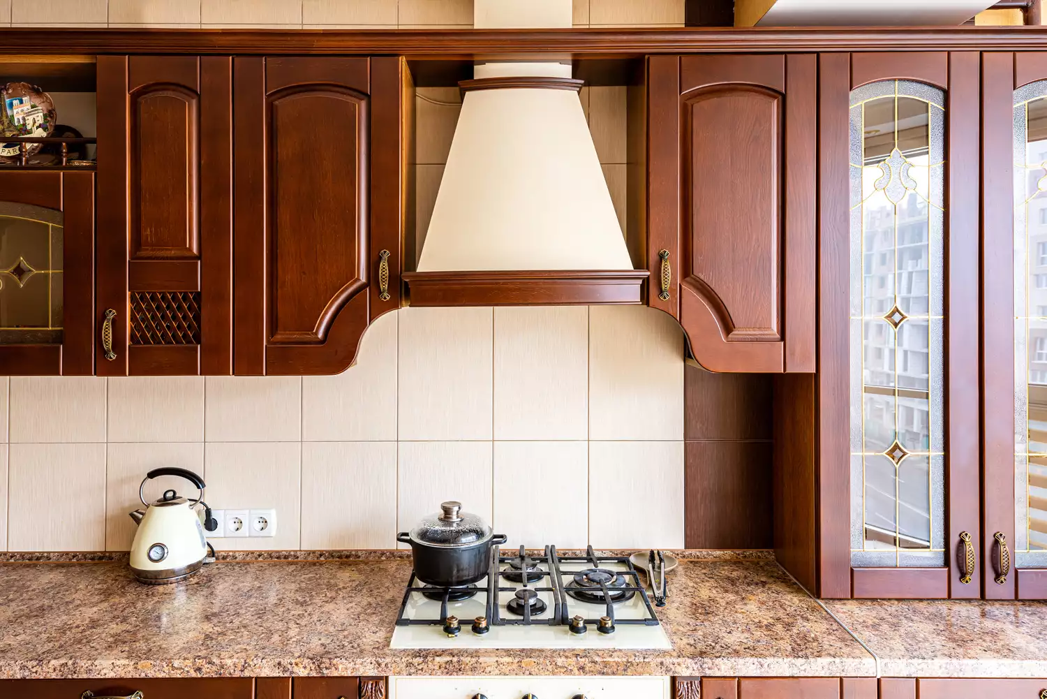
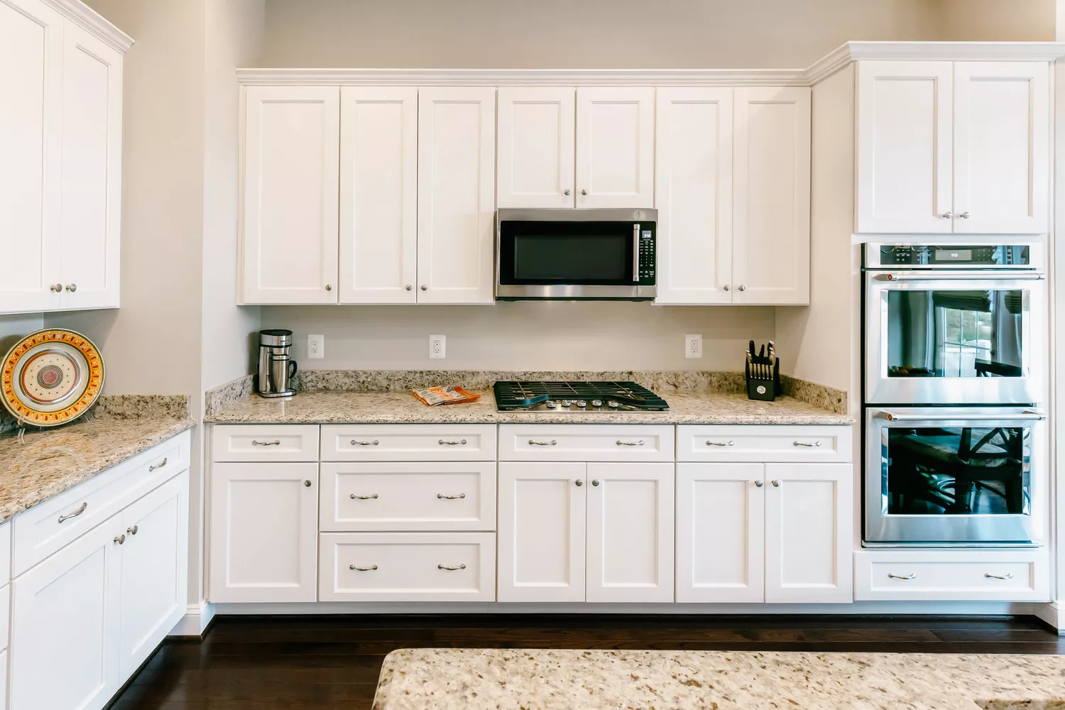
Next, muddy brown, particularly in granite slabs popular in the 2000s and 2010s, is identified as another tacky countertop color. These granites often contain iron-rich content, leading to a rusted or muddy appearance. To update a kitchen with such countertops, designers suggest pairing them with cream and beige cabinetry and wall colors, selecting shades that highlight the lighter specks within the granite to create a more cohesive and less dated look.
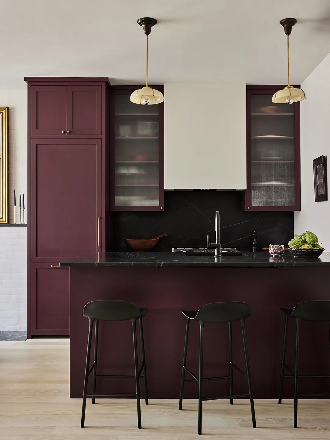
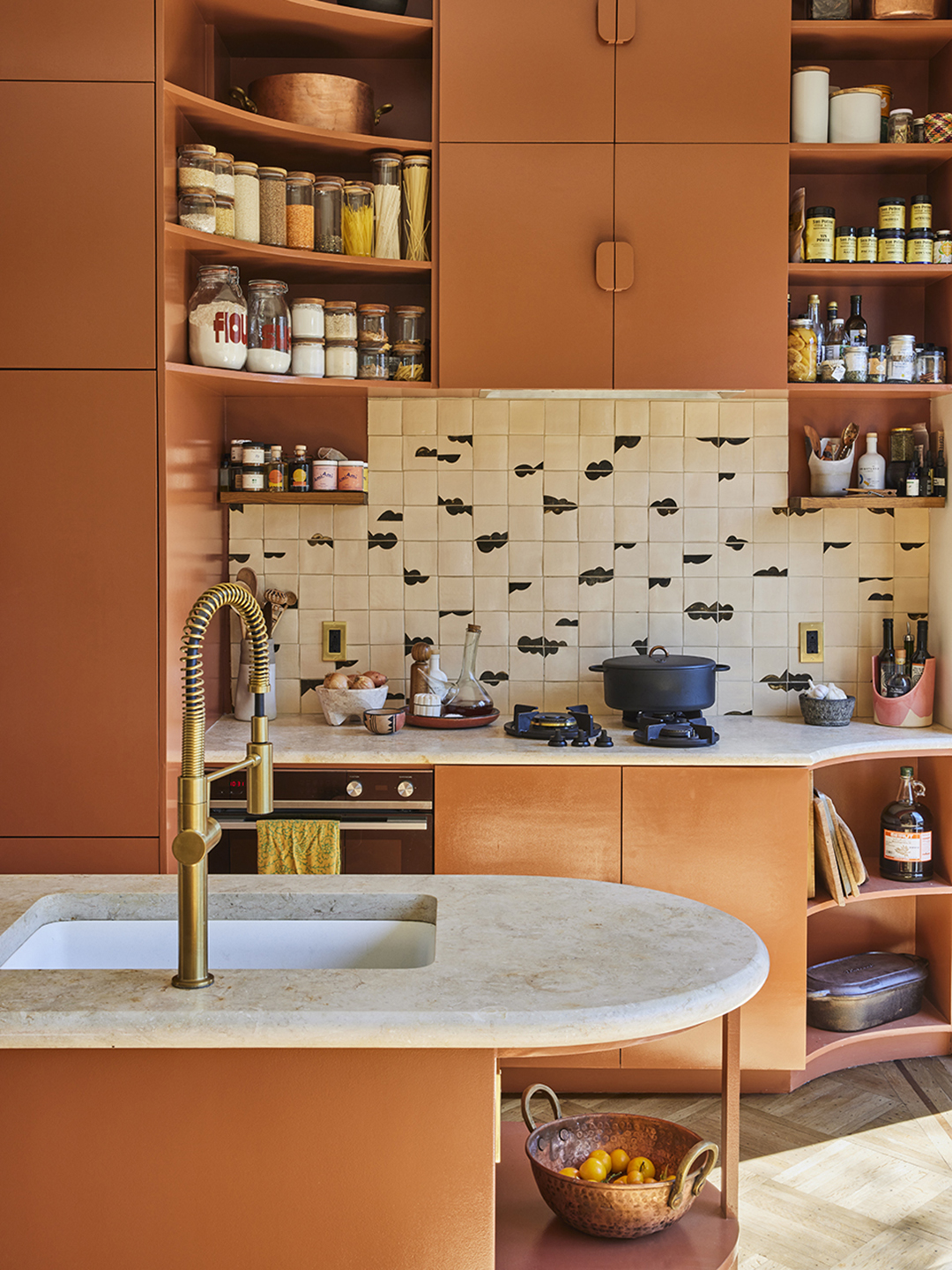
Red countertops, especially primary red hues, are considered harsh and dominating, making a kitchen feel chaotic rather than characterful. Instead of bright reds, experts advise choosing more versatile options like warm, dark, or muted reds, such as maroon, burgundy, or earthy terracotta. Incorporating red subtly through natural materials like marble with red undertones is also recommended. For those unable to replace existing red countertops, painting surrounding cabinets in warm, soft neutral shades can help balance the intensity of the red and prevent the space from feeling overwhelming.
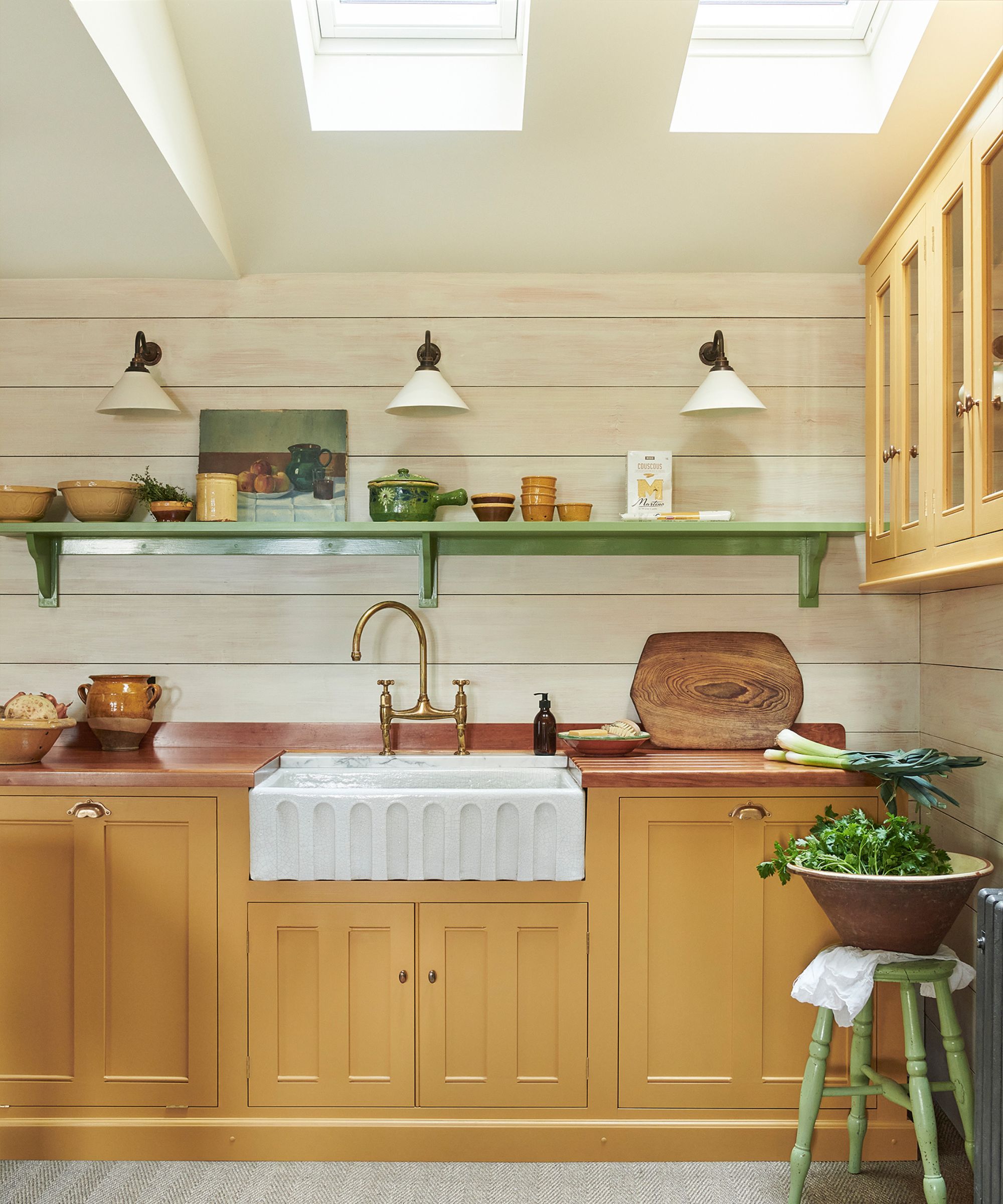
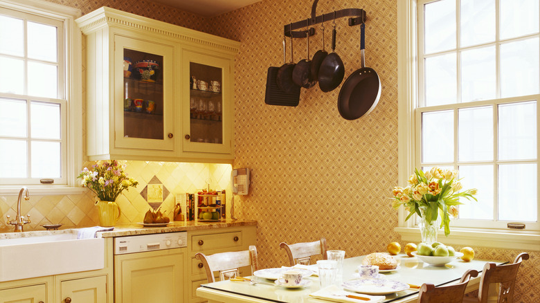
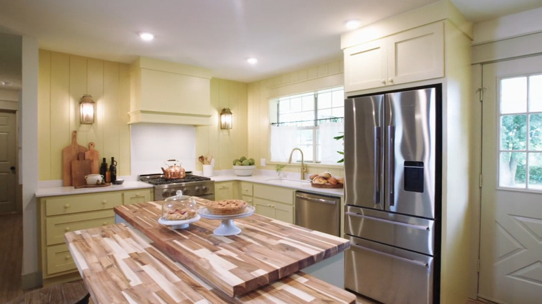
Yellow countertops, including mustard, magnolia, and Tuscan yellow, are also flagged as potentially dull and unflattering, despite their prevalence in 1990s kitchens. To modernize yellow countertops and counteract muddy undertones, designers suggest avoiding cool-toned paints. Instead, embrace a palette of neutral and warm shades, such as stony yellows, mushroom, or taupe, to create a cohesive look. Antique-style metal hardware, natural timber, aged brass, and brushed bronze can also add elegance and prevent the palette from appearing dated.
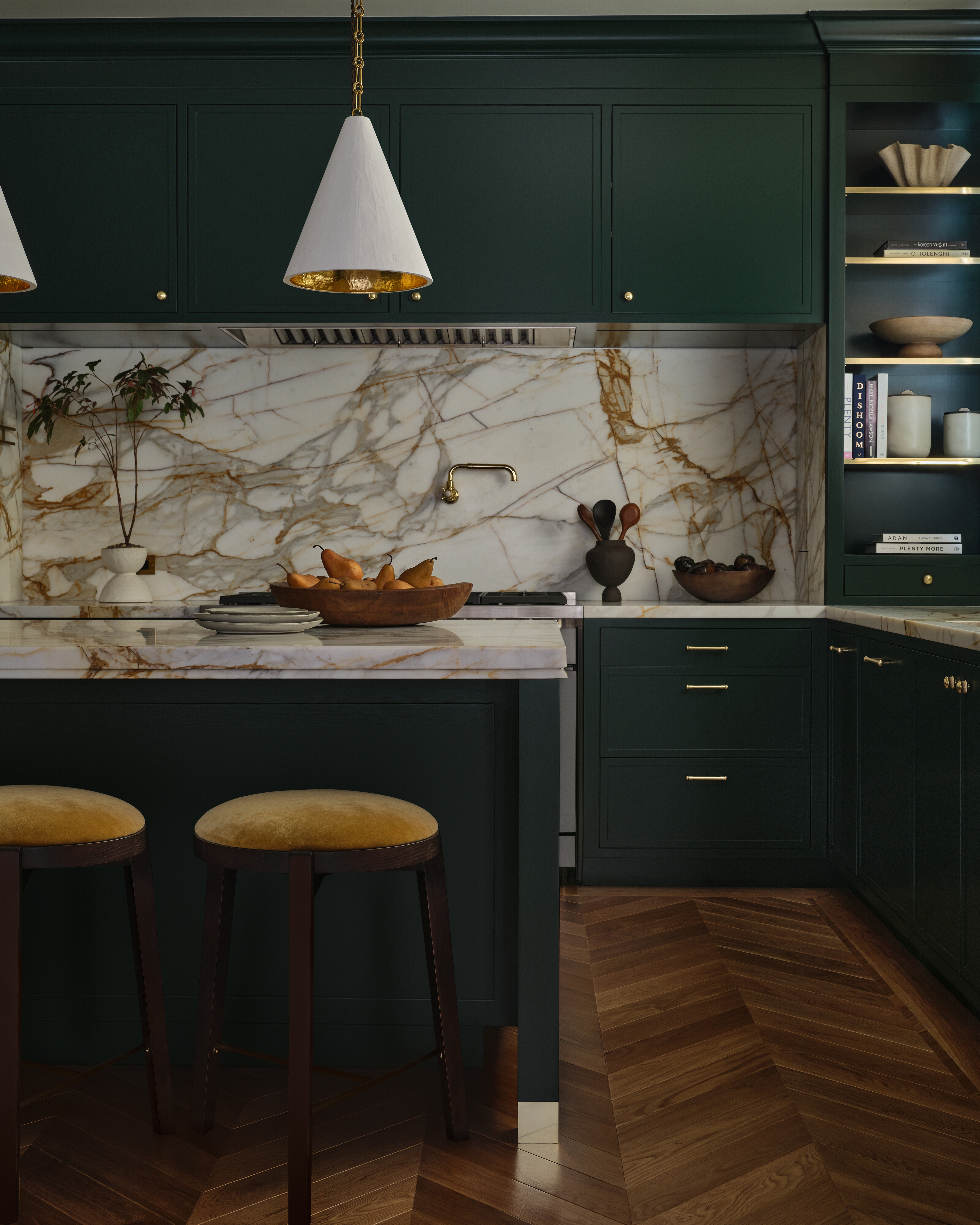
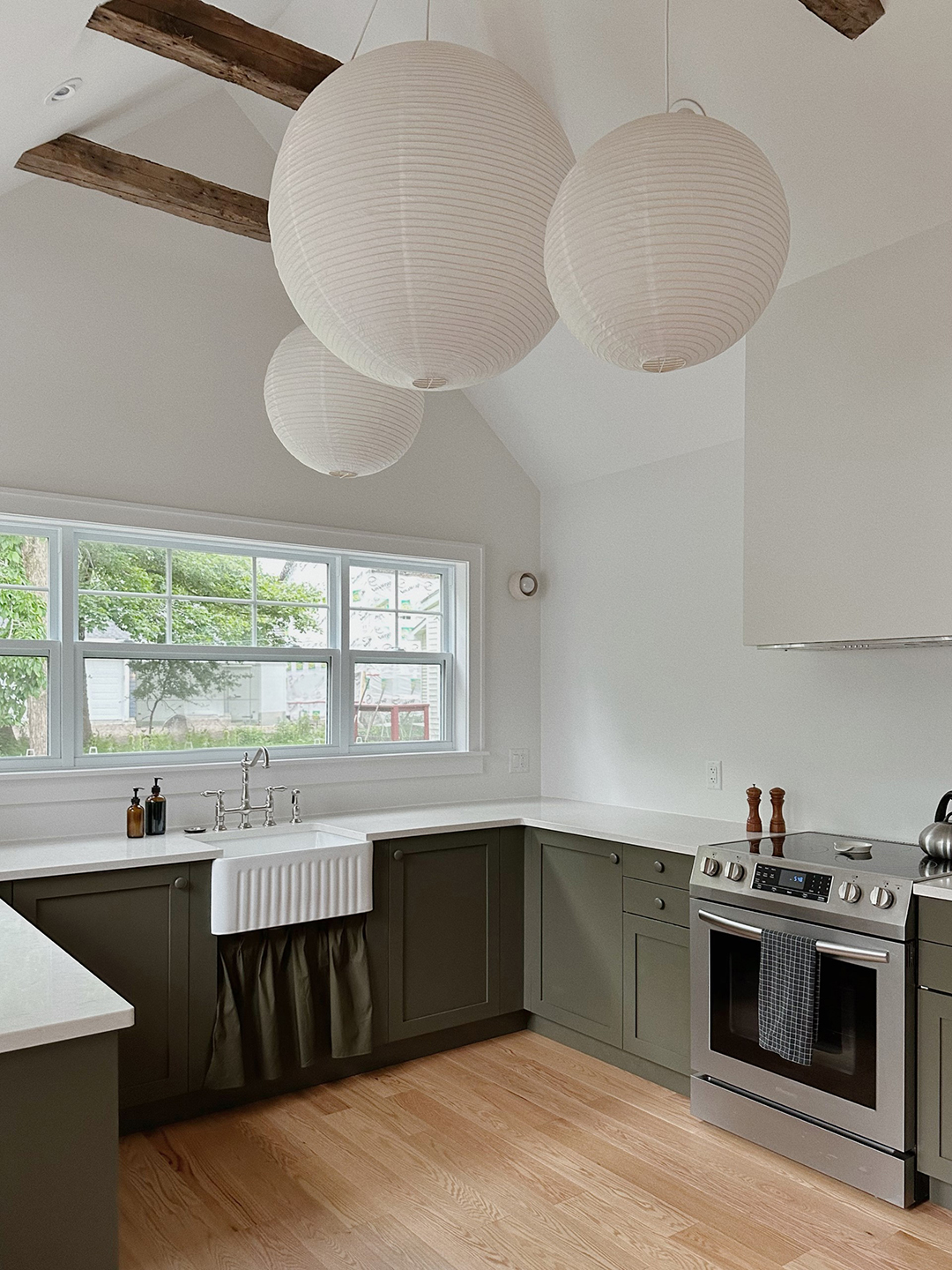
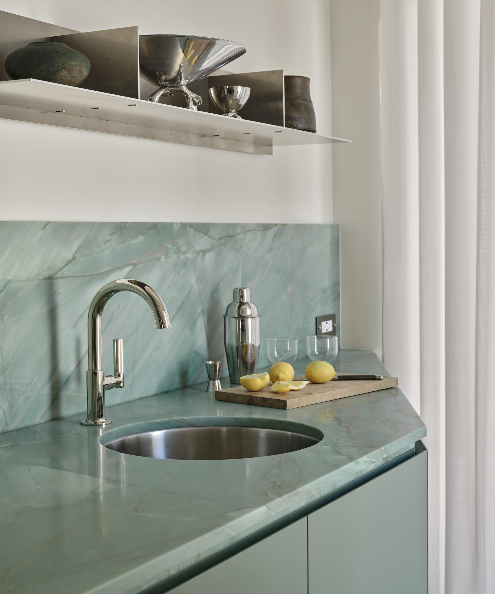
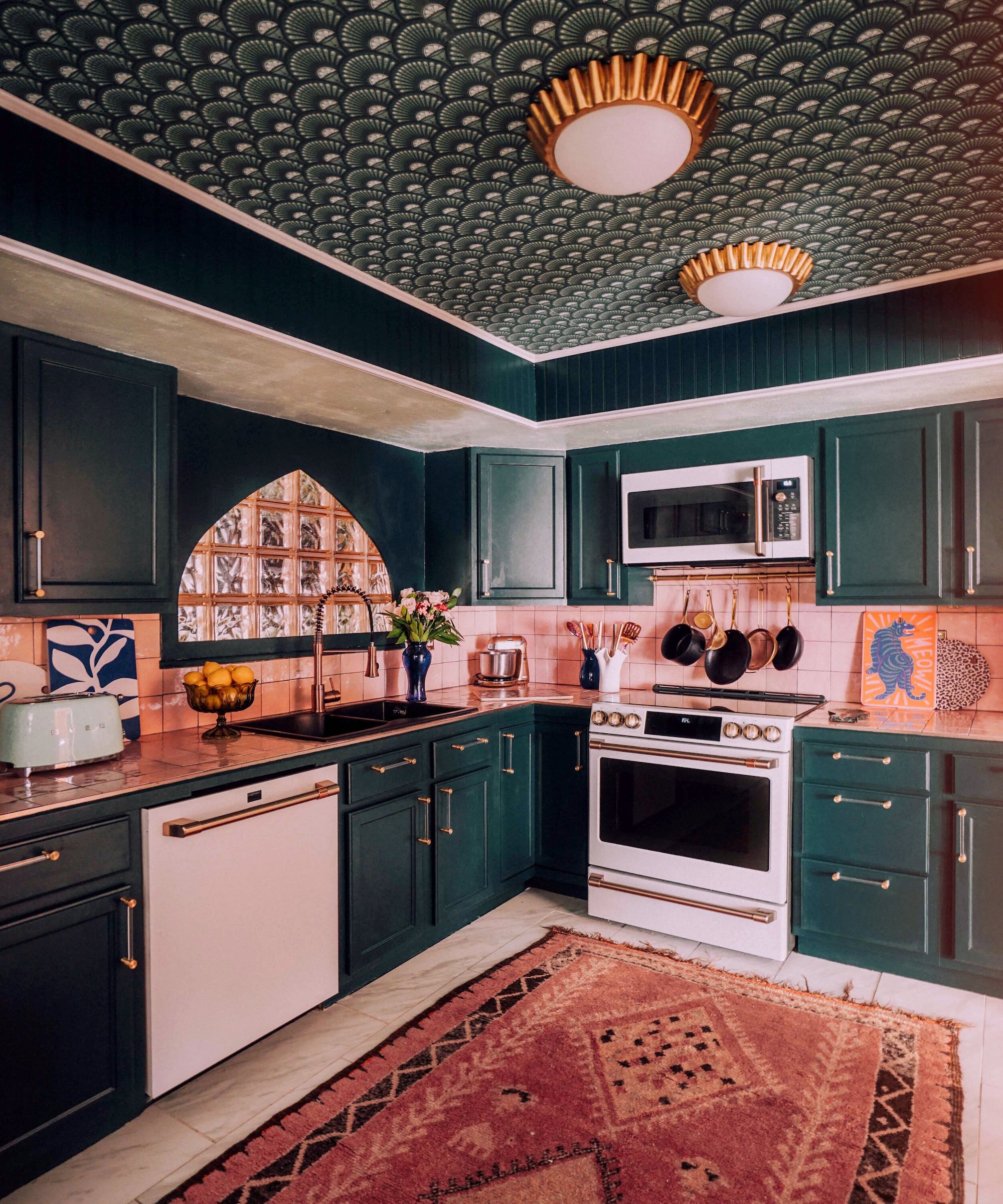
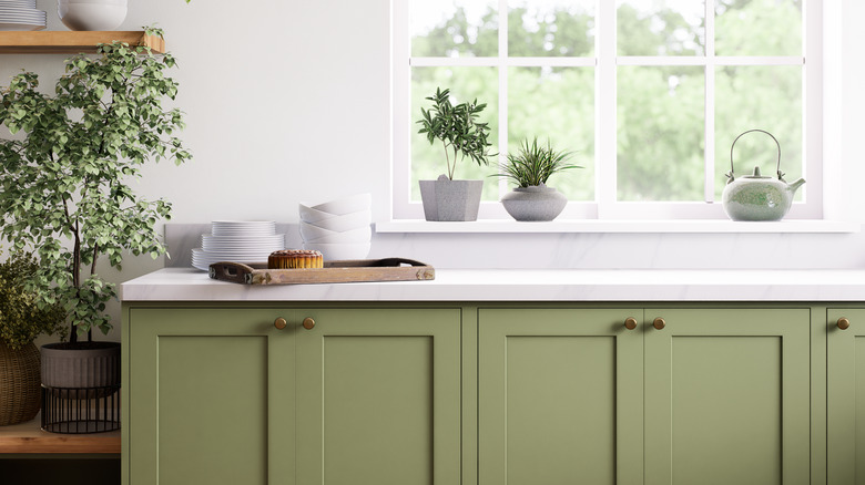
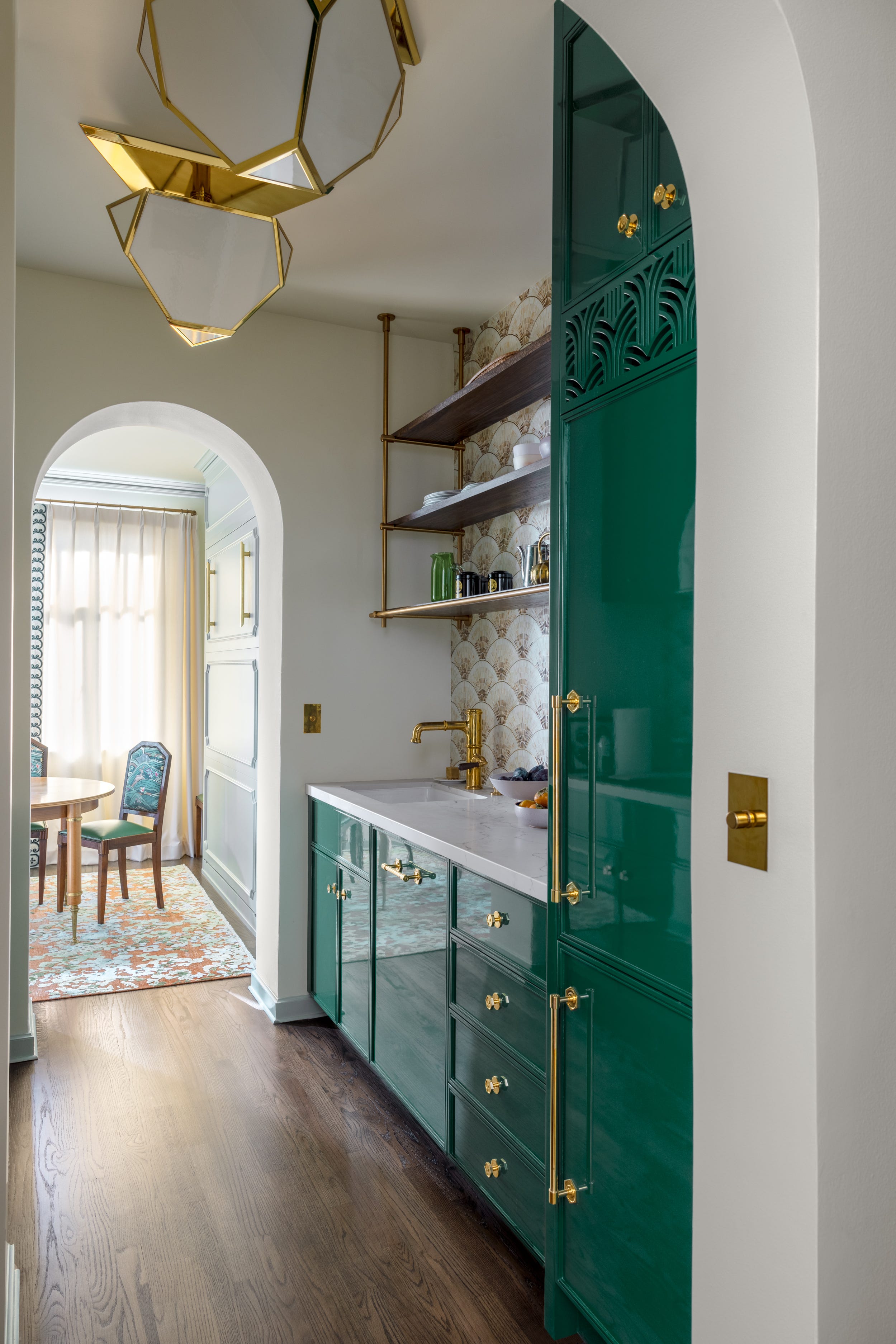
Finally, bright laminate green countertops are identified as a color that designers believe has no place in a kitchen, despite the popularity of nature-inspired earthy greens in other kitchen elements like cabinets and backsplashes. If a green countertop is desired, it is suggested to incorporate the color through natural materials like marble or granite. The article emphasizes that achieving a harmonious look with eccentric countertop colors like green requires a wide selection of cabinetry colors or custom options, as standard stock cabinetry often lacks the necessary complementary shades to make such countertops work effectively.
#KitchenDesign #CountertopColors #InteriorDesign #HomeDecor #DesignTrends #KitchenRemodel #StylingTips #ColorPsychology #OutdatedKitchen #KitchenDesign #CountertopColors #InteriorDesign #HomeDecor #DesignTrends #KitchenRemodel #StylingTips #ColorPsychology #OutdatedKitchen
0 comment in total
 No comments yet
You may also like
Kitchen Color Selection Tips from 5 Designers
5 Designers Weigh In on the Best Brands of Paint for Kitchen Cabinets

We Asked Designers: What’s the Next Big Kitchen Cabinet Color?

These 4 Countertop Colors Instantly Date Any Kitchen, Designers Say
5 Countertop Colors That Are Going Out of Style, and What You Should Choose Instead — According to Kitchen Designers

It’s Official: These are the Best Kitchen Paint Colors, According to Designers
We Asked Designers Which Paint Colors Shrink a Kitchen—And These 5 Are Cramping Your Style

5 White Kitchen Paints Designers Swear By
These are the 5 best colors to pair with a wooden kitchen countertop, according to interior designers
We Asked Designers for the Countertop Colors That Instantly Upgrade a Kitchen—And They Chose These 4
7 kitchen countertop color ideas designers say "will infuse your kitchen with tons of personality

Timeless Paint Colors HGTV Stars Love Using In Kitchens
We Asked Designers for the Cabinet Colors That Instantly Upgrade a Kitchen—They Gave Us 5
5 ways to nail the tri-color kitchen method, say designers
Designers Predict the Next “It” Kitchen Cabinet Color

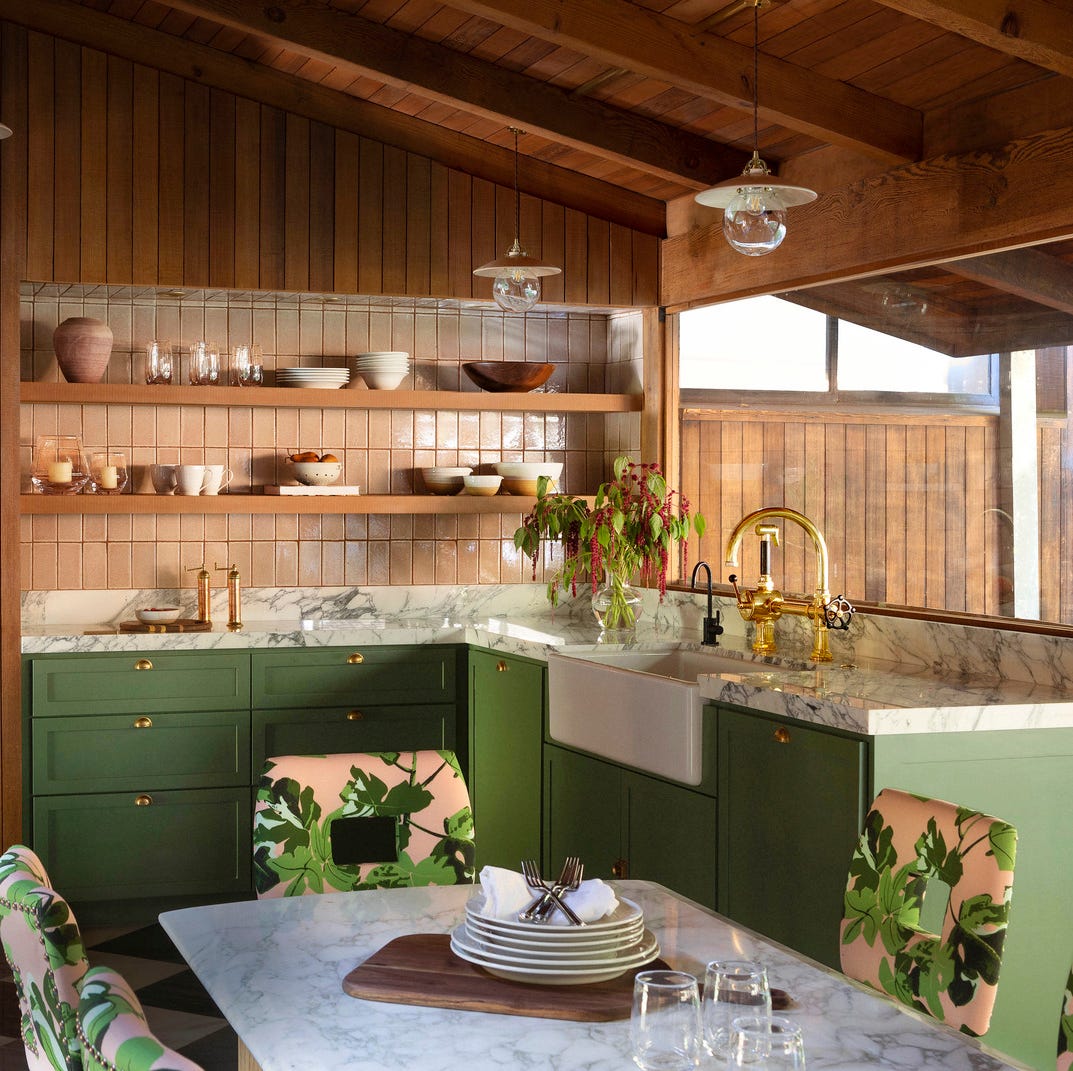
The Kitchen Colors Designers Call “Forever Favorites”

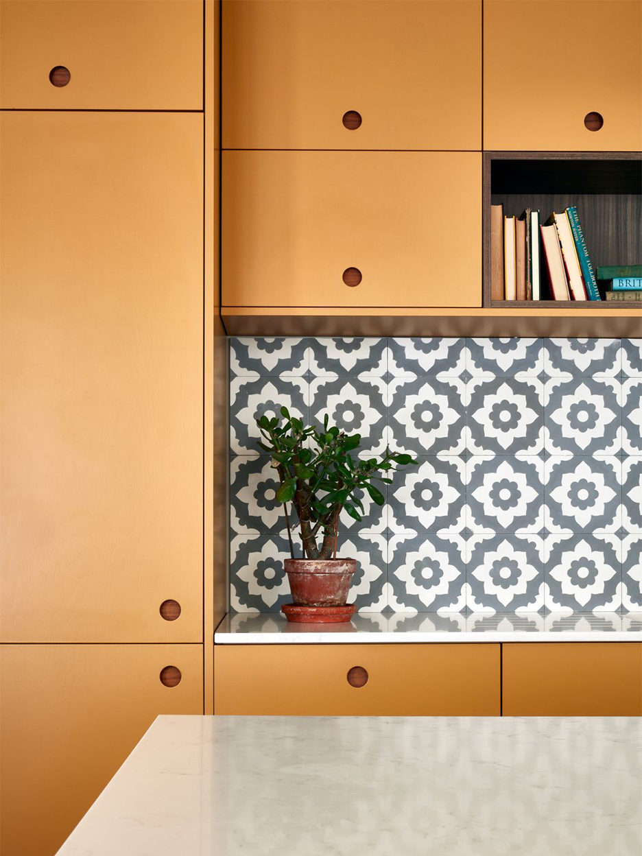
5 Designers Weigh In on the Best Brands of Paint for Kitchen Cabinets

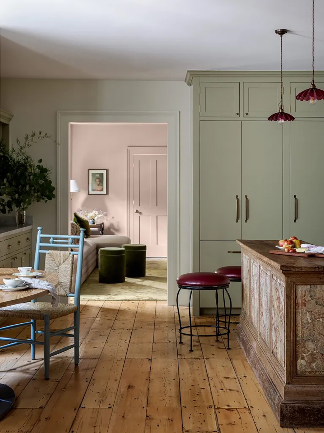
We Asked 20 Designers: What Is the Next Big Kitchen Cabinet Color?

5 Gorgeous Paint Colors To Elevate Your Kitchen Cabinets In 2025

5 Timeless Kitchen Cabinet Paint Colors Designers Love