1/9
'Cook dinner feeling soothed' - the 8 most calming colors for a small kitchen
This article explores various calming color palettes suitable for small kitchens, aiming to transform them into serene and inviting spaces despite their often hectic nature. The discussion emphasizes that color plays a more significant role in setting a kitchen's mood than its style, size, or layout. Designers highlight a range of hues, from classic greens and blues to more unconventional choices like warm woods and charcoal grays, each offering a unique approach to creating a tranquil culinary environment.
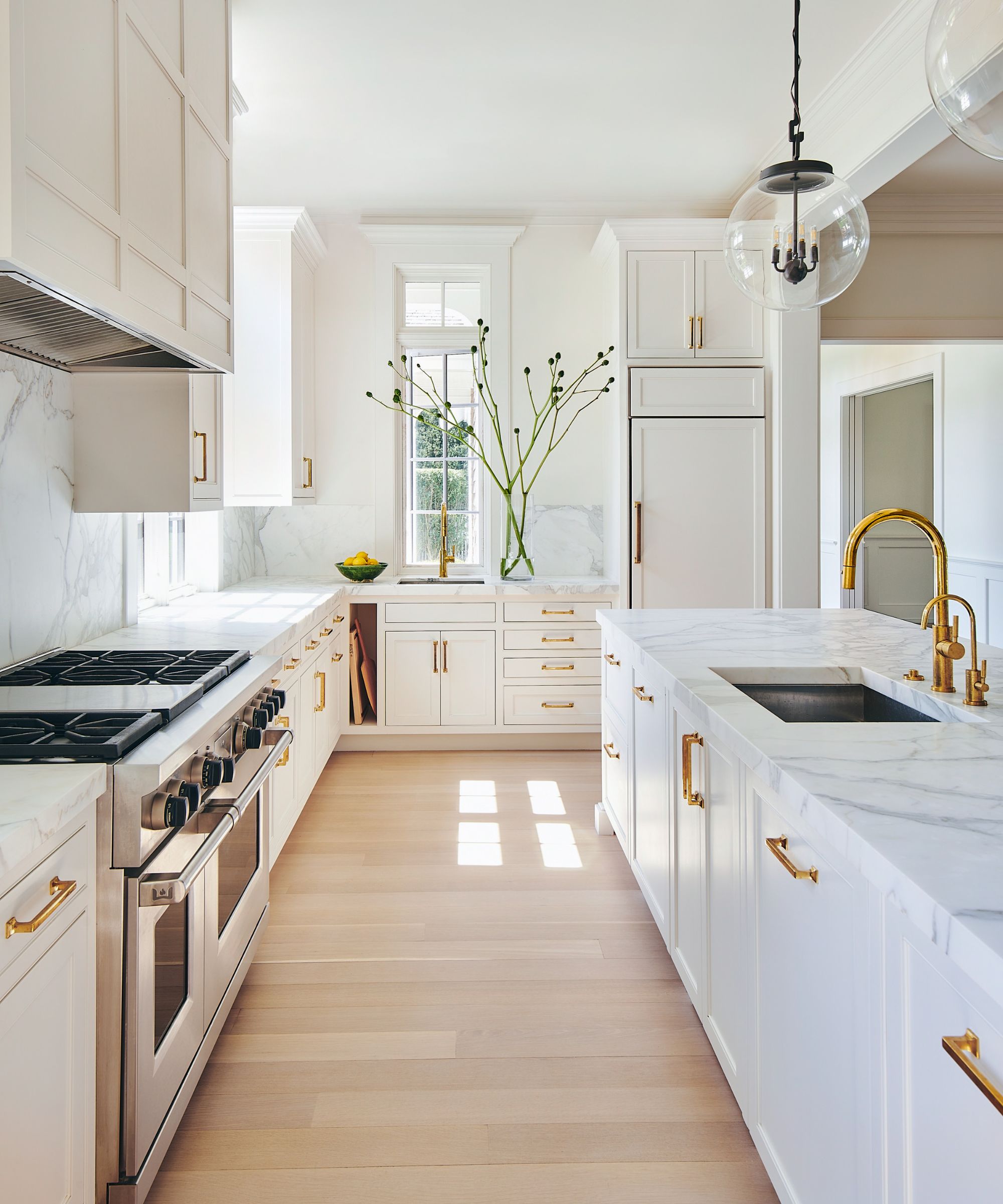
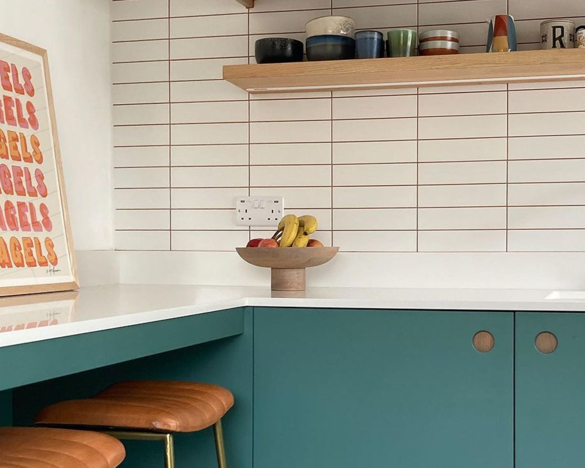
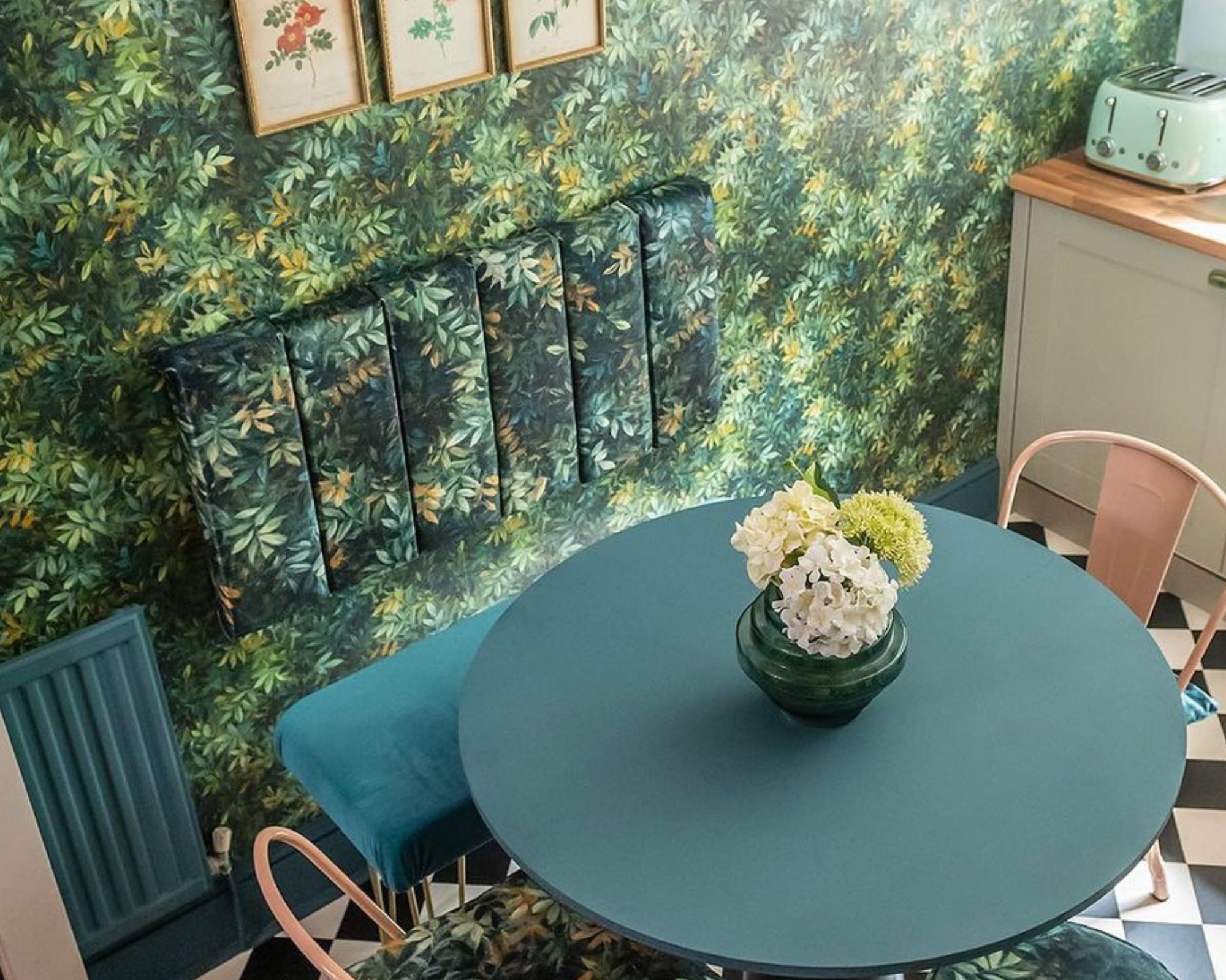
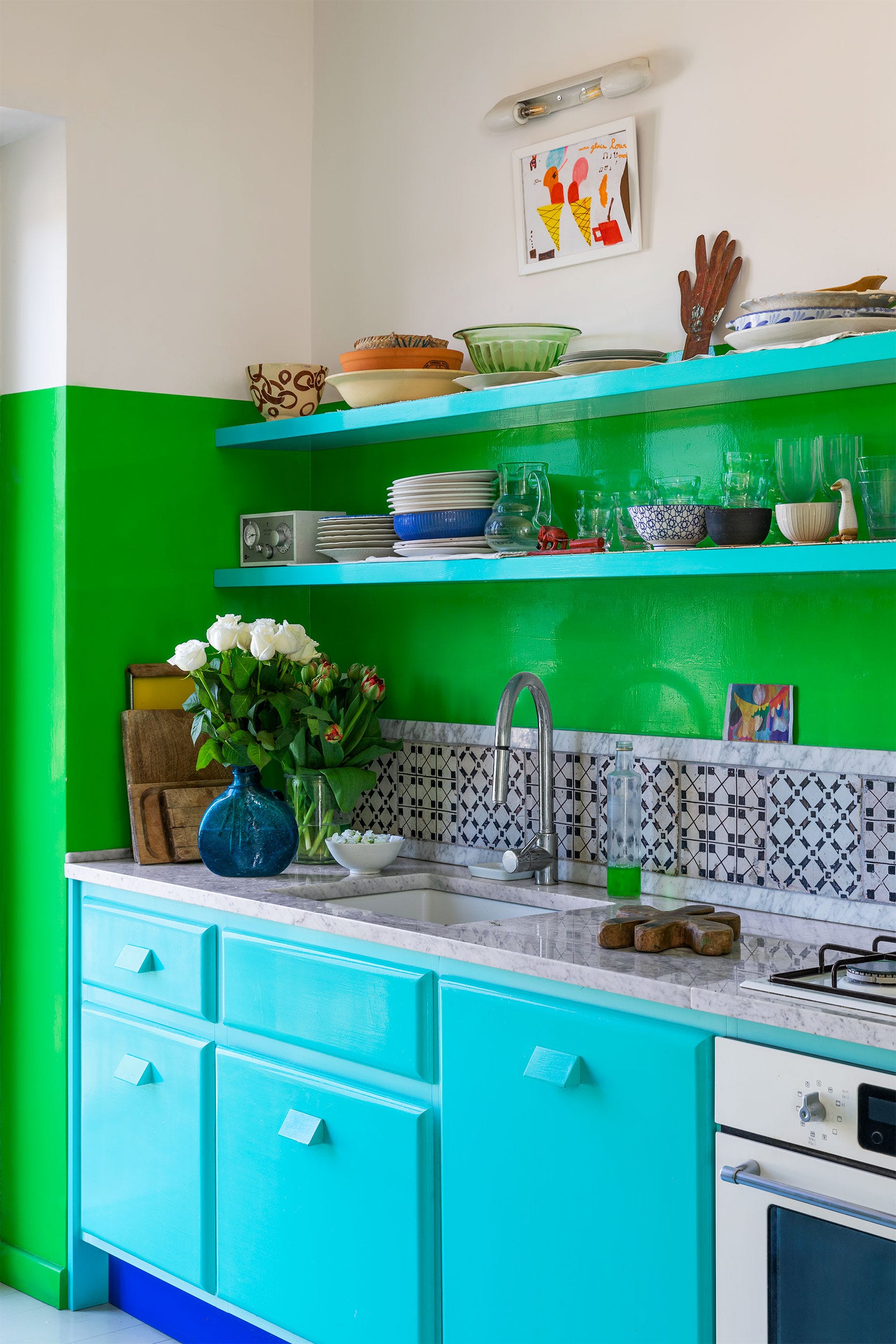
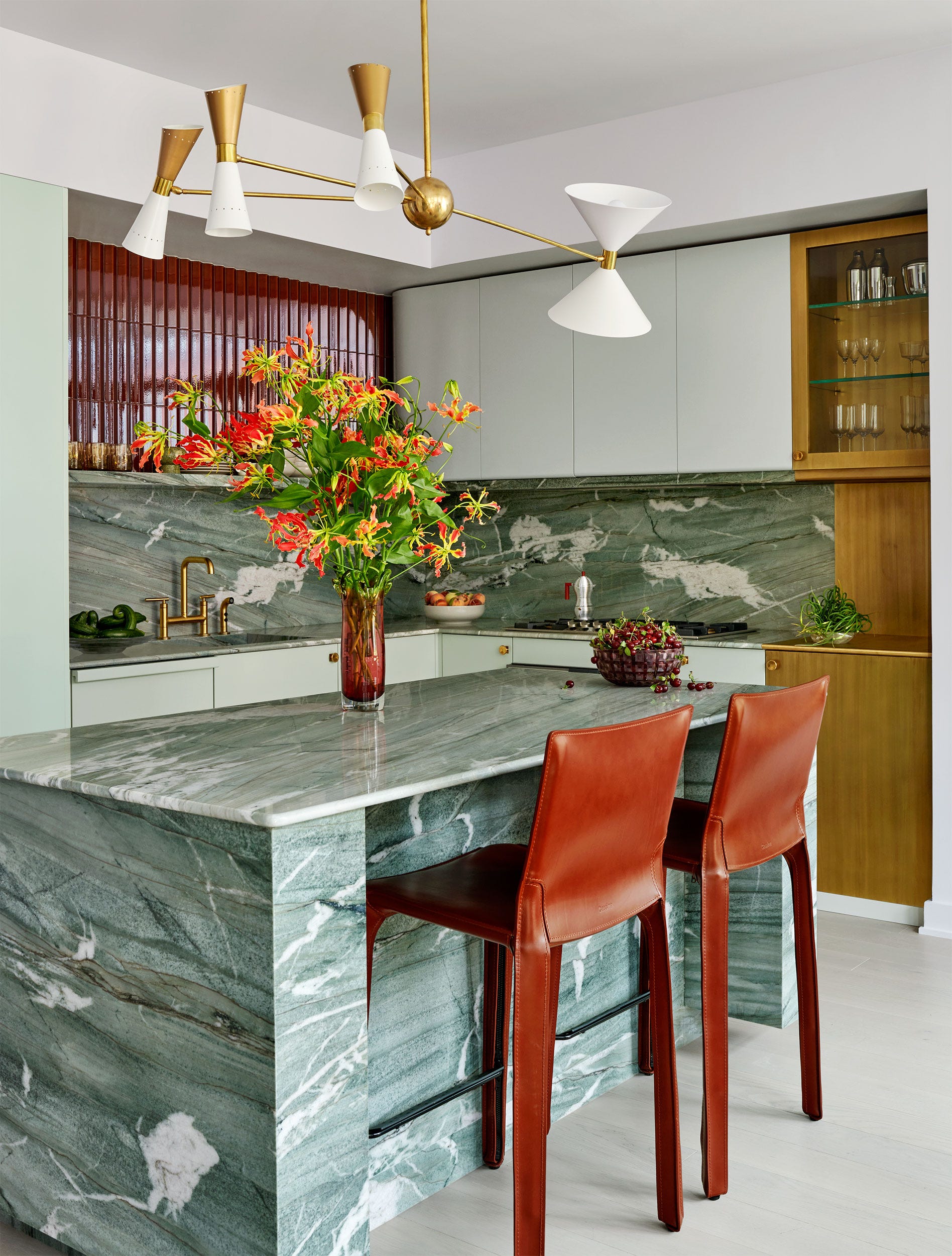
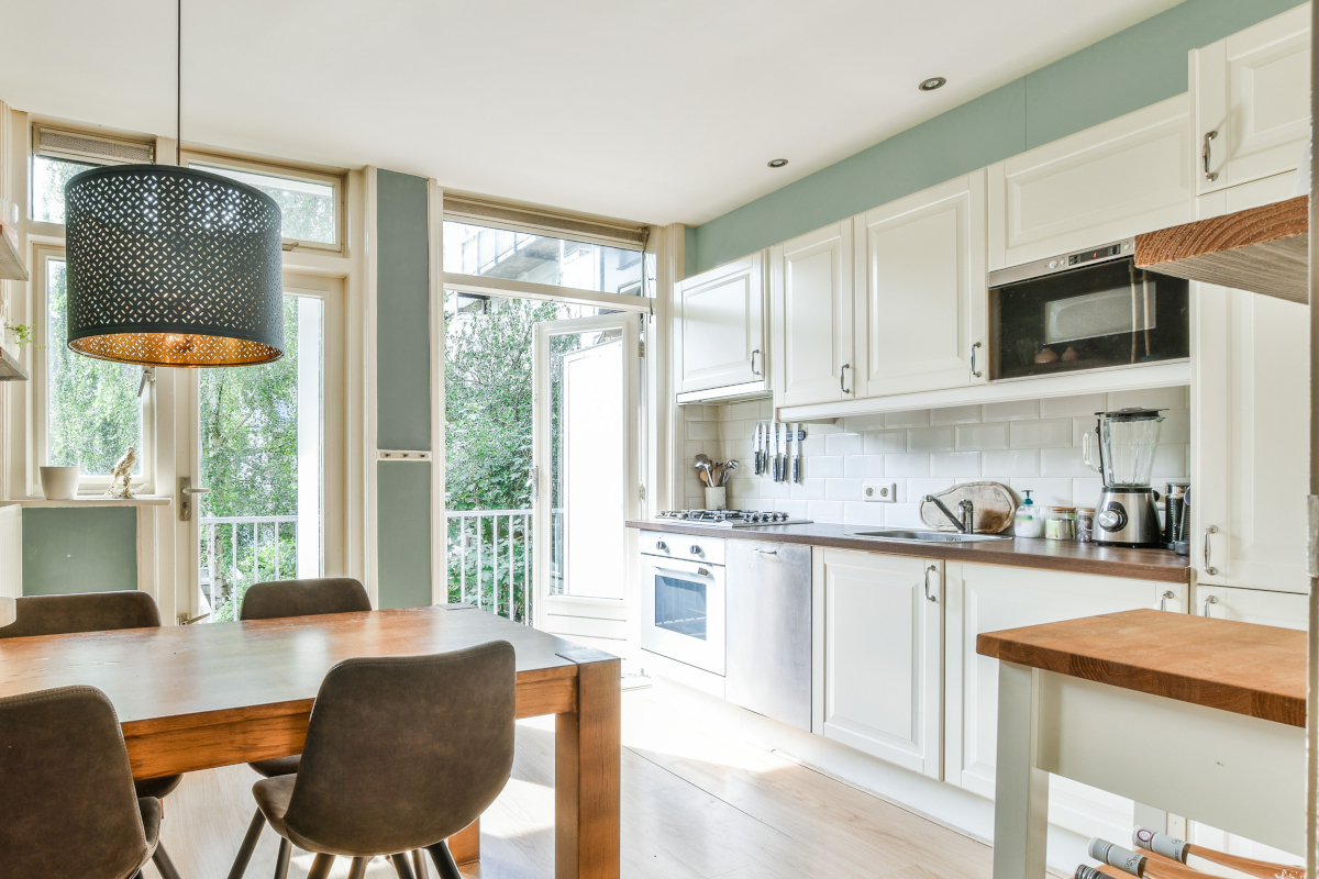
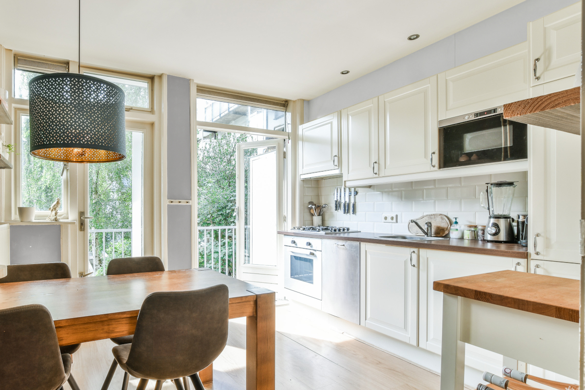
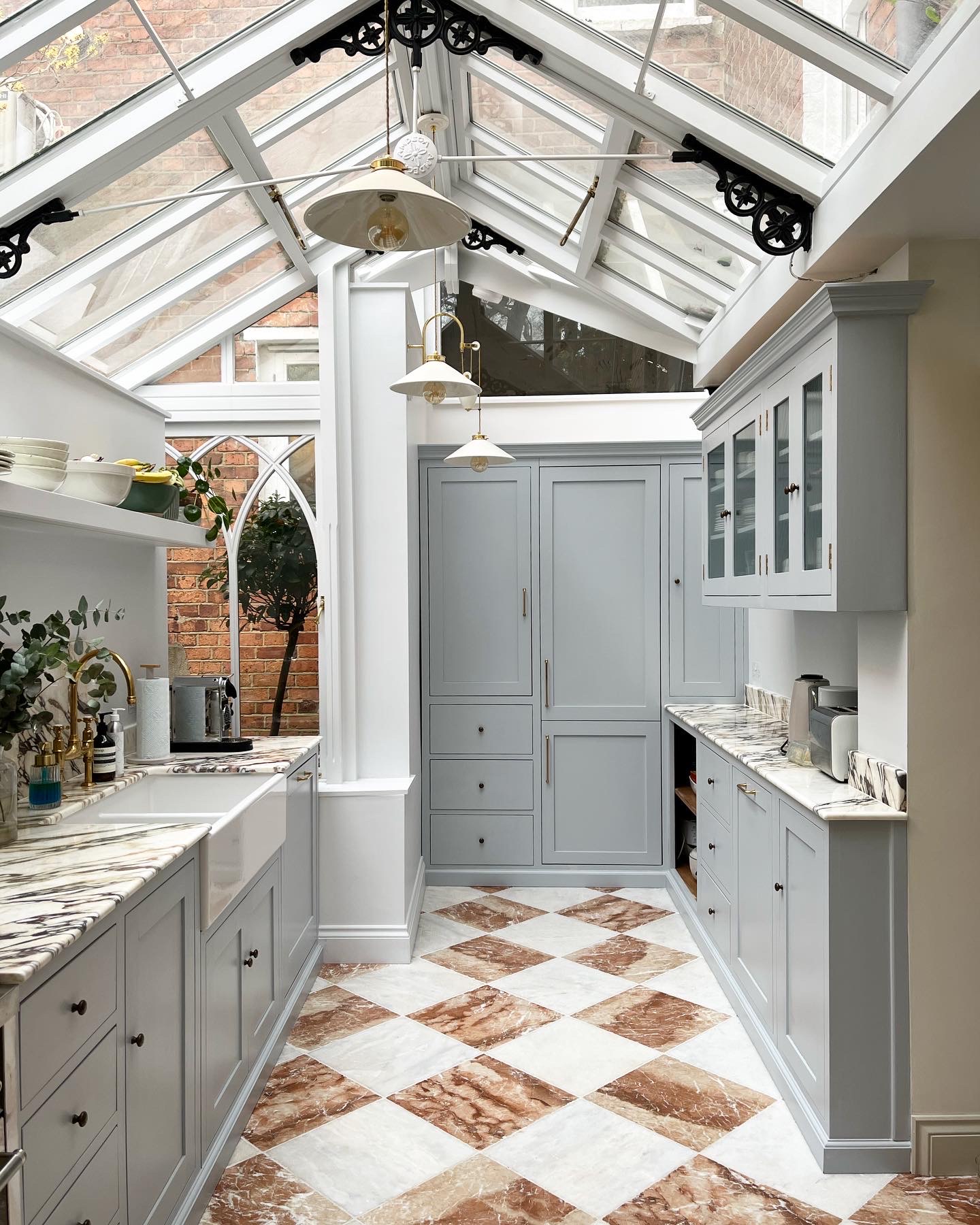
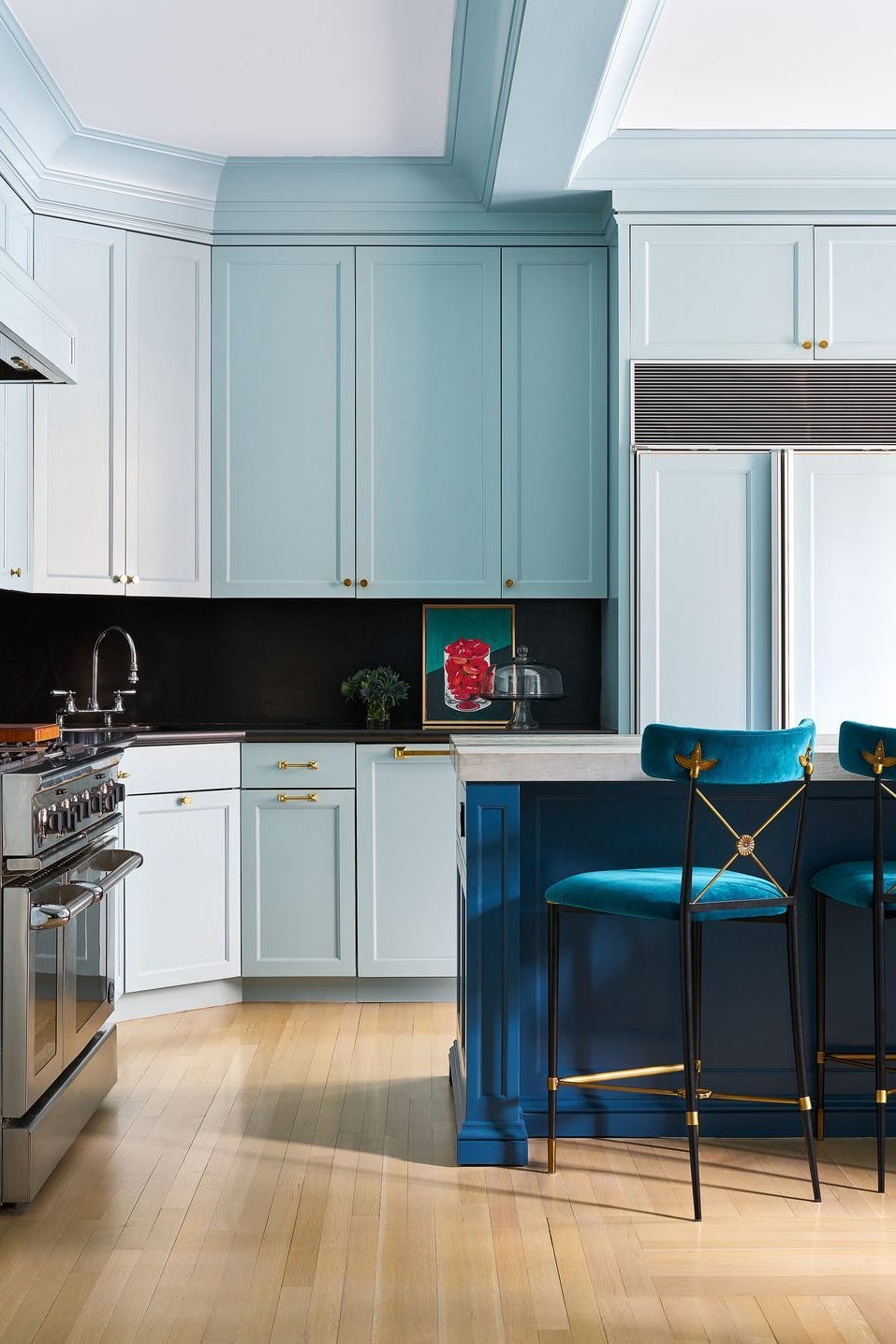
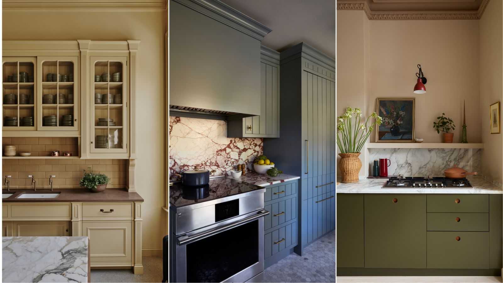
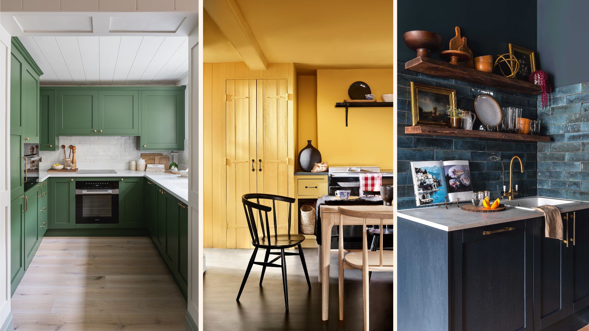
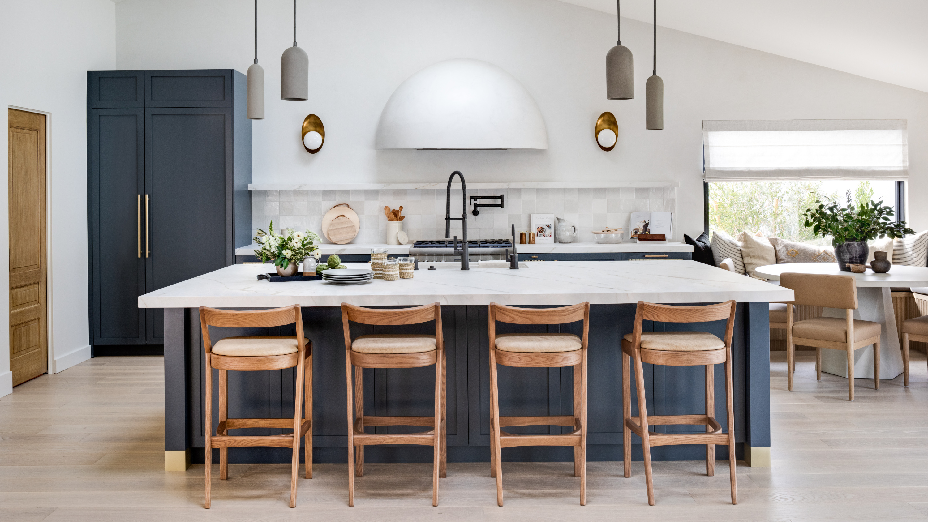
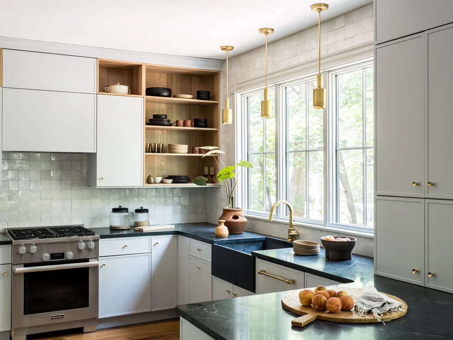
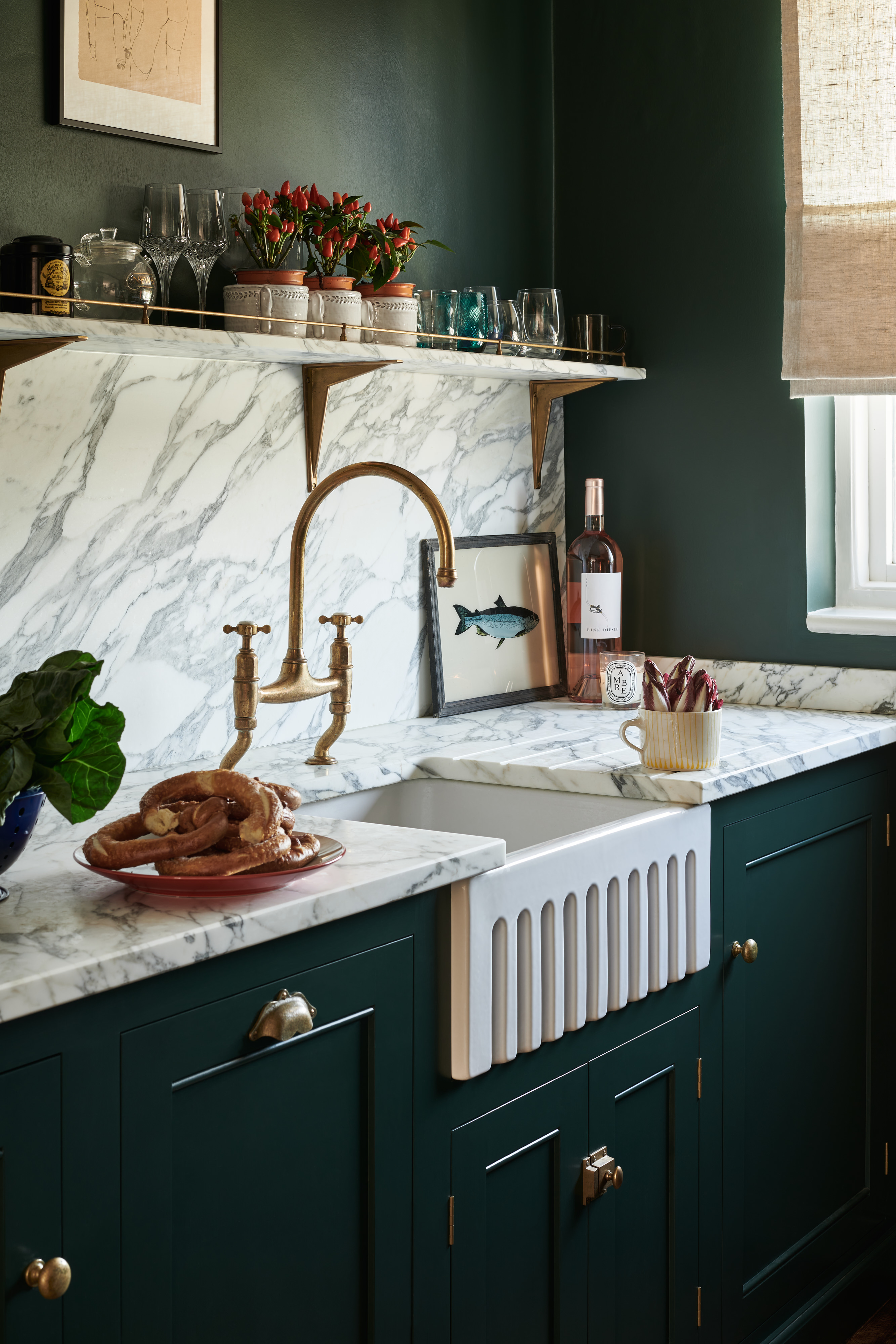
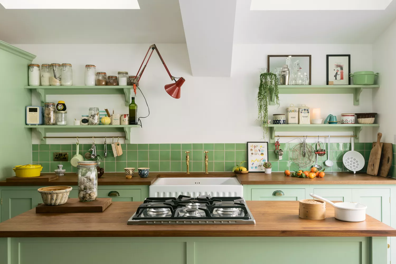
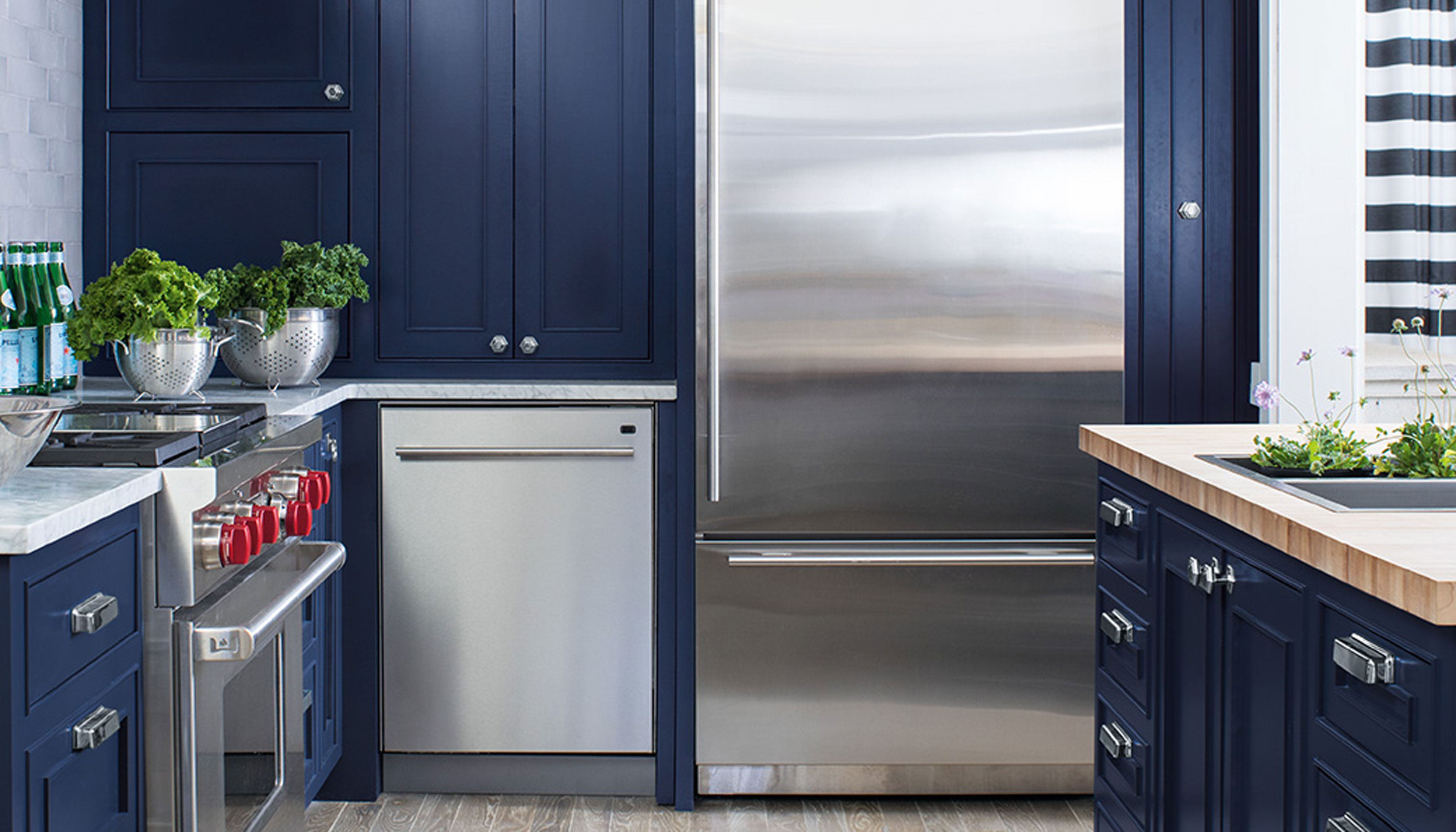
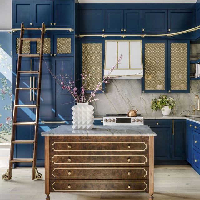
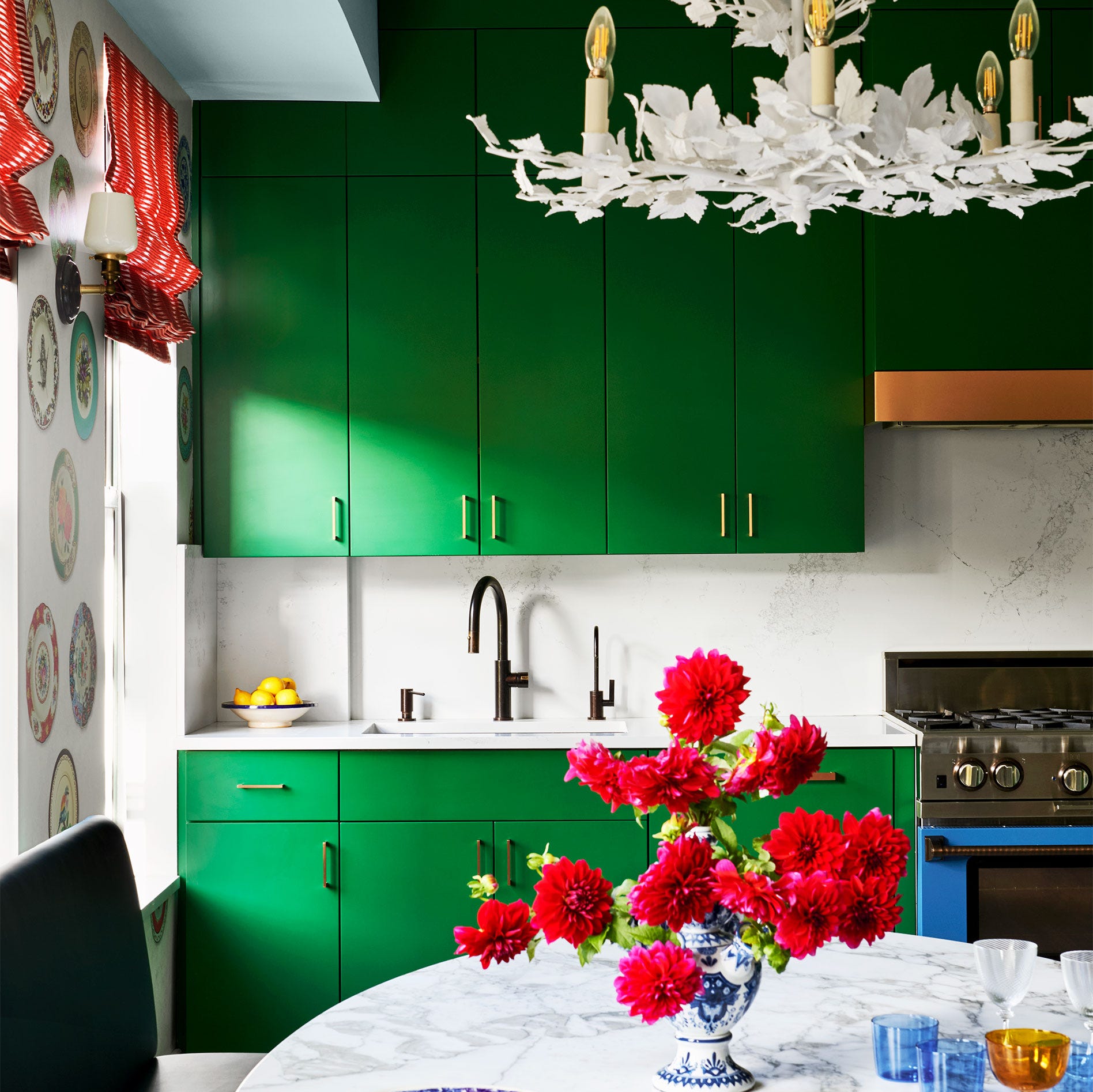
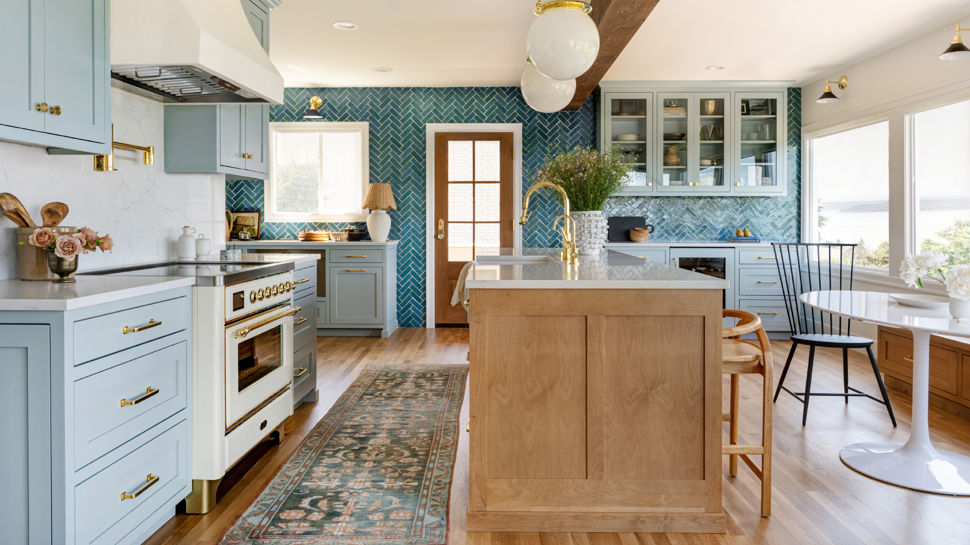
The article begins by introducing teal green, a combination of green and blue, as a tried-and-tested calming kitchen color. This shade, while appearing bold, can be chic and serene when used thoughtfully, particularly with open shelving to prevent the space from feeling overwhelmed. Designer Kate Guinness suggests pairing these cool tones with warm off-white or plaster pink walls. Following this, sky blue is presented as another classic calming option, adaptable to various styles from modern farmhouse to retro, creating a refreshing atmosphere. Keren Richter of White Arrow describes how a hazy blue was used to evoke the natural elements of a Hamptons beach house, blending with punchy dishware and white oak cabinetry.
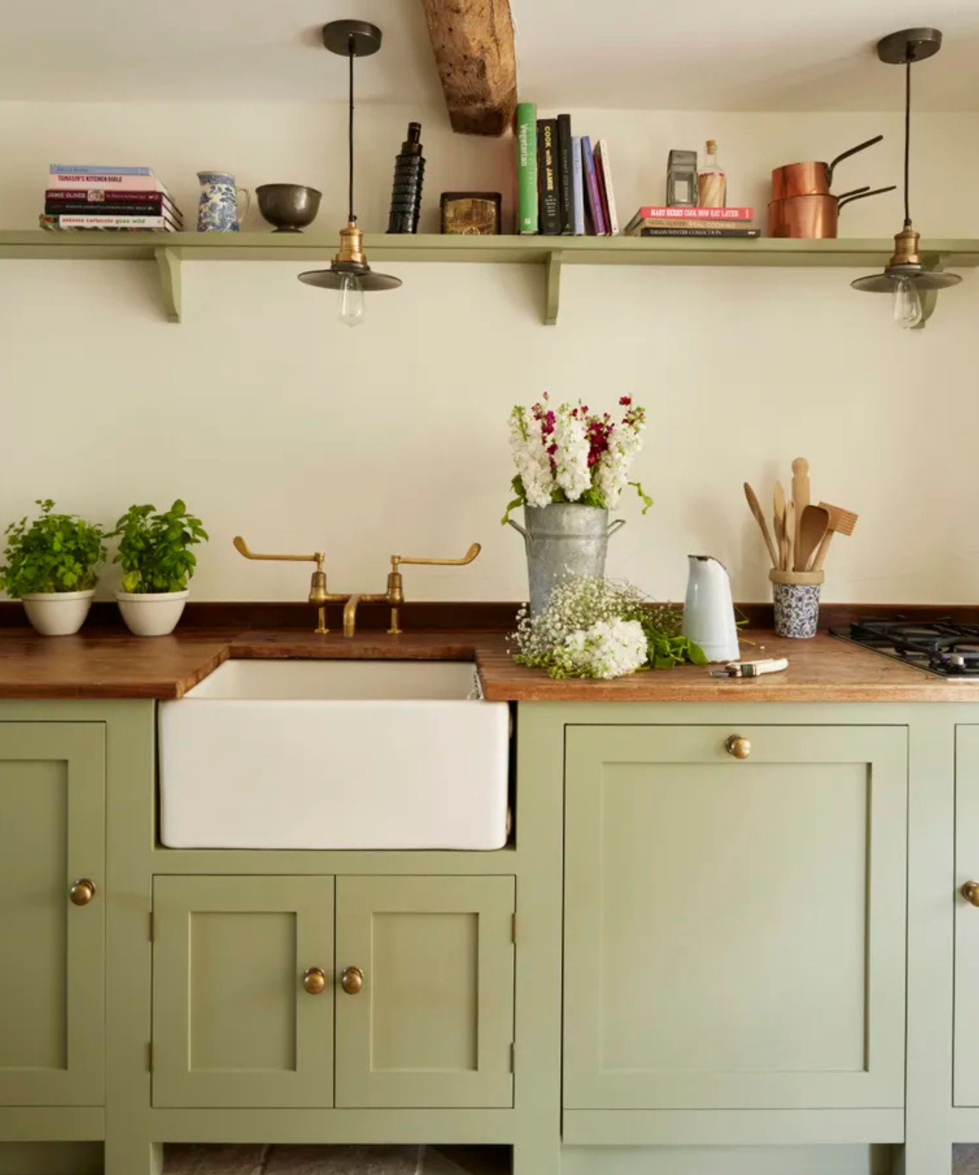
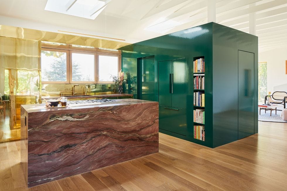
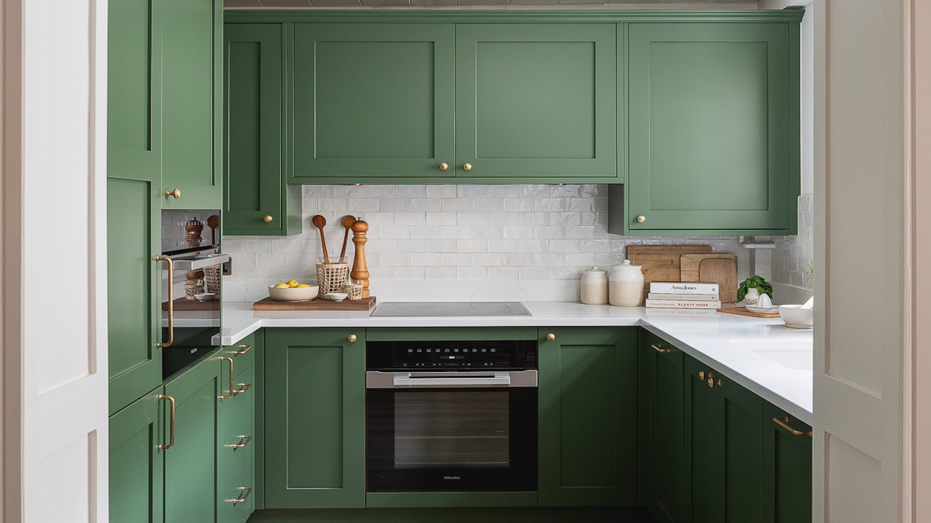
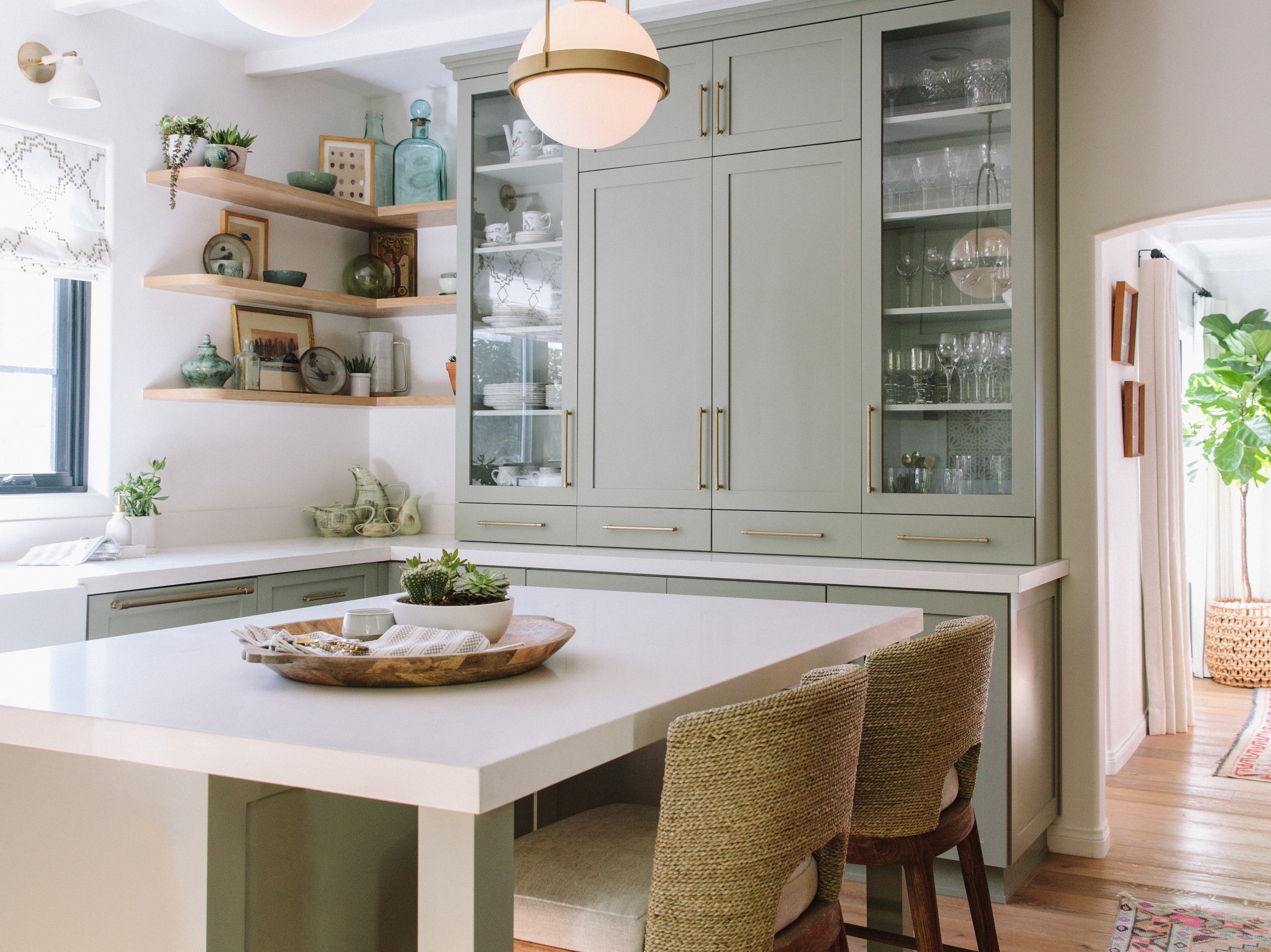
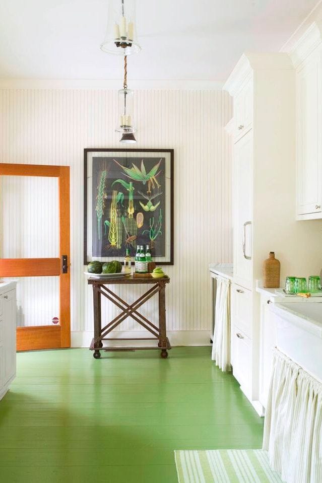
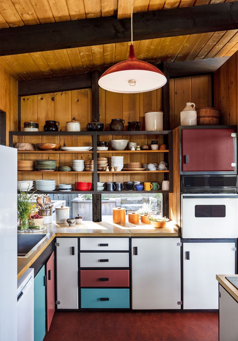
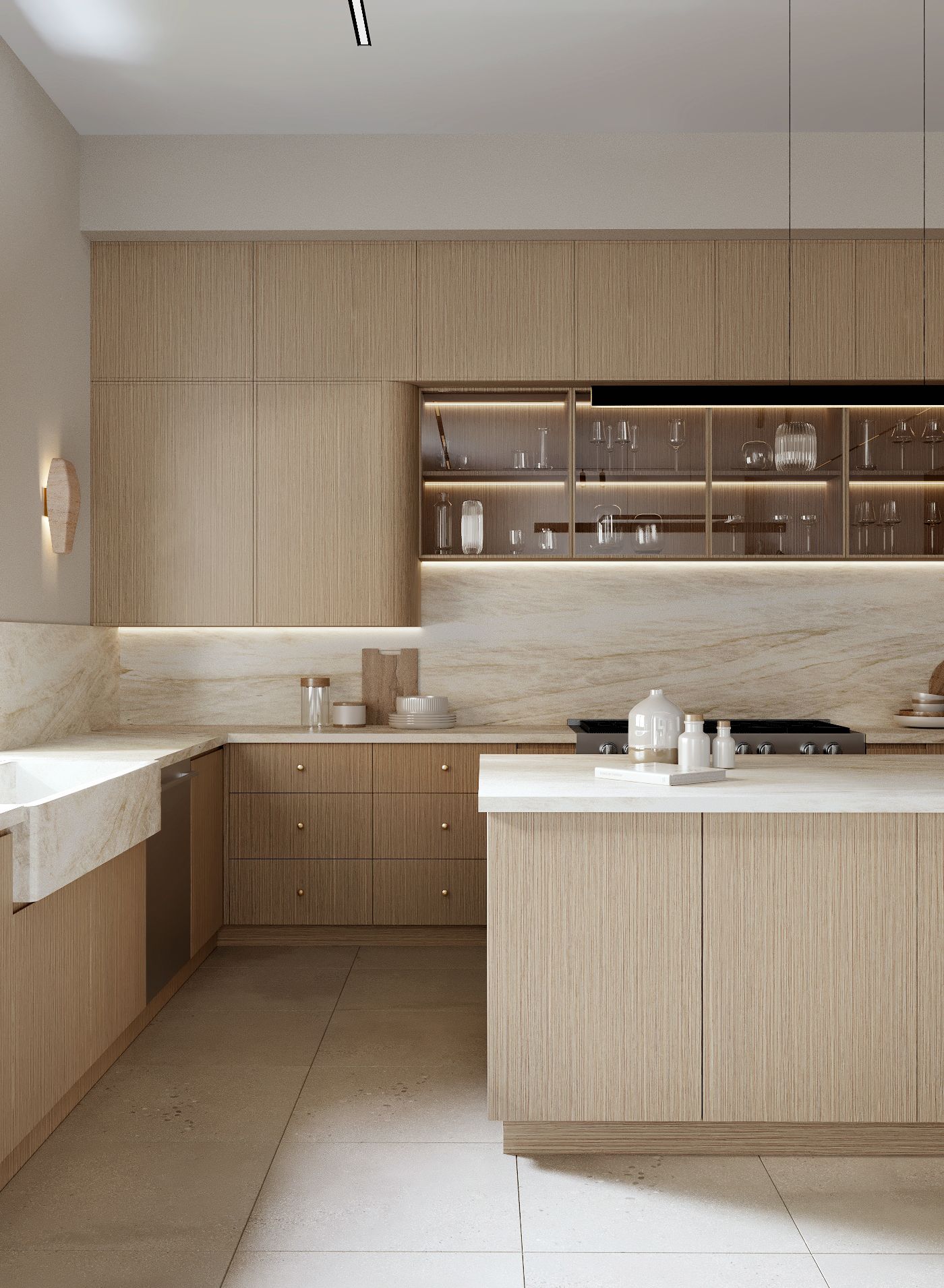
For those who prefer subtle color, olive green is recommended as a sophisticated choice that borders on neutral. It allows for a hint of color without dominating the space, ideal for backsplashes or floor tiles. Chelsey Cox of Chinotto House explains using deep olive green tiles and a painted island to modernize a 1970s architect-designed home while nodding to its original aesthetic. She emphasizes the role of natural wood tones in complementing these colors and adding warmth. The discussion then shifts to warm wood, not a color in itself but a shade that imparts calmness through natural textures and varied tones, as demonstrated in a project by Tala Fustok that balanced practicality with a contemporary design.
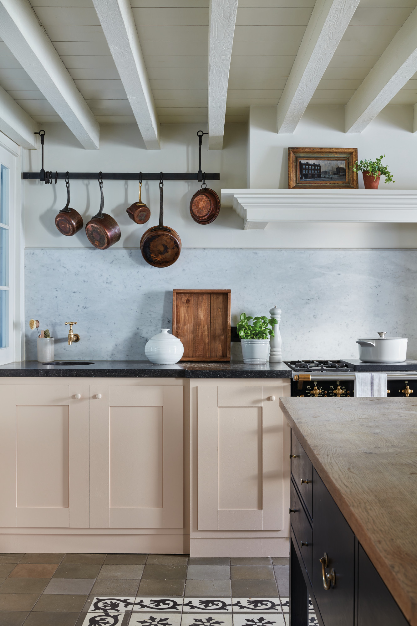
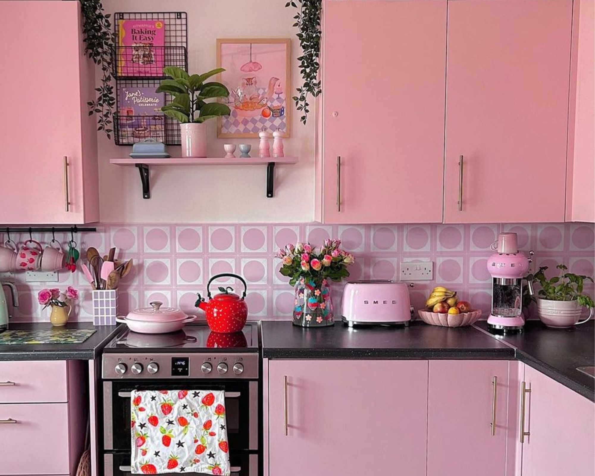
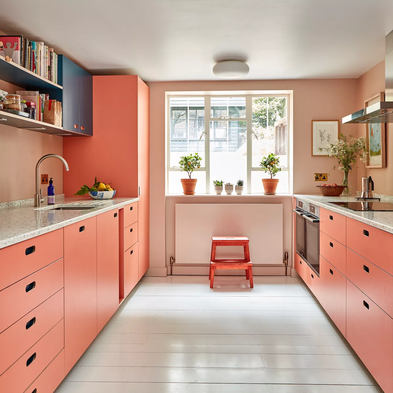
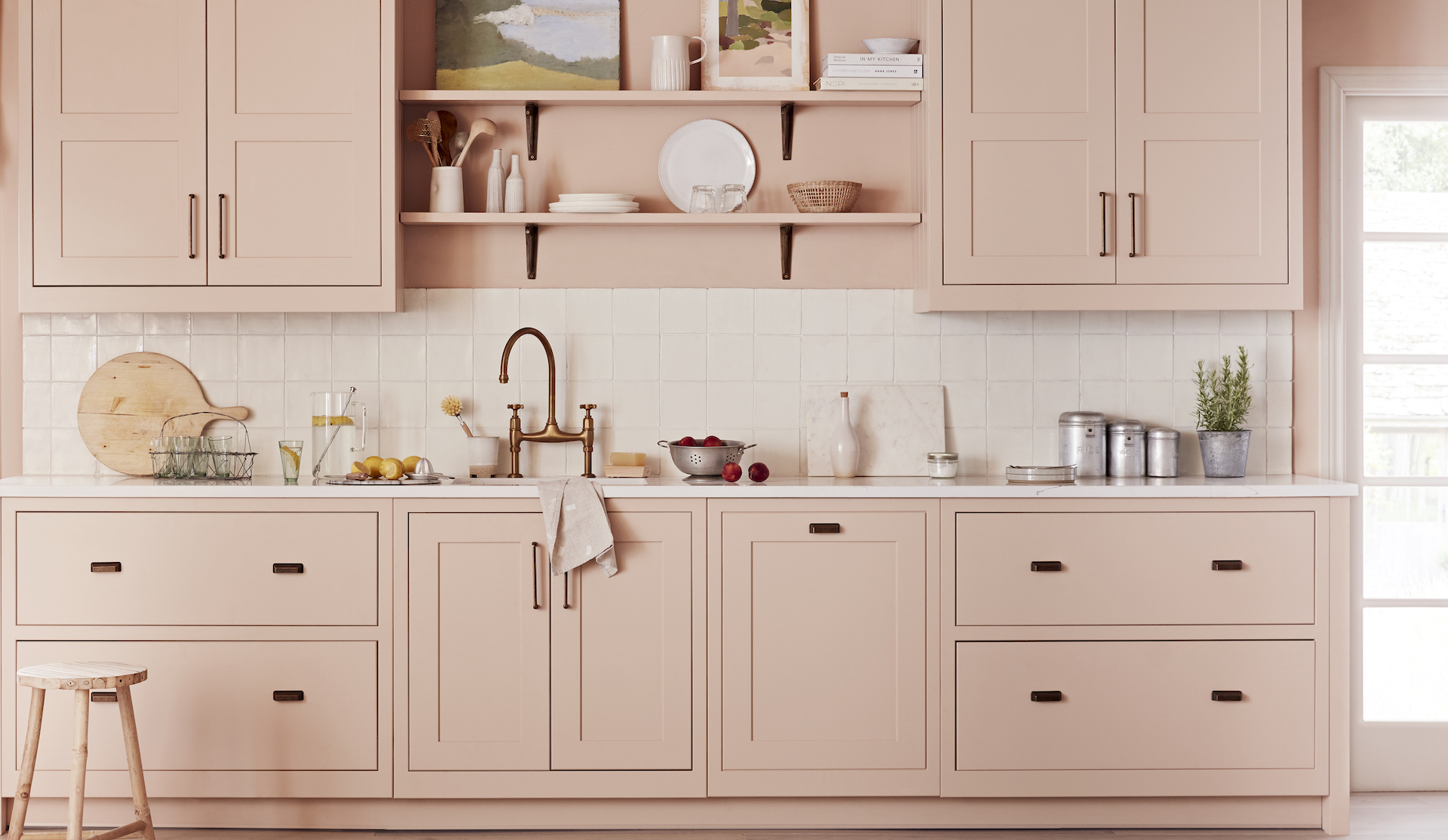
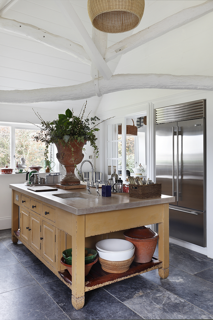
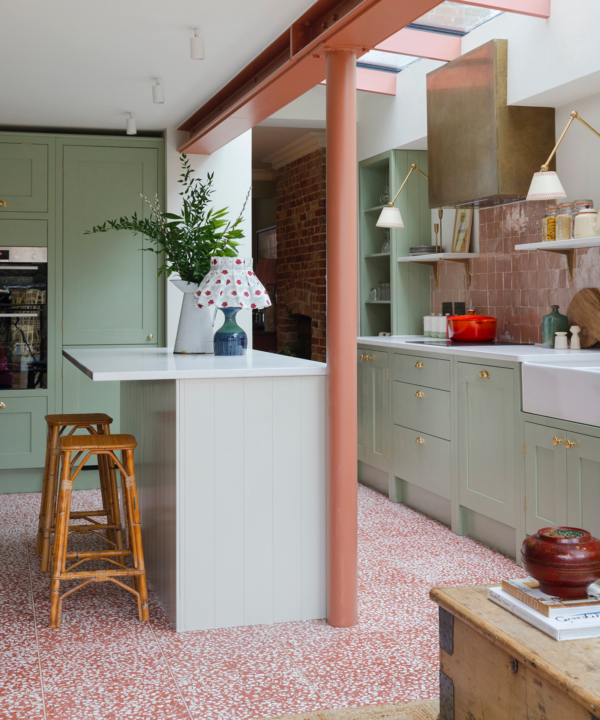
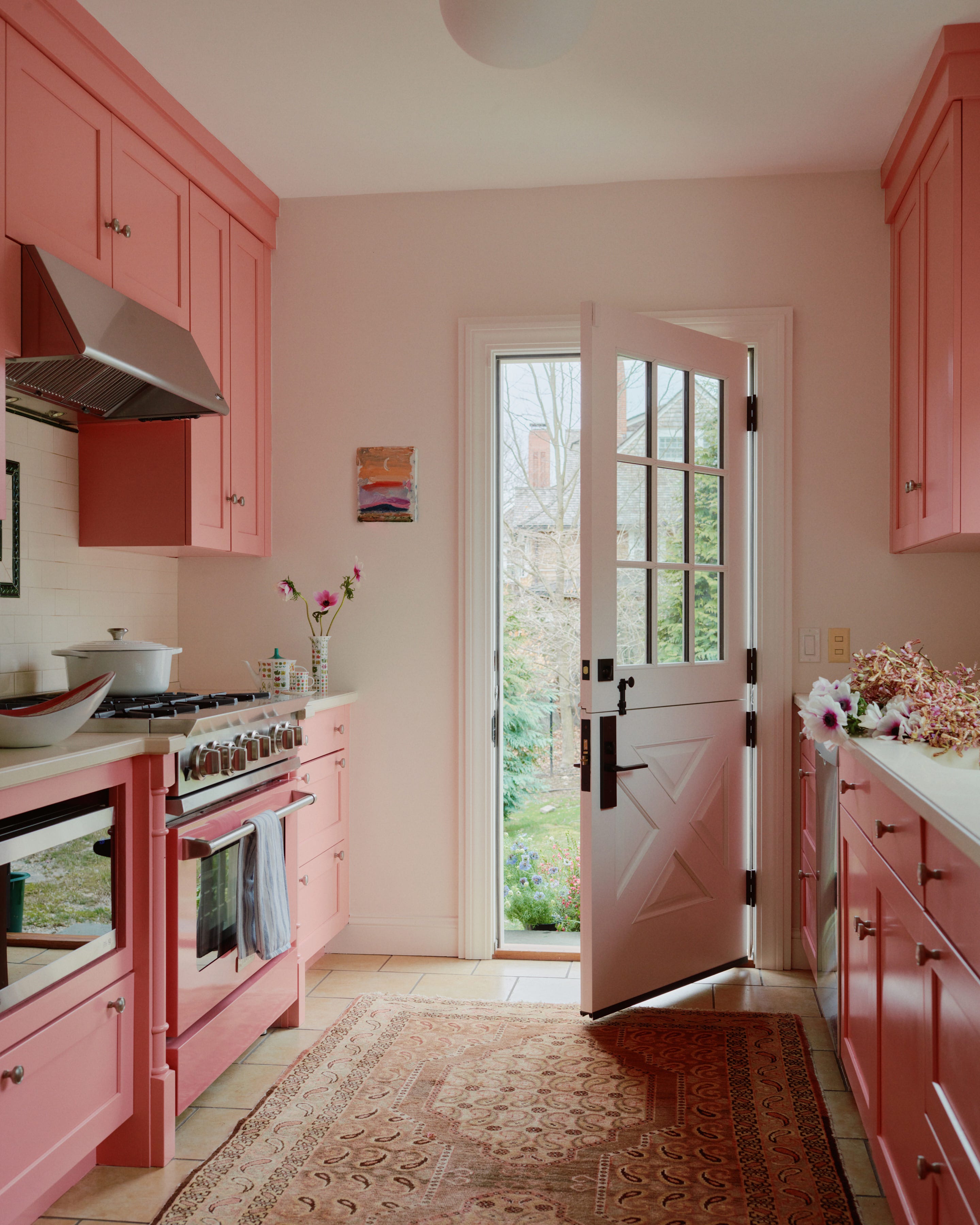
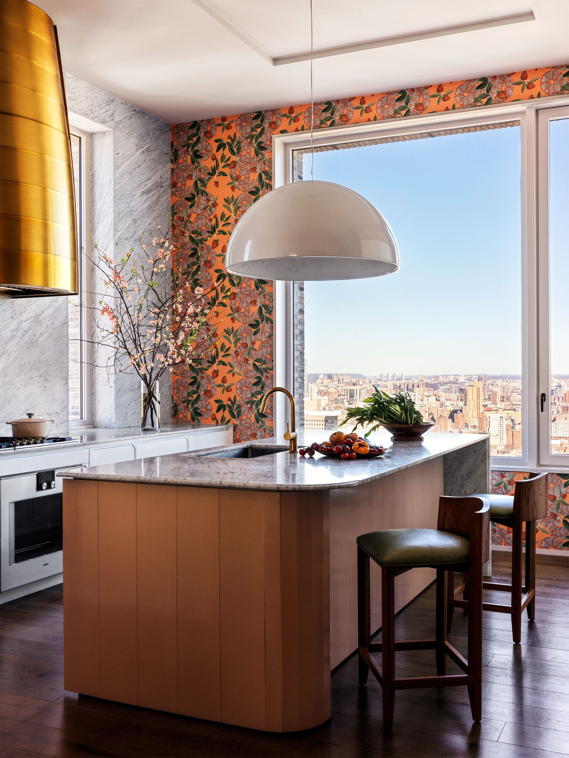
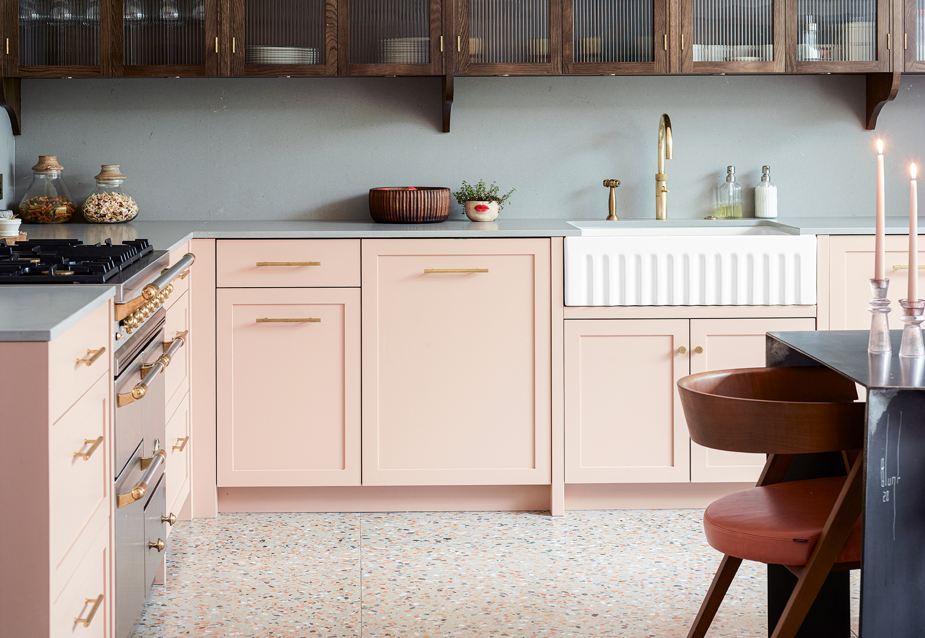
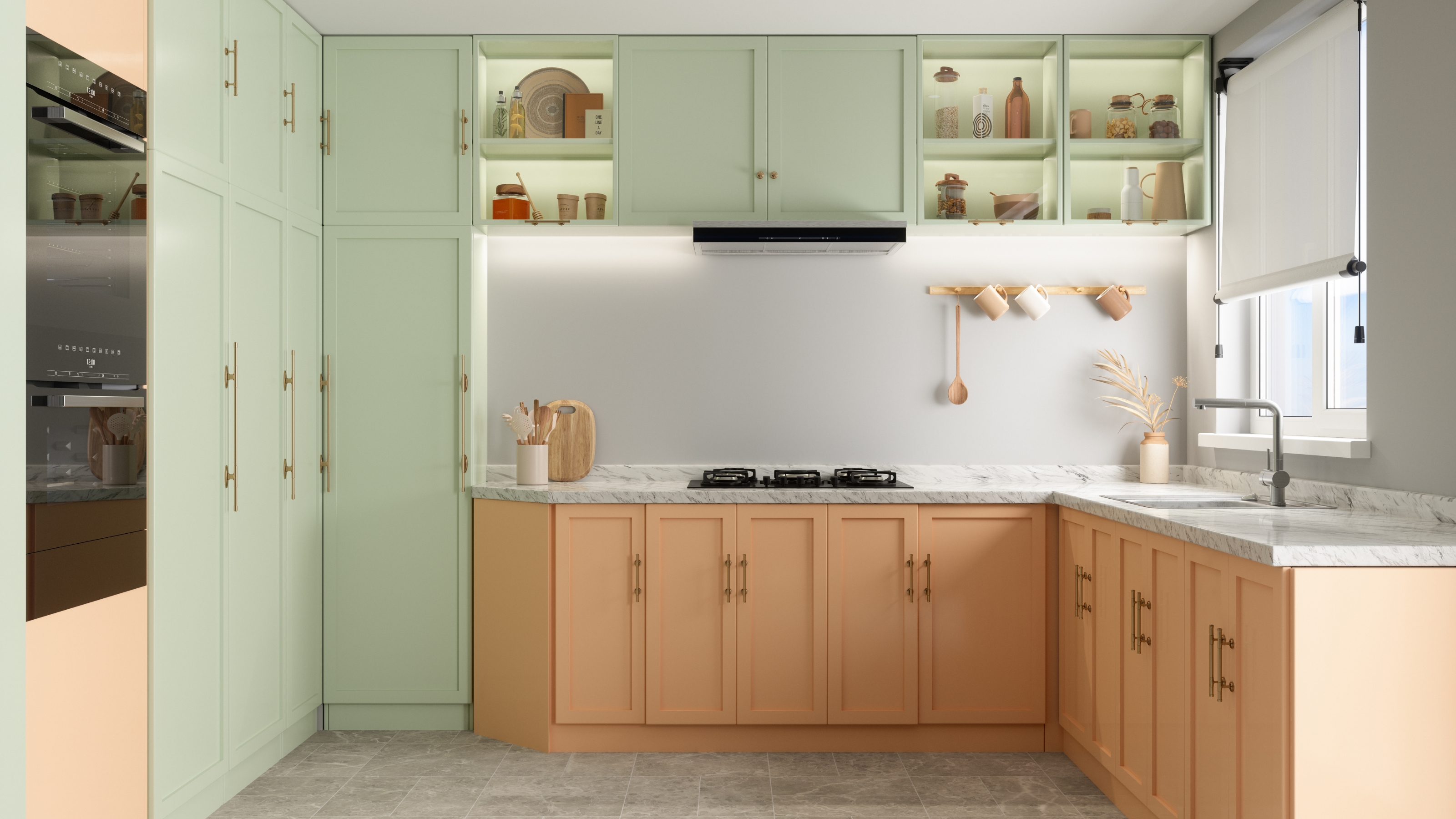
Unexpectedly, sunny yellows are introduced, specifically pale buttery forms or vibrant Zelige tiles. Marta Chrapka of Colombe explains how a strong, joyful yellow in textured Zelige tiles, complemented by wooden cabinets and pink terrazzo, transformed a kitchen to be vivid and energetic yet calming. This approach suggests that even bolder colors can be serene when balanced with textures and natural elements. Pale pink is highlighted as a gentle, calming color, providing more character than a neutral without being overpowering. Patrick O'Donnell of Farrow & Ball notes that dusky pink cabinets create tranquility, especially when paired with nuanced whites. Studio Duggan's pink kitchen, featuring contrasting dark wood cabinets and a bespoke terrazzo floor, exemplifies a modern yet warm application of the color.
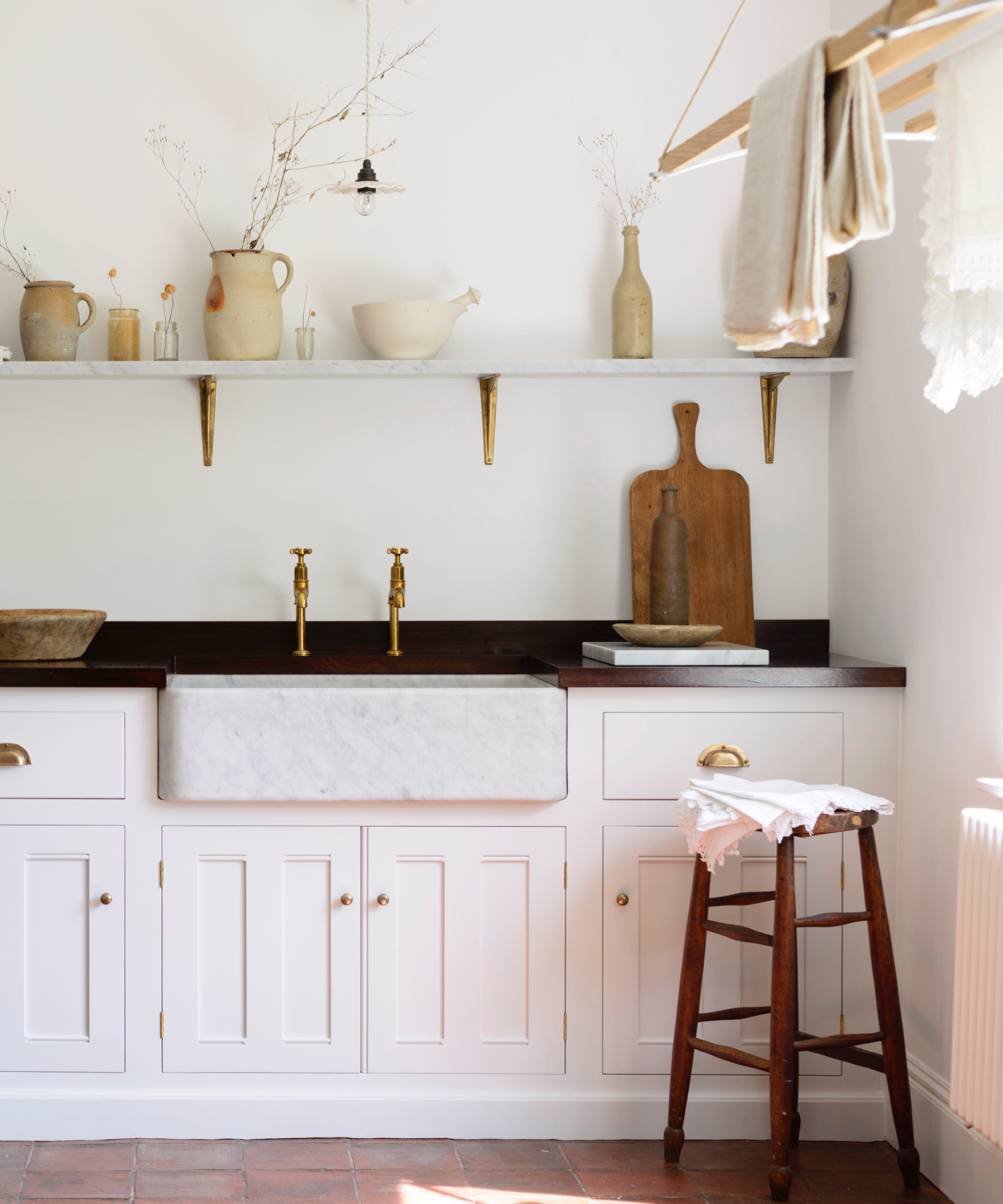
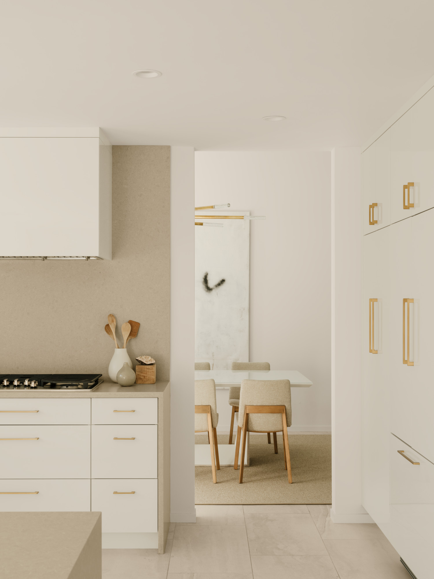
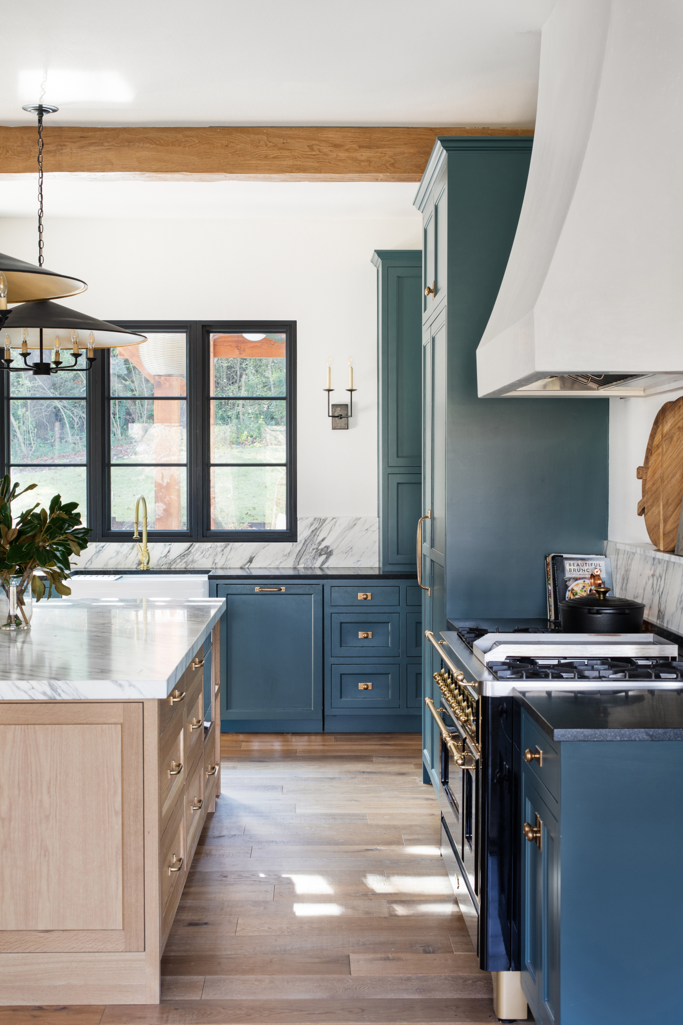
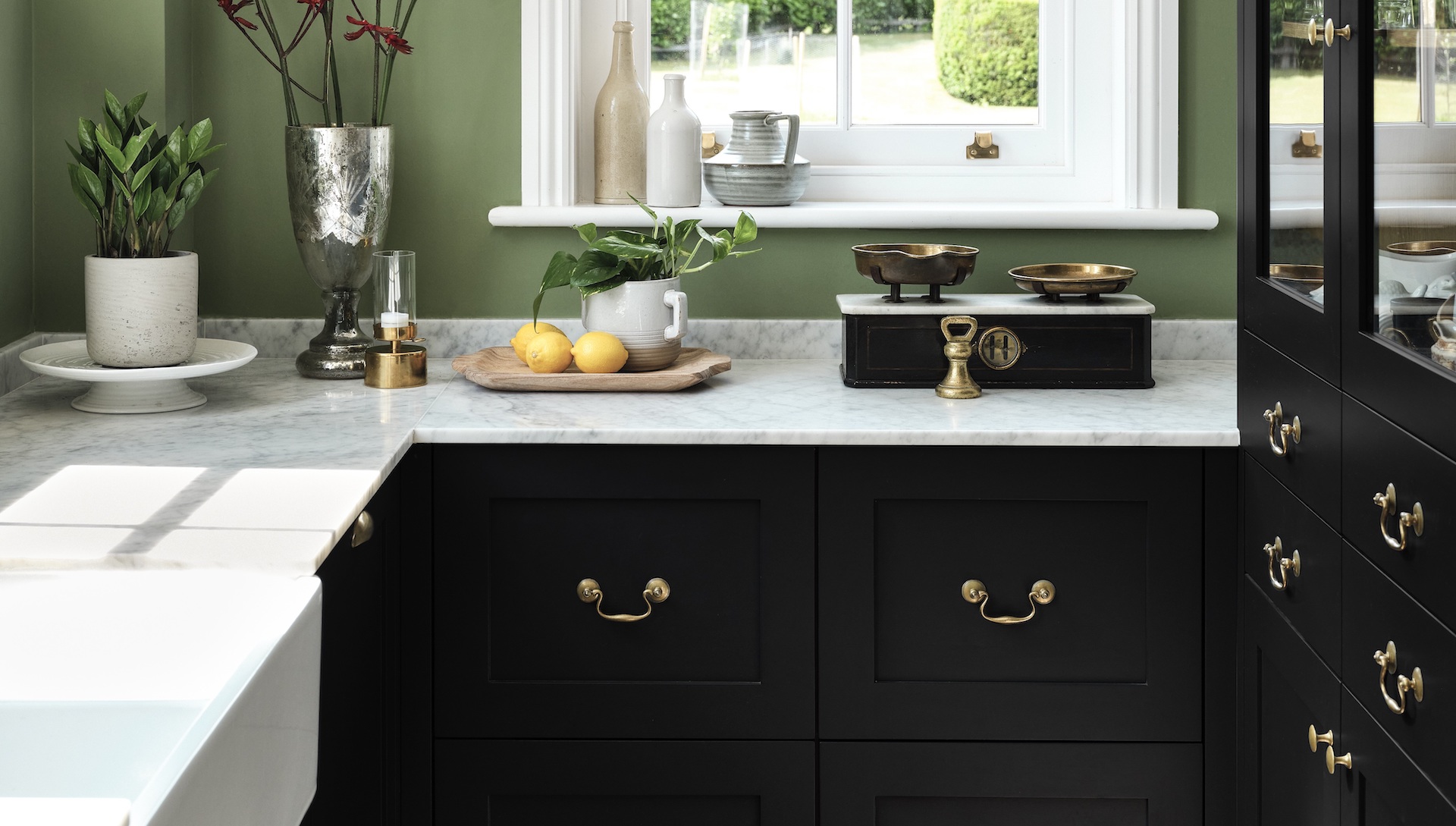
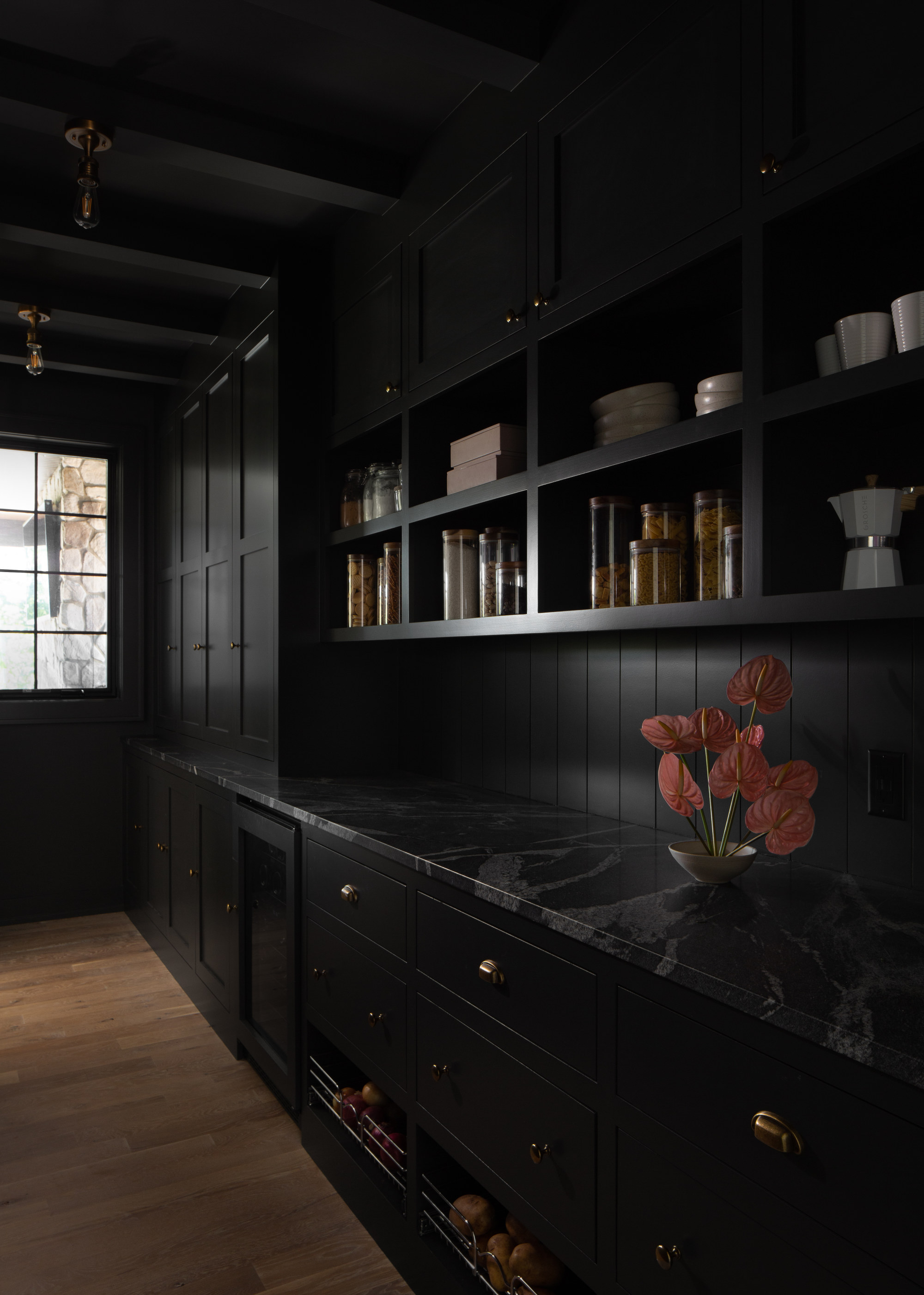
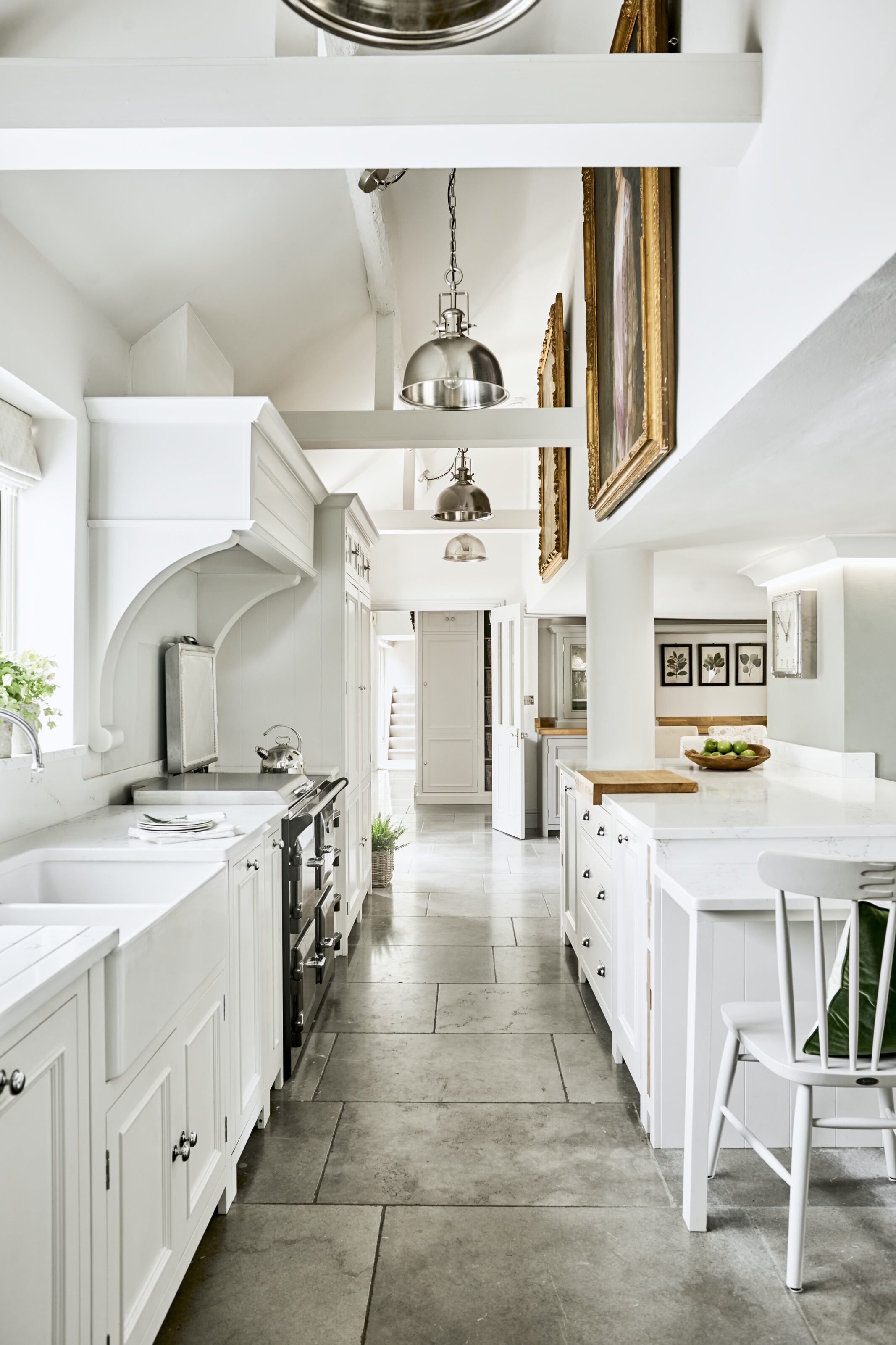
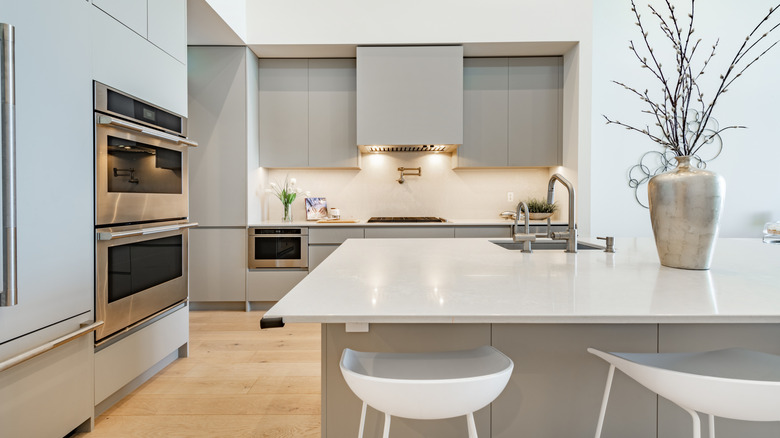
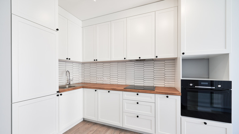
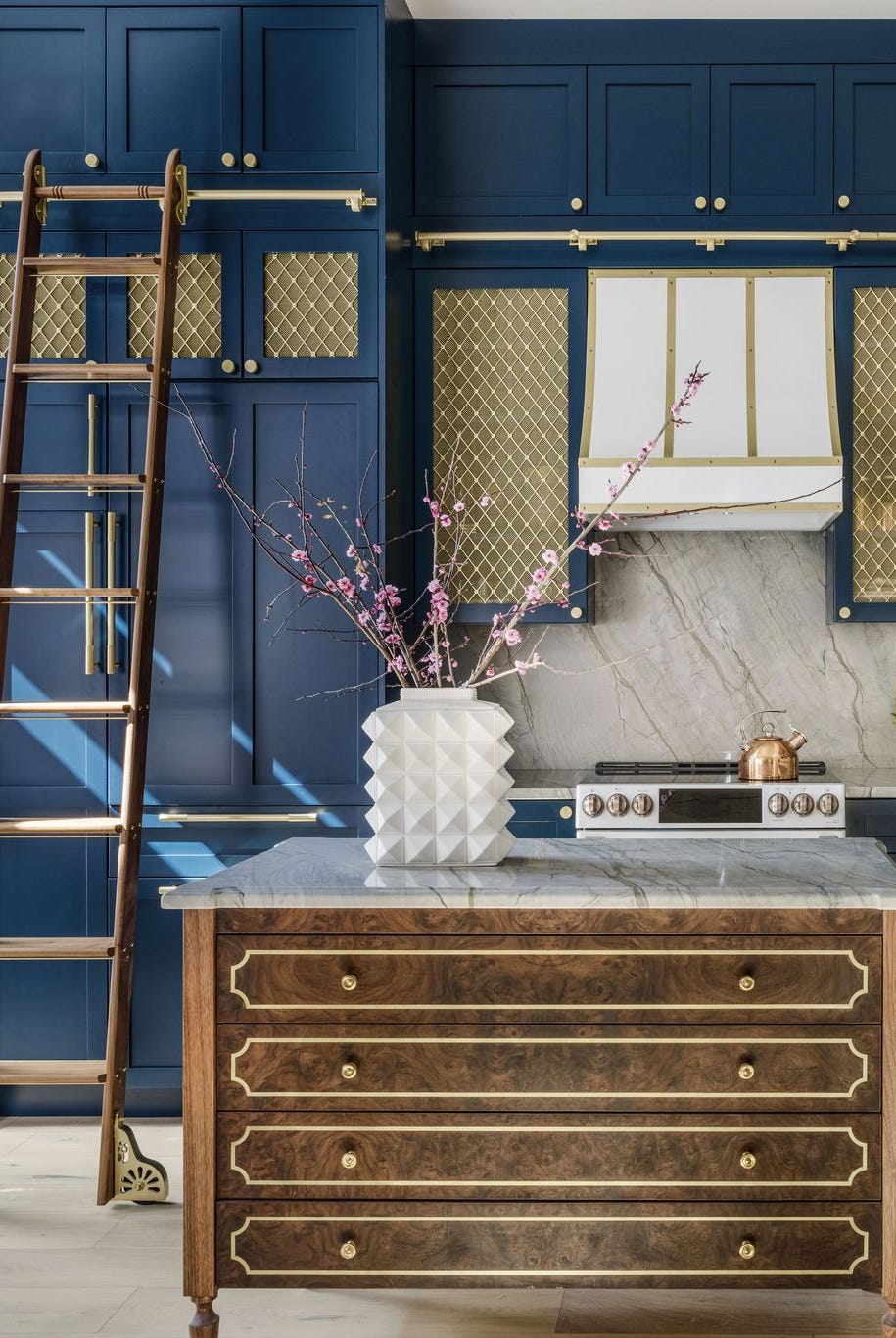
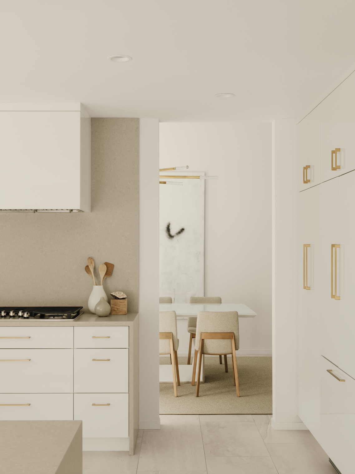
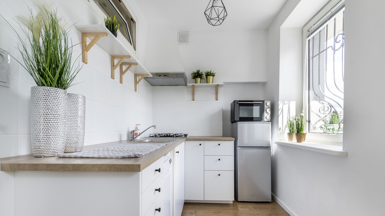
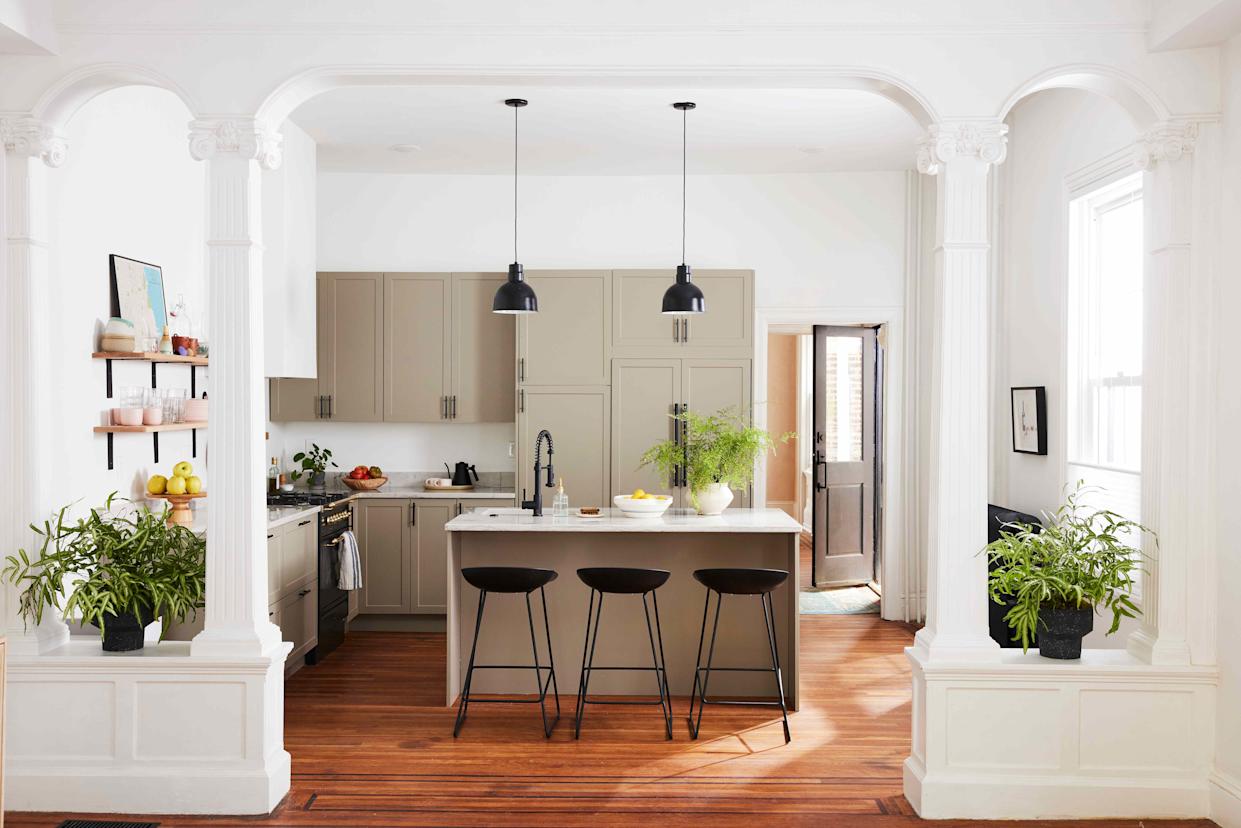
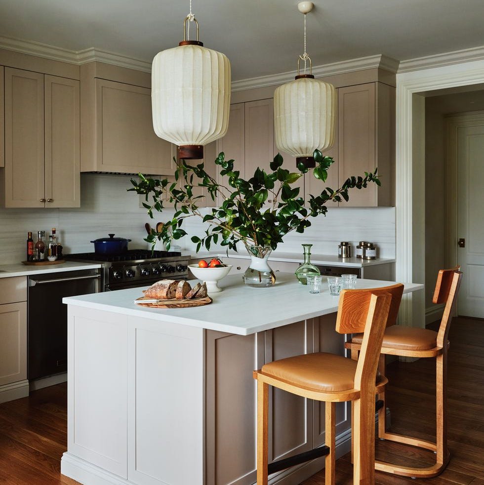
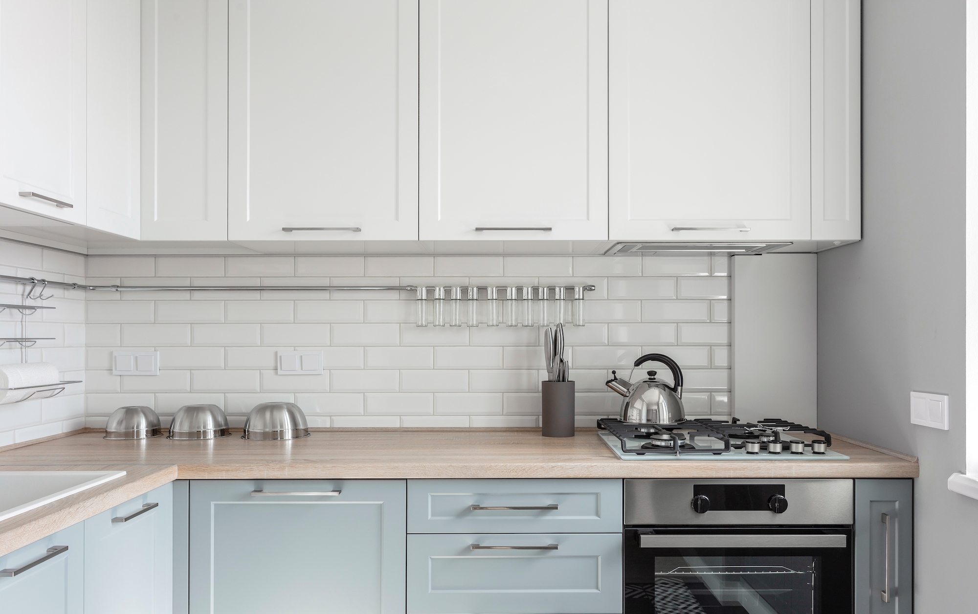
Warm white is proposed as an alternative to stark white, which can feel clinical in a small kitchen. By opting for pinkish or creamy whites, the space gains brightness and freshness while feeling more welcoming. Marta Chrapka describes using broken whites with warmer shades to soften a modernist tenement house kitchen. Finally, charcoal grey is presented as a surprisingly calming choice, provided it's a soft, deep shade rather than harsh black. The article advises pairing it with warm neutrals and wooden tones, as seen in a deVOL kitchen, to create a dramatic yet soothing effect. Patrick O'Donnell suggests dark cabinetry with an off-white for walls and woodwork to achieve a cohesive and tranquil scheme. The article concludes by emphasizing the transformative power of color in making even the busiest small kitchens feel like a haven.
#CalmingColors #SmallKitchenDesign #KitchenColorIdeas #InteriorDesign #HomeDecor #ColorPsychology #DesignTrends #KitchenRenovation #CalmingColors #SmallKitchenDesign #KitchenColorIdeas #InteriorDesign #HomeDecor #ColorPsychology #DesignTrends #KitchenRenovation
0 comment in total
 No comments yet
You may also like
6 calming kitchen colors that will make this hardworking space instantly more serene

Experts reveal the best small kitchen color ideas to maximize compact spaces

The 6 Best Cabinet Colors To Make A Small Kitchen Feel More Spacious
8 Calming Colors to Paint Your Living Room—and Make the Space More Relaxing

The 6 relaxing kitchen colors you should be using for calming schemes, according to designers
Cooking in a Shoebox-Sized Kitchen? 9 Paint Colors to Open Up the Room

5 Cabinet Colors That Instantly Make Small Kitchens Look Bigger

70 Genius Ideas to Make Your Small Kitchen Feel Bigger Than It Actually Is

8 colorful small kitchen ideas for a fun and playful look

We Asked Designers What Color to Paint a Small Kitchen to Make it Look Bigger—And We're Obsessed

8 small kitchen Feng Shui tips for all the good vibes

10 kitchen cabinet colors to make a small space look bigger
The Small Kitchen Paint Colors Designers Swear By for Even the Tiniest Spaces
The 5 Golden Rules to Help Choose a Color for a Small Kitchen That Designers Swear by
These Colors Will Make Your Kitchen Look Bigger, According to Designers
10 Colorful Kitchens That Buck The All-White Trend

These Small Kitchen Paint Color Ideas Have Major Big Chef Energy
How to make a kitchen more relaxing – 12 designer tips to create a zen-like space
5 of the best feng shui kitchen colors for a relaxing space according to experts
16 Calming Paint Colors That Will Make Your Home a More Restful Place