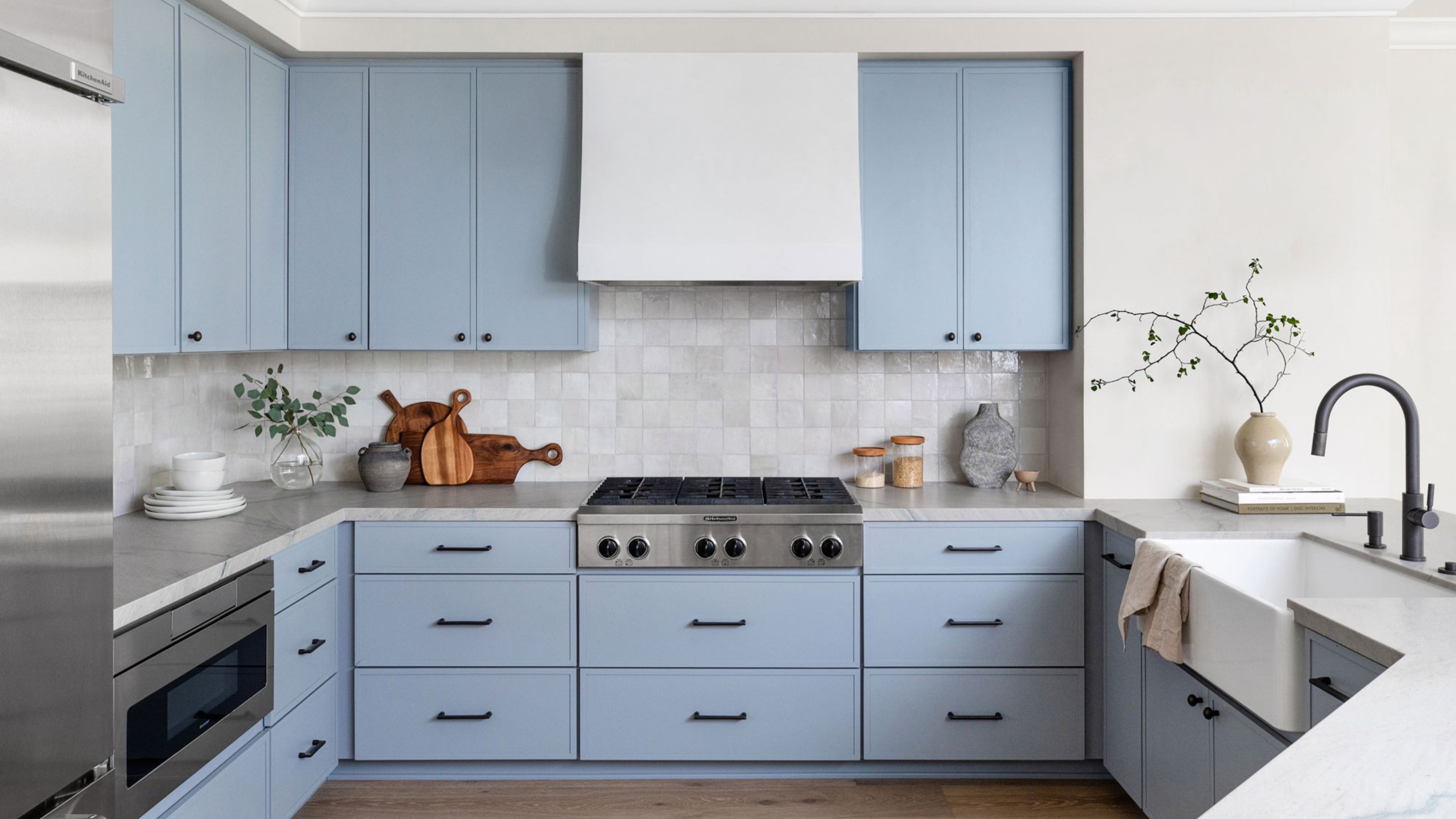
1/7
We Asked Designers: What's the Best Light Blue Paint Color? Here's 6 Shades They Swear By
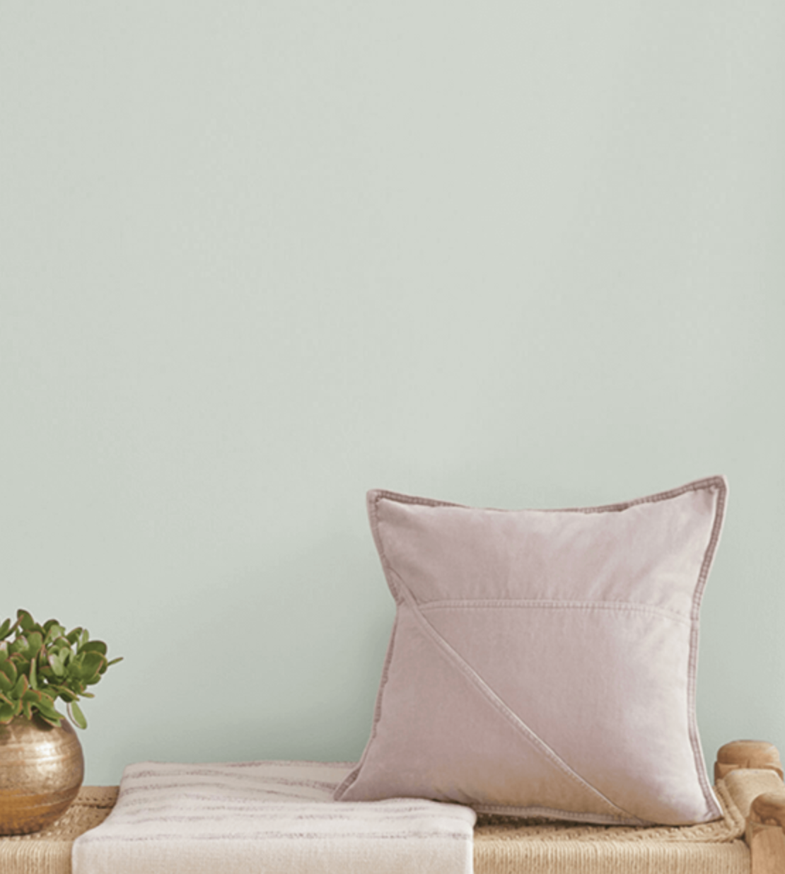
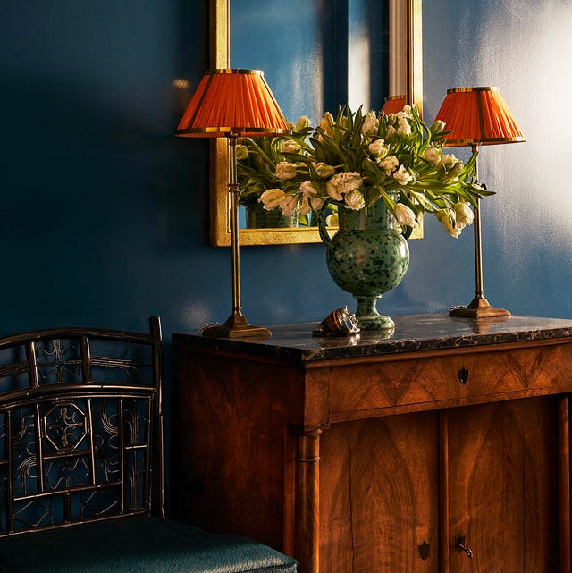
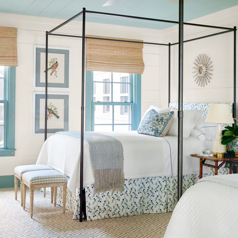
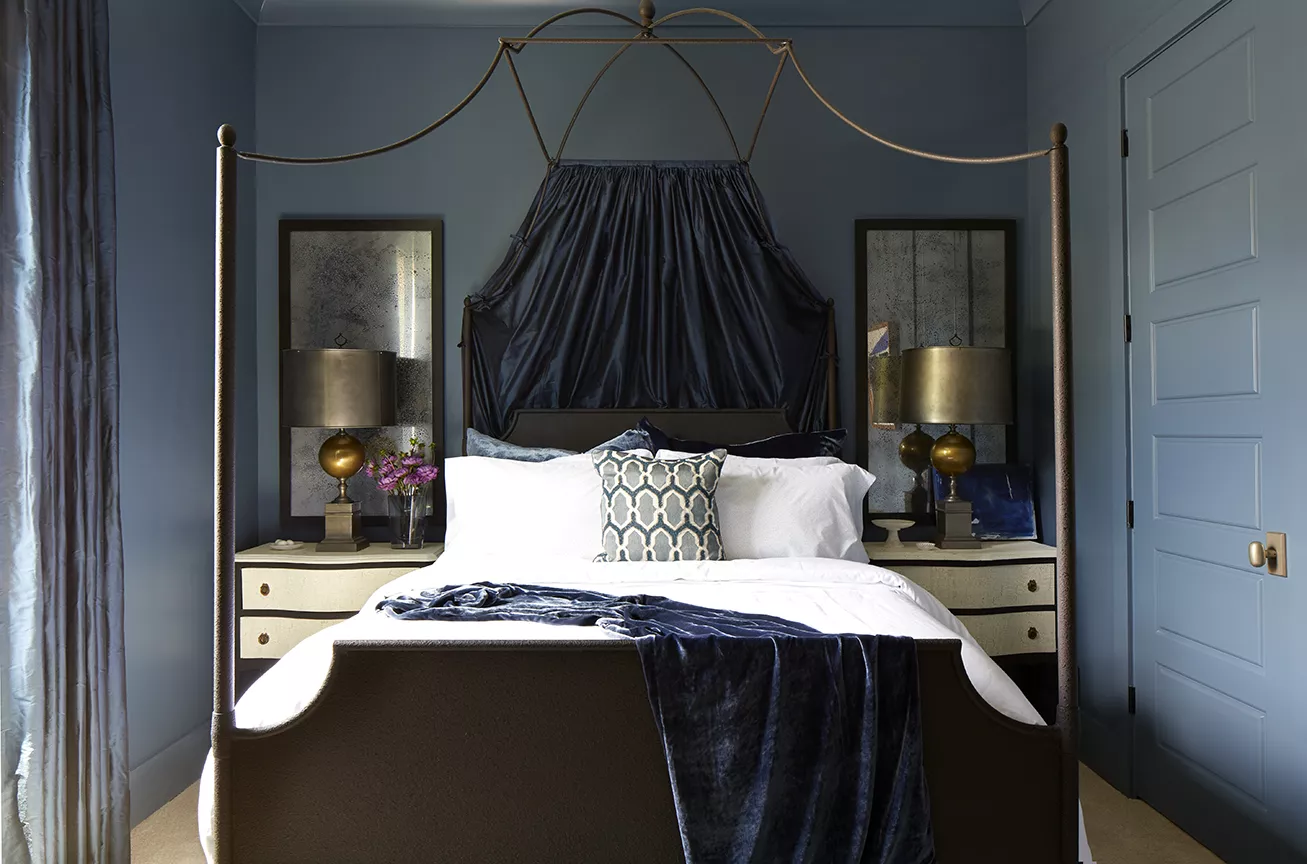
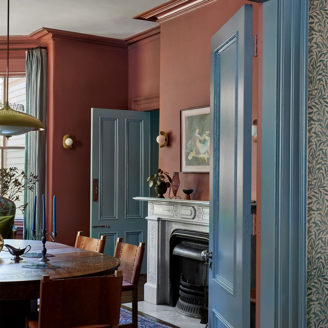
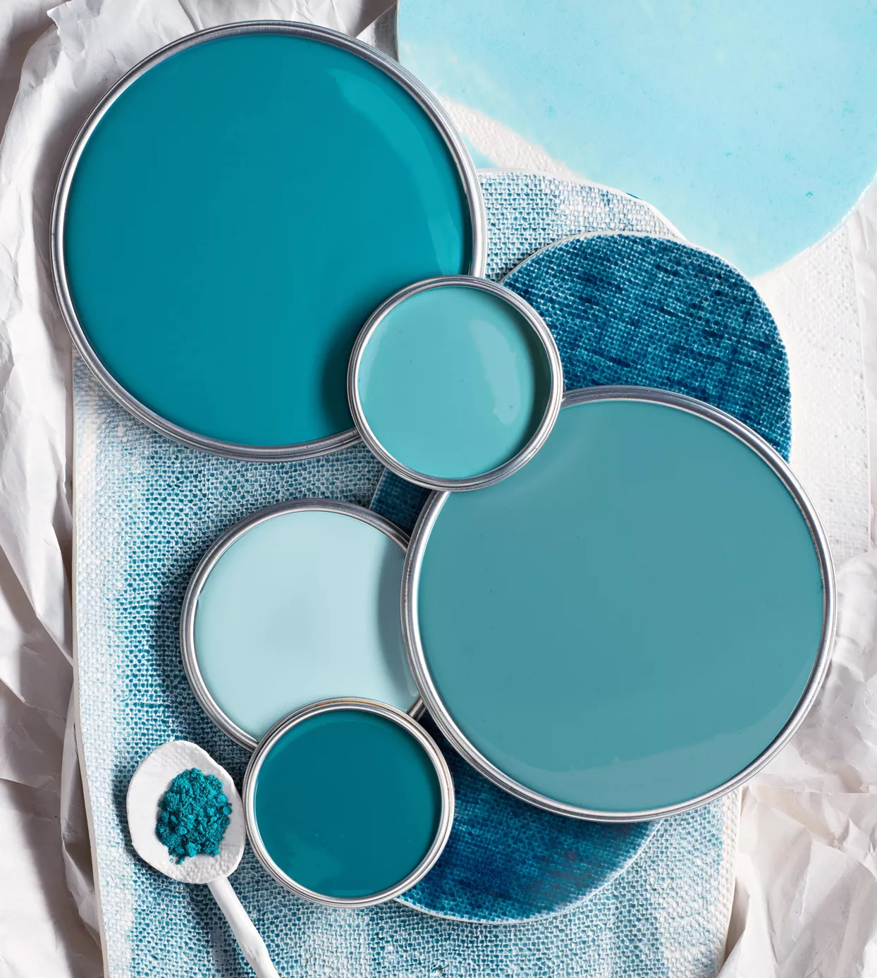
Light blue paint colors offer a versatile transition from grays and neutrals, introducing subtle color without overwhelming a room. These shades provide a sense of tranquility and airiness, making spaces feel more open. When selecting a light blue, consider the room's size, natural light exposure, existing color schemes, and the desired mood. Different light qualities—bright, warm, or cool—influence how a blue paint appears, necessitating attention to undertones. It is advisable to test paint swatches on walls to observe their appearance throughout the day under varying light conditions and to consider how the blue will interact with trim and ceiling colors.
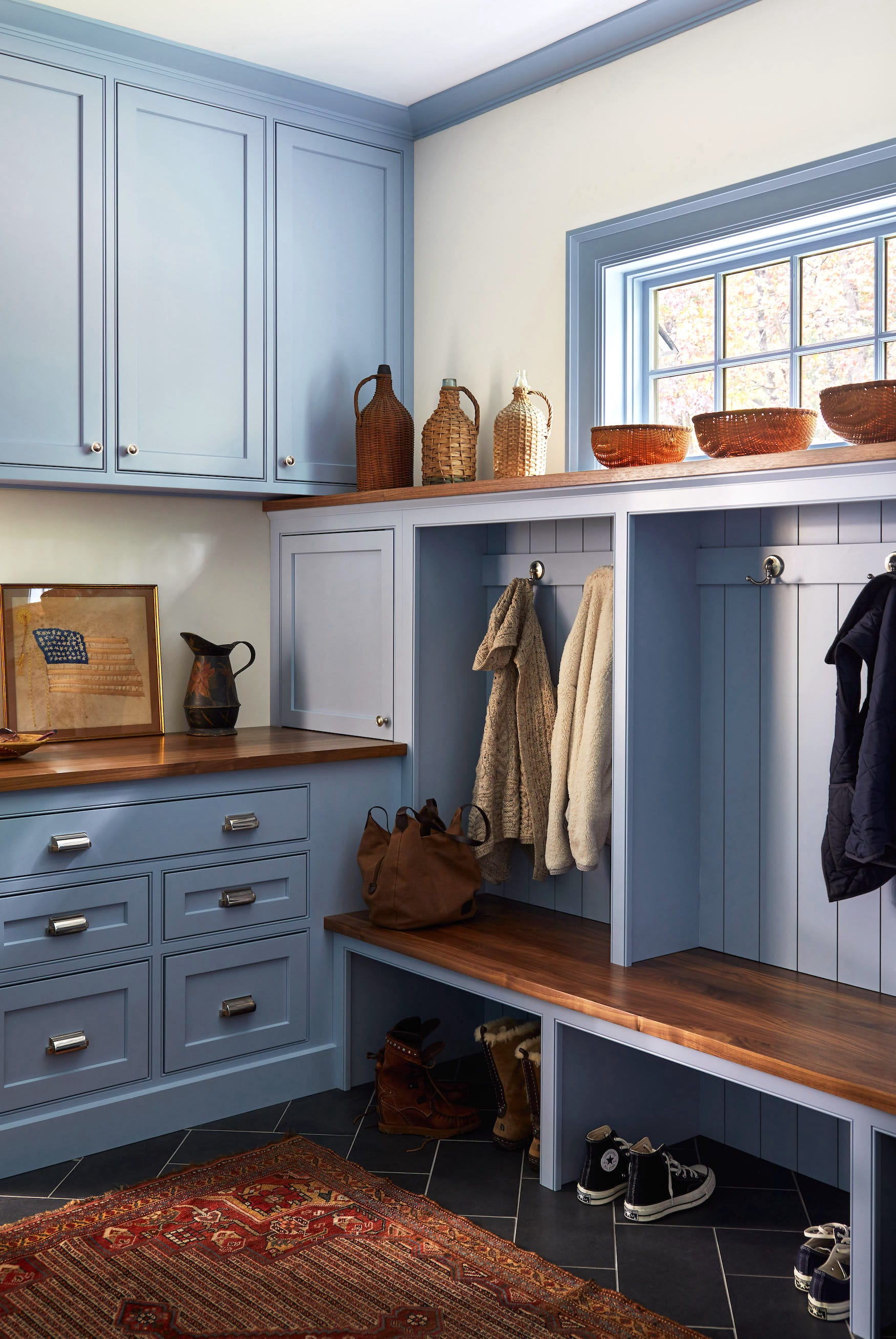
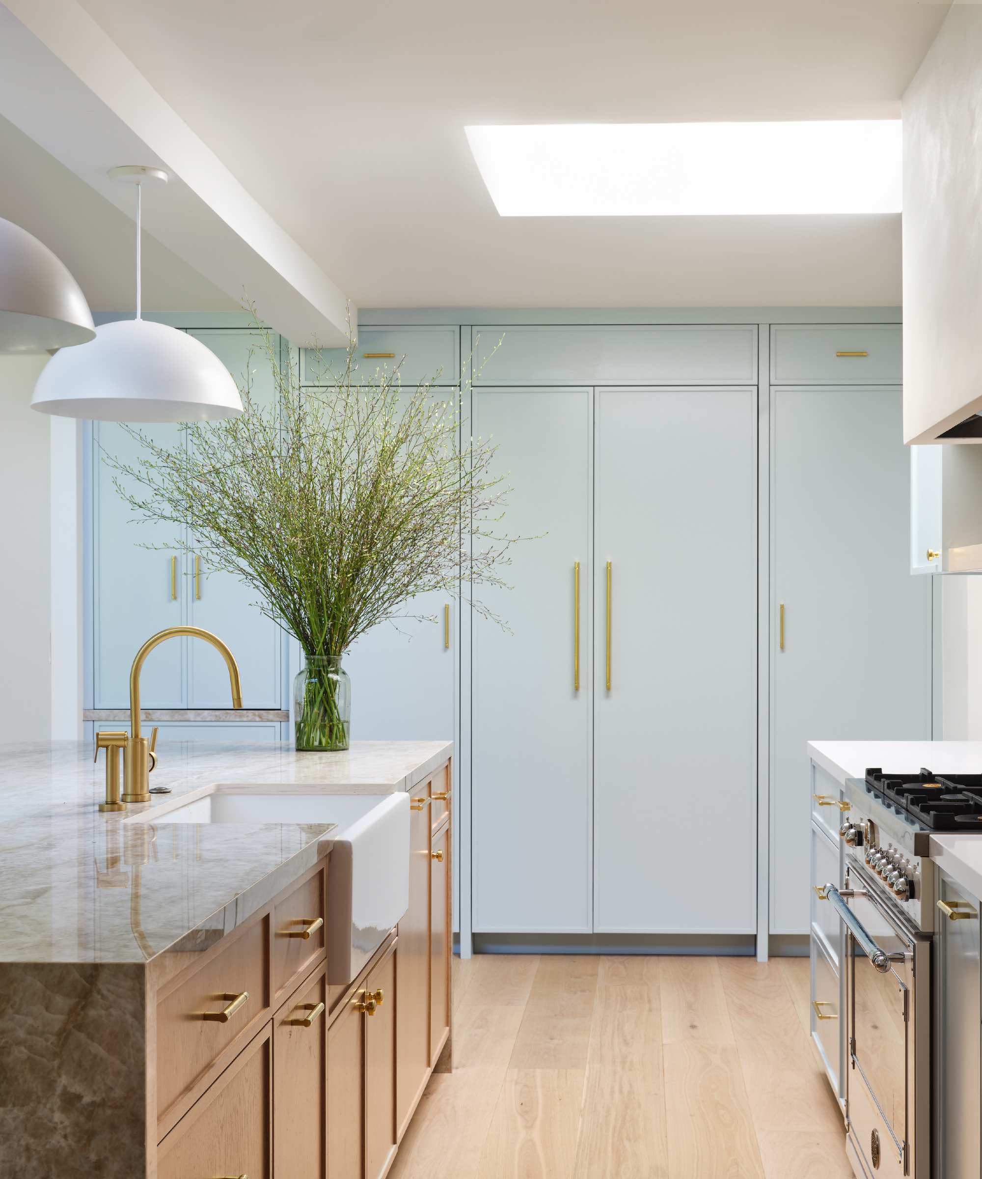
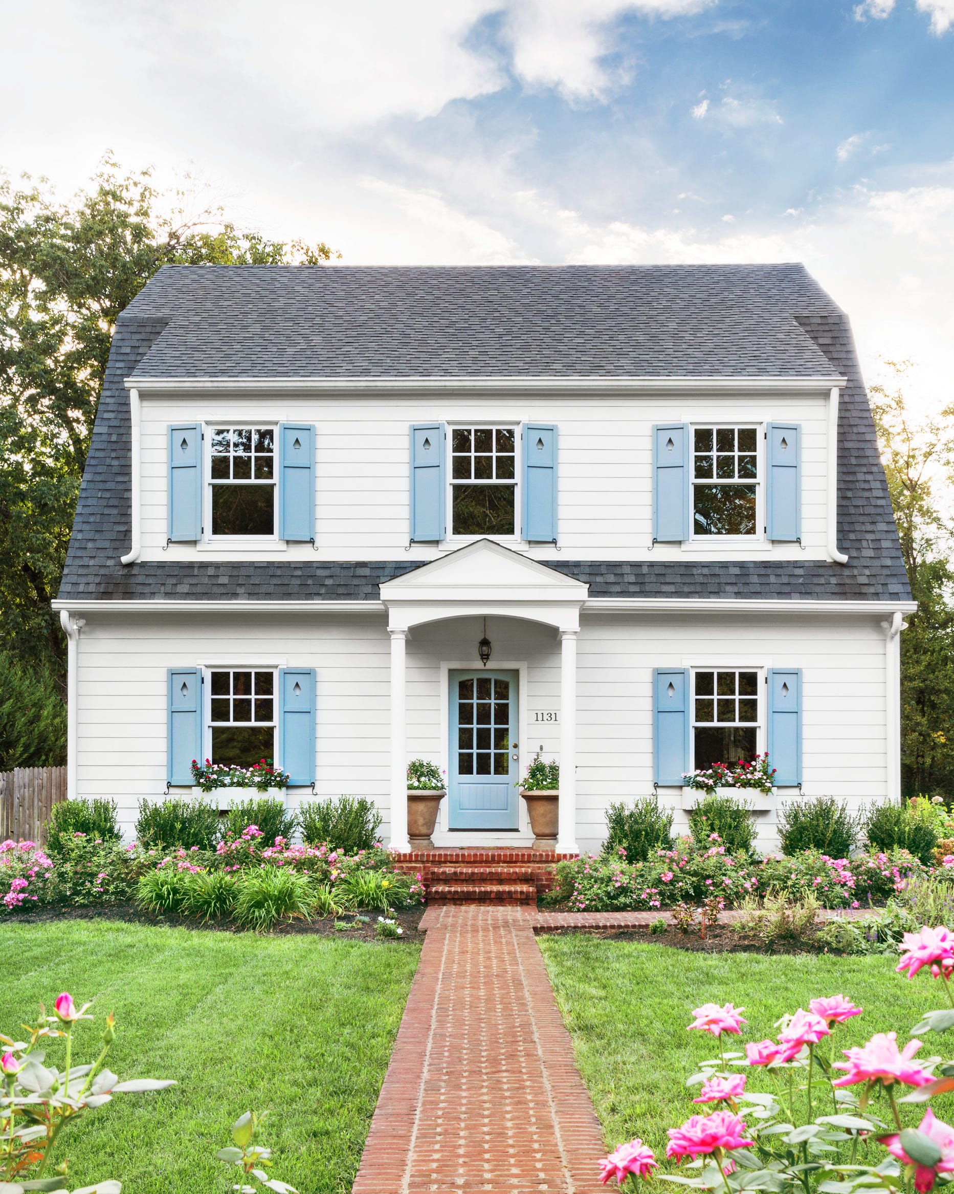
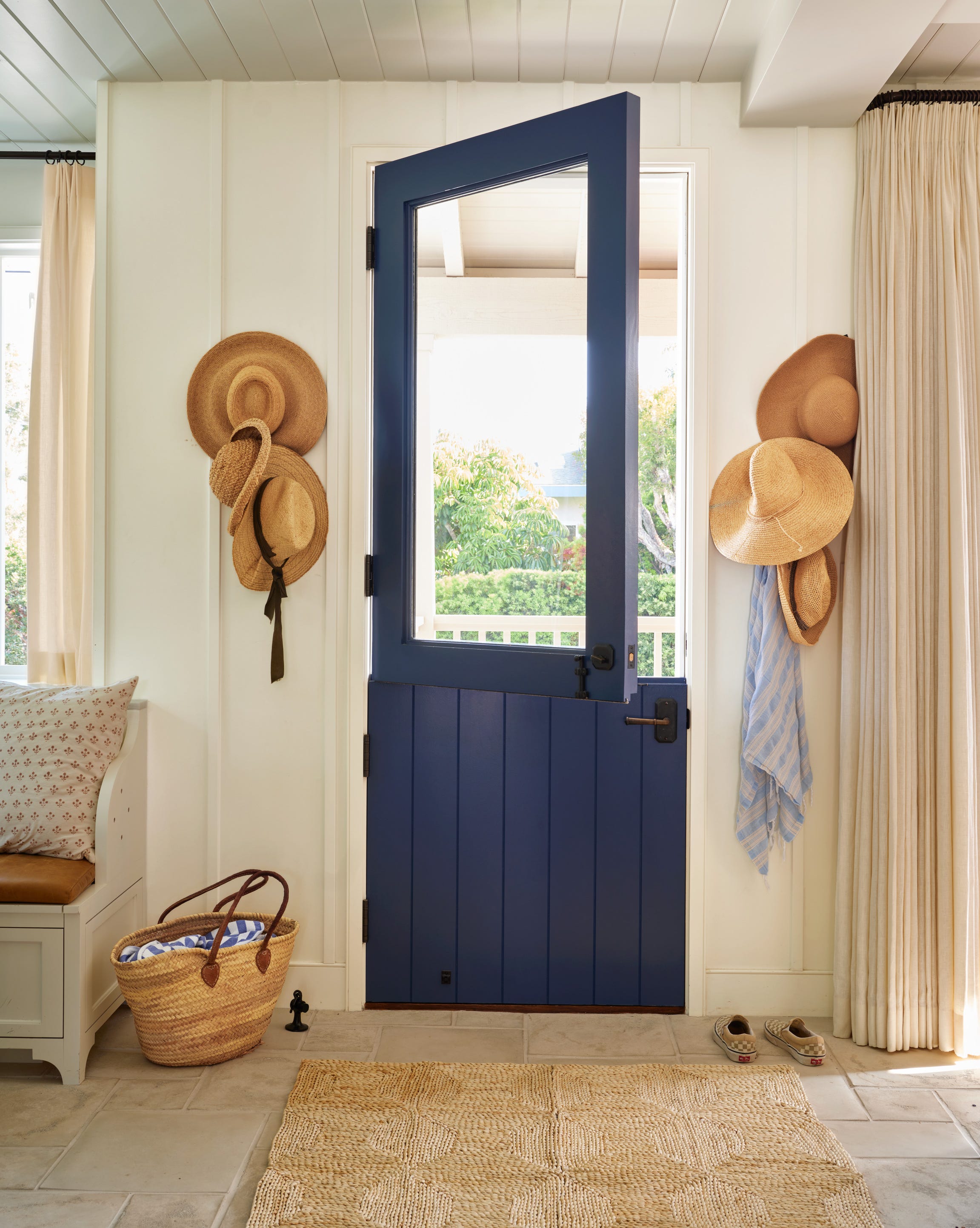
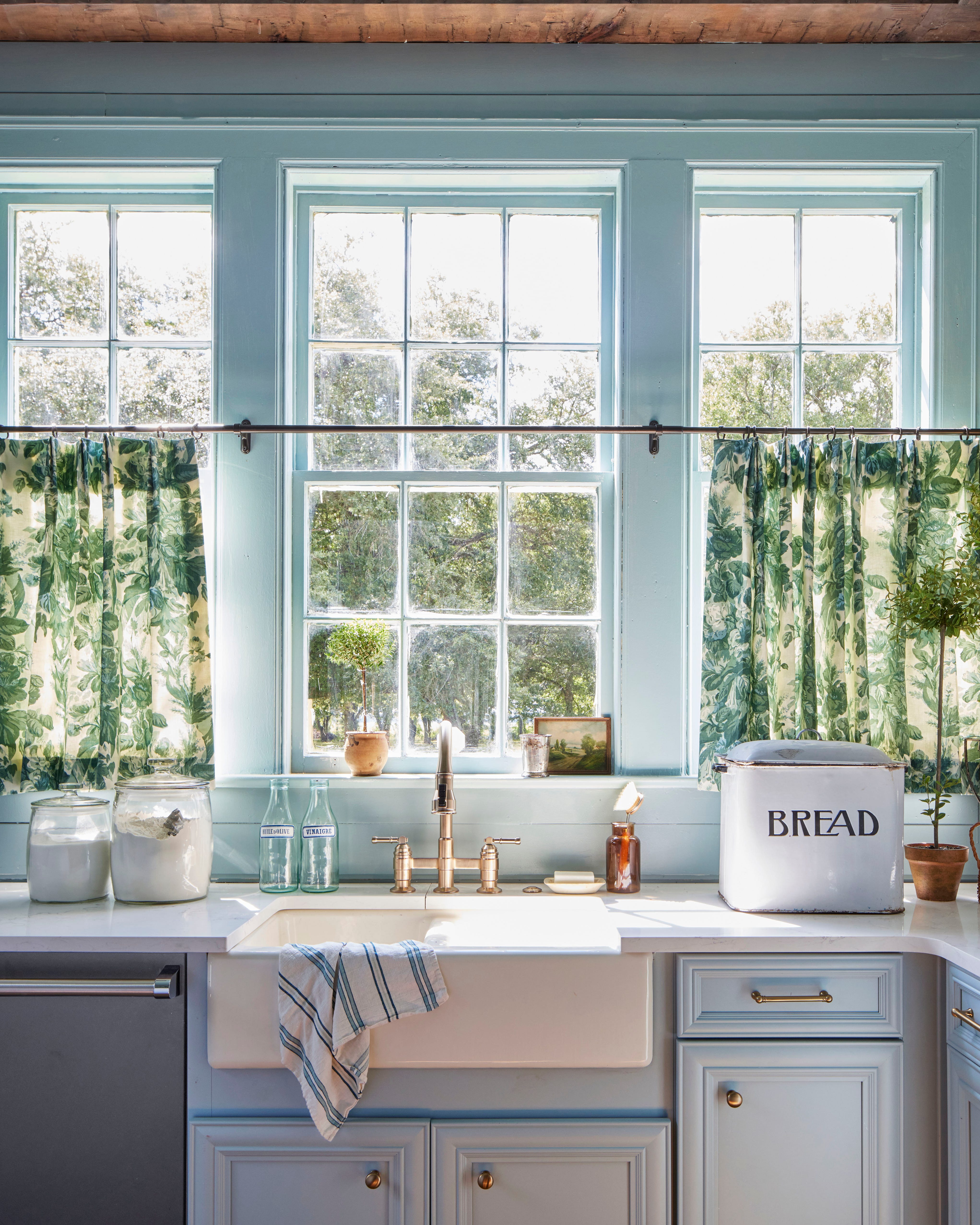
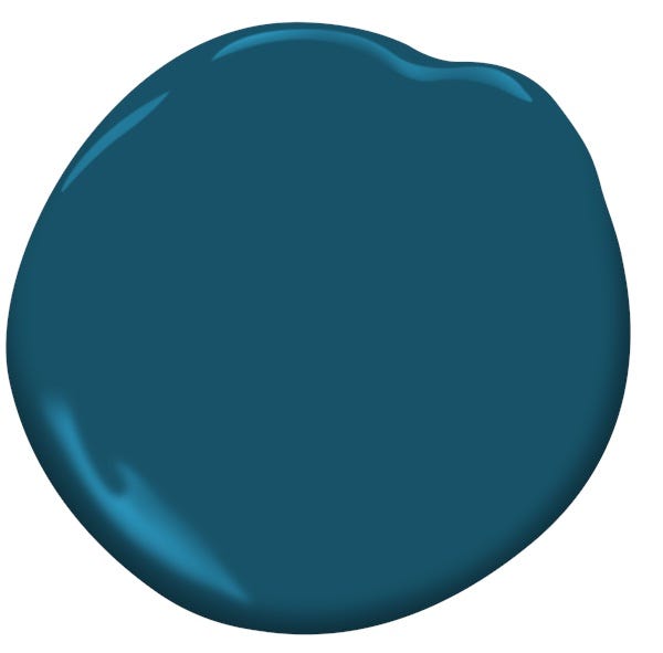
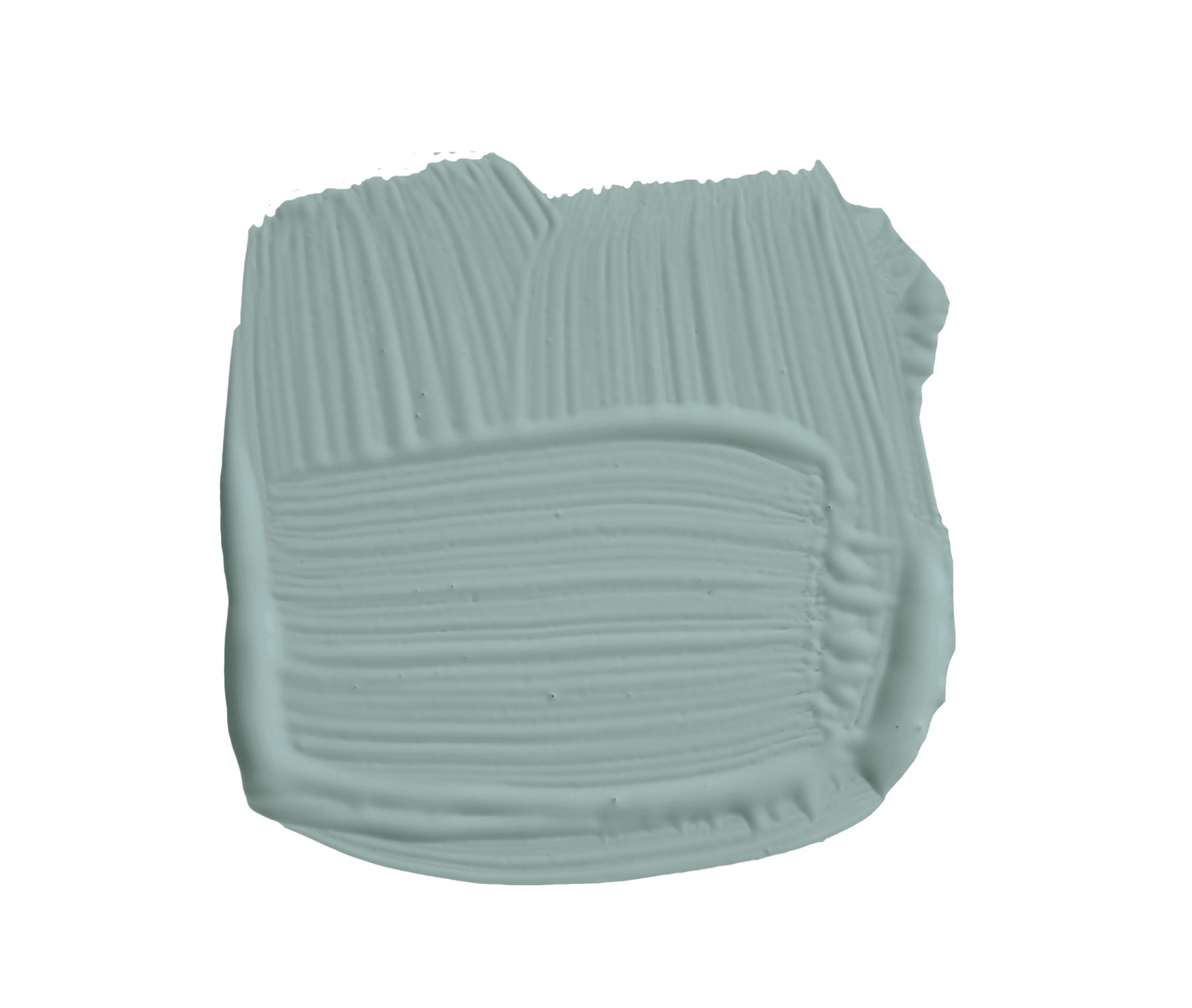
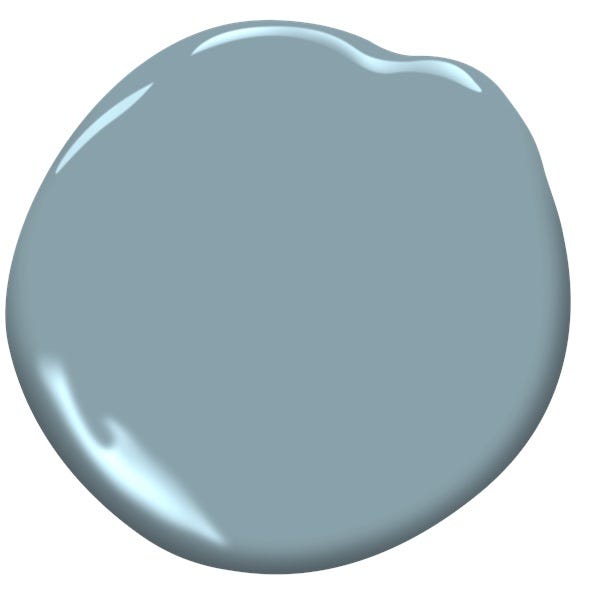
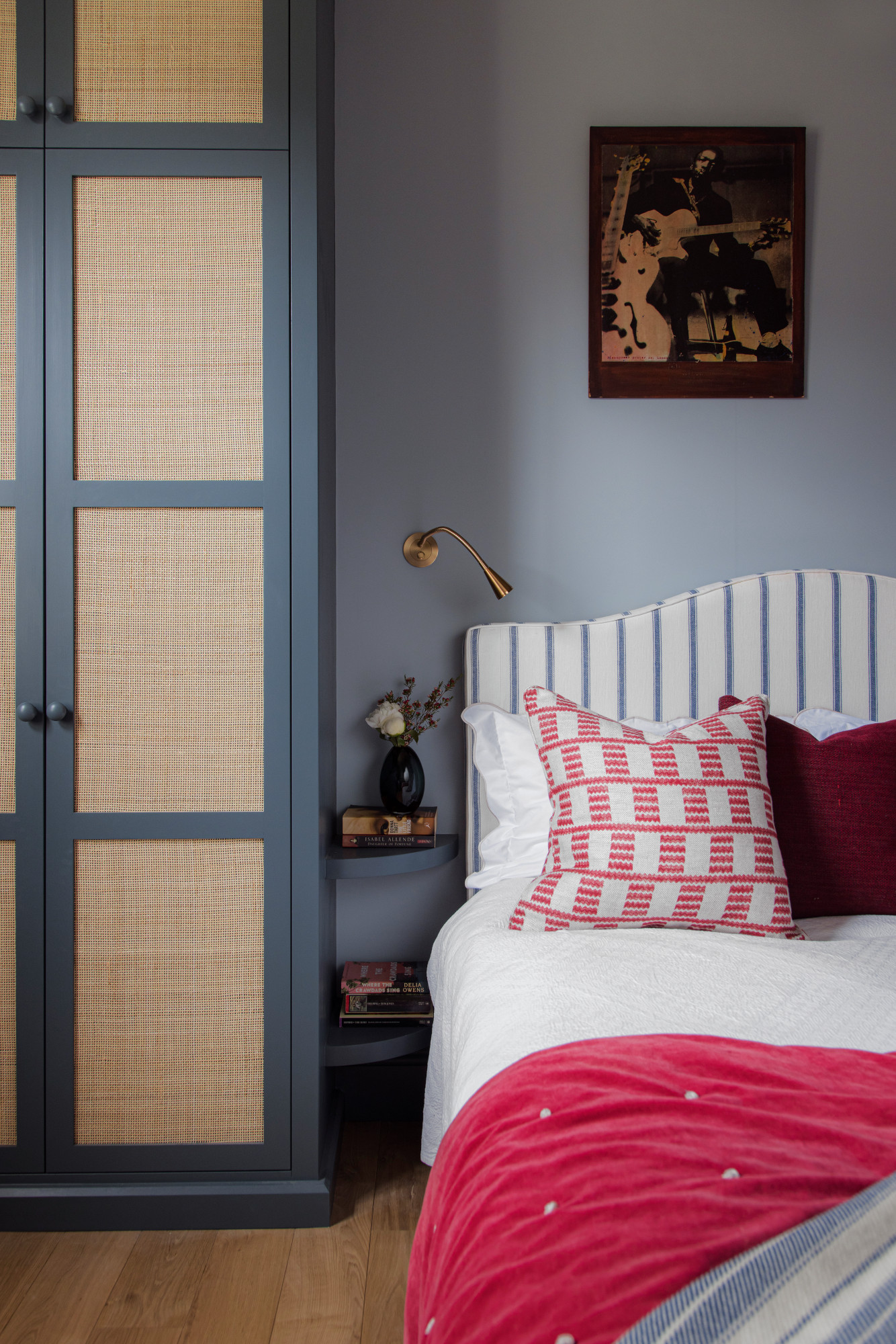
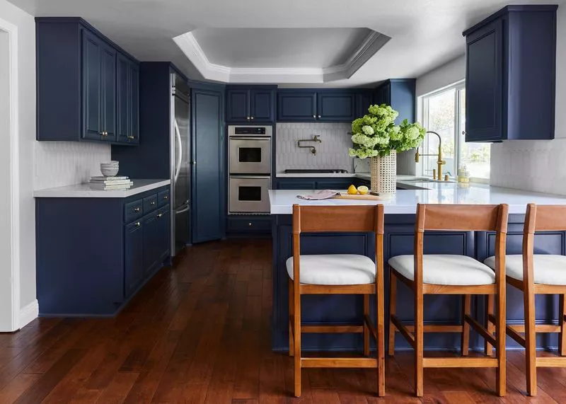
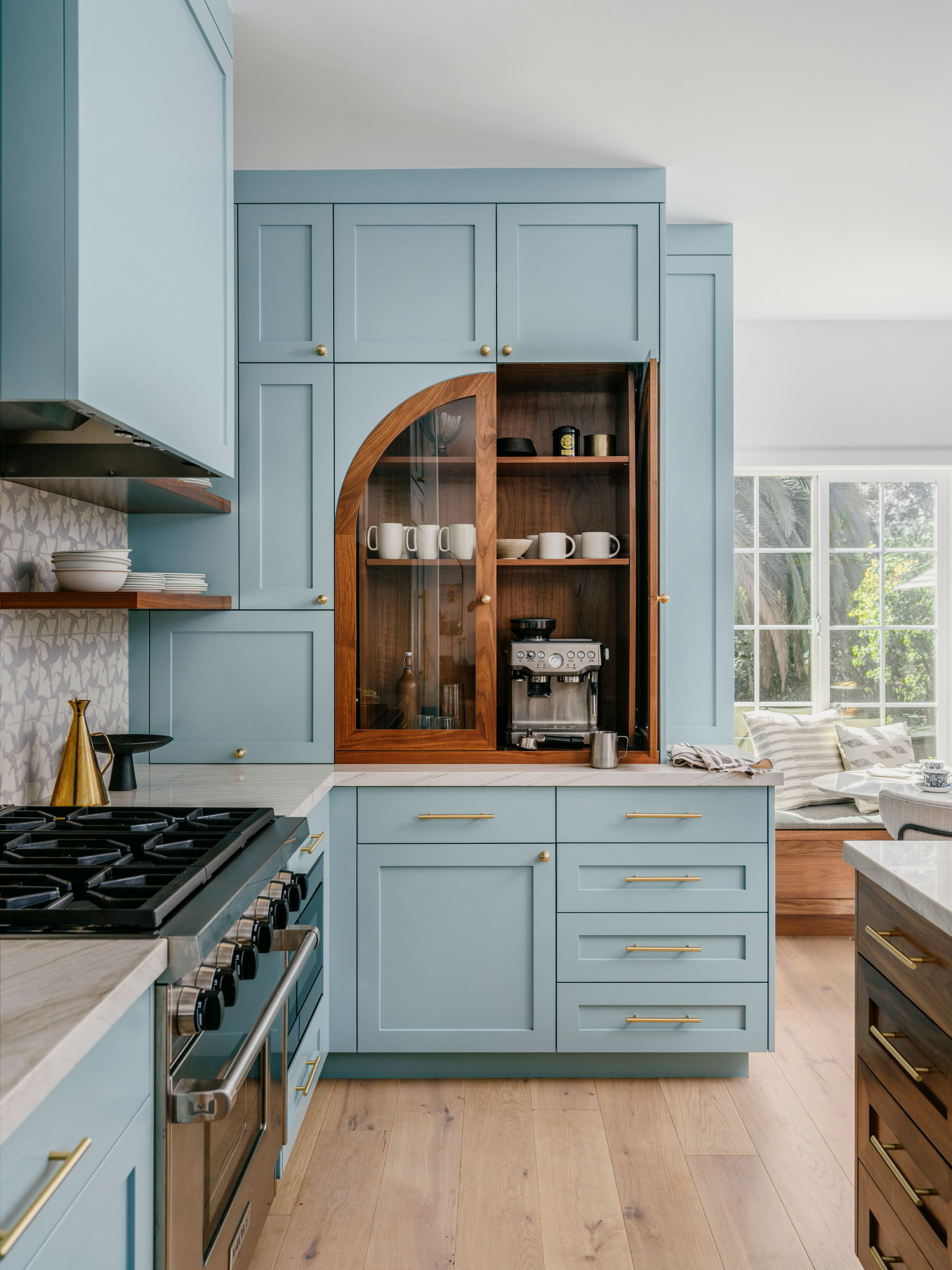
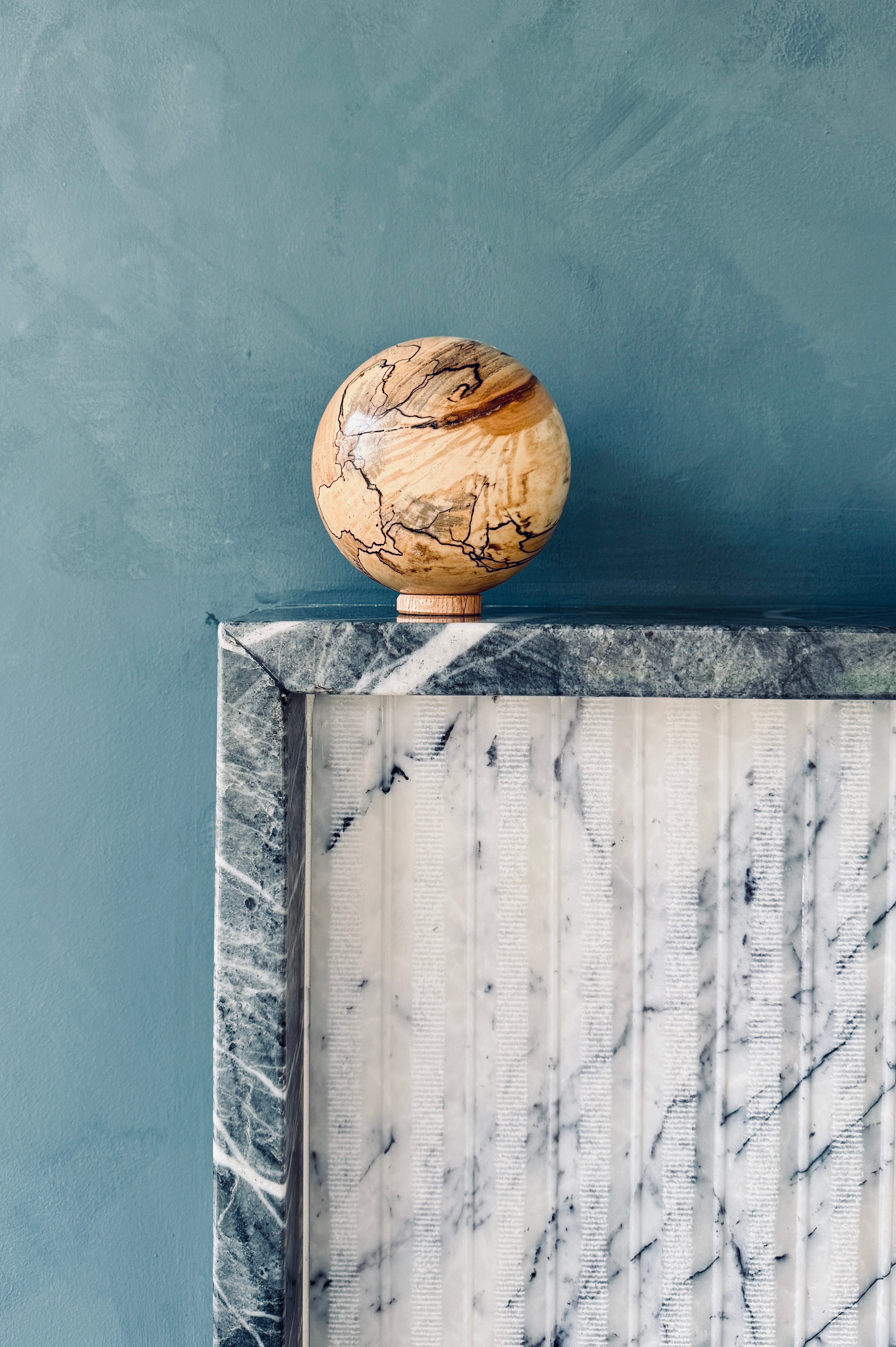
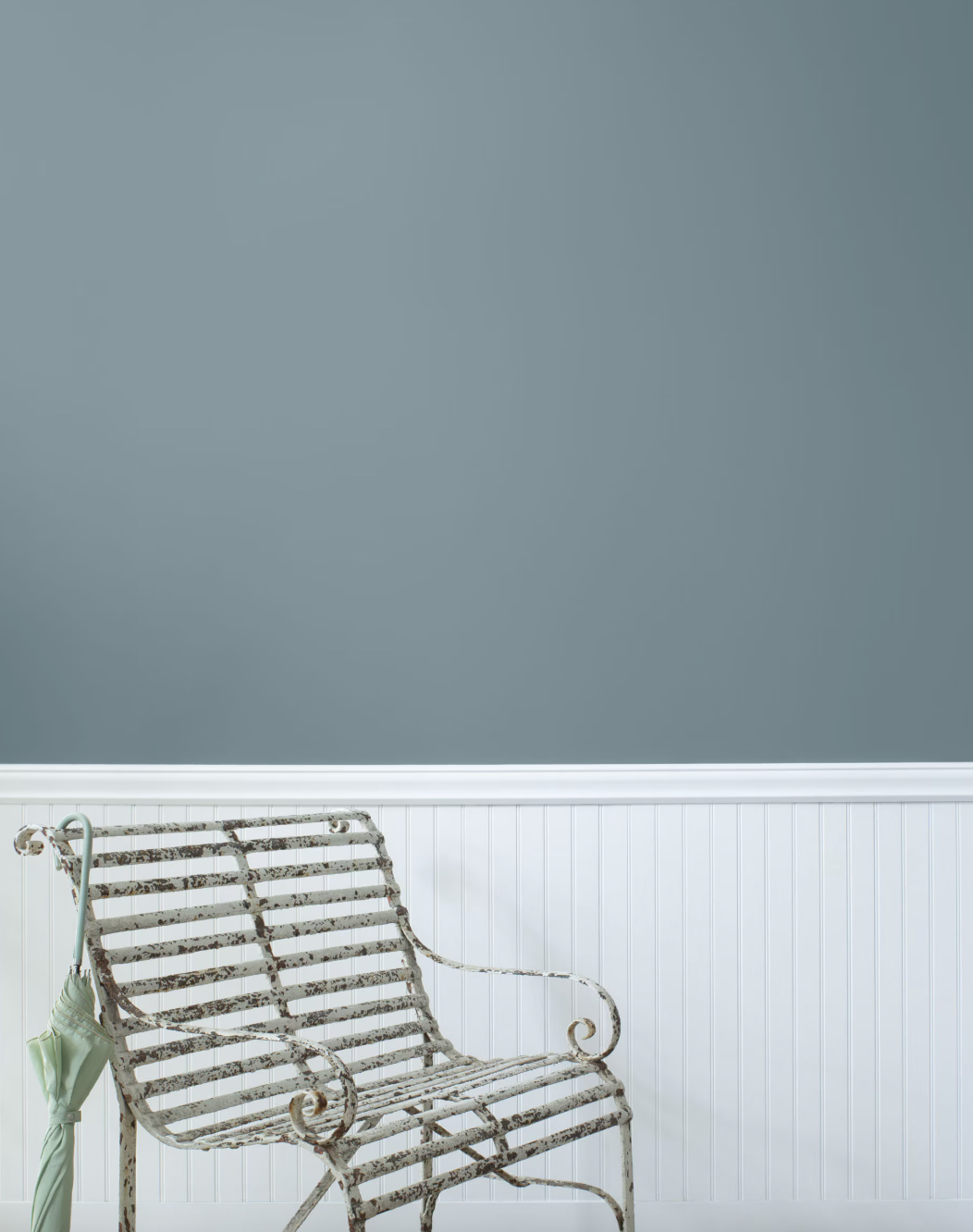
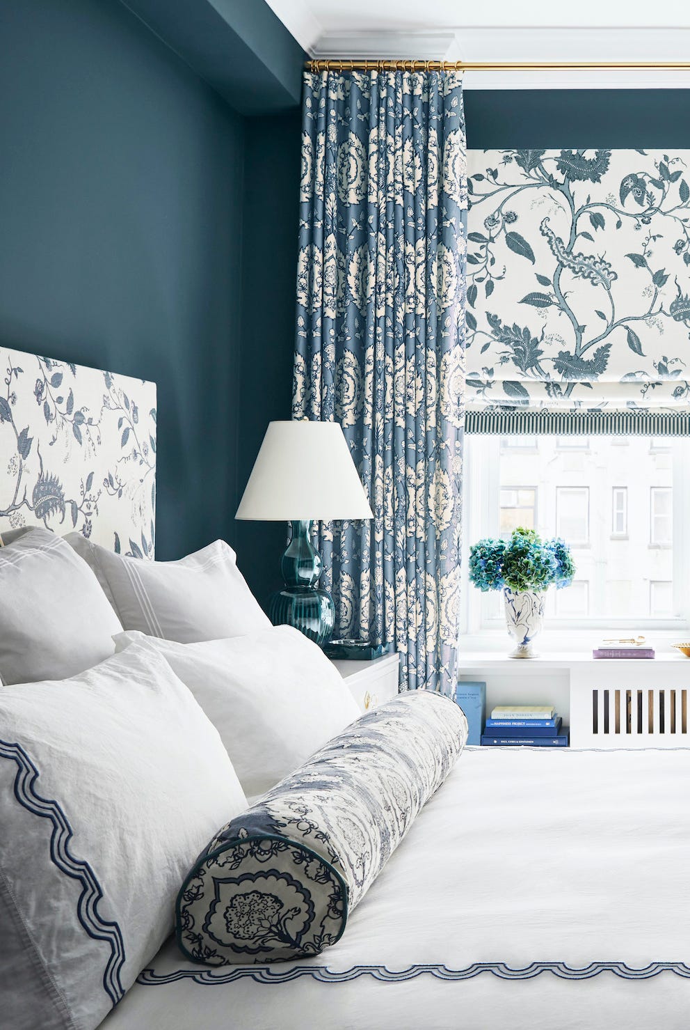
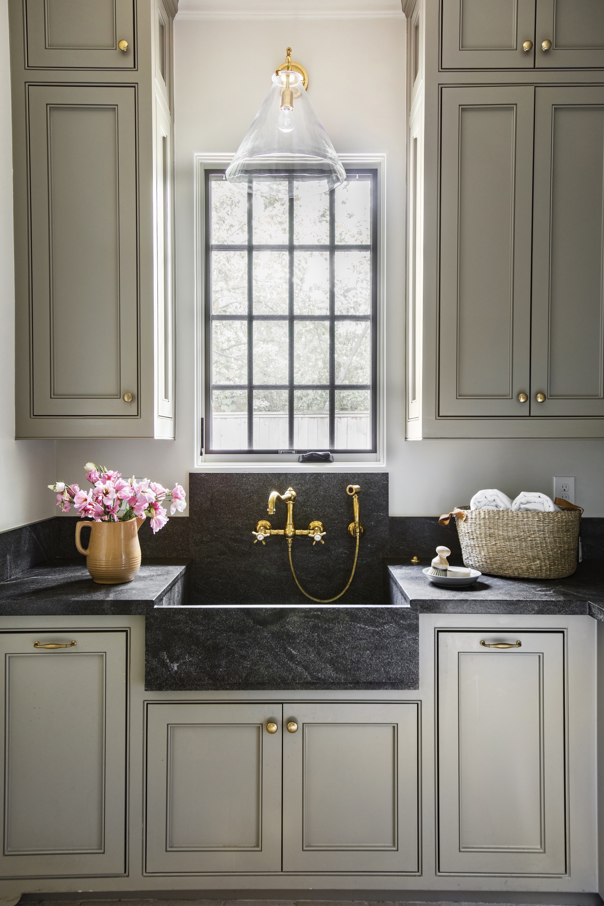
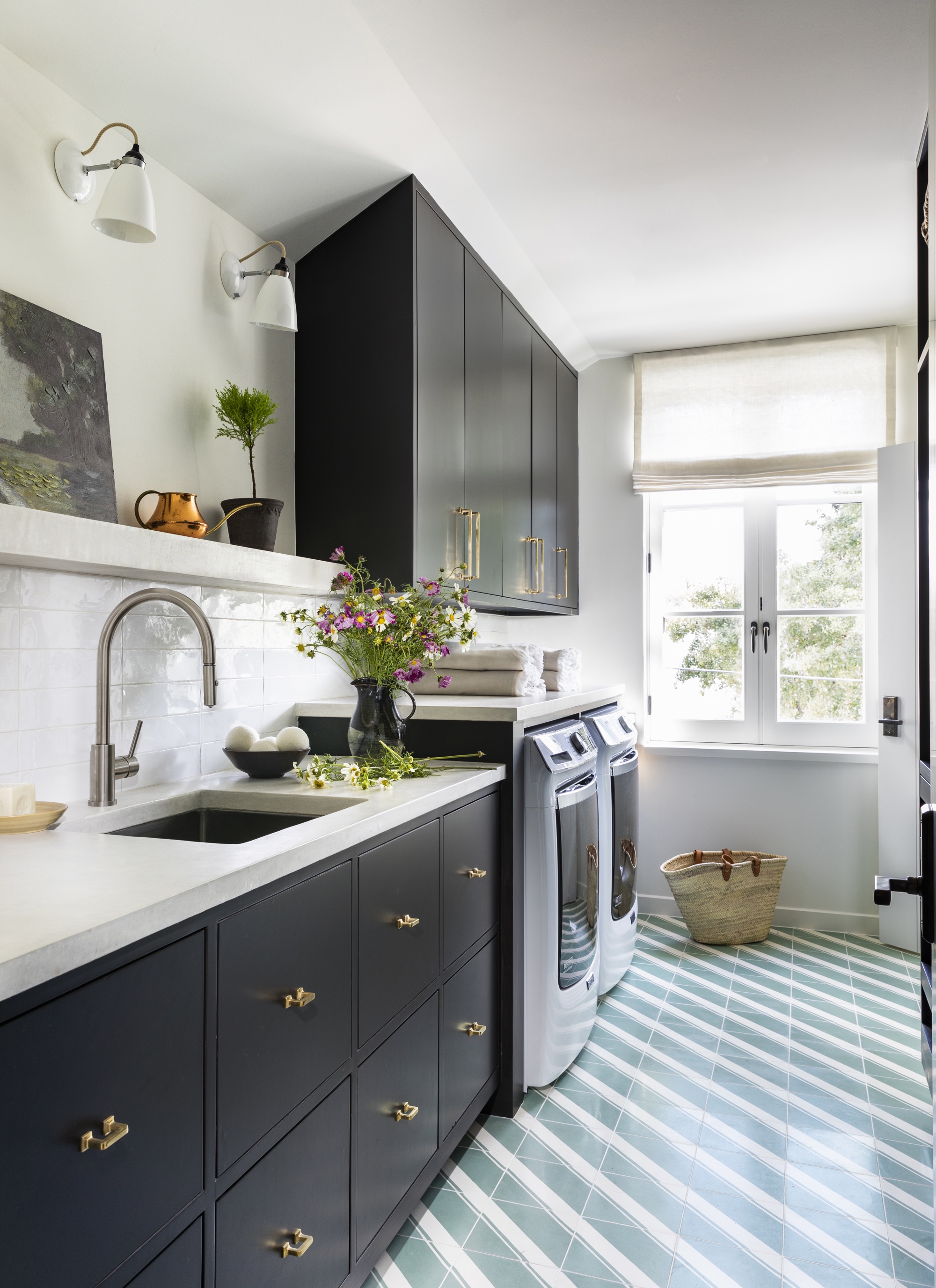
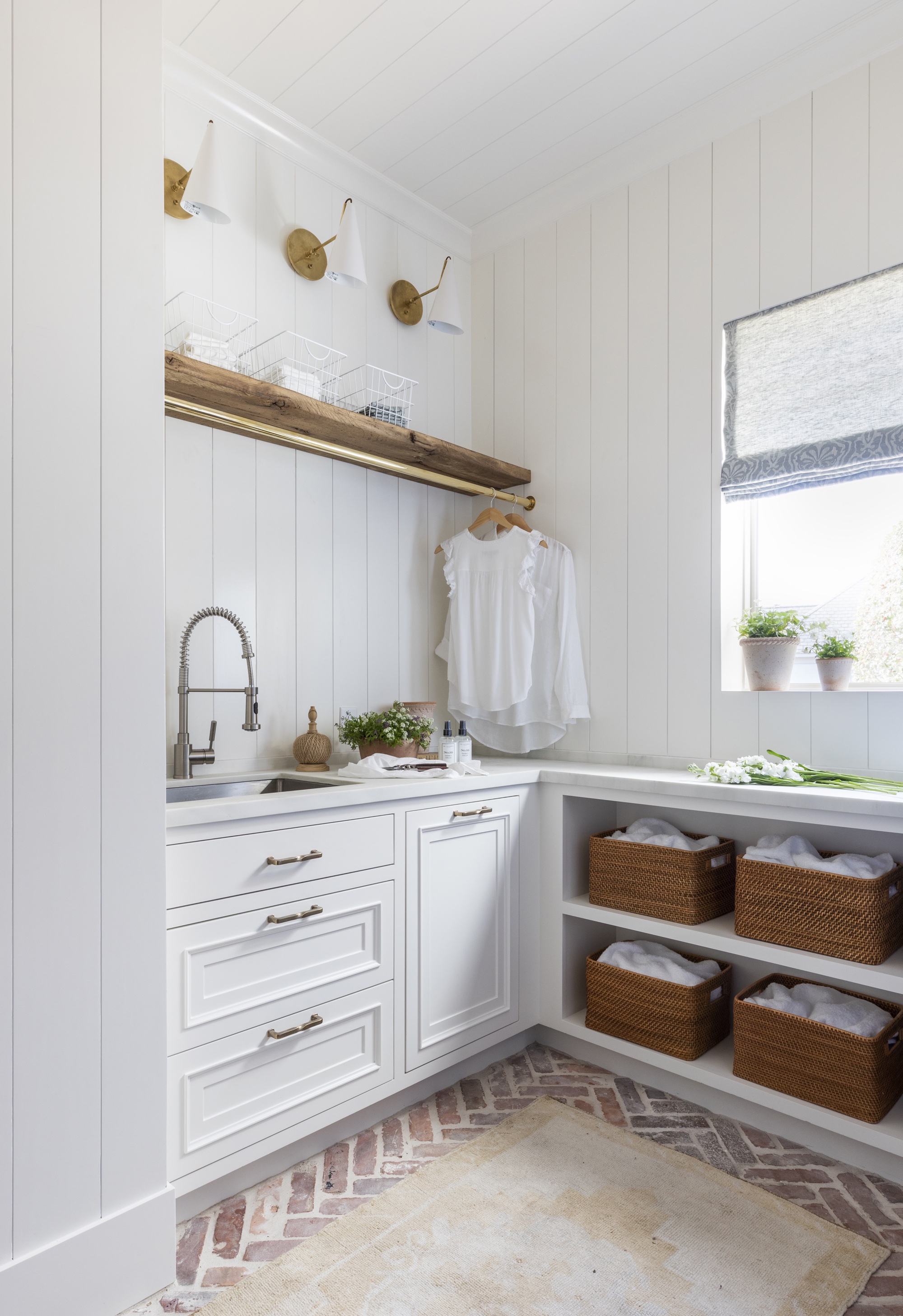
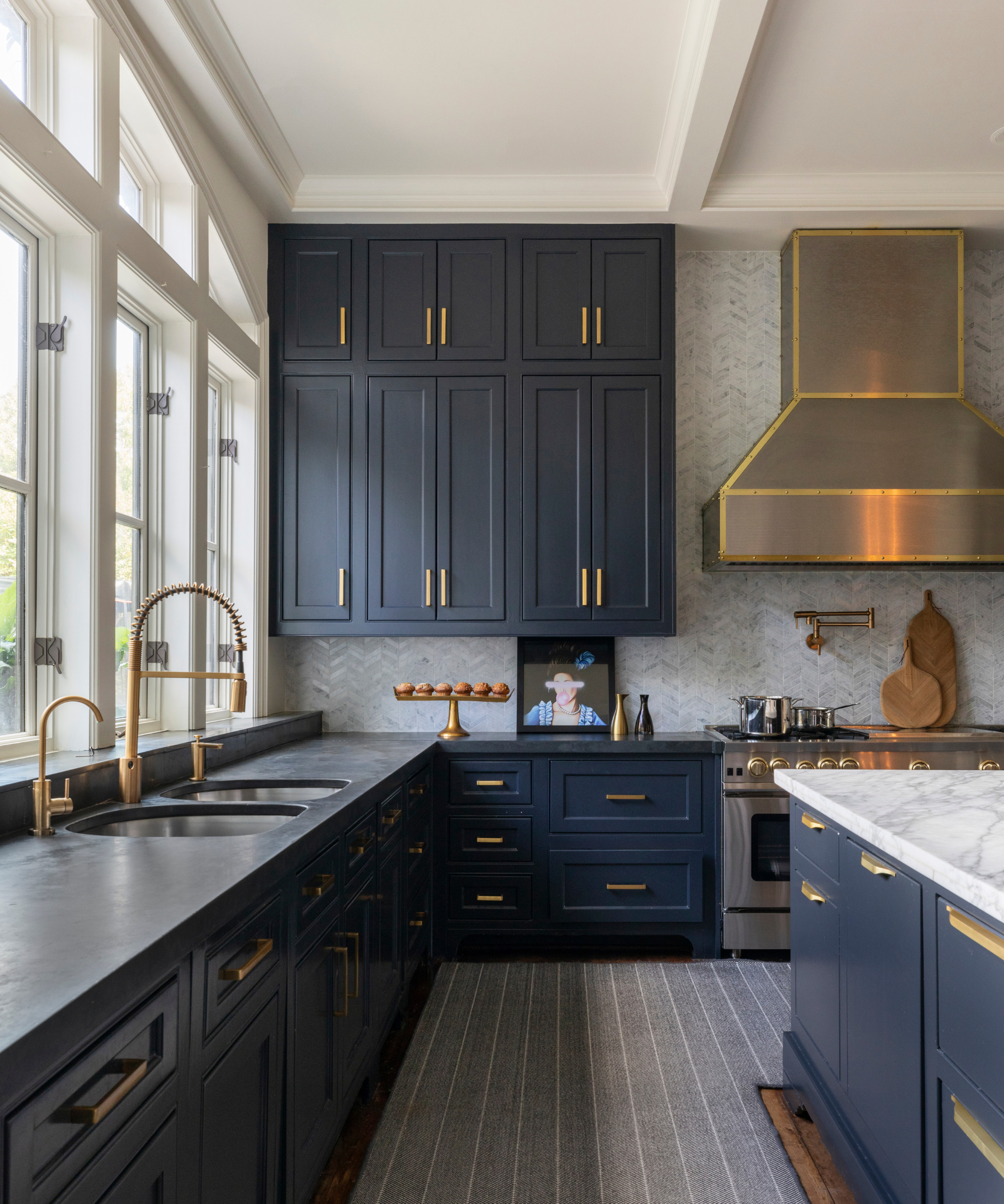
Designers recommend several light blue paint colors for their unique qualities. Sherwin-Williams' 'Niebla Azul' is favored by interior designer Lauren Sweet-Schuler for mudrooms. Despite the functional need to conceal dirt, this shade creates an unexpected and special aesthetic due to its softness, calming tone, and complex depth. Benjamin Moore's 'Water's Edge' is a choice for Emily Ruff, founder of Cohesively Curated Interiors. This shade incorporates a touch of gray, contributing to a subtle and calming effect. Emily also highlights Farrow & Ball's 'Borrowed Light' for its understated blue hue, adding just a hint of color to a space. For a light blue kitchen, Benjamin Moore's 'Sea Glass' was used to create impact without being overwhelming, complementing the room's water views and balancing warm wood tones with teal wall tiles.
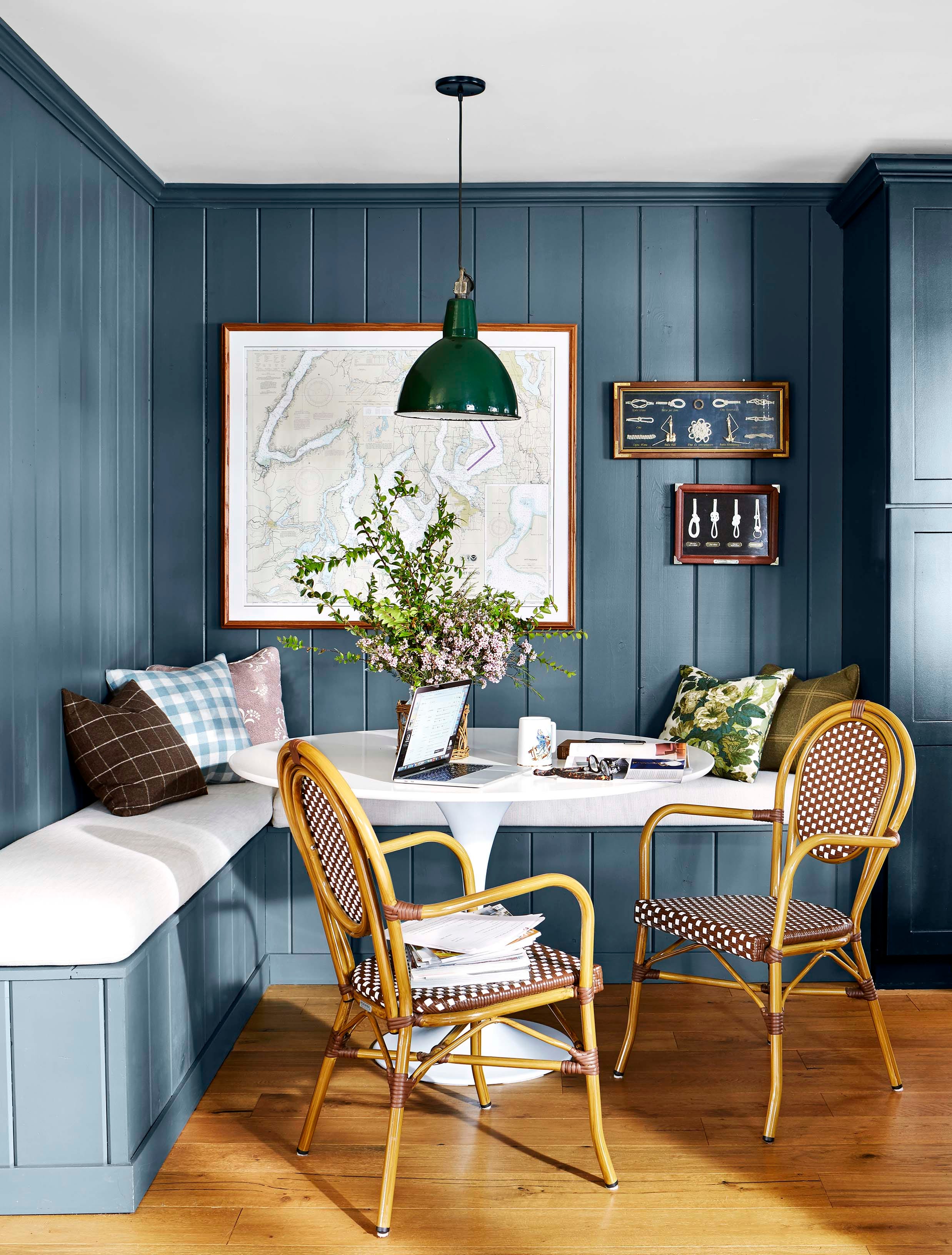
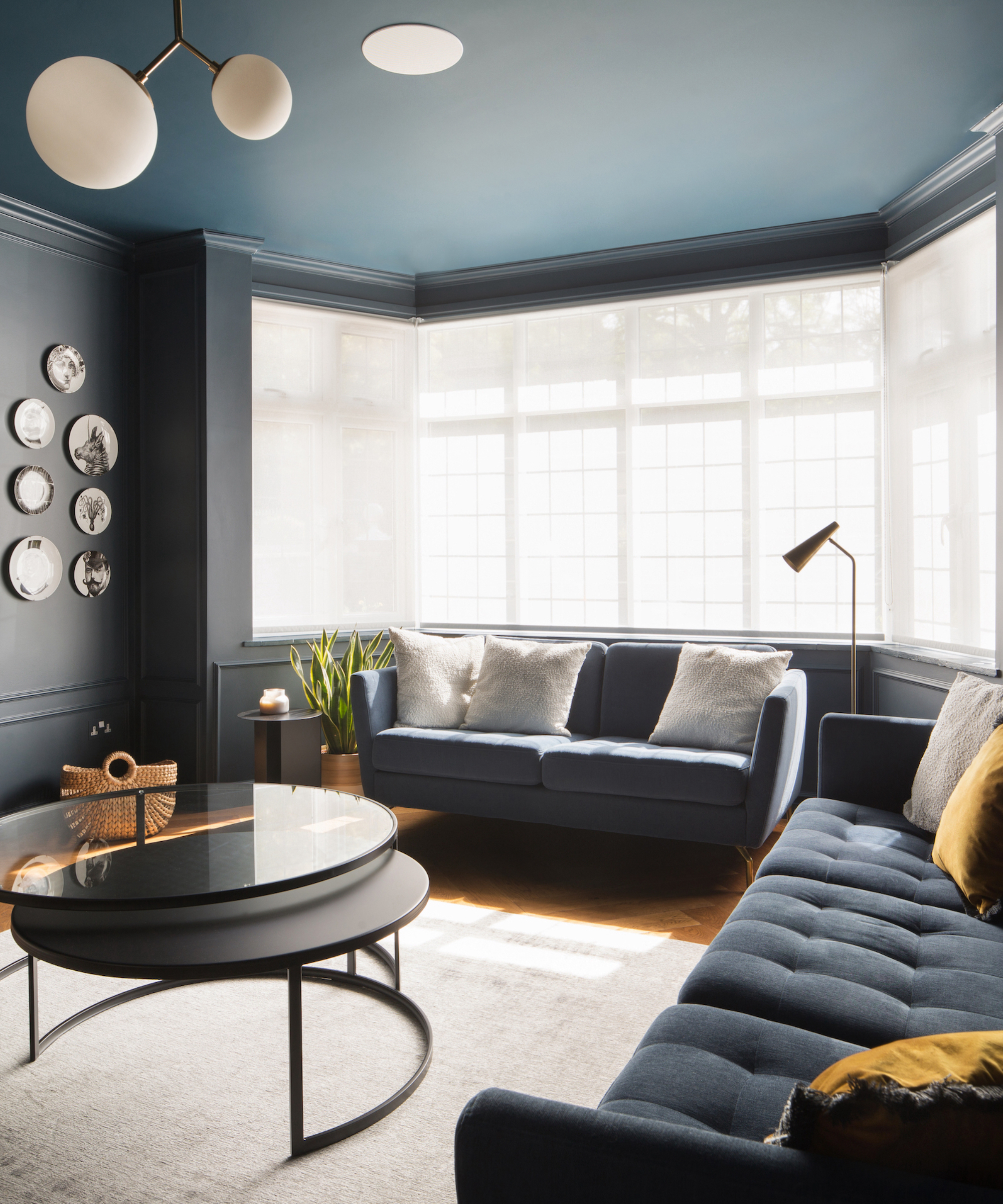
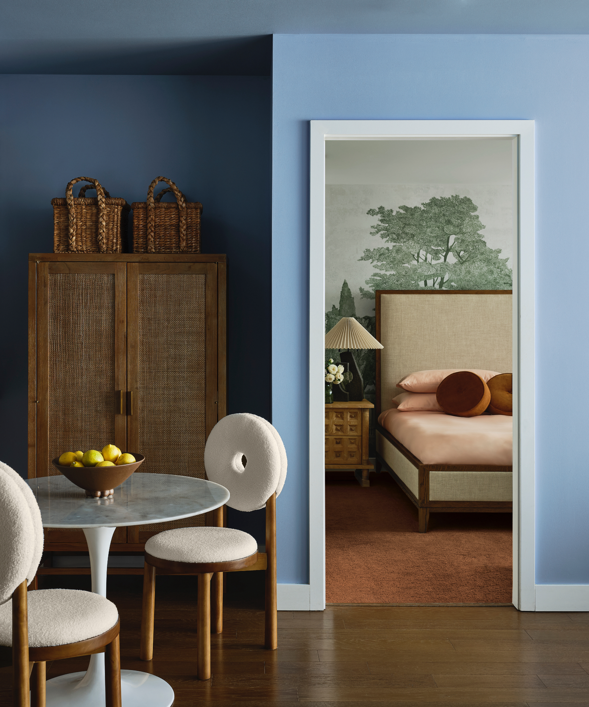
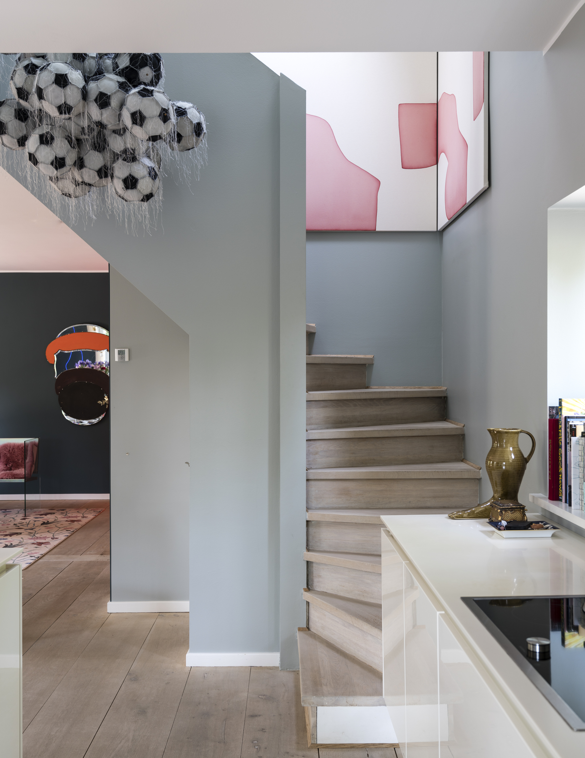
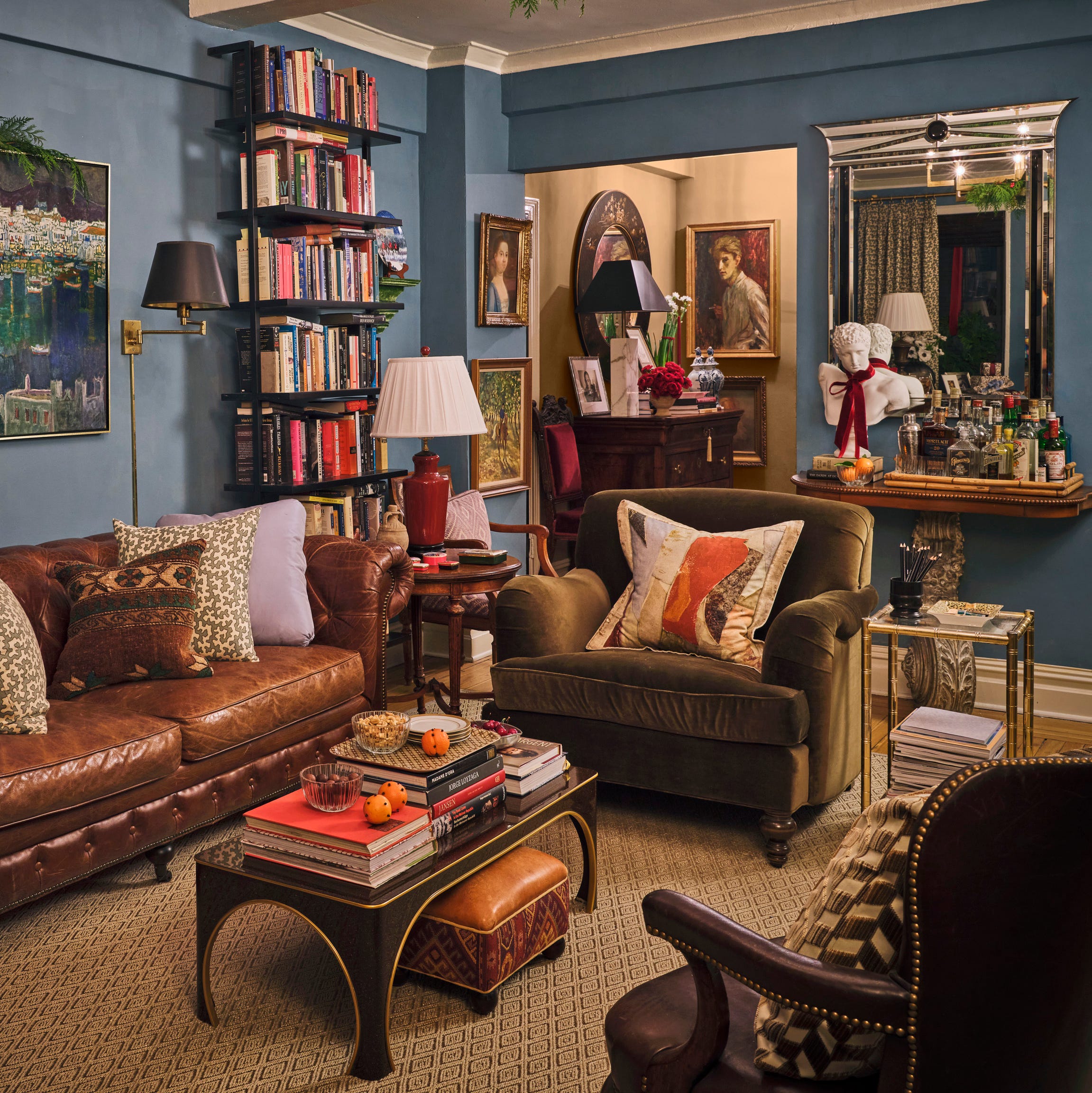
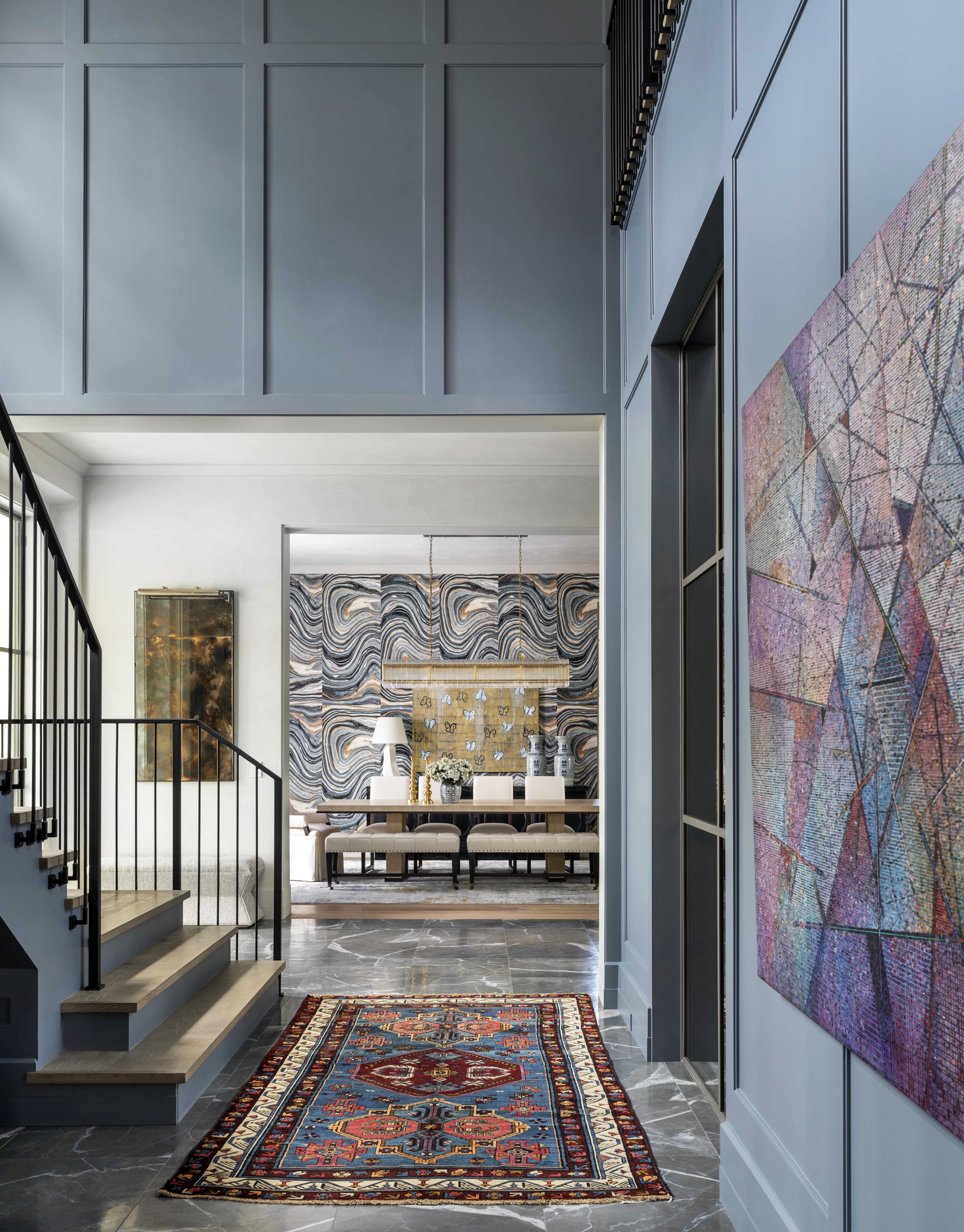
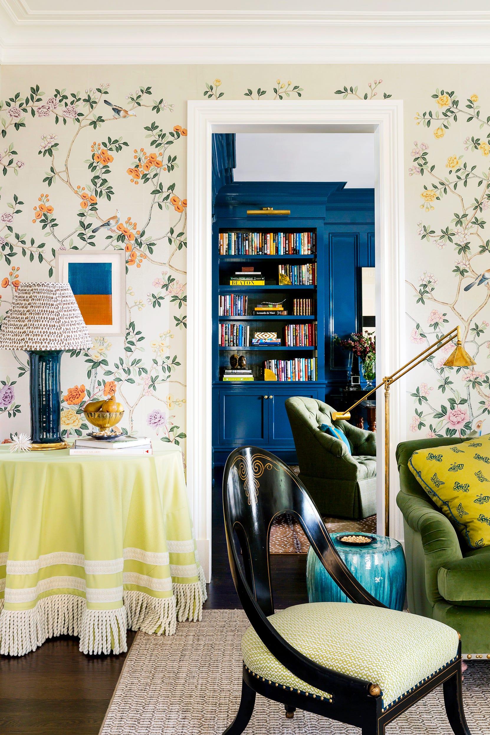
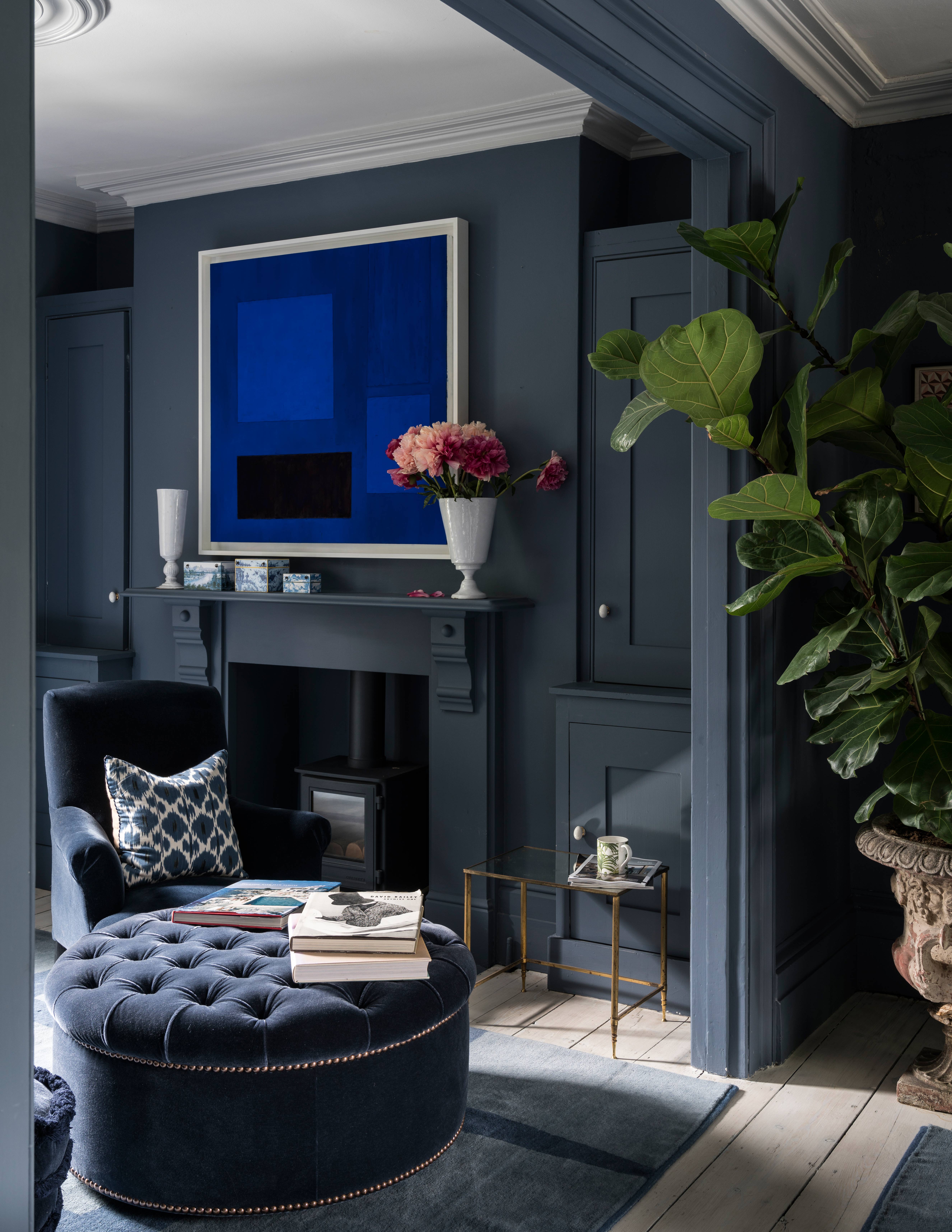
Crystal Sinclair, principal designer at Crystal Sinclair Designs, frequently uses 'Solitude' by Benjamin Moore. This soft and muted blue-gray works well in living rooms, demonstrating how light blue colors adapt to different natural light levels. Whitney Romanoff, owner of Meet West Studio, recommends Sherwin-Williams' 'Quietude,' pairing it with contrasting elements like a red rug and ebony cerused oak dining table. Although technically a green, 'Quietude' possesses complex blue-gray undertones, showcasing the depth and versatility possible within light blue hues.
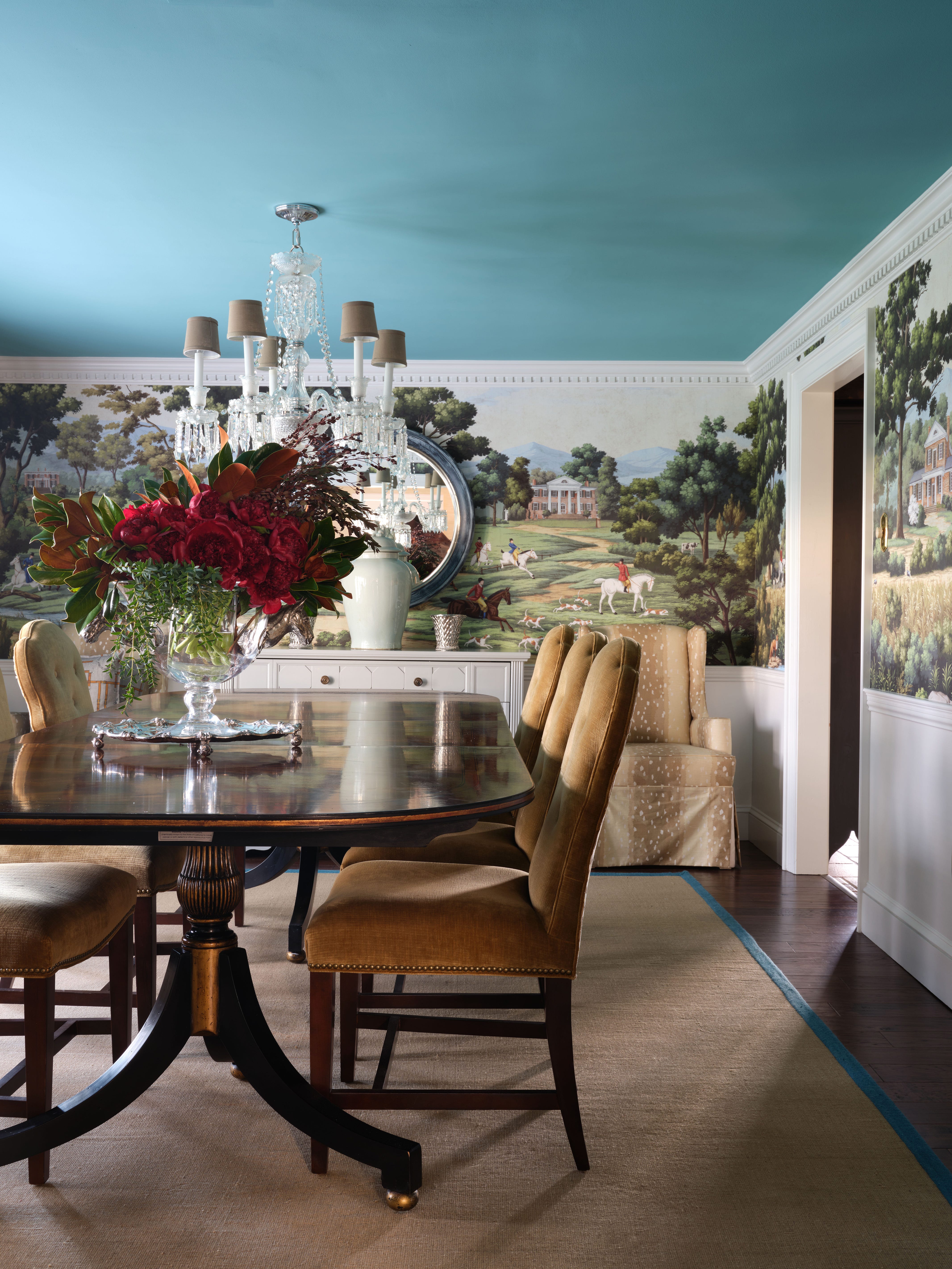
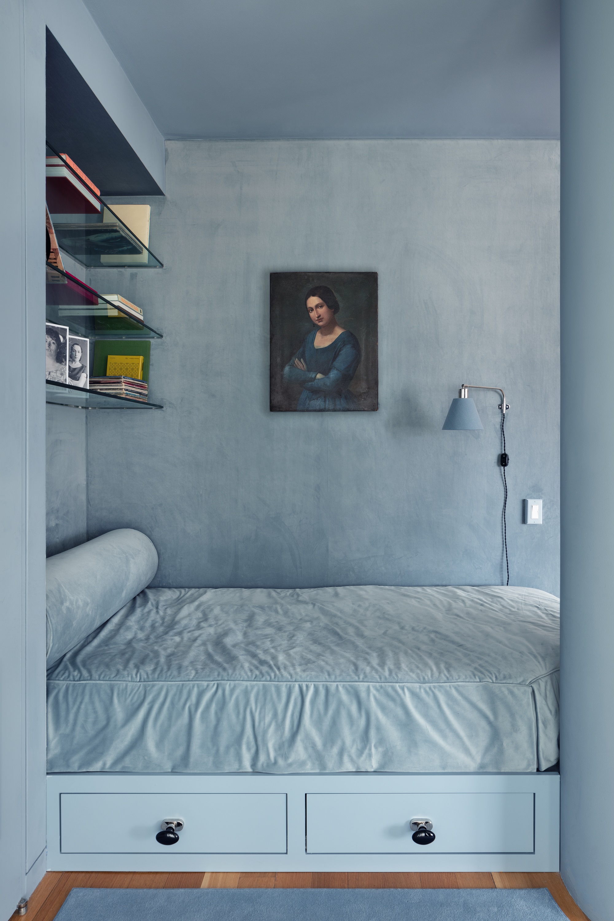
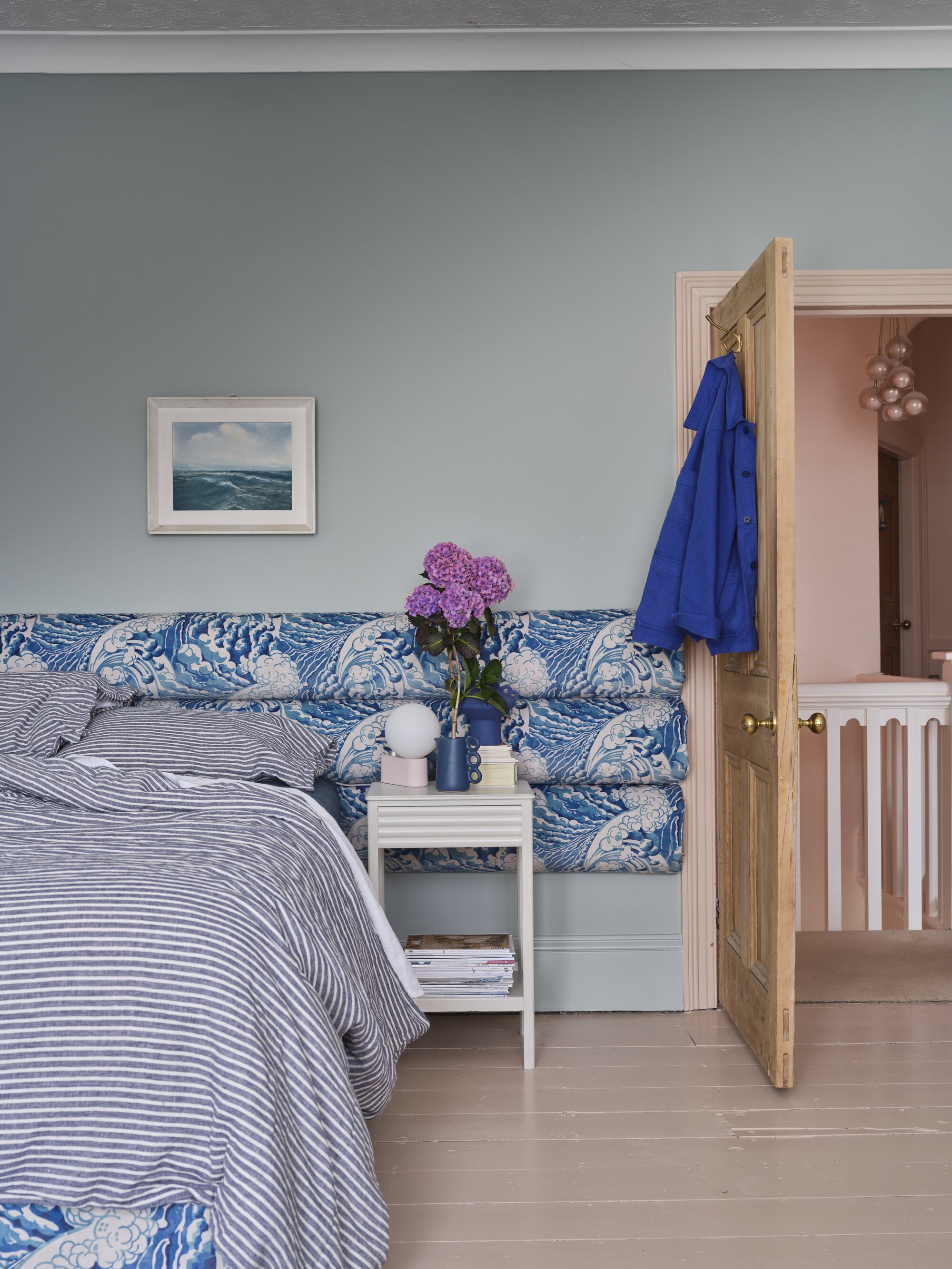
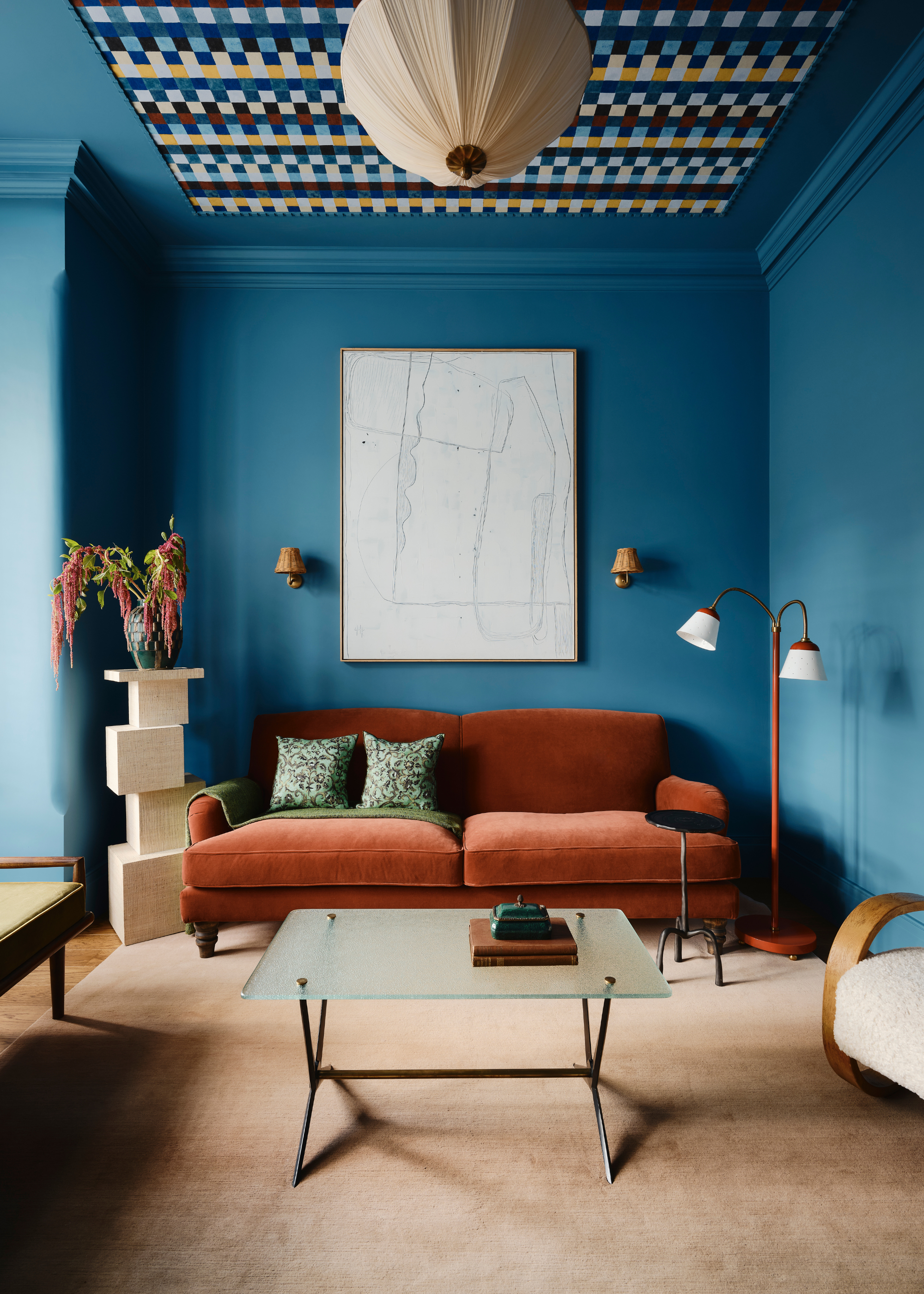
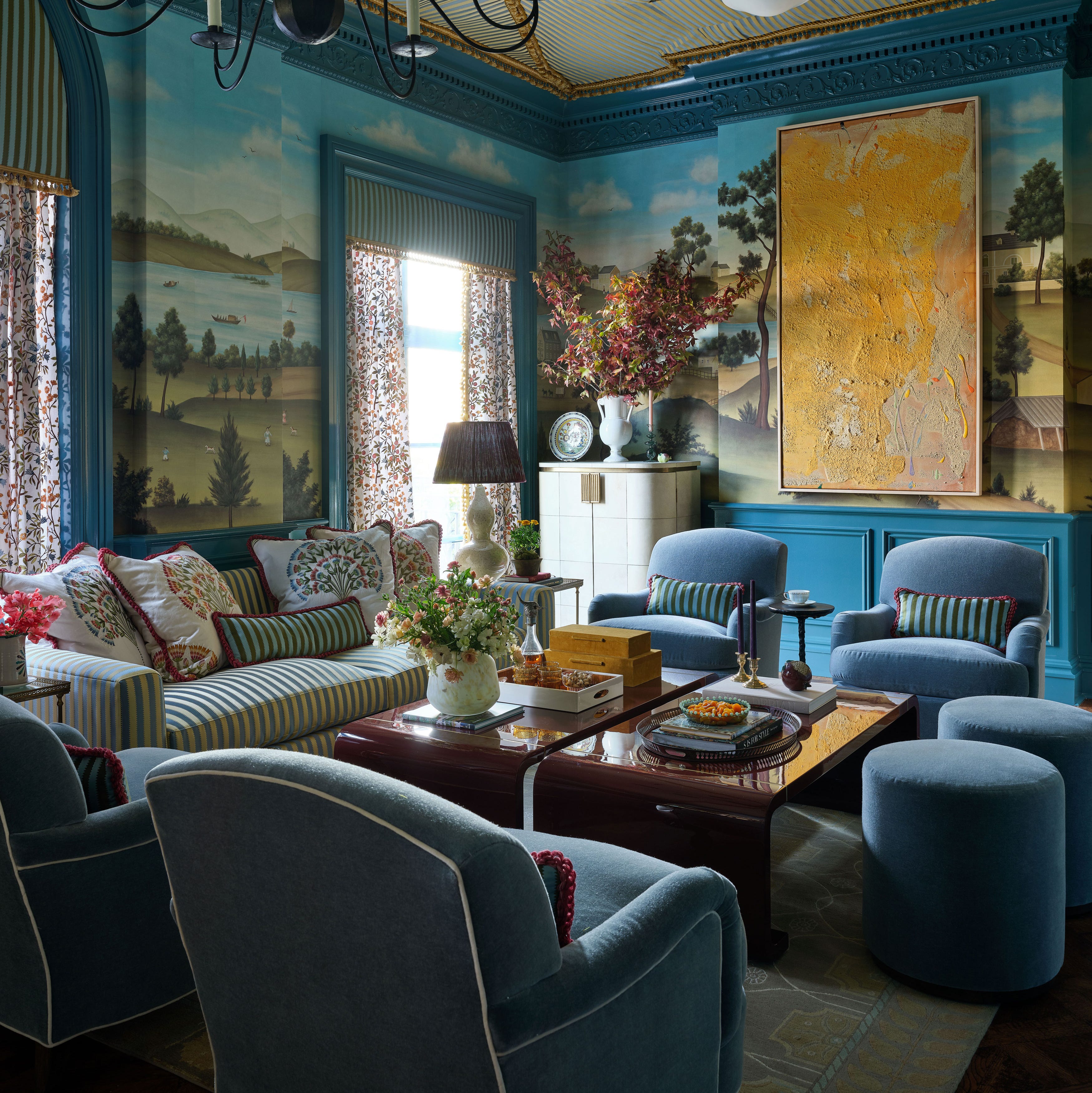
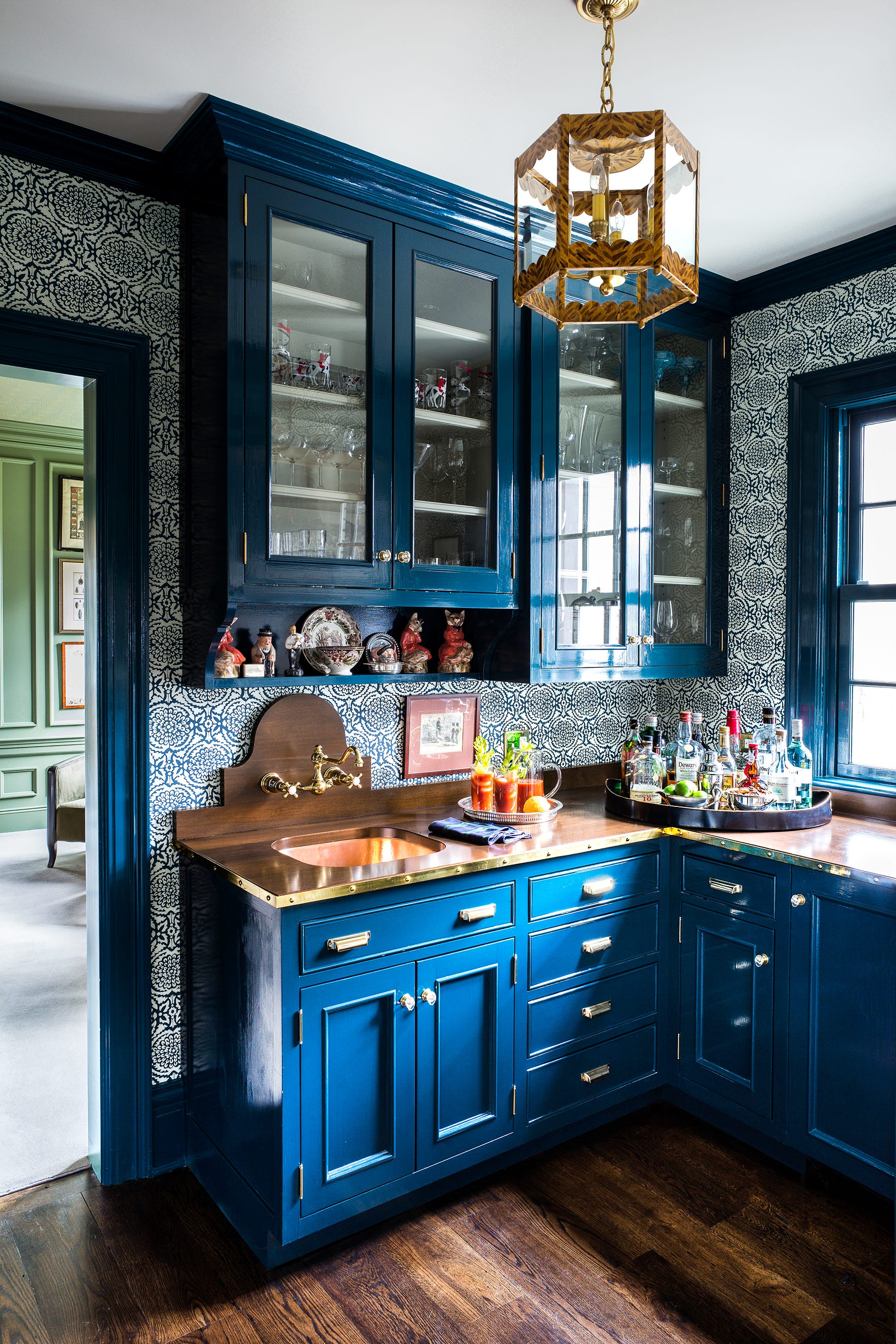
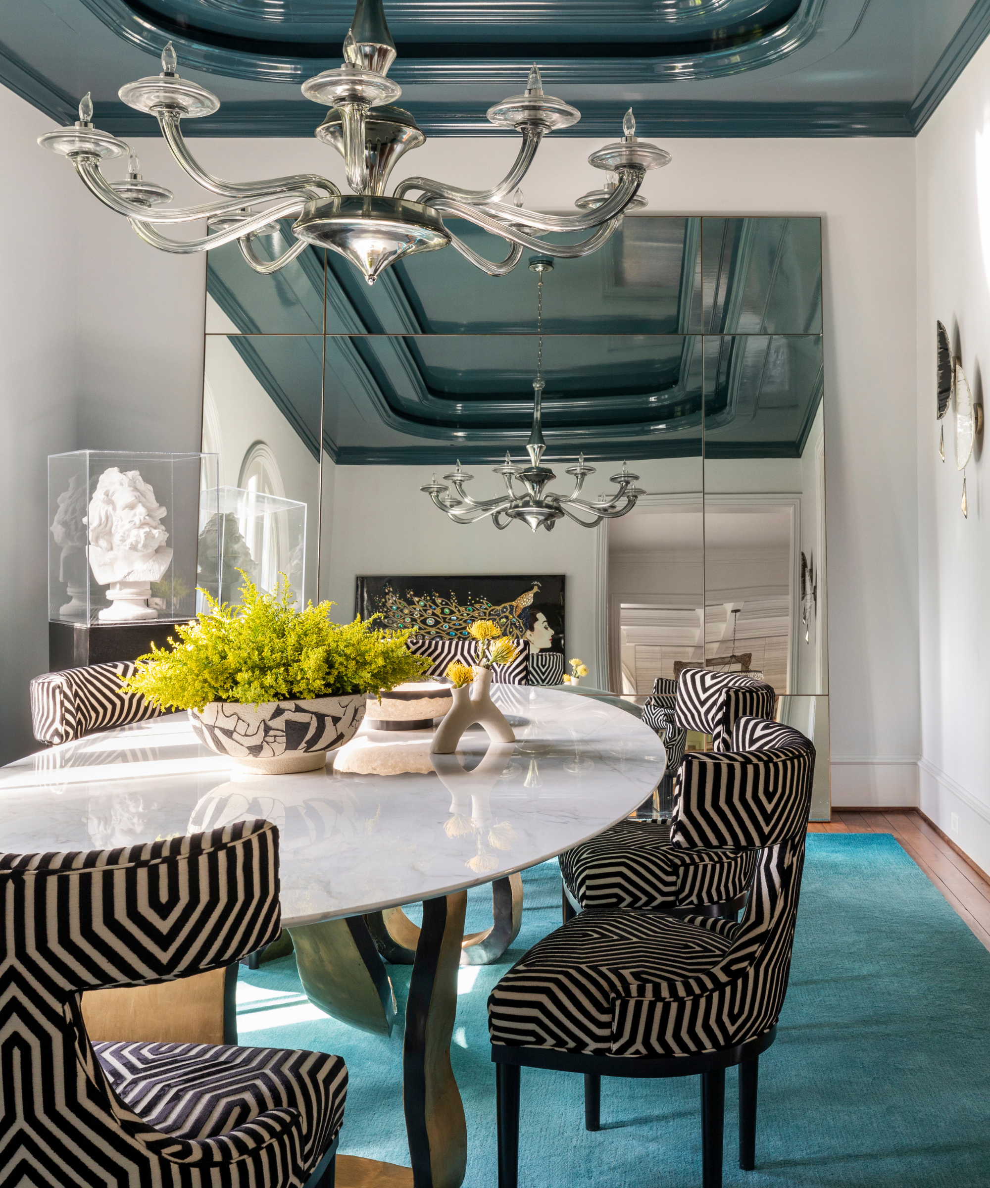
Lisa Frantz of Access to Design at The New York Design Center suggests Benjamin Moore's 'Beacon Gray,' which, despite its name, is a pale blue. Its sophisticated, nuanced, and chalky gray undertone allows it to feel mature, suitable for various spaces beyond children's rooms. For color drenching, Toledo Geller utilizes Benjamin Moore's 'Whispering Spring' in a gloss finish, applying it to walls, ceilings, millwork, and trim. This approach creates a calming, serene effect, while the lacquer finish enhances light reflection in a workspace.
Benjamin Moore identifies 'Palladian Blue,' 'Smoke,' and 'Constellation' as some of its most popular light blue shades. These colors evoke feelings of comfort and tranquility, reminiscent of clear skies and calming waters, while their inherent levity contributes to a sense of openness in any room. These selections highlight the broad appeal and adaptability of the light blue color family in interior design.
#LightBluePaint #InteriorDesign #PaintColors #ColorTrends #HomeDecor #DesignTips #BenjaminMoore #SherwinWilliams #FarrowAndBall #LightBluePaint #InteriorDesign #PaintColors #ColorTrends #HomeDecor #DesignTips #BenjaminMoore #SherwinWilliams #FarrowAndBall
0 comment in total
 No comments yet
You may also like
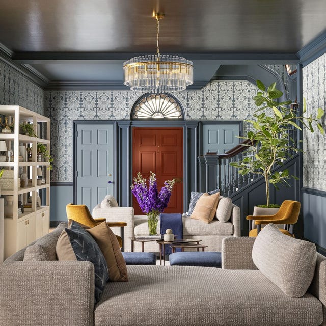
This Is the Best Blue Paint Color, According to Designers

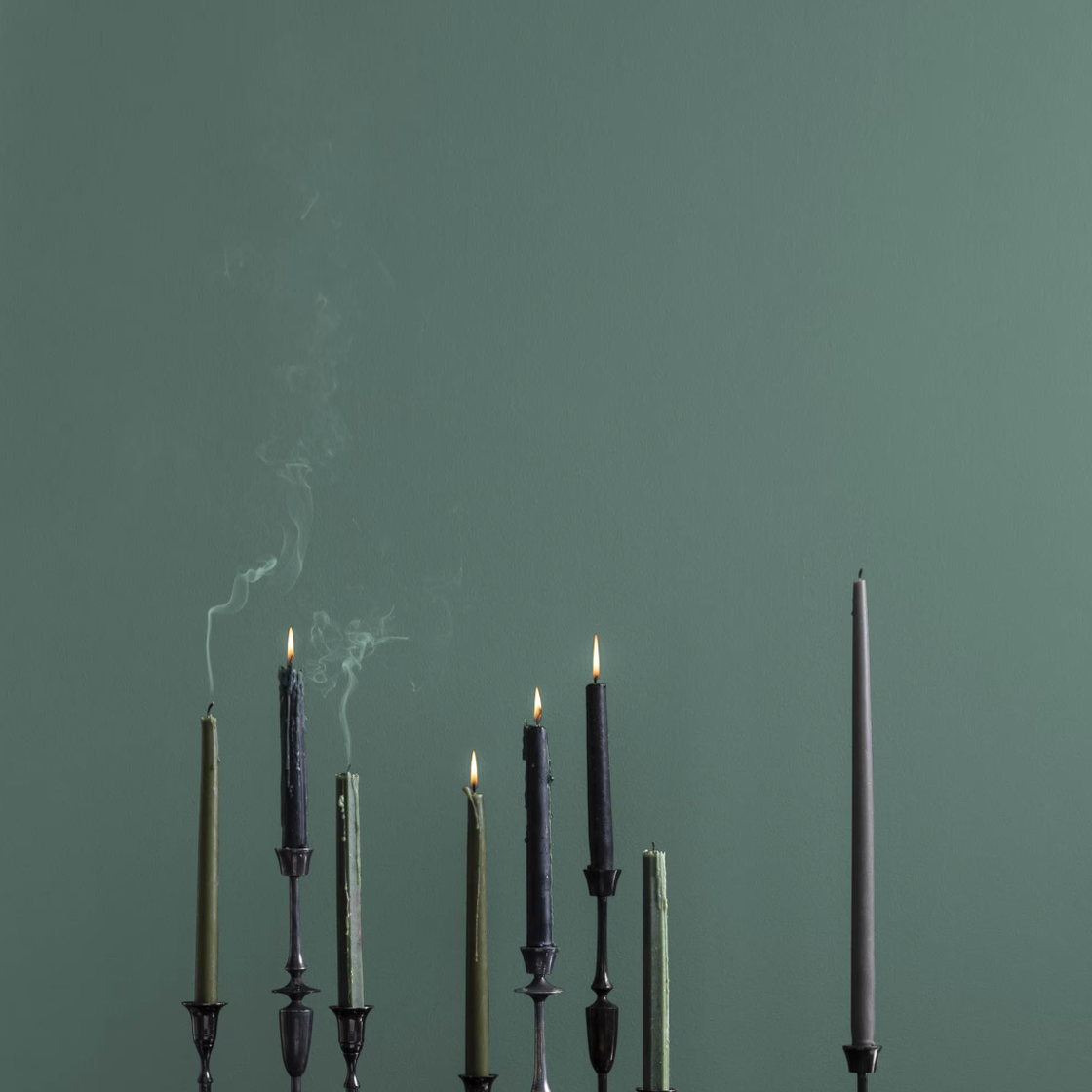
The 10 Best Blue-Green Paint Colors Designers Can't Stop Using

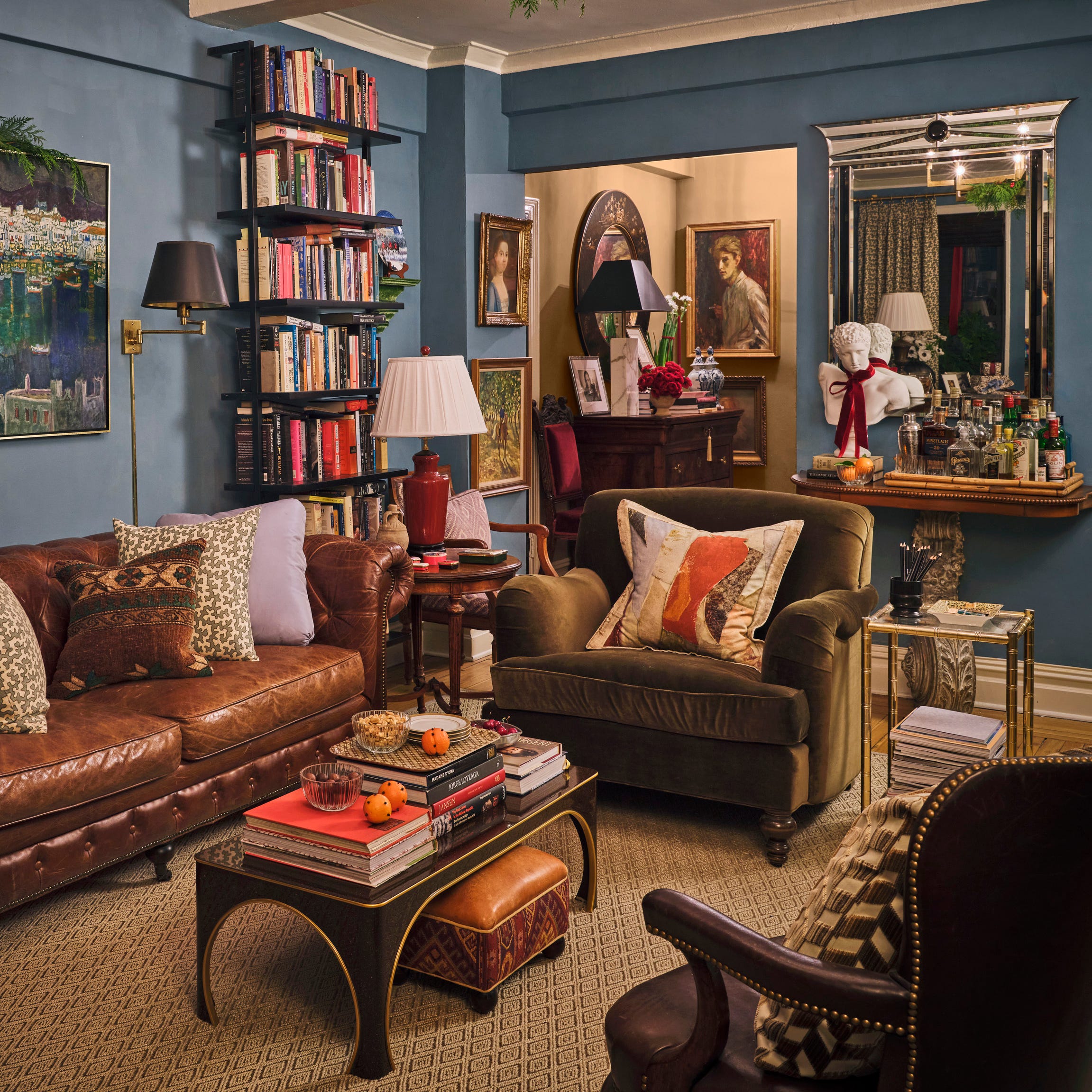
Designers Swear By These 11 Dark Blue Paint Colors for Chic and Moody Spaces

We Asked Designers Which Paint Colors Are Best for Brightening a Dark Room—6 Top Picks

5 best blue paints as chosen by interior designers

6 Light Blue Bedroom Ideas That Will Convince You It's the Most Relaxing Color to Paint Your Space
The 14 Best Blue Paint Colors For Your Kitchen, According To Designers
Why Designers Love This Shade of Blue Paint for Just About Any Room In the House
The 60 Best Blue Paint Colors for Every Room in Your Home
Looking for the Perfect Dark Blue Paint Color? Look No Further Than These Top Picks
15 Designer-Approved Blue-Gray Paint Colors That Will Never Go Out of Style
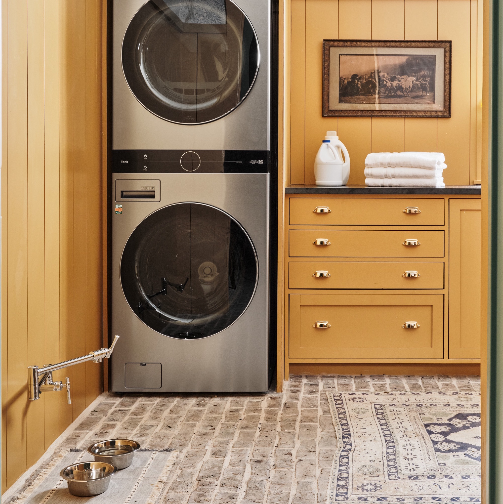
6 colors designers pick for laundry rooms - exact paint matches, from classic choices to surprising shades
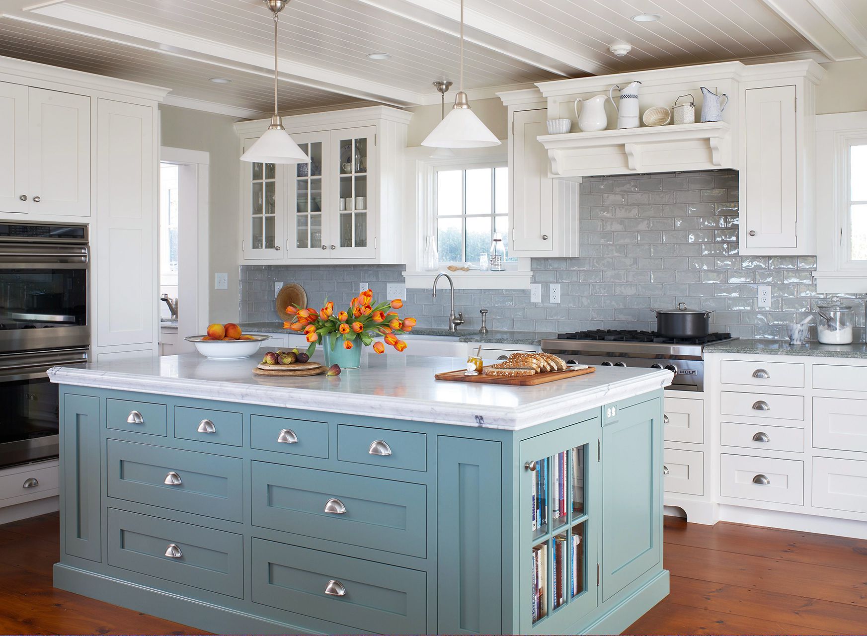
The Best Light-Blue Paint Colors for Every Room, According to Designers

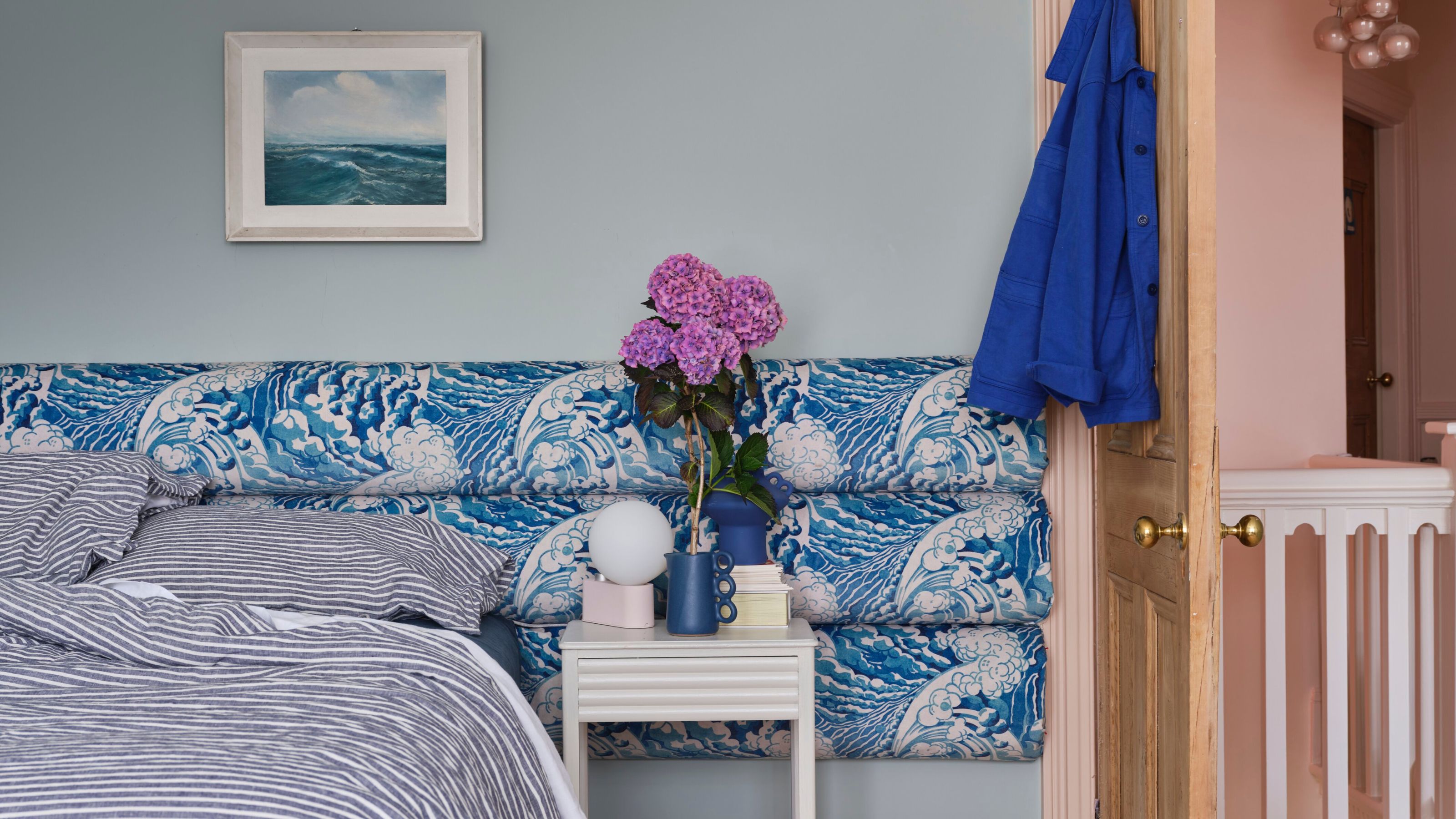
What a Paint Color Expert Would Pair With Light Blue Walls
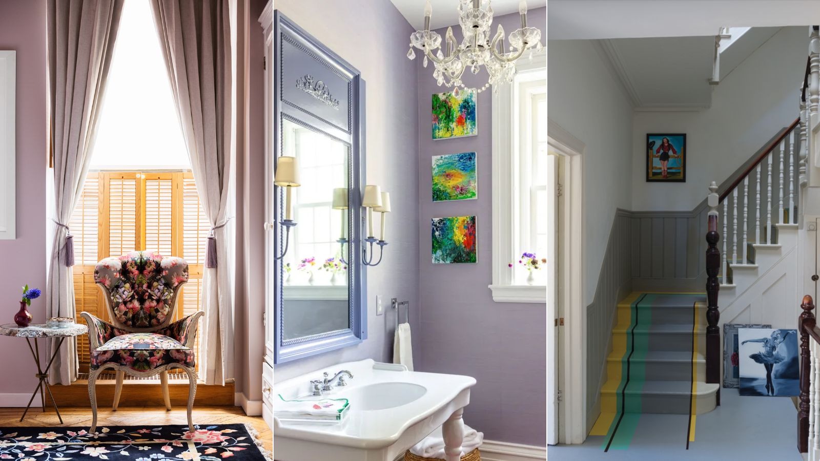
Best lavender paints as chosen by designers – 6 favorite varieties of this calming, pastel color
What Is the Most Expensive-Looking Blue? 7 Specific Shades to Paint Walls That Will Always Elevate Your Home
55 Tried-and-True Blue Paint Colors
Colors That Go With Blue — 16 Pairings Designers Depend on for Bold, Breezy, and Perfectly Balanced Palettes
Top Designers Reveal the 16 Best Purple Paint Colors They Absolutely Swear By

29 Best Blue Paint Colors for Perfectly-Hued Walls