6 Exterior Paint Colors That Are Secretly Annoying Your Neighbors
Choosing an exterior paint color for a home is a significant decision, not only for the homeowner's personal aesthetic but also for its impact on the surrounding neighborhood and potential future buyers. While individual preferences are important, certain paint choices can unintentionally create negative perceptions or clash with the local environment. Interior designers identify six specific categories of exterior paint colors that homeowners should consider avoiding to maintain neighborhood harmony and enhance curb appeal.
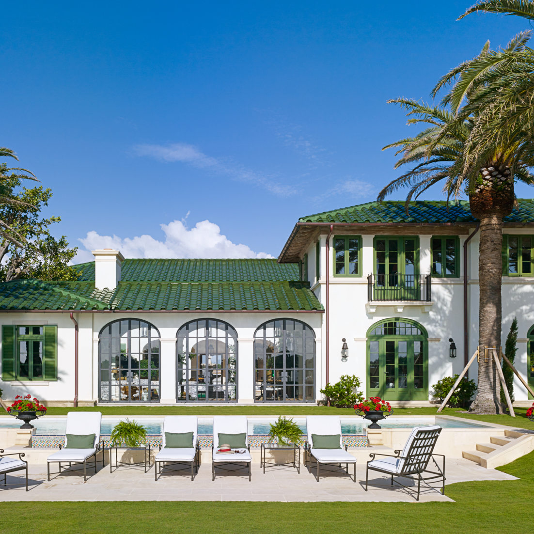
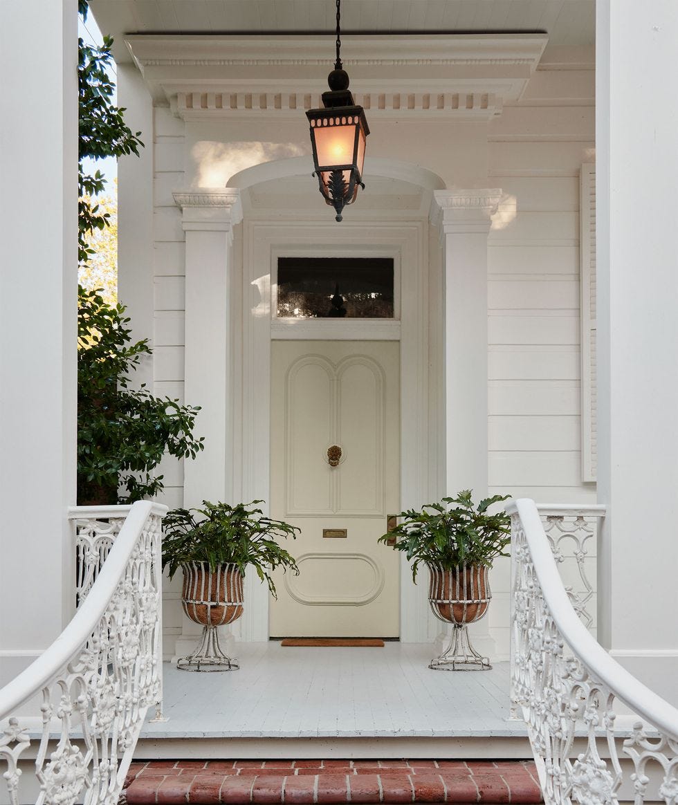
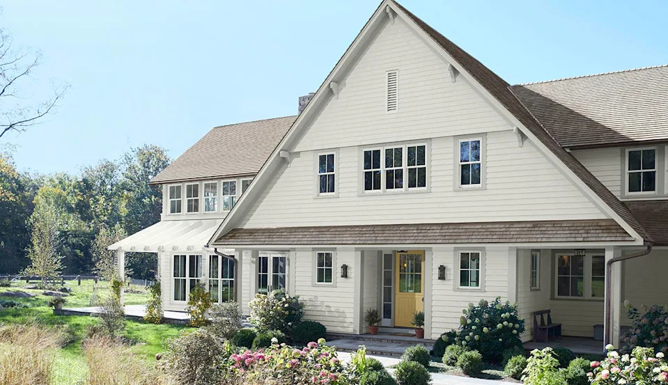
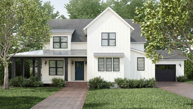
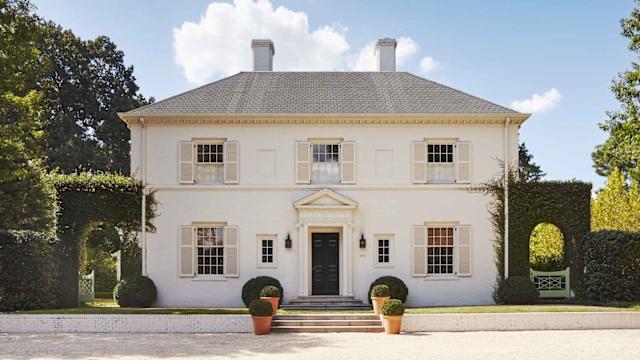
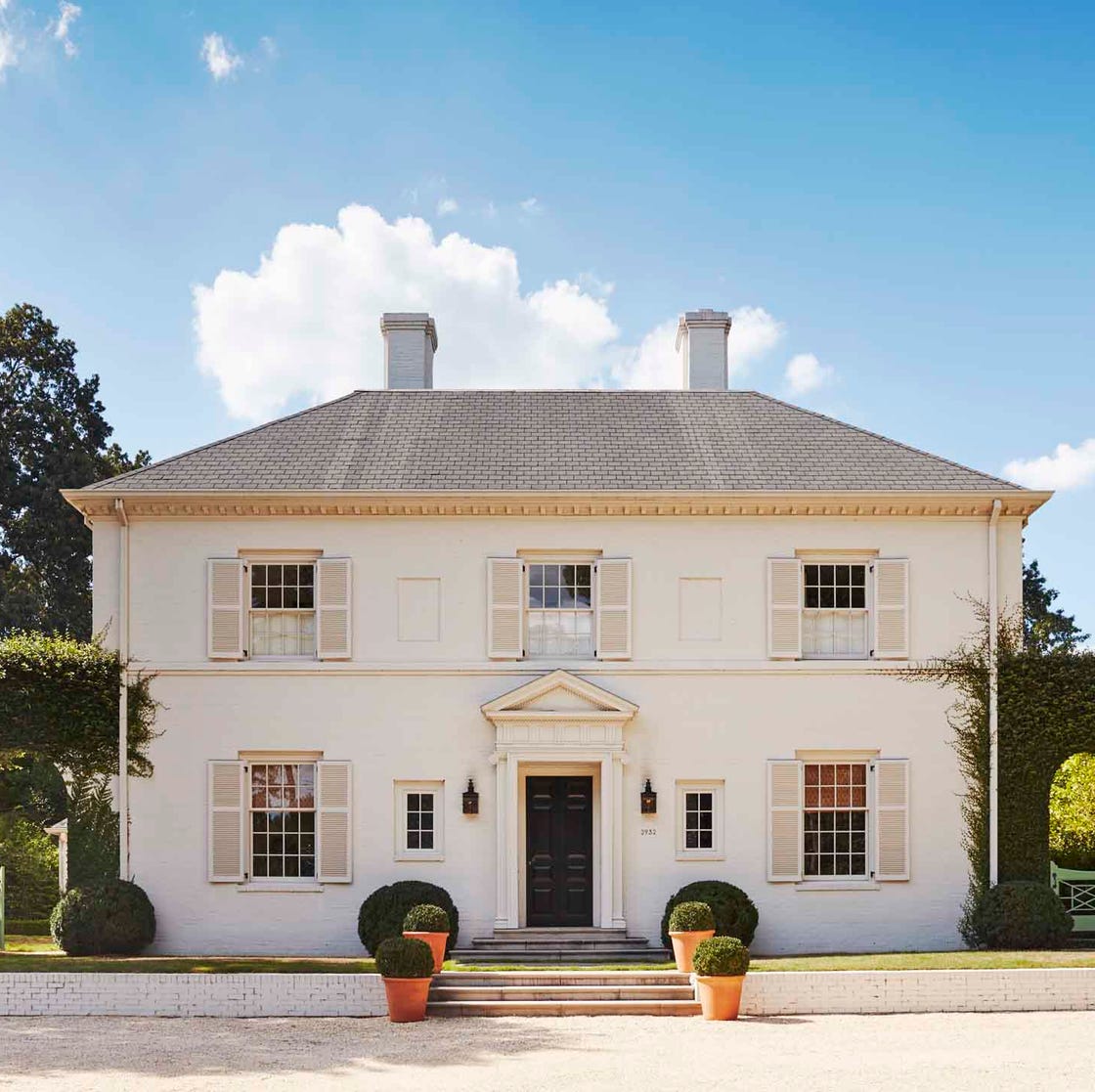
Stark white, though often perceived as timeless, can present several issues. In direct sunlight, it can appear sterile and blinding, diminishing the home's architectural details. Furthermore, its bright, uncompromising hue can feel out of place with natural landscaping and tends to show dirt more prominently. A more favorable alternative is a creamier white with softer undertones, which offers a more inviting appearance, better integrates with the natural surroundings, and is more forgiving with minor blemishes.
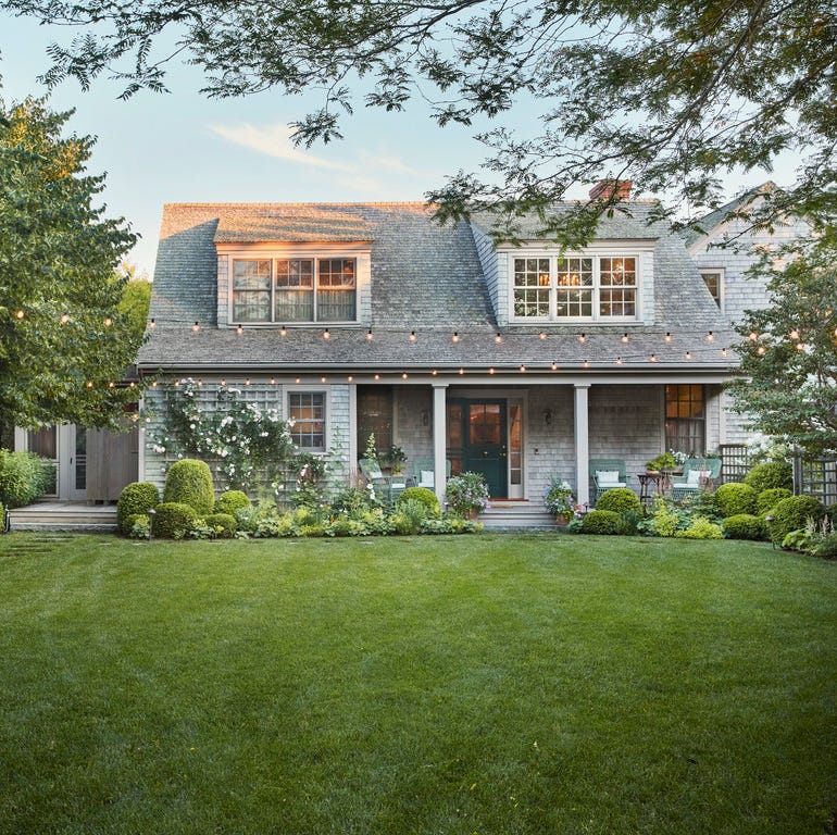
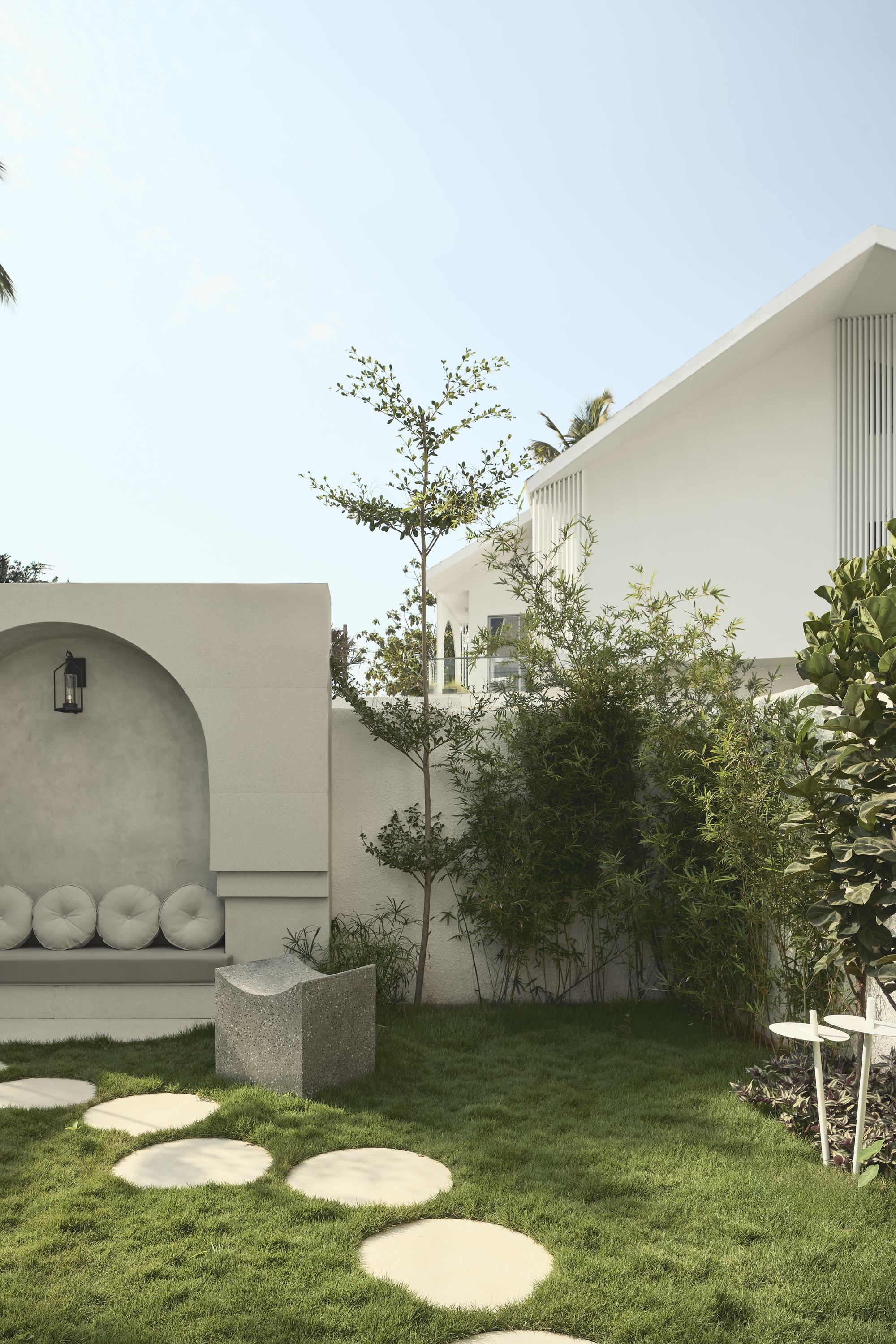
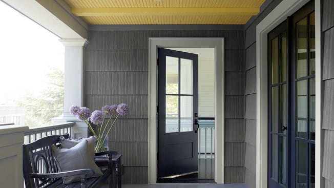
Cold gray, once a popular neutral, has fallen out of favor due to its tendency to make a home look flat, lifeless, and somber. When paired with bright white trim, it can evoke the unfinished look of a concrete structure. Designers recommend warmer grays, such as greige, warm taupe, or deep charcoal, as these provide a modern feel while adding depth and improving overall curb appeal.
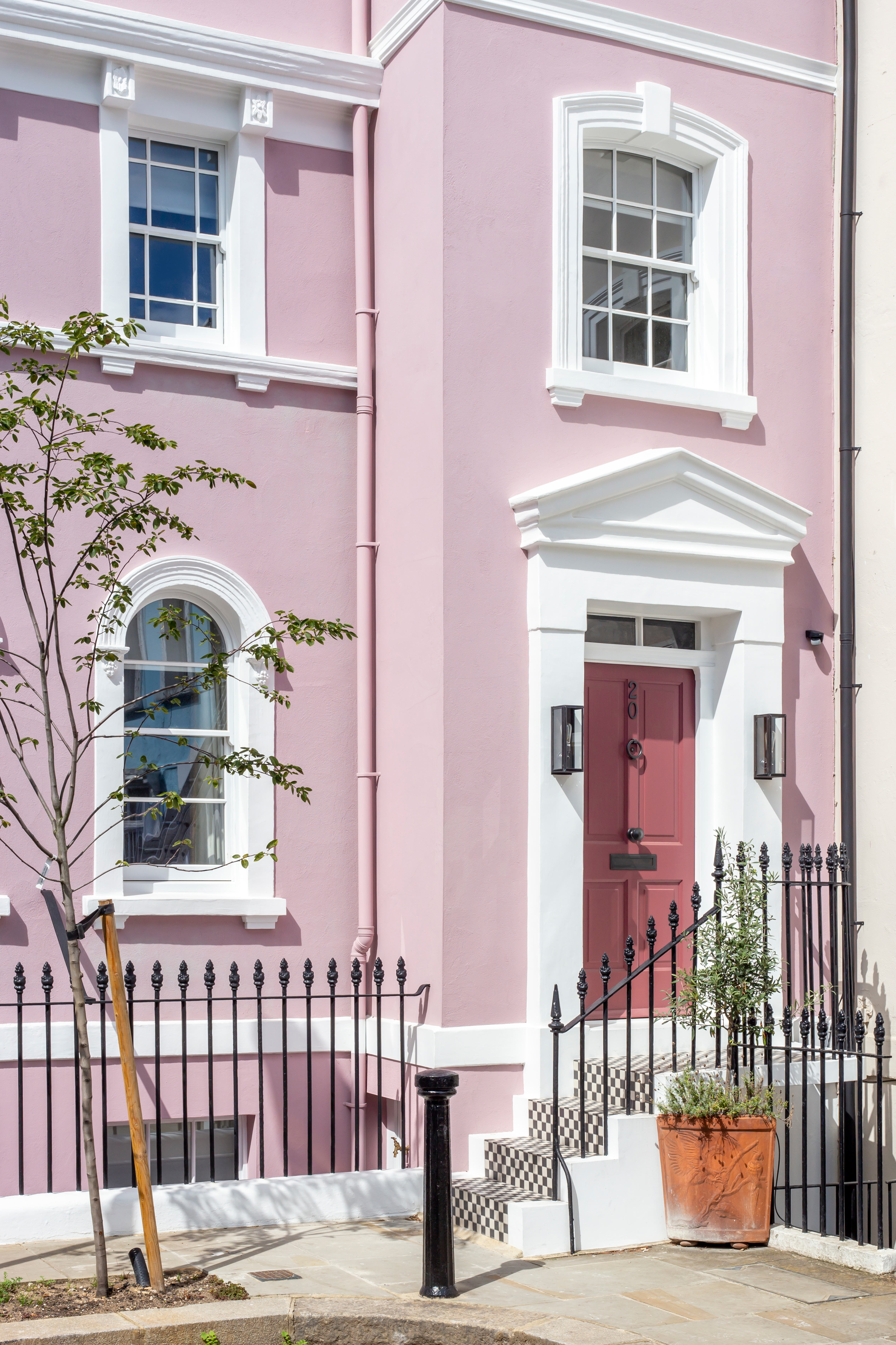
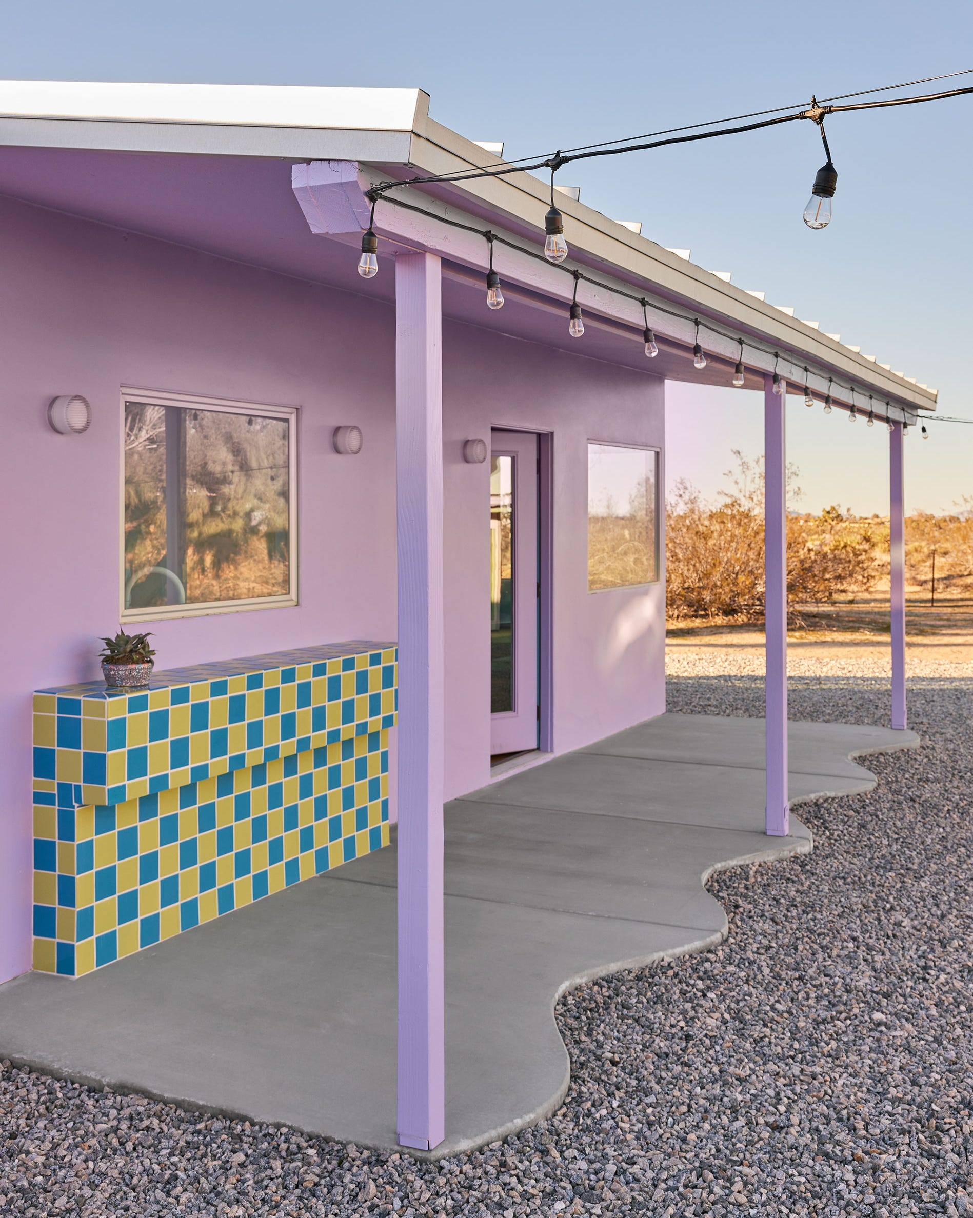
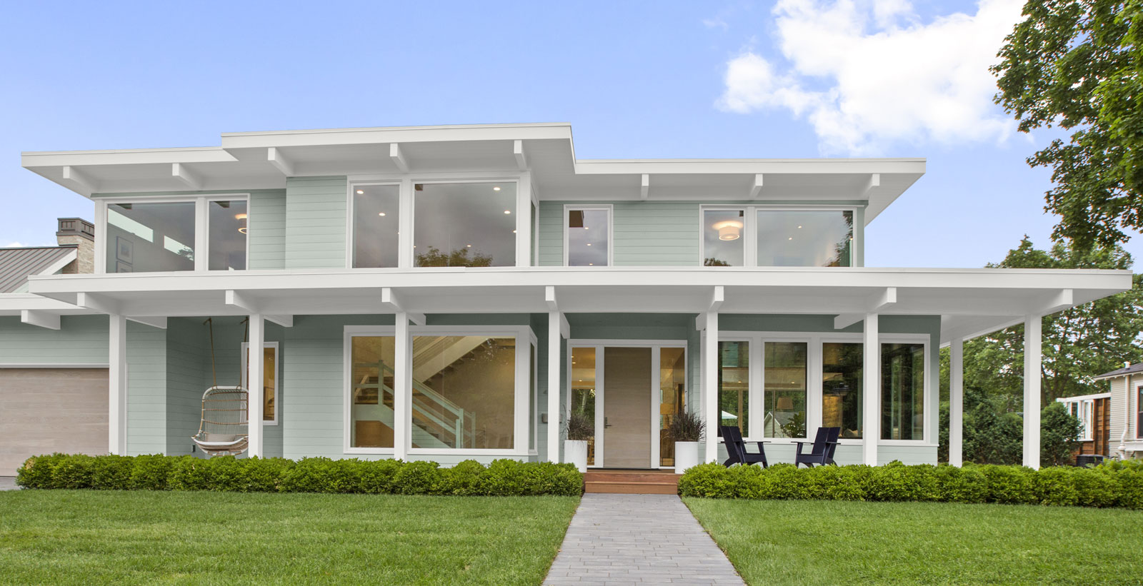
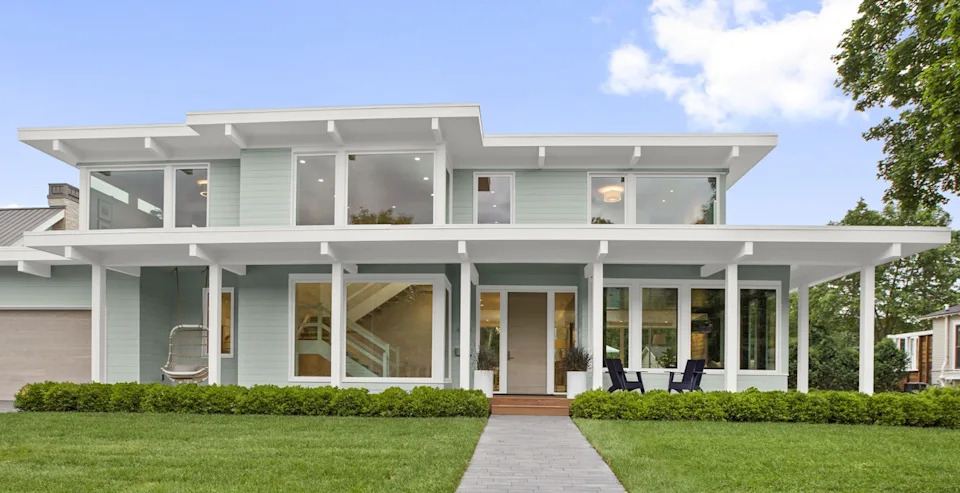
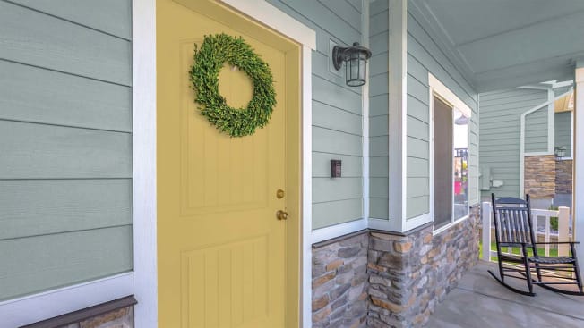
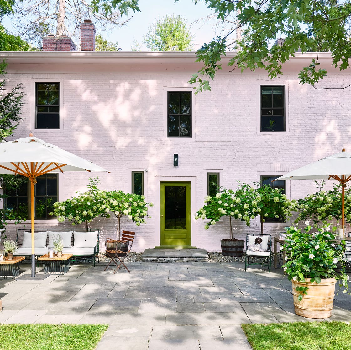
Pastel shades, like light robin’s egg blue or pale mint, are generally advised against for most traditional neighborhoods. While they might suit specific architectural styles, such as Victorian homes with intricate trim, or homes in coastal settings, they can make a house appear overly whimsical or like part of a 'springtime parade' in other contexts. If a touch of color is desired, subtle French blue or dusty blush tones are suggested as more sophisticated options that avoid an 'Easter egg' aesthetic.
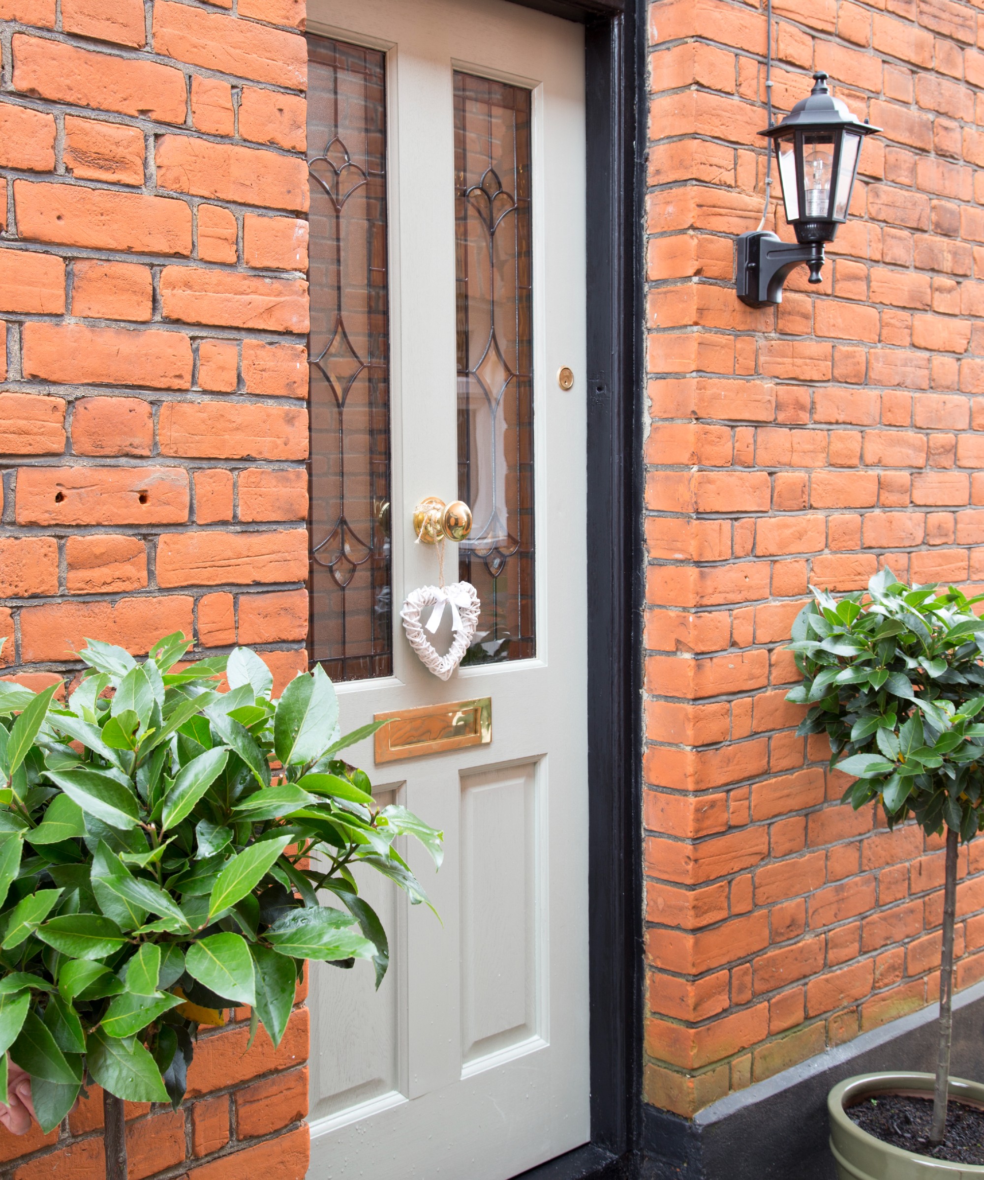
Another common pitfall is directly copying a neighbor’s chosen paint color. Homeowners invest considerable time and money in selecting a color that reflects their home's style and their personality. Duplicating a neighbor's choice can undermine this individuality, making the street feel generic and 'cookie-cutter,' rather than showcasing diverse and well-thought-out design decisions.
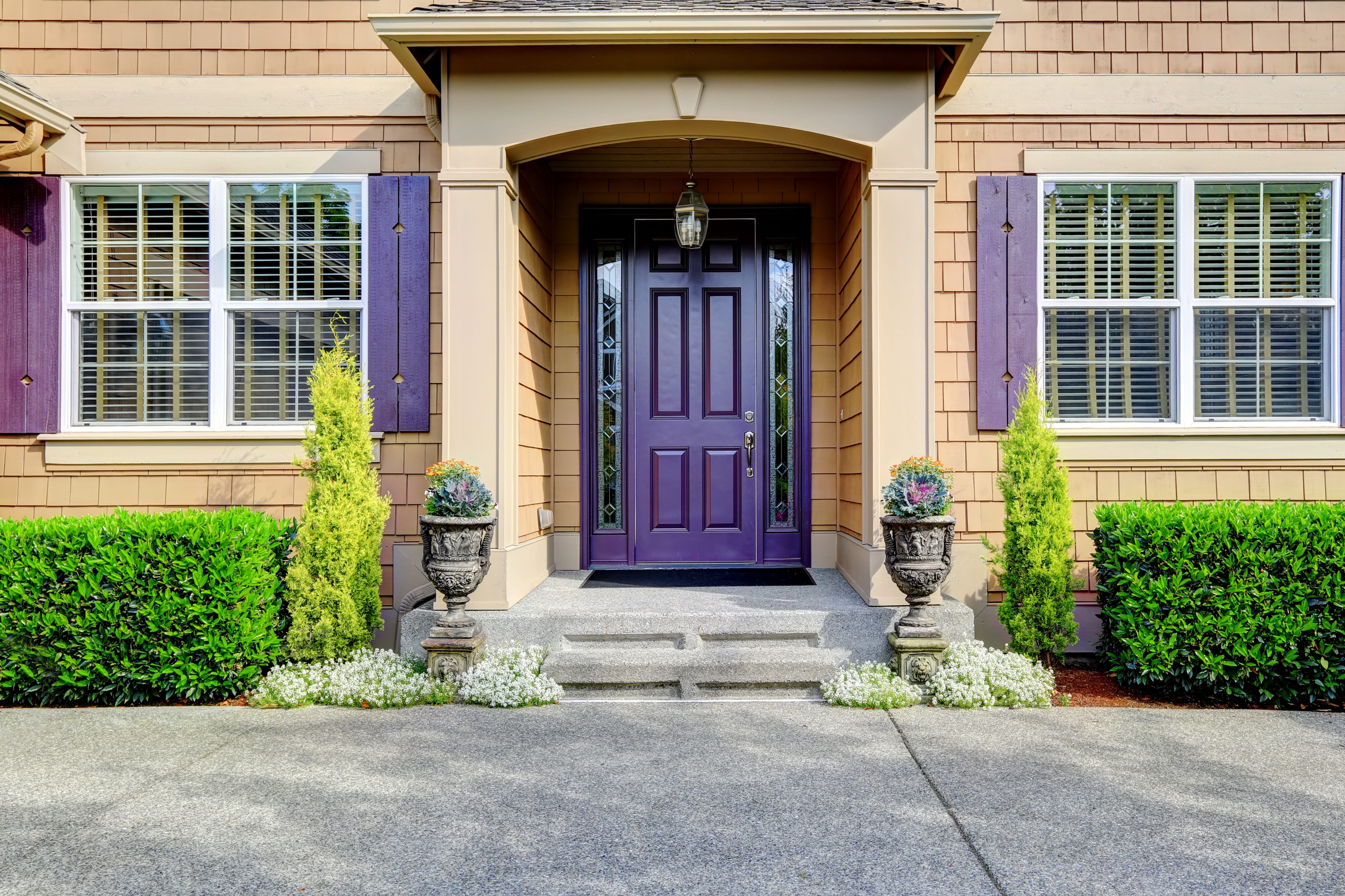
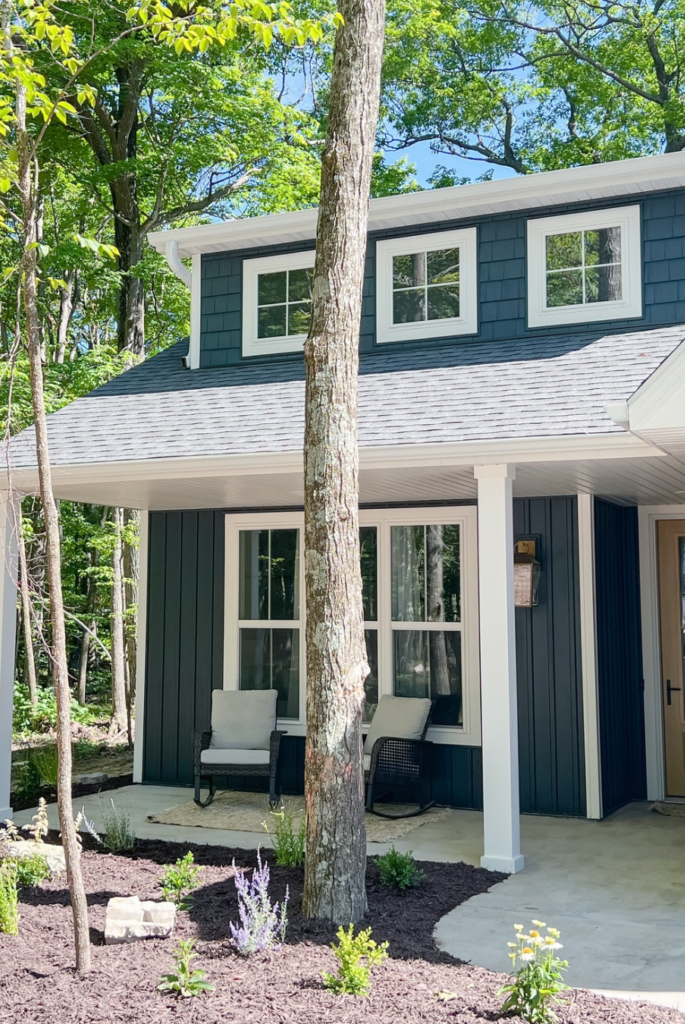
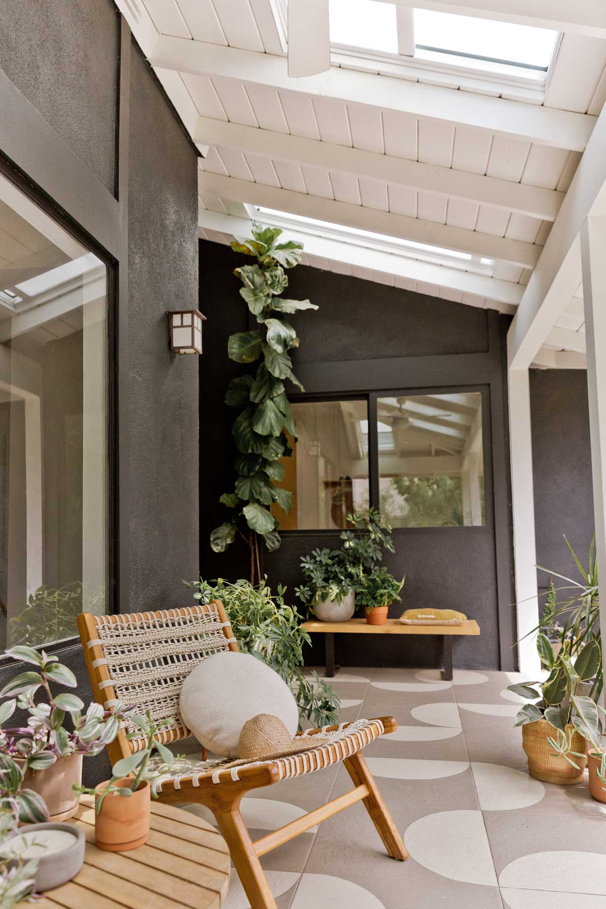
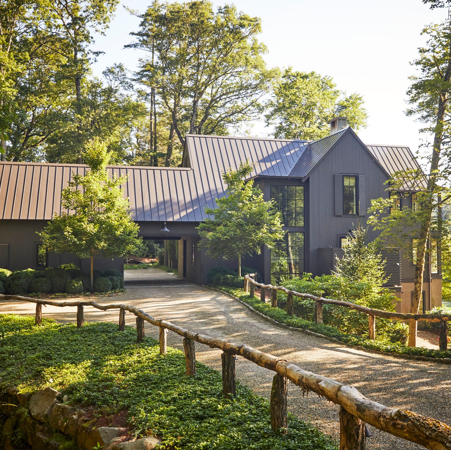
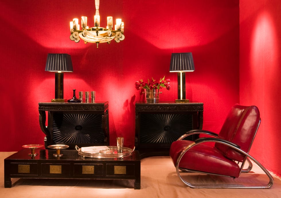
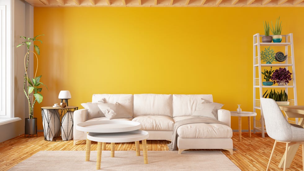
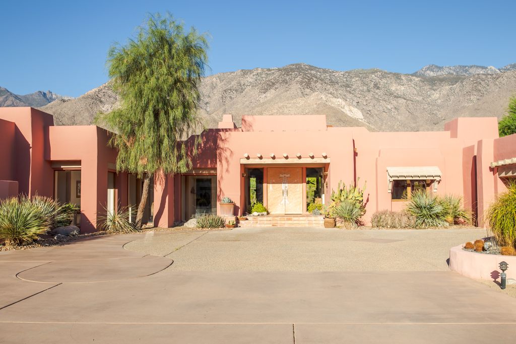
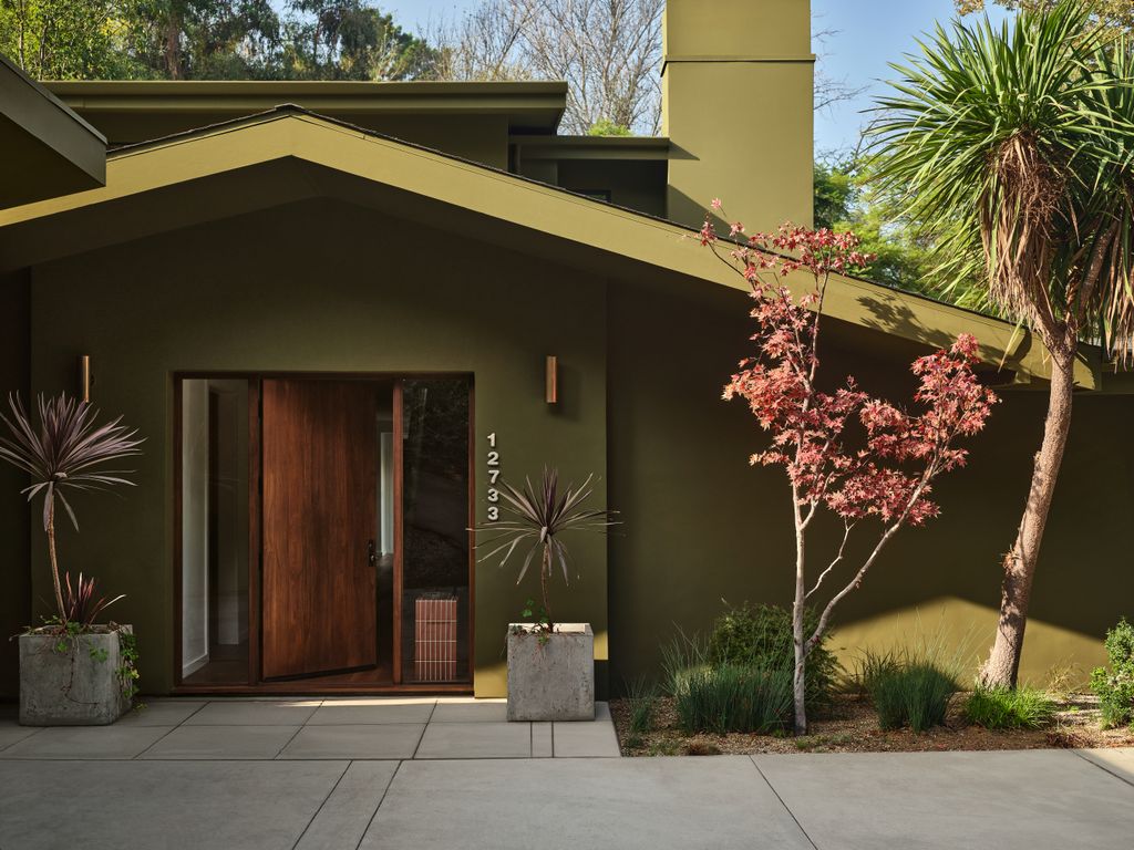
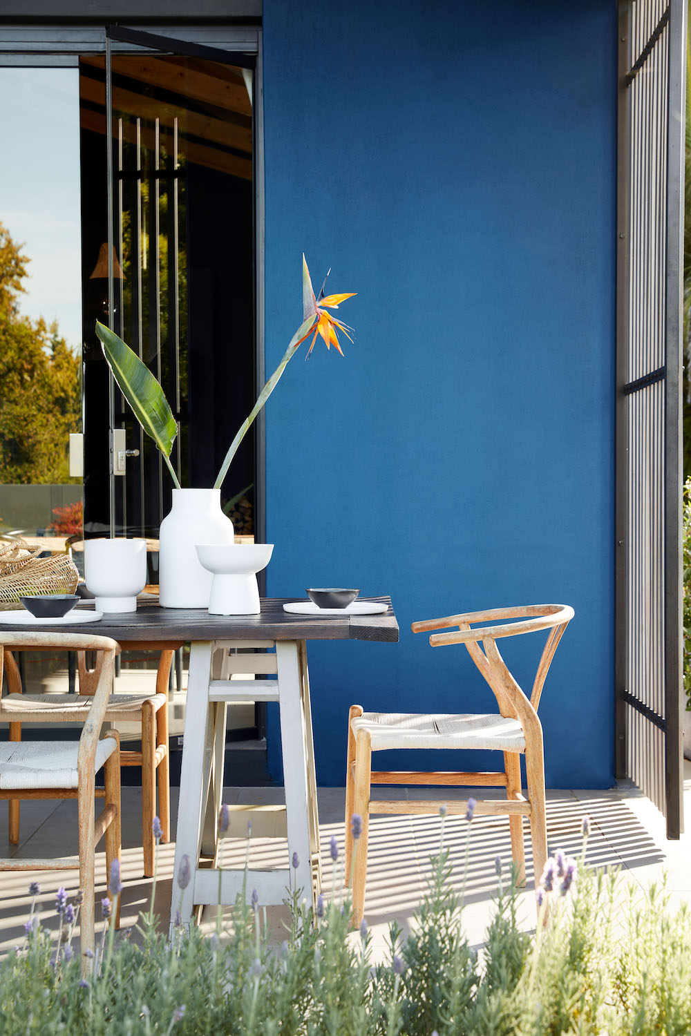

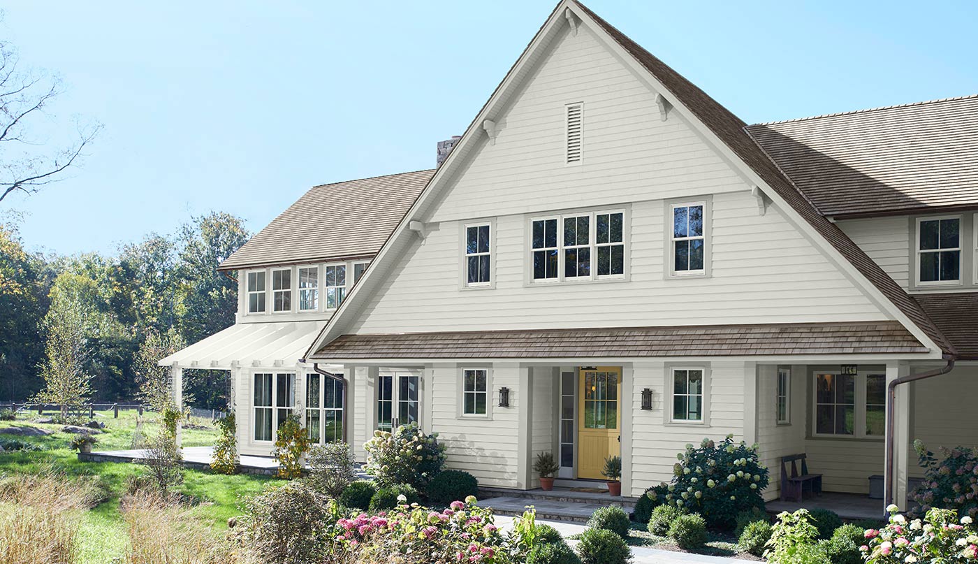
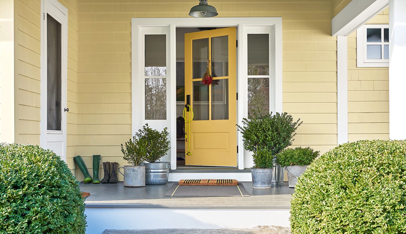
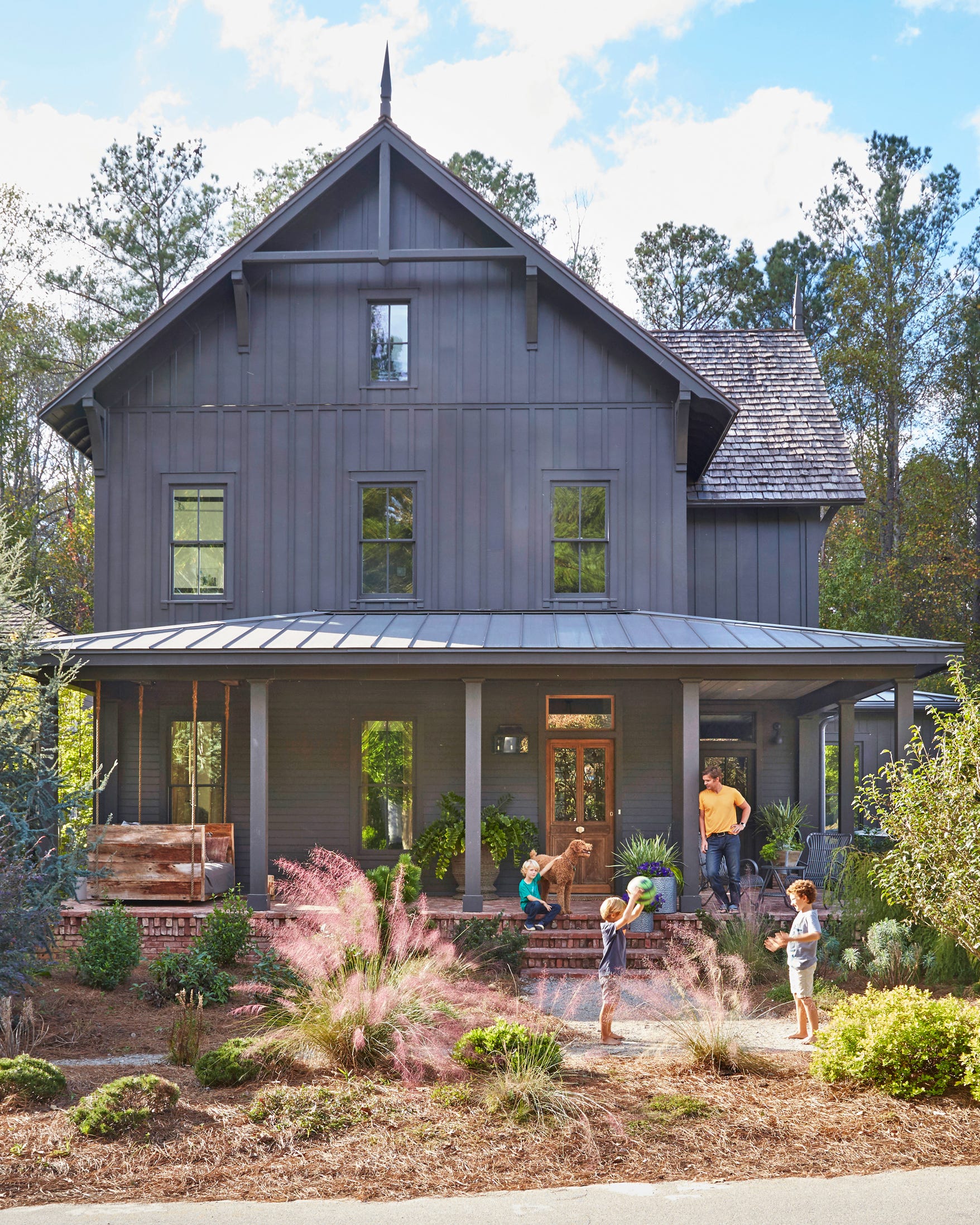
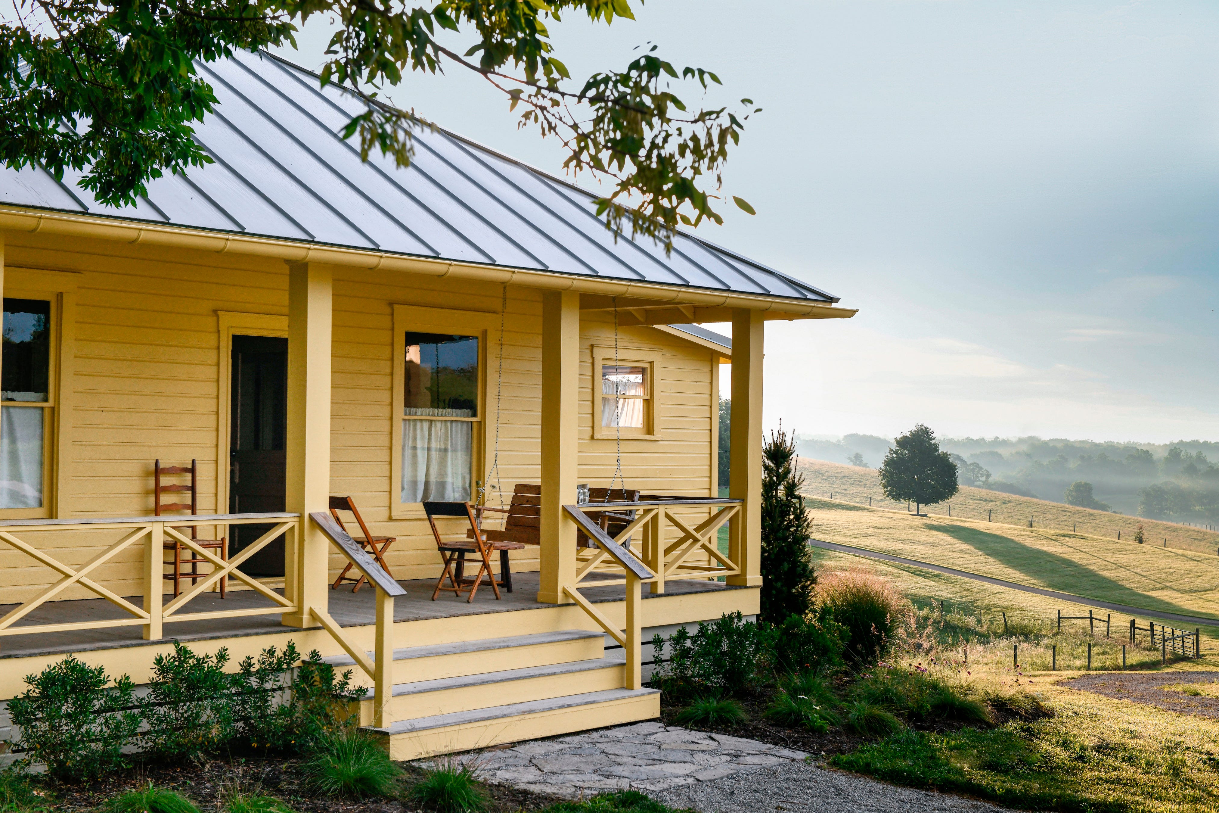
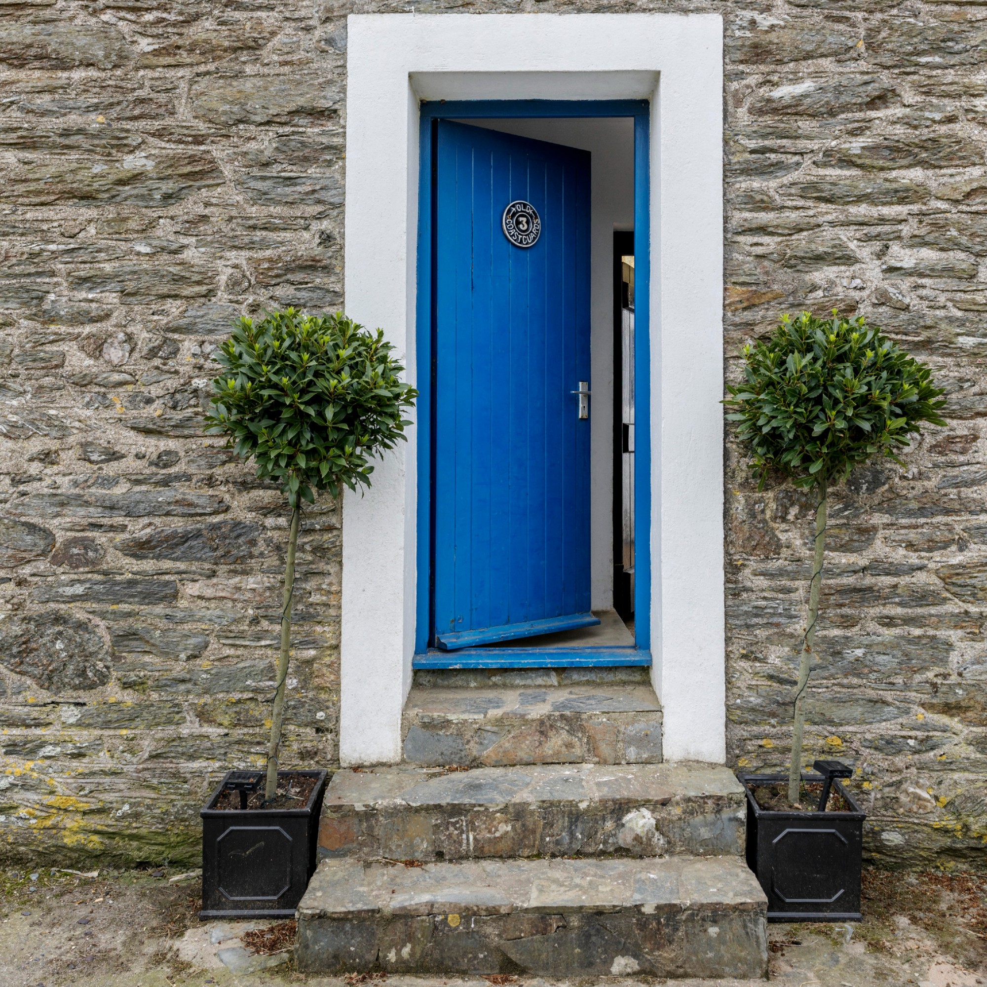
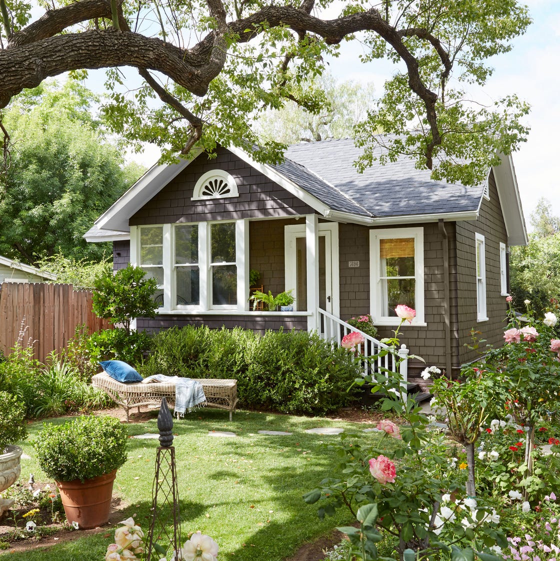
Unnatural shades, including bold colors like navy blue, bright yellow, black, and red, are often discouraged because they can jar with the natural environment and appear dated over time. Exterior paint colors should ideally complement the landscape rather than detract from it. For those who appreciate vibrant colors, toned-down versions like warm ochre or pale honey can offer a similar aesthetic without being overwhelming or creating an unwelcome contrast.
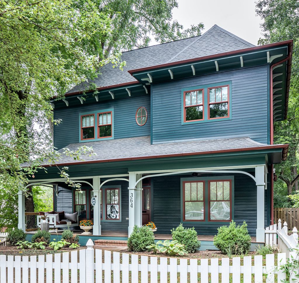
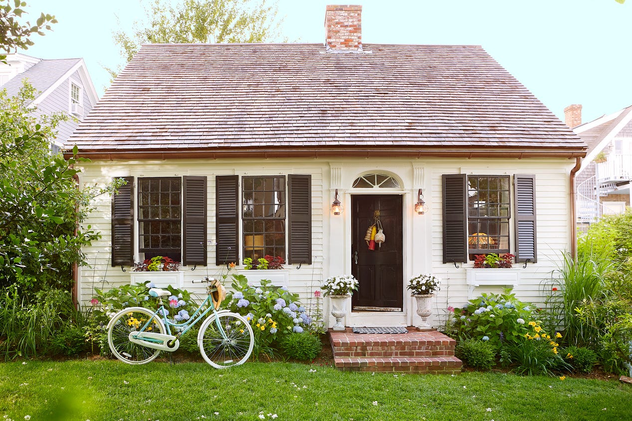
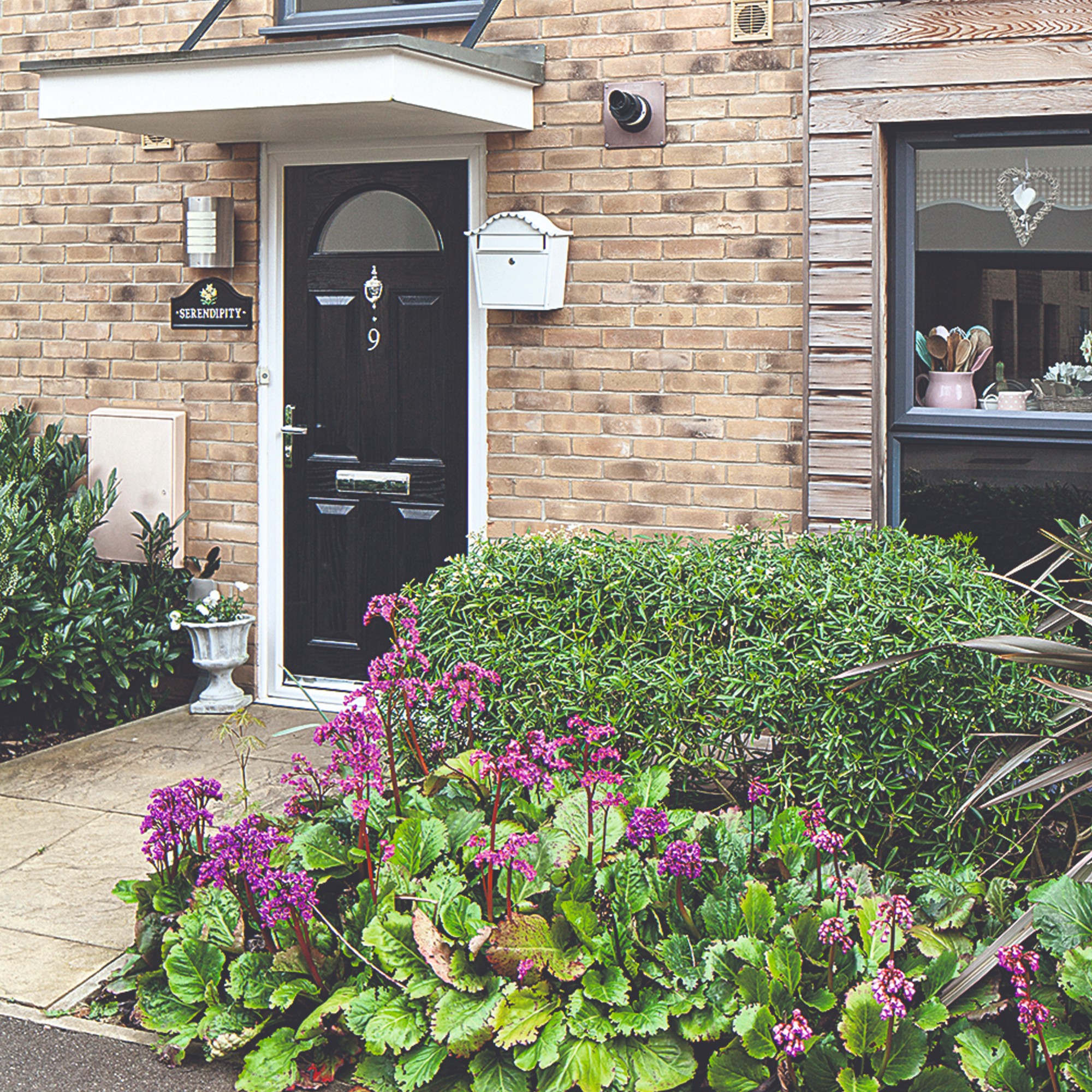
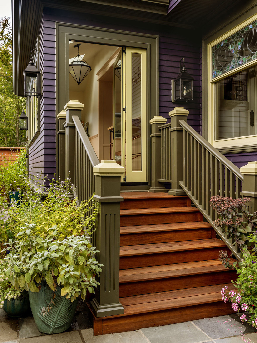
Finally, color blocking, which involves painting different sections of a home's exterior in various contrasting colors, is generally not recommended. Designers suggest sticking to a primary body color and, at most, an accent color for siding or trim. An excessive number of colors, particularly when applied inconsistently across the front, sides, and back of a house, can be distracting, visually chaotic, and can diminish the perceived value and elegance of the property and the neighborhood as a whole. Alternatives for adding visual interest, such as landscaping with flowers, are preferred over disjointed color schemes.
#ExteriorPaintColors #HomeDesign #CurbAppeal #NeighborhoodHarmony #PaintSelection #HomeownerTips #ArchitecturalStyle #ExteriorPaintColors #HomeDesign #CurbAppeal #NeighborhoodHarmony #PaintSelection #HomeownerTips #ArchitecturalStyle
0 comment in total
 No comments yet
You may also like
These Exterior House Paint Color Combos Are Bound to Turn Heads

24 Exterior House Colors That Add Major Curb Appeal

15 Striking Front Door Color Ideas That Will Make Your Neighbors Smile

8 Exterior Paint Colors That Make Your House Look More Expensive, According to Designers

8 Exterior Paint Colors That Make Your House Look More Expensive, According to Designers

6 Worst Colors To Paint Your Kitchen (And What To Choose Instead)
6 Colors You Should Never Paint Your Entryway, According to Color Experts

13 front door colours mistakes you might be making
These Paint Colors Bring Hostility to Your Home, According to Experts
6 Outdated Exterior Paint Colors Designers Would Be Happy to Never See Again

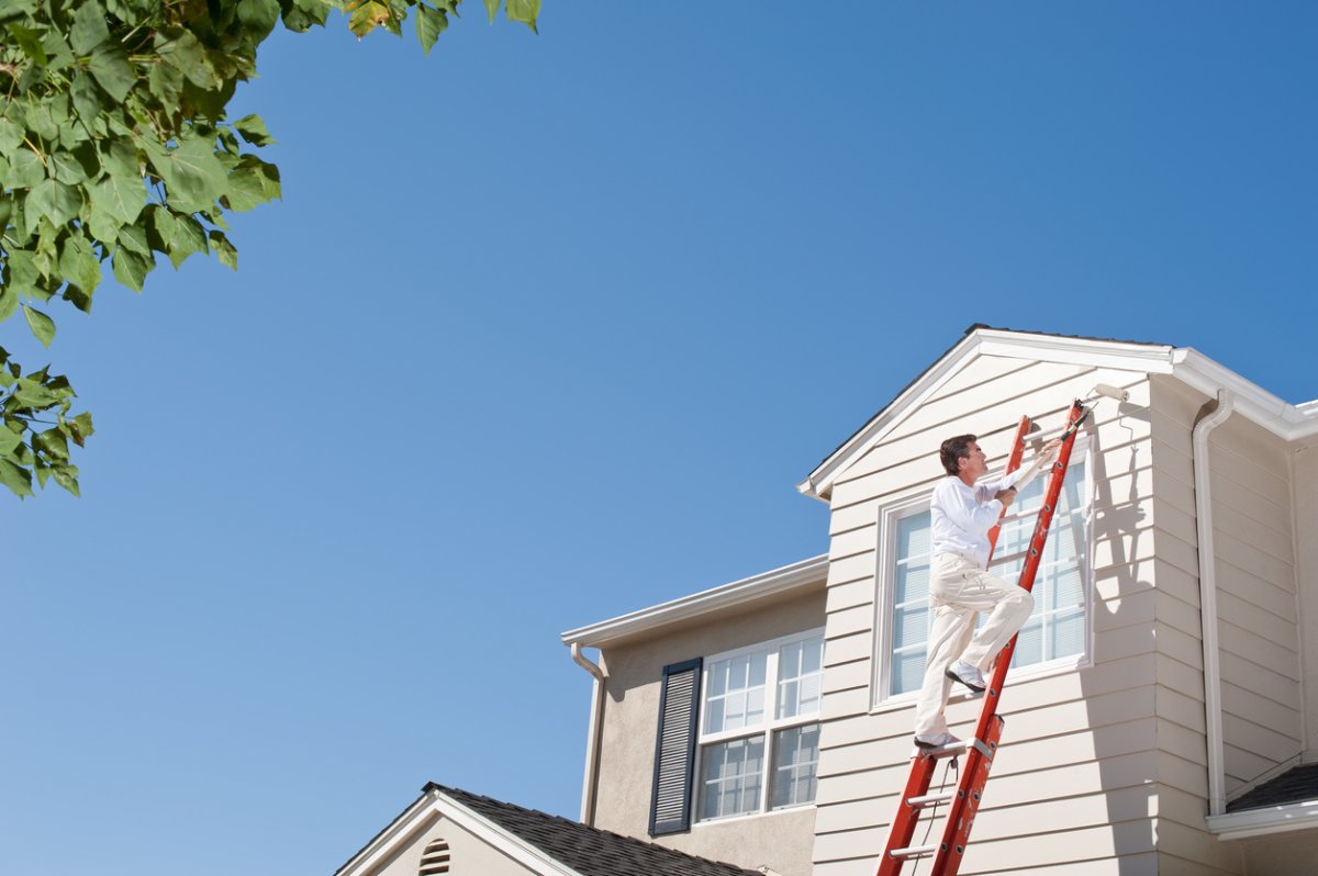
The Best Exterior House Paint Colors for Hot and Cold Climates

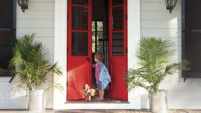
Hottest Exterior Paint Colors of 2020
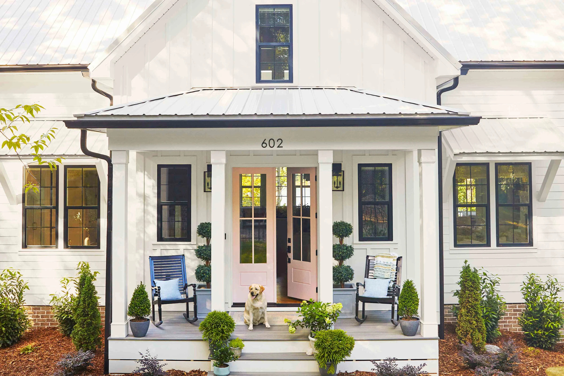
6 Exterior Paint Colors That Are Secretly Annoying Your Neighbors

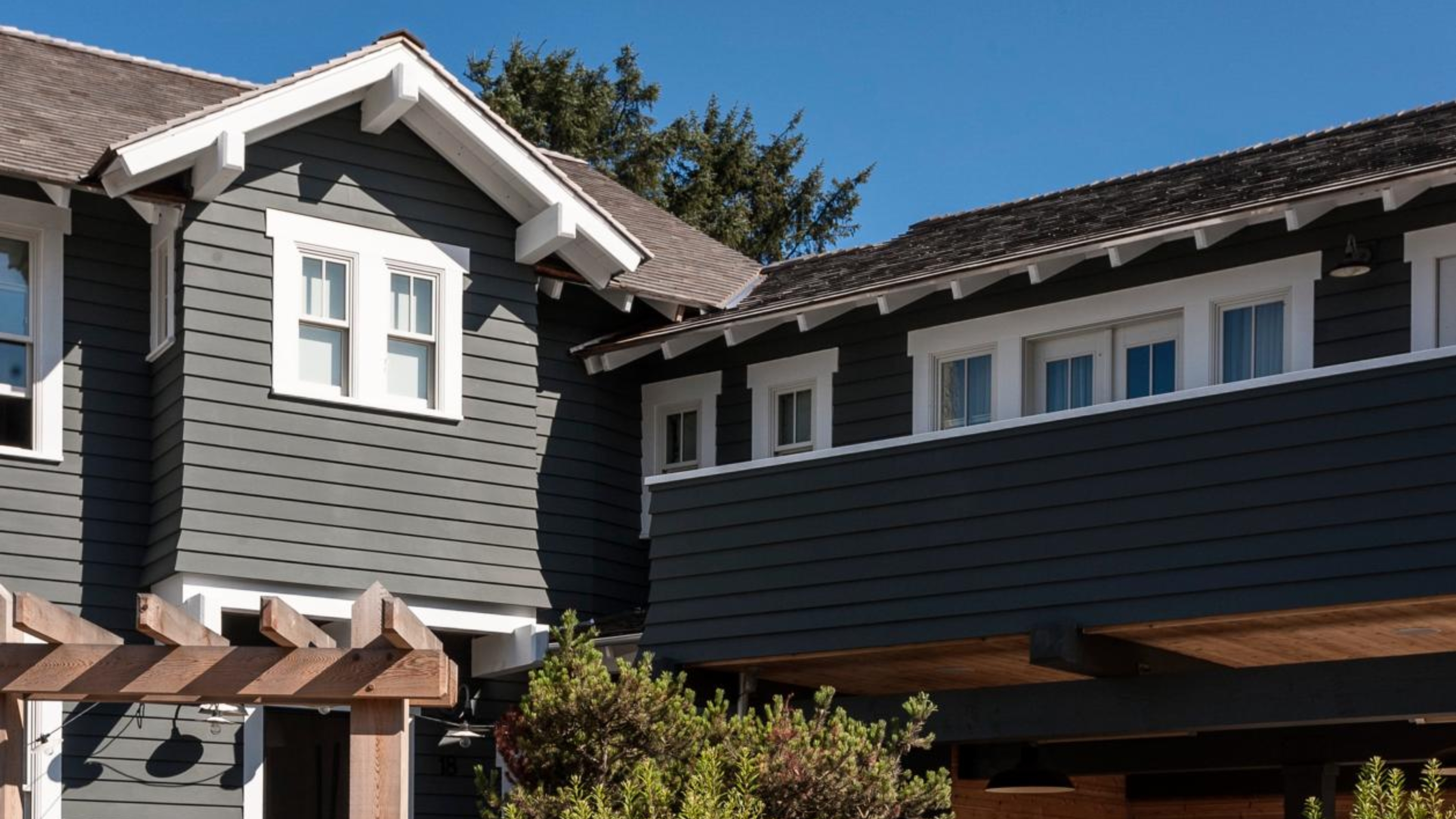
5 Exterior Paint Mistakes to Avoid If You Don't Want Your House to Become the Worst-Looking on the Street

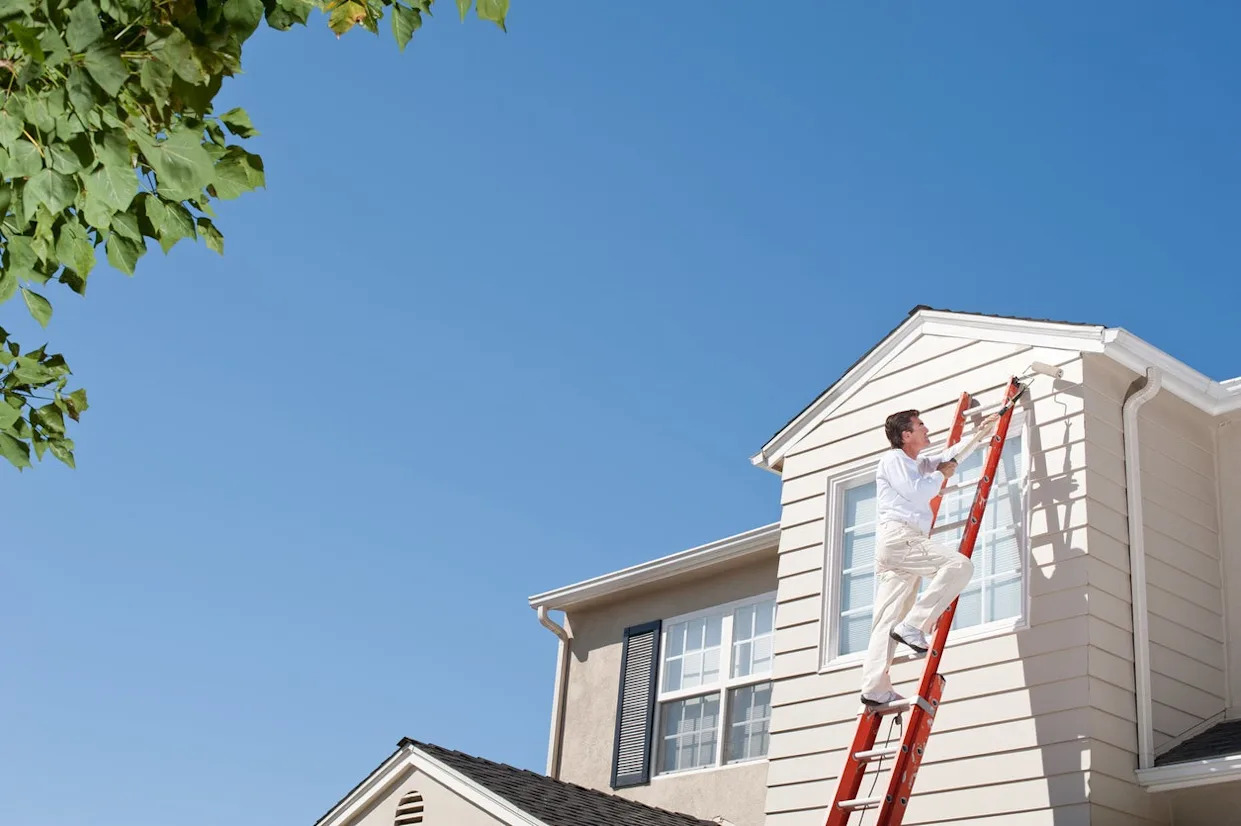
The Best Exterior House Paint Colors for Hot and Cold Climates
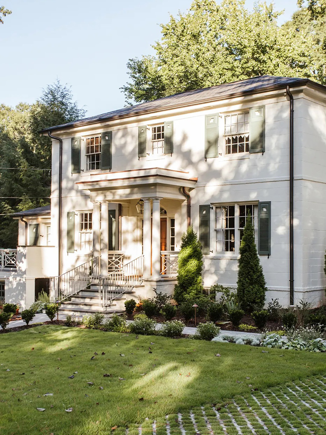
The Moody Shade That Will One-Up White Exteriors in 2026

6 Best Exterior Paints for Your Home, According to Experts

6 colors to avoid in an entryway – and the ones designers know make a better first impression
The 25 Best Exterior Paint Colors To Give Your Home Inviting Curb Appeal for 2025
6 Outdated Paint Colors Designers Don't Want to See in Homes Anymore in 2026